Vue normale

Il y a de nouveaux articles disponibles, cliquez pour rafraîchir la page.
Hier — 15 juillet 2025Flux principal

Opération Sundevil - Le jour où l'Amérique a déclaré la guerre aux hackers

Par : Korben
14 juillet 2025 à 11:37

Cet article fait partie de ma série de l’été spécial hackers. Bonne lecture !

Phoenix, Arizona, 6 heures du mat’. Un gamin de 16 ans dort paisiblement dans sa chambre, entouré de posters de Star Wars et de boîtes de pizza vides pendant que dehors, une dizaine d’agents armés jusqu’aux dents encerclent sa baraque…

Hé oui, aujourd’hui, je vais vous raconter comment 150 agents du Secret Service ont débarqué chez des ados boutonneux en pensant sauver l’Amérique. C’était le 8 mai 1990, et c’est devenu l’Opération Sundevil, la plus grosse opération anti-hacker de l’histoire.

À partir d’avant-hierFlux principal

Jeff Bezos’ Wedding Invite Looks Worse Than An 8-Year Old’s Scrapbook

Par : Sarang Sheth
27 juin 2025 à 15:20

Remember the entire Oscars debacle when La La Land was accidentally announced as the Best Picture winner when the award actually belonged to Moonlight? Remember when the design of the announcement card leaked online and the entire internet agreed that the layout was RIDDLED with readability errors? Or maybe you remember the time a Citibank employee accidentally transferred $900 million to the creditors of Revlon instead of paying the actual $7.8 million? The review of the banking dashboard’s graphic design exposed how bad design is often MUCH costlier than good design, given the severe impact it can have on societies.

Cut to the year 2025, and to the world’s third-richest man’s wedding invite: Bezos is marrying his long-time girlfriend Lauren Sanchez in Venice, and a leak of the wedding invite just shows how little the world’s elite think about design in general. The card, which looks like it was pulled from an MS Word template in the 90s, has the least creative design I’ve seen as a 34-year-old man who’s attended enough weddings in his life to know what a good invite looks like. At YD, we usually credit the designers, but this might be the first time I’m choosing not to. Not because I don’t know who designed the card, but because this is one of those rare occasions where we talk about the ‘lack of design’ rather than the presence of it.

Image Credits: Jeff Bezos

It’s estimated that Bezos and Sanchez are spending around $56 million on their wedding (although rumors in December indicated ‘falsely’ at a $600 million spend). It’s safe to say that even with a conservative budget of 1/10th that amount, Bezos could put together a much better invite. So what’s wrong with the invite’s design? Let’s get a little technical.

We start with the most obvious lack of any actual information. Sure, Bezos has a lot of name recognition, but does it hurt to put your name on your own wedding invite? Maybe a date too? These seem much more crucial to the invite than perhaps a dress code, or even a location (considering Bezos apparently rented ‘most of Venice’ for the nuptials). The lack of any identifying information really steals the credibility of the invite. More so, the word ‘WEDDING’ seems to be missing from the entire text, too. Strange…

As for the graphical layout itself, it lacks any sort of character or panache. Text in the center, with haphazard stickers on the outside that look like they came in a free PNG pack. Gondolas, feathers, birds, butterflies, all hideously generic pieces of clip art that only an 8-year-old would use. Centrally aligned text in that italic font is difficult to read too, and with just the words UNESCO and CORILA in bold, it really undercuts what the invite is all about – a wedding. And sure, one could argue that a wedding invite hardly has the same impact as accidentally announcing the wrong winner at the Oscars, or sinking hundreds of millions of dollars because of human error… but it’s the attitude towards good design that’s the problem. Fix that and you fix culture.

But hey, the invite literally has the entire design community talking… and that’s what’s so horrendously powerful about bad design – or polarizing design too. It spreads like wildfire, doing a far better job than good design at acquiring more eyeballs. I assume that’s probably why Bezos’ Blue Origin rocket looks the way it does too…

The post Jeff Bezos’ Wedding Invite Looks Worse Than An 8-Year Old’s Scrapbook first appeared on Yanko Design.

Experience Seamless Travel & Sustainable Design At Sydney’s New Light-Filled International Airport

23 juin 2025 à 23:30

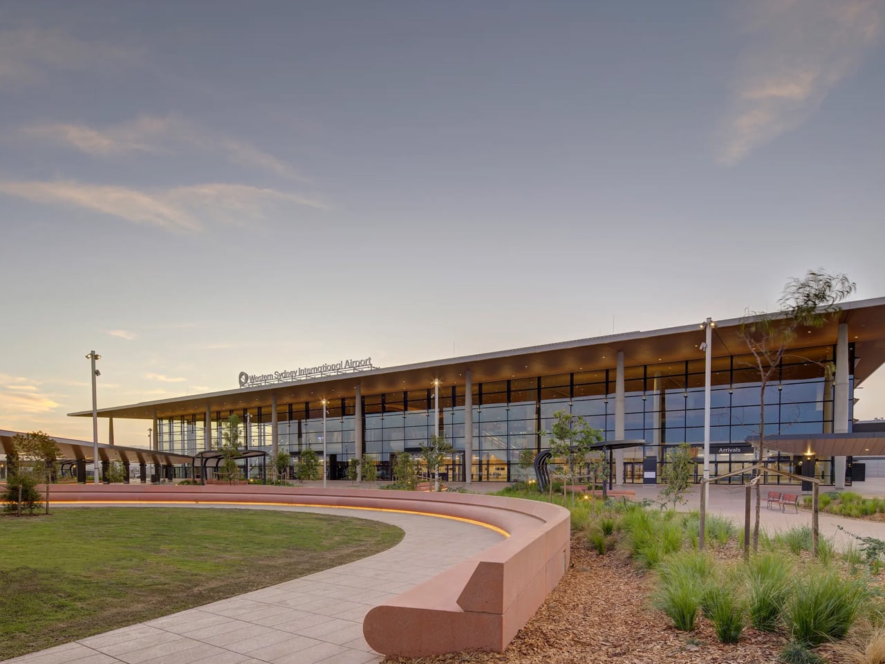
A new era of travel begins in Western Sydney with the unveiling of its international airport, a project that redefines what airport architecture can offer both passengers and the broader community. Designed with a focus on seamless movement, natural light, and environmental stewardship, the terminal is a study in how infrastructure can evoke welcome, clarity, and place. Its architecture is marked by an expansive, sculpted ceiling, creating a canopy that diffuses sunlight through the terminal and shapes the traveler’s first impressions of Australia.

Carefully considered circulation routes guide visitors from the curbside through check-in, security, and departure gates with minimal friction. Wide, open sightlines and intuitive wayfinding help reduce stress, while generous glazing throughout ensures that daylight is never far away. The material palette, grounded in warm wood, glass, and metal, brings in a sense of calm and durability. Passengers move through spaces that feel both monumental and approachable, an accomplishment that reflects the project’s ambition to balance the demands of efficiency with an elevated experience.

Designers: COX Architecture and Zaha Hadid Architects

The project employs a modular design that streamlines construction and reduces waste. Energy efficiency is prioritized through extensive use of daylight, high-performance glazing, and passive shading. Natural ventilation systems and water recycling further minimize the building’s environmental footprint. The approach is pragmatic but never clinical—technology serves to enhance comfort, not dictate it.

The sinuous ceiling, a signature gesture, is more than a visual flourish. It references the undulating Australian landscape and modulates the interior environment, providing both shade and a gentle play of light. This design move is echoed in the terminal’s external form, where the building sits low and broad, anchoring itself in the terrain rather than dominating it. The result is a structure that feels rooted, resilient, and unmistakably local.

Public spaces are generous, designed for lingering as much as for passing through. Seating areas are organized around panoramic views, and retail and dining are integrated without overwhelming the journey. For many travelers, this terminal will serve as their first encounter with Australia, and the design team has crafted an experience that is welcoming without being overwhelming, contemporary yet distinctly connected to its context.

Operationally, the airport is built for flexibility, ready to adapt as passenger volumes grow. The terminal is designed to handle 10 million travelers annually at launch, with capacity for expansion as Western Sydney continues to develop. Behind the tranquil experience is an infrastructure system engineered for reliability, efficiency, and future growth. This new gateway is a benchmark for what civic architecture can achieve. It doesn’t rely on spectacle but on thoughtful, human-centric design. Every feature—from the interplay of light and material to the integration of sustainable strategies—serves to create a sense of arrival and belonging.

The post Experience Seamless Travel & Sustainable Design At Sydney’s New Light-Filled International Airport first appeared on Yanko Design.

Cette théorie de la stupidité qui explique pourquoi Internet part en couille

Par : Korben
28 mai 2025 à 09:07

Je me suis encore tapé une bonne petite insomnie cette nuit, donc je me suis levé pour bosser et je suis tombé tout à fait par hasard sur ce PDF qui présente la “Théorie de la stupidité” de Dietrich Bonhoeffer, complété par une analyse de Carlo Cipolla sur “les lois fondamentales de la stupidité humaine”.

Je ne connaissais pas ces 2 gars ni leurs écrits, mais franchement, tous les jours ou presque je vois l’ampleur de la catastrophe et ça fait grimper ma pression artérielle. Et comme je ne comprends pas bien ce phénomène et que je ne sais pas trop comment m’y prendre pour y faire face, ça a évidemment attiré mon attention et je voulais partager ça avec vous.

❌
❌