❌

Vue normale

  • ✇Yanko Design
  • Road Barriers Become Benches Without Losing Their Warning Stripes
    A red-and-white safety barrier isn’t an object I’d normally consider inviting. It’s supposed to interrupt your plans. That’s why the stop! collection by Studio Martins Mezulis and creative 13_0663_tsx makes such a good first impression as a design idea. The outdoor benches and stools borrow the panels of Dutch traffic barriers to make places to sit, addressing a basic need in public space: somewhere to pause. Waiting for a friend shouldn’t require buying a coffee to justify occupying a chair. I
     

Road Barriers Become Benches Without Losing Their Warning Stripes

21 octobre 2026 à 05:15

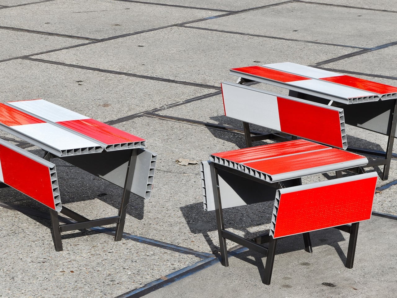
A red-and-white safety barrier isn’t an object I’d normally consider inviting. It’s supposed to interrupt your plans. That’s why the stop! collection by Studio Martins Mezulis and creative 13_0663_tsx makes such a good first impression as a design idea. The outdoor benches and stools borrow the panels of Dutch traffic barriers to make places to sit, addressing a basic need in public space: somewhere to pause.

Waiting for a friend shouldn’t require buying a coffee to justify occupying a chair. I like public seating that treats waiting, resting, and doing very little as perfectly legitimate activities. That’s the practical territory stop! occupies. Presented at Dutch Design Week in Eindhoven, running October 17–25, 2026, the collection invites people to stay for a while using an object associated with sending them elsewhere.

Designers: Studio Martins Mezulis and creative 13_0663_tsx

The starting point is the schrikhek, a red-and-white aluminum barrier used in the Netherlands to alert people to construction and redirect their route. You don’t need to recognize that Dutch term to understand the reference. The warning graphics do most of the explaining. Keeping them visible gives the furniture a little friction: your eyes register a restriction before your brain catches up with the seat.

It’s a fitting project for Studio Martins Mezulis, whose work spans graphic and spatial design. The stripes are doing both jobs here: defining a physical object and carrying a message that the designers are trying to change.

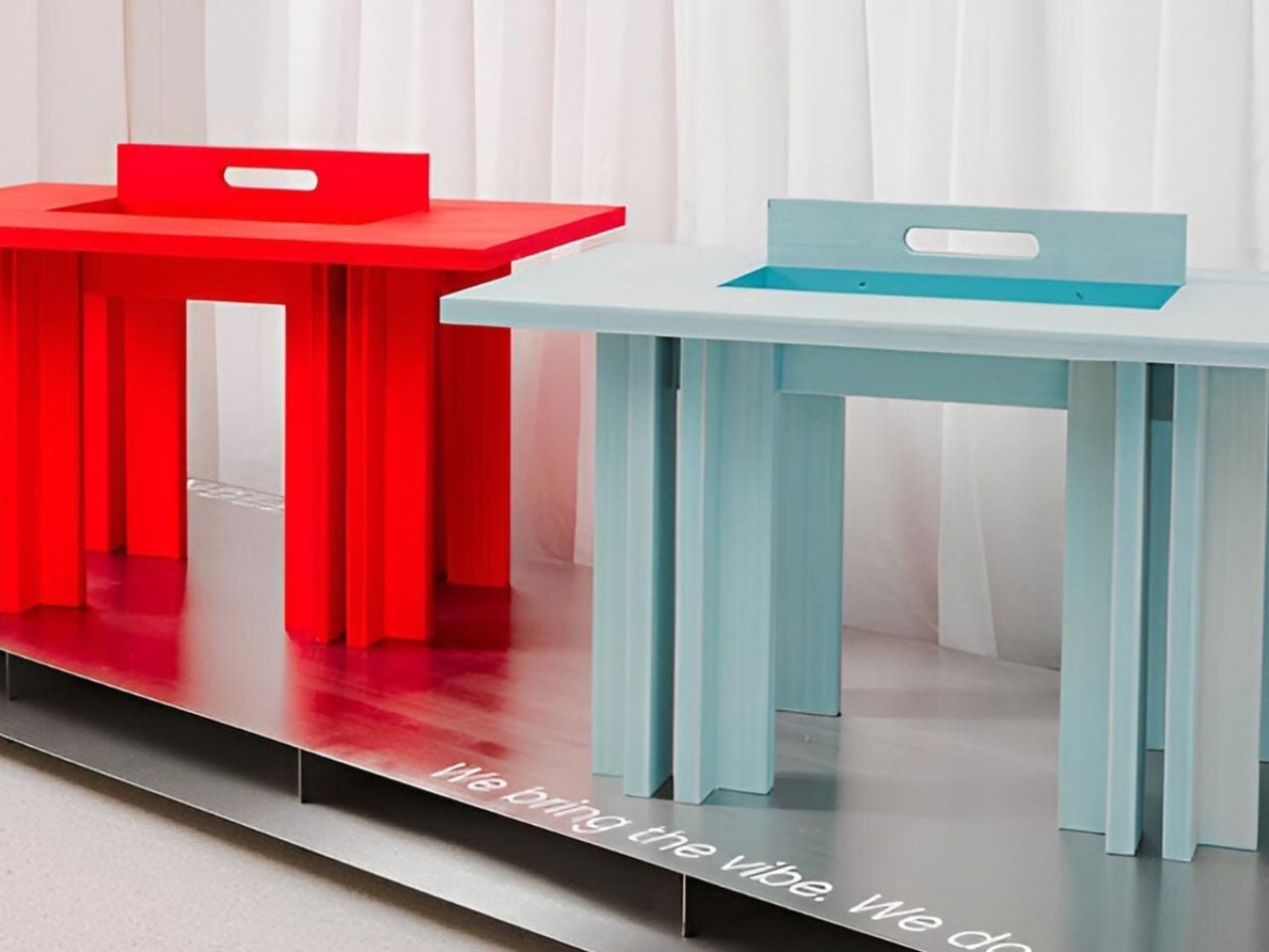
In the project’s render, long striped panels form the seating surfaces, with more panels running vertically along the sides. A narrow framework keeps the assembly visually open. The result looks deliberately assembled from infrastructure rather than dressed up to conceal its origins. I prefer that decision to a more polished makeover. Remove the red and white, and much of the reason to notice these benches disappears.

The published bench dimensions are 1,250 millimeters long, 500 millimeters wide, and 450 millimeters high, or approximately 49 by 20 by 18 inches. Road safety barriers and steel are listed as the materials. Those numbers describe a compact object rather than a sprawling park bench. Its proportions make the proposal easier to picture beside a pedestrian route or within a plaza, although placement would still need careful consideration.

The illustrated benches are also backless and lack armrests. That keeps their form simple and leaves the seat approachable from either side, but it doesn’t offer the support some people need. I’d read them as an invitation to take a short break rather than assume they’re suited to a long afternoon. The graphic wit is persuasive; comfort and durability would need evidence beyond a render.

That distinction matters because public furniture has a job beyond looking good in a design exhibition. Someone needs to understand that they can use it. Here, the same markings that make the collection memorable could initially make a passerby hesitate. I’d be interested to see how quickly people recognize the invitation. A bench occupied by one person might explain the idea better than a nearby project label.

The material story deserves similar precision. According to the project’s Dutch Design Week description, the designer hopes to work with construction infrastructure providers to reclaim decommissioned or discarded panels in the future. That isn’t confirmation that every panel in the current collection has already served at a construction site. Reuse is a proposed direction for expanding the collection, and it’s worth preserving that distinction rather than automatically labeling the furniture recycled.

For me, stop! works best as a modest adjustment to how a street communicates. It gives a familiar public object another use without erasing what made it recognizable. The humor gets your attention, but the seat has to justify keeping it. If the collection develops further, I’d rather see that effort go into making it useful to more people than into adding more visual tricks. A decent place to wait is already a worthwhile design brief.

The post Road Barriers Become Benches Without Losing Their Warning Stripes first appeared on Yanko Design.
  • ✇Yanko Design
  • A Coffee Bar Without a Remodel: UNITO’s Rolling Station
    A coffee grinder, a kettle, and a few favorite mugs can turn into a surprisingly territorial collection. Add filters, beans, and the tools that make a morning ritual feel worthwhile, and suddenly the kitchen counter has a second job. UNITO’s Coffee Station offers a dedicated home for that equipment, with wheels underneath so the coffee corner doesn’t have to become a permanent fixture. Designed by Unito, the station brings preparation space and storage together in a movable counter. Its appeal
     

A Coffee Bar Without a Remodel: UNITO’s Rolling Station

21 octobre 2026 à 04:15

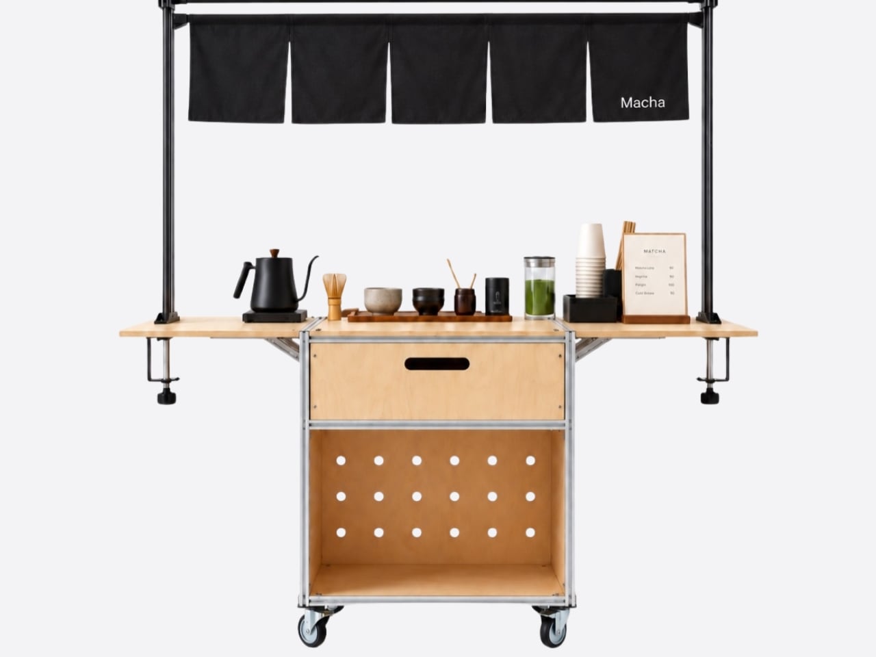
A coffee grinder, a kettle, and a few favorite mugs can turn into a surprisingly territorial collection. Add filters, beans, and the tools that make a morning ritual feel worthwhile, and suddenly the kitchen counter has a second job. UNITO’s Coffee Station offers a dedicated home for that equipment, with wheels underneath so the coffee corner doesn’t have to become a permanent fixture.

Designed by Unito, the station brings preparation space and storage together in a movable counter. Its appeal extends beyond reclaiming kitchen space. For a studio hosting clients or someone setting up a coffee pop-up, it could provide a more organized starting point than a table surrounded by supply boxes. Unito’s founder has described the Coffee Station as part of the brand’s move toward furniture and tools for small businesses.

Designer: Unito

The material combination gives that practical idea some personality. According to the supplied product description, silver anodized aluminum profiles form the frame, while light birch plywood supplies the panels. I like that the design lets both materials retain their identities. The metal outlines the structure with a workshop-like precision; the wood gives the broad surfaces enough warmth to keep the station from reading as purely institutional equipment.

That balance matters for something that might face customers. In the published photographs, the silver framework remains visible around the wooden drawer fronts, and side surfaces extend beyond the central cabinet on supporting brackets. Those extra surfaces look useful for separating preparation from pickup. A cup waiting to be served shouldn’t have to compete with the grinder for the same patch of counter.

Storage deserves as much attention as the equipment displayed above it. The described configuration includes two soft-close drawers, with an open compartment underneath. The photographs show wide finger-pull cutouts rather than projecting handles. I appreciate that restraint, but the more useful decision is giving small supplies somewhere to disappear. Filters, spoons, and towels could stay close without becoming part of the countertop display.

Then come the wheels, arguably the least glamorous and most consequential detail. The specifications list four locking stainless steel casters, and brake levers are visible in the photographs. That arrangement is intended to let the station move into position and then stay put. I’d still distinguish a rolling workstation from portable luggage. Moving across a suitable floor is a different proposition from negotiating stairs or loading it into a car.

The top also introduces an interesting possibility: it is specified to accept IGT panels or stoves. IGT refers to the Iron Grill Table system, whose modular approach combines frames with cooking and work-surface inserts. For UNITO, the appeal is a surface that could accommodate different tasks rather than permanently committing to one arrangement. Exact insert compatibility still needs confirmation before anyone starts ordering accessories.

The dedicated patio umbrella slot is another thoughtful detail. Published images show an umbrella rising above a fully arranged coffee setup, making the station read like a small service point rather than a kitchen cart parked outside. That could be useful for a temporary outdoor gathering. It doesn’t, however, establish that the plywood is weatherproof or that the station can anchor an umbrella safely in wind.

My favorite potential use is actually the less theatrical one: a shared studio where the coffee setup needs its own territory but the room changes throughout the week. A dedicated station could keep supplies together while allowing the host to rearrange the space. That feels like a convincing reason to put furniture on wheels, especially when building another fixed counter would make the room less flexible.

I wouldn’t call it a complete café or an outdoor kitchen. Those descriptions skip over water, power, cleanup, and the practical demands of serving people. Its more believable contribution is giving coffee equipment a coherent place to live and work. For someone who wants a serious setup without designing the room around it, that’s an appealing amount of commitment.

The post A Coffee Bar Without a Remodel: UNITO’s Rolling Station first appeared on Yanko Design.

  • ✇Yanko Design
  • LUMVIA Coffee Table Prototype Pairs a Customizable Mosaic With Hidden Drawers
    Choosing a coffee table usually means choosing a finish you’ll be living with for years. LUMVIA leaves that decision open a little longer, with interchangeable mosaic tiles that let you change the tabletop’s pattern instead of replacing the furniture. Developed by Romania’s mkt, the coffee table prototype puts that freedom inside a solid oak frame, with hidden storage underneath for the less decorative things. The top has a hexagonal outline, with a broad wooden border surrounding 24 triangular
     

LUMVIA Coffee Table Prototype Pairs a Customizable Mosaic With Hidden Drawers

Par : JC Torres
20 octobre 2026 à 06:07

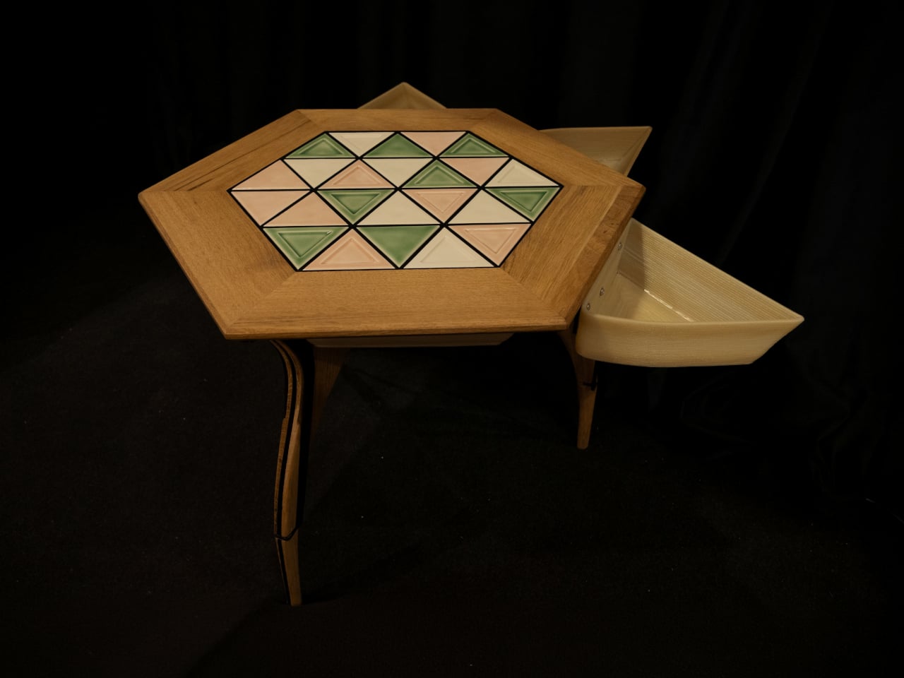
Choosing a coffee table usually means choosing a finish you’ll be living with for years. LUMVIA leaves that decision open a little longer, with interchangeable mosaic tiles that let you change the tabletop’s pattern instead of replacing the furniture. Developed by Romania’s mkt, the coffee table prototype puts that freedom inside a solid oak frame, with hidden storage underneath for the less decorative things.

The top has a hexagonal outline, with a broad wooden border surrounding 24 triangular tiles. Those repeated shapes give every arrangement a common structure, even when the colors change completely. You could group similar shades together or scatter contrasting pieces across the surface, turning the same geometry into a quiet backdrop or something that competes with the coffee cups for your attention.

Designer: mkt

There’s more to the customization than picking a favorite color, of course. Ceramic and glass provide different material options, while the lines between the tiles can be black or white. Dark separators make the individual triangles more pronounced against pale pieces; lighter ones soften that contrast. Even before rearranging anything, changing those lines alters how strongly the mosaic announces itself in a room.

That flexibility becomes particularly appealing when the rest of the room changes. A new rug might make yesterday’s tabletop feel a little too busy, while a neutral sofa could leave space for a bolder composition. LUMVIA’s removable tiles are intended to accommodate those shifts, letting owners revise the pattern over time rather than treating the original selection as a permanent decorating commitment.

The geometry continues underneath, where triangular drawers offer somewhere to tuck away the small objects that tend to collect around a sofa. Their shape follows the mosaic above, rather than introducing a rectangular box below it. There’s a practical tradeoff here, though: an angular compartment won’t suit everything, even if it gives keys or other small belongings a place away from the tabletop.

Both the drawers and the grid supporting the tiles are 3D-printed, placing digital manufacturing beneath the more familiar wood, ceramic, and glass. The approach gives the repeated triangular forms a role in construction as well as decoration. A separate wood version uses interlocking wooden tiles, offering another way to build a pattern without introducing ceramic or glass into the surface.

Still, a surface that invites rearranging also needs to work when you’re setting down a hot drink. Some tiles have recessed triangular details, while others are plain, making the choice about texture as well as color. How those pieces sit together, stay in place, and handle everyday spills will matter just as much as the pleasure of choosing which triangle goes where next.

LUMVIA remains a customizable prototype rather than a mass-produced table, and its configurator includes a step for selecting extra tiles. Having spare pieces could let you test different combinations without replacing the whole set every time your tastes change. You’ll still need somewhere to keep all the triangles that aren’t on display, though. Even a coffee table makeover can leave you with leftovers.

The post LUMVIA Coffee Table Prototype Pairs a Customizable Mosaic With Hidden Drawers first appeared on Yanko Design.
  • ✇Yanko Design
  • This Minimalist Bamboo Coffee Table Hides Everyday Clutter in Plain Sight
    A coffee table usually has a fairly straightforward job: hold a cup of coffee, a few books, and whatever else happens to accumulate in the living room. But what if it could accommodate everyday clutter without putting any of it on display? Designed by Marek Kounovský of MK Designers in collaboration with Prague-based furniture company Frayer, the Handle Table takes this familiar piece of furniture and gives it a more considered purpose. Made primarily from bamboo, the table incorporates conceal
     

This Minimalist Bamboo Coffee Table Hides Everyday Clutter in Plain Sight

19 octobre 2026 à 18:30

A coffee table usually has a fairly straightforward job: hold a cup of coffee, a few books, and whatever else happens to accumulate in the living room. But what if it could accommodate everyday clutter without putting any of it on display? Designed by Marek Kounovský of MK Designers in collaboration with Prague-based furniture company Frayer, the Handle Table takes this familiar piece of furniture and gives it a more considered purpose. Made primarily from bamboo, the table incorporates concealed storage, an integrated handle, and a restrained silhouette that allows its material and construction to take center stage.

The design takes inspiration from the Japanese principle of hodo-hodo, which loosely translates to the idea of “just enough.” Rooted in moderation and balance, the philosophy encourages appreciating things that serve their purpose without excess. Kounovský translates this thinking into furniture by reducing the table to its essential elements. Rather than introducing elaborate mechanisms or decorative features, he focuses on proportion, geometry, and the relationship between form and function. Every visible detail has a reason to exist, and the absence of unnecessary embellishment gives the table its distinct character.

Designer: MK Designers

One of its most interesting features is the concealed storage compartment, which is incorporated directly into the table’s geometry. Coffee tables often become gathering places for remote controls, magazines, chargers, and other small objects that are useful to have nearby but can quickly make a room feel cluttered. Handle Table addresses this familiar situation by providing a dedicated space for everyday belongings while preserving its clean exterior. The compartment remains visually discreet, allowing the table to maintain its sculptural appearance even as it performs an additional function.

The integrated handle is another subtle yet important element of the design. Rather than appearing as a separate attachment, it is incorporated into the tabletop itself, creating a functional feature that feels consistent with the overall composition. This detail makes the table easier to move and reposition, an especially relevant consideration for contemporary interiors where furniture frequently accommodates different activities throughout the day. The table can shift between spaces and arrangements without demanding a permanent position, extending its usefulness beyond that of a conventional stationary coffee table.

Material selection plays an equally significant role in the project. Bamboo forms the main structure, bringing its recognizable grain and natural texture into the otherwise reduced design. The surface is treated with an oil-based wood stain, developed through experimentation with application techniques suited specifically to bamboo. Instead of concealing the material beneath an opaque coating, the finish emphasizes its inherent structure and tactile qualities. The resulting surface gives the table a sense of depth while retaining the character of the bamboo itself.

This attention to finishing is particularly important in a design with so few visual elements. Without decorative distractions, the material becomes one of the primary ways the object communicates its identity. The stained bamboo, precise construction, and carefully controlled proportions work together to create visual interest through restraint. Even the concealed compartment contributes to this approach, demonstrating how practical considerations can become part of the furniture’s fundamental structure rather than additions made after the form has been established.

First presented at the 14th Czech Design Week international design festival in Prague, Handle Table reflects the collaboration between Kounovský’s design practice and Frayer’s approach to bamboo furniture. The project brings together an interest in thoughtful material treatment and an understanding of how furniture participates in everyday routines. Its simplicity is the result of deliberate decisions about what to include, what to conceal, and what can be left out altogether.

There is something appealing about furniture that makes room for the realities of daily life without constantly drawing attention to its cleverness. Handle Table does not attempt to reinvent the coffee table through an abundance of features. Instead, it refines the familiar object through a few carefully integrated gestures. The storage keeps essentials close, the handle makes movement easier, and the bamboo brings warmth and texture to its compact form. In a category where additional features are often presented as improvements, Kounovský offers a different proposition: perhaps a well-designed object needs only enough to do its job beautifully.

The post This Minimalist Bamboo Coffee Table Hides Everyday Clutter in Plain Sight first appeared on Yanko Design.
  • ✇Yanko Design
  • LAYER’s Ripple Dining Table Uses a Wavy Plywood Core to Cut Weight
    Large dining tables are useful right up until you need to move one, when their reassuring weight becomes somebody else’s lifting problem. LAYER’s Ripple research table explores a lighter construction by giving thin plywood a corrugated profile instead of relying on a thick slab. That said, the project keeps a flat surface for everyday use while putting the waves underneath, mostly hidden from view. The original table was specified at approximately 8.2 feet long and 39.4 inches wide, weighing ab
     

LAYER’s Ripple Dining Table Uses a Wavy Plywood Core to Cut Weight

Par : JC Torres
14 octobre 2026 à 06:07

Large dining tables are useful right up until you need to move one, when their reassuring weight becomes somebody else’s lifting problem. LAYER’s Ripple research table explores a lighter construction by giving thin plywood a corrugated profile instead of relying on a thick slab. That said, the project keeps a flat surface for everyday use while putting the waves underneath, mostly hidden from view.

The original table was specified at approximately 8.2 feet long and 39.4 inches wide, weighing about 19.8 pounds. That’s a generous dining surface for something intended to be moved by one person. Bringing it across a room for guests or shifting it away from the wall could become less of a coordinated household event. Its footprint, however, doesn’t shrink along with its weight.

Designer: LAYER

The material comes from a collaboration with Canadian manufacturer Corelam, using pressure lamination to form the repeating curves. LAYER specifies plywood approximately 0.12 inches thick, although that isn’t the overall depth of the assembled tabletop. The distinction matters here: the design gets its structure from a shaped sheet and layered construction, rather than pretending a thin, flat board can do everything alone.

Of course, a wavy dining surface would be a fairly annoying place to balance your coffee. Ripple covers its corrugated structure with a flat plywood sheet, leaving the waves visible below and along the edge. Plates and laptops get the ordinary surface they need, while the underside carries the more unusual geometry. The useful part doesn’t have to look particularly experimental from above.

The legs follow the same preference for shape over bulk. A refined version uses hollow triangular profiles, designed to increase rigidity in two directions. The tabletop’s underside also curves gently across its length and width. Those changes address a fairly obvious concern with lightweight furniture: being easy to pick up is only useful if the table still supports what you put on it.

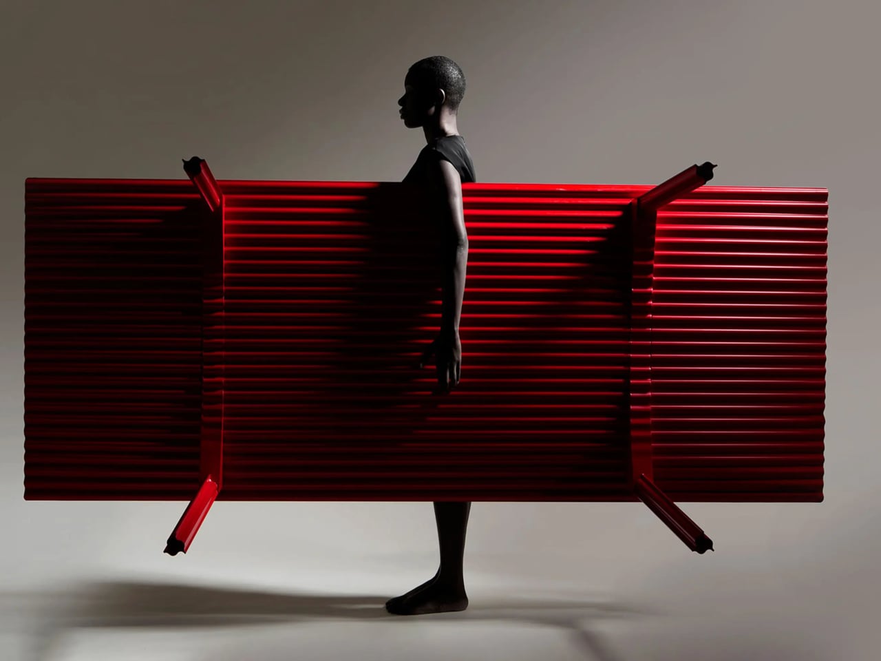
The red finish keeps Ripple from disappearing into the background, even with such a thin outline. From the side, the top appears almost like a sheet balanced on four narrow supports. Along the short edges, the repeating curves reveal why that impression is misleading. The structure supplies its own ornament, without adding a carved border or a heavier decorative frame.

Using less wood is part of the environmental argument, too. The project’s original documentation claims 70% to 80% less material than a standard timber table, but doesn’t establish a defined comparison for that figure. Less material isn’t automatically a complete environmental assessment, either. Adhesives, finishing, production, and working life still matter, even when the basic idea of doing more with less is appealing.

LAYER presents Ripple as a studio research project, without a current retail price or ordering details. The construction offers an answer for people whose furniture has to move with them, though size remains a constraint. You might no longer need help with the lifting, but you’d still need a clear route through the house before taking that tabletop around a corner.

The post LAYER’s Ripple Dining Table Uses a Wavy Plywood Core to Cut Weight first appeared on Yanko Design.
  • ✇Yanko Design
  • An Angled Public Bench for Hanging Out Without the Coffee Tab
    A bench can give you a place to sit and still make talking surprisingly awkward. Line up two people facing the street, and conversation requires a sideways turn. Add a third, and someone starts leaning around the person in the middle. Free to Face, a public seating project by Lim Junwoo and Hayoung Kang, addresses that everyday mismatch between having somewhere to sit and having somewhere to spend time together. The designers also frame the project around a larger concern: conversation becoming
     

An Angled Public Bench for Hanging Out Without the Coffee Tab

13 octobre 2026 à 18:30

A bench can give you a place to sit and still make talking surprisingly awkward. Line up two people facing the street, and conversation requires a sideways turn. Add a third, and someone starts leaning around the person in the middle. Free to Face, a public seating project by Lim Junwoo and Hayoung Kang, addresses that everyday mismatch between having somewhere to sit and having somewhere to spend time together.

The designers also frame the project around a larger concern: conversation becoming tied to consumption. Meeting over coffee is lovely, but buying a drink shouldn’t be the entry fee for sitting down with a friend. Free to Face proposes seating that gives people room to gather without a transaction attached. I like that ambition. It makes a modest, understandable request of public space: accommodate people who aren’t necessarily on their way somewhere else.

Designers: Lim Junwoo and Hayoung Kang

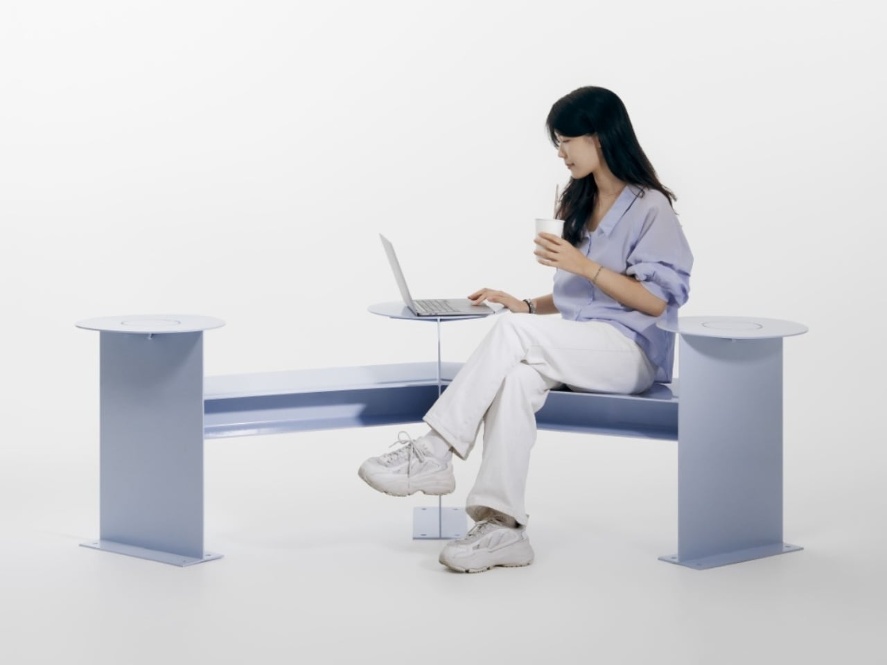
Its clearest design move is visible from above. Instead of a straight bench, the seating follows a shallow, angular bend, with round platforms punctuating the ends and middle. People sitting along the two arms can angle toward each other rather than share a single forward-facing view. The arrangement leaves an open area between them, giving conversation a physical center without enclosing the group or turning the furniture into a miniature booth.

That distinction matters to me. A seating arrangement can invite eye contact without making it compulsory. Free to Face’s photographs show people talking across the bend, but the backless layout also leaves room to choose another orientation. I’d rather have furniture that offers a social possibility than furniture that seems to assign everyone a role. A stranger sitting nearby shouldn’t automatically become your conversation partner, and a public bench shouldn’t feel like an icebreaker exercise.

The different surface heights make the project more interesting than its footprint alone suggests. The supplied description presents those levels as options for choosing a sitting position, with unused areas doubling as places for bags or food. In the photographs, one person occupies a raised circular platform while others sit lower. Elsewhere, a tote rests beside its owner. These are fixed surfaces, not an advertised height-adjustment mechanism, so the flexibility comes from how people occupy the structure.

Those little landing spots feel especially useful. A basic bench leaves your lunch, laptop, and bag competing with your lap or the seat beside you. Here, the circular surfaces provide alternatives, and the images demonstrate a shared meal arranged around the middle platform. I’m particularly fond of that use because it makes the social premise concrete. Two people splitting fries need somewhere to put the fries. Design doesn’t always need a more elaborate explanation than that.

Visually, Free to Face has a pale lavender finish, broad flat supports, and exposed structural geometry. The circular tops soften an otherwise angular assembly. A fabrication photograph shows the metal structure before finishing, although the supplied material doesn’t identify its alloy or coating specification. I like that the form remains readable: you can follow the bench’s bend, identify the raised surfaces, and understand several possible uses without consulting an instruction panel.

The studio setting does leave practical questions unanswered. The photographs establish a full-size physical build, not how it performs through rain, summer heat, or years of public use. Back support, comfortable seat heights, and room for someone using a wheelchair would all deserve attention before installation. I wouldn’t dismiss the design for lacking that documentation, but I also wouldn’t treat a staged lunch as proof of comfort or accessibility. Its strongest evidence is the arrangement itself, demonstrated through several uses.

One photograph shows a woman using a laptop alone, which is a welcome detail for a project about connection. Free public space needs to accommodate solitude, too. Sitting quietly shouldn’t count as using social furniture incorrectly. Free to Face appeals to me because its extra surfaces and angled layout offer choices beyond sitting in a row. I’d be happy to see more benches make that effort, especially if they let people linger without needing to order another coffee.

The post An Angled Public Bench for Hanging Out Without the Coffee Tab first appeared on Yanko Design.
  • ✇Yanko Design
  • Colheita Coffee Table Concept Shapes Its Steel Legs With Ant-Inspired Cuts
    Ants aren’t usually welcome around a coffee table, especially when there are snacks involved. The Colheita Coffee Table concept, however, borrows something more useful from them: the curved cuts left by leafcutter ants. Its steel surface folds downward to become its own legs, while movable wooden supports provide places for drinks. The nature reference gives the table its construction logic, rather than simply decorating it. The body starts with a single steel sheet, cut by laser and bent so th
     

Colheita Coffee Table Concept Shapes Its Steel Legs With Ant-Inspired Cuts

Par : JC Torres
12 octobre 2026 à 13:20

Ants aren’t usually welcome around a coffee table, especially when there are snacks involved. The Colheita Coffee Table concept, however, borrows something more useful from them: the curved cuts left by leafcutter ants. Its steel surface folds downward to become its own legs, while movable wooden supports provide places for drinks. The nature reference gives the table its construction logic, rather than simply decorating it.

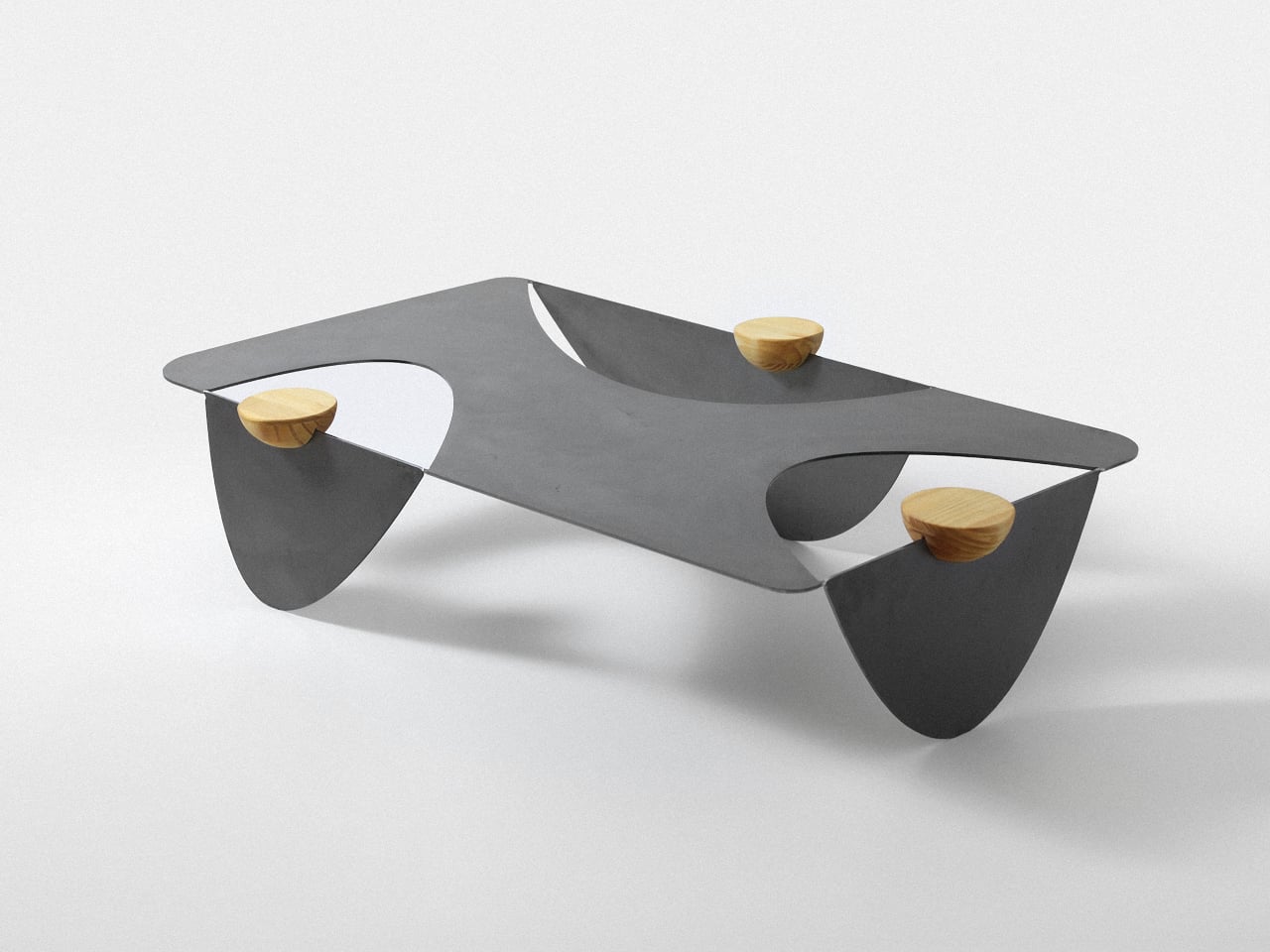
The body starts with a single steel sheet, cut by laser and bent so three broad sections reach the floor. Those sections remain attached, leaving openings where a conventional tabletop would be solid. Rather than adding separate legs underneath, Colheita carries the tabletop material through to its base. The relationship is easy to follow, even if the resulting silhouette is rather unusual.

Designer: Fabrício Auler

That approach is intended to reduce component count and material waste, although it isn’t a claim of waste-free manufacturing. A smaller detail helps explain how the sheet takes shape: enlarged, rounded ends on the cuts provide relief during bending. They’re there to ease stress where flat metal becomes a leg. The graceful curves have a fabrication purpose alongside their resemblance to a harvested leaf.

The wooden pieces might look like little bowls at first, but their flat tops serve as platforms rather than containers. Each hemisphere has a groove that slots onto the folded steel, allowing it to move along the edge. The wood adds a warmer color and visible grain to the dark metal, while giving a glass or small object its own resting place.

That means the arrangement doesn’t have to stay the same after you’ve chosen where the table goes. Move a wooden support closer to your seat, or spread them around when friends gather on different sides. The system is also intended to help stabilize the upper surface. These small additions therefore have a job beyond making the steel look a little less austere.

Of course, all those openings leave less uninterrupted space for whatever usually accumulates on a coffee table. A book or tray needs a solid patch beneath it, and a loose remote won’t forgive careless placement. The gaps do leave room for trailing plants and allow light through. Colheita invites you to arrange its contents more deliberately, which won’t appeal to everyone’s housekeeping habits.

The project also explores an unfinished carbon steel version, letting oxidation change the surface’s colors and patterns over time. That’s a different proposition from furniture meant to keep an immaculate, uniform finish. It gives the table a changing appearance rather than a permanent shade of gray. The project presentation doesn’t explain how to manage that aging around spilled drinks or routine household cleaning.

Colheita means “harvest” in Portuguese, a nod to the ants and to gathering around the table. It remains a concept project with fabrication work documented, rather than a verified retail offering. Dimensions and load capacity aren’t provided. Before trusting one of those platforms with hot coffee, you’d want to know how securely it stays put when someone nudges the table.

The post Colheita Coffee Table Concept Shapes Its Steel Legs With Ant-Inspired Cuts first appeared on Yanko Design.
  • ✇Yanko Design
  • FUSEBOOX’s Hidden Home Office Slides Away After Work
    Putting a laptop away doesn’t solve every problem with working from home. A video call still needs some privacy, and recording a voiceover beside the dishwasher is a negotiation nobody particularly wants. I like furniture that helps a room do more, but a folding desk only addresses half the issue. Sometimes the missing piece is a door. FUSEBOOX, designed by Czech architect Vojtěch Kolínský of Prague studio Indivizual, proposes a home office that slides out when needed and retracts into the surr
     

FUSEBOOX’s Hidden Home Office Slides Away After Work

12 octobre 2026 à 09:20

Putting a laptop away doesn’t solve every problem with working from home. A video call still needs some privacy, and recording a voiceover beside the dishwasher is a negotiation nobody particularly wants. I like furniture that helps a room do more, but a folding desk only addresses half the issue. Sometimes the missing piece is a door.

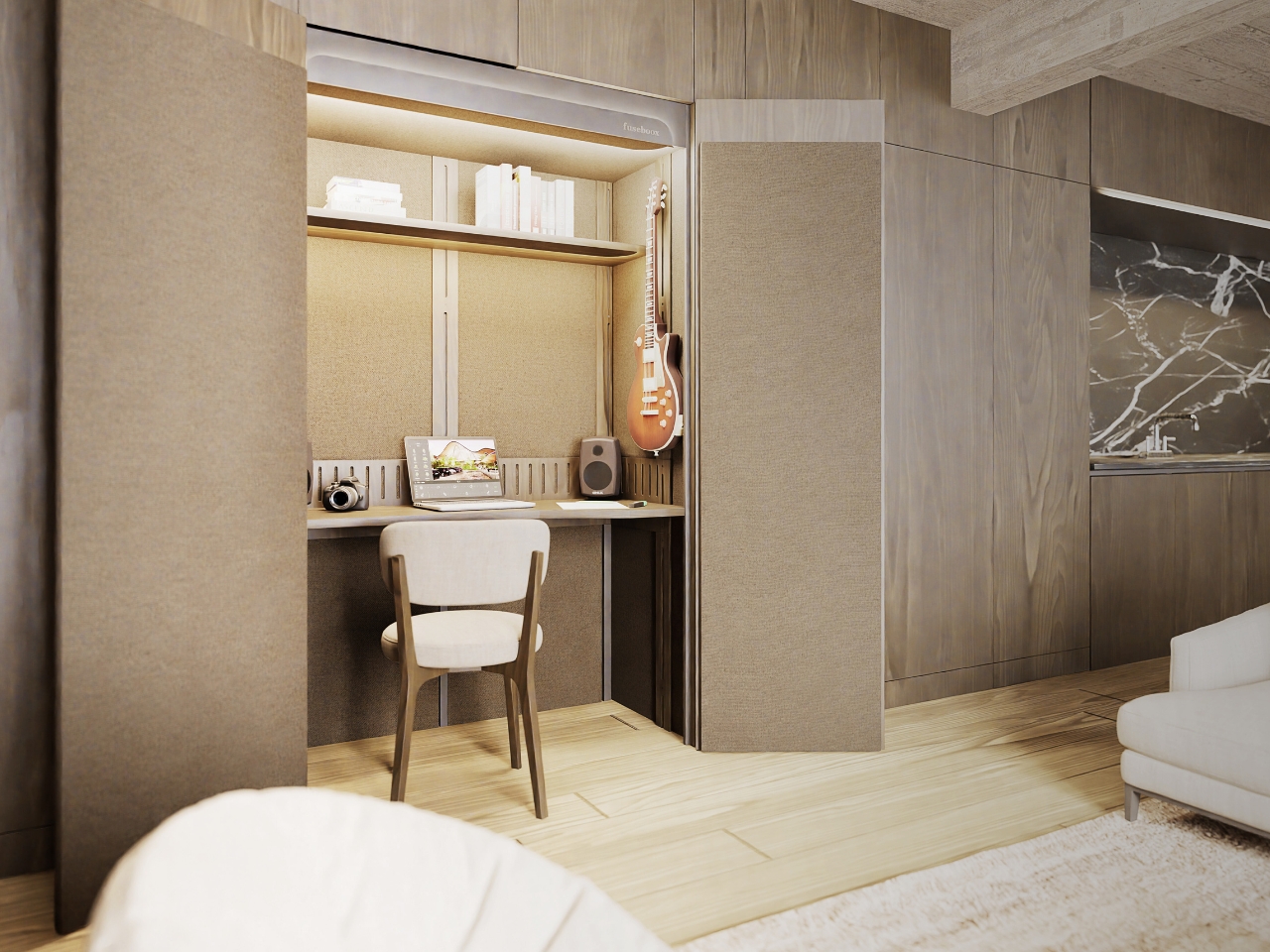
FUSEBOOX, designed by Czech architect Vojtěch Kolínský of Prague studio Indivizual, proposes a home office that slides out when needed and retracts into the surrounding interior afterward. It’s a built-in acoustic workspace, presented at DesignBlok 2026, rather than another freestanding booth asking for permanent floor space. The problem it tackles is straightforward: finding somewhere to concentrate without dedicating an entire room to it.

Designer: Vojtěch Kolínský

The module has three positions. Open, it works as a desk within the larger room, so you can stay connected to whatever’s happening around you. Extended and closed, it becomes a private enclosure intended to reduce noise traveling in and out. Retracted, the workspace disappears behind its exterior panels. A custom-developed mechanism handles extension and retraction automatically, according to the maker. That’s a more useful distinction than simply calling it a disappearing desk.

In the supplied images, the interior looks invitingly domestic. Pale wood-grain surfaces, textured wall panels, a narrow shelf, and warm lighting surround a compact desk. The exhibition setup includes a microphone and a metronome, while another image shows a guitar mounted above the worktop. Those details suggest a space for practicing and making things, not merely surviving the next calendar invitation. I’d rather see that than a miniature corporate meeting room.

The acoustic ambition deserves a closer look. FUSEBOOX describes a multilayer construction with sealed contact edges that limits sound transmission, alongside treatment intended to control reflections and reverberation inside. In practical terms, keeping household noise out and reducing echo around a microphone are separate jobs, and the design aims to address both. The supplied release promises studio-quality sound, but provides no measured isolation figures or independent testing to establish that claim.

Ventilation and adjustable lighting are included, with the website specifying variable brightness and color temperature. These are sensible priorities for a small enclosed workspace. I’d want airflow and lighting considered alongside the moving panels, because a booth that looks good from the couch still has to make sense from the chair. The tall glazed side panels visible in the images also keep the enclosure from looking like an opaque cabinet.

The hidden position is the strongest part of the idea for me. Closing a laptop leaves the desk, cables, and unfinished work in view. Closing up an entire workspace could give the living room a more convincing end to the workday. That isn’t a promise of better productivity or instant relaxation. It’s a physical boundary you can see, which feels more useful than another reminder to log off.

Of course, the module doesn’t manufacture extra square footage. Its built-in portion still occupies space, and the extended enclosure needs clear floor area in front. A coffee table or an awkward circulation path could complicate the arrangement. I see it as borrowing space at different times, rather than making space disappear. That makes the surrounding room layout just as important as the mechanism.

FUSEBOOX is designed and made in the Czech Republic, with configurable layouts, materials, fittings, upholstery, and exterior finishes. The company plans to open preorders in January 2027; prices and detailed dimensions haven’t been published yet. Those omissions matter for anyone picturing it at home. A custom built-in belongs in a renovation conversation, and renters would need to discuss installation with their landlord.

I’m drawn to the restraint of the proposal. The images suggest you could finish the exterior to read as ordinary cabinetry, leaving the more elaborate engineering behind it. A home office doesn’t always need to announce itself from across the room. If the acoustics and installation prove convincing, FUSEBOOX could offer something genuinely useful: a place to work, followed by permission to stop looking at it.

The post FUSEBOOX’s Hidden Home Office Slides Away After Work first appeared on Yanko Design.
  • ✇Yanko Design
  • Bloom Built a Cat Tower Around the Cat You Haven’t Got Yet
    A kitten might be happy with a hideaway, but give it a few months and that same nook starts looking cramped. Add another cat, and a single perch becomes contested territory. Bloom takes that problem literally, building a cat tower from separate cylindrical modules that can be arranged as its occupants grow. It starts small instead of demanding space for a feline family. Most cat towers arrive as a collection of platforms, posts, and houses, whether your cat needs all of them or not. Their bulk
     

Bloom Built a Cat Tower Around the Cat You Haven’t Got Yet

Par : JC Torres
7 octobre 2026 à 12:20

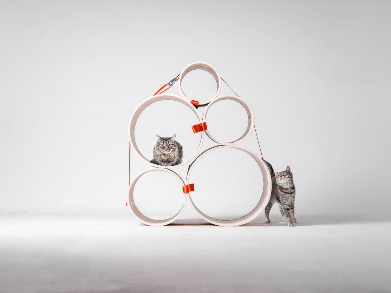
A kitten might be happy with a hideaway, but give it a few months and that same nook starts looking cramped. Add another cat, and a single perch becomes contested territory. Bloom takes that problem literally, building a cat tower from separate cylindrical modules that can be arranged as its occupants grow. It starts small instead of demanding space for a feline family.

Most cat towers arrive as a collection of platforms, posts, and houses, whether your cat needs all of them or not. Their bulk can make a living room feel as if it has been furnished around the pet. Bloom swaps that predetermined silhouette for a cluster of open tubes, each one a place to curl up, climb through, or watch the room.

Designers: Joonseo Choi, Taewoon Kang

Those cylinders come in several diameters, so arranging them feels closer to stacking play objects than assembling pet furniture. A smaller cat can settle into a tighter opening, while a larger one has room to stretch out in a wider tube. The circles also give Bloom its character: soft, repeating forms that can take different shapes instead of committing your room to one tower.

Of course, loose tubes wouldn’t make much of a cat tower once the occupants started leaping about. Bloom uses orange straps to hold the modules together, with hook-and-loop fastening that makes them easier to attach and detach. The straps add a punch of color to the pale cylinders, but their important job is letting you change the arrangement without committing to a rebuild.

You might begin with two tubes near the sofa, then add another when your kitten starts climbing above everybody’s heads. If a second cat joins the household, a wider cluster could give each animal somewhere to pause without fighting over the same opening. The exact layout can follow the cats, rather than asking them to adapt to whatever configuration came in a box.

The holes along the sides serve another purpose beyond giving the straps somewhere to attach. Slide a toy toward one, and a cat tucked inside has something to investigate, while you get a way to join the game without reaching into the tube. It’s a detail, but it turns the enclosed space into somewhere for interaction rather than just another hiding place.

There are still questions a concept can’t answer. A tall arrangement would need to stay steady under a cat’s weight, especially if one launches itself at an upper opening. Bloom doesn’t specify load limits or explain how every possible configuration would be supported, so that flexibility shouldn’t be mistaken for unlimited stacking. For now, its flexibility remains an intriguing, unproven design proposition.

Still, Bloom understands something about cats that a fixed tower often misses: the creature you bring home won’t always be small, and it might not always be alone. Its tubes can be rearranged as that story changes, while its openings leave room for curiosity. The furniture doesn’t need to grow overnight; it can take shape alongside the animals that claim it.

The post Bloom Built a Cat Tower Around the Cat You Haven’t Got Yet first appeared on Yanko Design.
  • ✇Yanko Design
  • Flat-Pack Furniture That Actually Survives Your Next Move
    Flat-pack furniture is easy to appreciate on the day it arrives. It fits through the door, and you can usually put it together without much help. The harder test comes later: can it survive a move, come apart cleanly, or be repaired when something goes wrong? FLAT/FORM, a collection by designer Satoshi Itasaka of h220430, is built around those questions. Its pieces use bolts and nuts so they can be assembled, disassembled, repaired, and transported again. That might sound like a modest ambition
     

Flat-Pack Furniture That Actually Survives Your Next Move

5 octobre 2026 à 04:15

Flat-pack furniture is easy to appreciate on the day it arrives. It fits through the door, and you can usually put it together without much help. The harder test comes later: can it survive a move, come apart cleanly, or be repaired when something goes wrong? FLAT/FORM, a collection by designer Satoshi Itasaka of h220430, is built around those questions. Its pieces use bolts and nuts so they can be assembled, disassembled, repaired, and transported again.

That might sound like a modest ambition, but it changes how I look at the furniture. A dining chair is rarely a one-time purchase for a single room. It may follow you through different apartments, sit beside several tables, and get carried up more stairs than you care to count. FLAT/FORM treats that ongoing life as part of the design brief, rather than leaving it to chance after the first assembly.

Designer: h220430

The material gives the project its character. FLAT/FORM uses 15-millimeter-thick veneer panels made from Japanese cedar trees more than 100 years old, with timber supplied by Miyazaki-based forestry company GROWTHRING. A dining chair and a low table are among the pieces in the collection. Both start from flat panels, a straightforward idea that lets the wood grain do some of the visual work while the construction remains easy to understand.

I like that balance. The collection does not try to disguise how it is made. Its flat planes and visible connections make assembly feel like a considered feature, not an awkward step between opening a box and enjoying the result. That distinction matters because a piece can be visually quiet without feeling anonymous. Here, the simple construction gives the furniture a recognizable point of view, while leaving room for the cedar to be the thing you notice first.

The choice of older cedar also invites a little care in how we talk about the project. Wood with a compelling history does not automatically make a product sustainable, and a furniture collection cannot solve every problem associated with consumption. What FLAT/FORM can offer is a more specific proposition: furniture intended to come apart, travel, and be repaired instead of being treated as finished when its first arrangement stops working. That seems more useful to me than a sweeping environmental promise.

There is a practical kindness to that approach. Moving is already expensive and tiring; furniture should not add a puzzle you are afraid to solve twice. Bolts and nuts are familiar hardware, and the collection’s assembly system is intended to make disassembly possible. None of that guarantees that every move will be effortless. It does mean the designer has acknowledged that people relocate and rearrange their lives, and that a chair ought to have some chance of keeping up.

I would still want to sit in the dining chair before making any grand claims about it. Photographs can tell you plenty about proportion and material, but not how a seat feels through a long dinner. Nor does an elegant assembly concept tell you what the collection costs or how its surfaces will age in a busy home. Those are fair questions for any furniture meant to last, particularly furniture whose appeal rests partly on the idea of keeping it around.

Even with those questions open, FLAT/FORM feels refreshing because it gives flat-pack design a different priority. Convenience at delivery is helpful, but convenience at every stage afterward may be the better measure. A table that can leave one home and settle into another without becoming a burden has a value that is easy to overlook when shopping by appearance alone. Itasaka’s collection makes that overlooked part of ownership visible.

Perhaps that is the quietest, strongest idea here: furniture should be allowed to have a future. FLAT/FORM does not need to look complicated to make that point. It uses flat cedar panels and ordinary fasteners to ask a sensible question of a familiar category: what if getting a piece into your home were only the beginning of a good design? That is a question worth asking before the next box arrives at the door.

The post Flat-Pack Furniture That Actually Survives Your Next Move first appeared on Yanko Design.
  • ✇Yanko Design
  • A 1908 New York building’s discarded fragments got turned into furniture instead of being demolished
    A renovation across the street from Rafael Prieto’s studio offered an unusually good view of his next project. As decorative pieces came off the facade of a Tribeca building, he arranged to save sixteen that were headed for disposal. Most of us would have watched the scaffolding go up and returned to our emails. Prieto, a Mexico-born designer and creative director based in Tribeca, had other ideas. The result is a furniture exhibition that keeps the building’s ornament alive in some very unexpe
     

A 1908 New York building’s discarded fragments got turned into furniture instead of being demolished

4 octobre 2026 à 09:20

A renovation across the street from Rafael Prieto’s studio offered an unusually good view of his next project. As decorative pieces came off the facade of a Tribeca building, he arranged to save sixteen that were headed for disposal. Most of us would have watched the scaffolding go up and returned to our emails. Prieto, a Mexico-born designer and creative director based in Tribeca, had other ideas. The result is a furniture exhibition that keeps the building’s ornament alive in some very unexpected forms.

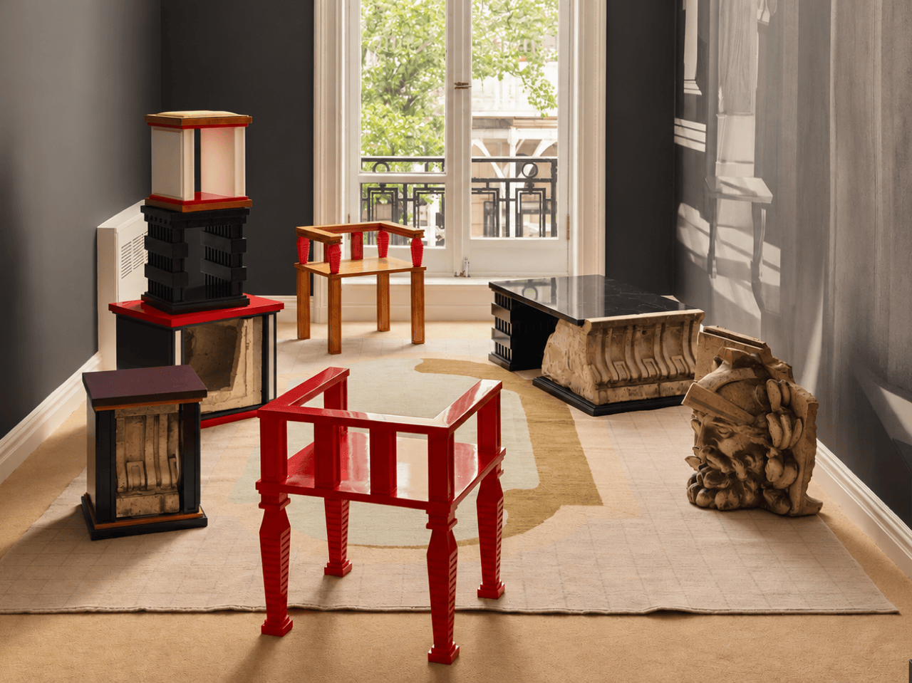
Prieto spent time with the fragments before turning them into the starting point for tables, chairs, and sculptural objects. Weathered ornament sits against painted birch, sometimes tucked inside a crisp new frame. The resulting furniture keeps its New York address close, even when its shape heads somewhere unexpected. Some pieces carry the actual stone; others borrow only its curves, grooves, and proportions. It is a show that rewards looking twice.

Designer: Rafael Prieto

The building across the street is 366 Broadway, now known as Collect Pond House, a twelve-story Beaux-Arts structure designed by Frederick C. Browne in 1908. It was once home to the Royal Typewriter Company, then became a residential co-op in 1979. The facade is densely ornamented: copper cornices, Greek key detailing, marble columns, and keystones carved into bearded faces that have been watching Tribeca change for over a century. A recent multi-year restoration replaced and conserved 65 terra cotta units. A handful of the pieces removed during that process did not make it back onto the building.

Before cutting anything, Prieto lived with the fragments in his studio for roughly a year and a half. He photographed and scanned each contour and ornament, then layered those images to pull out shapes and combinations that could inform new work. That process produced a design vocabulary rather than any direct copy of the originals. The stepped, ribbed profiles that climb the legs of the red lacquered chair came directly from this translation, somewhere between column fluting and abstracted skyline. It is a method closer to archaeology than furniture-making.

One of the standout pieces has a large carved stone cornice block sitting below a flat black painted tabletop, doing actual structural work. The stone is pale, dense, and loaded with repeating scroll forms, carrying roughly a century of New York weather on its surface. Another piece cages a smaller fragment between vertical black bars inside a cube-shaped form, the stone visible through the gaps like something on display. The medium listing for several works at the gallery confirms “Architectural Fragment” as a named material alongside painted birch. Not every piece carries original stone; some borrow only its shapes.

The all-red lacquered chair is the most confident piece in the show, its legs built from stacked, stepped planes that scanning and layering pulled from 366 Broadway’s fluted piers and molded profiles. Its natural birch counterpart deploys the same vocabulary in warm wood, swapping lacquer for grain and adding red geometric arm brackets at the joints. A console table makes the argument most literally: one end sits on a fabricated red plinth, the other rests on an actual salvaged Ionic stone volute, intact and weather-stained. The two supports are not supposed to match. The gallery describes this contrast as the central thread: the hard and the soft, the historic and the contemporary, running through every piece.

Several of the original keystones sit on the gallery floor unaltered, including one carved bearded face in a plumed helmet still stained with moss and a century of city air. Prieto’s analog photography wraps the walls in large-scale architectural murals, produced in collaboration with Wallpaper Projects. The room ends up feeling closer to a photographed ruin than a white-cube gallery, which is entirely the point. He told Family Style that “New York is its architecture,” and that most people talk about the skyline but “don’t look up.” The show does the looking for you.

‘The Future of the Past’ is Prieto’s second solo show with Emma Scully Gallery and runs through December 12 at the Upper East Side location, open Wednesday through Saturday. Pricing and availability are through the gallery directly. The question the collection keeps circling is whether furniture shaped by a building’s discarded ornament carries any of that building’s memory with it. Prieto does not seem interested in settling that question cleanly. The bearded face on the gallery floor looks like he has made his peace with the whole situation.

The post A 1908 New York building’s discarded fragments got turned into furniture instead of being demolished first appeared on Yanko Design.
  • ✇Yanko Design
  • One Table, 3 Games, Nobody Needs a Game Room
    Most people who want a pool table and a dining table end up choosing neither. The math never works. A regulation pool table eats up roughly the same square footage as a small bedroom, a ping pong table needs its own dedicated stretch of floor to swing a paddle without hitting a wall, and a proper dining table has to look good enough to survive being seen by dinner guests. Pick two out of three and you’re already stretching a normal house. Pick all three and you need a room nobody actually has.
     

One Table, 3 Games, Nobody Needs a Game Room

28 septembre 2026 à 15:20

Most people who want a pool table and a dining table end up choosing neither. The math never works. A regulation pool table eats up roughly the same square footage as a small bedroom, a ping pong table needs its own dedicated stretch of floor to swing a paddle without hitting a wall, and a proper dining table has to look good enough to survive being seen by dinner guests. Pick two out of three and you’re already stretching a normal house. Pick all three and you need a room nobody actually has.

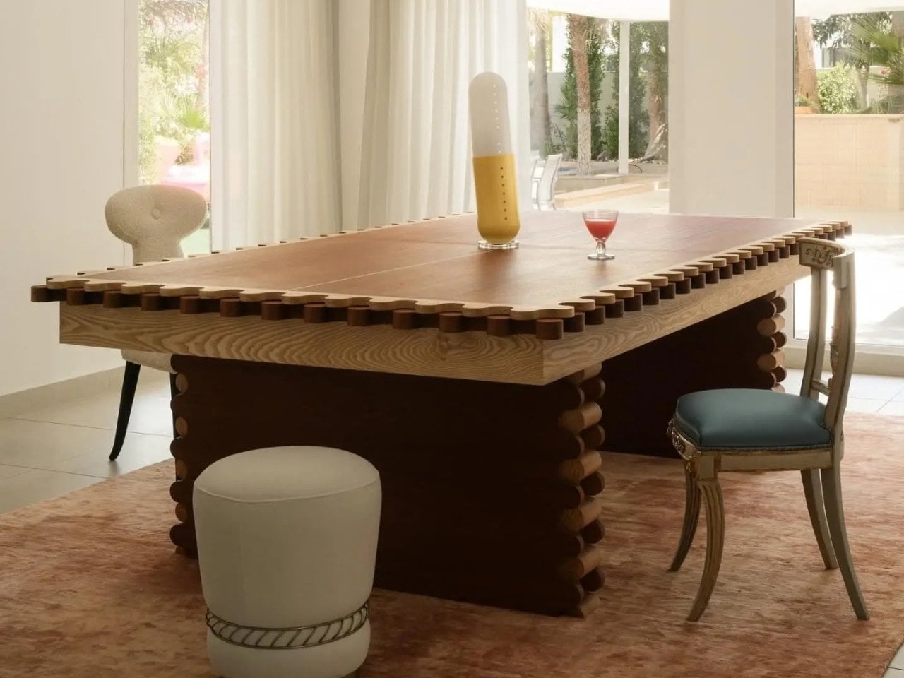
Sanne’s Department of Play looked at that math and decided it was wrong. The 3-in-1 Table is exactly what it sounds like: lift the top and a dining table becomes a full pool table, swap the surface again and it’s ping pong, complete with a cane-and-leather net that looks like it belongs in a much more expensive living room than most game tables ever see. It collapses three furniture purchases and three separate footprints into one object, which solves the actual problem that has quietly kept most people out of the game-room conversation entirely: there was never enough house for the fun stuff.

Designer: Sanne’s Department of Play (photos by Vitali Grishkov)

What gets me about this piece is that it doesn’t look like a compromise. Anyone who has shopped for a combo game table before knows the usual result, a pool table with a plywood lid bolted on top so it can technically also be a dining surface, priced around $800 and looking every bit like sports equipment wearing a costume. Sanne’s version starts somewhere else entirely. The scalloped edge running around the perimeter and down the legs, that repeating rounded bump pattern, looks like it was drawn first as a piece of sculpture and only later revealed to double as the ball guard for ping pong. Function followed form here instead of the other way around, and you can feel that order in every photo of it just sitting quietly as a dining table under a chandelier, giving away nothing about its second life.

The material choices back that up. The base is a deep walnut tone against lighter ash detailing, which reads more mid-century furniture than rec room. When it becomes a pool table, the felt is a rust orange rather than the standard casino green, which sounds like a small thing until you realize it’s the difference between a table that argues with your décor and one that sits right at home. Even the accessories got the same treatment. The cue rack is its own scalloped tower that matches the table instead of leaning against a wall wrapped in a canvas cover, the ping pong paddles are hand-painted with little leopards and floral motifs, and the ball tray is dovetailed like a keepsake box. Nobody asked for the ball tray to look nice. They built it that way anyway.

That attention to the parts nobody was going to scrutinize is what actually sells the bigger idea. Pricing puts the crafted-to-order version around $12,500, with a limited floorstock release closer to $7,500, so this sits firmly in collectible design furniture territory rather than impulse purchase territory. That framing matters more than it first appears. It’s less “we made a fun table” and more “we made a serious piece of furniture that happens to also be extremely fun,” and that distinction is the whole reason it works in a home that already has real art on the walls instead of only in a basement.

There’s a bigger shift happening around furniture like this, one where the game room stops being a separate destination and starts becoming part of the main living space instead of something hidden behind a closed door. A pool table tucked in a basement gets used four times a year. A pool table that is also the table where everyone already eats dinner gets used constantly, almost by accident, because nobody has to decide to go play. They just have to clear the plates.

The post One Table, 3 Games, Nobody Needs a Game Room first appeared on Yanko Design.
  • ✇Yanko Design
  • This Lounge Chair Is Built From Cork — and It’s Sturdier Than It Looks
    Cork is everywhere in design, and yet it’s almost always decorative. A tile floor. A pin board. A wine stopper. Copenhagen-based furniture designer Chiara Verde looked at that assumption and quietly dismantled it. Her Strata lounge chair doesn’t use cork as a finish — it uses cork as the architecture. The chair is built around a layered composite system: thin cork sheets alternated with natural fibre textiles, laminated together to form load-bearing shells. The textile reinforcement isn’t there
     

This Lounge Chair Is Built From Cork — and It’s Sturdier Than It Looks

18 septembre 2026 à 17:30

Cork is everywhere in design, and yet it’s almost always decorative. A tile floor. A pin board. A wine stopper. Copenhagen-based furniture designer Chiara Verde looked at that assumption and quietly dismantled it. Her Strata lounge chair doesn’t use cork as a finish — it uses cork as the architecture.

The chair is built around a layered composite system: thin cork sheets alternated with natural fibre textiles, laminated together to form load-bearing shells. The textile reinforcement isn’t there for aesthetics — it gives the cork directional stiffness and structural performance it simply doesn’t have on its own. A minimal metal frame handles only the points under concentrated load, leaving the cork shells to carry the rest. It reads, visually, like a chair slung from material intelligence rather than convention.

Designer: Chiara Verde

Verde’s background leans heavily into process. Her practice is built on material experimentation, prototyping, and structural research — work that treats the studio bench as an extension of the design itself. Strata wasn’t conceived and then executed. It emerged through months of testing, adjustment, failure, and recalibration. A cork stool came first — a full-scale testbed that validated the structural logic before Verde committed it to a larger form. The lounge chair is the result of everything that came before it.

What makes Strata worth paying attention to isn’t just the material provocation — it’s how restrained the final form is. The chair doesn’t announce itself. It holds the visual language of the natural world: organic in silhouette, warm in texture, quietly confident in its proportions. Cork has an inherent thermal quality to it, a softness underfoot and underhand that synthetic materials spend millions trying to replicate. Here, it’s simply doing its job.

The lineage of the slung chair runs deep — leather over steel tubing defined a generation of modernist seating in the early and mid-20th century. Verde is working in that same formal territory, proposing laminated cork as the next honest alternative to leather: a material that gives, breathes, and ages with use rather than against it.

Strata sits in a growing conversation around material-led design — not sustainability as branding, but sustainability as methodology. Verde isn’t marketing cork. She’s interrogating it, and the chair is the proof of concept. For a material that has spent decades on the periphery of furniture design, Strata might be the argument it needed all along.

The post This Lounge Chair Is Built From Cork — and It’s Sturdier Than It Looks first appeared on Yanko Design.
  • ✇Yanko Design
  • This Chair Proves a $2.3M Hypercar & Your Living Room Have More in Common Than You Think
    Most furniture doesn’t have a backstory worth telling. The Maniac Chair does. It looks, from across the room, like it wandered out of a 1950s Danish design studio — until you get close enough to realize it’s built from the same bloodline as a $2.35 million hypercar. Oilstainlab is the California-based studio founded by Ukrainian-born twins Iliya and Nikita Bridan — high school dropouts trained in Italy and California, responsible in their previous lives for 6.5 million street cars. In 2018, the
     

This Chair Proves a $2.3M Hypercar & Your Living Room Have More in Common Than You Think

13 septembre 2026 à 15:15

Most furniture doesn’t have a backstory worth telling. The Maniac Chair does. It looks, from across the room, like it wandered out of a 1950s Danish design studio — until you get close enough to realize it’s built from the same bloodline as a $2.35 million hypercar.

Oilstainlab is the California-based studio founded by Ukrainian-born twins Iliya and Nikita Bridan — high school dropouts trained in Italy and California, responsible in their previous lives for 6.5 million street cars. In 2018, they started Oilstainlab with a single promise: never to be sane. The result was the HF-11, a limited-production hypercar of which only 25 will ever exist. The Maniac Chair is the furniture-world extension of that same obsession, sold through House Dé Stains, Oilstainlab’s lifestyle brand.

Designer: Oilstainlab

The chair’s shell is built on a CNC-machined aluminum frame wrapped in a hand-laid carbon fiber shell. That detail matters. Hand-laid carbon fiber isn’t a production shortcut — it’s the language of motorsport, of race seats and monocoques shaped around bodies doing 200 mph. Here, it’s shaped around a body doing nothing more than sitting. That deliberate mismatch is the whole point. The midcentury silhouette is familiar enough to read as furniture; the material is foreign enough to make you question what you’re actually looking at.

The name traces back directly to the HF-11, which Oilstainlab offered in an exclusive “Maniac” package for 11 of its 25 cars. The chair carries that identity forward — it’s not merchandise, it’s an extension of a design philosophy that treats excess and restraint as two sides of the same surface. The carbon fiber reads as raw and technical; the form reads as warm and considered. Neither cancels the other out.

What Oilstainlab has done here is something furniture designers rarely attempt, and automotive designers rarely bother with: they’ve made a chair that has genuine provenance. It isn’t inspired by cars in the way that means “we added some aggressive lines.” It shares DNA with an actual race seat.

The prep process before upholstery even echoes motorsport fabrication. For a studio built on the idea that sanity is optional, the Maniac Chair is a surprisingly coherent object. It knows exactly what it is — a piece of furniture for people who want to sit inside a design argument — and it doesn’t flinch.

The post This Chair Proves a $2.3M Hypercar & Your Living Room Have More in Common Than You Think first appeared on Yanko Design.
  • ✇Yanko Design
  • Finally, a Bench Design That Never Wastes a Seat
    Anyone who has ever sprinted through a train station with a rolling suitcase in one hand and a coffee sloppily balanced in the other knows the particular despair of scanning a row of seats and finding every single one occupied by someone’s backpack. Not a person. A bag. Sitting there like it paid for the ticket too. That small, maddening moment is basically the whole reason a London studio called Of My Imagination designed something called Flip, a modular public seating system where each indivi
     

Finally, a Bench Design That Never Wastes a Seat

12 septembre 2026 à 18:30

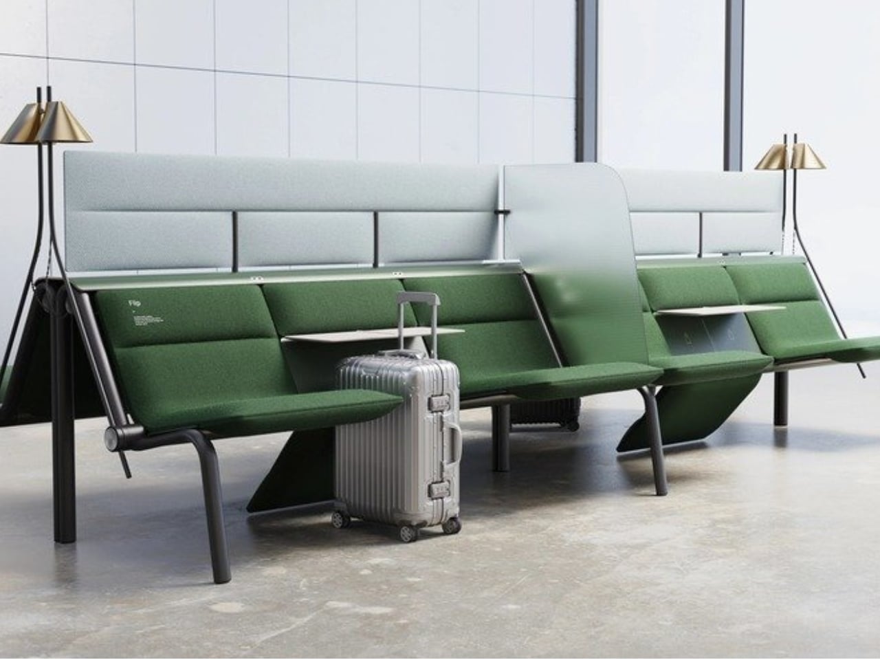
Anyone who has ever sprinted through a train station with a rolling suitcase in one hand and a coffee sloppily balanced in the other knows the particular despair of scanning a row of seats and finding every single one occupied by someone’s backpack. Not a person. A bag. Sitting there like it paid for the ticket too.

That small, maddening moment is basically the whole reason a London studio called Of My Imagination designed something called Flip, a modular public seating system where each individual seat can rotate out of the way on command. Instead of a bench being a fixed slab of “sit here or don’t,” Flip treats every seat as its own hinge point. Flip it down, it’s a chair. Flip it up and out, it becomes open space for luggage, a stroller, or just more room to breathe when a platform gets crowded. It sounds almost too simple to be clever, which is usually the sign of a genuinely good idea.

Designer: Of My Imagination

I’ve been thinking about public seating a lot lately, mostly because so much of it seems designed for an idealized version of how people move through the world rather than the messy, unpredictable reality of it. Airports, bus terminals, hospital waiting rooms. These spaces swing between dead quiet and total chaos within the same hour, and yet the furniture almost never adjusts with them. A bench built for a slow Tuesday afternoon becomes a liability during a holiday rush, when every inch of floor space suddenly matters and immovable seating just gets in the way.

Flip’s answer isn’t flashy. There’s no app, no motor, no sensor deciding when a seat should move. It’s a mechanical latch and a rotating joint, the kind of low-tech solution that feels almost old-fashioned in a moment when everything gets pitched as “smart.” I actually like that restraint. Public infrastructure breaks down constantly not because the technology is too simple, but because it’s too complicated, too fragile, too dependent on software updates and maintenance contracts nobody budgeted for. A seat that flips because a person physically flips it is a seat that still works during a power outage, a system failure, or just a Tuesday when the maintenance crew is short-staffed.

The pandemic-era spacing rules get a mention in OMI’s own description of the project, and it’s worth sitting with that for a second. Remember all those benches wrapped in caution tape or marked with awkward stickers telling you where not to sit? Most of that signage disappeared once the emergency did, but the underlying problem never really left. Public seating still needs to flex between “pack people in tightly” and “spread them out,” whether that’s for health reasons, accessibility needs, or just the reality of rush hour versus a quiet Sunday morning.

What strikes me most is how much this design respects the intelligence of the people using it. Flip doesn’t try to predict what a traveler needs. It just gives them the option and gets out of the way. That’s a surprisingly rare quality in public design, where the instinct is often to over-engineer a solution that anticipates every scenario instead of trusting a commuter to make a simple physical adjustment themselves.

Is it going to replace every bench in every transit hub across the country? Probably not right away, and cost, durability testing, and vandalism resistance are the unglamorous hurdles any concept like this has to clear before it shows up somewhere you’d actually sit down. But as a proof of concept, it’s a refreshing reminder that flexibility doesn’t require a screen or a subscription. Sometimes it just requires a hinge and a little humility about how unpredictable public spaces actually are.

The next time I’m standing in a crowded terminal, silently negotiating personal space with a stranger’s overstuffed duffel bag, I’ll probably think about Flip. Not because it solves everything, but because it solves the one thing that’s been sitting there, unaddressed, for as long as public benches have existed.

The post Finally, a Bench Design That Never Wastes a Seat first appeared on Yanko Design.
  • ✇Yanko Design
  • Open-Plan Offices Killed the Private Desk, and This Pod Brings It Back
    Most office furniture solves privacy by sealing someone off completely: four walls and a door that shuts out everyone else, along with any sense of connection to the room. The Seed Pod skips that tradeoff. It wraps a single desk and seat inside a radiating fan of white wooden slats, open enough to see through, dense enough to feel like a room of your own. That slat pattern isn’t just decorative. Vertical wooden ribs curve outward from a tall arched spine at the back, fanning shorter toward the
     

Open-Plan Offices Killed the Private Desk, and This Pod Brings It Back

Par : JC Torres
7 septembre 2026 à 12:20

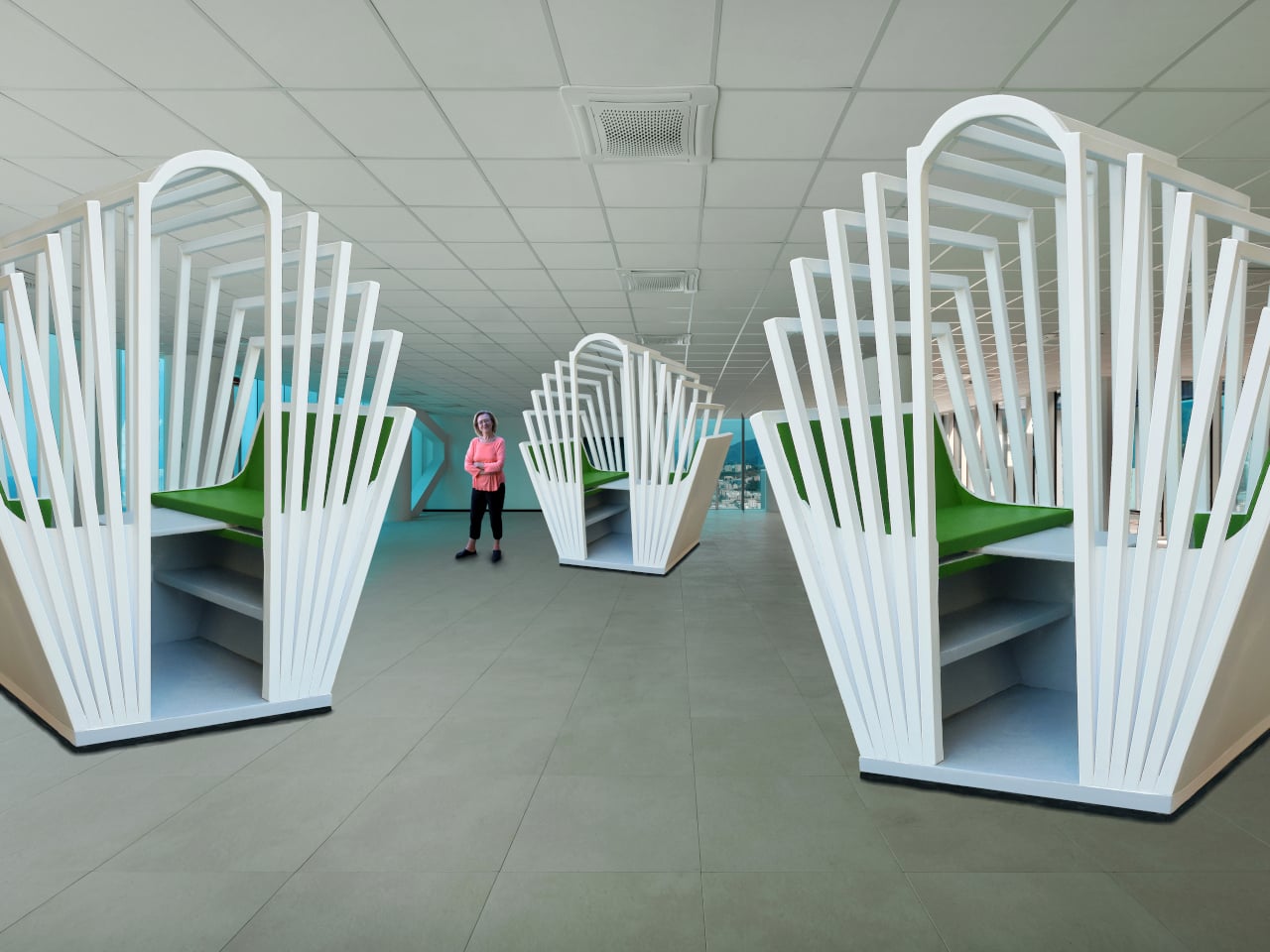
Most office furniture solves privacy by sealing someone off completely: four walls and a door that shuts out everyone else, along with any sense of connection to the room. The Seed Pod skips that tradeoff. It wraps a single desk and seat inside a radiating fan of white wooden slats, open enough to see through, dense enough to feel like a room of your own.

That slat pattern isn’t just decorative. Vertical wooden ribs curve outward from a tall arched spine at the back, fanning shorter toward the open front, so the whole structure reads like something caught mid-bloom rather than a static box. Gaps between each slat let light and sound pass through freely, creating enclosure without ever fully cutting the occupant off from whatever’s happening around them.

Designer: Michael Jantzen

Step inside and a bright green bench seat waits at the center, paired with built-in storage tucked into the lower walls on either side. Small wedge-shaped shelves hold whatever a workday requires nearby, papers, supplies, a bag, without eating into the already compact footprint. The contrast between crisp white slats outside and that saturated green interior gives the whole thing a distinct, almost botanical identity rather than reading as generic office equipment.

A sliding desktop surface handles the actual work. Sized specifically for a laptop, it can be repositioned to different spots under the main desk, adjusting to whatever posture or task someone needs at that moment rather than locking them into one fixed arrangement. Slide it back, and the same space clears out for someone to step in or out without maneuvering around a stationary tabletop.

Mobility matters just as much as the seating arrangement. The entire structure sits on wheels and plugs into any standard electrical outlet nearby, meaning it can roll into a corner of a shared office floor one week and relocate to a quiet spot at home the next. Nothing about setup requires special wiring or a dedicated room built around it.

Picture an open-plan office where video calls and side conversations blur together constantly, or a home where the only quiet corner left is also the one everyone walks through. Rolling a Seed Pod into either space carves out somewhere to actually concentrate, without requiring a renovation or a door that locks. Multiple units can sit side by side too, each occupant getting their own pocket of focus inside a shared room.

What makes the design work is restraint rather than enclosure. The slats do the job walls usually do, marking a boundary, without asking anyone to give up daylight, airflow, or the sense of still being present in the room they’re sitting in.

The post Open-Plan Offices Killed the Private Desk, and This Pod Brings It Back first appeared on Yanko Design.

  • ✇Yanko Design
  • The Coat Rack That Doubles as a Sculpture for Your Entryway
    Most coat racks have one job and barely manage it. They accumulate coats, yes, but also that one bag you keep meaning to put away, the umbrella you forgot about, and eventually the kind of low-level visual clutter that makes the entryway feel like it quietly surrendered. The Acrobat, designed by João Teixeira of Teixeira Design Studio, takes the opposite approach entirely. It starts by asking what a coat rack actually needs to do, then builds something genuinely beautiful around that answer. Th
     

The Coat Rack That Doubles as a Sculpture for Your Entryway

23 août 2026 à 18:30

Most coat racks have one job and barely manage it. They accumulate coats, yes, but also that one bag you keep meaning to put away, the umbrella you forgot about, and eventually the kind of low-level visual clutter that makes the entryway feel like it quietly surrendered. The Acrobat, designed by João Teixeira of Teixeira Design Studio, takes the opposite approach entirely. It starts by asking what a coat rack actually needs to do, then builds something genuinely beautiful around that answer.

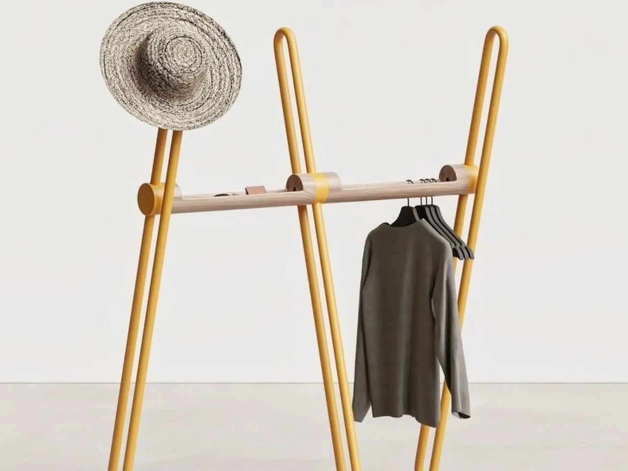
The name earns itself the moment you see the full form. A tripod base anchors the piece with quiet confidence, while a continuous bent metal tube rises and loops around it, creating a silhouette that reads as more gesture than furniture from across the room. It has the quality of something mid-motion, a figure caught mid-step that decided to stay exactly like that. Sculptural is an overused word in design writing, but it applies here without apology. The wood bar running through the center connects the metal structure while doing its own separate work: carved openings along its length are sized to hold the daily essentials that would otherwise migrate to whatever flat surface is nearest. Keys, wallet, sunglasses, the objects that technically belong somewhere but never quite find a place. Here, they do.

Designer: Teixeira Design Studio

The two-material pairing is deliberate in the best way. The metal tube handles the structural work and the hanging functions, its looped tops wide enough for coat shoulders and the brim of a hat. The wood handles texture and warmth, softening what could easily tilt too industrial for a home setting. Together they read as a genuine material conversation rather than a design decision arrived at by committee or trend-following. Each element is doing something specific, and you can read that in the form without anyone explaining it to you.

I appreciate that the Acrobat resists the pull toward the purely minimal. A lot of contemporary furniture design seems to mistake reduction for sophistication, stripping objects down until they barely register as functional at all. The Acrobat keeps everything it needs and nothing it doesn’t, but the form is generous rather than austere. The bent metal loops repeat and layer against each other depending on your viewing angle, creating a depth that a straight rail or a standard row of hooks simply wouldn’t offer. The piece looks different at 8 AM when you’re grabbing your bag on the way out than it does at night when it’s holding coats in a still room. That kind of visual behavior in an everyday object is rare.

The colorways matter too, more than they might initially seem. The white version has a graphic, almost architectural quality that would hold its own in a very considered interior. The mustard yellow version is something else entirely. It pushes the Acrobat from understated into genuinely expressive territory, the kind of color decision that takes equal confidence from the designer and the person buying it. A yellow coat rack is a commitment to a room’s character, not a neutral addition to it. I think that’s the right instinct. The best designed objects have a point of view, and this one clearly does.

Entryway design gets far less attention than it deserves relative to the rest of the home. The kitchen gets renovated, the living room gets considered, but the entry is often left to whatever hooks were already on the wall. It’s an oversight that matters, because the entry sets the tone for everything beyond it. The Acrobat makes a case for treating that space with the same intention you’d bring to any other room.

Teixeira Design Studio seems to be arguing, through this piece, that functional objects don’t need to apologize for being beautiful, and beautiful objects shouldn’t have to sacrifice the practical to justify their presence. The Acrobat does both, quietly and without laboring the point. It stands in the corner, holds everything you carry in from the outside world, and looks like it belongs in a gallery while doing it. For a coat rack, that’s a remarkable thing to pull off.

The post The Coat Rack That Doubles as a Sculpture for Your Entryway first appeared on Yanko Design.

  • ✇Yanko Design
  • An Industrial Designer Hid the Chair’s Entire Folding Mechanism Inside the Backrest
    Gudmundur Ludvik had a question he couldn’t let go of. Why should a folding chair be a compromise? The answer, for decades, had been accepted without much pushback: folding chairs sacrifice comfort for storage, aesthetics for portability. The category had been quietly settled. Ludvik disagreed. The Backflip, produced by HAY, is his rebuttal. An Icelandic designer based in Vejle, Denmark, Ludvik trained first as a carpenter and cabinetmaker before studying sculpture at the Icelandic Academy of A
     

An Industrial Designer Hid the Chair’s Entire Folding Mechanism Inside the Backrest

23 août 2026 à 07:40

Gudmundur Ludvik had a question he couldn’t let go of. Why should a folding chair be a compromise? The answer, for decades, had been accepted without much pushback: folding chairs sacrifice comfort for storage, aesthetics for portability. The category had been quietly settled. Ludvik disagreed.

The Backflip, produced by HAY, is his rebuttal. An Icelandic designer based in Vejle, Denmark, Ludvik trained first as a carpenter and cabinetmaker before studying sculpture at the Icelandic Academy of Arts and furniture design at the Danish Design School, graduating in 2002. That layered background — craft, art, design — shows in the Backflip. The chair doesn’t announce its ingenuity. It keeps it entirely to itself.

Designer: Gudmundur Ludvik

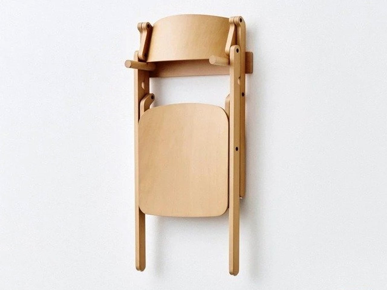
The defining feature is a folding mechanism concealed within the backrest. A single rotation collapses the chair in one continuous motion; one hand is all it takes. There are no exposed hinges, no visible hardware, no visual record of the engineering beneath. The mechanism is part of the structure rather than an addition to it, and that distinction is everything. From the front, the Backflip looks like a chair that simply sits well. Which is the point.

Ludvik’s stated ambition was to approach the folding chair typology from the opposite direction: create a good chair first, and a folding chair second. The frame is solid beech wood, lacquered, with a moulded plywood backrest. The profile is clean and unhurried, shaped by the logic of material and construction rather than any impulse toward decoration. Available in natural beech across a range of coloured finishes, it translates across private dining rooms and public hospitality interiors without trying too hard in either direction.

HAY also offers a matching wall bracket, designed to hold one or two folded Backflip chairs flush against any wall. It’s a satisfying extension of the concept: a chair that folds becomes genuinely space-saving only when storage itself is resolved. The bracket completes that thought without making a fuss about it.

The Backflip was previewed at 3 Days of Design in Copenhagen in 2026, where it sat alongside work from Jasper Morrison and Philippe Malouin in HAY’s exhibition at O-Overgaden, a contemporary art institution in Christianshavn. In that company, it held its own, which is a fair measure of how resolved the design feels.

What Ludvik has made is not a clever folding chair. It’s a chair that happens to fold, and the difference is considerable. That the mechanism disappears entirely into the backrest is less a magic trick than a design argument, made quietly, about where the priorities should lie.

The post An Industrial Designer Hid the Chair’s Entire Folding Mechanism Inside the Backrest first appeared on Yanko Design.

  • ✇Yanko Design
  • This Cork Cactus Looks Like Decor and Acts Like 3 Pieces of Furniture
    Coat stands have always occupied an awkward position in a room. They’re functional enough to keep around but rarely considered anything beyond a place to pile things on the way out the door. Pin boards face a similar problem, useful at a desk but hard to integrate into a living space without making it feel like an office. Objects that try to do both tend to resolve that tension poorly. Corctus starts from a different premise. The name merges “cork” and “cactus,” which is also a fair summary of
     

This Cork Cactus Looks Like Decor and Acts Like 3 Pieces of Furniture

Par : JC Torres
12 août 2026 à 12:20

Coat stands have always occupied an awkward position in a room. They’re functional enough to keep around but rarely considered anything beyond a place to pile things on the way out the door. Pin boards face a similar problem, useful at a desk but hard to integrate into a living space without making it feel like an office. Objects that try to do both tend to resolve that tension poorly.

Corctus starts from a different premise. The name merges “cork” and “cactus,” which is also a fair summary of the concept: a floor-standing object shaped like a saguaro cactus, made entirely from cork, and quietly capable of handling most of what people need to keep close at hand. Rather than solving the storage problem with hooks and brackets, it solves it by making the form itself the function.

Designer: Liam de la Bedoyere (boredeye)

Cork is the central material here, both practically and conceptually. The surface is textured enough to grip a pair of sunglasses on the rounded top without anything extra, and receptive to pins without reinforcement or a backing board. A sketch, a sticky note, or a reference card pins straight into the body of the object wherever it’s needed, with no designated zone for it.

The cactus arms extend outward with a slight upward curve that happens to work exactly like a hook. A backpack hangs from one, a tote bag from another, a scarf draped over without sliding off. Headphones sit naturally over an arm when not in use. None of this requires any hardware, any dedicated accessories, or any particular intention. The geometry of the form handles all of it.

The disc-shaped base adds one more surface. Magazines stack on it, a few books sit within reach, and it grounds the form without demanding much floor space. The compact proportions keep the whole object from reading as a coat stand, which is deliberate. The intention was always a sculptural companion rather than a piece of utilitarian furniture, and the scale reflects that.

That distinction matters in practice. Next to a desk, the Corctus functions as an immediate, physical task board without a screen. Move it into a living room or hallway and it shifts roles without changing character. The warm texture of the cork sits alongside the kinds of materials, and its sandy color sits comfortably against most interior palettes.

Most multifunctional objects succeed at one thing and compromise on everything else. Corctus earns its place as a sculptural form first, and the utility follows naturally from the shape rather than being imposed on it. There are no brackets, no hooks, no panels, and no assembly decisions to make. It stands where it’s put, and the room tends to organize itself around it.

The post This Cork Cactus Looks Like Decor and Acts Like 3 Pieces of Furniture first appeared on Yanko Design.

  • ✇Yanko Design
  • Furniture Made From Wood Scraps You’d Actually Pay For
    Every furniture workshop generates a particular kind of guilt. There are the offcuts, the trimmings, the odd-shaped remainders of boards that got cut to size and are now too small for anything useful, or so we assume. Most of them end up as kindling, compost, or landfill. We’ve accepted that as the cost of making things, a small fine paid for the privilege of precision. Studio Booboon is not interested in paying that fine. The Copenhagen-based studio, founded by Richard Bone and Jisu Yun, two d
     

Furniture Made From Wood Scraps You’d Actually Pay For

12 août 2026 à 09:20

Every furniture workshop generates a particular kind of guilt. There are the offcuts, the trimmings, the odd-shaped remainders of boards that got cut to size and are now too small for anything useful, or so we assume. Most of them end up as kindling, compost, or landfill. We’ve accepted that as the cost of making things, a small fine paid for the privilege of precision. Studio Booboon is not interested in paying that fine.

The Copenhagen-based studio, founded by Richard Bone and Jisu Yun, two designers who both trained under Japanese studio Nendo, released their latest collection, Fragments Becoming, and it’s exactly the kind of work that makes you wonder why no one thought to do it this way sooner. The collection is built entirely from timber offcuts, and before you picture something rustic or deliberately imperfect, let me be clear: these pieces are stunning. A cabinet, a dining table, and a lounge chair, each constructed from assembled fragments of discarded wood arranged with such precision and intention that the effect is closer to fine art than furniture-as-apology for sustainability.

Designer: Studio Booboon

The concept the studio uses is something they call “3D marquetry,” which sounds technical but is actually a fairly elegant idea once you sit with it. Traditional marquetry, the kind you’d see on antique furniture or decorative boxes, applies a pattern to a surface. It’s essentially decoration laid on top of structure. What Studio Booboon does instead is treat each fragment of wood as the structure itself. The pattern isn’t on the cabinet door; the door is the pattern. It runs through the object’s entire volume, which means the visual logic and the physical construction are the same thing. That’s not a subtle distinction. That’s a fundamentally different philosophy.

What I appreciate about this approach is that it removes the option to hide mistakes. The studio works with unstained wood, which means every fragment has to earn its place on its own terms, no pigment masking a poor match, no stain blurring the edges. Each piece has to work compositionally before it works functionally. That kind of constraint tends to produce either chaos or brilliance, and in this case, it’s clearly the latter.

Bone and Yun bring a cross-cultural sensibility to the work that shows up in the details. Their debut collection, Playful Reappropriation, released at Milan Design Week 2024, pulled from Korean craft traditions, and Fragments Becoming continues that thread. The materials include hanji (traditional Korean paper), canvas, silk, and Ottchil, a Korean lacquer technique that adds depth without dominating the natural tones of the wood. The combination of a British RCA education, Korean craft heritage, and a shared apprenticeship at Nendo, one of the most conceptually rigorous studios in contemporary design, explains a lot about why this work feels so considered without ever feeling cold.

The collection premiered at Milan Design Week 2026 and later showed at Other Circle 2026 during 3daysofdesign in Copenhagen. That double-billing matters. Milan tends to reward spectacle, while the Copenhagen circuit rewards ideas. The fact that Fragments Becoming landed well in both contexts suggests it’s doing something more than just looking good in photographs, which, for the record, it absolutely does.

Sustainability in design has become such an overused talking point that the word barely registers anymore. Every brand gestures toward it. But there’s a difference between sustainability as a value and sustainability as a method, and Studio Booboon’s work lives in the second category. They’re not telling you the collection is responsible and letting the aesthetics carry a different message. The responsible practice is the aesthetic. The offcut isn’t hidden. It’s the whole point.

That feels rare enough to be worth paying attention to. Design tends to celebrate the new, the seamless, the perfect. Fragments Becoming makes a quiet argument that the incomplete, the leftover, and the discarded might be where the most interesting work is still waiting to happen.

The post Furniture Made From Wood Scraps You’d Actually Pay For first appeared on Yanko Design.

❌