❌

Vue normale

  • ✇Yanko Design
  • The 90-Year-Old Lamp Nobody Improved On — Until Now
    A lamp can look beautiful on a desk and still make it harder to work. The bulb catches your eye, the light lands everywhere except the page, or the fixture takes up the space you needed for a notebook. Louis Poulsen’s reissued PH Piano Lamp starts with a more useful question: How do you put light precisely where it’s needed without making the lamp itself a distraction? Poul Henningsen designed the original for pianists, who needed to see their sheet music without uncomfortable glare. That probl
     

The 90-Year-Old Lamp Nobody Improved On — Until Now

2 octobre 2026 à 10:20

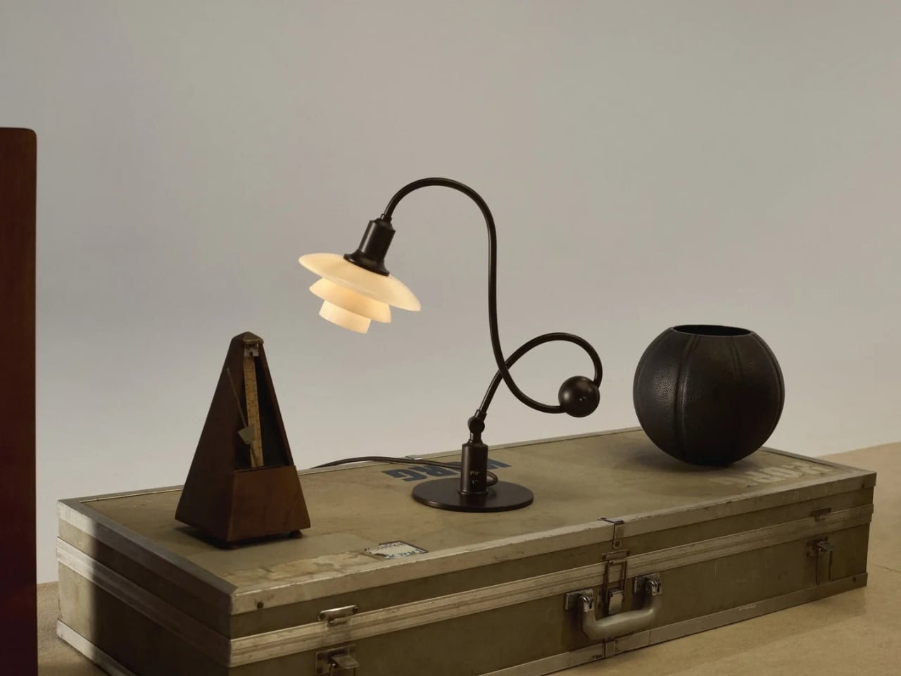
A lamp can look beautiful on a desk and still make it harder to work. The bulb catches your eye, the light lands everywhere except the page, or the fixture takes up the space you needed for a notebook. Louis Poulsen’s reissued PH Piano Lamp starts with a more useful question: How do you put light precisely where it’s needed without making the lamp itself a distraction? Poul Henningsen designed the original for pianists, who needed to see their sheet music without uncomfortable glare.

That problem reaches well beyond the piano. Anyone who has tried to read beside a bright table lamp or work under a harsh overhead light knows the difference between having enough light and having the right light. I like that this reissue hasn’t lost sight of its practical beginnings. Its curved, counterbalanced arm lets the shade move while the lamp stays stable, giving the design a sense of purpose you can read from across the room.

Designer: Poul Henningson for Louis Poulsen

Henningsen first created the Piano Lamp in the early 1930s, building on his PH lighting system, which uses layered shades to manage how light reaches the eye. Louis Poulsen has brought it back as the PH 1/1 Piano Table Lamp Limited Edition 2026, with adjustments intended to make it useful beyond its original setting. It’s an appealing idea for a reissue: keep the reason the object existed, then give more people a reason to use it.

The new version pairs aged brass with glass shades in a color Louis Poulsen calls Dusty Terra Cotta. On paper, that combination sounds richly nostalgic. In practice, its appeal is more specific. The warm-toned glass gives the lamp a softer visual presence, while the long arm and compact shade keep it from feeling like a decorative lamp that has wandered onto a work surface by mistake. You could imagine it near a keyboard, but also beside a book, a sketchpad, or a late-night crossword.

That versatility matters because our rooms rarely serve just one purpose anymore. A dining table becomes a desk. A side table has to accommodate a drink, a charger, and whatever we’re currently reading. Good lighting can make those small shifts easier without demanding that we rearrange the room. The Piano Lamp feels suited to those spaces precisely because it was designed around a task. Its shape may be memorable, but the starting point was helping someone see what they were doing.

I’m also drawn to the fact that it looks a little unusual. The arm has a gentle, almost musical curve, while the shade sits low enough to suggest a conversation between the lamp and whatever is beneath it. Many contemporary lights aim to disappear into the background. This one has a clear silhouette, yet its job is to make the thing you’re doing more comfortable. That balance is harder to achieve than a striking shape alone.

Of course, a limited-edition design lamp isn’t an automatic solution for every desk or budget. If all you need is a cheap light for a spare room, this probably isn’t the practical choice. But it does offer a useful reminder that a lamp’s value isn’t measured only by how brightly it shines. Where the light goes, how it feels, and how easily the fixture fits into daily routines all count. Those are the details you notice after the novelty of a new object wears off.

Louis Poulsen says the PH 1/1 Piano Table Lamp Limited Edition 2026 will be available from October through December 2026. The short window gives it collectible appeal, but I hope that isn’t the only reason people pay attention. Its more interesting quality is how current its original problem still feels. We have plenty of ways to brighten a room. Finding light that helps us focus, without making us squint, remains a much better goal.

The post The 90-Year-Old Lamp Nobody Improved On — Until Now first appeared on Yanko Design.

  • ✇Yanko Design
  • 9 Best Gifts for the Person Who Turned Their Living Room Into a Sports Bar
    Some people watch the game. Others build a whole experience around it. The living room becomes the venue, the couch becomes the seat, and somehow the right gift makes the whole setup feel intentional rather than assembled over years of impulse buys. These nine picks span every corner of the room, from the screen to the sound to the table that keeps the energy going long after the final whistle blows and nobody is ready to leave just yet. A great game-day room is not really about having the bigg
     

9 Best Gifts for the Person Who Turned Their Living Room Into a Sports Bar

2 octobre 2026 à 07:40

Some people watch the game. Others build a whole experience around it. The living room becomes the venue, the couch becomes the seat, and somehow the right gift makes the whole setup feel intentional rather than assembled over years of impulse buys. These nine picks span every corner of the room, from the screen to the sound to the table that keeps the energy going long after the final whistle blows and nobody is ready to leave just yet.

A great game-day room is not really about having the biggest TV. It is about having a room that works. Sound that fills the space without fighting for attention. A screen that earns its place on the wall even when the game is not on. A table that gives the energy somewhere to go at halftime. These gifts solve real problems in that space, and each one carries enough design thinking behind it to feel like a genuinely considered choice rather than a last-minute add to cart.

1. Portable CD Cover Player

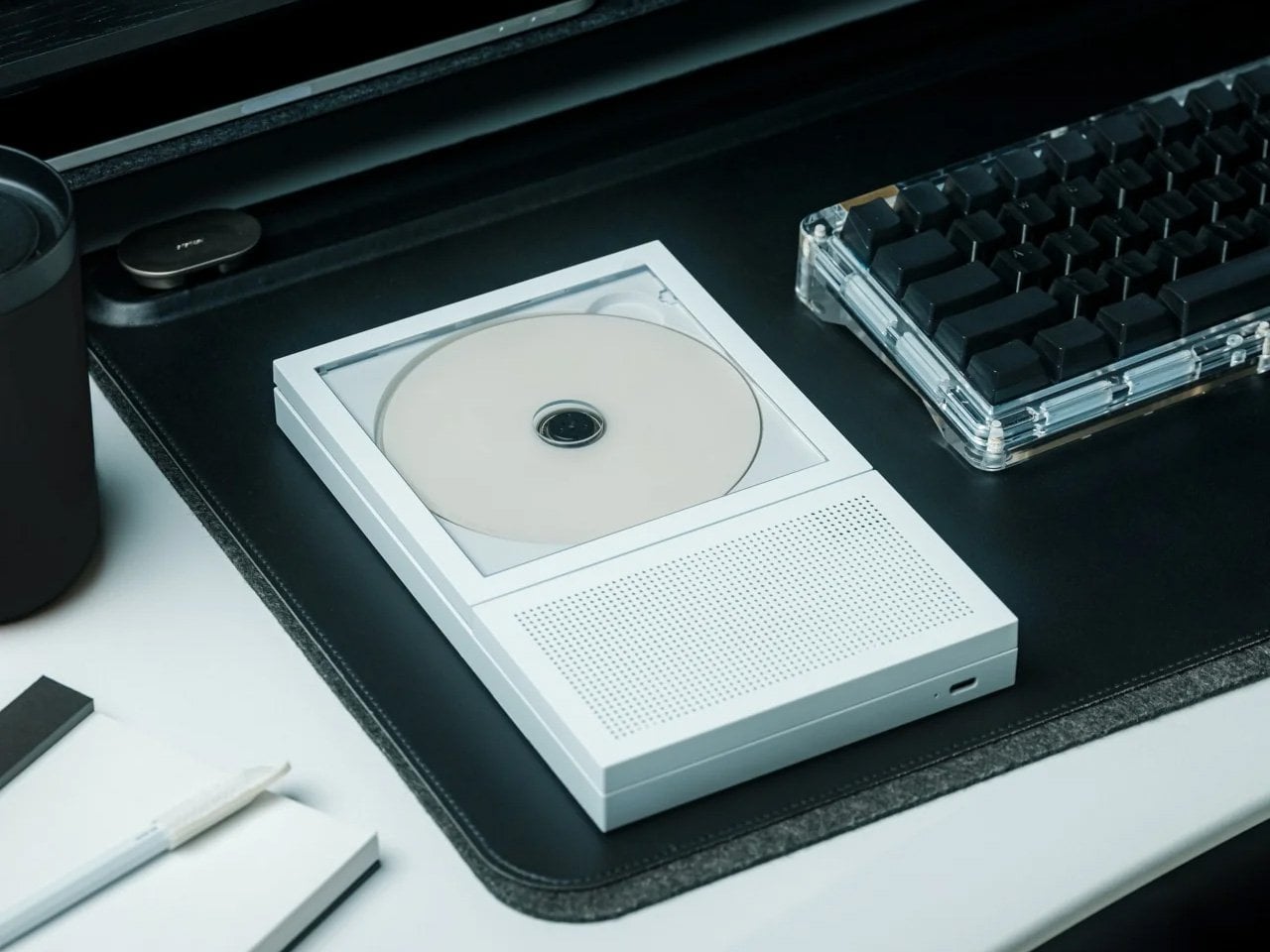
Most pregame rituals revolve around a playlist nobody agreed on. The Portable CD Cover Player changes the format entirely, looking exactly like a CD jewel case standing on edge, which means it earns its shelf spot before anyone presses play. For someone who has put real money into making their living room feel right, a music player that doubles as a sculptural object is the kind of gift that holds its ground in the room long after the season ends and the decorations come down for good.

Beyond the form, it delivers. Slot a disc in and the music plays back with the kind of warmth a streaming service on a phone speaker simply does not replicate. It reads as the pregame companion: the thing that sets the tone before the screen takes over and the broadcast audio fills the room. For the host who treats game day like an event rather than a habit, this is the detail that tells everyone in the room that the person running the setup actually thought it through from the first quarter to the last.

Click Here to Buy Now: $199.00

What We Like

  • The form is genuinely surprising without being gimmicky, earning a permanent shelf spot rather than a junk drawer after the novelty wears off in the first week.
  • At from $199 on YD Select, it sits in a gift tier that feels considered without crossing into impractical territory for most budgets.

What We Dislike

  • Physical media is a deliberate commitment, and someone who has moved entirely to streaming will need to rebuild a CD library, which is either a feature or a friction point depending entirely on who is receiving it.
  • Pricing for different color or finish variants beyond the base entry price is not confirmed on the current listing.

2. Hisense U6SF Pro

The U6SF Pro solves the problem most living rooms never fully address: glare. Sunlight through a window, a lamp left on during an afternoon game, the overhead light nobody turned off before kickoff. A standard panel washes out and flattens the image before halftime arrives, but Hisense’s anti-reflection, glare-free coating treats the room’s actual conditions as part of the design brief. Tom’s Guide’s reviewer noted they never once had to adjust the room lights during a full testing session with this panel in a real living room.

At $699, down from its original launch price of $1,099, the U6SF Pro puts a 1,200-nit Mini LED panel with a native 144Hz refresh rate and a built-in subwoofer into a price bracket that used to feel out of reach for this level of picture performance. That combination of brightness ceiling, motion handling, and built-in bass makes it the natural anchor for a game-day living room that is serious about the setup without being unreasonable about what the whole thing should realistically cost.

What We Like

  • The glare-free anti-reflection coating is a tested, real-world differentiator in rooms that are not dedicated dark home theaters, which describes most living rooms where the game actually gets watched.

What We Dislike

  • The built-in subwoofer is a convenient feature, but committed audio setups will likely still want a dedicated soundbar or speaker pair running alongside it for full-range coverage.
  • Available in larger screen sizes that may not suit every living room layout, so confirming dimensions before committing to this as a gift is worth the extra step.

3. XGIMI MoGo 4

The second-screen problem- where does the overflow crowd watch when the main room fills up- never gets planned for until it is actively happening. The XGIMI MoGo 4 is the answer that does not require buying a second television. A 1080p portable projector with 450 ISO Lumens, a 360-degree adjustable stand, Google TV with licensed Netflix built in, and dual 6W Harman Kardon speakers, it throws up to a 200-inch image from a cylinder compact enough to sit on a coffee table without commanding the room.

The 71.28Wh built-in battery delivers up to 2.5 hours of playtime, covering most games without needing a wall outlet nearby. Running on Wi-Fi 5 and Bluetooth 5.1, the setup is entirely wireless from start to finish. For a host who wants a backyard overflow screen, a garage viewing option, or a second room covered on playoff day, this is the projector that pulls all of that off without a permanent installation, a ceiling mount, or a second cable subscription attached to the monthly bill.

What We Like

  • The 360-degree adjustable stand means it can project onto a ceiling, a garage door, or a blank wall with the same minimal setup effort every single time.
  • Google TV with licensed Netflix built in removes the need for an external streaming stick or any additional device running alongside it out of the box.

What We Dislike

  • At 450 ISO Lumens, bright-room performance has real limits, and this works best in a controlled-light environment rather than a fully sunlit afternoon kickoff.
  • 2.5 hours of battery life covers a standard game comfortably but falls short for overtime-heavy playoff marathons without a power source kept nearby.

4. Come Together

Come Together Adds Rolling Speaker and Mini Fridge to Your Couch

Most game-day setups eventually arrive at the same friction point: someone has to get up to restock the drinks, and that person misses the play everyone is going to be talking about for the next ten minutes. Come Together is a three-piece robotic system designed specifically around that problem. The Tower sits as a calm black cylinder until it is needed, then rises to reveal a built-in mini fridge capable of holding up to five cans, with a tray on top that swaps in for snacks when the cooling function is not the priority.

The Base handles the sound half of the equation. It is a circular spatial audio unit that maps the room, figures out where people are sitting, and positions itself for the best possible coverage without anyone adjusting a thing. A Qi2 wireless charging pad keeps phones topped off through a long game without anyone leaving the couch to find a cable. For the host who has optimized everything else and still loses someone to the kitchen every twenty minutes, this is the piece that quietly closes that gap.

What We Like

  • The Qi2 wireless charging integration solves the dead-phone problem during long games without adding another cable to a setup that is already managed tightly.
  • A spatial audio unit that actively repositions itself for the room’s seating layout is a genuinely considered detail for a couch-forward, game-first viewing environment.

What We Dislike

  • Five cans is comfortable for one or two people but runs short for a full game-day group without a refill run, which somewhat undercuts the core convenience premise.
  • Consumer purchase availability should be confirmed before gifting, as this was covered at the concept-design stage and current retail status should be verified against the original coverage.

5. RetroWave 7-in-1 Radio

The RetroWave 7-in-1 Radio has the look of a vintage Japanese radio and the utility of something designed entirely for now. Behind the tactile tuning dial and compact body, measuring 5.04 inches wide and 3.86 inches tall in ABS resin and iron, it pulls in FM, AM, and shortwave stations, streams music over Bluetooth, plays MP3s via TF card, and carries a built-in flashlight and SOS alarm. For a game-day room, it earns its shelf spot the moment it arrives. Nobody in that room mistakes it for an afterthought.

During a game, its job is focused: fill the room with the pre-broadcast energy, the live radio commentary, or the kind of ambient music that does not demand a playlist decision before kickoff. When the power cuts out, and at some point it does, the radio keeps going in a way a smart speaker or a streaming device simply cannot promise without a signal. At $89, it is the gift that reads as a design object on the shelf and earns the label of genuine essential in the room and well beyond it.

Click Here to Buy Now: $89.00

What We Like

  • Seven real functions in one compact body, covering speaker, MP3, radio, flashlight, clock, power bank, and SOS alarm, with no redundancy in how each one actually gets used.
  • The retro Japanese design language means it lives on a shelf and looks like it belongs there rather than sitting out like a piece of tech that never found a proper home.

What We Dislike

  • The compact dimensions mean speaker output suits ambient listening and pregame music rather than filling a large room at full volume when the crowd gets loud.
  • Shortwave reception quality will vary by location and atmospheric conditions, meaning not every station is equally accessible in every US market throughout the season.

6. IKEA x Xbox YXSTABY Collection

IKEA and Xbox’s YXSTABY furniture collection makes gaming feel more at home

The IKEA and Xbox YXSTABY collection is nine pieces of furniture designed around the specific reality of a living room that doubles as a gaming and viewing setup. The rolling TV stand, the thumbstick-shaped stool, the D-pad cushion: each piece reads clearly as part of the same visual language while functioning as real, everyday furniture rather than themed décor that announces itself too loudly. It is the first time a gaming identity has been built into a living room collection at this level of design seriousness, and the craftsmanship reflects it.

For the person whose living room already functions as a game-day headquarters, these pieces solve the organizational and seating problems that quietly accumulate around a serious setup over time. The rolling TV stand keeps equipment mobile without the floor clutter of static furniture that never quite sits right. The stools double as extra seating the moment the couch fills up before kickoff. Launched in IKEA stores October 1, 2026, the collection ties the room together rather than adding another device to a pile that is already complicated enough.

What We Like

  • Nine coordinated pieces mean gifting one item or several works without the room looking inconsistent, since everything belongs to the same design system from day one.
  • The rolling TV stand solves the real logistical problem of rearranging a viewing setup without unplugging and re-routing every cable in the process.

What We Dislike

  • The gaming-identity aesthetic is deliberate and visible, which suits the target audience perfectly but narrows the appeal for someone who prefers a more neutral living room look throughout their space.
  • Availability in specific IKEA markets should be confirmed before purchasing, since not every location will carry the full nine-piece range at launch without advance stock checks.

7. Department of Play 3-in-1 Table

One Table, 3 Games, Nobody Needs a Game Room

Sanne’s Department of Play table does the math that most game-room setups never quite solve: one table, three games, and no dedicated room required. It converts between pool, ping pong, and dining configurations, which means it earns its square footage in a normal-sized living room rather than demanding a basement or a spare room nobody actually has. For the person who has maxed out the screen and sound side of their setup, this is the piece that extends the experience past the final whistle into the rest of the evening.

Halftime has a specific energy problem. The game pauses, but the room does not settle with it. A table that converts to pool or ping pong in a few steps gives that energy somewhere productive to go rather than everyone drifting toward their phones and losing the thread of why they came over in the first place. It is also the one item on this list that earns equal weight during the offseason, which makes it the most defensible large-format gift in the group by a considerable margin.

What We Like

  • Three fully functional game configurations in one piece means it does not feel like a compromise on any of the three: pool, ping pong, and dining each hold up entirely on their own.
  • It earns its keep in the offseason in a way that purpose-built game-day furniture rarely manages once the season wraps up and the schedule clears.

What We Dislike

  • The footprint is significant, and the room should be measured carefully before committing, especially if the living room already has an established furniture layout that functions well as-is.
  • Converting between configurations takes time and some physical effort, which feels less appealing mid-game when a quick round between plays was the actual goal going in.

8. Hisense CanvasTV

The CanvasTV solves the problem most televisions ignore entirely: what the screen looks like when the game is not on. A 4K QLED Google TV wrapped in a teak frame, it ships with an UltraSlim wall mount already included in the box, letting the panel hug the wall closely enough to read as a framed painting rather than a floating screen. A Hi-Matte anti-glare panel and an RGB light sensor allow it to adapt to the room’s actual lighting conditions throughout the day without anyone touching a setting.

When no one is watching, the Motion Detector blanks the display, cutting to a neutral screen the moment the room empties and switching back to art the moment someone returns. Access to more than 1,000 curated artworks comes built in at no extra subscription cost. At $1,997.99, it is the top-of-list anchor gift for someone whose living room already performs during the game and deserves a screen that holds its own for the other twenty-two hours of the day when the broadcast is off, and the room still needs to look right.

What We Like

  • The UltraSlim wall mount included in the box removes the most common installation friction point and makes the all-in price considerably more honest than it first appears.
  • Over 1,000 curated artworks with no subscription fee attached is a genuine differentiator against competitors that charge a monthly rate for access to their art libraries.

What We Dislike

  • The teak frame aesthetic is specific and intentional, working beautifully in the right interior but unlikely to suit every room style with the same effortless ease.

9. Side A Cassette Speaker

The Side A Cassette Speaker is the easiest item on this list to explain and the hardest to put down once it is in your hands. A Bluetooth speaker shaped and sized exactly like a cassette tape, it sits on a shelf, a coffee table, or a windowsill and reads as a found object rather than a piece of tech left out between uses. For a room that has been carefully assembled piece by piece, it is the kind of small detail that signals genuine taste without demanding any attention at all from the people in the room.

At $49 on YD Select, it functions as the natural lower-budget pick in this lineup: the item that rounds out a larger gift or works entirely on its own when the occasion calls for something thoughtful rather than extravagant. It plays music with enough clarity to carry the room before the main screen takes over, and it does so while looking like something that was always meant to be there rather than something plugged in and forgotten in the corner when the season gets busy and the setup expands.

Click Here to Buy Now: $49.00

What We Like

  • At $49, it sits comfortably in the easy-yes gift tier: specific enough to feel genuinely considered and affordable enough to give without second-guessing the price once it is wrapped.
  • The form is the function. It looks like a cassette, plays music clearly, and earns a permanent shelf spot in a room that has been put together with real care and intention over time.

What We Dislike

  • Speaker output is proportional to its size. It is a pregame and ambient-listening companion rather than a replacement for a dedicated Bluetooth speaker when volume becomes the actual priority of the room.
  • The cassette format is a deliberate nod to a specific era of nostalgia, which works well for the right recipient but may feel too referential for someone who prefers a forward-facing, minimal design language throughout their space.

The Room That Works All Season

A game-day room is really just a room with strong opinions about what it needs to do well. The right screen, the right sound, the right table for when the final whistle goes, and nobody is ready to pack up and head home. Every pick on this list earns its place by solving a real problem in that room rather than adding noise to a setup that is already working well enough on its own without it.

The best part of giving something to the person who has already built the room is that they will actually use it, week after week, throughout the season and past it. These are not conversation pieces or shelf fillers added for their own sake. They are objects that get switched on, picked up, sat in, and genuinely appreciated in real time during a game that matters to the people in that room, and that kind of usefulness is harder to gift than it looks.

The post 9 Best Gifts for the Person Who Turned Their Living Room Into a Sports Bar first appeared on Yanko Design.

  • ✇Yanko Design
  • The VIVIFoCAL S1 Glasses Focus Themselves So Your Eyes Don’t Have To
    Your phone focuses by firing an invisible laser pulse at whatever you’re aiming it at, timing the bounce, and telling a tiny motor to move some glass. The whole loop finishes in a few hundredths of a second and nobody has thought about it since roughly 2017. VIVIFoCAL has taken that identical hardware recipe, a time of flight sensor, a microcontroller and an actuator, and bolted it onto a pair of glasses pointed at the world instead of at your brunch. The S1 measures how far away the thing you’
     

The VIVIFoCAL S1 Glasses Focus Themselves So Your Eyes Don’t Have To

1 octobre 2026 à 21:45

Your phone focuses by firing an invisible laser pulse at whatever you’re aiming it at, timing the bounce, and telling a tiny motor to move some glass. The whole loop finishes in a few hundredths of a second and nobody has thought about it since roughly 2017. VIVIFoCAL has taken that identical hardware recipe, a time of flight sensor, a microcontroller and an actuator, and bolted it onto a pair of glasses pointed at the world instead of at your brunch. The S1 measures how far away the thing you’re looking at is, works out the optical power your eyes need, and mechanically shifts the lenses into position in under 0.1 seconds. It’s autofocus, except the sensor is on your face.

Dr. Zhao, who earned his doctorate at a world-leading university and previously ran an optical R&D laboratory at a major optics company, built VIVIFoCAL around a piece of physics that has not yet been widely adopted by the general public. The S1 uses Alvarez lenses, two complementary freeform elements that change optical power when one slides sideways across the other. Nobel laureate Luis Alvarez patented the principle, and it was then stranded for decades because somebody had to do the sliding. A motor does it now. The result covers 8 inches to infinity in a 40 gram frame, and it launches with VIP pricing from $289.

Designer: VIVIFoCAL

Click here to Reserve Now: $10 (VIP pricing from $289).

A laser, a motor, and the 1967 patent working in the background

Three sensors do the work rather than one. A time of flight laser reads distance, a G-sensor tracks head posture, and an infrared wear detection sensor tells the glasses whether they’re on a face at all, which is how the battery survives being pushed up onto your head mid-conversation. The microcontroller sits between them, converting a distance reading into a lens position and commanding the motor in a single pass. The lenses simply change optical power to match whatever distance you’re looking at, the same job your eyes handle on their own before presbyopia kicks in. VIVIFoCAL calls that loop Instant Focus, and the same time of flight hardware we’ve watched migrate into phones, robot vacuums and door locks is what makes it affordable in eyewear.

Fitting a moving lens assembly, a rangefinder, a motion sensor, a microcontroller, a motor and a battery into something that still reads as eyewear is the harder half of this product. VIVIFoCAL has pushed the electronics into the brow bar and the temple arms, keeping the optical stack shallow enough that the frame sits on a face instead of announcing itself as hardware. The 160.5 x 160 x 43.5mm envelope is ordinary spectacle territory, which is the entire argument. Every packaging decision is downstream of one goal, helping the wearer see clearly across distances without thinking about the machine doing it.

Progressive lenses ask you to tilt your chin… this doesn’t

Presbyopia is projected to affect 2.1 billion people by 2030, and the standard answer for most of them is a progressive lens with three prescriptions blended into one lens, near at the bottom, distance at the top, intermediate smeared between. Finding the right part of the glass means tilting your chin, and the tradeoff is the narrow tunnel vision that progressive wearers describe, with softness creeping in toward the edges. VIVIFoCAL calls its answer Full-Lens Clarity, where the Alvarez lenses deliver one consistent optical power across the whole lens at every setting instead of splitting it into zones. There is nothing to hunt for and less peripheral distortion to work around. I’ve watched that chin-tilt dance play out for years, so the appeal is obvious.

Progressive glasses are generally built around everyday reading tasks, and for closer or more detailed work plenty of wearers still reach for a second pair or a magnifier. S1’s focusing range starts at 8 inches, which brings fine detail inside the same lens handling everything else. VIVIFoCAL demoed the glasses at WonderFest 2026 against a 1/35 scale miniature, the sort of precision hobby work that has kept optical visors and loupes in business for a century, and the testers who work with their hands responded the way you’d expect. One early tester shared that using S1 in a data center was a productivity gain and a huge plus, because he could walk past equipment and read tiny serial numbers without interrupting his workflow to take out extra readers, switch to other glasses, or use additional visual aids. He no longer carries multiple pairs when he leaves the house.

Forty grams, three nose pad sizes, and all-day power

VIVIFoCAL designed around the fact that head sizes and nose bridge heights vary far more than eyewear brands usually admit, which is why S1 ships with flexible spring hinges and three sizes of interchangeable nose pads to adapt across face shapes. The frame lands at 40 grams bare and 50 with the magnetic front clip, built on TR90 temples, the same material that has quietly taken over lightweight frames and wearable arms across the industry. Those numbers matter because forgetting you’re wearing them is the whole point of automating focus in the first place. A 250mAh battery holds up through 8 hours of constant refocusing and refills over USB-C in about an hour, with normal use stretching to a full day. Glasses that can run flat is still a new idea to make peace with.

A separate pair of lenses attaches behind the Alvarez elements, so one pair carries your prescription to see near and far. Magnetic polarized sunglass lenses snap onto the front for outdoor use with adaptive focus still running underneath. The polycarbonate lenses carry anti-reflective and anti-smudge coatings, transmit more than 90 percent of light, and sit inside a field of view above 110 degrees. The app adds a ±0.5D fine-tuning range on top of the automatic correction, which is how the glasses absorb the slow drift of a presbyopic prescription instead of being replaced. Presbyopia correction tops out at 3.5D, so the deepest cases fall outside what S1 can currently handle.

The bet VIVIFoCAL is making on moving glass

The company isn’t chasing this idea alone. Other teams are working on adaptive focus through liquid crystal lenses or eye tracking instead of a mechanical shift, and the category is young enough that the approaches are still diverging. VIVIFoCAL is betting on the refractive route, real glass moving to change optical power rather than a pixelated layer simulating it, and that bet buys the two things that matter most in eyewear you keep on your face all day. S1 holds above 90 percent light transmittance and a field of view past 110 degrees, which is why the image through it behaves like a lens instead of a screen.

Alvarez lenses have been a lab curiosity since 1967 for one reason, which is that the sliding had to be automated by something small enough to live inside a temple arm. Sensors, motors and microcontrollers have finally shrunk far enough to make that trivial, which makes S1 a triumph of packaging, and packaging is where most wearables actually get decided. Autofocus earned its invisibility in cameras by working so fast nobody noticed it, and 0.1 seconds across 8 inches to infinity puts the same disappearing act in front of your eyes. S1 ships with a 1-year warranty, and a refundable $10 deposit locks in VIP pricing at $289 ahead of the official launch, with either the prescription lens service or the sunglass lens bundle included depending on which one you need. Sixty years is a long time for a good idea to wait for its motor.

Click here to Reserve Now: $10 (VIP pricing from $289).

The post The VIVIFoCAL S1 Glasses Focus Themselves So Your Eyes Don’t Have To first appeared on Yanko Design.

  • ✇Yanko Design
  • Designers Already Prototype Hardware – Now They’re Prototyping Demand Too
    Every product that finds its way onto these pages eventually meets the same crossroads: the moment a designer takes the thing public. For physical product creators chasing something original enough that established retailers won’t touch it, Kickstarter remains the most democratic proving ground available. The platform has hosted more than 654,000 campaigns since 2009, drawing over $8.5 billion in pledges from more than 23 million backers, with 2025 marking its strongest year on record. That mom
     

Designers Already Prototype Hardware – Now They’re Prototyping Demand Too

1 octobre 2026 à 20:30

Every product that finds its way onto these pages eventually meets the same crossroads: the moment a designer takes the thing public. For physical product creators chasing something original enough that established retailers won’t touch it, Kickstarter remains the most democratic proving ground available. The platform has hosted more than 654,000 campaigns since 2009, drawing over $8.5 billion in pledges from more than 23 million backers, with 2025 marking its strongest year on record. That momentum creates a seductive and specific trap: creators see the platform’s gravity and assume a beautiful product with a compelling story will naturally convert into backers. A crowdfunding agency called TCF (The Crowdfunding Formula), which holds Kickstarter Premier Partner status and has facilitated more than $520M raised across campaigns, has spent years watching that assumption fail in real time, and what they built to counter it is one of the more disciplined pre-launch processes in the business.

TCF’s methodology, recently published in full detail, centers on a single observation that most campaigns never act on: interest and purchase intent are not the same signal. Emails, follows, and comments cost nothing to give, which is why none of them predict whether a product sells. Validation asks for money, not opinions, and a small deposit on a product that does not exist yet is the closest available proxy for a real backer, because the act of paying is what carries the information, not the amount. The resulting data resolves three decisions most creators make by guesswork: the price, the positioning, and the audience, all settled before a campaign page exists, before ad spend, and before the outcome is locked in, because those are the three things most likely to break a launch and the three most often decided by assumption. It is a design methodology applied to the market, and it deserves the same respect that designers already extend to physical prototyping.

Circular Ring 2

How a $2 Deposit Separates the Buyers from the Browsers

The process runs on Prelaunch.com. A product page goes live showing the product, the visuals, what it does, how it works, and the characteristics that make it different, with no price. Visitors who want to know more leave their email address, which is the interest signal and only that. A second page then opens, presenting the price alongside an offer: put down a deposit today and receive a discount when it launches. Someone who pays has moved from liking the product to paying for a product with no campaign page, no ship date, and no reviews. Someone who does not pay is interested but not convinced, and that is a result too.

The pushback the deposit mechanism reliably attracts is predictable: does $2 actually prove anything about future purchase behavior? The deposit is the part people push back on, but the $2 is not the point. The act is the point. Getting up, finding a card, and typing the numbers in for something with no campaign page, no ship date, and no reviews is a different order of behavior from tapping a heart, and the people who do it are the closest thing to your future backers that exists before you have any. The Circular Ring 2, a smart health ring, funded in just four minutes and crossed $2.5 million in pledges in under 40 days. Products that open with that kind of velocity tend to do so because the audience already knows it wants the thing, and that certainty is built long before a campaign goes live.

Image Credits: TCF

The Rejection Data Is the Brief

The survey is where validation stops being a scoreboard and starts being useful. From the people who reserved, you learn what actually moved them: whether it was the color, the form, a specific function, the price, or the promise, and which features are carrying the product versus which ones you have been overselling. From the people who left an email and then did not pay, you learn something you cannot get anywhere else: exactly where you lost them, and what would change their mind. The color they wanted was not there. The shape was wrong. It looked too heavy. The price was too high. These are the people who were close enough to care and honest enough to walk away, and their answers are a list of things you can fix before the fix costs anything.

This is co-creation in the most literal sense: meeting your potential buyers before you launch, and letting them tell you what to build. A creator who learns that 60% of their non-converting subscribers balked at weight has a design brief, not a marketing problem. A creator who discovers that two colorways were widely expected but absent has a specification list, not a gap in their ad copy. The survey turns a theoretical audience into an actively contributing one, delivering feedback while the product can still absorb it. Kickstarter’s most successful campaigns tend to share that structure: they do not open to strangers, they open to people who were already consulted.

BB-777 Boombox

Why Validation Doesn’t Always Mean Lowering Your Price

Creators tend to assume validation exists to talk them down. It does not. One agency ran validation on a pet product priced at $30 a unit, and the data showed the right price was $40. The creator had been leaving money on the table, and no amount of instinct would have told them that, because instinct in that situation almost always argues for the safer, lower number. No stated-preference survey, no focus group, and no amount of social engagement would have surfaced it, because stated preference and paid behavior are different instruments measuring entirely different things. Validation is where you settle positioning and audience rather than guessing at them, running price variations, testing different messaging, and finding which audience responds before you have committed to a single frame of campaign video. The point is to find the price, the position, and the audience that let the product reach its full potential, and then launch into that.

The validated price sets reward tiers, and the early discount tested during validation is a trigger that has already been watched working, rather than one you hope will. The reserver surveys told you which characteristics did the persuading, which decides your headline, your hero shot, and the order of your video. You are not inventing arguments for the product; you are repeating the ones your buyers already made. Running price variations and messaging tests before a single production decision is committed changes the campaign from a bet into a brief. The learning does not expire when the campaign closes. A validated price, position, and audience are the same three things an e-commerce store runs on, which is what lets a product keep scaling after the campaign instead of peaking with it.

Kode Dot

The Designer’s Instinct Problem and Why Demand Needs Its Own Prototype

The design process and the validation process ask for decisions in different orders, and that difference matters more than it first appears. A designer who arrives at a product through material, form, and function is not naturally thinking about reservation rates. Validation is the design loop pointed at the three things a physical prototype cannot test: what people will pay, how the product should be framed, and who it is really for. Designers already accept this discipline everywhere else; nobody tools up an injection mold without a prototype. A “do not launch” result from this process is a success, saving a creator a year, a production run, and the damage of a public failure. A careful launch protects more than the person running it; it protects the shared resource of backer trust, which every quiet project erodes.

The question worth answering before a launch is not how big a campaign you can build. It is what you can prove before you build it. Whether that discipline becomes standard practice across the crowdfunding ecosystem or remains the habit of the more methodical subset of creators, the underlying argument is one any designer can recognize. You do not ship a mechanism you have not tested. Treating the market as the final untested component, rather than an assumption baked into launch day, is the shift the methodology is asking for. Across hundreds of millions of dollars raised in crowdfunding projects, the cases where testing these three things costs more than getting them wrong are functionally nonexistent.

The post Designers Already Prototype Hardware – Now They’re Prototyping Demand Too first appeared on Yanko Design.

  • ✇Yanko Design
  • The 1969 Lamp Nobody Knew They Needed Is Back
    Most statement lighting presents a familiar dilemma. A lamp can give a room personality, but the more attention it demands, the harder it can be to live with everything around it. Furniture starts to feel like a supporting cast. Even the lamp’s glow can seem secondary to its silhouette. Gubi’s reissued Lotus lamp offers a more appealing proposition: a piece with enough presence to change the mood of a room, without making the room feel like a showroom. Designed by Carlo Nason in 1969, the Lotus
     

The 1969 Lamp Nobody Knew They Needed Is Back

1 octobre 2026 à 18:30

Most statement lighting presents a familiar dilemma. A lamp can give a room personality, but the more attention it demands, the harder it can be to live with everything around it. Furniture starts to feel like a supporting cast. Even the lamp’s glow can seem secondary to its silhouette. Gubi’s reissued Lotus lamp offers a more appealing proposition: a piece with enough presence to change the mood of a room, without making the room feel like a showroom.

Designed by Carlo Nason in 1969, the Lotus lamp belongs to a period when designers were willing to treat lighting as sculpture. Nason’s fluency with glass is central to its appeal, and Gubi’s reissue brings that idea back into view more than half a century later. It is easy to see why the design has returned now. Plenty of contemporary interiors look polished, yet oddly reluctant to have fun. A lamp with a little imagination can do more for them than another carefully chosen neutral.

Designer: Carlo Nason

What makes Lotus interesting to me is the difference between being distinctive and being loud. Its flower-inspired identity gives you a way into the design, but it does not require an entire room to follow the theme. You can appreciate the botanical reference without surrounding it with curved chairs, patterned wallpaper, and a vase of matching flowers. That restraint matters. The best objects leave space for the lives unfolding around them.

Glass also changes how we read a lamp. A metal shade tends to draw a firm outline; glass has a more elusive presence, especially when light enters the picture. It can feel substantial and delicate at once. Nason built a career around exploring what the material could do, and Lotus carries that curiosity into an everyday object. I like the idea of a lamp that rewards a second look when it is switched off, rather than disappearing until evening.

Of course, reissuing a decades-old design invites a fair question: Are we drawn to the lamp itself, or to the comforting idea of owning a piece of design history? Vintage references can become a shortcut to taste. A recognizable date and designer’s name do some of the work that the object should be doing on its own. Lotus earns more attention when you set that pedigree aside and imagine it in an actual home, beside the books you have not put away and the chair you sit in every night.

That is where its value as a design object becomes clearer. A good lamp changes a space twice: once as an object you notice during the day, and again when you turn it on. The Lotus makes a case for treating those experiences as connected rather than choosing one over the other. It asks to be seen, but the point of bringing a lamp home is still to live with its light.

There is a broader reason this reissue feels timely. So much shopping for the home now happens through images that reward instant impact. A dramatic silhouette can stop a scroll, even if it would be exhausting across the room from your couch. The more useful test is slower. Would you want to see it on a rainy Tuesday? Would it still hold your attention once you stopped photographing it? Lotus strikes me as the kind of design that could pass both tests.

It also offers an alternative to the notion that a room has to speak in one consistent style. An older Italian design can sit comfortably among newer pieces if you let it be a point of contrast rather than the start of a complete makeover. That is a more personal approach to decorating. Most homes accumulate meaning over time, through choices made for different reasons and at different moments.

Gubi did not need to invent a new kind of lamp to make lighting feel fresh. Reintroducing Nason’s 1969 design is a reminder that an object can have a strong point of view without turning the rest of your home into a backdrop. For anyone caught between the sensible lamp and the memorable one, Lotus makes a persuasive argument for wanting both.

The post The 1969 Lamp Nobody Knew They Needed Is Back first appeared on Yanko Design.

❌