❌

Vue normale

  • ✇Yanko Design
  • Masa’s Wavy Tray Is Sculpture You Can Actually Serve Snacks On
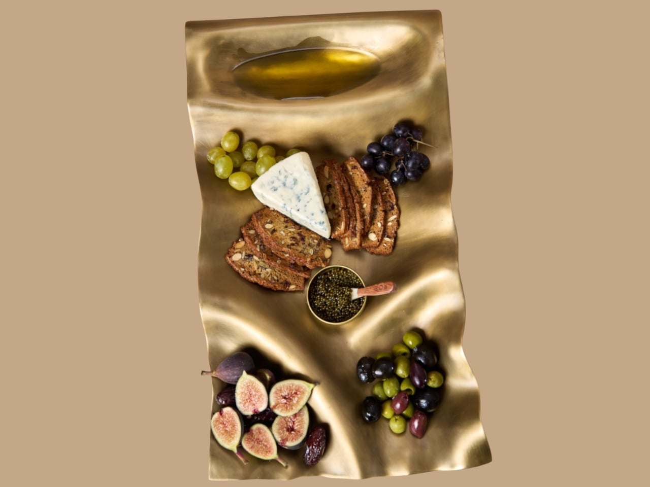
    Six burgers, a pile of fries, and generous spoonfuls of caviar are a pretty good way to explain dumæ’s Masa Tray. In the brand’s photographs, the food sits on a rippling brass surface that looks more like a small sculpture than standard serving ware. I like the slightly ridiculous pairing. It also makes the tray’s purpose clear: give dinner a visually interesting home without adding a separate decorative centerpiece. Designed by Los Angeles brand dumæ and handcrafted in India, Masa addresses th
     

Masa’s Wavy Tray Is Sculpture You Can Actually Serve Snacks On

20 octobre 2026 à 09:20

Six burgers, a pile of fries, and generous spoonfuls of caviar are a pretty good way to explain dumæ’s Masa Tray. In the brand’s photographs, the food sits on a rippling brass surface that looks more like a small sculpture than standard serving ware. I like the slightly ridiculous pairing. It also makes the tray’s purpose clear: give dinner a visually interesting home without adding a separate decorative centerpiece.

Designed by Los Angeles brand dumæ and handcrafted in India, Masa addresses that familiar divide between the serving pieces you use and the decorative objects you leave out. Its project description says the brass tray is finished to be food-safe, allowing it to move between both roles. The appeal is having one substantial object that doesn’t need to disappear when everyone finishes eating.

Designer: dumæ

The starting point is the movement of waves, translated into broad rises and shallow dips rather than a literal seashell outline. IADA’s announcement traces the reference to Point Dume, the stretch of coast where dumæ founder Kym Gold grew up. I appreciate that the backstory isn’t required reading. Even without knowing the geography, you can see how the curves break up what could otherwise be a rather stern metal rectangle.

In the close-up photographs, light collects along the higher ridges while the depressions fall into softer shadow. That gives the surface a sense of movement even when it’s covered with crackers and grapes. The edges rise and dip with the rest of the form, so the shape feels continuous rather than decorated afterward. To my eye, that’s the strongest design decision here. The visual interest comes from the tray itself, without needing a pattern applied on top.

Those undulations also deserve a practical look. A sculpted surface offers a different proposition from a flat platter, particularly if you’re arranging small bowls or setting down glasses. I’d treat Masa primarily as a tabletop serving piece rather than assume it’s the ideal tray for carrying drinks across a room. The photographs make a convincing case for loosely arranged food. They don’t establish how securely every vessel would sit, and the distinction matters when the surface is this expressive.

The handcrafting adds another layer. According to the announcement, small differences in form and finish occur from piece to piece. That feels appropriate for a design built around irregular movement; perfect repetition would almost work against the idea. Still, handmade isn’t a performance specification. The individuality is a reason to appreciate the object visually, not evidence that it will resist scratches or survive every kind of use. I’d want the maker’s specific care guidance before treating it as everyday workhorse tableware.

Retail listings put its footprint at approximately 21.5 by 11.5 inches, with a height of 3 inches. That’s worth measuring against your table before imagining a generous spread surrounded by dinner plates. The Happy Kangaroo lists Masa at $595, although it’s marked sold out at the time of writing. At that price, this is a considered decorative purchase with a serving function, and its appeal depends on wanting to see it between meals.

Masa received Platinum recognition in both Kitchen & Dining Room Design and Homewear & Decor at the International Architecture & Design Awards 2026. Those categories neatly reflect its intended overlap: something for the table that can also hold its own elsewhere in the house. The recognition is useful context, though the more persuasive argument is still visible in the photographs: food looks inviting against those broad brass curves.

I’m most persuaded by the burger arrangement. The cheese, figs, and carefully grouped grapes are lovely, but takeout gives the tray a less precious personality. It suggests that owning a sculptural serving piece doesn’t require hosting a perfectly coordinated dinner party. I’d rather see an object like this earn its space under a heap of fries than spend its life waiting for an occasion formal enough to deserve it. The waves are already doing the decorating.

The post Masa’s Wavy Tray Is Sculpture You Can Actually Serve Snacks On first appeared on Yanko Design.

  • ✇Yanko Design
  • The 8 Best EDC Designs of October 2026
    The most useful thing in your bag is often the thing you forgot to pack. Scissors for a stubborn package, a light for a dark stairwell, a driver for the screw working loose on your gear. October’s EDC selection starts with Eiger’s eight-function scissors, then moves through seven other designs that give familiar tasks a more considered form, without assuming everyone needs to carry an entire miniature workshop every day. Pocket space is limited, so every extra object needs a reason to come alon
     

The 8 Best EDC Designs of October 2026

20 octobre 2026 à 07:40

The most useful thing in your bag is often the thing you forgot to pack. Scissors for a stubborn package, a light for a dark stairwell, a driver for the screw working loose on your gear. October’s EDC selection starts with Eiger’s eight-function scissors, then moves through seven other designs that give familiar tasks a more considered form, without assuming everyone needs to carry an entire miniature workshop every day.

Pocket space is limited, so every extra object needs a reason to come along. A pen that packs down, a wallet stripped to the essentials, and a charger built around one USB-C port approach that constraint differently. Some designs combine jobs; others concentrate on doing one thing well. The appeal lies in finding something that earns its place in your daily routine without giving you more than you actually need.

1. Eiger 8-in-1 Scissors

EigerTool starts with a pair of scissors and works the extra functions into their existing geometry. Made by hand in Sanjo, Niigata, the SUS420J2 stainless-steel tool combines cutting with a knife, can opener, bottle opener, screw-cap opener, shell cracker, prying tool, and gas-release function. It’s a sensible starting point for an everyday tool: the main cutting action stays accessible, rather than being a miniature attachment you have to dig out of a handle before opening a stubborn package.

At 5.1 inches long and 53 grams, Eiger is better understood as a small bag tool than a keychain accessory. An included leather case covers it between uses, while a red NITE IZE carabiner gives it a place outside the bag. The black finish comes from an oxidation coloring treatment that the maker says improves corrosion resistance. That doesn’t remove the need for care: EigerTool recommends washing and thoroughly drying the scissors before storage, particularly after messy jobs around camp.

Click Here to Buy Now: $65.00

What we like

  • Scissors take priority, with seven supporting functions.
  • The leather case and bag-attachment carabiner are included.

What we dislike

  • The five-inch length favors bag carry over a keychain.
  • The steel still needs washing and thorough drying after use.

2. RolTine 2.0 Titanium Tape Measure

COMANDI-Corres puts two ways of measuring into a titanium disc measuring 46 millimeters across and 18 millimeters thick. RolTine 2.0 contains a retractable 150-centimeter tape for conventional measurements, plus a rolling wheel for following contours. The wheel’s 150-millimeter circumference provides the reference: count complete turns, then add the remaining dial reading. It’s an appealing approach for checking rounded objects or curved edges, provided you’re willing to keep track of rotations rather than expect an electronic readout to do the arithmetic.

The Grade 5 titanium frame is skeletonized around the mechanism, giving this tape measure some of the exposed complexity associated with mechanical watches. An embedded magnet adds a way to park it on a steel toolbox between measurements. The important qualification is availability; February 2027 is the estimated shipping date. For now, its most convincing idea is giving curved measurements a place beside the straight tape without doubling pocket clutter.

Click Here to Buy Now: $75 $130 (42% off). Hurry, only 12/370 left! Raised over $130,000.

What we like

  • Retractable tape and rolling measurement share one compact body.
  • The embedded magnet provides a convenient place to park it.

What we dislike

  • Rolling measurements require manually tracking complete rotations.
  • February 2027 delivery is an estimate, not confirmed availability.

3. Corkor Front-Pocket Cork Wallet

Not every EDC improvement needs another mechanism. Corkor’s Front-Pocket Cork Wallet makes its case through a familiar card-holder layout and an unusual material. The Portuguese brand uses cork for an animal-free exterior, with three card slots, an ID window, and two compartments for folded bills. At a listed 20 grams, it starts light before you add your essentials. The surface gives the collection a welcome material change, particularly if your carry already contains plenty of black plastic and brushed metal.

The dimensions are 110 by 80 by 10 millimeters, which makes restraint part of the design rather than an optional extra. Add spare cards and receipts, and you start working against the point of a slim holder. Corkor includes RFID-blocking construction, but the more tangible daily benefit is the straightforward division between cards, ID, and cash. There’s no coin pocket, and bills need folding. It suits someone ready to edit their wallet, not someone looking to relocate an overstuffed bifold.

What we like

  • The animal-free cork exterior offers an alternative to leather.
  • Dedicated card, ID, and cash compartments keep the layout straightforward.

What we dislike

  • There’s no compartment for loose change.
  • Folded bills are less convenient to sort than cash in a full-size wallet.

4. CasaBeam Everyday Flashlight

CasaBeam takes a less tactical approach to the everyday flashlight. The body combines ABS and aluminum alloy, with a hanging loop and an included diffuser cap that broaden where the light can work. Adjust the beam for a concentrated spot or wider illumination, then stand the flashlight upright for ambient use. That flexibility matters more here than aggressive styling: one light can move between a bag, a bedside table, and a shelf.

The listing specifies up to 1,000 lumens, three brightness levels, a 2,600mAh rechargeable battery, and USB-C charging. Its claimed 24-hour runtime applies at the low setting, not maximum brightness. At 6.14 inches long and 175 grams, this is a deliberate bag-carry choice rather than something that disappears beside your keys. The useful design move is keeping handheld and stationary lighting together, so you don’t need to reserve the flashlight exclusively for the next power cut or an occasional camping trip.

Click Here to Buy Now: $50.00

What we like

  • The included diffuser extends its role into ambient lighting.
  • An adjustable beam and hanging loop offer different working arrangements.

What we dislike

  • At 175 grams, it’s substantial for pocket carry.
  • The longest advertised runtime requires the lowest brightness setting.

5. MetMo Pocket Driver

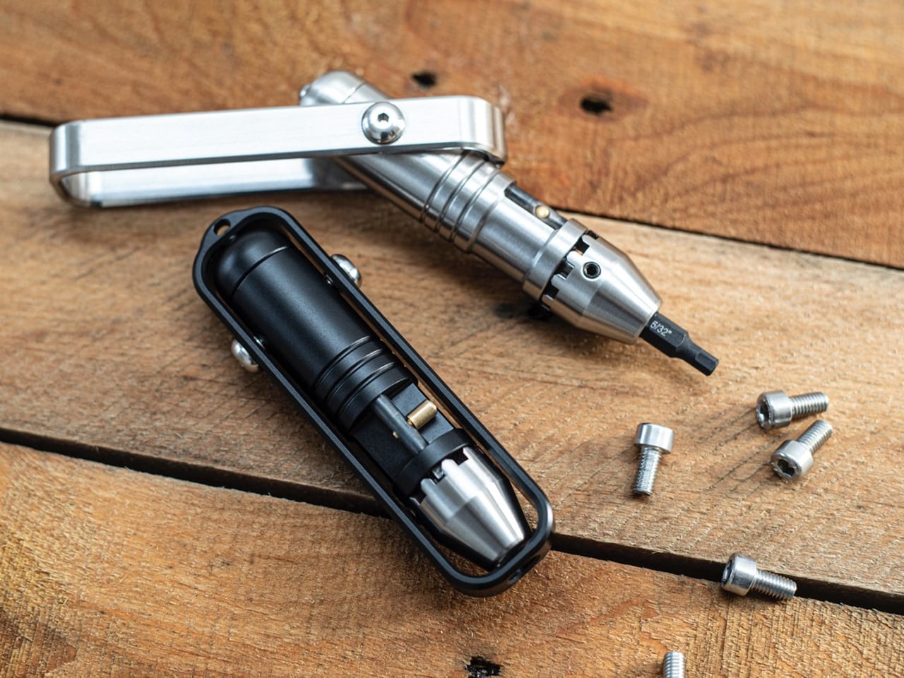
The MetMo Pocket Driver features its own dedicated tool, built around a reversible ratchet and a handle that folds outward. Keep it inline for a narrow approach, or open the handle into a T configuration when you need a different grip. Standard quarter-inch hex-bit compatibility is the important practical detail: you can choose bits around your own equipment instead of buying into a proprietary format. It’s a compact repair tool whose working parts remain visible during each turn.

MetMo lists the black aluminum version at 103 millimeters long and 109 grams, with hardened steel among its working materials. The handle stores two bits, enough to keep frequently used sizes with the driver without carrying an entire bit case. That also sets a limit: repairs needing several different heads require extra storage. It earns a place for people who tighten and adjust things throughout the week. If you rarely encounter a loose screw, it’s another handsome object to carry.

What we like

  • The reversible ratchet works with multiple handle positions.
  • Standard quarter-inch hex bits let you tailor it to your equipment.

What we dislike

  • Only two bits fit inside the handle.
  • Its 109-gram weight needs justifying if fastening jobs are rare.

6. Lumink Titanium Fountain Pen

EyeQ’s Lumink addresses the awkward part of carrying a fountain pen: the length that makes it comfortable to write with can make it inconvenient to pocket. Its threaded configuration changes from approximately 96 millimeters in carry form to 140 millimeters for writing. The Grade 5 titanium body has twelve facets designed to stop it rolling away, plus a pocket clip.

The writing end uses a German nib, and the seller lists compatibility with international cartridges and converters. That gives owners a choice between convenient replacements and filling from bottled ink. Belloc describes a threaded cap and internal gasket intended to prevent drying between uses. There’s still a setup step before writing, unlike the instant deployment of a click pen. That makes Lumink better suited to someone who enjoys a writing instrument’s mechanics than someone who needs the quickest possible signature.

What we like

  • A short carry form becomes a full-length writing instrument.
  • Cartridge and converter compatibility provides different filling options.

What we dislike

  • Threaded setup adds a step before writing.
  • Fountain-pen cleaning remains part of ownership.

7. Tilta Khronos Core Limited Edition Kit

Tilta’s Khronos Core Limited Edition Kit treats a phone case as a small platform for everyday accessories. A CNC-machined aluminum frame accepts four backplates without tools: a kickstand plate, rotating ring plate, transparent keepsake compartment, or card holder. The card holder takes up to three cards behind a latched cover, while the transparent option leaves space for a photograph. Available for iPhone 18 Pro and Pro Max, it changes the function of the phone’s exterior rather than changing its color.

The kit includes short and long straps, with magnetic quick-release attachments and multiple mounting points on the frame. This supports different carrying arrangements, including wearing the phone across your body. Its strongest EDC argument is consolidation: a card plate could replace a separate wallet for a short outing. The compromise is buying several configurations when you may favor only one. Tilta’s standard case already includes the kickstand backplate, so the complete kit makes sense only if you’ll use the alternatives regularly.

What we like

  • Four tool-free backplates let the same frame serve different purposes.
  • The three-card compartment could replace a separate holder for short outings.

What we dislike

  • This kit is specific to iPhone 18 Pro and Pro Max.
  • The extra backplates add little value if you only use the kickstand.

8. Rolling Square Supertiny 100W GaN Charger

Rolling Square’s Supertiny 100W is the bag essential in this selection, rather than another object to clip onto your keys. Introduced through crowdfunding, it concentrates its advertised 100-watt output into a single USB-C port. The US version has folding prongs, a useful detail when the charger shares a pouch with cables and other equipment. EU and UK versions use different fixed plug arrangements, so the tiny footprint shouldn’t be treated as identical across every regional version or every travel setup.

The appeal is straightforward if you carry a compatible USB-C laptop and want to leave a larger adapter at home. One capable port avoids the extra sockets and bulk of a multiport charger, but also limits the standard setup to one connected device.

What we like

  • The single-port layout prioritizes compactness over extra connections.
  • Folding prongs on the US model make packing more convenient.

What we dislike

  • One USB-C port limits the standard setup to one device.
  • Current retail availability of the 100W version remains unverified.

Carry for the Jobs You Actually Do

Start with the small inconvenience that repeats. If you keep borrowing scissors, that’s a stronger reason to carry Eiger than any function count. If you regularly repair equipment, build a bit selection around the MetMo. A wallet or charging adapter might make a bigger difference than either. The useful test is what an object replaces, or what specific job it makes possible, rather than how impressive it looks laid out.

Leave room for changing your mind, too. A bag packed for commuting doesn’t need the same tools as one packed for a weekend away, and a phone case with card storage may make a separate holder unnecessary. The aim isn’t to assemble all eight into a matching collection. It’s to find the one or two objects that deserve to stay packed after the novelty has worn off and life resumes.

The post The 8 Best EDC Designs of October 2026 first appeared on Yanko Design.

  • ✇Yanko Design
  • LUMVIA Coffee Table Prototype Pairs a Customizable Mosaic With Hidden Drawers
    Choosing a coffee table usually means choosing a finish you’ll be living with for years. LUMVIA leaves that decision open a little longer, with interchangeable mosaic tiles that let you change the tabletop’s pattern instead of replacing the furniture. Developed by Romania’s mkt, the coffee table prototype puts that freedom inside a solid oak frame, with hidden storage underneath for the less decorative things. The top has a hexagonal outline, with a broad wooden border surrounding 24 triangular
     

LUMVIA Coffee Table Prototype Pairs a Customizable Mosaic With Hidden Drawers

Par : JC Torres
20 octobre 2026 à 06:07

Choosing a coffee table usually means choosing a finish you’ll be living with for years. LUMVIA leaves that decision open a little longer, with interchangeable mosaic tiles that let you change the tabletop’s pattern instead of replacing the furniture. Developed by Romania’s mkt, the coffee table prototype puts that freedom inside a solid oak frame, with hidden storage underneath for the less decorative things.

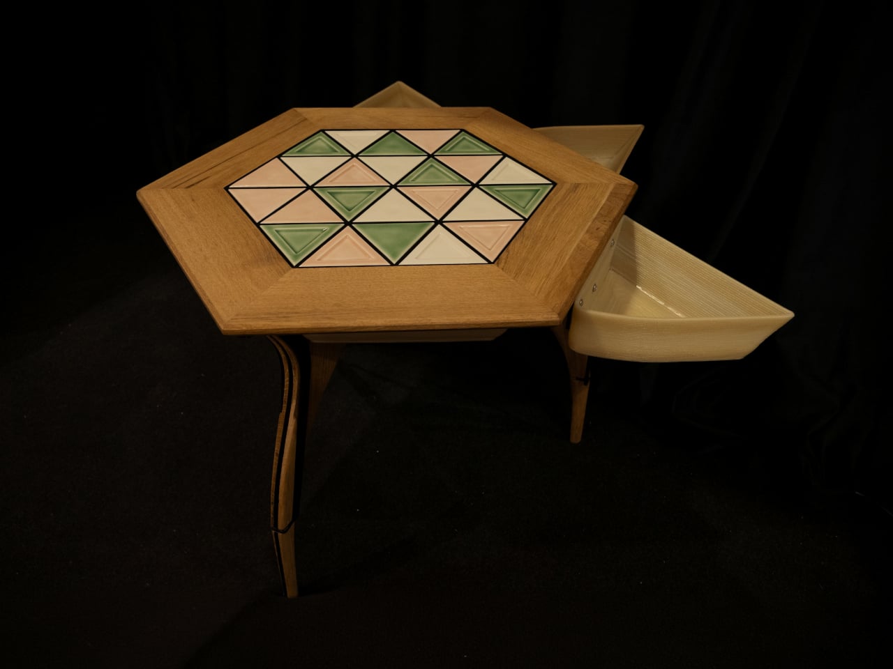
The top has a hexagonal outline, with a broad wooden border surrounding 24 triangular tiles. Those repeated shapes give every arrangement a common structure, even when the colors change completely. You could group similar shades together or scatter contrasting pieces across the surface, turning the same geometry into a quiet backdrop or something that competes with the coffee cups for your attention.

Designer: mkt

There’s more to the customization than picking a favorite color, of course. Ceramic and glass provide different material options, while the lines between the tiles can be black or white. Dark separators make the individual triangles more pronounced against pale pieces; lighter ones soften that contrast. Even before rearranging anything, changing those lines alters how strongly the mosaic announces itself in a room.

That flexibility becomes particularly appealing when the rest of the room changes. A new rug might make yesterday’s tabletop feel a little too busy, while a neutral sofa could leave space for a bolder composition. LUMVIA’s removable tiles are intended to accommodate those shifts, letting owners revise the pattern over time rather than treating the original selection as a permanent decorating commitment.

The geometry continues underneath, where triangular drawers offer somewhere to tuck away the small objects that tend to collect around a sofa. Their shape follows the mosaic above, rather than introducing a rectangular box below it. There’s a practical tradeoff here, though: an angular compartment won’t suit everything, even if it gives keys or other small belongings a place away from the tabletop.

Both the drawers and the grid supporting the tiles are 3D-printed, placing digital manufacturing beneath the more familiar wood, ceramic, and glass. The approach gives the repeated triangular forms a role in construction as well as decoration. A separate wood version uses interlocking wooden tiles, offering another way to build a pattern without introducing ceramic or glass into the surface.

Still, a surface that invites rearranging also needs to work when you’re setting down a hot drink. Some tiles have recessed triangular details, while others are plain, making the choice about texture as well as color. How those pieces sit together, stay in place, and handle everyday spills will matter just as much as the pleasure of choosing which triangle goes where next.

LUMVIA remains a customizable prototype rather than a mass-produced table, and its configurator includes a step for selecting extra tiles. Having spare pieces could let you test different combinations without replacing the whole set every time your tastes change. You’ll still need somewhere to keep all the triangles that aren’t on display, though. Even a coffee table makeover can leave you with leftovers.

The post LUMVIA Coffee Table Prototype Pairs a Customizable Mosaic With Hidden Drawers first appeared on Yanko Design.

  • ✇Yanko Design
  • Benks’ new Kevlar iPhone 18 Pro cases look like they’re ready for a holiday cruise
    Kevlar has spent most of its career in serious places, like bulletproof vests, racing tires, and the occasional helmet. Chemist Stephanie Kwolek invented it at DuPont in 1965, and I doubt anyone in that lab imagined a functional fabric like Kevlar would one day be asked to look classy. Today the fiber basically has a second life as a fashion fabric. I find that delightfully absurd, like learning your bodyguard also had a career as a swimsuit model. Benks has been leaning into that split persona
     

Benks’ new Kevlar iPhone 18 Pro cases look like they’re ready for a holiday cruise

19 octobre 2026 à 21:45

Kevlar has spent most of its career in serious places, like bulletproof vests, racing tires, and the occasional helmet. Chemist Stephanie Kwolek invented it at DuPont in 1965, and I doubt anyone in that lab imagined a functional fabric like Kevlar would one day be asked to look classy. Today the fiber basically has a second life as a fashion fabric. I find that delightfully absurd, like learning your bodyguard also had a career as a swimsuit model. Benks has been leaning into that split personality for a while, and its latest drop takes it somewhere sunnier.

Meet Haven Azure and Haven Rouge, two Kevlar cases for the iPhone 18 Pro and Pro Max, priced at $69.99 each. Benks weaves the pattern directly into the Kevlar fiber using a 600D floating jacquard technique, rather than printing it onto the surface. That means the design is part of the weave itself, not just a layer of color that can scuff off. Azure ripples in layered blues, Rouge glows in warm reds, and both wrap the phone in a slim, full coverage shell. Building on the ArmorAir, the Haven series features a taller raised metal camera frame for enhanced lens protection, along with an upgraded ArmorKey that fully covers the Camera Control button. The result is a slim, full-coverage case that offers more comprehensive protection without compromising its refined design. Same tough stuff, just dressed for vacation.

Designer: Benks

Click Here to Buy Now: $69.99 Haven Azure | Click Here to Buy Now: Haven Rouge.

An 1800s Loom Trick, Now Running on Kevlar

Jacquard weaving builds a design into the cloth by lifting individual threads in a programmed order, a trick Joseph-Marie Jacquard automated with punched cards in the early 1800s. Silk mills near Lake Como, Benks’ stated inspiration, have long used the technique for ties. Benks applies the same logic to Kevlar, letting some threads float over others so colors and shapes appear in the weave. The 600D figure is a denier rating, which tells you how thick the yarn is. According to Benks, strands finer and more densely woven than the common 1500D give a smoother surface and a slimmer case. A loom from 1804 would recognize the idea instantly.

Getting color into Kevlar takes effort, and most of us picture the fiber as black and nothing else. Benks says the Haven colorways are woven into the fiber structure, with no laminated surface layer to peel, so the texture you feel is the weave itself. The brand has been heading here for a while, from the Knight ArmorAir with its champagne horse that reads like pixel art made from industrial fiber, to these flowing ripples. Benks bills the 600D Kevlar jacquard as an industry first, and the product shots show why it wants the credit. Big diagonal sweeps also suit a phone better than tiny repeating logos ever could.

Azure Cools Things Down, Rouge Warms Them Up

Azure sets a deep navy base and runs a diagonal band of lighter blues down the back, a bit like sunlight breaking up on lake water. Benks describes the pattern as gentle ripples in layered blue tones. Look closely at the product shots and the lighter threads read like tiny stitched pixels, which gives the band a cross-stitch charm. Rouge flips the mood with a burgundy base and a pale gold band, and Benks calls the shade Rouge Valley Red, with woven contour lines meant to recall warm valleys at dusk. Honestly, Azure feels like a lake breeze and Rouge feels like a glass of wine.

Benks shows both cases on all four iPhone 18 Pro colors, which are Black, Glacier, Burgundy, and Silver. Rouge on Burgundy looks like the obvious match, since phone and case speak the same dark red language. Azure beside Glacier makes sense too, though the blues also look sharp against Silver and Black. Each colorway has a matching ArmorPop grip and stand at $29.99 for anyone who wants the full set. The Haven tagline is “somewhere between here and away,” which also describes my mental state every Friday afternoon. Pick the mood first, then let your phone color follow.

Metal Frame, Enclosed Keys, Built-In Magnets

The iPhone 18 Pro is the first iPhone with a physical variable aperture, so its camera plateau deserves a proper guard. Haven wraps it in a raised metal frame that Benks says helps shield the lenses from scratches and bumps. Raised screen edges keep the display off flat surfaces without adding bulk. Enclosed ArmorKeys cover the side buttons, camera button included, and Benks promises crisp, responsive clicks. Cutouts line up with the ports, and the Kevlar texture wraps around the edges for a slip-resistant grip. A built-in magnetic core handles MagSafe accessories, so your charger, wallet, and grip stay where you put them.

Haven Azure and Haven Rouge are listed at $69.99 each on Benks’ site, with versions for the iPhone 18 Pro and the Pro Max (they’ll fit the 17 Pro series too). The cases boast a one year warranty, free shipping on orders of $39 or more, and a 30 day return window. Matching ArmorPop grips sit on the same product pages if you want to coordinate. Protection and personality have usually sat on separate shopping lists for phone cases, and weaving color straight into Kevlar is a neat way to merge them. Kevlar went from body armor to brunch, and I suspect it has a few more lives left.

Click Here to Buy Now: $69.99 Haven Azure | Click Here to Buy Now: Haven Rouge.

The post Benks’ new Kevlar iPhone 18 Pro cases look like they’re ready for a holiday cruise first appeared on Yanko Design.

  • ✇Yanko Design
  • Nothing’s Ear (open) should have been a CMF product all along… Here’s proof
    I’ll say it: Nothing launched the Ear (open) under the wrong logo. The open-ear buds debuted in 2024 at $149, wrapped in Nothing’s signature transparent look, and they were good enough to win a Red Dot Product Design award. Still, every time I looked at them, my brain kept whispering “CMF.” Open-ear buds are the casual, colorful, sweat-friendly second pair you toss in a gym bag, which describes CMF’s entire personality. Even Nothing seems to have noticed, since the Ear (open) now comes in soft
     

Nothing’s Ear (open) should have been a CMF product all along… Here’s proof

19 octobre 2026 à 20:30

I’ll say it: Nothing launched the Ear (open) under the wrong logo. The open-ear buds debuted in 2024 at $149, wrapped in Nothing’s signature transparent look, and they were good enough to win a Red Dot Product Design award. Still, every time I looked at them, my brain kept whispering “CMF.” Open-ear buds are the casual, colorful, sweat-friendly second pair you toss in a gym bag, which describes CMF’s entire personality. Even Nothing seems to have noticed, since the Ear (open) now comes in soft blue for $99 in the US. That’s CMF money in a CMF color, wearing a Nothing name tag.

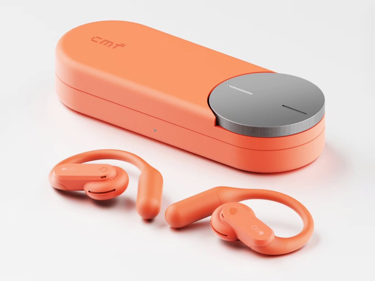
Apparently I’m not alone in this conspiracy theory. Industrial designer Shreyansh Onial, whose CMF Flip foldable concept got a reaction from Carl Pei himself, built the CMF Ear (open) that Nothing never released, and it looks like it rolled straight off CMF’s assembly line. The over-ear hook stays, but the transparent panels give way to solid Coral, Light Grey, and Dark Grey. Each bud gets a chunky physical button, and the pill-shaped case borrows the knurled Smart Dial from CMF’s $99 Clip Pro. It’s the alternate-universe launch I didn’t know I was waiting for.

Designer: Shreyansh Onial

Trading Nothing’s see-through shell for CMF’s candy-colored hooks

Coral, Light Grey, and Dark Grey carry the whole concept, and they match the Clip Pro’s palette exactly. Transparency is Nothing’s calling card, though on the Ear (open) much of the surface is a silicone ear hook anyway. Onial goes fully opaque, with a soft matte finish on the hook and a glossier coat on the round acoustic pod that sits by your ear canal. The outer face is a rounded pill panel with a single round button and a tiny glyph made of a circle, a dot grid, and a filled dot. The battery tail picks up a fine stippled texture, which gives sweaty fingers something to grip.

A real button on each bud fixes the biggest workout annoyance with the Ear (open), which relies on pinch controls that get fiddly with slippery fingers. CMF already gave the Clip Pro physical buttons for exactly this reason, so the move fits the brand’s own playbook. Flip the bud around and you’ll find a perforated metal grille shaped like a little kidney bean, plus two pogo pins on a short collar for charging. That bean grille is my favorite detail, because it gives the bud an oddly cartoonish face. It also mirrors the soft circles of the dial on the case. The whole thing feels friendly and approachable, which suits a pair built for sweat and sidewalks.

The Clip Pro’s Smart Dial case meets a hook built for runners

The case comes straight from CMF’s Clip Pro, a deep pill-shaped capsule with a knurled metal dial set into one end of the lid. On the Clip Pro, that Smart Dial adjusts volume, controls playback, answers calls, and triggers pairing. CMF put the same dial on its Buds Pro 2, and it has since become the brand’s signature move. Onial adds a dot-matrix “cmf” wordmark on the lid, a front status LED, and a USB-C port on the side. Inside, molded cradles hold the two hooks in a neat V, with a charging pocket waiting for each acoustic pod.

Over-ear hooks anchor behind the ear, which keeps them planted through runs, burpees, and sprints for the bus. The Clip Pro’s C-shaped clip hugs the ear’s outer edge instead, a format better suited to commutes and long desk days. That leaves the runner with a CMF-shaped hole in their gym bag, since CMF currently offers nothing for them (lowercase n). A dial makes even more sense here, because twisting a knob on the case beats digging through phone menus mid-stretch. Pair it with real buttons on the buds and you get a workout setup that never asks for a precise touch gesture.

Where a CMF Ear (open) would land in a crowded open-ear market

Open-ear audio got crowded fast, with Bose’s Ultra Open sitting at the top for $299 and Sony’s LinkBuds Clip, Huawei’s FreeClip, and Shokz’s hook-style buds filling out the field. The Clip Pro landed at $99 with LDAC support, a 10.8mm driver, and up to 32.5 hours of total battery. The Ear (open) counters with a bigger 14.2mm driver, 8 hours per charge, and 30 hours with its case. Each Ear (open) bud weighs 0.29 oz (8.1 grams), while each Clip Pro bud weighs 0.21 oz (5.9 grams). A CMF hook could split the difference, pairing the Ear (open)’s stable fit and big driver with the Clip Pro’s dial, buttons, and price.

The blue Ear (open) already sells for $99 in the US, the same price as the Clip Pro, so Nothing has basically priced its own product at CMF level. Moving it under the CMF badge would make that price tag look like a plan instead of a markdown. It would also free Nothing to return later with a pricier transparent sequel, flipping the usual order where the premium brand gets the good stuff first. CMF became an independent Nothing subsidiary headquartered in India last year, and a signature sport bud would give the young brand another reason to stand apart from its parent. Onial’s renders already look ready for the shelf. Sometimes the little sibling deserves the new toy first.

The post Nothing’s Ear (open) should have been a CMF product all along… Here’s proof first appeared on Yanko Design.

  • ✇Yanko Design
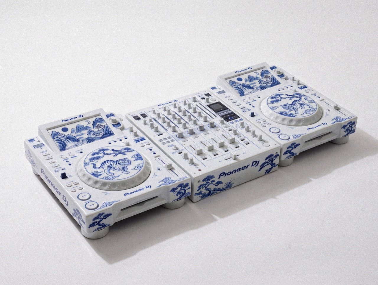
  • This porcelain Pioneer DJ setup belongs in a museum, not an Ibiza nightclub
    David Guetta just won DJ Mag’s Top 100 DJs poll for a record sixth time, and I have a very specific idea for his trophy shelf. Somebody on the internet has turned a Pioneer DJ setup into Korean blue-and-white porcelain, tigers and all. Two decks and a four-channel mixer, glazed bone white and hand-painted (well, AI-painted) in cobalt blue. It looks like something you’d find behind glass at the Met, right before a security guard asks you to step back. It’s also the most Guetta-coded object I’ve
     

This porcelain Pioneer DJ setup belongs in a museum, not an Ibiza nightclub

19 octobre 2026 à 15:20

David Guetta just won DJ Mag’s Top 100 DJs poll for a record sixth time, and I have a very specific idea for his trophy shelf. Somebody on the internet has turned a Pioneer DJ setup into Korean blue-and-white porcelain, tigers and all. Two decks and a four-channel mixer, glazed bone white and hand-painted (well, AI-painted) in cobalt blue. It looks like something you’d find behind glass at the Met, right before a security guard asks you to step back. It’s also the most Guetta-coded object I’ve seen all year, because a guy who headlines weekly Ibiza residencies deserves a rig that looks as expensive as the bottle service.

The setup comes from creators patchkims and takitani.lab, who posted it as the “Joseon Baekja Prototype,” complete with a “1 of 1, no restock” caption that reads like a sneaker drop. It’s an AI render, so nobody’s shipping it to Guetta’s villa anytime soon. The idea still lands, though. Each jog wheel carries a tiger and a magpie under a pine tree, lifted straight from Korean folk painting, and the screens swap waveforms for misty mountains and waterfalls. Suddenly your DJ gear graduates from booth equipment to living room centerpiece, which is a fun flex for anyone, let alone the world’s No. 1 DJ.

Designers: patchkims & takitani.lab

Kkachi horangi is a genre of Korean folk painting where a deliberately goofy tiger, nicknamed the idiot tiger, plays the aristocratic yangban, and a smug magpie in a pine tree speaks for the common people. Both jog wheels here carry that exact scene, with the cat prowling below and the bird looking unbothered above. The two decks get different tiger poses, so the platters work like a call and response. Joseon painters used the setup to poke fun at the ruling class, and now it sits under the palms of whoever runs the dance floor. That is either delicious irony or very on-brand for a king of the booth.

The screens trade waveforms for misty peaks, a waterfall, a pavilion, and a pair of moons, echoing Irworobongdo, the sun, moon and five peaks painting that stood behind the king’s throne in Joseon palaces. The sun and moon stood for the king and queen, so the painting doubled as a majesty backdrop. A headliner on a raised stage occupies similar real estate, so the throne comparison writes itself. The original sun burned red, and going cobalt turns it into a second moon, which suits a room that wakes up after midnight. Calling a DJ booth a throne room is a stretch, but watch a stadium crowd hang on a Guetta build-up and the royalty comparison stops feeling silly.

Joseon Korea made white its signature after the green celadon era of Goryeo, and cobalt-painted porcelain sat at the top of the pile. The pigment was rare and imported from China, so when supply dried up, court kilns improvised with iron-brown, and some banquet wares wore painted imitations of blue-and-white called gahwa, literally fake painting. A porcelain Pioneer rig conjured by AI is a 2026 gahwa, a convincing stand-in for an object nobody has actually fired in a kiln. I’m weirdly fine with that, because the Joseon court got there first. Meanwhile, Christie’s has estimated a genuine 15th-century cobalt jar at roughly $2 million to $3 million, so the real thing sets the bar high.

The real-world version of this lineup runs two AlphaTheta CDJ-3000X players at $2,999 each plus a Pioneer DJ DJM-A9 mixer at $2,899, roughly $8,900 in the US. The render looks closer to the older CDJ-2000NXS2 generation, disc slots and all. Pioneer did sell a limited white CDJ-2000NXS2-W run in 2017, so colorway flexes are old news for the brand. I imagine if such a product were to exist, it would probably cost in the hundreds of thousands. That being said, I’m sure an enthusiastic deejay with money to throw could acquire this for their den. Guetta, SHM, heck even Shaq… I’m looking at y’all.

The post This porcelain Pioneer DJ setup belongs in a museum, not an Ibiza nightclub first appeared on Yanko Design.

  • ✇Yanko Design
  • Porsche Mission S ditches the center screen for a driver-focused supercar cockpit
    Porsche has unveiled the Mission S, a vision model that previews its evolving design language and introduces plans for a new mid-engine super sports car positioned above the 911. The German automaker describes the performance machine as the foundation for a permanent addition to its lineup, combining motorsport influences with a more focused approach to driving. Revealed in Queens, New York, the Mission S also draws attention to Porsche’s history. The location recalls the 1953 appearance of the
     

Porsche Mission S ditches the center screen for a driver-focused supercar cockpit

19 octobre 2026 à 11:20

Porsche has unveiled the Mission S, a vision model that previews its evolving design language and introduces plans for a new mid-engine super sports car positioned above the 911. The German automaker describes the performance machine as the foundation for a permanent addition to its lineup, combining motorsport influences with a more focused approach to driving.

Revealed in Queens, New York, the Mission S also draws attention to Porsche’s history. The location recalls the 1953 appearance of the 550 Spyder on the same pier, a car that helped establish the company’s reputation in the United States. The new concept carries that legacy forward through proportions and details inspired by several of the marque’s historic sports cars.

Designer: Porsche

Its exterior centres on a low nose, rounded headlights and pronounced front fenders that recall the 911. The flat front end takes inspiration from the 911 GT1, while the roofline extending beneath the rear wing references the 959. At the back, a design treatment derived from the GT1 creates a layered, car-within-a-car effect. These references are integrated into a contemporary form rather than reproduced as retro styling.

A continuous line connects the front and rear light signatures, visually tying the body together. Above it, the sculpted surfaces emphasise the car’s muscular proportions; below, exposed technical elements reinforce its functional character. The centrally positioned engine makes the familiar Porsche roofline possible, while a cooling arrangement inspired by the 917’s radiator fan and an integrated active rear wing bring engineering details into the visual design. The wheels reinterpret the distinctive dial-like pattern of the 928, with an emphasis on lightweight construction.

On the inside, Porsche takes a less screen-dependent approach to the driving experience. The cabin draws on the 550 Spyder and 356, using flowing lines across the dashboard and doors to create a low, enclosed cockpit. Traditional switches and physical controls sit alongside digital displays, with the layout arranged around the driver. White, grey and red accents reference the brand’s racing colours.

The instrument cluster is a central feature. Five round instruments sit behind the steering wheel, with an analogue rev counter at the centre and a digital display behind it. Their arrangement can change with the selected driving mode, adapting the presentation to the driver’s needs. A redesigned Sport Chrono element combines analogue styling with digital functions, while push-pull controls provide direct access to selected vehicle settings.

Porsche has also left out a permanently installed central touchscreen and passenger display. Instead, a retractable smartphone holder compatible with MagSafe allows a personal device to serve as a navigation or information screen when needed. The My Porsche app provides access to vehicle functions and offers historically inspired designs for the digital instrument displays.

For now, Mission S remains a vision model, not a production car with confirmed performance figures or a launch date. Porsche has, however, announced development of a new mid-engine super sports car platform. Its eventual production models will show how much of this concept’s design and driver-focused philosophy makes it to the road.

The post Porsche Mission S ditches the center screen for a driver-focused supercar cockpit first appeared on Yanko Design.

❌