Vue normale

Il y a de nouveaux articles disponibles, cliquez pour rafraîchir la page.
À partir d’avant-hierFlux principal

The Hermès Birkin Finally Has a LEGO Version and It Opens to Reveal A Secret Runway Inside

Par : Sarang Sheth
8 mai 2026 à 19:15

The Hermès Birkin has one of the most theatrical purchasing rituals in luxury retail. You cannot simply walk into a boutique on Rue du Faubourg Saint-Honoré and buy one. Hermès makes you earn it, building a relationship with a sales associate over months, sometimes years, demonstrating cultural fluency with the house before they’ll even have the conversation. The result is an object that carries as much mythology as it does resale value, a handbag that has become shorthand for a particular kind of aspirational excess that the internet finds endlessly fascinating.

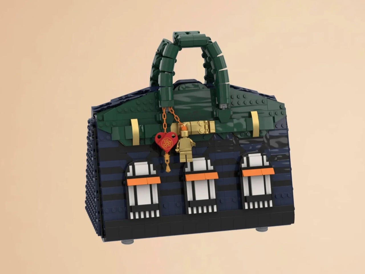
LEGO Ideas builders BOI_Design and KittyJW found a rather elegant workaround. Their MOC (My Own Creation) reimagines the Birkin 20 Faubourg, the special edition inspired by Hermès’s flagship Paris store, as approximately 1,400 bricks of deep navy, dark green, and gold. The exterior facade doubles as a miniature rendering of 24 Rue du Faubourg Saint-Honoré itself, complete with arched boutique windows and orange awnings. And it opens.

Designers: BOI_Design and KittyJW

The silhouette is immediately recognizable to anyone who has spent time in the vicinity of luxury retail, or, more realistically, scrolled past one on Instagram. The trapezoidal body is rendered in deep navy blue tiles, layered with a subtle horizontal banding that gives the surface genuine texture and depth. The handles arc overhead in dark green, assembled from linked Technic-adjacent elements that convincingly mimic the soft curve of the real bag’s leather grip. Gold hardware details sit at the clasp, at the side buckles, and along the turnlock assembly, and a tiny linked orange chain drops a red heart charm and a gold minifigure pendant in a detail that reads as both playful and surprisingly precise. Flip the bag around and the back panel is clean and quiet, just navy tiles and a gold Hermès tile sitting on a dark strap, which is exactly how the real thing looks.

The front face depicts three arched windows dressed with crisp white frames and orange awnings are spaced across the lower body, referencing the Haussmannian rhythm of the actual boutique facade at Faubourg Saint-Honoré. It takes a second to fully resolve in your eye, this thing that is simultaneously a handbag and a building, and that slight double-take is very much the point. The builders describe it as merging fashion and architecture into a single object, and looking at it straight on, that framing holds up completely.

My favorite detail, however, is what happens when you open it. The lid swings up to reveal a hidden interior scene that commits fully to the bit. Three pink minifigures, each carrying a tiny handbag, are posed on oversized primary-color bricks in red, yellow, and blue, the kind of bold, joyful color blocking that feels distinctly LEGO while also evoking a fashion week runway setup. Nestled alongside them is a miniature Birkin 20 Faubourg bag rendered at a smaller scale, a self-referential easter egg that will land immediately with anyone paying attention. The interior lining is lined in cream and tan tiles, a genuinely considered touch that mirrors how a real Birkin’s suede interior contrasts against its exterior leather. At 28.5 centimeters wide and 29 centimeters tall, the whole thing has real physical presence on a shelf.

The build is currently gathering votes on LEGO Ideas, the community platform where fan submissions need to reach 10,000 supporters before LEGO’s internal team will formally review them for potential production. It’s early days for this one, but the concept has the kind of crossover appeal, fashion collectors, LEGO enthusiasts, Paris romantics, people who just want the Birkin experience without the two-year waitlist, that could carry it a long way. You can head to the LEGO Ideas page here to cast your vote.

The post The Hermès Birkin Finally Has a LEGO Version and It Opens to Reveal A Secret Runway Inside first appeared on Yanko Design.

LEGO and Crocs Finally Made the $89 Collab Nobody Knew They Needed

Par : Ida Torres
1 avril 2026 à 14:20

No matter how you feel about Crocs, you cannot deny the brand has a remarkable talent for finding partners that make you stop and say, “wait, actually… that works.” We’ve seen Krispy Kreme clogs dripping in donut-glazed energy, Windows XP nostalgia packed into a wearable throwback, and Ghostbusters uniforms distilled down to clog form. Every time I think Crocs has peaked its collab game, another partnership resets the bar. This time, they’ve linked up with LEGO for the Creativity Clogs collection, and this one lands a little differently.

The appeal is almost embarrassingly obvious in hindsight. Both LEGO and Crocs are built around the same core philosophy: take something simple, make it endlessly customizable, and let people go wild with it. LEGO gave us the stud system; Crocs gave us Jibbitz holes. Jibbitz charms are basically a wearable LEGO build. The two brands have been spiritually aligned for decades without anyone thinking to actually put them together, and the fact that it took this long feels like a design oversight that’s now been corrected.

Designers: LEGO x Crocs

The collection spans several configurations. The base Creativity Clog starts at $79.99, keeping things relatively clean with colorful LEGO bricks along the sole and a Jibbitz-ready upper waiting to be personalized. There is also a Kids’ Creativity Clog at $59.99, because LEGO is a multigenerational brand whether anyone admits it or not.

The Masterbrand Creativity Clog at $89.99 is the one that goes all in. It arrives with 12 LEGO brick Jibbitz charms already loaded onto the upper and around the sole, plus a LEGO Minifigure tucked into the box. That detail genuinely made me smile. It is the kind of considered touch that separates a real collaboration from a brand simply slapping a logo on an existing product.

The Midnight Garden Creativity Clog takes the same design language in a different direction. Where the other colorways lean into LEGO’s signature primary palette, this version opts for a darker, more subdued aesthetic that feels almost grown-up by comparison. It is the right pick for someone who wants to quietly signal their appreciation for the collab without committing to the full crayon-box energy of the others.

Visually, these clogs strike a balance I did not expect. The brick texture runs along the sole without overtaking the whole shoe, so you are not walking around in something that looks like a toy store exploded on your feet. It is restrained enough to wear in public while still being obviously, joyfully LEGO. The Jibbitz-ready holes mean you can keep building on top of the base, swapping in dedicated LEGO charm packs depending on your mood. That is exactly the kind of open-ended customization that makes both brands tick.

The LEGO Group and Crocs announced their multi-year global partnership in January 2026, and the Creativity Clogs dropped on March 19, with LEGO Insiders getting a three-day head start. Certain sizes sold out quickly, which tells you all you need to know about the appetite for this one.

My honest read is that this collaboration is smarter than its predecessor. The original LEGO Brick Clogs were built for viral moments and display shelves. Giant foam bricks make a statement, but they do not go anywhere useful. The Creativity Clogs are the real follow-through, translating LEGO as a design language into something you would actually wear to a theme park, a farmers market, or around the house on a slow Tuesday. The playfulness is baked in without demanding you commit to a costume to participate.

That said, $89.99 for a pair of Crocs is a price point worth sitting with, even if the included Minifigure does technically sweeten the deal. Crocs collabs have always commanded a premium over the core classics, and by now the brand’s audience is accustomed to paying for the concept as much as the shoe itself. Whether the LEGO x Crocs Creativity Clog earns its place in your rotation will probably depend on how much real estate your inner kid still occupies. For a lot of people, that answer is quite a bit of space.

The post LEGO and Crocs Finally Made the $89 Collab Nobody Knew They Needed first appeared on Yanko Design.

Rimowa Classic Aluminium Grid Revives a Forgotten 1969 Design

Par : Ida Torres
25 mars 2026 à 17:20

Most luggage brands don’t have a 127-year-old story to draw from. Rimowa does, and it seems to know exactly when it’s worth pulling from that history and when to let the present speak for itself. With the Classic Aluminium Grid, they’ve clearly decided the archive deserves a second act.

The Classic Aluminium Grid is the German brand’s latest limited-edition release, and it’s generating the kind of quiet excitement that reserved design circles usually save for restored mid-century furniture or a first-edition book that resurfaces at auction. The reason is simple: Rimowa didn’t just design something new. They reached back to 1969, pulled out a hand-carry case design that had been sitting in their archives, and asked what it would look like today if it were treated with the same reverence they give to the grooves.

Designer: Rimowa

That grooved shell, by the way, is practically synonymous with the brand itself. You know a Rimowa from across an airport terminal. Those parallel ridges running down the aluminium surface are one of the most recognizable design signatures in travel goods, and they’ve been that way for decades. So when the brand quietly steps away from them and replaces the lines with a grid, a structured, geometric, embossed pattern pressed right into the aluminium shell, it feels like a real statement. It’s not a gimmick. It’s a choice that speaks to a different kind of confidence.

The grid comes from a real place. In 1969, Rimowa was producing hand-carry cases featuring this geometric pattern: practical, modular, and rooted in the kind of technical precision that defined that era’s design thinking. There’s a reason so much design from that decade still holds up. It wasn’t chasing aesthetics for their own sake. Form followed function, and it did so elegantly. Reviving that spirit in 2026 doesn’t read as nostalgia pandering. It reads as a brand that knows exactly where its DNA lives and isn’t afraid to dig for it.

The collection comes in three sizes: the Classic Hand-Carry Case, the Classic Cabin, and the Classic Trunk. All three are made in Cologne, Germany, which matters more than it might seem. Manufacturing location is one of those details that’s easy to gloss over until you’re actually holding the product, and with Rimowa, the German-made quality is part of the whole point. The embossed grid pattern, the blue leather handles, the individually numbered serial number patch on each case: these aren’t details you’d notice in a thumbnail. They’re details you notice after living with the piece and realising it only gets better over time.

And yes, price matters here. The Classic Aluminium Grid sits in the $2,725 to $3,225 range, which puts it firmly in the territory of deliberate, considered purchasing. That’s not casual spending, and it shouldn’t be. This is the kind of purchase that functions as an heirloom more than a travel accessory, something you keep, care for, and eventually pass along. The lifetime guarantee Rimowa extends to all its suitcases reinforces that framing. They’re not selling you a bag built for a few trips. They’re selling you something built to outlast most things currently in your home.

What makes this collection feel genuinely compelling rather than just another limited drop is the restraint behind it. Rimowa didn’t add bright colour for the sake of attention. They didn’t partner with a streetwear brand or commission someone’s artwork across the shell. They went to their own archive, found something worth preserving, and let the design carry the weight. The grid is subtle enough that it won’t read as flashy at baggage claim, but anyone paying close attention will recognise it as something different. Something that doesn’t quite look like everything else on the carousel.

That’s a hard balance to strike in design. Loud enough to be interesting, quiet enough to be enduring. The Classic Aluminium Grid lands squarely in that space, and for a brand with over a century of aluminium behind it, that feels less like luck and more like a brand that knows exactly what it’s doing.

The post Rimowa Classic Aluminium Grid Revives a Forgotten 1969 Design first appeared on Yanko Design.

KFC’s Pickle Puffer Is Fashion’s Weirdest Power Move

Par : Ida Torres
25 mars 2026 à 08:45

At some point, the line between fashion and performance art quietly dissolved, and I think we need to have a serious conversation about who’s holding the needle. Because KFC just debuted a puffer jacket filled with real sliced gherkins and acid-green brine, and it is fully, sincerely, unapologetically real.

The Pickle Puffer is exactly what it sounds like. A clear plastic puffer jacket, entirely see-through, packed with floating slices of pickled cucumber and brine so vividly green it almost looks radioactive. The insulation is gone, replaced with hundreds of actual pickles that shift and float with every movement.

Designer: KFC

Picture a standard puffer silhouette, the kind you’d wear on a cold commute, except every quilted chamber is sealed, transparent, and filled with floating pickle slices suspended in green liquid. The jacket moves the way a lava lamp moves. Tilt left and the gherkins drift. A hydration hose runs along the chest like something from a trail runner’s kit, except it feeds into a reservoir of pickle juice. The zipper pull is shaped like a pickle. The whole thing is lurid and weirdly beautiful in the way that only objects with absolutely no interest in being subtle can be.

I genuinely don’t know whether to call this genius or absurdist theatre, and I’m starting to think the distinction doesn’t matter anymore. What makes the Pickle Puffer particularly fascinating is its origin story. It didn’t start in a brand meeting or a creative studio. It started with an AI-generated video on TikTok of a man handing out gherkin slices from a pickle-filled puffer jacket. The video had barely a hundred likes. A hundred. And yet something about it triggered that very specific brand instinct that says: we should make this real.

The fact that KFC actually followed through says a lot about where we are right now. We’ve officially entered an era where a low-engagement AI fantasy can become a physical product, and the feedback loop between online imagination and real-world manufacturing has compressed to almost nothing. KFC UK brand manager James Channon was refreshingly candid, calling it “a bit unhinged, but that’s the point.”

And it is unhinged. But it’s also timed to perfection. The jacket dropped alongside KFC’s new Pickle Mania Menu in the UK, which includes Pickle Loaded Fries and a Pickle Pepsi, riding the wave of a full-blown cultural obsession. The #pickles hashtag on TikTok has racked up billions of views, and apparently the correct brand response is to wear that moment on your body, literally soaked in brine.

Now, this is a one-off. You can’t buy it. You have to win it through an Instagram giveaway, which is its own kind of genius because the scarcity makes it collectible and the competition makes it content. KFC isn’t really selling a jacket. They’re selling a news story, a talking point, and a social media moment that will keep circulating long after the pickles start to turn. That’s the actual product here.

It also puts the Pickle Puffer in the company of a growing category of fashion-as-marketing stunts increasingly committed to the bit. Aldi’s Jacket Potato Jacket came before it. Lidl has played in this space too. There’s a whole lane developing for grocery and fast-food brands to use absurdist outerwear as their loudest advertising medium, and it’s clearly working. I’m writing about a pickle jacket right now, so there’s your proof.

What I keep coming back to is how genuinely well it’s designed for what it’s supposed to do. The translucency is intentional. The floating pickles are the visual. The hydration hose is the punchline that also happens to be functional. Every element is deliberate and considered, even if the whole thing is engineered to make you laugh first and think second. Plenty of brands try for weird and land on confusing. KFC landed on weird and made it covetable. Fashion has always been partly spectacle. The Pickle Puffer just has better snacks.

The post KFC’s Pickle Puffer Is Fashion’s Weirdest Power Move first appeared on Yanko Design.

❌
❌