Bigme HiBreak Dual Has E Ink Up Front and a Round LCD in Back
Staring at a phone screen for hours isn’t kind to your eyes, and more people are finally taking that seriously. The backlit displays on most modern smartphones are tuned for vivid color and fast scrolling, but sustained use can lead to real fatigue. That growing awareness has pushed E Ink displays into smartphone territory, where their paper-like readability makes a lot of practical sense.
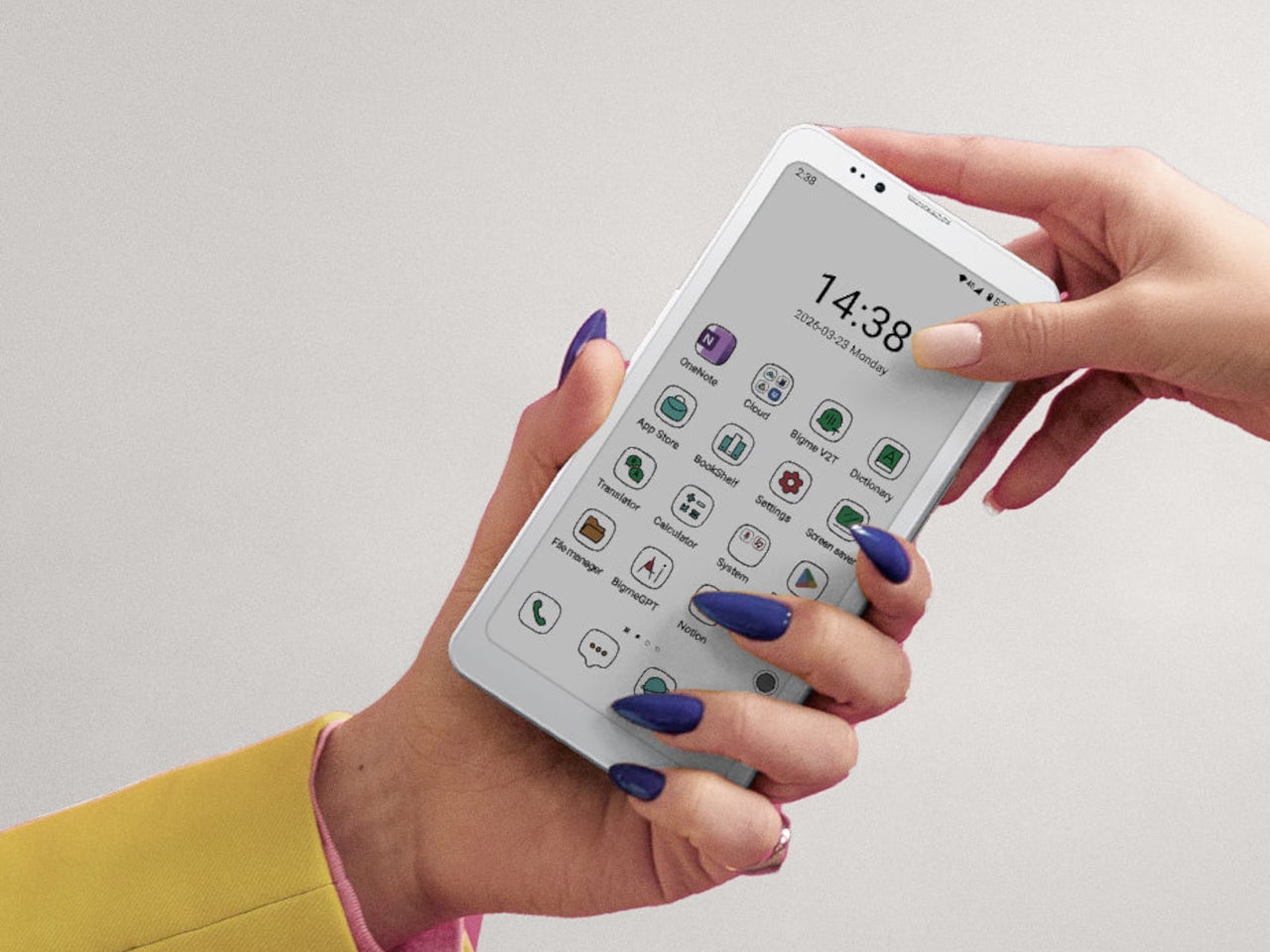
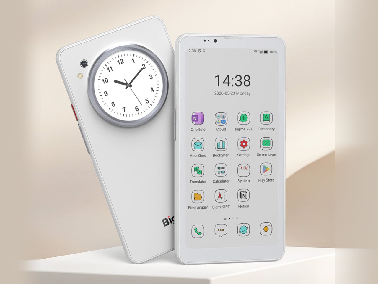
Bigme has been building its HiBreak series into a line of Android smartphones centered on E Ink displays, and the HiBreak Dual is its newest entry. Rather than simply updating the screen, Bigme gave this model two displays: a full-sized E Ink panel on the front and a compact circular LCD on the back, letting the phone handle information at two different levels of urgency.
Designer: Bigme
![]()
![]()
The main display is a 6.13-inch E Ink screen at 824 by 1,648 pixels, delivering 300 pixels per inch in greyscale mode. The color model supports up to 4,096 colors, and a frontlight with 36 brightness levels covers both dim interiors and bright outdoor settings. Because E Ink reflects ambient light rather than emitting it, reading outdoors is comfortable in a way that backlit displays simply aren’t.
![]()
What sets the HiBreak Dual apart from the rest of the lineup is its stylus support, a first for the HiBreak series. A 4,096-level pressure-sensitive pen lets you write, sketch, and annotate directly on the E Ink surface, turning the phone into something closer to a digital notebook. The paper-like texture of the display makes the experience feel more tactile and far less clinical than a standard touchscreen.
![]()
![]()
The circular LCD on the back measures 1.85 inches and pulls off a surprisingly wide range of tasks. It shows the time, notifications, music controls, and weather at a glance, and also doubles as a viewfinder for the 20MP main camera. Bigme even added an AI pet feature that generates an animated version of your actual pet from a photo, keeping it alive on that small round screen.
![]()
Despite the unconventional display setup, the HiBreak Dual doesn’t skimp on the fundamentals. Although dated, Android 14 with full GMS certification keeps the entire Google Play library accessible, and NFC support means Google Wallet and contactless payments work just as they would on any standard Android device. The 5MP front camera handles video calls and everyday selfies without issue, while a fingerprint sensor takes care of security.
![]()
Under the hood, the phone runs on a MediaTek Dimensity 1080 processor paired with either 8GB or 12GB of RAM and up to 256GB of internal storage, further expandable by an additional 2TB via microSD. A 4,500mAh battery gets through a full day without much drama, while 5G on dual SIM cards, Bluetooth 5.2, and dual-band WiFi take care of the rest.
Pricing starts at $519 for the 8GB/128GB model, with early bird options in the $359 to $409 range and a 12GB/256GB version also available. It’s a phone designed for people who spend a significant part of their day reading, writing, and staying on top of things through a mobile device, and who’d genuinely rather do it on a screen that asks a little less of their eyes.
![]()
The post Bigme HiBreak Dual Has E Ink Up Front and a Round LCD in Back first appeared on Yanko Design.