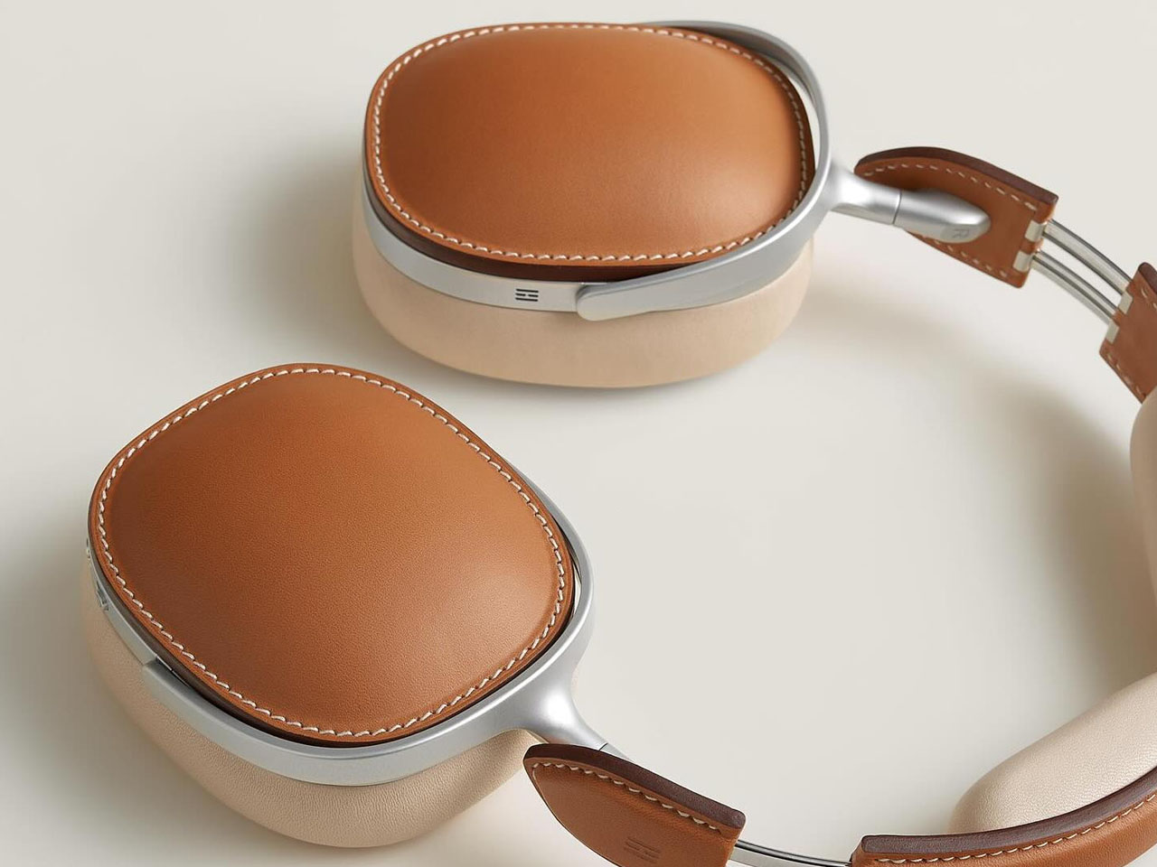
Hermès, the iconic French luxury house known for its craftsmanship and timeless design, has stepped into the premium audio space with the unveiling of its Ateliers Horizons headphones. Priced at $15,000, this offering merges high-fidelity listening with haute couture, delivering a product that targets connoisseurs who value exclusivity as much as sound.
This move differentiates Hermès from traditional audio brands such as Bose, Sony, Sennheiser, and Apple. Rather than competing on technical specifications alone, Hermès positions its headphones as wearable art – designed not just to perform, but to signal status and taste. To signal status and taste, underscored by their mind-numbing $15,000 price tag, these bespoke headphones are not within the reach of most of us. The headphones are expected to arrive in select Hermès boutiques by summer 2025
Designer: Hermes
According to Axel de Beaufort, creative director of Ateliers Horizons since 2012, “The idea is not to be able to replicate that 10,000 times as a big headset supplier would do. The idea is to have the few that we will do made perfectly, and that has been a very long learning process. It’s about really super high-end craftsmanship.”
Luxury Craftsmanship as a Core Feature
What sets the Ateliers Horizons headphones apart is the artisanal quality of their construction. Handcrafted over two years by nearly 50 artisans in France, each pair features premium materials like Hermès’ signature saddle-stitched leather and polished metal hardware. The design draws directly from the brand’s famed Kelly bag, with five distinctive colorways available, including Rouge H and Prussian Blue.
This level of craftsmanship is absent in mainstream headphones such as the Bose QuietComfort Ultra or Sony WH-1000XM6, which are designed for mass production. While these models offer excellent active noise cancellation and adaptive sound technologies, they lack the tactile richness and bespoke quality that defines Hermès products. For those seeking a headphone that reflects personal style and heritage craftsmanship, Hermès offers something no tech brand currently does.
Even Apple’s AirPods Max, arguably the closest in terms of design appeal, rely heavily on industrial processes. They are sleek, feature-rich, and integrate tightly into Apple’s ecosystem—but they’re not handcrafted. Hermès, on the other hand, delivers a product where no two units are entirely alike, tailored to the luxury buyer’s sensibilities.
Radical Philosophy in Audio Design
While Hermès hasn’t disclosed extensive technical specifications, the headphones are expected to deliver high-end audio performance consistent with their premium positioning. The open grille design suggests the use of planar magnetic drivers, often favored by audiophiles for their clarity and precision. However, the real differentiator is not technology but philosophy: Hermès is crafting a unique sound signature described as “Hermès sound,” developed in-house rather than licensed from existing platforms.
Unlike competitors that emphasize software-driven sound adjustments, Hermès focuses on authenticity in both build and audio. The headphones eschew touch controls in favor of physical buttons – offering tactile satisfaction and durability. Both wired and Bluetooth connectivity options are available, ensuring versatility while maintaining a minimalist design ethos.
This contrasts with feature-rich models like the Sennheiser MOMENTUM 4 Wireless, which touts customizable EQ settings, multi-device support, and extended battery life. Similarly, premium offerings from Bowers & Wilkins, such as the Px8, emphasize acoustic engineering, app-based sound personalization, and cutting-edge wireless performance. Hermès chooses not to compete on those terms, instead aiming for timelessness over upgradability – prioritizing craftsmanship and aesthetic permanence over iterative tech enhancements.
For fat-pocketed audiophiles who are also collectors, the Ateliers Horizons headphones represent a new category: audio as a luxury object. Hermès isn’t trying to replace the go-to travel or studio headphones. Rather, it’s offering an accessory that hones a refined listening experience that sits outside the typical framework of consumer electronics!
The post Hermès Ateliers Horizons Headphones launch with an eye-watering $15,000 price tag first appeared on Yanko Design.