Vue normale

Il y a de nouveaux articles disponibles, cliquez pour rafraîchir la page.
À partir d’avant-hierTechs Design

The World’s First Portable Espresso Maker with its own Water Heater lets you Brew Coffee literally anywhere

Par : Sarang Sheth
25 avril 2024 à 22:30

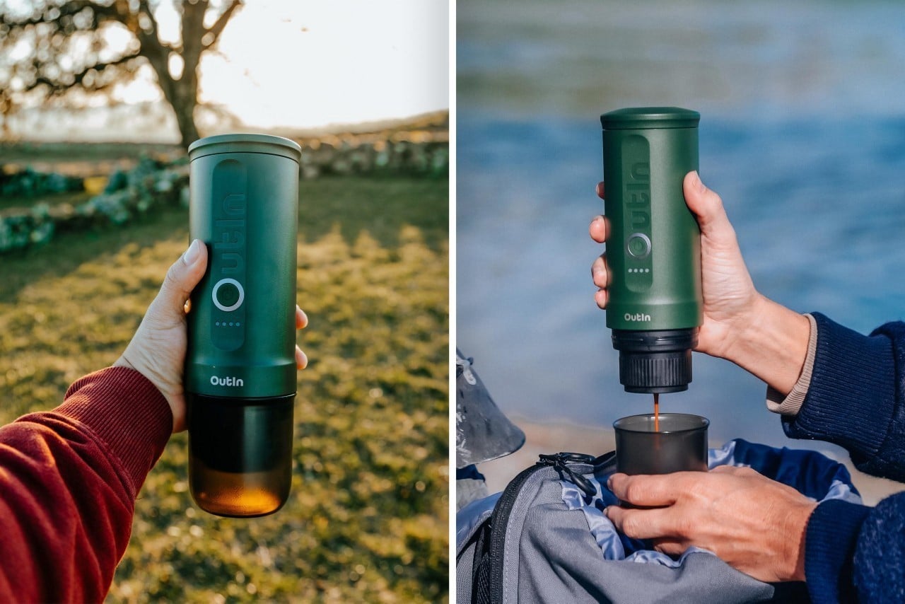
Dubbed the OutIn Nano, this little flask-shaped beauty is your key to a golden cup of coffee literally anywhere. Use it indoors, outdoors, or even in the sky – the OutIn Nano Portable Espresso Maker lets you pull a shot of espresso anywhere, letting you relish your coffee whenever you want. Even equipped with its own water heater, the Nano will warm up your water as it brews the coffee, which means you really don’t need anything apart from an empty cup and a caffeine craving.

Designer: OutIn

The OutIn Nano is perhaps the only portable espresso maker that will heat your water for you. Sure, other portable espresso makers boast a compact design, but every single one of them needs you to add your own hot water. That really isn’t a concern for the OutIn Nano, which has its own heating coil that ensures you get a perfect espresso shot even if all you have is tap water or mineral water around. The vertical flask-shaped design lets you add water to the top, and either a Nespresso or Keurig pod at the bottom, or a small puck filled with your own coffee grounds. A single-button interface gets your coffee brewing, and a built-in pump extracts your espresso right into the OutIn Nano’s cap, which serves as a nifty cup.

A 7500mAh battery powers the OutIn Nano, heating up water in just 200 seconds. Alternatively, you could just add hot water the way you would with any other portable espresso maker and that should speed up the process. The battery life also significantly differs between cold and hot water, with the OutIn Nano brewing 5 cups of coffee if you add cold water and rely on the built-in water heater feature, or a stunning 200 cups of coffee on a full battery if you use pre-heated water.

The resulting coffee is deliciously authentic, with a rich crema created by heating/brewing at 92°C/198°F and passing the water through the coffee grounds at an impressive 20 bars of pressure. The entire cycle takes just 4 minutes from start to finish (if you use the water heater), giving you your espresso. The OutIn Nano holds as much as 80ml of water, which is more than enough for a double-shot, allowing you to either drink your coffee neat or turn it into an Americano or a latte by adding water or milk.

Weighing just 700 grams, the OutIn Nano was practically built for the outdoors. It comes in 5 colors, charges via USB (even working with your car charger), and ships in a soft-shell case that includes the entire coffee-making kit. Heck, the Nano even won both the Red Dot and iF Design Award last year for its impressively compact design.

The post The World’s First Portable Espresso Maker with its own Water Heater lets you Brew Coffee literally anywhere first appeared on Yanko Design.

Fan-made PlayStation 5 ‘Mini’ is 70% smaller than Sony’s Original PS5 and fits in backpacks

Par : Sarang Sheth
25 avril 2024 à 20:45

Even tinier than the PS5 Slim that launched in October last year, this fan-made gaming rig is small enough to slide into a backpack, has a glowing PS logo on the front, docks and charges two DualShock controllers on either side, and has a thermal performance that almost matches up to the regular PS5. Designed by YouTuber NFC, this ‘PlayStation Mini’ relies on a reimagined architecture and an external disc drive that helps cut space by nearly 70%, giving you a final console that’s merely 30% the size of its original self. No Ozempic was involved…

Designer: Not From Concentrate

When rumors of the PS5 Slim began making rounds on the internet, YouTuber NFC (short for Not From Concentrate) hoped that Sony would radically shrink the console and make the disc drive external instead of detachable. Instead, we got a marginally smaller console that had a disc drive that could only be used by snapping it onto the side of the vertical console. Not that anything’s wrong with the PS5 Slim, we think it’s an iteratively improved console, but NFC definitely found himself wanting more. The journey he embarked on is one that not all of us can take – it involved deep designing, engineering, and using CNC machines and 3D printers to build everything from new outer housings to inner thermal architectures, and even adding a logo and backlight to make it something so professional it looked like it came out of Sony’s own headquarters.

The resulting PS5 Mini is probably a one-off unit that NFC built for the YouTube video (you can watch the entire thing above), but it’s a sheer work of art and engineering. Anyone can rip circuitry off from the existing PS5 and cram it into a new plastic body… but only a few of them can do such a great job that the resulting PS5 Mini has a performance that rivals its bigger sibling. In fact, the tinier console is nearly 3.3 liters in volume, making it significantly smaller than the 10.5-liter PS5. It’s so small it fits into most backpacks and is no larger than a thick book.

The PS5 Mini comes with a construction featuring metal, plastic, and even carbon fiber parts. It has a completely new heat sink, a new chassis, outer body with massive grills on the side for air flow, a new fan, and even backlit plastic components that glow blue when the machine’s on. It also features not one but two DualShock controller docks that also charge your controllers when put in place, doing something that even the OG PlayStation couldn’t.

The new build features up to 20 redesigned components that were either made in NFC’s studio workshop on his CNC machine or 3D printer, or ordered from a fabrication website. The size of the new PS5 Mini was determined by the motherboard, which was a compact rectangular little component that served as the starting point for the console’s design. NFC uses a Black-Ridge CPU Cooler heat sink, and even a new fan and fan controller because the original PS5’s fan is a massive component that played a major role in what made the original console so big. NFC explains that Sony prioritized console ‘quietness’ with the old design, owing to the large fan size (larger fans move more air at slower speeds, creating less noise). The power supply was replaced with a smaller 250W GaN one, the front was capped off with carbon fiber that contrasted the white outer body beautifully, and NFC used the original PS5’s status LEDs to light up a new PS logo that now adorned the front.

The stand charges the controllers even when it’s switched off.

An external disc drive made sense, allowing the PS5 to be web-based when needed, and disc-based when plugged in.

Surprisingly, even the thermals match up to the original, with idle temperatures being a mere 1°C hotter, and gaming temperatures hitting a marginal but impressive 4°C hotter than the original. The way NFC did this is by literally wiring temperature probes into the different parts of the console to get a holistic reading of the console’s temperature at all times. The new fan works in theory, but NFC does point out that making everything smaller means having a marginally noisier fan. Luckily, this could easily be taken care of by placing the console near some speakers, that would wash out the fan’s sound.

The post Fan-made PlayStation 5 ‘Mini’ is 70% smaller than Sony’s Original PS5 and fits in backpacks first appeared on Yanko Design.

This Pininfarina Racing Rig Concept might be the most Gorgeous Simulator Setup ever made

Par : Sarang Sheth
23 avril 2024 à 20:45

The problem with racing simulator rigs are that they aren’t designed by automotive designers, they’re designed by gamers. Most sim-racers are fairly utilitarian looking, with an almost bare-basics cockpit-inspired design focusing on real-world feel. The most aesthetic part is almost always the driver’s seat, and everything else looks like a naked chassis. Not the Pininfarina Formula though… designed by Fabio Bilotta, this concept piece brings the world of automotive art and gaming together to create a rig so unique it’ll garner stares the same way a hypercar does.

Designer: Fabio Bilotta

The Pininfarina Formula combines sleek aesthetics with user-centered functionality. Paying homage to the iconic shape of the Istanbul Air Traffic Control Tower, it embodies a blend of sophistication and dynamism. The secret to the Pininfarina Formula’s sculptural beauty lies in its meticulous material selection. Carbon fiber offers a perfect balance of strength and lightness, while reinforced plywood ensures long-lasting durability. Stainless steel adds a touch of class, and genuine leather elevates the experience with a luxurious feel.

The Pininfarina Formula models itself ergonomically on Formula 1 cars, positioning the user’s feet at shoulder height for optimal control and mimicking the posture of professional racers. But it doesn’t stop there. The setup is designed to adapt to individual needs. The pedal sledge and steering wheel housing are both fully adjustable, allowing users of all heights and preferences to find their perfect racing position.

Whether you prefer the immersive world of virtual reality or the classic experience of a traditional screen, the Pininfarina Formula caters to your taste. Its adaptable design seamlessly integrates with different gaming setups, ensuring you can enjoy your favorite racing titles in the way that suits you best. The setup comes without a wheel or pedals, giving you the ability to attach your own, based on your preferences as well as your budget… although if you’re splurging on a Pininfarina-inspired rig, is money really an object for you?!

Images via Automotive Design Planet

The post This Pininfarina Racing Rig Concept might be the most Gorgeous Simulator Setup ever made first appeared on Yanko Design.

DaVinci Resolve’s latest Micro Control Panel turns your Apple iPad Pro into a full-fledged studio

Par : Sarang Sheth
23 avril 2024 à 19:15

Just in time for Apple’s May 7th event, Blackmagic announced the Micro Control Panel, a tiny, keyboard-sized controller that takes your iPad color grading to a whole new level. Dock your latest iPad Pro in the Micro Control Panel, fire up the DaVinci Resolve app, and this tiny rig rivals most color-grading setups. Designed for professional as well as novice videographers and unveiled at NAB 2024 this year, the new portable control panel features a mounting slot for an Apple iPad Pro, an internal battery, supports both Bluetooth and USB-C connections, and boasts an affordable $495 price tag.

Designer: Blackmagic

Standing out for its portability, the DaVinci Resolve Micro Color Panel is roughly the size of a keyboard. Don’t be fooled by its size, though. This panel packs a punch with high-quality trackballs and machined knobs for precise control over color correction. Whether you’re adjusting shadows, highlights, or saturation, the tactile feedback provided by these controls allows for nuanced fine-tuning.

Beyond color correction, the panel offers a range of transport and grading controls conveniently positioned around the edges. With these buttons at your fingertips, you can navigate your project timeline, set stills, and execute other commands with ease, significantly speeding up your workflow. Notably, some of these controls were previously exclusive to the larger DaVinci Resolve Mini and Advanced panels.

For existing DaVinci Resolve users, the Micro Color Panel offers a familiar feel. The trackballs boast a similar professional design, and the shift keys mimic the layout of higher-end panels. This ensures a smooth transition for experienced colorists while offering a user-friendly introduction for beginners.

An exciting feature for creators on the go is the integrated battery and Bluetooth connectivity. Ditch the cables and achieve wireless control over your color grading suite. This makes the Micro Color Panel ideal for location shoots or editing suites with limited space. But don’t worry, traditionalists can still connect via USB-C if desired.

The biggest perk might be the price tag. At $495, the DaVinci Resolve Micro Color Panel is significantly more affordable than its larger counterparts. This opens the door for a wider range of editors and colorists to experience the power of dedicated control panels and take their creative output to the next level.

The post DaVinci Resolve’s latest Micro Control Panel turns your Apple iPad Pro into a full-fledged studio first appeared on Yanko Design.

The Playdate Handheld Gaming Console gets a Nintendo Switch-style dock… but better

Par : Sarang Sheth
22 avril 2024 à 23:30

Remember the Playdate console from 2019? If you don’t, here’s a refresher – the Playdate made the rounds on the internet at a time when gaming was becoming quite the craze. Google had just announced Stadia, Apple had recently unveiled their subscription-based games service, and among all that news, the Playdate emerged as this bastion of retro handheld gaming. It came with a quirky, bold design courtesy of Teenage Engineering, and sported a unique hand-cranked control that promised to add a new dimension to your gaming experience. With a retro black and white screen and the promise of immersing you in nostalgia, the Playdate garnered quite a bit of a fan following, but that doesn’t seem to be all on the horizon. The console’s maker, Panic, has just announced a new docking station for the console. Quite similar to Nintendo’s dock, this one lets you attach the gaming device to the dock for charging… but that’s not all. The Stereo Dock, as it’s named, also serves as a Bluetooth speaker, as well as a stand for the Playdate’s stylus, a new input device for the gaming console!

Designer: Panic

With a design that mirrors the Playdate console’s aesthetic perfectly, the Stereo Dock is a quirky retro-punk box that sits on your desk with speaker grilles on either side, a stylus popping out the top, and a very old-school kickstand at the bottom that lets you prop the dock up at an angle. Along with the Playdate console, it almost looks like a tiny retro television with buttons on the bottom and an antenna on the top!

The Playdate console snaps right onto the front of the dock and begins charging wirelessly. The dock doesn’t just serve as a speaker for the console, but also as a general stereo speaker that you can connect to your phone or any other device for audio playback. The Playdate DOES have a touchscreen interface, so it wouldn’t be a surprise if the stylus in the Stereo Dock would work along with the console. If it relies on regular capacitive touch input then the stylus would just as easily work with your smartphone or touchscreen tablet too, which would surely be interesting.

There’s no official launch date for the Stereo Dock, although Panic has had its share of minor delays. Project Lead Greg Maletic said “We apologize to everyone with a Playdate who has been waiting patiently for the Stereo Dock; it’s been a trickier project than we anticipated and we had a few false starts. We thought we’d save some time on that project by having our factory do the software for the Stereo Dock, but we’ve learned that you don’t always necessarily want that in some cases. The Stereo Dock is very much alive, we have the physical prototypes to prove it! We expect to have a formal update on when you can buy one later this year.”

It isn’t easy being a fledgling gaming company dealing with product success – folks who remember Cyberpunk 2077 know how small companies can sometimes get crushed by the burden of expectations, although Panic certainly delivered on its promise by launching the Playdate in 2022 after a few road bumps that also included needing to change battery suppliers due to a serious battery issue. Hopefully, the Stereo Dock will be out sometime later this year, although it’s currently missing an official price tag.

The post The Playdate Handheld Gaming Console gets a Nintendo Switch-style dock… but better first appeared on Yanko Design.

This Tiny $10 Titanium Pocket Knife has the most unique design we’ve ever seen

Par : Sarang Sheth
22 avril 2024 à 20:45

Shaped like a comma, the Tops Home Store Titanium Knife is an unusual little EDC that’s full of surprises. Measuring a mere 1.65 inches long when closed, this ridiculously compact number is affordable, durable, capable, and just so unique-looking that it’s sure to grab the top spot in your EDC collection.

Designer: Tops Home Store

Click Here to Buy Now

The knife’s handle is hollow and features an open filigree-style design that lets you see right through it. Crafted from titanium, this unique design choice allows the EDC to be lightweight yet grippy, as your hands interpret the cutouts as a friction texture of sorts. When closed, you can see the blade right through the handle, which makes for an interesting visual effect giving the feeling of depth. Open it out, however, and you’ve got a tiny handle with an even tinier blade… but that doesn’t mean the Tops Home Store Titanium Knife isn’t a functional behemoth.

Even for its size, the Tops Home Store Titanium Knife is deadly sharp. The blade itself is 0.83 inches in length, but sports a neat drop-point design that makes the knife perfect for crafts, unboxing, DIY work, and even cutting ropes/cords. While the handle’s made from Titanium, the blade comes crafted from 5Cr13MoV Steel, known for its resilience, ability to hold a sharp edge, and anti-corrosion properties.

However, the most incredible part of the knife is its unique ball-bearing locking mechanism and guide. Given its size and compactness, the knife’s design relies on some rather clever detailing to help the blade open and close securely. A pair of ball bearings and guides help the knife open exactly as much as it should, while even locking in its open position. A tiny cutout in the blade lets you easily open the knife with your fingernails, and closing the knife is as simple as pressing down on the blade’s spine to disengage the snap and have it fold back into the handle.

The small EDC knife comes with its own small price tag. The sub $10 tag makes the Tops Home Store Titanium Knife quite a no-brainer, along with the fact that it’s small enough to fit on your keychain. Each knife comes with its own keychain ring that lets you secure the EDC to your keys, so the knife’s on you no matter where you go!

Click Here to Buy Now

The post This Tiny $10 Titanium Pocket Knife has the most unique design we’ve ever seen first appeared on Yanko Design.

Here Are The Oldest Apple Products Still Available Today

Par : Sarang Sheth
17 avril 2024 à 23:30

If you asked anyone on the streets, they’d probably agree that Apple stands at the cutting edge of innovation. The company leads the smartphone market, wearable market, and tablet market, is one of the leaders in the desktop and laptop markets too, and is touted to be quite the disruptor in the AR/VR market too. Apple makes its own silicon, has a remarkable supply chain, runs its entire headquarters on renewable energy, and is set to go entirely carbon neutral by 2030. The company improves each product line at most every year, or at least every 2-3 years, but there are products in Apple’s production line that still haven’t seen updates in 3-4 or more years (some haven’t been updated in almost 9 years at this point). We’ve made a list of some of the ‘oldest’ products still available on Apple’s website dating back as early as 2015 and as recent as 2021. Now sure, all these devices are pretty great even by today’s standards… but there’s definitely room for improvement… and we’ve taken the liberty to leave out accessories like connectors and cables. Here are some of the ‘oldest’ Apple products you can still buy today.

Magic Mouse Gen 2 (2015)

It’s been nearly a decade since the infamous Magic Mouse Gen 2 got an update. Okay, maybe that isn’t entirely true because the wireless mouse did get a refresh in 2019 and 2021, but the only thing that materially changed was the introduction of new color variants. Even today, however, the mouse runs on the same internals, houses the same Lightning port, and still charges in a way that continues to baffle users around the globe. It’s speculated that Apple will be giving the mouse a refresh in 2024, although most rumors say that the company only plans on upgrading the charging port to USB-C. If you ask me, there’s a lot more they can do to improve the Magic Mouse’s design…

Magic Trackpad 3 (2015)

The Magic Trackpad 3 too shares this distinction with the Magic Mouse Gen 2. Debuted in 2015, the trackpad has only received color refreshes in upcoming years. However, the distinct difference between the trackpad and the mouse is that there really seems to be no room for improvement as far as this product is concerned. It looks sleek, performs well, and is wireless. It also charges via Lightning, which is something Apple should change moving forward, but at least you don’t need to turn the trackpad upside down while charging it…

Pro Display XDR (2019)

2019 really got overshadowed by the cheesegrater Mac Pro and its incredibly expensive wheels, but alongside them was also announced the Pro Display XDR. Designed to be the most high-end display available for Mac users, the display boasted a 32-inch 6K Retina screen with an ‘astonishing’ 1,000,000:1 contrast ratio and an eye-watering $4999 starting price – that’s about as much as one Vision Pro headset and one iPhone 15 Pro Max with some change to spare. Surely the Pro Display XDR isn’t for everyone (Apple has a slightly more affordable Studio Display for most users), which is probably why Apple never gave it an update post-2019. After all, do you really need to upgrade a 32-inch 6K Retina display?! Fun Fact: The cheesegrater Mac Pro actually got an update in June 2023 with the M2 Ultra chip, leaving the Pro Display XDR behind.

AirPods Max (2020)

It became almost certain when Apple acquired Beats by Dre that they had plans of their own to enter the wearable audio market in a big way. The Beats acquisition happened in 2014, and just 2 years later, Apple dropped the first wireless AirPods in 2016. However, it took the company 4 full years to release their first wireless over-ear headsets. The AirPods Max debuted in December of 2020, immediately becoming Apple’s flagship wearable audio device. It had everything – an aluminum design, a woven head strap, a fancy charging case, a rotating crown, and Spatial Audio (one of the first devices to support the feature). In all honesty, Apple doesn’t really NEED to refresh the AirPods Max because feature-for-feature, they’re just as good today as they were 4 years ago. However, there’s always room for improvement – for example, the AirPods Max doesn’t have an Ultra-Wideband chip that makes them easy to track using Apple’s Find My app, the charging case is one of the most absurd designs ever, and hey, we’re still stuck on Lightning when the AirPods Pro have upgraded to USB-C.

AirTag (2021)

Ah, the AirTags, every clutterbrain and stalker’s best friend. Announced in 2021, the AirTag leverages Apple’s Find My network and their Ultra-Wideband chip to really help you track and detect objects with precise accuracy. They run on CR2032 batteries which last around a year and are easy to replace – a big improvement over some tracking devices that have built-in batteries that can’t be removed. However, the AirTags haven’t seen any update since their announcement in 2021. Now here’s the question again – do they need updating? Well, on the feature front, no… they’re pretty good, have anti-stalking features, and are fairly helpful when it comes to tracking everything from bags, to pets, to even vehicles. However, the one major upgrade they need is on the design front. They’re circular and bulky, which makes them difficult to store in wallets, passport covers, and other slim belongings. Heck, I’d like a slim AirTag just so I could strap it to my Apple TV remote which keeps getting lost every third day.

iPad Mini 6th Gen (2021)

The AirTags weren’t the only product to get left behind in 2021 – Apple hasn’t refreshed the iPad Mini in 3 years either, still leaving it with the A15 Bionic chip while the other iPads get their M-series chips. Now it’s entirely possible that Apple’s held the iPad Mini back all these years deliberately – the people who buy the tiny iPad aren’t Apple’s core tablet users. They don’t need power features, they don’t edit movies on their tablet, and they clearly don’t need their tablet to work as a makeshift laptop with a dedicated keyboard folio case. However, the iPad Mini 6th Gen does support the 2nd Gen Apple Pencil and does have a USB-C port that also works for connecting external displays. The iPad Mini, as small as it is, was built to be a mighty little tablet. However, that A15 Bionic chip doesn’t really compare to the M3 chip that Apple’s due to give its latest iPads this year. Could we also see a better camera system on the iPad Mini if it gets refreshed soon? I surely hope so… but up until then, we’re stuck with the model from 2021.

Bonus – Apple Card (2019)

The Apple Card makes it to this list for purely technical reasons, but truth be told, there’s never any need to update a payments card the way you’d update smartphones and tablets every year. Apple announced the card in 2019 in partnership with Goldman Sachs, but as of 2023 November, Goldman Sachs will stop providing banking support for the card, leaving Apple to look for another partner. As far as the card’s design goes, there’s not much you can upgrade – the Apple Card comes machined from solid titanium, making it highly durable, but it’s still susceptible to scratches or discoloration. Maybe color variants??

The post Here Are The Oldest Apple Products Still Available Today first appeared on Yanko Design.

The Polestar 8 is a rugged SUV concept that brings automotive aggression out through minimalism

Par : Sarang Sheth
17 avril 2024 à 20:45

This might not be Polestar’s first SUV, but it’s surely the first to have an attitude…

Meet the Polestar 8, an SUV concept from the mind of Turin-based Salvatore Ville. A subsidiary of Volvo, Polestar is best known for its pure and minimalist ethos, which reflects in its choice of zero-emission drivetrains, clean designs, and even the use of recycled materials in its construction – however, minimalism has never really been a defining visual language for any car brand. Automotive minimalism is somewhat of a misnomer because people usually like their cars to offer more value for money. Sure, that’s a reductionist way to go about designing a car, but the cleaner a car looks, oftentimes the less eye-catching it tends to be around other cars. Keeping this in mind, Ville designed the Polestar 8 as an SUV that embraces minimalism with a twist – instead of simply opting for clean surfaces, Ville amped up the aggression by giving the car a dominating silhouette. The Polestar 8 looks like the Polestar 3 that went to the gym. It has a wider more brutish stance, a clean design that still manages to look roguish, and an interplay between metallic surfaces and black trims to create a dual-tone effect that gives the car dynamism without being overtly distracting.

Designer: Salvatore Ville

What Ville does really well with the Polestar 8’s design is balance aggression with automotive DNA. The SUV captures the essence of the Polestar brand with its headlights and taillights, the strategic placement of the Polestar logo, and the use of clean surfaces without any major detailing like air intakes. The car’s aggression manifests in the form of large tires, a dominating stance, and those razor-thin rear-view cameras on the side that could cut through wind like a sword.

Around the back, the Polestar 8’s design remains faithful to the futuristic motif. The taillights stretch across the vehicle’s width and height, creating a luminous signature that could double as a motif in a sci-fi film. Here, form follows function in a dance of light, giving the SUV a presence that’s hard to miss when night falls.

The profile of this conceptual Polestar is where the narrative of modern sculpture on wheels truly unfolds. It carries an athletic stance, with a roofline that sweeps back in a coupe-like descent. The absence of traditional door mirrors—replaced, perhaps, by cameras—stays true to the ethos of creating a seamless profile that’s as wind-friendly as it is eye-catching. Large, imposing wheels fill the arches, grounded yet ready to propel this vision into motion at a moment’s notice.

The use of color and materials appears meticulously chosen to reflect light and shadow in a dance that changes as the day grows old. The Polestar 8, with its combination of metallic hues and carbon fiber accents, looks just as much at home in the heart of a bustling metropolis as it does against the backdrop of a futuristic skyline. One can only imagine the interior, likely a cocoon of advanced technology and minimalist luxury—a space where the outside world is both present and pleasantly held at bay.

While the Polestar 8 concept SUV may not be a blueprint for a production model, it stands as a canvas for the imagination.

The post The Polestar 8 is a rugged SUV concept that brings automotive aggression out through minimalism first appeared on Yanko Design.

This Website Will Tell You If Your Million-Dollar Idea Or Design Is Ready For Launch

Par : Sarang Sheth
2 avril 2024 à 01:45

Think of Prelaunch.com as a ‘Shark Tank’ for ideas… but without hungry investors asking difficult questions. The world’s first ‘Market Validation’ platform was designed to help creators better understand what their designs needed to become million-dollar success stories – but now the website is launching an ‘Idea Validation’ feature that lets you understand if your idea has any potential. Thanks to a community panel of more than 200 million people, Prelaunch tests your concept in the marketplace of ideas to see whether it’s ready for the world, helping you fine-tune your design in its nascent stages, so you don’t end up spending all your money on R&D only to realize your product had a flaw, or was targeted at the wrong audience, or worse, was too ahead of its time.

Click Here to Know More

Did you know Apple launched a game console in 1996 called the Pippin? Or that they also launched a touchscreen tablet with a stylus in 1992 called the Newton? How about the fact that Nintendo had its own VR headset back in 1995 called the Virtual Boy? Surely you knew about TwitterPeek, the microblogging platform’s first (and only) hardware device designed for only tweeting, which was launched back in 2008? Chances are you haven’t heard of these products for a good reason – they went as fast as they came, as the companies worked extremely hard to bury these massive failures. Some of these products weren’t well thought-out, others were just a little too early for their time. Most large companies can survive such setbacks… but smaller ones (like the startup Juicero that charged $400 for a device that simply squeezed bags of juice) usually collapse when their products fail. Prelaunch helps mitigate that possibility by allowing you to vet your ideas before you end up walking into a Shark Tank where you get shredded for your product, valuation, or sales. The Prelaunch website helps you get consumer feedback before you even get consumers, so you know whether an idea is worth spending hundreds of thousands (or potentially millions) of dollars into.

The “Idea Validation” feature steps away from the traditional, often tedious process of market research and surveys. Instead, it offers a streamlined, three-step approach for creators to bring their idea to life: describe your product, highlight its killer features, and then flesh out the specifications. The platform then harnesses the power of AI to generate a product landing page, complete with images and descriptions, in mere seconds. Prelaunch has integrated multiple survey panel providers, unified and standardized their processes, and as a result, now has access to 200 million people who are ready to give feedback.

Prelaunch’s entire process takes mere minutes, as opposed to the months (or even years) and financial capital it takes to develop a proof of concept.

Why is this revolutionary? Well, analysis from Prelaunch.com suggests that projects with prototypes stand a significantly better chance of validation and success. This new feature doesn’t just level the playing field; it virtually eliminates it, allowing creators with nothing more than a concept to compete with those who have tangible prototypes. The platform leverages the power of AI to help flesh out the idea, so it can be rapidly tested with a target audience to check for viability.

The platform offers the following metrics to creators:

  • Interest rate: Percent of visitors who liked the idea. It measures how many users clicked the ‘Like’ button or reacted positively to the webpage’s content. A higher rate implies greater audience engagement and appreciation for the content.
  • Survey completion rate: Percent of people who completed the survey out of all people who started the survey.
  • Saves rate: Percent of visitors who provided their email. It measures the number of users who chose to save the webpage for future reference, indicating an intent to revisit the content. A higher rate signifies greater user commitment and interest in the content compared to simply liking it.
  • Rating: Rating of the product from the “Rate this product” survey question.
  • Price: Average, Minimum, and Maximum results from survey questions like – “How much would you like to pay?”
  • Concept Idea Score: Calculated based on a formula that contains several components of interest rate, saves rate, etc.
  • Demographics: Data based on country, age, and gender.

For a limited time, Prelaunch.com is offering this feature for free—a gesture that speaks volumes about their commitment to nurturing creativity and innovation. Prelaunch CEO Narek Vardanyan’s vision is clear: to empower creators to bring their ideas to life by providing valuable feedback as early as possible.

On a lighter note, imagine if famous inventors and creators had access to something like the “Idea Validation” feature. Would Edison have had an easier time convincing people about the light bulb? Would Da Vinci have gotten immediate feedback on his flying machine designs? While we can’t rewrite history, Prelaunch.com is ensuring that the future of innovation is brighter, bolder, and validated by the very people it seeks to inspire. Welcome to the future of creation, where your next big idea doesn’t just have to be a dream.

Click Here to Know More

The post This Website Will Tell You If Your Million-Dollar Idea Or Design Is Ready For Launch first appeared on Yanko Design.

Nothing pokes fun at Apple for discontinuing the iPhone Mini with the Phone (2a) Micro

Par : Sarang Sheth
1 avril 2024 à 19:15

There are some people who still buy the iPhone 13 Mini in bulk because it’s the last small smartphone Apple ever made. In the pursuit of ‘bigger and better’, smartphone companies have abandoned the very concept of ergonomics, and phones nowadays are so large and heavy, people quite literally have indented pinky fingers as a result. The iPhone 13 Mini and perhaps the Asus Zenfone 9 were perhaps the last ‘small’ phones before the concept was retired – so Nothing decided to do something about it. Or rather, poke fun at it at least.

Meet the Phone (2a) Micro – an alternative to the Plus and Max phones of today’s world. Announced as a rather fitting April Fool’s Prank, the Phone (2a) Micro is functionally miniscule, measuring probably no larger than a Zippo lighter. However, it still manages to hold up rather well considering its size. The prototype (although we’re 99% certain it’s CGI) features a rather usable (yet tiny) screen that still somehow manages to be usable. The video above is a tiny (no pun intended) demonstration of the phone in action… and it also takes aim at major smartphone companies for abandoning the relatively large (again, no pun intended) audience of people with small hands!

Designer: Nothing

Roughly 3 inches tall, the Phone (2a) Micro comes with the same design as its predecessor, albeit scaled down. It ditches the dual camera on the back for a single one (there’s really no real estate for 2 lenses), but still retains every aspect of the phone’s design including even its Glyph Interface (which apparently works, in the video demo). Flip the phone over and you’ve got a virtually bezel-less screen (clearly even the tiniest of bezels weigh heavily on a phone that size), but the lack of bezels is made up by a whopper of a front-facing camera, which eats into a significant portion of the display. I guess good selfies are an important part of owning a phone, right?

I’ll be honest, April Fool’s Day jokes have all but died down ever since the pandemic, when corporates decided it just wasn’t worth the effort. Sure, sometimes a company like Volkswagen DOES crack a joke about rebranding to Voltswagen, sending economies and stock markets into a flurry, but overall, larger companies have sort of lost their sense of humor (Google used to crack elaborate jokes every year before Sundar Pichai took the reigns). However, it’s good to see newer companies taking things in their stride and trying to engage with their fans and communities using humor. Whether it’s Nothing’s tiny phone, or Razer’s chair with robotic arms, a good corporate joke just makes large brands feel more human, allowing people to resonate and connect with them on a deeper level… but as far as the Phone (2a) Micro goes, does it have a 3.5mm audio jack, though??

The post Nothing pokes fun at Apple for discontinuing the iPhone Mini with the Phone (2a) Micro first appeared on Yanko Design.

Forget the iPad Pro… This Windows Tablet with a 13″ 2K screen and a Wacom Stylus is perfect for digital creators

Par : Sarang Sheth
25 mars 2024 à 01:45

Under most normal circumstances, I wouldn’t be talking smack about the iPad Pro like this… but the LincStudio S1 Tablet offers some distinct advantages over its Apple-based counterpart. It’s bigger, has a 2K touchscreen with multitouch input, also comes with a highly precise Wacom stylus, runs Windows on a 4-core Intel i7 processor, and lets you use a whole slew of desktop-based software and apps to create content. That means you can carry your existing PC workflow onto the LincStudio S1, use AI-based programs with your workflow, and even rely on the 12 customizable shortcut keys on either side to cruise through work. When all’s said and done, 65W charging comes in exceptionally handy, letting you quickly juice your tablet for another round of design iterations… because creativity never takes a holiday, right?

Designers: Xiaohui Li and Bernhard Geisen

Click Here to Buy Now: $895 $1,279 (30% off). Hurry, only a few left!

Can’t use my favorite drawing software on iPad? Try LincStudio!

The perfect hybrid between a tablet and a laptop, the LincStudio S1 was designed keeping artists, 3D modelers, animators, designers, architects, or anyone in the creative profession in mind. Slim enough to fit into most laptop bags and weighing a paltry 1.1 kilograms, the LincStudio S1 comes with its own kickstand that lets you prop it up, giving you the freedom to use it in a variety of angles based on the kind of work you’re doing. A companion Wacom Shinonome stylus gives you precise control over your workflow, whether you’re sketching, reviewing detailed blueprints, or just taking notes, but if you do want to switch to a more traditional laptop-inspired typing experience, a keyboard connector at the bottom lets you snap on any keyboard, turning the LincStudio S1 into a makeshift laptop.

Wacom EMR Shinonome Series Pen

The problem with current tablets is that they get one crucial thing wrong – the operating system. A tablet isn’t supposed to be an enlarged phone, so the fact that it runs a version of a smartphone OS like Android or iPadOS just doesn’t make any sense. Where the LincStudio S1 differs is in recognizing this and giving creators the familiar Windows OS but in the avatar of a touchscreen tablet. The LincStudio S1’s 13-inch screen is perfect for sketching, editing, modeling, post-production, or any creative workflow, with support for multitouch that lets you interact with the Windows interface in a new way.

However, a tablet is only as good as the stylus it comes with, and the LincStudio S1 packs Wacom’s cutting-edge Shinonome EMR stylus. The stylus runs on electromagnetic resonance technology instead of capacitive technology, which gives it a winning combination of precision, responsiveness, and resolution over most standard styluses. Designed to be just as precise as Apple’s own Pencil, the Wacom Shinonome has 10-millisecond instant input (without parallax), comes with 4096 pressure levels, 450PPS resolution, and even has tilt support, making it a game-changer in illustration or sculpting apps.

Meanwhile, the tablet sports dedicated shortcut buttons on its sides, allowing you to assign macros/functions to them that are specific to each program. Sort of like a Wacom tablet, you can use these shortcuts to perform certain tasks, toggle between brushes (in Photoshop), and play with parameters like brush size, opacity, screen brightness, volume, etc. The shortcuts are laid out on both the left and right side, allowing for ambidextrous use along with the stylus.

The LincStudio S1 itself comes with a sizeable 13-inch display boasting a resolution of 2160×1440, a 100% sRGB gamut, 16.7 million colors, and a wide 178° viewing angle. It’s powered by an 11th-gen Intel i7 processor, has 16GB RAM and 512GB storage, and comes running Windows 11 Pro right out of the box. In keeping with the ambidextrous design, the tablet has dual speakers, along with thunderbolt USB-C ports on both the left and right side. There’s also a USB-A port on one side for plugging in wireless peripherals or flash storage, and a 3.5mm jack for good measure, letting you connect speakers or headphones to your S1.

The tablet starts at a heavily discounted $895, which includes the Wacom stylus along with a Windows 11 Pro subscription (and is also significantly larger than most other tablets). In contrast, Microsoft’s Surface Pro 9 has similar specs, but with a whopping $1700 price tag (and the Surface Slip Pen sold separately). Apple’s no different, with a sizeable $1200 price tag for the 256GB 12.9-inch model, but an extra $79 for the pencil, $299 for the Magic Keyboard, and the inability to run desktop programs. The iPad Pro also famously lacks a kickstand, which the LincStudio S1 proudly includes in its design, and while the iPad Pro maxes out at 20W of charging, the LincStudio offers 65W charging capabilities, letting you juice your battery much faster than the competition. Perfect for creatives looking to get more hands-on with their workflows, the LincStudio offers the best of both laptop and tablet worlds.

Click Here to Buy Now: $895 $1,279 (30% off). Hurry, only a few left!

The post Forget the iPad Pro… This Windows Tablet with a 13″ 2K screen and a Wacom Stylus is perfect for digital creators first appeared on Yanko Design.

Swatch x Omega’s Moonphase Watch features a Bioceramic Case and a Familiar NASA Mascot

Par : Sarang Sheth
24 mars 2024 à 23:30

Space exploration continues to capture our imagination, and the world of watches is no exception. Swatch’s latest collaboration with Omega, the Bioceramic MoonSwatch Mission To The Moonphase, takes inspiration from the cosmos, offering a unique and playful twist on a classic timepiece.

Designers: Swatch & Omega

The all-white aesthetic evokes the brilliance of a full moon. But the real innovation lies in the combination of a chronograph function, a first for the MoonSwatch line, and a moon phase display. This ingenious pairing allows you to track both earthly time and the lunar cycle on your wrist.

Adding a touch of whimsy to this sophisticated timepiece is none other than Snoopy, NASA’s beloved mascot. Snoopy makes his appearance nestled on the moon phase disc, a subtle tribute to the “Snoopy” Apollo 10 lunar module. For true fans, a hidden quote from the Snoopy comics is revealed under UV light, adding a delightful layer of discovery.

The Bioceramic MoonSwatch Mission To The Moonphase isn’t just about aesthetics; it’s crafted with sustainability in mind. Swatch’s Bioceramic material, a blend of ceramic and castor oil-based bioplastic, offers a durable and lightweight option for environmentally conscious watch enthusiasts.

Beyond the innovative materials, the watch boasts several features that echo the original Omega Speedmaster Moonwatch. The asymmetrical case, the iconic tachymeter bezel, and the chronograph subdials all pay homage to this legendary timepiece. Completing the space-ready look is a Velcro strap, ensuring a comfortable and secure fit for any adventure.

With a water resistance of 3 bar and a playful case back featuring Snoopy’s paw print, the Bioceramic MoonSwatch Mission To The Moonphase is a watch that’s both functional and fun. Available from March 26th in select Swatch stores for a price of around US$310, this non-limited edition watch makes the coveted Moonwatch experience accessible to a wider audience. It’s a stellar collaboration that proves that innovative design and playful touches can coexist in a timepiece that’s both stylish and sophisticated.

The post Swatch x Omega’s Moonphase Watch features a Bioceramic Case and a Familiar NASA Mascot first appeared on Yanko Design.

Husqvarna launches new Autonomous Lawnmower With Built-in GPS

Par : Sarang Sheth
24 mars 2024 à 20:45

For professional landscapers and property managers of sprawling green spaces, achieving that perfectly manicured lawn can be a constant battle. Traditionally, robotic mowers have relied on boundary wires to define their work area. This not only requires time-consuming installation but also presents a challenge during maintenance or landscaping projects. Husqvarna, a name synonymous with outdoor power equipment (and also motorcycles), is shaking things up with the Automower 520 EPOS, a revolutionary robot mower that ditches the wires in favor of a sophisticated GPS navigation system.

Designer: Husqvarna

Designed for tackling large areas of up to 5,000 square meters (roughly 1.2 acres), the Automower 520 EPOS boasts an impressive ability to handle slopes as steep as 45 degrees. This makes it ideal for managing expansive properties like parks, sports complexes, or corporate campuses. The key innovation lies in the EPOS system, which does away with the need for physical boundary wires. Instead, it utilizes a network of satellites and a reference station to create a virtual work zone. This not only saves time on installation but also eliminates the risk of accidentally damaging wires during other lawn maintenance tasks.

The mower seamlessly integrates with Husqvarna Fleet Services, a comprehensive app-based management system. Imagine the convenience of remotely controlling and monitoring your entire fleet of mowers from your smartphone or computer. The app allows for functionalities like simultaneous operation of multiple mowers, real-time location tracking, and even adjusting mowing schedules based on weather conditions. An alarm system deters potential theft, while automatic weather timers ensure the mower adapts its schedule to avoid rain or excessive heat, maximizing its efficiency and protecting the health of the lawn.

The mower employs a systematic mowing pattern, ensuring a consistently well-maintained lawn. The tiny grass clippings it leaves behind are finely mulched and returned to the soil, acting as a natural fertilizer. This eco-friendly approach not only eliminates the need for bagging and disposal of clippings but also contributes to a healthier, greener landscape. Furthermore, the mower boasts features like over-the-air software updates and a patented cutting height adjustment system, ensuring it stays at the forefront of lawn care technology.

While the initial cost of the Automower 520 EPOS might seem like a significant investment, the long-term benefits for professional lawn care providers are undeniable. Reduced labor costs due to automation, improved efficiency through remote management, and a consistently pristine lawn all contribute to a significant return on investment. The Automower 520 EPOS represents a glimpse into the future of lawn maintenance, a future where robotic mowers operate with precision and autonomy, guided by the power of GPS technology. This innovative solution not only frees up valuable time and resources but also paves the way for a more sustainable approach to maintaining sprawling green spaces.

The post Husqvarna launches new Autonomous Lawnmower With Built-in GPS first appeared on Yanko Design.

The Leica M Camera Gets A Minimalist Makeover

Par : Sarang Sheth
20 mars 2024 à 20:45

We’re officially in an age of remakes and reboots. Whether it’s movie franchises, music genres, vinyl discs, or even cars like the Lamborghini Countach getting a modern revival, the words ‘Old Is Gold’ seem to hold true for nostalgic classics… Now, Shanghai-based designer Wencheng Zhang is reviving yet another classic from the mid-50s. Perhaps one of the most iconic cameras of its time, the Leica M gets a minimal redesign thanks to Zhang. Crafted from a single block of aluminum, the redesigned camera combines old-world analog charm with a modern aesthetic and cutting-edge features that bring the 1954 classic shooter well into the year 2024.

Designer: Wencheng Zhang

Zhang’s concept reimagines the Leica M for the modern era, stripping away unnecessary elements to create a truly minimalist design. Imagine a camera precisely carved from a single block of aluminum, echoing the unibody confidence of classic Leicas while hinting at the sleek lines of the Leica TL2. Zhang mentions that the inspiration for this form came from none other than Leica’s very first camera, the Ur-Leica Replica.

While the classic Leica M layout is instantly recognizable, Zhang incorporates subtle tweaks to enhance ergonomics. A gently angled top plate improves in-hand feel, while the familiar viewfinder and large touchscreen display (borrowed from the M11) remain. However, in the spirit of minimalism, Zhang removes the M11’s three customizable function buttons.

Essential physical controls are consolidated on the top plate, just like a classic Leica. Raised numbers provide a nice textural contrast on the shutter speed dial, which sits perfectly flush with the camera body alongside the shutter button. The overall design prioritizes clean lines and seamless interaction.

Zhang even extends the minimalist concept to the charger, featuring a compact dual-slot design for convenient battery management on the go.

The post The Leica M Camera Gets A Minimalist Makeover first appeared on Yanko Design.

This Smart Ring Tracks Everything From Your Heartbeat To Sleep And Even Your Immune System

Par : Sarang Sheth
20 mars 2024 à 01:45

While Samsung’s Galaxy Ring is still months away from an official launch, its announcement is proof that the smart ring is the next frontier of the health wearable space. The problem with smartwatches like the Apple or Galaxy Watch, you see, is that they aren’t for everyone. Not all people wear watches, and for the ones who do, there’s a large subset of people who prefer analog timepieces rather than gadgets with screens and sensors. Rings, on the other hand, have a distinct advantage – they’re smaller, sleeker, lighter, and unlike watches, you can wear multiple, combining your wedding ring or any ring-based jewelry with a health-tracking wearable ring. The smart ring market is at the precipice of expansion, and months from now you’ll see hundreds of brands jumping on the bandwagon… but if you’re looking for one now, the Vera Ring is a compelling pick. Designed to be incredibly sleek, breathtakingly light, and completely waterproof, the Vera Ring does everything a health tracker can do and more. It monitors your heart rate 24/7, tracking your heart health, respiratory health, stress levels, sleep quality, and even combines multiple metrics like body temperature, heart rate variability, and stress levels to tell you how good your overall immunity is.

Designer: Vera Health

Click Here to Buy Now: $249 $349 ($100 off) Hurry! Only 126 units left!

The creators of the Vera Ring make a compelling argument – in the regular world, you’re bombarded with metrics and data everywhere. Businesses thrive on data, programs require data to run, AI systems are entirely beholden to their databases – but there’s hardly any good real-time data-measuring for your body. Unless you’re wearing a smartwatch 24/7, you have no way of being able to get a broad yet focused overview of your health. That’s where a smart ring comes in. The Vera Ring looks and feels exactly like your everyday ring, but sits on your finger and tracks your body metrics all day all week. With a battery that lasts for 7 full days on a charge, the Vera captures a weekly holistic portrait of your health, presenting all that information to you in a way that’s easy to digest. You can see if your heart’s healthy, if you’re running normal body temperature, if you’re sleeping well or sleeping enough, if you’re stressed or relaxed, and even track menstrual cycles. More so, the Vera app also recommends tweaks to your lifestyle to help you improve your health, and catches health issues before they become serious or irreversible.

The beauty of the Vera Ring lies in its design. 2.5mm thick and 7.5mm wide, the Vera is an icon of minimalism, with a metal finish on the outside, and a medical-grade resin inner that holds all the components in place. The tiny ring weighs anywhere from 5.2 grams (0.18 ounces) to 8.5 grams (0.29 ounces) depending on size, and is hermetically sealed, making it completely waterproof so you could wear it everywhere, even in the shower or the pool. The only time you really need to take it off is when it’s low on charge, and the ring comes with its own holder/charger that lets you dock it and charge it in mere minutes.

Slip the ring on and it begins tracking all your vitals, sending complex data to the Vera app where everything is simplified into easy-to-digest bits. The ring has a 6-axis accelerometer, a skin temperature sensor, and multiple PPG sensors that measure blood volume variations to detect heart rate, blood oxygen, and multiple other metrics pertaining to your health while you’re awake or asleep. Data in real-time gets sent to the Vera app, where an intuitive dashboard gives you scores based on different domains like your heart health, sleep health, stress levels, and even your overall immunity, calculated as a culmination of multiple factors. The app lets you monitor your scores over days and weeks, and does so not just for your ring, but for your entire family, allowing you to check up on your elderly parents, see if your kids are getting enough physical activity or sleep, or if you or your partner are feeling stressed. For women, the Vera also helps effectively track menstrual cycles, giving them a holistic snapshot of their body through the week and the month.

What really seals the deal is that the Vera Ring focuses on the essentials, doing the job of a health-tracking watch but without a distracting screen. You aren’t inundated with notifications, or with a constant need to keep looking at how many steps you’ve taken (I’m guilty of wanting to complete my Apple Watch activity ring every single day) – the ring silently and diligently tracks your vitals 24×7, connecting to your smartphone via Bluetooth 4.0 to present you with information only when you access the Vera smartphone app.

The Vera Ring comes in 6 different finishes (3 matte metal and 3 ‘precious’ chrome metal finishes) and multiple sizes to fit a variety of fingers. Each ring is also accompanied by a battery stand that can charge the ring and can even hold enough power to juice your Vera Ring 30 times over. The Vera Ring starts at a discounted $249, ships globally with a 1-year warranty, and backers get a lifetime subscription to all the Vera app’s features.

Click Here to Buy Now: $249 $349 ($100 off) Hurry! Only 126 units left!

The post This Smart Ring Tracks Everything From Your Heartbeat To Sleep And Even Your Immune System first appeared on Yanko Design.

The Kershaw Misdirect is a sub-$30 Small Pocket Knife with the Attitude of a Big EDC Blade

Par : Sarang Sheth
19 mars 2024 à 20:45

A part of Kershaw’s ‘Starter Series’, the Misdirect is designed to be compact, affordable, and reliable, making it perfect for people looking for their first EDC blade. However, that minimalist design, stone-washed reverse tanto blade, and smooth stainless steel are sure to captivate even seasoned EDC collectors and knife aficionados. Sitting at just 4-inches when closed and weighing just 3.2 oz. (93 g), the Misdirect is a masterclass in classic knife design – it’s small, but has a larger-than-life attitude, and can handle benign tasks indoors, as well as work equally well in tactical outdoor situations.

Click Here to Buy Now

With a blade that measures just 2.9 inches, the Misdirect falls closely short of the 3-inch margin required to be called a medium-to-large blade knife. The sub-3-inch blade comes crafted from 4Cr13 steel, with a BlackWash™ stonewashed finish that bestows a rather rustic appeal upon the blade. However, the sharp, slightly curved belly, and the reverse tanto profile make the blade highly capable of all sorts of tasks, from cutting and piercing to slashing, scraping, and even chopping with a rocking motion thanks to the slightly curved edge. Meanwhile, jimping on the top of the blade gives you a nice place to comfortably rest your thumb, while the knife’s flipper acts as a nice cross-guard to keep your index finger in place.

A flipper lets you quickly and reliably deploy the blade with either your thumb or index finger, while a frame lock holds the blade in place so it doesn’t shut while in use. To disengage the blade, just pry open a cutout in the frame and the blade comfortably folds back, getting secured shut for the next time you need your EDC.

The Misdirect has a satisfyingly slim stainless steel handle that measures 0.38 inches (9.8 mm) thick, with a built-in wide lanyard holder and a pocket clip that can be arranged in three different positions. Threaded holes on either side of the handle let you place the clip in multiple orientations, giving the Misdirect a unique customizability so you can stash it in your pocket just the way you want it, deploying it in seconds as you pull it out.

Given that the knife is a part of Kershaw’s Starter Series, it boasts an incredible under-$30 price tag that makes it a compelling purchase if you’re looking to own your first EDC blade. With how good it looks and how well it performs, it might just be your last purchase too!

Click Here to Buy Now

The post The Kershaw Misdirect is a sub-$30 Small Pocket Knife with the Attitude of a Big EDC Blade first appeared on Yanko Design.

This Helicopter Is So Easy To Control, A Toddler Could Probably Operate It

Par : Sarang Sheth
19 mars 2024 à 17:20

With just one joystick and two touchscreen panels, the Skyryse One is making helicopters more autonomous, intuitive, and safe.

Helicopters, like pretty much any airborne vehicle, are notoriously difficult to operate. You’ve got controls in front of you, beside you, sometimes even above you – it’s no wonder you need a license with hundreds of hours of training to be able to professionally pilot one. While understandably, you’d expect helicopter pilots to go through rigorous training before being certified to operate a hunk of metal through the sky, there’s really no need for control panels and dashboards to be as complicated as they are. Founded in 2016, Skyryse has been working to simplify how helicopters are operated. Distinct from traditional helicopters, the Skyryse One eschews conventional controls like the cyclic stick, collective lever, throttle, and anti-torque pedals for a simplified control scheme centered around a single stick and a touchscreen interface. This design philosophy is built around Skyryse’s proprietary SkyOS system, which aims to enhance safety by streamlining operations and automating critical functions such as takeoff, hovering, and in the event of system failures, autorotation and landing. The company’s first-ever helicopter, the Skyryse One, puts this new control panel front and center. In fact the company claims it’s so easy to learn, you need just 20 hours of practice before taking to the skies.

Designer: Skyryse

Eschewing the traditional, mechanically complex controls found in helicopters, Skyryse introduces a fly-by-wire system controlled by a single four-axis control stick and two touch screens. This system, powered by Skyryse’s proprietary SkyOS, brings an unprecedented level of simplicity and safety to aviation​​​. Fly-by-wire, a technology where electronic systems replace mechanical ones, is not new to aviation but applying it to helicopters in such a simplified manner certainly is. The SkyOS enhances this system by continuously analyzing pilot input, environmental conditions, aircraft status, and flight parameters, ensuring the aircraft remains within a safe flight envelope​​​.

One of the most groundbreaking features of the Skyryse One is its fully automated autorotation capability. In traditional helicopters, autorotation is a complex emergency maneuver required when the engine fails, demanding immediate and precise actions from the pilot. The Skyryse One, through SkyOS, automates this process, significantly reducing the pilot’s workload and making emergency landings safer​​​.

Moreover, features like auto-pickup and set-down, swipe-to-start, and hover assist simplify operations that previously required intricate control and coordination. The inherent stability feature of the Skyryse One means that at any point, the pilot can release the controls, with the aircraft immediately activating autonomous protocols to maintain safe flying parameters.

Skyryse is making the dream of piloting more accessible. Despite its advanced technology, flying the Skyryse One only requires a standard helicopter Private Pilot License. For those already licensed for airplanes, transitioning to the Skyryse One involves just an additional 20 hours of flight training. This approach could significantly expand the helicopter pilot community by lowering the entry barrier to flying​.

As revolutionary as it is, the Skyryse One comes with a hefty price tag of $1.8 million. However, for aviation enthusiasts and professionals looking for the cutting edge of safety and simplicity, the investment might well be worth it. The company has started accepting a $2,500 deposit for reservations, with deliveries expected to begin following airworthiness certification​​​.

The post This Helicopter Is So Easy To Control, A Toddler Could Probably Operate It first appeared on Yanko Design.

World’s First E-Ink Smartphone with a QWERTY Keyboard will get your eyes and hands to fall in love

Par : Sarang Sheth
18 mars 2024 à 01:45

It’s like if the smartphone, Kindle, and Blackberry had a baby… and frankly, it’s gorgeous.

The Minimalist Phone stands at a rather unique junction of two trajectories – one, with smartphones getting more and more advanced, and being able to do much more than they previously did, and another, with phones that are designed to be ‘dumb-phones’ that just handle the basics, and don’t have you becoming a screen addict. Strangely enough, even though the two of them should really never have an intersection point, it seems like the Minimalist Phone IS that intersection point. It’s a unique combination of traditional smartphone features, coupled with a no-nonsense design that cuts all the clutter, but reintroduces the QWERTY keyboard, bringing a world of user-focused functionality back. And just if you’re wondering, yes, the Minimal Phone works exactly like any other smartphone – it runs Android 13, supports all your favorite apps, has a fingerprint reader, 4G LTE, and surprisingly enough, both rear and front-facing cameras so you can click color photos just like you would on a regular phone. (You’ll still need to view them in color on a regular screen though)

Oh, and it also has a 3.5mm jack.

Designers: Andre Youkhna and Armen Youssefian

Click Here to Buy Now: $325 $450 ($125 off, exclusive perk for YD Readers only). Hurry, only a few left!

“Live more. Scroll less,” say Andre Youkhna and Armen Youssefian, the folks who designed the Minimal Phone, a smartphone designed to switch the existing relationship where we’re slaves to our technological devices. Here, the smartphone empowers you, giving you the features of a phone without the layer of addictive interfaces and notifications. In essence, the Minimal Phone behaves just like your existing smartphone but has a different approach to interface, features, hardware, etc.

The e-ink display of the Minimal phone offers users a comfortable, glare-free reading experience, significantly reducing eye strain even during prolonged use.

Just like the Fairphone focuses on supply-chain transparency, the Minimal Phone focuses on a user-centric design. The device boasts a 3.5-inch-wide e-ink touchscreen that runs all your apps, lets you send/receive messages, watch videos, and even browse the internet. It has a 300PPI resolution and a 90Hz refresh rate, which even by regular OLED screen standards, is pretty impressive. However, the e-ink screen notably, trades color for high-contrast, daytime visibility, and a much longer battery life. The lack of color isn’t really a bug, but rather a feature that helps deliver information without any distractions, ensuring you use your phone for exactly what you need and don’t spend more time on it than necessary.

Under the screen lies a 43-key QWERTY keyboard that brings back the glory days of being able to type out messages without accidental presses and those godawful typos that are still a problem with touchscreen keyboards. The Minimal Phone’s QWERTY keyboard is 70mm wide, and each key has a respectable travel of 0.15mm, giving you a confident and reliable typing experience.

When you’re not typing out messages and emails (or sh*tposting on X), the phone’s touch-sensitive screen lets you easily browse the internet, use apps, and perform regular smartphone-related functions. Building on the ongoing trend of the minimal OS courtesy brands like Nothing, the one on the Minimal Phone is fairly utilitarian too, with clear text, easy-to-navigate menus, and even widgets. The only difference, however, is the landscape nature of the display, which means apps look/feel different on the Minimal Phone. Nevertheless, you can still use all your favorite Android apps like Uber, Spotify, Instagram, WhatsApp, even Maps.

Its software capabilities aside, the Minimal Phone has some impressive hardware too. Under its hood you’ve got a MediaTek 6769 processor with 6GB of RAM, 128GB of storage, and a 4000mAh battery that should last up to a week on a full charge. The Minimal Phone has Bluetooth 5.0, dual-band WiFi, NFC, and 4G LTE. The phone stands at 4.7 inches tall, 2.8 inches wide, 0.39 inches (or 10mm) thick. It’s got a fingerprint reader built into the power button, a USB-C port, a single SIM tray, a 12MP main camera and an 8MP front-facing selfie-cam, and most impressively, still retains a 3.5mm aux input, quite literally giving you the best of all worlds! The Minimal Phone starts at a discounted price of $325, and is designed to be completely repairable, complying with the latest EU regulations.

Click Here to Buy Now: $325 $450 ($125 off, exclusive perk for YD Readers only). Hurry, only a few left!

The post World’s First E-Ink Smartphone with a QWERTY Keyboard will get your eyes and hands to fall in love first appeared on Yanko Design.

The iPhone 16 might just be worth missing… History tells us why.

Par : Sarang Sheth
17 mars 2024 à 20:45

Historically, every three years, the iPhone’s design gets a ‘boring’ upgrade. Do you remember the iPhone 8 or the iPhone 13’s most exciting features? Neither do I.

The iPhone X and 11 had radical new designs with the notch, the iPhone 12 introduced 5G and MagSafe… but after two consecutive years of exciting features, the iPhone 13 barely had anything worth talking about (unless you consider ‘Cinematic Mode’ to be a game-changing feature). Skip to the next year and the iPhone 14 Pro had the Dynamic Island and Satellite Connectivity. The iPhone 15 had the Action Button, the USB-C port, and a titanium construction. All indications show that the upcoming iPhone 16 won’t really dazzle much. Aside from a few hardware upgrades and perhaps one or two extra camera features (probably tied to the Vision Pro), there isn’t any thrilling rumor regarding the upcoming iPhone 16’s design. Not that there needs to be – Apple’s entitled to taking a short break every few years and just focusing on fine-tuning the product rather than wowing people. If you’re thinking of upgrading to the 16 this year, I’d probably give it a miss and go for the 15 instead. The iPad, on the other hand, is due for a BIG refresh with rumors of a glass-back, MagSafe, and perhaps some more camera upgrades to support the Vision Pro.

The rumor mill for the latest iPhone often begins around a year prior to its release. Once a model of the iPhone launches, analysts and experts begin speculating what the next year’s model could look like. Speculations turn into rumors by January. Rumors turn into leaks by April or May. And renders emerge online by July or August, approximately a month before Apple announces its newest iPhone. So far, the rumors have been rather underwhelming at best, with some minor upgrades being touted for the iPhone 16.

So far, outlets like MacRumors haven’t specified any ‘game-changing’ new features for the iPhone 16. Sure, you have a chipset upgrade every year and the 16 Pro will run Apple’s latest A18 Bionic chip. Cameras get upgraded too, and there’s speculation that the Ultrawide camera could get a 48MP bump this year. The new iPhone 16 series will apparently have larger displays (so maybe smaller bezels), better 5G, WiFi 7 capabilities, and a new stacked battery architecture for better battery life. Visibly, the iPhone 16 might have a different camera layout, defaulting to the original vertical orientation seen with the iPhone 11 and 12 (although the bump around them may be capsule-shaped instead of square like older models). There’s also speculation about a new physical ‘capture’ button for clicking photos or recording videos… although all indications show that this might just be one of those rumors that end up staying a rumor. Apple’s famously trying to move away from buttons and ports, so adding an extra button to the new phone just doesn’t sound like something the company would do. Moreover, the volume buttons already work as capture buttons when the camera app’s active… so a dedicated capture button feels rather redundant.

The iPhone 16 Pro might see some extremely small incremental changes, with barely any visible differences. The rendering below shows a possible iPhone 16 Pro with a design that’s indistinguishable from last year’s 15 Pro model. Apple will almost certainly stick to titanium for the Pro series, potentially with newer colors to help differentiate them from last year’s models.

All eyes, however, are on Apple’s software development team this year. The company famously canceled its rumored Apple Car project, moving the entire Project Titan team to work for the in-house AI development department. Analysts like Ming-Chi Kuo speculate that Apple might announce AI-based features like a next-gen Siri powered by Apple’s own LLM, or other generative AI capabilities. These announcements, however, may just come with the iOS 18 debut during WWDC in June. To push the latest iPhone series, Apple may also limit these AI features only to the iPhone 16 range, forcing consumers to make the upgrade. However, until these speculations are confirmed, the iPhone 16 may just be worth a miss this year.

Images via MacRumors

The post The iPhone 16 might just be worth missing… History tells us why. first appeared on Yanko Design.

❌
❌