Newegg offers some of our favorite gaming CPUs bundled with motherboards and precious RAM in a limited summer sale
AI continues to wreak havoc on the tech industry, driving up the prices of processors, RAM, motherboards, and more PC hardware so companies can keep up with its hunger for more power (and RAM).
Fortunately, Newegg is offering a limited sale on several discounted bundles containing AMD processors we've tested and rated highly for their solid performance, alongside compatible motherboards and 16GB RAM modules to help these CPUs reach their full potential.
So, if you're looking to upgrade your PC with some of the best CPUs for gaming or productivity content creation, along with the best motherboards and precious RAM to maintain their stability, this round-up could be your next best solution.
![]()
"True to its word, AMD has specifically targeted gamers with this affordable powerhouse, and I expect my upcoming tests only to cement its place in your next rig." — Ben Wilson, Senior Editor
Windows Central review: ⭐⭐⭐⭐½View Deal
![]()
"For gamers with a passion for livestreaming, it offers almost max specs for a reasonable price and power draw." — Ben Wilson, Senior Editor
![]()
"In a masterclass of performance-per-watt efficiency, AMD offers incredible single-core performance scores that beat its intended 14600K rival and even challenge the 14700K." — Ben Wilson, Senior Editor
Windows Central review: ⭐⭐⭐⭐½View Deal
![]()
This bundle contains an AMD Ryzen 5 9600X processor along with a compatible MSI B850 GAMING PLUS WIFI6E motherboard with fast WiFi 7 wireless connectivity and two 8GB RAM sticks.View Deal
![]()
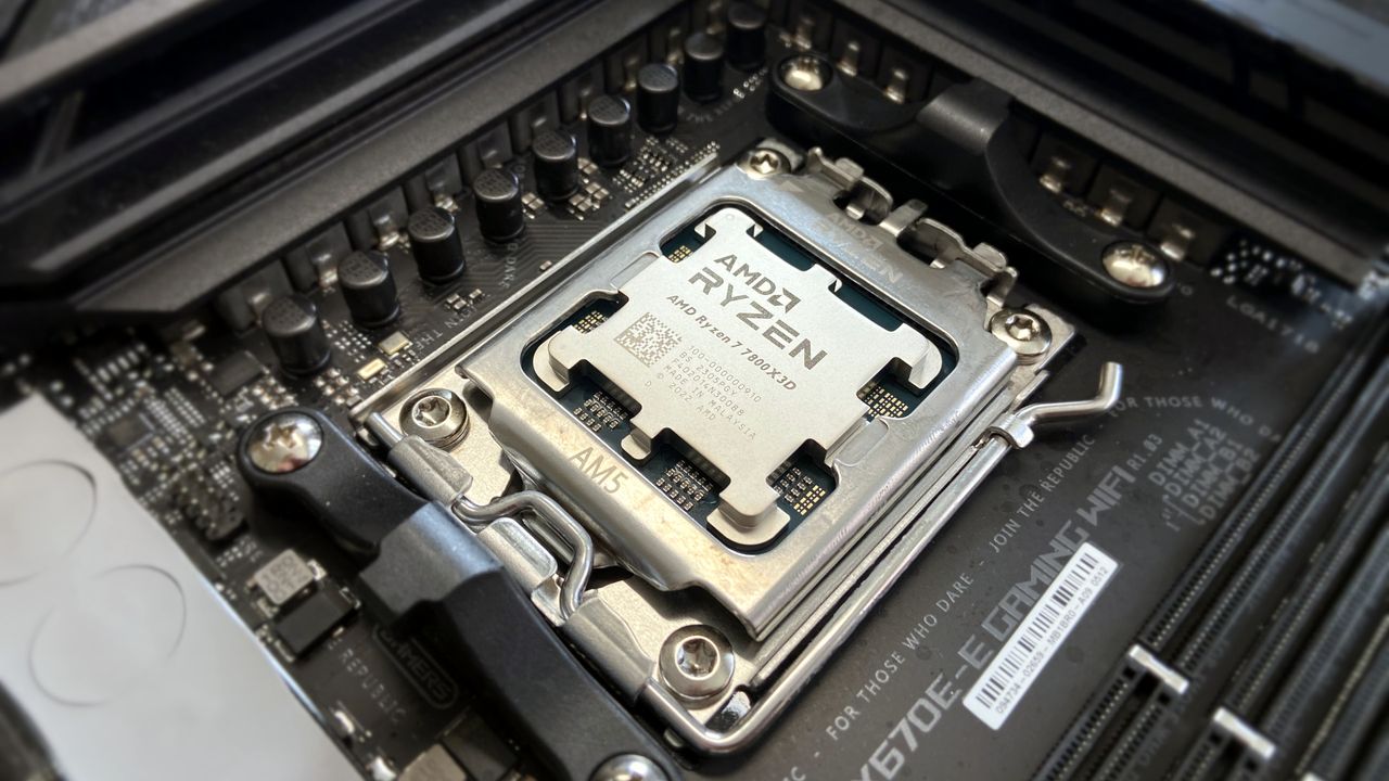
This gaming-focused bundle contains an AMD Ryzen 7 7800X3D processor, a GIGABYTE B650E EAGLE WF6E motherboard that offers PCIe 5.0 and Wi-Fi 6E, and two 8GB RAM sticksView Deal
![]()
This bundle contains an AMD Ryzen 9 9900X processor with an ASUS TUF GAMING X870E-PLUS WIFI7 motherboard that features two onboard PCIe 5.0 M.2 slots with fast Wi-Fi 7 and two 8GB DDR5 RAM sticks.View Deal
FAQ
How long will these discounts last?
These discount deals will last from July 14, 2026 to July 31, 2026.
Are these AMD processors good for gaming?
Indeed, they are. AMD's Ryzen 9 9900X, Ryzen 7 7800X3D, and Ryzen 5 9600X processors all offer good to exceptional performance for boosting frame rates and smoothness, particularly the -X3D chips.
Which of these processors is good for productivity?
The Ryzen 7 7800X3D productivity performance is somewhat underwhelming, while the Ryzen 9600X fares much better with creative apps and solid single-core performance.
![]()
Join us on Reddit at r/WindowsCentral to share your insights and discuss our latest news, reviews, and more.
AMD Ryzen 7 7800X3D in socket
![]()
AI-generated image of an AMD processor with an MSI motherboard and Team Group RAM.

