Vue normale

Il y a de nouveaux articles disponibles, cliquez pour rafraîchir la page.
Hier — 20 février 2025Flux principal

OPPO Find N5 Review: Engineering Excellence, Productivity Powerhouse

Par : Aki Ukita
20 février 2025 à 16:20

PROS:


  • Super-thin and lightweight design

  • Almost undetectable crease

  • Great main and telephoto camera performance

  • Fast wired and wireless charging

CONS:


  • Underwhelming 8MP ultrawide camera performance

  • Speakers are only on the front screen side

RATINGS:

AESTHETICS
ERGONOMICS
PERFORMANCE
SUSTAINABILITY / REPAIRABILITY
VALUE FOR MONEY

EDITOR'S QUOTE:

The OPPO Find N5 stands out in the growing foldable market, offering an impressive package for those seeking a high-end, versatile, and reliable foldable smartphone.

I was a big fan of the OPPO Find N3, so when I heard rumors that OPPO might be exiting the foldable market, I was disappointed. That’s also why I was excited when I received the news that OPPO is indeed launching a new book-style foldable phone. What I liked about the Find N3 was that its camera performance didn’t feel like a compromise, something that was not always the case with many foldable phones when the Find N3 was released. While having a powerful imaging system on a foldable phone means dealing with a sizable camera bump, it was a trade-off I was happy to live with.

The foldable phone landscape varies significantly across regions. While US consumers are limited to Samsung, Google, and OnePlus, international markets enjoy a more diverse selection, with brands like Xiaomi, Vivo, Huawei, and others competing to deliver increasingly sophisticated foldable devices. Now, roughly 15 months after the Find N3’s debut, OPPO has unveiled the Find N5, pushing boundaries once again.

Designer: OPPO

The Find N5 brings a lot to the table. It’s the world’s thinnest book-style foldable, the first foldable powered by the Snapdragon 8 Elite, and the first foldable certified with IPX6, IPX8, and IPX9 ratings. As a longtime admirer of the Find N3 Fold, I approached the Find N5 with high expectations. Let’s see how it stacks up.

Aesthetics

We are at a time when flagship smartphones are moving away from large camera bumps, and the OPPO Find N5 makes a bold yet elegant statement. The camera island has been thoughtfully redesigned, achieving a 20% reduction in thickness compared to its predecessor while retaining OPPO’s distinctive Cosmos Ring design. This refined approach creates a more sophisticated profile that aligns with the phone’s premium positioning.

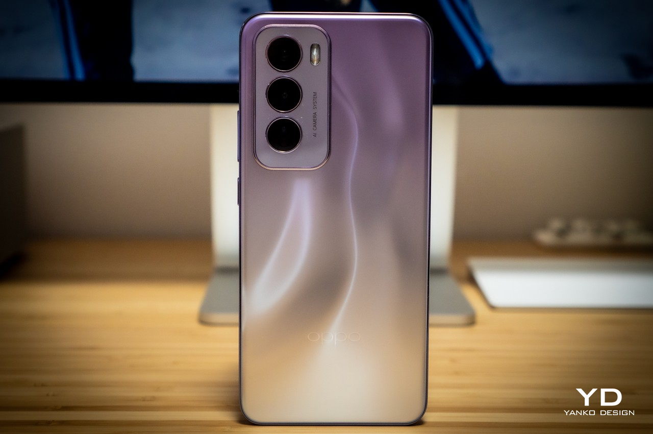
The Find N5’s design philosophy emphasizes clean lines and minimal ornamentation, yet manages to maintain visual interest through careful material selection and finish details. Available in two colorways, each variant offers a unique aesthetic appeal. The Cosmic Black variant features a sophisticated matte back panel that evokes a deep, mysterious appearance resembling frosted glass. Its matte gray frame creates a seamless, monolithic appearance that exudes understated luxury.

The Misty White variant, on the other hand, incorporates nano-lithography technology to create an ethereal, constantly shifting pattern across its back panel. This finish catches and plays with light in subtle ways, creating an almost ethereal effect as you move the device. The silver frame provides a striking contrast that highlights the phone’s premium construction while adding a touch of brightness to the overall design.

Both colorways share a similar textured back that delivers an exceptionally refined tactile experience. The surface treatment not only provides a pleasant silky touch but also helps minimize fingerprints and smudges, maintaining the phone’s pristine appearance during daily use.

Ergonomics

The Oppo Find N5 claims the title of the world’s thinnest book-style foldable, measuring just 4.21mm when unfolded and 8.93mm when folded. The phone’s dimensions are 160.87mm x 145.58mm x 4.21mm when unfolded, and 160.87mm x 74.42mm x 8.93mm when folded. The Find N5 boasts more than just thinness; it’s also very light, weighing only 229g. To put it in perspective, that is only 6.8mm thicker and 2g heavier than the iPhone 16 Pro Max.

Despite its slim profile, the device feels robust and well-engineered. Holding the folded Find N5 feels almost like holding a slab phone, and it fits comfortably in your palm or pocket. Oppo revisited almost every componentfrom the motherboard to the USB-C port, the hinge, and the frameto achieve this balance of thinness, lightness, and durability.

Another impressive feature of this phone is the crease, or rather, the lack of one. It’s barely noticeable both visually and tactically. You wouldn’t notice the crease unless you look at it from a certain angle. What’s even more remarkable is that you hardly feel it when you run your finger across it, both in terms of width and depth. The Find N3 already had a very subtle crease, but the Find N5 takes it to the next level, with a crease that is 10% narrower and 50% shallower. It has the most deceptive crease of any foldable phone I’ve ever tried.

The hinge feels consistent throughout its range of motion. Unlike the inconsistent hinge of the Samsung Galaxy Z Fold 6 or the more effort-demanding hinge of the Pixel Fold, opening and closing the N5 feels smooth and fluid. Unfortunately, the Find N5’s hinge isn’t as steady when the phone is opened at a wider angle. There were a few occasions when the phone slowly opened flat while I was watching a video with the phone at about a 95 to 100-degree angle.

Another thing to note is the position of the volume rocker: it’s too high. You’ll need to shift your palm or hold the phone with two hands to reach it. Also, when I hold the phone open, with my pinky finger supporting most of the weight, it digs into my pinky. But this probably has to do with the position of my pinky, as I tend to support the phone with the side of my pinky near the nail. If I support it with the pad of my pinky, it’s not an issue.

Performance

Display quality stands as one of the Find N5’s strongest features. The outer 6.62-inch OLED screen (2616 x 1140 resolution, 431 PPI) delivers impressive brightness up to 1600 nits outdoors. The inner 8.12-inch OLED display (2248 x 2480 resolution, 412 PPI) reaches 1400 nits of outdoor. Both screens feature adaptive 1-120Hz refresh rates with LTPO technology and support HDR10+ and Dolby Vision. The outer display’s 20.7:9 aspect ratio provides a familiar smartphone experience, while the inner screen’s 9.9:9 ratio creates an immersive viewing canvas. The transition between displays is seamless, enhancing the overall user experience.

The Find N5 features stereo speakers, but they are only located on the outer screen side. This design choice reduces the immersive experience, as you’ll notice the sound coming from just one side of the phone when watching content with the phone unfolded.

Powered by the Snapdragon 8 Elite chipset, the Find N5 handles multitasking and intensive workloads effortlessly, maintaining cool temperatures even under pressure. Find N5 runs ColorOS15.0.1 based on Android 15. The improved Boundless View makes multitasking, switching between apps, copy and paste easy and seamless. Find N5 further enhances productivity through various AI features, including AI Document for translation and summarization, and AI Call Summary for transcribing audio conversations.

One of the standout features is O+ Connect for Mac, which builds upon OPPO’s existing file transfer capabilities between OPPO devices and iOS and iPadOS. This new functionality enables remote Mac control through the Find N5, though it requires the O+ Connect application to be installed on your Mac. The device also supports the OPPO Pen, adding another layer of productivity and creativity. However, testing this feature wasn’t possible during the review period, as I was unable to acquire the OPPO Pen.

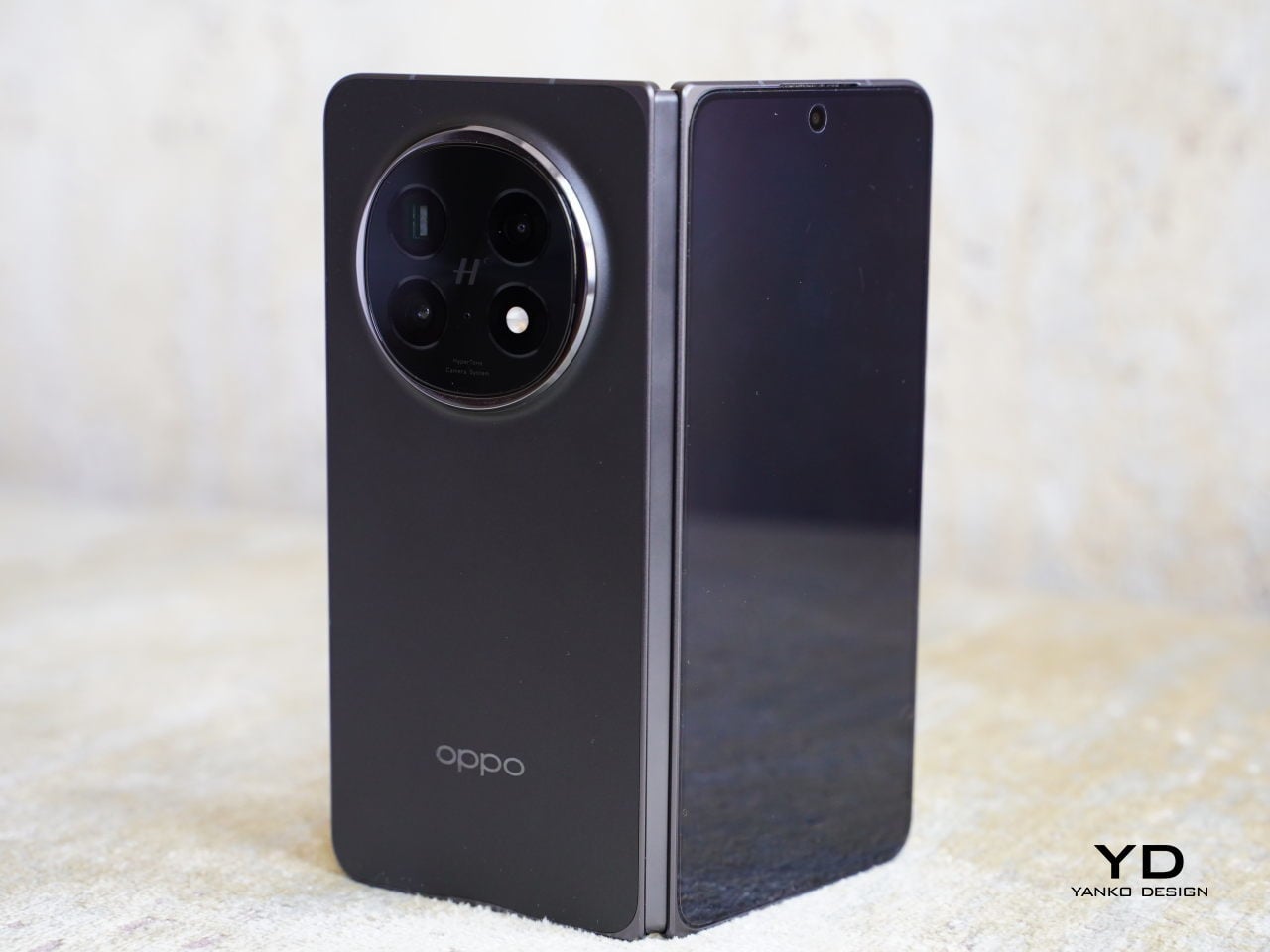
The Find N5’s imaging system builds upon OPPO and Hasselblad’s photography expertise, featuring a triple-camera array. The 50MP main camera shares the same Sony LYT-700 sensor (1/1.56-inch, f/1.89) with Optical Image Stabilization (OIS) as the Find X8, delivering excellent results in both daylight and low-light conditions. Images show impressive sharpness, accurate white balance, and strong dynamic range.

Accompanying the main sensor is a 50MP telephoto camera (1/2.75-inch sensor, f/2.7) with OIS, offering 3x optical zoom and 6x lossless zoom capabilities. While the camera technically supports up to 120x zoom, image quality deteriorates significantly beyond 6x. The telephoto lens doubles as a capable macro shooter with a 10cm focal length.

The 8MP ultra-wide camera (15mm-equivalent, 116-degree field-of-view, f/2.2) proves to be the system’s weak point, particularly in challenging lighting conditions. This limitation is especially disappointing given the foldable form factor’s unique advantage for selfie composition using the outer display as a viewfinder.

Video capabilities include 4K 60fps recording on both main and telephoto cameras, while the ultra-wide is limited to 4K 30fps. Camera switching during video recording is possible but lacks smoothness in transition.

OPPO has managed to pack an impressive 5600mAh battery into the Find N5’s slim frame, complemented by robust charging capabilities. The device supports 80W SuperVOOC wired charging and 50W AirVOOC wireless charging, ensuring quick power replenishment when needed. Battery performance is particularly noteworthy given the device’s form factor. The Find N5 easily handles a full day of heavy usage, including extended periods of content consumption on the larger inner display and intensive camera use. This endurance is especially impressive considering the power demands of the big inner screen.

Sustainability

One of the concerns many people have when it comes to foldable phones is durability. The hinge is the essential element of a foldable phone, forming the foundation of its structural integrity and ensuring its overall durability. The hinge of Find N5 is crafted from aerospace-standard Grad 5 titanium alloy and utilizes advanced 3D printing technology to achieve precision and strength. 

Just like the hinge, the inner screen is subjected to the physical stress of opening and closing. To address this, N5 uses what it calls a Dual Shielded Flexible Screen. This technology employs an ultra-thin stainless steel plate, ultra-thing glass, and an exclusive anti-shock film, making Find N5 70% more shock-resistant compared to the previous generation, according to Oppo.

The other worry that comes with a foldable phone is its vulnerability to water. Luckly Find N5 is IPX6, IPX8, and IPX9-rated, which means it can withstand submersion and high-pressure, high temperature. While it does not have an official rating for dust protection, protection against extreme water conditions gives you peace of mind whether you are caught in the rain or accidentally drop the phone into water.

As for the update, Find N5 will get 4 years of Android updates and 5 years of security updates. This is pretty much the industry standard when it comes to software support, so it’s reassuring that OPPO isn’t cutting corners here. Improving the phone’s longevity plays an important role in reducing its negative impact on the environment as time goes by.

Value

The OPPO Find N5 is a remarkable device, showcasing cutting-edge foldable smartphone technology. Its engineering achievementssuch as its thin profile, innovative hinge, and durabilityposition it as a premium option in the foldable space. You’d be hard-pressed to find such a potent laundry list of desirable bullet points in a single device.

While its retail price and market availability will play significant roles in determining its value, the combination of advanced features, productivity tools, and exceptional build quality makes the Find N5 a strong contender in the high-end foldable market. If you’re looking for a blend of portability, build quality, productivity, and camera performance, the Find N5 delivers a compelling package.

Verdict

The OPPO Find N5 represents a refined approach to foldable smartphone design, addressing many common issues associated with the form factor. OPPO has delivered a well-polished device that’s practical for everyday use, with features like its slim profile, near-invisible crease, and water resistance.

Its standout achievements include impressive camera performance, seamless display transitions, and a solid balance between portability and battery life. The integration of productivity features like O+ Connect for Mac and AI tools further elevates its utility.

The OPPO Find N5 stands out in the growing foldable market, offering an impressive package for those seeking a high-end, versatile, and reliable foldable smartphone. As foldables continue to mature, the Find N5 suggests that OPPO is leading the charge in refining this exciting technology.

The post OPPO Find N5 Review: Engineering Excellence, Productivity Powerhouse first appeared on Yanko Design.

À partir d’avant-hierFlux principal

Tecno Spark 30 Pro Optimus Prime Edition Review: Budget-Friendly Solid-Performer, Roll Out!

Par : Aki Ukita
22 janvier 2025 à 09:00

PROS:


  • Fun, eye-catching design for sci-fi buffs

  • Vibrant AMOLED screen

  • Ample internal storage

CONS:


  • Single camera setup

  • Underwhelming build quality

RATINGS:

AESTHETICS
ERGONOMICS
PERFORMANCE
SUSTAINABILITY / REPAIRABILITY
VALUE FOR MONEY

EDITOR'S QUOTE:

The Tecno Spark 30 Pro Optimus Prime Edition is a truly one-of-a-kind design that’s sure to spark joy for any Transformers fan.

Tecno is a smartphone brand that has steadily built a strong presence in emerging markets, particularly in Africa and Southeast Asia, thanks to its budget-friendly yet feature-packed devices. The brand’s Spark series has always been a hit with younger users, offering a stylish design and solid performance at an accessible price. With the launch of the Tecno Spark 30 series, the company has taken things up a notch, introducing something truly unique: a collaboration with the iconic Transformers franchise.

This collaboration brings two special editions to the Spark 30 lineup: the Bumblebee-themed Spark 30 and the Optimus Prime-themed Spark 30 Pro. We were fortunate enough to get our hands on the Optimus Prime-themed Spark 30 Pro, a device that combines budget-friendly specs with a design that will surely excite Transformers fans. But does this phone live up to the hype? In this review, we’ll dive into the features, performance, and overall value of the Optimus Prime Spark 30 Pro, and see if it’s worth adding to your collection—or if it’s just another gimmicky release.

Designer: Tecno

Aesthetics

Before you even pick up the phone, it’s clear that Tecno didn’t just slap the Transformer name on the back of the Spark 30 Pro. They’ve carefully crafted every detail, going far beyond simple branding. It starts right at the packaging, making the unboxing experience a true delight.

The phone arrives in a special box with an outer sleeve that unfolds to reveal Optimus Prime or, in the case of the other edition, Bumblebee. The double-door box, adorned with the Autobot logo, opens from the center to reveal the phone, wrapped in a Transformers-themed material. Beneath the compartment that houses the phone is a hidden drawer where the 33W charger brick, a USB-A to USB-C cable, wired earbuds, and warranty paperwork all reside. Unfortunately, these accessories come in plain white without any Transformer-themed details.

The phone itself boasts a visually striking design inspired by Optimus Prime. The back cover features a sleek, metallic finish that mirrors the Autobot leader’s signature color scheme: deep reds and blues with chrome accents. The design incorporates etched details that add visual depth, though these details are buried beneath a clear plastic panel, making the texture purely visual rather than tactile.

The circular camera island, positioned in the top right, houses the camera and LED flash, featuring additional Optimus Prime references with the red and blue color rings and text reading “Optimus Prime Altruistic Protective”. A silver Autobot symbol sits at the bottom right corner of the phone, while the Tecno Spark and Transformer names are stacked vertically on the opposite side.

Overall, the design of the device is a fun and tasteful tribute to the Transformers universe, sure to delight any fan of the franchise. At the same time, the design isn’t in your face that only Transformers fans will appreciate it, though few outside that fandom will immediately associate it with the heroic robot. In fact, any fan of sci-fi or metallic aesthetics, with an inclination towards blue, red, and white colors, might also find it quite appealing.

Ergonomics

The Tecno Spark 30 Pro Optimus Prime Edition features a slim profile, measuring just 7.4mm in thickness, making it lightweight and comfortable to hold. While it offers comfort, the phone’s plastic construction feels somewhat less durable compared to higher-end models. I’ve used plenty of phones with plastic backs, but this one feels, well, very plasticky.

The other notable downside is that the back panel is highly prone to fingerprints and smudges. The glossy surface requires frequent cleaning to maintain its pristine look, as even the slightest touch leaves visible marks. While the smooth finish gives the device a sleek appearance, its tendency to attract grime can can definitely take away from its appeal.

The side frame is also made of glossy plastic, which, like the back panel, is a fingerprint and smudge magnet. In terms of physical layout, the right side houses the volume rocker and power button, while the left side features a dual-SIM + micro SD card tray. On the bottom edge, you’ll find the 3.5mm headphone jack, USB-C port, and primary speaker, with the secondary speaker positioned at the top.

One odd thing is the placement of the headphone jack which is not centered and sits very close to the bottom edge. The SIM tray is also a little off-center, which gives the phone a slightly cheap vibe. These minor design quirks, but they do make the phone feel a little less polished.

Performance

As a special Transformers edition, the Tecno Spark 30 Pro comes loaded with exclusive wallpapers and icon designs, bringing the world of Autobots and Decepticons right to your fingertips. You can choose from two Optimus Prime wallpapers or two Bumblebee wallpapers, along with other non-Transformers-themed options to further personalize your device. If you’re feeling creative, there’s also an AI Wallpaper Generator that lets you design unique, custom wallpapers to match your style.

Under the hood, the phone comes with MediaTek Helio G100 paired with either 128 GB or 256 GB of storage and 8 GB of RAM (expandable to 16 GB), offering solid performance for daily tasks including gaming. While it might not compete with flagship devices in sheer power, it gets the job done smoothly, and it comes with a 5-year lag-free performance warranty for peace of mind.

The Spark 30 Pro runs HiOS 14.5 based on Android 14. Tecno has brought plenty of AI features including thehese include the previously mentioned AI Wallpaper Generator, AI Artboard for turning sketches into artwork, AI Eraser for photo editing, and the AI voice assistant Ella.

When it comes to the display, the 6.78-inch AMOLED screen is a huge step up from its predecessor, the Spark 20 Pro, which had an LCD. The new display offers a 1080 x 2436 resolution (Full HD+) and a 120Hz refresh rate, making scrolling and navigation feel smooth. It also gets plenty bright, with a peak brightness of 1700 nits, making it easy to view in direct sunlight.

The screen looks vibrant and crisp, and for a more comfortable viewing experience, the phone comes with 2160Hz PWM dimming, which helps reduce screen flicker—especially useful in low light, so your eyes won’t get as tired after long sessions. The stereo dual speakers with Dolby Atmos and Hi-Res Audio support deliver loud and immersive sound to complement this very capable display.

Another neat addition is the under-display fingerprint sensor, which works reliably. And if you’re the type who uses your phone around moisture (rain, sweat, or just damp fingers), the Wet Touch Control ensures the screen stays responsive even when it’s a little wet.

A 5,000 mAh battery keeps you going through a full day of average use, and the 33W wired charging capability means you won’t be waiting long to top it up. It’s definitely not the fastest in the market, but a charging time of around an hour from zero to full is still a lot better than some leading brands.

The device features a 108 MP rear camera with up to 10X zoom, capable of capturing decent photos in bright environments. On the front, there’s a 32 MP selfie camera with a dual-color LED flash. The flash lets you adjust both the intensity and color temperature across three different levels, giving you more control over your lighting for the perfect selfie.

1x

3x

1x

3x

Camera output is pretty decent, though it seems to lean more towards oversaturating colors to make a bigger impact. It’s biggest flaw is, of course, the fact that there’s only one camera doing the work of two or three. You can forget about ultra-wide shots, and zoomed in quality isn’t as good as a dedicated telephoto lens. Then again, this is a case of getting what you pay for.

1x, Portrait

2x, Portrait

Sustainability

The Tecno Spark 30 Pro boasts an A rating for TÜV SÜD’s 60-month fluency, meaning it’s designed to perform smoothly for up to 5 years. After 1,000 charge cycles, the battery retains over 80% of its original capacity, suggesting excellent long-term durability. Additionally, the phone features an IP54 rating, offering protection against water splashes and dust. This is a nice upgrade from its predecessor’s IP53 rating, making it more resilient to everyday wear and tear.

That said, while these durability features are a step in the right direction, we’d love to see more sustainability initiatives from the brand in the future, such as more eco-friendly materials in both the products and packaging. Given the limited edition design, it might be fine for low production numbers, but it’s also high time for Tecno to spark some interest in this aspect of its design philosophy.

Value

The Tecno Spark 30 Pro Optimus Prime Edition, priced around $200 USD (depending on the market), stands out as a unique contender in the budget smartphone space. While the Optimus Prime-themed design is the most obvious draw, it’s far from the only reason to consider this handset. Like most budget phones, there are a few compromises. It’s not going to offer the absolute best processor or camera compared to some competitors. The camera situation, in particular, is a bit disappointing when even an 8MP ultra-wide shooter would do wonders for your dramatic panoramas.

But what it does offer is a distinctive design and a well-rounded set of features, including a vivid screen, a large battery, and ample memory. If you’re a Transformers fan looking for a budget-friendly device that still packs a punch, the Tecno Spark 30 Pro Optimus Prime Edition is definitely worth a look.

Verdict

The Tecno Spark 30 Pro Optimus Prime Edition is a truly one-of-a-kind design that’s sure to spark joy for any Transformers fan. With the bold Optimus Prime branding and thoughtful design details, this phone really brings the iconic character to life. Whether it’s the sleek, futuristic look or the nostalgic charm, the Spark 30 Pro Optimus Prime Edition stands out in a way that’s hard to miss. 

It’s a budget-friendly device that gets a lot of things right: a large AMOLED display, solid battery life, a 108 MP rear camera, and a 5-year lag-free performance guarantee. These are all impressive features at its price point, especially for users looking for a phone that offers good value without breaking the bank. If you’re a fan of the franchise, this phone offers a unique way to carry a piece of the Transformers universe with you, all while adding a touch of flair to your everyday tech.

The post Tecno Spark 30 Pro Optimus Prime Edition Review: Budget-Friendly Solid-Performer, Roll Out! first appeared on Yanko Design.

Pixel 9a leaked renders look pretty barren without the distinctive camera bar

Par : JC Torres
1 octobre 2024 à 10:35

With the Pixel 6 in 2021, Google embarked on a new design language and visual identity for its smartphones. Like it or not, and some definitely didn’t, the camera “visor” has become an identifying mark of the Pixel phones since then, something that no other brand dared to even try. It underwent a few refinements until it was finally replaced by the camera “bar” in this year’s Pixel 9. Some loved it, some despised it, and some even wanted to have the old visor back. It seems that Google isn’t done playing around with the design just yet if these early unofficial renders for next year’s “mid-release” Pixel phone. And if the Pixel 9a is any indicator of the direction that Google will take in the future, it’s bound to split camps yet again.

Designer: Google (via AndroidHeadlines and OnLeaks)

It’s not that hard to understand how divisive the Pixel camera design is. On the one hand, it is big, visible, and distracting, but on the other hand, it is executed elegantly, balances the phone on your desk, and gives your index finger something to rest on when holding the phone. What both camps will probably agree is that the camera visor or bar is an identifying mark of the Pixel phone, and it’s something the Pixel 9a might lack.

Based on the first CAD renders made from leaked information, the next mid-range Pixel phone will ditch the camera bar for a flatter design. Curiously, the cameras aren’t placed closer to the upper left corner of the phone’s back even without the bump, and it seems to be in the exact same position if it did have that bar. It’s almost as if Google just did a magic trick like pulling out the tablecloth from under the cameras, leaving them in the exact same place. At the same time, however, the camera island isn’t completely flush with the rest of the phone’s back as it has a raised lip around the oval, perhaps for protection. Whether it will make the wobble is something that can only be tested with an actual unit.

Other than that, the rest of the Pixel 9a’s design is pretty similar to the Pixel 9, down to having only two cameras on its back. The exact dimensions of the upcoming phone remain undisclosed, so we don’t know yet how bigger or smaller it is compared to the Pixel 9. The bezels around the display, however, do look a little thicker, giving it a less premium appearance overall.

The Pixel “a” series often carries the design from the same generation, so it would be surprising to see this big a change for the phone. It could also be Google’s strategy to further differentiate the Pixel 9a from the Pixel 9, giving it an aesthetic that definitely looks more “mid-range” than the flagship models. You can still see signs of the Pixel DNA if you look hard enough, but other than the position and orientation of the cameras, it’s almost too easy to pass the Pixel 9a over for some more visually interesting mid-tier phones.

The post Pixel 9a leaked renders look pretty barren without the distinctive camera bar first appeared on Yanko Design.

Xiaomi 14T Pro Review: Flagship Features Without the Flagship Price

Par : Aki Ukita
26 septembre 2024 à 13:30

PROS:


  • Solid camera performance

  • Fast wired and wireless charging capabilities

  • Bright and easy-to-eyes display


CONS:


  • Uninspiring color options

  • Minor hardware upgrade from the predecessor


RATINGS:

AESTHETICS
ERGONOMICS
PERFORMANCE
SUSTAINABILITY / REPAIRABILITY
VALUE FOR MONEY

EDITOR'S QUOTE:

With its combination of features and competitive pricing, the Xiaomi 14T Pro delivers a well-rounded experience that is sure to satisfy the needs of most users.

2024 has been a year of remarkable growth and innovation for Xiaomi. Building upon its success in the smartphone market, the company has expanded its horizons with the launch of its first electric vehicle, the SU7, back in March. The company then proceeded with the launch of its first-ever flip phone, the Xiaomi MIX Flip, as well as the fourth iteration of its flagship foldable, the MIX Fold 4. Impressive sales figures for the SU7 and the positive reception of the MIX Flip and MIX Fold 4 demonstrated Xiaomi’s ability to capture market shares in diverse product categories. It is clear that Xiaomi wants to take advantage of this moment and solidify its position as a leading global technology brand with the launch of the Xiaomi 14T and 14T Pro. Part of its budget-friendly numbered T series, the Xiaomi 14T Pro boasts flagship features similar to its flagship Xiaomi 14 and 14 Ultra phones, such as cameras co-developed with Leica. But does Xiaomi still have its magic touch or has it spread itself too thin? Read on to find out.

Aesthetics

The Xiaomi 14T Pro’s understated design is its strength. While it doesn’t offer groundbreaking aesthetics, its simplicity is elegant. The familiar design language from its predecessor is carried over into this model. Available in Titan Gray, Titan Blue, and Titan Black, but choosing a color shouldn’t be a challenge as they all offer similar aesthetics. I wish Xiaomi had explored more fun color options. We received the Titan Black variant. The matte black back panel is speckled for a light-catching effect and features a velvety texture that resists fingerprint smudges.

The device’s square camera island is big but maintains a discreet profile that matches the color of the back panel. The camera island’s smooth surface contrasts with the back panel’s textured finish. The arrangement of the cameras and LED light is perfectly symmetrical, centered around the Leica logo. Each camera and LED light is housed in a raised circular enclosure, making it slightly more challenging to clean dust that may accumulate. That said, it carries a sort of LEGO block vibe that makes it stand out a bit, especially from the rest of the Xiaomi 14 series.

The small Xiaomi logo in silver is positioned on the lower left and the regulatory icons and text on the lower right. Overall, 14T Pro offers a clean design, while the matte textured back panel and metallic aluminum alloy frame give it a premium feel. It is simple and direct, a breath of fresh air from the visually noisy designs of recent smartphones.

Ergonomics

Measuring 160.4mm x 75.1mm x 8.39mm and weighing 209g, the Xiaomi 14T Pro leans towards the larger side of the spectrum. Despite its size, the device feels comfortable to hold, whether with one or both hands. All edges slightly curve into the frame giving comfort, while the flat sides provide a better grip when you hold the device in your hand.

The right side of the phone features volume and power buttons with diagonal engraving, while the left side remains clean except for antenna cutouts. The top houses an IR blaster and speaker, while the bottom accommodates a dual SIM slot, microphone, USB-C port, and speaker. The sides might be busy with these many parts, but they visually blend into the frame and stay out of the way of your fingers or your palm when you hold the phone.

The off-center camera module can cause the phone to wobble slightly on flat surfaces which might be a minor inconvenience if they are sensitive to such details. Nothing that a case wouldn’t fix, of course, and it’s a design trait shared by almost all smartphones these days. The Xiaomi 14T Pro is thankfully not uncomfortable to hold and use despite its large size, though it doesn’t stand out as an example of good ergonomics either.

Performance

Xiaomi’s collaboration with Leica has significantly elevated its camera capabilities, resulting in exceptional photo and video quality. This partnership continues as Xiaomi works with Leica on its more budget-friendly flagship models, ensuring high-quality imaging remains accessible. The 14T Pro features a triple camera setup, including a 50MP main camera with an f/1.6 aperture, a 50MP telephoto camera with an f/2.0 aperture, and a 12MP ultra-wide camera with an f/2.2 aperture. All three cameras offer two Leica photographic styles: “Leica Vibrant” and “Leica Authentic.”

The main camera features a Light Fusion 900 sensor and delivers great photos with nice detail, wide dynamic range, natural colors, and minimal noise in both daylight and low-light conditions. While the dynamic range is generally great, exposure often skews toward the brighter end, leading to washed-out highlights and crushed shadows in some situations. Additionally, HDR performance struggles with motion, especially in low-light environments, leading to blurry images of moving subjects.

Ultrawide (0.6x)

1x

2x

2.3x

The telephoto camera performs well in most scenarios, maintaining good detail and color accuracy. In contrast, the ultra-wide camera produces acceptable photos, but it tends to lack sharpness and detail in challenging conditions.

Telephoto (5x)

Telephoto (10x)

Telephoto (20x)

Portrait mode offers four focal lengths, 23mm, 35mm, 60mm, and 75mm, with the default set to 60mm. While the 60mm and 75mm portraits are captured with the telephoto camera, the 23mm and 35mm portraits are shot with the main camera. All portrait photos I took, regardless of focal length, exhibited impressive subject isolation and pleasing bokeh.

Normal (1x)

Portrait (60mm)

Although color rendering remains consistent across different cameras and magnifications in regular photo mode, a noticeable shift in white balance can be observed between photos captured with the telephoto and main cameras in portrait mode.

Portrait (23mm)

Portrait (35mm)

Portrait (75mm)

On the opposite side, the upgraded 32 MP front camera with f/2.0 aperture takes satisfactory photos, which isn’t that surprising given the hardware. The Xiaomi 14T Pro can record videos up to 8K at 24 or 30 fps with the main camera, while the telephoto and ultra-wide cameras are capable of shooting videos up to 4K at 60 fps. The front-facing camera can record up to 4K at 30 fps and 1080p at 60 fps. The 4K footage from the main and telephoto cameras is impressive, showcasing good detail, realistic colors, and a wide dynamic range, all complemented by excellent stabilization.

While the Xiaomi 14T Pro offers incremental hardware improvements compared to its predecessors, its most significant advancements lie in its AI capabilities. The device supports Google Gemini and introduces Circle to Search, a first for Xiaomi devices. Additional AI features include AI Interpreter, AI Notes, AI Recorder, and AI Subtitles. These AI features and Circle to Search will be available via an over-the-air (OTA) update starting September 26th, which means they aren’t accessible during this review period.

One of the AI features I was able to test was AI Erase Pro, and it was remarkably effective. The tool offers four modes: Manual, Remove Object, Remove People, and Remove Lines. The Remove People mode was particularly impressive, accurately recognizing individuals and color-coding them. Even when people were positioned in a staggered formation, the AI could identify each person. However, while erasing people from the photos worked well, the shadows were left unmanipulated.

The other impressive feature of the Xiaomi 14T Pro is a big 6.67-inch AMOLED flat screen that boasts a 1.5K resolution (2,712 x 1,220), a 144Hz refresh rate, and a pixel density of 446 ppi. Supporting 12-bit color depth, HDR10+, and Dolby Vision, the display delivers sharp, vibrant visuals. Even under direct sunlight, the peak brightness of 4,000 units ensures excellent visibility while the 3,840 Hz PWM dimming reduces eye fatigue. Also, the stereo speaker is plenty loud and produces nice sounds, making the phone great for enjoying movies.

The 5,000mAh battery provides sufficient power for a full day of use. If you need a quick boost, Xiaomi’s 120W HyperCharge technology allows for incredibly fast wired charging, reaching a full charge in about 19 minutes, as stated by the company. Additionally, the 14T Pro supports 50W wireless charging, a much-welcome upgrade. Xiaomi claims that the device can be fully charged with a wireless charger in approximately 45 minutes. My personal experience aligns with these impressive capabilities.

The device runs HyperOS based on Android 14 and Google services are thankfully available out of the box. Powered by MediaTek’s flagship Dimensity 9300+ chipset and paired with 12GB or 16GB of LPDDR5X RAM and 256GB, 512GB, or 1TB of UFS 4.0 storage, the Xiaomi 13T Pro delivers great performance. The device handles multitasking seamlessly, with no noticeable lag or stutter even when running multiple apps simultaneously. Additionally, it does not get hot during extended video shoots or gaming sessions, enhancing the overall user experience.

Sustainability/Repairability

The Xiaomi 14T Pro promises a 1,600 battery life cycle and delivers IP68 dust and water resistance, ensuring both durability and longevity. Its longevity and overall sustainability aspects, however, are not as promising, especially in the area of software updates. This is somewhat disappointing for a company that is becoming one of the industry’s leading players. As the tech industry increasingly emphasizes environmental responsibility, Xiaomi has an opportunity to take a leading role by integrating sustainability into all of its products and, hopefully, it won’t let that opportunity pass it by.

Value

The Xiaomi 14T Pro positions itself as a compelling option for those seeking a high-performance smartphone without breaking the bank. It offers a blend of flagship-level features and a more affordable price point. While its camera may not quite reach the heights of the Xiaomi 14 Ultra, it still delivers excellent results for everyday photography and videography. It delivers much of what it promises on paper, but the real question is whether it is something you will reach for in your next smartphone buy.

Xiaomi is definitely not the only player in this field, including in the mid-range market where there are dozens of brands and models to choose from. And while the Xiaomi 14T Pro is definitely good, it doesn’t exactly stand out in any specific way. It’s a well-balanced phone, no doubt, but it might overlooked when placed side-by-side with other mid-range phones with better cameras, higher performance, or, more importantly, lower price tags.

Verdict

The Xiaomi 14T Pro may not be the most exciting phone, but there is no doubt it offers a tempting value proposition. Its solid camera performance, powerful processor, fast-charging capabilities, and vibrant display make it a compelling option for users who prioritize performance and affordability. It may not offer the absolute pinnacle of smartphone technology, leaving that for its more powerful and more expensive non-T siblings, but it doesn’t lag behind in any significant way either. With its combination of features and competitive pricing, the Xiaomi 14T Pro delivers a well-rounded experience that is sure to satisfy the needs of most users.

The post Xiaomi 14T Pro Review: Flagship Features Without the Flagship Price first appeared on Yanko Design.

Vivo V40 Pro Review: Prime Mobile Photography Arrives in a Sleek Package

Par : JC Torres
7 août 2024 à 14:20

PROS:


  • Elegant and aesthetic design

  • Powerful quad 50MP camera system

  • Large 5,500mAh battery despite thin profile

  • IP68 rating

CONS:


  • No wireless charging

  • Telephoto camera only supports 2x optical zoom

  • Limited global availability

RATINGS:

AESTHETICS
ERGONOMICS
PERFORMANCE
SUSTAINABILITY / REPAIRABILITY
VALUE FOR MONEY

EDITOR'S QUOTE:

The Vivo V40 Pro builds on the brand's outstanding photography performance to deliver an even more powerful experience in a stylish design.

Cameras have become one of if not the most important aspects of a smartphone these days. Of course, the display is functionally the most critical component, but other than being large and crisp, people tend to gravitate to the best smartphone camera their money can buy. Unfortunately, the best ones are often reserved for the most expensive handsets as well, leaving the majority of consumers, especially the younger generation, dreaming of better days. Vivo’s V series of smartphones has always aimed to make smartphone photography more accessible, and last year’s Vivo V30 Pro definitely put more expensive devices on notice. Can the Vivo V40 Pro top that or has the brand already reached its peak? We take Vivo’s latest and greatest V series phone for a spin to find out.

Designer: Vivo

Aesthetics

Right off the bat, we can already say that Vivo has outdone itself with the design of the Vivo V40 Pro. Last year’s flagship was already a looker, but it suddenly feels a bit lacking compared to its younger sibling. You still have a sleek appearance, smooth curves, and a thin profile, but the real winner here is the camera design. That Vivo was able to fit three 50MP cameras in such a compact space is already a marvel, but the way it managed to make the design look appealing is a rare feat these days.

Vivo calls it a “Gemini Ring Design,” which is a fancy term for what looks like a curvy keyhole. Two of the three cameras are enclosed in a circle that sits on top of a pill-shaped elevation. Inside that is another oblong enclosure housing the third camera and the Aura Ring flash. There is a subtle beauty to the play of balance and asymmetry in this design, and it definitely gives the Vivo V40 Pro a unique visual character.

The company didn’t pull punches in the different colors and materials available for both the Vivo V40 and the V40 Pro, and all of them are beautiful in their own way. The Sunglow Peach colorway with its warm hues and dynamic magnetic ink is quite an eye-catcher, and our review unit’s Moonlight White with its pale blue streaks has a soothing and calming effect. Other than the camera bump and the small vivo branding at the bottom, there are no distractions on the back of the phone, allowing you to appreciate the beauty of these designs.

At only 7.58mm, the Vivo V40 Pro is already thin, and the curved edges of both the screen and the back panel make it look even thinner. This could be a divisive decision in 2024, though, with many seeing curved edges as a thing of the past. It definitely still has appeal and it perfectly matches the smoothness of the rest of the phone.

Ergonomics

The Vivo V40 Pro is not a small phone by any means so that thin profile helps offset the size of the device. It’s incredibly light as well at only 192g, especially considering what it packs inside, like a very generous battery. All in all, it’s difficult to hold it up for long periods of time, though the glass material on its back could prove to be slippery for some hands.

The debate around flat versus curved edges continues here as well. With part of the screen curving off to the sides, there’s always the possibility of accidental touches in those areas. There isn’t much surface area or sharp corners for your hand to grip either, and you might find yourself straining a bit just to hold the phone tight. It’s partly personal preference and partly the shape of your hand, but thankfully Vivo ships a protective case with the phone just in case.

Performance

It might not be part of Vivo’s top-tier X series, but the Vivo V40 Pro definitely packs quite a punch, starting with the MediaTek Dimensity 9200+, the chipmaker’s flagship silicon. It’s paired with up to 12GB of RAM, as was the case in our review unit, which can be boosted with another 12GB. That said, it takes some of that from the 512GB internal storage, which isn’t expandable like many phones these days. All in all, the Vivo V40 Pro performs like a champ for any use case, whether it’s social media, watching videos, or playing games. The latter is helped by an Ultra-Large VC Cooling System that keeps the phone running at a stable pace without throttling.

More impressive, however, is the 5,500mAh battery the phone crams inside its thin and light body. It’s definitely one of the largest capacities available in a phone that’s barely 7.6mm thick, allowing it to easily support all your shutterbug adventures. With an 80W charging speed, you can quickly top up to full in around 30 minutes, at least with the right charging brick. Unfortunately, Vivo hasn’t yet decided to put wireless charging on its V series phones, but maybe that will change next year.

The real stars of the show, however, are the cameras, all of them with 50MP sensors. Yes, that includes the selfie camera with a Samsung ISOCELL JN1 sensor and a wide 92-degree field of view for those “wefies” or “groufies.” If that sounds familiar, then you might have heard of the Vivo V30 Pro last year. In fact, in almost all but one case, it’s nearly the exact same set of 50MP cameras, like the 50MP Sony IMX816 telephoto shooter and the 50MP Samsung JN1 119-degree ultra-wide camera.

What’s different this year is the new 50MP Sony IMX921 with a larger 1/1.56-inch sensor. That means it is able to take in more light information even in darker environments, improving its overall quality. In fact, the entire ensemble is actually commendable in their output, delivering super images bolstered by AI and computational photography. Of course, these cameras have optics tuned by ZEISS, so there’s little surprise there. And one can’t forget Vivo’s signature Aura Light that takes the regular flash and turns it into a mini ring light for softer and more natural lighting. Its most recent incarnation includes Electronic Control Technology that lets you adjust the brightness of the light depending on the distance of the subject.

In essence, the Vivo V40 Pro builds on the success of its predecessor and adds some extra value with upgraded specs and improved software. Unfortunately, it also carries over the flaws, most notably the short optical zoom range of the telephoto camera. It only goes as far as 2x zoom, but Vivo is heavily advertising what it calls “50x ZEISS Ultra HD Zoom,” which is a mouthful that really means software-assisted digital zoom.

Sustainability

Just like the Vivo V30 Pro last year, the brand is sadly silent on any of its efforts in using even a fraction of sustainable materials for this year’s V series flagship. It also hasn’t stopped shipping chargers in its boxes, which is unsurprising since it wants to make sure that its phones use the right 80W charger for the fastest speed they can support. We’re still holding out hope that Vivo will take the lead in this area soon.

That said, it does have some good news when it comes to keeping the Vivo V40 Pro away from the trash for as long as possible. It’s the first in the V series to reach an IP68 rating, ensuring that it’s protected from dust and water which can mean the end for many smartphones. It also advertises a “50-Month Smooth Experience” guarantee that basically says the phone can run for over four years without losing its fluidity and performance. Unfortunately, it doesn’t translate to having four years of updates, and Vivo has made no promises on that matter.

Value

It’s perfectly clear from our time with the Vivo V40 Pro that it delivers everything it promises on paper. The Quad 50MP Camera System it carries over from last year continues the tradition of excellent mobile photography, but this time with a larger 5,500mAh battery that better supports all those photo and video content creation. Even better, the phone comes in a sleek, slim, and light design that makes you feel like you’re holding an art object rather than a cold piece of technology.

In other words, the Vivo V40 Pro would have been perfect if not for the fact that some people might not even be able to get their hands on it. The $560 price tag it carries (converted from Indian figures) isn’t that heavy, but global availability is still undisclosed at the moment. Hopefully, it will fare better than the Vivo V30 Pro which didn’t get a wider distribution that would have spread the word of its amazing camera chops.

Verdict

Smartphones are getting more powerful and so are their cameras. But with this increase in technical performance, designers are often forced to make many compromises to fit all of them inside a product that should still fit our pockets. In that regard, the Vivo V40 Pro is quite a feat, cramming not only four 50MP cameras but a large 5,500mAh battery inside a body that’s as thin and as light as it can be. It’s a beautiful phone with impressive performance and an accessible price point, and it deserves to be made available to more markets this time.

The post Vivo V40 Pro Review: Prime Mobile Photography Arrives in a Sleek Package first appeared on Yanko Design.

Nokia 7380 5G concept reimagines one of the quirkiest phones in history

Par : JC Torres
7 août 2024 à 10:07

At this point in time, the design of smartphones is pretty much set in stone, at least disregarding novel designs like foldables and rollables. The “candy bar” form factor emerged as the standard, displacing even the fashionable clamshell “flip phones” that are making a comeback through small foldables, mostly because they are practical, handy, and efficient. There was a time, however, when phone form factors were all over the map, with brands like Nokia boldly experimenting with different designs that were functional but also a bit unconventional. The Nokia 7280 and 7380 “lipstick” phones were two of the phone manufacturer’s oddest creations, and one creator is bringing that past design to the present, giving it a modern touch to fit today’s aesthetics.

Designer: AndroidLeo

The Nokia 7380 was, strangely enough, part of the company’s “Fashion Phone” line back in the early 2000s. At a time when people actually used mobile phones for phone calls more than anything else, it could easily get away with its stick-like design and tiny mirror-like screen. You can’t do much else with it, other than listen to music and take photos that were already high-quality during that era, which sounds like the perfect recipe for a distraction-free, minimalist phone today.

In that regard, the Nokia 7380 5G concept doesn’t sound that outlandish after all. The design updates the aesthetics to modern standards, making use of interesting geometric shapes like a trapezoidal prism instead of a rectangular box, and puts a slightly taller screen that covers the whole surface this time around. It will still be too small to do anything productive like texting or even browsing the web, so it will mostly be for controlling the phone and launching apps that have to be custom-designed for that screen aspect ratio.

There’s also a camera on the narrow side of the prism, hidden behind a sliding mechanism. Given today’s technologies and the fact that this phone won’t have much in the way of other components, there should be enough space for a 50MP or higher camera. The concept design, which is based on rumors, also puts a dual camera setup on the “front,” or rather where the screen is. It’s not clear what the use case would be for having two cameras there, though.

In a nutshell, this smartphone stick could be marketed as a device that’s oriented towards music and photos, at least taking photos. There are two headphone jacks on one end, perfect for sharing your music with a friend, and the handy shape of the device makes it easy to take photos and selfies. It’s like a fashionable action cam that can play music and make phone calls as well, though it also raises the question of who would want to buy such a curious but less usable smartphone in the first place.

The post Nokia 7380 5G concept reimagines one of the quirkiest phones in history first appeared on Yanko Design.

nubia Z60S Pro Smartphone Review: AI to Empower Your Creativity

Par : JC Torres
5 août 2024 à 14:20

PROS:


  • Eye-catching "Cosmic Ring" Camera design

  • Dedicated camera slider

  • Decent flagship performance

CONS:


  • Thick, heavy, and slippery

  • Last year's Snapdragon flagship

RATINGS:

AESTHETICS
ERGONOMICS
PERFORMANCE
SUSTAINABILITY / REPAIRABILITY
VALUE FOR MONEY

EDITOR'S QUOTE:

The nubia Z60S Pro delivers AI-powered photography in an accessible package with a distinctive design

AI is undoubtedly the buzzword that’s taking by storm any industry related to computers. It’s not just the generative AI that’s making up essays and artwork, much to creators’ chagrin, or the prying eyes that watch over your social interactions online. AI has actually been in our phones a bit longer than those, using imaging magic to enhance photos and videos in ways that were unknown to us until recently. Now, almost every new phone has some AI feature in its bullet points, and nubia is not one to be left behind. With the nubia Z60S Pro, it is entering into this new arena, so we take the brand’s newest flagship for a spin to see if it is able to stand out from the growing throng of AI-enhanced smartphones.

Designer: nubia

Aesthetics

Smartphone cameras are getting more powerful and larger as the years go by, and these are putting the skills of designers to the test. It’s no longer a question of how to cram those sensors and lenses but how to make them look less conspicuous and less atrocious. It’s no surprise that not all manufacturers get it right, so it’s quite a relief to see nubia pull it off somehow.

nubia calls it a “Cosmic Ring Design” and it takes inspiration from our solar system. Three small circles surround a larger one in a symmetrical pattern, calling to mind how the planets revolve around the sun. A “coronet” extrudes from the left side with the words “Be yourself” engraved on it, sending the brand’s exhortation to everyone to take a closer look. It’s a well-balanced and pleasing composition, unlike the sometimes messy and skewed designs of other phones. The red ring around the central lens is a nice touch, giving the phone a more camera-like appearance, especially on our black review unit.

There are three color options for the nubia Z60S Pro, with both Black and Aqua sporting a single solid swatch of color. White has a bit more flair, with cloudy formations of gray that give it some visual texture. Of course, all three have a glass panel covering their rears, so it’s really only an illusion. All sides of the phone are devoid of curves, except for the four corners, of course. This aligns with the design trends these days, like it or not, so it carries a modern touch in its simplicity.

The Z60S Pro carries a moderately minimalist design, with only that large circle as the center of distraction. We’ve definitely seen worse, but we’ve also seen more interesting designs, so it doesn’t stand out that much unless you really take a closer look and take a moment to appreciate the design.

Ergonomics

The nubia Z60S Pro is quite a large phone, not unusual for a flagship these days, and that doesn’t come without consequences. Although it’s the de facto standard, of course, the design previously derided as “phablets” are not the easiest to hold securely and use with one hand, which is especially true with a thick and substantial device like this. Granted, it’s not alone in that category, with the likes of the Samsung Galaxy S24 Ultra leading the way. That doesn’t mean, however, that it is ideal or one that phone designers should aspire to.

It’s especially problematic if the back of the phone is prone to slipping from your grasp due to its extra smooth texture. It’s rather curious that even after years, phone makers still haven’t perfected the design of anti-slip glass. Some do have a matte texture, but those still fail to stick to your palm. The one thing going in the Z60S Pro’s favor are, ironically, those flat edges and sharp corners that help your skin get a better grip. You can also put the included frosted protective case on the phone, but that also mars its pristine beauty.

Performance

As a premium flagship, you’d expect the nubia Z60S Pro to have the latest specs to boost its performance, and that is true for the most part. The 6.7-inch “1.5K” screen definitely meets expectations with a vibrant, color-rich, and fast display that is great for videos and games. There’s also 12GB of RAM and 256GB of storage, which could be higher depending on your configuration. The one odd duck is the processor, which is last year’s Qualcomm Snapdragon 8 Gen 2. In practice, there isn’t such a wide gap between the current Snapdragon flagship, but when you’re trying to advertise on-device AI functionality, you’ll want to squeeze every drop of performance from the silicon.

Fortunately, there isn’t a bottleneck in performance, both from synthetic benchmarks and real-world use. This is critical considering how much nubia is banking on AI to sell the Z60S Pro. From system-level optimization to photography image processing, the phone is able to keep up with the demands of features as well as users. The large 5,100mAh battery, one of the reasons for the phone’s heft, also delivers a commendable all-day performance. 80W for charging is a bit disappointing when we’re always hearing about 100W or higher rates, but it’s not slow either. Just make sure to use the included power brick to maximize the charging time.

The real focus of the phone’s AI chops is, of course, the camera system. It even has a slider button that, by default, is used to launch the camera app. The trio of cameras is led by a 50MP 1/1.56-inch Sony IMX906 sensor that aims for more natural-looking photos with its 35mm equivalent lens, a popular format for cameras because of how it more closely matches our eyesight. It is joined by another 50MP camera, this time with a 13mm focal length and 125-degree field of view for ultra-wide shots. There’s a dedicated telephoto camera but it only has a measly 8MP sensor. It’s not a bad set unless you love doing macro and zoom shots.

The natural output of the cameras is pretty decent, but AI really takes it up a notch, especially for difficult scenes like zooming into the shot and nighttime photography. It’s actually quite impressive how much the Z60S Pro can accomplish with hardware that’s not exactly at the top of benchmarks, and you’d be hard-pressed to find the noise in those images unless you really examine them closely. As a phone designed to bring AI-powered photography to the masses who might not have advanced photography know-how, the nubia Z60S Pro definitely makes the cut. It empowers many to pull off breathtaking shots, artistic photography, and unforgettable moments just with a single tap of the camera button.

Sustainability

nubia is no newcomer to the smartphone arena and has its roots deep in this market. That’s why it’s a bit disappointing that it hasn’t yet left strong marks when it comes to ensuring the longevity of its products and of the planet at large. The Z60S Pro is your typical assortment of glass, metal, and plastic, and, at least officially, the company has made no statement on the use of recycled materials either in the phone itself or its packaging.

And then there’s the matter of repairability and software updates, especially with the latter issue. The nubia Z60S Pro comes at a rather odd time when there will be new hardware coming out, and the company isn’t exactly well-known for pushing timely and frequent updates. It will definitely help improve its reputation if nubia becomes a bit more explicit in its upgrade strategy, allowing it to lead its peers by example instead of playing catch-up with trends.

Value

On its own, the nubia Z60S Pro is a pretty competitive modern smartphone. With the exception of the CPU, it has the current technologies the market has to offer and is able to keep up well with benchmarks, actual real-world performance, and camera output. And with a starting price of $569, it’s not a bad deal for its price, especially when you consider how those other AI-toting flagships are nearly double the price.

But even with its rather distinctive camera design, the Z60S Pro sadly fails to stand out from the crowd as well. There are simply too many choices in that price range and just as many that offer nearly the same features for a lower price tag. What makes the situation a bit worse is that those competitors come from nubia’s other Z60 models as well. What the nubia has going for it will mostly be the brand loyalty, but those fans might also just grab the company’s more powerful and more exciting designs instead.

Verdict

We might be reaching that point in time again when the smartphone market is just over-saturated with choices. AI is becoming the differentiating factor, but almost all have similar features by now. Things get a bit more complicated when brands try to throw everything they can at a wall to see which ones stick, ending up with consumer confusion and missed opportunities. The nubia Z60S Pro could very well be one of these casualties. Offering decent performance and AI-enhanced photography at an affordable price, the smartphone gives everyone the opportunity to become a content creator, but it is sadly easily overshadowed not only by rival brands but even by its own siblings.

The post nubia Z60S Pro Smartphone Review: AI to Empower Your Creativity first appeared on Yanko Design.

Motorola Edge 50 Neo leak shows off Pantone colors and minimalist design

Par : JC Torres
5 août 2024 à 13:20

Smartphone brands have thankfully become more conscious of the design of their phones, or at the very least are now talking more about that aspect of the product. Not everyone gets it right, of course, especially if you look at some of the ginormous camera designs on phones these days. Once in a while, though, you come across a design that still delivers the promise of powerful cameras without being as in your face as their other kin. This year, Motorola’s Edge 50 series seems to have hit the target with a smooth and elegant minimalist design, as shown by leaked images of the upcoming Motorola Edge 50 Neo. Strangely enough, it calls to mind a design that we actually liked and wished stuck around longer.

Designer: Motorola (via Evan Blass/evleaks)

In 2022, we reviewed the OPPO Find X5 Pro which seemed to defy convention with a rear design that ditched the usual metal island that surrounded smartphone cameras. Instead, it used a gentler, curving slope that looked distinctive, less noisy, and more elegant, but it sadly didn’t last more than that year’s OPPO flagship. Whether by coincidence or by design (pardon the pun), it’s like that aesthetic has suddenly resurfaced where we least expect it.

A serving of official-looking renders reveals the design of the Motorola Edge 50 Neo or at least its back, and we can’t help but get a sense of deja vu. Not that we’re complaining, since it’s quite a striking and unusual appearance, and it’s not even limited to this particular model. All members of the 2024 Edge 50 family bear this same design language, including the Motorola Edge 50 Fusion with only two cameras on its back.

Also like its other siblings, the Edge 50 Neo is Pantone-certified, a mark it bears proudly as well. This particular model will come in four color options: Grisaille (Gray), Nautical Blue, Poinciana (Red), and Latte (Beige). The images also suggest that the phones will bear the same textured material on their back, which not only gives them a luxurious feel but also improves their grip.

Other than these visual details, however, not much is known about the Motorola Edge 50 Neo just yet. It will have three cameras, and it might follow in the footsteps of the base Edge 50 model with a 50MP main camera, a 10MP 3x optical zoom telephoto camera, and a 13MP ultra-wide shooter. But as beautiful as this phone looks, consumers might end up a little bit confused as there will be not only two, not even three but four Motorola Edge 50 models to choose from when the “Neo” finally launches.

The post Motorola Edge 50 Neo leak shows off Pantone colors and minimalist design first appeared on Yanko Design.

realme 13 Pro is coming with ultra clear camera powered by HYPERIMAGE+ AI

Par : JC Torres
4 juillet 2024 à 14:20

Smartphone cameras have gotten quite powerful, that they might have hit a wall when it comes to hardware. Although they have reached mind-blowing 100 megapixels, sensors have also gotten a little too large for the ever-thinning smartphones. To make up for that slump in optical solutions, manufacturers are turning to software, specifically everyone’s favorite AI special sauce, to produce astounding images and experiences that wouldn’t have been possible with hardware alone. That said, AI alone won’t be enough either, so at its AI Imaging Media Preview Event in Bangkok, realme unveiled a new AI photography architecture that harnesses both powerful optics and powerful algorithms to bring mobile photography to the next level.

Designer: realme

realme’s new HYPERIMAGE+ AI photography architecture, which it claims is a first for the industry, leverages three layers to create its seemingly magical imaging feats. It stands on a solid foundation of powerful hardware, delivered by a new Sony LYT-701, a 50MP sensor with OIS, and a 50MP Sony LYT-600 paired with a periscope-style telephoto lens that lets it zoom in up to 3x without any loss in detail. The hardware alone would have been enough to handle any photography task even in challenging lighting situations, so you can imagine how much more impressive the results would be with help from AI.

HYPERIMAGE+ also utilizes both on-device AI imaging algorithms as well as cloud-based AI image editing to go beyond what the hardware is capable of. HyperRAW, for example, brings image processing capabilities to the high-quality RAW domain, boosting image quality and dynamic range to faithfully recreate light and shadows. AI Pure Bokeh helps in the separation of foreground, midground, and background elements, applying pixel-level segmentation and targeted optimization to create realistic portrait photos, all within seconds. An in the event that the cameras weren’t able to capture enough resolution for rich details, AI Ultra Clarity enhances the image to still produce crystal clear and stunning images.

Oplus_131072

Of course, all these benefits of AI would be meaningless if it doesn’t get into the hands of those who need it the most. Young users, in particular, are always craving stunning photos, striking videos, and unforgettable memories, pushing the boundaries of what their smartphones are capable of. They are, therefore, the perfect audience for this ultra clear camera with AI, and are exactly who the upcoming realme 13 Pro+ will be aiming for. realme’s AI-empowered flagship is set to launch soon, though details are still scant and will be provided closer to the launch date.

The post realme 13 Pro is coming with ultra clear camera powered by HYPERIMAGE+ AI first appeared on Yanko Design.

OPPO Reno 12 Pro Review: Making AI Affordable in a Stylish Design

Par : JC Torres
24 juin 2024 à 17:20

PROS:


  • Elegant and stylish design, especially the Nebula Silver color

  • Supports a micro SD card for external storage

  • 50MP autofocus front camera can do 4K UHD videos

CONS:


  • Processor is a downgrade compared to Chinese model

  • No wireless charging

  • Glossy bottom plate is a smudge magnet (Space Brown, Sunset Gold)

RATINGS:

AESTHETICS
ERGONOMICS
PERFORMANCE
SUSTAINABILITY / REPAIRABILITY
VALUE FOR MONEY

EDITOR'S QUOTE:

The OPPO Reno 12 Pro delivers powerful AI experiences packed in a beautiful and soothing design.

AI is the buzzword in the tech industry, with mainstream media picking up on it and sometimes not in a good way. All the benefits that the technology brings, however, are for naught if only a select few can afford to use it. AI on smartphones promises quality-of-life improvements and exciting creative features, but only if you have the latest and greatest models with powerful specs and matching high prices. Fortunately, AI on mobile is such a hot topic that manufacturers are bringing those features to almost any new device. That’s pretty much the premise of the OPPO Reno 12 Pro, specifically the global edition that the brand just launched, one of the first few to advertise these AI benefits on what some would consider a mid-range model. But is it a potent combination or is the experience hampered by the Reno 12 Pro’s hardware? We take the phone for a spin to bring you the answers.

Designer: OPPO

Aesthetics

Companies avoid using the label “mid-range” or “mid-tier” for good reason. They often come with the connotation of lacking quality and appeal, which is definitely not something that can be said for the Reno 12 Pro. Right off the bat, you’ll be surprised by how enchanting the phone is, especially the Nebula Silver colorway we received for this review. OPPO utilizes what it calls Fluid Ripple Texture that gives the phone’s back a 3D visual effect of liquid gently moving underneath the glass. It even has something like a parallax effect that gives the illusion that there’s truly some solid mass despite having a completely flat surface. The play of light, shadow, and colors has a mesmerizing effect that gives the phone a more stylish and elegant air.

The other two color options, Sunset Gold and Space Brown, are no less attractive but have a different approach. They use a two-tone design that combines a matte section and a smaller glossy area separated by a chic metal-like ribbon running across the width of the phone. It’s a familiar composition, only arranged upside-down, giving the Reno 12 Pro a distinctive look. Unfortunately, this design has one rather critical flaw, the glossy part will always be where your palm rests, which means it will always have oils and smudges whenever you hold it.

The phone’s flat edges give it a modern look and its reflective surface gives the impression of a metallic nature. It is, however, a sleight of hand, given how the material is actually a new proprietary alloy that OPPO promises has the same durability but with less weight. All in all, the OPPO Reno 12 Pro definitely has a striking presence that’s almost on par with more expensive flagships.

Ergonomics

Given the phone’s large size, it’s almost shocking that the OPPO Reno 12 Pro weighs only 180g. Part of that is probably thanks to the absence of “real” metal in the frame, utilizing OPPO’s High-Strength Alloy Framework instead. On the one hand, this gives the phone a lightweight body that lessens the strain on your hand. On the other hand, no pun intended, it sometimes makes the phone feel a bit flimsy, lacking the substance you’d find on premium handsets.

Smartphone designs these days either go for flat edges or the more traditional curved screens, but the OPPO Reno 12 Pro finds a rather curious middle ground. Its sides are quite flat, but the screen isn’t exactly the same. It has a very minimal curvature not only on the left and right sides but also top and bottom but never goes over the edges. OPPO says this design delivers that same immersive viewing experience without the accidental touches that curved screens are notorious for. Along with more rounded corners, this design offers comfort and confidence in your grip, making for a more pleasurable smartphone experience.

Performance

The OPPO Reno 12 Pro isn’t exactly new but it is only now making its way to global markets. That journey, however, seems to have taken a toll on the handset, and OPPO decided to use a custom MediaTek Dimensity 7300-Energy. This variant of the processor is geared towards more efficient battery use, but it’s still based on a rather mid-range silicon line. Fortunately, the phone still performs admirably, especially with 12GB of RAM, though you might see some stuttering or dropped frames in more intensive games. In exchange, however, OPPO gives the Reno 12 Pro a feature that’s all but gone from smartphones these days: a microSD card slot sharing space with the second SIM card slot.

Like any other smartphone these days, OPPO takes great pride in the Reno 12 Pro’s imaging system, and for good reason. It boasts two 50MP sensors, one for the main wide shooter and another for telephoto. These high-performance cameras produce impressive images, even on overcast days, bringing rich detail and accurate colors to every shot. These two cameras also work together to deliver beautiful bokeh effects in portrait mode, creating an accurate separation of foreground and background and giving the latter a pleasant blur. Sadly, the 8MP ultra-wide camera barely holds a candle to these two, but it thankfully still gets the basics right. Even more impressive, however, is the 50MP front-facing camera that not only has autofocus but can even take videos in 4K UHD quality.

Given that the main selling point of this generation of the Reno family is AI, we definitely have to say a few words about it. At the time of this writing, the rollout of some of the features is still ongoing or scheduled, but the complete set is definitely something worth waiting for. You have a combination of generative AI features across the board, from intelligently handling the performance of the phone to tweaking your photos to match a certain appearance with the AI Studio. Leveraging the power of Google Gemini, The Reno 12 Pro features an AI sidebar that can analyze the content displayed on the screen and offer relevant tools for it. It can, for example, summarize a long article into a few bullet points, recommend a text to post on social media, or even speak out the contents of a website. This is just the tip of the iceberg for the AI features that OPPO is bringing to everyone who can afford it, and the Reno 12 Pro’s price point makes sure of that.

Sustainability

While OPPO has had strong advocacy for the use of sustainable processes and materials on its phones, it’s not easy to see that on the OPPO Reno 12 Pro, at least not directly. It doesn’t mention any use of recycled materials, for one, and its new alloy material is unsurprisingly a big secret. It wouldn’t be surprising, however, if it had a considerable amount of plastic in the mix, which would be on par with most mid-range phones.

Instead, the company focuses more on the durability and longevity of its design, ensuring that the phone won’t meet an untimely end that quickly. It uses the latest Corning Gorilla Glass Victus 2 protection for the screen and boasts an IP65 dust and water resistance rating. Curiously, OPPO also talks about a biomimetic cushion for internal parts inspired by the structure of a sponge, further protecting sensitive components from bumps and falls. That said, only a proper teardown will reveal the true nature of that new protective layer.

Value

The OPPO Reno 12 Pro is quite a looker and it boasts plenty of AI features you’d only hear about on premium flagships. At the same time, it delivers a decent performance, especially for one that has the marks of a mid-tier market smartphone. The question, however, is whether all of these are worth the price OPPO is asking for.

To be fair, it isn’t asking for much, depending on the market. The Pro model goes for 599 EUR, roughly $650, which is far below the latest high-end offerings. That said, it isn’t the only player in this particular field, and OPPO is even up against the venerable Google Pixel 8a. The question then becomes one of availability as well as preferences, especially when it comes to the custom OPPO ColorOS Android experience. At the moment, though, the Reno 12 Pro is one of the few mid-range phones to offer such a variety of AI-powered features, but that number will only grow in the months ahead, giving OPPO plenty of competition in this space.

Verdict

There’s no escaping AI, at least for now, and it isn’t just in powerful PCs or the Web. Smartphones are the next arena for AI, whether you like it or not, but only if it’s something that more people can obtain and, more importantly, enjoy. Phone and chip manufacturers are naturally more interested in flexing their muscles to showcase powerful hardware to support advanced AI processes, but these won’t land in most people’s hands that easily.

The OPPO Reno 12 Pro represents a new breed of smartphones that is making AI more accessible to the masses with more wallet-friendly options. But it isn’t just its AI prowess that sets this phone apart. Its striking design is definitely a head-turner, and its promise of durability increases trust not only in the phone but also in OPPO’s brand. It definitely has some tough competition ahead, but at least for now, it is leading the pack with its combination of power, gracefulness, and, more importantly, price.

The post OPPO Reno 12 Pro Review: Making AI Affordable in a Stylish Design first appeared on Yanko Design.

Top 5 Quirky Phone Designs That Actually Make Sense

Par : JC Torres
14 mai 2024 à 16:40

Smartphones today seem to look very similar, varying only in the shape of the camera bump and the color of their backs. Sometimes, the materials might be different, too, but the same large-sized “candy bar” form factor has become the standard for all the smartphones currently in the market. There was a time, however, when companies were a bit more daring, experimenting with phone designs and features in an attempt to stand out from the crowd. That did lead to some rather eccentric and sometimes even ridiculous designs that make us question the sanity of the minds behind them. But there are times when those odd designs of the past actually have important relevance today. Here are five such phone design oddities that we wished existed or still exist, and some alternatives in case you may have been smitten by their quirky appearance.

Designer: Google, Motorola

Undying Handset: Project Ara

Google’s Project Ara inspired the idea of a modular smartphone whose components you can easily swap to upgrade or repair parts. In theory, this would make the phone last forever, or at least as long as the base is intact and parts continue to be manufactured for it. In practice, it was a very ambitious endeavor that could neither meet expectations nor present a viable business model that wouldn’t bankrupt manufacturers. In the end, that sustainable and immortal smartphone remained just a dream, at least in that idealistic and perfect form.

Alternative: Fairphone 5

Designer: Fairphone

Fortunately, a part of that dream is actually possible and even sustainable in more ways than one. Although you can’t hot swap components on the fly, the Fairphone 5 at least offers a way for owners to change important parts of the phone, like batteries or even cameras, to keep them running almost forever. There are some limitations, of course, but if all you want is a phone that will last you for almost a decade instead of just two years, this self-repairable design pretty much has that in the bag.

Mobile Shutterbug: Nokia N90

One of the biggest uses for smartphones today next to social media is taking photos and videos. In the days even before the term “smartphone” was coined, even the most advanced handsets from the likes of Nokia could barely hold a candle to point-and-click cameras. That’s why the quirky Nokia N90 was prophetic and way ahead of its time, envisioning a day when smartphones would be used like camcorders, though with a bit more awkwardness due to their inflexible designs.

Alternative: Nokia x Nothing Concept

Designer: Viet Doan Duc

While clamshell phones are back in season thanks to foldable screens, the folding and twisting design of the original Nokia N90 remains a distant memory. This concept tries to answer the question of “what if?” and mixes two famed brands’ design languages to craft what could be the perfect camera phone. It makes you feel like a pro photographer or cinematographer, holding up your phone not with shame but with pride, capturing not only the moment but also people’s attention in a good way.

Pocket Book: YotaPhone Dual-Screen Phone

Designer: YotaDevices

E Ink devices are becoming more popular these days, especially after the addition of features like stylus support and color. These displays are easy on the eyes and the battery, allowing the screen to show the same thing for days without requiring a recharge. A few years back, a small company tried to bring those benefits to the smartphone in the oddest way, by putting an E Ink screen on its back. Although it can be used for reading e-books on the go, its main purpose was to have a battery-saving always-on display that is a bit more dynamic and useful than typical AOD implementations.

Alternative: Onyx BOOX Palma

Designer: BOOX

That said, a phone-sized Android device with an E Ink display might be an even more efficient design, which is what the Onyx BOOX Palma is offering. Technically, it’s an e-book reader that’s the size of a regular phone and actually runs Android, which is the standard for BOOX’s devices. This means it has access to the same apps you have on your regular phone, but without color. You also don’t have cellular connectivity via a SIM card, which might be a deal-breaker for a phone but a great deal for distraction-free reading and mobility.

Productive Minimalism: Minimal Phone

Designer: The Minimal Company

BlackBerry might have joined the likes of Nokia and LG as just parts of the annals of mobile history, but its squarish shape and QWERTY keyboard are forever etched in the consciousness of even the least tech-savvy person on the planet. Many have tried to recreate that magic, but this rather elegant yet odd phone puts a twist to it. It combines the iconic BlackBerry design with an E Ink screen and a minimalist aesthetic, promising distraction-free productivity by actually limiting what you can do on the device. It can even make it easier to actually reply to or post on social media, though the drab grayscale screen is probably going to make that a little less enjoyable anyway.

Alternative: Clicks QWERTY Case

Designer: Clicks

The idea of a BlackBerry-like experience might tickle the fancy of smartphone users, but none of them will be willing to ditch their powerful, colorful, and highly functional smartphones. Clicks is a case that tries to bring the best of both worlds, and it’s practically just a case that slides onto an iPhone to provide that tactile typing experience. You won’t have to give up your favorite apps, especially the ones you need to actually be productive, but the burden of being disciplined and ignoring distractions is now on you instead.

Shapeshifting Multitasker: Astro Slide 5G

Designer: Planet Computers

A phone that opens like a mini typewriter has actually been around since the days of the Nokia Communicator and its kin, but that design proved to be more complicated than they’re worth. After playing with that same design, PlanetComputing shifted to a slider that still provides that typing experience while retaining the exact same functions as a phone. Unfortunately, such a mechanism proved to be just as clunky and unreliable, and the software platform didn’t exactly lend itself well to a landscape screen.

Alternative: Any Foldable Phone

Designer: OPPO

These days, you don’t have to rely on a physical qwerty keyboard to have that same mini laptop experience. With foldable phones now more common, you can tap away on a more flexible on-screen keyboard when the device is only half-folded. At the same time, however, you have both phone and tablet functionality in your hands. Admittedly, the design is far from perfect, and we’re still waiting for more affordable foldables coming in the very near future.

The post Top 5 Quirky Phone Designs That Actually Make Sense first appeared on Yanko Design.

Sharp still makes smartphones and its latest design is beautiful but a little off

Par : JC Torres
9 mai 2024 à 13:20

The mobile phone market is a very aggressive one, so it’s no surprise that even big companies bow out eventually. Nokia raised the white flag after numerous failed attempts with both Windows Phone and Android. BlackBerry also closed shop after failing to find a profitable market for its QWERTY phones, while LG opted to focus on its other businesses other than mobile. Some brands, on the other hand, simply downsize their operations, like HTC mostly in China, and Sony only through online shops. Sharp, is part of this latter group, though its presence has been so small you’d hardly notice it still existed. In fact, it just announced its latest handset, and while the Sharp AQUOS R9 looks rather elegant in its simplicity, a single design element, unfortunately, mars its otherwise clean appearance.

Designer: Sharp

When it comes to minimalism, the two cultures that are considered to be the epitome of this style and lifestyle are Scandinavian and Japanese. In that regard, it shouldn’t be a surprise that Sharp’s new smartphone embodies minimalism almost to the extreme. It barely has any branding on the back of the phone aside from the small “AQUOS” and “LEICA” texts in the camera circle. With flat surfaces and edges, plain colors, and the lack of almost any embellishments, the Sharp AQUOS R9 is like a breath of fresh air in the smartphone market.

Unfortunately, it’s because of that very simplicity that your eyes are immediately drawn to the one conspicuous element on the phone’s back: its cameras. The design, while simple, looks a bit skewed, lopsided, and uncertain as if it can’t decide if it wants to be a square or a circle, the two predominant camera designs in the market today. Even more unbalanced, despite being an even number, are the camera lenses, positioned diagonally and off-center and with slightly different sizes. We’ll just have to take Leica’s unspoken word that this is the optimal placement for these cameras.

In terms of hardware, the Sharp AQUOS R9 looks quite competitive, at least on paper. It’s powered by a mid-range Qualcomm Snapdragon 7+ Gen 3 processor with 12GB of RAM, with a large 5,000mAh battery to keep it running. The 6.5-inch Full HD screen boasts TV maker Sharp’s Pro IGZO OLED technology and is capable of 240Hz refresh rates. Those two odd cameras on its back both have 50MP sensors, and the front-facing camera for selfies and video calls has a similar 50MP hardware. As mentioned, Sharp is proudly flaunting LEICA’s brand, indicating how its imaging system has been approved by one of the biggest names in the optics industry.

There’s no word yet on how much the Sharp AQUOS R9 will cost or if it will even be available outside of Japan. It’s definitely an odd design choice, one whose elegant minimalism is juxtaposed with an asymmetrical camera bump. It’s not ugly, for sure, but it’s an appearance that looks a little confusing and disconcerting, creating a bit of a visual discomfort whenever you try to appreciate its clean looks.

The post Sharp still makes smartphones and its latest design is beautiful but a little off first appeared on Yanko Design.

❌
❌