Rolls-Royce Firmament Concept Turns the Hood Into a Meteor Shower Chasing the Spirit of Ecstasy
![]()
Every shooting star you have ever wished on was actually dying. What looks like a streak of pure light tearing across the sky is a rock disintegrating, burning up in its final seconds, and yet we treat that death as a gift, a wish granted. Stars carry the same contradiction. The calcium in your bones and the iron in your blood were forged inside a star that had to die violently to scatter those elements across the universe. Creation and destruction run on the same fuel line, not as metaphor but as literal astrophysics. French design student Gaspard Deveugle built an entire Rolls-Royce concept around that exact paradox.
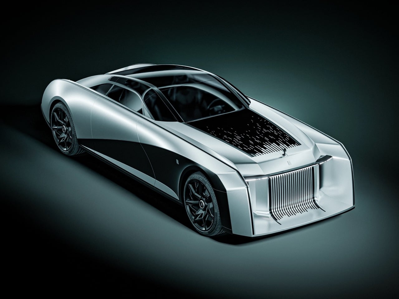
Called Firmament, the concept deletes the vertical Pantheon grille that has anchored every Rolls-Royce face for a century. A low, pointed nose takes its place, tapering to a blade like a ship’s hull. Streaks of light rain across the hood and glass roof, dense near the windshield and scattering into faint dust toward the tip, the way a meteor burns brightest right before it disappears. The pattern converges on the Spirit of Ecstasy, as if she is the one point catching everything falling from the sky. It is the loudest thing on the car, and everything else has been quieted to let it read clearly.
Designer: Gaspard Deveugle
![]()
![]()
Deveugle is a 3D design student based in Valenciennes, France, with internship experience across BMW, Kingfisher, and RealNum, and Firmament sits inside a portfolio built almost entirely on reinterpreting storied marques. He has rendered a Bentley Speed 8 tribute, sketched a Bugatti Type 52, built cafe racer studies off Harley Davidson and Moto Guzzi platforms, and designed a yacht concept called Arcane. Firmament arrives as an internship project rather than a factory commission, posted on Behance alongside a companion breakdown of the sketch and modeling process behind it. That distinction matters here. Nobody at Goodwood signed off on deleting the grille, which frees the concept to treat Rolls-Royce’s most sacred design element as raw material rather than untouchable heritage.
![]()
Rolls-Royce has already flirted with turning night sky into physical form, just never on the outside of the car. The Ghost introduced its fiber-optic Starlight headliner in 2014, a swath of black leather stitched with over a thousand tiny points of light, and Spectre pushed that further with more than five thousand illuminated points woven into the dashboard fascia. Both live entirely inside the cabin, visible only to whoever paid for the seat. Firmament takes that same instinct and turns it inside out, moving the starfield from the headliner to the hood where anyone on the street can see it. That single move reframes a private luxury detail as the entire visual identity of the car.
The mood board Deveugle built around the idea, titled Power of Duality, leans on real astrophysics rather than loose poetry. Stars manufacture heavy elements inside their cores through nucleosynthesis, then have to die violently to scatter that material across the universe, meaning creation and destruction share the same fuel line by necessity, not metaphor. His reference imagery pairs a comet’s frozen tail with a supernova’s radial burst and a single meteor reflected over open water, the visual grammar he then translated onto sheet metal. That grounding shows in how the streak pattern behaves on the car itself. It thickens where energy would concentrate and thins where it would dissipate, following a logic borrowed from physics rather than instinct.
![]()
![]()
The rest of the surfacing supports that reading without competing for attention. A raised black spine splits the rear deck into twin fenders that taper to points, a quiet nod to Rolls-Royce’s own boat-tail coachbuilding, though it plays a supporting role here rather than the headline. Dark, turbine bladed wheels replace the static hubcaps Rolls-Royce is known for, hardware that stays upright on its axle no matter how fast the wheel spins, trading serenity for something closer to a hypercar’s stance. There are no visible door handles or shutlines anywhere in the renders, just one continuous poured surface running from nose to tail. Every panel gap that would normally interrupt a Rolls-Royce silhouette has been resolved into a single, unbroken skin.
![]()
None of this is destined for Goodwood’s production line, and that is fine. Firmament works precisely because it is unburdened by the things a real Rolls-Royce has to solve, crash structures, pedestrian safety, a grille that still needs to cool something even on an EV. What it offers instead is a sharp piece of brand thinking from a student still building his portfolio, taking a hundred-year-old grille and a hood ornament everyone stopped truly looking at and making both feel dangerous again. Rolls-Royce spends real engineering effort making its cars feel weightless and silent. Deveugle’s answer is to make one look like it just survived a meteor storm, closer to what the Spirit of Ecstasy was always chasing.
![]()
![]()
The post Rolls-Royce Firmament Concept Turns the Hood Into a Meteor Shower Chasing the Spirit of Ecstasy first appeared on Yanko Design.