Vue normale

Il y a de nouveaux articles disponibles, cliquez pour rafraîchir la page.
À partir d’avant-hierYanko Design

This LEGO VHS Player Actually Has Cassettes You Can Insert and Remove

Par : Sarang Sheth
16 mai 2026 à 00:30

Before streaming queues and binge-watching algorithms rewired how we consume film and television, there was a ritual. You drove to the video store, walked the aisles, made your pick, and came home to slide that chunky black cassette into a slot that swallowed it with a satisfying mechanical thunk. The VCR wasn’t just a piece of consumer electronics. It was the centerpiece of a whole cultural ceremony, the thing that turned an ordinary Tuesday night into a genuine event. Polar-Angel_UA, a LEGO builder and 10K Club Member from Ukraine, has captured exactly that feeling in brick form with the Video Home System.

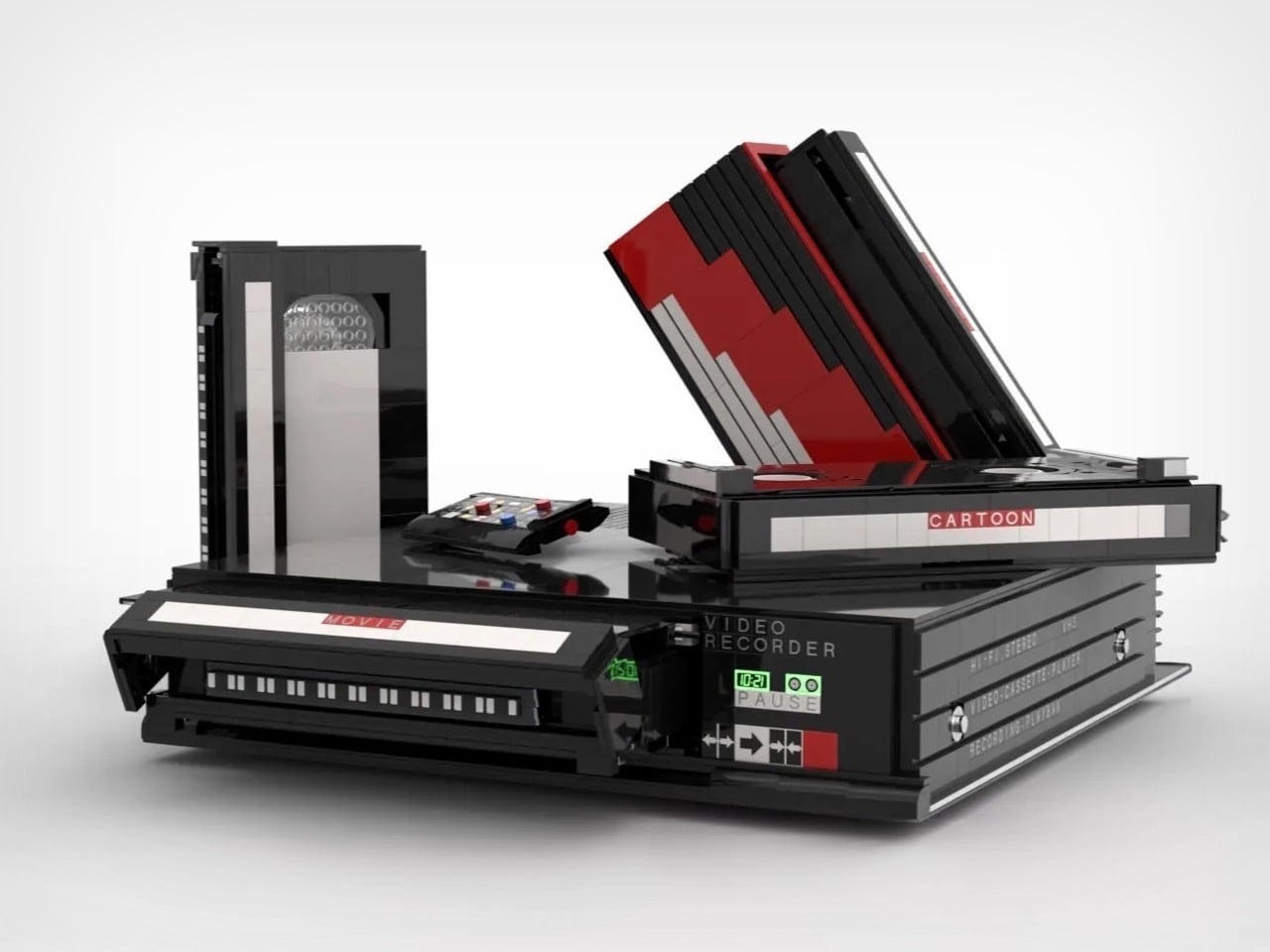
The build recreates a classic VHS setup with the kind of specificity that only someone who actually lived through the era could pull off. The main unit nails the flat, utilitarian slab aesthetic of a proper 80s or 90s VCR deck, complete with a cassette slot, a row of playback controls, and a PAUSE indicator rendered in green. A top-loading lid flips open to reveal the tape mechanism inside, and the real delight here is in that interaction. The tapes go in. The tapes come out. For a build that’s ostensibly a static display piece, that single interactive element transforms the whole experience.

Designer: Polar-Angel_UA

Four items accompany the main unit: a movie cassette, a cartoon cassette, a remote control, and a VHS case. The distinction between the movie tape and the cartoon tape is a quietly brilliant design decision because if you grew up in that era, you absolutely had a dedicated shelf section for each. Saturday morning cartoons lived in their own plastic sleeve, carefully rewound and stacked away from the movie collection. Polar-Angel_UA understands the taxonomy of the VHS-era household intimately, and it shows.

The MOC’s inherently block-ish nature (thanks to the LEGO bricks) works well for this product. VCRs were not delicate objects. They were heavy, deliberately black, and looked like they meant business sitting under your television set, blinking 12:00 in perpetuity because nobody ever set the clock. This LEGO version carries that same hulking, I-mean-business energy, with the cassettes propped against it like they’re already queued up for a double feature. The remote control sitting casually beside the deck is a small touch that completes the tableau perfectly. You can almost feel the carpet under your feet and smell the takeaway boxes.

The Video Home System is currently gathering votes on the LEGO Ideas platform, where fan-created builds compete for the chance to become official retail sets. Cross the 10,000 vote threshold and LEGO’s internal team reviews the submission for potential production. With 688 supporters on the board right now and 422 days left on the clock, there is plenty of runway here. Head to the LEGO Ideas page and cast your vote!

The post This LEGO VHS Player Actually Has Cassettes You Can Insert and Remove first appeared on Yanko Design.
The Hermès Birkin Finally Has a LEGO Version and It Opens to Reveal A Secret Runway Inside

Par : Sarang Sheth
8 mai 2026 à 19:15

The Hermès Birkin has one of the most theatrical purchasing rituals in luxury retail. You cannot simply walk into a boutique on Rue du Faubourg Saint-Honoré and buy one. Hermès makes you earn it, building a relationship with a sales associate over months, sometimes years, demonstrating cultural fluency with the house before they’ll even have the conversation. The result is an object that carries as much mythology as it does resale value, a handbag that has become shorthand for a particular kind of aspirational excess that the internet finds endlessly fascinating.

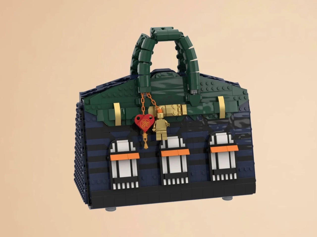
LEGO Ideas builders BOI_Design and KittyJW found a rather elegant workaround. Their MOC (My Own Creation) reimagines the Birkin 20 Faubourg, the special edition inspired by Hermès’s flagship Paris store, as approximately 1,400 bricks of deep navy, dark green, and gold. The exterior facade doubles as a miniature rendering of 24 Rue du Faubourg Saint-Honoré itself, complete with arched boutique windows and orange awnings. And it opens.

Designers: BOI_Design and KittyJW

The silhouette is immediately recognizable to anyone who has spent time in the vicinity of luxury retail, or, more realistically, scrolled past one on Instagram. The trapezoidal body is rendered in deep navy blue tiles, layered with a subtle horizontal banding that gives the surface genuine texture and depth. The handles arc overhead in dark green, assembled from linked Technic-adjacent elements that convincingly mimic the soft curve of the real bag’s leather grip. Gold hardware details sit at the clasp, at the side buckles, and along the turnlock assembly, and a tiny linked orange chain drops a red heart charm and a gold minifigure pendant in a detail that reads as both playful and surprisingly precise. Flip the bag around and the back panel is clean and quiet, just navy tiles and a gold Hermès tile sitting on a dark strap, which is exactly how the real thing looks.

The front face depicts three arched windows dressed with crisp white frames and orange awnings are spaced across the lower body, referencing the Haussmannian rhythm of the actual boutique facade at Faubourg Saint-Honoré. It takes a second to fully resolve in your eye, this thing that is simultaneously a handbag and a building, and that slight double-take is very much the point. The builders describe it as merging fashion and architecture into a single object, and looking at it straight on, that framing holds up completely.

My favorite detail, however, is what happens when you open it. The lid swings up to reveal a hidden interior scene that commits fully to the bit. Three pink minifigures, each carrying a tiny handbag, are posed on oversized primary-color bricks in red, yellow, and blue, the kind of bold, joyful color blocking that feels distinctly LEGO while also evoking a fashion week runway setup. Nestled alongside them is a miniature Birkin 20 Faubourg bag rendered at a smaller scale, a self-referential easter egg that will land immediately with anyone paying attention. The interior lining is lined in cream and tan tiles, a genuinely considered touch that mirrors how a real Birkin’s suede interior contrasts against its exterior leather. At 28.5 centimeters wide and 29 centimeters tall, the whole thing has real physical presence on a shelf.

The build is currently gathering votes on LEGO Ideas, the community platform where fan submissions need to reach 10,000 supporters before LEGO’s internal team will formally review them for potential production. It’s early days for this one, but the concept has the kind of crossover appeal, fashion collectors, LEGO enthusiasts, Paris romantics, people who just want the Birkin experience without the two-year waitlist, that could carry it a long way. You can head to the LEGO Ideas page here to cast your vote.

The post The Hermès Birkin Finally Has a LEGO Version and It Opens to Reveal A Secret Runway Inside first appeared on Yanko Design.

A Mouse You Can Squeeze Like a Stress Ball While You Work

Par : JC Torres
2 mai 2026 à 22:30

The computer mouse hasn’t changed much in decades. Still mostly hard plastic, still shaped like a bar of soap, still asking your hand to grip something that gives absolutely nothing back. The rest of the desk setup has evolved, ergonomic chairs, standing desks, wrist rests, but the one device your hand touches for eight hours straight has remained stubbornly rigid and deeply uninteresting.

The PILLIGA mouse concept makes a fairly obvious argument for why that should change. Instead of hard plastic, the entire upper chassis is a squishy, flexible membrane packed with a viscous, translucent gel. It’s the same basic impulse that makes people reach for a stress ball mid-meeting, except it’s also the thing you need to get any work done.

Designer: Guillermo Gonzalez

The thinking behind it is straightforward enough. Deadline pressure builds, calls run long, and the urge to fidget becomes almost impossible to ignore. Rather than keeping a stress ball in the desk drawer as a separate ritual, the mouse folds that habit directly into the tool that’s already in your hand. You can squeeze, press, or knead the gel without ever lifting your hand off your workflow.

The dome shape isn’t just for show, either. It follows the natural arch of your palm rather than forcing your hand flat against a hard surface, and the gel underneath absorbs the kind of low-level muscular strain that builds up quietly over hours of clicking and scrolling. It’s the sort of ergonomic consideration that usually requires its own dedicated accessory, not just a different material.

The controls themselves are sensibly laid out. A flat circular interface sits embedded in the front of the mouse, cleanly split for left and right clicks, with a textured, rubberized scroll wheel running between them. A USB-C port at the front handles charging, keeping the wireless design intact without the inconvenience of a separate charging dock. The bottom carries the optical sensor and power switch.

What makes the PILLIGA mouse concept genuinely interesting is how far it extends color as a design element. The gel comes in several variants, from vivid green with gold flecks and a blue version scattered with purple glitter, to darker, more subdued options that look considerably more at home on a professional desk. Each colorway pairs with a matching base and click interface, making the whole thing feel deliberate.

That range matters. The more reserved colorways hint that this isn’t a novelty item for a niche corner of the internet; it works just as comfortably on a professional desk as it does on a creative’s workstation. The gel doesn’t make it look cheap. It makes it look like something designed by someone who gave serious thought to what a mouse should feel like.

Concepts like the PILLIGA are more useful as provocations than promises. Computer mouse design has been coasting on the same assumptions for decades, and the idea that your primary input device could also be physically satisfying to hold hasn’t come up often enough. The gel-filled body raises the question, and that’s honestly more than most peripheral design manages to do.

The post A Mouse You Can Squeeze Like a Stress Ball While You Work first appeared on Yanko Design.

The LEGO Metal Slug Diorama With Adjustable Cannons, POWs, and Mid-Air Grenades Is Here

Par : Sarang Sheth
8 avril 2026 à 20:30

By 1996, the arcade was dying. Virtua Fighter and Tekken had the crowds. Sega’s racing cabinets had the spectacle. The conventional wisdom was that 2D games were finished, and anyone still making pixel art sidescrollers was simply behind the curve. Then Nazca Corporation released Metal Slug on SNK’s Neo Geo hardware, and the conventional wisdom had to sit quietly in a corner for a while. The game’s hand-animated sprites moved with a fluidity that polygon games couldn’t touch, and the humor, panicking soldiers, grateful POWs tossing rocket launchers, a tank that waddled like a toy, made the whole thing feel alive in a way that pure technical showmanship never quite manages.

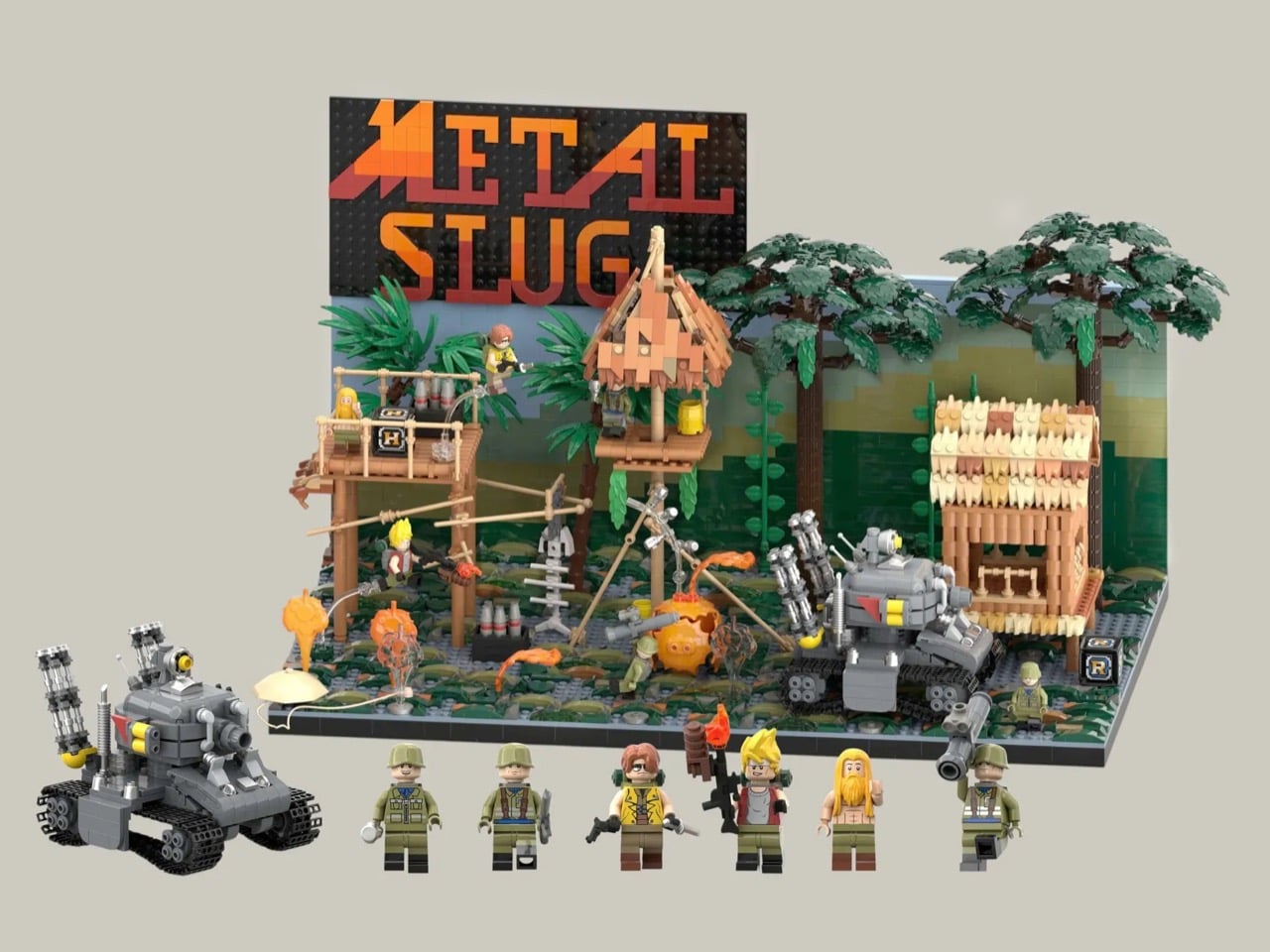
LEGO Ideas builder MagicBrick has captured a freeze-frame of that world in brick form, reconstructing the game’s iconic jungle mission with 2,701 pieces and 6 minifigures locked into a scene of swamp terrain, rebel soldiers, dense jungle vegetation, and the squat, waddling Super Vehicle-001 tank at the center of it all. It’s a dense, affectionate build made by someone who clearly lost many, many credits to this game, and it shows in every deliberately chosen detail, from the mid-jump Marco Rossi clutching a Heavy Machine Gun to the bearded POW standing by with a reward.

Designer: MagicBrick

The scene is structured like a freeze-frame from the game itself, which is exactly the right instinct. MagicBrick describes the goal as capturing “a dynamic instant where everything is in motion: jumps, actions, and interactions come together to recreate the fast-paced feeling typical of the game,” and the build delivers on that. Marco Rossi in his red jacket is airborne, Heavy Machine Gun in hand. Tarma Roving, yellow jacket, stands ready with a pistol and knife. Three Rebel Army soldiers in green uniforms and helmets fill out the opposition, armed with bazookas and rifles. The swamp base uses tiles in multiple shades to sell the terrain, jungle trees and palms crowd the background, and the brick-built backdrop reflects the arcade color palette of the original game rather than any attempt at realism. That last decision is a smart one. Metal Slug was never interested in realism, and neither is this.

The Super Vehicle-001 is the centerpiece, and MagicBrick has packed a surprising amount of function into a compact footprint. The rear cannons are adjustable, the tracks are functional, and antennas complete the silhouette. Scattered across the scene are the environmental details that will hit Metal Slug veterans like a reflex: ammo crates, yellow barrels, a hanging fish skeleton, a parachute, and both the Heavy Machine Gun and Rocket Launcher power-up pickups rendered in brick. My favorite touch, though, is the grenade sequence, a classic cartoon-logic arc of thrown grenades ending in a mid-air explosion, frozen in plastic at exactly the right moment of absurdity.

Topping the whole structure is the Metal Slug logo itself, rendered in a red-to-orange gradient that makes the build read as a display piece as much as a playset. It’s that combination of environmental storytelling, playable features, and genuine fan knowledge that separates builds like this from generic video game tributes.

LEGO Ideas is the platform where fan-designed MOCs (My Own Creations) gather community votes, with 10,000 supporters needed to trigger an official LEGO review and potential production as a retail set. MagicBrick’s Metal Slug submission hit 100 supporters almost immediately after going live and has been picking up Reddit traction since. If you grew up feeding tokens into a Neo Geo cabinet, head to the LEGO Ideas page and cast your vote here.

The post The LEGO Metal Slug Diorama With Adjustable Cannons, POWs, and Mid-Air Grenades Is Here first appeared on Yanko Design.

Beethoven Gets a 200th Anniversary LEGO Set Complete With Für Elise Sheet Music

Par : Sarang Sheth
6 avril 2026 à 20:30

Beethoven composed his Ninth Symphony completely deaf. He never heard a single note of it performed, yet it remains one of the most emotionally overwhelming pieces of music ever written. That particular detail about his life has a way of stopping people cold, the idea that the instrument of his perception was gone, and yet the music kept coming, arguably better than ever. There are very few stories in human history that capture creative resilience quite like his.

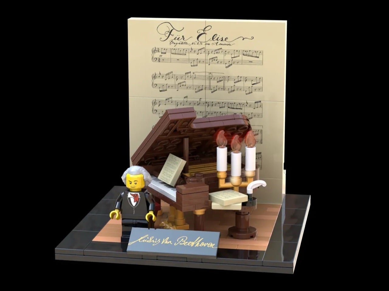
Fan designer CousinExcitedCactus has channeled that legacy into a 358-piece LEGO Ideas set timed to a significant milestone: March 26, 2027 marks the 200th anniversary of Beethoven’s passing. The result is a compact, modular display set with a grand piano, a Beethoven minifigure, a candlelit writing table, and a removable “Für Elise” sheet music backdrop, plus a surprisingly moving recreation of his grave monument in Vienna.

Designer: CousinExcitedCactus

The piano is the heart of this build, and it’s different from your average modern day grand piano. The design draws from two instruments Beethoven actually owned and played: the Érard grand gifted to him in 1803, and the Conrad Graf fortepiano he used in his final years, by which point his hearing was almost entirely gone. Both instruments were period pieces with a lighter, more intimate tone than the thundering concert grands of today, and the LEGO recreation captures that sense of a working composer’s instrument rather than a showpiece. The lid is propped open, strings are visible inside, and a small sheet of music rests on the stand, the kind of atmospheric detail that makes a display scene feel lived-in rather than staged.

The candelabra beside the piano is a three-flame setup rendered with white cylinder candles and transparent flame elements, casting the whole scene in an implied warm glow. The Beethoven minifigure stands on a warm-toned wooden stage floor, white hair, dark formal coat, red cravat, with his signature in gold script on a nameplate tile at the front edge. Behind everything, a large printed tile carries the full opening bars of “Für Elise” in period calligraphy, functioning simultaneously as a backdrop panel and the set’s most immediately recognizable design element. It is a clever piece of dual-purpose design, the kind of thing that looks obvious only after someone else has already thought of it.

My favorite detail, though, is the grave monument. The builder has included a fully separate modular sub-build recreating Beethoven’s actual resting place at Vienna’s Zentralfriedhof, a white obelisk on a columned base with “Beethoven” lettered across the front, pink flowers at the perimeter, and a golden butterfly at the apex. The reverse side of the “Für Elise” sheet music tile features a printed reproduction of the grave, which means the backdrop itself does double duty depending on which way you face it. That is a genuinely thoughtful design decision.

The set currently sits at 720 supporters on LEGO Ideas, the fan platform where community-made MOCs (My Own Creations) gather votes toward the 10,000-vote threshold required to trigger an official LEGO design review. With 414 days left on the clock, there is plenty of time to get it there. If you want to see this one make it to store shelves in time for the 2027 anniversary, head to the LEGO Ideas page and cast your vote here.

The post Beethoven Gets a 200th Anniversary LEGO Set Complete With Für Elise Sheet Music first appeared on Yanko Design.

LEGO and Crocs Finally Made the $89 Collab Nobody Knew They Needed

Par : Ida Torres
1 avril 2026 à 14:20

No matter how you feel about Crocs, you cannot deny the brand has a remarkable talent for finding partners that make you stop and say, “wait, actually… that works.” We’ve seen Krispy Kreme clogs dripping in donut-glazed energy, Windows XP nostalgia packed into a wearable throwback, and Ghostbusters uniforms distilled down to clog form. Every time I think Crocs has peaked its collab game, another partnership resets the bar. This time, they’ve linked up with LEGO for the Creativity Clogs collection, and this one lands a little differently.

The appeal is almost embarrassingly obvious in hindsight. Both LEGO and Crocs are built around the same core philosophy: take something simple, make it endlessly customizable, and let people go wild with it. LEGO gave us the stud system; Crocs gave us Jibbitz holes. Jibbitz charms are basically a wearable LEGO build. The two brands have been spiritually aligned for decades without anyone thinking to actually put them together, and the fact that it took this long feels like a design oversight that’s now been corrected.

Designers: LEGO x Crocs

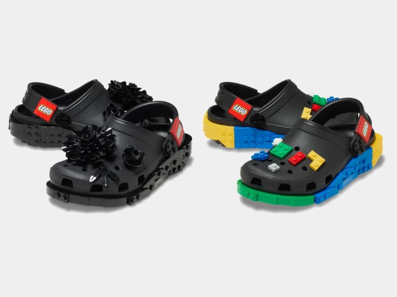
The collection spans several configurations. The base Creativity Clog starts at $79.99, keeping things relatively clean with colorful LEGO bricks along the sole and a Jibbitz-ready upper waiting to be personalized. There is also a Kids’ Creativity Clog at $59.99, because LEGO is a multigenerational brand whether anyone admits it or not.

The Masterbrand Creativity Clog at $89.99 is the one that goes all in. It arrives with 12 LEGO brick Jibbitz charms already loaded onto the upper and around the sole, plus a LEGO Minifigure tucked into the box. That detail genuinely made me smile. It is the kind of considered touch that separates a real collaboration from a brand simply slapping a logo on an existing product.

The Midnight Garden Creativity Clog takes the same design language in a different direction. Where the other colorways lean into LEGO’s signature primary palette, this version opts for a darker, more subdued aesthetic that feels almost grown-up by comparison. It is the right pick for someone who wants to quietly signal their appreciation for the collab without committing to the full crayon-box energy of the others.

Visually, these clogs strike a balance I did not expect. The brick texture runs along the sole without overtaking the whole shoe, so you are not walking around in something that looks like a toy store exploded on your feet. It is restrained enough to wear in public while still being obviously, joyfully LEGO. The Jibbitz-ready holes mean you can keep building on top of the base, swapping in dedicated LEGO charm packs depending on your mood. That is exactly the kind of open-ended customization that makes both brands tick.

The LEGO Group and Crocs announced their multi-year global partnership in January 2026, and the Creativity Clogs dropped on March 19, with LEGO Insiders getting a three-day head start. Certain sizes sold out quickly, which tells you all you need to know about the appetite for this one.

My honest read is that this collaboration is smarter than its predecessor. The original LEGO Brick Clogs were built for viral moments and display shelves. Giant foam bricks make a statement, but they do not go anywhere useful. The Creativity Clogs are the real follow-through, translating LEGO as a design language into something you would actually wear to a theme park, a farmers market, or around the house on a slow Tuesday. The playfulness is baked in without demanding you commit to a costume to participate.

That said, $89.99 for a pair of Crocs is a price point worth sitting with, even if the included Minifigure does technically sweeten the deal. Crocs collabs have always commanded a premium over the core classics, and by now the brand’s audience is accustomed to paying for the concept as much as the shoe itself. Whether the LEGO x Crocs Creativity Clog earns its place in your rotation will probably depend on how much real estate your inner kid still occupies. For a lot of people, that answer is quite a bit of space.

The post LEGO and Crocs Finally Made the $89 Collab Nobody Knew They Needed first appeared on Yanko Design.

Razer Just Proved Ergonomic Keyboards Don’t Have to Be Miserable

Par : JC Torres
1 avril 2026 à 10:07

Ergonomic keyboards have a reputation problem. They work, technically, but most of them look like they were designed by someone who’d never sat through a full workday. The splits are too wide, the angles too aggressive, and the learning curve steep enough to make you miss the flat keys you’ve always known. Plenty of people give it a try and quietly go back to what they had before.

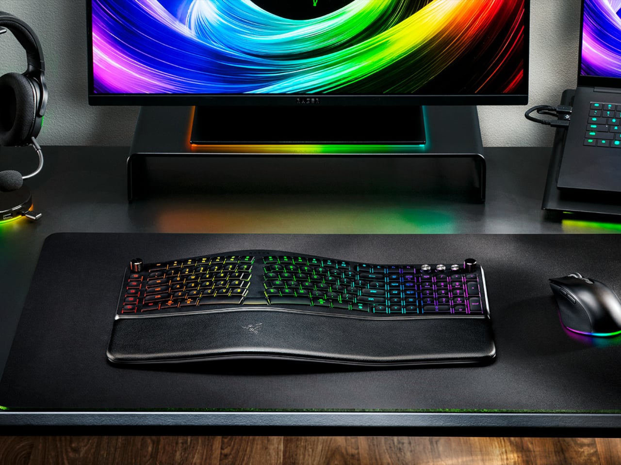
Razer’s answer is the Pro Type Ergo, its first wireless split ergonomic keyboard, built with that frustration clearly in mind. Rather than throwing you into a radical new layout, it’s tuned to feel approachable from the very first keystroke. The split gently angles your hands into a more natural alignment, easing the sideways reach that makes most forearms ache by mid-afternoon, without asking you to completely relearn how to type.

Designer: Razer

One of the more interesting layout choices is the dual “B” key arrangement, with one on each side of the split, along with an extra backspace tucked between two space bars. The idea is that both thumbs take on common actions, so you’re reaching less and crossing your fingers over each other less throughout the day. It’s a small shift that makes more sense the longer you sit with it.

The keycaps are ultra-low-profile, fitted with subtle spherical indents that nudge your fingertips into the right position without you having to think about it. Sound-dampening layers and tuned stabilizers underneath keep the typing noise low enough for open offices and video calls. Shorter key travel also means less physical effort per keystroke, which doesn’t sound like much until you’ve been at your desk for six hours straight.

The wrist rest is permanently integrated rather than removable, which turns out to be a feature rather than a limitation. It’s just always there, supporting your wrists from the moment you sit down without any extra setup. A 10-degree base slope sets the starting angle, and five tilt positions, from flat to seven degrees forward or back, let you dial in the fit depending on your desk height and preference.

A Razer Command Dial lets you assign up to eight functions, expandable to 100 via Razer Synapse, while five macro keys along the left side keep your most-used shortcuts within easy reach. There’s also a dedicated AI Prompt Master key that handles things like drafting emails, summarizing blocks of text, or kicking off a research query in a single press, without pulling you out of whatever window you’re already in.

Connectivity spans Razer HyperSpeed Wireless at 2.4 GHz, three Bluetooth profiles, and USB-C wired mode, with support for up to five devices total. Razer Chroma RGB backlighting covers 19 customizable zones and can be switched off entirely for offices where animated key lighting might not go over well. The design is clean and understated, a far cry from the aggressively lit gaming keyboards Razer is better known for.

The Pro Type Ergo retails at $189.99, about $30 more than Razer’s conventional Pro Type Ultra from 2021. For anyone who types for a living and has been quietly working around the ache of a standard keyboard layout, that extra cost starts to feel a lot less significant once you’ve spent a full day on something that actually fits how your hands are supposed to sit.

The post Razer Just Proved Ergonomic Keyboards Don’t Have to Be Miserable first appeared on Yanko Design.

Stay Classy, San Diego: This LEGO Anchorman Set Recreates the Entire Channel 4 Newsroom in 1,500 Bricks

Par : Sarang Sheth
20 mars 2026 à 20:45

Anchorman: The Legend of Ron Burgundy turned twenty in 2024, and somehow, the film has only gotten funnier with age. What started as a Will Ferrell comedy about a hilariously fragile male ego navigating the very real 1970s newsroom gender wars became one of the most quoted, most meme’d, most endlessly rewatchable comedies in modern American film history. “I’m kind of a big deal,” “I love lamp,” “60% of the time it works every time” – the lines are so deeply embedded in pop culture at this point that people quote them without even knowing where they came from. San Diego’s most legendary fictional anchor deserves better than a passing reference in a listicle, and LEGO Ideas builder footonabrick clearly agrees.

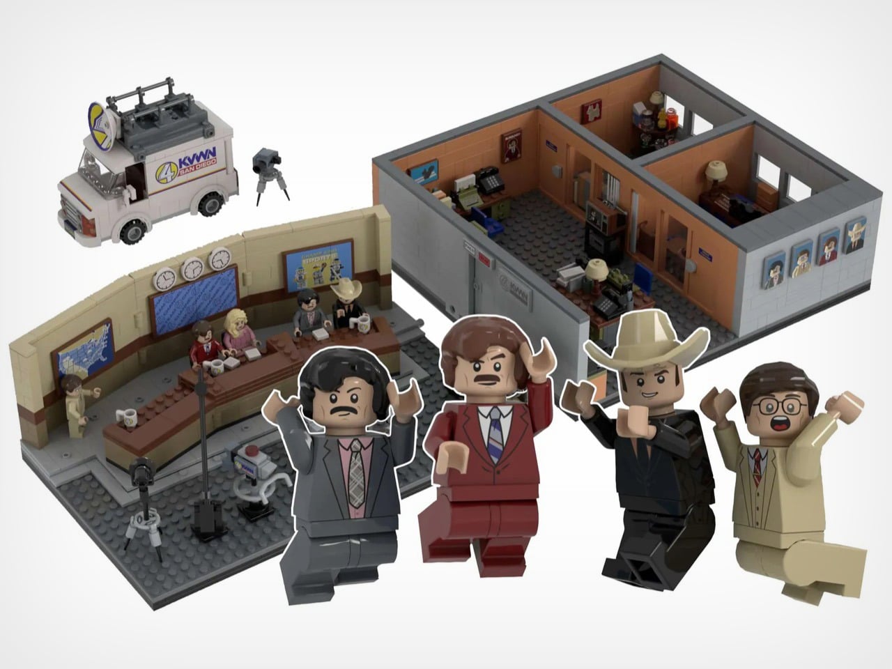
The result is a just-over-1,500-piece MOC (My Own Creation) that reconstructs the Channel 4 News Team’s world with an almost obsessive attention to detail, covering the broadcast studio, the newsroom offices, and even the KVWN news van parked out front. The studio section is immediately recognizable: a curved tan backdrop wall, three wall clocks ticking away above the anchor desk, dual blue Channel 4 News Team screens flanking the set, and the full team seated behind that iconic brown desk with their Channel 4 mugs. It looks like a freeze-frame from the film, and that’s entirely the point.

Designer: footonabrick

The broadcast desk is the centerpiece, and footonabrick nails the warm tan-and-brown palette of that gloriously dated 70s newsroom aesthetic. Ron and Veronica sit front and center behind their Channel 4 mugs, with Brian Fantana, Champ Kind, and Brick Tamland flanking them across the curved desk. The curved wall behind them is one of the trickier builds to pull off cleanly in LEGO, and the segmented panel construction keeps it looking smooth without losing the layered depth of the real set. Camera equipment on the studio floor, a boom-arm mic stand, and a vanity mirror station on the side round out the production floor detail beautifully.

Turn to the office areas and you’ll find a bunch of details and easter eggs. Ron’s private office has his nameplate desk, a glass of scotch rendered in a transparent amber round piece, and a “Missing” poster for Baxter tucked onto a side shelf. Brian Fantana’s cologne closet, one of the film’s most beloved gags, is recreated with an open cabinet stocked with colourful brick-built bottles, with a “Brian Fantana” book sitting on his desk for good measure. The hallway outside features a glass-panel wall looking into Ron’s office, and a Ron Burgundy door nameplate that even Veronica would have to respect. My favorite detail, though, is the row of four team portrait tiles mounted on the exterior office wall, each one a miniature LEGO-art-style illustration of the Channel 4 crew. Tiny, considered, and completely unnecessary in the best way.

The eight minifigures are pitch-perfect. Ron arrives in his burgundy suit with a jazz flute and a scowl that says “I have many leather-bound books.” Brick Tamland, naturally, comes with his trident. Champ has his signature cowboy hat, Fantana carries what appears to be a cologne bottle, and Veronica is rendered in her pink suit with that particular expression of someone perpetually tolerating Ron’s nonsense. Baxter the dog is included as a separate figure, and there’s even a bonus Ron on a tiny red bicycle, which is exactly the kind of specific deep-cut that separates a good MOC from a great one.

footonabrick’s Anchorman set is currently gathering votes on LEGO Ideas, the community platform where fan-created MOCs (My Own Creations) need 10,000 supporters to trigger an official LEGO review and potential retail production. With 344 votes on the board and 421 days left on the clock, there’s plenty of runway. If you want to see this land on store shelves, head to the LEGO Ideas page and cast your vote. You stay classy.

The post Stay Classy, San Diego: This LEGO Anchorman Set Recreates the Entire Channel 4 Newsroom in 1,500 Bricks first appeared on Yanko Design.

This classic 1979 LEGO computer brick hides a fully functional Mac mini workstation inside

Par : Gaurav Sood
18 mars 2026 à 19:15

Retro designs often carry a sense of nostalgia, but occasionally they evolve into something more functional and imaginative. The M2x2 workstation by Watt IV is a good example with the inventive reinterpretation of a classic LEGO element transformed into a fully working desktop computer. Created by Dutch designer Paul Staal, the device takes inspiration from the iconic sloped LEGO computer brick introduced in 1979 and scales it up into a practical workstation powered by a modern Mac mini.

The DIY centers around the familiar wedge-shaped Slope 45 2×2 LEGO piece, a part historically used in LEGO space-themed sets as a representation of computer terminals inside spacecraft cockpits. Staal enlarged this element to roughly ten times its original size, turning it into a functional housing that blends retro toy aesthetics with contemporary computing power. Inside the oversized brick sits an Apple Mac mini equipped with Apple’s M4 chip, transforming the playful concept into a capable desktop system.

Designer: Paul Staal

Rather than serving as a simple decorative shell, the M2x2 integrates several practical features that enhance its usability as a workstation. A slanted 7-inch IPS touchscreen is embedded in the front face of the structure, echoing the display graphic printed on the original LEGO piece while providing real functionality. The compact screen acts as a secondary interface, often used for quick system information or dashboards. Staal, for instance, uses it primarily to monitor and control his smart home through a Home Assistant interface while working on a larger external display.

The case includes front-facing ports enabled through a USB-C hub, along with an SD card reader for easy access to external storage and accessories. This arrangement ensures the device remains practical for everyday use despite its playful form factor. The system also retains portability elements inspired by early Apple computers, including a built-in handle at the back that makes the unit easy to move around a desk or workspace. While the M2x2 works as a self-contained computer, it is typically paired with a larger external monitor for full productivity. In everyday use, the Mac mini handles the heavy computing tasks while the built-in display functions as a control panel or status screen.

Perhaps the most creative detail lies in the oversized LEGO studs on top of the case. Instead of being purely decorative, these studs are designed to perform useful functions. One of them operates as a rotary control that can adjust volume or media playback, while the other conceals a wireless charging bay capable of powering devices such as AirPods or an Apple Watch. The studs themselves remain compatible with standard LEGO elements, allowing users to attach minifigures or bricks for a playful finishing touch.

The M2x2 is largely built from 3D-printed components, making it accessible to enthusiasts who want to build their own version. Staal modeled the structure in CAD software and designed it as a modular system consisting of multiple printable parts. Aside from the Mac mini itself, the required materials are relatively simple, including PLA filament, a small touchscreen display, screws, and a USB-C hub. Assembly instructions and downloadable files are available, allowing makers to replicate or modify the design to suit their needs.

The post This classic 1979 LEGO computer brick hides a fully functional Mac mini workstation inside first appeared on Yanko Design.

CIGA Design Just Built the Most Interesting Tourbillon Watch of 2026

Par : Sarang Sheth
17 mars 2026 à 00:30

In Mandarin, the phrase 马上 (mǎ shàng) translates literally as “on horseback,” but its common meaning is “immediately” or “without delay.” It’s a concept of swiftness and forward momentum. For its Year of the Horse timepiece, CIGA Design has built an entire watch around this clever piece of wordplay. The design embodies that feeling of instant progress and unstoppable movement, creating a narrative woven directly into the mechanical and aesthetic choices. It is a watch about the philosophy of action.

The central tourbillon is the engine of this idea, its constant rotation a visual metaphor for momentum that the wearer sees with every glance at the wrist. The dial’s concentric grooved rings radiate outward from this spinning core, amplifying the sense of energy in every direction. A 24K gilded horse at six o’clock connects the concept directly to its zodiac inspiration, rendered small and precise, more like a seal than a decoration. CIGA Design, the first Chinese watchmaker to win the Grand Prix d’Horlogerie de Genève, has a track record of treating mechanics as design language, and this is the clearest expression of that philosophy yet. The cultural reference and the engineering are telling the same story, which is rarer in theme watches than it should be.

Designer: CIGA Design

Putting a tourbillon front and center is a serious power move. Most watchmakers tuck it away at the six o’clock position, but CIGA’s in-house CD-12-SI caliber was clearly designed for the spotlight. The entire visual architecture of the watch is built to serve this mechanism. It runs at a modern 28,800 vibrations per hour, which gives the balance wheel a smooth, fluid sweep. A 38-hour power reserve is perfectly serviceable for a manual-wind piece, meaning you get to have that tactile interaction with it daily. It’s the kind of engineering that invites you to look closer, to appreciate the complexity instead of just accepting that it works.

The case material, Grade 5 titanium, is a choice that speaks volumes. At 45.5mm, this watch could have been a heavy, unwieldy piece of metal in steel, but titanium makes it surprisingly light and comfortable on the wrist. The black DLC coating gives it a tough, scratch-resistant finish that feels both modern and understated. Those concentric grooves on the dial are the most impressive part of the case work. They give the flat black dial a sense of depth and texture that plays with light in interesting ways. It’s a very architectural approach that prevents the watch from feeling boring, which is a real risk with monochrome designs.

You solve the problem of telling time without cluttering the main event with a pair of floating diamonds for hands. It’s a brilliant, minimalist solution. Legibility might take a slight hit in certain lighting, but it’s a worthy trade-off for maintaining an unobstructed view of the tourbillon. The strap is shell cordovan, a fantastic, non-porous leather known for its durability and rich patina over time. Pairing it with a hidden butterfly clasp was the right call, preserving a clean, unbroken line around the wrist. These details show a design team that was thinking about the complete ownership experience, not just the initial wow factor.

The $2,699 price fundamentally challenges the idea that an in-house tourbillon must cost as much as a mid-size sedan. This watch appeals directly to the enthusiast buying the complication itself, not the logo on the dial. The 199-piece production run feels like a calculated appeal to a very specific customer who values the engineering over the emblem. With this move, CIGA methodically builds its credibility on accessible complexity and a design language that is unmistakably its own. They are carving out a space by delivering serious horology without the traditional five-figure barrier to entry.

The post CIGA Design Just Built the Most Interesting Tourbillon Watch of 2026 first appeared on Yanko Design.

LiberNovo Omni Just Won the iF Design Award 2026 for Wellness Design

Par : JC Torres
16 mars 2026 à 01:45

Most office chairs operate on a quiet assumption that sitting is something your body should adapt to, not the other way around. You adjust the height, nudge the lumbar support into roughly the right position, and then spend the rest of the day subtly fighting the chair anyway. The ache between your shoulders, the stiffness in your lower back by mid-afternoon, that’s just part of the deal, apparently, and most of us have accepted it without much argument.

LiberNovo decided not to accept it. The result is the Omni, a chair the company calls a Dynamic Ergonomic Chair, and it just picked up the iF DESIGN AWARD 2026 in the Product Design – Beauty/Wellness category. The iF Design Award has been one of the most internationally respected design recognitions since 1954, with this year’s cycle drawing more than 10,000 entries from over 60 countries. That’s a serious field to stand out in

Designer: LiberNovo

Click Here to Buy Now: $929 $1099 (15% off). Hurry, deal ends in 48-hours!

The core idea behind the Omni is that your posture doesn’t stay fixed throughout a workday, so your chair probably shouldn’t either. The Bionic FlexFit Backrest is built around that logic, using 16 spherical pivot points, 8 adaptive flexible panels, and 14 dual-connection points to follow the natural curve of your spine as it shifts. It covers you from the hips up through the shoulders, spreading pressure across the whole back rather than piling it onto one fixed lumbar point.

What makes this work in practice is the Dynamic Support system, which adjusts automatically to changes in your posture without you having to reach for anything. Lean forward during a focused stretch of work, sit back when you’re thinking something through, the chair tracks those shifts, and responds in real time. It’s the kind of feature that sounds modest until you realize how much of your day you’ve spent adjusting a chair that couldn’t do this.

Then there’s OmniStretch, which is where the Omni starts to feel like something genuinely different. Sitting for long hours compresses the lower spine gradually, and most chairs just let that happen. OmniStretch is a guided decompression feature that gently stretches the lower spine during the workday, designed to actively relieve pressure rather than simply tolerate it. It’s probably why the iF jury placed the Omni in the Beauty/Wellness category: this chair isn’t just holding you up, it’s doing a bit of recovery work along the way.

The Omni also offers four recline positions running from 105 to 160 degrees. The shallower end is built for focused, upright work, while the deep 160-degree Spine Flow position is designed for full spinal decompression between sessions. The two intermediate angles cover the range in between, which gives the chair a kind of daily rhythm that matches how most people actually move through their hours rather than sitting rigidly in one position all day.

The chair was developed by LiberNovo’s team in Shenzhen alongside industrial design firm Kairos Innovation, also based there. Winning an iF award is meaningful external confirmation that the design thinking behind the Omni translates beyond the product brief. For a chair that started from the premise that desk work doesn’t have to hurt, that’s a pretty good place to land.

Click Here to Buy Now: $929 $1099 (15% off). Hurry, deal ends in 48-hours!

The post LiberNovo Omni Just Won the iF Design Award 2026 for Wellness Design first appeared on Yanko Design.

LEGO Just Built the $90 Snoopy Set Every Peanuts Fan Always Wanted

Par : Ida Torres
19 février 2026 à 15:20

No matter how old we get, most of us would probably still collect things from our favorite characters when we were kids. Some would call it healing our inner child, while others would simply say we now have the money to buy what we want compared to back then. Either way, there’s something undeniably joyful about it. Snoopy is probably one of the most beloved and enduring characters of all time, and if you’re a LEGO lover as well as a fan of this witty beagle, then you’d want to hold on to your roof.

LEGO is releasing a new build for Snoopy fans to celebrate over 75 years of the Peanuts legacy. LEGO Ideas Peanuts: Snoopy’s Doghouse is a 964-piece set that features the iconic dog and his legendary red doghouse. It’s not just a toy, as it’s meant for those who are 18 years old and above. Rather, it’s a display piece that brings together fun, nostalgia, and the unique joy that comes from building something featuring our all-time favorite character.

Designer: LEGO

What makes this set even more special is its origin story. It started as a fan submission on the LEGO Ideas platform, a space where LEGO enthusiasts submit their own brick creations, rally votes from the community, and if they’re lucky, see their dream set come to life. This one was designed by fan creator “bossofdos64,” and after earning enough votes from fellow fans, the LEGO Group worked their magic to make it a reality. So in a way, this set was made by a fan, for fans, and that’s something truly worth celebrating.

The doghouse itself stands over 10 inches high, 6.5 inches wide, and 5.5 inches deep, making it ideal as a statement piece on your shelf or desk. Aside from the iconic red doghouse that even casual fans would recognize anywhere, the set also comes with a posable Snoopy figure. It has two alternative leg builds so you can pose him sitting or standing, and two neck positions so he can be upright or lying down, fully ready for whatever mood strikes you.

A Snoopy scene wouldn’t be complete without Woodstock, his little yellow bird bestie of officially unknown species. The set also includes accessories like a typewriter to give Snoopy his classic writing moments, a campfire with marshmallows for a cozy toasting scene, and a grassy green base to anchor the whole display together. The interior walls of the doghouse can even be folded out to reveal a gorgeous starry night sky backdrop that really sets the mood.

With all these elements, you’ll be able to recreate some iconic scenes to make your Snoopy heart truly happy. You can display him lounging on top of the doghouse with Woodstock resting on his belly, living his best life and, honestly, inspiring us all. You can also pose Snoopy typing away at his little LEGO typewriter, working on that great novel we’re all still waiting for, or have the two besties toasting marshmallows together under a starry sky. The set offers enough variety that you might find yourself rearranging the display every season just because you can.

The LEGO Builder app gives you access to 3D instructions, whether you’re a first-timer or an experienced builder who wants to zoom in, rotate, and track their progress along the way. The set is priced at $89.99 USD, making it a thoughtful splurge or a perfect gift for any Peanuts lover in your life. You can pre-order the set now, and it will start shipping out this June.

Whether you’re building it for yourself or gifting it to someone whose eyes light up at the mere sight of a little black-and-white beagle, this set is a beautiful reminder that some things never get old. Snoopy has been napping on that rooftop, dreaming big, and making us smile for over 75 years, and clearly, he has absolutely no plans of stopping. Good grief, indeed.

The post LEGO Just Built the $90 Snoopy Set Every Peanuts Fan Always Wanted first appeared on Yanko Design.

Google Released a New Pixel 10a and It’s Basically the Same Phone From Last Year

Par : Sarang Sheth
18 février 2026 à 20:15

Google would like you to meet the Pixel 10A. It has a new name, new colors, and a press release that runs to several pages. It costs $499, which is exactly what the Pixel 9A cost. It weighs the same. It measures the same. It has the same cameras, the same battery, the same chip, and the same 6.3 inch display. There is a episode of The Office where Pam preoccupies Michael by presenting two identical photo printouts as a spot-the-difference puzzle. Google has essentially done that, except the printout costs five hundred dollars.

To be precise about what actually changed: the display is about 10% brighter, the glass protecting it moved from Gorilla Glass 3 to Gorilla Glass 7i, wired charging climbed from 23 watts to 30, and wireless charging went from 7.5 watts to 10. The camera bump, already barely perceptible on the 9A, is now completely flush. In some regions, satellite SOS is supported. That is the complete list. Google did not forget to send the rest of it.

Designer: Google

The Pixel 10 and Pixel 10 Pro both run on the Tensor G5. The Pixel 10A runs on the Tensor G4, the same chip from last year’s A-series, and the year before that in the Pixel 9 Pro. For years, buying the A-series meant getting the current flagship chip in a cheaper body. That was a genuinely good deal. Google has decided, apparently, that it was too good.

Best Take, Camera Coach, Call Screening, Clear Calling, Now Playing, Gemini as a built-in assistant, and seven years of updates add up to an experience that Android competitors at this price genuinely struggle to match. The Pixel ecosystem has real pull, and Google knows it. The 10A is banking on that pull being strong enough to carry a spec sheet that would embarrass a 2024 phone.

Google looked at the Pixel 9A, decided it had not been wrong about any of it, and shipped it again with brighter glass and a new colorway called Fog. In an industry that routinely invents problems to solve, there is something almost philosophical about a company that simply refuses to fix what it considers unbroken. The Pixel 10A does not have an identity crisis. It has its predecessor’s identity, and it is completely comfortable with that.

It will sell because the cameras are good, the battery lasts, the software support is unmatched at the price, and most people upgrading to it will be coming from something two or three generations older where the difference feels significant regardless of which Tensor chip is inside. Google understands its buyer perhaps better than its buyer understands the spec sheet. The Pixel 10A is a perfectly competent phone that knows exactly what it is. But also… this smartphone announcement could have been an email.

The post Google Released a New Pixel 10a and It’s Basically the Same Phone From Last Year first appeared on Yanko Design.

❌
❌