❌

Vue normale

  • ✇Yanko Design
  • DRIFT’s Glass Sculpture Traces Wind Without Moving
    Wind usually needs an accomplice to become visible: a bending tree, a billowing curtain, a plastic bag having a much more cinematic afternoon than it deserves. Air itself gives us very little to look at. Aeolus, a new installation by Amsterdam-based studio DRIFT, takes on that perceptual problem with hundreds of suspended glass rods and light. It gives an invisible force a form you can actually follow. The studio’s founders, Lonneke Gordijn and Ralph Nauta, have made Aeolus an interactive artwo
     

DRIFT’s Glass Sculpture Traces Wind Without Moving

20 octobre 2026 à 14:20

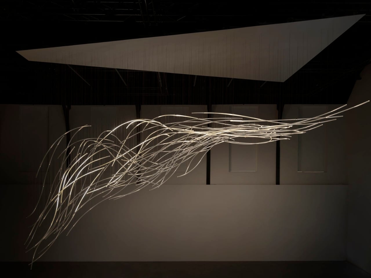
Wind usually needs an accomplice to become visible: a bending tree, a billowing curtain, a plastic bag having a much more cinematic afternoon than it deserves. Air itself gives us very little to look at. Aeolus, a new installation by Amsterdam-based studio DRIFT, takes on that perceptual problem with hundreds of suspended glass rods and light. It gives an invisible force a form you can actually follow.

The studio’s founders, Lonneke Gordijn and Ralph Nauta, have made Aeolus an interactive artwork rather than a conventional light fixture. Presented with Carpenters at London’s Ladbroke Hall from October 13 through 25, 2026, the installation takes its name from the Greek god of the winds. Its shape, though, comes from a specific earthly source: the architecture of the room containing it.

Designer: DRIFT

DRIFT begins with a digital reading of the surrounding architecture, then translates that space into a virtual environment where air can flow. The studio selects one moment from that simulated movement and gives it physical form in glass. That distinction matters. Aeolus isn’t showing a live reading of whatever breeze happens to be passing through the gallery. Its structure holds a chosen instant, while the lighting introduces a separate layer of change.

I like that the room has a say in the result. A sculpture built from its setting feels more considered than an impressive object dropped into an available corner. DRIFT says each installation is generated by its host architecture, so the curves carry information about a particular place. The building becomes part of the design process, even if visitors never see the digital model behind it.

In Benjamin Baccarani’s photographs, the rods gather into a long, sweeping formation, dipping at one end and stretching outward at the other. Fine suspension lines lead up to a broad overhead panel. The material list is more technical than the airy appearance suggests: borosilicate glass rods, stainless steel nodes, custom LEDs, and microcoax cables. I appreciate that contrast. Making an object look almost weightless still requires hardware, connections, and a deliberate relationship with gravity.

The glass itself stays still. According to Carpenters, small lights inside the rods change their rhythm and intensity in response to visitors moving through the space. Waves of illumination create the impression of motion without the sculpture physically shifting. That’s the cleverest choice here. The designers don’t need to swing a roomful of glass around to suggest wind; they let your eyes follow light across a fixed structure, doing much of the perceptual work.

The interaction also gives visitors a meaningful role without turning them into operators. Walking changes the work’s lighting, a relationship that seems appropriately direct for an installation about air and movement. I’m drawn to technology that makes its presence felt through an understandable response. Here, the interesting question is how your movement alters what you see, rather than how many technical features the system contains.

DRIFT frames Aeolus as an invitation to reconsider our relationship with nature. I’d treat that as a starting point for looking, not a transformation any artwork can promise. The more convincing achievement is smaller and more specific: making airflow legible through material and light. You don’t need to leave with a new environmental philosophy to appreciate the way a simulated path has become a collection of precise, luminous curves.

For me, the appeal sits in that modest shift in attention. The room stops being an empty container for an artwork and starts to look like a place shaped by movement. Aeolus makes that movement imaginable while keeping the glass suspended in a single instant. A visitor supplies motion, the lights answer, and the fixed structure takes on another rhythm. The glass gives you time to study a shape that moving air would never hold still for inspection.

The post DRIFT’s Glass Sculpture Traces Wind Without Moving first appeared on Yanko Design.
  • ✇Yanko Design
  • Masa’s Wavy Tray Is Sculpture You Can Actually Serve Snacks On
    Six burgers, a pile of fries, and generous spoonfuls of caviar are a pretty good way to explain dumæ’s Masa Tray. In the brand’s photographs, the food sits on a rippling brass surface that looks more like a small sculpture than standard serving ware. I like the slightly ridiculous pairing. It also makes the tray’s purpose clear: give dinner a visually interesting home without adding a separate decorative centerpiece. Designed by Los Angeles brand dumæ and handcrafted in India, Masa addresses th
     

Masa’s Wavy Tray Is Sculpture You Can Actually Serve Snacks On

20 octobre 2026 à 09:20

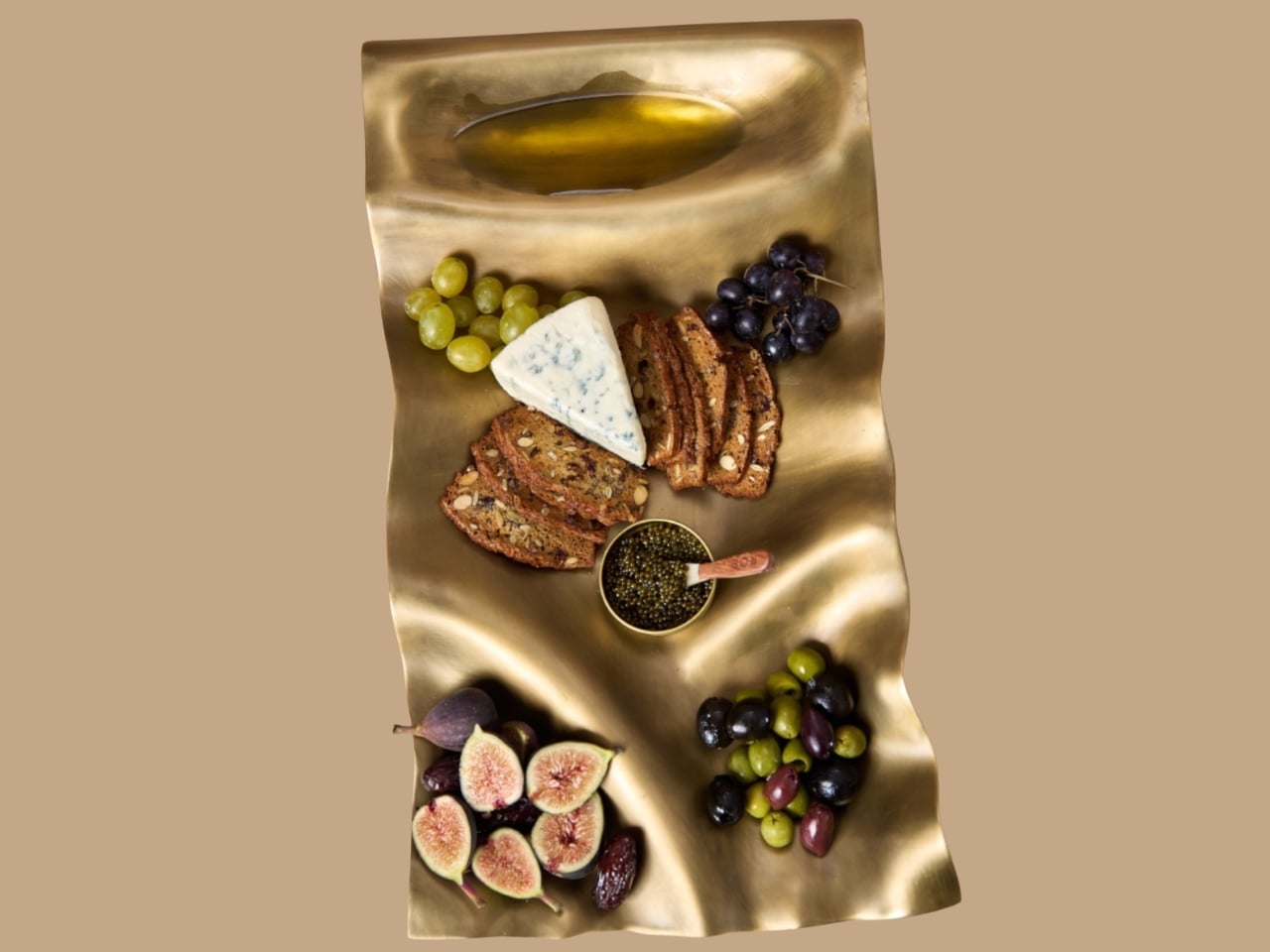
Six burgers, a pile of fries, and generous spoonfuls of caviar are a pretty good way to explain dumæ’s Masa Tray. In the brand’s photographs, the food sits on a rippling brass surface that looks more like a small sculpture than standard serving ware. I like the slightly ridiculous pairing. It also makes the tray’s purpose clear: give dinner a visually interesting home without adding a separate decorative centerpiece.

Designed by Los Angeles brand dumæ and handcrafted in India, Masa addresses that familiar divide between the serving pieces you use and the decorative objects you leave out. Its project description says the brass tray is finished to be food-safe, allowing it to move between both roles. The appeal is having one substantial object that doesn’t need to disappear when everyone finishes eating.

Designer: dumæ

The starting point is the movement of waves, translated into broad rises and shallow dips rather than a literal seashell outline. IADA’s announcement traces the reference to Point Dume, the stretch of coast where dumæ founder Kym Gold grew up. I appreciate that the backstory isn’t required reading. Even without knowing the geography, you can see how the curves break up what could otherwise be a rather stern metal rectangle.

In the close-up photographs, light collects along the higher ridges while the depressions fall into softer shadow. That gives the surface a sense of movement even when it’s covered with crackers and grapes. The edges rise and dip with the rest of the form, so the shape feels continuous rather than decorated afterward. To my eye, that’s the strongest design decision here. The visual interest comes from the tray itself, without needing a pattern applied on top.

Those undulations also deserve a practical look. A sculpted surface offers a different proposition from a flat platter, particularly if you’re arranging small bowls or setting down glasses. I’d treat Masa primarily as a tabletop serving piece rather than assume it’s the ideal tray for carrying drinks across a room. The photographs make a convincing case for loosely arranged food. They don’t establish how securely every vessel would sit, and the distinction matters when the surface is this expressive.

The handcrafting adds another layer. According to the announcement, small differences in form and finish occur from piece to piece. That feels appropriate for a design built around irregular movement; perfect repetition would almost work against the idea. Still, handmade isn’t a performance specification. The individuality is a reason to appreciate the object visually, not evidence that it will resist scratches or survive every kind of use. I’d want the maker’s specific care guidance before treating it as everyday workhorse tableware.

Retail listings put its footprint at approximately 21.5 by 11.5 inches, with a height of 3 inches. That’s worth measuring against your table before imagining a generous spread surrounded by dinner plates. The Happy Kangaroo lists Masa at $595, although it’s marked sold out at the time of writing. At that price, this is a considered decorative purchase with a serving function, and its appeal depends on wanting to see it between meals.

Masa received Platinum recognition in both Kitchen & Dining Room Design and Homewear & Decor at the International Architecture & Design Awards 2026. Those categories neatly reflect its intended overlap: something for the table that can also hold its own elsewhere in the house. The recognition is useful context, though the more persuasive argument is still visible in the photographs: food looks inviting against those broad brass curves.

I’m most persuaded by the burger arrangement. The cheese, figs, and carefully grouped grapes are lovely, but takeout gives the tray a less precious personality. It suggests that owning a sculptural serving piece doesn’t require hosting a perfectly coordinated dinner party. I’d rather see an object like this earn its space under a heap of fries than spend its life waiting for an occasion formal enough to deserve it. The waves are already doing the decorating.

The post Masa’s Wavy Tray Is Sculpture You Can Actually Serve Snacks On first appeared on Yanko Design.

  • ✇Yanko Design
  • Kenko’s 18-Gram Pieni III Camera Shoots Without a Screen
    Keychain cameras have a certain appeal for those who love to carry a bit of nostalgic charm with them. Well, technically, they’re still digital cameras, but there’s a retro feel to them that appeals to those who remember taking photos before smartphones. They’re cute and tiny enough to carry as accessories, but they still let you take photos and videos to add to your collection. Kenko Tokina has released another tiny camera to add to the fun. The Kenko Pieni III is an ultra-small digital toy ca
     

Kenko’s 18-Gram Pieni III Camera Shoots Without a Screen

20 octobre 2026 à 04:15

Keychain cameras have a certain appeal for those who love to carry a bit of nostalgic charm with them. Well, technically, they’re still digital cameras, but there’s a retro feel to them that appeals to those who remember taking photos before smartphones. They’re cute and tiny enough to carry as accessories, but they still let you take photos and videos to add to your collection.

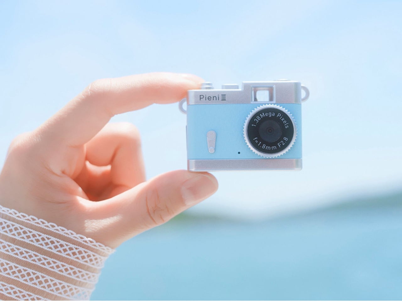
Kenko Tokina has released another tiny camera to add to the fun. The Kenko Pieni III is an ultra-small digital toy camera designed to be worn as a necklace or an accessory. It comes with a neck strap for that purpose. It’s not meant to replace your bigger camera, of course, but it offers another way to take photos and videos.

Manufacturer: Kenko Tokina

This version of the Pieni camera is just over two inches wide and weighs approximately 18 grams, excluding the memory card and accessories. It comes in a classic camera-style design, so it can also serve as a camera-shaped accessory or a decorative display. But when you want to use it as an actual camera, it can capture still images at 1440 × 960 pixels and videos with audio at 720 × 480 pixels and 30 frames per second.

There’s an important detail behind those photo dimensions, though. The sensor has only 320,000 effective pixels, or 0.32 megapixels, and the camera interpolates the images to create larger files. That doesn’t give you the detail of a higher-resolution sensor. It’s worth keeping your expectations in toy-camera territory rather than expecting crisp images suitable for large prints. But I think this lo-fi aesthetic is part of the appeal of using these toy cameras as a secondary way to capture moments.

It doesn’t have a screen or a viewfinder, so you can’t preview your framing or immediately review what you’ve taken. It can be a way to enjoy capturing a spontaneous moment without worrying about making it perfect, although aiming without a preview may be a challenge for some. There’s also a difference between accepting an imperfect photo and accidentally leaving someone out of the frame, so that uncertainty is part of the trade-off.

The controls are simple in number, with just two buttons. One handles power and the shutter or video recording, while the other switches between photo and video modes. LEDs indicate which mode you’re using. There aren’t many controls to navigate, although you’ll still need to learn the button presses and signals. The camera also has an integrated rear magnet, so you can attach it to compatible magnetic surfaces, such as a refrigerator or a suitable metal railing. This could be useful for recording yourself when you don’t want to hold the camera. You’ll still need to find a secure position and judge where it’s pointing, especially since there’s no screen to help you set up the shot.

Photos and videos are saved to a separately purchased microSDHC card, with supported capacities ranging from 4 GB to 32 GB. There’s no user-accessible internal storage, so the card is something you’ll need before you start shooting. That’s a small but important extra purchase if you’re planning to give the camera as a gift. To see the results, you can connect the camera to a computer or transfer files directly to a compatible USB-C smartphone using the included USB-C-to-USB-C cable. Kenko Tokina cautions that it doesn’t guarantee compatibility with every smartphone. The USB connection also handles charging, keeping the basic setup fairly compact.

The Pieni III is available in four colors: Soda, Strawberry, Milk, and Black. There are also five character versions in the separate Sanrio Character Toy Camera STREET line, which has the same basic performance as the Pieni III. The range includes Hello Kitty, My Melody, Kuromi, Cinnamoroll, and Hangyodon.

For moments you absolutely need to capture correctly, the lack of framing and immediate review may be frustrating. But if you’re happy to take a few chances, there’s something appealing about putting the camera away without checking every shot. You get to find out later which pictures worked—and which ones missed what you were aiming for.

The post Kenko’s 18-Gram Pieni III Camera Shoots Without a Screen first appeared on Yanko Design.

  • ✇Yanko Design
  • Scooby-Doo Birkenstock Concepts Actually Look Like the Gang
    A turquoise strap and a tiny “SD” tag turn a caramel clog into Scooby-Doo before you even register the spots. That’s the appeal of “Scooby Birks,” an unofficial Birkenstock × Scooby-Doo concept collection by The Missing Drop. It addresses a familiar design problem: how to wear your affection for a cartoon without looking like you borrowed something from the costume aisle. I’d rather recognize a character through those details than a giant printed face. Before anyone starts planning a purchase,
     

Scooby-Doo Birkenstock Concepts Actually Look Like the Gang

19 octobre 2026 à 16:30

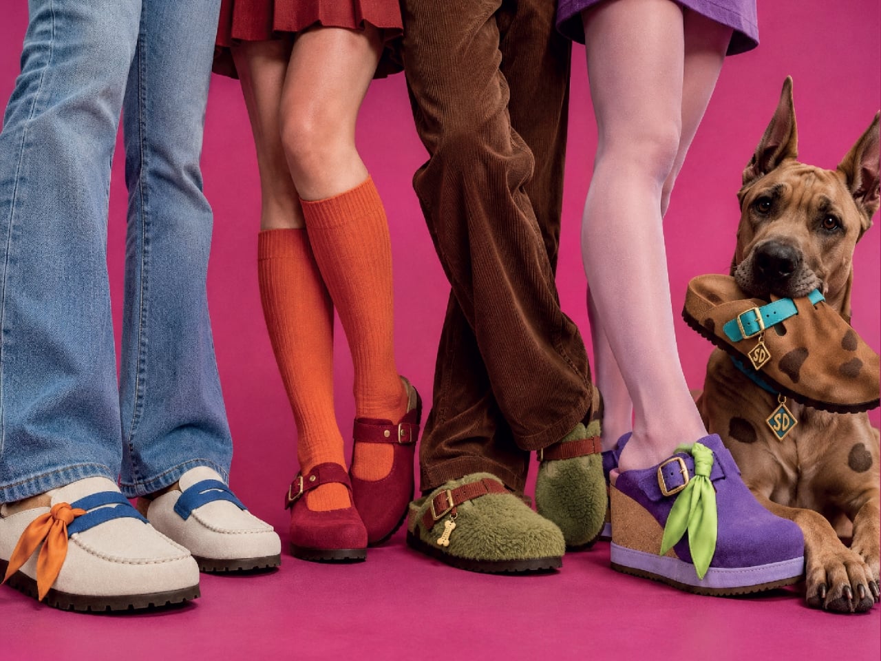
A turquoise strap and a tiny “SD” tag turn a caramel clog into Scooby-Doo before you even register the spots. That’s the appeal of “Scooby Birks,” an unofficial Birkenstock × Scooby-Doo concept collection by The Missing Drop. It addresses a familiar design problem: how to wear your affection for a cartoon without looking like you borrowed something from the costume aisle. I’d rather recognize a character through those details than a giant printed face.

Before anyone starts planning a purchase, these are imagined products, not manufactured prototypes. The project has no affiliation with or endorsement from Birkenstock or Warner Bros. Its six designs borrow familiar footwear silhouettes to interpret Mystery Inc. and the Mystery Machine. That distinction matters because the presentation, right down to the packaging, has the confidence of an actual retail campaign.

Designer: The Missing Drop

Scooby’s Boston is the clearest introduction to the idea. Its brown, suede-like surface carries irregular dark patches, while the turquoise buckle strap takes the place of his collar. The dangling gold-colored tag completes the reference. Moving a collar onto an existing shoe strap is an economical decision: the designer gives a familiar component another meaning without needing to reshape the entire clog. Even the rounded toe feels appropriate for this particular character.

Shaggy’s Boston would be my pick, partly because the joke is so pleasantly literal. The concept imagines olive-green shaggy shearling across the upper, paired with a rust-colored, corduroy-textured strap and a little biscuit charm. His green shirt and brown pants become a material palette. It’s deliberately scruffy, but the buckle and recognizable clog shape keep it from reading as a novelty slipper. I’d happily lose the charm and keep everything else.

Velma gets a red Mantova Mary Jane with orange ribbing around the interior, a reference to her sweater that rewards a closer look. It’s probably the easiest design here to separate from its inspiration and wear as an ordinary shoe. Daphne’s purple Namica takes the opposite approach, adding a lavender sole band and a bright green scarf tied beside the buckle. The wedge gives her interpretation a dressier profile, although that dangling scarf raises a practical question about keeping it clear of the ground.

Fred’s Naples translates his outfit into a cream-colored loafer-style upper, blue detailing, and an orange scarf knot. I like the way the moccasin-style stitching gives that polished character a slightly more relaxed expression. Then there’s the Mystery Machine Arizona, with turquoise straps, lime edging, and orange flowers. Including the van is a smart expansion of the collection: it offers a recognizable reference for someone who loves the show but doesn’t particularly identify with one member of the gang.

The shoebox deserves attention, too. Inspired by Scooby Snacks, it uses turquoise, a broad lime diagonal, orange flowers, and oversized “Scooby Birks” lettering. The palette connects it to the van as well as the fictional treats. I like that the packaging allows itself to be louder than the footwear. A box can carry the full cartoon enthusiasm while the shoes get on with being something you might build an outfit around.

The response suggests that this visual shorthand travels well. Designer Julien Buisson-Fizellier, who identifies the project as his work, reported nearly 8 million TikTok views. That’s his reported figure, not evidence of purchase demand, but it helps explain the concept’s appeal as a shared image. You can recognize the reference, pick a favorite, and send it to someone without needing a lengthy explanation.

My reservation is how easily the campaign’s polish could outpace a viewer’s attention to its concept label. The more convincing an imaginary collaboration looks, the more important that disclosure becomes. Still, the design lesson is worth taking seriously. Scooby’s collar already behaves like a strap; Daphne’s scarf can sit beside a buckle. Those connections give the collection its personality. I’d want a real version to preserve that specificity, even if the loose accessories needed another pass before leaving the drawing board.

The post Scooby-Doo Birkenstock Concepts Actually Look Like the Gang first appeared on Yanko Design.

❌