❌

Vue normale

  • ✇Yanko Design
  • Oppo Find X10 Pro Max Review: Stunning Imaging, Well-Balanced Flagship, Big Price
    PROS: Industry-first triple 200MP camera system Natural, consistent photo colors across all cameras Strong video capability Bright, immersive AMOLED display with thin bezel Excellent battery life CONS: High price Optional teleconverter kit limits lens options while in use RATINGS: AESTHETICSERGONOMICSPERFORMANCESUSTAINABILITY / REPAIRABILITYVALUE FOR MONEYEDITOR'S QUOTE:With standout cameras and top-tier hardware, the Find X10 Pro Max nails nearly every mark. Just be ready
     

Oppo Find X10 Pro Max Review: Stunning Imaging, Well-Balanced Flagship, Big Price

Par : Aki Ukita
21 octobre 2026 à 11:00

PROS:


  • Industry-first triple 200MP camera system

  • Natural, consistent photo colors across all cameras

  • Strong video capability

  • Bright, immersive AMOLED display with thin bezel

  • Excellent battery life

CONS:


  • High price

  • Optional teleconverter kit limits lens options while in use

RATINGS:

AESTHETICS
ERGONOMICS
PERFORMANCE
SUSTAINABILITY / REPAIRABILITY
VALUE FOR MONEY

EDITOR'S QUOTE:

With standout cameras and top-tier hardware, the Find X10 Pro Max nails nearly every mark. Just be ready to pay for the privilege

In 2026, nearly every major phone maker is eager to add “Pro Max” to their flagship lineups. Oppo is now joining this trend with its Find X10 Pro Max. Whether you see the naming as bold or just another industry move, one thing is hard to ignore. Even when manufacturers like Oppo pack their phones with leading-edge hardware and arguably superior imaging, they still face the ongoing challenge of measuring up to Apple’s influence at the top of the market.

This device brings a massive 6.78-inch AMOLED display and debuts the industry’s first trio of 200-megapixel cameras. Its battery is also among the largest found in any mainstream smartphone. Oppo claims this phone stands out for both design and capability. After spending time with the Find X10 Pro Max, I set out to discover if this “Pro Max” truly lives up to its name or simply chases a label.

Designer: OPPO

Aesthetics

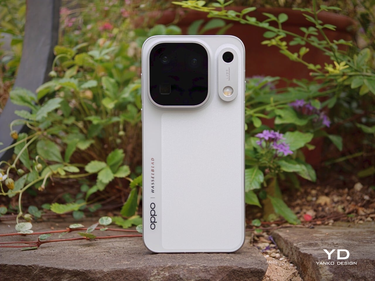
The Oppo Find X10 Pro Max carries forward some of the Find X9 Pro’s most recognizable design elements, including its signature square camera bump, now paired with an oval accent for the color sensor and LED. Oppo offers this flagship in two finishes. The Titanium Grey edition features a single sculpted piece of glass with contours that flow seamlessly into the camera area, softening the visual impact and giving the phone an understated, professional vibe. The grey itself is subtle, with hints of mauve appearing under certain lighting conditions.

For this review, I received the Luna White edition, which channels inspiration from classic cameras and reimagines the look for a contemporary audience. The camera island sports a matte silver metallic finish with knurled detailing, highlighted by Hasselblad’s signature orange accent ring. The back showcases a subtle fabric-inspired pattern, with Oppo and Hasselblad branding on the side. While both colors exude sophistication, those who prefer darker tones or bolder shades may find themselves wishing for greater variety in the color lineup.

Ergonomics

Despite its impressive size and powerful hardware, the Oppo Find X10 Pro Max manages to feel thoughtfully balanced in hand. My review unit is the global version, which comes with a substantial 8000mAh battery and weighs 235 grams (about 8.29 ounces) in Titanium Grey or 233 grams (about 8.22 ounces) in Luna White. The EU version features a slightly smaller 7150mAh battery and is a bit lighter at 228 grams (about 8.04 ounces) for Titanium Grey and 226 grams (about 7.97 ounces) for Luna White. Measuring 161.32 x 76.57 x 8.40 mm, or approximately 6.35 x 3.02 x 0.33 inches, this phone clearly fits into the large flagship category, yet its slim profile keeps it manageable.

The weight of the Find X10 Pro Max is certainly noticeable each time you pick it up, although the distribution helps maintain comfort during longer use. Both color options have a matte back and frame that do an excellent job resisting fingerprints and smudges, while also offering a velvety texture that is genuinely pleasant to touch. The device maintains a clean look throughout the day and feels luxurious with every interaction. The edges are only slightly curved, almost flat and straighter than on many other flagships, so they do not dig into your hand but may affect comfort depending on how you hold the phone over time.

Performance

The Oppo Find X10 Pro Max delivers the kind of fluid, responsive experience you expect from a flagship. Powered by the Dimensity 9600 Pro, the phone handles daily tasks, multitasking, and demanding apps without any noticeable lag or slowdowns. ColorOS 17 brings a polished feel with more refinement than revolution, ensuring that every interaction is smooth and intuitive. Everything from app launches to switching between tasks happens with impressive speed and reliability.

The large 6.78-inch LTPO AMOLED display stands out with a sharp 2772 × 1272 resolution and vibrant colors, thanks to BT.2020 coverage and 10-bit color support. Bezels measure just 1.15mm and are perfectly symmetrical, which makes the screen feel even more expansive. With up to 3,600 nits peak HDR brightness, visibility outdoors is excellent. The adaptive refresh rate ranges from 1 to 120Hz for smooth scrolling, while 144Hz is available in select gaming scenarios for extra fluidity. The speakers provide plenty of volume, though sound quality does not really stand out.

Hasselblad Hi-Res (50MP) mode, main camera, 1x

Main Camera, 1x

Over the past few years, smartphone cameras have leaned heavily on computational processing to overcome the limitations of small lenses. Sometimes the results are impressive, but too much digital magic can leave photos looking punchy or even artificial. With the Find X10 Pro Max, Oppo takes a different route by aiming for images that genuinely match what you saw in real life. The brand continues its collaboration with Hasselblad to fine-tune color science, and this generation introduces the LUMO True Image Engine, which keeps colors believable and resists the urge to overdo sharpening or saturation.

Oppo debuts the industry’s first triple 200-megapixel camera system in the Find X10 Pro Max. You get a 200MP main camera (Samsung ISOCELL HPC, 1/1.3″, f/1.5 with OIS), a 200MP ultra-wide (Samsung ISOCELL HP5, 1/1.56″, f/2.2 with autofocus), and a 200MP periscope telephoto (Samsung ISOCELL HP5, 1/1.56″, f/2.1 with OIS). Flip the phone around and you’ll find a 50MP front camera (Samsung ISOCELL JN5, 1/2.75”, autofocus, 100° FOV).

Ultrawide, 0.5x

Telephoto, 3x

Telephoto, 6x

The headline megapixel count is only part of the story. The main sensor leverages DeepPix technology, redesigning each pixel to improve light-gathering efficiency and preserve detail even in challenging conditions. It delivers up to 17 stops of dynamic range for images full of nuance from shadow to highlight. Daylight photos are crisp and vibrant, and low-light shots stay clear and accurate.

Most flagships treat ultra-wide cameras as a weak spot, but Oppo breaks that trend by using the same large sensor in both its ultra-wide and telephoto modules as in the main camera. The ultra-wide’s 13mm-equivalent focal length provides an expansive 124-degree field of view and captures sharp images across the frame. There is still some noticeable lens distortion at the edges, which is common for lenses this wide, but overall image quality remains impressively crisp. Color consistency is another area where Oppo truly excels. Tones stay remarkably uniform across all three lenses, so your shots always look cohesive.

Ultrawide, 0.5x

Main Camera, 1x

Main Camera, 1x

Telephoto, 3x

Personally, I love shooting with the telephoto camera on the X10 Pro Max. It is genuinely a treat for anyone who enjoys zoom photography. Hasselblad Master mode is another highlight because it delivers a more natural, less processed look that gives images a classic photographic character rather than an overdone “smartphone” feel. For those who want total control, Pro mode within Hasselblad Master mode allows for granular manual adjustments.

For users seeking more flexibility, Oppo offers a Hasselblad Teleconverter Kit in Luna White that includes a MagSafe-compatible case, lens adapter plate, teleconverter lens, lens bracket, shoulder strap, and pouch, all in silver or white with orange accents to match the Luna White phone version. While I love how visually unified the kit appears, attaching the lens adapter plate blocks both the main and ultra-wide lenses at once, just like on the Find X9 Pro teleconverter. This can limit your photo options when using the kit.

Telephoto Converter, 20x

Telephoto Converter, 40x

Oppo’s camera app supplies a nice set of filters. The selection is not as broad as Vivo’s catalog but still offers plenty of creative and customizable choices. Each filter lets you tweak tonality, saturation, and intensity to match your style preferences. My main gripe is with how OPPO lays out these filters: instead of small thumbnails along the bottom edge like most brands use, you only see one filter preview filling the UI at a time. This makes it tougher to quickly browse options and can slow down creative experimentation.

Filter UI

Open Gate Mode

Video performance keeps pace with stills. All three rear cameras support up to 8K at 30fps, 4K at 60fps, and even 4K at 120fps for dramatic slow motion. The front camera supports up to 4K at 60fps for sharp selfies and vlogs. If you apply creative filters during recording, output is capped at 1080p at 30fps. Open Gate recording is available on all rear cameras as well, so creators can leverage every pixel for flexible cropping in post-production.

My global review unit features a massive 8000mAh battery, while the EU version is equipped with a still-impressive 7150mAh cell. Both models support fast charging, with 80W SUPERVOOC wired charging making it easy to top up quickly and 50W AIRVOOC wireless charging for added convenience. Battery life is outstanding. It easily lasts more than a full day of heavy use and can reach two days with moderate usage.

Main Camera, 1x, Night

Sustainability

Oppo positions the Find X10 Pro Max as a durable and future-proof flagship, but most of its claims align with what’s now expected at the high end. The phone comes with IP66, IP68, and IP69 ratings, so it stands up well to dust and water in a wide range of scenarios. Both the front and back are protected by OPPO Crystal Guard Glass, co-developed with Corning, promising solid scratch and drop resistance. SGS Five-Star Drop Resistance Certification adds further reassurance, though these certifications have become standard for premium smartphones.

Oppo also states that the battery should retain over 80% of its original capacity after five years of typical use, which is consistent with leading brands but does not set a new bar. The promise of five years of major Android OS updates and six years of security patches is definitely good news for long-term owners and matches current flagship expectations. That said, it would be great to see Oppo take additional steps in sustainability, such as using more recycled materials in construction and offering easier repair options, to truly stand out in this space.

Value

Official pricing was unavailable at the time of writing this review, but the Oppo Find X10 Pro Max is rumored to launch at €1,799 (about $1,900) for the 16GB+512GB EU version. This firmly places it among the highest-priced flagships on the market and marks a clear jump from last year’s Find X9 Pro (€1,299, or around $1,370) and even the Find X9 Ultra (€1,699, or about $1,790). A significant part of this price hike likely comes from soaring RAM and storage costs, driven by increased demand from the AI boom and broader tech trends.

If these figures are correct, Oppo will face an uphill battle. Even with top-of-the-line hardware and some of the best mobile imaging features available, nearly two thousand dollars is a serious investment, especially as many consumers are feeling economic pressure. The EU version of the Find X10 Pro Max is even more expensive than both the iPhone 18 Pro Max with 512GB of storage and the Samsung Galaxy S26 Ultra 512GB model in the U.S. For Oppo to justify this price point, buyers will need to be truly convinced by its unique camera system and design philosophy. Otherwise, many may find more value in established alternatives from Apple or Samsung.

Verdict

The Oppo Find X10 Pro Max stands out as a well-balanced flagship that gets almost everything right and, at times, feels nearly flawless. What really sets it apart is its excellent mobile photography, from the industry-first triple 200-megapixel camera system to the natural color science developed in partnership with Hasselblad. Everyday performance is smooth, build quality is unquestionably premium, and battery life ranks among the best available in any flagship.

On the flip side, the high price tag puts the Find X10 Pro Max in direct competition with industry giants. While it delivers top-tier hardware and leading imaging capability, buyers must be willing to stretch both their expectations and their budgets. For those who put a premium on cutting-edge camera features and want an alternative to Apple or Samsung, Oppo’s latest is a compelling choice. For everyone else, especially those mindful of budget, there are several strong alternatives on the market that may offer a more accessible fit.

The post Oppo Find X10 Pro Max Review: Stunning Imaging, Well-Balanced Flagship, Big Price first appeared on Yanko Design.
  • ✇Yanko Design
  • Huawei Watch D3 Review: A Game Changer for On-Wrist Blood Pressure Monitoring
    PROS: Cuff-style blood pressure reading with 24-hour ambulatory monitoring Quiet measurement that didn’t disturb my sleep Streamlined ensign and comfortable everyday fit Good battery life Comprehensive health and fitness tracking alongside everyday smartwatch features CONS: Limited third-party app selection Not suitable for swimming or showering RATINGS: AESTHETICSERGONOMICSPERFORMANCESUSTAINABILITY / REPAIRABILITYVALUE FOR MONEYEDITOR'S QUOTE:T
     

Huawei Watch D3 Review: A Game Changer for On-Wrist Blood Pressure Monitoring

Par : Aki Ukita
20 octobre 2026 à 11:20

PROS:


  • Cuff-style blood pressure reading with 24-hour ambulatory monitoring

  • Quiet measurement that didn’t disturb my sleep

  • Streamlined ensign and comfortable everyday fit

  • Good battery life

  • Comprehensive health and fitness tracking alongside everyday smartwatch features

CONS:


  • Limited third-party app selection

  • Not suitable for swimming or showering

RATINGS:

AESTHETICS
ERGONOMICS
PERFORMANCE
SUSTAINABILITY / REPAIRABILITY
VALUE FOR MONEY

EDITOR'S QUOTE:

The Huawei Watch D3 pairs quiet blood pressure monitoring with everyday comfort and style.

Hypertension, or high blood pressure, is a major cause of premature death worldwide and increases the risk of heart disease, stroke, and kidney damage. Nearly half of U.S. adults have it, according to the CDC. Yet it often causes no noticeable symptoms, so feeling fine does not necessarily mean your blood pressure is where it should be.

The Huawei Watch D3 puts blood pressure measurement on your wrist, using an inflatable airbag built into the strap and offering scheduled readings throughout the day and night. That sounds like a recipe for a bulky, rather clinical accessory, but the watch I received looks nothing of the sort. More importantly, it is comfortable enough that I was happy to keep wearing it, including overnight. Huawei has squeezed some unusual hardware into a familiar package, and after living with it, I am impressed by how little fuss it adds to my day.

Designer: Huawei

Aesthetics

Huawei has made the Watch D3 surprisingly discreet, and that is one of its biggest design strengths. This is a health-focused smartwatch with more going on under the surface than most, yet it does not look overly technical or awkwardly bulky. Instead, it comes across as clean, polished, and easy to wear, which helps it feel like a proper everyday smartwatch rather than a specialist device.

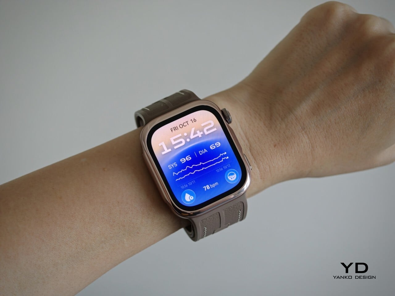
Visually, it sits somewhere between the clean familiarity of an Apple Watch and the more assertive presence of an Apple Watch Ultra, giving it a look that feels both familiar and slightly more rugged. Huawei offers the Watch D3 in three color options: White, Black, and Mocha Gold. I received the Mocha Gold version, and it gives the watch a warmer, slightly more elevated look than the other finishes. The rectangular-shaped case is paired with a color-matched fluoroelastomer strap, which also houses the airbag used for blood pressure measurement.

Ergonomics

For a smartwatch with a tiny airbag tucked into its strap, the Watch D3 is surprisingly easy to wear. On paper, it is not a small device at 1.83 x 1.61 x 0.44 inches, but it never feels ungainly or overengineered once it is actually on your wrist. The 1.92-inch rectangular display fits well and doesn’t overwhelm the wrist, keeping the overall look streamlined. Huawei has also trimmed the thickness down from 0.52 inches on the Watch D2 to 0.44 inches here, and that slimming makes a real difference. The D3 feels less like a specialist gadget and more like a smartwatch you can throw on in the morning without a second thought.

In practice, the bigger surprise is how quickly it stops feeling unusual. The Watch D3 feels like an ordinary smartwatch on the wrist in the best possible sense. The strap is inevitably thicker than a conventional smartwatch band because it contains the inflatable airbag, but I never found it cumbersome. If anything, that unusual construction fades into the background faster than expected, which is not something I would have assumed before wearing it.

The weight helps here too. At around 1.41 ounces without the strap, the Watch D3 feels substantial enough to come across as a proper piece of hardware, but not heavy enough to become annoying over the course of a full day. Fit matters more on the Watch D3 than it does on a typical smartwatch. Huawei accounts for that with a paper measuring guide and two strap sizes. A watch built around blood pressure readings needs to fit properly, and the D3 feels better for that extra attention.

Performance

Blood pressure monitoring is the main reason to consider the Watch D3, but what surprised me first was how quiet it is. It makes virtually no sound during a reading, with the increasing pressure around my wrist providing the only obvious sign that anything is happening. The sensation is noticeable, as you would expect from an inflatable strap, but the process feels discreet enough that taking a reading does not become a bother.

There are medical credentials behind the feature, too. According to Huawei, the Watch D3’s blood pressure measurement has obtained NMPA medical device registration in China and CE certification under the European Union’s Medical Device Regulation, commonly called CE-MDR.

The Watch D3 also supports ambulatory blood pressure monitoring, or ABPM, which schedules repeated measurements over a 24-hour period, including while you sleep. Rather than giving you one isolated reading, it builds a record of how your blood pressure changes throughout the day and night. Huawei Health brings those results together into a report showing daytime, nighttime, and overall averages, which you can save or share with your doctor.

That does not mean you can forget about the process entirely. During waking hours, you still need to pause, keep still, and hold the watch at heart level, following the positioning instructions. You can adjust the measurement schedule rather than stick with the default intervals. Overnight, the watch takes readings automatically without requiring you to assume the daytime posture. Thankfully, those nighttime readings did not bother me or wake me up.

There is also a dedicated feature for measuring blood pressure before and after six workout types, covering indoor and outdoor running, walking, and cycling. You take an initial reading before starting, then begin another measurement within two minutes of finishing. There is a reason those changes are worth studying. Research using clinical exercise tests has linked certain blood pressure responses during exercise and recovery with a higher risk of developing hypertension or experiencing cardiovascular events later on.

Beyond blood pressure, the D3 covers heart rate, sleep, blood oxygen saturation, and skin temperature, with ECG available in supported regions. Fitness tracking is solid too, with more than 80 workout modes. It works well as an everyday companion for keeping an eye on activity, workouts, and daily movement without making every walk feel like homework.

The everyday smartwatch features are more familiar. The D3 runs HarmonyOS and works with both Android and iOS, although the experience is not identical across the two platforms. Bluetooth calling and music playback are supported, but the limited third-party app selection leaves less room to expand beyond the built-in tools.

With a compatible Android phone, you can respond to supported messages using quick replies or the on-screen keyboard. Message replies are not supported when the watch is paired with an iPhone, which is worth knowing before you buy. Offline maps are available for supported models, while NFC payment support depends on your region and the available payment service. Having NFC hardware does not automatically mean it will work with your usual cards.

Battery life has been good in my use, too. Huawei quotes up to six days under typical conditions, dropping to around one day with ABPM enabled. My typical-use results were close to that six-day claim, while I comfortably passed a day with ambulatory monitoring enabled. Measurement frequency matters here, since Huawei’s ABPM battery test uses 15-minute intervals, so your results may differ depending on your settings.

Charging speed is okay rather than especially quick, but outside ABPM sessions, I was not constantly looking for the charger. The supplied charger uses a USB-C rather than USB-A, which is a welcome change. That is one less reason to keep an older USB-A power adapter around.

Sustainability

The Watch D3 has an IP68 rating, but that is not an invitation to take it swimming or into the shower. Huawei advises against both because of the air openings used by the blood pressure system. The watch is not water- or dust-resistant while taking a measurement, so those openings need to stay clean and dry. It requires a little more care around water than you might expect from an everyday smartwatch.

The strap feels durable, although Huawei does not provide wear-test figures to put that impression into context. It is removable, so a tear would not necessarily mean replacing the whole watch, provided Huawei makes compatible replacement straps available. That is useful for keeping the D3 in service, but the broader sustainability picture remains unclear. I would have liked more information about recycled materials, repair options, and long-term software support.

Value

The Watch D3 costs £399.99 (roughly $533) in the UK and €449 (roughly $505) in Europe, so it is not exactly an impulse purchase. Whether that feels expensive depends on what you want from your watch. The D3’s appeal is having cuff-style blood pressure readings and 24-hour ambulatory monitoring in something you can wear throughout the day and overnight.

If those are features you will use regularly, the price becomes easier to justify, especially given how comfortable I found it. I am also impressed by how streamlined the whole package feels, considering the specialized hardware tucked inside the watch and strap. You are getting more than an extra health metric on a screen, without having to wear something that feels like medical equipment. If you mostly want notifications and workout tracking, though, I would be less inclined to pay for blood pressure hardware that rarely gets used.

Verdict

The Watch D3 impressed me most by making its unusual hardware so easy to live with. Blood pressure readings are quiet, the strap never felt cumbersome, and overnight measurements did not wake me up. Battery life was good, too, particularly outside ambulatory monitoring sessions. I never felt I was putting up with an awkward gadget just to use its blood pressure features.

I would still like a broader selection of third-party apps and clearer information about repair options and long-term support. The price also makes more sense if blood pressure monitoring will be a regular habit rather than an occasional curiosity. It is a tool to use alongside professional care, not a reason to diagnose yourself or change medication based on your readings. With that understood, the D3 earns my recommendation for combining useful blood pressure features with the comfort and discretion of an everyday smartwatch.

The post Huawei Watch D3 Review: A Game Changer for On-Wrist Blood Pressure Monitoring first appeared on Yanko Design.

  • ✇Yanko Design
  • Clevetura S Keyboard Review: Swipe Across the Keys Instead of Reaching for a Mouse
    PROS: Innovative combination of keyboard and touchpad in one Compact, lightweight design Customizable gestures and sensitivity Supports 3 Bluetooth and 1 USB-C connections CONS: Has a bit of a learning curve for accuracy and speed Premium price tag RATINGS: AESTHETICSERGONOMICSPERFORMANCESUSTAINABILITY / REPAIRABILITYVALUE FOR MONEYEDITOR'S QUOTE:The Clevetura CLVX S brings typing and navigation together in a compact design that gives your mouse hand
     

Clevetura S Keyboard Review: Swipe Across the Keys Instead of Reaching for a Mouse

Par : JC Torres
19 octobre 2026 à 12:20

PROS:


  • Innovative combination of keyboard and touchpad in one

  • Compact, lightweight design

  • Customizable gestures and sensitivity

  • Supports 3 Bluetooth and 1 USB-C connections

CONS:


  • Has a bit of a learning curve for accuracy and speed

  • Premium price tag

RATINGS:

AESTHETICS
ERGONOMICS
PERFORMANCE
SUSTAINABILITY / REPAIRABILITY
VALUE FOR MONEY

EDITOR'S QUOTE:

The Clevetura CLVX S brings typing and navigation together in a compact design that gives your mouse hand less traveling to do.

Keyboards and mice have shared our desks for decades, but our hands still have to travel between them whenever typing gives way to clicking. That familiar shuffle becomes especially noticeable when there’s barely enough room for a laptop, let alone another accessory. The Clevetura S offers an interesting solution by turning the keys themselves into a touchpad, giving your fingers another way to get around without leaving the keyboard.

Also known as the CLVX S, this compact, 78-key keyboard brings Clevetura’s TouchOnKeys technology to a more portable design. The Windows version reviewed here can handle familiar gestures without additional software, although there’s plenty to customize if you want to. More importantly, it makes an unusual interaction surprisingly useful, even if sliding across letters and keeping resting fingers from triggering gestures take a little getting used to.

Designer: Clevetura

Aesthetics

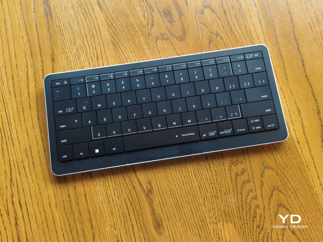
Upfront, the Clevetura S looks almost like someone forgot to leave space between the keys. The flat keycaps sit unusually close together, giving the 78-key layout a tidy, almost tiled appearance. There’s a practical reason for that, of course. Fingers need to travel across the surface as comfortably as they press down on it, and generous gaps would make that second job considerably less inviting.

An anodized aluminum base gives the keyboard its silver lower half, while polycarbonate covers the top and ABS plastic forms the keycaps. Both black and white versions retain that silver body, which is particularly noticeable against the darker finish. I would have preferred an entirely black option for a simpler look, though the contrast does make the thin profile a little more obvious when viewed from the side.

Otherwise, there isn’t much to distract from that continuous field of keys, save for the extra markings explaining their secondary functions. Two buttons below the spacebar provide physical left- and right-click controls, recalling the arrangement on older laptops. Then there’s the per-key RGB lighting, which can turn this relatively understated keyboard into something considerably more colorful. Fortunately, those lights also have practical roles beyond decorating your desk.

Ergonomics

At roughly 403g, the Clevetura S doesn’t ask for much commitment when you’re packing a laptop bag. Its body measures approximately 11.5 inches wide, 5.12 inches deep, and just 0.49 inches (12.4mm) thick, making it easy to accommodate on smaller desks, too. The closely fitted keycaps don’t leave many edges sticking out, although I’d still use the included fabric pouch rather than let them rub against everything else.

The scissor switches feel familiar if you’re coming from a decent laptop keyboard, with around 1.2mm of travel. Typing is perfectly serviceable, though it probably won’t steal the attention of someone devoted to mechanical switches. Folding feet let you raise the back, but there’s only one elevated position. That keeps setup simple, provided you’re comfortable with either the flat profile or the available incline.

The more interesting benefit shows up when you need to scroll through a reference or reposition the cursor between sentences. Instead of reaching sideways, you can make that movement right where you’ve been typing. Your chair and screen position still matter, of course. The Clevetura S simply reduces the back-and-forth, although its flat, closely fitted keys take some getting used to when finding your usual typing rhythm.

Performance

The central key area doubles as the touchpad, automatically switching between recognizing finger movements and registering keypresses. Sliding across letters feels a little peculiar at first, but my fingers didn’t catch on the edges, and pointer control worked well. Scrolling through a document becomes especially convenient when you’re jumping back into writing every few moments. A light tap handles clicking without requiring you to press a letter.

That automatic switching does have to contend with personal habits, however. Mine involves keeping fingers on the home row, which happens to sit inside the touchpad area. This frequently triggered three-finger gestures when I hadn’t intended anything of the sort. Sensitivity adjustments and the option to disable unwanted gestures provide useful flexibility, though finding the right balance is something to budget time for rather than expect immediately.

Clevetura’s Adaptive Intelligence, or AI, can help by selecting a sensitivity level after studying 10,000 typed characters. Training requires the TouchOnKeys app and a USB connection, with touch recognition disabled while it runs. A separate mouse is handy during that process, although you can pause training if necessary. Thankfully, this particular AI has a fairly modest assignment: learning when your fingers mean to type rather than swipe.

The lighting makes that second role easier to follow, and a little more entertaining, too. In my setup, a white trail followed my finger across the keys, almost like leaving a trace of magic behind. Checking the battery dims the surrounding lighting and uses illuminated number keys to show the remaining charge. Even the function row gets involved, with touch sliders for volume and backlight brightness.

Windows recognizes supported touchpad gestures without installing additional software, but TouchOnKeys opens up more settings, including profiles for different apps. Three Bluetooth slots and a USB-C connection let you select between up to four devices, one at a time. That’s useful if your desk serves more than one computer. The cable also handles charging and provides the wired connection required for firmware updates.

Clevetura advertises up to 44 hours of continuous use without backlighting, which is an important qualification for anyone drawn to those colorful effects. That’s the manufacturer’s estimate rather than a result measured here, so it shouldn’t become a promise of weeks between charges. Wired operation remains available at a desk, while wireless endurance deserves particular attention if you’re planning to travel with the lighting switched on.

Sustainability

The aluminum and plastic construction follows a fairly familiar recipe, and there’s no documented recycled content to give the CLVX S a particular advantage on materials. Clevetura rates its keys for 3 million presses, although that remains a manufacturer specification rather than a prediction of service life. The more useful question is how easily this unusual keyboard can be maintained once everyday use starts leaving its mark.

Here, the same integration that makes TouchOnKeys possible also limits what owners can replace. Clevetura warns against removing or swapping keycaps because doing so can damage the keyboard, and the battery isn’t easily user-replaceable either. Routine surface cleaning and manufacturer support therefore matter more than they would on a board designed for tinkering. It’s worth understanding that arrangement before expecting mechanical-keyboard levels of customization or straightforward repairs.

Value

At $199, discounted from $209, the Windows model sits well above the price of many conventional compact keyboards. The extra cost is easier to understand when you consider what you’re paying for: typing and pointer control in the same footprint. Separate devices offer more freedom to choose each component, but they also need more space. Clevetura’s appeal is having those everyday functions share one portable object.

That could be particularly attractive when you’re writing code, checking references, or moving between shortcuts and controls in creative software. Quick navigation stays close, even if detailed drawing or extended pointer work still calls for a separate mouse. The Clevetura S doesn’t have to handle every task equally well to be useful. Its value depends on how often you make those small trips away from the keys.

Verdict

Combining a keyboard and touchpad sounds simple enough until your fingers have to tell the two jobs apart. Clevetura gives that idea a thoughtful physical form, from the closely fitted keys to lighting that explains what’s happening beneath your hands. My habit of resting on the home row made gesture sensitivity especially important, but the pointer control itself worked well and gave the unusual surface a practical purpose.

The Clevetura CLVX S makes the strongest impression when space is limited and typing is regularly interrupted by a scroll or a click. Its price deserves consideration, and the flat surface won’t replace everyone’s favorite keyboard feel. Still, there’s something pleasing about editing a sentence, sliding across the letters to move the cursor, and carrying on without sending a hand off to find another device.

The post Clevetura S Keyboard Review: Swipe Across the Keys Instead of Reaching for a Mouse first appeared on Yanko Design.
  • ✇Yanko Design
  • Huawei MatePad Pro 12” Review: Stunning Hardware, One Familiar Caveat
    PROS: Gorgeous PaperMatte display Very thin and light formfactor Big battery Good speaker CONS: No built-in Google Play Store Long-term software support remains unclear RATINGS: AESTHETICSERGONOMICSPERFORMANCESUSTAINABILITY / REPAIRABILITYVALUE FOR MONEYEDITOR'S QUOTE:The MatePad Pro 12" is stylish, light, and lovely to use, with a PaperMatte display that does a lot of the heavy lifting. Huawei’s tablet lineup is not doing itself many favors right now. The names suggest one
     

Huawei MatePad Pro 12” Review: Stunning Hardware, One Familiar Caveat

Par : Aki Ukita
2 octobre 2026 à 11:20

PROS:


  • Gorgeous PaperMatte display

  • Very thin and light formfactor

  • Big battery

  • Good speaker

CONS:


  • No built-in Google Play Store

  • Long-term software support remains unclear

RATINGS:

AESTHETICS
ERGONOMICS
PERFORMANCE
SUSTAINABILITY / REPAIRABILITY
VALUE FOR MONEY

EDITOR'S QUOTE:

The MatePad Pro 12" is stylish, light, and lovely to use, with a PaperMatte display that does a lot of the heavy lifting.

Huawei’s tablet lineup is not doing itself many favors right now. The names suggest one thing, the products suggest another, and if you are just a normal person trying to work out which model is which, the whole range can feel oddly muddled. The MatePad Air sounds like it should be the lighter, breezier option, yet the MatePad Pro 12″ is actually the one that feels lighter and more effortless in the hand.

The MatePad Pro Max, by contrast, is much easier to understand. It is the big brother in the family, and it looks the part too, with a very similar design language to the MatePad Pro 12″. That makes this tablet feel like the middle child in Huawei’s lineup, not in a bad way, but in the sense that it sits between the easy-to-place Max and the more confusingly named Air.

Designer: Huawei

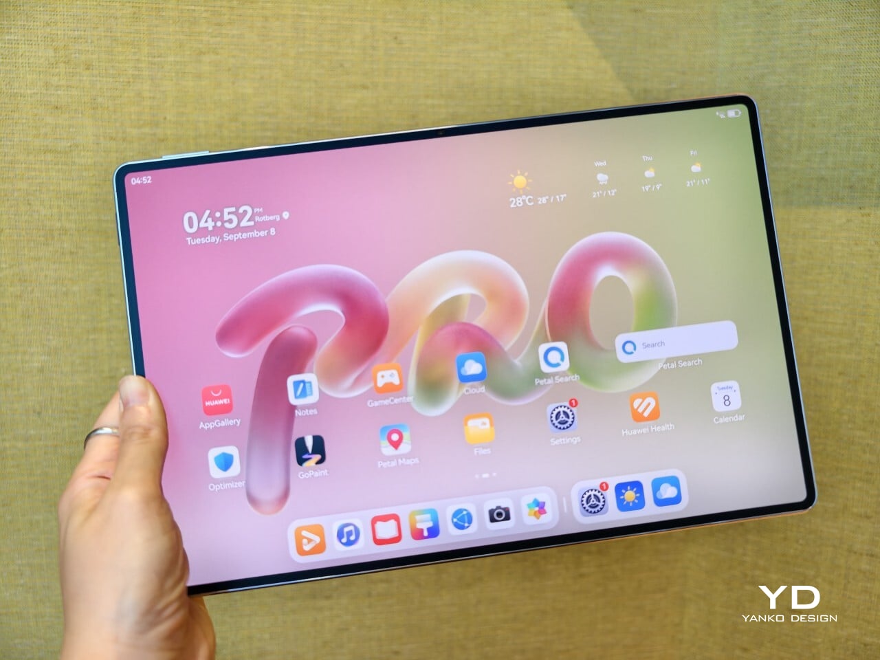
The good news is that the product itself is much easier to understand than the naming. The MatePad Pro 12″ is a slim, striking tablet that clearly wants to be useful as well as beautiful. It aims to cover work, entertainment, note-taking, and creative play in one polished package, and for the most part, it succeeds by being pleasant to use rather than merely impressive on paper.

Aesthetics

The MatePad Pro 12″ looks a lot like a smaller MatePad Pro Max, which is no bad thing. The two share the same slim, polished design language, and that gives the Pro 12″ an immediately premium feel. If anything, this size makes the look more approachable. It still has that high-end flagship polish, just in a form that feels a little less dramatic and easier to live with.

Both tablets come in Blue and Space Gray, and the Blue version I received is especially attractive. It has a soft shimmer finish that catches the light nicely without tipping into anything too flashy or fussy. There is also a nice contrast between the shimmer back panel and the glossy side frame, while the slightly rounded edges keep the tablet from feeling too sharp or severe. Together with the circular camera bump, these details give the design a bit more warmth and character without taking away from its clean, premium feel.

Ergonomics

For a 12-inch tablet, the MatePad Pro 12″ is impressively easy to handle. It measures about 10.4 x 6.8 inches (264.2 x 172.9 mm) and is just 0.19 inches thick (4.7 mm), but at 454g, or about 1 pound, it feels lighter in the hand than its size suggests. That makes a real difference in daily use. It is easy enough to hold one-handed for short stretches, and it never feels as cumbersome as some larger tablets do.

Just as importantly, it does not feel flimsy. Despite how thin and light it is, the MatePad Pro 12″ still feels solid and premium in the hand. That balance matters, because a tablet this slim could easily have tipped into feeling delicate. Instead, it feels refined without feeling fragile.

I also received the optional Huawei Glide Keyboard, which weighs 399g, or about 14.1 ounces, and turns the tablet into something much closer to a compact laptop. The typing experience is good, and one detail I especially appreciated is the way the keyboard neatly nests the stylus. It gives the pen a proper place to sit, which means there is less chance of it going missing while you are carrying the tablet around. Small touches like that make the whole setup feel more thought through.

That said, the keyboard is not perfect. The touchpad is a little too easy to trigger, and I often found myself accidentally brushing it while typing, so I ended up turning off Tap to Click. There is also only one viewing angle, which limits flexibility a bit, and the keyboard is not backlit. None of these issues are deal-breakers on their own, but together they make the accessory feel a little less polished than the tablet itself.

Performance

The display of the MatePad Pro 12″ is the obvious star. Huawei’s PaperMatte screens remain one of the company’s best ideas, and that is true here as well. The 12-inch OLED panel looks sharp, bright, and vibrant, while the slim 3.5mm bezels help give it a more immersive feel. Huawei has also embedded the front camera neatly into that thin border, which keeps the front looking clean and uninterrupted rather than broken up by a notch or thicker framing.

What really makes the screen stand out, though, is the PaperMatte finish. Huawei’s PaperMatte displays have impressed me before, and this one is no exception. The matte treatment cuts down on glare without making the panel look flat or dull, which is not always easy to pull off. Huawei says anti-reflection performance is 30 percent better than the previous generation, and that feels believable in everyday use. Even in bright environments, the screen comes remarkably close to reflection-free, and with up to 1600 nits of peak brightness, it stays comfortable for reading, browsing, and longer work sessions without constantly fighting the light.

The speakers are another pleasant surprise. The MatePad Pro 12″ uses a four-speaker setup, and for something this thin and light, it gets plenty loud and has more bass presence than you might expect, which gives music, dialogue, and video a bit more body than a device this slim really ought to manage. It never quite feels like the sound is coming from such a small and thin tablet. The audio can get a little sharp at times, especially at higher volume, but for casual listening and streaming, it still does a very good job.

Battery life has been solid in my use. The MatePad Pro 12″ packs a 10,400mAh battery, and in a fairly normal day of writing, emails, keeping up with my team on Slack, web browsing, and YouTube, it got through to the end of the day without me worrying too much about battery. Huawei rates it for up to 14.7 hours of local video playback, and there is also 40W reverse charging if you need to top up another device.

Software is where the MatePad Pro 12″ becomes a more conditional recommendation. The tablet runs Harmony OS 4.3 out of the box, and there is no built-in support for the Google Play Store or Google Mobile Services here, and while there are workarounds, there is no guarantee every app you rely on will work exactly as expected. That is the main thing potential buyers need to understand going in. The hardware is easy to appreciate straight away. The software side asks for a bit more patience and flexibility.

Huawei’s AppGallery does offer options like GBox, which can help you access apps that depend on Google services, but the experience is not always seamless. In my testing, GBox did not support split-screen, which felt limiting on a tablet that is otherwise clearly built for multitasking. I had better luck with apps downloaded through Aurora, which did work in split-screen, but that still leaves you deciding how comfortable you are relying on third-party app sources. For some people, that will be a manageable compromise. For others, it will be reason enough to hesitate.

On the plus side, Huawei’s own built-in apps for productivity and creativity are genuinely quite capable. GoPaint, in particular, feels feature-rich, with a wide variety of brushes and granular control over how they behave. There are also more ambitious tools like animation, which appears to build movement from your layers, and a timelapse feature that lets you replay a drawing from start to finish. Even if not everyone will use those tools seriously, they help the app feel more than just a token extra.

The Notes app is also packed with features, including AI handwriting-to-text. In my case, the results were not always perfectly accurate, but that may say as much about my handwriting as it does about the software. Either way, it is another example of Huawei putting real effort into its own app ecosystem. So while the lack of built-in Google support remains the bigger issue, the tablet’s first-party software is stronger than you might expect.

Sustainability

Sustainability is not the strongest part of Huawei’s pitch here, at least not from the information currently available. There is plenty of talk about thinness, portability, and productivity, but much less about things like recycled materials, repairability, or broader environmental commitments. More notably, Huawei has not made any official statement about how long the MatePad Pro 12″ will receive software support, which makes it harder to judge the tablet’s long-term value from a sustainability point of view.

What Huawei does emphasize is durability. The company says the MatePad Pro 12″ offers 50 percent better bend resistance than the previous generation, which is a meaningful improvement for a device this thin. A tablet that is less likely to flex or fail in everyday use is at least more likely to stay in service longer. That is not the same thing as a full sustainability strategy, but it still counts for something.

Value

Value is where the MatePad Pro 12″ becomes more complicated. Pricing starts at €1,199, or about $1,330, for the 12GB and 256GB model with a folio cover, rises to €1,299, or roughly $1,440, with the Glide Keyboard, and reaches €1,449, or around $1,610, for the 12GB and 512GB version with the keyboard. For context, Apple’s 11-inch iPad Pro with 256GB of storage starts at $1,199 in the U.S., so Huawei is clearly pricing this in direct flagship territory.

Judged purely on hardware, the MatePad Pro 12″ feels convincingly premium. It is slim, light, beautifully made, and fitted with an excellent display. The problem is that the software caveats do not disappear just because the hardware is this polished. The lack of built-in support for the Google Play Store or Google Mobile Services still makes this a more selective recommendation than the price might suggest. If you are already comfortable with Huawei’s ecosystem, the value makes more sense. If not, the asking price may feel harder to justify.

Verdict

The Huawei MatePad Pro 12″ makes its strongest case through hardware. It is slim, light, beautifully made, and fitted with a PaperMatte display that remains one of Huawei’s real strengths. The speakers are better than you might expect from something this thin, battery life has been solid in my use, and the overall experience feels properly premium. It is the kind of tablet that makes a strong first impression and, for the most part, keeps earning it.

What stops it from being an easy recommendation is software. There is no built-in support for the Google Play Store or Google Mobile Services, and while workarounds exist, they are still workarounds. For buyers already comfortable with Huawei’s ecosystem, that may be manageable. For everyone else, it adds friction to a tablet that is otherwise polished and appealing. The MatePad Pro 12″ is a very good piece of hardware, but it is not the most straightforward premium tablet to buy.

The post Huawei MatePad Pro 12” Review: Stunning Hardware, One Familiar Caveat first appeared on Yanko Design.

Huawei Watch GT 7 Pro Review: Refined, Not Reinvented

Par : Aki Ukita
28 septembre 2026 à 11:20

Verdict 3.8 out of 5 Average of 5 criteria
Aesthetics
4.0 out of 5
Ergonomics
4.0 out of 5
Performance
4.0 out of 5
Sustainability / Repairability
3.0 out of 5
Value for money
4.0 out of 5

What works

  • Distinctive octagonal design with a premium look
  • Strong battery life
  • Bright, sharp AMOLED display
  • Board health and fitness tracking

What doesn't

  • Limited third-party app support
  • Proprietary pinned strap design
The Watch GT 7 Pro 46mm shows Huawei sticking to a proven formula and sharpening it further. It is not a bold leap, but it is a confident and well-rounded one.

Huawei has spent the last few years turning wearables into one of the strongest parts of its consumer business. The company has performed especially well in China, with that momentum also carrying into overseas markets. As a result, Huawei has grown into one of the biggest names in smartwatches, offering a lineup that covers different styles, price points, and user needs.

Within Huawei’s smartwatch lineup, the GT series is the company’s sports-focused range. The new GT 7 series stays true to that identity, building on the formula that has made the lineup popular. The GT 7 Pro is not a major leap over the GT 6 Pro, but it feels like a more polished and refined take on the same core idea.

Designer: Huawei

Aesthetics

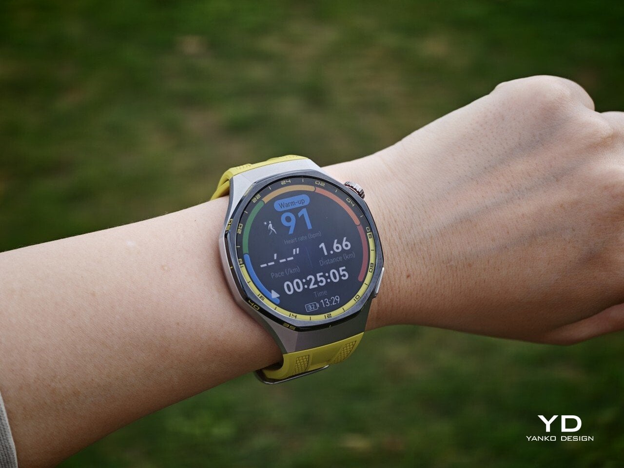
The Watch GT 7 Pro 46mm stays largely in line with the design language of its predecessor, keeping the same sporty character that defined the GT 6 Pro. Its octagonal case continues to give it a distinctive look, helping it stand out from the many conventional round smartwatches on the market. At the same time, Huawei balances that sportier shape with a polished finish, so the watch still feels premium rather than overtly rugged.

The front of the watch keeps that same balance. Its 1.47-inch AMOLED display sits beneath sapphire glass, which adds a more upscale touch while also improving durability for everyday wear. Around the display, Huawei uses 24-hour markings that strengthen the watch’s sporty identity and give the face a more instrument-like look.

Huawei is offering the GT 7 Pro 46mm in yellow, green, and black, and each one gives the watch a distinct personality. The yellow version I received is easily the boldest of the three, pairing a silver case with a black bezel and a bright lime yellow strap. Matching yellow accents around the bezel and on the watch face make it feel the most energetic and overtly sporty of the lineup.

The green version takes a more outdoorsy approach. It keeps the same overall design but swaps in a muted green strap and matching accents, giving the watch a look that feels active without being as loud as the yellow model. The black version, by contrast, is the most understated. With its darker finish and strap combination, it gives the GT 7 Pro a stealthier and more versatile appearance that should appeal to buyers who prefer something cleaner and easier to wear every day.

Ergonomics

Despite its sporty, fairly bold design, the Watch GT 7 Pro 46mm is comfortable to wear for long stretches. At 56g and 11.2mm thick, it has enough presence to feel substantial on the wrist, but it never comes across as overly bulky in daily use. Huawei has also done a good job with weight distribution, which matters more than raw dimensions when you are wearing the watch through workouts, sleep tracking, or a full day out.

The strap has also been revised. Huawei calls it the Easy Cross Strap, and the key change is that the loose end tucks underneath instead of threading through a traditional belt loop. According to Huawei, this makes the watch easier to wear day to day while also creating a snugger fit that can help improve the consistency of health tracking. The elastomer strap feels soft enough for extended wear while still staying secure during exercise. It is detachable and uses a 22mm fitting, but because it is secured with pins, swapping it out is less straightforward than with a standard third-party strap.

Huawei’s control layout is familiar and easy to get used to. The buttons sit within easy reach, and the rotating crown adds a more tactile way to move through menus. That makes the watch feel more natural to use when you are on the move and do not want to rely entirely on touch input. Combined with the curved case and integrated strap design, the GT 7 Pro feels built not just to look sporty, but to wear like it too.

Performance

The Watch GT 7 Pro 46mm features a 1.47-inch AMOLED display, and it is one of the first things that stands out about the watch. Huawei claims a peak brightness of 3,000 nits, and in use the panel looks sharp, bright, and vibrant. Watch faces have plenty of visual punch, while menus and health data remain easy to read at a glance. Huawei has been consistently strong in this area, and that continues here with a screen that feels right at home on a watch in this class.

Out of the box, the GT 7 Pro runs HarmonyOS 6.1 and supports both Android and iOS devices, which immediately makes it more flexible than some ecosystem-bound alternatives. The software itself is easy to navigate, with clean menus, smooth animations, and a layout that does not take long to learn. It is not trying to overwhelm you with complexity, and that works in its favor on a smartwatch that is meant to balance fitness features with everyday usability.

Health and fitness remain at the heart of the experience, which is exactly where the GT series has built much of its appeal. Huawei includes a broad set of tracking features here, covering the usual essentials such as heart rate, sleep, blood oxygen, stress, and workout monitoring, while also adding more unusual tools like the Diabetes Risk Study and Coronary Heart Disease Study. The latter, however, was not available on my test unit during the review period.

On the fitness side, the watch offers more than 100 workout modes, reinforcing its role as a serious sports-focused smartwatch. Huawei has also expanded its support for winter sports, with dedicated indoor and outdoor skiing as well as snowboarding modes. These can track data such as maximum speed, average incline, total descent, and run count, making the watch more useful for users who want something beyond basic activity logging. It also supports downloads for more than 3,000 ski resort maps worldwide, complete with details such as slope names, difficulty ratings, and lift station locations.

Since ski season is still months away where I live, I was not able to test those winter sports features properly. My hands-on time was limited to more routine activities like outdoor walks, yoga, and casual cycling. Even within that narrower scope, the watch performed well. GPS tracking was accurate in my testing, even when I passed under railway bridges and near buildings, where signals can sometimes become less stable.

Battery life is one of the GT 7 Pro’s biggest strengths. Huawei rates it for up to 21 days at the upper end, up to 12 days under typical use, up to 7 days with the always-on display (AOD) enabled, and as much as 51 hours in trail running mode. Those are ambitious figures, but in my time with the watch, its endurance was genuinely impressive.

I took it with me on a nine-day trip after charging it to 100 percent, and by the end of the trip it still had 19 percent battery remaining. During that time, I had all health tracking features on, AOD turned on, and used it for a couple of indoor and outdoor walking sessions as well. That makes the result more impressive, because the watch was not simply sitting idle for most of the trip. In day-to-day use, that kind of endurance makes a real difference, especially on a sports-focused smartwatch where frequent tracking can drain smaller batteries much more quickly.

Charging is handled through a proprietary magnetic wireless charger included in the box, and it is fairly quick. Because of the watch’s shape, though, it does not sit flat on the charger, which can be a mild annoyance in everyday use. It hovers slightly, and I often found myself checking to make sure it was still charging after the initial confirmation screen disappeared. It also feels like time for Huawei to move from USB-A to USB-C, as the included cable already feels a bit dated.

Sustainability

The Watch GT 7 Pro also puts some emphasis on durability. It carries both IP69 and 5ATM ratings, giving it a solid level of protection against dust and water exposure. That makes sense for a watch positioned around sports and outdoor use, where it is more likely to be exposed to sweat, rain, splashes, and more demanding day-to-day conditions.

Huawei also uses sapphire glass over the display, which adds another layer of reassurance. Sapphire is known for its strong scratch resistance, and it also helps the watch feel more premium in the process. Taken together, these details give the GT 7 Pro a tougher, more dependable character without pushing it fully into rugged-watch territory. That said, sustainability is less of a focus, with no clear mention of recycled materials or other environmental measures.

Value

At £379, or roughly $510, the Watch GT 7 Pro is priced like a premium smartwatch, so it has to offer more than just a nice design. For the most part, it does. You are paying for a watch that gets the basics right, with strong battery life, a durable build, a comfortable fit, and a health and fitness feature set that feels broad enough for most users.

The value proposition really comes down to what you want from a smartwatch. If you care most about app support and deeper smart features, there are rivals that make a stronger case. But if your priorities are battery life, fitness tracking, and a watch that looks and feels good on the wrist, the GT 7 Pro makes more sense. It is not a dramatic step up from the GT 6 Pro, so current owners may not feel much pressure to upgrade. Still, for anyone coming from an older device, it feels like a well-rounded package that knows exactly what it is.

Verdict

The Watch GT 7 Pro 46mm is not the kind of upgrade that changes everything, but it does not need to be. Huawei has taken a formula that already worked and polished it further, keeping the GT series focused on the things it has consistently done best. The result is a smartwatch that looks distinctive, wears comfortably, lasts a long time on a charge, and offers more than enough health and fitness features for most users.

It is not without trade-offs. Third-party app support remains limited, and Huawei’s pinned strap design also cuts down your band options compared with a standard 22mm quick-release system. Still, if you want a premium sports-focused watch that feels dependable, lasts well beyond a few days, and fits easily into everyday use, the GT 7 Pro gets a lot right. It is not a radical step forward, but it is a solid and well-rounded one.

The post Huawei Watch GT 7 Pro Review: Refined, Not Reinvented first appeared on Yanko Design.

  • ✇Yanko Design
  • Poco F9 Ultra Review: Great Sound, Grown-Up Design
    PROS: Bose-tuned speaker remains a genuine standout big , bright 185Hz display Huge 8,050mAh battery Great performance CONS: Relatively large and heavy body will not suit everyone Ultrawide still does not feel especially wide RATINGS: AESTHETICSERGONOMICSPERFORMANCESUSTAINABILITY / REPAIRABILITYVALUE FOR MONEYEDITOR'S QUOTE:The F9 Ultra feels like Poco growing into its strengths, with Bose-tuned sound still leading the experience. The Poco F8 Ultra f
     

Poco F9 Ultra Review: Great Sound, Grown-Up Design

Par : Aki Ukita
19 septembre 2026 à 18:30

PROS:


  • Bose-tuned speaker remains a genuine standout

  • big , bright 185Hz display

  • Huge 8,050mAh battery

  • Great performance

CONS:


  • Relatively large and heavy body will not suit everyone

  • Ultrawide still does not feel especially wide

RATINGS:

AESTHETICS
ERGONOMICS
PERFORMANCE
SUSTAINABILITY / REPAIRABILITY
VALUE FOR MONEY

EDITOR'S QUOTE:

The F9 Ultra feels like Poco growing into its strengths, with Bose-tuned sound still leading the experience.

The Poco F8 Ultra felt like a turning point for Poco. Up to that point, the brand had always been easy to understand. You bought a Poco for speed, sharp pricing, and a bit of swagger. The F8 series added something new to that formula with Bose-tuned speakers, and that changed the feel of the phone in a way a faster chip or brighter screen usually does not.

It was not just about volume or clarity. The whole device felt more built around entertainment. Games had more punch, films had more room to breathe, and even everyday audio felt less like an afterthought. The denim-inspired rear panel helped give the F8 Ultra a bit of tactile identity too, even if the finish was more denim-adjacent than truly fabric-like, but the thing that stayed with you was the sound.

Designer: POCO

The Poco F9 Ultra takes that idea and pushes it further. Rather than treating the Bose-tuned system as a one-off flourish, Poco seems to be building on it with more confidence this time, wrapping that sound-first approach in a package that feels bigger, more polished, and more ambitious. If the F8 Ultra introduced a new side of Poco, the F9 Ultra feels like the phone that tries to make it stick.

Aesthetics

If the Poco F8 Ultra leaned young and fashionable, the Poco F9 Ultra leans sophisticated. It keeps the brand’s taste for visual confidence, but expresses it in a more restrained way, swapping tactile playfulness for cleaner lines, flatter surfaces, and a more polished sense of control.

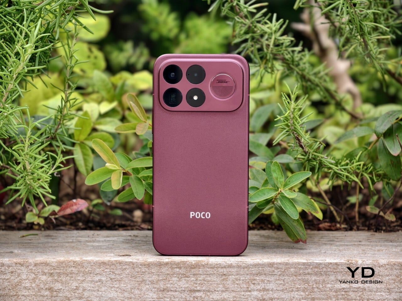
That shift is obvious the moment you look at the back. The denim-inspired treatment from the F8 Ultra is gone, replaced by a finish that feels more metallic and more architectural. The overall silhouette is simpler, but it does not come across as plain. Instead, it feels like Poco has traded novelty for composure, letting shape and proportion do more of the work.

The camera island design remains largely the same as its predecessor, but it feels more resolved here. A large rectangular module sits across the top portion of the phone, housing three cameras and an LED flash in a neat 2 by 2 arrangement, with the speaker grille set off to the right. It is still a bold layout, but one that now feels less experimental and more like a defining part of the phone’s identity.

New to the F9 Ultra is a dynamic light ring built around the speaker grille. It supports personalized visual effects for incoming calls, games, and music. The effect itself appears to be fairly simple, closer to a clean white LED accent than anything overly flashy, but that may be exactly the point. It feels like Poco’s way of keeping a hint of gaming-phone energy alive without letting it overwhelm the more sophisticated direction of the design.

The two colors also tell slightly different stories. The Dark Cherry finish is the more expressive option, bringing warmth and a bit of drama without tipping into flashiness. The Black version feels more understated and technical, especially with the red side-button accent adding a small but effective point of contrast. Both work, but they speak to different moods. One is richer and more characterful, while the other is cooler and more controlled.

Ergonomics

That more sophisticated look does come with a more substantial physical presence. At 235g, the Poco F9 Ultra is about 15g heavier than the F8 Ultra, and you feel that extra weight immediately. It sits firmly on the heavier side, especially in one-handed use, where its size and mass are hard to ignore.

Its dimensions, 163.49 x 77.94 x 8.74mm, are broadly in line with its predecessor, so the overall footprint will feel familiar if you are coming from the older model. It is still a wide phone, though, and not the easiest to manage with one hand. The curved edges do help soften the grip and make it feel less severe than the numbers suggest, but this is still a device that feels more at home in two-handed use.

The matte finish does its part as well. It feels premium, pleasant to touch, and better at disguising smudges than a glossier surface would be. Add in the familiar button placement and unchanged in-display fingerprint scanner, and the F9 Ultra ends up feeling less like a phone you need to relearn and more like one you simply need to get used to carrying.

Performance

The F9 Ultra runs on Qualcomm’s Snapdragon 8 Elite Gen 5, the same flagship platform used in the F8 Ultra. Poco has also retained the VisionBoost D8, a dedicated chip aimed at improving gaming and video performance. In practice, that makes the F9 Ultra feel less like a leap in raw power and more like a refinement of an already capable performance formula.

The F9 Ultra pairs that gaming focus with a 6.9-inch 1.5K AMOLED display, and it is exactly the kind of panel you would want on a phone built around entertainment. It is large, sharp, and vibrant, with a refresh rate that gives the phone a clear performance edge in games that can actually take advantage of it. Outside of gaming, that same smoothness carries over into scrolling, animations, and general navigation, even if the practical difference becomes less dramatic in everyday use.

Brightness is another clear strength. Poco says this is the first global lineup to use the new M11 luminescent material, which helps the panel reach up to 4,500 nits in peak brightness and as high as 10,000 nits for HDR highlights. The numbers are extreme, but the more practical takeaway is that the screen stays very readable outdoors and gives bright scenes a stronger sense of punch and contrast without losing too much detail.

The F9 series is also Poco’s first to push to 185Hz, with support for 24 games running at a native 185fps. That sounds more dramatic than it always feels in practice, because the benefit depends heavily on the kind of game you are playing. In faster titles like Blood Strike, Crossfire: Legends, and Brawl Stars, the higher refresh rate does make a difference. Motion looks cleaner, visual updates come faster, and the game feels a little more immediate under your fingers. In slower games like Clash of Clans, Clash Royale, or Hearthstone, the gain is much smaller. You still get smoother animations and interface movement, but not the same kind of gameplay advantage.

In an hour-long session of Blood Strike at the highest graphic settings, the F9 Ultra was able to hold 185fps without any obvious frame drops. Just as importantly, it did not get uncomfortably hot, staying at around 40 degrees Celsius on the surface. There is clearly enough cooling here to keep performance from falling off over time, but the more important takeaway is that the phone stays consistent under load.

Main Camera, 1x

Portrait mode, Main Camera, 3.1x

The F9 Ultra is the second phone to come out of Poco’s partnership with Bose, which makes the collaboration feel less like a one-off experiment and more like part of the series identity. The Bose-tuned speaker system remains one of its most distinctive features, and also one of the easiest to appreciate in daily use. Poco says it has redesigned the acoustic port and upgraded the dual speakers for clearer sound and richer bass. It also keeps the sound profile presets and 10-band EQ introduced on the F8 Ultra, which means there is still plenty of room to tailor the sound to your liking.

Telephoto Camera, 5x

Telephoto Camera, 10x

In use, the speakers are easy to like. Just like the F8 Ultra, the F9 Ultra delivers some of the best smartphone audio you can get. The sound is fuller and more open than what most phones manage, with enough bass presence to give games, films, and music a bit more body. Dialogue comes through clearly, and the overall presentation feels less cramped than the average smartphone speaker setup.

Main Camera, 1x

Telephoto Camera, 5x

Telephoto Camera, 10x

The F9 Ultra upgrades the main camera from 50MP on the F8 Ultra to 200MP here, though the sensor itself is smaller, dropping from 1/1.31-inch to 1/1.56-inch. That makes it less a straightforward upgrade and more a different kind of tradeoff. The rest of the setup remains familiar, with a 50MP 5x telephoto, a 50MP ultrawide, and a 32MP front camera.

Poco has also made a subtle but useful change to the focal lengths. The F9 Ultra uses a 24mm-equivalent main camera and a 17mm-equivalent ultrawide, compared with 23mm and 18mm on the F8 Ultra. The shift is small, and the ultrawide still does not feel especially expansive, but the added separation between the two lenses makes the jump from main to ultrawide feel a little more purposeful.

Ultrawide Camera, 0.7x

Main Camera, 1x

Telephoto Camera, 10x

In use, the main camera captures photos with good detail, solid dynamic range, and vibrant color. The 5x telephoto is also capable, though it tends to produce images that look a bit more saturated and contrast-heavy. Video is solid too, with crisp footage and enough consistency to make the camera system feel dependable for everyday shooting.

Night Shot, Ultrawide Camera, 0.7x

Night Shot, Main Camera, 1x

Night Shot, Telephoto Camera, 5x

Night Shot, Telephoto Camera, 10x

Battery life remains one of the F9 Ultra’s biggest strengths. The 8,050mAh battery is enormous even by flagship standards, and it gives the phone a clear advantage in the kind of heavy use it is designed for. In my use, it was easy to stretch the phone across two days on a charge, which suits the F9 Ultra’s media-heavy, gaming-friendly character especially well.

Charging is just as capable, with 100W wired and 50W wireless support, plus 27W wired reverse charging and 22.5W wireless reverse charging. It is a battery setup that feels as well-rounded as the rest of the phone.

Sustainability

The F9 Ultra is not a phone that talks much about sustainability in the material-driven sense, but it does make a decent case for longevity. Its IP68 rating and Corning Gorilla Glass 7i should help it stand up to everyday wear, which is still one of the most practical ways a phone can stay useful for longer.

Poco also promises four major Android OS updates and six years of security patches, which gives the F9 Ultra a fairly credible long-term support story. That matters because software support plays a big role in whether a phone remains worth keeping. Poco may not be leading the conversation around recycled materials or repairability here, but the basics of durability and usable lifespan are in place.

Value

The F9 Ultra starts at $799 for the 12GB/256GB version, which puts it $70 above the F8 Ultra. That is still an increase, but not an especially aggressive one in the current climate, where similar phones have seen price jumps closer to $100. Some of that restraint may come from Poco reusing the same Snapdragon 8 Elite Gen 5 platform, which likely helped balance out the rising cost of RAM and other components.

As an upgrade, though, the case is less convincing. If you already have the F8 Ultra, moving to the F9 Ultra does not make a lot of sense unless you specifically want the new design, the 185Hz display, or the 200MP main camera. As a fresh buy, however, it remains one of the best affordable flagship-level phones around. Poco may be edging upward in price, but it still knows how to deliver a lot of phone for the money.

Verdict

The Poco F9 Ultra feels like Poco settling into a formula that actually works. The design is more mature, the gaming side is still strong, and the Bose-tuned speakers remain one of the best reasons to care about the series in the first place. Add the huge battery and the 185Hz display, and you end up with a phone that feels very sure of what it wants to be.

If you already have the F8 Ultra, I do not think this is the upgrade to chase. The older phone is still good enough that the differences here feel more iterative than urgent. But if you are buying fresh, the F9 Ultra is still one of the better affordable flagship-level phones around, especially if you care as much about sound and gaming as you do about the usual specs.

The post Poco F9 Ultra Review: Great Sound, Grown-Up Design first appeared on Yanko Design.

  • ✇Yanko Design
  • TECNO CAMON Slim 5G Review: Thinner than a Pencil, Tough as a Tank
    PROS: Unbelievably slim and lightweight design Striking and stylish art-inspired finish Large 6,000mAh battery despite slim profile Exceptional durability with quad-IP rating, supporting underwater photography CONS: Modest hardware specs No dedicated telephoto camera RATINGS: AESTHETICSERGONOMICSPERFORMANCESUSTAINABILITY / REPAIRABILITYVALUE FOR MONEYEDITOR'S QUOTE:Slim, art-inspired, and tougher than it looks, the TECNO CAMON Slim 5G packs a 6,000mA
     

TECNO CAMON Slim 5G Review: Thinner than a Pencil, Tough as a Tank

Par : JC Torres
18 septembre 2026 à 11:20

PROS:


  • Unbelievably slim and lightweight design

  • Striking and stylish art-inspired finish

  • Large 6,000mAh battery despite slim profile

  • Exceptional durability with quad-IP rating, supporting underwater photography

CONS:


  • Modest hardware specs

  • No dedicated telephoto camera

RATINGS:

AESTHETICS
ERGONOMICS
PERFORMANCE
SUSTAINABILITY / REPAIRABILITY
VALUE FOR MONEY

EDITOR'S QUOTE:

Slim, art-inspired, and tougher than it looks, the TECNO CAMON Slim 5G packs a 6,000mAh battery into a body thin enough to turn heads.
award-icon

Slim phones have always come with a catch. Shave down the body and something else usually gets sacrificed: usually the battery, sometimes the durability, occasionally both. The TECNO CAMON Slim 5G doesn’t play by that old rulebook. At just 6.39mm thick, it still packs a 6,000mAh battery, 5G connectivity, and a durability rating most phones twice its thickness wouldn’t dare claim.

This review spent real time with the phone away from spec sheets, mostly to see if the design holds up once the initial wow wears off. That meant handling the Neo Mondrian finish TECNO sent for testing, carrying it through a normal week, testing the camera in situations that actually matter, and checking whether the durability claims survive contact with water and everyday clumsiness. The design conversation comes first.

Designer: TECNO

Aesthetics

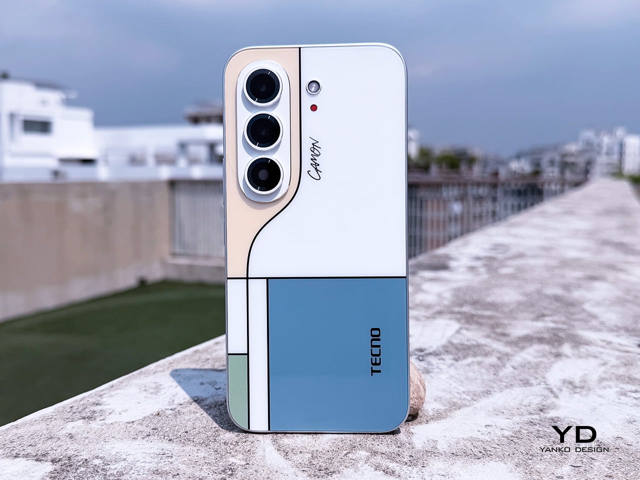
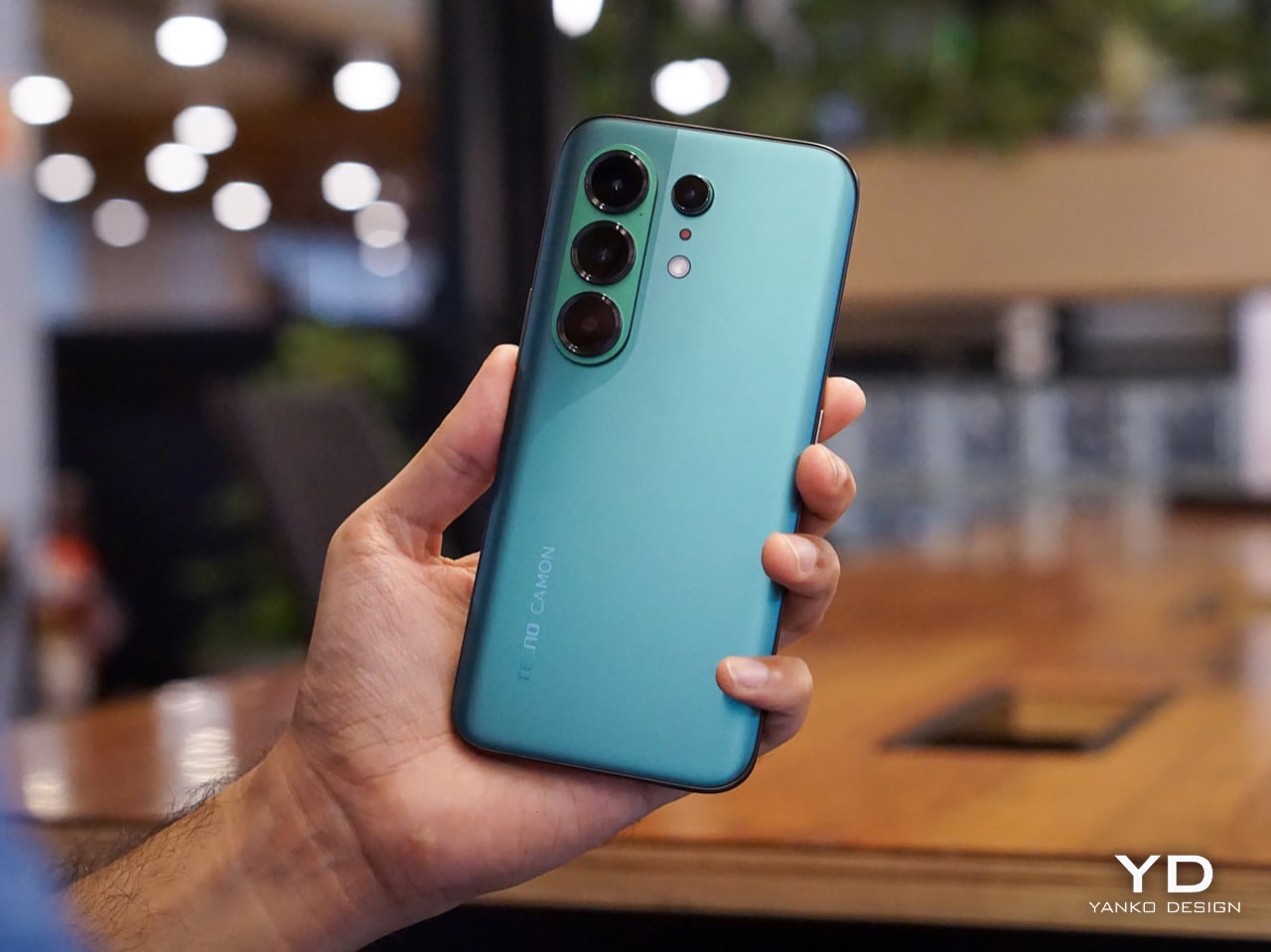
Pull the CAMON Slim 5G out in public and watch what happens. People notice a phone this thin the way they’d notice a watch too elegant for its price tag, usually with a double take and a request to hold it. TECNO carried over the swan-neck curve from the CAMON 50 series, and on a body this slender, that curve reads like a signature rather than a spec sheet footnote.

TECNO sent the Neo Mondrian colorway for this review, and it’s the strongest argument for treating a phone back as an actual canvas. Expose the panel to sunlight and yellow, green, and cyan blocks slowly bloom out of white, forming the grid Piet Mondrian made famous a century ago. It’s a photochromic trick, but watching it happen feels less like a gimmick and more like a magic show.

Neo Mondrian isn’t the only finish doing something interesting. Van Gogh Blue uses similar light-reactive techniques to make its swirling nebula pattern look like it’s actually rotating as shadows shift across it, closer to a painting than a phone back. Matisse Black leans into fluorescent green or pink color blocks that echo the artist’s cut-out work, while Burgundy Red blends fiberglass and matte texture into a warm, understated finish. Rebel Pink keeps things simpler, pairing a black body with sharp pink accents for something a little more playful.

Phone backs used to be an afterthought, something to protect rather than admire, which is why so many people slapped an opaque case on day one without a second thought. That’s changing. As manufacturers invest more in finishes, textures, and light-reactive coatings, more owners are leaving their phones bare, treating the back panel the same way they’d treat a piece of art they paid good money to display.

Ergonomics

Carrying the CAMON Slim 5G is where the thin body actually pays off day to day. It slides into a front pocket without that telltale bulge, sits flat against a jacket without pulling on the fabric, and feels lighter in hand than the display size suggests. After a few days, reaching for a thicker phone almost feels like picking up a brick by comparison.

Those flat edges aren’t just a style choice borrowed from boxier design trends. They give fingers something to actually grip onto, instead of sliding off a rounded rim the way slippery slab phones tend to do. The matte texture on the Neo Mondrian panel adds even more confidence, and TECNO’s wet and oily finger recognition keeps the touchscreen responsive when hands aren’t exactly dry or clean.

Performance

The 6.78-inch AMOLED display runs at 1.5K resolution and 144Hz, and both numbers translate into a screen that looks sharp and feels fast under a thumb. Photos pop with the kind of contrast only AMOLED delivers, video looks great for a lunch break binge, and scrolling through a feed never feels like it’s fighting the hardware. TÜV Rheinland’s low blue light certification is a nice bonus for long reading sessions.

Under the hood sits a MediaTek Dimensity 7300e, a processor built for balance rather than benchmark bragging rights. It handles social apps, photo editing, and everyday multitasking without hiccups, though demanding 3D games will ask more of it than it’s built to give. The 8GB of RAM stretches to 24GB with virtual memory extension, which covers most multitasking habits without needing to close every open app.

The 50MP Sony LYTIA 700C handles most of the photography workload, and it earns that responsibility. A 1/1.56-inch sensor paired with an f/1.8 lens pulls in plenty of light for evening shots, while the closed-loop ball motor keeps focus locked even when subjects won’t sit still. The 8MP ultra-wide feels more like a footnote, and there’s no telephoto here, but the main camera rarely leaves you wanting one.

The real showstopper is the 6,000mAh battery, a number that seems almost impossible once you remember this phone measures 6.39mm thick. It comfortably carries a full day of camera use, video, and scrolling without the battery anxiety that usually comes with slim designs. That same waterproofing also unlocks a dedicated underwater photography mode, one that kicks in automatically the moment the phone senses it’s gone for a swim.

Sustainability

TECNO rates the CAMON Slim 5G at IP69K, IP69, IP68, and IP66, a combination that’s rare even among phones that don’t have to worry about staying thin. That covers everything from high-pressure water jets to dust particles to full submersion, which is a lot of technical armor for a phone this delicate-looking. Finding this rating on a 6.39mm body is the kind of detail that quietly impresses.

There’s also a MIL-STD-810 rating covering shock and drop resistance, which pairs nicely with features like Rain Touch and Waterproof Case Touch that keep the screen usable in a downpour or behind a case. This doesn’t read like a feature bolted on at the last minute. It feels like TECNO wanted this phone to survive actual daily chaos, not just look good sitting still on a shelf.

Longevity extends past the hardware, too. TECNO promises three major OS upgrades and five years of security patches, plus a 60-month smoothness certification from TÜV SÜD. That’s a meaningful commitment in a market where phones often get abandoned after two update cycles. A well-built object is worth keeping around, and TECNO seems to be betting that owners will want to hold onto this one for a while.

Value

TECNO hasn’t confirmed global pricing yet, but early indications point to somewhere around $400. At that number, buyers get a phone with genuine art-inspired finishes, a 6.78-inch 144Hz AMOLED screen, a Sony-backed 50MP camera with real stabilization, a 6,000mAh battery, and a durability rating that most phones twice the price don’t bother chasing. That’s a fairly generous list for a phone that costs less than most flagships.

Most phones in this price range make you pick a lane. Go thin, and the battery usually suffers, or the body skips water resistance entirely, or the software support runs out after a couple of years. TECNO’s five-year update promise and its layered durability ratings quietly add up to lower long-term cost, since a phone built and supported to last half a decade doesn’t need replacing as often.

This phone makes the most sense for people who are tired of carrying an identical black slab and want something that says a little more about them. It’s not the right pick for hardcore mobile gamers chasing max frame rates, or photographers who need optical zoom on tap. For nearly everyone else, it covers daily needs while looking like it belongs on a gallery shelf.

Verdict

After a few days of actual use, the 6,000mAh battery and the quad-IP rating stop feeling like marketing footnotes and start feeling like the whole point. TECNO built a phone that looks like it belongs in a design museum and still survives a rainy commute or a splash at the sink. The Neo Mondrian panel alone gives it a personality that’s genuinely hard to find anywhere near this price.

Plenty of phones ask you to choose between something beautiful and something dependable, and most buyers have quietly accepted that trade-off as the cost of owning a nice-looking device. The CAMON Slim 5G makes a strong case that the choice was never as necessary as the industry made it seem. It’s a phone that looks good on a café table and still works fine after falling off of one.

The post TECNO CAMON Slim 5G Review: Thinner than a Pencil, Tough as a Tank first appeared on Yanko Design.

  • ✇Yanko Design
  • Tecno Camon 50 Ultra 5G Review: A $420 AI Phone With Built-in Gemini, ChatGPT, DeepSeek, and Grok
    PROS: EllaClaw is one of the most impressive phone AI experiences available right now Multi-model AI support, including Gemini, ChatGPT, Grok, DeepSeek, Meta AI, and Ella Strong 2-day battery life from the 6500mAh cell Competitive value in the mid-range segment CONS: Single speaker setup sounds tinny and lacks bass Curved waterfall display is prone to accidental palm touches No wireless charging or Qi2 (MagSafe) RATINGS: AESTHETICSERGONOMICSPERFORMANCESUSTAINABILITY /
     

Tecno Camon 50 Ultra 5G Review: A $420 AI Phone With Built-in Gemini, ChatGPT, DeepSeek, and Grok

16 août 2026 à 21:46

PROS:


  • EllaClaw is one of the most impressive phone AI experiences available right now

  • Multi-model AI support, including Gemini, ChatGPT, Grok, DeepSeek, Meta AI, and Ella

  • Strong 2-day battery life from the 6500mAh cell

  • Competitive value in the mid-range segment

CONS:


  • Single speaker setup sounds tinny and lacks bass

  • Curved waterfall display is prone to accidental palm touches

  • No wireless charging or Qi2 (MagSafe)

RATINGS:

AESTHETICS
ERGONOMICS
PERFORMANCE
SUSTAINABILITY / REPAIRABILITY
VALUE FOR MONEY

EDITOR'S QUOTE:

The Camon 50 Ultra 5G feels like Tecno looked at the current AI phone race, skipped the walled garden nonsense, and built the first assistant experience that actually shows you why you’d want to use it in the first place.

Apple has Apple Intelligence. Google Pixel has Gemini. Samsung has Galaxy AI. Tecno has everything else. Packed into its EllaClaw agent is the ability to use Gemini, ChatGPT, Grok, and DeepSeek, because a walled garden never benefited anyone. Tecno’s Camon 50 Ultra 5G is a great phone, but what makes it worth doing a double take for is EllaClaw, an agentic AI built into the phone that offers a phone AI experience I have yet to see on any smartphone so far. EllaClaw is currently an invite-only closed Beta feature limited to just this phone, but seeing it in action gave me everything I needed to understand where other phones are going wrong with their on-board AI, and where they can learn from Tecno.

The wild part is how approachable it all feels. EllaClaw does not sit around waiting for you to guess the perfect command like some moody genie. It actively shows you what it can do, which makes the whole experience feel far less intimidating than Gemini or Apple Intelligence currently do. Within minutes, I was jumping between message summaries, creative tools, settings help, and different AI models without feeling like I needed a tutorial or a prayer.

Aesthetics

The moment I unboxed the Camon 50 Ultra 5G, I was hit with a serious case of déjà vu. The green variant has a gorgeous satin finish that gives it a silky, metallic glow under the light, and it immediately sent me down a memory lane trip to my old OnePlus 8 Pro which I faithfully used from 2020 to 2024. The color, the texture, even the way the camera module is arranged, it all felt so familiar and, frankly, so premium. Tecno absolutely nailed the flagship-esque feel here. The back is smooth to the touch, resists fingerprints reasonably well, and has a subtle elegance that a lot of phones in this bracket just do not bother with.

The front is where the design language gets a little more complicated, at least for me. Tecno went with a waterfall display, which means the screen curves dramatically around the sides. It looks stunning when the phone is off or when you are watching a video, creating an immersive, almost bezel-free experience. But I have always had a love-hate relationship with these displays. They are beautiful, no doubt, but they can be a magnet for accidental palm touches. While the software does its best to ignore them, I still found myself occasionally tapping something I did not mean to. It is a classic case of striking aesthetics meeting the messy reality of how we hold our phones. I do have to say that Tecno’s Liquid Glass homage does look much better on a waterfall display than on a bezel-ridden iPhone.

Ergonomics

That waterfall display has a big effect on how the phone feels in your hand. The curved edges melt away into the frame, making the Camon 50 Ultra 5G incredibly comfortable to hold. There are no sharp, flat corners digging into your palm, which is great for long sessions of scrolling or gaming. The trade-off, of course, is that the phone can feel a little slippery if you are not paying attention. It has that smooth, polished-stone feel that is lovely to touch but always feels one careless gesture away from a gravity experiment. It is a phone that practically begs to be put in a case, even if it feels like a shame to cover up the design.

The button layout is personally feels a little little bit tricky. On the left, you have a dedicated AI key that summons EllaClaw, a shortcut I ended up using constantly. You can remap it, but having a one-press gateway to the AI is a smart touch. The right side, however, is where my muscle memory started to complain. There is a power button and a fairly short, single-piece volume rocker. Because the rocker is slightly compact, I often found myself fumbling, unsure if my thumb was on volume up, down, or about to lock the screen. It is a small pain, but a tiny indent in the middle of the volume button would have made all the difference. The buttons themselves are slightly sharp and textured, a necessary choice for a phone with curved edges, but it does not quite solve the problem of telling them apart by feel alone.

Performance

EllaClaw is where the Camon 50 Ultra 5G earns its stripes. The dashboard (which you access by swiping towards the left – where you’d see Google Discover on most Android phones) keeps surfacing prompts, shortcuts, and suggestions, making the AI feel alive and accessible rather than buried under three layers of settings. Most phone AI treats users like they should already know what they want. EllaClaw meets you halfway, and that changes everything about how you interact with the phone.

The deeper layer, EllaClaw Pro, is genuinely impressive. It reaches into the phone’s apps and system functions in a way that feels ahead of where the conversation currently is. I asked it to summarize my text messages without opening the messages app, and it did exactly that, handling the whole thing on its own. That kind of agentic behavior is the next logical step for phone assistants, and right now, Tecno seems to be ahead of the pack. Nothing reassured me that the AI wasn’t reading my messages to enhance its database though, so the privacy conscious might have a thing or two to worry about.

Tecno’s decision to build EllaClaw as a multi-model hub is one of the smartest software calls I have seen this year. My unit offered access to DeepSeek, Gemini, ChatGPT, Grok, and Meta AI alongside Ella’s own model, all in one dashboard. Claude is conspicuously missing, but everything else is here and free to use (at least during the Beta period). Daily limits are applied on AI use which reset every 24 hours, and you can buy extra credits in case you overshoot. In all my hours of testing, I never needed to purchase extra credits, which means image generation, video generation, and sketch-to-photo tools were all available at no additional cost.

EllaClaw is still being refined, though. The dashboard lagged occasionally, and the AI sometimes took longer to load than felt comfortable. Restarting the app always sorted it out, but it is a reminder that this experience has not fully grown into its ambition yet. Users in certain regions may also need a VPN to get the full experience running, which is worth knowing upfront.

The camera system is built around a 50MP Sony LYT-700C main sensor with OIS, paired with a 50MP telephoto lens offering 3x optical zoom (70mm equivalent) and an 8MP ultrawide. That telephoto is a proper standout for a phone at this price point, and the software leans into it with confidence. You get 60x hybrid zoom, which is mostly digital exaggeration past the 3x mark, but the results between 3x and 10x are still usable in decent light. The main camera performs well across a range of scenarios, especially in good light, and night mode is aggressive without getting too soupy. The front camera is a 50MP sensor with autofocus, which makes a noticeable difference in selfie sharpness compared to the fixed-focus cameras on cheaper phones.

Tecno stuffs the camera app with modes including dual-cam, underwater mode, document scanning, super night mode, and super macro. FlashSnap is the standout, though. It watches your scene and captures the most dramatic moment automatically, so if someone is mid-jump or mid-throw, the phone clicks at exactly the right time without you having to think about it. It made me look like a considerably better photographer than I actually am. Video recording tops out at 4K at 30fps, which is fine but not particularly exciting.

Battery life is one of the phone’s most quietly satisfying qualities. The 6500mAh cell pushed comfortably through two full days of use without needing a charge, which is more than my current flagship iPhone manages. At some point I just stopped thinking about charging altogether, which is the best thing a battery can do. The phone supports 45W wired charging, which is fast enough to feel civilized without being record-breaking.

The display is a 6.78-inch AMOLED panel with a 1.5K resolution (1208 x 2644 pixels, 429 ppi) and a 144Hz refresh rate with LTPO support for adaptive refresh. It is vibrant, sharp, and performs well in low light. The 144Hz refresh makes scrolling and gaming feel smooth, and the high PWM dimming (2160Hz) helps reduce flicker for those sensitive to it. The curved waterfall edges are a design choice I have already aired my reservations about, and this section will not relitigate that argument. It looks great. It catches accidental touches. Moving on.

Speakers are a weak spot, and a noticeable one. There is a single grille at the bottom right, so stereo is off the table, and the audio leans tinny with very little bass to speak of. For a phone this polished everywhere else, it feels like a department that got the budget cut.

Gaming held up well for everything I tried. Tecno’s dedicated gaming software manages frame rates and battery draw sensibly, and the Dimensity 7400 handled casual to moderate sessions without complaint. The 144Hz display helps make fast-paced games feel responsive, and the phone stayed well within comfortable temperature ranges throughout. Nothing I played caused any real issues, thermal throttling never became a concern, and the large battery meant I could game for extended sessions without nervously watching the percentage drop.

Sustainability

Tecno is promising 3 years of Android OS upgrades and 5 years of security patches for the Camon 50 Ultra 5G, which puts it roughly in line with brands like Motorola and slightly ahead of OnePlus, though still behind Nothing’s 6-year security support.That is a meaningful commitment for a phone at this price, especially if you are someone who plans to use the device well beyond the usual two-year upgrade cycle.

Tecno also claims the battery is built for durability, marketing it as a “5-Year Durability Battery” with TÜV certification and a 72-month lag-free guarantee. Whether that holds true in practice is something only time will tell, but the fact that the company is willing to stake that claim suggests they are at least thinking about longevity beyond the usual marketing fluff. The 6500mAh capacity itself helps, because the less frequently you need to charge, the slower the battery degrades. If you are getting two full days of use out of a charge right now, that headroom means the phone should still feel usable years down the line when the cell inevitably loses some of its capacity.

Value

The Tecno Camon 50 Ultra 5G is priced at $420 for the 8GB + 256GB variant (that’s based on its ₹40,000 Indian price, since the phone hasn’t officially launched in the US). For a phone with a 50MP telephoto, a 144Hz AMOLED display, and a 6500mAh battery, that positioning feels competitive in the under-40K segment, especially when you factor in the AI ambitions.

What feels less competitive is the setup experience. When I powered on the phone and began the initial configuration, India was not listed in the countries menu. Hilariously enough, Palestine was available as an option. The world’s most populated country, nowhere on the list. I eventually had to select a different region just to proceed, which immediately felt awkward for a phone launching in India. Later, I also needed a VPN to access EllaClaw, which could have been a software issue tied to my initial region selection, or it could point to broader availability constraints. Obviously this won’t be the case for everyone since mine was a review unit with the EllaClaw beta program probably tied to a certain region. Either way, it is a frustrating first impression for a feature that is supposed to be the phone’s main selling point.

As for EllaClaw Pro and its credits system, Tecno does offer a credit-based structure for premium AI features like image generation and video creation. In my testing, I never hit a paywall or needed to purchase add-on credits, which suggests the included allocation is generous enough for typical use, at least initially. How sustainable that remains over time, or whether Tecno tightens the limits later, is harder to predict. For now, though, the experience feels surprisingly open, which is a rare thing in the AI phone space.

Verdict

The Tecno Camon 50 Ultra 5G delivers a lot of value for $420. The camera is genuinely impressive, with super night mode shots and 60x zoom that feel bonkers for this price range, and the battery life makes it easy to forget about charging anxiety for days at a time. But I am not recommending this phone for its camera, or its battery, or even its design, as much as I enjoyed all of those things. I am recommending it for EllaClaw, because it is the closest I have come to using a phone AI that feels like it was built for actual humans.

EllaClaw is everything Gemini and Apple Intelligence hope to achieve, and a bit more. I did not think I would see a phone that lets me choose the LLM for its AI assistant, swapping between models depending on what I need. I definitely did not expect an AI assistant dashboard to genuinely give me so much insight and value into how I can use the AI, rather than just sitting through a keynote, nodding along to feature lists, and then forgetting half of them the moment I leave the room. Tecno has cracked something here that bigger brands are still struggling with, which is making AI feel approachable, integrated, and genuinely useful instead of intimidating or buried.

The phone has a few tiny flaws that feel manageable if you’re more driven by the AI chops. The speakers are tinny, the curved display catches palm touches, EllaClaw occasionally lags, and the setup process was a bit of a hassle given I needed a VPN to get EllaClaw to work (but that’s just my China-bound review unit). But if you are looking for a phone that shows you what AI on mobile should feel like when it grows up, the Camon 50 Ultra 5G is worth your attention. It is not perfect, but it is ambitious in all the right ways. Google, Apple, and Samsung could surely take notes.

The post Tecno Camon 50 Ultra 5G Review: A $420 AI Phone With Built-in Gemini, ChatGPT, DeepSeek, and Grok first appeared on Yanko Design.

❌