PROS:
- Flagship-level Snapdragon 8s Gen 4 delivers powerful performance
- Vivid, crisp, and large 6.83-inch display
- Premium build with glass back panel and metal frame
CONS:
- No eSIM or wireless charging support
- Quite a number of bloatware
RATINGS:
SUSTAINABILITY / REPAIRABILITY
EDITOR'S QUOTE:
If you value speed, all-day power, and a futuristic look, the Poco F7 deserves your attention.
It’s become a familiar pattern in the smartphone world as brands now often launch their “Pro” and “Ultra” models before releasing the standard, or “vanilla,” version of a series. This shift can make the regular edition feel like an afterthought and sometimes leaves buyers confused about what really separates each version. The lines between Pro and non-Pro are getting less defined, especially as features and designs often overlap across the whole lineup.
Poco has built its reputation on delivering high-performance phones for gaming enthusiasts and power users, usually at aggressive price points. The new Poco F7 follows that tradition, arriving after its Ultra and Pro siblings launched in March but bringing its own bold style and focus on speed. With performance front and center, the Poco F7 aims to give gamers and demanding users something special, even as the competition between models gets more crowded and complicated. After spending time with all three color variants, here’s how the Poco F7 delivers on that promise.
Designer: POCO
Aesthetics
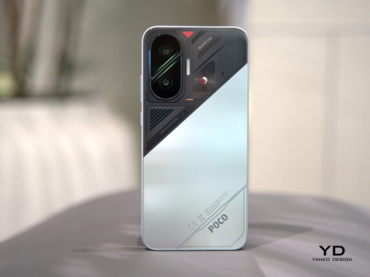
The Poco F7 looks nothing like the Poco F7 Ultra or Poco F7 Pro, giving it a distinct presence in this year’s F7 series lineup. The Poco F7 is available in three color options, Black, White, and Cyber Silver, all featuring a two-tone design, glass back panels, and metal frames, but with very different visual impact.
The Black and White variants offer a more subtle two-tone effect. On the Black model, the glossy finish is paired with a slightly darker accent, creating a sleek look that feels refined and understated, though it does show fingerprints easily. The White variant features a matte finish that resists smudges and pairs a crisp main shade with a softer, almost pearlescent accent for extra depth.
The Cyber Silver edition is the most distinctive of the three. It features a bold, high-contrast two-tone design, with a glossy metallic lower half and a mechanics-inspired upper section covered in geometric overlays and a prominent Snapdragon logo. This version is unapologetically retro-futuristic and expressive, sure to draw attention, though its dramatic look may not appeal to everyone.
A key visual highlight on all three variants is the camera module. It is an elongated vertical oval set in the upper left corner, with a diagonal divider seamlessly integrated into the frame. This divider, flanked by two vivid green lines, separates the dual camera lenses and injects a pop of unexpected color.
While the green accent adds an energetic, gaming-inspired touch, its purpose is somewhat mysterious and may not fit everyone’s taste. Still, this camera island ensures the Poco F7 is instantly recognizable and reinforces its bold personality.
Ergonomics
The Poco F7’s completely flat display, flat side frame, and curved corners give it an iPhone-like impression at first glance. At 163.1 x 77.9 x 8.2mm and 215.7g, it is a large and fairly hefty phone, which makes one-handed use a challenge, especially for those with smaller hands.
That said, the build quality is nothing to scoff at, with a glass back panel and metal side frame that feel solid and premium in the hand. This sturdy construction not only looks refined but also gives the phone a reassuring sense of durability. The IP68 rating adds peace of mind for accidental splashes or brief drops in water, but the device’s overall heft is always present in daily use.
Both the power and volume buttons are placed on the right side and are easily accessible, though the sheer size of the device may require a stretch for some. The fingerprint scanner sits close to the bottom edge of the display, and while it unlocks quickly, transitioning from unlocking to navigating the interface can feel a bit awkward due to its low placement.
USB-C port and speaker placement are standard at the bottom. The dual-SIM tray, USB-C port, and main speaker are located at the bottom, while the top houses a microphone that also serves as a secondary speaker. The phone wobbles when used on a flat surface because of its camera bump, which can be distracting when tapping or typing on a desk.
Performance
The Poco F7 is powered by the Snapdragon 8s Gen 4 processor, which delivers consistently fast and fluid performance for everyday tasks. This chip is part of Qualcomm’s top-tier 8-series family, but it’s designed to make flagship-level speed and efficiency more accessible. In simple terms, the Snapdragon 8s Gen 4 gives you nearly all the power you’d find in the most expensive Android phones, but at a much friendlier price. Whether you’re gaming, streaming, or multitasking, the F7 keeps up without missing a beat.
The 6.83-inch 1.5K AMOLED display is vivid and exceptionally bright, with a tall aspect ratio that is ideal for video streaming, browsing, and gaming. Its impressive color range, up to 120Hz refresh rate, and 3200 nits peak brightness ensure content looks sharp and immersive, even outdoors. TÜV Rheinland certifications and high-frequency PWM dimming help reduce eye fatigue during long viewing sessions. Audio performance is also solid, with the dual speaker system producing clear and well-balanced sound with good volume for games, movies, and music.
The Poco F7 is a strong pick for gamers, handling demanding titles like Genshin Impact and Call of Duty without any stutter or lag. WildBoost Optimization 4.0 is Poco’s dedicated gaming mode that maximizes performance and helps keep gameplay smooth. Visual enhancement features are also available, allowing you to boost frame rates and resolution. This combination means you can play games like Genshin Impact, which are usually limited to 60 frames per second (FPS) on other Android phones, at up to 120 FPS on the F7.
High performance does create heat, especially during long gaming sessions, but Poco addresses this with an advanced cooling system. The F7 includes a 6,000 mm2 3D Dual-Channel IceLoop system, which is the largest Poco has ever used. In real-world use, the phone can still get uncomfortably hot if you are gaming for a long time, although the performance remains stable and responsive without major slowdowns.
Battery life is a strong point, thanks to the 6500mAh cell, and the 90W fast charging means you can get back to 80% in just 30 minutes. Reverse charging at 22.5W is handy for powering up accessories or other devices. As expecged but still disappointing, there is no wireless charging to be found.
The 50MP Sony IMX882 main camera with OIS performs well in good lighting, capturing images with pleasing dynamic range and solid detail at 1x. It can digitally zoom up to 10x, and photos at higher zoom levels look surprisingly natural, with restrained processing that avoids the overly sharpened look some rivals produce.
The 8MP ultra-wide camera creates cooler-toned photos with good dynamic range, but distortion is noticeable at the edges. The 20MP front camera is decent for selfies, though it tends to make reds look a bit too saturated, sometimes resulting in an orangish skin tone.
As for video capabilities, the main camera supports up to 4K recording at 60 FPS, delivering sharp and fluid footage suitable for casual clips. In contrast, both the ultra-wide and front-facing cameras are limited to 1080p at 30 FPS, which is serviceable for basic video needs.
The new camera UI makes it easier to access advanced features. Swiping up now reveals modes like Slow motion and Long exposure, which is more convenient than the old side-swiping method. However, the main photo and video interface only provides quick access up to 2x magnification, despite supporting up to 10x for photos and 6x for video. To access higher zoom levels, you need to use the on-screen zoom dial, which can be less intuitive in fast-paced situations.
It would be more user-friendly if dedicated buttons for higher magnifications were available by default. For video specifically, you can initially zoom in up to 2x before hitting the record button, but once recording starts, you can continue zooming up to 6x. This approach may slow you down if you want to quickly capture distant subjects, and a more streamlined zoom interface would benefit users who frequently switch between focal lengths during recording. Hopefully, these interface limitations will be addressed in a future update.
Unfortunately, Poco is also known for including a lot of bloatware, and the F7 is no exception. During the setup process, you are presented with a list of recommended apps, which are selected by default. You have to manually uncheck these recommendations before proceeding, which can be annoying if you prefer a clean start.
Sustainability
Sustainability isn’t a headline feature for the Poco F7, but there are a few things here that help the phone last. Poco doesn’t mention using any recycled or eco-friendly materials in the phone’s build, so if you’re looking for a “green” smartphone, this might not be your top pick.
Where the F7 does shine is in durability and long-term support. It’s rated IP68 for water and dust resistance, so you don’t have to stress about everyday spills or a quick splash at the pool. The display is protected by Gorilla Glass 7i, which means it’s built to handle bumps, drops, and scratches better than many budget phones out there.
Perhaps best of all, Poco is promising four years of major Android updates and six years of security patches. This kind of long-term software support is fantastic for a phone in the mid-range category, and it means you can keep your device updated and secure for far longer than most competitors. Even if sustainability isn’t front and center, the F7’s durability and software longevity help it stay out of the landfill for years to come.
Value
The Poco F7 is priced competitively at $399 for the 12GB+256GB model and $449 for the 12GB+512GB version, with early bird deals bringing these down to $339 and $399. At this price point, you get a flagship-level Snapdragon 8s Gen 4 chip, a large 6.83-inch AMOLED display, IP68 water resistance, fast charging, and class-leading software support. It’s rare to find this combination of features bundled together in the global mid-range market.
Notable competitors include the iQoo Neo 10, though it is only available in select markets. If wireless charging or top-tier camera performance is your main priority, you might want to look elsewhere. However, for pure performance and features per dollar, the Poco F7 is tough to beat in the mid-range segment.
Verdict
The Poco F7 stands out by blending flagship-grade performance, a vibrant and expansive display, and reliable battery stamina within a bold, modern design. Its powerful performance, massive display, big battery, and solid build make it a compelling choice for anyone seeking a premium experience without the typical flagship price tag.
While there are a few minor drawbacks, such as the weight and some software quirks, the overall package is hard to beat in its segment. If you value speed, all-day power, and a futuristic look, the Poco F7 deserves your attention.
The post Poco F7 Review: Flagship Power, Big AMOLED Display, and Bold Design for Under $400 first appeared on Yanko Design.