Vue normale

Il y a de nouveaux articles disponibles, cliquez pour rafraîchir la page.
À partir d’avant-hierYanko Design

Electrolux 800/8000 Vacuum Redefines Home Cleaning With Style, Intelligence, and Sustainability

Par : Tanvi Joshi
4 juillet 2025 à 22:30

What if your vacuum didn’t just clean your home, but became part of it? The Electrolux/AEG 800/8000 cordless vacuum cleaner doesn’t shout for attention. It quietly earns its place, designed with such subtlety and intelligence that it feels like it was always meant to be there. This isn’t just an upgrade, it’s a rethinking of what home cleaning should look and feel like.

At the heart of this transformation is the philosophy of effortless living. The 800/8000 series was crafted to eliminate the very friction we’ve come to accept in everyday maintenance. Tangled cords, dusty filters, messy emptying, all of it replaced with streamlined elegance. Designed with Scandinavian minimalism in mind, the vacuum and its components blend smoothly into home environments without disrupting the aesthetic. It’s cleaning technology that finally understands the modern home doesn’t want to look like a storage closet.

Designer: Jakob Dawod

But the visual integration is only the beginning. The real leap lies in its performance and usability, especially with the introduction of its companion: the all-in-one automatic emptying station. This station doesn’t just charge your vacuum; it takes care of it. One tap and the dustbin is emptied from the bottom, reducing mess and eliminating dust contact entirely. Inside, a secondary battery sits fully charged, ready to swap in when needed, while a subtle red indicator light informs you when the dust bag needs replacing. Hidden compartments hold maintenance tools and filters, and a clever access system allows you to remove and clean them without fuss. Even the rarely used HEPA filter is easily reached through an eject button on the base.

The vacuum itself has been refined to deliver premium-level performance while keeping the user’s day-to-day experience smooth and intuitive. When docked, the cleaner’s telescopic tube automatically compresses, saving space and kickstarting the charging and emptying process. Docking doesn’t require precision, just roll it in and lift slightly. The rotational base allows you to access the cleaner from different angles, adapting to your space and your routine. Every interaction feels intentional and considered.

This design didn’t emerge in a straight line. It was the product of countless sketches, ideas, and experiments, from early cardboard mockups to 3D-printed prototypes and detailed, high-fidelity appearance models. The development journey was marked by iteration, collaboration, and constant refinement. Engineers and designers worked side-by-side to solve real user frustrations, resulting in features like intuitive accessory storage, effortless hand-unit release, and even a compact accessory bag that’s as aesthetic as it is practical.

The experience doesn’t stop at dry cleaning. The evolved wet mop attachment expands the vacuum’s role into full-surface care. Controlled via the smart UI on the hand unit, users can maintain the perfect dampness of the mop pads with different drip speeds or target tough stains with a quick spray activated by a long button press. It’s this attention to detail, this layering of functionality onto an already elegant system, that transforms cleaning into something closer to satisfaction than obligation.

Underneath the polish, the 800/8000 system represents a deeper commitment to sustainability. Not only does it reduce waste by encouraging proper upkeep through smart maintenance tools, but it also supports longevity through design. Removable batteries, cleanable filters, and thoughtfully constructed accessories extend the product’s life far beyond the average vacuum, supporting Electrolux’s mission to be a truly sustainable brand.

And behind all this innovation? A team that believed in the power of design to change behavior. Cross-functional collaboration within the Electrolux Group made this complex product feel remarkably simple. From the closest design partners to the engineering teams who transformed sketches into smooth, real-world mechanics, every detail was a testament to shared vision and dedication.

The post Electrolux 800/8000 Vacuum Redefines Home Cleaning With Style, Intelligence, and Sustainability first appeared on Yanko Design.

Japandi-Inspired Home Showcases Floating Teahouse, Glass Bridge, & Sunlit Spaces In California

4 juillet 2025 à 17:20

The Waterbridge House shows us what it means to live both inside and out. Set amid the pines of Pebble Beach, this glass-clad sanctuary floats above the landscape, a calm, geometric silhouette that is as much an homage to nature as it is a feat of architecture. Designed by a local artist, the home’s spirit is rooted in the Japandi style, where Japanese calm and Scandinavian restraint meet the warmth of the California coast.

Staggered concrete steps emerge from the hillside, guiding you toward the house’s signature feature: a glass corridor that bridges a tranquil pool. This floating link is more than an entryway. It’s a threshold—a moment of pause between the everyday and the restorative energy within. The two wings that it connects speak to both privacy and togetherness.

Designer: Emily Yang Bauer

One wing features a spacious open-plan kitchen, living room, and dining area—perfect for gatherings and everyday living. The opposite wing is dedicated to privacy, offering a primary suite that opens onto a generous deck, a separate den or office, and two additional en-suite bedrooms. Below the common area, a separate guest suite with its own kitchenette and private entrance provides comfort and autonomy for visitors.

Waterbridge House’s minimalist form delivers a thoughtful complexity. The facade is a study in contrasts: bare white stucco, punctuated by vertical frameless windows, melts into entire glass walls that slide open to expansive decks. The effect is seamless. Indoors and outdoors blend, and natural light pours through the space, transforming at every hour. Here, the forest is never just a backdrop—it’s invited in, echoing along every surface and reflecting off the pool below.

Central to the home’s philosophy is its relationship with water and landscape. The glass corridor doesn’t only serve as a bridge – it is a calm vantage point, suspended between sky and pool, framing the shifting patterns of light and shade. It’s no wonder the house earned its name: Waterbridge. On quiet mornings, you might cross this bridge with coffee in hand, watching fog drift between trees and sunlight skip over ripples below.

The inspiration for Waterbridge House traces back centuries and continents. The staggered layout and bamboo-accented calm draw from the Cui Linglong, an 11th-century building in Suzhou, China. That legacy is felt most strongly in the home’s floating tea house—a conceptual pavilion accessed by its own set of concrete steps, perfect for contemplation or quiet gatherings. This gentle nod to history grounds the home’s modern lines, adding a layer of serenity and depth.

The house is blessed with light-filled spaces and a connection to nature, creating an atmosphere that is both calming and invigorating. The design offers privacy without isolation, and the floating glass bridge is a daily reminder of the home’s unique vision. The few cons—perhaps a less urban location or a minimalist palette that may not suit maximalist tastes—are far outweighed by the sense of peace and spaciousness.

The post Japandi-Inspired Home Showcases Floating Teahouse, Glass Bridge, & Sunlit Spaces In California first appeared on Yanko Design.

Copilot Fellow Concept is an AI Pendant That Feels More Like a Friend Than a Gadget

Par : JC Torres
4 juillet 2025 à 16:20

Ever feel like AI is always hiding in the background, tucked away on your phone or buried behind a dozen browser tabs? Most of us interact with digital assistants through screens, which, let’s be honest, makes technology feel a little distant from our actual lives. But what if AI could be more present, accessible, and even a little bit stylish? That’s where the Copilot Fellow concept comes in, and honestly, it’s hard not to get a little excited about the idea.

The Copilot Fellow isn’t just another gadget to add to your collection. Picture a pill-shaped device, smooth and minimal, with a flat front and back. The front features a camera and a bold Copilot button, the heart of the design. Tap it, and you’re instantly connected to your AI assistant, ready to ask a question, set a reminder, or get a quick weather update. It’s designed to be intuitive, something you can operate without fiddling around or losing your train of thought.

Designer: Braz de Pina

What really makes Copilot Fellow stand out, though, are the four shortcut buttons, two on each side, that you can program for your favorite prompts or voice commands. Imagine setting one for “What’s on my calendar?” and another for “Send a quick note.” There’s no scrolling through endless menus or getting lost in settings. It’s simple, direct, and focused on the way you actually use AI day to day.

Now, here’s a little twist to that premise: While the front is all about that single, satisfying Copilot button, the back features a discreet screen. If you want to read your prompts or see some quick info, it’s there. But since it’s hidden away on the reverse side, it never gets in the way. This design choice keeps your interactions as screen-free as you want them to be, which feels like a breath of fresh air in our notification-heavy world.

One of the coolest things about Copilot Fellow is how you can wear it. You’re not locked into any one style, it works as a pendant around your neck, or you can just toss it in your pocket. It feels less like another gadget and more like a little presence you carry with you, always ready to help but never demanding attention. There’s something almost companion-like about it, which is a big leap from the usual “Hey Siri” or “Okay Google” voice floating out of your phone.

It’s important to remember that this is still a concept design, and Microsoft is unlikely to make one itself. But honestly, wouldn’t it be cool if someone DIY’ed their own version? The simplicity and flexibility make it feel approachable, even for tinkerers. Copilot Fellow reimagines how we might invite AI into our lives: more personal, more tangible, and a lot more stylish. Would you wear your AI around your neck, or are you sticking with the old-school phone in your pocket? Either way, this concept makes us rethink what AI gadgets could be.

The post Copilot Fellow Concept is an AI Pendant That Feels More Like a Friend Than a Gadget first appeared on Yanko Design.

World’s Narrowest Fiat Panda is one anorexic 19-inch-wide EV destined for the record books

Par : Gaurav Sood
27 juin 2025 à 22:30

Classic cars often become platforms for bold customization, but few reimaginings are as visually striking (or ugly, I have to admit) as this one. Italian mechanic Andrea Marazzi has transformed a 1993 Fiat Panda into what is now being described as the world’s narrowest functioning car. At just 19.6 inches wide, the one-seater electric vehicle looks more like a cartoon sketch brought to life than a road-ready hatchback. Yet it can move, steer, stop, and drive like any other car. That said, I would never imagine myself driving this one-eyed Cyclops in this lifetime.

Marazzi, who works at his family’s scrapyard and mechanical workshop in Bagnolo Cremasco, spent over a year building the vehicle as a tribute to the original Fiat Panda. Nearly every original part of the 1993 car has been reused in the process—doors, lights, roof, and wheels—but the body has been split vertically and rebuilt to shrink the vehicle’s width down to a comically slim profile. What was once a compact city car is now a sculptural slice of steel with just enough room to accommodate a single person, seated at the exact center.

Designer: Andrea Marazzi

Powering this narrow Panda is a small electric motor borrowed from an e-scooter, paired with a 24V battery that gives the car a modest top speed of about 15 kilometers per hour and a driving range of approximately 25 kilometers. It’s not built for real-world commuting, nor is it legally road-registered. But it functions exactly as a basic car should: offering forward and reverse drive, braking, turning, and a working headlight and turn signals. While Marazzi originally created it as a showpiece, the vehicle is fully operational and was recently driven in public at an enthusiast gathering in Pandino, Italy.

The car made its debut at “Panda a Pandino,” a festival celebrating 45 years of the Fiat Panda. Surrounded by thousands of conventionally sized Pandas, Marazzi’s single-seater stood out immediately. Videos and images from the event quickly went viral online, leaving viewers fascinated by its proportions and mobility. Many were amused by how the Panda looks almost flattened, as if it had been squeezed into a 2D shape while retaining its ability to move. Others praised the engineering behind it, describing it as a brilliant blend of creativity, nostalgia, and humor.

Though it’s not street-legal, Marazzi is in the process of submitting the car for a Guinness World Record as the slimmest functioning vehicle ever made. At just a third of the width of the original Fiat Panda, it’s an extreme but fascinating reinterpretation of automotive form. More art installation than transport solution, the narrow Panda invites viewers to rethink proportions, functionality, and playfulness in mechanical design. It’s a rolling experiment—part engineering challenge, part tribute, and part public spectacle.

The post World’s Narrowest Fiat Panda is one anorexic 19-inch-wide EV destined for the record books first appeared on Yanko Design.

Scientists create living building material that traps carbon dioxide

Par : Ida Torres
24 juin 2025 à 17:00

Buildings are responsible for a huge share of global carbon emissions, especially during the production of materials like cement. Traditional concrete manufacturing is one of the biggest sources of CO2 worldwide. If we can switch to materials that don’t just stop this but even use CO2 to our advantage, then we can make a big difference in fighting climate change. Imagine a future where our homes and offices not only look beautiful but also help clean the air by capturing carbon dioxide (CO2).

Thanks to a team of scientists at ETH Zurich, that future might be closer than we think. They have developed a remarkable new building material that doesn’t just sit there. It’s actually alive and actively helping the planet. This groundbreaking material is a type of concrete, but with a twist: it contains living bacteria. These aren’t just any bacteria as they are specially chosen because they can turn carbon dioxide from the air into solid minerals. That means while regular concrete actually releases CO2 during its production, this living material absorbs it, helping to reduce greenhouse gases in our atmosphere.

Designer: ETH Zurich

Inside the material, millions of bacteria are hard at work. These bacteria are fed a mixture of nutrients, including calcium. When they “eat,” they react with CO2 in the air, producing solid calcium carbonate. This process is similar to how seashells form in nature. Over time, the bacteria help the material grow stronger while trapping more carbon dioxide. The scientists designed their material to be porous, which means it has lots of tiny holes. These holes give bacteria plenty of room to live and work, while also allowing air to pass through so the bacteria can capture CO2 efficiently.

The new living material could be used in walls, floors, or even outdoor structures. Imagine a city full of buildings that quietly soak up CO2 day after day, making the air cleaner for everyone. But the benefits don’t stop there. The production of this living material uses less energy than regular concrete. Plus, the process is designed to be sustainable from start to finish. The bacteria don’t need fancy care—they just need a bit of food and the right conditions to thrive. If a piece of the material breaks, it can even “heal” itself. The bacteria inside can repair small cracks by producing more calcium carbonate, just like how your skin heals a cut. This could help buildings last longer and require less maintenance.

The research team is still working on perfecting their creation. They want to make sure the material is strong enough for real-world use and figure out the best ways to produce it on a large scale. There are also questions about how the bacteria will behave over many years and in different climates. Still, the early results are very promising. This living building material could offer a win-win solution: helping to build the cities of tomorrow while also cleaning up the air today.

The post Scientists create living building material that traps carbon dioxide first appeared on Yanko Design.

Poco F7 Review: Flagship Power, Big AMOLED Display, and Bold Design for Under $400

Par : Aki Ukita
24 juin 2025 à 14:20

PROS:


  • Flagship-level Snapdragon 8s Gen 4 delivers powerful performance

  • Vivid, crisp, and large 6.83-inch display

  • Premium build with glass back panel and metal frame

CONS:


  • No eSIM or wireless charging support

  • Quite a number of bloatware

RATINGS:

AESTHETICS
ERGONOMICS
PERFORMANCE
SUSTAINABILITY / REPAIRABILITY
VALUE FOR MONEY

EDITOR'S QUOTE:

If you value speed, all-day power, and a futuristic look, the Poco F7 deserves your attention.

It’s become a familiar pattern in the smartphone world as brands now often launch their “Pro” and “Ultra” models before releasing the standard, or “vanilla,” version of a series. This shift can make the regular edition feel like an afterthought and sometimes leaves buyers confused about what really separates each version. The lines between Pro and non-Pro are getting less defined, especially as features and designs often overlap across the whole lineup.

Poco has built its reputation on delivering high-performance phones for gaming enthusiasts and power users, usually at aggressive price points. The new Poco F7 follows that tradition, arriving after its Ultra and Pro siblings launched in March but bringing its own bold style and focus on speed. With performance front and center, the Poco F7 aims to give gamers and demanding users something special, even as the competition between models gets more crowded and complicated. After spending time with all three color variants, here’s how the Poco F7 delivers on that promise.

Designer: POCO

Aesthetics

The Poco F7 looks nothing like the Poco F7 Ultra or Poco F7 Pro, giving it a distinct presence in this year’s F7 series lineup. The Poco F7 is available in three color options, Black, White, and Cyber Silver, all featuring a two-tone design, glass back panels, and metal frames, but with very different visual impact.

The Black and White variants offer a more subtle two-tone effect. On the Black model, the glossy finish is paired with a slightly darker accent, creating a sleek look that feels refined and understated, though it does show fingerprints easily. The White variant features a matte finish that resists smudges and pairs a crisp main shade with a softer, almost pearlescent accent for extra depth.

The Cyber Silver edition is the most distinctive of the three. It features a bold, high-contrast two-tone design, with a glossy metallic lower half and a mechanics-inspired upper section covered in geometric overlays and a prominent Snapdragon logo. This version is unapologetically retro-futuristic and expressive, sure to draw attention, though its dramatic look may not appeal to everyone.

A key visual highlight on all three variants is the camera module. It is an elongated vertical oval set in the upper left corner, with a diagonal divider seamlessly integrated into the frame. This divider, flanked by two vivid green lines, separates the dual camera lenses and injects a pop of unexpected color.

While the green accent adds an energetic, gaming-inspired touch, its purpose is somewhat mysterious and may not fit everyone’s taste. Still, this camera island ensures the Poco F7 is instantly recognizable and reinforces its bold personality.

Ergonomics

The Poco F7’s completely flat display, flat side frame, and curved corners give it an iPhone-like impression at first glance. At 163.1 x 77.9 x 8.2mm and 215.7g, it is a large and fairly hefty phone, which makes one-handed use a challenge, especially for those with smaller hands.

That said, the build quality is nothing to scoff at, with a glass back panel and metal side frame that feel solid and premium in the hand. This sturdy construction not only looks refined but also gives the phone a reassuring sense of durability. The IP68 rating adds peace of mind for accidental splashes or brief drops in water, but the device’s overall heft is always present in daily use.

Both the power and volume buttons are placed on the right side and are easily accessible, though the sheer size of the device may require a stretch for some. The fingerprint scanner sits close to the bottom edge of the display, and while it unlocks quickly, transitioning from unlocking to navigating the interface can feel a bit awkward due to its low placement.

USB-C port and speaker placement are standard at the bottom. The dual-SIM tray, USB-C port, and main speaker are located at the bottom, while the top houses a microphone that also serves as a secondary speaker. The phone wobbles when used on a flat surface because of its camera bump, which can be distracting when tapping or typing on a desk.

Performance

The Poco F7 is powered by the Snapdragon 8s Gen 4 processor, which delivers consistently fast and fluid performance for everyday tasks. This chip is part of Qualcomm’s top-tier 8-series family, but it’s designed to make flagship-level speed and efficiency more accessible. In simple terms, the Snapdragon 8s Gen 4 gives you nearly all the power you’d find in the most expensive Android phones, but at a much friendlier price. Whether you’re gaming, streaming, or multitasking, the F7 keeps up without missing a beat.

The 6.83-inch 1.5K AMOLED display is vivid and exceptionally bright, with a tall aspect ratio that is ideal for video streaming, browsing, and gaming. Its impressive color range, up to 120Hz refresh rate, and 3200 nits peak brightness ensure content looks sharp and immersive, even outdoors. TÜV Rheinland certifications and high-frequency PWM dimming help reduce eye fatigue during long viewing sessions. Audio performance is also solid, with the dual speaker system producing clear and well-balanced sound with good volume for games, movies, and music.

The Poco F7 is a strong pick for gamers, handling demanding titles like Genshin Impact and Call of Duty without any stutter or lag. WildBoost Optimization 4.0 is Poco’s dedicated gaming mode that maximizes performance and helps keep gameplay smooth. Visual enhancement features are also available, allowing you to boost frame rates and resolution. This combination means you can play games like Genshin Impact, which are usually limited to 60 frames per second (FPS) on other Android phones, at up to 120 FPS on the F7.

High performance does create heat, especially during long gaming sessions, but Poco addresses this with an advanced cooling system. The F7 includes a 6,000 mm2 3D Dual-Channel IceLoop system, which is the largest Poco has ever used. In real-world use, the phone can still get uncomfortably hot if you are gaming for a long time, although the performance remains stable and responsive without major slowdowns.

Battery life is a strong point, thanks to the 6500mAh cell, and the 90W fast charging means you can get back to 80% in just 30 minutes. Reverse charging at 22.5W is handy for powering up accessories or other devices. As expecged but still disappointing, there is no wireless charging to be found.

The 50MP Sony IMX882 main camera with OIS performs well in good lighting, capturing images with pleasing dynamic range and solid detail at 1x. It can digitally zoom up to 10x, and photos at higher zoom levels look surprisingly natural, with restrained processing that avoids the overly sharpened look some rivals produce.

The 8MP ultra-wide camera creates cooler-toned photos with good dynamic range, but distortion is noticeable at the edges. The 20MP front camera is decent for selfies, though it tends to make reds look a bit too saturated, sometimes resulting in an orangish skin tone.

As for video capabilities, the main camera supports up to 4K recording at 60 FPS, delivering sharp and fluid footage suitable for casual clips. In contrast, both the ultra-wide and front-facing cameras are limited to 1080p at 30 FPS, which is serviceable for basic video needs.

The new camera UI makes it easier to access advanced features. Swiping up now reveals modes like Slow motion and Long exposure, which is more convenient than the old side-swiping method. However, the main photo and video interface only provides quick access up to 2x magnification, despite supporting up to 10x for photos and 6x for video. To access higher zoom levels, you need to use the on-screen zoom dial, which can be less intuitive in fast-paced situations.

It would be more user-friendly if dedicated buttons for higher magnifications were available by default. For video specifically, you can initially zoom in up to 2x before hitting the record button, but once recording starts, you can continue zooming up to 6x. This approach may slow you down if you want to quickly capture distant subjects, and a more streamlined zoom interface would benefit users who frequently switch between focal lengths during recording. Hopefully, these interface limitations will be addressed in a future update.

Unfortunately, Poco is also known for including a lot of bloatware, and the F7 is no exception. During the setup process, you are presented with a list of recommended apps, which are selected by default. You have to manually uncheck these recommendations before proceeding, which can be annoying if you prefer a clean start.

Sustainability

Sustainability isn’t a headline feature for the Poco F7, but there are a few things here that help the phone last. Poco doesn’t mention using any recycled or eco-friendly materials in the phone’s build, so if you’re looking for a “green” smartphone, this might not be your top pick.

Where the F7 does shine is in durability and long-term support. It’s rated IP68 for water and dust resistance, so you don’t have to stress about everyday spills or a quick splash at the pool. The display is protected by Gorilla Glass 7i, which means it’s built to handle bumps, drops, and scratches better than many budget phones out there.

Perhaps best of all, Poco is promising four years of major Android updates and six years of security patches. This kind of long-term software support is fantastic for a phone in the mid-range category, and it means you can keep your device updated and secure for far longer than most competitors. Even if sustainability isn’t front and center, the F7’s durability and software longevity help it stay out of the landfill for years to come.

Value

The Poco F7 is priced competitively at $399 for the 12GB+256GB model and $449 for the 12GB+512GB version, with early bird deals bringing these down to $339 and $399. At this price point, you get a flagship-level Snapdragon 8s Gen 4 chip, a large 6.83-inch AMOLED display, IP68 water resistance, fast charging, and class-leading software support. It’s rare to find this combination of features bundled together in the global mid-range market.

Notable competitors include the iQoo Neo 10, though it is only available in select markets. If wireless charging or top-tier camera performance is your main priority, you might want to look elsewhere. However, for pure performance and features per dollar, the Poco F7 is tough to beat in the mid-range segment.

Verdict

The Poco F7 stands out by blending flagship-grade performance, a vibrant and expansive display, and reliable battery stamina within a bold, modern design. Its powerful performance, massive display, big battery, and solid build make it a compelling choice for anyone seeking a premium experience without the typical flagship price tag.

While there are a few minor drawbacks, such as the weight and some software quirks, the overall package is hard to beat in its segment. If you value speed, all-day power, and a futuristic look, the Poco F7 deserves your attention.

The post Poco F7 Review: Flagship Power, Big AMOLED Display, and Bold Design for Under $400 first appeared on Yanko Design.

When Nature Meets Nordic Design: MycoWorks’ Reishi Transforms Danish Craftsmanship

23 juin 2025 à 22:30

The intersection of biotechnology and traditional craftsmanship reached a defining moment at Copenhagen’s 3 Days of Design 2025, where MycoWorks’ Reishi biomaterial took center stage in a groundbreaking exhibition that challenges our understanding of sustainable luxury materials.

Curated by: Marie-Louise Høstbo

A Living Material Meets Visionary Designers

“Reishi in the Nordic Light” brought together five of Denmark’s most celebrated design studios in an unprecedented collaboration. Curated by Marie-Louise Høstbo at Galerie MøllerWitt from June 18-20, the exhibition explored how this mycelium-based material responds to the subtle interplay of natural and artificial light that defines Nordic design philosophy.

The timing couldn’t be more significant. As the design world increasingly seeks alternatives to environmentally damaging materials, Reishi has emerged as a genuine contender in the luxury market. More than just an eco-friendly leather alternative, mycelium leather has luxury brands excited because of its remarkable quality. Major fashion houses including Hermès, Stella McCartney, and Calvin Klein are already partnering with mycelium innovators like MycoWorks.

Beyond Traditional Materials: The Science of Sustainable Luxury

Reishi represents a significant advancement in biomaterial technology. MycoWorks has developed a patented mycelium-based technology called Fine Mycelium, resulting in luxury mycelium leather that looks and feels like fine animal leather but with much lower environmental impact. The material meets or exceeds furniture industry benchmarks for flexibility, abrasion resistance, colorfastness and aging, while producing only 6 pounds of carbon dioxide equivalent for every 11 square feet manufactured, far less than animal or synthetic leathers.

The commercial validation is impressive. Reishi recently debuted in a Ligne Roset couch and on the inner door panels of a concept electric General Motors Cadillac. MycoWorks operates a 136,000 square foot plant in Union, South Carolina, using artificial intelligence and robotics to automate production, with materials shipped for tanning to Igualada, Spain.

Masters of Modern Danish Design

The exhibition featured an extraordinary roster of talent, each bringing decades of expertise to this biomaterial exploration. Cecilie Manz, who founded her Copenhagen studio in 1998, has become synonymous with refined industrial design through collaborations with Bang & Olufsen, Iittala, Muuto, and Hermès. Her recent work includes the launch of Bang & Olufsen’s A1 3rd generation speaker in May 2025 and the Maku screen collection, demonstrating her continued relevance in contemporary design. Named Scandinavian designer of the year in 2024, Manz’s participation signals the serious consideration biomaterials are receiving from established designers.

OEO Stamp

OEO Studio, founded in 2003 by Thomas Lykke and Anne-Marie Buemann, has garnered international recognition for redefining contemporary Scandinavian style. Their recent projects include designing the interiors for Noma Kyoto’s 2024 pop-up, and their work spans from Michelin-star restaurant interiors to medieval hotels in Italy. With pieces in the permanent collection of London’s Victoria and Albert Museum, their involvement with Reishi™ represents a significant endorsement of biomaterials in high-end design applications.

Maria Bruun

Maria Bruun brings particular gravitas to the collaboration. The 2022 Wegner Prize recipient also won the prestigious Danish Finn Juhl Prize in 2021, making her one of Denmark’s most decorated contemporary furniture designers. Her approach to working with natural materials, exemplified by acclaimed pieces like the Pioneer stool and Islets table for Fredericia, makes her collaboration with Reishi particularly compelling. Currently participating in the Bruno Mathsson Design Residency 2025, Bruun’s sculptural designs showcase a deep understanding of material properties.

Frederik Gustav

Frederik Gustav, established by Royal Academy graduates Frederik Weber and Gustav Dupont, continues pushing boundaries of construction and materiality from their Amager workshop, while atelier axo, founded in 2019 by Rose Hermansen and Caroline Sillesen, brings a crossdisciplinary approach characterized by poetic and structural sensibility.

Market Forces Driving Change

This Copenhagen showcase represents more than aesthetic experimentation. It signals a broader shift driven by market realities. The mycelium leather market, which reached $12 million in 2024, will soar up to $336 million by 2033, indicating massive growth potential for biomaterials. The global leather goods market exceeded $400 billion in 2021 and is expected to surpass $720 billion by 2030, creating enormous opportunity for sustainable alternatives.

The exhibition’s focus on light interaction reveals another crucial aspect of material design. By emphasizing how Reishi responds to Nordic lighting conditions, the designers demonstrated that sustainable materials can enhance rather than limit creative expression. Each object is designed to capture and diffuse light, emphasizing texture, subtle detail, and emotional resonance.

The material’s versatility was demonstrated across multiple venues during the Copenhagen event. Beyond the main exhibition, Reishi™ appeared at ADORNO, showcasing the DUK floating side table conceptualized with Studio TOOJ, and at BIG’s Materialism presentation, indicating broad industry validation.

The Future of Conscious Design

What makes this collaboration particularly significant is its demonstration that sustainable luxury doesn’t require compromise. As mycelium leather becomes more accessible, it serves as an excellent choice for designers looking to create quality products with a low carbon footprint. MycoWorks has focused on refining the material’s unique properties rather than attempting to imitate leather, creating what they call “not an alternative material, but a new category altogether.”

For designers and manufacturers watching this space, the Copenhagen exhibition offers a clear message: sustainable materials have moved beyond experimental status to become viable options for high-end applications. When designers of this caliber, from Manz’s industrial precision to Bruun’s material poetry, choose to work with emerging materials, it signals approaching mainstream adoption.

The exhibition ran from June 18-20, 2025, but its impact on sustainable design thinking will likely extend far beyond those three days in Copenhagen. As the design industry continues to grapple with environmental responsibilities, collaborations like this provide a roadmap for how traditional craftsmanship can evolve without losing its essential character and perhaps discover new expressive possibilities in the process.

The post When Nature Meets Nordic Design: MycoWorks’ Reishi Transforms Danish Craftsmanship first appeared on Yanko Design.

Electric Kia Elan concept shows wedge shaped future Roadster

Par : Sarang Sheth
18 juin 2025 à 00:30

The Kia Elan was never a chart-topping icon, but for those who remember it, it carried a certain charm. A compact roadster borrowed from Lotus DNA, it was Kia’s unlikely flirtation with sportiness in the mid-’90s. Fast forward to today, and designer JinTae Tak is revisiting that lineage, not by replicating the original, but by extracting its essence and reshaping it for the electric era.

The Kia Elan EV concept doesn’t just hint at a new design language, it commits to one. You won’t find soft curves or classic sports car proportions here. Instead, the Elan EV cuts through convention with brutal, origami-like surfaces and a stance that hugs the ground like it’s part of the architecture. There’s no pretense of retro styling, just deliberate, sculpted form driven by the freedoms afforded by EV platforms.

Designer: JinTae Tak

JinTae Tak’s main objective was to use electrification as a design opportunity, not just an engineering shift. With no bulky combustion engine to accommodate, the Elan EV lowers its nose dramatically, resulting in a pronounced wedge silhouette. It’s sharp and aggressive, but not impractical. The side profile is where this decision is most apparent. The car hunkers forward, creating a visual tension that draws your eye from the subtle peak of the roofline down into the low-slung nose. This isn’t just for drama. It’s a studied way of reinterpreting the low center of gravity look of the original Elan, now translated into a closed-top GT form.

Look closely and you’ll notice how many times the same narrow, angular motif repeats across the body. From the pinch at the A-pillar to the fender transitions and the flush door seams, it’s a consistent language of compression and expansion. There’s a kind of visual rhythm in how these angles play with the light, almost architectural.

From the front, the EV’s lighting treatment makes an immediate statement. A series of segmented LEDs span the nose, mirroring the rear lighting in layout and attitude. It gives the car a clear identity, especially in low light. The hood, with its severe wedge, risks looking overly narrow, but JinTae solves this with a visual trick. The wide fender volumes spill out toward the ground, offsetting the narrowness of the centerline and pulling the car visually wider.

Swing around to the rear and the fenders become the main event. Unlike the original Elan’s simple surfacing, the Elan EV revels in volume here. The horizontal gesture is emphasized with precision, letting the taillights slice across cleanly. It’s one of the more direct nods to the roadster roots of the original car, though executed with today’s taste for muscular silhouettes and precise geometry.

Even the wheels are worth a second look. They’re huge, visually enclosed, and likely designed to aid aerodynamics, typical EV priorities. But their styling doubles down on the overall theme, angular, directional, and aggressive.

Given the conceptual nature, there’s no spec sheet, no drivetrain details, and no promises of production. That’s not really the point. The Kia Elan EV is a design study that explores how brands can revisit the past without repeating it. It’s not a tribute to the old Elan. It’s a conversation with it.

The post Electric Kia Elan concept shows wedge shaped future Roadster first appeared on Yanko Design.

We’re Live at Electronics Home Mexico: Latin America’s Newest B2B Electronics Expo

17 juin 2025 à 22:44

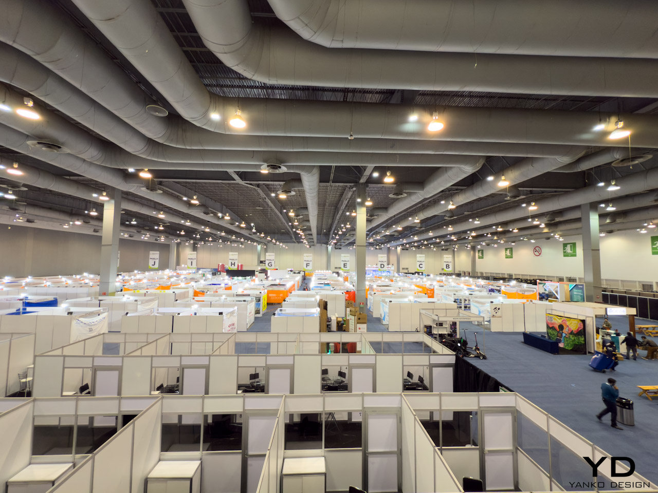
Mexico City hosts the inaugural Electronics Home Mexico today through June 19, 2025, at Centro Banamex. The three-day trade fair marks Grupo Eletrolar’s expansion into North America after 17 years of organizing successful electronics events across Brazil and Argentina.

The event spans 10,000 square meters of exhibition space, showcasing over 300 exhibitors and drawing major buyers from Mexico, Central America, and South America. Carlos Clur, CEO of Grupo Eletrolar, presents this launch as the third component of Latin America’s “business triathlon,” joining the established Eletrolar Show in Brazil and Electronics Home Argentina.

Strategic Market Position and Organizational Excellence

Mexico consolidates itself as the new regional center for the consumer electronics industry amid international uncertainty marked by tariff tensions and commercial disputes with the United States. The timing proves crucial as Mexico’s import market reaches approximately $467 billion annually, creating substantial opportunities for electronics manufacturers and distributors optimizing supply chains and ensuring timely product delivery across Latin America.

“Mexico is a challenge, but it’s something in our strategy that we need to do, because we want to integrate Latin America total market,” explains Carlos Clur. “We are in the three biggest markets. Mexico was the second, at least the second economy. So we needed to put the feet here.” The CEO acknowledges the complexity of entering Mexico’s concentrated retail landscape while emphasizing the strategic importance of creating a unified Latin American electronics ecosystem.

The fair features consumer electronics, large and small home appliances, telecommunications equipment, and technology products. Exhibitors display smartphones, tablets, laptops, smart TVs, audio devices, gaming consoles, washing machines, refrigerators, microwaves, vacuum cleaners, air conditioners, and IoT solutions. The event showcases more than 600 exhibitors and high-level executives , with over 1,000 international brands participating. The fair operates daily from 11:00 to 19:00 hours throughout the three-day period.

Grupo Eletrolar brings extensive experience from managing two major regional events. The Eletrolar Show in São Paulo occupies 50,000 square meters at Distrito Anhembi, attracting over 40,000 visitors and featuring more than 600 exhibitors showcasing 12,000 products from 1,500 brands. Electronics Home Argentina, running at Centro Costa Salguero from June 30 to July 2, 2025, serves as the country’s most important business fair for household goods and consumer electronics.

The organization implements proven programs including the VIP Buyer Program, which sponsors airfare and accommodation for qualified buyers from South and Central American countries attending all three fairs in the business triathlon. The Matchmaking Program facilitates pre-scheduled meetings between distributors and retailers, ensuring direct contact with potential buyers.

Walking Through the Ultimate Electronics Treasure Hunt

The exhibition floor delivers exactly what you’d expect from a hybrid of Amazon’s endless variety, Best Buy’s tech showcase energy, and TJ Maxx’s treasure-hunting excitement. Within minutes of entering, unexpected discoveries emerge around every corner.

At one booth, a cold bourbon dispenser catches attention not for its electronics, but for solving a problem whiskey enthusiasts know well. “If you add ice, that means you reduce the taste of the whiskey,” explains the exhibitor, demonstrating how their $250 USD unit maintains optimal temperature without dilution. The compressor-based system preserves the pure taste that ice traditionally compromises.

Here’s where trade fairs get interesting. Despite being neither a bourbon enthusiast nor someone who typically drinks whiskey at 11 AM on a Tuesday morning, the sample proved impossible to refuse. The cold bourbon hit differently than expected: smooth, clean, and surprisingly palatable even to someone who usually avoids brown liquor. The exhibitor’s point about ice dilution became clear immediately. This wasn’t the harsh bite associated with room-temperature whiskey, nor the watered-down taste from melted ice. The controlled temperature created an entirely different drinking experience.

For bars and restaurants, this represents the kind of specialized solution that makes B2B trade fairs valuable. The minimum order quantity (MOQ) conversation reveals the fair’s true nature. At 100-200 units minimum, this isn’t consumer retail. The unexpected morning bourbon tasting also highlights how these events blur professional boundaries: where else would trying whiskey at 11 AM count as market research?

A few aisles over, CJ Tech from Guangzhou displays 100-inch televisions that reveal the complex economics behind consumer electronics. The company operates as a pure ODM/OEM manufacturer, producing displays for European markets, Middle East, Africa, and select US clients. Their booth showcases the invisible supply chain powering familiar brands.

The pricing structure tells the real story. A standard 100-inch 4K TV costs $900 USD at factory level, while the Mini LED version jumps to $1,800 USD. The MOQ requires a minimum order, but their standard container capacity holds 46 units, meaning a single container of Mini LED displays represents an $82,800 investment at factory pricing. “American market certification cost is very high,” explains the representative, revealing why US electronics carry premium pricing. Certification alone costs 100,000 Chinese yuan (approximately $14,000 USD), making small orders economically unfeasible.

The mathematics become clearer when considering volume. While the factory price seems reasonable, certification costs must be distributed across units sold. For a single container of 46 Mini LED TVs, the $14,000 certification adds roughly $300 per unit. For smaller orders of one or two containers, this burden becomes prohibitive. The representative explains why “American customers want one container, two containers, but the certification cost is very high.”

This conversation illuminates why certain markets dominate global electronics. The certification barrier explains why CJ Tech focuses on European and African markets, where regulatory costs prove more manageable. The $1,800 factory price becomes significantly higher after logistics, certification, and regulatory compliance, explaining why a comparable 100-inch Hisense TV retails for $5,000 USD in American markets.

The company also produces speakers for Hisense and displays for Harman, demonstrating how major brands rely on specialized ODM partners. Their booth features products destined for Amazon’s private label program, revealing the interconnected nature of global electronics distribution. The Mini LED technology costs “between double and triple” the standard 4K version due to enhanced local dimming capabilities that improve color reproduction.

CEO Vision: Building Latin America’s Connected Electronics Ecosystem

Carlos Clur’s strategy extends beyond individual trade fairs to create an integrated regional marketplace. “We want to create these meetings with the C-level executives. They can create joint ventures, ideas to produce in Mexico, ideas to create alliances with the retail, with the suppliers, with the industry, with the components market,” he explains. “We want to have this industry more connected. This connection makes the economy stronger.”

The challenge lies in Mexico’s retail concentration. “The retail is very concentrated in some points, the industry also,” Clur acknowledges. “What we are doing for our challenge is bring the small retail, medium retail, and the big ones, but also the most strategic is bring the neighboring countries.” This international approach distinguishes Electronics Home Mexico from domestic trade shows.

Clur emphasizes the fair’s role in democratizing business opportunities. “Maybe this small retail in the future will be a big retail, and this is something that for us is important. Also bring professionals to the show, create strong relations for long term.” He describes how a single connection can transform businesses: “One company in a show can change the life, the economic life, because they said, ‘Okay, Walmart, make an order.'”

The CEO recognizes technology’s role in market education. “Journalists and influencers, they connect with the consumers, show the new technology, the new prototypes, the new trends, and they promote the industry,” he explains. In Brazil, Grupo Eletrolar works with influencers commanding 50 million followers, while Mexico features Shark Tank personalities discussing artificial intelligence and entrepreneurship.

Even Clur participates in the discovery process, purchasing a recording device from a Mexican company during the fair. “This is our work,” he concludes, emphasizing that successful B2B events require continuous investment in matchmaking programs, buyer initiatives, and marketing campaigns to “bring the right people to the right place.”

Understanding the Hidden Value Chain

These conversations provide invaluable insight into electronics pricing that consumers never see. Walking through Electronics Home Mexico offers education worth thousands of dollars in business consulting fees. The direct access to ODM manufacturers, MOQ discussions, and certification cost breakdowns reveal why electronics cost what they do in different markets.

The bourbon dispenser conversation alone demonstrates how specialized B2B products find their markets. Understanding that 100-unit minimums separate consumer purchases from commercial distribution explains why certain products remain invisible to regular shoppers. These aren’t products you find on Amazon or Best Buy shelves, yet they represent significant business opportunities for the right buyers.

The CJ Tech discussion provides even deeper value. Learning that a $5,000 consumer TV starts at $1,800 factory pricing, then understanding how certification costs, logistics, retailer margins, and brand premiums build the final price, offers insights typically reserved for industry insiders. The revelation that certification costs can add $300 per unit for small orders explains why electronics companies focus on high-volume markets.

This knowledge transforms how you view electronics retail. Every smartphone, television, or appliance carries similar hidden costs and supply chain complexities. The fair provides direct access to manufacturers who typically remain invisible behind brand names, offering education about global trade mechanics that business schools struggle to teach.

These discoveries encapsulate the fair’s treasure-hunt atmosphere. Buyers arrive expecting smartphones and appliances, but leave with deep understanding of supply chain economics, MOQ requirements, and certification barriers that reshape pricing strategies. Each conversation reveals the complex calculations behind consumer electronics pricing, from factory floor to retail shelf.

Current Impact and Business Integration

Electronics Home Mexico strengthens Latin America’s position in global electronics trade while addressing international trade tensions. The event targets Chinese companies seeking strategic partnerships in Mexico, capitalizing on shifting supply chain dynamics amid global uncertainty.

For exhibitors, participating in Electronics Home Mexico represents the opportunity to position themselves as innovation leaders in the sector. Direct contact with highly specialized audiences allows companies to understand market needs and adjust commercial strategies with valuable information about consumption trends and behaviors. The event positions itself as a platform designed for real retail, where inspiration, innovation, and action converge , rather than simply an exhibition space. This approach mirrors the successful format established at Eletrolar Show, facilitating in-person meetings between industry and retail partners to eliminate trade barriers and enhance networking opportunities.

Mexico City serves as an economic hub for the entire region, with the country recognized as a regional center with modern infrastructure enabling efficient logistics throughout the continent. The location proves strategic given Mexico’s increasing role in global supply chains and manufacturing, especially as companies seek alternatives amid international trade disputes.

The Mexico-Brazil Chamber provides institutional support, reflecting the event’s role in strengthening bilateral trade relationships. Media coverage includes partnerships with outlets like Infobea, Energía Hoy, and Canton Fair Net, ensuring broad industry awareness across Spanish and Portuguese-speaking markets.

The opening day draws thousands of qualified visitors and hundreds of confirmed exhibitors across consumer electronics, home appliances, and related technology sectors. The event attracts decision-makers from retail chains, specialty stores, e-commerce platforms, and distribution networks throughout Mexico and neighboring regions. Attendees engage in business rounds, networking sessions, innovation forums, and conferences covering market opportunities in Mexico. These components mirror successful formats from the Brazilian and Argentine events, adapted for the Mexican market’s specific characteristics.

“This is the only show that Mexico has for consumer electronics,” Clur notes, emphasizing the event’s unique position in the market. “We believe that we will arrive with a very strong network in Latin America. This is our differential, but we think we have very long work for the next years.”

The inaugural Electronics Home Mexico establishes Grupo Eletrolar’s presence in North America’s largest Spanish-speaking market, completing their regional coverage across Latin America’s three major economic centers while addressing the current global trade environment’s challenges and opportunities. Early activity indicates strong interest from both exhibitors and buyers, with business meetings already underway across the exhibition floor. The event demonstrates Mexico’s growing importance as a strategic hub for electronics trade in the Americas.

The post We’re Live at Electronics Home Mexico: Latin America’s Newest B2B Electronics Expo first appeared on Yanko Design.

Polaroid and MoMA unite for a creative collaboration

Par : Ida Torres
28 mai 2025 à 10:07

The trend of having a fusion of analog and digital photographs doesn’t seem to be just a trend anymore as we’re seeing a lot of brands still thriving. There is a certain joy in having printed photos adorn your wallet, journal, or wall, no matter if you’re Gen X or a Millenial or Gen Alpha. It’s not just about memory keeping or photography sometimes as it’s also an expression of creativity when you use various other things to decorate it or you use it as actual decoration. We see brands also embrace the creative aspect that collectors get from tangible photographs and this latest collaboration between two giants of creativity is one that you have to watch out for.

This exciting new partnership sees Polaroid, a brand synonymous with instant photography, joining forces with the prestigious Museum of Modern Art (MoMA) to create a truly unique and collectible item. At the heart of this collaboration is a limited-edition iteration of the highly sought-after Polaroid Now Generation 3 Instant Camera. This special MoMA Edition stands out with its visually arresting monochrome blue finish, a sleek and modern aesthetic that perfectly complements the iconic MoMA logo, which is prominently displayed as a mark of this creative union.

Designer: Polaroid and MoMA

Adding a touch of personalization and style, the camera is accompanied by not just one, but three interchangeable neck straps. Each strap boasts a distinct color-blocking design, allowing users to switch them out to match their personal style or mood, making this camera as much a fashion statement as it is a tool for capturing memories. There is also a limited-edition i-Type Film MoMA Edition pack that has 8 of the 12 designed special frames. They are either marked with the MoMA logo or it has quotes from famous artists like An-My Lê, Betye Saar, Carmen Herrera, Meret Oppenheim, Milton Glaser, and Vincent van Gogh. This adds another layer of creativity and inspiration as the quotes from these groundbreaking artists can challenge new creatives to defy convention and tread their own path.

This exciting collaboration between Polaroid and MoMA beautifully illustrates the enduring appeal of tangible photography and the boundless power of artistic inspiration. By offering a unique camera and film adorned with iconic imagery and thought-provoking quotes, they’re providing a catalyst for creativity, encouraging individuals to capture their world through an artistic lens, one instant photograph at a time.

The post Polaroid and MoMA unite for a creative collaboration first appeared on Yanko Design.

Everything We Know About Jony Ive’s $6.5 Billion Dollar ‘Secret’ AI Gadget

Par : Sarang Sheth
28 mai 2025 à 00:30

Let’s be honest, the tech world hasn’t felt this electric since Steve Jobs pulled the original iPhone from his pocket. Sure, we felt a few sparks fly in 2024 when Rabbit and Humane announced their AI devices, but that died down pretty quickly post-launch. However, when news broke that OpenAI had acquired Jony Ive’s mysterious startup “io” for a staggering $6.5 billion, the speculation machine kicked into overdrive. What exactly are the legendary Apple designer and ChatGPT’s creators cooking up together? The official announcement speaks vaguely of “a new family of products” and moving beyond traditional interfaces, but the details remain frustratingly sparse.

What we do know with certainty is limited. OpenAI and Ive’s company, io, are building something that’s reportedly “screen-free,” pocket-sized, and designed to bring AI into the physical world in a way that feels natural and ambient. The founding team includes Apple veterans Scott Cannon, Evans Hankey, and Tang Tan, essentially the hardware dream team that shaped the devices in your pocket and on your wrist. Beyond these confirmed facts lies a vast expanse of rumors, educated guesses, and wishful thinking. So let’s dive into what this device might be, with the appropriate grains of salt at the ready.

The Design: Ive’s Aesthetic Philosophy Reimagined

AI Representation

If there’s one thing we can reasonably predict, it’s that whatever emerges from Ive’s studio will be obsessively considered down to the micron. His design language at Apple prioritized simplicity, honest materials, and what he often called “inevitable” solutions, designs that feel so right they couldn’t possibly be any other way. A screen-free AI device presents a fascinating challenge: how do you create something tactile and intuitive without the crutch of a display?

I suspect we’ll see a device that feels substantial yet effortless in the hand, perhaps with a unibody construction milled from a single piece of material. Aluminum seems likely given Ive’s history, though ceramic would offer an interesting premium alternative with its warm, almost organic feel. The absence of a screen suggests the device might rely on subtle surface textures, perhaps with areas that respond to touch or pressure. Ive’s obsession with reducing visual complexity, eliminating unnecessary seams, screws, and buttons, will likely reach its logical conclusion here, resulting in something that looks deceptively simple but contains remarkable complexity.

Color choices will probably be restrained and sophisticated, think the elegant neutrals of Apple’s “Pro” lineup rather than the playful hues of consumer devices. I’d wager on a palette of silver, space gray, and possibly a deep blue, with surface finishes that resist fingerprints and wear gracefully over time. The environmental considerations that have increasingly influenced Ive’s work will likely play a role too, with recycled materials and sustainable manufacturing processes featured prominently in the eventual marketing narrative.

Technical Possibilities: AI in Your Pocket

AI Representation

The technical challenge of creating a screen-free AI device is immense. Without a display, every interaction becomes an exercise in invisible design, the device must understand context, anticipate needs, and communicate through means other than visual interfaces. This suggests an array of sophisticated sensors and input methods working in concert.

Voice recognition seems an obvious inclusion, likely using multiple microphones for spatial awareness and noise cancellation. Haptic feedback, perhaps using Apple-like Taptic Engine technology or something even more advanced, could provide subtle physical responses to commands or notifications. The device might incorporate motion sensors to detect when it’s being handled or carried, automatically waking from low-power states. Some reports hint at environmental awareness capabilities, suggesting cameras or LiDAR might be included.

The processing requirements for a standalone AI device are substantial. Running large language models locally requires significant computational power and memory, all while maintaining reasonable battery life. This points to custom silicon, possibly developed with TSMC or another major foundry, optimized specifically for AI workloads. Whether OpenAI has the hardware expertise to develop such chips in-house remains an open question, though their Microsoft partnership might provide access to specialized hardware expertise. Battery technology will be crucial; a device that needs charging multiple times daily would severely limit its utility as an always-available AI companion.

The User Experience: Beyond Screens and Apps

AI Representation

The most intriguing aspect of this rumored device is how we’ll actually use it. Without a screen, traditional app paradigms become irrelevant. Instead, we might see a return to conversational computing, speaking naturally to an assistant that understands context and remembers previous interactions. The “ambient computing” vision that’s been promised for years might finally materialize.

I imagine a device that feels less like a gadget and more like a presence, something that fades into the background until needed, then responds with uncanny intelligence. Perhaps it will use subtle audio cues or haptic patterns to indicate different states or notifications. The lack of a visual interface could actually enhance privacy; without a screen displaying potentially sensitive information, the device becomes more discreet in public settings. Of course, this also raises questions about accessibility, how will deaf users interact with a primarily audio-based device?

Integration with existing ecosystems will be crucial for adoption. Will it work seamlessly with your iPhone, Android device, or Windows PC? Can it control your smart home devices or integrate with your calendar and messaging apps? The answers remain unknown, but OpenAI’s increasingly broad partnerships suggest they understand the importance of playing nicely with others. The real magic might come from its predictive capabilities, anticipating your needs based on time, location, and past behavior, then proactively offering assistance without explicit commands.

Market Positioning and Price Speculation

AI Representation

How much would you pay for an AI companion designed by the man behind the iPhone? The pricing question looms large over this project. Premium design and cutting-edge AI technology don’t come cheap, suggesting this will be positioned as a high-end device. Looking at adjacent markets provides some clues, Humane’s AI Pin launched at $699, while Rabbit’s R1 came in at $199, though both offer significantly less sophisticated experiences than what we might expect from OpenAI and Ive.

My educated guess places the device somewhere between $499 and $799, depending on capabilities and materials. A lower entry point might be possible if OpenAI adopts a subscription model for premium AI features, subsidizing hardware costs through recurring revenue. The target market initially appears to be tech enthusiasts and professionals, people willing to pay a premium for cutting-edge technology and design, before potentially expanding to broader consumer segments as costs decrease and capabilities improve.

As for timing, the supply chain whispers and regulatory tea leaves suggest we’re looking at late 2025 at the earliest, with full availability more likely in 2026. Hardware development cycles are notoriously unpredictable, especially for first-generation products from newly formed teams. The $6.5 billion acquisition price suggests OpenAI sees enormous potential in this collaboration, but also creates substantial pressure to deliver something truly revolutionary.

The Competitive Landscape: A New Category Emerges

AI Representation

The AI hardware space is still in its infancy. Early entrants like Humane have struggled with fundamental questions about utility and user experience. What makes a dedicated AI device compelling when smartphones already offer capable assistants? The answer likely lies in specialized capabilities that phones can’t match, perhaps always-on contextual awareness without battery drain, or privacy guarantees impossible on multipurpose devices.

OpenAI and Ive are betting they can define a new product category, much as Apple did with the iPhone and iPad. Success will require not just technical excellence but a compelling narrative about why this device deserves space in your life. The competition won’t stand still either, Apple’s rumored AI initiatives, Google’s hardware ambitions, and countless startups will ensure a crowded marketplace by the time this device launches.

The most fascinating aspect might be how this hardware play fits into OpenAI’s broader strategy. Does physical embodiment make AI more trustworthy, useful, or personable? Will dedicated devices provide capabilities impossible through software alone? These philosophical questions underpin the entire project, suggesting that Ive and Altman share a vision that extends beyond quarterly profits to how humans and AI will coexist in the coming decades.

What This Could Mean for the Future of Computing

AI Representation

If successful, this collaboration could fundamentally reshape our relationship with technology. The screen addiction that defines contemporary digital life might give way to something more ambient and less demanding of our visual attention. AI could become a constant companion rather than an app we occasionally summon, always listening, learning, and assisting without requiring explicit commands for every action.

The privacy implications are both promising and concerning. A device designed from the ground up for AI interaction could incorporate sophisticated on-device processing, keeping sensitive data local rather than sending everything to the cloud. Conversely, an always-listening companion raises obvious surveillance concerns, requiring thoughtful design and transparent policies to earn user trust.

For Jony Ive, this represents a chance to define the post-smartphone era, potentially creating his third revolutionary product category after the iPod and iPhone. For OpenAI, hardware provides a direct channel to users, bypassing platform gatekeepers like Apple and Google. The stakes couldn’t be higher for both parties, and for us, the potential users of whatever emerges from this collaboration.

Waiting for the Next Big Thing

AI Representation

The partnership between OpenAI and Jony Ive represents the most intriguing collision of AI and design talent we’ve seen yet. While concrete details remain scarce, the ambition is clear: to create a new kind of computing device that brings artificial intelligence into our physical world in a way that feels natural, beautiful, and essential.

Will they succeed? History suggests caution; creating new product categories is extraordinarily difficult, and first-generation devices often disappoint (raise your hands if you own a bricked Humane AI Pin or Rabbit R1. Yet the combination of OpenAI’s technical prowess and Ive’s design sensibility offers reason for optimism. Whatever emerges will undoubtedly be thoughtfully designed and technically impressive. Whether it finds a permanent place in our lives depends on whether it solves real problems in ways our existing devices cannot.

For now, we wait, analyzing every patent filing, supply chain rumor, and cryptic statement for clues about what’s coming. The anticipation itself speaks volumes about the state of consumer technology: in an era of incremental smartphone updates and me-too products, we’re hungry for something genuinely new. Jony Ive and Sam Altman just might deliver it.

The post Everything We Know About Jony Ive’s $6.5 Billion Dollar ‘Secret’ AI Gadget first appeared on Yanko Design.

EcoFlow GLACIER Classic Portable Refrigerator Review: Getting the Basics Right

Par : JC Torres
26 avril 2025 à 01:45

PROS:


  • Compact design with bigger storage capacity

  • Removable battery for extended outdoor use

  • Removable divider for flexible setup between freezer and refrigerator

  • Multiple charging options, including purely solar energy

CONS:


  • Simple ice cooler appearance might not appeal to everyone

  • No wheel add-on for easier transportation

RATINGS:

AESTHETICS
ERGONOMICS
PERFORMANCE
SUSTAINABILITY / REPAIRABILITY
VALUE FOR MONEY

EDITOR'S QUOTE:

The EcoFlow GLACIER Classic focuses on perfecting the basics to deliver an efficient portable refrigerator that isn't weighed down by unnecessary features.
award-icon

Embarking on outdoor adventures often means leaving behind the comforts of home, particularly when it comes to keeping food and drinks fresh. Whether you’re camping in remote locations, road-tripping across the country, or simply enjoying a day at the beach, the challenge of maintaining a reliable cold chain for perishables can quickly turn an exciting expedition into a frustrating experience. Traditional coolers with ice packs might work for a day, but they create a soggy mess and require constant replenishment, making them impractical for extended trips.

The EcoFlow GLACIER Classic Portable Refrigerator aims to solve these common outdoor food storage problems with a practical approach to portable refrigeration. Unlike its predecessor, which featured an integrated ice maker, the GLACIER Classic focuses on maximizing storage space while maintaining impressive cooling performance. Available in three sizes (35L, 45L, and 55L), this portable refrigerator promises to keep your provisions perfectly chilled without requiring constant attention or maintenance. But does this streamlined approach deliver the performance that outdoor enthusiasts need? Let’s dive into the details to find out if this cooling companion deserves a spot in your adventure gear.

Designer: EcoFlow

Click Here to Buy Now: $799 $1199 (Early Bird $100 + $300 extra coupon = $400 off). Hurry, deal ends in 48-hours!

Aesthetics

The EcoFlow GLACIER Classic doesn’t try to win any beauty contests with its straightforward design philosophy that prioritizes function over flashy aesthetics. At first glance, it resembles an oversized cooler with a clean, minimalist exterior that won’t turn heads but won’t embarrass you either. The understated appearance belies the thoughtful engineering underneath, offering practical features that matter to users while eliminating unnecessary frills that would only add to the cost and complexity without providing tangible benefits to the outdoor experience.

What the GLACIER Classic lacks in visual excitement, it makes up for with impressive space efficiency, packing substantial storage capacity into a surprisingly compact footprint. The refrigerator is approximately 40% smaller than comparable models on the market, yet it can accommodate an impressive amount of provisions: the largest 55L model can hold up to 90 standard beverage cans. You don’t even have to repack those 8-pack soda can bundles to fit them inside, making the packing process less of a chore.

Part of the GLACIER Classic’s diet trick is removing unnecessary features. Unlike the original GLACIER model, this Classic version omits the built-in ice maker, a convenience that sounded good on paper but was not used that much in outdoor scenarios after all. Removing it not only significantly increased the interior space but also reduced the overall bulk and weight of the product. It doesn’t hurt that it also helped reduce the price tag, too!

The color scheme sticks to the typical EcoFlow black and silver that won’t show dirt and grime accumulated during outdoor use, a thoughtful choice that outdoor enthusiasts will appreciate after a few dusty trips. The control panel features an intuitive layout with clearly marked buttons and indicators that remain visible even in bright sunlight, allowing for quick temperature adjustments without requiring users to consult the manual repeatedly. All in all, the EcoFlow GLACIER Classic’s simple appearance belies the power it hides, giving credence to the advice not to judge a book by its cover.

Ergonomics

Car Camping

RV Camping

Despite its reduced size, at least compared to other portable refrigerators of the same capacity, the EcoFlow GLACIER Classic is clearly still a heavy unit. Unlike its predecessor, there are no detachable wheels and levers to help you roll the portable refrigerator around. Instead, the design optimizes for the most common use case: keeping the box in the car trunk, whether in transportation or in use.

The GLACIER Classic features thoughtfully designed foldable handles that extend wide for comfortable carrying but tuck away neatly against the body. This clever design element ensures nothing protrudes from the sides when the refrigerator is packed into tight spaces like vehicle trunks or storage compartments, maximizing the efficient use of limited space during transport while still providing ergonomic carrying options when you need to move the unit from your vehicle to your campsite or outdoor gathering spot.

One of the smartest and most practical features is the dual-direction lid that can be opened from either of the long sides, providing flexible access regardless of how the refrigerator is positioned in your vehicle or at your campsite. This seemingly simple design choice eliminates the frustration of having to reposition the entire unit when access is blocked on one side, a common problem with traditional coolers and refrigerators that have single-direction openings.

The EcoFlow mobile app adds another layer of convenience, allowing users to monitor and adjust temperature settings remotely without standing beside the refrigerator all the time. Mirroring its design choices, EcoFlow listened to customer feedback to focus on the essentials and shed off any unnecessary features that burden the users or their pockets.

Performance

The EcoFlow GLACIER Classic comes equipped with a removable 298Wh battery that delivers an impressive runtime of up to 43 hours for the 35L model and approximately 39 hours for the larger 45L and 55L versions. This substantial battery capacity means you can maintain proper food storage temperatures throughout a weekend camping trip without needing to recharge, providing peace of mind when venturing into areas without reliable power sources. The temperature range is equally impressive, spanning from -20°C to 60°C (-4°F to 140°F), keeping drinks cool and ingredients frozen until you’re ready to cook them.

The removable divider system deserves special mention for its clever multifunctionality. Beyond organizing the interior space, it creates configurable temperature zones with up to 4.2°C (39.6°F) difference between compartments, allowing users to store different types of food at their optimal temperatures simultaneously. This means you can configure the unit as a refrigerator, freezer, or combination of both, depending on their specific needs for each adventure and eliminating the need for separate cooling solutions for different types of provisions. The divider even doubles as a cutting board, saving precious packing space by combining two essential camping tools into one multifunctional component that enhances the overall utility of the refrigerator during outdoor meal preparation.

The versatility of the GLACIER Classic extends to its charging capabilities, with multiple options to keep the unit powered in virtually any situation. Users can charge via standard AC outlets, car chargers, compatible solar panels (11-30V input, up to 110W), specialized EcoFlow alternator chargers, or even through the 100W USB-C port. For maximum charging speed, combining the USB-C and XT60 alternator connections can deliver up to 200W of charging power, replenishing the battery in just 1.5 hours.

Beyond its primary cooling function, the unit doubles as an emergency power bank through its 100W USB-C output port, capable of charging laptops, phones, and other devices when traditional power sources are unavailable during extended outdoor excursions. It definitely won’t stand up to EcoFlow’s dedicated solar power stations, especially since it’s also using its power to run the refrigerator, but it’s a nice convenience when you’re out of charging ports to use. That said, it would have been nice if there were two of these, even if it means halving the output when both are in use.

The companion app provides detailed insights into power consumption patterns, allowing users to optimize settings for their specific usage scenarios and remaining battery capacity. The app also gives users a heads-up not only when the battery is low but also when temperatures deviate by 5°C from the set level for over 10 minutes, ensuring that you can take action to keep your food and drinks safe.

Sustainability

The GLACIER Classic demonstrates EcoFlow’s commitment to sustainable design through its user-replaceable battery system, which significantly extends the product’s useful lifespan. Rather than discarding the entire unit or going through an expensive process when the battery eventually degrades, users can simply replace the battery module, reducing electronic waste and maximizing the long-term value of their investment. This approach not only benefits the environment but also provides practical advantages for users who can carry spare batteries for extended trips, swapping depleted batteries for fresh ones to maintain continuous cooling without waiting for recharging during critical food storage situations.

The refrigerator’s compatibility with solar charging further enhances its sustainability credentials, allowing users to power the unit entirely with renewable energy when camping in sunny locations. This solar capability makes the GLACIER Classic particularly valuable for extended off-grid adventures, where traditional power sources are unavailable but sunlight is abundant. By harnessing solar energy, outdoor enthusiasts can maintain proper food storage temperatures indefinitely without consuming fossil fuels or depleting limited battery resources, creating a truly sustainable solution for wilderness food preservation that aligns with environmentally conscious outdoor recreation principles.

Value

35L, 45L, or 55L to suit any vehicle.

The EcoFlow GLACIER Classic delivers impressive functionality at a competitive price point, with the 35L model starting at $799, the 45L at $899, and the 55L at $1,199, though early bird pricing drops these figures to $699, $799, and $899, respectively, from April 25 to May 25. When comparing these prices to similar portable refrigerators on the market, the GLACIER Classic offers exceptional value, particularly considering its versatile temperature zones, substantial battery life, and multifunctional features that eliminate the need for separate cooling solutions. While the original GLACIER model included an ice maker, market feedback suggested this feature wasn’t essential for most users, and its omission in the Classic version allows for more storage space at a lower price point.

The GLACIER Classic isn’t the only game in town, though, but it easily outshines the competition in key areas. Compared to an $800 40L portable refrigerator, the EcoFlow GLACIER Classic 45L is 20% smaller. Even the 55L is still 7% smaller, proving how compact the design really is. It’s also lighter, making it easier to make room for the portable refrigerator and transport it. And, unlike the competition, the GLACIER Classic’s removable divider lets you decide how much space you want to allocate for the freezer or the refrigerator, putting you in charge rather than being at the mercy of the product’s design.

For outdoor enthusiasts who prioritize practical functionality over novelty features, the GLACIER Classic represents a sound investment that will enhance countless adventures for years to come. The combination of ample storage capacity, flexible configuration options, and multiple charging methods ensures the refrigerator can adapt to virtually any outdoor scenario, from weekend camping trips to extended overland expeditions. When factoring in the long-term savings from not purchasing ice, the convenience of always having properly chilled food and beverages, and the extended product lifespan enabled by the replaceable battery, the initial purchase price becomes even more reasonable for serious outdoor enthusiasts who regularly need reliable food storage solutions beyond what traditional coolers can provide.

Verdict

Outdoor adventures should be about creating memorable experiences, not stressing over logistical challenges like keeping food fresh and beverages cold. Too often, travelers find themselves burdened with bulky, inefficient cooling solutions that consume valuable space and require constant maintenance, detracting from the freedom and spontaneity that make outdoor exploration so rewarding. The right portable refrigeration system should fade into the background, quietly performing its essential function without demanding attention or compromising your mobility and flexibility during adventures of any duration or intensity.

The EcoFlow GLACIER Classic Portable Refrigerator successfully achieves this balance, offering reliable cooling performance in a practical package that prioritizes the features outdoor enthusiasts actually need. Its thoughtful design maximizes storage capacity while minimizing external dimensions, its versatile power options ensure functionality in virtually any setting, and its configurable temperature zones accommodate everything from fresh produce to frozen meats. While not without limitations, particularly regarding weight and mobility, the GLACIER Classic represents a significant advancement in portable refrigeration technology that will enhance the outdoor experience for campers, road trippers, and adventure seekers who value fresh food and cold drinks without the hassle of traditional coolers and ice management.

Click Here to Buy Now: $799 $1199 (Early Bird $100 + $300 extra coupon = $400 off). Hurry, deal ends in 48-hours!

The post EcoFlow GLACIER Classic Portable Refrigerator Review: Getting the Basics Right first appeared on Yanko Design.

Saudi Arabia’s Red Sea Island Resort Sets New Standard For Sustainable Tourism & Luxury Living

25 avril 2025 à 23:30

Saudi Arabia has unveiled Laheq, the latest phase of its ambitious Red Sea giga-project, as part of the kingdom’s transformation into a major tourist destination. Laheq will be developed on a luxurious island and feature an artificial ring, offering visitors a unique experience. The project is designed by Foster + Partners, a renowned British architectural firm also linked to other groundbreaking Saudi developments. Described as a “Forever Garden” due to its abundant greenery, Laheq will be situated on an island off Saudi Arabia’s west coast, forming part of an archipelago of 90 islands within the wider Red Sea development.

Designer: Foster + Partners

The island spans 400 hectares (988 acres) and is designed around a distinctive feature called “the Ring,” an 800-meter (approximately 2,600-foot) diameter artificial structure set in the water. This impressive centerpiece will house luxury apartments and hotels, with some residences available for purchase and others offered as vacation rentals. Beyond the Ring, the island resort will feature additional upscale residences, including timber-built homes, alongside amenities such as a bustling market, diverse retail spaces, entertainment zones, a world-class golf course, and a 115-berth marina.

Wellness is a central theme, with dedicated facilities aimed at promoting relaxation and health. Water sports will be a major attraction, especially diving. Visitors will have the opportunity to explore what Saudi officials describe as the world’s fourth-largest barrier reef, located nearby, and encounter over 2,000 species of fish unique to the region, making it a haven for marine life enthusiasts and adventure seekers alike.

Laheq is scheduled for completion in 2028, marking another milestone in Saudi Arabia’s ambitious Red Sea giga-project. Its unveiling comes on the heels of the recently completed Desert Rock resort, further highlighting the rapid pace of development in the region. The developer, Red Sea Global, has pledged that by 2030, all operations within the Red Sea project will be powered entirely by renewable energy. Essential efforts will be made to preserve extensive mangrove areas and restore the natural coastline, demonstrating a commitment to environmental sustainability.

Beyond the Red Sea project, Saudi Arabia is experiencing an impressive construction boom, with several visionary developments underway. Notable among them are The Line, a revolutionary linear city that forms part of the Neom giga-project, as well as Qiddiya, a sprawling entertainment city, the futuristic Mukaab, the towering JEC Tower, and other transformative projects, all contributing to the nation’s ongoing transformation. Saudi Arabia is redefining its skyline but also prioritizing environmental preservation, renewable energy, and unique visitor experiences. As these visionary projects progress toward completion, they promise to transform the region, attract international visitors, and set new standards for sustainable luxury and urban development in the Middle East and beyond.

The post Saudi Arabia’s Red Sea Island Resort Sets New Standard For Sustainable Tourism & Luxury Living first appeared on Yanko Design.

Mimic’s hands-on approach to humanoid teaching bridges emotion and AI through wearable input

Par : Gaurav Sood
25 avril 2025 à 19:15

As the boundaries between human experience and artificial intelligence continue to blur, designers are rethinking how we interact with technology on an emotional level. In the rapidly evolving landscape of domestic robotics, the conversation is no longer just about efficiency or automation—it’s about connection. While robots are becoming more capable, their integration into intimate human spaces still sparks discomfort for many. This friction doesn’t stem from technological limitations alone, but from the absence of a natural, empathetic bridge between user and machine. That’s the context in which Mimic emerges—not just as a wearable, but as a reimagined interface for trust-building with humanoid companions.

The next-gen wearable is designed to bridge the emotional and psychological gap between humans and humanoid robots. In a future where household humanoids are commonplace, Mimic enables users to teach robots actions based on their behavior data. Initially, humanoids perform basic functions, but over time, they learn to understand and personalize tasks for the user. Through this process, users actively teach humanoids, forming emotional bonds and overcoming psychological barriers.​

Designer: Dohyuk Joo

By wearing the device and performing desired actions, users provide real-time data that the robot uses to learn and adapt. This hands-on approach fosters a sense of control and agency, reducing feelings of unease and promoting a more harmonious relationship between humans and robots. The device is lightweight and ergonomically designed to be worn during daily activities. Its intuitive interface ensures that users can seamlessly integrate it into their routines without disruption.

The robot can adapt to changes in user behavior over time. By allowing users to wear the device and physically demonstrate tasks they want their robots to perform, Mimic shifts the paradigm from command-based interaction to embodied teaching. For example, if a user is preparing their own version of Korean stew, Mimic enables the humanoid to grasp more than just the recipe—it interprets the specific ingredients, motions, and subtle preferences involved. This context-aware learning gives the robot a far deeper understanding of the user’s world, moving beyond generic presets.

The device comprises two integrated modules: the Vision tracker and the Hand tracker. The Vision tracker collects visual and auditory data using an array of infrared sensors, tracking cameras, and vision-based AI. It maps the environment with Lidar and captures head movement using a 6-DOF camera alongside a front-facing RGB camera, forming a dynamic world model. It’s engineered to adjust comfortably to different body types through an adaptable rail system, ensuring seamless wearability.

Meanwhile, the Hand tracker—worn on the forearm—records nuanced physical data like grip strength, arm angle, and muscle activity through electromyography (EMG) sensors and precision tracking cameras. By analyzing electrical signals and motion patterns, it decodes how users interact with objects on a tactile level. This fusion of data is processed through deep learning to construct a comprehensive behavioral profile. Even passive moments become learning opportunities, as Mimic uses 360-degree and dual-facing cameras to observe environmental structure and object purpose, enabling the humanoid to understand intent even when it’s unstated.

Through these layers of sensory input and contextual modeling, Mimic doesn’t just teach tasks—it conveys intuition. It represents a new approach to robotics, one that leverages embodied cognition to break down psychological resistance and cultivate emotional resonance. As our homes evolve alongside technology, Mimic points to a future where machines don’t just serve—they relate, reflect, and respond.

The post Mimic’s hands-on approach to humanoid teaching bridges emotion and AI through wearable input first appeared on Yanko Design.

SpellRing is an AI-enabled smart ring that converts American Sign Language into phone text

Par : Gaurav Sood
21 mars 2025 à 20:30

People who are deaf or cannot speak, or both – have long been aided by the American Sign Language (ASL) in communicating with people. Although the accuracy of the communication solely depends on the understanding of people on both ends, that can be a problem if one or more conversants are not that fluent in ASL. Researchers at Cornell University have recognized this problem and want to leverage the goodness of wearable technologies to make it smoother for people who are differently abled to communicate with the world as they intend to.

The experts at the university have employed the smart ring platform to develop a wearable that tracks the American Sign Language gestures of the wearer to accurately transcribe them into understandable text or audio to a computer or a smartphone. They call it the SpellRing, and it can be worn on the thumb to get the desired input for the translated data. The wearable comes with embedded sensors including a mini-gyroscope to measure the angular data from hand movement. The on-board speakers and mic detect the inaudible sound waves from the movement. All these components are housed inside a 3D-printed housing that’s no more than the size of a quarter.

Designer: Cornell University

The smart AI ring can detect all 26 letters in the English language with micro-sonar technology to precisely track the fingerspelling of the wearer. For more accuracy sonar images are also fed into the system. The data that is received from all the sensors and hardware is then processed by a deep-learning algorithm. All of this is done in a split second time to predict the ASL fingerspelled by the wearer. To make possible an in-depth and unbiased view of the wearable for further development, the researchers from Carnegie Mellon University and Stony Brook University, along with the researchers from Cornell University have tested the wearable thoroughly.

In the conducted tests, 20 amateur and experienced ASL signers were asked to spell more than 20,000 words to see the accuracy of the AI-assisted wearable ring. The 3D-printed wearable passed with a combined accuracy of around 90 percent with both signed words, as well as, sentences. It was even tested to perform actions such as web search, map navigation, or typing in notes with the input. According to Hyunchul Lim, lead author of SpellRing’s papered documentation, “ASL is a very complicated, complex visual language,” and the focus is right now on tuning the algorithm to make the AI ring understand words and phrases with maximum accuracy.

The SpellRing is currently in the prototype stage and there is no word on the availability of the ring yet. The team is confident that even in the current stage, ASL fingertyping will be significantly faster than typing on your smartphone’s keyboard. Researchers want this ring to be a tool for fast and accessible text entry with a niche set of benefits targeted toward a set of users. The prospects of this AI ring graduating to the wearable market are very high since it costs just $30 to make the current prototype AI ring. When it will be mass produced that cost can be further trimmed down.

The post SpellRing is an AI-enabled smart ring that converts American Sign Language into phone text first appeared on Yanko Design.

Metal, Leather, Rubber, NATO, or Canvas – Which is the Right Watch Strap Material for You?

Par : Sarang Sheth
10 février 2025 à 01:30

Choosing a strap for your watch is like choosing a paint-job for your car. Or the furniture for your house. It adds an aesthetic, sometimes functional layer to the watch, just like choosing yellow paint is an aesthetic + functional choice for a cab, or choosing bunk-beds is an aesthetic + functional choice for a home with a single bedroom for two siblings, or a dorm. Watches come in hundreds (if not thousands) of varieties, and so do watch straps… but you can boil these straps down to 5 broad materials – Metal, Leather, Rubber (or Silicon), NATO (Nylon), or Canvas. So, does it make sense to spend time deliberating on what material works with your watch? Absolutely!

Each material offers its own balance of comfort, durability, and aesthetic appeal, making it crucial to consider how it fits into your daily routine and personal style. Whether you’re a suit-and-tie kind of person, a weekend explorer, or someone who just wants a reliable everyday watch, there’s a strap that perfectly suits your needs. Let’s break down each option to help you decide.

Metal Straps – Classic, Durable, and Timeless

Metal straps, often made from stainless steel or titanium, are the definition of versatility. They pair effortlessly with both formal and casual watches, making them a staple for anyone who values longevity and a refined aesthetic. A well-crafted metal bracelet adds heft and presence to a watch, making it feel more substantial on the wrist. Whether it’s the sleek polish of a Rolex Jubilee bracelet or the rugged appeal of an Omega Seamaster’s chunky links, or even the Milanese-style mesh on your Tissot Seastar, metal straps exude confidence and durability.

They work best with dive watches, dress watches, and chronographs, complementing cases that range from slim and elegant to bold and industrial. Metal straps fit seamlessly into business attire, evening wear, and even smart-casual outfits. However, they might not be the best choice for extreme outdoor activities, as they can feel heavy and less comfortable in hot weather.

Pros:

  • Exceptional durability
  • Waterproof and sweatproof
  • Timeless aesthetic
  • Excellent resale value
  • Low maintenance
  • Perfect for professional settings

Cons:

  • Generally heavier than other options
  • Can be expensive
  • May pull arm hair
  • Limited flexibility in formal situations
  • Can be challenging to size properly

Leather Straps – Sophisticated, Versatile, and Full of Character

Leather straps remain the quintessential choice for dress watches and classic timepieces, offering an unmatched level of sophistication and elegance. Available in countless varieties – from classic calfskin to exotic alligator and ostrich – leather straps can transform the character of a watch while providing excellent comfort. They’re particularly suited to dress watches, vintage timepieces, and chronographs.

The versatility of leather is remarkable, with different treatments and finishes allowing for both formal and casual applications. A black alligator strap can elevate a watch to black-tie status, while a distressed brown leather strap can create a perfect casual vintage look. They work exceptionally well with business attire and formal wear, though certain casual leather varieties can complement everyday casual wear as well.

Pros:

  • Develops unique patina over time
  • Excellent comfort
  • Wide range of styles and colors
  • Perfect for formal occasions
  • Ages beautifully
  • Easy to change

Cons:

  • Requires maintenance
  • Not water-resistant
  • Can deteriorate in hot climates
  • May show wear quickly
  • More expensive for quality options

Rubber Straps – Sporty, Waterproof, and Built for Action

Rubber straps have come a long way from their humble beginnings as purely utilitarian options for dive watches. Today’s rubber straps are available in various grades and compositions, from natural rubber to sophisticated synthetic compounds, offering supreme comfort and durability. They’re ideal for sports watches, dive watches, and any timepiece that might be exposed to water or physical activity.

High-end rubber straps, like those from Oysterflex by Rolex or Vulcanized rubber by Richard Mille, have elevated this material to luxury status. They’re also a standard fixture for most smartwatches, making them uniquely dichotomic, so don’t let people look down on you for wearing rubber straps. Rubber, or sometimes even silicone, can be hypoallergenic too, making them perfect for people with sensitive skin.

Pros:

  • Extremely durable
  • Waterproof
  • Easy to clean
  • Comfortable in all weather
  • Perfect for active lifestyles
  • Anti-allergenic

Cons:

  • Can attract dust
  • May not age as gracefully as leather
  • Limited formal applications
  • Quality varies significantly
  • Can trap moisture against skin

NATO Straps – Military Roots with Modern Versatility

Born from military specifications in the 1970s, NATO straps have evolved from purely functional items to fashion statements in their own right. Made from woven nylon, these straps are lightweight, breathable, and incredibly secure, as they loop under the watch case to prevent the watch from falling off if a spring bar fails. Their affordability and wide range of colors make them a go-to option for those who like to switch up their watch’s look frequently.

NATO straps are perfect for field watches, tool watches, and casual dive watches, giving them a rugged yet approachable vibe. They pair well with relaxed, everyday outfits—think jeans, a T-shirt, and a vintage-style watch. While they’re not ideal for formal occasions, they excel in outdoor adventures and summer wear, offering unmatched comfort in hot and humid conditions.

Pros:

  • Extremely affordable
  • Easy to change
  • Highly secure
  • Wide variety of colors and patterns
  • Comfortable in hot weather
  • Water-resistant

Cons:

  • Can look too casual for formal occasions
  • May add thickness to the watch
  • Can wear out relatively quickly
  • Some designs may appear too busy
  • Not suitable for dress watches

Canvas Straps – Rugged, Lightweight, and Understated

Canvas straps represent a perfect middle ground between the casualness of NATO straps and the sophistication of leather. These fabric straps, often made from cotton or linen, offer a unique texture and visual interest that can complement both vintage and modern timepieces. They work particularly well with field watches, pilot watches, and casual everyday timepieces.

The informal nature of canvas makes these straps perfect for weekend wear and casual settings, while still maintaining a more refined appearance than their NATO cousins. They’re especially suitable for summer months and tropical climates, offering excellent breathability while adding a touch of adventure to any watch they’re paired with.

Pros:

  • Excellent breathability
  • Casual yet refined appearance
  • Generally affordable
  • Comfortable in hot weather
  • Easy to clean
  • Lightweight

Cons:

  • Limited formal applications
  • Can absorb moisture and odors
  • May fray over time
  • Less durable than other options
  • Can be difficult to find in high quality

The post Metal, Leather, Rubber, NATO, or Canvas – Which is the Right Watch Strap Material for You? first appeared on Yanko Design.

Top 5 Beautiful Note-taking Apps to Spark Creativity and Enhance Productivity

Par : JC Torres
9 février 2025 à 00:30

The creative process is a multi-faceted journey, one that involves different stages that sometimes require tools different from our normal ones. Authors, for example, often find themselves doodling mind maps or sketching figures, while designers will type out notes and tasks every so often. When it comes to tools like notebooks and paper, there is no one solution that rules them all, but apps offer a kind of synergy that isn’t possible with analog tools.

At the same time, there are in fact too many apps nowadays thriving on buzzwords like GTD, PKM, and AI, and a whole lot of them seem to be targeted at a more tech-savvy audience. Their power often comes with complexity and carries an aesthetic that will spreadsheet-lovers more than stationery collectors. Worry not, because there are indeed note-taking and productivity apps designed with creatives and creators in mind, and these are five of the most powerful and beautiful note-taking apps to help designers, artists, and writers collect inspiration and organize their ideas.

Milanote

Even before the whole tribe of powerful note-taking apps descended on the digital landscape, Milanote was already carving out a niche for itself. Designed specifically with designers in mind, the app offers just enough tools to help users gather as many bits and pieces of inspiration as they can and then organize their thoughts, references, and inspirations for use later.

Designer: Milanote

Milanote basically gives users an infinite canvas to pin card-like objects that can contain text, images, YouTube links, and checklists. These can be arranged in a column or float on their own, drawn over with scribbles, and connected with lines, giving them the freedom to create mood boards, palettes, charts, and other visually interesting compositions to help their creative process. At the same time, it also helps them keep tabs on their tasks with checklists and kanban boards.

Milanote has been around for almost a decade now and, unfortunately, its age is starting to show. Unlike other apps in this space, the selection of objects that you can embed in that canvas is quite limited. While it does keep things simple, it might also fail to give the tools designers need to go beyond these basic building blocks. Milanote’s pricing system hasn’t changed that much either and it is one of the more restrictive and expensive ones out there.

What We Like

  • Clean and beautiful interface.
  • Simple and easy to use.
  • Available on Desktops and Mobile devices.

What We Don’t Like

  • Very restrictive free tier, expensive pricing.
  • Limited types of objects.

Scrintal

Although it started as something like yet another Notion alternative (more on that later), Scrintal recently launched a new version and a new image, billing itself as a “Playground for the Mind.” Instead of the more document-centric platform it once used, it now embraces a more visual approach to shaping your ideas and documenting your creative process.

Designer: Scrintal

Like with Milanote and other apps like it, Scrintal uses different kinds of blocks to represent objects, but this time with more variety and power. Not only are the more types of blocks, you can also do more with them, like structurally linking them instead of just drawing lines between them. And when you’re done with the free-form brainstorming process, you can actually convert your boards into more traditional structured documents.

If Milanote only had a very limited free tier, Scrintal doesn’t have one at all. You can have a free trial, but that’s pretty much it. And because its “2.0” version is quite new, there isn’t even any mobile app available yet. Of course, you’re unlikely to move blocks around on your phone or tablet, but just being able to view your notes anywhere can be quite convenient.

What We Like

  • Powerful free-form canvas for doing anything you want.
  • Link blocks not only visually but also logically.
  • Switch between visual board and standard documents seamlessly.

What We Don’t Like

  • New version doesn’t have mobile apps yet.
  • No limited free tier.

AFFiNE

As powerful as many of these note-taking tools might be, very few of us really know what happens behind the scenes. It’s not just because they’re complicated pieces of software but also because we have no access to their code in the first place. Some people are more conscious about their privacy and data security, and AFFinNE tries to serve this user base by offering an open source platform where you can be in total control of your data.

Designer: AFFiNE

AFFiNE’s experience operates on two different levels. On the one hand, you have what looks like a traditional linear document, except that paragraphs are actually blocks that can be almost anything, from images to tables with sliders and controls. Literally flip the switch and you’re taken to an infinite whiteboard where you can arrange these elements in a more visual way.

AFFiNE is one of the very few open source apps in this space, and some might see its fast-paced development and changes as a sign of instability and unreliability. That said, its free tier is quite generous and its lowest paid tier is also affordable, though you will have to for a different subscription to have access to much-hyped AI features.

What We Like

  • Generous free tier.
  • Seamlessly blends linear documents and visual blocks.
  • Open source software with self-hosting options coming soon.

What We Don’t Like

  • Still new and undergoing many changes.
  • AI features is a separate subscription.

Miro

Generating and organizing your own thoughts is one thing, but working with others can be quite a different beast. Different designers might have different requirements when it comes to their tools, and keeping everyone on the same page can sometimes feel like herding cats. Miro is built specifically to address the needs of collaboration, but rather than using a boring document or spreadsheet, it offers a lot of flexibility in how you express ideas and tasks.

Designer:

Miro makes working in teams not only more efficient but also a bit more fun. Visualization tools can speak louder than words, especially when they’re interactive and pleasing to look at. It also supports a wide variety of templates so you don’t always have to start a mind map or kanban board from scratch, further reducing time and friction.

This is one of the more mature products on this list and, unfortunately, it is also one of the more complicated and expensive ones. Targeted at creative professionals who mostly work with others, Miro has more disadvantages than advantages for the solo designer. It does have AI features to help condense the complexity, but, again, the pricing could be a little too much for individuals.

What We Like

  • Plenty of tools for brainstorming, planning, and documentation.
  • Expansive library of templates for different use cases.
  • Mature and stable platform with large industry backing.

What We Don’t Like

  • More oriented towards visual collaboration than individual ideation.
  • Expensive pricing plans

Walling

If you’re looking for a more organized visual representation of your content without becoming a full-blown structured document, then Walling might suit your needs and aesthetic tastes. Using the metaphor of blocks, which it calls “bricks” here, you basically create walls of different types of bricks that include images, videos, text, tables, calendars, and more. And, of course, it also has AI to help you generate ideas and organize them.

Designer:

Unlike a more free-form infinite canvas, these bricks follow a grid-like pattern that makes them look more like neatly laid-out magazines than messy whiteboards. Indeed, Walling actually lets you publish your wall or even just a section of it, practically turning it into a webpage. It’s almost like a website builder, but with a lot more freedom in how you want to lay out your cards.

Although Walling has been around for half a decade now, it has only been recently making waves with its simpler and more straightforward interface compared to bloated visual note-taking apps. In that course of time, it has also adjusted its free tier to be a bit more useful, while its paid offerings are also priced competitively.

What We Like

  • Clean user interface and magazine-like document layout
  • Publishing walls or sections is a simple click.

What We Don’t Like

  • No free-form canvas option.
  • Heavy focus on AI features.

Honorable Mentions (or Why Your Favorite App Didn’t Make The Cut)

This list is almost literally just the tip of the iceberg. The so-called PKM space is overflowing with apps with a wide range of designs, capabilities, and target audiences. These might not even be the most popular in the market, but power and popularity don’t always translate to satisfying user experiences.

There are definitely more options available, though not all of them might appeal to designers, artists, and creatives. We’d be remiss if we didn’t mention them, however, because people have different needs and tastes as well. If the previous five didn’t meet your requirements, the following apps could be more to your liking instead.

Notion and xTiles: Superpowered Databases

Databases and spreadsheets were traditionally seen as the purview of executives and IT, but the likes of Notion and xTiles have made them trendy among the productivity-loving crowd as well. In a nutshell, these platforms offer the ability to display the same piece of data in different ways, turning a line in a spreadsheet into a to-do list or a list of links into a grid of images.

Notion

Both these apps work on the level of “blocks,” which can almost be anything. Like Walling, they only allow a limited way of arranging these blocks, often in grids or columns. They are extremely powerful, appealing not just to advanced users but also to more creative people who want to bring their analog Bullet Journals to the digital world. All that power and flexibility, however, translates to complexity and, in many ways, visual chaos. It takes a lot of work to actually make good-looking pages, and you might find yourself losing time to that instead of actually doing creative work.

xTiles

Obsidian and Logseq: Privacy-First, Visuals Second

When people think of note-taking with computers and mobile devices, they most likely think of typed notes first. In this area, Obsidian and its open source rival Logseq are at the top of the food chain, offering the simplicity of text-based documents but with add-ons that go beyond just words. Both, for example, feature whiteboards and canvases where you can arrange and link your notes visually, mixing in some images and files as well.

Obsidian

Logseq

These apps value the privacy and longevity of the notes above all, which is why they adopted plain text as their primary document format and stored files locally on the device, with options to sync to the cloud at additional cost. These apps have a large treasury of plugins that add dashboards, spreadsheets, interactive elements, and whatnot to the experience, but at the end of the day, they’re still text-based, and that might be a bit limiting to visual note-takers.

MyMind and Google Keep: Pining for Pinterest

Pinterest is quite a popular resource for designers and artists, making its staggered grid (a.k.a. masonry) layout a favorite among those creating mood boards. It’s a simple design that adds visual interest without going overboard, and it’s the kind of layout that some note-taking apps are trying to adopt as well. It removes unnecessary features and distracting designs so you can simply focus on collecting references, jotting down inspiration, and scrolling through your gallery.

MyMind is a particular example of this design. With its simple and clean interface, it feels almost like Milanote but confined to this dynamic grid layout. It doesn’t come cheap, though, and has no free tier, but Google Keep comes close as a poor man’s moodboard option. That said, it really eschews the freedom of expression in exchange for a tidier space, something that could feel a bit suffocating for some users.

The post Top 5 Beautiful Note-taking Apps to Spark Creativity and Enhance Productivity first appeared on Yanko Design.

Teenage Engineering-inspired flashlight concept breaks the mold with a boxy design

Par : JC Torres
27 janvier 2025 à 14:20

In the course of using some everyday products, we probably seldom stop to question why things are designed the way they are. Why are appliances like speakers and air purifiers traditionally rectangular and boxy while flashlights and lamps are cylindrical? Sometimes, the answers lie in history and practicality, but other times it’s just a matter of convention and the lack of motivation to think outside the box.

This flashlight design concept, however, isn’t afraid to dare to be different, perhaps even to the point of sacrificing some ergonomics. Embracing a trending design aesthetic, it isn’t just breaking the mold by throwing out most conventions. It is also challenging those conventions to see what’s possible if we’re not afraid to ask “What if?”

Designer: Nikhil Kapoor

Industrial design aesthetics has carried a rather negative connotation of being cold and impersonal, but recent trends have cast a more positive light on modern renditions of the design language. Teenage Engineering’s products, in particular, have presented a certain flavor of minimalism that embraced the cold surface of metal, the angular and sharp edges of boxes, and an intentionally limited color palette.

The FL-1 flashlight concept embraces these design elements to shock and confound. Instead of the conventional barrel form, it comes in a box that will admittedly be cumbersome to hold for long periods of time, at least depending on the size. It could easily fit in the palm of your hand, as many EDC flashlights do these days, but the sharp edges could bite into your skin over time.

The design does have a few interesting features beyond its industrial aesthetic. The rectangular shape gives it enough room to fit two LED lights, which can be turned on individually or together with a simple sliding switch mechanism. There’s also a display to show the remaining battery charge so you’re never caught unaware. The flashlight is charged via USB-C, which is the only reference to the correct scale of the object.

Like Teenage Engineering’s designs, the FL-1 practically uses only two colors, or three if you count the contrasting shade of gray. A vibrant orange backside increases its visibility, but only if it’s upside down, while there’s no method for seeing the flashlight in the dark if it’s right side up. The concept definitely has its flaws, but it is still a worthwhile thought experiment on how we can challenge the status quo and come up with designs that aren’t just different but also even better.

The post Teenage Engineering-inspired flashlight concept breaks the mold with a boxy design first appeared on Yanko Design.

Atari x Nubeo limited edition Watches bring the chaos of Asteroids to your wrist

Par : JC Torres
27 janvier 2025 à 09:45

Even before turntables and instant cameras became fashionable again, the gaming industry has already been obsessed with old-school design. Whether it’s actually playing those classic titles or creating new games in a pixelated retro style, both gamers and designers have been harnessing the power of nostalgia to craft products that connect generations of people and keep the history of gaming alive.

Sometimes it’s not just the games themselves but even the merchandise that pulls at the heartstrings of fans of these cherished games. This watch, for example, might not actually let you play the iconic Asteroids game (which sounds like an idea for a smartwatch app), but it does bring not only the charm of those amorphous objects representing colliding asteroids, it even recreates the rather chaotic atmosphere of the game as well.

Designers: Atari x Nubeo

After Pong, Asteroids was arguably one of the most iconic first titles that graced the gigantic arcade cabinets in the youth of the gaming industry. Its graphics and concept were simple, but its mechanics could be unforgiving. You basically shoot down asteroids and UFOs passing by that may collide with you, all with very limited moving capabilities. It can get pretty messy quickly, with a random assortment of objects filling the large screen. Now imagine all those in a circle small enough to sit on your wrist.

That’s the adrenaline-pumping atmosphere that the limited edition Ventana Automatic watches are trying to convey every time you try to look at the time. Celebrating the game’s 45th anniversary, this Atari Asteroids watch brings all the familiar elements of the game and shrinks it down to a scale that, if it were actually a game, would be a sordid mess.

The triangular ship in the center moves to track the passing of each second, while two UFOs, colored differently from the asteroids, mark the minutes and hours using a unique layered disc system that rotates concentric circles instead of moving hands. This element adds a distinctive flair to the watch that easily sets it apart from more serious-looking timepieces.

1

The Ventana Automatic Atari Asteroids watch is powered by a Japanese automatic movement. The graphic elements are printed with Swiss Super-LumiNova, giving the watch an eerie glow in the dark. Available in Nova Nightfall, Plasma Pumpkin, Nebula Blue, Supernova Red, and Celestial Citrine colors, the limited edition watch will be something that gaming history fans and collectors might want to quickly reach for while supplies last.

The post Atari x Nubeo limited edition Watches bring the chaos of Asteroids to your wrist first appeared on Yanko Design.

❌
❌