Vue normale

Il y a de nouveaux articles disponibles, cliquez pour rafraîchir la page.
À partir d’avant-hierFlux principal

Game-Changing Haptic 3D Mouse Lets You Feel Digital Objects Like They’re Real… We Tried It

Par : Sarang Sheth
10 février 2025 à 02:45

Going to CES is a lot like going on a treasure hunt. You know you’re going to be surrounded by tech, but a lot of the stuff you see is either mediocre or iterative. Only one in maybe a thousand or two thousand products actually achieves something so game-changing, you stop, observe, interact, and then praise. At this year’s CES in Las Vegas, the Haply MinVerse was that product for me. At first glance, it looked like an unassuming input device, but the moment I placed my hand on it, everything changed. This wasn’t a typical mouse. It moved in ways no mouse ever had before—through three dimensions instead of two—and, more importantly, it let me feel what was happening on the screen.

The MinVerse, developed by Haply Robotics, introduces a level of tactile interaction that redefines digital creation. Instead of passively gliding through surfaces, it reacts to the virtual world, pushing back when encountering solid surfaces, offering the sensation of weight, and making digital objects feel real. Sculpting in 3D suddenly felt natural, as if I was actually pushing clay rather than manipulating polygons. Controlling objects felt precise, like my hands were directly influencing on-screen physics. I’ve spent years playing VR games knowing fully well that the virtual wall in front of me isn’t real… but with the MinVerse, I tried touching a 3D surface, and the mouse stopped my hand the moment it hit resistance. That’s truly mind-bending.

Designers: Felix Desourdy & Romain Bursi

Click Here to Buy Now: $670 $1500 ($830 off). Hurry, only 13/15 left! Raised over $80,000.

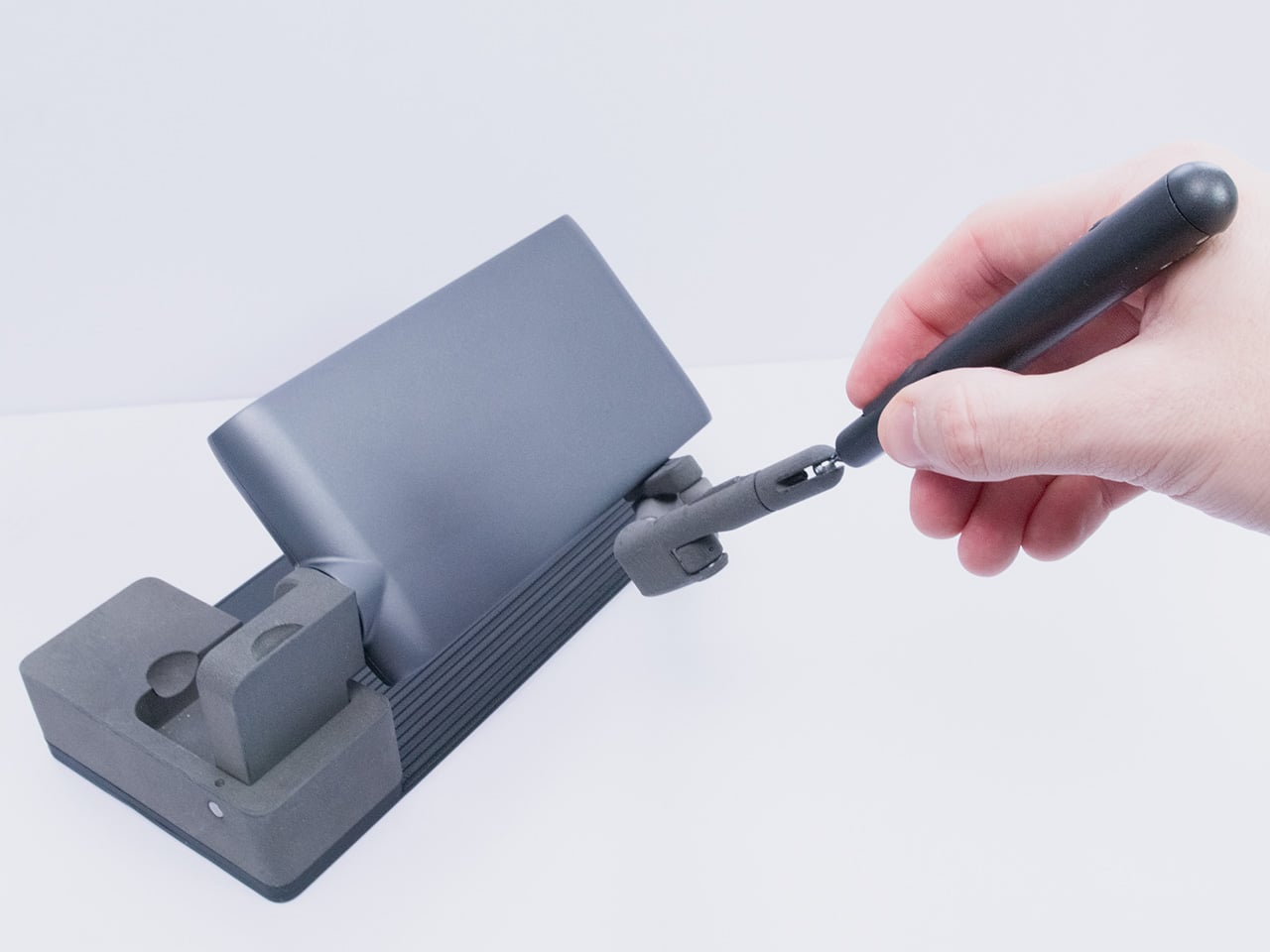
The MinVerse was developed by the folks at Haply Robotics as an iterative improvement to their Inverse robot. The Inverse (which I saw first) is a 3D input and haptic feedback device designed for industrial and scientific applications. It’s impressive, but it isn’t consumer-grade. Realizing that 3D input should be for consumers and smaller creators too, Haply designed the MinVerse, a smaller, flatter, and more advanced version of its predecessor. About the size of a large power-bank, the MinVerse sits at just 40mm or 1.5 inches in height, with the ability to be used on its own, attached to a computer mouse, or even a stylus – effectively revolutionizing fields like design, engineering, creative coding, game development, and even gaming itself.

The device measures 240mm (9.4 inches) wide, 120mm (4.7 inches) deep, and 40mm (1.5 inches) tall when folded shut. Open it and you notice how unique it looks compared to any mouse you’ve ever seen, but you also immediately get the hang of it in minutes without really any learning curve. The mouse’s parallel linkage arms allow for any movement on a 2D plane, but lift your hand off the floor and you realize that you can now manipulate the same cursor in another axis.

A 4kHz refresh rate means smooth usage whether you’re modeling or gaming. Plus, its force feedback, ranging from 2N to 4N, ensures that users don’t just see virtual objects but physically sense them. If a cursor hits a wall, the MinVerse pushes back, making the digital barrier feel solid… and I can’t stress enough how much of a quantum leap this combination of 3D manipulation and haptic reaction is for a lot of professions.

For 3D artists and designers, it offers a way to sculpt, model, and manipulate objects with realistic force feedback. Instead of relying solely on visual cues, they can feel the depth, texture, and weight of their creations. Game developers using software like Blender and Unity can position assets, adjust camera angles, and refine animations with an intuitive sense of touch, making workflows more natural.

Engineers and robotics enthusiasts benefit from the precise force feedback when controlling robotic arms or piloting drones. Instead of abstract joystick movements, they can physically feel the machine’s response, leading to more accurate and immersive control. Even gamers will find the experience transformative—whether it’s feeling the tension of a bowstring, the weight of a sword, or the kickback of a firearm, the MinVerse brings digital interactions closer to reality.

Imagine designing a product and being able to feel how its parts fit together before manufacturing. Or training in a simulated environment where the controls respond like real-world machinery. This technology has the potential to go beyond creative industries, extending into education, medical training, and even remote-controlled robotics.

I’ll be honest – Haptic feedback isn’t new, but integrating it into a consumer device at this level is a major leap forward. The device recreates the sensation of textures, resistance, and force, allowing users to feel surfaces, materials, and physical interactions as if they were truly there. The MinVerse does for mice what the Oculus Rift did in 2012 for VR headsets – make them popular, affordable, compact, and potentially create a new device category for consumers and professionals.

The MinVerse is available for a discounted price of $670 for early adopters, studios (both design and gaming), robotics startups, engineers, and 3D modelers/animators. It’s not cheap – but devices that are a generational leap aren’t supposed to be budget-focused. It comes in a gorgeous matte-metallic space-grey finish along with a comprehensive kit of modules. The modular attachments—including a stylus, a 2D mouse mode, and a VR controller—allow the MinVerse to switch functions seamlessly. The MinVerse connects via USB-C and features a wireless stylus, with a wireless mouse mode coming soon.

Click Here to Buy Now: $670 $1500 ($830 off). Hurry, only 13/15 left! Raised over $80,000.

The post Game-Changing Haptic 3D Mouse Lets You Feel Digital Objects Like They’re Real… We Tried It first appeared on Yanko Design.

Metal, Leather, Rubber, NATO, or Canvas – Which is the Right Watch Strap Material for You?

Par : Sarang Sheth
10 février 2025 à 01:30

Choosing a strap for your watch is like choosing a paint-job for your car. Or the furniture for your house. It adds an aesthetic, sometimes functional layer to the watch, just like choosing yellow paint is an aesthetic + functional choice for a cab, or choosing bunk-beds is an aesthetic + functional choice for a home with a single bedroom for two siblings, or a dorm. Watches come in hundreds (if not thousands) of varieties, and so do watch straps… but you can boil these straps down to 5 broad materials – Metal, Leather, Rubber (or Silicon), NATO (Nylon), or Canvas. So, does it make sense to spend time deliberating on what material works with your watch? Absolutely!

Each material offers its own balance of comfort, durability, and aesthetic appeal, making it crucial to consider how it fits into your daily routine and personal style. Whether you’re a suit-and-tie kind of person, a weekend explorer, or someone who just wants a reliable everyday watch, there’s a strap that perfectly suits your needs. Let’s break down each option to help you decide.

Metal Straps – Classic, Durable, and Timeless

Metal straps, often made from stainless steel or titanium, are the definition of versatility. They pair effortlessly with both formal and casual watches, making them a staple for anyone who values longevity and a refined aesthetic. A well-crafted metal bracelet adds heft and presence to a watch, making it feel more substantial on the wrist. Whether it’s the sleek polish of a Rolex Jubilee bracelet or the rugged appeal of an Omega Seamaster’s chunky links, or even the Milanese-style mesh on your Tissot Seastar, metal straps exude confidence and durability.

They work best with dive watches, dress watches, and chronographs, complementing cases that range from slim and elegant to bold and industrial. Metal straps fit seamlessly into business attire, evening wear, and even smart-casual outfits. However, they might not be the best choice for extreme outdoor activities, as they can feel heavy and less comfortable in hot weather.

Pros:

  • Exceptional durability
  • Waterproof and sweatproof
  • Timeless aesthetic
  • Excellent resale value
  • Low maintenance
  • Perfect for professional settings

Cons:

  • Generally heavier than other options
  • Can be expensive
  • May pull arm hair
  • Limited flexibility in formal situations
  • Can be challenging to size properly

Leather Straps – Sophisticated, Versatile, and Full of Character

Leather straps remain the quintessential choice for dress watches and classic timepieces, offering an unmatched level of sophistication and elegance. Available in countless varieties – from classic calfskin to exotic alligator and ostrich – leather straps can transform the character of a watch while providing excellent comfort. They’re particularly suited to dress watches, vintage timepieces, and chronographs.

The versatility of leather is remarkable, with different treatments and finishes allowing for both formal and casual applications. A black alligator strap can elevate a watch to black-tie status, while a distressed brown leather strap can create a perfect casual vintage look. They work exceptionally well with business attire and formal wear, though certain casual leather varieties can complement everyday casual wear as well.

Pros:

  • Develops unique patina over time
  • Excellent comfort
  • Wide range of styles and colors
  • Perfect for formal occasions
  • Ages beautifully
  • Easy to change

Cons:

  • Requires maintenance
  • Not water-resistant
  • Can deteriorate in hot climates
  • May show wear quickly
  • More expensive for quality options

Rubber Straps – Sporty, Waterproof, and Built for Action

Rubber straps have come a long way from their humble beginnings as purely utilitarian options for dive watches. Today’s rubber straps are available in various grades and compositions, from natural rubber to sophisticated synthetic compounds, offering supreme comfort and durability. They’re ideal for sports watches, dive watches, and any timepiece that might be exposed to water or physical activity.

High-end rubber straps, like those from Oysterflex by Rolex or Vulcanized rubber by Richard Mille, have elevated this material to luxury status. They’re also a standard fixture for most smartwatches, making them uniquely dichotomic, so don’t let people look down on you for wearing rubber straps. Rubber, or sometimes even silicone, can be hypoallergenic too, making them perfect for people with sensitive skin.

Pros:

  • Extremely durable
  • Waterproof
  • Easy to clean
  • Comfortable in all weather
  • Perfect for active lifestyles
  • Anti-allergenic

Cons:

  • Can attract dust
  • May not age as gracefully as leather
  • Limited formal applications
  • Quality varies significantly
  • Can trap moisture against skin

NATO Straps – Military Roots with Modern Versatility

Born from military specifications in the 1970s, NATO straps have evolved from purely functional items to fashion statements in their own right. Made from woven nylon, these straps are lightweight, breathable, and incredibly secure, as they loop under the watch case to prevent the watch from falling off if a spring bar fails. Their affordability and wide range of colors make them a go-to option for those who like to switch up their watch’s look frequently.

NATO straps are perfect for field watches, tool watches, and casual dive watches, giving them a rugged yet approachable vibe. They pair well with relaxed, everyday outfits—think jeans, a T-shirt, and a vintage-style watch. While they’re not ideal for formal occasions, they excel in outdoor adventures and summer wear, offering unmatched comfort in hot and humid conditions.

Pros:

  • Extremely affordable
  • Easy to change
  • Highly secure
  • Wide variety of colors and patterns
  • Comfortable in hot weather
  • Water-resistant

Cons:

  • Can look too casual for formal occasions
  • May add thickness to the watch
  • Can wear out relatively quickly
  • Some designs may appear too busy
  • Not suitable for dress watches

Canvas Straps – Rugged, Lightweight, and Understated

Canvas straps represent a perfect middle ground between the casualness of NATO straps and the sophistication of leather. These fabric straps, often made from cotton or linen, offer a unique texture and visual interest that can complement both vintage and modern timepieces. They work particularly well with field watches, pilot watches, and casual everyday timepieces.

The informal nature of canvas makes these straps perfect for weekend wear and casual settings, while still maintaining a more refined appearance than their NATO cousins. They’re especially suitable for summer months and tropical climates, offering excellent breathability while adding a touch of adventure to any watch they’re paired with.

Pros:

  • Excellent breathability
  • Casual yet refined appearance
  • Generally affordable
  • Comfortable in hot weather
  • Easy to clean
  • Lightweight

Cons:

  • Limited formal applications
  • Can absorb moisture and odors
  • May fray over time
  • Less durable than other options
  • Can be difficult to find in high quality

The post Metal, Leather, Rubber, NATO, or Canvas – Which is the Right Watch Strap Material for You? first appeared on Yanko Design.

Forget Cloud Storage – This Tiny Thunderbolt 5 SSD Puts 4TB of High-Speed Data in Your Pocket

Par : Sarang Sheth
8 février 2025 à 02:45

Remember when we OWNED things? I’m not talking about houses and cars being affordable, I’m talking about a time before the tyranny of subscription fees. You didn’t pay monthly fees for the right to see a movie – you owned a disc with the movie on it and it belonged to you for your entire life. Your external hard disk (yes, the ones we used so lovingly back in the 2010s) was yours to own – it wasn’t a cloud subscription you paid to access periodically. Small monthly fees sure made things seem easier when they actually aren’t – and I think we’re beginning to realize this sooner than later. We create and consume more data now than we ever did… which is why owning your own high-storage SSD makes so much sense in 2025.

Imagine carrying your entire digital life in your pocket—movies, games, work files, and backups—all accessible at speeds so fast they make cloud storage feel ancient. That’s the promise of the Comet Thunderbolt 5 Portable SSD, a tiny but ridiculously powerful external drive that redefines storage as we know it. With transfer speeds of up to 7,000MB/s, this thing moves data at speeds so fast your gigabit internet would feel like dial-up.

Designer: Comet

Click Here to Buy Now: $129 $199 (35% off) Hurry! Only 6 of 20 units.

To put that speed into perspective, transferring a full 4K movie with Thunderbolt 5 takes just five seconds. It takes the average human 1 minute to reach this sentence, which means you could have transferred 20 movies in this time. Compared to a standard USB 3.2 Gen2 SSD, this drive is seven times faster, which means that whether you’re editing 8K footage, rendering complex 3D models, or moving terabytes of raw photos, your workflow won’t just be smoother—it’ll feel instantaneous.

The highlight of the Comet is that it helps you reclaim ownership of your data and your storage. The tiny device is roughly the size of a stack of credit cards, but boasts storage starting at 1TB and going to 4TB, giving you enough room to store hundreds of AAA games, thousands of high-resolution photos, or an entire library of 4K movies. The 4TB model? That’s basically a Premium Google Drive subscription in your pocket, minus the fees and the agony of waiting for downloads on a half-decent internet connection. If you’re the kind of person who hoards media like a digital dragon, this drive lets you keep everything offline, secure, and instantly accessible.

The Comet SSD works seamlessly whether you’re on a Windows PC, Mac, Linux system, PS5, Xbox Series X|S, or a professional editing rig. While Thunderbolt 5 enables its top-tier speeds, it also plays nice with Thunderbolt 3, Thunderbolt 4, USB4, and even older USB 3.2 standards, giving you backward compatibility so that the SSD works perfectly with all your devices.

The SSD might be tiny but it isn’t fragile. The IP65-rated chassis is resistant to water, dust, and drops from up to two meters, meaning you can toss it in a bag, drop it on the floor, or even get caught in the rain without losing your data. The fanless aluminum casing keeps it cool under load, ensuring long-term reliability even when transferring terabytes of data.

And the best part? The price. $129 gets you the 1TB model, while the top-tier 4TB version goes for $279—a fraction of what some premium SSDs cost. We used to own things – the Comet SSD brings that era back by giving you ownership of your storage… without the fees, without the cloud, and without the possibility of it being hacked/leaked or worse, monetized for ads.

Click Here to Buy Now: $129 $199 (35% off) Hurry! Only 6 of 20 units.

The post Forget Cloud Storage – This Tiny Thunderbolt 5 SSD Puts 4TB of High-Speed Data in Your Pocket first appeared on Yanko Design.

Apple Researchers Built A Pixar-Style Robot Lamp That Moves And Emotes Like A Living Creature

Par : Sarang Sheth
8 février 2025 à 01:30

Apple’s latest experiment in robotics feels like a love letter to Pixar’s Luxo Jr. The tiny, energetic desk lamp that hops onto the screen before every Pixar film has always been more than just a mascot—it’s a symbol of character-driven storytelling. Now, Apple’s researchers have taken that same playful, emotive energy and brought it into a real-world robotic lamp, designed not just to function, but to interact, express, and even entertain. Researchers at Apple presented a paper titled ‘ELEGNT’ (Expressive and Functional Movement Design for Non-Anthropomorphic Robot) along with a comprehensive video of the lamp in action.

There’s a poetic connection here. Steve Jobs, the man who shaped Apple’s design philosophy, was also the visionary who helped Pixar become an animation powerhouse. The DNA of both companies has always been about creating technology that feels approachable—whether through the friendly curves of an iPhone or the lifelike expressions of an animated toy. Apple’s robotic lamp embodies that same philosophy, proving that robots don’t need to be powerful to be meaningful. They just need to be relatable.

Designers: Apple Machine Learning Research Division

Developed by Apple’s Machine Learning Research division, this robotic lamp is more than an automated light source. It gestures, reacts, and even sulks when it’s left behind. A demonstration video shows it performing tasks in two modes: “Functional,” where it simply executes commands, and “Expressive,” where it adds personality to its movements. The difference is striking. Instead of cold efficiency, the expressive mode makes interactions feel natural—like the lamp is part of the room’s social fabric, not just an object within it.

In one scene, the lamp hears music and starts swaying, an irresistible display of curiosity. In another, it glances outside before describing the weather, as if pausing to check for itself. When it reminds a user to drink water, it nudges the glass forward—not as a command, but as a gentle encouragement. These small but thoughtful gestures tap into something deeply human: the way we naturally ascribe personality to objects that behave in familiar ways.

This is why anthropomorphism in robotics matters. People don’t just want machines that work—they want machines they can connect with. A robot that can convey joy, hesitation, or even mild disappointment is far more engaging than one that simply executes tasks. It’s a lesson we’ve seen play out in animated films for decades, and it’s one that robotics engineers are beginning to embrace. In a way it also helps shed the impression of robots being scary (Skynet, Terminator, Transformers, Ultron) by embracing more delicate, humane characteristics instead.

Apple’s research aligns with earlier reports from Mark Gurman suggesting the company is developing a home robot with an articulating arm and an iPad-like interface. Speculated to launch by 2026 or 2027, it could integrate with smart home systems and even act as a companion device. If Apple is serious about bringing robotics into consumer spaces, this expressive lamp could be a glimpse of what’s to come.

For now, this experiment serves as a reminder that technology doesn’t have to be rigid or clinical to be useful. The best machines aren’t just the ones that perform tasks efficiently—they’re the ones that make us feel something. And if a desk lamp can make you smile just by hanging its head in disappointment, Apple might be onto something special. You can read the entire research paper on Apple’s website here.

The post Apple Researchers Built A Pixar-Style Robot Lamp That Moves And Emotes Like A Living Creature first appeared on Yanko Design.

If Framework Designed A Drone: Meet the Modular Drone Concept with Fully Upgradable Components

Par : Sarang Sheth
7 février 2025 à 21:30

Here’s my hot take for 2025, technology that cannot be upgraded is genuinely consumer-unfriendly. Framework proved it was possible by designing a sleek laptop that featured totally upgradable components – most gaming PCs are entirely upgradable too – so why not phones? Why not tablets? And why not drones?

Drones are devices that you probably buy once or twice in your lifetime. Nobody buys a new drone every 2 years – they use the one they have for as long as possible before upgrading (that’s only if they need to upgrade)… which really means you’re stuck with backward tech for a fairly long time. To combat this, Ethan White designed the ARK – a modular drone with an architecture that features removable and upgradable components. Need a new battery? Swap it out. Want a better camera lens? Substitute the older one for a newer model.

Designer: Ethan White

“Traditional drones require complete hardware changes or airframe redesigns to perform different roles. The ARK, however, offers an integrated solution with the simple act of swapping module pack,” says Ethan. Although the drone references Noah’s Ark, it quite literally represents the metaphor of the ‘Ship of Theseus’ – a thought experiment revolving around a ship that remains constant, with its parts gradually replaced over time.

The way the ARK is designed balances purposeful bulkiness with aerodynamics. Sure, laptops can be sleek for cosmetic reasons – but drones need to shed every single ounce they can for efficiency – a heavy or bulky drone can’t fly as well as a lithe, aerodynamic one – so making a drone that’s easy to disassemble, modular, and upgradable presents a unique challenge.

Components can’t be interwoven with each other inside a single outer body. The battery needs to exist independent of the PCB. The motors, sensors, cameras, every element has to be positioned very thoughtfully, so that they can be individually removed and replaced.

To that end, the ARK has a remarkable design, featuring components that interlock together when in use, and separate when you need to perform a swap. All this while still making sure you’ve got a drone that’s portable, foldable, and aerodynamic. The modularity also means you can purpose-build your drone based on your needs. Want something for entertainment, choose a basic package. Want a multimedia beast, upgrade your camera. Want to record at night, swap the daytime camera for a module that supports night vision. Want better range, add better antennas on top. You can build your drone with precise intent, just like you would your PC.

The drone features upgradable PCBs, cameras, propellers/motors, battery packs, and even other components like anti-collision sensors. Although conceptual, Ethan is working on a proof-of-concept and states that he’s aiming for IP43 water and dust resistance, along with a 30-minute flight-time. That might sound dull on paper, but I’d choose 30 minutes of flight with an absolutely incredible camera lens and sensor over 50-60 minutes with a fairly basic lens array. Plus, things will only get better with time – and as a consumer, you directly benefit from it.

The post If Framework Designed A Drone: Meet the Modular Drone Concept with Fully Upgradable Components first appeared on Yanko Design.

Never Pay A Brand Markup Again: Montoir’s V2 Dive Watch Delivers Swiss-Made Luxury On A Budget

Par : Sarang Sheth
27 janvier 2025 à 02:45

Microbrands in the watch world often capture attention by blending accessibility, quality, and striking designs. Montoir, a Chicago-based brand with Swiss-made credentials, entered the scene in late 2023 with its first dive watch. It was a standout debut—a stylish, robust timepiece with a Sellita automatic movement and serious 200m water resistance. Now, Montoir is back with the MWMOD-01 V2 Dive Watch, offering the same successful formula with an exciting twist: bold new colors.

Dive watches have a storied legacy, but Montoir takes that history and redefines it with precision and craftsmanship. The exterior is the definition of a modern classic. Crafted from 316L stainless steel, it combines various finishes—horizontal brushing, mirror polishing, and a lightly blasted dial—for a sophisticated and versatile aesthetic. Under the minimal-functional exterior is the customized Sellita SW200-1 Swiss automatic movement—a hallmark of reliability. Montoir has fine-tuned the movement to a no-date configuration, creating a clean, distraction-free dial. The 38-hour power reserve and robust build ensure it’s as functional as it is stylish.

Designer: Montoir

Click Here to Buy Now: $375 $750 (50% off). Hurry, only 3/139 left! Raised over $62,000. Only 72-hours left.

The new collection boasts dial options in Mint, Salmon, Cool Grey, and Green, alongside existing hues like Polar White, Black, and Blue. These colors are complemented by subtle refinements to the design, ensuring that each variant feels like more than just a palette swap. A green bezel insert paired with the green dial is particularly eye-catching, making it the standout piece of the collection. For the other colors, black bezels maintain a timeless, understated appeal.

The new colors aren’t just cosmetic—they reflect Montoir’s effort to create a timepiece that fits seamlessly into anyone’s wardrobe. The Salmon dial, for example, exudes vintage warmth, while the Cool Grey is a masterclass in understated elegance. Paired with Montoir’s combination of brushed and polished finishes, every variant tells its own story while staying true to the brand’s DNA.

At 40.5mm in diameter and just under 12mm in height, the stainless steel case maintains the same balanced proportions as its predecessor. The brushed finish with polished accents gives it a versatile aesthetic—equally at home underwater or at a casual dinner. The unidirectional bezel with a detailed 60-minute scale ensures functionality for diving enthusiasts, while a double-domed sapphire crystal with anti-reflective coatings keeps the dial legible under all conditions. The solid caseback, featuring an embossed diving helmet, adds a distinctive touch. Inside, the MWMOD-01 V2 draws its power from the Sellita SW200-1 automatic movement. This Swiss-made workhorse, a reliable alternative to the ETA 2824-2, offers a 38-hour power reserve and operates at a smooth 28,800 vibrations per hour. While it’s a proven performer, Montoir’s choice to omit a date complication keeps the dial refreshingly clean and focused on legibility.

Speaking of the dial, the new lightly sandblasted matte finish adds depth and texture. The oversized indices, coated in Super-LumiNova BGW9, glow brightly in low-light conditions, as do the hour and minute hands. Depending on the color variant, you’ve got yourself a wonderful contrast between the hands and the watch face. The lighter face shades opt for black hands, making them visible at a glance, while the richer watch faces come with polished chrome-like hands that glimmer in the light, instantly catching your eye.

The watches come equipped with a 20mm tropic-style strap made from recycled FKM rubber. The strap’s quick-release system makes swapping bands effortless, adding to the watch’s versatility. The rubber strap means this is truly a bonafide diver watch, designed to easily take on your diving adventures as a fish takes to water. The watch’s rated for 200m or 20ATM of water resistance too. For those drawn to value-driven watches, the Montoir MWMOD-01 V2 is a compelling option. With Kickstarter pricing starting at $375 for early backers (or $450 after the initial 48-hour window), the watch offers a lot of bang for the buck. For a Swiss-made dive watch with professional-grade specs, the final retail price of $750 still represents strong value.

This second installment from Montoir refines everything the company got right with its first series, building on it with fresh aesthetics and thoughtful design tweaks. Whether you’re an experienced connoisseur or a first-time buyer looking for a robust, stylish diver, the MWMOD-01 V2 is a worthy contender for your collection – especially given its Swiss-made movement at an authentic, non-marked-up price tag.

Click Here to Buy Now: $375 $750 (50% off). Hurry, only 3/139 left! Raised over $62,000. Only 72-hours left.

The post Never Pay A Brand Markup Again: Montoir’s V2 Dive Watch Delivers Swiss-Made Luxury On A Budget first appeared on Yanko Design.

It’s Time To Retire ‘Millennial Grey’ – Why The Neutral Interior Color Desperately Needs To Go

Par : Sarang Sheth
27 janvier 2025 à 00:30

For a hot minute, gray was everywhere. Not just a little bit here and there—gray dominated. Gray walls, gray furniture, gray kitchen cabinets, gray exteriors. It was the unofficial uniform of home design in the 2010s, with its cold yet “modern” vibe signaling minimalism, sophistication, and, well, the ability to stage a house for resale.

But after years of grayscale everything, we’re collectively realizing it might be time to let this trend rest in peace. It’s not that gray is inherently bad—it’s just been beaten to death – like a song that goes viral on TikTok and then eventually gets hated by everyone. Let’s talk about why this trend exploded, how it overran our homes (and lives), and what’s next now that we’re all over it.

Gray Took Over Everything—and We Let It Happen

Gray didn’t just appear overnight—it filled a vacuum left by the beige overload of the early 2000s. Millennials, raised in homes with yellowy beige carpets and walls, rejected those warm tones for something cooler and more modern. Gray offered an alternative that felt like a fresh start: sleek, clean, and refreshingly neutral. It was the perfect choice for a generation looking to distance itself from the outdated interiors of the past.

Its rise was also deeply practical. Gray was calm and versatile, perfectly aligning with the minimalist aesthetic that dominated the 2010s. It offered a sense of peace in a chaotic world, and for millennials facing housing insecurity and constant economic stress, creating a serene home was a small victory. Gray wasn’t just a color—it was a vibe, one that represented order in an otherwise messy reality.

Real estate developers and landlords also saw the practicality of gray. For new builds and rental properties, it was a neutral, inoffensive choice that made spaces feel modern while appealing to as many people as possible. Add to that the influence of social media, where gray walls and monochromatic palettes became the hallmark of every trendy home makeover video, and suddenly, gray wasn’t just popular—it was unavoidable.

But like every trend that gets oversaturated, gray lost its magic. Entire homes in varying shades of gray began to feel cold, lifeless, and repetitive. What was once sleek and modern became bland and uninspired, leaving people craving warmth, personality, and individuality. The shift away from gray marks a broader move toward more vibrant and dynamic interiors—spaces that finally feel alive.

The Problem With Gray: We Overdid It

The thing about gray is that, like any good trend, it starts out fresh and exciting. But when everything is gray, it starts to feel sterile, repetitive, and kind of lifeless. What started as “modern and clean” quickly spiraled into “cold and depressing.” Then there’s the issue of personality. The beauty of a neutral is that it’s supposed to complement bold accents or allow you to add your own flair. But what ended up happening is that people just stopped adding personality altogether. They leaned into the “safe” choice, and to be honest, there’s only so much you can do with gray walls, gray flooring, and gray furniture before it all blends together into one dull blob of grayscale monotony.

And let’s talk about how this trend wasn’t even a choice for a lot of people. Landlords slapped gray paint on rental walls because it was cheap and easy, leaving tenants stuck with lifeless spaces they weren’t allowed to change. New homeowners, meanwhile, were so drained from the expense of buying a house (because, surprise, buying a house is extremely expensive) that repainting gray interiors wasn’t exactly a top priority. Gray became less of a trend and more of a trap.

The Emotional Toll of Living in Gray Spaces

There’s also something deeper to this shift. Millennials, the generation who popularized gray, are also the generation that got hit with housing crises, skyrocketing costs of living, and an endless sense of instability. Is it any wonder that a neutral like gray—a color that doesn’t ask too much or stand out too loudly—became the default? Gray doesn’t take up space. It’s non-threatening. But it’s also emotionally flat.

Living in gray-heavy spaces can feel uninspiring at best, suffocating at worst. During the pandemic, when many of us were stuck at home 24/7, those blank gray walls stopped feeling sleek and modern. Instead, they felt like cages. People started craving warmth, vibrancy, and a sense of life—things gray can’t exactly deliver.

The Signs of a Shift: Bold and Vibrant Trends Take Over

So, if we’re done with gray, what’s next? Thankfully, interior design is moving in a brighter, bolder direction. Here are a few trends that are leaving millennial gray in the dust:

1. Boho Chic:
This trend is all about earthy tones, natural textures, and an eclectic mix of patterns. Think warm terracotta, soft sage greens, woven baskets, and rugs with bold designs. It feels inviting and lived-in, the opposite of the sterile perfection of gray interiors.

2. Mediterranean Vibes:
Earthy whites, sun-drenched yellows, deep blues, and rustic wood accents are making their way into homes. This trend brings warmth, elegance, and a timeless quality that gray just can’t match. Bonus: it makes you feel like you’re vacationing in Greece.

3. Jewel Tones:
Bold jewel-inspired hues are having a major moment. From emerald green walls to amethyst purple sofas, people are embracing color in a big way. If you’re ready to embrace boldness, jewel tones are rich, luxurious, and full of personality.

4. Statement Walls:
Gray walls are out; patterned wallpapers, murals, and accent walls are in. Adding texture and visual interest to a space brings personality and vibrancy, something gray could never quite pull off.

Why These Trends Feel Right for Right Now

The death of millennial gray isn’t solely about aesthetics—it’s a reflection of bigger cultural shifts. After years of playing it safe, people are ready to embrace individuality and creativity. The pandemic taught us that our homes need to be more than just pretty; they need to feel like places we actually want to live in. Warm colors, bold designs, and eclectic touches bring life to a space in a way gray never could.

And let’s not forget: this is also about reclaiming some sense of joy. Millennials have spent the better part of their adult lives stuck in economic uncertainty. Maybe that’s why gray felt right for a while—it didn’t make any bold promises. But now? We’re ready for something that sparks a little happiness.

How to Move On From Gray (Without Losing Your Mind)

If you’re staring at gray walls and thinking, “Okay, what now?”—don’t panic. Transitioning away from gray doesn’t have to be overwhelming or expensive. Here’s how to start:

  • Start Small: Add color through accents like pillows, rugs, or artwork. You don’t have to repaint your entire home overnight.
  • Focus on Key Areas: Pick one room or one wall to revamp. A bold accent wall or a colorful piece of furniture can instantly shift the vibe.
  • Layer in Warmth: Incorporate natural materials like wood, rattan, or woven textiles to add warmth and texture.
  • Experiment: Try a peel-and-stick wallpaper or a removable decal for a low-commitment pop of personality.

For renters, small changes like colorful curtains or vibrant bedding can make a big difference. And if your landlord is cool with it, ask about painting one accent wall—it might just convince them to rethink their gray obsession too.

Gray’s Legacy—and What’s Next

So, will gray ever really go away? Probably not. It’s neutral, it’s functional, and for a lot of people, it’s still a safe choice. But its dominance as the color of the decade is definitely over. Gray will stick around in smaller doses—as a backdrop for bolder designs or paired with richer tones—but it’s no longer the main event.

The future of home design is looking a lot more colorful, a lot more personalized, and, honestly, a lot more fun. So let’s raise a glass to millennial gray: you had your moment, but now it’s time to make room for something brighter. And remember, if you’re still surrounded by gray, there’s no shame in taking your time to switch it up. Just know that when you do, your home might finally feel less like a catalog and more like, well, you.

The post It’s Time To Retire ‘Millennial Grey’ – Why The Neutral Interior Color Desperately Needs To Go first appeared on Yanko Design.

19-Foot High Bookshelves with a Deejay Booth – This Streetwear Store is Breaking All The Rules

Par : Sarang Sheth
26 janvier 2025 à 23:30

The one word you usually associate with a library is ‘quiet’, but step into this library and you’re greeted with floor-to-ceiling bookshelves and a DJ booth with a massive sound system. Designed almost as if libraries met counterculture, this is the ‘Nude Library’ – a streetwear store in Barcelona, Spain.

This space doesn’t whisper sophistication the way a conventional library does; instead, it cranks up the volume and tells you to pay attention. Designed by El Departamento for the Nude Project’s flagship store in La Roca Village, it’s where architecture meets attitude. The shelves frame the room like a stage, elevating the DJ booth—literally and metaphorically—into the spotlight. When the music starts, the sound resonates off the wood, filling the space with energy. A librarian worth their salt wouldn’t survive a day in this place!

Designer: El Departamento

The Nude Project is a brand that champions creativity and self-expression, a philosophy echoed throughout its flagship store. Known for its bold streetwear that blends urban aesthetics with artistic flair, the Nude Project caters to a young, vibrant audience. The store’s prime objective isn’t to purely sell clothes—it’s to cultivate a community. By incorporating design, music, and a striking visual narrative, the Nude Library becomes more than a retail space; it’s a hub for inspiration and individuality.

What’s genius here is the flow of the design. The shelves serve as the backbone of the room, giving it warmth and depth. The wood’s natural texture feels grounding, a perfect counterpoint to the industrial coolness of the sound system integrated within. That DJ booth doesn’t just sit there awkwardly; it fits, almost too perfectly, as if the entire space was built around it. There’s something irresistibly cheeky about the way it all comes together—a space that takes itself seriously but doesn’t lose its sense of fun.

Beyond the music and the drama of the shelves, there’s an intentional softness tucked away in the fitting room. Baby blue tones dominate here, with rounded forms and a sense of calm that feels like a deliberate contrast to the rest of the store’s boldness. It’s a thoughtful touch, giving visitors a moment to pause and reset before diving back into the high-energy main floor. It’s this kind of balance that makes the design feel alive, like it’s breathing with you as you move through it.

The unique juxtaposition of a library with a club make the store a place you can’t ignore. It’s the kind of store that makes you linger, not because you’re shopping but because the space itself is an experience. The shelves tell one story, the music tells another, and somehow they’re all part of the same conversation. It’s not just retail; it’s an interaction, a memory, a reason to return.

Sure, libraries are supposed to be quiet. But this one throws that idea out the window, replacing it with beats, energy, and creativity. The Nude Library rewrites the rules and then plays them at full volume.

The post 19-Foot High Bookshelves with a Deejay Booth – This Streetwear Store is Breaking All The Rules first appeared on Yanko Design.

This LEGO Grammy Trophy Replica Turns an Iconic Award into a 207-Brick Collectible

Par : Sarang Sheth
26 janvier 2025 à 21:45

The Grammys are exactly a week away, and the air is already buzzing with anticipation. Whether you’re rooting for Charli XCX’s Brat winning Album of the Year or cringing at the idea of Espresso winning the Best Song because it was plastered all across social media, the Grammy statuette—arguably one of the most iconic trophies in music history—will soon take center stage. Shaped like a vintage gramophone, this gleaming golden award has been synonymous with excellence in music since its debut in 1959. Now, thanks to LEGO enthusiast _ironman, this piece of music history has been reimagined in an entirely new way: as a LEGO set.

In true LEGO Ideas fashion, the design captures the essence of the real Grammy award—a gramophone frozen in time, its brass horn glinting with a sense of pride and tradition. But what makes this build more than a miniaturized tribute to the Grammys is its intention. According to _ironman, the project was inspired by a desire to encourage kids to chase their dreams, even in the face of adversity. “One day, I’ll get one of these,” is the thought this LEGO set aims to inspire, especially for children who may be dreaming of making music their career. It’s a powerful idea wrapped in a clever, brick-built package.

Designer: _ironman

Standing at 16.6 x 19.5 x 31 mm, this LEGO Gramophone shows off a minimalist design that doesn’t skimp on details. With 207 pieces, including four golden “records” tucked away in a gold box, it strikes a balance between elegance and accessibility. The build isn’t overly complex, making it a perfect project for music lovers of all ages—LEGO newcomers and seasoned builders alike. There’s even a blank nameplate that you can add your name to, just as the ultimate manifestation!

The idea of merging LEGO with cultural icons isn’t new, but this project feels especially poignant. Music has a way of uniting people, and the Grammys are a celebration of that universal connection. By recreating the Grammy award in LEGO form, this set becomes a bridge between two art forms: music and building. Whether you’re someone who loves constructing MOCs (My Own Creations) or simply admires the rich history of the Grammys, this project has something for you.

As we countdown to Grammy night, this LEGO Gramophone reminds us that creativity knows no bounds. While not everyone will walk away with an actual Grammy, the dream to reach that pinnacle begins somewhere. And sometimes, it starts with a handful of bricks, an idea, and a spark of imagination. So, if you’re as inspired by this as we are, head over to the LEGO Ideas website to vote for _ironman’s project, and let’s make this golden dream an official box set. After all, even the longest musical journey starts with a single note—or in this case, a single LEGO brick.

The post This LEGO Grammy Trophy Replica Turns an Iconic Award into a 207-Brick Collectible first appeared on Yanko Design.

The Ultimate Emergency Multitool: Why First-Responders Love the Leatherman Skeletool RX

Par : Sarang Sheth
22 janvier 2025 à 12:40

There are cameras for the masses, and then cameras for photographers. There are cars for commutes, and cars for automotive enthusiasts. Similarly, there’s EDC (Everyday Carry) meant for the general populace, and then there’s EDC designed specifically for people who need the right tool at the right time in the face of adversity. Every first responder will tell you that a faulty tool (or even the wrong tool) can sometimes be the difference between success and failure, life and death… which is why the EDC meant for these situations needs to be engineered to absolute perfection. Ask first responders what their favorite EDC is and the most common name will be the Skeletool RX from Leatherman.

Measuring about four inches long and tipping the scales at a mere five ounces, the Skeletool RX is a lesson in efficiency. Its stripped-down design—complete with a carabiner clip and integrated bottle opener—might initially give the impression of being too minimal. But spend a week with it, and you’ll likely change your tune. This tool is crafted for those who value simplicity and performance over frills, and it delivers that effortlessly. No unnecessary tools, no distracting details, nothing extraneous – just sheer productivity in a compact, rapid-deploy package.

Designer: Leatherman

Click Here to Buy Now

The Skeletool comes in a few variants, the RX being one of them. Others are the standard Skeletool, designed for versatile everyday tasks; the CX, which features upgraded materials like DLC-coated stainless steel and a 154CM blade for added durability; and the Skeletool KB, a streamlined option that focuses on knife functionality with a built-in bottle opener. The RX, however, is purpose-built for emergency responders, with features tailored to critical, high-pressure situations. It includes a serrated 154CM blade with a hooked design for cutting through tough materials like seat belts or fabric with ease, as well as a carbide glass breaker for fast access in rescue scenarios. Couple this with the ’emergency’ red colorway and you’ve got yourself the perfect life-saving instrument for those who need split-second reliability.

The blade is a little different from the kind you’d find on other EDC knives. Made from 420HC stainless steel, it’s sharp, durable, and incredibly easy to deploy one-handed. Its unique edge helps with all kinds of cutting techniques, letting you effectively slice through everything from parcels to wood, paracord, and even seatbelts. The knife is big enough to handle slicing, cutting, and general utility tasks but compact enough to avoid being cumbersome. Its placement on the tool ensures it’s always at the ready, giving you a reliable edge in situations where you’d otherwise be scrambling for a dedicated blade.

The pliers, another essential feature, are no slouch either. Designed with needle-nose precision and a sturdy grip, they tackle both delicate and heavy-duty tasks with ease. Whether it’s tightening bolts or gripping small wires, the pliers hold up under pressure—literally. The inclusion of hard-wire cutters and regular wire cutters further adds to their versatility, ensuring that even small tasks around the house or campsite are covered.

On the end of one of its handles is the RX’s its bit driver system. It comes with two double-sided bits stored snugly in the handle, offering four functions right out of the box. Got a loose screw or something that needs repairing? The driver system comes in handy, but one of the bits holds a surprising function – armed with a carbide tip, this bit turns the RX into a glass-breaker that can easily shatter through even reinforced or toughened glass panels, making it perfect for emergency exits or evacuations. Leatherman’s upgrade packs and adapters also let you expand its capabilities like adding 1/4-inch bits or other add-ons.

All its features included, the Skeletool RX still fits comfortably in your grip. Its ergonomic design, coupled with carbon fiber handle accents, ensures a comfortable grip no matter the task. The balance between size and weight feels deliberate, allowing for maximum control without any awkward bulk. Even the mechanism for opening and closing tools has a tactile quality that’s oddly addictive—you’ll catch yourself flicking it open and closed just for the sheer fidgety satisfaction of that smooth motion. Finally, a carabiner clip on the handle lets you easily string it to your backpack or belt loop for secure carrying… and a deep pocket clip lets you slide the Skeletool RX into pockets and pouches for quick-access.

However, the Skeletool isn’t for everyone. Its focus on minimalism means it doesn’t pack as many tools as some of its bulkier competitors. If you’re someone who demands a full arsenal of gadgets in a multi-tool, this might feel limiting. That said, its design philosophy leans heavily on portability and daily practicality, so it never feels like it’s trying to be something it’s not. You can always enhance its functionality with additional bits, but even without them, it covers most of the essentials, making it perfect for its intended target audience of first responders and EDC enthusiasts who just need pure functionality in a small yet sturdy package.

Click Here to Buy Now

The post The Ultimate Emergency Multitool: Why First-Responders Love the Leatherman Skeletool RX first appeared on Yanko Design.

iPhone SE 4 Leaked Photos show Single-Lens Camera, USB-C Port, Mute Switch, and No Capture Button

Par : Sarang Sheth
21 janvier 2025 à 21:45

Apple’s next budget-friendly smartphone is almost here, and it’s not playing by the old rules. The iPhone SE 4, or what might be called the iPhone 16e, seems ready to shake things up in early 2025. Rumors of a March launch are floating around the interwebs, although there’s no official date in mind (given that Apple hasn’t made any announcements for upcoming keynotes yet). That being said, the iPhone SE 4 is long overdue, given that its predecessor launched in 2022.

A tipster on X shared images of a dummy phone given to case-makers and accessory manufacturers. Touted to be the upcoming iPhone SE 4, the phone gives us a pretty concise idea of what we can expect with Apple’s latest budget-friendly iPhone. Gone are the thick bezels and that physical home button. Instead, you get a 6.1-inch edge-to-edge display that takes cues from the iPhone 14. The shift feels long overdue, but it’s a welcome change. Apple has clearly decided that even its “budget” options shouldn’t look outdated. Whether the device will stick with a notch or adopt the Dynamic Island remains a mystery, but the overall design promises to feel more current than before.

Image via X (@SonnyDickson)

From the rumors circling the internet, it’s not just the look that’s leveling up. The screen technology is taking a leap forward too. Moving from an LCD to OLED is a serious win for anyone upgrading from an older SE. Expect richer colors, better contrast, and improved efficiency. It’s the kind of difference you notice right away—deeper blacks and visuals that just feel more polished. For a phone in this price range, that’s not something you’d usually expect.

And then there’s the long-overdue shift to USB-C. If you’ve been juggling different cables for different devices, this change simplifies things. Even though the port may only support USB 2.0 speeds, the move feels like a step in the right direction. Other visual changes on the phone’s frame include the lack of an action button (we’re back to the old mute switch days), and clearly no Camera Control ‘button’ like Apple announced with the 16 series. The SE 3 didn’t have MagSafe so one could argue the SE 4 might miss it too, although wireless capabilities and MagSafe are really becoming a dominant feature in phones of this supposed price range.

Image via X (@SonnyDickson)

Speaking of upgrades, the camera is getting a major refresh. A 48MP sensor allegedly replaces the old 12MP one, bringing a noticeable bump in photo quality. Whether it’s snapping shots at night or recording 4K video, the iPhone SE 4 will give you more to work with. Apple hasn’t confirmed much about zoom capabilities, but the upgrade alone should satisfy both casual users and anyone who takes their mobile photography seriously. Don’t expect dual-lens camera setups on the SE anytime soon – but even with one lens, the iPhone SE 4 should definitely get the job done.

Under the hood, the SE 4 is rumored to feature Apple’s A18 chip paired with 8GB of RAM. What does that mean for the user? Faster performance, smoother multitasking, and the kind of speed that keeps your phone future-proof for a while. Apple’s massive push towards Apple Intelligence probably means this phone will come with the highly awaited AI assistant. That’s sort of why Apple decided to give the SE 4 the same chip as the iPhone 16 series. More on this when the phone officially launches.

Curiously, Apple might be rethinking how it positions this phone. The potential rebranding as the iPhone 16e hints at a shift in strategy. Instead of standing out as the “cheap iPhone,” it could become a core part of the lineup—offering flagship features with just a few compromises. That name change, subtle as it seems, could reshape how people perceive the device.

Price-wise, the SE 4 is expected to start at $499. Sure, it’s a bump up from its predecessor, but considering the OLED display, the camera upgrades, and the more powerful chip, it feels justified. You’re getting more for your money, and that’s the bottom line. Regional pricing might vary, but overall, it’s still positioned to attract users who want Apple’s ecosystem without the premium price tag.

The post iPhone SE 4 Leaked Photos show Single-Lens Camera, USB-C Port, Mute Switch, and No Capture Button first appeared on Yanko Design.

This Wireless 4K HDMI Transmitter Basically Killed Every HDMI Cable Ever

Par : Sarang Sheth
20 janvier 2025 à 02:45

Stream from any Type-C device/console or your smartphone to your TV without a long cable in between. Connect your laptop or tablet to a projector without worrying about dongles and HDMI ports. Transmit crisp 4K visuals without trippy wires that ruin the aesthetic of your home or office. That’s the life 4URPC (pronounced “For Your PC”) promises…

Technology has a way of simplifying life, but it often leaves us tangled in wires and struggling with compatibility issues. Enter the 4URPC Gen 2—a sleek, compact solution promising seamless wireless connectivity for video and audio transmission. This gadget offers a glimpse into the future of how we interact with our screens – without 5-10 foot-long cables. If you’ve ever wished for a plug-and-play solution that doesn’t demand a manual or endless app downloads, this is it.

Designer: 4URPC

Click Here to Buy Now: $115 $200 (43% off). Hurry, only a few left! Raised over $226,000.

The 4URPC exists as a 2-part dongle – a transmitter and a receiver. Plug them into their respective devices and you’ve basically got yourself an invisible HDMI cable connecting these two devices. With built-in 5GHz Wi-Fi capable of transmitting 4K at 30Hz or 1080p at 60Hz, the 4URPC gives you the power of an HDMI cable without the cable. Use it with your TV, a monitor, a projector, or any device you want to use as an external display.

Inside this two-part dongle beats a quad-core processor capable of beaming 4K visuals at 30Hz or a smooth 1080p at 60Hz. It handles these tasks with a certain confidence, using built-in 5G WiFi to keep audio and visuals locked in sync. There’s no app, no WiFi setup to wrestle with—just plug the Type-C transmitter into your device and the receiver into an HDMI port, and the connection is instantaneous. It’s a kind of simplicity that feels almost nostalgic, like when gadgets just worked without trying too hard to impress.

What’s refreshing is how unpretentious this thing is about its versatility. It hops between Windows, MacOS, and Android devices with no fuss, as long as they support DP Alternate Mode through a Type-C port. You can take it from a boardroom presentation to movie night at home without missing a beat. And it’s equally at home connecting with friends, family, or colleagues, thanks to its support for multiple transmitters on a single receiver. You can share the screen-swapping duties without stepping on each other’s toes.

The 4URPC isn’t a new device – it launched in 2024, garnering support from backers on Kickstarter exactly a year ago. Now, the makers are back with a vision for Gen2, built on the backs of technological advancements as well as feedback from early adopters. Backers of the first version provided crucial feedback about small issues like limited multi-device options and connectivity time. The Gen 2 addresses these pain points with noticeable precision. Setup times are practically nonexistent—just 0.01 seconds for the wireless connection to kick in. And if you’re in a setting where multiple users need access, the receiver now juggles up to five transmitters.

There is, however, ‘one more thing’ with the 4URPC. It isn’t only an HDMI transmitter/receiver, it’s also a 100W PD3.0 adapter, allowing you to charge or run devices through the dongle itself. Why? Because ports are a rarity on devices like phones or laptops (you only get a limited number of them), so it only makes sense to provide as much value if you’re going to utilize a port. To that end, 100 watts of power deliver is perfect for laptops and more than sufficient for tablets or phones, allowing them to fast-charge in a snap. Pair that with improved heat dissipation—air vents that look cool and work cooler—and you’ve got a device that can handle itself during extended use without overheating.

The transmitter-receiver duo is tiny—just 0.23 inches thick and lighter than most smartphones. Toss it in a bag, and you might forget it’s even there until you need it. Even the cable feels thoughtfully designed, with reinforced materials that stood up to tens of thousands of bend tests. The quad-core processor handles 4K streaming with minimal lag and DRM support, which means you can play games using the 4URPC or even stream content from Netflix, Hulu, Disney and other streaming apps. You can order your 4URPC now and it’ll deliver by April 2025.

Click Here to Buy Now: $115 $200 (43% off). Hurry, only a few left! Raised over $226,000.

The post This Wireless 4K HDMI Transmitter Basically Killed Every HDMI Cable Ever first appeared on Yanko Design.

This Gorgeous All-Metal Pen was Machined from a Single Block of Copper with Zero Plastic Parts

Par : Sarang Sheth
16 janvier 2025 à 02:45

Sometimes, the tools we use tell as much of a story as the work we create with them. A pen might seem basic in a world dominated by keyboards and touchscreens, but when it’s designed with precision and purpose, it reminds you why physical tools still matter. The TWYST Ballpoint Pen isn’t trying to compete with modern tech—it’s here to complement it, giving form to thoughts that deserve to be more than fleeting pixels on a screen.

What sets TWYST apart isn’t just its materials or design—it’s the way it fits into your workflow without fanfare. Made from copper and brass, it’s crafted to last, both in durability and relevance. The feel of its octagonal body in your hand, the smooth twist mechanism—it all works together to create a writing experience that’s satisfying without trying too hard. It’s a tool that simply gets it right, striking the balance between form, function, and a little bit of personality.

Designer: Legendär

Click Here to Buy Now: $67 $103 (35% off). Hurry, only 2/98 left!

Copper, with its undeniable warmth and depth, is the soul of this pen. Each piece is CNC-milled, ensuring that every single unit is sculpted to perfection. Over time, the metal develops a unique patina, creating a one-of-a-kind signature for its user. It’s a design choice that speaks to a love for the enduring—a reflection of its creator’s belief in blending timeless aesthetics with utility.

But it’s not just copper’s character that makes the TWYST pen stand out. Brass, another noble metal and an additional TWYST variant, adds strength and elegance. Together, these materials bring a certain gravitas to the pen, given that they have a gorgeous bronze-rose color, and that they’re heavier than the more commonplace stainless steel. The pen’s antibacterial properties add a practical edge, while the balance of weight in hand reminds you that simplicity often carries the most significance.

As for its design, every detail has been meticulously thought through. The octagonal geometry ensures a natural grip, whether you’re jotting down quick notes or penning something profound. The smooth twist mechanism feels intuitive, a reflection of the craftsmanship behind it. The Schmidt Technology refill housed within ensures every stroke glides across the page with precision.. Simple, and sophisticated. That’s all.

The materials are fully recyclable, with no plastic components in sight. The pens are designed to practically last forever, because that’s what craftsmanship was like back in the day. No planned obsolescence, no single-use culture. Just a good old-fashioned fusion of design, engineering, and intent. The pens measure a little over 5.1 inches, sport that gorgeous octagonal body which is great to grip and prevents rolling. There is, however, a palpable lack of a pocket clip, although in my opinion that would ruin the TWYST’s silhouette.

The TWYST pen was built for those who see beauty in simplicity and power in details. It’s not just about making your mark—it’s about enjoying every moment of the process. When the weight of the pen aligns with your thoughts, and the copper warms to your touch, it doesn’t feel like a tool anymore. It feels like an extension of who you are and what you create. Whether you’re a dreamer, a doer, or somewhere in between, TWYST invites you to approach your work with intention. With every twist of its mechanism and every word it commits to paper, it becomes a quiet reminder: the tools you use should match the weight of your ideas.

Click Here to Buy Now: $67 $103 (35% off). Hurry, only 2/98 left!

The post This Gorgeous All-Metal Pen was Machined from a Single Block of Copper with Zero Plastic Parts first appeared on Yanko Design.

This Designer Has A Wild Idea To Make Tech Companies Great Again – Tech Trading Cards

Par : Sarang Sheth
15 janvier 2025 à 21:45

Tech isn’t boring. At least, it shouldn’t be. We’re living in a world where pocket-sized wonders connect us to everything humanity has ever created, yet unboxing these marvels can feel like opening a pack of bland stationery. Unboxing videos which were once the highlight of every tech youtuber’s career is now practically an afterthought.

Why? Companies have ruined unboxing experiences to prioritize profits. You’d get chargers, earphones, cases, screen protectors, and sometimes even brand stickers (looking at you, Apple) inside smartphone boxes. Now, merely a phone and if you’re lucky, a braided cable. Designer Andrea Copellino has a solution to fix this problem – Bring back excitement, curiosity, and storytelling to technology using trading cards. Yes, trading cards. And it’s not as random as it sounds. It’s the perfect intersection of nostalgia, storytelling, and fun.

Designer: Andrea Copellino

To demonstrate this, Copellino chooses tech startup Nothing to demonstrate this idea. Nothing, a tech brand with a quirky ethos of transparency and an obsession with reintroducing joy into technology, is exactly the kind of company that could pull this off. Their design language already reads like a conversation with an old friend: clear materials that show the guts of the product, a marketing team that doesn’t mind poking fun at itself, and a YouTube channel where their designers casually break down creative decisions. It’s approachable and refreshingly human. But Francesco and his collaborator Francesco (yes, another Francesco), think the brand could do even more. They believe Nothing’s biggest untapped potential is right there in the unboxing experience.

Now, unboxing isn’t typically a topic that gets pulses racing, but it’s where Francesco’s storytelling brilliance shines. He’s reimagining unboxing as a chance to weave narrative into the very first interaction you have with a product. Instead of the usual manuals and filler paper, Francesco envisions collectible trading cards tucked into Nothing’s products. Imagine this: you open your new earbuds, and alongside them is a sleek card adorned with abstract art that hints at the product’s creative inspiration. Flip it over, and there’s a short story about the quirky origins of the design—like how pharmaceutical packaging inspired the bubble-like Ear (A) case.

These cards aren’t just gimmicks. They’re thoughtfully crafted artifacts. Each card would feature high-quality illustrations, metadata like product names and release dates, and captivating anecdotes. Even the card’s material and packaging echo Nothing’s aesthetic: semi-transparent paper, subtle textures, and a pierced detail that nods to their love for transparency. The goal isn’t just to inform but to delight. It’s tactile, personal, and—most importantly—memorable.

And the brilliance of this idea? It’s collectible. Francesco’s design aligns perfectly with how Nothing already connects with its audience. The company actively invites its community to participate in its creative process, from forums to YouTube comment sections. These cards could take that engagement to the next level. Imagine Nothing hosting design contests where fans create illustrations for the cards or special edition collectibles handed out at launch events. It’s a way to keep the community invested without the logistical nightmares of overly ambitious projects like Nothing’s Community Edition Phone.

But Francesco’s concept goes even deeper. Trading cards tap into something bigger than tech; they tap into culture. Millennials and Gen Z grew up with Pokémon cards, Magic: The Gathering, and other collectible phenomena. The resurgence of physical trading cards, fueled by their nostalgic and tactile appeal, isn’t slowing down. Francesco sees these cards as an opportunity to blend Nothing’s bold industrial design with the emotional pull of cherished childhood memories. It’s a way to bridge the cold utility of tech with the warmth of human experience.

And it’s practical too. The cards don’t rely on apps, servers, or any digital infrastructure—they’re yours forever. No subscriptions. No updates. Just a simple piece of art and story that fits perfectly in your hand (or a Pokémon binder, for those inclined). Even better, they’re scalable. Every Nothing device could come with a unique card, offering a new piece of the brand’s story to collectors with each purchase. It’s an idea that feels premium but doesn’t break the bank.

The most exciting part? This idea could redefine how we think about unboxing. Instead of it being an afterthought, it becomes an event—a chance to connect with the product and its creators on a deeper level. Francesco’s trading cards aren’t about adding unnecessary fluff; they’re about reminding us that technology isn’t just functional. It’s personal. It has stories, quirks, and, thanks to Nothing, a sense of humor.

Nothing’s ethos is rooted in challenging conventions, and Francesco’s trading card concept feels like an extension of that mission. It’s a bold, fun, and slightly eccentric idea that fits seamlessly into their brand DNA. It would be fun if Nothing entertained the concept – there’s really little to lose given how simple the execution is with something as basic as a trading card. At least it’ll revive the unboxing experience, turning it into something that has a little touch of intrigue and suspense… and everyone loves a little suspense, right?

The post This Designer Has A Wild Idea To Make Tech Companies Great Again – Tech Trading Cards first appeared on Yanko Design.

The Small Samurai: Upgrade Your EDC with this Ultra-Compact Titanium Pocket Knife

Par : Sarang Sheth
21 décembre 2024 à 02:45

I remember reviewing a tiny knife earlier this year and using the phrase ‘Napoleon of EDC’ to describe how compact-yet-ruthlessly-efficient it was. To be honest, it’s a phrase I’ve come to love and I wish I could use it all the time… but the problem is that there can only be one Napoleon. However, the NanoMax embodies a similar spirit, with its small form-factor. Barely the size of a key when closed, the NanoMax opens up to become quite the powerhouse, getting you through any scenario where a sharp blade comes in handy.

Compact yet impressively capable, the NanoMax by TiGo is designed to slip seamlessly into your everyday routine. Crafted with a strong GR5 titanium frame and a premium M390 steel blade, this mini folding knife measures a mere 6.9cm (2.7 inches) when closed and weighs just 53.5g. The result is a tool that’s as convenient to carry as a house key, yet robust enough to tackle demanding tasks whenever they arise.

Designer: TiGo

Click Here to Buy Now: $79 $109 (28% off) Hurry! Only 58 Discounted Units Left!

Rather than merely shrinking down a standard knife, the NanoMax brings purposeful design to the EDC scene. Its sleek titanium handle, fortified with surface anti-slip grooves, ensures a confident grip in any condition, while the M390 blade maintains a razor-sharp edge through long stretches of frequent use. The combination isn’t just about aesthetics—it’s about long-term durability, reliable cutting performance, and a consistently refined experience.

Two distinct deployment methods—an integrated back flipper and a thumb groove—allow for effortless one-handed opening. Meanwhile, a secure liner lock mechanism keeps the blade firmly in place once engaged, providing peace of mind whether you’re slicing open a package, paring down kindling, or performing detailed craftwork. A roller bearing system ensures each opening action feels smooth and satisfying, minimizing any hesitation when you need the blade most.

Once flipped open, you’re greeted with a curved-belly Wharncliffe blade that looks like it means business. Measuring 53mm (2.1 inches), the blade’s tiny, but goes above and beyond to get the job done. Made from M390, a martensitic chromium steel that’s incredibly tough, corrosion-resistant, and easy to sharpen, the blade complements the NanoMax’s titanium handle perfectly. It outshines other steels like D2 and Damascus with how well it retains edges, and that Wharncliffe blade profile (also known as sheepsfoot) handles everything from cutting to slicing, piercing, whittling, and scraping. It’ll just as easily slice through boxes as it will through your seatbelt, giving it the kind of versatility that’s somewhat uncommon in the tiny knife world.

In an emergency, the titanium frame can pair with a ferro rod to help spark a fire, making the NanoMax more than a mere cutting tool. Whether you’re slicing rope on a campsite or opening letters at the office, this knife transitions smoothly between urban and outdoor environments. Its slim profile ensures that it never feels cumbersome or out of place—just ready for action at a moment’s notice.

For added practicality, a built-in keychain hole and pocket clip give you flexible carry options. Attach it to your keys, clip it to your pocket or bag, or hang it as a pendant. The NanoMax’s Tritium slot (vial sold separately) even lets you add a subtle glow-in-the-dark element for easy spotting in low light, reinforcing that this knife is designed with real-world conditions in mind.

At under 2 ounces, and roughly the size of a key or a thumbdrive, the NanoMax really does live up to its name. It’s tiny, but not as a compromise because it definitely maxes out with the materials it uses. To be honest, the use of titanium and M390 are exactly what allow the NanoMax to be so tiny, giving you something that punches well above its weight.

The NanoMax comes in just a single colorway for now, with its nude titanium and steel finish that kind of does feel like a classic color palette, if you ask me. The rawness of this lack of color or anodization gets taken away by the fact that the knife comes with a fair bit of detailing, including straight lines, sharp angles, and the judicious use of curves and radii. Simple grooved patches give the knife grip, and those tritium slots let you customize the EDC, making it visible even in low-light.

Although TiGo doesn’t explicitly mention this anywhere, you can expect a knife like the NanoMax to last you decades without breaking a sweat. Titanium has the ability to withstand pretty much any form of physical abuse, while the M390 blade will do so too… but just in case its edge wears out after a few years, a quick sharpening session gets you back to the NanoMax being its deadly, compact self. Sort of like the tiny little warrior I referenced earlier.

Click Here to Buy Now: $79 $109 (28% off) Hurry! Only 58 Discounted Units Left!

The post The Small Samurai: Upgrade Your EDC with this Ultra-Compact Titanium Pocket Knife first appeared on Yanko Design.

LEGO How I Met Your Mother Brick Set Brings Ted Mosby’s Iconic Apartment to Life

Par : Sarang Sheth
20 décembre 2024 à 20:15

The only fitting adjective to describe this LEGO kit is Legen… wait for it… Dary!

For nine years, How I Met Your Mother captured global audiences with a distinctive blend of humor, heartfelt storytelling, and unforgettable characters. It developed a devoted following that continues through reruns and streaming, as people revisit the Manhattan apartment, the bar around the corner, and the inside jokes that made viewers laugh, cry, and find comfort in a group of friends navigating life, love, and dreams.

Now, fans can relive the nostalgia of Mosby and his gang’s shenanigans through this LEGO Ideas set that recreates the show’s beloved apartment in remarkable detail. With around 1,300 pieces and six minifigures (plus a goat), this model includes a kitchen, living room, bathroom, and both Ted’s and Marshall and Lily’s bedrooms. Each room presents subtle nods and references to the show’s memorable episodes, giving builders a hands-on way to celebrate the series’ enduring legacy.

Designer: Dreamnbricks

Picture this: Ted’s iconic apartment, recreated with stunning attention to detail using approximately 1,300 LEGO pieces. Fans of the show will recognize every corner of this familiar setting, from the lovingly cluttered kitchen to the cozy living room where so many of those legendary moments took place. Marshall and Lily’s bedroom, Ted’s personal retreat, and even a tiny bathroom—each room is a nod to the set that became a second home for millions of viewers. The HIMYM LEGO Ideas set comes from the mind of Dreamnbricks, a LEGO builder who wanted to pay tribute to one of his favorite TV series of all time.

Of course, no tribute to How I Met Your Mother would be complete without its iconic characters. The set includes six minifigures: Ted, Marshall, Lily, Barney, Robin, Missy the goat, and the mysterious woman who Ted finally marries, standing with her iconic yellow umbrella. These figures bring the spirit of the show to life, with just the right balance of charm and detail to capture their personalities. Barney, for example, looks like he’s mid-scheme in his legendary suit, while Robin’s figure feels ready to belt out a hit as Robin Sparkles. The only recurring characters missing from the set are Ted’s children, who often feature in the intro of each show.

The LEGO Ideas kit comes filled with easter eggs from the show. The apartment is littered with familiar imagery from the blue French horn, the pineapple, the Intervention sign in the living room, Barney’s Playbook, and even the yellow umbrella tucked into the scene. Designed like a studio set, the LEGO kit also comes with the HIMYM placard on top, along with studio lighting placed along the edge of the walls.

The design also emphasizes practicality, which is fitting for a sitcom built on the everyday magic of friendship. The apartment’s modular layout makes it easy to customize, giving builders the freedom to recreate their favorite moments or even imagine new scenarios. Want to stage the slap bet? Go ahead. Reenact the goat incident? Absolutely. It’s a set that’s as playful as it is nostalgic, capturing the heart of the series while letting fans make it their own.

But why now? Why does How I Met Your Mother deserve its own LEGO set almost a decade after its final episode aired? Because the show’s impact hasn’t faded. Its reruns and streaming presence keep it alive for new generations, who laugh, cry, and cringe their way through Ted’s winding path to love. This LEGO project taps into that enduring legacy, offering fans a tangible way to celebrate a story that’s as much about the journey as the destination.

Currently, the How I Met Your Mother kit is a submission on the LEGO Ideas website – a forum where fans can share their own LEGO creations and vote for their favorites. With just under 2,000 votes, this particular MOC (My Own Creation) is gradually picking up the attention of HIMYM-lovers. If you want to see this LEGO kit come to life, visit the LEGO Ideas website and cast your vote!

The post LEGO How I Met Your Mother Brick Set Brings Ted Mosby’s Iconic Apartment to Life first appeared on Yanko Design.

Portable Zen Garden: Crystal SANDSARA Perfectly Blends Meditation, Creation, and Automation

Par : Sarang Sheth
10 décembre 2024 à 02:45

Remember those mesmerizing desktop Zen gardens we fawned over a few years back? It’s rare to find a device that marries technology and artistry so seamlessly that it feels as though it exists outside the realm of ordinary gadgets. The Crystal SANDSARA, a tabletop kinetic sculpture that conjures mesmerizing sand patterns through an intricate interplay of design and algorithm, is exactly that. A few years ago, it quietly debuted as a meditative centerpiece, charming those who found solace in its hypnotic sand paintings. Now, in its latest iteration, the Crystal SANDSARA returns with thoughtful updates that enhance its artistry and functionality, inviting a new wave of appreciation for its delicate craftsmanship.

The Crystal SANDSARA is the brainchild of Ed Cano, who captivated us with the original SANDSARA – a beautiful tabletop sculpture that drew mesmerizing patterns on sand. This new iteration takes the concept a step further, stripping away the wooden frame to reveal the essence of the artwork: the interplay of sand, light, and movement. The transparent enclosure allows for an unobstructed view of the mesmerizing dance, making it a captivating focal point for any space.

Designer: Ed Cano

Click Here to Buy Now: $199 $398 (50% off). Hurry, only a few left! Raised over $140,000.

The original SANDSARA was something of a conversation starter—a visual symphony powered by magnets, motors, and mathematics. It etched intricate designs into fine grains of sand, creating kaleidoscopic patterns in the soft sand by pushing a metallic ball around like Sisyphus conducting a massive art project. This new version, however, presents a more polished, dynamic, and user-friendly experience. Instead of encasing the entire installation in an opaque frame, the Crystal SANDSARA sports a transparent outer body that lets you see the sands all around the sides as well as the top. Light that glowed through just the upper surface now glows through the sides too, making the artpiece even more immersive.

The most striking feature remains its graceful, undulating patterns. The mechanism at the heart of the Crystal SANDSARA has been fine-tuned, ensuring smoother movement and even greater precision. It’s the sort of improvement you notice not just visually, but viscerally. New design modes expand its repertoire, giving users access to a library of patterns that range from simple geometric shapes to elaborate fractals. The patterns feel alive, flowing seamlessly like ripples on a pond stirred by an invisible hand. With quieter motors and a sturdier build on the inside, the Crystal SANDSARA evokes a stronger sense of calm by eliminating any sounds that the inner mechanics would make.

The updated Crystal SANDSARA also brings a more intuitive interface, addressing a minor quirk of the original design. Managing the device is now as effortless as the patterns it creates, thanks to smart connectivity upgrades. Through an easy-to-use app, users can do the usual – adjust RGB lighting, set schedules, and even increase/decrease the ball speed. However, the app goes a step further by also letting you create your own sand patterns using the app’s ‘Creators Tool’, and even share your designs with (or browse other user-shared designs on) the SANDSARA community.

Yet, its most notable upgrade is in the form of a major design tweak. Its wooden frame gets ditched for a transparent outer body, a deliberate nod to minimalism. The entire monolithic zen garden almost feels like it hovers in space, the way the sand on the top cascades down the sides, visible to the eye. The ball won’t etch patterns on the side, but the Crystal SANDSARA creates that illusion of limitlessness. Moreover, the new device now comes with a built-in battery that lets you go cord-free, allowing your zen garden to be placed anywhere without having an ugly cable interfere with the overall aesthetic. A fully charged battery gives the Crystal SANDSARA up to 6 hours of run-time.

Despite its high-tech heart, the Crystal SANDSARA feels almost analog in its purpose. It’s a deliberate counterpoint to the pace of modern life, a device that asks you to slow down and enjoy its gentle, rhythmic storytelling. For tech enthusiasts, it’s an exercise in mechanical precision. For design lovers, it’s an elegant, ever-changing art piece. And for everyone in between, it’s an antidote to the screens and noise that define our daily routines.

The Crystal SANDSARA comes with an option between white or black sand. Each kit comes with 3 standard-sized metallic balls, although you can upgrade to a larger 12mm metallic ball that creates bolder, broader patterns – personally, the intricate designs of the smaller metal balls appeal to me more. You also get a glass cover to place on the SANDSARA, in case you want to use it as a table or prevent kids (or pets) from playing with the sand, as well as a 120V power adapter to charge your Crystal SANDSARA or have it plugged in, if you can find a way to discreetly manage the wire so that your zen garden’s visual magic remains untarnished. The Crystal SANDSARA ships globally with a 1-year warranty and is designed with longevity in mind. More importantly, it’s crafted to be repaired—because true tranquility and zen should never come with an expiration date.

Click Here to Buy Now: $199 $398 (50% off). Hurry, only a few left! Raised over $140,000.

The post Portable Zen Garden: Crystal SANDSARA Perfectly Blends Meditation, Creation, and Automation first appeared on Yanko Design.

Apple and Sony are apparently working on PlayStation VR2 Gaming Controllers for the Vision Pro

Par : Sarang Sheth
9 décembre 2024 à 21:45

Don’t dismiss the Vision Pro just yet. Sure, rumors have been swirling that the company has pretty much halted all production of their flagship spatial computing device, but Bloomberg’s Mark Gurman has some interesting updates. His scoop? Apple and Sony, are reportedly in talks to integrate PlayStation VR2’s Sense controllers with Apple’s Vision Pro headset. This partnership, if realized, could reshape how we think about virtual and mixed reality experiences, seamlessly blending gaming prowess with Apple’s signature design ethos.

The Vision Pro, Apple’s first foray into spatial computing, debuted as a device with lofty ambitions. Relying on gaze-and-pinch interactions paired with hand-tracking, its interface felt futuristic yet restrained when stacked against the tactile immersion offered by physical controllers. While its approach works wonders for casual gaming and productivity tasks, the absence of tactile input left a gaping hole in its potential for more dynamic, fast-paced VR gaming. Enter Sony, whose PS VR2 Sense controllers are heralded for their precise tracking, haptic feedback, and adaptive triggers. It’s easy to see why Apple would tap into Sony’s expertise to elevate Vision Pro’s gaming and interactive experiences.

Gurman, a well-known source of tech scoops, shared that Apple initiated discussions with Sony earlier this year, targeting the seamless integration of the Sense controllers into the Vision Pro ecosystem. The collaboration promises to extend beyond just gaming, allowing users to navigate visionOS interfaces using Sony’s controllers. For Vision Pro, this move is not just a band-aid solution but a strategic decision aimed at capturing a more serious gaming demographic. The absence of robust gaming support has been a sticking point for Vision Pro since its announcement. Adding PS VR2 Sense controllers could be the olive branch Apple extends to hardcore gamers who’ve so far been unimpressed by its current offerings.

What’s particularly intriguing is the potential ripple effect this partnership could have on the gaming industry. Sony has been fiercely protective of its PS VR2 ecosystem, even to the extent of not selling its Sense controllers separately. Yet, this exclusivity might soften if Sony and Apple push ahead with making these controllers available through Apple’s sales channels. Imagine walking into an Apple Store, purchasing a PS VR2 Sense controller, and unlocking new gaming experiences on a Vision Pro. It’s a scenario that positions both companies as collaborators rather than competitors—an unusual but potentially brilliant strategy.

But could this partnership lead to something even bigger? Some speculate it might pave the way for a broader gaming alliance between Apple and Sony. Such a move would undoubtedly send shockwaves through the gaming industry, especially with Microsoft’s Xbox looming large as the primary rival. While Apple could technically develop its own controllers tailored to the Vision Pro, partnering with Sony allows them to sidestep years of R&D and leverage Sony’s established credibility among gamers.

Beyond gaming, this partnership could also enhance Vision Pro’s value proposition for non-gaming applications. The tactile advantages of Sony’s controllers could transform how professionals interact with 3D models, designers manipulate virtual canvases, or filmmakers storyboard immersive scenes. By broadening its use cases, Apple has a shot at making Vision Pro more than a niche device for early adopters or AR enthusiasts.

Yet, as with any ambitious endeavor, there are potential roadblocks. Gurman notes that the announcement, initially planned for weeks ago, was delayed—possibly signaling internal hiccups or last-minute refinements. Whether it’s technical integration challenges, supply chain constraints, or plain old corporate hesitance, there’s always a chance this partnership could stall or be scrapped altogether.

However, the timing of this rumor feels strategic. Vision Pro’s early reviews have highlighted its groundbreaking potential while pointing out areas where it falls short. Apple knows that it must demonstrate more than technological novelty to justify the $3,500 price tag. Teaming up with Sony to bring richer gaming and interactive experiences could be the shot in the arm Vision Pro needs as it prepares for its full release next year.

For now, Apple and Sony remain tight-lipped, but the possibility of this partnership is tantalizing. It paints a picture of a future where Apple’s minimalistic design philosophy meets Sony’s immersive gaming technology, creating an ecosystem that’s not only expansive but compelling. If nothing else, it underscores Apple’s willingness to think beyond its walled garden—a refreshing shift for a company known for keeping things close to its chest.

So, will this be the start of a beautiful friendship between Apple and Sony, or just another chapter in the rumor mill? Only time will tell. But for now, the idea of navigating visionOS with a PS VR2 Sense controller is enough to keep tech enthusiasts and gamers alike dreaming of the possibilities. And if this collaboration does take off, maybe it’s time to rethink that Xbox subscription—just saying.

The post Apple and Sony are apparently working on PlayStation VR2 Gaming Controllers for the Vision Pro first appeared on Yanko Design.

Move Over G-SHOCK, Casio’s New Sauna-friendly Watch Lets You Turn Up The Heat… Literally

Par : Sarang Sheth
3 décembre 2024 à 21:45

Casio’s latest watch isn’t what you’d expect from the brand. Rather than developing another G-Shock that has die-hards gushing over the quartz timepiece, Casio’s decided to create something a little more, well, quirky. Behold the CPP-002 – a watch with a story that’s just about as captivating as its unusual design. You see, the coil-cord bracelet aside, the CPP-002 is Casio’s first watch designed to be heat and humidity-resistant. Why you ask? Well, the watch is marketed as the brand’s first timepiece designed to be worn in saunas.

Saunas aren’t exactly high-tech battlegrounds. They’re places where you sweat out your existential dread or perhaps reflect on why you’re sitting in a small, wooden room cooking yourself like a rotisserie chicken. And yet, here comes Casio, leaning into this niche with all the earnestness of an inventor convinced the world needs this. Spoiler alert: with rising global temperatures, maybe we do.

Designer: Casio

At first glance, the CPP-002 looks like any other Casio—compact, lightweight, and built to handle everyday life without a fuss. But peel back the layers (or, in this case, step into 180°F of sauna bliss), and you’ll realize this watch is sweating the details in ways you didn’t even know mattered. Heat-resistant battery? Check. Expandable band for those swelling wrists? Oh, absolutely. A built-in 12-minute timer for your sauna session? Now we’re really getting specific. It’s a product so wonderfully niche that it feels like Casio is in on the joke—and delivering it with a straight face.

For a watch weighing just 24.5 grams, the CPP-002 punches above its weight when it comes to durability. Its 35.4mm resin case won’t flinch at heat or humidity, and it doesn’t shy away from water either, with a 50-meter resistance rating. You could almost picture it scoffing at the very idea of being fragile. And yet, it doesn’t scream “rugged” in the same way as Casio’s G-SHOCK lineup. It’s more like the cool sibling who doesn’t feel the need to boast.

Then there’s the timer function—a simple yet oddly charming addition that speaks directly to sauna-goers. With a few pushes of its bullhead-style buttons, you’ve got a perfectly timed 12-minute countdown for your steam-soaked zen. It’s quirky, sure, but undeniably practical, especially for those who lose track of time while wondering if they’re sweating out toxins or just yesterday’s bad decisions.

Visually, the CPP-002 has its moments. The collaboration with Sauna Ikitai adds a playful edge, with dials and stretchable bands in color combos that flirt with boldness without crossing into tacky. Whether it’s the crisp all-black variant or the cheeky versions that have a splash of vibrant orange or sky blue there’s a quiet confidence in the design—a willingness to have fun without overdoing it.

Casio’s decision to keep this watch outside the G-SHOCK lineup feels deliberate, almost like they wanted to prove they could make a tough watch without leaning on that branding. And they succeeded. The CPP-002 is tough in a way that feels subtle, like a knowing nod instead of a chest-thumping declaration. Its heat-resistant battery with a five-year lifespan is a prime example—practical, reliable, and completely on-brand for a watch that’s all about quiet competence.

Priced at around $53 during its crowdfunding phase on the Japanese site Makuake, the CPP-002 is almost disarmingly accessible. It’s the kind of watch that doesn’t demand to be taken seriously but earns your respect anyway. Sure, it’s a little funny that it exists, but it’s also hard to imagine a sauna enthusiast who wouldn’t appreciate it. And that’s where Casio shines—by finding a niche, embracing it wholeheartedly, and delivering a product that makes you smile even as it impresses you.

The post Move Over G-SHOCK, Casio’s New Sauna-friendly Watch Lets You Turn Up The Heat… Literally first appeared on Yanko Design.

❌
❌