Fiore Is a Wall Light, a Vase, and a Fragrance All at Once
![]()
Most lighting does one thing: it illuminates. If it’s beautiful, that’s a bonus. If it fits the space, you’re winning. But every once in a while, a design comes along and quietly expands the definition of what an object is supposed to be, and Fiore by Jimmy Rojas is doing exactly that.
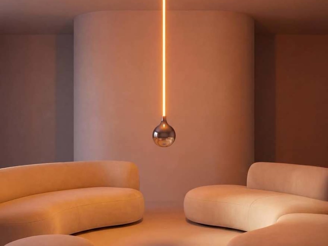
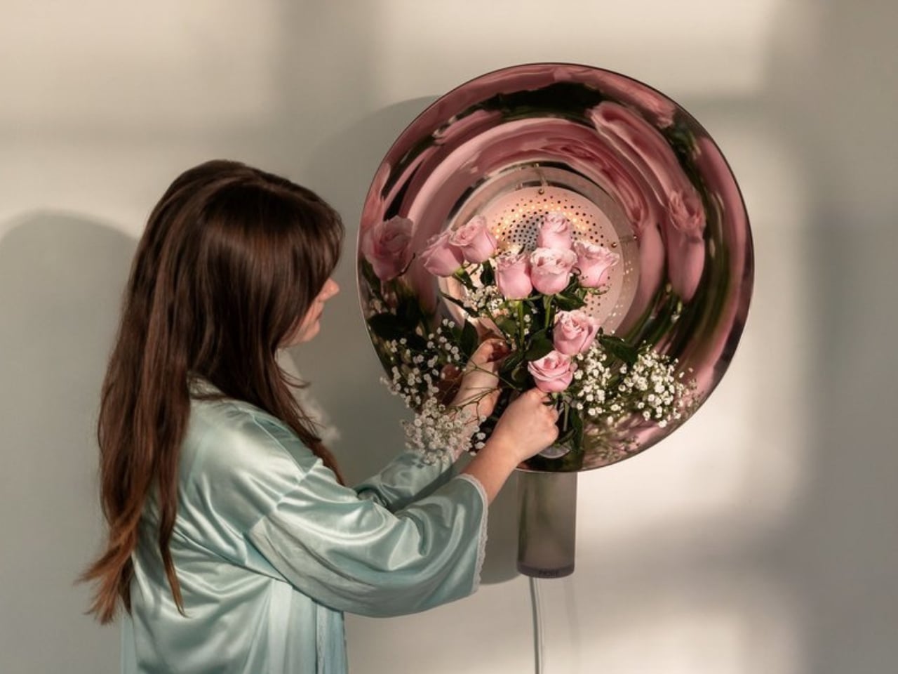
Fiore is a wall-mounted sconce, but to call it only that would be selling it short. At its core, it’s a multisensory piece that combines light, living flowers, and fragrance into a single wall-mounted object. The concept is elegantly simple: a built-in vase holds real blooms, and a signature scent designed to complement their natural aroma diffuses into the room. You’re not just looking at a beautiful light fixture; you’re experiencing it. You smell it. You watch the flowers change as the week goes on.
Designer: Jimmy Rojas
![]()
The design came out of Jimmy Rojas’ time at the Savannah College of Art and Design, and it’s been collecting recognition ever since. Fiore earned a Silver at the International Design Awards in the Conceptual Products category, was a People’s Choice honoree at the 2025 NYCxDESIGN Awards, and made its way to Salone Satellite in Milan, one of the most competitive stages for emerging designers in the world. These aren’t small accolades. They signal that the design community is paying attention, and for good reason.
What makes Fiore feel particularly relevant right now is the way it taps into something a lot of us are quietly craving: interiors that actually engage more than just our eyes. Biophilic design, the idea of bringing natural elements into our living spaces, has been a conversation in design circles for years. But Fiore takes that concept and makes it literal in the most delicate way possible. A real flower in your wall, radiating fragrance into the room. No screen, no app, no complicated setup. Just nature, light, and scent.
![]()
I’ll be honest, I have a slight bias here. I’ve always believed that the best design doesn’t announce itself loudly. It earns its place in a room by making life feel slightly better, slightly richer, in ways you notice over time rather than all at once. Fiore operates on that frequency. It’s the kind of object you come home to and slowly appreciate more as the days pass.
It’s also worth looking at how Fiore fits into the current interior design moment. Maximalism is back with force, from statement furniture to bold wallpapers to gallery walls stacked floor to ceiling. Within that landscape, Fiore manages to feel both bold and restrained. It’s wall-mounted, so it doesn’t compete for floor or shelf space. But it holds living flowers and diffuses scent, so it commands presence in a way that a standard sconce never could. Balancing those two qualities is genuinely difficult to pull off.
![]()
Rojas clearly understands that fragrance is one of the most underused tools in interior design. Candles and reed diffusers have long dominated the home fragrance space, and while they work well, they’re objects that sit on a surface and do their thing passively. Fiore integrates scent into the architecture of the room itself, into the wall, which feels like a genuinely new idea. The fact that the fragrance is designed to pair specifically with the real flowers in the vase adds another layer of intentionality that sets this apart from a concept piece that’s merely clever.
![]()
If Fiore moves into full production, there are real-world questions worth asking: how often do the flowers need replacing, what happens in winter when fresh blooms are harder to source, and whether the fragrance component can be made refillable and sustainable. Those aren’t dealbreakers, just the details that turn a great concept into a great product. But as a concept, Fiore is one of the more complete design ideas in recent memory. It knows what it wants to be, and it commits fully. Lighting has always been foundational to how a space feels. Fiore is simply asking whether it couldn’t also shape how a space smells, and how alive it feels. The answer, apparently, is yes.
![]()
The post Fiore Is a Wall Light, a Vase, and a Fragrance All at Once first appeared on Yanko Design.