❌

Vue normale

  • ✇Yanko Design
  • This glowing modular moss panel system might be the coolest way to fix a boring room
    Moss has been on this planet for around 450 million years, which means it predates dinosaurs, continents as we know them, and the concept of a watering schedule. The plant’s actual trick is that it has no roots and absorbs everything it needs directly through its surface, which makes it one of the most low-maintenance living things you could put in a room. Interior designers figured this out around 2015 and started installing living moss walls everywhere from hotel lobbies to coworking spaces,
     

This glowing modular moss panel system might be the coolest way to fix a boring room

13 octobre 2026 à 21:45

Moss has been on this planet for around 450 million years, which means it predates dinosaurs, continents as we know them, and the concept of a watering schedule. The plant’s actual trick is that it has no roots and absorbs everything it needs directly through its surface, which makes it one of the most low-maintenance living things you could put in a room. Interior designers figured this out around 2015 and started installing living moss walls everywhere from hotel lobbies to coworking spaces, at which point the rest of us learned that professional moss wall installation costs roughly what a decent used car costs. A consumer-friendly version of that idea has been weirdly slow to materialize. MOSSLAB designed Moss Hexa around that natural biology, using a soil-free system that reduces day-to-day care while preserving the texture and presence of real moss.

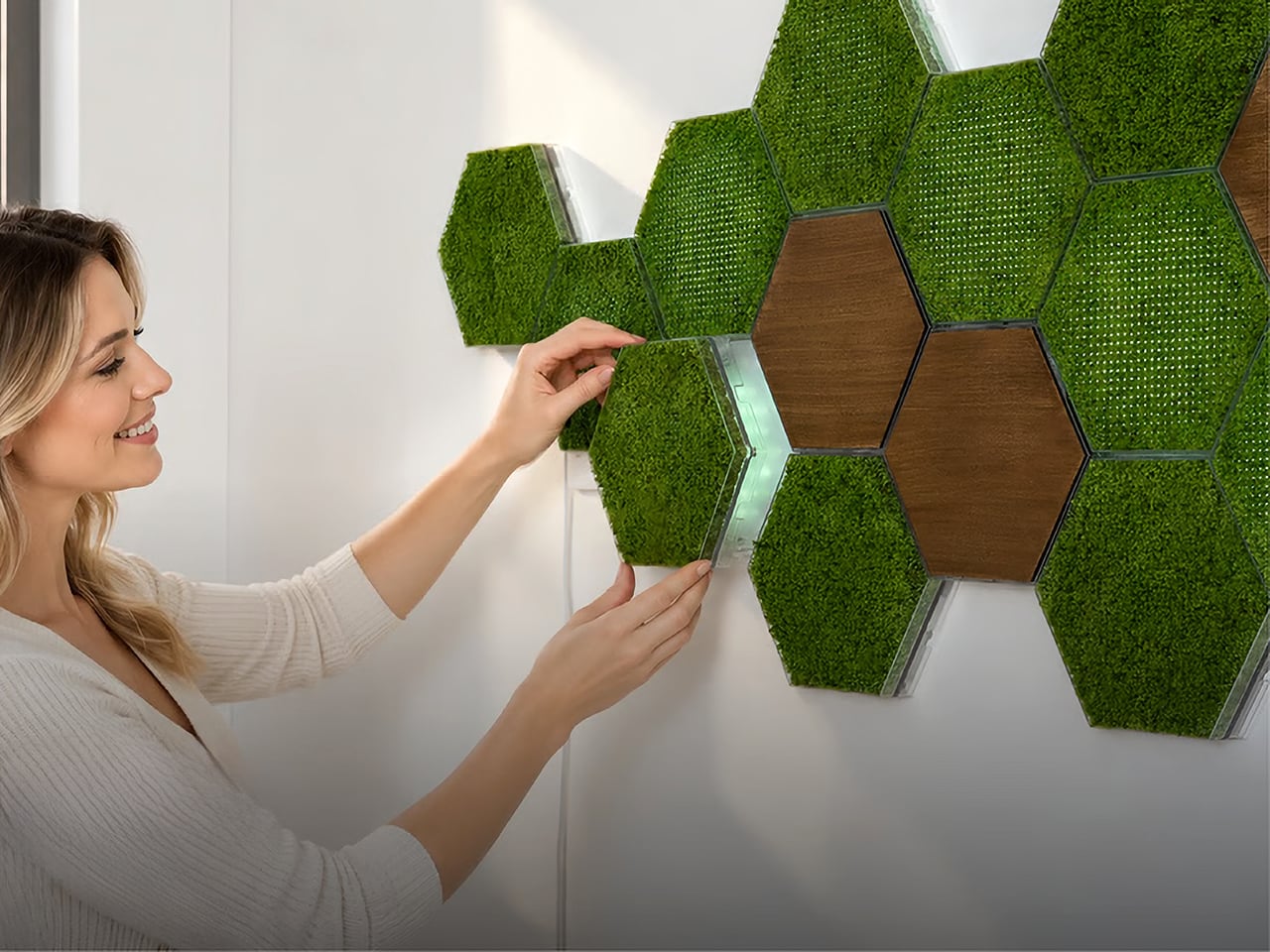
Moss Hexa is a modular moss system using 100% real moss panels in a hexagonal format, mounting via a proprietary magnetic system called HexaLock that lets you click panels into place, rearrange them, or swap them out without tools. Three panel types handle the main use cases: Basic for pure moss texture and color, Light for integrated LED ambient lighting with an auto-dimming sensor and app control, and Wood for warmth and visual rhythm as an accent. MOSSLAB, the South Korea-based studio behind the award-winning Moss Air and Moss Echo, built all three modules to share the same mounting hardware, making the whole system genuinely expandable over time without disturbing anything already on the wall. Pricing runs from a discounted $59 for the 3-panel Basic Starter Pack, with larger configurations available at campaign-exclusive pricing.

Designer: MOSSLAB

Click Here to Buy Now: $59 $90 ($31 off). Hurry, only a few left!

Hexagonal patterns appear throughout nature because they connect efficiently, repeat beautifully, and expand with minimal wasted space, from honeycomb structures to cellular geometry in biological tissue. MOSSLAB’s choice of the hexagon as Moss Hexa’s base unit is a structural decision that determines how the system scales and how freely it grows, and it pays off. Each panel measures 8.27 × 7.09 × 1.42 inches (210 × 180 × 36 mm), and because hexagons share flat, parallel edges on all sides, tiles can cluster in multiple directions without gaps or forced symmetry. The system offers preset configurations of 3, 9, and 15 panels, but the geometry means there’s nothing stopping you from building something in between. It holds up when you pull everything down six months later and try a completely different arrangement from scratch, which is the whole point.

The Basic panel features 100% real moss that is naturally drought-tolerant, requires no direct sunlight, and needs only occasional light misting to stay at its best. Its frame is made from PC and steel, with magnetic components, and the whole panel weighs just 0.75 lb (338 g). The moss retains its color and three-dimensional texture between mistings, helping preserve the natural depth and organic character that distinguish real moss from artificial alternatives. The Wood panel uses the same HexaLock mounting footprint but replaces moss with a warm wood-finish surface, designed as a compositional accent rather than a primary surface. A mostly-moss arrangement with a few Wood panels breaking the pattern is the right call; the contrast reads as intentional interior design rather than a texture experiment that got away from you.

Each Light panel combines 100% real moss with built-in ambient lighting designed to bring out the moss’s natural depth, color, and texture while changing the atmosphere of the surrounding space. Brightness can be adjusted from 1–100%, with a maximum power draw of 7W per panel, while a built-in ambient light sensor automatically adapts the lighting as the environment changes. Light panels connect directly to one another through USB-C-to-USB-C connections, and one Control Hub & Power Adapter can support up to nine Light Panels. The Hexa App provides manual lighting control, lighting presets, and Natural Daily Rhythm scheduling, giving users more flexibility to shape the atmosphere throughout the day.

Sound absorption performance was independently measured by KCL, a KOLAS-accredited laboratory recognized under the international ILAC-MRA framework, using a Moss Echo installation made with the same real moss material used across MOSSLAB’s Moss product line. Covering nearly 11 m² with approximately 300 moss panels, the installation was tested in a large-scale interior setting. The test recorded sound absorption of 27% at common speech frequencies, increasing to 56% at frequencies associated with keyboard typing and up to 65% at higher frequencies associated with background chatter. Those results add a functional layer to real moss beyond its visual and tactile presence. Because the test was conducted using the same real moss material found in Moss Hexa, the takeaway is not that Hexa replaces dedicated acoustic treatment, but that the material itself brings measurable sound-absorbing properties into a system designed to change how a space feels.

Powered by the HexaLock™ magnetic mounting system, each panel snaps into place with a single click, no complicated measuring, no specialist tools, no installation experience needed. You attach the mounting guide to your chosen surface, and both screws and adhesive mounting options are included. The guide handles alignment automatically, so panels sit consistently without leveling. The key design call is that Basic, Light, and Wood panels all share the same HexaLock™ footprint, meaning you can swap any panel type for any other at any point without touching the wall hardware. You can start with 3 Basic panels, add Light panels as a seasonal upgrade, and work toward a 15-panel Signature Styling set across multiple additions, all from the same original wall installation. The dual mounting option, screws for homeowners and adhesive for renters, is a small detail MOSSLAB got right, and the kind of thing you only think to include if you’ve genuinely considered your customer’s actual living situation.

Moss Air earned a CES Innovation Award, an iF Design Award, and an IDEA Design Award, and MOSSLAB has also participated in an open innovation program with a major Korean conglomerate, and in 2025 was the only international startup chosen among five for Panasonic’s Electric Works accelerator program. These are production-level credentials, not concept-stage accolades, and they matter when evaluating a new product that ships internationally. The Basic Starter Pack (3 panels) will be available for $59 during the first 72 hours of the Kickstarter campaign launch, the Light Starter Pack (3 panels) at $99, and the 9-panel Basic and Light Standard Packs starting at $159 and $229, respectively. The 15-panel Signature Styling Pack, which combines Basic, Light, and Wood panels, starts at $339 during the same launch period. Individual add-ons are available at $25 for a Basic Panel, $40 for a Light Panel, and $24 for a Wood Panel, while an additional Control Hub & Power Adapter Set is $23. Estimated U.S. shipping starts at $25 for a 3-panel configuration, with fulfillment estimated to begin in June 2027.

Click Here to Buy Now: $59 $90 ($31 off). Hurry, only a few left!

The post This glowing modular moss panel system might be the coolest way to fix a boring room first appeared on Yanko Design.
  • ✇Yanko Design
  • This chrome skeleton is the most extra mechanical keyboard ever made
    In 2006, Dutch designer Joris Laarman fed a bone growth algorithm into a computer and got a chair that looked grown rather than built. His Bone Chair became a landmark of generative furniture, and every hollowed out, nature mimicking object since has lived in its shadow. Zaha Hadid’s flowing buildings, Ross Lovegrove’s organic forms, and Neri Oxman’s computational experiments all share that family tree. Chairs, buildings, and lamps have all been invited to the reunion. Keyboards, strangely, nev
     

This chrome skeleton is the most extra mechanical keyboard ever made

13 octobre 2026 à 20:30

In 2006, Dutch designer Joris Laarman fed a bone growth algorithm into a computer and got a chair that looked grown rather than built. His Bone Chair became a landmark of generative furniture, and every hollowed out, nature mimicking object since has lived in its shadow. Zaha Hadid’s flowing buildings, Ross Lovegrove’s organic forms, and Neri Oxman’s computational experiments all share that family tree. Chairs, buildings, and lamps have all been invited to the reunion. Keyboards, strangely, never got the invite.

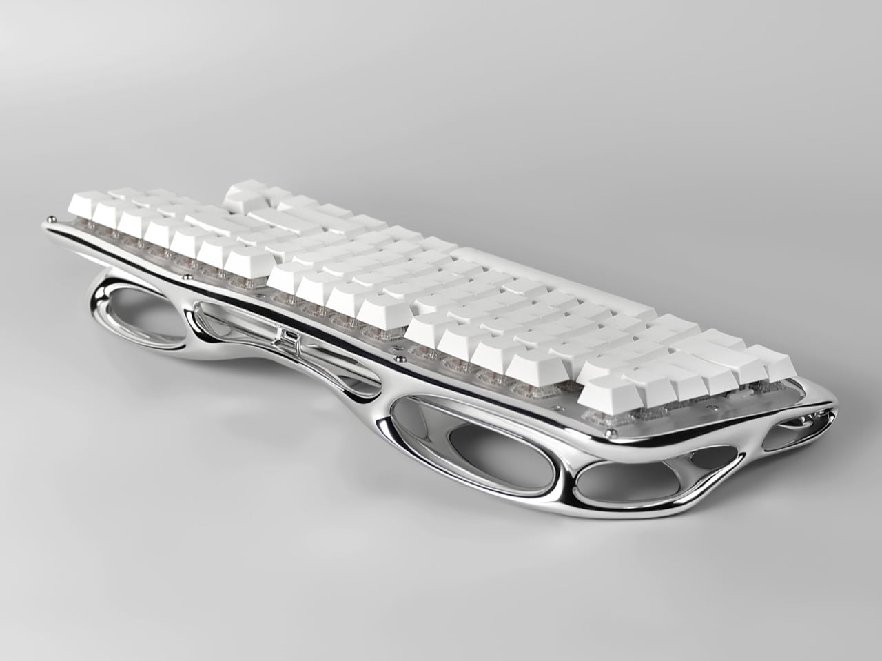
Pulse One, designed by Haoyuan Lu of New York based Pulsekey, is the late RSVP. Its 3D metal printed shell was shaped through generative design and digital sculpting, fusing the palm rest, frame, and bezel into one mirror finish lattice that looks like a skeleton went to a spa. White keycaps float above clear switches, and the board runs wireless. It earned Silver in Consumer Electronics / Computer Accessories at the International Design Awards. This is the most extra keyboard ever made, and I say that with admiration.

Designers: Haoyuan Lu, Hongbin Zhang & Wendi Yu

The closest pop culture cousin is the T-1000, the liquid metal assassin from Terminator 2: Judgment Day in 1991. That movie made flowing chrome terrifying, and designers have been borrowing the look ever since, minus the murder. Pulse One has the same mercury sheen, and every curve catches the light and stretches it into long silver ribbons. Park it on a desk and your monitor suddenly has a reflection to argue with. I would not outrun it, but I would happily let it sit next to my coffee.

Generative design, in general, works by handing a computer a set of goals and letting it propose the shape. The software piles material where a structure needs it and strips it away where it does not, which is why the results look so organic. You can see that logic in Pulse One’s shell, where big elliptical voids sit beside slim, tapering bridges of metal. Lu’s team then refined the form through digital sculpting, which is how a machine’s cold logic ends up looking this graceful. It reads as grown, much like Laarman’s chair did.

Folding the palm rest, frame, and bezel into one piece also cleans up a messy corner of keyboard design. Most boards stack a case, a plate, and a wrist rest, each with its own seams, screws, and opinions about alignment. Pulse One’s shell sweeps all of that into a single form that cradles the switches and tilts them toward your hands. A few small screws are still visible in the photos, so it is not magic, only very tidy engineering. Your wrists get a sculpted perch where a foam strip usually lives.

Under all that sculpture sits a keyboard people can actually live with. The campaign pitches it as wireless, hot-swappable, and good for weeks on a charge. Hot-swap sockets let you pull a switch and drop in another without a soldering iron, and one product photo shows exactly that, a lone switch pulled out beside a stray arrow keycap. The entry also describes the construction as modular, built for maintenance, customization, and renewal. Basically, it looks like a museum piece and behaves like a tinkerer’s board.

The post This chrome skeleton is the most extra mechanical keyboard ever made first appeared on Yanko Design.

  • ✇Yanko Design
  • Twelve New Designs in Six Weeks: Why I Love the new Apple under John Ternus
    For fifteen years, Apple was the friend who shows up to the party an hour late and then insists it brought the best snacks. Tim Cook even had a motto for it, saying Apple was perfectly fine with not being first. Then John Ternus took over on September 1, and the snack table got crowded fast. In six weeks Apple has revealed the foldable iPhone Duo, a HomeView smart display in tabletop and wall-mounted versions, and nine smart home accessories. That makes twelve fresh designs, a wild number for a
     

Twelve New Designs in Six Weeks: Why I Love the new Apple under John Ternus

13 octobre 2026 à 16:30

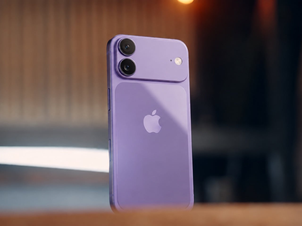
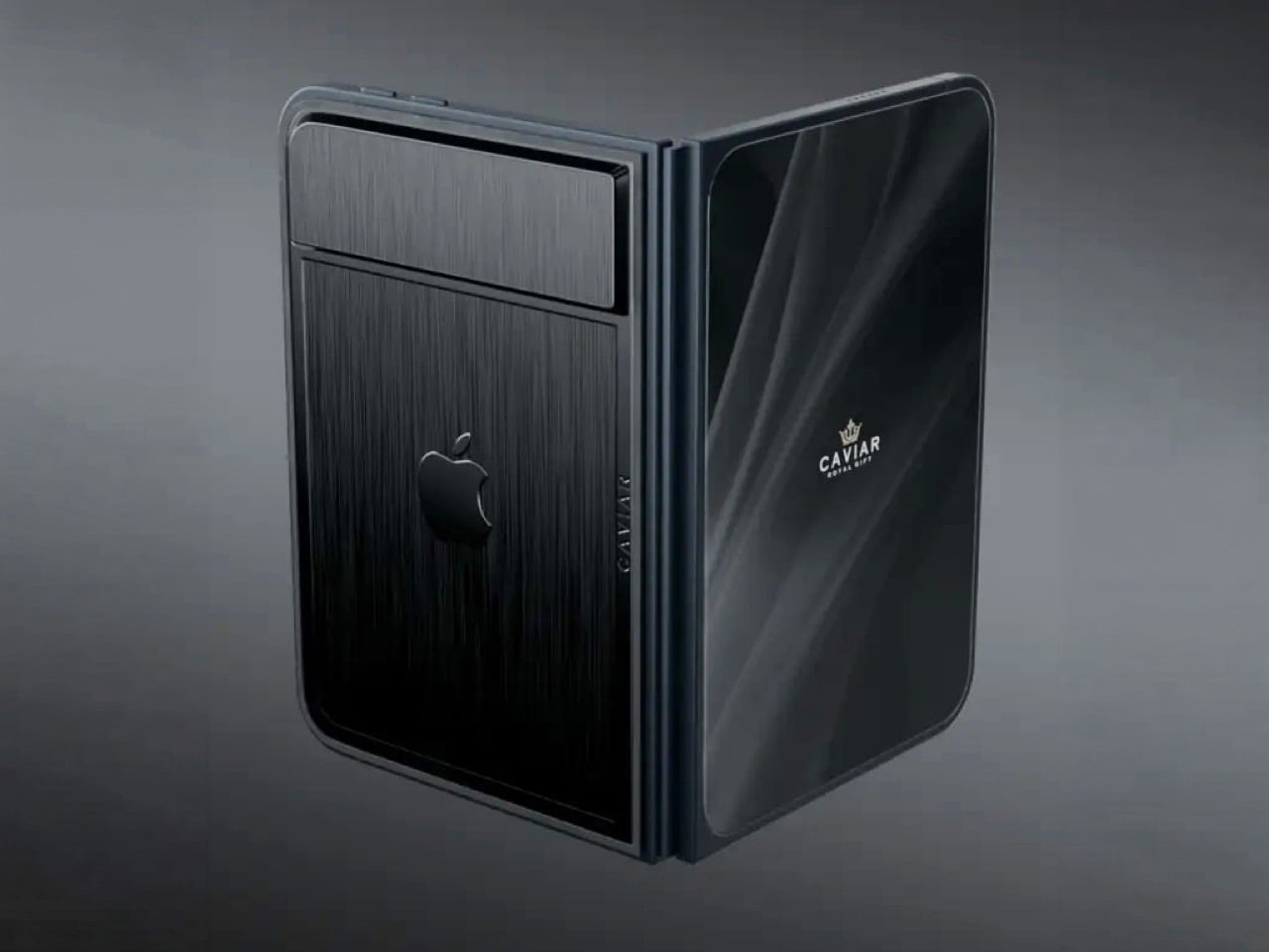
For fifteen years, Apple was the friend who shows up to the party an hour late and then insists it brought the best snacks. Tim Cook even had a motto for it, saying Apple was perfectly fine with not being first. Then John Ternus took over on September 1, and the snack table got crowded fast. In six weeks Apple has revealed the foldable iPhone Duo, a HomeView smart display in tabletop and wall-mounted versions, and nine smart home accessories. That makes twelve fresh designs, a wild number for a company that used to agonize over one hinge.

HomeView and the foldable will get the splashy coverage, but the real fun is the smart home gear. LG Electronics and Schneider Electric helped Apple build a video doorbell, a floodlight cam, outdoor and indoor cams, a deadbolt, two thermostats, and two sensors. They start arriving in December, with prices running from $39.95 for a sensor to $399.95 for the floodlight cam. Apple’s fingerprints are all over them, from the aluminum to the black glass to the rounded shapes. I am here to tell you why that deserves a small celebration.

Designers: LG and Schneider for Apple

The ROKR Taught Apple to Keep the Design and Rent the Factory

In September 2005, Steve Jobs launched the Motorola ROKR E1, a rebadged Motorola phone with an iTunes button and a cap of 100 songs. The demo stumbled and the phone flopped. Jobs looked pained onstage, and you can see why, since Apple’s software was riding around in someone else’s hardware. Roughly sixteen months later he unveiled the iPhone. The ROKR was a stepping stone he needed, taken at exactly the moment he needed it.

Ternus gets to run that play with the lesson already learned. Bloomberg reports that Apple shaped the design, features, and engineering of the LG gear, while LG handles manufacturing and support. The ROKR was Motorola’s design wearing Apple’s software. This is Apple’s design wearing LG’s factory. Ternus joined Apple in 2001, so he watched the ROKR saga from the inside, and the LG deal likely began on Cook’s watch but ships under Ternus, which puts it in his column.

Nine Products, One Family Look From Two Different Companies

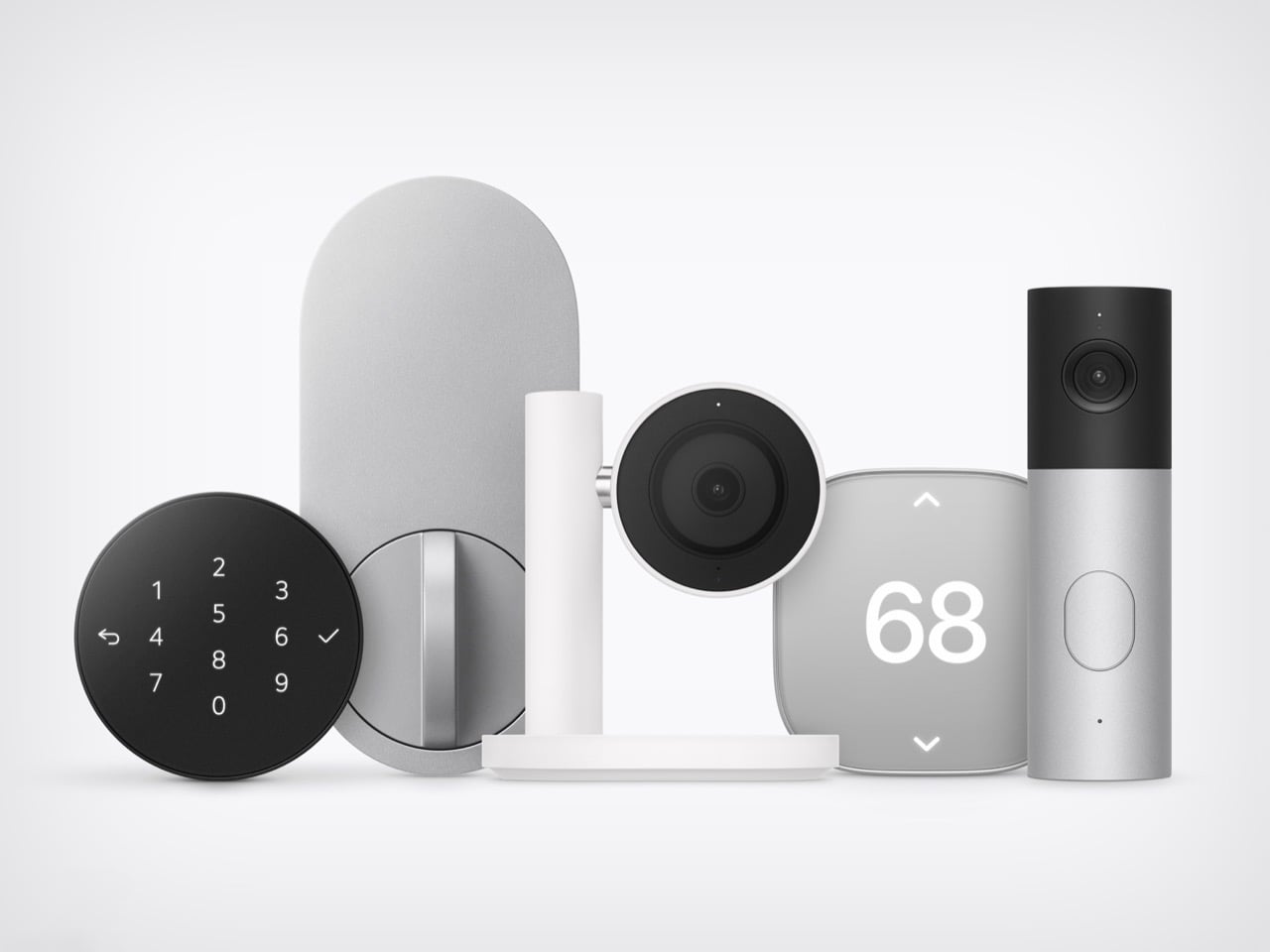
Line up the lock, camera, thermostat, and doorbell from Apple’s photo and the family resemblance is hard to miss. The Smart Deadbolt pairs a black glass keypad with a pill-shaped aluminum plate, and the Video Doorbell is an aluminum column capped in black glass. The Indoor Cam’s round head swivels on a chrome pivot that echoes the hinge on HomeView. The big 68 on the thermostat belongs to Schneider, yet it shares the same soft rounded-square body. Two companies, one look.

The Indoor Cam physically tilts down to stop watching the moment the first person gets home, which is the friendliest privacy gesture I have seen on a camera. The doorbell carries a 2.5K front camera plus a 1080p lens aimed at the doorstep for packages. The deadbolt uses Ultra Wideband (a precise short-range radio) to unlock as you walk up with your iPhone or Apple Watch, and it keeps working without internet. Everything sets up with one tap on your iPhone. There is no extra app and no extra account.

Ternus Ships What Is Ready Instead of Waiting for Perfect

Cook’s way was to wait until Apple could do it perfectly, and the home hub paid for it, slipping from spring 2025 while Siri caught up. Ternus, per Bloomberg, wants Apple to ship faster, experiment more, and spread launches through the year instead of two big events. HomeView still waited for Siri AI, so the rulebook did not change overnight. What changed is that the wait no longer stalls everything around it. The doorbell, lock, cameras, and thermostats are ready now, and Apple is shipping them.

The Home Collection starts at $39.95 for a sensor, with the lock at $349.95 and the floodlight cam topping out at $399.95. It arrives in December in the U.S. and Canada, the cameras and doorbell are also heading to the UK, and select items slip to early 2027. You can see the full lineup in Apple’s Home Collection announcement. Cook’s Apple was the friend who showed up late with the best snacks. Ternus’s Apple shows up on time, brings the snacks, and even has gluten-free options because he listened to his audience.

The post Twelve New Designs in Six Weeks: Why I Love the new Apple under John Ternus first appeared on Yanko Design.
  • ✇Yanko Design
  • Meet Apple HomeView: A weirdly genius combination of the iMac, Watch, iPad, and HomePod
    Apple’s design team apparently raided four different family albums and stitched the best bits into one object. HomeView has the iMac G4’s floating-screen silhouette, Apple Watch-style faces, the iPad’s slab of glass, and a speaker base that recalls the HomePod. I have a soft spot for that sunflower-lamp iMac, so seeing a dome and a tilting display make a comeback in 2026 made me unreasonably happy. Somehow the pile of parts works visually. It looks like a lamp, has a tablet’s touchscreen, and d
     

Meet Apple HomeView: A weirdly genius combination of the iMac, Watch, iPad, and HomePod

13 octobre 2026 à 14:20

Apple’s design team apparently raided four different family albums and stitched the best bits into one object. HomeView has the iMac G4’s floating-screen silhouette, Apple Watch-style faces, the iPad’s slab of glass, and a speaker base that recalls the HomePod. I have a soft spot for that sunflower-lamp iMac, so seeing a dome and a tilting display make a comeback in 2026 made me unreasonably happy. Somehow the pile of parts works visually. It looks like a lamp, has a tablet’s touchscreen, and doubles as a speaker.

Apple announced HomeView on October 13, 2026. It pairs a 7-inch Liquid Retina screen with a domed aluminum speaker base and a stainless steel hinge that lets you tilt the display. An A18 chip and the rebuilt Siri AI run the show, and Apple says it recognizes up to six enrolled users, each with a personalized experience. A wall-mounted version offers the same screen and core functions, though its speaker hardware differs. Both models cost $299 in the U.S., with preorders open and availability scheduled for November 13, 2026.

Designer: Apple

The iMac G4’s Dome and Personality Make a Comeback

The iMac G4 arrived in January 2002 with a 15-inch flat panel hovering over its base. Its sunflower-inspired form emerged from Steve Jobs and Jony Ive’s design discussions; Walter Isaacson’s account credits Ive with suggesting that the screen be separated from the base like a sunflower. HomeView echoes that silhouette but swaps the long swinging arm for a compact hinge, which suits a counter where nobody wants a lamp neck knocking over the olive oil. The tilt adjustment gives you some latitude on a low nightstand or a tall kitchen island.

The G4 showed how much personality a computer’s shape could carry. HomeView’s similar stance makes a box packed with a camera and microphones look friendlier, at least to my eye. A dome with a head-on-neck posture reads more like a desk pet than a gadget, which is a handy trick for something that recognizes faces. The thick black bezel is a taste call I’m happy to defend: it gives the Photos face a proper picture-frame border.

Apple Watch-Style Faces and iPad Glass Decide What You See

The screen looks like it comes from the iPad side of the family: a square slab of glass with rounded corners and a front camera for FaceTime. Center Stage adjusts the framing as people move or join the call. Apple lists a brightness range from 500 nits down to 0.3 nits, allowing the display to dim substantially at bedtime. True Tone adjusts the white balance to ambient lighting. Selected interface elements also respond to your distance, showing simpler information across the room and more detail as you approach.

The faces feel distinctly Apple Watch-like. Photos offers Portrait-style depth effects, while Flow reacts to movement in the room. Snoopy’s animations respond to the time of day, weather, and sporting events, a very Watch way of being useful and adorable at once. Home Modular puts favorite accessories on one dashboard, and Home Camera can stream up to nine video feeds at once. Fan designers were exploring this territory years ago. Justin Latham’s HomePod Nano concept, which we covered in 2023, imagined a speaker with a display running a proposed watchOS fork. It was a fan concept, not an Apple product or working software announcement. HomeView’s Live Activities surface the current song, an active timer, or an incoming Intercom message, bringing that glance-and-go logic to a household screen.

The Speaker Base Does the Heavy Lifting

The base recalls the HomePod, although Apple’s images show a perforated, color-matched exterior rather than the HomePod’s fabric mesh. Small grille holes also run along the display’s lower edge. A down-firing woofer and two force-cancelling passive radiators sit in the base, while two full-range drivers occupy the display.Apple says computational audio uses its silicon and onboard sensors to adjust loudness and bass response in real time.  The wall-mounted model has two full-range drivers but no base-mounted woofer or passive radiators, so the two versions shouldn’t be treated as acoustically identical. HomeView supports multiroom audio alongside HomePod, HomePod mini, and AirPlay-compatible speakers. Intercom also reaches HomeView and HomePod speakers elsewhere in the house.

The original HomePod was announced in 2017 at $349, when we dubbed it Apple’s “tune-busting Fabergé Egg.” Against that historical price, $299 for a speaker, screen, camera, and face recognition looks tempting on paper. You can pre-order HomeView on Apple’s site now, with both the tabletop and wall-mounted models arriving November 13. The tabletop unit ships with a color-matched USB-C cable, while the wall version relies on Schneider Home’s power mounts, which start at $59.95 and are sold separately. Siri AI launches in beta and in English, and Apple is not selling HomeView in the EU for now. Every ancestor in this object was Apple’s bet on a different decade, and HomeView is the first time they all share one counter.


The post Meet Apple HomeView: A weirdly genius combination of the iMac, Watch, iPad, and HomePod first appeared on Yanko Design.
  • ✇Yanko Design
  • CleanMyMac just made a Screen Cleaning Perfume for your MacBook that smells like a pine forest
    Apple’s official answer to a smudgy MacBook screen is a $9 Polishing Cloth, which, to be fair, is ten bucks cheaper than the version everyone roasted in 2021. MacPaw has a more extravagant answer. The Ukrainian company behind CleanMyMac just revealed CleanMyMac Mist, its first physical product, a screen and keyboard cleaner dressed up as a bottle of designer fragrance. One spritz on a microfiber cloth is meant to lift the fingerprints and leave your laptop smelling like a frosty pine forest. Yo
     

CleanMyMac just made a Screen Cleaning Perfume for your MacBook that smells like a pine forest

12 octobre 2026 à 16:30

Apple’s official answer to a smudgy MacBook screen is a $9 Polishing Cloth, which, to be fair, is ten bucks cheaper than the version everyone roasted in 2021. MacPaw has a more extravagant answer. The Ukrainian company behind CleanMyMac just revealed CleanMyMac Mist, its first physical product, a screen and keyboard cleaner dressed up as a bottle of designer fragrance. One spritz on a microfiber cloth is meant to lift the fingerprints and leave your laptop smelling like a frosty pine forest. Your candles, your hand soap and your car already have signature scents, so honestly, the MacBook was overdue.

MacPaw calls the scent Frosted Juniper, picked because juniper grows both in Ukraine, where the company was founded, and in California, where the Mac was born. That’s a little sentimental, and I’m completely here for it. The notes run from camphor, ozone and citrus up top to fir needle, cedar leaf and green apple at the base, and the brief was to smell clean without smelling like a cleaning product. Pole, a design and small-batch production studio in Ivano-Frankivsk, made the glass atomizer, its metal case, and a pink box loud enough to see from across the office. Only 100 bottles exist, and they’re up for grabs via a CleanMyMac Instagram and TikTok giveaway until October 23, so don’t go hunting for a price tag.

Designers: MacPaw & Pole

Every design choice here borrows from the perfume counter instead of the cleaning aisle. A slim glass atomizer sits inside a cylindrical metal case, and its silver-and-gray finish would sit happily next to any MacBook. The box flips the mood entirely, with a hot pink tray holding the Mist, a microfiber cloth, a small brush and a scent card, which is basically a perfume blotter for your laptop. The whole package is designed to live on your desk in plain view, far away from the Windex under the kitchen sink. Le Labo pulled a similar trick with its hand-cast concrete diffuser, treating a fragrance gadget as decor first.

Apple’s own cleaning guide warns against aerosol sprays, so the Mist uses a pump atomizer, and you spritz the cloth instead of the screen. That small habit change tackles a real problem, since one in three US Mac owners in MacPaw’s survey admitted to damaging their machine while cleaning it. The product site names the usual culprits: glass cleaners that strip anti-reflective coatings, paper towels that leave micro-scratches, and the hoodie sleeve that only feels like it’s doing something. Apple Stores reportedly keep their display units spotless with WHOOSH!, so dedicated screen formulas are nothing new. MacPaw’s twist is making the formula something you’d happily smell on your fingertips afterward, though nano-texture displays should still stick to Apple’s dry cloth.

As a longtime CleanMyMac user, I find the whole thing delightfully on the nose. The app launched in 2008, has racked up 29 million downloads sweeping caches, logs and leftover app files out of Macs, and MacPaw says it cleans a million machines a day. For 18 years, “clean” was a metaphor for digital housekeeping, and now the metaphor has a nozzle and a note pyramid. MacPaw handed the physical side to Pole, a design and production center in Ivano-Frankivsk with metal, wood, ceramics and biolab workshops under one roof. Pole specializes in runs of 1 to 500 units and built elements for Ukraine’s pavilion at Expo 2025 in Osaka, so a 100-bottle drop sits right in its comfort zone.

The Mist isn’t for sale, and the only way to get a bottle is a giveaway on CleanMyMac’s Instagram and TikTok that closes at 11:59 PM EST on October 23. MacPaw will pick 10 winners on Instagram and 5 on TikTok, so the odds are slim, but every entrant still gets a 20% CleanMyMac coupon. The full scent breakdown and entry details live at cleanmymacmist.com. Millions of Mac owners already trust MacPaw with the inside of their machines, and I suspect plenty of them would buy a refill to keep the outside smelling like a snowy forest. Frosted Juniper makes a great first edition, though I’m already lobbying for a cozy sandalwood one by December.

The post CleanMyMac just made a Screen Cleaning Perfume for your MacBook that smells like a pine forest first appeared on Yanko Design.

  • ✇Yanko Design
  • Why CMF’s New Milk Carton Speakers Are So Irresistible To Look At
    Everyone has held a milk carton, which is exactly why CMF’s new speakers are so hard to stop looking at. CMF, the budget sub-brand of Nothing, shaped its first Bluetooth speakers like gable-top cartons, a form that toy manufacturer John Van Wormer of Toledo, Ohio, patented in 1915 as the Pure-Pak. Your brain files that silhouette under breakfast, fridge door, and home before it even registers the grille. Then the colors and a deliberately mismatched knob finish the job. Black cylinders and bric
     

Why CMF’s New Milk Carton Speakers Are So Irresistible To Look At

12 octobre 2026 à 15:20

Everyone has held a milk carton, which is exactly why CMF’s new speakers are so hard to stop looking at. CMF, the budget sub-brand of Nothing, shaped its first Bluetooth speakers like gable-top cartons, a form that toy manufacturer John Van Wormer of Toledo, Ohio, patented in 1915 as the Pure-Pak. Your brain files that silhouette under breakfast, fridge door, and home before it even registers the grille. Then the colors and a deliberately mismatched knob finish the job. Black cylinders and bricks have run the speaker aisle for a decade, so a carton is practically a plot twist.

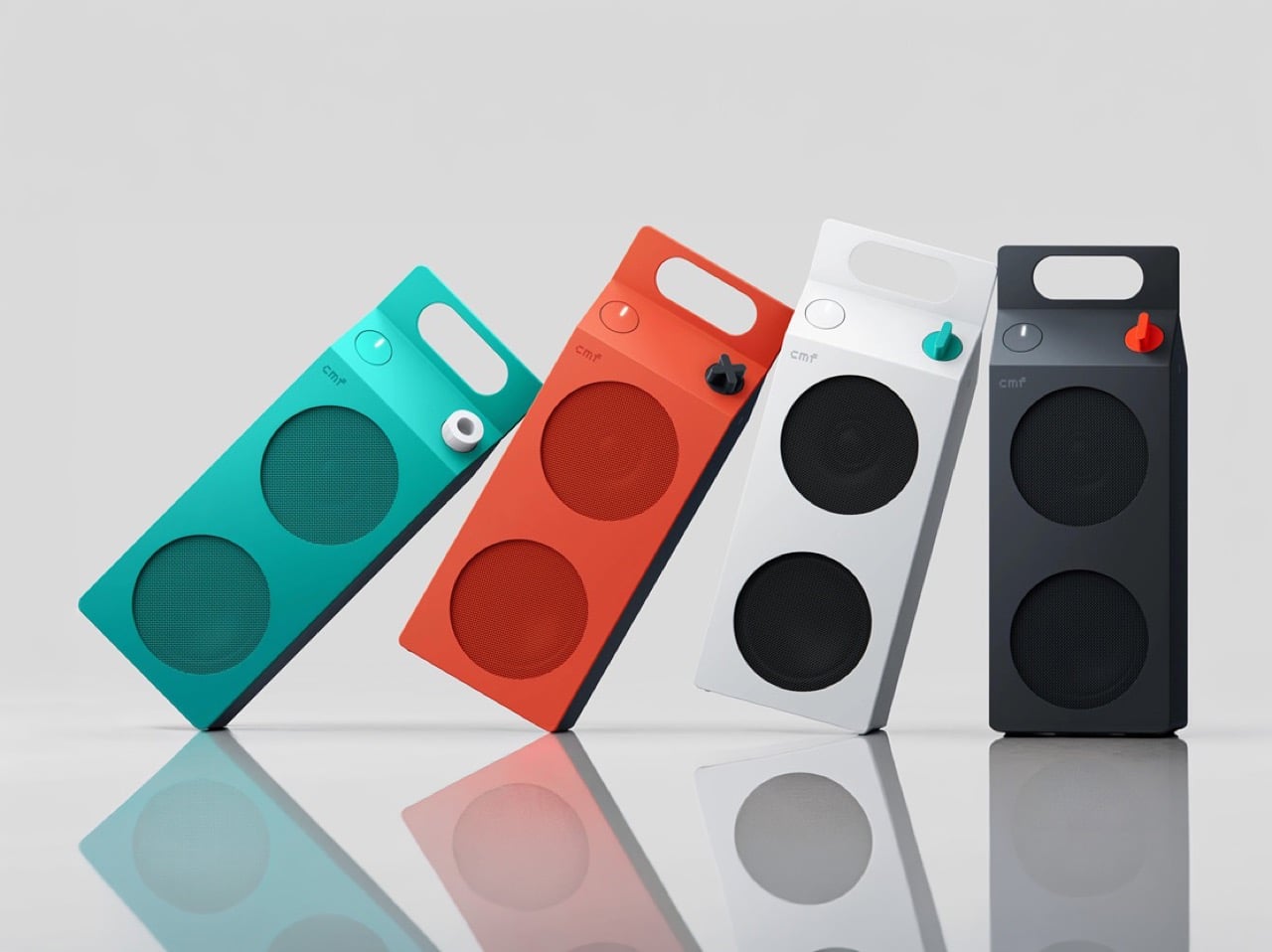
The CMF Speaker S ($59) and Speaker M ($109) launched October 12 at nothing.tech and select retailers, in white, dark grey, turquoise, and orange. CMF’s own product pages cite a carton’s sharp geometry as the inspiration, so the resemblance is deliberate. A sloped roof carries the knob where a carton’s screw cap would sit, and the M’s top fin doubles as a carry handle. The front panel and knob pop off, which turns each speaker into a base for swapping or 3D printing. Both are IP68 too, so the carton can sit on a patio table without a worry.

Designer: CMF by Nothing

The carton’s anatomy, rebuilt as a speaker face

A carton has three recognizable parts, and CMF kept all three. The sloped gable roof becomes the top edge of a folded color panel that wraps over from the front face. The sealed top seam becomes the M’s raised fin with a handle cutout, while the S settles for a round cutout in the corner. The screw cap, a carton upgrade Elopak dates to 1991, becomes a knob you press and turn. On the orange and turquoise models, a dark grey body sits behind the panel, so the color reads like printed paperboard around a core.

The grilles do the decorating. On the turquoise model the mesh is a deeper teal, on the orange it turns brick red, and on white and dark grey it goes black, so each face is a flat field with big circles punched in. The M stacks two of them, the S gets one, and a small pixel-style cmf wordmark sits above like a tiny brand stamp. An oval button with a white light bar is the only other mark besides the knob. That is very few elements, all of them deliberate.

Pint-and-quart proportions and a color system with a mismatched knob

The S measures 5.1 by 3.3 by 1.7 inches (130.5 by 85 by 44mm). The M stretches to 8.7 inches (220mm) tall at the same 85mm width, so the pair reads like a pint and a quart of the same product. Helen Sanematsu’s 1999 AIGA Journal essay on milk packaging argued that cartons get their punch from standing in rows, with color separating the varieties. CMF’s launch imagery lines up four colors across two sizes, which plays that exact game. Put them on a shelf together and you get a dairy case designed by someone with great taste.

Each colorway gets its own knob: a black X on orange, a white ring on turquoise, a red paddle on dark grey, and a teal paddle on white. That deliberate mismatch gives every speaker a single accent, like a bright cap on a carton. Pop it off and you can mix freely or 3D print your own, a habit that follows the CMF Phone 1, whose community printed everything from Lego-friendly backs to a foam dart launcher. We once featured a fan concept for a CMF speaker that went retro radio. The carton is the braver call.

Drivers, battery life, and durability behind the carton

The S pairs a 1.8 inch (45mm) driver with two passive radiators, unpowered diaphragms that beef up bass, for 10W. The M adds a 2.8 inch (70mm) woofer and 0.6 inch (16mm) tweeter for 35W RMS, a continuous power rating. Both claim 18 hours at 50 percent volume with Ultra Bass on, enough for a workday and the commute. A 10 minute charge buys an hour while you hunt for your keys. They survive 30 minutes in nearly 5 feet (1.5 meters) of water and passed a 30 inch (0.76 meter) drop test.

The S costs $59 and the M $109, and both are on sale now at nothing.tech and select retailers. That puts a distinctive object within impulse-buy range, which is unusual for a design this committed. It is the rare budget speaker that makes you want to rearrange a shelf. Van Wormer’s carton survived a century by being easy to hold, stack, and carry, and a portable speaker wants the same three traits. Somebody finally noticed a great speaker shape was sitting in your fridge door all along.

The post Why CMF’s New Milk Carton Speakers Are So Irresistible To Look At first appeared on Yanko Design.

  • ✇Yanko Design
  • Meet the electric beach wagon with smart assist, remote control, and underglow
    I have a theory that the beach wagon was invented by someone who never actually took one to the beach. On pavement it’s a dream, then the sand starts and you’re dragging a shopping cart through oatmeal. BougeRV’s new DuneRover is an electric wagon built around that exact misery. It folds, it hauls up to 198 pounds while moving, and it rolls on wide airless wheels with two motors doing the work. Soft sand is the whole design brief, and every part of the machine answers to it. The handle is the s
     

Meet the electric beach wagon with smart assist, remote control, and underglow

11 octobre 2026 à 21:45

I have a theory that the beach wagon was invented by someone who never actually took one to the beach. On pavement it’s a dream, then the sand starts and you’re dragging a shopping cart through oatmeal. BougeRV’s new DuneRover is an electric wagon built around that exact misery. It folds, it hauls up to 198 pounds while moving, and it rolls on wide airless wheels with two motors doing the work. Soft sand is the whole design brief, and every part of the machine answers to it.

The handle is the smartest thing about it, and it responds to your walking instead of a throttle. Sensors measure how hard you pull and multiply that effort, so a gentle tug gets a gentle nudge and a brisk stride gets a brisk wagon. Head down a dune and it brakes for you, and the moment you let go, it holds its position. Detach the control unit and the wagon becomes a remote-controlled beach truck, rolling ahead from up to 328 feet away. BougeRV, the Houston outdoor brand known for portable fridges and solar panels, built the whole thing.

Designer: BougeRV

Click Here to Buy Now: $539 $899 (40% off). Hurry, only 120 units left! Raised over $40,000.

Airless foam wheels that float instead of dig

The rear drive wheels measure 12 by 4 inches and are made of low-density PU foam, with no air inside. That means no flats, no pressure checks, and no tire coming off the rim halfway across the beach. A patented tread spreads the load across a wide footprint, rolls smoothly, sheds water, and treats turf gently. The front pair are 10-inch airless wheels in the same material. Wide contact area is the old trick for staying on top of sand, and here it comes with motors attached.

Two brushless geared motors deliver 66 N·m of combined torque, fed by a battery with 880W of peak output. Raw power can be a problem on sand, because spinning wheels just dig a trench. DuneGrip TCS, the wagon’s traction control system, watches for wheel slip and trims torque within milliseconds to stop it. A one-tap beach mode on the handle switches it on. Top speed is 3.7 mph, a relaxed walking pace, and the range runs 5 miles or more with a 165-pound load.

A handle that multiplies your pull and brakes without being asked

BougeRV calls the system RoverDrive Dynamic Assist, and it runs on what the company calls a Multiplicative Assist Algorithm. The handle measures your pulling force in real time and scales the motors in proportion, which is why there is no throttle, no gear shifting, and no direction switch to think about. Accelerate and the wagon accelerates with you. The dockable handle houses a power button, a mode switch, and an indicator light. A trigger-release design lets you empty out the sand that inevitably works its way into the control unit.

Uphill, the wagon holds its speed without extra effort from you, and it is rated for 15-degree slopes (a 26.8% grade) even at full load. Downhill, it brakes on its own. Release the handle on a slope and fail-safe electronic braking engages instantly. That covers a toddler sprinting toward the surf, a dropped pair of sunglasses, and any moment you stop to snap a photo. I like that the safe state is also the default, so letting go is always the right move.

Remote steering from 328 feet and an app with underglow

Undocking the control unit takes one step, and it becomes a 2.4 GHz remote with a range of up to 328 feet. Point it where you want the wagon to go, which frees you to carry the surfboard while the wagon carries everything else. If the signal drops or the remote disconnects, the wagon brakes and holds itself in place. Docking the unit back onto the handle returns you to assisted pulling automatically. There is zero setup and zero menu toggling in either mode.

Through the BougeRV app, you get real-time wagon status, battery levels for both the wagon and the remote, a mileage tracker, and system health monitoring. Firmware updates arrive over the air, and you can pair the remote, set speed and mode, and drive the wagon from your phone. Then there is the underglow, a customizable ambient lighting setup. One tap switches between preset scene modes. A glowing wagon on the sand at sunset is a ridiculous feature, and I would still turn it on.

A 2-pound battery that also charges your phone

The detachable UPP-88 battery weighs 2.06 pounds and measures 7.68 by 3.58 by 1.57 inches, about the size of a large power bank. Capacity is 24,000mAh, or 88.8Wh, which keeps it under 100Wh and airline-approved, with no prior declaration needed. It can discharge at up to 10C, enough to feed the 880W peak output. Fast charging runs through USB-C or XT60 ports at up to 100W. A multi-stage vent and flame-arresting labyrinth are meant to keep a single failing cell from setting off the rest, and the pack carries an IP66 rating.

The battery doubles as a power bank. BougeRV’s figures list up to 4.2 phone charges, 3.4 gaming device charges, 2.2 tablet charges, or 1.1 laptop charges. USB-C output reaches 100W and there is a USB-A port too. A built-in MPPT solar regulator tops it up on the move through an XT60 input that accepts 11 to 28V at up to 100W. BougeRV’s flexible portable panels are compatible, but the panel is sold separately. So the same pack that hauls the cooler can keep the phones alive until sunset.

Storage, folding, and pricing

The bed holds 161.7 quarts (153 liters) inside 600D Oxford fabric, with a side frame that opens to take longer gear like surfboards, secured with an elastic cargo net. Pockets are covered too: a front pocket, inner front and back pockets, and utility hooks. The wagon weighs 50.7 pounds (23 kg) and opens to 41.5 by 23.7 by 47.5 inches. Folded, it shrinks to roughly 23.7 by 12.2 by 28.7 inches, small enough for an SUV cargo area. IPX6 protection covers the whole vehicle, motors and control hub included, so a hose-down ends the day.

BougeRV lists the DuneRover at an MSRP of $899, with launch pricing running from $396 to $539 depending on the offer. A bundle with an extra detachable battery runs $603 against a $1,097 MSRP. The box holds the wagon, battery, remote, charging cable, two wheels, and a manual. Shipping is planned for the US, EU, UK, Canada, Australia, Japan, and Hong Kong, with deliveries expected to start in February 2027. Nobody packs lighter for the beach, so a wagon that keeps your pace is the sensible fix.

Click Here to Buy Now: $539 $899 (40% off). Hurry, only 120 units left! Raised over $40,000.

The post Meet the electric beach wagon with smart assist, remote control, and underglow first appeared on Yanko Design.

  • ✇Yanko Design
  • The Shenzhen Natural History Museum looks like it was carved by water instead of architects
    Most natural history museums look like banks. Big stone steps, columns out front, and a lobby so grand you feel underdressed for a trip to see a stuffed moose. 3XN’s Shenzhen Natural History Museum looks like a piece of riverbank that wandered into town and decided to stay. Its curving walls bend and loop like a river cutting oxbows across a floodplain, with gardens planted on top where the water should be. It’s easily the friendliest-looking museum I’ve seen in a while, and I mean that as a hu
     

The Shenzhen Natural History Museum looks like it was carved by water instead of architects

11 octobre 2026 à 18:30

Most natural history museums look like banks. Big stone steps, columns out front, and a lobby so grand you feel underdressed for a trip to see a stuffed moose. 3XN’s Shenzhen Natural History Museum looks like a piece of riverbank that wandered into town and decided to stay. Its curving walls bend and loop like a river cutting oxbows across a floodplain, with gardens planted on top where the water should be. It’s easily the friendliest-looking museum I’ve seen in a while, and I mean that as a huge compliment.

The museum opened on July 28, 2026, beside Yanzi Lake in Shenzhen’s Pingshan District, six years after we first saw it as a set of competition renders. Danish studio 3XN led the design alongside B+H Architects and local firm Zhubo Design, calling the scheme Delta after the river landscapes that inspired it. It covers roughly 1.13 million square feet (105,300 square meters), making it South China’s largest natural history museum. The roof is a public park you can stroll across without a ticket, and the galleries sit inside five enormous cones. One of those interior spaces holds a spiral staircase so swoopy it could pass for a Frank Gehry sketch.

Designer: 3XN, B+H Architects & Zhubo Design

Seen from above, the building is pure river doodle. Its walls swing out in long, lazy bends and then curl back in, leaving crescents of lawn and trees tucked inside each loop like oxbow lakes that dried up and became parks. Five rounded volumes sit along the curve, a bit like smooth stones the current forgot to carry away. Paths trace the tops of the walls the way a riverside trail follows the water. The footprint was drawn from the bends of the nearby Pingshan River, so the building is basically doing an impression of its neighbor.

The walls are built from vertical fins of Shandong granite, packed so tightly they read like rock that rain has been scratching at for a few thousand years. Those fins shade the galleries while still letting daylight slip through, which counts for a lot in Shenzhen’s subtropical heat. At sunset the stone turns warm and peachy, and every ridge throws a thin stripe of shadow down the curve. Most of the panels are standardized, so a damaged one can be swapped out without anyone noticing. The overall effect is a cliff face, which feels about right for a building that stores fossils for a living.

Cut into that stone are wide arched openings that look like the mouths of sea caves. The main one sits on the south side, linking the busy street to the wetland park behind the museum, so the front door doubles as a shortcut into nature. Reflecting pools stretch out in front, giving the arches mirrored twins in the water. Walking in should feel like ducking under a rock overhang on a hike, minus the risk of bumping your head. 3XN describes these openings as fissures in the cliff, a fancy geology word for a crack that happens to look cool.

Inside, the gray granite gives way to golden marble. Each of the five cones is wrapped in wood-grain marble from Guangxi, with stripes that look like layers of sediment or, if you’re hungry, a really nice slice of tiramisu. Between the cones, a central atrium rises toward a big rooflight, and a staircase spirals up around the core in wavy, uneven rings. This is the Gehry moment, all ripples and swoops, like the Guggenheim’s spiral after a double espresso. The architects named the atrium the Tree of Life, and the stair really does seem to grow upward, branching off onto each floor.

The roof slopes up from the ground like a grassy hill, so getting onto it feels about as formal as climbing a park mound. It’s split into five garden zones, from succulents and tropical plants to species pulled from Chinese literature, which is a very poetic way to sort a lawn. At its tallest the building reaches 118 feet (36 meters), but about half of it stays low to match the school and convention center next door. That keeps the mountain views to the north open for everyone, rooftop picnickers included. The roof is also set up for nighttime stargazing, which might be the best use of a museum ceiling yet.

Shenzhen has a reputation for building fast and building big, and plenty of its megaprojects shout to get noticed. This one speaks in curves, warm stone, and a whole lot of grass, which makes a 1.13-million-square-foot building feel oddly approachable. It also suits the job, since the exhibits inside trace how water, rock, and time shaped everything on the planet. The architecture tells that same story from the outside before you read a single label. I’d bet plenty of kids leave remembering the dinosaurs, and just as many remember the afternoon they rolled down the museum.

The post The Shenzhen Natural History Museum looks like it was carved by water instead of architects first appeared on Yanko Design.
  • ✇Yanko Design
  • This $175 Wii-style Smart paddle turns your TV into a pickleball court
    Pickleball has officially escaped the court. At some point in the last two years, it stopped being ironic and became a lifestyle: parking lots of suburban rec centers filled up, TikTok feeds followed, then came the celebrity investors, the professional leagues, the branded paddle drops, and the kind of mainstream saturation that tells you a sport has officially graduated from niche to undeniable. Getting turned into a Wii-style digital pastime is, at this point, a rite of passage for any sport
     

This $175 Wii-style Smart paddle turns your TV into a pickleball court

7 octobre 2026 à 21:45

Pickleball has officially escaped the court. At some point in the last two years, it stopped being ironic and became a lifestyle: parking lots of suburban rec centers filled up, TikTok feeds followed, then came the celebrity investors, the professional leagues, the branded paddle drops, and the kind of mainstream saturation that tells you a sport has officially graduated from niche to undeniable. Getting turned into a Wii-style digital pastime is, at this point, a rite of passage for any sport that has truly made it. Tennis got there. Golf got there. Boxing, baseball, bowling. MegaShot Pickl+ is the moment pickleball collects that particular badge, and it does so with an actual sensor-embedded pickleball racket for authentic gameplay, not some generic rectangular controller.

The smart paddle pairs with your phone, tablet, or laptop over Bluetooth and sends the game to your TV (via an included cable) for big-screen play, mimicking your real swing movements on screen and firing haptic feedback through the handle on every hit. A split-screen mode lets you play multiplayer on the same screen too, making it a great family entertainer. No court reservation, no weather to negotiate with. The Wii taught an entire generation that swinging something in your living room could feel surprisingly real. Pickl+ is betting that a generation raised on that premise is ready to do it again, this time for the sport that has genuinely taken over the world, and without an extra console to add to the mix. The Starter Edition is on Kickstarter now for $175, down from a planned retail price of $249 and the campaign has been backed 500% in just 24 hours! Pickl+ will be compatible with sports like tennis, ping pong, and badminton with more racket sports planned for the same smart-paddle platform.

Designer: MegaShot

Click Here to Buy Now: $175 $249 (30% off). Hurry, only a few left!

Under the hood, Pickl+ is built around a 9-axis sensor that reads the angle, speed, and arc of every swing for precise motion tracking. The haptic feedback responds distinctly to different kinds of hits, making the on-screen action feel genuinely tied to what your arm is actually doing. The paddle weighs around 300 grams, carries a 2000 mAh battery rated for up to five hours of continuous play, and charges over USB-C. Bluetooth 5.2 handles the wireless pairing, while an MHL cable connects your phone to the TV when the living room demands a proper screen. The app runs on Android 14+, iOS 18+, Windows, and macOS. Setup is as minimal as it sounds: download, charge, pair, connect, play. Unlike the Wii, Switch, or the Meta Quest, no extra console or hardware needed.

Most gaming hardware asks you to adapt to the machine: learn the buttons, the gestures, the control scheme. Pickl+ goes the other direction. You know how to hold a paddle, and you know what a swing feels like. Rather than turning a conventional controller into a sports accessory, Pickl+ turns the sports object itself into the controller. The technology is essentially trying to disappear into the physical experience, which is part of what makes it a more interesting object than just a clever game controller.

Ten-plus game modes ship at launch, including Streak, Practice, Split Mode, Career, Local Multiplayer, Target, and Beach Mode, with more already in the pipeline. VIP unlocks exclusive virtual courts, daily bonus challenges, glowing paddle effects, custom ball trails, and profile cosmetics.

Before the Kickstarter campaign went live, the beta version of the paddle was showcased at New York Toy Fair, where people across different age groups, including gaming enthusiasts and industry experts, got hands-on time with the motion tracking, gameplay, etc. It gave MegaShot an early real-world read on how quickly people understood and enjoyed the experience. Motion gaming can look impressive in a controlled demo; the real test is whether someone can pick up the paddle, understand what to do, and immediately have fun. New York Toy Fair gave MegaShot that read before asking anyone to back the campaign.

MegaShot arrived at this with receipts. Before Pickl+, the company built a smart bat, which sounds hyperlocal until the numbers land: 100,000+ units sold worldwide, 2,700+ Amazon reviews, and ratings above 4.5 across Google, Amazon, the Play Store, and iOS. The Smart Bat earned the team a spot on Shark Tank India, coverage across major publications, and placement on Walmart shelves. Cricket was a demanding proving ground, the kind of sport where precision hardware lives or dies by real player feedback. That foundation gave MegaShot a validated tech stack, a battle-tested supply chain, and the track record that earns trust going into a bigger, more globally ambitious launch.

Pickleball is the entry point for something larger. The same paddle hardware is designed to eventually support tennis, badminton, table tennis, and squash, with the VIP Pass carrying across sports as they are added. That roadmap turns Pickl+ from a single-sport product into a platform for multiple racket-sport experiences, which changes the value calculation considerably. The most globally accessible racket sport of this decade is also, as it turns out, the perfect vehicle for a company that built its credibility in one market and is now ready to find out how far a smart paddle can travel.

The Starter Edition, one smart paddle and an MHL cable, is available at its $175 Kickstarter launch price, versus a planned $249 retail price. Duo packs start at $275 for two paddles with a cable, while the Starter VIP Duo Pack, which throws in a VIP Pass, runs $315.

The Signature Edition, the premium single-paddle option, comes in at $349. The Signature Duo Edition bundles two premium paddles with cables, a VIP Pass, and protective sleeves for $499. Worldwide shipping begins in early 2027, covering the US, Canada, the UK, Germany, Australia, New Zealand, UAE, and India.

Click Here to Buy Now: $175 $249 (30% off). Hurry, only a few left!

The post This $175 Wii-style Smart paddle turns your TV into a pickleball court first appeared on Yanko Design.

  • ✇Yanko Design
  • Apple’s iPhone 18 is getting a ‘cheaper’ A20 chip to keep the overall phone affordable
    Apple has a long habit of handing last year’s brain to this year’s regular iPhone. The iPhone 15 shipped with the A16 chip while the 15 Pro got the shiny new A17 Pro, and nobody stormed Cupertino with pitchforks. It works because people shop for cameras and battery life, and nobody has ever asked a store clerk about die size. The iPhone 18 is about to run the same play with a twist. This time the regular model gets a brand new A20 chip, except it arrives months after everyone else’s. The chip i
     

Apple’s iPhone 18 is getting a ‘cheaper’ A20 chip to keep the overall phone affordable

7 octobre 2026 à 20:30

Apple has a long habit of handing last year’s brain to this year’s regular iPhone. The iPhone 15 shipped with the A16 chip while the 15 Pro got the shiny new A17 Pro, and nobody stormed Cupertino with pitchforks. It works because people shop for cameras and battery life, and nobody has ever asked a store clerk about die size. The iPhone 18 is about to run the same play with a twist. This time the regular model gets a brand new A20 chip, except it arrives months after everyone else’s.

The chip is the A20, and a leaked solder ball map analyzed on Weibo by user 白饭炒白米饭 (reported by Notebookcheck on October 1) suggests it is a slimmed down sibling of the A20 Pro. That Pro chip already powers the iPhone 18 Pro, starting at $1,199, and the iPhone Duo, starting at $1,999. Both reportedly use TSMC’s 2nm process, but the standard version supposedly keeps the AI hardware and trims the GPU, cache, and clock speeds. The base iPhone 18 is expected in spring 2027, and Apple has announced no price or date. So what does Apple cut when it wants a cheaper 2nm chip, and what does it refuse to touch?

Designer: Demon’s Tech

A Smaller Die Than Last Year’s Chip, on a Pricier 2nm Node

The standard A20’s bare die is estimated at 70 to 80 mm², which would make it smaller than the A19 at 82.8 mm² and well under the A20 Pro’s 98.8 mm². A die is the actual slab of silicon, and every square millimeter you shave off means more chips per wafer and a lower bill. On 2nm the savings count for more, since Notebookcheck’s report notes those wafers cost significantly more than earlier nodes. Our own look at the base iPhone 18 pegged its body as basically an iPhone 17 in disguise, so there is no fresh industrial design to pay for either. Apple looks to be spending the budget on silicon instead.

Apple reportedly gets there by halving the cache. The standard A20 is expected to carry 8 MB of L2 cache for its two super cores and 4 MB for its four efficiency cores, which is 50% less than the A20 Pro. Cache is the small, ultra fast memory sitting right next to the processor cores, so a smaller helping can mean slightly more trips out to slower memory under heavy load. It is also one of the most direct ways to shrink a die, because SRAM, the circuitry cache is built from, has scaled poorly on recent chip nodes. Honestly, it is the smartest corner to trim, since you will never see a cache spec on a phone box.

Why the A20 Pro Gets Fancy Packaging and the A20 Skips It

The A20 Pro reportedly uses WMCM, short for wafer-level multi-chip module, which places the processor and its memory side by side instead of stacking one on the other. That layout lets the chip connect straight to the vapor chamber, the cooling plate Apple introduced with the iPhone 17 Pro. Apple says the new Pro design delivers up to 40% better sustained performance than the 17 Pro. The standard A20 is expected to stay with traditional package-on-package, where the memory sits on top of the chip like a hat. A hat is cheap and compact, but it also traps heat right where you do not want it.

Packaging is how Apple reportedly gets the A20 Pro to 4.93 GHz, a figure from the leak analysis that Apple has never confirmed. The standard A20 is expected to clock considerably lower, so it likely does not need the same cooling tricks. Pair that with an expected 5-core GPU against the Pro’s 7 cores, and the gap could show up in a long gaming session. Past base chips trailed their Pro siblings by one GPU core, so a two-core deficit would be wider than usual. The vapor chamber stole the show in the iPhone 17 Pro teardown we covered, and the leak says nothing about the base model getting similar cooling.

The AI Hardware Apple Keeps, and What Spring 2027 Looks Like

The AI side of the chip reportedly survives the cuts largely intact. The leak says the A20 keeps the same dual 16-core Neural Engine as the Pro, the dedicated block that handles on-device AI tasks, along with its own 4 MB cache. The system-level cache, a shared pool of memory every part of the chip can tap, may grow from the A19’s 12 MB to 16 MB. The memory bus is also expected to widen to 96 bits, matching the Pro, which means more data can flow to the chip per second. In real life that means live translation and photo cleanup running on the phone instead of waiting on a server.

The iPhone Duo (the one with the open and close animation we gushed over) runs the same A20 Pro, so Apple’s fall lineup now shares one chip. The base model is expected to follow in spring 2027 with a lighter version of that platform. Apple has confirmed no date, price, or chip for it, so every number here is a leak. The iPhone 17 started at $799 and the Pros just rose $100, so the base model’s price is the number to watch. Back in the A16 days the hand-me-down chip was a consolation prize, but this time the regular iPhone gets a fresh 2nm brain with a little muscle trimmed, a deal I would happily take.

The post Apple’s iPhone 18 is getting a ‘cheaper’ A20 chip to keep the overall phone affordable first appeared on Yanko Design.

  • ✇Yanko Design
  • Corsair’s Xeneon Edge is the Stream Deck you always wanted, but bigger and better
    Elgato unveiled a little box of 15 LCD buttons in 2017, priced at $149.95, and it quietly rearranged how streamers sat at their desks. The Stream Deck got so popular that Corsair bought Elgato’s gaming business in 2018. Then the obvious question hung around for years: what if the buttons were just a screen? A screen can be any button, any dial, any chart, or any chat window, and it never runs out of room for one more shortcut. Anyone who has maxed out a 15-key pad knows that pain. Corsair event
     

Corsair’s Xeneon Edge is the Stream Deck you always wanted, but bigger and better

7 octobre 2026 à 16:30

Elgato unveiled a little box of 15 LCD buttons in 2017, priced at $149.95, and it quietly rearranged how streamers sat at their desks. The Stream Deck got so popular that Corsair bought Elgato’s gaming business in 2018. Then the obvious question hung around for years: what if the buttons were just a screen? A screen can be any button, any dial, any chart, or any chat window, and it never runs out of room for one more shortcut. Anyone who has maxed out a 15-key pad knows that pain. Corsair eventually got around to answering.

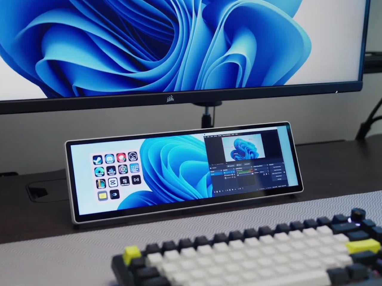
The answer is the Xeneon Edge, a 14.5-inch touchscreen with a 2560 x 720 panel and a 32:9 shape that sits under your main monitor like a very ambitious soundbar. It runs Elgato’s Stream Deck software, so your old button grid gets a much bigger canvas. Fourteen magnets, a detachable stand, and two ¼-20 threads let it live on a desk, a steel panel, or inside your PC case. It lists at $249.99 and is currently $199.99 at Corsair in the US, in all five colors.

Designer: Corsair

A 32:9 strip built for the stuff you only glance at

Think of 32:9 as two 16:9 monitors glued side by side, then shrunk until they fit beneath your main screen. The body measures about 14.6 by 4.7 by 0.8 inches (372 x 120 x 20mm) and weighs roughly 2.2 pounds (1 kg). That works out to about 183 pixels per inch, tighter than the 163 you get on a 27-inch 4K monitor, so small text stays crisp. At 720 pixels tall, the screen is shallow enough to tuck under a monitor without crowding your view. It also rotates to portrait, which turns it into a tall column beside your main display.

On a typical Tuesday, Spotify, Discord, a calendar, and your GPU temps all want a window, and your main screen is busy with actual work. Park them on the Edge and they stay put, one glance away, while you do your thing above. Video calls can live there too, so a meeting you only half-care about stays visible without eating your spreadsheet. Nothing needs alt-tabbing, and nothing gets lost behind a browser with 40 tabs. It’s the same idea as a phone propped next to your keyboard, except it’s wider, brighter, and plugged into your PC.

Fourteen magnets, two threads, and a 360mm radiator slot

Fourteen magnets sit under the plastic shell, so the Edge sticks to any steel surface without scratching it. That includes a steel desk, a PC side panel, a monitor stand, and yes, a fridge, if the cable is long enough. Inside a case, it takes the place of a 360mm radiator, a slot built for three 120mm fans, and it’s thinner than a regular case fan, so clearance is rarely an issue. Corsair also sells an LCD kit that mounts it into the side panel of the Frame 4000D and 5000D cases. Your build’s best view just got a clock and a temperature gauge.

Two ¼-20 threads on the back, the same screw size camera gear uses, let you hang the Edge from Elgato Multi-Mount hardware or any standard AV arm. That mount-anywhere thinking echoes the Elgato accessory support on Corsair’s Platform:6 desk, which we covered at its Gamescom reveal. Corsair also posts free 3D-printable accessories on Printables, including a taller stand that raises the screen behind a keyboard. The community has jumped in too, and Corsair has spotlighted a modular adapter mount from a creator named Naaackers. If you can think of a place for a screen, someone has either printed a bracket for it or soon will.

Widgets in iCUE and the Elgato Marketplace

Plug it in and Windows treats the Edge as an ordinary second monitor, touch included. Corsair’s iCUE software for Windows adds widgets on top: a clock, a calendar, weather, news headlines, a task list, and system sensors showing CPU and GPU temps. Each widget lands on a grid you arrange yourself, so your layout can look as busy or as clean as you like. Since May 2026, widgets live on the Elgato Marketplace, where anyone can download or build one. Corsair’s developer docs even point to AI coding tools as a shortcut, which means a custom widget can start as a plain-English wish.

The widget that matters most for old Stream Deck fans is the native Stream Deck widget in iCUE. It drops a full grid of tappable keys onto the Edge, and you add actions in Elgato’s Stream Deck software exactly as you would for a physical deck. Resize the grid and you get more keys than any 15-button pad ever offered. Launch a game, mute your mic, switch an OBS scene, or toggle your desk lights, each with one tap. Because the screen is still a screen, the same strip can show your calendar or GPU temps right next to the keys.

A bright 2560 x 720 panel and touch that behaves like a phone

The panel is AHVA, Corsair’s version of IPS, so colors and viewing angles hold up even when you’re looking at it from the side. It runs 2560 x 720 at 60Hz with 350 nits of peak brightness, plenty for a desk lit by a window and a lamp. Touch is 5-point capacitive, the same technology as your phone, so tapping, swiping, and pinching all feel familiar. A single USB-C cable with DP Alt Mode (video over USB-C) can carry picture and power when your PC supports it. HDMI 2.0 covers everything else, and Corsair includes cables for both in the box.

Not every shell is black, either. Colors include black, white, and the translucent Atomic Purple, Crystal, and Smoke, which channel the see-through plastic of late-90s gadgets. We’ve seen that look return in a fully transparent Game Boy Color mod and Analogue’s Game Boy Color-inspired Pocket, and it suits a desk accessory just as well. Translucent plastic also makes the stand look like part of the design, not an afterthought. Pick whichever matches your keyboard, or your mood, or your last impulse buy.

Price, rivals, and where the Edge fits on your desk

The Xeneon Edge lists at $249.99 and is currently $199.99 at Corsair in the US, across all five colors, with a three-year warranty and a zero-dead-pixel guarantee. For comparison, Elgato’s 15-key Stream Deck MK.2 lists at $149.99, and the 32-key Stream Deck XL lists at $249.99. The Edge costs the same as the XL and brings an actual display to the party. ASUS makes the closest rival, the ProArt PA147CDV, a 14-inch 32:9 touchscreen with a physical dial and pen support, but it runs a lower 1920 x 550 resolution and sells for roughly twice the Edge’s list price. Cheap no-name touchscreens exist too, but most skip the magnets, the threads, and the Stream Deck tie-in.

The Stream Deck taught desks that a small control room beside the keyboard beats hunting through menus. The Edge keeps that lesson and swaps the plastic keys for pixels that can become anything. It mounts where you want it, shows what you need, and gets better as the widget library grows. It’s available now at Corsair’s site for $199.99 in the US while the current sale runs, with $249.99 as the regular price. Fifteen buttons were a good start. A 14.5-inch strip of pixels is a much better sequel.

The post Corsair’s Xeneon Edge is the Stream Deck you always wanted, but bigger and better first appeared on Yanko Design.

  • ✇Yanko Design
  • MERACH’s new W60 Plus walking pad boasts 12 incline levels, RGB lights, and a built-in Bluetooth speaker
    The under-desk treadmill had its moment, arriving as the perfect sidekick for our sudden work-from-home lives (can you believe it’s been six whole years?). It was the simple, brilliant answer to hitting a step count between calls and emails, and products like the original WalkingPad and the WalkingPad S1 were among the early heroes of that era. We all got one, or knew someone who did, turning home offices into miniature gyms where productivity and light cardio could finally coexist. The problem
     

MERACH’s new W60 Plus walking pad boasts 12 incline levels, RGB lights, and a built-in Bluetooth speaker

4 octobre 2026 à 21:45

The under-desk treadmill had its moment, arriving as the perfect sidekick for our sudden work-from-home lives (can you believe it’s been six whole years?). It was the simple, brilliant answer to hitting a step count between calls and emails, and products like the original WalkingPad and the WalkingPad S1 were among the early heroes of that era. We all got one, or knew someone who did, turning home offices into miniature gyms where productivity and light cardio could finally coexist. The problem was that a lot of those machines, true to their budget price tags, started dying after six months of use. Walking pads got a reputation for being disposable, which was a shame, because the core concept was always worth taking seriously.

The UltraWalk W60 Plus is the clearest expression of what MERACH is building toward: a walking pad engineered with permanence at its core. When we caught the brand at IFA 2026, their first major trade show appearance despite an already loyal following built through e-commerce, the walking pad lineup stood out for build quality at a price most competitors couldn’t match. The W60 Plus has 12 automatic incline levels, a third-party SGS-certified motor, and a weight capacity that would make a full-size treadmill raise an eyebrow. Mood lighting and a Bluetooth speaker come along too, which sounds ridiculous until you realize how much more likely you are to use a machine that’s genuinely fun to be around.

Designer: MERACH

Click Here to Buy Now: $288 $499.99 ($211.99 off, use coupon code “MERACHW60”). Hurry, deal ends in 48-hours!

A 3.5 HP Brushless Motor, SGS-Certified Performance, and a Frame Rated for 330 Lb

The W60 Plus runs on a 3.5 HP peak / 1.25 CHP brushless motor with a 42mm diameter and a Hall sensor for precision feedback. Brushless motors are generally more efficient and longer-lasting than brushed ones, and MERACH claims a lifespan of up to 15,000 hours here, which the brand puts against the 300 to 800-hour lifespans typical of budget walking pad motors. The weight capacity sits at 330 lbs under SGS-certified testing conditions. The heavy-duty steel frame doesn’t wobble under a real walking load, which matters more than most spec sheet comparisons. That stability is what separates a machine you’ll want to use from one you’ll come to resent.

The W60 Plus passed SGS’ performance specs evaluation with flying colors. The noise testing came back at under 54 dB at medium speed with a 75 kg test load, which sits comfortably below the ambient volume of a normal conversation. At maximum speed that figure climbs to 60 dB with load, and 55 dB without, meaning the machine stays apartment-friendly even when it’s working hard. There’s also a one-touch mute function for those moments when you absolutely need silence (hello, important video calls). That noise profile lets you walk and watch TV simultaneously without either experience suffering, which is, honestly, the whole point of this category.

Twelve Auto-Incline Levels, a 16.5-Inch-Wide Deck, and a Speed Range Built for Walking

Twelve levels of automatic incline is the feature that separates the W60 Plus from the flat-and-boring competition, and for a machine in this price tier, it’s genuinely unusual. At the highest setting, it shifts from a gentle recovery walk to something that meaningfully elevates your heart rate, particularly through the posterior chain. The speed range of 0.6 to 4.0 MPH keeps things firmly in walking and light jogging territory, and that 4 MPH ceiling is worth acknowledging: this machine won’t satisfy runners. What it will do is make a 3 MPH incline walk feel like real exercise, which for most desk-workers is entirely the point. Incline transitions between levels automatically and smoothly, a detail that matters when you’re trying to maintain a rhythm.

The running deck measures 16.5 inches wide by 41.3 inches long, which MERACH puts at roughly 33% wider than the category standard. That extra width makes for a more natural gait and stride, particularly for taller users or anyone with broader hips. The non-slip surface handles uphill walking and light jogging without issue, and the length means you’re not constantly worrying about the back edge. Team USA heptathlete Annie Kunz has been using the W60 Plus for active recovery and step accumulation, describing it as a way to “jump on here and there when I feel a burst of energy.” Multi-event athletes log enormous volumes of low-intensity cross-training, and a 12-level incline walking pad fits that workflow more naturally than a flat surface ever could.

Sound-Reactive RGB Lighting, a 5W Bluetooth Speaker, and Triple-Platform App Integration

MERACH’s RGB lighting system reacts to step frequency and syncs to audio rhythm, creating a feedback loop between movement, sound, and visual stimulus that turns a walking session into something engaging. A walking pad that’s boring ends up under the sofa permanently, and MERACH clearly treats engagement as a design constraint, not an afterthought. The lighting pairs with a built-in 5W Bluetooth speaker that fills a home office without headphones, which matters when you’re walking through calls or podcasts. The whole feature cluster borrows from the cozy cardio playbook, acknowledging that for most users, habit formation is a bigger obstacle than physical capability. Make the machine enjoyable to use, and the steps take care of themselves.

Full app integration spans MERACH’s own platform, Apple Health, and Google Fit, with real-time tracking of speed, incline, calories, distance, time, and step count across all three. The MERACH app adds guided routines and custom workout programs, which pushes the W60 Plus into territory where it can coach you through a session rather than simply hosting it. An 8-button magnetic remote handles speed, incline, lighting, mute, start/stop, and program selection, and it docks magnetically to the frame when not in use. The LED display gives you a live readout of key metrics without having to pull out your phone. None of it requires a subscription, which at this price is a genuinely welcome detail.

Zero Assembly, 80 Percent Less Floor Space, and a Price That Makes Sense

The W60 Plus ships fully ready to use: unbox it, plug it into a standard 110V outlet, and step on. No assembly means no instruction booklet, no leftover mystery bolts, and no 45-minute YouTube tutorial that’s supposed to take 10 minutes. When you’re done, the vertical folding support stand lets the machine stand upright, which MERACH says cuts the floor-space footprint by up to 80%. The enlarged front transport wheels make it manageable to move even over carpet, which is where most budget transport wheel designs tend to give up. At 67.7 lbs, the W60 Plus isn’t light, so those wheels are doing real work every time you slide this thing out from under the desk.

The UltraWalk W60 Plus launched on May 26, 2026, and is available now through MERACH’s official website in a Grey finish, with the list price marked at $499.99 and the current sale price at $329.99. MERACH is also offering an extra discount code, MERACHW60, which drops the checkout price to $264.00 with free shipping, a much more aggressive number than this category usually sees for a 12-level auto-incline walking pad. The product page also offers optional accident protection from $29.99. Warranty details are not clearly surfaced in the material provided, so that part is best verified directly on MERACH’s store before publication.

Click Here to Buy Now: $288 $499.99 ($211.99 off, use coupon code “MERACHW60”). Hurry, deal ends in 48-hours!

The post MERACH’s new W60 Plus walking pad boasts 12 incline levels, RGB lights, and a built-in Bluetooth speaker first appeared on Yanko Design.
  • ✇Yanko Design
  • This Expandable LEGO Frame System Finally Solves the Collector Storage Nightmare
    Somewhere in a closet, a perfectly good LEGO minifigure is staring through a plastic bag at the back of a cardboard box. It has a tiny printed face, a surprisingly elaborate hat, and absolutely no audience. Every serious LEGO collector knows the feeling: shelves fill up fast, display cases sell at fixed sizes, and at some point the collection starts living in labeled ziplock bags rather than anywhere it can actually be seen. LEGO has released over 775 Collectible Minifigures across 51 series si
     

This Expandable LEGO Frame System Finally Solves the Collector Storage Nightmare

4 octobre 2026 à 19:30

Somewhere in a closet, a perfectly good LEGO minifigure is staring through a plastic bag at the back of a cardboard box. It has a tiny printed face, a surprisingly elaborate hat, and absolutely no audience. Every serious LEGO collector knows the feeling: shelves fill up fast, display cases sell at fixed sizes, and at some point the collection starts living in labeled ziplock bags rather than anywhere it can actually be seen. LEGO has released over 775 Collectible Minifigures across 51 series since 2010, with new figures arriving three times a year, which makes the storage problem a permanent one for anyone collecting seriously. Stephen Peaple, a British-born collector now based in Perth, Australia, had thousands of them and spent four years building the solution he could not find anywhere.

Finity Frames puts a collection on the wall in a clean white grid. A single frame carries 16 spaces, but removable dividers let you make room for bigger figures or pack in a crowd. When the collection grows, connected frames share edges so the display extends as one continuous piece without visual seams or doubled-up borders. Your next minifigure gets a spot without requiring a complete wall makeover. The system is injection-molded ABS, ships flat-packed, and the connection method that makes all of it work is patented.

Designer: Stephen Peaple

Click Here to Buy Now: $55. Hurry, only 5/16 left!

A Display System That Grows With Your LEGO Collection

Every Finity Frame is built around a seamless edge connection where neighboring frames share a single border, eliminating the doubled-up edge and any visual gap at the join. This is the core innovation that solves the fixed-size problem inherent in every other display case on the market. It means you can start with a single frame for one series of figures and expand outward in any direction, at any time, without having to replace your original investment. The aesthetic is clean and continuous, looking like a single, cohesive unit no matter how large it gets.

This design approach also makes the system more efficient as it grows. Peaple makes the math explicit: the first frame measures 312mm across, and each connected frame adds just 298mm, because one edge is always shared. This reduces material waste and lowers the cost per additional frame. A 2×2 Collector, for instance, cannot be broken apart into four 1×1 Starters, since it doesn’t include the extra pieces. For context, the most prominent fixed-case competitors max out around 190 minifigures. The Finity Frames Showcase holds 1,056, and two of them together can display over 2,100 figures as a single, unified piece.

Built for Customization and Creative Play

Each Finity Frame ships with three horizontal and three vertical internal slats, forming a standard 4×4 grid. This sixteen-space layout is not arbitrary; it maps exactly to one complete Collectible Minifigures series, which traditionally ships with 16 unique figures. The slats are removable in any combination, yielding 64 different internal layouts. You can pull the vertical dividers out, double-stack figures with jumper plates, and a 1×1 Starter can hold up to 88 minifigures. This flexibility lets you create custom spaces for dioramas, larger vehicles, or oversized figures like the Hulk who need a little extra room.

The system’s dimensions are precisely calibrated to the LEGO System of Play. Internal slats are exactly one brick wide, and the frame edges are exactly two bricks wide. Each compartment accepts a 6×8 LEGO plate or four 3×4 minifigure plates, the same stands that come with CMF packs. This means removing the acrylic cover turns the frame into a wall-mounted baseplate where builds can bridge continuously across spaces and frames. Peaple calls this “bridging,” a feature that turns a static display into a creative canvas. Every horizontal slat even has a built-in row of six studs for securing figures or small builds.

Designed for Collectors of All Kinds

A magnetic Perspex acrylic cover protects the collection from dust and removes in a single pull. It’s made from UV-stable material with built-in absorbers to block harmful light, preventing the slow fading that can damage valuable figures over time. The frame itself is a gallery-white, UV-treated ABS plastic, a color choice meant to disappear behind the collection rather than compete with it. Everything is designed to last, preserving the collection while keeping it easily accessible. The magnetic attachment is secure but quick, so you can get to your figures without fussing with clips or latches.

Flipping the horizontal slats 180 degrees turns the studded surfaces into flat shelves, opening the frame to almost any small-scale collectible. A single 64x64x49mm space can hold Funko Pocket POPs, Be@rbricks, Sonny Angels, or even shot glasses. Removing dividers creates double-height spaces for larger items like vintage Kenner 3¾” figures, Super7 ReAction figures, Playmobil sets, or graded collectible cards in their hard cases. It’s a true cabinet of curiosities, designed for a LEGO collection but adaptable enough for just about anything else that deserves a spot on the wall.

Five Sizes, Starting at $65 USD

The five frame sizes run from the 1×1 Starter at 12.3×12.3 inches (up to 88 minifigures) to the 4×3 Showcase at 47.4×35.7 inches (up to 1,056), with the 1×2 Duo, 2×2 Collector, and 3×2 Lifestyle filling in between. All frames run 55mm deep without the cover, 61mm with, and production units are estimated at 0.9 to 1.1kg for the 1×1 (roughly 2 lbs).

Retail pricing starts at AU$99 (roughly US$65) for the Starter and reaches AU$835 (roughly US$550) for the Showcase. Any size can be extended later through a Frame Extender on finityframes.com, where you input what you already own and order only the additional sets required. The system ships flat-packed globally, with US distribution in place through the manufacturing partner.

Click Here to Buy Now: $55. Hurry, only 5/16 left!

The post This Expandable LEGO Frame System Finally Solves the Collector Storage Nightmare first appeared on Yanko Design.
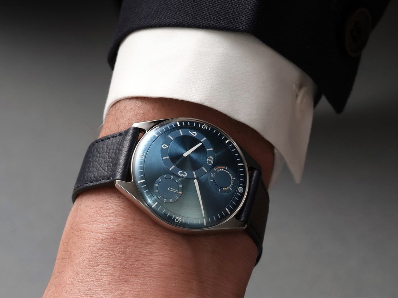
  • ✇Yanko Design
  • After 15 Years, Patek Philippe Returns With a Hand-Wound Chronograph That Stores Energy Like a Bow
    Perpetual calendar chronographs are Patek Philippe’s version of a solar eclipse. They do not happen often, and when they do, everyone stops what they’re doing to look up. The last one arrived back in 2011, which in watch years is basically a geological era. The wait is over, and Patek did not play it safe on the comeback. The new Ref. 5978P-010 is the first watch to combine the brand’s hand-wound chronograph movement with an instantaneous perpetual calendar, a mechanism usually reserved for its
     

After 15 Years, Patek Philippe Returns With a Hand-Wound Chronograph That Stores Energy Like a Bow

4 octobre 2026 à 16:45

Perpetual calendar chronographs are Patek Philippe’s version of a solar eclipse. They do not happen often, and when they do, everyone stops what they’re doing to look up. The last one arrived back in 2011, which in watch years is basically a geological era.

The wait is over, and Patek did not play it safe on the comeback. The new Ref. 5978P-010 is the first watch to combine the brand’s hand-wound chronograph movement with an instantaneous perpetual calendar, a mechanism usually reserved for its most serious grand complications, where every calendar display jumps simultaneously in under 30 milliseconds instead of dragging itself forward at midnight. It debuted at Patek’s seventh Watch Art Grand Exhibition in Milan, limited to 120 platinum pieces at $337,585 each, with a navy dial, red chronograph hands, and calendar text printed in Italian for the occasion. Rare watch, rare city, apparently rare patience too.

Designer: Patek Philippe

The new caliber inside the 5978P-010 is called the CH 29-535 PS QI, a hand-wound movement built from 500 parts. Patek fused two things it already had, the CH 29-535 PS chronograph base from 2009 and the instantaneous calendar module developed for the R CHR 27 PS QI inside references like the 5207, 5308, and 5208. The result is a watch where the day, date, month, leap year, and day and night indicators do not creep forward through the night. Instead, they wait, then snap into their new position together in roughly 30 milliseconds. Even the chronograph’s 30-minute counter gets the same instantaneous treatment, jumping to its next position in one clean motion rather than crawling minute by minute.

Rather than letting a spring slowly push the calendar discs forward, the movement spends hours steadily storing tension, then releases it all at once like a drawn bow. A progressive perpetual calendar can leave a date disc caught mid-flip for a few minutes around midnight, which looks fine until you actually need to read it. This one simply will not do that. The caliber beats at 28,800 vibrations per hour on a Breguet balance spring, and because it is hand-wound, there is no rotor blocking the view, so the full chronograph architecture sits exposed through the sapphire caseback.

The 42mm (1.65 inch) platinum case measures 14.24mm (0.56 inch) thick, with a concave bezel and scalloped lugs lifted from the Calatrava-style cases of the 5208 and 5205, a departure from the ornate shapes Patek usually reserves for this complication. A single diamond sits at 6 o’clock, the hallmark Patek adds to every platinum watch in its catalog. The sunburst navy dial fades into a black-gradient rim around a textured center, with white gold faceted markers and dauphine hands finished in white luminescent coating. Red varnished hands carry the chronograph and small seconds, the only flash of color on the dial. Calendar apertures ring the top of the dial between 10 and 2 o’clock, with the moon phase sitting at 6 and the instantaneous 30-minute counter opposite it at 3.

Patek’s own marketing describes the 5978P-010 as a sporty look timepiece, which is a strange way to describe a platinum perpetual calendar chronograph until you look at it. The navy and red color scheme, paired with a composite strap finished in a fabric weave rather than alligator, borrows more from the Aquanaut than from anything in the formal grand complications catalog. It is not the first time Patek has let its sportier instincts bleed into serious territory. We covered the Cubitus back when it launched, a watch that took the Nautilus’s DNA and reshaped it into something squarer and more divisive. The 5978P-010 is a subtler version of that same impulse, applied to a complication that has spent 85 years dressed for black tie.

The calendar windows on the 5978P-010 are printed in Italian, so Saturday reads SAB instead of SAT, a detail that only makes sense once you know this watch was built for Milan. The strap repeats the gesture in miniature, with a stopping point stitched in the colors of the Italian flag just before the clasp. Patek built the watch for its seventh Watch Art Grand Exhibition, which opened October 2 inside Milan’s CityOval and runs free through October 18. It is one of seven limited editions made for this stop on the tour, a group that also includes enamel-dialed World Time minute repeaters and three carbon-patterned Calatravas in the same tricolore palette. Altogether those seven references add up to 685 pieces, a genuinely small run by Patek’s standards.

There is a catch for anyone outside Italy who wants this watch: all seven Milan editions, including the 5978P-010, sell exclusively through Patek retailers inside the country. Buyers elsewhere wait for one to surface at auction, where past exhibition pieces have historically carried a premium over retail. At $337,585, this was never going to be an impulse buy, and the exclusivity only adds to that. What sticks with me is not the price, it is the choice to dress the brand’s most formal complication pairing in a strap that would not look out of place on a dive watch. Eighty five years after the 1518 started this lineage in stern black and gold, Patek just sent its most serious watch out wearing red sneakers, and somehow it works.

The post After 15 Years, Patek Philippe Returns With a Hand-Wound Chronograph That Stores Energy Like a Bow first appeared on Yanko Design.

  • ✇Yanko Design
  • Hilariously Practical USB-C Cable Looks Exactly Like a Construction-Site Extension Cord
    There are exactly zero USB-C cables that anyone has ever called beautiful. They come in black, white, or occasionally braided grey, and they all look identical regardless of who made them or what they cost. Pick any of them out of a drawer at random and there is no way to identify the brand without hunting for a logo. They are just cable, featureless and anonymous, which is fine if everything else on your desk is equally low-key. But once you are running a 160W GaN charger that looks like it be
     

Hilariously Practical USB-C Cable Looks Exactly Like a Construction-Site Extension Cord

4 octobre 2026 à 15:15

There are exactly zero USB-C cables that anyone has ever called beautiful. They come in black, white, or occasionally braided grey, and they all look identical regardless of who made them or what they cost. Pick any of them out of a drawer at random and there is no way to identify the brand without hunting for a logo. They are just cable, featureless and anonymous, which is fine if everything else on your desk is equally low-key. But once you are running a 160W GaN charger that looks like it belongs in a server room, the cable situation starts to feel like it is letting the whole setup down.

Matty Benedetto has been inventing things nobody asked him to invent since 2019, and this one might be his most wearable idea yet. The Extension-C looks exactly like what the name implies: a proper orange extension cord, right down to the rectangular housing on each end, scaled to USB-C. Ten feet long, rated for 60W charging and data transfer, available in safety orange, outdoor green, and stealth black for $25. Yanko Design has been tracking Benedetto’s work since Unnecessary Inventions first went viral on Instagram, and this is probably the first of his creations where the joke and the product exist in exactly equal measure. It is funny. It also ships.

Designer: Matty Benedetto (Unnecessary Inventions / MATTY)

Each end of the cable is a chunky rectangular housing that calls back to the three-prong outlet plug of a classic American extension cord, scaled down to something that slots into a laptop port but keeps all the visual bulk of the original. The ribbed strain relief detailing running down each housing mirrors what you would expect on actual job-site gear, and it reads as a deliberate design choice rather than ornament. “MATTY” is embossed on each connector cap, and it works because it looks like a certification stamp on real equipment rather than a tech brand inserting itself into the aesthetic. The orange body is thick enough to sell the illusion convincingly. At 10 feet, the cord has actual room to coil the way a real extension cord does, and a 3-foot version of this bit would have landed very differently.

Benedetto has been running Unnecessary Inventions out of his Burlington, Vermont studio since 2019, and the archive now sits at 471 entries. Not every invention makes it to MATTY, the retail arm where purchasable products actually live. The ones that do have typically proven themselves with audiences first and shown enough genuine demand to justify manufacturing. The Extension-C making that cut is a meaningful signal about where Benedetto himself rates this one. We covered his work through several roundups in 2019 and 2020, and revisited it in 2022 when he built a clever fix for the Apple Magic Mouse charging problem. His track record for making absurd things that people genuinely want to own is the most consistent thing about him.

The 60W rating handles most phones, tablets, controllers, and lightweight laptops at full charging speed, covering the realistic daily load on any serious desk setup. Pair it with a 160W GaN charger and the combination has a visual logic that is genuinely satisfying: the charger looks like heavy-duty hardware, and the cable finally looks like it belongs beside it. Safety Orange is the obvious pick for anyone committing fully to the construction-site bit. Outdoor Green makes more sense for a balcony or garden setup where orange would look out of place. Stealth Black drops the gag and keeps the form, and I will predict right now it ends up being the best-seller of the three.

The Extension-C sits at $25, which puts it above the no-name cables that come in 5-packs on Amazon but well below the premium braided options from Anker or Belkin. For what you get on the design side, that is a pretty reasonable trade. There is a broader point buried here about what Benedetto has figured out that most accessory brands have not: cables are so visually forgettable that even a small act of design intention reads as remarkable. The Extension-C is his 471st Unnecessary Inventions entry, and it might be the one where unnecessary and useful finally land in the same sentence without any friction between them. Grab one at thatwasmadebymatty.com, preferably in orange, because going halfway on a bit this committed would be a waste.

The post Hilariously Practical USB-C Cable Looks Exactly Like a Construction-Site Extension Cord first appeared on Yanko Design.

  • ✇Yanko Design
  • A 1908 New York building’s discarded fragments got turned into furniture instead of being demolished
    A renovation across the street from Rafael Prieto’s studio offered an unusually good view of his next project. As decorative pieces came off the facade of a Tribeca building, he arranged to save sixteen that were headed for disposal. Most of us would have watched the scaffolding go up and returned to our emails. Prieto, a Mexico-born designer and creative director based in Tribeca, had other ideas. The result is a furniture exhibition that keeps the building’s ornament alive in some very unexpe
     

A 1908 New York building’s discarded fragments got turned into furniture instead of being demolished

4 octobre 2026 à 09:20

A renovation across the street from Rafael Prieto’s studio offered an unusually good view of his next project. As decorative pieces came off the facade of a Tribeca building, he arranged to save sixteen that were headed for disposal. Most of us would have watched the scaffolding go up and returned to our emails. Prieto, a Mexico-born designer and creative director based in Tribeca, had other ideas. The result is a furniture exhibition that keeps the building’s ornament alive in some very unexpected forms.

Prieto spent time with the fragments before turning them into the starting point for tables, chairs, and sculptural objects. Weathered ornament sits against painted birch, sometimes tucked inside a crisp new frame. The resulting furniture keeps its New York address close, even when its shape heads somewhere unexpected. Some pieces carry the actual stone; others borrow only its curves, grooves, and proportions. It is a show that rewards looking twice.

Designer: Rafael Prieto

The building across the street is 366 Broadway, now known as Collect Pond House, a twelve-story Beaux-Arts structure designed by Frederick C. Browne in 1908. It was once home to the Royal Typewriter Company, then became a residential co-op in 1979. The facade is densely ornamented: copper cornices, Greek key detailing, marble columns, and keystones carved into bearded faces that have been watching Tribeca change for over a century. A recent multi-year restoration replaced and conserved 65 terra cotta units. A handful of the pieces removed during that process did not make it back onto the building.

Before cutting anything, Prieto lived with the fragments in his studio for roughly a year and a half. He photographed and scanned each contour and ornament, then layered those images to pull out shapes and combinations that could inform new work. That process produced a design vocabulary rather than any direct copy of the originals. The stepped, ribbed profiles that climb the legs of the red lacquered chair came directly from this translation, somewhere between column fluting and abstracted skyline. It is a method closer to archaeology than furniture-making.

One of the standout pieces has a large carved stone cornice block sitting below a flat black painted tabletop, doing actual structural work. The stone is pale, dense, and loaded with repeating scroll forms, carrying roughly a century of New York weather on its surface. Another piece cages a smaller fragment between vertical black bars inside a cube-shaped form, the stone visible through the gaps like something on display. The medium listing for several works at the gallery confirms “Architectural Fragment” as a named material alongside painted birch. Not every piece carries original stone; some borrow only its shapes.

The all-red lacquered chair is the most confident piece in the show, its legs built from stacked, stepped planes that scanning and layering pulled from 366 Broadway’s fluted piers and molded profiles. Its natural birch counterpart deploys the same vocabulary in warm wood, swapping lacquer for grain and adding red geometric arm brackets at the joints. A console table makes the argument most literally: one end sits on a fabricated red plinth, the other rests on an actual salvaged Ionic stone volute, intact and weather-stained. The two supports are not supposed to match. The gallery describes this contrast as the central thread: the hard and the soft, the historic and the contemporary, running through every piece.

Several of the original keystones sit on the gallery floor unaltered, including one carved bearded face in a plumed helmet still stained with moss and a century of city air. Prieto’s analog photography wraps the walls in large-scale architectural murals, produced in collaboration with Wallpaper Projects. The room ends up feeling closer to a photographed ruin than a white-cube gallery, which is entirely the point. He told Family Style that “New York is its architecture,” and that most people talk about the skyline but “don’t look up.” The show does the looking for you.

‘The Future of the Past’ is Prieto’s second solo show with Emma Scully Gallery and runs through December 12 at the Upper East Side location, open Wednesday through Saturday. Pricing and availability are through the gallery directly. The question the collection keeps circling is whether furniture shaped by a building’s discarded ornament carries any of that building’s memory with it. Prieto does not seem interested in settling that question cleanly. The bearded face on the gallery floor looks like he has made his peace with the whole situation.

The post A 1908 New York building’s discarded fragments got turned into furniture instead of being demolished first appeared on Yanko Design.

  • ✇Yanko Design
  • The VIVIFoCAL S1 Glasses Focus Themselves So Your Eyes Don’t Have To
    Your phone focuses by firing an invisible laser pulse at whatever you’re aiming it at, timing the bounce, and telling a tiny motor to move some glass. The whole loop finishes in a few hundredths of a second and nobody has thought about it since roughly 2017. VIVIFoCAL has taken that identical hardware recipe, a time of flight sensor, a microcontroller and an actuator, and bolted it onto a pair of glasses pointed at the world instead of at your brunch. The S1 measures how far away the thing you’
     

The VIVIFoCAL S1 Glasses Focus Themselves So Your Eyes Don’t Have To

1 octobre 2026 à 21:45

Your phone focuses by firing an invisible laser pulse at whatever you’re aiming it at, timing the bounce, and telling a tiny motor to move some glass. The whole loop finishes in a few hundredths of a second and nobody has thought about it since roughly 2017. VIVIFoCAL has taken that identical hardware recipe, a time of flight sensor, a microcontroller and an actuator, and bolted it onto a pair of glasses pointed at the world instead of at your brunch. The S1 measures how far away the thing you’re looking at is, works out the optical power your eyes need, and mechanically shifts the lenses into position in under 0.1 seconds. It’s autofocus, except the sensor is on your face.

Dr. Zhao, who earned his doctorate at a world-leading university and previously ran an optical R&D laboratory at a major optics company, built VIVIFoCAL around a piece of physics that has not yet been widely adopted by the general public. The S1 uses Alvarez lenses, two complementary freeform elements that change optical power when one slides sideways across the other. Nobel laureate Luis Alvarez patented the principle, and it was then stranded for decades because somebody had to do the sliding. A motor does it now. The result covers 8 inches to infinity in a 40 gram frame, and it launches with VIP pricing from $289.

Designer: VIVIFoCAL

Click here to Reserve Now: $10 (VIP pricing from $289).

A laser, a motor, and the 1967 patent working in the background

Three sensors do the work rather than one. A time of flight laser reads distance, a G-sensor tracks head posture, and an infrared wear detection sensor tells the glasses whether they’re on a face at all, which is how the battery survives being pushed up onto your head mid-conversation. The microcontroller sits between them, converting a distance reading into a lens position and commanding the motor in a single pass. The lenses simply change optical power to match whatever distance you’re looking at, the same job your eyes handle on their own before presbyopia kicks in. VIVIFoCAL calls that loop Instant Focus, and the same time of flight hardware we’ve watched migrate into phones, robot vacuums and door locks is what makes it affordable in eyewear.

Fitting a moving lens assembly, a rangefinder, a motion sensor, a microcontroller, a motor and a battery into something that still reads as eyewear is the harder half of this product. VIVIFoCAL has pushed the electronics into the brow bar and the temple arms, keeping the optical stack shallow enough that the frame sits on a face instead of announcing itself as hardware. The 160.5 x 160 x 43.5mm envelope is ordinary spectacle territory, which is the entire argument. Every packaging decision is downstream of one goal, helping the wearer see clearly across distances without thinking about the machine doing it.

Progressive lenses ask you to tilt your chin… this doesn’t

Presbyopia is projected to affect 2.1 billion people by 2030, and the standard answer for most of them is a progressive lens with three prescriptions blended into one lens, near at the bottom, distance at the top, intermediate smeared between. Finding the right part of the glass means tilting your chin, and the tradeoff is the narrow tunnel vision that progressive wearers describe, with softness creeping in toward the edges. VIVIFoCAL calls its answer Full-Lens Clarity, where the Alvarez lenses deliver one consistent optical power across the whole lens at every setting instead of splitting it into zones. There is nothing to hunt for and less peripheral distortion to work around. I’ve watched that chin-tilt dance play out for years, so the appeal is obvious.

Progressive glasses are generally built around everyday reading tasks, and for closer or more detailed work plenty of wearers still reach for a second pair or a magnifier. S1’s focusing range starts at 8 inches, which brings fine detail inside the same lens handling everything else. VIVIFoCAL demoed the glasses at WonderFest 2026 against a 1/35 scale miniature, the sort of precision hobby work that has kept optical visors and loupes in business for a century, and the testers who work with their hands responded the way you’d expect. One early tester shared that using S1 in a data center was a productivity gain and a huge plus, because he could walk past equipment and read tiny serial numbers without interrupting his workflow to take out extra readers, switch to other glasses, or use additional visual aids. He no longer carries multiple pairs when he leaves the house.

Forty grams, three nose pad sizes, and all-day power

VIVIFoCAL designed around the fact that head sizes and nose bridge heights vary far more than eyewear brands usually admit, which is why S1 ships with flexible spring hinges and three sizes of interchangeable nose pads to adapt across face shapes. The frame lands at 40 grams bare and 50 with the magnetic front clip, built on TR90 temples, the same material that has quietly taken over lightweight frames and wearable arms across the industry. Those numbers matter because forgetting you’re wearing them is the whole point of automating focus in the first place. A 250mAh battery holds up through 8 hours of constant refocusing and refills over USB-C in about an hour, with normal use stretching to a full day. Glasses that can run flat is still a new idea to make peace with.

A separate pair of lenses attaches behind the Alvarez elements, so one pair carries your prescription to see near and far. Magnetic polarized sunglass lenses snap onto the front for outdoor use with adaptive focus still running underneath. The polycarbonate lenses carry anti-reflective and anti-smudge coatings, transmit more than 90 percent of light, and sit inside a field of view above 110 degrees. The app adds a ±0.5D fine-tuning range on top of the automatic correction, which is how the glasses absorb the slow drift of a presbyopic prescription instead of being replaced. Presbyopia correction tops out at 3.5D, so the deepest cases fall outside what S1 can currently handle.

The bet VIVIFoCAL is making on moving glass

The company isn’t chasing this idea alone. Other teams are working on adaptive focus through liquid crystal lenses or eye tracking instead of a mechanical shift, and the category is young enough that the approaches are still diverging. VIVIFoCAL is betting on the refractive route, real glass moving to change optical power rather than a pixelated layer simulating it, and that bet buys the two things that matter most in eyewear you keep on your face all day. S1 holds above 90 percent light transmittance and a field of view past 110 degrees, which is why the image through it behaves like a lens instead of a screen.

Alvarez lenses have been a lab curiosity since 1967 for one reason, which is that the sliding had to be automated by something small enough to live inside a temple arm. Sensors, motors and microcontrollers have finally shrunk far enough to make that trivial, which makes S1 a triumph of packaging, and packaging is where most wearables actually get decided. Autofocus earned its invisibility in cameras by working so fast nobody noticed it, and 0.1 seconds across 8 inches to infinity puts the same disappearing act in front of your eyes. S1 ships with a 1-year warranty, and a refundable $10 deposit locks in VIP pricing at $289 ahead of the official launch, with either the prescription lens service or the sunglass lens bundle included depending on which one you need. Sixty years is a long time for a good idea to wait for its motor.

Click here to Reserve Now: $10 (VIP pricing from $289).

The post The VIVIFoCAL S1 Glasses Focus Themselves So Your Eyes Don’t Have To first appeared on Yanko Design.

  • ✇Yanko Design
  • Designers Already Prototype Hardware – Now They’re Prototyping Demand Too
    Every product that finds its way onto these pages eventually meets the same crossroads: the moment a designer takes the thing public. For physical product creators chasing something original enough that established retailers won’t touch it, Kickstarter remains the most democratic proving ground available. The platform has hosted more than 654,000 campaigns since 2009, drawing over $8.5 billion in pledges from more than 23 million backers, with 2025 marking its strongest year on record. That mom
     

Designers Already Prototype Hardware – Now They’re Prototyping Demand Too

1 octobre 2026 à 20:30

Every product that finds its way onto these pages eventually meets the same crossroads: the moment a designer takes the thing public. For physical product creators chasing something original enough that established retailers won’t touch it, Kickstarter remains the most democratic proving ground available. The platform has hosted more than 654,000 campaigns since 2009, drawing over $8.5 billion in pledges from more than 23 million backers, with 2025 marking its strongest year on record. That momentum creates a seductive and specific trap: creators see the platform’s gravity and assume a beautiful product with a compelling story will naturally convert into backers. A crowdfunding agency called TCF (The Crowdfunding Formula), which holds Kickstarter Premier Partner status and has facilitated more than $520M raised across campaigns, has spent years watching that assumption fail in real time, and what they built to counter it is one of the more disciplined pre-launch processes in the business.

TCF’s methodology, recently published in full detail, centers on a single observation that most campaigns never act on: interest and purchase intent are not the same signal. Emails, follows, and comments cost nothing to give, which is why none of them predict whether a product sells. Validation asks for money, not opinions, and a small deposit on a product that does not exist yet is the closest available proxy for a real backer, because the act of paying is what carries the information, not the amount. The resulting data resolves three decisions most creators make by guesswork: the price, the positioning, and the audience, all settled before a campaign page exists, before ad spend, and before the outcome is locked in, because those are the three things most likely to break a launch and the three most often decided by assumption. It is a design methodology applied to the market, and it deserves the same respect that designers already extend to physical prototyping.

Circular Ring 2

How a $2 Deposit Separates the Buyers from the Browsers

The process runs on Prelaunch.com. A product page goes live showing the product, the visuals, what it does, how it works, and the characteristics that make it different, with no price. Visitors who want to know more leave their email address, which is the interest signal and only that. A second page then opens, presenting the price alongside an offer: put down a deposit today and receive a discount when it launches. Someone who pays has moved from liking the product to paying for a product with no campaign page, no ship date, and no reviews. Someone who does not pay is interested but not convinced, and that is a result too.

The pushback the deposit mechanism reliably attracts is predictable: does $2 actually prove anything about future purchase behavior? The deposit is the part people push back on, but the $2 is not the point. The act is the point. Getting up, finding a card, and typing the numbers in for something with no campaign page, no ship date, and no reviews is a different order of behavior from tapping a heart, and the people who do it are the closest thing to your future backers that exists before you have any. The Circular Ring 2, a smart health ring, funded in just four minutes and crossed $2.5 million in pledges in under 40 days. Products that open with that kind of velocity tend to do so because the audience already knows it wants the thing, and that certainty is built long before a campaign goes live.

Image Credits: TCF

The Rejection Data Is the Brief

The survey is where validation stops being a scoreboard and starts being useful. From the people who reserved, you learn what actually moved them: whether it was the color, the form, a specific function, the price, or the promise, and which features are carrying the product versus which ones you have been overselling. From the people who left an email and then did not pay, you learn something you cannot get anywhere else: exactly where you lost them, and what would change their mind. The color they wanted was not there. The shape was wrong. It looked too heavy. The price was too high. These are the people who were close enough to care and honest enough to walk away, and their answers are a list of things you can fix before the fix costs anything.

This is co-creation in the most literal sense: meeting your potential buyers before you launch, and letting them tell you what to build. A creator who learns that 60% of their non-converting subscribers balked at weight has a design brief, not a marketing problem. A creator who discovers that two colorways were widely expected but absent has a specification list, not a gap in their ad copy. The survey turns a theoretical audience into an actively contributing one, delivering feedback while the product can still absorb it. Kickstarter’s most successful campaigns tend to share that structure: they do not open to strangers, they open to people who were already consulted.

BB-777 Boombox

Why Validation Doesn’t Always Mean Lowering Your Price

Creators tend to assume validation exists to talk them down. It does not. One agency ran validation on a pet product priced at $30 a unit, and the data showed the right price was $40. The creator had been leaving money on the table, and no amount of instinct would have told them that, because instinct in that situation almost always argues for the safer, lower number. No stated-preference survey, no focus group, and no amount of social engagement would have surfaced it, because stated preference and paid behavior are different instruments measuring entirely different things. Validation is where you settle positioning and audience rather than guessing at them, running price variations, testing different messaging, and finding which audience responds before you have committed to a single frame of campaign video. The point is to find the price, the position, and the audience that let the product reach its full potential, and then launch into that.

The validated price sets reward tiers, and the early discount tested during validation is a trigger that has already been watched working, rather than one you hope will. The reserver surveys told you which characteristics did the persuading, which decides your headline, your hero shot, and the order of your video. You are not inventing arguments for the product; you are repeating the ones your buyers already made. Running price variations and messaging tests before a single production decision is committed changes the campaign from a bet into a brief. The learning does not expire when the campaign closes. A validated price, position, and audience are the same three things an e-commerce store runs on, which is what lets a product keep scaling after the campaign instead of peaking with it.

Kode Dot

The Designer’s Instinct Problem and Why Demand Needs Its Own Prototype

The design process and the validation process ask for decisions in different orders, and that difference matters more than it first appears. A designer who arrives at a product through material, form, and function is not naturally thinking about reservation rates. Validation is the design loop pointed at the three things a physical prototype cannot test: what people will pay, how the product should be framed, and who it is really for. Designers already accept this discipline everywhere else; nobody tools up an injection mold without a prototype. A “do not launch” result from this process is a success, saving a creator a year, a production run, and the damage of a public failure. A careful launch protects more than the person running it; it protects the shared resource of backer trust, which every quiet project erodes.

The question worth answering before a launch is not how big a campaign you can build. It is what you can prove before you build it. Whether that discipline becomes standard practice across the crowdfunding ecosystem or remains the habit of the more methodical subset of creators, the underlying argument is one any designer can recognize. You do not ship a mechanism you have not tested. Treating the market as the final untested component, rather than an assumption baked into launch day, is the shift the methodology is asking for. Across hundreds of millions of dollars raised in crowdfunding projects, the cases where testing these three things costs more than getting them wrong are functionally nonexistent.

The post Designers Already Prototype Hardware – Now They’re Prototyping Demand Too first appeared on Yanko Design.

  • ✇Yanko Design
  • Would you pay $14,000 for an iPhone Duo without any cameras?
    Imagine sitting at a table with friends and whipping your phone out. Your friends see it’s a foldable… then as you unfold it, the animation looks suspiciously like the iPhone Duo. Your friends are impressed, they designate you as the group photo taker… and you tell them regrettably that your iPhone Duo has no cameras. Then you add… not only does it not sport any cameras, it also costs fourteen grand. To be honest, that scenario is entirely imaginary. Mainly for a bunch of key reasons. Caviar bu
     

Would you pay $14,000 for an iPhone Duo without any cameras?

1 octobre 2026 à 16:30

Imagine sitting at a table with friends and whipping your phone out. Your friends see it’s a foldable… then as you unfold it, the animation looks suspiciously like the iPhone Duo. Your friends are impressed, they designate you as the group photo taker… and you tell them regrettably that your iPhone Duo has no cameras. Then you add… not only does it not sport any cameras, it also costs fourteen grand.

To be honest, that scenario is entirely imaginary. Mainly for a bunch of key reasons. Caviar built this version of the iPhone Duo for privacy, championing what they call “Privacy, Minimalism, and a Refined Masculine Style.” Someone who sees truth in that ethos isn’t designated photographer material. And if they were, shelling 14k on a phone means you probably have a few extra grand to hire a photographer wherever you go. The only reason someone buys this hare-brained version of the iPhone Duo is because they can. Plain and simple.

Designer: Caviar Global

Removing the camera stack from the back of the iPhone Duo does something unexpected: the phone becomes genuinely beautiful. That rear panel, normally dominated by the triple-lens module, turns into a single flat sheet of satin-finished black titanium. No bumps, no rings, no glass circles competing for visual real estate, just one uninterrupted surface that shifts character depending on the light hitting it. Caviar calls the inspiration “supersonic aviation aesthetics,” which sounds like marketing speak until you actually look at the product photos. A blacked-out Apple logo sits flush in the titanium, the Caviar crown marks the opposite panel in a swept fabric-like texture, and the whole thing looks less like a phone and more like a prop from a very expensive spy film.

Apple’s decision to use Touch ID for the iPhone Duo, abandoning Face ID, turns out to be what makes Caviar’s camera-free execution actually hold up. A Face ID phone needs its front camera array to function as a biometric sensor, so pulling that out would mean a very pretty device that cannot unlock. Touch ID lives in the frame rather than behind the screen, so Caviar could strip the entire camera stack, front hole-punch and rear module both, without breaking anything fundamental. Based on product images, the inner display on the Ultimate appears completely clean, no hole-punch interrupting the screen, which makes the inside as seamless as the outside. Two separate design decisions from two separate companies ended up fitting together better than either could have planned.

Caviar made 19 of these total. Each unit ships in a custom lockable black luxury box, presented the way a jeweler presents a watch rather than the way Apple ships a phone. A smaller gold-colored wooden case inside holds what appears to be a gold-plated commemorative coin, the kind of object that exists purely to make the unboxing feel like a ceremony. The side of the phone is engraved with a serial number too, for exclusivity. Caviar knows exactly who they are selling to, and made sure the packaging matches the energy.

Caviar has been doing this for years, taking flagship Apple hardware somewhere Apple would never go, for clients who appreciate the gesture. The formula is consistent: start with the most premium Apple product on the market, make it rarer, make it more dramatic, and let the price be the final statement. We have covered their gold-plated and titanium iPhone builds here before, and none of them committed this hard to stripping features as a form of self-expression. At $13,990 for 19 units (mind you, that’s just the 512GB variant), the Ultimate is the purest version of the Caviar argument: a phone that costs seven times its base price because it does less, and somehow makes that sound like the point.

The post Would you pay $14,000 for an iPhone Duo without any cameras? first appeared on Yanko Design.

  • ✇Yanko Design
  • Ressence Doesn’t Want Your Watch to Look Like a Watch
    Design Mindset, Yanko Design’s weekly podcast, premieres every week with a new guest and a single animating question: what does it actually take to think differently about a design problem. The show is 23 episodes in, and this episode turns its attention to fine watchmaking via someone who arrived in the industry with no allegiance to its conventions. If a mechanical watch didn’t exist today, and a designer received the brief cold, would they give it hands, a crown, a flat dial? That question o
     

Ressence Doesn’t Want Your Watch to Look Like a Watch

1 octobre 2026 à 15:20

Design Mindset, Yanko Design’s weekly podcast, premieres every week with a new guest and a single animating question: what does it actually take to think differently about a design problem. The show is 23 episodes in, and this episode turns its attention to fine watchmaking via someone who arrived in the industry with no allegiance to its conventions. If a mechanical watch didn’t exist today, and a designer received the brief cold, would they give it hands, a crown, a flat dial? That question opens the conversation and also describes exactly what our guest spent 16 years answering in practice. The result is Ressence, a brand whose watches look like nothing else on the wrist.

Benoît Mintiens is a Belgian industrial designer who, before he ever touched a watch, designed high-speed trains, aircraft cabins, medical devices, leather goods, and even hunting guns. He founded Ressence in 2010, the name a contraction of Renaissance of the Essentials. The Type Three BB2 won the 2024 Red Dot Award Best of Best, and 2026 brought the same recognition to the TMN. His watches are designed in Antwerp, made in Switzerland, produced in limited editions each year, and worn by people who believe the future is brighter than the past. He is a designer who walked into one of the world’s most convention-bound industries and simply refused to accept what he found there.

Designing from the User Outward

When people ask Benoît how he designs a watch, the answer he gives is never the one they expect, because he starts with the relation between the user and the watch rather than with the movement itself. “Usually I start not with the watch. I start with the relation between you and the watch, and that is, I think, a very important step that very often is forgotten.” Most brands were created by watchmakers who always build from the inside out, from the movement to the wearer. As a designer, Benoît works in the opposite direction, from the user inward to the movement. That physical 180-degree reversal of process changes everything about what a watch ends up looking and feeling like.

Designing the relationship is, in Benoît’s view, fundamentally an ergonomic exercise, rooted in a deep study of physiology and how people interact with objects. The ultimate measure of success is disappearance: “The best product is the one you forget when you use it. Invisible. I’m using it, but I’m not even aware of it.” He tells customers who buy a Ressence that he hopes they forget quickly that they are wearing it, and that forgetting is the proof the design worked. In the rapid-fire round, he completes the sentence “the future belongs to designers who stop asking how to make things and start asking” with five words: “How do you want to feel.” That question is where every Ressence begins.

Challenging Industry Conventions

Until the quartz crisis of the 1970s, watchmaking was about precision, quality, and reliability. When quartz movements arrived at a fraction of the cost of mechanical ones, the industry had to reinvent itself to survive. “Watchmaking has found a way to survive by adding this emotional layer on top of their brands, on top of their physical products. It’s not so much about the physical product anymore. And that’s a pity, I think, as a designer.” Any product, Benoît argues, needs to pass through the survival-of-the-fittest logic of natural evolution to reach the next generation. Watchmaking’s functional evolution largely stopped at the quartz crossroads, and Ressence is attempting to pick it up from there.

A product is defined by multiple dimensions: aesthetics, ergonomics, technique, social context, and production. In watchmaking, only the aesthetic dimension has shifted from brand to brand, and the underlying system architecture has been frozen for two hundred years. Ressence repositions every dimension at once. “The way we show the time, the ergonomics, is actually what defines the aesthetics. Is actually the way we make them. Is actually the technique that lies behind. All these things are intertwined, and they all together create what I call this new paradigm.” The whole has to be logical and coherent, or as Benoît puts it, you end up with a Frankenstein.

The Human Connection to Mechanical Objects

Asked why people still choose to wear mechanical watches when a phone tells time more accurately and without winding, Benoît offers a concept he has been developing for years. “I call it the empathy for gears. We have, as humans, we have empathy for gears.” He builds toward the idea through a Titanic thought experiment: a survivor on floating debris must choose which of two strangers in the water to save, the one he spoke with during the voyage, or the one whose language he could never understand. “As a human, you pick the one you have a relation with.” Products operate by the same logic, and we form bonds most naturally with what we can understand and relate to.

A circuit board is opaque; the workings of a mechanical watch are graspable, even to someone with no technical knowledge. “That is the magic of mechanical watches, is that we feel close to them. Let’s not forget, they tick, they make a sound. They need care. You need to wind them. All these elements will generate a bond between you and the product. And that is why I’m a strong believer in mechanical watches.” Each quality that makes a mechanical watch demanding, the winding, the servicing, the ticking, deepens the relationship between wearer and object. That depth of feeling, Benoît argues, is a human need, and it deserves to be designed for.

Ressence’s Innovations and Design Philosophy

Ressence positions itself as a high-end brand, with Benoît drawing a specific distinction between high-end and luxury. Luxury is decorative and emotional, selling prestige and story; high-end means technically and functionally sophisticated, in service of the person using it. “We would believe that a product gets its relevance, its reason of existence, through the way or the quality the product is executing its function.” The most visible outcome of that philosophy is the Ressence Orbital Convex System, or ROCS, which replaces traditional hands with rotating discs requiring approximately 200 components where a standard watch uses four. The design brief Benoît imposed on himself back in 2008, years before the brand existed, made the mandate clear from the start: “Ressence needs to be original, but not marginal.”

The oil-filled dial, defining models from the Type 3 to the Type 7, has an origin in personal memory. Benoît traces it to childhood Mediterranean sailing trips, navigating overnight to Corsica guided only by an oil-filled ship’s compass in the days before GPS. “This image of the compass, an oil-filled system with inside a mechanical thing that turns around, showing the north. I’m pretty sure this has been the thing that has burned in my brains, and I believe the idea of the Type Three must have come from there.” Oil inside the Type 5 diver eliminates refractions between oil, sapphire, water, and dive mask, delivering a clear dial at any depth. The functional improvement is exactly the point: a diver watch you can actually read underwater.

Production, Materials, and the Future

Getting enough watches from suppliers is, after 16 years of operation, still the hardest thing Ressence faces as an organization. A single watch contains around 400 custom-made parts at extreme precision tolerances, and the Ressence dial is curved in three dimensions where almost every other watch is flat, requiring five-axis machining. Some parts pass through twelve different specialized companies before reaching a watchmaker’s desk. “If today I need more watches and I order them, I will only have them in between nine months and two years. There is no industry like that.” Those lead times explain the prices, the waiting, and the limited annual runs; the scarcity is structural, a consequence of producing something this technically complex as an independent brand.

Benoît is clear-eyed about products and unhurried about brand moving forward. Ressence has a product plan mapped for the next eight years, but brand recognition is the harder work and cannot be forced. “Stick to your vision, and move on and be coherent. I think that’s the central thing.” The reference brands held up as aspirational in watchmaking took fifty years to reach that position, and it was a consequence of what they did, not something they actively pursued. On materials, Benoît describes a fascination with mammoth ivory recovered from Siberia, finding its structure “very, very, very beautiful.” Ressence can be found at ressencewatches.com, on Instagram, and in Antwerp, where visitors are always welcome.

The post Ressence Doesn’t Want Your Watch to Look Like a Watch first appeared on Yanko Design.

❌