Vue normale

Il y a de nouveaux articles disponibles, cliquez pour rafraîchir la page.
Hier — 24 octobre 2025Flux principal

Apple Refused to Make Curved Monitors For Decades. Here’s Why…

Par : Sarang Sheth
23 octobre 2025 à 19:15

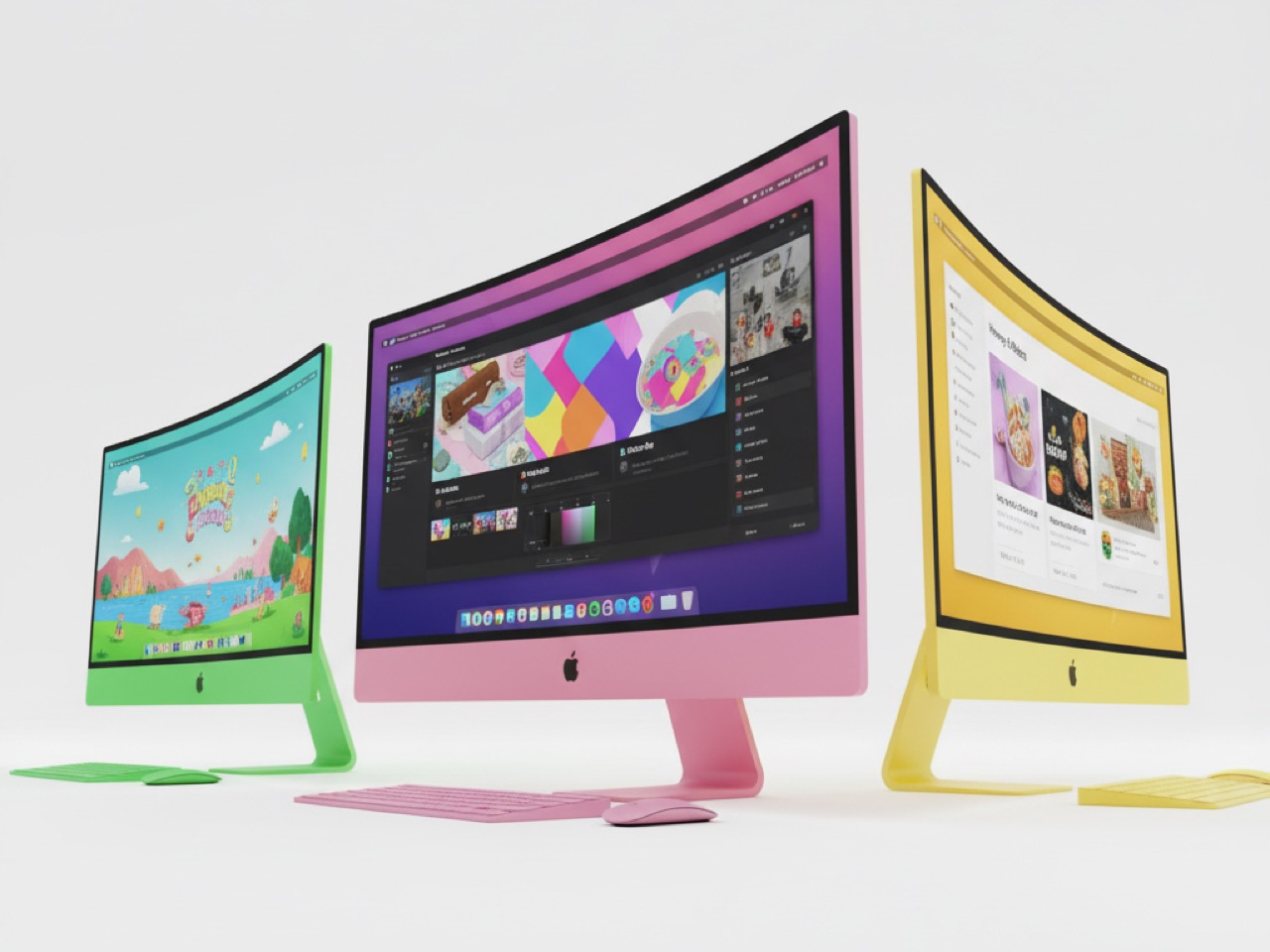
Apple will gladly sell you a $3,500 headset that wraps curved virtual displays around your entire field of view, but the company has never once shipped a physical curved display. Not on the iMac. Not on the Studio Display. Not even a subtle waterfall edge on the iPhone. This isn’t an oversight or technical limitation, it’s ideology made manifest in aluminum and glass.

While competitors like Samsung have built entire marketing campaigns around dramatic curved edges and Dell has carved out profitable niches with wraparound gaming monitors, Apple has spent decades systematically avoiding curves with the dedication of a geometry teacher. The result reveals something fascinating about how the world’s most valuable technology company thinks about design, professional workflows, and the fundamental nature of what a display should be.

Image Credits: Sarang Sheth

The Philosophy Behind the Flat

Jony Ive’s design philosophy wasn’t just about minimalism, it was about what he called “truth to materials.” Every curve had to justify its existence through function rather than form. In his worldview, inherited from design mentor Dieter Rams, displays served a singular purpose: presenting information with maximum clarity and minimum distraction. Curves introduced visual complexity that violated this core principle.

This wasn’t mere aesthetic preference but philosophical conviction. When Ive described transforming the iPad Pro from curved to flat edges, he emphasized how engineering advances allowed them to achieve “a very simple straightforward edge detail.” The language reveals everything: simplicity and straightforwardness were virtues, while curves represented unnecessary complexity. For Ive, flat displays weren’t just better designed, they were more honest about their purpose.

When Curves Meant Compromise

Physical curved displays present real-world problems that Apple’s engineering obsessives couldn’t stomach. Curved monitors suffer from geometric distortion near the edges, making straight lines appear bent, a nightmare for professionals working on architectural drawings or precise graphic design. Color accuracy varies across the curved surface as viewing angles change, violating Apple’s commitment to professional-grade color reproduction.

Manufacturing curved panels also means lower yields and higher costs, factors that conflict with Apple’s desire for predictable production economics. More importantly, curved displays complicate internal component layout, thermal management, and the kind of seamless integration that Apple prizes above flashy visual effects. Every curved panel represents engineering compromises that Apple’s teams historically refused to accept.

The Professional Workflow Justification

Apple positioned their displays squarely in professional creative markets where accuracy trumped immersion. Video editors, photographers, and graphic designers need displays that present images exactly as they’ll appear in final output. Even subtle curvature can introduce distortion that makes precision work difficult, particularly when multiple team members need to view the same screen from different angles.

This professional focus also explained Apple’s resistance to gaming-oriented features like high refresh rates until recently. Curved displays were marketed primarily for gaming and entertainment, markets where immersion mattered more than geometric precision. Apple’s customer base of creative professionals had different priorities, and the company built its display strategy around serving those specific needs rather than chasing broader consumer trends.

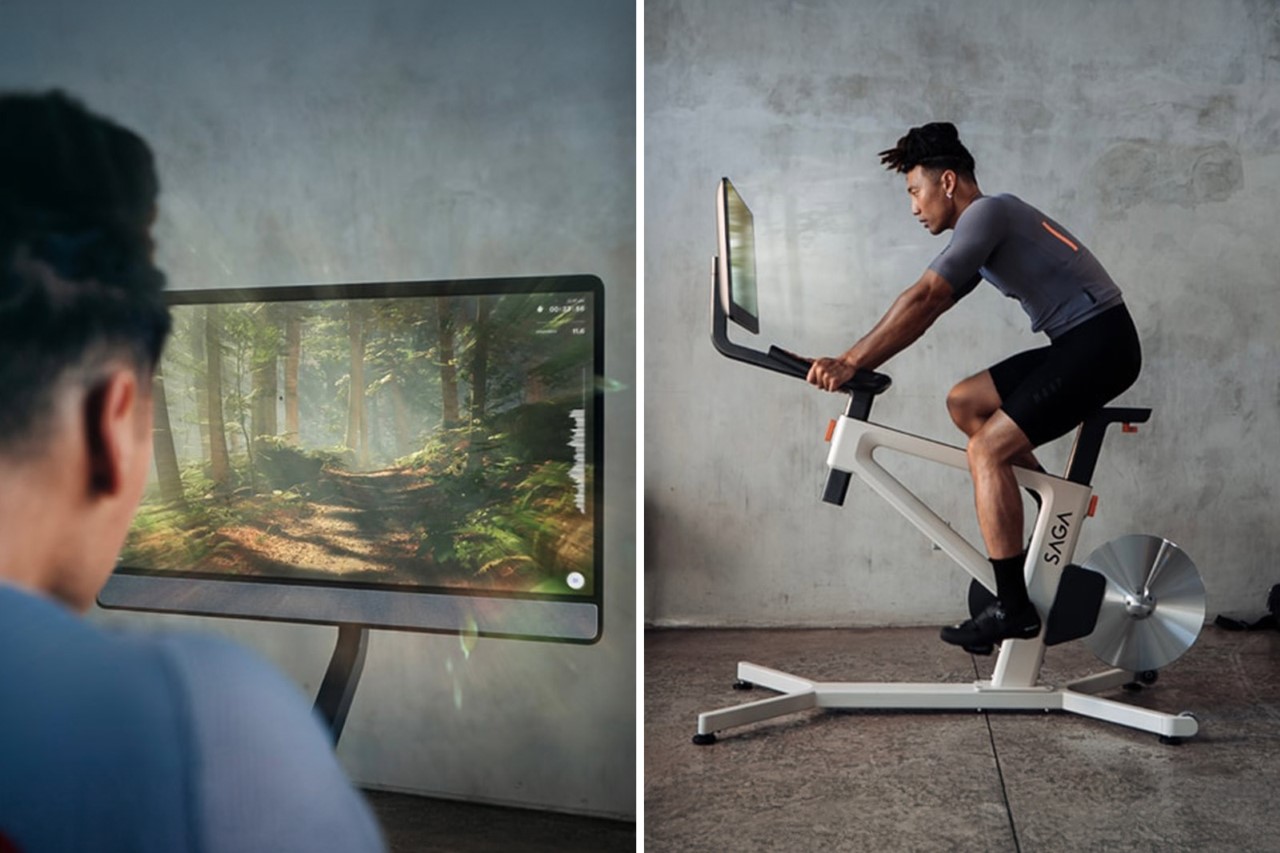
Virtual Reality Changes Everything

The Vision Pro’s enthusiastic embrace of curved virtual displays exposes the fundamental contradiction in Apple’s anti-curve stance. The latest visionOS update explicitly promotes wraparound displays that “curve around your periphery,” creating immersive experiences that physical displays simply cannot match. Apple actively markets these curved virtual screens as superior to traditional flat displays.

Virtual curvature solves every problem Apple cited with physical curved displays. Software can eliminate geometric distortion through pixel-perfect rendering. Color accuracy remains consistent because the underlying pixels are physically flat. Manufacturing yields become irrelevant because curves exist only in code. Most importantly, users can switch between curved and flat presentations depending on their task, providing the flexibility that rigid physical displays cannot offer.

Ive’s Geometric Obsession

Understanding Apple’s curved display aversion requires understanding Ive’s broader design philosophy, which extended far beyond hardware into software. His push for flat design in iOS 7 represented the same geometric principles applied to digital interfaces. He described the aesthetic as “profound and enduring beauty in simplicity,” explicitly rejecting decorative elements that didn’t serve essential functions.

This geometric obsession influenced every Apple product during Ive’s tenure. The iPhone’s evolution toward increasingly flat surfaces, the MacBook’s elimination of curves wherever possible, and even architectural elements in Apple Stores all reflected this commitment to geometric purity. Curves were acceptable only when they served clear functional purposes, never as decorative flourishes or visual drama.

The Industry’s Curved Rebellion

While Apple maintained its flat display orthodoxy, competitors found success with curved screens across multiple product categories. Samsung’s Galaxy Edge phones created differentiation through dramatic curved edges. Gaming monitor manufacturers like ASUS and MSI built enthusiastic followings with ultrawide curved displays. Even premium TV makers embraced subtle curves to enhance viewing experiences.

The curved display market grew substantially without Apple’s participation, suggesting that consumer demand existed for these products. Professional users began adopting curved ultrawide monitors for tasks like video editing and financial trading, undermining Apple’s argument that curves were incompatible with serious work. The company watched potential revenue streams flow to competitors while maintaining its geometric principles.

What Apple’s Missing (and Why They Don’t Care)

Apple’s curved display absence has cost the company market opportunities in gaming, entertainment, and even some professional segments where immersive displays provide clear benefits. Curved ultrawide monitors have become popular among content creators for timeline-based work, offering advantages that Apple’s flat Studio Display simply cannot match. The company has effectively ceded these markets to maintain design consistency.

Yet Apple seems remarkably unconcerned about these missed opportunities, and their Vision Pro strategy suggests why. The company appears to view curved physical displays as a transitional technology, something to skip entirely in favor of the ultimate curved display: virtual reality. Why compromise with curved glass when you can eventually sell customers infinitely configurable virtual curves instead? It’s a typically Apple approach, waiting to leapfrog an entire product category rather than participate in its incremental evolution.

The contradiction between Apple’s curved virtual displays and flat physical ones isn’t really a contradiction at all. It’s the logical endpoint of a design philosophy that values function over form, professional utility over consumer spectacle, and long-term vision over short-term market participation. Apple didn’t avoid curved displays because they couldn’t make them work. They avoided them because curved glass was never the destination, just a waypoint on the road to curved light.

The post Apple Refused to Make Curved Monitors For Decades. Here’s Why… first appeared on Yanko Design.

À partir d’avant-hierFlux principal

Top 5 Ways E Ink Displays Are Transforming Modern Design

Par : JC Torres
6 octobre 2025 à 11:40

Traditional screens have become the digital equivalent of energy vampires, constantly draining batteries while bombarding our eyes with harsh blue light that leaves us squinting and tired. LCD and OLED displays demand constant power to maintain their bright, flashy visuals, creating a world where we’re always hunting for charging cables and dealing with screens that become unreadable the moment we step into sunlight.

E Ink displays offer a refreshingly different approach to this screen fatigue problem. By mimicking the look and feel of actual ink on paper, this technology flips the script on what we expect from digital displays. E Ink dominates the ePaper market, though other electronic paper technologies exist alongside it. The result feels like reading a book instead of staring at a glowing rectangle.

What Makes E Ink Different

Unlike traditional displays that blast light at your face, E Ink reflects ambient light just like a printed page would. The technology uses tiny microcapsules filled with charged particles that rearrange themselves to form text and images. Once an image appears, it stays there without using any power at all, which explains why e-readers can last for weeks on a single charge.

The benefits extend far beyond just battery life. E Ink displays remain perfectly readable in bright sunlight, where your smartphone screen would become a useless mirror. The flexible nature of the technology means displays can bend, curve, and even fold without breaking. For designers tired of working around the rigid constraints of glass screens, E Ink opens up entirely new possibilities.

Designer: Montblanc

The Current Limitations

E Ink comes with certain trade-offs that designers need to understand. Colors remain somewhat muted compared to the vibrant displays we’re used to, though recent advances have brought more life to ePaper screens. Refresh rates are slower, so you won’t be watching Netflix on an E Ink display anytime soon. Large panels can still be pricey, though costs keep dropping as production scales up.

These constraints haven’t stopped designers from finding creative ways to harness E Ink’s strengths. Smart product teams have learned to work within these limitations, focusing on applications where the technology’s benefits far outweigh its drawbacks. The results often surprise people with their elegance and practicality, proving that constraints can spark innovation.

Designer: BOOX

Five Industries Embracing E Ink Innovation

The real magic happens when you see E Ink displays in action across different industries. Each sector has found unique ways to leverage the technology’s strengths, creating products that simply wouldn’t be possible with traditional screens. Here are five concrete examples that show how E Ink is changing the design game.

Laptops: Your Lid Becomes a Canvas

Designer: ASUS

Laptop lids have been boring black rectangles for decades, but E Ink is changing that in fascinating ways. ASUS’s Project Dali concept turns the back of your laptop into a customizable display where you can showcase artwork, display your calendar, or show off your company logo during meetings. It’s like having a digital tattoo for your computer that changes whenever you want it to.

Designer: Lenovo

Lenovo took this concept to market with their ThinkBook 13x Gen 4 SPE, which features an actual E Ink display built into the lid. You can switch between personal artwork during coffee breaks and professional branding during client presentations. The display sips so little power that it barely affects battery life, yet it transforms your laptop from anonymous tech into a personal statement piece.

Transportation: Solar-Powered Information That Actually Works

Public transit signs have always been a nightmare to power and maintain, especially at remote bus stops without electrical connections. Boston’s MBTA solved this problem elegantly by deploying solar-powered E Ink signs throughout the city’s bus stops and Green Line stations. These displays show real-time arrival information, service alerts, and schedules without requiring a single wire to be run.

Designer: MBTA, E Ink

The beauty of these installations becomes obvious during New England winters, when the signs keep working despite snow, ice, and sub-zero temperatures. Solar panels provide enough juice to keep the displays running continuously, while the E Ink technology ensures perfect readability whether you’re squinting through morning glare or trying to read in dim evening light.

Makers: DIY Dreams Made Accessible

The maker community has embraced E Ink displays with the enthusiasm typically reserved for new Arduino boards or 3D printing breakthroughs. Waveshare offers dozens of different E Ink modules that work seamlessly with Raspberry Pi, Arduino, and other popular platforms. Suddenly, creating a custom weather station or smart home dashboard doesn’t require a computer science degree or a massive budget.

Designer: Waveshare

Hobbyists use these displays to build everything from digital art installations to battery-powered information kiosks that can run for months without maintenance. The paper-like appearance means these creations blend naturally into homes and offices, avoiding the harsh, obviously digital look of traditional screens. It’s democratized display technology in ways that would have seemed impossible just a few years ago.

Fashion: Accessories That Change With Your Mood

Fashion has always been about self-expression, but E Ink takes personalization to an entirely new level. The Tago Arc bracelet demonstrates this beautifully, featuring a flexible E Ink display that lets you cycle through hundreds of different patterns using your smartphone. One moment you’re wearing geometric shapes, the next you’re sporting flowing organic patterns that match your outfit perfectly.

Designer: LIBR8TECH

The bracelet never needs charging because it draws power through NFC only when changing patterns. This means you get infinite customization without the hassle of yet another device to plug in every night. It’s the kind of accessory that makes people do double-takes, wondering how your jewelry just changed designs right before their eyes.

Consumer Electronics: Devices That Respect Your Attention

Designer: reMarkable

E Ink device like the BOOX Note Max and reMarkable Paper Pro Move have created an entirely new category of devices focused on thoughtful interaction. These tablets feel remarkably similar to writing on paper, making them favorites among designers, writers, and anyone who takes handwritten notes seriously. The screens don’t strain your eyes during long reading sessions, unlike their LCD counterparts.

The BOOX Palma takes this concept in a different direction by creating a phone-sized E Ink device that looks and feels like a smartphone but focuses entirely on reading and productivity. This pocket-sized e-reader runs Android, giving you access to reading apps, note-taking tools, and basic communication functions without the distracting elements that make regular smartphones so addictive. It’s like carrying a digital book that happens to connect to the internet, perfect for people who want to stay connected without getting sucked into endless social media scrolling.

Accessibility Revolution

E Ink technology has become surprisingly accessible to individual designers and small companies over the past few years. Development kits and reference designs are readily available from multiple suppliers, while costs have dropped to levels that make experimentation feasible for creative projects and startup ventures. You no longer need deep pockets or specialized engineering knowledge to explore ePaper possibilities.

This democratization has accelerated innovation across multiple industries. Designers can prototype E Ink applications quickly and affordably, leading to creative solutions that might never have emerged from traditional corporate research and development cycles. The growing ecosystem of compatible components and software libraries continues to lower barriers while expanding creative possibilities for everyone.

Designer: Pedro Luraschi

Designer: Ashtf

Technical Progress Continues

Recent advances have addressed many of E Ink’s early limitations while opening up new application areas. Color reproduction has improved dramatically, though it still requires thoughtful design consideration. Refresh rates have increased enough to support interactive applications, while manufacturing improvements have reduced costs and increased reliability across the board.

Research into advanced ePaper technologies continues at a rapid pace. Flexible displays that can fold, roll, or stretch are becoming practical for commercial applications. Integration with touch sensors and other interactive elements keeps improving, making E Ink displays suitable for sophisticated user interface design that goes beyond simple text and images.

Designer: Sony (FES U Watch)

A Different Design Philosophy

E Ink represents a fundamentally different approach to digital interaction, one that prioritizes sustainability, comfort, and thoughtful engagement over flashy visuals and constant stimulation. This philosophy resonates with designers who want to create products that enhance human experience without competing aggressively for attention. The technology encourages restraint and purposefulness in ways that feel refreshing in our cluttered digital landscape.

Products built around E Ink often exhibit a deliberate, focused quality that stands out from the noise. The constraints imposed by the technology force designers to think carefully about essential functions and user needs, often resulting in elegant solutions. The influence of E Ink thinking extends beyond products that actually use the technology, shaping broader conversations about conscious design practices.

As E Ink continues to mature, these ideas will likely influence how we think about digital interaction across many different product categories and industries. The technology has already proven that displays don’t need to be bright, fast, and power-hungry to be effective. Sometimes the best solution involves stepping back from the latest and greatest to focus on what actually serves people well.

Designer: E Ink

The post Top 5 Ways E Ink Displays Are Transforming Modern Design first appeared on Yanko Design.

LG StanbyME 2 features detachable 27-inch QHD display on wheels loaded with Dolby audio and visuals

Par : Gaurav Sood
15 juillet 2025 à 15:20

You can expect tablet-level versatility from your TV when LG is involved. The South Korean electronics giant previously demonstrated this with the Go model of its wireless StandbyME, which came in a carry case and was designed for outdoor use. Now making its global debut, the new StanbyME 2 offers even greater flexibility. The device is fully detachable from its movable docking stand, allowing it to function as a tablet, hang on a wall as a digital clock, or serve as an ambient display. And if that’s not fun enough, you could even pack the damn thing in the boot of your vehicle and take it camping or to a family picnic.

But it’s not just the portability and multi-orientation abilities that have changed with the StanbyME 2. The new model features an upgraded resolution and enhanced options for customizing audio, visuals, and controls, which can be tailored to users’ personal preferences and diverse media consumption needs, based on the environment it’s being used in.

Designer: LG

The portability of the StandbyME 2 is made possible by a built-in battery, which provides up to four hours of video playback on a full charge. The battery can be charged by docking the display to the stand and using USB-C. With no need for a constant power source, LG’s new display is convenient for both indoor and outdoor use. Like the original StandbyME, the StandbyME 2 comes mounted on a wheeled docking stand for easy mobility. The device can be detached from its base with a single click to be used independently for binge-watching shows, playing board games, or setting up at your creative workspace.

The StanbyME 2 is not a small device. It features a 27-inch QHD display with a native resolution of 2560 × 1440 pixels. Interestingly, it offers a dedicated 60Hz refresh rate – don’t bother gaming if you were thinking – but of course, you can find many other practical uses for the detachable screen. If you don’t want to use it as a large display tablet, you can use its built-in strap to get it up on the wall, where it’s your photo frame in disguise.

Of course, it’s portable, but the StanbyME 2 measures 623 × 364 × 28.5 mm and weighs 4.3 kg without the stand. So, it’s no kid’s play to fiddle with it or even think of detaching and moving it around. With the stand included, the display weighs 15.2 kg. The device is powered by LG’s α8 AI processor, runs WebOS 24, and supports voice control. The gadget is not dust and water-resistant, and it is advised to be placed away from direct sunlight.

Courtesy of the AI processor, the device can adjust brightness and tone based on ambient lighting. The 10W side-firing speakers (change output automatically based on the screen orientation) support Dolby Atmos and AI Sound Pro for virtual 9.1.2 surround sound. Clear Voice Pro feature helps enhance speech clarity on the device, Dolby Vision delivers cinematic visuals, while Bluetooth 5.1, Wi-Fi 5, HDMI with eARC, a pair of USB 2.0 ports, and a 5V USB port take care of the connectivity. Scheduled to start shipping in the US later this month for $1,400, the StanbyME 2 includes LG ThinQ, Apple AirPlay, Google Cast, and Google Home integration.

The post LG StanbyME 2 features detachable 27-inch QHD display on wheels loaded with Dolby audio and visuals first appeared on Yanko Design.

BYOK is an ultra-minimalist distraction-free writing device with a curious twist

Par : JC Torres
16 juin 2025 à 13:20

BYOK is an ultra-minimalist distraction-free writing device with a curious twist. With so many gadgets shouting for your attention, there is a growing number of devices promising a quiet space for words. From chunky electronic typewriters to sleek E Ink tablets with keyboard cases, the options seem endless. Yet as focused as these tools may be, there is often one big catch: they all come with someone else’s choice of keyboard, and that can make every sentence feel like a struggle.

The clever move with BYOK is to toss the keyboard question right back in your court. Instead of forcing you to adapt to built-in keys, this little device skips the keyboard altogether. What you get is a screen, and nothing but a screen, a pocket-sized monochrome LCD that is just big enough to show what you have written, and nothing more. It is a refreshing take, stripping away every possible barrier between you and your thoughts, leaving only the essentials.

Designer: BYOK

Choosing a keyboard is almost a personal ritual these days. Everyone has a favorite; some like the clack and snap of mechanical switches, and others want a featherlight touch or fancy split layouts. It is as much about comfort as it is about flow. BYOK, short for “Bring Your Own Keyboard,” lets you honor your own style. Whether you are loyal to an old friend or like to mix things up, this device never gets in the way. You pick the keyboard, the device simply follows your lead.

BYOK’s design is as simple as it gets. The thick, candy-bar-shaped device is about the size of a smartphone, but with a bit more bulk and heft. Its monochrome LCD is easy on the eyes and quick to refresh, showing just four lines of text at a time. Pair it up with your favorite keyboard using Bluetooth or USB-C. If your keyboard is old-school USB-A, just grab an adapter and you are set. The magnetic mount on the back is a neat touch, letting you stick BYOK onto any metal surface or pop it onto a stand for the perfect angle. It is the kind of flexibility that feels almost luxurious in its simplicity.

There is a trade-off for all this minimalism. BYOK’s built-in software is as basic as they come. You can type, scroll, and make tiny edits. That is it. Larger edits, organization, and polish all happen later in the companion app. While the device itself keeps your work local or syncs to the cloud, unlocking the app’s full powers means signing up for a subscription, which nudges the price up a bit. Still, for anyone who writes best without noise or clutter, BYOK is a breath of fresh air. It puts the tools in your hands and gets out of the way, making every writing session feel a little more like home.

The post BYOK is an ultra-minimalist distraction-free writing device with a curious twist first appeared on Yanko Design.

BOOX Tab X C goes big with a 13.3-inch E Ink Android Tablet

Par : JC Torres
16 juin 2025 à 08:45

Apple might be busy commanding the spotlight in the tablet world once again, but bigger screens do not always mean fewer headaches. These oversized digital companions can boost what you get done, but they also tend to double the distractions and leave your eyes feeling like they just ran a marathon. It is a classic case of more is not always better, especially when it comes to how much time you spend staring at glowing rectangles.

That is where E Ink, and specifically the BOOX Tab X C, offers a breath of fresh air. Unlike the glare and constant flicker of ordinary LCD or OLED tablets, E Ink technology is famously gentle on your vision. BOOX’s latest and largest Color E Ink tablet promises all the familiar perks: less eye strain, long battery life, and a reading experience that feels almost like paper. If you are looking for a healthier way to stay productive, this gentle giant might be exactly what you need.

Designer: BOOX

E Ink is not just about being easy on the eyes. It is also a champion when it comes to stretching battery life way beyond what you would expect from a big tablet. With no backlight constantly draining power and smart refresh rates that only update when you need them, you can read, write, and organize your day for hours without hunting for a charger. The crisp, high-contrast display makes reading a joy, whether you are flipping through a novel, marking up a PDF, or checking a contract.

Of course, E Ink screens come with a quirk: slower refresh rates and more muted colors. It sounds like a disadvantage, but it is actually a secret weapon. Social media feeds, video binging, and fast-paced games lose their grip when swiping is not buttery smooth and colors are a bit more subdued. Suddenly, it is easier to focus on what matters, and those endless distractions start to fade away.

The BOOX Tab X C truly stands out with its massive 13.3-inch Kaleido 3 Color E Ink display. It is nearly A4 in size, which means you can view documents at their original scale, and even run two apps side by side without feeling cramped. Whether you are juggling spreadsheets, reading academic papers, or sketching out ideas, there is room to breathe and multitask.

Running Android 13 with the Google Play Store pre-installed, this tablet opens the door to nearly any app you could want, from Kindle to Kobo and beyond. You can even sneak in a YouTube break if you are determined, and BOOX’s BSR tech does its best to make even videos look bearable on E Ink.

The Tab X C swaps out Wacom in favor of BOOX’s own pen technology, but unless you are a digital art purist, you will probably find it more than up to the task for notes and casual sketches. At $819.99, it is a serious investment, but if you value your eyes and your focus, the BOOX Tab X C is a big leap in the right direction.

The post BOOX Tab X C goes big with a 13.3-inch E Ink Android Tablet first appeared on Yanko Design.

Apple patents ‘Foldable’ Watch with a Radical Design Featuring Dual-Screens and Cameras

Par : Sarang Sheth
21 mars 2025 à 19:15

Conceptual Visualization

Forget the Apple Watch as you know it. New patents discovered at the USPTO (United States Patent and Trademark Office) show that Apple’s looking to incorporate foldable tech into its smartwatch series. If these patents are foreshadowing the future, we could be looking at a dual-screen Apple watch that basically feels like a tiny flip phone on your wrist. That isn’t all, the patent also looks to factor cameras into the wearable, giving you a tiny yet capable FaceTime device that lets you take video calls directly from your wrist.

The patent, filed by Apple Design Lead Vladimir Krneta, details a potential watch with ‘movable’ screens. While this doesn’t immediately imply a flip-phone-style clamshell smartwatch, Apple’s patent document showcases drawings of one, leading to speculation that maybe that’s the format Apple’s gravitating towards. The rest of the images in this article are visualizations based on the patent documents, created using AI. Although Apple has no immediate plans of launching a folding watch, the fact that they’ve filed the patent means that the R&D branch is working on a potential use-case of a foldable wearable for your wrist… with included cameras that turns the watch into something vastly more useful than a mere health wearable. But will it run Apple Intelligence???

Designer: Apple

Conceptual Visualization

Image Credits: Apple via United States Patent and Trademark Office

“A user may want the display to be extended when using certain applications, making phone/ video calls, playing games, browsing the web, etc,” the patent describes. “On the other hand, the user may want the display to be folded for convenience and portability, such as when the user is going about their day-to-day activities, outdoor activities, etc.”

Conceptual Visualization

The patent goes on to highlight other features, potentially turning the ‘health wearable’ into a practical extension of your phone. “For example, the wearable electronic device of the present disclosure can provide intuitive access and enhanced usability of features for convenient video calling, camera usage, web browsing, messaging, and interfacing social media.”

This description is supplemented by the proposed inclusion of multiple cameras – something Apple (and even other makers) have notably left out of their smartwatches. The patent hints at possibly two cameras (like in a phone), one for external capture as well as a wearer-facing camera for video calls.

Conceptual Visualization

It’s worth noting that this patent was filed in 2023 and discovered only recently by news outlets combing through the millions of patents at the USPTO. What Apple is doing with the Watch is not too different from what they did with the iPhone, i.e., replace a larger device. The iPhone was supposed to be a powerful laptop that fits in your hand, and now, Apple is scaling it down further, turning the Watch into an iPhone that fits on your wrist.

However, it’s best to take these patents with a massive grain of salt because Apple files hundreds of patents each year, hardly 1% of which actually translate to real products. If the foldable watch does become a reality, it wouldn’t be the first wrist-worn foldable device. A long time ago, Motorola teased a bendable phone that was flexible enough to fit around your wrist like a chunky bracelet. Sony’s even teased smartwatches with e-ink straps that change in color. Although both these are examples of products that never became mainstream, Apple tends to play the long game very well, waiting for the right time to launch the right, polished product. Until then, we apparently have a folding iPhone on the horizon!

Conceptual Visualization

The post Apple patents ‘Foldable’ Watch with a Radical Design Featuring Dual-Screens and Cameras first appeared on Yanko Design.

Meta’s futuristic Orion AR Glasses have Holographic Displays and Neural Control. Apple should take notes

Par : Sarang Sheth
25 septembre 2024 à 20:45

At the Meta Connect 2024 keynote, not only did Mark Zuckerberg debut actual Augmented Reality with holographic displays and neural control, it did so in a device that’s smaller, lighter, and one could argue, more socially acceptable (aka stylish) than Apple’s Vision Pro. Dubbed the Orion, it’s simply a developer prototype for now, but Meta hopes to refine the design, improve the displays, and actually sell it at an affordable price to consumers.

Designer: Meta

Orion is not a bulky headset—it’s a sleek, spectacle-like device that weighs under 100 grams, making it comfortable for extended use. This is an impressive feat considering the amount of technology packed into such a small form factor. While Meta Quest Pro and Apple’s Vision Pro are capable of mixed reality, Orion’s fully transparent, holographic display takes things to a different level. Instead of the passthrough experiences that blend digital elements on top of a live camera feed, Orion projects 3D objects directly into the real world using innovative waveguide technology. The frames are made from magnesium, a super-light metal known for its strength and ability to dissipate heat (something even NASA’s relied on for its space hardware).

The core of this magic is a set of tiny projectors embedded within the arms of the glasses. These projectors beam light into lenses that have nanoscale 3D structures, creating stunningly sharp holographic displays. Zuckerberg emphasized that you could go about your day—whether you’re working in a coffee shop or flying on a plane—while interacting with immersive AR elements like a cinema-sized virtual screen or multiple work monitors.

But it’s not just about visuals. The glasses also facilitate natural social interaction: you can maintain eye contact with others through the transparent lenses, and digital elements seamlessly overlay onto the real world. Need to send a message? Instead of fumbling for your phone, a hologram will appear before your eyes, letting you reply with a quick, subtle gesture. This fluid integration of the digital and physical worlds could set Orion apart from its competitors.

When it comes to control, the Orion glasses offer several interaction modes—voice, hand, and eye tracking—but the star of the show is the neural wristband. In contrast to the Vision Pro, which relies on hand gestures, eye-tracking, and voice commands, Orion takes the next step by reading neural signals from your wrist to control the device. This neural interface allows for discreet control. Imagine being in a meeting or walking down the street—gesturing in mid-air or speaking aloud commands isn’t always convenient. The wristband can pick up subtle electrical signals from your brain and translate them into actions, like tapping your fingers to summon a holographic card game or message a friend. This introduces a new level of human-computer interaction, far more intimate and nuanced than what’s currently available on the market.

While Apple’s Vision Pro and Meta’s previous Quest Pro have been praised for their intuitive interaction systems, Orion’s neural control represents a massive leap forward. It reduces the friction of interacting with digital elements by cutting down on the physical and vocal gestures required, creating a more seamless experience.

One of the key differentiators for Orion is its display technology. Unlike the Vision Pro or Meta Quest Pro, which rely on cameras to pass a live feed of the outside world onto a screen, Orion offers true augmented reality. The glasses project digital holograms directly into your field of view, blending with your surroundings. This isn’t just a camera feed of your environment with digital elements superimposed—it’s real-world AR with transparent lenses that you can see through as you would normal glasses. The holograms are bright enough to stand out even in varied lighting conditions and sharp enough to allow users to perceive fine details in their digital overlays.

Zuckerberg illustrated this with examples: receiving a message as a floating hologram or “teleporting” a distant friend’s avatar into your living room. The display architecture is entirely new, made possible by custom silicon chips and sensors integrated into the glasses, offering a level of immersion that’s more subtle yet more profound than the pass-through systems we’ve seen so far. In a private demo, he even played a metaverse version of Pong with key industry experts like Nvidia CEO Jensen Huang, and investors like Gary Vaynerchuck and Daymond John of Shark Tank.

For all its innovation, Orion is still in the development phase. Zuckerberg was candid that Orion is not yet ready for consumers. Instead, it will serve as a development kit for Meta’s internal teams and a select group of external partners. This will help refine both the hardware and software, as well as grow the ecosystem of apps and experiences that will make Orion valuable when it eventually hits the consumer market. There’s also the matter of affordability—Zuckerberg mentioned the team is working to improve manufacturing processes to bring the cost down. As it stands, this isn’t a device you’ll see in stores next week, but it’s a crucial step in realizing Meta’s vision for the future of AR.

The potential for Orion is vast. Zuckerberg envisions it as the next major computing platform, capable of reshaping how we work, play, and interact with others. By leveraging the power of true augmented reality with a groundbreaking neural interface, Orion positions itself as more than just a wearable gadget—it’s an entirely new way of interfacing with the digital and physical worlds. For now, it’s an exciting glimpse into what the future might hold. The Orion glasses may not be in your hands today, but their arrival could redefine the entire AR landscape in the years to come.

The post Meta’s futuristic Orion AR Glasses have Holographic Displays and Neural Control. Apple should take notes first appeared on Yanko Design.

Onyx BOOX Go Color 7 E-reader Review: Bringing Back the Simple Joys of Reading

Par : JC Torres
16 juillet 2024 à 13:20

PROS:


  • Compact and comfortable size for long reading

  • Stylish textured back cover

  • Impressive color E Ink display and performance

  • Google Play support out of the box

CONS:


  • Gapless page turn buttons

  • Some ghosting with color content

  • Fine-turning display settings per app can be overwhelming

RATINGS:

AESTHETICS
ERGONOMICS
PERFORMANCE
SUSTAINABILITY / REPAIRABILITY
VALUE FOR MONEY

EDITOR'S QUOTE:

Wrapped in a highly portable and stylish design, the BOOX Go Color 7 delivers a joyful reading experience without the distracting and sometimes confusing extra features.

Onyx BOOX is one of the more prolific E-book Reader manufacturers in the market today, always pushing the envelope of what these devices can do. It has almost a dozen models under its name, not counting discontinued ones, and every new release adds a few more features on top of the pile. While it’s good to advance the state of E-readers, sometimes one can mistake the forest for the trees and lose sight of what’s important. With the new BOOX Go line, the company is stepping back and focusing on the essentials, and while the BOOX Go 10.3 is presenting itself as a replacement for paper notebooks, the BOOX Go Color 7 is promising a return to what E-readers are meant to do: make reading pleasurable anytime, anywhere. So we pull off the shrink wrap and press the power button to see where the BOOX Go Color 7 stands in this growing sea of similar E Ink devices.

Designer: BOOX

Aesthetics

The Onyx BOOX Go Color 7 is at once both minimalist and stylish, depending on which side you’re looking at. The front has your typical asymmetrical design where one side extends beyond the screen bezel, creating not only a convenient place to hold but also a home for the physical page-turn buttons. It’s extremely bare, without even the BOOX name, making the 7-inch E Ink Kaleido 3 the sole focus of your attention. The glass protecting the screen sits flush with the bezels, creating a seamless and clean appearance that speaks to the maturity of this design.

Flip the device over and you have something more interesting, both for your eyes and your fingers. Eschewing the typical matte plastic cover on these devices, BOOX uses a paper-like material that adds not just texture but also improves your grip. In a way, it tries to bring back the tactile experience of holding a paper book in your hands, a small pleasure that is lost with these devices.

The BOOX Go Color 7 is hardly the thinnest nor the lightest, even among 7-inch E-readers, but it is definitely in that group. Its compact and portable design makes it a familiar face, one that makes it clear that this is a device for reading books. It just so happens to run Android, just like a tablet.

Ergonomics

While the BOOX Go 10.3 aimed for maximum thinness and minimum weight, its smaller but more colorful sibling is admittedly a bit all over the place. Compared to BOOX’s other 7-inch devices, it’s only slightly lighter but a bit thicker than the monochrome BOOX Page, but it definitely trumps the BOOX Tab Mini C in every dimension. Suffice it to say, it’s not going to break records, but it won’t break your wrist either.

The BOOX Go Color 7 is designed with ergonomics at its core, and not just because it’s small and light. That textured back cover does more than just make the E-reader look good, it also adds to its grippiness. You definitely won’t have to worry too much about the device slipping off your hand, nor do you even have to fret about leaving greasy fingerprints on the paper-like material.

The small E-reader is also designed for one-handed use, even for turning pages. The physical buttons, or button rather, are positioned precisely where you’d rest your thumb, so you easily press down either end to move forward or backward. It doesn’t even care if you’re right-handed or left-handed, because thanks to its support for auto-rotation, the buttons know which way is up all the time. The one design gripe we have is that the page-turn button is just a single, indistinguishable bar with no gap to separate the two functions. You’ll find yourself losing a few precious seconds either trying to feel for which end is which or, more likely, looking at the button to make sure you’re hitting the right half.

Performance

Anyone familiar with the BOOX family of devices pretty much knows its DNA. Every single one at this point is practically an Android device decked with an E Ink panel, not the custom operating systems used by Kindles and Kobos. Even better, it actually has Google Play support already built-in, which means you have access to almost all Android apps available, including those that you can sideload on your own.

Of course, you’ll have to set your expectations correctly, despite all the potential that the platform has. This is not a powerful Android device, not with an aging Qualcomm Snapdragon 665 processor and just 4GB of RAM. It’s enough to run a few apps, especially those related to reading or even browsing the Web, but it won’t be as fluid an experience, especially with the E Ink display, which we’ll get to later. There’s 64GB of onboard storage that you can expand up to 1TB with a microSD card. Definitely plenty of room for books and even audio files or recordings.

The killer feature is, of course, the E Ink Kaleido 3 screen, which also separates the BOOX Go Color 7 from the almost identical BOOX Page. This former supports 4,096 colors while the latter is just different shades of black and white. On top of this, BOOX adds its own technologies to tweak the performance of the E Ink panel, like introducing different refresh modes to make you choose between quality and speed, among other things. Suffice it to say, Onyx’s expertise in this area clearly shows how clear, crisp, and colorful the screen can be. Plain black and white text renders at 300ppi and is a joy to read, while colored content is halved at 150ppi, which is typical for this display. Nonetheless, reading comics and magazines is still comfortable and meaningful, even with muted tones.

The BOOX Go Color 7 brings back a bit of sanity by having front lighting and configurable light temperature, something that the BOOX Go 10.3 removed for the sake of thinness. This means you can easily read with the device at night, in the dark, or in any low-light situation, whenever and wherever you feel the urge to knock a few pages off your reading list. Onyx, however, did exclude a few features to keep the product light not only in weight but also in cost. There is no Wacom digitizer for scribbling notes, for example. It also doesn’t feature the company’s famed BOOX Super Refresh or BSR, a technology that significantly reduces ghosting at the expense of battery life. Otherwise, the E-reader’s 2,300mAh battery wouldn’t last the days that it did.

At the end of the day, the Onyx BOOX Go Color 7 is hyper-focused on doing only one thing and one thing well: be an enjoyable E-book Reader, whether that’s a plain-text book or a colorful magazine. It doesn’t distract you with features only tangential to that activity, like taking notes, making sketches, or even watching videos. While you can install almost any Android app under the sun, the hardware limitations actually serve to dissuade you from subverting the product’s spirit and purpose. And when it comes to that, the BOOX Go Color 7 is definitely one of the best choices in the market today.

Sustainability

Onyx is a company that has grown by leaps and bounds over the past few years. The number of devices it has launched is quite significant, but that also means the amount of material waste that comes from these devices is substantial as well. Fortunately, these devices are made for long-term use, unlike phones and tablets which still have a very high turnover. That only delays the inevitable, however, so we’re still looking forward to the day that the company starts switching to more sustainable materials or recycled plastics for its products.

Although Onyx does make devices with longevity in mind, the same can’t be said for the version of Android they use. The BOOX Go duo, for example, uses a nearly three-year-old Android 12, and most of its products were using Android 11 before that. Granted, E-readers aren’t exactly known for keeping up with the latest software fads, but those don’t run Android either. What this means is that not only are BOOX devices behind in terms of potentially useful features and optimizations, they’re also lagging in security patches and bug fixes that would protect users from digital harm.

Value

The Onyx BOOX Go Color 7 is a delightful little device designed to make reading enjoyable anywhere you are. It has a solid set of capabilities that focus on this core use case and isn’t encumbered by extraneous features, though it still leaves the door wide open for other experiences. On its own, it is quite a competitive product, especially with a $249.99 tag, but it doesn’t exist in a vacuum and, in a way, even competes with BOOX’s other 7-inch readers. Fortunately, the distinction between them is quite clear, especially when it comes to their price tag.

Closest to it is the BOOX Page, to the point that it could have very well been called the BOOX Page Color. They share many things in common but are ultimately separated by color or the lack of it. If all you need is a plain E-book reader and don’t mind reading colored content in shades of gray, the BOOX Page actually offers a sharper screen and a slightly more affordable $219.99 price tag. On the opposite side stands the BOOX Tab Mini C, which is the portable productivity partner. It has all the bells and whistles, including a stylus, but also a heavier figure and a heavier cost at $399.99. If all you really want to do is read and enjoy it in color, then you can’t go wrong with the BOOX Go Color 7.

Verdict

BOOX’s new Go devices are quite bold, but not because they’re debuting something new and exciting. On the contrary, their audacity comes from going in the completely opposite direction, shedding off the baggage that they’ve accumulated over the years. It’s not like all those powerful features are bad, just that they’re not everyone’s cup of tea. And for those who truly love sneaking in a page or two during unexpected moments of freedom, the portability and clarity that the Onyx BOOX Go Color 7 brings could very well be what they need.

The post Onyx BOOX Go Color 7 E-reader Review: Bringing Back the Simple Joys of Reading first appeared on Yanko Design.

Hybrid smartwatch concept puts a small E Ink display front and center

Par : JC Torres
11 juillet 2024 à 15:20

Samsung just unveiled its newest batch of wearables, which finally includes the much-awaited Galaxy Ring, so there is naturally some questions again on the significance of such devices. Smartwatches, in particular, have been around for a few years now, but not everyone is sold on the value they bring to our modern lives, especially those who are particularly fond of analog timepieces. It doesn’t have to be an either-or situation when it is possible to make designs that can cater to the different preferences of different people. This hybrid smartwatch concept, for example, doesn’t exactly go the way of classic mechanical watches but still offers enough good things from both worlds to create a design that tries to capture the essence of the moment.

Designer: Ravisankar R

Hybrid smartwatches have been around for a while now as well, though they haven’t gained as much market traction as either pure smartwatches or pure mechanical watches. In theory, this kind of design adds some of the key experiences of smartwatches, like activity tracking and even notifications, while planting its feet purely in the analog realm when it comes to the watch itself. Most of the time, the electronics are shoved off the watch straps or are invisible to the wearer. On rare occasions, a transparent display is overlaid on the watch’s glass, letting the user have a complete view of both faces.

Ksana takes a slightly different approach by making the electronic display completely visible but shrinks it down to a smaller circle that covers only the middle section of the watch. The more interesting detail here is that it uses E Ink display technology rather than the typical LCD or OLED screens on smartwatches. Not only is it more battery-efficient, it also ensures that it displays only essential information, without the distractions of animated graphics and colors.

Beneath that screen is a more typical analog watch with hands driven by mechanical movements. The seconds hand is noted to be quite special in that it glows in the dark to make the watch more usable at night, especially considering E Ink displays don’t give off lights of their own. The smooth and graceful glide of the dials contrasts with the almost frantic imagery of smartwatches, focusing more on the importance of being in the moment rather than stressing over your next appointment.

Ksana doesn’t go for the classic wristwatch aesthetic and adopts a design that’s closer to conventional smartwatches with sportier looks. That’s not to say it doesn’t go for premium materials, like lightweight yet robust aluminum for the clock body, sapphire glass for the protective cover, and recycled materials for the straps. In a way, Ksana is both exceptional and conventional at the same time, bridging times and themes into a single design that helps you focus on what’s essential here and now.

The post Hybrid smartwatch concept puts a small E Ink display front and center first appeared on Yanko Design.

If Peloton met Spatial Video – The HoloBike is an exercise bicycle with a 4K holographic, immersive screen

Par : Sarang Sheth
15 juin 2024 à 01:45

Wouldn’t you enjoy your exercises much more if they were immersive? It’s why apps like Beat Saber and Supernatural have become such hits in the VR community, offering a true exercise experience while transporting you from your home to somewhere different and more enjoyable. Your regular home gym, Rower Machine, or Peloton won’t do that, but the HoloBike will. With a design one can only describe as future-minimalist, the HoloBike is a cutting-edge spin cycle or exercise bike that comes with a massive 27-inch 4K holographic display on front. Think gaming monitor, but powered by exercise, letting you move around in a virtual space as you cycle. You can drive on virtual highways across the outback, cruise off-road on forest trails, or even on mountain terrains like the Alps. The faster you cycle, the faster you move in VR… except without needing to wear 3D glasses or a clunky nausea-inducing VR headset.

Designers: LAYER Design & Saga Holographic

Click Here to Buy Now: $2599 $2999 ($400 off) Hurry! Discount on first 200 HoloBikes.

If you stop thinking of the HoloBike as a bike and start thinking of it as a massive gaming controller, it all makes sense. Instead of pressing a forward button or left and right to turn, you cycle and steer to progress in the virtual space. It’s an innovative bridge between the rigor of exercise and the fun of gaming and exploration, but in the comfort of your house. Most exercise equipment leaves you staring at walls or at small displays with stats – the HoloBike immerses you in an environment that you can cycle around, letting you choose your trail.

“When I’m riding outdoors, I can go for 3 hours just absorbed in that captivating rhythm of moving through space. But even 10 minutes training on a stationary bike feels painfully monotonous. That phenomenon of time dilation is fascinating. If we could tap into that sense of flow, we could create a more meditative training experience that enhances focus and endurance,” says Samuel Matson, Saga CEO and Founder.

The hyper-minimalist design of the HoloBike is thanks to LAYER Design, which helped bring a clean aesthetic to the exercise equipment, making it look like something from the future. The spin bike comes with a floor-standing design but a black and white color-way and clean surfaces. A metal disc at the back encases the gear system while pedals on the front let you move. Orange details found around the bike’s frame let you adjust its shape to suit your ergonomics, and a large 4K display gives you glasses-free 3D so you can immerse yourself in your new world as you cycle.

The technology used by the HoloBike is similar to the glasses-free 3D screens seen in some niche smartphones across the last decade (remember the RED Phone?). The bike comes equipped with a sizeable 27-inch LCD screen outputting 4K resolution – but look closer and the screen has a lenticular film on it, comprising thousands of micro-lenses that create a left and right channel for your eyes, sort of like those holographic posters or sports cards. This effectively allows your eyes to sense depth by seeing two separate images, creating an immersive world that doesn’t require glasses or strapping a headset to your face. A soundbar right beneath it further enhances the immersive experience, transporting you to a new place.

The result is far superior to some crummy game you’d play on a laptop. As much as Saga Holographics (the company behind the bike) is an exercise company, it’s a spatial reality company too – every single environment offered by the HoloBike is designed from scratch using actual photogrammetric scans of trees, logs, leaves, bushes, roads, signs, etc. The virtual world is a reconstruction of the real world, using a combination of procedural rendering and AI advancements to help render out the entire experience in a way that feels hyperrealistic.

The stationary bike comes with adjustable wheels that let you move it around your house before locking it in place.

The bicycle itself is also fine-tuned to be a state-of-the-art exercise device. You can control the dashboard using buttons on the handlebars, setting your scene and pre-programming your routine. The bicycle’s proportions can be adjusted, letting you shift the handlebars up or down, move the seat forward or backward, or even adjust the seat’s height. Electromagnetic resistance lets you mimic real-life cycling experiences like gear shifts, or going uphill/downhill. A polymer drivetrain helps enable silent pedaling so all you can hear is the sound coming from the display in front of you, and your own breath as you work out.

The HoloBike has an impressive amount of tech inside it, with an AI-ready chipset that powers the 3D VR experience, a holographic display, and all the features of a cutting-edge spin bike or exercise bike without any of the monotony of regular home gym equipment, or the sneaky monthly fees of a Peloton. At $2599, it prices itself in the same Peloton category too, albeit with a minimalist design that grabs eyes, and a holographic display that grabs minds. Your exercises will never feel this immersive and fun!

Click Here to Buy Now: $2599 $2999 ($400 off) Hurry! Discount on first 200 HoloBikes.

The post If Peloton met Spatial Video – The HoloBike is an exercise bicycle with a 4K holographic, immersive screen first appeared on Yanko Design.

❌
❌