❌

Vue normale

  • ✇Yanko Design
  • This glowing modular moss panel system might be the coolest way to fix a boring room
    Moss has been on this planet for around 450 million years, which means it predates dinosaurs, continents as we know them, and the concept of a watering schedule. The plant’s actual trick is that it has no roots and absorbs everything it needs directly through its surface, which makes it one of the most low-maintenance living things you could put in a room. Interior designers figured this out around 2015 and started installing living moss walls everywhere from hotel lobbies to coworking spaces,
     

This glowing modular moss panel system might be the coolest way to fix a boring room

13 octobre 2026 à 21:45

Moss has been on this planet for around 450 million years, which means it predates dinosaurs, continents as we know them, and the concept of a watering schedule. The plant’s actual trick is that it has no roots and absorbs everything it needs directly through its surface, which makes it one of the most low-maintenance living things you could put in a room. Interior designers figured this out around 2015 and started installing living moss walls everywhere from hotel lobbies to coworking spaces, at which point the rest of us learned that professional moss wall installation costs roughly what a decent used car costs. A consumer-friendly version of that idea has been weirdly slow to materialize. MOSSLAB designed Moss Hexa around that natural biology, using a soil-free system that reduces day-to-day care while preserving the texture and presence of real moss.

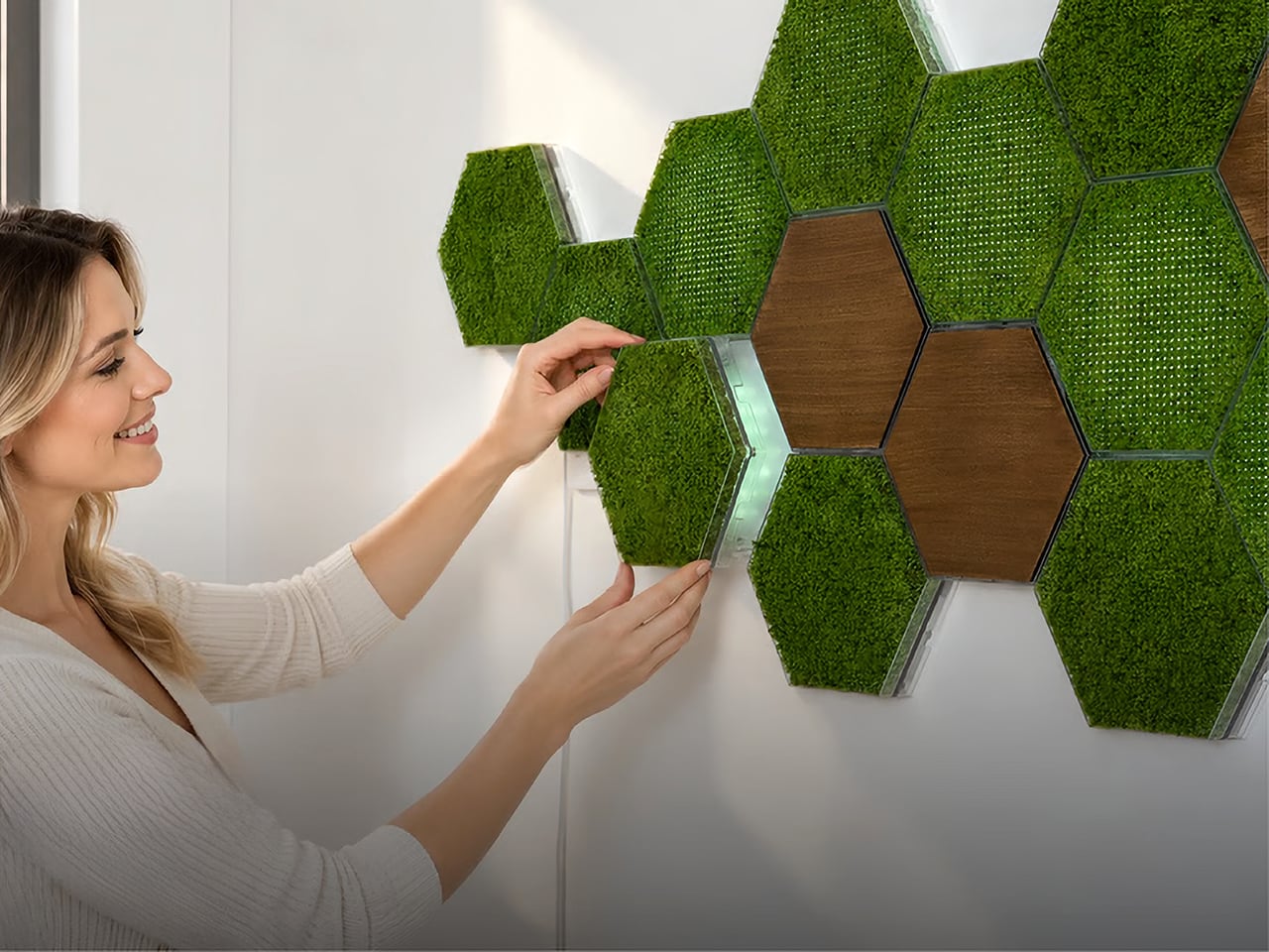
Moss Hexa is a modular moss system using 100% real moss panels in a hexagonal format, mounting via a proprietary magnetic system called HexaLock that lets you click panels into place, rearrange them, or swap them out without tools. Three panel types handle the main use cases: Basic for pure moss texture and color, Light for integrated LED ambient lighting with an auto-dimming sensor and app control, and Wood for warmth and visual rhythm as an accent. MOSSLAB, the South Korea-based studio behind the award-winning Moss Air and Moss Echo, built all three modules to share the same mounting hardware, making the whole system genuinely expandable over time without disturbing anything already on the wall. Pricing runs from a discounted $59 for the 3-panel Basic Starter Pack, with larger configurations available at campaign-exclusive pricing.

Designer: MOSSLAB

Click Here to Buy Now: $59 $90 ($31 off). Hurry, only a few left!

Hexagonal patterns appear throughout nature because they connect efficiently, repeat beautifully, and expand with minimal wasted space, from honeycomb structures to cellular geometry in biological tissue. MOSSLAB’s choice of the hexagon as Moss Hexa’s base unit is a structural decision that determines how the system scales and how freely it grows, and it pays off. Each panel measures 8.27 × 7.09 × 1.42 inches (210 × 180 × 36 mm), and because hexagons share flat, parallel edges on all sides, tiles can cluster in multiple directions without gaps or forced symmetry. The system offers preset configurations of 3, 9, and 15 panels, but the geometry means there’s nothing stopping you from building something in between. It holds up when you pull everything down six months later and try a completely different arrangement from scratch, which is the whole point.

The Basic panel features 100% real moss that is naturally drought-tolerant, requires no direct sunlight, and needs only occasional light misting to stay at its best. Its frame is made from PC and steel, with magnetic components, and the whole panel weighs just 0.75 lb (338 g). The moss retains its color and three-dimensional texture between mistings, helping preserve the natural depth and organic character that distinguish real moss from artificial alternatives. The Wood panel uses the same HexaLock mounting footprint but replaces moss with a warm wood-finish surface, designed as a compositional accent rather than a primary surface. A mostly-moss arrangement with a few Wood panels breaking the pattern is the right call; the contrast reads as intentional interior design rather than a texture experiment that got away from you.

Each Light panel combines 100% real moss with built-in ambient lighting designed to bring out the moss’s natural depth, color, and texture while changing the atmosphere of the surrounding space. Brightness can be adjusted from 1–100%, with a maximum power draw of 7W per panel, while a built-in ambient light sensor automatically adapts the lighting as the environment changes. Light panels connect directly to one another through USB-C-to-USB-C connections, and one Control Hub & Power Adapter can support up to nine Light Panels. The Hexa App provides manual lighting control, lighting presets, and Natural Daily Rhythm scheduling, giving users more flexibility to shape the atmosphere throughout the day.

Sound absorption performance was independently measured by KCL, a KOLAS-accredited laboratory recognized under the international ILAC-MRA framework, using a Moss Echo installation made with the same real moss material used across MOSSLAB’s Moss product line. Covering nearly 11 m² with approximately 300 moss panels, the installation was tested in a large-scale interior setting. The test recorded sound absorption of 27% at common speech frequencies, increasing to 56% at frequencies associated with keyboard typing and up to 65% at higher frequencies associated with background chatter. Those results add a functional layer to real moss beyond its visual and tactile presence. Because the test was conducted using the same real moss material found in Moss Hexa, the takeaway is not that Hexa replaces dedicated acoustic treatment, but that the material itself brings measurable sound-absorbing properties into a system designed to change how a space feels.

Powered by the HexaLock™ magnetic mounting system, each panel snaps into place with a single click, no complicated measuring, no specialist tools, no installation experience needed. You attach the mounting guide to your chosen surface, and both screws and adhesive mounting options are included. The guide handles alignment automatically, so panels sit consistently without leveling. The key design call is that Basic, Light, and Wood panels all share the same HexaLock™ footprint, meaning you can swap any panel type for any other at any point without touching the wall hardware. You can start with 3 Basic panels, add Light panels as a seasonal upgrade, and work toward a 15-panel Signature Styling set across multiple additions, all from the same original wall installation. The dual mounting option, screws for homeowners and adhesive for renters, is a small detail MOSSLAB got right, and the kind of thing you only think to include if you’ve genuinely considered your customer’s actual living situation.

Moss Air earned a CES Innovation Award, an iF Design Award, and an IDEA Design Award, and MOSSLAB has also participated in an open innovation program with a major Korean conglomerate, and in 2025 was the only international startup chosen among five for Panasonic’s Electric Works accelerator program. These are production-level credentials, not concept-stage accolades, and they matter when evaluating a new product that ships internationally. The Basic Starter Pack (3 panels) will be available for $59 during the first 72 hours of the Kickstarter campaign launch, the Light Starter Pack (3 panels) at $99, and the 9-panel Basic and Light Standard Packs starting at $159 and $229, respectively. The 15-panel Signature Styling Pack, which combines Basic, Light, and Wood panels, starts at $339 during the same launch period. Individual add-ons are available at $25 for a Basic Panel, $40 for a Light Panel, and $24 for a Wood Panel, while an additional Control Hub & Power Adapter Set is $23. Estimated U.S. shipping starts at $25 for a 3-panel configuration, with fulfillment estimated to begin in June 2027.

Click Here to Buy Now: $59 $90 ($31 off). Hurry, only a few left!

The post This glowing modular moss panel system might be the coolest way to fix a boring room first appeared on Yanko Design.
  • ✇Yanko Design
  • This Tiny Home Fits a Downstairs Bedroom and Two Lofts Into 24 Feet
    The updated Avalon 24 gives its most useful space-saving move to the bedroom: it keeps it downstairs. Dragon Tiny Homes pairs that main-level sleeping area with two lofts inside a 24-foot home on wheels, offering 204 square feet of floor space before counting the lofts. The completed, upgraded build is listed for sale, with built-in furniture and storage already fitted. Outside, blue and lavender wood cladding gives this version a cheerful identity, topped by a metal roof and supported by a dou
     

This Tiny Home Fits a Downstairs Bedroom and Two Lofts Into 24 Feet

13 octobre 2026 à 17:30

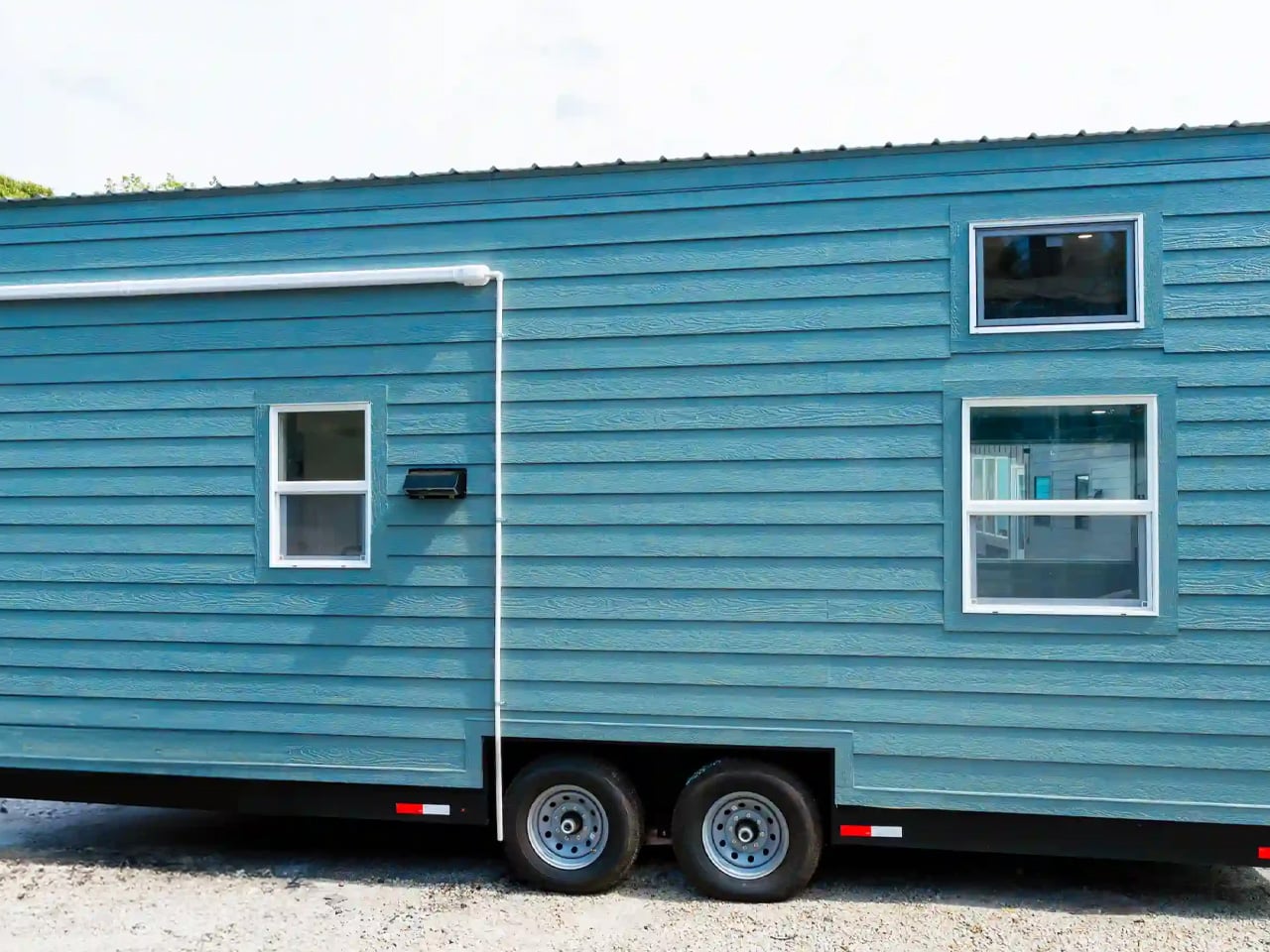
The updated Avalon 24 gives its most useful space-saving move to the bedroom: it keeps it downstairs. Dragon Tiny Homes pairs that main-level sleeping area with two lofts inside a 24-foot home on wheels, offering 204 square feet of floor space before counting the lofts. The completed, upgraded build is listed for sale, with built-in furniture and storage already fitted.

Outside, blue and lavender wood cladding gives this version a cheerful identity, topped by a metal roof and supported by a double-axle trailer. The color makes a welcome departure from the monochrome finishes common in compact housing, but the more consequential decisions happen inside. Here, sleeping space takes priority over a sprawling lounge.

Designer: Dragon Tiny Homes

The downstairs bedroom accommodates a double bed, a dedicated storage cabinet, and a wall-mounted television. Keeping the primary bed at floor level removes the nightly ladder climb, although the room remains snug. Above it sits the main sleeping loft, while a smaller loft over the bathroom provides another potential sleeping area or storage space. Removable ladders serve both upper levels, so these spaces demand more agility than the downstairs room.

The living area uses a built-in couch platform rather than leaving furniture placement entirely to the owner. Integrated sofa storage adds another place to tuck belongings away, and a large picture window opens the room toward the outdoors. White horizontal wall paneling and dark loft railings keep the interior visually legible, with the upper sleeping platform clearly separate from the space below.

In the kitchen, the upgraded build includes a 7.1-cubic-foot refrigerator housed in cabinetry with three drawers, alongside upper cupboards, a floating shelf, and a range hood. The Avalon’s induction cooktop has two burners, and its quartz surfaces include a bar top intended for dining or work. Laundry space is provided in the layout, though buyers should confirm the appliance package for their particular build. The cabinetry gives everyday objects assigned homes instead of relying entirely on loose shelving.

The bathroom contains a shower, vanity, and flushing toilet, with the upgraded unit adding a mirrored medicine cabinet and accent finishes. Dragon also lists upgraded insulation, a ceiling fan, and LED lighting with a night-light function. Those are useful specification details, though the listing doesn’t establish measured thermal performance or energy savings.

The featured inventory home is advertised at $63,500, including $10,100 in selected upgrades and a $6,600 discount from its configured price. Dragon lists a weight of 14,000 pounds and recommends an F350 or similar towing vehicle. That combination makes the Avalon’s tradeoff clear: its downstairs bedroom is appealing, but moving this small home still requires serious equipment.

The post This Tiny Home Fits a Downstairs Bedroom and Two Lofts Into 24 Feet first appeared on Yanko Design.

  • ✇Yanko Design
  • Zook Cabins Fits a Soaking Tub & Separate Shower Into a 470-Square-Foot A-Frame Retreat
    The A-Frame Retreat gives its most dramatic wall to glass, with windows climbing toward the roof’s sharp peak. Behind that familiar triangular silhouette, Zook Cabins has arranged 470 square feet of living space on a single floor, including a bathroom with a freestanding soaking tub. This is an available modular home, with a completed example at Zook Village in Gap, Pennsylvania, documented in March 2026. A black metal roof and thermally modified Lunawood siding establish the exterior’s restrai
     

Zook Cabins Fits a Soaking Tub & Separate Shower Into a 470-Square-Foot A-Frame Retreat

13 octobre 2026 à 13:20

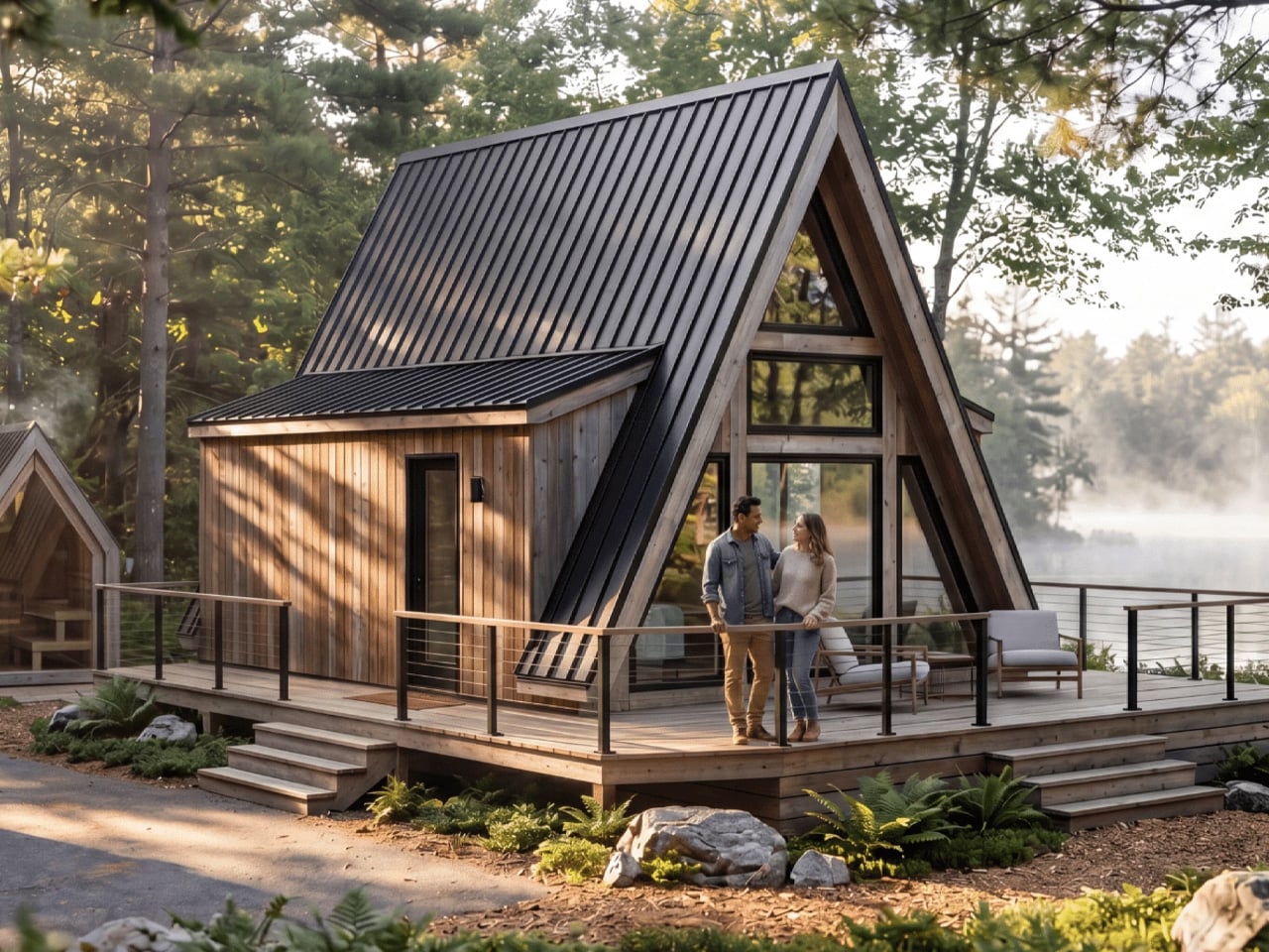
The A-Frame Retreat gives its most dramatic wall to glass, with windows climbing toward the roof’s sharp peak. Behind that familiar triangular silhouette, Zook Cabins has arranged 470 square feet of living space on a single floor, including a bathroom with a freestanding soaking tub. This is an available modular home, with a completed example at Zook Village in Gap, Pennsylvania, documented in March 2026.

A black metal roof and thermally modified Lunawood siding establish the exterior’s restrained palette. The more interesting move is the lower, box-like volume alongside the steep roof. In the company’s exterior rendering, it gives the cabin a vertical side wall and a sheltered entrance, while the glazed gable retains the recognizable A-frame profile. An optional deck extends the space outward without changing the enclosed footprint.

Designer: Zook Cabins

Inside, the published king-bed floor plan reads as a studio rather than a conventional one-bedroom house. Living, dining, sleeping, and kitchen areas share an open room, with the bathroom enclosed at the rear. The bed sits opposite the kitchen, while seating occupies the glazed end. Keeping these functions together avoids carving the compact interior into smaller rooms, though it also means there’s no bedroom door to separate sleep from conversation or cooking.

Cathedral ceilings preserve the roof’s height indoors, while painted cabinet-grade birch plywood covers the walls and ceilings. Vinyl plank flooring runs throughout. The interior rendering pairs these pale surfaces with exposed-looking timber elements and wooden furniture, giving the room visual warmth without covering every surface in wood. Straight wall sections also leave usable edges for cabinetry and furniture beneath the taller central space.

The kitchen takes a modest portion of the plan. Zook specifies painted shaker-style cabinets, quartz countertops, and spaces for a compact refrigerator and microwave. Those provisions deserve attention: space allocated for an appliance doesn’t establish that the appliance is included. The arrangement leaves more of the shared room available for the bed, dining table, and sitting area.

The bathroom receives a surprisingly generous allocation. Alongside the 60-inch freestanding soaking tub, the specifications list a separate glass-doored shower and a 48-inch vanity. The floor plan places these fixtures in their own enclosed room, giving bathing more privacy than sleeping. That’s a revealing priority for a small retreat: floor space goes toward a leisurely bathroom rather than a separate bedroom or another sleeping level. Delivery still requires planning. Zook says the cabin travels in one truckload, with two A-frame roof sections lifted into place on site. Its modern cabins require a permanent foundation and prepared utility connections. The small footprint simplifies the accommodation, but the installation remains a building project.

The post Zook Cabins Fits a Soaking Tub & Separate Shower Into a 470-Square-Foot A-Frame Retreat first appeared on Yanko Design.
  • ✇Yanko Design
  • This $70 Plate Is for People Who Refuse to Let Fried Food Sit in Its Own Oil
    Now that I’m learning to cook more, I’m pretty excited to experiment with dishes I see online. The results aren’t always ready for other people to try. I still have a lot to figure out. On some days, though, I keep it simple and fry something. That brings up a familiar problem: getting rid of excess oil before the food reaches my plate. Usually, I move it from the pan to a rack or paper towel, then transfer it again when I’m ready to eat. What if I could skip one of those transfers? The Half-Mo
     

This $70 Plate Is for People Who Refuse to Let Fried Food Sit in Its Own Oil

8 octobre 2026 à 07:40

Now that I’m learning to cook more, I’m pretty excited to experiment with dishes I see online. The results aren’t always ready for other people to try. I still have a lot to figure out. On some days, though, I keep it simple and fry something. That brings up a familiar problem: getting rid of excess oil before the food reaches my plate. Usually, I move it from the pan to a rack or paper towel, then transfer it again when I’m ready to eat. What if I could skip one of those transfers?

The Half-Moon Plate is more than a nicer way to serve food for a photo. It pairs a ceramic plate with a half-moon-shaped rack that sits over one side. You can place fried food on the rack to let excess oil and moisture drain away while leaving the other side available for a salad, vegetables, rice, or another side dish. Instead of draining food in one place and serving it in another, the plate brings those steps together.

Click Here to Buy Now: Starting at $70

That arrangement matters when timing is everything. If you’ve made tempura, fried chicken, or crispy potatoes, you probably don’t want them sitting in a puddle of oil while you finish getting dinner ready. Elevating the food gives the oil somewhere to go and may help it stay crisp until you eat. You still need to give freshly fried food time to drain; the plate simply gives you a way to do it at the table or as part of your final plating.

I also like that the design doesn’t make the rack the whole story. The open half of the plate leaves room for the rest of the meal, so the fried food doesn’t have to take over. You can see everything together before you sit down, rather than juggling a cooling rack, paper towels, and a separate serving dish. For someone cooking in a small kitchen, or someone who just wants fewer things on the counter, that’s an appealing idea.

The half-moon shape gives the plate its visual identity, but it also creates a natural division between the main dish and its sides. If you’re trying to be more mindful of portions, that division may be a useful visual cue. It won’t measure a balanced meal for you, and draining surface oil doesn’t make fried food automatically healthy. What it can do is encourage you to think about what else belongs on the plate alongside your crispy favorite.

Compared with an everyday dinner plate from a big brand such as IKEA, the Half-Moon Plate asks a little more of its design. A conventional plate gives you one uninterrupted surface and works with almost any meal. This one is more specialized: the rack makes the most sense when food needs to drain or when you want to keep it elevated before eating. That makes it less of an all-purpose replacement for your existing dishes and more of an addition for meals where its distinctive layout earns its place. The plate is listed starting at $70.

Of course, a plate like this won’t eliminate every step. You’ll still need to handle hot food carefully, wait for it to drain, and wash the rack afterward. Those are worth considering if you’re looking for the quickest possible cleanup. But if you already make fried food regularly, combining a draining surface and a serving plate could make the trip from pan to table feel more organized. When you don’t need the rack, you can lift it off and use the ceramic plate on its own. That flexibility is important: a design meant for one kind of meal is easier to justify when it can still be useful on other days. I’d reach for the rack when I’m making something crisp and use the plate by itself when dinner calls for a simpler presentation.

The Half-Moon Plate won’t make me a better cook overnight. I’ll still have to get the timing, seasoning, and frying right. But it does address one small frustration I know well: watching something come out of the pan beautifully crisp, only to wonder where to put it while I finish the meal. If it helps me serve dinner with fewer transfers and a little less fuss, that’s a design choice I can appreciate.

The post This $70 Plate Is for People Who Refuse to Let Fried Food Sit in Its Own Oil first appeared on Yanko Design.
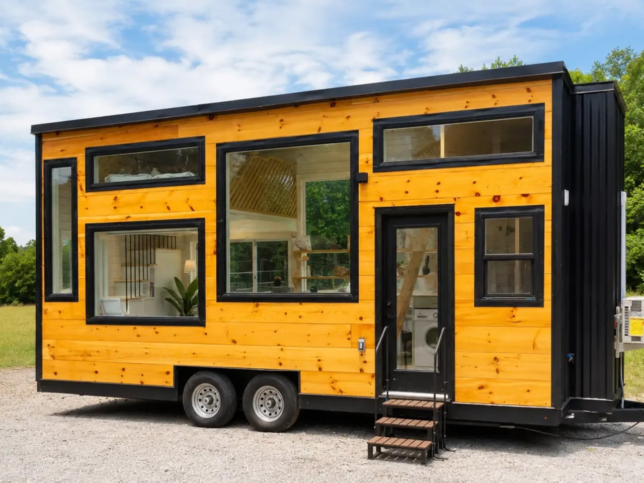
  • ✇Yanko Design
  • Two Bedrooms, Two Bathrooms, and a 700-Square-Foot Tiny Home That Doesn’t Feel Tiny
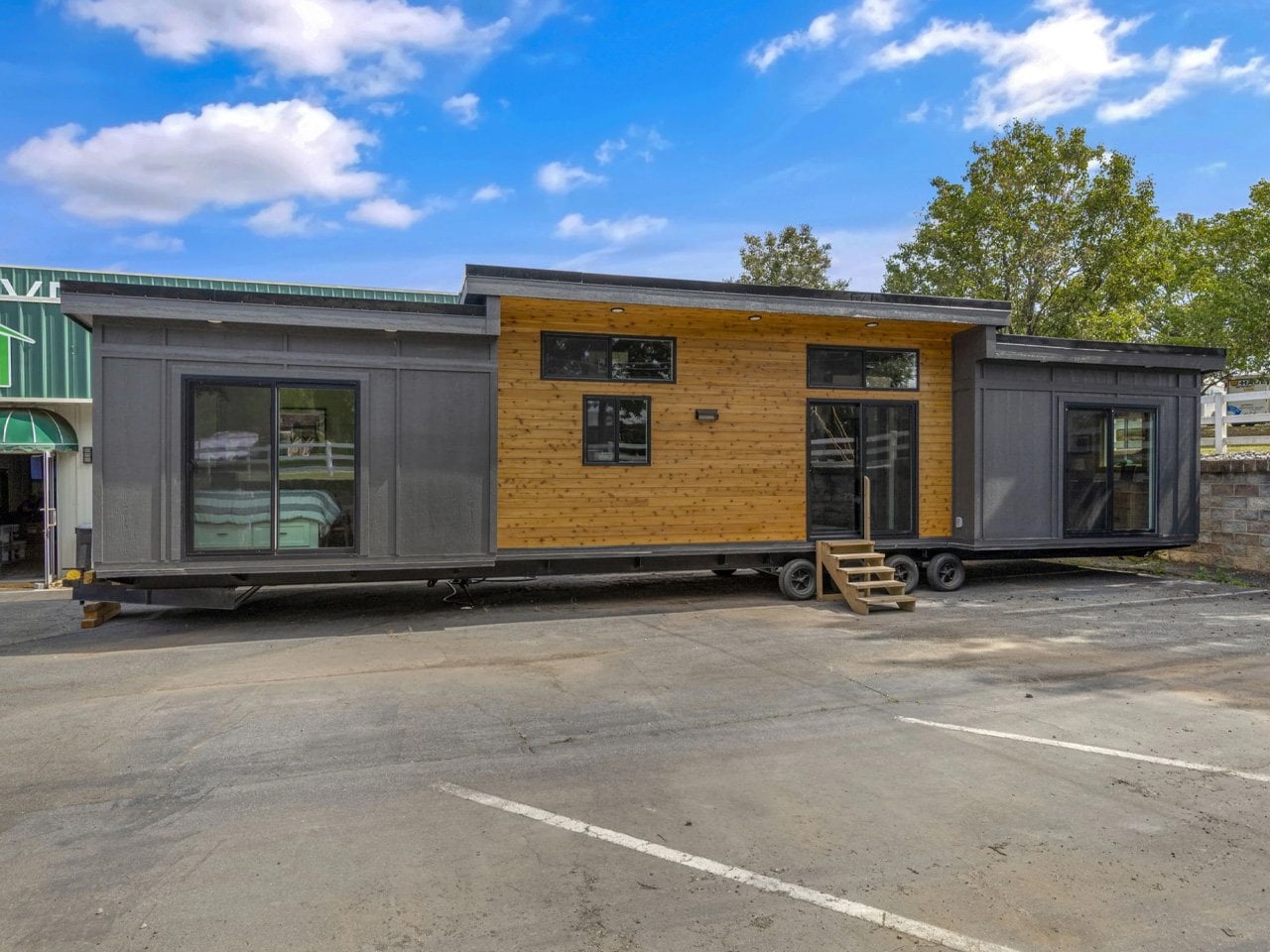
    Some homes earn their square footage. The Acadia by Sweet-Haus Tiny Cabin Company is one of them — a 700-square-foot, single-level home that packs two bedrooms and two full bathrooms into a footprint that feels genuinely generous. It sits on a quad-axle trailer, stretching 50 feet in length and 13.6 feet wide, which puts it firmly in park model territory — the kind of home you place once and actually live in. Sweet-Haus builds out of Chesnee, South Carolina, and the Acadia carries that craftsma
     

Two Bedrooms, Two Bathrooms, and a 700-Square-Foot Tiny Home That Doesn’t Feel Tiny

7 octobre 2026 à 17:30

Some homes earn their square footage. The Acadia by Sweet-Haus Tiny Cabin Company is one of them — a 700-square-foot, single-level home that packs two bedrooms and two full bathrooms into a footprint that feels genuinely generous. It sits on a quad-axle trailer, stretching 50 feet in length and 13.6 feet wide, which puts it firmly in park model territory — the kind of home you place once and actually live in.

Sweet-Haus builds out of Chesnee, South Carolina, and the Acadia carries that craftsmanship through every detail. The open-concept layout keeps the living, dining, and kitchen spaces connected — no wasted hallways, no chopped-up rooms. Large black windows flood the interior with natural light, and the black LowE 3 windows with argon gas fill-in do real thermal work, keeping the home efficient without sacrificing the look. The crinkle-cut matte roof and Advantech subfloor round out a build quality that punches well above the $176,500 MSRP.

Designer: Sweet-Haus Tiny Cabin Company

The kitchen is a full-size one, not a compromise version. It comes with a Haier stainless steel cabinet-depth fridge with bottom freezer, a 24″ Haier range, and an 18″ Haier dishwasher — a lineup that treats cooking as something that actually happens in this home. The cabinetry is custom Ergo-craft® millwork, milled from 3/4″ solid wood with soft-close hardware and custom-made pulls. It reads like furniture, not filler.

Both bedrooms accommodate a queen or king bed base with built-in storage drawers underneath, and each room connects to a full bathroom with a large vanity. The bathrooms offer a choice between a standalone shower or a tub/shower combo — a rare option at this scale. R19 insulation runs through the ceilings and floors, and a three-head HVAC system keeps the climate dialed in room by room. The Acadia is HUD-certified, which opens up financing options and simplifies placement in communities across South Carolina and North Carolina.

What Sweet-Haus has built with the Acadia is a home that doesn’t negotiate with itself. Most tiny homes ask you to give something up — ceiling height, counter space, closet room.

This one has built-in closets, two full baths, and a kitchen you’d actually cook in. At 700 square feet, it’s the version of tiny living where the word “tiny” stops mattering entirely.

The post Two Bedrooms, Two Bathrooms, and a 700-Square-Foot Tiny Home That Doesn’t Feel Tiny first appeared on Yanko Design.

  • ✇Yanko Design
  • MERACH’s new W60 Plus walking pad boasts 12 incline levels, RGB lights, and a built-in Bluetooth speaker
    The under-desk treadmill had its moment, arriving as the perfect sidekick for our sudden work-from-home lives (can you believe it’s been six whole years?). It was the simple, brilliant answer to hitting a step count between calls and emails, and products like the original WalkingPad and the WalkingPad S1 were among the early heroes of that era. We all got one, or knew someone who did, turning home offices into miniature gyms where productivity and light cardio could finally coexist. The problem
     

MERACH’s new W60 Plus walking pad boasts 12 incline levels, RGB lights, and a built-in Bluetooth speaker

4 octobre 2026 à 21:45

The under-desk treadmill had its moment, arriving as the perfect sidekick for our sudden work-from-home lives (can you believe it’s been six whole years?). It was the simple, brilliant answer to hitting a step count between calls and emails, and products like the original WalkingPad and the WalkingPad S1 were among the early heroes of that era. We all got one, or knew someone who did, turning home offices into miniature gyms where productivity and light cardio could finally coexist. The problem was that a lot of those machines, true to their budget price tags, started dying after six months of use. Walking pads got a reputation for being disposable, which was a shame, because the core concept was always worth taking seriously.

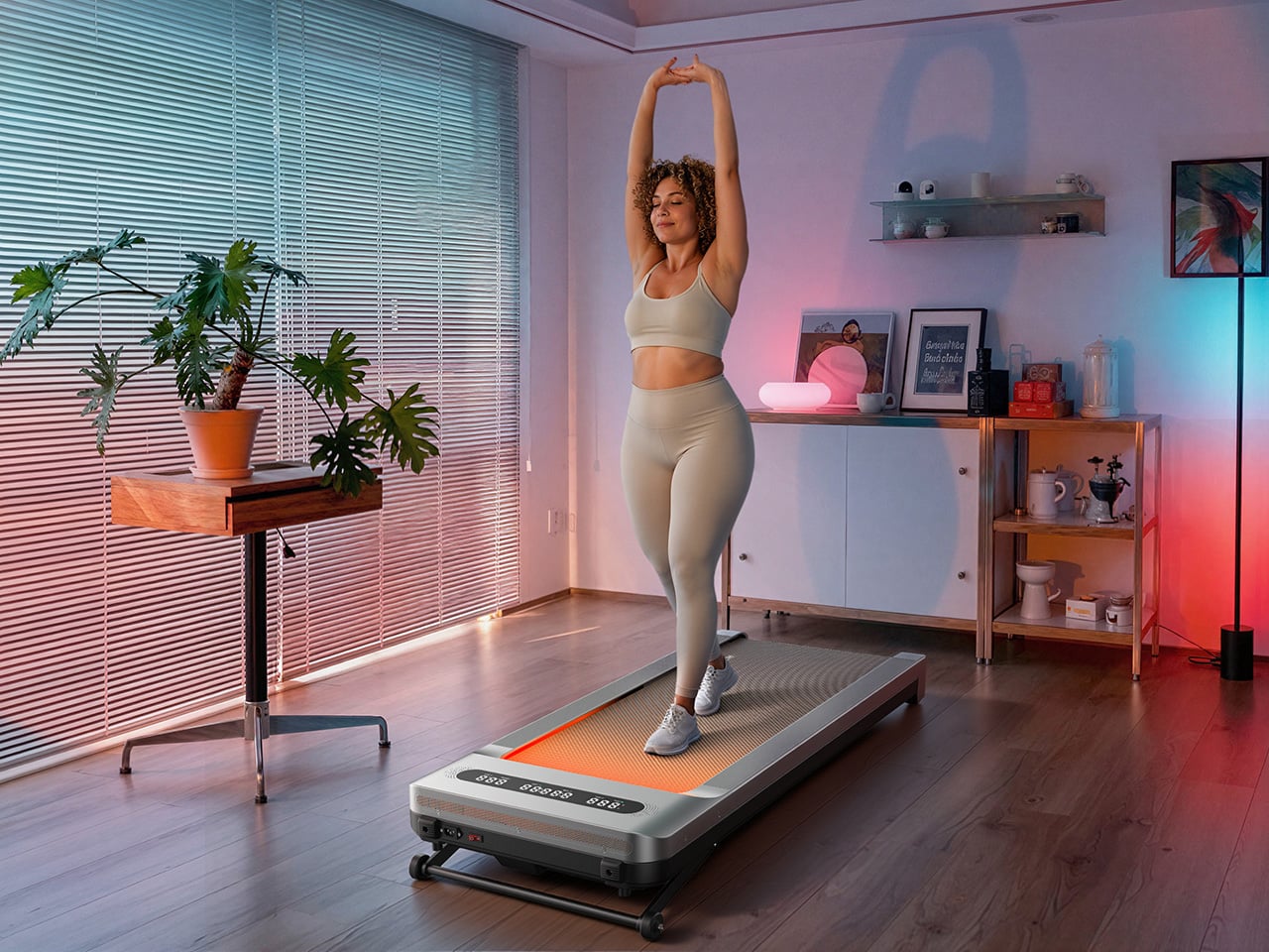
The UltraWalk W60 Plus is the clearest expression of what MERACH is building toward: a walking pad engineered with permanence at its core. When we caught the brand at IFA 2026, their first major trade show appearance despite an already loyal following built through e-commerce, the walking pad lineup stood out for build quality at a price most competitors couldn’t match. The W60 Plus has 12 automatic incline levels, a third-party SGS-certified motor, and a weight capacity that would make a full-size treadmill raise an eyebrow. Mood lighting and a Bluetooth speaker come along too, which sounds ridiculous until you realize how much more likely you are to use a machine that’s genuinely fun to be around.

Designer: MERACH

Click Here to Buy Now: $288 $499.99 ($211.99 off, use coupon code “MERACHW60”). Hurry, deal ends in 48-hours!

A 3.5 HP Brushless Motor, SGS-Certified Performance, and a Frame Rated for 330 Lb

The W60 Plus runs on a 3.5 HP peak / 1.25 CHP brushless motor with a 42mm diameter and a Hall sensor for precision feedback. Brushless motors are generally more efficient and longer-lasting than brushed ones, and MERACH claims a lifespan of up to 15,000 hours here, which the brand puts against the 300 to 800-hour lifespans typical of budget walking pad motors. The weight capacity sits at 330 lbs under SGS-certified testing conditions. The heavy-duty steel frame doesn’t wobble under a real walking load, which matters more than most spec sheet comparisons. That stability is what separates a machine you’ll want to use from one you’ll come to resent.

The W60 Plus passed SGS’ performance specs evaluation with flying colors. The noise testing came back at under 54 dB at medium speed with a 75 kg test load, which sits comfortably below the ambient volume of a normal conversation. At maximum speed that figure climbs to 60 dB with load, and 55 dB without, meaning the machine stays apartment-friendly even when it’s working hard. There’s also a one-touch mute function for those moments when you absolutely need silence (hello, important video calls). That noise profile lets you walk and watch TV simultaneously without either experience suffering, which is, honestly, the whole point of this category.

Twelve Auto-Incline Levels, a 16.5-Inch-Wide Deck, and a Speed Range Built for Walking

Twelve levels of automatic incline is the feature that separates the W60 Plus from the flat-and-boring competition, and for a machine in this price tier, it’s genuinely unusual. At the highest setting, it shifts from a gentle recovery walk to something that meaningfully elevates your heart rate, particularly through the posterior chain. The speed range of 0.6 to 4.0 MPH keeps things firmly in walking and light jogging territory, and that 4 MPH ceiling is worth acknowledging: this machine won’t satisfy runners. What it will do is make a 3 MPH incline walk feel like real exercise, which for most desk-workers is entirely the point. Incline transitions between levels automatically and smoothly, a detail that matters when you’re trying to maintain a rhythm.

The running deck measures 16.5 inches wide by 41.3 inches long, which MERACH puts at roughly 33% wider than the category standard. That extra width makes for a more natural gait and stride, particularly for taller users or anyone with broader hips. The non-slip surface handles uphill walking and light jogging without issue, and the length means you’re not constantly worrying about the back edge. Team USA heptathlete Annie Kunz has been using the W60 Plus for active recovery and step accumulation, describing it as a way to “jump on here and there when I feel a burst of energy.” Multi-event athletes log enormous volumes of low-intensity cross-training, and a 12-level incline walking pad fits that workflow more naturally than a flat surface ever could.

Sound-Reactive RGB Lighting, a 5W Bluetooth Speaker, and Triple-Platform App Integration

MERACH’s RGB lighting system reacts to step frequency and syncs to audio rhythm, creating a feedback loop between movement, sound, and visual stimulus that turns a walking session into something engaging. A walking pad that’s boring ends up under the sofa permanently, and MERACH clearly treats engagement as a design constraint, not an afterthought. The lighting pairs with a built-in 5W Bluetooth speaker that fills a home office without headphones, which matters when you’re walking through calls or podcasts. The whole feature cluster borrows from the cozy cardio playbook, acknowledging that for most users, habit formation is a bigger obstacle than physical capability. Make the machine enjoyable to use, and the steps take care of themselves.

Full app integration spans MERACH’s own platform, Apple Health, and Google Fit, with real-time tracking of speed, incline, calories, distance, time, and step count across all three. The MERACH app adds guided routines and custom workout programs, which pushes the W60 Plus into territory where it can coach you through a session rather than simply hosting it. An 8-button magnetic remote handles speed, incline, lighting, mute, start/stop, and program selection, and it docks magnetically to the frame when not in use. The LED display gives you a live readout of key metrics without having to pull out your phone. None of it requires a subscription, which at this price is a genuinely welcome detail.

Zero Assembly, 80 Percent Less Floor Space, and a Price That Makes Sense

The W60 Plus ships fully ready to use: unbox it, plug it into a standard 110V outlet, and step on. No assembly means no instruction booklet, no leftover mystery bolts, and no 45-minute YouTube tutorial that’s supposed to take 10 minutes. When you’re done, the vertical folding support stand lets the machine stand upright, which MERACH says cuts the floor-space footprint by up to 80%. The enlarged front transport wheels make it manageable to move even over carpet, which is where most budget transport wheel designs tend to give up. At 67.7 lbs, the W60 Plus isn’t light, so those wheels are doing real work every time you slide this thing out from under the desk.

The UltraWalk W60 Plus launched on May 26, 2026, and is available now through MERACH’s official website in a Grey finish, with the list price marked at $499.99 and the current sale price at $329.99. MERACH is also offering an extra discount code, MERACHW60, which drops the checkout price to $264.00 with free shipping, a much more aggressive number than this category usually sees for a 12-level auto-incline walking pad. The product page also offers optional accident protection from $29.99. Warranty details are not clearly surfaced in the material provided, so that part is best verified directly on MERACH’s store before publication.

Click Here to Buy Now: $288 $499.99 ($211.99 off, use coupon code “MERACHW60”). Hurry, deal ends in 48-hours!

The post MERACH’s new W60 Plus walking pad boasts 12 incline levels, RGB lights, and a built-in Bluetooth speaker first appeared on Yanko Design.
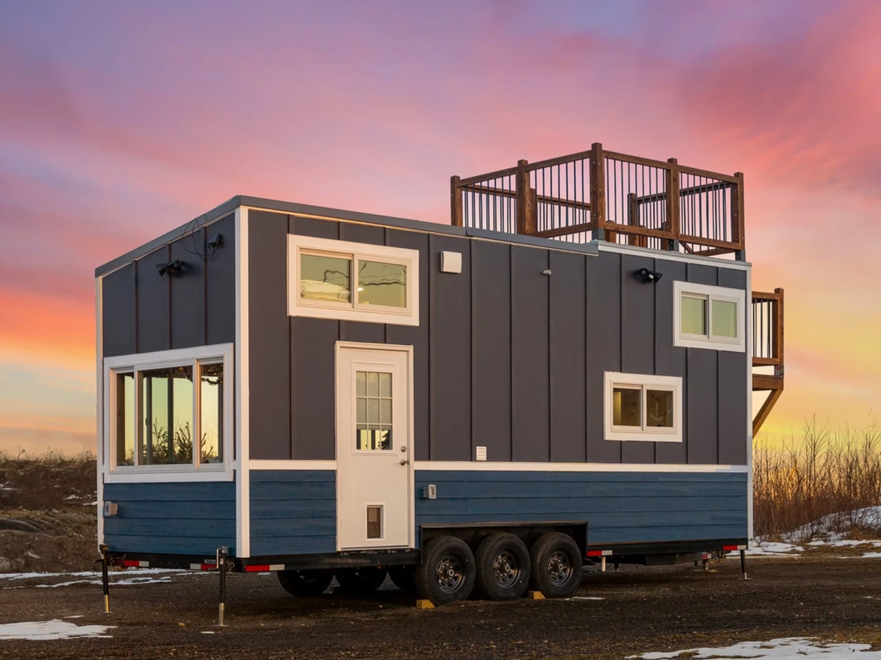
  • ✇Yanko Design
  • This Expandable LEGO Frame System Finally Solves the Collector Storage Nightmare
    Somewhere in a closet, a perfectly good LEGO minifigure is staring through a plastic bag at the back of a cardboard box. It has a tiny printed face, a surprisingly elaborate hat, and absolutely no audience. Every serious LEGO collector knows the feeling: shelves fill up fast, display cases sell at fixed sizes, and at some point the collection starts living in labeled ziplock bags rather than anywhere it can actually be seen. LEGO has released over 775 Collectible Minifigures across 51 series si
     

This Expandable LEGO Frame System Finally Solves the Collector Storage Nightmare

4 octobre 2026 à 19:30

Somewhere in a closet, a perfectly good LEGO minifigure is staring through a plastic bag at the back of a cardboard box. It has a tiny printed face, a surprisingly elaborate hat, and absolutely no audience. Every serious LEGO collector knows the feeling: shelves fill up fast, display cases sell at fixed sizes, and at some point the collection starts living in labeled ziplock bags rather than anywhere it can actually be seen. LEGO has released over 775 Collectible Minifigures across 51 series since 2010, with new figures arriving three times a year, which makes the storage problem a permanent one for anyone collecting seriously. Stephen Peaple, a British-born collector now based in Perth, Australia, had thousands of them and spent four years building the solution he could not find anywhere.

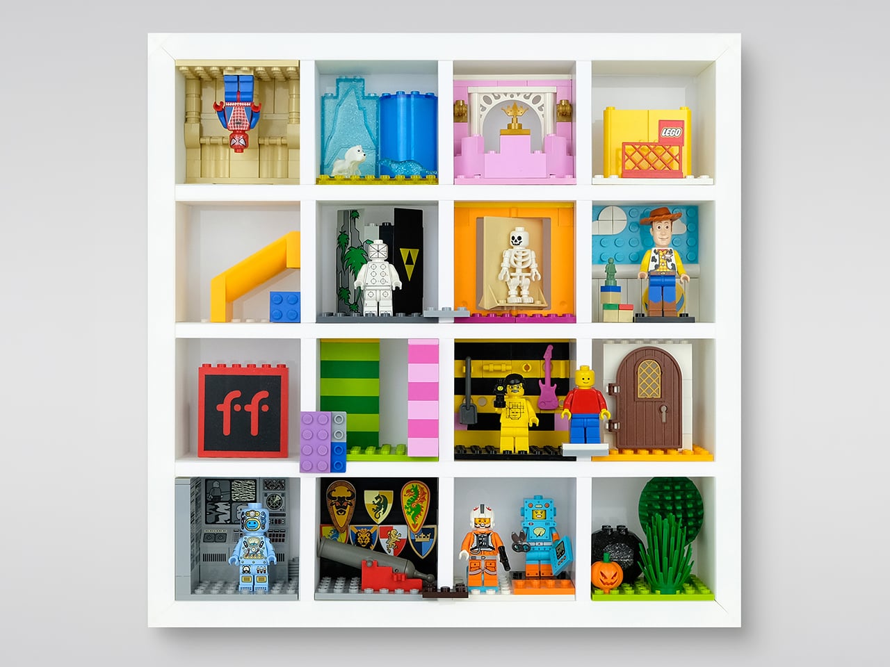
Finity Frames puts a collection on the wall in a clean white grid. A single frame carries 16 spaces, but removable dividers let you make room for bigger figures or pack in a crowd. When the collection grows, connected frames share edges so the display extends as one continuous piece without visual seams or doubled-up borders. Your next minifigure gets a spot without requiring a complete wall makeover. The system is injection-molded ABS, ships flat-packed, and the connection method that makes all of it work is patented.

Designer: Stephen Peaple

Click Here to Buy Now: $55. Hurry, only 5/16 left!

A Display System That Grows With Your LEGO Collection

Every Finity Frame is built around a seamless edge connection where neighboring frames share a single border, eliminating the doubled-up edge and any visual gap at the join. This is the core innovation that solves the fixed-size problem inherent in every other display case on the market. It means you can start with a single frame for one series of figures and expand outward in any direction, at any time, without having to replace your original investment. The aesthetic is clean and continuous, looking like a single, cohesive unit no matter how large it gets.

This design approach also makes the system more efficient as it grows. Peaple makes the math explicit: the first frame measures 312mm across, and each connected frame adds just 298mm, because one edge is always shared. This reduces material waste and lowers the cost per additional frame. A 2×2 Collector, for instance, cannot be broken apart into four 1×1 Starters, since it doesn’t include the extra pieces. For context, the most prominent fixed-case competitors max out around 190 minifigures. The Finity Frames Showcase holds 1,056, and two of them together can display over 2,100 figures as a single, unified piece.

Built for Customization and Creative Play

Each Finity Frame ships with three horizontal and three vertical internal slats, forming a standard 4×4 grid. This sixteen-space layout is not arbitrary; it maps exactly to one complete Collectible Minifigures series, which traditionally ships with 16 unique figures. The slats are removable in any combination, yielding 64 different internal layouts. You can pull the vertical dividers out, double-stack figures with jumper plates, and a 1×1 Starter can hold up to 88 minifigures. This flexibility lets you create custom spaces for dioramas, larger vehicles, or oversized figures like the Hulk who need a little extra room.

The system’s dimensions are precisely calibrated to the LEGO System of Play. Internal slats are exactly one brick wide, and the frame edges are exactly two bricks wide. Each compartment accepts a 6×8 LEGO plate or four 3×4 minifigure plates, the same stands that come with CMF packs. This means removing the acrylic cover turns the frame into a wall-mounted baseplate where builds can bridge continuously across spaces and frames. Peaple calls this “bridging,” a feature that turns a static display into a creative canvas. Every horizontal slat even has a built-in row of six studs for securing figures or small builds.

Designed for Collectors of All Kinds

A magnetic Perspex acrylic cover protects the collection from dust and removes in a single pull. It’s made from UV-stable material with built-in absorbers to block harmful light, preventing the slow fading that can damage valuable figures over time. The frame itself is a gallery-white, UV-treated ABS plastic, a color choice meant to disappear behind the collection rather than compete with it. Everything is designed to last, preserving the collection while keeping it easily accessible. The magnetic attachment is secure but quick, so you can get to your figures without fussing with clips or latches.

Flipping the horizontal slats 180 degrees turns the studded surfaces into flat shelves, opening the frame to almost any small-scale collectible. A single 64x64x49mm space can hold Funko Pocket POPs, Be@rbricks, Sonny Angels, or even shot glasses. Removing dividers creates double-height spaces for larger items like vintage Kenner 3¾” figures, Super7 ReAction figures, Playmobil sets, or graded collectible cards in their hard cases. It’s a true cabinet of curiosities, designed for a LEGO collection but adaptable enough for just about anything else that deserves a spot on the wall.

Five Sizes, Starting at $65 USD

The five frame sizes run from the 1×1 Starter at 12.3×12.3 inches (up to 88 minifigures) to the 4×3 Showcase at 47.4×35.7 inches (up to 1,056), with the 1×2 Duo, 2×2 Collector, and 3×2 Lifestyle filling in between. All frames run 55mm deep without the cover, 61mm with, and production units are estimated at 0.9 to 1.1kg for the 1×1 (roughly 2 lbs).

Retail pricing starts at AU$99 (roughly US$65) for the Starter and reaches AU$835 (roughly US$550) for the Showcase. Any size can be extended later through a Frame Extender on finityframes.com, where you input what you already own and order only the additional sets required. The system ships flat-packed globally, with US distribution in place through the manufacturing partner.

Click Here to Buy Now: $55. Hurry, only 5/16 left!

The post This Expandable LEGO Frame System Finally Solves the Collector Storage Nightmare first appeared on Yanko Design.
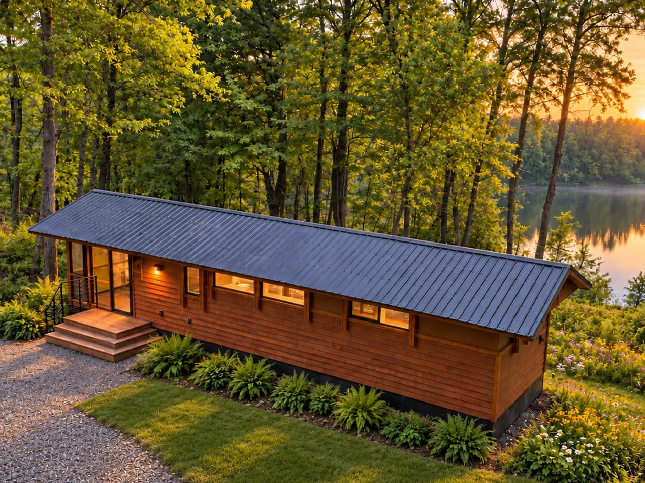
  • ✇Yanko Design
  • This 20-Foot Tiny Home on Wheels Proves Better Design Beats More Square Footage
    Not every home needs to shout to be heard. Highlands Tiny Homes, based in New South Wales, has built that idea into every corner of the Sierra — a single-level tiny home on wheels that measures just 6 meters in length and does absolutely nothing to apologize for it. It sits on a double-axle trailer and wears its compact footprint like a statement, not a compromise. The exterior leans into a woodland aesthetic without overdoing it. A pitched corrugated roof, aluminium sash windows, and a conside
     

This 20-Foot Tiny Home on Wheels Proves Better Design Beats More Square Footage

4 octobre 2026 à 13:20

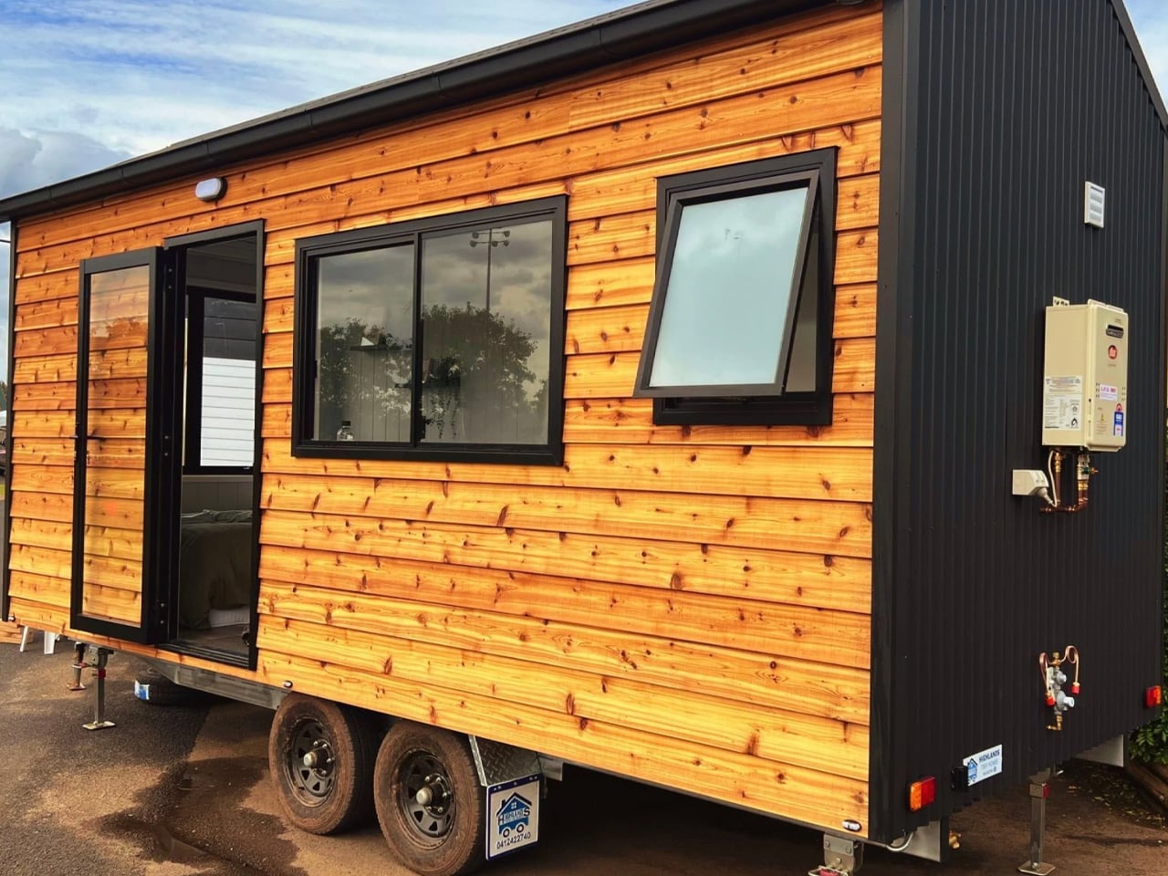
Not every home needs to shout to be heard. Highlands Tiny Homes, based in New South Wales, has built that idea into every corner of the Sierra — a single-level tiny home on wheels that measures just 6 meters in length and does absolutely nothing to apologize for it. It sits on a double-axle trailer and wears its compact footprint like a statement, not a compromise.

The exterior leans into a woodland aesthetic without overdoing it. A pitched corrugated roof, aluminium sash windows, and a considered combination of cladding and Colorbond accents give the Sierra a look that feels rooted — visually grounded in its surroundings regardless of where it’s parked. It’s the kind of exterior that photographs well in a pine clearing or beside a mountain road, reading more like an architect’s bush retreat than a prefab box.

Designer: Highlands Tiny Homes

Inside, the single-floor layout prioritizes openness over segmentation. White walls reflect the natural light that pours in through generously sized windows, while wooden countertops and bar seating in the kitchen add warmth without clutter. A ceiling fan overhead keeps things casual. The Sierra isn’t chasing the maximalist tiny-home trend of stacking every possible feature into the ceiling — it’s lean by design, and that restraint is exactly what makes it feel livable.

The kitchen claims a meaningful portion of the floor plan, which signals a priority worth noting: this is a home built for people who actually cook, not just for people who want to say they live small. The double bed doubles as a day bed and lounge area, keeping the space flexible without demanding a furniture reconfiguration every morning. The bathroom includes a glass-enclosed shower that feels considered rather than an afterthought.

Priced from US$59,000 including GST, the Sierra 6.0 sits at an entry point that makes serious compact living genuinely accessible. For those needing slightly more room, a 7.2-meter version is also available – same DNA, a little more breathing room.

The Sierra isn’t designed to impress at a trade show. It’s designed to work on a Tuesday morning when you’re making coffee and watching the light move across a wooden countertop. Highlands Tiny Homes has found a rhythm in the Sierra that many larger builds never quite locate — the specific calm that comes from a space that knows exactly what it is and refuses to be anything else.

The post This 20-Foot Tiny Home on Wheels Proves Better Design Beats More Square Footage first appeared on Yanko Design.

  • ✇Yanko Design
  • Nespresso x Swarovski: A $299 Coffee Machine Nobody Ignores
    Coffee machines have an awkward relationship with the kitchen counter. We need them within reach every morning, but once the coffee is made, many look like appliances we would rather tuck away. The Nespresso x Swarovski collection takes that small design problem seriously. Its crystal-embellished CitiZ Platinum is a machine meant to stay visible, giving the coffee corner a reason to look considered even when nobody is making a cup. That does not mean your morning coffee needs an audience. Most
     

Nespresso x Swarovski: A $299 Coffee Machine Nobody Ignores

4 octobre 2026 à 11:20

Coffee machines have an awkward relationship with the kitchen counter. We need them within reach every morning, but once the coffee is made, many look like appliances we would rather tuck away. The Nespresso x Swarovski collection takes that small design problem seriously. Its crystal-embellished CitiZ Platinum is a machine meant to stay visible, giving the coffee corner a reason to look considered even when nobody is making a cup.

That does not mean your morning coffee needs an audience. Most of us just want a reliable routine before the day gets loud. But a machine that sits out all day affects how a kitchen feels long after its job is done. I like the idea of treating that presence as part of the design, rather than pretending a frequently used appliance can somehow vanish between cups.

Designer: Nespresso x Swarovski

The limited-edition CitiZ Platinum has a silvery finish, with Swarovski crystals placed around its border. It is a noticeable change, though the machine remains recognizable as a CitiZ Platinum. That balance matters. Covering every surface in sparkle might make for a memorable photograph, but the more useful question is whether you would enjoy seeing it beside your favorite mugs on an ordinary Tuesday.

For me, the answer has less to do with luxury than with attention. Kitchens collect objects by necessity: a toaster, a kettle, a jar of spoons, the mug that never quite makes it back into the cabinet. A crystal-accented coffee machine cannot tidy that counter for you. It can, however, make one of its most permanent residents feel intentional.

The collaboration stretches beyond the machine. Nespresso and Swarovski have carried the festive look into coffee, accessories, and capsule-inspired ornaments. The collection’s packaging draws on Swarovski’s octagonal shape and color palette, so the visual idea follows you from the machine to the smaller things around it. I appreciate that continuity. A special-edition appliance can feel oddly isolated when everything accompanying it looks like business as usual.

There are limited-edition coffees in the collection, too, including Crystal Spark options for Nespresso’s Original and Vertuo systems. That gives the partnership a place in the cup as well as on the counter, though I would keep the two appeals separate. The crystals are a design choice, not a claim that the machine brews better coffee because it has been dressed up.

That distinction makes the product easier to appreciate. You do not have to believe every appliance needs a glamorous makeover to see who this is for. If you have spent time arranging a coffee station, choosing cups you enjoy holding, or finding a spot where the morning light hits just right, the machine fits into an interest you already have. It offers convenience without asking you to give up the pleasure of looking at your space.

It also makes sense as a gift for someone who already has very specific tastes. Coffee can be hard to buy for another person, especially when their preferred capsules and flavors are settled. A design-led machine is a more personal gesture, provided you know it suits their setup. I would check compatibility and availability before getting attached to the idea, particularly with a limited-edition collection.

Of course, sparkle is a matter of taste. Some kitchens look best with almost nothing on the counter; others are happier with color, collections, and objects that start conversations. This CitiZ Platinum belongs to the second group. It asks for a little space and attention, and that is either its charm or a good reason to admire it from afar.

What makes the Nespresso x Swarovski collection interesting is its modest premise beneath all the shine: everyday tools deserve design consideration, too. The machine still has coffee to make. But when that job is done, it remains part of the room. For anyone tired of choosing between a useful counter and a beautiful one, that is a lovely place to start.

The post Nespresso x Swarovski: A $299 Coffee Machine Nobody Ignores first appeared on Yanko Design.
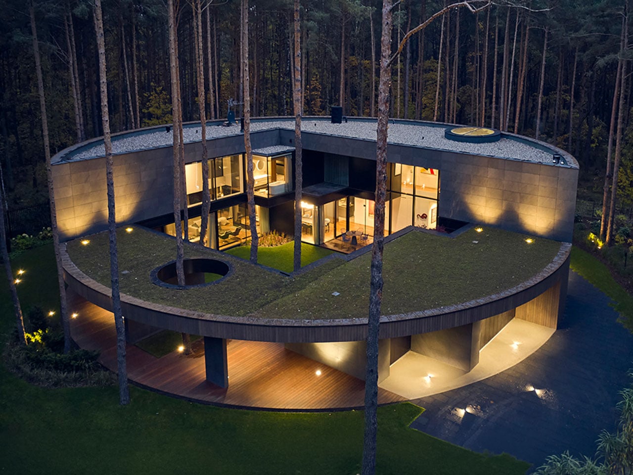
  • ✇Yanko Design
  • 9 Best Gifts for the Person Who Turned Their Living Room Into a Sports Bar
    Some people watch the game. Others build a whole experience around it. The living room becomes the venue, the couch becomes the seat, and somehow the right gift makes the whole setup feel intentional rather than assembled over years of impulse buys. These nine picks span every corner of the room, from the screen to the sound to the table that keeps the energy going long after the final whistle blows and nobody is ready to leave just yet. A great game-day room is not really about having the bigg
     

9 Best Gifts for the Person Who Turned Their Living Room Into a Sports Bar

2 octobre 2026 à 07:40

Some people watch the game. Others build a whole experience around it. The living room becomes the venue, the couch becomes the seat, and somehow the right gift makes the whole setup feel intentional rather than assembled over years of impulse buys. These nine picks span every corner of the room, from the screen to the sound to the table that keeps the energy going long after the final whistle blows and nobody is ready to leave just yet.

A great game-day room is not really about having the biggest TV. It is about having a room that works. Sound that fills the space without fighting for attention. A screen that earns its place on the wall even when the game is not on. A table that gives the energy somewhere to go at halftime. These gifts solve real problems in that space, and each one carries enough design thinking behind it to feel like a genuinely considered choice rather than a last-minute add to cart.

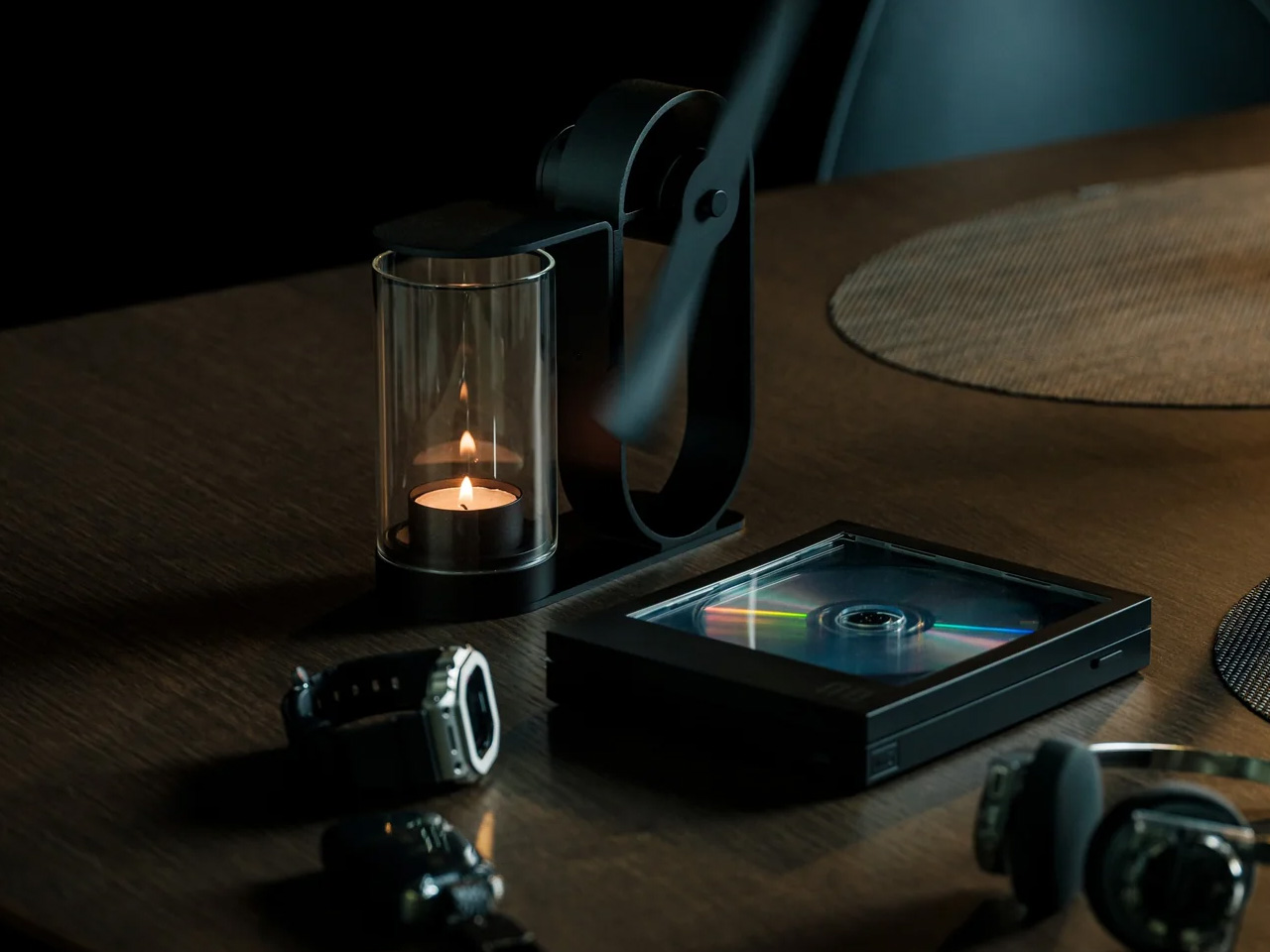
1. Portable CD Cover Player

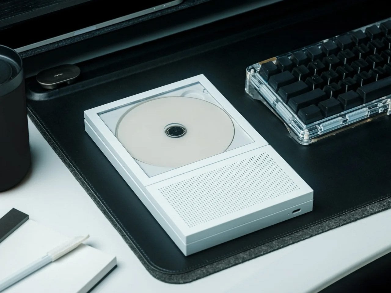
Most pregame rituals revolve around a playlist nobody agreed on. The Portable CD Cover Player changes the format entirely, looking exactly like a CD jewel case standing on edge, which means it earns its shelf spot before anyone presses play. For someone who has put real money into making their living room feel right, a music player that doubles as a sculptural object is the kind of gift that holds its ground in the room long after the season ends and the decorations come down for good.

Beyond the form, it delivers. Slot a disc in and the music plays back with the kind of warmth a streaming service on a phone speaker simply does not replicate. It reads as the pregame companion: the thing that sets the tone before the screen takes over and the broadcast audio fills the room. For the host who treats game day like an event rather than a habit, this is the detail that tells everyone in the room that the person running the setup actually thought it through from the first quarter to the last.

Click Here to Buy Now: $199.00

What We Like

  • The form is genuinely surprising without being gimmicky, earning a permanent shelf spot rather than a junk drawer after the novelty wears off in the first week.
  • At from $199 on YD Select, it sits in a gift tier that feels considered without crossing into impractical territory for most budgets.

What We Dislike

  • Physical media is a deliberate commitment, and someone who has moved entirely to streaming will need to rebuild a CD library, which is either a feature or a friction point depending entirely on who is receiving it.
  • Pricing for different color or finish variants beyond the base entry price is not confirmed on the current listing.

2. Hisense U6SF Pro

The U6SF Pro solves the problem most living rooms never fully address: glare. Sunlight through a window, a lamp left on during an afternoon game, the overhead light nobody turned off before kickoff. A standard panel washes out and flattens the image before halftime arrives, but Hisense’s anti-reflection, glare-free coating treats the room’s actual conditions as part of the design brief. Tom’s Guide’s reviewer noted they never once had to adjust the room lights during a full testing session with this panel in a real living room.

At $699, down from its original launch price of $1,099, the U6SF Pro puts a 1,200-nit Mini LED panel with a native 144Hz refresh rate and a built-in subwoofer into a price bracket that used to feel out of reach for this level of picture performance. That combination of brightness ceiling, motion handling, and built-in bass makes it the natural anchor for a game-day living room that is serious about the setup without being unreasonable about what the whole thing should realistically cost.

What We Like

  • The glare-free anti-reflection coating is a tested, real-world differentiator in rooms that are not dedicated dark home theaters, which describes most living rooms where the game actually gets watched.

What We Dislike

  • The built-in subwoofer is a convenient feature, but committed audio setups will likely still want a dedicated soundbar or speaker pair running alongside it for full-range coverage.
  • Available in larger screen sizes that may not suit every living room layout, so confirming dimensions before committing to this as a gift is worth the extra step.

3. XGIMI MoGo 4

The second-screen problem- where does the overflow crowd watch when the main room fills up- never gets planned for until it is actively happening. The XGIMI MoGo 4 is the answer that does not require buying a second television. A 1080p portable projector with 450 ISO Lumens, a 360-degree adjustable stand, Google TV with licensed Netflix built in, and dual 6W Harman Kardon speakers, it throws up to a 200-inch image from a cylinder compact enough to sit on a coffee table without commanding the room.

The 71.28Wh built-in battery delivers up to 2.5 hours of playtime, covering most games without needing a wall outlet nearby. Running on Wi-Fi 5 and Bluetooth 5.1, the setup is entirely wireless from start to finish. For a host who wants a backyard overflow screen, a garage viewing option, or a second room covered on playoff day, this is the projector that pulls all of that off without a permanent installation, a ceiling mount, or a second cable subscription attached to the monthly bill.

What We Like

  • The 360-degree adjustable stand means it can project onto a ceiling, a garage door, or a blank wall with the same minimal setup effort every single time.
  • Google TV with licensed Netflix built in removes the need for an external streaming stick or any additional device running alongside it out of the box.

What We Dislike

  • At 450 ISO Lumens, bright-room performance has real limits, and this works best in a controlled-light environment rather than a fully sunlit afternoon kickoff.
  • 2.5 hours of battery life covers a standard game comfortably but falls short for overtime-heavy playoff marathons without a power source kept nearby.

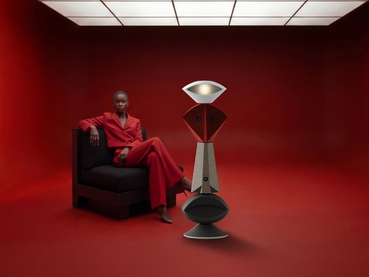
4. Come Together

Come Together Adds Rolling Speaker and Mini Fridge to Your Couch

Most game-day setups eventually arrive at the same friction point: someone has to get up to restock the drinks, and that person misses the play everyone is going to be talking about for the next ten minutes. Come Together is a three-piece robotic system designed specifically around that problem. The Tower sits as a calm black cylinder until it is needed, then rises to reveal a built-in mini fridge capable of holding up to five cans, with a tray on top that swaps in for snacks when the cooling function is not the priority.

The Base handles the sound half of the equation. It is a circular spatial audio unit that maps the room, figures out where people are sitting, and positions itself for the best possible coverage without anyone adjusting a thing. A Qi2 wireless charging pad keeps phones topped off through a long game without anyone leaving the couch to find a cable. For the host who has optimized everything else and still loses someone to the kitchen every twenty minutes, this is the piece that quietly closes that gap.

What We Like

  • The Qi2 wireless charging integration solves the dead-phone problem during long games without adding another cable to a setup that is already managed tightly.
  • A spatial audio unit that actively repositions itself for the room’s seating layout is a genuinely considered detail for a couch-forward, game-first viewing environment.

What We Dislike

  • Five cans is comfortable for one or two people but runs short for a full game-day group without a refill run, which somewhat undercuts the core convenience premise.
  • Consumer purchase availability should be confirmed before gifting, as this was covered at the concept-design stage and current retail status should be verified against the original coverage.

5. RetroWave 7-in-1 Radio

The RetroWave 7-in-1 Radio has the look of a vintage Japanese radio and the utility of something designed entirely for now. Behind the tactile tuning dial and compact body, measuring 5.04 inches wide and 3.86 inches tall in ABS resin and iron, it pulls in FM, AM, and shortwave stations, streams music over Bluetooth, plays MP3s via TF card, and carries a built-in flashlight and SOS alarm. For a game-day room, it earns its shelf spot the moment it arrives. Nobody in that room mistakes it for an afterthought.

During a game, its job is focused: fill the room with the pre-broadcast energy, the live radio commentary, or the kind of ambient music that does not demand a playlist decision before kickoff. When the power cuts out, and at some point it does, the radio keeps going in a way a smart speaker or a streaming device simply cannot promise without a signal. At $89, it is the gift that reads as a design object on the shelf and earns the label of genuine essential in the room and well beyond it.

Click Here to Buy Now: $89.00

What We Like

  • Seven real functions in one compact body, covering speaker, MP3, radio, flashlight, clock, power bank, and SOS alarm, with no redundancy in how each one actually gets used.
  • The retro Japanese design language means it lives on a shelf and looks like it belongs there rather than sitting out like a piece of tech that never found a proper home.

What We Dislike

  • The compact dimensions mean speaker output suits ambient listening and pregame music rather than filling a large room at full volume when the crowd gets loud.
  • Shortwave reception quality will vary by location and atmospheric conditions, meaning not every station is equally accessible in every US market throughout the season.

6. IKEA x Xbox YXSTABY Collection

IKEA and Xbox’s YXSTABY furniture collection makes gaming feel more at home

The IKEA and Xbox YXSTABY collection is nine pieces of furniture designed around the specific reality of a living room that doubles as a gaming and viewing setup. The rolling TV stand, the thumbstick-shaped stool, the D-pad cushion: each piece reads clearly as part of the same visual language while functioning as real, everyday furniture rather than themed décor that announces itself too loudly. It is the first time a gaming identity has been built into a living room collection at this level of design seriousness, and the craftsmanship reflects it.

For the person whose living room already functions as a game-day headquarters, these pieces solve the organizational and seating problems that quietly accumulate around a serious setup over time. The rolling TV stand keeps equipment mobile without the floor clutter of static furniture that never quite sits right. The stools double as extra seating the moment the couch fills up before kickoff. Launched in IKEA stores October 1, 2026, the collection ties the room together rather than adding another device to a pile that is already complicated enough.

What We Like

  • Nine coordinated pieces mean gifting one item or several works without the room looking inconsistent, since everything belongs to the same design system from day one.
  • The rolling TV stand solves the real logistical problem of rearranging a viewing setup without unplugging and re-routing every cable in the process.

What We Dislike

  • The gaming-identity aesthetic is deliberate and visible, which suits the target audience perfectly but narrows the appeal for someone who prefers a more neutral living room look throughout their space.
  • Availability in specific IKEA markets should be confirmed before purchasing, since not every location will carry the full nine-piece range at launch without advance stock checks.

7. Department of Play 3-in-1 Table

One Table, 3 Games, Nobody Needs a Game Room

Sanne’s Department of Play table does the math that most game-room setups never quite solve: one table, three games, and no dedicated room required. It converts between pool, ping pong, and dining configurations, which means it earns its square footage in a normal-sized living room rather than demanding a basement or a spare room nobody actually has. For the person who has maxed out the screen and sound side of their setup, this is the piece that extends the experience past the final whistle into the rest of the evening.

Halftime has a specific energy problem. The game pauses, but the room does not settle with it. A table that converts to pool or ping pong in a few steps gives that energy somewhere productive to go rather than everyone drifting toward their phones and losing the thread of why they came over in the first place. It is also the one item on this list that earns equal weight during the offseason, which makes it the most defensible large-format gift in the group by a considerable margin.

What We Like

  • Three fully functional game configurations in one piece means it does not feel like a compromise on any of the three: pool, ping pong, and dining each hold up entirely on their own.
  • It earns its keep in the offseason in a way that purpose-built game-day furniture rarely manages once the season wraps up and the schedule clears.

What We Dislike

  • The footprint is significant, and the room should be measured carefully before committing, especially if the living room already has an established furniture layout that functions well as-is.
  • Converting between configurations takes time and some physical effort, which feels less appealing mid-game when a quick round between plays was the actual goal going in.

8. Hisense CanvasTV

The CanvasTV solves the problem most televisions ignore entirely: what the screen looks like when the game is not on. A 4K QLED Google TV wrapped in a teak frame, it ships with an UltraSlim wall mount already included in the box, letting the panel hug the wall closely enough to read as a framed painting rather than a floating screen. A Hi-Matte anti-glare panel and an RGB light sensor allow it to adapt to the room’s actual lighting conditions throughout the day without anyone touching a setting.

When no one is watching, the Motion Detector blanks the display, cutting to a neutral screen the moment the room empties and switching back to art the moment someone returns. Access to more than 1,000 curated artworks comes built in at no extra subscription cost. At $1,997.99, it is the top-of-list anchor gift for someone whose living room already performs during the game and deserves a screen that holds its own for the other twenty-two hours of the day when the broadcast is off, and the room still needs to look right.

What We Like

  • The UltraSlim wall mount included in the box removes the most common installation friction point and makes the all-in price considerably more honest than it first appears.
  • Over 1,000 curated artworks with no subscription fee attached is a genuine differentiator against competitors that charge a monthly rate for access to their art libraries.

What We Dislike

  • The teak frame aesthetic is specific and intentional, working beautifully in the right interior but unlikely to suit every room style with the same effortless ease.

9. Side A Cassette Speaker

The Side A Cassette Speaker is the easiest item on this list to explain and the hardest to put down once it is in your hands. A Bluetooth speaker shaped and sized exactly like a cassette tape, it sits on a shelf, a coffee table, or a windowsill and reads as a found object rather than a piece of tech left out between uses. For a room that has been carefully assembled piece by piece, it is the kind of small detail that signals genuine taste without demanding any attention at all from the people in the room.

At $49 on YD Select, it functions as the natural lower-budget pick in this lineup: the item that rounds out a larger gift or works entirely on its own when the occasion calls for something thoughtful rather than extravagant. It plays music with enough clarity to carry the room before the main screen takes over, and it does so while looking like something that was always meant to be there rather than something plugged in and forgotten in the corner when the season gets busy and the setup expands.

Click Here to Buy Now: $49.00

What We Like

  • At $49, it sits comfortably in the easy-yes gift tier: specific enough to feel genuinely considered and affordable enough to give without second-guessing the price once it is wrapped.
  • The form is the function. It looks like a cassette, plays music clearly, and earns a permanent shelf spot in a room that has been put together with real care and intention over time.

What We Dislike

  • Speaker output is proportional to its size. It is a pregame and ambient-listening companion rather than a replacement for a dedicated Bluetooth speaker when volume becomes the actual priority of the room.
  • The cassette format is a deliberate nod to a specific era of nostalgia, which works well for the right recipient but may feel too referential for someone who prefers a forward-facing, minimal design language throughout their space.

The Room That Works All Season

A game-day room is really just a room with strong opinions about what it needs to do well. The right screen, the right sound, the right table for when the final whistle goes, and nobody is ready to pack up and head home. Every pick on this list earns its place by solving a real problem in that room rather than adding noise to a setup that is already working well enough on its own without it.

The best part of giving something to the person who has already built the room is that they will actually use it, week after week, throughout the season and past it. These are not conversation pieces or shelf fillers added for their own sake. They are objects that get switched on, picked up, sat in, and genuinely appreciated in real time during a game that matters to the people in that room, and that kind of usefulness is harder to gift than it looks.

The post 9 Best Gifts for the Person Who Turned Their Living Room Into a Sports Bar first appeared on Yanko Design.

  • ✇Yanko Design
  • A 24-Foot Tiny Home With Two Lofts, a Dishwasher, and a Real Home Office
    Dragon Tiny Homes has long been a name worth watching in the compact living space, and its latest custom Vista only strengthens that case. Built on a double-axle trailer, the home stretches 24 ft (7.3 m), larger than most European models but modest by North American standards, where builds twice this length are common. Finished in timber with metal accents and generous glazing throughout, it reads more like a considered architectural statement than a road-ready dwelling. Step inside and the gro
     

A 24-Foot Tiny Home With Two Lofts, a Dishwasher, and a Real Home Office

19 septembre 2026 à 13:20

Dragon Tiny Homes has long been a name worth watching in the compact living space, and its latest custom Vista only strengthens that case. Built on a double-axle trailer, the home stretches 24 ft (7.3 m), larger than most European models but modest by North American standards, where builds twice this length are common. Finished in timber with metal accents and generous glazing throughout, it reads more like a considered architectural statement than a road-ready dwelling.

Step inside and the ground floor’s 204 sq ft (19 sq m) opens up with surprising depth. The living room anchors the space with a sofa, and in place of a television, a space-saving projector paired with a pull-down screen keeps things clean and purposeful. Adjacent to it, a dedicated office nook with a desk and chair makes this model genuinely work-from-anywhere capable. A storage-integrated staircase nearby pulls double duty, folding in cupboard and shelf space where the footprint would otherwise offer none.

Designer: Dragon Tiny Homes

The kitchen is where the custom Vista earns its reputation. A sink, oven, and four-burner propane-powered cooktop handle the cooking side, while a small fridge tucked into the desk area keeps things spatially intelligent. What sets this build apart is the inclusion of both a washer/dryer and a dishwasher, amenities that rarely appear together in a home this size. Quartz counters and well-considered cabinetry bring the space together, making it feel complete rather than compromised.

The bathroom, reached from the kitchen, is snug in the way that tiny living demands: a vanity sink, a flushing toilet, and a walk-in shower. It’s tight and intentionally so. Dragon Tiny Homes made smart trade-offs here, and the square footage they saved has been redistributed into a build that genuinely earns its keep across the rest of the floor plan.

Upstairs, two separate lofts sit at opposite ends of the home. The main loft, accessed from the storage staircase, accommodates a double bed and features slatted timber room dividers that add texture while keeping a restless sleeper safely in place. The secondary loft is reached via a removable wooden ladder positioned in the kitchen. Sized similarly, it includes egress windows that make its use as a legal bedroom possible, though in this particular build it’s been set up for storage.

This model was created for a private client, and pricing remains undisclosed. Dragon Tiny Homes’ Vista range starts at $60,000, and given everything this custom build delivers, that baseline begins to feel like fair ground. A home office, a fully stocked kitchen, two lofts, egress windows, and a dishwasher: the custom Vista makes a quietly compelling case for compact living done right. At 24 feet, it proves that size rarely defines quality of life.

The post A 24-Foot Tiny Home With Two Lofts, a Dishwasher, and a Real Home Office first appeared on Yanko Design.
  • ✇Yanko Design
  • L’Objet Secretly Built Its Best Tableware Around a Single Shell
    I’ve always thought shells are underrated as design references. They’re one of nature’s most perfect spirals, built by something soft and unassuming, yet the shape ends up looking engineered on purpose. L’Objet and jewelry designer Jessica McCormack clearly feel the same way, because their new collaboration turns that spiral into the backbone of an entire tableware collection, and it works because the shape never feels decorative for its own sake. It feels structural, like the whole line was bu
     

L’Objet Secretly Built Its Best Tableware Around a Single Shell

19 septembre 2026 à 09:20

I’ve always thought shells are underrated as design references. They’re one of nature’s most perfect spirals, built by something soft and unassuming, yet the shape ends up looking engineered on purpose. L’Objet and jewelry designer Jessica McCormack clearly feel the same way, because their new collaboration turns that spiral into the backbone of an entire tableware collection, and it works because the shape never feels decorative for its own sake. It feels structural, like the whole line was built around it rather than sprinkled with it.

The problem this collection solves is a simple one. Most home collections borrow a motif and slap it everywhere until it loses meaning. A shell shows up on a napkin ring, then again on a candle, then again on a coaster, and by the third repetition it’s just noise. McCormack and L’Objet avoid that trap by treating the shell and its spiral as a load-bearing idea rather than a sticker. The swirl becomes a vase, its opening tilted just enough that flowers spill out at an angle instead of standing at attention. The same spiral, cast in gold, becomes a standalone object on a pedestal, polished until it looks like something pulled from a jewelry vitrine rather than a shelf.

Designer: Jessica McCormack

What sells the whole thing is the rope detail running through nearly every piece. Twisted cord, the kind you’d expect on a jewelry clasp or the trim of an old evening bag, wraps around the rim of an ice bucket, lines the edge of gold-rimmed plates, and forms the handle on a champagne cooler tucked into a velvet scallop-back chair in one of the campaign shots. It’s a small, consistent gesture, and that consistency is what makes the collection read as a single idea rather than a grab bag of pretty objects. You see the rope on the frame of a picture, then again on the handle of a fish server, and your eye starts connecting dots without anyone telling you to.

That fish server is part of the collection’s biggest milestone, even if it doesn’t announce itself as one. This marks L’Objet’s first-ever cutlery collection, and the brand chose to debut it wrapped entirely in the shell-and-rope language rather than starting with something safer. The flatware handles curl into spiraled shells, cast in the same gold finish as the rest of the tableware, so a fork looks less like an accessory to the collection and more like a piece of jewelry that happens to also feed people. For a house that’s spent years building a name in porcelain and glass, launching into cutlery through this particular design vocabulary feels less like a cautious first step and more like a statement about what the shape can do.

The serving pieces are where the shell shape gets the most literal, and that’s the right call. A bowl shaped like a conch shell, glazed in white with a gold-lined interior, holds a pile of cherry tomatoes in one shot and looks completely at home doing it. It’s not pretending to be a jewelry box. It’s a bowl that happens to have grown out of a shape usually reserved for something you’d wear. Two shell-handled forks pierce a pair of roasted fish on a rope-trimmed platter in another image, and the detail barely announces itself. You’d have to be looking for it. That’s the quiet confidence running through this whole release. Nothing here is shouting for attention, even when the materials, fine porcelain, hand-gilded gold, polished metal, would give it every right to.

McCormack’s jewelry has always leaned into antique reference points without feeling costumey, and that instinct translates cleanly into tableware, cutlery included. Her Georgian-era motifs, the twisted rope, the shell curves, were never really about the ocean specifically. They were about movement frozen into something solid, the same way a chain looks like it’s still swaying even when it’s sitting still on a table. L’Objet’s Mediterranean sensibility meets that idea halfway, and the result feels less like two brands cross-promoting and more like two people who see the same shape in different materials and decided to build a table setting, flatware and all, out of the overlap.

None of this needed a marine theme to feel cohesive. Shells and spirals could easily have read as a summer gimmick, gone by September. Instead they’re used as structure, the same way a good building leans on a repeated column rather than a repeated slogan. A gold-rimmed teacup, a swirl-handled vase, a shell-handled fork resting beside a scallop-backed chair holding an ice bucket shaped like the same curve, none of it needs an explanation once you notice the pattern. It just clicks into place, the way a good spiral always does, curling back toward its own center without ever quite repeating itself.

The post L’Objet Secretly Built Its Best Tableware Around a Single Shell first appeared on Yanko Design.
  • ✇Yanko Design
  • Two Lofts, a Rooftop Terrace, and Room for Five: This 26-Foot Tiny Home Does It All
    The name earns its place on a wishlist before you even see the floor plan. Backcountry Tiny Homes’ Winter Wonderland is a 26-foot tiny house on wheels that manages to feel bigger than its footprint has any right to suggest — not through clever visual tricks, but through honest, considered design that treats every square foot as a decision worth making. Mounted on a triple-axle trailer and clad in a mix of board-and-batten and lap siding, the exterior strikes a balance between rugged and refined
     

Two Lofts, a Rooftop Terrace, and Room for Five: This 26-Foot Tiny Home Does It All

18 septembre 2026 à 18:30

The name earns its place on a wishlist before you even see the floor plan. Backcountry Tiny Homes’ Winter Wonderland is a 26-foot tiny house on wheels that manages to feel bigger than its footprint has any right to suggest — not through clever visual tricks, but through honest, considered design that treats every square foot as a decision worth making.

Mounted on a triple-axle trailer and clad in a mix of board-and-batten and lap siding, the exterior strikes a balance between rugged and refined. It reads equally well parked against a tree line or tucked into a snowy clearing. The rooftop terrace is the Winter Wonderland’s most immediately conversation-worthy detail — a genuine outdoor living space elevated above the trailer bed, giving occupants the kind of perch that almost no tiny home at this scale even attempts. It’s not decorative. It’s livable.

Designer: Backcountry Tiny Homes

Inside the 26 x 8.5-foot shell, Backcountry Tiny Homes packs in two sleeping lofts, a sofa bed in the living area, a full kitchen, and a bathroom — with a total sleeping capacity of five. That number is the headline within a headline. One loft carries a king-size bed flanked by built-in cubbies for storage, and a small door at the far end opens directly onto the rooftop deck. It’s a detail that feels less like a practical solution and more like an architectural gesture, the kind of thing that makes you stop scrolling.

The fold-down breakfast bar keeps the kitchen footprint lean without cutting into function, and the interior finish leans toward natural materials — warm, textured surfaces that photograph well and age even better. There’s also a dedicated kennel area for pets, which signals clearly that Backcountry understands the lifestyle its buyers are actually living. Storage is woven throughout the build, which is the real benchmark for whether a tiny home designer truly thought the layout through or just made it look good in renderings.

Pricing starts at $116,455 for the shell, $63,670 unfurnished, and $127,230 for the fully turnkey model. For a build that legitimately sleeps five, includes a rooftop terrace, arrives NOAH certified, and comes move-in ready, the turnkey figure is easier to sit with than it might initially appear. NOAH certification also matters practically for anyone navigating zoning restrictions on their land of choice.

The Winter Wonderland isn’t chasing minimalism as an aesthetic. It’s chasing generosity within a tight frame — more square footage above your head than below your feet, more sleeping spots than you’d expect, and one door that opens onto a deck most full-size homes don’t bother with. That’s the pitch, and it lands.

The post Two Lofts, a Rooftop Terrace, and Room for Five: This 26-Foot Tiny Home Does It All first appeared on Yanko Design.
  • ✇Yanko Design
  • This 47-Foot Glass House by Escape Reframes Everything You Thought About Tiny Living
    The Glass House by Escape arrives at a moment when the tiny home conversation desperately needed a reset.It’s a park model that reads less like a compact shelter and more like someone took a considered, light-soaked apartment and simply decided it didn’t need to be attached to a city block. The structure stretches 47 feet long and 12 feet wide — uncommonly generous proportions for this category — finished in cedar that ages the way good materials should. But the defining move here is the glazin
     

This 47-Foot Glass House by Escape Reframes Everything You Thought About Tiny Living

13 septembre 2026 à 09:20

The Glass House by Escape arrives at a moment when the tiny home conversation desperately needed a reset.It’s a park model that reads less like a compact shelter and more like someone took a considered, light-soaked apartment and simply decided it didn’t need to be attached to a city block.

The structure stretches 47 feet long and 12 feet wide — uncommonly generous proportions for this category — finished in cedar that ages the way good materials should. But the defining move here is the glazing. One full wall runs 30 feet of continuous windows, pulling in light, landscape, and the kind of visual depth that makes a space feel genuinely expansive rather than merely tolerable. It’s a single-floor layout, which matters more than it sounds. No loft ladder, no crouched ceilings. Just clean, lateral living that prioritizes how a space feels to move through over how many square feet it can claim on paper.

Designer: Escape

The interior holds up to its exterior promise. The kitchen is equipped with a full-size fridge/freezer, dishwasher, induction cooktop, and a combination microwave/convection oven — the kind of spec sheet that signals the designers were thinking about real use, not Pinterest renders. The bathroom features a large glass-enclosed tiled shower, a vanity sink, and a proper flushing toilet with generous storage built around it. The bedroom carries the same commitment to glazing — framing a view of the surrounding landscape rather than walling it out. An enclosed porch extends the footprint further, offering an indoor/outdoor zone that shifts with the weather and the mood.

Escape, which has been building award-winning tiny homes for over 30 years, currently has the Glass House on view at its Canoe Bay Village property in Wisconsin — which is worth noting, because it suggests the design isn’t purely aspirational. It exists in a real landscape, subject to real seasons, and it holds its own.

What makes the Glass House interesting as a design object isn’t just its size or its spec list. It’s the underlying argument it’s making: that living small doesn’t require a philosophy of sacrifice. The single-floor plan, the wall of glass, the proper kitchen — these aren’t luxury additions. They’re the baseline of what attentive design looks like when it’s applied to a form that usually settles for less. The Glass House doesn’t settle.

The post This 47-Foot Glass House by Escape Reframes Everything You Thought About Tiny Living first appeared on Yanko Design.

  • ✇Yanko Design
  • No Switches Needed. Just Press, Pull, or Bop These Silicone Lamps: Behind The Design with YD
    Here is a fun little contradiction to chew on before we get into the actual lamps. The whole point of Call It a Day, Tongqi Design’s new lighting collection, is that you barely have to try. You bop it, you tug it, you flop your hand near it, and it turns on. Zero precision required, zero thinking involved, which is exactly the pitch when you have just walked through the door after a day that emptied you out. But get this. The less effort the lamp asks of you, the more effort someone else clearl
     

No Switches Needed. Just Press, Pull, or Bop These Silicone Lamps: Behind The Design with YD

12 septembre 2026 à 19:30

Here is a fun little contradiction to chew on before we get into the actual lamps. The whole point of Call It a Day, Tongqi Design’s new lighting collection, is that you barely have to try. You bop it, you tug it, you flop your hand near it, and it turns on. Zero precision required, zero thinking involved, which is exactly the pitch when you have just walked through the door after a day that emptied you out. But get this. The less effort the lamp asks of you, the more effort someone else clearly put into making that possible. That is the trade we are here to unpack.

Shanghai-based designer Tongqi Lu built the collection, a table lamp, floor lamp, and pendant, around soft silicone shades with zero switches anywhere on them. Every gesture works because the material itself is doing the sensing, not a button hunting for your finger. It sounds simple sitting in your living room. It is not simple to make, and that gap between the two is basically our whole story today.

Designer: Tongqi Lu

Click Here to Know More

The Design

Call It a Day is a three piece lighting collection, a table lamp, a floor lamp, and a pendant, and every one of them is dressed in soft, translucent silicone instead of glass or fabric. That alone is a break from convention, since silicone shades are usually reserved for LED strip diffusers rather than the whole visible body of a lamp. But the real departure is that none of these lamps have a switch. You bop the table lamp, you tug the pendant by its cord, you press the floor lamp wherever feels natural, and the light responds. There is no correct spot to find in the dark. The entire shade is the input, which sounds like a small shift until you realize how much of lamp design has always been built around finding one tiny precise point.

Lu frames the whole thing around the moment you get home and your body checks out before your brain does. She has talked about dropping onto the sofa and reaching out to press, pull, or tap without really thinking about it, and the light turning on not because she followed a rule but because she did not. That is a genuinely sharp way to think about interaction design. Most lighting asks you to be at your most coordinated right when you are at your least. Call It a Day flips that expectation, and the coiled yellow cable running through the collection is a nice touch too, borrowing the old pull chain gesture without being precious about it.

The Process

Here is where things get interesting, because the studio itself is not some slick production facility. It is an office in Shanghai with a plastic sheeted folding table, jerrycans of liquid silicone lined up against the wall, and a window looking out over the skyline. Before any of it was cast, the whole collection existed as full scale cardboard mockups, a pendant hung from a coiled cord and a table lamp balanced on a paper cone, sitting in the corner of the room like a rough draft nobody threw away. That is a genuinely useful thing to see, because it shows the gesture and the proportions were locked in long before the material was.

The shades themselves come out of large block molds with a fine grid texture cut into the cavity, which shows up on the finished silicone as a soft woven pattern once the lamp is lit. Getting silicone out of a mold cleanly is trickier than it sounds, since silicone tends to bond to itself, so getting a cast shade out of a cast mold without either tearing or fusing takes real care with release agents and material choice. Pouring it clean adds another layer of difficulty, since bubbles trapped in a translucent material show up as visible flaws once the light hits them. In the photos, you can see two people pouring together, one holding the bucket steady, the other running a palette knife across the lip so the silicone comes down in a thin ribbon instead of glugging out in one shot, which is a simple trick for keeping air out of the pour. It is not a factory process. It is a hand process, done carefully, on a folding table, gallon by gallon.

The Perspective

What I like most about Call It a Day is that the ease on the user’s end is clearly paid for somewhere upstream, and that upstream cost is visible if you know where to look. A switchless lamp sounds like a simple idea until you have to actually engineer a material that can be grabbed, twisted, and mistreated without breaking or losing its shape, and then cast that material cleanly at scale in a small studio. That gap between the lived experience and the labor behind it is exactly what a lot of good product design tries to hide, and here it is sitting right out in the open in the process photos.

It also helps that the whole thing traces back to something real. Lu’s early work, the lemon shaped Citron lamp, her furniture line built around trees and water lilies, all of it circles the same idea of pulling people back into their bodies after a long day in a city that does not really let them slow down. Call It a Day feels like the most literal version of that idea yet, a lamp built entirely around the ninety seconds when you have officially given up on being careful. Whether or not the gesture control holds up over years of actual use is a question only time and daily wear will answer, but as a piece of intent, this one lands.

Click Here to Know More

The post No Switches Needed. Just Press, Pull, or Bop These Silicone Lamps: Behind The Design with YD first appeared on Yanko Design.

  • ✇Yanko Design
  • 5 Best Homes That Disappear Into the Landscape in 2026
    Modern architecture is increasingly moving beyond simply occupying a site to becoming part of it. Instead of dominating the landscape, many contemporary homes integrate the contours, colors, and materials of their surroundings, creating a visual harmony that minimizes environmental impact. Through thoughtful siting, natural materials, and restrained forms, these residences blur the boundary between the built and natural worlds. Whether nestled into rugged mountains, hidden among dense forests,
     

5 Best Homes That Disappear Into the Landscape in 2026

12 septembre 2026 à 19:30

Modern architecture is increasingly moving beyond simply occupying a site to becoming part of it. Instead of dominating the landscape, many contemporary homes integrate the contours, colors, and materials of their surroundings, creating a visual harmony that minimizes environmental impact. Through thoughtful siting, natural materials, and restrained forms, these residences blur the boundary between the built and natural worlds.

Whether nestled into rugged mountains, hidden among dense forests, or perched along windswept coastlines, these homes show how architecture can celebrate instead of competing with nature. By responding to local climate, terrain, and ecosystems, they create immersive living experiences while leaving a lighter footprint on the landscape.

1. Mountain Homes That Become Part of the Terrain

Mountain homes often embrace steep slopes, rocky outcrops, and dramatic elevations instead of reshaping them. Architects use locally sourced stone, weathered timber, exposed concrete, and green roofs to visually anchor buildings within the landscape. Many designs are partially embedded into hillsides, allowing the surrounding topography to become an integral part of the architecture.

Large panoramic windows frame distant peaks while low-profile forms reduce visual impact. These homes appear sculpted from mountains, offering protection from harsh climates while creating a seamless relationship between architecture and the natural terrain.

3D visualizer and architectural designer Thilina Liyanage conceptualizes mountain living through a contemporary cabin concept that engages directly with extreme terrain. Set high above a rugged slope, the design appears to float against the mountainside, framed by expansive glass façades and sleek metal cladding. Its sharp triangular form enhances the sense of lightness, while the fully glazed surfaces open uninterrupted views of the surrounding peaks, turning the landscape into a continuous visual experience from inside the home.

Structurally, the cabin is anchored into the rock using steel beams and tension cables, making the engineering part of the architecture itself. This allows the home to project outward dramatically, hovering above the cliff edge. Inside, warm timber finishes balance the exterior’s industrial expression, creating a softer, livable atmosphere. A cantilevered deck extends the space further into the void, combining wooden flooring with a protective canopy.

2. Beach Homes That Blend with Coastal Landscapes

Coastal homes are designed to respond to shifting dunes, ocean breezes, and expansive horizons. Elevated structures, light-colored materials, timber cladding, and generous glazing help buildings harmonize with sandy beaches while improving resilience against coastal conditions. Their open layouts maximize natural ventilation and uninterrupted views.

Instead of becoming dominant landmarks, these homes maintain a quiet presence within the shoreline. Reflective glass, soft material palettes, and carefully integrated landscaping allow them to merge with the surrounding environment while preserving the character and beauty of the coast.

Based in Chile, ERRE Arquitectos designed Casa Ferran, a low-profile beach house in Matanzas. Set on a 240-square-meter site along the Pacific coast, the home follows a U-shaped plan that gently wraps the cliff edge, responding directly to the dramatic drop toward the ocean. The composition is carefully oriented to balance exposure and shelter, using its geometry to soften the impact of strong southwestern winds while preserving privacy along the side edges.

The central design strategy creates a protected courtyard that connects visually to the sea through a glazed common volume. This core space holds the kitchen, living, and dining areas, defined by full-height glass that draws in light and frames uninterrupted coastal views. Two wings extend outward: one containing bedrooms with planted atriums, and the other accommodating parking, guest rooms, and service zones. Built in black steel with pine cladding, and softened by white interiors and warm wood finishes, the home blends structure, landscape, and coastal living into one cohesive architectural gesture.

3. Forest Homes Hidden Among the Trees

Forest homes prioritize preservation by weaving architecture between existing trees rather than clearing the landscape. Dark timber, charred wood, Corten steel, and natural stone allow buildings to recede into woodland settings while respecting the surrounding ecosystem. Elevated walkways and compact footprints minimize disturbance to the forest floor.

Large windows invite natural light through the canopy, creating interiors that remain closely connected to seasonal changes. These homes dissolve into their wooded surroundings, allowing residents to experience nature without disrupting the delicate balance of the forest environment.

Circle Wood by Mobius Architekci redefines circular home design at a larger residential scale, set within a dense pine forest. Inspired by the form of a sliced tree trunk, the 400-square-meter house adopts a continuous circular geometry clad in okoume wood, carefully selected to help the structure merge with its natural surroundings. The smooth, knotless wooden exterior reinforces the idea of a seamless object embedded in the landscape rather than placed upon it.

The design organizes living spaces through a fluid, looping layout where rooms feel carved into the volume like pockets within timber. An overhanging oval frame extends the architecture to include a garage and open spa, strengthening the sense of continuity between functions. Generous glazing dissolves boundaries between inside and forest, while a central atrium draws daylight deep into the home. Inside, gallery-like interiors and sculptural elements, including a sweeping white staircase, enhance the experience of movement, making the house feel like a continuous walk through nature and space.

4. Desert Homes Inspired by the Landscape

Desert architecture embraces simplicity, using forms and materials that echo the surrounding terrain. Rammed earth, textured concrete, adobe, and locally sourced stone create earthy palettes that blend naturally with sand dunes, rocky formations, and arid landscapes. Courtyards and shaded outdoor spaces further respond to the harsh climate.

Low horizontal profiles reduce visual prominence while passive cooling strategies improve comfort with minimal energy use. These homes demonstrate how architecture can adapt to extreme environments by working alongside nature instead of resisting it.

In the heart of Inner Mongolia’s Tengger Desert, designRESERVE introduces Desert Ark, a 3D-printed concrete shelter system that redefines how architecture merges with extreme desert landscapes. Designed for volunteers working on large-scale reforestation efforts, the 150-square-meter base camp responds directly to harsh conditions where temperatures swing from extreme heat to cold. Instead of resisting the desert, the architecture is shaped to coexist with it, forming a compact settlement that feels naturally embedded in the sandscape.

The modular design consists of nine units arranged in a circular layout around a shared communal core, balancing privacy with collective living. Built using robotic 3D-printing and sand-based concrete, the structures feature layered, wavy surfaces that echo wind-shaped dunes, allowing them to visually dissolve into the environment. Integrated insulation cavities regulate temperature, making the interiors more habitable in extremes. Beyond function, Desert Ark becomes part of the desert itself as an adaptive, low-impact form that blends shelter, landscape, and technology into a unified architectural response.

5. Lakeside Homes That Reflect Their Surroundings

Homes along lakes and rivers often use transparency and subtle material choices to reduce their visual presence. Glass façades reflect changing skies and water, while timber, stone, and planted roofs soften the transition between architecture and the surrounding landscape. Many designs gently follow the shoreline instead of altering it.

By emphasizing reflection, openness, and carefully framed views, these homes create a continuous dialogue between indoor and outdoor spaces. The result is architecture that appears to dissolve into the water’s edge while providing peaceful living environments immersed in nature.

yh2 Architecture designs the Counter-Slope House as a quiet intervention within the steep terrain of Lake Memphremagog in Potton, Quebec. The 4,530-square-foot residence is embedded in a sharply sloping woodland site, where dense trees and shifting gradients shape every architectural decision. Instead of asserting presence toward the lake, the house withdraws into the land, reading more like a calibrated extension of the hillside.

The building is composed of two interlocking volumes that step gently with the slope, each capped by a subtly shifting dual-pitched roof that reduces visual mass and echoes the surrounding topography. Weathered cedar cladding allows the exterior to dissolve into the forest, while interiors in white oak introduce warmth and structure. Openings are carefully placed to capture fragmented lake views through trees rather than direct exposure, making light, movement, and seasonality central to the lived experience.

Ultimately, homes that disappear into their natural surroundings reflect a thoughtful approach to design, where architecture complements rather than competes with the landscape. By respecting local environments and embracing contextual materials, these residences create timeless spaces that foster a deeper connection between people and nature.

The post 5 Best Homes That Disappear Into the Landscape in 2026 first appeared on Yanko Design.

  • ✇Yanko Design
  • This Indonesian House Turns Its Sloping Roof Into a Garden, a Staircase, & a Rooftop Pool
    Some houses are designed to be looked at. Split Mass Residence, completed in 2026 by K-Thengono Design Studio, is designed to be moved through — a 712-square-metre home in BSD, South Tangerang, Indonesia, where every architectural decision is in service of movement, togetherness, and the slow pull of the outdoors. Founder Kelvin Thengono built the project around a single, quietly radical idea: “The main design goal was to allow a seamless sequence of spaces that keeps the family connected, whil
     

This Indonesian House Turns Its Sloping Roof Into a Garden, a Staircase, & a Rooftop Pool

12 septembre 2026 à 16:45

Some houses are designed to be looked at. Split Mass Residence, completed in 2026 by K-Thengono Design Studio, is designed to be moved through — a 712-square-metre home in BSD, South Tangerang, Indonesia, where every architectural decision is in service of movement, togetherness, and the slow pull of the outdoors.

Founder Kelvin Thengono built the project around a single, quietly radical idea: “The main design goal was to allow a seamless sequence of spaces that keeps the family connected, while also staying closely aligned with the surrounding landscape.” The house sits on a corner — what architects call a hook site condition — and rather than treat that exposure as a problem, the studio used it as the engine for the entire massing strategy. Volumes are split, pulled apart, and repositioned so that no single path through the house feels accidental.

Designer: K-Thengono Design Studio

That split is where the project gets interesting. Tiered, sloping garden roofs connect indoor living spaces directly to the planted outdoor setting, blurring the line between ceiling and garden in a way that feels more organic than architectural. From the open-plan kitchen, living, and dining area on the first floor, a glass door opens straight onto a grassy rooftop slope. An outdoor staircase continues upward to a swimming pool and barbecue area — the roof isn’t just a lid; it’s the social core of the house.

On the exterior, two materials do the heavy lifting. Concrete anchors the structure, giving it weight and presence on the streetscape. PE rattan panels wrap across the facade in woven screens that soften everything — filtering light, adding texture, and offering just enough visual privacy without closing the house off from its surroundings. The contrast is deliberate: one material says permanence, the other says warmth. Together they give the house a character that’s grounded and tactile rather than slick.

What Thengono has built here isn’t really a house in the traditional sense — it’s a system of encounters. Divided volumes, green roofs, and internal and external staircases create different scenarios for family interaction, so the architecture itself nudges people toward each other without ever forcing it. The rooftop garden crowning the whole composition reinforces that layered approach — landscape as architecture, architecture as landscape.

In a region where residential design often defaults to gated grandeur or tight minimalism, Split Mass Residence lands somewhere more considered. It’s a house that knows exactly where it wants you to be — and makes getting there feel like the whole point.

The post This Indonesian House Turns Its Sloping Roof Into a Garden, a Staircase, & a Rooftop Pool first appeared on Yanko Design.

  • ✇Yanko Design
  • 7 Japanese-Inspired Bedroom Accessories That Make a Dorm Room Feel Like a Ryokan
    A dorm room rarely arrives with any intention behind it. The furniture is standard issue, the lighting is whatever the university installed, and the walls belong to someone else’s lease. None of that stops you from shaping how the space feels. Japanese design has always found calm not through more, but through better. These seven objects apply that same thinking to the smallest rooms most people will ever live in. None of these picks need a drill, a landlord’s approval, or a subscription to any
     

7 Japanese-Inspired Bedroom Accessories That Make a Dorm Room Feel Like a Ryokan

10 septembre 2026 à 07:40

A dorm room rarely arrives with any intention behind it. The furniture is standard issue, the lighting is whatever the university installed, and the walls belong to someone else’s lease. None of that stops you from shaping how the space feels. Japanese design has always found calm not through more, but through better. These seven objects apply that same thinking to the smallest rooms most people will ever live in.

None of these picks need a drill, a landlord’s approval, or a subscription to anything. They are small, portable, and built around the same logic that shapes a good ryokan room: comfort comes from restraint, not accumulation. Each entry here handles one of four things — scent, light, sound, or surface — extremely well. Start with one, give it a few weeks, and notice how quickly the rest of the room reorganizes around it.

1. Battery-Free Aroma Diffuser

The most obvious thing about the Battery-Free Aroma Diffuser is right there in the name. No cord to manage, no batteries to replace, no USB port to compete with your laptop. A small candle sits inside a shielded housing, and the heat it generates spins a single fan blade that pushes scent further into the room than a standard candle would alone. The whole mechanism is visible from the outside, which is part of what makes it worth keeping on a nightstand in the first place.

There is something meditative about watching it work. The fan blade turns without any electricity, the scent builds slowly rather than blasting the room at once, and the exposed metalwork turns what is usually a plastic object into something closer to a piece of craft. In a dorm room where most objects compete for attention, this one earns it quietly.

Click Here to Buy Now: $290.00

What We Like

  • No batteries or cords means it works anywhere, including the awkward corner beside your bed
  • The exposed mechanism makes it look closer to a small kinetic sculpture than a gadget

What We Dislike

  • Scent only diffuses while the candle burns, so the effect does not last through the night
  • Open flame requires supervision and may conflict with dorm fire safety policies

2. REBORN PULP Acoustic Panel

Most acoustic panels solve one problem while creating another. They dampen sound but look like something salvaged from a recording studio, and nobody wants a room that looks like that. LIBGRAPHY’s REBORN PULP takes a different position entirely. Made from 100% recycled paper pulp with no plastics and no synthetic adhesives, it is fully biodegradable. The surface carries ridges and textures that reference a raked zen garden, available in colors drawn from traditional Japanese naming: natural, pale grey, celadon, and indigo.

What that means in practice is a panel that absorbs sound and reads as intentional decor at the same time, a combination almost nothing else in the acoustic category manages. The name Reborn refers to the material itself: paper that would otherwise be discarded, pressed into panels and returned to something useful. In a dorm room where wall decor is usually a poster or nothing, a REBORN PULP panel brings texture, quiet, and a considered material story from one object on the wall.

What We Like

  • The raked surface texture reads as genuine wall art, not acoustic treatment hiding behind decor
  • 100% recycled paper pulp construction with no plastics, no synthetic adhesives, fully biodegradable

What We Dislike

  • Availability outside Japan is still limited, making international purchasing complicated
  • Pricing is not publicly listed, which makes budgeting harder before you commit to inquiring

3. Portable CD Cover Player

Music in a dorm room usually comes from a phone propped against a glass. The Portable CD Cover Player changes the ritual entirely. You slot an actual CD into the body of the player, slide the album jacket into a front-facing pocket, and the artwork becomes part of what sits on your desk or hangs on the wall while the music plays. A built-in rechargeable battery and speaker mean it works anywhere you put it, no outlet or external speaker needed.

The design logic here is genuinely Japanese in its thinking: one object, handled well, replaces three. A phone stand, a music player, and wall art collapse into the same device. Priced from $199, it reintroduces the physical ritual of choosing and loading a disc, which is a deliberate act in a way that queueing a playlist never quite is. That small moment of intention is exactly what separates a ryokan from a hotel.

Click Here to Buy Now: $199.00

What We Like

  • Album art display turns a music player into a piece of rotating wall decor
  • Battery-powered and portable, so it moves freely around the room without hunting for an outlet

What We Dislike

  • Requires owning physical CDs, which most students no longer have on hand
  • The built-in speaker suits a small room but is not a substitute for dedicated audio

4. Pattern as Structure Shelf

When Japanese designer Muto Yumi set out to make furniture from paper, the result was not what most people would picture. No papier-mâché, no origami folding, no salvaged cardboard called art. What she built is a modular shelf system so structurally sound and visually precise that it makes you question most of what you assumed about material strength. The whole structure is built from rolled paper rods, and the pattern printed across each rod is not decoration. It is the joint itself.

Other paper rods slot through the pattern holes, linking each piece to the next without glue or hardware. The aesthetics and the engineering are the same thing, which is a level of design clarity rare in furniture of any material. Paper does not pretend to be something else. You can see the rolled layers at the cut ends. The pattern on each rod is both surface and structure, decoration and joint, and that indivisible coherence is what makes the shelf feel genuinely resolved.

What We Like

  • The pattern doubles as both decorative surface and structural joint, a design coherence almost nothing else achieves
  • Fully modular and hardware-free, meaning it can be reconfigured or disassembled without tools

What We Dislike

  • As a concept project, it is not yet available as a retail product to purchase
  • Paper furniture requires careful handling, and a shared dorm environment adds more risk than most

5. Infinite Solas Lamp

A dorm desk pulls double duty as dining table, reading surface, and workspace, often within the same hour. The Infinite Solas Lamp is built for that kind of restless room. It is fully wireless, running on a rechargeable battery that lasts up to 70 hours at low brightness or 6 to 7 hours at full, and the height adjusts between 22.5cm and 50cm so it fits wherever the moment calls for it, without the usual cord hunt before every use.

The color temperature runs from 2500K to 4000K with full dimming across the range, which means the same lamp that pushes you through a late assignment can settle into something much softer for reading in bed. The machined aluminum body with its anodized finish weighs just over a kilogram, enough to anchor a corner without needing shelf space.

Click Here to Buy Now: $325.00

What We Like

  • Battery life of up to 70 hours at low brightness means days between charges in normal use
  • Height adjusts from 22.5cm to 50cm so it functions equally well on a desk or nightstand

What We Dislike

  • At $325, it is one of the more expensive items on this list, which strains a dorm budget
  • Full brightness lasts only 6 to 7 hours per charge, so heavier use means more frequent recharging

6. Hinoki Bath Stools

A dorm shower is not typically where design decisions get made, but that does not mean the space is beyond improvement. Hinoki cypress lines traditional Japanese bathing rooms, carrying a natural oil that resists moisture and releases a gentle, forest-like scent that intensifies with warmth and steam. Tortoise General Store stocks these stools from $90, in three sizes, from the compact Umezawa at 10.5 inches long to the taller High Stool at nearly 15 inches.

The woodworkers of Tosaryu have perfected their craft in the mountains of Kochi, Japan since the 1970s, which matters for an object used every morning. The solid hinoki does not turn slippery underfoot the way plastic bath accessories do, and the natural oil within the wood keeps releasing scent each time it gets wet. Bringing one into a shared dorm bathroom is a small change with an outsized effect on how the space starts to feel.

What We Like

  • Natural hinoki oil releases a forest-like scent with heat and steam, making every shower more intentional
  • Three sizes available to suit different shower setups, from compact corners to wider stalls

What We Dislike

  • Solid wood requires occasional oiling to prevent drying and cracking in dry indoor climates
  • In a shared dorm bathroom with communal use, the stool will need consistent care and personal supervision

7. Aji Stone Book End Large

Most objects on a dorm desk either do a job or look good doing it. This one does both at once, without announcing either. The Aji Stone Book End Large is cut by Aoishima artisans from a single piece of granite quarried exclusively in the Aji and Mure regions of Kagawa Prefecture — a stone so dense and fine-grained it has been called the Diamond of Granite for over a thousand years. At 5.9 inches tall and 5.9 inches wide, it holds a shelf of design books in place with the kind of quiet authority that comes from actual mass, not styling.

The material itself is what makes it worth placing in a room. Aji stone is composed of quartz, feldspar, and biotite, and its tightly bonded crystals produce a polished surface with a speckled cloud pattern — called “ban” — that is unique to this stone alone and shifts subtly under different light. A ryokan room earns its calm partly through the weight and texture of real materials left to speak for themselves. One granite bookend on a shelf, holding a small stack of books, does more for a room’s mood than a shelf full of objects trying harder.

What We Like

  • Cut from a single piece of Aji granite by Kagawa artisans, so every surface marking is unique to that specific stone
  • The polished “ban” pattern shifts under different light conditions, making it a surface worth looking at even when nothing is leaning against it

What We Dislike

  • At $240, this is the highest price-per-square-inch object on the list, which is a real ask for a desk accessory
  • Genuine stone weight means it is not something to repack or move frequently, which matters in a room you vacate once a year

The Room You Sleep In Should Earn the Rest It Promises

A ryokan room earns its reputation not through luxury but through restraint. Nothing in it is accidental, and nothing is there simply to fill space. That same principle scales to a dorm room just as well. The objects on this list work because each one handles a single function with more care than the default version of that thing, and that care accumulates into something the room actually starts to feel like.

Start with light, since it does the most emotional work in the smallest footprint. Add scent next, because it transforms a room’s character without touching a single surface. Sound comes third. Surfaces come last, and they come slowly. The point is not to recreate a ryokan from scratch in a rented room. The point is to bring enough of that thinking with you that the place you sleep actually earns the rest it is supposed to give you.

The post 7 Japanese-Inspired Bedroom Accessories That Make a Dorm Room Feel Like a Ryokan first appeared on Yanko Design.

  • ✇Yanko Design
  • Finally, One Tower Replaces Your Speaker, Lamp, and Wine Fridge
    Anyone who has tried to furnish a studio apartment knows the specific defeat of running out of surfaces before you run out of gadgets. The speaker needs an outlet and a shelf. The lamp needs its own corner. The mini fridge for wine wants counter space that doesn’t exist. Each object is fine on its own, but stacked together on a single console table, they start to look like a garage sale that lost an argument with a design magazine. That is the exact problem South Korean designer Jung Hyun Kim s
     

Finally, One Tower Replaces Your Speaker, Lamp, and Wine Fridge

10 septembre 2026 à 06:07

Anyone who has tried to furnish a studio apartment knows the specific defeat of running out of surfaces before you run out of gadgets. The speaker needs an outlet and a shelf. The lamp needs its own corner. The mini fridge for wine wants counter space that doesn’t exist. Each object is fine on its own, but stacked together on a single console table, they start to look like a garage sale that lost an argument with a design magazine. That is the exact problem South Korean designer Jung Hyun Kim set out to solve with Babel, a concept he built for people who live in small rooms but refuse to shrink their idea of what home should feel like.

Kim designed Babel for a very specific and very real slice of the population, twenty somethings through mid thirties starting their independent lives in modest apartments, often around 500 to 550 square feet, the kind of footprint that is common from Seoul to Brooklyn to any first apartment in a city with real rent. His answer wasn’t to make each device smaller. It was to stop thinking about furniture and electronics as separate categories entirely, and instead build a single vertical column where every function gets its own segment, stacked like a totem instead of scattered like clutter.

Designer: Jung Hyun Kim

The tower reads almost like a figure standing in the room. At the top sits an eye shaped ambient lamp, its lens glowing warm and soft, the kind of light you’d want next to a couch at eleven at night. Below that, a red, fabric wrapped module houses the main speaker drivers, angled like a face with two eyes looking back at you, which is a genuinely clever piece of anthropomorphism for an object meant to live in your peripheral vision all day. The tapered midsection functions as the control hub, complete with a discreet volume display, and the whole thing terminates in a rounded black base that turns out to be a hidden drawer, a small cooling compartment for a couple of wine bottles. Four completely different jobs, one silhouette.

What makes this more than a novelty is the modularity built into the stacking logic. Nothing about Babel demands you use all four segments in one order. You can pull pieces apart, rearrange them, or run just the parts you need that week. A studio dweller might want the lamp and speaker without the bar module. Someone hosting more often might stack the drawer higher for easier reach. The design treats a small home the way a good capsule wardrobe treats a small closet, fewer pieces, each one doing more, none of them wasted.

I like that Babel doesn’t pretend the solution to small space living is owning less. It assumes you still want a good lamp, a good speaker, and a cold bottle of wine within reach, and it simply refuses to let those wants cost you three separate footprints. That feels more honest than most minimalist design advice, which tends to ask people to want less rather than design better. The name is a nice touch too, a nod to the biblical tower where many languages tried to reach the same point, which tracks neatly onto a product where lighting, sound, cooling, and control all speak different technical languages but rise from the same base.

Whether Babel ever becomes a shippable product is beside the point right now. It exists as a Behance concept, a portfolio piece from a designer who clearly thinks in systems rather than single objects, and that thinking is worth paying attention to regardless of manufacturing timelines. Apartment living isn’t getting more spacious anywhere, and the appetite for objects that look intentional rather than accumulated is only growing, especially among people who grew up curating every shelf for how it photographs. A stacked, sculptural answer to gadget clutter fits that mood perfectly.

Babel won’t fit every home, and a four function tower is a commitment, not an impulse buy. But as a piece of thinking about how to live well in less square footage, it’s one of the more clear headed ideas I’ve seen come out of a design program in a while. Sometimes the fix for too many objects isn’t fewer objects. It’s better posture.

The post Finally, One Tower Replaces Your Speaker, Lamp, and Wine Fridge first appeared on Yanko Design.

  • ✇Yanko Design
  • A Chilean Architect Quietly Built a House That Follows the Hill Instead of Fighting It
    House 22, designed by Chilean studio Loft7 and completed in 2023, sits on a sloping coastal lot south of Punta de Lobos — a stretch of Chilean coastline known for dramatic surf and untouched native scrubland. The lot descends toward the northwest, and rather than resisting that gradient, the architecture follows it, letting the terrain pull the building naturally toward an uninterrupted view of the Pacific Ocean. At 320 square meters, the residence is generous without being excessive. Loft7 str
     

A Chilean Architect Quietly Built a House That Follows the Hill Instead of Fighting It

9 septembre 2026 à 18:30

House 22, designed by Chilean studio Loft7 and completed in 2023, sits on a sloping coastal lot south of Punta de Lobos — a stretch of Chilean coastline known for dramatic surf and untouched native scrubland. The lot descends toward the northwest, and rather than resisting that gradient, the architecture follows it, letting the terrain pull the building naturally toward an uninterrupted view of the Pacific Ocean.

At 320 square meters, the residence is generous without being excessive. Loft7 structured the build using a combination of reinforced concrete and steel frames — a technical pairing that allows the house to hold its ground on a challenging slope while keeping the interior language warm and tactile. Exposed timber beams run through the living spaces, the dining area, and the kitchen, grounding each room in material honesty. There’s no attempt to disguise how the building is put together. That transparency is the design.

Designer: Loft7

What makes House 22 worth studying isn’t a single dramatic gesture — it’s restraint applied consistently. The interiors lean on wood, natural light, and sightlines that always resolve at the ocean. No surface fights for attention. The beam grid overhead becomes rhythm rather than decoration, and the open-plan social spaces feel like they’re orientated by the view rather than by a floor plan. Spaces breathe because the architecture got out of the way.

Pichilemu is famous in surfing circles, but architecturally it’s a place where the Chilean coast has quietly been producing some of the country’s most considered residential work. Loft7 fits that lineage — a studio that has built its reputation around sites where nature already has the upper hand. Their approach with Casa 22 trusts the land and the light, deploying materials that age well in a coastal climate and a massing that reads modestly from the outside while delivering on every expectation from within.

Photographed by Fabián Acuña, the project looks different at every hour of the day. Morning light hits the timber and fills the interiors with warmth; the Pacific turns silver in the afternoon. That relationship between material, orientation, and time of day is never accidental in good coastal architecture — and here it feels entirely intentional. House 22 isn’t trying to be the loudest house on the Chilean coast. It’s trying to be the most honest one. On both counts, Loft7 delivers.

The post A Chilean Architect Quietly Built a House That Follows the Hill Instead of Fighting It first appeared on Yanko Design.

❌