❌

Vue normale

  • ✇Yanko Design
  • This $6 Glow-in-the-dark Carabiner might be Camping EDC’s biggest upgrade
    We put glow on everything we are afraid of losing in the dark. Watch hands, exit signs, stair edges, light switches, and those plastic stars on a kid’s ceiling all got the memo decades ago. The carabiner, an object whose entire job is hanging onto things in low light, somehow missed it. It sits there, smug in anodized aluminum, daring you to find it. That is the oversight of the century, and I will happily defend that claim at any campsite. OBORO, from Maruhachi Kasei, a plastics factory in Na
     

This $6 Glow-in-the-dark Carabiner might be Camping EDC’s biggest upgrade

25 octobre 2026 à 21:45

We put glow on everything we are afraid of losing in the dark. Watch hands, exit signs, stair edges, light switches, and those plastic stars on a kid’s ceiling all got the memo decades ago. The carabiner, an object whose entire job is hanging onto things in low light, somehow missed it. It sits there, smug in anodized aluminum, daring you to find it. That is the oversight of the century, and I will happily defend that claim at any campsite.

OBORO, from Maruhachi Kasei, a plastics factory in Nagoya, Japan that has been molding resin since 1974, closes the loop. The large D carabiner is glow-infused polycarbonate, measures about 3 by 1.7 inches, weighs 0.42 ounces, and is rated for 66 pounds. Leave it in sunlight or under a lamp for a bit and it shines for hours, with no battery, no charging, and no app (thankfully). A one-handed clip joins it for towels and tarps, rated for 55 pounds, and both come in green or a cooler blue. It is accessory gear rather than climbing gear, so keep your rope work on the real stuff.

Designer: Maruhachi Kasei

Click Here to Buy Now: $73 $91 (20% off) for 12 pieces. Hurry! Only 5 days left.

The Glow Is Baked Into the Plastic Itself

The glow pigment is mixed into the polycarbonate itself, so the entire body is the light source. There is no paint layer to chip or flake, which matters on an object that spends its life banging against rocks, zippers, and other gear. Polycarbonate is the same family of plastic used in bulletproof glazing, and the maker claims five times the impact resistance of ABS and 250 times that of ordinary glass. It also handles weather and heat better than most plastics. The gate is a nickel-plated metal wire, the one part that has to flex thousands of times, so it makes sense that it is not resin.

In the maker’s own test, twenty minutes under a blacklight gave about three hours of visible glow. Brightness peaks in the first 10 to 20 minutes and fades gradually from there, the way every glow-in-the-dark thing you have ever owned behaves. Sunlight and ordinary LED room lighting both recharge it, as many times as you like. Long-afterglow pigments like this trace back to a 1993 breakthrough at Japan’s Nemoto & Co., the lineage behind Super-LumiNova on Swiss watch dials, though the maker does not name its exact pigment. Water is the weak spot: the maker says wet pigment loses its charge and the surface can cloud, so this belongs in the tent, not out in the rain.

A Bigger Gate, Beefier Numbers, and a Clip for Towels

The large D measures about 3 by 1.7 inches and 0.28 inches thick, which the maker says is 30 percent bigger than a standard carabiner. That extra room is the whole point of the redesign. The gate opens wide enough for thick camp rope, so a mug, a kettle, and a lantern can all hang without a game of Tetris. The working load is rated at 66 pounds, while the maker’s pull test ended at 213 kilograms, roughly 470 pounds. That gap is deliberate, since the rating sits near 15 percent of breaking load, and at 0.42 ounces you will forget the thing is on your bag until you need it.

The clip is built for flat, floppy things like towels and tarps. It opens and closes with one hand, using serrated jaws and a sliding block with a toothed lock, and a thin metal loop up top lets it hang from a line or a bag. The wide mouth takes thick fabric where a standard clothespin gives up. Its 55-pound rating sits a bit under the D carabiner, which is plenty for a soaked camp towel. Two clips and a rope between trees give you a glowing clothesline you can actually find after dark.

Two Colors, Endless Things to Hang, and Roughly $6 a Piece

Green is the classic and the brighter of the two, while blue is the rarer, cooler color that I find more fun to look at. By day neither looks like it does at night, since green reads pale yellow-green and blue looks milky white. Blue is dimmer after dark, which seems a fair trade for the novelty. The use cases click once the idea sinks in: a tent guyline, a go-bag handle, a kid’s school backpack, a dog’s leash, a key hook by the front door.

The 12-piece set (six large D carabiners and six clips) is ¥11,616, about $73, against a ¥14,520 (about $91) retail price, which works out to roughly $6 a piece. Singles run about $6 for a D carabiner and about $7 for a clip. Pink versions of both ($40 for six of each), a three-pack of Suncheck glow carabiners ($33), and the older Ouroboros Carabiner Clip ($4) are available as add-ons. OBORO ships worldwide with delivery estimated for January 2027.

Click Here to Buy Now: $73 $91 (20% off) for 12 pieces. Hurry! Only 5 days left.

The post This $6 Glow-in-the-dark Carabiner might be Camping EDC’s biggest upgrade first appeared on Yanko Design.

  • ✇Yanko Design
  • 5 Pocket-Sized EDC for People Who Hate Carrying Bulky Multitools
    A multitool can earn its place in your pocket, right up until its weight makes you leave it at home. Pliers, blades, drivers, and openers all need somewhere to go, and those stacked layers of steel add up. If your daily repairs mostly involve opening a package or tightening a loose screw, carrying the entire assortment can feel like packing a toolbox for a job that takes thirty seconds flat. The five designs here keep their ambitions small and their functions specific. There’s a DIY toolkit ins
     

5 Pocket-Sized EDC for People Who Hate Carrying Bulky Multitools

25 octobre 2026 à 19:30

A multitool can earn its place in your pocket, right up until its weight makes you leave it at home. Pliers, blades, drivers, and openers all need somewhere to go, and those stacked layers of steel add up. If your daily repairs mostly involve opening a package or tightening a loose screw, carrying the entire assortment can feel like packing a toolbox for a job that takes thirty seconds flat.

The five designs here keep their ambitions small and their functions specific. There’s a DIY toolkit inside a Zippo case, a utility knife with a magnetic ruler, a keychain tool, a flat flashlight, and compact scissors with a few useful extras. Each offers a different way to pare down your everyday carry. Pick the one that matches your usual tasks rather than treating the collection as a pocket packing list.

1. Tiny Tool Shop’s DIY Zippo Toolkit

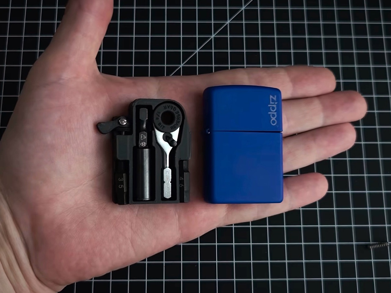
Closed, Tiny Tool Shop’s DIY toolkit is still a Zippo case. Open it, and a custom 3D-printed insert holds a Crom micro ratchet, two Steinwhale micro bits, and a Klein utility knife extension. The lighter insert has been removed, so this no longer doubles as a lighter. That constraint is part of the appeal: the maker uses an existing enclosure, with its hinged lid already solved, then designs the internal storage around a very specific selection of small tools.

The cleverest detail is retrieval. A spring salvaged from a Bic lighter helps push the ratchet through an opening in the case’s back, addressing the obvious problem of extracting something packed this tightly. Dedicated recesses organize the components instead of leaving them loose inside the shell. This is a maker project, not a ready-made Zippo product, and reproducing it means sourcing parts and making the insert. For someone drawn to mechanical projects, that assembly process is part of its attraction.

What we like

  • Reuses a familiar hinged enclosure with dedicated tool storage.
  • Spring-assisted retrieval addresses the difficulty of removing tightly packed components.

What we dislike

  • Requires DIY assembly and a custom printed insert.
  • Storage is tailored to the specified ratchet, extension, and bits.

2. CraftMaster EDC Utility Knife

CraftMaster makes more sense when opening boxes and trimming materials account for most of your tool use. The utility knife pairs a metal body with a replaceable OLFA blade deployed using a rotating knob. At 4.72 inches long, the package stays compact, while a companion metal ruler docks magnetically against the back. Rather than hiding a blade among unrelated attachments, the design gives cutting and measuring the full object, with the ruler stored alongside the knife.

The ruler carries both metric and imperial markings, with a raised edge to help lift it from a flat surface. It also incorporates a blade breaker for removing dull segments, keeping a maintenance accessory within the same compact arrangement. That’s the interesting decision here: the extra features support the main task instead of chasing a larger function count. At $80, this is a deliberate upgrade to a basic cutter, and its appeal depends on how often you cut and measure.

Click Here to Buy Now: $80.00

What we like

  • Magnetic storage keeps the ruler attached.
  • Replaceable blade with a dedicated blade breaker.

What we dislike

  • An $80 price for a utility knife.
  • No driver or plier functions.

3. Gerber Shard

Gerber’s Shard takes the opposite approach to the Zippo build: there’s nothing to unpack. This stainless steel keychain tool integrates a pry bar, two flathead drivers, a cross driver, a wire stripper, and a bottle opener into its fixed shape. A hole attaches it to your keys, so it doesn’t demand a separate pouch. The appeal is straightforward. For occasional small adjustments or light prying, you can reach for a tool without unfolding an entire set of handles and attachments.

The design asks you to accept a small gripping surface in exchange for less hardware. That’s a reasonable bargain for a backup, but not a reason to retire proper screwdrivers. There’s no blade or pair of pliers here, and the integrated tips aren’t interchangeable. Gerber specifies a titanium nitride coating for corrosion resistance, although that’s a protective treatment rather than a claim that the tool is titanium. Its distinction is how little mechanism it needs to do its limited jobs.

What we like

  • Integrated tools need no unfolding or assembly.
  • Keyring attachment avoids a separate carrying case.

What we dislike

  • Fixed driver tips cannot accommodate interchangeable bits.
  • Small gripping area limits its role in demanding jobs.

4. Streamlight Wedge SL

A flashlight earns its place here because seeing the screw can matter as much as having the right bit. Streamlight’s Wedge SL uses a flat aluminum body rather than a cylindrical tube, measuring 0.28 inches thick, or 0.41 inches with its pocket clip. It weighs 1.14 ounces and measures 5.65 inches long. Those proportions explain the design: this is a slim inspection light for a pocket edge or tool pouch, with dimensions that prioritize a thin profile over outright miniaturization.

Streamlight rates continuous output at 100 lumens on high and 50 on low, with a temporary mode reaching 500 lumens. Keeping those figures distinct matters more than leading with the biggest number. A tail switch handles operation, while USB-C charging and a user-replaceable battery support continued use. The manufacturer quotes 1.75 hours on high, so this is worth choosing around short inspections rather than assuming an entire evening at full output. That runtime deserves as much attention as the brightness.

What we like

  • Flat body measures 0.41 inches thick, including the clip.
  • USB-C charging and a user-replaceable battery.

What we dislike

  • The 500-lumen output is temporary, not continuous.
  • Rated runtime on high is only 1.75 hours.

5. Eiger 8-in-1 Scissors

EigerTool starts with the scissors, which is a sensible choice if most of your everyday cutting involves packaging, string, or labels. Made in Sanjo, Japan, the Eiger 8-in-1 Scissors use SUS420J2 stainless steel and measure 5.12 inches long, weighing 1.87 ounces without the carrying case. The handles and blades incorporate bottle, can, and screw-cap openers alongside other functions. Instead of burying small scissors inside a conventional folding tool, Eiger makes the familiar cutting action the center of the whole design.

A leather case covers the tool for carrying, and the included Nite Ize carabiner offers a bag attachment option. That matters because a tool this long still needs room, even if the scissors themselves weigh little. The case belongs in the size calculation, too: the listed 53 grams refers to the scissors, not everything you’ll carry when they’re protected and clipped on.

Click Here to Buy Now: $65.00

What we like

  • Scissors remain the primary tool.
  • Leather case and carabiner are included.

What we dislike

  • The 5.12-inch length needs pocket space.
  • Case weight isn’t included in the 53g specification.

Choose the Task Before the Tool

Before adding another tool, think about the last few times you actually needed one away from home. Frequent deliveries suggest carrying a dedicated package cutter. Loose fasteners suggest a driver. Dark cupboards suggest a light. That sounds obvious, but it’s an effective way to avoid choosing by function count alone. Your pocket has limited space; the useful question is which recurring inconvenience deserves a permanent place in it each day.

There’s also permission here to leave capabilities behind. If pliers rarely solve a problem for you, their absence isn’t automatically a flaw. If you need them regularly, none of these smaller alternatives make that requirement disappear. Compact carry works best as an honest edit, including the case, clip, or loose components that come along. The goal is a tool you’ll willingly bring, without slowly rebuilding the toolbox inside your pants.

The post 5 Pocket-Sized EDC for People Who Hate Carrying Bulky Multitools first appeared on Yanko Design.

  • ✇Yanko Design
  • This titanium watch turns Yuri Gagarin’s first orbit into a dial
    Ask any American watch nerd about space watches and you’ll hear one word within three seconds: Speedmaster. Moon landing, NASA certification, the whole legend. Meanwhile, eight years before Apollo 11, a Soviet pilot strapped on a standard-issue navigator’s watch and went around the planet first, and that story gets a fraction of the airtime. I love a Speedy as much as anyone. Still, the first human in orbit deserves a little more wrist love, and a Moscow designer just delivered some. Alexey Yak
     

This titanium watch turns Yuri Gagarin’s first orbit into a dial

25 octobre 2026 à 16:45

Ask any American watch nerd about space watches and you’ll hear one word within three seconds: Speedmaster. Moon landing, NASA certification, the whole legend. Meanwhile, eight years before Apollo 11, a Soviet pilot strapped on a standard-issue navigator’s watch and went around the planet first, and that story gets a fraction of the airtime. I love a Speedy as much as anyone. Still, the first human in orbit deserves a little more wrist love, and a Moscow designer just delivered some.

Alexey Yakushik’s Yuri Gagarin: First in Space is that delivery. His brand launched in 2025, and this is a big step up from its earlier releases on Vostok and Luch movements. The case is Grade 5 titanium, 45mm across (about 1.8 inches), with a domed sapphire crystal, a Miyota 8215 automatic sits under a custom module, and a rocket hand circles a blue Earth every hour. It collected two European Product Design Award wins this year. The run is 130 pieces, split between natural titanium and black PVD, at about $4,150 each, sold only through the brand’s Russian site.

Designer: Alexey Yakushik

A polished blue Earth sits dead center of the dial, and a rocket-shaped minute hand laps it once an hour. Minute numerals ring the globe like a launch-control readout. Hours sit lower down as bold Arabic numerals, with a red marker picking out the current one. Four plates on the diagonals spell СССР in Cyrillic, which is about as subtle as a Soviet space poster should be. For the record, Vostok 1 took roughly 89 minutes to orbit the planet and the rocket does it in 60, but I won’t be filing a complaint about the pacing.

The case and the integrated bracelet are both Grade 5 titanium, the alloy aerospace engineers love because it is strong, light, and unbothered by most of what life throws at it. At 45mm the case is large on paper, though titanium weighs far less than steel, and the brand hasn’t published the weight or thickness. The domed sapphire crystal is 35mm across and bulges up over the globe like a capsule window, which is the whole porthole idea in one piece of glass. Water resistance is 100 meters, the lume is BGW9, and the links look faceted and angular in the renders. Nobody is mistaking it for a dress watch.

Underneath sits the Miyota 8215, a 21-jewel Japanese automatic workhorse that keeps time reliably and stays out of the dial’s way, with the brand’s AYW001.1 module built on top. The renders show a custom rotor stamped with 1961, СССР, and 2026, the sort of detail only the owner will ever see. Yuri Alekseyevich Gagarin’s full name wraps the sapphire caseback window, and every watch carries its own number, such as 01/65. Hiding a love letter on the back of a watch is a wearer-only flex, and I’m here for it. Nobody across the table will ever read it, which is exactly the point.

Yakushik says the project has the blessing of Gagarin’s daughters, Galina and Elena, along with Roscosmos support. It launched April 16, 2026, timed to the flight’s 65th anniversary, and the first piece went to the Moscow Museum of Cosmonautics. The European Product Design Award is a paid-entry Farmani Group competition that covers concepts and finished products, so read the two wins as a nod to the design and leave the horological verdict to others. At about $4,150, the money goes to the titanium, the bracelet, the dome, and the custom display more than the base caliber. Gagarin carried a 33mm brass tool into orbit, and sixty-five years later his flight has a 45mm titanium watch of its own.

The post This titanium watch turns Yuri Gagarin’s first orbit into a dial first appeared on Yanko Design.

  • ✇Yanko Design
  • This Jenga tower is also a lamp, and it lights up as you stack it
    Give an architect a box of blocks and they’ll tell you it’s research. Toronto architecture studio PARTISANS took that excuse all the way and came out the other side with a lamp. The Jenga Light rebuilds the game’s famous rectangles in a translucent material that glows from inside. Set the blocks on a powered base and electricity travels upward through every point where one block rests on another. The path the weight takes is the same path the power takes. That one idea turns a party game about
     

This Jenga tower is also a lamp, and it lights up as you stack it

25 octobre 2026 à 15:15

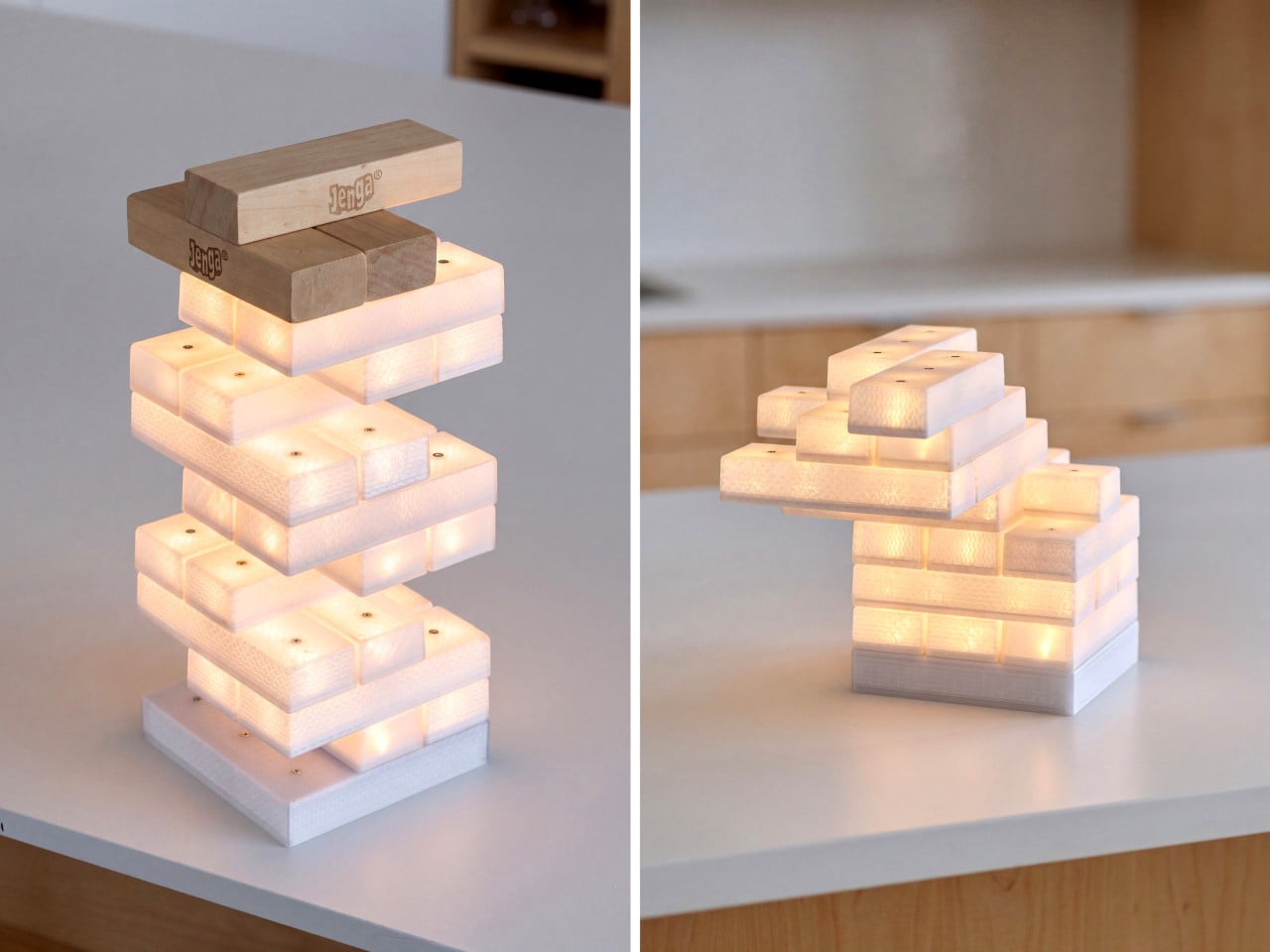
Give an architect a box of blocks and they’ll tell you it’s research. Toronto architecture studio PARTISANS took that excuse all the way and came out the other side with a lamp. The Jenga Light rebuilds the game’s famous rectangles in a translucent material that glows from inside. Set the blocks on a powered base and electricity travels upward through every point where one block rests on another. The path the weight takes is the same path the power takes. That one idea turns a party game about collapse into a lamp you build by hand, one glowing brick at a time.

Lead designer Alex Josephson and teammate Teddy Shropshire solved the fiddliest part of the problem with a component most people have never heard of. The blocks hide bridge rectifiers, tiny circuits that make polarity a non-issue. Flip a block, rotate it, or push it into a cantilever that looks like it’s daring gravity, and it still lights. The lamp won its category, Home Lighting: Lamps and Luminaires, at the 2026 European Product Design Award, an international competition that welcomes prototypes as well as finished designs. Pricing and availability haven’t been announced yet. Meanwhile, I’m trying to figure out how many blocks it takes to reach the ceiling.

Designers: Alex Josephson & Teddy Shropshire

How bridge rectifiers make every block reversible

Every electrical connection has a positive side and a negative side, and most stacking lamps deal with that by forcing pieces to go one way. A bridge rectifier is four diodes arranged in a loop, and it sends current out the same way no matter which way it comes in. Tuck them inside the blocks and “upside down” stops meaning anything. A brick can sit flat, sit flipped, or spin around, and its LEDs get the right polarity every time. That one cheap part deletes every rule you’d otherwise have to learn before playing. It’s the electrical version of a USB-C plug, which also stopped caring which way you hold it.

Compare that with the Tetris lamp ThinkGeek sold around 2012, where a powered bottom piece fed light to the tetrominoes stacked above it and the interlocking shapes did the steering. Later patents for modular light kits went mechanical, adding magnets and contacts shaped to avoid short circuits when blocks meet at odd angles. LumiBlocks took the magnetic route too, pairing snap-together blocks with app control and RGBCW LEDs. PARTISANS skips magnets entirely, letting electronics handle orientation and gravity handle everything else. The result asks nothing of you except a steady hand. That also happens to be the only thing Jenga ever asked.

Translucent printed bricks and a grid of contacts

From the photos, the bricks appear 3D-printed in a translucent plastic, with visible layer lines and a wavy internal infill. Most designers would sand or hide that texture, but here it does the job of a lampshade. Light passes through the infill and paints a woven, scaly pattern across every face, so each block glows with a grain that frosted acrylic could never give you. The shots mostly show warm white light, with one hero image running cooler. PARTISANS hasn’t published brightness or color temperature figures yet. Stack enough bricks and the whole thing reads like a lantern built by someone who really loved masonry.

Small metal contacts dot the top of each block, three in a row on the long pieces, while the base carries more, plus a power cord and a small port on one side. Those dots likely form a grid that decides how far one block can overhang the next and still stay lit. They also mean you can’t play an actual round of Jenga on it, since shimmying a brick out of the middle of a tower will just disconnect the entire top half of the lamp. Think of it as Jenga-inspired, with the building half of the game kept and the pulling half retired. A bumped table can still flatten a ten-minute spiral, which is the most Jenga thing left about it.

From a Toronto toy fair to a Toronto studio

Jenga began as a family game Leslie Scott played with wooden blocks growing up in Ghana, and it launched at the London Toy Fair in 1983. Its real break came in 1986 at the Toronto Toy Fair, where Hasbro’s chairman reportedly decided he had to have it. Forty years later, a Toronto studio has turned the same stack into a table lamp. PARTISANS is mostly an architecture practice, best known for the cedar-lined Grotto Sauna on Georgian Bay, yet Josephson keeps drifting into lighting. His Gweilo lamps, made from hand-molded acrylic sheets, won the 2016 AZ Award for Best Lighting Installation.

Playful lighting has had a good run lately, from Analog lamps, which grew out of LEGO play and now sell at MoMA, to app-controlled magnetic blocks for desk setups. The Jenga Light skips apps and color modes and bets everything on the hands-on part. The European Product Design Award judges entries anonymously and accepts prototypes, so this win recognizes the idea and its engineering ahead of any retail launch. PARTISANS hasn’t announced pricing or a release date. Until it does, I’m staring at my old Jenga set and wondering how hard bridge rectifiers really are to solder.

The post This Jenga tower is also a lamp, and it lights up as you stack it first appeared on Yanko Design.

  • ✇Yanko Design
  • Wuben’s tiny flashlight packs 500 lumens and a blade into 40 grams
    My phone flashlight handles most of my after-dark chores, which is a funny confession from someone who writes about EDC gear for a living. It is always in my pocket, it is bright enough, and it asks for nothing extra. Then a job needs both hands, and suddenly the phone is clamped in my teeth, aiming at the ceiling while I squint at a breaker box. The phone flashlight is a great idea with one design flaw, which is that it comes attached to a phone. Hands-free light has always been the gap, and h
     

Wuben’s tiny flashlight packs 500 lumens and a blade into 40 grams

24 octobre 2026 à 21:45

My phone flashlight handles most of my after-dark chores, which is a funny confession from someone who writes about EDC gear for a living. It is always in my pocket, it is bright enough, and it asks for nothing extra. Then a job needs both hands, and suddenly the phone is clamped in my teeth, aiming at the ceiling while I squint at a breaker box. The phone flashlight is a great idea with one design flaw, which is that it comes attached to a phone. Hands-free light has always been the gap, and headlamps are too much hardware for a trip to the garage.

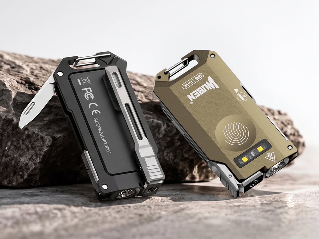
Wuben’s G6 SPARK is a keychain-sized answer to the teeth problem. Its clip rotates 90 degrees with distinct clicks, so you can clip it to a pocket, cap brim, or backpack strap and aim the beam where your hands are busy. The 500-lumen main light handles distance, a 100-lumen side light with red modes handles up close, and a hidden blunt-tip blade covers the odd chore. The body is 7075 aluminum, 0.34 inches (8.6 mm) thick, and 1.4 ounces (40 g or about as much as an AirPods case).

Designer: Wuben

Click Here to Buy Now: $33.99 $44.99 (24% off). Hurry, only 411/1000 left! Raised over $111,000.

Eleven credit cards thick and cut from aerospace aluminum

The G6 SPARK measures 2.56 by 1.35 inches and 0.34 inches thick (65 by 34.2 by 8.6 mm), and it weighs 1.4 ounces (40 g). That makes it roughly eleven credit cards thick, so it vanishes into a jeans pocket. The body is 7075 aluminum, which Wuben calls aerospace-grade, and a slab this thin needs a metal with a spine. Wuben rates it IP66 against dust and powerful water jets, with 1 meter (3.3 feet) of impact resistance, so a keychain’s daily abuse should not scare it. The USB charging port hides inside the body, which keeps the face clean and symmetrical.

7075 is the zinc-rich member of the aluminum family, and it has a reputation for being far tougher than the 6061 found in most flashlight bodies. Aircraft engineers fell for it because it is light and stiff at the same time. Stiffness is exactly what a flat flashlight needs, since a thin body that flexes is a bad day for the lens and the electronics. On a keychain, that rigidity should also help it survive a crowded pocket full of other metal. A push-release attachment lets you pop it off the ring when you want it in your hand instead of dangling off your keys.

Three lights, one button, and a click code you can learn in an evening

The main light tops out at 500 lumens with a 66 meter (217 ft) throw and a peak beam intensity of 1,089 candela. Those numbers describe a beam for the space around you, like a driveway or a campsite, rather than a hillside across the valley. Light color is 5000K, a daylight white, and the CRI of 70 means colors look decent rather than lab-accurate, which is fine for finding a dropped screw. Brightness steps are Eco, Low, Medium, and High, and you cycle them by holding the button. A double click jumps to Turbo, a triple click gives you Strobe, and mode memory remembers your last setting.

The independent side light is the one I expect to use most, since it gives a close-range pool of light at arm’s length. White comes in Low, Medium, and High, topping out at 100 lumens, which is plenty for reading a label or tracing a wire. Red adds a steady mode and a signal mode at 10 lumens, handy for saving night vision or flagging yourself on a dark road. Hold the button while the main light is off to wake the side light, and hold again to cycle the five modes. That is a lot of options on one button, though the click patterns are easy enough to learn in an evening.

A clip that aims, a blade that hides, and a cap brim that becomes a headlamp

The clip is the headline trick, rotating through 90 degrees with distinct mechanical clicks so you can feel each position. Clipped to a cap brim, it works like a minimalist headlamp, and I would happily wear it to read in a tent. Tucked into the side is a blunt-tip utility blade that handles opening boxes, slicing tape, and sharpening a pencil, and probably a marshmallow stick if you ask nicely. Fold it away and the G6 goes back to being a slab that keeps your keys company. My one wish is a tiny tactile mark near the button, so a cold thumb can find it in the dark.

Click Here to Buy Now: $33.99 $44.99 (24% off). Hurry, only 411/1000 left! Raised over $111,000.

The post Wuben’s tiny flashlight packs 500 lumens and a blade into 40 grams first appeared on Yanko Design.

  • ✇Yanko Design
  • This AI Assistant Looks Like a Tiny Monitor but Actually Operates Your Computer
    Copying customer details from a message into a spreadsheet probably isn’t anyone’s idea of a good afternoon. Unfortunately, even a perfectly capable computer still leaves plenty of that work to you. Bvio’s Violoop is a plug-in AI operator designed to handle those repetitive steps, giving your existing computer an assistant without asking you to replace the machine you’re already comfortable using. You can tell Violoop what you need in ordinary language, such as finding customer information in a
     

This AI Assistant Looks Like a Tiny Monitor but Actually Operates Your Computer

Par : JC Torres
24 octobre 2026 à 19:30

Copying customer details from a message into a spreadsheet probably isn’t anyone’s idea of a good afternoon. Unfortunately, even a perfectly capable computer still leaves plenty of that work to you. Bvio’s Violoop is a plug-in AI operator designed to handle those repetitive steps, giving your existing computer an assistant without asking you to replace the machine you’re already comfortable using.

You can tell Violoop what you need in ordinary language, such as finding customer information in a WhatsApp conversation and entering it into a customer relationship management (CRM) system. That might sound like a small convenience, until you’ve spent an afternoon repeating the same routine. The aim is to let you explain the task instead of manually carrying every detail from one window to another.

Designer: Team Violoop

Click Here to Buy Now: $399 $699 (43% off). Hurry, only a few left! Raised over $2.8 million.

To do that, Violoop interprets what’s on the screen and interacts with applications through keyboard and mouse controls. Its companion software supports Windows, macOS, and Linux, while the screen-based approach means it doesn’t need a dedicated integration for each application. You’re still working with familiar programs, only with assistance intended to bridge the gaps between them, and without the need to learn programming to give it instructions.

Of course, customer records are only part of the paperwork that follows a small business around. Invoice details need entering into spreadsheets, documents need organizing, and files rarely end up where they belong without some encouragement. Violoop is designed to help with that preparation, taking on the repetitive handling while leaving you to check the information and decide what to do with it.

Email offers another familiar example. Having something sensible to edit can be easier than staring at an empty reply box, especially when several messages need similar responses. Violoop can prepare replies as drafts for review, giving you a starting point while keeping the final wording in your hands. You can add the context that a customer relationship or a delicate conversation actually needs.

There’s also a reason this assistant takes up physical space on your desk. Its compact enclosure and angled touchscreen give ongoing tasks a place of their own, rather than burying everything in another software window. Inside, the tiny device packs a punch of up to 26 trillion operations per second (TOPS) of AI processing. That hardware is intended to support local screen understanding and other AI work on Violoop itself.

That local processing also supports a more personal approach to recurring work. Violoop keeps personal memory on the device, retaining preferences and context so you don’t have to explain the same habits every time. Local memory doesn’t mean every task stays offline, however. Depending on the selected mode, Violoop can also connect to cloud services or larger AI models when additional help is needed.

The most interesting control might be the button on top. Violoop separates AI processing from a dedicated security controller, with an approval step for sensitive actions. The physical confirmation button gives that pause a tangible form. Preparing information and committing to an action are different responsibilities, after all, and the design puts a deliberate checkpoint between what the AI proposes and what happens next.

You don’t have to stay beside it to keep an eye on progress, either. Phone access lets you check tasks, send further instructions, and approve sensitive actions while you’re away from the desk, provided the computer remains on and connected. That’s useful when you need to step out but still want to see how things are going, without returning to the keyboard for every update.

An organized spreadsheet won’t decide which project you should take on next, and a drafted reply doesn’t know everything about the person receiving it. Those parts still belong to you. Violoop’s role is to help get the surrounding work ready, using a device that keeps progress visible and approval close at hand. That leaves the final email waiting for something decidedly familiar: your own words.

Click Here to Buy Now: $399 $699 (43% off). Hurry, only a few left! Raised over $2.8 million.

The post This AI Assistant Looks Like a Tiny Monitor but Actually Operates Your Computer first appeared on Yanko Design.

  • ✇Yanko Design
  • Neo-Brutalist Vases Look Like Tiny Towers, Even Without Flowers
    An empty vase can make a shelf look oddly unfinished, as though the flowers were supposed to do all the decorating. Aleksander Kozera’s Neo-Brutalist Vases offer a convincing way around that small domestic problem. Created under his Warsaw-based Yird Ceramics brand, these ceramic vessels have enough architectural detail to hold attention on their own. I’d be inclined to leave them empty before deciding what, if anything, belongs inside. Their cylindrical bodies are divided into rectangular pane
     

Neo-Brutalist Vases Look Like Tiny Towers, Even Without Flowers

24 octobre 2026 à 18:30

An empty vase can make a shelf look oddly unfinished, as though the flowers were supposed to do all the decorating. Aleksander Kozera’s Neo-Brutalist Vases offer a convincing way around that small domestic problem. Created under his Warsaw-based Yird Ceramics brand, these ceramic vessels have enough architectural detail to hold attention on their own. I’d be inclined to leave them empty before deciding what, if anything, belongs inside.

Their cylindrical bodies are divided into rectangular panels, with tiny indentations that suggest construction details on a concrete facade. Circular recesses interrupt that grid, while curved projections extend from the sides like abbreviated balconies or exposed joints. The effect lands somewhere between an architectural model and a piece of science-fiction set dressing. They look a little like infrastructure for a very small, very design-conscious civilization, which is part of their appeal.

Designer: Aleksander Kozera

The concrete resemblance comes from the ceramic body itself. According to the collection’s Łódź Design Festival description, Kozera uses porcelain casting slip with ceramic pigments and black grog to produce that raw, concrete-like finish. In the close-up photographs, dark speckles break up the gray surface. That texture matters visually: without it, the panel lines and repeated circles could read as a smooth plastic prop. Instead, the surface gives the geometry some grit.

The modular approach also makes the collection more interesting than a row of differently sized cylinders. The festival describes vessels that can be combined and arranged into larger compositions. In the photographs, neighboring forms create narrow gaps, overlapping projections, and changing silhouettes. I like the possibility of treating a shelf as a small architectural composition rather than lining up three matching accessories. The vessels share a vocabulary without looking identical from every angle.

Kozera’s broader studio process helps explain that controlled repetition. He describes beginning with digital modeling, then 3D-printing master forms used to make plaster molds for slip-casting porcelain. That’s a useful distinction for anyone assuming these are printed plastic objects or directly printed ceramics. Digital tools establish the geometry, while casting translates it into ceramic. The workshop photographs make that relationship tangible, showing shaped components and molds alongside vessels at different stages of production.

The finish introduces another layer of detail. The collection description specifies a translucent green glaze, with the small exterior “windows” individually glazed by hand. The green is restrained enough that the photographed pieces still read predominantly as gray architectural objects. I prefer that decision to an all-over glossy finish. Small glazed areas give the eye somewhere to pause without obscuring the panel divisions or competing with the speckled body.

Flowers change the balance considerably. In the styled photograph, branching stems stretch above and across the vessels, disrupting all those disciplined horizontal and vertical lines. The arrangement is sparse enough that the ceramic remains visible, which seems the right approach. A dense supermarket bouquet might conceal much of the detail that makes these worth looking at. A few irregular branches would let the architecture and the plant material each have some breathing room.

My reservation is mostly about where they would live. These are visually busy objects, even with their limited palette. On a shelf already crowded with books, collectibles, and patterned ceramics, the small recesses and projecting edges could get lost. I’d give one a relatively clear stretch of console or place a group against a plain wall. That’s a styling preference, but the design rewards enough space to read its silhouette.

These are physical ceramic works rather than render-only proposals, and the collection is listed as selected for the make me! 2026 exhibition at Łódź Design Festival. That listing does not establish retail pricing or US availability, so it shouldn’t be mistaken for a confirmed shopping announcement.

For me, the strongest choice is the attention given to the sides of each vessel. Turn one, and the relationship between grid, recess, and projection changes. That gives the object a reason to stay on display after the stems are gone, without asking an empty vase to pretend it’s waiting for its next assignment.

The post Neo-Brutalist Vases Look Like Tiny Towers, Even Without Flowers first appeared on Yanko Design.

  • ✇Yanko Design
  • Edge & Pop pairs a tiny Damascus knife with a bottle opener
    Small jobs have a habit of sending us looking for bigger tools. A package arrives, the tape won’t budge, and suddenly you’re searching a drawer for something sharp. Carrying a large knife for these little interruptions feels a bit excessive, though. Lunark’s Edge & Pop takes a more modest approach, combining a folding pocket knife and bottle opener in one compact, wood-handled design. At 2.7 inches long when open, with a 1.6-inch handle and a 1.1-inch blade, Edge & Pop keeps its ambitio
     

Edge & Pop pairs a tiny Damascus knife with a bottle opener

Par : JC Torres
23 octobre 2026 à 21:45

Small jobs have a habit of sending us looking for bigger tools. A package arrives, the tape won’t budge, and suddenly you’re searching a drawer for something sharp. Carrying a large knife for these little interruptions feels a bit excessive, though. Lunark’s Edge & Pop takes a more modest approach, combining a folding pocket knife and bottle opener in one compact, wood-handled design.

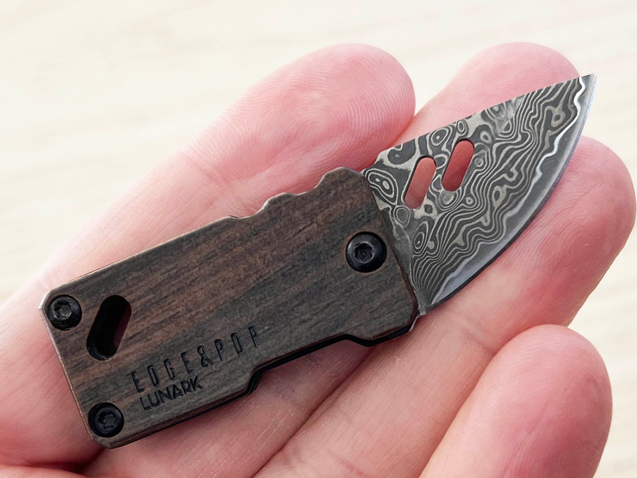
At 2.7 inches long when open, with a 1.6-inch handle and a 1.1-inch blade, Edge & Pop keeps its ambitions fairly small. And at one ounce, it’s quite lightweight, too. That’s useful when your pockets already have a phone, wallet, and keys competing for space. There’s little reason for a tool meant for occasional cutting to take over the rest of your everyday carry.

Designer: Allan Ospina, Founder of Lunark

Click Here to Buy Now: $39.20 $59 (33% off, use coupon code “YD’). Hurry, deal ends in 48-hours!

The drop-point blade brings a curved cutting edge and a tip that slopes down from the spine. It’s intended for modest tasks, such as opening envelopes, slicing packing tape, or trimming cord. You don’t need to invent a camping trip to find a reason to carry it. A delivery on the doorstep or a stubborn bit of packaging is a less dramatic place to start.

Of course, a tiny knife doesn’t have to look like anonymous hardware. The blade is made of Damascus steel with 67 layers of high-carbon 9Cr18MoV, while the winding patterns give its surface a character of its own. The lines resemble the contours on a map, bringing detail to a small area. That pattern is an aesthetic attraction that makes the knife feel more considered than your typical cutting tools.

The ebony handle gives that patterned steel a quieter companion. Dark wood grain sits alongside black fasteners and softened corners, keeping the shape simple without making it plain. It’s an appealing departure from tools that turn every surface into exposed metal. The grain varies between pieces, so some of the object’s personality comes from the material rather than an added color scheme.

The bottle opener, meanwhile, becomes useful when a capped drink calls for something better than an improvised trick. It sits at the rear of the blade and becomes accessible when the cutting edge folds into the handle. There’s no separate implement to swing out first. Moving between the two jobs means changing the blade’s position, keeping the arrangement compact without adding another folding tool.

That little opener has another job as well. Pressing its end helps rotate the blade outward, making it part of the opening mechanism rather than a feature sitting idle between drinks. A liner lock holds the blade in its extended position, so you won’t have to worry about the blade folding back in accidentally. It’s a small but critical detail you’ll be thankful for when facing a stubborn box.

An attachment opening in the handle provides another way to keep the tool nearby. Paired with the included mini carabiner, it can join a keychain or hang from a bag rather than occupy a pocket. Whether in a pocket or hanging from a belt or bag, having a choice of carry arrangements is useful for an object meant to tag along.

Beneath the ebony handle, a heat-treated 420 stainless steel frame gives the tool a neatly defined outline. The exposed metal traces the wood’s edges, while black fasteners keep the assembly visually restrained. It’s a considered way to bring several materials into such a small object. There’s detail to appreciate up close, yet the overall shape stays simple enough to read at a glance.

A taped box on the kitchen counter and a capped drink at the end of the day make a good case for keeping these two functions together. Edge & Pop answers both with a compact shape and materials that reward a closer look. The pleasure is in that combination, having something useful within reach that feels as thoughtfully designed as the objects you choose to display.

Click Here to Buy Now: $39.20 $59 (33% off, use coupon code “YD’). Hurry, deal ends in 48-hours!

The post Edge & Pop pairs a tiny Damascus knife with a bottle opener first appeared on Yanko Design.

  • ✇Yanko Design
  • Abxylute’s $65 smartphone gamepad packs Hall Effect triggers, clickable sticks, and gyro aiming
    Valve raised the price of the 512GB Steam Deck OLED to $789 this May, a number that makes anyone want to close the browser tab out of spite. Blame the AI boom, which has data centers swallowing memory chips faster than factories can make them, leaving handhelds to fight over the scraps. Now look at the phone in your hand. It runs native console ports like Resident Evil, streams entire Xbox and PlayStation libraries, and emulates most of the consoles a millennial grew up with. All it lacks is a
     

Abxylute’s $65 smartphone gamepad packs Hall Effect triggers, clickable sticks, and gyro aiming

23 octobre 2026 à 19:30

Valve raised the price of the 512GB Steam Deck OLED to $789 this May, a number that makes anyone want to close the browser tab out of spite. Blame the AI boom, which has data centers swallowing memory chips faster than factories can make them, leaving handhelds to fight over the scraps. Now look at the phone in your hand. It runs native console ports like Resident Evil, streams entire Xbox and PlayStation libraries, and emulates most of the consoles a millennial grew up with. All it lacks is a pair of real thumbsticks and triggers, which is a far cheaper problem to solve.

Hong Kong-based abxylute solves that problem with the M5 and M6, two sliding controllers that magnetically snap to the back of your phone. Closed, they sit behind it like a chunky case. Slide the phone up and a full gamepad appears underneath, Xperia Play style, with sticks, triggers, and rumble. The M5 is the slim one, plugging in over USB-C with zero pairing and pass-through charging. The M6 goes wireless over Bluetooth, adding clickable capacitive sticks, Hall Effect triggers, gyro aiming, and a 10-hour battery. Both retail under $90, roughly one-ninth of a Steam Deck these days, and for anyone whose gaming happens on commutes and couches, that math is hard to argue with.

Designer: abxylute

Click Here to Buy Now: $65 $84.99 (24% off) Hurry! Only limited units available.

A slider rail from the Nokia era, rebuilt for modern phones

Sliding rails nearly went extinct when touchscreen slabs replaced slider phones, and so did most of the factories that made them. abxylute eventually tracked down a manufacturer that once built rails for Nokia and Sony, then asked it to do something those phones never needed. A slider from 2010 only had to carry a lightweight screen half, while the M5 and M6 have to hold a phone and case weighing up to around 10.6 ounces (300g). The resulting bidirectional damped rail glides smoothly both ways, with magnets snapping it into the fully open and closed positions. That makes for a calmer motion than the spring-loaded slide on the OhSnap MCON, which fires the phone open at a button press.

The phone attaches through an adjustable magnetic mount rated at 4,098 gf, roughly 9 pounds of pull and comfortably above the 2,500 to 3,500 gf abxylute quotes for Apple’s MagSafe. Both mounts clear camera bumps up to 0.28 inches (7mm), and the plate shifts to suit different phone sizes. Supported phones include the iPhone 18 series, Galaxy S26, Pixel 11, OnePlus 15, and Xiaomi 17, with a magnetic adhesive ring in the box for anything lacking MagSafe. Thick cases will sap some of that grip, so slimmer cases make the safer pairing. Lightning iPhones sit out the M5 entirely, since that model needs a USB-C port to work.

The M5 goes wired and thin for pocket duty

The M5 began life as a DIY build by Jinjiang, an independent maker who handled the 3D modeling, PCB design, and programming himself before abxylute partnered with him to engineer it for mass production. Its connection is wired USB-C, which means no Bluetooth pairing, no battery to charge, and pass-through charging so your phone can top up mid-session. The sticks are low-profile carbon-film sliders modeled on the PSP, PSP Go, and Nintendo 3DS, recessed nearly flat to keep the controller slim. Because sliders can’t click, abxylute added dedicated LS and RS buttons that double as programmable macro keys. Micro-switch triggers with short travel and a crisp click round out the inputs.

Those choices produce a controller that weighs about 6 ounces (170g) and measures 0.91 inches (23mm) thick with the mount, thinning to 0.45 inches (11.5mm) at the grip area. It spans 5.9 inches (149.5mm) wide, about the width of a large phone, so it slips into a jacket pocket easily. I appreciate a product that commits this fully to one idea, and the M5 commits to portability. Slider sticks offer less throw than full-size ones, so they favor retro titles and platformers over twitchy shooters. A limited M5 Founder’s Edition, capped at 1,000 units, comes in translucent retro green with a customizable two-letter badge replacing the abxylute logo.

The M6 packs full-size controller features into the slide

The M6 took nearly three years to develop, long enough to earn the internal nickname “little Nezha,” and most of that effort went into the controls. Its capacitive sticks, developed with component maker K-Silver, tilt 20 degrees against the roughly 23 degrees of a full-size controller stick, and they click for L3 and R3. abxylute also built them to resist magnetic interference, a smart call given the strong magnet array sliding a few millimeters above them. Instead of sinking the sticks into deep wells, a stepped surface around each one frees up room for your thumbs. Stick output switches between circular and square modes, handy for racing games and emulators.

Hall Effect linear triggers with 0.22 inches (5.5mm) of travel handle racing games, and a Fast Trigger Mode shortens actuation for shooters. A face-mounted Z button takes remaps and multi-button macros, so a fighting game special move or a jump-and-shoot combo fits under one thumb. There’s also a 6-axis gyroscope for motion aiming, and Bluetooth 5.3 backed by a 500mAh battery rated for up to 10 hours. The lighting is diffused, bouncing off the controller’s surface instead of shining at your eyes, and its color changes with each mode. All this comes in at 6.7 ounces (191g) and 1.02 inches (26mm) thick, a modest premium over the M5.

Shared features, the abxy app, and what each model costs

Both controllers share a physical mode switch that flips between NS, XInput, and PS layouts, covering Switch emulators, Android and cloud gaming, and iPhone titles respectively. Each gets dual Z-axis linear vibration motors with four intensity levels, plus a Turbo function paired to the M button. The free abxy Game App doubles as a launcher for emulators and cloud services, and it handles remapping, dead zones, macros, lighting, and vibration. Virtual touch mapping lets you assign on-screen controls to physical buttons for games that never bothered with controller support. Detachable magnetic grips, held by magnets plus a mechanical shear lock, add full-size handles for longer sessions, though they aren’t listed among the box contents.

Kickstarter pricing currently sits at $65 for the M5 and $69 for the M6, against retail prices of $84.99 and $89.99, both well under the $169.99 Backbone Pro. A bundle with one of each costs $119, down from $174.98. The M6 is estimated to ship in November 2026 and the M5 in December 2026, with worldwide delivery. The M5 box adds a USB-C cable to the controller, adhesive ring, and manual that both models share. Valve wants $789 for a handheld. abxylute wants $69 to upgrade the one you already own.

Click Here to Buy Now: $65 $84.99 (24% off) Hurry! Only limited units available.

The post Abxylute’s $65 smartphone gamepad packs Hall Effect triggers, clickable sticks, and gyro aiming first appeared on Yanko Design.

  • ✇Yanko Design
  • These Japanese-Made Guitar Scissors Come With Their Own Mini Stand
    Even though I already have drawers and boxes of various stationery items, I’m always on the lookout for things that are cute and unique but still useful for work and my hobbies. Scissors are one of those things you can never have too many of, especially if they serve different functions. There are pairs for everyday cutting, for journaling, for cutting things into cute shapes, and some that are just highly decorative. If you love stationery and music, the Rockstar Guitar Scissors may be your ne
     

These Japanese-Made Guitar Scissors Come With Their Own Mini Stand

23 octobre 2026 à 16:30

Even though I already have drawers and boxes of various stationery items, I’m always on the lookout for things that are cute and unique but still useful for work and my hobbies. Scissors are one of those things you can never have too many of, especially if they serve different functions. There are pairs for everyday cutting, for journaling, for cutting things into cute shapes, and some that are just highly decorative.

If you love stationery and music, the Rockstar Guitar Scissors may be your next tiny purchase. As the name suggests, it’s a pair of scissors shaped like an electric guitar. But more than just being uniquely shaped, the design itself has a role in storing and using the scissors. It’s the kind of item you might want to keep out of your office drawer, and it could also make a small gift or stocking stuffer this upcoming holiday season.

Click Here to Buy Now: Starting at $30

A lot of differently shaped stationery items can just be novelty things that are good to display on your desk. This one, though, has parts that were thought out to match the theme while making it a functional piece for everyday use. So forget about guitar graphics slapped onto a pair of conventional scissors. This one takes the idea further. Well, it still can’t play actual music, of course.

The guitar body separates into the handles, with the finger openings as part of the lower body of the instrument it’s imitating. The narrow neck of the “guitar” separates into the cutting blades. It even has a removable ABS cap that completes the headstock when the scissors are closed. According to the store’s description, the cap also covers the sharp point and prevents the scissors from opening while it’s in place. That gives a decorative detail a useful job when you’re putting the scissors away.

The scissors have stainless steel blades, while the handles and cap use ABS plastic and the stand is made from elastomer. You can choose from three color options: black, metallic blue, and pearl white. They measure about 7.8 inches overall, and the YD Select lists black at US$30; metallic blue and pearl white at US$40 each.

They even come with a stand that holds up your closed scissors like an actual guitar at rest on an instrument stand. For anyone who tends to lose smaller tools among notebooks and pen cases, having a dedicated spot could make them easier to find. Of course, the stand takes up some desk space, so this isn’t really a space-saving solution. It’s more about giving a useful item a place where you’ll actually notice it.

Made in Japan by Nikken Cutlery, the scissors are also known as Seki Sound. Nikken says craftspeople in Seki individually sharpen the blades, and it describes a fluorine-coated finish intended to reduce adhesive sticking when cutting tape. That’s a relevant feature if your stationery projects involve tape, although it shouldn’t be read as a promise that the blades will never need cleaning. The guitar detailing also includes six strings and frets, rather than relying only on the outline.

Compared with options from a big brand like Fiskars, the Rockstar Guitar Scissors put more emphasis on their display-ready shape. Fiskars offers SoftGrip handles, Easy Action spring-assisted opening, and nonstick models, while its MoMA collection puts artwork on familiar scissor handles. The Rockstar design instead turns the whole tool into a miniature instrument, complete with a cap and stand. There isn’t enough evidence to say it cuts better or feels more comfortable than those alternatives; its clearest distinction is how the guitar shape carries through to storage.

I wouldn’t expect the Rockstar Guitar Scissors to replace every specialty scissor in my drawers. What appeals to me is having something with a recognizable personality that still has a reason to be on my desk. For a stationery lover who also loves music, it could make a good holiday gift or stocking stuffer, especially if you’d rather give something useful than another ornament that just sits there. At least this little guitar has a job between its imaginary performances.

The post These Japanese-Made Guitar Scissors Come With Their Own Mini Stand first appeared on Yanko Design.

  • ✇Yanko Design
  • These Five 3D-Printed Lamps Shape Light With Mazes and Moving Rings
    The relationship between technology and craftsmanship is evolving rapidly, and 3D-printed lighting sits at the center of this transformation. What once belonged purely to industrial manufacturing has now become a creative medium for designers, artists, and architects. Through digital modeling, parametric experimentation, and sustainable fabrication, 3D-printed lamps are redefining how ambient light interacts with interiors. These sculptural objects are more than functional fixtures. They merge
     

These Five 3D-Printed Lamps Shape Light With Mazes and Moving Rings

23 octobre 2026 à 12:20

The relationship between technology and craftsmanship is evolving rapidly, and 3D-printed lighting sits at the center of this transformation. What once belonged purely to industrial manufacturing has now become a creative medium for designers, artists, and architects. Through digital modeling, parametric experimentation, and sustainable fabrication, 3D-printed lamps are redefining how ambient light interacts with interiors.

These sculptural objects are more than functional fixtures. They merge precision engineering with artistic expression, creating lighting that feels organic, customizable, and emotionally engaging. As digital craft evolves, here is how 3D-printed lamps are shaping a future where light becomes both atmosphere and architecture.

1. Parametric Light Sculptures

Traditional lighting design often begins with hand sketches and material studies, but digital craft introduces a more fluid design process. Using parametric software, designers can manipulate patterns, geometries, and textures in real time. This allows lighting forms to evolve naturally through algorithms and experimentation.

The result is a new language of illumination where every curve, perforation, and layer influences the diffusion of light. Designers can create highly detailed structures that would be difficult or impossible to produce through conventional manufacturing. Digital precision transforms lamps into immersive visual experiences.

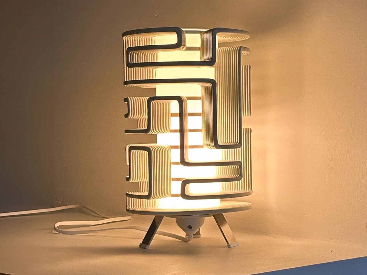
The Maze Lamp transforms experimental 3D printing into a sculptural lighting piece filled with movement, texture, and individuality. Created by designer Stijn van Aardenne, the lamp features intricate winding lines produced through an industrial 3D printing process that moves across a rotating axis. This technique creates mesmerizing maze-like patterns that wrap around the cylindrical form, casting dramatic shadows and ambient light throughout the space. Even when switched off, the lamp stands as a striking decorative object with an artistic and futuristic presence.

Each Maze Lamp is unique, as the flowing patterns are generated through a randomized printing process, ensuring no two pieces are ever identical. Crafted using recycled plastic sourced from discarded refrigerator doors, the design also embraces sustainability while celebrating digital craftsmanship. The layered structure creates a glowing effect that feels both mysterious and architectural, turning the lamp into a functional work of art.

2. Layered Printing Creates Soft Illumination

One of the most fascinating aspects of 3D-printed lamps is how layered fabrication affects light quality. During the printing process, thin material layers form subtle textures that interact beautifully with illumination. These ridges scatter light softly, creating a warm and ambient glow within interiors.

Instead of harsh brightness, the lamp becomes a medium for atmosphere. The printed patterns generate shadows and gradients that shift depending on viewing angles and light intensity. This blend of texture and luminosity turns ordinary lighting into a sensory and sculptural feature.

The Alherd Collection by YET FAB transforms lighting into a sculptural exploration of nature, technology, and atmosphere. Inspired by the organic growth of coral formations and the erosion of natural stone, the collection features porous, cellular structures created through advanced computational design and custom 3D printing. Founded by Ilya Kotler, Anastasiya Kotler, and Rael Kaymer, the studio blends biomimicry with digital fabrication to create lamps that glow like living forms while adding a soft ambient presence to contemporary interiors.

The collection includes table, floor, and pendant lamps, all sharing a unified visual language that adapts beautifully across different scales. Crafted from recyclable plastic, each lamp is made to order and can be customized in various finishes and colors. Integrated LED lighting softly illuminates the textured surfaces, producing a warm, atmospheric glow that feels both futuristic and organic.

3. Sustainable Materials Shape Modern Lighting

Sustainability has become a defining factor in contemporary product design, and 3D-printed lighting responds directly to this shift. Many designers now use biodegradable plastics, recycled polymers, and plant-based materials to produce environmentally conscious lamps. Digital fabrication also reduces material waste compared to traditional manufacturing methods.

Since objects are printed only where material is required, excess production is minimized. Designers can also manufacture locally, reducing transportation emissions and unnecessary inventory. This approach reflects a future where digital craft aligns aesthetics with responsible production practices.

The Drop Light by Teixeira Design Studio redefines everyday desk lighting through a thoughtful blend of functionality, sustainability, and minimalist design. Created in collaboration with Oftwise Studio, the lamp is 3D printed entirely from recycled plant-based PLA and features an integrated storage tray within its sculptural base. Designed to organize essentials like charging cables, earphones, and small accessories, the lamp transforms clutter into a seamless part of the design while maintaining a clean and contemporary aesthetic suited for modern interiors and workspaces.

The design highlights the versatility of 3D printing through contrasting textures and finishes. Its matte, tactile base offers durability and warmth, while the smooth, semi-translucent shade softly diffuses light to create a calm, ambient glow. The layered printing details feel intentional rather than industrial, emphasizing craftsmanship and precision. Combining sustainable materials with intelligent functionality, the Drop Light stands as a refined example of modern lighting design where utility, environmental consciousness, and understated elegance exist in perfect balance.

4. Customization Redefines Personal Spaces

3D printing allows lighting design to move beyond mass production toward personalization. Lamps can now be customized in size, texture, color, and form according to the needs of individual users or specific interiors. This flexibility creates stronger emotional connections between objects and spaces.

For homeowners and designers, customization means lighting can adapt to modern lifestyles. Organic forms inspired by nature, futuristic geometric structures, or minimal sculptural silhouettes can all be produced with ease. The result is lighting that feels unique rather than standardized.

The lighting collection from Gantri focuses on sustainable, design-led lamps made using plant-based, sugar-derived PLA materials. Each product is 3D printed to achieve precise forms, soft textures, and environmentally responsible construction. The designs combine modern aesthetics with functional lighting solutions suited for compact and contemporary interiors. The material choice ensures durability while maintaining a low environmental impact, making the lamps both practical and sustainable for everyday use.

The collection includes table, desk, and ambient lighting designed to enhance workspace and home environments. Products like sculptural desk lamps, multi-functional tray lights, and ambient mood lighting solutions offer features such as diffused illumination, space-saving bases, and integrated utility functions. Many designs emphasize minimal silhouettes, warm LED lighting, and ergonomic light distribution to reduce eye strain. Across the range, the focus remains on combining functionality, clean design, and eco-conscious production through advanced 3D printing technology, resulting in versatile lighting objects that suit modern living spaces.

5. The Fusion of Art, Technology, and Atmosphere

3D-printed lamps exist at the intersection of digital innovation and artistic craft. Designers are no longer limited by traditional tools or manufacturing constraints. Instead, they can experiment freely with fluid geometries, intricate lattices, and biomorphic forms that transform illumination into art.

As these lamps glow, they create immersive environments where technology feels human-centered rather than mechanical. Ambient lighting becomes an emotional experience shaped by texture, transparency, and shadow. This fusion of craft and computation reflects the future of contemporary design culture.

The Armadillo series by OHR Design explores how 3D printing can move beyond novelty objects into functional lighting systems. Inspired by the layered armor of the armadillo, the design transforms a simple shade into a kinetic, adjustable structure made of concentric printed rings. Originally developed from the OHRB tea light holder, the Armadillo introduces a flexible lighting concept where form directly controls illumination. The compact version stands at 240 mm and works as a bedside or accent light, while maintaining a sculptural presence even when unlit.

The Armadillo XL expands the concept into a full-scale desk lamp at 373.8 mm tall, designed for standard light bulbs and stronger everyday use. Its adjustable ring system allows users to open or close the shade, shifting light from a soft ambient glow to a focused beam depending on the need. Instead of being a fixed object, the lamp becomes interactive, letting the user physically shape lighting conditions.

These 3D-printed lamps transform digital craft into atmospheric experiences, blending technology, sustainability, and artistry. Through innovative fabrication and customizable forms, ambient lighting evolves into a sculptural expression that reshapes modern interior design.

The post These Five 3D-Printed Lamps Shape Light With Mazes and Moving Rings first appeared on Yanko Design.

  • ✇Yanko Design
  • Bandit9 (RED)800 Motorcycle Fades From Racing Red to Brushed Aluminum
    Only a few come close to Bandit9 when it comes to avant-garde custom motorcycle creations. We’ve seen some eye-popping designs from the Vietnam-based studio that lean into a sci-fi theme, with alien-inspired forms that stay within the desirable two-wheeler limits. This time around, the custom builder is back with a hand-built motorcycle crafted in collaboration with RED, an organization helping fight AIDS and other preventable diseases. Dubbed the (RED)800, this bike is a sight to behold with i
     

Bandit9 (RED)800 Motorcycle Fades From Racing Red to Brushed Aluminum

23 octobre 2026 à 11:20

Only a few come close to Bandit9 when it comes to avant-garde custom motorcycle creations. We’ve seen some eye-popping designs from the Vietnam-based studio that lean into a sci-fi theme, with alien-inspired forms that stay within the desirable two-wheeler limits. This time around, the custom builder is back with a hand-built motorcycle crafted in collaboration with RED, an organization helping fight AIDS and other preventable diseases.

Dubbed the (RED)800, this bike is a sight to behold with its raw form fused into a modern aesthetic, as the hand-brushed aluminum fades gradually into the sparkly red form. Only 9 units of this bike will ever be made, so that puts it firmly in the ultra-limited-edition category. More importantly, every single penny earned from the sales will go to RED’s mission for life-saving healthcare programs to communities most in need.

Designer: Bandit9 and RED

According to the makers, the bike’s bodywork is sculpted from scratch, with the attention to detail that’s worthy of a sculpture. As RED puts it, the bike is “an unexpected meeting of color and raw metal, executed by hand. It’s this kind of unconventional thinking and meticulous execution that defines a Bandit9 motorcycle.” Underneath that drool-worthy bodywork is the Ducati 821cc Testastretta V-twin producing 110 bhp. That takes the handsome machine from 0–60 mph in 3.3 seconds, and capable of hitting top speed of 201 km/h.

Coming back to that magnetic bodywork shaped in one continuous form, the hand-painted gradient transitions from the Racing Red to the raw hand-brushed aluminum with no apparent separating lines. Each one of the bikes will be hand-painted, so they’ll have a unique personality of their own. The finish of the bodywork is the talking point here, as the raw metal is turned into something organic while still feeling modern.

The mechanical components of the bike are left exposed underneath the aluminum shell for that muscular feel. Especially on the rear of the monocoque body, the metal surfaces are left exposed – showing off the steel trellis frame. The red strip light running from the saddle, all the way down to the suspension joint, gives the bike a sci-fi character. To complement the unibody design, the (RED)800 rides on spoked wheels and low-profile tires. For an aerodynamic riding posture, the bike gets rear-set foot controls and low-slung handlebars.

Bandit9 (RED)800 carries a price tag of $49,000 (plus shipping), and each one is made to order, with shipping taking anywhere from eight months to a year. So, you’ll have to be ultra-patient to get hands on one, even if you are lucky enough to order one of the only nine units.


The post Bandit9 (RED)800 Motorcycle Fades From Racing Red to Brushed Aluminum first appeared on Yanko Design.

  • ✇Yanko Design
  • The 8 Best Audio Designs for People Who Want to Own Their Music
    An album can be a folder you keep, a disc you lend, or a cassette you record yourself. That is a useful starting point for choosing audio equipment: what happens to the music after you press stop? The most interesting designs here give a collection a place to live, a way to travel, or a reason to come off the shelf. Their appeal starts with what you want to play. These eight picks approach ownership from different directions, from carrying digital files to displaying album artwork and making re
     

The 8 Best Audio Designs for People Who Want to Own Their Music

23 octobre 2026 à 07:40

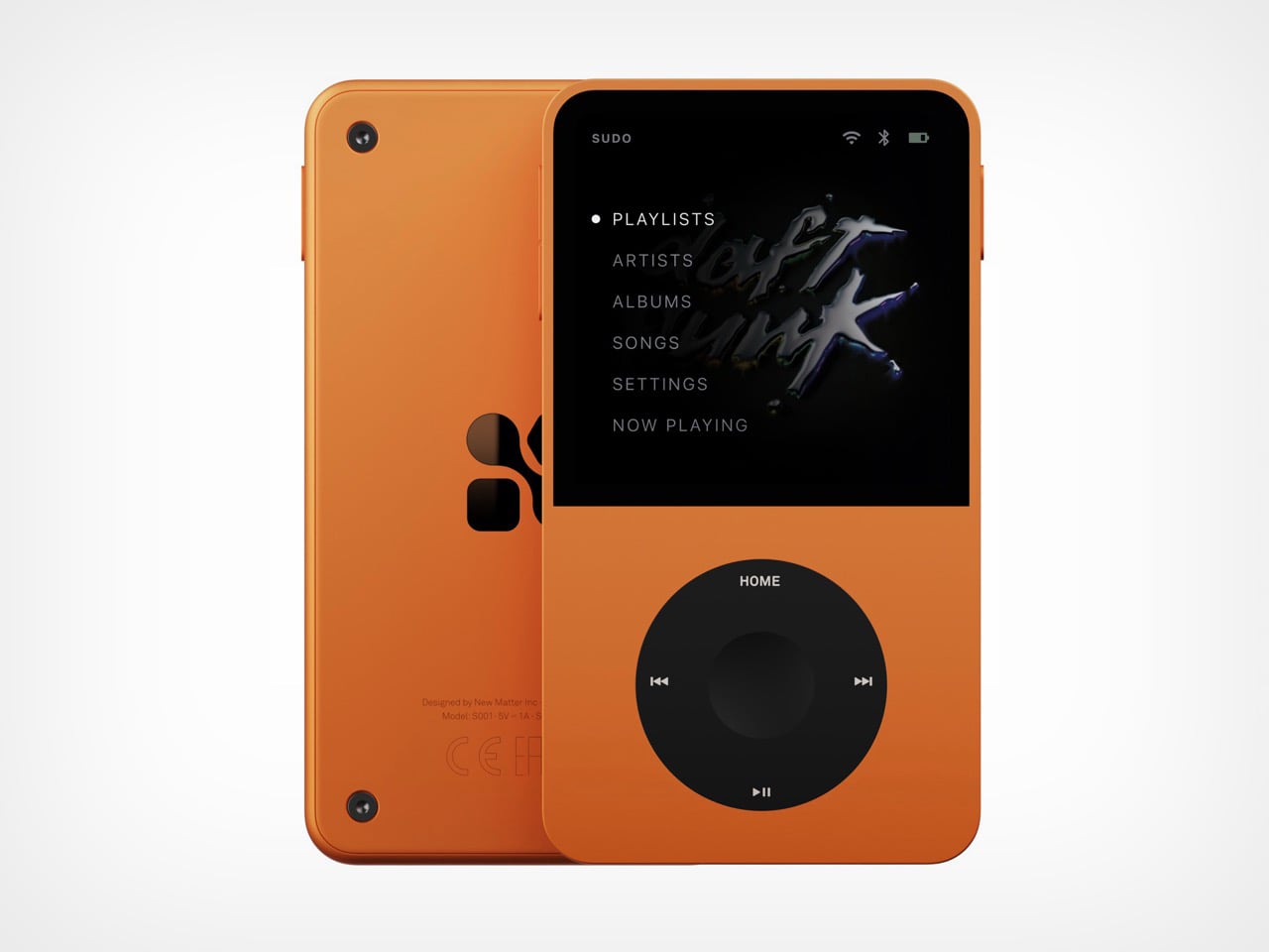
Tangerine Sudo music player shown from front and back, with playlists menu on screen and tactile wheel below

An album can be a folder you keep, a disc you lend, or a cassette you record yourself. That is a useful starting point for choosing audio equipment: what happens to the music after you press stop? The most interesting designs here give a collection a place to live, a way to travel, or a reason to come off the shelf. Their appeal starts with what you want to play.

These eight picks approach ownership from different directions, from carrying digital files to displaying album artwork and making recordings. You don’t need to abandon streaming to appreciate any of them. The selection includes an upcoming player alongside established products, chosen for their documented features and design decisions rather than hands-on sound testing. The question throughout is simple: what does this object let you do with the music you have chosen to keep?

1. Sudo Music Player

Silver Sudo music player held in one hand, thumb resting on the tactile wheel

Three silver Sudo players side by side showing the menu, a song list, and the now-playing screen

New Matter’s Sudo puts an iPod wheel beneath a small touchscreen, giving a familiar interaction a contemporary home. The upcoming player has an expected price of $ 249 and a straightforward appeal: carry your library on an object dedicated to listening. In the Tangerine version, black controls interrupt the orange body, making the wheel the obvious focal point. The layout gives playback its own physical territory, rather than asking a touchscreen to handle every interaction. It’s a promising starting point for a pocket music player.

New Matter lists 64GB of storage, microSD expansion up to 1TB, a 3.5mm jack, Bluetooth, and USB-C charging. It also lists streaming, so this isn’t a strictly offline machine. The reservation terms deserve equal attention: a refundable $50 deposit goes toward the expected purchase price, with shipping projected for the beginning of Q4 2027. Sudo leads this collection because of its design proposition, not proven performance. It remains something to watch, rather than a player to buy for immediate listening.

What we like

  • A dedicated wheel gives playback a clear physical interface.
  • Expandable storage accommodates a growing personal library.

What we dislike

  • Shipping is still projected for Q4 2027.
  • The $249 price is an estimate, not final pricing.

2. CD Jacket Player

The CD Jacket Player gives album packaging a job after you’ve removed the disc. Its frame accommodates the jacket artwork, letting the record you’re listening to become the player’s face. That makes particular sense for a collection assembled with some affection for sleeves, typography, and photography. Instead of letting those details disappear into a storage rack, the design brings one album forward. It turns choosing what to hear into choosing what to display, without requiring a separate picture frame.

The player offers Bluetooth output for wireless speakers or headphones and a 3.5mm jack for wired listening. A rechargeable battery and USB-C charging let it move between listening spots, while the shop includes a wall bracket. You’ll still need headphones or a speaker, and the display stand is sold separately. For someone who already owns a suitable listening setup, the attraction is the frame itself: the player gives an existing CD collection a visible place in the room.

Click Here to Buy Now: $170.00

What we like

  • Album artwork becomes part of the player’s appearance.
  • Wired and Bluetooth outputs provide listening flexibility.

What we dislike

  • It requires separate headphones or speakers.
  • The display stand costs extra.

3. FiiO DM15 R2R

FiiO’s DM15 R2R has a useful answer to the divide between collecting CDs and carrying digital files: it can rip tracks to external storage in WAV format while you listen. That makes it more than a destination for a disc. It can also be a step toward building a portable library from albums already on your shelf. For a collector who wants both formats, this is a more consequential feature than simply giving an old playback format a new enclosure.

Physical buttons and a volume knob keep the main operations accessible, with 3.5mm and balanced 4.4mm headphone outputs accommodating different wired setups. The copying workflow has boundaries worth knowing before buying. FiiO specifies FAT32 storage, recommends a USB-C flash drive of 32GB or smaller, and requires external power for ripping. Its support documentation also excludes Enhanced CDs from that function. Think of it as a disc player with a specific copying facility, rather than a replacement for every part of managing a digital collection.

What we like

  • WAV ripping connects a CD collection with digital playback.
  • Physical controls and two headphone outputs broaden its usefulness.

What we dislike

  • Ripping requires external power and compatible storage.
  • Enhanced CDs aren’t supported for ripping.

4. Side A Cassette Speaker

The Side A Cassette Speaker borrows the appearance of a mixtape, but its place here comes from a less conspicuous feature: microSD playback. Put MP3 files on a card, and the speaker can play your selection without using a phone as the source. The transparent shell and Side A graphics supply the visual joke, while the included clear case doubles as a stand. At $49, it’s an approachable way to give a small, personally assembled collection its own playback object.

Its limits are worth stating plainly. This is a cassette-shaped digital speaker, not a machine that plays tapes, and card playback supports MP3 files only. Bluetooth offers another source option when you want it. The case becoming a stand is the more thoughtful detail: something needed for storage also supports the speaker on a desk. It suits a deliberately edited selection of tracks, although the format restriction makes it less appropriate for someone hoping to play an existing library of lossless files unchanged.

Click Here to Buy Now: $49.00

What we like

  • microSD playback gives personal files a phone-free route.
  • The protective case doubles as a display stand.

What we dislike

  • Card playback is limited to MP3.
  • Despite its appearance, it cannot play cassettes.

5. Audio-Technica Sound Burger AT-SB727

Audio-Technica’s Sound Burger makes a compelling case for keeping a record player small without pretending records themselves are small. Its narrow clamshell body leaves much of the disc exposed during playback, creating an unmistakable silhouette. The regular-line AT-SB727 follows the limited anniversary model, bringing the design into the company’s continuing lineup. A belt-driven platter plays 33⅓ and 45 RPM records, while a spring applies stylus pressure through the tonearm. The compact mechanism is the story here, not merely the retro colors.

Bluetooth and a wired line output let it connect to suitable listening equipment, and Audio-Technica rates the rechargeable battery for up to 12 hours of playback. Portability needs a little interpretation: you can carry it between places, but the manual requires a level surface and warns against moving it while playing. You’ll also need an external listening device. For a smaller home, that tradeoff can make sense. The player is compact enough to put away, while your record collection remains the substantial part of the arrangement.

What we like

  • A distinctive compact mechanism accommodates full-size records.
  • Bluetooth and line output support different listening setups.

What we dislike

  • It needs external audio equipment.
  • Portable doesn’t mean usable while moving.

6. Shanling Q2

Shanling’s Q2 concentrates the personal-library argument into an 83g player measuring 80 by 50 by 13.5mm. Its microSD slot supports cards up to 2TB, giving a substantial collection somewhere to travel without requiring a phone. The rounded body, small touchscreen, and circular control make it visually approachable, but the interaction deserves clarification. Shanling identifies the touchscreen as the navigation interface and the touch wheel as a volume control. That distinction matters if its appearance has you expecting the full browsing behavior of an old iPod.

The Q2 includes both 3.5mm and balanced 4.4mm headphone outputs, making it relevant to listeners who already own wired headphones. It also supports network features, including Tidal streaming, so owning files and accessing a service aren’t mutually exclusive here. Shanling specifies that Tidal playback is online only, without offline downloads. For this collection, the microSD slot remains the reason to choose it: the player provides a compact home for music files you manage yourself, with streaming sitting alongside that function rather than replacing it.

What we like

  • Up to 2TB of card storage suits large libraries.
  • Two headphone outputs accommodate different wired connections.

What we dislike

  • The wheel controls volume rather than full menu navigation.
  • The 2.09-inch screen gives browsing limited space.

7. We Are Rewind GB-001 Blaster Curtis

The GB-001 Blaster Curtis brings recording into a collection otherwise dominated by playback. We Are Rewind’s boombox plays and records Type I and Type II cassettes, with backlit VU meters helping you monitor levels. The design puts the cassette mechanism between substantial speaker sections and adds dedicated controls for volume, bass, treble, and balance. It gives tape an appropriately physical interface. For someone interested in making recordings as well as collecting releases, the deck has a purpose that its retro appearance alone couldn’t supply.

A stereo line input and microphone input provide routes for recording, while Bluetooth allows the unit to work as a speaker for another source. The rechargeable battery is replaceable, a worthwhile provision in such a substantial object. And substantial it is: the manufacturer lists 6.81kg, or roughly 15 pounds. At $579, this is a deliberate commitment to cassette listening and recording. The carrying handle makes it transportable, but the weight suggests choosing its everyday home with more care than you would a pocket player.

What we like

  • Recording makes it useful beyond playing purchased tapes.
  • The rechargeable battery is replaceable.

What we dislike

  • Roughly 15 pounds limits casual portability.
  • The $579 price demands a serious interest in tape.

8. ClearFrame Speaker CD Player

ClearFrame lets the owner decide how much of the player to reveal. Insert album artwork into its included tray and the sleeve becomes its face; leave it out, and the clear body exposes the disc, circuitry, and mechanism. That choice gives it a different emphasis from the CD Jacket Player earlier in this list. The artwork can take center stage, but the hardware is also allowed to be interesting. At 27mm thick, the player makes those layers visible within a relatively shallow enclosure.

The built-in speaker is the practical distinction, allowing CD playback without a separate audio setup. It lists a 40mm driver with a bass diaphragm and up to 3W output, alongside a headphone jack and Bluetooth transmission. That last word matters: ClearFrame sends CD audio to compatible headphones or speakers but cannot receive music from a phone. Starting at $240, it offers a self-contained place to play and display discs, although the upright stand and wall-mount hardware are optional purchases rather than standard equipment.

Click Here to Buy Now: $240.00

What we like

  • Built-in audio avoids a separate speaker setup.
  • Artwork and exposed mechanics offer two distinct appearances.

What we dislike

  • Bluetooth cannot receive audio from a phone.
  • The display stand and wall mount cost extra.

Choose for the Music You Already Own

Start with the collection you actually have, rather than the format you feel you ought to love. A drawer of CDs calls for a different purchase from a carefully tagged folder of downloads. Think about where listening happens, too. Headphones on a train, a shelf beside a desk, and a shared living room ask different things of an object. Choose for the place where you’ll actually press play most often.

Leave room for the less photogenic parts of the decision: organizing files, keeping backups, finding suitable headphones, or making space for the media itself. Those tasks are part of maintaining a collection, and no attractive enclosure removes them. Good audio design should make that effort feel worthwhile by keeping the music within reach. Buy the object that helps you use your collection, rather than one that merely matches its aesthetic.

The post The 8 Best Audio Designs for People Who Want to Own Their Music first appeared on Yanko Design.

  • ✇Yanko Design
  • FilaLoom Weaves Yarn Into 3D Prints Without Extra Motors
    Blue and lilac yarn snakes through white plastic ribs in one of FilaLoom’s samples, giving the object a basketlike appearance that makes me want to pick it up. The appeal is easy to understand: intricate geometry only gets you so far when you want an object with a textile character. FilaLoom brings actual yarn into the process, letting the fibers remain visibly, unapologetically themselves. Developed by industrial and computational designer Joram de Haas for his master’s thesis in Integrated Pr
     

FilaLoom Weaves Yarn Into 3D Prints Without Extra Motors

23 octobre 2026 à 06:07

Blue and lilac yarn snakes through white plastic ribs in one of FilaLoom’s samples, giving the object a basketlike appearance that makes me want to pick it up. The appeal is easy to understand: intricate geometry only gets you so far when you want an object with a textile character. FilaLoom brings actual yarn into the process, letting the fibers remain visibly, unapologetically themselves.

Developed by industrial and computational designer Joram de Haas for his master’s thesis in Integrated Product Design at TU Delft, FilaLoom lets a desktop 3D printer automatically weave yarn into printed objects. It addresses a practical fabrication problem: combining printed structures with thread without making yarn placement a separate manual task. It’s a working research project, with DIY files available, rather than a finished consumer accessory.

Designer: Joram de Haas

The prototype uses a Bambu Lab A1 fitted with a yarn-depositing tool and a parking station. The printer builds plastic anchor points, picks up the tool, and guides yarn between them. It then parks the tool and resumes printing, securing the yarn where needed. That alternating sequence allows the structure and its textile elements to develop together, rather than requiring someone to thread a completed plastic skeleton afterward.

I like the restraint in the mechanism. FilaLoom uses the printer’s existing movement system, with no additional electronics. A mechanical coupling handles tool changes, while a spring-loaded spool provides adjustable yarn tension. The machine already knows how to move precisely; this attachment gives that movement another useful job.

Visually, the blue-and-lilac sample is a persuasive introduction. Its white vertical elements remain clearly legible, while the colored yarn establishes a contrasting horizontal rhythm. Neither material disappears into the other. To my eye, that makes the construction more interesting than a uniformly textured surface. You can follow the relationship between the ribs and the thread, which gives the pattern a purpose beyond decoration. It looks assembled through its own making.

The thesis also explores soft yarn textures and cable-driven interactions, extending the idea beyond basketlike objects. That range matters because a recognizable woven pattern could easily become the project’s entire identity. I’d be more interested in seeing designers use the process to decide where an object should bend, where it needs structure, or where a different surface character would be welcome. Those are design questions worth experimenting with.

The DIY format gives curious makers somewhere to start. De Haas’s GitHub repository provides printable component files and Grasshopper scripts for generating compatible GCode, the instructions that direct the printer’s movements. Still, that’s a more involved proposition than downloading a decorative planter file and pressing print. For a general audience, the useful distinction is that FilaLoom is an invitation to experiment with a fabrication method, not a ready-made home gadget.

There are physical compromises, too. The researchers report that the attachment reduces the A1’s usable combined printing-and-weaving volume to 54% of its original build volume. Yarn tension also needs care: too much can deform a print or pull it off the build plate. These constraints make the prototype more convincing to me, because its expanded capabilities come with clearly described boundaries.

I wouldn’t judge this project by how quickly it might replace a familiar manufacturing process. Its more immediate value is giving designers a way to test combinations they might otherwise have to assemble by hand. Even a small sample can help answer whether a pattern deserves to become a larger object. That feels like an appropriately useful ambition for a research tool.

For me, the strongest outcome would be an object whose form genuinely needs both materials. The yarn shouldn’t have to justify itself as a decorative flourish, and the plastic shouldn’t merely serve as a bulky substitute for thread. FilaLoom makes that relationship available for exploration. I’d happily trade another perfectly smooth printed vase for an experiment that leaves a little more to discover under your fingertips.

The post FilaLoom Weaves Yarn Into 3D Prints Without Extra Motors first appeared on Yanko Design.

  • ✇Yanko Design
  • Aery’s Office Chair Offers a Fit You Can Actually Fine-Tune
    A desk setup can look perfect and still feel wrong by lunch. The monitor is aligned, the cables are hidden, and the chair matches the room, yet you’re shuffling around trying to get comfortable. That gap between a workspace that photographs well and one that fits the person using it is the more interesting design problem to me. It’s where EFFYDESK’s Aery Ergonomic Chair makes its case. For anyone whose office occupies a bedroom corner or shares space with the living room, choosing a chair invol
     

Aery’s Office Chair Offers a Fit You Can Actually Fine-Tune

23 octobre 2026 à 04:15

A desk setup can look perfect and still feel wrong by lunch. The monitor is aligned, the cables are hidden, and the chair matches the room, yet you’re shuffling around trying to get comfortable. That gap between a workspace that photographs well and one that fits the person using it is the more interesting design problem to me. It’s where EFFYDESK’s Aery Ergonomic Chair makes its case.

For anyone whose office occupies a bedroom corner or shares space with the living room, choosing a chair involves a negotiation. You want something you can spend time in, but you also have to look at it after closing the laptop. The Aery approaches that compromise with a mesh back, a cushioned seat, and adjustments that let its proportions work around the person sitting in it.

Designer: effydesk

The mesh is doing some of the visual work here. A tall upholstered back can become a fairly imposing presence beside a small desk. With the Aery, the open surface allows the supporting structure to remain visible, breaking up what could otherwise read as one large block. It still looks like an office chair, especially with that separate headrest, but its outline has a little breathing room.

I appreciate that it doesn’t try to disguise its purpose. In black, the frame, armrests, and cushion form a straightforward piece of working furniture. It isn’t pretending to be a dining chair you could drag into a meeting. That distinction matters in a home office, where choosing something purely for the room’s aesthetic can leave you making compromises every time you sit down.

The fabric-covered cushion gives the design a softer counterpoint to the mesh back. It also offers a combination that may appeal to people who prefer padding beneath them without wanting an upholstered surface behind their entire torso. I like the visual balance between the two. The seat gives the chair some substance, while the open back keeps that substance from extending all the way upward.

The most useful adjustment is also one of the least visually dramatic: the seat slides forward and backward. Rather than changing the chair’s appearance in any meaningful way, it changes how the cushion sits beneath your legs. That’s worth paying attention to if you’ve ever loved the look of a chair but found yourself perched near its edge because sitting all the way back didn’t feel right.

The movable armrests follow the same thinking. They adjust in height, slide in different directions, and rotate, giving you some freedom to place the supports where your arms naturally rest. The appeal is less about collecting adjustment options than avoiding a fixed position that doesn’t suit you. A chair’s silhouette can look perfectly balanced while its armrests feel entirely wrong for the person using it.

The headrest and reclining back introduce a more relaxed posture into the design. I see the appeal for reading through a document or leaning back between tasks, particularly when the desk is where several parts of your day happen. Still, the headrest feels secondary to getting the seat and arms right. Those are the relationships you live with while doing the work.

I haven’t sat in the Aery, so its cushion comfort and the feel of its controls remain open questions. Images and adjustment lists can explain the design, but they can’t tell me whether an armrest stays put when I want it to. That’s what I’d want to check in person, along with how naturally the chair fits beneath my desk.

What appeals to me is how much of the Aery’s design can be put to an everyday use. The mesh changes its visual presence; the cushion changes the sitting surface; the adjustments offer room to work out a better fit. It gives a home-office buyer reasons to look beyond the styled photograph, while still acknowledging that the chair has to live in the room.

The post Aery’s Office Chair Offers a Fit You Can Actually Fine-Tune first appeared on Yanko Design.

  • ✇Yanko Design
  • INMO GO3 AI Glasses Review: Putting Information in Your Line of Sight
    PROS: Interchangeable batteries offer near-uninterrupted use Familiar frame styling keeps the design approachable Adjustable temples and nose pads help personalize the fit In-view translation into 98 languages reduces the need to check a phone CONS: Swapping batteries require a 5-second reboot Optional prescription lenses don't support hyperopia (farsightedness) RATINGS: AESTHETICSERGONOMICSPERFORMANCESUSTAINABILITY / REPAIRABILITYVALUE FOR MONEYEDITOR'S QUOTE:T
     

INMO GO3 AI Glasses Review: Putting Information in Your Line of Sight

Par : JC Torres
22 octobre 2026 à 21:45

PROS:


  • Interchangeable batteries offer near-uninterrupted use

  • Familiar frame styling keeps the design approachable

  • Adjustable temples and nose pads help personalize the fit

  • In-view translation into 98 languages reduces the need to check a phone

CONS:


  • Swapping batteries require a 5-second reboot

  • Optional prescription lenses don't support hyperopia (farsightedness)

RATINGS:

AESTHETICS
ERGONOMICS
PERFORMANCE
SUSTAINABILITY / REPAIRABILITY
VALUE FOR MONEY

EDITOR'S QUOTE:

The INMO GO3 AI Glasses pair familiar eyewear styling with practical translation tools and the convenience of swappable batteries.

Looking down at a phone to translate a conversation can interrupt the exchange it’s supposed to help. Reading presentation notes creates a similar problem, pulling attention away from the people in front of you. The INMO GO3 AI Glasses bring those words into view instead, putting translation and presentation tools inside a familiar rectangular frame that doesn’t require a dramatic change in personal style.

That familiar shape is only part of the appeal, though. Adjustable contact points, discreet controls, and, most importantly, a replaceable battery give the GO3 a practical foundation beyond its display. Together, they suggest an approach to smart glasses that puts everyday wear on equal footing with software features. How convincingly the GO3 brings those priorities together comes down to a few details, starting with the frame itself.

Designer: INMO

Click Here to Buy Now: $509 $699 ($190 off). Hurry, deal ends in 48-hours!

Aesthetics

The INMO GO3’s rectangular lenses and softened corners give it the outline of conventional eyewear, although the frame has more substance than a pair of reading glasses. That’s a reasonable visual compromise, of course, given what it packs inside. The thicker brow provides room for the display hardware while giving the front a confident shape, rather than leaving its components looking like something awkwardly attached afterward.

The dark matte finish does much of the visual work. It gives the broad surfaces a quieter presence than glossy plastic would, while the small red accents around the hinges add a bit of personality. Thankfully, the color doesn’t spread across the frame. There’s enough contrast to make the details interesting without making the glasses look like equipment borrowed from a gaming setup.

The GO3 utilizes aluminum alloy and polyamide for the construction with a CNC-finished, fingerprint-resistant surface. It’s not an entirely metal object, which makes sense when you consider that the electronics also add their own weight to the equation. The frame and temples share a restrained finish instead of competing for attention through contrasting textures.

The slim temples measure around 8mm, keeping the side profile from becoming an oversized box. The curved ends retain the familiar outline of glasses, even with additional hardware inside. It isn’t dainty eyewear, admittedly, but the shape avoids the visor treatment that would make a business lunch feel like a technology demonstration.

The camera is integrated into the front rather than perched above it, and the controls follow the temples. These details help the INMO GO3 read as a somewhat fashionable object instead of gadgets sharing a frame. A supplied camera cover also provides a way to obscure the lens when recording isn’t appropriate, especially given the current conversations around smart glasses.

Ergonomics

At approximately 58 grams, the INMO GO3 has the weight of electronics to accommodate as well as the frame itself. Comfort depends on more than the number on the specification sheet. The relationship between the nose pads, temples, and ears matters as much. There’s a focus on those contact points, rather than relying on a lightweight label to explain away the fitting process.

Air-cushion nose pads support the front, while the temples offer 15 degrees of adaptive movement, at least on paper. That flexibility gives the frame room to accommodate differences in head shape. Naturally, there will be cases when the head shape just won’t fit, but INMO has tried to accommodate as many head sizes as possible.

Given we’re talking about glasses, prescription support is another important piece of that everyday equation. The GO3 uses an insert system, with INMO’s current lenses supporting nearsightedness and astigmatism, though not farsightedness. That won’t cover every prescription, but it gives supported wearers a way to combine vision correction and the display.

Operating the glasses doesn’t have to depend on talking to them. Temple touch controls and physical power and GO buttons provide alternatives, while the companion app handles setup and settings. When you’re around people or somewhere that requires a degree of silence, a discreet gesture is often preferable to a spoken command, and familiar controls help make the wearable format a little less foreign.

Performance

Two-Way Dialogue Translation – Read translations directly through the glasses, while the other person sees or hears your translated response on the phone.

The INMO GO3’s binocular green Micro-LED display uses optical waveguides, with a 640×480 resolution and a 30-degree field of view. Adjustable brightness is listed up to 1,500 nits, which is plenty even for the bright outdoors. That said, those specs clearly mark it as something more for text and guidance rather than a miniature cinema. Green lettering has a slightly retro character, but a translation or the next line of a speech doesn’t need a full-color backdrop to be useful.

Translation, of course, is the primary use case for these glasses, and the numbers are admittedly impressive. INMO lists 78 source languages and 98 target languages online, with subtitles appearing in view rather than on a phone held between speakers. Offline support covers nine languages on Android and 13 on iOS, and future updates promise even more. The phone still needs to stay paired to a phone, of course, but a missing internet connection needn’t end every supported conversation.

Built-In Teleprompter – Follow your script directly through the glasses.

For presentations, the teleprompter moves the script from a desk into the speaker’s field of view, allowing for a more natural-looking stage presence. There’s automatic voice-following advancement in 17 languages (including English, Mandarin, Cantonese, Japanese, Korean, German, French, Thai, Russian, Spanish, Portuguese, Polish, Arabic, Indonesian, Vietnamese, Dutch, and Italian), alongside manual scrolling from the temple. Other languages will be displayed, depending on the document uploaded by the user, but the pages for unsupported languages can’t be automatically turned by voice. Very few will be sitting close enough to realize you’re not exactly looking at them, but at least you won’t be spending half of the presentation staring down at your notes.

Photo Translation – Point the camera at written text and read its translation directly through the glasses.

The GO3 also offers features better used in meetings, such as recording, transcription, and AI summaries for later review. Walking and cycling directions, an AI assistant powered by ChatGPT and Gemini, and photo translation extend the same idea beyond work scenarios: put a useful answer nearby without making a phone screen the center of every activity.

Admittedly, many AI smart glasses offer similar features, but the INMO GO3’s killer feature is its interchangeable battery system. One 270mAh battery is installed in the glasses, with one spare included. Continuous use yields around 3 hours on a full charge, which is probably more than enough for most use cases. The 1,300mAh battery charging case offers three to four more charges, so you practically get a full day’s worth in total.

Where it gets interesting is how you can swap out the dead battery on the tip of the GO3 with the spare in the charging case. It’s quick and convenient, but not entirely seamless. The glasses will shut down when you pull out the battery, but plugging a fresh one in boots it up in just a few seconds. It does mean you have to briefly stop what you’re doing or make sure you’re not in the middle of something critical, but it’s better than waiting for minutes for the glasses to charge up.

Sustainability

The replaceable battery has a longer-term benefit beyond getting through a busy afternoon. An aging power cell doesn’t automatically have to take the entire pair of glasses out of service. INMO lists a replacement battery at $49, making that component a separate ownership expense. That’s a useful piece of product design: the part expected to wear with repeated charging doesn’t have to remain permanently sealed inside.

That doesn’t establish a complete sustainability story, and there’s no need to pretend otherwise. The reviewed specifications don’t establish recycled material content, comprehensive component repairability, or an end-of-life program. The more defensible advantage is the ability to keep the same frame in service when its battery needs replacing. Thoughtful care still matters, particularly for the lenses and hinges, but accessible power replacement is a concrete place to start.

Value

At $699, currently discounted to $509, the INMO GO3 asks for a commitment beyond casual curiosity. The standard package includes the glasses, installed battery, single spare, and battery charging case. That’s a coherent starting point, with the power system already accounted for. The value comes from using the display repeatedly, rather than paying for a collection of functions that remain untouched save for a few presentations or travels abroad.

The useful comparison is between priorities, rather than a contest over the longest feature list. Camera-and-audio glasses answer a different need from eyewear that puts text in view, while entertainment-focused displays serve another purpose again. For someone moving between multilingual conversations and presentations, the GO3’s combination is easier to justify. That it can also be your travel companion and AI assistant brings added value to the table, especially when you don’t look like a walking technology advertisement.

Verdict

The INMO GO3’s most appealing quality is how its design keeps returning to recognizable habits. Wear glasses, follow a conversation, glance at a script, and change a battery when necessary. The technology adds steps of its own, of course, but the physical form doesn’t ask for an entirely new routine. Its familiar outline and adaptable contact points give the translation and presentation tools a sensible place to live.

Travelers, presenters, and people working across languages have the clearest reasons to appreciate that combination. A paired phone remains part of most workflows, and battery changes belong between tasks, but neither qualification takes away the appeal of information placed closer to the conversation. There’s something refreshingly practical about glasses that leave room for ordinary interactions, even when a little green text is helping them along.

Click Here to Buy Now: $509 $699 ($190 off). Hurry, deal ends in 48-hours!

The post INMO GO3 AI Glasses Review: Putting Information in Your Line of Sight first appeared on Yanko Design.

  • ✇Yanko Design
  • Ninja Labs MagSafe Flex Pouch turns your phone into a stretchy everyday carry pocket
    Smartphones have become the focal point of everyday carry, but their slim profiles leave little room for the small essentials people take everywhere. Ninja Labs, a Los Angeles-based company, offers a simple alternative with the MagSafe Flex Pouch. The accessory is a detachable silicone pocket that turns the back of a MagSafe-compatible smartphone into expandable storage for everyday items. Unlike conventional magnetic wallets designed primarily for cards, the Flex Pouch uses a flexible, stretch
     

Ninja Labs MagSafe Flex Pouch turns your phone into a stretchy everyday carry pocket

21 octobre 2026 à 09:20

Smartphones have become the focal point of everyday carry, but their slim profiles leave little room for the small essentials people take everywhere. Ninja Labs, a Los Angeles-based company, offers a simple alternative with the MagSafe Flex Pouch. The accessory is a detachable silicone pocket that turns the back of a MagSafe-compatible smartphone into expandable storage for everyday items.

Unlike conventional magnetic wallets designed primarily for cards, the Flex Pouch uses a flexible, stretchy compartment to accommodate objects of different shapes and sizes. It can hold credit cards, IDs, cash, coins, wireless earbuds, and even a car key fob. According to Ninja Labs, the pocket can accommodate anything from a single card to a stack of 20, making it a versatile option for people who want to carry fewer accessories.

Designer: Ninja Labs

The design is centered on a proprietary memory silicone blend that expands to roughly twice its original size before contracting again. Rather than relying on zippers, buttons, or rigid compartments, the material stretches around its contents. Its naturally grippy surface helps keep items in place, while the open-top construction allows quick access. When emptied, the pouch returns to its original compact form.

Ninja Labs says the material retained more than 90 percent of its original stretch after 10,000 stretching cycles, offering an indication of its intended durability. However, the company advises against carrying regular house keys or other sharp-edged objects that could puncture the silicone.

The MagSafe version introduces a refreshing change to the original Flex Pouch concept. Earlier versions integrated the pocket directly into an iPhone case, making it a permanent part of the phone’s exterior. The new accessory is a standalone unit that attaches magnetically to a MagSafe-compatible iPhone or case and can be removed whenever it is no longer needed. Android users can also use it with a suitable magnetic case, although the pouch does not provide phone protection of its own.

This detachable format makes the accessory adaptable to different situations. It can carry cards and cash for a quick errand, earbuds and a car fob while travelling, or small personal-care items during a night out. The flexible construction also allows it to accommodate bulkier objects than a traditional flat wallet, although adding more contents inevitably creates a pronounced bulge at the back of the phone.

The MagSafe Flex Pouch is priced at $59 and is available in pink, baby blue, lavender, and black, with transparent silicone and a sparkling pink finish among the options. Ninja Labs offers worldwide shipping, with international delivery listed at $10, so you can try it out right away. You can also go for their case cover version if MagSafe is not your thing.

The post Ninja Labs MagSafe Flex Pouch turns your phone into a stretchy everyday carry pocket first appeared on Yanko Design.

  • ✇Yanko Design
  • 5 Candle Designs, From Glass Spheres to a Melting-Wax Timer
    Candles have stepped beyond being just decorative objects that are placed on a dining table or shelf. Today, they are becoming artistic installations, architectural statements, sensory experiences, and even functional design objects. Designers across the world are transforming the humble candle into sculptural pieces that blur the line between art, craft, and innovation. These evolving creations reflect changing lifestyles, where everyday products are expected to combine beauty, functionality,
     

5 Candle Designs, From Glass Spheres to a Melting-Wax Timer

21 octobre 2026 à 06:07

Candles have stepped beyond being just decorative objects that are placed on a dining table or shelf. Today, they are becoming artistic installations, architectural statements, sensory experiences, and even functional design objects. Designers across the world are transforming the humble candle into sculptural pieces that blur the line between art, craft, and innovation.

These evolving creations reflect changing lifestyles, where everyday products are expected to combine beauty, functionality, craftsmanship, and emotional value within contemporary interiors. Here are some fascinating examples showing how contemporary design is reinventing the everyday candle.

1. Murano Glass Candles: Where Venetian Craft Meets Modern Luxury

Murano glass candles blend traditional craftsmanship with contemporary design, turning everyday candles into artistic decor objects. Known for their vibrant colors, flowing patterns, and handcrafted finishes, these candles create a warm visual experience that feels both elegant and sculptural. Their glass vessels often become statement pieces within modern interiors, adding character even when unlit.

What makes these candles especially appealing today is their lasting value beyond fragrance. Instead of being discarded after use, the handcrafted containers can be repurposed as decorative accents, small storage pieces, or collectible objects.

CADAR’s latest candle collection transforms traditional candles into sculptural objects crafted from exquisite hand-blown Murano glass. Created in collaboration with Venini, each candle is designed as a glossy glass sphere assembled from multiple rounded components that fit together seamlessly. The rich transparency, smooth finish, and substantial weight of the Murano glass give every piece a refined, collectible quality. Instead of functioning as simple candle holders, the vessels feel like contemporary art pieces that interact beautifully with light, reflection, and shadow.

The collection stands out through its dramatic use of color and the timeless craftsmanship of Murano glass. Deep cobalt blue, emerald green, ruby red, amber, smoky charcoal, and soft lavender create striking combinations with exceptional depth and luminosity. The high-gloss surfaces amplify the intensity of each shade, allowing the glass to glow almost like liquid under changing light. Together, the candles create a sophisticated visual experience where fragrance, craftsmanship, and Murano glass artistry merge into one luxurious design statement.

2. Flame to Elegance: The Candle That Becomes a Japanese Lantern

Some contemporary candle designs are moving beyond single-use functionality by transforming into decorative objects after the wax has melted away. Inspired by minimal, thoughtful design philosophies, these candles are crafted to evolve and do not simply disappear after use. This approach adds a deeper sense of purpose and emotional value to everyday objects.

The concept also reflects the growing importance of sustainability and long-lasting craftsmanship in modern design. Instead of creating waste, the candle continues to serve as a functional or decorative piece, encouraging reuse and mindful living.

Designed by James Kaoru Bury, the Chouchin Candle reinterprets the traditional Japanese lantern through a refined and contemporary candle design. Inspired by the soft glow of a classic “chouchin” lantern, the pillar-shaped candle features a dual-layer wax construction that combines functionality with atmospheric lighting. The inner core burns like a conventional candle, while the exterior is made from a patented non-melting wax that forms a translucent shell. As the flame flickers within, the outer layer gently diffuses the light, creating a warm lantern-like glow that enhances the surrounding ambiance.

Developed in collaboration with Pegasus Candle Co. Ltd in Kurashiki, Japan, the candle is designed for elegance and practicality. The non-melting exterior safely contains liquid wax, eliminating dripping and removing the need for a separate tray. With a burn time of nearly 60 hours and replaceable candle refills, the product also emphasizes longevity and sustainability while maintaining its calm, sculptural presence.

Click Here to Buy Now: $70

3. The Candle Disc: Tracking Time Through Melting Wax

Contemporary candle design is increasingly exploring the deeper meaning of time, transformation, and human experience through the way candles burn and evolve. Rather than remaining simple decorative objects, some candles are designed to change shape gradually as the wax melts, turning the burning process itself into a visual and emotional experience.

These ideas reflect a growing interest in mindful and experiential design. This is because modern candles are no longer valued only for fragrance or ambiance, but also for the atmosphere and reflection they inspire.

Designed by Seokoo Yeo, the Candle Go reimagines the traditional candle as a functional time-tracking object. Instead of a standard upright candle with a burning wick, the product uses a rotating disc-shaped wax candle mounted on an axis. A built-in warming element gradually melts the wax in a radial pattern, creating a visual representation of passing time. As sections of the wax disappear, gravity naturally causes the disc to rotate, turning the candle into a dynamic and interactive experience that feels both sculptural and meditative.

The product combines minimalist design with productivity-focused functionality. The changing wax pattern acts like a visual timer, allowing users to intuitively track work sessions, goals, or moments of focus. Melted wax is neatly collected in a lower chamber, keeping surfaces clean while eliminating the need for an open flame. Once the candle disc fully melts away, it reveals a hidden medal inside, transforming the product into a symbolic reward system that celebrates time spent productively and intentionally.

4. Scented Candle Cards: Compact Design for Modern Lifestyles

Scented candle cards are introducing a new and compact approach to candle design, rethinking how fragrance products can be experienced in everyday life. Unlike traditional candles housed in heavy containers, these designs are lightweight, portable, and minimal in form. Their slim structure and creative presentation make them feel modern, functional, and visually distinctive.

Beyond convenience, these candles reflect the growing interest in interactive and experience-driven products. Their compact format makes them suitable for gifting, travel, hospitality, and creative packaging concepts.

The AromaCandle Thank You Card transforms the traditional candle into a compact sensory experience that combines fragrance, design, and personal messaging. The product features an ultra-thin aromatic candle paired with a slim foldable card that functions as both packaging and a display stand. Once opened, the candle can be placed into a dedicated slot and lit, creating a warm glow and subtle fragrance while the handwritten message is read. Its minimalist construction makes the object feel delicate, elegant, and highly thoughtful.

The product stands out through its clever balance of aesthetics, functionality, and emotional design. Available in fragrances such as Sakura, Green Tea, and Yuzu, each candle is designed to evoke a distinct atmosphere through scent and color. The fire-retardant paper structure and self-extinguishing candle design add practicality and safety to the experience. Compact enough to be mailed like a standard card, the product reimagines candles as intimate objects that create memorable moments through light, fragrance, and personal connection.

Click Here to Buy Now: $20

5. Sfumato Candle: Inspired by Leonardo da Vinci’s Artistic Technique

Modern candle design is increasingly embracing craftsmanship, turning candles into carefully made artisanal objects rather than mass-produced decor items. In the process, starting from hand-poured wax to sculpted forms and detailed finishes, craftsmanship plays a major role in creating candles that feel unique and personal. Designers often experiment with textures, layered colors, and handcrafted techniques to give each candle its own identity and character.

This focus on craft also highlights the value of slow, thoughtful production. Many contemporary candles are created using traditional methods combined with modern design ideas, resulting in pieces that celebrate skill, creativity, and material quality. Beyond fragrance, these candles reflect the growing appreciation for handmade products that bring artistry and authenticity into everyday living.

The Sfumato Candle reimagines the everyday candle as a sculptural design object inspired by architecture and materiality. Designed by Kegan McDaniel, the candle is housed in a cast concrete vessel that gives it a bold, stone-like appearance with a refined architectural presence. Its minimalist form and textured finish make it feel more like a contemporary décor piece than a traditional scented candle. The sturdy concrete exterior adds depth and permanence, creating a calming visual experience even before the candle is lit.

The collection combines fragrance, color, and craftsmanship into a cohesive sensory design. Available in scents such as Tuscan Fields, Amalfi Citrus, and Sicilian Sage, each candle is paired with distinctive shades of green, yellow, and red inspired by Italian landscapes. The name “Sfumato,” borrowed from Leonardo da Vinci’s famous painting technique, reflects the soft, atmospheric quality the product aims to create. Together, the architectural vessel, earthy textures, and immersive fragrances transform the candle into a sophisticated object designed for relaxation and ambiance.

Modern candles are evolving beyond simple décor into immersive lifestyle objects that combine craftsmanship, innovation, sustainability, and emotional storytelling. Today’s designs focus on sculptural forms, sensory experiences, reusable materials, and atmospheric lighting, transforming candles into meaningful objects that engage the emotions and the surrounding space.

The post 5 Candle Designs, From Glass Spheres to a Melting-Wax Timer first appeared on Yanko Design.

  • ✇Yanko Design
  • Road Barriers Become Benches Without Losing Their Warning Stripes
    A red-and-white safety barrier isn’t an object I’d normally consider inviting. It’s supposed to interrupt your plans. That’s why the stop! collection by Studio Martins Mezulis and creative 13_0663_tsx makes such a good first impression as a design idea. The outdoor benches and stools borrow the panels of Dutch traffic barriers to make places to sit, addressing a basic need in public space: somewhere to pause. Waiting for a friend shouldn’t require buying a coffee to justify occupying a chair. I
     

Road Barriers Become Benches Without Losing Their Warning Stripes

21 octobre 2026 à 05:15

A red-and-white safety barrier isn’t an object I’d normally consider inviting. It’s supposed to interrupt your plans. That’s why the stop! collection by Studio Martins Mezulis and creative 13_0663_tsx makes such a good first impression as a design idea. The outdoor benches and stools borrow the panels of Dutch traffic barriers to make places to sit, addressing a basic need in public space: somewhere to pause.

Waiting for a friend shouldn’t require buying a coffee to justify occupying a chair. I like public seating that treats waiting, resting, and doing very little as perfectly legitimate activities. That’s the practical territory stop! occupies. Presented at Dutch Design Week in Eindhoven, running October 17–25, 2026, the collection invites people to stay for a while using an object associated with sending them elsewhere.

Designers: Studio Martins Mezulis and creative 13_0663_tsx

The starting point is the schrikhek, a red-and-white aluminum barrier used in the Netherlands to alert people to construction and redirect their route. You don’t need to recognize that Dutch term to understand the reference. The warning graphics do most of the explaining. Keeping them visible gives the furniture a little friction: your eyes register a restriction before your brain catches up with the seat.

It’s a fitting project for Studio Martins Mezulis, whose work spans graphic and spatial design. The stripes are doing both jobs here: defining a physical object and carrying a message that the designers are trying to change.

In the project’s render, long striped panels form the seating surfaces, with more panels running vertically along the sides. A narrow framework keeps the assembly visually open. The result looks deliberately assembled from infrastructure rather than dressed up to conceal its origins. I prefer that decision to a more polished makeover. Remove the red and white, and much of the reason to notice these benches disappears.

The published bench dimensions are 1,250 millimeters long, 500 millimeters wide, and 450 millimeters high, or approximately 49 by 20 by 18 inches. Road safety barriers and steel are listed as the materials. Those numbers describe a compact object rather than a sprawling park bench. Its proportions make the proposal easier to picture beside a pedestrian route or within a plaza, although placement would still need careful consideration.

The illustrated benches are also backless and lack armrests. That keeps their form simple and leaves the seat approachable from either side, but it doesn’t offer the support some people need. I’d read them as an invitation to take a short break rather than assume they’re suited to a long afternoon. The graphic wit is persuasive; comfort and durability would need evidence beyond a render.

That distinction matters because public furniture has a job beyond looking good in a design exhibition. Someone needs to understand that they can use it. Here, the same markings that make the collection memorable could initially make a passerby hesitate. I’d be interested to see how quickly people recognize the invitation. A bench occupied by one person might explain the idea better than a nearby project label.

The material story deserves similar precision. According to the project’s Dutch Design Week description, the designer hopes to work with construction infrastructure providers to reclaim decommissioned or discarded panels in the future. That isn’t confirmation that every panel in the current collection has already served at a construction site. Reuse is a proposed direction for expanding the collection, and it’s worth preserving that distinction rather than automatically labeling the furniture recycled.

For me, stop! works best as a modest adjustment to how a street communicates. It gives a familiar public object another use without erasing what made it recognizable. The humor gets your attention, but the seat has to justify keeping it. If the collection develops further, I’d rather see that effort go into making it useful to more people than into adding more visual tricks. A decent place to wait is already a worthwhile design brief.

The post Road Barriers Become Benches Without Losing Their Warning Stripes first appeared on Yanko Design.

  • ✇Yanko Design
  • A Coffee Bar Without a Remodel: UNITO’s Rolling Station
    A coffee grinder, a kettle, and a few favorite mugs can turn into a surprisingly territorial collection. Add filters, beans, and the tools that make a morning ritual feel worthwhile, and suddenly the kitchen counter has a second job. UNITO’s Coffee Station offers a dedicated home for that equipment, with wheels underneath so the coffee corner doesn’t have to become a permanent fixture. Designed by Unito, the station brings preparation space and storage together in a movable counter. Its appeal
     

A Coffee Bar Without a Remodel: UNITO’s Rolling Station

21 octobre 2026 à 04:15

A coffee grinder, a kettle, and a few favorite mugs can turn into a surprisingly territorial collection. Add filters, beans, and the tools that make a morning ritual feel worthwhile, and suddenly the kitchen counter has a second job. UNITO’s Coffee Station offers a dedicated home for that equipment, with wheels underneath so the coffee corner doesn’t have to become a permanent fixture.

Designed by Unito, the station brings preparation space and storage together in a movable counter. Its appeal extends beyond reclaiming kitchen space. For a studio hosting clients or someone setting up a coffee pop-up, it could provide a more organized starting point than a table surrounded by supply boxes. Unito’s founder has described the Coffee Station as part of the brand’s move toward furniture and tools for small businesses.

Designer: Unito

The material combination gives that practical idea some personality. According to the supplied product description, silver anodized aluminum profiles form the frame, while light birch plywood supplies the panels. I like that the design lets both materials retain their identities. The metal outlines the structure with a workshop-like precision; the wood gives the broad surfaces enough warmth to keep the station from reading as purely institutional equipment.

That balance matters for something that might face customers. In the published photographs, the silver framework remains visible around the wooden drawer fronts, and side surfaces extend beyond the central cabinet on supporting brackets. Those extra surfaces look useful for separating preparation from pickup. A cup waiting to be served shouldn’t have to compete with the grinder for the same patch of counter.

Storage deserves as much attention as the equipment displayed above it. The described configuration includes two soft-close drawers, with an open compartment underneath. The photographs show wide finger-pull cutouts rather than projecting handles. I appreciate that restraint, but the more useful decision is giving small supplies somewhere to disappear. Filters, spoons, and towels could stay close without becoming part of the countertop display.

Then come the wheels, arguably the least glamorous and most consequential detail. The specifications list four locking stainless steel casters, and brake levers are visible in the photographs. That arrangement is intended to let the station move into position and then stay put. I’d still distinguish a rolling workstation from portable luggage. Moving across a suitable floor is a different proposition from negotiating stairs or loading it into a car.

The top also introduces an interesting possibility: it is specified to accept IGT panels or stoves. IGT refers to the Iron Grill Table system, whose modular approach combines frames with cooking and work-surface inserts. For UNITO, the appeal is a surface that could accommodate different tasks rather than permanently committing to one arrangement. Exact insert compatibility still needs confirmation before anyone starts ordering accessories.

The dedicated patio umbrella slot is another thoughtful detail. Published images show an umbrella rising above a fully arranged coffee setup, making the station read like a small service point rather than a kitchen cart parked outside. That could be useful for a temporary outdoor gathering. It doesn’t, however, establish that the plywood is weatherproof or that the station can anchor an umbrella safely in wind.

My favorite potential use is actually the less theatrical one: a shared studio where the coffee setup needs its own territory but the room changes throughout the week. A dedicated station could keep supplies together while allowing the host to rearrange the space. That feels like a convincing reason to put furniture on wheels, especially when building another fixed counter would make the room less flexible.

I wouldn’t call it a complete café or an outdoor kitchen. Those descriptions skip over water, power, cleanup, and the practical demands of serving people. Its more believable contribution is giving coffee equipment a coherent place to live and work. For someone who wants a serious setup without designing the room around it, that’s an appealing amount of commitment.

The post A Coffee Bar Without a Remodel: UNITO’s Rolling Station first appeared on Yanko Design.

❌