❌

Vue normale

  • ✇Yanko Design
  • Beauer X6 Camper Sleeps Six Without Sacrificing a Porch
    A camper should be small enough to take places and spacious enough to enjoy once you get there. Those demands pull in opposite directions, particularly when six people need somewhere to sleep. French designer and manufacturer Beauer tackles that problem with the X6, an expandable travel trailer with two sleeping areas and a living room that opens onto a small porch. I like that it treats arriving as an opportunity to change the floor plan. At about 23.6 feet long, the X6 isn’t pretending to be
     

Beauer X6 Camper Sleeps Six Without Sacrificing a Porch

11 novembre 2026 à 14:20

A camper should be small enough to take places and spacious enough to enjoy once you get there. Those demands pull in opposite directions, particularly when six people need somewhere to sleep. French designer and manufacturer Beauer tackles that problem with the X6, an expandable travel trailer with two sleeping areas and a living room that opens onto a small porch. I like that it treats arriving as an opportunity to change the floor plan.

At about 23.6 feet long, the X6 isn’t pretending to be a miniature camper. Its space-saving trick happens sideways: a single telescoping section extends electrically, bringing the expanded width to approximately 11.8 feet. Beauer also gives it a squared-off body with softened corners, departing from its earlier, rounder trailers. That shape makes sense here. Straightening the ends leaves more useful space for the domestic puzzle inside, without adding another expanding section.

Designer: Beauer

The porch is the detail that gives the X6 its personality. A large hatch drops down into a small outdoor platform, with a tinted canopy overhead. Opening that much of the wall changes the relationship between the dining area and whatever you’ve parked beside. To me, that’s a more appealing use of a moving panel than adding another screen. It gives the living room a reason to face outside.

The kitchen’s sharply angled countertop is another useful decision. It places the sink and two-burner gas cooktop on different faces while making room for a bathroom in the corner. That’s the kind of slightly awkward-looking geometry I’m happy to defend when it earns its place. A 157-liter refrigerator, roughly 5.5 cubic feet, rounds out the kitchen, while the bathroom fits a shower, sink, and cassette toilet. Dinner and a shower remain part of the plan.

Sleeping arrangements are flexible, although “sleeps six” deserves a little unpacking. One bedroom has a roughly 63-by-79-inch double bed. The second can be ordered with another double, two bunks, or a desk, and the living-room sofa converts into an additional double. Choose the office and you’re choosing workspace over two sleeping spots. A curtain separates the rear sleeping areas, so I’d think of them as distinct zones rather than expect the privacy of two rooms at home.

I appreciate the choices offered for the interior, too. Beauer lists white, wood-tone, gray, and black furniture, with gray or beige cushions available in fabric or faux leather. I’d lean toward fabric and the lighter flooring option. With this much furniture sharing a relatively small footprint, I’d want the finishes to recede a little and let the changing layout be the interesting part.

One number makes me pause more than any upholstery decision. Beauer lists an equipped weight of approximately 3,748 pounds and a maximum loaded weight of about 3,968 pounds, leaving just 220 pounds of payload, depending on options. That’s a tight allowance for a trailer intended to accommodate six. Before getting attached to the porch, I’d want a clear accounting of what the quoted weight includes and how much capacity remains for the actual trip. Floor space and carrying capacity are very different kinds of room.

The X6 is listed from €74,990, with air conditioning and solar panels among the extra-cost options. Beauer’s FAQ says shipping to the United States is possible and directs interested buyers to contact the company. That makes delivery and the appropriate specifications part of the buying conversation, rather than something to assume from the European listing.

For me, the appeal is the possibility of sitting beside that open wall with breakfast, while the bed stays a bed and the kitchen stays usable. The expanding body makes that arrangement possible, but the porch makes it desirable. I’d still put the payload question ahead of the color chart. A clever floor plan should leave enough room in the weight budget for the things you actually bring camping.

The post Beauer X6 Camper Sleeps Six Without Sacrificing a Porch first appeared on Yanko Design.
  • ✇Yanko Design
  • Interstellar’s Ranger Is Actually Becoming an Official LEGO Set
    One of the most iconic sci-fi movies of the 21st century is Christopher Nolan’s Interstellar. Fans of the movie probably recognize the Ranger ship on sight, whether it’s in artwork or on fan-made merch, as it’s one of the things most associated with the time-bending film. So it’s not really a surprise that creative fans would come up with a LEGO build for it. Now Minibrick41587’s Ranger is set to become an official LEGO model. Interstellar’s Ranger is becoming an actual LEGO set after fans supp
     

Interstellar’s Ranger Is Actually Becoming an Official LEGO Set

11 novembre 2026 à 10:20

One of the most iconic sci-fi movies of the 21st century is Christopher Nolan’s Interstellar. Fans of the movie probably recognize the Ranger ship on sight, whether it’s in artwork or on fan-made merch, as it’s one of the things most associated with the time-bending film. So it’s not really a surprise that creative fans would come up with a LEGO build for it. Now Minibrick41587’s Ranger is set to become an official LEGO model.

Interstellar’s Ranger is becoming an actual LEGO set after fans supported the LEGO Ideas version and LEGO approved it for development on November 9, 2026. The approved proposal captures the recognizable utilitarian spacecraft through its silhouette and restrained detailing while still making space for interactions that could turn this brick replica into a toy fans can enjoy playing with. Those details describe the fan submission, though, rather than a finalized retail design.

Designer: Minibrick41587 with LEGO

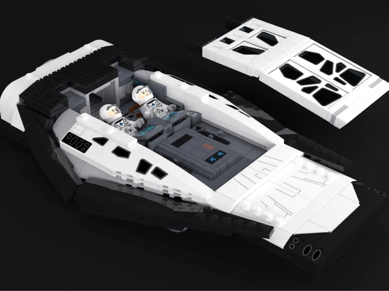
The submitted build uses 561 pieces and includes Cooper and Dr. Brand minifigures, along with brick-built versions of TARS and CASE. It’s a focused selection: one spacecraft and the characters that help establish its scale. The figures give the Ranger a purpose beyond looking familiar on a shelf. They’re also a useful way to judge the proportions, showing how much cabin the designer has managed to fit beneath that low roof.

The exterior gets much of its identity from the contrast between white upper panels and a dark lower body. Sloped sections form the wedge-shaped hull, while black window shapes interrupt the roof and sides. In the submission images, relatively smooth surfaces keep the silhouette readable without hiding every trace of the bricks underneath. That balance suits the subject: the Ranger looks like a working vehicle, with its visual interest coming from its shape rather than colorful decoration.

The removable roof is where the design becomes particularly interesting. A closed hull preserves the spacecraft’s profile, but lifting away the roof exposes the seating and controls inside. The proposed cabin accommodates both astronauts alongside either TARS or CASE. This addresses a practical problem with enclosed vehicle models: getting characters into position without taking apart the surrounding structure. The interior image shows the astronauts reclining beside each other, with a robot lying flat in the remaining cabin space.

There’s also an opening rear hatch, giving the crew another way into the ship. The submission image shows the hatch lowered outward, with a minifigure standing in the doorway. It’s a small feature, but one that supports the vehicle’s role as a landing craft. Opening the roof provides access from above; opening the hatch creates an entrance the characters can actually use during an imagined expedition.

TARS and CASE deserve some attention of their own. Their gray, rectangular bodies translate naturally into LEGO’s construction system, contrasting with the angled surfaces needed for the Ranger. Small colored display details distinguish their otherwise restrained forms. Beside the astronauts, they make an unusual little lineup: two familiar human figures and two upright slabs. The proposal retains that oddness instead of making the robots look more conventionally humanoid.

It’s worth separating fan support from LEGO’s approval. Under the LEGO Ideas process, reaching 10,000 supporters makes a submission eligible for consideration; it doesn’t automatically secure a place on store shelves. The Ranger has now cleared that additional hurdle. However, the approved submission remains a starting point for development, so its piece count, detailing, and character selection shouldn’t be treated as guaranteed retail specifications.

Pricing, final dimensions, and a release date haven’t been established in the sources reviewed, so there’s no shopping deadline to mark yet. What makes this proposal worth following is the way it accommodates an interior without giving up the Ranger’s low, angular profile. When LEGO reveals its production version, the most interesting comparison will be how it handles that same challenge: keeping the ship recognizable while leaving room for its crew and a builder’s hands.

The post Interstellar’s Ranger Is Actually Becoming an Official LEGO Set first appeared on Yanko Design.

  • ✇Yanko Design
  • Rimowa’s Hidden Clamp Keeps Your Passport in Its Aluminum Holder
    When I travel internationally, keeping my passport safe and secure is always a major concern. I have to make sure that the pouch where it’s kept won’t leave scratches or marks on it, so most of the time, it’s placed alone in a small pouch and brought out when needed. If you’re a bit more paranoid than I am, housing it in a sturdy case is probably worth considering. And if you’re a fan of the Rimowa brand and the iconic look of its grooved aluminum, you’ll be glad to know that it offers an Alumi
     

Rimowa’s Hidden Clamp Keeps Your Passport in Its Aluminum Holder

11 novembre 2026 à 06:07

When I travel internationally, keeping my passport safe and secure is always a major concern. I have to make sure that the pouch where it’s kept won’t leave scratches or marks on it, so most of the time, it’s placed alone in a small pouch and brought out when needed.

If you’re a bit more paranoid than I am, housing it in a sturdy case is probably worth considering. And if you’re a fan of the Rimowa brand and the iconic look of its grooved aluminum, you’ll be glad to know that it offers an Aluminum Passport Holder that matches the look of its easily recognizable luggage. It comes with features designed to keep your passport in place while you’re on the move.

Designer: Rimowa

Basically, since this is Rimowa, it’s a luxury accessory whose main purpose is to keep your passport contained and protected between document checks at the airport or wherever you’re going. It’s a sleeve that you slide your passport into, with a concealed clamp designed to keep it from slipping out unintentionally. The idea is to balance holding it securely with letting you remove it when needed.

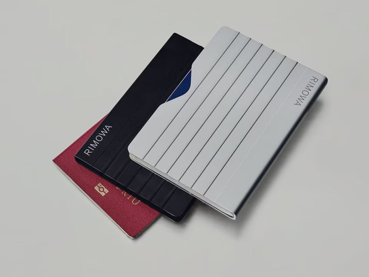
The stainless steel clamp is inside the aluminum body of the sleeve. Rimowa says it accommodates both standard and thicker frequent-flyer passports. The side opening is designed to make it easier for you to slip the passport out, rather than opening the conventional folding cover found on many passport holders. That’s the detail I’d be most interested in trying. A holder needs to keep the booklet in place without turning every document check into a struggle to get it out.

Compared with a fabric or leather sleeve, this one has a rigid metal enclosure in keeping with Rimowa’s style and material choices. But it also adds 85 grams, or about 3 ounces, to what you’re carrying. It’s still compact, but it’s not flexible. If you prefer slipping your passport into a pocket, think about whether you’d want a rigid case there, too.

The holder comes in silver and black, and the grooved exterior makes the connection to Rimowa’s luggage clear. That’s probably a big part of the appeal for fans of the brand. You don’t have to be coordinating an entire travel setup to appreciate the consistency, but matching your passport holder to your suitcase is certainly an option.

Rimowa also says the aluminum sleeve provides a heightened barrier against RFID and NFC technologies. That’s a manufacturer claim, not something we’ve independently tested, so I wouldn’t treat it as a guarantee against unauthorized reading. The same caution applies to my original concern about marks: we’d need to try the holder with a passport to know whether repeated insertion and removal leaves any wear on the cover.

At $285 on Rimowa’s US website, this is definitely a luxury purchase. It comes with a two-year warranty. For that price, I’d want the everyday handling to feel as considered as the exterior looks. A recognizable design might get my attention, but I’d still want to know how comfortably the case fits into my usual bag.

For now, my small pouch still does the job. But I can see the appeal of having a dedicated metal sleeve if you prefer a firmer enclosure. The deciding factor would be how easily it lets me take my passport out and put it away, because that’s something the grooves alone can’t tell me.

The post Rimowa’s Hidden Clamp Keeps Your Passport in Its Aluminum Holder first appeared on Yanko Design.

  • ✇Yanko Design
  • TernX’s Suitcase-Stroller Folds Without Making You Unpack
    I like observing people when I’m traveling, even when I’m at the airport. You encounter different kinds of people, from solo travelers to rowdy groups to families of all shapes and sizes. Sometimes, I see the struggle of parents who are balancing their luggage, strollers, and their young children. Aside from thinking I’m glad I’m not in their position, I also think someone should invent things for them that would make their lives easier. The TernX Carry On is one solution to the constant strugg
     

TernX’s Suitcase-Stroller Folds Without Making You Unpack

11 novembre 2026 à 04:15

I like observing people when I’m traveling, even when I’m at the airport. You encounter different kinds of people, from solo travelers to rowdy groups to families of all shapes and sizes. Sometimes, I see the struggle of parents who are balancing their luggage, strollers, and their young children. Aside from thinking I’m glad I’m not in their position, I also think someone should invent things for them that would make their lives easier.

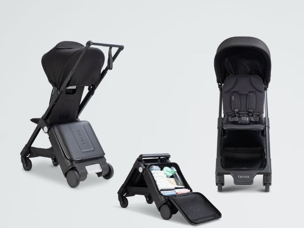
The TernX Carry On is one solution to the constant struggle of folding strollers and managing luggage when boarding planes. The suitcase-and-stroller hybrid has a “loaded folding” mechanism designed to ease the transition from pushing your child through the airport to getting them and everything else you’re carrying onto the plane.

Designers: Tack Lee and Hoe Ping Lo

The strongest aspect of this stroller is that you don’t need to remove everything that’s in the enclosed luggage compartment just to fold it when getting on the plane. This could remove one stressful step that a lot of parents experience when traveling. The mechanism preserves the suitcase compartment while allowing the stroller to fold into a compact package, rather than requiring you to unpack and repack your child’s things.

The hard-shell compartment is incorporated behind the stroller seat, and there’s even a separate open basket below. When folded, it takes on a luggage silhouette, so it looks more like an actual piece of luggage rather than the exposed bundle of tubes that we often see in folded strollers. It has a restrained black finish that connects the shell, frame, and textiles.

Of course, being a stroller is a main part of the TernX’s function, so your child has an actual stroller seat. According to TernX, it has an adjustable five-point harness, a fixed footrest, two recline positions at 99° and 126°, and a backrest that extends from approximately 15 to 20 inches (38 to 50 cm). It’s intended for children from six months old up to 48.5 pounds, depending on their size and fit, rather than newborns.

In suitcase mode, you get a two-wheel pull-along bag that you need to tilt and pull rather than roll upright like a four-wheel spinner. TernX says this arrangement allows the wheels to be recessed for a better overhead-bin fit. That’s a trade-off worth considering if you’re used to pushing your luggage alongside you.

The enclosed compartment offers 18 liters of storage, while the under-seat basket can carry up to about 4.4 pounds. That gives parents room for items such as diapers, snacks, and a change of clothes without necessarily needing another bag for those essentials. TernX also says the enclosed compartment remains accessible in both configurations, so you don’t have to unfold the stroller just to reach something you’ve packed inside.

There is an important distinction between being designed as a carry-on and being accepted on every flight. Folded, the TernX measures approximately 21.7 × 14 × 9.1 inches (55 × 35.5 × 23 cm). Airline size and weight limits vary, and limited cabin space can still mean a gate check. Parents should check their airline’s stroller and carry-on policies before traveling rather than assume the suitcase shape guarantees a place in the overhead bin.

The weight also deserves some thought. TernX lists the empty product at about 17.2 pounds, excluding the canopy. Add your belongings, and you’ll still have to lift the whole thing into an overhead bin if it’s accepted onboard. Combining two items doesn’t remove that part of the job.

I can see the appeal for parents who want fewer separate things to manage, especially when traveling with one young child. The part that makes the most sense to me is keeping the packed compartment intact during the switch. Parents would still have plenty to handle at boarding, but at least rearranging all those diapers and spare clothes wouldn’t have to be another task.

The post TernX’s Suitcase-Stroller Folds Without Making You Unpack first appeared on Yanko Design.

  • ✇Yanko Design
  • Flint’s Rechargeable Paper Battery Works Without Lithium
    Paper is an unexpected starting point for a rechargeable battery, which is part of Flint’s appeal. The Singapore-based company uses cellulose, the plant-derived material in paper, to rethink what goes inside the cells powering our gadgets. Its paper battery targets two problems that rarely make it onto the packaging: the materials batteries depend on and the safety concerns that come with storing energy in everyday objects. Flint announced on January 2, 2026, that its technology had entered pro
     

Flint’s Rechargeable Paper Battery Works Without Lithium

10 novembre 2026 à 14:20

Paper is an unexpected starting point for a rechargeable battery, which is part of Flint’s appeal. The Singapore-based company uses cellulose, the plant-derived material in paper, to rethink what goes inside the cells powering our gadgets. Its paper battery targets two problems that rarely make it onto the packaging: the materials batteries depend on and the safety concerns that come with storing energy in everyday objects.

Flint announced on January 2, 2026, that its technology had entered production in Singapore, supplying cells for customer pilots and early commercial integrations. That’s an important distinction from a promising laboratory sample, although it doesn’t mean you can grab a pack at the checkout counter. The company currently focuses on businesses and manufacturers rather than direct consumer sales.

Designer: Flint Labs

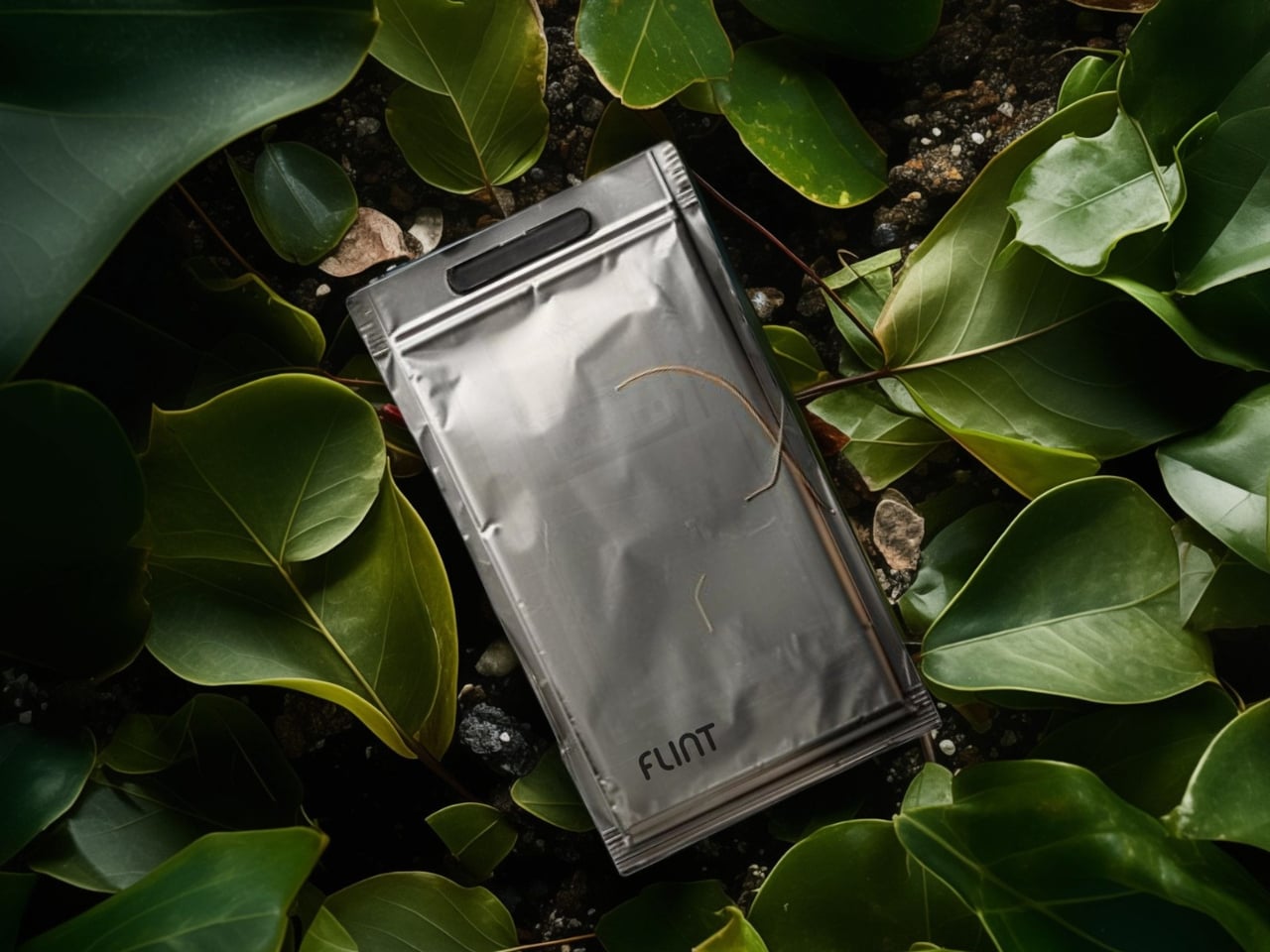
The name needs a little unpacking. You aren’t charging a sheet of stationery, and paper alone isn’t supplying the electricity. Flint uses zinc and manganese alongside its cellulose-based architecture and water-based electrolyte. The battery still has the familiar internal arrangement of an anode, cathode, and separator. Flint says cellulose supports ion transfer and gives the design structural flexibility. I like that the material has an actual job here, beyond making the sustainability story sound approachable.

That flexibility gives designers options beyond a rigid cylinder or rectangular block. Flint says its chemistry can accommodate different shapes, and IEEE Spectrum’s reporter handled a thin, bendable version at CES. The technology can also take familiar AA and AAA forms. To me, that’s a more interesting design proposition than making every device thinner: giving the battery more ways to fit the object.

Safety is another major part of the pitch. Flint describes its water-based batteries as non-flammable and resistant to damage, and its website presents demonstrations involving cutting a cell and exposing one to flame. Those demonstrations are attention-grabbing, but I’d put more weight on documented testing for a particular finished product. A dramatic demonstration can make the chemistry understandable; it doesn’t establish every condition a gadget might encounter.

The applications feel most convincing when they stay close to ordinary life. Flint has been piloting its technology with Logitech, including AAA batteries, according to IEEE Spectrum’s reporting. A mouse or keyboard might not have the glamour of an electric vehicle, but that’s a useful place to prove an alternative chemistry. I’d rather see a battery earn its place in an unremarkable daily object than headline an implausibly ambitious concept.

Then comes the composting claim, which deserves more care than the word “paper” suggests. Flint says its metals can be recovered and the remaining material composted. Its explanation also involves removing the vacuum-sealed casing before degradation begins. That isn’t an invitation to toss an intact battery into the backyard. I’d want explicit disposal instructions and a practical recovery route before treating compostability as an everyday convenience.

Performance remains the other test. Flint’s founder has claimed up to 1,000 charge cycles, but IEEE Spectrum reported that the company hadn’t published a white paper detailing its proprietary design. That leaves a gap between promising specifications and evidence readers can examine. I’m interested, but I wouldn’t translate those figures into a promise about how long a future wearable or remote will last between charges.

One less flashy choice may matter just as much: manufacturing. Flint says it deliberately designed the battery to align with existing lithium-ion production processes, while its Singapore facility uses water-based manufacturing methods. Compatibility with familiar equipment could help manufacturers consider a different chemistry without rebuilding everything around it. It’s the kind of practical decision I appreciate because an alternative material has limited value if making it remains prohibitively complicated.

For me, the payoff would be reassuringly uneventful: a gadget that works as expected, with a battery chosen more thoughtfully and a clear destination when it wears out. Flint has made that prospect worth watching. The next persuasive step is letting ordinary products, and their owners, do the demonstrating.

The post Flint’s Rechargeable Paper Battery Works Without Lithium first appeared on Yanko Design.

  • ✇Yanko Design
  • Seaweed’s Hidden Beauty Takes Shape in Alien-Like Sculptures
    Julia Lohmann’s seaweed sculptures look like they’ve wandered out of a science fiction movie and agreed to pose for a museum photograph. Their skins curl around exposed ribs, with open mouths and looping bodies that suggest creatures nobody has named yet. I like that they’re a little strange. For a project concerned with our relationship to nature, making the material difficult to ignore feels like a sensible place to start. The work is Kelp Council, an installation made for More than Human at
     

Seaweed’s Hidden Beauty Takes Shape in Alien-Like Sculptures

10 novembre 2026 à 09:20

Julia Lohmann’s seaweed sculptures look like they’ve wandered out of a science fiction movie and agreed to pose for a museum photograph. Their skins curl around exposed ribs, with open mouths and looping bodies that suggest creatures nobody has named yet. I like that they’re a little strange. For a project concerned with our relationship to nature, making the material difficult to ignore feels like a sensible place to start.

The work is Kelp Council, an installation made for More than Human at London’s Design Museum, which ran from July 11 through October 5, 2025. It addresses a design problem that doesn’t get solved by swapping one material for another: how to use nature without treating it as an endless supply closet. Lohmann gives seaweed a presence beyond its usefulness to us, inviting visitors to consider the organisms behind a potential design material.

Designer: Julia Lohmann

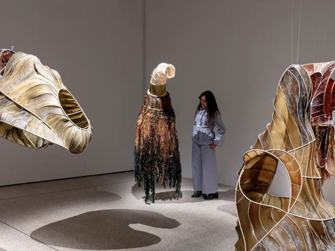
In the museum’s installation photograph, the surfaces range from olive green to warm amber and deep reddish brown. Light catches the thin skins, while the curved framework stays visible underneath. One form folds around a large opening; another flares outward like an oversized sea creature’s collar. The exposed construction matters. You can read the relationship between skin and support rather than seeing a perfectly smooth shell that conceals how it was assembled.

That relationship has been developing for years. Lohmann’s earlier Oki Naganode, installed at the Victoria and Albert Museum in 2013, used Japanese Naga seaweed treated to remain flexible, then stretched across a modular cane and aluminum framework. That project helps explain the material thinking behind her practice: seaweed can behave like a translucent covering, with enough visual character to become the reason for an object’s form. It doesn’t need to impersonate injection-molded plastic to be worth our attention.

Lohmann began exploring seaweed in 2007 and founded the Department of Seaweed in 2013, bringing together research, experimentation, and making. The name sounds enjoyably bureaucratic for a group dealing with such unruly material. Its stated position is serious, though. Seaweed-based alternatives only make sense, the group argues, when marine ecosystems and wild algae stocks come first. A renewable material still requires decisions about where it comes from and how it is grown.

Kelp Council adds another layer through sound. The installation includes a soundscape of rising and falling tides by Ville Aslak Raasakka and Lohmann, alongside seaweed species collected in Europe and East Asia. I appreciate that choice because it connects the gallery objects to a setting beyond the gallery. The word “council” also gives the gathering a slightly theatrical premise: humans are invited into a conversation whose other participants usually have no representation.

That premise could easily become precious, but the material keeps it grounded. In a Wallpaper* interview, Lohmann warned against responding to seaweed’s potential by simply harvesting more wild stock, which would create further problems for those habitats. To me, that caution is the strongest element of the project. The sourcing remains part of the design, even after the sculpture is finished. Any enthusiasm about seaweed replacing conventional materials needs to leave room for that distinction.

Of course, an installation cannot establish that a material is ready for your next lampshade or chair. A compelling sculpture alone can’t tell us what a mass-produced version would cost, how long it would last in a home, or what its full environmental footprint would be. I’d want those answers before calling it a practical replacement. As an exhibition piece, though, it has a different job: making those questions feel worth asking.

I’m more persuaded by the visible ribs and uneven colors than I would be by a perfectly uniform sheet advertised as the next miracle biomaterial. They suggest a design process willing to work with what makes seaweed distinctive. Kelp Council leaves me wanting objects that retain more of that identity, along with better information about their origins. If the material has a story, the finished design ought to let some of it show.

The post Seaweed’s Hidden Beauty Takes Shape in Alien-Like Sculptures first appeared on Yanko Design.

  • ✇Yanko Design
  • Casio’s Tiny Ring Watch Keeps Time Without a Wrist Strap
    I’m so used to wearing a watch, whether as a health tracker or just a way to tell time without looking at my phone. But sometimes I wish I could wear something that isn’t on my wrist. There are times I’d rather wear a bracelet instead or just keep my wrist free and unencumbered. There are ring health trackers available now, but I’d still want a watch or something that resembles one. If you’re a fan of the Casio A168, you’ll be happy to know that Casio has made a version for your finger. The Cas
     

Casio’s Tiny Ring Watch Keeps Time Without a Wrist Strap

10 novembre 2026 à 06:07

I’m so used to wearing a watch, whether as a health tracker or just a way to tell time without looking at my phone. But sometimes I wish I could wear something that isn’t on my wrist. There are times I’d rather wear a bracelet instead or just keep my wrist free and unencumbered. There are ring health trackers available now, but I’d still want a watch or something that resembles one. If you’re a fan of the Casio A168, you’ll be happy to know that Casio has made a version for your finger.

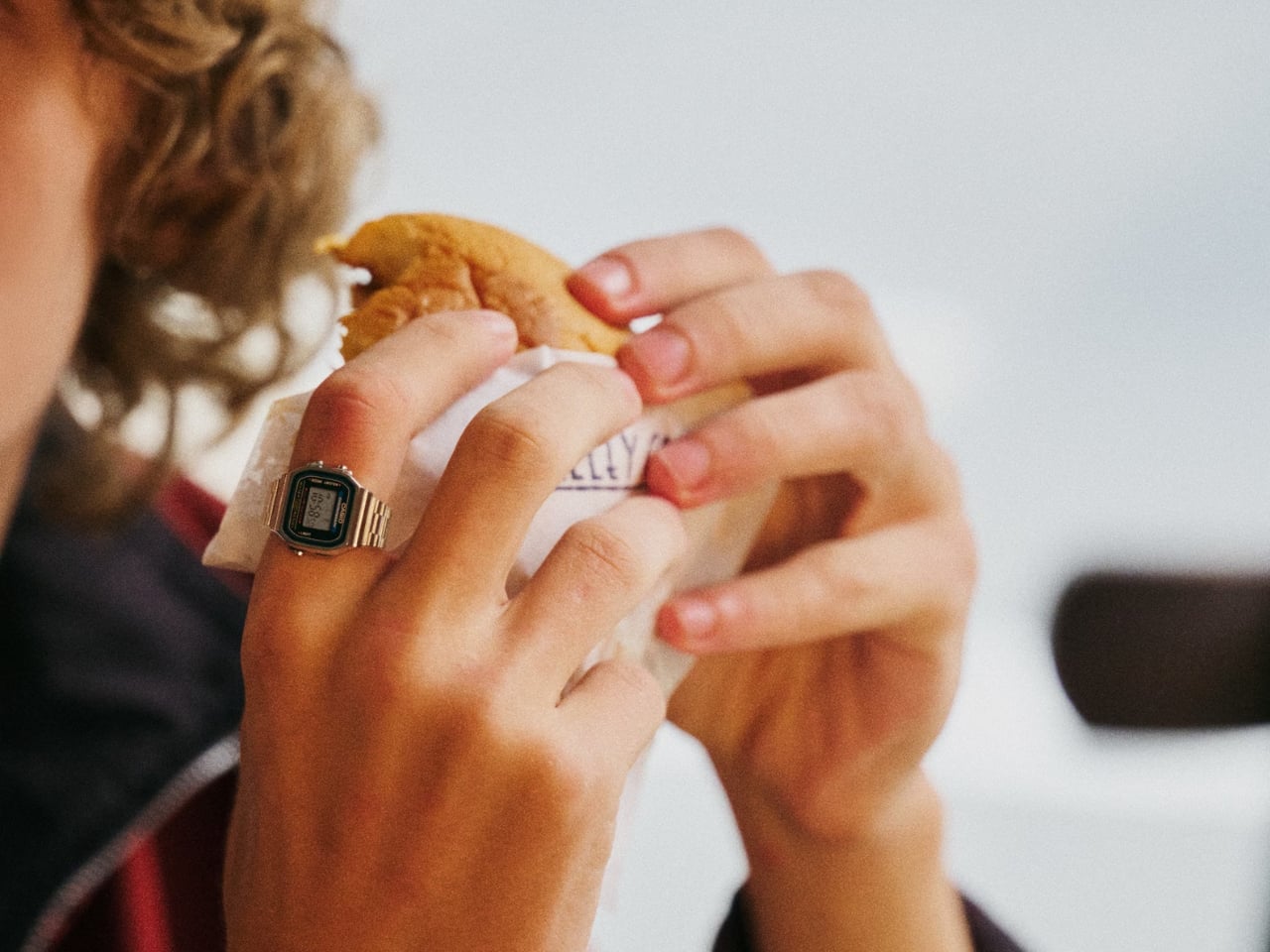
The Casio CRW-002 Ring Watch is a finger-scale version of the iconic A168, so you can wear it as a piece of jewelry while still keeping many of the original watch’s features. It’s an alternative for those who prefer something smaller but still want familiar watch functions, especially telling time.

Designer: Casio

Casio used metal injection molding, or MIM, to reproduce the intricate case and band shapes in stainless steel. The glossy case contrasts with the matte-finished band, carrying over details that make it recognizable as a tiny Casio. I like that the design keeps the look of a watch bracelet rather than turning the display into a plain metal ring.

The electronics are a separate part of that shrinking process. Casio says high-density mounting technology and a miniature battery make the module approximately one-tenth the size of a standard watch module. It’s still able to retain three buttons and a six-digit display that shows hours, minutes, and seconds. You also get dual time, an automatic calendar, a 12/24-hour format, and a 1/100-second stopwatch.

The case measures 25.2 × 18.2 × 6.2 mm, and the ring weighs 15 grams. Those numbers give you an idea of the scale, although they don’t tell us how comfortable it will be throughout the day. I’d want to know how the case feels against neighboring fingers and how easy those tiny buttons are to use.

There’s also an LED backlight and a Time Flash feature that produces a subtle pulse at a preset time or at the top of every hour. Casio describes Time Flash as entertainment rather than a dependable alert, and the light may be difficult to see in bright conditions. It’s a playful detail, but I wouldn’t rely on it for reminders.

You don’t lose water resistance entirely, but its limits matter. Casio rates it for daily-use water resistance, while the manual specifically excludes handwashing, swimming, and water-related work. You’ll need to remove it before washing your hands or using soap and detergent. That might seem like a small inconvenience for something like this, but it’s worth thinking about if you want a ring you can put on and forget about.

Fit is another thing to check before buying. The ring comes in a US size 10.5, with a 20 mm inner diameter. Two included spacers reduce that diameter to 19 mm or 18 mm. The bracelet-like detailing doesn’t mean you can adjust it like a wristwatch, so those three fit options won’t necessarily work for everyone. That’s something I’d want to try in person rather than guess from measurements.

Casio estimates approximately two years of battery life, so there’s no regular charging routine. The battery is replaceable, although the manual says replacement requires special tools and should be handled by the original retailer or an authorized Casio service center. For the US, Casio announced November 2026 availability, with the silver version priced at $135 and the gold-tone version at $155.

For me, the appeal is still being able to leave my wrist free without giving up a watch face. I’d need to get the fit right and decide whether taking it off at the sink would become annoying. But I do like the idea of choosing a bracelet for my wrist and letting a miniature Casio handle the timekeeping on my finger.

The post Casio’s Tiny Ring Watch Keeps Time Without a Wrist Strap first appeared on Yanko Design.

  • ✇Yanko Design
  • Antonia Tiny House Offers a Bedroom Without the Climb
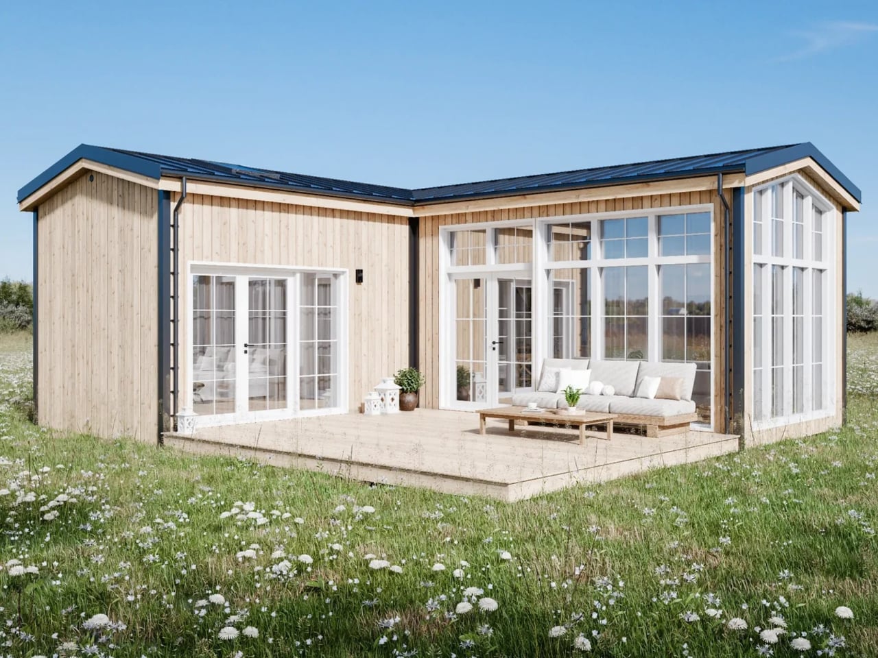
    Loft bedrooms look efficient on paper. Move the bed upstairs, and suddenly there’s room for a proper kitchen or a sofa below. But that saved space comes with a compromise: stairs to navigate at night and a ceiling that may not let you stand upright. I’d rather have a little less cleverness in the floor plan and a bedroom I can simply walk into. That’s the appeal of Antonia, an orderable modular home from Swedish company Vagabond Haven. Its main bedroom stays downstairs, while roughly 635 square
     

Antonia Tiny House Offers a Bedroom Without the Climb

9 novembre 2026 à 19:30

Loft bedrooms look efficient on paper. Move the bed upstairs, and suddenly there’s room for a proper kitchen or a sofa below. But that saved space comes with a compromise: stairs to navigate at night and a ceiling that may not let you stand upright. I’d rather have a little less cleverness in the floor plan and a bedroom I can simply walk into.

That’s the appeal of Antonia, an orderable modular home from Swedish company Vagabond Haven. Its main bedroom stays downstairs, while roughly 635 square feet across two levels leave room for a second sleeping area above. Two modules form an L around a terrace, giving the layout a useful bend rather than the proportions of a towable cabin. It’s designed to settle onto a foundation, delivered by truck and positioned by crane.

Designer: Vagabond Haven

That bend in the floor plan does useful work. The living area occupies one wing, while the bedroom, bathroom, and stairs occupy the other. Between them, the terrace sits inside the L, reached through glass doors from both the living room and the downstairs bedroom. In the published renderings, outdoor seating makes this corner read as another place to spend time, not merely a landing outside the door. The images are illustrative, so finishes and details may change.

I like that the outdoor space has a clear relationship to the rooms around it. A deck can be generous and still feel detached from daily life if getting there means walking around the house. Here, the layout suggests an easy route from cooking dinner to eating outside. That’s a more convincing use of limited space than counting every square foot of decking as though it were another climate-controlled room.

Indoors, the kitchen and living room share a high ceiling because the loft stays over the opposite wing. The kitchen follows its own L-shaped plan, with a sink, cooktop, oven, and refrigerator/freezer in the illustrated furnished setup. A dishwasher is optional, and a four-seat dining table sits nearby. The proportions matter more to me than the styling: a table that can remain a table is preferable to furniture that needs a nightly transformation.

The material palette is restrained: vertical Thermopine siding outside, a steel-sheet roof, laminate flooring, and Forestia/Huntonit interior panels. White cabinetry and pale wood tones give the renderings a familiar cottage feel. More importantly, the ground-floor bedroom is shown with a double bed and fitted wardrobes, while the bathroom accommodates a shower, vanity, toilet, and washer/dryer. Those aren’t glamorous features. They’re the infrastructure that lets a small home function beyond a weekend.

Upstairs, the compromise is more visible. The loft rendering shows a second double bed, a desk, and seating beneath a low pitched ceiling, with stairs providing access. I’d see this as useful guest space or an occasional work retreat before making it the primary bedroom. Keeping the downstairs option means the house doesn’t ask everyone to accept the same relationship with stairs, headroom, and getting up at night.

Pricing needs the same practical reading. Vagabond Haven lists the unfurnished Antonia at €67,500 before VAT, with a €77,500 furnished example configuration. The base price isn’t the price of the staged interior: the company excludes items including heating, appliances, bathroom fittings, the terrace, delivery, and utility connections. Its stated delivery market is Europe, so these figures shouldn’t be mistaken for a ready-to-install U.S. offer. A beautiful rendering doesn’t make those additional decisions disappear.

I’d pay particular attention to where it lands. With so much glass facing the terrace, choosing what those windows overlook would be part of making this layout work. A view of trees and a view of a neighbor’s kitchen aren’t interchangeable. Antonia makes an appealing case for letting outdoor space shape a small home, but that makes its eventual setting just as important as what arrives on the truck.

The post Antonia Tiny House Offers a Bedroom Without the Climb first appeared on Yanko Design.

  • ✇Yanko Design
  • Field Record’s 1.1-Pound Tent Stands Without Trekking Poles
    Carrying less shouldn’t have to mean giving up a tent that supports itself. That’s the appeal of Field Record’s FR-SCD, a one-person shelter with a listed body-and-pole weight of just 490 grams, or about 1.1 pounds. It addresses a recognizable backpacking dilemma: how to trim the load without switching to a shelter that depends on trekking poles for its structure. That number deserves a little unpacking before anyone starts rearranging their gear closet. The 490 grams covers the tent and its Ea
     

Field Record’s 1.1-Pound Tent Stands Without Trekking Poles

9 novembre 2026 à 17:30

Carrying less shouldn’t have to mean giving up a tent that supports itself. That’s the appeal of Field Record’s FR-SCD, a one-person shelter with a listed body-and-pole weight of just 490 grams, or about 1.1 pounds. It addresses a recognizable backpacking dilemma: how to trim the load without switching to a shelter that depends on trekking poles for its structure.

That number deserves a little unpacking before anyone starts rearranging their gear closet. The 490 grams covers the tent and its Easton carbon fiber poles, not the complete packed kit. Carry bags, stakes, and guy lines aren’t included in that figure. It’s still remarkably light, but I’d rather know what’s on the scale than fall in love with a number that leaves the accessories off it.

Designer: Field Record

Field Record comes from designer Kouichi Okamoto of Kyouei Design, and the brand says it handles design, cutting, sewing, and seam processing in-house. The FR-SCD also isn’t a fresh launch disguised by a recent round of attention. It appeared in the brand’s 2023 lineup, with a special 470-gram version developed alongside trail runner Shogo Mochizuki. The production model uses a different Dyneema fabric. That history gives the weight-saving ambition some useful context.

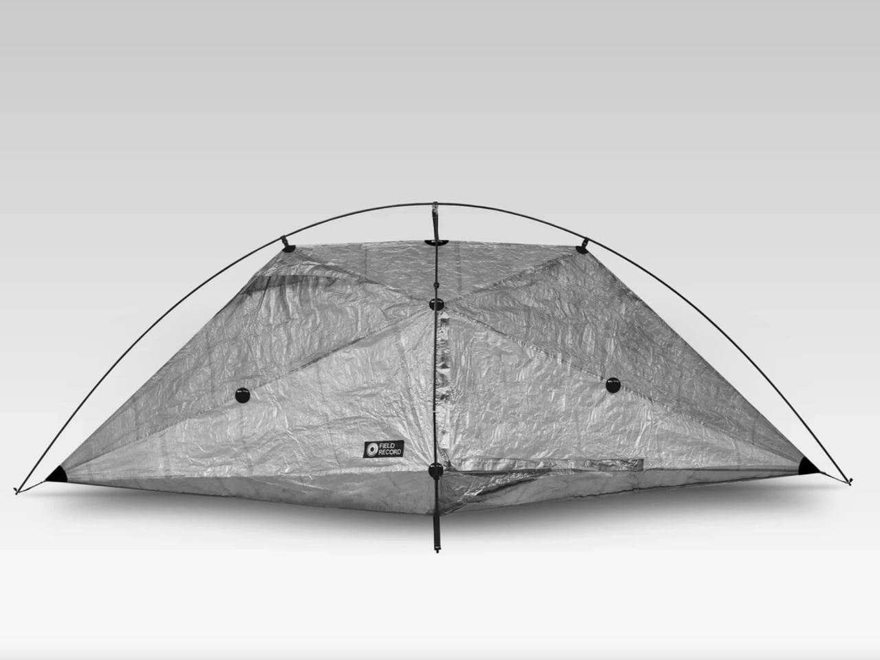
Visually, it’s an appealingly strange little object. The photographed shelter has a crinkled, translucent skin stretched beneath two crossing arcs, with pointed ends that make the overhead view resemble an elongated kite. I like how little effort it spends looking conventionally rugged. You can read the frame and the fabric as separate elements, and the shape feels more interesting for making that relationship so visible.

The construction is specific. Field Record pairs a Dyneema Composite Fabric body with Easton carbon poles, then applies bonded seam treatment after sewing. Twelve bonded reinforcement points support the construction. Those details matter because this isn’t merely a thin sheet draped over a frame. The maker has put reinforcement into selected locations while pursuing that low overall weight, a more interesting design exercise than indiscriminately removing material.

Ventilation is where the idea meets a less glamorous camping reality. Moisture inside a tent can be as unwelcome as rain outside it. Field Record says the FR-SCD’s form and four ventilation points encourage airflow to reduce condensation. That’s a design intention, not proof of consistently dry mornings. Ventilation is an established way to manage condensation, but I’d want field testing before treating these openings as a complete solution.

Space is another negotiation. The published dimensions are approximately 101.6 inches long, 42.5 inches wide, and 37.4 inches high. Those are overall measurements, not a rectangular sleeping area. Looking at the sharply tapered outline, I wouldn’t read the length and width as permission to sprawl. The low roof also makes this look like a place to sleep rather than a comfortable room for waiting out an entire afternoon.

Freestanding shouldn’t be mistaken for unanchored, either. A frame that holds the shelter’s shape is useful, but wind still makes staking and guying important. Sierra Designs’ tent guidance makes that distinction explicitly, even for freestanding models. I appreciate the convenience this architecture offers, provided the weight conversation doesn’t encourage anyone to leave necessary anchoring gear behind. Saving ounces shouldn’t depend on ignoring the campsite.

Then comes the price: ¥149,600, approximately $950 in New Atlas’s report. Field Record currently lists a roughly three-month lead time and offers international shipping, with customs charges left to the buyer. That puts it firmly in specialist territory. For me, the cost makes more sense as payment for a particular construction and manufacturing approach than as an obvious upgrade for anyone who occasionally spends a weekend outdoors.

I’m drawn to the FR-SCD because its priorities are easy to understand, even if they wouldn’t match everyone’s packing list. I’d want more evidence about livability before choosing it for a trip. As a design, though, it makes a persuasive case for keeping the convenience of a frame while being unusually disciplined about everything that frame has to carry.

The post Field Record’s 1.1-Pound Tent Stands Without Trekking Poles first appeared on Yanko Design.

  • ✇Yanko Design
  • Lift Ocean’s ONE Lifts Boats Above Water Without a New Hull
    A speedboat that rises above the water is an easy visual sell. The less glamorous question is what happens to the perfectly usable boat someone already owns. Replacing an entire vessel to get a smoother, more efficient ride is a fairly extravagant upgrade path. Norwegian company Lift Ocean is working on another option: ONE, a hydrofoil system designed to fit conventional boats rather than demand a completely new hull. I like that starting point. ONE is a tested system, but it isn’t a weekend in
     

Lift Ocean’s ONE Lifts Boats Above Water Without a New Hull

9 novembre 2026 à 10:20

A speedboat that rises above the water is an easy visual sell. The less glamorous question is what happens to the perfectly usable boat someone already owns. Replacing an entire vessel to get a smoother, more efficient ride is a fairly extravagant upgrade path. Norwegian company Lift Ocean is working on another option: ONE, a hydrofoil system designed to fit conventional boats rather than demand a completely new hull. I like that starting point.

ONE is a tested system, but it isn’t a weekend installation project for individual owners. According to New Atlas’s November 8 report, orders are currently limited to boat manufacturers and fleet operators, with shipping expected in 2027. That makes the immediate story a supplier offering foiling technology to the industry, rather than an accessory you can order for next Saturday’s lake trip. The distinction matters before anyone starts clearing space in the garage.

Designer: Lift Ocean

The hardware has an understandable layout: one foil assembly at the bow and two at the stern, flanking a single outboard motor. Each assembly places a movable underwater wing at the bottom of a vertical mast. As speed builds, those wings generate lift and raise the hull above the water. It’s an unusual-looking arrangement, but the logic is straightforward. Less hull moving through the water means an opportunity to reduce resistance.

Keeping that arrangement stable takes more than attaching wings. Lift Ocean’s active control system automatically adjusts their angles to maintain ride height and manage banked turns. The driver still uses steering and throttle, rather than learning to balance the boat manually. To me, that’s the right place to put the complexity: inside the controls, where it can do useful work, instead of turning a familiar activity into a new skill test.

The retractable wings are equally important, although they’re less likely to get top billing than the flying-boat footage. Lift Ocean says retracting them allows conventional planing, reduces marine growth, and makes maintenance easier. Its CEO also says the arrangement accommodates a conventional trailer. Those are sensible priorities. A boat still has to come home, sit unused, and get cleaned. I’d judge the design partly by how gracefully it handles those unphotogenic hours.

Compatibility is another appealing decision. ONE is designed to work with gasoline or electric outboards, so adopting the system doesn’t inherently require changing energy sources. An automatic engine lift bracket moves the motor vertically to keep its propeller submerged while the boat rises. That detail deserves attention: lifting the hull is only useful if propulsion continues working properly. The bracket addresses a problem created by the very feature everyone came to admire.

The efficiency claim is substantial. Lift Ocean told New Atlas that measurements from its test boats and client samples showed roughly a 50 percent reduction in fuel consumption, while emphasizing that results vary between boats. I’d treat that as a company-reported result, not a guaranteed discount at the fuel dock. Still, reducing the energy needed to move an existing hull is a compelling direction. It makes efficiency a question of how the boat travels, alongside what powers it.

I also appreciate that Lift Ocean acknowledges installation differences. In an interview with Marine Industry News, CEO Petter Mørland Pedersen explained that some modifications are normally required, depending on the vessel. “Bolt-on” shouldn’t be mistaken for universally effortless. Manufacturers still have integration work to do, and a standardized system doesn’t erase the individual boat’s structure or proportions. That caveat makes the proposition more credible to me, because it leaves room for the actual engineering.

Before calling ONE a practical upgrade, I’d want to see the installed price, maintenance requirements, and fuel savings on a specific boat. But as a design proposition, it has my attention. The appeal is being able to improve a familiar object without treating the entire object as obsolete. If boatbuilders can make that integration convincing, the most satisfying feature might be the hull you didn’t have to replace.

The post Lift Ocean’s ONE Lifts Boats Above Water Without a New Hull first appeared on Yanko Design.

  • ✇Yanko Design
  • Caviar’s Zodiac Duo Phone Refuses to Keep Your Star Sign Subtle
    Caviar’s Zodiac Duo may be on your wish list this year. Well, at least if you’re an Apple fan drawn to the idea of a foldable iPhone with a rather extravagant finish. Caviar presents the customization for the iPhone Duo, itself already a sort of luxury item. If you want to make your phone a bit different from all the others, this may just be the one you’d want to spend your money on. And I mean a lot of money. The Zodiac Duo isn’t simply a specially designed case featuring one of the 12 astrolo
     

Caviar’s Zodiac Duo Phone Refuses to Keep Your Star Sign Subtle

9 novembre 2026 à 06:07

Caviar’s Zodiac Duo may be on your wish list this year. Well, at least if you’re an Apple fan drawn to the idea of a foldable iPhone with a rather extravagant finish. Caviar presents the customization for the iPhone Duo, itself already a sort of luxury item. If you want to make your phone a bit different from all the others, this may just be the one you’d want to spend your money on. And I mean a lot of money.

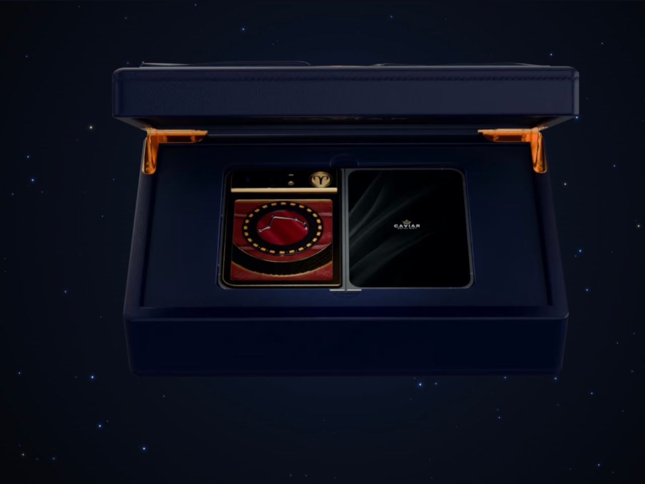
The Zodiac Duo isn’t simply a specially designed case featuring one of the 12 astrological signs. It’s a made-to-order customization offering with 12 zodiac-themed starting designs. There are eight steps to customize and personalize your phone, including changing things like the constellation, metal finish, decorative elements, and back-plate materials. Caviar says its jewelers will assemble the finished piece according to your specifications. So don’t expect this to be a simple or affordable kind of customization.

Designer: Caviar

The personalization aspect changes the decorative composition of your phone, rather than just its color or a generic zodiac symbol tacked onto it. You can configure several visually separate components, including the zodiac circle, medallion, frame, and decorative panel. The zodiac circle gives the design a visual structure, with the constellation and sign symbol guiding the rest of your choices. This way, you won’t just have various luxury materials scattered around a surface. There’s a recognizable theme holding everything together, even if your material choices are on the extravagant side.

Caviar lists silver, yellow and rose gold, and natural or black titanium among its metal options, although the exact construction depends on your configuration. Some components are specified as gold-plated rather than solid gold. For decoration, the choices include jewelry enamel, diamonds, sapphires, rubies, Swarovski crystals, and meteorite. The back plate can use crocodile, python, calfskin, or forged carbon. That’s quite a different set of decisions from choosing between a clear case and a silicone one. It also leaves room to decide how much sparkle you actually want.

The surface treatments deserve some attention, too. Caviar offers guilloché and clous de Paris hobnail patterns, adding intricate repeating details to the metal surfaces. These give you something else to consider beyond color and shine. A textured metal surface paired with leather suggests a different visual character from one surrounded by bright stones, even when both designs begin with the same zodiac sign.

For someone who follows astrology, the appeal is having a daily object connected to something personally meaningful. It could also make a very specific gift, assuming you know the recipient’s sign and taste well enough. The benefit here is self-expression. There’s no reason to expect a jeweled constellation to make your apps run faster or your photos look better.

The online configurator lets you see an estimated price as you make your selections. You can then save the design as a link or send it to a Caviar manager. That makes the process more manageable than trying to describe your preferred combination from scratch. Still, Caviar says the configurator image is illustrative, with the final appearance agreed upon with a manager. Those selections are the beginning of a conversation about the finished phone.

One configuration carries an estimated price of $16,629, but that isn’t a confirmed price for every possible combination. Buyers should request a configuration-specific quote and delivery information from Caviar. Before committing, I’d also want answers about the finished phone’s weight, charging compatibility, warranty, and repair options. Those practical details matter when the object you’re decorating still needs to function as your everyday phone.

The more interesting long-term question is what happens when that phone needs replacing. A zodiac sign won’t become outdated, but the device carrying it eventually will. At this price, knowing whether the decorative work can be repaired or reused would matter almost as much as choosing the right constellation.

The post Caviar’s Zodiac Duo Phone Refuses to Keep Your Star Sign Subtle first appeared on Yanko Design.

  • ✇Yanko Design
  • A $25 Water Bottle That Packs Snacks Without an Extra Bag
    A water bottle in one hand and a bag of trail mix in the other works perfectly well until you need your phone. Then the snack bag gets stuffed into a pocket or buried somewhere inconvenient. The FLPSDE XR Dual Chamber Water Bottle tackles that small but familiar packing problem by giving your drink and your snacks separate spaces inside one bottle. I like the premise: fewer loose things to keep track of, without abandoning the snacks. Designed by Ben Bazis, whose name appears on FLPSDE’s contai
     

A $25 Water Bottle That Packs Snacks Without an Extra Bag

9 novembre 2026 à 05:15

A water bottle in one hand and a bag of trail mix in the other works perfectly well until you need your phone. Then the snack bag gets stuffed into a pocket or buried somewhere inconvenient. The FLPSDE XR Dual Chamber Water Bottle tackles that small but familiar packing problem by giving your drink and your snacks separate spaces inside one bottle. I like the premise: fewer loose things to keep track of, without abandoning the snacks.

Designed by Ben Bazis, whose name appears on FLPSDE’s container patent, the XR is a retail product rather than a concept waiting for production. It’s the plastic version of the brand’s dual-chamber bottle, with drinking access at the top and storage accessed by flipping it over. That arrangement makes sense for an afternoon out when bringing a whole lunch bag feels excessive, but pretending you won’t get hungry feels optimistic.

Designer: Ben Bazis

The capacity needs a little unpacking. FLPSDE lists 32 ounces overall, but that’s divided between a 25-ounce drinking chamber and a 7-ounce storage compartment. You’re not getting a full 32-ounce water supply plus a bonus snack container. Some of the bottle’s interior is committed to storage, which seems like a reasonable exchange for short outings. For a longer walk with limited refill opportunities, I’d give water capacity priority over the convenience of consolidated packing.

Visually, the XR makes its unusual construction easy to understand. The product image shows a snack chamber nested inside the lower portion of a translucent blue body, with water occupying the space above and around it. You can see the contents rather than treating the base like a mystery compartment. I prefer that openness here. Seeing the remaining cashews is a useful reminder that you packed them, and an equally useful warning that you’re almost out.

The lid gets attention, too. FLPSDE includes a straw, a carry handle, and a wide opening for adding ice, along with the option to drink without the straw. Those are sensible accommodations for different habits, although the storage is still the reason this bottle deserves a look. I’m more interested in that practical combination than in another bottle asking me to appreciate its color alone. The XR does offer colors you can mix and match, if that’s your thing.

The lower compartment isn’t restricted to food. FLPSDE suggests keys or lip balm, and says it can also hold a separate cold drink, including electrolytes or cold coffee. The company describes the chambers as independently sealed. I’d use it for dry snacks first, simply because that’s the clearest benefit for my own packing preferences. A small second beverage has its appeal, but keeping a handful of nuts from disappearing into the bottom of a backpack feels more broadly useful.

Cleaning is where a clever container can become a chore. FLPSDE says the XR disassembles completely and that all parts are top-rack dishwasher safe. That matters more to me than the prospect of carrying two drinks. A bottle that holds food needs to be approachable after the outing, too. Disassembly is a sensible design choice, though it also means more pieces to wash and reassemble. Combining containers doesn’t make their maintenance disappear; it brings the jobs together.

At a listed $24.98, the XR is priced modestly enough to make its extra function worth considering. FLPSDE gives dimensions of 10.25 inches tall and 3.25 inches wide, and says it fits most cup holders. That last detail is worth checking against your own car or bag rather than assuming every holder agrees. The useful question is whether its shape fits the places where you already carry a bottle.

I wouldn’t replace a perfectly good bottle solely to acquire a snack compartment. But for someone already shopping, the XR offers a specific reason to choose it: the food travels with the water. Its appeal depends on how you pack, not how enthusiastically you collect drinkware. If a bottle is already coming along, giving it responsibility for the trail mix seems like a fair assignment.

The post A $25 Water Bottle That Packs Snacks Without an Extra Bag first appeared on Yanko Design.

  • ✇Yanko Design
  • Two Hidden Mechanical Movements Power One Slim Louis Erard Watch
    Two riveted portholes occupy the face of the Louis Erard × Vianney Halter Futur Antérieur, making it look like submarine equipment that escaped into a jewelry case. One window tells the hours and minutes. The other gives the seconds their own stage. I like the extravagance of that arrangement, especially because this limited-edition mechanical watch tackles a specific design challenge: delivering Halter’s distinctive aesthetic in a less prohibitively expensive package. At roughly $6,000 before
     

Two Hidden Mechanical Movements Power One Slim Louis Erard Watch

8 novembre 2026 à 15:15

Two riveted portholes occupy the face of the Louis Erard × Vianney Halter Futur Antérieur, making it look like submarine equipment that escaped into a jewelry case. One window tells the hours and minutes. The other gives the seconds their own stage. I like the extravagance of that arrangement, especially because this limited-edition mechanical watch tackles a specific design challenge: delivering Halter’s distinctive aesthetic in a less prohibitively expensive package.

At roughly $6,000 before taxes, “less expensive” needs context. Halter’s Antiqua, the perpetual-calendar watch he introduced in 1998, occupies a six-figure collecting universe. The Futur Antérieur translates its porthole architecture into a simpler watch that tells the time. Nobody needs to pretend that makes it affordable. Still, I appreciate a collaboration that preserves an independent watchmaker’s recognizable ideas rather than borrowing a famous name and printing it on an otherwise ordinary dial.

Designers: Louis Erard × Vianney Halter

The cleverest decision sits behind those windows. Two separate Sellita SW100 automatic movements power the displays, one handling hours and minutes, the other running the seconds. That sounds wonderfully excessive for such basic information, and it is. But it also gives each dial its own mechanical foundation. Rather than developing an elaborate mechanism to reposition the indications, the designers have used two small, existing movements to support the layout they wanted.

Two movements might suggest a second time zone, but that isn’t what you get. Design Milk reports that Louis Erard chose running seconds partly because keeping two movements sufficiently aligned for dual-time use would be difficult at the intended price. That’s useful context, and a reminder that the extra mechanism serves the design more than the feature list. I’d approach this as an expressive object, not a purchase justified by having more functions.

The dimensions help that expression avoid becoming a costume. Its stainless-steel case measures 38mm across and 44mm long, with a thickness of just 8.85mm. Those numbers matter because the raised windows and prominent crowns could easily suggest a much chunkier watch in photographs. On paper, the profile is restrained. I haven’t worn it, but I appreciate the decision to keep this much visual activity within relatively compact dimensions.

Look closer and the metalwork carries much of the personality. Each bezel has 12 yellow-gilt rivets, while each crown gets six. Brushed steel sits beside polished edges, and the blue steel hands introduce a cooler color against those warm accents. In the product images, the separate nameplates feel almost like labels attached to an old scientific instrument. The appeal, for me, comes from those specific details rather than the broad steampunk label.

The two versions pull that character in slightly different directions. Gold combines gold-toned dials with a black ostrich-leather strap. Silver pairs silver-toned dials with blue ostrich leather, picking up the color of the hands. I’d choose Silver. Its cooler palette lets the little gold rivets register as individual details instead of joining a larger wash of gold. The asymmetrical layout already has plenty to say without needing a louder color scheme.

There are ordinary ownership considerations beneath the unusual face. Louis Erard specifies a minimum 38-hour power reserve for each movement, with 42 hours typical. Leave it unworn for a weekend and you may return to a stopped watch. Quick-change strap bars offer a more convenient detail, letting owners change the strap without making that another complicated operation. These are worth considering alongside the sculptural appeal.

Each version is limited to 178 pieces and listed at CHF 4,950 before taxes. As of November 6, 2026, both are marked sold out on Louis Erard’s website. That scarcity limits the accessibility argument, even at this lower price. Still, the design itself makes sense to me: keep the familiar task of reading hours and minutes, then spend the mechanical extravagance on giving the passing seconds an unnecessarily handsome room of their own.

The post Two Hidden Mechanical Movements Power One Slim Louis Erard Watch first appeared on Yanko Design.
  • ✇Yanko Design
  • Embru’s Patio Chair Can Get a New Seat Without a New Frame
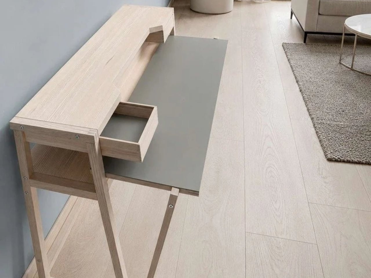
    A wire-grid lounge chair sounds like a hard sell for an afternoon off. Yet Moritz Schmid’s Patio Chair for Swiss furniture maker Embru has a visual ease that makes me want to give it a chance. The open seat and back leave much of the chair transparent, while the frame gives it a clear outline. Its more persuasive detail, though, addresses a familiar frustration: having to replace an entire object because one part has given up. Embru describes the construction as modular, with individual compone
     

Embru’s Patio Chair Can Get a New Seat Without a New Frame

8 novembre 2026 à 07:40

A wire-grid lounge chair sounds like a hard sell for an afternoon off. Yet Moritz Schmid’s Patio Chair for Swiss furniture maker Embru has a visual ease that makes me want to give it a chance. The open seat and back leave much of the chair transparent, while the frame gives it a clear outline. Its more persuasive detail, though, addresses a familiar frustration: having to replace an entire object because one part has given up.

Embru describes the construction as modular, with individual components that can be replaced or repaired. A specially developed mounting system accommodates different seating surfaces. That makes the announced chair interesting beyond its appearance. If the seat becomes damaged, the design allows the remaining structure to stay in use. I’d rather see that possibility built into a chair from the beginning than encounter it as an expensive customer-service question later.

Designer: Moritz Schmid for Embru

The visible connection between backrest and frame is worth a closer look. In Embru’s detail photograph, a circular metal fitting interrupts the blue grid, making the attachment point part of the composition. It’s a small, deliberate-looking piece of hardware, and I like that it hasn’t been disguised. You can read the chair as an assembly of parts. Visually, that gives the repairability story a little credibility before anyone starts explaining the engineering.

The material options give that construction another purpose. Embru plans an outdoor grid version and an indoor version with wood-veneer panels, including oak, ash, black ash, and walnut. Listed finishes include wine red, gray-blue, black, and silver hot-dip galvanizing. My preference would be the gray-blue grid: it gives the industrial geometry enough color to feel intentional without turning the chair into the loudest object on the patio.

The wood version changes the visual balance considerably. Where the grid lets the background pass through, the broad panels create solid planes. The rear view of the black version makes this especially clear: the backrest reads almost like a sheet suspended above the slender frame. That’s a useful distinction for anyone who likes the underlying shape but doesn’t want outdoor furniture setting the tone inside their living room.

Schmid has explored related territory with Embru before. His earlier Park Chair uses a tubular steel frame, with curved rear legs that give a straightforward garden chair an unexpectedly animated profile. Embru says that design was developed around the manufacturing capabilities at its Rüti factory. I appreciate that context because it makes the Patio Chair feel less like an isolated styling exercise. There’s an ongoing conversation here between a designer, a material, and the people equipped to shape it.

Appearance only gets a lounge chair so far, of course. I’d want to sit in the grid version before calling it an all-afternoon favorite. The photographs establish its shape, not how the seating surface feels after an hour with a book. For me, that’s the unresolved question that matters most. An appealing frame and replaceable parts are good reasons to pay attention, but neither substitutes for getting comfortable. The word “lounge” still has work to do.

Embru currently expects the Patio Chair to become available at the end of 2026. Its preview doesn’t provide a price or confirm US availability. I’d also want to know how replacement parts will be ordered and priced. Designing a component to come off is valuable; making its replacement straightforward to obtain is what turns that decision into a useful ownership benefit.

Still, the premise earns my interest. I don’t need every chair to become a family heirloom, and I’m wary of furniture being described as timeless before anyone has lived with it. I do want the option to keep a chair I like when one component wears out. The Patio Chair gives that ordinary expectation a considered form. Provided the parts support follows through, its most attractive feature may become apparent years after the first photograph.

The post Embru’s Patio Chair Can Get a New Seat Without a New Frame first appeared on Yanko Design.
  • ✇Yanko Design
  • A Pop-Up Book Vase Offers Six Looks Without Extra Vases
    I am not much of a flower person and, consequently, not much of a flower vase person. As much as I know that they can add to the aesthetic beauty of any space, I don’t have much space to display them or add to my messycore clutter. Also, most flower vase designs don’t appeal to me enough that I’d actually make space for them. But as a certified book lover, anything that’s close to the look of a book is something I might actually consider. The Pop-up Book Vase is one such flower display that has
     

A Pop-Up Book Vase Offers Six Looks Without Extra Vases

7 novembre 2026 à 19:30

I am not much of a flower person and, consequently, not much of a flower vase person. As much as I know that they can add to the aesthetic beauty of any space, I don’t have much space to display them or add to my messycore clutter. Also, most flower vase designs don’t appeal to me enough that I’d actually make space for them. But as a certified book lover, anything that’s close to the look of a book is something I might actually consider.

The Pop-up Book Vase is one such flower display that has a certain look I might go for if I decide to buy a few flowers and display them. It uses a book aesthetic where you can turn the page and get a new look with its three-dimensional paper vase silhouette. This way, you get a different look by switching among the three designs if you’re the kind of person who wants something new to look at every once in a while.

Click Here to Buy Now: $45.00

The way this vase is designed goes beyond printing a book pattern on a regular vase. The flowers go into a glass test tube, which fits into the book’s spine. Each book has three vase shapes that you can change as you turn the page. Turning the book upside down changes which end of the silhouette is wider, so you get something new again. You basically get six possible configurations of a vase in just one object, rather than six separate containers.

That division between the materials is what makes the idea work. The paper creates the decorative shape, while the glass holds the water. MECLI calls the design Flowery Tale and specifies water-resistant paper, but that doesn’t mean you should treat the whole thing like a waterproof vessel. The brand advises wiping up water promptly and letting the paper dry thoroughly before storing it. I’d still keep the messy part of refilling away from my actual books.

The storage aspect is probably what appeals to me most. MECLI says you can return it to a bookshelf when it’s not in use. The closed book measures approximately 3.9 inches wide, 1.2 inches deep, and 7.2 inches tall. For someone who doesn’t regularly buy flowers, that’s more useful than having an empty vase taking up display space between bouquets. It still needs room when open, of course, so I wouldn’t expect it to magically solve my clutter problem. But I like that it has somewhere to go when the flowers are gone.

It’s also a nice option for someone who wants a small floral gesture rather than a full centerpiece. The test-tube format suggests starting with a single bloom instead of trying to squeeze in a large bouquet. For me, that makes the idea of displaying flowers feel a little less like another decorating project. The page-turning is part of the appeal, too: I’d be choosing a shape to go with the flower rather than buying another vase.

At $45, though, the Pop-up Book Vase is a decorative purchase rather than the cheapest way to display a flower. IKEA’s VILJESTARK, a 6¾-inch glass vase listed at $1.99 in the US, handles the basic job for much less. Its shape stays the same, whereas the Pop-up Book Vase offers changing silhouettes and book-shaped storage. If all you need is a small container for a stem, IKEA makes more financial sense. Here, the extra money is buying the paper construction and the pleasure of changing the display.

I don’t think this would suddenly turn me into someone who always has fresh flowers at home. But it gives me a reason to consider making room for one. A vase that can spend its downtime on a bookshelf feels more suited to my habits than one that needs a permanent spot on the table.

The post A Pop-Up Book Vase Offers Six Looks Without Extra Vases first appeared on Yanko Design.

  • ✇Yanko Design
  • Diden Spider Robot Climbs Steel Walls and Actually Welds Them
    A welding tool is only useful if you can get it to the seam. Inside a ship’s steel structure, that can mean bringing a worker, equipment, and a platform into position before the actual welding begins. It’s the less glamorous side of industrial work, and arguably one of the more compelling reasons to build a climbing robot. South Korea’s Diden Robotics approaches that problem with four widely spread legs and magnetic feet. Its Diden Spider is designed to carry welding equipment onto steel walls
     

Diden Spider Robot Climbs Steel Walls and Actually Welds Them

7 novembre 2026 à 15:15

A welding tool is only useful if you can get it to the seam. Inside a ship’s steel structure, that can mean bringing a worker, equipment, and a platform into position before the actual welding begins. It’s the less glamorous side of industrial work, and arguably one of the more compelling reasons to build a climbing robot.

South Korea’s Diden Robotics approaches that problem with four widely spread legs and magnetic feet. Its Diden Spider is designed to carry welding equipment onto steel walls and ceilings, taking the tool to places that are awkward for people to reach. I like how directly its strange-looking body answers the task. The low stance and broad footprint aren’t there to give it personality. They help it stay attached while carrying equipment that has a job to do.

Designer: Diden Robotics

That spider shape also came from a practical failure. In a company interview, co-founder and COO Youngha Shin explains that early, dog-shaped configurations struggled when turning sideways on walls. The arrangement left fewer joint actuators supporting the body, and feet that failed to sit flat could cause the robot to flip. Spreading the legs outward kept the body closer to the wall and improved how the feet met the surface. The silhouette follows the problem.

The feet use electropermanent magnets, which deserve a little attention because they make the whole idea possible. An electrical pulse switches their magnetic state on or off. Once attached, they don’t need a continuous supply of electricity to maintain that magnetic hold, according to Diden. That doesn’t make the entire robot power-free. Its joints, sensors, and computing still have work to do. It means staying attached doesn’t require constantly feeding electricity into the magnets.

Diden rates the Spider 30 configuration for a payload of 30 kilograms, roughly 66 pounds. That capacity is important because climbing alone doesn’t accomplish much welding. The platform needs to carry useful equipment once it gets there. Diden describes interchangeable task modules, including robotic manipulators and inspection equipment. I find the traveling-tool-platform idea more compelling than treating the machine as a single-purpose mechanical welder. Its mobility could serve different jobs along the same steel structure.

One of my favorite details is much smaller than the legs. Shin says feedback from people using the robot led Diden to add LEDs to its feet, allowing them to see whether each foot had attached. That’s a sensible concession to human nerves. A control system may know its magnetic foot is holding, but someone watching expensive equipment hang from steel deserves a readable signal, too.

Finding the work is another challenge. Diden describes a navigation system that compares live, three-dimensional sensor data with a ship’s CAD model to estimate position and orientation. Its mapping system also reconstructs nearby obstacles from depth-camera data. In practical terms, the robot needs to understand where it is and what blocks its next step. A magnetic grip provides attachment; navigating a cluttered structure requires a separate layer of perception and control.

This is a physical machine with reported industrial use, rather than a speculative rendering. Diden says Spider 30 has completed field deployment at major Korean shipyards and that its welding results have been applied to vessels in production. Separately, Maeil Business Newspaper reported in May 2026 that Diden had completed sales to some major Korean shipbuilders. Those are meaningful signs of progress, although neither establishes dependable performance over every production shift.

I’d judge it by the less photogenic parts of the job: repeatable weld quality, maintenance demands, setup time, and how often somebody needs to intervene. Still, the design makes a persuasive starting argument. It gives an awkwardly placed tool a way to reach its work. If that removes even some occasions when a person has to climb into position with welding gear, the unusual body has earned its place.

The post Diden Spider Robot Climbs Steel Walls and Actually Welds Them first appeared on Yanko Design.
  • ✇Yanko Design
  • A 26-Foot Tiny Home That Refuses to Go Beige
    The Brightside puts the kitchen beside the front door, so the first thing you encounter is a place to make dinner. That feels like a sensible starting point for a small home. The problem with squeezing everyday life into 250 square feet is deciding which routines get compromised. Backcountry Tiny Homes gives cooking and eating a prominent role in this 26-foot, towable design for one or two people, rather than leaving them whatever space remains. The kitchen includes a two-burner electric cookto
     

A 26-Foot Tiny Home That Refuses to Go Beige

7 novembre 2026 à 13:20

The Brightside puts the kitchen beside the front door, so the first thing you encounter is a place to make dinner. That feels like a sensible starting point for a small home. The problem with squeezing everyday life into 250 square feet is deciding which routines get compromised. Backcountry Tiny Homes gives cooking and eating a prominent role in this 26-foot, towable design for one or two people, rather than leaving them whatever space remains.

The kitchen includes a two-burner electric cooktop, a 10-cubic-foot refrigerator, a ceramic sink, and laminate counters with a detachable dining table. It’s a modest setup, not a chef’s fantasy, but I like having an actual spot to sit down with a plate. Two burners would suit my expectations for cooking here: a skillet, a pot, and some acceptance that Thanksgiving probably needs another venue.

Designer: Backcountry Tiny Homes

The photographed interior is much less restrained about color. A red retro-style refrigerator sits beside a yellow patterned backsplash, surrounded by natural wood. A suspended branch carries pendant lights, giving the kitchen a slightly handmade, woodland character. I’m fond of that willingness to be cheerful. Choosing a smaller home shouldn’t require signing up for a lifetime of beige. Here, the refrigerator gets to contribute to the room’s personality instead of being an appliance to disguise.

Of course, giving the kitchen priority means making choices elsewhere. The sofa tucks beneath the staircase, which also incorporates storage. That arrangement uses the space below the route upstairs, but I’d want to check seated headroom before committing. It’s a clever use of volume with a practical test attached. The place you settle into after dinner needs to feel inviting enough to use every night, and a floor plan can’t establish that completely.

Upstairs, the builder says the loft accommodates a queen mattress, reached by stairs and a cable-railed walkway. The sleeping area has a maximum headroom of 3 feet, 5 inches, so nobody should confuse it with a conventional upstairs bedroom. I appreciate stairs over a ladder, but they don’t erase the low ceiling. For someone happy to reserve the loft for sleeping, that compromise may be reasonable. For someone who dislikes crouching, it’s significant.

The bathroom provides a plumbed toilet, a vanity sink, and a 32-inch shower. Laundry isn’t included as standard, although the company offers options during the design phase. That last detail deserves attention because washing clothes is part of living somewhere, not an optional lifestyle accessory. I’d sort out that routine before choosing finishes. A home can make excellent use of its footprint and still need a few practical decisions from its owner.

Backcountry currently lists the Brightside at $106,750 turnkey, $99,025 unfurnished, or $53,380 as a shell, excluding taxes. The word “unfurnished” needs careful reading here: that version omits the refrigerator and woodstove as well as furniture. I wouldn’t treat the three prices as interchangeable ways to buy the same experience. They represent different amounts of work, equipment, and spending left to the buyer.

The shell is particularly important to understand. Backcountry describes it as a dried-in structure with a completed exterior, but without utilities, roof and wall insulation, or interior finishes. That could appeal to someone with the skills and appetite to finish a home themselves. It isn’t a move-in-ready bargain hiding behind a different label. Personally, I’d weigh the appeal of making it my own against the time required to make it livable.

The Brightside’s most persuasive decision, for me, is leaving room for a meal that doesn’t happen on the sofa. I’d happily consider a smaller living area to keep that everyday ritual intact. But I’d make that choice with the loft dimensions and laundry plan beside me. The useful question isn’t how many features fit inside. It’s which spaces you’ll still enjoy using on an ordinary Tuesday.

The post A 26-Foot Tiny Home That Refuses to Go Beige first appeared on Yanko Design.

  • ✇Yanko Design
  • Baseus Sleep SK1 Brings Bedtime Audio Without Earbuds
    Since I live alone, listening to music or podcasts before I sleep is not really an issue, as there’s no one to complain about the sound. But when I share a hotel room or someone sleeps over, this may become a problem. Sure, there are earbuds, but I have this irrational fear that they may get buried deep in my ears when I fall asleep and move around. One possible solution would be speakers that can sit under the pillow and play close to my ears, with the aim of keeping the sound from bothering o
     

Baseus Sleep SK1 Brings Bedtime Audio Without Earbuds

7 novembre 2026 à 09:20

Since I live alone, listening to music or podcasts before I sleep is not really an issue, as there’s no one to complain about the sound. But when I share a hotel room or someone sleeps over, this may become a problem. Sure, there are earbuds, but I have this irrational fear that they may get buried deep in my ears when I fall asleep and move around. One possible solution would be speakers that can sit under the pillow and play close to my ears, with the aim of keeping the sound from bothering other people in the room.

The Baseus Sleep SK1 is one such speaker. It uses what Baseus calls micro-vibration conduction to carry audio through the pillow to your ears. Basically, your pillow becomes part of the audio system, while two sound-producing units are intended to direct the music, audiobook, or podcast toward the sleeper’s head. The idea is to keep the listening area small rather than fill the bedroom with sound.

Designer: Baseus

The Sleep SK1 looks like a Bluetooth speaker, with two circular pods joined by a narrow, curved bridge. It looks more like connected pucks than a bedside speaker. Its reported dimensions are about 6.5 by 1.8 by 0.55 inches, and it weighs roughly 1.55 ounces. The low profile is designed to minimize intrusion, although that doesn’t mean you won’t feel it through a compressed pillow. Comfort would still need to be tested.

The device has three physical buttons around the edge of one pod for operating the speaker. There’s also a digital display integrated into one circular face, showing the time, operating mode, and remaining battery level. That gives you another way to check the time when you wake up in the middle of the night instead of automatically reaching for your phone. Of course, you’d still have to uncover the display if it’s underneath your pillow.

For people who prefer background sounds to music or conversation, Baseus says its companion app offers more than 100 sound options, including rain, ocean waves, campfire sounds, and ASMR. You can also set up to 10 alarms for different schedules. The alarms use the same pillow-directed approach, which could be useful if you need to get up before the person sleeping beside you.

Baseus claims more than 10 hours of playback from the built-in 300 mAh battery, which would cover an overnight listening session if it holds up in practice. Charging is via USB-C, with a full charge reportedly taking about two hours. For something intended to stay beneath a pillow, the useful part is having enough battery life to use it without leaving a charging cable attached.

Your pillow is an important part of the setup, though. The Gadgeteer reports that Baseus recommends pillows up to about 3.1 inches thick and suggests increasing the volume for thicker pillows or when sleeping on your back. That makes pillow thickness and sleeping position things to consider before buying. Turning the volume up may help you hear, but whether it stays quiet enough for someone nearby is another question.

The SK1 is listed on JD.com in China, with a reported price of 184 yuan. That shouldn’t be mistaken for a confirmed US retail price, and an official US release hasn’t been established in the available sources. It’s worth checking regional availability and app support rather than assuming an imported unit will offer the same experience everywhere.

For me, the appeal is being able to listen without putting anything in my ears. But I’d want to know how clearly a podcast comes through my own pillow and how much of it someone else can hear. Those would be the deciding factors for me. If the SK1 can keep a familiar voice close to my pillow without sharing the whole conversation with the room, that would be a good enough reason to consider it.

The post Baseus Sleep SK1 Brings Bedtime Audio Without Earbuds first appeared on Yanko Design.
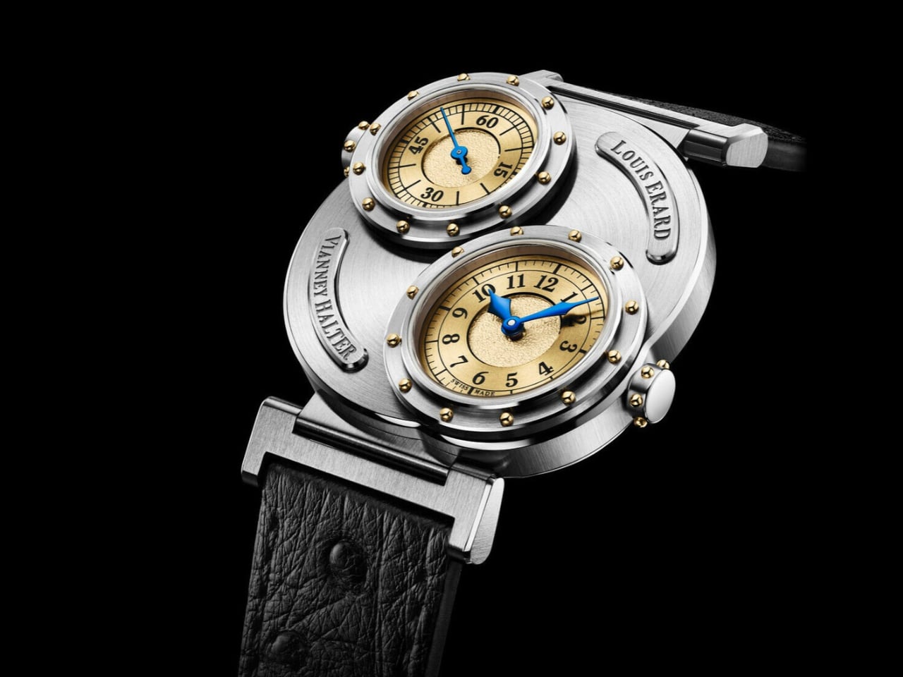
  • ✇Yanko Design
  • Story mfg.’s Plaid ASICS Go Outdoors Without the Tactical Look
    I like an outdoor sneaker that doesn’t look as though it came with a survival briefing. For everyday walks, the visual intensity of technical footwear can feel like more commitment than the outing requires. The Story mfg. x ASICS GEL-TRANSCEND FJ addresses that small but familiar wardrobe problem with hiking-blanket-inspired checks and a trail-derived sole. The collaboration’s online debut is scheduled for November 11, 2026, so this is a forthcoming release rather than something already on shel
     

Story mfg.’s Plaid ASICS Go Outdoors Without the Tactical Look

6 novembre 2026 à 17:30

I like an outdoor sneaker that doesn’t look as though it came with a survival briefing. For everyday walks, the visual intensity of technical footwear can feel like more commitment than the outing requires. The Story mfg. x ASICS GEL-TRANSCEND FJ addresses that small but familiar wardrobe problem with hiking-blanket-inspired checks and a trail-derived sole. The collaboration’s online debut is scheduled for November 11, 2026, so this is a forthcoming release rather than something already on shelves.

The blanket reference deserves a closer look. These aren’t described as shoes made from repurposed blankets. Instead, the collaboration translates that familiar check into an upper combining mesh and synthetic leather overlays. Plaid travels across the toe, lacing area, side stripes, and heel. It’s a clever place to put the pattern: the reinforcing pieces become the decoration, so the checks follow the shoe’s construction rather than appearing as a graphic dropped onto an otherwise unrelated sneaker.

Designers: Story mfg. x ASICS

The two color directions make that approach easier to live with. There’s a black-and-gray version and a rich brown alternative, both keeping the pattern within a restrained palette. Personally, I’d lean toward brown for the full camp-blanket association, although the black pair makes a convincing case for itself. In the product photograph, its pale crossing lines pick out the overlapping panels while the black mesh recedes. There’s plenty happening without a bright accent demanding attention.

ASICS supplies more than a recognizable logo here. The underlying GEL-TRANSCEND FJ draws on the company’s hiking and walking footwear from the 1990s, including elements of the TRANSCEND series, GEL-ODYSSEY, and GEL-RADIUS. That matters because the slightly old-fashioned proportions have a genuine design lineage. To my eye, they also give Story mfg.’s plaid a more convincing home than a streamlined racing upper would. The references feel compatible, even before the collaboration’s storytelling enters the picture.

Underneath, the model uses the GEL-FujiTrabuco 7 tooling system, which brings that jagged profile into the design. ASICS describes the base in terms of durability and grip across different conditions. Those are manufacturer claims, not a substitute for wearing this particular pair, but the borrowed platform gives the collaboration a functional foundation beyond its surface treatment. I’d still want to know how it fits and feels over several miles before calling it an everyday favorite.

The campaign gives the shoe a broader setting than an outfit photograph. A forager, a blacksmith, dancers, farmers, and cyclists appear in their own environments, extending the brands’ idea of rambling beyond a designated hiking route. I like that choice. It leaves room for movement that isn’t measured as exercise, and for people whose relationship with their surroundings comes through work, curiosity, or routine. A sneaker doesn’t need an athletic achievement attached to every outing.

Then comes the Rambling Club, which adds a pleasantly silly layer to the release. Events are scheduled at Story mfg.’s London studio on November 7 and 8, followed by a New York chapter on November 10. Prospective members submit an application and a hand-drawn self-portrait for early access. Asking someone to draw themselves is a charmingly awkward alternative to the usual frictionless checkout. I’d rather a launch have a little personality than another countdown timer.

For anyone skipping the club, the wider shopping details are straightforward: Story mfg.’s online release is scheduled for November 11, followed by ASICS and select retailers on November 20, 2026. Hypebeast lists the retail price at $180. That puts some responsibility on the design to offer more than a nice campaign, and I think the placement of the plaid does more persuasive work than the club membership ever could.

My interest would ultimately come down to how often I’d reach for them after the novelty wore off. The checks give the shoe character, but the subdued colors leave room for ordinary clothes and ordinary plans. I can picture the brown pair with faded jeans more readily than a coordinated hiking outfit. That’s the useful design proposition here: an outdoor-looking sneaker that doesn’t require the rest of the day to dress up around it.

The post Story mfg.’s Plaid ASICS Go Outdoors Without the Tactical Look first appeared on Yanko Design.
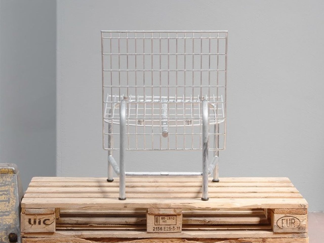
  • ✇Yanko Design
  • Urban Desk Saves Space Without Making You Move Your Monitor
    A monitor is an awkward thing to put away at the end of a workday. The screen, stand, cables, and nearby lamp make packing up feel like a small relocation project. Leave everything out, though, and the living room keeps looking like an office long after you’ve closed your laptop. Urban Desk, from German furniture brand UrbanNature, addresses that everyday friction by letting part of the workspace retreat while the equipment stays put. Designed by Jörg Brachmann, the desk takes a refreshingly mo
     

Urban Desk Saves Space Without Making You Move Your Monitor

6 novembre 2026 à 12:20

A monitor is an awkward thing to put away at the end of a workday. The screen, stand, cables, and nearby lamp make packing up feel like a small relocation project. Leave everything out, though, and the living room keeps looking like an office long after you’ve closed your laptop. Urban Desk, from German furniture brand UrbanNature, addresses that everyday friction by letting part of the workspace retreat while the equipment stays put.

Designed by Jörg Brachmann, the desk takes a refreshingly modest approach to working in a room that also has other jobs. Its lower work surface pulls forward for use and slides back afterward. A fixed upper structure holds the monitor and other accessories, so changing the desk’s configuration doesn’t require rebuilding your setup. It’s an existing product offered through UrbanNature’s online store, rather than a concept asking us to imagine the practical details.

Designer: UrbanNature

The distinction between a moving surface and a stationary shelf is the important design decision here. According to the project’s Green Product Award entry, the tabletop extends horizontally without lowering or tilting, while the rigid upper structure accommodates a monitor. I like that the transformation has a limited, understandable purpose. You’re bringing more work surface toward you, then returning it when you’re done. The furniture doesn’t need to perform an elaborate disappearing act to earn its place.

UrbanNature lists the movable worktop at approximately 16.5 inches deep when retracted and 26 inches when extended. That’s roughly 9.4 inches of additional depth during use. The base itself is about 19.7 inches deep, so the smaller worktop measurement shouldn’t be mistaken for the entire desk’s footprint. Those distinctions matter when you’re measuring a bedroom corner or deciding how much passage space you’ll have beside a sofa.

For me, the appeal is permission to leave a functional setup alone. A space-saving design loses some of its usefulness if putting it away becomes another chore. Here, the separation between equipment and working surface suggests a less demanding routine. You still have to manage whatever you’ve spread across the moving section, of course. A notebook doesn’t file itself because the furniture has a clever mechanism.

The materials also suit that domestic role. UrbanNature specifies solid ash or oak alongside a blockboard worktop finished with linoleum, plus exposed wooden joints. Two A4-sized drawers sit beneath the monitor shelf. Those are useful places for notebooks, pens, and charging accessories, rather than an invitation to accumulate an entire office archive. I’d rather have a little storage close to hand than add another cabinet beside a desk chosen to save space.

There’s a fair compromise in the name of this arrangement: your office never fully disappears. The monitor remains visible, as does the desk. Core77 aptly describes it as a partial hideaway. That won’t satisfy someone who wants work equipment completely out of sight during dinner. Personally, I find the compromise reasonable. Keeping a screen ready for tomorrow can be worth more than achieving a perfectly office-free room tonight.

I’d want to check the setup against my own equipment before buying, particularly the monitor’s position and how comfortably the extended surface meets a chair. The fixed upper shelf establishes part of that arrangement for you. UrbanNature itself notes that an appropriate chair and correct screen height still matter. A compact footprint is useful, but it shouldn’t become the only measurement that gets your attention.

The online listing currently ranges from €995 to €1,429, including VAT. International buyers would need to confirm delivery and the total cost; the shipping policy notes possible additional charges outside the EU. At that price, I’d want the pull-out surface to earn its keep daily. The strongest argument for Urban Desk is simple: it lets you keep a ready-to-use workstation while asking a little less of the room once work is over.

The post Urban Desk Saves Space Without Making You Move Your Monitor first appeared on Yanko Design.

❌