❌

Vue normale

  • ✇Yanko Design
  • One Architect Quietly Ditched Rent for a 1sqm Treehouse Office
    Munich has some of the steepest commercial rents in Germany, and anyone who has tried to lease even a modest studio space knows the arithmetic rarely works in a small firm’s favor. Brokers, multi-year contracts, square footage priced by the centimeter. When the Munich architecture practice Opposite Office needed a new home base, founder Benedikt Hartl looked at those numbers and decided the smartest move wasn’t a smaller office or a coworking membership. It was no office at all, at least not th
     

One Architect Quietly Ditched Rent for a 1sqm Treehouse Office

10 septembre 2026 à 10:20

Munich has some of the steepest commercial rents in Germany, and anyone who has tried to lease even a modest studio space knows the arithmetic rarely works in a small firm’s favor. Brokers, multi-year contracts, square footage priced by the centimeter. When the Munich architecture practice Opposite Office needed a new home base, founder Benedikt Hartl looked at those numbers and decided the smartest move wasn’t a smaller office or a coworking membership. It was no office at all, at least not the kind anyone pays rent on.

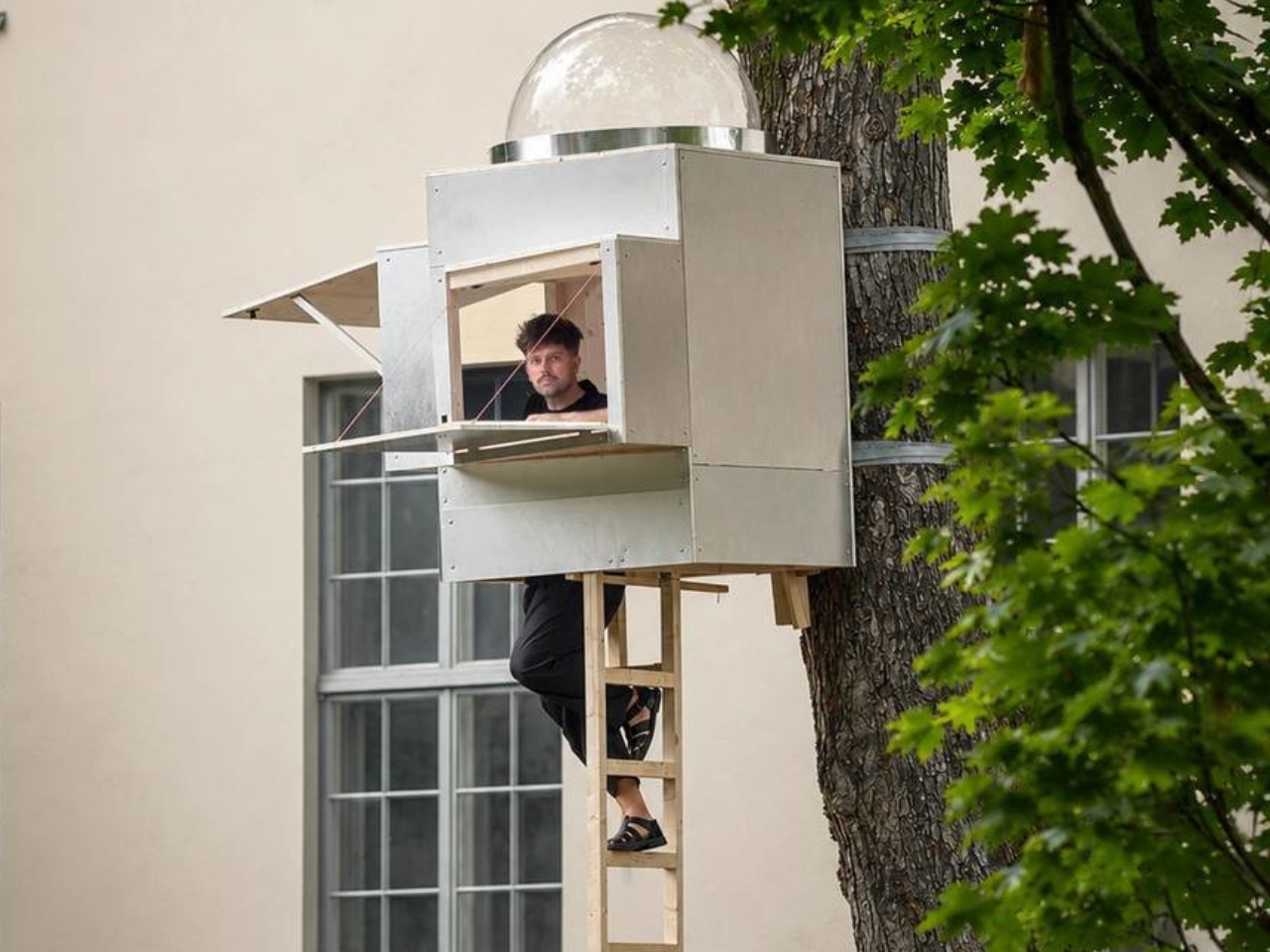
The result is Baumhaus Office, a roughly one-square-meter cube strapped to a tree on the campus of Bauhaus-Universität Weimar, built from spruce timber, plywood, and an aluminum shell that Hartl half-jokingly describes as “UFO-like.” A ladder gets you up to it. Inside, there’s shelving, a small desk, and fold-down panels that expand the workspace just enough to fit two or three people if everyone keeps their elbows in. A domed skylight sits overhead, so instead of staring at a drop ceiling, you get a view of the canopy. Two ratchet straps, cushioned with protective matting so the bark doesn’t suffer, hold the whole thing to the trunk. Hartl secured permission from the university’s president to install it there temporarily, and he’s designed it to come down just as easily and go up somewhere else.

Designer: Benedikt Hartl

His explanation for the whole exercise is refreshingly blunt. Rather than compete with Munich’s rental market, he moved the office out of it entirely and into the trees. He’s also put out an open call, only half-kidding, for anyone with a spare tree and a good view who doesn’t intend to charge him for it.

There’s an obvious punchline in a firm shrinking its footprint to one square meter, but the joke has a point buried in it. Opposite Office already works across borders on projects that rarely require a fixed headquarters, so the studio started asking why it needed a permanent lease at all. That question lands differently depending on where you’re reading this, but it lands. Downtown office towers in plenty of American cities have sat half empty for years now, landlords still pricing space as if 2019 never ended, and companies quietly deciding that a conference room and a Zoom link cover most of what used to require a floor plan. Baumhaus Office takes that same skepticism about commercial real estate and pushes it to its logical, slightly absurd conclusion. If the point of an office is a roof, a desk, and a door you can close, a tree does two of those things for free.

Opposite Office has framed the project as a nod to Cosimo, the boy in Italo Calvino’s “The Baron in the Trees” who abandons ground level entirely and never comes back down. I like that reference more than the usual sustainability talking points that get bolted onto projects like this. It’s not really about wood versus concrete. It’s about changing your vantage point on purpose, even briefly, to see whether the thing you assumed you needed was actually optional the whole time.

I’ll admit the practical side of me has questions. Winter in Thuringia is not gentle, and a plywood cube with a skylight is not insulation in any serious sense. But treating this as a permanent HQ misses the point Hartl is making. It’s a provocation with a ladder, built to prove that an architecture studio’s real asset is the people doing the thinking, not the address on the lease. Whether or not Baumhaus Office survives its first real storm, it’s already done its job: it made a very expensive problem look, for a moment, genuinely small.

The post One Architect Quietly Ditched Rent for a 1sqm Treehouse Office first appeared on Yanko Design.

  • ✇Yanko Design
  • Pharrell Quietly Revives Adidas’ Weirdest Y2K Water Shoe for $140
    Summer never really wants to let go, and neither does my closet. Every September I face the same annoying puzzle: sandals feel done, sneakers feel too heavy, and nothing in between actually handles a wet dock, a muddy trail, and a sidewalk trip to the coffee shop without looking like safety equipment. That gap between “technical” and “wearable” has been a real problem in footwear for years, and it’s exactly the space Adidas and Pharrell Williams just walked into with the PW Water Moc. The shoe
     

Pharrell Quietly Revives Adidas’ Weirdest Y2K Water Shoe for $140

10 septembre 2026 à 09:20

Summer never really wants to let go, and neither does my closet. Every September I face the same annoying puzzle: sandals feel done, sneakers feel too heavy, and nothing in between actually handles a wet dock, a muddy trail, and a sidewalk trip to the coffee shop without looking like safety equipment. That gap between “technical” and “wearable” has been a real problem in footwear for years, and it’s exactly the space Adidas and Pharrell Williams just walked into with the PW Water Moc.

The shoe is the third release under Pharrell’s ongoing Virginia label with Adidas, and unlike the Jellyfish or the Flat Earther before it, this one isn’t chasing runway drama. It’s pulling from something a lot more obscure: the Adidas Adventure Water Moc, a shoe most people forgot existed after the early 2000s. That’s the smart move here. Instead of inventing a new gorpcore silhouette from scratch, Pharrell dug up a shoe that was already built for exactly this problem, water to land, and gave it a reason to exist again.

Designer: Pharell x Adidas

Functionally, it actually holds up. The upper mixes breathable mesh with reflective webbing, and bungee-style laces get tucked under a wide strap so you’re not fumbling with knots every time you take it off at the door. The outsole is lifted from the 2005 Carnuba Adventure Moc, which means deep, aggressive lugs instead of the flat rubber most casual slip-ons get away with. It’s a shoe that seems genuinely fine with a creek crossing, not just a shoe that photographs well near one.

Where it gets interesting, and where I think Pharrell earns his credit, is the colorways. Adidas didn’t sand down the nostalgia to make it more palatable. The Lucid Ray Blue option comes with pink and seafoam accents that are unapologetically early-2000s, the kind of palette that would’ve looked at home on a Bratz commercial or a Limp Bizkit music video. There’s a black and silver pair for people who want the shape without the loud attitude, and a yellow colorway that splits the difference. None of them try to disguise where they came from.

I’ll admit I’m a little biased toward brands that actually go back to their own archive instead of just borrowing someone else’s aesthetic and calling it retro. Adidas has done this a few times now, quietly, and it tends to land better than the loud “vintage-inspired” drops that never point to an actual source. The Water Moc isn’t just Y2K flavored, it’s a real product from that era, rebuilt with better materials and a designer who clearly has affection for it rather than just using it as a trend hook.

At $140, it sits in a fair spot for a collaboration shoe with this much design history behind it. It’s not cheap, but it’s not asking you to pay Jellyfish-level hype pricing for something that’s essentially a reissue with upgrades. That price point also tells you who this shoe is actually for: people who want a functional water-ready shoe but refuse to wear something that looks like it belongs on a kayaking instructor.

What sneaker culture has been missing lately is a bit of goofiness that still functions. So much of the current outdoor-meets-fashion movement takes itself seriously, all muted colors and technical fabric with barely any personality. The Water Moc doesn’t ask to be taken that seriously, and that’s honestly refreshing. It’s a shoe that remembers being weird was part of the appeal the first time around.

Whether it becomes a genuine wardrobe staple or just a fun seasonal pickup probably depends on how much you already like the era it’s pulling from. But as a piece of design thinking, going back into the brand’s own closet instead of reinventing the wheel, it’s one of the more honest moves Adidas has made in a while. Sometimes the best new shoe isn’t new at all. It’s just finally getting its second summer.

The post Pharrell Quietly Revives Adidas’ Weirdest Y2K Water Shoe for $140 first appeared on Yanko Design.

  • ✇Yanko Design
  • Finally, One Tower Replaces Your Speaker, Lamp, and Wine Fridge
    Anyone who has tried to furnish a studio apartment knows the specific defeat of running out of surfaces before you run out of gadgets. The speaker needs an outlet and a shelf. The lamp needs its own corner. The mini fridge for wine wants counter space that doesn’t exist. Each object is fine on its own, but stacked together on a single console table, they start to look like a garage sale that lost an argument with a design magazine. That is the exact problem South Korean designer Jung Hyun Kim s
     

Finally, One Tower Replaces Your Speaker, Lamp, and Wine Fridge

10 septembre 2026 à 06:07

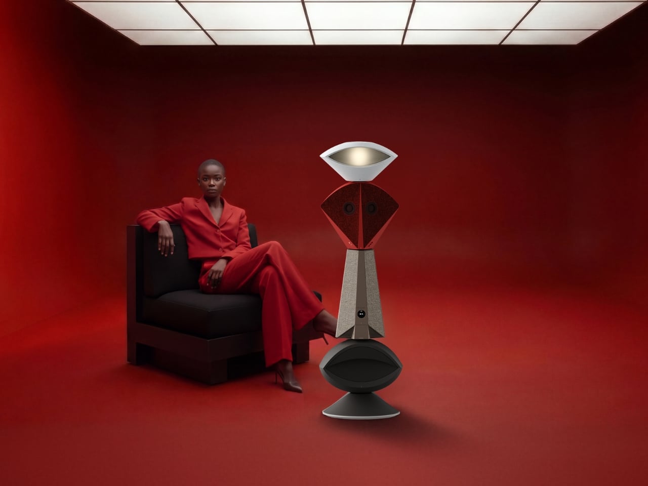
Anyone who has tried to furnish a studio apartment knows the specific defeat of running out of surfaces before you run out of gadgets. The speaker needs an outlet and a shelf. The lamp needs its own corner. The mini fridge for wine wants counter space that doesn’t exist. Each object is fine on its own, but stacked together on a single console table, they start to look like a garage sale that lost an argument with a design magazine. That is the exact problem South Korean designer Jung Hyun Kim set out to solve with Babel, a concept he built for people who live in small rooms but refuse to shrink their idea of what home should feel like.

Kim designed Babel for a very specific and very real slice of the population, twenty somethings through mid thirties starting their independent lives in modest apartments, often around 500 to 550 square feet, the kind of footprint that is common from Seoul to Brooklyn to any first apartment in a city with real rent. His answer wasn’t to make each device smaller. It was to stop thinking about furniture and electronics as separate categories entirely, and instead build a single vertical column where every function gets its own segment, stacked like a totem instead of scattered like clutter.

Designer: Jung Hyun Kim

The tower reads almost like a figure standing in the room. At the top sits an eye shaped ambient lamp, its lens glowing warm and soft, the kind of light you’d want next to a couch at eleven at night. Below that, a red, fabric wrapped module houses the main speaker drivers, angled like a face with two eyes looking back at you, which is a genuinely clever piece of anthropomorphism for an object meant to live in your peripheral vision all day. The tapered midsection functions as the control hub, complete with a discreet volume display, and the whole thing terminates in a rounded black base that turns out to be a hidden drawer, a small cooling compartment for a couple of wine bottles. Four completely different jobs, one silhouette.

What makes this more than a novelty is the modularity built into the stacking logic. Nothing about Babel demands you use all four segments in one order. You can pull pieces apart, rearrange them, or run just the parts you need that week. A studio dweller might want the lamp and speaker without the bar module. Someone hosting more often might stack the drawer higher for easier reach. The design treats a small home the way a good capsule wardrobe treats a small closet, fewer pieces, each one doing more, none of them wasted.

I like that Babel doesn’t pretend the solution to small space living is owning less. It assumes you still want a good lamp, a good speaker, and a cold bottle of wine within reach, and it simply refuses to let those wants cost you three separate footprints. That feels more honest than most minimalist design advice, which tends to ask people to want less rather than design better. The name is a nice touch too, a nod to the biblical tower where many languages tried to reach the same point, which tracks neatly onto a product where lighting, sound, cooling, and control all speak different technical languages but rise from the same base.

Whether Babel ever becomes a shippable product is beside the point right now. It exists as a Behance concept, a portfolio piece from a designer who clearly thinks in systems rather than single objects, and that thinking is worth paying attention to regardless of manufacturing timelines. Apartment living isn’t getting more spacious anywhere, and the appetite for objects that look intentional rather than accumulated is only growing, especially among people who grew up curating every shelf for how it photographs. A stacked, sculptural answer to gadget clutter fits that mood perfectly.

Babel won’t fit every home, and a four function tower is a commitment, not an impulse buy. But as a piece of thinking about how to live well in less square footage, it’s one of the more clear headed ideas I’ve seen come out of a design program in a while. Sometimes the fix for too many objects isn’t fewer objects. It’s better posture.

The post Finally, One Tower Replaces Your Speaker, Lamp, and Wine Fridge first appeared on Yanko Design.

  • ✇Yanko Design
  • The $300 Sony Headphones Everyone Wanted Are Actually Back
    Anyone who has priced out a decent pair of noise-cancelling headphones this year has felt the sticker shock. Sony’s own flagship, the WH-1000XM6, launches at $449.99, and its wilder sibling, the 1000X The ColleXion, sits even higher. Bose isn’t cheaper. Sennheiser isn’t cheaper. The whole category has quietly drifted toward the idea that “premium” now means “$400 and up,” and a lot of people who just want good ANC for their commute or their next flight have been priced out of the conversation e
     

The $300 Sony Headphones Everyone Wanted Are Actually Back

10 septembre 2026 à 05:15

Anyone who has priced out a decent pair of noise-cancelling headphones this year has felt the sticker shock. Sony’s own flagship, the WH-1000XM6, launches at $449.99, and its wilder sibling, the 1000X The ColleXion, sits even higher. Bose isn’t cheaper. Sennheiser isn’t cheaper. The whole category has quietly drifted toward the idea that “premium” now means “$400 and up,” and a lot of people who just want good ANC for their commute or their next flight have been priced out of the conversation entirely.

That gap is exactly what the Sony WH-1000XM4C is built to fill. Rather than chase another spec bump nobody asked for, Sony reached backward and pulled the WH-1000XM4, arguably the most decorated headphones the company has ever made, back onto shelves. It’s a strange move on paper. It’s a smart one in practice.

Designer: Sony

The original XM4 launched in 2020 at $349.99 and spent the next few years collecting best-of lists like trophies. Then Sony did what companies do: it moved on. The XM5 arrived in 2022 with a slicker profile and a bigger price tag, and the XM4 quietly slid off the roster, even as secondhand units kept trading hands and forum threads kept insisting it was still the smarter buy. That’s a telling signal. Products don’t usually get nostalgic followings this fast unless they actually solved a problem well the first time.

So here comes the WH-1000XM4C, essentially that same beloved design, tuned up and priced down to $299.99, a full fifty dollars less than what the XM4 cost at launch six years ago. Sony isn’t calling it a sequel or a flagship. It’s calling it what it is: the old favorite, finally made available again, minus the frustration of paying more for less.

The changes are modest, and that’s sort of the point. The equalizer jumps from five bands to ten, plus a new gaming EQ, so listeners actually get more control over their sound instead of trusting Sony’s factory tuning blindly. There’s a new Lavender colorway alongside the familiar Black and Platinum Silver, a small but welcome nod to people who don’t want their headphones to look like they were designed for a boardroom. The foldable hinge and rotating ear cups are back too, which matters more than it sounds. The XM5 abandoned that folding design entirely, and the XM6 only brought it back last year. The XM4C proves that some engineering decisions age just fine.

There is one real trade-off. To meet updated battery regulations, the XM4C uses a different cell, and that shaves ANC battery life from 30 hours down to 27. Sony compensates with faster charging, three minutes on the cord for a full hour of playback, which is a fair swap for most people who top up during a commute anyway.

What I appreciate here isn’t the spec sheet. It’s the confidence behind the decision. Bringing back a six-year-old product without dressing it up as something revolutionary takes a certain honesty that most tech companies avoid. Sony isn’t pretending this is groundbreaking. It’s admitting that the formula already worked, and that not every product needs constant reinvention to stay relevant.

There’s a mild irony worth naming. Sony still sells discounted stock of the original XM4 at the same $300 price point, and by most accounts, that older pair edges out the XM4C slightly on raw sound and noise cancellation. So the company is technically competing with itself. But for shoppers, that’s not really a problem. It just means there are now two well-regarded paths into the same trusted design, instead of one shrinking window before flagship prices take over completely.

Headphones don’t usually get second chances like this. Most get replaced, discounted into clearance, and forgotten. The XM4C suggests a different approach is possible, one where a genuinely good product doesn’t have to disappear just because something newer showed up. That’s a quieter kind of innovation, but it might be the one more of the industry could stand to learn from.

The post The $300 Sony Headphones Everyone Wanted Are Actually Back first appeared on Yanko Design.

  • ✇Yanko Design
  • Never Lose Your Keys Again With a Tracker That Glows in the Dark
    For forgetful people like me, trackers have basically become a must-have. Whether you’re clipping one onto your wallet, your car keys, your backpack, or whatever it is you absolutely cannot afford to lose, these little devices help you do exactly what they promise: keep track. The only catch is that a lot of trackers tend to look alike, and if you’re relying on appearance alone instead of the connected app, it’s easy to accidentally grab the wrong one. If you’re after a tracker that actually st
     

Never Lose Your Keys Again With a Tracker That Glows in the Dark

9 septembre 2026 à 18:30

For forgetful people like me, trackers have basically become a must-have. Whether you’re clipping one onto your wallet, your car keys, your backpack, or whatever it is you absolutely cannot afford to lose, these little devices help you do exactly what they promise: keep track. The only catch is that a lot of trackers tend to look alike, and if you’re relying on appearance alone instead of the connected app, it’s easy to accidentally grab the wrong one.

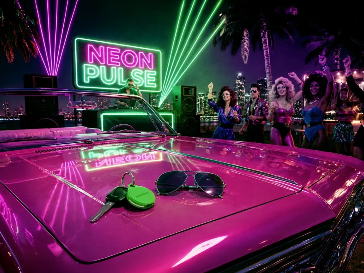
If you’re after a tracker that actually stands out, and one that can even glow in the dark, Pebblebee’s latest Evercolor drop might be exactly what you need. Evercolor is the brand’s limited-edition color program built exclusively for its Clip 5 tracker, and the newest release, called Neon Pulse, comes in two eye-catching shades: Techno Lime and Hotline Pink. Pebblebee describes the collection as perfect for “bold self-expression and a fresh-season reset,” and honestly, it’s hard to disagree.

Designer: Pebblebee

Evercolor has rolled out plenty of standout colors before, but Neon Pulse marks the first time the program has added glow-in-the-dark accents. That means your tracker stays visible even after its LED switches off, so you’re not just relying on the app to tell you where your item is. You can actually spot it in the dark, as long as it’s somewhere within eyesight.

Keep in mind that this is a limited-edition release, so if hot pink and neon green happen to be your colors, you’ll want to grab them soon. Pebblebee rolls out new Evercolor shades every twelve weeks, and once a drop sells out, it’s gone for good, no restocks. Previous collections like Freeze Frame and Heatwave Hijinks have already sold out, so if Neon Pulse catches your eye, don’t wait too long to add it to your cart.

Underneath all that color, though, it’s still the same reliable Clip 5 that Pebblebee originally released. It works with both Apple and Android devices, so you don’t have to worry about switching phones down the line. The rechargeable battery lasts up to a year on a single USB-C charge, which means no more digging through drawers for spare coin batteries. It also boasts a direct Bluetooth range of about 500 feet, roughly double what a lot of competitors offer, plus access to a global crowd-network for finding your stuff even farther away. On top of that, you get a 130dB siren, a bright LED strobe, and IP66 water resistance, so it can handle a little rain or an accidental splash without missing a beat.

It’s also worth noting that Neon Pulse still costs the same $34.99 as the standard Clip 5, so you’re not paying extra just for the fresh colorway. There’s also a free built-in safety feature called Alert, which can notify you if an unfamiliar tracker seems to be following you, a nice bit of peace of mind on top of everything else. Design-wise, the compact clip-on shape makes it look less like a tech gadget and more like an accessory for your bag, wallet, or keychain. Add in the bright, playful colorway, and it becomes even more fashionable, dare we say, kind of cool. So if your main complaint about trackers has always been that they all look the same, Neon Pulse is built to solve exactly that problem.

At the end of the day, a tracker is only useful if you can actually tell it apart from the pile of identical black and white gadgets everyone else seems to own, and if you enjoy using it enough to keep it clipped on in the first place. Pebblebee’s Neon Pulse drop checks both boxes, combining genuine utility with a design that feels personal rather than generic. Whether you’re the type who loses your keys weekly or you just want your tech to match your personality, this drop is worth a look before it disappears for good. And if pink and green aren’t quite your vibe, it might be worth keeping an eye on Pebblebee’s page anyway. With a new Evercolor drop landing every twelve weeks, there’s a good chance your perfect color combo is just around the corner.

The post Never Lose Your Keys Again With a Tracker That Glows in the Dark first appeared on Yanko Design.

  • ✇Yanko Design
  • This Photographer Spent Weeks in a Suzhou Silk Studio. Here’s What He Found
    When Jing Huang walked into a kesi weaving studio in Suzhou, China, he made a decision that runs counter to almost everything happening in photography right now. He put away the instinct to explain and just started watching. For most photographers working today, that would feel like leaving something on the table. In a studio where a finished piece can take months to complete, it turned out to be the only approach that made sense. Huang is a photographer with serious credentials. He won the Lei
     

This Photographer Spent Weeks in a Suzhou Silk Studio. Here’s What He Found

9 septembre 2026 à 14:30

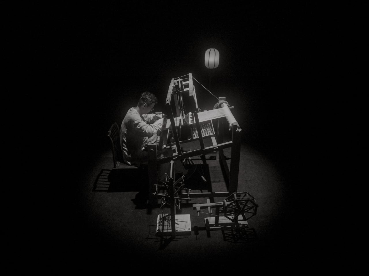
When Jing Huang walked into a kesi weaving studio in Suzhou, China, he made a decision that runs counter to almost everything happening in photography right now. He put away the instinct to explain and just started watching. For most photographers working today, that would feel like leaving something on the table. In a studio where a finished piece can take months to complete, it turned out to be the only approach that made sense.

Huang is a photographer with serious credentials. He won the Leica Oskar Barnack Newcomer Award in 2011 for a series called Pure of Sight, and his visual style has always leaned toward stillness, restraint, and negative space rather than the kind of maximalist documentation that tends to flatten its subject. So when Lexar and Leica brought him to Suzhou to photograph kesi artist Hao Naiqiang, known professionally as Jingwei, the choice made sense on paper. What’s harder to predict is what happens when a photographer with that kind of discipline actually sits with a craft as slow and precise as kesi.

Artist: Hao Naiqiang (Jingwei) for Lexar and Leica

Photographer: Jing Huang

Kesi is a Chinese silk weaving technique that’s been around for centuries, and it operates on a logic completely alien to the way most things get made today. The artisan builds a piece thread by thread against a fixed warp, making constant decisions about color, contour, and rhythm with no automation, no shortcuts, and no undo button. There’s an old Chinese saying that captures it better than any technical description: an inch of kesi is worth an inch of gold. Jingwei has been practicing it for more than a decade and is formally recognized as a representative inheritor of the Suzhou tradition. Every finished piece represents a depth of time investment that genuinely earns that comparison.

What Huang found in that studio wasn’t a process to document. It was an atmosphere to respond to. His photographs don’t walk you through kesi step by step the way a documentary would. They move between Jingwei’s hands, the threads, the studio details, and the quieter visual textures of Suzhou itself, using the same painterly restraint that shapes his broader work. He described his own approach in a way that cuts straight to the point: photography, he said, is sometimes about forgetting time rather than recording it. What stays in an image isn’t when it was taken but whether it still carries beauty once the moment is gone.

That’s a fairly specific thing to believe in 2026, when the surrounding conversation about images is almost entirely about speed and generation. Anyone can produce a technically competent photo of silk threads in soft light right now without a camera, a plane ticket, or a studio. What that won’t produce is the weeks of presence, of actually being in a room watching another person work, that shapes how Huang sees and frames a subject.

This is where Lexar’s role in the project stops being a footnote. Grace Su, who heads Lexar’s European operations, made the point directly: before any photograph becomes a print, a press image, or a cultural archive, it first exists as an original file that needs to survive. Leica captures the moment. Lexar protects the file behind it. It’s a clean division of labor that gives the brand a genuine reason to be part of this story rather than just attached to it for the optics.

The show itself, titled Threads of Time: A Journey Through Silk and Lens, is presented at Leica Gallery Amsterdam and runs September 11 to 15. Curator Linda Warmerdam framed the exhibition as a dialogue between the photographer’s eye and the artisan’s hand, and that framing holds up, because both of those things require a body in a specific place at a specific time. No model trained on existing images can reproduce that.

You don’t need to care about textile history or gallery culture for the underlying point to land. Some things take real time, happen once, and mean something precisely because they can’t be convincingly faked. Huang spent weeks in a Suzhou studio to understand what kesi actually is. The photographs are what he brought back.

The post This Photographer Spent Weeks in a Suzhou Silk Studio. Here’s What He Found first appeared on Yanko Design.

  • ✇Yanko Design
  • The $179 iPhone Speaker That Never Needs Charging
    You’ve been waiting for your favorite artist to release their latest album, counting down the hours until it finally drops on your streaming service of choice. You open your phone and press play… and you’re a little disappointed. It’s not that the album isn’t great, it’s that your phone’s speaker doesn’t do it justice. You want something to amplify that sound right now, but your external Bluetooth speaker hasn’t been charged in weeks. The Battery-free Amplifying iSpeakers can solve that problem
     

The $179 iPhone Speaker That Never Needs Charging

9 septembre 2026 à 13:20

You’ve been waiting for your favorite artist to release their latest album, counting down the hours until it finally drops on your streaming service of choice. You open your phone and press play… and you’re a little disappointed. It’s not that the album isn’t great, it’s that your phone’s speaker doesn’t do it justice. You want something to amplify that sound right now, but your external Bluetooth speaker hasn’t been charged in weeks.

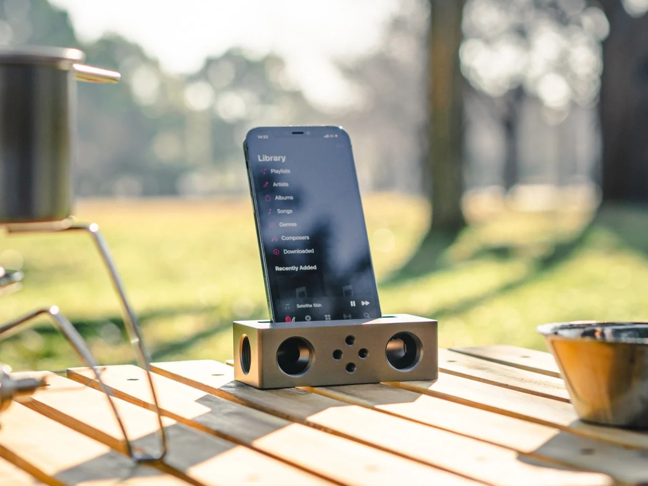
The Battery-free Amplifying iSpeakers can solve that problem for you, and you won’t need a single cable or Bluetooth connection to make it happen. This “dumb” speaker is actually smart enough to rely purely on acoustic engineering, channeling and amplifying the sound waves coming out of your phone so your music, podcast, or call sounds noticeably fuller than it would through your built-in speaker alone.

Click Here to Buy Now: $179.00

Designed by Ooi Masato and made in Japan, this battery-free device lives up to its name: it uses a precision-machined metal slot that cradles whatever phone you own, instantly amplifying whatever you’re playing. There’s no pairing process, no cord to plug in, and no anxious glance at a battery icon wondering if your speaker will cut out mid-song. You set your phone down, and it just works.

Design-wise, the iSpeakers follow a clean, minimalist aesthetic that looks just as at home on a cluttered work desk as it does on a nightstand or a bookshelf. The body is shaped around the golden ratio, giving it a visual balance that feels intentional rather than accidental (the kind of object you’d leave out on display rather than tuck into a drawer). It’s compact enough to toss in a bag, so you can bring your amplified sound with you to a picnic, a hotel room, or a friend’s backyard without hunting for an outlet. And because there’s no port, connector, or wireless protocol involved, it works with virtually any phone you own, including Apple’s freshly announced iPhone 18 Pro lineup and its first ever foldable, the iPhone Ultra, unveiled at today’s “Surprise and Shine” event. All you have to do is let the speaker slot cradle your phone’s speaker grille; there’s no compatibility chart to check and no software update to wait on.

The speaker itself is milled from Duralumin, the same lightweight, vibration resistant alloy used in aircraft construction. That means you’re getting a premium feel along with genuine durability. This isn’t a flimsy accessory that’ll crack after a few drops in your bag. The Japanese craftsmanship and golden ratio proportions give it a quiet sophistication that fits in seamlessly next to your laptop or coffee mug. If you want to get more out of it, you can also pick up the +Bloom and +Jet attachments, which let you customize how the sound projects, whether that means directing it upward for a fuller room fill or downward for a more intimate listening experience.

So how does this stack up against the Bluetooth speakers already crowding your shelf? Take a brand like JBL, whose Flip series has become a go-to for portable audio. Those speakers sound great and pump out serious volume, but they still ask you to charge them, remember to pair them, and eventually deal with a battery that won’t hold a charge like it used to. The iSpeakers skip all of that by design. You’re trading a bit of raw volume and bass depth for something Bluetooth speakers simply can’t offer: a device that will sound exactly the same in ten years as it does today, with zero maintenance and zero electronic waste. At $179, it’s priced closer to a premium Bluetooth speaker than a budget one, but you’re paying for a very different kind of value: permanence, craftsmanship, and simplicity over specs and app connectivity.

At the end of the day, the Battery-free Amplifying iSpeakers isn’t trying to replace your Bluetooth speaker for a backyard party. It’s solving a much smaller, more common frustration: the moment when you just want your phone to sound better, right now, without any setup. For anyone tired of charging cords, pairing screens, and speakers that die at the worst possible moment, this is a refreshingly simple fix, and a genuinely beautiful object to boot. Sometimes the smartest tech is the kind that doesn’t need power at all.

The post The $179 iPhone Speaker That Never Needs Charging first appeared on Yanko Design.

  • ✇Yanko Design
  • Felipe Pantone’s Tennis Court Refuses to Look the Same Twice
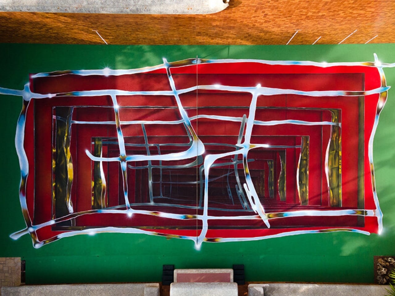
    A tennis court in Valencia currently looks like it’s sinking into the ground. Walk up to the edge of the one at Casa Axis and the white lines that normally just mark boundaries start pulling inward, stacking through fake layers of chrome and burgundy until the whole surface reads like a hallway you could fall down. It’s called Hard Court 2, painted by Spanish artist Spok Brillor, and it treats a sports court like a living canvas instead of a slab of asphalt everyone stops noticing the week afte
     

Felipe Pantone’s Tennis Court Refuses to Look the Same Twice

9 septembre 2026 à 12:20

A tennis court in Valencia currently looks like it’s sinking into the ground. Walk up to the edge of the one at Casa Axis and the white lines that normally just mark boundaries start pulling inward, stacking through fake layers of chrome and burgundy until the whole surface reads like a hallway you could fall down. It’s called Hard Court 2, painted by Spanish artist Spok Brillor, and it treats a sports court like a living canvas instead of a slab of asphalt everyone stops noticing the week after the ribbon gets cut.

That’s usually the fate of most site-specific art. A muralist gets a wall, a brand throws a launch party, and within a year the piece turns into background noise nobody actually looks at anymore. Sports facilities have it worse. A court gets painted once, and it stays that exact shade of green or blue for a decade, because nobody budgets for touch-ups, let alone reinvention. Casa Axis, the art and design space Felipe Pantone runs out of a 1975 house outside Valencia, didn’t fix that with a bigger maintenance budget. It fixed it with a rule: the court has to change, every single year, by design.

Designer: Spok Brillor

The rule lives inside C.A.I.O., the Casa Axis International Open, a scrappy little tennis tournament for artists that launched in June 2026. No rankings, no categories, no portfolios required. Just instinct, apparently, and a healthy amount of frustration. The twist is what the winner actually takes home. Instead of a trophy, they get handed the responsibility of repainting the court before the next tournament. Win the match, inherit the canvas.

Lucas Benarroch, known as MRKA, painted the first version in 2025, loosening the court’s regulation markings into loose, hand-drawn lines that felt more like a sketch than a sports surface. He then went on to win the inaugural C.A.I.O., which technically put him back in charge of the next transformation. He passed the job to Spok Brillor instead, who had competed against him in the same tournament. That handoff is the part I find genuinely clever. The competition doesn’t just crown a winner, it forces the winner to make a choice about who gets to shape the space next, which quietly turns a tennis match into a succession plan for an ongoing art piece.

Spok took the opposite approach from MRKA. Where MRKA loosened the geometry, Spok tightened it, repeating the court’s own markings inward through metallic gradients until the actual boundaries get harder to read. Deep reds and burgundies contract through rectangular planes, pale blue and yellow lines cross the surface like reflected metal, and the whole thing sits somewhere between an architectural shaft and a painted portal. It took twelve days to finish, and it’s already scheduled to disappear under whoever wins next year.

I like that this thing is built to be temporary on purpose. Most design work chases permanence, a piece that survives, a brand that lasts forever, a finish that never fades. Hard Court 2 does the opposite. It’s designed to be beaten, literally, by the next person good enough to win a tennis match on top of it. That’s a genuinely strange model for how art gets commissioned, and it works specifically because nobody involved is trying to make something that outlives its usefulness.

There’s also something honest about tying the transformation to actual competition rather than a curator’s calendar. Nobody at Casa Axis decided in advance that the court needed a refresh this September. It changed because someone won a match and had to make good on the assignment. That’s a small distinction, but it changes how the whole project feels. It’s less a rotating gallery and more a living structure that happens to have paint on it.

Whether this idea scales beyond one backyard court in L’Eliana is a fair question, and probably a “no” for most places. But the instinct behind it, building change into the rules instead of hoping someone remembers to update things later, feels like it’s worth stealing for a lot more than tennis courts.

The post Felipe Pantone’s Tennis Court Refuses to Look the Same Twice first appeared on Yanko Design.
❌