Vue normale

Il y a de nouveaux articles disponibles, cliquez pour rafraîchir la page.
Hier — 6 octobre 2025Flux principal

SUSA is a visionary AI-powered companion device concept for ASUS

Par : Ida Torres
6 octobre 2025 à 17:00

SUSA is a bold new concept in AI-powered companion devices, designed by Future Facility as a visionary project for ASUS. In a world where artificial intelligence is becoming an integral part of our daily routines, SUSA emerges as a thoughtful reimagining of what it means to live with technology that truly understands and supports its users.

Unlike typical smart speakers or digital assistants, SUSA is designed to serve as an intelligent and emotionally responsive companion. Developed as a conceptual project for ASUS, the device leverages advanced AI to learn routines, preferences, and contexts, adapting its responses to suit the individual. With SUSA, the focus isn’t just on automating tasks or providing answers but on creating a meaningful and intuitive relationship between user and device.

Designer Name: Future Facility

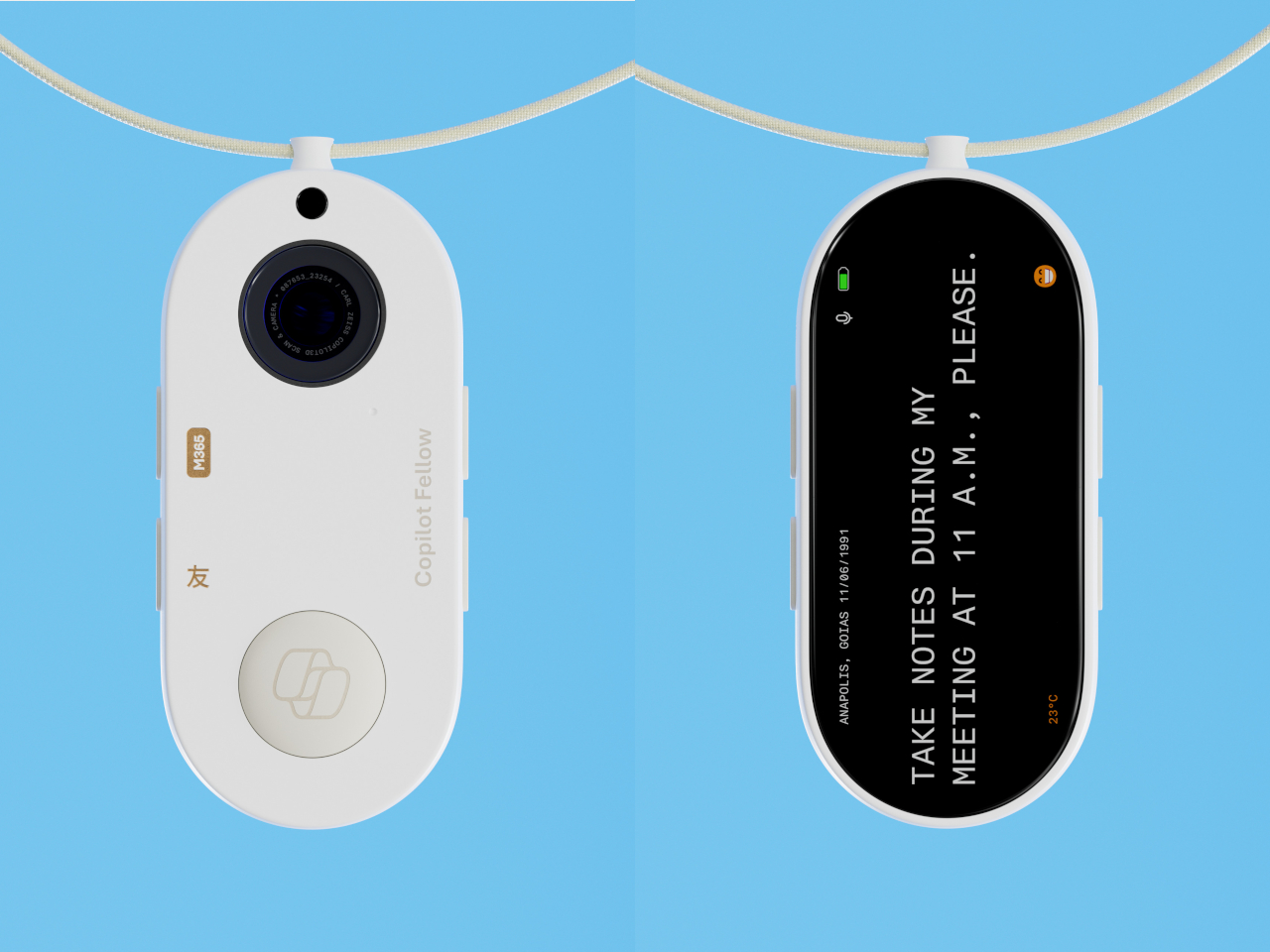
One of SUSA’s most innovative features is its emphasis on emotional intelligence. The device is engineered to recognize subtle cues in voice and behavior, allowing it to respond empathetically. Whether it’s offering calming support during stressful moments or celebrating your achievements, SUSA’s goal is to provide a sense of understanding and companionship that goes beyond typical digital interactions.

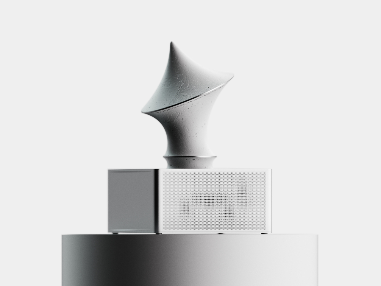
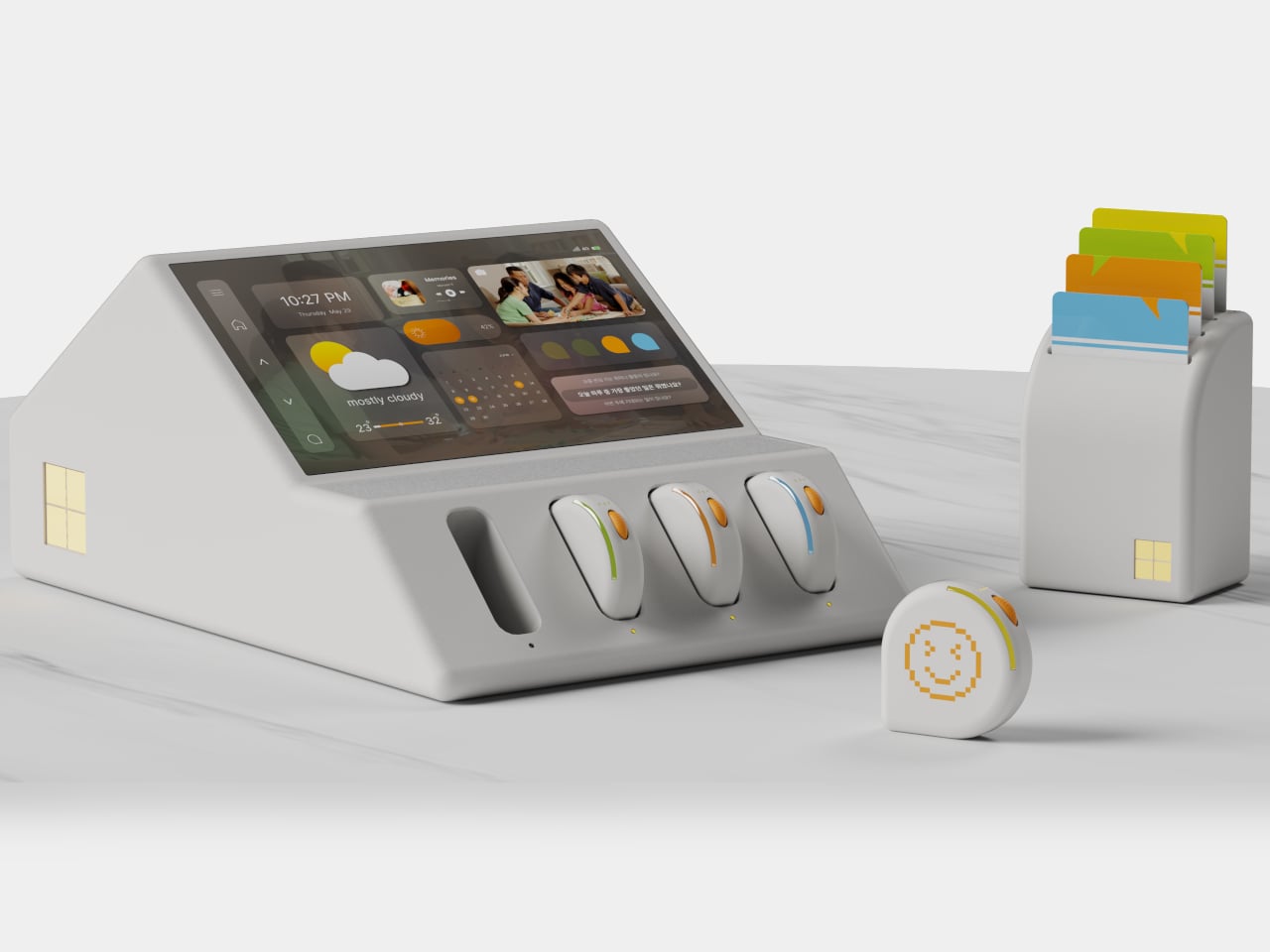
The physical design of SUSA reflects the same commitment to user experience. Future Facility has crafted a device that blends seamlessly into any living space, with a minimalist and inviting aesthetic. The interface relies on voice, soft lighting cues, and gentle movements, making interactions feel natural and unobtrusive. This approach ensures that SUSA is not only easy to use but also enhances the atmosphere of the home rather than detracting from it.

SUSA’s conceptual platform is also designed for openness and adaptability. It can connect with a wide range of services, manage schedules, control smart home devices, and deliver reminders, all while learning and evolving to fit a user’s unique lifestyle. Accessibility is at the forefront, with features that ensure people with different needs can benefit from SUSA’s capabilities, making technology more inclusive for everyone.

Privacy and security are fundamental to SUSA’s design. The device incorporates strong data protection measures and gives users control over their information. With capabilities for local processing, sensitive conversations and interactions can remain private, building trust between the user and their AI companion. SUSA represents a new direction for ASUS and Future Facility, showing how AI can move beyond functionality to foster genuine emotional connections. It highlights a future where technology doesn’t just work for us. It works with us, enriching our well-being and supporting us both practically and emotionally.

The post SUSA is a visionary AI-powered companion device concept for ASUS first appeared on Yanko Design.

How the Kirigami Parachute Concept Could Change Drone Deliveries

Par : Ida Torres
6 octobre 2025 à 16:20

Drone delivery technology is advancing quickly, and one of the most intriguing new concepts comes from the Mechanical Engineering department at Polytechnique Montreal. Their design, known as the kirigami parachute, offers a fresh take on how packages might be safely delivered from the sky in the future. Inspired by the Japanese art of kirigami, which involves folding and cutting paper to create patterns and structures, this innovative idea could help solve some familiar challenges in aerial deliveries.

Traditional parachutes have been a staple for many airborne tasks, but they can struggle to control descent in windy or unpredictable conditions. The kirigami parachute concept introduces a clever network of holes and slits, arranged in specific patterns, to regulate airflow and keep the parachute stable. These patterns are designed to help prevent packages from swinging or spinning as they descend, even when the wind picks up.

Designer Name: Mechanical Engineering department at Polytechnique Montreal

What makes the kirigami parachute concept stand out is its potential for highly accurate deliveries. In drone logistics, getting a package to land exactly where it’s supposed to is crucial. A missed drop can lead to damaged goods or safety issues. Early tests and simulations suggest that the kirigami design could help packages land closer to their intended targets compared to traditional round parachutes, thanks to its improved stability.

Another appealing aspect of this concept is how compact it can be. Kirigami parachutes are designed to fold flat, making them easy to store within the limited cargo space on drones. This could make them especially useful for commercial drone delivery systems, where every bit of space and weight matters. Plus, the design is flexible enough to be adapted for different sizes of packages, from small medical shipments to bigger consumer deliveries.

Environmental impact is a growing concern for all delivery systems, and the kirigami parachute concept addresses this as well. By using less material without sacrificing strength or functionality, it has the potential to be more eco-friendly than traditional parachutes. This could help make widespread drone delivery services more sustainable in the long run.

It’s important to note that the kirigami parachute is still a concept, not yet a commercial product. The team at Polytechnique Montreal is continuing to refine their design, and it has caught the eye of both researchers and industry leaders looking for improved solutions for drone deliveries. As interest in fast and contactless delivery services continues to grow, innovative ideas like this could play an important role in shaping the future of package transportation.

The post How the Kirigami Parachute Concept Could Change Drone Deliveries first appeared on Yanko Design.

À partir d’avant-hierFlux principal

Concept exercise bike brings minimalist fitness to your space

Par : Ida Torres
2 octobre 2025 à 17:00

I’ve been meaning to look at exercise equipment that I can add to my living space in order to finally, officially start my fitness journey. However what’s in the market, or rather, what’s within my budget, is either too big or too bulky. I’m still on the lookout for something that’s minimalist but also has what I need to encourage me to actually start exercising inside my house.

Jupiter X, even though it remains a concept design for now, seems to be turning a few heads. Created by Alexandr Zhukouski, Jupiter X is a modern minimalistic exercise bike envisioned to combine elegance, durability, and practicality for home or office use. With its sleek, compact form and intuitive features, this concept takes a fresh approach to how we think about workout devices and interior aesthetics.

Designer Name: Alexandr Zhukouski

The hallmark of Jupiter X is its sophisticated yet understated appearance. The frame boasts smooth, unbroken lines and a compact silhouette, making it a natural fit for a variety of modern interiors. Unlike many bulky exercise bikes that dominate a room, Jupiter X is designed to blend seamlessly into its surroundings. Whether placed in a living room, a home gym, or even a stylish office, this bike adds a touch of refinement rather than visual clutter.

Durability is also at the forefront of Jupiter X’s concept. The proposed use of high-quality materials ensures both longevity and a premium feel. The sturdy construction is intended to withstand daily use, while the minimalist design keeps maintenance straightforward and hassle-free. This attention to material choice not only supports the bike’s functionality but also enhances its visual appeal, promising a piece of equipment that looks as good as it performs.

Functionality is thoughtfully integrated into every aspect of the Jupiter X design. Intuitive controls are a key feature, allowing users to adjust resistance and settings without interrupting their workout flow. The clean interface means there are no unnecessary distractions, just smooth operation and an effective exercise experience. This user-friendly approach makes Jupiter X suitable for everyone, from fitness beginners to seasoned enthusiasts.

Compactness is another strength of this concept. With space often at a premium in modern homes and offices, the small footprint of Jupiter X makes it an attractive choice for those who want to stay fit without sacrificing valuable real estate. Its lightweight profile suggests easy repositioning, so users can move it as needed to accommodate changing layouts or routines.

Although Jupiter X is not yet available for purchase, its concept is most likely attractive to design fans and fitness lovers alike. If brought to market, Jupiter X could set a new standard for exercise equipment that merges high performance with minimalist elegance. As home-based and flexible fitness solutions continue to rise in popularity, concepts like Jupiter X highlight the growing demand for products that are both functional and aesthetically pleasing.

The post Concept exercise bike brings minimalist fitness to your space first appeared on Yanko Design.

Potrik concept reimagines urban mobility and personal delivery

Par : Ida Torres
2 octobre 2025 à 16:20

Have you ever experienced leaving the house with just one bag but throughout the day, you seem to be carrying more and more stuff? It’s probably okay if you’re moving around with a car but for those of us who commute, it can be a hassle. And as someone who can’t seem to just bring a small bag around, I do a lot of heavy lifting so to speak which can be a pain to my back and arms.

POTRIK is an innovative concept that reimagines how we move our belongings in the city. Designed by Yungwon Kang, Jueun Lee, Hyeonji Yang, Hyeongjoon Joo, and Hyogyeong Park, this concept tackles the hassle of carrying heavy shopping bags, making last-minute stops after errands, or picking up second-hand finds. With this modular sharing mobility system, you can enjoy lighter hands and more freedom every day, as POTRIK takes care of the heavy lifting for you.

Designers: Yungwon Kang, Jueun Lee, Hyeonji Yang, Hyeongjoon Joo, and Hyogyeong Park

At its core, POTRIK is a modular, detachable delivery mobility designed to move seamlessly between roads and sidewalks. The system is made up of two primary components: the Driving Module and the Storage Module. When you need to send something, a simple request through the POTRIK app sets everything in motion. The Driving Module, waiting at a city charging station, connects with the loaded Storage Module at your chosen departure point. Together, they form a single mobility unit that quickly transports your baggage along the road.

Upon reaching your destination, the Storage Module detaches and navigates sidewalks and building entrances autonomously. This means your items are delivered directly to you—no need to trek to a pick-up point or wait outside. With this system, quick and secure delivery is always within reach, whether you’re running errands or need to send something across town. POTRIK’s user experience is designed for simplicity and control.

You can track your belongings in real time through the POTRIK app, and with the 24H PASS, the system stays ready to respond at any hour, moving between strategically placed charging stations. When your delivery arrives, a tap with NFC opens the Storage Module so you can access your items instantly and securely.

The process is as easy as three steps: Send, Move, and Receive. Just set your pick-up and drop-off locations, and POTRIK handles the rest. This new delivery system is not just about moving things from place to place. It’s about making the process smarter and more personal. Whether you’re managing busy days packed with errands or need reliable help with heavy loads, POTRIK promises a lighter, more flexible way to get things done.

Though still a concept, POTRIK’s vision points to a new era of personalized, on-demand delivery. With POTRIK, your belongings arrive exactly where and when you need them, freeing you up to enjoy the city with lighter hands and a more liberated routine.

The post Potrik concept reimagines urban mobility and personal delivery first appeared on Yanko Design.

Loop chair concept brings together minimalism and comfort

Par : Ida Torres
2 octobre 2025 à 14:20

If you’re searching for a concept that blends artful design with functional vision, the LOOP Chair by Dntigrco Graphics is sure to catch your eye. Presented as a design concept on Behance, this striking chair explores the possibilities of seating for the modern home or office, combining minimalist style with ergonomic thinking.

The LOOP Chair concept impresses with its bold, angular frame that feels both dynamic and airy. The designer set out to create a continuous, flowing form, imagining a seat that almost “loops” around the sitter. This unique vision means the chair isn’t just a functional object, but a sculptural experience. The proposed frame, envisioned in walnut wood veneer with options for ash, oak, or black-stained finishes, serves as both a structural support and an artistic centerpiece. Its geometry is the result of careful sketching and creative exploration, balancing soft curves for comfort with sharp angles for a modern, architectural feel.

Designer Name: Dntigrco Graphics

The LOOP Chair concept stands out for its ability to suggest motion even while stationary. Its sculptural frame creates an intriguing play of light and shadow, making it a visual highlight in any room. Whether imagined in a contemporary office, a stylish lounge, or a refined living space, the chair’s form is designed to spark conversation and admiration.

Comfort is central to the chair’s conceptual design. The seat and backrest are imagined with high-density foam, wrapped in either premium fabric or leather upholstery available in a range of colors. This approach ensures that the concept delivers not only visual appeal but also a vision for supportive comfort from every angle. The upholstery options allow for further customization, so the chair could be tailored to complement a variety of interior styles.

Every aspect of the LOOP Chair has been thoughtfully detailed in its concept stage. The base is pictured as CNC-milled wood with a matte finish for durability and elegance, while anti-slip rubber pads are integrated into the feet for floor protection and stability. These features ensure that, if realized, the LOOP Chair would be as practical as it is beautiful.

Ultimately, the LOOP Chair is more than just an idea for furniture. It’s a harmonious exploration of minimalist design, ergonomic comfort, and customizable elegance. For design enthusiasts, collectors, or anyone interested in the future of interior design, it offers a fresh perspective on what seating can be.

The post Loop chair concept brings together minimalism and comfort first appeared on Yanko Design.

Luminate Lily helps reduce chemotherapy-induced hair loss

Par : Ida Torres
16 septembre 2025 à 10:07

Luminate, a healthcare company focused on at‑home solutions for cancer patients, has introduced Lily. It’s a wearable device that uses gentle scalp compression to lessen hair loss caused by chemotherapy. The technology is built into a discreet, helmet‑like structure that can be worn at home or in a clinic, offering patients a sense of control over one of the most emotionally challenging side effects of treatment. Research shows that fear of losing hair can discourage some individuals from starting or completing therapy, making Lily’s approach both medically and psychologically valuable.

The design work was commissioned to BLOND, a studio known for blending functionality with aesthetic appeal. Their task went beyond polishing the device’s appearance; they also created a soft, recyclable PET‑felt carry case and refined the user experience to feel intuitive and dignified. The result is a product that looks more like a lifestyle accessory than a piece of clinical equipment, helping users feel comfortable wearing it in public and even proud to own it.

Designer: BLOND Ltd

Key to Lily’s success is its inclusive design. The helmet is lightweight and softly contoured to accommodate a wide variety of head shapes. Adjustable Velcro straps, which magnetically reattach, make fitting quick and easy, while a removable antimicrobial chin strap ensures hygiene. A subtle capacitive touch interface lets users start or stop treatment without fiddling with buttons, and discreet orientation markers guide correct placement. All of these features were tested through multiple prototypes, each iteration improving comfort, fit, and usability while meeting strict regulatory standards for medical devices.

Beyond the hardware, Lily’s carry case reflects the same thoughtful approach. Made from soft, recycled PET felt, the case protects the device and adds a touch of elegance, reinforcing the idea that medical tools can be both functional and beautiful. This attention to material sensitivity aligns with Luminate’s broader mission to reduce side effects through at‑home solutions that fit seamlessly into daily life. By drawing inspiration from everyday objects, the team ensured Lily feels less clinical and more personal, turning a therapeutic aid into an empowering accessory.

For patients, Lily offers more than a reduction in hair loss; it provides a psychological boost that can improve adherence to chemotherapy regimens. For healthcare providers, the device adds a non‑invasive option that can be prescribed alongside standard treatments, expanding the toolkit for managing side effects. As the healthcare industry continues to prioritize patient‑centered care, innovations like Lily demonstrate how design and technology can work together to make cancer treatment less daunting.

The Luminate Lily device combines cutting‑edge medical engineering with thoughtful, lifestyle‑led design. Its lightweight, discreet form, user‑friendly interface, and elegant carry case create a holistic solution that addresses both the physical and emotional challenges of chemotherapy‑induced hair loss, helping patients feel more in control and confident throughout their treatment journey.

The post Luminate Lily helps reduce chemotherapy-induced hair loss first appeared on Yanko Design.

Water purifier and ice maker in one is space-saving and single-touch convenient

Par : Ida Torres
11 septembre 2025 à 17:00

VLND has introduced a sleek appliance that combines two kitchen staples into one compact unit: a water purifier and an ice maker. Designed for modern homes where countertop space is at a premium, the device delivers hot, cold, and filtered water along with clear, clean ice with just a single press of a button. Its streamlined appearance and intuitive controls make it a practical addition for anyone who wants reliable hydration and ice without cluttering the kitchen.

The first thing that catches the eye is the minimalist front panel. A square box rests on a smooth surface, echoing the image of an ice cube floating on gently rippled water. This visual cue is more than decorative; it reinforces the product’s core promise of pure water and pristine ice. The divided face of the unit creates an optical illusion that the machine is smaller than it actually is, helping it blend seamlessly into tight spaces such as narrow countertops, pantry shelves, or even office break rooms.

Designer: VLND Studio

Inside the compact shell lies a sophisticated filtration and ice‑making system. Despite the advanced technology, VLND has stripped away any unnecessary components, resulting in a clean layout with only a few essential buttons. Each button is distinctly labeled and produces a unique audible click when pressed, allowing users to confirm their selection without looking. This sound‑based feedback is especially useful in busy environments where a quick glance at the panel might be inconvenient.

Operation is straightforward. A single touch dispenses hot water for tea or coffee, cold water for instant drinks, and filtered water for cooking or drinking straight from the tap. For ice, the same touch releases a batch of crystal‑clear cubes that have been formed using purified water, ensuring that the ice is free from off‑flavors or impurities. The system’s temperature controls are calibrated to work efficiently year‑round, providing hot water in winter and refreshing cold water or ice during the summer months.

Maintenance has also been simplified. The removable water tank and ice storage compartment can be taken out for cleaning without the need for specialized tools. The filter replacement indicator alerts users when it’s time to change the cartridge, preventing a drop in water quality and extending the life of the appliance. Because the unit is designed to minimize moving parts, it operates quietly, making it suitable for open‑plan living spaces or office environments where noise can be a distraction.

From a design perspective, VLND’s approach aligns with current trends that favor clean lines, multifunctionality, and sustainability. By merging two essential kitchen appliances, the company reduces the need for separate devices, cutting down on both electricity consumption and countertop clutter. The single‑touch interface encourages users to stay hydrated and enjoy ice without the hassle of juggling multiple machines.

The post Water purifier and ice maker in one is space-saving and single-touch convenient first appeared on Yanko Design.

QUB Candlestick Concept Holds Two Candle Types in Minimalist Stone

Par : JC Torres
20 août 2025 à 14:20

Candlelight has this timeless way of making any space feel warmer and more intimate, but finding the perfect candlestick that works for different moods and candle types can be surprisingly tricky. Ross Sorokovyi’s QUB candlestick concept tackles this challenge with refreshingly simple geometry.

The QUB is basically a perfect 60mm stone cube, but here’s where it gets clever. Each cube has two different-sized holes on different faces, so you can hold either a standard taper candle or a tealight depending on which way you orient it. Need dramatic height for dinner? Pop in a taper candle. Want something cozy for reading? Flip it over and drop in a tealight.

Designer: Ross Sorokovyi (Mudu Studio)

What makes this design genuinely smart is how it strips away everything unnecessary while actually adding functionality. Most candlesticks lock you into one candle type forever, but QUB adapts to whatever vibe you’re going for. The cube form feels both ancient and contemporary, like something that could have existed centuries ago but still looks perfectly at home on a modern table.

These are carved from natural stone, and each piece shows off the material’s unique character. The images reveal gorgeous variations in marble and granite, from deep green with dramatic veining to soft gray with subtle patterns. The surface treatment mixes smooth polished areas with ribbed, chiseled sections that add visual texture and give your hands something interesting to feel.

The ribbed quarter-cylinder cut into each cube’s base does double duty, too. It lightens the visual weight so these don’t look like boring blocks, and it creates this modular quality where multiple QUBs can nest together or stack in interesting patterns. You can arrange them in grids, align the ribbed sections for rhythm, or mix different stone colors for contrast.

This modularity turns individual candle holders into something more sculptural and architectural. Instead of just lighting one candle, you’re creating these little landscapes of light and shadow. The weight of the stone keeps everything stable, while the compact size means you can easily rearrange them as your space or mood changes.

The concept celebrates that honest, tactile quality of natural stone where no two pieces look exactly alike. Those natural imperfections and variations become features rather than flaws, giving each QUB its own personality. The substantial weight makes them feel permanent and valuable rather than disposable.

Of course, this remains a concept design, so questions about heat resistance, cleaning, and real-world durability haven’t been tested yet. The sharp edges might also be less forgiving than traditional, rounded candlesticks if you accidentally bump into them in dim light.

But as a design statement, QUB succeeds brilliantly at reimagining something as basic as a candle holder. It proves that even the simplest objects can benefit from thoughtful reconsideration. For anyone who appreciates when form and function work together seamlessly, QUB offers a compelling vision of what everyday objects could become with just a little more creative thinking.

The post QUB Candlestick Concept Holds Two Candle Types in Minimalist Stone first appeared on Yanko Design.

Sofia mobility device reinvents comfort and confidence

Par : Ida Torres
20 août 2025 à 13:20

The Sofia mobility device by Alberto Essesi is setting a new standard for what personal mobility can feel and look like. Designed to address both the physical and emotional needs of users, Sofia brings together elegance, safety, and smart engineering for a truly empowering experience.

What sets Sofia apart is its organic, flowing form that naturally conforms to the human body. This design focus ensures not only comfort but also creates a sense of harmony and ease in every movement. Whether you are at home or navigating the city, Sofia’s sleek silhouette and gentle curves make it feel more like a part of you than just another piece of equipment.

Designer: Alberto Essesi

One of the most innovative features of Sofia is its fully enclosed sitting area. Unlike traditional mobility devices where clothing can get caught in the wheels, Sofia’s enclosed design eliminates this risk entirely, providing peace of mind and making daily use much simpler. Every detail, from the seat’s gentle embrace to the smooth edges, is crafted with the user’s safety and dignity in mind.

Sofia is built from a combination of carbon fiber, plastic, aluminum, high-density foam, and rubber. This blend of materials results in a device that is lightweight yet incredibly durable. As a result, Sofia is easy for a single person to maneuver and can be conveniently stored in a car or tight space. The thoughtful construction means less physical strain and more freedom to go where you want, when you want.

Versatility is another hallmark of the Sofia design. The mobility device features removable, power-assisted wheels that can be attached or detached depending on the user’s needs and the terrain. Whether you’re rolling over smooth indoor flooring or facing a bumpy outdoor path, Sofia adapts seamlessly to your lifestyle. This flexibility helps support independence and choice, letting users tailor their experience to their preferences.

Aesthetics and functionality are perfectly balanced in Sofia. The minimalist design radiates simplicity and sophistication, making it a device users can feel proud of. Every element, from the frame to the wheels, is designed for visual harmony and practicality, encouraging confidence and promoting a sense of independence. For anyone seeking a mobility device that truly understands user needs, Sofia by Alberto Essesi offers a refreshing alternative. It proves that mobility aids can be beautiful, intuitive, and life-enhancing all at once. By thoughtfully addressing comfort, safety, and self-expression, Sofia helps users embrace each day with renewed confidence.

The post Sofia mobility device reinvents comfort and confidence first appeared on Yanko Design.

TROPHY Mental Care Concept Transforms Stress Into Sculptural Art

Par : JC Torres
25 juillet 2025 à 10:07

Stress relief gadgets usually look like what they are: cheap plastic toys designed to be squeezed, spun, or clicked until they inevitably break. Most fidget devices prioritize function over form, leaving you with something that works but looks completely out of place on your desk or bookshelf.

The TROPHY concept takes a completely different approach to mental care products by disguising stress relief as sculptural art. This portable device looks more like a modern art piece or an elegant trophy than a typical fidget toy, making it something you’d actually want to display in your home or office.

Designer: Mingi Cho

TROPHY works by combining the proven benefits of tactile stimulation with intentional design aesthetics. Users can hold, grip, and manipulate both the trophy-shaped object and its textured metal stand, using physical movement and touch to help manage negative emotions and stress. The concept leverages acupressure principles and the playful elements found in fidget toys, but packages everything in a form that feels sophisticated rather than childish.

Research supports the effectiveness of tactile fidget tools for emotional regulation. Studies have shown that stimulating the tactile system can help improve sensory processing along with related emotions and behaviors, particularly for people dealing with anxiety or attention challenges. Physical movement, even small tactile actions, releases dopamine and norepinephrine, which can increase attention and help sharpen focus.

The analog approach feels refreshing in a world saturated with app-based wellness solutions and digital mental health tools. Instead of requiring screens, notifications, or connectivity, TROPHY relies entirely on physical interaction and sensory feedback. The device provides responsive communication through vibration, haptics, and rotation, creating a more immediate and tangible experience than smartphone-based stress management apps.

What makes TROPHY particularly clever is how it addresses the social stigma often associated with stress relief tools. Traditional fidget toys can look unprofessional or childish in adult environments, but this sculptural approach allows users to engage in stress management without drawing unwanted attention or feeling self-conscious about their coping mechanisms.

The concept’s tagline, “Things that never come back,” hints at the temporary nature of stress and negative emotions. By providing a physical outlet for these feelings, TROPHY encourages users to acknowledge their stress, engage with it through touch and movement, then let it go rather than carrying it around mentally.

The textured surfaces on both the trophy and its stand invite exploration and repeated interaction, much like worry stones or prayer beads that people have used for centuries to manage anxiety and promote mindfulness. This tactile engagement gives the mind something concrete to focus on, creating a meditative break from overwhelming thoughts or emotions.

TROPHY demonstrates how thoughtful design can elevate everyday wellness tools from functional gadgets into meaningful objects that people actually want to use and keep around. By combining proven stress relief techniques with sculptural aesthetics, this concept shows that mental care products don’t have to sacrifice style for effectiveness.

The post TROPHY Mental Care Concept Transforms Stress Into Sculptural Art first appeared on Yanko Design.

Recov concept lets you relax with incense and without guilt

Par : Ida Torres
15 juillet 2025 à 17:00

If you’re one of those people who drags themselves home after a long day, feeling like you’ve been running on empty for hours, you’re not alone. The constant cycle of work stress, endless meetings, and the pressure to always be “on” can leave anyone feeling drained. But what if there was a simple, elegant solution that could help you reclaim those precious moments of peace? Enter Recov, a revolutionary incense burner concept that’s designed specifically for people like you who desperately need to rediscover the value of rest.

Created by the talented design team of Ko Ye Been, Lee Ji Ho, Roh Woo Hyun, and Oh Yun, Recov isn’t just another home accessory. It’s a thoughtfully crafted wellness tool that transforms the ancient practice of incense burning into a modern ritual for recovery and relaxation. The tagline “Discover the value of rest” perfectly captures what this innovative product aims to achieve: making rest not just an afterthought, but a deliberate, mindful practice.

Designers: Ko Ye Been, Lee Ji Ho, Roh Woo Hyun, and Oh Yun

The design itself is refreshingly simple yet sophisticated. The clean, minimalist aesthetic features a warm cream-colored body with subtle orange accents that immediately feel calming and approachable. Unlike traditional incense burners that can feel ceremonial or intimidating, Recov looks like it belongs in your contemporary living space. The cylindrical form with its gentle curves and soft lighting creates an atmosphere that whispers “slow down” rather than demanding attention.

What makes Recov truly special is how it reimagines the entire incense experience. Instead of fumbling with matches and worrying about timing, you simply insert an incense stick into the top opening, set your desired duration using the intuitive timer system (15, 30, or 60 minutes), and let the device do the rest. The soft mood lighting gradually illuminates as the incense burns, creating a visual cue that helps your mind transition from work mode to rest mode. The thoughtful engineering extends to practical details that busy people will appreciate. The bottom tray collects ash automatically, eliminating the mess and maintenance that often deters people from using traditional incense. The timer function means you can start your relaxation ritual and trust that it will end safely, allowing you to fully let go without worrying about fire hazards or waste.

But perhaps the most brilliant aspect of Recov is how it makes rest feel intentional rather than guilty. In our productivity-obsessed culture, taking time to simply breathe and be present can feel selfish or lazy. By creating a structured, time-bound experience, Recov gives you permission to pause. It transforms those stolen moments of peace into a legitimate wellness practice, complete with sensory cues that signal to your brain that it’s time to decompress. The accompanying incense options, including “Calm Flow,” “Rest Bloom,” and “Inner Goals,” are specifically formulated to support different aspects of recovery. Whether you need to quiet racing thoughts after a stressful presentation or create a buffer between work and personal time, there’s a scent designed to help you transition more effectively.

The post Recov concept lets you relax with incense and without guilt first appeared on Yanko Design.

3D printer with AI can turn food scraps into useful items

Par : Ida Torres
15 juillet 2025 à 08:45

There have been numerous studies conducted and articles written on how much food is wasted every day in the U.S. alone. Creative thinkers are developing innovative ways to prevent this waste from ending up in landfills, going beyond traditional methods like composting, reusing, or turning scraps into animal feed. It would also be great if the solutions they develop could be useful in our everyday lives.

Now imagine turning your banana peels, coffee grounds, and vegetable scraps into useful household items instead of throwing them away. That’s exactly what MIT graduates Yiqing Wang and Biru Cao have made possible with their groundbreaking invention, the Foodres.AI 3D printer. This innovative desktop device represents a completely new approach to dealing with food waste by transforming organic waste into functional objects.

Designers: Yiqing Wang and Biru Cao

The technology works through a combination of artificial intelligence and 3D printing. Users simply place their food waste into the machine, and the accompanying mobile app uses AI to analyze the materials through the phone’s camera. The system uses a self-trained object detection model to identify food types and assess their printability, then suggests appropriate “print recipes” based on the physical properties of your waste materials. The printer can create a wide variety of useful items from your kitchen scraps. Users can print cup holders, coasters, decorative items, and custom designs by simply dropping in food waste and selecting the desired form and size. The built-in material processing module helps users mix waste with natural additives to form a printable bioplastic paste, making the entire process seamless and accessible.

What makes this printer particularly user-friendly is its intuitive design that requires no prior 3D printing experience. The app provides a library of design templates, and users can also upload their own custom models. Once you’ve selected your desired object and size, the printer’s custom three-axis extrusion system converts your scraps into something useful. The environmental impact potential is significant, as food waste accounts for up to 50 percent of household organic refuse in the United States. The project began as part of research supported by the MIT IDEAS program, addressing the fact that 40-50% of household food is wasted before it ends up in landfills or compost bins. By enabling people to repurpose non-edible leftovers and organic matter into functional items at home, the Foodres.AI printer promotes what the creators call “hyper-local circular economies.”

Beyond its practical applications, the Foodres.AI printer represents a shift in how we think about waste. Instead of viewing food scraps as something to be disposed of, this technology encourages users to see them as raw materials for creation. By making sustainable behavior interactive, creative, and rewarding, the product builds a community-driven culture of eco-consciousness. As concerns about environmental sustainability continue to grow, innovations like the Foodres.AI printer offer practical solutions that individuals can implement in their own homes, making circular living both achievable and engaging for the average person.

The post 3D printer with AI can turn food scraps into useful items first appeared on Yanko Design.

ITDA Concept Offers A Minimalist Approach to Family Connection at Home

Par : JC Torres
4 juillet 2025 à 17:00

It is easy to take for granted how much technology we surround ourselves with every day, but somehow, even surrounded by screens, real connections at home can feel harder than ever. That is the challenge at the heart of ITDA, a concept design from Korea that aims to help families find each other again in the most gentle and thoughtful way possible.

The name ITDA comes from a Korean word that means “to connect,” and that philosophy runs through every detail. This is not just another smart gadget or an app notification fighting for your attention. Instead, ITDA is a collection of gentle, tactile objects designed to quietly restore the little moments we have been missing, those exchanges of feeling and warmth that get lost in the shuffle of daily life.

Designers: Hyunwoo Jung, Yehoon Cho, Sieun Cha, Gayeon Kim

At the center of the system is TOPI, a device that looks more like a minimalist home sculpture than anything you would expect from a tech product. Set it on the kitchen table or by the entryway, and it becomes a gentle hub for conversation. Instead of sending out alerts or lighting up with endless information, TOPI introduces topics when family members are together, using a display that feels inviting rather than commanding. There is even a little shelf on its back for keys or treasures, which feels like a reminder that the belongings we carry say as much about us as our words do.

The rest of the collection is just as quietly clever. TILO gives a more humane spin on that drab office time card. Instead of something you dread, it welcomes you home with a familiar voice as soon as you step in the door and put in your personal card. It is the kind of touch that could easily become a small but meaningful ritual, the sound of someone who cares, right when you need it most.

Then there is TOK, a pebble-shaped device made for those times when words are tough to find. Instead of forcing a conversation, TOK lets you send a simple signal, by inserting the pebble-shaped object into TOPI that matches your mood, messages that say, “I am thinking of you,” or “I would like to talk.” It is nonverbal, simple, and maybe even a little poetic, especially for anyone who has ever wished they could reach out without having to explain everything.

What is striking about ITDA is how little it asks of you. There are no complicated screens to navigate, no endless setup menus, and no pressure to perform. The forms are gentle and approachable, meant to blend into your home rather than take it over. Every element, from the way you interact with the devices to the materials themselves, feels designed for comfort and calm.

It is worth remembering that ITDA is just a concept right now, not something you can buy and plug in tomorrow. But as a piece of design thinking, it feels especially timely. In a world where smart often means louder, brighter, and busier, ITDA turns the volume down and gently nudges us back toward each other. Maybe that is the real innovation: a reminder that sometimes, the most important connections do not happen on a screen, they happen in the quiet spaces we make for each other.

The post ITDA Concept Offers A Minimalist Approach to Family Connection at Home first appeared on Yanko Design.

Copilot Fellow Concept is an AI Pendant That Feels More Like a Friend Than a Gadget

Par : JC Torres
4 juillet 2025 à 16:20

Ever feel like AI is always hiding in the background, tucked away on your phone or buried behind a dozen browser tabs? Most of us interact with digital assistants through screens, which, let’s be honest, makes technology feel a little distant from our actual lives. But what if AI could be more present, accessible, and even a little bit stylish? That’s where the Copilot Fellow concept comes in, and honestly, it’s hard not to get a little excited about the idea.

The Copilot Fellow isn’t just another gadget to add to your collection. Picture a pill-shaped device, smooth and minimal, with a flat front and back. The front features a camera and a bold Copilot button, the heart of the design. Tap it, and you’re instantly connected to your AI assistant, ready to ask a question, set a reminder, or get a quick weather update. It’s designed to be intuitive, something you can operate without fiddling around or losing your train of thought.

Designer: Braz de Pina

What really makes Copilot Fellow stand out, though, are the four shortcut buttons, two on each side, that you can program for your favorite prompts or voice commands. Imagine setting one for “What’s on my calendar?” and another for “Send a quick note.” There’s no scrolling through endless menus or getting lost in settings. It’s simple, direct, and focused on the way you actually use AI day to day.

Now, here’s a little twist to that premise: While the front is all about that single, satisfying Copilot button, the back features a discreet screen. If you want to read your prompts or see some quick info, it’s there. But since it’s hidden away on the reverse side, it never gets in the way. This design choice keeps your interactions as screen-free as you want them to be, which feels like a breath of fresh air in our notification-heavy world.

One of the coolest things about Copilot Fellow is how you can wear it. You’re not locked into any one style, it works as a pendant around your neck, or you can just toss it in your pocket. It feels less like another gadget and more like a little presence you carry with you, always ready to help but never demanding attention. There’s something almost companion-like about it, which is a big leap from the usual “Hey Siri” or “Okay Google” voice floating out of your phone.

It’s important to remember that this is still a concept design, and Microsoft is unlikely to make one itself. But honestly, wouldn’t it be cool if someone DIY’ed their own version? The simplicity and flexibility make it feel approachable, even for tinkerers. Copilot Fellow reimagines how we might invite AI into our lives: more personal, more tangible, and a lot more stylish. Would you wear your AI around your neck, or are you sticking with the old-school phone in your pocket? Either way, this concept makes us rethink what AI gadgets could be.

The post Copilot Fellow Concept is an AI Pendant That Feels More Like a Friend Than a Gadget first appeared on Yanko Design.

Duck-inspired thermometer concept makes taking temperature fun for kids

Par : Ida Torres
27 juin 2025 à 17:00

Now that you’re an adult, taking your temperature is no big deal—maybe even pretty routine. But if you think back to when you were a kid, it was sometimes more of a struggle with your parents, especially if you were really feeling under the weather. There aren’t any needles involved, but it can still be a scary experience for young children, particularly when they don’t understand what’s happening. But what if checking their temperature could be a bit more fun and playful?

That’s the idea behind the Ducky Thermometer for Kids—a concept thermometer designed to bring comfort, safety, and a touch of fun to a child’s health routine. As its name suggests, it’s shaped like an adorable, friendly rubber ducky that helps put kids at ease by making them feel like they’re just playing. It can transform a potentially stressful moment into an engaging and playful interaction.

Designer: Geonwoo Kang

The ducky shape isn’t just adorable and inviting for kids—it’s thoughtfully designed to fit comfortably in small hands, allowing children to hold it themselves. This sense of involvement can help reduce anxiety, as kids feel more in control when they’re able to participate in the process, such as helping a parent position the thermometer on their forehead. To make the experience even more engaging, there’s a sound mode that can be adjusted with a slider, adding a playful touch to every temperature check.

What makes this thermometer even more unique is the display at the bottom of the duck, which shows the child their temperature—not with numbers, which might be confusing or intimidating—but with expressive ducky faces. There are three kinds of duckies to represent different temperature ranges: Active Ducky, with a smiling and happy look, represents a normal temperature; Resting Ducky, sitting down with a worried expression, appears if there’s a mild fever; and Sick Ducky, who looks unwell, shows up when the child has a high fever.

Although the product renders don’t show it, including a display for parents to view the exact temperature would be a valuable addition, as this information is essential for assessing and managing a child’s illness. Even so, small innovations like the Ducky Thermometer remind us that parenting doesn’t have to be all stress and worry. By blending playful design with practical functionality, Ducky turns everyday health checks into moments of comfort and connection—helping both parents and children feel a little more at ease, no matter what the day brings.

The post Duck-inspired thermometer concept makes taking temperature fun for kids first appeared on Yanko Design.

Clicker Pen Key Holder Concept Turns Everyday Keys Into Pocket Perfection

Par : JC Torres
27 juin 2025 à 16:20

There is something oddly frustrating about fishing around for the right key while juggling a phone, bag, or coffee cup. Traditional key holders sometimes make things tidier, but they still leave you with a tangle of metal, mystery jingles, and the occasional scratch on your favorite gadget. The simple act of grabbing a key shouldn’t feel like a daily puzzle, yet for many of us, it somehow does.

Key holders have existed for ages, but their designs rarely change. After all, keys are just keys, right? That’s why when an entrepreneur set out to rethink this small but stubborn daily problem, they partnered with a design team to create a truly clever alternative. The result is Keyo—a sleek, minimal organizer that borrows inspiration from those classic multi-cartridge pens you might remember from school.

Designer: Diego Mata, NOS Design

Keyo is compact, with a shape that feels natural in your hand or pocket. It’s designed to simplify one of those little interactions you repeat countless times a week. The hard plastic shell protects your keys from scratches and damage, while also keeping them from scratching anything else in your pocket or bag. It’s the kind of thoughtful upgrade that makes you wonder how you ever managed the old way.

The real fun comes with the sliding mechanism. With a satisfying click, you can deploy each of the three stored keys individually, so you always get the one you want, right when you need it. No more fumbling or flipping through a ring of lookalikes. This smooth action feels almost like using a fancy pen: one push, one key, and you’re set.

Keyo’s design also means less noise and less clutter. By housing everything inside a lightweight and durable shell, it cuts down on the jangling sound that follows most keychains. The body is available in several colors, making it easy to match your mood or style. Whether you prefer understated black or something a bit more playful, there’s a version for everyone.

Inside, the mechanism is designed to fit a wide variety of key shapes and sizes. The length of Keyo is carefully tuned to accommodate the most common key heads on the market, so you don’t need to order custom keys or make modifications. Just load them in and you’re ready to go, no fuss or extra trips to the hardware store required.

It’s the sort of concept that makes everyday life just a little smoother. With Keyo, searching for the right key becomes a thing of the past, replaced by a quick, intuitive motion that feels both familiar and refreshingly new. For anyone tired of the daily key shuffle, it’s a smart solution waiting to be brought into reality.

The post Clicker Pen Key Holder Concept Turns Everyday Keys Into Pocket Perfection first appeared on Yanko Design.

Versatile lighting system brings wellness, versatility, style to your space

Par : Ida Torres
26 juin 2025 à 10:07

I don’t really pay that much attention to the lighting at home, in the office, or whichever coffee shop I end up working in. As long as the light is good enough for me to work or read properly, then I’m satisfied. That’s probably because I’m not involved in designing the space, so I can’t really do anything about it. But if you love looking for lighting solutions that can adapt to your needs, then this concept may capture your attention.

The Wipro EcoLumi Flex is a concept for a modular, sustainable lighting system that functions as both a table lamp and a suspended ceiling light, featuring easy adjustability, customizable layouts, and a slidable shade for glare control. It enhances well-being with auto mode circadian lighting, allowing users to personalize brightness and color temperature throughout the day for optimal comfort and productivity.

Designers: Utkarsh Kulkarni, Sreya Acharyya

Its clever design features a smart, easy-to-use adjustability mechanism. With just a gentle twist, you can fine-tune both the height and the angle of the lamp. Whether you’re working at your desk or want to reimagine your ceiling lighting, this lamp’s flexibility means your light is always right where you need it. One of the standout features is the slidable shade; with a smooth motion, you can open or close the shade to control the direction of the light, reducing glare and enhancing comfort for those focused, productive moments. The modular design is also pretty interesting and useful—each unit can serve as a sleek table lamp or be effortlessly installed as a suspended ceiling light. Thanks to easy-install connectors and angular joints, you can link multiple lights together, crafting custom layouts that make your office truly unique and adaptable to your needs.

EcoLumi Flex is also about wellness. The Auto Mode feature automatically adjusts the color and intensity of the light throughout the day, following your natural circadian rhythm. Enjoy gentle yellow light (3000K) to ease you into the morning, crisp white light (4000K) for midday focus, and energizing blue-white light (5000K) to help you power through the afternoon. With intuitive controls right at your fingertips, you’re always in charge of your environment. This concept is also crafted with sustainability at its core. The modular system allows for easy upgrades and part replacements, reducing waste and ensuring your lighting solution stands the test of time. It’s a thoughtful choice for eco-conscious professionals and collectors who believe great design should also be good for the planet.

Sleek, minimal lines and a matte black finish give EcoLumi Flex a contemporary aesthetic that works beautifully in any setting. In open-plan offices, the coordinated look of multiple table lamps and custom-length ceiling lights creates a harmonious, designer feel and can make your workspace as inspiring as it is functional. Whether you’re passionate about sustainable design, crave flexibility, or are building a collection of future-ready office essentials, this lighting innovation concept can be both useful and inspiring.

The post Versatile lighting system brings wellness, versatility, style to your space first appeared on Yanko Design.

BricBloc Stacks Up Charging, Storage, and Connectivity in One Clever Block

Par : JC Torres
23 juin 2025 à 17:00

Desks have a way of turning into jungles of cables, chargers, and mystery gadgets. With every new device, the mess seems to multiply, crowding out precious workspace and making even a simple coffee break an exercise in cable dodging. As our digital lives get busier, the hunt for ways to keep things neat and easy gets more important by the day.

When table space runs out, the only way is up. That is where BricBloc comes in. This clever 3-in-1 concept stacks a fast charger, SSD, and screen expansion hub into a single, compact desktop accessory. By combining three essential tools in one neat block, it promises to tackle clutter and streamline your setup, not just at home but anywhere you need to work.

Designers: Jianshen Yuan, Boyuan Pan (Suosi Design)

Weighing just 185 grams, BricBloc is built for life on the move. It lightens your daily load, declutters your workspace, and keeps your gear list short and sweet. Whether you are packing for a coffee shop session or catching a flight, this all-in-one block means less bulk and fewer things to forget. It is the kind of smart integration that makes you wonder why more tech does not try to do more with less.

Design-wise, BricBloc keeps things sharp and simple. Its minimalist geometric style is all about clean lines and compact forms, with each module stacking like a perfect little tech skyscraper. There is something satisfying about the way it clicks together, giving you a sense of order and control that is hard to find in a tangle of dongles and chargers.

The modular system is both practical and elegant. A GaN charging block forms the sturdy base, the SSD module sits right on top, and the USB-C/HDMI hub rounds out the tower. Gold pogo pins connect each piece, letting power and data flow smoothly through the stack. No dangling wires, no fiddly connectors, just a tidy block that does the job.

What really makes BricBloc stand out is its translucent matte shell. This soft finish tones down the usual “serious tool” vibe of most tech gear, giving it a friendly, almost playful feel on your desk. It is a refreshing change from the usual black boxes, making your workspace look lighter and a little more inviting, all while keeping things running smoothly.

BricBloc is still a concept for now, but it is easy to see the appeal. It is a thoughtful, efficient way to bring order to chaos, stacking up power, storage, and connections in one spot and letting you get back to work, or play, without the clutter.

The post BricBloc Stacks Up Charging, Storage, and Connectivity in One Clever Block first appeared on Yanko Design.

Aesthetic Cat Litter Box concept is something you won’t want to hide away

Par : Ida Torres
17 juin 2025 à 21:30

I have a friend who has more than two cats and she always tells me that the most stressful part about being a cat parent is the constant cleaning of the litter box. She sometimes can’t stay out too long because if she doesn’t clean up the box, it will smell bad obviously. Of course, cats poop several times so this is pretty normal. And more often than not, these litter boxes are eyesores that you have to hide when you have visitors (or hide from your own eyes as well).

The Cat Litter Box Enclosure is a concept for a creative solution for that particular problem that is as functional as it is aesthetic. Instead of settling for the standard plastic trays we’re all used to hiding away in corners, designer Gia Han Pham has reimagined the traditional litter box with a fresh, sophisticated perspective that seamlessly fits into contemporary homes. Drawing inspiration from minimalist aesthetics, she has focused on clean lines, gentle curves, and a subtle color palette that quietly elevates any room. This isn’t just about hiding the litter box; it’s about making it an intentional part of your décor. Her thoughtful approach addresses the needs of both pets and their owners, providing a discreet, stylish shelter that you’ll actually want to show off.

Designer: Gia Han Pham

The enclosure features clean lines, neutral tones, and a subtle wood finish, making it easy to blend with any decor style, whether it’s a cozy farmhouse look or sleek Scandinavian. It’s clear that every element, from the choice of materials to the gentle curves, was chosen with both pets and people in mind. But the design also prioritizes the cat’ comfort and the owner’s convenience. Your pet has plenty of room to move around the enclosure so they still feel comfortable and unconfined. There’s a cleverly designed entrance where they can slip in and out with ease while still keeping the litter scatter contained. More importantly, it has discreet vents so the air can keep flowing and minimize those unpleasant odors that can sometimes linger in regular litter boxes.

So, if you’re like my friend or most of cat parents who are tired of sacrificing style for the sake of your pets, this concept offers a breath of fresh air. Instead of feeling embarrassed when guests drop by or constantly worrying about lingering smells, you’ll have peace of mind. Your space stays beautiful, your cats stay comfortable, and the dreaded clean-up routine feels just a little bit easier.

The post Aesthetic Cat Litter Box concept is something you won’t want to hide away first appeared on Yanko Design.

❌
❌