Vue normale

Il y a de nouveaux articles disponibles, cliquez pour rafraîchir la page.
Aujourd’hui — 26 juin 2024Flux principal

Microsoft Surface Pro 11, Surface Laptop 7 repairability gets thumbs up from iFixit

Par : JC Torres
26 juin 2024 à 10:07

It has only been a month since Microsoft unveiled its latest Surface-branded computers, and while the tech industry was awash with discussions on the company’s aggressive Copilot AI push and ARM-based Snapdragon X silicon, the products’ design may have left some people less than impressed. The Surface Pro 11 and Surface Laptop, for all intents and purposes, look exactly like their forebears, making one wonder if Microsoft has run out of creative juice or is desperate to milk its current design until it runs dry. Fortunately, that isn’t the end of the new Microsoft Story, as it turns out that the latest Surface Pro and Surface Laptop computers have one “invisible” upgrade it didn’t really talk about much: an easier repair process that has even the meticulous and stingy iFixit impressed.

Designer: Microsoft (via iFixit)

Laptops have come a long way from being impregnable fortresses that made even the smallest repairs or upgrades a hellish experience, though there are still some companies living the past in the present. Initially, the Surface Laptop was part of that group, requiring cutting through fancy Alcantara fabric just to open the laptop to replace a battery or upgrade the storage. This year’s design almost makes a complete U-turn with a bottom plate that’s only held down by four screws and magnets; no adhesive in sight. Even the battery can be easily removed by just removing screws and a few layers of parts blocking those.

Tablets are even worse news for repairs, especially with displays that are glued on top of the frame. To its credit, Microsoft has at least made changing the Surface Pro M.2 SSD painless by having an accessible magnet-locked panel to get to that storage instantly. The 11th-gen model takes things further by employing as little adhesive as possible, though you still have to go through the risky process of removing the screen first. Fortunately, getting to important parts like the battery is less of a grueling task, especially since it’s only held down by screws as well.

Even more impressive, however, is the fact that Microsoft officially supports such self-repair processes. It has made repair guides publicly available since day one and has even clearly marked out the number and types of screws that hold certain components in place. It’s far from perfect and definitely not on the same level as a Framework laptop, but it’s still an unexpected yet pleasant surprise, especially considering it’s Microsoft we’re talking about.

The post Microsoft Surface Pro 11, Surface Laptop 7 repairability gets thumbs up from iFixit first appeared on Yanko Design.

Hier — 25 juin 2024Flux principal

Cheaper Apple Vision design might have you connecting to an iPhone or Mac

Par : JC Torres
25 juin 2024 à 13:20

It hasn’t even been a year since it launched, but there are already talks of Apple’s next headset after the Vision Pro. No, it won’t be an upgrade that will make the $3,500 device obsolete but, instead, might even be considered a downgrade of sorts. In a way, this more affordable Apple Vision will be its own class, one that might have to make quite a few compromises to reach a desired price point. What those cuts will be is still unknown, but some insider insight suggests that the non-Pro Vision headset might offload its processing and software to an external device, requiring you to tether it to an iPhone or even a Mac or MacBook.

Designer: Apple (via Mark Gurman)

Impressive as the Vision Pro and visionOS might be, Apple’s spatial computing platform hasn’t yet taken the tech world by storm for one critical reason. The headset costs a whopping $3,500, far beyond the reach of developers without deep pockets or backing, let alone regular consumers. Apple has always planned on launching a more accessible Vision headset after the Pro model has taken root, but the big puzzle is how it would make it significantly cheaper without compromising on the experience too much.

The immediate answer would be to take the features down a few notches, throwing out EyeSight that shows your eyes to people on the opposite side of the glass, reducing image quality of passthrough visuals, or using less powerful processors. These, however, are the features that would differentiate the Vision from other mixed reality headsets, and a price tag of $1,500 would make it look even more expensive than the competition without these “killer features.” One alternative would be to have the headset connect to a device, either the iPhone or the Mac, making the Apple Vision focus solely on the optics and display.

This wouldn’t be the first phone-powered headset, and history has given us the advantages and disadvantages of that design. An iPhone would actually offer a bit more mobility and flexibility, especially if it will also power the Vision headset. It could, however, be the bottleneck considering the apps and experiences that visionOS supports. A MacBook, on the other hand, would deliver that much-needed power at the expense of freedom of movement and comfort.

This is definitely a conundrum for Apple, which isn’t always keen on degrading product quality in the name of price cuts. At the same time, however, it really has no choice but to make some concessions if it wants its spatial computing vision to be embraced by more people. It still hasn’t given up on the Vision Pro, whose successor is expected to arrive in 2026, but it will be pouring resources over the more accessible Vision for a 2025 launch, and hopefully, it will be able to hit the nail on the head in the end.

The post Cheaper Apple Vision design might have you connecting to an iPhone or Mac first appeared on Yanko Design.

OPPO Reno 12 Pro Review: Making AI Affordable in a Stylish Design

Par : JC Torres
24 juin 2024 à 17:20

PROS:


  • Elegant and stylish design, especially the Nebula Silver color

  • Supports a micro SD card for external storage

  • 50MP autofocus front camera can do 4K UHD videos

CONS:


  • Processor is a downgrade compared to Chinese model

  • No wireless charging

  • Glossy bottom plate is a smudge magnet (Space Brown, Sunset Gold)

RATINGS:

AESTHETICS
ERGONOMICS
PERFORMANCE
SUSTAINABILITY / REPAIRABILITY
VALUE FOR MONEY

EDITOR'S QUOTE:

The OPPO Reno 12 Pro delivers powerful AI experiences packed in a beautiful and soothing design.

AI is the buzzword in the tech industry, with mainstream media picking up on it and sometimes not in a good way. All the benefits that the technology brings, however, are for naught if only a select few can afford to use it. AI on smartphones promises quality-of-life improvements and exciting creative features, but only if you have the latest and greatest models with powerful specs and matching high prices. Fortunately, AI on mobile is such a hot topic that manufacturers are bringing those features to almost any new device. That’s pretty much the premise of the OPPO Reno 12 Pro, specifically the global edition that the brand just launched, one of the first few to advertise these AI benefits on what some would consider a mid-range model. But is it a potent combination or is the experience hampered by the Reno 12 Pro’s hardware? We take the phone for a spin to bring you the answers.

Designer: OPPO

Aesthetics

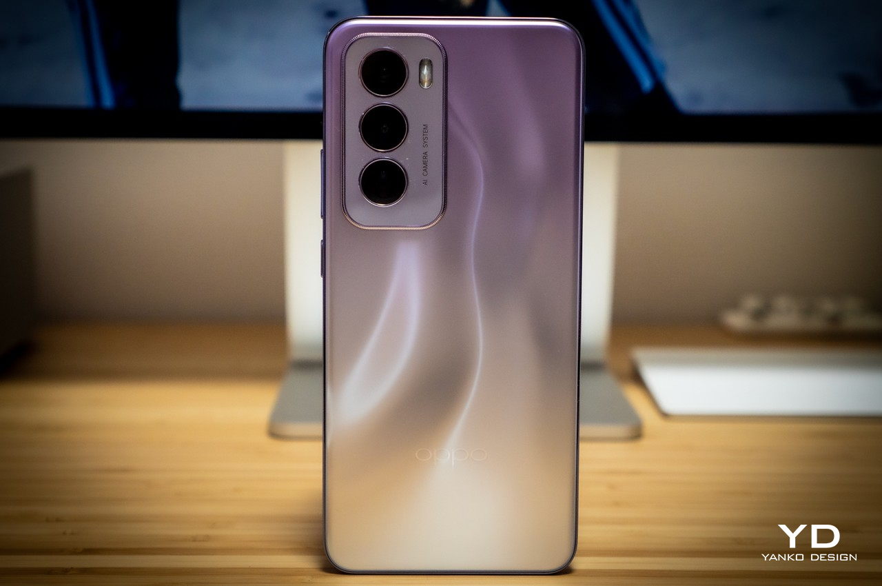
Companies avoid using the label “mid-range” or “mid-tier” for good reason. They often come with the connotation of lacking quality and appeal, which is definitely not something that can be said for the Reno 12 Pro. Right off the bat, you’ll be surprised by how enchanting the phone is, especially the Nebula Silver colorway we received for this review. OPPO utilizes what it calls Fluid Ripple Texture that gives the phone’s back a 3D visual effect of liquid gently moving underneath the glass. It even has something like a parallax effect that gives the illusion that there’s truly some solid mass despite having a completely flat surface. The play of light, shadow, and colors has a mesmerizing effect that gives the phone a more stylish and elegant air.

The other two color options, Sunset Gold and Space Brown, are no less attractive but have a different approach. They use a two-tone design that combines a matte section and a smaller glossy area separated by a chic metal-like ribbon running across the width of the phone. It’s a familiar composition, only arranged upside-down, giving the Reno 12 Pro a distinctive look. Unfortunately, this design has one rather critical flaw, the glossy part will always be where your palm rests, which means it will always have oils and smudges whenever you hold it.

The phone’s flat edges give it a modern look and its reflective surface gives the impression of a metallic nature. It is, however, a sleight of hand, given how the material is actually a new proprietary alloy that OPPO promises has the same durability but with less weight. All in all, the OPPO Reno 12 Pro definitely has a striking presence that’s almost on par with more expensive flagships.

Ergonomics

Given the phone’s large size, it’s almost shocking that the OPPO Reno 12 Pro weighs only 180g. Part of that is probably thanks to the absence of “real” metal in the frame, utilizing OPPO’s High-Strength Alloy Framework instead. On the one hand, this gives the phone a lightweight body that lessens the strain on your hand. On the other hand, no pun intended, it sometimes makes the phone feel a bit flimsy, lacking the substance you’d find on premium handsets.

Smartphone designs these days either go for flat edges or the more traditional curved screens, but the OPPO Reno 12 Pro finds a rather curious middle ground. Its sides are quite flat, but the screen isn’t exactly the same. It has a very minimal curvature not only on the left and right sides but also top and bottom but never goes over the edges. OPPO says this design delivers that same immersive viewing experience without the accidental touches that curved screens are notorious for. Along with more rounded corners, this design offers comfort and confidence in your grip, making for a more pleasurable smartphone experience.

Performance

The OPPO Reno 12 Pro isn’t exactly new but it is only now making its way to global markets. That journey, however, seems to have taken a toll on the handset, and OPPO decided to use a custom MediaTek Dimensity 7300-Energy. This variant of the processor is geared towards more efficient battery use, but it’s still based on a rather mid-range silicon line. Fortunately, the phone still performs admirably, especially with 12GB of RAM, though you might see some stuttering or dropped frames in more intensive games. In exchange, however, OPPO gives the Reno 12 Pro a feature that’s all but gone from smartphones these days: a microSD card slot sharing space with the second SIM card slot.

Like any other smartphone these days, OPPO takes great pride in the Reno 12 Pro’s imaging system, and for good reason. It boasts two 50MP sensors, one for the main wide shooter and another for telephoto. These high-performance cameras produce impressive images, even on overcast days, bringing rich detail and accurate colors to every shot. These two cameras also work together to deliver beautiful bokeh effects in portrait mode, creating an accurate separation of foreground and background and giving the latter a pleasant blur. Sadly, the 8MP ultra-wide camera barely holds a candle to these two, but it thankfully still gets the basics right. Even more impressive, however, is the 50MP front-facing camera that not only has autofocus but can even take videos in 4K UHD quality.

Given that the main selling point of this generation of the Reno family is AI, we definitely have to say a few words about it. At the time of this writing, the rollout of some of the features is still ongoing or scheduled, but the complete set is definitely something worth waiting for. You have a combination of generative AI features across the board, from intelligently handling the performance of the phone to tweaking your photos to match a certain appearance with the AI Studio. Leveraging the power of Google Gemini, The Reno 12 Pro features an AI sidebar that can analyze the content displayed on the screen and offer relevant tools for it. It can, for example, summarize a long article into a few bullet points, recommend a text to post on social media, or even speak out the contents of a website. This is just the tip of the iceberg for the AI features that OPPO is bringing to everyone who can afford it, and the Reno 12 Pro’s price point makes sure of that.

Sustainability

While OPPO has had strong advocacy for the use of sustainable processes and materials on its phones, it’s not easy to see that on the OPPO Reno 12 Pro, at least not directly. It doesn’t mention any use of recycled materials, for one, and its new alloy material is unsurprisingly a big secret. It wouldn’t be surprising, however, if it had a considerable amount of plastic in the mix, which would be on par with most mid-range phones.

Instead, the company focuses more on the durability and longevity of its design, ensuring that the phone won’t meet an untimely end that quickly. It uses the latest Corning Gorilla Glass Victus 2 protection for the screen and boasts an IP65 dust and water resistance rating. Curiously, OPPO also talks about a biomimetic cushion for internal parts inspired by the structure of a sponge, further protecting sensitive components from bumps and falls. That said, only a proper teardown will reveal the true nature of that new protective layer.

Value

The OPPO Reno 12 Pro is quite a looker and it boasts plenty of AI features you’d only hear about on premium flagships. At the same time, it delivers a decent performance, especially for one that has the marks of a mid-tier market smartphone. The question, however, is whether all of these are worth the price OPPO is asking for.

To be fair, it isn’t asking for much, depending on the market. The Pro model goes for 599 EUR, roughly $650, which is far below the latest high-end offerings. That said, it isn’t the only player in this particular field, and OPPO is even up against the venerable Google Pixel 8a. The question then becomes one of availability as well as preferences, especially when it comes to the custom OPPO ColorOS Android experience. At the moment, though, the Reno 12 Pro is one of the few mid-range phones to offer such a variety of AI-powered features, but that number will only grow in the months ahead, giving OPPO plenty of competition in this space.

Verdict

There’s no escaping AI, at least for now, and it isn’t just in powerful PCs or the Web. Smartphones are the next arena for AI, whether you like it or not, but only if it’s something that more people can obtain and, more importantly, enjoy. Phone and chip manufacturers are naturally more interested in flexing their muscles to showcase powerful hardware to support advanced AI processes, but these won’t land in most people’s hands that easily.

The OPPO Reno 12 Pro represents a new breed of smartphones that is making AI more accessible to the masses with more wallet-friendly options. But it isn’t just its AI prowess that sets this phone apart. Its striking design is definitely a head-turner, and its promise of durability increases trust not only in the phone but also in OPPO’s brand. It definitely has some tough competition ahead, but at least for now, it is leading the pack with its combination of power, gracefulness, and, more importantly, price.

The post OPPO Reno 12 Pro Review: Making AI Affordable in a Stylish Design first appeared on Yanko Design.

À partir d’avant-hierFlux principal

Ice-like sculptures are actually handcrafted plastic furniture

Par : JC Torres
15 juin 2024 à 23:30

Furniture can be made from any material, with the only requirement that it should be strong enough to serve its purpose. Wood is the most common choice and one that’s beloved by designers, but there are also a number that are made of metal or even glass. There is also furniture made from plastic, though these bear the stigma of not only being cheap in terms of cost but also in quality and durability. Of course, not all plastic is made equal, and some perform better than others. And depending on how you actually use the material, they can look as plain or as luxurious as you can make them. This furniture collection, for example, looks like it has been carefully carved out of blocks of ice, but if you’ve been following the flow so far, then you’d probably guess they’re made from plastic and handcrafted plastic at that.

Designer: Kasper Kyster

Despite the harm they pose to the environment, plastic is still a common sight in many products. They’re cheap to make and easy to work with, which is why they’re used in mass-production pipelines. You’d almost be crazy to manually form the plastic by yourself, but it’s that inspired insanity that brought these beautiful masterpieces to life.

The project, called “Crafting Plastic,” is meant to challenge the way the material is perceived or even utilized. Rather than going through a machine or even a 3D printer, sheets of PETG plastic are cut into small sizes, heated with a heat gun, and then bent and shaped by hand. The pieces are turned into tubes that can be flattened, folded, and bent to create the classic forms of furniture. It’s definitely a painstaking method that won’t scale well, but it definitely serves its purpose, proving that plastic is not as simple as we presume it to be.

The result is a unique aesthetic that, on the one hand, looks like transparent glass but, on the other hand, also resembles sculpted ice with its imperfections and rough surfaces. It has an element of delicateness that almost makes you hesitant to even touch it, let alone put some weight on the pieces to actually use them for the furniture that they are. Fortunately, the lamps in the collection are fully functional without requiring interaction, though they may have also been the most difficult to make. The folds of the plastic pipes have to be done in a certain way and direction to make sure that light actually passes through.

It’s probably for the best that these pieces of furniture are more artistic and not easily replicated because, after all, they are made from plastic. There is some amount of recycled plastic but it’s kept at a low percentage in order to retain the material’s structural rigidity and stability. Hopefully, the eye-catching and thought-provoking design will inspire more experimentation on the use of plastic in furniture that will take into account not only functionality and beauty but also sustainability.

The post Ice-like sculptures are actually handcrafted plastic furniture first appeared on Yanko Design.

Blown glass side tables look delicious enough to lick

Par : JC Torres
15 juin 2024 à 20:45

Glass isn’t often used for tables and even when it is, it’s usually only limited to the tabletop part. Glass is strong yet also brittle, so you would rarely want to have it in something that meets a lot of accidents in daily use. At the same time, however, glass also has an exquisite quality to its appearance that has even made it the favored material for counterfeit jewelry. There’s a certain artistry in glassware, especially when their production involves more traditional methods like glass blowing, embracing imperfections and flaws as unique traits that give the design a personality of its own. These side tables, simple as their shapes may be, are fine examples of how skilled craftsmanship can turn glass into something so beautiful that they might be good enough to eat.

Designer: Sabine Marcelis

Although they are completely functional, side tables often act more as decorative pieces, making them the perfect subject for design experimentation and thinking outside the box. There’s never a scarcity of concepts that explore different forms and functions for side tables, from transforming furniture to tables that serve both humans and pets at the same time. There are also plenty of more artistic renditions of what a side table is, like this collection that looks like tempting gigantic hard candy.

Coming in a variety of sizes, these square and rectangular glass boxes create a playful display of light and color through their translucent materials and even through the imperfections inside that material. The smoky gray and amber hues make the glass look less like jewelry and more like sweet treats that are too big to put in your mouth. Despite what would normally be boring shapes, the Lokum side tables have a certain aura of fun owing to the design’s charming character.

The simple boxy shapes of the side tables would normally be perfect for using mass-produced techniques, but these are instead blown glass into their geometric forms as evidenced by the traces of ripples in the glass. What would normally be seen as flaws actually enhance the glass tables’ playful image, adding a touch of dynamism to a rather static form. It also affects the way light passes through and bounces off, creating shadows and patterns that draw your attention further.

Elegant, entertaining, and ephemeral all at the same time, these blown glass side tables definitely do more than just provide a temporary place for books or cups. They turn imperfections into beautiful impressions, transform plain shapes into mouth-watering forms, and give life to any space through their simple yet eye-catching design. All these, using a technique that’s been around for centuries and a material that is as common as the sand.

The post Blown glass side tables look delicious enough to lick first appeared on Yanko Design.

Top Design Innovations from Computex 2024: Where Technology Meets Aesthetics

Par : JC Torres
8 juin 2024 à 22:45

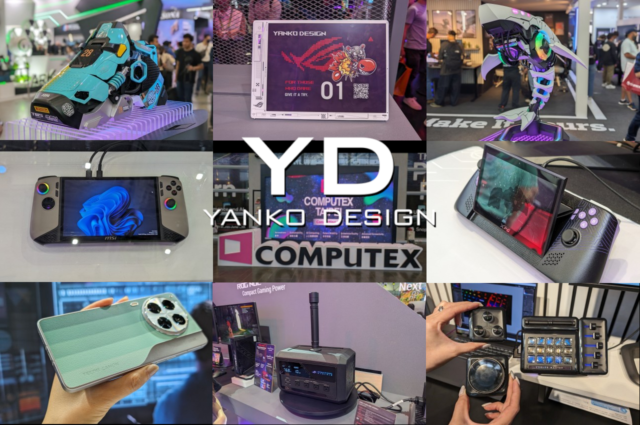
One of the world’s biggest computer-centric tech expos has just ended and, unsurprisingly, a lot of the rhetoric revolved around AI. But if you walk around the showroom floor, another theme quickly becomes evident in the midst of new products as well as some not-so-new wares. Consumer tastes have evolved once again, even among those who would embrace the label of being a gamer. Design is no longer just a feature for the few but an important part of a product’s DNA. We’ve seen quite a wide range of designs across an equally wide range of products, from the eccentric to the elegant. Here are some of the most notable designs to grace our paths at Computex 2024 in Taiwan, showcasing not just the trends but also the innovations in the computing industry.

Cool Computing: PC Case Designs

Desktop computers have evolved from uninspiring towers to smoldering workstations with over-the-top lighting to a smorgasbord of designs that cater to a variety of tastes and interests. Computex 2024 is a glowing testament to not only the changes in design trends but also to the extent that some manufacturers will go to in order to appeal to their loyal fans.

ADATA XPG Invader X

Designer: ADATA

Winner of an iF Design Award, the ADATA XPG Invader X values transparency in more ways than one. Its clear front and side panels let you marvel at the neatly arranged components that power this gaming beast, including the tubes and RGB-lit fans that keep the box operating at maximum efficiency. Equally interesting, however, is the chassis’s ESG-compliant design, utilizing post-consumer recycled plastics and upgrade-friendly components. It’s a stylish, eco-friendly computer that tries to offset the carbon emissions of your gaming lifestyle.

Cooler Master Mecha Cases

Designer: Cooler Master

Who said computers needed to come in the form of boxes? Cooler Master definitely didn’t. With designs that come in the form of a robotic shark and a giant mechanical sneaker, these PC cases shatter expectations and misconceptions about how our computers should look like. And as hardware becomes smaller even as they become more powerful, it’s only a matter of time before these become the standard rather than the outlier.

PNY Aftershock Bubble Tea PC

Designer: PNY x AftershockPC

Electronics and liquids don’t mix but it becomes a mind-blowing mystery when you see the two together. And now, we don’t mean liquid cooling. From the makers of ramen-themed desktop towers, this Bubble Tea PC will have you not only scratching your head but also craving a cup of boba. Instead of a sugary and milky drink, however, it’s a luscious-colored coolant that has faux tapioca balls swirling around as it keeps your cool-looking PC thermally cool. This collab between PC maker PNY and case designer Aftershock isn’t a joke either but a fully functional gaming PC that’s ready to put a new spin on your cravings.

Power In Your Hands: Handheld Gaming PCs

While there are plenty of AI-toting laptops scattered around Computex this year, they are hardly the only computers vying for attention. Gaming handheld PCs are pushing the envelope not only in performance in a small form factor but also in terms of design. There’s definitely plenty of room for experimentation, and there are a few that have caught our attention and fancy.

ADATA XPG Nia

Designer: ADATA

An unexpected contender from a brand better known for its memory and data storage hardware, the XPG Nia focuses on the aspects often left out in the wake of specs and benchmarks. A tilting screen, for example, can drastically improve the comfort of staring at a handheld computer for long periods of time, while upgradable RAM in addition to upgradable storage gives the device a longer life than even some of the smartphones we have today.

ASUS ROG Ally X

Designer: ASUS ROG

The ASUS ROG Ally X is a fine example of refinement over sensational changes. The base design remains the same, but the subtle and sometimes invisible improvements deliver an almost totally different experience that’s a step above in terms of usability. Best of all, however, ASUS isn’t removing the OG ROG Ally from the market just yet, leaving consumers with the choice between affordability and power.

MSI Claw 8 AI+

Designer: MSI

The MSI Claw A1M was an odd one when it came out, but the Claw 8 AI+ cements the manufacturer’s position in the young handheld gaming PC segment. With newer, AI-friendlier hardware comes significant improvements that are necessary for such a small gaming device. It’s still rather unique in its use of Intel silicon, and it will live or die by that commitment. Its design, however, is also enough to make it a noteworthy contender in this fast-growing arena.

ZOTAC ZONE

Designer: ZOTAC

ZOTAC is another new contender, one that has its sights set on the name that started it all: the Steam Deck. While it resembles this progenitor in some aspects, the ZOTAC ZONE tries to take the design where Valve seems reluctant to go. Better hardware and configurable controls will sing to the hearts of many gamers, but the steep price tag could be a major deterrent as well.

Material Matters: Aesthetic and Sustainable Designs

Design innovation doesn’t just have to come from wild new forms or combinations of ideas. Even the materials used for products can have a notable positive effect on the user experience, especially when they delight not just the eyes but also other senses like touch. Bonus points if they also benefit the environment, ensuring there will still be a planet for consumers to live on.

ASUS Ceraluminum

Designer: ASUS

Laptop users are becoming more and more design-conscious. Even those who don’t tend to personalize the backs of their laptops want it to be something that will leave a lasting positive impression on bystanders, not to mention on themselves. Combining the durability of metal with the luxury of ceramic, ASUS’s new Ceraluminum material subtly elevates the laptop from a technological product to an art object. First used on the new ASUS Zenbook S 16, this material exudes beauty that you not only see but also feel every time you touch the laptop or lift its lid.

TECNO CAMON 30 Series LOEWE Design Edition

Designer: TECNO

Paying homage to both coffee lovers and environment-conscious consumers, TECNO and LOEWE designed a back cover material that gives waste coffee grounds new life. Using an equally eco-friendly process, this more sustainable material gives the TECNO CAMON 30 Series LOEWE Design Edition a distinctive appearance and texture that easily sets itself apart from the crowd. Plus, the use of color blocking also marks the phone with a modern style to fit the discerning tastes of modern consumers.

Creative License: Tools for Designers

All these wonderful designs don’t just pop out from thin air. Someone has to make them, from initial ideation to prototyping to manufacturing. Designers and creators naturally need tools that can meet the growing complexities of their work, and Computex definitely has quite a few in store for them.

Acer SpatialLabs Eye 3D Camera

Designer: Acer

Spatial computing, mixed reality, and the metaverse require a special kind of content, one that breaks free from the confines of flat, 2D space. Even in video meetings and live selling streams, 3D objects are becoming more in demand, offering not just viewers but also presenters new ways to connect and communicate. Acer’s new SpatialLabs Eye 3D camera tries to democratize that process, effectively giving anyone the ability to capture, record, and stream any real-world 3D object as a digital copy.

ASUS ProArt PZ13 Detachable Laptop

Designer: ASUS

As computers become more powerful and geographical boundaries become shorter, content creation can no longer be confined to a desk in an office or room. The ASUS ProArt PZ13 gives designers, artists, engineers, and everyone in between that kind of flexibility with its portable and detachable design. What makes this 2-in-1 computer different is that it’s part of the new breed of Windows computers running on the latest Qualcomm Snapdragon X chip, promising improved performance and, of course, on-device AI capabilities.

Power to the User: Empowering Gamers and Creators

One thing that gamers, creators, and power users have in common is their need for power, both literally and figuratively. The ability to customize not only their experience but also the appearance of their equipment goes a long way in giving them the confidence to get their job done, and these designs definitely deliver that with a touch of pizzazz!

ASUS Project DALI E Ink Cover Laptop

Designer: ASUS

E Ink is no longer just for eBook readers. Now that it has color and is being used in signage, the eye-friendly and power-efficient display technology is finding its way to the most unexpected places, like the back of this laptop concept. Project DALI turns the laptop cover into a canvas for users of all walks of life to express themselves or simply have a different design every day if they want. All without draining the battery even when the laptop isn’t running.

ASUS ROG Mjolnir Portable UPS

Designer: ASUS ROG

Nothing scares a gamer or designer more than losing power in the middle of an intense playing or working session. Uninterruptible power supplies are a staple for these people, but if you’ll be getting one, why settle for a boring box when you can have one of the most powerful weapons in the universe? Shaped after the mythological hammer of Thor, the ROG Mjolnir is a power station with an attitude and, more importantly, the power and features to actually match.

Cooler Master MasterHUB Modular Stream Kit

Designer: Cooler Master

A typical computer keyboard has 87 to 101 keys or more, but sometimes even those aren’t enough for content creators, streamers, gamers, and advanced computer users. When you have to remember a bunch of keyboard shortcuts that differ from program to program, you’re putting a heavy burden on your mind that could be used for actual creative thinking instead. This modular MasterHUB stream kit and control center not only offers the power of programmable buttons but also lets you decide how you want those controls to be arranged and look.

The post Top Design Innovations from Computex 2024: Where Technology Meets Aesthetics first appeared on Yanko Design.

ASUS ROG Ally X gaming handheld PC brings small changes that have a big impact

Par : JC Torres
2 juin 2024 à 09:00

After numerous leaks and rumors, the cat is finally out of the bag. The next ASUS Republic of Gamers handheld PC isn’t the Ally 2 but the ROG Ally X as expected. While some might see it as simply splitting hairs, the naming does make a difference. It still has the beating heart of the first ROG Ally, but with a few extras that respond to the criticisms and requests of the gaming community who embraced this more portable form factor right off the bat. From some perspectives, those extras are really small and subtle, especially if looking at it from the outside. But with enough of those changes working together, the ROG Ally X is positioning itself to be a more powerful companion that will let you play more games longer.

Designer: ASUS ROG

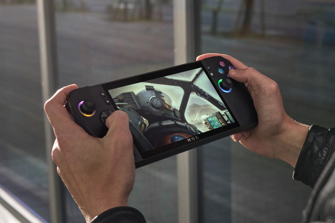
Just from a glance, you might not be able to tell that this is in any way different from the OG ROG Ally, at least except for its new all-black motif. It still boggles the mind why ASUS chose white for its first iteration, a color that’s almost alien to gamers’ palettes, though it did help the ROG Ally stand out from its rivals. If you look more closely, however, and hold the device in your hands, you might notice how things are somewhat different, hopefully for the better.

The handles, for example, are rounder now, which helps improve the grip that’s critical to a handheld device. The back triggers now come at an angle for better ergonomics, while the joystick and D-pad have been improved to be more durable and more precise. The biggest changes, however, are on the inside, where every little thing counts if it’s meant to improve the gaming experience.

It’s still the same AMD Ryzen Z1 Extreme as the original ROG Ally, but that mobile gaming processor is now paired with 24GB of DDR-7500 RAM, up from 16GB in the first iteration. The storage capacity has been doubled to up to 1TB, but the bigger surprise is that ASUS is making it easier to upgrade it. The battery has also been doubled to 80Wh, which means you’ll have more time playing before you need to plug the little monster in. To compensate for this newfound power, ASUS ROG promises an improved thermal cooling solution so you won’t burn your hand while you play.

There is at least one change that some might consider a downgrade, depending on how attached they’ve become to ASUS’ proprietary XG external graphics port. In its place, the ROG Ally X uses a more standard Thunderbolt-compatible USB-C port that could still work with external GPUs but also with a lot more devices as well. Given all these changes, it’s no surprise that the ASUS ROG Ally X will cost more than its predecessor at $799.99. Then again, this version is squarely aimed at power gamers, and those who can live with the bare minimum can still get the older model, at least for now.

The post ASUS ROG Ally X gaming handheld PC brings small changes that have a big impact first appeared on Yanko Design.

tinyPod turns the Apple Watch into a tiny iPod for nostalgia and then some

Par : JC Torres
27 mai 2024 à 10:07

The iPhone might be Apple’s one and only portable music player today, but it’s far from being its most iconic. That prestige belongs to the original iPad (not the Nano nor the Touch) whose design, like any other Apple product, was hailed for its beautiful minimalism and unique interface, a design that many have dared to copy even today. Of course, the iPod is now just a footnote in history, but there are still a few who want to relive those glorious days of the past in a way that makes a bit of sense in the present. That might be the idea behind a mysterious new accessory that seemingly revives the iPod but, rather than create a completely new device, it reuses a strapless Apple Watch instead.

Designer: tinyPod

The OG iPod was genius in its simplicity. It provided quick and easy access to dozens of functions with an innovative “click wheel” physical control that avoided overloading the user with buttons and menus. Of course, these days it’s just as easy to peck at the iPhone screen with your finger, but a smartphone brings along other sorts of complications and distractions that go beyond the simple joys of listening to music. At the same time, a dedicated media player no longer makes sense these days since it would be yet another device to buy and maintain in addition to a phone, a tablet, and a smartwatch.

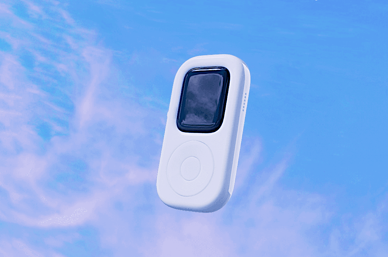
tinyPod seems to be trying to solve both problems by enclosing the Apple Watch in a case that is almost like a perfect replica of an iPod, except for the fact that it has a colored screen. What makes the case more interesting is that, at least based on a teaser video, you can actually control the Apple Watch using what looks like an authentic click wheel. It’s not yet known how it manages to do this, but this will be an important detail since the Apple Watch’s digital crown is inaccessible in this form, so you’ll need some other way to navigate through watchOS without always touching the screen.

The accessory is advertised to deliver an experience that’s like “your phone away from your phone,” which refers to the “watered-down” version of an iPhone that an Apple Watch offers. You can listen to and control your music without having to pull out your phone, but unlike the iPod, you can do so much more as well, like watching YouTube. In a way, it’s sort of like the middle ground between a “dumb” portable media player and a full-blown smartphone.

What little we know about tinyPod through a simple teaser still leaves many questions unanswered. You can probably keep this in your front pocket or even hang it around your neck, but it loses many of the health-related features that the Apple Watch is famous for in those situations. It’s also unknown how Apple will react to such an obvious copy of its iPod design, which could mean the device will be short-lived. Either way, we just have a month or so to wait for all the details to drop for this Apple Watch-powered iPod throwback.

The post tinyPod turns the Apple Watch into a tiny iPod for nostalgia and then some first appeared on Yanko Design.

Motorola Razr+ 2024 foldable phone: News, Rumors, Price, and Release Date

Par : JC Torres
15 mai 2024 à 15:20

Google I/O 2024 has come and gone, and despite rumors and expectations, a new foldable phone was nowhere in sight. Of course, the Google Pixel Fold is hardly the only game in town, nor is it the only one that’s expected to debut really soon. Perhaps beating both Google and Samsung to the punch, Motorola’s next-gen foldable could be hitting shelves as early as June, though it will still be competing with the likes of the Samsung Galaxy Z Flip rather than the OnePlus Open and other larger foldables. Unofficial information about the device is quite thin, but the ones we’ve already heard are quite substantial and paint an interesting picture, one that could make the Motorola Razr+ 2024 or Motorola Razr 50 Ultra the clamshell foldable to beat this year.

Designer: Motorola

Motorola Razr+ 2024: Design

According to sources, this year’s Motorola foldable would look exactly like last year’s Motorola foldable, save for some changes in screen size. That means the Motorola Razr+ 2024’s external screen will still cover the entire surface of the upper half of the phone’s back, leaving only room for the camera lenses themselves. It might sound like a letdown and a sign of lack of innovation over at Motorola, but sticking to a design that works is also a sign of maturity, especially since the design is only a year old.

Image courtesy of: MSPoweruser

Motorola’s design for its Cover Screen is admittedly divisive. On the one hand, it’s the only foldable of its kind that utilizes the whole area, while others make do with tiny rectangles, even tinier circles, or a square with an uneven cutout to make way for cameras. On the other hand, this also makes for a weird arrangement that actually cuts out part of the display anyway, making the image or text in that area inaccessible.

Motorola is also the only brand that allows normal apps to run on that external screen, which is both an advantage and a disadvantage. Regardless, it seems to be sticking to its guns for one more year, offering an experience that, while faithful to the design spirit of the original RAZR, isn’t afraid to go beyond to offer something new and useful.

Motorola Razr+ 2024: Specs and Software

While the Moto Razr+ 2024, or Moto Razr 50 Ultra, won’t look any different on the outside, it will be a very different beast on the inside. Of course, there’s the new Qualcomm Snapdragon 8s Gen 3 leading the changes, and there will supposedly be a larger external screen at 3.9 inches up from last year’s 3.6-inch Cover Screen. There will also be 12GB of RAM paired with 256GB of storage, while the battery has been expanded from 3,800mAh to 4,000mAh.

Given the expected launch windows, the 2024 Razr will be running Android 14 out of the box, and while it might sound like Motorola would upgrade it once Android 15 comes out, there’s not really any certainty. After all, the Motorola Razr+ 2023, which launched with Android 13, still received Android 14 half a year later. Despite being once owned by Google (now under Lenovo’s stewardship), Motorola’s track record for Android updates sadly isn’t that impressive.

Motorola Razr+ 2024: Cameras

Part of the big upgrades coming to the Motorola Razr+ 2024 according to those rumors is an upgrade to the camera system. It will now have not one but two 50MP cameras, one of which has a wide lens while the other is capable of 2x telephoto zoom. Given how Motorola advertises its foldable phone as a sort of mini camcorder, more capable cameras are definitely in order. The 32MP selfie camera, on the other, might remain the same as last year.

Motorola Razr+ 2024: Price and Release Date

There has been no word on the exact date when the Motorola Razr+ 2024 will be launched, which might go by the name of Motorola Razr 50 Ultra in other markets, but all signs point to yet another June release. In fact, the device was spotted making its way through a certification process, suggesting that its debut is close at hand. The leak also confirms what we’ve heard about the design, that it would be a dead knocker for last year’s model.

Image courtesy of: 91mobiles

That leak also “revealed” the color options for the Razr+ 2024, which include Blue, Orange, and Green instead of last year’s Black, Magenta, and Peach. But the more interesting detail about the phone is its starting price of $999 for the base model with 12GB of RAM and 256GB of storage. That’s the same price for half the capacity last year, so it will definitely make the Motorola Razr+ 2024 the cheapest flagship foldable in the market.

Motorola Razr+ 2024: Final Thoughts

Although they are younger than the larger foldables like the Galaxy Z Fold, clamshell-style foldables have become better accepted and sought after. They’re usually more affordable and look more stylish, bringing to mind the flip phones of old. They’re pocketability makes a bit more sense to most people who don’t need a phone that turns into a tablet, and their accessible price tag makes them feel more like regular flagships rather than overpriced novelties.

Of the many foldable flip phones in the market right now, the Motorola Razr+ 2024 seems to offer a more reasonable balance of features and price, especially one from a reputable brand. It looks like this year will show a significant upgrade, at least internally, while still keeping the design that has won fans. That said, Motorola’s Android updates don’t inspire confidence, and we’ve yet to see it make any improvements in that regard.

The post Motorola Razr+ 2024 foldable phone: News, Rumors, Price, and Release Date first appeared on Yanko Design.

Phone-sized mini PC lets you take your computer and your work anywhere

Par : JC Torres
15 mai 2024 à 13:20

Our smartphones have become so powerful that, in theory, they have hardware equivalent to entry-level laptops from a few years back. But despite all that silicon muscle, they can’t really replace our everyday PCs mostly because of the operating system that’s used on most of these computers: Windows. Small, portable, and inconspicuous computers have always been a dream for both users and business owners, whether it’s for working on the go or setting up kiosks, security systems, or space-efficient workstations. This small brick tries to deliver exactly that, giving you the flexibility you need for any kind of computing in almost any context in a size that’s no larger than high-capacity power banks.

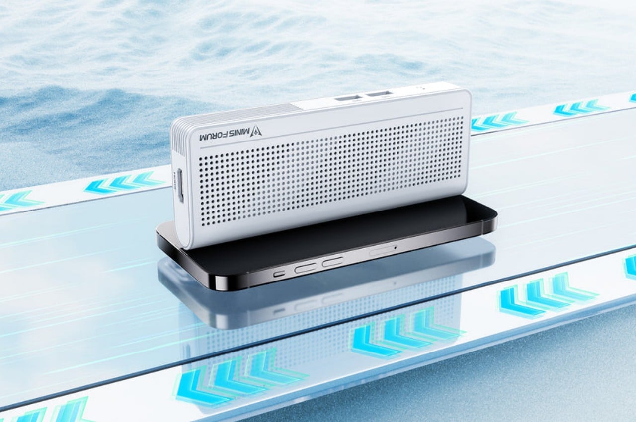
Designer: Minisforum

With the popularity of the Apple Mac Mini and, now, the Mac Studio, mini PCs have become more visible in the market. These desktop alternatives, however, are still meant to sit on a table or even on a shelf despite their small sizes. But while these small computers do offer plenty of power to support even some content creation or light gaming, that hardware also closes the door on many possible use cases that would have required them to be less tied down to a table.

The Minisforum S100 is a small, sleek box that you might easily mistake for a power bank. Ironically, it doesn’t actually have its own battery but is a mini PC that you can bring along with you or install in the narrowest of spaces. Despite its small size, it actually boasts a complete set of standard connectivity options, including Wi-Fi 6, Bluetooth 6.2, 2.5 Gbps Ethernet, USB-A ports, HDMI, and 65W USB-C.

The latter two are what make this design so portable and flexible. On a typical desktop, you can connect it to a USB-C monitor that supports USB-C PowerDelivery so that you don’t even have to plug the S100 into an outlet. You can connect another monitor via HDMI to have a dual-screen setup for increased productivity. And when you’re done for the day, you can pick up the palm-sized mini PC and go, maybe even work or chill in a cafe by connecting an external display and a power bank. The Ethernet port also supports Power-over-Ethernet or PoE, so you can use the S100 as the brains behind a camera security system and not have it plugged in at all.

Despite the flexibility that the Minisforum S100 offers, its performance is hampered a bit by the quad-core Intel N100 processor that runs the show, definitely not the best among the chip maker’s “mobile” processors. Its lower-power operation, however, does allow the mini PC to sip rather than chug electricity and keep thermals equally low. You definitely won’t be running heavy applications, but for $189, a Windows 11 computer you can easily slip into your bag or even your pocket might actually be worth the price.

The post Phone-sized mini PC lets you take your computer and your work anywhere first appeared on Yanko Design.

Top 5 Quirky Phone Designs That Actually Make Sense

Par : JC Torres
14 mai 2024 à 16:40

Smartphones today seem to look very similar, varying only in the shape of the camera bump and the color of their backs. Sometimes, the materials might be different, too, but the same large-sized “candy bar” form factor has become the standard for all the smartphones currently in the market. There was a time, however, when companies were a bit more daring, experimenting with phone designs and features in an attempt to stand out from the crowd. That did lead to some rather eccentric and sometimes even ridiculous designs that make us question the sanity of the minds behind them. But there are times when those odd designs of the past actually have important relevance today. Here are five such phone design oddities that we wished existed or still exist, and some alternatives in case you may have been smitten by their quirky appearance.

Designer: Google, Motorola

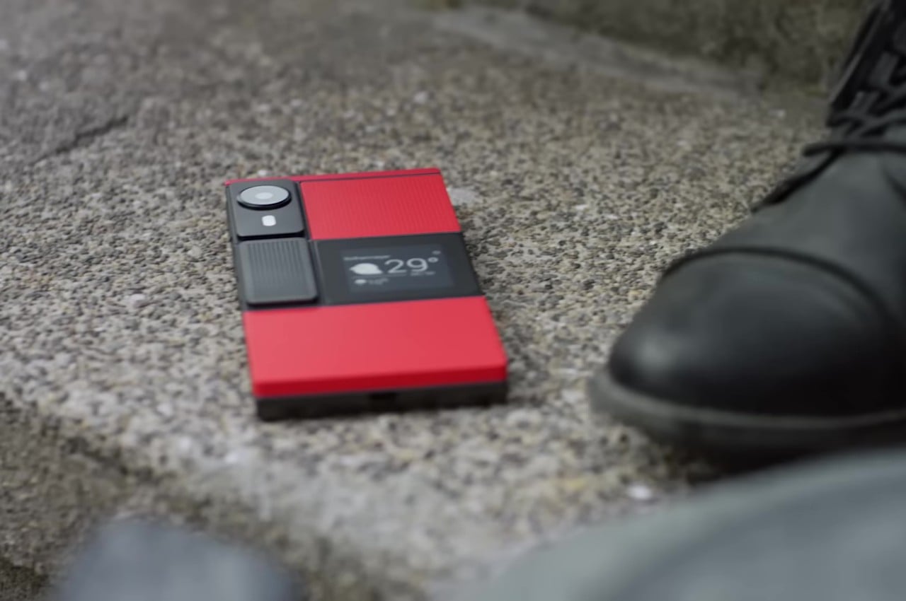
Undying Handset: Project Ara

Google’s Project Ara inspired the idea of a modular smartphone whose components you can easily swap to upgrade or repair parts. In theory, this would make the phone last forever, or at least as long as the base is intact and parts continue to be manufactured for it. In practice, it was a very ambitious endeavor that could neither meet expectations nor present a viable business model that wouldn’t bankrupt manufacturers. In the end, that sustainable and immortal smartphone remained just a dream, at least in that idealistic and perfect form.

Alternative: Fairphone 5

Designer: Fairphone

Fortunately, a part of that dream is actually possible and even sustainable in more ways than one. Although you can’t hot swap components on the fly, the Fairphone 5 at least offers a way for owners to change important parts of the phone, like batteries or even cameras, to keep them running almost forever. There are some limitations, of course, but if all you want is a phone that will last you for almost a decade instead of just two years, this self-repairable design pretty much has that in the bag.

Mobile Shutterbug: Nokia N90

One of the biggest uses for smartphones today next to social media is taking photos and videos. In the days even before the term “smartphone” was coined, even the most advanced handsets from the likes of Nokia could barely hold a candle to point-and-click cameras. That’s why the quirky Nokia N90 was prophetic and way ahead of its time, envisioning a day when smartphones would be used like camcorders, though with a bit more awkwardness due to their inflexible designs.

Alternative: Nokia x Nothing Concept

Designer: Viet Doan Duc

While clamshell phones are back in season thanks to foldable screens, the folding and twisting design of the original Nokia N90 remains a distant memory. This concept tries to answer the question of “what if?” and mixes two famed brands’ design languages to craft what could be the perfect camera phone. It makes you feel like a pro photographer or cinematographer, holding up your phone not with shame but with pride, capturing not only the moment but also people’s attention in a good way.

Pocket Book: YotaPhone Dual-Screen Phone

Designer: YotaDevices

E Ink devices are becoming more popular these days, especially after the addition of features like stylus support and color. These displays are easy on the eyes and the battery, allowing the screen to show the same thing for days without requiring a recharge. A few years back, a small company tried to bring those benefits to the smartphone in the oddest way, by putting an E Ink screen on its back. Although it can be used for reading e-books on the go, its main purpose was to have a battery-saving always-on display that is a bit more dynamic and useful than typical AOD implementations.

Alternative: Onyx BOOX Palma

Designer: BOOX

That said, a phone-sized Android device with an E Ink display might be an even more efficient design, which is what the Onyx BOOX Palma is offering. Technically, it’s an e-book reader that’s the size of a regular phone and actually runs Android, which is the standard for BOOX’s devices. This means it has access to the same apps you have on your regular phone, but without color. You also don’t have cellular connectivity via a SIM card, which might be a deal-breaker for a phone but a great deal for distraction-free reading and mobility.

Productive Minimalism: Minimal Phone

Designer: The Minimal Company

BlackBerry might have joined the likes of Nokia and LG as just parts of the annals of mobile history, but its squarish shape and QWERTY keyboard are forever etched in the consciousness of even the least tech-savvy person on the planet. Many have tried to recreate that magic, but this rather elegant yet odd phone puts a twist to it. It combines the iconic BlackBerry design with an E Ink screen and a minimalist aesthetic, promising distraction-free productivity by actually limiting what you can do on the device. It can even make it easier to actually reply to or post on social media, though the drab grayscale screen is probably going to make that a little less enjoyable anyway.

Alternative: Clicks QWERTY Case

Designer: Clicks

The idea of a BlackBerry-like experience might tickle the fancy of smartphone users, but none of them will be willing to ditch their powerful, colorful, and highly functional smartphones. Clicks is a case that tries to bring the best of both worlds, and it’s practically just a case that slides onto an iPhone to provide that tactile typing experience. You won’t have to give up your favorite apps, especially the ones you need to actually be productive, but the burden of being disciplined and ignoring distractions is now on you instead.

Shapeshifting Multitasker: Astro Slide 5G

Designer: Planet Computers

A phone that opens like a mini typewriter has actually been around since the days of the Nokia Communicator and its kin, but that design proved to be more complicated than they’re worth. After playing with that same design, PlanetComputing shifted to a slider that still provides that typing experience while retaining the exact same functions as a phone. Unfortunately, such a mechanism proved to be just as clunky and unreliable, and the software platform didn’t exactly lend itself well to a landscape screen.

Alternative: Any Foldable Phone

Designer: OPPO

These days, you don’t have to rely on a physical qwerty keyboard to have that same mini laptop experience. With foldable phones now more common, you can tap away on a more flexible on-screen keyboard when the device is only half-folded. At the same time, however, you have both phone and tablet functionality in your hands. Admittedly, the design is far from perfect, and we’re still waiting for more affordable foldables coming in the very near future.

The post Top 5 Quirky Phone Designs That Actually Make Sense first appeared on Yanko Design.

Anbernic Game Boy Advance SP clone does more than just copy an old design

Par : JC Torres
9 mai 2024 à 14:20

Retro gaming consoles and computers are still going strong, with many designs still left to be revived, resized, and retrofitted for modern times. Most of these products try to recreate the experience of those original machines, at least with the games they used to run on very limited hardware. That said, you can only go so far trying to recreate the past. Sooner or later, you will hit a wall, as demonstrated by the limited number of titles supported by many of these retro consoles. This reinterpretation of a Game Boy classic design, however, isn’t exactly a simple copy of the clamshell handheld. Instead, it takes the same spirit of portable adventure that the Game Boy Advance SP embodied and wraps it in a body that’s well-suited for modern gaming styles.

Designer: Anbernic

It’s honestly a bit of a gray legal area whenever third-party brands try to embrace a design so close to something from the annals of video gaming history. That hasn’t stopped the likes of Anbernic from taking obvious inspiration from those bygone designs but with enough modifications to skirt infringement accusations. Of course, Anbernic has its own original designs, but the ones that really grab your attention are those that pay homage to icons like the Nintendo Game Boy.

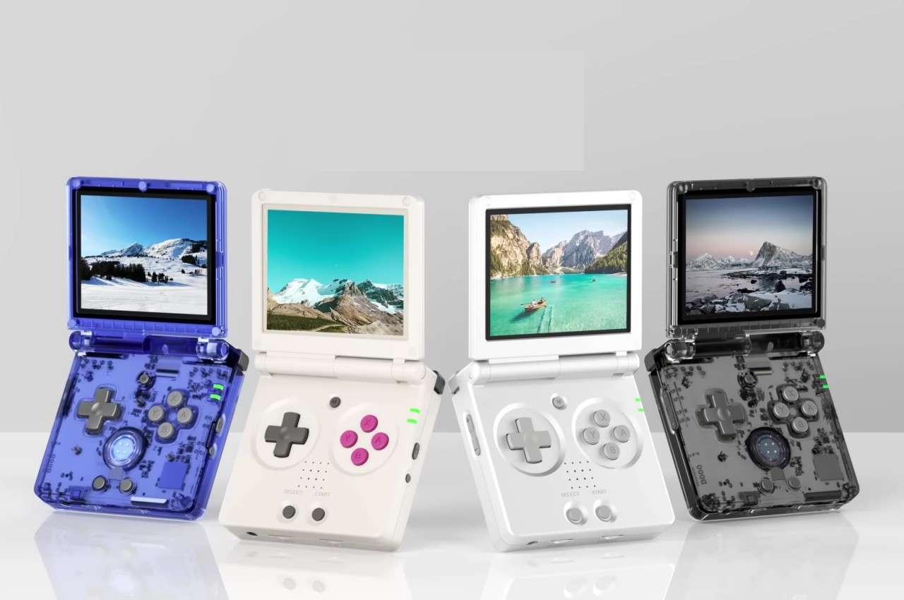
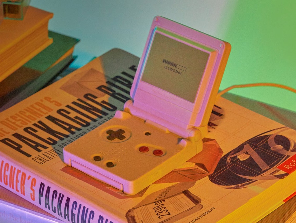
With the uninspiring name of Anbernic RG35XXSP, the prolific gaming handheld manufacturer is bringing the Game Boy Advance SP back to life, or at least the pocket-sized clamshell design that made it quite a hit. It’s just as blocky and thick as the original, but that’s also part of the device’s charm. For better or worse, however, that’s where the similarities end to the point that you can even say that the RG35XXSP was simply “inspired” by Nintendo’s handheld.

Deep inside, it uses the same guts as all the other iterations of the RG35XX, which means that it’s practically a mini computer that runs the Linux operating system. Specifically, it uses an emulation platform that can support a whole plethora of games from the likes of the Nintendo 64, PlayStation 1, PlayStation Portable, or even MS-DOS. And, yes, it can probably run Game Boy games as well, though you’re left to your own devices on how to make all these work.

What’s more important, however, is that the RG35XXSP doesn’t use the limited controls of the Game Boy Advance SP. Instead, it has enough buttons to support all those gaming platforms, though don’t expect any analog joystick here. The pocketable gaming handheld is also described to be equipped with modern technologies, like Wi-Fi and 5G for local multiplayer gaming, HDMI for TV output, and support for Bluetooth peripherals like controllers, keyboards, and mice. Shown off in four designs that give tribute to those consoles and handhelds of the past, launch details for the Anbernic RG35XXSP are unfortunately still unavailable at this moment.

The post Anbernic Game Boy Advance SP clone does more than just copy an old design first appeared on Yanko Design.

Sharp still makes smartphones and its latest design is beautiful but a little off

Par : JC Torres
9 mai 2024 à 13:20

The mobile phone market is a very aggressive one, so it’s no surprise that even big companies bow out eventually. Nokia raised the white flag after numerous failed attempts with both Windows Phone and Android. BlackBerry also closed shop after failing to find a profitable market for its QWERTY phones, while LG opted to focus on its other businesses other than mobile. Some brands, on the other hand, simply downsize their operations, like HTC mostly in China, and Sony only through online shops. Sharp, is part of this latter group, though its presence has been so small you’d hardly notice it still existed. In fact, it just announced its latest handset, and while the Sharp AQUOS R9 looks rather elegant in its simplicity, a single design element, unfortunately, mars its otherwise clean appearance.

Designer: Sharp

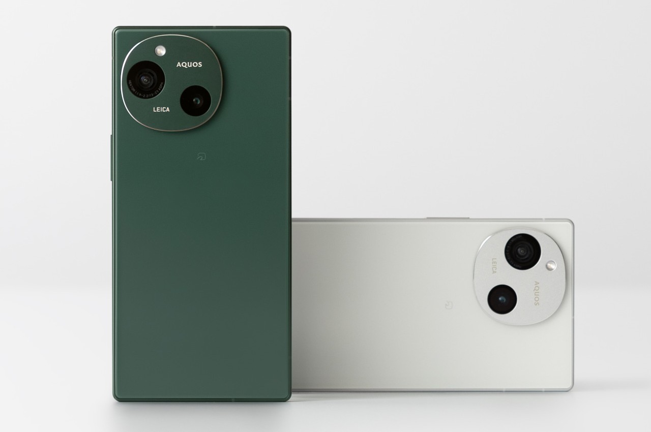
When it comes to minimalism, the two cultures that are considered to be the epitome of this style and lifestyle are Scandinavian and Japanese. In that regard, it shouldn’t be a surprise that Sharp’s new smartphone embodies minimalism almost to the extreme. It barely has any branding on the back of the phone aside from the small “AQUOS” and “LEICA” texts in the camera circle. With flat surfaces and edges, plain colors, and the lack of almost any embellishments, the Sharp AQUOS R9 is like a breath of fresh air in the smartphone market.

Unfortunately, it’s because of that very simplicity that your eyes are immediately drawn to the one conspicuous element on the phone’s back: its cameras. The design, while simple, looks a bit skewed, lopsided, and uncertain as if it can’t decide if it wants to be a square or a circle, the two predominant camera designs in the market today. Even more unbalanced, despite being an even number, are the camera lenses, positioned diagonally and off-center and with slightly different sizes. We’ll just have to take Leica’s unspoken word that this is the optimal placement for these cameras.

In terms of hardware, the Sharp AQUOS R9 looks quite competitive, at least on paper. It’s powered by a mid-range Qualcomm Snapdragon 7+ Gen 3 processor with 12GB of RAM, with a large 5,000mAh battery to keep it running. The 6.5-inch Full HD screen boasts TV maker Sharp’s Pro IGZO OLED technology and is capable of 240Hz refresh rates. Those two odd cameras on its back both have 50MP sensors, and the front-facing camera for selfies and video calls has a similar 50MP hardware. As mentioned, Sharp is proudly flaunting LEICA’s brand, indicating how its imaging system has been approved by one of the biggest names in the optics industry.

There’s no word yet on how much the Sharp AQUOS R9 will cost or if it will even be available outside of Japan. It’s definitely an odd design choice, one whose elegant minimalism is juxtaposed with an asymmetrical camera bump. It’s not ugly, for sure, but it’s an appearance that looks a little confusing and disconcerting, creating a bit of a visual discomfort whenever you try to appreciate its clean looks.

The post Sharp still makes smartphones and its latest design is beautiful but a little off first appeared on Yanko Design.

Odd pen holder has a unique way to showcase your favorite writing tool

Par : JC Torres
6 mai 2024 à 15:20

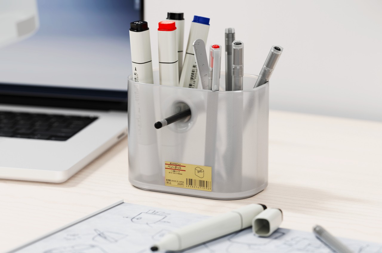
The key design elements for a pen holder or pen pot are pretty simple. It just needs to be tall enough to support writing instruments of different heights without them tipping over and would have enough room for at least a handful of pens, pencils, markers, and the like. Beyond that, the designer is free to interpret the shape of the container, and some even have dividers to segregate the different tools. But while pen holders are a convenient way to keep your pens together, they don’t really make it easy to pick out your favorite one from among the bundle. Some people would use a separate stand just for that single pen, which takes up unnecessary space on your desk. This concept design has a rather curious answer to the problem, one that pretty much leaves a conspicuous hole in the middle of the pill-shaped pot.

Designer: Liam de la Bedoyere

Usually, having a hole in the middle of a container is considered to be a defect, one that not only weakens the structure of the shape but also mars its visual integrity. After, something that cuts through an otherwise clean and whole form is sure to bother one’s aesthetic sense. In this case, however, that hole is not only intentional but also functional, setting the Void Pen Pot apart from your run-of-the-mill pen holders.

The hole that runs through the body of the pill-shaped container actually provides a convenient resting place for your most-used pen or pencil. Instead of wasting time and effort looking for that pen among half a dozen similar-looking rods, you can simply pull it out from its hole and start using it immediately. And when you’re done, you can just shove it back in to wait for the next time you need it.

Since that hole practically bisects the container, it also acts as a built-in divider that lets you group your pens into two. That said, this also means you’re not able to maximize the entire space of the container for your pens, specifically the area above and below the “tunnel” made by this hole.

The concept comes in two flavors, four if you consider the pen holder can be pill-shaped or a conventional can. One design employs a polished chrome body, while the other tries to adopt Japanese minimalist brand MUJI’s signature frosted polypropylene, both with cork bottoms. While the function of having an odd yet special place for your favorite pen is definitely useful, it still raises the question of whether such a quirky design will be appealing or off-putting instead, with a pen sticking out from an otherwise blemish-free surface.

The post Odd pen holder has a unique way to showcase your favorite writing tool first appeared on Yanko Design.

Innovative Bluetooth keyboard turns its surface into a giant touchpad

Par : JC Torres
6 mai 2024 à 13:20

Wireless keyboards are nothing new. Whether you’re on a desktop trying to escape the tangle of cables or on a laptop wanting to expand your limited set of keys, a wireless keyboard offers a bit more freedom and flexibility than other keyboards. That said, they still have the same limitations, namely, requiring a separate mouse or touchpad to move the computer cursor around. Not only does that take up more desk space, it also means another device you might forget or lose along the way. Some Bluetooth keyboards add a tiny touchpad off to the side, but that comes at the cost of reducing the number of keys available on the keyboard. This ingenious solution gives the best of both worlds by practically turning the entire keyboard into one giant touchpad you can swipe and pinch, just like any other touchpad.

Designer: Igor Solovyov (Industrial Designer, Clevetura)

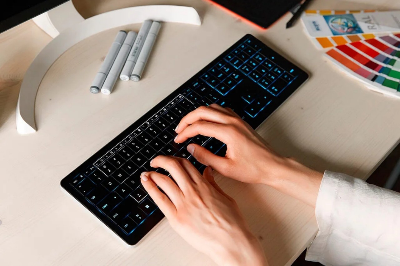
Laptops have the advantage of having both a keyboard and a pointing device in a single body, but their arrangement is hardly the best in terms of ergonomics and flexibility. Wireless keyboards with built-in trackpads, on the other hand, try to cram this component in an already small space but still manage to sacrifice keys like the numeric keypad. It’s almost as if there’s no ideal design that solves this problem, but the CLVX 1 boldly tries to think outside the box while offering a keyboard that, at least on paper, matches the functionality of many Bluetooth keyboards in the market today.

1

In a nutshell, the middle area of the CLVX 1 keyboard is touch-sensitive and functions like a giant touchpad. Thanks to a special slippery coating, you can effortlessly glide your finger across that area to move the mouse around without snagging on the edges of the keys. You can even pinch to zoom or perform any other touch gestures, just like a normal trackpad. As a bonus, the top row of function keys also functions as a slider that you can smoothly swipe without even having to look, making it just as easy to control the volume or any other function you program into the gesture. The keyboard promises that it won’t mix up typing and gestures, as it automatically disables touch detection once you press a key. And in case you’re wondering about mouse button presses, the keyboard has dedicated physical buttons below the spacebar for those actions.

In all other aspects, the CLVX 1 boasts a laundry list of features available on many wireless keyboards and then some. It has a 110-key layout, which is far more than your typical Bluetooth keyboard, and uses scissor switches. The RGB lighting also has a few tricks, like following your finger as you glide over the keys. You can pair up to three devices with it via Bluetooth, but you can also connect to a device using USB-C for a fourth connection.

The CLVX 1 is definitely an intriguing design, but its mettle still needs to be tested in real-world use. The smoothness of swiping over keys will definitely be the biggest point of concern, but the typing experience of having those keys so close together is also an important consideration. Nevertheless, it definitely deserves some praise for thinking outside the box to deliver a design that doesn’t compromise just to mix two functions in one.

The post Innovative Bluetooth keyboard turns its surface into a giant touchpad first appeared on Yanko Design.

Ultra-minimalist clipboard made from a sheet of metal has a built-in light

Par : JC Torres
3 mai 2024 à 13:20

You’ve probably had your share of seeing articles, YouTube videos, and Instagram posts about beautifully crafted notebooks and journals. Despite the prevalence of smartphones, computers, and digital devices, there is still a very strong culture around paper notebooks and the tools that support their use. That said, notebooks aren’t the only medium for this kind of creative activity, and loose-leaf paper has some benefits as well, at least as long as you have a way of keeping them together or writing on them on a flat surface. This extremely simple clipboard offers that kind of experience for artists, architects, and engineers, and it even adds a feature you’ve probably never seen on any clipboard before.

Designer: Studio SHFT

Clipboards have been around for decades, maybe even centuries, but very few people actually give them a second thought. You’d usually see them in offices, store rooms, or even on the field to hold a few sheets of paper together, mostly checklists or forms to be filled while standing up. Unfortunately, that underestimates the utility of this tool, and this all-metal clipboard demonstrates how you can take advantage of its features with a few ingenious design details.

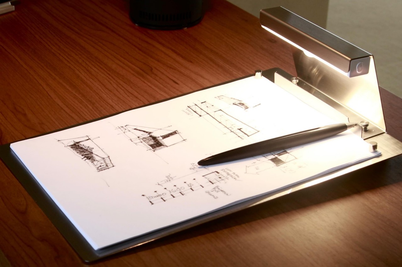
The most striking thing about the FOLD B is that it’s made from a single sheet of stainless steel. Although most clipboards are often made with plastic, cardboard, or even cork, a steel one isn’t at all unheard of yet extremely rare. Even rarer is the fact that it’s really just one flat sheet of metal, without even a clip to keep paper in place.

That function is instead delegated to two small cylindrical magnets that are strong enough to hold the paper down, though probably only a single sheet as well. The idea is to use the clipboard not as an organizer for loose-leaf paper but as a drawing board or canvas. You place a sheet of paper, “pin” it down with those two magnets, and start drawing, drafting, or writing to your heart’s content. The clipboard’s elevated rear drives home the fact that it’s really made for this kind of use case.

While it doesn’t have a paper clip, The one thing that does protrude from the top of the clipboard is a small rechargeable lamp. This assists the user to keep on working even in darker spaces, though it’s still better to have a properly lit environment anyway. This lamp is connected to the clipboard with screws, so it’s completely possible to remove it if you feel that it hinders rather than helps. Curiously, this built-in lighting also opens the design to more uses, like a guest book or a menu holder for restaurants.

The post Ultra-minimalist clipboard made from a sheet of metal has a built-in light first appeared on Yanko Design.

Futuristic car interior concept makes you feel like you’re driving a giant robot

Par : JC Torres
3 mai 2024 à 10:07

A great deal of interest has been poured into future car designs, most of which are envisioned to be self-driving vehicles. The reason for this is pretty simple, visionaries want to turn car cabins into moving hotel rooms, delivering luxurious and stylish comfort that lets passengers relax, enjoy, and ever socialize without having to pay attention to the traffic. We’re still far away from the future, however, and some car owners might prefer a different kind of ambiance and experience when driving. This car interior concept, for example, offers a different view of the future, one that makes you feel more like you’re inside the cockpit of a spaceship or, more accurately, a giant robot.

Designer: Advait Taware

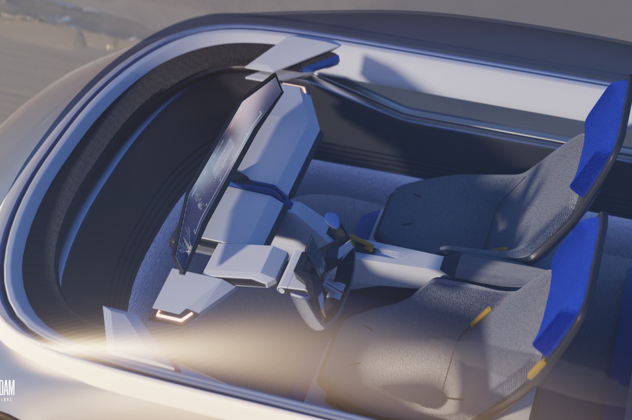
Of the many Japanese franchises that became a big hit worldwide, Gundam is perhaps the most iconic when it comes to giant piloted robots. Although the brand has a wide variety of robot designs, perhaps the most popular ones involve a particular white, blue, and red theme with plenty of flat panels, sharp edges, and polygonal surfaces. Gundam has inspired generations of toy collectors, enthusiasts, and even designers, one of which turned that motif into something that can actually be realistic, even if you don’t have a mecha to pilot.

A giant robot cockpit is probably the last thing you’d imagine for the car of the future. After all, those robots were often used for militaristic purposes, though some might say that daily commute traffic makes them feel that way. That said, the Gundam Interiors concept does have a certain charm to it, providing a futuristic driving experience that is, ironically, more steeped in present reality than the self-driving concepts that automobile makers and tech companies are trying to paint. In other words, it still requires the driver to be in control, providing seats in front and a steering wheel.

Of course, the designs of these components are anything but typical for this concept. The U-shaped steering wheel, for example, looks more like the controls of a plane than a car. A tall display in the middle of the wheel provides immediate information and controls, which is important since the instrumentation dashboard is quite far in front, too far to reach for any interaction. The seats are also atypical of car seats, adopting an almost angular shape that looks aerodynamic, almost like a small aircraft itself.

The cabin of this futuristic car is filled with such hard, edgy design elements, but the use of lighter tones like white and light gray softens the visual to some extent. Ironically, the exterior of this futuristic car is the thematic opposite of its interior, sporting a smooth and curved chassis not unlike the typical self-driving car concepts you’d see lately. It’s an interesting juxtaposition that does give the design a bit of character but could also prove to be a bit incoherent in terms of overall themes.

The post Futuristic car interior concept makes you feel like you’re driving a giant robot first appeared on Yanko Design.

Google Pixel Fold 2: News, Rumors, Price, and Release Date

Par : JC Torres
24 avril 2024 à 15:20

Despite developing an operating system that’s used on a variety of devices and computers, Google has practically snubbed anything other than a smartphone. It’s notorious for having a love-hate relationship with tablets, for example, so it was a bit of a surprise that Google would launch its own foldable device. Perhaps even more surprising is how it might actually release a second-gen foldable phone. Given its pedigree, the next Google foldable is definitely going to pique people’s curiosity, whether it will be called the Pixel Fold 2 or the Pixel 9 Pro Fold. Judging from what we’ve been hearing so far, this foldable phone will be undergoing several significant changes, though not all of them might appeal to Pixel fans and onlookers alike.

Designer: Google (renders courtesy of Smartprix, @OnLeaks)

Google Pixel Fold 2: Design

For three generations since the Pixel 6 in 2021, Google seemed to have settled on a signature design that, unusual as it may have been, gave its phones a unique personality. It seems, however, that Google has gotten tired of that look and will be moving to a different design for the Pixel 9 series. For better or for worse, that change is apparently happening to the foldable version of the Pixel as well, but not in the same way as leaks and renders would have it.

The camera bump, which was a horizontal bar across the width of the Pixel Fold’s “back,” has now been reduced to a more conventional rectangle. But unlike the ones you’d see on other smartphones, Google opted for an odd horizontal layout, with black pill-shaped markings that hold the actual camera lenses. It’s definitely an unusual design, but unlike the current “visor” shape, many might find it visually unappealing.

Fortunately, there will be even more important design changes in store for the Pixel Fold 2 (or Pixel 9 Pro Fold), though they might be a bit more subtle. According to rumors and at least one leaked prototype, the next Google foldable will have an outer screen that is taller than its predecessor, yielding an unfolded shape that is more square than the first Pixel Fold as well. Whereas the Pixel Fold had a rectangular shape that resembled a small notebook, the Pixel Fold 2 could be more like a minuscule iPad mini.

This change in screen aspect ratios isn’t just cosmetic and will have important usability implications. It won’t be as tall and narrow as the Samsung Galaxy Z Fold 5, which is notorious for being almost unusable as a regular phone, but it could make it a bit more awkward to use the Pixel Fold 2 in folded form, at least with a single hand. Those who loved the current wider design of the Pixel Fold might be disappointed, but those who missed using a 16:9 phone will welcome this change.

Samsung Galaxy Z Fold 2

Samsung Galaxy Z Fold 2

Samsung Galaxy Z Fold 2

Google Pixel Fold 2: Specs and Software

With the change in screen aspect ratios come changes in screen sizes as well, and everyone will probably love what’s rumored so far. The Pixel Fold 2/Pixel 9 Pro Fold is expected to have bigger screens on both sides, though there is some agreement on the exact sizes. Some claim that the external Cover Screen will be 6.4 inches and the main foldable screen will be 7.9 inches, while another source uses 6.29 inches and 8.02 inches for those same screens, respectively. Either way, it will still be a significant size boost compared to the current Pixel Fold’s 5.8-inch exterior and 7.6-inch interior displays.

As far as the hardware is concerned, Google might debut a new Tensor G4 on the Pixel Fold 2, a very big leap from the Tensor G2 on the OG Pixel Fold. Details on this new processor are still extremely slim at this point, but you can expect significant performance improvements, especially on Google’s favorite AI features. Uncharacteristically, Google might also be extra generous and give the Pixel Fold 2 as much as 16GB of RAM, something that even the Galaxy Z Fold 6 isn’t expected to have.

There seems to be some disagreement on which version of Android the Pixel Fold 2 will ship with, but that mostly depends on when the foldable device will actually launch. It could go with Android 14, which is the current version in circulation, or it could delay it to coincide with the release of Android 15. Pushing the Pixel 9 Pro Fold’s launch to the end of the year might sound unreasonable, but there might be one very good reason for doing so. Android 15 betas have revealed that Google implemented improvements to the behavior of apps on foldable phones, something that its Pixel Fold badly needed.

Google Pixel Fold 2: Cameras

It’s a bit surprising that there hasn’t been any news on the kind of cameras that the Pixel Fold 2 will bear. The new camera design on the back may look like Google was making room for an additional camera, but the lack of news in that department suggests otherwise. In short, the new Pixel Fold may still be using the exact same three sensors as the current model, with some additional lenses for focusing or maybe a thermal sensor for taking temperatures. It wouldn’t be unheard of for Google, since it prefers to rely on software solutions to improve image quality.

Another big camera design change will be the internal selfie camera which used to sit on the Pixel Fold’s ugly thick bezels. According to leaks and renders, the Pixel Fold 2 will do away with those atrocities, which means there’s a need to move the camera to a different place. The consensus is that it will take the form of an under-display camera similar to the Galaxy Z Fold, but it’s also possible Google will opt for a simpler solution that has a traditional punch-hole cutout for the camera.

Google Pixel Fold 2: Price and Release Date

Although the Pixel Fold 2, or Pixel 9 Pro Fold, will be advertised as an upgrade, it doesn’t seem like a huge generational leap if not for the difference in design and the new Tensor G4 processor. As such, it’s probably only reasonable to expect that the price tag won’t go higher than the $1,800 that the first Pixel Fold launched with. At the same time, it’s also not expected to go lower than that either.

As for its launch date, that could depend on whether Google wants to delay it to sync with Android 15’s release. If it’s fine with having it run Android 14 out of the box, it could follow the same schedule last year that saw the Pixel Fold hit shelves in June. Otherwise, we might be looking at an October date after Android 15 goes gold. Either way, we’ll definitely find out more next month when Google reveals the real deal at I/O 2024.

Google Pixel Fold 2: Final Thoughts

The first Pixel Fold was definitely a surprise for Google fans. It managed to carry some of the personality of the Pixel design language to a foldable phone, along with Google’s blessed flavor of the Android user experience. At the same time, however, it really failed to stand up to other options in the market, and its very thick bezels were a big turn-off for more design-conscious consumers.

Fortunately, the Pixel Fold 2 will be improving on those pain points, but it raises the question of whether it’s actually enough or if they’re the right changes to make. The screens will be larger and have thinner bezels, but Google is also moving away from an aspect ratio that was praised by some reviewers as one of its winning traits. The camera design will definitely be divisive, especially if it doesn’t bring significant improvements to the camera system anyway. While the Pixel Fold 2, or Pixel 9 Pro Fold, will catch the attention of Pixel fans and market watchers, it might not end up being the big hit that Google wants it to be, creating a self-fulfilling prophecy of low sales that will lead to the early demise of Google’s foldable phone line.

The post Google Pixel Fold 2: News, Rumors, Price, and Release Date first appeared on Yanko Design.

Elago Game Boy style MagSafe iPhone charger looks fun but comes up short

Par : JC Torres
24 avril 2024 à 13:20

Nostalgia is a powerful emotion, as proven by the number of successful crowdfunded projects and launched products that try to capitalize on this ongoing retro trend, especially in the gaming industry. Vintage designs of the past are today’s quirky oddities, and there are many who are quick to jump on the bandwagon. While many of these retro designs try to also recreate the experience of holding a real gaming console or turntable with some modern features and conveniences, others are just content to copy the aesthetics of old-school products and leave it at that. This MagSafe iPhone charger might be in that latter category, and while it is charming in the way it brings back fun, playful memories, it could have probably gone further if it really wanted to.

Designer: Elago

To be fair, the Elago WS M5 Charging Stand does exactly what it says it does, which is to offer a fun MagSafe charger in the design of the Nintendo Game Boy Advance SP. In that regard, it does its job well, providing a stable and useful stand for charging the phone. The fixed 30-degree angle, for example, is claimed to be perfect for watching videos or using iOS Standby Mode at night. It even has helpful support on its back to prevent the charger from tipping backward from the weight of the phone.

Elago never claimed that the stand was a functional gaming device, despite all visual indicators. It’s simply meant to inspire a trip down memory lane and nothing more. The buttons do nothing and you can’t fold the charger close like the original handheld it was based on. For a $25 MagSafe charging stand, that’s a bit disappointing. It sort of raises expectations and then dashes them quickly, making those good old days really feel more like a distant memory.

It’s also a missed opportunity for innovation and distinction. Sure, it won’t make much sense to turn it into a makeshift game controller, but having the buttons trigger some action on the phone or do anything at all is significantly better than making you feel like an idiot for expecting that a button press would actually result in something. A clamshell design would have also made this charging stand a bit more portable while relying on a kickstand mechanism to provide that same stability and support.

What this Game Boy-like MagSafe charger really accomplishes is to demonstrate the biggest benefit of this magnetic wireless charging technology. Sure, charging without cables is convenient, but its speed still leaves a lot to be desired. Instead, it’s the freedom to design a wider variety of accessories, from chargers to stands to docks, that MagSafe really shines, and this Elago WS M5, underwhelming as it might be, is just the tip of the iceberg of what’s possible.

The post Elago Game Boy style MagSafe iPhone charger looks fun but comes up short first appeared on Yanko Design.

❌
❌