Vue normale

Il y a de nouveaux articles disponibles, cliquez pour rafraîchir la page.
À partir d’avant-hierTechs Design

This Mod Made a Steam Machine Faceplate Charge Your Steam Controller

Par : JC Torres
6 août 2026 à 17:20

The Steam Machine has swappable faceplates, which is a genuinely good idea that Valve doesn’t appear to have fully exploited. The concept is essentially that the front panel of the console is a blank cosmetic slate, open to third parties and hobbyists to design around. So far, most of what’s been proposed has leaned on that word: cosmetic. Different textures, different graphics, different visual personalities for what is otherwise a matte black gaming cube.

This faceplate mod takes a different approach by asking what the panel could actually do. The result is a replacement front cover that integrates a charging cradle for the Steam Controller directly into the face of the console, turning what would normally be dead real estate into a functional docking station. Set the controller down, it charges. Pick it up, it’s ready. No separate charging puck dangling off to the side.

Designer: NefariousnessWhole25

The charging mechanism uses the Steam Controller’s own wireless puck seated inside the faceplate cradle, with a USB cable routed discreetly around the inside edge of the panel and into one of the Steam Machine’s existing USB ports. It’s a routing solution rather than a rewiring one, which keeps the electrical side simple and reversible. The puck sits in the cradle, the controller sits on the puck, and the whole arrangement slots onto the front of the machine like any other faceplate.

What makes it more than a wall mount with ambition is the kickstand built into the rear of the panel. It folds out from the back of the faceplate, propping the cradle up at an angle, turning the entire assembly into a standalone desk dock that works independently from the Steam Machine. Take the faceplate off the console and prop it up on a table, and it functions as a charging stand on its own terms.

The inspiration came partly from Valve’s own demonstration of an e-ink faceplate, which showed that the panel slot was capable of doing more than holding a decorative cover in place. That demonstration didn’t ship as a product, but it established the idea that the faceplate system had functional potential beyond aesthetics. This mod picks up that thread and takes it somewhere more immediately useful for anyone who has both pieces of Valve’s current hardware sitting on the same desk.

Design files haven’t been released yet, and there are no confirmed plans to sell finished units. The prototype is out, it works, and it raises a question worth asking about Valve’s approach to the faceplate ecosystem: if a single modder can turn the front panel into a functioning charging dock over a weekend, what would a dedicated accessory program actually look like at scale?

The post This Mod Made a Steam Machine Faceplate Charge Your Steam Controller first appeared on Yanko Design.

The Luxury Hotel Concept That Works Like a Food Truck for Wilderness

Par : JC Torres
6 août 2026 à 16:20

Luxury hotels have always had a location problem. The kinds of places that would make the most extraordinary backdrops, remote desert plains, rolling highland meadows, dramatic canyon edges, are almost never the places where a hotel can legally or practically be built. Extending infrastructure to those sites, from power grids to road access to permanent foundations, tends to either cost too much or damage the very landscape that made the location worth visiting.

The Mobiltels concept approaches hospitality from a completely different direction. Rather than building a permanent structure and hoping the location is compelling enough, each Mobiltel unit is designed to fold into a compact, truck-towable trailer, be driven to wherever the landscape is most remarkable, and then unfold into a functioning luxury accommodation. When the stay is over, it packs up and leaves without leaving much evidence behind.

Designer: Michael Jantzen

Three distinct unit types make up the proposed resort ecosystem. The first is the guest accommodation module, which deploys into two full hotel-style rooms, each with a private bath and its own private deck. The roof extends into a communal deck shaded by solar panels that generate the electricity to power the unit, while a second panel mounted on the exterior heats the water. The entire structure, decks and all, folds back into a trailer tight enough to tow down a highway.

The second unit is a solar-powered café and coffee shop that unfolds to reveal four outdoor dining decks with full kitchen and restroom facilities. The third is a large shade structure intended for gatherings, private events, and communal lounging, built as a striking open lattice that collapses into a flat-load trailer for transport. Additional unit types can theoretically follow the same logic, meaning a full resort amenity list could be assembled and disassembled as needed.

The off-grid energy system is what makes the location independence real rather than theoretical. Every unit generates and manages its own power and heated water from the sun, which means no connecting to local utilities and no requiring a serviced campsite. A Mobiltel cluster can go where a road exists and terrain is flat enough to level a trailer, which is a much lower bar than conventional construction.

The environmental argument is also embedded in the temporariness. A permanent hotel in a wilderness setting modifies that setting permanently. Roads are built, foundations are poured, and the land around the structure gradually changes to accommodate the infrastructure. A Mobiltel unit lands on a site for a season, its occupants absorb the specific quality of that place, and it leaves. The landscape recovers. The next location gets the same treatment.

There’s something quietly subversive about applying a mobile home chassis to a luxury hospitality concept. Mobile homes occupy a very specific cultural position, one that doesn’t usually include rooftop communal decks and solar-heated private baths. The Mobiltels concept borrows the transport logic of one and applies it to the aesthetic ambitions of the other, with the result that a high-end resort becomes as relocatable as a food truck. The result sits somewhere between architecture and expedition equipment, which is probably exactly the right place for it.

The post The Luxury Hotel Concept That Works Like a Food Truck for Wilderness first appeared on Yanko Design.

The new Timex Retroware Digital Watch Just Rekindled My Childhood Memory

Par : Gaurav Sood
6 août 2026 à 15:20

When I was growing up in the 1990s, there was a Timex I would kill for. If you remember the Timex Men’s Ironman Triathlon, you’d know what I mean. Not only was it the first to introduce the Indiglo backlight, but it was also the dominant sports watch, slayed with its rugged resin case. I owned one briefly before my brother, who had more muscle than me back then, coerced it out of my wrist to his advantage one day.

I had, in the last three decades, almost forgotten about it, but the moment the new Timex Retroware Digital showed up on my screen this morning, some memories were definitely rekindled. Thriving on the old digital sports watch charm of the ‘90s, the Retroware Digital is nowhere close to the Ironman for me, but it has its own retro vibe, which will find takers. Me… maybe, maybe not!

Designer: Timex

Taking nothing away from the new Timex sports watch, let me walk you through what’s changed in approach for the company and how this one, with retro looks, has a way forward to chime with Gen Z. It starts right at the bold and oversized display featuring huge, curved numerals that occupy the larger part of the dial. And this display we are talking about is not small by any means. It’s set in a 46 mm lightweight resin case. The size gives the watch a strong wrist presence, while the curved numerals remain arguably easy to read.

The Retroware Digital watch has a large case, but it’s not very thick, even for not-so-big wrists. It measures only 11 mm high and the 46 mm case ensures the distance from lug-to-lug is a large 50 mm. So, you definitely have a great Timex you’re dealing with. That said, it’s packed with features you’d appreciate whether you’re an ‘80s kid or a young athlete setting pace on a 400-meter track.

The watch is equipped with a chronograph and has a timer to make sure you’re never late for practice. The retro charm on the dial is rekindled by the Indiglo backlight. For the unaware, INDIGLO (how it’s stylized) was developed by Timex in 1992 for the, yes, Ironman Triathlon. It is an electroluminescent blue-green night light onboard that allows a wearer to tell the time in low light conditions with the push of a button.

The large display of the Timex Retroware perpetually ticks with the power of a quartz digital movement inside, which is driven by a CR2025 battery under the hood. The watch is 50-meter water-resistant, so you can definitely take it for a light swim in the pool or to shower later. Don’t go deep diving with it or try and set the stopwatch underwater. If you’re interested, Timex offers the Retroware Digital watch in two colors, blue and green-gray, with matching resin straps for $149.

The post The new Timex Retroware Digital Watch Just Rekindled My Childhood Memory first appeared on Yanko Design.

Phones Turn Reminders Into Distractions, This Magnetic Display Won’t

Par : JC Torres
6 août 2026 à 14:20

Smartphones have made information permanently accessible, but that accessibility comes at a price. The same device that shows you a reminder also delivers a notification for something unrelated, which leads to one more app opened, one more five-minute detour, and one more afternoon where the task you meant to remember sits unfinished somewhere in a mental stack. The problem isn’t access to information. It’s the medium through which it arrives.

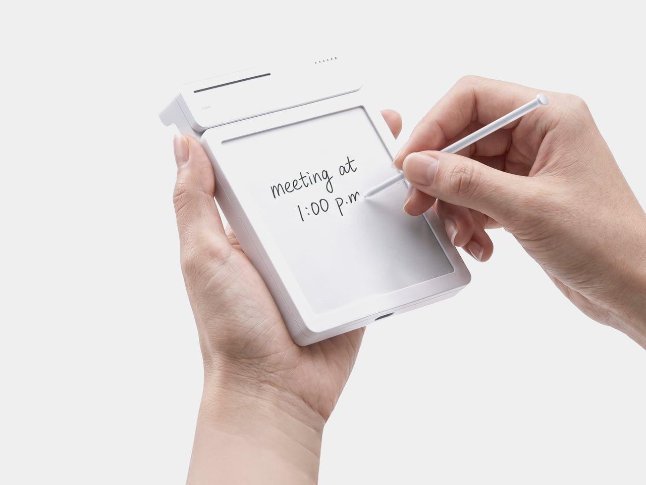
The ZecTrix Note 4 approaches that with a different premise: what if the display that shows your tasks doesn’t connect to your attention the same way a phone screen does? It’s a 4.2-inch e-paper smart display, about the size of a palm, that attaches magnetically to a metal surface and stays there showing whatever you most need to remember, using almost no power to do it.

Designer: ZecTrix

The interaction model is deliberately minimal. Press the physical button, speak your task or reminder, and the device converts that into text and adds it to the display. The built-in AI voice assistant handles the transcription and task management, and the e-paper screen holds whatever it’s showing without any power draw between updates. The display also handles weather, clocks, focus timers, handwritten notes, images, and custom templates.

Hardware underneath is solid for something this compact. An ESP32-S3 dual-core processor with 8 MB of PSRAM and 16 MB of flash handles the AI processing and connectivity, backed by a 2,000 mAh battery, 2.4 GHz Wi-Fi, Bluetooth 5.0, NFC, a speaker, a microphone, and a USB Type-C port for charging. GPIO expansion is also available, which opens the platform to custom hardware additions.

The 97mm x 97mm x 8.75mm square chassis comes in three enclosure variants: an injection-molded Minimal Premium Edition designed for clean desk or kitchen wall placement, a standard Everyday Edition for DIY-minded users, and a Color Edition with open-source 3D model files for those who want to print their own. The magnetic backplate sticks firmly to any suitable metal surface without adhesive or mounting hardware.

For users who want more than a black-and-white display, there’s the Note 4C, which replaces the monochrome panel with a four-color E Ink screen that adds red and yellow to the palette. It runs on the same hardware platform but ships without the consumer AI firmware, positioning it instead as an open development device for people with ESP32 experience. The color panel is slower to refresh, typically over ten seconds per full update, making it better suited to status labels, family photo cards, or API dashboards that update occasionally rather than continuously.

The two products are deliberately distinct rather than tiered versions of the same thing. The Note 4 is a finished product with a lifetime AI voice service included; the Note 4C is an open starting point for a custom build. Both share the same physical form, so the choice comes down to how much of the software someone wants to supply themselves.

The post Phones Turn Reminders Into Distractions, This Magnetic Display Won’t first appeared on Yanko Design.
This Umbrella Is Actually a 500-Year-Old Korean Hat in Disguise

Par : Ida Torres
6 août 2026 à 13:20

Anyone who has seen K-Pop Demon Hunters or an episode of a Korean historical drama is familiar with what a gat is. Even if you don’t know what it’s actually called, it’s pretty recognizable: the black hat with its cylindrical crown and wide, dramatic brim that sometimes hides the eyes or even the entire face. It was traditionally worn by men of high social standing during the Joseon era, serving as a marker of Confucian values, refinement, and status. It’s rarely worn now unless someone is shooting a drama or attending some sort of costume party, though the gat did have a major pop culture moment thanks to Netflix’s Kingdom, where it became instantly iconic worldwide.

The National Museum of Korea called for designers to reimagine the gat for a modern setting. Design studio TOSO created the winning entry, the Gat Umbrella, which is exactly what it sounds like. This is part of the MU (the official merchandise brand of the National Museum Foundation of Korea) competition that invites designers to reinterpret historical objects into something that can actually be used in modern times. It’s a brilliant initiative that bridges Korea’s rich cultural heritage with contemporary everyday life.

Designer: TOSO

The Gat Umbrella looks like a regular umbrella when folded, but when opened, it looks like you’re standing under a huge gat, with the added bonus of an actual canopy to keep you dry. It’s around 33 inches long and has a width of 1,050 millimeters when opened. The canopy is made from PVC with a fiberglass-reinforced frame, its tip from polypropylene, and the handle from EVA material. The deep black canopy is a direct callback to the traditional color of the gat, and the proportions of the brim have been carefully scaled to capture that wide, commanding silhouette. When held up against a grey sky, you can almost picture the Joseon-era scholar it was inspired by.

Aside from being a status symbol, the original gat was also used to protect its wearer from the sun, rain, and wind, which makes this reimagining feel even more intentional. Anyone who has watched enough K-dramas knows those dramatic scenes where characters brave storms with a gat firmly in place, rain streaming off its wide brim. So this transformation of the headwear is still a clever nod to its origins. It’s just more modern looking and has the added protection of a proper canopy, since the elements now tend to be a lot more mercurial.

What makes the Gat Umbrella especially appealing is how it straddles the line between functional product and cultural artifact. It’s not just a novelty item you display on a shelf. It’s something you actually take out on a rainy Tuesday and suddenly feel like the most stylish person on the street. There’s something deeply satisfying about a design that takes centuries of history and makes it wearable (or in this case, holdable) in the most practical way possible. And given the global reach of Korean culture right now, something tells us this won’t stay a niche item for long.

It also arrives at a moment when the global appetite for Korean culture is at an all-time high. From K-dramas to K-pop to Korean food, the world is paying attention, and the Gat Umbrella is exactly the kind of conversation starter that lets people engage with that culture in a tangible, everyday way. It’s not just merchandise; it’s a story you carry with you. The kind of thing that makes strangers stop you in the street and ask where you got it.

Whether you’re a K-culture enthusiast, a design collector, or simply someone who appreciates carrying a piece of history through a rainstorm, this is the kind of purchase that feels both indulgent and meaningful. It’s proof that heritage doesn’t have to stay locked behind glass. Sometimes, the best way to honor the past is to take it out into the rain.

The post This Umbrella Is Actually a 500-Year-Old Korean Hat in Disguise first appeared on Yanko Design.

5 Home Objects That Look Like They Belong in a Design Museum but Cost Less Than a Dinner Out

6 août 2026 à 11:40

The design museum makes one quiet argument. Certain objects deserve to be looked at, and how a thing is made can matter as much as what it does. Most people accept this on a Saturday afternoon in front of a Noguchi lamp or an Eames chair, then go home to a shelf full of things nobody chose with the same intention. That gap is worth closing, and it does not require a renovation budget.

These six objects cost somewhere between a round of drinks and a dinner for two. None are functional in the way a charging cable is functional. They are functional in the way a good room is, changing how a space reads and getting noticed before anyone can articulate why. That quality has very little to do with price and everything to do with knowing where to look for it.

1. Carte Blanche Ceramics

Dutch designer Annebet Philips began this collection in cardboard rather than clay, cutting shapes with deliberately uneven edges and treating the paper prototype as the design language itself rather than a step to be discarded. Belgian brand Serax carries the result through to porcelain: a coffee and tea service that has since grown to include plates, a breakfast bowl, an egg cup, and a salt and pepper set. Every piece started as a childlike cutout on a blank page. Nothing about that origin was smoothed away in production.

What makes each piece genuinely strange is that it reads as a drawing of itself. Hand-painted black lines trace every fold and seam, giving cups and saucers the flattened quality of ink on paper rather than fired ceramic. Photographed straight on, a cup collapses into what looks like a quick sketch, the handle reading as a doodled loop rather than a ceramic ear. Everything is microwave and dishwasher safe, which keeps the concept in daily use rather than retreating to a shelf nobody touches.

What we like

  • The trompe-l’oeil effect holds in person, not only in photographs
  • Dishwasher safe at a design level that rarely permits it

What we dislike

  • Sold through Serax stockists rather than one direct channel, which makes sourcing specific pieces more work than it should be
  • Hand-painted lines vary slightly between pieces, which is part of the concept but can feel inconsistent in a matched set

2. ECHO Ceramic Speaker

Most speakers announce themselves. They sit on surfaces with blinking lights and trailing cables, with the general suggestion of being placed there temporarily. Kenji Abe’s ECHO arrives from the opposite direction. It is a glazed ceramic chamber built on the acoustic logic of a seashell and a cupped hand that looks exactly like a small vase. Slide a phone underneath, and the cavity carries audio outward in soft, diffused waves. No power. No pairing. Nothing to charge or set up.

The decision to use ceramic was not incidental. Ceramic belongs to the visual grammar of a home, the language of objects that have simply always been there, and ECHO uses that familiarity to disappear into a room entirely. A guest would not identify it as a speaker. The glazed surface catches light the way pottery does, and when the phone is gone, it stays on the shelf with the composure of something that was never trying to perform in the first place.

What we like

  • Looks like a ceramic piece because it is one, not a speaker wearing a vase disguise
  • No charging, no pairing, no batteries to deplete or replace

What we dislike

  • The amplification is warm and subtle rather than loud, better suited to a quiet kitchen than a busy room
  • Designed for smartphones placed directly underneath, which limits where in a room it can be used

3. Petal Vase

Every day, thousands of tons of cut flowers are incinerated at flower markets because they reached the end of their shelf life before a buyer arrived. Rebloom Studio, a Korean design practice, collects those discarded blooms, processes them into pulp with Korean paper pulp and a natural binder, and molds the result around an interior glass cylinder. The finished piece is a vase made entirely from flowers that never got the chance to be seen by anyone.

No two Petal Vases look alike. The flowers used to make each one determine its final color, texture, and edge profile. The jagged rim, the petal compression visible in the walls, the slight asymmetry in the silhouette- all of it is preserved deliberately rather than corrected in finishing. When the vase reaches the end of its life, the biodegradable shell returns to the earth. It is one of those rare objects where the material story requires no explanation because you can already see exactly where it came from.

What we like

  • Every piece is genuinely one of a kind, not in the marketing sense but the literal one
  • The biodegradable origin is visible in the object itself rather than printed on the packaging

What we dislike

  • Availability depends on Rebloom Studio’s production schedule, and stock from a small Korean studio can be intermittent
  • The rough, irregular surface is the whole point, but buyers expecting a conventional smooth ceramic finish may need to adjust

4. Delicato Tray

The entryway surface tells a familiar story, and it is rarely flattering. Keys land wherever there is space, coins scatter to the edges, a watch ends up beside a receipt from last week. Joao Teixeira’s Delicato Tray for Oftwise is cast from Jesmonite AC730, a water-based, fire-rated stone composite, in the form of a rippled disc. The concentric waves are asymmetric by design: wider at the outer ring for keys and glasses, tighter toward the center for rings and coins.

At the center of those ripples sits a recessed pocket sized for a tealight candle, turning the daily ritual of dropping your things at the door into something closer to a ceremony. Because the tray is hand-cast, no two are identical. Small air bubbles, subtle texture variations, and minor color shifts are natural byproducts of the process. The result is two kilograms of warm sandy stone that makes a surface look deliberately arranged before anything has been placed on it at all.

What we like

  • The hierarchy is built into the form itself, so organization becomes almost unconscious
  • Hand-cast production means no two pieces are identical, in the way that actually matters

What we dislike

  • At €235 it sits at the very top of the dinner framing, and that math depends on which dinner you have in mind
  • Currently available in one color, which limits how it integrates into darker or cooler interiors

5. Luna

Robert Spillner spent years building components for Formula 1 teams before reversing the entire premise of his career. Instead of measuring speed, he built an object that stages time. Luna is a 400 x 400mm wall piece framed in matte black solid wood with a cast acrylic pane at its center. Inside, a single pointer moves through Zero Flow Technology, Spillner’s proprietary fluid made from distilled water, additives, micro-particles, and a small quantity of genuine lunar dust. Behind the pointer, turbulent patterns mark what has passed. Ahead of it, the liquid sits completely undisturbed.

The exact composition of the fluid is deliberately undisclosed, and that is the right call. The lunar dust is certified and billions of years old, documented with a certificate of authenticity that ships with each piece. Every Luna is signed, numbered, and limited to 99 per year, all made on demand in Germany. A small LCD touchscreen adjusts time and brightness without competing visually with the fluid. Spillner describes it as an art object with a time function, and the order of those words is correct.

What we like

  • The past-and-future visual logic is legible in the object itself, not only in the written description of it
  • Lunar dust certification and a limit of 99 per year make each piece traceable and unrepeatable

What we dislike

  • No public price is listed; the limited edition, handmade production profile suggests it sits above the other objects in this list
  • The 400mm square format demands a wall that can hold it as a singular focal point rather than one object among several

Editor’s Choice: Japanese Lantern Candle

The paper lantern is one of the oldest resolved problems in lighting design. How do you carry warmth from a candle flame into a room without losing it to the hardness of the fixture? Japanese designers worked through that question for centuries and arrived at a form that required almost no further development: a collapsible structure of thin ribs and translucent paper that diffuses candlelight into a soft, directionless glow.

What separates a well-made Japanese lantern from a decorative replica is the quality of light it produces and how it behaves in a room. Warm and sourceless, candlelight filtered through translucent paper fills a corner the way natural light from a small window does, without the hard edge of a focused lamp or the flatness of overhead lighting. On the floor beside a chair or a side table, it becomes the kind of object people notice and comment on before they have thought to ask what it is.

Click Here to Buy Now: $70.00

What we like

  • The quality of diffused candlelight it produces is genuinely different from any other fixture in a room
  • Stores flat, which matters in a small apartment where every permanent object has to earn its place

What we dislike

  • Works best as ambient lighting rather than a primary source for reading or close work
  • The candle paired with it needs to suit the scale and material to get the full effect

The Best Things in a Room Are the Ones Nobody Can Quite Explain

None of these objects ask for much. A shelf, a corner, a spare stretch of counter. They do not need a gallery to earn the attention they receive. What they share is the quality of being genuinely chosen, the sense that someone worked through a problem not just until it was functional but until it was right. That difference is immediately visible and, unlike most things in a home, it does not fade with time.

The museum argument is that certain objects deserve to be seen. These six make the same case from a kitchen counter, an entryway shelf, a bedroom wall. The price point is almost beside the point, though it helps. What matters is that buying thoughtfully and buying well tend to produce the same result: a home that feels assembled by someone who paid attention, rather than one that simply accumulated things over time.

The post 5 Home Objects That Look Like They Belong in a Design Museum but Cost Less Than a Dinner Out first appeared on Yanko Design.

The $33 Box That Locks Your Phone and Judges You for Opening It Early

Par : JC Torres
6 août 2026 à 10:07

Screen time management has spawned an entire industry of apps, built-in focus modes, notification filters, and weekly usage reports that most people glance at and promptly ignore. The fundamental problem with all of them is that they live on the same device you’re trying to avoid, which keeps willpower in charge of the whole arrangement. And willpower, predictably, tends to lose that particular argument somewhere around the third notification.

The Sonic Digitox The Routine sidesteps that problem entirely by making your phone physically unreachable for as long as you decide. It’s a timed lock case with no app to disable, no passcode to talk yourself into entering, and no settings menu to rationalize your way through. You put the phone in, set the lock, and that’s the end of your access until the timer says otherwise.

Designer: Sonic

Two lock modes handle different approaches to the problem. Routine Lock works on a schedule, letting you define repeating daily windows during which the case locks automatically and signals each transition with light and sound. If 11 PM to 7 AM is meant to be phone-free, the case enforces that without asking for your cooperation every night, which is precisely the point.

Timer Lock handles the more immediate situation where you need to focus right now, without a preset schedule. You set a countdown of up to 99 hours and 59 minutes, and the phone stays sealed until it runs out. For a study session, a focused work morning, or a dinner where nobody at the table needs to be somewhere else digitally, it removes the option before the habit has a chance to argue back.

Neither mode traps you completely. An emergency reset function exists for genuine urgency, but it isn’t quiet about it. Triggering it sounds a one-minute alarm and leaves a RESET mark displayed on the case for 24 hours afterward. The friction is deliberate, designed to make the difference between an actual emergency and a momentary craving feel tangible rather than theoretical.

Two additional modes round out the four-mode system for lighter use. Time Display shows the time without any lock, while a Timer mode runs a count-up or countdown without physically securing the phone. The case also includes a goal sticker and a smartphone contract form, a pairing that makes it a practical tool for parent-child agreements around device time, where putting terms in writing and then sealing the phone inside creates a layer of accountability that app-based controls don’t quite replicate.

The body is ABS plastic with a polycarbonate lid, running on three AAA batteries, and the whole thing measures approximately 190mm x 70mm x 170 mm. It comes in white, blue, and pink, and was recognized with a category award at the 2026 Japanese Stationery Awards, which is about as specific an endorsement as a phone lock case can hope for.

There’s a refreshing bluntness to what the Digitox offers. Most products in the digital wellness space treat phone overuse as a behavioral settings problem, one more toggle away from being solved. This one treats it as a custody problem, and the solution is handing custody over to a box that doesn’t negotiate. At roughly $33, it costs less than a single month of most productivity apps and requires no subscription to keep working.

The post The $33 Box That Locks Your Phone and Judges You for Opening It Early first appeared on Yanko Design.

Motorola’s Patent Isn’t a Phone You Wear, It’s a Watch You Unfold

Par : JC Torres
6 août 2026 à 08:45

The idea of merging a smartwatch and a smartphone into a single device has been floating around the industry for years, mostly because the obvious inconvenience is right there: two screens on two separate devices, one tiny and worn on the wrist, the other large and kept in a pocket, each doing essentially half the job the other can’t. The logical question is whether one of those devices could do both jobs depending on the situation.

Motorola’s latest patent, officially registered as US12,693,705 under the title “Pivoting wearable reconfigurable screen,” proposes exactly that. The device starts on the wrist as a conventional smartwatch, its flexible display curved around the band. When more screen real estate is needed, the strap pivots and unfolds, flattening into a short, wide display format that functions as a handheld device. A third configuration folds the bottom quarter into an “L” shape, turning the unit into a self-standing desk display.

Designer: Motorola (via Burnplate, David Kowalski/xeaks7)

The mechanism that makes it possible is the strap itself. Rather than housing a traditional watch face with a fixed display, almost the entire outer surface of the band carries a flexible screen. Worn, it reads like a standard wearable. Removed and unfolded, that same surface becomes the display area of a compact, landscape-oriented device. The pivot point is what separates this from simply being a wrist-wrap phone like earlier concepts.

That distinction matters because Nubia tried the wrist-phone idea back in 2018 with the Alpha, and the result was a fascinating but limited object. The Alpha wrapped a 4.01-inch OLED display around the upper wrist, delivering more screen real estate than any smartwatch before it, but the display stayed wrapped. It curved beautifully, could make calls, take photos, and run apps, but it never transformed into anything. The watch was the watch, full stop.

Nubia Alpha

Motorola’s patent reverses the logic. Rather than making a phone you can wear, it proposes a watch you can unfold. The distinction isn’t purely semantic. A device that starts as a watch and transforms into a handheld is solving a different problem than one that starts as a phone and straps to your wrist. The first carries a reasonable identity in both states; the second always feels like a compromise in one of them.

Nubia Alpha

The Nubia Alpha’s sticking point wasn’t the display, which was genuinely impressive and ahead of its time. It was the software, the battery, and the form factor’s limits in practice. Nubia never took the concept further after the original and a 2020 follow-up. The flexible display remained horizontal and wrist-bound, never taking the step toward becoming a genuinely detachable, self-sufficient screen.

Whether Motorola’s patented concept eventually ships as a real device is a separate question entirely. Patents are filed routinely without becoming products, and this one would require flexible display technology durable enough to handle daily wrist bending and regular unfolding, a battery that fits within strap dimensions, and software that transitions cleanly between modes. None of those are trivial problems.

Still, the direction of thinking has clearly shifted since 2018. Nubia asked what happens when a smartphone lives on your wrist. Motorola is asking what happens when a watch becomes a screen the moment you need one.

The post Motorola’s Patent Isn’t a Phone You Wear, It’s a Watch You Unfold first appeared on Yanko Design.

This $2,999 Device Turns Your Desktop Into A Custom Apparel Printing Factory (With Air Purification)

Par : Sarang Sheth
6 août 2026 à 01:45

Let’s talk about the math for starting a small apparel brand. You have the designs, the drive, and a growing list of people who want to buy your stuff. Then you look up the gear. Aside from the thousands in hardware, materials, and a good air-purification system (because breathing is generally a good thing), you’re also looking at a massive space investment. Suddenly, you’re nearly $10k in, and need an entire garage for something the XtraMaker M1 Series offers in a tabletop format for a fraction of the price. With a modular printhead design no less, allowing for customization all within the form factor of a large microwave oven.

This is where the XtraMaker M1 Series finally brings apparel creation into the desktop factory era. It takes that sprawling, expensive production line and collapses it into a single, self-contained unit for $2,999. This is the micro-factory for fabric we’ve been waiting for, handling everything from printing the transfer to curing the adhesive inside a fume-filtered system that fits on a desk. It’s the machine that makes the business plan finally make sense, shrinking the startup cost by two-thirds and proving that the next big apparel brand doesn’t need an industrial loan to get started; it just needs a desktop.

Designer: XtraMaker

Click Here to Buy Now: $2999 $6499 ($3500 off). Hurry, only 38/50 left! Raised over $331,000.

The M1’s core innovation is condensing the entire five-step DTF relay race into a single, autonomous sprint. It prints, powders, shakes, cures, and purifies its own air without any manual handoff between stages. This integrated workflow is critical for a desktop machine, as it eliminates the mess and fumes that make traditional DTF printing impossible in a home or small studio. The enclosed system uses a multi-layer filter to capture stray adhesive powder and neutralize the chemical smell from the curing process, keeping the workspace clean and breathable. This turns what was once a multi-machine, garage-only operation into a clean, one-click process you can run from a spare room.

Print quality is anchored to commercial standards, with G7 Master-certified color accuracy ensuring that on-screen RGB designs translate faithfully to the final CMYK print. At a resolution of 1440×1440 DPI, the M1 Series produces sharp, detailed transfers where fine lines and photo-realistic gradients come through cleanly. The resulting prints are just 0.5mm thick, allowing them to blend seamlessly with the fabric’s texture rather than sitting on top like a stiff, plastic patch. This professional-grade output works across a huge range of materials, from cotton, denim, and polyester to more delicate fabrics like silk, giving creators a massive canvas for their ideas.

XtraMaker’s engineers clearly obsessed over reliability, building in a suite of defensive systems to prevent common failures. The most notorious issue in DTF printing, white ink clogging, is addressed by the LoopMaster™ system, which uses automatic 15-minute circulation cycles and continuous cartridge stirring to keep the dense ink from settling and drying in the lines (the white ink circulation system operates with zero ink consumption too). Even more impressive is the built-in UPS battery. If power cuts out, the battery instantly triggers a flush, replacing the ink with a protective fluid to save the printhead from drying out. The UPS battery also powers the printer’s auto-maintenance system while the machine is on standby or powered off. This enables the machine to automatically fill the ink channels with moisturizing liquid and keep the white ink stirring continuously for up to 30 days. Combined with over 20 sensors that monitor the machine’s health and ink levels in real-time, all this creates a system that actively works to prevent the most expensive and frustrating problems before they happen.

The entire package is tailored for small business growth, from the software to the hardware options. The XtraMaker Studios app includes a cost estimation tool that calculates ink and film usage, giving you a precise per-print cost so you can price your products profitably. A 3D preview feature also lets you see how a design will look on a finished garment, saving time and materials. The M1 itself comes in two sizes: the standard M1 for A4-sized prints, perfect for logos and chest graphics, and the larger M1 Pro, which handles A3+ prints for full-back designs on hoodies and jackets. This gives a growing brand a clear upgrade path as their product line and ambitions expand.

XtraMaker’s M1 Series is aimed squarely at the new wave of creators: Etsy sellers, independent streetwear labels, and craft fair operators who need professional output without the industrial overhead. While other desktop DTF printers exist, none integrate the entire five-step workflow, the advanced anti-clog and power-loss protection, and the built-in air purification into a single unit at this price. It’s a machine that understands that for a small business, the real costs are complexity, downtime, and mess.

Click Here to Buy Now: $2999 $6499 ($3500 off). Hurry, only 38/50 left! Raised over $331,000.

The post This $2,999 Device Turns Your Desktop Into A Custom Apparel Printing Factory (With Air Purification) first appeared on Yanko Design.
The $195K Tiny Home That Finally Makes Sense for Families

Par : Ida Torres
5 août 2026 à 23:30

The tiny house movement has always been better at Instagram than at parenting. A couple, a dog, maybe a sourdough starter on the counter: that’s the fantasy it learned to sell. The moment a child enters the picture, the aesthetic dream quietly dissolves into a very real problem: where does anyone actually sleep, and who gets the bathroom first? Unplgd Tiny Homes, the Blue Mountains studio behind the original 26-foot Kookaburra, has spent the past year trying to answer that question seriously, and their answer is the Kookaburra 2.0.

The new model stretches to 8.5 metres long, 3 metres wide, and 4.5 metres at the gable (27.8 × 9.8 × 14.7 feet), adding just over half a metre to the original footprint but reorganising almost everything inside. Where the first Kookaburra was designed around two people working from home, the 2.0 reframes the interior around four distinct zones: cook, wash, store, and what the studio calls “reset after a big day.” That last phrase tells you exactly who this is for. Not minimalists chasing freedom, but parents chasing a moment of quiet.

Designer: Unplgd Tiny Homes

Structurally, the design’s smartest move is the dual-loft layout. A double-height void anchors the centre of the home, with the queen master loft at one end and a children’s single loft at the other, each reached by the same staircase-storage unit that doubles as the home’s main organisational spine. The queen loft offers standing headroom on three sides, which sounds like a minor detail until you’ve spent a morning in a traditional tiny house loft hunched over trying to find your socks. The kids’ loft sits separately, with its own clerestory window band that pulls in light while keeping privacy intact. On paper, the spatial hierarchy is genuinely considered.

The bathroom is getting a lot of attention, and for good reason. A full-size freestanding bathtub in a home under 28 feet is a confident choice, paired with an integrated laundry nook that treats domestic routine as a design problem worth solving. The L-shaped kitchen with breakfast bar follows the same logic. Outside, VJ panelling meets cream corrugated steel, a material palette that signals a specific aesthetic position in 2026 Australian residential design: not rough-hewn bush shack, not cold minimalist box, but something closer to considered coastal warmth.

AU$195,000 is the turnkey starting price, which puts it squarely in the range where comparisons to conventional housing become unavoidable. For roughly the same budget in regional New South Wales, you could find a small permanent house with a yard, without the towing and zoning complications that come with any road-legal tiny home. The 3-metre width is legal for towing across most Australian states without a wide-load permit, but regulations shift the moment you cross certain state borders, and the logistics follow. That’s not a dealbreaker, but it’s a real calculation that the breathless expo coverage tends to skip past.

It’s also worth naming the elephant in the room: no family has actually lived in this house yet. Every piece of coverage, including this one, is written from a display unit that toured the Hawkesbury Show circuit. The questions that matter most are the ones that can’t be answered from photos: whether noise transfers between lofts, whether the staircase is negotiable at 2am with a toddler, whether two adults and one child can share a morning bathroom without losing their minds. Unplgd deserves credit for thinking the brief through more carefully than most in this space, but the gap between a stunning expo build and a liveable family home is exactly the gap that gets papered over by beautiful photography.

One last thing worth flagging: search “Kookaburra tiny home” right now and you’ll pull up at least three different brands. Unplgd, Adapt Homes, and Kookaburra Tiny Homes AU are all trading under variations of the same bird name. They are completely unrelated companies. Do your research before you request a quote. The Kookaburra 2.0 is a genuinely promising design pushing against a real limitation in the tiny house category. Whether it delivers on the promise is a question only a family who actually lives in one can answer.

The post The $195K Tiny Home That Finally Makes Sense for Families first appeared on Yanko Design.
Someone Stuffed a Full Retro Console Inside an NES Controller for $17

Par : JC Torres
5 août 2026 à 14:20

Most original NES controllers haven’t seen active duty in decades. They survive in storage bins and attic boxes, physically intact and perfectly functional as controllers, but with nothing left to plug them into. The consoles they were paired with have long since been replaced or decommissioned. The hardware was always well built, but the form factor has been sitting idle for years.

This mod changes the job description of that controller shell entirely. The electronics inside a standard NES-style gamepad were stripped out and replaced with a Wemos ESP32-S2 Mini development board, a 1.54-inch 240×240 TFT display, a MicroSD card module, a 500 mAh lithium-polymer battery, a charging board, a speaker, and a slide power switch. From the outside, it still looks exactly like an NES controller.

Designer: Logic Gate Labs

Choosing the right processor was essentially a geometry problem. A larger ESP32-S3 would have offered dual-core performance and enough PSRAM to keep entire game ROMs in memory, but it was too big to fit inside the housing. Smaller ESP32 variants without PSRAM lacked the memory for smooth emulation. The ESP32-S2 Mini landed in the narrow window between board size and processing capability that the build required.

Getting everything to fit required real surgery on the shell. Internal plastic supports had to be trimmed back to make room for the display, and new openings were drilled for the screen, USB charging port, MicroSD slot, speaker, and power switch. A bare copper wire serves as a central ground distribution rail, cutting the number of individual ground wires needed and making it possible to actually close the controller afterward.

On the software side, the device runs the Retro-Go emulator framework, compiled using ESP-IDF and CMake since the ESP32-S2 isn’t a standard Retro-Go target. The result handles a range of classic 8-bit systems comfortably. As a bonus, Doom runs via PrBoom-Go from a Freedoom WAD file loaded on the MicroSD card, managing somewhere between five and 15 frames per second depending on the scene.

The total build cost runs about $17 using common suppliers, or closer to $8 when sourcing directly from overseas markets. That puts the project well under the price of a single modern game release. Flip the power switch, select a ROM from the MicroSD card, and the screen loads games that once required a dedicated console and television setup. No additional hardware is needed.

What makes this more than a novelty is how it reconsiders a form factor most people already have muscle memory for. The D-pad clicks the same way it always did, and the A and B buttons carry the same spring. What changed is where the signal goes after the press. Instead of traveling to a console that no longer exists, the controller now processes it directly inside its own shell.

The Retro-Go framework is open source, the parts are widely available, and the NES controller shell is one of the most common pieces of vintage hardware still circulating through the secondhand market. Nothing about this build required specialized equipment or proprietary components. The total part list costs less than a single new game on any current platform and fits inside hardware that most people already own.

The post Someone Stuffed a Full Retro Console Inside an NES Controller for $17 first appeared on Yanko Design.

Camera Batteries Go Missing, So This $70 One Tracks Itself

Par : JC Torres
5 août 2026 à 13:20

Camera batteries are one of those accessories that photographers never think about until something goes wrong. They’re small enough to vanish into the bottom of a bag or a jacket pocket, common enough to own several of and regularly mix up, and important enough that losing one mid-trip can force an early stop to a shoot. The solution most people reach for is buying more of them, which only increases the number of things to keep track of.

The FALCAM TagBatt addresses the problem from inside the battery itself. Compatible with Sony’s NP-FZ100 form factor, it integrates Apple’s Find My tracking technology directly into the cell, so the battery carries its own location data wherever it goes. If it ends up left behind at a studio, a venue, or the seat pocket of a flight, the Find My app will flag it and show its last known position.

Designer: FALCAM

Because the tracker lives inside the battery rather than clipped to a camera strap or screwed into a cage mount, it’s considerably harder to spot. An opportunistic thief who grabs a camera bag and removes any obvious Bluetooth puck from the outside can’t strip out what’s already built into the power source. It’s the kind of discreet integration that external trackers can’t quite replicate, no matter how small they get.

The tracking isn’t the only thing the TagBatt changes about how a camera battery behaves. A built-in USB-C port lets it charge directly from any standard USB-C source, including a power bank or a travel adapter, without needing the dedicated Sony battery charger that typically takes up its own space in a kit bag. Pop it out of the camera, plug it in overnight, and it’s ready in the morning without routing around a charger at all.

Capacity comes in at 2,600mAh against the OEM Sony NP-FZ100’s 2,280mAh, which translates to a modest but real advantage per charge. An advanced decoding chip handles the communication with the camera’s internal systems so the body treats it as it would any genuine battery, with accurate charge-level reporting and none of the “non-genuine battery” warning messages that typically accompany third-party cells.

Compatibility covers a wide sweep of Sony’s current lineup, including the Alpha 7 series through the Alpha 7 V, the Alpha 9 series, the Alpha 6700, the FX3 and FX30, and the ZV-E1, among others. A Canon LP-E6 version is also available now, with Nikon EN-EL15 and Fujifilm NP-W235 versions confirmed to be in development.

At $69.99, the TagBatt costs more than a standard third-party replacement but considerably less than the Sony original, and it comes with two capabilities that the original simply doesn’t offer. For photographers who travel frequently, work in locations where gear occasionally goes astray, or are just tired of carrying a charger they’d rather leave at home, the trade-off makes a fairly straightforward case.

The post Camera Batteries Go Missing, So This $70 One Tracks Itself first appeared on Yanko Design.
The 3 Best Japanese Kitchen Tools You Need to Buy August 2026

5 août 2026 à 11:40

Japanese kitchen tools tend to arrive with a very specific philosophy attached. They do less than you expect on paper and more than you realize until you’ve used them for a week. The three objects below cover different ends of that idea: a precision appliance from one of Japan’s most storied engineering brands, a pair of scissors built for the demands of serious kitchen prep, and a clay pot that has been doing its job correctly since the Kamakura period.

What connects them isn’t aesthetic or price point. It’s the sense that each was designed by someone who had a genuine opinion about what the object should do, then made it do exactly that. August is a good month to pay attention to the kitchen — the produce is at its best, the cooking is more instinctive, and the tools you reach for most tend to reveal themselves. These three are worth reaching for.

1. Mitsubishi Bread Oven

The name requires a moment. Mitsubishi, the Japanese conglomerate better known for cars and precision electronics, makes one of the most exacting home bread ovens available. The machine applies the same engineering discipline to baking that Mitsubishi Electric brings to everything else it builds: controlled heat, precise internal timing, and an attention to the baking chamber environment that consumer appliances from Western brands rarely match. The result is a loaf with a crust and crumb structure most countertop machines simply cannot produce, regardless of recipe.

What makes it worth covering in a design publication isn’t only the output. The form is unmistakably Japanese in its restraint — minimal, white, without the button complexity that clutters European bread makers at comparable prices. It occupies counter space the way well-considered appliances should: as an object with a clear visual point of view rather than a machine that apologizes for being there. Bread that comes out of it tastes like something was genuinely thought about. Because it was.

What We Like

  • Precision heat management produces a crust and crumb that typical home bread makers don’t come close to replicating
  • The minimalist appliance design treats the machine as a considered object rather than a utility box competing for counter attention

What We Dislike

  • Sourcing outside Japan requires import channels, which adds cost and complicates any warranty or service process
  • The price point places this firmly in investment appliance territory — this is a deliberate purchase, not a casual one

2. Precision Chef Kitchen Scissors

Kitchen scissors are one of those tools most cooks underestimate until they own a genuinely good pair. The Precision Chef Kitchen Scissors make the case for re-evaluation. Built with the material standards and blade geometry you’d expect from Japanese cutlery, they work through herbs, spring onions, dried chilies, and butcher twine without the handle torque that cheaper scissors force you to compensate for on every cut. Edge retention is where the quality gap between these and a supermarket pair becomes immediately obvious.

The design is deliberately restrained, which is exactly the right call for a kitchen tool that needs to sit in a drawer and get used without ceremony. Nothing superfluous in the grip, nothing decorative in the blade. Japanese kitchen scissors at this level function as precision instruments that happen to look like scissors. Once you’ve used a pair built this well for a full week of regular prep, the ones you owned before start to feel like a different category of object entirely.

Click Here to Buy Now: $95.00

What We Like

  • Edge retention and blade geometry handle repeated kitchen use without the performance drop that cheaper alternatives show within weeks
  • The restrained design means these function as tools first, rather than objects performing the idea of quality

What We Dislike

  • The refined aesthetic means they can disappear in a crowded kitchen drawer — worth designating a fixed home for them
  • Like most professional kitchen scissors, they require hand-washing to preserve edge quality, which adds a small but real step to cleanup

3. Iga-yaki Donabe Clay Pot

Iga clay comes from Mie Prefecture in Japan, where the local earth has been used for ceramics since at least the Kamakura period. The porous structure of Iga-yaki absorbs heat slowly and releases it with a consistency that metal pots structurally cannot replicate. Rice cooked in it sweetens. Broth deepens over a lower flame than you’d expect to produce it. The exterior stays rough and unfinished while the interior is glazed smooth — two surfaces on the same vessel, each doing exactly what it should.

Available from TOIRO Kitchen in several sizes, the donabe asks for a single seasoning step before first use — simmering rice water in the vessel — and then becomes one of the most reliable pots in the kitchen. It handles rice, hot pot, steaming, and slow braise with equal competence, which makes it the rare piece of cookware that earns its space by quietly replacing three other things. Store it with the lid off after washing, and it will be in your kitchen for decades.

What We Like

  • Iga clay’s heat retention produces results in rice and broth that no metal pot at any price point genuinely replicates
  • Real versatility across rice, hot pot, steaming, and slow cooking means one vessel covers what several usually would

What We Dislike

  • Requires a seasoning step before first use that the packaging doesn’t always communicate clearly upfront
  • The porous clay absorbs strong cooking odors over time and needs to be stored with the lid off after washing to stay fresh

Make the Kitchen Better, Not Faster

Three tools, three distinct registers of Japanese kitchen culture. Mitsubishi brings precision engineering to something as ordinary as a morning loaf. The scissors bring professional blade standards to daily prep work. The donabe brings centuries of ceramic craft to the kind of cooking that rewards patience over speed. None of them are trying to make the kitchen faster or more efficient. They’re trying to make it better, which is a different ambition and one worth paying for.

August is when most kitchens are running at full capacity — markets are abundant, evenings stretch long enough to cook properly. The tools you own in that window shape what’s actually possible in it. These three share a conviction that how something is made matters as much as what it does, and that conviction shows up every single time you reach for them. Start with whichever one your kitchen is currently missing most.

The post The 3 Best Japanese Kitchen Tools You Need to Buy August 2026 first appeared on Yanko Design.

The Hanoi House With 100 Windows and No Two the Same

Par : Ida Torres
5 août 2026 à 10:07

The name alone stops you. 100 Windows. Not “The Pavilion House” or “House No. 7” or something equally poetic and vague. Just a count. A blunt, almost confrontational declaration of exactly what you’re getting, and yet somehow, the moment you see it, the name feels like the most understated thing about it.

Designed by Hanoi-based architecture practice Inrestudio, this multi-generational home is wrapped in a terracotta-toned, double-layered exterior punctured by irregularly placed, mismatched openings. The windows aren’t uniform. They don’t line up in neat rows or follow a rational grid. They appear across the facade like a scatter of thoughts, some large, some small, some square, some elongated, placed with an intention that reveals itself slowly the longer you look. It’s controlled disorder, the kind that only happens when someone has thought very carefully about where chaos is allowed to go.

Designer: Inrestudio

The project sits within one of Vietnam’s most distinctive and genuinely challenging housing typologies: the tube house. These long, narrow urban homes are a product of Hanoi’s history, born from a time when property taxes were levied on street frontage, pushing families to build deep and vertical rather than wide. The tube house is, by nature, a compromise. You work with what the city gives you. What Inrestudio does here is refuse to let that constraint become a ceiling.

The double-layered envelope is the key move. By wrapping the home in two skins instead of one, the architects create what they call “in-between spaces,” zones that exist between the inner living areas and the outer facade. These aren’t wasted margins or dead air. They’re transitional, purposeful areas where the house breathes, where light filters and shifts through the day, where the rigid boundary between inside and outside softens into something more generous. It’s the kind of spatial thinking that doesn’t photograph easily but completely transforms the experience of actually being in a building.

This matters especially because 100 Windows was designed for multiple generations living under one roof, a reality that remains far more common in Vietnam than it does in most Western countries. Designing for multi-generational life is genuinely hard. You’re negotiating different rhythms, different needs for privacy and togetherness, different relationships to noise, light, and air. Architecture that understands this doesn’t just divide a floor plan into labeled rooms. It creates conditions where people can be near each other without being on top of each other, where the house itself does some of the social negotiating.

The terracotta tones feel right for this, too. The palette connects the building to its climate, to the warmth and humidity of Hanoi, to the earth tones of traditional Vietnamese buildings without becoming a costume or a nostalgia piece. It reads as contemporary without trying to distance itself from its own context, which is a balance a lot of architecture gets wrong in either direction.

What you take away from 100 Windows isn’t really about the windows, or at least not literally. It’s about the idea that a constraint, whether it’s a narrow plot, a shared family life, or a hundred openings that need to somehow feel cohesive, can become the source of design rather than the obstacle to it. The windows are a by-product of a layered system, not a stylistic decision made in isolation. That’s what earns it attention beyond the aesthetic.

Architecture like this tends to get filed under “interesting regional work” and not looked at as broadly as it deserves. But the conversation 100 Windows is having about density, family, and what a facade actually owes its inhabitants is one that any city grappling with urban housing should be paying attention to. It’s not proposing a universal solution. It’s doing something more useful: showing what happens when designers take the specific conditions of a place seriously enough to build something genuinely shaped by them. The result is a house that looks singular because it is.

The post The Hanoi House With 100 Windows and No Two the Same first appeared on Yanko Design.
A $2,699 Gaming PC That Doubles as a Display Case for Figurines

Par : JC Torres
5 août 2026 à 08:45

Cables are the dirty secret of PC building. No matter how carefully chosen the components are, or how expensive the case gets, the tangle of power, data, and fan connectors that crisscross the interior of most gaming desktops eventually undermines every effort at a clean aesthetic. The glass side panel that was supposed to show off the build ends up framing a web of wires that even the most diligent cable manager struggles to fully tame.

The Maingear Zero treats that problem as the actual design brief. Its patented MG-RC, or Rear Connection, system moves every motherboard connector to the back and underside of the board, clearing the visible interior of cables entirely. Paired with a single, seamless 4 mm tempered glass curve that wraps the front and side of the chassis without a single seam or pillar, the result is a desktop that looks like it has nothing to hide, because it genuinely doesn’t.

Designer: Maingear

Seven fans work to keep the hardware running at full performance without drawing much attention to themselves. A mix of standard and reverse-blade units pushes cool air in through the front and exhausts it out through a 360mm AIO liquid cooler at the top, all following a single front-to-back airflow path. The reverse-blade intakes are specifically designed so the fan blades themselves don’t interrupt the view through the glass, which is a level of detail that most cases simply don’t think to address.

All RGB lighting inside the Zero is diffused rather than sourced from visible diodes, meaning the light saturates the interior without any glowing point of origin to break the illusion. The whole package measures 236mm wide, 421mm tall, and 460mm deep, which is more compact than a traditional mid-tower while still accommodating a full-sized GPU and the 360mm cooler overhead. It doesn’t look like a PC that compromised on size to achieve the aesthetic.

The hardware ceiling is genuinely high. Configurations top out at an NVIDIA GeForce RTX 5090 paired with an AMD Ryzen 7 9850X3D or Intel Core Ultra 7 270K Plus, 32GB of DDR5 memory, and a 2TB NVMe SSD. The chassis uses standardized mATX components throughout, with no proprietary parts, so future upgrades don’t require a trip back to the manufacturer.

Beyond the hardware, the Launch Edition adds a pair of tool-free snap-in display stands inside the chassis, one for figurines and one for brick builds. The stands sit inside the case floor where passive airflow keeps whatever’s displayed inside dust-free. It’s the kind of feature that turns the interior from a hardware showcase into something closer to a display cabinet, which only makes sense given how much effort went into eliminating everything else that wasn’t worth looking at.

Every system is hand-built in New Jersey and ships with no bloatware pre-installed. Pricing starts at $2,699 for the base configuration, with the top-end Launch Edition Champion reaching $6,799. Built around the premise that nothing inside should be hidden, the Zero demonstrates how the best-looking gaming PC doesn’t have to sacrifice anything to get there.

The post A $2,699 Gaming PC That Doubles as a Display Case for Figurines first appeared on Yanko Design.

A Coin-Sized Disc Just Reinvented the Multi-Tool Nobody Could Fix

Par : JC Torres
5 août 2026 à 01:45

The multi-tool has been around long enough that most people have developed a frustrated relationship with it. You carry one because having a blade, a screwdriver, and a bottle opener in one place sounds practical, and then you grumble when you actually need something. Getting to the right tool means prying at a tightly packed frame with both hands, and that dynamic hasn’t changed much in decades.

GEO, designed by Invento Design, takes issue with that familiar frustration. Rather than folding tools out from a layered frame, it uses a patent-pending rotating disc mechanism that cycles through five tools, exposing each one through a single opening. It’s a deceptively simple reframing of an old idea, and one that makes you wonder why nobody had taken this approach before.

Designer: Francisco Molina (Founder of Invento Design)

Click Here to Buy Now: $45 $70 (36% off). Hurry, only a few left!

The way it works is fairly intuitive. Outer index levers let you rotate the internal mechanism until the tool you want lines up with the access window. A sliding lock then holds the selected tool in position before you start. The whole operation happens in one hand, without setting anything down first or needing a second hand to hold the frame steady.

The five tools cover a surprisingly practical range of everyday needs. You’d reach for the blade and scraper when a label refuses to peel cleanly, the box opener when a taped-up package isn’t cooperating, the bottle opener at the end of a long day, the flathead driver for a loose screw or a stubborn paint can lid, and the string cutter when scissors aren’t anywhere nearby.

Carrying something with a blade in your pocket raises the obvious question of what happens when it isn’t in use. GEO handles this with a dedicated safety mode, a neutral rotational position where no edges are exposed. The sliding lock serves a separate purpose, preventing the mechanism from turning mid-task. Together, they make it safe enough to pocket, clip to a belt, or drop into a bag.

The form factor makes carrying it a fairly easy decision. At 53.5mm in diameter and only 8.7mm deep, GEO lands somewhere between a large coin and a watch face. The integrated belt clip adds some depth but keeps the total thickness under 15mm. It fits in a jeans pocket, clips to a gear bag, or disappears into a drawer without demanding much space.

There’s something worth noting about how it actually feels to use, too. The rotation isn’t purely functional but also incredibly satisfying. Each position clicks into place with enough tactile feedback that you know exactly where you’ve landed, and the smooth lever action makes it oddly enjoyable to cycle through even when nothing needs doing. It tends to stay in your hand a bit longer than the task requires.

The construction does a good job of reinforcing the premise. GEO’s tool body is milled from 440C stainless steel hardened to 57–59 HRC, placing it in the same material territory as quality kitchen blades. Cover panels come CNC-machined from either 6061-T6 aluminum or Grade 5 titanium, with internal hardware in 304 stainless steel throughout, a quietly serious specification for something this compact.

GEO isn’t meant to replace the full-size tools sitting in workshop drawers or on a fully loaded belt. It’s better understood as something for the other moments: the stubborn tape, the loose screw, the cord that needs a clean cut. Its compact, circular form makes it easy enough to keep close that reaching for it becomes the natural first move rather than an afterthought.

Click Here to Buy Now: $45 $70 (36% off). Hurry, only a few left!

The post A Coin-Sized Disc Just Reinvented the Multi-Tool Nobody Could Fix first appeared on Yanko Design.

Nothing killed the Glyph Interface. This Teenage Engineering synth concept argues that was a mistake

Par : Sarang Sheth
5 août 2026 à 00:30

Nothing spent three phone generations convincing us that a few light strips on the back of a device counted as a personality. The Glyph Interface was the whole brand in one gesture, a Morse code of notifications you could read with the phone face-down on a bar table. Then Phone (3) arrived in July 2025 with the Glyph Matrix instead, a small dot matrix circle tucked in the corner, and the comment sections held a funeral. “NO GLYPH” became the shortest and angriest review of the year. Which makes it pretty funny that the most convincing argument for reviving that light language has come from a fan concept for a synthesizer.

Abdelrahman Shaapan’s Mini OP-3 wraps a semi-transparent rear panel around a compact synth, with LED effects and dynamic graphics that pulse along to whatever you’re playing. Flip it over and the front is pure Teenage Engineering, a clamshell with a touchscreen lid and a control deck of encoders, transport keys, numbered pattern buttons, and one red COPY key doing a lot of emotional labor. Shaapan calls the project an exercise in translating the design DNA of both brands into a single object. He also added a charm attachment point on the screen corner, because it is 2026 and everything needs a little guy hanging off it. The pitch is a smaller OP that keeps you off your laptop during production and live sets.

Designer: Abdelrahman Shaapan

Ten function keys run across the top of the deck, covering waveform and tape banks, sync, split, copy, paste, metronome, scissors, monitoring, and loop. Below them sit eight encoders arranged in a greyscale gradient from black to white, which is the single most OP-1 gesture available to any designer working in this language. A transport row follows with record, play, and numbered pattern keys, then a modifier row carrying shift, divide, ramp, and a random button. The hinge hides a perforated speaker band, and the front edge packs two USB-C ports beside four 3.5mm jacks. Every control is round, tactile, and spaced like it expects to be hit fast in a dark room.

Nothing built its identity on light as an interface, then retired it on the Phone (3) in favour of a dot matrix that most owners still describe as a downgrade. Shaapan’s rear panel puts that language back to work, running LED effects and dynamic graphics that respond to your audio in real time. On a phone, reactive lighting was always slightly decorative, a party trick for incoming calls and little else. On an instrument, it has an actual job, giving you a visual read on your track from across a stage or a crowded studio. Relocating the Glyph to the one product category where it earns its keep is a sharper piece of brand analysis than most fan concepts manage.

Shaapan rendered the whole thing in KeyShot. The soft-touch black body, the subtle sheen on the encoder caps, and that partially translucent rear panel with internals showing through all read as convincingly manufacturable rather than aspirational. The charm attachment point is the detail I keep coming back to, since TE has always sold straps and cases as identity objects and phone charms are having a genuine cultural moment. We covered a Teenage Engineering DJ console concept a couple of years back, and this one clears that bar comfortably. The presentation is good enough to be mistaken for a leak.

One thing undercuts the pitch. Shaapan says the goal was minimizing laptop dependence, but three renders show Ableton Live running on the touchscreen, which means the device became a laptop instead of replacing one. Ableton’s own Push 3 already solves the standalone problem and charges around two thousand dollars for it. That gap between the stated intent and the renders is the part a real product team would have to close first. Everything else here, though, is a better Nothing product than Nothing’s last one.

The post Nothing killed the Glyph Interface. This Teenage Engineering synth concept argues that was a mistake first appeared on Yanko Design.

A 355-Square-Foot Tiny Home With Room to Actually Walk Around

4 août 2026 à 23:30

Most tiny homes are upfront about their limitations. The Florence isn’t interested in that conversation. The Florence, by Alberta-based Teacup Tiny Homes, is the argument against all of that. Sitting on a triple-axle trailer, the Florence stretches 36 feet long and 8.5 feet wide, placing it at the roomier end of the towable tiny home spectrum. Its 355 square feet of interior space is arranged with the kind of logic you’d expect from a full-size home — not an afterthought. That discipline in planning is what separates it from the crowd.

Step inside and the first thing you notice is light. White tongue-and-groove paneling wraps the walls, 11-foot vaulted ceilings push the space upward, and generous windows pull the outdoors in. The living area anchors the layout, centered around a sofa and electric fireplace, with room for a television and a large built-in storage unit near the entrance. It doesn’t read like a compromise. It reads like a considered home.

Designer: Teacup Tiny Homes

Immediately adjacent is one of Florence’s more thoughtful touches — a dining nook that doubles as a home office, complete with an extending desk and integrated storage. For remote workers or anyone who needs a dedicated workspace without sacrificing a room, this dual-function zone is quietly brilliant. The kitchen runs along the galley wall nearby, equipped with a four-burner propane stove, oven, microwave, fridge/freezer, a large sink, and storage that actually holds things.

The master bedroom is located on the main floor, which is rarer than it should be in the tiny home world. Positioned next to the living area, it fits a double bed with genuine walking clearance on both sides and enough built-in storage to feel like a real room. A secondary sleeping loft sits above the kitchen and bathroom, accessed by a removable wooden ladder, offering space for a second double bed. The bathroom, tucked between the kitchen and bedroom, features a glass-enclosed shower, flushing toilet, and vanity sink.

Teacup Tiny Homes, a 100% female-owned and operated company founded in 2016, offers the Florence with a range of customization options — a soaking tub in place of the shower, choice of materials and furnishings, and permanent foundation installation if mobility isn’t the priority. Delivery runs across both the US and Canada. The Florence starts at roughly US $122,000. For a home this size, it’s a number that’s easier to justify than it might first appear.

The post A 355-Square-Foot Tiny Home With Room to Actually Walk Around first appeared on Yanko Design.

The Echo Chair Makes 3D Printing Feel Refined

Par : Tanvi Joshi
4 août 2026 à 22:30

ZHA has collaborated with Spanish design brand Nagami to create the Echo Chair, a 3D-printed seat made from recycled plastic waste. Formerly known as Zaha Hadid Architects, the studio developed the chair through parametric design and large-scale additive manufacturing. Its form is fluid and sculptural, with an arched backrest that extends towards the floor and a seat that curves upwards at the sides.

The two parts look separate at first, but they are printed as one continuous piece. Both surfaces grow from the same structural edge and share the same underlying geometry. One becomes the seat, while the other rises to form the backrest and support.

Designer: ZHA and Nagami

This continuous construction gives the chair a clear sense of logic. The shape is doing several jobs at once: supporting the body, holding the structure together, and defining the overall visual character.

The Echo Chair was developed through an iterative research process at ZHA Lab and manufactured by Nagami, a brand known for its work in large-format 3D printing. The studios used recycled PETG sourced from industrial waste, including single-use medical plastics.

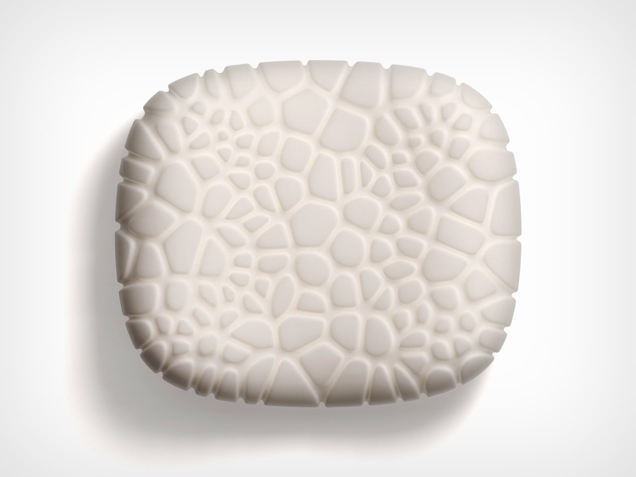
As the chair is printed layer by layer, the process leaves a ribbed texture across its surface. Those lines have been kept visible rather than hidden or polished away. That decision gives the chair much of its character. The texture follows the curves closely and makes the manufacturing process easy to read. It also gives the recycled plastic a more tactile, less generic appearance.

There is something useful in that honesty. The material is not being forced to look like timber, stone or metal. It keeps the visual qualities created by the printing process and uses them as part of the design. The surface does still reference natural materials in a subtle way. Its layered finish recalls mineral formations and carved stone, which helps the chair feel less industrial when placed in an interior.

ZHA and Nagami developed four colourways for the chair: white, black, a white-to-translucent gradient and a caramel tone made using a bio-based cork composite. The colour choices help shift the mood of the design. White makes the form feel lighter and more architectural, while black gives it a stronger, more graphic presence. The translucent version draws attention to the printing layers, and the caramel finish adds warmth to what could otherwise feel like a very technical object.

The caramel version is especially successful because it softens the synthetic quality of the plastic. It feels easier to imagine in a home, hotel lobby or lounge space, rather than only in a gallery or design exhibition. According to ZHA project design director Sebastian Andia, the goal was to turn an abundant and overlooked material into something people would genuinely want to live with. That idea matters because recycled material alone is rarely enough to make a product successful. People still need to like the object, find it comfortable and see a place for it in their environment.

The Echo Chair handles this well. Its sustainable story supports the design, rather than becoming the whole design. The seat’s raised sides create a more enclosed sitting position, while the curved backrest gives the chair a supportive and almost cocooned feel. The shape is expressive, but it still looks usable. Its scale and neutral colour options also make it easier to place than the form might suggest. It has enough presence to work as a statement piece, yet it does not depend on bright colour or decoration to stand out.

The 3D-printing process allows the chair to be produced without visible joints or separate components. This gives it a seamless appearance and keeps the connection between the digital model and final object very direct.

That connection is one of the strongest parts of the project. The manufacturing process does not sit behind the design. It shapes the design. The ribs, curves and continuous structure all come from the same production method. Each part of the chair feels related because it has been developed through the same system.

The Echo Chair continues ZHA and Nagami’s existing collaboration. Nagami launched its first collection of 3D-printed chairs in 2018, which included two designs by the architecture studio. Their latest project shows how much more refined large-scale 3D printing has become. The chair feels less like a technical experiment and more like a finished product with a clear place in contemporary interiors.

The Echo Chair is currently on display as part of London Creates at The Truman Brewery. What makes the chair interesting is the way it brings together material, form and manufacturing without overcomplicating the idea. Recycled plastic is treated as a starting point for the design, rather than something that needs to be disguised.

The post The Echo Chair Makes 3D Printing Feel Refined first appeared on Yanko Design.

❌
❌