❌

Vue normale

  • ✇Yanko Design
  • The 90-Year-Old Lamp Nobody Improved On — Until Now
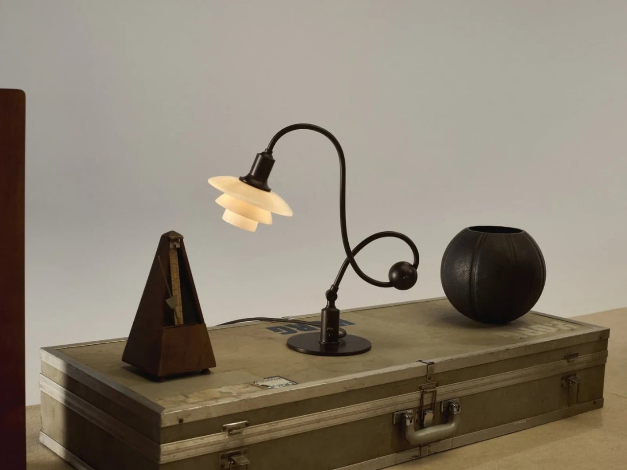
    A lamp can look beautiful on a desk and still make it harder to work. The bulb catches your eye, the light lands everywhere except the page, or the fixture takes up the space you needed for a notebook. Louis Poulsen’s reissued PH Piano Lamp starts with a more useful question: How do you put light precisely where it’s needed without making the lamp itself a distraction? Poul Henningsen designed the original for pianists, who needed to see their sheet music without uncomfortable glare. That probl
     

The 90-Year-Old Lamp Nobody Improved On — Until Now

2 octobre 2026 à 10:20

A lamp can look beautiful on a desk and still make it harder to work. The bulb catches your eye, the light lands everywhere except the page, or the fixture takes up the space you needed for a notebook. Louis Poulsen’s reissued PH Piano Lamp starts with a more useful question: How do you put light precisely where it’s needed without making the lamp itself a distraction? Poul Henningsen designed the original for pianists, who needed to see their sheet music without uncomfortable glare.

That problem reaches well beyond the piano. Anyone who has tried to read beside a bright table lamp or work under a harsh overhead light knows the difference between having enough light and having the right light. I like that this reissue hasn’t lost sight of its practical beginnings. Its curved, counterbalanced arm lets the shade move while the lamp stays stable, giving the design a sense of purpose you can read from across the room.

Designer: Poul Henningson for Louis Poulsen

Henningsen first created the Piano Lamp in the early 1930s, building on his PH lighting system, which uses layered shades to manage how light reaches the eye. Louis Poulsen has brought it back as the PH 1/1 Piano Table Lamp Limited Edition 2026, with adjustments intended to make it useful beyond its original setting. It’s an appealing idea for a reissue: keep the reason the object existed, then give more people a reason to use it.

The new version pairs aged brass with glass shades in a color Louis Poulsen calls Dusty Terra Cotta. On paper, that combination sounds richly nostalgic. In practice, its appeal is more specific. The warm-toned glass gives the lamp a softer visual presence, while the long arm and compact shade keep it from feeling like a decorative lamp that has wandered onto a work surface by mistake. You could imagine it near a keyboard, but also beside a book, a sketchpad, or a late-night crossword.

That versatility matters because our rooms rarely serve just one purpose anymore. A dining table becomes a desk. A side table has to accommodate a drink, a charger, and whatever we’re currently reading. Good lighting can make those small shifts easier without demanding that we rearrange the room. The Piano Lamp feels suited to those spaces precisely because it was designed around a task. Its shape may be memorable, but the starting point was helping someone see what they were doing.

I’m also drawn to the fact that it looks a little unusual. The arm has a gentle, almost musical curve, while the shade sits low enough to suggest a conversation between the lamp and whatever is beneath it. Many contemporary lights aim to disappear into the background. This one has a clear silhouette, yet its job is to make the thing you’re doing more comfortable. That balance is harder to achieve than a striking shape alone.

Of course, a limited-edition design lamp isn’t an automatic solution for every desk or budget. If all you need is a cheap light for a spare room, this probably isn’t the practical choice. But it does offer a useful reminder that a lamp’s value isn’t measured only by how brightly it shines. Where the light goes, how it feels, and how easily the fixture fits into daily routines all count. Those are the details you notice after the novelty of a new object wears off.

Louis Poulsen says the PH 1/1 Piano Table Lamp Limited Edition 2026 will be available from October through December 2026. The short window gives it collectible appeal, but I hope that isn’t the only reason people pay attention. Its more interesting quality is how current its original problem still feels. We have plenty of ways to brighten a room. Finding light that helps us focus, without making us squint, remains a much better goal.

The post The 90-Year-Old Lamp Nobody Improved On — Until Now first appeared on Yanko Design.
  • ✇Yanko Design
  • The 1969 Lamp Nobody Knew They Needed Is Back
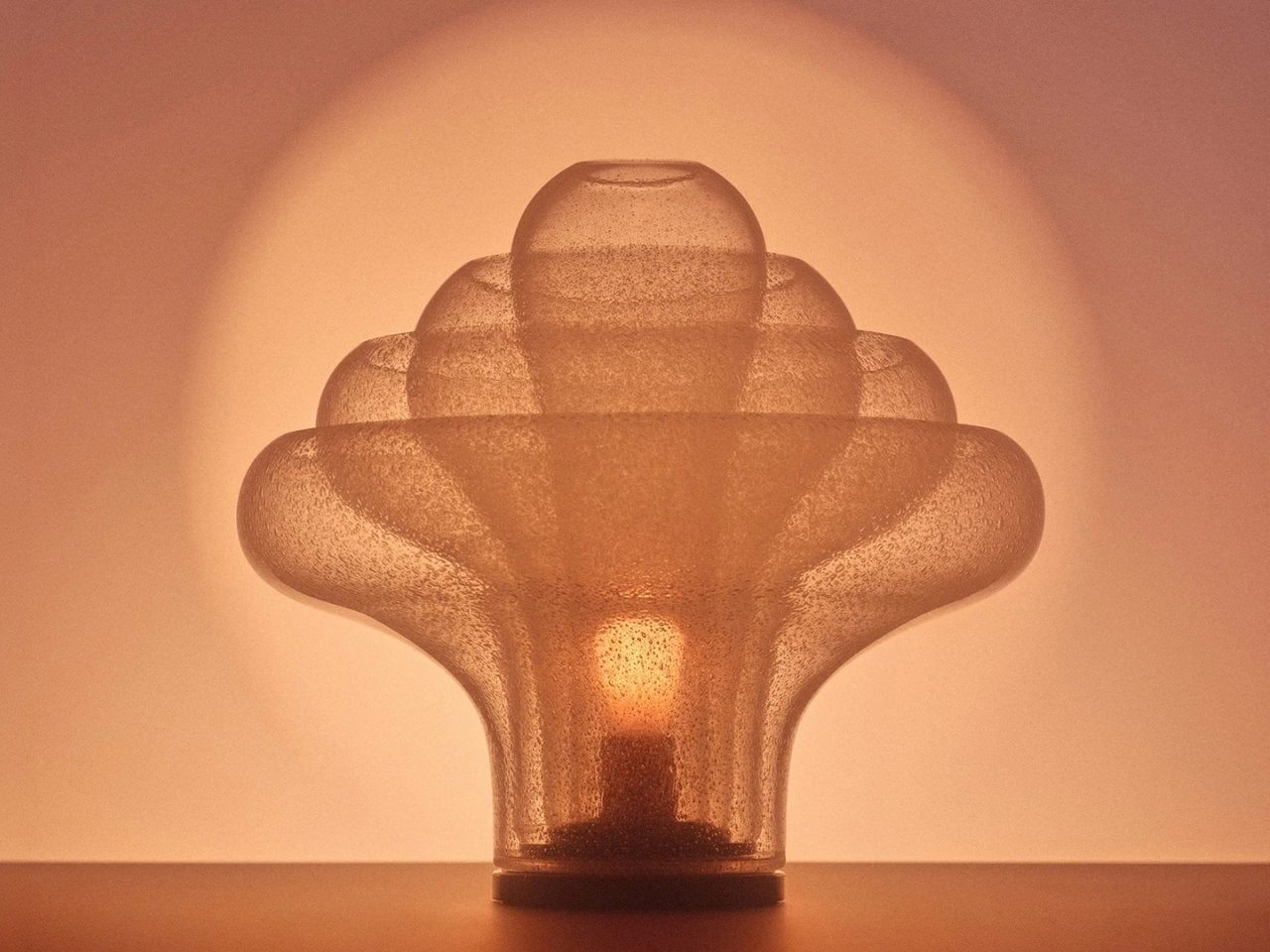
    Most statement lighting presents a familiar dilemma. A lamp can give a room personality, but the more attention it demands, the harder it can be to live with everything around it. Furniture starts to feel like a supporting cast. Even the lamp’s glow can seem secondary to its silhouette. Gubi’s reissued Lotus lamp offers a more appealing proposition: a piece with enough presence to change the mood of a room, without making the room feel like a showroom. Designed by Carlo Nason in 1969, the Lotus
     

The 1969 Lamp Nobody Knew They Needed Is Back

1 octobre 2026 à 18:30

Most statement lighting presents a familiar dilemma. A lamp can give a room personality, but the more attention it demands, the harder it can be to live with everything around it. Furniture starts to feel like a supporting cast. Even the lamp’s glow can seem secondary to its silhouette. Gubi’s reissued Lotus lamp offers a more appealing proposition: a piece with enough presence to change the mood of a room, without making the room feel like a showroom.

Designed by Carlo Nason in 1969, the Lotus lamp belongs to a period when designers were willing to treat lighting as sculpture. Nason’s fluency with glass is central to its appeal, and Gubi’s reissue brings that idea back into view more than half a century later. It is easy to see why the design has returned now. Plenty of contemporary interiors look polished, yet oddly reluctant to have fun. A lamp with a little imagination can do more for them than another carefully chosen neutral.

Designer: Carlo Nason

What makes Lotus interesting to me is the difference between being distinctive and being loud. Its flower-inspired identity gives you a way into the design, but it does not require an entire room to follow the theme. You can appreciate the botanical reference without surrounding it with curved chairs, patterned wallpaper, and a vase of matching flowers. That restraint matters. The best objects leave space for the lives unfolding around them.

Glass also changes how we read a lamp. A metal shade tends to draw a firm outline; glass has a more elusive presence, especially when light enters the picture. It can feel substantial and delicate at once. Nason built a career around exploring what the material could do, and Lotus carries that curiosity into an everyday object. I like the idea of a lamp that rewards a second look when it is switched off, rather than disappearing until evening.

Of course, reissuing a decades-old design invites a fair question: Are we drawn to the lamp itself, or to the comforting idea of owning a piece of design history? Vintage references can become a shortcut to taste. A recognizable date and designer’s name do some of the work that the object should be doing on its own. Lotus earns more attention when you set that pedigree aside and imagine it in an actual home, beside the books you have not put away and the chair you sit in every night.

That is where its value as a design object becomes clearer. A good lamp changes a space twice: once as an object you notice during the day, and again when you turn it on. The Lotus makes a case for treating those experiences as connected rather than choosing one over the other. It asks to be seen, but the point of bringing a lamp home is still to live with its light.

There is a broader reason this reissue feels timely. So much shopping for the home now happens through images that reward instant impact. A dramatic silhouette can stop a scroll, even if it would be exhausting across the room from your couch. The more useful test is slower. Would you want to see it on a rainy Tuesday? Would it still hold your attention once you stopped photographing it? Lotus strikes me as the kind of design that could pass both tests.

It also offers an alternative to the notion that a room has to speak in one consistent style. An older Italian design can sit comfortably among newer pieces if you let it be a point of contrast rather than the start of a complete makeover. That is a more personal approach to decorating. Most homes accumulate meaning over time, through choices made for different reasons and at different moments.

Gubi did not need to invent a new kind of lamp to make lighting feel fresh. Reintroducing Nason’s 1969 design is a reminder that an object can have a strong point of view without turning the rest of your home into a backdrop. For anyone caught between the sensible lamp and the memorable one, Lotus makes a persuasive argument for wanting both.

The post The 1969 Lamp Nobody Knew They Needed Is Back first appeared on Yanko Design.

  • ✇Yanko Design
  • Nobody Expected a Dumpster to Be the Coolest Bag
    Anyone who has seen me carry my huge tote bag probably wonders how I can find anything inside it. To be honest, it takes me a few seconds, and sometimes even a few minutes, to dig through the seemingly bottomless pit. The bag is deep, and I tend to carry a lot of stuff. Sure, bag organizers are available, but when I am in a hurry, it is easier to toss everything inside and sort through it later. You could say I sometimes go dumpster diving in my own bag when I need to find something. Rugsoda ta
     

Nobody Expected a Dumpster to Be the Coolest Bag

1 octobre 2026 à 17:30

Anyone who has seen me carry my huge tote bag probably wonders how I can find anything inside it. To be honest, it takes me a few seconds, and sometimes even a few minutes, to dig through the seemingly bottomless pit. The bag is deep, and I tend to carry a lot of stuff. Sure, bag organizers are available, but when I am in a hurry, it is easier to toss everything inside and sort through it later. You could say I sometimes go dumpster diving in my own bag when I need to find something.

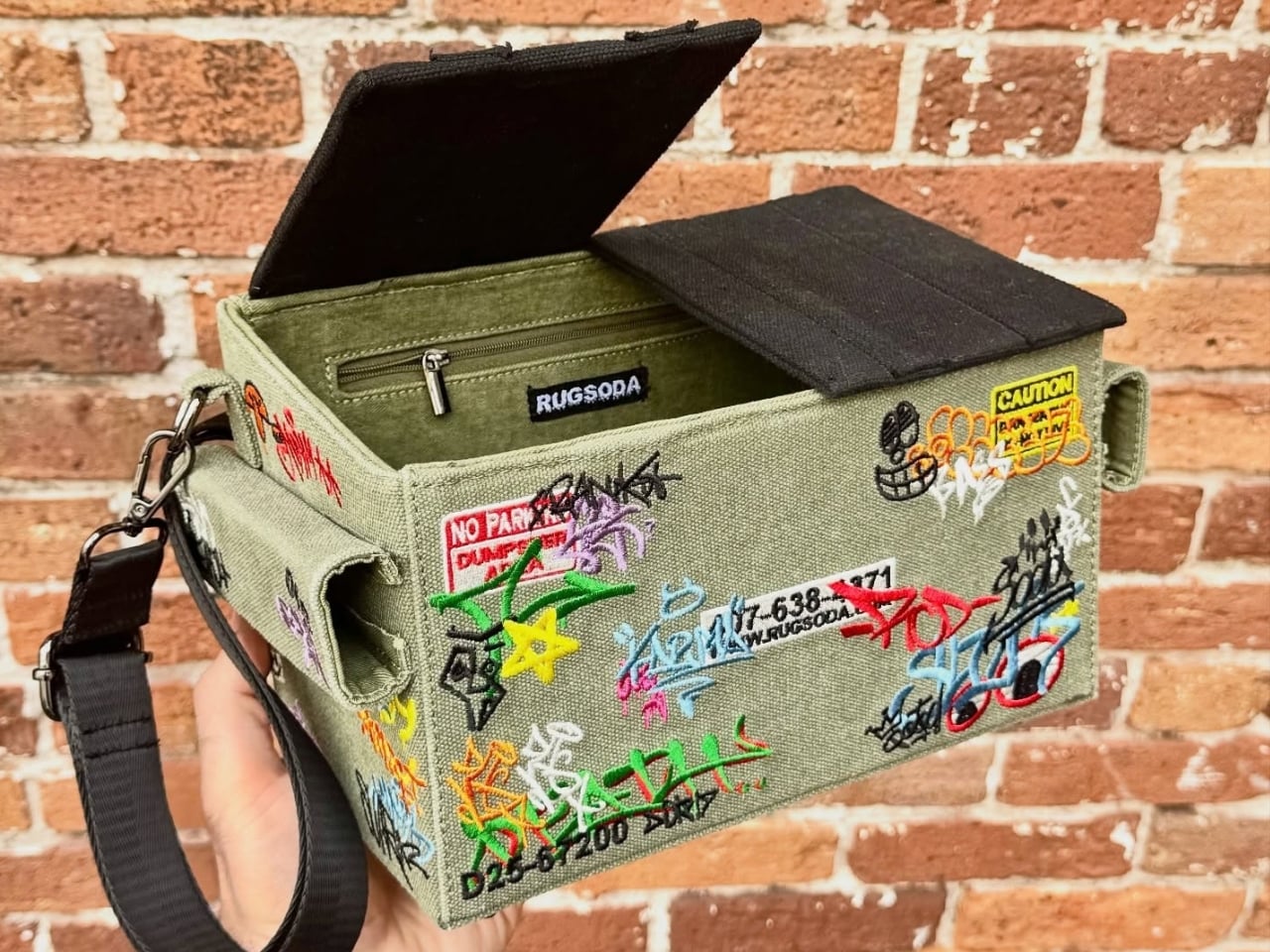
Rugsoda takes that idea literally with its unusual Dumpster Bag. The canvas shoulder bag is shaped like a miniature commercial dumpster, the kind you might see behind a restaurant, apartment building, or other business. Instead of holding garbage, however, it is designed to carry your everyday essentials. Its squared-off shape gives it a more structured appearance than a typical tote bag, while its relatively compact size makes it easier to search for your phone, wallet, keys, or other small items.

Designer: Rugsoda

The Dumpster Bag is indeed designed for everyday use, but it also functions as a fashionable and sculptural conversation piece. Its recognizable three-dimensional form transforms an object associated with clutter, waste, and urban back alleys into a wearable accessory. The design is especially eye-catching because it does not simply feature a printed dumpster graphic. The entire bag is constructed to resemble one, complete with flip-up lids, a boxy profile, and urban-inspired embroidered graffiti.

That graffiti treatment gives the bag a street-art sensibility and connects it to the real-world objects that inspired it. It also adds texture and visual interest to the canvas surface. The embroidery helps the design feel more like a crafted art piece than a novelty costume accessory, while the dumpster shape keeps its sense of humor intact. The flip-up lids feature magnetic closures that help keep your belongings secure while reinforcing the dumpster illusion. The magnetic fastening also allows for quick access when you need to reach inside. An adjustable shoulder strap gives you the option of carrying the bag over one shoulder or across your body, depending on how you want to wear it.

Several smaller details make the design even more enjoyable. Inside the bag, an embroidered raccoon serves as a hidden surprise, referencing the animals often associated with rummaging through trash. The bottom studs are more than decorative accents, too. They help keep the canvas base slightly elevated when you place the bag on a flat surface, which can reduce direct contact between the bottom of the bag and the ground.

Although the Dumpster Bag has a firm, boxy silhouette, its canvas construction gives it a softer, more tactile quality. The material keeps the bag from feeling like a rigid plastic container and contributes to its casual, handmade character. The canvas may also allow the shape to relax or lose some structure if the bag is heavily loaded, so it is better suited to everyday essentials than to carrying a large amount of gear.

Measuring 12 by 7 by 6 inches, the bag is compact enough for daily use while offering more room than a tiny evening bag. That size should accommodate items such as a smartphone, wallet, keys, sunglasses, cosmetics, and other small necessities. It is not intended to replace a roomy tote or a practical work bag, but it can be a useful alternative for people who want to carry less without sacrificing personality.

Rugsoda’s Dumpster Bag is also part of a broader design approach that turns familiar objects into functional textile pieces. The designer has created other bags inspired by playful, everyday forms, including dice and spray-paint cans. In each case, the object’s identity is preserved through its shape rather than reduced to a surface pattern.

Dumpsters are not usually considered glamorous objects, which is precisely what makes this bag such an entertaining fashion statement. It takes something associated with waste and gives it a new purpose as a wearable accessory. The result is a bag that offers practical storage, a memorable silhouette, and plenty of opportunities for conversation. For anyone tired of carrying a shapeless tote or looking for an accessory that does more than blend into an outfit, the Dumpster Bag offers a literal alternative to the usual carryall.

The post Nobody Expected a Dumpster to Be the Coolest Bag first appeared on Yanko Design.

  • ✇Yanko Design
  • Samsung’s SmartTag3 Refuses to Die at 790 Days Battery Life
    I’m the kind of person who can set down my keys, turn around, and immediately forget where they went. Wallets, earbuds, and bags have a way of disappearing at the least convenient moment, too. A smart tracker can spare you a frantic search, but only if its battery is working and its location can still be found. That makes battery life and the ability to locate an item beyond your phone’s immediate range just as important as a good-looking design. Designed by Samsung, the Galaxy SmartTag3 aims t
     

Samsung’s SmartTag3 Refuses to Die at 790 Days Battery Life

1 octobre 2026 à 13:20

I’m the kind of person who can set down my keys, turn around, and immediately forget where they went. Wallets, earbuds, and bags have a way of disappearing at the least convenient moment, too. A smart tracker can spare you a frantic search, but only if its battery is working and its location can still be found. That makes battery life and the ability to locate an item beyond your phone’s immediate range just as important as a good-looking design.

Designed by Samsung, the Galaxy SmartTag3 aims to address those everyday frustrations in a smaller package. Its rounded, nearly square shape gives it a clean look, while its reduced size should make it less noticeable on the things you carry. That matters more than it might seem. A tracker attached to a set of keys needs to be easy to live with every day, not just useful on the rare occasion those keys go missing.

Design: Samsung

The change in shape also raises a practical question: how will you attach it to your belongings? Samsung offers a silicone case with an integrated keyring and a loop case, giving users different ways to secure the tracker to keys or a bag. The smoother outline may look better on its own, but anyone buying one for their keys should consider which attachment will work best.

Samsung says the SmartTag3 is 35% smaller by volume and 33% lighter than its predecessor. It also retains an IP67 rating, indicating resistance to dust and water under specified test conditions. That offers reassurance if the tag gets caught in the rain, though it does not mean the device is waterproof in every situation.

Battery life may be the more meaningful upgrade for anyone who has discovered a dead tracker while looking for a lost item. Samsung says the SmartTag3 can run for up to 550 days under standard usage or up to 790 days in Power Saving Mode. Those figures are based on Samsung’s testing, not a promise that every user will get the same result. Still, a tracker that needs attention less often is less likely to let you down because you forgot to check its battery.

Finding something nearby should be easier, too. Compass View uses Bluetooth 6.0 Channel Sounding to provide distance and directional guidance from up to 60 meters away, about three times farther than on the previous model, according to Samsung. It could help you narrow down where to look before you’re close enough to spot the missing item. Compass View is not available on iOS.

The other finding features are intended to help in different situations. If you leave a tagged bag behind, a Left Behind Alert could prompt you to go back for it, although that feature is also unavailable on iOS. Place Notification is designed to alert you when a tagged item enters or leaves an area you define. Location History and Movement Detection Alert may provide additional clues about where an item has been or whether it has moved. Together, these tools could help you notice a problem sooner and narrow down where to look.

Lost Mode addresses a different problem: helping someone return an item they find. With a compatible phone, a finder can scan the tag using NFC to see the contact information or short message you have registered. That could be useful for a bag left at a café or luggage separated from you during a trip. When an item is beyond your phone’s range, however, location updates depend on nearby participating Galaxy devices. The SmartTag3 should not be treated as a continuous, real-time GPS tracker.

The SmartTag3’s appeal is the combination of a compact design, long claimed battery life, and features that help at several stages of a search. It cannot prevent you from leaving your keys behind, and its alerts will not replace paying attention to your belongings. But if it helps you catch a forgotten bag before you get home, or gives you a useful clue when something disappears, it has done what a well-designed tracker should: made a small, stressful problem easier to manage.

The post Samsung’s SmartTag3 Refuses to Die at 790 Days Battery Life first appeared on Yanko Design.

  • ✇Yanko Design
  • This Tabletop Fireplace Does What Solo Stove Doesn’t: Burn Indoors
    Fall is when the appeal of an open flame reasserts itself. The air turns crisp, and everyone wants that fireplace glow back in their evenings. The trouble is that most homes, especially rentals and apartments, were never built to give it to them. Adding a real fireplace means a gas line, a flue, a permit, and a contractor’s schedule that eats up far more than the one free weekend anybody actually has for it. That gap between wanting fire and being able to install it is exactly what the Harmony
     

This Tabletop Fireplace Does What Solo Stove Doesn’t: Burn Indoors

28 septembre 2026 à 18:30

Fall is when the appeal of an open flame reasserts itself. The air turns crisp, and everyone wants that fireplace glow back in their evenings. The trouble is that most homes, especially rentals and apartments, were never built to give it to them. Adding a real fireplace means a gas line, a flue, a permit, and a contractor’s schedule that eats up far more than the one free weekend anybody actually has for it.

That gap between wanting fire and being able to install it is exactly what the Harmony Flame Lamp solves. It is a brass tabletop fireplace that runs on bioethanol, sits on any flat surface you own, and produces a genuine flame with no ventilation, no gas hookup, and nothing built into a wall. You light it the way you’d light a candle, except what comes back is heat and light with real presence.

Click Here to Buy Now: $240

What sets it apart from most decorative objects claiming craftsmanship is who actually makes it. The Harmony Flame is built by hand by artisans who normally work on brass instruments, the kind of metalworkers who shape tubas and French horns for a living. That background is not a marketing footnote. Instrument-grade brass has to hold precise acoustic properties and structural integrity, and those same qualities happen to make it excellent at containing and reflecting a flame. The polished surface catches the fire and throws it back in shifting patterns of light and shadow, which is a much harder effect to fake than most LED “flame” gadgets ever manage.

Practically, the lamp behaves the way fall entertaining actually works. It moves from the dining table to the patio to a reading corner without any setup beyond a refill of fuel. Bioethanol burns clean, without smoke or odor, so there’s no lingering campfire smell on your jacket the next morning and no soot to wipe off afterward. The brass itself develops a patina with use, which means the lamp you buy in October will look different, and honestly better, by the time next fall rolls around.

It’s worth putting this next to the fire pit most Americans already know, which is Solo Stove. Solo Stove built an entire category around smokeless backyard fires, and it deserves credit for that. But it’s a wood or pellet-burning outdoor unit, sized for a patio and not meant to come inside. The Harmony Flame is working a different scale entirely. It’s small enough for a dinner table, quiet enough for a bedroom, and refined enough that it reads as a design object first and a heat source second. One is built for a backyard gathering. The other is built for the room you’re actually sitting in on a Tuesday night in November.

At $240, it isn’t an impulse buy, and I don’t think it’s trying to be one. You’re paying for hand-finished brass and a fuel system that skips every complication a real fireplace usually demands, and that combination is genuinely rare at this price. Compare it to a high-end bioethanol fireplace from a home goods brand and you’ll often pay two or three times as much for something with none of the instrument-making pedigree behind it.

The part that sold me is how ordinary the ritual feels once you own it. You strike a match, the brass catches the light, and the room changes temperature and mood at the same time. The Harmony Flame Fireplace is the kind of object that quietly becomes the centerpiece of a dinner party without anyone having to point it out. Fall has a way of making people want warmth and atmosphere they can control themselves, and this lamp answers that without asking for a renovation in return. If you’ve spent the last few autumns wishing your apartment had a fireplace, this is about as close as you’ll get without knocking down a wall.

The post This Tabletop Fireplace Does What Solo Stove Doesn’t: Burn Indoors first appeared on Yanko Design.

  • ✇Yanko Design
  • One Table, 3 Games, Nobody Needs a Game Room
    Most people who want a pool table and a dining table end up choosing neither. The math never works. A regulation pool table eats up roughly the same square footage as a small bedroom, a ping pong table needs its own dedicated stretch of floor to swing a paddle without hitting a wall, and a proper dining table has to look good enough to survive being seen by dinner guests. Pick two out of three and you’re already stretching a normal house. Pick all three and you need a room nobody actually has.
     

One Table, 3 Games, Nobody Needs a Game Room

28 septembre 2026 à 15:20

Most people who want a pool table and a dining table end up choosing neither. The math never works. A regulation pool table eats up roughly the same square footage as a small bedroom, a ping pong table needs its own dedicated stretch of floor to swing a paddle without hitting a wall, and a proper dining table has to look good enough to survive being seen by dinner guests. Pick two out of three and you’re already stretching a normal house. Pick all three and you need a room nobody actually has.

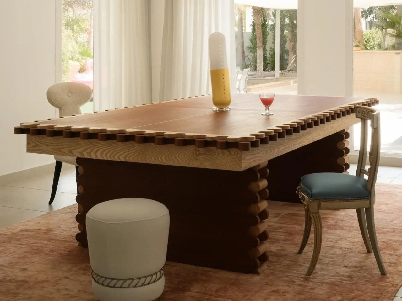
Sanne’s Department of Play looked at that math and decided it was wrong. The 3-in-1 Table is exactly what it sounds like: lift the top and a dining table becomes a full pool table, swap the surface again and it’s ping pong, complete with a cane-and-leather net that looks like it belongs in a much more expensive living room than most game tables ever see. It collapses three furniture purchases and three separate footprints into one object, which solves the actual problem that has quietly kept most people out of the game-room conversation entirely: there was never enough house for the fun stuff.

Designer: Sanne’s Department of Play (photos by Vitali Grishkov)

What gets me about this piece is that it doesn’t look like a compromise. Anyone who has shopped for a combo game table before knows the usual result, a pool table with a plywood lid bolted on top so it can technically also be a dining surface, priced around $800 and looking every bit like sports equipment wearing a costume. Sanne’s version starts somewhere else entirely. The scalloped edge running around the perimeter and down the legs, that repeating rounded bump pattern, looks like it was drawn first as a piece of sculpture and only later revealed to double as the ball guard for ping pong. Function followed form here instead of the other way around, and you can feel that order in every photo of it just sitting quietly as a dining table under a chandelier, giving away nothing about its second life.

The material choices back that up. The base is a deep walnut tone against lighter ash detailing, which reads more mid-century furniture than rec room. When it becomes a pool table, the felt is a rust orange rather than the standard casino green, which sounds like a small thing until you realize it’s the difference between a table that argues with your décor and one that sits right at home. Even the accessories got the same treatment. The cue rack is its own scalloped tower that matches the table instead of leaning against a wall wrapped in a canvas cover, the ping pong paddles are hand-painted with little leopards and floral motifs, and the ball tray is dovetailed like a keepsake box. Nobody asked for the ball tray to look nice. They built it that way anyway.

That attention to the parts nobody was going to scrutinize is what actually sells the bigger idea. Pricing puts the crafted-to-order version around $12,500, with a limited floorstock release closer to $7,500, so this sits firmly in collectible design furniture territory rather than impulse purchase territory. That framing matters more than it first appears. It’s less “we made a fun table” and more “we made a serious piece of furniture that happens to also be extremely fun,” and that distinction is the whole reason it works in a home that already has real art on the walls instead of only in a basement.

There’s a bigger shift happening around furniture like this, one where the game room stops being a separate destination and starts becoming part of the main living space instead of something hidden behind a closed door. A pool table tucked in a basement gets used four times a year. A pool table that is also the table where everyone already eats dinner gets used constantly, almost by accident, because nobody has to decide to go play. They just have to clear the plates.

The post One Table, 3 Games, Nobody Needs a Game Room first appeared on Yanko Design.

  • ✇Yanko Design
  • The Park Sculpture Nobody Expected to Double as a Basketball Hoop
    Most public sculpture asks you to look and keep walking. You admire the bronze figure, read the little plaque, maybe snap a photo, and move along to wherever you were actually headed. The art stays over there, behind an invisible line, and you stay over here. That gap between viewer and object is the quiet problem a lot of city parks have never solved: they install expensive, meaningful work, and then wonder why nobody lingers. Alexandre Arrechea’s answer, installed this year at Biidaasige Park
     

The Park Sculpture Nobody Expected to Double as a Basketball Hoop

28 septembre 2026 à 09:20

Most public sculpture asks you to look and keep walking. You admire the bronze figure, read the little plaque, maybe snap a photo, and move along to wherever you were actually headed. The art stays over there, behind an invisible line, and you stay over here. That gap between viewer and object is the quiet problem a lot of city parks have never solved: they install expensive, meaningful work, and then wonder why nobody lingers.

Alexandre Arrechea’s answer, installed this year at Biidaasige Park as part of Toronto’s new Lassonde Art Trail, is to remove the line entirely. Orange Functional is a twenty-foot steel tree with basketball hoops sprouting off its branches, and you’re invited to bring your own ball and start shooting. No velvet rope, no “please do not touch” energy. Just a big red tree standing at the park entrance, daring you to play.

Designer: Alexandre Arrechea

I like that the idea took over a decade to get here. Arrechea’s archive traces the concept back to 2010, when the hoop-covered tree existed purely as sculpture, something you’d circle and photograph but never actually use. It wasn’t until a 2022 commission from Art Omi in upstate New York that he reengineered the branches so real basketballs could drop through the nets. That’s a meaningful shift for an artist. Turning a static object into a functional one means giving up some control. Once people can touch the work, they also get to misuse it, argue about it, get bored of it. Arrechea made that trade anyway, and the piece is better for it.

What sells me on the design is how little it explains itself. A basketball hoop is one of the most recognizable objects in American and Canadian public life, sitting outside driveways, gyms, and rec centers everywhere. Arrechea doesn’t reinvent it so much as multiply it until it stops making sense as sport equipment and starts reading as something closer to a fruit tree. Art Omi’s own description leans into that: as people throw the ball and it falls from hoop to grass, it evokes oranges dropping from a branch. The title does double duty, too, pairing the color with the idea of something actually working the way it looks like it shouldn’t.

Placing the sculpture at a park entrance, next to newly planted real trees, feels like the smartest curatorial choice in the whole project. It’s not tucked into a sculpture garden where only people already looking for art will find it. It’s the first thing you see walking in, competing for attention with the skyline behind it. A parent walking past with a kid who has a basketball in their bag doesn’t need to understand Arrechea’s twenty-year interest in public gathering spaces to want to stop and shoot a few hoops. The concept sells itself in about four seconds.

There’s a version of this idea that could have felt gimmicky, a photo-op sculpture built mainly for Instagram. Arrechea avoids that trap by making the interaction the entire point rather than an afterthought bolted onto a finished artwork. He’s spent over two decades returning to the basketball court as a symbol, and this piece is where that research finally gets to be useful instead of just visible. You don’t need the artist statement to enjoy it. You need a ball and about ninety seconds of patience while you figure out which branch to aim for.

Public art has a reputation problem in a lot of cities: expensive, confusing, occasionally resented by the people who live near it. Orange Functional sidesteps all of that by refusing to be precious. It asks for nothing more than a basketball and a little curiosity, and it gives back an actual reason to stop walking. That’s a rarer trade in public space than it should be.

The post The Park Sculpture Nobody Expected to Double as a Basketball Hoop first appeared on Yanko Design.

  • ✇Yanko Design
  • A Folding Tiny Home That Refuses to Feel Like Camping
    Camping has always come with a quiet trade-off. You get the freedom of being anywhere, but you give up the comfort of being somewhere. Tents leak, campers feel cramped, and cabins can’t move with you when the season changes. Atelier Lune, a US-based design studio, just built something that refuses to make you choose. It’s called Camping House. The idea is simple to say and genuinely hard to execute: a home that tows behind a standard SUV, unfolds like a tent within a couple of hours, and then b
     

A Folding Tiny Home That Refuses to Feel Like Camping

28 septembre 2026 à 05:15

Camping has always come with a quiet trade-off. You get the freedom of being anywhere, but you give up the comfort of being somewhere. Tents leak, campers feel cramped, and cabins can’t move with you when the season changes. Atelier Lune, a US-based design studio, just built something that refuses to make you choose.

It’s called Camping House. The idea is simple to say and genuinely hard to execute: a home that tows behind a standard SUV, unfolds like a tent within a couple of hours, and then behaves like real architecture once it’s standing. Architect Na Shen, who previously worked at Gensler and Zaha Hadid Architects before starting her own studio, designed the whole structure around that tension between mobility and permanence, and you can feel that intention in every decision she made.

Designer: Atelier Lune

That last part is the actual innovation. Plenty of tiny homes are mobile, but most of them stay rigid once you get them there, basically a smaller box on wheels. Camping House does something different. The structure is a folding shell that fans open on-site into a steep A-frame, then locks into place with weather-sealed joints and insulated panels built to hold up through an actual winter. The A-frame isn’t just an aesthetic choice either. It’s structurally efficient, sheds rain and snow naturally, and creates a dramatic interior volume that reads much larger than the footprint suggests.

The system is built around three modules the studio calls Ports. The Residential Port handles living and sleeping, with furniture that flips from day mode to night mode in seconds. The Utility Port carries a real kitchen and a real bathroom, not a camper-van compromise version of either. The Extended Port clips on when you need a workspace, storage, or room for guests. You arrive, stabilize the base, release the hinges, and the shell swings open into a two-level interior that looks nothing like what fit on the trailer an hour earlier. The joinery and panel system that makes this possible is where most of the real design work lives, hidden in the hinges and seals rather than announced by the exterior.

What makes this feel like it’s arriving at the right moment is who it’s actually for. Remote work untethered a lot of people from a single address, and the appetite for spending real time outdoors, not just weekend camping but seasonal living, has grown alongside it. Camping House is designed with that shift in mind: off-grid solar integration, rainwater harvesting, passive cross-ventilation through a solar chimney, and no permanent foundation required. It leaves the ground beneath it essentially undisturbed, which matters if you’re setting up somewhere ecologically sensitive, or if you just don’t want to explain a poured foundation to a national forest.

There’s a practical honesty to designing for departure instead of designing for permanence. Most residential architecture asks how a building holds its ground. Camping House asks how a building lets go of it. Multiple units can even couple together into small clusters, which opens the door to uses beyond personal travel: disaster relief housing, temporary shelter during regional housing shortages, or small eco-tourism outposts that can be struck at the end of a season without leaving scars.

None of this is on the market yet. It’s a concept, and concepts have a habit of staying concepts. But two people can reportedly assemble it in under two hours, which is a modest ask for what you get in return: a structure with actual dignity, not a glorified pop-up tent with delusions of permanence.

The bigger idea Camping House is testing is whether shelter has to pick a lane between temporary and permanent. For a long time, those felt like separate categories with separate architecture. This project treats them as two settings on the same machine. Whether or not this exact version reaches driveways, the question it’s asking, why should mobility mean sacrificing comfort, feels like one more designers are going to keep chasing.

The post A Folding Tiny Home That Refuses to Feel Like Camping first appeared on Yanko Design.

  • ✇Yanko Design
  • 7 Reasons Non-Artists Need a Drawing Pad on Their Desk
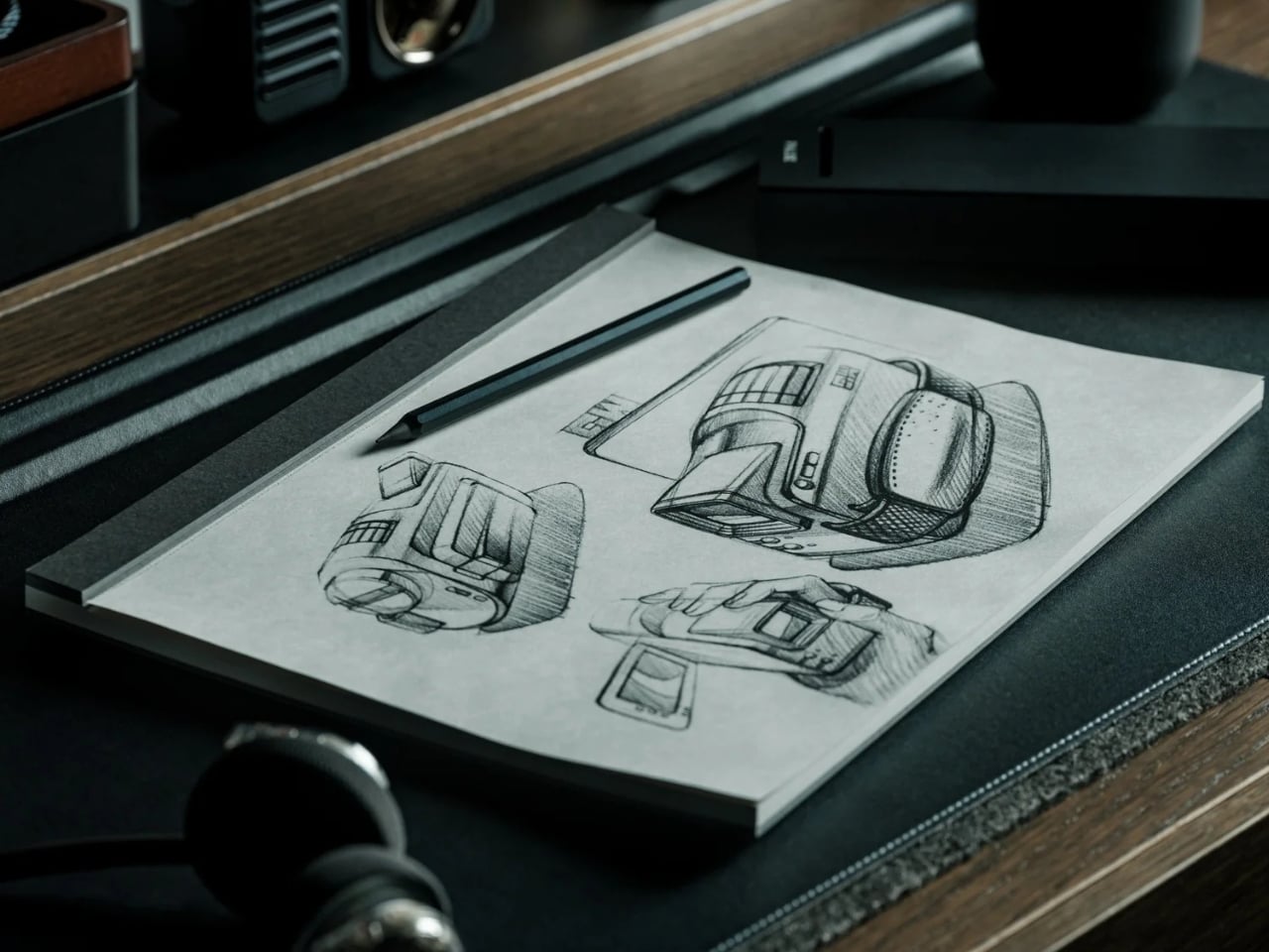
    I’ve established in my previous articles that I’m not an artist and can only draw stick figures, or maybe follow paint-by-numbers-style sketches. That hasn’t stopped me from buying and collecting drawing pads and notebooks of all kinds, though. Of course, I’m not hoping I’ll eventually learn to draw or become the next Andy Warhol or anything like that. I like having these writing surfaces because I have a lot of things to write down, whether it’s for productivity, as part of my numerous journal
     

7 Reasons Non-Artists Need a Drawing Pad on Their Desk

27 septembre 2026 à 19:30

I’ve established in my previous articles that I’m not an artist and can only draw stick figures, or maybe follow paint-by-numbers-style sketches. That hasn’t stopped me from buying and collecting drawing pads and notebooks of all kinds, though. Of course, I’m not hoping I’ll eventually learn to draw or become the next Andy Warhol or anything like that. I like having these writing surfaces because I have a lot of things to write down, whether it’s for productivity, as part of my numerous journaling tools, or just somewhere to randomly write or sketch things out.

The Japanese Drawing Pad, despite having “drawing” in its name, isn’t just an art tool for artists, architects, and other visual creatives. It’s a blank, tactile surface that can be useful for anyone who likes to write, think, plan, or organize. And in a world that’s becoming an increasingly digital-analog hybrid, having a tool like this by your side whenever you need it is always a plus. It’s not just a regular drawing pad, though. It’s simply designed, but expertly crafted by masters in the bookbinding and papermaking industries, giving you paper that helps you create your own masterpiece, whether visual or written.

Click Here to Buy Now: Starting at $40. Get Everlasting All-metal Pencil Free ($19.95 Value). Hurry, this is a limited-time launch gift.

So if you’re like me and don’t need it for actual drawing, here are a few ways to get your money’s worth out of the Japanese Drawing Pad. No drawing skills needed.

Brain-dump Your To-Do List

For those times when you just need to mindlessly dump out all your tasks, lists, and thoughts, this is the perfect place to do it. It doesn’t have a cover, so you get straight to the blank page you need. The tear-away pages make it easy to toss the list once you’re done, or stick it somewhere you’ll actually see it.

Create a Mood Board

The drawing pad can also serve as your analog Pinterest board. Use it to brainstorm a trip itinerary, visualize an outfit for an upcoming event, or build a vision board for your next few months. The microperforated pages tear easily and cleanly, so you can arrange them side by side on a wall or corkboard.

Take Notes in a Meeting (Without a Boring Notebook)

Meetings can drag on forever, but having a unique tool to take notes with can make them feel a little less like a slog. The Drawing Pad’s gray paper and black base give it a sleeker, more distinctive look than your average notepad, so pulling it out mid-meeting feels less like a chore and more like an upgrade.

Mind-mapping and Brainstorming

Having a freeform space without any lines is ideal for when you need to jot down branching ideas, bubbles, and connections. It also comes in different sizes (A6, A5, and A4), so you can choose how much space you need for these brainstorming sessions, even if the meeting is just with yourself.

Journaling

Whether you need a space for habit tracking, junk journaling, or creative writing prompts, the premium feel of the paper will make your journaling ritual more satisfying. If you tear off the pages, you can attach them to your other journals or use the loose-leaf sheets to build a journal of your own.

Teaching Kids (or Yourself) Letters, Numbers, and Shapes

The pad can also double as a lesson space for kids who are still learning to write their letters, numbers, or shapes, offering a low-pressure surface with no stakes attached. And if you’re learning a new language that uses characters different from what you’re used to, it can be your practice space, too.

Doodling to De-stress

Even if you’re not an artist who can draw well, there may be times when you just want to doodle your stress away. Whether you’re sketching the meal you just ate, dreaming up an imaginary creature to fight off boredom, or scribbling whatever abstract shapes come to mind, the pad puts no pressure on you to be “good.” It’s simply a tactile stress outlet.

Beyond what’s already been covered, the Japanese Drawing Pad has a few more details worth knowing. Every pad is handmade by ITO Bindery, a Japanese bookbindery that’s been at it since 1938. The binding glue is still brushed on by hand, and each microperforation is checked for consistency by trained craftspeople rather than left entirely to machines. The pages themselves are premium paper (81.4 g/m²) mounted on a sturdy, recycled cardboard base, and each sheet tears away cleanly without leaving any strays behind on the page. This particular edition is also limited to just 100 individually numbered pads per size, which makes the pad feel less like a disposable notepad and more like a small, functional collectible.

At the end of the day, you don’t need to be able to draw to justify owning something this well made. A design like the ITO BINDERY × YANKO DESIGN Drawing Pad earns its keep simply by being there, ready on your desk for the next to-do list, doodle, or half-formed idea you don’t want to lose. And that’s really the beauty of building an analog habit into an otherwise digital life: it doesn’t ask much of you, just a pen, a blank page, and a few free minutes. Whether it ends up full of to-do lists, mind maps, or terrible stick-figure doodles, this drawing pad might just become one of those small, everyday objects you didn’t know you needed until it’s part of your routine.

The post 7 Reasons Non-Artists Need a Drawing Pad on Their Desk first appeared on Yanko Design.

  • ✇Yanko Design
  • This $21 Charger Powers Your iPhone, Apple Watch, and AirPods at Once
    Most of us have two or more gadgets that need constant charging, plus several chargers and cables to keep them all juiced up. That’s probably fine if you have an entire outlet strip at home or in the office, but when you’re working with a small space, or you’re traveling and on the go, it can be a real challenge to charge multiple devices at once. You end up with a tangle of cords and charging heads, or sometimes you even have to take turns charging your gadgets. If you mostly own Apple devices
     

This $21 Charger Powers Your iPhone, Apple Watch, and AirPods at Once

19 septembre 2026 à 16:45

Most of us have two or more gadgets that need constant charging, plus several chargers and cables to keep them all juiced up. That’s probably fine if you have an entire outlet strip at home or in the office, but when you’re working with a small space, or you’re traveling and on the go, it can be a real challenge to charge multiple devices at once. You end up with a tangle of cords and charging heads, or sometimes you even have to take turns charging your gadgets.

If you mostly own Apple devices or other USB-C-powered gear, the TESSAN 3-in-1 USB-C Charger may actually solve that problem for you. It’s a compact wall charger with a USB-C port, a USB-A port, and a built-in magnetic Apple Watch dock, so you only need one outlet to power up three devices at the same time.

Designer: TESSAN

This 3-in-1 charger is especially handy when you only have one outlet available but need to power up three different devices. A few years ago, this wouldn’t have been much of an issue, since most of us only had one phone to worry about. But now that owning multiple devices is the norm, charging has become an everyday hassle. What do you do when you’ve got a phone, a pair of AirPods, and a smartwatch that all need power at the same time?

TESSAN’s charger features fast charging through its 20W USB-C port, so you can get a device like the iPhone 15 up to 55 percent battery in just 30 minutes. At the same time, its 18W USB-A port can juice up an accessory simultaneously while your main device charges. It also offers broad compatibility, working with everything from the latest iPhone models to AirPods and other USB-powered devices. The real star of the show, though, is the built-in magnetic charger for your Apple Watch. There’s no separate puck or cable needed here. Instead, you get a self-aligning dock, so you won’t have to fuss with positioning your watch every time you need to charge it.

The charger comes in four finishes (white, black, pink, and blue) and is clearly designed to double as a small desk-aesthetic item, though it will likely still read as “just a charger” to most people, especially in the white colorway. Where it really shines is portability: it’s a travel-friendly device you can toss in a bag without a second thought, instead of hauling around three separate chargers that eat up space and weight in your carry-on.

How does it stack up against the competition? The most obvious comparison is Belkin, whose 3-in-1 MagSafe charging stands are the gold standard in this category. Belkin’s BoostCharge Pro and UltraCharge Pro docks charge an iPhone, Apple Watch, and AirPods wirelessly and look considerably more premium sitting on a nightstand, but they also run anywhere from $95 to $150 and require more desk real estate. TESSAN’s charger, at $20.99, skips the wireless charging bells and whistles in favor of a compact, plug-in design that’s built more for function and travel than for a styled bedside setup. If you want a showpiece charging stand for your living room, Belkin is still hard to beat. But if you want something inexpensive, pocketable, and fast enough to get you out the door in the morning, TESSAN makes a compelling case for itself as the budget-friendly, travel-first alternative.

At the end of the day, this isn’t a charger trying to be a lifestyle centerpiece. It’s a charger trying to solve a genuinely annoying, everyday problem: too many devices, not enough outlets, and not enough patience to wait in line for your turn at the power strip. For $20.99, the TESSAN 3-in-1 USB-C Charger delivers fast charging, broad compatibility, and a clever built-in Apple Watch dock in a package small enough to disappear into a laptop bag or a nightstand drawer. It won’t turn heads the way a sleek charging stand might, but it will quietly keep your phone, watch, and earbuds powered up without the usual cord chaos. For anyone juggling multiple Apple devices on a daily basis, or packing for a trip and dreading the tangle of cables, this little charger earns its spot on the “actually useful” list.

The post This $21 Charger Powers Your iPhone, Apple Watch, and AirPods at Once first appeared on Yanko Design.

  • ✇Yanko Design
  • The Wooden Box That Refuses to Let Your Phone Win
    I’ve tried every trick to get my phone to leave me alone. Do Not Disturb. Grayscale mode. Leaving it in another room, which mostly just means I walk to the other room every twenty minutes to check on it. None of it works for long, because the problem was never the settings. The problem is that the phone is still there, still glowing, still capable of buzzing the second I let my guard down. Willpower is a terrible security system, and every app-based fix is still just asking me to trust myself,
     

The Wooden Box That Refuses to Let Your Phone Win

19 septembre 2026 à 11:20

I’ve tried every trick to get my phone to leave me alone. Do Not Disturb. Grayscale mode. Leaving it in another room, which mostly just means I walk to the other room every twenty minutes to check on it. None of it works for long, because the problem was never the settings. The problem is that the phone is still there, still glowing, still capable of buzzing the second I let my guard down. Willpower is a terrible security system, and every app-based fix is still just asking me to trust myself, which is exactly the thing I can’t do at nine at night with a bag of chips in one hand.

That’s the gap French industrial designer Pascal Grangier is quietly working in with FARADAY, a home object that doesn’t ask you to resist your phone. It makes resistance unnecessary. Named after the 19th-century scientist whose cage design blocks electromagnetic fields, the piece works on the same basic physics: once your phone is inside, it has no signal at all. No calls sneak through, no texts land, no app can light up your lock screen and drag your eyes back to it. You’re not disconnecting through discipline. You’re disconnecting through geometry.

Designer: Pascal Grangier

What makes this more than a novelty is the shape it comes in. Most signal-blocking products look like they were built for a hardware store, not a living room. Faraday pouches for concerts and courtrooms are floppy nylon sleeves you’d never leave out on a counter. Grangier’s version is carved from wood, with the kind of soft, rounded form you’d expect from a well-made bowl or a piece of studio furniture. It’s designed to sit on a nightstand or a kitchen counter without looking like a confession that you have a phone problem. That distinction matters more than it sounds like it should. An object you’re proud to display gets used. An object you’re embarrassed by gets shoved in a drawer and forgotten by the second week.

I think a lot about why boxes like this are showing up now, and it’s not really about phones getting worse. It’s about people finally admitting that the “just put it on silent” advice never addressed the actual craving, which is the urge to check, not the urge to hear. Silent mode still lets the dopamine loop run in the background of your brain, because you know the notifications are piling up somewhere, waiting. A Faraday enclosure removes the pile entirely. There’s nothing accumulating on the other side of that lid, so there’s nothing to be curious about later.

I don’t think objects like FARADAY are anti-technology, and I’d push back a little on anyone who frames it that way. It’s closer to how we treat food we know we’ll overeat if it’s sitting on the counter. Nobody calls it deprivation to put the cookies in a cabinet instead of banning sugar from the house. A wooden box that mutes a phone for the length of a dinner, or a weekend, or a first date, isn’t rejecting the smartphone era. It’s setting a boundary the same way a lock on a liquor cabinet does, respectfully and without lecturing anyone.

The dinner table is probably where this thing earns its keep fastest. Phone stacking, where everyone tosses their device into a pile and the first person to grab theirs pays the check, has become a real ritual at restaurants precisely because people know they need external enforcement. FARADAY takes that same instinct and gives it a permanent home, no penalty games required, no honor system to break.

Whether a hand-carved signal blocker becomes a fixture in American homes the way candles or diffusers did, I couldn’t tell you yet. But the appetite is obviously there. We keep buying productivity apps, screen time trackers, even flip phones marketed as luxury items, all chasing the same outcome Grangier reached with a block of wood and a basic law of physics. Sometimes the smartest tech solution is the one that refuses to be technology at all.

The post The Wooden Box That Refuses to Let Your Phone Win first appeared on Yanko Design.

  • ✇Yanko Design
  • L’Objet Secretly Built Its Best Tableware Around a Single Shell
    I’ve always thought shells are underrated as design references. They’re one of nature’s most perfect spirals, built by something soft and unassuming, yet the shape ends up looking engineered on purpose. L’Objet and jewelry designer Jessica McCormack clearly feel the same way, because their new collaboration turns that spiral into the backbone of an entire tableware collection, and it works because the shape never feels decorative for its own sake. It feels structural, like the whole line was bu
     

L’Objet Secretly Built Its Best Tableware Around a Single Shell

19 septembre 2026 à 09:20

I’ve always thought shells are underrated as design references. They’re one of nature’s most perfect spirals, built by something soft and unassuming, yet the shape ends up looking engineered on purpose. L’Objet and jewelry designer Jessica McCormack clearly feel the same way, because their new collaboration turns that spiral into the backbone of an entire tableware collection, and it works because the shape never feels decorative for its own sake. It feels structural, like the whole line was built around it rather than sprinkled with it.

The problem this collection solves is a simple one. Most home collections borrow a motif and slap it everywhere until it loses meaning. A shell shows up on a napkin ring, then again on a candle, then again on a coaster, and by the third repetition it’s just noise. McCormack and L’Objet avoid that trap by treating the shell and its spiral as a load-bearing idea rather than a sticker. The swirl becomes a vase, its opening tilted just enough that flowers spill out at an angle instead of standing at attention. The same spiral, cast in gold, becomes a standalone object on a pedestal, polished until it looks like something pulled from a jewelry vitrine rather than a shelf.

Designer: Jessica McCormack

What sells the whole thing is the rope detail running through nearly every piece. Twisted cord, the kind you’d expect on a jewelry clasp or the trim of an old evening bag, wraps around the rim of an ice bucket, lines the edge of gold-rimmed plates, and forms the handle on a champagne cooler tucked into a velvet scallop-back chair in one of the campaign shots. It’s a small, consistent gesture, and that consistency is what makes the collection read as a single idea rather than a grab bag of pretty objects. You see the rope on the frame of a picture, then again on the handle of a fish server, and your eye starts connecting dots without anyone telling you to.

That fish server is part of the collection’s biggest milestone, even if it doesn’t announce itself as one. This marks L’Objet’s first-ever cutlery collection, and the brand chose to debut it wrapped entirely in the shell-and-rope language rather than starting with something safer. The flatware handles curl into spiraled shells, cast in the same gold finish as the rest of the tableware, so a fork looks less like an accessory to the collection and more like a piece of jewelry that happens to also feed people. For a house that’s spent years building a name in porcelain and glass, launching into cutlery through this particular design vocabulary feels less like a cautious first step and more like a statement about what the shape can do.

The serving pieces are where the shell shape gets the most literal, and that’s the right call. A bowl shaped like a conch shell, glazed in white with a gold-lined interior, holds a pile of cherry tomatoes in one shot and looks completely at home doing it. It’s not pretending to be a jewelry box. It’s a bowl that happens to have grown out of a shape usually reserved for something you’d wear. Two shell-handled forks pierce a pair of roasted fish on a rope-trimmed platter in another image, and the detail barely announces itself. You’d have to be looking for it. That’s the quiet confidence running through this whole release. Nothing here is shouting for attention, even when the materials, fine porcelain, hand-gilded gold, polished metal, would give it every right to.

McCormack’s jewelry has always leaned into antique reference points without feeling costumey, and that instinct translates cleanly into tableware, cutlery included. Her Georgian-era motifs, the twisted rope, the shell curves, were never really about the ocean specifically. They were about movement frozen into something solid, the same way a chain looks like it’s still swaying even when it’s sitting still on a table. L’Objet’s Mediterranean sensibility meets that idea halfway, and the result feels less like two brands cross-promoting and more like two people who see the same shape in different materials and decided to build a table setting, flatware and all, out of the overlap.

None of this needed a marine theme to feel cohesive. Shells and spirals could easily have read as a summer gimmick, gone by September. Instead they’re used as structure, the same way a good building leans on a repeated column rather than a repeated slogan. A gold-rimmed teacup, a swirl-handled vase, a shell-handled fork resting beside a scallop-backed chair holding an ice bucket shaped like the same curve, none of it needs an explanation once you notice the pattern. It just clicks into place, the way a good spiral always does, curling back toward its own center without ever quite repeating itself.

The post L’Objet Secretly Built Its Best Tableware Around a Single Shell first appeared on Yanko Design.

  • ✇Yanko Design
  • The Japanese Grooming Kit That Actually Makes Sense
    Most guys have a drawer like this: a razor with a blade that’s gone slightly dull but not dull enough to justify tossing, tweezers that pinch skin as often as hair, and a nail clipper that crushes more than it cuts. None of it is broken exactly. It just quietly underperforms every single day, and most of us have stopped noticing because we’ve never used anything better. That’s the actual gap the Auger PrecisionMaster Grooming Set is built to close. It’s a five-piece kit from Kai Corporation, th
     

The Japanese Grooming Kit That Actually Makes Sense

18 septembre 2026 à 19:30

Most guys have a drawer like this: a razor with a blade that’s gone slightly dull but not dull enough to justify tossing, tweezers that pinch skin as often as hair, and a nail clipper that crushes more than it cuts. None of it is broken exactly. It just quietly underperforms every single day, and most of us have stopped noticing because we’ve never used anything better.

That’s the actual gap the Auger PrecisionMaster Grooming Set is built to close. It’s a five-piece kit from Kai Corporation, the Japanese company that’s been making blades since 1908, and it bundles a razor, tweezers, curved scissors, a nail file, and a nail clipper into one matte black collection that costs $150. The pitch isn’t flashy. It’s the opposite. The whole set is designed around the idea that grooming tools should just work, consistently, without you having to think about them.

Click Here to Buy Now: $150.00

The razor is the standout piece, and it’s worth explaining why. It has a 30-degree adjustable pivoting head and a five-blade system, which sounds like spec-sheet noise until you realize what it actually solves: the awkward angles under the jaw or around the nose that force most razors into a compromise. The tweezers use a patented stopper mechanism so the tips close with the same pressure every time instead of slipping at the worst moment. Even the nail clipper has a rotating lever built to cut thicker nails without the hand strain that comes from cheap versions. None of this is revolutionary engineering. It’s just engineering that was actually done, instead of skipped because grooming tools are treated as an afterthought category.

That’s really the argument for buying Kai over the brands most Americans grab without thinking. Gillette and Harry’s have made razors a subscription commodity, cheap, replaceable, and optimized for margin rather than feel. A Gillette Fusion refill pack runs you close to $20 for four cartridges you’ll toss in a month, and a Harry’s starter set lands around $25 with plastic that feels exactly like what it costs. Kai isn’t playing that game. It’s a company that’s spent over a century making blades for barbers and kitchens, and the Auger set is what happens when that expertise gets pointed at your bathroom counter instead of a professional’s toolkit. You’re not paying for a brand name stamped on plastic. You’re paying for a company that actually knows what a blade is supposed to do.

Is $150 a lot for tweezers and a nail file? Sure, if you’re comparing it to what’s sitting in a drugstore bin. But that comparison misses the point a little. This set isn’t for someone who wants the cheapest option that technically works. It’s for someone who’s tired of tools that almost work, who wants their morning routine to feel less like maintenance and more like something they actually control. The all-black finish and the total absence of loud branding fit that mindset too. Nothing about this set is trying to impress anyone else. It’s built for the person using it, not the person watching.

I’ll admit I’m a sucker for products that solve a problem nobody bothers to name out loud, and the Auger PrecisionMaster Grooming Set is exactly that kind of product. Bad grooming tools are one of those small frustrations we’ve all just agreed to tolerate, the same way we tolerated bad headphones before good ones existed. The Auger set won’t change your life. But it might change your morning, and for $150, that’s a fair trade for never reaching for a dull blade again.

The post The Japanese Grooming Kit That Actually Makes Sense first appeared on Yanko Design.

  • ✇Yanko Design
  • The $50 Titanium Cup That Refuses to Ruin Your Whiskey
    I’ve broken more shot glasses than I care to admit, and I’ve also poured a good shot of whisky into a glass that smelled faintly of dish soap because nobody thought to hand-dry it properly. That’s the quiet failure of most drinkware. It’s not that it looks bad. It’s that it gets in the way of the thing you’re actually drinking, whether through fragility, absorption, or just feeling like an afterthought grabbed from a gift-shop shelf. The Titanium Artisan Spirits Cup solves a problem I didn’t re
     

The $50 Titanium Cup That Refuses to Ruin Your Whiskey

13 septembre 2026 à 19:30

I’ve broken more shot glasses than I care to admit, and I’ve also poured a good shot of whisky into a glass that smelled faintly of dish soap because nobody thought to hand-dry it properly. That’s the quiet failure of most drinkware. It’s not that it looks bad. It’s that it gets in the way of the thing you’re actually drinking, whether through fragility, absorption, or just feeling like an afterthought grabbed from a gift-shop shelf.

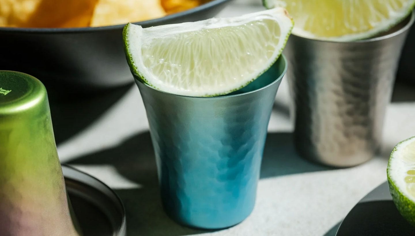
The Titanium Artisan Spirits Cup solves a problem I didn’t realize I’d been quietly annoyed by for years: the vessel changing the experience instead of getting out of its way. Made in Japan from solid titanium, this tiny cup, just 70ml, about the size of a proper sake or spirits pour, is built from a material that’s completely non-reactive. No metallic aftertaste, no lingering smell from last week’s whiskey, no worry about it cracking if you set it down a little too hard after a long day. It just holds the drink and lets the drink be the drink.

Click Here to Buy Now: Starting at $50

I’ll admit I was skeptical the first time I read “titanium cup” and pictured something that belonged on a camping trip, not a bar cart. But this isn’t the same brushed, utilitarian titanium you’d find in a hiking mug. The anodized finishes here, Horizon’s pink-to-green gradient, Aurora’s iridescent blue-green, Daylight’s pale blue shimmer, are created through an electrochemical process, not paint, which means the color actually lives inside the metal’s oxide layer. Practically speaking, that means no two colored cups come out quite the same. You’re not buying a product off an assembly line so much as picking one version of a process that never repeats itself exactly. For $50 to $60 depending on finish, that’s a small price for owning something genuinely singular.

It’s worth comparing this to how a brand like Yeti has trained American drinkers to think about premium drinkware over the last decade. Yeti built an empire on durability and temperature retention, on the promise that your drink stays cold or hot for hours in something that survives getting thrown in the truck bed. That’s a real, useful problem solved well. But Yeti’s whole design language is about insulation and toughness for casual, high-volume drinking. This titanium cup is solving something almost opposite: it’s not trying to keep your drink at a certain temperature or survive a drop from a tailgate. It’s built for the smaller, slower moment, the two-ounce pour you’re meant to sit with, not gulp. One is engineered for durability at scale. The other is engineered for intimacy in a single sip.

What actually sold me on this piece isn’t the finish or the aerospace-grade pedigree of the material, though both are legitimate. It’s the size. Seventy milliliters forces a kind of restraint. You can’t casually refill it five times without noticing you’re doing it. It nudges you toward treating a pour of whiskey or sake as an event rather than background noise while you scroll through your phone. That’s a small, almost accidental piece of good design, the kind that changes behavior without lecturing you about it.

I also don’t think the Titanium Artisans Spirit Cup is for everyone, and that’s fine. If you want something that holds sixteen ounces of iced tea and survives a dishwasher cycle, this isn’t your object. But if you’ve ever wanted a single, honest vessel for the good stuff, the bottle you save for a specific mood or a specific person, this earns its place on a shelf. With only a handful available at a time, it’s also not pretending to be mass-market, which somehow makes it feel more genuine rather than more precious. Good drinkware should disappear the moment the drink hits your lips. This one actually manages that, and it does it while looking like something you’d want to hold onto forever.

The post The $50 Titanium Cup That Refuses to Ruin Your Whiskey first appeared on Yanko Design.

  • ✇Yanko Design
  • The Bali Sculpture That Finally Makes Overshot Views Feel New
    Bali has a photo problem. Not a bad one, exactly, but a familiar one: the same rice terrace, the same infinity pool angle, the same swing shot dangling over the same jungle canopy, reposted by a few million travelers who all found the identical spot through the same map pin. When a landscape gets photographed enough times, it starts to flatten out in your memory before you’ve even seen it in person. You arrive, and it feels like déjà vu instead of discovery. That’s the quiet problem Vincent Ler
     

The Bali Sculpture That Finally Makes Overshot Views Feel New

13 septembre 2026 à 11:20

Bali has a photo problem. Not a bad one, exactly, but a familiar one: the same rice terrace, the same infinity pool angle, the same swing shot dangling over the same jungle canopy, reposted by a few million travelers who all found the identical spot through the same map pin. When a landscape gets photographed enough times, it starts to flatten out in your memory before you’ve even seen it in person. You arrive, and it feels like déjà vu instead of discovery.

That’s the quiet problem Vincent Leroy’s new installation seems to answer, even if he’d probably never put it in those terms. Tucked into the hills of Munduk, “Eccentric Lenses” is a field of Fresnel lenses mounted on posts, catching the wind and spinning on axes that aren’t centered, so nothing ever settles into a repeatable frame. Point a camera at it in the morning and again at dusk and you won’t get the same picture twice, not because the location changed, but because the lenses never stop rearranging it for you.

Designer: Vincent Leroy

Fresnel lenses are the flat, ridged discs you’d recognize from old lighthouses or projector screens, built to bend light without the bulk of a curved glass lens. Leroy has been experimenting with them for years, but this piece feels like his most site-specific use of the idea. Instead of distorting a studio backdrop, he’s pointed the lenses at Bali’s actual terrain, its rice fields, its distant volcanic peaks, its low clouds, and let the wind do the editing. Every gust nudges a lens a few degrees, and the mountain behind it splits, doubles, or slides sideways for a second before reassembling.

What I appreciate here is the restraint. There’s no motor, no app, no LED strip pretending to be magic. It’s just optics and weather, working together in a way that feels almost stubbornly analog for 2026. We’ve spent the better part of a decade being told that wonder needs a screen attached to it, that a landscape only becomes interesting once it’s been filtered, looped, or turned into a Reel. Leroy’s installation goes the opposite direction. It takes the one thing every travel photo tries to eliminate, unpredictability, and makes it the entire point.

There’s a reason kinetic art tied to natural forces keeps resurfacing right now, from wind-driven sculptures to mirror installations chasing the sun across a field. People are a little exhausted by content that behaves exactly the way it’s supposed to. A piece that changes because the wind decided to pick up speed is refreshing precisely because nobody, including the artist, can fully predict what it’ll look like an hour from now. That unpredictability used to be considered a flaw in outdoor art. Here it’s the mechanism.

It also helps that Leroy didn’t ask Bali’s landscape to hold still for him. The lenses don’t compete with the rice terraces or try to outshine the mountains; they just keep reintroducing you to them. That’s a small but telling choice. So much of contemporary installation art wants to be the main event, the thing you drove out to see. This piece works because it insists the actual landscape was always worth a second look, it just needed a nudge to prove it.

I don’t think “Eccentric Lenses” is trying to solve tourism fatigue or fix anyone’s relationship with their camera roll. But it’s hard not to read it that way anyway, especially watching footage of a single mountain peak splintering into five overlapping versions of itself, then quietly reforming into one. For a moment, an overexposed view of Bali stops feeling used up. It just feels new again, which might be the most useful trick any piece of art can pull off right now.

The post The Bali Sculpture That Finally Makes Overshot Views Feel New first appeared on Yanko Design.

  • ✇Yanko Design
  • Finally, a Bench Design That Never Wastes a Seat
    Anyone who has ever sprinted through a train station with a rolling suitcase in one hand and a coffee sloppily balanced in the other knows the particular despair of scanning a row of seats and finding every single one occupied by someone’s backpack. Not a person. A bag. Sitting there like it paid for the ticket too. That small, maddening moment is basically the whole reason a London studio called Of My Imagination designed something called Flip, a modular public seating system where each indivi
     

Finally, a Bench Design That Never Wastes a Seat

12 septembre 2026 à 18:30

Anyone who has ever sprinted through a train station with a rolling suitcase in one hand and a coffee sloppily balanced in the other knows the particular despair of scanning a row of seats and finding every single one occupied by someone’s backpack. Not a person. A bag. Sitting there like it paid for the ticket too.

That small, maddening moment is basically the whole reason a London studio called Of My Imagination designed something called Flip, a modular public seating system where each individual seat can rotate out of the way on command. Instead of a bench being a fixed slab of “sit here or don’t,” Flip treats every seat as its own hinge point. Flip it down, it’s a chair. Flip it up and out, it becomes open space for luggage, a stroller, or just more room to breathe when a platform gets crowded. It sounds almost too simple to be clever, which is usually the sign of a genuinely good idea.

Designer: Of My Imagination

I’ve been thinking about public seating a lot lately, mostly because so much of it seems designed for an idealized version of how people move through the world rather than the messy, unpredictable reality of it. Airports, bus terminals, hospital waiting rooms. These spaces swing between dead quiet and total chaos within the same hour, and yet the furniture almost never adjusts with them. A bench built for a slow Tuesday afternoon becomes a liability during a holiday rush, when every inch of floor space suddenly matters and immovable seating just gets in the way.

Flip’s answer isn’t flashy. There’s no app, no motor, no sensor deciding when a seat should move. It’s a mechanical latch and a rotating joint, the kind of low-tech solution that feels almost old-fashioned in a moment when everything gets pitched as “smart.” I actually like that restraint. Public infrastructure breaks down constantly not because the technology is too simple, but because it’s too complicated, too fragile, too dependent on software updates and maintenance contracts nobody budgeted for. A seat that flips because a person physically flips it is a seat that still works during a power outage, a system failure, or just a Tuesday when the maintenance crew is short-staffed.

The pandemic-era spacing rules get a mention in OMI’s own description of the project, and it’s worth sitting with that for a second. Remember all those benches wrapped in caution tape or marked with awkward stickers telling you where not to sit? Most of that signage disappeared once the emergency did, but the underlying problem never really left. Public seating still needs to flex between “pack people in tightly” and “spread them out,” whether that’s for health reasons, accessibility needs, or just the reality of rush hour versus a quiet Sunday morning.

What strikes me most is how much this design respects the intelligence of the people using it. Flip doesn’t try to predict what a traveler needs. It just gives them the option and gets out of the way. That’s a surprisingly rare quality in public design, where the instinct is often to over-engineer a solution that anticipates every scenario instead of trusting a commuter to make a simple physical adjustment themselves.

Is it going to replace every bench in every transit hub across the country? Probably not right away, and cost, durability testing, and vandalism resistance are the unglamorous hurdles any concept like this has to clear before it shows up somewhere you’d actually sit down. But as a proof of concept, it’s a refreshing reminder that flexibility doesn’t require a screen or a subscription. Sometimes it just requires a hinge and a little humility about how unpredictable public spaces actually are.

The next time I’m standing in a crowded terminal, silently negotiating personal space with a stranger’s overstuffed duffel bag, I’ll probably think about Flip. Not because it solves everything, but because it solves the one thing that’s been sitting there, unaddressed, for as long as public benches have existed.

The post Finally, a Bench Design That Never Wastes a Seat first appeared on Yanko Design.
  • ✇Yanko Design
  • The Lamp That Actually Looks Better With the Lights Off
    Most lighting has a dirty secret: it only works half the day. Flip the switch and a pendant or sconce can look spectacular, all warm glow and dramatic shadow. Flip it off, and you’re left staring at what is often just a glorified fixture, a thing bolted to a ceiling that has nothing to say for itself once the bulb goes dark. That gap between “on” and “off” is where a lot of home lighting quietly fails us, and it’s a problem most people never think to name because they’ve simply accepted it. Hol
     

The Lamp That Actually Looks Better With the Lights Off

12 septembre 2026 à 15:15

Most lighting has a dirty secret: it only works half the day. Flip the switch and a pendant or sconce can look spectacular, all warm glow and dramatic shadow. Flip it off, and you’re left staring at what is often just a glorified fixture, a thing bolted to a ceiling that has nothing to say for itself once the bulb goes dark. That gap between “on” and “off” is where a lot of home lighting quietly fails us, and it’s a problem most people never think to name because they’ve simply accepted it.

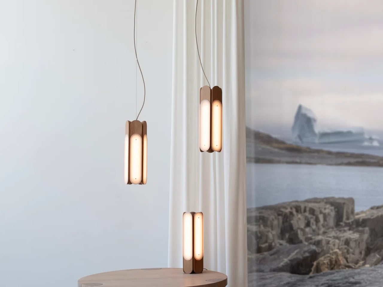
Hollis+Morris, the Toronto studio behind the new Beaufort collection, clearly has thought about it. Their solution isn’t a smarter bulb or a clever dimmer app. It’s a rethinking of what a light fixture is supposed to do when it’s doing nothing at all. Beaufort is built from sculpted solid wood paired with sandblasted acrylic, and the acrylic is cut and finished so it holds a kind of frozen depth, layered, translucent, a little mysterious, whether or not there’s current running through it. Turn it on and light diffuses through those layers in soft gradients. Turn it off and you still have an object worth walking past twice.

Designer: Hollis+Morris

The origin story is the kind of thing that sounds almost too tidy, except it happens to be true. Mischa Couvrette, the studio’s founder and lead designer, was flying home from Copenhagen’s 3daysofdesign when a conversation about ice, and about climate change, turned into sketches on a cocktail napkin somewhere over the Atlantic. By the time the plane landed, the collection basically existed in his head. The name comes from the Beaufort Sea, that remote stretch of Arctic water above Alaska and Canada’s Northwest Territories, which is a fitting reference for a studio that has built its identity on restraint rather than spectacle.

I appreciate that the collection doesn’t try to literally recreate an iceberg hanging from your ceiling. Instead it borrows the logic of ice: how light moves through something dense and layered, how clarity shifts depending on where you’re standing. The studio achieves that through repetition, mirroring, and rotation of a small set of core components, which is a fancy way of saying they’ve built one coherent visual language and then let it flex across a sconce, a mirrored horizontal pendant, a lantern-like vertical pendant, and a table lamp. Nothing in the lineup feels like an afterthought tacked onto a single hero piece just to pad out a catalog.

Jonathan Mandeville of Hollis+Morris put it plainly when he said the collection sits in a lineage of Scandinavian and Canadian design that values material honesty and quiet restraint, the idea that an object should earn its keep even when it isn’t doing anything. That’s a bit of a jab, gentle as it is, at a design moment that has leaned hard into maximalism and novelty for novelty’s sake. I don’t think Beaufort is arguing that bold, loud design is wrong. Plenty of homes need a little chaos. But there’s real value in a piece that doesn’t ask for your attention so much as reward it once you’ve already given it, and that’s a harder trick to pull off than another oversized statement chandelier.

It also matters, at least to me, that these pieces are made in Canada by a B Corp certified studio that treats that fact as a working value rather than a sticker on the box. Knowing who made a light and how isn’t a small thing anymore, especially with home goods, where supply chains can be murky at best.

Beaufort isn’t cheap. The R5 horizontal pendant runs $3,800 and the M2 horizontal starts around $1,900, so this is squarely in investment-piece territory, not an impulse buy from a big box store. But for anyone who has ever bought a light fixture, loved it while it was on, and felt a little let down by it during the day, Beaufort makes a fairly convincing case that the two states shouldn’t have to be so different.

The post The Lamp That Actually Looks Better With the Lights Off first appeared on Yanko Design.
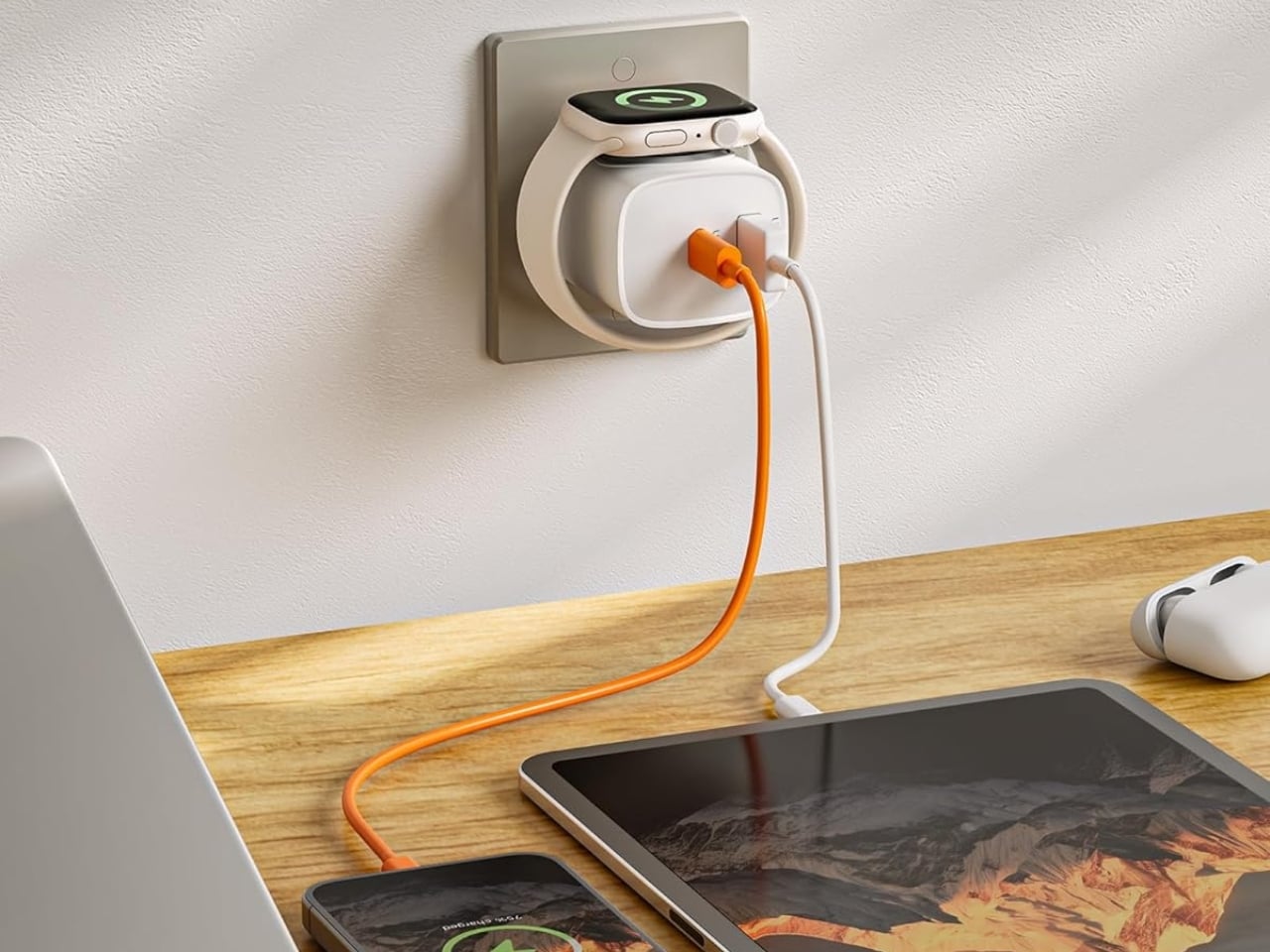
  • ✇Yanko Design
  • One Architect Quietly Ditched Rent for a 1sqm Treehouse Office
    Munich has some of the steepest commercial rents in Germany, and anyone who has tried to lease even a modest studio space knows the arithmetic rarely works in a small firm’s favor. Brokers, multi-year contracts, square footage priced by the centimeter. When the Munich architecture practice Opposite Office needed a new home base, founder Benedikt Hartl looked at those numbers and decided the smartest move wasn’t a smaller office or a coworking membership. It was no office at all, at least not th
     

One Architect Quietly Ditched Rent for a 1sqm Treehouse Office

10 septembre 2026 à 10:20

Munich has some of the steepest commercial rents in Germany, and anyone who has tried to lease even a modest studio space knows the arithmetic rarely works in a small firm’s favor. Brokers, multi-year contracts, square footage priced by the centimeter. When the Munich architecture practice Opposite Office needed a new home base, founder Benedikt Hartl looked at those numbers and decided the smartest move wasn’t a smaller office or a coworking membership. It was no office at all, at least not the kind anyone pays rent on.

The result is Baumhaus Office, a roughly one-square-meter cube strapped to a tree on the campus of Bauhaus-Universität Weimar, built from spruce timber, plywood, and an aluminum shell that Hartl half-jokingly describes as “UFO-like.” A ladder gets you up to it. Inside, there’s shelving, a small desk, and fold-down panels that expand the workspace just enough to fit two or three people if everyone keeps their elbows in. A domed skylight sits overhead, so instead of staring at a drop ceiling, you get a view of the canopy. Two ratchet straps, cushioned with protective matting so the bark doesn’t suffer, hold the whole thing to the trunk. Hartl secured permission from the university’s president to install it there temporarily, and he’s designed it to come down just as easily and go up somewhere else.

Designer: Benedikt Hartl

His explanation for the whole exercise is refreshingly blunt. Rather than compete with Munich’s rental market, he moved the office out of it entirely and into the trees. He’s also put out an open call, only half-kidding, for anyone with a spare tree and a good view who doesn’t intend to charge him for it.

There’s an obvious punchline in a firm shrinking its footprint to one square meter, but the joke has a point buried in it. Opposite Office already works across borders on projects that rarely require a fixed headquarters, so the studio started asking why it needed a permanent lease at all. That question lands differently depending on where you’re reading this, but it lands. Downtown office towers in plenty of American cities have sat half empty for years now, landlords still pricing space as if 2019 never ended, and companies quietly deciding that a conference room and a Zoom link cover most of what used to require a floor plan. Baumhaus Office takes that same skepticism about commercial real estate and pushes it to its logical, slightly absurd conclusion. If the point of an office is a roof, a desk, and a door you can close, a tree does two of those things for free.

Opposite Office has framed the project as a nod to Cosimo, the boy in Italo Calvino’s “The Baron in the Trees” who abandons ground level entirely and never comes back down. I like that reference more than the usual sustainability talking points that get bolted onto projects like this. It’s not really about wood versus concrete. It’s about changing your vantage point on purpose, even briefly, to see whether the thing you assumed you needed was actually optional the whole time.

I’ll admit the practical side of me has questions. Winter in Thuringia is not gentle, and a plywood cube with a skylight is not insulation in any serious sense. But treating this as a permanent HQ misses the point Hartl is making. It’s a provocation with a ladder, built to prove that an architecture studio’s real asset is the people doing the thinking, not the address on the lease. Whether or not Baumhaus Office survives its first real storm, it’s already done its job: it made a very expensive problem look, for a moment, genuinely small.

The post One Architect Quietly Ditched Rent for a 1sqm Treehouse Office first appeared on Yanko Design.
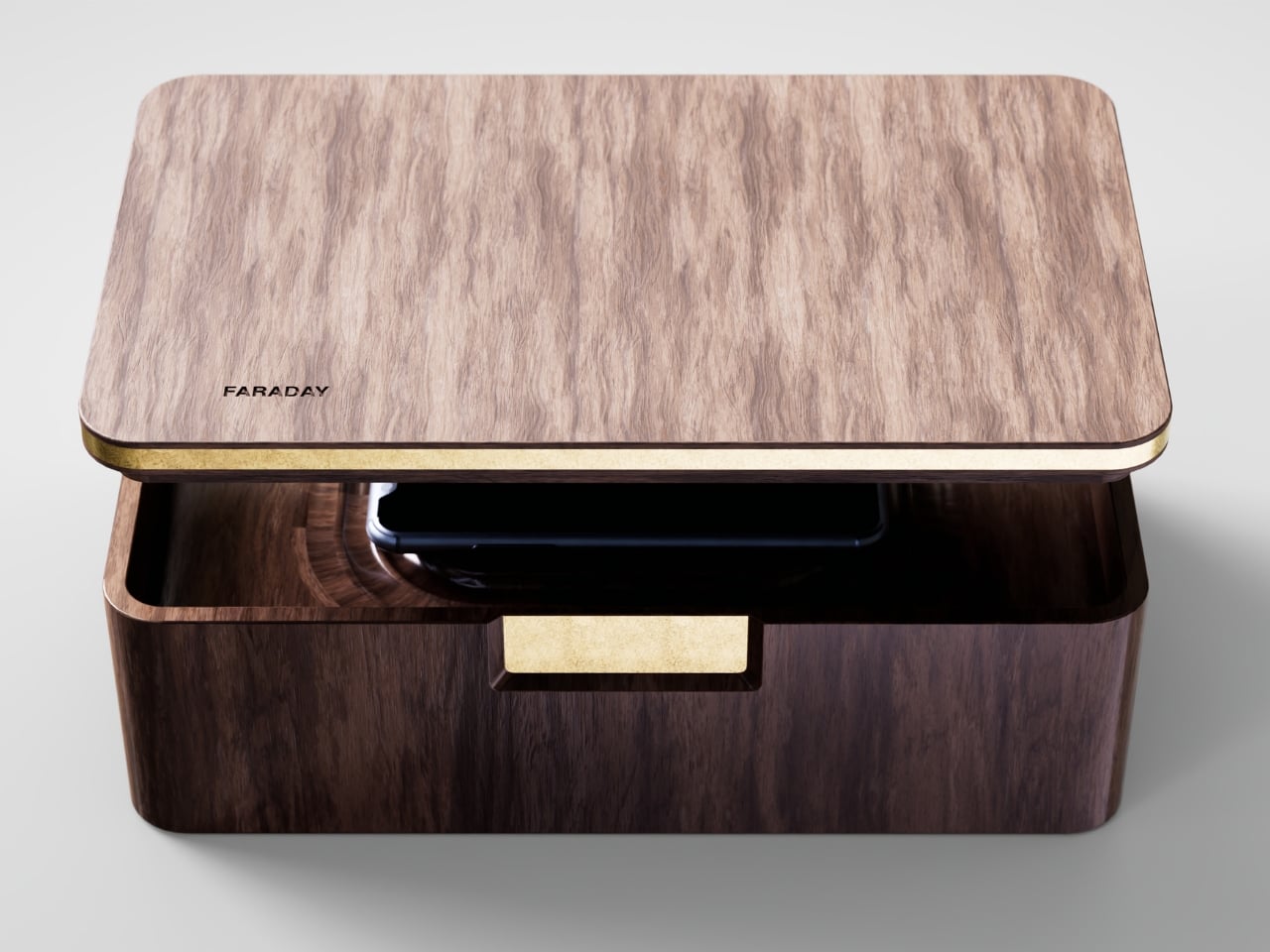
  • ✇Yanko Design
  • Pharrell Quietly Revives Adidas’ Weirdest Y2K Water Shoe for $140
    Summer never really wants to let go, and neither does my closet. Every September I face the same annoying puzzle: sandals feel done, sneakers feel too heavy, and nothing in between actually handles a wet dock, a muddy trail, and a sidewalk trip to the coffee shop without looking like safety equipment. That gap between “technical” and “wearable” has been a real problem in footwear for years, and it’s exactly the space Adidas and Pharrell Williams just walked into with the PW Water Moc. The shoe
     

Pharrell Quietly Revives Adidas’ Weirdest Y2K Water Shoe for $140

10 septembre 2026 à 09:20

Summer never really wants to let go, and neither does my closet. Every September I face the same annoying puzzle: sandals feel done, sneakers feel too heavy, and nothing in between actually handles a wet dock, a muddy trail, and a sidewalk trip to the coffee shop without looking like safety equipment. That gap between “technical” and “wearable” has been a real problem in footwear for years, and it’s exactly the space Adidas and Pharrell Williams just walked into with the PW Water Moc.

The shoe is the third release under Pharrell’s ongoing Virginia label with Adidas, and unlike the Jellyfish or the Flat Earther before it, this one isn’t chasing runway drama. It’s pulling from something a lot more obscure: the Adidas Adventure Water Moc, a shoe most people forgot existed after the early 2000s. That’s the smart move here. Instead of inventing a new gorpcore silhouette from scratch, Pharrell dug up a shoe that was already built for exactly this problem, water to land, and gave it a reason to exist again.

Designer: Pharell x Adidas

Functionally, it actually holds up. The upper mixes breathable mesh with reflective webbing, and bungee-style laces get tucked under a wide strap so you’re not fumbling with knots every time you take it off at the door. The outsole is lifted from the 2005 Carnuba Adventure Moc, which means deep, aggressive lugs instead of the flat rubber most casual slip-ons get away with. It’s a shoe that seems genuinely fine with a creek crossing, not just a shoe that photographs well near one.

Where it gets interesting, and where I think Pharrell earns his credit, is the colorways. Adidas didn’t sand down the nostalgia to make it more palatable. The Lucid Ray Blue option comes with pink and seafoam accents that are unapologetically early-2000s, the kind of palette that would’ve looked at home on a Bratz commercial or a Limp Bizkit music video. There’s a black and silver pair for people who want the shape without the loud attitude, and a yellow colorway that splits the difference. None of them try to disguise where they came from.

I’ll admit I’m a little biased toward brands that actually go back to their own archive instead of just borrowing someone else’s aesthetic and calling it retro. Adidas has done this a few times now, quietly, and it tends to land better than the loud “vintage-inspired” drops that never point to an actual source. The Water Moc isn’t just Y2K flavored, it’s a real product from that era, rebuilt with better materials and a designer who clearly has affection for it rather than just using it as a trend hook.

At $140, it sits in a fair spot for a collaboration shoe with this much design history behind it. It’s not cheap, but it’s not asking you to pay Jellyfish-level hype pricing for something that’s essentially a reissue with upgrades. That price point also tells you who this shoe is actually for: people who want a functional water-ready shoe but refuse to wear something that looks like it belongs on a kayaking instructor.

What sneaker culture has been missing lately is a bit of goofiness that still functions. So much of the current outdoor-meets-fashion movement takes itself seriously, all muted colors and technical fabric with barely any personality. The Water Moc doesn’t ask to be taken that seriously, and that’s honestly refreshing. It’s a shoe that remembers being weird was part of the appeal the first time around.

Whether it becomes a genuine wardrobe staple or just a fun seasonal pickup probably depends on how much you already like the era it’s pulling from. But as a piece of design thinking, going back into the brand’s own closet instead of reinventing the wheel, it’s one of the more honest moves Adidas has made in a while. Sometimes the best new shoe isn’t new at all. It’s just finally getting its second summer.

The post Pharrell Quietly Revives Adidas’ Weirdest Y2K Water Shoe for $140 first appeared on Yanko Design.
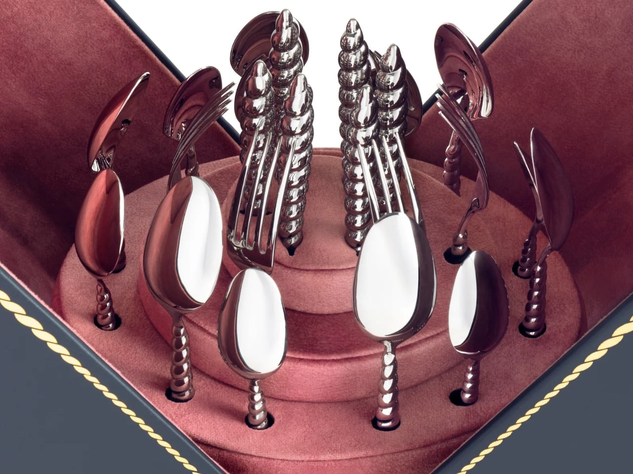
  • ✇Yanko Design
  • Finally, One Tower Replaces Your Speaker, Lamp, and Wine Fridge
    Anyone who has tried to furnish a studio apartment knows the specific defeat of running out of surfaces before you run out of gadgets. The speaker needs an outlet and a shelf. The lamp needs its own corner. The mini fridge for wine wants counter space that doesn’t exist. Each object is fine on its own, but stacked together on a single console table, they start to look like a garage sale that lost an argument with a design magazine. That is the exact problem South Korean designer Jung Hyun Kim s
     

Finally, One Tower Replaces Your Speaker, Lamp, and Wine Fridge

10 septembre 2026 à 06:07

Anyone who has tried to furnish a studio apartment knows the specific defeat of running out of surfaces before you run out of gadgets. The speaker needs an outlet and a shelf. The lamp needs its own corner. The mini fridge for wine wants counter space that doesn’t exist. Each object is fine on its own, but stacked together on a single console table, they start to look like a garage sale that lost an argument with a design magazine. That is the exact problem South Korean designer Jung Hyun Kim set out to solve with Babel, a concept he built for people who live in small rooms but refuse to shrink their idea of what home should feel like.

Kim designed Babel for a very specific and very real slice of the population, twenty somethings through mid thirties starting their independent lives in modest apartments, often around 500 to 550 square feet, the kind of footprint that is common from Seoul to Brooklyn to any first apartment in a city with real rent. His answer wasn’t to make each device smaller. It was to stop thinking about furniture and electronics as separate categories entirely, and instead build a single vertical column where every function gets its own segment, stacked like a totem instead of scattered like clutter.

Designer: Jung Hyun Kim

The tower reads almost like a figure standing in the room. At the top sits an eye shaped ambient lamp, its lens glowing warm and soft, the kind of light you’d want next to a couch at eleven at night. Below that, a red, fabric wrapped module houses the main speaker drivers, angled like a face with two eyes looking back at you, which is a genuinely clever piece of anthropomorphism for an object meant to live in your peripheral vision all day. The tapered midsection functions as the control hub, complete with a discreet volume display, and the whole thing terminates in a rounded black base that turns out to be a hidden drawer, a small cooling compartment for a couple of wine bottles. Four completely different jobs, one silhouette.

What makes this more than a novelty is the modularity built into the stacking logic. Nothing about Babel demands you use all four segments in one order. You can pull pieces apart, rearrange them, or run just the parts you need that week. A studio dweller might want the lamp and speaker without the bar module. Someone hosting more often might stack the drawer higher for easier reach. The design treats a small home the way a good capsule wardrobe treats a small closet, fewer pieces, each one doing more, none of them wasted.

I like that Babel doesn’t pretend the solution to small space living is owning less. It assumes you still want a good lamp, a good speaker, and a cold bottle of wine within reach, and it simply refuses to let those wants cost you three separate footprints. That feels more honest than most minimalist design advice, which tends to ask people to want less rather than design better. The name is a nice touch too, a nod to the biblical tower where many languages tried to reach the same point, which tracks neatly onto a product where lighting, sound, cooling, and control all speak different technical languages but rise from the same base.

Whether Babel ever becomes a shippable product is beside the point right now. It exists as a Behance concept, a portfolio piece from a designer who clearly thinks in systems rather than single objects, and that thinking is worth paying attention to regardless of manufacturing timelines. Apartment living isn’t getting more spacious anywhere, and the appetite for objects that look intentional rather than accumulated is only growing, especially among people who grew up curating every shelf for how it photographs. A stacked, sculptural answer to gadget clutter fits that mood perfectly.

Babel won’t fit every home, and a four function tower is a commitment, not an impulse buy. But as a piece of thinking about how to live well in less square footage, it’s one of the more clear headed ideas I’ve seen come out of a design program in a while. Sometimes the fix for too many objects isn’t fewer objects. It’s better posture.

The post Finally, One Tower Replaces Your Speaker, Lamp, and Wine Fridge first appeared on Yanko Design.
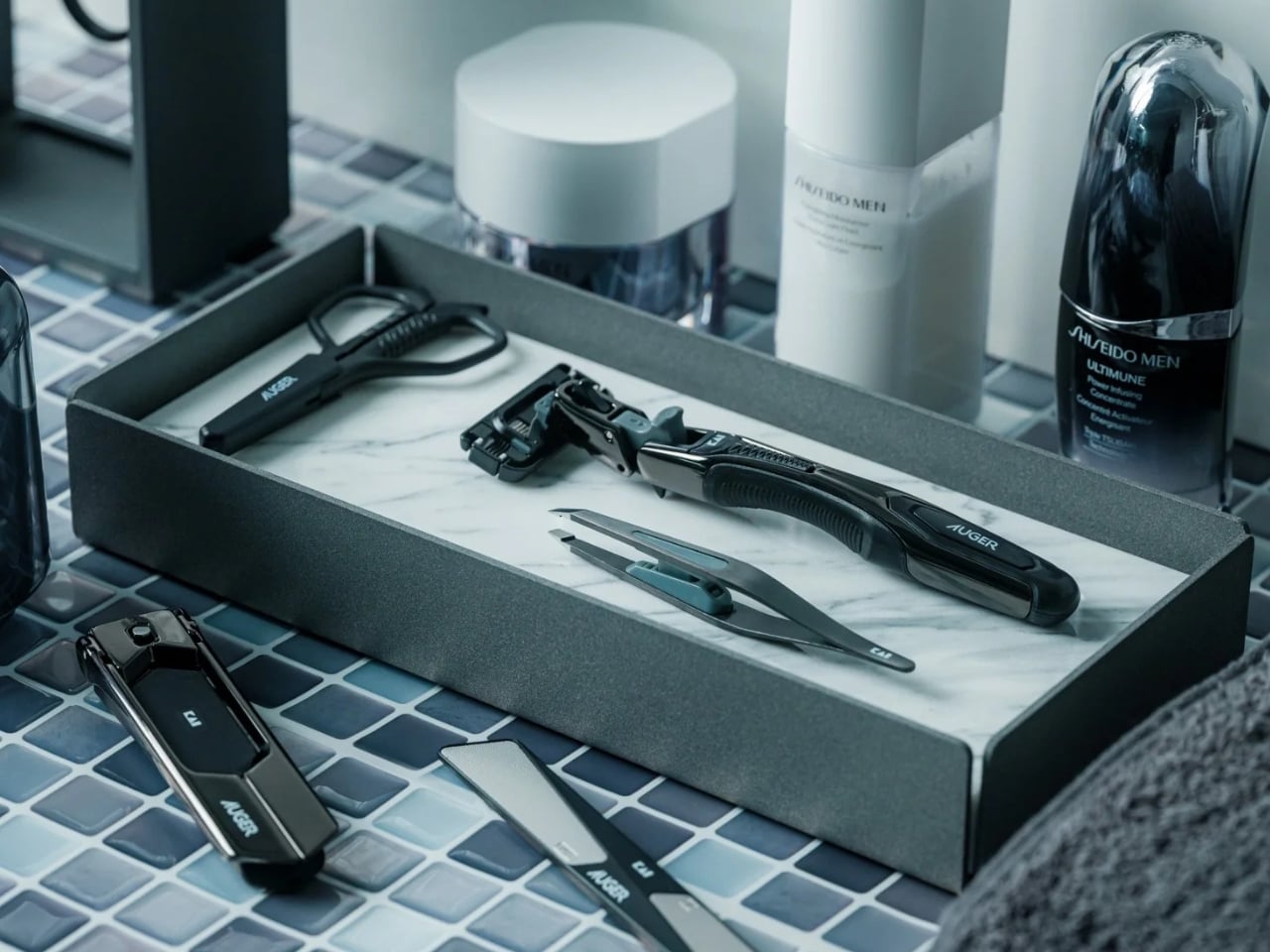
❌