❌

Vue normale

  • ✇Yanko Design
  • NUS Researchers Turn Electronic Threads Into a Touchscreen Sleeve
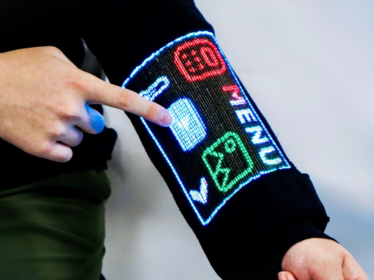
    Checking your sleeve usually means looking for a stain, not opening a calculator. Researchers at the National University of Singapore have given that familiar piece of clothing a rather different purpose, threading a working touchscreen into its fabric. The research prototype displays images, responds to presses, and bends around the forearm without relying on a rigid panel strapped on top of it. The interesting part is how the screen becomes part of the garment. Each electronic fiber carries a
     

NUS Researchers Turn Electronic Threads Into a Touchscreen Sleeve

Par : JC Torres
26 octobre 2026 à 10:20

Checking your sleeve usually means looking for a stain, not opening a calculator. Researchers at the National University of Singapore have given that familiar piece of clothing a rather different purpose, threading a working touchscreen into its fabric. The research prototype displays images, responds to presses, and bends around the forearm without relying on a rigid panel strapped on top of it.

The interesting part is how the screen becomes part of the garment. Each electronic fiber carries a row of LEDs and a touch-sensitive layer beneath them, all within a thread about 0.04 inches thick. Pressing the fiber closes a circuit, allowing the system to locate your finger. You aren’t poking through fabric at a hidden glass screen; the thread itself detects the press.

Designers: Heng Fu, Ziang Li, Swetika Chaturvedi, Xiaoyu Zhang, Xiaolong Li, Qianyi Li & Tural Khudiyev (National University of Singapore)

The sleeve combines 54 of those fibers, each carrying 96 LEDs, into a display roughly 6.6 inches by 4.1 inches. Its 96-by-54-pixel resolution isn’t going to replace your phone’s display, although the prototype can show pictures and play video. Large icons make more sense here than tiny menus, giving the interface a chunky character that suits a screen wrapped around a moving arm.

That placement puts simple tools within reach without fishing through a pocket. The team demonstrated a calculator, compass, photo viewer, and voice commands, along with Bluetooth image transfers. Video runs at 30 frames per second, dropping to 25 with synchronized audio. Those aren’t smartphone specifications to brag about, of course, but checking a direction doesn’t demand a miniature movie theater on your sleeve.

Other fibers carry a microphone, speaker, and sensors for movement, light, direction, and temperature. That lets the interface rotate with the arm and adjust its brightness automatically. A temperature-sensing fiber positioned under the arm can send a reading to the sleeve, suggesting how clothing might eventually make personal measurements easier to check. That doesn’t mean it’s ready to replace your thermometer, though.

Of course, clothing has to survive more than a few demonstrations. NUS reports that light output and touch response barely changed after 50 detergent washes and 1,000 bends. The washing procedure used a laundry bag and a gentle cycle, rather than treating the electronics like gym socks. That’s encouraging, though a laundry test isn’t a promise of surviving years of careless washing.

There’s also a difference between making the display flexible and making the entire computer disappear. Separate controller circuits and battery packs still support this prototype, so the electronics haven’t all become yarn. The researchers report breathability comparable to common fabrics, including cotton and denim, but a wearable system also has to account for where its power supply and other hardware sit during use.

For now, this remains a laboratory garment, with no announced retail price or release date. Higher resolution and more integrated electronics are among the challenges ahead. There’s a practical design question underneath the glowing sleeve, too. If the interface lives in your clothes, charging, repairing, and eventually replacing it become wardrobe decisions, alongside the ordinary matter of choosing something that fits comfortably.

The post NUS Researchers Turn Electronic Threads Into a Touchscreen Sleeve first appeared on Yanko Design.

  • ✇Yanko Design
  • DeWalt’s Tool Batteries Can Charge Laptops Without an Outlet
    A charged drill battery and a dying laptop can sit on the same table and still be useless to each other. That feels like an unnecessarily strict division of labor. DeWalt’s DCB094K USB Charging Kit addresses that disconnect by letting compatible tool batteries power USB devices through an attachable adapter. If you already have spare packs in the garage, the appeal is straightforward: stored energy becomes available to something besides the tool it normally clicks into. The better detail is tha
     

DeWalt’s Tool Batteries Can Charge Laptops Without an Outlet

26 octobre 2026 à 09:20

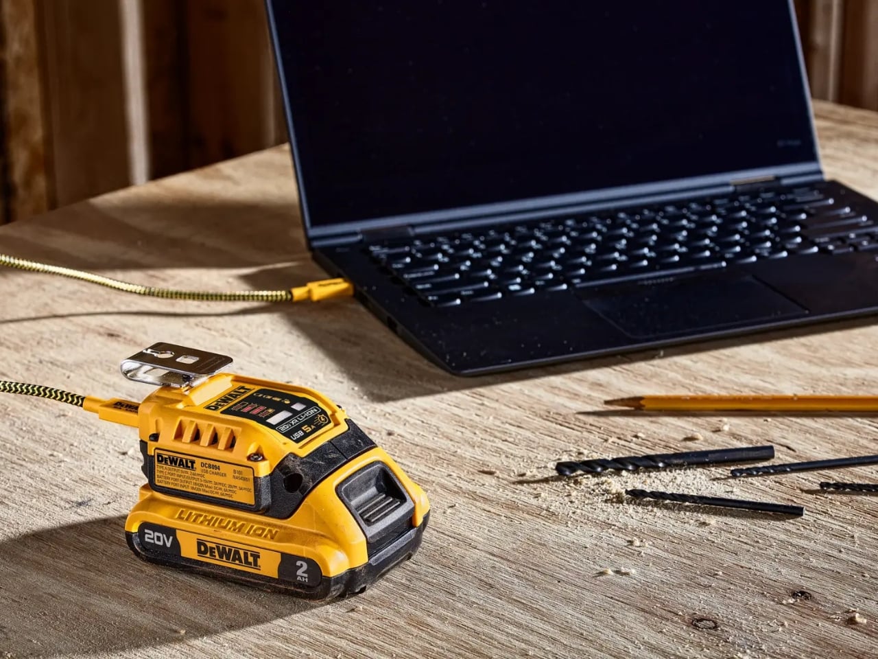
A charged drill battery and a dying laptop can sit on the same table and still be useless to each other. That feels like an unnecessarily strict division of labor. DeWalt’s DCB094K USB Charging Kit addresses that disconnect by letting compatible tool batteries power USB devices through an attachable adapter. If you already have spare packs in the garage, the appeal is straightforward: stored energy becomes available to something besides the tool it normally clicks into.

The better detail is that power can travel the other way, too. The kit’s DCB094 adapter has a bidirectional USB-C port, so it can recharge a DeWalt battery from a suitable USB power supply as well as draw from that battery to charge personal electronics. That solves a second annoyance: needing a dedicated tool-battery charging dock when a compatible USB supply could do the job. It’s this return trip that makes the accessory interesting to me.

Designer: DeWalt

Visually, DeWalt hasn’t tried to disguise it as a sleek desk accessory. The yellow-and-black housing sits on the battery like a smaller piece of power-tool equipment, complete with ventilation slots and a metal belt hook. In the product photograph, the attached battery still accounts for much of the assembly’s bulk. I like that lack of pretense. It looks appropriate beside drill bits and a pencil, even when the cable coming out of it leads to a laptop.

The headline specification deserves a closer look, though. DeWalt rates the USB-C connection for up to 100 watts in either direction, but the kit includes a 65-watt wall supply. You also get a 100-watt-rated USB cable and the belt hook, but no battery. In other words, the adapter’s maximum capability and the supplied wall charger’s output are different numbers. The included charger cannot deliver a 100-watt input simply because the port can accept it. That distinction matters more than the big number on the listing.

Compatibility also needs a little attention. DeWalt lists support for its 20V MAX and FLEXVOLT batteries, while the adapter provides a USB-A output rated at up to 12 watts alongside USB-C. The latter is the connection to consider for a compatible laptop, but check the computer’s charging requirements first. A USB-C socket alone doesn’t establish that a laptop accepts charging through it, and this adapter isn’t a universal substitute for every computer’s power brick.

One interface choice feels less intuitive than the overall idea. The adapter’s indicator lights report charging activity for the DeWalt battery, not the phone or laptop receiving power. DeWalt’s manual specifically notes that the LEDs won’t illuminate while charging personal devices. I’d prefer an obvious output indicator, particularly on an accessory that changes roles depending on what’s connected. As designed, you’ll need to look at the receiving device to confirm that it’s getting power.

The workbench appearance shouldn’t be mistaken for permission to leave it in the weather, either. The manual says to keep the charger out of rain and snow and provide a dry location outdoors. It also instructs owners to detach the battery when the adapter isn’t being used to avoid draining the pack in storage.

Runnings currently lists the kit at $119, which makes this a considered accessory purchase rather than an automatic addition to the cart. I’d find it easier to justify with compatible batteries already on hand. Buying a battery as well would mean paying for an entire setup when the actual need might simply be keeping a phone charged. The useful question is how often those existing packs could cover a charging need away from an outlet.

For someone who moves between DIY projects and laptop work, the two-way charging is the strongest argument. I’d rather add a useful connection to equipment I already own than collect another battery solely for occasional backup duty. The DCB094K makes that possible, provided its price and your device’s requirements line up.

The post DeWalt’s Tool Batteries Can Charge Laptops Without an Outlet first appeared on Yanko Design.

  • ✇Yanko Design
  • The Lamp That Refuses to Need an Outlet or a Charger
    There aren’t a lot of situations that would require me to pull a portable lamp out of my bag. But as someone who likes to journal on the go and read whenever I get the chance, I’ve run into more than a few moments where the available light just wasn’t enough. Even at home, a lamp comes in handy for those times when the main overhead lighting feels like way too much. The Anywhere-Use Lamp is built for exactly those moments. You don’t need an outlet, you don’t need an extension cord, and you don’
     

The Lamp That Refuses to Need an Outlet or a Charger

26 octobre 2026 à 07:40

There aren’t a lot of situations that would require me to pull a portable lamp out of my bag. But as someone who likes to journal on the go and read whenever I get the chance, I’ve run into more than a few moments where the available light just wasn’t enough. Even at home, a lamp comes in handy for those times when the main overhead lighting feels like way too much.

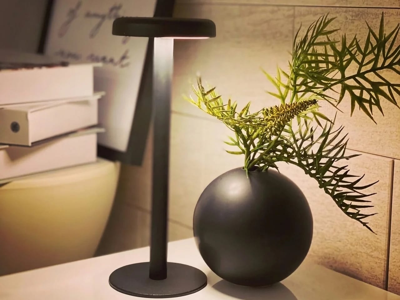
The Anywhere-Use Lamp is built for exactly those moments. You don’t need an outlet, you don’t need an extension cord, and you don’t need to panic if your battery is dead. This lamp works wherever you need it, whether that’s indoors on your desk or nightstand, or outdoors on a picnic table or inside a camping tent.

Click Here to Buy Now: $149

The lamp looks like a mushroom popping up out of the ground, with a soft, rounded cap sitting atop a slim stem base. It reads more like a small sculptural object thanks to its minimalist design, rather than the sleek, tech-forward look most portable gadgets go for. The metal base is “scratch-detailed,” meaning the wear and imperfections it picks up over time become part of its character instead of something you need to constantly wipe down or worry about.

Because it comes in a modular, pack-flat construction, you can assemble and disassemble the lamp quickly and toss it into your bag whenever you’re on the move. There are no dials or switches to fuss with, either. You simply press along any edge of the cap to cycle through brightness levels, and you’ll even feel a satisfying haptic click each time you adjust it, a small but memorable tactile detail that makes the whole interaction feel more considered than your average lamp.

The six high-CRI LEDs are built for light quality over quantity. The warm, soft glow settles gently into your space, functioning more like ambient lighting that supports your surroundings rather than a harsh task light glaring in your face. It runs entirely on AA batteries, so there’s no charging cable to hunt down. As long as you’re carrying a spare set, you can keep the light going for as long as you need.

If you’ve shopped for portable lamps before, you’ve probably come across the Philips Hue Go, one of the biggest names in the battery-powered lighting space. At $179.99, the Hue Go offers smart features the Anywhere-Use Lamp doesn’t try to compete with, including app control, millions of color options, and Alexa or Google Home compatibility. But that convenience comes with strings attached. It relies on a charging base, needs to be recharged every 5 to 48 hours depending on brightness, and works best when you’re connected to Wi-Fi or Bluetooth for full functionality.

The Anywhere-Use Lamp takes the opposite approach. At $149, it skips the smart home ecosystem entirely and leans into pure simplicity: no app, no charging base, no dead battery with nowhere to plug in. If you’re at a campsite, a beach house, or a hotel with an outlet that’s just out of reach, you can swap in fresh AAs and keep going, no Wi-Fi signal required. For readers who want dependable, no-fuss lighting over smart-home bells and whistles, that difference matters.

The true beauty of the Anywhere-Use Lamp is right there in its name. You can use it anywhere you want or need to, thanks to its thoughtful design and practical features. Whether you’re at home looking for a bit of mood lighting or out camping and need a reliable light source to finish up a task, this lamp is ready to be your go-to lighting companion.

At the end of the day, good lighting shouldn’t come with a long list of conditions attached. It shouldn’t require a nearby outlet, a fully charged battery pack, or a phone app just to turn on. The Anywhere-Use Lamp strips all of that away and hands you something refreshingly simple: warm, reliable light that goes exactly where you go. For anyone who values design as much as function, and who’s tired of being tied down by cords and chargers, this little mushroom-shaped lamp might just earn a permanent spot in your bag.

The post The Lamp That Refuses to Need an Outlet or a Charger first appeared on Yanko Design.

  • ✇Yanko Design
  • Statik PowerStand turns a USB-C cable into a folding phone stand
    A phone charging flat on a desk isn’t particularly useful when you want to follow a recipe or join a video call. Statik’s PowerStand gives that familiar cable an extra job, building a folding stand directly into its USB-C connector. The $19.99 retail accessory lets your phone stay propped up while plugged in, without adding a separate cradle to the table. Most of the work happens in a broad connector housing that sits across the phone’s bottom edge. Two legs pivot out from its ends, turning the
     

Statik PowerStand turns a USB-C cable into a folding phone stand

Par : JC Torres
26 octobre 2026 à 06:07

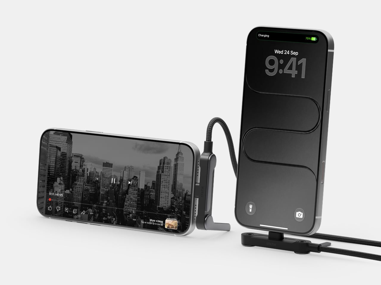
A phone charging flat on a desk isn’t particularly useful when you want to follow a recipe or join a video call. Statik’s PowerStand gives that familiar cable an extra job, building a folding stand directly into its USB-C connector. The $19.99 retail accessory lets your phone stay propped up while plugged in, without adding a separate cradle to the table.

Most of the work happens in a broad connector housing that sits across the phone’s bottom edge. Two legs pivot out from its ends, turning the plug into a little support structure for portrait or landscape viewing. Fold those legs back against the housing when you’re finished, and the stand travels with the cable rather than becoming another loose accessory to forget.

Designer: Statik

That arrangement makes particular sense beside a laptop, where a phone can sit upright for calls while the computer handles everything else. Turn it sideways, and the same support becomes useful for watching a video over lunch. There’s no magnetic ring or special case to attach first, although you do have to plug the stand end into the phone to use it.

The connector’s shape matters even when you aren’t using the stand. Its right-angle layout sends the cord along the phone’s edge instead of straight out into your hand, a useful distinction when holding it horizontally for a game. Statik also extends the plug’s shaft to reach through most cases, though that isn’t a promise that every bulky protective cover will fit.

Putting a wide piece of hardware underneath a phone creates another problem, since that space often contains speakers and microphones. PowerStand’s housing includes molded channels that Statik says direct sound toward the listener while keeping those openings clear. It’s a thoughtful response to the connector’s added width, although the available evidence doesn’t establish a measurable improvement in volume or call quality.

Statik rates the cable for up to 240W using USB Power Delivery 3.1, allowing it to serve compatible laptops when paired with an appropriate charger. That figure describes the cable’s capacity, not what every connected device will receive. Data transfers are limited to USB 2.0’s 480Mbps, making this a charging-first accessory rather than a particularly speedy file-transfer cable for large video projects and backups.

At 6.6 feet, the cord gives you some room between the outlet and whatever patch of desk or kitchen counter you’re using. It has a braided nylon jacket and reinforced strain relief, while the connector combines TPE plastic and aluminum. The rest of the lead remains a conventional cable, with a standard USB-C plug at the opposite end rather than another folding mechanism.

Of course, putting a stand inside a connector means accepting a much wider plug, even on days when you only want to charge. There’s no getting around that tradeoff by folding the feet away. But for someone who regularly props a phone beside a keyboard or hotel bed, though, that extra width buys a more useful resting place than the nearest coffee mug on the nightstand.

The post Statik PowerStand turns a USB-C cable into a folding phone stand first appeared on Yanko Design.

  • ✇Yanko Design
  • The Slurptop DIY Laptop Pairs Power-Tool Styling With a Swappable Battery
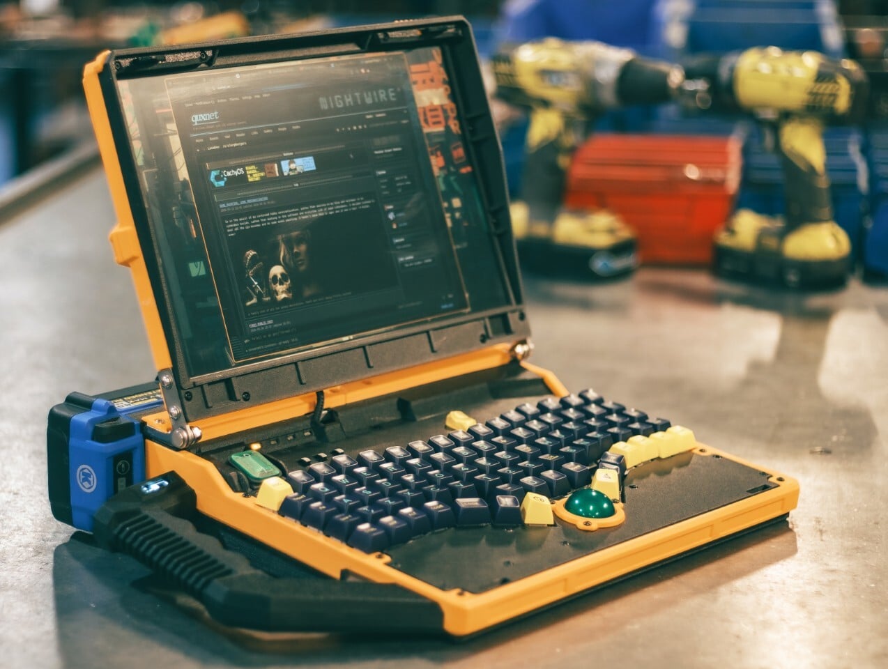
    The Slurptop borrows its battery from the toolbox, and its body doesn’t bother pretending otherwise. This homemade cyberdeck wraps mini PC hardware in a chunky yellow-and-black clamshell, complete with an integrated carry handle and mechanical keys. It’s a completed personal project rather than a retail laptop, designed around coding, light design work, and controls that don’t apologize for taking up some extra space. The angular, 3D-printed enclosure takes its cues from power tools, with simil
     

The Slurptop DIY Laptop Pairs Power-Tool Styling With a Swappable Battery

Par : JC Torres
26 octobre 2026 à 05:15

The Slurptop borrows its battery from the toolbox, and its body doesn’t bother pretending otherwise. This homemade cyberdeck wraps mini PC hardware in a chunky yellow-and-black clamshell, complete with an integrated carry handle and mechanical keys. It’s a completed personal project rather than a retail laptop, designed around coding, light design work, and controls that don’t apologize for taking up some extra space.

The angular, 3D-printed enclosure takes its cues from power tools, with similarly conspicuous controls. The yellow frame uses glass-fiber-filled plastic, while black components use carbon-fiber-filled filaments. An aluminum bar reinforces the hinge area, with shared bolts securing several structural layers. The handle fits between sections of the case, so assembling the housing locks it into position before its own mounting screws are added.

Designer: Slurpburgers

Open the lid, and the keyboard immediately takes over. Its 82 mechanical keys sit in angled groups rather than the straight rows you’d expect on a laptop, leaving a green trackball near the front center. That ball runs on three ceramic bearings above a sensor salvaged from a gaming mouse. You can move the pointer without clearing desk space for a separate mouse.

The display keeps things relatively conventional, pairing a 14-inch panel with a 1920-by-1200 resolution and a 16:10 aspect ratio. Behind the custom shell is hardware from a GMKtec M5 Ultra mini PC, including an AMD Ryzen 7 7730U processor, 64GB of RAM, and a 500GB SSD. CachyOS supplies the familiar Linux desktop, so there’s a recognizable computing environment beneath all that workshop character.

An XP-Pen drawing tablet also gets its own holder behind the display, adding pen input without displacing the keyboard or trackball. Connected beside the laptop, it provides a separate surface for sketching or editing artwork, leaving the main display free to show what you’re working on. That keeps everything together for travel, although actually drawing still calls for some extra desk space.

The power arrangement follows the same willingness to borrow useful parts. A 24V Kobalt tool battery supplies the machine through a converter that adjusts its output to the PC’s required 19V. A separate cutoff board guards against draining the pack too far. The battery remains an obvious external attachment, making its removal part of the operating routine instead of a repair procedure.

That decision comes with a catch, naturally. The Slurptop doesn’t charge the battery itself, so the pack has to visit its tool charger. Wall power can run the computer independently, and a switching module transfers between the adapter and battery. Keeping it plugged in lets the owner change packs without shutting down, but there’s no uninterrupted battery swap away from an outlet.

The builder reports more than four hours of writing and coding on a 4Ah battery, with some charge remaining. That’s a useful reference, not an independently measured endurance rating. The power-tool styling doesn’t come with a documented weatherproofing or drop rating, either. You can carry this homemade workstation by its handle, but treating it like a drill would be an unfortunate misunderstanding.

The post The Slurptop DIY Laptop Pairs Power-Tool Styling With a Swappable Battery first appeared on Yanko Design.

  • ✇Yanko Design
  • HMD 2660 Flip Senior Edition Brings AI Conversations to an Old-School Phone
    Making a phone call shouldn’t feel like learning a new piece of software. The HMD 2660 Flip Senior Edition responds to that familiar frustration with big buttons, a folding body, and an unexpected addition called Mary. This AI companion from inTouch brings conversation to a basic phone, letting older adults try the technology without trading their keypad for a touchscreen full of apps. The hardware doesn’t stray far from the regular HMD 2660 Flip introduced in 2025. Open the clamshell, and ther
     

HMD 2660 Flip Senior Edition Brings AI Conversations to an Old-School Phone

Par : JC Torres
26 octobre 2026 à 04:15

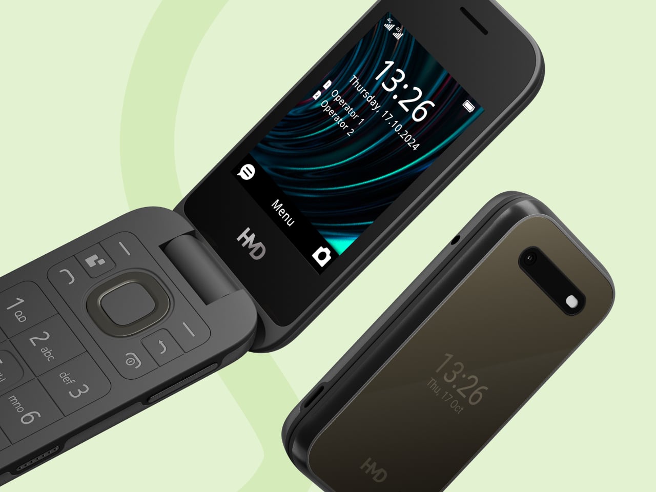
Making a phone call shouldn’t feel like learning a new piece of software. The HMD 2660 Flip Senior Edition responds to that familiar frustration with big buttons, a folding body, and an unexpected addition called Mary. This AI companion from inTouch brings conversation to a basic phone, letting older adults try the technology without trading their keypad for a touchscreen full of apps.

The hardware doesn’t stray far from the regular HMD 2660 Flip introduced in 2025. Open the clamshell, and there’s a 2.8-inch screen above a generously sized number pad, with a navigation control separating the two. Answering or ending a call can be tied to opening or closing the phone, giving those actions a physical beginning and end that a touchscreen doesn’t quite offer.

Designer: HMD Global

The outside gets its own smaller display, so checking the time doesn’t require unfolding the whole thing. Its dark body and rounded corners stick to the recognizable flip-phone formula rather than dressing the device up as medical equipment. That restraint matters here. The phone offers an alternative way to stay in touch, without announcing that its owner needs an entirely different category of gadget.

Mary adds a different kind of contact to the phone, one that’s available for a casual conversation around the clock. HMD says the companion speaks slowly, leaves room for replies, and remembers earlier conversations. A chat might involve history, a favorite memory, or a game. The interesting choice is delivering those interactions through speech, instead of asking someone to type their thoughts.

Of course, an AI feature can easily complicate a supposedly simple phone. Here, Mary appears in the main menu, and selecting her icon before pressing the call button starts the conversation. There’s no separate app to install or number to memorize. Activation still involves a website or QR code, though, so the simplest experience comes after someone has handled that initial setup.

The less glamorous details haven’t disappeared beneath the AI pitch. A removable 1,450mAh battery and USB-C charging keep the basics familiar, while HMD rates the body IP54 for protection against dust and splashes. A replaceable battery also means you can swap a worn component, rather than treating the whole phone as something that has reached retirement age.

The UK listing puts the phone at £79.99 (about $107), including a five-hour trial of Mary. Continuing the service costs £16.90 (about $23) monthly, with carrier charges potentially adding to that. The trial doesn’t automatically become a paid plan, but inTouch’s general terms say paid subscriptions renew automatically. It can be canceled, but ongoing conversations introduce another expense alongside ordinary phone service.

There’s an important distinction between making conversation easier to access and replacing human company. Mary is software, and her availability shouldn’t be confused with evidence that she reduces loneliness. The change here is how someone reaches that software. They can keep the familiar ritual of opening a phone and making a call, and still use their handset after the AI subscription ends.

The post HMD 2660 Flip Senior Edition Brings AI Conversations to an Old-School Phone first appeared on Yanko Design.

  • ✇Yanko Design
  • This $6 Glow-in-the-dark Carabiner might be Camping EDC’s biggest upgrade
    We put glow on everything we are afraid of losing in the dark. Watch hands, exit signs, stair edges, light switches, and those plastic stars on a kid’s ceiling all got the memo decades ago. The carabiner, an object whose entire job is hanging onto things in low light, somehow missed it. It sits there, smug in anodized aluminum, daring you to find it. That is the oversight of the century, and I will happily defend that claim at any campsite. OBORO, from Maruhachi Kasei, a plastics factory in Na
     

This $6 Glow-in-the-dark Carabiner might be Camping EDC’s biggest upgrade

25 octobre 2026 à 21:45

We put glow on everything we are afraid of losing in the dark. Watch hands, exit signs, stair edges, light switches, and those plastic stars on a kid’s ceiling all got the memo decades ago. The carabiner, an object whose entire job is hanging onto things in low light, somehow missed it. It sits there, smug in anodized aluminum, daring you to find it. That is the oversight of the century, and I will happily defend that claim at any campsite.

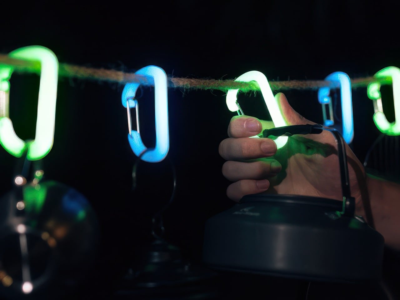
OBORO, from Maruhachi Kasei, a plastics factory in Nagoya, Japan that has been molding resin since 1974, closes the loop. The large D carabiner is glow-infused polycarbonate, measures about 3 by 1.7 inches, weighs 0.42 ounces, and is rated for 66 pounds. Leave it in sunlight or under a lamp for a bit and it shines for hours, with no battery, no charging, and no app (thankfully). A one-handed clip joins it for towels and tarps, rated for 55 pounds, and both come in green or a cooler blue. It is accessory gear rather than climbing gear, so keep your rope work on the real stuff.

Designer: Maruhachi Kasei

Click Here to Buy Now: $73 $91 (20% off) for 12 pieces. Hurry! Only 5 days left.

The Glow Is Baked Into the Plastic Itself

The glow pigment is mixed into the polycarbonate itself, so the entire body is the light source. There is no paint layer to chip or flake, which matters on an object that spends its life banging against rocks, zippers, and other gear. Polycarbonate is the same family of plastic used in bulletproof glazing, and the maker claims five times the impact resistance of ABS and 250 times that of ordinary glass. It also handles weather and heat better than most plastics. The gate is a nickel-plated metal wire, the one part that has to flex thousands of times, so it makes sense that it is not resin.

In the maker’s own test, twenty minutes under a blacklight gave about three hours of visible glow. Brightness peaks in the first 10 to 20 minutes and fades gradually from there, the way every glow-in-the-dark thing you have ever owned behaves. Sunlight and ordinary LED room lighting both recharge it, as many times as you like. Long-afterglow pigments like this trace back to a 1993 breakthrough at Japan’s Nemoto & Co., the lineage behind Super-LumiNova on Swiss watch dials, though the maker does not name its exact pigment. Water is the weak spot: the maker says wet pigment loses its charge and the surface can cloud, so this belongs in the tent, not out in the rain.

A Bigger Gate, Beefier Numbers, and a Clip for Towels

The large D measures about 3 by 1.7 inches and 0.28 inches thick, which the maker says is 30 percent bigger than a standard carabiner. That extra room is the whole point of the redesign. The gate opens wide enough for thick camp rope, so a mug, a kettle, and a lantern can all hang without a game of Tetris. The working load is rated at 66 pounds, while the maker’s pull test ended at 213 kilograms, roughly 470 pounds. That gap is deliberate, since the rating sits near 15 percent of breaking load, and at 0.42 ounces you will forget the thing is on your bag until you need it.

The clip is built for flat, floppy things like towels and tarps. It opens and closes with one hand, using serrated jaws and a sliding block with a toothed lock, and a thin metal loop up top lets it hang from a line or a bag. The wide mouth takes thick fabric where a standard clothespin gives up. Its 55-pound rating sits a bit under the D carabiner, which is plenty for a soaked camp towel. Two clips and a rope between trees give you a glowing clothesline you can actually find after dark.

Two Colors, Endless Things to Hang, and Roughly $6 a Piece

Green is the classic and the brighter of the two, while blue is the rarer, cooler color that I find more fun to look at. By day neither looks like it does at night, since green reads pale yellow-green and blue looks milky white. Blue is dimmer after dark, which seems a fair trade for the novelty. The use cases click once the idea sinks in: a tent guyline, a go-bag handle, a kid’s school backpack, a dog’s leash, a key hook by the front door.

The 12-piece set (six large D carabiners and six clips) is ¥11,616, about $73, against a ¥14,520 (about $91) retail price, which works out to roughly $6 a piece. Singles run about $6 for a D carabiner and about $7 for a clip. Pink versions of both ($40 for six of each), a three-pack of Suncheck glow carabiners ($33), and the older Ouroboros Carabiner Clip ($4) are available as add-ons. OBORO ships worldwide with delivery estimated for January 2027.

Click Here to Buy Now: $73 $91 (20% off) for 12 pieces. Hurry! Only 5 days left.

The post This $6 Glow-in-the-dark Carabiner might be Camping EDC’s biggest upgrade first appeared on Yanko Design.

  • ✇Yanko Design
  • 5 Pocket-Sized EDC for People Who Hate Carrying Bulky Multitools
    A multitool can earn its place in your pocket, right up until its weight makes you leave it at home. Pliers, blades, drivers, and openers all need somewhere to go, and those stacked layers of steel add up. If your daily repairs mostly involve opening a package or tightening a loose screw, carrying the entire assortment can feel like packing a toolbox for a job that takes thirty seconds flat. The five designs here keep their ambitions small and their functions specific. There’s a DIY toolkit ins
     

5 Pocket-Sized EDC for People Who Hate Carrying Bulky Multitools

25 octobre 2026 à 19:30

A multitool can earn its place in your pocket, right up until its weight makes you leave it at home. Pliers, blades, drivers, and openers all need somewhere to go, and those stacked layers of steel add up. If your daily repairs mostly involve opening a package or tightening a loose screw, carrying the entire assortment can feel like packing a toolbox for a job that takes thirty seconds flat.

The five designs here keep their ambitions small and their functions specific. There’s a DIY toolkit inside a Zippo case, a utility knife with a magnetic ruler, a keychain tool, a flat flashlight, and compact scissors with a few useful extras. Each offers a different way to pare down your everyday carry. Pick the one that matches your usual tasks rather than treating the collection as a pocket packing list.

1. Tiny Tool Shop’s DIY Zippo Toolkit

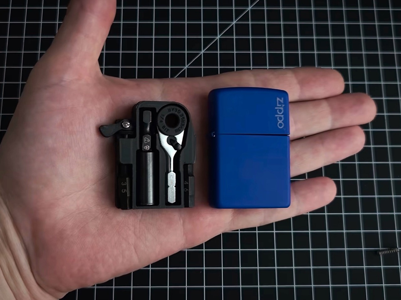
Closed, Tiny Tool Shop’s DIY toolkit is still a Zippo case. Open it, and a custom 3D-printed insert holds a Crom micro ratchet, two Steinwhale micro bits, and a Klein utility knife extension. The lighter insert has been removed, so this no longer doubles as a lighter. That constraint is part of the appeal: the maker uses an existing enclosure, with its hinged lid already solved, then designs the internal storage around a very specific selection of small tools.

The cleverest detail is retrieval. A spring salvaged from a Bic lighter helps push the ratchet through an opening in the case’s back, addressing the obvious problem of extracting something packed this tightly. Dedicated recesses organize the components instead of leaving them loose inside the shell. This is a maker project, not a ready-made Zippo product, and reproducing it means sourcing parts and making the insert. For someone drawn to mechanical projects, that assembly process is part of its attraction.

What we like

  • Reuses a familiar hinged enclosure with dedicated tool storage.
  • Spring-assisted retrieval addresses the difficulty of removing tightly packed components.

What we dislike

  • Requires DIY assembly and a custom printed insert.
  • Storage is tailored to the specified ratchet, extension, and bits.

2. CraftMaster EDC Utility Knife

CraftMaster makes more sense when opening boxes and trimming materials account for most of your tool use. The utility knife pairs a metal body with a replaceable OLFA blade deployed using a rotating knob. At 4.72 inches long, the package stays compact, while a companion metal ruler docks magnetically against the back. Rather than hiding a blade among unrelated attachments, the design gives cutting and measuring the full object, with the ruler stored alongside the knife.

The ruler carries both metric and imperial markings, with a raised edge to help lift it from a flat surface. It also incorporates a blade breaker for removing dull segments, keeping a maintenance accessory within the same compact arrangement. That’s the interesting decision here: the extra features support the main task instead of chasing a larger function count. At $80, this is a deliberate upgrade to a basic cutter, and its appeal depends on how often you cut and measure.

Click Here to Buy Now: $80.00

What we like

  • Magnetic storage keeps the ruler attached.
  • Replaceable blade with a dedicated blade breaker.

What we dislike

  • An $80 price for a utility knife.
  • No driver or plier functions.

3. Gerber Shard

Gerber’s Shard takes the opposite approach to the Zippo build: there’s nothing to unpack. This stainless steel keychain tool integrates a pry bar, two flathead drivers, a cross driver, a wire stripper, and a bottle opener into its fixed shape. A hole attaches it to your keys, so it doesn’t demand a separate pouch. The appeal is straightforward. For occasional small adjustments or light prying, you can reach for a tool without unfolding an entire set of handles and attachments.

The design asks you to accept a small gripping surface in exchange for less hardware. That’s a reasonable bargain for a backup, but not a reason to retire proper screwdrivers. There’s no blade or pair of pliers here, and the integrated tips aren’t interchangeable. Gerber specifies a titanium nitride coating for corrosion resistance, although that’s a protective treatment rather than a claim that the tool is titanium. Its distinction is how little mechanism it needs to do its limited jobs.

What we like

  • Integrated tools need no unfolding or assembly.
  • Keyring attachment avoids a separate carrying case.

What we dislike

  • Fixed driver tips cannot accommodate interchangeable bits.
  • Small gripping area limits its role in demanding jobs.

4. Streamlight Wedge SL

A flashlight earns its place here because seeing the screw can matter as much as having the right bit. Streamlight’s Wedge SL uses a flat aluminum body rather than a cylindrical tube, measuring 0.28 inches thick, or 0.41 inches with its pocket clip. It weighs 1.14 ounces and measures 5.65 inches long. Those proportions explain the design: this is a slim inspection light for a pocket edge or tool pouch, with dimensions that prioritize a thin profile over outright miniaturization.

Streamlight rates continuous output at 100 lumens on high and 50 on low, with a temporary mode reaching 500 lumens. Keeping those figures distinct matters more than leading with the biggest number. A tail switch handles operation, while USB-C charging and a user-replaceable battery support continued use. The manufacturer quotes 1.75 hours on high, so this is worth choosing around short inspections rather than assuming an entire evening at full output. That runtime deserves as much attention as the brightness.

What we like

  • Flat body measures 0.41 inches thick, including the clip.
  • USB-C charging and a user-replaceable battery.

What we dislike

  • The 500-lumen output is temporary, not continuous.
  • Rated runtime on high is only 1.75 hours.

5. Eiger 8-in-1 Scissors

EigerTool starts with the scissors, which is a sensible choice if most of your everyday cutting involves packaging, string, or labels. Made in Sanjo, Japan, the Eiger 8-in-1 Scissors use SUS420J2 stainless steel and measure 5.12 inches long, weighing 1.87 ounces without the carrying case. The handles and blades incorporate bottle, can, and screw-cap openers alongside other functions. Instead of burying small scissors inside a conventional folding tool, Eiger makes the familiar cutting action the center of the whole design.

A leather case covers the tool for carrying, and the included Nite Ize carabiner offers a bag attachment option. That matters because a tool this long still needs room, even if the scissors themselves weigh little. The case belongs in the size calculation, too: the listed 53 grams refers to the scissors, not everything you’ll carry when they’re protected and clipped on.

Click Here to Buy Now: $65.00

What we like

  • Scissors remain the primary tool.
  • Leather case and carabiner are included.

What we dislike

  • The 5.12-inch length needs pocket space.
  • Case weight isn’t included in the 53g specification.

Choose the Task Before the Tool

Before adding another tool, think about the last few times you actually needed one away from home. Frequent deliveries suggest carrying a dedicated package cutter. Loose fasteners suggest a driver. Dark cupboards suggest a light. That sounds obvious, but it’s an effective way to avoid choosing by function count alone. Your pocket has limited space; the useful question is which recurring inconvenience deserves a permanent place in it each day.

There’s also permission here to leave capabilities behind. If pliers rarely solve a problem for you, their absence isn’t automatically a flaw. If you need them regularly, none of these smaller alternatives make that requirement disappear. Compact carry works best as an honest edit, including the case, clip, or loose components that come along. The goal is a tool you’ll willingly bring, without slowly rebuilding the toolbox inside your pants.

The post 5 Pocket-Sized EDC for People Who Hate Carrying Bulky Multitools first appeared on Yanko Design.

  • ✇Yanko Design
  • This Spanish Home Uses Curved Roofs and Cork Walls to Stay Naturally Cool
    Some houses make their presence known through bold shapes, while others seem to grow naturally from the landscape.  Casa Vereda, designed by L’Aura Ortín Architecture For Happiness, finds a balance between the two. Set in the Spanish countryside, the residence draws inspiration from regional construction traditions, agricultural heritage, and Mediterranean living. Its curved roofs, earthy materials, and distinctive green shutters give the home a contemporary identity that feels rooted in its su
     

This Spanish Home Uses Curved Roofs and Cork Walls to Stay Naturally Cool

25 octobre 2026 à 18:30

Some houses make their presence known through bold shapes, while others seem to grow naturally from the landscape.  Casa Vereda, designed by L’Aura Ortín Architecture For Happiness, finds a balance between the two. Set in the Spanish countryside, the residence draws inspiration from regional construction traditions, agricultural heritage, and Mediterranean living. Its curved roofs, earthy materials, and distinctive green shutters give the home a contemporary identity that feels rooted in its surroundings.

The architecture is defined by a succession of curved rooflines that ripple across the long, low structure. Constructed using traditional Catalan vaulting techniques and handcrafted bricks, these sculptural forms reference a building method deeply embedded in Spanish architectural history. The exterior is finished in pale sprayed cork, creating a continuous texture across the walls and roof while helping regulate temperature and moisture.

Designer: L’Aura Ortín Architecture For Happiness

A row of tall, leaf green shutters adds a vibrant contrast to the neutral facade. Inspired by traditional Mallorcan designs, the shutters were custom-designed by the architects and made from powder-coated aluminum to provide shade, privacy, and security. Surrounded by vegetation, the house takes on an almost agricultural appearance, recalling the farm buildings and cultivated terraces that characterize the region.

Alongside the residence, a spacious patio paved with handcrafted terracotta tiles creates an inviting outdoor gathering space. The earthy flooring references the area’s agricultural heritage, while large glass doors connect the terrace directly to the interiors. Adjustable shutters help control sunlight throughout the day, making the transition between indoors and outdoors comfortable even during warmer months.

Inside, the living room unfolds beneath a dramatic Catalan vaulted ceiling made from handcrafted bricks in varying shades of terracotta, pink, and sandy beige. The exposed brick brings warmth and texture to the spacious interior, contrasting with smooth white walls and polished terrazzo flooring. Beyond its appearance, the terrazzo contributes to passive temperature regulation by absorbing warmth from the winter sun and staying cool during summer when the shutters are closed.

Modular sofas and ottomans upholstered in rust colored fabric form a comfortable seating arrangement around a simple pine coffee table. A freestanding black fireplace separates the lounge from the dining area without interrupting the open layout. Tall glass doors flood the space with daylight, while cherry-toned timber doors and pale wooden cabinets complete the warm material palette.

The adjoining dining area features a long, pale timber table paired with matching chairs and benches. A simple white dome pendant hangs overhead, while a low wooden sideboard provides storage along the wall. The exposed brick ceiling stretches across the space, adding character to an otherwise minimal setting.

Beside the dining room, the kitchen introduces richer tones through pine cabinetry lacquered in a cherry finish. The reddish wood contrasts with light colored countertops, while a long island provides additional workspace and casual seating with timber stools. Integrated appliances and streamlined cabinetry maintain a clean appearance, allowing the natural materials and vaulted ceiling to remain the focal points.

The bedrooms continue the home’s restrained aesthetic, with exposed brick vaults, white walls, pale terrazzo floors, and natural timber furniture. Unlike the communal areas, these rooms have lower ceilings that create a more intimate atmosphere while making them easier to heat and cool. In the main bedroom, a simple wooden bed is accompanied by a floating bedside table, neutral bedding, and a full-length mirror. The second bedroom features a single timber bed, a compact desk, and a matching wardrobe, with a mustard colored throw adding a subtle pop of color. Glass doors fitted with slatted shutters provide natural light and ventilation while allowing occupants to adjust privacy and shade.

The bathrooms introduce a softer palette through pale gray rectangular wall tiles, warm pink cabinetry, and terracotta colored vessel sinks. One features a floating vanity with a white countertop and round mirror, while the other includes a wider vanity and a large rectangular mirror reflecting the walk-in shower opposite. Contemporary fixtures and minimal glass detailing keep the spaces open and bright, with exposed brick ceilings maintaining continuity throughout the interiors.

Architectural drawings reveal a long, single-story layout organized around everyday functionality. A two-car garage occupies one end, the open living, dining, and kitchen spaces form the center, and the bedrooms and bathrooms sit toward the opposite end. The communal spaces open directly onto the generous terrace, strengthening the home’s relationship with its garden and surroundings.

Casa Vereda finds its charm in the thoughtful reinterpretation of familiar architectural elements. The curved brick vaults, Mallorcan-inspired shutters, terracotta surfaces, and cork exterior serve practical purposes while giving the residence a distinctive identity. Through a careful balance of traditional craftsmanship, passive climate strategies, and contemporary interiors, L’Aura Ortín Architecture For Happiness has created a home that feels entirely at ease with its rural Mediterranean setting.

The post This Spanish Home Uses Curved Roofs and Cork Walls to Stay Naturally Cool first appeared on Yanko Design.

  • ✇Yanko Design
  • This titanium watch turns Yuri Gagarin’s first orbit into a dial
    Ask any American watch nerd about space watches and you’ll hear one word within three seconds: Speedmaster. Moon landing, NASA certification, the whole legend. Meanwhile, eight years before Apollo 11, a Soviet pilot strapped on a standard-issue navigator’s watch and went around the planet first, and that story gets a fraction of the airtime. I love a Speedy as much as anyone. Still, the first human in orbit deserves a little more wrist love, and a Moscow designer just delivered some. Alexey Yak
     

This titanium watch turns Yuri Gagarin’s first orbit into a dial

25 octobre 2026 à 16:45

Ask any American watch nerd about space watches and you’ll hear one word within three seconds: Speedmaster. Moon landing, NASA certification, the whole legend. Meanwhile, eight years before Apollo 11, a Soviet pilot strapped on a standard-issue navigator’s watch and went around the planet first, and that story gets a fraction of the airtime. I love a Speedy as much as anyone. Still, the first human in orbit deserves a little more wrist love, and a Moscow designer just delivered some.

Alexey Yakushik’s Yuri Gagarin: First in Space is that delivery. His brand launched in 2025, and this is a big step up from its earlier releases on Vostok and Luch movements. The case is Grade 5 titanium, 45mm across (about 1.8 inches), with a domed sapphire crystal, a Miyota 8215 automatic sits under a custom module, and a rocket hand circles a blue Earth every hour. It collected two European Product Design Award wins this year. The run is 130 pieces, split between natural titanium and black PVD, at about $4,150 each, sold only through the brand’s Russian site.

Designer: Alexey Yakushik

A polished blue Earth sits dead center of the dial, and a rocket-shaped minute hand laps it once an hour. Minute numerals ring the globe like a launch-control readout. Hours sit lower down as bold Arabic numerals, with a red marker picking out the current one. Four plates on the diagonals spell СССР in Cyrillic, which is about as subtle as a Soviet space poster should be. For the record, Vostok 1 took roughly 89 minutes to orbit the planet and the rocket does it in 60, but I won’t be filing a complaint about the pacing.

The case and the integrated bracelet are both Grade 5 titanium, the alloy aerospace engineers love because it is strong, light, and unbothered by most of what life throws at it. At 45mm the case is large on paper, though titanium weighs far less than steel, and the brand hasn’t published the weight or thickness. The domed sapphire crystal is 35mm across and bulges up over the globe like a capsule window, which is the whole porthole idea in one piece of glass. Water resistance is 100 meters, the lume is BGW9, and the links look faceted and angular in the renders. Nobody is mistaking it for a dress watch.

Underneath sits the Miyota 8215, a 21-jewel Japanese automatic workhorse that keeps time reliably and stays out of the dial’s way, with the brand’s AYW001.1 module built on top. The renders show a custom rotor stamped with 1961, СССР, and 2026, the sort of detail only the owner will ever see. Yuri Alekseyevich Gagarin’s full name wraps the sapphire caseback window, and every watch carries its own number, such as 01/65. Hiding a love letter on the back of a watch is a wearer-only flex, and I’m here for it. Nobody across the table will ever read it, which is exactly the point.

Yakushik says the project has the blessing of Gagarin’s daughters, Galina and Elena, along with Roscosmos support. It launched April 16, 2026, timed to the flight’s 65th anniversary, and the first piece went to the Moscow Museum of Cosmonautics. The European Product Design Award is a paid-entry Farmani Group competition that covers concepts and finished products, so read the two wins as a nod to the design and leave the horological verdict to others. At about $4,150, the money goes to the titanium, the bracelet, the dome, and the custom display more than the base caliber. Gagarin carried a 33mm brass tool into orbit, and sixty-five years later his flight has a 45mm titanium watch of its own.

The post This titanium watch turns Yuri Gagarin’s first orbit into a dial first appeared on Yanko Design.

  • ✇Yanko Design
  • This Jenga tower is also a lamp, and it lights up as you stack it
    Give an architect a box of blocks and they’ll tell you it’s research. Toronto architecture studio PARTISANS took that excuse all the way and came out the other side with a lamp. The Jenga Light rebuilds the game’s famous rectangles in a translucent material that glows from inside. Set the blocks on a powered base and electricity travels upward through every point where one block rests on another. The path the weight takes is the same path the power takes. That one idea turns a party game about
     

This Jenga tower is also a lamp, and it lights up as you stack it

25 octobre 2026 à 15:15

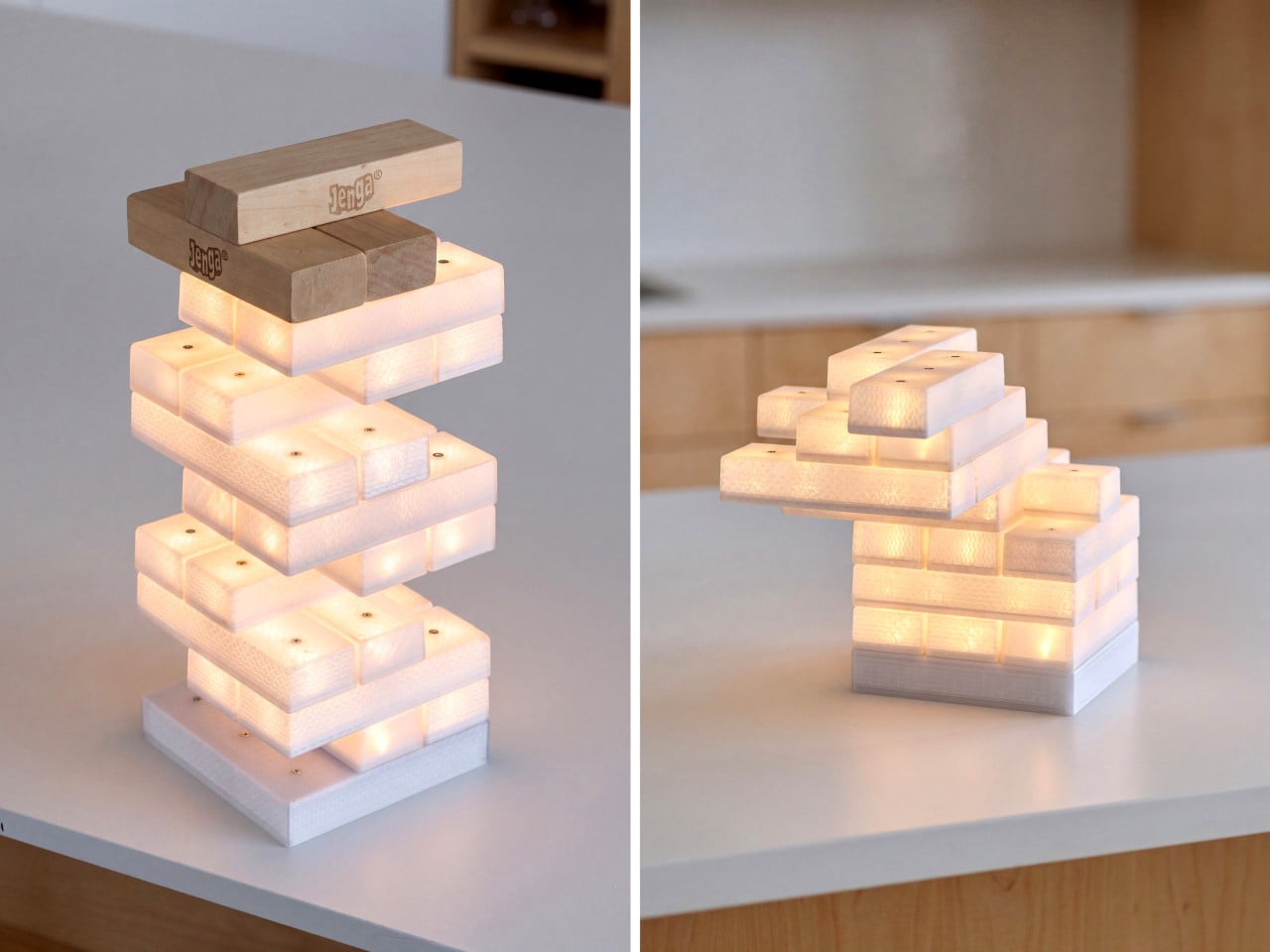
Give an architect a box of blocks and they’ll tell you it’s research. Toronto architecture studio PARTISANS took that excuse all the way and came out the other side with a lamp. The Jenga Light rebuilds the game’s famous rectangles in a translucent material that glows from inside. Set the blocks on a powered base and electricity travels upward through every point where one block rests on another. The path the weight takes is the same path the power takes. That one idea turns a party game about collapse into a lamp you build by hand, one glowing brick at a time.

Lead designer Alex Josephson and teammate Teddy Shropshire solved the fiddliest part of the problem with a component most people have never heard of. The blocks hide bridge rectifiers, tiny circuits that make polarity a non-issue. Flip a block, rotate it, or push it into a cantilever that looks like it’s daring gravity, and it still lights. The lamp won its category, Home Lighting: Lamps and Luminaires, at the 2026 European Product Design Award, an international competition that welcomes prototypes as well as finished designs. Pricing and availability haven’t been announced yet. Meanwhile, I’m trying to figure out how many blocks it takes to reach the ceiling.

Designers: Alex Josephson & Teddy Shropshire

How bridge rectifiers make every block reversible

Every electrical connection has a positive side and a negative side, and most stacking lamps deal with that by forcing pieces to go one way. A bridge rectifier is four diodes arranged in a loop, and it sends current out the same way no matter which way it comes in. Tuck them inside the blocks and “upside down” stops meaning anything. A brick can sit flat, sit flipped, or spin around, and its LEDs get the right polarity every time. That one cheap part deletes every rule you’d otherwise have to learn before playing. It’s the electrical version of a USB-C plug, which also stopped caring which way you hold it.

Compare that with the Tetris lamp ThinkGeek sold around 2012, where a powered bottom piece fed light to the tetrominoes stacked above it and the interlocking shapes did the steering. Later patents for modular light kits went mechanical, adding magnets and contacts shaped to avoid short circuits when blocks meet at odd angles. LumiBlocks took the magnetic route too, pairing snap-together blocks with app control and RGBCW LEDs. PARTISANS skips magnets entirely, letting electronics handle orientation and gravity handle everything else. The result asks nothing of you except a steady hand. That also happens to be the only thing Jenga ever asked.

Translucent printed bricks and a grid of contacts

From the photos, the bricks appear 3D-printed in a translucent plastic, with visible layer lines and a wavy internal infill. Most designers would sand or hide that texture, but here it does the job of a lampshade. Light passes through the infill and paints a woven, scaly pattern across every face, so each block glows with a grain that frosted acrylic could never give you. The shots mostly show warm white light, with one hero image running cooler. PARTISANS hasn’t published brightness or color temperature figures yet. Stack enough bricks and the whole thing reads like a lantern built by someone who really loved masonry.

Small metal contacts dot the top of each block, three in a row on the long pieces, while the base carries more, plus a power cord and a small port on one side. Those dots likely form a grid that decides how far one block can overhang the next and still stay lit. They also mean you can’t play an actual round of Jenga on it, since shimmying a brick out of the middle of a tower will just disconnect the entire top half of the lamp. Think of it as Jenga-inspired, with the building half of the game kept and the pulling half retired. A bumped table can still flatten a ten-minute spiral, which is the most Jenga thing left about it.

From a Toronto toy fair to a Toronto studio

Jenga began as a family game Leslie Scott played with wooden blocks growing up in Ghana, and it launched at the London Toy Fair in 1983. Its real break came in 1986 at the Toronto Toy Fair, where Hasbro’s chairman reportedly decided he had to have it. Forty years later, a Toronto studio has turned the same stack into a table lamp. PARTISANS is mostly an architecture practice, best known for the cedar-lined Grotto Sauna on Georgian Bay, yet Josephson keeps drifting into lighting. His Gweilo lamps, made from hand-molded acrylic sheets, won the 2016 AZ Award for Best Lighting Installation.

Playful lighting has had a good run lately, from Analog lamps, which grew out of LEGO play and now sell at MoMA, to app-controlled magnetic blocks for desk setups. The Jenga Light skips apps and color modes and bets everything on the hands-on part. The European Product Design Award judges entries anonymously and accepts prototypes, so this win recognizes the idea and its engineering ahead of any retail launch. PARTISANS hasn’t announced pricing or a release date. Until it does, I’m staring at my old Jenga set and wondering how hard bridge rectifiers really are to solder.

The post This Jenga tower is also a lamp, and it lights up as you stack it first appeared on Yanko Design.

  • ✇Yanko Design
  • Bellavista 11 Folds Thin White Concrete Planes Down an Ibiza Hillside Toward the Sea
    Bellavista 11 makes a hillside feel like the starting point of a home rather than a problem to solve. Designed by Fran Silvestre Arquitectos in Roca Llisa, Ibiza, the villa descends toward the Mediterranean through a sequence of white horizontal planes. Its most striking feature is not its size or its pool, but the way its roofs, floors, and terraces appear to belong to one continuous architectural gesture. The house is the first completed residence in The Roca Views, a development of six homes
     

Bellavista 11 Folds Thin White Concrete Planes Down an Ibiza Hillside Toward the Sea

25 octobre 2026 à 13:20

Bellavista 11 makes a hillside feel like the starting point of a home rather than a problem to solve. Designed by Fran Silvestre Arquitectos in Roca Llisa, Ibiza, the villa descends toward the Mediterranean through a sequence of white horizontal planes. Its most striking feature is not its size or its pool, but the way its roofs, floors, and terraces appear to belong to one continuous architectural gesture.

The house is the first completed residence in The Roca Views, a development of six homes by the studio. Across three low volumes, the arrangement follows the slope: arrival and garage at the top, shared living spaces in the middle, and five bedrooms below. This descending organization gives the building a legible rhythm, breaking its mass into layers rather than presenting one tall facade to the hillside.

Designer: Fran Silvestre Arquitectos

The defining white concrete plane is just 15 centimeters thick, approximately six inches. Its folds establish roof terraces above the lower volumes and extend outward to shelter outdoor areas. The appeal lies in this double duty: the geometry that gives the villa its identity also helps organize daily life around sun, shade, and time outside.

The central living level brings the kitchen, dining area, and lounge together beside the swimming pool. Full-height sliding glass doors use slender frames and concealed tracks to keep the threshold visually quiet. Open, they connect the rooms to their terraces; closed, they retain the expansive outlook. Below, the bedroom volume faces another outdoor seating area, giving the quieter part of the house its own relationship with the surrounding landscape.

Inside, the material palette softens the precision of the exterior. White walls sit alongside natural stone flooring, oak, and stretched textile ceilings, as detailed by the developer. These surfaces give sunlight different textures to move across, allowing warmth without relying on a busy mix of finishes. In the main bedroom, a private terrace extends the room outward, while motorized curtains offer control over daylight and privacy.

There is a practical counterpoint to all this apparent effortlessness: a house arranged down a slope moves to levels part of everyday living. The developer lists an elevator among the villa’s features, an important detail within such a strongly stepped plan. The project is therefore more interesting as a carefully organized hillside home than as an image of minimalism alone.

Bellavista 11 works best when its sculptural clarity is understood through those ordinary experiences: arriving, descending, opening a door, or finding shade beside the pool. The white planes provide a consistent frame, but the changing Mediterranean light and distant sea supply the variation. Its restraint gives the landscape room to remain the most compelling presence in the house every day.

The post Bellavista 11 Folds Thin White Concrete Planes Down an Ibiza Hillside Toward the Sea first appeared on Yanko Design.

  • ✇Yanko Design
  • Titanium Smart Glasses Concept Refuses to Hide Its Tech
    Fitting a computer into a pair of glasses creates an awkward design problem: the electronics need room, but the result still has to belong on someone’s face. Povilas Grigas approaches that tension without pretending it can disappear. His Glasses concept gives the hardware a deliberately different silhouette, treating smart eyewear as its own design category rather than ordinary frames with a technological secret. I like that starting point. Developed for his 2024 design BA thesis, the mixed-rea
     

Titanium Smart Glasses Concept Refuses to Hide Its Tech

25 octobre 2026 à 11:20

Fitting a computer into a pair of glasses creates an awkward design problem: the electronics need room, but the result still has to belong on someone’s face. Povilas Grigas approaches that tension without pretending it can disappear. His Glasses concept gives the hardware a deliberately different silhouette, treating smart eyewear as its own design category rather than ordinary frames with a technological secret. I like that starting point.

Developed for his 2024 design BA thesis, the mixed-reality concept imagines an alternative to being tethered to a phone or desktop screen. The ambition is to make computing available through something worn rather than something you continually look down at or sit in front of. That’s an appealing proposition, although moving digital information closer to your eyes doesn’t automatically make it less demanding of your attention.

Designer: Povilas Grigas

Visually, these glasses have enough personality to carry that discussion. The broad, rounded lens openings sit within a flowing silver-colored frame, while the bridge has two dark circular elements above an oval opening. In the front view, that arrangement almost resembles a tiny surprised face. It’s an unexpectedly playful detail in an otherwise polished object. To my eye, the overall effect lands somewhere between sculptural eyewear and a science-fiction costume department with unusually good taste.

Grigas specifies CNC-milled, polished grade 5 titanium for the frame and optically polished sapphire crystal for the lenses. Those are proposed material choices, not evidence that the finished glasses would feel featherlight or survive everyday abuse. Still, I appreciate the intention behind them. A computer worn this prominently deserves the material attention we give a watch or a favorite pair of glasses, especially if the expectation is that it becomes part of someone’s daily appearance.

The frame’s outline follows the bones around the eyes, according to Grigas, and the vision sensors occupy the bridge for a centered point of view. That placement gives the front a clear organizing feature. Rather than scattering visually competing details across the brow and corners, the design concentrates its most conspicuous technology near the middle. It’s a convincing composition, even if a convincing composition is only one part of making wearable computing practical.

From the side, the arms look substantial, with long, smooth surfaces that curve downward behind the ears. Their thickness is part of the visual identity rather than a detail the presentation tries to conceal. I’d rather see that volume handled deliberately than watch a designer chase thinness at the expense of the overall shape. Here, the broad arms and generous front feel like parts of the same object.

The personal question is whether I’d want such a distinctive object defining my face every day. I’m not sure, and that uncertainty is worth keeping in the conversation. Glasses are unusually intimate technology because people look through them while other people look at them. A frame can be beautifully resolved and still feel wrong for an individual wearer. I’d want more than an impressive image before deciding these belonged in my routine.

The proposed leather charging case helps make that routine easier to imagine. The glasses fold flat inside it, and the presentation shows a dark, textured exterior with visible stitching and a circular metal closure. It reads as an eyeglass accessory rather than a miniature electronics bag. More importantly, putting the glasses away feels like a recognizable action. I find that more reassuring than an expectation that a wearable computer should remain on your body indefinitely.

For now, this is an academic design proposal, not a demonstrated replacement for your laptop. Its presentation doesn’t establish battery endurance, display quality, or long-term comfort, so those questions remain open. What earns my interest is the willingness to give computing a visible presence without making the frame look apologetic. I wouldn’t ask these glasses to pass as ordinary eyewear. I would ask whether their eventual usefulness could earn the space they occupy on my face.

The post Titanium Smart Glasses Concept Refuses to Hide Its Tech first appeared on Yanko Design.

  • ✇Yanko Design
  • Only nine of these gorgeous red-to-aluminum Ducati customs will ever exist
    Paint has one job on most vehicles, and that job is covering up the metal underneath. Bandit9 clearly doesn’t agree with that particular ideology. The Saigon-based studio’s new (RED) 800 starts out in deep Racing Red at the nose, then lets the color thin out as it sweeps back until all that’s left is raw, hand-brushed aluminum. It’s a Ducati 821 custom built with (RED), the charity co-founded by Bono and Bobby Shriver, and only nine will ever exist. Every one of them sends $14,000 to the fight
     

Only nine of these gorgeous red-to-aluminum Ducati customs will ever exist

25 octobre 2026 à 09:20

Paint has one job on most vehicles, and that job is covering up the metal underneath. Bandit9 clearly doesn’t agree with that particular ideology. The Saigon-based studio’s new (RED) 800 starts out in deep Racing Red at the nose, then lets the color thin out as it sweeps back until all that’s left is raw, hand-brushed aluminum. It’s a Ducati 821 custom built with (RED), the charity co-founded by Bono and Bobby Shriver, and only nine will ever exist. Every one of them sends $14,000 to the fight against AIDS and other preventable diseases, which is a pretty great excuse to own a motorcycle this good-looking.

Each fade gets applied by hand, so no two of the nine bikes will wear their red in exactly the same spot. I love that, because the paint job becomes a fingerprint. Underneath sits the same recipe from Bandit9’s Ducati 821 build: Ducati’s 821cc Testastretta twin making 110 horsepower, wrapped in a seamless hand-shaped aluminum unibody that weighs a claimed 386 pounds dry. That earlier bike went with aluminum and carbon and skipped the red entirely, which feels almost rude for a Ducati. This one brings the red back and then lets it fade out halfway, a Ducati that only partly remembers its roots. It’s priced at $49,900 and built to order, with an 8 to 12 month wait.

Designers: Bandit9 & (RED)

How the red drains across one seamless aluminum shell

The fade works because there’s nowhere for it to stop. Bandit9’s unibody wraps the nose, tank, and flanks in one hand-shaped aluminum skin, so the red never runs into a panel gap that would force a hard edge. The color sits deepest on the tank and tail, then drains down the flanks toward the belly like it was poured on from above. By the time it reaches the engine cases, the brushed grain of the metal has taken over completely. In the close-up shots, that grain even seems to show through the red near the transition, which hints at a translucent candy coat laid straight onto bare aluminum.

That candy approach, if it is one, would explain why the bike looks lit from inside. Translucent paint lets light hit the metal underneath and bounce back through the color, so the red picks up a glow that solid paint can’t fake. Thinning the coat by hand also means the painter controls exactly how fast the red gives up, which is where the fingerprint comes in. A red LED strip tracing the tail’s edge down toward the rear suspension carries a line of color past the point where the paint stops. Basically, the red keeps going even after the bike runs out of paint.

A fade with roots in 1950s hot rods and (RED)’s aluminum gadgets

Southern California painter Larry Watson gets a lot of the credit for turning fades into a custom-culture staple. Starting in the late 1950s, Watson helped popularize panel paint, scallops, veils, and fades, shooting candy colors over silver and pearl on cars like his own 1958 Thunderbird. Those jobs were loud, flashy, and built to be seen at a drive-in. Bandit9 takes the same basic idea and strips out the flash, using a single color and letting bare metal do the rest. It’s a hot rod technique wearing a gallery outfit.

Red over bare aluminum also happens to be (RED)’s unofficial house style. One of the organization’s most famous early products was a red aluminum iPod nano in 2006, and in 2013 Jony Ive and Marc Newson designed a one-off aluminum Leica M for a (RED) auction at Sotheby’s. That camera sold for $1.8 million, and the whole sale raised $26.2 million once the Gates Foundation matched it. Bandit9’s bike slots neatly into that family of red-and-metal objects built to raise money. It’s also the only one I know of with a Ducati engine.

The same price as the regular 821, which makes the red free

Bandit9 left Ducati’s mechanical bits alone and rebuilt everything you actually look at. The 821cc Testastretta twin makes 110 horsepower and 65.8 lb-ft of torque, good for a claimed 0 to 60 mph run of 3.3 seconds and a top speed of about 125 mph (201 km/h). A custom tubular steel trellis frame holds it together, with a 43mm Sachs fork, an adjustable Sachs rear shock, and a single-sided swingarm. Dual 320mm Brembo monobloc calipers handle stopping up front. Ducati’s engineers did the hard part, and Bandit9 spent its months on the shell.

At $49,900, the (RED) 800 costs exactly what Bandit9 charges for its regular Ducati 821, which means the buyer pays nothing extra for the paint or the $14,000 donation. Sell all nine and (RED) collects $126,000. Orders go directly through Bandit9, and with only nine slots, they probably won’t hang around long. Plenty of charity editions just dip a product in red and call it a day. Bandit9 made the red the entire design, then had the good sense to let it fade out right where the metal gets interesting.

The post Only nine of these gorgeous red-to-aluminum Ducati customs will ever exist first appeared on Yanko Design.

  • ✇Yanko Design
  • Lavvu’s Tiny Home Has a Bathtub and Hidden Storage
    A full-size bathtub is a wonderfully stubborn thing to put inside a tiny home. Lavvu includes one in its published XL specification, despite having only about 237 square feet to work with. That choice gets straight to the problem these modular homes tackle: shrinking a dwelling without making everyday life feel like a series of concessions. I like that the answer leaves room for a soak. Lavvu offers four sizes, from roughly 108 to 237 square feet, with the XL credited to architecture studio Re:
     

Lavvu’s Tiny Home Has a Bathtub and Hidden Storage

25 octobre 2026 à 07:40

A full-size bathtub is a wonderfully stubborn thing to put inside a tiny home. Lavvu includes one in its published XL specification, despite having only about 237 square feet to work with. That choice gets straight to the problem these modular homes tackle: shrinking a dwelling without making everyday life feel like a series of concessions. I like that the answer leaves room for a soak.

Lavvu offers four sizes, from roughly 108 to 237 square feet, with the XL credited to architecture studio Re:Büro. The company is promoting the range for preorder, an important distinction between an appealing design and an immediately available place to live. These are furnished homes, but buyers shouldn’t assume that every size includes every feature shown in the company’s presentation. The XL is the clearest expression of the idea.

Designer: Lavvu

In the promotional imagery, rounded corners and vertically ribbed exterior surfaces give the cabins a slightly retro, almost transportation-inspired appearance. Inside, wood-toned surfaces soften that impression. The large glazed end is the visual centerpiece, framing the landscape rather than leaving it outside a small window. I prefer this approach to making a tiny house resemble a miniature suburban one. The proportions acknowledge that you’re occupying a compact space, while giving your eyes somewhere farther away to land.

The kitchen makes a more practical argument. Lavvu specifies a built-in refrigerator, dishwasher, and two-burner induction cooktop, along with a sliding island that adjusts to provide seated legroom or accommodate standing use. That movable surface is a detail I appreciate. A fixed counter has to commit to one relationship with your body. Letting it shift recognizes that breakfast, food preparation, and moving through a narrow room don’t all require the same arrangement. Small spaces need that kind of flexibility more than another decorative flourish.

Storage gets similar attention. The published XL description includes drawers beneath the bed, nearby shelves, and a wardrobe with hanging space and dedicated shoe storage. These aren’t especially glamorous features, which is precisely why they matter. I’m more persuaded by a place to put yesterday’s clothes than by an immaculate room with no visible possessions. Built-in storage gives the design a plausible way to absorb ordinary belongings, although it doesn’t remove the need to edit what you own.

All that glass makes the setting a meaningful part of the design decision, too. The imagery places the cabins beside water and trees, where openness is the attraction. I’d be less enthusiastic about the same arrangement facing a neighbor’s kitchen. For me, the panoramic end makes the most sense as a retreat with a carefully chosen outlook. Privacy deserves as much attention as the view when deciding where one belongs.

“Mobile” also needs a realistic reading here. Lavvu says its homes travel as fully assembled modules on a trailer or flatbed platform. That describes transportable architecture, not a camper you casually hitch up for a weekend. I see the appeal in having the interior assembled before delivery, but the destination still matters. Access arrangements and installation are questions to resolve with the maker, rather than details to mentally crop out of the scenic pictures.

The listed prices reinforce that this is a considered purchase: the smallest S module starts at €45,000, while the XL starts at €75,000, both before tax. Those are the company’s euro-denominated starting prices, not verified delivered prices for an American property. I’d want a site-specific quote, a confirmed equipment list, and delivery details before treating either number as a complete budget. The distinction matters more than a tempting headline price.

For me, Lavvu’s strongest idea is giving small routines enough space to remain recognizable. Sit at a counter with room for your knees. Put shoes away. Keep a book beside the bed. Take a bath if that’s your preferred way to end the day. I wouldn’t mistake this for an easy answer to every housing need, but as a compact retreat, its attention to ordinary domestic habits makes the design worth considering.

The post Lavvu’s Tiny Home Has a Bathtub and Hidden Storage first appeared on Yanko Design.

  • ✇Yanko Design
  • Wuben’s tiny flashlight packs 500 lumens and a blade into 40 grams
    My phone flashlight handles most of my after-dark chores, which is a funny confession from someone who writes about EDC gear for a living. It is always in my pocket, it is bright enough, and it asks for nothing extra. Then a job needs both hands, and suddenly the phone is clamped in my teeth, aiming at the ceiling while I squint at a breaker box. The phone flashlight is a great idea with one design flaw, which is that it comes attached to a phone. Hands-free light has always been the gap, and h
     

Wuben’s tiny flashlight packs 500 lumens and a blade into 40 grams

24 octobre 2026 à 21:45

My phone flashlight handles most of my after-dark chores, which is a funny confession from someone who writes about EDC gear for a living. It is always in my pocket, it is bright enough, and it asks for nothing extra. Then a job needs both hands, and suddenly the phone is clamped in my teeth, aiming at the ceiling while I squint at a breaker box. The phone flashlight is a great idea with one design flaw, which is that it comes attached to a phone. Hands-free light has always been the gap, and headlamps are too much hardware for a trip to the garage.

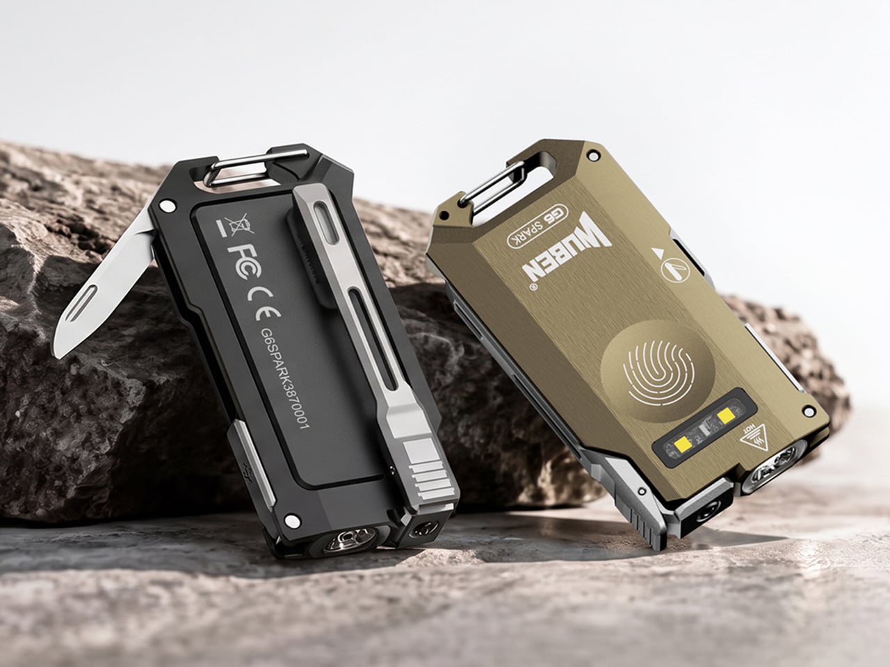
Wuben’s G6 SPARK is a keychain-sized answer to the teeth problem. Its clip rotates 90 degrees with distinct clicks, so you can clip it to a pocket, cap brim, or backpack strap and aim the beam where your hands are busy. The 500-lumen main light handles distance, a 100-lumen side light with red modes handles up close, and a hidden blunt-tip blade covers the odd chore. The body is 7075 aluminum, 0.34 inches (8.6 mm) thick, and 1.4 ounces (40 g or about as much as an AirPods case).

Designer: Wuben

Click Here to Buy Now: $33.99 $44.99 (24% off). Hurry, only 411/1000 left! Raised over $111,000.

Eleven credit cards thick and cut from aerospace aluminum

The G6 SPARK measures 2.56 by 1.35 inches and 0.34 inches thick (65 by 34.2 by 8.6 mm), and it weighs 1.4 ounces (40 g). That makes it roughly eleven credit cards thick, so it vanishes into a jeans pocket. The body is 7075 aluminum, which Wuben calls aerospace-grade, and a slab this thin needs a metal with a spine. Wuben rates it IP66 against dust and powerful water jets, with 1 meter (3.3 feet) of impact resistance, so a keychain’s daily abuse should not scare it. The USB charging port hides inside the body, which keeps the face clean and symmetrical.

7075 is the zinc-rich member of the aluminum family, and it has a reputation for being far tougher than the 6061 found in most flashlight bodies. Aircraft engineers fell for it because it is light and stiff at the same time. Stiffness is exactly what a flat flashlight needs, since a thin body that flexes is a bad day for the lens and the electronics. On a keychain, that rigidity should also help it survive a crowded pocket full of other metal. A push-release attachment lets you pop it off the ring when you want it in your hand instead of dangling off your keys.

Three lights, one button, and a click code you can learn in an evening

The main light tops out at 500 lumens with a 66 meter (217 ft) throw and a peak beam intensity of 1,089 candela. Those numbers describe a beam for the space around you, like a driveway or a campsite, rather than a hillside across the valley. Light color is 5000K, a daylight white, and the CRI of 70 means colors look decent rather than lab-accurate, which is fine for finding a dropped screw. Brightness steps are Eco, Low, Medium, and High, and you cycle them by holding the button. A double click jumps to Turbo, a triple click gives you Strobe, and mode memory remembers your last setting.

The independent side light is the one I expect to use most, since it gives a close-range pool of light at arm’s length. White comes in Low, Medium, and High, topping out at 100 lumens, which is plenty for reading a label or tracing a wire. Red adds a steady mode and a signal mode at 10 lumens, handy for saving night vision or flagging yourself on a dark road. Hold the button while the main light is off to wake the side light, and hold again to cycle the five modes. That is a lot of options on one button, though the click patterns are easy enough to learn in an evening.

A clip that aims, a blade that hides, and a cap brim that becomes a headlamp

The clip is the headline trick, rotating through 90 degrees with distinct mechanical clicks so you can feel each position. Clipped to a cap brim, it works like a minimalist headlamp, and I would happily wear it to read in a tent. Tucked into the side is a blunt-tip utility blade that handles opening boxes, slicing tape, and sharpening a pencil, and probably a marshmallow stick if you ask nicely. Fold it away and the G6 goes back to being a slab that keeps your keys company. My one wish is a tiny tactile mark near the button, so a cold thumb can find it in the dark.

Click Here to Buy Now: $33.99 $44.99 (24% off). Hurry, only 411/1000 left! Raised over $111,000.

The post Wuben’s tiny flashlight packs 500 lumens and a blade into 40 grams first appeared on Yanko Design.

  • ✇Yanko Design
  • This AI Assistant Looks Like a Tiny Monitor but Actually Operates Your Computer
    Copying customer details from a message into a spreadsheet probably isn’t anyone’s idea of a good afternoon. Unfortunately, even a perfectly capable computer still leaves plenty of that work to you. Bvio’s Violoop is a plug-in AI operator designed to handle those repetitive steps, giving your existing computer an assistant without asking you to replace the machine you’re already comfortable using. You can tell Violoop what you need in ordinary language, such as finding customer information in a
     

This AI Assistant Looks Like a Tiny Monitor but Actually Operates Your Computer

Par : JC Torres
24 octobre 2026 à 19:30

Copying customer details from a message into a spreadsheet probably isn’t anyone’s idea of a good afternoon. Unfortunately, even a perfectly capable computer still leaves plenty of that work to you. Bvio’s Violoop is a plug-in AI operator designed to handle those repetitive steps, giving your existing computer an assistant without asking you to replace the machine you’re already comfortable using.

You can tell Violoop what you need in ordinary language, such as finding customer information in a WhatsApp conversation and entering it into a customer relationship management (CRM) system. That might sound like a small convenience, until you’ve spent an afternoon repeating the same routine. The aim is to let you explain the task instead of manually carrying every detail from one window to another.

Designer: Team Violoop

Click Here to Buy Now: $399 $699 (43% off). Hurry, only a few left! Raised over $2.8 million.

To do that, Violoop interprets what’s on the screen and interacts with applications through keyboard and mouse controls. Its companion software supports Windows, macOS, and Linux, while the screen-based approach means it doesn’t need a dedicated integration for each application. You’re still working with familiar programs, only with assistance intended to bridge the gaps between them, and without the need to learn programming to give it instructions.

Of course, customer records are only part of the paperwork that follows a small business around. Invoice details need entering into spreadsheets, documents need organizing, and files rarely end up where they belong without some encouragement. Violoop is designed to help with that preparation, taking on the repetitive handling while leaving you to check the information and decide what to do with it.

Email offers another familiar example. Having something sensible to edit can be easier than staring at an empty reply box, especially when several messages need similar responses. Violoop can prepare replies as drafts for review, giving you a starting point while keeping the final wording in your hands. You can add the context that a customer relationship or a delicate conversation actually needs.

There’s also a reason this assistant takes up physical space on your desk. Its compact enclosure and angled touchscreen give ongoing tasks a place of their own, rather than burying everything in another software window. Inside, the tiny device packs a punch of up to 26 trillion operations per second (TOPS) of AI processing. That hardware is intended to support local screen understanding and other AI work on Violoop itself.

That local processing also supports a more personal approach to recurring work. Violoop keeps personal memory on the device, retaining preferences and context so you don’t have to explain the same habits every time. Local memory doesn’t mean every task stays offline, however. Depending on the selected mode, Violoop can also connect to cloud services or larger AI models when additional help is needed.

The most interesting control might be the button on top. Violoop separates AI processing from a dedicated security controller, with an approval step for sensitive actions. The physical confirmation button gives that pause a tangible form. Preparing information and committing to an action are different responsibilities, after all, and the design puts a deliberate checkpoint between what the AI proposes and what happens next.

You don’t have to stay beside it to keep an eye on progress, either. Phone access lets you check tasks, send further instructions, and approve sensitive actions while you’re away from the desk, provided the computer remains on and connected. That’s useful when you need to step out but still want to see how things are going, without returning to the keyboard for every update.

An organized spreadsheet won’t decide which project you should take on next, and a drafted reply doesn’t know everything about the person receiving it. Those parts still belong to you. Violoop’s role is to help get the surrounding work ready, using a device that keeps progress visible and approval close at hand. That leaves the final email waiting for something decidedly familiar: your own words.

Click Here to Buy Now: $399 $699 (43% off). Hurry, only a few left! Raised over $2.8 million.

The post This AI Assistant Looks Like a Tiny Monitor but Actually Operates Your Computer first appeared on Yanko Design.

  • ✇Yanko Design
  • Neo-Brutalist Vases Look Like Tiny Towers, Even Without Flowers
    An empty vase can make a shelf look oddly unfinished, as though the flowers were supposed to do all the decorating. Aleksander Kozera’s Neo-Brutalist Vases offer a convincing way around that small domestic problem. Created under his Warsaw-based Yird Ceramics brand, these ceramic vessels have enough architectural detail to hold attention on their own. I’d be inclined to leave them empty before deciding what, if anything, belongs inside. Their cylindrical bodies are divided into rectangular pane
     

Neo-Brutalist Vases Look Like Tiny Towers, Even Without Flowers

24 octobre 2026 à 18:30

An empty vase can make a shelf look oddly unfinished, as though the flowers were supposed to do all the decorating. Aleksander Kozera’s Neo-Brutalist Vases offer a convincing way around that small domestic problem. Created under his Warsaw-based Yird Ceramics brand, these ceramic vessels have enough architectural detail to hold attention on their own. I’d be inclined to leave them empty before deciding what, if anything, belongs inside.

Their cylindrical bodies are divided into rectangular panels, with tiny indentations that suggest construction details on a concrete facade. Circular recesses interrupt that grid, while curved projections extend from the sides like abbreviated balconies or exposed joints. The effect lands somewhere between an architectural model and a piece of science-fiction set dressing. They look a little like infrastructure for a very small, very design-conscious civilization, which is part of their appeal.

Designer: Aleksander Kozera

The concrete resemblance comes from the ceramic body itself. According to the collection’s Łódź Design Festival description, Kozera uses porcelain casting slip with ceramic pigments and black grog to produce that raw, concrete-like finish. In the close-up photographs, dark speckles break up the gray surface. That texture matters visually: without it, the panel lines and repeated circles could read as a smooth plastic prop. Instead, the surface gives the geometry some grit.

The modular approach also makes the collection more interesting than a row of differently sized cylinders. The festival describes vessels that can be combined and arranged into larger compositions. In the photographs, neighboring forms create narrow gaps, overlapping projections, and changing silhouettes. I like the possibility of treating a shelf as a small architectural composition rather than lining up three matching accessories. The vessels share a vocabulary without looking identical from every angle.

Kozera’s broader studio process helps explain that controlled repetition. He describes beginning with digital modeling, then 3D-printing master forms used to make plaster molds for slip-casting porcelain. That’s a useful distinction for anyone assuming these are printed plastic objects or directly printed ceramics. Digital tools establish the geometry, while casting translates it into ceramic. The workshop photographs make that relationship tangible, showing shaped components and molds alongside vessels at different stages of production.

The finish introduces another layer of detail. The collection description specifies a translucent green glaze, with the small exterior “windows” individually glazed by hand. The green is restrained enough that the photographed pieces still read predominantly as gray architectural objects. I prefer that decision to an all-over glossy finish. Small glazed areas give the eye somewhere to pause without obscuring the panel divisions or competing with the speckled body.

Flowers change the balance considerably. In the styled photograph, branching stems stretch above and across the vessels, disrupting all those disciplined horizontal and vertical lines. The arrangement is sparse enough that the ceramic remains visible, which seems the right approach. A dense supermarket bouquet might conceal much of the detail that makes these worth looking at. A few irregular branches would let the architecture and the plant material each have some breathing room.

My reservation is mostly about where they would live. These are visually busy objects, even with their limited palette. On a shelf already crowded with books, collectibles, and patterned ceramics, the small recesses and projecting edges could get lost. I’d give one a relatively clear stretch of console or place a group against a plain wall. That’s a styling preference, but the design rewards enough space to read its silhouette.

These are physical ceramic works rather than render-only proposals, and the collection is listed as selected for the make me! 2026 exhibition at Łódź Design Festival. That listing does not establish retail pricing or US availability, so it shouldn’t be mistaken for a confirmed shopping announcement.

For me, the strongest choice is the attention given to the sides of each vessel. Turn one, and the relationship between grid, recess, and projection changes. That gives the object a reason to stay on display after the stems are gone, without asking an empty vase to pretend it’s waiting for its next assignment.

The post Neo-Brutalist Vases Look Like Tiny Towers, Even Without Flowers first appeared on Yanko Design.

❌