Vue normale

Il y a de nouveaux articles disponibles, cliquez pour rafraîchir la page.
Aujourd’hui — 14 décembre 2025Flux principal

Rotating Kitchen Cubes Make Wasting Food Actually Impossible

Par : Ida Torres
14 décembre 2025 à 14:20

We’ve all been there. You buy fresh produce with the best intentions, tuck it away in the fridge or pantry, and then discover a wilted mess two weeks later. It’s frustrating, wasteful, and honestly, it happens way more often than we’d like to admit. But what if your storage system actually worked with you instead of against you?

Enter Saveit, a modular food storage concept by designer Yerin Kim that’s making me rethink everything about how we organize our kitchens. At first glance, it looks like something straight out of a design museum with its sleek metal boxes, perforated panels, and pops of color. But the real magic happens when you actually use it.

Designer: Yerin Kim

The system is built around a brilliantly simple idea: rotating storage that follows the FIFO principle (first in, first out). You know how grocery stores stock their shelves so older items move to the front? That’s exactly what Saveit does for your home. The modules feature these clever two-way rotating structures, so when you add new food from one side, the older items naturally move toward the exit point. No more mystery tomatoes rotting in the back of your produce drawer.

What makes this system feel genuinely different is how modular and adaptable it is. The stackable metal units can be configured in countless ways, kind of like edible Tetris. Need more space for root vegetables this week? Rearrange. Stocking up on citrus? Adjust accordingly. The colored sliding trays and hanging hooks accommodate everything from loose potatoes to bunches of bananas, and each component is designed to maximize airflow through those perforated backs, keeping produce fresher longer.

The aesthetic is industrial meets playful, with that brushed metal finish that feels both serious and approachable. Those bright red, green, blue, and yellow accents aren’t just for looks either. They help you quickly identify different food categories or rotation systems at a glance. It’s functional design that doesn’t sacrifice personality.

But here’s what really sold me on this concept: every single part slides out and pops into the dishwasher. Anyone who’s ever tried to clean a traditional produce basket or drawer knows that trapped dirt and sticky residue situation. Saveit eliminates that headache entirely. The removable design means you can actually keep your storage clean without contortionist-level flexibility or a dedicated scrub brush.

The environmental angle here is significant too. Food waste is a massive problem. We’re talking about roughly a third of all food produced globally ending up in the trash, which contributes to greenhouse gas emissions and represents billions of dollars thrown away annually. While Saveit won’t solve food waste entirely, it tackles one of the root causes: poor visibility and organization at home. When you can actually see what you have and the system naturally prioritizes older items, you’re far more likely to use everything before it goes bad. There’s something refreshing about design that solves real problems without overcomplicating things. Saveit doesn’t require an app, doesn’t need to be plugged in, and doesn’t come with a subscription service. It’s just smart, thoughtful design applied to an everyday challenge. The kind of thing that makes you wonder why storage hasn’t worked this way all along.

Yerin Kim’s creation sits at this interesting intersection of sustainability, functionality, and visual appeal that feels very now. It’s the type of design that tech enthusiasts appreciate for its systematic approach, that eco-conscious consumers love for its waste-reduction potential, and that design lovers simply want to display on their countertops. It transforms a mundane task (food storage) into something that actually feels considered and intentional. Whether Saveit moves from concept to production remains to be seen, but it represents a shift in how we think about kitchen organization. Storage shouldn’t be something you work around. It should work for you, making sustainable choices easier and more intuitive. And if it looks this good while doing it? Even better.

The post Rotating Kitchen Cubes Make Wasting Food Actually Impossible first appeared on Yanko Design.

Dual vats, 14K screen, heated resin: inside Anycubic’s game-changing Photon P1 3D Printer

Par : Sarang Sheth
14 décembre 2025 à 02:45

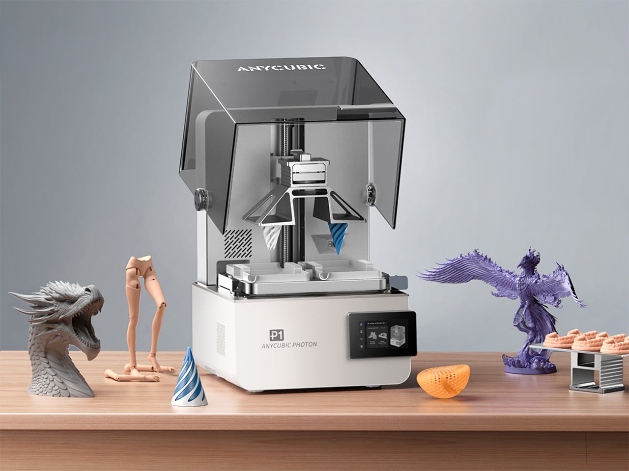
Desktop resin printers usually ask a simple question: how much resolution can you afford. Anycubic’s Photon P1 adds a more interesting one: what if the same machine could handle two colors, two materials, or two entirely different jobs without claiming more room on your bench. By pairing a dual‑vat system with a high resolution 14K display and a serious Z axis, the Photon P1 feels tailored to studios that prototype daily and iterate fast. The Photon P1 also packs LighTurbo 4.0 (an advanced UV light source system) for curing developed specially by Anycubic, along with a smart heated vat that temperature-controls the resin baths, offering a kind of industrial-grade output you’d never see in other consumer 3D printers.

Central to this new approach is a cleverly engineered dual‑vat system, a feature so rare in the consumer space that it feels like a genuine novelty. Instead of a single, monolithic resin tank, the P1 offers the option of two smaller, distinct vats side by side (the default is still a single-vat version for most basic users). Hovering above them is a forked build plate, a single component with two separate printing surfaces that can operate in tandem. This architecture allows the printer to print two colors or two resin types in a single job, eliminating the need for separate runs. Its slicer supports material-specific configurations optimized for dual-vat workflows, keeping both materials stable and consistent within one print. When working with premium or engineering resins, this setup also reduces waste and helps lower overall material costs, this setup also reduces waste and helps lower overall material costs. This fundamentally changes the workflow – it effectively gives you the power of two printers, but with the synchronized precision and footprint of one. The machine is not just building an object, it is managing a production queue, all within its own chassis.

Designer: Anycubic

Click Here to Buy Now: $499 $799 (38% off). Hurry, only 31/400 left! Raised over $416,000.

This opens a fascinating playbook for designers and creators. A product designer, for instance, could prototype a remote control with a hard, rigid casing printed from standard resin in the left vat, while simultaneously printing soft, flexible buttons from a TPU‑like resin in the right vat. The result is a multi‑material prototype in a single print job, offering a far more accurate representation of a final product without the hassle of printing parts separately and assembling them later. For artists and miniature sculptors, the possibilities are just as compelling. Imagine printing a fantasy character where the main figure is rendered in an opaque grey for maximum detail, while a magical spell effect or a ghostly appendage is printed in a translucent, colored resin from the second vat. This dual‑system approach streamlines the creation of complex, multi‑part models, reducing post‑processing and painting time.

Beyond multi‑material applications, the P1 excels as a pure productivity engine. A technical studio can produce engineering-grade resin prototypes. Designers or creatives can model and produce flexible materials for complex assemblies. A small business owner running an Etsy shop for custom D&D miniatures could use it to fulfill two different orders at once, performing batch production or even dual-part workflows for maximized efficiency. This parallel workflow essentially doubles the machine’s throughput for small to medium‑sized objects, making it an incredibly efficient tool for anyone doing light production work. It transforms the printer from a single‑task device into a small‑batch manufacturing hub.

Of course, these advanced capabilities would be meaningless without a foundation of precision and reliability. Anycubic has clearly invested in the P1’s mechanical integrity, moving it out of the hobbyist category and into prosumer territory. The Z‑axis, often a weak point on budget machines, is built around an industrial‑grade ball screw and robust linear rails. This is a significant upgrade from the typical lead screw setup, translating to smoother, more consistent vertical travel. For the user, this means virtually no visible layer lines, a dramatic reduction in Z‑wobble artifacts, and exceptional repeatability, ensuring that parts designed to fit together do so with tight tolerances.

This focus on industrial‑grade components extends to the build plate itself. Instead of the usual anodized aluminum, the P1 uses a precision‑milled slab of steel. Steel’s superior rigidity and thermal stability mean the plate is less likely to warp over time, ensuring a perfectly flat and level surface for consistent first‑layer adhesion, which is critical for print success. It is a subtle but important detail that signals a commitment to long‑term reliability. This mechanical stability is the bedrock that supports the printer’s headline features.

At the heart of its imaging system is a 14K monochrome LCD. That number translates directly into breathtaking surface detail. With an extremely fine XY resolution, the P1 can reproduce microscopic textures, razor‑sharp edges, and intricate patterns that would be lost on lower‑resolution screens. For jewelry designers prototyping complex filigree or architects building scale models with fine brickwork, this level of detail is indispensable. The monochrome screen also offers the practical benefits of faster cure times and a much longer operational lifespan than the older RGB LCDs, reinforcing the P1’s role as a dependable workhorse.

The Anycubic Photon P1, therefore, is more than just the sum of its impressive parts. It represents a holistic design philosophy where each component complements the others. The high‑resolution 14K screen provides the detail, the industrial Z‑axis ensures that detail is rendered flawlessly layer after layer, and the innovative dual‑vat system leverages that quality to create more complex, more functional, and more beautiful objects with unparalleled efficiency. It is a machine that seems to understand the creative process, offering not just a tool, but a smarter way to work.

Anycubic unveiled the Photon P1 at the Formnext additive manufacturing show, with a Kickstarter campaign debuting this month to let people get their hands on the Photon P1. The retail price is set at a competitive $799, but early adopters have an opportunity to get in at a much lower early‑bird price of $499 (available for a limited period only), a figure that makes its prosumer features accessible to a much wider audience of serious creators and designers.

Click Here to Buy Now: $499 $799 (38% off). Hurry, only 31/400 left! Raised over $416,000.

The post Dual vats, 14K screen, heated resin: inside Anycubic’s game-changing Photon P1 3D Printer first appeared on Yanko Design.

This Doughnut Chair Has One Bite Missing, and That’s Your Seat

Par : JC Torres
13 décembre 2025 à 23:30

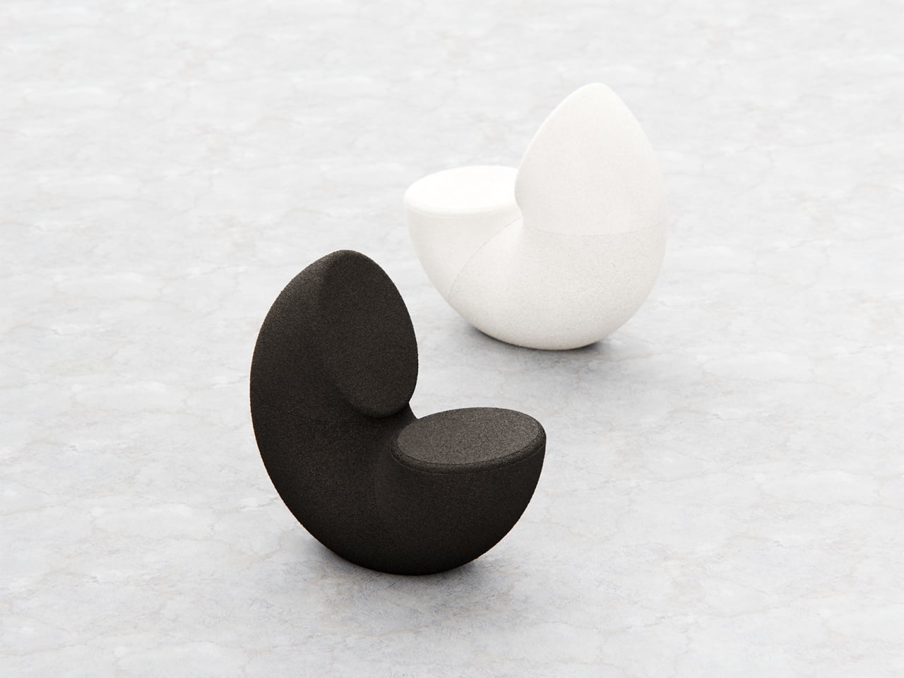
Most chairs are clearly assembled objects, with legs, a seat, and a backrest, all stacked and joined together. Sculptural lounge pieces sometimes flip that script and feel more like a single volume that has been carved or sliced. Chunk is a concept that leans into that second approach, imagining seating as a doughnut with a bite taken out rather than a frame with cushions bolted on, treating furniture as something you edit rather than assemble.

The designer imagined a chair that looks like a doughnut with a chunk removed. The missing piece becomes the seat and the opening for the backrest, while the rest of the ring wraps around in a continuous loop. The concept is less about novelty and more about seeing how far a single looping form can be pushed into something you can actually sit in, where the absence of material defines the place for the body.

Designer: Liam de la Bedoyere

Both the seat and backrest share the same oval cross-section, but as the base curves up to become the backrest, that oval quietly swaps its length and width. It is wide and low where you sit, then gradually becomes tall and narrow as it rises behind you. The section never breaks; it just morphs along the path, which gives the chair a sense of motion even when it is still and empty.

The “bite” creates a bowl-like seat that cradles the hips and thighs, while the rising loop offers a relaxed backrest rather than a rigid upright. The proportions suggest a low, lounge-style posture, closer to a reading chair or a corner piece in a living room than a dining chair. The continuous curve encourages you to lean back and sink in, not perch on the edge ready to stand again.

A near-cylindrical form can look like it might roll away, but the geometry and internal structure are tuned to keep the center of gravity low and slightly behind the seat. The base is subtly flattened, and a denser core at the bottom would keep it from tipping forward when someone leans back. The result is a chair that looks precarious from some angles but behaves like a grounded lounge piece once you sit.

The monolithic upholstery, a textured fabric that wraps the entire volume without obvious breaks, reinforces the idea of a single chunk of material. The form reads differently as you move around it, sometimes like a shell, sometimes like a curled leaf, sometimes like a coiled creature. It is the kind of chair that anchors a corner or gallery-like space, inviting you to walk around it before you decide to sit down and settle in.

Chunk uses subtraction as its main design move, starting from a complete ring and then removing just enough to create a place for the body. For a category that often defaults to adding parts, there is something satisfying about a chair that feels like it has been edited down to a single, looping gesture, with one decisive bite turning an abstract volume into a place to rest, read, or just sink into for a while.

The post This Doughnut Chair Has One Bite Missing, and That’s Your Seat first appeared on Yanko Design.

When Your Desk Lamp Becomes Your Study Partner: Check Mate

Par : Ida Torres
13 décembre 2025 à 21:45

We’ve all been there. You’re three hours into a study session, hunched over your desk with tabs multiplying like rabbits, your phone buzzing with notifications, and that nagging feeling that you’re not actually retaining anything. Digital learning promised us flexibility and endless resources, but sometimes it feels more like drowning in information while learning nothing at all.

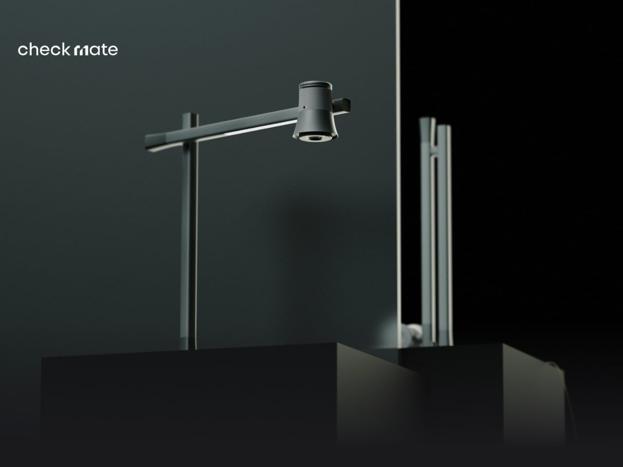
A new concept design called Check Mate is tackling this exact problem, and it’s making waves in the design community for all the right reasons. Created by a team of seven designers (Dongkyun Kim, Jaeryeon Lee, Eojin Jeon, Noey, Jaeyeon Lee, Jagyeong Baek, and Jimin Yeo), this concept reimagines what a study companion could look like if we actually designed for how people learn in the digital age. While you can’t buy it yet, the ideas behind it are definitely worth paying attention to.

Designers: Dongkyun Kim, Jaeryeon Lee, Eojin Jeon, Noey, Jaeyeon Lee, Jagyeong Baek, Jimin Yeo

Create your own Aesthetic Render: Download KeyShot Studio Right Now!

The name itself is clever. “Check Mate” borrows from chess, evoking that decisive moment of victory, but it’s also wonderfully literal. This concept envisions a device that genuinely acts as your learning mate, checking in on your progress and helping you actually achieve those goals instead of just feeling busy. The design language speaks to this dual nature with a clean, minimalist aesthetic in soft gray tones, punctuated by shots of energizing yellow that feel like highlighting the important bits in a textbook.

What makes this concept compelling is that the designers didn’t just jump to solutions. They actually did their homework (pun intended) by researching what digital learners need and where current methods fall short. Their field research identified some uncomfortable truths: digital learning can create passive attitudes, make us susceptible to misinformation, and ironically, despite all our access to information, contribute to declining literacy levels. We’re getting really good at searching and depending on AI, but are we actually learning?

The proposed device looks deceptively simple. At first glance, it’s an elegant desk lamp with an adjustable arm and a cylindrical head wrapped in fabric, giving it a softer, more approachable vibe than your typical tech gadget. But the concept goes deeper, packing some serious multitasking capabilities into that minimal form. The lamp head would rotate and adjust, there appears to be a projection or camera system integrated into the design, and the base doubles as a wireless charging pad. Those yellow accents aren’t just for looks either, they’re envisioned as tactile interaction points that make the technology feel more human and less intimidating.

Where Check Mate really shines as a concept is in how it reimagines the learning experience. The visualization shows it functioning as a projection device that could display educational content, video calls with instructors, or interactive annotations directly onto your workspace or wall. Imagine highlighting text on actual paper and having that integrate with your digital notes, or being able to project your screen large enough to actually see what you’re working on without squinting at a laptop.

The concept addresses one of digital learning’s biggest weaknesses: that narrow, passive relationship we have with our screens. By proposing a way to bring information into your physical space and allowing for more natural interaction, it suggests learning could feel less like staring into the void and more like an active, engaging process. You wouldn’t just be consuming content, you’d be working with it in a space that feels comfortable and personal.

The packaging design in the concept presentation deserves a mention too. Everything is shown organized in a beautifully designed kit with that signature yellow and gray color scheme. It’s the kind of unboxing experience that would make you feel like you’re opening something important, not just another gadget. There’s a psychological element to that. When something looks and feels intentional, we treat it more seriously. As a concept, Check Mate represents the kind of forward thinking we need more of in the education technology space. It pushes conversations forward about how we should be designing for learning, how technology could support rather than distract, and what the future of education might actually look like when we stop thinking about it as just “Zoom, but make it fancier.”

The reality is that digital learning isn’t going anywhere. Remote work, online courses, and hybrid education models are here to stay. So maybe concepts like Check Mate can inspire the tools we actually need, devices designed for this reality instead of just adapting what we already have. The best part? It suggests that the answer isn’t more screens or more apps, it’s smarter integration of digital and physical spaces, and technology that adapts to how we naturally learn rather than forcing us to adapt to it.

The post When Your Desk Lamp Becomes Your Study Partner: Check Mate first appeared on Yanko Design.

Tray210 Proves Recycled Plastic Doesn’t Have to Look Grey and Boring

Par : JC Torres
13 décembre 2025 à 20:15

Recycled plastic products often fall into two camps: grey utilitarian bins or loud, speckled experiments that feel more like proof of concept than something you want on your desk. Tray210 recycled, a collaboration between Korean studio intenxiv and manufacturer INTOPS under the rmrp brand, takes a different approach, using recycled plastics and waste additives to create a tray that feels like a considered object first and an eco story second, treating material diversity as part of the design language.

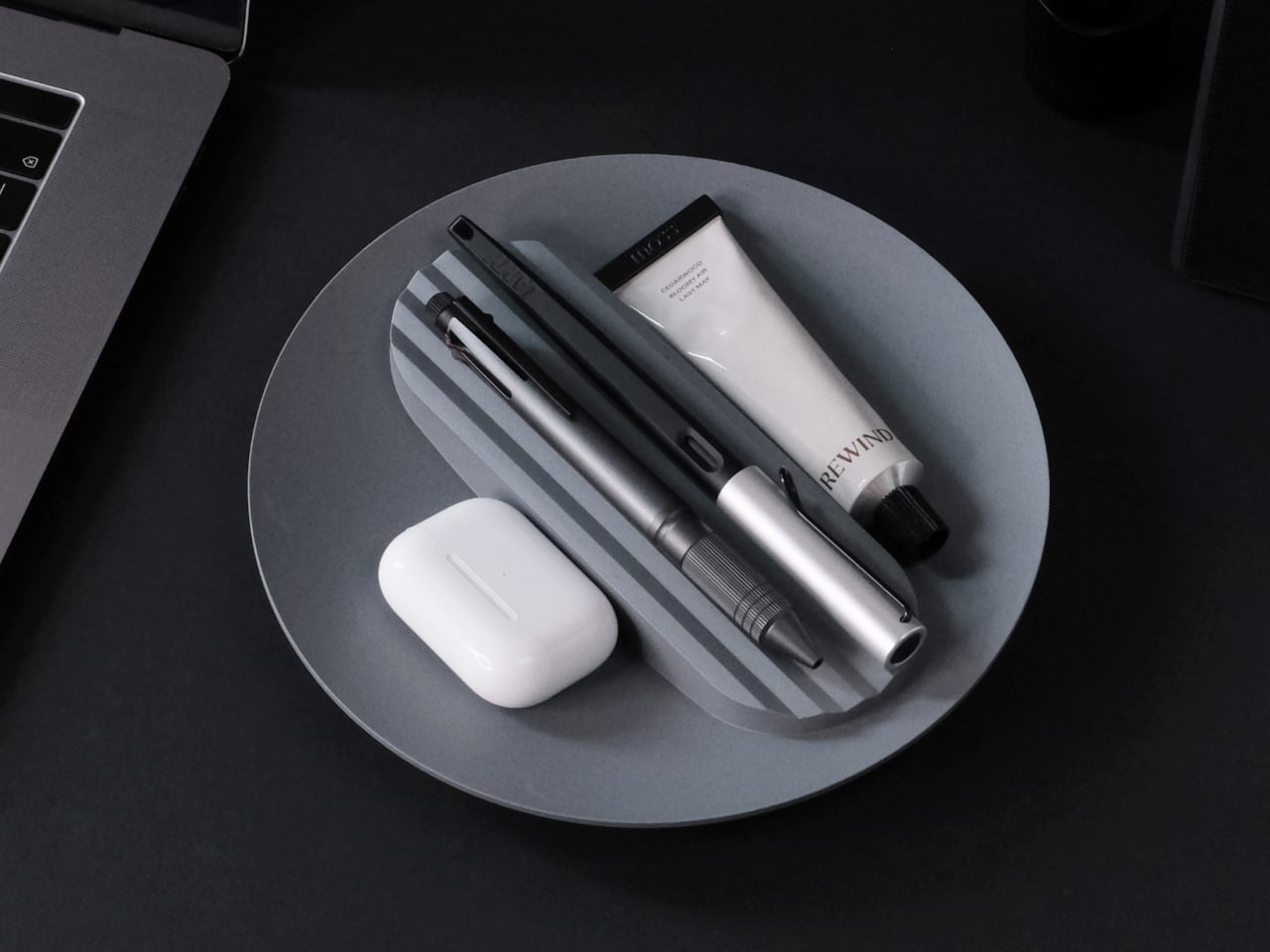
Tray210 recycled is a circular tray with three compartments, an evolution of the original Tray210 form. It grew out of INTOPS’ grecipe eco-material platform and hida’s CMF proposals, which is a long way of saying it is the result of a tight loop between material science and industrial design. The goal was to pursue material diversity and break away from the cheap recycled stereotype, making something that belongs in sight rather than hidden under a desk.

Designer: Intenxiv x INTOPS

The form is intuitive, a 210 mm circle with a raised, ribbed bar running across the middle and two shallow wells on either side. The central groove is sized for pens, pencils, or chopsticks, and the ribs keep cylindrical objects from rolling away. The side compartments are open and shallow, perfect for earbuds, clips, rings, or keys. It is the kind of layout you understand at a glance without needing instructions or labels; just place your pen where the grooves are.

The material story is where Tray210 recycled gets interesting. Multiple recycled blends reflect their sources: Clam and Wood use 80 percent recycled PP with shell and wood waste, Charcoal adds 15 percent charcoal to 80 percent recycled PP, and Stone uses 10–50 percent recycled ABS. Transparent and Marble variants use recycled PC or PCABS with ceramic particles or marble-like pigment. Each colorway is visually tied to its waste stream, making the origin legible and intentional.

The aim is to create a design closer to the lifestyle rmrp pursues, breaking away from the impression recycled plastic generally gives. The Clam and Wood versions read as soft, muted pastels with fine speckling, Charcoal feels like a deep, almost architectural grey, and Stone and Transparent lean into translucency and particulate. Instead of hiding the recycled content, the CMF work uses it as texture and character, closer to terrazzo or stoneware than to injection-molded scrap that just happens to be grey.

The combination of clear zoning and tactile surfaces makes Tray210 recycled feel at home on a desk, entryway shelf, or bedside table. The central groove keeps your favorite pen or stylus always in the same place, while the side wells catch whatever tends to float around, from SD cards to jewelry. The different material stories let you pick a version that matches how you want the space to feel: calm, earthy, industrial, or a bit more playful.

A simple tray can carry a lot of design thinking, from intuitive ergonomics to material storytelling and responsible sourcing. Tray210 recycled is not trying to save the world on its own, but it does show how recycled plastic can be turned into something you actually want to touch and keep in sight. For people who care about both what an object does and what it is made from, that is a quiet but meaningful upgrade over another anonymous catch-all that eventually ends up in a drawer.

The post Tray210 Proves Recycled Plastic Doesn’t Have to Look Grey and Boring first appeared on Yanko Design.

Record setting Pocket Lab shrinks a full AI supercomputer into the size of a power bank

Par : Gaurav Sood
13 décembre 2025 à 18:20

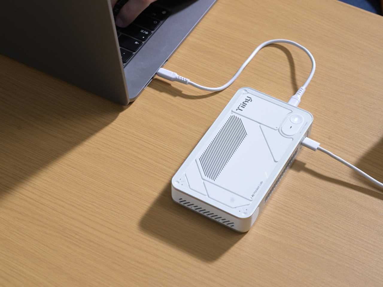
We have come a long way from the computers the size of entire rooms to the sleek personal computers that sit comfortably on our desks. The evolution of computing has consistently pushed toward smaller form factors and greater efficiency. The Mac mini, for example, illustrates how compact modern PCs have become. Yet the question persists: how miniature can a powerful computing device truly be? A recent Guinness World Records certification offers a striking answer.

Tiiny AI, a US-based deep-tech startup, has unveiled the Pocket Lab, officially verified as the “world’s smallest personal AI supercomputer.” This palm-sized device, no larger than a typical power bank, is capable of running large language models (LLMs) with up to 120 billion parameters entirely on-device, without relying on cloud servers or external GPUs.

Designer: Tiiny AI

At its core, the Pocket Lab aims to make advanced artificial intelligence both personal and private. Traditional AI systems often depend on cloud infrastructure, which can raise concerns around data privacy, latency, and carbon emissions associated with large server farms. The Pocket Lab addresses these issues by enabling fully offline AI computation. All processing, data storage, and inference happen locally on the device, reducing dependence on internet connectivity or cloud resources.

Despite its compact size, measuring 14.2 × 8 × 2.53 centimeters and weighing roughly 300 grams, this mini supercomputer delivers noteworthy computing power. The system operates within a typical 65-watt energy envelope, comparable to a conventional desktop PC, yet manages to support extensive AI workloads. The hardware architecture combines a 12-core ARMv9.2 CPU with a custom heterogeneous module that includes a dedicated Neural Processing Unit (NPU), together achieving approximately 190 TOPS (tera-operations per second) of AI compute performance. This configuration is backed by 80 GB of LPDDR5X memory and a 1 TB solid-state drive, allowing large AI models to run efficiently without external accelerators.

Two key technologies underpin the Pocket Lab’s ability to run large models so efficiently in such a small package. TurboSparse improves inference efficiency through neuron-level sparse activation, reducing computational overhead while preserving model intelligence. PowerInfer, an open-source heterogeneous inference engine with a significant developer following, dynamically distributes workloads across the CPU and NPU, delivering server-grade performance at far lower power and cost than traditional GPU-based solutions.

In practical terms, the Pocket Lab supports a wide ecosystem of open-source AI models and tools. Users can deploy popular LLMs such as GPT-OSS, Llama, Qwen, DeepSeek, Mistral, and Phi, alongside agent frameworks and automation tools, all with one-click installation. This broad software compatibility extends the device’s usefulness beyond enthusiasts and hobbyists to developers, researchers, professionals, and students.

By storing all user data and interactions locally with bank-level encryption, the Pocket Lab also emphasizes privacy and long-term personal memory. This feature contrasts with many cloud-based AI services that retain data on remote servers. Tiiny AI plans to showcase the Pocket Lab at CES 2026, but has not yet disclosed full details on pricing or release dates.

The post Record setting Pocket Lab shrinks a full AI supercomputer into the size of a power bank first appeared on Yanko Design.

Poco Pad X1 & Poco Pad M1 Review: Budget Tablets That Challenge the iPad

Par : Aki Ukita
13 décembre 2025 à 16:20

PROS:


  • Strong display for the money

  • Complete accessory ecosystem

  • Big batteries

CONS:


  • Neither tablet is light enough for comfortable one-handed use

  • Fully kitted-out X1 with Floating Keyboard and Focus Pen gets expensive fast

RATINGS:

AESTHETICS
ERGONOMICS
PERFORMANCE
SUSTAINABILITY / REPAIRABILITY
VALUE FOR MONEY

EDITOR'S QUOTE:

Poco Pad X1 and M1 are not perfect, but together they deliver more screen, battery, and versatility than almost any other budget tablet pair right now.

Poco built its name on phones that punch above their price, and now it wants to do the same on your coffee table. With Poco Pad X1 and Poco Pad M1, the brand is not just throwing out a couple of cheap tablets. It is trying to turn its budget DNA into a fuller ecosystem that covers gaming, work, and everyday media.

You can feel that ambition in how these two models are drawn. The Poco Pad X1 is a slightly more compact, high refresh performance slate, tuned for games and quick multitasking on an 11.2-inch 3.2K display. The Poco Pad M1 steps up to a 12.1-inch 2.5K panel and the largest battery Poco has ever shipped in a global device, aiming to be the big screen that carries you through movies, sketching sessions, and long days away from a charger.

Designer: Poco

If you have been eyeing an affordable Android tablet for gaming, streaming, or light work, should you reach for the sharper, faster Poco Pad X1, or the larger, more relaxed Poco Pad M1? In this review, we will live with both, compare their strengths, and help you decide which one actually fits your desk, your bag, and your budget.

Aesthetics

Poco Pad X1

Poco is not trying to reinvent tablet hardware with Poco Pad X1 or Poco Pad M1. Both follow a familiar rectangle with rounded corners, flat sides, and a camera module that sits quietly in one corner. On Poco Pad X1, the focus is clearly on framing its 11.2-inch display as efficiently as possible. Poco Pad M1 takes the same basic formula and scales it up with a 12.1-inch panel.

Color choices on the Pad X1 and the Pad M1 are simple. They both come in Grey and Blue. Grey leans more gunmetal and understated with a contrasting yellow accent around the camera module, while Blue reads a little more casual and friendly, but neither option is loud or experimental. Both tablets use a metal unibody design for the main shell, with separate parts for the camera island and buttons, and a big Poco logo stamped in the center for instant brand recognition. The Poco Pad X1 uses a square camera island, while the Poco Pad M1 switches to a softer oval, which gives each model a slightly different signature when you flip them over.

Poco Pad M1

Taken together, the two tablets look exactly like what they are meant to be. They are straightforward, modern Android slabs that fade into the background and let their screens and specs do the talking. For budget-friendly hardware, that quiet, functional design approach feels like the right call.

Ergonomics

In the hand, the main ergonomic difference between Poco Pad X1 and Poco Pad M1 is simply size and weight, but neither is a true one-handed tablet for long stretches. The Poco Pad X1, with its 11.2-inch footprint and 500 g weight, is the more compact of the two. It is easier to manage on a sofa or in bed than the larger Poco Pad M1, but you will still want a second hand or some support if you are holding it for a long time. Even though the Poco Pad X1 is relatively slim and light for an aluminum unibody tablet with an 8,850 mAh battery, with dimensions of 251.22 x 173.42 x 6.18 mm, it does not quietly disappear in one hand the way a smaller 8 or 9-inch device might.

Poco Pad M1

Poco Pad M1 stretches that template out to a 12.1-inch diagonal with dimensions of 279.8 x 181.65 x 7.5 mm and a weight of about 610 g, which puts it clearly into big tablet territory. It is still slim, but the larger footprint makes it even less suited to long one-handed use, especially if you are moving around. Instead, it feels more like a tablet you rest on a table, prop up with a cover, or pair with its official keyboard, where the extra screen real estate really pays off for split-screen apps, video, and drawing.

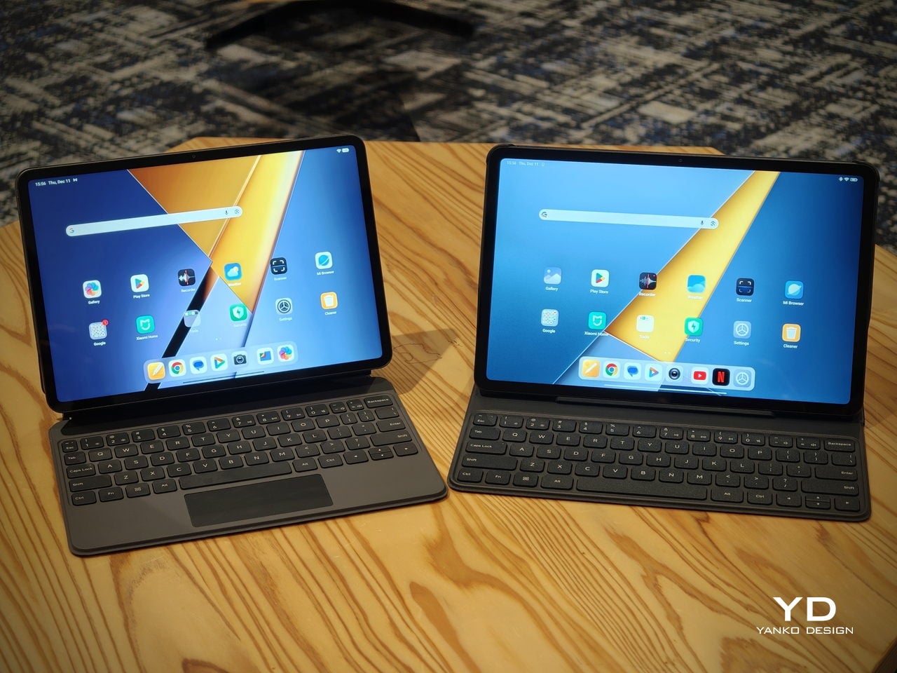
The accessory ecosystem around the Pad X1 and the Pad M1 makes them versatile, but in slightly different ways. Poco Pad M1 is compatible with the optional Poco Pad M1 Keyboard, Poco Smart Pen, and Poco Pad M1 Cover, a trio that turns it into a very capable small-screen workstation. The cover folds into a stand and adds a built-in holder for the pen, which makes it easy to move between bag, desk, and sofa without worrying about where the stylus went. The keyboard is lightweight and easy to carry, but the keys feel a bit plasticky in use, which slightly undercuts the otherwise solid metal body of the tablet.

Poco Pad X1

Poco Pad X1 has its own dedicated set of accessories. It supports the Poco Pad X1 Floating Keyboard, the Poco Pad X1 Keyboard, the Poco Focus Pen, and the Poco Pad X1 Cover, which together give it a surprisingly flexible setup for both work and play. The cover folds like origami and doubles as a stand, letting you enjoy the tablet vertically or horizontally, and for horizontal use, you can choose between two different viewing heights.

The Floating Keyboard is the standout here. It adds some weight and only offers a modest tilt range, but the key feel is excellent for this class, and the trackpad is responsive and accurate enough that you quickly forget you are on a tablet accessory. Clipped together, the Poco Pad X1 and the Floating Keyboard behave much more like a compact laptop than a budget slate with an afterthought keyboard, which makes it far easier to treat this smaller tablet as a real writing and work machine when you need it.
 

Performance

Living with Poco Pad X1 and Poco Pad M1 quickly shows how differently they lean, even though they share a lot of DNA. The Poco Pad X1 is the sharper and faster option, with an 11.2-inch 3.2K display at 3,200 x 2,136 px, around 345 ppi, and refresh up to 144 Hz in supported apps. It can hit about 800 nits peak brightness, supports Dolby Vision and HDR10, and uses a 3:2 aspect ratio that feels very natural for reading, web browsing, and document work, helped by TÜV eye care, DC dimming, and adaptive colors to keep things comfortable.

Poco Pad M1

The Poco Pad M1, on the other hand, trades a bit of sharpness and speed for sheer size and flexibility. Its 12.1-inch 2.5K panel runs at 2,560 x 1,600px with around 249 ppi and up to 120 Hz refresh, plus 500 nits typical and 600 nits in high brightness mode. You still get Dolby Vision, DC dimming, and TÜV certifications for low blue light, flicker-free behavior, and circadian friendliness, along with wet touch support that keeps it usable with damp fingers.

Poco Pad X1

Both tablets use quad speakers with Dolby Atmos and Hi-Res support, so you get surprisingly full sound from either. Crucially, the Poco Pad M1 also adds a 3.5 mm headphone jack and a microSD slot for up to 2 TB of expandable storage, which makes it a much easier media hoarder and a better fit for wired headphones and speakers. The X1 relies on its internal storage and wireless audio instead, which suits its more performance-driven, travel-friendly role.

Poco Pad X1

Poco Pad M1

Performance and gaming clearly favor the Poco Pad X1. It uses the Snapdragon 7+ Gen 3 with 8 GB of RAM and up to 512 GB of storage, and combined with the 144 Hz panel, it feels like a handheld console that also happens to be good at multitasking and productivity. The Poco Pad M1 steps down to the Snapdragon 7s Gen 4 with 8 GB of RAM and 256 GB of storage, which is still more than enough for apps and casual gaming, but clearly tuned more for streaming, browsing, and note-taking than for chasing every last frame. In practice, the Poco Pad X1 is the one you reach for when you care about smooth, high refresh gameplay, while the Pad M1 is the one you leave on the coffee table for everyone to use.

Poco Pad M1

Battery life follows the same logic. The Poco Pad X1 pairs its 8,850 mAh battery with 45 W turbo charging, which Poco says can go from zero to full in about 94 minutes, and my experience matches that claim in day-to-day use. The Poco Pad M1 leans into a 12,000 mAh pack, billed as the largest battery in a global Poco device, with up to 105.36 hours of music playback, around 83 days of standby, 33 W charging, and up to 27 W wired reverse charging so it can top up your other devices.

Poco Pad M1

Poco Pad X1

On the software side, both run Xiaomi HyperOS with Xiaomi Interconnectivity and Google’s AI hooks, so you get shared clipboard, call and network sync, Circle to Search, and Gemini support whichever size you choose. As for cameras, Poco Pad X1 pairs a 13 MP rear camera and an 8 MP front camera, while Poco Pad M1 sticks to 8 MP sensors on both sides. The results are perfectly fine for video calls, document scans, and the odd quick snap, but nothing special, which is exactly what you would expect from tablets at this price bracket.

Poco Pad M1

Poco Pad X1

Sustainability

Poco is not making a big environmental branding play with Poco Pad X1 and Poco Pad M1, but there are a few practical touches that matter if you plan to keep a tablet for several years. The most important one is long-term software support. Both Pad X1 and Pad M1 are slated to receive four years of security updates, which gives you a clearer runway for safe everyday use. For budget tablets, that commitment is still not guaranteed across the market, so it is good to see Poco spell it out.

Poco Pad M1


That longer support window pairs well with the hardware choices. The aluminum unibody shells on both models feel sturdy enough to survive several upgrade cycles, and the generous storage options, plus microSD expansion on the Poco Pad M1, reduce the pressure to replace them early just to fit more apps or media. It is not a full sustainability story with recycled materials and carbon tracking, but if your definition of sustainable starts with buying something that will not feel obsolete or unsafe in two years, these tablets are at least pointed in the right direction.

Value

The Poco Pad X1 and Poco Pad M1 both land in the affordable bracket, but they scale very differently once you add accessories. The Poco Pad X1 with 8 GB of RAM and 512 GB of storage is $399 USD, which feels fair for the Snapdragon 7+ Gen 3 and high-end 3.2K 144 hertz display. Its accessories are priced like mini laptop gear, with the Floating Keyboard at $199 USD, the X1 Keyboard at $129 USD, the X1 Cover at $49 USD, and the Poco Focus Pen at $99 USD. A fully loaded X1 setup quickly pushes past $600 USD, but in return, you get a compact tablet that can genuinely stand in for a small laptop and drawing pad.

Poco Pad X1

The Poco Pad M1 starts cheaper at $329 USD for 8 GB and 256 GB, and its add-ons stay firmly in value territory. The M1 Keyboard is $99 USD, the M1 Cover is $29 USD, and the Poco Smart Pen is $69 USD, so even a complete kit undercuts an equivalently kitted X1 by a healthy margin. Factor in the microSD slot and 3.5 millimeter headphone jack, and M1 clearly aims to be the better deal for big screen media, note-taking, and family use, while X1 makes more sense if you are willing to pay extra for performance, storage, and that excellent Floating Keyboard experience.

Verdict

The Poco Pad X1 and Poco Pad M1 end up serving two somewhat different roles. If you prioritize performance, the Poco Pad X1 is the clear choice. The Snapdragon 7+ Gen 3, 3.2K 144 Hz display, 512 GB storage, and excellent Floating Keyboard make it feel like a serious little work and gaming machine, even if the full setup gets expensive and you give up the headphone jack and SD slot. If you care more about big-screen comfort and value, the Poco Pad M1 quietly wins. The 12.1-inch 2.5K screen, quad speakers, 3.5 mm jack, microSD expansion, huge battery, and cheaper accessories make it a better fit for big-screen media and everyday productivity.

Poco Pad X1

Whichever way you lean, you are getting more tablet than the price suggests. For context, Apple’s base iPad costs $449 with only 64 GB of storage and a 60 Hz screen. The iPad still has a faster processor and a tighter app ecosystem, but Poco gives you bigger batteries, sharper displays, and a lot more storage for less money. Pick the Poco Pad X1 if you want compact power and a great keyboard experience. Pick the Poco Pad M1 if you want maximum screen, battery, and flexibility for the money. Either way, you end up with a tablet that feels more considered than most of what you will find at this price.

The post Poco Pad X1 & Poco Pad M1 Review: Budget Tablets That Challenge the iPad first appeared on Yanko Design.

Nocs Braque Stacks Two Cubes into a 25kg Sculptural Stereo System

Par : JC Torres
13 décembre 2025 à 14:20

Most hi-fi speakers still look like anonymous black rectangles, even when they sound great. A few brands treat speakers as furniture or sculpture, but often at the expense of engineering. Braque by Nocs tries to sit in the middle, a pair of cubes that are as considered visually as they are technically, treating stereo as both sound and composition rather than one serving the other as an afterthought.

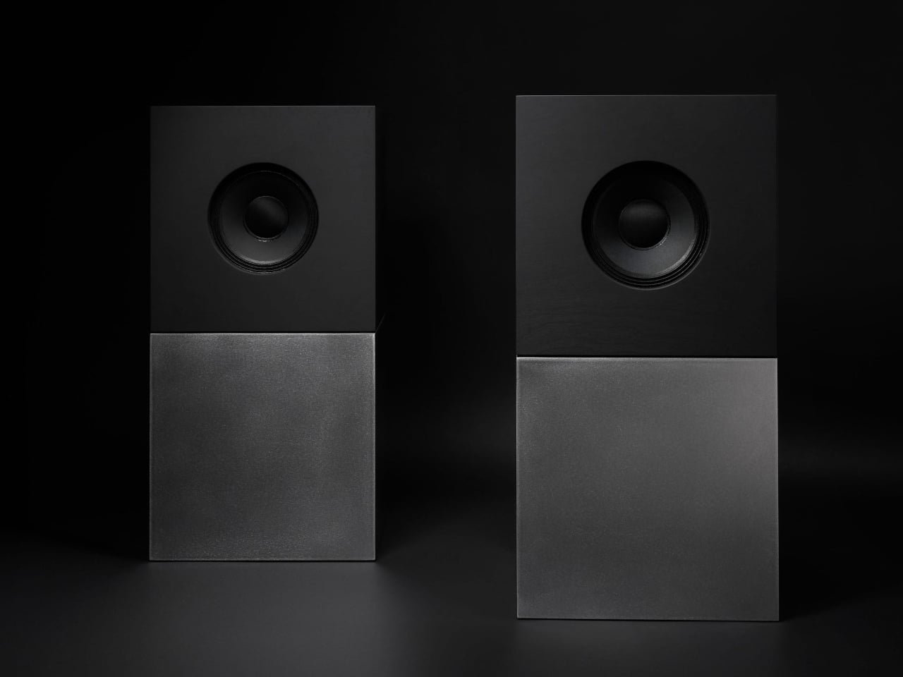
Nocs calls Braque “two cubes, one sculptural stereo system,” and each speaker is a stacked pair, a CNC-machined plywood enclosure on top of a 25 kg solid-steel base. Built in numbered editions, assembled in Estonia with the steel cube handcrafted in Sweden, and tuned back at Nocs Lab, Braque signals that this is not a mass-market soundbar or a safe play for casual listeners who just want something wireless.

Designer: Nocs Design

The upper cube is rigid plywood finished in deep matte-black oil, chosen for tonal warmth and acoustic integrity, and the lower cube is a hand-welded, brushed steel block that anchors the system physically and visually. Sorbothane isolation pads sit between them, decoupling the enclosure from the base so the driver can move without shaking the furniture or smearing the soundstage. Together, the two volumes form a study in symmetry, a minimal yet expressive composition.

The acoustic core is an 8-inch Celestion FTX0820 coaxial driver with a 1-inch compression tweeter at its center, powered by dual Hypex FA122 modules delivering 125 W per side with integrated DSP. The coaxial layout gives a point-source image, and the active 2-way design lets Nocs control crossover and EQ precisely, resulting in a 42 Hz–20 kHz response that is tuned rather than guessed at from a passive circuit.

Nocs describes their studio-sound approach as tuning like sculpture, not adding but uncovering, working with artists and engineers to balance emotion, texture, and detail. The dual-cube design is part of that, lifting the driver to ear height when seated and using mass and isolation to keep the presentation clean and stable at real-world volumes. The idea is that a speaker should reveal music rather than shape it into a brand’s house curve.

Braque offers both analog and digital inputs, RCA and XLR for analog, plus S/PDIF, AES/EBU, and coaxial for digital, and it is meant to connect directly to turntables with a phono stage, streamers, or studio interfaces. There is no built-in streaming or app layer, which feels intentional; you bring your own source and let the speakers handle amplification and conversion from there without trying to be a whole ecosystem.

Braque behaves in a living room or studio as two strict cubes that read like small pieces of Cubist architecture until you press play. For people who want their speakers to be part of the composition of a space, not just equipment pushed into corners, the combination of Celestion drivers, Hypex power, and that heavy steel base makes Braque feel like a very deliberate answer to how a stereo should look and sound in 2025, where form and performance finally coexist without one apologizing for the other.

The post Nocs Braque Stacks Two Cubes into a 25kg Sculptural Stereo System first appeared on Yanko Design.

Top 5 Non-Tech Gifts for Designers Who Have Every Gadget

13 décembre 2025 à 12:40

Designers accumulate screens, tablets, and peripherals until their desks resemble mission control. Yet the most meaningful moments in creative work often happen away from pixels and processors. A perfectly weighted pen moving across paper creates a connection that no stylus can replicate. These analog tools offer something technology can’t: the tactile satisfaction of manipulating physical materials, the quiet pleasure of objects that don’t require charging or updates.

This collection celebrates the opposite of smart devices. Each piece proves that thoughtful design doesn’t need Bluetooth connectivity or app integration to elevate daily rituals. From writing implements engineered with surgical precision to candles that transform ambient lighting into meditation, these gifts remind us that the best tools sometimes do exactly one thing extraordinarily well. They’re for designers whose homes already hum with gadgets but whose souls crave something more deliberate and human.

1. Jetstream Edge

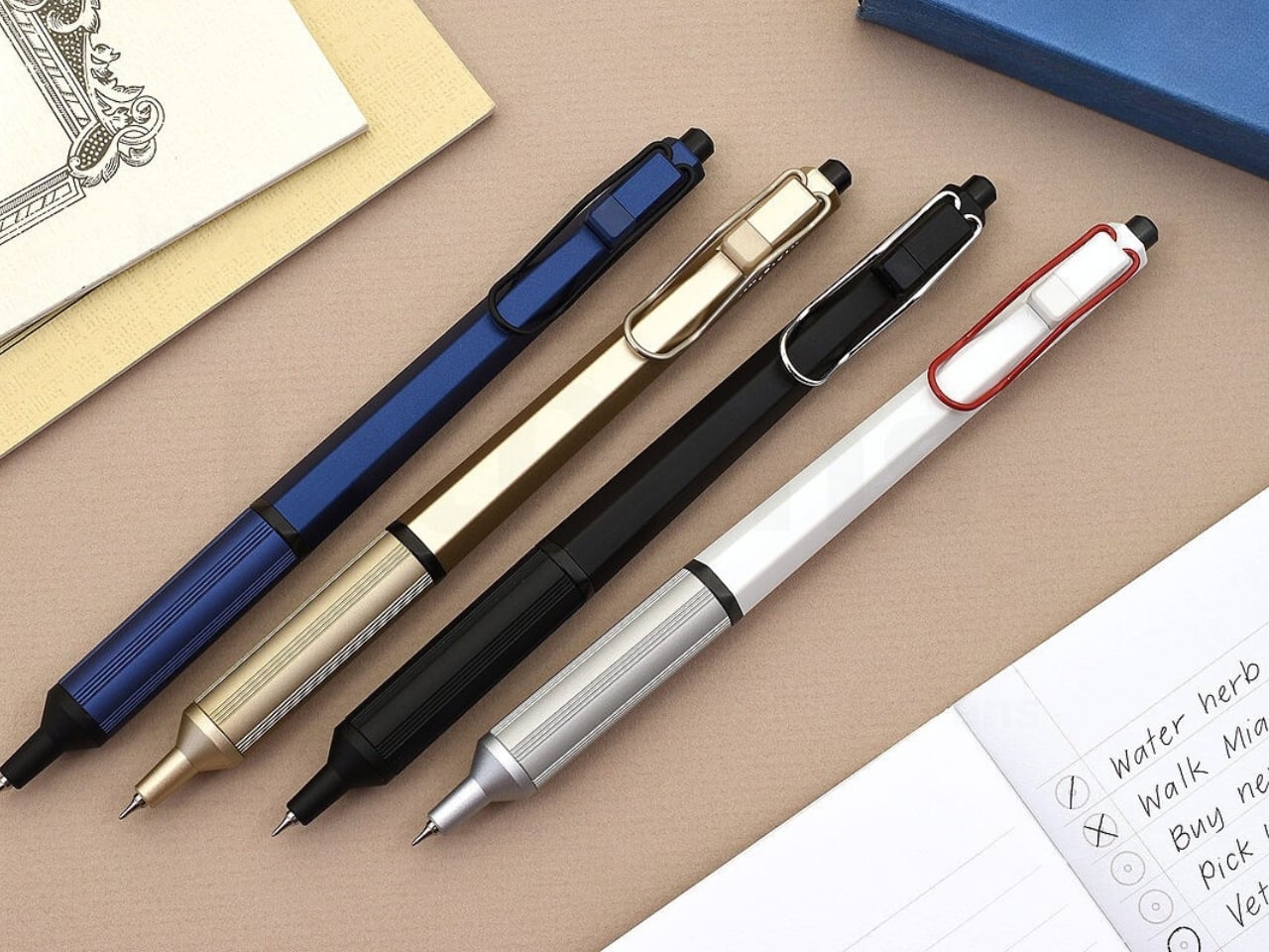
The world’s thinnest ballpoint pen sounds like marketing hyperbole until you drag the 0.28mm tip across paper and watch lines appear that rival technical drafting pens. This Uniball creation doesn’t just write thin; it writes with the kind of precision that makes handwritten notes feel like an intentional design exercise. The hexagonal black barrel catches light along its edges while the knurled metal grip provides just enough texture to keep your fingers anchored during extended writing sessions without causing fatigue or slippage.

What makes this pen exceptional lies in its hybrid ink formulation. The archival-quality black ink combines gel pen smoothness with ballpoint quick-drying properties, eliminating the smeared margins that plague lefties and rushed note-takers. The low center of gravity keeps the ultra-fine tip stable against paper, preventing the wobble that turns delicate linework into jagged scratches. The wire clip adds visual interest while securing the pen to notebook covers or shirt pockets. For designers who sketch concepts before digitizing them, this pen transforms rough ideation into refined mark-making.

What we like

  • The 0.28mm tip delivers drafting-pen precision in a portable ballpoint format.
  • Hybrid ink technology dries instantly to prevent smudging on fresh pages.
  • The hexagonal barrel and knurled grip provide ergonomic control during long sessions.
  • Archival-quality black ink ensures notes and sketches remain legible for years.

What we dislike

  • The ultra-fine tip requires quality paper to prevent catching or tearing.
  • Replacement refills may prove difficult to source compared to standard ballpoints.

2. Heritage Craft Unboxing Knife

Most box cutters hide in junk drawers because they’re aggressively utilitarian and vaguely dangerous-looking. This aluminum sculpture reimagines the ancient hand axe through precision machining, creating something you’ll want displayed on your desk rather than buried in a drawer. Carved from a solid aluminum block, its circular form echoes Paleolithic tools while the wave-like patterns from the cutting process provide grip and visual intrigue. The tapered shape fits naturally in the hand, making package opening feel less like a chore and more like wielding a carefully considered instrument.

The intentional blade angle prevents over-penetration that damages package contents while maintaining enough sharpness for clean tape slicing. Aluminum’s inherent luster gives the knife a refined presence that elevates the mundane ritual of receiving deliveries. Designers who appreciate when everyday objects receive serious design consideration will find themselves reaching for this piece even when scissors would suffice. It sits at the intersection of functional tool and desktop sculpture, proving that utilitarian objects don’t need to sacrifice beauty for practicality or effectiveness.

Click Here to Buy Now: $99.00

What we like

  • Paleolithic-inspired form transforms mundane unboxing into a satisfying ritual.
  • Precision-milled aluminum construction provides luxury weight and lasting durability.
  • Wave-pattern machining creates a natural grip while adding sculptural visual interest.
  • Angled blade design ensures safe cutting without damaging package contents.

What we dislike

  • The exposed blade requires careful handling despite thoughtful safety considerations.
  • Premium aluminum construction places it at a higher price point than standard cutters.

3. Japanese Lantern Candle

Chouchin lanterns once lit Japanese festival nights with a gentle glow that modern LEDs struggle to replicate. This contemporary interpretation captures that soft illumination through handmade candles crafted in Kurashiki by artisans who understand how light transforms space. The minimalist holder design lets the candle become the focal point while patented technology prevents the outer wax from melting, maintaining the lantern shape throughout its burn life. As the interior wax liquefies, light dances through the undulating surface, creating shifting patterns that turn any room into a contemplative sanctuary.

The ritual of lighting a candle creates a deliberate pause that screens and notifications constantly interrupt. For designers accustomed to blue light and digital stimulation, this analog light source offers a different quality of illumination—one that encourages winding down rather than ramping up. The traditional chouchin form brings Japanese design philosophy into Western interiors without feeling forced or appropriative. Each candle burns with the kind of warm ambiance that makes reading physical books or sketching in analog notebooks feel natural again, reclaiming evening hours from device dependency.

Click Here to Buy Now: $69.00

What we like

  • Handcrafted by Japanese artisans in Kurashiki using traditional candle-making methods.
  • Patented technology maintains the lantern shape as interior wax melts and liquefies.
  • Minimalist design integrates seamlessly into contemporary or traditional interior styles.
  • The undulating surface creates mesmerizing light patterns as the candle burns down.

What we dislike

  • Replacement candles require sourcing from specific suppliers rather than local stores.
  • The contemplative burn time means less instant gratification than switching on a lamp.

4. Penguin x MOEBE Book Stand

Books deserve better than lying face down with spines cracked or getting buried under device chargers. This collaboration between Penguin and MOEBE treats reading material as objects worth displaying, using bent steel to create a versatile stand that functions as a bookmark, display easel, or bookend depending on configuration. The single-sheet construction eliminates visible fasteners that would interrupt the clean lines, while the matte finish in stainless steel, cream, black, or Penguin orange lets you match existing desk aesthetics or add a pop of color.

The angled base supports everything from slim poetry collections to chunky design monographs without wobbling or tipping forward. Designers who collect physical books for reference and inspiration will appreciate how the stand keeps current reading visible rather than lost in stacks. Pair two stands to create bookends that frame a curated shelf section, or use a single piece to hold cookbooks open during kitchen experiments. Subtle Penguin and MOEBE branding sit on the base, where it remains visible without dominating the overall form. The stand quietly insists that books matter.

What we like

  • Single bent-steel construction creates seamless form without visible fasteners or joints.
  • Angled base supports books of varying thickness without wobbling or tipping.
  • Multiple colorways, including Penguin’s signature orange, integrate with existing decor.
  • Functions as a bookmark, display stand, or bookend depending on current needs.

What we dislike

  • The minimalist aesthetic may not provide enough visual presence for some interiors.
  • Steel construction adds weight that makes it less portable than plastic alternatives.

5. Personal Whiteboard

Digital note-taking apps promise searchability and cloud sync, yet many designers still think best with markers in hand. This portable whiteboard reduces the friction between thought and capture by fitting the essential ritual into a notebook form factor. The multi-functional cover wipes the surface clean, props the board at a comfortable viewing angle, and creates a pocket for loose papers. The Mag Force system turns the cover into both a handle for carrying and a magnetic pen holder that keeps your marker attached and accessible.

The genius lies in accepting that some notes are ephemeral. Sketch a quick concept, photograph it for the cloud, then wipe it clean for the next idea. The single reusable page eliminates the wasteful stack of marker-stained papers while maintaining the kinetic satisfaction of writing on a physical surface. Any standard whiteboard marker works, removing the premium-refill anxiety that plagues some reusable notebooks. For designers who facilitate workshops, lead brainstorming sessions, or simply think better while standing at a wall, this personal version brings that same energy to individual work.

Click Here to Buy Now: $49.00

What we like

  • Multi-functional cover serves as an eraser, an adjustable stand, and a document pocket.
  • The magnetic Mag Force system secures any whiteboard marker for transport and storage.
  • Photograph-then-erase workflow combines analog thinking with digital archiving.
  • Compatible with all standard whiteboard markers rather than proprietary refills.

What we dislike

  • The single-page format limits capturing multiple simultaneous thoughts or comparisons.
  • The whiteboard surface can develop ghosting over time with frequent use and inadequate cleaning.

Beyond the Charging Cable

The best gifts don’t always light up or connect to Wi-Fi. These five pieces prove that analog tools still have vital roles in creative work, offering textures and interactions that screens can’t replicate. From the meditative ritual of lighting a candle to the precise satisfaction of an engineered pen, each object does one thing superbly well without requiring updates or subscriptions. They’re investments in slowing down, in making everyday interactions feel intentional rather than automatic.

For designers drowning in devices, these non-tech gifts offer something increasingly rare: objects that work the same way in five years as they do today. No planned obsolescence, no compatibility issues, no battery anxiety. Just beautifully considered tools that make analog rituals feel luxurious again. They remind us that the most sophisticated technology sometimes means no technology at all, just materials and craftsmanship in service of human needs that haven’t changed in centuries.

The post Top 5 Non-Tech Gifts for Designers Who Have Every Gadget first appeared on Yanko Design.

10 Best Tiny Gifts Under $100 Everyone Steals From Stockings First

13 décembre 2025 à 02:45

The best stocking stuffers aren’t the ones that fill space—they’re the ones that get plucked out first, pocketed before breakfast, and quietly claimed before anyone else notices. These are the gifts that punch above their price tag, blending clever design with genuine utility in a package small enough to tuck into a sock but compelling enough to become someone’s new everyday carry. They’re the kinds of objects that spark conversations, solve real problems, and feel impossibly thoughtful for something that costs less than dinner.

This year’s lineup leans into tactile pleasure, unexpected innovation, and quiet luxury that doesn’t scream its price point. From gravity-defying desk sculptures to grooming tools engineered like precision instruments, these ten designs prove that small gifts can carry a serious impact. Each one clocks in under a hundred dollars, fits in the palm of your hand, and delivers the kind of daily delight that makes people wonder why they didn’t have one sooner.

1. Side A Cassette Speaker

Remember making mixtapes? This pocket-sized throwback reimagines that ritual for the Bluetooth era, disguising modern wireless tech inside an eerily accurate cassette shell. The transparent casing reveals inner mechanics that mirror the real thing, complete with side A labeling and that distinctive tape aesthetic that defined an entire generation’s music culture. Pop it into its crystal-clear protective case, and it transforms into a desk-worthy display piece that actually delivers sound.

The engineering surprises lie beneath the nostalgia. Bluetooth 5.3 ensures stable connections across devices, while microSD support allows for offline playback when streaming isn’t an option. The audio profile skews warm rather than tinny, deliberately echoing the softness of analog tape rather than chasing clinical clarity. At 80 grams with its case, it disappears into jacket pockets and backpacks, making it the kind of speaker people actually carry instead of leaving on a shelf collecting dust.

Click Here to Buy Now: $45.00

What we like

  • The transparent shell design captures cassette aesthetics without feeling like cheap cosplay
  • Bluetooth 5.3 connectivity pairs instantly and stays locked without dropouts
  • Six-hour battery life outlasts most workdays at full volume
  • The included case doubles as a display stand for desk placement
  • The microSD card slot enables phone-free listening anywhere

What we dislike

  • Limited to the MP3 format only for card playback
  • Two-hour recharge cycle feels lengthy for the battery capacity
  • Compact speaker size naturally limits bass response depth

2. Ritual Card Diffuser

Scent diffusion gets stripped to its essence here—no mist clouds, no reed forests, just a simple card insertion that marks the beginning of a fragrance ritual. The mechanism borrows from Japanese train ticketing, where sliding a washi paper card into an anodized aluminum body initiates a slow, controlled release of alcohol-based fragrance oils. It’s diffusion as deliberate practice rather than background ambiance.

The design language stays minimal to the point of zen. Hand-poured oil bases pair with handcrafted Japanese washi paper that absorbs and disperses scent through capillary action alone. Layered glass creates visual lift while the aluminum housing grounds everything with industrial elegance. Fire-free and power-free operation means placement flexibility—nightstands, desks, shelves—anywhere stillness exists. When the oil runs low, refilling takes seconds without disassembly or mess.

Click Here to Buy Now: $89.00

What we like

  • Tactile card insertion transforms scent diffusion into a mindful ritual
  • The patented washi mechanism diffuses fragrance without heat or electricity
  • Compatible with premium alcohol-based fragrance oils
  • Zero maintenance beyond simple oil refills and card replacements
  • Anodized aluminum body offers durability with refined aesthetics

What we dislike

  • Limited to alcohol-based fragrances rather than universal compatibility
  • Scent throw remains subtle compared to powered diffusers
  • Replacement washi cards create ongoing consumable costs

3. Key Holder Wakka

Lost keys cause daily chaos. This magnetic key holder solves that problem by making the act of placing keys genuinely satisfying—so satisfying you’ll actively want to do it. The system combines a wooden base with a metal keyring, held together by a powerful neodymium magnet that releases with a crisp, surprisingly soothing tap when pulled apart. That sonic feedback creates instant habit reinforcement every single time.

Material choices elevate this beyond typical key storage. Choose between maple or walnut bases, each paired with a stainless steel, brass, and iron keyring that carries proper weight. The magnetic hold stays strong enough to prevent accidental drops yet releases smoothly with intentional pulling. Placed near an entryway, it becomes a calming transition point between outside chaos and home sanctuary—a small ritual that anchors your arrival routine with sensory pleasure instead of mindless muscle memory.

Click Here to Buy Now: $45.00

What we like

  • Neodymium magnet provides a secure hold without accidental releases
  • Satisfying tapping sound creates positive habit reinforcement
  • Available in maple or walnut wood base options
  • Multi-metal keyring construction adds premium tactile weight
  • Elegant desk or entryway presence doubles as decor

What we dislike

  • Limited to a single keyring capacity per base unit
  • The wood base requires occasional maintenance to preserve the finish
  • The magnetic field may interfere with certain proximity cards

4. CasaBeam Everyday Flashlight

Most flashlights get buried in junk drawers until emergencies strike. This one stays visible because it actually deserves counter space, blending minimalist form with dual-mode versatility that works as both a handheld beam and a freestanding lantern. The 1000-lumen output reaches 200 meters in spotlight mode, while the adjustable zoom head twists to flood light across entire rooms when needed.

Stand it upright and watch it transform into ambient lighting for reading, dining, or a power outage calm. Five modes span three brightness levels plus two SOS settings, all controlled through an intuitive two-button operation that stays simple even when fumbling in darkness. The 2,600mAh battery delivers up to 24 hours on low settings, recharging via USB-C hidden beneath the zoom head to maintain clean visual lines. A bright yellow hanging loop adds practical mounting options while serving as the design’s only color accent.

Click Here to Buy Now: $49.00

What we like

  • Powerful 1000-lumen beam with 200-meter reach
  • Adjustable zoom toggles between spotlight focus and flood illumination
  • Upright stance converts flashlight into hands-free lantern mode
  • The hidden USB-C port maintains a minimalist profile while enabling fast charging
  • Integrated yellow loop enables tent and bag hanging
  • Smart three-color battery indicator prevents unexpected shutdowns

What we dislike

  • Built-in battery means no field-swappable power options
  • The yellow loop may not suit all aesthetic preferences
  • The zoom mechanism requires periodic cleaning to maintain smooth operation

5. Auger PrecisionLever Nail Clipper

Grooming tools rarely warrant much attention until you encounter one engineered like actual equipment. Kai Corporation—Japan’s blade authority since 1908—designed this clipper around a patented rotating lever mechanism that shifts the pivot point closer to the cutting edge. The result delivers cleaner cuts through thicker nails using less hand pressure while maintaining surgical control throughout each clip.

At 67 grams, the clipper carries satisfying heft that signals quality without bulk. The 86mm compact form slips into dopp kits and desk drawers with equal ease. Stainless cutlery steel blades slice cleanly without tearing or splitting, producing smooth edges that rarely snag fabric afterward. Zinc die-cast lever components wear a sleek plated finish while the thermoplastic stopper and integrated filing surface round out the material story. The press-and-release action stays whisper-quiet and consistently smooth—precision you can feel with every trim.

Click Here to Buy Now: $49.00

What we like

  • Patented rotating lever optimizes cutting pressure distribution
  • Stainless cutlery steel blades deliver clean cuts without nail splitting
  • Weighted 67-gram feel provides stable control during use
  • Compact 86mm length fits grooming kits and drawers easily
  • Quiet operation maintains subtlety during use
  • Refined material selection ensures long-term performance consistency

What we dislike

  • Premium price point exceeds basic clipper budgets
  • The rotating mechanism requires occasional cleaning for optimal performance
  • Compact size may challenge users with larger hands

6. Sakura Petal Grater

Culinary tools become art objects when Japanese heritage meets functional design. Tsuboe created this sakura blossom-shaped grater to commemorate the Ōkōzu Diversion—a historic flood control project that transformed the Shinano River region—while delivering razor-sharp grating performance for ginger, wasabi, garlic, and citrus zest. The petal silhouette fits comfortably in your palm while adding genuine beauty to any kitchen environment.

Two material options define the aesthetic. The pink edition features lightweight aluminum alloy with a vibrant anodized finish inspired by cherry blossoms lining river levees. The silver edition showcases pure copper with tin plating that creates a luminous interplay between metals while adding substantial heft. Precision-raised blades crafted via custom NC machines maintain sharpness through countless uses. Commemorative packaging includes sakura motifs and story cards celebrating the cultural heritage behind each grater’s creation—transforming kitchen prep into a connection with Japanese craftsmanship traditions.

Click Here to Buy Now: $25.00

What we like

  • Sakura petal shape brings functional elegance to kitchen spaces
  • Custom NC machine blades ensure consistent sharpness
  • Choice between aluminum or copper construction with distinct finishes
  • Palm-sized form suits tableside grating applications
  • Commemorative packaging adds gifting narrative depth
  • Heritage storytelling connects users to Japanese cultural history

What we dislike

  • Premium materials command a higher price versus standard graters
  • Small size limits large-volume grating tasks
  • The copper edition requires occasional polishing to maintain luster

7. DraftPro Top Can Opener

Cracking a cold can usually mean sipping through a narrow opening that traps aroma and limits taste. Award-winning designer Shu Kanno reimagined that moment, creating a precision opener that removes the entire top to deliver glass-like drinking experiences straight from the aluminum. The smooth-edged cut transforms canned beer, sparkling water, and premixed cocktails into proper vessels where you catch every aromatic note.

Beyond elevated sipping, practical advantages multiply quickly. Drop ice cubes directly into opened cans for instant chilling on hot days. Mix cocktails inside the can itself—no shaker, no cleanup, no glassware. Universal sizing works across domestic and international CAN standards, so you’re never caught without compatibility. The lightweight, portable build makes it easy to pack for camping, tailgates, or beach days. Used cans become mini planters or desk organizers thanks to the clean, safe edge. Japanese design discipline shows through every detail—smooth opening motion, comfortable grip, zero visual excess.

Click Here to Buy Now: $59.00

What we like

  • Complete top removal enables full aroma and taste access
  • Smooth edge allows safe, direct ice cube additions
  • Can-based cocktail mixing eliminates shaker cleanup
  • Universal fit works with domestic and international can sizes
  • Lightweight portability suits outdoor and travel use
  • Clean cut facilitates creative can reuse and recycling

What we dislike

  • Single-purpose tool adds to kitchen gadget collection
  • Opening motion requires a brief learning curve for the technique
  • Sharp cutting mechanism demands careful handling and storage

8. Titanium Artisan Spirits Cup

Spirits deserve glassware that enhances rather than distracts from their complexity. This titanium vessel weighs just 22 grams yet delivers sensory amplification through hammered texture that lifts aromatic compounds, while the ultra-thin rim ensures clean flavor contact. At 2.05 inches in diameter by 2.17 inches in height, it fits sake, tequila, and whiskey servings with equal grace.

Titanium construction brings unexpected benefits beyond durability. The metal maintains temperature without rapid heat transfer from your hand, keeping chilled spirits cold longer. Vibrant anodized finishes create unique color variations across each cup—no two look identical, adding bespoke character to any collection. The hammered surface provides subtle grip texture while refracting light beautifully. Compact dimensions suit modern interiors and outdoor settings alike, transitioning seamlessly from home bars to campfire toasts. Minimalist elegance meets practical performance in a cup engineered for connoisseurs who value both flavor clarity and design integrity.

Click Here to Buy Now: $27.00

What we like

  • Ultra-light 22-gram weight enhances portability and comfort
  • Hammered texture amplifies aromatic profiles during sipping
  • Thin rim ensures clean flavor contact without interference
  • Unique anodized finishes create individualized color variations
  • Titanium construction offers exceptional durability
  • Compact size suits diverse spirit types and settings

What we dislike

  • Hand-wash requirement adds care steps versus dishwasher convenience
  • Premium titanium pricing exceeds standard glassware budgets
  • Small capacity limits the use to spirits rather than mixed drinks

9. Levitating Pen

Most desk accessories serve function or form—rarely both with equal commitment. This gravity-defying pen floats vertically above its magnetic pedestal without batteries or electronics, transforming writing tools into kinetic sculpture. The invisible magnetic field holds the pen suspended and spinning with the gentlest touch, creating mesmerizing motion that offers mental breaks during intense work sessions.

Engineering precision makes the magic possible. High-precision CNC machining maintains tolerances under 0.1mm—the same manufacturing standards used for Apple products—enabling perfect hover balance and fluid rotation. Swiss-made ballpoint cartridges deliver smooth, reliable writing performance while Cross-brand refills ensure long-term usability. The magnetic cap provides instant access without fumbling. Whether spinning hypnotically during calls or standing elegantly between uses, the pen becomes a source of inspiration and relaxation. Sleek aesthetics meet practical function in a design that professionals, artists, and engineers appreciate equally for performance and presence.

Click Here to Buy Now: $79.00

What we like

  • Battery-free magnetic levitation creates a captivating desk presence
  • High-precision CNC machining ensures a flawless hovering balance
  • Swiss-made ballpoint cartridge delivers premium writing smoothness
  • Easy refill compatibility with standard Cross-brand cartridges
  • Magnetic cap enables quick single-handed access
  • Mesmerizing spin motion provides stress relief and inspiration

What we dislike

  • The pedestal requires desk space and a stable surface placement
  • The magnetic field may interfere with nearby electronics or cards
  • Premium price reflects complex manufacturing requirements

10. Heritage Craft Unboxing Knife

Box cutters typically hide in drawers because they look utilitarian at best. This one deserves prominent desk placement, carved from solid aluminum into a form inspired by Paleolithic hand axes—ancient tools reimagined through modern precision machining. Wave-like cutting patterns create visual intrigue while providing secure grip texture. The circular shape and tapered profile feel substantial in hand, while the raw metal aesthetic radiates both mystery and intentional design.

Aluminum once commanded prices higher than gold, and this knife showcases the material’s inherent luster and satisfying weight. Milling from a solid block rather than casting ensures structural integrity and refined surface quality. The blade slices through packing tape and cardboard with surgical ease, while the distinctive form starts conversations whenever someone spots it. Placing this on your desk signals appreciation for objects that blend utility with artistry—tools that inspire rather than just serve. Unboxing packages becomes a moment of tactile pleasure rather than a mindless routine.

Click Here to Buy Now: $99.00

What we like

  • Paleolithic hand axe inspiration creates a distinctive sculptural form
  • Solid aluminum construction showcases material luster and a premium feel
  • Precision machining produces wave patterns that enhance grip security
  • Tapered shape balances visual weight with handling comfort
  • Desk-worthy aesthetics encourage display rather than drawer storage
  • Sharp blade handles tape and cardboard efficiently

What we dislike

  • Exposed blade design requires careful handling and storage
  • Aluminum softness may show wear marks over extended use
  • Unconventional shape requires adjustment for traditional box cutter users

The Gift That Keeps Getting Stolen

Stocking stuffers reveal their true value in the days after unwrapping, when practical magic beats flashy excess every time. These ten designs prove that thoughtful gifts don’t require three-digit budgets or oversized boxes—just genuine utility wrapped in forms people actually want to touch, use, and keep within arm’s reach. They’re the presents that migrate from stockings to pockets to daily rotation faster than anyone expects.

Smart gifting means choosing objects that respect both giver and recipient through lasting quality and daily relevance. Each of these pieces delivers experiences beyond their physical size, turning mundane moments into small rituals worth savoring. Whether someone’s grating ginger, opening mail, or taking mental breaks with a spinning pen, these are the gifts that prove you paid attention to how people actually live rather than what they might politely accept.

The post 10 Best Tiny Gifts Under $100 Everyone Steals From Stockings First first appeared on Yanko Design.

Le Super Saiyan aurait dû devenir la forme de base de Goku, mais Toriyama a trahi son propre concept...

Il fut un moment dans Dragon Ball où le Super Saiyan aura dû devenir la forme de base de Goku, mais aussi de Gohan. Après avoir intelligemment introduit, Akira Toriyama semble avoir oublié cette formidable idée qui a encore plus disparu avec la suite de l'oeuvre culte.

En manque de Titanfall ou d'Apex Legends ? Le dernier trailer de Highguard et sa date de sortie vont vous faire plaisir !

Par : luneera
14 décembre 2025 à 13:48
Dévoilé aux Game Awards 2025, ce nouveau FPS en PvP promet de se démarquer du genre. Développé par les créateurs d'Apex Legends et Titanfall, Highguard est un hero shooter qui mêle magie et technologie pour un résultat absolument explosif. Et il arrive très bientôt !

"Comment pouvait-on croire qu'une telle chose allait réellement se produire ?" Le créateur de Cyberpunk reconnaît que les souhaits des fans sont parfois lunaires

Par : MuchBaguette
14 décembre 2025 à 13:02
Il y a quelques années, CD Projekt a sorti un excellent jeu vidéo de science-fiction appelé Cyberpunk 2077. Mais avant que cet univers ne soit un jeu vidéo, il a d’abord été un jeu de rôle sur table. Son créateur a récemment été interviewé, et il a notamment reconnu que les souhaits des fans ne sont...

Ce jeu s'attendait à 100 000 joueurs... Il n'y en a que 320 et pourtant c'était pendant un week-end gratuit

Par : MuchBaguette
14 décembre 2025 à 12:16
Parfois, la réalité du marché du jeu vidéo frappe les développeurs et les éditeurs de plein fouet. Sorti il y a quelques mois, ce jeu vidéo n’a réussi à attirer que 320 joueurs en simultané… lors d’un week-end gratuit. Un chiffre à des années lumière des attentes de son éditeur…

"C'est pratiquement injouable" La sortie de Skyrim sur Nintendo Switch 2 suscite de grosses critiques et les joueurs soulignent deux points à améliorer

Par : Antoine_Duez
14 décembre 2025 à 11:08
La mise à jour de Skyrim Anniversary Edition sur Switch 2 vient tout juste de sortir et les joueurs ont déjà plusieurs choses à lui reprocher. Certains conseillent même de rester sur l’ancienne version pour avoir une meilleure expérience.

Un milliard de minutes visionnées, 200 millions de dollars de budget : le plus grand film de SF sur Prime Video attend toujours une suite !

Par : luneera
14 décembre 2025 à 10:36
En 2021, ce blockbuster de science-fiction a battu des records sur Amazon Prime Video. Avec une star du Marvel Cinematic Universe à l'affiche et un budget de 200 millions, ce film compte plus d'un milliard de minutes visionnées. Et pourtant, sa suite peine à pointer le bout de son nez !

Ce joueur a accidentellement échangé sa candidature à un emploi... avec sa fiche de perso dans Donjons & Dragons ! L'employeur le recherche désormais sur Reddit

Une erreur d'un joueur amuse tout Reddit en ce moment : à la place de son CV, il a envoyé sa fiche de personnage de Donjons&Dragons à un potentiel employeur. Alors que l'histoire pourrait s'arrêter là, son recruteur cherche désormais à le retrouver !

Végéta ne ressemblait pas du tout à ce qu'on connaît au début de Dragon Ball... et c'est à cause de Toriyama !

Par : MuchBaguette
14 décembre 2025 à 08:01
Plus de 40 ans après la sortie du premier tome de Dragon Ball, les personnages du manga sont toujours aussi connus et reconnaissables grâce notamment à la patte du très regretté Akira Toriyama. Cependant, lors des premiers épisodes de la version animée, Vegeta ne ressemblait pas du tout au personnage...

❌
❌