❌

Vue normale

  • ✇Yanko Design
  • This 47-Foot Glass House by Escape Reframes Everything You Thought About Tiny Living
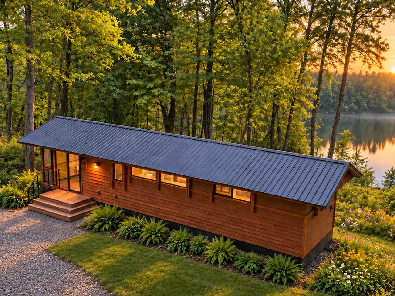
    The Glass House by Escape arrives at a moment when the tiny home conversation desperately needed a reset.It’s a park model that reads less like a compact shelter and more like someone took a considered, light-soaked apartment and simply decided it didn’t need to be attached to a city block. The structure stretches 47 feet long and 12 feet wide — uncommonly generous proportions for this category — finished in cedar that ages the way good materials should. But the defining move here is the glazin
     

This 47-Foot Glass House by Escape Reframes Everything You Thought About Tiny Living

13 septembre 2026 à 09:20

The Glass House by Escape arrives at a moment when the tiny home conversation desperately needed a reset.It’s a park model that reads less like a compact shelter and more like someone took a considered, light-soaked apartment and simply decided it didn’t need to be attached to a city block.

The structure stretches 47 feet long and 12 feet wide — uncommonly generous proportions for this category — finished in cedar that ages the way good materials should. But the defining move here is the glazing. One full wall runs 30 feet of continuous windows, pulling in light, landscape, and the kind of visual depth that makes a space feel genuinely expansive rather than merely tolerable. It’s a single-floor layout, which matters more than it sounds. No loft ladder, no crouched ceilings. Just clean, lateral living that prioritizes how a space feels to move through over how many square feet it can claim on paper.

Designer: Escape

The interior holds up to its exterior promise. The kitchen is equipped with a full-size fridge/freezer, dishwasher, induction cooktop, and a combination microwave/convection oven — the kind of spec sheet that signals the designers were thinking about real use, not Pinterest renders. The bathroom features a large glass-enclosed tiled shower, a vanity sink, and a proper flushing toilet with generous storage built around it. The bedroom carries the same commitment to glazing — framing a view of the surrounding landscape rather than walling it out. An enclosed porch extends the footprint further, offering an indoor/outdoor zone that shifts with the weather and the mood.

Escape, which has been building award-winning tiny homes for over 30 years, currently has the Glass House on view at its Canoe Bay Village property in Wisconsin — which is worth noting, because it suggests the design isn’t purely aspirational. It exists in a real landscape, subject to real seasons, and it holds its own.

What makes the Glass House interesting as a design object isn’t just its size or its spec list. It’s the underlying argument it’s making: that living small doesn’t require a philosophy of sacrifice. The single-floor plan, the wall of glass, the proper kitchen — these aren’t luxury additions. They’re the baseline of what attentive design looks like when it’s applied to a form that usually settles for less. The Glass House doesn’t settle.

The post This 47-Foot Glass House by Escape Reframes Everything You Thought About Tiny Living first appeared on Yanko Design.

  • ✇Yanko Design
  • No Switches Needed. Just Press, Pull, or Bop These Silicone Lamps: Behind The Design with YD
    Here is a fun little contradiction to chew on before we get into the actual lamps. The whole point of Call It a Day, Tongqi Design’s new lighting collection, is that you barely have to try. You bop it, you tug it, you flop your hand near it, and it turns on. Zero precision required, zero thinking involved, which is exactly the pitch when you have just walked through the door after a day that emptied you out. But get this. The less effort the lamp asks of you, the more effort someone else clearl
     

No Switches Needed. Just Press, Pull, or Bop These Silicone Lamps: Behind The Design with YD

12 septembre 2026 à 19:30

Here is a fun little contradiction to chew on before we get into the actual lamps. The whole point of Call It a Day, Tongqi Design’s new lighting collection, is that you barely have to try. You bop it, you tug it, you flop your hand near it, and it turns on. Zero precision required, zero thinking involved, which is exactly the pitch when you have just walked through the door after a day that emptied you out. But get this. The less effort the lamp asks of you, the more effort someone else clearly put into making that possible. That is the trade we are here to unpack.

Shanghai-based designer Tongqi Lu built the collection, a table lamp, floor lamp, and pendant, around soft silicone shades with zero switches anywhere on them. Every gesture works because the material itself is doing the sensing, not a button hunting for your finger. It sounds simple sitting in your living room. It is not simple to make, and that gap between the two is basically our whole story today.

Designer: Tongqi Lu

Click Here to Know More

The Design

Call It a Day is a three piece lighting collection, a table lamp, a floor lamp, and a pendant, and every one of them is dressed in soft, translucent silicone instead of glass or fabric. That alone is a break from convention, since silicone shades are usually reserved for LED strip diffusers rather than the whole visible body of a lamp. But the real departure is that none of these lamps have a switch. You bop the table lamp, you tug the pendant by its cord, you press the floor lamp wherever feels natural, and the light responds. There is no correct spot to find in the dark. The entire shade is the input, which sounds like a small shift until you realize how much of lamp design has always been built around finding one tiny precise point.

Lu frames the whole thing around the moment you get home and your body checks out before your brain does. She has talked about dropping onto the sofa and reaching out to press, pull, or tap without really thinking about it, and the light turning on not because she followed a rule but because she did not. That is a genuinely sharp way to think about interaction design. Most lighting asks you to be at your most coordinated right when you are at your least. Call It a Day flips that expectation, and the coiled yellow cable running through the collection is a nice touch too, borrowing the old pull chain gesture without being precious about it.

The Process

Here is where things get interesting, because the studio itself is not some slick production facility. It is an office in Shanghai with a plastic sheeted folding table, jerrycans of liquid silicone lined up against the wall, and a window looking out over the skyline. Before any of it was cast, the whole collection existed as full scale cardboard mockups, a pendant hung from a coiled cord and a table lamp balanced on a paper cone, sitting in the corner of the room like a rough draft nobody threw away. That is a genuinely useful thing to see, because it shows the gesture and the proportions were locked in long before the material was.

The shades themselves come out of large block molds with a fine grid texture cut into the cavity, which shows up on the finished silicone as a soft woven pattern once the lamp is lit. Getting silicone out of a mold cleanly is trickier than it sounds, since silicone tends to bond to itself, so getting a cast shade out of a cast mold without either tearing or fusing takes real care with release agents and material choice. Pouring it clean adds another layer of difficulty, since bubbles trapped in a translucent material show up as visible flaws once the light hits them. In the photos, you can see two people pouring together, one holding the bucket steady, the other running a palette knife across the lip so the silicone comes down in a thin ribbon instead of glugging out in one shot, which is a simple trick for keeping air out of the pour. It is not a factory process. It is a hand process, done carefully, on a folding table, gallon by gallon.

The Perspective

What I like most about Call It a Day is that the ease on the user’s end is clearly paid for somewhere upstream, and that upstream cost is visible if you know where to look. A switchless lamp sounds like a simple idea until you have to actually engineer a material that can be grabbed, twisted, and mistreated without breaking or losing its shape, and then cast that material cleanly at scale in a small studio. That gap between the lived experience and the labor behind it is exactly what a lot of good product design tries to hide, and here it is sitting right out in the open in the process photos.

It also helps that the whole thing traces back to something real. Lu’s early work, the lemon shaped Citron lamp, her furniture line built around trees and water lilies, all of it circles the same idea of pulling people back into their bodies after a long day in a city that does not really let them slow down. Call It a Day feels like the most literal version of that idea yet, a lamp built entirely around the ninety seconds when you have officially given up on being careful. Whether or not the gesture control holds up over years of actual use is a question only time and daily wear will answer, but as a piece of intent, this one lands.

Click Here to Know More

The post No Switches Needed. Just Press, Pull, or Bop These Silicone Lamps: Behind The Design with YD first appeared on Yanko Design.

  • ✇Yanko Design
  • 5 Best Homes That Disappear Into the Landscape in 2026
    Modern architecture is increasingly moving beyond simply occupying a site to becoming part of it. Instead of dominating the landscape, many contemporary homes integrate the contours, colors, and materials of their surroundings, creating a visual harmony that minimizes environmental impact. Through thoughtful siting, natural materials, and restrained forms, these residences blur the boundary between the built and natural worlds. Whether nestled into rugged mountains, hidden among dense forests,
     

5 Best Homes That Disappear Into the Landscape in 2026

12 septembre 2026 à 19:30

Modern architecture is increasingly moving beyond simply occupying a site to becoming part of it. Instead of dominating the landscape, many contemporary homes integrate the contours, colors, and materials of their surroundings, creating a visual harmony that minimizes environmental impact. Through thoughtful siting, natural materials, and restrained forms, these residences blur the boundary between the built and natural worlds.

Whether nestled into rugged mountains, hidden among dense forests, or perched along windswept coastlines, these homes show how architecture can celebrate instead of competing with nature. By responding to local climate, terrain, and ecosystems, they create immersive living experiences while leaving a lighter footprint on the landscape.

1. Mountain Homes That Become Part of the Terrain

Mountain homes often embrace steep slopes, rocky outcrops, and dramatic elevations instead of reshaping them. Architects use locally sourced stone, weathered timber, exposed concrete, and green roofs to visually anchor buildings within the landscape. Many designs are partially embedded into hillsides, allowing the surrounding topography to become an integral part of the architecture.

Large panoramic windows frame distant peaks while low-profile forms reduce visual impact. These homes appear sculpted from mountains, offering protection from harsh climates while creating a seamless relationship between architecture and the natural terrain.

3D visualizer and architectural designer Thilina Liyanage conceptualizes mountain living through a contemporary cabin concept that engages directly with extreme terrain. Set high above a rugged slope, the design appears to float against the mountainside, framed by expansive glass façades and sleek metal cladding. Its sharp triangular form enhances the sense of lightness, while the fully glazed surfaces open uninterrupted views of the surrounding peaks, turning the landscape into a continuous visual experience from inside the home.

Structurally, the cabin is anchored into the rock using steel beams and tension cables, making the engineering part of the architecture itself. This allows the home to project outward dramatically, hovering above the cliff edge. Inside, warm timber finishes balance the exterior’s industrial expression, creating a softer, livable atmosphere. A cantilevered deck extends the space further into the void, combining wooden flooring with a protective canopy.

2. Beach Homes That Blend with Coastal Landscapes

Coastal homes are designed to respond to shifting dunes, ocean breezes, and expansive horizons. Elevated structures, light-colored materials, timber cladding, and generous glazing help buildings harmonize with sandy beaches while improving resilience against coastal conditions. Their open layouts maximize natural ventilation and uninterrupted views.

Instead of becoming dominant landmarks, these homes maintain a quiet presence within the shoreline. Reflective glass, soft material palettes, and carefully integrated landscaping allow them to merge with the surrounding environment while preserving the character and beauty of the coast.

Based in Chile, ERRE Arquitectos designed Casa Ferran, a low-profile beach house in Matanzas. Set on a 240-square-meter site along the Pacific coast, the home follows a U-shaped plan that gently wraps the cliff edge, responding directly to the dramatic drop toward the ocean. The composition is carefully oriented to balance exposure and shelter, using its geometry to soften the impact of strong southwestern winds while preserving privacy along the side edges.

The central design strategy creates a protected courtyard that connects visually to the sea through a glazed common volume. This core space holds the kitchen, living, and dining areas, defined by full-height glass that draws in light and frames uninterrupted coastal views. Two wings extend outward: one containing bedrooms with planted atriums, and the other accommodating parking, guest rooms, and service zones. Built in black steel with pine cladding, and softened by white interiors and warm wood finishes, the home blends structure, landscape, and coastal living into one cohesive architectural gesture.

3. Forest Homes Hidden Among the Trees

Forest homes prioritize preservation by weaving architecture between existing trees rather than clearing the landscape. Dark timber, charred wood, Corten steel, and natural stone allow buildings to recede into woodland settings while respecting the surrounding ecosystem. Elevated walkways and compact footprints minimize disturbance to the forest floor.

Large windows invite natural light through the canopy, creating interiors that remain closely connected to seasonal changes. These homes dissolve into their wooded surroundings, allowing residents to experience nature without disrupting the delicate balance of the forest environment.

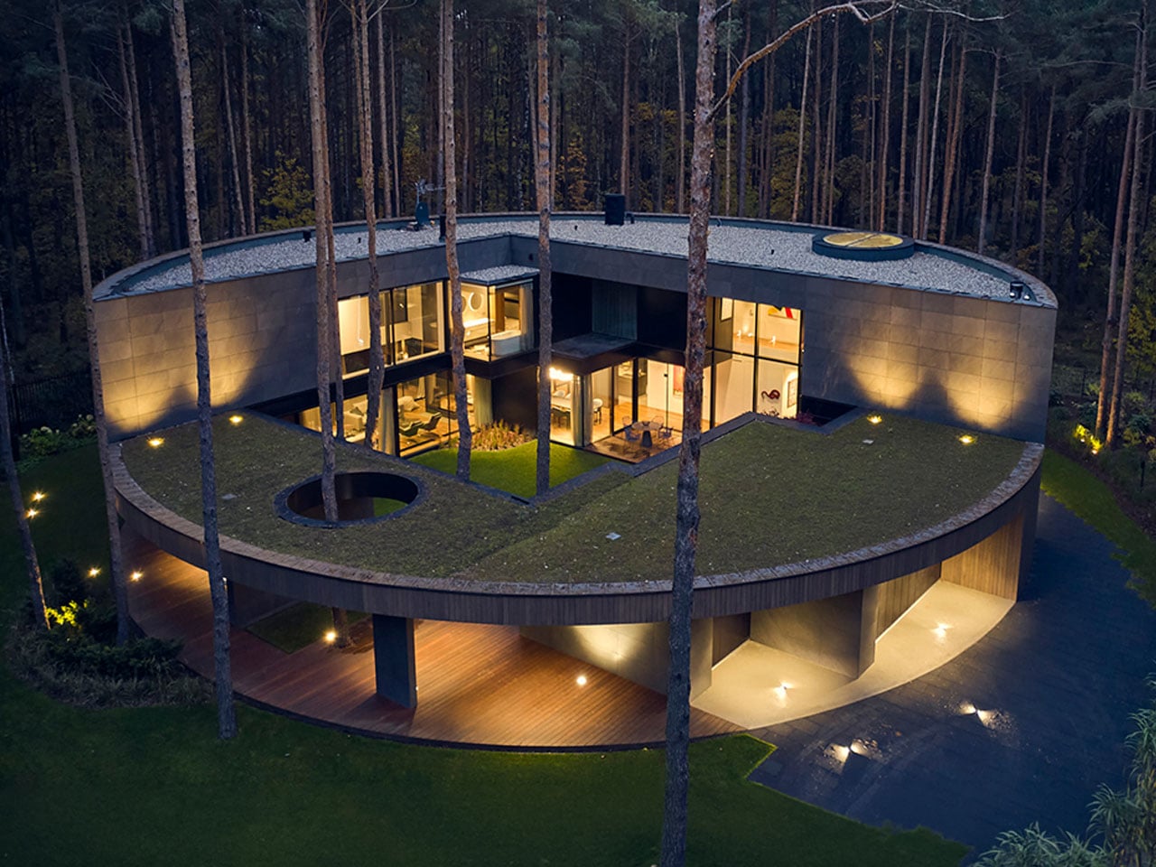
Circle Wood by Mobius Architekci redefines circular home design at a larger residential scale, set within a dense pine forest. Inspired by the form of a sliced tree trunk, the 400-square-meter house adopts a continuous circular geometry clad in okoume wood, carefully selected to help the structure merge with its natural surroundings. The smooth, knotless wooden exterior reinforces the idea of a seamless object embedded in the landscape rather than placed upon it.

The design organizes living spaces through a fluid, looping layout where rooms feel carved into the volume like pockets within timber. An overhanging oval frame extends the architecture to include a garage and open spa, strengthening the sense of continuity between functions. Generous glazing dissolves boundaries between inside and forest, while a central atrium draws daylight deep into the home. Inside, gallery-like interiors and sculptural elements, including a sweeping white staircase, enhance the experience of movement, making the house feel like a continuous walk through nature and space.

4. Desert Homes Inspired by the Landscape

Desert architecture embraces simplicity, using forms and materials that echo the surrounding terrain. Rammed earth, textured concrete, adobe, and locally sourced stone create earthy palettes that blend naturally with sand dunes, rocky formations, and arid landscapes. Courtyards and shaded outdoor spaces further respond to the harsh climate.

Low horizontal profiles reduce visual prominence while passive cooling strategies improve comfort with minimal energy use. These homes demonstrate how architecture can adapt to extreme environments by working alongside nature instead of resisting it.

In the heart of Inner Mongolia’s Tengger Desert, designRESERVE introduces Desert Ark, a 3D-printed concrete shelter system that redefines how architecture merges with extreme desert landscapes. Designed for volunteers working on large-scale reforestation efforts, the 150-square-meter base camp responds directly to harsh conditions where temperatures swing from extreme heat to cold. Instead of resisting the desert, the architecture is shaped to coexist with it, forming a compact settlement that feels naturally embedded in the sandscape.

The modular design consists of nine units arranged in a circular layout around a shared communal core, balancing privacy with collective living. Built using robotic 3D-printing and sand-based concrete, the structures feature layered, wavy surfaces that echo wind-shaped dunes, allowing them to visually dissolve into the environment. Integrated insulation cavities regulate temperature, making the interiors more habitable in extremes. Beyond function, Desert Ark becomes part of the desert itself as an adaptive, low-impact form that blends shelter, landscape, and technology into a unified architectural response.

5. Lakeside Homes That Reflect Their Surroundings

Homes along lakes and rivers often use transparency and subtle material choices to reduce their visual presence. Glass façades reflect changing skies and water, while timber, stone, and planted roofs soften the transition between architecture and the surrounding landscape. Many designs gently follow the shoreline instead of altering it.

By emphasizing reflection, openness, and carefully framed views, these homes create a continuous dialogue between indoor and outdoor spaces. The result is architecture that appears to dissolve into the water’s edge while providing peaceful living environments immersed in nature.

yh2 Architecture designs the Counter-Slope House as a quiet intervention within the steep terrain of Lake Memphremagog in Potton, Quebec. The 4,530-square-foot residence is embedded in a sharply sloping woodland site, where dense trees and shifting gradients shape every architectural decision. Instead of asserting presence toward the lake, the house withdraws into the land, reading more like a calibrated extension of the hillside.

The building is composed of two interlocking volumes that step gently with the slope, each capped by a subtly shifting dual-pitched roof that reduces visual mass and echoes the surrounding topography. Weathered cedar cladding allows the exterior to dissolve into the forest, while interiors in white oak introduce warmth and structure. Openings are carefully placed to capture fragmented lake views through trees rather than direct exposure, making light, movement, and seasonality central to the lived experience.

Ultimately, homes that disappear into their natural surroundings reflect a thoughtful approach to design, where architecture complements rather than competes with the landscape. By respecting local environments and embracing contextual materials, these residences create timeless spaces that foster a deeper connection between people and nature.

The post 5 Best Homes That Disappear Into the Landscape in 2026 first appeared on Yanko Design.

  • ✇Yanko Design
  • This Indonesian House Turns Its Sloping Roof Into a Garden, a Staircase, & a Rooftop Pool
    Some houses are designed to be looked at. Split Mass Residence, completed in 2026 by K-Thengono Design Studio, is designed to be moved through — a 712-square-metre home in BSD, South Tangerang, Indonesia, where every architectural decision is in service of movement, togetherness, and the slow pull of the outdoors. Founder Kelvin Thengono built the project around a single, quietly radical idea: “The main design goal was to allow a seamless sequence of spaces that keeps the family connected, whil
     

This Indonesian House Turns Its Sloping Roof Into a Garden, a Staircase, & a Rooftop Pool

12 septembre 2026 à 16:45

Some houses are designed to be looked at. Split Mass Residence, completed in 2026 by K-Thengono Design Studio, is designed to be moved through — a 712-square-metre home in BSD, South Tangerang, Indonesia, where every architectural decision is in service of movement, togetherness, and the slow pull of the outdoors.

Founder Kelvin Thengono built the project around a single, quietly radical idea: “The main design goal was to allow a seamless sequence of spaces that keeps the family connected, while also staying closely aligned with the surrounding landscape.” The house sits on a corner — what architects call a hook site condition — and rather than treat that exposure as a problem, the studio used it as the engine for the entire massing strategy. Volumes are split, pulled apart, and repositioned so that no single path through the house feels accidental.

Designer: K-Thengono Design Studio

That split is where the project gets interesting. Tiered, sloping garden roofs connect indoor living spaces directly to the planted outdoor setting, blurring the line between ceiling and garden in a way that feels more organic than architectural. From the open-plan kitchen, living, and dining area on the first floor, a glass door opens straight onto a grassy rooftop slope. An outdoor staircase continues upward to a swimming pool and barbecue area — the roof isn’t just a lid; it’s the social core of the house.

On the exterior, two materials do the heavy lifting. Concrete anchors the structure, giving it weight and presence on the streetscape. PE rattan panels wrap across the facade in woven screens that soften everything — filtering light, adding texture, and offering just enough visual privacy without closing the house off from its surroundings. The contrast is deliberate: one material says permanence, the other says warmth. Together they give the house a character that’s grounded and tactile rather than slick.

What Thengono has built here isn’t really a house in the traditional sense — it’s a system of encounters. Divided volumes, green roofs, and internal and external staircases create different scenarios for family interaction, so the architecture itself nudges people toward each other without ever forcing it. The rooftop garden crowning the whole composition reinforces that layered approach — landscape as architecture, architecture as landscape.

In a region where residential design often defaults to gated grandeur or tight minimalism, Split Mass Residence lands somewhere more considered. It’s a house that knows exactly where it wants you to be — and makes getting there feel like the whole point.

The post This Indonesian House Turns Its Sloping Roof Into a Garden, a Staircase, & a Rooftop Pool first appeared on Yanko Design.

  • ✇Yanko Design
  • 7 Japanese-Inspired Bedroom Accessories That Make a Dorm Room Feel Like a Ryokan
    A dorm room rarely arrives with any intention behind it. The furniture is standard issue, the lighting is whatever the university installed, and the walls belong to someone else’s lease. None of that stops you from shaping how the space feels. Japanese design has always found calm not through more, but through better. These seven objects apply that same thinking to the smallest rooms most people will ever live in. None of these picks need a drill, a landlord’s approval, or a subscription to any
     

7 Japanese-Inspired Bedroom Accessories That Make a Dorm Room Feel Like a Ryokan

10 septembre 2026 à 07:40

A dorm room rarely arrives with any intention behind it. The furniture is standard issue, the lighting is whatever the university installed, and the walls belong to someone else’s lease. None of that stops you from shaping how the space feels. Japanese design has always found calm not through more, but through better. These seven objects apply that same thinking to the smallest rooms most people will ever live in.

None of these picks need a drill, a landlord’s approval, or a subscription to anything. They are small, portable, and built around the same logic that shapes a good ryokan room: comfort comes from restraint, not accumulation. Each entry here handles one of four things — scent, light, sound, or surface — extremely well. Start with one, give it a few weeks, and notice how quickly the rest of the room reorganizes around it.

1. Battery-Free Aroma Diffuser

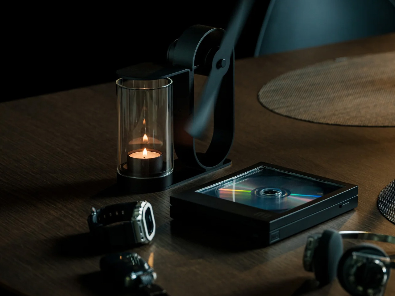
The most obvious thing about the Battery-Free Aroma Diffuser is right there in the name. No cord to manage, no batteries to replace, no USB port to compete with your laptop. A small candle sits inside a shielded housing, and the heat it generates spins a single fan blade that pushes scent further into the room than a standard candle would alone. The whole mechanism is visible from the outside, which is part of what makes it worth keeping on a nightstand in the first place.

There is something meditative about watching it work. The fan blade turns without any electricity, the scent builds slowly rather than blasting the room at once, and the exposed metalwork turns what is usually a plastic object into something closer to a piece of craft. In a dorm room where most objects compete for attention, this one earns it quietly.

Click Here to Buy Now: $290.00

What We Like

  • No batteries or cords means it works anywhere, including the awkward corner beside your bed
  • The exposed mechanism makes it look closer to a small kinetic sculpture than a gadget

What We Dislike

  • Scent only diffuses while the candle burns, so the effect does not last through the night
  • Open flame requires supervision and may conflict with dorm fire safety policies

2. REBORN PULP Acoustic Panel

Most acoustic panels solve one problem while creating another. They dampen sound but look like something salvaged from a recording studio, and nobody wants a room that looks like that. LIBGRAPHY’s REBORN PULP takes a different position entirely. Made from 100% recycled paper pulp with no plastics and no synthetic adhesives, it is fully biodegradable. The surface carries ridges and textures that reference a raked zen garden, available in colors drawn from traditional Japanese naming: natural, pale grey, celadon, and indigo.

What that means in practice is a panel that absorbs sound and reads as intentional decor at the same time, a combination almost nothing else in the acoustic category manages. The name Reborn refers to the material itself: paper that would otherwise be discarded, pressed into panels and returned to something useful. In a dorm room where wall decor is usually a poster or nothing, a REBORN PULP panel brings texture, quiet, and a considered material story from one object on the wall.

What We Like

  • The raked surface texture reads as genuine wall art, not acoustic treatment hiding behind decor
  • 100% recycled paper pulp construction with no plastics, no synthetic adhesives, fully biodegradable

What We Dislike

  • Availability outside Japan is still limited, making international purchasing complicated
  • Pricing is not publicly listed, which makes budgeting harder before you commit to inquiring

3. Portable CD Cover Player

Music in a dorm room usually comes from a phone propped against a glass. The Portable CD Cover Player changes the ritual entirely. You slot an actual CD into the body of the player, slide the album jacket into a front-facing pocket, and the artwork becomes part of what sits on your desk or hangs on the wall while the music plays. A built-in rechargeable battery and speaker mean it works anywhere you put it, no outlet or external speaker needed.

The design logic here is genuinely Japanese in its thinking: one object, handled well, replaces three. A phone stand, a music player, and wall art collapse into the same device. Priced from $199, it reintroduces the physical ritual of choosing and loading a disc, which is a deliberate act in a way that queueing a playlist never quite is. That small moment of intention is exactly what separates a ryokan from a hotel.

Click Here to Buy Now: $199.00

What We Like

  • Album art display turns a music player into a piece of rotating wall decor
  • Battery-powered and portable, so it moves freely around the room without hunting for an outlet

What We Dislike

  • Requires owning physical CDs, which most students no longer have on hand
  • The built-in speaker suits a small room but is not a substitute for dedicated audio

4. Pattern as Structure Shelf

When Japanese designer Muto Yumi set out to make furniture from paper, the result was not what most people would picture. No papier-mâché, no origami folding, no salvaged cardboard called art. What she built is a modular shelf system so structurally sound and visually precise that it makes you question most of what you assumed about material strength. The whole structure is built from rolled paper rods, and the pattern printed across each rod is not decoration. It is the joint itself.

Other paper rods slot through the pattern holes, linking each piece to the next without glue or hardware. The aesthetics and the engineering are the same thing, which is a level of design clarity rare in furniture of any material. Paper does not pretend to be something else. You can see the rolled layers at the cut ends. The pattern on each rod is both surface and structure, decoration and joint, and that indivisible coherence is what makes the shelf feel genuinely resolved.

What We Like

  • The pattern doubles as both decorative surface and structural joint, a design coherence almost nothing else achieves
  • Fully modular and hardware-free, meaning it can be reconfigured or disassembled without tools

What We Dislike

  • As a concept project, it is not yet available as a retail product to purchase
  • Paper furniture requires careful handling, and a shared dorm environment adds more risk than most

5. Infinite Solas Lamp

A dorm desk pulls double duty as dining table, reading surface, and workspace, often within the same hour. The Infinite Solas Lamp is built for that kind of restless room. It is fully wireless, running on a rechargeable battery that lasts up to 70 hours at low brightness or 6 to 7 hours at full, and the height adjusts between 22.5cm and 50cm so it fits wherever the moment calls for it, without the usual cord hunt before every use.

The color temperature runs from 2500K to 4000K with full dimming across the range, which means the same lamp that pushes you through a late assignment can settle into something much softer for reading in bed. The machined aluminum body with its anodized finish weighs just over a kilogram, enough to anchor a corner without needing shelf space.

Click Here to Buy Now: $325.00

What We Like

  • Battery life of up to 70 hours at low brightness means days between charges in normal use
  • Height adjusts from 22.5cm to 50cm so it functions equally well on a desk or nightstand

What We Dislike

  • At $325, it is one of the more expensive items on this list, which strains a dorm budget
  • Full brightness lasts only 6 to 7 hours per charge, so heavier use means more frequent recharging

6. Hinoki Bath Stools

A dorm shower is not typically where design decisions get made, but that does not mean the space is beyond improvement. Hinoki cypress lines traditional Japanese bathing rooms, carrying a natural oil that resists moisture and releases a gentle, forest-like scent that intensifies with warmth and steam. Tortoise General Store stocks these stools from $90, in three sizes, from the compact Umezawa at 10.5 inches long to the taller High Stool at nearly 15 inches.

The woodworkers of Tosaryu have perfected their craft in the mountains of Kochi, Japan since the 1970s, which matters for an object used every morning. The solid hinoki does not turn slippery underfoot the way plastic bath accessories do, and the natural oil within the wood keeps releasing scent each time it gets wet. Bringing one into a shared dorm bathroom is a small change with an outsized effect on how the space starts to feel.

What We Like

  • Natural hinoki oil releases a forest-like scent with heat and steam, making every shower more intentional
  • Three sizes available to suit different shower setups, from compact corners to wider stalls

What We Dislike

  • Solid wood requires occasional oiling to prevent drying and cracking in dry indoor climates
  • In a shared dorm bathroom with communal use, the stool will need consistent care and personal supervision

7. Aji Stone Book End Large

Most objects on a dorm desk either do a job or look good doing it. This one does both at once, without announcing either. The Aji Stone Book End Large is cut by Aoishima artisans from a single piece of granite quarried exclusively in the Aji and Mure regions of Kagawa Prefecture — a stone so dense and fine-grained it has been called the Diamond of Granite for over a thousand years. At 5.9 inches tall and 5.9 inches wide, it holds a shelf of design books in place with the kind of quiet authority that comes from actual mass, not styling.

The material itself is what makes it worth placing in a room. Aji stone is composed of quartz, feldspar, and biotite, and its tightly bonded crystals produce a polished surface with a speckled cloud pattern — called “ban” — that is unique to this stone alone and shifts subtly under different light. A ryokan room earns its calm partly through the weight and texture of real materials left to speak for themselves. One granite bookend on a shelf, holding a small stack of books, does more for a room’s mood than a shelf full of objects trying harder.

What We Like

  • Cut from a single piece of Aji granite by Kagawa artisans, so every surface marking is unique to that specific stone
  • The polished “ban” pattern shifts under different light conditions, making it a surface worth looking at even when nothing is leaning against it

What We Dislike

  • At $240, this is the highest price-per-square-inch object on the list, which is a real ask for a desk accessory
  • Genuine stone weight means it is not something to repack or move frequently, which matters in a room you vacate once a year

The Room You Sleep In Should Earn the Rest It Promises

A ryokan room earns its reputation not through luxury but through restraint. Nothing in it is accidental, and nothing is there simply to fill space. That same principle scales to a dorm room just as well. The objects on this list work because each one handles a single function with more care than the default version of that thing, and that care accumulates into something the room actually starts to feel like.

Start with light, since it does the most emotional work in the smallest footprint. Add scent next, because it transforms a room’s character without touching a single surface. Sound comes third. Surfaces come last, and they come slowly. The point is not to recreate a ryokan from scratch in a rented room. The point is to bring enough of that thinking with you that the place you sleep actually earns the rest it is supposed to give you.

The post 7 Japanese-Inspired Bedroom Accessories That Make a Dorm Room Feel Like a Ryokan first appeared on Yanko Design.

  • ✇Yanko Design
  • Finally, One Tower Replaces Your Speaker, Lamp, and Wine Fridge
    Anyone who has tried to furnish a studio apartment knows the specific defeat of running out of surfaces before you run out of gadgets. The speaker needs an outlet and a shelf. The lamp needs its own corner. The mini fridge for wine wants counter space that doesn’t exist. Each object is fine on its own, but stacked together on a single console table, they start to look like a garage sale that lost an argument with a design magazine. That is the exact problem South Korean designer Jung Hyun Kim s
     

Finally, One Tower Replaces Your Speaker, Lamp, and Wine Fridge

10 septembre 2026 à 06:07

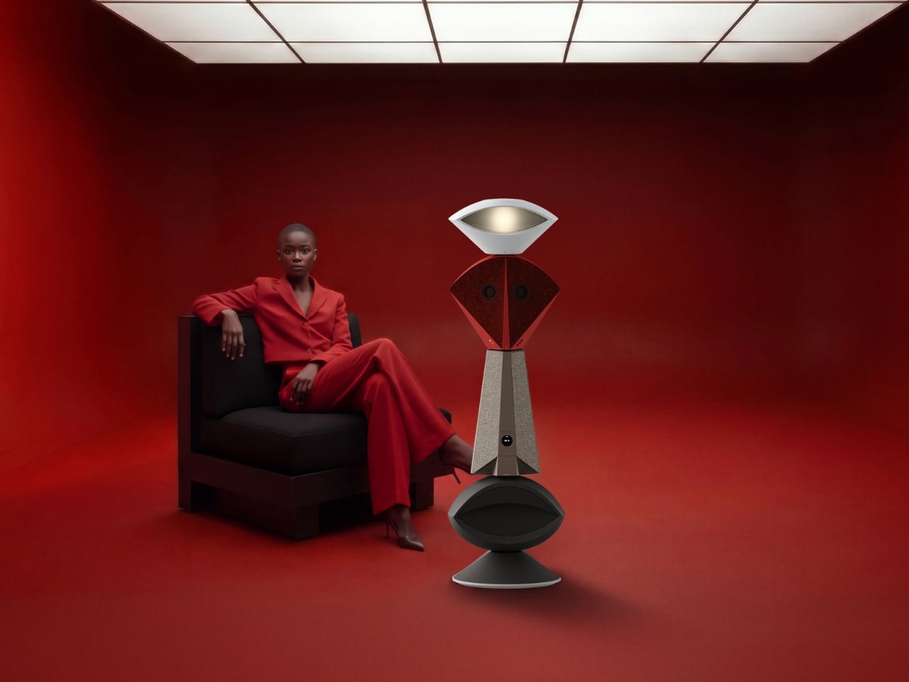
Anyone who has tried to furnish a studio apartment knows the specific defeat of running out of surfaces before you run out of gadgets. The speaker needs an outlet and a shelf. The lamp needs its own corner. The mini fridge for wine wants counter space that doesn’t exist. Each object is fine on its own, but stacked together on a single console table, they start to look like a garage sale that lost an argument with a design magazine. That is the exact problem South Korean designer Jung Hyun Kim set out to solve with Babel, a concept he built for people who live in small rooms but refuse to shrink their idea of what home should feel like.

Kim designed Babel for a very specific and very real slice of the population, twenty somethings through mid thirties starting their independent lives in modest apartments, often around 500 to 550 square feet, the kind of footprint that is common from Seoul to Brooklyn to any first apartment in a city with real rent. His answer wasn’t to make each device smaller. It was to stop thinking about furniture and electronics as separate categories entirely, and instead build a single vertical column where every function gets its own segment, stacked like a totem instead of scattered like clutter.

Designer: Jung Hyun Kim

The tower reads almost like a figure standing in the room. At the top sits an eye shaped ambient lamp, its lens glowing warm and soft, the kind of light you’d want next to a couch at eleven at night. Below that, a red, fabric wrapped module houses the main speaker drivers, angled like a face with two eyes looking back at you, which is a genuinely clever piece of anthropomorphism for an object meant to live in your peripheral vision all day. The tapered midsection functions as the control hub, complete with a discreet volume display, and the whole thing terminates in a rounded black base that turns out to be a hidden drawer, a small cooling compartment for a couple of wine bottles. Four completely different jobs, one silhouette.

What makes this more than a novelty is the modularity built into the stacking logic. Nothing about Babel demands you use all four segments in one order. You can pull pieces apart, rearrange them, or run just the parts you need that week. A studio dweller might want the lamp and speaker without the bar module. Someone hosting more often might stack the drawer higher for easier reach. The design treats a small home the way a good capsule wardrobe treats a small closet, fewer pieces, each one doing more, none of them wasted.

I like that Babel doesn’t pretend the solution to small space living is owning less. It assumes you still want a good lamp, a good speaker, and a cold bottle of wine within reach, and it simply refuses to let those wants cost you three separate footprints. That feels more honest than most minimalist design advice, which tends to ask people to want less rather than design better. The name is a nice touch too, a nod to the biblical tower where many languages tried to reach the same point, which tracks neatly onto a product where lighting, sound, cooling, and control all speak different technical languages but rise from the same base.

Whether Babel ever becomes a shippable product is beside the point right now. It exists as a Behance concept, a portfolio piece from a designer who clearly thinks in systems rather than single objects, and that thinking is worth paying attention to regardless of manufacturing timelines. Apartment living isn’t getting more spacious anywhere, and the appetite for objects that look intentional rather than accumulated is only growing, especially among people who grew up curating every shelf for how it photographs. A stacked, sculptural answer to gadget clutter fits that mood perfectly.

Babel won’t fit every home, and a four function tower is a commitment, not an impulse buy. But as a piece of thinking about how to live well in less square footage, it’s one of the more clear headed ideas I’ve seen come out of a design program in a while. Sometimes the fix for too many objects isn’t fewer objects. It’s better posture.

The post Finally, One Tower Replaces Your Speaker, Lamp, and Wine Fridge first appeared on Yanko Design.

  • ✇Yanko Design
  • A Chilean Architect Quietly Built a House That Follows the Hill Instead of Fighting It
    House 22, designed by Chilean studio Loft7 and completed in 2023, sits on a sloping coastal lot south of Punta de Lobos — a stretch of Chilean coastline known for dramatic surf and untouched native scrubland. The lot descends toward the northwest, and rather than resisting that gradient, the architecture follows it, letting the terrain pull the building naturally toward an uninterrupted view of the Pacific Ocean. At 320 square meters, the residence is generous without being excessive. Loft7 str
     

A Chilean Architect Quietly Built a House That Follows the Hill Instead of Fighting It

9 septembre 2026 à 18:30

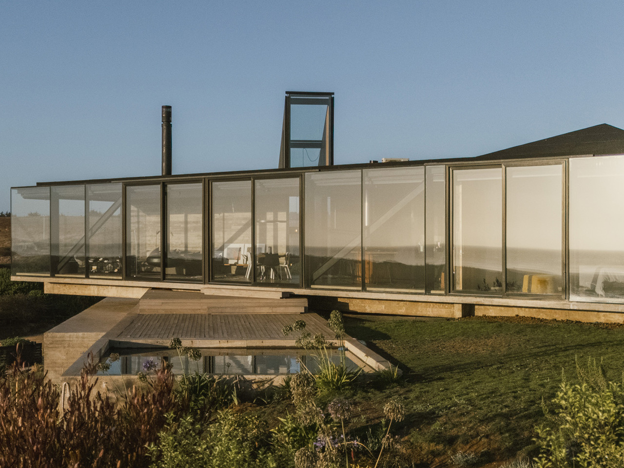
House 22, designed by Chilean studio Loft7 and completed in 2023, sits on a sloping coastal lot south of Punta de Lobos — a stretch of Chilean coastline known for dramatic surf and untouched native scrubland. The lot descends toward the northwest, and rather than resisting that gradient, the architecture follows it, letting the terrain pull the building naturally toward an uninterrupted view of the Pacific Ocean.

At 320 square meters, the residence is generous without being excessive. Loft7 structured the build using a combination of reinforced concrete and steel frames — a technical pairing that allows the house to hold its ground on a challenging slope while keeping the interior language warm and tactile. Exposed timber beams run through the living spaces, the dining area, and the kitchen, grounding each room in material honesty. There’s no attempt to disguise how the building is put together. That transparency is the design.

Designer: Loft7

What makes House 22 worth studying isn’t a single dramatic gesture — it’s restraint applied consistently. The interiors lean on wood, natural light, and sightlines that always resolve at the ocean. No surface fights for attention. The beam grid overhead becomes rhythm rather than decoration, and the open-plan social spaces feel like they’re orientated by the view rather than by a floor plan. Spaces breathe because the architecture got out of the way.

Pichilemu is famous in surfing circles, but architecturally it’s a place where the Chilean coast has quietly been producing some of the country’s most considered residential work. Loft7 fits that lineage — a studio that has built its reputation around sites where nature already has the upper hand. Their approach with Casa 22 trusts the land and the light, deploying materials that age well in a coastal climate and a massing that reads modestly from the outside while delivering on every expectation from within.

Photographed by Fabián Acuña, the project looks different at every hour of the day. Morning light hits the timber and fills the interiors with warmth; the Pacific turns silver in the afternoon. That relationship between material, orientation, and time of day is never accidental in good coastal architecture — and here it feels entirely intentional. House 22 isn’t trying to be the loudest house on the Chilean coast. It’s trying to be the most honest one. On both counts, Loft7 delivers.

The post A Chilean Architect Quietly Built a House That Follows the Hill Instead of Fighting It first appeared on Yanko Design.

  • ✇Yanko Design
  • IKEA’s Tiny Houses Quietly Admit Your Messy Home Is Fine
    Even though I have enough space to have people over, the fact that my place is terribly messy stops me from inviting family and friends. I don’t want to spend an entire day just stuffing stuff I want to hide into my boxes and closets. That’s not a design problem. That’s a me problem and more specifically, a modern life problem, and it happens to be the exact one IKEA just built a series of dollhouses to talk about. The company recently installed handcrafted miniature homes, built at a precise 1
     

IKEA’s Tiny Houses Quietly Admit Your Messy Home Is Fine

9 septembre 2026 à 09:20

Even though I have enough space to have people over, the fact that my place is terribly messy stops me from inviting family and friends. I don’t want to spend an entire day just stuffing stuff I want to hide into my boxes and closets. That’s not a design problem. That’s a me problem and more specifically, a modern life problem, and it happens to be the exact one IKEA just built a series of dollhouses to talk about.

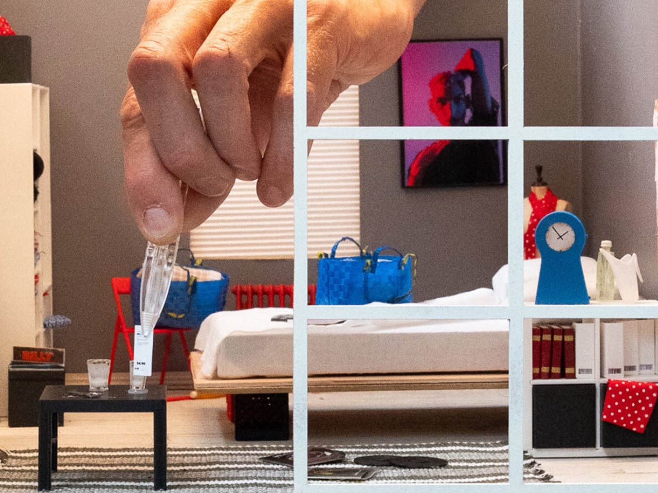
The company recently installed handcrafted miniature homes, built at a precise 1:12 scale, in public spaces across Melbourne, Chengdu, and Beijing. They’re gorgeous, obsessively detailed little things made by Stockholm-based miniature artist Christopher Robin Nordström, who goes by TokyoBuild online. But they’re not really about scale-model furniture. They’re about the fact that our homes are now expected to be office, gym, classroom, and sanctuary all at once, in the same square footage we’ve always had, while somehow still looking like a magazine spread. That expectation is exhausting, and most of us already know it.

Designer: Christopher Robin Nordström for IKEA

IKEA backed this up with a survey of more than 30,000 people across 31 countries, and the headline number is the kind of thing you want to text a friend: 59 percent said they’d rather live somewhere characterful than somewhere manicured. Not a landslide, but a real majority, and a fairly clear rejection of the sterile, everything-matches aesthetic we’ve been sold for the last decade.

I like that the tiny houses lean into locality instead of pretending every home looks the same everywhere. The Melbourne model has a miniature BILLY bookcase stacked with tiny novels and sports memorabilia. The Chengdu and Beijing versions center on scaled-down METOD kitchens instead, because that’s where those homes actually live and breathe. It’s a small choice, but it says the quiet part out loud: nobody’s home is supposed to look like a showroom, because nobody’s life actually happens in a showroom.

Nordström said something that stuck with me more than any stat in the report. He explained that when you build in miniature, you can’t include everything, so every object has to earn its place, and you realize a home isn’t defined by how much it contains but by what people choose to make room for. That’s a graceful way to describe editing your life down to what matters, and it applies just as well at full scale as it does at one twelfth of it.

The behavioral data is where this stops feeling like a marketing campaign and starts feeling like a mirror. Nearly one in five people admit to keeping gifts they never wanted, just to avoid hurting someone’s feelings. More than a quarter hide mementos from past relationships, a habit slightly more common among men. Ten percent have actually canceled plans with friends because their place felt too messy to host, and over a third shuffle clutter from room to room right before guests arrive. Some people use their oven purely for storage, which, if I’m honest, sounds familiar to at least one junk drawer I refuse to open around visitors.

What strikes me isn’t that people are messy. It’s that so many of us are quietly performing tidiness for other people instead of actually living in our own space. IKEA’s pitch, wrapped up in tiny bookshelves and miniature kitchens, is refreshingly modest: you don’t need a renovation to fix that. You need smarter storage and permission to stop apologizing for your actual life.

The tiny houses tour wraps up soon, but IKEA Open House continues in stores through September, built around the same idea at real scale, with the kind of affordable, small-footprint fixes most of us can actually use. Whether or not you ever walk through it, the message is worth sitting with. Perfect homes are rare. Honest ones are just about everywhere, once you stop hiding them.

The post IKEA’s Tiny Houses Quietly Admit Your Messy Home Is Fine first appeared on Yanko Design.

  • ✇Yanko Design
  • The 5 Home Upgrades Every Pet Parent Actually Uses (Not Just Buys)
    Pet furniture & products have operated under a different standard than everything else in the home for too long. The scratchy beige tower. The plastic bowl by the radiator. The mat that looks like an afterthought. That gap between what owners expect from their own furniture and what they accept for their pets is closing, and the designs collected here are evidence of that shift. These are objects that take the animal’s life seriously without surrendering the room. This is not a list for own
     

The 5 Home Upgrades Every Pet Parent Actually Uses (Not Just Buys)

8 septembre 2026 à 07:40

Pet furniture & products have operated under a different standard than everything else in the home for too long. The scratchy beige tower. The plastic bowl by the radiator. The mat that looks like an afterthought. That gap between what owners expect from their own furniture and what they accept for their pets is closing, and the designs collected here are evidence of that shift. These are objects that take the animal’s life seriously without surrendering the room.

This is not a list for owners who want to spoil their pets. It is a list for owners who want their home to feel coherent, and who understand that coherence includes the animal living in it. A vacuum that maps your dog’s favourite spots. A bowl that keeps a fast eater honest. A table built around the fact that the cat is going to be there anyway. Five upgrades, and one shared premise.

1. Chunky Cat Tree

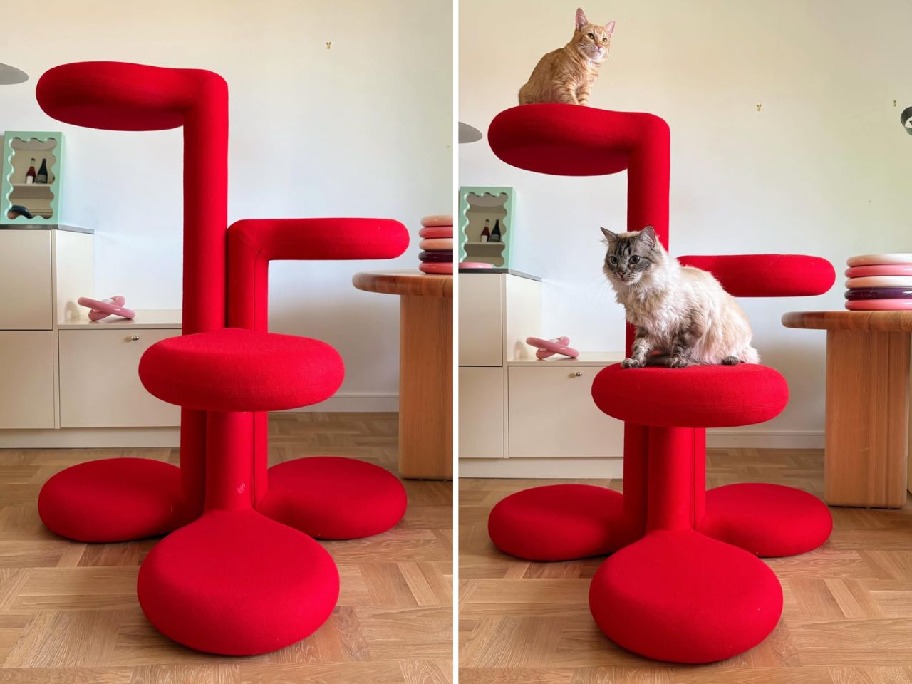
Cat trees solve a specific problem and fail at everything else. They anchor the room in exactly the wrong way, and most owners spend years working around them rather than with them. Gustaf Westman’s Chunky Cat Tree asks whether the category has to operate this way at all. The Swedish designer, known for his Chunky collection of ceramics, glassware, and home objects, has applied that same rounded vocabulary to a cat climbing structure. The result is a piece you place rather than hide.

The form carries all of Westman’s signatures: stacked volumes, inflated proportions, a material presence that reads as warm and deliberate. Made to order in Sweden, the tree is upholstered in wool across five colourways: red, yellow, purple, blue, and cobalt blue. Westman has said he designed it after years of seeing ugly cat trees and deciding the category deserved better. The comment captures the larger idea behind the object. Everything can be designed better, including the things we have come to accept as visually unpleasant.

What we like:

  • Treats cat furniture as a design category worth the same formal attention as any other home object
  • Wool upholstery and sculptural proportions earn placement in the room rather than tolerance of it

What we dislike:

  • Made to order in Sweden means lead times and pricing that will not suit everyone who falls for the visual
  • No confirmed US retail availability or price at time of writing

2. Narwal Flow 2 White

Robot vacuums and pet homes have always had a complicated relationship. Hair wraps around the brush, filters clog faster than the maintenance schedule allows, and the machine ends up parked in the corner half the time. The Narwal Flow 2 White addresses that at the hardware level before asking for any trust. A certified detangling system eliminates hair tangling. A 31,000 Pa motor handles the volume that stops most competitors mid-session. Pet Mode maps your animal’s active zones and adjusts cleaning paths accordingly.

The white colourway matters more than it sounds. Most robot vacuums read as appliances, objects you notice when working and ignore otherwise. The Flow 2 White sits closer to quiet luxury, a thing you leave in the room rather than hiding beneath furniture. Find My Pet uses the onboard camera to locate your animal from your phone on demand. A FlowWash mopping system heats water to 140 degrees for a result that goes well beyond what surface-level mop attachments typically deliver at any price.

Click Here to Buy Now: $1069.99 $1499.99 ($430 off, use coupon code “YDNARWAL”). Hurry, deal ends in 48-hours! Website Link Here.

What we like:

  • Pet Mode and the certified detangling system treat pet ownership as a design constraint rather than a marketing hook
  • Find My Pet and AI Floor Tag add genuine daily utility beyond the core cleaning function

What we dislike:

  • At $1,099.99 launch price, the commitment is significant for a category with a historically patchy reliability record

3. Sloddy

Slow feeders solve the problem once. Most dogs need about a week to learn the maze, and then mealtime returns to its previous five-second format. Designer Kyung-seo Yoo built Sloddy around that specific failure mode. The bowl ships with multiple interchangeable puzzle inserts at increasing difficulty levels, and you rotate them as the dog adapts. The challenge stays real. The eating pace stays controlled. It is a straightforward idea that the rest of the category never thought to try.

An adjustable MDF wood stand raises or lowers the bowl to match shoulder height, addressing a posture and digestion concern that most pet owners encounter long after they needed the fix. Every component disassembles fully for cleaning, with no corners that trap food beyond reach. The peachy-orange palette and warm wood base sit somewhere between kitchen object and design piece, and the recyclable cardboard packaging doubles as a storage shelf for the spare inserts once the box is opened.

What we like:

  • The modular difficulty system is the first meaningful update to the slow feeder format in years
  • Full disassembly for cleaning eliminates the trapped-food problem that makes most slow feeders a short-term purchase

What we dislike

  • The modular system only works if the owner actively manages the insert rotation — it requires consistent owner effort, and most households will default to leaving the same insert in indefinitely
  • The MDF wood stand, while visually warm, is vulnerable to water damage and splashing at feeding time, which is a daily reality with most dogs

 4. Pet Paws

Paws are how the outdoors follows your dog into every room. Mud, grit, bacteria, and allergens come in with every return from outside, and a doormat or a towel handles it partially at best. This portable mat was designed to close that gap by combining three functions- cleaning, drying, and disinfecting- in a single object that sits where the problem actually begins. The all-in-one approach trades the multi-step routine by the door for something that takes seconds and requires nothing else.

The portability is part of the logic. A fixed solution only works at one entry point; a mat you can move adapts to wherever the animal actually comes in, which is rarely the same door every day. For households where paw hygiene connects directly to allergy management or general cleanliness standards, shortening the threshold routine without eliminating it offers something most door products never attempt: cleaning, drying, and treating in the same step, without a trip to the sink.

What we like:

  • Three-in-one functionality handles the most repetitive daily pet hygiene task without multiple products
  • Portable format adapts to wherever the animal actually enters, not just the main door

What we dislike:

  • The disinfecting function almost certainly requires a cleaning solution or refill, adding an ongoing cost and supply dependency that the headline promise of a single portable mat quietly glosses over
  • Dogs that resist paw handling or unfamiliar textures underfoot will need consistent training before the mat becomes a reliable part of the routine rather than something they walk around

5. Dinos Cat WFH Table

Anyone who works from home with a cat recognizes the pattern. The animal locates the warmest, most centrally placed surface in the room and treats it as its own. The desk. The keyboard. The notebook. Japanese furniture company Dinos designed a table that accepts this behavior as a given and builds around it rather than against it. A center cavity in the tabletop creates a through-hole, and a hidden perching shelf beneath gives the cat a settled spot at the same level as everything happening above.

The logic is quiet and functional. Rather than competing with the animal for desk space, the table distributes the surface so both uses fit without interrupting each other. The cat sits close enough to its owner to settle down, without walking across the keyboard to get there. For anyone who has rearranged a work setup around a cat’s habits anyway, this just makes the accommodation honest, building it into the object rather than improvising it daily with a cardboard box and a folded blanket.

What we like:

  • Treats the cat as a design parameter from the start rather than an inconvenience to be managed around
  • The hidden perching shelf reduces desk negotiation without requiring any behavioral change from the animal

What we dislike

  • The center cavity is sized and designed specifically for cats, making it a non-starter for dog owners and narrowing the audience of this roundup in a way worth flagging before recommending
  • The table assumes the cat will use the designated perch, and cats are reliably indifferent to designated anything, meaning the design works best for animals already inclined to settle rather than roam

Good Design Has No Exceptions

Pet ownership has changed faster than the objects designed around it. The animals have moved into bedrooms, onto sofas, into daily routines in ways the existing product categories have not kept pace with. What this list represents is a small group of designers who noticed that gap and decided to close it, not by producing novelties, but by applying real design thinking to objects that have been overlooked or tolerated for too long.

None of these are impulse purchases or quick fixes. They are considered responses to specific problems, and that distinction matters. A cat tree that earns its spot. A vacuum that accounts for hair before it becomes a problem. A bowl that stays challenging. A mat that completes the threshold routine in one step. A table that accepts the cat before it ever arrives. That is what good design looks like when it reaches the right problems.

The post The 5 Home Upgrades Every Pet Parent Actually Uses (Not Just Buys) first appeared on Yanko Design.

❌