Vue normale

Il y a de nouveaux articles disponibles, cliquez pour rafraîchir la page.
À partir d’avant-hierYanko Design

Turning 350 Razor Blades into a Super-Sharp Damascus Steel Knife

Par : Sarang Sheth
17 octobre 2024 à 20:45

But why make a massive blade out of something that can ALREADY cut things – you ask? It probably sounds like using a lot of small LEGO bricks to make one large LEGO brick, right? Well, the thing with razor blades is that they’re made to serve a finite purpose. They’ll last a few days, maybe a few weeks, and then they need to be discarded. Razor blades are ridiculously sharp, but they’re also ridiculously flimsy and you can break one with your own hands… so YouTuber Knives Project decided to just use a bunch of them to make something more everlasting, more worthy of being cherished, while being just as sharp.

It took 350 blades being forged together into a metal ingot to make this final knife. The result is truly heirloom-worthy. The knife sports a gorgeous marbled blade created thanks to the combination of the steel used in the razors as well as the steel powder added into the ingot to fill in the air gaps. The knife finally gets a nice wooden handle with a bit of metal at the beginning of the hilt.

Designer: Knives Project

The 15-and-a-half-minute video guides you through Knives Project’s process, from forging the steel ingot to shaping it, etching it, honing it, and then building the handle for the knife. The result looks rather artisanal, with a kitchen knife-style design sporting a drop-point edge and a wonderful marbled body reminiscent of Damascus Steel. The knife also comes with a wooden handle with an octagonal cross-section that’s easy to grip and maneuver.

Razor blades are primarily made from martensitic steel – a steel alloy known for its high strength and wear resistance, with the more expensive ones being made from carbon steel. Given that the knife uses 350 of these razors, it’s possible Knives Project sprung for regular blades, adding them one by one into a bolt to create a cylindrical form. The cylinder was then dropped into a hollow metal block and all the air gaps were filled with steel filings, resulting in a solid block that had no air gaps.

Once the metal block goes into the furnace, the steel inside begins melting, forming a rough cluster that Knives Project extracts by opening the outer box using an angle grinder. The reason is that this outer box is made of iron, while its internal components are the steel you need to form into an ingot.

The process involved constantly heating, hammering, and forming the resulting metal ingot into a flat strip that could then be cut into the knife’s shape. Once cut, the surface was made smooth before being dipped into an acid bath to reveal the marbled pattern caused by the different kinds of steel used in the knife.

Once the blade was completely ready, Knives Project added a handle to it, using primarily wood combined with metal and a black block of presumably polymer to create a fair amount of contrast. The handle was given an octagonal cross-section and a fairly simple silhouette. Arguably a knife this pretty could be given a prettier, more ergonomic handle, but then again, that may steal from the star of the show, its blade – forged from 350 razors. Now if only Knives Project could cut that blade up into 350 pieces and turn them back into razors!

The post Turning 350 Razor Blades into a Super-Sharp Damascus Steel Knife first appeared on Yanko Design.

Prada Designs Spacesuit for the First Woman Astronaut On The Moon. Here’s what is different…

Par : Sarang Sheth
17 octobre 2024 à 19:15

When you think of spacesuits, luxury fashion probably doesn’t come to mind—but Axiom Space and Prada are changing that. Together, they’ve unveiled the Axiom Extravehicular Mobility Unit (AxEMU), a next-generation spacesuit designed for NASA’s Artemis III mission, which will return astronauts to the Moon. This suit represents a groundbreaking shift in both form and function, blending the technical precision required for space exploration with the high-performance materials and design innovations Prada is known for. And it’s more than just a style statement: the AxEMU has been carefully crafted to support the historic lunar landing of astronaut Christina Koch, who will be the first woman to walk on the Moon.

Designers: Axiom Space and Prada

An Unlikely Collab between NASA and Prada

At first glance, the AxEMU may not look like the bulky spacesuits we’ve come to expect. In fact, that’s the point. Designed with a scalable and adaptable architecture, this suit breaks free from the rigid, one-size-fits-all approach of traditional space gear. The AxEMU is built to accommodate a wide range of body types, allowing astronauts from various anthropometric percentiles—meaning different heights, weights, and builds—to feel comfortable and functional in the suit. Whether you’re on the smaller side or fall into the larger percentile, the AxEMU adjusts to ensure maximum mobility, a critical factor for a mission as demanding as Artemis III.

Prada’s expertise in material science plays a key role here. The luxury fashion house worked closely with Axiom engineers to develop an outer layer that not only looks sleek but also performs under extreme conditions. Crafted from a reflective white material, this layer helps regulate temperature by reflecting the sun’s heat while simultaneously protecting the astronaut from lunar dust and radiation. While traditional spacesuits focus on pure functionality, the AxEMU integrates aesthetics with performance, combining Prada’s advanced sewing techniques with Axiom’s life support technology to create something truly revolutionary in both appearance and utility.

High-Tech Meets High-Street Fashion

What truly sets the AxEMU apart from its predecessors is its balance between high-end design and cutting-edge technology. The suit boasts enhanced safety systems, including a regenerable carbon dioxide scrubbing system that ensures astronauts can breathe safely during spacewalks lasting up to eight hours. It also features advanced cooling technology, which is crucial for maintaining comfort in the extremes of the lunar environment. Astronauts will be better equipped to perform complex tasks thanks to upgraded dexterity in the gloves—something previous spacesuits struggled with, often limiting the fine motor control astronauts need to manipulate tools or conduct experiments.

The helmet also offers significant upgrades, with an advanced visor that improves visibility in the harsh lighting conditions of the Moon’s surface. The design of the AxEMU is about more than just protection; it’s about enabling astronauts to push the boundaries of what’s possible in space exploration. Thanks to Prada’s involvement, the suit’s exterior may feel more like high-performance sportswear than traditional space armor. But make no mistake—this is gear built to survive the extreme cold and searing heat of the Moon’s surface, with every detail engineered to keep astronauts safe and functional in one of the most hostile environments known to man.

What Makes The AxEMU So Different?

Compared to existing spacesuits, the AxEMU is a leap forward in versatility and user experience. Most current spacesuits, like NASA’s EMU (Extravehicular Mobility Unit), were designed decades ago, with little adaptation for the variety of missions astronauts now face. The AxEMU, by contrast, is built with a flexible architecture that can evolve for different missions, from the lunar surface to low-Earth orbit. This flexibility allows Axiom Space to customize the suit for a wide range of environments and tasks, whereas older suits were often mission-specific, with limited adaptability.

Safety is another area where the AxEMU shines. Conventional spacesuits are built with basic redundancy, but the AxEMU integrates a more robust set of redundant systems, ensuring multiple fail-safes in life support and mobility functions. This suit also goes beyond standard temperature control, using Prada’s material expertise to provide better heat management, allowing astronauts to remain comfortable during long spacewalks, even in the harsh lunar environment. Furthermore, the AxEMU has been tested with advanced simulations, including underwater testing to mimic the reduced gravity on the Moon, setting a new standard for preparation and reliability.

Designed for Christina Koch: A Spacesuit for the First Woman on the Moon

Christina Koch will make history as the first woman to walk on the Moon, and the AxEMU has been designed with that momentous occasion in mind. While traditional spacesuits were largely designed for male astronauts, the AxEMU has been engineered with inclusivity at its core. One of the key differences lies in its customizability: unlike older suits that often required uncomfortable modifications for female astronauts, the AxEMU offers a better fit right from the start, making adjustments seamless and comfortable for a wide range of body types. This is particularly important for Koch, as a properly fitted suit means enhanced mobility and reduced fatigue during long spacewalks.

Additionally, the suit’s gloves, helmet, and overall design have been tailored for precision, allowing Koch to work more efficiently on the lunar surface. The improved dexterity of the gloves will enable her to conduct more intricate scientific tasks, such as collecting samples and performing experiments, without the restrictions of older spacesuit designs. For Koch, the first woman to explore the Moon, having a suit that adapts to her needs, rather than her adapting to the suit, marks a symbolic and practical step forward in space exploration, ensuring that future missions can be more inclusive.

The AxEMU represents the future of spacesuits—one where technology, design, and inclusivity come together to push the boundaries of human potential. With Christina Koch set to wear this groundbreaking suit during her historic moonwalk, the AxEMU is leading the way into a new era of space exploration, where astronauts of diverse backgrounds, genders, and physiques will have the tools they need to reach new frontiers.

The post Prada Designs Spacesuit for the First Woman Astronaut On The Moon. Here’s what is different… first appeared on Yanko Design.

HOVERAir: World’s First 8K Flying Action Camera fits in your pocket and operates without a remote

Par : Sarang Sheth
10 octobre 2024 à 01:45

Your phone has a pretty phenomenal camera, but unless it’s an absolute flagship device, it probably won’t record 8K video. And it for sure won’t fly around in the air taking dramatic shots of you while you pose on the top of a mountain or dirt bike on a rocky trail or dive into a lake. You’ll probably need a selfie drone for that, but before you go spending hundreds of dollars on a drone that’s fragile, expensive, and comes with a massive learning curve involving controllers and joysticks, the folks at HOVERAir might have built the perfect consumer-grade pro drone, or as they call it – a flying action camera. Designed to be foldable, small enough to fit in your pocket, and durable enough to withstand any rookie accidents The HOVERAir X1 PROMAX still packs a state-of-the-art flying system and an 8K camera capable of outshining any other drone its size. It works on voice commands (but also comes with an optional Wi-Fi 6-enabled Beacon), takes off from your palm, reaches speeds of up to 60 km/h (37.2 mph), can capture slow-motion videos at 120fps, and even works in sub-zero temperatures just in case you want to film yourself skiing or snowboarding. The best part, the X1 PRO’s $499 starting price, along with its compact size which makes it compliant with FAA guidelines so anyone can use one.

Designer: HOVERAir

Click Here to Buy Now: $499. Hurry, only 30 left! Raised over $4.6 million.

You may remember HOVERAir from years ago when they first debuted their folding selfie-drone cameras. More than 8 years later, the company’s still sticking to its wildly popular and innovative folding drone template, but has managed to outfit its device with some very impressive tech. Available in two variants – the X1 PRO and the X1 PROMAX, these flying action cameras are capable of recording at 4K and 8K respectively. Both devices weigh under the FAA-regulated 250-gram limit, hit speeds of 42 km/h (26mph) with bursts of up to 60 km/h (37.2mph), shoot slow-mo, take photos, and also capture vertical videos for social media. The X1 PROMAX just packs a slightly better camera system that has a marginally higher FoV at 107° (compared to the X1 PRO’s 104° FoV), and uses vision-based sensors for rear active collision detection. Think of the X1 PRO as the perfect hands-free drone for filming sports, landscapes, and your dance reels, while the X1 PROMAX just being a notch higher for serious professionals and content creators who also want great photography capabilities in their drone. No controllers, no learning curve, no fuss.

The X1 PRO and PROMAX’s design remains their strongest selling point. The flying action camera opens and closes like a book, with a camera and battery system in the ‘spine’, while the four propellers sit on either side, enclosed within a flexible, durable cage-like structure made from cutting-edge HEM materials to protect them from damage during transit or flight. To use the selfie drone, open it up and you’re ready to hit the skies. The X1 PRO and PROMAX operate on voice commands, but for more expert and intuitive tracking, HOVERAir designed a hardware Beacon that packs controls, tracking sensors, and a screen for viewing your flying action camera’s PoV. There’s no traditional remote, although the Beacon transforms into one using a series of modules like a Joystick for motion control and haptic feedback, or even the ability to snap on your smartphone to give you a true RC experience with a drone’s PoV preview. In short, the drone will fly on its own and play cinematographer to all your stunts, but if you want to get behind the ‘wheel’, it’s more than happy to relinquish control. However, if you’re looking to have your flying action camera perform a set of standard flight paths, the X1 PRO and PROMAX’s automated flight modes let you choose from in-built settings like Hover, Zoom Out, Bird’s Eye, and Orbit that capture dynamic cinematic moments, or Follow, Side Follow, and Dolly Track which are better suited for action shots. HOVERAir also plans to add more modes through OTA updates.

Of course, all of this ease of use wouldn’t matter much without an impressive camera. Fortunately, the HOVERAir X1 PRO delivers on that front too. Its 17mm wide-angle lens offers a generous 104° field of view, letting you capture expansive vistas and unique angles that would be impossible from the ground. The X1 PRO can shoot in 1080p at 120 frames per second, making it perfect for those stunning slow-motion shots. Want to take things even further? Enter the X1 PROMAX, which ups the ante with 8K resolution, 4K@120fps slow-motion, and a 107° FoV, giving you the tools to create breathtaking cinematic footage. The PROMAX model also introduces an extra vision-based sensor for rear active collision detection, adding an additional layer of protection when you’re flying in tight or unpredictable spaces – ideal for those moments when you’re pushing boundaries (and maybe your luck).

The PRO and PROMAX both have a two-axis gimbal with EIS (electronic image stabilization) and HL (horizon leveling), so your footage will be rock steady even when the adventure is rough.

When it comes to camera drones, stability is everything. No one wants shaky footage from a breezy afternoon at the beach or during a fast-paced tracking shot through a forest trail. The HOVERAir X1 PRO and PROMAX rise to the challenge with built-in video stabilization that they call SmoothCapture 2.0. A two-axis gimbal with EIS (electronic image stabilization) and HL (horizon leveling) kicks in while the drone’s in flight, allowing you to focus on capturing the scene rather than compensating for jitters. For more accurate honing in on your subject, you’ve got the HoverAir Beacon, a nifty add-on that clips onto your handlebar while you’re riding, allowing you to quickly see the flying action camera’s PoV while also giving it a target it can track. This companion device unlocks live previews and expanded control options, transforming your flying experience into something closer to autonomous filmmaking. The Beacon uses HoverLink™ Technology for ultra-precise tracking, so you can leave the steering to the X1 PRO or PROMAX and focus on getting the shot.

Once you’ve filmed your shot, Wi-Fi 6 integration ensures your aerial masterpiece doesn’t stay stuck in the device’s memory. Quick file transfers mean you can start editing almost immediately after landing. Plus, the selfie drone’s long-range video transmission of up to 1 km (with the Beacon) lets you explore and shoot from afar, capturing wide-open landscapes or large events without sacrificing video quality. It’s the kind of feature that makes you feel like the director of your own blockbuster.

Beyond the camera and flight smarts, the Hover X1 PRO is built to be a winning combination of portable and durable. The foldable design doesn’t affect the drone’s ability to fly with great dexterity, and even with those collision-prevention mechanisms in place, the X1 PRO and PROMAX can dust off mild bumps and accidents thanks to a flexible, shock-absorbing propeller cage. And then there’s the thrill of taking this thing off-road—literally. The X1 Pro’s Omni terrain capability makes it versatile enough to fly over lakes, through snowy forests, or along cliff edges with ease. It adds a whole new layer of adventure to your flights. The control system adapts right along with it, allowing you to turn the Hover Beacon into a one-handed joystick or opt for the more traditional two-handed smartphone setup. Either way, it adjusts to how you want to fly and where you’re flying.

You can either fold the device and carry it around in your pocket when not in use, but HOVERAir also makes a slick leather carrying case to haul your compact aerial camera around wherever you go. However, if you’re looking for an upgrade, HOVERAir’s even designed a PowerCase, which both houses your flying action camera and even supplements it with up to two additional battery charges. Designed specifically for use in extreme cold weather, the PowerCase works at temperatures even as low as -4°F (-20°C) to keep your device charged and ready for flight. Of course, flying your drone in sub-zero temperatures is yet another challenge, which is why HOVERAir even sells a special ‘Thermo Battery’ that you can fit into either the X1 PRO or X1 PROMAX, giving it an operating temperature range of -4°F to 113°F.

Both the HOVERAir X1 PRO and PROMAX come with built-in 64GB storage, upgradable up to 1TB thanks to an SD card slot located on the flying action camera’s body. The X1 PRO and PROMAX run in conjunction with the HOVERAir X1 app, which allows you to configure flight modes, download and share content, launch manual control, and even install firmware updates on your flying action camera. The app offers a transmission range of 500m, while the Beacon bumps it up to an entire kilometer. You can grab the X1 PRO and PROMAX either as standalone devices, or opt for cycling or skiing combos that include the leather carrying case, PowerCase, Thermo Battery, the Beacon, or the modular accessories that turn the Beacon into a joystick. The X1 PRO and PROMAX have already begun shipping as of end-September with a 12-month warranty, and the batteries get a 12-month warranty too (applicable up to 100 cycles).

Click Here to Buy Now: $499. Hurry, only 30 left! Raised over $4.6 million.

The post HOVERAir: World’s First 8K Flying Action Camera fits in your pocket and operates without a remote first appeared on Yanko Design.

Waterdrop ED01’s Portable Electric Filter Pitcher gives you Pure Drinking Water in Under 1 Second

Par : Sarang Sheth
9 octobre 2024 à 01:45

You fill a glass from the tap, the water looks clear enough, and you take a sip without thinking twice. But do you really know what’s in that water? Hidden beneath its transparency are impurities you can’t always see—chemicals, metals, microorganisms, etc. We assume the tap is fine because it’s what we’ve always done. But why settle for “good enough” when you could have water that’s visibly, undeniably clean? That’s the idea behind Waterdrop’s ED01 Electric Water Filter Pitcher. It’s not just about filtration; it’s about transparency—literally. The water-purifying pitcher itself is crystal clear, so you see exactly what you’re pouring into your glass. No more guessing, no more second thoughts. And the best part? Being able to carry your ED01 around from room to room instead of having to walk to the kitchen or your wall-mounted purifier every single time you need a glass of water. Whether you’re working at your desk, lounging on the couch, or prepping a meal, this sleek pitcher follows you, offering fresh, purified water wherever you need it. Clean water, on your terms.

Designer: Waterdrop

Click Here to Buy Now: $37.23 $57.19 (31% off on Amazon). Get an extra 5% off with coupon code ‘YDreader’. Hurry, deal ends in 24 hours!

The Waterdrop ED01 is a remarkably portable water filter pitcher, designed to give you clear water wherever you go. The pitcher itself holds 3.5 liters (or 15 glasses worth) of water in it at any given point in time, with a one-touch dispenser that automatically filters and dispenses water directly into your bottle or glass. At 10.2 inches in height, it’s compact enough to even slide right into your fridge, giving you the added advantage of crisp, chilled drinking water at the push of a button.

Even though its transparent design is arguably its most eye-catching feature, the real beauty of the Waterdrop ED01 is what you don’t see—the advanced filtration happening behind the scenes. Sure, we all want clean water, but most of us don’t give a second thought to what’s actually in that water. With a single-button dispensing system, this pitcher does the heavy lifting of purifying for you on demand, removing bacteria, heavy metals, chemicals, and other contaminants you don’t want in your body. And it does so instantly, meaning you’re not just getting water that’s filtered—you’re getting water that’s as fresh as it can possibly be. Compare that to traditional gravity-fed systems, where the water can sit around for hours, potentially growing germs or losing its crisp taste.

Waterdrop’s electric filter pitchers provide instant filtration too, at a stunning 0.8 liters a minute compared to gravity water filters that take nearly 4x as long. All you do is hit the water drop icon on top and the ED01 gets to work. Water passes through a 5-micrometer filter that traps and removes over 30 harmful contaminants like chlorine, PFOA/PFOS, lead, benzene, mercury, while even trapping molecules that give some types of water a bad odor or taste. It doesn’t reduce the water’s TDS count, which you may want to take care of if you’ve got high-TDS tap water in your neighborhood – that’s where RO filtration systems are required, although RO systems are traditionally a lot bigger and bulkier than the ED01’s sleek water filter design.

The cartridge-based filters are easy to install and even swap out. Sort of like installing a big battery, the cylindrical filter cartridges slide in and slide out, making replacement a breeze. Each cartridge is good for up to 200 gallons of water or 1600 bottles, lasting anywhere between 4-6 months based on your water consumption. The ED01’s built-in battery has a 30-day life too, so you only ever need to recharge the thing once a month.

The ED01’s portable design and built-in handle mean you can carry your water purifier around with you – reducing your dependency on single-use water bottles. Whether you’re at home, at work, or out in nature, the ED01 has your drinking water needs sorted. Going on a camping trip? No need to haul around a bunch of bottled water when you can just bring the ED01 along and get fresh, filtered water from any available source. Living in a small apartment? The compact size won’t take up much counter space, and the clean, minimalist design ensures it won’t clash with your décor. The minimal, all-clear design adapts to your decor, and the compact form factor to your lifestyle, offering you the flexibility and freedom to get clean water wherever you are. You don’t realize how much you rely on something as simple as good, clean water until you have a product that makes it this easy to access.

Click Here to Buy Now: $37.23 $57.19 (31% off on Amazon). Get an extra 5% off with coupon code ‘YDreader’. Hurry, deal ends in 24 hours!

The post Waterdrop ED01’s Portable Electric Filter Pitcher gives you Pure Drinking Water in Under 1 Second first appeared on Yanko Design.

ROLI Airwave Uses AI and Gesture Control to Transform Music Learning and Production

Par : Sarang Sheth
8 octobre 2024 à 13:00

Think of if a Piano, a Theremin, and ChatGPT had a baby.

I distinctly remember seeing the music video for Greyhound by the Swedish House Mafia (and if you haven’t seen it I recommend you do). The video has the three members of the EDM group standing in an empty space, wearing headsets and controlling virtual objects that help them play music while also racing robotic greyhounds on salt flats. The music video released 12 years ago, but painted a very different picture of how people would make music in the future – not with instruments, but rather with gestures. Today, the folks at ROLI unveiled the first step to that future in the form of Airwave – an AI-powered device that uses advanced image recognition to not only help you learn to play music, but perform music intuitively using unique gestures.

Known for its revolutionary Seaboard, ROLI broke away from traditional keyboards by enabling musicians to explore the microtonal spaces between notes, opening up a vast universe of expressive possibilities. Now, with the Airwave, ROLI is set to disrupt the industry again—this time, by using AI to transform how people learn to play music.

For decades, aspiring musicians have been limited to traditional learning methods like in-person lessons, online courses, or YouTube tutorials. While each of these has its strengths, they often lack real-time, personalized feedback that adapts to the learner’s unique progress. ROLI’s Airwave, powered by its Music Intelligence (MI) platform, changes this dynamic by acting as a bridge between instrument and instructor. It introduces a new era of “intelligent pianos” that use cutting-edge AI, vision, and voice technologies to offer a truly immersive learning experience.

Designer: ROLI

“Music learning and playing have been far too difficult for too long: intimidating, expensive, and one-size-fits-all,” said Roland Lamb, CEO of ROLI. “With recent advances in computer vision and AI, we are finally able to innovate beyond the keys and bring this human-centric technology to music learners and creators alike.”

The Airwave works by utilizing 3D infrared cameras that, together with ROLI’s new Vision technology, can “see” your hands as they move across the keyboard, capturing intricate finger movements and gestures. This allows the system to offer highly personalized feedback based on precise tracking of your playing technique. Whether you’re a beginner struggling with finger positioning or an advanced player fine-tuning your dynamics, Airwave adjusts its guidance to match your skill level.

At the heart of this breakthrough is ROLI’s MI platform, which incorporates five key sensory technologies—sound, sight, touch, vision, and voice. These allow Airwave to not only track your hand movements but also respond to voice commands. Ask it to show you a chord, suggest a new piece to learn, or even guide you through tricky sections of a song. This transforms the learning process into an interactive, conversational experience that feels less like traditional lessons and more like having a personal music coach at your side.

The magic really comes alive when Airwave is paired with ROLI’s Piano M (formerly known as LUMI Keys). The Piano M’s light-up keys combined with Airwave’s real-time feedback make for a compelling, intuitive learning environment. Players can practice essential elements of piano technique such as posture, hand positioning, rhythm, and harmony, all while getting immediate, adaptive feedback. This system effectively builds better habits and speeds up the learning curve without the need for constant human instruction.

On the creative front, Airwave doesn’t stop at teaching—it’s also a powerful tool for composers and performers. Its gesture-based controls allow musicians to manipulate sound in novel ways. With a simple hand raise or wrist tilt, you can shift from a piano to a symphonic ensemble, blending different tones and effects in real-time. Marco Parisi, a renowned musician and producer, emphasized the revolutionary potential of Airwave: “Every movement and gesture creates a new sound unique to the musician. It will make music much more expressive and could even lead to new genres of music”.

Airwave is now available for pre-order, setting the stage for a new AI-powered era in human-led music technology. Whether you’re a budding musician looking for a smarter way to learn or a seasoned creator in search of fresh expressive possibilities, ROLI’s latest innovation promises to redefine what’s possible with music.

The post ROLI Airwave Uses AI and Gesture Control to Transform Music Learning and Production first appeared on Yanko Design.

Alfa Romeo Ascension GT Concept: A Bold Fusion of Heritage and Future-Driven Design

Par : Sarang Sheth
7 octobre 2024 à 20:45

The Alfa Romeo Ascension GT concept by Ugur Sahin Design doesn’t just sit on four wheels—it prowls, waiting for the moment it can spring to life. There’s a presence about this car, a sense that it’s constantly in motion even when it’s at a standstill. With a form that seems to defy the rules of traditional automotive design, it’s a machine sculpted to evoke speed, aggression, and elegance all in one glance. From the sleekness of its low-slung silhouette to the carefully crafted lines that sweep over its body like a gust of wind, the Ascension GT is not merely designed; it’s engineered to make a statement. This car isn’t about following trends or catering to mainstream tastes. It’s about pushing the boundaries of what’s possible when innovation and heritage collide, creating a machine that commands attention as much as it commands the road.

Designer: Ugur Sahin Design

The first thing that grabs your attention is the way the Ascension GT’s profile hugs the pavement, with a stance so aggressive it feels like the car is ready to leap forward. Alfa Romeo’s iconic V-shaped grille is unmistakable, but here, it’s been reimagined, framed by headlights so sleek and predatory they look like they’re about to cut through the night. These aren’t mere design flourishes; every element of the car’s front end is built with purpose. The broad air intakes aren’t just for show—they’re functional, feeding air to the engine while reducing drag and cooling critical components. And then there’s the front splitter, bold and assertive, visually lowering the car to enhance its aerodynamics, making sure it hugs the road with precision even at breakneck speeds. The Ascension GT isn’t just a design statement—it’s a masterclass in balancing form and function.

As you move around the car, the attention to detail becomes even more striking. The hood, for instance, isn’t just a smooth, unbroken surface; it’s punctuated by subtle, well-placed vents that speak to the power lying beneath. These aren’t just aesthetic choices—they’re carefully engineered features designed to optimize airflow, cooling the high-performance engine while adding an aggressive edge to the car’s persona. The large, black, multi-spoke wheels take inspiration from Alfa Romeo’s rich racing history, providing a visual connection to the brand’s legacy of high-speed thrills. But they’re not just a nostalgic nod—they’re designed to amplify the car’s performance, giving it the stability and control needed when pushing the car to its limits. At the rear, the wide spoiler and integrated diffuser ensure that this car doesn’t just look fast; it delivers. Every feature, from the sweeping lines to the aerodynamic components, works in harmony to create a machine that’s both visually stunning and mechanically superior.

Underneath its sculpted exterior, the Ascension GT is a machine engineered for enthusiasts who demand more than just speed. It’s about the experience — from the roar of the engine to the way the car grips the asphalt at high speeds. This is a vehicle designed to stir emotions, one that captures the essence of driving at its purest form. The large wheels, aerodynamic features, and attention to weight distribution all work together to create a car that is as thrilling to drive as it is to behold.

The name Ascension GT perfectly encapsulates its design philosophy. “Ascension” signifies a leap forward, an elevation in design, performance, and driving experience. It speaks to Alfa Romeo’s vision for the future, where every new model reaches new heights, not just in terms of performance but in the entire driving experience. The “GT” badge, traditionally associated with grand touring cars, assures comfort and luxury without sacrificing the blistering speed and precision that Alfa Romeo enthusiasts expect. This car is about moving forward, taking Alfa Romeo’s legacy to the next level without ever losing sight of its roots.

The post Alfa Romeo Ascension GT Concept: A Bold Fusion of Heritage and Future-Driven Design first appeared on Yanko Design.

Taylor Swift gets a LEGO version of her Eras Tour poster with 10 Dedicated Eras and Minifigures

Par : Sarang Sheth
7 octobre 2024 à 19:15

Now the richest woman in the music business (and the second richest musician lagging only behind Jay-Z), Taylor Swift deserves everything she’s attained. Sure, you might not love her music, you might not care for her entirely – but Taylor’s built an entire empire solely on her music skills. While other artists have diverged into building streaming platforms and record labels like Jay-Z, starting cosmetics businesses like Rihanna and Selena Gomez, or even working for fashion brands like Pharrell and Kanye West, Taylor’s net worth is SOLELY tied to her music. With her successful Eras Tour coming to a grand conclusion this year after 2 full years of back-to-back touring, it’s only fitting that she gets her own LEGO kit – even if it’s only fan-made. Designed by the folks at Minibrick Productions, the LEGO Ideas Eras Tour Poster is a seemingly flat piece of LEGO artwork modeled on the Eras Tour poster… but remove each individual thumbnail from the artwork and you’re greeted by a minifigure of Taylor dressed for that era! The poster contains 10 eras with 10 dedicated Taylor Swift minifigures.

Designer: Minibrick Productions

The entire LEGO Ideas set comes made from 1,410 bricks, featuring a minimalist yet instantly recognizable depiction of the Eras poster. You’ve got all the eras on it, from Taylor’s debut album ‘Taylor Swift’ to the last album to debut before her tour, ‘Midnights’. It’s a fairly simple build, to be honest, with quite a few bricks going towards the artwork, as well as the frame. The result, however, is both intricate AND interactive, as pulling apart the thumbnail for any of the given eras reveals a tiny diorama featuring mama Swift herself.

The dioramas are all ‘taylor’-made to fit each era. It starts with her in her Teal dress for her debut album and era, moving onto icons like the casual outfit for Red, a black-donned Taylor with a snake for Reputation, Taylor in her iconic bodysuit for the Lover era, and the ‘bejeweled’ suit for Midnights. All the dioramas have tiny icons of the eras too, from clocks to guitars, snakes, and even the plaid pattern seen in the Evermore era.

“This brick-built poster will earn its rightful place on any LEGO lover and Swiftie’s wall!” says Minibrick Productions, who’s also responsible for other iconic LEGO sets like the LEGO Polaroid One-Step SX-70 camera, and even the LEGO Interstellar Miller’s Planet scene. Minibrick Productions’ current submission is gathering votes on the LEGO Ideas forum, where enthusiasts can vote for their favorite fan-made creations. With nearly 6,000 votes as of writing this, the LEGO Ideas Taylor Swift Eras Poster is well on its way to hitting the 10,000 vote mark, following which it’ll be reviewed by LEGO’s internal team and hopefully turned into an official box-set! If you’d like to see that happen, cast your vote on the LEGO Ideas website now!

The post Taylor Swift gets a LEGO version of her Eras Tour poster with 10 Dedicated Eras and Minifigures first appeared on Yanko Design.

Meet ComfortPure™: The Ultimate 3-in-1 Air Purifier, Heater, and Cooler

Par : Sarang Sheth
6 octobre 2024 à 23:30

We don’t give air purifiers enough credit, and it’s probably because “seeing is believing” is so ingrained into our belief system and unless you can see the impurities in the air you breathe, you just assume the air is clean… but here’s the truth – According to the Environmental Protection Agency (EPA), indoor air can be two to five times more polluted than outdoor air. Imagine breathing in a cocktail of pollutants every time you take a breath indoors—sounds alarming, right? Well, before you go rushing to buy just any air purifier, the folks at Blueair (a leader in air care solutions) have something that does the job of an air purifier but also doubles as a heater in the winters and an AC in the summers. Meet the ComfortPure™, the most powerful 3-in-1 air purifier that heats and cools while simultaneously cleansing your air up to 4x* better than the leading competitor.

Designer: Blueair

Click Here to Buy Now: $399.99 $499 (20% off using Coupon Code “Yanko”) Hurry, deal ends in 48 hours!

Designed in Stockholm, with a sleek silhouette that blends into any home decor, the ComfortPure™ cleverly packs three appliances in the space of one, giving you a device you can use all year round to keep your living environment clean and clutter-free. Sure, you can’t personally see ‘bad air’, but what the ComfortPure™ does is it keeps your habitat cozy and comfortable while turning bad or good air into an afterthought. It cleans the air for you, but also allows you to feel physically comfortable in a temperate room. Your body feels relaxed, your lungs get clean air, and your mind feels at peace as a direct result. Neat, no?

The so-called secret behind the ComfortPure’s 3-in-1 ability is Blueair’s TripleFlow technology, which ensures purified air is delivered no matter the mode—whether you’re simply using it to purify the air, purify and cool, or purify and heat. The heating element can output a maximum of 1500 watts, up to 100°F, ensuring that even during the coldest days, your space is both warm and clean. Equally, on those hotter days, the cooling fan operates at impressive air speeds of up to 1.7 m/s, ensuring a refreshing breeze while keeping your environment pollutant-free. 350-degree oscillation allows the ComfortPure™ to cover nearly a full spin on its vertical axis, allowing it to face everywhere for consistent heating or cooling. That’s significantly better than most coolers and heaters, which only throw air in one direction.

Given that we live in 2024, the ComfortPure™ is Wi-Fi connected and can be controlled and configured through the Blueair app – where users can monitor both indoor and outdoor air quality, schedule operation times, and even adjust display settings for the screen’s brightness. The integration with voice assistants such as Amazon Alexa and Google Assistant adds an extra layer of convenience, allowing users to adjust settings through simple voice commands. If you want to ditch the app, there’s also the option of operating the ComfortPure™ via a remote control, as well as directly using its on-device control panel.

The ComfortPure™ will be available in two models, catering to different room sizes and requirements. The smaller model T10i, available now, covers spaces from 175 to 840 square feet, while the larger T20i (available later this year) handles areas from 351 to 1,688 square feet. Both models boast a Clean Air Delivery Rate (CADR) of 113 CFM and 227 CFM respectively, indicating how efficiently the unit can filter the air. Built-in handles make the device easier to move from room to room. Additionally, the replaceable filter is easy to swap out when needed, and the filter lasts up to nine months before needing a replacement. For those conscious of both sound and energy use, there are even built-in energy-efficient modes that keep consumption at 25-35 watts even in Boosted Purification mode, ensuring that your power bill won’t skyrocket. A Night Mode also reduces the purifier’s sound to a steady, soft hum, while dimming the display so you can sleep with the purifier running all night long.

When it comes to actually using the appliance, the ComfortPure™ takes the guesswork out of the equation thanks to its advanced built-in sensors. The ComfortPure™ can intuitively adjust its settings based on your air quality and automatically adjusts its capabilities, intensifying when it detects an uptick in air pollution, and stabilizing when it achieves optimal air purity. It can also auto-adjust to reach a target temperature in the heating setting.

The ComfortPure™ is perfect for homes, rented apartments, or even small commercial spaces. After all, why buy separate purifiers, heaters, and fans when you can combine them all into one streamlined device? Smart connectivity means the ComfortPure™ can be easily controlled via an app or your phone’s assistant, while a fairly elegant and portable design means you can carry the ComfortPure™ around without having to worry about hiding the appliance (like you would with most HVACs)… and given that it purifies, cools, AND warms, I guess that’s a win-win-win!

Click Here to Buy Now: $399.99 $499 (20% off using Coupon Code “Yanko”) Hurry, deal ends in 48 hours!

The post Meet ComfortPure™: The Ultimate 3-in-1 Air Purifier, Heater, and Cooler first appeared on Yanko Design.

This Retro iPhone Case turns it into a Makeshift Old Windows PC with Clippy and Internet Explorer

Par : Sarang Sheth
6 octobre 2024 à 20:45

Quite literally the opposite of Back to the Future, this iPhone 16 Pro case is more like “Forward to the Past”.

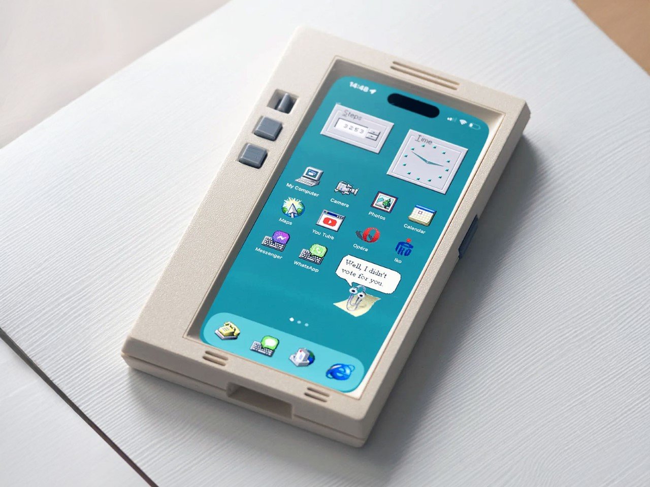
When you buy a phone, chances are you spring for a case immediately for one of two reasons – to either protect your phone, or to personalize it. However, Printables user Retron Print may have invented a new reason to add a case to your phone. Meet the iPhone Retro Case – a case that takes your cutting-edge smartphone and transforms it into a marvel of old-school technology. The two-part case sandwiches your phone in between, turning it into an old-timey CRT monitor (albeit with a functional main camera and dynamic island). To complement the case’s old-school design, Retron Print also equipped the phone with a retro home screen and custom icons and widgets. Although I’d personally love to have the iPhone stick to a Macintosh-based system, this one is unabashedly Windows, with a non-functional Clippy icon on the screen. Quite a downgrade from Siri and Apple Intelligence, no?

Designer: Retron Print

The beauty of the case is that it justifies every aspect of its retro design without compromise. Look at monitors from times of yore and they often had thick, chunky bezels. While most monitors came with a ‘chin’ which would either house a floppy disk reader or just control buttons, this retro case shifts the asymmetric chin to the side, with front-facing buttons that actually work. Built cleverly into the case’s mechanism are buttons that face forwards, but trigger the action and volume buttons on the side of the iPhone. The detailing’s prebuilt into the case’s design, and all you need to really do is 3D print and then assemble.

On the front, the case features an oval frame reminiscent of old CRT monitors, although it doesn’t obstruct the screen in any way. It’s a small but meaningful detail that gives the case a distinctly vintage vibe. Around the back, long, deep grooves evoke the look of classic desktop computers and also provide better grip. These thoughtful design elements ensure that while the case embraces nostalgia, it still offers the user a modern experience with improved functionality and tactile appeal. Meanwhile, speaker systems are accounted for too, with slots on the top and bottom that let you listen to audio from your iPhone.

When it comes to color options, Retron Print suggests using filament in shades like sandy beige, gray, or light brown to fully capture the retro essence. These muted tones are reminiscent of the classic electronics from decades past, enhancing the nostalgic appeal. This attention to detail extends to the print process itself. The case’s front and back panels are best printed on a textured print plate, adding an extra dimension to the overall look and feel, while the buttons should be printed on a smooth plate to maintain their tactile nature.

For those eager to bring a bit of retro flair to their iPhone, the case is available for iPhone 14 and iPhone 15 models. You can purchase the STL files for just $10 on Printables.com and print the case yourself, although this just includes the retro case’s 3D files and not the wallpaper and app icons. When it comes to color options, Retron Print suggests using filament in shades like sandy beige, gray, or light brown to fully capture the retro essence. These muted tones are reminiscent of the classic electronics from decades past, enhancing the nostalgic appeal.

However, commercial use of this model is restricted. To sell prints of this design, users must become a member of the Retron Print Commercial Club, ensuring that the creator, AndrzejG, receives credit and support for their work. This stipulation ensures that while the model is available for personal use, it remains protected against unauthorized distribution.

The post This Retro iPhone Case turns it into a Makeshift Old Windows PC with Clippy and Internet Explorer first appeared on Yanko Design.

The Nothing Robot Vacuum (1) brings transparent tech to Smart Homes, along with a Glyph Interface

Par : Sarang Sheth
6 octobre 2024 à 11:40

If you think just about the Nothing.tech company ethos of bringing fun back to tech while still being design-driven and meaningful, that ethos can apply to pretty much any category of product. Sure, Nothing’s best known for their earbuds, phones, and even other accessories like the CMF Watch Pro… so here’s a proposition – what if we took Nothing’s ethos and brought it to other products that are a bit of a visual afterthought? The robot vacuum, for instance, is a fairly ‘boring’ looking product. Its job is literally to scuttle around the house cleaning up after your mess, so for the most part, its design is driven by function rather than expression. However, by bringing the robot vacuum under the Nothing design umbrella, Soo Hyun Lim and PDF HAUS have uplifted an otherwise dull-looking appliance into something that inherently feels more modern – because it borrows its design cues directly from Nothing’s modern-looking smartphones.

Designers: Soo Hyun Lim & PDF HAUS

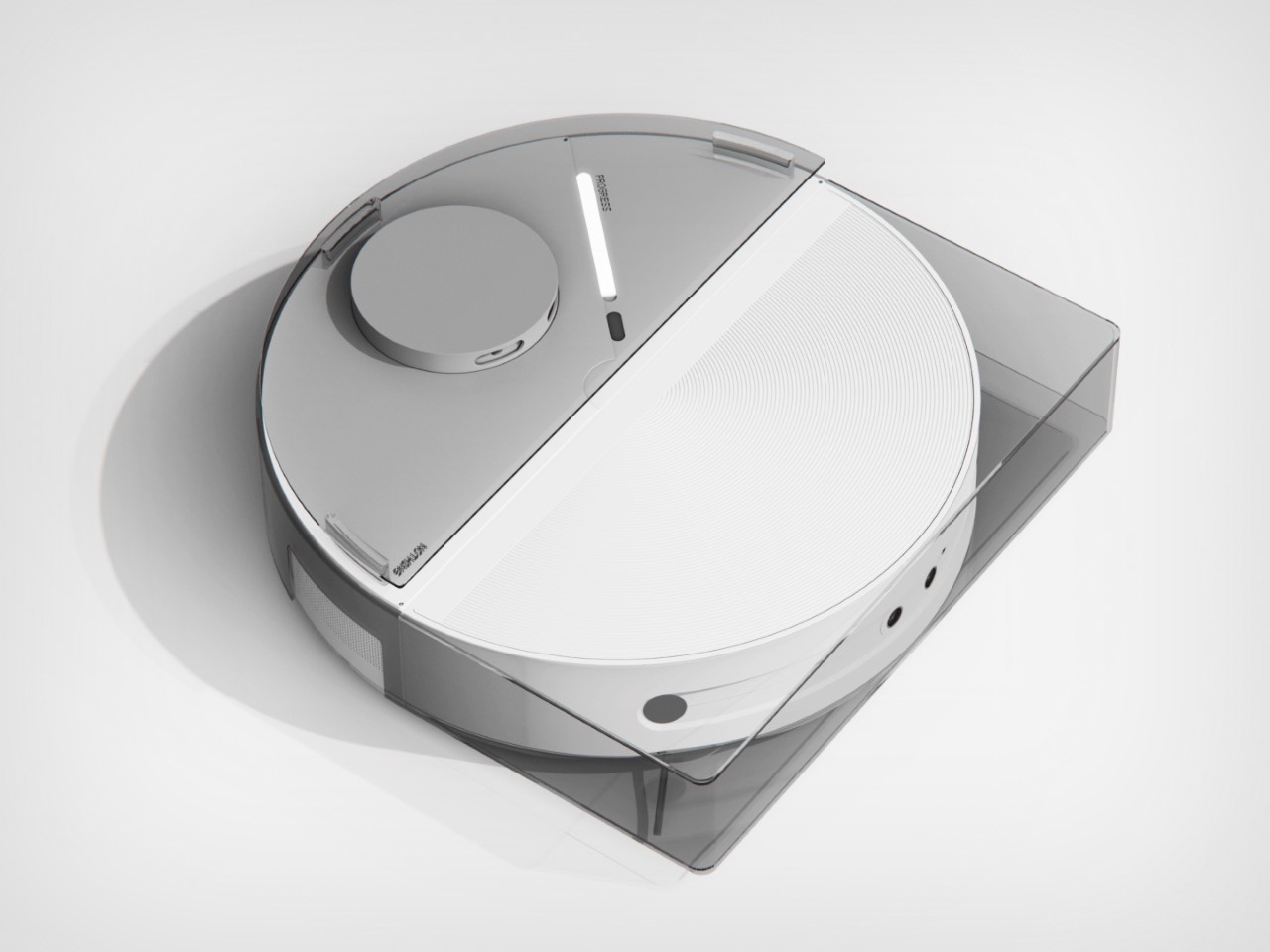
Meet the Nothing Robot Vacuum (1), a tongue-in-cheek fan-made concept that ports Nothing’s DNA onto a familiar product template. Most robot vacuums are the same shape and size, so how could you possibly make things interesting? Well, LEDs and transparent covers, of course! The Robot Vacuum (1) has a circular profile that’s then outfitted with a transparent D-shaped outer shell, giving it an almost ‘preserved in glass’ kind of look. Sensors are where they belong (on the front as well as on the top), and although you can’t entirely make a robot vacuum transparent, what with all the dust and dirt, Hyun Lim does something clever by bringing the Glyph Interface to the product. What does the interface do? Well, it acts as a progress bar that lets you know how much cleaning’s left. Similarly, Glyph lights on the vacuum’s docking station light up to indicate charging process as well as letting you know the fill-status on the station’s dustbin, so you know when to throw the trash out every week or so.

With the aesthetic appeal of a fancy turntable, the Nothing Robot Vacuum (1) highlights a kind of Bauhaus-meets-Scandinavian minimalism that companies like Bang&Olufsen have come to showcase so well with their products. The vacuum looks classy, not appliance-y, which is quite a win because of how menial its task actually is. I mean, sure some appliances have boring jobs, like thermostats and dehumidifiers, but that’s no reason they should look ‘boring’, right? Well, the Nothing Robot Vacuum (1) rejects that stereotype.

As far as the design goes, the vacuum comes in 3 colors – black, white, and grey. Just from a top view, you instantly recognize the Nothing design template. The Glyph Interface at the 7 o’clock position, the transparent elements along the body, and a radial pattern on the upper half of the circular top that sort of resembles the coils in the wireless charging zone on the smartphones. It’s simple, yet cleverly executed.

Just like with the phones, you’ve got microtextures galore, along with text screen-printed onto the transparent elements like the upper guard (that prevents the sensors on top from being damaged), and the front transparent bumper that helps the robot vacuum easily maneuver into corners. Moreover, Hyun Lim mentions that the vacuum is constructed from recycled plastic and aluminum, which seems like a nice sustainability touch that goes well with the ‘clean’ image of the vacuum cleaner.

Although conceptual, Hyun Lim does give the robot vacuum a fair bit of detail. You’ve got a rotary broom on the front, along with a vibrating wet mop that helps get grease, grime, and other stains off your floor. The simple design is complemented by a simple UX – you can lift the lid to access the robot’s power button or open its water reservoir to replenish it between cleaning sessions. The sensors on the front and top help the vacuum navigate through the house, while an app on the phone gives you all the controls you need to set schedules, paths, no-go zones, and charging times. Plus, when the robot vacuum runs low on juice, it automatically goes and docks in its station, where the battery gets charged and the dust-tank gets cleaned.

The docking station is just as minimal as the vacuum itself, and serves as a place where your appliance goes to take a pit-stop. Once docked, the Robot Vacuum (1) charges its batteries, while performing a self-clean operation so it’s good to go for round 2. This means the mop head gets cleaned with water, and the dust/dirt tank gets disposed into the docking station’s larger ‘dustbin’. When the dustbin gets filled (after a couple of days of cleaning), all you need to do is empty the trash bag inside and replace it with a new one. That’s where the docking station’s Glyph lights come handy, letting you know your vacuum’s charging rate, along with the dustbin’s current capacity.

Although the Robot Vacuum (1) is purely conceptual at this point, it does prove that Nothing’s approach to redefining technology as ‘accessible fun’ is quite a winning and versatile one. The Robot Vacuum (1) doesn’t exist but there’s no reason it shouldn’t. Carl, you listening?

The post The Nothing Robot Vacuum (1) brings transparent tech to Smart Homes, along with a Glyph Interface first appeared on Yanko Design.

Forget the iPhone 16 Camera Control, this Gimbal Attachment gives any smartphone a DSLR experience

Par : Sarang Sheth
1 octobre 2024 à 01:45

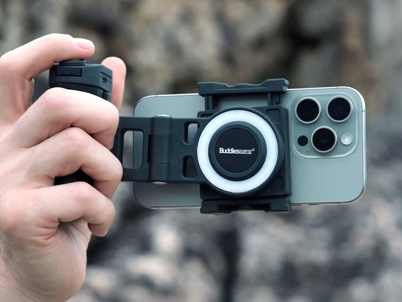
A shutter button, a built-in gimbal for landscape and portrait shooting, a zoom wheel, an integrated LED ring light, a tripod setting, and even an external battery pack to boost your phone’s battery. The Snappy offers way more for photography enthusiasts than the iPhone 16 does. It attaches onto any smartphone, giving you a bona fide DSLR-like experience, complete with an ergonomic grip. When you don’t need to shoot content, the Snappy pops right off, turning your handheld camera back into a daily driver smartphone.

Designer: Buddiesman

Click Here to Buy Now: $89 $149 (40% Off) Hurry! Only 21 of 520 left. Raised over $101,000.

Just three weeks ago, Apple debuted the iPhone 16 line-up, adding one crucial new hardware feature to their phones – a Camera Control ‘button’. Designed to help intuitively capture photos without having to fiddle with on-screen controls, the capacitive button lets you perform a variety of actions from zooming, switching between presets, adjusting focal length, or even accessing other key camera features. With the Camera Control, Apple’s reinforced its idea that the smartphone is a great camera first, and then a good mobile device… the only problem is that great cameras are more than just fancy lenses and sensors. Enter the Snappy mobile grip, a device designed to transform the way we take photos on our phones. With its motorized gimbal providing single-axis stabilization, Snappy quickly becomes a trusted companion for anyone tired of blurry images or shaky videos. Unlike larger gimbals such as DJI’s Osmo, Snappy brings stabilization in a small, portable form—making it a solution that fits right into your pocket.

Designed by Buddiesman, a Hong Kong-based manufacturer of photographic gear, Snappy’s centerpiece is its motorized, spring-loaded clamp that securely grips your smartphone. This clamp adjusts easily to accommodate a range of phone sizes, so you won’t have to worry about removing your phone case to make it fit. The ergonomic grip attached to the clamp gives the device a comfortable feel, while an articulated arm allows the phone to be rotated seamlessly between landscape and portrait modes with the flick of a thumbwheel. Powered by a brushless motor, this feature also gives the Snappy stabilizing gimbal-like abilities, ensuring your phone stays level, even during handheld video shoots.

Plug your phone in and it literally feels like a professional camera-mimicking rig for your phone. Use any phone you want with the Snappy and it gives you the added benefit of being able to intuitively capture content the way you would with a more pro-facing device like a DSLR or mirrorless camera. A shutter button on the top lets you easily take photos and record videos without fumbling to touch the screen or hit a volume button to take the shot (like you would with most smartphones). The grip feels instantaneously comfortable, allowing you to point and shoot with a single hand. Worried you’ll accidentally drop your phone? The Snappy has a built-in strap that lets you secure it to your hand too, so even the largest, heaviest of phones don’t put too much strain on that wrist of yours.

If there’s something a photographer hates more than phone cameras, it’s the flashlight on phone cameras. The flashlight is way too coarse, and no self-respecting photographer uses it unless absolutely necessary. To fix that, the Snappy comes with its own multi-LED built-in ring light. Located just beside the phone’s lenses (where you’d expect the MagSafe ring to line up), users can toggle between cool and warm light settings simply by tapping the touch-sensitive zone inside the ring, adjusting brightness to get the perfect shot regardless of the lighting conditions. This feature is perfect for low-light environments where smartphone cameras traditionally struggle.

For even greater flexibility, Snappy allows users to detach the grip from the main body, turning it into a wireless remote. With a range of up to 10 meters (33 feet), you can take photos and videos from a distance, offering a new level of creativity and control in framing your shots. With the remote detached (or even with the remote unit still on), the Snappy can be used as a tripod of sorts, propping your phone up so you don’t need to hold it in your hands. Perfect for using as a phone stand while reviewing the footage you’ve shot, or propping your phone up to take a remote video/photo while you stand away from your camera, this feature gives the Snappy one remarkable ability that neither phones nor DSLR cameras have, barring actually buying a tripod of course. And just in case you’re a tripod purist, the Snappy has a tripod mount too. Want to add accessories to your smartphone camera? The Snappy also includes a cold shoe mount for attaching additional peripherals like microphones or even external lights just in case the ring light on the device isn’t enough.

The Snappy relies on a built-in battery that powers this entire experience. Although the battery’s capacity (and use time) is a bit of a mystery, the folks at Buddiesman tout that the Snappy can transform into a power bank for your smartphone when you’re running low on juice. Just connect your phone to the Snappy’s charging port via a USB-C cable and it instantly begins recharging your phone, giving you the benefit of a gimbal that also enhances your phone’s battery life along with its camera capabilities.

Currently available on Kickstarter, early adopters can secure a Snappy with a pledge of $89, while the retail price is set to be $149 once it hits the market. The $89 kit includes the Snappy itself, although you can upgrade to a bundle that also includes an add-on tripod and an external light that mounts into the Snappy’s cold shoe adapter. With its combination of user-friendly design and professional-grade features, Snappy could very well bridge the gap between smartphones and traditional cameras, bringing the best of both worlds to your pocket. They say the best camera is the one that’s in your pocket. No matter whether it’s the Google Pixel, a Samsung Galaxy, or even older variants of the iPhone, the Snappy turns your phone’s camera into a makeshift pro-grade shooter that’s perfect for turning average photos and videos into polished content.

Click Here to Buy Now: $89 $149 (40% Off) Hurry! Only 21 of 520 left. Raised over $101,000.

The post Forget the iPhone 16 Camera Control, this Gimbal Attachment gives any smartphone a DSLR experience first appeared on Yanko Design.

Custom Balrog and Gandalf Keycaps give your Mechanical Keyboard a LOTR Middle-Age facelift

Par : Sarang Sheth
30 septembre 2024 à 20:45

Few moments in fantasy history are as iconic as Gandalf’s showdown with the Balrog on the Bridge of Khazad-dûm. Now, thanks to a collaboration between Drop and The Lord of the Rings, this epic clash has been immortalized in a way that combines fandom with functionality. The Balrog and Mithrandir Artisan Keycap and Spacebar set offers a chance to bring the magic of Middle-earth to your fingertips, and it’s more than just a collector’s item. It’s a fusion of premium craftsmanship, stunning design, and technical precision that adds a touch of the fantastical to your everyday typing experience.

Designer: Dwarf Factory for Drop

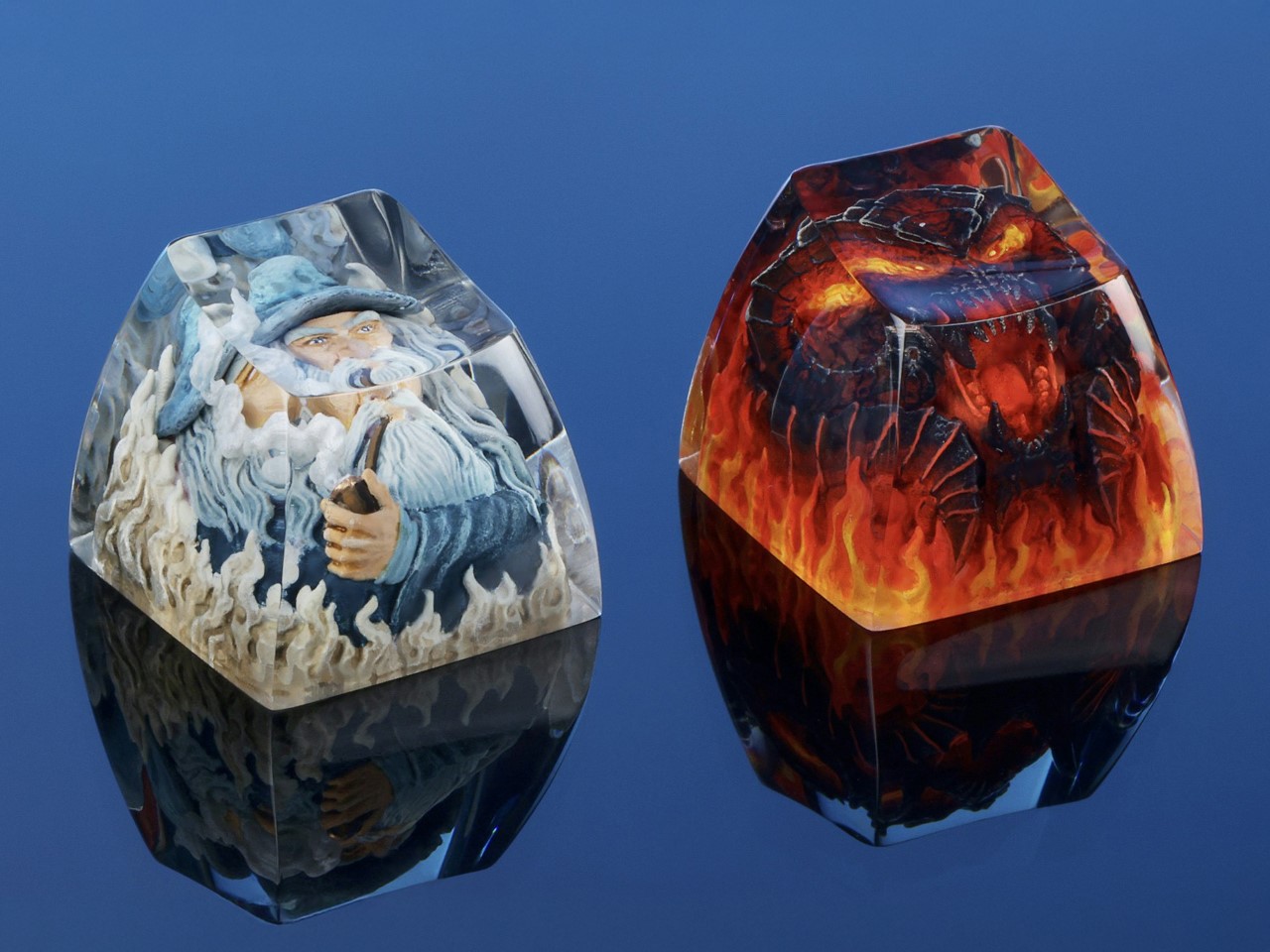
Crafted by Dwarf Factory, each piece is an artisan masterpiece in resin, featuring rich details that evoke the essence of these legendary characters. The Balrog, with its fiery menace and aggressive stance, looks ready to engulf your entire keyboard, while Mithrandir stands resolute, channeling his defiant power just as he did when facing the beast. The level of detail is extraordinary—from the flame-like textures on the Balrog to the serene yet powerful expression of Gandalf, these keycaps are tiny works of art. Available in a 1u size for both characters, and with the Balrog also available as a 6.25u spacebar, these keycaps not only add visual impact but are also fully functional. They integrate smoothly with Cherry MX switches and clones, making them a natural fit for most mechanical keyboards.

The 1u Balrog keycap is nothing short of a fiery masterpiece. Designed to reflect the raw power and menacing presence of Durin’s Bane, it features intricate detailing that brings the dark, fiery creature to life. With its flame-engulfed body and haunting expression, the keycap feels like it’s radiating heat right off your keyboard. The resin material used for the keycap captures the vivid colors of fire, from the burning red to deep molten black, creating a striking visual contrast that mirrors the Balrog’s destructive force. Every angle of this 1u keycap has been meticulously designed to showcase the Balrog’s fearsome nature, making it a perfect choice for those looking to add an element of danger and mystery to their keyboard setup. It fits comfortably on any Cherry MX switch or clone, ensuring that it’s as functional as it is eye-catching.

Mithrandir, or Gandalf, takes center stage in the second 1u keycap, offering a calm but powerful contrast to the Balrog. In this design, Gandalf is depicted in his role as the Grey Pilgrim, holding his staff and ready to face down the ancient evil with the iconic line, “You shall not pass!” The keycap perfectly captures the quiet strength and wisdom that defines the wizard, with intricate detailing in his robes and an expression of calm determination. Crafted in resin, the Mithrandir keycap offers a more subtle aesthetic compared to the fiery Balrog, but its craftsmanship is no less impressive. The muted grey tones and flowing details create a sense of movement, almost as if Gandalf himself is preparing to strike. This keycap serves as a symbol of resilience and courage, and for fans of The Lord of the Rings, it’s a meaningful reminder of Gandalf’s pivotal role in the story.

The pièce de résistance, however, is the 6.25u Balrog spacebar. A true showstopper, this spacebar turns your keyboard into a battleground between the Maiar. Unlike the 1u keycap, the spacebar offers a wider canvas, allowing for even more detail in the Balrog’s fiery design. The flames stretch across the length of the spacebar, creating a dramatic scene that feels like it’s pulled straight from the depths of Moria that comes to life with the backlight switched on. The spacebar also features subtle texturing that mimics the rugged look of stone, further emphasizing the destructive force of the Balrog. With its large profile and vivid design, this spacebar commands attention and becomes the focal point of any keyboard. And, like the other keycaps in the set, it’s compatible with Cherry MX switches, ensuring that your epic setup doesn’t sacrifice functionality for style.

The custom-made keycaps are the perfect combination of nostalgia and utility, seamlessly blending a piece of Tolkien’s world into your everyday life. Whether you’re aligning yourself with the fiery might of the Balrog or the steadfast courage of Mithrandir, these keycaps turn your keyboard into a mini piece of Middle-earth. And with their high-quality resin construction, you can trust that they’re built to last, no matter how epic your typing battles become.

Priced at $49, a notable drop from its original $65, the Balrog and Mithrandir Artisan Keycap and Spacebar set is available for pre-order now, with an estimated shipping date of February 10, 2025.

The post Custom Balrog and Gandalf Keycaps give your Mechanical Keyboard a LOTR Middle-Age facelift first appeared on Yanko Design.

Braun Prize 2024: Submit Your Innovative Design for a $50,000 Reward

Par : Sarang Sheth
30 septembre 2024 à 01:45

The Braun Prize, first introduced in 1968, is an internationally renowned design competition that celebrates the power of innovation and craftsmanship in industrial design. Braun, the German design powerhouse behind the prize, has long been synonymous with iconic, minimalist, sensible design. Known for its clean lines, functional aesthetics, and products that marry form with function, Braun has shaped the landscape of product design for decades. Its influence is deeply rooted in the design world, inspiring generations of designers to prioritize simplicity, utility, and timelessness. With a rich legacy in creating everything from shavers to radios, Braun’s dedication to design excellence extends to the Braun Prize, which has become a benchmark for recognizing creative talent across the globe.

A key element that underscores the significance of the Braun Prize is its distinguished jury, which has, in the past, included design legends like Dieter Rams, Braun’s former Head of Design. Rams, one of the most influential figures in modern design, chaired the competition for several years, bringing his renowned “less, but better” philosophy to the forefront. Other notable figures, such as Peter Schneider and Dr. Fritz Eichler, have also shaped the competition with their expertise. This tradition continues in 2024 under the leadership of Prof. Oliver Grabes, Braun’s current Head of Design, ensuring the competition maintains its high standards of evaluating innovative ideas that fuse practicality with creativity.

For the 2024 edition, under the theme “Ideas to Keep,” Braun invites designers and inventors to participate by submitting projects that highlight both timeless design principles and forward-thinking solutions. Open to students and young professionals globally and held once every 2-3 years, participants have the chance to showcase their work on an international stage and compete for a prize pool totaling $50,000 USD. Designers can submit their entries via the Braun Prize platform, or if you’re looking for inspiration, scroll down to take a look at some Braun Prize winners from the previous edition.

Click Here to Submit Now. Deadline: 14th October 2024.

Braun Prize 2021 Winners

Drilling Targeting Systems (DTS) by Mehmet Mehmetalioglu (Student)

Mehmet Mehmetalioglu’s Drilling Targeting Systems (DTS) is setting a new standard in aerospace assembly. With the surge in aircraft production, DTS provides a much-needed solution for the intricate task of joining fuselage and ribs, enhancing workflows and reducing the need for highly skilled labor. The system employs ultrasonic technology in its modular target unit to accurately locate drilling points, while the drilling unit performs the task with precision, ensuring the surface remains undamaged. This innovation not only minimizes human error but also improves safety in aircraft manufacturing. Juror Stefan Schamberg commends the DTS for its intelligent design, top-notch prototyping, and its potential to elevate industry standards, underscoring Mehmetalioglu’s dedication to meticulous craftsmanship and forward-thinking solutions.

PAPILIO Wind Powered Street Light by Tobias Trübenbacher (Student)

Tobias Trübenbacher’s innovative street light, PAPILIO, addresses the escalating issue of light pollution and energy consumption. As our cities grow taller and windier, so do the environmental challenges we face, including the 6% annual increase in artificial light worldwide. PAPILIO tackles these problems head-on with a Savonius wind rotor that generates its own electricity, significantly reducing CO2 emissions from public lighting. Designed to be both eco-friendly and effective, PAPILIO features a full-cut-off light that directs illumination downward, significantly decreasing its impact on insects and the environment. An infrared sensor ensures the light activates only when necessary, further minimizing unnecessary illumination. Juror Johanna Schoemaker admires the balanced design, highlighting the way the wind turbines’ graceful movement adds an aesthetic element reminiscent of a simple paper windmill. PAPILIO not only offers a functional solution but also enriches public spaces both day and night, making energy generation an elegant spectacle.

RUEI-01 Robotically Recyclable Shoe by Maxwell Ashford (Student)

Maxwell Ashford’s RUEI-01 presents an innovative approach to shoe recycling, solving a challenging problem with precision and creativity. Unlike traditional recycling methods that struggle with mixed materials, RUEI-01 is a multi-material shoe designed for robotic disassembly. By embedding digital information directly into the shoe—including robotic g.code instructions and detailed material data—robots can separate and recycle each component accurately. This method ensures the production of high-quality recycled materials that can compete with new ones, significantly reducing waste and environmental impact from material extraction and production. Juror Sukwoo Lee praises the project’s forward-thinking solution and its practical execution, highlighting the impressive use of seam structures for robotic recycling and the robust presentation of research and prototypes. RUEI-01 exemplifies how contemporary tools and thoughtful design can revolutionize recycling practices, maintaining the durability and functionality of multi-material shoes while addressing pressing environmental concerns.

CANNE Self-directed CPR Learning Experience by Shuai Li (Student)

Shuai Li’s CANNE redefines CPR training with a self-directed, cost-effective solution tailored for developing countries. With more than 550,000 sudden cardiac deaths annually in China and a dismal less-than-1% out-of-hospital survival rate, CANNE addresses the urgent need for accessible and engaging CPR training. This innovative kit, made from corrugated cardboard, allows individuals to practice CPR independently using a smartphone app that leverages AR technology. The app offers real-time feedback through the phone’s camera and microphone, guiding users in identifying cardiac arrest, performing chest compressions, and proper ventilation. By making CPR training affordable, portable, and user-friendly, CANNE breaks down barriers related to cost, availability of qualified instructors, and motivation. Juror Li Ning Ning commends CANNE for its ingenious combination of common materials and sensor technology, highlighting its potential to boost CPR course participation and save lives. CANNE’s practical approach could significantly enhance public health by increasing out-of-hospital cardiac arrest survival rates, particularly in regions where traditional CPR training is challenging to access.

LIDfree Origami Cup by Chia Chun Chuang and Pei Chun Hsueh (Young Creatives)

LIDfree, the ingenious creation by Chia Chun Chuang and Pei Chun Hsueh, tackles the escalating plastic waste problem exacerbated by the pandemic. In a world where plastic lid usage is rampant, LIDfree offers a sustainable alternative by merging the cup and lid into one cohesive unit using the art of origami. This revolutionary design features a hexagonal folding rim that collapses inward, eliminating the need for a separate plastic lid. Users can open and close the cup quickly, prevent spills, and enjoy the convenience of an eco-friendly design that accommodates straws of any width. By maintaining the familiar feel of a typical takeaway cup, LIDfree enhances user experience while encouraging eco-friendly habits. Made from a single type of paper, it simplifies the recycling process, allowing easy separation and flattening without mess. Juror applause highlights its stackability, ease of use, and clever incorporation of functionalities—traits that embody simplicity, elegance, and practical ingenuity. LIDfree proves that sustainable design can seamlessly integrate into daily life, supporting environmental protection effortlessly even during challenging times.

MonkeyBots IoT Robots by Georg Kloeck and Mohammad Moradi

MonkeyBots, created by Georg Kloeck and Mohammad Moradi, revolutionizes the way we interact with digital notifications by transforming them into physical actions. These small IoT robots help liberate us from constant screen time by performing tangible tasks like clicking switches, rattling pill containers, or striking a gong to remind us of important activities. Designed to be secure and unobtrusive, MonkeyBots connect to your phone via Bluetooth-Low-Energy without microphones or cameras, ensuring privacy. They feature sustainably 3D printed add-ons that can grip, push, hit, or click almost anything, making them versatile tools for everyday routines. The design, compatible with LEGO and available in organic PLA or recycled PET, seamlessly blends into various environments. The jury applauded MonkeyBots for their ability to bring digital notifications into the physical world in a playful and creative way, offering endless possibilities without compromising user privacy.

Click Here to Submit Now. Deadline: 14th October 2024.

The post Braun Prize 2024: Submit Your Innovative Design for a $50,000 Reward first appeared on Yanko Design.

Top Tips For Designing Your Tiny Home Based on Climate and Environment

Par : Sarang Sheth
29 septembre 2024 à 11:40

The appeal of tiny homes continues to rise as more people are drawn to the simplicity, affordability, and sustainability they offer. However, creating a cozy, functional, and lasting tiny home necessitates taking your local climate and environment into account. In this editorial, we’ll explore how to tailor your tiny home to thrive in various climates, offering practical design considerations for temperate, tropical, arid (desert), cold, and coastal environments. From personal anecdotes to professional insights, this article will guide you through what to prioritize to ensure your tiny home is both comfortable and efficient.

The environment where you plan to build isn’t just a backdrop; it’s a critical element that influences construction materials, design aesthetics, and long-term livability. A well-designed tiny home reflects thoughtful consideration of the climate, turning potential challenges into advantages. Whether you’re dealing with extreme temperatures, high humidity, frequent storms, or snowfall, your tiny home can be an oasis of comfort and functionality if built with the right principles in mind. Let’s dive into how to design your tiny sanctuary to harmonize with the environment you live in.

Tiny Home Tips for a Temperate (Mild) Climate

1. Effective Insulation: Keep it Cozy Year-Round

One of the best decisions you can make for a tiny home in a temperate climate is to invest in effective insulation. Think materials such as thermal insulation that can maintain comfortable indoor temperatures regardless of the season. Double-glazed windows are a game-changer. They help keep the heat out during summer and retain warmth in winter, making your tiny home’s energy consumption significantly lower.

2. Natural Light: Brighten Your Space Naturally

Maximizing natural light is another key consideration. Large windows and skylights can transform a small space into a bright, airy sanctuary. Light-colored interior finishes, such as white walls or pale wood flooring, help reflect sunlight, enhancing the overall sense of space. This is not just about aesthetics; natural light positively impacts mental health and reduces the need for artificial lighting, saving energy.

3. Seasonal Adaptability: Adjust Your Spaces with Ease

A temperate climate sees changes in temperature and humidity throughout the year. Designing flexible spaces or modular elements within your home can allow you to adjust your living conditions easily. Heating and cooling systems should be tailored for moderate variations, ensuring that your home remains comfortable through the seasons without significant energy expenditure.

4. Ventilation: Fresh Air Circulation

Proper ventilation is crucial for maintaining air quality in your tiny home. Design your windows and vents to promote cross-ventilation, ensuring fresh air circulates freely. Ceiling fans or mechanical ventilation systems can supplement natural airflow, especially on those days when opening windows isn’t an option.

5. Sustainable Materials: Eco-Friendly Living

Choosing locally sourced, sustainable building materials not only reduces your carbon footprint but also supports local businesses. Consider green roofs or walls, which can offer additional insulation and improve air quality, making your tiny home more eco-friendly and enjoyable to live in.

Tiny Home Tips for a Tropical (Humid) Climate

1. Moisture-Resistant Materials: Combat the Dampness

In tropical climates, dealing with high humidity and frequent rainfall is essential. Bamboo wood is a superb choice, as it is naturally resistant to moisture. Metals that don’t rust and mold-resistant paints and finishes will also extend the life of your home, reducing maintenance costs and efforts.

2. Ventilation: Natural Breezes to prevent that Musty Feeling

Strategic window placement and the use of louvers can help maximize airflow, keeping your home cool and dry. Elevated flooring is another effective strategy, allowing air to circulate underneath the house and preventing moisture build-up and that dank, musty feeling that you can often get from homes with the windows shut for too long.

3. Shading: Beat the Heat and Rain

To combat the relentless sun, incorporate overhangs and pergolas into your design. These elements protect against direct sunlight and rain, while light-colored and reflective roofing materials can reduce heat absorption, keeping the indoor spaces cooler.

4. Cooling Strategies: Passive Solutions to Stay Comfortable

Incorporate natural cooling techniques such as wide eaves and verandas, which shield your home from the sun while allowing breezes to flow through. Passive cooling systems, like roof ventilation or even small water features, can also play a significant role in keeping your tiny home comfortably cool.

5. Outdoor Living Spaces: Expand Your Living Area

Designing for outdoor living spaces in tropical climates not only expands your living area but also helps mitigate indoor heat. Equip these areas with weather-resistant furniture and fixtures, creating a comfortable and inviting addition to your tiny home.

Tiny Home Tips for an Arid (Desert) Climate

1. Thermal Mass: Regulate Temperature Naturally

In desert climates, the drastic temperature changes between day and night call for materials with high thermal mass, such as adobe or concrete. These materials absorb heat during the day and release it at night, helping to regulate your home’s temperature naturally.

2. Shade and Cooling: Keeping Cool in the Desert Heat

Incorporate shading devices like awnings and pergolas to reduce heat gain. Evaporative cooling systems, which use water to cool the air, can be incredibly effective in these dry climates, providing an energy-efficient means of temperature control.

3. Water Conservation: Make Every Drop Count

Water is a precious resource in arid environments. Implement rainwater harvesting systems to collect and store what little rainfall you get. Low-flow fixtures and greywater recycling systems can help minimize water use, making your home more sustainable.

4. Solar Energy: Harness the Sun’s Power

Solar panels are a must in sun-drenched regions. With strategic placement, these panels can provide a significant portion of your home’s energy needs, reducing reliance on non-renewable sources and lowering bills.

5. Landscape Design: Drought-resistant and Beautiful

Opt for xeriscaping—a landscaping method that uses drought-resistant plants. This reduces the amount of water needed for gardening while still offering aesthetic benefits. Efficient irrigation solutions can further minimize outdoor water use, aligning your tiny home with sustainable living practices.

Tiny Home Tips for a Cold (Snowfall) Climate

1. Insulation and Heating: Stay Warm All Winter Long

For areas experiencing significant snowfall, proper insulation is paramount. Materials like spray foam or rigid foam board provide excellent thermal resistance. Efficient heating systems such as radiant floor heating or wood stoves can ensure your home remains warm and cozy.

2. Snow Load Consideration: Keep Your Roof Safe

Your roof should be designed to handle heavy snow loads. This typically means a steep pitch and possibly a metal roofing material to facilitate snow shedding, preventing structural damage.

3. Energy Efficiency: Keep the Cold Out and the Warmth In

Triple-glazed windows are an excellent investment in colder climates. They provide superior insulation, keeping the heat inside and cold air out. Pair these with energy-efficient appliances and fixtures to further reduce your energy consumption.

4. Weatherproofing: Shield Against the Elements

Sealing and weatherproofing are vital to prevent drafts and heat loss. Use durable, weather-resistant exterior cladding to protect your home from the elements, ensuring longevity and reduced maintenance.

5. Access and Safety: Ease Your Winter Woes

For those snowy winters, incorporating heated walkways or driveways can prevent ice build-up, making daily access safer. Design considerations should also include adequate storage for winter gear and provisions, ensuring that your tiny home remains functional during the cold months.

Tiny Home Tips for a Coastal Climate

1. Salt-Resistant Materials: Protect Against Corrosion

Living near the sea presents unique challenges, primarily due to salt. Choose materials like composites or treated wood that can withstand salt corrosion. Non-corrosive metals, such as stainless steel or aluminum, are also excellent options for fixtures and structural elements.

2. Elevated Design: Guard Against Flooding

An elevated structure helps prevent flooding and water damage, which are common issues in coastal areas. Sturdy foundations are necessary to withstand coastal storms and wave impact, ensuring the safety and durability of your tiny home.

3. Wind Resistance: Build to Withstand Strong Winds

To combat high winds, incorporate aerodynamic designs that reduce resistance. Reinforced structural elements, such as hurricane ties or braced frames, are critical in providing additional stability and safety.

4. Humidity Control: Maintain a Healthy Environment

Dehumidifiers or humidity control systems are essential in coastal climates. Proper ventilation is key to preventing mold and mildew growth, ensuring that your living space remains healthy and comfortable.

5. Views and Natural Light: Embrace the Scenic Beauty

One of the joys of coastal living is the view. Large windows and open layouts can maximize these ocean vistas, making your tiny home a serene retreat. Outdoor living spaces that blend seamlessly with the natural environment not only enhance the aesthetic appeal but also expand your living area.


Designing a tiny home that harmonizes with its environment is an exercise in both creativity and practicality. The benefits are manifold: from increased comfort and efficiency to sustainability and aesthetic appeal. It requires a nuanced understanding of local climate challenges and opportunities. By using the right materials and design principles, you can create a tiny home that not only stands the test of time but also provides a sanctuary in harmony with nature.

Remember, your tiny home is more than just a place to live— it’s a reflection of your lifestyle and values. Whether you’re basking in the sun’s tropical warmth, savoring the tranquility of the coast, or enjoying the crisp air of a snowy landscape, your tiny home can be your personal oasis, thoughtfully designed for comfort and sustainability. So, as you embark on this journey, consider these tailored recommendations to make every square foot of your tiny home a testament to smart, climate-conscious design.

The post Top Tips For Designing Your Tiny Home Based on Climate and Environment first appeared on Yanko Design.

Memobottle Launches Stunning EDC-worthy Titanium, Copper, and Satin Steel Bottles for its 10th Anniversary

Par : Sarang Sheth
26 septembre 2024 à 01:45

The pioneer of the ‘flat-pack’ bottle designed to be carried in laptop bags, handbags, and pockets is celebrating a decade of its iconic presence with new limited-edition metallic memobottles, in addition to their Original Tritan plastic and stainless steel ranges. The 10th-anniversary collection features the iconic memobottles made from titanium, copper, and satin steel. As always, the space-saving bottles are sized keeping international paper sizes and notebook proportions in mind, across A5, A6, A7, and Slim form factors.

Designers: Jesse Leeworthy and James Butler

Click Here to Buy Now: $47 $55 ($8 off, delivered before Christmas 2024). Hurry, only few left! Raised over $91,000.

Dubbed the Elements collection, this edition turns bottles rightfully into EDC. Staying hydrated is usually a chore, but these memobottles make being hydrated feel exceptionally cool. The Titanium Ultralight, Copper PVD, and Satin Steel memobottles have a gorgeous microtextured finish reminiscent of high-end tech gear. Leading the collection is the Titanium Ultralight Memobottle, a standout thanks to its use of aerospace and medical-grade TA1 titanium. Known for its exceptional strength and lightweight properties, titanium makes this 600ml Slim bottle both durable and highly portable. The ultralight design allows for easy carrying without adding unnecessary bulk, ideal for those who are constantly on the move. Its slender, flat profile ensures it can slip into bags without taking up much space, making it the perfect choice for minimalists and travelers alike.

Crafted from 304 stainless steel and sand-blasted down to a smooth satin finish.

With a striking warm-toned rosy glow from its PVD Copper exterior, this bottle is bound to make a statement everywhere you go.

Crafted from TA1 – aerospace and medical grade – pure Titanium. At only 0.42 lb, 189g, it’s 48% lighter than its stainless steel counterpart, without compromising on durability.

The Copper PVD memobottle offers a warmer, more luxurious take on everyday hydration. Made from stainless steel with a Copper PVD coating, this A6 model holds 500ml and stands out with its rich, metallic finish. Copper has a natural antibacterial quality, adding a functional edge to the bottle’s already impressive aesthetic. It’s a great option for those who appreciate both style and utility in their daily accessories. The flat design, characteristic of all Memobottles, ensures this one fits neatly into slim bags or alongside laptops, making it a practical yet eye-catching companion for work, commuting, or leisure.

If you want to explore memobottle’s various sizes, the Satin Steel version comes in all four sizes (unlike the Titanium and Copper models that are limited to just a single size). From the compact A7 (250ml) to the larger A5 (1050ml), these bottles are made from 304-grade stainless steel, ensuring they’re as durable as they are stylish. The metallic finish gives them a modern minimalist edge, putting them miles ahead of plastic bottles but also outshining most boring cylindrical thermos designs. Whether you’re carrying the ultra-compact A7 for quick hydration or the larger A5 for all-day use, the Satin Steel bottles and their iconic flat profiles are designed to optimize space in bags while maintaining a strong visual appeal.

Beyond aesthetics, Memobottle even hopes to share a message of sustainability with its broader audience. Aside from just being the most gorgeous set of multi-use bottles that allow you to ditch dependence on use-and-throw bottles of mineral water, the company has also donated over 34 million days of safe water access to communities in need through their partnership with Water.org. As far as the Elements series goes, the use of recyclable materials like stainless steel and titanium reflects the company’s commitment to offering long-lasting alternatives to single-use plastic bottles that can last for years with maintenance. Each bottle is built to endure heavy use over the years, and you can even grab cleaning tablets with your memobottle that you can pop into the bottle when you want an extra deep clean. When the bottles do reach the end of their lifespan, they are fully recyclable too. You can grab your own memobottle Elements-edition, with the Satin Steel and Copper PVD variants shipping before Christmas, and the Titanium Ultralight shipping next year. To make sure your bottles reach you with a minimal carbon footprint, Memobottle has even optimized its shipping routes, using sea freight wherever possible.

Click Here to Buy Now: $47 $55 ($8 off, delivered before Christmas 2024). Hurry, only few left! Raised over $91,000.

The post Memobottle Launches Stunning EDC-worthy Titanium, Copper, and Satin Steel Bottles for its 10th Anniversary first appeared on Yanko Design.

Meta’s futuristic Orion AR Glasses have Holographic Displays and Neural Control. Apple should take notes

Par : Sarang Sheth
25 septembre 2024 à 20:45

At the Meta Connect 2024 keynote, not only did Mark Zuckerberg debut actual Augmented Reality with holographic displays and neural control, it did so in a device that’s smaller, lighter, and one could argue, more socially acceptable (aka stylish) than Apple’s Vision Pro. Dubbed the Orion, it’s simply a developer prototype for now, but Meta hopes to refine the design, improve the displays, and actually sell it at an affordable price to consumers.

Designer: Meta

Orion is not a bulky headset—it’s a sleek, spectacle-like device that weighs under 100 grams, making it comfortable for extended use. This is an impressive feat considering the amount of technology packed into such a small form factor. While Meta Quest Pro and Apple’s Vision Pro are capable of mixed reality, Orion’s fully transparent, holographic display takes things to a different level. Instead of the passthrough experiences that blend digital elements on top of a live camera feed, Orion projects 3D objects directly into the real world using innovative waveguide technology. The frames are made from magnesium, a super-light metal known for its strength and ability to dissipate heat (something even NASA’s relied on for its space hardware).

The core of this magic is a set of tiny projectors embedded within the arms of the glasses. These projectors beam light into lenses that have nanoscale 3D structures, creating stunningly sharp holographic displays. Zuckerberg emphasized that you could go about your day—whether you’re working in a coffee shop or flying on a plane—while interacting with immersive AR elements like a cinema-sized virtual screen or multiple work monitors.

But it’s not just about visuals. The glasses also facilitate natural social interaction: you can maintain eye contact with others through the transparent lenses, and digital elements seamlessly overlay onto the real world. Need to send a message? Instead of fumbling for your phone, a hologram will appear before your eyes, letting you reply with a quick, subtle gesture. This fluid integration of the digital and physical worlds could set Orion apart from its competitors.

When it comes to control, the Orion glasses offer several interaction modes—voice, hand, and eye tracking—but the star of the show is the neural wristband. In contrast to the Vision Pro, which relies on hand gestures, eye-tracking, and voice commands, Orion takes the next step by reading neural signals from your wrist to control the device. This neural interface allows for discreet control. Imagine being in a meeting or walking down the street—gesturing in mid-air or speaking aloud commands isn’t always convenient. The wristband can pick up subtle electrical signals from your brain and translate them into actions, like tapping your fingers to summon a holographic card game or message a friend. This introduces a new level of human-computer interaction, far more intimate and nuanced than what’s currently available on the market.

While Apple’s Vision Pro and Meta’s previous Quest Pro have been praised for their intuitive interaction systems, Orion’s neural control represents a massive leap forward. It reduces the friction of interacting with digital elements by cutting down on the physical and vocal gestures required, creating a more seamless experience.

One of the key differentiators for Orion is its display technology. Unlike the Vision Pro or Meta Quest Pro, which rely on cameras to pass a live feed of the outside world onto a screen, Orion offers true augmented reality. The glasses project digital holograms directly into your field of view, blending with your surroundings. This isn’t just a camera feed of your environment with digital elements superimposed—it’s real-world AR with transparent lenses that you can see through as you would normal glasses. The holograms are bright enough to stand out even in varied lighting conditions and sharp enough to allow users to perceive fine details in their digital overlays.

Zuckerberg illustrated this with examples: receiving a message as a floating hologram or “teleporting” a distant friend’s avatar into your living room. The display architecture is entirely new, made possible by custom silicon chips and sensors integrated into the glasses, offering a level of immersion that’s more subtle yet more profound than the pass-through systems we’ve seen so far. In a private demo, he even played a metaverse version of Pong with key industry experts like Nvidia CEO Jensen Huang, and investors like Gary Vaynerchuck and Daymond John of Shark Tank.

For all its innovation, Orion is still in the development phase. Zuckerberg was candid that Orion is not yet ready for consumers. Instead, it will serve as a development kit for Meta’s internal teams and a select group of external partners. This will help refine both the hardware and software, as well as grow the ecosystem of apps and experiences that will make Orion valuable when it eventually hits the consumer market. There’s also the matter of affordability—Zuckerberg mentioned the team is working to improve manufacturing processes to bring the cost down. As it stands, this isn’t a device you’ll see in stores next week, but it’s a crucial step in realizing Meta’s vision for the future of AR.

The potential for Orion is vast. Zuckerberg envisions it as the next major computing platform, capable of reshaping how we work, play, and interact with others. By leveraging the power of true augmented reality with a groundbreaking neural interface, Orion positions itself as more than just a wearable gadget—it’s an entirely new way of interfacing with the digital and physical worlds. For now, it’s an exciting glimpse into what the future might hold. The Orion glasses may not be in your hands today, but their arrival could redefine the entire AR landscape in the years to come.

The post Meta’s futuristic Orion AR Glasses have Holographic Displays and Neural Control. Apple should take notes first appeared on Yanko Design.

7-in-1 Titanium EDC Multitool combines both Tactical Gear and a Toolshed into the Ultimate Portable Form

Par : Sarang Sheth
25 septembre 2024 à 01:45

Imagine a toolbox that fits in your palm. Not a metaphor, but an actual toolbox of sorts. The Titanium Multifunctional Magnetic Screwdriver or the TI-MMS for short, is a marvel of compact multitool design that packs a surprising punch. Small enough to disappear in your pocket but packed with enough features to handle a range of everyday situations, it’s like a Swiss Army knife that’s been reimagined for the modern tinkerer. Crafted from Grade 5 titanium, this EDC is light, corrosion-proof, and tough enough to survive whatever you can throw at it—whether that’s a quick fix at home, an emergency situation, or a tactical escape.

Designer: Comandi

Click Here to Buy Now: $69 $99 (30% off). Hurry, only 174/200 left!

About the size of a car keyfob, the TI-MMS packs as many as 7 different tools within its palm-sized design, starting with a multi-bit screwdriver. Inside its compact frame, you’ll find a set of 4 hex bits neatly stored with magnets. No more digging through a drawer or toolbox for the right bit—when you need a driver, the TI-MMS lets you mount those bits on top for a standard screwdriver experience. However, if you want to upgrade your drive, mount the bits on the side, within the TI-MMS’ ratchet mechanism that lets you apply some serious torque without feeling like you’re wrestling a stubborn screw. This side-mount option offers a more comfortable grip, especially for those longer jobs where your wrist usually starts protesting.

Beyond its screwdriver duties, the TI-MMS also handles everyday tasks like a breeze. Tucked into its sleek body is a multi-functional pry bar, perfect for prying open stuck lids or pulling out nails. Cutouts in the multitool’s side serve as a hex wrench, with slots that fit 4mm and 6mm nuts, making it handy for tightening bolts when a full toolbox isn’t an option. And for those moments when you need to slice through something—be it tape, a package, or whatever else life throws at you—there’s a foldable scalpel blade that takes replaceable 11# surgical blades. The best part? It’s TSA-compliant. Just pop the blade out before flying, and the tool remains travel-friendly.

While the scalpel blade is designed to also serve as a self-defense tool, the TI-MMS’ integrated window-breaker is perfect for tactical and emergency exits – a feature you hope you never need but are glad to have just in case. A ceramic bead is perched at the top of the tool, ready to smash through glass in an emergency. You never know when you might need to make a quick escape, and this little feature makes sure you’re covered, whether you’re dealing with an actual emergency or just one of those days when you accidentally lock yourself in (or even outside) the car.

In true multifunctional spirit, the TI-MMS also throws in a blunt saw edge (conveniently placed on the pry bar) for more stubborn cutting like thick branches. And for the night owls or outdoor adventurers, there’s an option to install tritium vials in six pre-cut slots, giving the tool a glow-in-the-dark effect that makes it easy to find in your bag or tent, even when the lights are long gone.

Grade-5 titanium was an inspired choice for this tool. Known for its durability and resistance to corrosion, the TI-MMS is built to last while staying remarkably light. At just 80 grams, it’s easy to carry around in your pocket or attached to a keychain, without feeling like it’s weighing you down. Details like brass gaskets and a well-designed integrated lock for your blades just add a chef’s kiss to the overall build. Although the folks at Comandi don’t explicitly say so, the multitool should last you decades without showing any signs of giving up. That’s where the replaceable scalpel blade comes in handy too, allowing you to switch old blades out for new ones so you spend less time sharpening your multitool’s blade and more time actually using it.

And while the TI-MMS covers almost everything you could need in a tool, there is one thing I personally miss: a bottle opener! After a long day of fixing, prying, and cutting, wouldn’t it be nice to crack open a cold one? The TI-MMS ships globally, starting at a discounted price of $69. This includes the compact 7-in-1 multitool itself, along with a detachable scalpel blade, and free worldwide shipping.

Click Here to Buy Now: $69 $99 (30% off). Hurry, only 174/200 left!

The post 7-in-1 Titanium EDC Multitool combines both Tactical Gear and a Toolshed into the Ultimate Portable Form first appeared on Yanko Design.

DAB Motors unveils Transparent E-bike inspired by Retro Gaming Consoles like the Nintendo 64

Par : Sarang Sheth
24 septembre 2024 à 20:45

Back in the ’90s, transparency became a cool trend in tech, particularly with gaming consoles. Anyone remember the clear plastic of the Nintendo 64 controllers or the transparent Game Boy Color and Advance? Those see-through designs let you peek into the gadget’s inner workings, blending functionality with a futuristic aesthetic, and paving the way for Apple’s gorgeous iMacs and MacBooks, followed by Nothing’s transparent tech that has revisited the retro trend in its own unique way. Fast forward to today, and the French electric motorcycle maker DAB Motors (a Peugeot sub-brand) has captured that retro spirit in its stunning DAB 1α Transparent Edition. This motorcycle, though a far cry from gaming consoles, channels that same nostalgic vibe with modern elegance. It feels like it could have come straight out of an arcade racing game—if those games had ever been this sleek.

Designer: DAB Motors

DAB Motors’ 1α Transparent Edition is all about turning heads, and its translucent bodywork is the ultimate conversation starter. The bike’s frame and design are partially see-through, offering a glimpse at its high-tech components—reminiscent of those old gaming consoles where you could see the wires, circuits, and chips. This visual transparency gives the bike a light, almost futuristic vibe that pairs beautifully with the carbon fiber parts made from repurposed Airbus materials. Yes, you read that right—Airbus.

Beyond the cool see-through aspects, the 1α stays grounded with modern touches, like an Alcantara saddle for comfort and a sharp monobloc LED tail light that’s both translucent and futuristic. The front-end design isn’t shy either, featuring a 2.8-inch integrated LCD dashboard and a lenticular headlight that’ll look right at home whether you’re cruising through city streets or zooming down a highway.

Under the clear, see-through hood, a 25.5 kW brushless DC motor powers this electric motorcycle, allowing it to reach a top speed of 130 km/h (81 mph). With a torque output of 395 Nm at the wheel, this machine has more pull than many electric cars. The 150 km range is powered by a 72V Li-Ion battery that’s designed to be both repairable and recyclable.

DAB didn’t skimp on convenience either. The bike comes with an onboard charger that works with both home sockets and Type 2 charging stations, offering a full charge in just 3 hours. That’s right—no lengthy overnight charging sessions here. In terms of customization, the DAB 1α offers four ride modes: Eco, Standard, Sport, and a fun Nitrous Boost mode for when you really want to feel the power surge. It even has a reverse mode to help with tight parking situations, which can come in handy, especially for urban riders.

The steel double cradle frame ensures that the bike remains both sturdy and lightweight, tipping the scales at just 125 kg. For suspension, DAB teamed up with Paioli to equip the bike with a 46mm adjustable USD fork at the front and a spring preload adjustable rear—both offering a smooth, responsive ride. And let’s not forget those Brembo radial brakes with dual ABS for stopping power that inspires confidence whether you’re riding in the rain or dry conditions. The wheels on this transparent beauty are custom-made by DAB x FABA, paired with Pirelli Diablo Rosso 4 tires that are designed for performance and grip. Whether you’re navigating tight city streets or open highways, the wheels (17-inch front and rear) ensure excellent control and stability.

For all this innovation and style, the DAB 1α Transparent Edition starts at €14,900 ($16,651 USD) – and only 400 units will be made. If you’re already daydreaming about pulling up to your local café on this retro-inspired machine, you might want to act fast. Financing options are available, but once these limited editions are gone, they’re gone. And with worldwide delivery, it doesn’t matter where you are—you can still channel your inner gamer while cruising through the streets on this eye-catching piece of machinery.

The post DAB Motors unveils Transparent E-bike inspired by Retro Gaming Consoles like the Nintendo 64 first appeared on Yanko Design.

Nothing launches sports-friendly Ear (open) earphones with built-in ChatGPT for just $149

Par : Sarang Sheth
24 septembre 2024 à 12:45

No, it isn’t Phone (3), but to be honest, haven’t we had enough phone launches already?!

Say hello to the Nothing Ear (open), the latest ‘hearable’ from London-based tech-brand Nothing. Designed in vein with their existing Nothing Ear series, the Ear (open), as its name suggests, is an open-ear wearable and the first of its kind from the company. The newly launched device introduces a distinctive open-ear design that prioritizes comfort, situational awareness, and superior sound quality. This marks the company’s fourth mainline set of earbuds, not counting special editions (like the Nothing Ear (stick)) and their CMF budget line. Known for pushing the boundaries of audio tech with a bold design, Nothing seems intent on revolutionizing the way we experience audio on the move.

Designer: Nothing

One glance at the Nothing Ear (open), and you immediately notice the company’s signature minimalist aesthetic. Transparency is the name of the game here. Rather than having earpieces with silicone tips that create an airtight seal to lock in sound and minimize audio leakage, these open-ear wearables rest against your ear canal, firing audio directly in without compromising your ability to hear the world around you. Sort of like how holding your phone up to your ear lets you hear calls but also lets environmental sounds to make it to your ear so you’re aware of your surroundings. “A lot of people were skeptical internally, but I was really bullish on this form factor because you see people wearing regular earbuds these days, and sometimes they only wear earbuds with one bud in the ear and the other one out… because they want to what’s, you know, happening all around them”, says Nothing founder Carl Pei. “But this form factor opens up, so that you can hear all your surroundings without having to do that.”

Staying true to their design philosophy, the Ear (open) showcases a slim, see-through form factor that emphasizes the craftsmanship behind its sleek exterior. Weighing just 8.1 grams per earbud, these are designed to be lightweight and portable, and with the case measuring a mere 19 mm in thickness, you can easily slip them into your pocket. The buds also come equipped with a smart case that mirrors the same transparency-focused design the company has come to be known for, along with a dimple in the center of the lid for fidgeting purposes. Obviously, the case acts as a charging dock for the earphones when not in use.

The Ear (open) shines with its Open Sound Technology, a software feature that aims to let users enjoy immersive sound while staying connected to their environment. Whether you’re on a busy city street or in a park, these earbuds let ambient sounds like traffic or birdsong through, without drowning out your music or calls. This makes them ideal for those who want to stay aware of their surroundings—whether for safety reasons or just to feel more present.

Supplementing the open-ear design is the Sound Seal System and directional speakers. These features work together to minimize sound leakage, ensuring that you get a rich, personal listening experience without disturbing those around you. This system’s privacy-oriented design addresses one of the common pain points with open-ear earbuds, giving you the best of both worlds—situational awareness and high-quality sound.

The earbuds feature a three-point balance system that, alongside flexible silicone ear hooks, ensures the earbuds sit securely in your ears. Designed with the intent of being worn while running, exercising, cycling, or just walking through the city, the Ear (open) promises a secure fit that won’t fall out during your activities. Combined with their feather-light weight, these earbuds are designed to make you forget you’re even wearing them.

On the performance front, the Ear (open) delivers with its custom patent-pending diaphragm, titanium coating, and ultra-light driver setup. These earbuds are built to handle both the deep lows and the crisp highs, offering a balanced soundstage that’s sort of rare for open-ear designs (although we intend to verify this when we get our review unit!) The bass is further enhanced by an automatic Bass Enhance algorithm, giving the low frequencies an extra punch without distorting the sound quality… something we’ll definitely confirm once we try these bad-boys on.

You’ll get 8 hours of continuous playback on a single charge, with the total extending to 30 hours when factoring in the charging case. And if you’re pressed for time, a quick 10-minute charge provides an additional 2 hours of playback. For those who take a lot of calls on the go, the Clear Voice Technology uses AI-enhanced processing to deliver crystal-clear call quality, even in noisy environments. Trained on over 28 million noise scenarios, this tech ensures that your voice comes through loud and clear, regardless of your surroundings. Additionally, Dual Connection allows seamless switching between devices, and a Low Lag Mode is designed specifically for gaming, ensuring minimal audio delay during gameplay.

Earlier in the year, Nothing announced it was bringing ChatGPT to all its earphones, and the Ear (open) gets this feature too, allowing you to tap into GPT instead of your phone’s assistant for a more intuitive, intelligent conversation. Need to check the weather before heading out or quickly look up an answer to that random question nagging at you? Just ask—no need to fumble for your phone. The ChatGPT feature is accessible directly from your earbuds via the Nothing X app, making real-time information just a voice command away. Whether it’s getting directions, solving a debate, or grabbing quick updates on the go, ChatGPT turns your earbuds into more than just audio devices. That’s more than you can say for a pair of AirPods that are still yet to get Apple Intelligence.

The Nothing Ear (open) will be available for pre-order starting September 24th, with the official launch on October 1st. Priced at $149 USD (£129/€149), these earbuds are positioned to offer great value for those who want cutting-edge technology and user-friendly design without breaking the bank. If you’re the kind who needs music while exercising or training, these open-ear wearables might just be perfect to give a try. Especially at that affordable price point.

The post Nothing launches sports-friendly Ear (open) earphones with built-in ChatGPT for just $149 first appeared on Yanko Design.

❌
❌