Vue normale

Il y a de nouveaux articles disponibles, cliquez pour rafraîchir la page.
À partir d’avant-hierFlux principal

Pixel 9 Pro Fold replacement screen from iFixit arrives with a big caveat

Par : JC Torres
13 novembre 2024 à 11:07

Smartphones today are very complex products, which is why manufacturers have long discouraged or even disallowed owners from opening up theirs just to repair a single part. Most people probably don’t have the skills for that anyway, but the old policies also prevented small third-party businesses from offering more accessible repair services. That has been changing slowly, with more major phone makers finally allowing self-repair to some extent.

Of course, that all hinges on the availability of replacement parts, which isn’t that easy to come by when it comes to official components. Fortunately, the likes of Google have partnered with iFixit to actually sell the most critical parts, opening the doors further to self-repair or third-party services. That includes the new Pixel 9 Pro Fold, though the replacement foldable screen might still be beyond most people’s reach.

Designer: Google, iFixit

A foldable phone probably has the most complex design among smartphones today, especially because of its flexible display panel. Unfortunately, that is probably the component that will break faster, which means it will be the one that will get replaced more often. Even more unfortunately, it’s also one of the most expensive parts of the phone.

The official Pixel 9 Pro Fold replacement screen being sold on iFixit is a prime example of that. Now available for anyone to purchase, the foldable screen alone costs $1,199.99. If it’s your first iFixit self-repair, you might want to buy the screen and a repair kit, setting you back $1,206.99 in total. It’s an eye-watering price tag, especially when you consider that the Pixel 9 Pro Fold itself already costs $1,799.

It doesn’t help that the process for repairing the Pixel 9 Pro Fold is, as expected, a bit convoluted and nerve-wracking for novices. Then again, that isn’t too surprising, given the young age of the technology and the rarity of available parts. Most owners probably won’t do the process themselves but iFixit and Google’s partnership will allow small businesses to thrive making repairs for these devices.

Despite those rather large hurdles, it’s still a significant step forward in making smartphones longer-lasting and more sustainable. There will be more options to get the Pixel 9 Pro Fold repaired, even if they’re pricey. It’s definitely a much better situation compared to the past where even opening up a smartphone on your own marks you for some legal trouble.

The post Pixel 9 Pro Fold replacement screen from iFixit arrives with a big caveat first appeared on Yanko Design.
AI-powered smart tea set creates narratives from stories shared by friends

Par : JC Torres
12 novembre 2024 à 18:20

AI can almost be found everywhere these days, but most people will probably be familiar with generative AI like ChatGPT. These are mostly encountered in computers and phones because that’s where they make the most sense, but their applications can definitely go beyond that limited scope. These conversational AI can, for example, be embedded anywhere that has a computer, a microphone, and a speaker, which can literally be any object you can imagine.

Yes, it might result in an odd combination that challenges your notions of what AI chatbots can do for you. This smart tea set concept, for example, is a rather intriguing example of this idea, weaving technology, tea-drinking rituals, and social bonds in an unexpected way.

Designers: Kevin Tang, Kelly Fang

ChatGPT and others like it have started to approach the so-called “uncanny valley” in a totally non-visual way. The responses they give sound or read so naturally that it really takes an expert to distinguish it from human output. Talking to these chatbots almost feels like talking to someone, perhaps a friend who is willing to hear how your day went.

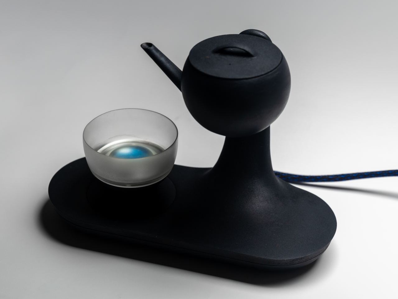
That’s the kind of experience that gpTea, a play on the brewed drink and this type of generative AI, wants to bring in a rather novel way. As a smart tea set, it not only brews tea but even tips the kettle forward to automatically pour the drink into a specially designed cup. Impressive as that may seem, that’s not even its most notable feat.

1

gpTea’s key feature is actually in interactive storytelling that weaves the responses of friends and family separated by distance and connected only through the Internet using this smart tea set. It asks you how your day went and, depending on your response, it might share a similar story given by another friend or loved one in the past. The more people use it, the bigger and longer the narrative grows. It’s almost like developing an oral tradition or history, except one that’s stored in the memory of an AI.

1

Another interesting feature of gpTea is the glass cup itself, which has a circular display at the bottom. The AI also generates images related to the story it’s telling, making it feel like you’re using magic to see the scene inside the cup. Admittedly, it’s a rather convoluted and complex way of sharing stories with friends when you can just talk to each other, but it’s still an interesting application of AI that actually tries to build connections between humans who are physically far apart.

The post AI-powered smart tea set creates narratives from stories shared by friends first appeared on Yanko Design.

Topographic wooden coffee table puts the Rock of Gibraltar in your room

Par : JC Torres
12 novembre 2024 à 15:20

Coffee tables these days aren’t just places to put down books and drinks. They’re often the center of a room, specifically a living room, both in location and in design. They do more than just add visual interest in a space but, in many homes, also reflect the owner’s tastes and sometimes their aspirations.

That’s especially true if you get the opportunity to design your own coffee table or get someone to do it for you. This wood and glass design, for example, tries to capture feelings of welcoming warmth as well as structural strength. And what better way to represent those ideas than by putting the semblance of a glorious mountain right in the center of your living room.

Designer: Prerna Panjwani

The Rock of Gibraltar is a majestic sight that inspires awe not just with its height but with its distinctive shape as well. It’s almost like a ship resting in the ocean and a testament to the Earth’s geological history. It isn’t as imposing as other mountains, making it the perfect fit for a coffee table design.

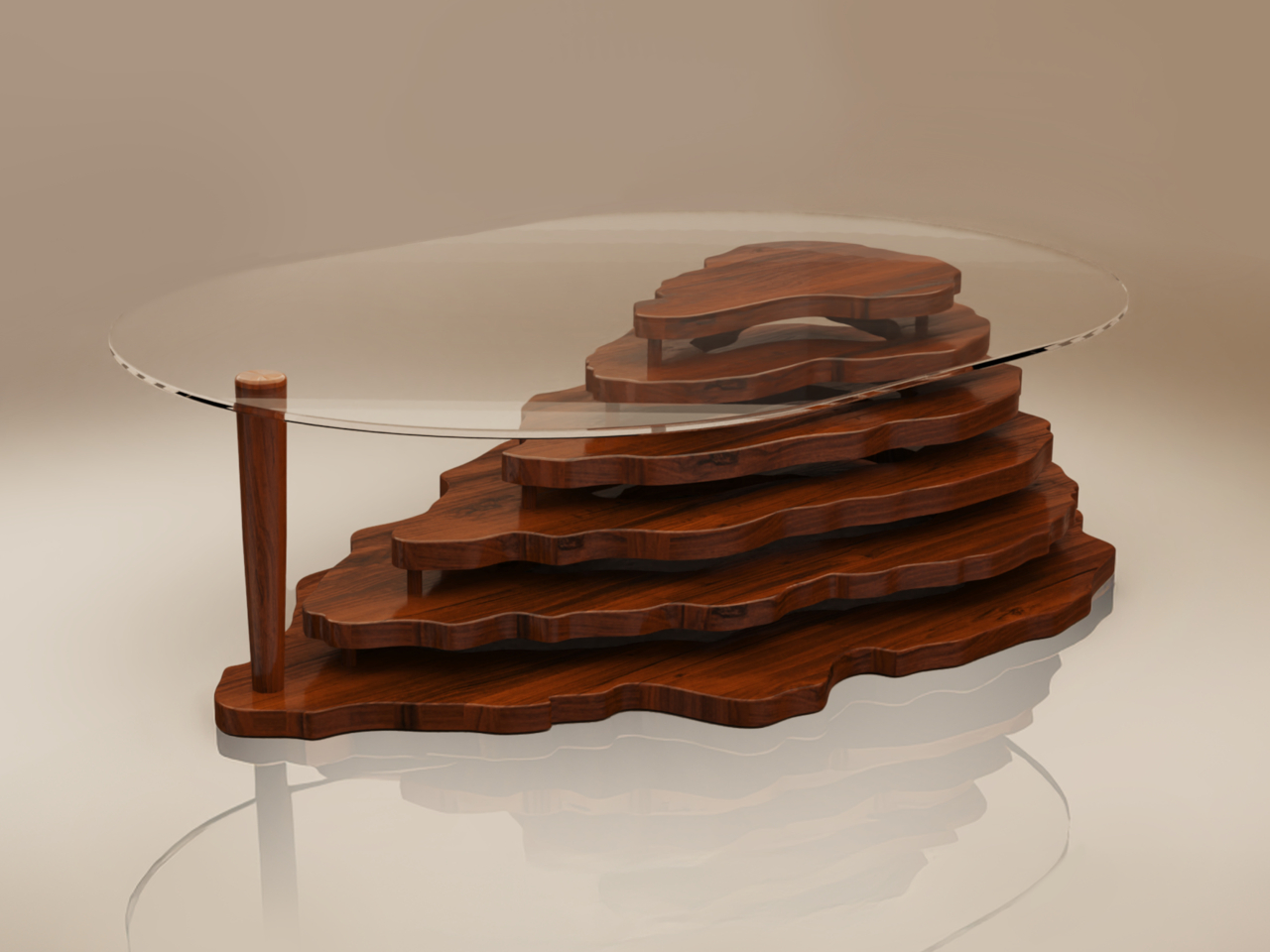
The Vista coffee table, however, doesn’t simply mold or carve the shape of the mountain. It instead assembles layers of rosewood panels cut to the rough shape of the Rock of Gibraltar. The layers are held together by a few sticks of wood, creating very visible gaps in between each step.

The resulting aesthetic is similar to those cardboard topographic maps some students are told to make for their science projects. It’s almost like an artistic representation of a geographic form, leaving just enough details for our minds to fill in the gaps. At the same time, this layered design is like a metaphor for the natural formation of the mountain itself, built up layer by layer over hundreds if not thousands of years.

The Vista coffee table tries to combine the lofty image of mountains with the grounding materials of wood. It’s definitely a conversation starter among guests seeing it for the first time, or even between friends revisiting memories of the table’s arrival. Perhaps an unintended feature of the design is the gaps that can be used to hold or hide objects, almost like the man-made structures that have been built around the mountain, also a metaphor for the clutter that humans create around nature.

The post Topographic wooden coffee table puts the Rock of Gibraltar in your room first appeared on Yanko Design.

Cyberpunk-themed power socket box concept removes a reason to hide your cables

Par : JC Torres
18 octobre 2024 à 14:20

Cable management and hiding is not only a trend; it has even become an art form. Messy cables don’t just get in the way but are also an eyesore. But what if the cables become part of the desk’s aesthetic? What if the power strip or socket box actually gave you a reason to have those charging wires out in the open? That’s the idea behind this socket box design that appeals to gamers, geeks, and gadget lovers by giving their desks a cyberpunk aesthetic. At the same time, it also makes cable management simpler by not having to hide wires and cables in the first place.

Designer: PTPC

It has become en vogue to hide power sockets and charging ports from view, whether disguising themselves as part of the desk or simply placing them behind tables. While that may be an effective way to reduce the visual mess, it also means most of these outlets are harder to reach. You shouldn’t have to sacrifice convenience for aesthetics, especially if the aesthetic you’re aiming for isn’t the kind that adheres to clean and tidy arrangements.

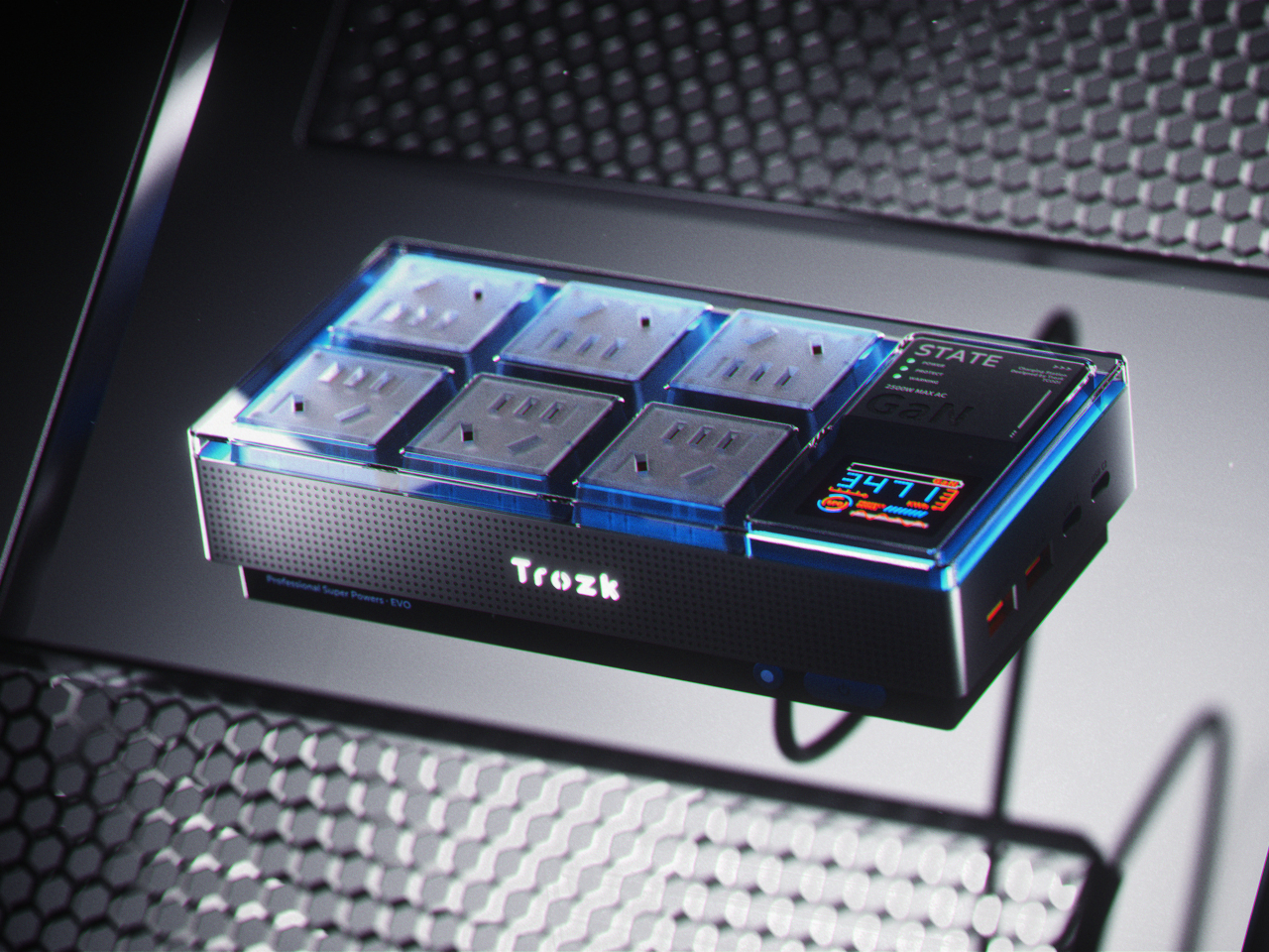
Trozk is a “hardcore” socket box that makes you want to actually have your wires in plain sight by embracing the popular cyberpunk theme. As the name itself implies, this genre’s design language is sometimes messy, unrefined, and even garish. You have tangled cables, neon lights, and geometric shapes in abundance, though still executed in a stylistic and intentional manner.

The socket box concept is aptly big, boxy, and flashy. On the top, you have six universal power outlets arranged in a 2×3 grid that can accommodate almost any plug type. Beside them is a square with small LED indicators and a square LCD display for information such as power input, output, and the like. Off to the side are USB ports for charging mobile devices. The concept incorporates GaN (Gallium Nitride) technology to handle the load of having 10 ports putting out power.

Like any cyberpunk-themed gadget, Trozk has RGB lighting that highlights the top surface of the box as well as the branding in front. Because of its interesting visual, the socket box is clearly designed to be shown off, even when there are cables coming out of it. That makes it easier to plug and remove chargers at will, while also giving your desk or shelf a sci-fi vibe. Of course, you’ll still have to make sure your cables don’t get tangled up, but at least now you’ll have a cyberpunk excuse for the mess.

The post Cyberpunk-themed power socket box concept removes a reason to hide your cables first appeared on Yanko Design.

Beautiful lamp fixture is made from an unlikely medical equipment

Par : JC Torres
18 octobre 2024 à 13:20

We’ve seen many striking lamp designs inspired by beautiful things in the world. Most of them get their cues from nature, taking inspiration from the moon, trees, or even mushrooms. While that in itself is a form of art, it takes more creativity and skill to turn something uninspiring or unsettling into a stunning and elegant design. This desk lamp, for example, looks soothing and calming in the dark, and you’ll probably never guess that it was made by repurposing an existing object that is associated not with beauty or elegance but with blood, pain, and wounds.

Designer: Kairi Eguchi

You might not be familiar with its name, but the pus tray is a common sight in hospitals, operating rooms, and TV shows depicting such scenes. Often made of stainless steel or even plastic, the kidney-shaped vessel is often used to collect pus but is sometimes depicted to hold bloody cotton, surgical tools, bullets, and other things that might come out from a body during surgery. Even the name alone carries a very negative connotation, and one can hardly imagine such a medical device being used for something less disturbing.

POND, however, proves that presumption wrong. It is part of a project that attempts to give new meaning to existing products, transforming them for a completely different and almost opposite purpose. In this particular case, a white-coated tray serves as the base for a cylindrical lighting element that’s placed not in the middle but near the edge of the tray. In daytime or in bright light, the lamp already looks interesting because of its unique shape, but the real magic happens when it becomes the only light source in a dark room.

The bowl virtually becomes a literal pond of light, using the natural contours of the tray to create an enchanting play of light and shadow. Unlike other lamps, the outward-facing surface of the pus tray is completely devoid of illumination, creating an effect not unlike the dark side of the moon. The curves and gently diffused light work together to create a soothing effect, the complete opposite of the proper medical use of the pus tray.

Given its bowl shape, POND can also be used as a container of sorts for small items. Of course, those objects will interfere and interact with the light, but that, in turn, could create an even more interesting visual, like fish swimming in a mystical pond of light.

The post Beautiful lamp fixture is made from an unlikely medical equipment first appeared on Yanko Design.
Nike Grind Dumbbells use recycled rubber from footwear byproduct

Par : JC Torres
17 octobre 2024 à 13:20

Of the many pieces of clothing we buy and use, shoes are probably the ones designed to last the longest. Because of that, footwear is usually made using materials that are durable and long-lasting but are also unfortunately often not environment-friendly. Rubber, particularly synthetic rubber, is one of the biggest culprits, not just in terms of post-consumer waste but even material waste during the manufacturing process. As one of the biggest footwear makers, Nike is thankfully taking a responsible stance, giving those rubber byproducts and excess materials a new purpose.

Designer: Nike

Although natural rubber is sourced from plants, it’s not that easy to replenish to meet the high demand for the material. Just like plastic, synthetic rubber is easy to manufacture but also harmful the environment due to their chemical content. Rubber from discarded shoes is one thing, but even the bits and pieces of cutoffs and scraps produced when making them also pose a threat to the environment.

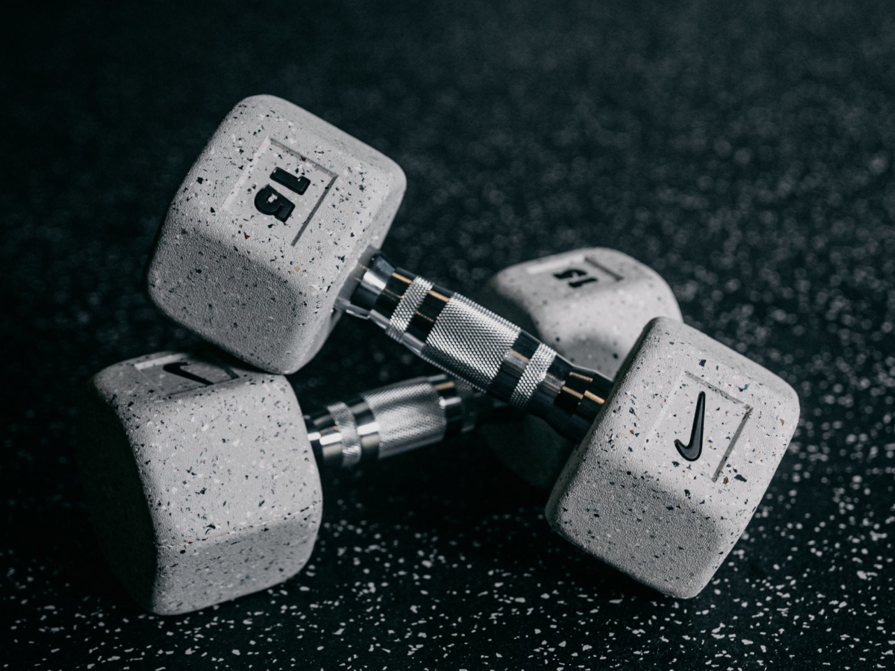
Considering its lion’s share of the sports shoes market, Nike developed the Grind material that recycles manufacturing byproducts like rubber, foam, and even textiles to create a material that can be applied to products other than shoes. In this case, the Nike Grind Dumbbells are made with at least 20% Nike Grind material to offer an alternative fitness tool for environment-conscious consumers.

In addition to its sustainable value, the recycled material also gives the dumbbells a unique aesthetic. The hexagonal weights themselves have a light gray hue sprinkled with colorful specs that create a terrazzo-like appearance. Each dumbbell is, thus, totally unique, and the mixture of colors will vary from season to season, depending on the styles of footwear that Nike launches.

The gray motif of the weights perfectly complements the chrome-plated knurled handles. The handle diameter varies depending on the weight, increasing as the load gets heavier to provide a more ergonomic grip. Available in weights ranging from 2.5 lbs to 50 lbs, the Nike Grind Dumbbell offers people a fitness tool that not only takes care of their health but also the environment.

The post Nike Grind Dumbbells use recycled rubber from footwear byproduct first appeared on Yanko Design.

Origami-inspired foldable laptop desk also functions as a car table and food tray

Par : JC Torres
9 octobre 2024 à 15:20

Laptops today are truly powerful computers worthy of the title of “desktop replacements,” but despite their name, they have never really been great to use on your lap. Yes, you can put them there, at least until they get too hot, but they’re not the most comfortable nor the most ergonomic positions. Some laptop desks or trays, particularly the ones with cushions, try to fix some of that by slightly raising the laptop while still pressing down on your lap and preventing proper blood circulation. The ones with legs, on the other, are best used in bed or sometimes on desks, undoing the benefit of portability. This rather curious design, however, promises to address all those and let you use your laptop in your seat or even have food or a drink on the side.

Designer: FansDreams

1

Unlike a typical laptop desk with legs, the Fansdreams Pi takes a few pages from the Japanese art of paper folding to keep its form slim and light. In a nutshell, it uses downward force to lock the legs in place and uses flat planes to hold the desk up. Thanks to that, the Pi is only 0.5 inches (12.7mm) thin when folded, while the use of PU leather and high-strength fiberglass gives it its durability and light 2-lb weight.

Perhaps more interesting than its appearance is the different functions the foldable desk serves. Of course, it holds your laptop up at a higher level, but there’s also enough space to put other items at the side, like a game controller, a bowl of food, or even a drink. Ideally, you wouldn’t put liquid near a laptop, but it can happen at times. And when not in use as an actual laptop desk, the Fansdreams Pi can function as a car table for actual eating or maybe working white paper.

The Pi laptop desk has one rather curious form where you turn it upside down and use one of the legs to raise the laptop at an incline. This configuration is good for having the screen at a higher level, though you’ll probably have to use a separate keyboard to type more comfortably. Either way, it’s also a good demonstration of how sturdy and stable the legs can be if they can support the weight of the laptop directly.

The Fansdreams Pi’s thin and lightweight design makes it easy to bring anywhere, though its rather long surface might not fit some smaller bags. And while it does bring the convenience of being able to work even in a car, it does encourage a rather unusual and somewhat unhealthy lifestyle of simply working and eating anywhere.

The post Origami-inspired foldable laptop desk also functions as a car table and food tray first appeared on Yanko Design.
Retro-style handheld computer flaunts QWERTY keyboard and a Raspberry Pi

Par : JC Torres
9 octobre 2024 à 13:20

It’s pretty amazing how much computing power can be crammed into a small space these days. After all, our smartphones are very capable computers themselves, but we also have handheld gaming PCs and single-board computers or SBCs that are no larger than (very thick) credit cards. The latter, popularized by the super-affordable Raspberry Pi, blasted wide open the doors to creative projects and gadgets, from mirrors that act as your smart home console to fictional cyberdeck computers brought to life. This latest design is one of the latter, offering a handheld computer with modern features and an aesthetic that seems to come from an alternate 80s timeline.

Designer: soulscircuit

Despite its size, the Raspberry Pi is a complete computer, one that can run desktop operating systems, including a trimmed-down version of Windows. With just the right peripherals, it can be used as a normal computer, and some have even turned the SBC into a laptop or even a desktop, complete with liquid cooling. These, however, don’t take full advantage of the Raspberry Pi’s small and portable size, a form that’s perfect for a handheld computer.

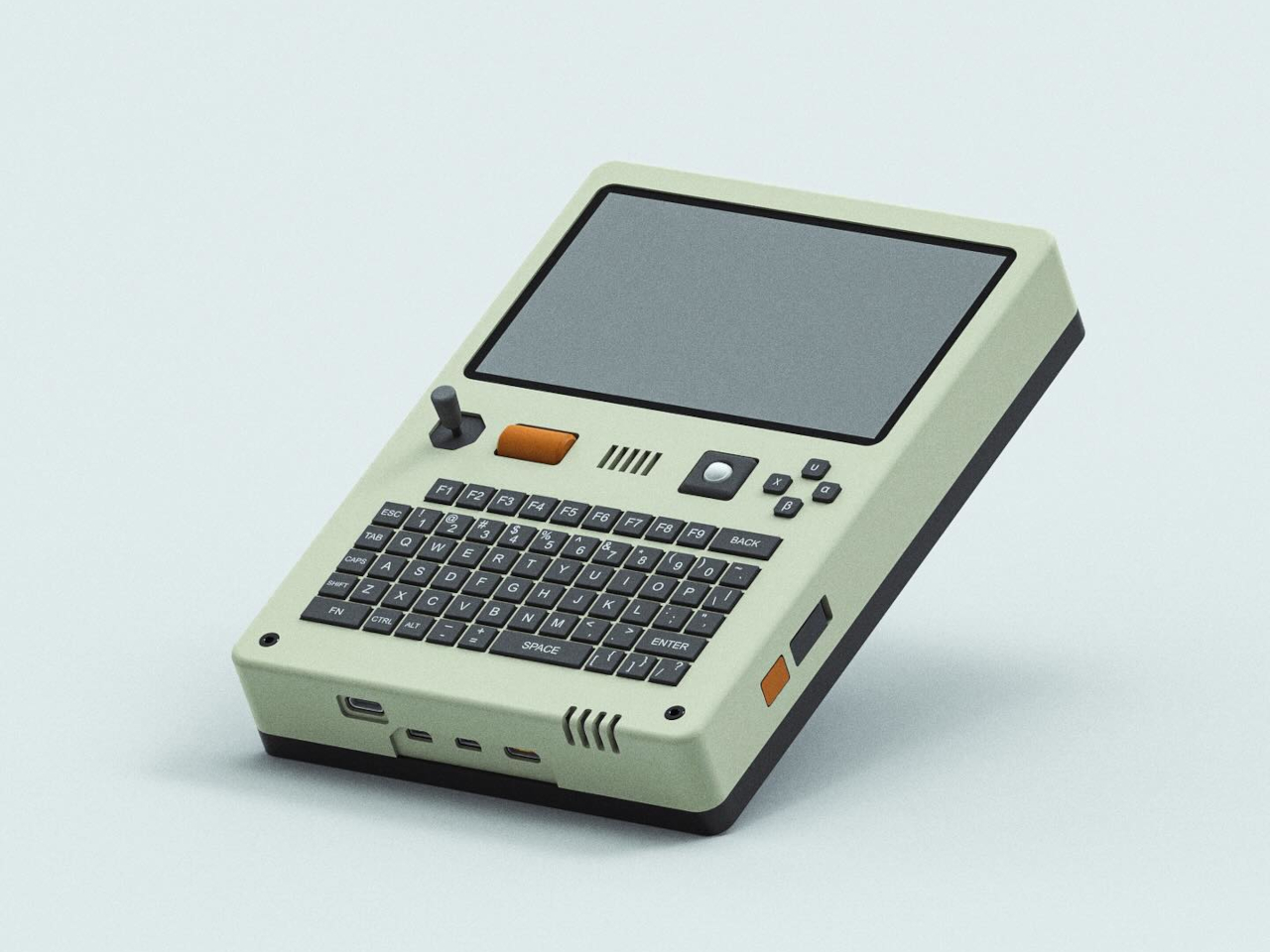
The Pilet 5 handheld console adds those essential missing parts to the barebones computer, turning it into a finished product that is usable the moment you turn it on. This form takes the shape of a rather chunky box with a 5-inch screen at the top and a QWERTY keyboard on the bottom half. This isn’t the first BlackBerry-like design powered by a Raspberry Pi and it definitely won’t be the last, but there are a few details that makes this project a bit interesting.

In addition to the keyboard, Pilet 5 has a four-direction D-pad as well as a tiny trackball on the right side of the device, while the opposite side has a joystick and a scroll wheel. These would definitely be more than enough to move the mouse, if the touchscreen still wasn’t enough, and they open up more use cases, like gaming for example. The aesthetic of the design is also less grungy and raw, unlike typical cyberpunk-inspired “cyberdecks.” The beige motif, gray buttons, and minimal colors give it a vibe similar to the consoles and computers from the late 80s and early 90s.

Just like the Pilet 7, formerly known as Consolo, the more compact Pilet 5 still promises a 7-hour battery life thanks to dual 8,000mAh batteries, just in a smaller and more complete form. That said, it does lose out on the appeal of a modular design that can adapt to almost any use case, which is what the Pilet 7 will bring to the table once it’s actually out.

The post Retro-style handheld computer flaunts QWERTY keyboard and a Raspberry Pi first appeared on Yanko Design.

Stream Deck Studio goes overboard with 32 customizable LCD keys for broadcasters

Par : JC Torres
9 octobre 2024 à 10:07

The very first Stream Decks were, as the name implied, made for streamers, content creators who thrived on live Internet video platforms like Twitch and YouTube. Over time, the device spread to more creative professionals who use the programmable buttons to make their workflows less cumbersome. That said, these tools benefited people working in mostly digital environments, such as those using computers. Realizing that even traditional broadcasting workflows could use an upgrade, a new kind of Stream Deck was made, one that had a ridiculous number of LCD buttons to customize, not to mention a stackable design to double or triple that number if it weren’t enough.

Designer: Elgato

The idea behind the Stream Deck and its kind is pretty simple. Rather than a sequence of keystrokes that are hard to remember across different apps and services, it offered buttons that could be mapped to almost any function. Even better, those buttons are actually LCD keys, so they can have dynamic icons that identify their purpose and change depending on the app in use.

That kind of flexibility is critical in a smooth and fast digital workflow, whether it’s changing settings on a live stream, stitching up videos, or changing digital brushes. Traditional broadcasting also has use for so many controls, but those buttons and dials are often fixed and permanent. The Stream Deck Studio brings the flexibility of Elgato’s mainstream devices to this professional setting where speed is of the essence.

Unlike the boxy Stream Decks, the Studio is a long 19-inch bar with two rows of 16 keys flanked by a dial on each end. This is the largest Stream Deck product to date and is obviously not meant for regular desktop use. The shape of the device, however, fits perfectly with broadcast studio racks. In fact, you can also stack and connect two or three of them, for a whopping 96 buttons and six dials.

Like any other Stream Deck product, the keys and dials are programmable, but there’s a slight catch this time. The Studio was developed together with Bitfocus, whose Companion software is already a popular alternative to Stream Deck’s own app, with tweaks for broadcast media. The new Buttons software was made specifically for the Stream Deck studio, though it requires a recurring subscription. Then again, the $900 price tag makes the Stream Deck Studio a no-go for individual creators anyway, but offers studios and other companies the same kind of flexibility and power that the Stream Deck offers, except on a larger scale.

The post Stream Deck Studio goes overboard with 32 customizable LCD keys for broadcasters first appeared on Yanko Design.

Flashlight design concept reframes an ordinary tool as a familiar smartphone

Par : JC Torres
7 octobre 2024 à 10:07

There’s no rule that says everyday tools need to be mundane and boring. With the trend in everyday carries and kits, people are discovering how ordinary objects can become more interesting or even more functional by changing their designs. Sometimes that means giving the object a fresh new look, one far removed from the original design and yet even more familiar to people. A flashlight, for example, doesn’t have to just be a cylindrical or rectangular stick you point with, and this concept design runs with that freedom to envision alternative forms, giving it the shape and interface of one of the most familiar products of this age: our smartphones.

Designer: Sihyun Choi

There is, of course, a good reason why conventional flashlights are shaped as long fat cylinders. They’re easy to grab and wrap your hands around, and their length allows you to possibly insert it in narrow spaces. There might also be some traces of their original inspiration, the equally cylindrical candlesticks. It might be an ergonomic design, but ergonomics can change over time as well.

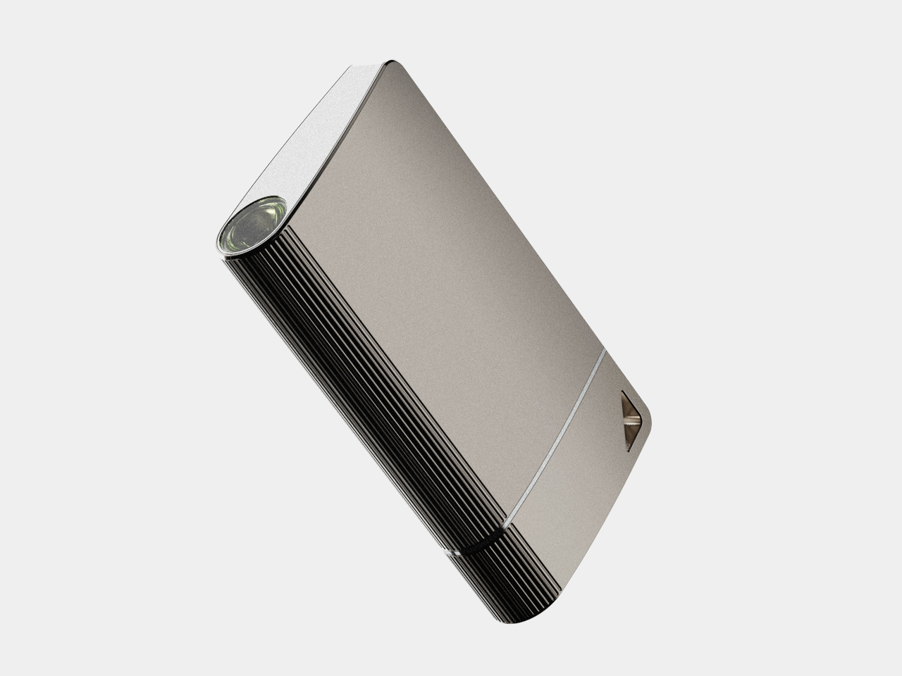
Today, for example, many people are just as adept at grasping their smartphones in their hands, which is the inspiration behind the WHITT concept. In a nutshell, it takes the basic form of a smartphone but puts the internals of a flashlight instead. It’s not a completely faithful recreation of a smartphone, of course, considering it tapers to one side a bit. It actually looks more like a lopsided flask or even a handheld laser projector in this case.

WHITT is also operated like a smartphone, at least when it comes to turning it on and off. The button is at the side, like where you would find a phone’s own power button, which is something we probably unconsciously push dozens or even hundreds of times a day. The similarities end there, however, as the flashlight isn’t even powered by rechargeable batteries. It uses two AA batteries that can be easily swapped out, unlike the fixed batteries inside smartphones.

As interesting as the design might be, it still leaves the question of ergonomics hanging. Opposite the tapered side is a curved edge with a ribbed surface that should improve the flashlight’s grip. Even then, a cylindrical flashlight is probably still easier to grip firmly, which is an important aspect of the tool’s utility.

The post Flashlight design concept reframes an ordinary tool as a familiar smartphone first appeared on Yanko Design.

HoloLens 2 discontinuation practically ends Microsoft’s Mixed Reality vision

Par : JC Torres
2 octobre 2024 à 10:07

There was a time, before today’s AI rush, when anyone and everyone seemed to be going all in on eXtended Reality or XR, the umbrella term for AR, VR, and mixed reality all smashed together. Now it seems that Meta and Apple, the latter with its self-branded “spatial computing” platform, are the only big players left in this field. HTC Vive, like its smartphones, has silently gone into the background, and Valve’s SteamVR and Index headset have taken a backseat to the Steam Deck. Now another big name in that is practically calling it quits, regardless of any lingering ties and commitments. Microsoft has reportedly discontinued its remaining mixed reality headset, the HoloLens 2, and in doing so puts the final nail in the coffin of a virtual experience that was already on life support for a long time.

Designer: Microsoft (via UploadVR)

It probably surprises no one that the HoloLens 2 is on its way out. It’s a five-year-old device that sported advanced features no one else had back in 2019 but has been surpassed by modern headsets since then. Without any successor, however, it’s clear that Microsoft has other plans, ones that no longer involved the enterprise, nor the mixed reality experience that it made available to the public.

Microsoft actually announced late last year that its Windows Mixed Reality (WMR) platform was being deprecated, so the writing has been on the wall ever since. This mixed reality platform, launched back in 2017, predated Apple’s visionOS but practically promised the same virtual computing experiences in real-world space. Of course, the technology back then wouldn’t be able to hold a candle to today’s Vision Pro, and Microsoft quickly learned that its HoloLens and WMR aren’t going to fly with consumers who can’t even afford the headset. It has, since then, pivoted to the enterprise market, targeting industrial and field workers, training scenarios, and the like.

According to the report, the HoloLens 2, the current and last iteration of that hardware, has gone out of production, so the moment supplies run out, that will be it for the headset. It will remain supported until December 2027, perhaps to honor Microsoft’s existing enterprise contracts. That said, it hasn’t completely turned its back on extended reality, but its focus will be on the militarization of the technology, which means custom experiences that won’t be available to the public. And that will last for only as long as the US Army is interested in that technology.

Microsoft’s exit from the XR market is perhaps yet another sign of this industry’s ailing health. Although the Apple Vision Pro generated plenty of hype, its prohibitive price tag has made it less of a commercial success. In the meantime, Meta more or less remains at the top and continues to try its luck with new designs that could bring this technology to even more people. Even Microsoft has put its XR eggs in the Quest basket, making its Office suite and Xbox Cloud Gaming available there, which in turn, made its own XR platform really pointless. But with even fewer stakeholders, XR runs the risk of becoming a monoculture where only one company dictates the kind of experiences you’ll have in the Metaverse and beyond.

The post HoloLens 2 discontinuation practically ends Microsoft’s Mixed Reality vision first appeared on Yanko Design.
Stay Cool Anywhere With the Ultimate Portable Air Duster Fan for Any Adventure

Par : JC Torres
2 octobre 2024 à 01:45

Imagine being in the great outdoors, basking in nature’s beauty, but also sweating profusely and feeling sluggish under the oppressive sun. You might not believe it, but your body definitely feels both days and nights getting hotter. Portable fans are the rage these days, but many of them require you to carry large bottle-sized contraptions that sacrifice your comfort just to beat the heat. That’s where ZERA MAX comes in, a revolutionary portable air duster fan designed to keep you cool and comfortable no matter where your adventures take you. Meticulously crafted to seamlessly combine power, portability, and stunning design, this handheld turbine delivers the wind you need to keep cool and look cool anytime. Whether you’re an avid camper, a dedicated hiker, or someone just looking to conquer the summer heat, the ZERA MAX promises to bring indoor comfort to your outdoor experiences.

Designer: ZERA

Click Here to Buy Now: $89 $159 (44% off). Hurry, deal ends soon! Raised over $106,000.

1

What sets the ZERA MAX apart at first glance is its sleek, ergonomic, and pocket-sized design. Crafted from aluminum alloy, this fan is lightweight yet incredibly durable, making it an indispensable companion for any outdoor activity. Its modern and minimalist aesthetic is a visual delight, ensuring it doesn’t just function well but looks good doing it. The convenience of its compact build cannot be overstated – you can effortlessly slip it into your backpack, hiking gear, or beach bag, giving you the freedom to carry it wherever you go, unlike other fans that are as large as water bottles. This blend of style and practicality ensures that relief from the heat is always within arm’s reach.

1

The relief is delivered by a small yet powerful wind turbine with a top speed of 150,000 rpm. With a simple sliding button, you can customize the speed that you need, whether it’s a gentle breeze for a mellow afternoon or a strong gust to keep the sweltering midday heat at bay. All the information you need is available at a glance on the handle’s digital display, whether it’s battery charge or speed. It’s these thoughtful features that distinguish the ZERA MAX as a versatile tool, perfect for any situation you might find yourself in.

But the ZERA MAX isn’t just a fan – it’s a powerhouse of functionality. Picture this: you’ve just reached your camping spot, and with a quick switch, your fan doubles as an air duster to swiftly blow away dirt from your equipment. It’s a dream come true for outdoor enthusiasts who often have to deal with dusty environments and gear. It can also function as a vacuum, an air mattress and ball inflator, an eyeglasses cleaner, and more. All these functions are made possible with a variety of interchangeable nozzles that quickly snap and stay on thanks to a strong rare-earth magnet on the fan’s nose. These features are not just convenient but essential, ensuring your gear stays clean and functional, allowing you to focus on enjoying your adventure.

1

With such a powerful wind turbine in your pocket, the last thing you’d want is for your portable air duster fan to die after just half an hour of use. Thanks to a large 4,000mAh battery in the handle, that’s never a worry and you can enjoy a comfortable breeze for up to 3 hours. And when it does come to juice up the ZERA MAX, its fast USB-C charging makes sure you’ll be up and ready again in no time. It is designed to keep up with your energetic lifestyle, providing uninterrupted comfort throughout your outdoor excursions. With its harmonious fusion of innovative design, exceptional functionality, and versatile adaptability, this handheld wind turbine redefines what a portable fan can be. Whether you’re embracing the outdoors, trying to survive a hot day, setting up a mattress, or simply cleaning your laptop, the ZERA MAX is ready to revolutionize your adventures, wherever the wind blows, especially if the wind isn’t blowing at all.

Click Here to Buy Now: $89 $159 (44% off). Hurry, deal ends soon! Raised over $106,000.

The post Stay Cool Anywhere With the Ultimate Portable Air Duster Fan for Any Adventure first appeared on Yanko Design.
Key-bowed hybrid violin and keyboard synthesizer produces pure musical joy

Par : JC Torres
1 octobre 2024 à 15:20

Of the many creative endeavors, music is probably one of the hardest to learn and practice. And of the well-known musical instruments, the violin is one of the hardest to play. But what if you can play the violin or some semblance of the instrument as easily as you could press down keys on a piano? And what if that produced the unique tonal quality of a violin while still hitting all the right notes perfectly? That’s the kind of musical experience that this DIY synthesizer offers, combining two classical instruments in a single form that might leave you confused with one hand playing the keyboard and the other playing the violin.

Designer: Washiyama Giken

Electronic keyboards can try to mimic the sounds of different musical instruments, but they don’t always work. They can’t, for example, reproduce the unique vibrating quality of the violin family, which at the very least would require some physical medium to produce that kind of sound. Conversely, violins are hard to master because you need to also move the bow at a very precise location to hit the right pitch, and that location isn’t marked like on a guitar.

Key-bowed, which is a very creative name, tries to combine the strengths of both the keyboard and the violin with very few of the flaws. It’s actually an idea decades in the making, but it’s finally possible to pull it off thanks to modern technologies and hardware. The synthesizer combines a Roland K-25m keyboard, an Arduino Uno R4 minima controller, and a self-made bowing sensor with a vertical acrylic plate. Of course, the assembly also requires some programming know-how, especially when dealing with sound waves.

Despite the complexity of the build, using the Key-bowed looks pretty simple, at least for the musically inclined. You simply hit the keys with one hand to produce music like on a regular keyboard or piano, and then you use the other hand to move the bow across the acrylic plate as you would with a violin. The vibrations on the plate are detected by the sensor and then transformed into waves that modify the note that’s produced, resulting in a very realistic recreation of a violin sound, with perfect pitch, and without the screeches. You can even pluck the plate and make it sound like you’re really plucking a string.

240702181648552

Key-bowed is definitely a work of genius that makes playing music both fun and enchanting. It still requires you to have some basic music knowledge, of course, but it makes the execution less daunting, especially if you’ve always dreamed of playing the violin. Of course, there are limits to the music you can play, since you’re technically producing notes with only one hand, and the design is made for those who hold the violin bow with their right hand. Nonetheless, it still creates a captivating experience, and hopefully, it can become a commercial product that will let everyone enjoy that experience as well.

The post Key-bowed hybrid violin and keyboard synthesizer produces pure musical joy first appeared on Yanko Design.
Rectangular robot vacuum concept proposes a more efficient design for smaller spaces

Par : JC Torres
1 octobre 2024 à 13:20

Robot vacuum cleaners and mops are common sights these days, but despite all the advancements they’ve made in terms of technology, their basic shape has remained unchanged since the first-ever Roomba. They’re almost all circular, though the are some that have taken on rounded square forms, a shape that was dictated by the limitations of old technologies that don’t seem to be relevant today. This standard design, however, still carries over other limitations, like squeezing into tight spaces or cleaning corners. Perhaps it’s time to rethink that old and outdated design, which is what this concept tries to do in order to cater to homes with smaller, cramped spaces and messy floors.

Designer: Subin Kim

The initial design of robot vacuums was made primarily for the robot and not the humans. The circular shape made it easier for the machine to turn and correct its direction, something that was all too common given the very basic technologies from decades past. Today, however, most robot cleaners have no problem navigating the most cluttered floors, so there’s now an opportunity to rethink that basic shape.

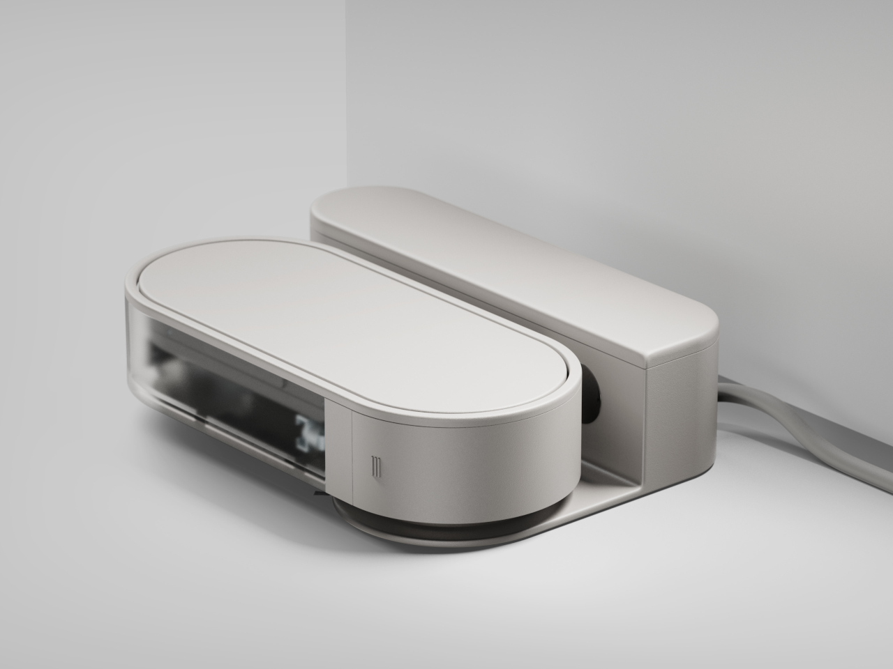
mini is a concept design that stretches the robot vacuum into a more rectangular form, technically more pill-shaped with its rounded sides. The idea is that this robot can better squeeze itself into narrow spaces, like those between walls and furniture, or hug edges to properly brush and vacuum areas that even the most sophisticated circular robot can’t reach. In small apartments or tiny homes, that is more often the case, so such a design is more useful than the majority of round or square robots.

The design can actually be even more efficient than standard robot vacuums because it can change its orientation depending on the area of the floor to be cleaned. In its vertical mode, it can easily clean out narrow gaps, but then it can rotate and switch to horizontal mode if there’s a wider space available for it to move. Such a feat would require AI and advanced sensors, both of which are readily available on most robot cleaners today.

mini’s design does mean it won’t be able to turn quickly, but that can be handled by better obstacle detection and smarter navigation. Although it might not work perfectly in practice, the concept does challenge the status quo and encourages a design that really puts the user at the center, rather than simply turning such robot helpers into technological showcases.

The post Rectangular robot vacuum concept proposes a more efficient design for smaller spaces first appeared on Yanko Design.
Pixel 9a leaked renders look pretty barren without the distinctive camera bar

Par : JC Torres
1 octobre 2024 à 10:35

With the Pixel 6 in 2021, Google embarked on a new design language and visual identity for its smartphones. Like it or not, and some definitely didn’t, the camera “visor” has become an identifying mark of the Pixel phones since then, something that no other brand dared to even try. It underwent a few refinements until it was finally replaced by the camera “bar” in this year’s Pixel 9. Some loved it, some despised it, and some even wanted to have the old visor back. It seems that Google isn’t done playing around with the design just yet if these early unofficial renders for next year’s “mid-release” Pixel phone. And if the Pixel 9a is any indicator of the direction that Google will take in the future, it’s bound to split camps yet again.

Designer: Google (via AndroidHeadlines and OnLeaks)

It’s not that hard to understand how divisive the Pixel camera design is. On the one hand, it is big, visible, and distracting, but on the other hand, it is executed elegantly, balances the phone on your desk, and gives your index finger something to rest on when holding the phone. What both camps will probably agree is that the camera visor or bar is an identifying mark of the Pixel phone, and it’s something the Pixel 9a might lack.

Based on the first CAD renders made from leaked information, the next mid-range Pixel phone will ditch the camera bar for a flatter design. Curiously, the cameras aren’t placed closer to the upper left corner of the phone’s back even without the bump, and it seems to be in the exact same position if it did have that bar. It’s almost as if Google just did a magic trick like pulling out the tablecloth from under the cameras, leaving them in the exact same place. At the same time, however, the camera island isn’t completely flush with the rest of the phone’s back as it has a raised lip around the oval, perhaps for protection. Whether it will make the wobble is something that can only be tested with an actual unit.

Other than that, the rest of the Pixel 9a’s design is pretty similar to the Pixel 9, down to having only two cameras on its back. The exact dimensions of the upcoming phone remain undisclosed, so we don’t know yet how bigger or smaller it is compared to the Pixel 9. The bezels around the display, however, do look a little thicker, giving it a less premium appearance overall.

The Pixel “a” series often carries the design from the same generation, so it would be surprising to see this big a change for the phone. It could also be Google’s strategy to further differentiate the Pixel 9a from the Pixel 9, giving it an aesthetic that definitely looks more “mid-range” than the flagship models. You can still see signs of the Pixel DNA if you look hard enough, but other than the position and orientation of the cameras, it’s almost too easy to pass the Pixel 9a over for some more visually interesting mid-tier phones.

The post Pixel 9a leaked renders look pretty barren without the distinctive camera bar first appeared on Yanko Design.
Bamboo drone explores a more sustainable way to fly and deliver things

Par : JC Torres
30 septembre 2024 à 14:20

Some see them as annoyances and others consider them as privacy and security risks. That said, flying drones, just like their quadruped terrestrial counterparts, will inevitably be a part of our near future. That does mean there will be more mass-produced drones, more than what we already have today, and the materials used to make them aren’t always accessible or sustainable. But just as plastic is being replaced in other design industries, there’s also an opportunity to test other materials that are just as suitable for these flying robots. One experiment does exactly that, and it chooses a rather unexpected option that’s much loved in the design industry: wood.

Designer: Deepak Dadheech

Wood is not something you’d immediately associate with electronics, let alone robotics, but it is finding its way to more appliances and gadgets. In those cases, the material is prized for its sustainability and aesthetics, the latter of which isn’t exactly a priority among unmanned aerial vehicles or UAVs like drones. That said, not all wood is created equal, and one particular type could very well be suitable for the demands of a drone.

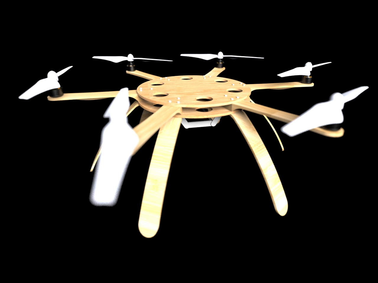
Bamboo, in particular, is known for being lightweight yet also durable, especially when it comes to its tensile strength. Unlike hardwood, which could splinter and break on impact, bamboo can absorb a bit more strength. It’s also in high supply or easily renewable, unlike other trees that take a longer time to mature. Because of these properties, it could make for a good substitute for both plastic and carbon fiber, as the Bamboo hexacopter drone demonstrates.

Of course, the whole drone isn’t made of bamboo. In addition to the circuitry and brushless motors, the propellers are still made from plastic. Only the main frame, legs, and arms use bamboo, which is the largest use of plastic or carbon fiber in drones anyway. For only around $12 worth of bamboo, you can have a drone that weighs only 350g, half that of typical plastic builds.

The question, however, is whether such a strategy will actually be effective or if it will have too many compromises for the sake of sustainability. The Bamboo Drone does fly indeed and it can, in theory, carry light payloads like tools, emergency supplies, or scientific instruments. How it will fair against strong winds and light rain has yet to be tested, and that will really determine how suitable bamboo will be for a fleet of drones.

The post Bamboo drone explores a more sustainable way to fly and deliver things first appeared on Yanko Design.

Modular In-car Coat Hanger Concept Doubles as a Tablet Holder and Stand

Par : JC Torres
30 septembre 2024 à 13:20

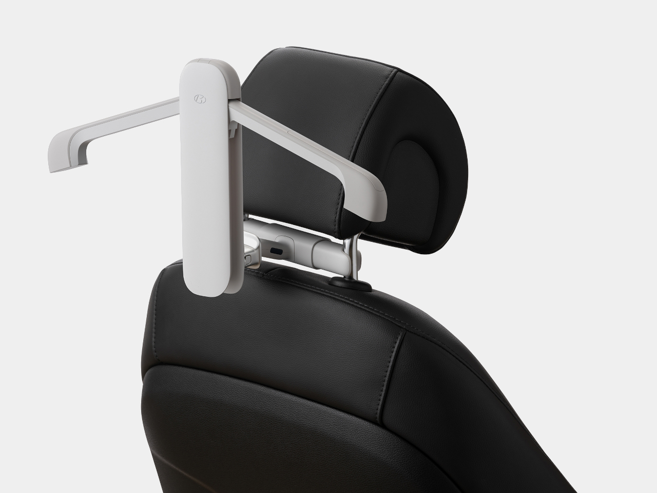
Vehicles like cars and vans have a variety of storage solutions for almost everything you might want to bring with you except for coats, dress shirts, and dresses. It’s not uncommon for people to bring certain clothes they need to hang, but even after decades, the majority of cars don’t have a proper solution to that problem. At the same time, it might be a waste of precious space to have a permanent fixture just for hanging clothes you might bring occasionally, so this accessory concept utilizes a modular design that adds a hanger in your car when you need it or any other thing you need to hang from the back of a car seat, like a tablet, for example.

Designer: BKID co

Theoretically, you could always hang clothes from the car’s grab handles or assist grips, but they’re obviously not designed for that purpose. It doesn’t align the hanger with the car’s cabin, making it awkward, cumbersome, and space-consuming. This Hyundai Multi Hanger, in contrast, uses the space right behind the driver or front passenger seats, using a hanger design that doesn’t get in the way when you don’t need it or can even be used for some other purpose.

The secret to this multi-functional feat is the modular design of the hanger. The hanger itself has “wings” that can fold inside its body, conserving space even while it’s still attached to the seat. The base of the hanger clamps onto the rods of the seat’s headrest, which means you will need to raise that headrest a bit, which could be uncomfortable for the person sitting in front. Alternatively, the hanger itself can be hooked somewhere else, presuming there’s a bar thin enough to fit inside the very small hook.

If you do remove the hanger from the holder, you can attach other parts instead. One of these is a clamp for holding tablets, which transforms the hanger into an entertainment panel, which kids might enjoy. That clamp can also be used standalone, with the connector at the back acting as a stand for the tablet.

In theory, plenty of other things can be attached to this modular system, like a pocket or basket for small items or maybe even a holder for food and drinks. It’s a simple yet effective solution that takes advantage of an often overlooked area of cars, made possible thanks to the creative use of foldable mechanisms.

The post Modular In-car Coat Hanger Concept Doubles as a Tablet Holder and Stand first appeared on Yanko Design.

Folding Travel Toothbrush Concept Keeps Your Teeth and the Planet Clean

Par : JC Torres
30 septembre 2024 à 10:07

Dental hygiene is already quite the tiresome chore at home, so you can probably imagine how some people use travel as an excuse to conveniently “forget” brushing their teeth. Of course, you can always bring your own toothbrush, or hope your hotel provides one, but not all travel toothbrushes seem to be designed for travel. Conventional toothbrushes take up plenty of space with their long bodies while folding designs feel flimsy, unreliable, and always disposable. For those who really want to keep their teeth healthy even when far from home, they’ll need this kind of toothbrush that can keep them company for years to come, thanks to a modular design that also ensures that the planet’s health isn’t sacrificed for the sake of yours.

Designer: Uladzislau Patapchyk

The vast majority of toothbrushes, whether those for the home or for travel, are made from plastic. Given how people are advised to replace their toothbrushes regularly, the accumulated waste from all these dental hygiene tools is staggering. In reality, what you really need to replace is just the bristles of the brush, something that this concept design takes into heart.

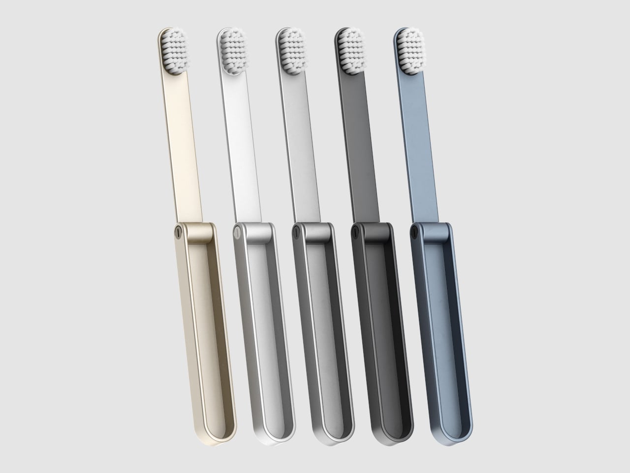
More than just its compact foldable form, the IO travel toothbrush concept embraces a modular design that lets you swap out those bristles as needed. It helps reduce the amount of waste from toothbrushes that are thrown out as a whole object when you really need to only replace the head. It also makes the toothbrush more hygienic and convenient, since you can replace the bristles anytime, especially after an accidental drop or brush (no pun intended) with unsanitary surfaces.

The body of the toothbrush itself is also designed to last and is made using surgical steel or other durable metals. The smooth, edge-free design prevents that metal from cutting into your mouth or skin. It has an elegant minimalist design that not only makes it aesthetically pleasing but also reduces the space it takes up in your bag or kit. Like the bristles, it actually also has a modular design that lets you separate the two parts, in case you need to replace one or the other.

This IO toothbrush concept is designed for sustainability from every angle. Even the packaging is supposed to be biodegradable and can even be dissolved in water. You can easily just dissolve the packaging rather than throw it away, ensuring that you won’t be leaving any trash behind. With some outside-the-box thinking, this toothbrush concept proves that human health and convenience don’t have to come at the expense of the planet.

The post Folding Travel Toothbrush Concept Keeps Your Teeth and the Planet Clean first appeared on Yanko Design.

Ride-on suitcase for kids doubles as an in-flight bed or leg rest

Par : JC Torres
25 septembre 2024 à 15:20

Rideable motorized suitcases are odd products, even more so when adults are the ones riding on them. They look more like fun toys for kids, but strangely enough, such products are in low supply or even non-existent. Of course, the dangers of sitting a kid on a moving vehicle, cute as it may be, can be frightening, but that doesn’t mean the basic design of a ride-on suitcase doesn’t have merits, especially if it doesn’t have motors in the first place. This unusual suitcase for toddlers takes that idea and gives it a little twist, giving it some other utility even when already boarded on the plane or train.

Designer: Frost Produkt

There are plenty of suitcases with colors and decorations catering to kids, but strangely enough, the majority of them aren’t exactly designed for kids. They function more like miniature suitcases for adults with zippers that are difficult to use and compartments that are difficult to access without having to first lay the suitcase down. That might just be a hassle for grownups, but it’s nothing short of a chore for kids, not unlike being told to clean up their closet.

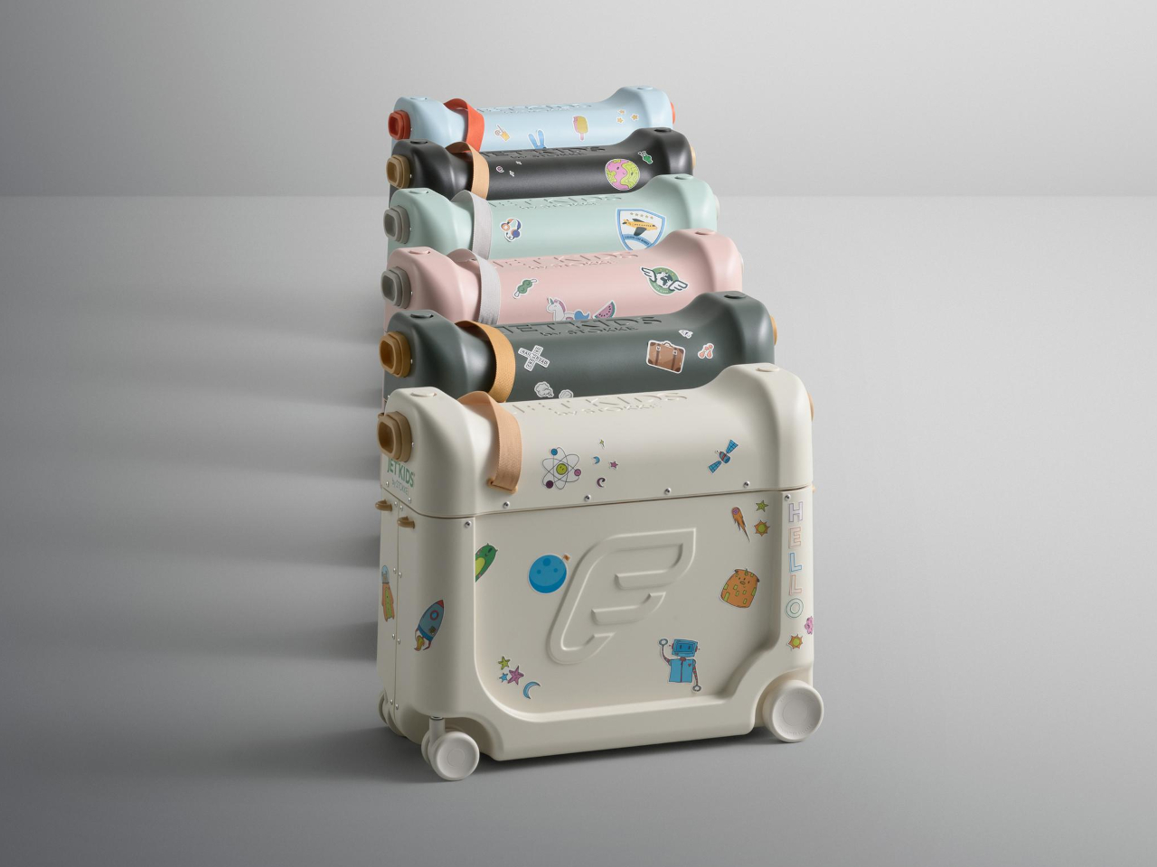
Jetkids is a ride-on suitcase truly designed with a young child in mind, and not just because of how fun it seems to sit on top of it. Instead of a zipper that opens from the front, this suitcase has a top cover that can be easily lifted to reveal the contents inside. The cover itself is actually a container as well, suitable for smaller items or things that the child or parent needs to access immediately.

That’s because this cover can be flipped over and placed on top of the suitcase, acting not only as a sort of desk but also as a leg rest or bed. The idea is to place the suitcase in front of the child’s seat on the plane, extending the area they can sit or even lie down on. And when the child is on the ground and about, the suitcase also offers a place for them to sit down and, if needed, be pulled by their family or guardian.

This unusual yet useful design does limit Jetkids, which was also marketed under the name Stokke Bedbox, to a certain age range that allows them to sit safely on the suitcase. It’s still an interesting design that really puts the ease of use and comfort of the child in mind rather than simply shrinking a product made for older people.

The post Ride-on suitcase for kids doubles as an in-flight bed or leg rest first appeared on Yanko Design.

❌
❌