Vue normale

Il y a de nouveaux articles disponibles, cliquez pour rafraîchir la page.
Hier — 6 août 2026Techs Design

Motorola’s Patent Isn’t a Phone You Wear, It’s a Watch You Unfold

Par : JC Torres
6 août 2026 à 08:45

The idea of merging a smartwatch and a smartphone into a single device has been floating around the industry for years, mostly because the obvious inconvenience is right there: two screens on two separate devices, one tiny and worn on the wrist, the other large and kept in a pocket, each doing essentially half the job the other can’t. The logical question is whether one of those devices could do both jobs depending on the situation.

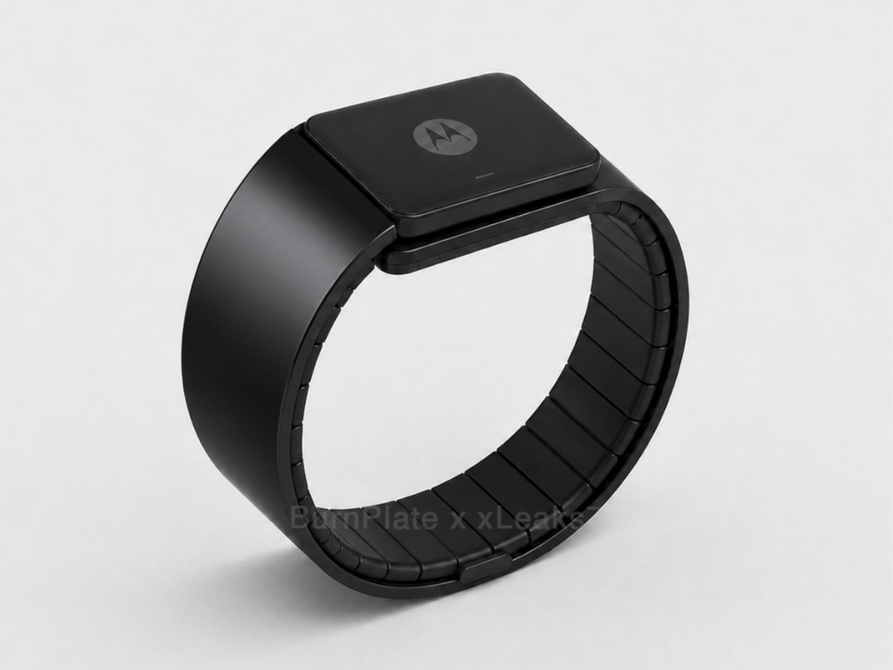
Motorola’s latest patent, officially registered as US12,693,705 under the title “Pivoting wearable reconfigurable screen,” proposes exactly that. The device starts on the wrist as a conventional smartwatch, its flexible display curved around the band. When more screen real estate is needed, the strap pivots and unfolds, flattening into a short, wide display format that functions as a handheld device. A third configuration folds the bottom quarter into an “L” shape, turning the unit into a self-standing desk display.

Designer: Motorola (via Burnplate, David Kowalski/xeaks7)

The mechanism that makes it possible is the strap itself. Rather than housing a traditional watch face with a fixed display, almost the entire outer surface of the band carries a flexible screen. Worn, it reads like a standard wearable. Removed and unfolded, that same surface becomes the display area of a compact, landscape-oriented device. The pivot point is what separates this from simply being a wrist-wrap phone like earlier concepts.

That distinction matters because Nubia tried the wrist-phone idea back in 2018 with the Alpha, and the result was a fascinating but limited object. The Alpha wrapped a 4.01-inch OLED display around the upper wrist, delivering more screen real estate than any smartwatch before it, but the display stayed wrapped. It curved beautifully, could make calls, take photos, and run apps, but it never transformed into anything. The watch was the watch, full stop.

Nubia Alpha

Motorola’s patent reverses the logic. Rather than making a phone you can wear, it proposes a watch you can unfold. The distinction isn’t purely semantic. A device that starts as a watch and transforms into a handheld is solving a different problem than one that starts as a phone and straps to your wrist. The first carries a reasonable identity in both states; the second always feels like a compromise in one of them.

Nubia Alpha

The Nubia Alpha’s sticking point wasn’t the display, which was genuinely impressive and ahead of its time. It was the software, the battery, and the form factor’s limits in practice. Nubia never took the concept further after the original and a 2020 follow-up. The flexible display remained horizontal and wrist-bound, never taking the step toward becoming a genuinely detachable, self-sufficient screen.

Whether Motorola’s patented concept eventually ships as a real device is a separate question entirely. Patents are filed routinely without becoming products, and this one would require flexible display technology durable enough to handle daily wrist bending and regular unfolding, a battery that fits within strap dimensions, and software that transitions cleanly between modes. None of those are trivial problems.

Still, the direction of thinking has clearly shifted since 2018. Nubia asked what happens when a smartphone lives on your wrist. Motorola is asking what happens when a watch becomes a screen the moment you need one.

The post Motorola’s Patent Isn’t a Phone You Wear, It’s a Watch You Unfold first appeared on Yanko Design.

À partir d’avant-hierTechs Design

The 3 Best Japanese Kitchen Tools You Need to Buy August 2026

5 août 2026 à 11:40

Japanese kitchen tools tend to arrive with a very specific philosophy attached. They do less than you expect on paper and more than you realize until you’ve used them for a week. The three objects below cover different ends of that idea: a precision appliance from one of Japan’s most storied engineering brands, a pair of scissors built for the demands of serious kitchen prep, and a clay pot that has been doing its job correctly since the Kamakura period.

What connects them isn’t aesthetic or price point. It’s the sense that each was designed by someone who had a genuine opinion about what the object should do, then made it do exactly that. August is a good month to pay attention to the kitchen — the produce is at its best, the cooking is more instinctive, and the tools you reach for most tend to reveal themselves. These three are worth reaching for.

1. Mitsubishi Bread Oven

The name requires a moment. Mitsubishi, the Japanese conglomerate better known for cars and precision electronics, makes one of the most exacting home bread ovens available. The machine applies the same engineering discipline to baking that Mitsubishi Electric brings to everything else it builds: controlled heat, precise internal timing, and an attention to the baking chamber environment that consumer appliances from Western brands rarely match. The result is a loaf with a crust and crumb structure most countertop machines simply cannot produce, regardless of recipe.

What makes it worth covering in a design publication isn’t only the output. The form is unmistakably Japanese in its restraint — minimal, white, without the button complexity that clutters European bread makers at comparable prices. It occupies counter space the way well-considered appliances should: as an object with a clear visual point of view rather than a machine that apologizes for being there. Bread that comes out of it tastes like something was genuinely thought about. Because it was.

What We Like

  • Precision heat management produces a crust and crumb that typical home bread makers don’t come close to replicating
  • The minimalist appliance design treats the machine as a considered object rather than a utility box competing for counter attention

What We Dislike

  • Sourcing outside Japan requires import channels, which adds cost and complicates any warranty or service process
  • The price point places this firmly in investment appliance territory — this is a deliberate purchase, not a casual one

2. Precision Chef Kitchen Scissors

Kitchen scissors are one of those tools most cooks underestimate until they own a genuinely good pair. The Precision Chef Kitchen Scissors make the case for re-evaluation. Built with the material standards and blade geometry you’d expect from Japanese cutlery, they work through herbs, spring onions, dried chilies, and butcher twine without the handle torque that cheaper scissors force you to compensate for on every cut. Edge retention is where the quality gap between these and a supermarket pair becomes immediately obvious.

The design is deliberately restrained, which is exactly the right call for a kitchen tool that needs to sit in a drawer and get used without ceremony. Nothing superfluous in the grip, nothing decorative in the blade. Japanese kitchen scissors at this level function as precision instruments that happen to look like scissors. Once you’ve used a pair built this well for a full week of regular prep, the ones you owned before start to feel like a different category of object entirely.

Click Here to Buy Now: $95.00

What We Like

  • Edge retention and blade geometry handle repeated kitchen use without the performance drop that cheaper alternatives show within weeks
  • The restrained design means these function as tools first, rather than objects performing the idea of quality

What We Dislike

  • The refined aesthetic means they can disappear in a crowded kitchen drawer — worth designating a fixed home for them
  • Like most professional kitchen scissors, they require hand-washing to preserve edge quality, which adds a small but real step to cleanup

3. Iga-yaki Donabe Clay Pot

Iga clay comes from Mie Prefecture in Japan, where the local earth has been used for ceramics since at least the Kamakura period. The porous structure of Iga-yaki absorbs heat slowly and releases it with a consistency that metal pots structurally cannot replicate. Rice cooked in it sweetens. Broth deepens over a lower flame than you’d expect to produce it. The exterior stays rough and unfinished while the interior is glazed smooth — two surfaces on the same vessel, each doing exactly what it should.

Available from TOIRO Kitchen in several sizes, the donabe asks for a single seasoning step before first use — simmering rice water in the vessel — and then becomes one of the most reliable pots in the kitchen. It handles rice, hot pot, steaming, and slow braise with equal competence, which makes it the rare piece of cookware that earns its space by quietly replacing three other things. Store it with the lid off after washing, and it will be in your kitchen for decades.

What We Like

  • Iga clay’s heat retention produces results in rice and broth that no metal pot at any price point genuinely replicates
  • Real versatility across rice, hot pot, steaming, and slow cooking means one vessel covers what several usually would

What We Dislike

  • Requires a seasoning step before first use that the packaging doesn’t always communicate clearly upfront
  • The porous clay absorbs strong cooking odors over time and needs to be stored with the lid off after washing to stay fresh

Make the Kitchen Better, Not Faster

Three tools, three distinct registers of Japanese kitchen culture. Mitsubishi brings precision engineering to something as ordinary as a morning loaf. The scissors bring professional blade standards to daily prep work. The donabe brings centuries of ceramic craft to the kind of cooking that rewards patience over speed. None of them are trying to make the kitchen faster or more efficient. They’re trying to make it better, which is a different ambition and one worth paying for.

August is when most kitchens are running at full capacity — markets are abundant, evenings stretch long enough to cook properly. The tools you own in that window shape what’s actually possible in it. These three share a conviction that how something is made matters as much as what it does, and that conviction shows up every single time you reach for them. Start with whichever one your kitchen is currently missing most.

The post The 3 Best Japanese Kitchen Tools You Need to Buy August 2026 first appeared on Yanko Design.

Insta360’s foldable drone patent targets DJI Neo 2 at sub-250g

Par : Sarang Sheth
29 juillet 2026 à 21:30

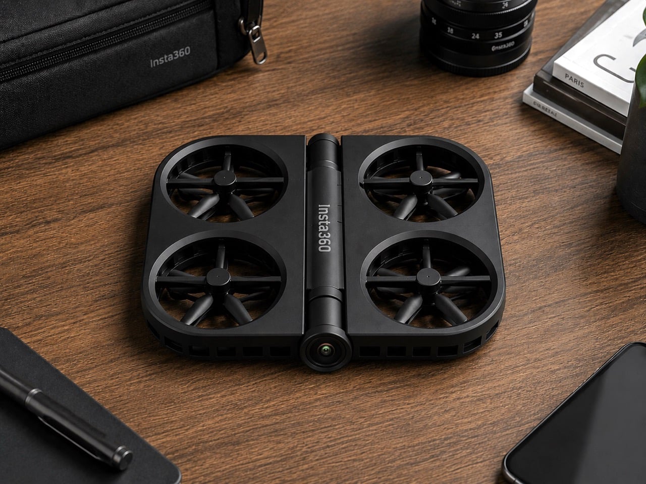
Insta360 built its reputation on cameras that see in every direction at once. It’s literally in their name. The X series made 360-degree capture accessible; the Luna Ultra brought Leica optics to a handheld gimbal. Flying something, though, is a different category of challenge, and the patent images that appeared in July 2026 show the company working through what a foldable drone looks like with Insta360 DNA. The illustrated design at the bottom shows folding arms, a ring-shaped propeller guard, and a dedicated locking mechanism, a form factor that prioritizes the moment of packing away just as much as the moment of takeoff.

DJI’s Neo 2 has the casual drone segment largely to itself in the sub-250g category, with a rigid one-piece frame and a 19-minute flight time that have made it a reliable default for creators who want aerial footage without the complexity of a serious drone setup. Insta360 entering that space would break what has effectively been a two-player market, with Zero Zero Robotics’ HoverAir as the only real alternative. The folding design alone gives Insta360 a structural argument against the Neo 2; a potential 360-degree camera, if it materializes, would give it a creative one. What a wonderful year for foldables, eh? We’re expecting a folding iPhone in September, and Insta360 might give us a folding drone too!

This isn’t just some forum rumor, either. The patent images (from patent file CN223865117U), which started making the rounds on July 16th and were highlighted by outlets like Tech Court, are pretty specific. They show a drone body with the “Insta360” logo stamped on it, with fully folding arms that tuck into the chassis and a distinctive ring-shaped guard protecting the propellers. There’s even a dedicated locking mechanism detailed, which tells you just how seriously they’re taking the whole “fold-and-go” concept. This is a design that screams it was made to be stuffed into a pocket, not carefully placed in a bespoke case.

But here’s the thing: this isn’t Insta360’s first aerial rodeo. Before they decided to put their own name on a drone, they sent in a scout team under the sub-brand Antigravity. The A1 drone they launched was, frankly, a bit of a monster: a sub-249g drone with a wild dual-lens setup that shot 8K 360-degree video and made the drone itself invisible in the footage. It was a spec-sheet beast and a clear shot across DJI’s bow, proving Insta360 had the engineering chops to compete in the sky. It was their way of testing the waters.

Now, it looks like they’re done testing. This new patent is the second, more direct shot. And here’s the kicker: for a company obsessed with 360-degree video, the patent images don’t show a fisheye lens. At all. It’s a huge question mark hanging over the whole project. Are they hiding the tech, or are they planning to launch a drone that, for the first time, doesn’t have their signature feature? If they’re aiming for a rumored sub-$200 price point, leaving the 360 camera on the cutting room floor might be the only way to get there. It’s a move that would be both shocking and, in a weird way, perfectly logical.

You also can’t forget that this is all happening while the two companies are actively suing each other in China. This isn’t friendly competition; it’s a full-blown hardware rivalry. Insta360 came for DJI’s gimbals, tested the drone market with a sub-brand, and is now preparing a direct assault on DJI’s most accessible drone. With a release window expected somewhere between late 2026 and early 2027, we’re not just watching a new product being born. We’re watching the next chapter in a tech soap opera, and it’s about to get very, very interesting.

The post Insta360’s foldable drone patent targets DJI Neo 2 at sub-250g first appeared on Yanko Design.

Stanley doesn’t make gym equipment… but this stylish kettlebell proves it should

Par : Sarang Sheth
29 juillet 2026 à 19:15

Fill a Stanley tumbler with a yogurt-based smoothie from bottom to top and you actually end up getting an arm workout. A 40oz Stanley cup can weigh close to 4lbs or upwards of 1.5 kilograms if filled to the brim with something dense like a smoothie or a thick latte. Jane Morelli just decided that if she was gonna give her arms a workout, why simultaneously rely on ugly looking kettlebells? Morelli superimposed Stanley’s design language onto kettlebells and the result looks just gorgeous.

Every gym equipment I’ve used has looked boringly functional. The kettlebells at my gym come in bright colors, but that’s just a color-code so you know the difference between a lighter and a heavier kettlebell even if the number on it wears off (it almost always does). Morelli’s design merely bridges two worlds together, and I won’t lie – the results look like the most seamless collab ever imagined. My only gripe is, I wish these kettlebells were actually tumblers too!

Designer: Emanuele Jane Morelli

Haute gym equipment might not be a category but these kettlebells definitely make a case for it. Each one is styled with chic curves, and a color palette I’d only expect from companies like Hermès or Stanley. Subtle pastel shades, punctuated by just one hot pink color for the yoga-moms who need their gym equipment to be as flashy as their gym outfits. Each kettlebell has a lacquer-like sheen on it, along with the Stanley logo emblazoned on the front, larger than the weight units below it because that’s what matters more. The style statement.

I get that I can sound a little ironic, but I’m all for brand crossovers. (The only time I really object is when Tesla does stuff like manufacturing vodka or whistles because they seem to be obsessed with side quests and not really making any cars). This one piques my fancy because Stanley isn’t just a social statement, it’s perfect for fitness-freaks too who love chugging protein shakes from their 30-40oz cups, or sharing Strava stats superimposed against their Stanley cups just to paint a picture of how much ‘aura’ they have.

Morelli’s done a pretty remarkable job of simply yet effectively distilling Stanley’s brand language onto a piece of gym equipment, without necessarily caricaturing the Stanley cup’s silhouette. The kettlebells have a separate, distinct character, and the dual-band colors on each individual kettlebell represents a palette that feels distinctly high-fashion yet accessible. Quite like the company’s big, beautiful, nearly indestructible tumblers.

The post Stanley doesn’t make gym equipment… but this stylish kettlebell proves it should first appeared on Yanko Design.

G-Shock Just Turned a Japanese Paper Lantern Into Wearable Art

Par : Ida Torres
19 juin 2026 à 19:15

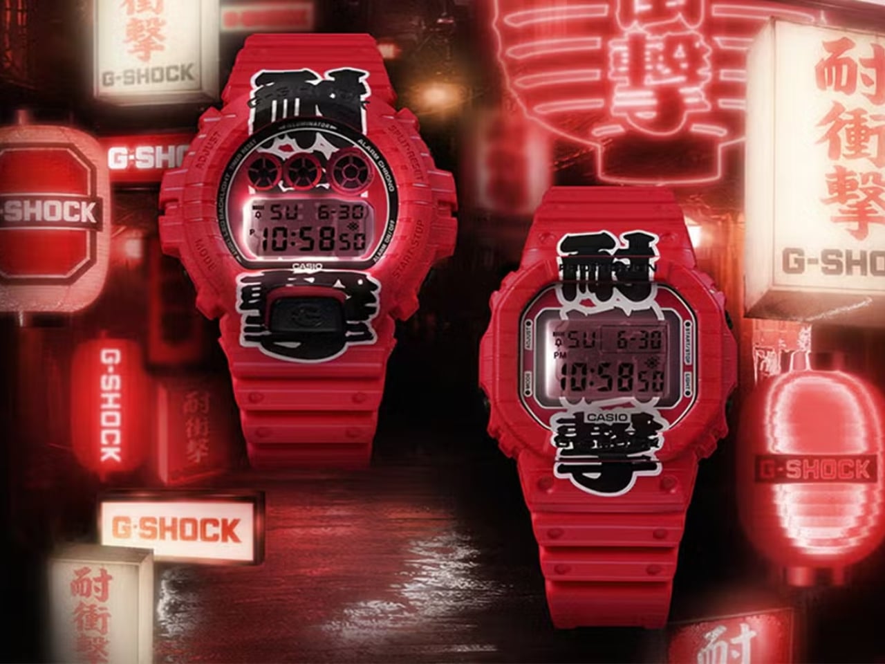
G-Shock has always known how to make a statement. From its reckless-by-design origins in 1983 to its cult status across military barracks, skate parks, and high-fashion runways, the brand has never really needed to justify itself. It just shows up. But with the new Aka-Chochin collection, built around the DW-5600AKA-4 and DW-6900AKA-4, G-Shock isn’t just showing up. It’s glowing.

The concept behind these two watches is, genuinely, one of the more thoughtful design moves I’ve seen from the brand in a while. “Aka-Chochin” translates to “red lantern,” a reference to the traditional paper lanterns that hang outside izakayas, the beloved Japanese taverns where people gather after long days for food, drinks, and the kind of conversation that only happens past 9 p.m. These lanterns, which date back to the early Edo period in the 17th century, weren’t decorative in the precious sense. They were practical and symbolic at once, signaling warmth, welcome, and the specific pleasure of slowing down. Casio took that idea and pushed it into two of its most iconic silhouettes.

Designer: G-Shock

The result is unapologetically red. Not a subtle, wine-at-dinner red. A full-on, stop-what-you’re-doing red that covers the resin case, bezel, and band from top to bottom. On paper, it sounds like a lot. In practice, it earns its confidence. Both watches carry kanji characters down the face of the dial, reading “耐衝撃,” which means “shock resistance,” one of G-Shock’s founding promises. The characters are split between the bezel and the LCD display, and when the LED backlight activates, the two halves complete each other like a puzzle piece lighting up from within. It’s a detail you have to see in person to fully appreciate, and it’s the kind of thing that elevates a colorway from a gimmick to a genuine design choice.

The bezels on both models also feature hot-stamped grooves that mimic the ribbed texture of a paper lantern, and that same motif carries through to the edges of the strap. It’s not subtle, but it is cohesive. G-Shock committed to the bit, and the commitment pays off.

Now, I’ll say this upfront: the Aka-Chochin aesthetic is polarizing. All-red anything tends to divide opinion, and a digital watch in this colorway is not trying to blend in. If your instinct is to gravitate toward muted, understated timepieces, these are probably not for you, and that’s fine. But if you’ve ever wanted a watch that reads as confident and culturally curious at the same time, the DW-5600AKA-4 and DW-6900AKA-4 make a genuinely compelling argument.

The choice of silhouettes is also worth noting. The DW-5600 is essentially G-Shock’s origin story made physical, the square case that started everything, a design so clean and deliberate it has barely needed updating in four decades. The DW-6900 is its more expressive sibling, with that distinctive triple-window dial and wider case presence. Pairing both with the same concept gives collectors and casual buyers alike an entry point, whether you’re drawn to the classic restraint of the 5600 or the bolder graphic energy of the 6900.

At $190 each, neither watch is a budget impulse buy, but it’s not a stretch, either. G-Shock has always occupied that interesting middle ground between functional tool watch and cultural artifact, and the Aka-Chochin collection lands squarely in that territory. You’re not just buying a watch that tells time reliably. You’re buying into a very specific idea about where design, heritage, and streetwear culture converge.

Red lanterns were built to be seen at night, to cut through the dark and draw people in. G-Shock’s interpretation of that idea works for the same reason. Bold doesn’t have to mean reckless. Sometimes it just means knowing exactly what you want to say and saying it clearly, wrist and all.

The post G-Shock Just Turned a Japanese Paper Lantern Into Wearable Art first appeared on Yanko Design.

Phone Cases Are Boring, This One Puts a Living Terrarium Inside

Par : JC Torres
10 mai 2026 à 17:20

Phone cases have largely settled into two camps: the ones that protect your phone without anyone noticing they exist, and the ones that make a statement with printed graphics, colors, or textures. Neither approach has found a way to make the back of a phone genuinely interesting rather than just decorated. Designer Daniel Idle found a third option that neither camp seems to have considered.

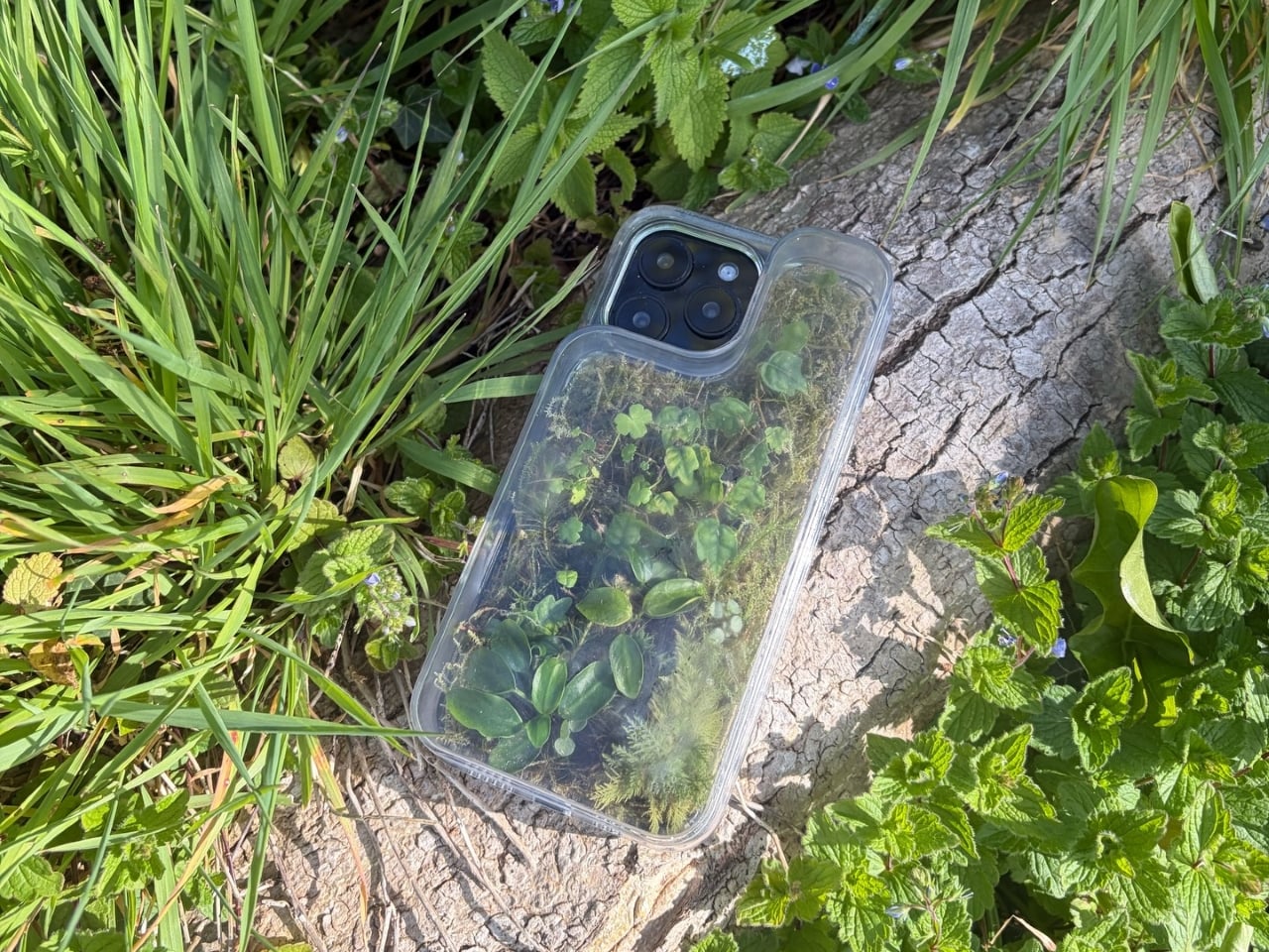
The Terrarium Phone Case is a clear resin case for the iPhone 16 Pro Max with an actual planted environment sealed inside the back cavity. Moss, small-leafed plants, and a stabilized soil substrate are embedded within the transparent shell, creating a thin cross-section of living terrain that you carry around with you wherever the phone goes. It’s a working phone case, a functional terrarium, and an oddly calming thing to have in your pocket all at once.

Designer: Daniel Idle

The construction involved 3D modeling and fabrication in clear resin, producing a case with enough depth in the back wall to house soil, roots, and plant matter. The plants are packed using a stabilized substrate that keeps the arrangement intact when the phone is picked up, rotated, tilted, or slipped into a bag. The camera cutout is fully preserved; the charging port at the bottom remains accessible; the phone continues to work exactly as it always did.

What keeps everything alive inside the sealed cavity is a closed-loop moisture system. The plants and soil generate humidity, which evaporates toward the inner surface of the resin, condenses back into droplets, and cycles down again. Light passing through the clear shell feeds the plants from outside, while the substrate provides gradual nutrient release. The whole thing is, in a fairly literal sense, a miniature ecosystem that sustains itself without any intervention from the person carrying it.

The condensation that forms on the inside of the shell during high-humidity moments is part of the visual appeal rather than a flaw to be engineered away. Seeing that vapor cycle through the case is a reminder that something in there is alive, actively breathing and responding to its environment, in the same pocket or bag as a device specifically engineered to minimize all biological interference.

There’s a running thread through design culture about bringing nature back into objects and spaces that have drifted too far from it. Biophilic design has become a recognizable term for everything from moss walls in offices to plant-filled shelving in apartments. Most of those applications treat plants as decoration layered on top of an existing design. Idle’s approach is different because the plant system isn’t decoration; it’s structural, sealed directly into the object’s body as a core component rather than an afterthought.

Of course, there will be some reservations about putting moisture and soil so close to your phone, which might be resistant to water and dust, but only from brief encounters. Good thing, then, that it’s still a concept project right now. But as a thought experiment about what a phone case could reasonably contain, it lands somewhere between genuinely novel and gently absurd, which is probably the most honest place for a good idea to start.

The post Phone Cases Are Boring, This One Puts a Living Terrarium Inside first appeared on Yanko Design.

vivo X300 FE Review: The Compact Flagship That Earns Its Keep

Par : JC Torres
2 mai 2026 à 15:20

PROS:


  • Compact, comfortable, and premium design

  • Powerful 50MP main and telephoto cameras

  • Large battery with fast wired and wireless charging

  • Long-term software support

CONS:


  • Mediocre 8MP ultra-wide camera

  • Uncommon horizontal camera design

  • A bit pricier than most "small flagships"

RATINGS:

AESTHETICS
ERGONOMICS
PERFORMANCE
SUSTAINABILITY / REPAIRABILITY
VALUE FOR MONEY

EDITOR'S QUOTE:

The vivo X300 FE proves that a compact phone doesn't have to feel like a lesser one.

Premium smartphones have been trending bigger, heavier, and more visually imposing for years. It’s reached the point where “flagship” is almost synonymous with large, and carrying one all day feels less like convenience and more like a commitment. The compact phone hasn’t disappeared, but finding one that doesn’t sacrifice performance, battery life, or camera quality in exchange for a smaller footprint has been genuinely difficult.

That’s the gap the vivo X300 FE is aiming to fill. It pairs a 6.31-inch flat display with a Snapdragon 8 Gen 5 chipset, a 6,500 mAh battery, and a ZEISS co-engineered camera system, all within a compact design that stays remarkably light for its class. On paper, it reads like a phone that shouldn’t be this compact. But does it actually work in practice? We give it a spin to find out.

Designer: vivo

Aesthetics

The X300 FE follows a flat-design language that’s become increasingly standard among more expensive flagships. There aren’t any curved glass edges or aggressively contoured surfaces, just a clean, rectangular form with ultra-narrow bezels, an aerospace-grade aluminum frame, and a front face that looks symmetrical and composed. The centered punch-hole is small and unobtrusive, and those slim borders give the display a neat, purposeful presence that doesn’t need theatrics to feel premium.

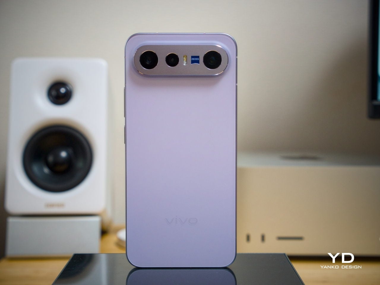
Our review unit came in white, which turns out to be a great choice for a phone this carefully considered. The matte rear panel uses vivo’s Metallic Sand AG glass treatment, giving it a soft, slightly chalky texture that resists fingerprints well and picks up ambient light in a way that shifts subtly between warm and cool tones. It doesn’t try to be eye-catching; it just looks well-made.

The flat aluminum frame wraps cleanly around the body, with edges that make it comfortable to grip without feeling sharp or slippery. The white model measures 8.10mm thick and weighs 192g, a hair more than the other colorways, but those differences don’t register in hand. What does register is the overall sense of a phone that’s been assembled with genuine attention to detail.

The camera module deserves its own mention. Rather than going for the oversized circular island that’s become visual shorthand for “serious camera phone,” vivo opted for a horizontal bar that spans the upper portion of the back. Three lenses are arranged neatly across it, with a ZEISS badge centered between them. It’s recognizable and distinctive without domineering the rest of the design. Admittedly, it’s going to be a divisive design, but it at least lets the vivo X300 FE easily stand out from the competition.

Ergonomics

At 150.83mm tall and 71.76mm wide, the X300 FE sits firmly in one-handed territory. It isn’t trying to be a miniature phone. It’s simply sized more sensibly than most flagships on the market. You can reach across the screen without adjusting your grip, slip it into a front pocket without thinking, and hold it for extended periods without the wrist fatigue bigger phones tend to bring.

The 192g weight for the white model falls in a range that feels present without being burdensome. There’s enough substance here to reinforce the premium feel of the materials, but not so much that you’re constantly aware of it. The 8.10mm profile isn’t exactly wafer-thin, though that’s a reasonable trade-off for a 6,500 mAh cell packed inside a frame this compact.

The flat-sided frame also contributes more to the ergonomic experience than it might seem. It gives your palm a stable, consistent surface to press against during typing and scrolling, which feels more controlled than on rounded-edge designs. The compact footprint, flat back, and balanced weight distribution all work together to make this a phone that feels designed around how it’s actually used.

Performance

The Snapdragon 8 Gen 5 inside doesn’t need much introduction. It’s a flagship-class mobile processor, and the X300 FE puts it to good use. The 12GB RAM, expandable with another 12GB taken from the generous 512GB storage, clearly marks it as a class above your typical mid-tier compact phone. It runs Origin OS 6, based on the current Android 16 release, embracing a more minimalist and flat aesthetic that perfectly matches the phone’s design.

Day-to-day tasks feel completely effortless, from switching between apps and browser tabs to occasional gaming sessions, and nothing about the experience suggests the compact body is in any way holding the hardware back. Thermals are pretty impressive, given the vivo X300 FE’s size, but its compact form factor might work against it when it comes to how you hold it during those long periods.

Thankfully, the display backs that up well. It’s a 6.31-inch LTPO AMOLED panel with an adaptive refresh rate of 1 to 120 Hz, a 1.5K resolution at 460 PPI, and a local peak brightness of 5,000 nits. The 2,160 Hz PWM dimming also makes prolonged reading and scrolling noticeably more comfortable on the eyes, a detail that matters far more than most spec sheets would have you believe.

Then there’s the battery, arguably the X300 FE’s most impressive engineering accomplishment. A 6,500 mAh cell in a phone this slim and light isn’t something you see every day, and in practice, that capacity means genuine all-day endurance with room to spare. The 90W wired and 40W wireless charging mean you’re rarely stuck waiting long when it runs low, at least with the appropriate chargers.

The camera system is led by a 50 MP ZEISS main camera and a 50 MP ZEISS super-telephoto camera, with an 8 MP ultra-wide rounding out the rear. The main and telephoto cameras handle portraits, street photography, and concert scenes with real confidence. An optional telephoto extender accessory also exists for those who want extended reach, though it’s firmly in niche territory.

The results are impressive, especially when starting to zoom in on subjects. Even without the telephoto extender, you can enjoy clear and detailed shots, even at night. The 8MP ultra-wide, though usable, is a bit of a letdown, but vivo had to cut some corners to bring down the price and differentiate this model from its more powerful and more expensive siblings. You do have a ton of settings to tweak to get your perfect shot, but even the defaults are good enough to make fleeting moments more memorable.

Sustainability

The X300 FE carries IP68 and IP69 dust and water resistance ratings, alongside an SGS five-star drop resistance certification, giving it a reassuring level of durability for daily use. It also carries an SGS five-star drop resistance certification, which gives it more formal durability credentials than most phones in its class. Together, those ratings make a convincing case for a phone built to survive daily life without requiring any particularly careful handling.

Software longevity is where the X300 FE makes its strongest long-term case. On that front, vivo is committing to five years of OS upgrades, seven years of security maintenance, and a five-year smooth experience promise. That support window is competitive with the best in the Android space, and it signals that this phone is meant to be genuinely used for years, not replaced the moment something newer comes along.

Value

At around €1,000, The X300 FE isn’t a budget phone, and it doesn’t try to be. It competes in the premium compact flagship space, where the particular combination it offers is harder to find than you’d expect. A current-generation chipset, a genuinely large battery, fast wired and wireless charging, ZEISS-branded imaging, and a durable premium build in a package that remains notably light for a flagship is a rare and coherent offering.

The person this phone is designed for isn’t shopping for the biggest or most spec’d-out device available. It’s someone who wants a phone that keeps pace with their life without dominating it, one that fits in a jacket pocket, lasts a full day, and still takes genuinely good photos. Frequent travelers, urban commuters, and anyone who’s tired of unwieldy flagships will feel right at home here.

Verdict

The vivo X300 FE is the kind of compact flagship that doesn’t feel like a compromise once you’re actually using it. The design is restrained and coherent, the battery is frankly impressive for the size, the chipset handles everything you throw at it, and the camera does its best work in exactly the situations most people find themselves in, out in the world rather than on a lab bench.

What the X300 FE offers is a phone that’s easy to carry, genuinely long-lasting, and capable enough for the photography and day-to-day demands you’ll actually encounter. It’s well built, well supported, and clearly designed with a specific kind of person in mind. That clarity of purpose is refreshing, and for the right buyer, it’s exactly what makes this phone worth serious consideration.

The post vivo X300 FE Review: The Compact Flagship That Earns Its Keep first appeared on Yanko Design.

5 Over-Ear Headphones That Look as Good When They’re Around Your Neck as When They’re on Your Head

2 mai 2026 à 11:40

The headphone has become something it was never originally designed to be: a silhouette. Worn around the neck on a subway platform or draped over a chair at a coffee shop, a great pair of over-ears communicates taste in much the same way a watch or a well-chosen bag does. The best ones are now designed with that resting moment in mind, not as an afterthought, but as a deliberate part of the brief.

What separates a good headphone from a great one is increasingly less about frequency response and more about how the object behaves when it’s not in use. The five pairs on this list earn their place on both counts. Worn on the head, they deliver. Worn around the neck, they still look like they were built by people who thought carefully about that exact resting moment, collarbone and all.

1. StillFrame Headphones

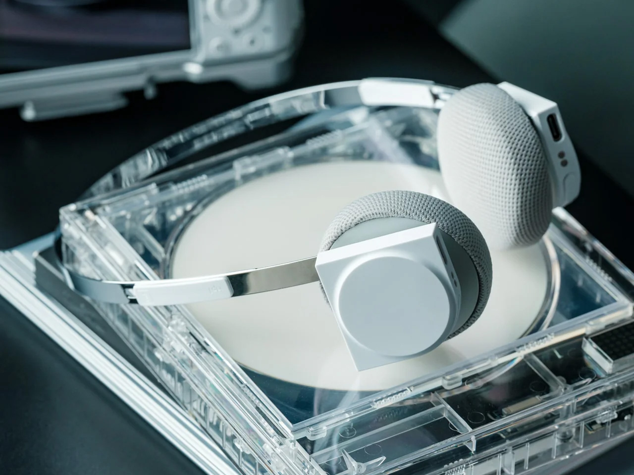
Most headphones achieve lightness by sacrificing material quality somewhere along the way. StillFrame achieves it by rethinking the entire structure from scratch. At 103 grams, it sits on your head with the kind of effortless presence most pairs spend an entire product page trying to claim. The ultra-minimal design, clean lines, no exposed hardware, and no decorative flourish anywhere on the frame is the kind of restraint that reads as confidence rather than budget constraint.

Around the neck, StillFrame does what minimal design always promises and rarely delivers: it disappears into your outfit rather than competing with it. The 24-hour battery means you’ll reach for these in the early morning and still have charge well into the evening without thinking about a cable. For anyone who wants headphones that age well, that look as right in three years as they do today, this is where the search ends.

Click Here to Buy Now: $245.00

What We Like

  • At 103 grams, this is one of the lightest over-ear headphones available without any sacrifice in build integrity, and the weightlessness is felt the moment you put them on
  • A 24-hour battery life means this pair genuinely runs from morning to night on a single charge, removing the low-battery anxiety that comes with most wireless headphones on the market

What We Dislike

  • Minimal colorway options are a direct consequence of the same design restraint that makes the StillFrame look this considered, and that trade-off is real and visible
  • With so little on the frame to grab visual attention, this pair asks you to commit fully to its design language, which rewards patience but does not suit every aesthetic

2. Meze Audio Strada

Romanian audio atelier Meze has spent two decades treating headphones as craft objects, and the Strada makes that philosophy fully explicit. Hand-carved walnut and ebony ear cups, each unique in grain and tone, sit alongside a magnetic ear pad system that snaps on and off cleanly, making them the first pair that genuinely anticipates its own aging. The leather headband drapes naturally against the collarbone. At $799, you’re investing in the idea that daily objects deserve this level of material care.

Worn around the neck, the Strada does something genuinely rare: it makes you look considered rather than plugged in. Those hand-carved wood cups catch light in a way that aluminum never quite manages, and the closed-back design delivers warmth and isolation without the clinical precision of most audiophile gear.

What We Like

  • The hand-carved wood ear cups make every unit genuinely one-of-a-kind, an unusual distinction in a product category that typically prizes consistency and uniformity above everything else
  • The magnetic ear pad system solves a real longevity problem that most headphone manufacturers still choose to ignore, making the Strada feel genuinely built for the long term from the start

What We Dislike

  • The warm, closed-back tuning leans toward intimacy over accuracy, which won’t satisfy listeners who prefer a flat, analytical sound profile for critical or reference listening sessions
  • No active noise cancellation at $799 is a deliberate aesthetic choice, but it will not suit everyone who regularly listens in open, noisy, or busy urban environments

3. Bang & Olufsen Beoplay H95

 Bang & Olufsen has been designing objects that make a room better simply by existing in it since 1925. The Beoplay H95 carries that logic to your ears. Brushed aluminum arcs support lambskin ear cushions with the quiet authority of something that was never trying to impress anyone. Custom 40mm titanium drivers deliver an expansive, unhurried soundstage, and 38 hours of battery life with ANC active means you rarely need to think about charging. At $1,250, it reads as inevitable rather than expensive.

Around the neck, the H95 makes its strongest case. The slim profile rests cleanly against the collarbone, the aluminum catches light without glare, and the lambskin ages into something better than what you started with. Vogue Scandinavia named it the headphone that pairs best with the softest cashmere roll-neck and a cocooning wool coat, which is not exactly a mid-range endorsement. The tactile control dial and hard carrying case complete the picture of a brand that hasn’t needed to shout for a century.

What We Like

  • Lambskin ear cushions and brushed aluminum give the H95 a material quality that makes every other pair on this list look like it is working a little harder to impress you
  • 38-hour ANC battery life is class-leading and genuinely difficult to match at any price point, making this the pair most likely to outlast a long-haul journey without any hesitation

What We Dislike

  • At $1,250, this is a significant investment for a product category where $400 already delivers very strong audio performance from multiple well-regarded and respected manufacturers
  • The control dial is elegant but carries a subtle learning curve that takes several days of regular use to feel completely intuitive and second-nature in the hand

4. Bowers & Wilkins Px8 S2

The Px8 S2 looks like it was designed by someone who spent too much time around luxury automobiles and not enough time worrying about what people thought. Diamond-quilted Nappa leather ear cups sit inside angular aluminum driver housings that don’t apologize for taking up space. Bowers & Wilkins built their reputation on speaker cabinets in British living rooms, and that obsession with material quality is fully present in the Px8 S2. At $799, it’s the most visually assertive pair on this entire list.

Worn on the head, the 40mm Carbon Cone drivers deliver a focused sound that rewards careful listening. Worn around the neck, the quilted leather and aluminum geometry create a silhouette that reads closer to jewelry than consumer electronics.

What We Like

  • The diamond-quilted Nappa leather ear cups are a genuinely distinctive design move that no other headphone brand at this price point is executing with this level of craft and conviction
  • 40mm Carbon Cone drivers bring the kind of focused sound detail that makes streaming audio feel like it might be holding something back, consistently rewarding attentive listeners on every session

What We Dislike

  • The angular form does not fold into a compact carry position, making the included case noticeably bulkier than most direct competitors when packed into a bag for daily commuting use
  • The firm clamping force is necessary for the acoustic seal, but it makes itself felt during extended listening sessions, which matters for anyone who wears headphones for several consecutive hours at a time

5. Sonos Ace

Sonos spent two decades being the most thoughtfully designed speaker company in the world before ever touching headphones. The Ace is what happens when a brand famous for restraint and material quality finally commits to an entirely new product category. Stainless steel arms, memory foam ear cushions, and a clean form in Midnight or White carry the same quiet authority as Sonos’s best home equipment. At $449, it sits below the B&O and B&W while fully matching them on design character and material coherence.

What makes the Ace genuinely stand out is what you don’t notice: no visible seams on the headband, no mismatched materials, no hardware that apologizes for itself. Active noise cancellation and a 30-hour battery complete a pair that wears as well around a neck as it sounds through the drivers, making it the most versatile pick on this list.

What We Like

  • The material cohesion across every surface, every finish, and every seam speaks one consistent and considered design language, which is an unusually disciplined achievement at the $449 price point
  • Active noise cancellation combined with a 30-hour battery puts the Ace ahead of most competitors on the two specifications that matter most for daily and travel listening

What We Dislike

  • The body is predominantly high-quality plastic rather than metal, which is a material trade-off that some buyers will feel at this price point relative to the B&O and B&W alternatives
  • Head-tracking spatial audio is most effective when paired with a Sonos home speaker system, limiting the feature’s full appeal for listeners who don’t already own Sonos hardware at home

The Best Headphones Are the Ones You Never Want to Take Off

What all five of these pairs share is a seriousness of intent that goes well beyond frequency response. They were built by companies that think about how objects live in the world, not just during a listening session, but on a train platform, at a desk, hanging around a neck. That’s a harder problem to solve than noise cancellation, and the brands that crack it tend to stay relevant far longer than those that don’t.

The range here runs from $449 to $1,250, but the price gaps matter less than they appear at first. What you’re really choosing between is design language: Romanian craft warmth, Scandinavian restraint, British precision, speaker-first material thinking, or clean minimalism that genuinely disappears. Any of these pairs earns the right to hang around your neck. The question is which one earns it in a way that feels made for how you actually move through the world/

The post 5 Over-Ear Headphones That Look as Good When They’re Around Your Neck as When They’re on Your Head first appeared on Yanko Design.

This iPhone Air 2 Concept Adds Two Cameras and Suddenly the Phone Makes More Sense

Par : Sarang Sheth
17 avril 2026 à 20:30

Every first-generation Apple product is essentially a beta test with a premium price tag, and the iPhone Air was no exception. The engineering was genuinely remarkable: 5.6mm thin, a large ProMotion display, A19 Pro performance, and battery life that surprised nearly everyone who reviewed it. What wasn’t remarkable were the two omissions that showed up in every single hands-on: one camera and one speaker, on a phone that cost $999. Those two complaints alone handed buyers a perfectly logical reason to spend the same money on a Pro instead. The Air needed a second generation the moment the first one shipped.

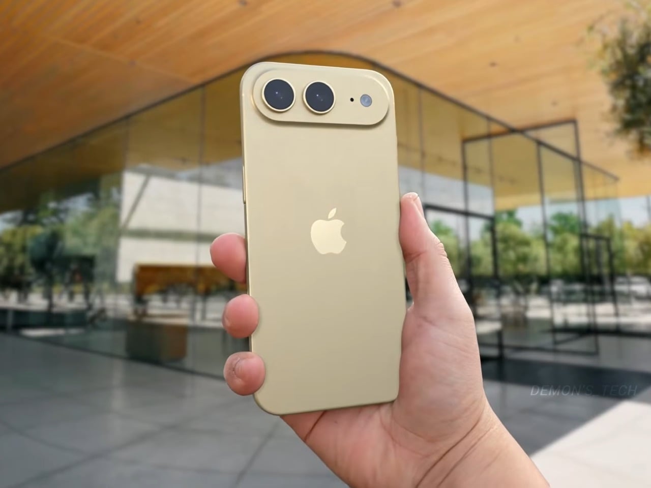
Demon’s Tech has imagined exactly what that second generation could look like, and the concept renders suggest Apple already has a clear path to making the Air the phone it should have been from the start. The dual-camera bar is wide and confident across the top of the phone, housing two lenses with room to spare. The rest of the body is pure restraint, a flat back, centered Apple logo, and a color range vivid enough to give the phone a personality that its specs can now actually back up. If the rumored stereo speaker and efficiency-focused N2 chip join that camera upgrade, the Air 2 goes from interesting to genuinely compelling.

Designer: Demon’s Tech

Two 48-megapixel sensors reportedly sit inside the pill-shaped housing, one primary and one ultrawide, which aligns with leaks from Chinese tipster Digital Chat Station suggesting Apple is going for a main-plus-ultrawide configuration rather than a telephoto. That choice makes sense for the Air’s positioning. Telephoto glass demands physical depth that a sub-6mm chassis simply cannot accommodate, and ultrawide coverage is what most non-Pro users actually miss day-to-day. The original Air’s single-lens bar always looked slightly incomplete, like a sentence that trailed off mid-thought, and Demon’s Tech addresses that by stretching the new pill-shaped housing almost the full width of the phone’s upper third, sitting flush and purposeful rather than apologetic. It is a small change on paper that transforms the entire visual logic of the back panel.

Apple shipped the original Air in four relatively restrained options: cloud white, sky blue, light gold, and matte space black. Demon’s Tech blows that palette wide open, running through violet, cobalt, mint green, and vivid red alongside the sandy gold seen in the hero shots, which is closer to what the iPhone 5C attempted in 2013, a phone that led with color as a statement rather than a courtesy. The Air’s lifestyle positioning actually supports this approach in a way the 5C’s budget framing never quite did. A phone you buy partly because it is extraordinarily thin is a phone you buy to be noticed, and being noticed in muted gold is considerably less fun than being noticed in electric blue. The renders make a quiet argument that Apple’s colorway restraint on the original Air was a missed opportunity, not a deliberate choice.

Twelve gigabytes of RAM paired with the A20 Pro keeps the performance story simple: this is a phone that matches the Pro lineup on silicon even if it concedes on optics. The sleeper upgrade is Apple’s rumored N2 efficiency chip, because getting better battery life out of a body that physically has less room for cells requires exactly this kind of architectural work, the same discipline that let the original Air post competitive endurance numbers despite its dimensions. Add stereo sound from a bottom speaker alongside the existing top one, and the two most common complaints about the first Air evaporate inside a single product cycle. That is a more focused corrective than Apple managed with either the Mini or the Plus, both of which spent multiple generations struggling to justify their existence. If Apple lands all of this at the same $999 price point, the value math finally starts working in the Air’s favor.

Apple has confirmed the Air line continues, with the second generation reportedly targeting a spring 2027 release window, landing after the iPhone 18 Pro, Pro Max, and foldable models ship in fall 2026. That later window gives Apple’s engineering teams more time to solve the thermal and battery challenges that come with building capable hardware into an impossibly thin frame, and it gives the Air its own launch moment rather than forcing it to compete for attention against a foldable iPhone. Demon’s Tech’s concept is the best visual argument yet for what that launch moment could look like: a phone that carries its thinness as a given rather than an excuse, and finally has the camera system and audio to back up everything the form factor promises.

The post This iPhone Air 2 Concept Adds Two Cameras and Suddenly the Phone Makes More Sense first appeared on Yanko Design.

Bigme HiBreak Dual Has E Ink Up Front and a Round LCD in Back

Par : JC Torres
17 avril 2026 à 08:45

Staring at a phone screen for hours isn’t kind to your eyes, and more people are finally taking that seriously. The backlit displays on most modern smartphones are tuned for vivid color and fast scrolling, but sustained use can lead to real fatigue. That growing awareness has pushed E Ink displays into smartphone territory, where their paper-like readability makes a lot of practical sense.

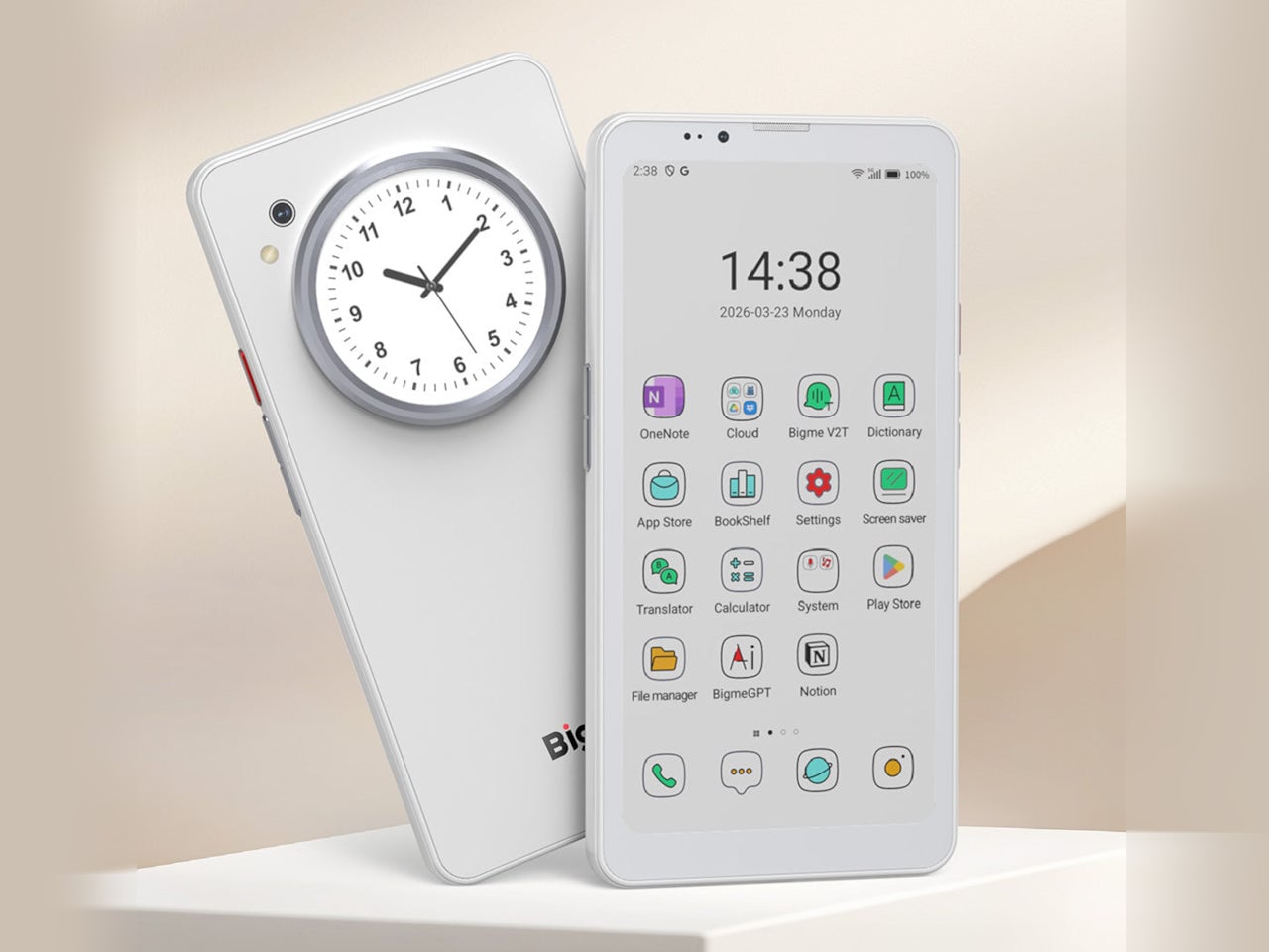
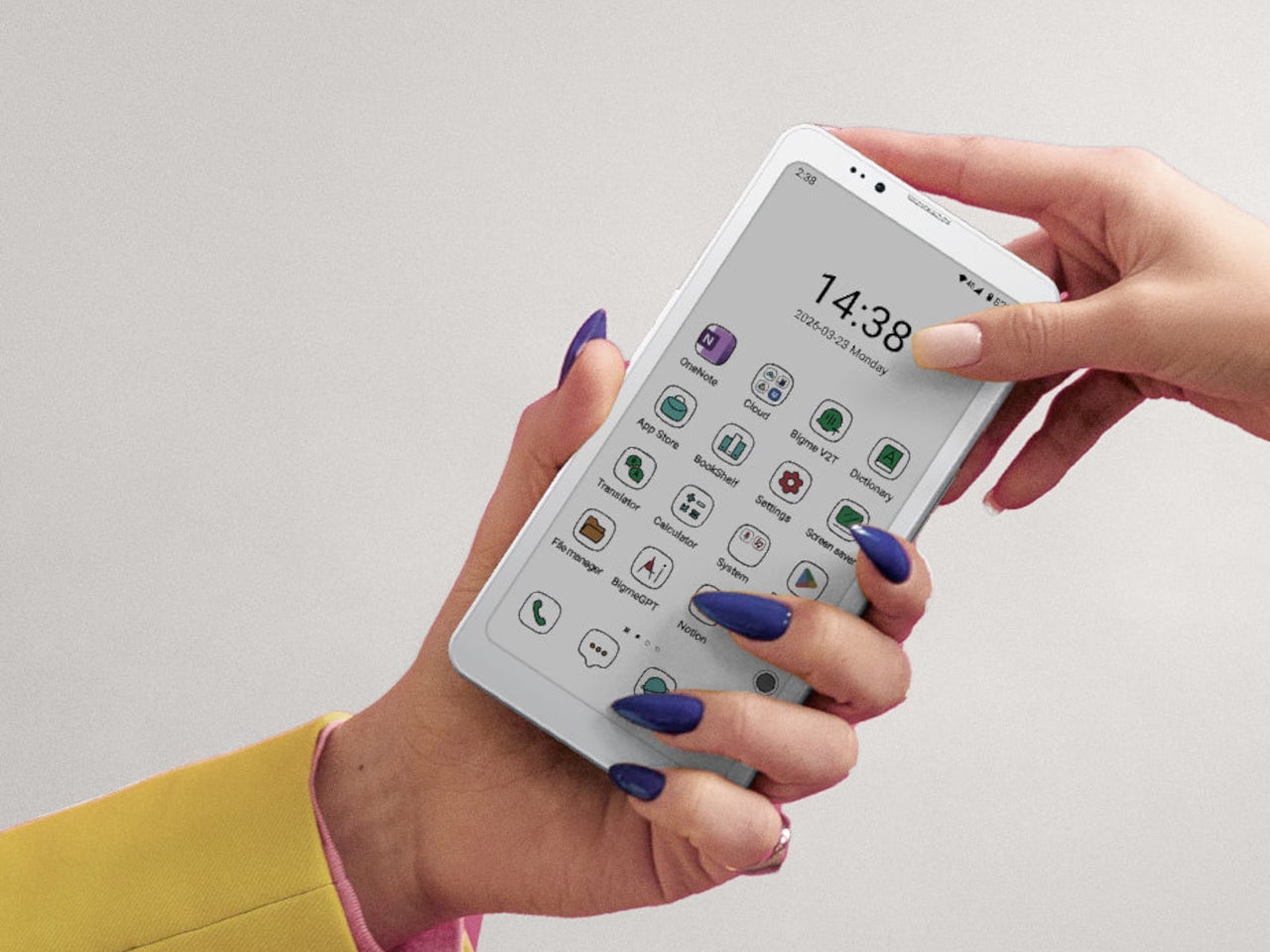
Bigme has been building its HiBreak series into a line of Android smartphones centered on E Ink displays, and the HiBreak Dual is its newest entry. Rather than simply updating the screen, Bigme gave this model two displays: a full-sized E Ink panel on the front and a compact circular LCD on the back, letting the phone handle information at two different levels of urgency.

Designer: Bigme

The main display is a 6.13-inch E Ink screen at 824 by 1,648 pixels, delivering 300 pixels per inch in greyscale mode. The color model supports up to 4,096 colors, and a frontlight with 36 brightness levels covers both dim interiors and bright outdoor settings. Because E Ink reflects ambient light rather than emitting it, reading outdoors is comfortable in a way that backlit displays simply aren’t.

What sets the HiBreak Dual apart from the rest of the lineup is its stylus support, a first for the HiBreak series. A 4,096-level pressure-sensitive pen lets you write, sketch, and annotate directly on the E Ink surface, turning the phone into something closer to a digital notebook. The paper-like texture of the display makes the experience feel more tactile and far less clinical than a standard touchscreen.

The circular LCD on the back measures 1.85 inches and pulls off a surprisingly wide range of tasks. It shows the time, notifications, music controls, and weather at a glance, and also doubles as a viewfinder for the 20MP main camera. Bigme even added an AI pet feature that generates an animated version of your actual pet from a photo, keeping it alive on that small round screen.

Despite the unconventional display setup, the HiBreak Dual doesn’t skimp on the fundamentals. Although dated, Android 14 with full GMS certification keeps the entire Google Play library accessible, and NFC support means Google Wallet and contactless payments work just as they would on any standard Android device. The 5MP front camera handles video calls and everyday selfies without issue, while a fingerprint sensor takes care of security.

Under the hood, the phone runs on a MediaTek Dimensity 1080 processor paired with either 8GB or 12GB of RAM and up to 256GB of internal storage, further expandable by an additional 2TB via microSD. A 4,500mAh battery gets through a full day without much drama, while 5G on dual SIM cards, Bluetooth 5.2, and dual-band WiFi take care of the rest.

Pricing starts at $519 for the 8GB/128GB model, with early bird options in the $359 to $409 range and a 12GB/256GB version also available. It’s a phone designed for people who spend a significant part of their day reading, writing, and staying on top of things through a mobile device, and who’d genuinely rather do it on a screen that asks a little less of their eyes.

The post Bigme HiBreak Dual Has E Ink Up Front and a Round LCD in Back first appeared on Yanko Design.

Someone Made The E-Ink Kindle Smartphone That Amazon Refused To Make

Par : Sarang Sheth
8 avril 2026 à 21:30

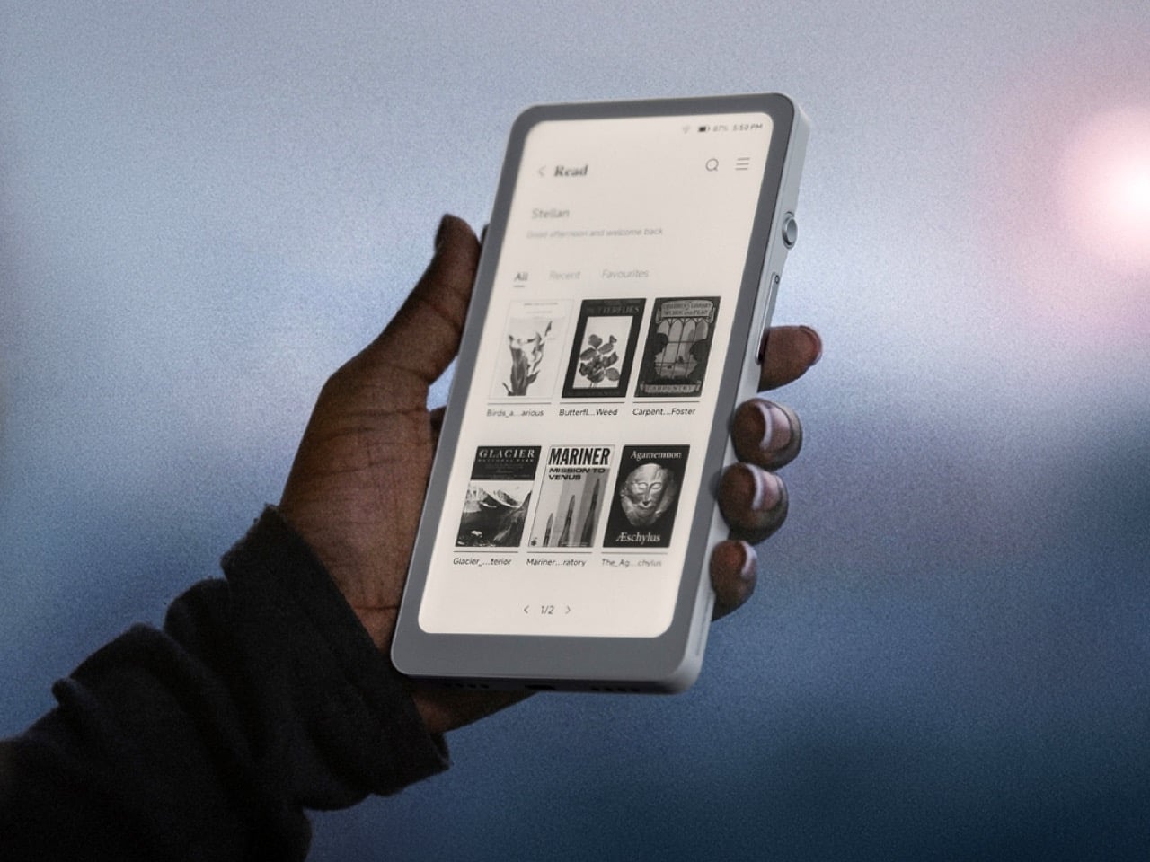
Amazon has spent nearly two decades perfecting the Kindle, turning it into the default eReader for millions of people, and in all that time they’ve steadfastly refused to shrink it down to pocket size or open it up to the broader Android ecosystem. They had every opportunity to merge the best parts of their Kindle line with the form factor of a smartphone, creating a distraction-free reading and productivity device that could actually fit in your jeans pocket and run the apps you already use. Instead, they kept the Kindle locked into its walled garden, kept it at 6 inches or larger, and left a gaping hole in the market for anyone willing to build what they wouldn’t. DuRoBo took that opportunity and ran with it, launching the Krono, a 6.13-inch E Ink tablet running full Android 15 that costs $279.99 and does exactly what Amazon has spent years pretending nobody wants.

The Krono packs an E Ink Carta 1200 display at 300 PPI (matching the sharpness of a Kindle Paperwhite), an octa-core processor, 6GB of RAM, 128GB of storage, a 3,950 mAh battery, and a unique side-mounted Smart Dial that controls screen refresh, frontlight adjustment, voice recording, and web browsing through a single rotary knob. It weighs just 173 grams, measures 154 x 80 x 9 mm, and is available in black or white from DuRoBo’s site or Amazon US. The pitch is straightforward: it’s an eReader, a voice note-taker, a podcast player, and a music device all in one, built on an open platform that lets you install whatever reading app, productivity tool, or communication software you actually want to use. It launched in August 2025 and started shipping in September, quietly carving out space in the niche that BOOX’s Palma lineup has been dominating for the past year.

Designer: DuRoBo

Six gigs of RAM in an E Ink device is borderline excessive in the best possible way, especially when most eReaders ship with 2GB or less and struggle the moment you try to run anything beyond the stock reading app. The 128GB of storage means you can load an absurd library of ebooks, PDFs, audiobooks, and whatever else without ever worrying about running out of room. Running Android 15 (not some ancient fork, but the actual current OS) gives the Krono access to the full Play Store ecosystem, which is exactly what Amazon has been allergic to for years. You want Kindle, Libby, Moon+ Reader, Pocket, Instapaper, Obsidian, and Spotify all on one device? The Krono lets you do that. A Kindle will let you read Kindle books and maybe listen to Audible if you’re lucky. That’s the entire difference.

The Smart Dial highlights DuRoBo’s industrial design philosophy most clearly – instead of burying every interaction behind capacitive touch menus (which E Ink refresh rates make tedious), they mounted a physical rotary dial on the side of the device that you can press and rotate to trigger different actions depending on context. It’s a design choice borrowed more from cameras and audio gear than from tablets, and it gives the Krono a tactile, mechanical quality that most E Ink slabs completely lack. The back of the device features what DuRoBo calls the Axis, a strip housing six small breathing lights that glow softly on a schedule to gently nudge you back toward focused reading or work. It’s a wellness-adjacent UX detail that could easily feel gimmicky, but in the context of a device explicitly marketed as a “focus hub,” it at least makes thematic sense. The whole package is clearly designed to feel intentional and calm, a deliberate counterpoint to the dopamine-optimized chaos of a smartphone.

DuRoBo is positioning the Krono hard into the distraction-free productivity and mindfulness lane, framing it as the device you reach for when you want to read long-form content, capture ideas through voice notes, or listen to podcasts without getting dragged into Instagram or TikTok. The dual-tone frontlight (warm and cool adjustment) and the paper-like texture of the Carta 1200 display are meant to make extended reading sessions comfortable in a way that backlit screens never quite manage. The built-in speaker and Bluetooth support let it double as a surprisingly capable audio player for music, audiobooks, and podcasts, which gives it utility beyond just being a reading slab. The open Android platform means you can customize it to fit whatever workflow you actually need, whether that’s Notion for notes, Pocket for saved articles, or Spotify for background music while you write. Amazon would never build this, because opening the Kindle platform would undermine their entire content ecosystem lock-in strategy.

The Krono is available now for $279.99; with a fitted TPU case is sold separately, designed to accommodate both the Smart Dial and the Axis breathing lights without blocking either. At that price point, it’s competing directly with the BOOX Palma (which runs around $280 depending on configuration) and sits well above Amazon’s Kindle Paperwhite but below their Kindle Scribe. Whether the Smart Dial, the breathing lights, and DuRoBo’s focus-first branding are enough to justify choosing it over a Palma or just installing a launcher on a Kindle will depend entirely on how much you value that design identity over raw software polish.

The post Someone Made The E-Ink Kindle Smartphone That Amazon Refused To Make first appeared on Yanko Design.

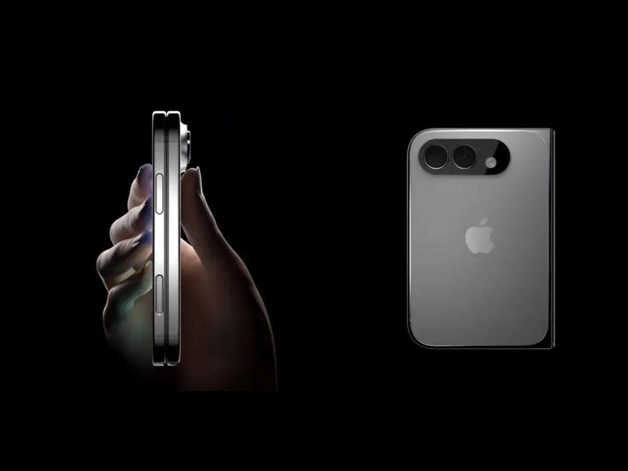
Pictures of iPhone Fold appear online, just before Apple’s supposed foldable hits engineering challenges

Par : Gaurav Sood
8 avril 2026 à 19:15


Apple’s first foldable phone, the Apple’s first foldable phone, iPhone Fold (if that’s how it will be called) is one of the most anticipated smartphones in recent memory. While Apple remains tight-lipped about anything concerning the awaited device, rumors, leaks, and concepts have flooded our memories over the years with what the iPhone Fold is and what it will be like.

2026 is suggestively the magical year when Apple is expected to launch the foldable iPhone. It has been an unperturbed timeline in almost all the reports we have seen. In the same loop – but without a timeline – a recognized Apple leaker, Majin Bu has shown “actual design of the iPhone Fold” in the latest leaked pictures.

Designer: Apple

It’s “more beautiful than the previous one,” Bu notes in his update on X, stating that he believes this is “the final design of the future iPhone Fold.” How much context there is in the claim, only time will tell, but Bu has had some correct Apple-related predictions in the past, which suggests he could have some substance to back his claim.

From the leaked pictures, one can visually notice that the camera bump on the back of the foldable device is significantly smaller than that seen in previously rumored designs. The images appear more than renders and supposedly of a prototype, showing the iPhone in a book-style foldable form factor. Appearing to open horizontally to reveal a tablet-like display on the inside.

If the 2026 timeline is to go by – it’s Apple’s golden jubilee year as well – the iPhone Fold should ship alongside the iPhone 18 Pro slated for release in fall this year. But according to a new report from Nikkei Asia, the launch could be delayed. Nikkei reports that Apple has encountered a major setback in the engineering test phase of the foldable iPhone. There have been previously report concerning the foldable display’s crease, but this time, the report notes that the Cupertino giant is facing “more complex engineering challenges than anticipated.” If the issues persist, they could, “in a worst-case scenario,” delay the iPhone Fold launch schedule by some months. It could even mean a postponement until 2027.

Earlier this year, it was rumored that Apple had entered into the manufacturing phase of its first foldable device at Foxconn. New revelations, however, suggest Apple is “notifying” its component suppliers about the possibility of a delay in the “component production schedule for the new foldable iPhone.”

Despite the reports and unauthorized leaks, one thing is definite now. Foldable iPhone – by whatever moniker it comes – is clearly on the horizon. Apple will soon have a competitor for the Samsung Fold and other foldable smartphones on the market. If it is anything like the iPhones that rocked the smartphone world in the late 2000s, the iPhone Fold could repeat that in the late 2020s.

The post Pictures of iPhone Fold appear online, just before Apple’s supposed foldable hits engineering challenges first appeared on Yanko Design.

This $215 Phone Has a 7,000mAh Battery and Lasts 20 Hours on Video

Par : JC Torres
8 avril 2026 à 08:45

Budget smartphones have always played the same game of compromises. You get 5G connectivity but lose camera quality, or you get a fast screen but sacrifice battery life. As affordable phones adopt faster network speeds, keeping up with 5G’s energy demands has become one of the biggest challenges for manufacturers trying to keep costs down without leaving users hunting for an outlet before noon.

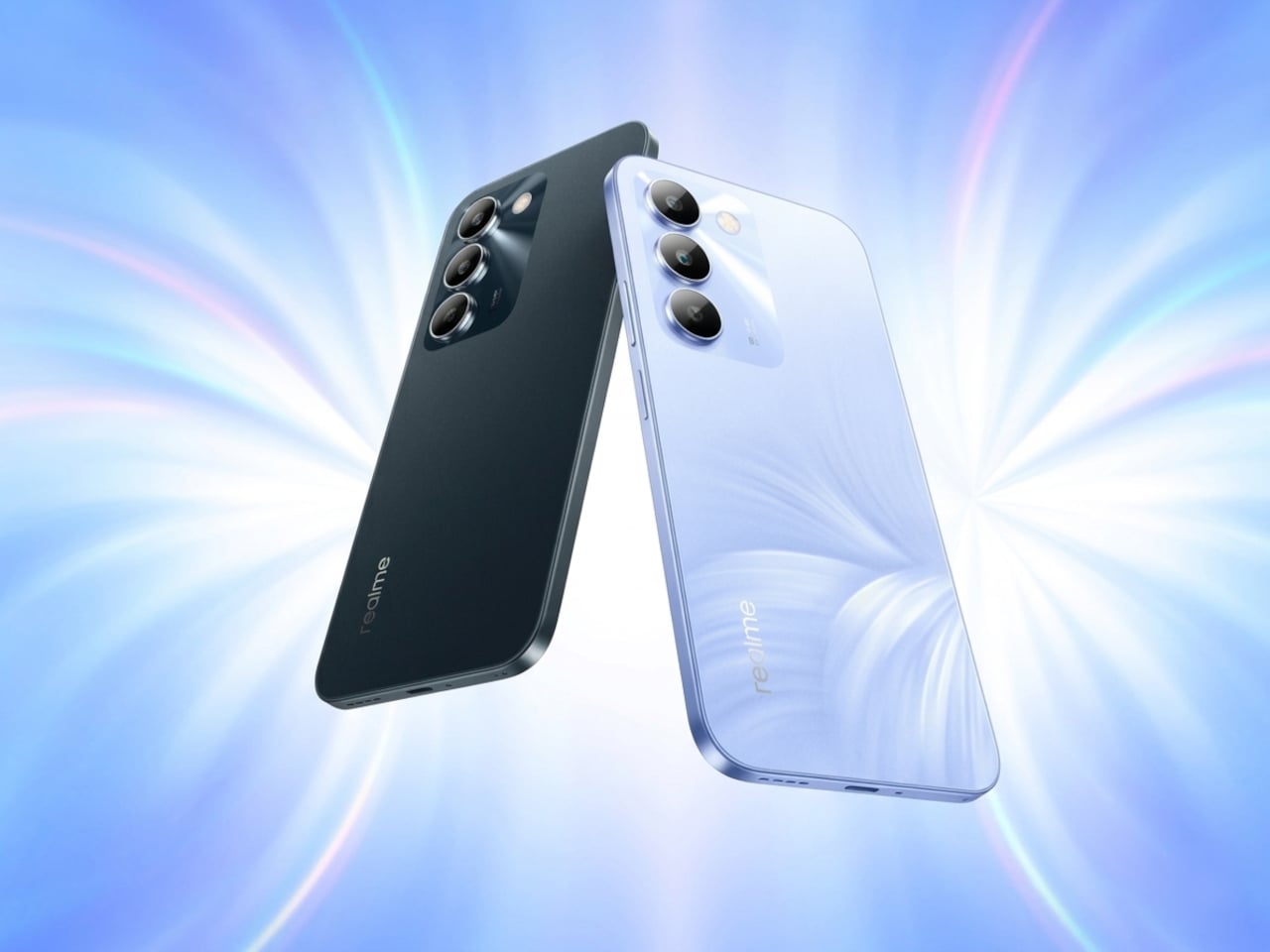
Realme’s answer to that is the C100 5G, a phone that doesn’t shy away from its budget origins but tries to get the fundamentals right. Built around the energy demands of a full-time 5G device, it leads with a 7,000mAh battery, backed by 45W SuperVOOC fast charging, a capable processor, and a 6.8-inch display that refreshes faster than most phones twice its price.

Designer: realme

Imagine the kind of day that drains most smartphones by mid-afternoon. You’re streaming music during your commute, navigating with GPS through unfamiliar streets, and then spending the evening on video calls or catching up on a show. Realme claims the C100 5G can handle nearly 20 hours of continuous video playback and over 18 hours of GPS navigation before needing a recharge.

When you do eventually need to plug in, the 45W fast charging takes care of the battery fairly quickly. There’s also 6.5W reverse wired charging built in, meaning the phone can act as a power bank for other devices when you’re away from an outlet. It also supports bypass charging, which helps reduce battery strain during extended gaming or heavy usage sessions.

Under the hood is MediaTek’s Dimensity 6300, a 6nm chip that handles 5G connectivity and everyday multitasking without much fuss. The display runs at up to 144Hz, which is genuinely rare at this price point, making scrolling and casual gaming feel noticeably smoother. It peaks at 900 nits of brightness and covers 83% of the NTSC color gamut, holding up decently outdoors.

The rear camera centers on a 50MP main sensor with an f/1.8 aperture and autofocus, capable of solid daylight photography, while the 5MP front camera handles selfies and video calls without complaint. The phone comes in two colors, Blooming Purple with a floral-patterned back and Sprouting Green, both with a matte frame and a squared-off silhouette measuring about 8.88mm thick.

Durability is also factored in, with an IP64 rating for dust and water splash resistance and a claim of 360-degree drop protection with military-grade certification. Running Realme UI 7.0 based on Android 16, the phone also supports external memory cards for additional storage. In Thailand, pricing starts at THB 6,999 (around $215) for 4GB/128GB and THB 7,499 (around $230) for 6GB/128GB.

For a budget phone, the C100 5G makes an interesting case by not competing on camera specs or premium materials, but on the one thing most users are tired of compromising on. Not everyone needs the sharpest sensor or the fastest chipset, but nearly everyone has panicked at a single-digit battery percentage at some point, and Realme clearly knows exactly who it’s building this for.

The post This $215 Phone Has a 7,000mAh Battery and Lasts 20 Hours on Video first appeared on Yanko Design.

iPhone 18 Pro Leaks Reveal a 2nm A20 Pro Chip, 35% Smaller Dynamic Island, and a Deep Red Color

Par : Sarang Sheth
6 avril 2026 à 21:30

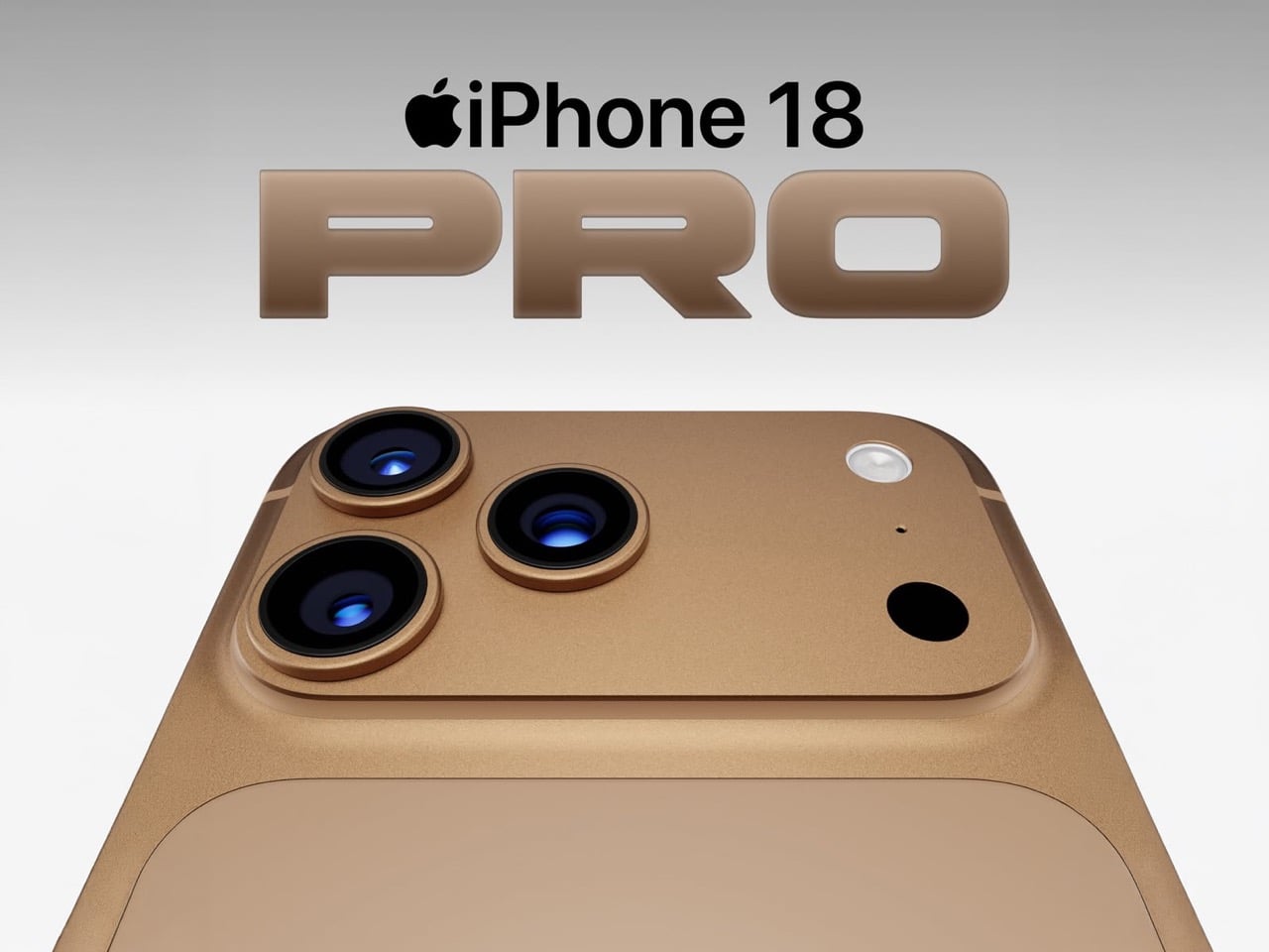
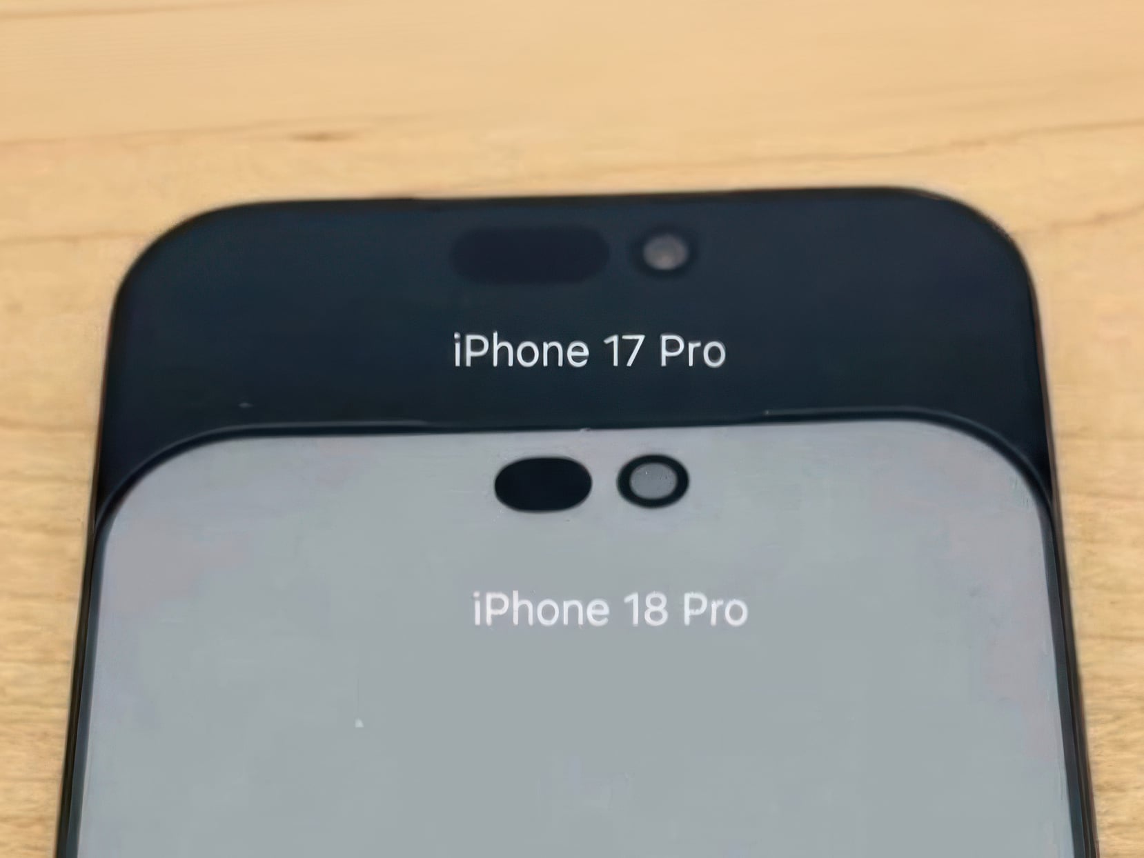
Apple has spent four years refusing to touch the Dynamic Island, treating it like some untouchable monument to software-hardware integration. Samsung cycled through three foldable generations in that time. Google rebooted the Pixel lineup twice. Nothing went from startup curiosity to legitimate competitor. And the iPhone 14 Pro’s pill-shaped cutout just sat there, exactly the same width, height, and visual footprint on the 15 Pro, 16 Pro, and 17 Pro. Leaked screen protectors sourced from Weibo now suggest Apple has finally decided four years is long enough, and the company is gearing up to shrink the Dynamic Island by roughly 35 percent on the iPhone 18 Pro. The mechanism is straightforward: move the Face ID flood illuminator under the display, leave only the infrared camera and front lens in the cutout, and suddenly that wide pill becomes a narrow sliver sitting unobtrusively at the top of the screen. The infrared flood illuminator that powers Face ID is moving under the display on the iPhone 18 Pro, leaving only the infrared camera requiring a physical cutout alongside the front-facing lens.

But the Dynamic Island shrinkage is hardly the headline here, because the iPhone 18 Pro is also the phone where Apple trades in its most iconic color for something it has never tried before on a Pro model. Bloomberg’s Mark Gurman reports that Apple is testing a deep red finish for the 18 Pro lineup, a shade closer to burgundy than the bright Product Red tones the company used on standard models years ago. Apple removed black from the Pro lineup with the iPhone 17 Pro, the first time in the series’ history that no dark option existed, and the 18 Pro appears set to continue that direction rather than course-correct. September 2026 is the expected launch window, which makes this arguably the most important incremental iPhone in years. It is widely believed to be the last model in this design language before Apple delivers a radical overhaul for the 20th anniversary iPhone in 2027, so whatever ships this fall is likely your final chance to buy an iPhone that looks like an iPhone has looked since 2017.

Designer: Volodymyr Lenard

Leaker Ice Universe claimed the Dynamic Island cutout on the iPhone 18 Pro models will be approximately 35% narrower than it is on the iPhone 17 Pro models, with a width of around 13.5mm down from around 20.7mm. That figure refers to the default on-screen Dynamic Island width including surrounding black pixels, not the physical hardware cutout itself, but the visual difference should be immediately apparent in daily use. The iPhone 17 Pro’s Island is a wide, commanding presence even at rest. The 18 Pro’s leaked cutout reads almost delicate by comparison, a narrow pill sitting unobtrusively at the top of the screen. Apple will still need to revisit four years of Live Activities design and the entire interaction vocabulary built around the existing Island’s dimensions, which is a reasonable explanation for why this transition is taking as long as it is. Android manufacturers have shipped under-display cameras for years, with visible quality tradeoffs that Apple’s user base simply would not accept on a thousand-dollar phone. Holding the line until the technology meets the standard, rather than shipping it to win a spec sheet argument, is the kind of call that frustrates people in the short term and builds loyalty over time.

Under the hood, the A20 Pro chip built on TSMC’s advanced 2nm process promises roughly 15% faster performance and up to 30% better power efficiency compared to the current 3nm A19 Pro. Paired with 12 GB of RAM across the lineup, the new silicon should power smoother Apple Intelligence features, enhanced on-device AI processing, and better multitasking. Connectivity upgrades include Apple’s first in-house C2 5G modem, replacing reliance on Qualcomm components. The modem supports improved mmWave performance and expanded satellite connectivity, potentially enabling always-connected cellular service via NR-NTN standards for emergency messaging and basic data in remote areas without traditional coverage. Battery life stands out as a major highlight, especially for the iPhone 18 Pro Max. Leakers report a capacity jump to 5,100 to 5,200 mAh, the largest ever in an iPhone, enabled by a slightly thicker chassis measuring around 8.8mm up from 8.75mm on the iPhone 17 Pro Max. The added thickness and weight would accommodate the bigger cell while the more efficient 2nm chip helps stretch usage even further. Some projections suggest up to 40 hours of mixed use on a single charge.

The deep red finish represents a significant departure for a Pro lineup that has historically favored controlled, conservative colors like graphite, silver, gold, and muted titanium shades. Rumors of purple and brown finishes have also circulated, but Gurman believes those are just variants of the same red idea. The decision to skip black for a second consecutive year has already generated polarized reactions among enthusiasts, with some welcoming the bold direction and others mourning the loss of the classic understated aesthetic. For buyers who want black, Gurman specifically noted that the foldable iPhone is being designed with conservative space gray and silver finishes, suggesting Apple is deliberately separating its color identity across product lines. The iPhone 18 Pro may read as a modest update on paper, but as the final iteration of a design language that has defined the modern iPhone for nearly a decade, it carries more symbolic weight than any spec sheet can communicate.

The post iPhone 18 Pro Leaks Reveal a 2nm A20 Pro Chip, 35% Smaller Dynamic Island, and a Deep Red Color first appeared on Yanko Design.

This $299 Android Phone Says Glowing Screens Are Already Obsolete

Par : JC Torres
1 avril 2026 à 08:45

For most people, the smartphone screen is where focus goes to die. Even when you pick one up with a purpose, the bright OLED glare, the notifications, and the endless scroll have a way of pulling you elsewhere. Screen fatigue is real, blue light is a genuine concern, and the push for digital wellness has grown loud enough that even tech companies have started quietly acknowledging it.

The Bigme HiBreak Plus takes a different approach to the smartphone entirely. Built around a 6.13-inch E Ink Kaleido 3 color display, it runs on Android 14 with full Google Play support and connects via dual 4G SIM, making it a genuinely functional phone. But unlike everything else in your pocket, it defaults to a mode that’s easier on the eyes and harder to mindlessly abuse.

Designer: Bigme

E Ink displays on smartphones have always had one obvious weakness: the refresh rate. Previous devices refreshed so slowly that casual scrolling felt like a real chore. The HiBreak Plus addresses that with a remarkably high 52 FPS refresh rate for an E Ink display, making it responsive enough for reading, annotating, and light browsing without the ghost-image flicker that dogged earlier E Ink phones.

The display’s advantages don’t stop at being easy to look at. E Ink panels are naturally readable under direct sunlight without any brightness cranked up, which means you can check maps, take notes outdoors, or read in the afternoon light without squinting. There’s no backlight shining toward your face either, just a soft, paper-like surface that reflects the ambient light around it.

A front light with 36 brightness levels handles the dimmer end of things. It reads the surrounding environment and automatically calibrates brightness and color temperature, going from a cool, crisp tone for morning work to a warm amber glow at night. There’s no digging through menus or manually adjusting sliders; the phone handles it quietly in the background, adapting to wherever you happen to be.

Handwriting support, via an optional stylus, adds another layer to what the phone can do. Writing directly on the E Ink surface feels closer to putting pen to paper than tapping on glass. It makes the HiBreak Plus a natural fit for jotting down thoughts during a commute, capturing ideas in a meeting, or working through a long reading session with annotations in the margins.

The rest of the specs are functional rather than flashy: an octa-core processor, 4GB of RAM, 64GB of storage, GPS, a fingerprint sensor in the power button, and a 4500 mAh battery that should comfortably outlast most conventional smartphones thanks to the energy-efficient E Ink display. The whole package weighs just 193g, light enough to slip into a shirt pocket without a second thought.

Of course, there are some downsides as well, ones that go beyond the screen refresh rate and color vibrancy. Although not exactly outdated, 4G LTE caps data speed significantly, and the rather modest RAM and storage capacity don’t do it any favors either. That said, at a $299 price point ($249 on pre-order), you are getting a pocket-sized color e-reader that can also make calls and connect to the Internet, without the usual distracting trappings of a smartphone.

The post This $299 Android Phone Says Glowing Screens Are Already Obsolete first appeared on Yanko Design.

Apple Turns 50, and Its Most Ambitious Phone Hasn’t Even Launched Yet — 5 iPhone Fold Concepts

1 avril 2026 à 01:45

On April 1st, 2026, Apple turns 50. For a company that has spent half a century rewriting the rules of consumer technology, the milestone deserves something genuinely transformative. The Macintosh redefined personal computing. The iPod gave an entire generation a new relationship with music. The original iPhone, unveiled in 2007, combined a phone, a music player, and the internet into a single glass rectangle and made every competitor look outdated overnight. The iPhone Fold is real, and it’s coming.

Leaks from early 2026 paint a detailed picture: a book-style foldable powered by the A20 Pro chip on a 2nm process, backed by a 5,500mAh battery, with a 7.8-inch creaseless OLED inner display and a 5.5-inch outer screen. Pricing is expected to start around $2,400, and while a September announcement seems likely, most analysts believe shipments may not begin until December. Designers, modders, and concept artists have spent years filling the void with their own visions of a folding iPhone, each carrying a distinct theory about what Apple should prioritize. These five concepts map the full range of that imagination and capture exactly how much is riding on the real thing.

1. iPhone iFold by Michal Dufka — The Clamshell That Makes Sense

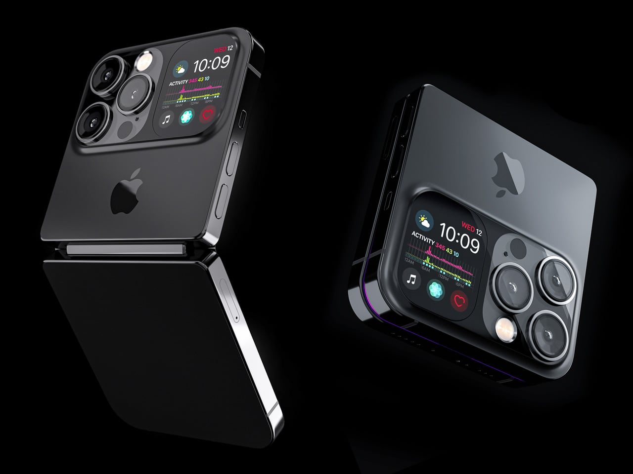
Designer Michal Dufka’s iPhone iFold is built on restraint. Rather than reinventing the iPhone’s entire identity, it applies a clamshell fold to the form factor people already love, drawing direct inspiration from the MotoRAZR and Samsung Galaxy Z Flip. The phone closes into a compact, pocketable square and opens into a full iPhone experience with a generously large display. For anyone who has quietly missed a phone that actually fits in a jeans pocket, this concept speaks to that feeling.

What sets the iFold apart is the secondary display placed beside the camera bump. When the phone is closed, that smaller screen surfaces notifications, time, and essential stats without requiring you to open the device at all. It functions almost like an Apple Watch built into the back of the phone. With Apple’s always-on display technology mature enough for this kind of ambient use, the dual-display setup feels less like speculation and more like a logical next step.

What We Like

  • The secondary display mirrors Apple Watch notification behavior, making glanceable information genuinely useful without ever opening the phone
  • The clamshell format makes the iPhone pocket-friendly for the first time in years without sacrificing screen size when it matters

What We Dislike

  • The clamshell form limits overall screen real estate compared to the expanded tablet surface that a book-style foldable provides
  • Hinge durability over sustained daily use is entirely unexplored here, and it remains the most critical engineering question for any clamshell design

2. iPhone Fold Ultra by 4RMD — When the Specs Match the Ambition

Design studio 4RMD’s iPhone Fold Ultra is grounded in credibility. Built directly from reported leaks rather than pure creative license, the concept presents a book-style foldable with dual 48MP rear cameras, a 24MP ultra-wide front camera, and the A20 Pro chip running on a 2nm process. Three color options appear across the renders: White, Black, and Deep Purple. At an estimated $2,299, this concept sits at the very top of Apple’s lineup with total conviction.

That Deep Purple colorway deserves its own moment. It is a deliberate callback to the iPhone 14 Pro’s most celebrated finish, and it lands differently on a book-style foldable. Something about that color on a device this ambitious reads as genuinely luxurious, the kind of finish that reframes a $2,299 price tag from a shock into a statement. 4RMD clearly understands Apple’s visual grammar, and this concept shows what happens when research and aesthetics share the same design space.

What We Like

  • Specs pulled from verified leaks give this concept real credibility, making it feel like a preview of what is actually coming rather than pure speculation
  • The Deep Purple colorway is a smart, crowd-pleasing callback to one of Apple’s most recognized and beloved finishes

What We Dislike

  • The “Ultra” label sets an expectation that demands exceptional build quality, and no concept can fully address whether the real device will deliver on that promise
  • Crease visibility across the inner display remains unaddressed, which continues to be the most persistent criticism of every book-style foldable on the market

3. iPhone Fold by Svyatoslav Alexandrov — The One That Replaces Two Devices

Svyatoslav Alexandrov’s iPhone Fold concept, created for the YouTube channel ConceptsiPhone, thinks in bigger terms than anything else on this list. Starting as a standard smartphone with a 6.3-inch outer display, it unfolds into a squarish 8-inch tablet that sits clearly in iPad Mini territory. This is not a phone with a bonus screen bolted on. It is a device designed to make carrying both an iPhone and an iPad feel genuinely redundant.

Alexandrov replaces Face ID with a full-display Touch ID fingerprint sensor, keeping the front notch minimal and clean. The rear carries the iPhone 12 Pro’s complete camera array: wide, ultra-wide, telephoto lenses, a LiDAR scanner, and flash. MagSafe compatibility and 5G readiness are already confirmed in the concept, adding meaningful weight to its productivity pitch. Whether the device supports the Apple Pencil is left open, but given an 8-inch inner display, its absence would feel like a missed opportunity.

What We Like

  • The full-display Touch ID is a clean and creative solution that keeps the front uncluttered while solving Face ID’s known complications on foldable form factors
  • The iPad Mini-sized inner screen makes a practical, real-world case for consolidating two devices into one without any meaningful compromise

What We Dislike

  • Removing Face ID eliminates one of the iPhone’s most seamless and trusted authentication features, which most users rely on dozens of times every day
  • Leaving Apple Pencil support unconfirmed weakens what should naturally be this concept’s strongest argument for productivity

4. iPhone Fold by Mechanical Pixel — The Foldable That Doesn’t Actually Fold

Mechanical Pixel’s concept takes the most unconventional approach on this list, and the reasoning is worth understanding. Rather than bending the iPhone itself, the design keeps the main body completely rigid and attaches a separate foldable display to the rear panel instead. The core phone experience remains exactly as people know it, maintaining the familiar dimensions and feel that iPhone users already rely on. That additional screen only enters the picture when a larger surface is specifically needed.

That rear foldable panel sits raised on a platform above the phone’s back, unfolding outward into a larger, squarish tablet surface when required. The layered profile is clearly visible from the side, giving the device a deliberately experimental and modular quality. The camera module remains in its standard position, completely unaffected by the additional display layer. The logic is unconventional, but the core argument of preserving the primary iPhone experience from any foldable compromise is genuinely hard to dismiss.

What We Like

  • Keeping the main body rigid entirely sidesteps the crease and long-term hinge durability problems that define every conventional foldable on the market today
  • The modular approach means the everyday iPhone experience is never degraded or compromised by the mechanics of the foldable element

What We Dislike

  • The raised rear platform creates an unrefined, layered side profile that sits well outside anything Apple’s design language has ever produced or endorsed
  • The prototype-like aesthetic makes it very difficult to imagine this direction surviving Apple’s notoriously demanding and detail-oriented product design process

5. iPhone V — The One Someone Actually Built

Every concept on this list exists as a digital render. The iPhone V is different. A YouTuber modder physically dismantled an iPhone X, extracted its internal components, and rebuilt the entire device inside a Motorola Razr chassis. The result is a working, folding iPhone that runs real iOS, carries a Retina-quality display, and folds in half like a classic flip phone. As a proof of concept, it is extraordinary. As a finished product, every question comes flooding in.

What makes the iPhone V genuinely compelling is not fit, finish, or polish, because it has none in any conventional sense. It is the straightforward fact that someone cared enough to prove the idea could actually work using parts that already exist. The folding mechanism and device thickness still need serious refinement. A working clamshell iPhone running authentic iOS is, in the end, a more persuasive argument for this form factor than any polished render has managed to be.

What We Like

  • The iPhone V is the only entry on this list that is fully functional, running real iOS inside an actual working clamshell device
  • Its physical existence proves the clamshell iPhone concept is viable using genuine Apple hardware, well beyond anything a render can demonstrate

What We Dislike

  • The repurposed Motorola Razr chassis produces a build that falls far short of consumer-grade fit, finish, and structural refinement
  • Hinge mechanism quality and overall device thickness remain significant engineering challenges that the mod cannot resolve, and they are exactly what Apple needs to solve

The Concepts That Made the Wait Worthwhile

Fifty years in, Apple is still the company that makes you wait. The iPhone Fold concepts here are not just exercises in creative imagination — they are a record of what designers and makers have been asking for, year after year. Some nailed the form factor. Others got the specs exactly right. A few did both. Together, they have shaped the entire conversation around a device that already feels utterly inevitable.

When the real iPhone Fold arrives, it will be measured against each of these visions. That is the power of concept design — it sets the bar before the product ships. Apple turning 50 while holding back its most ambitious device is pure theater. The design community has been writing this script for years. The only question is whether the real thing can live up to what the imagination has already built.

The post Apple Turns 50, and Its Most Ambitious Phone Hasn’t Even Launched Yet — 5 iPhone Fold Concepts first appeared on Yanko Design.

Leaked iPhone 18 Pro Screen Protector Shows A 35% Smaller Dynamic Island

Par : Sarang Sheth
1 avril 2026 à 00:30

Four years is a long time in smartphone design, long enough for entire product categories to rise, peak, and fade. Samsung has cycled through multiple foldable generations. Google has rebooted its Pixel lineup twice. Nothing has gone from startup curiosity to legitimate contender. Apple, meanwhile, has kept the Dynamic Island exactly where it was when it debuted with the iPhone 14 Pro, same width, same height, same visual footprint. Leaked screen protectors for the iPhone 18 Pro, sourced from Weibo, suggest that Apple has finally decided four years is long enough.

According to the leak, the infrared flood illuminator that powers Face ID is moving under the display on the iPhone 18 Pro, leaving only the infrared camera requiring a physical cutout alongside the front-facing lens. The result is a Dynamic Island roughly 35% smaller than what ships on the iPhone 17 Pro today. Apple is also expected to pair this with its first 2nm chip, the A20 Pro, along with a variable aperture system on the main camera. The 20th anniversary iPhone in 2027 is widely expected to go further with a fully clean display, but the 18 Pro represents the clearest signal yet that Apple is working its way there on a deliberate schedule.

Image Credits: Weibo

The size reduction is more significant than the percentage suggests when you look at the two side by side. The iPhone 17 Pro’s Island is a wide, commanding presence even at rest. The 18 Pro’s leaked cutout reads almost delicate by comparison, a narrow pill sitting unobtrusively at the top of the screen. Apple will still need to revisit four years of Live Activities design and the entire interaction vocabulary built around the existing Island’s dimensions, which is a reasonable explanation for why this transition is taking as long as it is.

Android manufacturers have shipped under-display cameras for years, with visible quality tradeoffs that Apple’s user base simply would not accept on a thousand-dollar phone. Holding the line until the technology meets the standard, rather than shipping it to win a spec sheet argument, is the kind of call that frustrates people in the short term and builds loyalty over time. The iPhone 18 Pro may read as a modest update on paper. That smaller pill tells a different story.

The post Leaked iPhone 18 Pro Screen Protector Shows A 35% Smaller Dynamic Island first appeared on Yanko Design.

Samsung’s Galaxy A Phones Now Get IP68 and 6-Year Updates From $449

Par : JC Torres
26 mars 2026 à 08:45

Mid-range smartphones have been getting very good, very quickly. Most now check the boxes for performance, camera quality, and even design, but the compromises tend to show up later. Software support runs out too soon, water resistance gets downgraded to save costs, or the storage fills up faster than expected. It’s a category where the spec sheet looks promising right up until the parts that actually matter start falling short.

Samsung’s Galaxy A57 5G and Galaxy A37 5G tackle those exact issues. Rather than simply refreshing the hardware, these two phones address the pain points that tend to sour long-term ownership, from shorter software cycles to inadequate protection from the elements. Samsung describes both as the most capable Galaxy A devices yet, and for once, that kind of claim holds up when you look at what’s actually new.

Designer: Samsung

The Galaxy A57 5G leads with a noticeably slimmer build, now at just 6.9mm and 179 grams. A 13% larger vapor chamber helps keep the new Exynos 1680 processor running cool through long gaming sessions or extended recordings. The display also gets slimmer bezels and a bright Super AMOLED+ panel with Vision Booster, so the screen stays readable whether you’re inside at your desk or standing in direct sunlight.

Storage is where the A57 5G makes history for the Galaxy A line. It’s the first A-series phone to offer a 512 GB option, a welcome change for anyone managing a large photo library or shooting high-resolution video regularly. The triple-camera setup, led by a 50 MP main sensor with a 12 MP ultrawide and a 5 MP macro, handles everything from wide-angle landscapes to fine close-up detail.

The Galaxy A37 5G takes a different route to earn its upgrade. Its primary camera now uses a larger 50 MP sensor with support for 10-bit HDR video recording, improving low-light performance and color depth over its predecessor. More significantly, the durability rating jumped from IP67 to IP68, and it now ships with Gorilla Glass Victus+ on both the front and back, which is a notable step up at this price.

Both phones run One UI 8.5 with a broader set of Awesome Intelligence (get it? “AI”?) features. The camera uses AI-based subject and scene recognition to balance skin tones and create cleaner background separation automatically. Circle to Search has also been updated with multi-object recognition, so you can search an outfit, its accessories, and the surrounding backdrop all at once, rather than hunting for each element separately or toggling between searches.

What gives both phones long-term value is Samsung’s commitment to six generations of Android OS updates and six years of security support. Add to that 5,000 mAh batteries and IP68-rated protection across both models, and these are phones clearly meant to outlast the typical mid-range upgrade cycle. The Galaxy A57 5G starts at $549.99 and the Galaxy A37 5G at $449.99 in the US, with availability beginning April 9, 2026.

The post Samsung’s Galaxy A Phones Now Get IP68 and 6-Year Updates From $449 first appeared on Yanko Design.

Leaked Honor 600 Pro looks a lot like the iPhone 17 Pro, but with a much bigger battery

Par : Sarang Sheth
25 mars 2026 à 20:30

I have to hand it to Honor, they are consistent. When I wrote about the Magic8 Pro Air and its striking similarity to the iPhone Air, I thought we had seen the peak of their “inspiration.” It turns out that was just the warm-up act. The main event has arrived in the form of the Honor 600 and 600 Pro, and this time they have perfectly mimicked the iPhone 17 Pro. The new renders, courtesy of WinFuture, show a design that lifts every key element from Apple’s latest flagship. The full-width camera bar, the arrangement of the lenses, the flat metal frame, and even the color options are all present and accounted for. It’s a remarkable feat of reverse-engineering that feels both impressive and completely shameless.

What makes this strategy so fascinating is that Honor isn’t just making a cheaper clone. They are using the familiar, market-tested design as a vessel for a totally different philosophy. The Honor 600 is expected to ship with a 200MP camera and a 9,000mAh battery, specs that are practically alien to Apple’s ecosystem. It’s a phone designed to look like an iPhone from a distance but to function like an endurance-focused Android powerhouse up close. Honor is essentially telling the world that you can have Apple’s style without having to accept Apple’s compromises, and that’s a powerful message.

Designer: HONOR

The horizontal camera bar is not just vaguely similar, it’s dimensionally faithful. Both models feature the same raised rectangular module spanning nearly the full width of the device, with lenses, flash, and sensor cutouts arranged in a configuration that directly mirrors Apple’s layout. The standard Honor 600 goes with a dual rear camera setup, with its LED flash and laser autofocus tucked into a separate pill-shaped island below. The Pro model steps it up with a triple-lens arrangement, going all-in on the vertical stack. Even the colorways follow Apple’s playbook closely, with glossy black, metallic gold, and a bright orange finish that lands somewhere between homage and photocopy. Honor’s team clearly studied the iPhone 17 Pro with the intensity of an art student sketching a masterpiece in a museum.

The hardware rumors add even more intrigue to the picture. A 9,000mAh silicon battery in a flagship-tier device is almost unheard of in 2026, delivering the kind of multi-day endurance that the iPhone 17 Pro can only dream about. Both phones also get a 6.57-inch 120Hz OLED display at 1.5K resolution, wireless charging, a 3D ultrasonic in-display fingerprint sensor, and a Snapdragon 8 series chipset. There’s even a dedicated camera button on the side, which is, yes, another very Apple-like touch. Honor is effectively saying: if you love how the iPhone looks but wish it prioritized endurance and camera specs over thinness, we built that phone for you. Whether that resonates with buyers remains to be seen, but the logic behind it is hard to argue with.

The post Leaked Honor 600 Pro looks a lot like the iPhone 17 Pro, but with a much bigger battery first appeared on Yanko Design.

❌
❌