Vue normale

Il y a de nouveaux articles disponibles, cliquez pour rafraîchir la page.
À partir d’avant-hierYanko Design

This USB-C Dongle Just Let You Control an iPhone From Windows

Par : JC Torres
28 juin 2026 à 01:45

Remote work has fundamentally changed how often people need access to devices they aren’t sitting in front of. The tools built for this, however, haven’t kept up. Software-based remote access drops the moment a device sleeps or the screen locks, traditional KVMs demand a tangle of HDMI, USB, power, and Ethernet cables, and phones and tablets have been left out of the picture entirely.

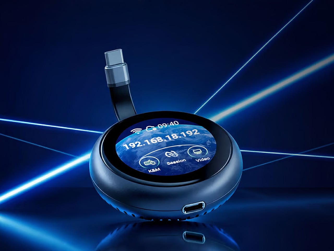
GL.iNet, the Hong Kong-based networking company behind a range of popular OpenWrt routers, has built the Comet Q to tackle all three of those problems at once. Officially designated the GL-RMQ1, it’s described as the world’s first browser-based, pocket-sized remote-control device built specifically for USB-C devices, covering laptops, phones, tablets, and Mac minis. You plug it in, open a browser, and you’re in.

Designer: GL.iNet

Click Here to Buy Now: $89 $129.9 (31% off). Hurry, only 866/2500 left! Raised over $1 million.

What sets the Comet Q apart is that it operates at the hardware level, not through software installed on the target device. That distinction matters more than it sounds. Traditional remote desktop software relies on the operating system and an active network connection, failing the moment a device sleeps, locks, or loses Wi-Fi. The Comet Q keeps working through all of that, as long as the device stays powered on and hasn’t entered a hibernation state that cuts off its HDMI/USB output.

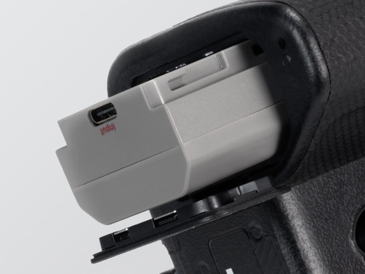
That control comes through a single USB-C cable that simultaneously carries video, data, and power, doing away with the HDMI dongle and USB hub that traditional KVMs require. Video output reaches up to 2K at 60 fps with two-way audio, and a built-in USB-C passthrough port means the device being controlled stays charged throughout the session. It’s a genuinely pocket-sized setup that actually earns that description.

Where the Comet Q breaks new ground is with mobile devices. No KVM was ever built for them, and if something went wrong remotely, there was no clean solution short of being physically present. It connects directly through the USB-C port, working with iPhones from the iPhone 15 onward (excluding the iPhone 16e and later budget models), iPads, and a wide range of Android phones and tablets, provided the port supports DisplayPort Alt Mode.

All of that also means the OS combination no longer matters. Users can control an iPhone from a Windows PC, a MacBook from an Android tablet, or an iPad from a Linux machine. Developers can manage test devices without being at their desks, IT teams can monitor a fleet of phones from one interface, and content creators can run a dedicated recording device from anywhere in the same room.

There’s a surprisingly personal side to this. If you’ve ever tried walking a parent through a tech problem over the phone, knowing you could take over their screen remotely would have saved everyone a lot of stress. The Comet Q makes that possible, and since Wi-Fi credentials can be preset before shipping the device, the person receiving it doesn’t need to set it up.

Accessing the Comet Q doesn’t require any downloads. From a laptop or desktop, any browser pointed to glkvm.com is enough to take full control, with no account creation needed. When controlling from a phone or tablet, the GLKVM app, available on Windows, macOS, App Store, and Google Play, handles touch gestures more precisely. A 1.8-inch circular touchscreen on the device also makes initial setup possible without opening a laptop.

Security runs through every layer of the design. Each session ends the moment the Comet Q is physically disconnected, leaving no residual access or background processes behind. Built-in support for Tailscale, ZeroTier, and WireGuard VPN keeps remote connections encrypted and firewall-friendly, while two-factor authentication adds yet another layer on top. Remote access that works through hardware rather than software has been a long time coming for phones and tablets.

Click Here to Buy Now: $89 $129.9 (31% off). Hurry, only 866/2500 left! Raised over $1 million.

The post This USB-C Dongle Just Let You Control an iPhone From Windows first appeared on Yanko Design.

The Soviet Union Built UFO-Shaped Circuses. Now You Can Fold One.

Par : Ida Torres
27 juin 2026 à 22:30

The Soviet Union had a complicated relationship with spectacle. Everything about Soviet ideology pointed toward collective purpose, practical function, and the rejection of excess. And then they went and built circus arenas shaped like flying saucers, out of raw concrete, in capital cities across Central Asia and Eastern Europe. If that is not a contradiction worth paying attention to, I do not know what is.

Cirk, a new book from David Navarro and Martyna Sobecka of Zupagrafika, makes that contradiction its entire subject. The Poznań-based design duo have spent over a decade documenting the brutalist and modernist architecture of the former Eastern Bloc, and Cirk is their latest, most playful entry in that ongoing project. The book surveys the permanent circus arenas built across the former USSR from the 1960s through the 1980s, buildings that, as Zupagrafika puts it, combined “socialist modernism, experimental engineering, and choreographed spectacle.” It is an architectural typology most people have never thought about, and yet once you see these buildings, you cannot stop looking.

Designers: David Navarro and Martyna Sobecka

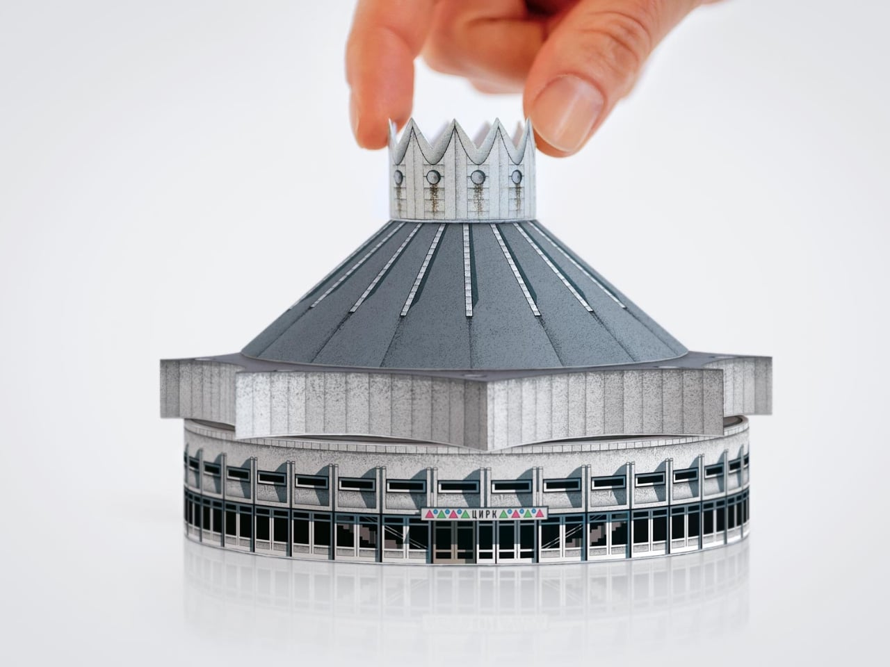
But the part of Cirk that has people talking is not the photography, gorgeous as it is. It is the second half of the book: five press-out paper models of actual circus buildings, designed for readers to punch out and assemble with nothing but glue. The five models represent the Kyrgyz State Circus in Bishkek, the Chișinău State Circus in Moldova, the Dnipro State Circus in Ukraine, the Great Moscow State Circus, and the Tashkent State Circus in Uzbekistan. Five buildings. Five cities. Five strikingly different pieces of architecture, each one reduced to a miniature you can hold in your hands.

I have a genuine soft spot for paper models, and I think their reputation as a “children’s activity” has always undersold what they actually are. A well-designed paper model is an act of translation. Someone has to study a real building, understand its geometry from every angle, figure out how to collapse it into a flat sheet, and do it in a way that holds together when you fold it back up. That is not trivial when the buildings in question are full of curves, cantilevers, and circular geometry. The circus arenas in Cirk are not simple boxes. Many have sweeping domed roofs and wide cylindrical bases, and the kind of sculptural confidence that makes them look like props from a science fiction film. Getting that geometry to behave on paper requires real design skill, and Zupagrafika clearly has it.

The studio has been producing paper model kits alongside their books for years, so this is familiar territory. But tucking five models into the back of a hardcover book feels like a deliberate choice, not an afterthought. The models are not a gimmick. They are an argument. You can look at photographs of the Great Moscow State Circus for a long time, and it will remain something abstract and distant. When you press out those perforated shapes and fold them into a miniature version of that building, something shifts. The scale changes. The building becomes tactile and personal. You start to understand its proportions in a way that a photograph simply cannot deliver.

There is also something quietly political about the whole exercise. These arenas were built as monuments to Soviet power, intended to be overwhelming and permanent. Reducing one to a paper model is almost cheeky. It takes these grand gestures of ideological architecture and makes them domestic, approachable, collectible. The Soviet state is long gone. Someone is now folding the Great Moscow State Circus on their kitchen table. History has a strange sense of humor.

Cirk is a hardcover running 88 pages, sized generously at 30 by 24 centimeters, giving the models room to breathe on the page. The first half carries photography and historical essays, with a foreword from writer Jelena Prokopljević. It is a complete package: context, visual archive, and the hands-on satisfaction of making something. For anyone drawn to architecture, Cold War history, or just the very specific pleasure of a perforated page coming apart cleanly, Cirk is a book that earns its shelf space. The flying-saucer buildings are absolutely worth it.

The post The Soviet Union Built UFO-Shaped Circuses. Now You Can Fold One. first appeared on Yanko Design.

Wacom MovinkPad Pro 14 Review: The $900 Sketchbook Designers Needed

Par : JC Torres
27 juin 2026 à 15:22

PROS:


  • Minimalist design streamlined for focused work on the go

  • Paper-like experience when drawing or writing

  • Comes with Wacom Pro Pen 3 in the box

  • Large, bright, color-accurate OLED screen with anti-reflective surface


CONS:


  • Quite a significant investment

  • Uncertain software update roadmap

  • Instant Pen Display Mode is currently offered as a beta feature

RATINGS:

AESTHETICS
ERGONOMICS
PERFORMANCE
SUSTAINABILITY / REPAIRABILITY
VALUE FOR MONEY

EDITOR'S QUOTE:

The Wacom MovinkPad Pro 14 isn't another Android tablet. It's a sketchbook that happens to run one.
award-icon

For decades, Wacom has held an almost unchallenged grip on the drawing tablet and pen display market. Its products are so trusted that studios and design firms often keep them running for years, sometimes long after they’ve been discontinued. Lately, though, its rivals have been gaining a lot of attention, pushing increasingly attractive prices and expanding into new product categories.

That doesn’t mean Wacom has been idling. The company is finally wading into standalone Android tablet territory with the MovinkPad 11 and the more premium MovinkPad Pro 14, a proper portable drawing machine aimed squarely at working creatives. We’ve been spending time with the larger of the two, along with the new Wacom Art Pen 2, and the question is whether it’s worth every dollar of its price tag.

Designer: Wacom

Aesthetics

Right out of the box, the MovinkPad Pro 14 doesn’t dazzle the way other tablets in its price range tend to. There are no flashy colors, no ultra-thin borders, no polished surfaces. The bezels are noticeably wide, the default wallpaper is a solid, flat light gray, and the whole thing carries a stubbornly plain look that feels almost out of step with the competition.

It’s all very much by design. Wacom’s intent is to mimic the look and feel of a physical sketchbook, the kind artists, designers, and architects carry everywhere. The device comes in one color, light gray, which echoes the tone of most sketchbook paper. Its rectangular form, wide borders included, also closely mirrors the footprint of an A4 pad, binding and all.

The sides of the device carry that same restraint. One long edge holds the power button, volume rocker, and microSD slot, while the opposite edge features connectors for the optional cover accessory. The short edges house the speakers, and the bottom is reserved for branding, regulatory inscriptions, and four rubber feet. There’s nothing extraneous, nothing decorative, and nothing that distracts from the task you’re there to do.

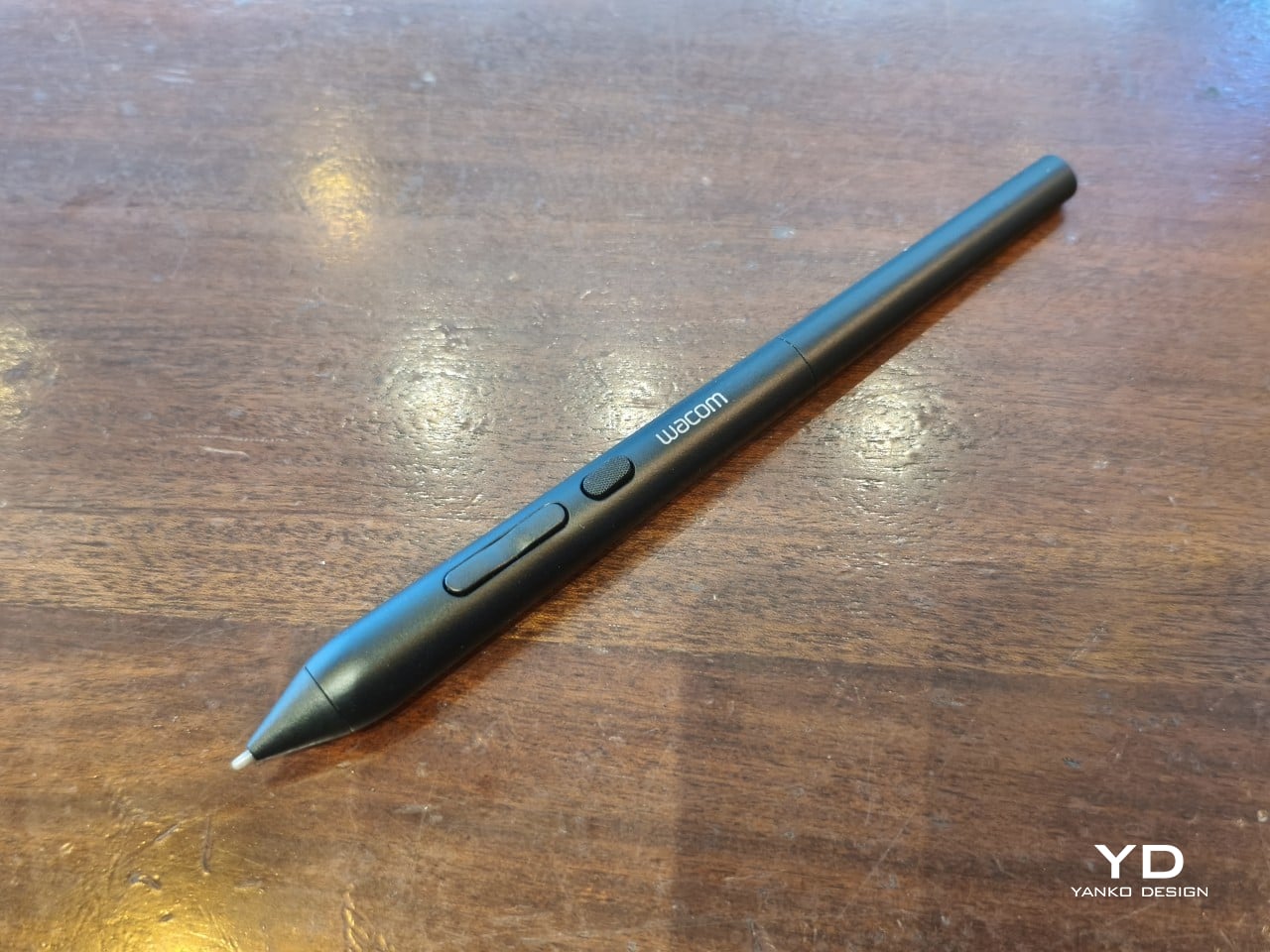
The included Pro Pen 3 follows the same philosophy. It’s all black, slim, and cylindrical, with a body so uniform it almost looks like a high-end mechanical pencil. The three side buttons are barely raised, sitting nearly flush against the barrel for a cleaner look. Unscrewing the rear half reveals three replacement nibs tucked inside: a Carbon Shaft nib, a Felt nib, and a POM nib.

Wacom’s vision for the MovinkPad Pro 14 is to replicate the feeling of picking up a sketchbook, flipping to a fresh page, and getting straight to work. That intent comes through clearly because the tablet removes just about every visual, physical, and digital distraction it can. It doesn’t try to be the slickest-looking device in the room. It tries to be the one you reach for first.

Ergonomics

At 14 inches, the MovinkPad Pro 14 isn’t something you’d hold up one-handed for long, but at just 699 grams and 5.9mm thin, it slips easily into any bag. Resting it on your arm or lap doesn’t feel like a chore either. For creatives who move between locations throughout the day, that combination of size and lightness goes a long way toward making it a genuinely portable tool.

The four rubber feet on the underside keep the tablet from sliding around on a desk and slightly raise the back off the surface, which helps with airflow. There’s no built-in kickstand or angled stand, so if you prefer working at a tilt, you’ll need to source one separately, either from Wacom’s own accessory line or from a third-party option. It’s a small gap in an otherwise thoughtful package.

Those wide bezels, which might seem like a design quirk at first, actually earn their place here. They give you a comfortable inactive area to rest your palm or fingers when gripping the tablet from the sides, so your touch input doesn’t accidentally interfere with whatever you’re drawing. It’s the kind of practical thinking that tends to reveal itself only once you’re deep into a long session.

That said, the MovinkPad Pro 14’s footprint means it isn’t something you’d pull from a bag and start sketching on at a moment’s notice. For that kind of spontaneous work, the smaller MovinkPad 11 is probably the better fit. The Pro 14 is better suited to longer, more involved sessions away from the desk, as long as you’ve found a comfortable spot to settle in.

The Pro Pen 3 is well-balanced and comfortable enough in the hand, though your experience will vary depending on what you’re used to. Its slim, pencil-like build can lead to some cramping over long sessions for those accustomed to thicker tools. Official grips are available but aren’t cheap. The nearly-flushed buttons are also too easy to press accidentally. The Art Pen 2, which we’re also reviewing, offers a wider barrel as an alternative but is sold separately.

Performance

Under the hood, the MovinkPad Pro 14 runs on a Qualcomm Snapdragon 8s Gen 3 with 12GB of RAM and 256GB of storage, expandable via microSD up to 2TB. The processor isn’t the newest available, but it handles everything thrown at it with ease. Multitasking is smooth, app switching is fluid, and there’s no sense that the hardware is struggling to keep pace with anything.

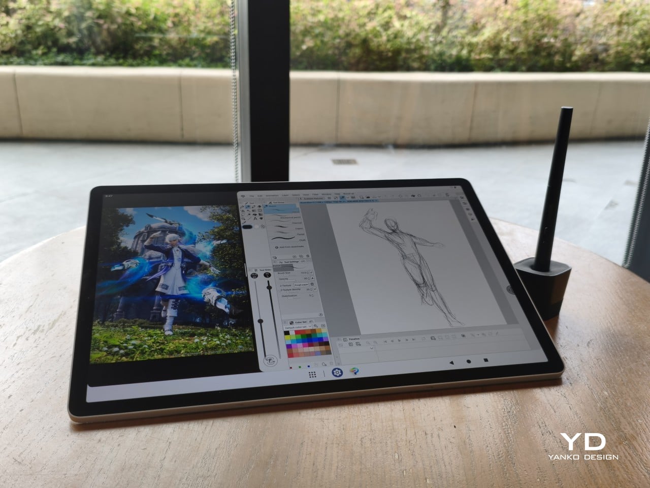
The 14-inch OLED display runs at a 2880×1800 resolution with a 120Hz refresh rate, treated with anti-fingerprint, anti-reflective, and anti-glare textured glass. The wide rectangular aspect ratio works in favor of drawing apps that line their UI panels along the sides, something squarish iPad screens can’t accommodate as cleanly. The textured coating adds a satisfying scratchiness to each stroke, and pen accuracy is, naturally, exactly what you’d expect from Wacom.

There are no cameras on the MovinkPad Pro 14, front or back. That’s a deliberate choice. There’s no temptation to flip over to social media, no accidental video calls, nothing that pulls focus away from what you’re there to do. Passively watching a tutorial in a corner of the screen is about as off-task as it gets, which, honestly, isn’t a bad thing for anyone prone to distraction. Split-screen functionality makes it easy to have a reference off to the side while you work.

The software side is equally stripped down. Android 15 comes installed with zero bloatware and just three Wacom-made apps: Shelf for your gallery, Tips for settings, and Canvas, a quick sketching surface that wakes directly from sleep with a tap of the pen. It’s intentionally bare-bones for capturing fleeting ideas, though a few more brush options would genuinely be welcome. From Canvas, you can instantly send your sketch to an Android app, though it seems to be limited to Clip Studio Paint, iBisPaint, and Autodesk Sketchbook. Hoping it will offer some flexibility in the future.

Speaking of apps, desktop-grade drawing applications like Clip Studio Paint and Krita run without issue. The broader Android ecosystem opens up a decent range of options, though it’s worth remembering that anything exclusive to Windows or Mac won’t be available here. Customizing the pen buttons is also off the table, a limitation of the Android platform rather than any fault of the hardware itself.

The Instant Pen Display Mode is arguably the most intriguing feature here. It converts the tablet into a secondary display for a Windows or Mac computer, via USB or Wi-Fi, turning it into a portable, makeshift Cintiq. It’s part of Wacom Lab, an experimental creator community that lets users explore and provide feedback on new creative possibilities through beta features. As of this writing, the setup process involves quite a number of steps, and pen button support is currently limited to toggling a small side panel for common modifier keys. It definitely shows promise, so hopefully development will be quick.

Battery life is genuinely impressive. The 10,000mAh cell can sustain nearly five days on standby and supports 65W fast charging, though you’ll need to bring your own charger since none is included in the box. The USB-C port is only 2.0, so it doesn’t charge as quickly as the spec might suggest, but an hour or more of active drawing barely makes a dent in the battery.

Sustainability

Wacom doesn’t use recycled or notably sustainable materials in the MovinkPad Pro 14 itself, but the company does meet several other environmental benchmarks worth noting. Its packaging is compact, minimal, entirely plastic-free, and fully recyclable, while the device is built with the kind of durability Wacom products are known for, the sort that keeps them in active use long after most gadgets would have been binned.

That longevity argument holds well for Wacom’s drawing tablets and pen displays, which tend to outlast their useful lives many times over. A standalone Android tablet is a different matter, though. Apps like Clip Studio Paint have already dropped Android 12 support, making regular OS updates critical. Wacom has committed to keeping the MovinkPad Pro 14 current, but no clear update schedule or roadmap has been shared publicly yet.

Value

At $899.95, the MovinkPad Pro 14 isn’t an impulse buy, but it’s a reasonably grounded one. An equivalent iPad would require buying the Apple Pencil separately, while a comparable Samsung Galaxy Tab tends to run noticeably higher. For a tablet built specifically around the drawing experience, with Wacom’s pen technology at its core, the price lands in a range that’s genuinely difficult to argue against.

The large screen and capable hardware make it a compelling option for creatives who frequently work away from their desks. It doesn’t sacrifice quality for the sake of portability. With the right app installed, it functions as a capable mobile workstation wherever you happen to be. And when a PC or Mac app becomes unavoidable, Instant Pen Display Mode is there to bridge the gap.

There are caveats, of course. The beta status of Instant Pen Display Mode means it’s not quite ready to be a daily driver feature. You’ll also need to feel at home with Android’s drawing ecosystem for this workflow to really make sense. And the uncertainty around long-term Android updates is a concern that Wacom will need to address more concretely before most buyers can put it fully to rest.

Verdict

The MovinkPad Pro 14 isn’t Wacom’s first stab at a standalone portable device. Veterans will remember the Windows-based Cintiq Companions and the MobileStudio Pros. But this is by far the most portable and clearly focused version of that idea. It doesn’t try to cram Windows into a pen display. It’s a purpose-built mobile experience that happens to carry a Cintiq-like trick discreetly tucked away.

At the same time, it doesn’t operate like an Android tablet with a Wacom digitizer tacked on, which is essentially what Samsung’s Wacom-enabled slates are. Wacom has built something around a specific, coherent idea: a true digital sketchbook. Some software edges still need ironing out, but for artists and designers craving genuine creative freedom outside the studio, the MovinkPad Pro 14 offers something few tablets in its class can match.

The post Wacom MovinkPad Pro 14 Review: The $900 Sketchbook Designers Needed first appeared on Yanko Design.

Wacom Art Pen 2 Review: A Stylus That Finally Moves Like a Real Brush

Par : JC Torres
27 juin 2026 à 15:20

PROS:


  • Ergonomic design with raised and angled buttons

  • 360-degree barrel rotation sensitivity

  • Iconic Wacom flared grip design

  • Accessible price point for a pro tool

CONS:


  • Limited compatibility with Wacom drawing tablets

  • No option for custom weight swapping


RATINGS:

AESTHETICS
ERGONOMICS
PERFORMANCE
SUSTAINABILITY / REPAIRABILITY
VALUE FOR MONEY

EDITOR'S QUOTE:

The Wacom Art Pen 2 proves that sometimes one feature is all it takes to make a tool feel irreplaceable.

Digital drawing has matured to a point where the pen you use often defines the kind of work you’re capable of. Most tablets ship with a capable stylus included, and pressure sensitivity has become nearly standard. Where real differences emerge is in the finer details: tilt support, button placement, barrel thickness, and the nuanced control that separates a general sketching tool from something more professional.

Wacom knows this territory well, having refined its pen technology across decades of products. The Art Pen 2 is its latest attempt to push that nuance even further, reviving a feature from its predecessor that dedicated artists genuinely missed: 360-degree barrel rotation. It’s an accessory designed not for everyone, but for those who want their digital brushes to behave as closely as possible to the real thing.

Designer: Wacom

Aesthetics

The Art Pen 2 carries Wacom’s iconic flared grip design, widening toward the tip and tapering toward the back. It gives the pen more visual character than a plain cylinder, while the two raised side buttons, set at a slight angle, add a bit of intentional texture to an otherwise clean barrel. The shape looks distinctly professional without being flashy, which suits the kind of serious work it’s built for.

Unscrew the back half, and a small nib compartment is tucked inside, keeping replacement tips within arm’s reach during a session. It’s a detail borrowed from the Pro Pen 3 and one that makes swapping nibs far less disruptive mid-drawing. The pen comes in an all-black finish, which keeps things clean and consistent, and makes the angled buttons stand out just enough to locate them quickly by sight.

Ergonomics

The pen is well-balanced and feels substantial in the hand without being heavy. The wider barrel suits anyone who finds slimmer pens like the Pro Pen 3 a bit uncomfortable during long sessions, though that’s always a personal call. The three raised, angled buttons make accidental presses nearly impossible and are effortless to identify by feel, which matters when your eyes are glued to the canvas.

The flared shape does come with a trade-off. It won’t sit easily in most pen loop accessories or grip covers, and there’s no way to slim it down if the barrel feels too wide. That’s the opposite situation from the Pro Pen 3, where an aftermarket grip can always bulk things up. The Art Pen 2’s shape is fixed, and you work with it or find something else.

Performance

Pressure sensitivity sits at 8,192 levels with full tilt support, putting it on par with the best pens at any price. Accuracy and response are exactly what you’d expect from Wacom, meaning there’s nothing to second-guess. What sets the Art Pen 2 apart, though, is the 360-degree barrel rotation, which picks up precisely how much and in which direction the pen shaft is turned.

For tools like calligraphy brushes or natural-media simulations, barrel rotation is genuinely transformative. It’s worth noting, though, that it’s also a fairly niche feature and not many drawing apps currently support it. Casual users probably won’t miss it at all. Where it resonates most is as an upgrade path for those who owned and relied on the original Art Pen before it was discontinued.

Compatibility is currently limited to a specific set of devices: the Wacom MovinkPad Pro 14, select Cintiq models (DTK168, DTK246, DTH246), and three Intuos Pro variants (PTK470, PTK670, and PTK870). Wacom has said that support for additional Pro Pen 3-enabled devices will be added over time, but for now, buyers should double-check their tablet is on the list before committing.

Sustainability

Like most professional accessories, the Art Pen 2 is plastic and metal, with nothing notably sustainable about the materials themselves. There’s no recycled content or eco-conscious material choice to speak of. Packaging tells a different story, though. It’s minimal, plastic-free, and fully recyclable, which aligns with what Wacom has been doing across its more recent product releases. A small step, but a consistent one.

What does count in the pen’s favor is Wacom’s track record for longevity. The original Art Pen was in production and active support for close to 16 years, an almost unheard-of lifespan for a digital accessory. If the Art Pen 2 follows a similar path, the investment stretches well beyond what most accessories can promise, and that kind of durability is its own quiet form of sustainability.

Value

The barrel rotation feature does limit the Art Pen 2’s broader appeal. Plenty of artists won’t need it, and for those users, there’s still a reasonable case for sticking with the more standard Pro Pen 3. If rotation has never factored into your workflow, the Art Pen 2’s most distinctive selling point simply won’t move the needle for you, and that’s worth being honest about.

That said, there’s a hidden value worth considering. At $99.95, the Art Pen 2 is $30 cheaper than the Pro Pen 3, with nearly identical core performance and barrel rotation on top. For those who prefer a thicker grip, it also sidesteps the added cost of official grip accessories. As a package, it makes considerably more financial sense than it first appears.

Verdict

The Wacom Art Pen 2 is a well-considered accessory for a specific type of creative. It doesn’t try to replace the Pro Pen 3, and it’s clearly not aimed at casual sketchers. What it offers is a combination of pro-level pressure sensitivity, a comfortable and distinctive grip, and a rotation feature that no competing pen at this price comes close to matching.

The limited compatibility list is a real constraint, and Wacom should address it sooner rather than later. But for those drawing on a supported device, particularly the MovinkPad Pro 14, the Art Pen 2 is a genuinely valuable add-on that earns its asking price without much argument. Especially at $99.95, it delivers a kind of brush-like expressiveness through barrel rotation that no standard pen, regardless of price, can replicate.

The post Wacom Art Pen 2 Review: A Stylus That Finally Moves Like a Real Brush first appeared on Yanko Design.

This Ceramic Vase Is Actually a Phone Speaker That Needs No Power

Par : JC Torres
12 mai 2026 à 16:20

The home has become increasingly cluttered with gadgets that need charging, pairing, and their own dedicated spaces. Even something as simple as playing music from a smartphone often involves a Bluetooth speaker sitting on a shelf, waiting for its battery to drain. There’s been a quiet counter-movement in product design, where objects do their jobs without power and sit in a room the way a vase or a mug would.

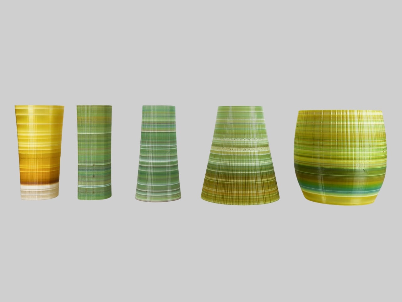
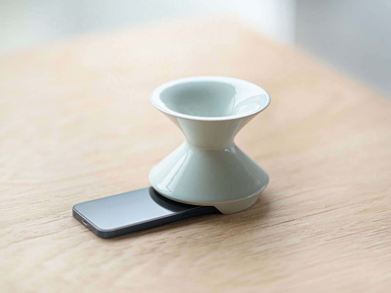
Kenji Abe’s ECHO is exactly that kind of object. It’s an analog speaker that amplifies smartphone audio simply by being set on top of the phone, requiring no power, no pairing, and no setup beyond placing it down. The concept takes its cues from wind instruments and seashells, two forms that have been shaping and projecting sound for centuries without the help of electricity.

Designer: Kenji Abe

The inside of ECHO works like a chamber, built to catch the phone’s audio and carry it outward in soft, diffused waves rather than projecting it directly. The geometry draws from the same logic as a cupped hand, but with more control over how sound travels. The result isn’t a dramatic volume boost so much as a room-filling quality that feels warmer than a powered speaker on a desk.

The choice of material makes as much of a statement as the form. Abe uses glazed ceramic, the same material found in vases, mugs, and tableware, giving ECHO a texture and presence that belongs in a home rather than on a tech shelf. It doesn’t look like an accessory. It looks like something that was always there, something that simply happened to be placed near a phone.

That quality matters when the phone is on the kitchen counter and you want music while cooking, or on a desk where you’d rather not have a speaker taking up permanent residence. ECHO doesn’t need to live next to a charging cable or be put away between uses. It sits on the table and becomes part of the room, as unobtrusive as any other ceramic piece nearby.

A guest walking in wouldn’t necessarily clock it as a tech product. That’s partly the point. The glazed surface catches light the way pottery does, and the form is quiet enough to sit beside books or plants without demanding attention. When a phone is slid underneath it, it starts doing its job. When the phone is gone, it just stays there, still looking like it belongs. The same underlying principle runs through the Battery-free Amplifying iSpeakers, where a Duralumin metal enclosure amplifies a smartphone’s audio without any power.

Abe designed ECHO to exist comfortably in a room even when it isn’t doing anything, a goal most speakers never consider. Most audio accessories announce themselves. This one quietly waits, and when a phone is close enough to fill the cavity with sound, the room gets a little warmer and a little fuller without anyone having to reach for a power button.

The post This Ceramic Vase Is Actually a Phone Speaker That Needs No Power first appeared on Yanko Design.

This Quebec Home Doesn’t Fight the Forest – It Disappears Into It

10 mai 2026 à 22:30

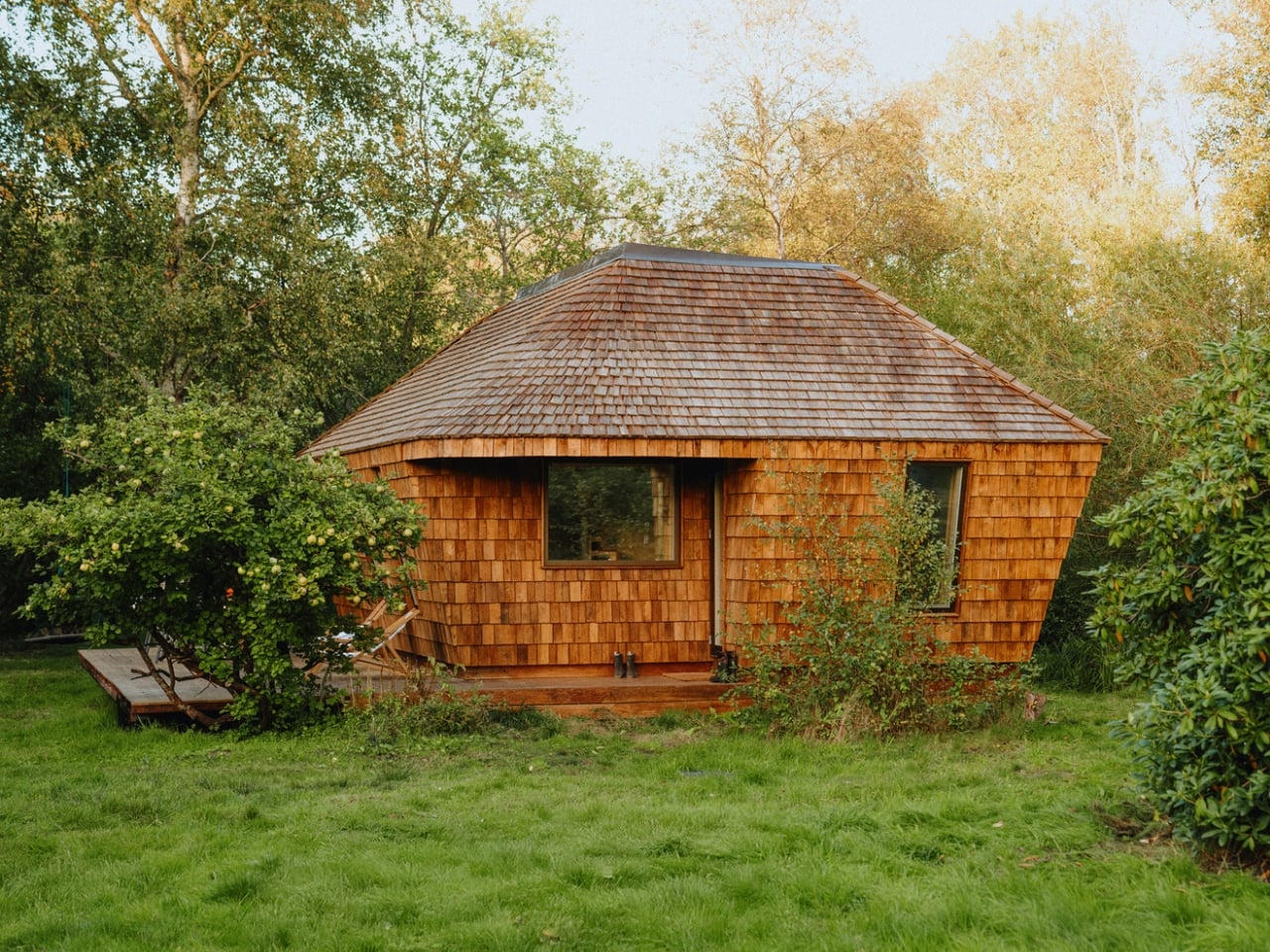
Certain kinds of architecture don’t announce themselves. La Maraude, the latest project by Nathalie Thibodeau Architecte, is exactly that — a compact residential dwelling tucked into the dense woodlands of Boileau, in Quebec’s Outaouais region, that earns its presence through restraint rather than spectacle. Completed in 2024, it’s one of the more quietly compelling houses to come out of Canada in recent memory.

The name itself carries meaning. ‘Maraude’ — to roam, to forage — hints at the relationship the house cultivates with its surroundings. Rather than claiming a dominant position along the river’s edge, the architects deliberately set the home deeper within the treeline, orienting the house’s interior life entirely toward the forest. It’s a gesture that shapes everything else about the project.

Designer: Nathalie Thibodeau Architects

The design draws directly from Quebec’s vernacular architectural tradition — steeply pitched rooflines, grounded proportions, and a material palette that feels native to the region. The exterior is clad in natural cedar shingles and topped with a metal roof, two materials with deep roots in the local building culture. These aren’t nostalgic choices. They’re translated through a contemporary lens, stripped of ornament, reduced to their essential geometry. “Designed with particular attention to simplicity, functionality, and respect for traditional codes, La Maraude embodies a successful dialogue between contemporary architecture and local traditions,” says Nathalie Thibodeau Architecte.

What makes the spatial sequence genuinely interesting is the use of two courtyards as organizing devices. The plan doesn’t simply open to the outdoors — it pulls the forest in, fragmenting the landscape into a series of framed views that shift with the seasons. One courtyard faces north, more sheltered and partly enclosed by the building itself, oriented toward higher ground. The other faces south, brighter and more expansive, drawing the eye down toward the lower terrain. The result is a house that reads differently in every light condition, every month of the year.

The second volume, arranged over two levels in response to the site’s slope, plays a more introverted role. Openings here are smaller and precisely placed to frame specific moments within the tree canopy — quiet apertures rather than panoramic statements.

Photographed by Maxime Brouillet, La Maraude has the look of a project that will age well, both materially and culturally. It’s already being discussed as a potential anchor for a broader ensemble of small retreats on the site — a first building in what could become a considered, evolving conversation between architecture and landscape.

The post This Quebec Home Doesn’t Fight the Forest – It Disappears Into It first appeared on Yanko Design.

Nocturne’s Free App Turns Your Bricked Spotify Car Thing Into Something Better Than the Original

Par : Sarang Sheth
10 mai 2026 à 20:45

The open-source community has a long history of doing more with abandoned hardware than the original manufacturers ever did. The PSP got emulators Sony never approved. The Wii got homebrew loaders that ran software Nintendo pretended didn’t exist. The pattern repeats because the hardware is always fine; it’s the corporate support structure around it that evaporates. The Spotify Car Thing joined that lineage in December 2024 when Spotify killed server-side authentication and turned every unit into an expensive knob with a screen attached.

Nocturne picked up where Spotify dropped off. The project launched in October 2024, anticipating the shutdown, and has shipped four major versions since. V4.0.0, currently in beta with a public release imminent, finally delivers true Bluetooth connectivity without phone tethering, a companion app, and a feature set that makes the original Spotify firmware look like a rough draft.

Developer: Nocturne Team (Brandon Saldan, Dominic Frye, and contributors)

The Car Thing runs a 512MB RAM, 4GB storage Amlogic S905D2 SoC, which is a polite way of saying it has the processing power of a mid-range router from 2015. Early versions of Nocturne required a Raspberry Pi as a co-processor just to get the thing online, which was a heroic workaround but not exactly mainstream-friendly. V3 replaced that with Bluetooth tethering through your phone’s hotspot. V4 cuts the tether entirely, pairing directly via Bluetooth through the new Nocturne Companion app, which requires a Nocturne+ subscription to fund the team’s continued development.

What the photos make immediately clear is how clean the UI actually looks in practice. The now-playing screen pulls album art and renders it as a full bleed gradient background, the same visual logic Spotify used but executed with noticeably more polish in edge cases. The typography is large and glanceable. The playlist browser view is dense but organized, using album thumbnails and track titles in a layout that navigates naturally with the knob. Image 3 shows a subtle ambient lighting effect around the screen border, a rainbow glow that responds to the current track, which is the kind of detail you wouldn’t expect from a community firmware project running on 2021 budget hardware.

The gesture control, OTA updates, Spotify Connect device switcher, podcast support, local file playback, and DJ mode all carried over from V3. The V4 architecture also bakes in full offline functionality, meaning the firmware survives without Spotify’s servers being cooperative, which was precisely the failure mode that bricked every original unit in the first place.

Nocturne’s GitHub currently lists V3.0.0 as the stable release, with V4.0.0 accessible to donors via Discord while the team finishes the public build. If you’ve got a Car Thing in a drawer, the installation guide at usenocturne.com is the next tab you should open.

The post Nocturne’s Free App Turns Your Bricked Spotify Car Thing Into Something Better Than the Original first appeared on Yanko Design.

Phone Cases Are Boring, This One Puts a Living Terrarium Inside

Par : JC Torres
10 mai 2026 à 17:20

Phone cases have largely settled into two camps: the ones that protect your phone without anyone noticing they exist, and the ones that make a statement with printed graphics, colors, or textures. Neither approach has found a way to make the back of a phone genuinely interesting rather than just decorated. Designer Daniel Idle found a third option that neither camp seems to have considered.

The Terrarium Phone Case is a clear resin case for the iPhone 16 Pro Max with an actual planted environment sealed inside the back cavity. Moss, small-leafed plants, and a stabilized soil substrate are embedded within the transparent shell, creating a thin cross-section of living terrain that you carry around with you wherever the phone goes. It’s a working phone case, a functional terrarium, and an oddly calming thing to have in your pocket all at once.

Designer: Daniel Idle

The construction involved 3D modeling and fabrication in clear resin, producing a case with enough depth in the back wall to house soil, roots, and plant matter. The plants are packed using a stabilized substrate that keeps the arrangement intact when the phone is picked up, rotated, tilted, or slipped into a bag. The camera cutout is fully preserved; the charging port at the bottom remains accessible; the phone continues to work exactly as it always did.

What keeps everything alive inside the sealed cavity is a closed-loop moisture system. The plants and soil generate humidity, which evaporates toward the inner surface of the resin, condenses back into droplets, and cycles down again. Light passing through the clear shell feeds the plants from outside, while the substrate provides gradual nutrient release. The whole thing is, in a fairly literal sense, a miniature ecosystem that sustains itself without any intervention from the person carrying it.

The condensation that forms on the inside of the shell during high-humidity moments is part of the visual appeal rather than a flaw to be engineered away. Seeing that vapor cycle through the case is a reminder that something in there is alive, actively breathing and responding to its environment, in the same pocket or bag as a device specifically engineered to minimize all biological interference.

There’s a running thread through design culture about bringing nature back into objects and spaces that have drifted too far from it. Biophilic design has become a recognizable term for everything from moss walls in offices to plant-filled shelving in apartments. Most of those applications treat plants as decoration layered on top of an existing design. Idle’s approach is different because the plant system isn’t decoration; it’s structural, sealed directly into the object’s body as a core component rather than an afterthought.

Of course, there will be some reservations about putting moisture and soil so close to your phone, which might be resistant to water and dust, but only from brief encounters. Good thing, then, that it’s still a concept project right now. But as a thought experiment about what a phone case could reasonably contain, it lands somewhere between genuinely novel and gently absurd, which is probably the most honest place for a good idea to start.

The post Phone Cases Are Boring, This One Puts a Living Terrarium Inside first appeared on Yanko Design.

Inside the Log-and-Glass Home Olson Kundig Built for a Builder on Salt Spring Island

10 mai 2026 à 13:20

Salt Spring Island doesn’t need much convincing — it already has the cliffs, the meadows, and the trees. The name sounds more like a childhood storybook setting than an architectural statement — and that tension is exactly the point. Nestled amidst the trees and rugged cliffs of Salt Spring Island, BC, the Daisy Ranch is Olson Kundig’s most recent residential project, led by design principal Tom Kundig. It’s casual. It’s rugged. And it’s entirely, unapologetically itself.

The house sits at the edge of a sweeping meadow, anchored by a log structure that feels like it could have always been there. The primary move is a rugged glass box paired with a long, cantilevered roof that stretches over a generous deck — a roof that earns its keep through BC’s shifting seasons, offering shelter without closing anything off. What makes it work visually is the layering: large square-cut logs and glass soften the rust-colored patina of weathered steel cladding, giving the exterior a palette that feels earned rather than designed.

Designer: Olsun Kundig

The plan is organized along a clean linear axis, with two distinct volumes bisected by an eastern entry stairway. The front door is tucked under a generous overhang — a small but considered gesture that grounds the arrival sequence without dramatizing it. The northern volume, clad in wood and steel, handles the private program: a primary suite and additional bedrooms, with framed view corridors that offer deliberate glimpses of the landscape rather than full exposure. Privacy and connection, calibrated carefully.

Inside, the bathroom is where the project gets most personal. Widespread use of wood infuses the space with warmth, while a clawfoot tub set before corner windows underscores the home’s persistent connection to the landscape outside. It’s the kind of detail that feels borrowed from an older, more tactile way of building — which is precisely the intention.

The project was designed in close collaboration with the client, Patrick Powers, a builder and fabricator who also served as general contractor. That relationship left its mark. The house doesn’t feel like it was delivered to a site; it feels like it was made with the site, material decision by material decision.

As Kundig put it: “There’s a lineage at play in this project, a quiet innovation that comes from the shared DNA of materials and relationships.” The Daisy Ranch is the kind of project that doesn’t need to announce itself. It sits lightly on its land, opens wide to its meadow, and gets on with the business of being lived in.

The post Inside the Log-and-Glass Home Olson Kundig Built for a Builder on Salt Spring Island first appeared on Yanko Design.

UNO and Vrbo Are Renting Vacation Homes for $4 a Night

Par : Ida Torres
9 mai 2026 à 20:45

Brand collaborations are everywhere these days, but every once in a while, one lands so perfectly that you have to stop and appreciate the logic behind it. The UNO x Vrbo partnership is exactly that kind of collab. Not because it’s flashy or trying to be something it’s not, but because it genuinely makes sense.

Starting May 15, Mattel and Vrbo are opening bookings for six limited-time vacation home stays built entirely around the spirit of game night. Six properties across the U.S., two tiers of experience, and one very clever price point: $4 per night. That last part is a deliberate nod to UNO’s iconic Draw 4 card (which can make or break relationships), and it’s the kind of detail that makes you smile whether you’re a brand person or not.

Designers: UNO x Vrbo

The stays are divided into two experiences. At the top end sit the two “Wild Card” homes, located in the Hollywood Hills and Texas Hill Country. These are the full production: UNO-themed décor, organized game nights, and an in-home dining experience. They’re designed for groups of up to 10 guests who want the whole immersive package, the kind of weekend that’s more curated getaway than casual vacation. Then there are the four “Play It Your Way” stays in Winter Park, Colorado; Palm Desert, California; Panama City Beach, Florida; and Atlanta, Georgia. These are a little more relaxed, but still come with a co-branded UNO x Vrbo Welcome Kit, a game room, and either a pool or hot tub. Essentially, they’re the version for people who want the fun without the fuss. All six properties are bookable for one three-night stay, Friday to Monday, on a first-come, first-served basis. Bookings open May 15 at 1 PM ET. I’ll be honest: at $4 a night, they are going to go fast.

What makes this collaboration genuinely interesting, beyond the price tag, is the attention that went into the actual product. A custom UNO deck was commissioned for this collab, illustrated by Pietari Posti, with artwork inspired by travel destinations and vacation themes. It also comes with an exclusive rule called the “Vacation Rental Swap,” which lets players swap hands with anyone at the table. It’s a small thing, but it shows that the two brands weren’t just slapping logos on a vacation home and calling it a day. They put real creative thought into what the collaboration could actually feel like to experience.

That’s the part that tends to separate a genuinely good brand collab from a lazy one. Anyone can license a logo and stick it on merchandise. Fewer brands take the time to ask what the experience should feel like from the inside, and build something around that answer. UNO, at its core, is a game about chaos and connection. You play it with people you like and you inevitably end up yelling at them. It’s social in the most fundamental way. Vrbo, meanwhile, is about giving groups a private space to actually be together without the interruptions of a hotel. Put those two things in the same room and you get something that doesn’t need to be explained.

It also helps that this collab is part of a growing relationship between Mattel and Expedia Group, Vrbo’s parent company. Mattel already appeared in an Expedia Super Bowl commercial earlier this year through the Barbie universe. So this isn’t a one-off stunt; it reads more like two brands actively figuring out how to build something together over time. For anyone who grew up playing UNO at a kitchen table, there’s an undeniable nostalgia pull here. But the campaign doesn’t lean into nostalgia as a crutch. It uses the game’s identity as a starting point and builds forward from it, which is ultimately why it works. The best collaborations don’t just remind you of something you loved. They give you a new reason to love it again.

The post UNO and Vrbo Are Renting Vacation Homes for $4 a Night first appeared on Yanko Design.

The TrackPoint Was Always Laptop-Only, This $52 Bean Changes That

Par : JC Torres
8 mai 2026 à 14:20

The pointing stick is one of the more divisive input devices in computing history. Lenovo’s TrackPoint has a devoted following, built around people who never want to lift their hands off the keyboard home row just to move a cursor. Everyone else finds the red nub somewhere between baffling and genuinely annoying. Either way, it has stayed locked to laptop keyboards for decades, with essentially no standalone options available.

Ploopy, the Canadian open-source hardware company known for its lineup of trackballs and trackpads, has changed that with the Bean. It’s a standalone external pointing stick that connects over USB-C and sits flat on a desk. Think of it as a TrackPoint you don’t have to buy a ThinkPad to access, with a few deliberate improvements added to address the weaknesses that nub has always had.

Designer: Ploopy

The Bean measures 84mm x 64mm x 16mm and houses a red pointing nub near the center of its flat, 3D printed case. Unlike the fixed nubs built into laptop keyboards, this one has additional travel in its movement, which Ploopy says helps reduce fatigue from pushing a stiffer stick over long sessions. Four buttons flank the nub, covering the standard left, right, middle click, and scroll by default.

None of those defaults is locked in. The Bean runs QMK open-source firmware on a Raspberry Pi RP2040 microcontroller, and remapping any of the four Omron D2LS-21 buttons takes just a few minutes using the free VIA web app. There are no drivers to install and no proprietary software to deal with, just a browser-based tool that reads the device and lets you assign functions however you like.

For anyone who finds the conventional mouse hard on their wrist, or simply prefers keeping their hands positioned in front of them rather than reaching out to one side constantly, a pointing stick can make a noticeable difference over long sessions. You nudge the nub, and the cursor moves without your palm going anywhere. It’s a small thing until it isn’t, especially for people managing repetitive strain concerns.

Like everything else Ploopy makes, the Bean is completely open source. Hardware design files and firmware are both on GitHub, so anyone who wants to print their own case, modify the button layout, or write custom firmware from scratch has everything they need to do it. That kind of transparency is unusual for any consumer input device and puts Ploopy in a different category from virtually every competitor.

The Bean is available now for $70 CAD (around $52 USD), which is reasonable for a device with this much flexibility built in. It isn’t going to pull in anyone who has never thought about pointing sticks before, but for the enthusiast crowd that has been waiting for a standalone option this customizable and this open, it’s about as close to a purpose-built answer as anyone has delivered.

The post The TrackPoint Was Always Laptop-Only, This $52 Bean Changes That first appeared on Yanko Design.

A Mouse You Can Squeeze Like a Stress Ball While You Work

Par : JC Torres
2 mai 2026 à 22:30

The computer mouse hasn’t changed much in decades. Still mostly hard plastic, still shaped like a bar of soap, still asking your hand to grip something that gives absolutely nothing back. The rest of the desk setup has evolved, ergonomic chairs, standing desks, wrist rests, but the one device your hand touches for eight hours straight has remained stubbornly rigid and deeply uninteresting.

The PILLIGA mouse concept makes a fairly obvious argument for why that should change. Instead of hard plastic, the entire upper chassis is a squishy, flexible membrane packed with a viscous, translucent gel. It’s the same basic impulse that makes people reach for a stress ball mid-meeting, except it’s also the thing you need to get any work done.

Designer: Guillermo Gonzalez

The thinking behind it is straightforward enough. Deadline pressure builds, calls run long, and the urge to fidget becomes almost impossible to ignore. Rather than keeping a stress ball in the desk drawer as a separate ritual, the mouse folds that habit directly into the tool that’s already in your hand. You can squeeze, press, or knead the gel without ever lifting your hand off your workflow.

The dome shape isn’t just for show, either. It follows the natural arch of your palm rather than forcing your hand flat against a hard surface, and the gel underneath absorbs the kind of low-level muscular strain that builds up quietly over hours of clicking and scrolling. It’s the sort of ergonomic consideration that usually requires its own dedicated accessory, not just a different material.

The controls themselves are sensibly laid out. A flat circular interface sits embedded in the front of the mouse, cleanly split for left and right clicks, with a textured, rubberized scroll wheel running between them. A USB-C port at the front handles charging, keeping the wireless design intact without the inconvenience of a separate charging dock. The bottom carries the optical sensor and power switch.

What makes the PILLIGA mouse concept genuinely interesting is how far it extends color as a design element. The gel comes in several variants, from vivid green with gold flecks and a blue version scattered with purple glitter, to darker, more subdued options that look considerably more at home on a professional desk. Each colorway pairs with a matching base and click interface, making the whole thing feel deliberate.

That range matters. The more reserved colorways hint that this isn’t a novelty item for a niche corner of the internet; it works just as comfortably on a professional desk as it does on a creative’s workstation. The gel doesn’t make it look cheap. It makes it look like something designed by someone who gave serious thought to what a mouse should feel like.

Concepts like the PILLIGA are more useful as provocations than promises. Computer mouse design has been coasting on the same assumptions for decades, and the idea that your primary input device could also be physically satisfying to hold hasn’t come up often enough. The gel-filled body raises the question, and that’s honestly more than most peripheral design manages to do.

The post A Mouse You Can Squeeze Like a Stress Ball While You Work first appeared on Yanko Design.

ASUS Zenbook DUO (2026) Review: One Laptop, Two Screens, All Business

Par : JC Torres
17 avril 2026 à 15:20

PROS:


  • Beautiful, nearly identical 14-inch 144Hz 3K OLED screens

  • Narrower hinge creates a more immersive visual experience

  • Ceraluminum design adds visual and tactile character

  • Powerful Intel Panther Lake performance and impressive battery life

CONS:


  • Quite pricey

  • No built-in card reader

  • RAM is soldered

RATINGS:

AESTHETICS
ERGONOMICS
PERFORMANCE
SUSTAINABILITY / REPAIRABILITY
VALUE FOR MONEY

EDITOR'S QUOTE:

The ASUS Zenbook DUO (UX8407) earns its premium with two stunning co-equal OLED screens, a sleeker hinge, and Intel Panther Lake performance built for serious work on the go.
award-icon

For a time, it seemed that foldable and rollable screens would be the future of laptops, just as they are positioned to be where smartphones are going. That was until people realized that what may be good for handheld devices might not work for 14-inch slabs with keyboards. Foldable laptops might still have their day, but they are too impractical and costly for now.

ASUS has chosen to instead design and deliver a solution for today’s needs and problems. Rather than a screen that folds just to save space, the Zenbook DUO has opted to expand the user’s workspace instead, bringing the productivity advantages of dual-monitor setups from desktops to laptops. This year’s ASUS Zenbook DUO (UX8407) does more than just upgrade the spec sheet. It is also adding a touch of style and elegance that makes a power user tool feel more considered.

Designer: ASUS

Aesthetics

The 2026 ASUS Zenbook DUO (UX8407) is quite stunning in almost any form, whether it’s closed shut, opened like a laptop, or especially when it’s wide open. The lid cover exudes not only minimalism but also character, with a reflective “ASUS ZENBOOK” logo engraved against the Elephant Gray “Ceraluminum” surface, creating a simple yet eye-catching visual and material contrast.

That Ceraluminum is, of course, ASUS’s latest material innovation that uses a special oxidation process to give aluminum some ceramic-like properties, particularly durability and higher resistance to scratches. The end result is a material that isn’t just nice to look at but also pleasing to touch, giving the lid a texture that almost feels like stone or, well, ceramic. There is also a certain visual “roughness” to the Ceraluminum surface, setting it apart from the brushed metal or anodized appearances of its peers.

Of course, the real show happens when you open the laptop and lift the keyboard away, revealing two gorgeous 14-inch screens connected together by a hinge, no messy or awkward cables. For this iteration, ASUS poured its efforts into making that connection look even more seamless, not only by shrinking the bezels between the displays but also by developing a new “hideaway” hinge that narrows the gap from 25.31mm down to 7.6mm. Make no mistake, there’s still a very obvious separation between the two, but it is now less jarring, making it feel like you’re working with a screen that just happened to be split into two, rather than two screens stitched together.

With the detachable Bluetooth keyboard resting on the second screen or when it’s closed, the Zenbook DUO (2026) looks almost like a normal laptop. You have a few (literally) ports on either side along with some air vents, and a wide-long grille at the bottom above the built-in kickstand. Your only clue that this isn’t a normal laptop is when you accidentally close the laptop lid without the keyboard attached, creating a very noticeable gap that, unfortunately, would also be an open invitation for small items to come in and scratch the screens.

Ergonomics

At 1.65kg (3.64lbs) with the Bluetooth keyboard attached, the ASUS Zenbook DUO (UX8407) isn’t exactly lightweight compared to other 14-inch laptops in the market, at least the non-gaming kind. That said, it’s not exactly on the heavier side either, especially when you consider that you’re carrying two 14-inch screens, not to mention a 99Wh battery, in a single bundle. In that context, it’s actually amazing how much ASUS was able to reduce the heft without cutting corners.

That said, having two connected displays brings its own ergonomics puzzle, something that ASUS seems to have finally solved almost to perfection. You have no less than 5 ways to use the laptop, from a normal laptop to two screens vertically stacked to the side-by-side “desktop mode”. While the hinge does most of the hard work, the built-in kickstand literally carries the burden, supporting that full weight (minus the keyboard) on its own.

The new kickstand is stronger, sturdier, and stiffer, providing confidence it won’t just suddenly close down. It can open to a maximum of 90 degrees, which is the angle you’ll need for desktop mode. That said, it also means that you only have possible angle for the displays in that mode, unless you have a separate stand to prop it up, which kind of defeats the purpose of having a built-in kickstand.

One thing to note in desktop mode is that you will naturally be sacrificing one side of ports. Thankfully, you can turn the Zenbook DUO (2026) which ever side up, whether you need an extra HDMI and headphone jack, or an extra USB-A port. Thankfully, both Thunderbolt 4 ports are equal in capabilities, so you don’t have to make a sacrifice on that end.

If there’s one thing I found a bit cumbersome in the Zenbook DUO’s design is that the power button sits so flushed against the frame. On the one hand, that means it won’t snag with anything in your bag, nor will it get triggered accidentally. On the other hand, it also makes it harder to locate it without looking or fumbling with your finger sliding across the edge repeatedly.

Performance

The ASUS Zenbook DUO (UX8407) is one of the early laptops to embrace Intel’s new Panther Lake chips, specifically the Intel Core Ultra 3 series. The dual-screen laptops comes in two options, one with an Intel Core Ultra 7 355 and the Intel Core Ultra X9 388H. In terms of CPU alone, these already represent a huge leap not just in performance but also in power efficiency, but the latter configuration pulls an even bigger feat.

The review unit we received comes with an Intel Arc B390 GPU based the latest 3rd-gen Intel Xe graphics. Forget what memories you might have had of integrated Intel graphics, because we’re entering an era where you can actually play games with decent settings on it. Of course, your mileage may vary and benchmarks can only provide some general idea, but that all these specs mean is that the ASUS Zenbook DUO (2026) is built for serious productivity and creative work.

It is, after all, designed for heavy-duty computer users ranging from knowledge workers to creators who need to bring the productivity they enjoy on the desktop to wherever they go. Productivity suites, video editors, graphics programs, 3D modelers, and even games won’t make this flexible laptop break a sweat. And yes, that includes some AI shenanigans, thanks to an upgraded NPU as well.

Of course, this also means that it has enough muscle to support running two screens which, by default, is set to extended (versus mirroring each other). The beauty is that these two screens are nearly identical not just in size but also in capabilities, where other dual-screen laptops skimp on the second screen more often than not. We’re talking two 14-inch 3K (2880×1800) 144Hz Lumina Pro OLED displays. Both support touch and, more importantly, both support the ASUS Pen stylus.

In reality, there are very slight differences between the two screens in terms of full color gamut and maximum brightness, but you won’t notice it too much unless you are actively looking for it. In practice, most people will keep content they’re working on in one of two screens anyway, leaving the other as an auxiliary for references or controls.

The latter is actually an interesting aspect of this dual-screen laptop, making the Zenbook DUO feel almost futuristic. While it does have a detachable keyboard, there might be times when you want to have more direct access to the lower touch screen without having to switch back and forth with the Bluetooth keyboard at the side. With a six-finger gesture, you can summon a half-height virtual keyboard, a half-height virtual keyboard with a virtual trackpad to the right, or a full-screen keyboard with a large trackpad below it, pretty much like the virtual equivalent of the physical keyboard.

Additionally, you can have other virtual knobs and sliders above the keyboard or as floating windows, thanks to ASUS’s Dial & Control app. These controls, which also include a numpad and an area for writing with a pen, can change depending on what app is currently in focus. With a browser window, it can have a button for a new tab or a dial for zooming in and out. Or it could be a knob for volume and a slider for screen brightness.

As for the detachable keyboard, it magnetically snaps into place, with retracting pogo pins creating a more stable connection than Bluetooth, though that is the only way to use it when it’s detached. That said, there are no notches or protrusions along the edges of the keyboard, so prying it away from that strong magnetic hold can take a bit of work. The keyboard charges when it’s lying on the laptop, but it can also be charged separately via USB-C. Key travel is decent, but the keys themselves feel a bit squishy. The large trackpad is sensitive, but the hydrophobic coating gives it too much resistance when gliding your finger across it.

The combination of the more power-smart Intel Panther Lake processor and the 99Wh battery tucked inside gives the ASUS Zenbook DUO (UX8407) quite a long uptime, even with both screens enabled. Even a battery of benchmarks and hours of typing and browsing has left a good 12% of battery left, rounding up to a little over 15 hours of use, just a little below ASUS’s advertised 18 hours (with two screens). The included 100W USB-C charging brick helps mitigate the battery loss, and the fact that you can easily use power banks to top up on the go makes the battery narrative even more compelling.

Sustainability

ASUS didn’t use to speak much about the sustainability of its laptops, but that has changed in recent years. The invention of Ceraluminum adds another level to that story, though a bit indirectly. In a nutshell, the material is meant to increase the durability and longevity of the product by protecting it from small accidents. Whether the ZenBook DUO uses sustainable materials, or at least what percentage of it does, isn’t public information.

That longevity, however, is also affected by how much you can upgrade or even repair the laptop. Given how unconventional its design is, it’s really no surprise that there isn’t much here in the way of upgrade options. You do have easy access to the SSD underneath the kickstand. The Zenbook DUO (2026) can support up to 2TB with a full-sized M.2 SSD. The 32GB RAM, however, is soldered down.

Value

The ASUS Zenbook DUO (UX8407) is a laptop on a mission. It is, in a nutshell, designed for people who thrive and need multi-tasking capabilities that they could only enjoy while chained to their desk (or awkwardly carrying a portable monitor). That actually covers a wide range of professions and industries, including creators, designers, office workers, executives, and, yes, gamers. In that sense, there can probably be no better tool for them than this.

In both performance and flexibility, the 2026 Zenbook DUO offers users the power they need, as they need it. Cramped for space on a plane? Just use it as a single-screen laptop, and no one will be the wiser. Need to collaborate with a team? Lay it out flat on the desk to give everyone the same perspective. Need to reference documents as you write? The book-like desktop mode has you covered.

That said, it’s definitely far from perfect. For a laptop aimed at creatives and professionals, the absence of a built-in SD card reader seems pretty odd. And then there’s the $2,699.99 price for the configuration that has the impressive Intel Arc graphics. That puts it way above most 14-inch ultra-thin laptops and in the range of gaming laptops. But then again, none of those have two 14-inch screens, either.

Verdict

Laptops with foldable screens admittedly look fancy and impressive. The big OEMs, including ASUS, are still playing around to find the formula that will finally make it feel more than just a fancy and expensive experiment. In the meantime, however, people need to get work done, and when it comes to that, nothing really beats using more than two screens.

You could always carry a portable screen along with your laptop, which is awkward, cumbersome, and inefficient, or you could grab the ASUS Zenbook DUO (UX8407). With an improved hinge, beautiful co-equal 14-inch displays, and an Intel Panther Lake processor that can handle almost anything you throw at it, the dual-screen laptop lets you choose the way you want or need to work. And it looks stylish to boot in any form, making sure you’ll be the envy of everyone in the coffee shop.

The post ASUS Zenbook DUO (2026) Review: One Laptop, Two Screens, All Business first appeared on Yanko Design.

Foshan’s Forgotten Warehouses Got a Rooftop Park Under Floating Domes

Par : Ida Torres
17 avril 2026 à 13:20

Somewhere along the Huadi River in Foshan, China, a cluster of old grain storage warehouses has been turned into one of the most quietly poetic pieces of architecture I’ve seen all year. The Yongping Warehouse Renovation, completed in 2025 by Guangzhou-based Atelier cnS, is exactly the kind of project that makes you stop scrolling and actually look.

The site sits in Dali Town, Nanhai District, a former industrial pocket of the Pearl River Delta that’s been gradually shedding its factory-town skin in favor of something more livable and publicly accessible. These particular warehouses, lined up along the riverfront, were derelict grain storage buildings with no obvious future. Not exactly glamorous source material. But Atelier cnS didn’t flinch, and the result is a project that earns its attention without asking for it loudly.

Designer: Atelier cnS

Because the site has a narrow footprint, the architects pushed the public space upward, placing a landscaped rooftop park above the commercial interiors below. Vertical programming isn’t a new idea, but what makes Yongping feel different is how thoughtfully the transition between levels was handled. The gaps between warehouse blocks weren’t sealed or filled in. Instead, they were preserved and widened into passageways, so as you move through the building, you catch glimpses of the river framed by walls before the whole view opens up at the top. It’s a slow reveal, and it’s deliberate.

And then there are the canopies. A series of translucent, domed structures built from hexagonal frames cluster across the roofline like a quiet gathering of clouds. Atelier cnS actually named the project “A Wisp of Cloud” over Huadi River, and the photos earn that name completely. The domes are light-diffusing, casting shade without blocking river views. They create zones for sitting, moving, and play without ever feeling like they’re closing the space in. They look like they arrived gently, rather than being imposed on the building below them.

The rooftop itself is shaped into slopes, steps, and play surfaces that echo the original pitched forms of the warehouse roofs. It’s one of those details that most visitors probably won’t consciously register, but it’s exactly the kind of architectural memory that makes a renovation feel grounded rather than gratuitous. The old buildings aren’t being pretended out of existence. The new design is in active conversation with what was there before.

I’m genuinely drawn to this project because it gets the balance right in a way that many adaptive reuse projects don’t quite manage. Too often, the renovations that attract the most attention are the ones where the new design overwhelms the original structure, turning the old building into nothing more than a convenient shell. Yongping avoids that trap. The warehouses are still very much present. Their bones dictate the rhythm, the circulation, and some of the visual language of the final result. You can feel the history of the place without having to read about it first.

Atelier cnS has been developing this kind of thinking for years. The studio’s earlier work on elevated public circulation, including a “roof-hopping” design approach explored in their White House Guesthouse project, signals a long-running interest in finding new life in existing structures. Yongping feels like a maturation of that sensibility. More refined, more integrated, and more tuned in to the texture of a neighborhood mid-transition.

The project spans 4,311 square meters, and it’s worth noting what it does beyond the architecture itself. Turning a commercial renovation into a publicly accessible rooftop park, in a district shifting away from its industrial past, is a real act of generosity. A park on a roof could easily read as a private amenity. Here, it reads like a gift to the neighborhood, a place to walk, rest, and look out at the river without needing a reason to be there.

Architecture doesn’t always need to announce itself to be worth paying attention to. The Yongping Warehouse Renovation is understated, purposeful, and lit from above by a cluster of translucent domes that look, from a distance, exactly like a wisp of cloud over the river.

The post Foshan’s Forgotten Warehouses Got a Rooftop Park Under Floating Domes first appeared on Yanko Design.

Belgium’s Most Striking Concrete Villa Was Designed by the Dunes

Par : Ida Torres
8 avril 2026 à 23:30

If you’ve ever stood on a beach and watched the tide pull back, you know that moment right before the water retreats completely, when it leaves those delicate horizontal lines etched across wet sand. That’s what the facade of Villa Nouvelle Vague looks like. Not metaphorically. Literally. Belgian architect Magalie Munters designed the concrete surface of this seaside villa in Oostduinkerke with a horizontal grain that mirrors the striations the North Sea leaves behind at low tide. The reference isn’t decorative, it’s structural. And that distinction matters.

The villa sits on a corner plot at the edge of a protected dune reserve in Oostduinkerke, a small coastal town already known for a few wonderfully eccentric things: a ship-shaped restaurant and fishermen who harvest shrimp on horseback. Into this landscape, Munters has introduced something that manages to be arresting without being loud. The form is sculptural and unmistakably modern, but it doesn’t shout. It settles.

Designer: Magalie Munters

The name “Nouvelle Vague” borrows from the French New Wave film movement, and the reference is apt in ways that go beyond the obvious nod to style. The French New Wave was defined by breaking conventional rules while remaining deeply committed to craft. Munters is working in a similar register. For years, her Ghent-based boutique studio has been developing residential architecture with organic geometries, pushing against the idea that construction methods should set the ceiling on what architecture can achieve. “Through that ongoing research, I developed a way of building in which construction and technology no longer act as a limitation to the architecture,” she explains. Villa Nouvelle Vague is where that research cashes out.

The concrete form is completely curved across the entire volume, not just as a surface treatment but as a governing logic, carried through every detail: the absent roof edges, the curved garage opening, even the way the house integrates into the ground. The bedrooms are half-buried in the dunes, which is both a functional and a conceptual move. The house doesn’t sit on the landscape. It’s anchored into it. Above those buried rooms, the living spaces rise toward the horizon, pulling in light and opening out to views of the dunes in a way that feels earned rather than forced.

The way you move through the house is where Munters’ admiration for Le Corbusier becomes most legible. She’s spoken about his influence, specifically in “the rooftop solarium, in the way spaces expand and contract, and in the vertical shafts that structure movement through the house.” You enter through a vertical shaft that climbs toward the roof before expanding into the main living space. The compression-then-release is theatrical in the best sense. The house is working on your nervous system before you’ve even sat down.

I keep coming back to that word: deliberate. Munters uses it herself: “What might appear as a free form is in fact the result of a very deliberate construction logic.” That’s the tension the villa lives in, and frankly, it’s what makes it interesting. Nothing here is freehand improvisation. The curves look fluid because the logic behind them is airtight. The concrete looks like it grew from the dunes because the architect studied the dunes before she touched a drawing. That’s different from a building that mimics nature for aesthetic points. It’s rarer, and harder.

Belgian architecture doesn’t always get the international visibility it deserves, and Magalie Munters is one of those names worth paying attention to even if residential architecture isn’t usually your thing. Villa Nouvelle Vague is the kind of project that earns its name. It has the confidence of something that knows exactly what it is, and the intelligence not to over-explain itself. Just like the best films of the movement it references.

The post Belgium’s Most Striking Concrete Villa Was Designed by the Dunes first appeared on Yanko Design.

MUJI-Meets-Cyberpunk Vinyl Record Player Glows Like an Ambient Light and Charges Wirelessly

Par : Sarang Sheth
8 avril 2026 à 01:45

Minimalism in product design has gotten boring. We’re swimming in smooth white rectangles, touch controls that offer zero feedback, and devices designed to vanish. Apple spent two decades training the industry to sand away every visible seam, and now we live in a world where a Bluetooth speaker looks like a cylinder because a cylinder offends nobody. Bang & Olufsen understood early that audio equipment could occupy space like sculpture, could earn its place in a room through presence instead of absence. Teenage Engineering proved that mechanical honesty and playful geometry could coexist with premium materials. Both approaches work because they have a point of view.

TRETTITRE’s TTT series combines those instincts into something harder to categorize. The TTT-LP3 wireless vinyl player uses CNC-machined aluminum for the main frame and features a diffused lighting panel that spreads light evenly across the surface when music plays. The TTT-DP3 Bluetooth CD player takes inspiration from a UFO-like form with a transparent magnetic cover that rotates open to reveal the spinning disc. The TTT-CP3 cassette player uses a metal housing with sharp geometric lines and mechanical transport keys that deliver clear physical response. All three mount on the TTT-W magnetic modular wall rack, turning physical media playback into a visible, functional part of interior design.

Designers: Noah – Founder & Designer, Trettitre

Click Here to Buy Now: $229 $449 ($220 off). Hurry, only 55/99 left! Raised over $654,000.

TTT-LP3: A Vinyl Player That Doubles as Ambient Light

The back of the LP3 includes a hidden mounting structure that allows it to hang directly on a wall. You can mount it vertically so the record becomes part of the visual display, or go for the classic horizontal layout. When you want to move it, you lift the silicone leather handle at the top and take it down. The player detaches easily and gives you the freedom to listen wherever you choose. Traditional turntables usually stay exactly where you put them, limiting your options for when and where you listen. The LP3 works a little differently because of the battery and the wall mount’s wireless charging system, which keeps it powered without a visible cable.

Behind the LP3 sits a diffused lighting panel that spreads light evenly across the surface of the unit. When it’s on, the entire body of the player glows softly, designed to feel closer to ambient lighting than decorative lighting. You can change the lighting effects with the touch of a button. When a record spins, the moving shadows create a quiet visual effect. You can also leave the player mounted on the wall as a soft light source even when no music is playing. That ambient quality pushes the LP3 from well-designed product into something more considered: a slow, breathing light fixture that happens to play records.

The LP3 uses a self-balancing tonearm system that automatically sets the correct pressure when the player powers on. You place the record on the platter and lower the needle, and the system handles the rest. Many turntables require careful calibration before they can be used properly, with tonearm balance, tracking pressure, and counterweight adjustment all part of the process. For experienced collectors that process can be enjoyable, but for beginners it often feels complicated. The LP3 removes that barrier entirely while preserving the tactile experience people enjoy. The player supports both 33 RPM and 45 RPM records, and includes a manual control dial that allows small adjustments to playback speed (roughly ±0.5%), useful for older records that may not spin perfectly at their original speed anymore.

Wireless audio is handled through Qualcomm Bluetooth v5.3 with SBC, aptX, aptX HD, and aptX Adaptive, which allows higher-quality and lower-latency wireless audio than basic Bluetooth streaming. For wired setups, the player also includes a 3.5mm audio output. The built-in battery provides up to 6 hours of vinyl playback or up to 3 hours when used purely as an ambient light source. Full specs: dimensions 342×233×87mm, weight 1430g, Audio-Technica AT3600L moving magnet stereo cartridge, CNC-machined aluminum frame with silicone leather carrying strap. The LP3 arrives in June 2026 for Early Bird backers, May 2026 for Fast Delivery backers.

TTT-DP3: Giving the Compact Disc Its Aura Back

The DP3 keeps the reliability of CDs but gives the player a different visual presence. The design takes inspiration from a UFO-like form with a transparent magnetic cover. When the cover rotates open, the disc is partially visible as it spins, turning something simple into a small visual moment. A CD player shaped like a flying saucer with a rotating transparent lid is an audacious idea, and it works because it doesn’t try to evoke nostalgia. It reframes a CD player as a mechanical object of curiosity, something you watch as much as use.

The control buttons include raised tactile dots combined with a gold-embossed finish, making it easy to identify the buttons by touch alone. You can pause or skip tracks without needing to look down at the player. A small OLED display on the player shows track numbers, playback status, and battery level. The interface is intentionally simple so the information you need is visible immediately. A built-in battery allows the DP3 to run for several hours on its own, so you can move it from room to room, bring it to a small gathering, or take it while traveling. Full specs: Ø170×27mm, 324g, supports CD-DA and HDCD formats, Bluetooth 5.4, SNR >70dB, THD <3%, ABS+PC+Metal construction. The DP3 ships in May 2026.

TTT-CP3: Cassette Hardware for Modern Audio Setups

The CP3 keeps the tactile mechanical elements people associate with tapes while updating the electronics inside. The player uses a metal housing with sharp geometric lines that give it a distinctly industrial appearance. Instead of trying to imitate retro plastic designs, the CP3 leans into a more modern interpretation of cassette hardware. The playback controls use independent mechanical keys similar to piano keys. Each press has a clear physical response. Play, rewind, and stop feel deliberate instead of soft or mushy.

Inside the CP3 sits a Bluetooth module that allows cassette audio to stream wirelessly to speakers or headphones. The player decodes analog audio signals with high precision, helping reduce background noise and preserve more detail from the original recording. The result still sounds like cassette tape, but with greater clarity. Full specs: 122×120×32mm, 360g, supports Type I-IV cassette cartridges, Bluetooth 5.4, SNR ≥55dB, THD <3.5%, Metal+PC+ABS construction. The CP3 ships in May 2026.

When Storage Becomes Part of the Spectacle

The TTT-W Magnetic Modular Wall Rack uses an all-metal geometric structure that allows multiple TTT players to be arranged into a clean wall display while keeping them organized and ready to use. The rack integrates magnetic alignment and wireless charging for the vinyl player, so the LP3 can stay powered without visible cables while being part of the room’s design. Two configurations are available: a T-shaped rack (263×196×27mm, 300g) and a magnetic modular wall rack (612×302×27mm, 775g, combined style T+3). Both support wireless charging at 5-10W and use USB-C 5V 2A input.

The Supporting Cast, from Sculptural Speakers to Planar IEMs

TRETTITRE offers a range of add-ons designed to complement the TTT system. The TreSound1 Speaker arrives in concrete and wooden editions, delivering 2×30W + 1×60W output power with a 1″ tweeter, 2.75″ mid-range, and 5.25″ subwoofer for 30Hz-25KHz frequency response. The conical speaker features 360° surround sound, Bluetooth 5.2 with Qualcomm aptX HD, and a sculptural form that occupies space like a piece of furniture. The TreSound Mini is a portable Bluetooth speaker with a 5200mAh battery, 30W RMS output, and 360° surround sound. The TTT-E3 in-ear headphones use a 13mm planar magnetic driver with a 4-strand silver-copper hybrid conductor, available in 3.5mm and 4.4mm configurations. An aluminum alloy side table (300×300×750mm, 1.75kg, max load 50kg) rounds out the ecosystem.

What It Costs to Build the Setup, and When It Ships

The TTT-LP3 wireless vinyl player is available at $229 for Early Bird backers (June 2026 delivery), down from a planned $449 MSRP. The TTT-DP3 Bluetooth CD player is priced at $79 standalone ($179 MSRP), while the TTT-CP3 cassette player is also $79 standalone ($199 MSRP). If you’re a bonafide audiophile, a $399 bundle gets you all three devices. Optional add-ons include the TreSound Mini Bluetooth Speaker at $169 ($299 MSRP), TreSound1 Wooden Edition at $449 ($659 MSRP), TreSound1 Concrete Edition at $499 ($799 MSRP), TTT-E3 planar IEMs at $139 ($239 MSRP), and the TTT Side Table at $89 ($199 MSRP). The campaign runs through April 9, 2026, with worldwide delivery beginning May 15, 2026.

Click Here to Buy Now: $229 $449 ($220 off). Hurry, only 55/99 left! Raised over $654,000.

The post MUJI-Meets-Cyberpunk Vinyl Record Player Glows Like an Ambient Light and Charges Wirelessly first appeared on Yanko Design.

Studioninedots’ Light House Is a Vertical Amsterdam Home Built From Playfully Stacked Boxes

7 avril 2026 à 22:30

What does a home look like when you throw out the floor plan entirely? For Amsterdam-based firm Studioninedots, the answer is a tower of playfully stacked boxes, each one dedicated to a single moment in life, that rises above one of the Dutch capital’s newest neighborhoods. Completed in 2025, Light House sits on Centrumeiland, a newly developed artificial island district defined by its self-build culture and strong sustainability ambitions.

The project began with a simple brief from a couple with two children who wanted a home that would genuinely bring them together. Rather than anchoring daily life to the ground floor the way most houses do, Studioninedots dedicated each of the family’s key activities — eating, gathering, cooking, relaxing — to its own distinct volume, then arranged those volumes vertically into a single, tightly considered composition. The result is a 257-square-meter residence that feels less like a stacked building and more like a small vertical neighborhood.

Designer: Studioninedots

Movement through the home unfolds through a sequence of open passages and compressed zones, where shifts in scale produce entirely different spatial moods. Smaller, enclosed areas carve out space for focused, quieter activities, while larger voids open up visual connections across levels, dissolving any conventional sense of what is above and what is below. Hovering above the kitchen is a sheltered, secluded volume ideal for yoga or film watching, while the journey through the house culminates at the top in what the architects describe as a “holiday home” within the city. Flanked by arched ceiling-height glass openings, this 14-metre-high gathering room commands panoramic views across the IJmeer lake.

The facade does a lot of the design’s heavy lifting. A wall of square glass blocks wraps the front of the building, filtering natural light into the interior while abstracting the life inside, offering privacy without sacrificing the warmth of daylight. At night, the facade glows from within, giving the house an almost lantern-like presence on the street.

Sustainability is baked into the structure itself. Light House is built as a lightweight system using prefabricated timber components inside a steel frame, a circular and modular method that allows for flexibility, long-term adaptability, and ease of disassembly. The layout is not fixed either, as children grow and priorities shift, the home can be reconfigured to meet whatever the family needs next. Light House is a rare thing: a home that feels entirely personal yet completely considered, one where architecture quietly gets out of the way and lets life fill the space.

The post Studioninedots’ Light House Is a Vertical Amsterdam Home Built From Playfully Stacked Boxes first appeared on Yanko Design.

Beethoven Gets a 200th Anniversary LEGO Set Complete With Für Elise Sheet Music

Par : Sarang Sheth
6 avril 2026 à 20:30

Beethoven composed his Ninth Symphony completely deaf. He never heard a single note of it performed, yet it remains one of the most emotionally overwhelming pieces of music ever written. That particular detail about his life has a way of stopping people cold, the idea that the instrument of his perception was gone, and yet the music kept coming, arguably better than ever. There are very few stories in human history that capture creative resilience quite like his.

Fan designer CousinExcitedCactus has channeled that legacy into a 358-piece LEGO Ideas set timed to a significant milestone: March 26, 2027 marks the 200th anniversary of Beethoven’s passing. The result is a compact, modular display set with a grand piano, a Beethoven minifigure, a candlelit writing table, and a removable “Für Elise” sheet music backdrop, plus a surprisingly moving recreation of his grave monument in Vienna.

Designer: CousinExcitedCactus

The piano is the heart of this build, and it’s different from your average modern day grand piano. The design draws from two instruments Beethoven actually owned and played: the Érard grand gifted to him in 1803, and the Conrad Graf fortepiano he used in his final years, by which point his hearing was almost entirely gone. Both instruments were period pieces with a lighter, more intimate tone than the thundering concert grands of today, and the LEGO recreation captures that sense of a working composer’s instrument rather than a showpiece. The lid is propped open, strings are visible inside, and a small sheet of music rests on the stand, the kind of atmospheric detail that makes a display scene feel lived-in rather than staged.

The candelabra beside the piano is a three-flame setup rendered with white cylinder candles and transparent flame elements, casting the whole scene in an implied warm glow. The Beethoven minifigure stands on a warm-toned wooden stage floor, white hair, dark formal coat, red cravat, with his signature in gold script on a nameplate tile at the front edge. Behind everything, a large printed tile carries the full opening bars of “Für Elise” in period calligraphy, functioning simultaneously as a backdrop panel and the set’s most immediately recognizable design element. It is a clever piece of dual-purpose design, the kind of thing that looks obvious only after someone else has already thought of it.

My favorite detail, though, is the grave monument. The builder has included a fully separate modular sub-build recreating Beethoven’s actual resting place at Vienna’s Zentralfriedhof, a white obelisk on a columned base with “Beethoven” lettered across the front, pink flowers at the perimeter, and a golden butterfly at the apex. The reverse side of the “Für Elise” sheet music tile features a printed reproduction of the grave, which means the backdrop itself does double duty depending on which way you face it. That is a genuinely thoughtful design decision.

The set currently sits at 720 supporters on LEGO Ideas, the fan platform where community-made MOCs (My Own Creations) gather votes toward the 10,000-vote threshold required to trigger an official LEGO design review. With 414 days left on the clock, there is plenty of time to get it there. If you want to see this one make it to store shelves in time for the 2027 anniversary, head to the LEGO Ideas page and cast your vote here.

The post Beethoven Gets a 200th Anniversary LEGO Set Complete With Für Elise Sheet Music first appeared on Yanko Design.

Meet the World’s First Door Grown From Fungi, Not Cut From Wood

25 mars 2026 à 21:30

What if the door you walk through every day was grown from fungi? Danish mycelium company Rebound and architecture studio Det Levende Hus have partnered to create what they claim is the world’s first mass-produced interior door with a core cultivated from fungal mycelium. Currently in the prototype phase, the door is part of a broader collection of bio-based interior and sliding doors designed for modern living spaces, and it may quietly redefine what architectural materials can be.

The concept is straightforward but radical. Rebound cultivates the fast-growing root structure of fungi inside a mould, producing a rigid, lightweight panel with natural sound-absorbing qualities. That mycelium core is then enclosed within a timber frame built from reclaimed and surplus wood, including offcuts sourced from Danish flooring manufacturer Dinesen, meaning the door carries minimal material waste from start to finish.

Designer: Rebound & Det Levende Hus

Rebound co-founder Jon Strunge sees this as a direct challenge to the construction industry’s dependence on slow-growing hardwoods. “We wanted to demonstrate how regenerative, high-performance mycelium-based materials open opportunities for new, innovative, and scalable building components,” he said. The growing process takes roughly two weeks and is designed to scale industrially, making these doors a production-ready proposition rather than a one-off experiment.

What makes the design particularly noteworthy is its adaptability. Colour and surface texture can be altered during the growing process itself, removing the need for post-production finishing. The current prototype presents a smooth, silky surface, but the material can shift in tone and can also be finished with a layer of clay for a warmer, earthier aesthetic.

Structural performance was equally prioritised. A bio-based layer incorporated during the growing process stiffens the door and improves fire resistance, a bio-welding method that adds reinforcement without glue or additional manufacturing stages. The door was also designed to comply with current building standards for private homes, particularly around fire and moisture resistance, making it a credible candidate for real construction.

The first real-world application will be at Kaerhytten, a low-impact housing project in Ramloese, Denmark, designed by architect Jens Martin Suzuki-Højrup, scheduled for completion in 2026. The prototype also features a door handle by architect Bjarne Hammer for Danish brand Randi, the Moom handle cast from recycled seashells, adding a tactile detail that mirrors the door’s material ethos. Looking ahead, Rebound and Det Levende Hus are expanding into mycelium-based acoustic wall panels and ceilings. As Suzuki-Højrup put it, “It’s about how natural materials can transform our experience of space, visually, acoustically, even emotionally.”

The post Meet the World’s First Door Grown From Fungi, Not Cut From Wood first appeared on Yanko Design.

❌
❌