Vue normale

  • ✇Yanko Design
  • Nomad’s Leather Folio Turns Your iPhone Duo Into A $1999 Bifold Wallet
    The folio case for smartphones remains an entirely boomer product offering. Having a case with a flap that covers your screen and needs to be folded open like a book to answer calls or use your phone is an innately ‘old-soul’ experience. The flap protects your screen but it also obscures it. Fold the flap to the back and it reveals your screen but blocks your camera. It isn’t for millennials or Gen-Z phone owners, but for anyone who wears reading glasses, this folio style case is as addictive a
     

Nomad’s Leather Folio Turns Your iPhone Duo Into A $1999 Bifold Wallet

10 septembre 2026 à 16:30

The folio case for smartphones remains an entirely boomer product offering. Having a case with a flap that covers your screen and needs to be folded open like a book to answer calls or use your phone is an innately ‘old-soul’ experience. The flap protects your screen but it also obscures it. Fold the flap to the back and it reveals your screen but blocks your camera. It isn’t for millennials or Gen-Z phone owners, but for anyone who wears reading glasses, this folio style case is as addictive as their generation’s Candy Crush habit. With Apple launching the iPhone Duo just yesterday, Nomad developed a similar folio style case for the Apple foldable.

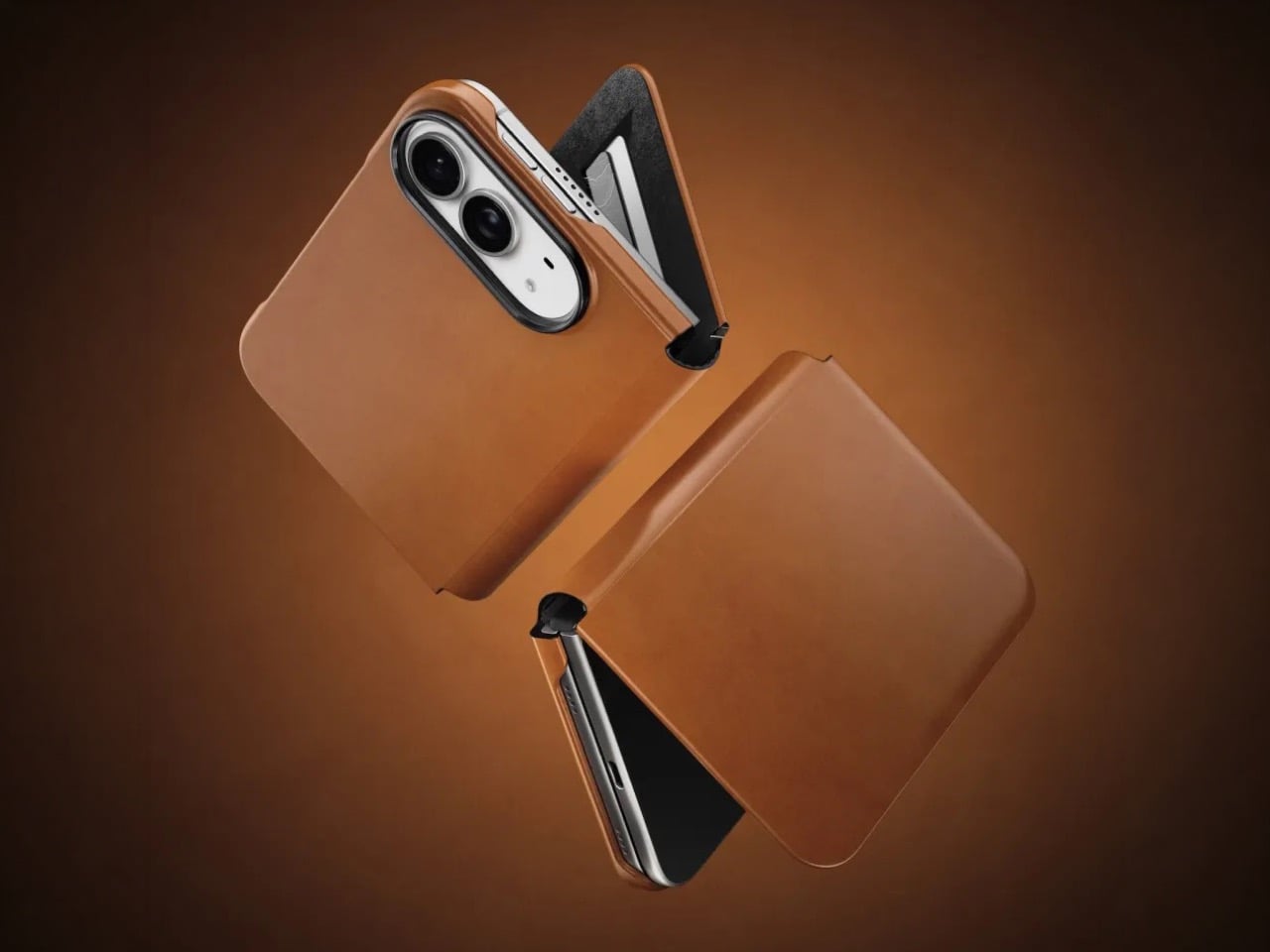
Nomad’s Folio case for the Duo is a strange little thing. While most folio cases turn candybar phones into bifolds, Nomad’s case sort of turns it into a trifold, if you will… or a bifold with a partition. The case is a single-piece leather and plastic design, created to wrap your phone not just from the back but also the front. The front flap magnetically snaps to your phone’s outer display, and lets you open your phone in two ways – firstly, by just disengaging the flap to see the outer screen, but also by disengaging the flap and outer screen together to see the inner screen… and like any good folio case, the flap’s inside packs a card-holder for your payment, ID, and access cards so you don’t need a MagSafe wallet ruining your iPhone Duo’s design.

Designer: Nomad

Like all of Nomad’s leather cases, this one’s made from Horween leather, crafted from a single piece of hide that’s been tanned, bent, crimped, and buffed to absolute beauty. The leather gracefully wraps around the edges, keeping the buttons exposed and accessible, while also covering the hinge in a way that creates that bifold feeling. The leather then transitions upwards ever so slightly before cutting off to a plastic lip around the camera bump, cushioning your phone’s precious shooters from accidental drops and bumps.

On the inside, the leather’s reinforced by a microfiber layer that protects the iPhone’s glass panels from damage. Sure, Apple touts Ceramic Shield on both the front and back, but nothing breaks your heart faster than seeing a cut or a scratch running down the glass body from abrasive action caused by objects in your pocket or even your table. Meanwhile, a slot on the front stores two cards from the looks of it, so your iPhone Duo doubles as a card holder beyond what Apple Pay already lets you do.

Like all good leather cases, this one’s designed to age gracefully with time. Chances are, if you’re an iPhone Duo buyer, you will probably use this phone as your ride or die for another 2 years. In that time, Nomad says the case will patina gorgeously with time, aging uniquely based on how you use the phone. Luckily, the case isn’t too expensive. Priced at $129, you can grab the Nomad iPhone Duo Traditional Folio in one of three colors – Saddle, Rustic Brown, and Black, with global shipping starting November 14th.

The post Nomad’s Leather Folio Turns Your iPhone Duo Into A $1999 Bifold Wallet first appeared on Yanko Design.

  • ✇Yanko Design
  • This House Splits Into Three Pieces So It Can Stay Hidden in Its Own Forest
    The Curious House in Zagreb doesn’t try to win you over immediately, and that’s exactly the point. Designed by Croatian studio FORVM arhitektura, it’s a family residence perched on a steep hillside, slightly pulled back from the main road and swallowed by dense urban vegetation — orchards, spruces, pines, cedars. The house doesn’t announce itself. It settles in. Rather than drop a single mass onto the slope, FORVM broke the program into three distinct elements, each responding to a different re
     

This House Splits Into Three Pieces So It Can Stay Hidden in Its Own Forest

10 septembre 2026 à 15:20

The Curious House in Zagreb doesn’t try to win you over immediately, and that’s exactly the point. Designed by Croatian studio FORVM arhitektura, it’s a family residence perched on a steep hillside, slightly pulled back from the main road and swallowed by dense urban vegetation — orchards, spruces, pines, cedars. The house doesn’t announce itself. It settles in.

Rather than drop a single mass onto the slope, FORVM broke the program into three distinct elements, each responding to a different register of the site. It’s a compositional decision that reads as both pragmatic and poetic, dissolving the usual tension between building and terrain into something more like a conversation. The topography shapes the architecture. The architecture shapes how you live inside it.

Designer: FORVM

The ground floor is fully glazed — a deliberate move to keep the resident in constant dialogue with the world outside. Green cascades past the glass. The tree canopies filter sunlight and block sightlines, doing the work that walls might otherwise do. Privacy here isn’t enforced by opacity; it’s offered by nature. The forest earns its place as an active participant in the spatial experience, not just a backdrop.

The upper floor shifts register. Where the ground level opens up, the upper volume turns more inward, more considered. Roof windows cut directly to the sky, and through them, tree silhouettes remind you again that you’re inside a forest. The building keeps finding ways to return you to the landscape — not through grand gestures, but through quiet architectural moves that accumulate into something genuinely atmospheric.

From the outside, the Curious House plays a different game. Its smooth, reflective surfaces don’t reveal the interior so much as they absorb the green world around it. You expect transparency; instead, you get a mirror. The observer looks for signs of life within the envelope and finds it harder than the glazing might suggest. It’s a house that hides in plain sight.

Designed by Dinko Uglešić, Ina Vlahović, and Marijana Rančić, and photographed by Bosnic+Dorotic, the Curious House exemplifies a strain of European residential architecture that takes landscape seriously — not as an amenity to be framed, but as a logic to be followed. FORVM, founded in 1991 by Ante Uglešić, has long worked within the specifics of Croatian terrain and climate, and that attentiveness shows here in every decision, from the fragmented massing to the calibrated relationship between glass and canopy.

The post This House Splits Into Three Pieces So It Can Stay Hidden in Its Own Forest first appeared on Yanko Design.

  • ✇Yanko Design
  • Retroid Pocket Duo makes dual-screen gaming feel fresh again with its modern clamshell design
    There is something immediately satisfying about a handheld that refuses to make two screens behave like one. Retroid’s new Pocket Duo takes that idea and builds it into a modern clamshell, giving Nintendo DS and 3DS-style gaming a form factor that feels considerably more natural than squeezing both displays onto a single screen. The Pocket Duo puts a 5.5-inch 16:9 OLED display above a smaller 4.5-inch 4:3 OLED screen, with both running at 120Hz. Rather than treating the second display as an aft
     

Retroid Pocket Duo makes dual-screen gaming feel fresh again with its modern clamshell design

10 septembre 2026 à 14:20

There is something immediately satisfying about a handheld that refuses to make two screens behave like one. Retroid’s new Pocket Duo takes that idea and builds it into a modern clamshell, giving Nintendo DS and 3DS-style gaming a form factor that feels considerably more natural than squeezing both displays onto a single screen.

The Pocket Duo puts a 5.5-inch 16:9 OLED display above a smaller 4.5-inch 4:3 OLED screen, with both running at 120Hz. Rather than treating the second display as an afterthought, Retroid has designed the handheld around the way dual-screen games were originally meant to be played. The company has already demonstrated 3DS titles running at 4x resolution, along with DS games through melonDS.

Designer: Retroid

Under the hood, the Duo has Qualcomm’s Dragonwing Q-7790 – an IoT-focused chip based on the Snapdragon 7 Gen 4 – mated to Adreno 722 graphics. Active cooling helps keep the hardware running under load, while a 6,000mAh battery handles power. The device runs Android 16 and weighs 350g, with a 180-degree free-stop hinge allowing the two displays to be positioned at different angles. Retroid has also paid attention to the physical controls. The thumbsticks sit symmetrically in recessed positions, while the ABXY buttons use tactile clicks. The shoulder buttons are stacked, giving the Duo a layout that is intended to feel like a proper gaming handheld rather than a phone with an extra screen attached.

The Pocket Duo Lite takes the same dual-screen concept and makes some straightforward changes to bring the price down. Its upper display remains 5.5 inches, but switches from OLED to a 60Hz IPS LCD, while the lower screen is slightly smaller at 4.2 inches. Both displays retain their respective 16:9 and 4:3 formats. The Lite also steps down to Qualcomm’s Dragonwing QCS6125 processor with Adreno 610 graphics and runs Android 15.

The handheld uses in-line shoulder triggers instead of the stacked controls found on the regular Duo. Despite those compromises, it retains the 180-degree free-stop hinge, symmetrical recessed thumbsticks, active cooling and a 6,000mAh battery. There are two Lite configurations: 4GB RAM with 64GB storage and 6GB RAM with 128GB storage. It comes in Black, GC, 16Bit, Ice Blue and Clear Purple, matching the colour choices of the standard model.

For anyone who grew up with dual-screen handhelds, the Pocket Duo is an intriguing modern interpretation of a familiar idea. Instead of mere recreation of the classic era, Retroid is giving the format a faster display and contemporary hardware. The Lite, however, makes the same unusual design considerably easier to justify.

The pricing also makes the Lite particularly compelling. The 4GB/64GB version starts at $135 during pre-orders and will retail for $149, while the standard Pocket Duo is priced at $250 during pre-orders and $270 at retail. There is no official release date, though.

The post Retroid Pocket Duo makes dual-screen gaming feel fresh again with its modern clamshell design first appeared on Yanko Design.

  • ✇Yanko Design
  • 5 Designs That Prove Vinyl’s Comeback Was Never Just About the Music
    Vinyl has returned to the cultural spotlight, but its comeback is about much more than nostalgia. A new generation is discovering records as objects of design, ritual, and personal expression. For Gen Z, vinyl offers something increasingly rare in a digital-first world: a physical relationship with music. Choosing an album, holding the sleeve, placing the record on a turntable, and listening from beginning to end creates a slower, more intentional experience. The renewed interest in vinyl is al
     

5 Designs That Prove Vinyl’s Comeback Was Never Just About the Music

10 septembre 2026 à 12:20

Vinyl has returned to the cultural spotlight, but its comeback is about much more than nostalgia. A new generation is discovering records as objects of design, ritual, and personal expression. For Gen Z, vinyl offers something increasingly rare in a digital-first world: a physical relationship with music. Choosing an album, holding the sleeve, placing the record on a turntable, and listening from beginning to end creates a slower, more intentional experience.

The renewed interest in vinyl is also influencing interiors and product design. Record players are becoming sculptural objects, album covers are being displayed like artwork, and dedicated listening corners are finding their place inside contemporary homes. Here is how Gen Z is giving an old format a new visual language, transforming the record experience into a lifestyle statement.

1. Vinyl Becomes A Lifestyle

Vinyl has moved beyond the traditional collector’s shelf to become part of a broader lifestyle centered around music, design, and self-expression. Gen Z is attracted to records because they provide something that streaming cannot: a tangible connection to an artist and an album. The large-format sleeve, physical record, and carefully designed packaging create an experience that feels more substantial than tapping a song on a phone.

This shift has also made vinyl increasingly relevant to interiors. Records can sit on open shelving, lean against walls, or become part of carefully arranged listening corners. Collections communicate personality through color, artwork, typography, and genre. Instead of simply storing music, younger listeners are using their collections to shape the atmosphere and identity of their spaces.

The Ripple Turntable transforms sound into a visual language, drawing inspiration from the way audio waves radiate outward from a single source. Its pristine white surface features sculpted ripples that appear to emanate from the center of the platter and the base of the tonearm, intersecting across the surface to create a striking sense of movement. The effect turns an otherwise functional audio device into an expressive sculptural object, giving the act of playing music a distinctly visual dimension.

A sleek gold tonearm introduces a subtle accent against the all-white body, while the black vinyl record provides a strong visual contrast. Its minimalist yet playful character makes it particularly suited to Scandinavian and Japanese-inspired interiors, where sculptural simplicity and thoughtful detailing take center stage.

2. The Ritual Of Listening

Streaming has made listening almost effortless, allowing users to access millions of songs instantly. Vinyl introduces a different rhythm. The listener has to select an album, remove the record from its sleeve, place it carefully on the turntable, and lower the needle. These small actions create a physical ritual that encourages greater attention.

That ritual is particularly relevant to a generation accustomed to constant notifications and rapidly changing digital content. Listening to a record can create a moment of pause, where the album becomes the focus rather than background noise. Turning the record over halfway through also introduces a natural break, making music feel like an activity rather than an endless stream of content.

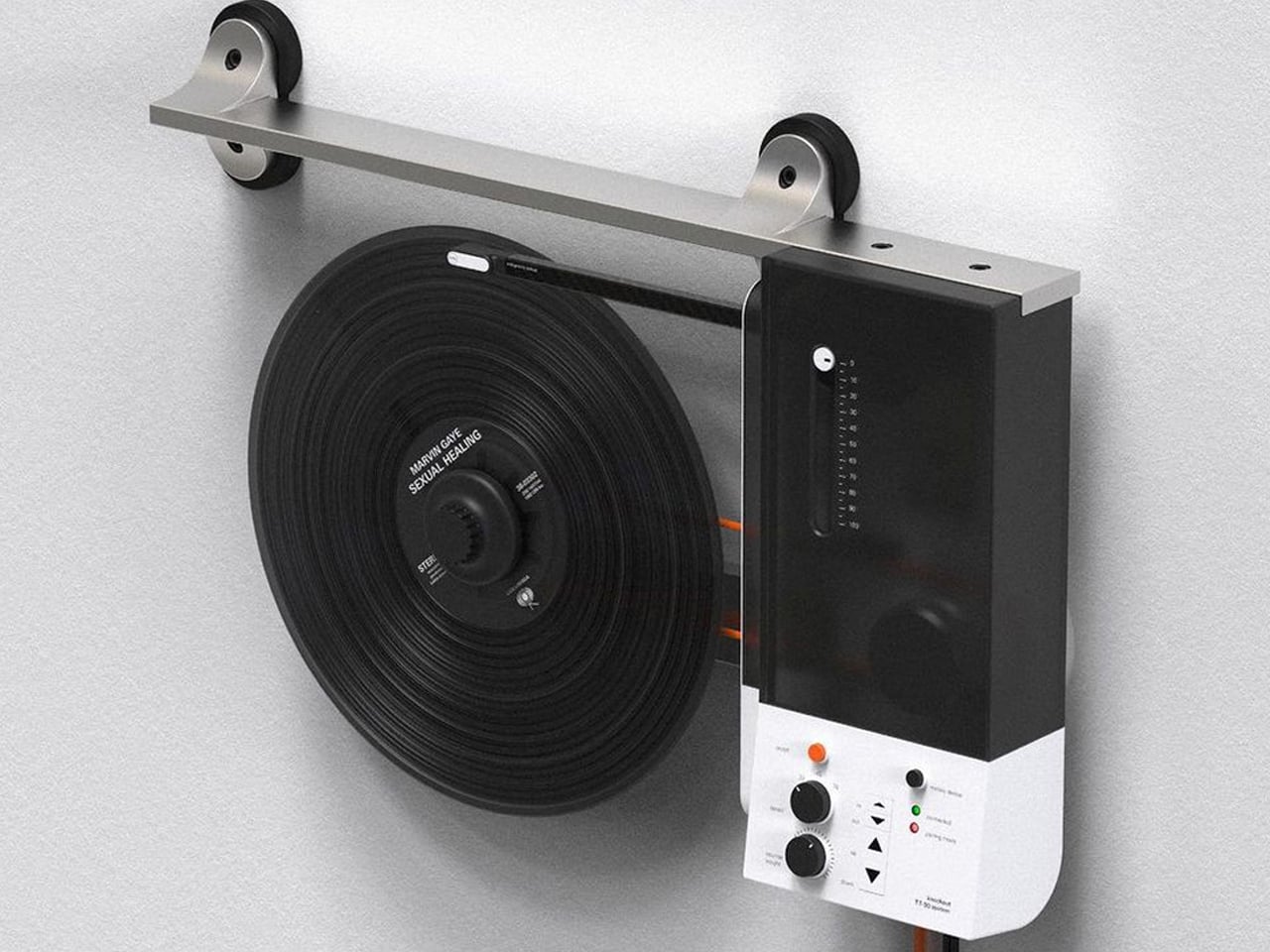
Oscar Olsson’s TT-90 System reimagines the traditional turntable by combining analog listening with contemporary digital functionality. Flipping the record player 90 degrees, the concept mounts the vinyl vertically on the wall, creating the illusion of a record floating in space as it spins beneath the needle. The unconventional format also addresses a common limitation of traditional turntables: their bulky footprint. Instead of occupying valuable furniture space, the TT-90 becomes part of the wall, transforming an everyday audio device into a striking piece of interior design. Available in black, orange, and white, its streamlined silhouette gives the familiar record player a distinctly futuristic character.

Beyond its space-saving approach, the TT-90 System introduces smartphone connectivity, allowing listeners to control playback digitally alongside onboard controls. Rubber components help reduce vibration against the wall, while a threaded knob secures the record during vertical playback. The result is a playful fusion of physical music culture, modern technology, and sculptural design.

3. Record Players Become Design

The turntable is experiencing its own design revival. Contemporary models are increasingly being designed to look at home alongside modern furniture rather than being treated purely as technical equipment. Minimal controls, warm materials, compact forms, transparent components, and sculptural bases are giving turntables a more furniture-like presence.

For Gen Z, this visual quality matters because technology is increasingly expected to contribute to a home’s aesthetic. A record player can become the centerpiece of a listening corner, positioned alongside books, plants, speakers, and carefully selected objects. The result is a more integrated approach to audio design, where performance and appearance work together instead of technology disappearing into a cabinet.

The Symphony headphones by Przemysław Wolnicki explore an intriguing meeting point between vinyl culture and contemporary personal audio. Instead of simply recreating the look of a record player, the concept translates its tactile interaction into a headphone interface. Each earcup features a miniature vinyl-inspired control surface that functions like a tiny turntable. Rotating the record allows listeners to seek forward or rewind, while the stylus controls track selection and playback. The interaction gives digital listening a physical dimension, creating a playful connection between nostalgic analog rituals and modern wireless audio.

Visually, the Symphony headphones take a distinctly premium approach. Brushed stainless steel gives the concept an audiophile-inspired character, while elongated structural elements add a futuristic, almost automotive quality to the earcups. Transparent sections introduce another layer of visual intrigue, allowing parts of the mechanism to remain visible.

4. Album Art Enters Interiors

Vinyl’s physical scale gives album artwork a presence that digital platforms cannot easily reproduce. A record sleeve can be picked up, examined, framed, displayed, or arranged as part of a larger collection. Its typography, photography, illustration, and color palette can influence the character of an entire room.

Gen Z’s interest in personalized interiors has made this particularly relevant. Rather than following perfectly coordinated design schemes, younger homeowners and renters often use meaningful objects to create spaces that feel individual. A stack of favorite records or a carefully arranged shelf can reveal musical taste while adding visual interest. Music therefore becomes part of interior storytelling, with album artwork functioning almost like a rotating gallery.

Building a vinyl collection comes with an important challenge: keeping records in excellent condition. Unlike digital music, physical records require careful storage and handling, with warping being one of the most common problems. Exposure to heat, pressure, or improper storage can distort a record’s shape, potentially causing skips, pops, and uneven playback. Pro-Ject’s Flatten it offers a dedicated solution for collectors who want to preserve their records or restore warped discs. Designed specifically for vinyl maintenance, the machine gently flattens damaged records while aiming to protect the delicate grooves responsible for their sound.

The Flatten it resembles a sophisticated record player, but instead of playing music, it uses heated aluminum plates to distribute warmth evenly across the record. Temperature controls allow users to adjust the process, while low temperature hysteresis helps maintain consistent conditions. Its solid aluminum construction gives the machine a premium, durable feel, while its straightforward operation makes it approachable even for first-time vinyl collectors.

5. A New Generation Collects

Gen Z is approaching collecting differently from previous generations. Owning vinyl does not necessarily mean building an exhaustive collection of an artist’s entire discography. Instead, younger collectors may choose albums because of their emotional significance, artwork, rarity, cultural relevance, or connection to a particular period of their lives.

Social media has further strengthened vinyl’s visual appeal. Record hauls, listening setups, shelves, packaging details, and limited-edition pressings naturally become content for visually driven platforms. Yet the appeal goes deeper than aesthetics. In an economy built around subscriptions and temporary digital access, owning a physical album offers a sense of permanence. Vinyl gives listeners something they can hold, display, revisit, and pass on.

Album artwork has long played an important role in shaping how music is experienced, turning records into visual as well as auditory objects. As streaming has reduced album covers to small digital thumbnails, vinyl has restored the opportunity to create tangible, immersive packaging. OK Go embraces that potential with its album And the Adjacent Possible, featuring an inventive vinyl jacket designed by Yuri Suzuki and Claudio Ripol. The gatefold cover transforms the familiar act of opening a record into an interactive visual experience, extending the album’s creative identity beyond the music itself.

Opening the jacket reveals a three-dimensional pop-up structure featuring geometric red and green domes that rise from the surface. A reflective element beneath them creates an optical illusion, making the partial forms appear like complete spheres. The playful construction recalls the wonder of a pop-up book while maintaining a sophisticated aesthetic. Its precise folds, geometric forms, and restrained palette turn the record sleeve into a sculptural object that connects music, packaging, and interactive design.

Vinyl’s revival reflects a growing desire for tactile, intentional experiences in a digital world. Gen Z is not simply bringing records back; it is redesigning the entire experience around listening, collecting, interiors, and personal expression.

The post 5 Designs That Prove Vinyl’s Comeback Was Never Just About the Music first appeared on Yanko Design.

  • ✇Yanko Design
  • Aston Martin’s 130-HP road-legal bike brings its luxury design language to two wheels
    Aston Martin has finally put its name on a road-ready motorcycle. Developed with Brough Superior, the AMB 002 Roadster is the first street-legal bike from the partnership, fusing Aston Martin’s sculptural design language and Brough Superior’s highly specialized approach into motorcycle engineering. Limited to just 300 individually built examples, it is intended for collectors and street riders alike. Unlike the earlier AMB 001 and AMB 001 Pro bikes, which were created exclusively for track use,
     

Aston Martin’s 130-HP road-legal bike brings its luxury design language to two wheels

10 septembre 2026 à 11:20

Aston Martin has finally put its name on a road-ready motorcycle. Developed with Brough Superior, the AMB 002 Roadster is the first street-legal bike from the partnership, fusing Aston Martin’s sculptural design language and Brough Superior’s highly specialized approach into motorcycle engineering. Limited to just 300 individually built examples, it is intended for collectors and street riders alike.

Unlike the earlier AMB 001 and AMB 001 Pro bikes, which were created exclusively for track use, the AMB 002 has been developed from the ground up for road riding. Aston Martin’s design studio has given it a compact, forward-biased silhouette, with smooth carbon-fiber surfaces broken up by crescent-shaped cooling vents along the sides. The bodywork rises around the rider, while slim, stalk-like mirrors and an exposed mechanical structure keep the motorcycle visually light.

Designer: Aston Martin

There are also deliberate references to Aston Martin’s cars. The brand’s signature side-strake has been reinterpreted around the headlamp, while the twin oval exhausts feature ribbed heat sinks inspired by the exhaust finishers used on models including the Vanquish, DB12 S and DBX S. At the rear, thin light blades borrow their visual character from the Aston Martin Vulcan, Valkyrie and Valhalla. Even smaller details, including the backlit ignition button, keyless operation and hand-crafted saddle leather seat pads, reinforce the connection between the motorcycle and Aston Martin’s road cars.

Underneath that carefully shaped bodywork is an all-new 1,083cc water-cooled V-twin producing 130 hp and 110 Nm of torque. Rather than chasing an extreme peak-power figure, the engine has been tuned around strong low- and mid-range torque, giving the roadster a more usable character for winding roads. The engine is CNC-machined from billet and built in-house at Brough Superior’s Toulouse facility, where the motorcycle is also machined and assembled.

The engineering gets particularly interesting around the chassis. A titanium structural frame is milled from a solid billet and weighs only 5 kg. It forms the backbone of the motorcycle while helping achieve a 50:50 weight distribution. Carbon-fiber body panels and the fuel tank help keep the center of gravity low, contributing to a total weight of 190 kg. Up front, the AMB 002 uses Brough Superior’s Fior fork, a double-wishbone system evolved from the setup used on the AMB 001 Pro. By separating steering and braking forces, the arrangement is designed to maintain front-end geometry under hard braking while improving steering precision. Its anti-dive characteristics are particularly useful when braking while leaned into a corner.

The result is an unusually focused road motorcycle where materials and mechanical architecture are as important to the experience as outright performance. Brough Superior will build each AMB 002 by hand in Toulouse, with first deliveries scheduled for the third quarter of 2027. Orders are already being accepted, making this less a conventional new motorcycle launch and more a limited production exercise in Aston Martin’s design language beyond four wheels.

The post Aston Martin’s 130-HP road-legal bike brings its luxury design language to two wheels first appeared on Yanko Design.

  • ✇Yanko Design
  • One Architect Quietly Ditched Rent for a 1sqm Treehouse Office
    Munich has some of the steepest commercial rents in Germany, and anyone who has tried to lease even a modest studio space knows the arithmetic rarely works in a small firm’s favor. Brokers, multi-year contracts, square footage priced by the centimeter. When the Munich architecture practice Opposite Office needed a new home base, founder Benedikt Hartl looked at those numbers and decided the smartest move wasn’t a smaller office or a coworking membership. It was no office at all, at least not th
     

One Architect Quietly Ditched Rent for a 1sqm Treehouse Office

10 septembre 2026 à 10:20

Munich has some of the steepest commercial rents in Germany, and anyone who has tried to lease even a modest studio space knows the arithmetic rarely works in a small firm’s favor. Brokers, multi-year contracts, square footage priced by the centimeter. When the Munich architecture practice Opposite Office needed a new home base, founder Benedikt Hartl looked at those numbers and decided the smartest move wasn’t a smaller office or a coworking membership. It was no office at all, at least not the kind anyone pays rent on.

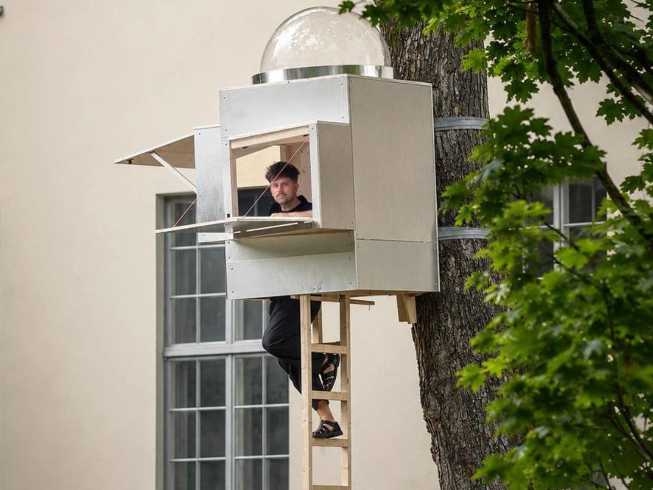
The result is Baumhaus Office, a roughly one-square-meter cube strapped to a tree on the campus of Bauhaus-Universität Weimar, built from spruce timber, plywood, and an aluminum shell that Hartl half-jokingly describes as “UFO-like.” A ladder gets you up to it. Inside, there’s shelving, a small desk, and fold-down panels that expand the workspace just enough to fit two or three people if everyone keeps their elbows in. A domed skylight sits overhead, so instead of staring at a drop ceiling, you get a view of the canopy. Two ratchet straps, cushioned with protective matting so the bark doesn’t suffer, hold the whole thing to the trunk. Hartl secured permission from the university’s president to install it there temporarily, and he’s designed it to come down just as easily and go up somewhere else.

Designer: Benedikt Hartl

His explanation for the whole exercise is refreshingly blunt. Rather than compete with Munich’s rental market, he moved the office out of it entirely and into the trees. He’s also put out an open call, only half-kidding, for anyone with a spare tree and a good view who doesn’t intend to charge him for it.

There’s an obvious punchline in a firm shrinking its footprint to one square meter, but the joke has a point buried in it. Opposite Office already works across borders on projects that rarely require a fixed headquarters, so the studio started asking why it needed a permanent lease at all. That question lands differently depending on where you’re reading this, but it lands. Downtown office towers in plenty of American cities have sat half empty for years now, landlords still pricing space as if 2019 never ended, and companies quietly deciding that a conference room and a Zoom link cover most of what used to require a floor plan. Baumhaus Office takes that same skepticism about commercial real estate and pushes it to its logical, slightly absurd conclusion. If the point of an office is a roof, a desk, and a door you can close, a tree does two of those things for free.

Opposite Office has framed the project as a nod to Cosimo, the boy in Italo Calvino’s “The Baron in the Trees” who abandons ground level entirely and never comes back down. I like that reference more than the usual sustainability talking points that get bolted onto projects like this. It’s not really about wood versus concrete. It’s about changing your vantage point on purpose, even briefly, to see whether the thing you assumed you needed was actually optional the whole time.

I’ll admit the practical side of me has questions. Winter in Thuringia is not gentle, and a plywood cube with a skylight is not insulation in any serious sense. But treating this as a permanent HQ misses the point Hartl is making. It’s a provocation with a ladder, built to prove that an architecture studio’s real asset is the people doing the thinking, not the address on the lease. Whether or not Baumhaus Office survives its first real storm, it’s already done its job: it made a very expensive problem look, for a moment, genuinely small.

The post One Architect Quietly Ditched Rent for a 1sqm Treehouse Office first appeared on Yanko Design.

  • ✇Yanko Design
  • Pharrell Quietly Revives Adidas’ Weirdest Y2K Water Shoe for $140
    Summer never really wants to let go, and neither does my closet. Every September I face the same annoying puzzle: sandals feel done, sneakers feel too heavy, and nothing in between actually handles a wet dock, a muddy trail, and a sidewalk trip to the coffee shop without looking like safety equipment. That gap between “technical” and “wearable” has been a real problem in footwear for years, and it’s exactly the space Adidas and Pharrell Williams just walked into with the PW Water Moc. The shoe
     

Pharrell Quietly Revives Adidas’ Weirdest Y2K Water Shoe for $140

10 septembre 2026 à 09:20

Summer never really wants to let go, and neither does my closet. Every September I face the same annoying puzzle: sandals feel done, sneakers feel too heavy, and nothing in between actually handles a wet dock, a muddy trail, and a sidewalk trip to the coffee shop without looking like safety equipment. That gap between “technical” and “wearable” has been a real problem in footwear for years, and it’s exactly the space Adidas and Pharrell Williams just walked into with the PW Water Moc.

The shoe is the third release under Pharrell’s ongoing Virginia label with Adidas, and unlike the Jellyfish or the Flat Earther before it, this one isn’t chasing runway drama. It’s pulling from something a lot more obscure: the Adidas Adventure Water Moc, a shoe most people forgot existed after the early 2000s. That’s the smart move here. Instead of inventing a new gorpcore silhouette from scratch, Pharrell dug up a shoe that was already built for exactly this problem, water to land, and gave it a reason to exist again.

Designer: Pharell x Adidas

Functionally, it actually holds up. The upper mixes breathable mesh with reflective webbing, and bungee-style laces get tucked under a wide strap so you’re not fumbling with knots every time you take it off at the door. The outsole is lifted from the 2005 Carnuba Adventure Moc, which means deep, aggressive lugs instead of the flat rubber most casual slip-ons get away with. It’s a shoe that seems genuinely fine with a creek crossing, not just a shoe that photographs well near one.

Where it gets interesting, and where I think Pharrell earns his credit, is the colorways. Adidas didn’t sand down the nostalgia to make it more palatable. The Lucid Ray Blue option comes with pink and seafoam accents that are unapologetically early-2000s, the kind of palette that would’ve looked at home on a Bratz commercial or a Limp Bizkit music video. There’s a black and silver pair for people who want the shape without the loud attitude, and a yellow colorway that splits the difference. None of them try to disguise where they came from.

I’ll admit I’m a little biased toward brands that actually go back to their own archive instead of just borrowing someone else’s aesthetic and calling it retro. Adidas has done this a few times now, quietly, and it tends to land better than the loud “vintage-inspired” drops that never point to an actual source. The Water Moc isn’t just Y2K flavored, it’s a real product from that era, rebuilt with better materials and a designer who clearly has affection for it rather than just using it as a trend hook.

At $140, it sits in a fair spot for a collaboration shoe with this much design history behind it. It’s not cheap, but it’s not asking you to pay Jellyfish-level hype pricing for something that’s essentially a reissue with upgrades. That price point also tells you who this shoe is actually for: people who want a functional water-ready shoe but refuse to wear something that looks like it belongs on a kayaking instructor.

What sneaker culture has been missing lately is a bit of goofiness that still functions. So much of the current outdoor-meets-fashion movement takes itself seriously, all muted colors and technical fabric with barely any personality. The Water Moc doesn’t ask to be taken that seriously, and that’s honestly refreshing. It’s a shoe that remembers being weird was part of the appeal the first time around.

Whether it becomes a genuine wardrobe staple or just a fun seasonal pickup probably depends on how much you already like the era it’s pulling from. But as a piece of design thinking, going back into the brand’s own closet instead of reinventing the wheel, it’s one of the more honest moves Adidas has made in a while. Sometimes the best new shoe isn’t new at all. It’s just finally getting its second summer.

The post Pharrell Quietly Revives Adidas’ Weirdest Y2K Water Shoe for $140 first appeared on Yanko Design.

  • ✇Yanko Design
  • 7 Japanese-Inspired Bedroom Accessories That Make a Dorm Room Feel Like a Ryokan
    A dorm room rarely arrives with any intention behind it. The furniture is standard issue, the lighting is whatever the university installed, and the walls belong to someone else’s lease. None of that stops you from shaping how the space feels. Japanese design has always found calm not through more, but through better. These seven objects apply that same thinking to the smallest rooms most people will ever live in. None of these picks need a drill, a landlord’s approval, or a subscription to any
     

7 Japanese-Inspired Bedroom Accessories That Make a Dorm Room Feel Like a Ryokan

10 septembre 2026 à 07:40

A dorm room rarely arrives with any intention behind it. The furniture is standard issue, the lighting is whatever the university installed, and the walls belong to someone else’s lease. None of that stops you from shaping how the space feels. Japanese design has always found calm not through more, but through better. These seven objects apply that same thinking to the smallest rooms most people will ever live in.

None of these picks need a drill, a landlord’s approval, or a subscription to anything. They are small, portable, and built around the same logic that shapes a good ryokan room: comfort comes from restraint, not accumulation. Each entry here handles one of four things — scent, light, sound, or surface — extremely well. Start with one, give it a few weeks, and notice how quickly the rest of the room reorganizes around it.

1. Battery-Free Aroma Diffuser

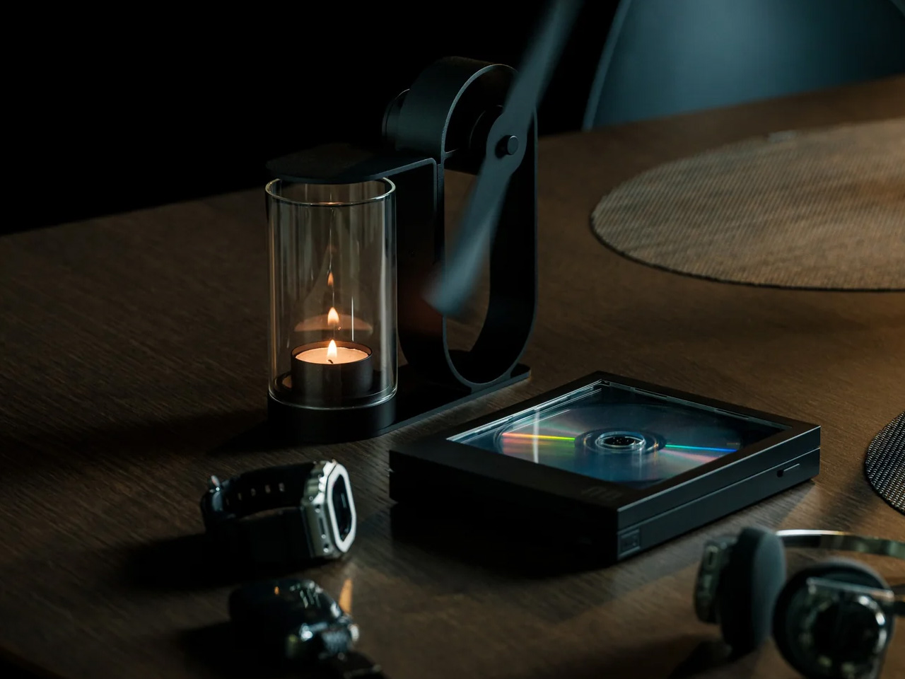
The most obvious thing about the Battery-Free Aroma Diffuser is right there in the name. No cord to manage, no batteries to replace, no USB port to compete with your laptop. A small candle sits inside a shielded housing, and the heat it generates spins a single fan blade that pushes scent further into the room than a standard candle would alone. The whole mechanism is visible from the outside, which is part of what makes it worth keeping on a nightstand in the first place.

There is something meditative about watching it work. The fan blade turns without any electricity, the scent builds slowly rather than blasting the room at once, and the exposed metalwork turns what is usually a plastic object into something closer to a piece of craft. In a dorm room where most objects compete for attention, this one earns it quietly.

Click Here to Buy Now: $290.00

What We Like

  • No batteries or cords means it works anywhere, including the awkward corner beside your bed
  • The exposed mechanism makes it look closer to a small kinetic sculpture than a gadget

What We Dislike

  • Scent only diffuses while the candle burns, so the effect does not last through the night
  • Open flame requires supervision and may conflict with dorm fire safety policies

2. REBORN PULP Acoustic Panel

Most acoustic panels solve one problem while creating another. They dampen sound but look like something salvaged from a recording studio, and nobody wants a room that looks like that. LIBGRAPHY’s REBORN PULP takes a different position entirely. Made from 100% recycled paper pulp with no plastics and no synthetic adhesives, it is fully biodegradable. The surface carries ridges and textures that reference a raked zen garden, available in colors drawn from traditional Japanese naming: natural, pale grey, celadon, and indigo.

What that means in practice is a panel that absorbs sound and reads as intentional decor at the same time, a combination almost nothing else in the acoustic category manages. The name Reborn refers to the material itself: paper that would otherwise be discarded, pressed into panels and returned to something useful. In a dorm room where wall decor is usually a poster or nothing, a REBORN PULP panel brings texture, quiet, and a considered material story from one object on the wall.

What We Like

  • The raked surface texture reads as genuine wall art, not acoustic treatment hiding behind decor
  • 100% recycled paper pulp construction with no plastics, no synthetic adhesives, fully biodegradable

What We Dislike

  • Availability outside Japan is still limited, making international purchasing complicated
  • Pricing is not publicly listed, which makes budgeting harder before you commit to inquiring

3. Portable CD Cover Player

Music in a dorm room usually comes from a phone propped against a glass. The Portable CD Cover Player changes the ritual entirely. You slot an actual CD into the body of the player, slide the album jacket into a front-facing pocket, and the artwork becomes part of what sits on your desk or hangs on the wall while the music plays. A built-in rechargeable battery and speaker mean it works anywhere you put it, no outlet or external speaker needed.

The design logic here is genuinely Japanese in its thinking: one object, handled well, replaces three. A phone stand, a music player, and wall art collapse into the same device. Priced from $199, it reintroduces the physical ritual of choosing and loading a disc, which is a deliberate act in a way that queueing a playlist never quite is. That small moment of intention is exactly what separates a ryokan from a hotel.

Click Here to Buy Now: $199.00

What We Like

  • Album art display turns a music player into a piece of rotating wall decor
  • Battery-powered and portable, so it moves freely around the room without hunting for an outlet

What We Dislike

  • Requires owning physical CDs, which most students no longer have on hand
  • The built-in speaker suits a small room but is not a substitute for dedicated audio

4. Pattern as Structure Shelf

When Japanese designer Muto Yumi set out to make furniture from paper, the result was not what most people would picture. No papier-mâché, no origami folding, no salvaged cardboard called art. What she built is a modular shelf system so structurally sound and visually precise that it makes you question most of what you assumed about material strength. The whole structure is built from rolled paper rods, and the pattern printed across each rod is not decoration. It is the joint itself.

Other paper rods slot through the pattern holes, linking each piece to the next without glue or hardware. The aesthetics and the engineering are the same thing, which is a level of design clarity rare in furniture of any material. Paper does not pretend to be something else. You can see the rolled layers at the cut ends. The pattern on each rod is both surface and structure, decoration and joint, and that indivisible coherence is what makes the shelf feel genuinely resolved.

What We Like

  • The pattern doubles as both decorative surface and structural joint, a design coherence almost nothing else achieves
  • Fully modular and hardware-free, meaning it can be reconfigured or disassembled without tools

What We Dislike

  • As a concept project, it is not yet available as a retail product to purchase
  • Paper furniture requires careful handling, and a shared dorm environment adds more risk than most

5. Infinite Solas Lamp

A dorm desk pulls double duty as dining table, reading surface, and workspace, often within the same hour. The Infinite Solas Lamp is built for that kind of restless room. It is fully wireless, running on a rechargeable battery that lasts up to 70 hours at low brightness or 6 to 7 hours at full, and the height adjusts between 22.5cm and 50cm so it fits wherever the moment calls for it, without the usual cord hunt before every use.

The color temperature runs from 2500K to 4000K with full dimming across the range, which means the same lamp that pushes you through a late assignment can settle into something much softer for reading in bed. The machined aluminum body with its anodized finish weighs just over a kilogram, enough to anchor a corner without needing shelf space.

Click Here to Buy Now: $325.00

What We Like

  • Battery life of up to 70 hours at low brightness means days between charges in normal use
  • Height adjusts from 22.5cm to 50cm so it functions equally well on a desk or nightstand

What We Dislike

  • At $325, it is one of the more expensive items on this list, which strains a dorm budget
  • Full brightness lasts only 6 to 7 hours per charge, so heavier use means more frequent recharging

6. Hinoki Bath Stools

A dorm shower is not typically where design decisions get made, but that does not mean the space is beyond improvement. Hinoki cypress lines traditional Japanese bathing rooms, carrying a natural oil that resists moisture and releases a gentle, forest-like scent that intensifies with warmth and steam. Tortoise General Store stocks these stools from $90, in three sizes, from the compact Umezawa at 10.5 inches long to the taller High Stool at nearly 15 inches.

The woodworkers of Tosaryu have perfected their craft in the mountains of Kochi, Japan since the 1970s, which matters for an object used every morning. The solid hinoki does not turn slippery underfoot the way plastic bath accessories do, and the natural oil within the wood keeps releasing scent each time it gets wet. Bringing one into a shared dorm bathroom is a small change with an outsized effect on how the space starts to feel.

What We Like

  • Natural hinoki oil releases a forest-like scent with heat and steam, making every shower more intentional
  • Three sizes available to suit different shower setups, from compact corners to wider stalls

What We Dislike

  • Solid wood requires occasional oiling to prevent drying and cracking in dry indoor climates
  • In a shared dorm bathroom with communal use, the stool will need consistent care and personal supervision

7. Aji Stone Book End Large

Most objects on a dorm desk either do a job or look good doing it. This one does both at once, without announcing either. The Aji Stone Book End Large is cut by Aoishima artisans from a single piece of granite quarried exclusively in the Aji and Mure regions of Kagawa Prefecture — a stone so dense and fine-grained it has been called the Diamond of Granite for over a thousand years. At 5.9 inches tall and 5.9 inches wide, it holds a shelf of design books in place with the kind of quiet authority that comes from actual mass, not styling.

The material itself is what makes it worth placing in a room. Aji stone is composed of quartz, feldspar, and biotite, and its tightly bonded crystals produce a polished surface with a speckled cloud pattern — called “ban” — that is unique to this stone alone and shifts subtly under different light. A ryokan room earns its calm partly through the weight and texture of real materials left to speak for themselves. One granite bookend on a shelf, holding a small stack of books, does more for a room’s mood than a shelf full of objects trying harder.

What We Like

  • Cut from a single piece of Aji granite by Kagawa artisans, so every surface marking is unique to that specific stone
  • The polished “ban” pattern shifts under different light conditions, making it a surface worth looking at even when nothing is leaning against it

What We Dislike

  • At $240, this is the highest price-per-square-inch object on the list, which is a real ask for a desk accessory
  • Genuine stone weight means it is not something to repack or move frequently, which matters in a room you vacate once a year

The Room You Sleep In Should Earn the Rest It Promises

A ryokan room earns its reputation not through luxury but through restraint. Nothing in it is accidental, and nothing is there simply to fill space. That same principle scales to a dorm room just as well. The objects on this list work because each one handles a single function with more care than the default version of that thing, and that care accumulates into something the room actually starts to feel like.

Start with light, since it does the most emotional work in the smallest footprint. Add scent next, because it transforms a room’s character without touching a single surface. Sound comes third. Surfaces come last, and they come slowly. The point is not to recreate a ryokan from scratch in a rented room. The point is to bring enough of that thinking with you that the place you sleep actually earns the rest it is supposed to give you.

The post 7 Japanese-Inspired Bedroom Accessories That Make a Dorm Room Feel Like a Ryokan first appeared on Yanko Design.

  • ✇Yanko Design
  • Finally, One Tower Replaces Your Speaker, Lamp, and Wine Fridge
    Anyone who has tried to furnish a studio apartment knows the specific defeat of running out of surfaces before you run out of gadgets. The speaker needs an outlet and a shelf. The lamp needs its own corner. The mini fridge for wine wants counter space that doesn’t exist. Each object is fine on its own, but stacked together on a single console table, they start to look like a garage sale that lost an argument with a design magazine. That is the exact problem South Korean designer Jung Hyun Kim s
     

Finally, One Tower Replaces Your Speaker, Lamp, and Wine Fridge

10 septembre 2026 à 06:07

Anyone who has tried to furnish a studio apartment knows the specific defeat of running out of surfaces before you run out of gadgets. The speaker needs an outlet and a shelf. The lamp needs its own corner. The mini fridge for wine wants counter space that doesn’t exist. Each object is fine on its own, but stacked together on a single console table, they start to look like a garage sale that lost an argument with a design magazine. That is the exact problem South Korean designer Jung Hyun Kim set out to solve with Babel, a concept he built for people who live in small rooms but refuse to shrink their idea of what home should feel like.

Kim designed Babel for a very specific and very real slice of the population, twenty somethings through mid thirties starting their independent lives in modest apartments, often around 500 to 550 square feet, the kind of footprint that is common from Seoul to Brooklyn to any first apartment in a city with real rent. His answer wasn’t to make each device smaller. It was to stop thinking about furniture and electronics as separate categories entirely, and instead build a single vertical column where every function gets its own segment, stacked like a totem instead of scattered like clutter.

Designer: Jung Hyun Kim

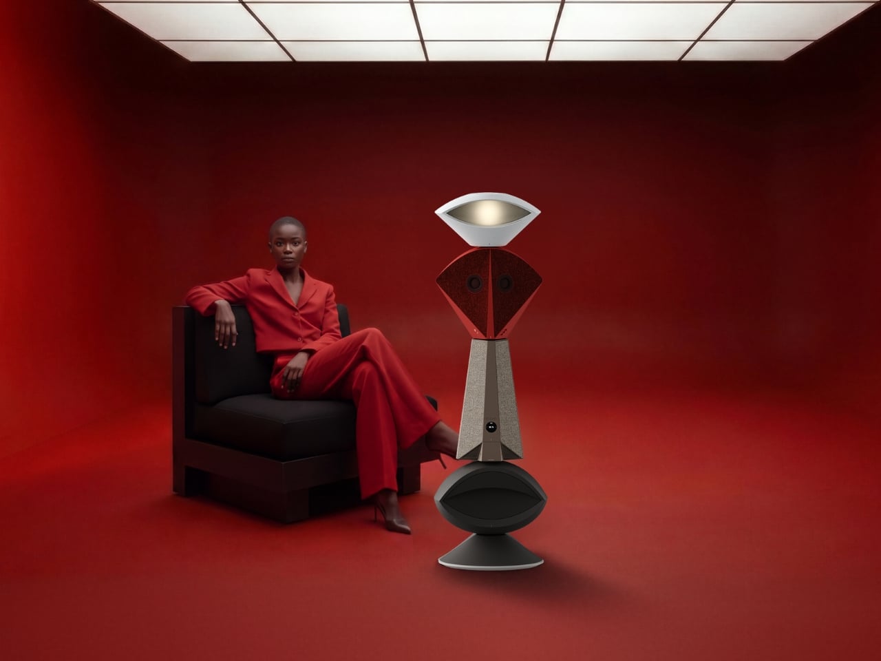
The tower reads almost like a figure standing in the room. At the top sits an eye shaped ambient lamp, its lens glowing warm and soft, the kind of light you’d want next to a couch at eleven at night. Below that, a red, fabric wrapped module houses the main speaker drivers, angled like a face with two eyes looking back at you, which is a genuinely clever piece of anthropomorphism for an object meant to live in your peripheral vision all day. The tapered midsection functions as the control hub, complete with a discreet volume display, and the whole thing terminates in a rounded black base that turns out to be a hidden drawer, a small cooling compartment for a couple of wine bottles. Four completely different jobs, one silhouette.

What makes this more than a novelty is the modularity built into the stacking logic. Nothing about Babel demands you use all four segments in one order. You can pull pieces apart, rearrange them, or run just the parts you need that week. A studio dweller might want the lamp and speaker without the bar module. Someone hosting more often might stack the drawer higher for easier reach. The design treats a small home the way a good capsule wardrobe treats a small closet, fewer pieces, each one doing more, none of them wasted.

I like that Babel doesn’t pretend the solution to small space living is owning less. It assumes you still want a good lamp, a good speaker, and a cold bottle of wine within reach, and it simply refuses to let those wants cost you three separate footprints. That feels more honest than most minimalist design advice, which tends to ask people to want less rather than design better. The name is a nice touch too, a nod to the biblical tower where many languages tried to reach the same point, which tracks neatly onto a product where lighting, sound, cooling, and control all speak different technical languages but rise from the same base.

Whether Babel ever becomes a shippable product is beside the point right now. It exists as a Behance concept, a portfolio piece from a designer who clearly thinks in systems rather than single objects, and that thinking is worth paying attention to regardless of manufacturing timelines. Apartment living isn’t getting more spacious anywhere, and the appetite for objects that look intentional rather than accumulated is only growing, especially among people who grew up curating every shelf for how it photographs. A stacked, sculptural answer to gadget clutter fits that mood perfectly.

Babel won’t fit every home, and a four function tower is a commitment, not an impulse buy. But as a piece of thinking about how to live well in less square footage, it’s one of the more clear headed ideas I’ve seen come out of a design program in a while. Sometimes the fix for too many objects isn’t fewer objects. It’s better posture.

The post Finally, One Tower Replaces Your Speaker, Lamp, and Wine Fridge first appeared on Yanko Design.

  • ✇Yanko Design
  • The $300 Sony Headphones Everyone Wanted Are Actually Back
    Anyone who has priced out a decent pair of noise-cancelling headphones this year has felt the sticker shock. Sony’s own flagship, the WH-1000XM6, launches at $449.99, and its wilder sibling, the 1000X The ColleXion, sits even higher. Bose isn’t cheaper. Sennheiser isn’t cheaper. The whole category has quietly drifted toward the idea that “premium” now means “$400 and up,” and a lot of people who just want good ANC for their commute or their next flight have been priced out of the conversation e
     

The $300 Sony Headphones Everyone Wanted Are Actually Back

10 septembre 2026 à 05:15

Anyone who has priced out a decent pair of noise-cancelling headphones this year has felt the sticker shock. Sony’s own flagship, the WH-1000XM6, launches at $449.99, and its wilder sibling, the 1000X The ColleXion, sits even higher. Bose isn’t cheaper. Sennheiser isn’t cheaper. The whole category has quietly drifted toward the idea that “premium” now means “$400 and up,” and a lot of people who just want good ANC for their commute or their next flight have been priced out of the conversation entirely.

That gap is exactly what the Sony WH-1000XM4C is built to fill. Rather than chase another spec bump nobody asked for, Sony reached backward and pulled the WH-1000XM4, arguably the most decorated headphones the company has ever made, back onto shelves. It’s a strange move on paper. It’s a smart one in practice.

Designer: Sony

The original XM4 launched in 2020 at $349.99 and spent the next few years collecting best-of lists like trophies. Then Sony did what companies do: it moved on. The XM5 arrived in 2022 with a slicker profile and a bigger price tag, and the XM4 quietly slid off the roster, even as secondhand units kept trading hands and forum threads kept insisting it was still the smarter buy. That’s a telling signal. Products don’t usually get nostalgic followings this fast unless they actually solved a problem well the first time.

So here comes the WH-1000XM4C, essentially that same beloved design, tuned up and priced down to $299.99, a full fifty dollars less than what the XM4 cost at launch six years ago. Sony isn’t calling it a sequel or a flagship. It’s calling it what it is: the old favorite, finally made available again, minus the frustration of paying more for less.

The changes are modest, and that’s sort of the point. The equalizer jumps from five bands to ten, plus a new gaming EQ, so listeners actually get more control over their sound instead of trusting Sony’s factory tuning blindly. There’s a new Lavender colorway alongside the familiar Black and Platinum Silver, a small but welcome nod to people who don’t want their headphones to look like they were designed for a boardroom. The foldable hinge and rotating ear cups are back too, which matters more than it sounds. The XM5 abandoned that folding design entirely, and the XM6 only brought it back last year. The XM4C proves that some engineering decisions age just fine.

There is one real trade-off. To meet updated battery regulations, the XM4C uses a different cell, and that shaves ANC battery life from 30 hours down to 27. Sony compensates with faster charging, three minutes on the cord for a full hour of playback, which is a fair swap for most people who top up during a commute anyway.

What I appreciate here isn’t the spec sheet. It’s the confidence behind the decision. Bringing back a six-year-old product without dressing it up as something revolutionary takes a certain honesty that most tech companies avoid. Sony isn’t pretending this is groundbreaking. It’s admitting that the formula already worked, and that not every product needs constant reinvention to stay relevant.

There’s a mild irony worth naming. Sony still sells discounted stock of the original XM4 at the same $300 price point, and by most accounts, that older pair edges out the XM4C slightly on raw sound and noise cancellation. So the company is technically competing with itself. But for shoppers, that’s not really a problem. It just means there are now two well-regarded paths into the same trusted design, instead of one shrinking window before flagship prices take over completely.

Headphones don’t usually get second chances like this. Most get replaced, discounted into clearance, and forgotten. The XM4C suggests a different approach is possible, one where a genuinely good product doesn’t have to disappear just because something newer showed up. That’s a quieter kind of innovation, but it might be the one more of the industry could stand to learn from.

The post The $300 Sony Headphones Everyone Wanted Are Actually Back first appeared on Yanko Design.

  • ✇Yanko Design
  • Come for the Cut, Stay for the Click: The DeckShiv Neo Delivers Both
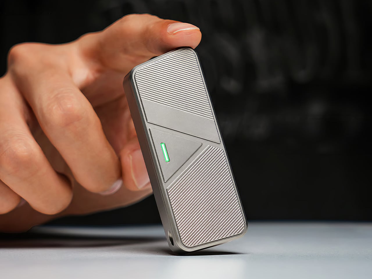
    Most utility knives are tools you forget about until you need one. The DeckShiv Neo is the one you reach for when you don’t. Rather than just existing purely to get a job done, like slicing open a box or trimming a stray thread, the DeckShiv Neo has a purpose long after you finish the task at hand. It’s a compact utility knife built around the moments when there’s nothing to cut at all, just a satisfying magnetic slide that clicks home every time you push it. That feeling comes from a three-par
     

Come for the Cut, Stay for the Click: The DeckShiv Neo Delivers Both

Par : JC Torres
9 septembre 2026 à 21:45

Most utility knives are tools you forget about until you need one. The DeckShiv Neo is the one you reach for when you don’t. Rather than just existing purely to get a job done, like slicing open a box or trimming a stray thread, the DeckShiv Neo has a purpose long after you finish the task at hand. It’s a compact utility knife built around the moments when there’s nothing to cut at all, just a satisfying magnetic slide that clicks home every time you push it.

That feeling comes from a three-part motion the brand calls the Push: travel, resistance, and return. Slide it forward, feel resistance build under your thumb, then let it snap cleanly back. The DeckShiv Neo adds 0.26 inches of extra travel over the original, just enough room for that resistance to develop without turning the motion into work. It’s a tiny change, but it’s the whole point.

Designer: ACTMAX Design Team

Click Here to Buy Now: $49 $79 ($30 off). Hurry, only a few left! Raised over $51,000.

Underneath that motion sits a reworked internal system built from four N52 magnets, two tucked inside the body and two more inside the slider cover. They add resistance as you push, then guide the slider back once you let go. A solid, CNC-machined brass rail also replaces the thin shim used before, giving the mechanism a guided path instead of loose surface contact.

There’s also a Pin and Stop Pin system tucked inside, which sounds technical but solves a simple problem: knowing exactly when the slide is finished moving. Push it all the way, and it stops firmly, with no mushy give or extra wiggle room. That crisp finish is part of why the motion feels complete every time, not just smooth in the middle.

The DeckShiv Neo’s surface plays a role, too. A fine, bidirectional texture is machined into the body so your thumb finds grip whether you’re pushing forward or letting it slide back, and it works the same whether you’re left- or right-handed. Every corner is chamfered, and every transition smoothed over, so the knife stays comfortable to hold no matter how many times you’ve already picked it up.

When there’s actually something to cut, whether it’s a stubborn shipping box, packing tape, or a swatch of leather, the Neo handles it with a 15-degree asymmetric blade opening that exposes about 0.95 inches of edge, roughly 26% more than before. That extra visibility keeps the cutting line in clear view, letting you guide the blade with more precision instead of guessing where it actually is.

The blade itself is a standard SK5 utility blade, the same kind you’d find at any hardware store, not some proprietary cartridge that locks you into overpriced refills. Two N52 magnets hold it firmly in place, backed by a mechanical stop that keeps it from shifting in use. Once it dulls, swapping in a fresh one takes seconds and barely costs anything.

The DeckShiv Neo is also about 20% thinner than its predecessor, measuring roughly 2.9 by 2.7 by 0.51 inches, small enough to disappear into a pocket without printing through your jeans. A one-piece deep-carry clip keeps it riding low and steady, and it comes off entirely if you’d rather clip it elsewhere or thread it through the built-in lanyard point instead, whichever suits how you carry things.

The body comes in Grade 5 titanium, aluminum, or PEI, and the choice changes more than the color. Titanium feels dense and grounded, giving each push a deliberate, mechanical quality. Aluminum feels crisper and lighter, quicker to respond under your thumb. PEI runs warmer to the touch, with a softer, more playful character. Same mechanism inside, three distinct personalities depending on what your hand prefers.

There’s one more quiet touch worth mentioning: an optional tritium vial slot that glows on its own for up to 25 years, with no batteries or charging involved. It’s a small, personal detail rather than a flashy one, fitting for a compact companion you’ll reach for out of habit, whether or not you need to cut much of anything that day.

What makes Neo different isn’t the titanium or the magnets. It’s the fact that you’ll push it for no reason at all, and that’s exactly the point. It’s a tool that cuts when you need it, but you’ll reach for it long after the boxes are opened. You’ll buy it for the cut. You’ll keep it for the click.

Click Here to Buy Now: $49 $79 ($30 off). Hurry, only a few left! Raised over $51,000.

The post Come for the Cut, Stay for the Click: The DeckShiv Neo Delivers Both first appeared on Yanko Design.

  • ✇Yanko Design
  • This Porsche 911 was lifted and rebuilt into a Chicago-ready urban safari car
    What happens when a Porsche 911 stops worrying about staying low to the ground? Tangent Design Group has an answer. Lift it three inches, widen its stance, add chunky off-road tires, and turn one of Stuttgart’s most recognizable sports cars into something that looks ready to escape the city rather than attack a racetrack. Built in Chicago, the Urban Safari 911 is an unusual exercise in rethinking what a modern Porsche can be. The project began in 2019, when the Chicago-based industrial design s
     

This Porsche 911 was lifted and rebuilt into a Chicago-ready urban safari car

9 septembre 2026 à 20:30

What happens when a Porsche 911 stops worrying about staying low to the ground? Tangent Design Group has an answer. Lift it three inches, widen its stance, add chunky off-road tires, and turn one of Stuttgart’s most recognizable sports cars into something that looks ready to escape the city rather than attack a racetrack. Built in Chicago, the Urban Safari 911 is an unusual exercise in rethinking what a modern Porsche can be.

The project began in 2019, when the Chicago-based industrial design studio decided to build a Porsche without the constraints of a conventional client brief. Tangent eventually started with a 2021 Porsche 911 Carrera 4, chosen for its all-wheel-drive platform. Finished in Porsche’s Paint-to-Sample Black Olive with a tan interior, the car already had a distinctive character before the transformation began.

Designer: Tangent Design Group

Tangent approached it like a product-development exercise. The original 992 was digitally scanned, including its bumpers, fenders, wheel wells, rocker panels, and rear engine cover. That data became the foundation for developing new components that could properly integrate with the factory body and its increasingly complex electronics. Full-scale parts were then 3D-printed and physically fitted to the car to refine proportions and attachment points before final production.

The most significant change sits underneath the body. Tangent developed a bespoke three-inch lift system while retaining the Porsche’s stock suspension architecture and avoiding software errors. The additional clearance makes room for larger off-road tires and fundamentally changes the stance of the 911. On a truck, three inches might be unremarkable; on a low-slung sports car, it transforms the proportions completely. Something similar to what Vagabund Moto did in collaboration with NINE ELEVEN OUTLAW and DakarGarage to transform a Porsche 924 S into an off-road-worthy ride.

The wheels received the same level of attention. Tangent designed them in-house and worked with Brixton Forged to produce bespoke forged aluminum wheels. Full-scale printed versions were used during development to judge how the design sat against the widened body before the final wheels were manufactured. Visually, the Urban Safari combines wide fender extensions, revised rocker panels, a custom front bull bar and a pronounced ducktail-style rear wing. Auxiliary lighting and roof-mounted adventure equipment reinforce its rally-inspired character, while the graphics package borrows from historic Porsche rally liveries without simply recreating one.

That distinction is important. Tangent’s project predates Porsche’s factory 911 Dakar, having been conceived in 2019, but it draws from the same broader history of Porsche competition cars built for surfaces far removed from a racetrack. Instead of copying a classic rally car or dressing the 992 in retro cues, Tangent has created something that feels contemporary and purpose-built.

The result is currently a one-off, but Tangent is accepting inquiries about the Urban Safari kit, leaving open the possibility that its design language could eventually find its way onto other 992-generation cars.


The post This Porsche 911 was lifted and rebuilt into a Chicago-ready urban safari car first appeared on Yanko Design.

  • ✇Yanko Design
  • Never Lose Your Keys Again With a Tracker That Glows in the Dark
    For forgetful people like me, trackers have basically become a must-have. Whether you’re clipping one onto your wallet, your car keys, your backpack, or whatever it is you absolutely cannot afford to lose, these little devices help you do exactly what they promise: keep track. The only catch is that a lot of trackers tend to look alike, and if you’re relying on appearance alone instead of the connected app, it’s easy to accidentally grab the wrong one. If you’re after a tracker that actually st
     

Never Lose Your Keys Again With a Tracker That Glows in the Dark

9 septembre 2026 à 18:30

For forgetful people like me, trackers have basically become a must-have. Whether you’re clipping one onto your wallet, your car keys, your backpack, or whatever it is you absolutely cannot afford to lose, these little devices help you do exactly what they promise: keep track. The only catch is that a lot of trackers tend to look alike, and if you’re relying on appearance alone instead of the connected app, it’s easy to accidentally grab the wrong one.

If you’re after a tracker that actually stands out, and one that can even glow in the dark, Pebblebee’s latest Evercolor drop might be exactly what you need. Evercolor is the brand’s limited-edition color program built exclusively for its Clip 5 tracker, and the newest release, called Neon Pulse, comes in two eye-catching shades: Techno Lime and Hotline Pink. Pebblebee describes the collection as perfect for “bold self-expression and a fresh-season reset,” and honestly, it’s hard to disagree.

Designer: Pebblebee

Evercolor has rolled out plenty of standout colors before, but Neon Pulse marks the first time the program has added glow-in-the-dark accents. That means your tracker stays visible even after its LED switches off, so you’re not just relying on the app to tell you where your item is. You can actually spot it in the dark, as long as it’s somewhere within eyesight.

Keep in mind that this is a limited-edition release, so if hot pink and neon green happen to be your colors, you’ll want to grab them soon. Pebblebee rolls out new Evercolor shades every twelve weeks, and once a drop sells out, it’s gone for good, no restocks. Previous collections like Freeze Frame and Heatwave Hijinks have already sold out, so if Neon Pulse catches your eye, don’t wait too long to add it to your cart.

Underneath all that color, though, it’s still the same reliable Clip 5 that Pebblebee originally released. It works with both Apple and Android devices, so you don’t have to worry about switching phones down the line. The rechargeable battery lasts up to a year on a single USB-C charge, which means no more digging through drawers for spare coin batteries. It also boasts a direct Bluetooth range of about 500 feet, roughly double what a lot of competitors offer, plus access to a global crowd-network for finding your stuff even farther away. On top of that, you get a 130dB siren, a bright LED strobe, and IP66 water resistance, so it can handle a little rain or an accidental splash without missing a beat.

It’s also worth noting that Neon Pulse still costs the same $34.99 as the standard Clip 5, so you’re not paying extra just for the fresh colorway. There’s also a free built-in safety feature called Alert, which can notify you if an unfamiliar tracker seems to be following you, a nice bit of peace of mind on top of everything else. Design-wise, the compact clip-on shape makes it look less like a tech gadget and more like an accessory for your bag, wallet, or keychain. Add in the bright, playful colorway, and it becomes even more fashionable, dare we say, kind of cool. So if your main complaint about trackers has always been that they all look the same, Neon Pulse is built to solve exactly that problem.

At the end of the day, a tracker is only useful if you can actually tell it apart from the pile of identical black and white gadgets everyone else seems to own, and if you enjoy using it enough to keep it clipped on in the first place. Pebblebee’s Neon Pulse drop checks both boxes, combining genuine utility with a design that feels personal rather than generic. Whether you’re the type who loses your keys weekly or you just want your tech to match your personality, this drop is worth a look before it disappears for good. And if pink and green aren’t quite your vibe, it might be worth keeping an eye on Pebblebee’s page anyway. With a new Evercolor drop landing every twelve weeks, there’s a good chance your perfect color combo is just around the corner.

The post Never Lose Your Keys Again With a Tracker That Glows in the Dark first appeared on Yanko Design.

  • ✇Yanko Design
  • A Chilean Architect Quietly Built a House That Follows the Hill Instead of Fighting It
    House 22, designed by Chilean studio Loft7 and completed in 2023, sits on a sloping coastal lot south of Punta de Lobos — a stretch of Chilean coastline known for dramatic surf and untouched native scrubland. The lot descends toward the northwest, and rather than resisting that gradient, the architecture follows it, letting the terrain pull the building naturally toward an uninterrupted view of the Pacific Ocean. At 320 square meters, the residence is generous without being excessive. Loft7 str
     

A Chilean Architect Quietly Built a House That Follows the Hill Instead of Fighting It

9 septembre 2026 à 18:30

House 22, designed by Chilean studio Loft7 and completed in 2023, sits on a sloping coastal lot south of Punta de Lobos — a stretch of Chilean coastline known for dramatic surf and untouched native scrubland. The lot descends toward the northwest, and rather than resisting that gradient, the architecture follows it, letting the terrain pull the building naturally toward an uninterrupted view of the Pacific Ocean.

At 320 square meters, the residence is generous without being excessive. Loft7 structured the build using a combination of reinforced concrete and steel frames — a technical pairing that allows the house to hold its ground on a challenging slope while keeping the interior language warm and tactile. Exposed timber beams run through the living spaces, the dining area, and the kitchen, grounding each room in material honesty. There’s no attempt to disguise how the building is put together. That transparency is the design.

Designer: Loft7

What makes House 22 worth studying isn’t a single dramatic gesture — it’s restraint applied consistently. The interiors lean on wood, natural light, and sightlines that always resolve at the ocean. No surface fights for attention. The beam grid overhead becomes rhythm rather than decoration, and the open-plan social spaces feel like they’re orientated by the view rather than by a floor plan. Spaces breathe because the architecture got out of the way.

Pichilemu is famous in surfing circles, but architecturally it’s a place where the Chilean coast has quietly been producing some of the country’s most considered residential work. Loft7 fits that lineage — a studio that has built its reputation around sites where nature already has the upper hand. Their approach with Casa 22 trusts the land and the light, deploying materials that age well in a coastal climate and a massing that reads modestly from the outside while delivering on every expectation from within.

Photographed by Fabián Acuña, the project looks different at every hour of the day. Morning light hits the timber and fills the interiors with warmth; the Pacific turns silver in the afternoon. That relationship between material, orientation, and time of day is never accidental in good coastal architecture — and here it feels entirely intentional. House 22 isn’t trying to be the loudest house on the Chilean coast. It’s trying to be the most honest one. On both counts, Loft7 delivers.

The post A Chilean Architect Quietly Built a House That Follows the Hill Instead of Fighting It first appeared on Yanko Design.

  • ✇Yanko Design
  • Your iPhone’s Portrait Mode Was Fake for a Decade – The iPhone 18 Pro Changes That With A Real Aperture
    Would you be shocked to hear that the “Portrait Mode” on your iPhone all these years was ‘fake’? Well, it’s real as in the background is actually blurred, but it isn’t blurred because the camera captured it that way, it’s all been software trickery for the past decade… until now. Six laser cut blades, each thinner than a human hair, are about to change that. The iPhone 18 Pro’s new main camera can physically open and close its lens for the first time in iPhone history, and that single mechanica
     

Your iPhone’s Portrait Mode Was Fake for a Decade – The iPhone 18 Pro Changes That With A Real Aperture

9 septembre 2026 à 18:30

Would you be shocked to hear that the “Portrait Mode” on your iPhone all these years was ‘fake’? Well, it’s real as in the background is actually blurred, but it isn’t blurred because the camera captured it that way, it’s all been software trickery for the past decade… until now. Six laser cut blades, each thinner than a human hair, are about to change that. The iPhone 18 Pro’s new main camera can physically open and close its lens for the first time in iPhone history, and that single mechanical change rewrites how the blur behind your subject actually gets made.

Here’s the quick version of how Portrait Mode has worked since 2016. Your iPhone takes the shot, uses a second lens or depth data to figure out roughly where you end and the background begins, then runs software over the image to blur everything behind that outline. It’s a clever guess dressed up as photography, and it’s why hair strands sometimes disappear into a smudge or a stray earring gets blurred along with the wall behind it. The new aperture system skips the guessing entirely. The lens itself controls how much of the scene stays sharp, the same way it’s always worked on a real camera.

Designer: Apple

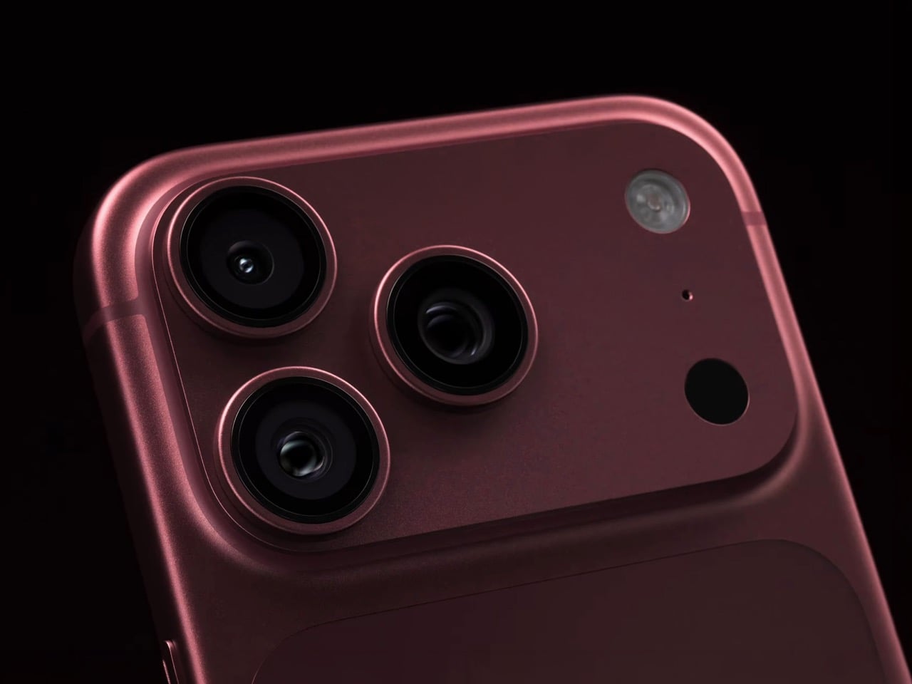
So how does a phone this thin pull off something that usually needs a chunky lens barrel? Apple built a system of six laser cut blades, each one thinner than a strand of hair, arranged around the main lens and moved by a tiny rotor mechanism. Together they shift the aperture through four stops, all the way down to f/1.48, with the camera defaulting to a f/1.8 for everyday portraits and opening or closing automatically depending on what it’s looking at. In low light it opens wider to pull in around 50 percent more light, which should mean cleaner night shots and sharper astrophotography without cranking up the ISO and adding grain.

Because this is optical now instead of computational, the depth falls off the way it would on an actual camera lens. Hair, glasses, jewelry, the fine stuff that always tripped up the old software blur, should render properly instead of getting smeared into the background by accident. Close the aperture down and you get more of the scene in focus for group shots, which is the same tradeoff photographers have been making with real cameras for a century. It’s just that now your phone gets to make that tradeoff too.

Apple didn’t stop at making the hardware smarter, it also handed a lot of that control directly to you. The redesigned camera app now includes Pro Controls, letting you manually pick one of the four aperture settings yourself, check exposure with an actual histogram, dial in white balance, and adjust shutter speed for motion blur or freeze frame shots. Third party camera apps are getting access to the same aperture system through an updated API, so this isn’t going to stay locked inside Apple’s own app for long. Photography folks who like getting hands on with their settings finally have a real reason to poke around the camera app instead of leaving everything on auto.

The upgrade carries over into video too. Cinematic mode effects can now be applied after you’ve already shot the footage, and it supports 60fps for smoother half speed slow motion. Time-lapse jumps to 4K with Dolby Vision HDR. None of that depends directly on the aperture blades, but it’s part of the same larger push this year to hand serious creative control to people who just want to point their phone and shoot something that looks intentional.

All of this sits inside a redesigned Pro body that now uses color matched aluminum and back glass, available in Black, Silver, the new Glacier, and a genuinely gorgeous Burgundy that photographs beautifully next to the camera module. The iPhone 18 Pro starts at $1,199 and the Pro Max at $1,299, both up for preorder September 12 and shipping September 18. For a feature that lives entirely inside a few hair thin blades you’ll never actually see moving, it might end up being the most noticeable camera change Apple has made in years.

The post Your iPhone’s Portrait Mode Was Fake for a Decade – The iPhone 18 Pro Changes That With A Real Aperture first appeared on Yanko Design.

  • ✇Yanko Design
  • Apple’s Coolest Watch Feature Has Nothing To Do With Health… It Lets You Rewind Time.
    “Could you come again?” “Pardon?” “Huh?” “Wait, say that one more time?” These are examples of phrases that make you seem dumber than you really are. Nothing destroys aura more than unironically asking someone to repeat something they said because A. you weren’t listening, or B. you were but just didn’t happen to comprehend what they were saying. Apple has a solution for that, and it’s wrapped up in their latest smartwatch. The new Live Rewind feature, powered by Apple’s new S11 chip, allows yo
     

Apple’s Coolest Watch Feature Has Nothing To Do With Health… It Lets You Rewind Time.

9 septembre 2026 à 16:30

“Could you come again?” “Pardon?” “Huh?” “Wait, say that one more time?” These are examples of phrases that make you seem dumber than you really are. Nothing destroys aura more than unironically asking someone to repeat something they said because A. you weren’t listening, or B. you were but just didn’t happen to comprehend what they were saying. Apple has a solution for that, and it’s wrapped up in their latest smartwatch. The new Live Rewind feature, powered by Apple’s new S11 chip, allows you to instantly transcribe the past 15 seconds of any conversation and read its chat logs. Press the digital crown on the new Watch twice, and you pretty much get ‘subtitles’ for the past 15 seconds, so you don’t have to “excuse me” your way into a repetition.

Your watch, just like your phone, earbuds, smart speaker, and smart home hub, is always listening. It’s waiting for the magic words “Hey Siri” or Alexa, or Google depending on which ecosystem you’re tied into. The point is, it’s always listening, so Apple simply created a way to package that into a feature that feels impressive rather than invasive. Think of how a dashcam can auto-log the past 3 minutes of video AFTER an accident occurs (using a feature called loop recording), Apple just brought that to your watch, packaged as a part of its new Audio Intelligence suite of features. Impressive, no?

Designer: Apple

Once you’ve got the transcript, you can ask Siri about it directly, or save it into the new Siri app to dig up later. Say your coworker rattles off a Wi-Fi password or a colleague mentions a book recommendation mid-hallway chat. Instead of fumbling for your phone, you catch it on your wrist and move on. Apple says none of this gets recorded in the traditional sense. Audio flows into a secure buffer inside the S11’s Secure Exclave, a hardware compartment isolated from the rest of the system, and once the transcript is generated, the raw audio is gone. No file, no clip, nothing to subpoena, because nothing exists.

Sitting next to Live Rewind is Siri Recap, which does the same basic trick but for an entire conversation instead of a 15 second clip. Turn it on before a meeting or a parent teacher conference, and Apple Intelligence quietly builds a title, a summary, and a list of key points you can review afterward in the Siri app. You control the boundaries here more than you’d expect. Leave it running all day, schedule it for work hours only, or flip it off entirely from Control Center whenever the conversation turns private. Summaries auto delete after seven days unless you save them, and saved ones sync end to end encrypted, so not even Apple can read them back.

Audio Intelligence isn’t just built for eavesdropping on your own life. Sound Recognition listens for sirens, alarms, doorbells, and crying babies, then buzzes your wrist even when your phone is nowhere nearby, which makes it a genuinely useful accessibility tool for anyone who is deaf or hard of hearing. Shazam gets folded in too, sitting in the Smart Stack and naming whatever song is playing around you without you having to pull out a phone. Four features, one microphone, and one chip doing the quiet work behind all of them.

Both Live Rewind and Siri Recap need Siri AI to function, and Siri AI is still in beta, so expect this to roll out gradually starting in English before other languages follow. You’ll also need an iPhone 16 or newer paired to the Watch, so the 16e and anything older is out of luck. Apple Watch Series 12 itself starts at $399, is available for preorder today, and ships September 18. The health sensors got a real upgrade this generation too, but for once, that isn’t the headline. The mic is.

The post Apple’s Coolest Watch Feature Has Nothing To Do With Health… It Lets You Rewind Time. first appeared on Yanko Design.

  • ✇Yanko Design
  • The iPhone Duo just killed the Dynamic Island, the SIM tray, and the demand for an iPad Mini
    Spare a thought for the iPad Mini, which had a perfectly good career until this morning. Apple’s $1,999 iPhone Duo arrives October 23 with a 7.6-inch inner display that takes Apple Pencil with USB-C later this year and runs two apps side by side, which covers roughly everything the Mini was for, except the Mini does not fit in your jeans. It also killed the dynamic island, swapping it for a punch hole outside and a FaceTime camera tucked under the inner screen. And it killed the SIM tray worldw
     

The iPhone Duo just killed the Dynamic Island, the SIM tray, and the demand for an iPad Mini

9 septembre 2026 à 15:11

Spare a thought for the iPad Mini, which had a perfectly good career until this morning. Apple’s $1,999 iPhone Duo arrives October 23 with a 7.6-inch inner display that takes Apple Pencil with USB-C later this year and runs two apps side by side, which covers roughly everything the Mini was for, except the Mini does not fit in your jeans. It also killed the dynamic island, swapping it for a punch hole outside and a FaceTime camera tucked under the inner screen. And it killed the SIM tray worldwide, because the thinnest iPhone ever made had no room left for sentiment.

Apple never announces any of this. It ships the replacement and lets the old thing stop making sense on its own schedule. The Duo is a whole product built out of things Apple decided to stop carrying, and the interesting part is how little you miss any of them once you see what moved into the empty space. John Ternus called it the most transformational change to iPhone since the original, which I not only agree with, I think I’d take it a step further by saying – this is such a dramatic leap for the iPhone that it stops being an iPhone. It isn’t an iPad either. It’s something completely different.

Designer: Apple

Apple refused to build a squarish slab that happens to close, and said so from the stage, calling out rivals whose square inner screens box movies into oversized black bars. The Duo lands at roughly passport size, with an asymmetric profile: two rounded corners on the right, squared geometry at the hinge. That asymmetry does something clever, because it tells your hand which edge to open before your brain gets involved. It reads like a small hardcover you want to crack open, which is a strange compliment to pay a phone. Somebody fought for that shape in a review meeting, and I am glad they won.

Both displays share a single aspect ratio, which is the decision the whole product rests on. Closed, the 5.4-inch outer panel delivers 90 percent of an iPhone 18 Pro’s screen area, so it works as a complete phone rather than a notification window. Open, the 7.6-inch inner canvas runs 50 percent larger than an 18 Pro Max. Because the proportions match, content scales between the two instead of reflowing awkwardly every time you fold, and the movie you started on the cover screen simply gets bigger. Every foldable before this one asked you to accept a jarring transition, and Apple designed the jarring part out.

Content flows between the two displays as the phone opens, expanding out of the cover screen and settling into the larger canvas without a stutter. I would put that transition ahead of anything Samsung, Google or Oppo has shipped on a folding device, and it is the single most beautiful piece of UI in the category right now. The matched aspect ratio is what makes it possible, because there is no reflow to disguise, only a scale. Controls stay locked in place along the side while the content grows around them. Watching it happen is the closest a phone has come to feeling like sleight of hand.

The crease is the thing people notice first on a foldable, and Apple has more or less made it disappear. A matte nano-texture finish across the inner display cuts glare and flattens how the fold reads, so the eye stops finding the seam. It also solves the other foldable complaint nobody talks about, which is the cheap plastic feel of a folding panel under your fingertip. Real glass sits above and below the display, and the whole stack is built to stop the panel distorting after a few thousand folds. Nine years of waiting bought Apple a fold you have to hunt for.

Grade 5 titanium forms the frame, polished to a mirror finish and broken by a hinge cover in contrasting micro-blasted texture. That pairing is the sharpest visual detail on the object, a bright reflective body interrupted by one matte band at the spine, and it gives the closed device a piece of jewelry quality that photographs beautifully in star white. Ceramic Shield protects the back, Ceramic Shield 2 the front, and the whole thing carries an IP68 rating. Pulling that dust and water rating across a moving joint is genuinely difficult engineering. The night sky colorway, a deep navy, is the one I would actually buy.

The dock is vertical now. iOS 27 moved essential controls to the side of the screen, freeing vertical space for content and landing the buttons under your thumb, which rewrites a layout convention Apple has held since 2007. The status bar compresses into a corner and the Dynamic Island turns sideways along the edge of both displays. Every first-party app had to be relaid out to make this coherent, and the fact that it still reads unmistakably as iOS is the real achievement here. Nobody outside Apple would have been permitted to move that dock.

Fold it halfway and iOS slides content away from the crease, giving you a laptop-style prop for video calls, a hands-free camera rig, and a bedside alarm face that wakes you with a gentle glow. StandBy now runs even when the phone is off charge, turning it into a photo frame or widget hub the moment you set it down. The speakers retune themselves depending on how far apart the two halves are sitting. One device, half a dozen legible postures, all of them designed rather than discovered by users after launch. The alarm clock pose alone will sell a few thousand units.

The cameras take advantage of having a second screen. Duo Preview throws a live feed onto the outer display so your subject can see themselves and fix their own framing, which ends a decade of “can you take it again.” Kid Cue plays Peanuts animations to make toddlers look at the lens. Smart Take watches the scene and fires the shutter once everyone is finally posed, killing the timer scramble. A 48MP Fusion Main with a 2x telephoto handles the actual imaging, alongside the same 48MP Ultra Wide found on the iPhone 18 Pro.

Going eSIM only across every market freed the internal volume for one battery per side, managed so the pair behaves as a single cell, delivering 31 hours of video on the inner display and 44 on the outer. I will miss the tray as a traveler, and I also suspect Apple has wanted it gone for years, because a physical port punched through the frame is a liability on a device chasing IP68 across a hinge. A20 Pro drives both panels, and fast charging reaches 50 percent in around 20 minutes. Some deletions are grief. This one is mostly relief.

Touch ID in the side button is a real step back from Face ID on a two thousand dollar phone, and it exists because a TrueDepth array had nowhere to live. Apple Pencil support arrives later this year rather than at launch, which softens the iPad Mini argument for a few months. The bezels look chunky beside a Galaxy Z Fold 8, and the folded body still reads thick in the hands-on shots. At $1,999, a hundred dollars over the Fold 8 and five hundred under what everyone predicted, Apple showed up nine years late and priced like it was early. Pre-orders open October 16.

The post The iPhone Duo just killed the Dynamic Island, the SIM tray, and the demand for an iPad Mini first appeared on Yanko Design.

  • ✇Yanko Design
  • This Photographer Spent Weeks in a Suzhou Silk Studio. Here’s What He Found
    When Jing Huang walked into a kesi weaving studio in Suzhou, China, he made a decision that runs counter to almost everything happening in photography right now. He put away the instinct to explain and just started watching. For most photographers working today, that would feel like leaving something on the table. In a studio where a finished piece can take months to complete, it turned out to be the only approach that made sense. Huang is a photographer with serious credentials. He won the Lei
     

This Photographer Spent Weeks in a Suzhou Silk Studio. Here’s What He Found

9 septembre 2026 à 14:30

When Jing Huang walked into a kesi weaving studio in Suzhou, China, he made a decision that runs counter to almost everything happening in photography right now. He put away the instinct to explain and just started watching. For most photographers working today, that would feel like leaving something on the table. In a studio where a finished piece can take months to complete, it turned out to be the only approach that made sense.

Huang is a photographer with serious credentials. He won the Leica Oskar Barnack Newcomer Award in 2011 for a series called Pure of Sight, and his visual style has always leaned toward stillness, restraint, and negative space rather than the kind of maximalist documentation that tends to flatten its subject. So when Lexar and Leica brought him to Suzhou to photograph kesi artist Hao Naiqiang, known professionally as Jingwei, the choice made sense on paper. What’s harder to predict is what happens when a photographer with that kind of discipline actually sits with a craft as slow and precise as kesi.

Artist: Hao Naiqiang (Jingwei) for Lexar and Leica

Photographer: Jing Huang

Kesi is a Chinese silk weaving technique that’s been around for centuries, and it operates on a logic completely alien to the way most things get made today. The artisan builds a piece thread by thread against a fixed warp, making constant decisions about color, contour, and rhythm with no automation, no shortcuts, and no undo button. There’s an old Chinese saying that captures it better than any technical description: an inch of kesi is worth an inch of gold. Jingwei has been practicing it for more than a decade and is formally recognized as a representative inheritor of the Suzhou tradition. Every finished piece represents a depth of time investment that genuinely earns that comparison.

What Huang found in that studio wasn’t a process to document. It was an atmosphere to respond to. His photographs don’t walk you through kesi step by step the way a documentary would. They move between Jingwei’s hands, the threads, the studio details, and the quieter visual textures of Suzhou itself, using the same painterly restraint that shapes his broader work. He described his own approach in a way that cuts straight to the point: photography, he said, is sometimes about forgetting time rather than recording it. What stays in an image isn’t when it was taken but whether it still carries beauty once the moment is gone.

That’s a fairly specific thing to believe in 2026, when the surrounding conversation about images is almost entirely about speed and generation. Anyone can produce a technically competent photo of silk threads in soft light right now without a camera, a plane ticket, or a studio. What that won’t produce is the weeks of presence, of actually being in a room watching another person work, that shapes how Huang sees and frames a subject.

This is where Lexar’s role in the project stops being a footnote. Grace Su, who heads Lexar’s European operations, made the point directly: before any photograph becomes a print, a press image, or a cultural archive, it first exists as an original file that needs to survive. Leica captures the moment. Lexar protects the file behind it. It’s a clean division of labor that gives the brand a genuine reason to be part of this story rather than just attached to it for the optics.

The show itself, titled Threads of Time: A Journey Through Silk and Lens, is presented at Leica Gallery Amsterdam and runs September 11 to 15. Curator Linda Warmerdam framed the exhibition as a dialogue between the photographer’s eye and the artisan’s hand, and that framing holds up, because both of those things require a body in a specific place at a specific time. No model trained on existing images can reproduce that.

You don’t need to care about textile history or gallery culture for the underlying point to land. Some things take real time, happen once, and mean something precisely because they can’t be convincingly faked. Huang spent weeks in a Suzhou studio to understand what kesi actually is. The photographs are what he brought back.

The post This Photographer Spent Weeks in a Suzhou Silk Studio. Here’s What He Found first appeared on Yanko Design.

  • ✇Yanko Design
  • The $179 iPhone Speaker That Never Needs Charging
    You’ve been waiting for your favorite artist to release their latest album, counting down the hours until it finally drops on your streaming service of choice. You open your phone and press play… and you’re a little disappointed. It’s not that the album isn’t great, it’s that your phone’s speaker doesn’t do it justice. You want something to amplify that sound right now, but your external Bluetooth speaker hasn’t been charged in weeks. The Battery-free Amplifying iSpeakers can solve that problem
     

The $179 iPhone Speaker That Never Needs Charging

9 septembre 2026 à 13:20

You’ve been waiting for your favorite artist to release their latest album, counting down the hours until it finally drops on your streaming service of choice. You open your phone and press play… and you’re a little disappointed. It’s not that the album isn’t great, it’s that your phone’s speaker doesn’t do it justice. You want something to amplify that sound right now, but your external Bluetooth speaker hasn’t been charged in weeks.

The Battery-free Amplifying iSpeakers can solve that problem for you, and you won’t need a single cable or Bluetooth connection to make it happen. This “dumb” speaker is actually smart enough to rely purely on acoustic engineering, channeling and amplifying the sound waves coming out of your phone so your music, podcast, or call sounds noticeably fuller than it would through your built-in speaker alone.

Click Here to Buy Now: $179.00

Designed by Ooi Masato and made in Japan, this battery-free device lives up to its name: it uses a precision-machined metal slot that cradles whatever phone you own, instantly amplifying whatever you’re playing. There’s no pairing process, no cord to plug in, and no anxious glance at a battery icon wondering if your speaker will cut out mid-song. You set your phone down, and it just works.

Design-wise, the iSpeakers follow a clean, minimalist aesthetic that looks just as at home on a cluttered work desk as it does on a nightstand or a bookshelf. The body is shaped around the golden ratio, giving it a visual balance that feels intentional rather than accidental (the kind of object you’d leave out on display rather than tuck into a drawer). It’s compact enough to toss in a bag, so you can bring your amplified sound with you to a picnic, a hotel room, or a friend’s backyard without hunting for an outlet. And because there’s no port, connector, or wireless protocol involved, it works with virtually any phone you own, including Apple’s freshly announced iPhone 18 Pro lineup and its first ever foldable, the iPhone Ultra, unveiled at today’s “Surprise and Shine” event. All you have to do is let the speaker slot cradle your phone’s speaker grille; there’s no compatibility chart to check and no software update to wait on.

The speaker itself is milled from Duralumin, the same lightweight, vibration resistant alloy used in aircraft construction. That means you’re getting a premium feel along with genuine durability. This isn’t a flimsy accessory that’ll crack after a few drops in your bag. The Japanese craftsmanship and golden ratio proportions give it a quiet sophistication that fits in seamlessly next to your laptop or coffee mug. If you want to get more out of it, you can also pick up the +Bloom and +Jet attachments, which let you customize how the sound projects, whether that means directing it upward for a fuller room fill or downward for a more intimate listening experience.

So how does this stack up against the Bluetooth speakers already crowding your shelf? Take a brand like JBL, whose Flip series has become a go-to for portable audio. Those speakers sound great and pump out serious volume, but they still ask you to charge them, remember to pair them, and eventually deal with a battery that won’t hold a charge like it used to. The iSpeakers skip all of that by design. You’re trading a bit of raw volume and bass depth for something Bluetooth speakers simply can’t offer: a device that will sound exactly the same in ten years as it does today, with zero maintenance and zero electronic waste. At $179, it’s priced closer to a premium Bluetooth speaker than a budget one, but you’re paying for a very different kind of value: permanence, craftsmanship, and simplicity over specs and app connectivity.

At the end of the day, the Battery-free Amplifying iSpeakers isn’t trying to replace your Bluetooth speaker for a backyard party. It’s solving a much smaller, more common frustration: the moment when you just want your phone to sound better, right now, without any setup. For anyone tired of charging cords, pairing screens, and speakers that die at the worst possible moment, this is a refreshingly simple fix, and a genuinely beautiful object to boot. Sometimes the smartest tech is the kind that doesn’t need power at all.

The post The $179 iPhone Speaker That Never Needs Charging first appeared on Yanko Design.

  • ✇Yanko Design
  • Felipe Pantone’s Tennis Court Refuses to Look the Same Twice
    A tennis court in Valencia currently looks like it’s sinking into the ground. Walk up to the edge of the one at Casa Axis and the white lines that normally just mark boundaries start pulling inward, stacking through fake layers of chrome and burgundy until the whole surface reads like a hallway you could fall down. It’s called Hard Court 2, painted by Spanish artist Spok Brillor, and it treats a sports court like a living canvas instead of a slab of asphalt everyone stops noticing the week afte
     

Felipe Pantone’s Tennis Court Refuses to Look the Same Twice

9 septembre 2026 à 12:20

A tennis court in Valencia currently looks like it’s sinking into the ground. Walk up to the edge of the one at Casa Axis and the white lines that normally just mark boundaries start pulling inward, stacking through fake layers of chrome and burgundy until the whole surface reads like a hallway you could fall down. It’s called Hard Court 2, painted by Spanish artist Spok Brillor, and it treats a sports court like a living canvas instead of a slab of asphalt everyone stops noticing the week after the ribbon gets cut.

That’s usually the fate of most site-specific art. A muralist gets a wall, a brand throws a launch party, and within a year the piece turns into background noise nobody actually looks at anymore. Sports facilities have it worse. A court gets painted once, and it stays that exact shade of green or blue for a decade, because nobody budgets for touch-ups, let alone reinvention. Casa Axis, the art and design space Felipe Pantone runs out of a 1975 house outside Valencia, didn’t fix that with a bigger maintenance budget. It fixed it with a rule: the court has to change, every single year, by design.

Designer: Spok Brillor

The rule lives inside C.A.I.O., the Casa Axis International Open, a scrappy little tennis tournament for artists that launched in June 2026. No rankings, no categories, no portfolios required. Just instinct, apparently, and a healthy amount of frustration. The twist is what the winner actually takes home. Instead of a trophy, they get handed the responsibility of repainting the court before the next tournament. Win the match, inherit the canvas.

Lucas Benarroch, known as MRKA, painted the first version in 2025, loosening the court’s regulation markings into loose, hand-drawn lines that felt more like a sketch than a sports surface. He then went on to win the inaugural C.A.I.O., which technically put him back in charge of the next transformation. He passed the job to Spok Brillor instead, who had competed against him in the same tournament. That handoff is the part I find genuinely clever. The competition doesn’t just crown a winner, it forces the winner to make a choice about who gets to shape the space next, which quietly turns a tennis match into a succession plan for an ongoing art piece.

Spok took the opposite approach from MRKA. Where MRKA loosened the geometry, Spok tightened it, repeating the court’s own markings inward through metallic gradients until the actual boundaries get harder to read. Deep reds and burgundies contract through rectangular planes, pale blue and yellow lines cross the surface like reflected metal, and the whole thing sits somewhere between an architectural shaft and a painted portal. It took twelve days to finish, and it’s already scheduled to disappear under whoever wins next year.

I like that this thing is built to be temporary on purpose. Most design work chases permanence, a piece that survives, a brand that lasts forever, a finish that never fades. Hard Court 2 does the opposite. It’s designed to be beaten, literally, by the next person good enough to win a tennis match on top of it. That’s a genuinely strange model for how art gets commissioned, and it works specifically because nobody involved is trying to make something that outlives its usefulness.

There’s also something honest about tying the transformation to actual competition rather than a curator’s calendar. Nobody at Casa Axis decided in advance that the court needed a refresh this September. It changed because someone won a match and had to make good on the assignment. That’s a small distinction, but it changes how the whole project feels. It’s less a rotating gallery and more a living structure that happens to have paint on it.

Whether this idea scales beyond one backyard court in L’Eliana is a fair question, and probably a “no” for most places. But the instinct behind it, building change into the rules instead of hoping someone remembers to update things later, feels like it’s worth stealing for a lot more than tennis courts.

The post Felipe Pantone’s Tennis Court Refuses to Look the Same Twice first appeared on Yanko Design.

❌