❌

Vue normale

  • ✇Yanko Design
  • Garmin’s New Watches Go 320 Hours Without Dying on You
    The most frustrating moment for a sports watch to fail is when you need it most: halfway through a long route with no easy way to recharge, or standing over a golf shot on an unfamiliar course with no clear sense of the distance. Garmin’s Enduro 4 and Approach S72 tackle different versions of that problem. One is built to keep working deep into an adventure. The other puts more useful information within reach before and after every swing. They make an interesting pair because neither treats des
     

Garmin’s New Watches Go 320 Hours Without Dying on You

8 octobre 2026 à 09:20

The most frustrating moment for a sports watch to fail is when you need it most: halfway through a long route with no easy way to recharge, or standing over a golf shot on an unfamiliar course with no clear sense of the distance. Garmin’s Enduro 4 and Approach S72 tackle different versions of that problem. One is built to keep working deep into an adventure. The other puts more useful information within reach before and after every swing.

They make an interesting pair because neither treats design as decoration. The Enduro 4 favors battery life, low weight and quick access to maps. The Approach S72 gives golfers a brighter, more visual way to understand the course and their game. Both have premium materials and comfortable fabric bands, but their real appeal is how those choices serve the person wearing them.

Designer: Garmin

Garmin Enduro

For the Enduro 4, battery life is the headline. Garmin rates it for up to 320 hours in activity mode or up to 90 days in smartwatch mode, with solar charging under the conditions behind those estimates. That is a meaningful promise for someone planning an ultramarathon, a backpacking trip or several days away from an outlet. I would still treat those numbers as best-case figures, but the design priority is clear: spend less time managing the watch and more time moving.

Its 51mm case is substantial, yet Garmin says the watch weighs 66 grams. A titanium bezel and scratch-resistant Power Sapphire lens bring durability, while a fiber-reinforced polymer case helps keep the weight down. The 1.4-inch MIP display is less showy than a vivid AMOLED screen, but paired with the solar lens, it suits a watch built around endurance. The fabric band and white-and-red LED flashlight are thoughtful details for long days that may turn into nights.

The improvements are not limited to how long the watch lasts. Garmin says the Enduro 4 has 50% more RAM than the Enduro 3 and map panning that is 30% faster. Grade-adjusted pace tools offer a better way to judge effort on hills, while stamina features help athletes see how their endurance changes during training. Garmin Epic can group activities across multiple days. Together, those features address a familiar problem: plenty of data, but not always enough context to use it.

Garmin Approach S72

The Approach S72 takes the opposite visual approach. Available in 43mm and 47mm sizes, it has a bright AMOLED display, a titanium bezel, a sapphire lens and a lightweight ComfortFit fabric band. I like the choice of two sizes here. A golf watch needs enough screen space to make a hole legible at a glance, but it also has to feel comfortable through a round and look at home afterward.

Its most intriguing idea is connecting golf performance to what is happening with the player. The watch can show heart-rate trends alongside a completed round, while swing metrics include hand speed, backswing length and wrist rotation. On the driving range, golfers can log practice sessions rather than leaving that work outside their broader activity record. None of this guarantees a lower score, but it could make practice feel more purposeful than guessing which part of a swing went wrong.

The course tools are more immediate. Green reading uses contour data to help golfers judge a line on select courses, while aerial imagery provides a clearer look at the hole ahead. Post-round putting analytics can reveal tendencies in speed, direction and make rate. These are the features that could save a few uncertain decisions during play, then give someone a specific thing to work on afterward. Some require a Garmin Golf membership, a detail worth checking before buying.

Battery life matters here, too, though on a different scale. Garmin rates the 47mm S72 for up to 20 hours of golf activity or 16 days in smartwatch mode; the 43mm model is rated for up to 15 hours and 10 days, respectively. Add heart-rate, stress and sleep tracking, and it becomes easier to see why Garmin designed this as an everyday watch rather than a device you pull out only for tee time.

Neither watch is trying to do everything for everyone. The Enduro 4 makes the strongest case for people whose plans regularly outlast ordinary battery life; the S72 is for golfers who want clearer decisions and better feedback. What connects them is a useful design principle: the best sports technology should reduce the little uncertainties that distract you from the activity you came to enjoy.

The post Garmin’s New Watches Go 320 Hours Without Dying on You first appeared on Yanko Design.

  • ✇Yanko Design
  • This $70 Plate Is for People Who Refuse to Let Fried Food Sit in Its Own Oil
    Now that I’m learning to cook more, I’m pretty excited to experiment with dishes I see online. The results aren’t always ready for other people to try. I still have a lot to figure out. On some days, though, I keep it simple and fry something. That brings up a familiar problem: getting rid of excess oil before the food reaches my plate. Usually, I move it from the pan to a rack or paper towel, then transfer it again when I’m ready to eat. What if I could skip one of those transfers? The Half-Mo
     

This $70 Plate Is for People Who Refuse to Let Fried Food Sit in Its Own Oil

8 octobre 2026 à 07:40

Now that I’m learning to cook more, I’m pretty excited to experiment with dishes I see online. The results aren’t always ready for other people to try. I still have a lot to figure out. On some days, though, I keep it simple and fry something. That brings up a familiar problem: getting rid of excess oil before the food reaches my plate. Usually, I move it from the pan to a rack or paper towel, then transfer it again when I’m ready to eat. What if I could skip one of those transfers?

The Half-Moon Plate is more than a nicer way to serve food for a photo. It pairs a ceramic plate with a half-moon-shaped rack that sits over one side. You can place fried food on the rack to let excess oil and moisture drain away while leaving the other side available for a salad, vegetables, rice, or another side dish. Instead of draining food in one place and serving it in another, the plate brings those steps together.

Click Here to Buy Now: Starting at $70

That arrangement matters when timing is everything. If you’ve made tempura, fried chicken, or crispy potatoes, you probably don’t want them sitting in a puddle of oil while you finish getting dinner ready. Elevating the food gives the oil somewhere to go and may help it stay crisp until you eat. You still need to give freshly fried food time to drain; the plate simply gives you a way to do it at the table or as part of your final plating.

I also like that the design doesn’t make the rack the whole story. The open half of the plate leaves room for the rest of the meal, so the fried food doesn’t have to take over. You can see everything together before you sit down, rather than juggling a cooling rack, paper towels, and a separate serving dish. For someone cooking in a small kitchen, or someone who just wants fewer things on the counter, that’s an appealing idea.

The half-moon shape gives the plate its visual identity, but it also creates a natural division between the main dish and its sides. If you’re trying to be more mindful of portions, that division may be a useful visual cue. It won’t measure a balanced meal for you, and draining surface oil doesn’t make fried food automatically healthy. What it can do is encourage you to think about what else belongs on the plate alongside your crispy favorite.

Compared with an everyday dinner plate from a big brand such as IKEA, the Half-Moon Plate asks a little more of its design. A conventional plate gives you one uninterrupted surface and works with almost any meal. This one is more specialized: the rack makes the most sense when food needs to drain or when you want to keep it elevated before eating. That makes it less of an all-purpose replacement for your existing dishes and more of an addition for meals where its distinctive layout earns its place. The plate is listed starting at $70.

Of course, a plate like this won’t eliminate every step. You’ll still need to handle hot food carefully, wait for it to drain, and wash the rack afterward. Those are worth considering if you’re looking for the quickest possible cleanup. But if you already make fried food regularly, combining a draining surface and a serving plate could make the trip from pan to table feel more organized. When you don’t need the rack, you can lift it off and use the ceramic plate on its own. That flexibility is important: a design meant for one kind of meal is easier to justify when it can still be useful on other days. I’d reach for the rack when I’m making something crisp and use the plate by itself when dinner calls for a simpler presentation.

The Half-Moon Plate won’t make me a better cook overnight. I’ll still have to get the timing, seasoning, and frying right. But it does address one small frustration I know well: watching something come out of the pan beautifully crisp, only to wonder where to put it while I finish the meal. If it helps me serve dinner with fewer transfers and a little less fuss, that’s a design choice I can appreciate.

The post This $70 Plate Is for People Who Refuse to Let Fried Food Sit in Its Own Oil first appeared on Yanko Design.

  • ✇Yanko Design
  • RIMOWA’s 2 New Colors Quietly Solve the Baggage Claim Problem
    At baggage claim, a good suitcase can have one frustrating flaw: it looks like everyone else’s. Rows of black and gray cases roll past, and the bag you chose for its clean design becomes surprisingly hard to pick out. Color seems like an easy answer, until the options swing too far the other way. Not everyone wants their luggage to look like a highlighter. RIMOWA’s new Umber and Ultramarine collection offers a more considered choice. Umber is an earthy brown; Ultramarine is a deep, saturated bl
     

RIMOWA’s 2 New Colors Quietly Solve the Baggage Claim Problem

8 octobre 2026 à 05:15

At baggage claim, a good suitcase can have one frustrating flaw: it looks like everyone else’s. Rows of black and gray cases roll past, and the bag you chose for its clean design becomes surprisingly hard to pick out. Color seems like an easy answer, until the options swing too far the other way. Not everyone wants their luggage to look like a highlighter.

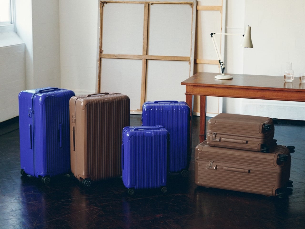
RIMOWA’s new Umber and Ultramarine collection offers a more considered choice. Umber is an earthy brown; Ultramarine is a deep, saturated blue. Both give the brand’s familiar luggage a distinct presence without asking travelers to trade a design they like for a novelty print. The colors extend to bags and accessories, too, so someone building a travel setup has more to choose from than a single suitcase.

Designer: Rimowa

I’m drawn to Umber because brown is an unusual choice for a hard-shell case. It has the warmth of an old leather travel bag, but on RIMOWA’s grooved Essential silhouette, it feels sharper and more contemporary. It’s a color for someone who wants to move away from black without feeling conspicuous at the hotel desk. I can imagine it looking just as right on a short work trip as it would on a longer vacation.

Ultramarine makes a different case for itself. It has enough depth to feel substantial, but it won’t disappear into a lineup of dark luggage. RIMOWA’s campaign connects the shades to historical pigments, drawing Umber from earth tones and Ultramarine from the blue associated with lapis lazuli. That backstory could have felt overly precious. Here, it gives the colors a useful design logic: these are rich, recognizable hues, not shades chosen just because they photograph well this season.

The execution matters as much as the palette. On the Essential suitcases, the color carries across the hardware for a monochromatic finish. That keeps the eye on the shape of the case and the rhythm of its grooves, rather than breaking it up with contrasting details. It’s a small decision, but one that makes the suitcases feel designed as complete objects instead of existing models dipped in new paint.

There’s also an appealing restraint to the wider collection. RIMOWA has brought the colors into its Groove bags, including a Mini Shopping Bag offered in both shades, while select smaller pieces come in Umber. That gives frequent travelers the option of a coordinated set, but it doesn’t demand one. I’d be more inclined to choose one piece I’d use often than to make every bag I own match my carry-on.

That’s where this release has a practical payoff. A more distinctive suitcase may be easier to recognize when bags are coming off the carousel, and a color you genuinely enjoy carrying can make familiar travel routines feel a little less anonymous. Neither benefit needs to be exaggerated. Umber and Ultramarine won’t create more packing space or make a delayed flight arrive sooner. They solve a quieter problem: useful luggage doesn’t have to feel interchangeable.

Of course, color is only part of a buying decision at this price. RIMOWA lists the Essential Cabin in Ultramarine at $990, so I’d still choose the size and configuration that suit my trips before choosing a shade. The collection is most compelling if you already like the Essential suitcase or want one of the smaller bags on its own. A beautiful color can make the right purchase more satisfying; it can’t turn the wrong suitcase into the right one.

For me, the success of Umber and Ultramarine is that they let two different personalities inhabit the same recognizable design. Umber feels calm and adaptable. Ultramarine has more energy, but enough depth to avoid feeling like a passing gimmick. That’s a good way to think about luggage you’ll live with beyond the excitement of buying it: not whether it looks striking in a campaign, but whether you’ll still be glad to spot it when it comes around the carousel.

The post RIMOWA’s 2 New Colors Quietly Solve the Baggage Claim Problem first appeared on Yanko Design.

  • ✇Yanko Design
  • This $20 Thank-You Card Just Solved Saying Thanks Without Overcomplicating It
    Giving out thank-you cards after a wedding or another event is not automatic anymore. Plenty of people still keep the custom alive, but others send a group email, post a message on social media, or simply move on to the next thing. I, for one, like receiving thank-you notes, whether they are personalized or not. They give me something to remember the occasion by, and I might even tuck one into my journal. When a note comes with a small gift, it feels all the more thoughtful. It tells me the sen
     

This $20 Thank-You Card Just Solved Saying Thanks Without Overcomplicating It

7 octobre 2026 à 19:30

Giving out thank-you cards after a wedding or another event is not automatic anymore. Plenty of people still keep the custom alive, but others send a group email, post a message on social media, or simply move on to the next thing. I, for one, like receiving thank-you notes, whether they are personalized or not. They give me something to remember the occasion by, and I might even tuck one into my journal. When a note comes with a small gift, it feels all the more thoughtful. It tells me the sender wanted to give me something I could enjoy after the event was over.

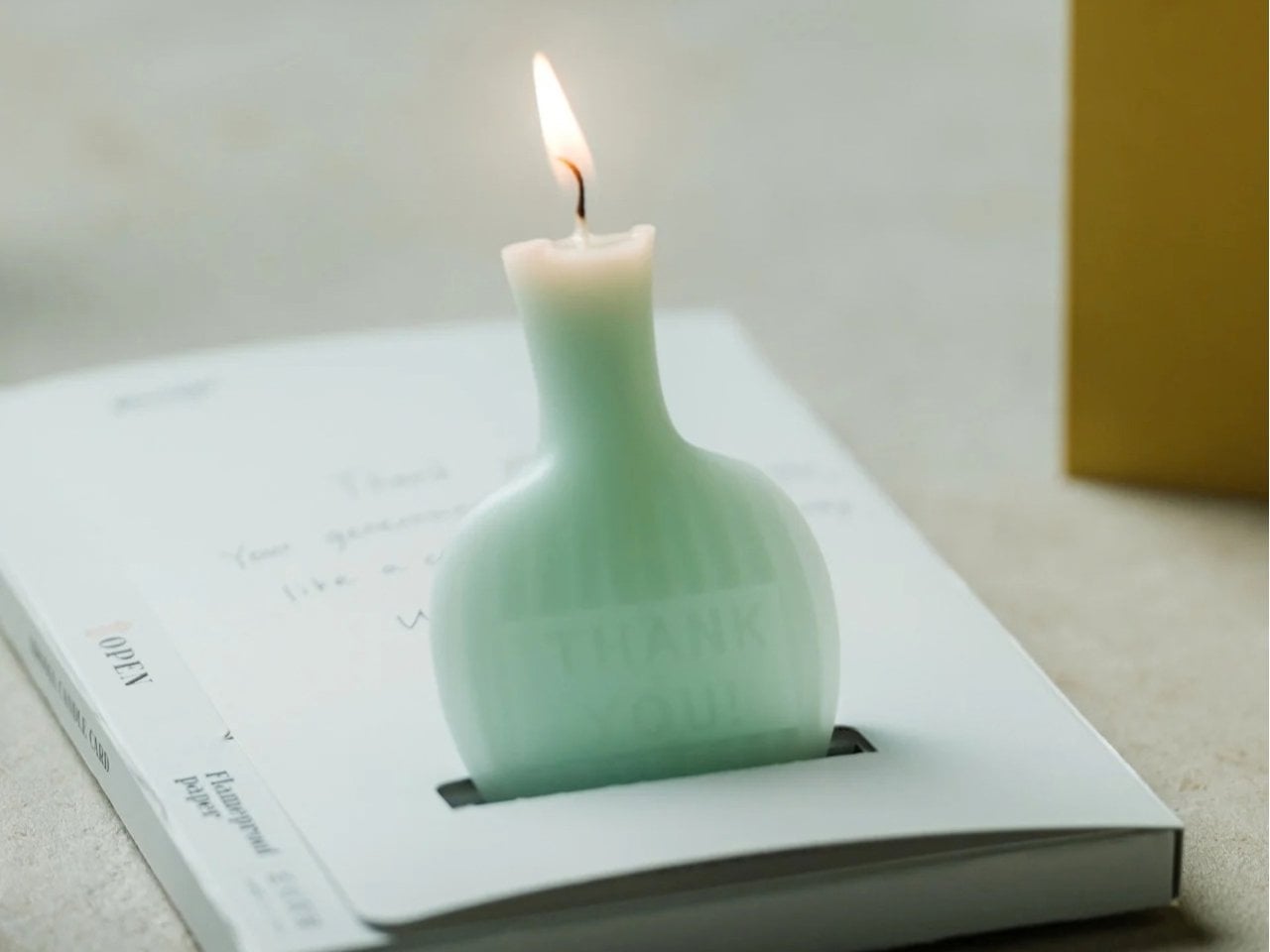
That is the idea behind the AromaCandle Thank You Card. It pairs a greeting card with a scented candle, turning a familiar gesture into something the recipient can read, display, and light. The written message delivers the thank-you, while the candle gives that message a little more time to linger. Even if someone eventually parts with the card because they do not like keeping paper around, they can still enjoy the candle. Well, until it burns out, of course.

Click Here to Buy Now: $20. Hurry, only 2 left!

At its heart, the design brings together two things people already give separately: a card with a personal message and a small gift. That combination is what makes it useful. You do not have to hunt for a candle that suits the occasion and then find a card to go with it. You still have room to write something specific, whether you are thanking a guest for attending your wedding or a friend for helping you move. The product is made in Japan, but its most appealing design choice is simple: it makes the card and candle feel like parts of the same gesture.

You have three options when it comes to the star, or rather, the flame of the show, which is the candle: Sakura (pink), Yuzu (yellow), and Green Tea (green). All three scents are associated with Japanese culture, even though the scents themselves were developed by artisans in Paris and New York. The smells and the colors as well can evoke the feeling of calm, freshness, and serenity once the receiver lights it up. It comes in a minimalist and elegant form and is shaped like a mini bottle with the actual words “Thank You” etched onto it directly.

For comparison, you could buy a Hallmark thank-you card and pair it with a Yankee Candle. That approach gives you more freedom to choose the exact card and candle you want, which might matter if you know your recipient’s favorite fragrance. The AromaCandle Thank You Card offers a different kind of convenience: the two elements are already designed to go together. At its $20 price tag, it is an option for someone who wants to give more than a card without shopping for a separate present. It is not a replacement for a larger candle, but it does make a small thank-you feel more complete.

That makes it especially appealing for occasions when a gift feels appropriate but a large one would feel excessive. You could give it to someone who hosted dinner, looked after your pet, or helped make an event run smoothly. It also offers an alternative to sending a quick text when you want to acknowledge someone’s effort more personally. The candle is a pleasant extra, but it does not have to carry the sentiment on its own. A few sincere, handwritten lines are what will make the gift feel like it came from you.

The AromaCandle Thank You Card solves a small but familiar problem: wanting to say more than “thanks” without making the gesture complicated. Its card gives you space to put your gratitude into words, and its candle gives the recipient something to enjoy afterward. Neither needs to be grand to be meaningful. Sometimes the most memorable part of a gift is simply knowing that someone took a moment to choose it, write a note, and hand it to you.

The post This $20 Thank-You Card Just Solved Saying Thanks Without Overcomplicating It first appeared on Yanko Design.

  • ✇Yanko Design
  • A Pen Holder That Actually Looks Like Desk Art
    When it comes to stationery and my work and leisure desk, I consider my aesthetic to be messycore and maximalist. Having a lot of pens and other supplies on hand whether for work or for my journaling sessions is normal for me. I tried to use some desk organizers, but it seems that there is order in my chaos and I can still find what I need when I need it, although it doesn’t really look all that Instagrammable. That hasn’t stopped me from looking at and exploring desk organizers and pen holders
     

A Pen Holder That Actually Looks Like Desk Art

7 octobre 2026 à 18:30

When it comes to stationery and my work and leisure desk, I consider my aesthetic to be messycore and maximalist. Having a lot of pens and other supplies on hand whether for work or for my journaling sessions is normal for me. I tried to use some desk organizers, but it seems that there is order in my chaos and I can still find what I need when I need it, although it doesn’t really look all that Instagrammable. That hasn’t stopped me from looking at and exploring desk organizers and pen holders, especially ones that look different from the usual.

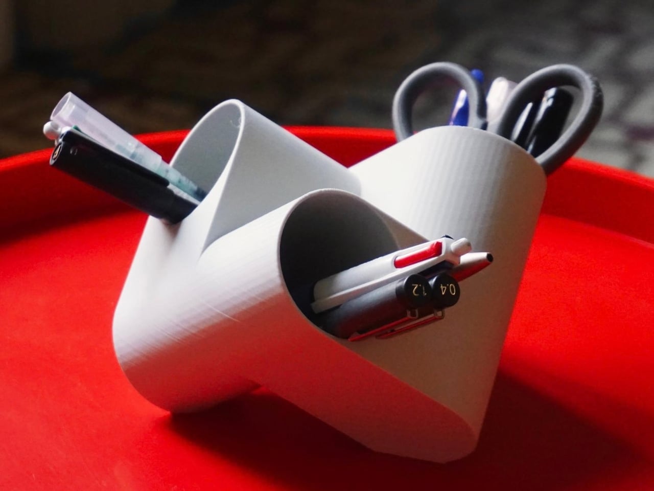
Ciclo is one such pen holder from Spanish industrial designer Eduardo Blanco. The way it’s designed is for you to have more space for your various stationery items and also to give your desk a kind of sculptural-looking organizer that looks good in person and also when you decide to do a post of how your desk looks at the moment. The inspiration for the design actually comes from mathematics and the name itself has ties to it.

Designer: Eduardo Blanco

Blanco said he wanted something that didn’t look banal on his desk. The inspiration comes from the Cartesian coordinate system, using three cylinders repeated around the same axis that are stacked and joined one on top of the other. Think about the X, Y, Z axes discussed during math classes (which I would rather forget) but brought to life as a sculptural stationery object. What would normally be a mundane or ordinary object is transformed into a well-designed piece that would look at home at an office desk, a creative workspace, or your side table. Aside from looking beautiful just sitting there, it also means you have three spaces to put your pencils, pens, markers, scissors, cutter, and other supplies you need to organize on your desk.

And honestly, that’s where Ciclo wins me over. Even for someone like me, whose desk looks like a stationery store had a very good time, there’s something undeniably appealing about having one piece that anchors the whole thing visually. You don’t have to be a minimalist to appreciate a beautiful object. If anything, if you’re already going the maximalist route, you might as well make sure some of those items on your desk are actually worth looking at, and Ciclo definitely qualifies. There’s also something kind of fun about having a mathematically inspired piece sitting among your journaling supplies and highlighter collection.

What I also find interesting about Ciclo is the way it challenges how seriously we take the objects we use every day. Most of us grab whatever cheap plastic pen cup is on sale at the office supply store, and that’s perfectly fine. It works. But Blanco’s approach asks a simple but quietly radical question: why settle for something that just works when you could have something that also makes you pause for a second and go, “huh, that’s actually really cool”? That shift in thinking is kind of what separates good design from great design, and it’s exactly what makes Ciclo stand out in a product category that designers have largely ignored.

It’s also worth noting that Ciclo was selected as part of Lagranja Design’s Open Design Editions 2026, a program that spotlights emerging and thoughtful design work, and was presented during Barcelona Design Week. That’s not a small nod. It means the design community sees real value in what Blanco created here, and that Ciclo is more than just a pretty object to put on display.

Whether you keep a very tidy, carefully curated desk or your workspace is a glorious organized mess like mine, Ciclo is the kind of object that earns its spot. It’s a pen holder, sure, but it’s also a small, quiet statement that the things you keep close while you work or create don’t have to be boring. And in a world where so many of us spend a huge chunk of our day at our desks, that feels like it actually matters.

The post A Pen Holder That Actually Looks Like Desk Art first appeared on Yanko Design.

  • ✇Yanko Design
  • A Reading Light That Actually Clips to Your Hair, Not Your Book
    Any bookworm worth their salt has experienced reading a book under the covers with a flashlight after their parents said it was time for lights out. When we got older and no longer had to follow a bedtime, we switched to bedside lamps or clip-on reading lights. Those two options, however, come with their own set of problems. A bedside lamp isn’t always the most comfortable option, especially when you need to change positions while lying down. A clip-on light, meanwhile, adds extra weight to the
     

A Reading Light That Actually Clips to Your Hair, Not Your Book

7 octobre 2026 à 15:20

Any bookworm worth their salt has experienced reading a book under the covers with a flashlight after their parents said it was time for lights out. When we got older and no longer had to follow a bedtime, we switched to bedside lamps or clip-on reading lights. Those two options, however, come with their own set of problems. A bedside lamp isn’t always the most comfortable option, especially when you need to change positions while lying down. A clip-on light, meanwhile, adds extra weight to the book, and you may have to keep adjusting it as you read.

This is the problem that Ryo Matsuoka seeks to solve with the concept for the Wearable Reading Light. As the name implies, it’s a light that you actually wear, so it moves with you as you read while lying in bed. The small light attaches magnetically to a clip worn in your hair. It can also attach directly to eyeglass frames made of magnetic metal, though not to every pair of reading glasses. You can angle the light toward your book while reading with the room lights off before going to sleep.

Designer: Ryo Matsuoka

The light has a wet-formed leather exterior, with three-dimensional shaping that gives it a smooth, rounded form. It doesn’t really look like your typical reading light; it’s designed to look more like a small accessory. The light unit measures 24 × 24 × 12 mm (about 0.94 × 0.94 × 0.47 inches) and weighs only 4.5 g (about 0.16 ounces), so it adds very little weight to what you’re wearing. Its compact shape also keeps it from looking like a headlamp when it’s clipped into your hair.

The indigo-dyed wood is another detail worth noticing. Together with the leather, it gives the device a more crafted appearance than you might expect from a small electronic gadget. Matsuoka has kept the technology out of sight beneath the leather, leaving the exterior clean and simple. In the photos, you mostly see a dark, rounded form and the small opening where the light shines through.

You can adjust the brightness across three levels, since the amount of light you want may depend on your surroundings or personal preference. There’s a hidden button to switch the light on, while a touch sensor controls the dimming. Those controls matter for something this small: you can make adjustments without adding a prominent switch to the design. The magnetic connection also lets you change the light’s angle, so you’re not stuck with one position if you shift around in bed.

It uses a replaceable coin battery, such as a CR1632, rather than a built-in rechargeable one. That means you won’t have to stop reading to charge it, provided you have a spare battery on hand. Matsuoka chose this approach with long-term use in mind: when the battery runs out, you can replace it instead of retiring the whole light because its rechargeable battery has degraded. The leather and wood were selected with that same idea in mind, as materials the designer expects to age well over time.

There’s also a dedicated storage case made from the same wet-formed leather and wood. It holds both the light and the clip, giving these tiny pieces a place to go when you’re done reading. That’s a practical touch for an object small enough to disappear among the things on a nightstand or at the bottom of a bag. It also makes the light feel like a complete design rather than just a clever attachment.

What makes the Wearable Reading Light interesting isn’t simply that it’s small. It’s that Matsuoka has moved the light away from the book altogether. You can hold a paperback without a clip tugging on its cover, and the light can stay with you when you change positions. For anyone who likes to end the day with a few pages in bed, that could make a familiar routine a little more comfortable. The concept doesn’t promise to replace every bedside lamp, but it offers an alternative for readers who have never quite found the right place to put one.

The post A Reading Light That Actually Clips to Your Hair, Not Your Book first appeared on Yanko Design.

  • ✇Yanko Design
  • Nike Actually Made Sneakers That Look Like Grandma’s Couch
    I lived in an era and a culture where our couches’ designs were pretty maximalist and contained a gazillion details. So when I see similar designs now being touted as “vintage”, I feel a little old but I’m also not surprised. All these floral and brocade prints seem to be a favorite now but I never expected Nike to actually join this party. The upcoming new Dunk Lows will be sporting the Golden Hops Brocade design so it will fit right in with your grandma’s couch, a sentence I never thought I w
     

Nike Actually Made Sneakers That Look Like Grandma’s Couch

5 octobre 2026 à 05:15

I lived in an era and a culture where our couches’ designs were pretty maximalist and contained a gazillion details. So when I see similar designs now being touted as “vintage”, I feel a little old but I’m also not surprised. All these floral and brocade prints seem to be a favorite now but I never expected Nike to actually join this party.

The upcoming new Dunk Lows will be sporting the Golden Hops Brocade design so it will fit right in with your grandma’s couch, a sentence I never thought I would have to write. This line is normally known for their minimalist and clear cut designs but they probably thought it’s about time to bring something different to the table, or more specifically, to your feet.

Designer: Nike

Unlike your usual sneakers from the Dunk Low line with its leather-heavy build, this pair’s entire upper is cut from velvet and features an elaborate floral/brocade pattern. It runs across the toe box, overlays, side panels, and even the heel. This makes your sneakers look like it was upholstered but still with the familiar Dunk Low silhouette.

The colors help sell the whole idea. Golden Hops and Velvet Brown give the floral pattern that warm, lived-in look, while the Pale Ivory details stop the shoes from disappearing into a sea of brown. I can imagine them sitting next to a tasseled lamp and looking perfectly at home, which is probably not a compliment I would give most sneakers. Then again, that is exactly why these caught my attention. They are leaning into the comparison instead of trying to make velvet look sporty.

Even the Swooshes get in on the fun. They have a puffier, stitched appearance rather than lying flat against the upper, with brown piping outlining their shape. The canvas tongue and light-colored laces offer a little visual break from all the flowers. Those details matter because an all-over print can become overwhelming pretty quickly. Here, your eye has somewhere to rest before wandering back to the pattern and finding another tiny flourish you missed the first time.

What would you wear with shoes that look ready to claim a spot in the living room? I would start simple. Dark jeans, relaxed brown pants, or a plain sweater would give them room to be the interesting part of the outfit. You do not need to dress like the entire couch set. In fact, the less competition these sneakers have, the easier it is to appreciate how unusual they are. They could also be a fun way to make an otherwise ordinary fall outfit feel more personal.

That is probably their biggest benefit. If you already own a reliable pair of everyday Dunks, the Golden Hops Brocade is not here to replace them. It is here for the days when your usual shoes feel a little too predictable. The familiar low-top shape keeps the look from feeling completely unfamiliar, while the velvet and floral print give people something to talk about. Whether the first comment you get is a compliment or a couch joke, at least your sneakers will have started a conversation.

There is a practical side to consider, though. Velvet is a different proposition from the leather you might normally expect on a Dunk Low, so I would not treat this as my carefree, wear-it-in-any-weather pair. The texture is part of the appeal, and I would want to keep it looking good. These make more sense as a statement shoe you bring out when the forecast is friendly, not the pair you grab before walking through a downpour.

The shoes are reportedly priced at $125 and expected to arrive in Fall/Winter 2026, although an exact release date has not been announced. If you are looking for a sneaker that will quietly match everything in your closet, this probably is not it. But if you have ever looked at an old floral couch and thought, “You know what? That pattern deserves another chance,” Nike might have made the shoe for you.

The post Nike Actually Made Sneakers That Look Like Grandma’s Couch first appeared on Yanko Design.

  • ✇Yanko Design
  • Flat-Pack Furniture That Actually Survives Your Next Move
    Flat-pack furniture is easy to appreciate on the day it arrives. It fits through the door, and you can usually put it together without much help. The harder test comes later: can it survive a move, come apart cleanly, or be repaired when something goes wrong? FLAT/FORM, a collection by designer Satoshi Itasaka of h220430, is built around those questions. Its pieces use bolts and nuts so they can be assembled, disassembled, repaired, and transported again. That might sound like a modest ambition
     

Flat-Pack Furniture That Actually Survives Your Next Move

5 octobre 2026 à 04:15

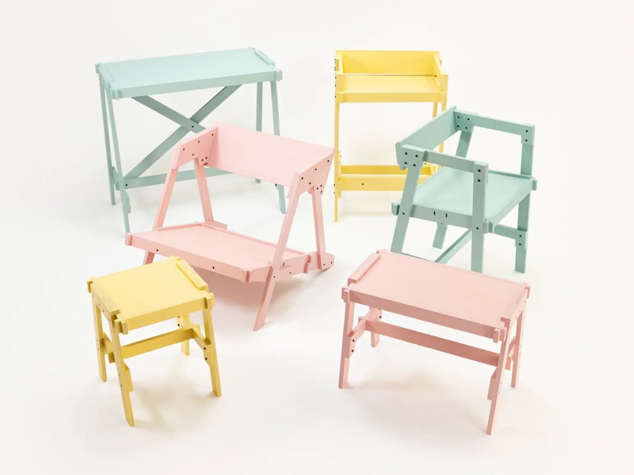
Flat-pack furniture is easy to appreciate on the day it arrives. It fits through the door, and you can usually put it together without much help. The harder test comes later: can it survive a move, come apart cleanly, or be repaired when something goes wrong? FLAT/FORM, a collection by designer Satoshi Itasaka of h220430, is built around those questions. Its pieces use bolts and nuts so they can be assembled, disassembled, repaired, and transported again.

That might sound like a modest ambition, but it changes how I look at the furniture. A dining chair is rarely a one-time purchase for a single room. It may follow you through different apartments, sit beside several tables, and get carried up more stairs than you care to count. FLAT/FORM treats that ongoing life as part of the design brief, rather than leaving it to chance after the first assembly.

Designer: h220430

The material gives the project its character. FLAT/FORM uses 15-millimeter-thick veneer panels made from Japanese cedar trees more than 100 years old, with timber supplied by Miyazaki-based forestry company GROWTHRING. A dining chair and a low table are among the pieces in the collection. Both start from flat panels, a straightforward idea that lets the wood grain do some of the visual work while the construction remains easy to understand.

I like that balance. The collection does not try to disguise how it is made. Its flat planes and visible connections make assembly feel like a considered feature, not an awkward step between opening a box and enjoying the result. That distinction matters because a piece can be visually quiet without feeling anonymous. Here, the simple construction gives the furniture a recognizable point of view, while leaving room for the cedar to be the thing you notice first.

The choice of older cedar also invites a little care in how we talk about the project. Wood with a compelling history does not automatically make a product sustainable, and a furniture collection cannot solve every problem associated with consumption. What FLAT/FORM can offer is a more specific proposition: furniture intended to come apart, travel, and be repaired instead of being treated as finished when its first arrangement stops working. That seems more useful to me than a sweeping environmental promise.

There is a practical kindness to that approach. Moving is already expensive and tiring; furniture should not add a puzzle you are afraid to solve twice. Bolts and nuts are familiar hardware, and the collection’s assembly system is intended to make disassembly possible. None of that guarantees that every move will be effortless. It does mean the designer has acknowledged that people relocate and rearrange their lives, and that a chair ought to have some chance of keeping up.

I would still want to sit in the dining chair before making any grand claims about it. Photographs can tell you plenty about proportion and material, but not how a seat feels through a long dinner. Nor does an elegant assembly concept tell you what the collection costs or how its surfaces will age in a busy home. Those are fair questions for any furniture meant to last, particularly furniture whose appeal rests partly on the idea of keeping it around.

Even with those questions open, FLAT/FORM feels refreshing because it gives flat-pack design a different priority. Convenience at delivery is helpful, but convenience at every stage afterward may be the better measure. A table that can leave one home and settle into another without becoming a burden has a value that is easy to overlook when shopping by appearance alone. Itasaka’s collection makes that overlooked part of ownership visible.

Perhaps that is the quietest, strongest idea here: furniture should be allowed to have a future. FLAT/FORM does not need to look complicated to make that point. It uses flat cedar panels and ordinary fasteners to ask a sensible question of a familiar category: what if getting a piece into your home were only the beginning of a good design? That is a question worth asking before the next box arrives at the door.

The post Flat-Pack Furniture That Actually Survives Your Next Move first appeared on Yanko Design.

  • ✇Yanko Design
  • Nespresso x Swarovski: A $299 Coffee Machine Nobody Ignores
    Coffee machines have an awkward relationship with the kitchen counter. We need them within reach every morning, but once the coffee is made, many look like appliances we would rather tuck away. The Nespresso x Swarovski collection takes that small design problem seriously. Its crystal-embellished CitiZ Platinum is a machine meant to stay visible, giving the coffee corner a reason to look considered even when nobody is making a cup. That does not mean your morning coffee needs an audience. Most
     

Nespresso x Swarovski: A $299 Coffee Machine Nobody Ignores

4 octobre 2026 à 11:20

Coffee machines have an awkward relationship with the kitchen counter. We need them within reach every morning, but once the coffee is made, many look like appliances we would rather tuck away. The Nespresso x Swarovski collection takes that small design problem seriously. Its crystal-embellished CitiZ Platinum is a machine meant to stay visible, giving the coffee corner a reason to look considered even when nobody is making a cup.

That does not mean your morning coffee needs an audience. Most of us just want a reliable routine before the day gets loud. But a machine that sits out all day affects how a kitchen feels long after its job is done. I like the idea of treating that presence as part of the design, rather than pretending a frequently used appliance can somehow vanish between cups.

Designer: Nespresso x Swarovski

The limited-edition CitiZ Platinum has a silvery finish, with Swarovski crystals placed around its border. It is a noticeable change, though the machine remains recognizable as a CitiZ Platinum. That balance matters. Covering every surface in sparkle might make for a memorable photograph, but the more useful question is whether you would enjoy seeing it beside your favorite mugs on an ordinary Tuesday.

For me, the answer has less to do with luxury than with attention. Kitchens collect objects by necessity: a toaster, a kettle, a jar of spoons, the mug that never quite makes it back into the cabinet. A crystal-accented coffee machine cannot tidy that counter for you. It can, however, make one of its most permanent residents feel intentional.

The collaboration stretches beyond the machine. Nespresso and Swarovski have carried the festive look into coffee, accessories, and capsule-inspired ornaments. The collection’s packaging draws on Swarovski’s octagonal shape and color palette, so the visual idea follows you from the machine to the smaller things around it. I appreciate that continuity. A special-edition appliance can feel oddly isolated when everything accompanying it looks like business as usual.

There are limited-edition coffees in the collection, too, including Crystal Spark options for Nespresso’s Original and Vertuo systems. That gives the partnership a place in the cup as well as on the counter, though I would keep the two appeals separate. The crystals are a design choice, not a claim that the machine brews better coffee because it has been dressed up.

That distinction makes the product easier to appreciate. You do not have to believe every appliance needs a glamorous makeover to see who this is for. If you have spent time arranging a coffee station, choosing cups you enjoy holding, or finding a spot where the morning light hits just right, the machine fits into an interest you already have. It offers convenience without asking you to give up the pleasure of looking at your space.

It also makes sense as a gift for someone who already has very specific tastes. Coffee can be hard to buy for another person, especially when their preferred capsules and flavors are settled. A design-led machine is a more personal gesture, provided you know it suits their setup. I would check compatibility and availability before getting attached to the idea, particularly with a limited-edition collection.

Of course, sparkle is a matter of taste. Some kitchens look best with almost nothing on the counter; others are happier with color, collections, and objects that start conversations. This CitiZ Platinum belongs to the second group. It asks for a little space and attention, and that is either its charm or a good reason to admire it from afar.

What makes the Nespresso x Swarovski collection interesting is its modest premise beneath all the shine: everyday tools deserve design consideration, too. The machine still has coffee to make. But when that job is done, it remains part of the room. For anyone tired of choosing between a useful counter and a beautiful one, that is a lovely place to start.

The post Nespresso x Swarovski: A $299 Coffee Machine Nobody Ignores first appeared on Yanko Design.

  • ✇Yanko Design
  • 4 Marvel Kettlebells for Collectors Who Actually Work Out
    If you were ever cast in a Marvel movie that would require you to be in an action scene, probably one of the first things you would do is sign up for a gym membership or start picking up those weights. You would also probably take inspiration from some of those Marvel characters, who are among the most fit actors in this universe. Now if you could put working out and Marvel together, it would be perfect, even if you weren’t actually going to be in a Marvel movie. The Marvel Kettlebell Series by
     

4 Marvel Kettlebells for Collectors Who Actually Work Out

4 octobre 2026 à 07:40

If you were ever cast in a Marvel movie that would require you to be in an action scene, probably one of the first things you would do is sign up for a gym membership or start picking up those weights. You would also probably take inspiration from some of those Marvel characters, who are among the most fit actors in this universe. Now if you could put working out and Marvel together, it would be perfect, even if you weren’t actually going to be in a Marvel movie.

The Marvel Kettlebell Series by SUPERX in partnership with Strict Vision Athletics features four iconic Marvel characters to be part of your workout routine. You have Spider-Man, Wolverine, Venom, and Hulk sculpted into fully functional, premium cast iron kettlebells, and they come in two editions: the Matte Black Bundle and the Hand-Painted Bundle.

Designer: SuperX

These Marvel characters aren’t just painted onto the weights. Each one has a weight-to-character pairing based on the power level and role that they have in the Marvel Universe. The form of the bell itself becomes the respective character, and the handle is integrated into the functionality as well. The kettlebells are cast from high-grade iron with durable powder-coated finishes. The 3D figures are printed in premium resin with hand-painted details.

Spider-Man is the entry-level weight at 30 lbs since he’s more the agility type of superhero. At 40 lbs, Wolverine is more in the mid-range and is meant to build your endurance since he’s the kind of hero that never stays down. Venom, with his symbiote power, is heavier at 50 lbs and needs to be “fed” with a more intense workout. And of course, the heaviest bell at 60 lbs is the Hulk since they all believe he’s the strongest Avenger (well, maybe except for Thor, who says he is).

What makes this series even more special is how the two editions cater to different kinds of Marvel fans. The Matte Black Bundle offers a sleek, uniform finish across all four characters, giving your gym a clean, understated look that doesn’t scream “novelty item.” It’s the kind of thing you could have sitting in your living room next to a coffee table book and it would fit right in.

The Hand-Painted Bundle, on the other hand, is where things get truly collector-level. Each bell is individually hand-finished by a single artist, bringing out the full color and character detail of every figure. With only a handful of these existing per drop, this is less of a fitness purchase and more of a limited-edition art acquisition, one that you can actually use to get stronger. Think of it as the sneaker drop equivalent of home gym equipment: highly limited, art-quality, and the kind of thing most people have never seen before.

And that’s really the whole point of this series. Kettlebell workouts are among the most effective full-body training tools out there, targeting multiple muscle groups at once and helping build explosive power through moves like swings, cleans, and snatches. The progressive weight structure of 30, 40, 50, and 60 lbs means you can start with Spider-Man and work your way up to Hulk-level as your strength grows. It’s essentially a built-in training program disguised as a collector’s set.

For the Marvel fan who has been telling themselves they’ll eventually get around to working out, this might just be the push they need. There’s something motivating about picking up a weight that looks like your favorite superhero, and it’s harder to skip leg day when Wolverine is staring you down. And for the fitness enthusiast who’s already deep in their training routine, swapping out generic weights for a sculpted Wolverine or a menacing Venom is the kind of upgrade that makes getting off the couch a whole lot easier.

The Marvel Kettlebell Series is officially licensed by Marvel and ships from SUPERX’s headquarters in Nashville, Tennessee. Both bundles are available in extremely limited quantities, so if you’re the kind of person who collects things that matter and also wants to get stronger, this one is pretty much made for you.

The post 4 Marvel Kettlebells for Collectors Who Actually Work Out first appeared on Yanko Design.

  • ✇Yanko Design
  • 4 Times a Day the StillFrame Headphones Switch Jobs For You
    A lot of people spend the entire eight hours of a working day just sitting in front of their screens. You probably have your speakers on or put on your headphones to listen to some background music or for online meetings. But for those of us who don’t want to spend one-third of the day like this, we go through different “phases,” which means that the audio that accompanies us throughout the day also changes. From commuting to work to sitting down at your workstation to going on a dinner date an
     

4 Times a Day the StillFrame Headphones Switch Jobs For You

3 octobre 2026 à 19:30

A lot of people spend the entire eight hours of a working day just sitting in front of their screens. You probably have your speakers on or put on your headphones to listen to some background music or for online meetings. But for those of us who don’t want to spend one-third of the day like this, we go through different “phases,” which means that the audio that accompanies us throughout the day also changes. From commuting to work to sitting down at your workstation to going on a dinner date and finally relaxing at home, you don’t want the same setting all day.

That’s the more interesting way to look at the StillFrame Headphones. Rather than asking them to create one uninterrupted listening session, imagine taking them through a day full of stops and starts. They offer Noise Cancelling and Transparency modes, Bluetooth 5.4 connectivity, a USB-C wired option, and dual microphones with noise control. Each feature has a place in that routine, even if no two days follow quite the same route.

Click Here to Buy Now: $245

The first part of the day for most of those who go to a regular office is the morning commute. You might be on a noisy train with a lot of people talking or walking along a busy street with a lot of city noise. StillFrame’s Noise Cancelling mode will help you focus on what you’re listening to and drown out some of the chaotic noise around you. It is always there as an option for times when you want to immerse yourself in your playlist or the next chapter of the book you’re listening to.

When you do need to let the world back in, you don’t have to turn off your podcast episode at a crucial moment. The headphones have a Transparency Mode option that’s there with a tap for moments when you need to order a coffee or you’re walking somewhere that requires your full attention. Just tap between the two modes for what you need at the moment without having to pause or stop what you’re listening to. It’s also a good reminder that the world isn’t always a distraction.

When you finally reach your office, you might have a scheduled meeting sometime during the day. StillFrame is useful even for work things, as it has dual microphones with noise control so you can shift from consuming audio to communicating with others using the headphones. That doesn’t mean every conversation will sound perfect in every environment. It does mean you can move from a podcast or playlist to a meeting without reaching for a separate pair of headphones just because your role in the audio has changed.

When you finally get home to your cozy bed, you sometimes still want to continue listening to that audiobook, start a new podcast episode, or let some soothing music lull you to sleep. You can choose to continue using your StillFrame headphones over Bluetooth 5.4 or use the USB-C wired option if you’d rather plug in. Either way, the wired option is an alternative to wireless listening and not a reason to assume the headphones will work after their battery runs out.

A few other details help round out the picture. StillFrame weighs 103 grams and has a stainless-steel headband, a minimalist frame, and 40mm drivers. Its ear cushions attach magnetically, making them easy to swap; the white model comes with extra pairs in light gray and turquoise. Battery life is rated at up to 24 hours per charge, though actual use may vary. Those details aren’t the main story here, but they help explain what you’re carrying from one part of the day to the next.

No pair of headphones can make a commute quiet, a meeting short, or a busy day slow down. What StillFrame Headphones offer is a set of ways to respond as those moments change. You can focus, let the world in, take a call, or settle into an evening listen. The best setting isn’t one you choose in the morning and keep all day. It’s the one that fits where you are now.

The post 4 Times a Day the StillFrame Headphones Switch Jobs For You first appeared on Yanko Design.
  • ✇Yanko Design
  • The 90-Year-Old Lamp Nobody Improved On — Until Now
    A lamp can look beautiful on a desk and still make it harder to work. The bulb catches your eye, the light lands everywhere except the page, or the fixture takes up the space you needed for a notebook. Louis Poulsen’s reissued PH Piano Lamp starts with a more useful question: How do you put light precisely where it’s needed without making the lamp itself a distraction? Poul Henningsen designed the original for pianists, who needed to see their sheet music without uncomfortable glare. That probl
     

The 90-Year-Old Lamp Nobody Improved On — Until Now

2 octobre 2026 à 10:20

A lamp can look beautiful on a desk and still make it harder to work. The bulb catches your eye, the light lands everywhere except the page, or the fixture takes up the space you needed for a notebook. Louis Poulsen’s reissued PH Piano Lamp starts with a more useful question: How do you put light precisely where it’s needed without making the lamp itself a distraction? Poul Henningsen designed the original for pianists, who needed to see their sheet music without uncomfortable glare.

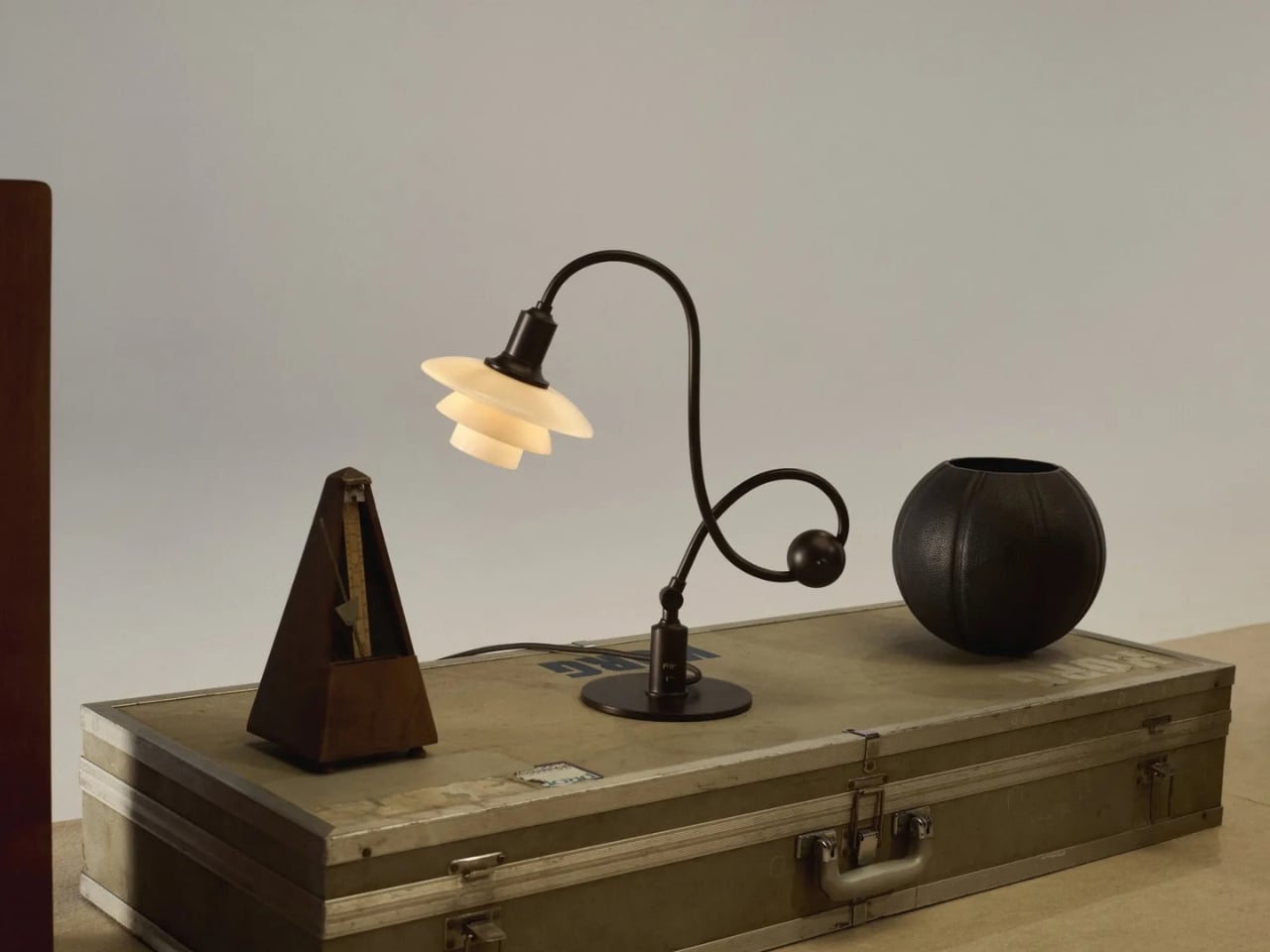
That problem reaches well beyond the piano. Anyone who has tried to read beside a bright table lamp or work under a harsh overhead light knows the difference between having enough light and having the right light. I like that this reissue hasn’t lost sight of its practical beginnings. Its curved, counterbalanced arm lets the shade move while the lamp stays stable, giving the design a sense of purpose you can read from across the room.

Designer: Poul Henningson for Louis Poulsen

Henningsen first created the Piano Lamp in the early 1930s, building on his PH lighting system, which uses layered shades to manage how light reaches the eye. Louis Poulsen has brought it back as the PH 1/1 Piano Table Lamp Limited Edition 2026, with adjustments intended to make it useful beyond its original setting. It’s an appealing idea for a reissue: keep the reason the object existed, then give more people a reason to use it.

The new version pairs aged brass with glass shades in a color Louis Poulsen calls Dusty Terra Cotta. On paper, that combination sounds richly nostalgic. In practice, its appeal is more specific. The warm-toned glass gives the lamp a softer visual presence, while the long arm and compact shade keep it from feeling like a decorative lamp that has wandered onto a work surface by mistake. You could imagine it near a keyboard, but also beside a book, a sketchpad, or a late-night crossword.

That versatility matters because our rooms rarely serve just one purpose anymore. A dining table becomes a desk. A side table has to accommodate a drink, a charger, and whatever we’re currently reading. Good lighting can make those small shifts easier without demanding that we rearrange the room. The Piano Lamp feels suited to those spaces precisely because it was designed around a task. Its shape may be memorable, but the starting point was helping someone see what they were doing.

I’m also drawn to the fact that it looks a little unusual. The arm has a gentle, almost musical curve, while the shade sits low enough to suggest a conversation between the lamp and whatever is beneath it. Many contemporary lights aim to disappear into the background. This one has a clear silhouette, yet its job is to make the thing you’re doing more comfortable. That balance is harder to achieve than a striking shape alone.

Of course, a limited-edition design lamp isn’t an automatic solution for every desk or budget. If all you need is a cheap light for a spare room, this probably isn’t the practical choice. But it does offer a useful reminder that a lamp’s value isn’t measured only by how brightly it shines. Where the light goes, how it feels, and how easily the fixture fits into daily routines all count. Those are the details you notice after the novelty of a new object wears off.

Louis Poulsen says the PH 1/1 Piano Table Lamp Limited Edition 2026 will be available from October through December 2026. The short window gives it collectible appeal, but I hope that isn’t the only reason people pay attention. Its more interesting quality is how current its original problem still feels. We have plenty of ways to brighten a room. Finding light that helps us focus, without making us squint, remains a much better goal.

The post The 90-Year-Old Lamp Nobody Improved On — Until Now first appeared on Yanko Design.

  • ✇Yanko Design
  • The 1969 Lamp Nobody Knew They Needed Is Back
    Most statement lighting presents a familiar dilemma. A lamp can give a room personality, but the more attention it demands, the harder it can be to live with everything around it. Furniture starts to feel like a supporting cast. Even the lamp’s glow can seem secondary to its silhouette. Gubi’s reissued Lotus lamp offers a more appealing proposition: a piece with enough presence to change the mood of a room, without making the room feel like a showroom. Designed by Carlo Nason in 1969, the Lotus
     

The 1969 Lamp Nobody Knew They Needed Is Back

1 octobre 2026 à 18:30

Most statement lighting presents a familiar dilemma. A lamp can give a room personality, but the more attention it demands, the harder it can be to live with everything around it. Furniture starts to feel like a supporting cast. Even the lamp’s glow can seem secondary to its silhouette. Gubi’s reissued Lotus lamp offers a more appealing proposition: a piece with enough presence to change the mood of a room, without making the room feel like a showroom.

Designed by Carlo Nason in 1969, the Lotus lamp belongs to a period when designers were willing to treat lighting as sculpture. Nason’s fluency with glass is central to its appeal, and Gubi’s reissue brings that idea back into view more than half a century later. It is easy to see why the design has returned now. Plenty of contemporary interiors look polished, yet oddly reluctant to have fun. A lamp with a little imagination can do more for them than another carefully chosen neutral.

Designer: Carlo Nason

What makes Lotus interesting to me is the difference between being distinctive and being loud. Its flower-inspired identity gives you a way into the design, but it does not require an entire room to follow the theme. You can appreciate the botanical reference without surrounding it with curved chairs, patterned wallpaper, and a vase of matching flowers. That restraint matters. The best objects leave space for the lives unfolding around them.

Glass also changes how we read a lamp. A metal shade tends to draw a firm outline; glass has a more elusive presence, especially when light enters the picture. It can feel substantial and delicate at once. Nason built a career around exploring what the material could do, and Lotus carries that curiosity into an everyday object. I like the idea of a lamp that rewards a second look when it is switched off, rather than disappearing until evening.

Of course, reissuing a decades-old design invites a fair question: Are we drawn to the lamp itself, or to the comforting idea of owning a piece of design history? Vintage references can become a shortcut to taste. A recognizable date and designer’s name do some of the work that the object should be doing on its own. Lotus earns more attention when you set that pedigree aside and imagine it in an actual home, beside the books you have not put away and the chair you sit in every night.

That is where its value as a design object becomes clearer. A good lamp changes a space twice: once as an object you notice during the day, and again when you turn it on. The Lotus makes a case for treating those experiences as connected rather than choosing one over the other. It asks to be seen, but the point of bringing a lamp home is still to live with its light.

There is a broader reason this reissue feels timely. So much shopping for the home now happens through images that reward instant impact. A dramatic silhouette can stop a scroll, even if it would be exhausting across the room from your couch. The more useful test is slower. Would you want to see it on a rainy Tuesday? Would it still hold your attention once you stopped photographing it? Lotus strikes me as the kind of design that could pass both tests.

It also offers an alternative to the notion that a room has to speak in one consistent style. An older Italian design can sit comfortably among newer pieces if you let it be a point of contrast rather than the start of a complete makeover. That is a more personal approach to decorating. Most homes accumulate meaning over time, through choices made for different reasons and at different moments.

Gubi did not need to invent a new kind of lamp to make lighting feel fresh. Reintroducing Nason’s 1969 design is a reminder that an object can have a strong point of view without turning the rest of your home into a backdrop. For anyone caught between the sensible lamp and the memorable one, Lotus makes a persuasive argument for wanting both.

The post The 1969 Lamp Nobody Knew They Needed Is Back first appeared on Yanko Design.

  • ✇Yanko Design
  • Nobody Expected a Dumpster to Be the Coolest Bag
    Anyone who has seen me carry my huge tote bag probably wonders how I can find anything inside it. To be honest, it takes me a few seconds, and sometimes even a few minutes, to dig through the seemingly bottomless pit. The bag is deep, and I tend to carry a lot of stuff. Sure, bag organizers are available, but when I am in a hurry, it is easier to toss everything inside and sort through it later. You could say I sometimes go dumpster diving in my own bag when I need to find something. Rugsoda ta
     

Nobody Expected a Dumpster to Be the Coolest Bag

1 octobre 2026 à 17:30

Anyone who has seen me carry my huge tote bag probably wonders how I can find anything inside it. To be honest, it takes me a few seconds, and sometimes even a few minutes, to dig through the seemingly bottomless pit. The bag is deep, and I tend to carry a lot of stuff. Sure, bag organizers are available, but when I am in a hurry, it is easier to toss everything inside and sort through it later. You could say I sometimes go dumpster diving in my own bag when I need to find something.

Rugsoda takes that idea literally with its unusual Dumpster Bag. The canvas shoulder bag is shaped like a miniature commercial dumpster, the kind you might see behind a restaurant, apartment building, or other business. Instead of holding garbage, however, it is designed to carry your everyday essentials. Its squared-off shape gives it a more structured appearance than a typical tote bag, while its relatively compact size makes it easier to search for your phone, wallet, keys, or other small items.

Designer: Rugsoda

The Dumpster Bag is indeed designed for everyday use, but it also functions as a fashionable and sculptural conversation piece. Its recognizable three-dimensional form transforms an object associated with clutter, waste, and urban back alleys into a wearable accessory. The design is especially eye-catching because it does not simply feature a printed dumpster graphic. The entire bag is constructed to resemble one, complete with flip-up lids, a boxy profile, and urban-inspired embroidered graffiti.

That graffiti treatment gives the bag a street-art sensibility and connects it to the real-world objects that inspired it. It also adds texture and visual interest to the canvas surface. The embroidery helps the design feel more like a crafted art piece than a novelty costume accessory, while the dumpster shape keeps its sense of humor intact. The flip-up lids feature magnetic closures that help keep your belongings secure while reinforcing the dumpster illusion. The magnetic fastening also allows for quick access when you need to reach inside. An adjustable shoulder strap gives you the option of carrying the bag over one shoulder or across your body, depending on how you want to wear it.

Several smaller details make the design even more enjoyable. Inside the bag, an embroidered raccoon serves as a hidden surprise, referencing the animals often associated with rummaging through trash. The bottom studs are more than decorative accents, too. They help keep the canvas base slightly elevated when you place the bag on a flat surface, which can reduce direct contact between the bottom of the bag and the ground.

Although the Dumpster Bag has a firm, boxy silhouette, its canvas construction gives it a softer, more tactile quality. The material keeps the bag from feeling like a rigid plastic container and contributes to its casual, handmade character. The canvas may also allow the shape to relax or lose some structure if the bag is heavily loaded, so it is better suited to everyday essentials than to carrying a large amount of gear.

Measuring 12 by 7 by 6 inches, the bag is compact enough for daily use while offering more room than a tiny evening bag. That size should accommodate items such as a smartphone, wallet, keys, sunglasses, cosmetics, and other small necessities. It is not intended to replace a roomy tote or a practical work bag, but it can be a useful alternative for people who want to carry less without sacrificing personality.

Rugsoda’s Dumpster Bag is also part of a broader design approach that turns familiar objects into functional textile pieces. The designer has created other bags inspired by playful, everyday forms, including dice and spray-paint cans. In each case, the object’s identity is preserved through its shape rather than reduced to a surface pattern.

Dumpsters are not usually considered glamorous objects, which is precisely what makes this bag such an entertaining fashion statement. It takes something associated with waste and gives it a new purpose as a wearable accessory. The result is a bag that offers practical storage, a memorable silhouette, and plenty of opportunities for conversation. For anyone tired of carrying a shapeless tote or looking for an accessory that does more than blend into an outfit, the Dumpster Bag offers a literal alternative to the usual carryall.

The post Nobody Expected a Dumpster to Be the Coolest Bag first appeared on Yanko Design.

  • ✇Yanko Design
  • Samsung’s SmartTag3 Refuses to Die at 790 Days Battery Life
    I’m the kind of person who can set down my keys, turn around, and immediately forget where they went. Wallets, earbuds, and bags have a way of disappearing at the least convenient moment, too. A smart tracker can spare you a frantic search, but only if its battery is working and its location can still be found. That makes battery life and the ability to locate an item beyond your phone’s immediate range just as important as a good-looking design. Designed by Samsung, the Galaxy SmartTag3 aims t
     

Samsung’s SmartTag3 Refuses to Die at 790 Days Battery Life

1 octobre 2026 à 13:20

I’m the kind of person who can set down my keys, turn around, and immediately forget where they went. Wallets, earbuds, and bags have a way of disappearing at the least convenient moment, too. A smart tracker can spare you a frantic search, but only if its battery is working and its location can still be found. That makes battery life and the ability to locate an item beyond your phone’s immediate range just as important as a good-looking design.

Designed by Samsung, the Galaxy SmartTag3 aims to address those everyday frustrations in a smaller package. Its rounded, nearly square shape gives it a clean look, while its reduced size should make it less noticeable on the things you carry. That matters more than it might seem. A tracker attached to a set of keys needs to be easy to live with every day, not just useful on the rare occasion those keys go missing.

Design: Samsung

The change in shape also raises a practical question: how will you attach it to your belongings? Samsung offers a silicone case with an integrated keyring and a loop case, giving users different ways to secure the tracker to keys or a bag. The smoother outline may look better on its own, but anyone buying one for their keys should consider which attachment will work best.

Samsung says the SmartTag3 is 35% smaller by volume and 33% lighter than its predecessor. It also retains an IP67 rating, indicating resistance to dust and water under specified test conditions. That offers reassurance if the tag gets caught in the rain, though it does not mean the device is waterproof in every situation.

Battery life may be the more meaningful upgrade for anyone who has discovered a dead tracker while looking for a lost item. Samsung says the SmartTag3 can run for up to 550 days under standard usage or up to 790 days in Power Saving Mode. Those figures are based on Samsung’s testing, not a promise that every user will get the same result. Still, a tracker that needs attention less often is less likely to let you down because you forgot to check its battery.

Finding something nearby should be easier, too. Compass View uses Bluetooth 6.0 Channel Sounding to provide distance and directional guidance from up to 60 meters away, about three times farther than on the previous model, according to Samsung. It could help you narrow down where to look before you’re close enough to spot the missing item. Compass View is not available on iOS.

The other finding features are intended to help in different situations. If you leave a tagged bag behind, a Left Behind Alert could prompt you to go back for it, although that feature is also unavailable on iOS. Place Notification is designed to alert you when a tagged item enters or leaves an area you define. Location History and Movement Detection Alert may provide additional clues about where an item has been or whether it has moved. Together, these tools could help you notice a problem sooner and narrow down where to look.

Lost Mode addresses a different problem: helping someone return an item they find. With a compatible phone, a finder can scan the tag using NFC to see the contact information or short message you have registered. That could be useful for a bag left at a café or luggage separated from you during a trip. When an item is beyond your phone’s range, however, location updates depend on nearby participating Galaxy devices. The SmartTag3 should not be treated as a continuous, real-time GPS tracker.

The SmartTag3’s appeal is the combination of a compact design, long claimed battery life, and features that help at several stages of a search. It cannot prevent you from leaving your keys behind, and its alerts will not replace paying attention to your belongings. But if it helps you catch a forgotten bag before you get home, or gives you a useful clue when something disappears, it has done what a well-designed tracker should: made a small, stressful problem easier to manage.

The post Samsung’s SmartTag3 Refuses to Die at 790 Days Battery Life first appeared on Yanko Design.
  • ✇Yanko Design
  • This Tabletop Fireplace Does What Solo Stove Doesn’t: Burn Indoors
    Fall is when the appeal of an open flame reasserts itself. The air turns crisp, and everyone wants that fireplace glow back in their evenings. The trouble is that most homes, especially rentals and apartments, were never built to give it to them. Adding a real fireplace means a gas line, a flue, a permit, and a contractor’s schedule that eats up far more than the one free weekend anybody actually has for it. That gap between wanting fire and being able to install it is exactly what the Harmony
     

This Tabletop Fireplace Does What Solo Stove Doesn’t: Burn Indoors

28 septembre 2026 à 18:30

Fall is when the appeal of an open flame reasserts itself. The air turns crisp, and everyone wants that fireplace glow back in their evenings. The trouble is that most homes, especially rentals and apartments, were never built to give it to them. Adding a real fireplace means a gas line, a flue, a permit, and a contractor’s schedule that eats up far more than the one free weekend anybody actually has for it.

That gap between wanting fire and being able to install it is exactly what the Harmony Flame Lamp solves. It is a brass tabletop fireplace that runs on bioethanol, sits on any flat surface you own, and produces a genuine flame with no ventilation, no gas hookup, and nothing built into a wall. You light it the way you’d light a candle, except what comes back is heat and light with real presence.

Click Here to Buy Now: $240

What sets it apart from most decorative objects claiming craftsmanship is who actually makes it. The Harmony Flame is built by hand by artisans who normally work on brass instruments, the kind of metalworkers who shape tubas and French horns for a living. That background is not a marketing footnote. Instrument-grade brass has to hold precise acoustic properties and structural integrity, and those same qualities happen to make it excellent at containing and reflecting a flame. The polished surface catches the fire and throws it back in shifting patterns of light and shadow, which is a much harder effect to fake than most LED “flame” gadgets ever manage.

Practically, the lamp behaves the way fall entertaining actually works. It moves from the dining table to the patio to a reading corner without any setup beyond a refill of fuel. Bioethanol burns clean, without smoke or odor, so there’s no lingering campfire smell on your jacket the next morning and no soot to wipe off afterward. The brass itself develops a patina with use, which means the lamp you buy in October will look different, and honestly better, by the time next fall rolls around.

It’s worth putting this next to the fire pit most Americans already know, which is Solo Stove. Solo Stove built an entire category around smokeless backyard fires, and it deserves credit for that. But it’s a wood or pellet-burning outdoor unit, sized for a patio and not meant to come inside. The Harmony Flame is working a different scale entirely. It’s small enough for a dinner table, quiet enough for a bedroom, and refined enough that it reads as a design object first and a heat source second. One is built for a backyard gathering. The other is built for the room you’re actually sitting in on a Tuesday night in November.

At $240, it isn’t an impulse buy, and I don’t think it’s trying to be one. You’re paying for hand-finished brass and a fuel system that skips every complication a real fireplace usually demands, and that combination is genuinely rare at this price. Compare it to a high-end bioethanol fireplace from a home goods brand and you’ll often pay two or three times as much for something with none of the instrument-making pedigree behind it.

The part that sold me is how ordinary the ritual feels once you own it. You strike a match, the brass catches the light, and the room changes temperature and mood at the same time. The Harmony Flame Fireplace is the kind of object that quietly becomes the centerpiece of a dinner party without anyone having to point it out. Fall has a way of making people want warmth and atmosphere they can control themselves, and this lamp answers that without asking for a renovation in return. If you’ve spent the last few autumns wishing your apartment had a fireplace, this is about as close as you’ll get without knocking down a wall.

The post This Tabletop Fireplace Does What Solo Stove Doesn’t: Burn Indoors first appeared on Yanko Design.

  • ✇Yanko Design
  • One Table, 3 Games, Nobody Needs a Game Room
    Most people who want a pool table and a dining table end up choosing neither. The math never works. A regulation pool table eats up roughly the same square footage as a small bedroom, a ping pong table needs its own dedicated stretch of floor to swing a paddle without hitting a wall, and a proper dining table has to look good enough to survive being seen by dinner guests. Pick two out of three and you’re already stretching a normal house. Pick all three and you need a room nobody actually has.
     

One Table, 3 Games, Nobody Needs a Game Room

28 septembre 2026 à 15:20

Most people who want a pool table and a dining table end up choosing neither. The math never works. A regulation pool table eats up roughly the same square footage as a small bedroom, a ping pong table needs its own dedicated stretch of floor to swing a paddle without hitting a wall, and a proper dining table has to look good enough to survive being seen by dinner guests. Pick two out of three and you’re already stretching a normal house. Pick all three and you need a room nobody actually has.

Sanne’s Department of Play looked at that math and decided it was wrong. The 3-in-1 Table is exactly what it sounds like: lift the top and a dining table becomes a full pool table, swap the surface again and it’s ping pong, complete with a cane-and-leather net that looks like it belongs in a much more expensive living room than most game tables ever see. It collapses three furniture purchases and three separate footprints into one object, which solves the actual problem that has quietly kept most people out of the game-room conversation entirely: there was never enough house for the fun stuff.

Designer: Sanne’s Department of Play (photos by Vitali Grishkov)

What gets me about this piece is that it doesn’t look like a compromise. Anyone who has shopped for a combo game table before knows the usual result, a pool table with a plywood lid bolted on top so it can technically also be a dining surface, priced around $800 and looking every bit like sports equipment wearing a costume. Sanne’s version starts somewhere else entirely. The scalloped edge running around the perimeter and down the legs, that repeating rounded bump pattern, looks like it was drawn first as a piece of sculpture and only later revealed to double as the ball guard for ping pong. Function followed form here instead of the other way around, and you can feel that order in every photo of it just sitting quietly as a dining table under a chandelier, giving away nothing about its second life.

The material choices back that up. The base is a deep walnut tone against lighter ash detailing, which reads more mid-century furniture than rec room. When it becomes a pool table, the felt is a rust orange rather than the standard casino green, which sounds like a small thing until you realize it’s the difference between a table that argues with your décor and one that sits right at home. Even the accessories got the same treatment. The cue rack is its own scalloped tower that matches the table instead of leaning against a wall wrapped in a canvas cover, the ping pong paddles are hand-painted with little leopards and floral motifs, and the ball tray is dovetailed like a keepsake box. Nobody asked for the ball tray to look nice. They built it that way anyway.

That attention to the parts nobody was going to scrutinize is what actually sells the bigger idea. Pricing puts the crafted-to-order version around $12,500, with a limited floorstock release closer to $7,500, so this sits firmly in collectible design furniture territory rather than impulse purchase territory. That framing matters more than it first appears. It’s less “we made a fun table” and more “we made a serious piece of furniture that happens to also be extremely fun,” and that distinction is the whole reason it works in a home that already has real art on the walls instead of only in a basement.

There’s a bigger shift happening around furniture like this, one where the game room stops being a separate destination and starts becoming part of the main living space instead of something hidden behind a closed door. A pool table tucked in a basement gets used four times a year. A pool table that is also the table where everyone already eats dinner gets used constantly, almost by accident, because nobody has to decide to go play. They just have to clear the plates.

The post One Table, 3 Games, Nobody Needs a Game Room first appeared on Yanko Design.
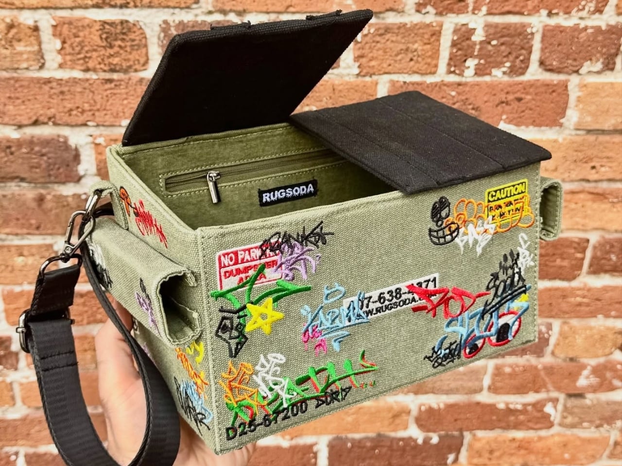
  • ✇Yanko Design
  • The Park Sculpture Nobody Expected to Double as a Basketball Hoop
    Most public sculpture asks you to look and keep walking. You admire the bronze figure, read the little plaque, maybe snap a photo, and move along to wherever you were actually headed. The art stays over there, behind an invisible line, and you stay over here. That gap between viewer and object is the quiet problem a lot of city parks have never solved: they install expensive, meaningful work, and then wonder why nobody lingers. Alexandre Arrechea’s answer, installed this year at Biidaasige Park
     

The Park Sculpture Nobody Expected to Double as a Basketball Hoop

28 septembre 2026 à 09:20

Most public sculpture asks you to look and keep walking. You admire the bronze figure, read the little plaque, maybe snap a photo, and move along to wherever you were actually headed. The art stays over there, behind an invisible line, and you stay over here. That gap between viewer and object is the quiet problem a lot of city parks have never solved: they install expensive, meaningful work, and then wonder why nobody lingers.

Alexandre Arrechea’s answer, installed this year at Biidaasige Park as part of Toronto’s new Lassonde Art Trail, is to remove the line entirely. Orange Functional is a twenty-foot steel tree with basketball hoops sprouting off its branches, and you’re invited to bring your own ball and start shooting. No velvet rope, no “please do not touch” energy. Just a big red tree standing at the park entrance, daring you to play.

Designer: Alexandre Arrechea

I like that the idea took over a decade to get here. Arrechea’s archive traces the concept back to 2010, when the hoop-covered tree existed purely as sculpture, something you’d circle and photograph but never actually use. It wasn’t until a 2022 commission from Art Omi in upstate New York that he reengineered the branches so real basketballs could drop through the nets. That’s a meaningful shift for an artist. Turning a static object into a functional one means giving up some control. Once people can touch the work, they also get to misuse it, argue about it, get bored of it. Arrechea made that trade anyway, and the piece is better for it.

What sells me on the design is how little it explains itself. A basketball hoop is one of the most recognizable objects in American and Canadian public life, sitting outside driveways, gyms, and rec centers everywhere. Arrechea doesn’t reinvent it so much as multiply it until it stops making sense as sport equipment and starts reading as something closer to a fruit tree. Art Omi’s own description leans into that: as people throw the ball and it falls from hoop to grass, it evokes oranges dropping from a branch. The title does double duty, too, pairing the color with the idea of something actually working the way it looks like it shouldn’t.

Placing the sculpture at a park entrance, next to newly planted real trees, feels like the smartest curatorial choice in the whole project. It’s not tucked into a sculpture garden where only people already looking for art will find it. It’s the first thing you see walking in, competing for attention with the skyline behind it. A parent walking past with a kid who has a basketball in their bag doesn’t need to understand Arrechea’s twenty-year interest in public gathering spaces to want to stop and shoot a few hoops. The concept sells itself in about four seconds.

There’s a version of this idea that could have felt gimmicky, a photo-op sculpture built mainly for Instagram. Arrechea avoids that trap by making the interaction the entire point rather than an afterthought bolted onto a finished artwork. He’s spent over two decades returning to the basketball court as a symbol, and this piece is where that research finally gets to be useful instead of just visible. You don’t need the artist statement to enjoy it. You need a ball and about ninety seconds of patience while you figure out which branch to aim for.

Public art has a reputation problem in a lot of cities: expensive, confusing, occasionally resented by the people who live near it. Orange Functional sidesteps all of that by refusing to be precious. It asks for nothing more than a basketball and a little curiosity, and it gives back an actual reason to stop walking. That’s a rarer trade in public space than it should be.

The post The Park Sculpture Nobody Expected to Double as a Basketball Hoop first appeared on Yanko Design.

  • ✇Yanko Design
  • A Folding Tiny Home That Refuses to Feel Like Camping
    Camping has always come with a quiet trade-off. You get the freedom of being anywhere, but you give up the comfort of being somewhere. Tents leak, campers feel cramped, and cabins can’t move with you when the season changes. Atelier Lune, a US-based design studio, just built something that refuses to make you choose. It’s called Camping House. The idea is simple to say and genuinely hard to execute: a home that tows behind a standard SUV, unfolds like a tent within a couple of hours, and then b
     

A Folding Tiny Home That Refuses to Feel Like Camping

28 septembre 2026 à 05:15

Camping has always come with a quiet trade-off. You get the freedom of being anywhere, but you give up the comfort of being somewhere. Tents leak, campers feel cramped, and cabins can’t move with you when the season changes. Atelier Lune, a US-based design studio, just built something that refuses to make you choose.

It’s called Camping House. The idea is simple to say and genuinely hard to execute: a home that tows behind a standard SUV, unfolds like a tent within a couple of hours, and then behaves like real architecture once it’s standing. Architect Na Shen, who previously worked at Gensler and Zaha Hadid Architects before starting her own studio, designed the whole structure around that tension between mobility and permanence, and you can feel that intention in every decision she made.

Designer: Atelier Lune

That last part is the actual innovation. Plenty of tiny homes are mobile, but most of them stay rigid once you get them there, basically a smaller box on wheels. Camping House does something different. The structure is a folding shell that fans open on-site into a steep A-frame, then locks into place with weather-sealed joints and insulated panels built to hold up through an actual winter. The A-frame isn’t just an aesthetic choice either. It’s structurally efficient, sheds rain and snow naturally, and creates a dramatic interior volume that reads much larger than the footprint suggests.

The system is built around three modules the studio calls Ports. The Residential Port handles living and sleeping, with furniture that flips from day mode to night mode in seconds. The Utility Port carries a real kitchen and a real bathroom, not a camper-van compromise version of either. The Extended Port clips on when you need a workspace, storage, or room for guests. You arrive, stabilize the base, release the hinges, and the shell swings open into a two-level interior that looks nothing like what fit on the trailer an hour earlier. The joinery and panel system that makes this possible is where most of the real design work lives, hidden in the hinges and seals rather than announced by the exterior.

What makes this feel like it’s arriving at the right moment is who it’s actually for. Remote work untethered a lot of people from a single address, and the appetite for spending real time outdoors, not just weekend camping but seasonal living, has grown alongside it. Camping House is designed with that shift in mind: off-grid solar integration, rainwater harvesting, passive cross-ventilation through a solar chimney, and no permanent foundation required. It leaves the ground beneath it essentially undisturbed, which matters if you’re setting up somewhere ecologically sensitive, or if you just don’t want to explain a poured foundation to a national forest.

There’s a practical honesty to designing for departure instead of designing for permanence. Most residential architecture asks how a building holds its ground. Camping House asks how a building lets go of it. Multiple units can even couple together into small clusters, which opens the door to uses beyond personal travel: disaster relief housing, temporary shelter during regional housing shortages, or small eco-tourism outposts that can be struck at the end of a season without leaving scars.

None of this is on the market yet. It’s a concept, and concepts have a habit of staying concepts. But two people can reportedly assemble it in under two hours, which is a modest ask for what you get in return: a structure with actual dignity, not a glorified pop-up tent with delusions of permanence.

The bigger idea Camping House is testing is whether shelter has to pick a lane between temporary and permanent. For a long time, those felt like separate categories with separate architecture. This project treats them as two settings on the same machine. Whether or not this exact version reaches driveways, the question it’s asking, why should mobility mean sacrificing comfort, feels like one more designers are going to keep chasing.

The post A Folding Tiny Home That Refuses to Feel Like Camping first appeared on Yanko Design.

  • ✇Yanko Design
  • 7 Reasons Non-Artists Need a Drawing Pad on Their Desk
    I’ve established in my previous articles that I’m not an artist and can only draw stick figures, or maybe follow paint-by-numbers-style sketches. That hasn’t stopped me from buying and collecting drawing pads and notebooks of all kinds, though. Of course, I’m not hoping I’ll eventually learn to draw or become the next Andy Warhol or anything like that. I like having these writing surfaces because I have a lot of things to write down, whether it’s for productivity, as part of my numerous journal
     

7 Reasons Non-Artists Need a Drawing Pad on Their Desk

27 septembre 2026 à 19:30

I’ve established in my previous articles that I’m not an artist and can only draw stick figures, or maybe follow paint-by-numbers-style sketches. That hasn’t stopped me from buying and collecting drawing pads and notebooks of all kinds, though. Of course, I’m not hoping I’ll eventually learn to draw or become the next Andy Warhol or anything like that. I like having these writing surfaces because I have a lot of things to write down, whether it’s for productivity, as part of my numerous journaling tools, or just somewhere to randomly write or sketch things out.

The Japanese Drawing Pad, despite having “drawing” in its name, isn’t just an art tool for artists, architects, and other visual creatives. It’s a blank, tactile surface that can be useful for anyone who likes to write, think, plan, or organize. And in a world that’s becoming an increasingly digital-analog hybrid, having a tool like this by your side whenever you need it is always a plus. It’s not just a regular drawing pad, though. It’s simply designed, but expertly crafted by masters in the bookbinding and papermaking industries, giving you paper that helps you create your own masterpiece, whether visual or written.

Click Here to Buy Now: Starting at $40. Get Everlasting All-metal Pencil Free ($19.95 Value). Hurry, this is a limited-time launch gift.

So if you’re like me and don’t need it for actual drawing, here are a few ways to get your money’s worth out of the Japanese Drawing Pad. No drawing skills needed.

Brain-dump Your To-Do List

For those times when you just need to mindlessly dump out all your tasks, lists, and thoughts, this is the perfect place to do it. It doesn’t have a cover, so you get straight to the blank page you need. The tear-away pages make it easy to toss the list once you’re done, or stick it somewhere you’ll actually see it.

Create a Mood Board

The drawing pad can also serve as your analog Pinterest board. Use it to brainstorm a trip itinerary, visualize an outfit for an upcoming event, or build a vision board for your next few months. The microperforated pages tear easily and cleanly, so you can arrange them side by side on a wall or corkboard.

Take Notes in a Meeting (Without a Boring Notebook)

Meetings can drag on forever, but having a unique tool to take notes with can make them feel a little less like a slog. The Drawing Pad’s gray paper and black base give it a sleeker, more distinctive look than your average notepad, so pulling it out mid-meeting feels less like a chore and more like an upgrade.

Mind-mapping and Brainstorming

Having a freeform space without any lines is ideal for when you need to jot down branching ideas, bubbles, and connections. It also comes in different sizes (A6, A5, and A4), so you can choose how much space you need for these brainstorming sessions, even if the meeting is just with yourself.

Journaling

Whether you need a space for habit tracking, junk journaling, or creative writing prompts, the premium feel of the paper will make your journaling ritual more satisfying. If you tear off the pages, you can attach them to your other journals or use the loose-leaf sheets to build a journal of your own.

Teaching Kids (or Yourself) Letters, Numbers, and Shapes

The pad can also double as a lesson space for kids who are still learning to write their letters, numbers, or shapes, offering a low-pressure surface with no stakes attached. And if you’re learning a new language that uses characters different from what you’re used to, it can be your practice space, too.

Doodling to De-stress

Even if you’re not an artist who can draw well, there may be times when you just want to doodle your stress away. Whether you’re sketching the meal you just ate, dreaming up an imaginary creature to fight off boredom, or scribbling whatever abstract shapes come to mind, the pad puts no pressure on you to be “good.” It’s simply a tactile stress outlet.

Beyond what’s already been covered, the Japanese Drawing Pad has a few more details worth knowing. Every pad is handmade by ITO Bindery, a Japanese bookbindery that’s been at it since 1938. The binding glue is still brushed on by hand, and each microperforation is checked for consistency by trained craftspeople rather than left entirely to machines. The pages themselves are premium paper (81.4 g/m²) mounted on a sturdy, recycled cardboard base, and each sheet tears away cleanly without leaving any strays behind on the page. This particular edition is also limited to just 100 individually numbered pads per size, which makes the pad feel less like a disposable notepad and more like a small, functional collectible.

At the end of the day, you don’t need to be able to draw to justify owning something this well made. A design like the ITO BINDERY × YANKO DESIGN Drawing Pad earns its keep simply by being there, ready on your desk for the next to-do list, doodle, or half-formed idea you don’t want to lose. And that’s really the beauty of building an analog habit into an otherwise digital life: it doesn’t ask much of you, just a pen, a blank page, and a few free minutes. Whether it ends up full of to-do lists, mind maps, or terrible stick-figure doodles, this drawing pad might just become one of those small, everyday objects you didn’t know you needed until it’s part of your routine.

The post 7 Reasons Non-Artists Need a Drawing Pad on Their Desk first appeared on Yanko Design.
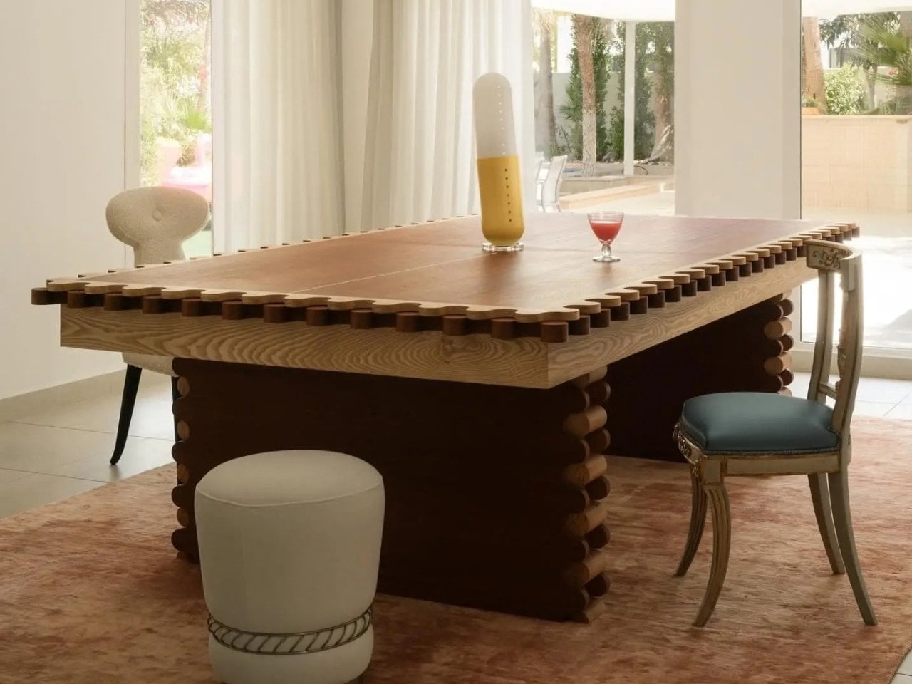
❌