Vue normale

Il y a de nouveaux articles disponibles, cliquez pour rafraîchir la page.
Hier — 13 novembre 2024Yanko Design

10 Best iPod-Inspired Homage Designs To Honor The Iconic Device

13 novembre 2024 à 12:40

The iPod, a groundbreaking device that revolutionized the way we listen to music, is celebrating its 23rd anniversary. While it may no longer be at the forefront of Apple’s product lineup, its legacy lives on in various nostalgic designs that pay homage to its iconic status. And, we’ve curated a collection of innovative and intriguing designs – concepts and tangibles alike, that perfectly capture the essence of the iPod while integrating modern technology.

These products celebrate the iPod’s legacy by blending nostalgia with modern technology. Each design offers a unique way to honor the iconic device, whether through transforming existing gadgets, enhancing smartphone functionality, or reimagining the iPod Shuffle. They are an interesting mix of conceptual designs and real products but they all showcase the enduring influence of the iPod on the world of technology and design. As we celebrate its 23rd anniversary, these innovations remind us of the iPod’s impact and the creative possibilities it continues to inspire.

1. Pod Case

If you’re wondering if this is the new iPod, sadly, it isn’t. But it is something much better! A way for you to celebrate and reminisce over the iconic iPod. It is designed to be an old-school external case for your beloved Apple Watch. Designed by Joyce Kang and C.O. Design Lab, the Pod Case is a beautiful celebration of the evergreen iPod. It is made from silicone, and will smoothly slide over the body of your Apple Watch, offering it a fun and funky throwback.

Since the watch’s screen almost matches the screen size of the classic iPod Nano, this design works well, creating an amusing fusion of the past and the present. The jog wheel on the front doesn’t work, but you can easily navigate and control the watch through the touch screen. If you’re a Gen-Z who never got to experience the iPod, or a millennial wishing to relive their glorious iPod days, the Pod Case is a great idea.

What we like

  • Perfect fusion of the past and the present.
  • Besides being aesthetically unique, it offers protection for your Apple Watch.

What we dislike

  • The case may not be compatible with all Apple Watch models and sizes.
  • The design may not appeal to those who want a more modern look.

2. AW6 Case

Designed by Elago, and dubbed the AW6 case for the AirPods, this adorable little case is another tribute to the iPod. It is created to replicate the iPod Classic’s jog dial while serving as a protective cover for your AirPods case. This case is compatible with 1st and 2nd gen AirPods, and the sleeve is equipped with a slot for the charger, and a carabiner clip to hang it from your belt loop or backpack. There is a tiny hole above the menu for the charging light as well.

If you’re looking to take a trip down memory, then the AW6 case is a great bet as it not only protects your AirPods and their case but also takes you back to the days when the iPod was a sweet reality instead of a distant memory. It adds a fun twist to typical and conventional AirPods accessories, by merging the old and the new.

What we like

  • The design may offer an improved grip compared to the smooth surface of the original AirPods case.
  • Will serve as a conversation starter amongst Apple enthusiasts.

What we dislike

  • May not appeal to those who want a more minimal and contemporary look for their tech devices.

3. Opal Tadpole

Designed by Opal, the Tadpole is an iPod Shuffle-shaped webcam with a 4k sensor and AI feature. It features a new machine-learning signal processor which delivers “DSLR-rivaling quality”. It is also equipped with a moderately wide 90-degree field of view. The wide angle is great for capturing more than just your face, it is a boon for dynamic presentations, or when you want to show your surroundings more.

It features a f/1.8 lens, which can capture well even in low-light conditions. It also includes a digital microphone array, which can pick up your voice clearly while minimizing any background noise. It adopts the shape and size of a 3rd-Gen iPod Shuffle, with a lovely minimalist design to match. It can easily clip onto your laptop or monitor without adding much bulk.

What we like

  • The 4K sensor offers high-resolution video quality.
  • The iPod Shuffle-inspired design offers a compact and portable form factor.

What we dislike

  • The unique design might raise questions about durability and how well the device can deal with regular use.

4. Shuffle AirTag Case

Elago is back with another cutesy design! This is the Shuffle AirTag Case, and it is the perfect accessory for any Apple lover. It looks like the 4th Gen iPod Shuffle and is designed to be a protective case for your AirTag. It is built from soft silicone and offers protection from bumps and scratches. It also features a keyring, which allows you to securely attach it to bags, backpacks, etc.

The case has been built with attention to detail, and it successfully captures the iPod Shuffle’s iconic beauty. It includes a circular interface on the front, as well as a switch and 3.5mm audio input on the bottom. It is available in two colors – mint green and black, although black does seem like the more appealing option.

What we like

  • It transforms the look of the AirTags, allowing users to personalize their devices.
  • Provides an additional layer of protection for the AirTag.

What we dislike

  • The case may add some bulk to the compact AirTag, which could affect its fit in certain accessories or holders.

5. tinyPod

Called the tinyPod, this delightfully little accessory is another interesting way to convert your Apple Watch into a miniature iPod. It features a nostalgic design and a modern twist. The Apple Watch is enclosed in a case that resembles the iPod and provides a colored screen and an interesting click-wheel-like control system. We are unsure of the functionality, but it will deliver an experience that will take you back to the good old days.

It also allows you to enjoy the added capabilities of the Apple Watch. The accessory allows users to listen to music, watch YouTube, and more without even touching their smartphones. It bridges the gap between a simple portable media player and a full-fledged smartphone.

What we like

  • By combining the Apple Watch’s features with the iPod’s design, users can enjoy music and other media with ease.

What we dislike

  • Details about the click-wheel functionality and overall user experience are unclear.

6. iPod Magnetic Hybrid Card Holder

Say hello to Elago’s iPod Magnetic Hybrid Card Holder. It is a MagSafe-compatible accessory that will bring a hint of nostalgia to modern smartphones. This card holder is designed to resemble the classic iPod, and it merges old-school charm with new technology. It can fit perfectly and seamlessly onto MagSafe-enabled iPhones, providing an easy and convenient way to carry essential cards with you.

The cardholder is made from durable polycarbonate, and it is equipped with powerful Neodymium magnets which provide a secure fit. It is blessed with an ergonomic design which includes a finger groove for easy handling, and a card removal aid for convenience.

What we like

  •  The card pocket holds up to two cards, providing a practical solution for carrying essentials without a bulky wallet.
  • Made from robust materials, the card pocket is designed to withstand daily use.

What we dislike

  • Only compatible with MagSafe-enabled iPhones, limiting its use to a specific audience.

7. Nothing Npod (1)

The Nothing Npod (1) is a lovely fan-made tribute to the iPod Shuffle. It is a conceptual design created by designers Shreyansh Onial and Aditya Pandharpure. It integrates Nothing’s transparent design aesthetic and glyph interface with the beautiful memory of the iPod Shuffle. It is equipped with a signature circular panel that will remind you of the original iPod Shuffle.

The concept also includes a wireless charging coil, and a USB-C charger, thereby combining classic design elements with modern technology. The glyph interface works well, adding a unique touch, and responding to music with visual indicators for volume and playback progress.

What we like

  • Integrates modern conveniences into its retro design.
  • The glyph interface offers the potential for dynamic interaction.

What we dislike

  • It is a conceptual design, so we don’t know how well it will translate into a tangible product.

8. iPod Touch 2024

Designers JUAN and Wong teamed up to reimagine the iPod Touch, drawing inspiration from the iPhone 16 language. The iPod is no longer in production, but this reimagined concept brings to us what the iPod would probably look like in today’s times. Their unique vision retains the 4-inch retina display but adopts elements from the latest iPhones.

The iPod includes a single Apple logo on the back and a revived pop-out loop hanger button. They’ve also retained the 3.5mm headphone jack, bringing attention to the iPod Touch’s identity and cost-effectiveness. It is exciting to see how the iPod Touch would have looked like in 2024.

What we like

  • Blends classic iPod Touch design with contemporary iPhone elements.
  •  The loop hanger button and headphone jack add distinctive touches.

What we dislike

  • Not yet available as a tangible product.
  • It appeals to fans of both iPod and iPhone design languages, so it has a limited audience.

9. W6 Stand

The W6 Stand by Elago is designed as a nifty throwback to the iPod! If you want to convert your Apple Watch into an iPod, this is a tangible and buyable product that you can purchase. It transforms your Apple Watch into a nostalgic display reminiscent of the classic music players. It is compatible with all the Apple Watch series and perfectly creates the impression of the lovely vintage device.

The stand is built from scratch-free silicone, and it provides protection and stability and prevents scratches or wear and tear. The W6 Stand is perfect for nightstand use. You can also slide the Watch charger inside too, so your Watch can charge as it docks in its new yet not-so-new home.

What we like

  • Works with all Apple Watch series, ensuring broad usability.
  • Silicone construction prevents scratches,

What we dislike

  • The retro design may not appeal to everyone.
  • It is best suited for use as a nightstand, so it may not appeal to all users.

10. iPod Classic 2021

Designer Andrea Copellino reimagined a modern iPod Classic that brings the nostalgic and lovely charm of Apple’s iconic MP3 player. This iPod Classic drew inspiration from the iPhone 12 Pro, featuring a stainless steel body and flat sides. The concept also includes a click wheel and Apple Remote Integration. The concept is a celebration of the beloved iPod Classic, weaving a surreal image of its potential future.

Of course, the iPod doesn’t seem to have a foreseeable future, but this iPod Classic concept is a fun and playful way to celebrate and remember the audio device. It manages to capture the essence of the iPod with modern design elements, and contemporary aesthetics, creating a perfect fusion of the old and the new.

What we like

  • Features high-quality materials and a sleek aesthetic.
  • Combines click wheel nostalgia with Apple Remote functionality.

What we dislike

  •  As a design concept, it is not yet available for purchase, and we are unsure how well it will translate into a real product.

The post 10 Best iPod-Inspired Homage Designs To Honor The Iconic Device first appeared on Yanko Design.


Pixel 9 Pro Fold replacement screen from iFixit arrives with a big caveat

Par : JC Torres
13 novembre 2024 à 11:07

Smartphones today are very complex products, which is why manufacturers have long discouraged or even disallowed owners from opening up theirs just to repair a single part. Most people probably don’t have the skills for that anyway, but the old policies also prevented small third-party businesses from offering more accessible repair services. That has been changing slowly, with more major phone makers finally allowing self-repair to some extent.

Of course, that all hinges on the availability of replacement parts, which isn’t that easy to come by when it comes to official components. Fortunately, the likes of Google have partnered with iFixit to actually sell the most critical parts, opening the doors further to self-repair or third-party services. That includes the new Pixel 9 Pro Fold, though the replacement foldable screen might still be beyond most people’s reach.

Designer: Google, iFixit

A foldable phone probably has the most complex design among smartphones today, especially because of its flexible display panel. Unfortunately, that is probably the component that will break faster, which means it will be the one that will get replaced more often. Even more unfortunately, it’s also one of the most expensive parts of the phone.

The official Pixel 9 Pro Fold replacement screen being sold on iFixit is a prime example of that. Now available for anyone to purchase, the foldable screen alone costs $1,199.99. If it’s your first iFixit self-repair, you might want to buy the screen and a repair kit, setting you back $1,206.99 in total. It’s an eye-watering price tag, especially when you consider that the Pixel 9 Pro Fold itself already costs $1,799.

It doesn’t help that the process for repairing the Pixel 9 Pro Fold is, as expected, a bit convoluted and nerve-wracking for novices. Then again, that isn’t too surprising, given the young age of the technology and the rarity of available parts. Most owners probably won’t do the process themselves but iFixit and Google’s partnership will allow small businesses to thrive making repairs for these devices.

Despite those rather large hurdles, it’s still a significant step forward in making smartphones longer-lasting and more sustainable. There will be more options to get the Pixel 9 Pro Fold repaired, even if they’re pricey. It’s definitely a much better situation compared to the past where even opening up a smartphone on your own marks you for some legal trouble.

The post Pixel 9 Pro Fold replacement screen from iFixit arrives with a big caveat first appeared on Yanko Design.

Unitree’s Pump MAX: The All-in-One Home Gym Engineered by Robotics Experts

Par : Sarang Sheth
13 novembre 2024 à 02:45

Whenever I visit any tech expo or fair, I swing by Unitree’s booth to take a look at their incredible robots. With their popular dog and humanoid bots that can do everything from sit to run, jump, wave, walk up/down stairs, and perform complex activities, Unitree’s robots are nothing short of futuristic. Under the hood, the robots run on a highly complex combination of motors, sensors, and algorithms that perfectly execute movements. So when Unitree decided to put these motors, sensors, and algorithms into a compact home gym, you best bet that it’s going to be state-of-the-art.

Although it sounds like an unlikely area for a robotics company like Unitree to venture into, its fitness division (named UnitreeFitness) is a perfect balance to its robotic endeavors. It helps the company fine-tune their hardware in the perfect stress-test environment – exercise. The PUMP MAX is UnitreeFitness’ way of condensing down an entire gym into a compact hub that attaches to a shapeshifting exercise frame. The advanced internal motor provides between 4 to 70 kilos of resistance with half-a-kilo increments, while multiple exercise modes let you work out targeting 90% of all your muscle groups… without spending thousands on a Peloton, or on gym memberships.

Designer: Unitree

Click Here to Buy Now: $499 $899 (44% off). Hurry, only a few left! Raised over $439,000.

PUMP MAX redefines the modern workout experience by putting the gym right on your wall. Imagine having a sleek, multi-functional workout machine that adapts to every fitness goal without taking up half your room. PUMP MAX is compact yet powerful, packed with customizable features that make it your all-in-one home gym solution, ready to cater to beginners and experienced athletes alike.

At its core, PUMP MAX offers a workout experience tailored precisely to your needs. Whether you’re adjusting resistance in small increments or targeting specific muscle groups, this machine adapts effortlessly. Its high-speed motor provides weight adjustments in increments as precise as 0.5 kg, ranging from 4 kg up to 70 kg, so you’re covered for anything from a light burn to a serious strength session. This kind of precision, combined with an innovative design, makes PUMP MAX feel less like a machine and more like a personalized workout partner.

One of PUMP MAX’s standout features is its five distinct workout modes, each designed for a specific training focus. Standard mode brings a familiar gym feel, while concentric and eccentric modes fine-tune muscle engagement, focusing on either lifting or lowering phases of your reps. Constant mode keeps resistance steady, ideal for those looking to push endurance, and Chains mode provides variable resistance, which mimics chain-based weight training. These options mean that PUMP MAX is more than a simple weight system – it’s a high-tech, adaptable fitness experience that gives you the flexibility of an entire gym in one sleek setup.

You might be wondering if one machine can effectively replace traditional gym equipment. PUMP MAX does so by engaging nearly 90% of your body’s muscle groups in one cohesive setup. Thanks to a 2-meter rope and an internal gearbox with dual resistance levels, you get smooth, steady power no matter the weight setting, making exercises for chest, back, legs, and arms feel effortless in their consistency. Every movement, from light reps to heavier resistance exercises, feels fluid, almost as if guided by an invisible trainer who knows exactly how much push you need.

A remote control lets you adjust intensity, switch modes, and activate preset functions on the fly, minimizing interruptions and letting you focus fully on your workout. Plus, the PUMP MAX comes with emergency disengagement sensors built into the system, ensuring you’re protected from unintended movements or risky positions, allowing you to focus solely on your performance without the need for a spotter.

PUMP MAX also offers additional options that make it a truly versatile tool for any home gym setup. If you pair it with a gym bench, you’ve got a full-body workout station that tackles nearly every muscle group in your body. Rack modules are available for those who want seamless integration with their existing setups, making PUMP MAX adaptable to a variety of home gym layouts. It even transforms into a rowing machine, adding cardiovascular workouts into its repertoire, while an optional gym board provides a broader range of exercise positions for ultimate flexibility.

Battery life isn’t a concern, either. Pump Max’s detachable 96.2Wh battery supports over a week of regular use on a full charge, even during intense regimens. Capable of handling between 60,000 to 70,000 kg of training weight on a single charge, this power source combines efficiency with durability, so you’re never caught mid-session without the charge to finish.

And to top it all off, Pump Max connects with your smartphone, bringing app-enabled intelligence to your workout. Track your progress, access personalized programs, and join a thriving fitness community, all in one place. This network of insights and support ensures you’re part of a dynamic fitness ecosystem, where each session is backed by data-driven coaching and encouragement.

The entire PUMP MAX setup (no matter which bundle you opt for), is highly portable – which means it doesn’t eat into your living space the way most home gyms and exercise equipment do (we’re looking at you, Peloton). Setup is a breeze, and once you’re done, winding down takes mere minutes, allowing you to stow away your home gym so it doesn’t look like exercising is your entire personality. The machine adapts to your needs, ensuring you train every part of your body, helping build cardio, strength, and muscle… And not to foreshadow anything, think of it as Unitree’s way of getting you shredded so that when the robots come to take over humanity, you’ll be in fit fighting shape!

Click Here to Buy Now: $499 $899 (44% off). Hurry, only a few left! Raised over $439,000.

The post Unitree’s Pump MAX: The All-in-One Home Gym Engineered by Robotics Experts first appeared on Yanko Design.

‘Not So Tiny’ Tiny Home Offers A Peak Cottagecore Aesthetic On The Road

13 novembre 2024 à 00:30

Designed by Alabama’s TimberCraft Tiny Homes, the Big Sky is a rustic not-so-tiny tiny home with a spacious interior that can sleep four people. Timbercraft Tiny Homes are known for their luxurious cottage-like models, and the Big Sky lives up to their reputation. It is based on a quaint-axle trailer and features a length of 41.4 feet.

It is on the larger spectrum. The home is based on the firm’s Denali model, but a few western Montana architecture-inspired changes were made. The exterior of the home features a western cedar finish, and a horizontal metal siding, topped with a metal roof.

Designer: TimberCraft Tiny Homes

The interior occupies 399 sq ft and is equipped with shiplap walls, hardwood floors, and a tongue and groove ceiling. The main entrance leads to an L-shaped kitchen, which includes a breakfast bar for two people, an oven, a propane-powered four-burner stove, a fridge/freezer, a dishwasher, a hammered copper sink, and plenty of cabinetry. The living room is closely located, and is quite spacious owing to a high ceiling and generous glazing. This room contains a sofa, and optional French doors that lead to the outside. A porch area can be installed if needed.

The kitchen in this tiny home leads to a hallway, which in turn connects to a bathroom. The bathroom contains a shower with subway tiles, a vanity sink, a flushing toilet, and a stacked washing machine and dryer. The opposite end of the house includes the master bedroom. Since, it is a downstairs bedroom, it has plenty of headroom to stand upright. It includes a king-size bed with integrated storage space, a spacious closet, and a stained black feature wall.

You can install a second loft bedroom in the home if needed. This can be accessed via a staircase from the hallway that is linked to the master bedroom. The second bedroom is a conventional loft-style room as found in most tiny homes. It features a low ceiling, and can sleep one or two people.

The post ‘Not So Tiny’ Tiny Home Offers A Peak Cottagecore Aesthetic On The Road first appeared on Yanko Design.

Apple and Georgia Tech Team Up to Design the Future of Chip Engineering

12 novembre 2024 à 23:30

Apple’s efforts to shape the future of technology go well beyond the devices we use every day. The company’s New Silicon Initiative (NSI), started in 2019, aims to nurture talent in chip design, computer architecture, and integrated systems. With Georgia Tech now joining as the eighth university in this initiative, it helps bridge the gap between academic theory and industry practice, setting up future innovators for success in hardware engineering.

The partnership between Apple and Georgia Tech’s School of Electrical and Computer Engineering (ECE) builds upon a collaboration that introduced a digital circuit design course in 2022. This expanded initiative gives ECE students valuable access to Apple’s expertise in multiple ways. Students will have expanded coursework in integrated circuit (IC) design and the tapeout-to-silicon process, along with mentorship from Apple engineers, guest lectures by industry experts, networking events, and direct project reviews.

The final chip designed by ECE 4804 student groups embedded in a PCB.

A great example is the ECE 4804 VLSI Design: Theory to Tapeout course, created in partnership with Apple. This two-semester course takes undergraduates through the complete VLSI design cycle. In the first semester, students design a digital System on Chip (SoC) using industry-standard Electronic Design Automation (EDA) tools. The second semester focuses on testing the fabricated chips manufactured using Taiwan Semiconductor Manufacturing Company (TSMC)’s 65nm CMOS process. This hands-on experience gives students practical insights into chip design and manufacturing.

On October 3, 2024, a kick-off event at Georgia Tech attracted over 600 students, showing a strong interest in this collaboration. The initiative provides students with hands-on experience in integrated systems and silicon chip design, skills that are fundamental to the development of modern technology. The NSI program at Georgia Tech offers several benefits to students. These include scholarship and fellowship opportunities, such as a Ph.D. Fellowship in Integrated Circuits and Systems announced in October. The curriculum has been enhanced to focus on circuit technology, electronic devices, computing hardware, and emerging architectures. Students will receive direct feedback from Apple engineers on IC design course projects, giving them invaluable industry insights. Moreover, they will gain exposure to new technologies and industry practices, preparing them for an evolving tech landscape. These elements give students a valuable view of industry practices, preparing them for the tech landscape.

More than 600 Georgia Tech students joined the Apple NSI kick-off event at the Clough Undergraduate Learning Commons in early October, highlighting the excitement around this partnership.

Apple engineers will collaborate with ECE faculty to present guest lectures in various integrated system design courses. The engineers will also participate in project reviews in several IC design courses and offer practical feedback to help students refine their designs during the tape-out process. In the inaugural run of the VLSI Design course, every student design was validated as fully functional—a success that highlights the value of direct industry involvement.

ECE Professor Visvesh Sathe teaching the first VLSI Design: Theory to Tapeout cohort in Spring 2023.

“Working with Apple as part of its New Silicon Initiative allows us to bridge the skills gap for a workforce in IC design and computer architecture by preparing students with the technical abilities and skills to enter a rapidly evolving, always in-demand industry,” said Arijit Raychowdhury, professor and Steve W. Chaddick School Chair of ECE.

This collaboration represents an important investment in the future of hardware engineering and chip design. By bringing real-world challenges and professional feedback directly into the academic setting, Apple is helping to accelerate the growth of the next generation of talent. This initiative impacts Georgia Tech students and the broader future of technology development and innovation.

Looking ahead, there are plans to expand this course and explore new courses in other chip development areas, like analog and packaging. As technology advances, initiatives like NSI are crucial in preparing tomorrow’s workforce to meet the industry’s challenges.

The post Apple and Georgia Tech Team Up to Design the Future of Chip Engineering first appeared on Yanko Design.

Leica’s New 4K ‘Cine Play 1’ Projector Brings a Massive 300-Inch Screen to Your Home

Par : Sarang Sheth
12 novembre 2024 à 21:45

You may know Leica for their expensive pro-grade cameras, but did you know the company makes expensive projectors too? Aside from high-end cameras, the company has made in-roads in quite a few industries that rely on optics, like binoculars, televisions, and projectors. Although the brand is most known for building products with a premium price tag, their latest projector, the Cine Play 1 has an unusually affordable price, considering its 4K output and ability to output a massive 300-inch screen to rival most cinemas.

I’ve long been an advocate for projectors. They’re the same price as TVs, while being portable and having the ability to cast displays nearly 5x larger than most televisions. While the Cine Play 1’s $3,795 price tag isn’t really “affordable”, it does feel so when compared to something like Samsung’s 146-inch “The Wall” 4K television that has an eye-watering $220,000 market price. Contrast it with any other leading 4K long-throw projector brand too, and the Cine Play 1 fits well within the $2000-$4000 range for its category.

Designer: Leica

So, what makes it special? For starters, the Cine Play 1’s compact design. We’re talking a sleek 10.3 x 9.5 x 9-inch box that packs a mighty 3,000 lumens, making it versatile enough for various settings—even well-lit rooms. Thanks to its triple RGB laser tech and Leica Image Optimization, colors remain balanced and vivid, while its 4K clarity holds strong even as you scale down to 65 inches. This adaptability makes it ideal for any space, whether you’re hosting a gaming night or screening movies under the stars.

The overall design is a nod to Leica’s strong minimal-metal visual DNA. With a Bauhaus-inspired single-piece aluminum body and glass front, it’s a minimalist piece that complements any space. As an optional add-on, Leica also lets you buy a floor stand that complements your projector with an all-metal design and hidden power connections that route cables through the stand’s central cylindrical pillar, rather than having the cable dangle aimlessly around and ruin your room’s aesthetic.

You’d expect anything with Leica’s brand name to nail the visuals and optics, but the projector does a stellar job with audio too. The Cine Play 1 is built-in 10-watt speakers feature DTS Virtual:X, simulating surround sound to create an immersive audio experience. This means there’s no need to fuss with external speakers; you’re set with crisp highs and rich bass tones right out of the box. User experience features like automatic image alignment save you from the usual trial-and-error of projector placement. And with HDR10+ and Dolby Vision support, Leica wants you to enjoy content in the quality it was meant to be seen.

With built-in WiFi, the projector also lets you stream directly from your favorite apps, turning any surface into a high-quality viewing experience without additional gear or hassles. The inclusion of Apple Airplay, Bluetooth, Wi-Fi, and multiple ports allows you to stream from smartphones, tablets, laptops, or external drives. The VIDAA smart system gives you quick access to popular streaming apps, while smart home integration lets you control it with just your voice.

Priced at $3,795, the Cine Play 1 is definitely a more affordable entry in the Leica lineup, aimed at enthusiasts who appreciate high-end design but are conscious of budget. And if you’re short on surface space, Leica offers a compatible tripod stand for an extra $495, so you won’t be restricted to a countertop setup. For those ready to elevate their viewing game without a massive home theater overhaul, the Cine Play 1 feels like an intriguing blend of luxury and practicality.

The post Leica’s New 4K ‘Cine Play 1’ Projector Brings a Massive 300-Inch Screen to Your Home first appeared on Yanko Design.

Audi Unveils New EV Brand in China Without Its Iconic Four-Ring Logo

Par : Sarang Sheth
12 novembre 2024 à 20:15

A car’s identity can be attributed to two things – its overall design language, and the logo that sits on the front and back of it, allowing you to identify its ‘marque’. For decades, Audi’s identity could be traced back to the iconic four-ring logo on its front, coupled with its sporty-aggressive design language. Times, however, change, and Audi is embracing that change too. The company just unveiled its first China-specific EV brand in collaboration with SAIC Motor. Dubbed just ‘AUDI’, the brand eschews the four-ring logo for four capital letters, tying both to its German name as well as the way its partner’s name ‘SAIC’ is spelled.

The new brand was announced alongside an EV concept, built with a fast-charging 800V powertrain and two 760HP motors supplying energy to the car’s AWD platform. The car accelerates 0-60mph in just 3.6 seconds, despite its large frame, while, a 100 kWh gives the car a range of 434 miles on a full charge. Exclusive just to the Chinese market, the car is looking at an August 2025 launch, with a price of $42,000 USD.

Designer: Audi

Positioned as a fully electric Sportback, the AUDI E boasts a significant presence on the road with its dimensions: 4,870 mm in length, 1,990 mm in width, and 1,460 mm in height, with a generous 2,950 mm wheelbase. Two electric motors on the front and rear axles generate a thrilling 570 kW and 800 Nm of torque, ensuring the iconic quattro four-wheel drive feel. Performance enthusiasts will appreciate the AUDI E’s 0-100 km/h sprint in just 3.6 seconds, and the brand promises that it drives with all the comfort and dynamism that fans expect from Audi.

The vehicles will be built on an Advanced Digitized Platform, a joint effort with SAIC that combines Audi’s premium design and engineering with SAIC’s technological prowess and understanding of Chinese consumer needs. This platform underpins the upcoming lineup, which will hit the market starting in 2025, targeting mid-size to full-size segments. With this collaboration, Audi’s commitment goes beyond creating cars—it’s about creating a distinctly localized driving experience that merges Audi’s luxury touch with China’s fast-paced digital landscape.

At the core of the AUDI E is a 100-kWh battery that supports a range of 700 km (434 miles) on a full charge, measured according to CLTC (China Light-Duty Vehicle Test Cycle) standards. This EV comes equipped with an innovative 800-volt architecture, making charging speeds incredibly fast. Imagine gaining more than 370 km (230 miles) of range in just 10 minutes at a rapid charging station. For users in China, these speeds add significant convenience to daily commutes and long journeys, transforming how they experience charging times and range anxiety.

Stepping inside, the cabin introduces a level of interactivity that blurs the line between digital and physical. The AUDI Assistant, an AI-driven avatar, takes center stage, handling touch and voice controls with effortless finesse. This assistant doesn’t just respond; it interacts with an intuitive design that adds a layer of emotion and feedback, creating an experience that feels like a dialogue. Meanwhile, seamless smartphone integration enables users to bring their digital lives on the road with ease, a must-have for today’s hyper-connected audience.

While the new brand aligns itself with Audi’s established reputation, the rebranding feels like a conscious step into a future defined by both global standards and local resonance. The new, ring-less identity signals Audi’s awareness of the unique needs and preferences of Chinese drivers, opening up a pathway to engage a younger, tech-driven customer base. Personally, the four-ring identity had a unique iconic appeal that transcended language barriers. With the new logo in English, it’s difficult to say if it’ll imprint on the Chinese audience, although I’m sure the German marque’s done a fair bit of planning in advance!

The post Audi Unveils New EV Brand in China Without Its Iconic Four-Ring Logo first appeared on Yanko Design.

AI-powered smart tea set creates narratives from stories shared by friends

Par : JC Torres
12 novembre 2024 à 18:20

AI can almost be found everywhere these days, but most people will probably be familiar with generative AI like ChatGPT. These are mostly encountered in computers and phones because that’s where they make the most sense, but their applications can definitely go beyond that limited scope. These conversational AI can, for example, be embedded anywhere that has a computer, a microphone, and a speaker, which can literally be any object you can imagine.

Yes, it might result in an odd combination that challenges your notions of what AI chatbots can do for you. This smart tea set concept, for example, is a rather intriguing example of this idea, weaving technology, tea-drinking rituals, and social bonds in an unexpected way.

Designers: Kevin Tang, Kelly Fang

ChatGPT and others like it have started to approach the so-called “uncanny valley” in a totally non-visual way. The responses they give sound or read so naturally that it really takes an expert to distinguish it from human output. Talking to these chatbots almost feels like talking to someone, perhaps a friend who is willing to hear how your day went.

That’s the kind of experience that gpTea, a play on the brewed drink and this type of generative AI, wants to bring in a rather novel way. As a smart tea set, it not only brews tea but even tips the kettle forward to automatically pour the drink into a specially designed cup. Impressive as that may seem, that’s not even its most notable feat.

1

gpTea’s key feature is actually in interactive storytelling that weaves the responses of friends and family separated by distance and connected only through the Internet using this smart tea set. It asks you how your day went and, depending on your response, it might share a similar story given by another friend or loved one in the past. The more people use it, the bigger and longer the narrative grows. It’s almost like developing an oral tradition or history, except one that’s stored in the memory of an AI.

1

Another interesting feature of gpTea is the glass cup itself, which has a circular display at the bottom. The AI also generates images related to the story it’s telling, making it feel like you’re using magic to see the scene inside the cup. Admittedly, it’s a rather convoluted and complex way of sharing stories with friends when you can just talk to each other, but it’s still an interesting application of AI that actually tries to build connections between humans who are physically far apart.

The post AI-powered smart tea set creates narratives from stories shared by friends first appeared on Yanko Design.

Apple Music releases limited-edition coffee table book version of 100 Best Albums

Par : Ida Torres
12 novembre 2024 à 16:20

When you’re searching for a definitive “best of” list, especially relating to music, you probably search for it on YouTube or streaming services like Spotify or Apple Music. You don’t really look for a book to read since it’s missing the multimedia aspect that comes with most of these lists. But if it’s a very pretty, limited edition coffee table book, you probably might consider getting that instead.

Designer: Apple Music

That’s what Apple Music is hoping for with the release of Apple Music: 100 Best Albums, a companion to the list that they have previously published online. The list was compiled by their team of experts together with some artists like Pharrell Williams, Charli XCX, J Balvin, and Maren Morris. You can own this list presented in a minimalist but expensive looking book that you can display at home for bragging rights. Actually reading it is another thing of course.

The book has the album cover on one side and then the liner notes and in-depth analysis on the other side. It has a custom-designed translucent acrylic slipcase with the Apple Music logo etched on it. It has a linen hardcover debossed with the logo and the edge of the pages are golden gilded. The back of the case has the edition number and inside you have the hand-numbered ex libris.

The reason for the numbers indicated is that there will only be 1,500 pcs produced so they emphasize the limited nature of this item. That’s also the reason why the price tag for this coffee table book is pretty expensive. It is now available for pre-order for those willing to shell out $450 for it. I will probably stick to reading the list online and streaming it on my music service of choice.

The post Apple Music releases limited-edition coffee table book version of 100 Best Albums first appeared on Yanko Design.

Topographic wooden coffee table puts the Rock of Gibraltar in your room

Par : JC Torres
12 novembre 2024 à 15:20

Coffee tables these days aren’t just places to put down books and drinks. They’re often the center of a room, specifically a living room, both in location and in design. They do more than just add visual interest in a space but, in many homes, also reflect the owner’s tastes and sometimes their aspirations.

That’s especially true if you get the opportunity to design your own coffee table or get someone to do it for you. This wood and glass design, for example, tries to capture feelings of welcoming warmth as well as structural strength. And what better way to represent those ideas than by putting the semblance of a glorious mountain right in the center of your living room.

Designer: Prerna Panjwani

The Rock of Gibraltar is a majestic sight that inspires awe not just with its height but with its distinctive shape as well. It’s almost like a ship resting in the ocean and a testament to the Earth’s geological history. It isn’t as imposing as other mountains, making it the perfect fit for a coffee table design.

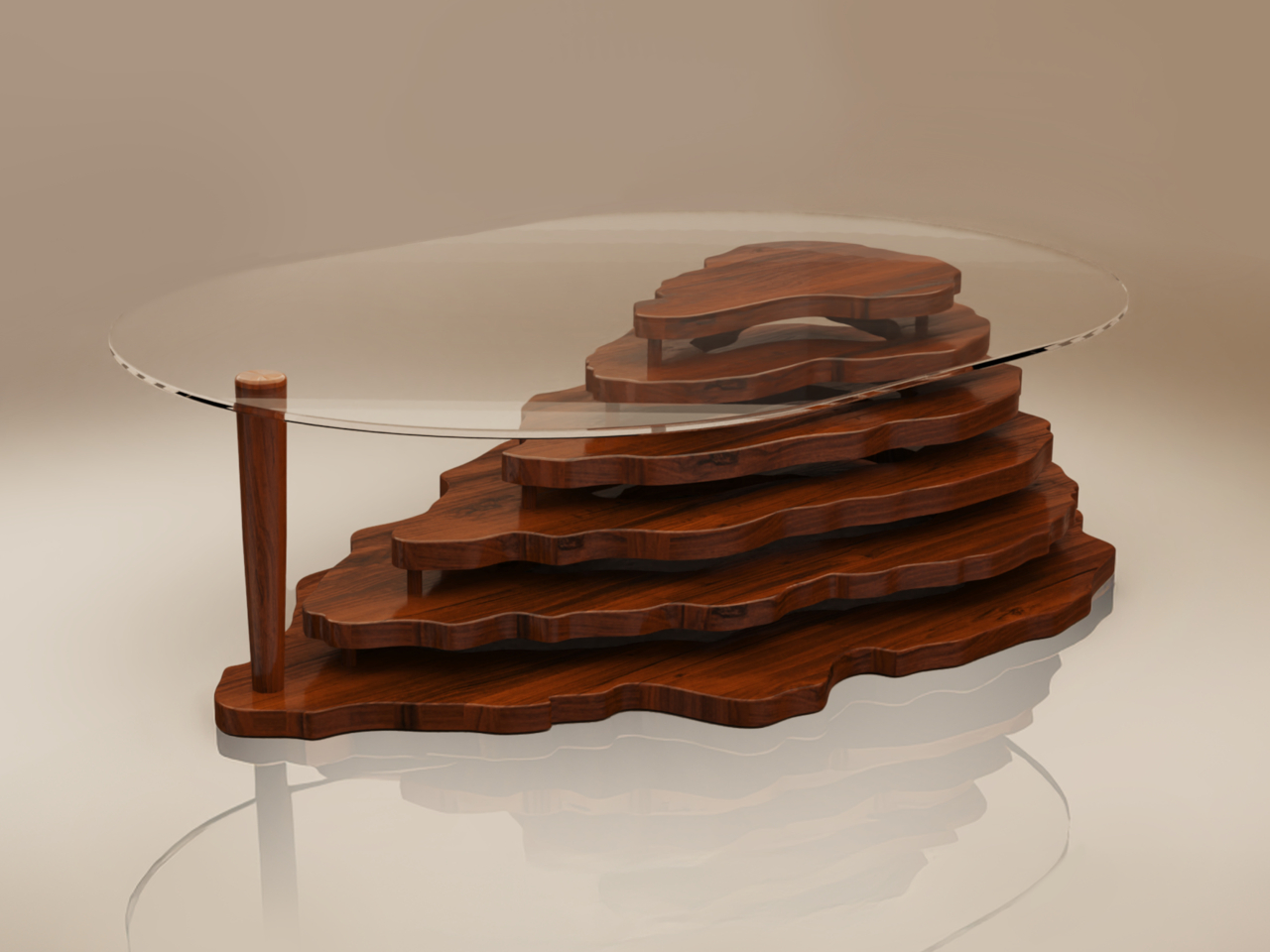
The Vista coffee table, however, doesn’t simply mold or carve the shape of the mountain. It instead assembles layers of rosewood panels cut to the rough shape of the Rock of Gibraltar. The layers are held together by a few sticks of wood, creating very visible gaps in between each step.

The resulting aesthetic is similar to those cardboard topographic maps some students are told to make for their science projects. It’s almost like an artistic representation of a geographic form, leaving just enough details for our minds to fill in the gaps. At the same time, this layered design is like a metaphor for the natural formation of the mountain itself, built up layer by layer over hundreds if not thousands of years.

The Vista coffee table tries to combine the lofty image of mountains with the grounding materials of wood. It’s definitely a conversation starter among guests seeing it for the first time, or even between friends revisiting memories of the table’s arrival. Perhaps an unintended feature of the design is the gaps that can be used to hold or hide objects, almost like the man-made structures that have been built around the mountain, also a metaphor for the clutter that humans create around nature.

The post Topographic wooden coffee table puts the Rock of Gibraltar in your room first appeared on Yanko Design.

À partir d’avant-hierYanko Design

Top 10 Products That Elevate Your Meditation Practice

18 octobre 2024 à 15:20

Meditation is known to offer mental well-being benefits by encouraging the observation of thoughts neutrally before refocusing attention on the breath or another focal point. Essentially, meditation encourages observing thoughts and emotions without fixating on positives or avoiding negatives. Even though meditation doesn’t demand equipment, meditation apps, cushions, chairs, pods, and innovative products could provide a helpful start and assist in sustaining the routine.

Designer: Lee Ye Chan

1. Meditation Chair

For anyone seeking a momentary escape from stress, the “Goyo” chair offers a compact solution. This avant-garde piece draws inspiration from Tibetan singing bowls used in meditation, featuring a rounded steel design that cocoons you in tranquility. The chair’s bowl-like shape, complemented by a smooth maple wood seat and stand, cocoons you, shielding you against stressors. Its ergonomically angled backrest and seat enhance comfort during meditation, while the option to strike the bowl produces soft, soothing sounds. While it has museum-like appearance, the chair is designed for relaxation and comfort, providing a peaceful oasis within a hectic day.

2. Outdoor Chair

Designer: Eun Whan Cho (Mootaa)

The Amplification Of The Senses Chair is a uniquely designed public seat along Seoul’s Han River. It enhances the environment’s natural sounds to create a relaxing ASMR experience. Crafted to encourage reflection and tranquility, the chair’s megaphone-shaped backrest amplifies river and nature sounds while blocking peripheral vision for focused serenity. Made from recycled plastic waste, it’s an eco-friendly effort that cleanses both the environment and the mind. Nature-focused, sustainable, and calming, these chairs redefine relaxation and environmental responsibility.

3. Meditative Pods

Designers: Deepak Chopra, Yves Behar, fuseproject for OpenSeed

The Iris pod, designed by Deepak Chopra and Yves Behar, offers a tranquil sanctuary amid bustling environments. As remote work reshapes office dynamics, integrating purposeful breaks has gained significance. Iris pods, a collaboration between OpenSeed, Deepak Chopra, fuseproject, and Yves Behar, address this need. These meditation pods, located in high-traffic areas like offices, cocoon users in peaceful isolation. Studies reveal that using Iris pods enhances workflow and meditation benefits. The pods feature essential oils, immersive sound and light tech, and guided meditations curated with Chopra’s expertise.

Designers: Mike & Maiike

A collaboration between a design studio and Headspace has birthed the Headspace Pod – a unique furniture piece designed for public spaces like offices, universities, and lobbies. Resembling a large curved mailbox, it offers a cushioned seat and backrest for comfortable meditation sessions. Free from screens or plugs, the pod promotes distraction-free meditation, aided by built-in directional audio. Three buttons inside the pod allow you to choose from 10-minute sessions for relaxation, refreshment, or focus. While not fully enclosed, its ergonomic design aims to provide a calming and focused atmosphere. Tailored for breaks in various public spaces, the Headspace Pod introduces a new way to meditate.

Designer: Thilina Liyanage

Experience nature-infused meditation with the Lakeside Meditation Pod by architect Thilina Liyanage. Resembling an egg or conch shell, this outdoor space floats on a lake, immersing yoga practitioners in natural tranquility. The pod accommodates up to 5 individuals and an instructor, accessed via a short staircase. Crafted from wood and composite panels, it blends seamlessly with its environment. Liyanage’s biophilic design approach shines through, harmonizing architecture and nature. The pod’s unique aesthetic and lakeside position offer a serene setting for meditation, capturing the essence of both design and mindfulness.

4. Yoga Friendly Cushion

Designer: Zmind Design

The Float Meditation Cushion ingeniously supports ergonomic comfort in yoga poses like the simplified lotus (padma asana) and kneeling (vajra asana). Molded foam achieves an ideal blend of firmness and comfort, enabling lengthy meditation without ankle or knee strain. Like an ergonomic office chair for meditation, the Float ensures proper limb, hip, and spine alignment, negating yoga mat-induced slouching. Rooted in ancient Indian and Japanese practices, the cross-legged and seiza kneeling poses offer digestive benefits, flexibility, improved blood flow, posture enhancement, focus, anxiety reduction, and energy revitalization. Welcoming beginners, the cushion aids in adopting these postures comfortably on any surface. Designed for simplicity and portability, it incorporates a strategic handle-like cutout, akin to a yoga mat’s convenience. Emphasizing optimal meditation posture, the cushion accommodates seated and kneeling positions and incorporates a magnetic attachment for added lumbar support by extending the backrest.

5. A Foldable Bed

Designer: Yves Behar for Opus

Integrating ‘Spatial Sound and Vibration with Established Healing Techniques’, the Opus SoundBed™ presents a distinct folding design that compacts to ottoman pouf dimensions. Designed by acclaimed designer Yves Béhar of fuseproject, the bed transcends being merely a therapeutic tool, resembling a chic accessory adaptable to any room and easily unfurled for meditation and healing. When fully expanded, the bed aims to offer an immersive home experience that rejuvenates the body and rejuvenates the nervous system. Through comprehensive body vibrations and spatial sound, it introduces an enhanced therapeutic approach that aids in stress reduction and the release of happiness-associated hormones.

6. Meditation Headset

Designer: Layer Design for Resonate

In today’s stress-ridden world, a tech-integrated meditation headset offers much-needed solace. Layer Design’s LightVision headset, crafted for Resonate, transforms meditation into an enchanting experience. LED lights create dynamic visuals that emerge as biomorphic patterns, engaging closed eyes to trigger the brain’s frequency-following response. Wrapped in textile casing, the minimal, ergonomic design comfortably envelops the face, fostering distraction-free tranquillity. While its effectiveness raises intrigue about potential eye strain, if resolved, this headset could be the stress-relieving catalyst sought by the modern world. By merging sensory input and technology, it elevates meditation routines, potentially ushering in a new era of mental well-being.

7. Desktop-Friendly Zen Garden

Designers: Project Rotate x Yuki Kawae

Scaled for desktop Zen gardens, Project Rotate and Zen Garden artist Yuki Kawae collaborate on a collection of Kawaerakes and hand rakes. These downsized tools bring the meditative art of sand raking to compact spaces. Groove and ridge sets, each comprising six handheld rakes, offer diverse sand designs with their natural wood handles and white trimming. Kawae’s traditional hand rakes, featuring longer handles, allow for intricate designs. Completing the set is a sand leveller for a fresh start. Project Rotate’s simple yet innovative rake profiles amplify creative possibilities, enhancing the Zen Garden experience with intuitive tools for mindfulness and imagination.

8. Hand-held Meditation Device

Designer: MindNap

The portable MindNap device enhances meditation by guiding deep breathing. With thumb-placed metal pads detecting biosignals, it vibrates gently for inhaled and exhaled cues. Paired with an app, one can choose from creativity, focus, relaxation, or energy settings. By analyzing internal cues like heart rate and BMP, it tailors breathing patterns to desired states, reducing stress and anxiety while improving focus and creativity. It energizes too, boosting blood flow. Available in two colors, the MindNap includes a portable leather case for on-the-go clarity and sanity in today’s demanding times.

9. Zen Alarm Clock

Designer: Mudita

For non-morning people, the Mudita Bell calming alarm clock offers a natural wake-up call based on circadian rhythms. It replaces pre-sleep phone scrolling with its E-Ink screen, reducing blue light exposure. Minimalist design soothes eyes pre-bed and upon waking. With acoustic sounds, it gently wakes without irritation. The clock tracks air quality and suggests improvements like humidifiers for healthier sleep. It also includes preset meditation timers, promoting overall wellness.

10. Breathing Assistive Stone

Designers: Wenxi Qi and Hengbo Zhang

Ayama, an iF Design Talent Award-winning device, aids anxiety with rhythmic breathing. Resembling a stone, it expands and contracts using integrated motors for pranayama techniques, clearing energy channels to induce calm. Intuitive and adjustable, Ayama offers modes like ujjayi and kapalabhati to combat stressors, enhancing focus and tranquility. The wireless charging zen garden serves as a reminder for emotional well-being. By simplifying pranayama, Ayama empowers users to battle anxiety’s challenges, promoting relaxation and balance through a button-press and controlled breath.

To initiate your meditation practice, try experimenting to discover what aligns with your personality and daily routine. Begin with straightforward techniques, gradually extending your session time, without feeling obligated to engage in lengthy sessions.

The post Top 10 Products That Elevate Your Meditation Practice first appeared on Yanko Design.

Cyberpunk-themed power socket box concept removes a reason to hide your cables

Par : JC Torres
18 octobre 2024 à 14:20

Cable management and hiding is not only a trend; it has even become an art form. Messy cables don’t just get in the way but are also an eyesore. But what if the cables become part of the desk’s aesthetic? What if the power strip or socket box actually gave you a reason to have those charging wires out in the open? That’s the idea behind this socket box design that appeals to gamers, geeks, and gadget lovers by giving their desks a cyberpunk aesthetic. At the same time, it also makes cable management simpler by not having to hide wires and cables in the first place.

Designer: PTPC

It has become en vogue to hide power sockets and charging ports from view, whether disguising themselves as part of the desk or simply placing them behind tables. While that may be an effective way to reduce the visual mess, it also means most of these outlets are harder to reach. You shouldn’t have to sacrifice convenience for aesthetics, especially if the aesthetic you’re aiming for isn’t the kind that adheres to clean and tidy arrangements.

Trozk is a “hardcore” socket box that makes you want to actually have your wires in plain sight by embracing the popular cyberpunk theme. As the name itself implies, this genre’s design language is sometimes messy, unrefined, and even garish. You have tangled cables, neon lights, and geometric shapes in abundance, though still executed in a stylistic and intentional manner.

The socket box concept is aptly big, boxy, and flashy. On the top, you have six universal power outlets arranged in a 2×3 grid that can accommodate almost any plug type. Beside them is a square with small LED indicators and a square LCD display for information such as power input, output, and the like. Off to the side are USB ports for charging mobile devices. The concept incorporates GaN (Gallium Nitride) technology to handle the load of having 10 ports putting out power.

Like any cyberpunk-themed gadget, Trozk has RGB lighting that highlights the top surface of the box as well as the branding in front. Because of its interesting visual, the socket box is clearly designed to be shown off, even when there are cables coming out of it. That makes it easier to plug and remove chargers at will, while also giving your desk or shelf a sci-fi vibe. Of course, you’ll still have to make sure your cables don’t get tangled up, but at least now you’ll have a cyberpunk excuse for the mess.

The post Cyberpunk-themed power socket box concept removes a reason to hide your cables first appeared on Yanko Design.

Beautiful lamp fixture is made from an unlikely medical equipment

Par : JC Torres
18 octobre 2024 à 13:20

We’ve seen many striking lamp designs inspired by beautiful things in the world. Most of them get their cues from nature, taking inspiration from the moon, trees, or even mushrooms. While that in itself is a form of art, it takes more creativity and skill to turn something uninspiring or unsettling into a stunning and elegant design. This desk lamp, for example, looks soothing and calming in the dark, and you’ll probably never guess that it was made by repurposing an existing object that is associated not with beauty or elegance but with blood, pain, and wounds.

Designer: Kairi Eguchi

You might not be familiar with its name, but the pus tray is a common sight in hospitals, operating rooms, and TV shows depicting such scenes. Often made of stainless steel or even plastic, the kidney-shaped vessel is often used to collect pus but is sometimes depicted to hold bloody cotton, surgical tools, bullets, and other things that might come out from a body during surgery. Even the name alone carries a very negative connotation, and one can hardly imagine such a medical device being used for something less disturbing.

POND, however, proves that presumption wrong. It is part of a project that attempts to give new meaning to existing products, transforming them for a completely different and almost opposite purpose. In this particular case, a white-coated tray serves as the base for a cylindrical lighting element that’s placed not in the middle but near the edge of the tray. In daytime or in bright light, the lamp already looks interesting because of its unique shape, but the real magic happens when it becomes the only light source in a dark room.

The bowl virtually becomes a literal pond of light, using the natural contours of the tray to create an enchanting play of light and shadow. Unlike other lamps, the outward-facing surface of the pus tray is completely devoid of illumination, creating an effect not unlike the dark side of the moon. The curves and gently diffused light work together to create a soothing effect, the complete opposite of the proper medical use of the pus tray.

Given its bowl shape, POND can also be used as a container of sorts for small items. Of course, those objects will interfere and interact with the light, but that, in turn, could create an even more interesting visual, like fish swimming in a mystical pond of light.

The post Beautiful lamp fixture is made from an unlikely medical equipment first appeared on Yanko Design.

Top 5 Pop Culture-Inspired Footwear That Are The Coolest Designs You’ve Ever Seen

18 octobre 2024 à 11:40

Footwear is not simply a practical necessity any longer, something we just wear on our feet to protect them. It has become a powerful form of self-expression. We can select styles that represent our favorite TV shows, movies, music, and iconic characters from pop culture. Footwear brands have begun to create designs that capture the essence and magic of various popular trends and franchises. And, we’ve curated a collection of pop culture-inspired footwear that will excite collectors and enthusiasts alike. Irrespective if you’re a major lover of pop culture or someone who simply enjoys unique fashion designs, these innovative and one-of-a-kind styles will elevate your shoe game.

1. Batmobile Crocs

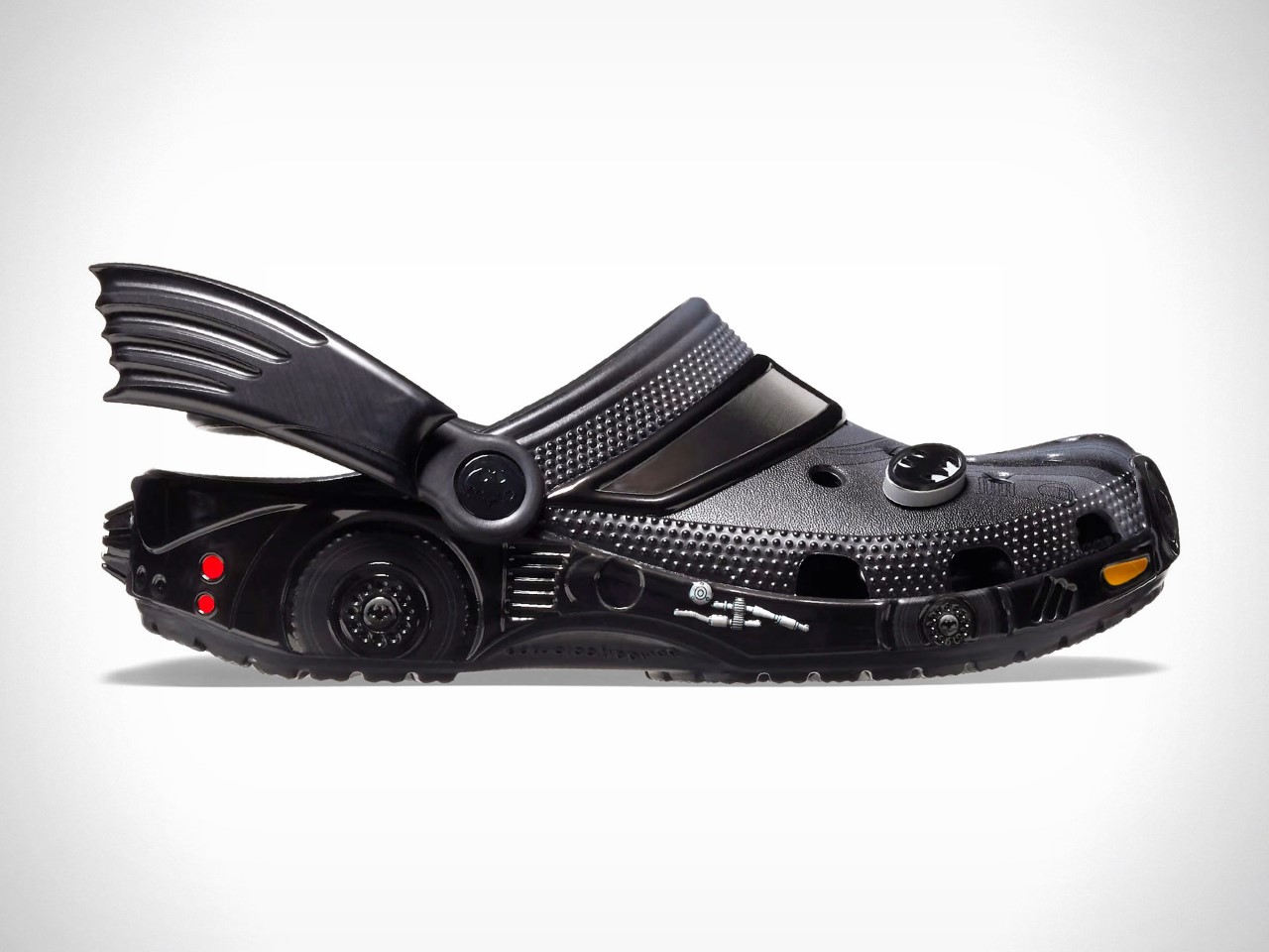
These Batmobile Crocs are truly iconic! They’re modeled after the dashing vehicle from the 1989 Batman movie starring Micheal Keaton. The shoes are brilliantly designed and amped with all the bells and whistles, such as a graphic on the front that displays the hood. It also features a set of fins near the ankle, and there are wheel-shaped details around the heel. The front section includes actual windshields! The Crocs are also equipped with headlights, taillights, a jet engine intake at the front, and an afterburner on the back.

2. Pringles x Croc Boots

Meet the Pringles x Crocs boots – these boots are the perfect culmination of functionality and fun, and they’re intended to grab attention. The primary color of the boots is a chill beige, which will complement all your outfits very well. The shoes also include bold red accents which instantly call for attention. The Pringles logo is displayed on the cuff and the side pocket, imparting the boots with a snack-themed vibe. The boots are unique and cool, but they may make you look like a sore thumb, so if you’re okay with that, then they’re a great fit for you.

3. The Simpson Stan Smith Sneakers

If you’re a Simpsons lover and an Adidas regular, then these Stan Smith sneakers are exactly what you need. The color scheme is interesting yet somber since it features a neutral white with a pop of slashy green. Adidas has brought back the Simpsons using this iconic scene where Homer slowly backs into the bush. This scene is much loved by meme enthusiasts all over the world! The sneakers are a representation of symbiotic fusion that transcends fashion trends.

4. Marvel x Nike Footwear

Meet these stunning Marvel x Nike Football sneakers! They are created by Paul Parsons using MidJourney’s AI. The mindblowing and innovative shoes are designed to represent the grandeur and power of MCU’s iconic heroes and antiheroes. The collection includes 9 intriguing footwear models that draw inspiration from the distinctive and memorable characters from the Avengers movie, and Wolverine too!

5. Wednesday Stomp Clogs

Inspired by Tim Burton’s hit Netflix series Wednesday, the Wednesday Stomp Clogs are the perfect culmination of gothic style and comfort. Designed by Crocs, these limited-edition clogs are creepy yet chic. They are designed to provide a fresh and dramatic look that is great for fans of the show and lovers of spooky fashion. They feature a glossy black upper and a white color detail, giving a nod to Wednesday’s schoolgirl outfit. The Crocs are great for casual outings or Halloween events this spooky season!

The post Top 5 Pop Culture-Inspired Footwear That Are The Coolest Designs You’ve Ever Seen first appeared on Yanko Design.

Analogue 3D console lets you enjoy classic Nintendo 64 games in 4K

Par : Gaurav Sood
18 octobre 2024 à 10:07

Want to reexperience the Nintendo 64 as it was meant to be without any compromises in gaming experience? One is the graphics that are hard to emulate on modern screens in 4K via HDMI. Then Analogue 3D has got you covered if you’ve got the game console cartridges and controllers stashed in your library. It’ll come with an in-built bespoke 4K-upscaler and original display modes for a lag-free method to enjoy your classic titles how you want.

Analogue who previously created versions of the Game Boy, NES and Sega Genesis, has finally revealed that the long-awaited clone console will arrive in Q1 2025, and you can preorder it from 21 October (11 AM ET onwards) for $250. This console powered by 3DOS (the evolution of AnalogueOS) comes with features including support for saved states and capturing screenshots.

Designer: Analogue

The original Nintendo console’s vibe is intact with power and reset buttons. In case you’ve got no controller to go with the 3D console or want a modern compatible controller to play, they’ve got you covered there as well. They’ve collaborated with 8BitDo to redesign a N64 controller that’s got all the buttons to make you go crazy. As I mentioned, it’ll work fine with old cartridges and has an expansion pack built-in. It will be safe to say, the console can save your game progress and might even have the trickery to import your old saved progress back from the late 90s.

The 8BitDo N64 controllers will cost $40 a piece and the complete package will cost $290. These modern controllers will have a Hall effect stick and will be compatible with Switch, PC and Android as it has support for D-input and S-input modes. Since we are talking Analogue here, you will only get the console in two colors – black or white – and controllers from their website or via third-party resellers. Given the N64 can be a big hassle with emulators, the Analogue 3D is a big win since you’ll play right from the source. Therefore, you can expect a glitch-free experience playing titles like Super Mario, FIFA 99, or The Legend of Zelda.

The post Analogue 3D console lets you enjoy classic Nintendo 64 games in 4K first appeared on Yanko Design.

Why the Leonardo 1519 Watch Runs Backwards: A Col&MacArthur Tribute to da Vinci

Par : Satsuki Then
18 octobre 2024 à 01:45

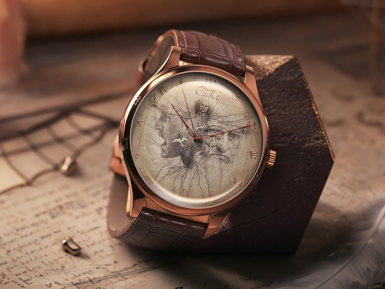
Inspired by the genius of Leonardo da Vinci, who could draw/write with both hands and also write in reverse, the folks at Col&MacArthur designed the Leonardo 1519 – a watch that, just like da Vinci’s writing, runs in reverse. An incredibly intriguing watch that pays tribute to the greatest genius of the Rennaissance, the Leonardo 1519 quite literally runs anti-clockwise, with the hands running ‘backward’ and the numbers on the watch oriented in reverse. The watch sports a few other key details that celebrate the Italian artist and creator’s life, from his artworks like the Vitruvian Man and the Battle of Anghiari, as well as concepts like the Fibonacci sequence, which da Vinci’s believed to have used heavily in his art and architecture.

Have you ever thought of why clocks move ‘clockwise’? The reason’s pretty simple if you work backward to the ancestor of the modern clock – the sundial. Invented in the northern hemisphere, sundials relied on the shadow of the sun to tell time, and as a result, the sun cast its shadow in a way that caused the dial to move ‘clockwise’. So naturally, when clocks were first engineered, they were made to mimic the movement of the shadow on the sundial. If sundials were first made in the southern hemisphere, clocks would rotate the absolute opposite of how they do today. With the Leonardo 1519, the watchmakers at Col&MacArthur are simply exploring this unique ‘reverse’ timekeeping trend while celebrating the most notable genius of the 15th century.

Designer: Col&MacArthur

Click Here to Buy Now: $325 $540 (40% off). Hurry, 10/15 left!

The name “Leonardo 1519” holds particular significance—it marks the year of da Vinci’s death. In choosing this date, the collection honors not just the man, but his enduring influence on art, science, and innovation. The year 1519 represents a turning point when the world lost a visionary, but his ideas continued to shape generations of thinkers and creators. This watch isn’t just about looking back; it’s about carrying da Vinci’s spirit of discovery into the future, making his genius relevant to today’s world.

At first glance, the reverse movement catches you off guard. It’s a direct nod to da Vinci’s mirror writing, a technique he often used in his notebooks. This unusual feature may seem like a simple design choice, but it transforms the experience of checking the time into a reflection on da Vinci’s constant challenge of conventions. The watch comes with a choice between mechanical and automatic movements – codenamed Codex and Mecanicca. You can get a variant of the watch that tells the time clockwise – just in case you’d like a time-telling tribute to da Vinci that isn’t difficult to read. However, if you want an absolute conversation starter, the Codex Reversed feels like living in the mirror dimension. The Codex Reversed model runs on a quartz Ronda movement that ticks in reverse. Reading the time definitely is a bit of  learning curve, but the watch makes up for it with clear numerals on the dial, and in just a few days it comes naturally to you. Moreover, it’s a perfect visual metaphor for people who believe in doing things differently!

For those who prefer their time to move in a more traditional direction, the Codex Classic offers the same impeccable craftsmanship with a clockwise movement. Both Codex models are encased in stainless steel, topped with sapphire glass, and backed by a two-year warranty. The collection’s flagship model, the Meccanica Classic, elevates the experience with an automatic Japanese Miyota movement, visible through an exhibition case back. Limited to 1,519 pieces, this model commemorates the year of da Vinci’s passing and makes it a rare collector’s item. Its embossed “elevato” dial design, which plays with light and shadow, adds a layer of visual complexity, reminiscent of da Vinci’s own studies on light and form.

Every detail in the Leonardo 1519 collection is steeped in symbolism. The Vitruvian Man, da Vinci’s famous drawing exploring the harmony of human proportions, is intricately etched into the watch’s dial, a reminder of the perfect balance between art and science that da Vinci so masterfully embodied. The dial also has a close-up of the soldier from da Vinci’s sketch of the Battle of Anghiari, along with his self-portrait, all masterfully blended into a collage that celebrates the man. Other features include birds depicted in flight, a tribute to da Vinci’s groundbreaking studies on aerodynamics and his Codex on Flight. The Fibonacci sequence, symbolizing nature’s mathematical harmony, is also subtly embedded, reflecting da Vinci’s fascination with the intersection of mathematics and the natural world. While the Codex models don’t come with an exhibition back, they do have an artistic depiction of the da Vinci sculpture by Marino Marini.

Col&MacArthur’s watches are museums in their own right. Previous timepieces from the brand have featured parts of the Berlin Wall, fragments of Moon dust and Mars dust, and even honored legends like Napoleon and historical events like Dunkirk. The Leonardo 1519 is just the next chapter in this series, celebrating historic times through something as befitting as time itself!

Click Here to Buy Now: $325 $540 (40% off). Hurry, 10/15 left!

The post Why the Leonardo 1519 Watch Runs Backwards: A Col&MacArthur Tribute to da Vinci first appeared on Yanko Design.

This Little Geodesic Dome Is The World’s First Pentakis Dodecahedron (60-Sided) Tiny Home

17 octobre 2024 à 23:30

Called the Mini Dome, this is the world’s first pentakis dodecahedron (60-sided) tiny home. It is a geodesic dome home that has been created to maximize the limited space, serving as a unique vacation rental. The pint-sized little house will be available for sale in bare hub kit form too. Geodesic domes were initially popularized by the architect Buckminster Fuller, and they comprise interconnected triangles. The domes are often preferred by hobbyists for greenhouses and eco-homes. This little dome was designed by Dodeca Domes’ Joshua Tulberg, and it includes a welded steel hub and wooden struts. It is supported by an elevated pier and beam foundation and also features great insulation.

Designer: Joshua Tulberg of Dodeca Domes

The interior of the dome occupies around 308 sq ft, and it spans over two floors. It has a pretty open layout, with a front door leading to the main living area. The living area is equipped with triangular windows, and the interior of the home is pretty attractive with a unique shape. The layout is cleverly designed to accommodate the curving walls, and it contains a sofa bed and a dining table for two people. A central section functions as the kitchen, bathroom, and bedroom. It also includes a TV. The kitchen is amped with a fridge/freezer, sink, coffee maker, microwave, toaster, and some cabinetry. While the bathroom includes a shower and a toilet.

The bedroom can be accessed via a space-saving spiral staircase, and it is essentially a simple mezzanine with a queen-sized bed. There is plenty of space to stand upright as well. The Mini Dome is up for rent on Airbnb, and Tulberg is planning to sell the bare hub kit for US$15,000 in 2025.

The post This Little Geodesic Dome Is The World’s First Pentakis Dodecahedron (60-Sided) Tiny Home first appeared on Yanko Design.
Governors Point is the Ultimate Eco-Luxury Escape You’ll Wish You Lived In

17 octobre 2024 à 22:30

Governors Point, an exclusive residential enclave, sits on a pristine 125-acre peninsula in Washington’s Salish Sea. Envisioned by acclaimed architect Omer Arbel, this unique community offers an exquisite mix of luxury living and deep respect for the environment. The development features 16 custom waterfront homes that blend seamlessly into the surrounding landscape. Each home is crafted to celebrate the raw beauty of the area, ensuring it complements rather than overpowers the natural setting.

Designer: Omer Arbel

Image credit: Governors Point

Governors Point’s history adds depth to its current form. Originally, the site was slated for over 300 homes and multiple marinas, but a transformative partnership between design entrepreneur Randy Bishop and the Whatcom Land Trust shifted its destiny. Their focus was on conservation, turning Governors Point into a haven for both residents and nature.

Exterior Design: Blending With Nature

The exterior of each home at Governors Point reflects Omer Arbel’s innovative approach to merging architecture with nature. The homes are placed strategically along the peninsula, with some landward facades partially buried to reduce their visual presence and make them part of the landscape.

Image credit: Governors Point

On the west-facing side, a “cloudlike” exterior skin made from cedar burl offcuts adds a striking visual feature. These cedar pieces, described as “boulder-shaped modules,” are mounted on metal standoffs and gently sway, creating a kinetic effect. Over time, moss and lichens will grow on these surfaces, adding a living, evolving element to the design.

Roofs are designed to allow the forest to grow over them, making the homes seem like natural extensions of the landscape. This design choice also offers energy efficiency, as the forest provides natural insulation.

Paths leading to the homes are discreet, guiding residents through nature in a way that contrasts the enclosed feeling of the homes—often opening up dramatically to views over the cliffs. These paths are set between retaining walls, enhancing the contrast between entering underground spaces and emerging to cliff-edge views. Landscaping is restricted to just 3,000 square feet per 1.5-acre lot, ensuring that most of the natural flora is preserved. This careful planning maintains the native beauty of Governors Point, keeping ecological integrity at the forefront.

Image credit: Governors Point

The design also respects the existing kayak route along the shoreline, ensuring that the natural recreational pathways remain unobstructed and inviting for kayakers.

Interior Design: Seamless Flow Indoors and Out

The interior of each Governors Point home reflects Arbel’s commitment to creating harmony between luxury and nature. The homes are capped at 2,900 square feet, maintaining a modest size that fits within the environment.

Expansive floor-to-ceiling windows bring in sweeping views of the Salish Sea and San Juan Islands, flooding rooms with natural light. These windows create a seamless connection between the indoor and outdoor spaces, making the landscape a natural part of the home’s interior.

The living room design beautifully showcases this philosophy, featuring woven leather chairs and a low-profile marble coffee table. The living area opens directly to the outdoors, framed by boulder-like modules connecting the home to the natural world. The use of earthy tones and tactile fabrics throughout the living room maintains a sense of warmth and cohesion, while built-in shelves add functionality without overwhelming the space.

The materials used throughout the homes, like locally sourced wood and stone, add warmth and texture, while low-VOC paints and reclaimed wood floors keep the building process eco-friendly.

Fixtures from Arbel’s design firm, Bocci, are featured throughout, including custom glass pendants that bring a unique glow to the rooms. The collaboration between Omer Arbel and Bocci goes back nearly two decades, allowing Bocci’s luxurious finishes to integrate seamlessly into Arbel’s architectural projects. Skylights and open floor plans ensure that natural light fills every corner, enhancing the spaciousness while connecting each room to the outdoors.

Image credit: Governors Point

In the kitchen, an elegant concrete finish defines the space, with natural textures continuing to enhance the connection between indoor and outdoor environments. This description is based on conceptual design elements rather than a confirmed source from the images or documents provided. Large windows frame views of the sea, while the design focuses on subtle built-in features, such as hidden storage and a minimalist aesthetic, ensuring the kitchen is functional and stylish.

The Parametric Approach: Architecture With Variation

Omer Arbel takes a parametric design approach at Governors Point—meaning the homes are crafted within a set of guidelines that allow for natural variations. Each home follows core principles but adapts to the specific conditions of its location.

Image credit: Governors Point

For example, cedar burl offcuts on the west-facing facades are arranged within set parameters but come together in unique compositions. This gives every home its personality while maintaining a consistent architectural language across the community.

Arbel’s process involves setting constraints and letting materials and site-specific factors guide the final design. This approach allows the architecture to adapt to the environment, making each home a reflection of its surroundings.

It turns construction into a creative, evolving process that celebrates unpredictability and uniqueness. Arbel also extends this parametric philosophy to interior fixtures, using materials like copper and glass to adapt to the living spaces’ flow.

Image credit: Governors Point

The master bedroom continues the organic design language with a feature wall that mimics the boulder-shaped modules seen outside. The furniture, including the bed and integrated shelving, balances the ruggedness of natural materials and refined craftsmanship. Custom Bocci lighting adds a sculptural quality, casting soft light that enhances the serene atmosphere.

Image credit: Governors Point

A Commitment to Sustainability

Governors Point is a model of sustainable architecture, with 98 of the 125 acres set aside as a nature reserve managed by the Whatcom Land Trust. This area features a 2.5-mile public access loop trail, allowing residents and visitors to explore the peninsula’s stunning natural beauty, including access to beaches and viewpoints on both sides.

Image credit: Governors Point

Keeping most of the land as a nature reserve helps protect local ecosystems, balancing development and conservation.

Each residence is capped at 2,900 square feet, with an additional 1,100 square feet allowed for garages or outbuildings. By limiting the size of the homes and restricting manicured landscaping, the development ensures that the natural surroundings remain untouched as much as possible.

Using sustainable materials, such as repurposed cedar burl offcuts for exterior cladding, reduces waste and promotes regional resource efficiency. Governors Point also bans using pesticides and harmful chemicals, protecting the local flora and fauna.

Image credit: Governors Point

Energy efficiency is key in architectural planning, with large windows designed to optimize passive solar heating while offering stunning views. The project maintains a low-density footprint by limiting the development to only 16 homes on the 27 developed acres, reducing habitat disruption and preserving wildlife corridors.

The design blends the homes into the landscape with natural features like buried facades and forest-covered roofs, setting a new standard for eco-conscious luxury.

The post Governors Point is the Ultimate Eco-Luxury Escape You’ll Wish You Lived In first appeared on Yanko Design.
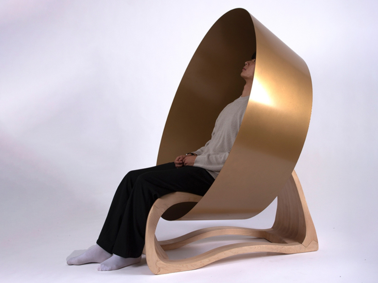
Turning 350 Razor Blades into a Super-Sharp Damascus Steel Knife

Par : Sarang Sheth
17 octobre 2024 à 20:45

But why make a massive blade out of something that can ALREADY cut things – you ask? It probably sounds like using a lot of small LEGO bricks to make one large LEGO brick, right? Well, the thing with razor blades is that they’re made to serve a finite purpose. They’ll last a few days, maybe a few weeks, and then they need to be discarded. Razor blades are ridiculously sharp, but they’re also ridiculously flimsy and you can break one with your own hands… so YouTuber Knives Project decided to just use a bunch of them to make something more everlasting, more worthy of being cherished, while being just as sharp.

It took 350 blades being forged together into a metal ingot to make this final knife. The result is truly heirloom-worthy. The knife sports a gorgeous marbled blade created thanks to the combination of the steel used in the razors as well as the steel powder added into the ingot to fill in the air gaps. The knife finally gets a nice wooden handle with a bit of metal at the beginning of the hilt.

Designer: Knives Project

The 15-and-a-half-minute video guides you through Knives Project’s process, from forging the steel ingot to shaping it, etching it, honing it, and then building the handle for the knife. The result looks rather artisanal, with a kitchen knife-style design sporting a drop-point edge and a wonderful marbled body reminiscent of Damascus Steel. The knife also comes with a wooden handle with an octagonal cross-section that’s easy to grip and maneuver.

Razor blades are primarily made from martensitic steel – a steel alloy known for its high strength and wear resistance, with the more expensive ones being made from carbon steel. Given that the knife uses 350 of these razors, it’s possible Knives Project sprung for regular blades, adding them one by one into a bolt to create a cylindrical form. The cylinder was then dropped into a hollow metal block and all the air gaps were filled with steel filings, resulting in a solid block that had no air gaps.

Once the metal block goes into the furnace, the steel inside begins melting, forming a rough cluster that Knives Project extracts by opening the outer box using an angle grinder. The reason is that this outer box is made of iron, while its internal components are the steel you need to form into an ingot.

The process involved constantly heating, hammering, and forming the resulting metal ingot into a flat strip that could then be cut into the knife’s shape. Once cut, the surface was made smooth before being dipped into an acid bath to reveal the marbled pattern caused by the different kinds of steel used in the knife.

Once the blade was completely ready, Knives Project added a handle to it, using primarily wood combined with metal and a black block of presumably polymer to create a fair amount of contrast. The handle was given an octagonal cross-section and a fairly simple silhouette. Arguably a knife this pretty could be given a prettier, more ergonomic handle, but then again, that may steal from the star of the show, its blade – forged from 350 razors. Now if only Knives Project could cut that blade up into 350 pieces and turn them back into razors!

The post Turning 350 Razor Blades into a Super-Sharp Damascus Steel Knife first appeared on Yanko Design.

❌
❌