Vue normale

Il y a de nouveaux articles disponibles, cliquez pour rafraîchir la page.
À partir d’avant-hierTechs Design

QUB Candlestick Concept Holds Two Candle Types in Minimalist Stone

Par : JC Torres
20 août 2025 à 14:20

Candlelight has this timeless way of making any space feel warmer and more intimate, but finding the perfect candlestick that works for different moods and candle types can be surprisingly tricky. Ross Sorokovyi’s QUB candlestick concept tackles this challenge with refreshingly simple geometry.

The QUB is basically a perfect 60mm stone cube, but here’s where it gets clever. Each cube has two different-sized holes on different faces, so you can hold either a standard taper candle or a tealight depending on which way you orient it. Need dramatic height for dinner? Pop in a taper candle. Want something cozy for reading? Flip it over and drop in a tealight.

Designer: Ross Sorokovyi (Mudu Studio)

What makes this design genuinely smart is how it strips away everything unnecessary while actually adding functionality. Most candlesticks lock you into one candle type forever, but QUB adapts to whatever vibe you’re going for. The cube form feels both ancient and contemporary, like something that could have existed centuries ago but still looks perfectly at home on a modern table.

These are carved from natural stone, and each piece shows off the material’s unique character. The images reveal gorgeous variations in marble and granite, from deep green with dramatic veining to soft gray with subtle patterns. The surface treatment mixes smooth polished areas with ribbed, chiseled sections that add visual texture and give your hands something interesting to feel.

The ribbed quarter-cylinder cut into each cube’s base does double duty, too. It lightens the visual weight so these don’t look like boring blocks, and it creates this modular quality where multiple QUBs can nest together or stack in interesting patterns. You can arrange them in grids, align the ribbed sections for rhythm, or mix different stone colors for contrast.

This modularity turns individual candle holders into something more sculptural and architectural. Instead of just lighting one candle, you’re creating these little landscapes of light and shadow. The weight of the stone keeps everything stable, while the compact size means you can easily rearrange them as your space or mood changes.

The concept celebrates that honest, tactile quality of natural stone where no two pieces look exactly alike. Those natural imperfections and variations become features rather than flaws, giving each QUB its own personality. The substantial weight makes them feel permanent and valuable rather than disposable.

Of course, this remains a concept design, so questions about heat resistance, cleaning, and real-world durability haven’t been tested yet. The sharp edges might also be less forgiving than traditional, rounded candlesticks if you accidentally bump into them in dim light.

But as a design statement, QUB succeeds brilliantly at reimagining something as basic as a candle holder. It proves that even the simplest objects can benefit from thoughtful reconsideration. For anyone who appreciates when form and function work together seamlessly, QUB offers a compelling vision of what everyday objects could become with just a little more creative thinking.

The post QUB Candlestick Concept Holds Two Candle Types in Minimalist Stone first appeared on Yanko Design.

Sofia mobility device reinvents comfort and confidence

Par : Ida Torres
20 août 2025 à 13:20

The Sofia mobility device by Alberto Essesi is setting a new standard for what personal mobility can feel and look like. Designed to address both the physical and emotional needs of users, Sofia brings together elegance, safety, and smart engineering for a truly empowering experience.

What sets Sofia apart is its organic, flowing form that naturally conforms to the human body. This design focus ensures not only comfort but also creates a sense of harmony and ease in every movement. Whether you are at home or navigating the city, Sofia’s sleek silhouette and gentle curves make it feel more like a part of you than just another piece of equipment.

Designer: Alberto Essesi

One of the most innovative features of Sofia is its fully enclosed sitting area. Unlike traditional mobility devices where clothing can get caught in the wheels, Sofia’s enclosed design eliminates this risk entirely, providing peace of mind and making daily use much simpler. Every detail, from the seat’s gentle embrace to the smooth edges, is crafted with the user’s safety and dignity in mind.

Sofia is built from a combination of carbon fiber, plastic, aluminum, high-density foam, and rubber. This blend of materials results in a device that is lightweight yet incredibly durable. As a result, Sofia is easy for a single person to maneuver and can be conveniently stored in a car or tight space. The thoughtful construction means less physical strain and more freedom to go where you want, when you want.

Versatility is another hallmark of the Sofia design. The mobility device features removable, power-assisted wheels that can be attached or detached depending on the user’s needs and the terrain. Whether you’re rolling over smooth indoor flooring or facing a bumpy outdoor path, Sofia adapts seamlessly to your lifestyle. This flexibility helps support independence and choice, letting users tailor their experience to their preferences.

Aesthetics and functionality are perfectly balanced in Sofia. The minimalist design radiates simplicity and sophistication, making it a device users can feel proud of. Every element, from the frame to the wheels, is designed for visual harmony and practicality, encouraging confidence and promoting a sense of independence. For anyone seeking a mobility device that truly understands user needs, Sofia by Alberto Essesi offers a refreshing alternative. It proves that mobility aids can be beautiful, intuitive, and life-enhancing all at once. By thoughtfully addressing comfort, safety, and self-expression, Sofia helps users embrace each day with renewed confidence.

The post Sofia mobility device reinvents comfort and confidence first appeared on Yanko Design.

Top 5 Modern CD Players That Prove CDs Are Making A Comeback In 2025

20 août 2025 à 11:40

Physical media is having a moment in 2025, and it’s not just vinyl records getting all the attention. CDs are selling $541 million worth of units, up 1% from 2023, proving there’s still plenty of love for the humble compact disc. While vinyl grabs headlines with its 18th consecutive year of growth, CDs are quietly finding their way back into music lovers’ hearts and homes.

The CD players hitting the market now aren’t the chunky, plastic boxes your parents had in the ’90s. These five designs show how far we’ve come, merging sleek looks with smart features that make sense for how we live and listen to music today. The CD comeback isn’t about looking backward. It’s about finding a middle ground between the instant gratification of streaming and the full commitment of vinyl. Sometimes you want to hold your music, read the liner notes, and experience an album the way it was meant to be heard, and these players make that feel fresh again.

1. ClearFrame CD Player

Now here is something you don’t see every day: a CD player that’s completely see-through. The ClearFrame takes transparency literally, housing everything in crystal-clear plastic so you can watch the magic happen. That black circuit board isn’t hidden away; it’s part of the show, turning your tech into something worth staring at.

It treats your album covers like mini art exhibitions. Slip in your favorite disc, slide the cover into the frame, and suddenly you’ve got a piece that works on your shelf, desk, or even hanging on the wall. It’s perfect for those moments when you want to really focus on an album, not just have music playing in the background. The whole ritual of choosing a CD and watching it spin becomes part of the experience.

Click Here to Buy Now: $199.00

What we like

  • The transparent design turns every play session into a visual experience.
  • You can mount it on the wall like an actual artwork.

What we dislike

  • All that clear plastic is going to show every fingerprint and dust speck.
  • The exposed electronics might need regular cleaning to keep looking sharp.

2. Portable CD Cover Player

This little player gets something that streaming services still struggle with: album artwork matters. The built-in pocket for your CD’s cover art means you’re not just hearing the music, you’re seeing it too. It’s a simple idea that makes a huge difference when you’re trying to connect with an album the way the artist intended.

The portable design with its own speaker means you can take your music anywhere without dragging along extra equipment. Kitchen counter while cooking? Perfect. Bedroom nightstand? Works great. Want to hang it up somewhere? Go for it. This player understands that sometimes you want your music to be the main event, not just background noise.

Click Here to Buy Now: $199.00

What we like

  • The album art display brings back the full music experience.
  • Built-in speaker means no fussing with separate audio gear.

What we dislike

  • A single speaker can’t deliver true stereo sound.
  • The compact size might mean compromising on audio quality.

3. Orion

The Orion takes minimalism to its logical conclusion: a flat metal box that does one thing exceptionally well. That powder-coated finish gives it an industrial vibe that’s both tough and elegant. The front-loading slot eliminates the flip-top mechanism, creating cleaner lines and fewer things that can break.

This is for people who want their music equipment to disappear into the background. Just a large eject button and an IR sensor interrupt the otherwise perfect surface. There’s something almost meditative about using gear this simple; it forces you to focus on the music instead of fiddling with settings.

What we like

  • The industrial design is both beautiful and built to last.
  • Front-loading slot means fewer moving parts to worry about.

What we dislike

  • Minimal controls might leave you guessing about basic functions.
  • Still in concept phase, so you can’t buy one yet.

4. SYITREN R300

The R300 doesn’t try to hide what it is; it’s a CD player that’s proud of its heritage while embracing modern tech. Those finish options (wood, white, and that fascinating fruit green) show that audio gear doesn’t have to be boring black boxes. The MUSE Design Gold Award isn’t just marketing fluff; this product really does nail the balance between looks and performance.

It handles different types of music amazingly. CDs, burned discs, MP3s, WAV files – it plays them all without breaking a sweat. The Bluetooth 5.3 is cutting-edge wireless tech, while the headphone jack and optical output keep traditional connections happy. That 2000mAh battery gives you over six hours means you’re not constantly hunting for outlets.

What we like

  • Multiple color options let you match your style.
  • Handles practically any audio format you can throw at it.

What we dislike

  • The retro styling might feel too nostalgic for some tastes.
  • All those features could make simple tasks more complicated than they need to be.

5. Frame CD Player

The best designs usually know when to quit, and the Frame CD Player nails this philosophy. Clean lines, minimal fuss, and just enough features to do the job right. It’s a clever design that fits into modern spaces without screaming for attention, which is exactly what you want from good design.

The Bluetooth 5.0 connection is where old meets new in the best way. You get the ritual and sound quality of CDs with the freedom to use your favorite wireless headphones or speakers. The rechargeable battery keeps things portable without turning the whole thing into a compromise.

Click Here to Buy Now: $169.00

What we like

  • The clean design works in any room without looking out of place.
  • Bluetooth lets you go wireless while keeping the CD experience.

What we dislike

  • The minimal controls might mean reaching for your phone more than you’d like.
  • The simple design could mean missing out on advanced playback features.

CDs Are Having Their Moment Again

Something interesting is happening with how people consume music. After years of endless streaming playlists, there’s a growing appetite for the complete album experience. These CD players tap into that desire for intentional listening. When you put on a disc, you’re committing to the artist’s full vision, not just hunting for the next dopamine hit. CD sales climbed by just under 6.5% at independent record stores, which tells you this isn’t just a fad.

People are actively choosing physical media again. The broader picture shows physical purchases comprised 11% of the $17.7 billion in music revenue recorded in 2024, up 5% from 2023, proving there’s real money behind this trend. These five players solve the biggest problems CDs always had: ugly design and limited functionality. They keep what made CDs great, excellent sound quality, durability, and the satisfaction of actually owning your music, while adding the connectivity and style that make sense for how we live now.

The post Top 5 Modern CD Players That Prove CDs Are Making A Comeback In 2025 first appeared on Yanko Design.

Arca Modular Furniture System Adapts Effortlessly to Any Space

Par : JC Torres
20 août 2025 à 10:30

Finding furniture that actually keeps up with your changing life feels impossible these days. You move apartments, your needs shift, or you just want to rearrange things, and suddenly that expensive bookshelf becomes dead weight.

Elements Studio looked at this problem and created something genuinely clever with their Arca modular system. Each piece is made from premium Baltic birch, which brings that beautiful fine grain and rock-solid stability you can actually feel when you touch it.

Designer: Ishac Bertran and Jon Wohl (Elements Studio)

The natural knots and imperfections aren’t hidden away either; they’re celebrated as proof this stuff came from actual trees. Elements Studio crafts these pieces in small batches with regional artisans, which means every unit gets proper attention instead of rolling off some anonymous assembly line.

The real genius lies in how ridiculously versatile each unit becomes. One piece works as a nightstand, bench, bookshelf, or storage depending on what you need that day. Stack them vertically for a tower of shelves or line them up horizontally for a media console.

Those included stacking pins keep everything secure when you build upward, so you’re not worried about your tower toppling over. The whole system ships flat and assembles without any tools, which means no hunting for screwdrivers or deciphering confusing diagrams.

This approach makes so much sense for how people actually live now. Your studio apartment setup becomes completely different when you move into a house. That bench by your entryway transforms into bedroom storage when life changes.

Instead of buying new furniture every time, you just reconfigure what you already own. The flat-pack shipping keeps costs reasonable and reduces environmental impact compared to shipping fully assembled pieces. Assembly takes minutes rather than hours.

What makes Arca genuinely exciting is how it invites you to participate in designing your own space. Most furniture forces you to work around its limitations, but Arca adapts to whatever weird corner or awkward wall you’re dealing with.

Start with one unit and expand as your collection or space grows. The sustainability angle feels authentic rather than forced. By designing pieces that evolve with users instead of becoming obsolete, Elements Studio tackles the throwaway furniture problem from a practical angle.

Local production supports regional economies while reducing shipping emissions, too. Arca represents a smarter approach to furnishing modern homes. Instead of buying static pieces that might work for your current situation, you invest in a system that grows alongside your life.

For anyone tired of furniture that holds them hostage to one configuration, Arca offers genuine freedom to experiment and evolve. It’s modular furniture done right, without the compromises or cheap materials that usually come with the territory.

The post Arca Modular Furniture System Adapts Effortlessly to Any Space first appeared on Yanko Design.

FlexFusion brings 5 hair styling tools in one device

Par : Ida Torres
20 août 2025 à 09:25

If you love beautiful hair but dread the countertop clutter from too many styling tools, the new FlexFusion by LAYER and Shark Beauty could be the answer you’ve been waiting for. This device brings together five essential hair styling tools into one streamlined, elegant system that’s designed to fit every beauty routine and lifestyle.

FlexFusion was created by experience design agency LAYER, led by founder Benjamin Hubert, in close partnership with Shark Beauty. The result is a modular 5-in-1 hair styling tool that merges a ceramic straightener, hot brush, auto-wrap curlers, concentrator, and diffuser. Whether you’re looking to smooth, straighten, curl, or define your hair’s natural texture, FlexFusion makes it simple to achieve your favorite looks without juggling multiple devices. Each attachment connects easily using a plug-and-play system, so you can switch between styling options in just seconds.

Designer: LAYER and Shark Beauty

This innovation isn’t just about convenience. FlexFusion was carefully engineered to suit all hair types and styling preferences, reducing the need for multiple devices and making it easier to keep your space tidy. The device features a digital interface with precise temperature and airflow controls, including a special “Scalp Shield” mode that helps protect delicate new hair growth from excessive heat. The controls are designed around an intuitive “island” system that makes it easy to find and adjust the settings you need, even if you’re new to advanced styling tools.

Design isn’t an afterthought here. FlexFusion’s sculptural, ergonomic shape is inspired by the natural curves of your hand and scalp, providing a secure grip and comfortable experience every time you style. Subtle design cues like creased transitions and chamfered edges guide your hands and highlight key performance areas, while a satin metallic finish adds a touch of luxury and sophistication to your vanity. Air inlets and outlets are positioned for efficiency and precision, blending seamlessly into the tool’s sleek silhouette.

The launch of FlexFusion is part of an ongoing creative partnership between LAYER and Shark Beauty, aimed at redefining the aesthetics and usability of everyday beauty tools. Their shared goal is to create a unified design language for the brand’s portfolio, making beauty routines more enjoyable and accessible for everyone. Benjamin Hubert, the founder of LAYER, describes FlexFusion as a product that “simplifies the beauty process without compromising on performance.” It’s a vision that feels right on target for today’s busy women, collectors, and anyone who wants their self-care routine to feel as beautiful and thoughtful as the results.

With its blend of cutting-edge function and elegant design, FlexFusion is poised to become an essential for those who want to streamline their styling routine while elevating the everyday ritual of self-care. If you’re looking to replace your crowded drawer of hair tools with a single stylish solution, FlexFusion could be your next beauty must-have.

The post FlexFusion brings 5 hair styling tools in one device first appeared on Yanko Design.

Snapmaker U1 Color 3D Printer Blends Blazing Speed With Less Waste

Par : JC Torres
20 août 2025 à 01:45

Most 3D printers force you to choose between speed, color, quality, or price. You can have fast prints, but only in one color. Multi-color prints take forever and waste enormous amounts of filament. Professional results require expensive machines that most makers can’t justify.

The Snapmaker U1 Color 3D Printer refuses to accept these compromises. This isn’t just another incremental improvement but a fundamental rethinking of how desktop 3D printing should work. It’s designed for makers who want everything: speed, color, precision, and sustainability.

Designer: You Li

Click Here to Buy Now: $749 $999 ($250 off). Hurry, only 411/3500 left! Raised over $6.2 million.

A New Approach to Multi-Material Printing

Traditional consumer 3D printers rely on single-nozzle systems that require time-consuming filament swaps and produce mountains of waste. Every color change means flushing perfectly good material, creating wasteful piles of purge that often use more filament than the actual print.

The Snapmaker U1 introduces a four-head tool-changing system that allows multi-color and multi-material prints in a single job. Each toolhead is physically separate, eliminating cross-contamination and enabling seamless transitions between colors and materials. This approach mirrors professional industrial printers but brings the technology to desktop users.

Design Philosophy and Brand Confidence

Snapmaker has built a reputation for reliable, innovative desktop fabrication tools that actually deliver on their promises. The U1 continues this tradition with a modular CoreXY design that looks as advanced as it performs. With an aesthetic plastic shell and careful attention to engineering, this creation tool is designed from the get-go to be accessible, both in terms of cost as well as functionality.

The machine’s visual design reflects its technical sophistication. The Snapmaker U1 has a transparent back panel that complements its open front, allowing it to visually flow more naturally into your workspace. Clean lines, thoughtful component placement, and a transparent approach to showing its capabilities create a printer that’s as much a statement piece as a production tool.

SnapSwap™: Fast, Waste-Free Tool-changing

The SnapSwap™ system enables physical toolhead swaps in just five seconds, transforming how multi-material printing works. This avoids the little balls of perfectly good filament, wasted by typical AMS style machines, and reduces filament waste by up to 80% compared to traditional systems. The precision is remarkable: automatic toolhead alignment stays within 0.04mm for sharp, clean prints.

Consider a four-color dragon figure that takes five hours on the U1 versus thirty hours on conventional printers. The U1 uses just 96 grams of filament, while others waste 483 grams on the same model. It even boasts up to 80% electricity savings! That’s not just efficiency but a fundamental shift toward sustainable making.

Speed, Precision, and Print Quality

The CoreXY motion system delivers print speeds up to 300mm/s with travel speeds reaching 500mm/s and acceleration hitting 20,000mm/s². These aren’t just impressive numbers but translate into real-world time savings without sacrificing quality. Smart calibration features include mesh bed leveling and active vibration control.

The large 270 x 270 x 270mm build volume accommodates both ambitious single prints and efficient batch production. Pressure advance compensates for flow delays, ensuring accurate prints with crisp details even at high speeds. Stainless steel nozzles support a wide range of filaments, with hardened steel nozzles and even new nozzle sizes on the way.

Eco-Friendly Innovation

The SnapSwap™ system’s waste reduction goes beyond cost savings to address environmental concerns. Using large amounts of filament typically wasted during color changes aligns with growing demands for sustainable maker tools. This isn’t greenwashing but genuine material efficiency.

The environmental impact extends beyond individual projects. When scaled across thousands of users, the waste reduction becomes significant. It’s the kind of innovation that makes 3D printing more responsible without sacrificing capability.

Smart Automation for Effortless Printing

The automatic filament system holds four spools with RFID recognition, auto-loading, and backup mode functionality. This eliminates manual intervention during long prints and ensures consistent material flow. The built-in AI camera captures time-lapses while monitoring for anomalies and print failures.

Snapmaker Orca Slicer provides engineer-tested profiles optimized for the U1’s capabilities. The companion app enables remote print management, real-time monitoring, and instant alerts when issues arise. Failure detection covers air printing, filament run-out, and power loss recovery.

The Snapmaker U1 represents a leap forward in accessible, high-performance 3D printing. It empowers makers to create more while wasting less, exploring new creative possibilities in a machine that’s as visually impressive as it is technically advanced. Sometimes the best innovations come from refusing to accept the limitations everyone else considers inevitable.

Click Here to Buy Now: $749 $999 ($250 off). Hurry, only 411/3500 left! Raised over $6.2 million.

The post Snapmaker U1 Color 3D Printer Blends Blazing Speed With Less Waste first appeared on Yanko Design.

KeyGo Ultra-Slim Folding Keyboard Puts a Touch Screen at Your Fingertips

Par : JC Torres
19 août 2025 à 23:30

Working on the go always feels like a compromise. You’re stuck with tiny laptop keyboards that cramp your hands, or you’re juggling a separate keyboard, mouse, and maybe a portable monitor that never quite fits together properly. The whole setup becomes this awkward dance of cables and stands.

The KeyGo Ultra-Slim Folding Keyboard throws out that rulebook entirely. This isn’t just another portable keyboard with a gimmicky feature tacked on but a genuine rethinking of what mobile productivity can look like when you stop accepting limitations as inevitable.

Designer: KeyGo

Click Here to Buy Now: $269 $538 (50% off). Hurry, less than 72 hours left! Raised over $152,000.

Premium Build That Actually Feels Premium

The first thing you notice about KeyGo is how substantial it feels. The CNC-anodized aluminum construction gives it that MacBook-level heft and finish that makes most plastic peripherals feel cheap by comparison. This isn’t trying to be the lightest option but the most satisfying one to use.

The 180-degree foldable design is where the engineering really shows. The hinge mechanism transitions smoothly from closed to fully open without any wobble or flex. At 800 grams and folding down to just 324mm wide, it slips into most laptop bags without dominating your carry weight.

Lighting That Actually Matters

Those RGB backlighting modes aren’t just for show (though they do look fantastic). The three lighting options serve real purposes: breathing mode for low-light work, solid color for distraction-free typing, and rainbow wave for when you want your workspace to feel more alive. The FN + Q/W/E shortcuts make switching between them effortless.

The lighting system goes beyond basic functionality to create an emotional connection with your workspace. There’s something satisfying about watching the rainbow wave ripple across the keys as you type, or having the breathing effect gently pulse during those late-night work sessions. It’s the kind of detail that transforms a tool into something you genuinely enjoy using.

Two Input Methods, Infinite Possibilities

Here’s where KeyGo gets interesting. That 12.8-inch touchscreen sitting above the keyboard isn’t just a novelty but a genuine second display with 1920×720 resolution and full ten-finger touch support. The fully laminated glass eliminates that annoying air gap you get with cheaper displays.

The screen works as a traditional second monitor for multitasking, but the touch capability transforms how you interact with your devices. Swipe between apps, drag files directly with your fingers, or use it as a massive touchpad when you need precision. The 72% NTSC color gamut makes it suitable for creative work too.

Universal Compatibility Done Right

KeyGo works with everything: Windows, macOS, Linux, Android, and even iOS devices. The dual USB-C ports (one for power only, the other for full functionality) plus a USB-A port mean you’re never hunting for the right adapter. Turn your tablet into a productivity powerhouse or add touch input to that old desktop that’s never had it.

The scissor-switch keys are quiet enough for coffee shop work but responsive enough for serious typing sessions. Whether you’re coding, writing, or managing spreadsheets, the keyboard feels like a natural extension of your workflow rather than a compromise you have to work around.

Scenarios That Actually Make Sense

Picture this: you’re working remotely and need to reference documents while writing. Instead of constantly alt-tabbing, your references live on the KeyGo screen while you type on the main display. Or you’re editing video and want timeline controls at your fingertips without cluttering your main workspace.

The modular design adapts to different environments, too. Desktop setup when you’re at home, mobile workstation when you’re traveling, or even mounted in a car for those times when your vehicle becomes your office. The easy-to-clean surface makes it practical for medical or shared environments.

The Future of Portable Productivity

KeyGo represents something bigger than just another keyboard upgrade. It’s proof that portable productivity doesn’t have to mean settling for less. By combining tactile typing with versatile touch input, it creates new possibilities for how we work, create, and interact with our devices.

Sometimes the best innovations come from refusing to accept that things have to work a certain way. KeyGo makes mobile productivity feel less like a compromise and more like a genuine choice. It’s the kind of product that makes you wonder why everyone else is still doing things the hard way.

Click Here to Buy Now: $269 $538 (50% off). Hurry, less than 72 left! Raised over $152,000.

The post KeyGo Ultra-Slim Folding Keyboard Puts a Touch Screen at Your Fingertips first appeared on Yanko Design.

When Crisis Becomes Canvas: The Q Timex 1972 Time Machine Reissue Proves Accessible Design Never Goes Out of Style

19 août 2025 à 22:30

When time travel costs less than your phone bill, something interesting happens to our perception of value and design. The Q Timex 1972 Time Machine Reissue carries the DNA of design born from chaos, back when the watchmaking industry faced what historians call the Quartz Crisis , a technological upheaval that threatened to destroy centuries of Swiss mechanical tradition. While European manufacturers scrambled to preserve their heritage, American brand Timex saw opportunity where others saw disaster.

Designer: Timex

This new reissue, priced at $249 for the silver variant and $279 for the gold , represents more than nostalgic throwback marketing. The watch embodies a moment when crisis forced innovation, when accessibility became a design philosophy rather than a compromise. In a world where good design often carries prohibitive price tags, the Time Machine Reissue stands as proof that democratic design principles still matter.

Design Democracy in a 39mm Package

The original 1972 Q Timex emerged during American watchmaking’s most defining period. Swiss manufacturers, comfortable with their mechanical supremacy, initially dismissed quartz technology as a passing fad . Timex took the opposite approach, embracing the precision of quartz while wrapping it in bold, unapologetically American aesthetics. The hexagonal link bracelet wasn’t trying to mimic Swiss elegance. The tonneau case didn’t apologize for its unconventional proportions.

These design choices reflected a different philosophy entirely. Where Swiss watches emphasized exclusivity and tradition, the Q Timex prioritized accessibility and forward-thinking design. The floating hour markers, achieved through applied indices that cast subtle shadows around the dial , created visual depth without requiring expensive manufacturing techniques. Each element served both functional and aesthetic purposes.

The wood-grain dial pattern, available in deep red on the gold-toned case, represented pure design confidence. This wasn’t subtle or understated. The Time Machine demanded attention, celebrating its quartz precision rather than hiding it. For a brand targeting everyday Americans, this boldness made perfect sense.

The coin-operated battery hatch on the caseback tells its own story about user-centered design. In 1972, when the original cost $125 (equivalent to roughly $800 today) , Timex understood that luxury shouldn’t require specialized service. Users could replace their own batteries using a simple coin, eliminating the need for expensive watchmaker visits.

Disruption as Creative Catalyst

Understanding the Quartz Crisis context makes the Time Machine’s design choices even more meaningful. Between 1970 and 1985, Swiss watch industry employment plummeted from 89,450 to just 32,000 workers . Traditional watchmaking faced an existential threat as Japanese companies like Seiko introduced accurate, affordable quartz movements that outperformed mechanical alternatives.

Timex, already positioned as an accessible American brand, adapted faster than established players. The company recognized that quartz technology offered more than just accuracy. It enabled new design possibilities, freed from the size constraints of mechanical movements. The Time Machine’s distinctive case shape, measuring 39mm wide and 43mm long , maximized visual impact while maintaining comfortable wearability.

The acrylic crystal choice reflected both practical and aesthetic considerations. While mineral or sapphire crystals offered superior scratch resistance, acrylic provided the domed profile that defined 1970s watch design . This wasn’t cost-cutting but conscious design decision, preserving the authentic visual character that made the original distinctive.

Modern production techniques allow the reissue to improve on certain aspects while maintaining historical accuracy. The applied hour markers now sit higher above the dial surface, creating more dramatic shadows and enhanced legibility . The quartz movement delivers accuracy within milliseconds per day , far exceeding the precision possible with 1970s technology.

Each design element reflects the original’s democratic philosophy. The 20mm lug width accepts standard straps, ensuring easy customization. Water resistance to 50 meters provides practical everyday protection without unnecessary complexity. The stainless steel construction, now made from recycled materials , demonstrates how responsible manufacturing can coexist with accessible pricing.

The tonneau case shape deserves particular attention for its ergonomic intelligence. Unlike round cases that can feel disconnected from the wrist’s natural curves, the Time Machine’s elongated profile follows the arm’s contours. This creates a more integrated wearing experience, especially important for a watch designed for daily use rather than occasional display.

Sustainability Meets Storytelling

The recycled stainless steel used in both case and bracelet represents thoughtful evolution rather than marketing gimmick . Timex didn’t simply recreate the 1972 original but adapted its principles for contemporary concerns. The steel maintains identical durability and finish quality while reducing environmental impact, proving that sustainable practices can enhance rather than compromise design integrity.

This approach reflects broader shifts in how we understand luxury and value. The original Time Machine succeeded because it delivered premium design elements at accessible prices. The reissue maintains this philosophy while addressing modern sustainability expectations. The result feels both historically authentic and contemporarily relevant.

The gold-tone option, available for $279, demonstrates how surface treatments can dramatically alter a watch’s character without changing fundamental proportions. Against the wood-grain red dial, the warm metal creates a distinctly 1970s aesthetic that feels both retro and timeless. The silver version offers more versatility for contemporary styling while maintaining the same design DNA.

When History Becomes Tomorrow

The Time Machine’s revival coincides with broader renewed interest in 1970s design across multiple industries. Architecture, furniture, and automotive design all show influence from this period’s bold geometric forms and expressive color palettes. The watch industry’s embrace of vintage-inspired designs reflects this cultural shift, but few brands execute it with the Time Machine’s historical authenticity.

Perfect timing meets perfect proportions. The 39mm case size, considered large for 1972, now aligns perfectly with contemporary preferences . This sizing sweet spot works across different wrist sizes, offering substantial presence without overwhelming smaller arms. The proportional relationship between case, dial, and bracelet creates visual harmony that transcends temporal fashion trends. Unlike many modern watches that chase ever-larger dimensions, the Time Machine found its ideal size decades ago.

Modern watch enthusiasts appreciate the Time Machine’s honesty about its quartz movement. Electronic precision takes center stage rather than hiding behind mechanical mimicry. The clean dial layout, punctuated by the date window at 3 o’clock, prioritizes legibility over ornamentation. This functional approach feels refreshingly direct in an era of increasingly complex watch designs. No complications clutter the face, no subdials demand attention.

Those hexagonal bracelet links deserve recognition for their ergonomic sophistication. Each link articulates smoothly around the wrist’s curves while maintaining structural integrity. The polished surfaces catch and reflect light dynamically, creating visual interest without relying on precious metals or gem settings. Thoughtful engineering creates luxury-level aesthetics at accessible price points. The bracelet flows like liquid metal, conforming to your wrist’s natural movement patterns. Even after extended wear, comfort never becomes an issue.

Success comes from understanding that good design should be democratic rather than exclusive. The Q Timex 1972 Time Machine Reissue delivers hand-finished details, quality materials, and distinctive aesthetics typically reserved for watches costing significantly more. At $249, it challenges industry assumptions about pricing and quality relationships. Contemporary design culture increasingly values authenticity over artificial scarcity. The Time Machine demonstrates market appetite for products that prioritize genuine design merit over manufactured exclusivity.

Timex preserved the original’s essential character while adapting it for modern manufacturing and usage patterns. Superficial vintage styling gets replaced by respectful historical translation. The Q Timex 1972 Time Machine Reissue proves that crisis-born design can transcend its origins to become genuinely timeless. Democracy wins over exclusivity. Innovation trumps tradition. For $249, you get wearable proof that good design belongs to everyone.

The post When Crisis Becomes Canvas: The Q Timex 1972 Time Machine Reissue Proves Accessible Design Never Goes Out of Style first appeared on Yanko Design.

India’s First Mass Timber Home In Goa Raises The Bar For Sustainable Living

19 août 2025 à 21:30

Overlooking the lovely coastline of Vagator, Goa, sits something India has never seen before. Architecture Discipline’s Timber Residence breaks new ground as the country’s first mass timber home, proving that environmental responsibility and stunning design can work hand in hand. Architect Akshat Bhatt wanted to create more than just another luxury residence. The 8,650 square foot structure challenges everything we think we know about Indian construction.

The secret lies in eleven glulam portal frames, each one carefully crafted in New Delhi before making the journey to Goa. These aren’t your typical building materials. Glued laminated timber represents a completely different construction approach, where pieces get stronger when combined rather than weakened. The entire house operates like sophisticated building blocks that can actually be taken apart and moved elsewhere decades from now.

Designer: Architecture Discipline

From the outside, charred-wood cladding gives the home its stunning weathered appearance while protecting it from monsoon rains and coastal salt air. The linear design captures sweeping views of both the Arabian Sea and Chapora River, turning the house into a front-row seat for nature’s daily show. Inside, exposed timber beams steal the spotlight, their raw authenticity warming rooms finished with black granite floors and deliberately bare white walls.

The lower level houses something special: a glass-enclosed wood workshop bathed in natural light from clerestory windows above. This creative space opens onto a timber deck that feels more like an outdoor room than a traditional balcony. Instead of walls or railings, planters define the deck’s edges, keeping the connection to the surrounding landscape completely uninterrupted. The workshop becomes a bridge between indoor creativity and outdoor inspiration.

Building on a cliff in Goa means preparing for nature’s worst moods. Bhatt worked with engineers to ensure the structure could handle fifty years of typhoons and torrential rains without flinching. The glulam construction method does something remarkable: it removes carbon from the atmosphere during production. While concrete construction takes from the environment, this timber approach gives back, making each beam part of the solution rather than the problem.

International architecture publications have taken notice, recognizing this project as a catalyst for change across India’s building industry. The residence is proof that sustainable construction doesn’t mean compromising on quality or beauty. With India’s population demanding smarter housing solutions, this Goa home shows a path forward where environmental consciousness and architectural excellence aren’t just compatible but essential partners in creating the future of responsible design.

FAQs

1. What makes the Timber Residence unique in India?

This home is a real first for India, it’s the country’s debut mass timber house, built using glulam frames instead of the usual concrete or steel. What sets it apart is how it was designed: almost like a giant set of building blocks that can be taken apart and moved if needed. The focus on sustainability, adaptability, and a much lighter environmental footprint makes it a standout in Indian residential architecture.

2. Why use glulam (glued laminated timber) instead of concrete or steel?

Glulam is a bit of a game-changer. It’s incredibly strong, but much lighter than concrete or steel, and it can be prefabricated, which means less mess and faster building on site. The real bonus is that timber stores carbon, so using glulam helps the environment rather than hurting it. You get all the strength you need for a modern home, but with a much smaller carbon footprint.

3. How does the Timber Residence handle Goa’s harsh coastal weather?

Goa’s weather can be tough, think heavy rains, salty air, and the occasional typhoon. The Timber Residence was built with all that in mind. Its charred-wood exterior helps protect it from moisture and decay, and the engineered timber frames are made to last. Every detail, from the materials to the structure itself, was chosen to make sure the house stays comfortable and resilient, no matter what the weather throws at it.

The post India’s First Mass Timber Home In Goa Raises The Bar For Sustainable Living first appeared on Yanko Design.

The New Vans Future Clog Looks Like an Alien Spaceship for Your Feet

Par : Sarang Sheth
19 août 2025 à 20:30

It’s a striking move for Vans to embrace the clog format, especially with a design that leans so hard into futuristic minimalism. Looking at the Vans Future Clog in light of the Dutch clog’s history, the connection is both surprising and oddly fitting. Traditional Dutch clogs, or “klompen,” were sturdy, carved from wood, and designed as practical footwear for farmers and laborers. Their iconic, blocky silhouette, instantly recognizable for its simplicity and function, has endured for centuries as a symbol of honest craftsmanship and everyday utility.

The Vans Future Clog plays with this legacy in a way that feels almost tongue-in-cheek. The exaggerated, blunt front and seamless build echo the klomp’s solid, all-in-one construction, but instead of wood, Vans opts for a lightweight, synthetic material that is molded rather than carved. The simplicity of the clog is preserved: there are no laces, minimal seams, and a monolithic look, but it’s been reimagined for a postmodern, urban audience. The result is something that feels both ancient and alien at once: a nod to Europe’s peasant past, updated for streetwear’s obsession with the bold and the unusual.

Designer: SR Studio for Vans

Sterling Ruby’s SR Studio brings an art world perspective to this collaboration that elevates the clog beyond typical footwear territory. Ruby, known for his large-scale sculptures and installations that often explore themes of decay, transformation, and industrial materials, seems like an ideal partner for reimagining something as humble as the clog. His influence is evident in the Future Clog’s sculptural quality and its willingness to look more like a wearable art piece than traditional footwear. The collaboration suggests that Vans is serious about pushing boundaries, not just creating another slip-on variation.

Comparing the Vans Future Clog to other modern, monomaterial footwear, the parallels with Yeezy’s Foam Runner and similar slip-on silhouettes are obvious. These shoes, popularized by brands like Adidas (Yeezy), Crocs (with their recent designer collabs), and even Merrell (Hydro Moc), all tap into a shared ethos: comfort, easy wear, and a sculptural approach that makes each pair instantly recognizable. They’re all about statement shapes, single-piece construction, and a willingness to look strange, sometimes even polarizing, rather than safe.


Where the Yeezy Foam Runner has organic curves and alien pod-like holes, the Vans Future Clog is more angular and automotive, almost as if the designers took the klomp, ran it through a wind tunnel, and then cast it in foam. Both shoes are intentionally minimal in branding, letting the silhouette and material do the talking. Each pairs well with streetwear and casual fits, but they telegraph different moods: Yeezies are more futuristic and playful, Crocs lean on comfort and nostalgia, while the Vans Future Clog splits the difference between industrial design object and fashion experiment.

The real question is whether this represents a new direction for Vans or just a one-off experiment. Given the brand’s recent “New Future” campaign and their push into premium materials and collaborations, this feels like testing the waters for a more design-forward approach. The clog format offers advantages: it’s Instagram-friendly, comfortable for extended wear, and different enough to generate buzz without alienating core customers who can always fall back on Old Skools. Smart brands know when to zig while others zag, and Vans appears to be zigging hard into sculptural footwear territory.

The post The New Vans Future Clog Looks Like an Alien Spaceship for Your Feet first appeared on Yanko Design.

Steel and Stone Piano V2 brings art, music, and design together

Par : Ida Torres
13 août 2025 à 13:20

The Steel and Stone Piano V2 is the latest creation from the innovative minds at Batten and Kamp, in collaboration with acclaimed pianist Henry Chu. This strikingly modern, fully functional electronic piano stands out as both a sculptural art piece and a musical instrument, and it is now available in an exclusive limited edition of just eight pieces plus four artist proofs.

The updated Steel and Stone Piano V2 features a refined design with hidden inputs, a minimal hinge, and the elegant addition of pink granite. The visual drama of stainless steel paired with natural granite gives each piano a distinctive, contemporary presence. Its articulated structure allows for both horizontal and upright configurations, making it adaptable to different spaces and styles. In the horizontal setup, the piano measures 1235mm wide, 250mm deep, and 1000mm high. When arranged upright, it stands 700mm wide, 250mm deep, and an impressive 1570mm high.

Designers: Batten and Kamp x Henry Chu

Batten and Kamp approached this project with their signature focus on simplicity, craftsmanship, and artistic impact. Every detail, from the seamless hinge to the carefully concealed inputs, reflects their dedication to minimalism and function. The pink granite not only adds visual contrast but also introduces a warm, organic touch to the piece’s cool, polished steel frame. Henry Chu’s influence ensures that the piano is not just beautiful to look at but also inspiring to play. The electronic keyboard delivers expressive, dynamic sound and playability, marrying the tactile joy of a traditional piano with the flexibility of modern technology.

Musicians and collectors alike will appreciate the instrument’s advanced specifications. The Steel and Stone Piano V2 is equipped with a high-quality MIDI keyboard, available in either 76-key (E-G) or 88-key (A-C) versions. It features hammer mechanics for a realistic piano feel, and supports MIDI note messages ranging from 28-103 (76 keys) or 21-108 (88 keys), complete with 127-step velocity sensitivity. Connectivity options include MIDI output, a USB interface, and a connector for a foot pedal, making the piano versatile for both performance and studio use.

Offered in a limited run, each Steel and Stone Piano V2 is a collectible work of art, individually crafted to the highest standards. Whether displayed as the centerpiece of a living space or used as a professional instrument, it invites admiration and conversation while delivering exceptional musical performance. For those seeking a piano that is as stunning visually as it is satisfying to play, the Steel and Stone Piano V2 by Batten and Kamp x Henry Chu represents a perfect fusion of art, design, and technology. With only a handful available worldwide, it stands as a rare opportunity to own a piece that redefines what a piano can be.

The post Steel and Stone Piano V2 brings art, music, and design together first appeared on Yanko Design.

5 Best Kitchen Gadgets & Tools Of August 2025

13 août 2025 à 11:55

August cooking hits different. The summer heat makes every kitchen session count, pushing us toward tools that deliver results without the fuss. Whether you’re brewing that essential morning coffee or prepping dinner while trying to stay cool, having the right equipment transforms the entire experience. These five kitchen essentials are the culmination of clever design, meet real cooking needs.

The tools solve actual problems while looking incredible on your countertop. From a coffee machine that thinks like a professional barista to knives forged by Japanese sword makers, these tools bridge the gap between everyday cooking and culinary artistry. The products are simple yet substantial. No complicated learning curves or kitchen overhauls required. These pieces integrate seamlessly into your existing routine while elevating every task they touch. Your August cooking becomes more efficient, more enjoyable, and undeniably more stylish with tools designed for people who cook.

1. xBloom

Meet the coffee machine that thinks like a barista. The xBloom handles everything from grinding beans to executing that perfect spiral pour, all while you’re still half-asleep. This isn’t just another pod machine—it reads RFID tags on each coffee packet to dial in the exact grind size, water temp, and brewing time for those specific beans.

Watching this thing work feels like witnessing kitchen magic. The machine moves the filter from the grinding station to the brewing chamber, then pours in precise spirals just like a trained barista would. Those ex-Apple designers who created it clearly understood that great coffee should be effortless, not a morning struggle with variables you can barely pronounce.

What we like

  • Zero learning curve for barista-quality results.
  • RFID technology eliminates guesswork.

What we dislike

  • Premium pricing puts it out of reach for many.
  • Locked into their pod ecosystem rather than any beans.

2. Black Kitchen Knives

These aren’t your typical kitchen knives. Forged in Seki, Japan’s legendary blade-making region, each one gets individual attention from craftsmen who’ve been perfecting their technique for generations. The pitch-black molybdenum vanadium steel with titanium coating looks like something a fantasy character would wield, but cuts vegetables with surgical precision.

Food prep transforms when you’re working with blades this sharp and well-balanced. The full-scale double-edged design means every slice feels effortless, whether you’re working with delicate herbs or tough root vegetables. That dramatic black finish isn’t just for looks; the titanium coating keeps the blade sharp longer and resists the scratches that plague regular knives.

Click Here to Buy Now: $99.00

What we like

  • Authentic Japanese craftsmanship you can feel in every cut.
  • Titanium coating maintains appearance and edge retention.

What we dislike

  • Investment-level pricing reflects premium materials.
  • Black surface shows water spots more than steel.

3. SplatterDōm

Someone has finally tackled the splatter problem properly. This isn’t another mesh screen that blocks access to your food or a flimsy silicone cone that ends up cooking in your sauce. This system keeps oils and sauces where they belong, in the pan, while letting you stir, flip, and season without obstruction.

The unique product is compatible with your existing cookware. No need to replace perfectly good pots and pans to achieve splatter-free cooking. Your stovetop stays cleaner, your clothes stay sauce-free, and cleanup becomes genuinely easier. It’s one of those solutions that makes you wonder why nobody thought of it sooner.

What we like

  • Works with any existing cookware without modifications.
  • Provides real splatter protection without blocking cooking access.

What we dislike

  • Requires additional storage space in already crowded kitchens.
  • Takes some getting used to if you’re set in your cooking ways.

4. Obsidian Black Precision Chopstick Tongs

These chopstick-shaped tongs give you the precision of traditional chopsticks with the grabbing power of proper tongs. Perfect for flipping small pieces of fish, handling sushi, or managing ingredients that regular tongs would crush. They let you deal with delicate ingredients with ease!

The genius lies in the familiar shape; if you can use chopsticks, these feel natural immediately. Made from lightweight stainless steel with that same scratch-resistant black coating, they’re sturdy enough for serious cooking but nimble enough for plating delicate dishes. The design bridges Eastern precision with Western practicality in a way that works.

Click Here to Buy Now: $19

What we like

  • Intuitive for anyone comfortable with chopsticks.
  • Lightweight design prevents hand fatigue during long cooking sessions.

What we dislike

  • Takes practice if you’re not used to chopstick-style handling.
  • Won’t completely replace heavy-duty tongs for larger tasks.

5. Supreme Daikon Radish Grater

This grater represents Japanese craftsmanship at its finest. Each blade gets hand-carved using the traditional Hon-Meguri technique, where artisans use sharp chisels to create individual cutting edges. The result is a tool that grates ingredients without tearing fibers, producing that perfect fluffy texture you see in high-end restaurants.

The innovative Quattro blade arrangement prevents ingredients from slipping around while you work, giving you more control and better results. That thick stainless steel construction means this grater will outlast cheaper alternatives by decades. Yes, it’s specifically designed for daikon, but it transforms any grating task into something almost meditative.

Click Here to Buy Now: $99.00

What we like

  • Traditional craftsmanship creates exceptionally sharp, durable blades.
  • Quattro design prevents ingredient slipping for better control.

What we dislike

  • Specialized purpose limits versatility compared to standard graters.
  • Premium construction comes with premium pricing.

Why These Tools Matter Right Now

Cooking demands efficiency and results. These tools deliver both while looking incredible in your kitchen. Each one tackles a specific pain point that home cooks face daily, from achieving café-quality coffee to preventing the endless cycle of stovetop cleanup. The visual cohesion among these pieces creates a sophisticated kitchen aesthetic that feels intentional rather than accidental. Black finishes and clean lines work together, turning functional tools into design statements that enhance your cooking space.

What sets these apart is their focus on real problems. The coffee machine eliminates morning guesswork. The knives make prep work enjoyable rather than tedious. The tongs handle delicate tasks with confidence. The grater produces professional textures. The splatter guard keeps everything cleaner. These aren’t gadgets you’ll abandon after the novelty wears off. Each one deals with fundamental cooking challenges while introducing possibilities you hadn’t considered before.

The post 5 Best Kitchen Gadgets & Tools Of August 2025 first appeared on Yanko Design.

German robotics’ Bert and Spot explores Mars-like terrains

Par : Ida Torres
13 août 2025 à 10:07

Meet Bert and Spot, the dynamic robotic duo developed by the German Aerospace Center (DLR), making headlines for their innovative approach to exploring Mars-like environments. These two robots are not only technological marvels but also a glimpse into the future of planetary exploration, where humans and intelligent machines work side by side.

Bert is a wheeled rover, while Spot is a four-legged robot resembling a robotic dog, built by Boston Dynamics and enhanced by DLR’s engineers. Together, they form a versatile team designed to tackle a variety of challenges on rugged, rocky terrain similar to what future Mars missions might encounter. Their recent field tests took place in the rocky, volcanic landscape of Mount Etna in Sicily, Italy, which is considered an excellent stand-in for the Martian surface.

Designer: German Aerospace Center (DLR)

What sets these robots apart is their use of artificial intelligence and teamwork. Bert and Spot are equipped with cameras, sensors, and advanced software that allow them to navigate obstacles, analyze their surroundings, and carry out scientific tasks autonomously. During tests, they practiced searching for signs of life, identifying geologically interesting features, and collecting samples, all tasks that are crucial for Mars missions.

A key innovation in DLR’s approach is the collaboration between robots and astronauts. The team tested scenarios in which an astronaut aboard the International Space Station acted as a mission commander, guiding Bert and Spot remotely. This setup simulates how astronauts in orbit around Mars could oversee robotic explorers on the surface, combining the adaptability of human decision-making with the endurance and precision of robots.

Spot’s agile legs allow it to climb over rocks and uneven ground, making it perfect for exploring areas that are too risky for wheeled vehicles. Bert, with its stable wheels, can carry more equipment and samples. Working together, they can cover more ground and handle more complex assignments than a single robot could alone. For example, Spot can investigate a steep slope or cave, then relay data back to Bert, which can analyze the information and plan the next move.

DLR’s mission with Bert and Spot is to develop reliable systems that could one day help scientists search for signs of past or present life on Mars. The robots’ ability to work semi-independently and cooperate with humans is a major leap forward. By training these robots on Earth, engineers are preparing them for the unpredictable conditions on Mars, where communication delays and harsh environments make autonomous decision-making essential.

The collaboration between DLR, Boston Dynamics, and international partners showcases the potential of combining artificial intelligence, robotics, and human expertise for space exploration. As development continues, it’s easy to imagine a future on Mars where robotic teams like Bert and Spot are the first to scout new frontiers, paving the way for human explorers to follow. Bert and Spot are more than just impressive machines; they are trailblazers for the next generation of space exploration, showing us that the partnership between humans and robots holds the key to unlocking the mysteries of the Red Planet.

The post German robotics’ Bert and Spot explores Mars-like terrains first appeared on Yanko Design.

Qui Magnetic Pencil System Turns Everyday Writing Into a Mindful Ritual

Par : JC Torres
13 août 2025 à 08:45

The humble pencil gets no respect. We lose them constantly, treat them as disposable afterthoughts, and rarely think about their environmental impact. Most office supplies exist in this weird limbo between necessary and forgettable, serving their purpose without adding any joy to our daily routines.

The Qui Magnetic Pencil System by PQ Design and Ozio challenges this throwaway mentality entirely. This isn’t just another writing tool but a thoughtfully engineered system that transforms how we interact with something as basic as putting pencil to paper.

Designer: Piero Quintiliani (PQ Design) x Ozio

PQ Design built Qui around a simple but profound question: how can a pencil become a constant, valued companion rather than a disposable object? Their answer combines meaningful innovation with the belief that the smallest gestures often matter most.

The foundation starts with a recycled paper pencil made entirely from post-consumer waste. This sounds like it might feel cheap or flimsy, but the engineering is surprisingly sophisticated. The paper body performs exactly like traditional wood while avoiding the environmental cost of harvesting trees.

The tactile experience feels genuinely pleasant. The surface has a subtle texture that’s comfortable to grip during long writing sessions. The lightweight feel reduces hand fatigue, and there’s zero risk of splintering like you sometimes get with wooden pencils.

A colorful magnetic clip attaches to the pencil body, serving as both visual accent and functional anchor point. This small component transforms how you store and retrieve your writing tool, creating a satisfying snap when docking or undocking from magnetic surfaces.

The system includes a discreet adhesive steel disk that can be mounted anywhere you need quick pencil access. Stick it on your monitor, notebook cover, desk edge, or wall. The disk blends into its environment while ensuring your pencil stays exactly where you left it.

This transforms the entire experience of using a pencil. No more rummaging through drawers or losing track of your writing tool. The magnetic connection means your pencil is always anchored and ready, turning retrieval into a small moment of satisfaction rather than frustration.

The modularity adds practical value, too. Individual components can be replaced or updated without discarding the whole system. The colorful clips let you personalize your setup, while the replaceable pencil bodies extend the system’s useful life indefinitely.

Qui represents something bigger than just better stationery. It’s about bringing mindfulness and intentionality to the tools we use every day. The satisfying click of the magnetic connection, the pleasant feel of the recycled paper body, and the visual pop of color all contribute to making writing feel more deliberate and enjoyable. This design shows that even something as simple as a pencil can be reengineered to foster sustainability, reduce waste, and bring genuine delight to everyday moments.

The post Qui Magnetic Pencil System Turns Everyday Writing Into a Mindful Ritual first appeared on Yanko Design.

Where Outdoor EDC Meets Gaming: This Pocket Flashlight Also Has A RGB Pixel Display With ‘Games’

Par : Sarang Sheth
13 août 2025 à 01:45

Picture this: you’re fumbling around in a power outage, reach for your EDC flashlight, and instead of just clicking it on, you’re greeted by a tiny pixelated smiley face winking back at you. Welcome to 2025, where the humble flashlight has evolved into something that would make your inner 90s kid absolutely lose their mind. The LOOPDOT isn’t trying to reinvent the wheel here, but it’s definitely asking why that wheel can’t also play rock-paper-scissors while illuminating your path.

The intersection of EDC culture and gaming tech has been brewing for years, but the LOOPDOT is the first product to nail the landing. While most flashlight manufacturers obsess over lumens and battery life (important, sure), LOOPGEAR decided to ask a different question: what if your everyday carry could also be your everyday joy? The result is a device that manages to be both a serious 400-lumen workhorse and a delightful pocket companion that can entertain you during boring meetings or power outages.

Designer: LOOPGEAR

Click Here to Buy Now: $35 $50 (30% off). Hurry, only a few left!

Let’s talk specs first because underneath all that pixel art magic lies a genuinely capable flashlight. The LOOPDOT pumps out 400 lumens at maximum output with a CRI of 90, which means colors look natural and accurate under its beam. That’s impressive for something this compact and playful. The stepless dimming system lets you dial in exactly the brightness you need, from a gentle nightstand glow to full-power illumination. Most EDC lights force you into preset brightness levels, but the LOOPDOT’s smooth adjustment feels luxurious by comparison. The dual beam system offers both flood and throw modes, making it versatile enough for close-up work or distance lighting.

What sets this apart from every other flashlight on the market is that RGB pixel display staring back at you. Early users describe it as surprisingly bright, colorful, and crisp, which immediately transforms the device from tool to conversation starter. The display shows custom animations, mini-games, battery status, and whatever else the community dreams up. Think of it as a tiny canvas for 8-bit art that happens to be attached to a high-quality flashlight. The display isn’t just decorative either; it communicates useful information about your flashlight’s status in ways that feel more engaging than traditional LED indicators.

Controlling everything is a mechanical fidget dial that doubles as both interface and stress toy. Modeled to somewhat resemble the crown on an Apple Watch, this little wheel is sheer eye and finger-candy, giving you something to obsess over. You scroll through brightness levels, navigate the pixel display menus, and play those built-in mini-games all through this single control. The fidget aspect isn’t accidental; LOOPGEAR clearly understands that EDC enthusiasts love objects they can manipulate and interact with throughout the day. The dial gives your hands something to do during conference calls while also serving as the primary interface for a surprisingly sophisticated device.

Gaming elements elevate this beyond typical EDC fare. The mini-games aren’t throwaway features; they’re genuinely engaging diversions that take advantage of the pixel display and fidget dial interface. Imagine playing a quick rock-paper-scissors while waiting for your coffee to brew to reflect your mood. These features tap into the same nostalgic gaming impulses that make retro handhelds so appealing, but in a package that serves a practical daily function.

Community input shaped the LOOPDOT’s development, with over 2,500 EDC enthusiasts contributing feedback during the design process. This crowdsourced approach shows in the final product’s attention to user preferences and real-world needs. The device feels like it was designed by people who actually carry and use EDC gear daily, rather than engineers working in isolation. That community connection also suggests ongoing firmware updates and new features as the user base grows and shares ideas.

The entire device has the design appeal of something made by a nerdy tech and EDC enthusiast. The LOOPDOT pays tribute to new-age products like the Plaud NotePin with its capsule-shaped design, the Apple Watch with its rotating crown/wheel, and retro gizmos like the Tamagotchi with its pixel-based gaming interface. The body of the LOOPDOT is sand-blasted aluminum, complete with a curved tempered glass on the front.

A magnetic back lets you snap it to metallic objects, the built-in clip lets you attach the LOOPDOT to your pocket for hands-free lighting, and a lanyard hole lets you string a lanyard for easy carry. The LOOPDOT is EDC, after all…

The LOOPDOT represents something genuinely new in the EDC space: a device that combines serious functionality with unabashed playfulness. At 400 lumens with high color rendering, it handles lighting duties admirably. The pixel display and fidget dial transform routine interactions into moments of delight. For $23.50 during the pre-order campaign, it’s positioned as an accessible entry point into this new category of playful EDC gear. Whether this signals the future direction of pocket tools or remains a delightful novelty, the LOOPDOT proves that even the most utilitarian objects can benefit from a generous helping of joy and creativity.

The LOOPDOT carries an IPX6 rating, meaning it laughs off rain and even brief submersion. The body is built to handle drops and daily abuse, which is essential for any EDC item worth carrying. A magnetic base provide flexible mounting options, while the overall size remains compact enough for comfortable pocket carry. Each LOOPDOT ships with a 5-year warranty as well as a 30-day money-back guarantee if you aren’t thrilled with your purchase – although those 30 days will cruise by while you obsess over the light’s sheer usefulness and the addictive gaming feature on that RGB pixel display!

As of the launch day (August 12th), all users who place an order within the first 4 hours will receive magnetic clips along with their order. 10 lucky backers to register a pledge within the first 12 hours will be randomly selected to receive a standard aluminum LOOPDOT for free (priority shipped 10-15 days after the campaign ends). 3 more lucky winners within the next 24 hours will receive priority shipping too! The LOOPDOT ships locally from the US, the UK, and the EU.

Click Here to Buy Now: $35 $50 (30% off). Hurry, only a few left!

The post Where Outdoor EDC Meets Gaming: This Pocket Flashlight Also Has A RGB Pixel Display With ‘Games’ first appeared on Yanko Design.

Sunlight gives Vanlife camper a unique duplex form factor but trims its seating capacity

Par : Gaurav Sood
13 août 2025 à 00:30

Germany-based Sunlight is not among the top brass, but it is an adventure company with an impressive fleet of camper vans and motorhomes. While other companies are stressing on configuring vehicles to accommodate passengers, Sunlight has tailored the new Vanlife – yes, the camper van is called Vanlife – with a layout that can accommodate your gear and a few guests without hampering your privacy.

Oftentimes, people are faced with the dilemma of how to configure their camper vans to make place for more than a couple of residents, without (of course) compromising the legalities. With the Vanlife, Sunlight has most brilliantly been able to create that ideal layout and an appealing design, which every family or group of friends who like to travel together for an extended time would appreciate. But would they really do? Let’s head down to find out.

Designer: Sunlight

The camper van has a pop-up roof, accessible via a storage-integrated internal staircase, which obviously would be the chief sleeping section. The room below has convertible seating for remote working, dining, and sleeping a couple. The standout here (and potentially a letdown also) is the separate cab. Since it is walled off from the living area, it takes up the space to seat an additional set of people during the day. You get the extra convenience, a warmer, and private living space, but up front, the Vanlife only carries two people in the cab while driving.

So that gets me to thinking, if the numbers don’t match up for occupancy during the day and night time usage; is the Vanlife only made for a couple’s living in it as a mini-home on wheels: where you can sleep stargazing happily in the pop-up section and have the living area and dinette laid out like in your apartment back in the city. And of course, the area can also be used as a remote work desk even if you’re working a graveyard shift.

Until Sunrise plans to add another row of seats in the cabin, the flexibility and convenience of a second bed always stands, which can accommodate a couple on the way, should they choose to spend a night in your classy Vanlife. Despite the compact van size, the freshly thought layout with full separation from the driver’s cab bestows the camper van an exceptional feeling of spaciousness. So, you get a wet bathroom and a fully equipped kitchen. The bathroom is located right across the staircase and features, folding sink, a shower (that swings out through the window for outdoor use), and a bench toilet. The kitchen has a dual-burner stove on a flip-up worktop, and a 64L fridge under the staircase.

To ensure you can have extended time on the road, both as a couple or with a set of friends, Vanlife gets 100L of fresh water, 90L waste water tanks, and a rechargeable 95Ah battery. Its convenient design clears up space in the middle to store and carry your adventure gear, and this entire package is priced at €58,999 (roughly $68,000).


The post Sunlight gives Vanlife camper a unique duplex form factor but trims its seating capacity first appeared on Yanko Design.

Modular Sauna Brings Hammam and Sauna Rituals Home: Modern Design, No Extra Space Needed

12 août 2025 à 23:30

Entering a sauna after a long day feels like pure luxury. Now imagine having that experience alongside a traditional hammam and refreshing plunge bath, all within the same sleek system. That’s exactly what Italian wellness company Effe created with their new Petra SH, which made its debut at Milan Design Week 2025. Designer Marco Williams Fagioli became fascinated by the rituals surrounding thermal wellness while developing this system. He discovered that traditional hammams required bathers to bow when entering through deliberately low doorways as a sign of respect.

These cultural nuances shaped his approach, ensuring the Petra SH honors the authentic spirit of these ancient practices while fitting seamlessly into modern homes. The flexibility of this modular design is its USP. Whether you’re planning a compact home retreat or designing a hotel spa, the system adapts to your space. You can choose between clear glass panels for an open, airy feel or opt for opaque surfaces when privacy matters more. This versatility makes it work just as well in a city apartment as it does in a sprawling country estate.

Designer: Effe

The entire system uses eco-friendly, recyclable materials that align with today’s environmental consciousness. The sauna interior features Swiss pine cladding, chosen for its natural anti-bacterial properties and distinctive alpine fragrance. This hardy wood withstands temperature extremes and also creates that authentic forest-like atmosphere that makes sauna sessions so restorative. Having the plunge bath integrated directly into the system changes everything. Instead of needing a separate setup for cold therapy, you get the complete thermal contrast experience in one beautifully designed unit.

This proves useful in urban settings where space comes at a premium, yet people still crave comprehensive wellness experiences. Effe has spent nearly four decades perfecting wellness design, and that expertise shows in every detail of the Petra SH. The company understands that great wellness design goes beyond just functionality—it needs to create an experience that transports you from everyday stress into a state of genuine relaxation.

The timing is exceptional. Home wellness has exploded in popularity, with people investing in creating sanctuary spaces within their walls. The Petra SH addresses this desire while solving the common problem of needing multiple systems for different types of heat therapy. Instead of choosing between a sauna and a steam room, you get both, plus the cold plunge that completes the traditional Nordic wellness cycle.

I admire how this system brings together wellness traditions from different cultures—Finnish sauna culture, Turkish hammam rituals, and cold therapy practices—into one cohesive experience. It’s not just about having multiple options; it’s about creating a journey that honors the deep cultural significance of these practices while making them accessible for modern life.

FAQs

1. What is a modular spa system, and how does it work?

A modular spa system is all about flexibility and personalization. Instead of being locked into a single setup, you get a series of components—like a sauna, hammam, and cold plunge—that can be mixed and matched to fit your space and your needs. With something like Petra SH, you can create a wellness retreat that works just as well in a city apartment as it does in a larger home. The modules are designed to fit together seamlessly, so you can choose the features and finishes that suit your style, and even reconfigure or expand the setup later on if your needs change.

2. What are the health benefits of combining sauna, hammam, and cold plunge?

Bringing together sauna, hammam, and cold plunge therapies gives you the best of all worlds. The heat from the sauna and steam room helps relax your muscles, encourages deep sweating, and gets your blood flowing. When you follow that with a cold plunge, it wakes up your senses, reduces inflammation, and can even help your body recover after a workout. Switching between hot and cold is a time-tested way to boost circulation, ease stress, and support your immune system. Many people find this routine leaves them feeling both deeply relaxed and re-energized.

3. What makes Petra SH different from other home wellness systems?

Petra SH sets itself apart by blending authentic wellness traditions with modern design. It’s inspired by the rituals of Turkish hammams and Finnish saunas, so you get thoughtful details—like the low doorway and the use of Swiss pine—that honor those roots. But it’s also incredibly versatile: you can have a sauna, steam room, and cold plunge all in one system, tailored to fit your space. Sustainability is built in, with eco-friendly materials throughout. The result is a wellness experience that feels both timeless and perfectly suited to contemporary living.

The post Modular Sauna Brings Hammam and Sauna Rituals Home: Modern Design, No Extra Space Needed first appeared on Yanko Design.

Lightship AE.1: The Electric Travel Trailer Built for Real Adventures

12 août 2025 à 22:35

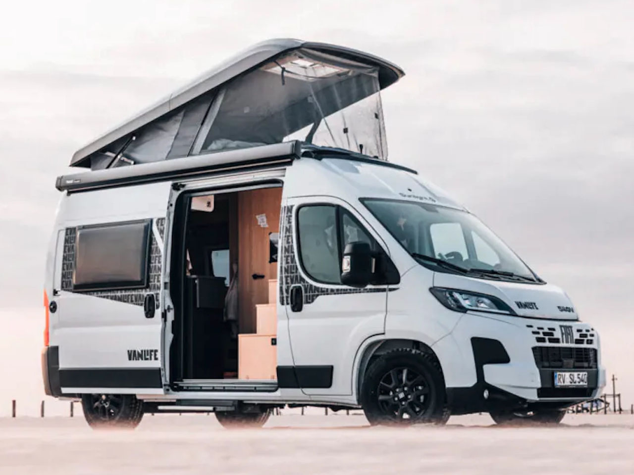
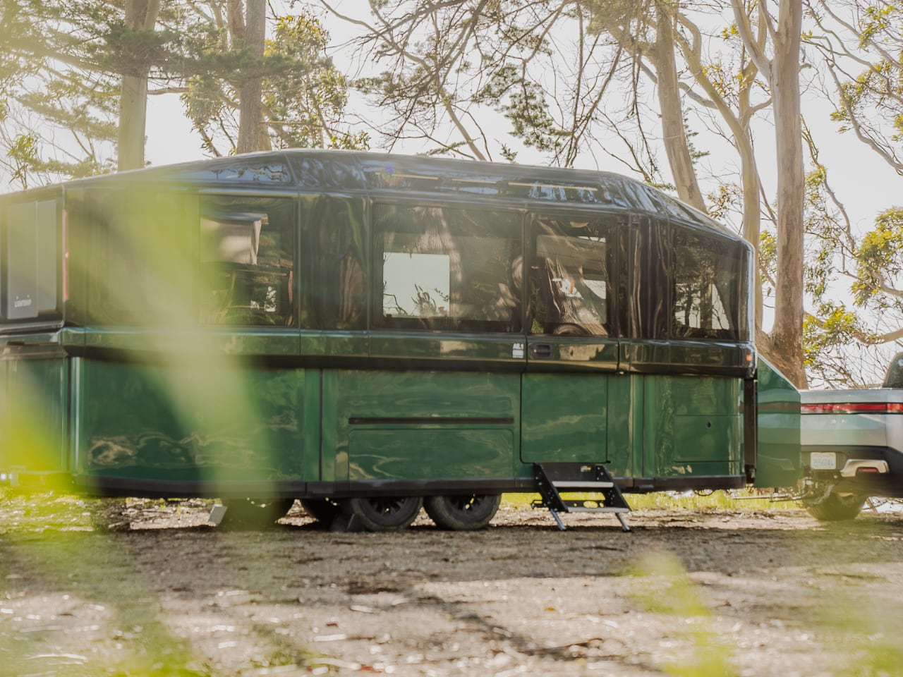
The recreational vehicle world has been stuck in the past while every other industry embraced electric innovation. Finally, we have something that doesn’t treat outdoor enthusiasts like they’ll settle for compromised gear. Lightship’s AE.1 electric travel trailer has officially entered production at their Colorado facility, with the first Cosmos Edition models reaching adventurers by summer’s end.

Designer: Lightship

This trailer addresses real problems that anyone who’s spent serious time camping knows all too well. Noisy generators that scare wildlife, propane safety concerns, limited off-grid capability, and terrible towing efficiency that kills your range. The AE.1 solves these issues without making you sacrifice comfort or capability.

Silent Power for Extended Adventures

Traditional RV generators are adventure killers. They’re loud, smelly, and turn your peaceful wilderness campsite into an industrial zone. The AE.1’s 77 kWh battery pack and roof-mounted solar array create what Lightship calls a “self-contained microgrid.”T his means weeks of off-grid camping without firing up a single generator.

The solar integration spans the entire roof, continuously feeding power back into the system while you’re out exploring during the day. When you return to camp after a long hike or bike ride, your trailer has been quietly recharging itself. No fuel to carry, no fumes to deal with, and most importantly, no noise disrupting the natural sounds you came to experience.

The battery capacity provides enough juice to run everything from the full kitchen setup to climate control and all your electronic devices. Charging ports and wireless charging pads are strategically placed throughout the interior, so your cameras, phones, and GPS units stay topped up for the next day’s adventure. This isn’t about roughing it anymore, it’s about having reliable power that doesn’t compromise your outdoor experience.

What makes this setup particularly smart for outdoor use is how it handles power management. The system automatically balances energy consumption and generation, prioritizing essential systems when battery levels drop. You’re not constantly worrying about rationing power or making tough choices between comfort and capability. The trailer manages it all while you focus on why you came out here in the first place.

Towing That Actually Helps Your Vehicle

Here’s where the AE.1 flips conventional thinking completely. Most people assume an electric trailer would drain your towing vehicle’s battery faster. The proprietary TrekDrive system does exactly the opposite, extending your range by up to 300 miles.

The two-way force sensing technology monitors road conditions constantly. When you’re climbing steep mountain passes to reach remote trailheads, the trailer’s motors kick in to help push the entire rig uphill. On descents, it provides enhanced braking control, reducing strain on your vehicle’s brakes and actually regenerating power back into both systems. This isn’t just clever engineering, it’s practical technology that makes getting to difficult locations easier.

The aerodynamic design works hand-in-hand with the propulsion system. Traditional travel trailers are basically rolling parachutes that fight you every mile. The AE.1’s telescoping shell minimizes wind resistance while towing, then expands to maximize living space once you reach camp. You’re not constantly battling crosswinds or feeling the trailer push your vehicle around on mountain highways.

For electric vehicle owners, this solves the biggest barrier to extended outdoor adventures. Range anxiety disappears when your trailer is actually helping extend your vehicle’s capability rather than limiting it. You can reach those remote boondocking spots that were previously out of range, opening up entirely new areas for exploration.

The system integrates seamlessly with your existing vehicle, whether it’s electric, hybrid, or traditional gas. The NACS charging port means you can plug into Tesla Supercharger networks for quick top-ups during travel, with maximum charging rates hitting 155 kW. No more planning routes around RV-specific charging infrastructure that barely exists.

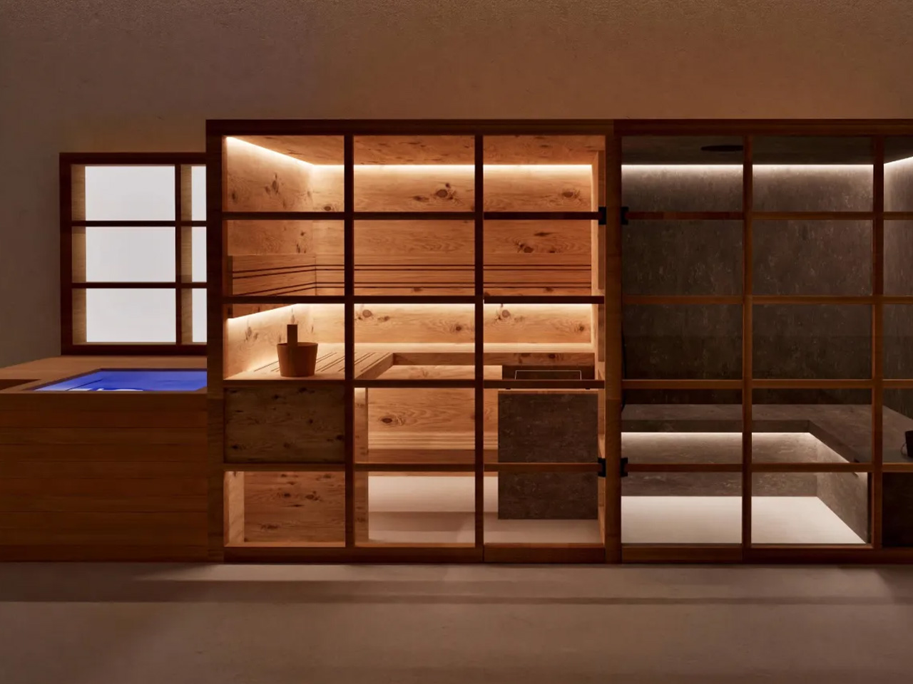
Interior Design That Understands Outdoor Life

Walking into the AE.1 reveals thoughtful design choices that show someone actually understands how outdoor enthusiasts use their gear. The 27-foot interior sleeps four people comfortably via a convertible day bed and dinette arrangement, but the layout prioritizes functionality over cramming in flashy features.

The dozen panoramic windows and multiple skylights create an open connection to your surroundings. When you’re parked in a scenic location, you want to feel part of the landscape, not hidden away from it. The natural light transforms how the space feels, making it genuinely pleasant to spend time inside during weather delays or evening planning sessions.

The kitchen setup reflects real cooking needs rather than RV industry compromise. Full-size appliances including a dishwasher, refrigerator, convection oven, and induction cooktop are arranged to give you actual workspace. After spending all day hiking or biking, you want to prepare proper meals, not survive on camp food because the kitchen is too cramped to use effectively.

The bathroom design breaks away from typical RV afterthoughts. This is a real bathroom with a proper shower, designed for people who spend their days getting dirty outdoors. The modular mirror system that reveals hidden storage is the kind of detail that shows they understand space efficiency without sacrificing usability.

Storage throughout the trailer focuses on gear organization rather than random compartments. Outdoor equipment has specific requirements, from wet gear separation to easy access while setting up camp. The AE.1’s storage solutions reflect actual use patterns rather than generic RV thinking.

Climate control uses automotive-grade systems that actually work efficiently in varying outdoor conditions. You’re not dealing with underpowered units that struggle in temperature extremes. Whether you’re camping in desert heat or mountain cold, the electrical systems provide consistent, quiet climate management.

Technology That Enhances Rather Than Complicates

The Atlas System serves as the central brain connecting every trailer function into one intuitive interface. This isn’t some aftermarket control panel bolted onto existing systems. Everything from climate and lighting to power management and security runs through this hub, accessible through touchscreen controls that work even with gloves on.

The Lookout Camera System addresses a genuine pain point for anyone who’s tried backing a trailer into primitive campsites. Three ultra-wide cameras provide complete visibility around the rig, integrating with Atlas to show real-time monitoring and obstacle detection. When you’re navigating narrow forest service roads or trying to position perfectly at a scenic overlook, this system eliminates guesswork and reduces stress.

Power monitoring gives you real-time data on generation, consumption, and remaining capacity. You always know exactly where you stand energy-wise, allowing you to plan activities and manage usage intelligently. The system learns your patterns and provides recommendations for optimizing power use based on weather forecasts and planned activities.

The CampQuiet operation lives up to its name. All systems run silently, preserving the natural acoustics you came to experience. No generator noise scaring away wildlife or disrupting the peaceful environment that drew you to remote locations in the first place.

Production Reality and Market Positioning

Lightship isn’t making empty promises about future availability. The Colorado production facility is currently manufacturing Cosmos Edition units, with customer deliveries starting before summer ends. The limited run of 50 Cosmos Edition trailers sold out completely, indicating strong demand among serious outdoor enthusiasts willing to invest in better technology.

The company has planned a logical product rollout beyond the initial launch. Two additional variants, the Atmos and Panos models, will follow the Cosmos Edition with different price points and feature sets. This gives adventurers options without diluting the core electric technology that makes extended wilderness access more practical.

The U.S. manufacturing approach means parts availability and service support won’t depend on international supply chains. For people who take their rigs to remote locations, knowing you can get support and parts domestically matters when something needs attention.

The post Lightship AE.1: The Electric Travel Trailer Built for Real Adventures first appeared on Yanko Design.

Instead of walls, this interior designer divided a Warehouse Space using colours and shapes

Par : Sarang Sheth
12 août 2025 à 21:30

Walk into a warehouse in Bangalore’s Turahalli Forest and you might expect the usual: concrete, echoing emptiness, and the faint smell of dust. What you get instead is a journey – one that Megha Dugar Jain crafted for her client, THE ROOOM, completely redefining what a 2,500-square-foot godown can be. Sometimes, the most extraordinary transformations happen in the most ordinary places. The original space was as unremarkable as they come, but Megha’s vision turns it into a series of moments, each more surprising than the last, with every inch designed to invite curiosity and spark delight.

This is interior design as storytelling. Megha doesn’t just lay down materials or pick colors off a swatch book. She orchestrates visual microcosms, letting each zone unfold in its own unique way. The result is a kind of spatial patchwork where your eyes group elements together, building mini-worlds out of color, texture, and form. The lack of traditional walls isn’t a limitation; it’s an invitation to explore, to let boundaries blur and new relationships emerge between spaces.

Designer: Megha Dugar Jain

Mr. Folds is the silent protagonist here. Not a person, but an idea: the spirit of transformation itself. Megha talks about him like an old friend, a metaphor for the magic that happens when the ordinary is folded – sometimes literally, sometimes just in spirit – into something layered and unexpected. Think of Mr. Folds as the gentle mischief behind every crease in the design, the reason a simple panel suddenly suggests complexity, and why every corner seems to have a little more to say than you first notice. Scroll down and you may just spot Mr. Folds casually browsing around the space.

Walking into the main area, visitors immediately notice the dramatic shift from the soft peach monochrome of the entrance to a bold black-and-white interplay that defines different functional zones. The reception area features a striking curved counter with a crisp white top sitting atop a terracotta jaali base, its geometric patterns allowing light and air to flow through while creating intricate shadows across the floor. Above this, a flowing metal arch structure partially divides the space without closing it off completely. These arches serve multiple purposes: they guide movement, frame views into adjacent areas, and add a sculptural element that draws the eye upward. Megha has cleverly used these architectural features to suggest boundaries rather than enforce them. The arch motif repeats throughout the space, creating a visual rhythm that helps tie disparate elements together. Each arch feels like a portal, inviting visitors to step through and discover what lies beyond, while the curved forms soften what could otherwise be a boxy, rigid environment.

Perhaps the most playful elements in the space are what I call the “orange splooshes,” those organic, fluid shapes that break up the geometric precision of the checkered floor. These vibrant orange forms appear to spill out from the staircase, defying the grid and introducing an element of surprise and whimsy. The stairs themselves continue this orange theme, creating a bold visual statement that draws you upward. You’ll even see a strange ‘sploosh’ underneath the leg of a table. What makes these elements so effective is their unexpectedness; in a space defined by careful planning and intentional design moves, these fluid shapes feel almost rebellious, as if the orange paint had a mind of its own and decided to ignore the boundaries. Megha describes this as “an optical illusion of spillage, an artful disruption that intrigued and delighted.” And she’s right. These moments of controlled chaos provide relief from the more structured elements, reminding us that the best designs often include an element of playfulness. The orange forms also serve as wayfinding devices, subtly guiding visitors through the space without resorting to obvious signage.

The origami inspiration takes physical form in the sit-out area, where an extraordinary plywood panel transforms a simple wall into a sculptural masterpiece. This isn’t delicate paper folding; it’s origami principles applied to a rigid material, creating dramatic angles and planes that catch light and cast ever-changing shadows throughout the day. The technical achievement here shouldn’t be underestimated. Coaxing plywood, a material that naturally resists bending, into these complex folds requires both engineering knowledge and artistic vision. The result is a feature that feels simultaneously architectural and artistic. As natural light moves across its surface, the panel comes alive, revealing new dimensions and details. Visitors often find themselves touching these surfaces, trying to understand how something so solid can appear so dynamic. The panel serves as a focal point in the sit-out area, which itself opens to views of the surrounding Turahalli Forest, creating a dialogue between the geometric precision inside and the organic forms of nature outside.

Complementing these architectural elements are the custom-crafted berge decorative panels that adorn various walls throughout the space. These panels feature intricate, flowing patterns carved into the plywood, celebrating the natural grain and texture of the wood while adding another layer of visual complexity. Unlike the folded panels, which create dimension through physical manipulation of the material, these berge panels achieve depth through intricate surface patterning. The wavy, organic forms feel almost like topographic maps or flowing water, introducing a natural element that balances the more geometric aspects of the design. What makes these panels particularly impressive is how Megha transforms a humble material like plywood into something that looks precious and handcrafted.

What ultimately makes this transformation so successful is Megha Dugar Jain’s unique approach to spatial division. Instead of erecting walls to separate functions, she’s used color, material, and thematic elements to create distinct zones that still feel connected to the whole. The active, human-centric areas burst with vibrant hues and dynamic forms, while display zones adopt a more restrained palette that puts the focus on the products themselves. This strategy creates a space that feels both cohesive and varied, allowing for different experiences within a single open environment. The transitions between zones feel natural rather than abrupt, guided by subtle shifts in flooring, lighting, and material. And while each area has its own character, recurring elements like the curved forms, organic patterns, and thoughtful material selections create a visual language that unifies the entire project. The space works because it balances structure with spontaneity, allowing for moments of surprise within an overall framework that makes sense. It’s like a well-composed piece of music, with themes that repeat and evolve throughout, creating something that feels both familiar and fresh with each encounter.

The post Instead of walls, this interior designer divided a Warehouse Space using colours and shapes first appeared on Yanko Design.

❌
❌