Vue normale

Il y a de nouveaux articles disponibles, cliquez pour rafraîchir la page.
Hier — 19 novembre 2025Techs Design

7 Best LEGO Creations Of November 2025

19 novembre 2025 à 12:40

November 2025 marks a turning point for LEGO. The Danish brick giant has evolved from childhood toy manufacturer into something more nuanced: a creator of kinetic sculptures, display pieces that command adult spaces, and intricate tributes to pop culture that blur the line between building set and collectible art. This month’s releases span from mechanical aquariums to starships, from Hollywood race cars to space exploration milestones, each demonstrating how far brick-based design has traveled.

What unites these seven releases is their refusal to sit still on shelves. They demand interaction, closer inspection, and appreciation for the engineering challenges their designers solved. Whether through cranks that animate underwater scenes, modular sections that separate like the real starship, or intricate layering that creates dimensional depth, these sets prove LEGO understands its adult audience wants more than nostalgia. They want conversation pieces that justify their desk space.

1. LEGO Icons Tropical Aquarium (10366)

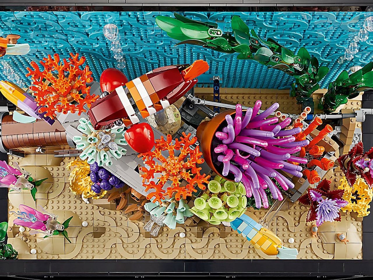
The Tropical Aquarium transforms 4,154 pieces into a living mechanical tableau that launched on November 13 for $479.99. This isn’t decor that fades into the background. Three distinct cranks and dials control independent motion systems, turning the aquarium into a kinetic sculpture where your interaction determines the scene’s energy. Turn one dial and the jellyfish bob through their vertical dance. Another crank sends the sea turtle gliding past coral formations. The third activates smaller fish as they navigate through swaying seaweed and bubble streams that appear frozen mid-rise.

LEGO solved a fundamental design challenge here: creating convincing spatial depth within a fundamentally shallow display case. The build employs layering techniques with translucent elements, representing water, varied-height coral structures, and the strategic placement of marine life to establish foreground, middle ground, and background planes. Four model fish become compositional tools rather than fixed elements. You’re not assembling a predetermined scene. You’re curating an underwater environment where placement decisions affect visual balance. The set includes seaworms, an oyster shell containing a pearl, sea snails, and air bubbles, serving as additional elements for creating your personal ecosystem.

What we like

  • The kinetic mechanism creates genuine movement that changes depending on your crank speed and direction
  • Compositional flexibility lets you rearrange elements rather than following rigid instructions

What we dislike

  • At $479.99, this represents a significant investment for a display piece rather than a traditional play set
  • The mechanical systems require regular interaction to justify the kinetic elements

2. LEGO Ideas Apollo 8 Earthrise (40837)

William Anders captured humanity’s first color photograph of Earth from space on December 24, 1968, using his Hasselblad 500 EL during the Apollo 8 lunar orbit. That image, titled Earthrise, showed our planet suspended above the moon’s desolate horizon and fundamentally altered how we see ourselves. Now, nearly sixty years later, LEGO Ideas has transformed that pivotal moment into an 859-piece buildable art piece that stands 48 centimeters tall and 32 centimeters wide.

This rendition captures three distinct visual elements that define the photograph: the infinite black void of space, Earth as a cloud-swirled blue marble, and the moon’s cratered, mottled surface in the foreground. LEGO’s designers used the brick medium to convey texture and color gradation across each element. The moon’s surface employs varied grey tones and deliberate gaps between pieces to suggest the shadowed irregularity of impact craters. Earth’s atmospheric layers transition from deep ocean blues to white cloud formations using careful brick selection. The black space background creates negative space that makes both celestial bodies pop forward visually.

What we like

  • The subject matter elevates this beyond standard space sets into historical tribute territory
  • At 859 pieces, the build offers enough complexity for an engaging construction experience

What we dislike

  • The relatively conservative piece count means some details require visual interpretation
  • Mounting hardware for the wall display isn’t included, requiring a separate purchase

3. LEGO Icons U.S.S. Enterprise NCC-1701-D (10364)

The Galaxy-class flagship from Star Trek: The Next Generation arrives in brick form on November 28 as a 3,600-piece behemoth measuring two feet long. Priced at $399.99, this isn’t LEGO’s first Trek venture, but it represents the most screen-accurate version of arguably the most beloved Enterprise design. The set captures the distinctive saucer-and-engineering-hull silhouette that defined seven television seasons and multiple films, complete with functional saucer separation mechanics that mirror the starship’s emergency protocol capabilities.

LEGO included enough minifigures to staff the bridge properly: Captain Picard, Commander Riker, Lieutenant Commander Data, Lieutenant Worf, Counselor Troi, Chief Engineer La Forge, and Doctor Crusher. Each figure comes with printed details that capture their Season 1 uniforms and distinctive features. The build itself uses advanced construction techniques to achieve the Enterprise-D’s smooth, curved surfaces while maintaining structural integrity. The warp nacelles attach via articulated pylons. The deflector dish receives intricate detailing. Even the bridge dome atop the saucer section gets architectural attention. This targets adult collectors who want the ship commanding their desk space with the same authority Picard brought to the captain’s chair.

What we like

  • Functional saucer separation adds interactive play value beyond static display
  • Screen-accurate proportions and details satisfy longtime Trek fans who know every hull panel

What we dislike

  • The $399.99 price point places this firmly in premium collector territory
  • Some builders note that the saucer section’s large, flat surfaces require patience during repetitive sections

4. LEGO Speed Champions APXGP F1 Race Car (77076)

LEGO’s partnership with the upcoming F1 film starring Brad Pitt and directed by Joseph Kosinski produces this sleek recreation of the fictional APXGP team’s race car. The model wears the movie’s distinctive black-and-gold livery, capturing the cinematic energy through carefully applied decals and printed elements. Two minifigures represent drivers Sonny Hayes and Joshua Pearce, complete with race suits, helmets with reflective visors, and printed sponsor logos that tie directly to the film’s aesthetic.

The build distinguishes itself from previous Speed Champions Formula 1 sets through refined proportions and wider Pirelli-style tires that better capture modern F1 car stance. Custom decals add visual depth across the bodywork. The set includes small accessories that reward closer inspection: a wrench and a remote control that nod toward the engineering side of racing. The wrench serves double duty as an actual building tool for applying stickers or separating tight bricks. These thoughtful inclusions demonstrate LEGO understands its audience wants both display accuracy and functional building aids.

What we like

  • The black-and-gold livery creates a striking visual contrast suitable for display
  • Film tie-in elements provide cultural relevance beyond generic racing sets

What we dislike

  • The Speed Champions scale limits interior detail compared to larger Technic F1 sets
  • Movie-specific branding may not appeal to builders wanting real team liveries

5. LEGO Ideas The Goonies (21350)

This $330 LEGO Ideas release transforms the 1985 adventure classic into a full-blown tribute to one of cinema’s most beloved treasure hunts. The set isn’t just a model you build and stick on a shelf. This captures those iconic moments that blend adventure with just the right amount of creepy: the Fratelli hideout functioning as a haunted house for criminals, the terrifying boulder trap, skeleton-filled caves, and One-Eyed Willy’s legendary pirate ship, the Inferno, complete with sails, treasure, and plenty of bones.

What really makes this set special are the minifigures. All twelve of them. You get the whole gang: Mikey, Mouth, Data, Chunk, Brand, Andy, and Stef, plus Sloth in his Superman shirt, Mama Fratelli, Francis, Jake, and even One-Eyed Willy’s skeleton. LEGO created brand new elements specifically for this set, like Sloth’s pirate hat and Mama Fratelli’s hair and beret combo, showing the level of detail they’re committed to. The skeleton pirate minifigure arrives perfectly timed for Halloween nostalgia, capturing both the film’s adventurous spirit and its spooky underground atmosphere.

What we like

  • Twelve minifigures provide the complete cast, including villains and One-Eyed Willy’s skeleton
  • Multiple iconic scenes from the film can be recreated with the Fratelli hideout and pirate ship

What we dislike

  • The $330 price point may feel steep for fans expecting a lower-tier Ideas set
  • Balancing multiple scenes in one set means each vignette receives less piece allocation

6. LEGO Ideas Pacific Rim Jaegers

Din0Bricks’ fan-made tribute to Guillermo del Toro’s Pacific Rim has earned LEGO Ideas Staff Pick status and rallied 661 supporters toward the 10,000 needed for official production consideration. The 2,218-piece concept recreates three iconic Jaegers from the 2013 film: Gipsy Danger with a retractable sword, Crimson Typhoon with rotating saw blades, and Cherno Alpha with its brutal industrial aesthetic. Support helicopters accompany each mech, capturing the logistical reality behind deploying humanity’s towering defenders against Kaiju threats.

What makes this concept remarkable is how Din0Bricks solved the challenge of capturing the Jaegers’ massive, imposing presence while maintaining structural stability and playability. Each mech features articulated joints at shoulders, elbows, hips, and knees, allowing authentic combat poses. The retractable sword mechanism on Gipsy Danger uses internal gearing. Crimson Typhoon’s three-armed configuration required custom engineering to balance properly. Cherno Alpha’s distinctive fists and nuclear reactor detailing push LEGO’s aesthetic toward industrial brutalism. This isn’t just a fan project. It’s a masterclass in translating screen designs into buildable, poseable figures that honor the source material’s scale and mechanical complexity.

What we like

  • Three distinct Jaegers provide variety and display options in a single set
  • Articulated joints enable dynamic combat poses that capture the film’s action sequences

What we dislike

  • As a LEGO Ideas concept, this isn’t guaranteed for production without reaching 10,000 supporters
  • The 2,218-piece count and three large models suggest a premium price point if approved

7. LEGO Ideas NASA James Webb Space Telescope

The LEGO James Webb Space Telescope replica tackles one of modern engineering’s most complex achievements through brick-based construction that mirrors the actual satellite’s intricate folding mechanisms. This build captures the telescope’s launch-critical ability to fold into a compact configuration before unfolding in space, requiring builders to understand both structural engineering and the precise mechanical sequences that made the real JWST mission possible. The design transforms complicated aerospace engineering into an accessible building experience that educates while it entertains.

Every major subsystem finds representation in this meticulous replica, from the eighteen iconic hexagonal mirrors that form the light-gathering array to the layered sun shield that protects sensitive instruments. The secondary hinged mirror, science instruments, propulsion systems, and communications arrays all function through LEGO’s mechanical systems, creating an interactive educational experience that illuminates the genuine complexity behind space exploration’s latest triumph. This isn’t a simplified approximation. It’s a functional demonstration of how the telescope actually operates in its orbit at the L2 Lagrange point.

What we like

  • Functional folding mechanism replicates the actual telescope’s deployment sequence
  • Eighteen hexagonal mirrors accurately represent the primary mirror array’s distinctive design

What we dislike

  • The complex folding mechanism requires careful handling to avoid stressing connection points
  • As a concept, availability depends on the LEGO Ideas approval process

Why November 2025 Matters for LEGO Design

These seven releases demonstrate LEGO’s strategic expansion into adult collector territory while maintaining the building experience that defines the brand. The kinetic mechanisms in the Tropical Aquarium, the historical gravitas of Earthrise, the pop culture cachet of the Enterprise and Goonies sets, the cinematic energy of the F1 car, and the community-driven passion behind the Pacific Rim Jaegers and James Webb Telescope all point toward a company that understands its audience has evolved. These aren’t toys. They’re display pieces that arrive in buildable form, offering the satisfaction of construction before claiming their space on shelves, desks, and walls.

What November’s lineup proves is that LEGO has moved beyond simple recreation into thoughtful interpretation. Each set solves specific design challenges: creating depth in shallow spaces, capturing kinetic energy through mechanical systems, translating beloved designs into brick form with screen accuracy, honoring cultural moments that shaped cinema, and making complex aerospace engineering comprehensible. The result is a collection of releases that justify their premium pricing through engineering sophistication, visual impact, and the kind of cultural resonance that makes people stop and ask about the objects commanding your workspace. That’s the difference between a toy and a design statement.

The post 7 Best LEGO Creations Of November 2025 first appeared on Yanko Design.

DIY 3D-Printed Clamshell Turns BOOX Palma Into a Tiny Laptop

Par : JC Torres
19 novembre 2025 à 11:07

Palmtops and UMPCs are experiencing a quiet resurgence among people who want something more focused than a laptop and more tactile than a phone. Compact e-ink devices and tiny Bluetooth keyboards have become affordable building blocks for exactly this kind of project, letting makers combine them into pocketable machines tailored to writing, reading, or just tinkering. The result is a small but growing wave of DIY cyberdecks and writerdecks that feel like modern reinterpretations of classic Psion palmtops.

The Palm(a)top Computer v0 is one of those projects, born on Reddit when user CommonKingfisher decided to pair a BOOX Palma e-ink Android phone with a compact Bluetooth keyboard and a custom 3D-printed clamshell case. The result looks like a cross between a vintage Psion and a modern writerdeck, small enough to slide into a jacket pocket but functional enough to handle real writing and reading sessions on the go.

Designer: CommonKingfisher

The core hardware is straightforward. The BOOX Palma sits in the top half of the shell, while a CACOE Bluetooth mini keyboard occupies the bottom half. The keyboard was originally glued into a PU-leather folio, which the maker carefully peeled off using gentle heat from a hair dryer to expose the bare board. When opened, the two halves form a tiny laptop layout with the e-ink screen above and the keyboard below.

The clamshell itself is 3D-printed in a speckled filament that looks like stone, with two brass hinges along the spine giving it a slightly retro, handcrafted feel. Closed, it resembles a small hardback book with the Palma’s camera cutout visible on the back. Open, the recessed trays hold both the screen and keyboard flush, turning the whole thing into a surprisingly polished handheld computer, considering it’s a first prototype.

The typing experience is functional but not perfect. The maker describes it as “okay to type on once you get used to it,” and thumb typing “kinda works,” though it’s not ideal for either style. You can rest the device on your lap during a train ride and use it vertically like a book, with the Palma displaying an e-book and the keyboard ready for quick notes or annotations.

The build has a few issues that the maker plans to fix in the next version. It’s top-heavy, so it needs to lie flat or gain a kickstand or counterweight under the keyboard, possibly a DIY flat power bank. The hinge currently lacks friction and needs a hard stop around one hundred twenty degrees to keep the screen upright. There are also small cosmetic tweaks, like correcting the display frame width.

Palm(a)top Computer v0 shows how off-the-shelf parts and a 3D printer can turn a niche e-ink phone into a bespoke palmtop tailored to one person’s workflow. Most consumer gadgets arrive as sealed rectangles you can’t modify, but projects like this embrace iteration and imperfection. It’s less about having all the answers and more about building something personal that might inspire the next version.

The post DIY 3D-Printed Clamshell Turns BOOX Palma Into a Tiny Laptop first appeared on Yanko Design.

Freewrite Wordrunner Counts Words With Clicking Mechanical Wheels

Par : JC Torres
19 novembre 2025 à 09:45

Writers spend more time with their keyboards than any other tool, yet most options are either gaming boards covered in RGB lights or cheap office slabs optimized for cost rather than comfort. Neither category really thinks about what writers actually need, which is a keyboard that can keep up with long sessions without killing your wrists and maybe even help you stay focused when the blank page starts feeling oppressive.

Freewrite’s Wordrunner is a mechanical keyboard built specifically for writing, complete with a built-in mechanical word counter and sprint timer. It works with any device that accepts a USB or Bluetooth keyboard, from laptops and desktops to tablets and phones, and its core features live in the hardware rather than in yet another app or cloud service that you’ll forget to open halfway through your writing session.

Designer: Freewrite

The standout feature is the Wordometer, an eight-digit electromechanical counter with rotating wheels driven by a coreless motor and controlled by an internal microprocessor. It tracks words in real time using a simple algorithm based on spaces and punctuation, stays visible even when the keyboard is off, and can be reset with a mechanical lever to the left of the display. The counter makes a soft clicking sound as the wheels turn, giving you tactile and audible feedback every time you hit a milestone.

The keyboard also includes a built-in sprint timer that lets you run Pomodoro-style sessions or custom writing sprints without leaving your desk. Subtle red and green lights keep you on track, and you can configure the timer to count up or down depending on how you prefer to work. The standard function row has been replaced with writer-centric keys like Find, Replace, Print, and Undo, plus three programmable macro keys labeled Zap, Pow, and Bam for whatever shortcuts you use most.

The typing experience is what you’d expect from a premium mechanical keyboard. High-quality tactile switches, multiple layers of sound dampening, and a gasket mount design deliver what beta testers kept calling “so satisfying.” Each switch is rated for eighty million presses, which should be enough to see you through multiple novels without the keys wearing out. The die-cast aluminum body gives the board a heft and solidity that plastic keyboards can’t match, keeping it planted on your desk no matter how fast your fingers fly.

Tucked into the top right corner is a multi-directional joystick that controls media playback and volume, so you can adjust your music without touching the mouse or breaking flow. Connectivity is equally flexible. The Wordrunner supports wired USB-C and Bluetooth, pairs with up to four devices at once, and switches between them with a keystroke. It works with Windows, macOS, iPadOS, and Android without requiring special software, which means you can move it between machines without reconfiguring anything.

Wordrunner is designed for writers who want their keyboard to be more than a generic input device. It turns progress into something physical with the mechanical word counter, structures writing sessions with the built-in timer, and wraps it all in a solid, retro-industrial chassis that looks like a specialized tool rather than consumer electronics. It’s less about flashy features and more about making the act of writing feel intentional every time you sit down to work.

The post Freewrite Wordrunner Counts Words With Clicking Mechanical Wheels first appeared on Yanko Design.

This E Ink Clock Prints Fortunes and Jokes on Paper Slips

Par : JC Torres
19 novembre 2025 à 02:45

Time usually passes without much fanfare. Numbers flip on your phone screen, the day blurs from morning coffee to evening TV, and most minutes feel interchangeable. Clocks are background objects, functional but forgettable, doing nothing more than reminding you how late you’re running. There’s no ceremony to checking the time, no surprise waiting when you glance at the display. It’s just numbers counting down to whatever you’re supposed to do next.

Houracle by True Angle approaches this differently. Instead of treating time as something that simply ticks away, it turns each minute into a potential moment of delight. The device is part clock, part oracle, with an eco-friendly thermal printer tucked into the top that spits out fortunes, jokes, riddles, or random facts tied to the exact moment you press the button. It’s the kind of thing that makes you want to check the time just to see what happens.

Designer: True Angle

Click Here to Buy Now: $128 $213 (40% off). Hurry, only a few left!

The design is deliberately retro. A boxy, powder-coated aluminum body with rounded edges, a large orange or yellow button on the top, and an e-ink display that looks like a pencil sketch on paper. The screen shows the time and date, the weather for your selected location, and a small prompt inviting you to press print. Five icons along the right edge let you select modes, fortune, fact, joke, riddle, or surprise, each represented by simple graphics.

Press the button and the printer whirs to life, a satisfying mechanical sound as the paper slip emerges from the top. At 7:42 in the morning, it might tell you destiny took a coffee break and suggest making your own magic. At 11:15, it could mention your brain runs on about 20 watts, enough to power a dim bulb or a brilliant idea. The messages feel oddly personal because they’re tied to that specific minute.

What makes this genuinely charming is how the slips accumulate. They end up on the fridge, tucked into notebooks, or shared with family members over breakfast. Heck, you might find yourself printing extras just to see what weird fact or ridiculous joke Houracle generates next. The lucky numbers printed at the bottom add an extra layer of whimsy that completes the fortune cookie vibe without taking itself too seriously.

The e-ink screen plays a bigger role than you’d expect. Unlike the glowing blue displays most clocks use, this one reflects ambient light rather than emitting it. That makes it easier on the eyes, especially at night, and gives the whole device a calming presence. The screen updates when you interact with it, but otherwise sits quietly, blending into the background.

Of course, the whole thing runs on wall power, which means no batteries to replace or USB cables to manage. The aluminum body is built to last, assembled with screws rather than glue. Houracle also uses BPA and BPS-free thermal slips, sourced from a company that plants a new tree or restores kelp in the ocean for every box of thermal rolls purchased. True Angle designed Houracle with sustainability in mind, using recyclable materials and avoiding planned obsolescence.

What’s surprising is how much a simple printed slip can shift your mood. A clever riddle before bed, a dumb joke during a work break, or a strange fact that makes you pause for a second. These aren’t profound moments, but they add small pockets of joy to days that might otherwise feel routine. Houracle captures the anticipation you used to feel when cracking open a fortune cookie.

The device sits on your desk or nightstand, looking unassuming until you press that button and hear the printer activate. Then it becomes something else entirely, a little machine that marks time with paper artifacts you’ll probably keep longer than you should. For anyone who’s tired of clocks that just tell time and do nothing else, that small shift makes all the difference.

Click Here to Buy Now: $128 $213 (40% off). Hurry, only a few left!

The post This E Ink Clock Prints Fortunes and Jokes on Paper Slips first appeared on Yanko Design.

UNO x Formula 1 Card Game Features Exciting New Gameplay With All 10 Teams And 1000+ Collectible Cards

Par : Sarang Sheth
19 novembre 2025 à 01:30

Most licensed UNO decks are basically souvenirs; you play the same game you always have, only this time with movie stills or cartoon faces staring back at you. UNO Elite Formula 1 is aiming for something more ambitious. Mattel is taking the basic UNO framework and wrapping it in a light collectible shell, with Elite Action cards that feature F1 drivers, cars, team principals, circuits, and helmets, and then selling those cards in starter packs and boosters like a stripped down trading card game.

That shift changes what an “UNO edition” even is. Instead of a one and done deck, you get a product you can tune, expand, and personalize around your favorite teams and drivers. It is still approachable enough to throw on the table at a family gathering, but there is a clear nudge toward collecting, tinkering, and even house ruling your way into race weekend formats and team championships. In other words, this is UNO stepping closer to F1’s world of strategy and fandom, without asking players to learn an entirely new game.

Designer: Mattel

On paper, UNO and Formula 1 do not look like natural teammates. One is a simple, almost universal card game you can teach in under a minute; the other is a hyper technical, data obsessed motorsport with a rulebook thick enough to choke a diffuser. UNO Elite Formula 1 is Mattel’s attempt to bridge that gap, not by turning UNO into a simulation, but by layering F1’s personalities and drama onto a ruleset that practically everyone already knows. The result is a deck that plays like classic UNO at its core, but arrives packaged with Elite Action cards and boosters that push it into collectible territory.

The Core Edition Starter Pack gives you a 112 card deck that functions just like the one you already own, but it also includes four booster packs to get you started. Those packs contain a random assortment of the set’s 100 plus unique Elite Action cards. From there, you can buy separate Booster Sets to keep hunting for your favorite drivers or to find rare foil variations, which bring the total number of unique cards in the line to over 1,000. It is a clever way to add the thrill of the chase from trading card games without the intimidating barrier of complex deckbuilding rules.

What this does at the table is make the game modular. You can keep the Elite cards out and play a pure, classic game of UNO. Or you can shuffle in a handful of them to add a little F1 flavor, introducing new actions tied to drivers, teams, or circuits. For dedicated fans, the real fun will be in curating the experience, perhaps creating a deck where only cards from rival teams are included, or running a “constructors championship” where players team up and score points over a whole evening. The game provides the pieces; the players provide the narrative.


This is a smart play from both Mattel and Formula 1, who both acknowledge that their fanbases are passionate and ready for new ways to engage. It is a low friction entry point for F1 fans who might not touch a traditional hobby board game, and it gives UNO a much needed shot of strategic depth and collectibility that could keep it on the table for longer. The success of UNO Elite Formula 1 will ultimately depend on whether players embrace that potential. It is one thing to provide the tools for a deeper experience, but it is another for the community to pick them up and build something truly exciting with them.

The post UNO x Formula 1 Card Game Features Exciting New Gameplay With All 10 Teams And 1000+ Collectible Cards first appeared on Yanko Design.

This Printed-Circuit Sconce Turns Exposed Electronics Into Functional Sculpture

Par : Tanvi Joshi
19 novembre 2025 à 00:30

In contemporary lighting, technology is often concealed, hidden behind frosted diffusers, buried in housings, or tucked into recesses where its presence is merely utilitarian. The Printed Circuit sconce by American designer August Ostrow turns this convention inside-out. Instead of disguising the mechanics of illumination, the sconce makes electronics themselves the aesthetic centerpiece, revealing the beauty of a material more frequently associated with industrial devices than interior design.

At the core of the sconce is a flexible polyimide printed circuit board, a material prized in the electronics industry for its thermal stability, durability, and ability to bend without losing structural integrity. Commonly found within consumer devices, aerospace components, and advanced industrial systems, polyimide typically remains unseen, functioning behind the scenes as a backbone for electrical pathways. Ostrow repositions this substrate as both shade and light source, allowing the circuitry to take on a sculptural presence within the room.

Designer: August Ostrow

The traces, copper routes, and tactile surface details that usually operate invisibly now become the primary graphic language of the design. When illuminated, these pathways glow softly, revealing an intricate network that is part engineering diagram, part textile-like pattern. The sconce becomes a luminous map of its own function, offering viewers a rare opportunity to see the inner logic of circuitry elevated to decorative status.

This approach aligns with Ostrow’s broader practice of material exploration, challenging expectations of what electronic components can be when removed from their typical contexts. By bending the polyimide board into a gentle arc, the designer leverages its natural flexibility, allowing it to act simultaneously as a structural element, a diffuser, and a carrier for the embedded LEDs. The armature that supports the sconce performs dual duty as well: it physically holds the piece in place while also serving as the conduit for its DC power connection. The result is a clean, integrated assembly where function and form are inseparable.

The Printed Circuit sconce also speaks to a growing movement in industrial and lighting design where designers intentionally expose mechanisms, celebrate raw materials, and reveal inner workings rather than hiding them. The aesthetic of the PCB, once considered too technical or visually chaotic for interior surfaces, is reinterpreted here as refined, graphic, and unexpectedly elegant. The glow of the light accentuates the fine geometries etched into the board, producing an effect that is both futuristic and tactile.

Beyond its visual appeal, the sconce raises interesting questions about the relationship between technology and ornamentation. What does it mean when circuitry, traditionally understood as purely functional infrastructure, becomes decorative? How do our perceptions shift when we encounter electronic materials not as hidden hardware but as expressive, crafted surfaces? The Printed Circuit sconce offers a compelling answer: electronics, when thoughtfully framed, possess a structural and aesthetic richness worthy of display. In celebrating the circuitry rather than concealing it, the design offers a refreshing perspective, one that suggests beauty does not need to be added to technology; sometimes it only needs to be revealed.

The post This Printed-Circuit Sconce Turns Exposed Electronics Into Functional Sculpture first appeared on Yanko Design.

Silva Wood Collection by KFI Studios: Steam-Bent Beech Furniture Designed by Union Design

18 novembre 2025 à 23:30

When solid beech wood flows from floor to backrest in a single steam-bent arc, you’re witnessing KFI Studios push the boundaries of what wood furniture can achieve. Silva, the company’s first fully wood collection, exemplifies material honesty and sculptural restraint.

Designer: KFI Studios

Designed in collaboration with Union Design, Silva rejects the noise of contemporary furniture design in favor of something more enduring: curves that follow the wood’s natural character, finishes that reveal rather than conceal grain patterns, and forms that balance timeless craft with approachable modern sensibility.

A Collection Built on Natural Warmth

Silva includes guest chairs, lounge chairs, stools, and coordinating tables across occasional, standard, counter, and bar heights. The versatility makes it equally at home in workplace lounges, hospitality environments, and social spaces where warmth matters more than clinical precision.

“It’s our first full wood collection, and something we’ve wanted to do for a long time,” says Chris Smith, CEO of KFI Studios. “It’s got that natural warmth and character that makes spaces feel instantly inviting.”

The signature detail defining the collection is that steam-bent rear leg. It flows in a single graceful line from floor to backrest, giving each piece a sculptural quietness that traditional joinery methods simply can’t achieve. The lounge chair in particular pushes wood bending techniques into elegant, continuous arcs that demonstrate what happens when material capability meets design ambition.

Design Details That Honor the Material

Every curve, edge, and contour in Silva was calibrated to highlight beech wood’s natural grain and inherent character. Gently rounded edges on seating pieces create tactile comfort without over-designing. Softly shaped square tabletops offer practical surface area while maintaining the collection’s organic aesthetic language.

“Every curve, edge, and contour was carefully considered to highlight the material, create comfort, and offer a sense of simplicity,” says Jeff Theesfeld, founder of Union Design.

The solid wood construction extends throughout the collection, with subtle engineering details that enhance functionality without compromising aesthetic purity. Guest chairs stack three high for space-efficient storage, making them practical for venues that need flexible seating arrangements. Stools feature chromed steel footrests that add durability and comfort while maintaining visual lightness. Table tops come in two configurations: wood tops with soft edge profiles that emphasize organic warmth, or optional laminate tops with knife edge profiles for environments requiring enhanced durability.

The finish palette expands beyond traditional wood tones into territory that feels distinctly contemporary. Seven stain options include Natural, Timber, Coffee, and Black alongside modern color-drenched hues: Navy, Evergreen, and Clay. These colored finishes don’t obscure the wood grain. They enhance it, letting the material’s natural texture show through while introducing unexpected color depth.

Chairs can be specified with or without upholstered seats. When upholstery enters the equation, KFI Studios offers a wide selection of graded-in textiles or COM options, allowing designers to calibrate comfort and aesthetic expression to specific project requirements.

Silva and the Biophilic Design Resurgence

According to Jeff Theesfeld, Silva arrives at a moment when designers are increasingly prioritizing wellbeing through material choices. Biophilic design, the practice of connecting interior environments to natural elements, continues gaining momentum as research confirms what intuition already suggested: natural materials and calming tactility improve how people experience spaces.

Silva’s all-wood construction, paired with finishes that enhance rather than hide wood grain, brings grounding presence to environments that benefit from nature-inspired warmth. As workplace design evolves beyond stark minimalism and hospitality spaces seek differentiation through material authenticity, collections like Silva offer designers tools to create environments that feel both contemporary and fundamentally human.

The collection represents more than aesthetic preference. It signals a broader shift toward furniture that prioritizes enduring material quality over trend-driven surface treatments, toward forms that respect craft traditions while serving modern spatial requirements.

The post Silva Wood Collection by KFI Studios: Steam-Bent Beech Furniture Designed by Union Design first appeared on Yanko Design.

This solar powered motorcycle never needs charging for true energy independence

Par : Gaurav Sood
18 novembre 2025 à 22:30

For years, electric mobility has been shaped by predictable patterns: bigger batteries, denser charging networks, and efficiency improvements that feel more evolutionary than revolutionary. Yet the dependency remains the same: riders still need plugs, stations, and the infrastructure that powers their daily movement. In the middle of this familiar landscape arrives a concept that doesn’t try to optimize the system but instead questions why the system needs to exist at all. The SOLARIS Self-Charging Solar Motorcycle by MASK Architects challenges the core assumptions of electric mobility with a vehicle that produces its own energy and redefines the relationship between rider, machine, and environment.

Developed by Öznur Pınar Cer and Danilo Petta, the SOLARIS approaches mobility as something closer to a self-sustaining organism than a machine waiting to be recharged. It operates entirely on power it generates itself, eliminating reliance on fuel stations, external charging points, or electrical grids. This shift reframes freedom for riders, offering movement that isn’t conditioned by access to infrastructure or energy markets. It introduces a future where independence is built into the vehicle, pushing the concept of autonomy far beyond driving modes or connected features.

Designer: MASK Architects

The technology that enables this transformation begins with next-generation photovoltaic cells integrated into the motorcycle’s structure. These high-efficiency solar elements convert light into energy throughout the day, ensuring the system remains active under varying conditions. A defining feature of the SOLARIS is its deployable charging mechanism, which expands into a protective wing when the motorcycle is parked. This design increases the solar capture area by up to 150 percent, allowing the battery to be replenished whether the vehicle is in motion or stationary. The result is a power source that continuously supports itself, removing the downtime associated with conventional charging and allowing the vehicle to remain ready for use without external input.

Visual identity plays an equally important role in its appeal. The deployable wing draws inspiration from the structure of a dragonfly’s wing, merging natural efficiency with a mechanical aesthetic. This biomimetic approach gives the motorcycle a distinctive presence while reinforcing its connection to the environment it relies on for power. The blend of organic influence and engineered precision creates a form that communicates both purpose and innovation, capturing the attention of users who value sustainability and future-focused design.

The potential impact of a self-charging motorcycle extends beyond individual riders. Without dependence on fuel or electricity networks, the concept becomes a practical solution for remote regions, developing communities, and delicate natural environments where infrastructure is limited or intentionally preserved. For logistics operators, tour providers, and municipal programs, the removal of energy costs and reduced mechanical complexity offers clear economic advantages and faster returns compared to traditional electric models.

The post This solar powered motorcycle never needs charging for true energy independence first appeared on Yanko Design.

iPhone ‘Lock Screen Mirror’ feature lets you quickly check your hair/teeth without opening the camera

Par : Sarang Sheth
18 novembre 2025 à 21:30

Never have I seen something so audaciously brilliant I actually summon a CEO to help make it a reality but Tim Cook… if you’re reading this, this lock-screen mirror definitely needs to ship on the next iOS build. Put together by Jakub Zegzulka, an ex-Apple, Meta, and OpenAI fellow, this tiny little feature is perhaps more important than FaceID itself!

How many times have you stepped out for a meeting with friends or for an interview, having no idea what you look like… or whether you’ve got food stuck in your teeth? You unlock your phone, open the camera app, and flip to the front-facing camera to do a quick vibe-check. It’s a 3-step process that absolutely doesn’t need to be a 3-step process. Instead, Zegzulka’s solution involves just long-pressing on the camera icon on the bottom right of your lock screen. That brings up a tiny window emerging off the dynamic island, giving you a quick preview of yourself. You can check your hair, fix your make-up, adjust your specs, run your tongue across your teeth, or just quickly check out that annoying zit that appeared at the wrong place and wrong time.

Designer: Jakub Zegzulka

Zegzulka didn’t outline much, except a quick video demo of this feature on Threads. Although that was enough to gather nearly 2K likes in just over a day. The Lock Screen Mirror isn’t an app. It’s just a quick interaction that lets you open the camera’s viewfinder right on your lock screen for checking your appearance. The tiny circular window is almost exactly the size of a make-up mirror, and the feature is legitimately handy, even for me as a guy who has fairly curly hair that needs to just be ruffled before I step out.

Heck, imagine going an entire hour on a date with spinach stuck in your teeth and them being polite enough to not point out. Instead, you just do a quick check, get that pesky piece of green stuck on your pearly whites, and you’re good to go. It’s such a tiny-yet-life-enhancing feature that Apple could totally ship with their next build. You’re NOT opening your camera app with this lock screen mirror function, just a preview. You could drag your finger up and have the app open like it traditionally does, but a feature like this would probably eliminate the need to, if all you need to do is see if you look good right before you meet your friends, your future boss, or the potential love of your life.

The post iPhone ‘Lock Screen Mirror’ feature lets you quickly check your hair/teeth without opening the camera first appeared on Yanko Design.

Apple’s 3D-Printed Titanium Apple Watch: When Manufacturing Becomes Design Philosophy

18 novembre 2025 à 20:15

Apple’s shift to 3D-printed titanium marks a turning point, not just for wearables, but for how material innovation becomes the foundation for meaningful design change. Every Apple Watch Ultra 3 and titanium Series 11 case now emerges from additive manufacturing using 100 percent recycled aerospace-grade titanium powder. The process cuts raw material consumption in half and saves over 400 metric tons this year alone.

Designer: Apple

The mirrored polish catches light like traditionally forged luxury timepieces. The featherweight durability feels indistinguishable from cases that started as solid titanium blocks. But these surfaces hide a manufacturing revolution that transforms waste into possibility, turning production constraints into design advantages Swiss watchmakers using forged steel never imagined.

The Material Challenge That Changed Everything

Traditional watch case manufacturing works subtractively. Large titanium blocks get machined down until the case emerges, with excess material becoming waste. 3D printing reverses this entirely. Six lasers build each case layer by layer, over 900 times, until the form reaches near-final shape using only what the design actually needs.

“It wasn’t just an idea: it was an idea that wanted to become a reality,” Kate Bergeron, Apple’s vice president of Product Design, explains. The team spent over a decade watching 3D printing mature across industries. Hospitals printed prosthetics. Astronauts manufactured tools aboard the International Space Station. But cosmetic parts at consumer electronics scale remained impossible until Apple solved the titanium puzzle.

The material itself fought back. Titanium powder needs atomization to 50 microns, like sifting ultra-fine sand. But at that scale, oxygen content becomes critical. Too much oxygen, and hitting the powder with lasers risks fireworks instead of precision manufacturing. The materials science team engineered a low-oxygen titanium powder that could withstand six simultaneous lasers without compromising aerospace-grade quality.

Design Unlocked Through Process

The 3D printing breakthrough delivered benefits traditional forging never could. The process enables texture printing in locations previously inaccessible during manufacturing. For cellular Apple Watch models, this solved a critical waterproofing challenge.

Cellular cases require a plastic-filled split to enable antenna functionality. The bonding between metal and plastic determines water resistance performance. 3D printing allowed Apple to print specific textures on the inner metal surface, dramatically improving how plastic bonds to titanium.

For swimmers doing open-water laps, athletes training in downpours, or anyone caught in unexpected rain, that improved bonding translates to confidence the watch survives submersion without compromise. Better waterproofing emerges without adding bulk or sacrificing the slim profile that keeps the watch comfortable through 14-hour days.

“This has now opened up the opportunity for even more design flexibility than what we had before,” Bergeron notes. That flexibility already extended beyond Apple Watch. The new iPhone Air’s USB-C port features a titanium enclosure 3D-printed with the same recycled powder. The incredibly thin yet durable design only became possible through additive manufacturing.

Sustainability as Systems Change

The environmental mathematics tell a compelling story. Apple’s additive process uses half the raw titanium compared to subtractive machining of previous generations. That 50 percent reduction translates to two watches from material previously required for one.

“We’re extraordinarily committed to systems change,” Sarah Chandler, Apple’s vice president of Environment and Supply Chain Innovation, states. “We’re never doing something just to do it once: we’re doing it so it becomes the way the whole system then works.”

This aligns with Apple 2030, the company’s goal to achieve carbon neutrality across its entire footprint by decade’s end. All electricity powering Apple Watch manufacturing already comes from renewable sources like wind and solar. The 3D printing advancement represents another major step toward eliminating waste throughout the production chain.

The process preserves material quality without compromise. Ultra 3 maintains its durability and lightweight form for everyday adventurers. Series 11’s polished mirror finish stays pristine. Both deliver better environmental performance using the same or superior materials compared to traditionally machined cases.

Manufacturing Precision at Scale

Each 3D printer houses a galvanometer with six lasers working simultaneously. Layer thickness must hit exactly 60 microns. A precision squeegee spreads powder at microscopic tolerances. Speed matters for scalability, but precision matters for design standards.

“We have to go as fast as we possibly can to make this scalable, while going as slow as we possibly can to be precise,” Bergeron explains. After printing completes, operators vacuum excess powder during rough depowdering. An ultrasonic shaker removes powder trapped in case interlocks during fine depowdering. A thin electrified wire saws between each case during singulation while liquid coolant manages heat. Automated optical inspection verifies dimensions and cosmetics before cases move to final processing.

The multiyear journey started with demos and proofs of concept. Apple tested 3D printing at smaller scales in previous product generations before committing to this titanium breakthrough. Each incremental step validated the next possibility. The specific alloy composition, the printing process itself, the quality control protocols, all required continuous optimization to meet Apple’s exacting standards.

Design Philosophy Meets Environmental Imperative

What makes this achievement remarkable isn’t just the technical complexity. It’s how Apple made sustainability inseparable from design excellence. The polished titanium finish looks identical whether machined or printed. Performance remains unchanged or improves. Durability meets or exceeds previous generations.

According to Apple, environment is a core value for every team. The 3D printing technology offered material efficiency critical for reaching Apple 2030 goals. But the team refused to compromise aesthetics or functionality to hit environmental targets. Instead, they engineered a solution delivering all three simultaneously.

The manufacturing breakthrough also demonstrates how production constraints can drive design innovation rather than limit it. Printing textures in previously inaccessible locations improved waterproofing. Additive manufacturing enabled thinner, more durable USB-C ports. Material efficiency created new design possibilities instead of restricting existing ones.

“When we come together to innovate without compromise across design, manufacturing, and our environmental goals, the benefits are exponentially greater than we could ever imagine,” Chandler adds. By merging manufacturing efficiency with environmental responsibility, Apple turns sustainability into a creative asset rather than a corporate checkbox.

“We’re only beginning to imagine where additive manufacturing can take us,” Bergeron notes. The 3D-printed titanium Apple Watch cases prove manufacturing processes can become design philosophy. When production efficiency, material sustainability, and aesthetic excellence align, the result transcends simple environmental compliance. It becomes a new standard for what responsible design looks like at scale.

Key Takeaways

Manufacturing becomes design opportunity: 3D printing shifts titanium production from wasteful subtraction to efficient addition, cutting material use by 50 percent while enabling new design possibilities.

Sustainability unlocks features: The additive process allowed texture printing in previously inaccessible locations, directly improving waterproofing performance for cellular models without adding bulk.

Scale meets precision: Apple’s approach sets a manufacturing precedent, proving consumer electronics can achieve millions of identical premium-quality cases through 3D printing with 100 percent recycled materials.

Cross-product innovation: Breakthroughs developed for Apple Watch extended to iPhone Air’s impossibly thin USB-C port, demonstrating how solving constraints for one product unlocks possibilities across entire product lines.

The post Apple’s 3D-Printed Titanium Apple Watch: When Manufacturing Becomes Design Philosophy first appeared on Yanko Design.

À partir d’avant-hierTechs Design

7 Best Versatile Seating Solutions That Transform How We Live & Sit

7 novembre 2025 à 12:40

Modern living demands furniture that adapts, evolves, and serves multiple purposes within our increasingly flexible spaces. The traditional single-function chair no longer meets the needs of contemporary homes where rooms serve multiple roles throughout the day. Today’s most innovative seating solutions transcend basic functionality, offering dynamic designs that transform alongside our lifestyles.

These seven exceptional pieces represent the cutting edge of versatile seating design, each bringing unique solutions to modern living challenges. From reimagined classics to experimental concepts, these chairs prove that versatility and beauty can coexist in remarkable ways.

1. IKEA POÄNG Redesigned Chair: Social Connection Redefined

IKEA has fundamentally reimagined its most enduring furniture icon through a transformative redesign that prioritizes social interaction over solitary comfort. The POÄNG armchair received its most significant design evolution in nearly five decades when late designer Noboru Nakamura emerged from retirement to personally oversee this dramatic transformation. His final creative act involved removing the signature headrest entirely, creating a low-back version that encourages conversation rather than retreat.

The elimination of the headrest serves multiple purposes beyond pure aesthetics, fundamentally changing how people interact with both the chair and their surroundings. By lowering the overall profile and opening the back design, Nakamura created seating that transforms a personal sanctuary into an invitation for interaction. This modification reflects contemporary living patterns where multipurpose spaces demand furniture that adapts to various social contexts and encourages meaningful human connection.

What we like

• Promotes social interaction and conversation through open-back design.

• Maintains iconic comfort while adapting to modern living needs.

What we dislike

• Less head and neck support for extended relaxation sessions.

• May not suit those preferring private, enclosed seating experiences.

2. Color Roller Transparent Rolling Chairs: Dynamic Chromatic Design

Like De Stijl once deconstructed form and space into elemental purity, Color Roller reimagines that legacy through motion and transparency using primary colors red, yellow, and blue. This experimental furniture collection plays with relationships between geometry, light, and interaction, creating transparent forms that transcend boundaries and merge into endless new shades. The result transforms furniture into evolving chromatic sculpture that invites users to participate in environmental reconstruction.

Color Roller explores how color and form coexist as active agents in spatial design through three components, including a hexagonal chair, a rectangular table, and a triangular floor lamp. Made entirely from transparent acrylic panels intersecting in pairs, these forms create vivid and flexible compositions of color. Depending on light direction and intensity, the furniture transforms and casts overlapping shadows and gradients that turn interiors into interactive canvases.

What we like

• Creates dynamic color interactions that change throughout the day.

• Lightweight rolling design allows easy reconfiguration of spaces.

What we dislike

• Transparent acrylic may show fingerprints and require frequent cleaning.

• Limited cushioning options may affect long-term seating comfort.

3. Himalaya Pelvis Chair: Biomimicry Meets Elegant Function

Furniture often aspires to fit the body, but the Himalaya Pelvis Chair goes further by finding its silhouette directly in pelvic bone structure. This direct translation from biology to design yields a chair that feels organic, functional, and distinctly new, where comfort and concept are literally intertwined. Designers Mingyu Seo and Eojin Jeon created this rare piece that genuinely makes you reconsider relationships between our bodies and daily objects.

The chair’s entire premise builds on the pelvic bone’s natural ability to cradle and support, translating anatomical engineering directly into refined seating design. This approach sidesteps abstract biomimicry by presenting clear, almost educational links between form and inspiration through unapologetically direct reference. The execution transcends its medical source material through such refined craftsmanship that it becomes genuinely elegant rather than clinical.

What we like

• Anatomically-inspired design provides natural ergonomic support.

• Unique sculptural form serves as a conversation piece and functional seating.

What we dislike

• Bold design may not integrate easily with traditional decor styles.

• Limited availability as a concept piece may affect accessibility.

4. Frank Lloyd Wright Reconstructed Chairs: Architectural Seating Heritage

The reconstructed chairs illuminate Wright’s approach to furniture as architectural elements rather than standalone pieces, demonstrating his belief that furniture should emerge organically from the building’s overall design concept. Wright called this philosophy “integral ornamentation” and applied it consistently throughout his career, spanning five distinct periods from 1911 to 1959. The exhibition traces a dramatic evolution from Prairie School geometric vocabulary to later organic forms with flowing curves.

Highlights include first-ever fabrications of designs never built during Wright’s lifetime, such as cafe chairs originally envisioned for the Solomon R. Guggenheim Museum. These cafe chairs represent some of the exhibition’s most significant reconstructions, now realized through collaboration with Milwaukee metal-spinning firm. Early Prairie School pieces display right angles and linear elements complementing the horizontal prairie house emphasis, while later work reveals shifts toward organic forms.

What we like

• Historic design pedigree brings timeless architectural principles to modern spaces.

• Integral ornamentation philosophy ensures harmony with surrounding architecture.

What we dislike

• Limited production availability may result in higher costs.

• Period-specific styling may not suit all contemporary interior approaches.

5. LOOP Chair: Sculptural Minimalism in Motion

The LOOP Chair concept impresses with a bold, angular frame that feels both dynamic and airy while creating a continuous, flowing form that almost “loops” around the sitter. This unique vision transforms the chair from a functional object into a sculptural experience that serves as both structural support and artistic centerpiece. The proposed walnut wood veneer frame offers options for ash, oak, or black-stained finishes to complement various interior styles.

The chair’s geometry results from careful sketching and creative exploration, balancing soft curves for optimal comfort with sharp angles for modern, architectural aesthetic appeal. The flowing design creates visual lightness while maintaining structural integrity, making it suitable for both residential and commercial applications. This sculptural approach elevates everyday seating into an artistic statement that enhances rather than merely occupies space.

What we like

• Sculptural design serves a dual purpose as furniture and artistic centerpiece.

• Multiple wood finish options allow customization for different interior styles.

What we dislike

• Concept status may limit immediate availability for purchase.

• Angular design elements might not suit all body types comfortably.

6. Same Same Twin Chairs: Playful Minimalist Interaction

The Same Same twin chairs by A204 challenge traditional furniture limitations by functioning beautifully as standalone seating with built-in storage while unlocking playful possibilities when paired together. These minimalist wooden chairs transform from simple furniture into a creative toolkit that allows interaction, configuration, and use possibilities that adapt to changing needs. The design language speaks to Scandinavian minimalism with pale plywood construction and clean, geometric lines.

Each chair features a subtle sage green accent on the seat and storage surfaces, adding warmth without overwhelming natural wood grain characteristics. The under-seat storage space accommodates magazines, small objects, or standard Euro containers for organized solutions, making each chair genuinely useful beyond basic seating function. When paired together, the chairs create new possibilities for social interaction and spatial configuration.

What we like

• Built-in storage maximizes functionality in compact living spaces.

• Pairing capability creates flexible seating arrangements for various occasions.

What we dislike

• The twin chair concept requires purchasing multiple pieces for full functionality.

• Minimalist design may lack cushioning for extended sitting comfort.

7. Permanent Souls Chair Collection: Memory Made Tangible

The visual impact is immediate and haunting as light passes through netting in patterns that shift as you move around each piece. These chairs appear solid from a distance but reveal their permeable nature up close, allowing you to see through them, around them, and into spaces they create. They exist in strange territory between presence and absence, like memories made tangible that question the very nature of traditional furniture function.

This collection explores what happens when objects lose their original purpose but somehow endure, transforming nets that once held things together into something that questions functional boundaries. The chairs challenge conventional seating expectations by creating pieces that exist both physically and conceptually, offering a unique perspective on how furniture can embody abstract concepts while remaining functionally relevant.

What we like

• Unique conceptual approach creates a truly distinctive seating experience.

• Permeable design allows light to create dynamic shadow patterns in spaces.

What we dislike

• Unconventional materials may not provide traditional seating comfort expectations.

• Artistic concept may prioritize form over practical everyday functionality.

The Future of Adaptive Seating

These seven innovative seating solutions demonstrate how contemporary designers are reimagining the fundamental relationship between furniture and daily life. Each piece offers a unique approach to versatility, whether through social interaction, dynamic color, anatomical inspiration, architectural heritage, sculptural beauty, playful modularity, or conceptual exploration.

The best versatile seating solutions for modern living transcend traditional boundaries, offering functionality that adapts to our changing needs while adding aesthetic and emotional value to our spaces. These designs prove that chairs can be simultaneously practical tools, artistic statements, and catalysts for human connection, making them essential components of thoughtfully designed modern homes.

The post 7 Best Versatile Seating Solutions That Transform How We Live & Sit first appeared on Yanko Design.

Lemokey Keyboard With Analog Keys Triggers 4 Actions Per Press

Par : JC Torres
7 novembre 2025 à 11:07

The mechanical keyboard market has split into factions that rarely speak to each other. Gaming boards chase millisecond advantages with features most people will never configure, while design-focused options prioritize clean lines at the expense of functionality. Premium keyboards exist in both categories, but they seldom bridge the gap between looking appropriate in a minimalist workspace and delivering the kind of technical depth that competitive players actually use.

The Lemokey L1 HE addresses this gap with a CNC-milled aluminum chassis that weighs nearly two kilograms and looks deliberate rather than flashy. Available in white with yellow accents, black, or silver, the 75% layout includes macro keys and a programmable roller on the left side that defaults to volume control but accepts custom assignments. The metal construction and clean lines work on desks where aesthetics matter.

Designer: Lemokey (Keychron)

The switches underneath are where things get interesting. Gateron’s double-rail magnetic switches use Hall Effect sensors instead of physical contact points, which sounds technical until you realize what it enables. Every key’s activation point adjusts from feather-light to deliberate across a 3.6mm range. Set your movement keys to hair-trigger sensitivity. Configure typing keys deeper so resting fingers don’t accidentally fire off characters. The keyboard adapts to how you work rather than forcing adaptation the other way.

Press a key partway, and one action triggers. Press deeper, and a different command fires. Deeper still, another. Release at the right depth and a fourth activates. This isn’t theoretical; it changes how certain games and workflows operate once you stop thinking in binary keypresses. Walking versus running becomes pressure instead of separate keys. Multi-key shortcuts collapse into single presses with varying depth. Finger gymnastics get replaced by pressure control.

Switching to analog mode turns the keyboard into something closer to a controller. Racing games suddenly respond to how deeply you press acceleration keys, not just whether they’re pressed at all. The magnetic switches detect these pressure variations smoothly enough that steering feels genuine rather than approximated. People who prefer keyboards over controllers gain functionality that previously required switching input methods entirely.

The web-based configurator runs through any modern browser without installation, working identically across operating systems. Remapping happens quickly. Macros are built through straightforward menus. The keyboard connects wirelessly at 1000Hz polling for gaming or switches between three Bluetooth devices for productivity. Battery lasts long enough that charging becomes a weekly task rather than a daily concern.

Typing produces sounds that feel dampened and substantial rather than hollow or sharp. Multiple foam layers and gasket mounting create that quality, along with stabilizers that keep larger keys smooth. The double-shot PBT keycaps handle daily wear without developing shine, and the metal body prevents any flex during aggressive typing sessions. RGB lighting exists but stays subdued enough not to dominate the aesthetic.

The L1 HE occupies unusual territory between gaming keyboards and professional boards. It delivers rapid trigger modes and analog control alongside a build quality and appearance that work in spaces where RGB unicorn vomit would draw complaints. The programmable roller, magnetic switches, and four-action keys make it technically ambitious, while the design keeps it visually restrained.

The post Lemokey Keyboard With Analog Keys Triggers 4 Actions Per Press first appeared on Yanko Design.

This Power Station Has Mood Lighting (And 8 Charging Ports)

Par : Ida Torres
7 novembre 2025 à 09:45

Let’s be honest. Most portable power stations look like someone’s idea of what a camping generator should be: utilitarian, bulky, and about as stylish as a cinderblock. They’re the kind of gadgets you’d happily hide in a closet when company comes over. But what if your power station could actually enhance your space instead of cluttering it? Enter the ARKEEP Halo Portable Power Station, and trust me when I say this isn’t your typical backup battery.

Designed by Union Suppo Battery, the ARKEEP Halo is what happens when someone finally asks the question: why can’t emergency power be beautiful? The result is a device that takes its design cues from high-end electronics rather than construction equipment, creating something that looks equally at home on your desk, in your living room, or tucked into your camping gear.

Designer: Union Suppo Battery

What makes this little powerhouse so compelling is how it refuses to be just one thing. It’s an 8-port charging hub that includes dual 140W PD3.1 ports and dual 100W USB-C ports, two 22.5W USB-A ports, and here’s where it gets interesting: dual wireless charging pads at 15W and 5W. This means you can charge your laptop, your phone, your tablet, and your partner’s phone all at the same time without needing to carry around a tangled mess of charging bricks. It’s the kind of thoughtful design that makes you wonder why every power station doesn’t work this way.

But the real genius of the ARKEEP Halo lies in a feature you wouldn’t necessarily expect from a battery pack: integrated lighting. This isn’t just a simple flashlight stuck on the side. The designers created a 270-degree ambient glow system with adjustable color temperature and brightness that can simulate natural light rhythms. During the day, it provides functional illumination. At night, it shifts to warmer tones with lower blue light output, creating an atmosphere that actually helps reduce anxiety and promotes relaxation. It’s like having a mood lamp, a charging station, and an emergency power supply all rolled into one sleek package.

The design philosophy here is refreshingly different. Instead of treating portable power as purely functional, ARKEEP has reimagined it as an everyday essential that seamlessly integrates into modern life. The aesthetic strikes that tricky balance between looking sophisticated enough for your home office while being rugged enough to handle outdoor adventures. It’s the Swiss Army knife approach to power stations, where versatility doesn’t come at the cost of elegance.

This matters more than you might think. We live in an age where our devices are extensions of ourselves. Our phones, laptops, and tablets aren’t just tools anymore but lifelines to work, relationships, and entertainment. The anxiety of running out of battery has become a legitimate modern stressor. Having a power solution that’s not only reliable but actually pleasant to look at and use changes the entire relationship we have with backup power.

What’s particularly smart about the ARKEEP Halo is how it acknowledges that portable power stations have evolved beyond their original purpose. Sure, they’re still great for camping trips and power outages, but increasingly, they’re becoming part of our everyday tech ecosystem. Remote workers need them for flexibility. Content creators use them for on-location shoots. Digital nomads rely on them for constant connectivity. The ARKEEP Halo was designed with all these use cases in mind, not as an afterthought but as core considerations.

The ambient lighting feature deserves special attention because it reveals a deeper understanding of how people actually use these devices. During power outages, harsh white light can feel jarring and cold. The ability to create a softer, warmer glow transforms a stressful situation into something more manageable. It’s a small detail that makes a significant emotional difference, the kind of thoughtful touch that separates good design from great design.

In a market flooded with black boxes covered in neon highlights and aggressive industrial styling, the ARKEEP Halo stands out by simply being more human. It recognizes that technology should adapt to our lives, not the other way around. Whether you’re powering through a blackout, working from a coffee shop, or setting up camp under the stars, this is a device that actually understands what you need. And that’s worth celebrating.

The post This Power Station Has Mood Lighting (And 8 Charging Ports) first appeared on Yanko Design.

I Replaced My iPhone Alarm with this Literature Clock and it made my mornings 5x Stress-Free

Par : Sarang Sheth
7 novembre 2025 à 02:45

Your phone tells you it’s 7:23 AM and cloudy. NovellaMate tells you the same information through a passage from Dickens or Neruda, transforming raw data into something you actually want to read. The difference matters more than you’d think, because most of us have forgotten that time and weather aren’t just functional details to be consumed and discarded. They’re the backdrop to our lives, the quiet constants that shape mood, memory, and even creativity. A clock that treats them like poetry instead of spreadsheets isn’t just a novelty; it’s a quiet rebellion against the way we’ve been conditioned to interact with technology.

I’ll admit, when I first heard about the NovellaMate being a smart clock, my skepticism flared up like a bad WiFi connection. Another “smart” gadget for the nightstand? Another Kickstarter darling promising to revolutionize the way we wake up? But then I watched the demo video, and something clicked. This isn’t about smarter alarms or better sleep tracking. It’s about designing an object that respects the ritual of timekeeping, that understands how deeply literature can embed itself in the mundane, and that for some people, life isn’t a routine, it’s a movie or a book being played out as the main character. The kind of thing that makes you pause mid-morning, coffee in hand, because the clock just read you a line from One Hundred Years of Solitude that somehow fits the way the light is slanting through your window. That’s not a feature; that’s an experience. And in a market flooded with devices that prioritize efficiency over emotion, an experience like the NovellaMate feels magical.

Designers: Mark Chow, Jueer Lee, Stan Lee & Natto Kang

Click Here to Buy Now: $179 $279 ($100 off). Hurry, only 142 of 150 left!

The specs, when you dig into them, reveal a product that’s been thought through with unusual care. NovellaMate’s database doesn’t just pull random quotes from a generic pool; it’s a curated collection of handpicked literary passages, each tied to a specific minute of the day or a weather condition. Rain at 3:47 PM? There’s a quote for that. Clear skies at dawn? Another. The clock doesn’t just tell you it’s 10:12 AM; it finds a way to make 10:12 AM feel like a moment worth noticing. The team behind it claims to have spent over a year compiling and categorizing these quotes, working with literary experts to ensure the selections aren’t just famous but meaningful. That’s the kind of detail that separates a gimmick from something genuinely compelling, the difference between a product that gets used for a week and one that becomes part of your daily rhythm.

NovellaMate inspires us everyday.

Unlike most smart displays that shout information at you, NovellaMate leans into subtlety. The time and weather are presented through literature, either displayed in text or read aloud in a voice that’s designed to feel more like a friend sharing a favorite passage than a robot reciting data. The audio is paired with soft, adaptive lighting and ambient music, creating a wake-up routine that’s closer to a sunrise than an alarm. NovellaMate compares it to being nudged awake by a particularly thoughtful librarian, which, let’s be honest, is a vibe we could all use more of. The physical design reinforces this ethos: walnut grain, vegan leather, a warm glow that acts as an earthy antithesis to the plastic, glass, and metal boxes we associate with IoT devices today.

NovellaMate telling the time.

Of course, the elephant in the room is whether this thing actually works as a clock. The short answer is yes, but don’t expect this to replace your Swiss Chronograph. NovellaMate does tell the time, and it does so accurately, but it’s not designed for glance-and-go utility. If you’re the type of person who needs to know the exact second to time your morning sprint to the office, this isn’t for you. The device prioritizes immersion over immediacy- that’s a deliberate choice, one that forces you to slow down, which people with tight mechanical schedules will see as a trade-off, but to the target audience, it feels like being a protagonist of a book. The weather functionality relies on an internet connection to pull local data, so if your WiFi is acting up, you might get a generic quote instead of one tailored to a sudden downpour. These aren’t dealbreakers, but they’re worth noting if you’re someone who values precision over poetry.

NovellaMate telling the weather.

And sure, with time the same quotes may just become a tad bit repetitive, which is why the NovellaMate promises to constantly add newer quotes to its vast database. The team has hinted at regular updates, with new quotes and even seasonal themes added over time, which suggests they’re thinking long-term. There’s also the quote-saving feature, which lets you build a personal collection of favorites, turning the device into a kind of interactive anthology. That’s a smart move, because it gives users a reason to keep engaging with the clock beyond the initial charm. Still, the success of this hinges on execution. If the updates are sparse or the quotes start repeating too often, the illusion shatters.

What’s most striking about NovellaMate is how it reframes the role of technology in our lives. So much of what we interact with daily is designed to optimize, to streamline, to make us more efficient. NovellaMate does the opposite. It asks us to linger. It turns the act of checking the time into an opportunity for reflection, a tiny pause in the rush of the day. Given how all our devices are constantly demanding our attention, a clock that whispers instead of shouts feels like a small act of resistance, a refreshing reminder that technology can do more than just solve problems. Sometimes, it can make life a little more beautiful.

The NovellaMate comes in across 2 variants – an 8GB one and a 16GB one, which determines how vast its internal database of quotes will be. The 8GB variant is priced at $179, while the 16GB costs $199 (just an extra 20 bucks). Each NovellaMate ships with a 1-year warranty, starting January 2026, so your new year can begin on a much more poetic note!

Click Here to Buy Now: $179 $279 ($100 off). Hurry, only 142 of 150 left!

The post I Replaced My iPhone Alarm with this Literature Clock and it made my mornings 5x Stress-Free first appeared on Yanko Design.

A Rectangular Bladeless Fan? This Design Breaks All the Rules

Par : Ida Torres
7 novembre 2025 à 01:30

You know how some designs just make you stop scrolling? That’s exactly what happened when I came across this bladeless fan by Foshan Perfect Industrial Design. It’s not your typical circular fan that we’ve all gotten used to seeing since Dyson popularized the concept. This one’s rocking a square base, and honestly, it’s kind of genius.

Let me explain why this caught my attention. We’ve been conditioned to think that fans, bladeless or not, should be round. It makes sense, right? Air flows in circular patterns, so circular fans seem like the natural choice. But here’s where this design gets interesting. The team behind this fan decided to challenge that assumption and built their concept around a square-based design language. And it’s not just about being different for the sake of standing out.

Designer: Foshan Perfect Industrial Design

The real innovation here is what they’re calling 5D air circulation. Now, I’ll admit that sounds like marketing speak at first, but stick with me. Traditional bladeless fans work by hiding a propeller in the base that sucks air in and pushes it through a ring-shaped opening. The expelled air creates what’s called negative pressure, which pulls even more surrounding air through the ring, multiplying the airflow by up to 15 times.

This square design takes that concept and apparently amplifies it with a focused air duct system. Instead of just sending air in one general direction like circular fans tend to do, this focused duct system accelerates and directs the airflow more precisely. Think of it like the difference between a garden hose with a regular nozzle versus one with a spray gun attachment. Same water source, but way more control and power.

What I find particularly clever about the square form factor is how it fits into modern living spaces. Most of our furniture, shelves, and room layouts are based on right angles and straight lines. A square-based fan just sits more naturally on a desk, side table, or shelf without that awkward “where do I put this round thing” moment we’ve all experienced. It’s one of those design decisions that seems obvious once you see it, but took real creative thinking to actually execute.

The bladeless fan category itself has come a long way since it first hit the market. These devices are safer than traditional fans because there are no exposed blades that curious kids or pets can stick their fingers into. They’re also typically quieter and more energy-efficient. But they’ve mostly followed the same aesthetic playbook, which is why seeing a square interpretation feels refreshing.

This design won recognition from the MUSE Design Awards, which celebrates innovative product design across categories. And it’s not hard to see why. It takes an established product category and reimagines it in a way that’s both functional and aesthetically interesting. The square form doesn’t just look different, it potentially offers better spatial efficiency and air direction control. I think what makes this design work is that it doesn’t sacrifice function for form. The square base isn’t just a stylistic choice; it’s integrated with the technical improvements like that focused air duct system. That’s the sweet spot in product design, where aesthetics and engineering work together rather than competing for attention.

For anyone who’s into tech, design, or just appreciating when everyday objects get thoughtfully reimagined, this fan is worth a second look. It’s a reminder that even in mature product categories, there’s still room for innovation when designers are willing to question the assumptions we’ve all been making. Sometimes the best ideas come from asking the simplest questions, like “does a fan really need to be round?” Whether this square bladeless fan becomes the new standard or remains a cool design experiment, it’s already succeeded in making us think differently about an appliance we barely notice. And that’s kind of the whole point of good design, isn’t it?

The post A Rectangular Bladeless Fan? This Design Breaks All the Rules first appeared on Yanko Design.

This Ingenious 30-Foot Tiny Home That Redefines Family Living In Compact Spaces

7 novembre 2025 à 00:30

Big Freedom Tiny Homes has built a reputation for redefining what’s achievable within the compact and creative world of tiny living. Their newest model, recently completed and still unnamed, stands as a testament to the power of smart design. Measuring just 30 feet (9.14 meters) long, this tiny house manages to feel surprisingly spacious while remaining easy to tow. Built on a robust triple-axle trailer, the home is compact by North American standards yet far more generous than many European counterparts. This makes it a great fit for a small family looking for mobility and comfort without sacrificing style or functionality.

The exterior of the new tiny house is both attractive and durable. It’s finished in richly stained cedar siding, which gives a warm, rustic appearance, and is complemented by modern metal accents. The roof, also made of metal, adds to the home’s resilience against the elements while contributing to its clean, contemporary look. This careful blend of materials ensures the home is not only eye-catching but also built to last—whether parked in a forest clearing, by a lake, or in a suburban setting.

Designer: Big Freedom Tiny Homes

Entering through the glazed doorway, visitors step directly into the living room—a bright and welcoming space. Here, a large L-shaped sofa bed invites relaxation, providing enough seating for family movie nights or a comfortable spot for guests to sleep. A well-placed coffee table completes the setup, offering both functionality and style. The clever use of glazing and an open floor plan ensures the living area feels airy and inviting, rather than closed in, which is often a challenge with smaller homes.

At the heart of the home, the kitchen stands out for its practical design and surprising spaciousness. Unlike many tiny homes where the kitchen is squeezed into a corner, this one boasts full-sized amenities: a four-burner propane-powered stove, a proper oven, a fridge/freezer, and a sleek sink. Quartz countertops and extensive cabinetry provide ample storage and workspace, while a two-person breakfast bar serves as a convenient dining area or a flexible workspace. While the space isn’t intended for large dinner parties, it’s certainly equipped for everyday family meals and the occasional gathering of close friends.

The bathroom is thoughtfully located at the far end of the house, away from the main living area to maximize privacy. It’s equipped with a shower, a modern sink, and a flush toilet, ensuring all the comforts of a conventional home are present. Nearby, a stacked washer and dryer make laundry easy, a rare convenience in many tiny homes. This attention to daily living needs shows a commitment to making the home as livable as possible, even within a restricted footprint.

Sleeping arrangements are cleverly designed to make the most of vertical space. The secondary bedroom is a loft above the living room, accessed by a removable ladder, and is best suited for children or as extra storage. The master bedroom, larger and accessed by a staircase with built-in storage, sits above the bathroom. Both spaces have low ceilings typical of lofts, but the areas are efficiently organized. The master loft fits a double bed and offers additional storage, creating a cozy and private retreat. While the price of this specific model isn’t available, similar models from Big Freedom Tiny Homes start at $109,000. Based in Bellingham, Washington, the company continues to deliver innovative, comfortable, and stylish solutions for those seeking a smaller, more flexible lifestyle.

The post This Ingenious 30-Foot Tiny Home That Redefines Family Living In Compact Spaces first appeared on Yanko Design.

Make It So: LEGO’s 3,600-Piece U.S.S. Enterprise NCC-1701-D Is the Ultimate Trek Tribute

6 novembre 2025 à 23:34

Trekkies, clear your coffee tables. LEGO is launching the U.S.S. Enterprise NCC-1701-D, and this isn’t your childhood spaceship set. At 3,600 pieces and two feet long, this is the Galaxy-class flagship from Star Trek: The Next Generation rendered in meticulous brick form. It’s designed for adults who grew up watching Picard sip Earl Grey and want that same starship commanding their desk space.

Designer: LEGO

The set drops November 28, 2025 for $399.99, and LEGO isn’t holding back on the details. This is the definitive brick-built version of arguably the most beloved Enterprise design, complete with screen-accurate proportions, functional saucer separation, and enough minifigures to staff the bridge. Whether you’re a lifelong Trekkie or a design enthusiast who appreciates iconic sci-fi aesthetics, this set delivers serious display presence.

What makes this release special is how LEGO balanced accuracy with buildability. The Enterprise-D has always been a challenging design to capture because of its smooth, sweeping lines and distinctive saucer-meets-engineering-hull silhouette. LEGO’s designers nailed it, creating a model that reads instantly as Picard’s ship from any angle while maintaining the satisfying tactility that makes LEGO builds so rewarding.

Design Accuracy Meets Functional Features

The centerpiece feature is the detachable command saucer. Just like in the show, the saucer section separates from the secondary hull, letting you recreate one of the Enterprise-D’s most dramatic maneuvers. This isn’t just a cosmetic trick; the engineering required to make a sturdy separation mechanism while maintaining the ship’s graceful lines shows real design sophistication. The connection points are hidden beautifully, so the joined ship looks seamless.

LEGO captured the Enterprise-D’s signature warp nacelles with striking fidelity. The red and blue detailing on these engines is instantly recognizable to any TNG fan, and seeing them rendered in brick form with proper color gradients and proportions is genuinely impressive. The nacelle pylons sweep back at the correct angle, and the overall stance on the included display stand gives the ship that dynamic, forward-leaning energy that made the original VFX model so memorable.

Built for Interaction and Display

This isn’t a static model locked behind glass. The rear shuttlebay opens to reveal two Type-15 Shuttlepods tucked inside, ready for away missions. These tiny craft are surprisingly detailed for their scale, complete with proper hull markings and recognizable silhouettes. Being able to physically open the shuttlebay and extract these little vessels adds a layer of interaction that transforms the model from sculpture to storytelling tool.

The angled display stand deserves special mention. Rather than a boring flat base, LEGO designed a stand that tilts the Enterprise at a dramatic angle, as if banking into warp speed or executing a tactical maneuver. A schematic plaque with ship statistics sits at the base, adding that museum-quality presentation polish. This stand transforms the model into a legitimate piece of desk art rather than just a toy on a shelf.

For builders who want every construction detail at their fingertips, the LEGO Builder app provides 3D digital instructions alongside the printed manual. You can rotate, zoom, and view assembly steps from any angle on your phone or tablet, which is genuinely helpful for a build this complex and detailed.

The Crew You Need

Nine minifigures ship with the set, representing the iconic TNG bridge crew plus a few beloved supporting characters. You get Picard (with teacup, naturally), Riker (complete with trombone and stand for jazz night), Worf, Data (with his cat Spot), Dr. Crusher, Geordi, Troi, Guinan, and Wesley Crusher. Each figure comes with custom accessories that reference their character perfectly. Data gets Spot, the cat he famously cared for while learning about emotions. Picard gets his Earl Grey tea. Riker gets his trombone because of course he does.

The accessory selection goes deep: phasers, tricorders, PADDs, engineering cases, even a portable tractor beam generator. LEGO clearly consulted with people who know this show inside and out, choosing items that feel authentic to the TNG universe rather than generic sci-fi props. These aren’t just decorative additions; they’re storytelling tools that let you recreate specific episodes or imagine new adventures.

Collectability and Display Presence

At 24 inches long, 19 inches wide, and 11 inches tall (including stand), this Enterprise commands serious real estate. That scale is intentional. This is designed to be a showpiece, the kind of build that anchors a room and starts conversations. The detailing holds up to close inspection, which is exactly what a centerpiece model needs to do. From across the room it reads as a sleek, powerful starship. Up close, you appreciate the clever techniques LEGO’s designers used to achieve those curves and gradients within the constraints of rectangular bricks.

For serious collectors, LEGO is offering a bonus Type-15 Shuttlepod as a gift with purchase during the launch window, plus other limited-time bonuses like Classic Animation Scenes. The set also earns 2,600 LEGO Insiders Points, which is a nice bonus for people already invested in LEGO’s ecosystem. With only 10,000 sets produced initially (per LEGO’s typical Icons limited run strategy), this will likely appreciate in value for those who keep it sealed.

The U.S.S. Enterprise NCC-1701-D represents everything LEGO’s Icons line does best: taking beloved cultural touchstones and translating them into buildable, displayable art. This isn’t a toy, though it has playful elements. It’s not quite a model kit, though it requires serious building skill. It exists in that sweet spot where nostalgia, design appreciation, and hands-on creativity converge. For $399.99, you’re getting 3,600 pieces of carefully engineered brick design that lets you spend hours building, then years displaying. That’s a fair trade for the flagship of the Federation.

The post Make It So: LEGO’s 3,600-Piece U.S.S. Enterprise NCC-1701-D Is the Ultimate Trek Tribute first appeared on Yanko Design.

This Tiny 1TB SanDisk Drive Solved My Biggest MacBook Storage Problem

Par : Sarang Sheth
6 novembre 2025 à 22:30

Imagine doubling, or even quadrupling, your laptop’s storage without opening the chassis, voiding a warranty, or so much as busting out a screwdriver. That’s the promise of SanDisk’s Extreme Fit USB-C. Plug it in, and it all but disappears, silently transforming your laptop, tablet, or car into a storage powerhouse. For anyone who’s hit the dreaded “disk full” warning, this tiny drive is a compelling solution, a simple fix for the sin of buying a laptop with too little built-in storage. It’s the kind of gadget that feels like it was designed out of pure necessity in an era of soldered-down SSDs.

The appeal is almost entirely in the name: “Fit.” This new USB-C model continues the legacy of its predecessors by being so comically small that once you plug it in, you can genuinely forget it’s there. The entire proposition hinges on its physical footprint, or lack thereof. You can slide a laptop into a tight sleeve without the drive catching or creating a pressure point on the screen. It turns the USB-C port from a temporary data gateway into a semi-permanent expansion slot. This is a fairly clear admission that sometimes, cloud storage isn’t the answer, and a dangling external SSD is just another piece of gear to carry and potentially break.

Designer: SanDisk

Click Here to Buy Now

The Extreme Fit comes in 4 sizes, a puny 128GB, a 256GB, a reasonable 512GB, and finally the big boss, a 1TB variant (all the exact same size). But let’s be clear about what this is, and what it is not. This is a capacity play, not a performance one. SanDisk claims read speeds of up to 400MB/s, and while that’s respectable for a drive this size, it’s a far cry from what you’d get from a proper external SSD, let alone your internal drive. For context, a decent portable SSD like Samsung’s T7 will hit speeds over 1,000MB/s, and your laptop’s internal NVMe drive likely operates anywhere from 3,000 to 7,000MB/s. So, no, you will not be editing 4K video directly from this thing. Its tiny chassis also means it will almost certainly throttle under sustained load, a basic law of thermal dynamics.

So, the ideal use case is specific. This is the drive for your permanent media library, your collection of documents, or as a secondary backup target that just lives in your machine. It’s for the user who bought a 256GB MacBook Air and now regrets it. You offload the large, infrequently accessed files to the Extreme Fit and free up your precious internal storage for applications and active projects. It’s a set-it-and-forget-it solution for static data. If your workflow involves constantly moving gigabytes of data back and forth, you should look elsewhere. The convenience of its form factor is paid for with a performance compromise.

The Extreme Fit is a fairly calculated bet from SanDisk. They know that for a large number of users, the pain point is not transfer speed, but the sheer inconvenience of external storage. By creating a drive that effectively merges with the device it’s plugged into, they have solved a real-world usability problem. It’s a clever piece of engineering that knows its limitations and leans into its strengths. For the right kind of user, the one who prioritizes capacity and invisibility over raw throughput, this drive is an elegant and incredibly practical fix.

Click Here to Buy Now

The post This Tiny 1TB SanDisk Drive Solved My Biggest MacBook Storage Problem first appeared on Yanko Design.

This LEGO Reflexology Mat Turns a Parent’s Worst Nightmare into Physical Therapy

Par : Sarang Sheth
6 novembre 2025 à 21:30

The only thing worse than ‘Floor is Lava’ is probably ‘Floor is LEGO Brick’. LEGO bricks are famously torturous to step on. The studs, the sharp corners, the unforgiving plastic, all of these combine into creating something that feels like modern day torture. Step on a lego brick with enough body-weight and that thing practically digs into your tissue, causing probably one of the most painful experiences according to the internet. However, what if there was a ‘right’ way of stepping on LEGO bricks?

No, I’m not talking about some mind-over-body nonsense where you overcome your ability to feel pain. LEGO builder eat.sleep.build.repeat. designed a foot reflexology mat using just LEGO bricks, tapping into ancient eastern healing techniques to create a stimulating mat that helps you boost blood flow to your legs and to even other parts of the body. Made from just 820 bricks, this piece, titled ‘How to Step on a LEGO Brick?’ is a rather fun and informative hat-tip to old culture, using modern-day plastic bricks. One might say it puts the LEG in LEGO!

Designer: eat.sleep.build.repeat.

“Foot reflexology is an ancient practice, extremely common in China, where people step on mats with pressure nodes that practitioners believe produce beneficial effects elsewhere in the body,” says eat.sleep.build.repeat. “Decades later, their popularity remains strong as people continue to embrace simple, natural methods for daily wellness.”

The 820-brick MOC comes with the foot mat itself, color coded to perfection with different zones that supposedly stimulate different parts of the body. Each kit also comes with a coded legend that lets you see which color is assigned to which body part. Not that we’re medical professionals (please don’t take this as medical advice), but standing on the mat while having pressure applied (thanks to the LEGO studs) on different parts of the foot is known to be able to cure diseases and boost recovery. Who knew standing on LEGO bricks could be this therapeutic?!

The MOC (My Own Creation) is currently gathering steam on the LEGO Ideas website, an online forum dedicated to enthusiasts who build and vote for their favorite LEGO creations. If this particular build sounds enticing to you (apart from the prospect of stepping on LEGO bricks of course), head down to the LEGO Ideas website and cast your vote for this build!

The post This LEGO Reflexology Mat Turns a Parent’s Worst Nightmare into Physical Therapy first appeared on Yanko Design.

❌
❌