Vue normale

Il y a de nouveaux articles disponibles, cliquez pour rafraîchir la page.
Hier — 15 juillet 2025Yanko Design

Status Audio’s New Pro X Premium Earbuds Feature Knowles Balanced Armature Drivers

15 juillet 2025 à 17:20

Knowles Corporation has announced that Status Audio has selected Knowles balanced armature drivers for its new Status Pro X true wireless earbuds. The earbuds feature a triple-driver hybrid configuration with two Knowles BA drivers and one dynamic driver in each earbud. This collaboration delivers crystal clear sound quality that rivals many other hybrid true wireless stereo designs currently available in the market. The Status Pro X showcases how advanced driver technology can be integrated into compact form factors without compromising audio performance. Consumer expectations for high-definition audio continue to evolve, and this partnership addresses those demands through technical innovation. The collaboration represents a significant step forward in making professional-grade audio technology accessible to mainstream consumers.

Designers: Status Audio + Knowles Corporation

Design and Engineering Architecture

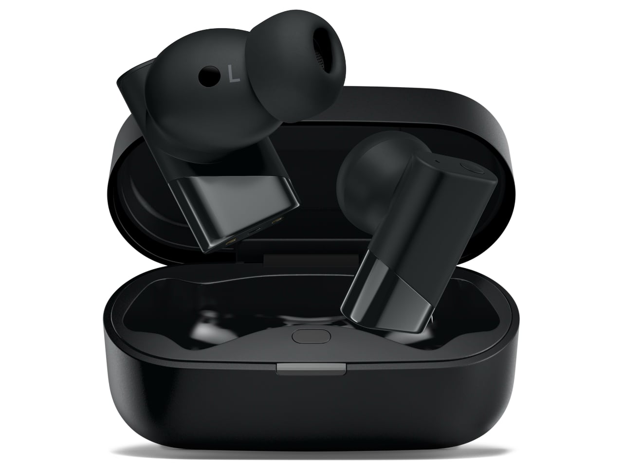
The Status Pro X features a sleek black design with angular geometric elements that house the complex driver configuration. The earbuds display a modern aesthetic with glossy black surfaces and subtle chrome accents that complement the technical sophistication within. Each earbud contains the triple-driver system arranged in a carefully engineered acoustic chamber that maximizes sound quality while minimizing size. The charging case maintains the same black finish with a subtle LED indicator strip that provides battery status information.

The exterior design reveals distinctive left (L) and right (R) channel markings that are subtly integrated into the black housing. The earbuds feature a two-tone design with matte black sections contrasting against glossy chrome or metallic gray accents that create a diagonal split across each earbud’s body. The ergonomic ear tip design shows how the silicone tips are engineered to provide secure fit while maintaining comfort during extended wear. The tips appear to have a tapered design that accommodates different ear canal sizes while ensuring proper acoustic seal for optimal sound delivery.

The internal architecture reveals the complexity of the hybrid driver system through detailed exploded views showing each component’s placement. The 12mm dynamic driver handles lower frequencies while the two Knowles balanced armature drivers manage mid and high frequencies with precision. The Status 5.3 processor chip sits at the base of each earbud, managing the complex audio processing required for the multi-driver configuration. Gold-plated charging contacts ensure reliable power delivery while maintaining the aesthetic throughout the design.

The driver configuration utilizes Knowles’ miniaturized BA technology to achieve frequency response characteristics that would require larger components in traditional designs. Each balanced armature driver features precision-engineered magnetic assemblies with copper-colored accent rings that distinguish them from conventional dynamic drivers. The assembly process requires careful alignment of multiple acoustic chambers to ensure optimal sound delivery across the entire frequency spectrum. This engineering approach allows Status Audio to achieve audiophile-quality sound reproduction in a form factor suitable for active lifestyles.

Advanced Acoustic Engineering and Driver Isolation

The exploded views reveal a critical engineering achievement: independent acoustic chambers for each driver type. The balanced armature drivers are housed in separate sealed chambers from the dynamic driver, preventing acoustic interference between different frequency ranges. This isolation is crucial because BA drivers operate on electromagnetic principles while dynamic drivers use magnetic coil movement. Without proper isolation, the magnetic fields from the dynamic driver could interfere with the precise electromagnetic operation of the BA drivers, causing distortion and frequency response irregularities.

The engineering decisions visible in the Status Pro X’s internal architecture suggest several theoretical advantages for sound quality, though actual performance will require hands-on testing to verify. The independent acoustic chambers for each driver type should theoretically eliminate the frequency response irregularities that plague many hybrid designs. When drivers operate in shared acoustic spaces, their different operating principles can create interference patterns that manifest as peaks and dips in the frequency response.

The copper-colored accent rings visible around the BA drivers serve a dual purpose beyond aesthetics. These rings function as electromagnetic shielding, containing the magnetic fields within each driver’s operating space. This shielding prevents crosstalk between drivers and maintains the precise frequency separation that hybrid configurations require. The metallic finish also provides structural reinforcement for the delicate BA driver assemblies.

The internal layout demonstrates a sophisticated crossover network integrated directly into the circuit board assembly. Traditional earbuds often rely on simple capacitive or resistive crossovers, but the Status Pro X appears to implement active crossover technology through the Status 5.3 processor chip. This approach allows for precise frequency division points and phase alignment between the dynamic driver (handling bass frequencies) and the dual BA drivers (managing midrange and treble frequencies).

The active crossover implementation through the Status 5.3 processor offers theoretical advantages over passive crossover networks. Active crossovers can provide steeper roll-off slopes and more precise frequency division points, which should translate to cleaner separation between bass, midrange, and treble frequencies. This precision becomes particularly important in the critical midrange frequencies where vocals and many instruments reside.

The stacked driver arrangement positions the dynamic driver at the bottom of the assembly, closest to the ear canal opening. This placement takes advantage of the dynamic driver’s natural bass response while allowing the BA drivers to be positioned for optimal mid and high-frequency projection. The acoustic design ensures that sound waves from all three drivers reach the ear canal with proper timing alignment, preventing phase cancellation that could muddy the sound.

The vertical stacking arrangement with the dynamic driver positioned closest to the ear canal should theoretically provide more natural bass response. Dynamic drivers excel at moving the air volume necessary for impactful bass reproduction, and their placement at the acoustic output point maximizes this advantage. The BA drivers positioned further back in the assembly can focus on their strengths in midrange clarity and treble extension without competing for the same acoustic space.

Thermal Management and Power Efficiency Optimization

The internal images show strategic component placement that addresses thermal management concerns. The Status processor chip is positioned away from the dynamic driver’s magnet assembly, which generates the most heat during operation. This separation prevents thermal interference with the digital signal processing and maintains consistent audio performance during extended listening sessions. The gold-plated charging contacts indicate attention to electrical efficiency throughout the design. Gold plating provides superior conductivity and corrosion resistance compared to standard contacts, ensuring reliable power delivery to the complex multi-driver system.

This attention to electrical efficiency is crucial for maintaining the precise power requirements of the BA drivers, which are more sensitive to voltage fluctuations than traditional dynamic drivers. The 21 percent size reduction compared to the previous model represents a significant engineering achievement when housing three separate drivers. The images reveal vertical stacking optimization where components are arranged to minimize lateral footprint while maintaining acoustic performance. This vertical integration required custom-designed BA drivers from Knowles that could operate effectively in the confined space while maintaining their electromagnetic isolation requirements.

The circuit board integration shows how the digital processing components are embedded directly into the acoustic assembly rather than occupying separate space. This integration reduces internal volume requirements while maintaining the electrical isolation necessary for clean audio signal processing. The blue circuit traces visible on the Status chip indicate high-frequency signal paths that require careful routing to prevent electromagnetic interference with the sensitive BA driver operations.

Audio Technology and Performance Capabilities

Status Pro X users can select from multiple equalizer settings, including the Status Signature setting and the Knowles Curve setting. The Knowles Curve setting is based on the Knowles Preferred Listening Response Curve, which represents a breakthrough in audio engineering based on research showing that listeners across age ranges and hearing abilities prefer expanded treble response beyond 10 kHz for a more satisfying music experience. By leveraging Knowles BA technology, Status Audio achieves the higher frequencies necessary to produce optimal audio performance and unlock intricate musical details while preserving the natural tonal balance that audiophiles demand.

The Knowles Preferred Listening Response Curve implementation suggests that the Status Pro X may deliver a more engaging sound signature than traditional flat response tunings. Research indicates that listeners consistently prefer moderate treble emphasis above 10 kHz, which can enhance the perception of detail and airiness in music.

The hybrid configuration allows for precise frequency separation that eliminates the compromises associated with single-driver designs. Jon Kiachian, President of MedTech and Specialty Audio at Knowles Corporation, stated that their BA drivers represent the pinnacle of miniaturized audio engineering. The collaboration with Status Audio demonstrates how their BA drivers can help brands deliver audio experiences in compact form factors. The Status Pro X showcases what becomes possible when driver technology meets thoughtful product design, creating an audio experience that reveals all the nuances and details of music that conventional earbuds cannot reproduce.

The dual BA configuration suggests that Status Audio has dedicated one driver to midrange frequencies and another to treble, allowing for more specialized tuning of each frequency band. The dual BA configuration provides the headroom necessary to achieve this extended treble response without distortion, something that single dynamic drivers often struggle to accomplish.

The balanced armature drivers provide the precision needed for critical listening while maintaining the efficiency required for extended battery life. The sophisticated acoustic system creates a frequency response that captures both subtle sonic textures and dynamic range that single-driver designs cannot achieve. This technical approach showcases the advantages of hybrid driver configurations in true wireless products. The engineering allows for precise control over different frequency ranges while maintaining the compact size requirements of modern earbuds.

Size Reduction and Market Positioning

Knowles BA drivers enable unprecedented sound performance for their size, allowing Status Audio to create an earbud that is 21 percent smaller than its previous model without compromising sound quality, frequency range, or battery life. The high sensitivity of Knowles BAs also facilitates improved hearing personalization while maximizing power efficiency. This combination of size reduction and performance enhancement addresses key consumer demands in the competitive earbud market. The miniaturization achievement demonstrates how advanced driver technology can overcome traditional limitations in portable audio devices.

James Bertuzzi, Status Audio CEO, explained that when designing the Pro X, they needed a technology partner that could help them deliver on their promise of uncompromising audio quality in a more compact form. Knowles BA drivers were the clear choice, allowing them to achieve frequency response and detail that would be impossible with conventional dynamic drivers alone. The combination results in a listening experience that differentiates the Pro X in today’s crowded earbud market.

The Status Pro X earbuds are available for pre-order now, with shipping beginning in early September. The partnership enables Status Audio to compete with established brands while maintaining their commitment to accessible high-quality audio. The Status Pro X represents a significant milestone in the collaboration between component manufacturers and consumer audio brands, demonstrating how specialized technology can enhance the end-user experience in competitive markets.

The post Status Audio’s New Pro X Premium Earbuds Feature Knowles Balanced Armature Drivers first appeared on Yanko Design.

Recov concept lets you relax with incense and without guilt

Par : Ida Torres
15 juillet 2025 à 17:00

If you’re one of those people who drags themselves home after a long day, feeling like you’ve been running on empty for hours, you’re not alone. The constant cycle of work stress, endless meetings, and the pressure to always be “on” can leave anyone feeling drained. But what if there was a simple, elegant solution that could help you reclaim those precious moments of peace? Enter Recov, a revolutionary incense burner concept that’s designed specifically for people like you who desperately need to rediscover the value of rest.

Created by the talented design team of Ko Ye Been, Lee Ji Ho, Roh Woo Hyun, and Oh Yun, Recov isn’t just another home accessory. It’s a thoughtfully crafted wellness tool that transforms the ancient practice of incense burning into a modern ritual for recovery and relaxation. The tagline “Discover the value of rest” perfectly captures what this innovative product aims to achieve: making rest not just an afterthought, but a deliberate, mindful practice.

Designers: Ko Ye Been, Lee Ji Ho, Roh Woo Hyun, and Oh Yun

The design itself is refreshingly simple yet sophisticated. The clean, minimalist aesthetic features a warm cream-colored body with subtle orange accents that immediately feel calming and approachable. Unlike traditional incense burners that can feel ceremonial or intimidating, Recov looks like it belongs in your contemporary living space. The cylindrical form with its gentle curves and soft lighting creates an atmosphere that whispers “slow down” rather than demanding attention.

What makes Recov truly special is how it reimagines the entire incense experience. Instead of fumbling with matches and worrying about timing, you simply insert an incense stick into the top opening, set your desired duration using the intuitive timer system (15, 30, or 60 minutes), and let the device do the rest. The soft mood lighting gradually illuminates as the incense burns, creating a visual cue that helps your mind transition from work mode to rest mode. The thoughtful engineering extends to practical details that busy people will appreciate. The bottom tray collects ash automatically, eliminating the mess and maintenance that often deters people from using traditional incense. The timer function means you can start your relaxation ritual and trust that it will end safely, allowing you to fully let go without worrying about fire hazards or waste.

But perhaps the most brilliant aspect of Recov is how it makes rest feel intentional rather than guilty. In our productivity-obsessed culture, taking time to simply breathe and be present can feel selfish or lazy. By creating a structured, time-bound experience, Recov gives you permission to pause. It transforms those stolen moments of peace into a legitimate wellness practice, complete with sensory cues that signal to your brain that it’s time to decompress. The accompanying incense options, including “Calm Flow,” “Rest Bloom,” and “Inner Goals,” are specifically formulated to support different aspects of recovery. Whether you need to quiet racing thoughts after a stressful presentation or create a buffer between work and personal time, there’s a scent designed to help you transition more effectively.

The post Recov concept lets you relax with incense and without guilt first appeared on Yanko Design.

Open-Source Robot Reachy Mini Brings AI to Your Desktop

Par : JC Torres
15 juillet 2025 à 16:20

Most robots today look like they belong in a factory or a science fiction movie, with their cold metal frames and intimidating mechanical movements that make you think twice about getting too close. There’s something inherently off-putting about the way most robotic designs prioritize function over approachability, creating machines that feel more like tools than companions, even when they’re supposed to help us in our daily lives.

That’s what makes Reachy Mini such a refreshing departure from the typical robotics playbook. This compact desktop robot from Hugging Face feels more like a curious pet than a piece of industrial equipment, with its expressive LED eyes and animated antennas that give it genuine personality. At just 11 inches tall and weighing 3.3 pounds, it’s sized more like a stuffed animal than a traditional robot.

Designer: Hugging Face, Pollen Robotics

Hugging Face, the machine learning platform often called “the GitHub of AI” for its vast community of developers sharing AI models and datasets, has taken its first step into physical robotics with this charming little companion. The company’s open-source, community-driven philosophy translates beautifully into hardware, creating a robot that’s designed to be modified, customized, and shared rather than locked down by proprietary restrictions.

The design itself is surprisingly endearing, with two animated antennas that move expressively and a head that can rotate with six degrees of freedom, giving Reachy Mini an almost pet-like quality. When it goes into sleep mode, it actually shrinks down to about 9 inches tall, which adds to its charm in a way that most tech products completely miss. The wide-angle camera and 5W speaker are integrated so seamlessly that they don’t disrupt the friendly aesthetic.

What’s particularly clever about Reachy Mini is how it comes as a kit with 3D-printable components, making customization not just possible but encouraged. You can choose between a Lite version for $299 that connects to your computer, or the full autonomous version with a Raspberry Pi 5 that can operate independently. The fact that everything is open-source means you’re not just buying a robot, you’re joining a community of makers who share modifications and improvements.

The AI integration is where things get really interesting, though. Reachy Mini taps directly into Hugging Face’s ecosystem of AI models, giving it conversational abilities, object recognition, and even emotional expression that feels surprisingly natural. You can have actual conversations with it, use it as a coding tutor, or even turn it into an interactive art project, all through simple Python programming that’s accessible to beginners.

Of course, there are some practical considerations to keep in mind. The early development phase means you’re essentially becoming a beta tester, and the full autonomous version won’t ship until fall 2025 at the earliest. The Lite version, arriving late summer 2025, requires a tethered connection to your computer, which limits its mobility somewhat.

The educational potential here is enormous, particularly for STEM programs where students can learn programming, AI, and robotics through hands-on experimentation rather than abstract theory. The growing community around Reachy Mini is already sharing projects, modifications, and educational resources that make advanced robotics accessible to everyone, not just engineering students.

Reachy Mini succeeds because it understands that the future of robotics isn’t about creating more sophisticated machines, but about making technology more human-centered and approachable. By combining expressive design with open-source accessibility, it proves that the most innovative robots might just be the ones that feel less like robots and more like companions we actually want to spend time with.

The post Open-Source Robot Reachy Mini Brings AI to Your Desktop first appeared on Yanko Design.

LG StanbyME 2 features detachable 27-inch QHD display on wheels loaded with Dolby audio and visuals

Par : Gaurav Sood
15 juillet 2025 à 15:20

You can expect tablet-level versatility from your TV when LG is involved. The South Korean electronics giant previously demonstrated this with the Go model of its wireless StandbyME, which came in a carry case and was designed for outdoor use. Now making its global debut, the new StanbyME 2 offers even greater flexibility. The device is fully detachable from its movable docking stand, allowing it to function as a tablet, hang on a wall as a digital clock, or serve as an ambient display. And if that’s not fun enough, you could even pack the damn thing in the boot of your vehicle and take it camping or to a family picnic.

But it’s not just the portability and multi-orientation abilities that have changed with the StanbyME 2. The new model features an upgraded resolution and enhanced options for customizing audio, visuals, and controls, which can be tailored to users’ personal preferences and diverse media consumption needs, based on the environment it’s being used in.

Designer: LG

The portability of the StandbyME 2 is made possible by a built-in battery, which provides up to four hours of video playback on a full charge. The battery can be charged by docking the display to the stand and using USB-C. With no need for a constant power source, LG’s new display is convenient for both indoor and outdoor use. Like the original StandbyME, the StandbyME 2 comes mounted on a wheeled docking stand for easy mobility. The device can be detached from its base with a single click to be used independently for binge-watching shows, playing board games, or setting up at your creative workspace.

The StanbyME 2 is not a small device. It features a 27-inch QHD display with a native resolution of 2560 × 1440 pixels. Interestingly, it offers a dedicated 60Hz refresh rate – don’t bother gaming if you were thinking – but of course, you can find many other practical uses for the detachable screen. If you don’t want to use it as a large display tablet, you can use its built-in strap to get it up on the wall, where it’s your photo frame in disguise.

Of course, it’s portable, but the StanbyME 2 measures 623 × 364 × 28.5 mm and weighs 4.3 kg without the stand. So, it’s no kid’s play to fiddle with it or even think of detaching and moving it around. With the stand included, the display weighs 15.2 kg. The device is powered by LG’s α8 AI processor, runs WebOS 24, and supports voice control. The gadget is not dust and water-resistant, and it is advised to be placed away from direct sunlight.

Courtesy of the AI processor, the device can adjust brightness and tone based on ambient lighting. The 10W side-firing speakers (change output automatically based on the screen orientation) support Dolby Atmos and AI Sound Pro for virtual 9.1.2 surround sound. Clear Voice Pro feature helps enhance speech clarity on the device, Dolby Vision delivers cinematic visuals, while Bluetooth 5.1, Wi-Fi 5, HDMI with eARC, a pair of USB 2.0 ports, and a 5V USB port take care of the connectivity. Scheduled to start shipping in the US later this month for $1,400, the StanbyME 2 includes LG ThinQ, Apple AirPlay, Google Cast, and Google Home integration.

The post LG StanbyME 2 features detachable 27-inch QHD display on wheels loaded with Dolby audio and visuals first appeared on Yanko Design.

Samsung Removed the Galaxy Z Fold7 S Pen, and This Stylus Lover Agrees

Par : JC Torres
15 juillet 2025 à 13:20

Samsung just took the covers off the Galaxy Z Fold7, and it represents the biggest change in the foldable flagship since the Galaxy Z Fold3 introduced S Pen support in 2021 and the Galaxy Z Fold5’s new hinge in 2023 that allowed it to close completely flat. This year’s highlights include the thinnest Galaxy Z Fold yet, better durability, larger screens, and, finally, upgraded cameras. It’s not all good news, of course, like the bulging camera bump, but perhaps the change that sent waves across the Internet was the removal of S Pen support.

I have been a great fan of pen-enabled devices, seeing them as the near-perfect fusion of digital and analog worlds, particularly when it comes to drawing and note-taking. Samsung was one of the first few tech companies that embraced this, from the Galaxy Note phones and tablets to the old Samsung ATIV PC line. Although styluses, both active and capacitive, aren’t that rare anymore (thank you Apple Pencil), Samsung remains part of a small group that uses the famed Wacom’s technologies for its smartphones and tablets. Despite my self-professed obsession with the stylus, I think Samsung made the right call in removing it from the Galaxy Z Fold7, but I don’t think the story ends here either.

Designer: Samsung

Why Samsung Removed The Z Fold7 S Pen

Galaxy Z Fold6

Galaxy Z Fold5

Imagine whipping out your smartphone, unfolding it into a tablet, and immediately sketching inspiration or jotting down ideas the instant inspiration strikes. It’s almost like pulling out a paper sketchbook or pocket notebook but with the advantage of apps and the cloud. It’s one of the advertised features of Samsung foldables since the Galaxy Z Fold3 and a dream come true for digital creators. Except, it turns out, very few actually use these devices that way.

Galaxy Z Fold3

The Web, especially YouTube, is filled with anecdotes and examples of artists, designers, and even architects using tablets for their work, but not so much on foldables. Yes, there are very few pen-enabled foldable phones in the market, but there are even fewer voices showing how they use these devices for those very specific purposes. Reading, watching, or even typing, are all covered, but drawing with a stylus and handwritten notes are almost always limited to one-time reviews and demos.

Galaxy Z Fold7

It’s not that the stylus use case is invalid but because, at least at this point in time, consumers have bigger concerns about foldables than where to store the S Pen (more on that later). They are more interested in how thin the phone is when folded, how usable it is as a phone, and, more importantly, how durable that fragile flexible main screen is. As it happens, those are exactly the things that Samsung addressed in the Galaxy Z Fold7, choosing to focus on what people need here and now, while still keeping the doors open for the return of the pen.

Why The S Pen Fold Edition Didn’t Work

Popularity wasn’t the biggest problem of the S Pen for the Galaxy Z Fold. Quite the contrary, it was the symptom, not the cause. The reasons why even die-hard stylus users shy away from the accessory’s foldable version can probably be boiled down to two things: confidence and convenience.

Galaxy Z Fold5

Let’s face it: even with all the marketing and figures, even foldable owners are still a little bit wary of the durability of the foldable inner screen. It tends to be a little softer than a regular phone screen, and poking it with a stylus or pressing down hard on it might cause some to worry. The technology is getting better, of course, but not yet to the point of completely dispelling fears.

Galaxy Z Fold6

There’s also the design of the foldable phone itself, which leaves no room for the stylus unless you don the right case. Tablets have it easy with a large body that can be used to magnetically hold and charge their stylus, but not so much a device that folds down to the size of a pocketable phone. Not unless you have a silo like on the Galaxy S Ultra, but then you’d be going back to the problem of thickness.

There’s also the matter of awkwardness when using the foldable phone as a digital canvas because of its almost square aspect ratio. An iPad mini with the same screen size has a larger surface area and a more rectangular shape that matches paper and notebooks more closely. It’s definitely a minor gripe, but one that gnaws at the creator’s subconscious little by little.

Galaxy Z Fold6

One Chapter Closes, The Next Is Yet To Be Written

To some extent, the removal of S Pen functionality from this year’s flagship foldable definitely feels like a huge loss, but I don’t think the story ends there completely. There are still plenty of ways that foldables can be improved that would allow the triumphant return of the stylus. Samsung does seem to be moving in that direction, though it’s not yet clear when all the pieces will fall into place.

Galaxy Z Fold5

For one, there’s the tri-fold device that Samsung will be unveiling later this year. That will help solve the awkward feeling of scribbling on a square display since it will give you a regular tablet-shaped screen to work with. Whether the “G Fold” will actually come with S Pen support or not is still uncertain, but given the Galaxy Z Fold7, I’m leaning more towards a “no” for now.

Galaxy Z Fold4

Samsung is also rumored to be working on a new stylus technology that is more like the Apple Pencil or Microsoft’s Surface Pen. That means using a stylus that requires a battery in order to remove the need for a digitizer layer underneath the screen. This digitizer is one of the reasons for the thickness of previous Z Fold models, and its removal helped trim down the Galaxy Z Fold7’s size a lot. Of course, this also means no longer using Wacom technology, but that might be a small price to pay in the grand scheme of things.

Such a technology would also mean that Samsung will be able to continue improving the durability of a foldable screen with better Ultra-Thin Glass (UTG). That, in turn, helps give confidence that every press and stroke won’t take the foldable phone closer to its demise.

The Big Question: Galaxy Z Fold7, Skip or Buy?

Galaxy Z Fold7

Setting aside the awkward, bulging camera bump for a moment, the answer is rather a simple one. If the stylus has never captured your fancy, then the Galaxy Z Fold7 represents the best of Samsung’s foldable design and technology. It’s super slim, more usable as a phone when folded, and can take better pictures. It’s still catching up to some of its rivals, especially in the photography department, but it’s encouraging to see some bold choices being made, even if it meant taking out one key feature.

For those who buy Samsung foldables for the stylus experience, the answer is even easier: no. Stick to the Galaxy Z Fold6, which is a decent device on its own, and wait for the next chapter in the story of the Galaxy Z Fold to be written. It’s exciting to finally see some movement from Samsung in this space, and hopefully, all the signs pointing in that direction will come to pass.

Galaxy Z Fold7

The post Samsung Removed the Galaxy Z Fold7 S Pen, and This Stylus Lover Agrees first appeared on Yanko Design.

Commodore 64 Ultimate Returns in Style with Glowing and Gold Editions

Par : JC Torres
15 juillet 2025 à 11:02

The Commodore 64 was one of those computers that defined an entire generation’s relationship with technology, complete with its chunky beige case and that satisfying mechanical keyboard that made every keystroke feel deliberate. These days, most of our computing happens on sleek, minimalist devices that prioritize function over personality, which makes the new Commodore 64 Ultimate series feel like a breath of fresh air.

What makes this modern revival particularly interesting is how it doesn’t just slap some retro styling onto contemporary hardware and call it a day. Instead, the Ultimate series comes in three distinct flavors, each designed to appeal to different types of nostalgia seekers while actually being useful computers you can plug into your modern setup.

Designer: Commodore

The BASIC Beige edition is probably what most people picture when they think of a faithful C64 recreation. It sports that familiar cream-colored plastic case that screams 1980s home computing, complete with a proper mechanical keyboard that delivers the same tactile satisfaction as the original. Of course, underneath that nostalgic exterior, you’ll find modern conveniences like HDMI output and USB ports, so you won’t have to hunt down vintage monitors or deal with finicky RF connections.

Then there’s the Starlight Edition, which takes the retro concept in a completely different direction. This version features a translucent case packed with sound-reactive LEDs that pulse and change colors based on whatever game or music you’re playing. The effect is pretty spectacular, especially when you consider they’ve also created the world’s first translucent mechanical keyboard PCB, allowing the internal lighting to shine through each key as you type.

The real showstopper, however, is the Founders Edition, which is limited to just 6,400 units. This golden beauty takes inspiration from the legendary millionth C64 that Commodore produced back in the day, featuring a translucent amber case that gives off a warm, premium glow. The attention to detail here is impressive, with 24k gold-plated badges, satin gold keycaps, and a comprehensive collector’s package that includes everything from a commemorative certificate to an exclusive t-shirt and even a gold dog tag necklace.

All three editions share the same modernized guts, which means you get contemporary features like SD card slots for easy game loading, Ethernet connectivity, and compatibility with both vintage peripherals and modern accessories. The mechanical keyboards across all versions aren’t just for show either, they’re fully functional and maintain compatibility with original C64 software, so these aren’t just expensive display pieces gathering dust on your shelf.

What’s particularly clever about this approach is how it taps into the growing trend of technostalgia without falling into the trap of being purely decorative. Sure, these computers look fantastic sitting on your desk, but they’re also genuinely useful for anyone interested in retro computing, programming, or just experiencing what home computing felt like before everything moved to touchscreens and cloud services.

That said, you’ll need to be prepared for some compromises. The limited production runs mean these won’t be cheap, and the Founders Edition in particular is clearly aimed at serious collectors rather than casual users. The translucent cases and LED lighting, while visually striking, might not appeal to everyone’s aesthetic preferences either.

The Commodore 64 Ultimate series succeeds because it understands that good retro design isn’t just about copying old aesthetics. Instead, it takes the best parts of the original experience, the tactile keyboard, the distinctive case design, the immediate boot-up satisfaction, and combines them with modern reliability and connectivity. The result is something that feels both familiar and fresh, proving that sometimes the best way forward is to take a thoughtful look backward.

The post Commodore 64 Ultimate Returns in Style with Glowing and Gold Editions first appeared on Yanko Design.

3D printer with AI can turn food scraps into useful items

Par : Ida Torres
15 juillet 2025 à 08:45

There have been numerous studies conducted and articles written on how much food is wasted every day in the U.S. alone. Creative thinkers are developing innovative ways to prevent this waste from ending up in landfills, going beyond traditional methods like composting, reusing, or turning scraps into animal feed. It would also be great if the solutions they develop could be useful in our everyday lives.

Now imagine turning your banana peels, coffee grounds, and vegetable scraps into useful household items instead of throwing them away. That’s exactly what MIT graduates Yiqing Wang and Biru Cao have made possible with their groundbreaking invention, the Foodres.AI 3D printer. This innovative desktop device represents a completely new approach to dealing with food waste by transforming organic waste into functional objects.

Designers: Yiqing Wang and Biru Cao

The technology works through a combination of artificial intelligence and 3D printing. Users simply place their food waste into the machine, and the accompanying mobile app uses AI to analyze the materials through the phone’s camera. The system uses a self-trained object detection model to identify food types and assess their printability, then suggests appropriate “print recipes” based on the physical properties of your waste materials. The printer can create a wide variety of useful items from your kitchen scraps. Users can print cup holders, coasters, decorative items, and custom designs by simply dropping in food waste and selecting the desired form and size. The built-in material processing module helps users mix waste with natural additives to form a printable bioplastic paste, making the entire process seamless and accessible.

What makes this printer particularly user-friendly is its intuitive design that requires no prior 3D printing experience. The app provides a library of design templates, and users can also upload their own custom models. Once you’ve selected your desired object and size, the printer’s custom three-axis extrusion system converts your scraps into something useful. The environmental impact potential is significant, as food waste accounts for up to 50 percent of household organic refuse in the United States. The project began as part of research supported by the MIT IDEAS program, addressing the fact that 40-50% of household food is wasted before it ends up in landfills or compost bins. By enabling people to repurpose non-edible leftovers and organic matter into functional items at home, the Foodres.AI printer promotes what the creators call “hyper-local circular economies.”

Beyond its practical applications, the Foodres.AI printer represents a shift in how we think about waste. Instead of viewing food scraps as something to be disposed of, this technology encourages users to see them as raw materials for creation. By making sustainable behavior interactive, creative, and rewarding, the product builds a community-driven culture of eco-consciousness. As concerns about environmental sustainability continue to grow, innovations like the Foodres.AI printer offer practical solutions that individuals can implement in their own homes, making circular living both achievable and engaging for the average person.

The post 3D printer with AI can turn food scraps into useful items first appeared on Yanko Design.

Montoir’s MWMOD-01 V2 People’s Choice Collection: Swiss Mechanics Meet Community Design

Par : Sarang Sheth
15 juillet 2025 à 01:45

Good design often exists at the intersection of scarcity and accessibility. The watch industry typically forces consumers to choose between mass-produced affordability or exclusive luxury at astronomical prices. Montoir’s new MWMOD-01 V2 People’s Choice Collection carves out an intriguing middle path with just 100 numbered timepieces spread across three community-selected colorways. These Swiss-made mechanical watches deliver premium specifications at $375 (currently 50% off future retail), challenging conventional pricing models through direct-to-consumer distribution. The collection represents something increasingly rare in today’s market: genuine exclusivity without artificial inflation.

The watches themselves tell a compelling design story through vibrant, carefully considered dial options. The “Watermelon” variant (limited to 25 pieces) features a soft green dial with a light red seconds hand. “Banana Creme” (50 pieces) offers a warm yellow face paired with a crisp white seconds hand. The “White Fume” edition (25 pieces) showcases a smoky, vignetted white-to-grey gradient with a bold red seconds hand for contrast. Each colorway emerged from months of community voting, making these designs a direct reflection of enthusiast preferences rather than corporate market testing. This approach has produced timepieces with genuine character in a segment often plagued by derivative aesthetics.

Designer: Montoir Watches

Click Here to Buy Now: $360 $375 ($15 off, use coupon code “YANKO”). Hurry, deal ends in 48-hours!

The 40mm case strikes an ideal balance between presence and wearability, measuring just 11.9mm thick with a comfortable 47.8mm lug-to-lug span. Constructed from surgical-grade 316L stainless steel, the case architecture features clean lines, brushed finishing, and a 120-click unidirectional bezel with a luminous pip. The flat sapphire crystal includes an anti-reflective coating for improved legibility, while the screw-down crown ensures the watch maintains its impressive 200-meter water resistance rating. Each caseback comes individually numbered and decorated with an engraved vintage diver’s helmet motif, reinforcing both exclusivity and thematic coherence.

Montoir has equipped these watches with a Swiss-made mechanical movement, custom modified to eliminate the “ghost date” function. This thoughtful adjustment creates smoother winding action and removes unnecessary crown positions, demonstrating attention to detail often reserved for much pricier timepieces. The movement beats at 28,800 vibrations per hour, offers hacking and hand-winding capabilities, and provides approximately 38 hours of power reserve. BGW9 Super-LumiNova adorns the hands, hour markers, and bezel pip, ensuring nighttime legibility. The included premium FKM rubber strap comes color-matched to each dial variant, combining vintage tropic styling with modern materials and comfort.

The watch industry increasingly relies on artificial scarcity and inflated pricing, with many brands producing “limited editions” in quantities that strain the definition of exclusivity. Montoir takes a different approach by genuinely limiting production to 100 total pieces, individually numbering each watch, and committing to never repeating these exact configurations. This strategy creates authentic collectibility without exploiting customer FOMO or manipulating secondary market values. The transparent pricing model further distinguishes Montoir from competitors, delivering Swiss mechanical quality at a price point typically associated with mass-produced quartz timepieces from fashion brands.

The watches represent a compelling value proposition for design enthusiasts and collectors alike. The 40mm case size suits most wrists, while the sub-12mm thickness ensures comfortable daily wear. The combination of vibrant dials, quality construction, mechanical movement, and serious water resistance creates versatile timepieces suitable for both casual and professional environments. With most units already claimed and production scheduled to deliver in early 2026, these watches demonstrate how thoughtful design, community involvement, and transparent business practices can create genuinely desirable products in an increasingly crowded marketplace. For those interested in securing one of the remaining pieces, Montoir offers an additional $15 discount with code “YANKO” at checkout.

Click Here to Buy Now: $360 $375 ($15 off, use coupon code “YANKO”). Hurry, deal ends in 48-hours!

The post Montoir’s MWMOD-01 V2 People’s Choice Collection: Swiss Mechanics Meet Community Design first appeared on Yanko Design.

This Gigantic ‘AirPods’ Backpack actually holds (and organizes) your items

Par : Sarang Sheth
15 juillet 2025 à 00:30

I can only imagine the look on the TSA’s face as you walk up to them with a massive AirPods case strapped to your back. You’ll definitely get a few looks from the people around you, and maybe a few covert videos as you pop open the lid to reveal two massive AirPods-looking containers inside the bag… only for them to slide out and be, well, actual containers.

Designed by New York-based Bravest Studios, the AirPack is equal parts EDC and social commentary. The quirky design enlarges the AirPods to the size of a 44-liter backpack, playing on scale, design, and familiarity in a way that should easily grab everyone’s attention. There’s nothing ‘special’ about the backpack’s design if you look at it just objectively. But unless you’ve lived under a rock for the past decade, just a glance at the AirPack will instantly make you think, “Did that guy just walk past me with a massive AirPods case strapped to his back??”

Designer: Bravest Studios

The design’s meant to grab eyeballs, something fairly important in today’s economy. It comes with a fairly surprising level of detail. The top of the bag pops up exactly like an AirPods case’s lid, revealing two AirPods-shaped masses on the inside. The interior of the lid has the negative indentations to make space for the ‘AirPods’, and a close look reveals a fairly impressive level of detail with the hinge mechanism too.

However, slide the AirPods out and you’ll realize that they’re just regular containers. Designed to hold anything from clothes to sneakers, or even some of your tech and EDC, the two containers organize your belongings into ‘left’ and ‘right’ channels. Zippers mean you can use each container individually too, although they make much more sense when popped into the backpack! Besides, there’s even space for a laptop in the backpack, although images don’t really show where you’d store your laptop or how you’d access it. I’m inclined to believe Bravest Studios, though.

That’s because the AirPack isn’t a concept or vaporware. It’s a real product that will go on sale at Bravest’s NYC Soho popup on the 19th of July. There’s no word on pricing yet (although expect this limited-edition drop to be on the more expensive side), but if you can afford the AirPack, promise me you won’t desecrate it with those godawful Labubu accessories. I beg you.

The post This Gigantic ‘AirPods’ Backpack actually holds (and organizes) your items first appeared on Yanko Design.

Affordable, Modern Living In 135 Square Feet: Is This the Perfect Tiny Home For First-Time Buyers?

14 juillet 2025 à 23:30

Designed by Dragon Tiny Homes, the Genesis V2 strips away everything unnecessary to reveal what compact living truly means. This 16-foot masterpiece transforms 135 square feet into a super comfy tiny home that values function over flash. Starting at $39,500, the home casually reinvents what affordable housing can accomplish. The clean lines and purposeful layout represent a thoughtful design philosophy that worships substance over superficial details.

The loft-style bedroom maximizes vertical space while maintaining comfortable proportions for two occupants. Below, the main living area flows seamlessly between functions, with generous glazing that floods the space with natural light. The kitchen occupies just enough space to handle essential cooking tasks – it includes a two-burner induction cooktop, a sink, fridge/freezer, and some cabinetry.

Designer: Dragon Tiny Homes

The bathroom is fully functional, despite the home occupying a minimal square footage. A complete shower, sink, and flushing toilet arrangement proves that compact doesn’t mean compromise on basic needs. The space planning here reflects careful consideration of daily routines and movement patterns. Clean finishes and efficient fixtures create a bathroom that feels complete rather than condensed. This attention to essential amenities makes the Genesis V2 a genuine home territory rather than a basic shelter.

Climate control receives careful attention through a mini-split heater and air conditioning system and a ceiling fan combination. These mechanical systems ensure year-round comfort without overwhelming the compact space or energy systems. The dual approach to temperature management shows understanding of how small spaces can quickly become uncomfortable without proper ventilation. The systems integrate seamlessly into the overall design without creating visual clutter or operational complexity.

Who is the Genesis V2 best suited for?

The Genesis V2 is ideal for first-time tiny home buyers, minimalist couples, and anyone seeking an affordable entry into compact living. Its 16-foot design and efficient layout make it perfect for singles or pairs who value function, comfort, and simplicity over excess space.

With its ready-to-go availability and approachable price, the Genesis V2 is also a smart choice for those looking to downsize, embrace a minimalist lifestyle, or add a flexible guest house or vacation retreat to their property. It seems ideal for buyers who want to experience tiny living without navigating complex customization processes

Are there any drawbacks to the Genesis V2 tiny home?

The tiny home offers impressive affordability and a great design, but there are some drawbacks to consider:

  • Limited Space: With only 135 square feet, the Genesis V2 may feel cramped for more than two people or those with lots of belongings.
  • Minimal Storage: Storage options are basic, so buyers with significant storage needs may find it challenging to stay organized.
  • Small Kitchen: The kitchen is compact, with limited counter space and cabinetry, which may not suit those who love to cook or entertain.
  • Loft Access: The sleeping loft is accessed by a ladder, which may not be ideal for those with mobility concerns.

Our Take

The Genesis V2 manages to adopt a pretty mature approach to tiny home design, where genuine livability takes precedence over fleeting novelty. The updated version builds on lessons learned from the original Genesis while maintaining the core philosophy of functional minimalism that has made Dragon Tiny Homes a respected name in compact living.

Every design decision in the Genesis V2 reflects this maturation. The loft bedroom provides real comfort, the kitchen handles daily cooking needs, and the bathroom functions without compromise. It feels like a genuine home that happens to be compact rather than a novelty space that sacrifices comfort for size. This distinction matters enormously for anyone considering the transition to tiny living.

The post Affordable, Modern Living In 135 Square Feet: Is This the Perfect Tiny Home For First-Time Buyers? first appeared on Yanko Design.

À partir d’avant-hierYanko Design

Gaming Dice turned into Gentleman’s EDC: Meet the 7-in-1 Prophecy Dice Spinner

Par : Sarang Sheth
5 juillet 2025 à 01:45

So, I was in Macau a month and a half ago, walking through all the grand casinos to get to the expo venues where I was attending a trade show. The casinos were decked up in a rather Vegas-like fashion. Glitz, glamor, gold, with a hint of scarlet. You’d see lush green boards with red dice rolling around, and while that looked nice, a month later, I was in a D&D campaign, using similar dice, looking at it and just thinking – these look so out of place with the mythic/mystic/rustic vibe of my game. The reality is, most polyhedral dice are sort of a template – six or more sides, made from either plastic or, if you’re lucky, metal, with really no aesthetic match to the game you’re playing. Enter Prophecy Dice, the latest oddball object to catch the attention of the RPG crowd and, frankly, anyone who loves a slick gadget.

What if dice don’t look like dice? Asked the guys at Dragonstonegaming, who developed the Prophecy Dice – a pocket-watch-shaped gizmo that fits a trigger-activated spinner with a ‘Dice meets Wheel of Fortune’ vibe. The spinner looks like something from an alternate timeline where Victorian-era adventurers carried precision instruments for determining their fates. Press a button, watch the internal mechanism spin, and let the pointer reveal your roll. It carries the ceremonial weight of traditional dice rolling but packages it in a form factor that appeals to the EDC enthusiast in me, but more broadly, really fits the thematic DNA of RPG games. It’s engineered for “balanced and fair” outcomes, which is always the line, but Dragonstone appears to have invested in actual spin-testing and symmetry too.

Designer: Dragonstonegaming

Click Here to Buy Now: $69 $118 (42% off) Hurry! Only 150 left of 2300.

The mechanism feels less like rolling dice and more like spinning the Wheel of Fortune, with a tactile immediacy that’s weirdly addictive. You select your die type (d4 through d100, all the classics), line up the internal indicator, and let it rip. The pointer snaps to rest in a window, and boom – you’ve got your roll. The simplicity is deceptive; this is a precision-milled device, not a kitchen timer, and the Kickstarter video shows off the smooth, almost hypnotic spin.

At first glance, this feels like peak EDC gadget territory – the kind of thing that makes you wonder if we really needed to reinvent the humble d20. But dig deeper into the engineering, and there’s actually some thoughtful design philosophy at work here. The all-metal construction addresses one of the biggest complaints about traditional dice: inconsistency. Anyone who’s spent serious time rolling knows that cheap plastic dice can be weighted, chipped, or just plain unreliable. Metal spinners, when properly balanced, eliminate those variables entirely.

The 7-in-1 functionality is where this gets interesting from a UX perspective. Instead of fumbling through a bag of different polyhedrals mid-game, you’re looking at a single device that covers d4, d6, d8, d10, d12, d20, and d100. The push-button mechanism feels deliberately analog in our increasingly digital world, giving you that tactile feedback that smartphone dice apps can never replicate. Windows on both sides of the dice let you access the different ‘polyhedra’.

What really sells me on the design is the pocket watch aesthetic. This could have easily been another generic gadget in a plastic housing, but Dragonstone Gaming understood that EDC gear for D&D needs to look the part. The metallic finish and classic proportions mean this actually works as a conversation starter, especially if your game is centered around vintage or steampunk themes. The Dice comes in two styles – one with a storm-summoning witch named Selene Tidecaller, and another with a valiant Knight named Edric Thornsworn. Both designs have the same relief-style carving on the front, back, and sides, making this truly look like something your great-grandfather would hand down to you.

Selene Tidecaller

Edric Thornsworn

The engineering challenges here are more complex than they initially appear. Creating a truly balanced spinner that delivers fair results across seven different dice types requires precise calibration of weight distribution, friction coefficients, and stopping mechanisms. Traditional dice rely on physics and probability over thousands of rolls, but a spinner needs to be mathematically fair on every single use. The fact that they’re claiming “balanced and fair” results suggests they’ve put serious thought into the internal mechanics, though I’d love to see some independent testing data on the actual randomness distribution.

The Kickstarter numbers are, frankly, wild. Prophecy Dice aimed for a modest $2,000 and currently sits north of $340,000 with weeks left to go, over 3,300 backers deep. That’s not just hype, that’s people with dice fatigue looking for something better, or at least different. Tabletop gaming lives and dies by its rituals and accessories, and Prophecy Dice slots perfectly into the EDC arms race: a gadget that feels essential without ever being necessary. The $69 price is what you’d expect for a premium, all-metal, limited-run object, but backers seem happy to pay for novelty that actually works. The campaign is loaded with stretch goals and metallic finishes, and I wouldn’t be surprised if custom engravings show up next.

Although I’m curious to see how it holds up to months of real play. Will the spin wear out? Will the mechanism jam after a few too many critical fails? That’s the risk with any Kickstarter, especially one that blends analog charm with moving parts. However, this isn’t Dragonstonegaming’s first campaign. Their SpinDice from last year also blew past its funding goal, with over 800 backers bringing the project to life. The Prophecy Dice feels like the next iteration, and ships with an optional leather handmade slip case, or a ‘relic’ mount. The Prophecy Dice ships globally starting October 2025.

Click Here to Buy Now: $69 $118 (42% off) Hurry! Only 150 left of 2300.

The post Gaming Dice turned into Gentleman’s EDC: Meet the 7-in-1 Prophecy Dice Spinner first appeared on Yanko Design.

This hard-sided, A-frame aluminum truck camper is easily the lightest in its category

Par : Gaurav Sood
5 juillet 2025 à 00:30

As a rule of thumb, you want the camper in the back of your truck to be lightweight. There are multiple reasons for it: safety, performance, and durability. I don’t want to get into details of it, but if you know what I’m trying to imply, you would like the Switchback pick-up camper. At just 375 lbs, it is a great option for those prioritizing weight savings.

The feather-light camper is made entirely of rot-proof aluminum, which adds to its longevity, and makes the Switchback a solid investment for people who camp in different weather conditions throughout the year. Of course, the weight is the first striking aspect from a camper’s point of view; but for me, it’s the A-frame form factor, which really wins the heart.

Designer: Aliner 

Designed equally well for off-roading into the wild or camping under the stars, the Switchback, by Pennsylvania RV manufacturer Aliner, is compatible with most mid-size and full-size trucks. When in drive mode, the camper folds down into a box and sticks just slightly above the bed walls. You can park the vehicle easily in the garage with the camper mounted or take it where your heart desires without impacting the mileage too much. When you’re at the camp, clip open the box, lift up the side hard walls in A shape, stretch out the inner fabric lining and swing the split door open to have yourself a nice sleeping camper. The entire folding and unfolding process takes under 30 seconds.

Aliner has not done anything fancy in the Switchback. Provided with a comfortable 60″ x 72″ bed (which doubles as bench seating, when you’re living out a mid-day storm at the camp), the camper is only your cozy above-ground shelter on a short overnight or, at max, a weekend adventure. Aliner is mulling the addition of an electrical system, but that’s for an upgraded model. For now, it’s the bare minimum that you’re going to get for the $9,500 asking price.

This is Aliner’s first niche pick-up camper, but not the first A-frame camper. The Pennsylvanian manufacturer is a world leader in compact and versatile campers, most A-shaped, symbolizing freedom and exploration. The Switchback, in addition to the sleeping arrangement inside, features a pair of long, lockable drawers, just outside at the entrance, below the camper floor. The drawers are 5 feet deep and should be able to store a camping stove, adventure gear, and other necessities. The cabin interior however measures 5.8 feet at the highest point. It is not standing height for everyone, but should be comfortable enough for the time two people plan to spend within the Switchback. Given its basic features, robust construction, and unique shape, the pick-up camper is easily the best, lightweight, full hard-sided truck camper out there!

The post This hard-sided, A-frame aluminum truck camper is easily the lightest in its category first appeared on Yanko Design.

This Tiny Cabin Is Designed For Sustainable & Serene Living Amid Romania’s Forested Hills

4 juillet 2025 à 23:30

Situated in the forested hills of Valea lui Enache, the CL02 Cabin by Vinklu beautifully shows us how minimalism can be both inspiring and deeply functional. The first impression is a sense of calm—a dark, understated silhouette softened by the filtered light of the surrounding trees. In this surreal cabin, less isn’t an aesthetic; it is intended to be a deliberate gesture toward finding contentment in simplicity. Every line and every finish supports the idea that a home should serve its inhabitants without demanding attention, quietly enabling the rituals of daily life.

The 55-square-meter structure stands where an earlier project failed, and it’s clear that Vinklu approached this second chance with a sense of reverence. The layout is straightforward: a ground floor with an open living area, a full kitchen, and a bathroom, and an upper level for rest. Each space is compact but never feels cramped, thanks to a vaulted ceiling and panoramic windows that extend the interior outward, inviting the forest in. The circular kitchen window frames a shifting tableau of leaves and light, turning even the most routine meal into an act of quiet observation.

Designer: Vinklu

The full-size kitchen is a luxury, especially in a home of this scale. It’s designed for those who find joy in cooking—ample countertop space, integrated appliances, and just enough storage to keep things tidy. The kitchen’s natural finishes echo the palette outside, blurring the boundary between interior and landscape.

The cabin is clad in dark, weather-resistant timber, allowing it to recede into the forest’s shadows. Inside, pale wood and minimal detailing create a sense of light and openness. There’s restraint in every decision, but also an invitation: to touch, to pause, to notice the subtle changes in the quality of light as the day moves on. The living area is open yet intimate, with just enough room for a small table and a pair of chairs. The focus isn’t on filling space but on creating an environment that feels both nurturing and uncluttered.


The CL02 Cabin’s relationship to its site is its most fabulous feature. The structure neither dominates nor disappears; it exists in dialogue with the landscape, responding to its contours and rhythms. Sustainability is embedded in the design—efficient insulation, passive solar orientation, and natural ventilation reduce the need for mechanical intervention. The house feels like a gentle addition to the hillside, its presence marked by sensitivity rather than intrusion.

Living in the CL02 Cabin is an exercise in mindful reduction. It’s not about doing without, but about having enough—and knowing that enough can be generous. There are compromises, of course: storage is limited, and the seasonal design may not suit every lifestyle. But for those drawn to clarity and contemplation, this is a space that offers both refuge and inspiration.

The post This Tiny Cabin Is Designed For Sustainable & Serene Living Amid Romania’s Forested Hills first appeared on Yanko Design.

Electrolux 800/8000 Vacuum Redefines Home Cleaning With Style, Intelligence, and Sustainability

Par : Tanvi Joshi
4 juillet 2025 à 22:30

What if your vacuum didn’t just clean your home, but became part of it? The Electrolux/AEG 800/8000 cordless vacuum cleaner doesn’t shout for attention. It quietly earns its place, designed with such subtlety and intelligence that it feels like it was always meant to be there. This isn’t just an upgrade, it’s a rethinking of what home cleaning should look and feel like.

At the heart of this transformation is the philosophy of effortless living. The 800/8000 series was crafted to eliminate the very friction we’ve come to accept in everyday maintenance. Tangled cords, dusty filters, messy emptying, all of it replaced with streamlined elegance. Designed with Scandinavian minimalism in mind, the vacuum and its components blend smoothly into home environments without disrupting the aesthetic. It’s cleaning technology that finally understands the modern home doesn’t want to look like a storage closet.

Designer: Jakob Dawod

But the visual integration is only the beginning. The real leap lies in its performance and usability, especially with the introduction of its companion: the all-in-one automatic emptying station. This station doesn’t just charge your vacuum; it takes care of it. One tap and the dustbin is emptied from the bottom, reducing mess and eliminating dust contact entirely. Inside, a secondary battery sits fully charged, ready to swap in when needed, while a subtle red indicator light informs you when the dust bag needs replacing. Hidden compartments hold maintenance tools and filters, and a clever access system allows you to remove and clean them without fuss. Even the rarely used HEPA filter is easily reached through an eject button on the base.

The vacuum itself has been refined to deliver premium-level performance while keeping the user’s day-to-day experience smooth and intuitive. When docked, the cleaner’s telescopic tube automatically compresses, saving space and kickstarting the charging and emptying process. Docking doesn’t require precision, just roll it in and lift slightly. The rotational base allows you to access the cleaner from different angles, adapting to your space and your routine. Every interaction feels intentional and considered.

This design didn’t emerge in a straight line. It was the product of countless sketches, ideas, and experiments, from early cardboard mockups to 3D-printed prototypes and detailed, high-fidelity appearance models. The development journey was marked by iteration, collaboration, and constant refinement. Engineers and designers worked side-by-side to solve real user frustrations, resulting in features like intuitive accessory storage, effortless hand-unit release, and even a compact accessory bag that’s as aesthetic as it is practical.

The experience doesn’t stop at dry cleaning. The evolved wet mop attachment expands the vacuum’s role into full-surface care. Controlled via the smart UI on the hand unit, users can maintain the perfect dampness of the mop pads with different drip speeds or target tough stains with a quick spray activated by a long button press. It’s this attention to detail, this layering of functionality onto an already elegant system, that transforms cleaning into something closer to satisfaction than obligation.

Underneath the polish, the 800/8000 system represents a deeper commitment to sustainability. Not only does it reduce waste by encouraging proper upkeep through smart maintenance tools, but it also supports longevity through design. Removable batteries, cleanable filters, and thoughtfully constructed accessories extend the product’s life far beyond the average vacuum, supporting Electrolux’s mission to be a truly sustainable brand.

And behind all this innovation? A team that believed in the power of design to change behavior. Cross-functional collaboration within the Electrolux Group made this complex product feel remarkably simple. From the closest design partners to the engineering teams who transformed sketches into smooth, real-world mechanics, every detail was a testament to shared vision and dedication.

The post Electrolux 800/8000 Vacuum Redefines Home Cleaning With Style, Intelligence, and Sustainability first appeared on Yanko Design.

This 2216-piece functional LEGO Rubik’s Cube could be the ultimate desk flex

Par : Sarang Sheth
4 juillet 2025 à 20:45

You’d think the world had run out of challenges for LEGO builders. After all, we’ve seen ‘functional’ lawnmowers, instant-photo Polaroid cameras that spit out LEGO “photos,” and even a ‘working’ rotary phone, all meticulously engineered, all somehow feeling like they’re right at home in the pantheon of LEGO absurdity. Yet, every so often, a builder comes along who ups the ante and rewrites the rules of what counts as “functional.” This time, that crown goes to a Rubik’s Cube, the kind that actually works. Not a blocky facsimile or a fidget toy with half-hearted spin, but a LEGO-built, fully twistable, color-matching, soul-crushing 3×3 Rubik’s Cube that might just be the most precise and satisfying “MOC” (that’s “My Own Creation” for the LEGO uninitiated) you’ll see this season.

Precision is the name of the game with Rubik’s Cubes. Every speedcuber, every fidgeter worth their salt, knows that the difference between a good cube and a mediocre one is measured in microns. A single click or jam, and your whole solve is toast. So making a functioning cube out of LEGO, with its famously not-quite-millimeter-perfect clutch power and those tiny mold-parting lines, feels like tempting fate. Yet here it is, spinning with the kind of smoothness that would make Erno Rubik himself do a double take. The builder, whose project recently surfaced on the LEGO Ideas platform, didn’t just aim for “works in theory.” They built a full-size, color-accurate cube that moves with the same crispness and tactile feedback you expect from a real puzzle.

Designer: Kragle Dog

The mechanism underneath those glossy 3×3 tiles? A clever lattice of LEGO Technic and system bricks, ingeniously stacked and interlocked to mimic the familiar spindle-and-corner arrangement of the original. It’s a feat that takes patience and an obsessive eye for tolerances, because even a fraction of a millimeter’s error can mean the difference between a cube that spins and a cube that simply locks up.

Size-wise, this thing’s a beast. Scale it against a standard Rubik’s Cube, and you’re looking at a puzzle that’s roughly four times the volume of the pocket original, clocking in at 15.6cm or over 6 inches per side. That extra space isn’t wasted, though. It gives the mechanism inside room to breathe and function, letting each axis rotate independently and with minimal play. The outer tiles are color-matched to classic Rubik’s specs, with red, blue, green, yellow, orange, and white plates snapping into place like a proper 80s icon. The result is a cube that looks like it was plucked directly from the world’s nerdiest toy store and dropped onto your desk, ready for a scramble.

“The Rubik’s Cube truly is an iconic toy, shoulder-to-shoulder with the likes of the LEGO brick,” says LEGO builder Kragle Dog. “So, being a fan of both LEGO bricks and Rubik’s Cube, I decided to try a new challenge and combine those two legendary toys into one epic idea.” The resulting build uses a staggering 2,216 bricks (that’s just the cube, not counting the base or the Rubik minifigure).

What really gets me is how this project manages to bridge the gap between playful creativity and mechanical purism. Most LEGO MOCs err on the side of whimsy, sacrificing accuracy for charm. Here, though, the builder’s gone full engineer, wrangling LEGO’s sometimes-fussy tolerances into something that actually works. That’s no small feat. The prototype reportedly holds together under repeated twists and turns, resisting the kind of catastrophic blowouts that plague less robust builds. There’s sheer genius in how each piece interlocks, trading the usual friction-fit for a system that’s both sturdy and forgiving. It’s the kind of object that makes you want to pick it up, scramble it, and maybe even try to speedsolve just to see if it can keep up. And no, you’re not allowed to use a Brick Separator to ‘solve’ the cube, even though that’s technically possible.

The flex doesn’t stop at the cube itself. The builder included a custom 357-brick display stand, elevating the puzzle into the realm of functional sculpture. There’s even a minifigure of Erno Rubik, the Hungarian architect who kicked off the global cubing craze back in 1974, complete with his signature hair and a tiny cube of his own. It’s a wink at the history and the culture surrounding the puzzle, and a reminder that behind every great invention is a designer obsessed with the details. The stand’s got just enough visual heft to make it a centerpiece on any shelf, while the figure adds a layer of narrative that most LEGO MOCs skip over in favor of pure form.

If you do want to see this project come to life, it just requires you to vote for it on the LEGO Ideas forum – a platform created for LEGO enthusiasts to share unique creations and vote for their favorite builds. We’ve covered hundreds of MOCs at this point, and I for one continue to be surprised by the kind of ingenuity LEGO builders possess, even after covering this beat for over 10 years!

The post This 2216-piece functional LEGO Rubik’s Cube could be the ultimate desk flex first appeared on Yanko Design.

Richard Mille’s next launch isn’t a Wristwatch… it’s a 130hp Luxury Superbike

Par : Sarang Sheth
4 juillet 2025 à 19:15

It’s a curious thing, watching luxury watchmakers dip their toes into the world of high-performance vehicles. The precision engineering, the obsession with mechanical perfection, the almost neurotic attention to detail – these traits translate remarkably well from tiny wrist-bound timepieces to roaring machines. Richard Mille, the Swiss brand whose watches routinely command six-figure prices and adorn the wrists of Rafael Nadal and F1 drivers, has now turned its horological expertise toward the asphalt with the RMB01 superbike, created in partnership with legendary British motorcycle manufacturer Brough Superior.

This isn’t Richard Mille’s first venture beyond watchmaking – the brand has previously dabbled in racing partnerships and automotive-inspired timepieces (remember the world’s thinnest mechanical watch with Ferrari in 2022?) – but the RMB01 represents their most ambitious crossover yet. The collaboration makes perfect sense when you think about it: both companies trade in mechanical art that performs at the highest level, both cater to clients who view technical excellence as the ultimate luxury, and both understand that in a digital world, there’s something profoundly appealing about analog mechanical perfection.

Designers: Brough Superior & Richard Mille

The RMB01 itself is a track-focused beast that takes clear design cues from both brands’ DNA. At its heart beats a 997cc V-twin engine that showcases the same philosophy that drives Richard Mille’s skeletonized watch movements. The engine block starts as 352 pounds of aluminum before being precisely machined down to just 50 pounds of essential components. This weight-obsessed approach yields 130 horsepower, which might seem modest by hyperbike standards, but reflects a focus on usable power and mechanical transparency rather than headline-grabbing numbers. The engine casings themselves are works of art, machined from solid blocks of 5000-series aluminum alloy with high magnesium content, exposing the mechanical ballet within.

The chassis follows the same less-is-more philosophy, with a CNC aluminum frame connected to a self-supporting forged carbon exoskeleton. The suspension setup features Brough Superior’s signature Fior-type fork with double wishbone, separating steering from braking forces for exceptional stability through corners. Look closely at the wheels and you’ll notice divided rims that mirror the layered gear trains in a luxury watch movement. Even the speedometer has been reimagined as a mechanical display that would look at home on a Richard Mille timepiece.

Visually, the RMB01 strikes a balance between raw mechanical exposure and sculpted elegance. Available in three finishes (Nocturnal Sapphire, Selene, and Pearl of Speed), the bike features a frosted anthracite grey aerodynamic kit complemented by light grey detailing. Blue accents highlight the cylinder head covers, clutch master cylinder, alternator cover, and shock absorber springs, creating a sophisticated palette that’s unmistakably high-end without being flashy.

Only 150 individually numbered RMB01s will be hand-built in France, with pricing expected to exceed $200,000 per unit. Each represents roughly 18 months of collaborative development between the two companies, resulting in a motorcycle that blurs the line between functional vehicle and mechanical sculpture. For the lucky few who can afford one, the RMB01 offers a unique proposition: the mechanical soul of a Richard Mille watch scaled up to something you can actually ride. Whether on display in a collector’s living room or carving corners on a private track day, it’s a statement piece that demonstrates how the principles of haute horology can be applied to an entirely different mechanical canvas.

The post Richard Mille’s next launch isn’t a Wristwatch… it’s a 130hp Luxury Superbike first appeared on Yanko Design.

Japandi-Inspired Home Showcases Floating Teahouse, Glass Bridge, & Sunlit Spaces In California

4 juillet 2025 à 17:20

The Waterbridge House shows us what it means to live both inside and out. Set amid the pines of Pebble Beach, this glass-clad sanctuary floats above the landscape, a calm, geometric silhouette that is as much an homage to nature as it is a feat of architecture. Designed by a local artist, the home’s spirit is rooted in the Japandi style, where Japanese calm and Scandinavian restraint meet the warmth of the California coast.

Staggered concrete steps emerge from the hillside, guiding you toward the house’s signature feature: a glass corridor that bridges a tranquil pool. This floating link is more than an entryway. It’s a threshold—a moment of pause between the everyday and the restorative energy within. The two wings that it connects speak to both privacy and togetherness.

Designer: Emily Yang Bauer

One wing features a spacious open-plan kitchen, living room, and dining area—perfect for gatherings and everyday living. The opposite wing is dedicated to privacy, offering a primary suite that opens onto a generous deck, a separate den or office, and two additional en-suite bedrooms. Below the common area, a separate guest suite with its own kitchenette and private entrance provides comfort and autonomy for visitors.

Waterbridge House’s minimalist form delivers a thoughtful complexity. The facade is a study in contrasts: bare white stucco, punctuated by vertical frameless windows, melts into entire glass walls that slide open to expansive decks. The effect is seamless. Indoors and outdoors blend, and natural light pours through the space, transforming at every hour. Here, the forest is never just a backdrop—it’s invited in, echoing along every surface and reflecting off the pool below.

Central to the home’s philosophy is its relationship with water and landscape. The glass corridor doesn’t only serve as a bridge – it is a calm vantage point, suspended between sky and pool, framing the shifting patterns of light and shade. It’s no wonder the house earned its name: Waterbridge. On quiet mornings, you might cross this bridge with coffee in hand, watching fog drift between trees and sunlight skip over ripples below.

The inspiration for Waterbridge House traces back centuries and continents. The staggered layout and bamboo-accented calm draw from the Cui Linglong, an 11th-century building in Suzhou, China. That legacy is felt most strongly in the home’s floating tea house—a conceptual pavilion accessed by its own set of concrete steps, perfect for contemplation or quiet gatherings. This gentle nod to history grounds the home’s modern lines, adding a layer of serenity and depth.

The house is blessed with light-filled spaces and a connection to nature, creating an atmosphere that is both calming and invigorating. The design offers privacy without isolation, and the floating glass bridge is a daily reminder of the home’s unique vision. The few cons—perhaps a less urban location or a minimalist palette that may not suit maximalist tastes—are far outweighed by the sense of peace and spaciousness.

The post Japandi-Inspired Home Showcases Floating Teahouse, Glass Bridge, & Sunlit Spaces In California first appeared on Yanko Design.

ITDA Concept Offers A Minimalist Approach to Family Connection at Home

Par : JC Torres
4 juillet 2025 à 17:00

It is easy to take for granted how much technology we surround ourselves with every day, but somehow, even surrounded by screens, real connections at home can feel harder than ever. That is the challenge at the heart of ITDA, a concept design from Korea that aims to help families find each other again in the most gentle and thoughtful way possible.

The name ITDA comes from a Korean word that means “to connect,” and that philosophy runs through every detail. This is not just another smart gadget or an app notification fighting for your attention. Instead, ITDA is a collection of gentle, tactile objects designed to quietly restore the little moments we have been missing, those exchanges of feeling and warmth that get lost in the shuffle of daily life.

Designers: Hyunwoo Jung, Yehoon Cho, Sieun Cha, Gayeon Kim

At the center of the system is TOPI, a device that looks more like a minimalist home sculpture than anything you would expect from a tech product. Set it on the kitchen table or by the entryway, and it becomes a gentle hub for conversation. Instead of sending out alerts or lighting up with endless information, TOPI introduces topics when family members are together, using a display that feels inviting rather than commanding. There is even a little shelf on its back for keys or treasures, which feels like a reminder that the belongings we carry say as much about us as our words do.

The rest of the collection is just as quietly clever. TILO gives a more humane spin on that drab office time card. Instead of something you dread, it welcomes you home with a familiar voice as soon as you step in the door and put in your personal card. It is the kind of touch that could easily become a small but meaningful ritual, the sound of someone who cares, right when you need it most.

Then there is TOK, a pebble-shaped device made for those times when words are tough to find. Instead of forcing a conversation, TOK lets you send a simple signal, by inserting the pebble-shaped object into TOPI that matches your mood, messages that say, “I am thinking of you,” or “I would like to talk.” It is nonverbal, simple, and maybe even a little poetic, especially for anyone who has ever wished they could reach out without having to explain everything.

What is striking about ITDA is how little it asks of you. There are no complicated screens to navigate, no endless setup menus, and no pressure to perform. The forms are gentle and approachable, meant to blend into your home rather than take it over. Every element, from the way you interact with the devices to the materials themselves, feels designed for comfort and calm.

It is worth remembering that ITDA is just a concept right now, not something you can buy and plug in tomorrow. But as a piece of design thinking, it feels especially timely. In a world where smart often means louder, brighter, and busier, ITDA turns the volume down and gently nudges us back toward each other. Maybe that is the real innovation: a reminder that sometimes, the most important connections do not happen on a screen, they happen in the quiet spaces we make for each other.

The post ITDA Concept Offers A Minimalist Approach to Family Connection at Home first appeared on Yanko Design.

Copilot Fellow Concept is an AI Pendant That Feels More Like a Friend Than a Gadget

Par : JC Torres
4 juillet 2025 à 16:20

Ever feel like AI is always hiding in the background, tucked away on your phone or buried behind a dozen browser tabs? Most of us interact with digital assistants through screens, which, let’s be honest, makes technology feel a little distant from our actual lives. But what if AI could be more present, accessible, and even a little bit stylish? That’s where the Copilot Fellow concept comes in, and honestly, it’s hard not to get a little excited about the idea.

The Copilot Fellow isn’t just another gadget to add to your collection. Picture a pill-shaped device, smooth and minimal, with a flat front and back. The front features a camera and a bold Copilot button, the heart of the design. Tap it, and you’re instantly connected to your AI assistant, ready to ask a question, set a reminder, or get a quick weather update. It’s designed to be intuitive, something you can operate without fiddling around or losing your train of thought.

Designer: Braz de Pina

What really makes Copilot Fellow stand out, though, are the four shortcut buttons, two on each side, that you can program for your favorite prompts or voice commands. Imagine setting one for “What’s on my calendar?” and another for “Send a quick note.” There’s no scrolling through endless menus or getting lost in settings. It’s simple, direct, and focused on the way you actually use AI day to day.

Now, here’s a little twist to that premise: While the front is all about that single, satisfying Copilot button, the back features a discreet screen. If you want to read your prompts or see some quick info, it’s there. But since it’s hidden away on the reverse side, it never gets in the way. This design choice keeps your interactions as screen-free as you want them to be, which feels like a breath of fresh air in our notification-heavy world.

One of the coolest things about Copilot Fellow is how you can wear it. You’re not locked into any one style, it works as a pendant around your neck, or you can just toss it in your pocket. It feels less like another gadget and more like a little presence you carry with you, always ready to help but never demanding attention. There’s something almost companion-like about it, which is a big leap from the usual “Hey Siri” or “Okay Google” voice floating out of your phone.

It’s important to remember that this is still a concept design, and Microsoft is unlikely to make one itself. But honestly, wouldn’t it be cool if someone DIY’ed their own version? The simplicity and flexibility make it feel approachable, even for tinkerers. Copilot Fellow reimagines how we might invite AI into our lives: more personal, more tangible, and a lot more stylish. Would you wear your AI around your neck, or are you sticking with the old-school phone in your pocket? Either way, this concept makes us rethink what AI gadgets could be.

The post Copilot Fellow Concept is an AI Pendant That Feels More Like a Friend Than a Gadget first appeared on Yanko Design.

❌
❌