Vue normale

Il y a de nouveaux articles disponibles, cliquez pour rafraîchir la page.
Aujourd’hui — 1 février 2026Yanko Design

This 5-Inch “Video Business Card” Wants To Replace Your Stack Of Paper Cards

Par : Sarang Sheth
1 février 2026 à 02:45

Televisions used to be heavy boxes that dominated a room. Now, the latest LG and Samsung prototypes at CES 2026 look more like posters than TVs, with panels so slim they almost blend into the wall and bezels that seem to disappear when the screen lights up. These displays are no longer just appliances in the corner of a living room. They are becoming design elements that can live almost anywhere you might put a sheet of paper.

That shift makes it feel natural to ask a simple question: if screens can be this thin, why not put them where we have always relied on print? Business cards are a perfect example. They carry introductions, identity, and a first impression in a tiny rectangle. VidCard takes that same footprint and turns it into a living surface, transforming the familiar business card into a personal video introduction that plays in the palm of your hand.

Designer: Parsifal

Click Here to Buy Now: $59 $99 (40% off). Hurry, only a few left! Raised over $66,000.

VidCard is basically what it sounds like: a rigid card with a 5 inch, 1280×720 IPS LCD screen built in, playing a looping video of you introducing yourself or your brand motion graphic. The whole thing measures 120.05mm by 86.4mm, which puts it somewhere between a credit card and a small phone, and it’s under 5mm thick. That’s genuinely impressive when you remember there’s a battery, NFC chip, display controller, and 256MB of onboard storage packed inside. The card charges via contact pins, lasts about an hour of continuous playback (roughly 120 to 240 interactions per charge), and syncs content through a companion app on iOS or Android. You upload your intro video, it pushes to the card, and you’re set. The screen itself looks clean in the campaign photos and bright enough for indoor use.

The NFC feature sidesteps the whole “how do I actually save your contact info” problem. You tap the card against someone’s phone, and it pulls up your mobile optimized landing page with your video, company profile, documents, and whatever else you want to link. No app download required on their end, which makes sense because nobody wants to install something just to see your business card. Real time analytics track who viewed your profile, when they watched, how long they engaged, and if they came back for a second look. There’s a slightly dystopian charm to getting a notification at 11pm that someone just rewatched your intro for 87 seconds, but it does give you actual data to inform follow ups instead of wondering if your card got tossed in a drawer.

Here’s the thing, though. You know what else has a high resolution screen, NFC, internet connectivity, and can play video? The phone in your pocket. You could theoretically just show someone your intro video on your phone, tap for NFC sharing, and achieve most of the same result for zero additional hardware. VidCard’s counter to that is the physical artifact itself. Handing someone a glowing screen feels different than showing them your phone (besides, unlocking a phone, opening your gallery, and finding the right video can take painful minutes), and if you leave the card behind with a high value contact, it becomes a keepsake that lives on their desk instead of disappearing into a contacts list. That’s either brilliant or unnecessary depending on how much you value the showmanship in networking, although I genuinely can’t decide which camp I’m in.

The founders claim inspiration from Call of Duty: Advanced Warfare, where a character hands over a video business card inviting you to join a fictional military contractor. That’s a deeply nerdy origin story, and I respect it. VidCard works best in situations where you need to stand out in a sea of forgettable interactions: trade shows, high stakes sales meetings, investor pitches, creative industry networking where showing your work matters more than listing credentials. It’s overkill for casual meetups or industries where a LinkedIn connection does the job, but if you’re trying to leave an impression on someone who sees 50 people a day, a card that talks and moves will get you remembered. The real test is whether that memory translates to actual follow through, which the analytics dashboard is designed to help with by showing you who’s genuinely interested versus who just thought the card was neat.

VidCard is live on Kickstarter through February 5, 2026, with early bird pricing starting at $59 USD for a single unit, $162 USD for a three pack, and scaling up to $599 USD for a 10 unit business pack with bulk branding options. Estimated delivery is June 2026 for early backers, with standard shipments following through June 20. The campaign has already cleared its funding goal by a wide margin, which suggests the concept resonates with enough people that we may just end up seeing video or even holographic business cards in the not-so-distant future.

Click Here to Buy Now: $59 $99 (40% off). Hurry, only a few left! Raised over $66,000.

The post This 5-Inch “Video Business Card” Wants To Replace Your Stack Of Paper Cards first appeared on Yanko Design.

10 Best Japanese Stationery Items Under $100 Planners Obsess Over

1 février 2026 à 00:30

The stationery world has long looked to Japan for innovation, and planning enthusiasts know this better than anyone. Japanese design philosophy brings together minimalism, functionality, and thoughtful engineering to create tools that transform mundane tasks into moments of creative joy. These aren’t just accessories that sit pretty on your desk. They’re carefully crafted instruments that respect your workflow, elevate your planning rituals, and make every stroke of the pen feel intentional.

What separates Japanese stationery from the rest comes down to obsessive attention to detail and problem-solving that addresses friction you didn’t even know existed. The best pieces remove obstacles between your thoughts and the page, letting ideas flow without interruption. From clipboards that reinvent organization to pencils that never need sharpening, these ten items represent the pinnacle of accessible Japanese design. Each piece delivers exceptional value while staying comfortably under the $100 mark, proving that extraordinary craftsmanship doesn’t require a luxury price tag.

1. Inseparable Notebook Pen

Pens have a frustrating tendency to disappear precisely when inspiration strikes. The Inseparable Notebook Pen addresses this through elegant magnetic integration, designed specifically to blend seamlessly with your planning system. The minimalist form feels natural in your hand, with comfortable grip proportions and smooth ink flow that removes any friction between thought and page. The magnetic clip securely attaches to your notebook cover, ensuring the pen travels with your planning system as a permanent extension rather than a separate item you might forget.

The built-in silencer demonstrates the obsessive attention to detail that defines Japanese design excellence. Instead of the harsh click or scrape of metal on metal, attaching and detaching the pen creates a quiet, satisfying sensation that respects your workspace and thinking process. The sleek aesthetic complements any notebook style without drawing attention to itself, allowing your planning system to maintain its visual coherence. For those who have developed specific pen preferences and rituals around their planning practice, this tool honors that relationship by creating reliable, constant access. The pen becomes as integral to your system as the notebook itself.

Click Here to Buy Now: $19.95

What We Like

  • The magnetic clip system ensures the pen always stays with your notebook
  • The built-in silencer creates a refined, quiet attachment experience that respects workspace tranquility
  • Minimalist aesthetics blend seamlessly with any notebook style or planning system
  • The comfortable grip and smooth ink flow support extended writing sessions without hand fatigue

What We Dislike

  • The magnetic system requires your notebook to have a compatible cover material and thickness
  • The specialized design focuses on notebook integration rather than standalone versatility

2. Magboard Clipboard

Planning systems thrive on flexibility, and the Magboard Clipboard understands this at a fundamental level. This minimalist marvel replaces traditional clipboard mechanisms with an elegant magnet and lever system that secures up to thirty sheets without punching holes or creating permanent bindings. The hardcover construction means you can capture thoughts while standing at a gallery opening, jotting notes during a walking meeting, or sketching layouts at a coffee shop. The freedom to rearrange pages instantly transforms how you organize information, letting you shuffle priorities and reorder thoughts as your projects evolve.

The water-resistant surface adds a practical dimension that traditional clipboards simply can’t match. Spilled coffee becomes a minor inconvenience rather than a catastrophe, and the easy-to-clean material means your workspace aesthetic stays pristine. Planning enthusiasts particularly love how this design eliminates the commitment anxiety that comes with bound notebooks. Pages can migrate between projects, early drafts can be removed without tearing, and your organizational system can adapt as fluidly as your thinking process. The Magboard turns note-taking into a dynamic, modular experience.

Click Here to Buy Now: $45.00

What We Like

  • The magnetic binding system offers unprecedented flexibility for reorganizing content on the fly
  • The hardcover design enables comfortable writing while standing or moving
  • Water resistance protects your work from common desk disasters
  • The minimalist aesthetic complements any planning system or workspace style

What We Dislike

  • The thirty-sheet capacity might feel limiting for those working on extensive projects
  • The hardcover adds weight compared to traditional clipboards, which may matter during long periods of handheld use

3. Everlasting All-Metal Pencil

The ritual of sharpening pencils carries a certain nostalgic charm, but it also breaks concentration and creates friction between thinking and writing. The Everlasting All-Metal Pencil eliminates this with a special alloy core that writes like traditional graphite yet refuses to wear down at any noticeable rate. The aluminum body feels substantial in your hand, grounding you in the physical act of writing, while the metal tip glides across paper with familiar smoothness. For planners who sketch layouts, draft bullet journal spreads, or map out monthly calendars, this tool becomes an extension of thought itself.

What makes this pencil genuinely revolutionary is how it erases cleanly with standard erasers despite its metal composition. The marks blend beautifully with watercolor and water-based markers, making it perfect for planners who incorporate artistic elements into their organizational systems. The pocket-sized variant now available means you can carry this innovation everywhere, always prepared to capture ideas without worrying about broken mechanical pencil leads or dull points. The permanence of the pencil itself creates a different relationship with your tools, transforming a disposable item into a lasting companion.

Click Here to Buy Now: $19.95

What We Like

  • The alloy core eliminates sharpening completely while maintaining authentic pencil-like writing
  • Standard erasers work perfectly, preserving the familiar correction process
  • The metal construction ensures the pencil will outlast countless traditional alternatives
  • Compatibility with watercolor techniques expands creative possibilities for artistic planners

What We Dislike

  • The unfamiliar feel of metal may require an adjustment period for those accustomed to wooden pencils
  • The fixed line weight offers less variation than traditional pencils that develop different points through sharpening

4. Heritage Craft Unboxing Knife

Opening packages becomes a small ceremony when you’re using a tool that looks like it belongs in a design museum. The Heritage Craft Unboxing Knife takes inspiration from Paleolithic hand axes, reimagining ancient stone tools through the lens of modern materials and precision machining. Carved from a single block of aluminum, the circular form fits naturally in your palm while the wave-like patterns created during manufacturing provide both visual interest and functional grip. This isn’t a utility blade you’ll hide in a drawer. The sculptural quality demands display, transforming a mundane task into an opportunity for tactile pleasure.

The tapered design adds practical benefits beyond aesthetics. The form naturally guides the blade through tape and packaging materials with minimal effort, while the substantial weight provides cutting control. Planning enthusiasts who regularly receive stationery hauls, subscription boxes, or online orders find genuine joy in the unboxing ritual this tool creates. The piece occupies that rare space where functional tool meets conversation starter, sitting proudly on your desk as both instrument and art object. The connection to human tool-making history adds a layer of meaning that elevates everyday tasks.

Click Here to Buy Now: $99.00

What We Like

  • The ancient-tool-inspired design brings historical resonance to a modern implement
  • Wave-pattern machining marks create a natural, ergonomic grip texture
  • The sculptural form makes this a display-worthy desk object rather than a hidden utility
  • The substantial metal construction ensures durability and satisfying cutting control

What We Dislike

  • The circular form takes practice to master compared to conventional box cutter shapes
  • The artistic design comes at a higher price point than basic utility blades

5. Craftmaster EDC Utility Knife

Precision tools appeal to planning enthusiasts because they respect the importance of exact measurements and clean cuts. The Craftmaster EDC Utility Knife combines minimalist aesthetics with thoughtful functionality, packaging an OLFA blade system in a sleek metal body just 0.3 inches thick. The tactile rotating knob for blade deployment feels satisfying in a way that cheap sliding mechanisms never match, turning tool use into a deliberate, mindful action. What sets this apart is the magnetic companion piece: a metal ruler with both metric and imperial markings that docks directly to the knife’s back.

The ruler itself demonstrates exceptional design thinking. The raised edge makes it easy to lift from flat surfaces, solving that frustrating fumbling moment when thin rulers refuse to cooperate. The built-in blade breaker lets you snap off dulled OLFA segments safely, extending blade life and maintaining cutting precision. The 15-degree curved edge protects your fingers during use, while the 45-degree inclination angle makes opening boxes cleaner and safer. For planners who craft custom inserts, trim printed materials, or create collage elements, this tool brings professional-level precision to personal projects without requiring a dedicated crafting space.

Click Here to Buy Now: $79.00

What We Like

  • The magnetic ruler system keeps measurement and cutting tools together in one compact package
  • The rotating deployment knob offers tactile satisfaction and precise blade control
  • The raised ruler edge and integrated blade breaker demonstrate thoughtful problem-solving
  • The slim 0.3-inch profile makes this genuinely pocketable despite its metal construction

What We Dislike

  • The OLFA blade system requires purchasing specific replacement blades rather than universal options
  • The premium materials and mechanisms place this at the higher end of utility knife pricing

6. Personal Whiteboard

Digital planning tools promise endless flexibility, but they can’t match the cognitive benefits of writing by hand. The Personal Whiteboard offers the best of both worlds: the tactile satisfaction of marker on surface combined with instant digital capture and infinite reusability. This single-page whiteboard notebook transforms brainstorming and quick planning into a frictionless process. Jot down your daily priorities, sketch out a weekly layout, or map connections between projects, then simply photograph your work to preserve it before wiping it clean. The multi-functional cover serves as an eraser, a built-in stand, and a storage pocket.

The innovative Mag Force system exemplifies Japanese attention to small details that create big impacts. This mechanism functions as both a cover handle for comfortable carrying and a secure pen holder, ensuring your marker never goes missing. Compatible with any standard whiteboard marker, this removes the frustration of proprietary refills or special equipment. Planning enthusiasts particularly love this for morning brain dumps, temporary schedules that change frequently, and collaborative planning sessions where ideas need to flow without commitment. The ephemeral nature paradoxically encourages bolder thinking since nothing feels permanent until you decide to save it.

Click Here to Buy Now: $49.00

What We Like

  • The reusable surface eliminates paper waste while maintaining the benefits of handwriting
  • Quick photography lets you preserve and share work before erasing for the next session
  • The Mag Force system keeps the pen and whiteboard together as an integrated tool
  • Standard marker compatibility means no proprietary supplies or special purchases required

What We Dislike

  • The single-page format limits how much information you can view simultaneously
  • Whiteboard markers can dry out faster than traditional pen options, requiring more frequent replacement

7. Effortless Standing Letter Cutter

The daily mail ritual deserves better than raggedly torn envelopes or dangerous knife work. The Effortless Standing Letter Cutter transforms this mundane task into a moment of satisfying precision. This elegant bar of anodized aluminum sits upright on your desk, functioning as both sculpture and tool until correspondence arrives. Simply slide an envelope across the blade and watch it create a clean incision along one edge, opening the letter without generating paper scraps that need disposal. The standing design means the cutter occupies minimal space while remaining constantly accessible.

What planners appreciate most is how this tool respects the correspondence they receive. Important documents, special cards, and treasured letters all deserve careful opening, and this cutter delivers that reverence. The substantial weight allows it to double as a paperweight when needed, pinning down reference materials or holding open your planner to a specific spread. The replaceable blade extends the product’s lifetime indefinitely, embodying sustainable design principles that Japanese manufacturers champion. This piece represents the Japanese design philosophy of finding extraordinary solutions for overlooked everyday moments.

Click Here to Buy Now: $49.00

What We Like

  • The standing design keeps the cutter accessible while maintaining an elegant desk presence
  • Clean side incisions eliminate paper scraps and disposal frustration
  • The anodized aluminum construction offers both beauty and functional weight as a paperweight
  • Replaceable blades ensure this tool lasts indefinitely with minimal maintenance

What We Dislike

  • The specialized function means this serves one specific task rather than offering versatility
  • Those who receive minimal physical mail may find limited opportunities to use this tool

8. Japanese Drawing Pad

Paper quality fundamentally affects the planning experience, yet most people accept whatever their notebooks provide. The Japanese Drawing Pad elevates this foundational element, offering sheets that honor the centuries-old Japanese papermaking tradition. Available in traditional white or striking black, these pads let you choose the backdrop that best suits your planning style and creative vision. The durable paper fibers resist damage from erasing, marker bleed-through, and frequent handling, maintaining their integrity through intensive use. Microperforations allow effortless tearing when you need to extract a page.

The recycled cardboard base adds environmental consciousness without compromising quality, staying rigid enough to support writing and drawing when you’re away from a desk. Planning enthusiasts who incorporate illustration, calligraphy, or watercolor elements into their systems find that this paper transforms their results. The fiber quality creates the right amount of tooth for pencil work while remaining smooth enough for fine-line pens. Available in A6, A5, and A4 sizes, you can match the pad to your specific planning needs, whether you’re working on pocket-sized daily cards or full-page monthly spreads. The paper itself becomes a creative partner.

Click Here to Buy Now: $26.00

What We Like

  • Traditional Japanese paper quality elevates the writing and drawing experience noticeably
  • The choice between white and black paper enables different aesthetic approaches and creative styles
  • Microperforations allow clean page removal without damaging the sheet or pad
  • Multiple size options let you match the paper to your specific planning system

What We Dislike

  • The premium paper quality comes at a higher cost than standard drawing pads
  • The cardboard base, while sturdy, lacks the portability of hardcover-bound alternatives

9. Scissors with Base

Scissors live an undignified life, scattered in drawers or lost in desk clutter, despite being essential tools. The Scissors with Base restores proper respect to this fundamental implement, providing a magnetic aluminum base that keeps the scissors upright, visible, and exactly where you need them. The Japanese stainless steel construction with Teflon coating delivers confident, precise cuts through paper, tape, fabric, and packaging materials. The solid weight creates stability during cutting, preventing the lightweight flimsiness that makes cheap scissors frustrating to use.

The innovative dual-function design adds unexpected versatility. One finger ring incorporates a box cutter blade, giving you two essential tools in a single elegant form. Planning enthusiasts who craft custom layouts, work with washi tape, or assemble collage elements find that this combines accessibility with performance. The upright storage means the scissors become a desk sculpture rather than a hidden tool, and the visual presence actually proves functional since you’ll never waste time searching. The magnetic base attachment feels satisfying in a way that transforms the simple act of returning scissors to their home into a small moment of order restored.

Click Here to Buy Now: $49

What We Like

  • The magnetic base keeps scissors upright, accessible, and prevents the common problem of misplacement
  • Japanese stainless steel with Teflon coating ensures smooth, precise cutting performance
  • The integrated box cutter in the finger ring adds practical versatility
  • Substantial weight provides cutting stability and confidence compared to lightweight alternatives

What We Dislike

  • The base requires desk space dedicated to scissors rather than allowing drawer storage
  • The premium materials and engineering place these at a higher price point than standard scissors

10. Serenity Pen Stand

Most pen stands compete for attention, using elaborate designs that overshadow the writing instruments they’re meant to showcase. The Serenity Pen Stand takes the opposite approach, reducing itself to the absolute minimum: a small cylinder with a cavity for your pen’s tip, tilted slightly for easy access. Made from aluminum and copper with a dual-tone finish, the diminutive stand places complete focus on your pen while adding a subtle accent of visual interest. The heavy copper bottom creates a low center of gravity that prevents tipping despite the stand’s minimal footprint.

This represents quintessential Japanese design philosophy, finding beauty in reduction and celebrating the tools we use daily by giving them proper presentation. Planning enthusiasts who invest in quality pens, like the Everlasting All-Metal Pencil, finally have a display option that honors their instruments without dominating the desk landscape. The stand occupies minimal space, making it perfect for carefully curated workspaces where every object needs to earn its place. When the pen is in use, the stand remains an elegant small sculpture. The copper’s natural patina development means the piece evolves, gaining character and becoming uniquely yours.

Click Here to Buy Now: $39.00

What We Like

  • The minimalist design ensures the pen remains the visual focus rather than the stand
  • The copper bottom creates exceptional stability despite its incredibly small size
  • The dual-tone metal finish adds subtle visual interest without overwhelming aesthetics
  • Perfect proportions work especially well with metal pens like the Everlasting All-Metal Pencil

What We Dislike

  • The tilted angle might not suit all desk arrangements or personal preferences
  • The stand accommodates only one pen, requiring multiple units for those who rotate between writing instruments

Finding Your Perfect Planning Tools

These ten items share a common philosophy that resonates deeply with planning enthusiasts: the belief that everyday tools deserve extraordinary design. Japanese manufacturers understand that the objects we interact with daily shape our experience, our thinking, and our creative output. These aren’t luxury goods positioned beyond reach. They’re accessible innovations that demonstrate how thoughtful design improves life in measurable ways. Each piece removes a small friction point, adds a moment of satisfaction, or solves a problem you might not have consciously identified.

Building a planning practice means surrounding yourself with tools that support your process rather than fighting against it. The best stationery becomes invisible in use, removing barriers between your thoughts and their physical expression. These Japanese designs achieve that goal while also bringing beauty into your daily rituals. Whether you’re reorganizing pages on a Magboard, gliding an Everlasting Pencil across premium paper, or placing your favorite pen on its minimalist stand, these tools transform planning from a task into a practice worth savoring. Your planning system deserves instruments this considered.

The post 10 Best Japanese Stationery Items Under $100 Planners Obsess Over first appeared on Yanko Design.

This Concept Makes Reading a Physical Ritual, Not an App Reminder

Par : JC Torres
31 janvier 2026 à 23:30

The intention to read a physical book more often usually gets buried under phones, streaming, and vague guilt about never finishing that stack on the nightstand. Reading is not just opening a book; it is a whole arc from deciding to start to actually making it through chapters without drifting away. Lead is a small family of objects designed to sit around a book and quietly support that arc.

Lead is a design concept that treats reading as a story with a beginning, rising action, climax, and resolution. The name is a contraction of “Let’s read” and the first word of the slogan “lead back to the era of reading,” and the system uses three products, Bookeeper, Candle, and Quill, to give each phase of a reading session its own physical cue instead of relying on app notifications you will probably dismiss.

Designers: Yoo Chaeyeon, Kwon Eui Hwan, Yang Jinoo, Lee Sooyeon, Ha Seongmin

Coming home, you drop your book into Bookeeper, where it sits hidden behind a calm green panel. Earlier, you set a time to read, and as that moment approaches, the base lifts and the book slowly emerges from behind the screen. Instead of a phone notification buzzing and vanishing, the book itself appears, a quiet reminder that this is the slot you promised yourself you would actually use.

Candle is a slim vertical light that links to Bookeeper by default, then switches into timer mode with a twist of its ring. Before you dive into the pages, you set how long you want to read, and Candle becomes both atmosphere and clock. As you move through chapters, you can sense how your pace matches the time you set, adjusting speed without feeling chased by a digital countdown ticking in the corner.

When a line or idea sticks, Quill is a smart pen that lets you write by hand in a notebook or margin, then flip into scan mode to store that text on a device later. It has two main modes, transcription and scan, so you can copy favourite phrases, jot down reflections, and then capture them without breaking the flow. A bookmark element on the back lets Quill rest in the book when you pause.

All three objects share dark bases and a calm, translucent green for the parts that move or light up, so they feel like a family without shouting for attention. The interactions are borrowed from analog reading rituals, taking a book off a shelf, lighting a candle, picking up a pen, but layered with just enough technology to guide habit without dragging you back to a screen.

Lead is less about adding gadgets to the reading table and more about designing a gentle structure around a physical book. Bookeeper brings you back at the right time, Candle holds the space and the clock, and Quill helps you remember why the session mattered. When reading often gets squeezed between notifications and feeds, a trio of objects that simply lead you back to the page feels like a quietly radical idea.

The post This Concept Makes Reading a Physical Ritual, Not an App Reminder first appeared on Yanko Design.

HOVSTEP Helps ADHD Focus with Helicopter Missions That Actually End

Par : JC Torres
31 janvier 2026 à 21:45

Modern work and study days are chopped into tiny fragments, with multiple tabs, apps, and timers all competing for attention. Even well-intentioned plans fall apart because time feels abstract and slippery, especially if you lean toward ADHD or time-blindness. Checking the clock becomes another interruption instead of a guide. HOVSTEP is a concept that tries to make time feel like one clear mission instead of a background anxiety.

HOVSTEP treats each block of time like a helicopter mission. It is both a physical clock and an app-linked timer, inspired by how a mission helicopter takes off with one purpose, completes it, and returns. The idea is to help you see a study session, assignment, or break as a single mission you dispatch and then bring home, with a beginning, middle, and end that are all visible at once.

Designer: Ho joong Lee, Ho taek Lee

Opening the app in the morning, you drop studies, tasks, breaks, and games into short mission slots across the day. The app shows your routine by time zone, then switches to an analog view where each mission has a clear start, end, and remaining time. When a mission starts, a little helicopter icon descends, and the activity timer kicks in with an alarm, making the transition feel deliberate.

HOVSTEP shows time passing with a yellow hand that appears on the clock face when a mission begins, rotating once around the dial and showing how much of that block is left. It is framed as the helicopter being dispatched, flying its route, and returning when the hand lands back at 12. You are watching a mission unfold and trying to stay with it until the end.

The object itself is a small helicopter-shaped clock that can sit on a monitor or hang on a wall. A rotor on top acts as the analog hand, a digital display shows timer information, and side buttons let you adjust volume and timer details. A center button on top turns the clock on and starts missions manually, so you can run a quick focus block without opening the app.

The design is grounded in research about how people with ADHD often respond better to movement, change, and short time units than to static digits. By turning each activity into a dispatched mission with a visible arc and clear end, HOVSTEP reduces the need to constantly check the clock. You get a sense of flow, knowing that as long as the yellow hand is moving, you are still inside the mission.

The project’s line, “One mission completed, one step closer to focus,” captures the spirit. Instead of promising to fix attention with another app, HOVSTEP reframes time as a series of small, winnable missions. Sometimes the most helpful tools for focus are the ones that make progress visible and finite, one flight at a time, instead of asking you to manage an infinite stream of minutes.

The post HOVSTEP Helps ADHD Focus with Helicopter Missions That Actually End first appeared on Yanko Design.

Your Dog Can Now Turn On the Lights (No, Really)

Par : Ida Torres
31 janvier 2026 à 20:15

We’re living through a strange moment where our refrigerators are smarter than ever, our thermostats learn our habits, and now, apparently, dogs can control household appliances. The Dogosophy Button, developed by researchers at The Open University’s Animal-Computer Interaction Laboratory, is a wireless switch designed specifically for canine use. Think of it as a smart home device, but instead of asking Alexa, you’re teaching your golden retriever.

This isn’t some novelty gadget cooked up to go viral on TikTok. The button is the result of years of serious research led by Professor Clara Mancini, who runs the ACI Lab. Initially created for assistance dogs who need to help their owners turn on lights, fans, or kettles, the button has now been launched to the public for any dog owner who wants to give their pet a bit more agency. The philosophy behind it, called “Dogosophy,” centers on designing technology around how dogs actually experience the world, rather than forcing them to adapt to our human habits.

Designer: The Open University’s Animal-Computer Interaction Laboratory

So what makes this button dog-friendly? Start with color. Dogs see the world differently than we do, and blue happens to be one of the colors they can recognize most clearly. The button’s push pad is a bright blue, set against a white casing that creates high contrast, making it easier to spot against floors, walls, or furniture. The slightly curved, raised shape means dogs can press it from various angles without needing pinpoint accuracy, which anyone who’s watched a dog enthusiastically miss their water bowl can appreciate.

The button itself is built to handle the reality of being used by an animal. The outer casing is sturdy plastic designed to withstand repeated nose-booping and paw-whacking. The push pad has a textured surface that helps dogs grip without slipping, whether they’re using their snout or paw. Inside, a small light flashes when the button is pressed, soft enough not to hurt their eyes but clear enough to confirm the action worked. It’s the kind of thoughtful design that comes from actually studying how dogs interact with objects, not just shrinking human tech down to pet size.

The system is refreshingly simple. Each set includes the button, a receiver, and basic mounting hardware. The receiver plugs into whatever appliance you want your dog to control, from a lamp to a fan to a kettle. The button connects wirelessly up to 40 meters away, giving you flexibility in where you place it. Press the button once, the appliance turns on. Press it again, it turns off. No app required, no monthly subscription, no “please update your firmware” notifications.

For assistance dogs, this kind of tool is genuinely useful. A dog trained to help someone with mobility issues could turn on a light when their owner enters a dark room or switch on a fan during hot weather. But the public release opens up more playful possibilities. Your dog could theoretically learn to turn on a fan when they’re overheated, activate a toy dispenser when they’re bored, or signal when they want attention by flipping a lamp on and off like a furry poltergeist.

Of course, training matters. Professor Mancini tested the button with her own husky, Kara, noting that huskies are notoriously stubborn compared to more biddable breeds like Labradors. The button works if your dog is motivated and you’re patient. This isn’t plug-and-play; it’s more like plug-and-train-with-treats-and-repetition.

The Dogosophy Button is priced at £96 (including VAT) and is currently available through retailers like Story & Sons. Whether it becomes a legitimate tool for pet owners or just an interesting experiment in animal-computer interaction remains to be seen. But there’s something appealing about the idea of designing technology that considers more than just human needs. Professor Mancini puts it plainly: humans have built a world measured for ourselves, often pushing other species out. A button that meets dogs on their terms feels like a small step toward sharing space more thoughtfully.

The post Your Dog Can Now Turn On the Lights (No, Really) first appeared on Yanko Design.

REDMAGIC 11 Air Review: Fan-cooled Gaming Flagship at Just 207g, $499

Par : JC Torres
31 janvier 2026 à 16:20

PROS:


  • Slimmer and lighter design for a gaming smartphone

  • Distinctive gaming aesthetic

  • Large 7,000 mAh battery with 80W fast charging

  • More Accessible price point

CONS:


  • No wireless charging

  • Mediocre 8MP ultra-wide camera

  • Basic IP54 dust and water resistance

RATINGS:

AESTHETICS
ERGONOMICS
PERFORMANCE
SUSTAINABILITY / REPAIRABILITY
VALUE FOR MONEY

EDITOR'S QUOTE:

The REDMAGIC 11 Air doesn't apologize for being a gaming phone, but wraps it in the slimmest, lightest package the brand has made yet.

Gaming phones have split off into their own design species, leaning into transparent backs, RGB lighting, and visible cooling that looks more like sci‑fi props than communication devices. The REDMAGIC 11 Pro, which we reviewed recently, took that to its extreme with a liquid‑cooling window showing coolant flowing like spaceship controls. It made a strong visual statement but was unapologetically a gamer’s machine first and everything else a distant second.

REDMAGIC 11 Air tries to keep the same esports‑grade performance, active cooling, and transparent style in a slimmer frame. It packs a Snapdragon 8 Elite, 7,000mAh battery, 6.85‑inch 144Hz OLED, and 24,000 RPM fan into a 7.85mm, 207g body. Whether this Air approach can balance hardcore gaming with something closer to everyday usability, or just becomes a slightly thinner version of the same uncompromising brick, is worth finding out.

Designer: REDMAGIC

Aesthetics

The moment you see the REDMAGIC 11 Air, it announces itself as a gaming phone. Phantom transparent black and Prism transparent white finishes expose stylized internals, circuit‑like etching, and RGB‑lit fan and logo elements. This is not subtle or generalist; it is a cyberpunk, sci‑fi motif that wants to sit next to mechanical keyboards rather than hide in a leather case.

Despite the gaming‑first aesthetic, materials feel more refined than expected. The aluminum alloy frame, Gorilla Glass front and back, and 7.85mm thickness give it a solid feel. It is positioned as the lightest in the REDMAGIC lineup, which matters compared to the heavier 11 Pro. The curves and 20:9 aspect ratio help it sit more naturally in the hand, even if the styling still clearly prioritizes gamers over minimalists.

RGB lighting and transparent elements add atmosphere without chaos. Fan and logo lights sync with in‑game audio, making the back feel alive during sessions, but both can be toned down or disabled when you want less conspicuous carry. That duality helps if you like the gaming aesthetic but occasionally need to bring the phone into neutral environments where flashing lights feel out of place.

Ergonomics

Living with the 11 Air daily, the slimmer and lighter design makes a real difference. Long landscape gaming sessions feel less fatiguing, and the phone slips into pockets more easily than expected, given the 6.85‑inch display. The curved back and aluminum frame help with grip, and the 20:9 screen ratio balances a wide gaming canvas with something that still fits in most hands without constant readjusting.

The large screen dominates the front with a 95.1% screen‑to‑body ratio and slim bezels. That is great for immersion, but leaves little room to rest thumbs without touching the screen during landscape play. Fortunately, the shoulder triggers take over some of that load, letting the screen act more like a viewfinder while the top edges handle key inputs when you need them most.

Controls are where the gaming focus becomes clear. The 520Hz physical shoulder triggers are tuned for low‑latency and now work in portrait and landscape, giving flexibility for different games. Combined with the 0809 X‑axis linear motor for 4D haptics, the phone feels more like a handheld console, especially when triggers are mapped to aiming or abilities through Game Space’s interface.

Outside of gaming, the transparent back and RGB accents may not suit every situation, but the size and weight make it easier to carry than the 11 Pro or older gaming phones. One‑handed use is still a stretch given the display size, but basic tasks like messaging and browsing feel manageable if you are already used to large phones or phablets.

Performance

At the core sits the Snapdragon 8 Elite paired with RedCore R4, LPDDR5X RAM, and UFS 4.1 storage. Clock speeds reach 4.32GHz on the Oryon CPU and 1,250MHz on the Adreno 830 GPU. The dedicated RedCore R4 and CUBE scheduling engine focuses on stable frame rates rather than just benchmark spikes, which matters more in sustained gaming, where consistency beats bursts.

The ICE Cooling System backs that up with a large vapor chamber, graphene thermal layers, and a 24,000 RPM turbo fan. Unlike the REDMAGIC 11 Pro’s dramatic liquid‑cooling window showing coolant flowing like sci‑fi, the REDMAGIC 11 Air hides cooling under the transparent back. It opts for slimness while still actively managing CPU and GPU temperatures during long sessions, which keeps performance from throttling halfway through a match.

The active cooling fan is audible when it spins up under heavy load. It is not loud enough to overpower game audio, but it is noticeable in quiet rooms. For a device prioritizing sustained performance, this is expected, and fan behavior can be tuned in Game Space if you prefer cooler operation or less noise during specific sessions or when gaming in shared spaces.

Cameras are solid without being the headline. The 50 MP main sensor with OIS delivers clean photos for social media and casual shots, and the 16 MP front camera handles selfies and video calls well enough. The 8MP ultra-wide camera is a bit of a disappointment in this day and age, but it’s not exactly terrible. These are clearly not camera‑phone specs, but they work fine for anyone who needs decent everyday photography alongside gaming.

Battery and charging are part of the performance story. The 7,000 mAh battery is generous in this slim chassis, going over a day with general use, and hours upon hours of binging video streaming at max brightness. The 80W fast charging refills quickly, while Charge Separation routes power to the motherboard during plugged‑in gaming, reducing heat and protecting battery health over time.

Worth noting is the absence of wireless charging. For a phone focused on performance and internal cooling, skipping wireless charging feels like a conscious choice to prioritize battery size, thermals, and layout. It is not a deal‑breaker with rapid wired charging, but it is worth keeping in mind if you are used to charging pads between sessions or overnight.

Sustainability

Durability starts with materials. The aluminum alloy frame, Gorilla Glass GG7i front, and Gorilla Glass 5 back give a solid, premium feel that should handle knocks better than plastic gaming phones. The combination of metal and tempered glass makes it feel built to survive being tossed into bags, dropped onto desks, and carried through crowds without showing age too quickly or feeling fragile.

IP54 dust and water resistance is a pragmatic compromise. For a device packed with vents, fans, and shoulder triggers, pushing water resistance higher would likely require trade‑offs in cooling capacity or thickness. The phone will survive light rain or dusty environments, but it is not meant for submersion or rough outdoor abuse, worth keeping in mind if you game near water or in harsh conditions.

Value

At launch, the REDMAGIC 11 Air starts at $499 ($529 in the US and Canada) for 12 GB + 256 GB and goes up to $599 ($629 in North America) for 16 GB + 512 GB. That puts it in upper mid‑range territory, but with hardware rivaling more expensive phones in gaming performance, especially when you factor in cooling, battery, and gaming‑specific controls that most flagships skip entirely.

Value shows up in what you get for that money. At this price, you are getting Snapdragon 8 Elite, active cooling with a 24,000 RPM fan and vapor chamber, 7,000mAh battery with 80W charging, 6.85‑inch 144Hz OLED, and 520 Hz shoulder triggers. Many similarly priced phones focus on cameras or slimness, leaving gaming performance to throttle once heat builds, so the 11 Air feels like a focused tool rather than a jack‑of‑all‑trades.

Of course, this focus narrows the audience. The transparent, RGB‑lit, cyberpunk design and heavy emphasis on Game Space features, triggers, and haptics make the 11 Air most appealing to mobile gamers. For someone who barely plays and cares more about camera versatility or minimalist aesthetics, much of what makes this device interesting will feel like overkill or actively off‑putting.

Contrasting it with the REDMAGIC 11 Pro helps clarify positioning. The Pro leans harder into showpiece territory with its visible liquid‑cooling window and heavier footprint, while the 11 Air trades some spectacle for slimness and lighter weight. For gamers who want REDMAGIC’s performance and style but prefer something easier to carry daily, the Air’s pricing and positioning make sense as a more practical but still gaming‑centric option.

Verdict

REDMAGIC 11 Air takes the brand’s familiar ingredients, transparent design, RGB accents, active cooling, shoulder triggers, and wraps them in a slimmer chassis that feels more manageable than previous monsters. It does not pretend to be a mainstream flagship, but within its lane of delivering stable high‑fps gaming and distinct visual identity, it hits targets convincingly. The flagship silicon, thermal management, and gaming controls make it hard to ignore if mobile gaming matters to you.

For people who treat mobile gaming seriously and who like the idea of a semi‑transparent, cyber‑mech slab with a fan inside more than a polished glass rectangle, REDMAGIC 11 Air makes a strong case. It will not convert everyone, and it is not trying to, but for the crowd it speaks to, it offers a rare mix of performance, personality, and practicality at a price undercutting many conventional flagships while still feeling like a purpose‑built tool.

The post REDMAGIC 11 Air Review: Fan-cooled Gaming Flagship at Just 207g, $499 first appeared on Yanko Design.

This Award-Winning Bookstore Looks Like a Portal to Outer Space

Par : Ida Torres
31 janvier 2026 à 14:20

Picture walking through a bustling marketplace in China and suddenly stumbling upon what looks like a giant celestial machine that’s crashed through the ceiling. That’s exactly the vibe designer Li Xiang was going for with the Huai’an Zhongshuge Bookstore, and let me tell you, this place is absolutely wild.

Located in Jiangsu Province and completed in 2023, this isn’t your typical cozy corner bookshop with reading nooks and potted plants. Instead, Li Xiang of X+Living studio created something that feels like you’ve stepped through a portal into another dimension. The bookstore just snagged the 2025 Platinum A’ Design Award in Interior Space and Exhibition Design, which is basically the design world’s way of saying “this is incredibly special.”

Designer: Li Xiang

What makes this space so mind-blowing? It’s all about those massive three-dimensional structures that look like astronomical instruments floating inside the store. Imagine concentric rings and geometric forms inspired by celestial mechanics, all reimagined as bookshelves and display areas. The books themselves seem to defy gravity, positioned on these dramatic structures in ways that make you feel like you’re browsing a library floating somewhere in deep space.

But here’s the thing that really gets me about this design. Li Xiang didn’t just want to create something that looked cool for Instagram (though it absolutely does). There’s a deeper philosophy at work here. He describes the project as tearing open a spacetime rift in the midst of everyday city life, which sounds dramatic but actually makes total sense when you think about it.

Li Xiang believes that in our fast-paced modern world, many people have lost the ability to dream. We get stuck in routines, moving through identical concrete cityscapes, dealing with the mundane realities of daily life. His idea was to create a space where people could detach from all that, even just briefly, and rediscover something more imaginative within themselves. As he puts it, the architectural space becomes an extension of dreamlike reality, a spiritual revelation suspended above the ordinary city below.

That’s pretty powerful stuff for a retail space, right? But it works because the design truly commits to the concept. Those exaggerated celestial forms aren’t just decoration. They break up the monotony of reinforced concrete and rectangular spaces that dominate urban architecture. When you’re surrounded by these cosmic structures, your brain kind of has no choice but to shift gears and enter a different mental space.

What I really appreciate is how this fits into the broader Zhongshuge philosophy. This bookstore chain follows a principle of “chain but not replicate, each store with its own cultural style.” So while there are other Zhongshuge locations across China, each one tells its own story and creates a unique experience. The Huai’an location chose to go full sci-fi spectacular, and the results speak for themselves.

From a technical standpoint, pulling this off wasn’t simple either. The project had to overcome some seriously complex spatial and structural challenges to create that feeling of cosmic vastness within what’s actually a confined retail area. Those massive rings and irregular geometric forms needed precise engineering to work safely while maintaining that surreal, gravity-defying aesthetic.

There’s something really special about seeing retail design pushed this far. We’re used to stores being functional, maybe pleasant, occasionally stylish. But Li Xiang took a different approach entirely, creating an environment that prioritizes experience and emotion over conventional retail logic. It’s architecture that values your mental space, that wants you to feel something beyond just the transaction of buying books.

If you’re someone who gets excited about the intersection of design, technology, and culture, this bookstore represents something important. It shows us that commercial spaces don’t have to be boring or predictable. They can be destinations, experiences, even forms of art that make us think differently about the everyday spaces we move through. And maybe, just maybe, they can help us remember how to dream a little.

The post This Award-Winning Bookstore Looks Like a Portal to Outer Space first appeared on Yanko Design.

5 Best Gaming Concepts To Revolutionize Gaming In 2026

31 janvier 2026 à 12:40

Gaming hardware has reached an inflection point where pure performance no longer separates the exceptional from the ordinary. Today’s players demand experiences that merge technical capability with thoughtful design, creating tools that feel intuitive, personal, and genuinely innovative. The concepts emerging from design studios around the world reflect this shift, prioritizing clever form factors, sustainable interaction models, and aesthetics that challenge gaming’s aggressive visual language.

These five gaming concepts push beyond incremental improvements to reimagine how we hold, power, display, and interact with gaming hardware. From ultra-compact controllers that defy ergonomic conventions to coin-operated mechanics that transform strategy itself, each design addresses real friction points while offering fresh perspectives on what gaming equipment can become when liberated from market expectations.

1. ONO Compact Controller

The gaming controller has ballooned in size over successive console generations, growing ever more complex with paddle buttons, touchpads, and haptic motors layered beneath increasingly aggressive shell designs. Alban Contrepois challenges this evolution with the ONO, a capsule-shaped controller that condenses every essential input into a device barely larger than a smartphone. The design philosophy centers on radical simplification without functional sacrifice, proving that ergonomics need not require bulk when the fundamentals are properly considered.

What makes the ONO particularly compelling is its platform-agnostic approach to button labeling and connectivity. Rather than PlayStation symbols or Xbox letters, the action buttons feature abstract geometric shapes, allowing the controller to work seamlessly across mobile, console, and cloud gaming platforms without visual confusion. The rounded capsule form sits naturally in palms without requiring the exaggerated wing grips found on conventional controllers, while dual analog sticks and shoulder buttons maintain full modern functionality. Contrepois even offers the 3D files freely, inviting makers to fabricate their own working prototypes and experiment with personal modifications.

What We Like

  • Genuinely pocket-portable form factor solves real mobility challenges for travelers and commuters
  • Platform-neutral button design eliminates ecosystem lock-in and branding conflicts
  • Free 3D files democratize access and encourage community iteration
  • Minimalist aesthetic appeals to players seeking less visually aggressive hardware

What We Dislike

  • Compact size may create hand cramping during extended gaming sessions
  • Lack of haptic feedback or adaptive triggers limits next-generation console compatibility

2. Goo-Inspired Sony Controller Concept

Gaming peripherals have long treated controllers as utilitarian plastic shells, functional objects devoid of personality or emotional resonance. This translucent controller concept rejects that paradigm entirely, transforming the gaming peripheral into a living entity that breathes alongside your gameplay. The bulbous form draws inspiration from the Switch Pro controller’s compact proportions while introducing cloudy black plastic construction that appears deceptively ordinary in its dormant state. Power activation unlocks the controller’s true character as mesmerizing internal illumination floods through the translucent shell.

The controller’s arms pulse rhythmically like breathing lungs, creating an organic connection between player and hardware that traditional rumble motors can only hint at. This breathing illumination responds dynamically to gameplay, intensifying during combat sequences and softening during exploration moments. The translucent construction allows internal LED arrays to project mood-responsive visuals that serve as ambient feedback, communicating game states through color shifts and pulsation patterns. The design treats controllers as character-driven accessories rather than sterile tools, acknowledging that gaming hardware can enhance immersion through visual poetry as effectively as through haptic precision.

What We Like

  • Breathing illumination patterns create an organic emotional connection between the player and the hardware
  • Cloudy translucent construction offers visual intrigue without an aggressive gamer aesthetic
  • Mood-responsive lighting provides ambient gameplay feedback beyond traditional rumble
  • Compact bulbous ergonomics maintain comfort during marathon gaming sessions

What We Dislike

  • Continuous lighting effects may prove distracting during competitive gameplay, requiring total focus
  • Translucent materials reveal fingerprints, smudges, and internal dust accumulation over time

3. Braun-Inspired Minimalist Controller

Gaming controllers have descended into a visual arms race where aggressive angles, neon lighting, and textured grips compete for shelf presence in increasingly chaotic ways. Mark Moes’s Braun-inspired controller concept offers a deliberate counterpoint, channeling Dieter Rams’ “less but better” philosophy into a design that prioritizes calm functionality over visual stimulation. The result feels refreshingly restrained in a market drowning in aesthetic noise.

The controller’s soft rectangular form features gentle curves and a balanced symmetry that prioritizes long-session comfort without resorting to exaggerated ergonomic flourishes. A matte finish in off-white, gray, and black creates visual breathing room, while subtle orange accents on key buttons provide functional highlights without devolving into RGB chaos. The design strips away the threatening visual language that dominates contemporary gaming hardware, instead offering an aesthetic that could comfortably sit on a minimalist desk alongside Braun audio equipment or carefully chosen office accessories.

What We Like

  • Minimalist aesthetic creates a calming alternative to gaming’s visual aggression
  • Thoughtful color choices and material finishes demonstrate timeless design principles
  • Design proves gaming hardware can achieve sophistication without sacrificing functionality
  • Subtle orange accents provide necessary visual guidance without overwhelming the composition

What We Dislike

  • Understated design may lack shelf presence in retail environments dominated by flashy competitors
  • Premium materials and finishes could drive manufacturing costs beyond mass-market viability

4. X-Cube Gaming Mini PC

The gaming PC market has polarized into either massive RGB-laden towers or anonymous black boxes that hide their capabilities behind conservative shells. KiwiDesign’s X-Cube Gaming Mini PC embraces a third path with its cyberpunk-inspired aesthetic that treats internal components as design features rather than elements to conceal. Equipped with an Intel 14-core i9 processor and NVIDIA 4060 GPU, the X-Cube delivers flagship AAA gaming performance wrapped in a form factor that celebrates technical complexity rather than minimizing it.

The cubic design showcases internal components through transparent panels that transform technical infrastructure into a visual spectacle, creating an industrial aesthetic that aligns with cyberpunk’s machine-worship sensibility. A 4-inch front-mounted display provides real-time performance monitoring while offering customizable interface options for personalization. Multi-faceted air intake grilles ensure adequate thermal management during demanding gaming sessions while reinforcing the mechanical design language. The X-Cube targets enthusiasts who view their gaming hardware as centerpiece objects deserving architectural prominence rather than discrete appliances hidden beneath desks.

What We Like

  • Transparent design celebrates technical components as aesthetic features worth displaying
  • The integrated performance monitoring screen provides useful real-time system information
  • Compact mini PC form factor delivers flagship performance without requiring massive tower footprints
  • Cyberpunk aesthetic offers clear differentiation in a homogenized mini PC market

What We Dislike

  • Transparent components showcase dust accumulation and cable management challenges
  • Bold aesthetic may alienate players preferring understated hardware that blends into living spaces

5. CoinPlay Handheld Console

Retro gaming handhelds typically rely on nostalgia as their primary selling proposition, recreating classic form factors without reimagining the interaction model itself. The CoinPlay concept disrupts this pattern by incorporating coin-operated mechanics directly into gameplay, transforming limited-use power-ups into physical objects that demand strategic consideration. Rather than endless continues and infinite lives, CoinPlay restricts powerful abilities to physical coins that must be carefully deployed at crucial moments.

The handheld features a top-mounted coin slot that accepts special power-up tokens in different colors, each providing distinct in-game advantages. Blue coins might restore health or grant extra lives, while red tokens could unlock weapons or essential items. Orange coins might boost attack power or strengthen defenses. The physical limitation creates genuine strategic tension absent from conventional handheld gaming, forcing players to weigh when deploying their finite resources will provide maximum advantage. The design evokes Game Boy DMG proportions with standard D-pad, face buttons, and shoulder controls, ensuring compatibility with classic arcade-style titles where strategic power-up deployment feels most natural.

What We Like

  • Coin-operated mechanic creates genuine strategic depth through resource scarcity
  • Physical power-up tokens provide tactile interaction missing from digital-only interfaces
  • Design successfully modernizes arcade coin-op nostalgia without requiring actual payment
  • Limited resources encourage thoughtful gameplay rather than brute-force repetition

What We Dislike

  • Physical coin requirement creates potential loss and replacement headaches
  • The chunky form factor may prove uncomfortable during extended gaming sessions

Looking Forward

These five concepts share a common thread beyond their innovative approaches to gaming hardware. Each design challenges assumptions about what gaming equipment must look like, how it should function, and who it serves. The ONO proves that portability need not sacrifice functionality. The Nintendo Switcher demonstrates that gaming design language can transcend its category. Mark Moes’ minimalist controller shows restraint as a viable alternative to visual aggression. The X-Cube celebrates technical complexity as an aesthetic virtue. And CoinPlay reimagines digital scarcity through physical objects.

What makes these concepts particularly valuable is their willingness to question established patterns rather than simply iterating on existing templates. As gaming continues expanding beyond traditional demographics and use cases, hardware design must evolve to serve increasingly diverse needs and aesthetic preferences. These concepts point toward futures where gaming equipment embraces portability, sustainability, sophistication, transparency, and strategic physicality as core values worth pursuing.

The post 5 Best Gaming Concepts To Revolutionize Gaming In 2026 first appeared on Yanko Design.

Meta Misread the Future Twice. Now They’re Sitting on a Golden Egg, But Don’t Know It

Par : Sarang Sheth
31 janvier 2026 à 02:45

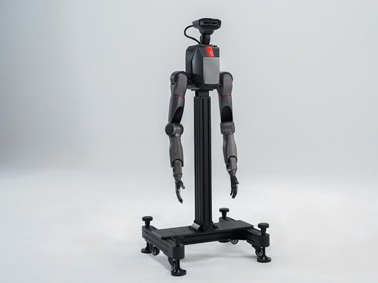
Mark Zuckerberg changed his company’s name to Meta in October 2021 because he believed the future was virtual. Not just sort-of virtual, like Instagram filters or Zoom calls, but capital-V Virtual: immersive 3D worlds where you’d work, socialize, and live a parallel digital life through a VR headset. Four years and roughly $70 billion in cumulative Reality Labs losses later, Meta is quietly dismantling that vision. In January 2026, the company laid off around 1,500 people from its metaverse division, shut down multiple VR game studios, killed its VR meeting app Workrooms, and effectively admitted that the grand bet on virtual reality had failed. Investors barely blinked. The stock went up.

The official line now is that Meta is pivoting to AI and wearables. Zuckerberg spent much of 2025 building what he calls a “superintelligence” lab, hiring top-tier AI talent with eye-watering compensation packages that are now one of the largest drivers of Meta’s 2026 expense growth. The company released Llama models that benchmark decently against OpenAI and Google, embedded chatbots into WhatsApp and Instagram, and talks constantly about “AI agents” and “new media formats.” But from a product and profit perspective, Meta’s AI strategy looks suspiciously like its metaverse strategy: lots of spending, vague promises, and no breakout consumer experience that people actually love. Meanwhile, the thing that is quietly working, the thing people are buying and using in the real world, is a pair of $300 smart glasses that Meta barely talks about. If this sounds like a pattern, that’s because it is. Meta has now misread the future twice in a row, and both times the answer was hiding in plain sight.

The Metaverse Was a $70 Billion Fantasy

Reality Labs has been hemorrhaging money since late 2020. As of early 2026, cumulative operating losses sit somewhere between $70 and $80 billion, depending on how you slice the quarters. In the third quarter of 2025 alone, Reality Labs posted a $4.4 billion loss on $470 million in revenue. For 2025 as a whole, the division lost more than $19 billion. These are not rounding errors or R&D investments that will pay off next year. These are structural losses tied to a product category, VR headsets and metaverse platforms, that the market simply does not want at the scale Meta imagined.

The vision sounded compelling in a keynote. You would strap on a Quest headset, meet your coworkers in a virtual conference room with floating whiteboards, then hop over to Horizon Worlds to hang out with friends as legless avatars. The problem was that almost no one wanted to do any of that for more than a demo. VR remained a niche gaming platform with occasional fitness and entertainment use cases, not the next paradigm shift in human interaction. Zuckerberg kept insisting the breakthrough was just around the corner. He was wrong, and the January 2026 layoffs and studio closures were the formal acknowledgment that Reality Labs as originally conceived was dead.

The irony is that Meta actually had a potential killer app inside Reality Labs, and it murdered it. Supernatural, a VR fitness game that Meta acquired for $400 million in 2023, was one of the few pieces of Quest software that generated genuine user loyalty and recurring revenue. People who used Supernatural regularly described it as the most effective home workout they had ever done, combining rhythm-based gameplay with full-body movement in a way that treadmills and Peloton bikes could not replicate. It had a subscription model, a dedicated community, and real retention. In January 2026, Meta moved Supernatural into “maintenance mode,” which is corporate speak for “we fired almost everyone and it will get no new content.” If you are trying to prove that VR has mainstream utility beyond gaming, fitness is one of the most obvious wedges. Meta had that wedge, and it chose to kill it in the same round of cuts that shuttered studios working on Batman VR games and other prestige titles. The message was clear: Zuckerberg had lost interest in Quest, even the parts that worked.

The AI Bet That Looks Like the ‘Metaverse Bust’ 2.0

After spending years insisting the future was virtual worlds, Meta pivoted hard to AI in 2023 and 2024. Zuckerberg now talks about AI the way he used to talk about the metaverse: with sweeping language about paradigm shifts and transformative platforms. The company stood up an AI division focused on building what it calls “superintelligence,” hired aggressively from OpenAI and Anthropic, and made technical talent compensation the second-largest contributor to Meta’s 2026 expense growth behind infrastructure. This is not a side project. Meta is spending billions on AI research, training, and deployment, and Zuckerberg expects losses to remain near 2025 levels in 2026 before they start to taper.

From a technical standpoint, Meta’s AI work is solid. The Llama family of models is legitimately competitive with GPT-4 class systems and has found real adoption among developers who want open-source alternatives to OpenAI and Google. Meta’s internal AI is also driving real business value in ad targeting, content ranking, and moderation. Those systems work, and they contribute directly to Meta’s core revenue. But from a consumer product perspective, Meta’s AI feels scattered and often unnecessary. The company has embedded “Meta AI” chatbots into WhatsApp, Instagram, Messenger, and Facebook, none of which feel like natural places for a chatbot. Instagram’s feed is increasingly stuffed with AI-generated images and engagement bait that users actively complain about. Meta has launched character-based AI bots tied to influencers and celebrities, and approximately no one uses them. The gap between “we have impressive models” and “we have a product people love” is enormous, and it is the exact same gap that sank the metaverse.

What Meta is missing, again, is product intuition. OpenAI built ChatGPT and made it feel like the future because the interface was simple, the use cases were obvious, and it delivered consistent value. Google integrated Gemini into Search and productivity tools where users were already working. Meta, by contrast, seems to be throwing AI at every surface it controls and hoping something sticks. Zuckerberg talks about “an explosion of new media formats” and “more interactive feeds,” which in practice means more algorithmic slop and fewer posts from people you actually know. Analysts are starting to notice. One Bernstein note from early 2026 argued that the “winner” criteria in AI is shifting from model quality to product usage, which is a polite way of saying that having a great model does not matter if your product is annoying. Meta has a great model. Its products are annoying.

The financial picture is also murkier than Meta would like to admit. Reality Labs is still losing close to $20 billion a year, and while AI is not a separate reporting segment, the talent and infrastructure costs are clearly rising. Meta’s overall revenue growth is strong, driven by advertising, but the company is not yet showing a clear path to AI profitability outside of ‘ad optimization’. That puts Meta in the awkward position of having pivoted from one unprofitable moonshot (metaverse) to another potentially unprofitable moonshot (consumer AI products) while the actual profitable parts of the business, social ads and engagement, keep the lights on. This is a pattern, and it is not a good one.

The Smart Glasses Lead That Meta Is Poised to Lose

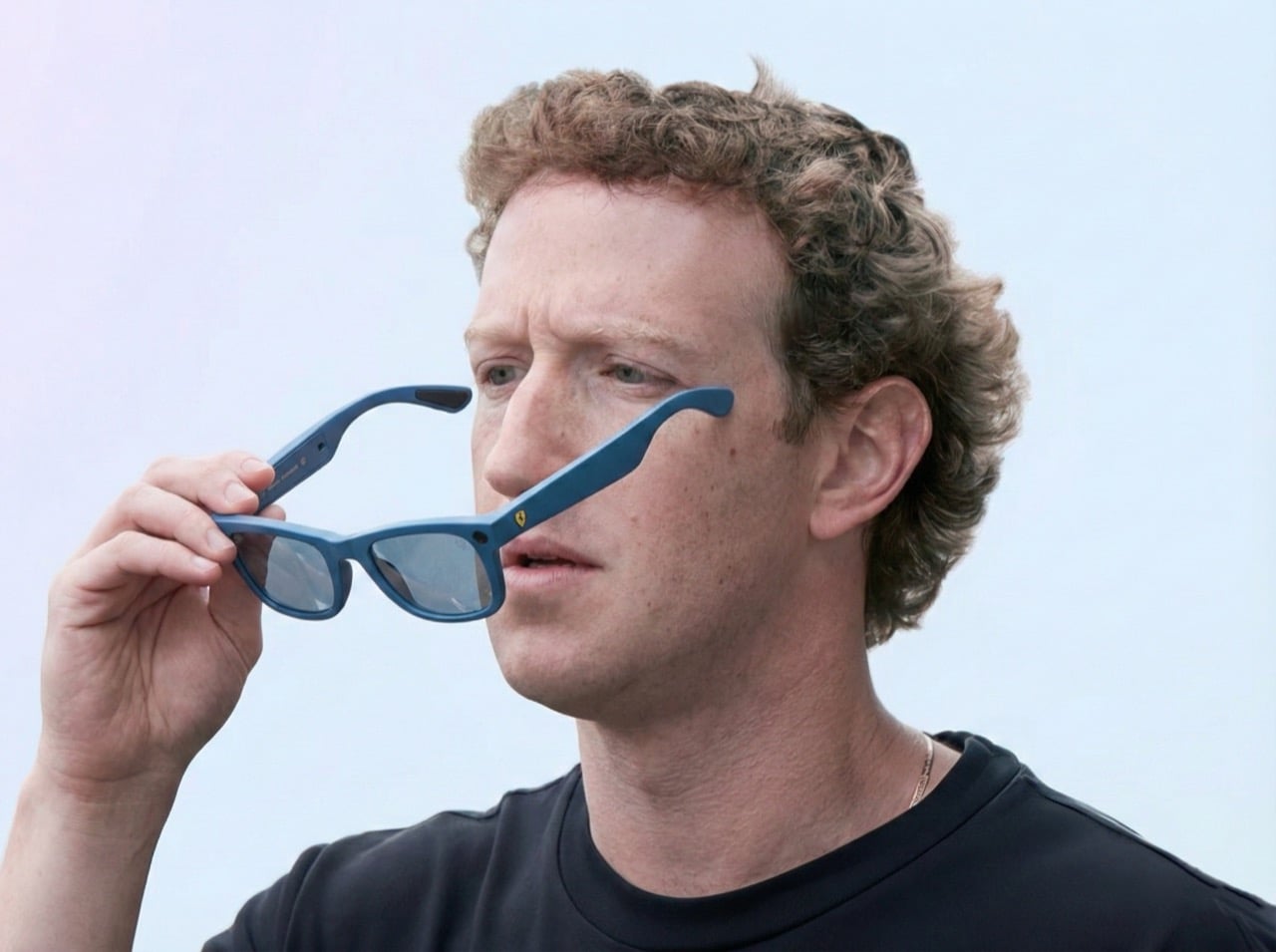
Meta talks about the Ray-Ban smart glasses constantly. Zuckerberg calls them the “ultimate incarnation” of the company’s AI vision, and the pitch is relentless: sales more than tripled in 2025, the glasses represent the future of ambient computing, this is the post-smartphone platform. The problem is not that Meta is ignoring the glasses. The problem is that Meta is about to squander a massive early lead, and the competition is closing in fast. 2026 is shaping up to be a blockbuster year for smart glasses. Samsung confirmed its AR glasses are launching this year. Google is releasing its first pair of smart glasses since 2013, an audio-only pair similar to the Ray-Ban Meta glasses. Apple is reportedly pursuing its own smart glasses and shelved plans for a cheaper Vision Pro to prioritize the project. Meta dominated VR because it was early, cheap, and had no real competition. In smart glasses, that window is closing fast, and the field is getting crowded with all kinds of names, from smaller players like Looktech and Xgimi’s Memomind to mid-sized brands like Xreal, to even larger ones like Google, TCL, and Xiaomi.

The Ray-Ban Meta glasses work because they are simple and focused. They take photos and videos, play music, make calls, and provide real-time answers through an AI assistant. Parents use them to record their kids hands-free. Travelers use them for translation. The form factor, actual Ray-Ban Wayfarers that cost around $300, means they do not scream “I am wearing a computer on my face.” This is the rare Meta hardware product that feels intuitive rather than forced, and it is selling because it solves boring, everyday problems without requiring users to change their behavior.

Then Meta made a critical mistake. To use the glasses, you have to route everything through the Meta AI app, which means you cannot just power-use the hardware without engaging with Meta’s AI-slop ecosystem. Want to access your photos? Meta AI. Want to tweak settings? Meta AI. The app is the mandatory gateway, and it is stuffed with the same kind of algorithmic recommendations and AI-generated suggestions that clutter Instagram and Facebook. Instead of letting the glasses be a clean, utilitarian tool, Meta is using them as another vector to push its AI products. Google and Samsung are not going to make that mistake. Their glasses will integrate with Android XR and existing ecosystems without forcing users into a single AI app. Apple, if and when it launches, will almost certainly take a similar approach: clean hardware, seamless OS integration, optional AI features. Meta had a head start, Ray-Ban branding, and a product people actually liked. It is on track to waste all of that by prioritizing AI evangelism over product discipline, and the competition is going to eat its lunch.

What Happens When You Chase Narratives Instead of Products

The pattern across metaverse and AI is that Meta keeps betting on big, abstract visions rather than iterating on the things that work. Zuckerberg is a narrative-driven founder. He wants to define the future, not respond to it. That impulse gave us Facebook in 2004, when no one else saw the potential of real-identity social networks, but it has led Meta astray repeatedly in the 2020s. The metaverse was a narrative, not a product. The idea that billions of people would strap on headsets to work and socialize in 3D was always more science fiction than product roadmap, but Zuckerberg committed so hard to it that he renamed the company.

AI feels like the same mistake. The narrative is that foundation models and “agents” will transform every part of computing, and Meta wants to be seen as a leader in that transformation. The actual products, chatbots in WhatsApp and AI-generated feed content, do not meaningfully improve the user experience and in many cases make it worse. Meanwhile, the thing that is working, smart glasses, does not fit cleanly into the AI or metaverse narrative, so it gets less attention and investment than it deserves. Meta’s 2026 strategy, “shifting investment from metaverse to wearables,” is a tacit admission of this, but it is couched in language that still emphasizes AI rather than the hardware itself.

The other pattern is that Meta is willing to kill its own successes if they do not fit the broader narrative. The hit VR fitness game on Meta’s Horizon, Supernatural, was working. It had subscribers, retention, and cultural momentum within the VR fitness community. It was also a relatively small, specific product rather than a platform play, and that made it expendable when Meta decided to scale back Reality Labs. The same logic applies to Quest more broadly. The headset had carved out a niche in gaming and fitness, and with sustained investment in content and ecosystem development, it could have grown into a meaningful adjacent business. Instead, Meta is deprioritizing it because Zuckerberg has decided the future is AI and lightweight wearables. That might turn out to be correct, but the way Meta is executing the pivot, by shuttering studios and putting products in maintenance mode rather than spinning them out or finding partners, suggests a lack of product discipline.

Why Smart Glasses Might Actually Be the Next Facebook

If you step back and ask what Meta is actually good at, the answer is not virtual reality or language models. Meta is good at building social products with massive scale, capturing and distributing content, and monetizing attention through ads. The Ray-Ban Meta glasses fit all of those strengths. They make it easier to capture photos and video, which feeds into Instagram and Facebook. They use AI to provide contextual information, which ties into Meta’s model development. And they are a physical product that people wear in public, which is a form of distribution and branding that Meta has never had before.

The bigger story is that smart glasses as a category are exploding, and Meta happened to be early. It is not just Samsung, Google, and Apple entering the space. Meta itself is expanding the Ray-Ban line with Displays (which adds a heads-up display) and partnering with Oakley on HSTN, a sportier model aimed at action sports. Google is teaming up with Warby Parker for its glasses, which gives it instant credibility in eyewear design. And then there are the startups: Even Realities, Xiaomi, Looktech, MemoMind, and dozens more, all slated for 2026 releases. This feels exactly like the moment AirPods sparked the true wireless earbud movement. Apple defined the format, then everyone from Samsung to Sony to no-name brands flooded the market, and now you can buy HMD ANC earbuds for 28 dollars. Smart glasses are following the same trajectory, which means the form factor itself is validated, and Meta’s early lead matters less than whether it can keep iterating faster than everyone else.

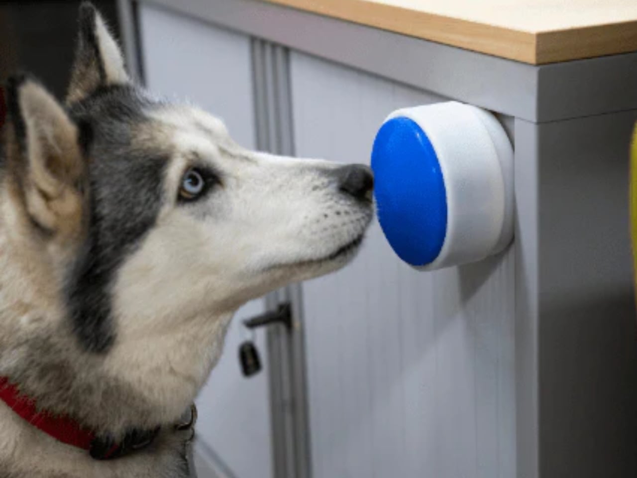
The other underrated piece is that having an instant camera on your face is genuinely useful in ways that VR headsets never were. People are using Ray-Ban Meta glasses as GoPro alternatives while skateboarding, cycling, and doing action sports, because POV capture without holding a phone or mounting a camera is frictionless. Content creators are using them to shoot hands-free B-roll at events like CES. Parents are using them to record their kids playing without the weird “I am holding my phone up at the playground” vibe. Pet owners are capturing spontaneous moments with dogs and cats that would be impossible to get with a phone. These are not sci-fi use cases or metaverse fantasies. They are boring, real-world problems that the glasses solve immediately, and that is why they are selling. Meta has spent a decade chasing grand visions of the future, and it accidentally built a product that people want right now. The challenge is whether it can resist the urge to over-complicate it before Google, Samsung, and Apple catch up.

The Real Lesson Is About Focus

Meta has spent the last five years oscillating between grand visions, metaverse and AI, and neglecting the products that actually work. The Ray-Ban Meta glasses are proof that when Meta focuses on solving real problems with tangible products, it can still build things people want. The metaverse failed because it was a solution in search of a problem, and the AI push is struggling because Meta is shipping features rather than products. Smart glasses, by contrast, are succeeding because they make everyday tasks easier without requiring users to change their behavior or buy into a futuristic narrative.

If Zuckerberg can internalize that lesson, Meta might actually have a shot at owning the next platform. But that requires a level of product discipline and restraint that Meta has not shown in years. It means resisting the urge to turn every product into a platform, admitting when a bet has failed rather than pouring another $10 billion into it, and focusing on iteration over narration. The irony is that Meta already has the right product. It just needs to stop looking past it.

The post Meta Misread the Future Twice. Now They’re Sitting on a Golden Egg, But Don’t Know It first appeared on Yanko Design.

This palm-sized desktop vacuum combo keeps your setup squeaky clean

Par : Gaurav Sood
31 janvier 2026 à 01:30

Believe you me, desk setups look amazing when you have all the gadgets and accessories in place. Some days down the line, that squeaky clean look fades away as dust settles in, food crumbs scatter around, water spots look ugly, and human skin and hair shed. That isn’t a very pretty sight when you kick off your work in the morning. Not for me atleast, as I like to clean my desk first thing before starting off my creative journey.

A small gadget that can automate that cleaning regime is a welcome addition, getting things ready even before you get up in the morning. Meet Vacy, a desktop vacuum cleaner designed to be a palm-sized accessory, working in stealth mode to get your desktop setup in pristine condition every single day without any fails. If that’s not enough, the Mopy mini robot washer gives a second treatment of cleaning, just like your home floors do each day.

Designer: Aleksandr Misiukevich

Both pocketable accessories can be carried along easily for portability and deployed on demand. For a guy like me who works in multiple work setups, that is a good feature to have. The Vacy vacuum cleaner sucks debris from the bottom and collects it inside the safe compartment. Once full, you can push the lid to take out all the trash. The indicators on the top show the current battery level, and once the battery level drops below 20 percent, the palm-sized vac returns to the charging dock. The edges of the desk are no problem, as the robo vac comes with a Cliff sensor to stop and turn in the other direction. Vacy can suck objects smaller than 2 cm; meaning hair, crumbs, pet fur, and office stationery like pins get sucked right in.

The second one is my favorite, just because of the unique idea. Mopy mini robot vacuum cleaner gets rid of all those pesky spots on the surface for an instant fresh look. It has an opening on top to fill the water compartment and a long-pile cleaning replaceable pad at the bottom to get the job done. Just like its brother Vacy, the mopping vac returns to its charging dock once the charge levels drop below 20 percent. Be it water droplets, coffee stains, sugary liquids, or fine dust crumbs; the vac makes quick work of everything.

In tandem, the robot vacs clean the nooks and corners of your desk, normally left unattended by the normal cleaning. The concept sounds interesting, but would it have many takers? I’m not sure everyone has an obsessive-compulsive disorder for cleanliness.

The post This palm-sized desktop vacuum combo keeps your setup squeaky clean first appeared on Yanko Design.

À partir d’avant-hierYanko Design

Aerospace Engineers Just Solved Your Messy Nightstand Problem

Par : Ida Torres
22 décembre 2025 à 14:20

You know that thing where you walk into your bedroom at the end of the day and just start emptying your pockets onto whatever flat surface is closest? Keys land on the dresser, wallet gets tossed on the nightstand, watch goes who knows where. It’s a universal ritual of coming home, and it’s exactly the kind of everyday moment that aerospace engineers Javier De Andrés García and Anaïs Wallet decided to redesign.

Their brand, Unavela, takes the precision and intentionality of aerospace engineering and applies it to the mundane objects we interact with daily. The Unavela Valet Tray is a perfect example of this philosophy: it’s a catchall that doesn’t just catch, it elevates the entire experience of organization into something that feels considered and purposeful.

Designers: Javier De Andrés García, Anaïs Wallet (Unavela)

What makes this particularly interesting is the design pedigree behind it. De Andrés García and Wallet aren’t your typical product designers who sketch pretty shapes and call it a day. They come from a world where every gram matters, where form follows function with almost religious devotion, and where materials are chosen based on performance characteristics rather than trends. When aerospace engineers decide to make a tray for your keys, you can bet they’ve thought about it differently than everyone else.

The valet tray sits in that sweet spot between utilitarian and beautiful. It’s not trying to disappear into your decor, nor is it screaming for attention. Instead, it occupies space with quiet confidence, the way really good design tends to do. Think of it as the functional equivalent of that friend who just makes everything run more smoothly without making a big deal about it.

Valet trays themselves have an interesting history. Originally, they were the domain of well-appointed gentleman’s dressers, a place to organize pocket watches, cufflinks, and collar stays. But in our modern world of smartphones, AirPods, car key fobs, and whatever else we’re carrying, the valet tray has become even more relevant. We might not wear pocket watches anymore, but we’ve got more stuff to keep track of than ever before.

What Unavela brings to this category is a fresh perspective. When you look at their work across different products, you see a consistent thread: they’re interested in what they call “functional objects.” Not decorative objects that happen to be functional, but pieces where the function itself becomes the aesthetic statement. It’s a subtle but important distinction. The beauty comes from how well something works, not from applied decoration or styling tricks.

This approach feels particularly resonant right now. We’re living in an era where people are increasingly interested in buying fewer, better things. The whole concept of everyday carry (EDC) has evolved from a niche hobby into a broader cultural conversation about intentionality and quality. People are thinking more carefully about the objects they interact with daily, and they want those objects to reflect thoughtfulness and care. The Unavela Valet Tray fits perfectly into this mindset. It’s not fast furniture or disposable decor. It’s a considered piece that’s designed to be used daily and to improve with that use. There’s something deeply satisfying about having a designated spot for your everyday items, about the ritual of emptying your pockets into a tray that was designed specifically for that purpose.

From a design perspective, what’s compelling is how Unavela bridges the gap between industrial design and consumer products. Aerospace engineering isn’t typically associated with home goods, but maybe it should be. After all, if you can design components for aircraft where failure isn’t an option and weight is critical, you probably have some interesting insights about how to make a really excellent tray. The beauty of good design is that it often looks simple, even inevitable, but that simplicity is the result of countless decisions and refinements. Every angle, every dimension, every material choice has been considered. It’s the difference between something that works and something that works exceptionally well.

For anyone interested in design, tech, or the intersection of engineering and everyday life, the Unavela Valet Tray represents something larger than just a place to put your keys. It’s a statement about bringing rigor and intentionality to the objects we live with. It’s about applying aerospace-level thinking to earthbound problems. And honestly, in a world full of stuff that’s designed to be replaced rather than cherished, that’s a pretty refreshing approach.

The post Aerospace Engineers Just Solved Your Messy Nightstand Problem first appeared on Yanko Design.

5 Travel Essentials Every Last-Minute 2025 Traveler Regrets Forgetting

22 décembre 2025 à 13:15

There’s a particular kind of panic that sets in about thirty minutes before you need to leave for the airport. You’ve thrown clothes into a suitcase, triple-checked your passport, and convinced yourself that you’ve packed everything important. Then you arrive at your destination and realize you’ve brought three chargers for devices you don’t own but somehow forgot the one thing that would’ve made your entire trip better. Last-minute travel has a way of exposing what truly matters versus what we think we need.

The beauty of spontaneous trips lies in their unpolished edges, but that doesn’t mean you should suffer through bad coffee, tangled headphone cords, or eating with your hands because the airline meal came with a flimsy plastic fork that snapped on contact. The difference between a trip you remember fondly and one you spent complaining about comes down to a handful of well-chosen essentials that solve real problems. These five designs represent the kind of thoughtful gear that takes up minimal space but delivers maximum impact when you need it most.

1. Nikon 4x10D CF Pocket Binoculars

Binoculars feel like relics from another era, the kind of thing your grandfather kept in a leather case that smelled faintly of pipe tobacco. Nikon’s 4x10D CF pocket binoculars challenge that entire perception by shrinking the form factor down to something that actually fits in your pocket without creating an awkward bulge. These aren’t meant to compete with your smartphone’s digital zoom or replace professional birding equipment. They exist in a different category entirely, prioritizing the experience of optical viewing over pixel counts and processing power.

The genius lies in recognizing that people don’t carry traditional binoculars because they’re too bulky and conspicuous. Nikon solved that problem by creating something so discreet it almost disappears. The optical quality remains surprisingly sharp for such a compact device, delivering a viewing experience that feels immediate and artifact-free. Whether you’re trying to read a distant street sign in an unfamiliar city or want a closer look at architectural details without looking like a tourist with professional gear, these slip into your travel kit without demanding dedicated space or special protection.

What we like

• The form factor makes them genuinely pocketable, solving the primary reason people don’t carry binoculars.

• Optical viewing delivers a tactile, immediate experience that digital zoom can’t replicate.

• The updated colorways transform them from technical equipment into an accessory you want to carry.

• Multiple uses, from reading transit signs to appreciating distant landscapes without looking conspicuous.

What we dislike

• The 4x magnification is modest compared to traditional binoculars, limiting long-distance viewing.

• The compact size means smaller objective lenses, reducing light-gathering capability in low-light conditions.

2. StillFrame Headphones

Air travel has become an endurance test for your ears. Between engine noise, crying babies, and the passenger next to you who insists on watching action movies without headphones until a flight attendant intervenes, you need something that creates a barrier between you and chaos. StillFrame wireless headphones approach this problem with a design philosophy borrowed from a time when music felt like a deliberate choice rather than background noise. The aesthetic draws from compact disc geometry, creating a visual language that feels refreshingly analog in an aggressively digital world.

Weighing just 103 grams, these headphones occupy a middle ground between intrusive over-ear designs and in-ear buds that always seem to fall out at the worst possible moment. The 40mm drivers create a soundstage that gives music room to breathe, which matters when you’re spending hours in compressed airplane cabins where everything feels claustrophobic. The combination of active noise cancelling and transparency mode means you can shift between complete isolation and situational awareness without removing them. That flexibility proves essential when navigating unfamiliar airports or wanting to hear boarding announcements without sacrificing your peace during the actual flight.

Click Here to Buy Now: $245.00

What we like

• The 24-hour battery life eliminates anxiety about running out of power mid-journey.

• Magnetic fabric ear cushions swap easily, giving you color options that match different moods.

• Dual connectivity through Bluetooth 5.4 and USB-C cable offers wireless freedom or wired stability.

• The exposed circuit board aesthetic celebrates the technology rather than hiding it behind plastic shells.

What we dislike

• The on-ear design may cause discomfort during extremely long flights compared to over-ear alternatives.

• The fashion-forward aesthetic might not appeal to travelers who prefer more conventional headphone designs.

3. 0.25 oz Aero Spork

There’s something deeply frustrating about packing perfectly good food for a trip only to realize you have nothing reasonable to eat it with. Plastic cutlery snaps under minimal pressure, full-sized metal utensils add unnecessary weight, and trying to eat noodles with a standard spoon requires patience most travelers don’t have after a long day. The Aero Spork weighs less than a quarter of an ounce but manages to feel substantial enough to handle actual meals. That combination of minimal weight and genuine utility makes it the kind of item that earns permanent residence in your travel kit.

The ergonomic curve gives you a secure grip even when your hands are cold or wet, while the tapered design specifically addresses the noodle-eating problem that plagues travelers across Asia and increasingly everywhere else. The stackable design means you can carry multiple sporks without them taking up more space than a single standard utensil. This becomes relevant when you’re traveling with others or want a backup. The durability factor matters more than you’d expect; these survive being tossed into bags, stepped on accidentally, and subjected to the kind of casual abuse that destroys lesser travel utensils within weeks.

Click Here to Buy Now: $19.95

What we like

• The 7-gram weight makes it lighter than most travel accessories you’ll forget you’re carrying.

• Stackable design solves the multi-person dining situation without requiring a full cutlery set.

• The tapered shape genuinely improves noodle-eating, addressing a specific and common travel challenge.

• Metal construction means it lasts indefinitely, unlike disposable or plastic alternatives.

What we dislike

• The hybrid spoon-fork design means neither side works quite as well as a dedicated utensil.

• Cleaning can be tricky in the field without proper access to soap and water.

4. MokaMax Portable Coffee Maker

Hotel coffee represents a special category of disappointment. It tastes like regret mixed with lukewarm water, extracted from pods that somehow cost three dollars each. Even when you find a decent café, you’re either waiting in line behind seventeen people who each ordered customized drinks with five modifications, or you’re drinking something that went cold during your walk back to your hotel. MokaMax addresses this problem by building a legitimate pressure-brewing system into a form factor that looks like a standard travel mug. The ridged stainless steel body provides a secure grip while reinforcing the rugged, outdoor-ready aesthetic.

The design spent considerable effort getting those ridges right, balancing functional grip with comfortable handling and visual interest. The flexible rope attachment transforms it from just another mug into something that clips onto backpacks or hangs from hooks, integrating into your mobile gear rather than requiring dedicated carrying. The key advantage over simply buying coffee everywhere you go is consistency and timing. You control the strength, temperature, and exact moment you brew. That autonomy matters when you’re dealing with jet lag and need coffee at 4 AM when nothing is open, or when you’re hiking and want something better than instant crystals dissolved in lukewarm water.

What we like

• The pressure-brewing system delivers espresso-style coffee without electricity or complex equipment.

• Single-vessel design eliminates the need to carry separate brewing and drinking containers.

• Ridged stainless steel construction provides grip and durability for genuine outdoor use.

• The rope attachment integrates it into your travel gear ecosystem rather than requiring dedicated space.

What we dislike

• The brewing process takes longer than simply buying coffee if you’re in an area with good options.

• Cleaning requires more attention than a standard travel mug, especially after brewing dark roasts.

5. Craftmaster EDC Utility Knife

Most travelers don’t think they need a utility knife until they’re standing in a hotel room trying to open packaging with their keys, teeth, or increasingly desperate improvisation. The Craftmaster EDC utility knife occupies just 8mm of thickness and 12cm of length, making it slim enough to slip into pockets, bags, or organizer pouches without creating bulk. The metallic construction gives it heft that feels reassuring rather than burdensome, while the rotating knob deployment mechanism adds a tactile satisfaction that pure functionality doesn’t require but somehow makes the tool more enjoyable to use.

The magnetic back serves double duty by letting you dock the knife on any metal surface and providing a home for the companion metal scale. That scale includes both metric and imperial measurements, a raised edge for easy pickup, and a blade-breaker for maintaining the OLFA blade’s sharpness. The 15-degree curvature protects your fingers during cutting tasks, while the 45-degree inclination helps with opening boxes without damaging contents. These details transform a basic utility knife into something that solves multiple problems, from precise measuring for emergency clothing repairs to clean package opening without destroying whatever’s inside.

Click Here to Buy Now: $79.00

What we like

• The 8mm thickness makes it genuinely pocketable without the bulk of traditional utility knives.

• Magnetic docking turns any metal surface into convenient storage, preventing loss in hotel rooms.

• The included ruler with blade-breaker combines multiple functions without requiring separate tools.

• OLFA blades are replaceable and widely available, extending the knife’s useful life indefinitely.

What we dislike

• The minimalist metal design lacks texture that could improve grip in wet conditions.

• Airport security restrictions mean it needs to go in checked luggage, limiting accessibility during travel days.

Why These Five Items Matter for Last-Minute Travel

The connecting thread between these designs is that they solve specific problems while occupying minimal space and requiring almost no learning curve. You don’t need an instruction manual, a YouTube tutorial, or previous experience. They work immediately and continue working reliably. That reliability becomes essential when you’re already dealing with the stress of spontaneous travel, unfamiliar locations, and the general chaos that comes from not having time to plan properly.

The other advantage is that none of these items are single-use solutions. Pocket binoculars serve navigation, sightseeing, and practical reading purposes. Headphones deliver both entertainment and environmental control. A quality spork handles any meal situation. The portable coffee maker works everywhere from mountain peaks to hotel rooms. The utility knife solves dozens of cutting, measuring, and opening challenges. That versatility means carrying five items gives you solutions to dozens of potential problems, which is exactly the kind of efficiency last-minute travelers need most.

The post 5 Travel Essentials Every Last-Minute 2025 Traveler Regrets Forgetting first appeared on Yanko Design.

This Case Fixes iPhone’s Weak Selfie Camera with a Second Screen

Par : JC Torres
22 décembre 2025 à 11:07

The iPhone’s rear cameras keep getting better, but selfies still rely on a smaller, lower-resolution front sensor, and storage upgrades cost considerably more than a microSD card. People who shoot a lot of photos and video feel squeezed on both fronts, choosing between spending hundreds on internal storage or dealing with blurry front-camera selfies. Selfix is a case for the iPhone 17 Pro that tackles both problems at once.

Selfix is a case for the iPhone 17 Pro and Pro Max that adds a circular 1.6-inch AMOLED screen to the back and hides a microSD slot inside. The rear screen acts as a tiny viewfinder so you can use the 48 MP rear cameras for selfies, while the card slot lets you add up to 2 TB of storage without touching Apple’s upgrade menu or monthly cloud fees.

Designer: Selfix

The rear display mirrors the camera view so you can frame yourself, adjust in real time, and pick any of the rear lenses, from ultra-wide group shots to telephoto portraits. You get the main sensor’s larger 1/1.28-inch glass, Night Mode, and up to 8× optical zoom for selfies, instead of guessing with a cropped front camera and hoping everyone fits into the narrower field of view.

Selfix connects through the phone’s USB-C port and does not need a separate app. You snap the case on, open the camera, and the rear screen wakes up. A dedicated button on the case lets you turn the display off when you are not using it to save battery. The idea is to feel like a built-in second screen, not another gadget that needs pairing, permissions, and a drawer full of instructions.

The case includes a microSD slot that supports cards up to 2 TB, using the same USB-C connection to integrate with the phone. A 512 GB card costs around $50, while Apple’s $200 jump for the same capacity makes swappable storage a compelling alternative. Heavy shooters can archive trips or projects without paying monthly cloud fees or deleting older work to make room for new sessions.

Selfix is made from high-quality TPU and comes in Oat White, Blush Pink, and Midnight Black, sized to match the 17 Pro and Pro Max. It adds some thickness, bringing the total to 17mm, but in return, you get a grippy shell, a second screen, and a hidden storage bay. The design aims to look like a natural extension of the phone rather than a bolt-on camera rig or accessory that screams afterthought.

Selfix is aimed at people who care enough about image quality to use the rear cameras for everything, and who are tired of juggling storage or paying the upgrade tax. A case that quietly turns the iPhone into a dual-screen shooter with expandable memory makes you wonder why the phone did not ship this way, especially when the rear cameras already outclass the front by a significant margin, and storage remains artificially expensive.

The post This Case Fixes iPhone’s Weak Selfie Camera with a Second Screen first appeared on Yanko Design.

This $2,899 Desktop AI Computer With RTX 5090M Lets You Cancel Every AI Subscription Forever

Par : Sarang Sheth
22 décembre 2025 à 02:45

Look across the history of consumer tech and a pattern appears. Ownership gives way to services, and services become subscriptions. We went from stacks of DVDs to streaming movies online, from external drives for storing data and backups to cloud drives, from MP3s on a player to Spotify subscriptions, from one time software licenses to recurring plans. But when AI arrived, it skipped the ownership phase entirely. Intelligence came as a service, priced per month or per million tokens. No ownership, no privacy. Just a $20 a month fee.

A device like Olares One rearranges that relationship. It compresses a full AI stack into a desktop sized box that behaves less like a website and more like a personal studio. You install models the way you once installed apps. You shape its behavior over time, training it on your documents, your archives, your creative habits. The result is an assistant that feels less rented and more grown, with privacy, latency, and long term cost all tilting back toward the owner.

Designer: Olares

Click Here to Buy Now: $2,899 $3,999 (28% off) Hurry! Only 15/320 units left!

The pitch is straightforward. Take the guts of a $4,000 gaming laptop, strip out the screen and keyboard, put everything in a minimalist chassis that looks like Apple designed a chonky Mac mini, and tune it for sustained performance instead of portability. Dimensions are 320 x 197 x 55mm, weighs 2.15 kg without the PSU, and the whole package pulls 330 watts under full load. Inside sits an Intel Core Ultra 9 275HX with 24 cores running up to 5.4 GHz and 36 MB of cache, the same chip you would find in flagship creator laptops this year. The GPU is an NVIDIA GeForce RTX 5090 Mobile with 24 GB of GDDR7 VRAM, 1824 AI TOPS of tensor performance, and a 175W max TGP. Pair that with 96 GB of DDR5 RAM at 5600 MHz and a PCIe 4.0 NVMe SSD, and you have workstation level compute in a box smaller than most soundbars.

Olares OS runs on top of all that hardware, and it is open source, which means you can audit the code, fork it, or wipe it entirely if you want. Out of the box it behaves like a personal cloud with an app store containing over 200 applications ready to deploy with one click. Think Docker and Kubernetes, but without needing to touch a terminal unless you want to. The interface looks clean, almost suspiciously clean, like someone finally asked what would happen if you gave a NAS the polish of an iPhone. You get a unified account system so all your apps share a single login, configurable multi factor authentication, enterprise grade sandboxing for third party apps, and Tailscale integration that lets you access your Olares box securely from anywhere in the world. Your data stays on your hardware, full stop.

I have been tinkering with local LLMs for the past year, and the setup has always been the worst part. You spend hours wrestling with CUDA drivers, Python environments, and obscure GitHub repos just to get a model running, and then you realize you need a different frontend for image generation and another tool for managing multiple models and suddenly you have seven terminal windows open and nothing talks to each other. Olares solves that friction by bundling everything into a coherent ecosystem. Chat agents like Open WebUI and Lobe Chat, general agents like Suna and OWL, AI search with Perplexica and SearXNG, coding assistants like Void, design agents like Denpot, deep research tools like DeerFlow, task automation with n8n and Dify. Local LLMs include Ollama, vLLM, and SGIL. You also get observability tools like Grafana, Prometheus, and Langfuse so you can actually monitor what your models are doing. The philosophy is simple. String together workflows that feel as fluid as using a cloud service, except everything runs on metal you control.

Gaming on this thing is a legitimate use case, which feels almost incidental given the AI focus but makes total sense once you look at the hardware. That RTX 5090 Mobile with 24 GB of VRAM and 175 watts of power can handle AAA titles at high settings, and because the machine is designed as a desktop box, you can hook it up to any monitor or TV you want. Olares positions this as a way to turn your Steam library into a personal cloud gaming service. You install your games on the Olares One, then stream them to your phone, tablet, or laptop from anywhere. It is like running your own GeForce Now or Xbox Cloud Gaming, except you own the server and there are no monthly fees eating into your budget. The 2 TB of NVMe storage gives you room for a decent library, and if you need more, the system uses standard M.2 drives, so upgrades are straightforward.

Cooling is borrowed from high end laptops, with a 2.8mm vapor chamber and a 176 layer copper fin array handling heat dissipation across a massive 310,000 square millimeter surface. Two custom 54 blade fans keep everything moving, and the acoustic tuning is genuinely impressive. At idle, the system sits at 19 dB, which is whisper quiet. Under full GPU and CPU load, it climbs to 38.8 dB, quieter than most gaming desktops and even some laptops. Thermal control keeps things stable at 43.8 degrees Celsius under sustained loads, which means you can run inference on a 70B model or render a Blender scene without the fans turning into jet engines. I have used plenty of small form factor PCs that sound like they are preparing for liftoff the moment you ask them to do anything demanding, so this is a welcome change.

RAGFlow and AnythingLLM handle retrieval augmented generation, which lets you feed your own documents, notes, and files into your AI models so they can answer questions about your specific data. Wise and Files manage your media and documents, all searchable and indexed locally. There is a digital secret garden feature that keeps an AI powered local first reader for articles and research, with third party integration so you can pull in content from RSS feeds or save articles for later. The configuration hub lets you manage storage, backups, network settings, and app deployments without touching config files, and there is a full Kubernetes console if you want to go deep. The no CLI Kubernetes interface is a big deal for people who want the power of container orchestration but do not want to memorize kubectl commands. You get centralized control, performance monitoring at a glance, and the ability to spin up or tear down services in seconds.

Olares makes a blunt economic argument. If you are using Midjourney, Runway, ChatGPT Pro, and Manus for creative work, you are probably spending around $6,456 per year per user. For a five person team, that balloons to $32,280 annually. Olares One costs $2,899 for the hardware (early-bird pricing), which breaks down to about $22.20 per month per user over three years if you split it across a five person team. Your data stays private, stored locally on your own hardware instead of floating through someone else’s data center. You get a unified hub of over 200 apps with one click installs, so there are no fragmented tools or inconsistent experiences. Performance is fast and reliable, even when you are offline, because everything runs on device. You own the infrastructure, which means unconditional and sovereign control over your tools and data. The rented AI stack leaves you as a tenant with conditional and revocable access.

Ports include Thunderbolt 5, RJ45 Ethernet at 2.5 Gbps, USB A, and HDMI 2.1, plus Wi-Fi 7 and Bluetooth 5.4 for wireless connectivity. The industrial design leans heavily into the golden ratio aesthetic, with smooth curves and a matte aluminum finish that would not look out of place next to a high end monitor or a piece of studio equipment. It feels like someone took the guts of a $4,000 gaming laptop, stripped out the compromises of portability, and optimized everything for sustained performance and quietness. The result is a machine that can handle creative work, AI experimentation, gaming, and personal cloud duties without breaking a sweat or your eardrums.

Olares One is available now on Kickstarter, with units expected to ship early next year. The base configuration with the RTX 5090 Mobile, Intel Core Ultra 9 275HX, 96 GB RAM, and 2 TB SSD is priced at a discounted $2,899 for early-bird backers (MSRP $3,999). That still is a substantial upfront cost, but when you compare it to the ongoing expense of cloud AI subscriptions and the privacy compromises that come with them, the math starts to make sense. You pay once, and the machine is yours. No throttling, no price hikes, no terms of service updates that quietly change what the company can do with your data. If you have been looking for a way to bring AI home without sacrificing capability or convenience, this is probably the most polished attempt at that idea so far.

Click Here to Buy Now: $2,899 $3,999 (28% off) Hurry! Only 15/320 units left!

The post This $2,899 Desktop AI Computer With RTX 5090M Lets You Cancel Every AI Subscription Forever first appeared on Yanko Design.

How Coca Cola’s Benny Lee Is Redefining Industrial Design as Storytelling, Not Just “Making Products”

Par : Sarang Sheth
22 décembre 2025 à 00:30

Design Mindset steps into episode 16 with a clear purpose: to understand how industrial designers are navigating a world where tools, platforms, and expectations keep shifting under their feet. Yanko Design’s weekly podcast, Design Mindset, powered by KeyShot, is less about design celebrity and more about design thinking, unpacking how decisions get made, how stories are built around products, and how technology is reshaping the craft from the inside out. Each week, a new episode premieres with designers who are actively pushing workflows, visuals, and experiences into new territory.

This episode features Benny Lee, Senior Design Manager of Technology and Strategic Partnerships at The Coca-Cola Company, and a practitioner who moves comfortably between mass production, digital ecosystems, and even film props. Trained as an industrial designer, Benny started at Coke in a traditional ID role while also leading visualization, bringing advanced 3D rendering into a company that was still heavily reliant on Photoshop and 2D assets. He now sits at the intersection of heritage and innovation, helping a 140 year old brand adopt real time visualization, AI, and new storytelling platforms without losing what makes Coca-Cola recognizable everywhere.

Download your Free Trial of KeyShot Here

Storytelling as the real job of industrial design

Benny treats industrial design as a storytelling discipline first and a styling discipline second. His training spans sketching, 3D modeling, rendering, and prototyping, but he frames each of these as a narrative tool rather than a technical checkpoint. Sketches, CAD, and renders exist to show what a product does, how it behaves, and how it should feel to use, not just how it looks on a white background.

Inside a large organization, that narrative focus becomes practical very quickly. He puts it plainly in the conversation: “Storytelling as an ID, you know, is important because it’s all about bringing this visual alignment of the actual product when you’re trying to get a buy in to sell in.” The job is to reach a point where the design communicates its intent on its own, without the designer in the room. Call to action areas, material breaks, and even lighting choices in a render become part of that silent story, aligning stakeholders around what the product is supposed to be.

When rendering becomes a thinking tool, not just a final output

When Benny joined Coca-Cola, much of the visualization work sat in a 2D world. Concepts were often built through Photoshop and static compositions, heavily intertwined with graphic design. He talks about the shift he helped drive quite directly: “I find it really quite an honor and a pleasure that I was able to bring 3D renderings into the practice here.” That move to 3D was not just about realism, it was about adding depth to how ideas are explored and communicated.

The key change is that rendering is no longer treated as the last step before a presentation. Tools like KeyShot become part of the exploration loop. Benny uses quick CAD setups and fast render passes to test light, material, and even simple motion, and to storyboard how a product opens, glows, or reacts in context. He describes this as a way to “fail fast, iterate faster,” and he underlines that “we don’t always just use renderings to create pretty visuals and a lot of times we’re using it to build new experience.” Visualization turns into a thinking environment, especially valuable when physical labs and prototypes are slow or limited.

Respecting a 140 year old brand while pushing it into new arenas

Designing at Coca-Cola means working around a product that barely changes. The formula in the bottle remains constant, so innovation happens in the ecosystem that surrounds it. Packaging systems, retail touchpoints, digital layers, and immersive experiences become the canvas where design can move, while the core product stays familiar.

Benny describes his role with a custodian mindset. He imagines the brand as a skyscraper built over generations, and his work as adding “layers of bricks” rather than ripping out foundations. That perspective shows up in how Coca-Cola experiments with new platforms. The company explores metaverse activations, NFTs, experiential installations, and AI driven storytelling, not as disconnected stunts but as new ways to retell the same product story for new audiences. The strategy, as he frames it, is to adapt the ecosystem and technology “to retell the product’s story” while staying true to the brand’s core character.

Mass production versus one off film props

Benny’s portfolio stretches across lifestyle accessories, consumer electronics, and concept work for films like the Avengers. On the surface, the process for these domains begins similarly, with sketching, modeling, and rendering. The divergence appears when the work hits reality. In consumer products, industrial design is tied to mass production, with all the constraints of tooling, factory collaboration, golden samples, logistics, and long term durability.

Film work operates under a different set of pressures. Concept art might start in tools like ZBrush with exaggerated, dramatic forms that look incredible on screen but are not remotely manufacturable in a traditional sense. Benny’s responsibility in those situations is to respect the creative vision while making it buildable. Props do not have to scale to millions of units. They have to survive a shoot and read correctly on camera. If one breaks, it can be rebuilt. That freedom shifts what is possible in form and material, but the throughline is still storytelling, captured in a few seconds of screen time instead of years of daily use.

Adapting to an ever expanding toolset without losing your core

Throughout the episode, Benny returns to the pace of change in design tools. Skills that were once specialized are now table stakes. Students are graduating with exposure to UI and UX, electronics integration, and AI enhanced workflows. He notes that “you have to wear so many hats,” and points out that traditional industrial design is becoming a “rare breed” precisely because the field has branched into web, mobile, service, and emerging tech work.

His response is not to chase mastery of every new tool, but to understand what each category can do and to build teams around that understanding. He emphasizes hiring people who are better than you at specific domains and managing the mix of skills rather than guarding personal expertise. In parallel, he argues that adaptation is now the most important traditional trait. The designers who thrive will be the ones who stay resilient, keep a story first mindset, and move fluidly between CAD, KeyShot, AI, and whatever comes next, while still grounding their decisions in how things work in the real world.


Design Mindset, powered by KeyShot, returns every week with conversations like this, tracing the connection between how designers think, the tools they use, and the work they put into the world. Episode 6 with Reid Schlegel leaves you with a simple, practical challenge: see your ideas sooner, in more ways, and with less fear of being imperfect.

Download your Free Trial of KeyShot Here

The post How Coca Cola’s Benny Lee Is Redefining Industrial Design as Storytelling, Not Just “Making Products” first appeared on Yanko Design.

3D-Printed Tiny Home Cuts Build Time in Half and Challenges Luxembourg’s Housing Crisis

Par : Tanvi Joshi
21 décembre 2025 à 23:30

In Niederanven, a quiet commune east of Luxembourg City, a small concrete dwelling is rewriting expectations for housing innovation. Designed by ODA Architects in collaboration with Coral Construction Technologies, Tiny House LUX is the nation’s first fully 3D-printed residence, a test case in using robotic fabrication to deliver faster, cheaper, and more energy-efficient homes. At just 47 square meters of usable space, the structure is modest, but the architectural ambitions behind it are anything but small.

Created to address Luxembourg’s ongoing housing shortage, the home was printed in less than 28 hours per phase, an extraordinary reduction in build time compared to conventional masonry or timber construction. The speed is significant in a country where demand vastly outpaces supply: Luxembourg needs approximately 7,000 new apartments each year, yet only under 4,000 are completed. This imbalance fuels some of the highest housing costs in Europe. A 47 m² apartment in the capital can exceed €560,000, while the estimated price of the 3D-printed prototype is roughly one-third less, a difference that begins to make entry-level housing more attainable.

Designer: ODA Architects

Energy performance is central to the project’s value. Solar panels on the roof generate enough electricity to power daily usage, while a film-based underfloor heating system removes the need for water pipes, radiators, or boilers. After printing, the walls are packed with insulation made from low-impact materials to minimize long-term energy consumption. The architects emphasize simplicity: systems that are easy to run, maintain, and repair over the life of the home rather than engineering complexity that becomes costly later.

Inside, the layout is intentionally straightforward for efficient living. A small south-facing entrance leads into a corridor that connects every major room, from a technical area and bathroom to a bedroom at the end of the plan. To the left of the entrance, an open living, dining, and kitchen zone forms a single continuous space. A door opens to a terrace on the south side, linking the interior to outdoor space and the surrounding garden. Openings facing north and northeast bring light into the home, reinforcing the idea that a compact footprint can still be bright, breathable, and connected to nature.

Beyond design considerations, 3D printing reduces construction waste, limits the use of heavy machinery, and lowers labor needs by following precise digital instructions. The municipality of Niederanven is leasing the home to a young resident for ten years under its Hei wunne bleiwen initiative, which supports community engagement and starter housing. To offset construction emissions, the project also includes a commitment to plant 21 trees.

For now, Tiny House LUX remains a prototype. But its promise is clear: a new building method that pairs architectural intelligence with urgency, offering a practical, scalable model for affordable, low-energy housing in Luxembourg, and possibly beyond.

The post 3D-Printed Tiny Home Cuts Build Time in Half and Challenges Luxembourg’s Housing Crisis first appeared on Yanko Design.

This $7,000 Robot Shapeshifts Into 3 Different Machines

Par : Ida Torres
21 décembre 2025 à 21:45

Imagine a robot that can transform like a high-tech LEGO set, swapping out legs for arms or wheels depending on what the day throws at it. That’s exactly what LimX Dynamics has cooked up with their latest creation, the Tron 2, and honestly, it’s making me rethink everything I thought I knew about what robots can do.

The Tron 2 isn’t your typical one-trick-pony robot. This thing is basically the Swiss Army knife of the robotics world. Chinese startup LimX Dynamics just unveiled this modular marvel that can morph between three completely different configurations: a dual-armed humanoid torso, a wheeled-leg explorer, or a bipedal walker that can actually climb stairs without making you nervous. And get this, you can switch between these forms with just a screwdriver. No fancy tools, no complicated procedures. Just some strategic unscrewing and you’ve got a whole new robot.

Designer: LimX Dynamics

The company’s demo video starts with something delightfully surreal: just a pair of robotic legs casually strolling along, completely headless and armless. Then, like watching a transformer come to life in real time, those same leg components get repurposed into arms, complete with a head and torso. Suddenly, you’ve got a full humanoid lifting heavy water bottles and showing off its surprisingly impressive strength.

What makes the Tron 2 particularly fascinating is its intelligence layer. This isn’t just a mechanical chameleon. It’s powered by advanced AI and built on what’s called a vision-language-action platform, which essentially means it can see, understand commands, and actually do something useful with that information. The robot comes with a fully open software development kit that plays nice with both ROS1 and ROS2, making it a dream for researchers and developers who want to experiment without fighting proprietary systems.

Performance-wise, the specs are genuinely impressive. Each of its dual arms features seven degrees of freedom with a reach of 70 centimeters and can handle up to 10 kilograms of payload together. The wheeled configuration offers about four hours of runtime and can haul around 30 kilograms of cargo, while the bipedal mode excels at navigating tricky terrain like staircases that would leave most wheeled robots stuck at the bottom. The demo footage shows Tron 2 doing things that feel almost show-offy: playing table tennis, performing cartwheels, rolling around smoothly on wheels, and conquering staircases with the confidence of someone who’s done it a thousand times. It’s the kind of versatility that makes you wonder why we’ve been so committed to single-purpose robots for so long.

And here’s where things get really interesting. LimX is positioning the Tron 2 as ideal for future Mars missions. Think about it: on Mars, you can’t exactly call a repair truck when something breaks or send a specialized robot for every different task. You need something adaptable, something that can switch roles as mission needs evolve. The modular design means you could potentially swap out damaged components or reconfigure for different tasks without needing an entirely new robot shipped from Earth.

For research labs, the Tron 2 offers something that’s been surprisingly rare: a flexible test bed that can support multiple types of projects without requiring a whole fleet of different robots. Whether you’re studying manipulation, locomotion, or AI integration, you can configure the same platform to suit your specific needs. Perhaps most surprisingly, this technological marvel starts at just 49,800 Chinese yuan, which translates to around $7,000 USD. For context, that’s dramatically cheaper than many specialized robots that can only do a fraction of what the Tron 2 offers. Pre-orders are already open, though LimX hasn’t fully disclosed all the pricing details or specified exactly who their target customers are.

The Tron 2 represents something bigger than just another cool robot demo. It’s pointing toward a future where adaptability matters more than specialization, where one well-designed platform can handle whatever challenges come its way. Whether it ends up exploring Mars or revolutionizing warehouse operations here on Earth, this shape-shifting bot is definitely one to watch.

The post This $7,000 Robot Shapeshifts Into 3 Different Machines first appeared on Yanko Design.

Fiio Snowsky Disc is a compact audio player tailored for modern listeners

Par : Gaurav Sood
21 décembre 2025 à 20:15

For audiophiles, nothing gets beyond their love for music and the audio gear they own. The exploration for the best headphone, IEM, or DAC never ends, given there is so much to discover and the different permutations of combining the gear for blissful audio output. This has consequently led to several brands trying to cater to this serious hobby while staying on a budget.

Fiio, as a Chi-Fi brand, has ensured that audiophiles don’t always have to invest in steeply priced gear to get the preferred sound without breaking the budget. The DM15 R2R Portable CD Player by the Chinese brand already demonstrated how serious they are about spreading the love for music in all forms and shapes. Now they’ve revealed the Snowsky Disc digital audio player, which is the perfect amalgam of modern audio technology and the unrelenting charm of the CD player.

Designer: Fiio

The compact DAP is designed with the needs of modern audiophiles in mind, who prioritize audio quality, intuitive operation, and a love for physical music libraries. Versatility is the key here as the audio player is compatible with all the devices you throw at it, and supports a wide array of file types. Connect it to your valued in-ear monitors or pair it with sensitive headphones; Snowsky Disc can handle it all without much fuss. The player is built on a dual DAC architecture that promises balanced, clean, and detailed audio, no matter what file type you are playing it through. This enhances the overall musical tonality for a more engaging listening experience.

The CD player-inspired design of this DAP is something anyone would appreciate. There’s a circular touch screen on the front to toggle all the on-screen controls. The inclusion of lyrics playback and album artwork adds to the engagement with your music listening sessions. The audio gadget can also be controlled via the compatible smartphone app for convenience. Along with support for 2TB memory expansion to carry your high-resolution music files, the player also supports audio streaming via apps. It has built-in Wi-Fi support for AirPlay streaming and installing firmware updates on the fly.

For wired connectivity, the player has a USB-C port, a 3.5mm single-ended jack, and a 4.4mm balanced output. The player can even be connected to external DACs, hi-fi systems, amplifiers, and other audio gear via the SPDIF output. If you want to enjoy music wirelessly, the LDAC high-res codec can be connected to supported headphones, IEMs, and earbuds. Snowsky Disc boasts 12 hours of playback, which is enough to get you through a day of work or travel. Priced at $80, the digital audio player will be available to buy in January.

The post Fiio Snowsky Disc is a compact audio player tailored for modern listeners first appeared on Yanko Design.

Handcrafted Porcelain Dinnerware Redefines Everyday Dining Through Craft, Light, and Ritual

Par : Tanvi Joshi
21 décembre 2025 à 18:20

Porcelain dinnerware has long been shaped by the logic of industrial production. Uniform forms, limited color palettes, and standardized finishes dominate the contemporary table, reducing porcelain to a neutral backdrop rather than an active part of the dining experience. This porcelain dinner set positions itself in deliberate contrast to that reality. It proposes a quieter, more thoughtful vision in which craft, material honesty, and visual sensitivity redefine how everyday meals are experienced.

At the core of the design lies a simple but powerful idea: food presentation should be as engaging as flavor. Dining is not only an act of nourishment, but also one of attention, rhythm, and atmosphere. By merging handcrafted processes with functional versatility, the set bridges modern living and nostalgic familiarity. It feels contemporary in its restraint, yet warm in its tactile and visual language.

Designer: Monte Porcelain

The collection consists of four pieces designed as a cohesive system: a glass, a bowl, a deep plate known as the Saturn plate, and a service or supla plate. Rather than assigning each object a single rigid purpose, the designer embraced multi-use functionality. This approach reflects evolving dining habits, where objects are expected to adapt fluidly across meals, occasions, and spaces.

The glass is conceived as more than a vessel for drinks. Its form allows it to function equally well as a dessert or snack bowl, encouraging informal and flexible use. The bowl supports a wide range of meals, from soup and salad to breakfast cereal and hot appetizers. Along its upper edge, engraved firefly patterns introduce a subtle decorative layer. These motifs are filled with glaze, ensuring a smooth, sealed surface that interacts gently with light, adding depth without distracting from the food itself.

The Saturn plate is designed for both sauced and non-sauced dishes, such as pasta and main courses. Its flat-edged form frames the food cleanly, while the patterned base enriches the visual composition of the plate. The service plate anchors the set, offering generous proportions suitable for main course presentations or layered pasta services. Together, the four pieces create a table setting that is expressive yet balanced.

Material integrity and production ethics play a central role in the project. White porcelain, often referred to as bone porcelain, was selected for its suitability for food contact, durability, and timeless visual quality. Each piece was cast using high-quality porcelain clay in plaster molds, then fired at 1230 degrees with transparent glaze. The firefly patterns were engraved using a special technique and selectively colored or left transparent, allowing light to pass through while remaining fully sealed and hygienic.

The project was developed over an eight-month period, beginning in June 2024 and completed in February 2025 at the Monte Porcelain Ayvalık Workshop. Every stage of production was carried out by hand, including molding, casting, glazing, and painting. Throughout the process, a fair production approach was maintained, with careful consideration for environmental responsibility and respect for nature. No living creatures were harmed at any stage.

Dishwasher safe, food safe, and designed for long-term daily use, the set demonstrates that handcrafted objects can be both poetic and practical. Recognized within international design contexts such as the A’ Design Award & Competition, this dinnerware collection repositions porcelain as an active participant in the dining ritual. It invites users to slow down, notice light and texture, and rediscover the quiet pleasure of thoughtfully designed everyday objects.

The post Handcrafted Porcelain Dinnerware Redefines Everyday Dining Through Craft, Light, and Ritual first appeared on Yanko Design.

❌
❌