Vue normale

Il y a de nouveaux articles disponibles, cliquez pour rafraîchir la page.
Aujourd’hui — 19 février 2026Yanko Design

Your Tactical Role-Playing Game Setup deserves a better Command Deck. Meet the ONE BOX 4.0

Par : Sarang Sheth
19 février 2026 à 02:45

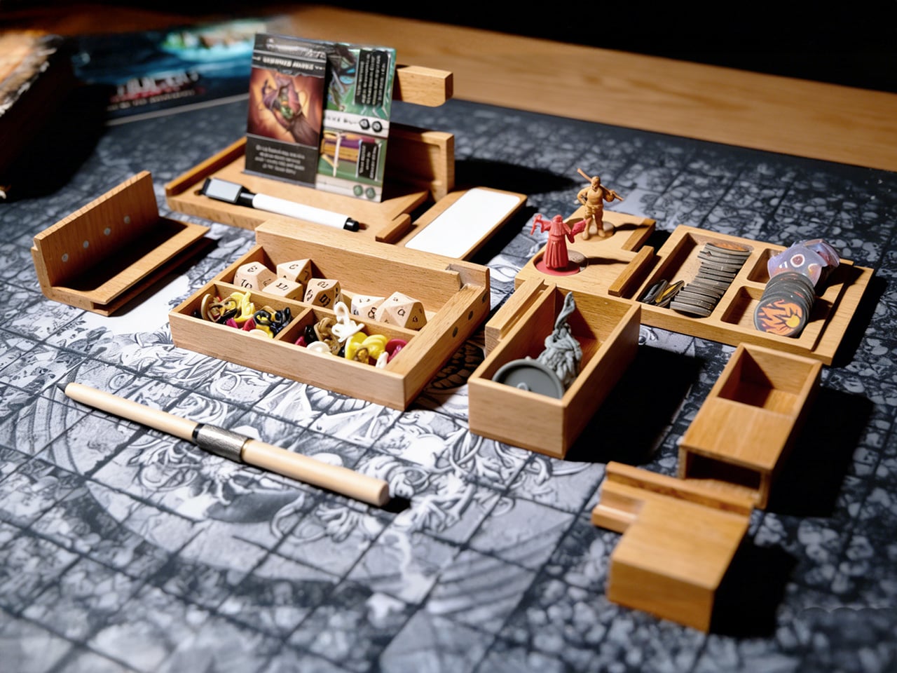
Board game nights typically end the same way: scattered tokens, bent cards sliding across the table, dice that have rolled onto the floor for the third time. The chaos becomes part of the experience, tolerated because storage solutions only address what happens after everyone goes home. ONE BOX 4.0 takes a different approach by treating organization as something that belongs inside the game itself, using modular wooden compartments that stay open and active throughout play. The whole thing behaves less like a box and more like a portable command deck that happens to collapse into something the size of a pencil case. You unfold it, and the table suddenly has lanes, stages, and zones instead of a single flat battlefield where everything fights for the same square inches.

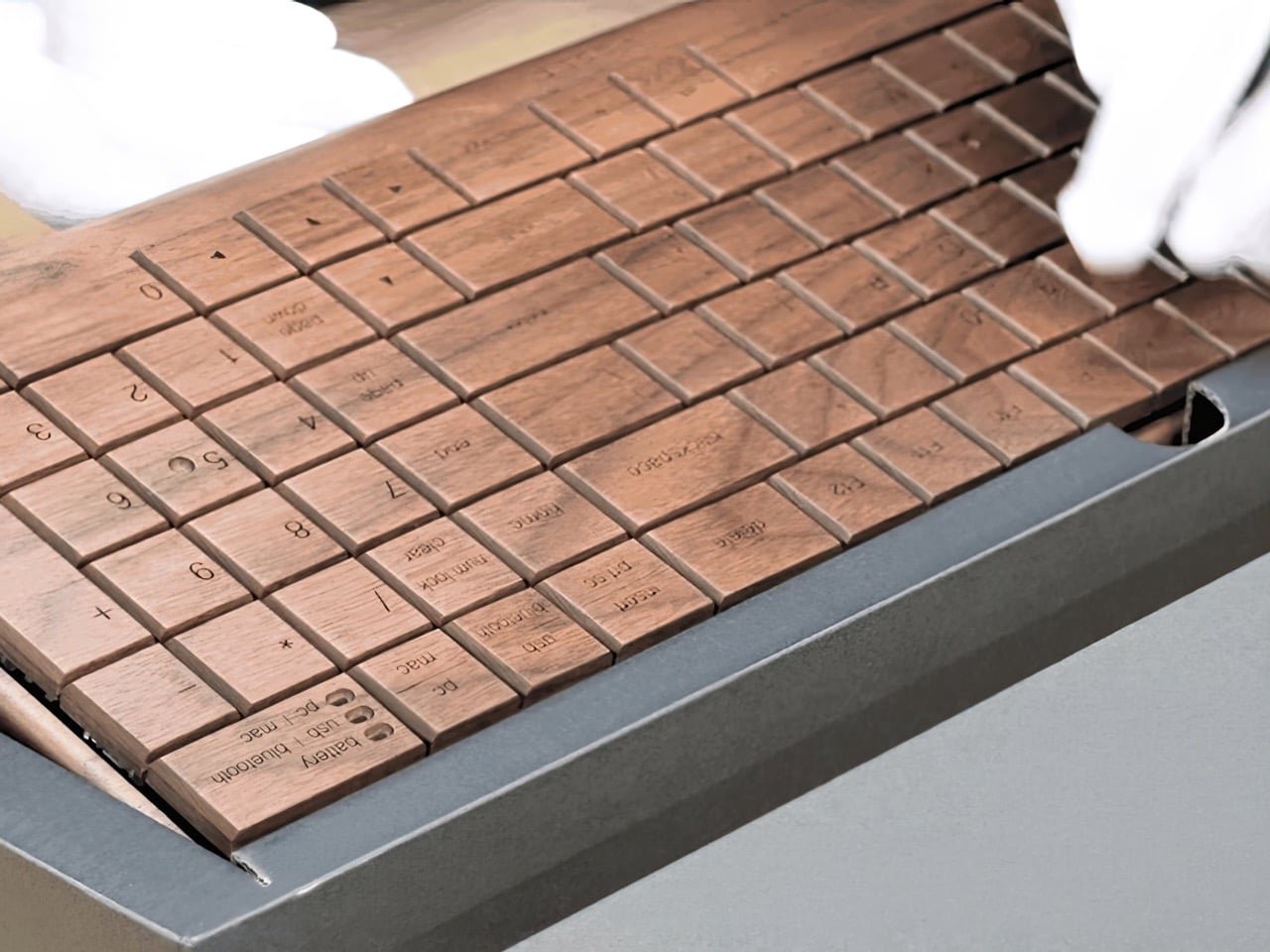
CHENGSHE.design built the system from mortise and tenon joinery, the kind of traditional woodworking that holds furniture together without screws or glue. Each unit comes in beech, teak, or black walnut, and the natural grain variations mean no two boxes look identical. The modules include card display stands, contained dice rolling areas, and phone holders that keep digital rulebooks accessible without crowding the play surface. The parts interlock into a single carryable brick, then fan out into a full tabletop system in a couple of moves. It feels like someone took the logic of a good travel tool roll, mixed it with a GM screen, and then asked an architect to make it beautiful without turning it into furniture cosplay.

Designer: ONE BOX 4.0

Click Here to Buy Now: $59 $119 (59% off). Hurry, only a few left!

The design addresses three distinct phases of a session: setup, active play, and teardown. Before play, the modules unfold from a single case into multiple zones in a matter of seconds, with dividers and trays already proportioned for cards, dice, tokens, and reference materials. During play, cards sit upright in angled stands, which keeps information visible and reduces edge wear from constant handling. Dice move through a contained rolling lane that prevents table escapes and limits collisions with card stacks or miniatures. After the session, components return to defined compartments, which then recombine into a unified case for transport and shelf storage.

Underneath the pretty wood, the logic is very modular and very modern. One set of modules can handle a deck-heavy Euro game one night and a crunchy TRPG session the next, simply by rearranging dividers and stands. The dividers are adjustable, so you can create narrow lanes for standard 63.5 by 88 mm cards or open wider slots for tarot or oversized character sheets. A lot of “board game accessories” assume a single flagship game and then become useless when your group rotates titles. ONE BOX 4.0 behaves more like a system-level accessory, closer to a camera cage or modular tool chest that expects you to change the loadout constantly. The fact that this is the fourth generation shows in that ecosystem thinking.

The mortise and tenon construction is not a decorative flex either. That joint style is pretty resilient when you are opening and closing something hundreds of times, applying torsion in slightly different directions every session. Screws back out, cheap hinges loosen, glued butt joints fail at the worst moment. Properly cut mortise and tenon joints share load across surfaces and age with the wood rather than against it. Combined with hardwoods like teak and black walnut, you get a product that can take the mild abuse of transport and table slams without turning into a rattling box of regret.

The other design decision that lands beautifully is backward compatibility. If you bought ONE BOX 3.0, you do not have to retire it to adopt 4.0. The new modules plug into the old ecosystem, which is the kind of long horizon thinking you usually only see in camera mounts, bike standards, or pro audio racks. That matters because people build habits around their table setups. If you already have a certain arrangement for card lanes and dice trays, you can add a new TRPG-focused module or that OB Infinite Pen without rethinking everything. This is how you build a niche platform instead of a series of isolated products that age out every two years.

The OB Infinite Pen and erasable whiteboard module signal a clear orientation toward TRPG and scenario driven gameplay. By dedicating space to writing tools and a reusable surface, the system supports initiative tracking, hit points, quick maps, and ad hoc notes without adding disposable paper clutter. The pen shares the same wood material language as the box, which unifies the visual identity and reinforces the idea that note taking is an integrated part of the experience. For groups that run mixed digital and analog setups, the phone and tablet holder aligns with this approach, parking screens at the edge of the system instead of scattering them across the main play field.

Visually, this is the opposite of RGB acrylic chaos. Natural wood, clean chamfers, visible grain, and a restrained color palette of light beech, warm teak, and dark walnut. On a table, it reads more like a compact piece of joinery than a toy, which is exactly what you want if your “game table” is also your work desk or dining surface. There is a subtle psychological trick here: when the tools of play look like serious objects, people tend to treat the whole session with a bit more focus. You are less likely to fling dice across a carefully built wooden lane than across a bare laminate tabletop.

Folded shut, the core ONE BOX 4.0 package is roughly pencil box sized, which means it goes into a backpack alongside a laptop and a rulebook without much negotiation. Unfolded, it spreads to cover a player station or GM area without requiring a dedicated gaming table. That portability is what separates this from the beautiful but immovable wooden tables that dominate the aspirational side of tabletop culture. You can take this to a cafe, a friend’s apartment, or a convention hall, and your setup logic travels with you instead of being rebuilt from scratch every time.

The ONE BOX 4.0 comes in three primary wood options: beech for a pale, almost Scandinavian tone, teak for a warmer mid tone, and black walnut for a darker, more saturated look. Configurations range from a single core box setup to multi box “command station” style bundles that add dedicated dice rollers, erasable whiteboard modules, storage bags, and the OB Infinite Pen in matching wood. Up to 50 early backers can grab the beech variant for as low as $59, while the next tier for all wood versions sits at $79 (which includes the ‘recording kit’ featuring the OB Infinite Pen and erasable whiteboard modules). Throw in an extra twenty, and the $99 tier also gets you a dice roller. The ONE BOX 4.0 is open for preorder and ships globally starting May 2026.

Click Here to Buy Now: $59 $119 (59% off). Hurry, only a few left!

The post Your Tactical Role-Playing Game Setup deserves a better Command Deck. Meet the ONE BOX 4.0 first appeared on Yanko Design.

Wall-Clock inspired by a Pile Of Leaves tells time but also a Nature-inspired Visual Story

Par : Sarang Sheth
19 février 2026 à 01:30

“Foglie” is the Italian word for leaves, and Tobias Sartori makes no effort to obscure the reference. His Foglie Wall Clock is built from dozens of hand-carved pine leaves, each shaped with a carved central ridge that mimics a real leaf’s midrib, arranged into a pointed, flame-like cluster that functions as the clock face. Branch-carved hands in a contrasting darker finish sweep the hours from a movement housed at the center. The result sits between decorative object and wall art, and it does so with enough material confidence to hold that ground convincingly.

Sartori first worked with leaf forms in a jewelry project, carving wooden pendants for necklaces, and the motif followed him home. A beech hedge outside and a botanical wallpaper inside reinforced the idea, together suggesting that an entire clock could operate in the same visual vocabulary. Several layout sketches followed before two strong candidates emerged. The chosen design is the one where every individual carved leaf echoes the overall silhouette of the piece, creating a quality that feels grown from the inside out.

Designer: Tobias Sartori

The final piece has a remarkable sense of depth and texture, a direct result of its meticulous construction. Because each pine leaf is an individual component, hand-carved and set at a slightly different angle and height, the clock creates a dynamic topography of light and shadow that shifts throughout the day. This layered arrangement gives the object a living quality, changing its character as the sun moves across the room.

The choice of pine, with its warm and expressive grain, gives the clock an approachable, organic feel that invites a closer look. The darker, more delicate hands provide just enough contrast to ensure legibility without overpowering the woodwork. It is a quiet object that reveals its handmade complexity gradually, rewarding careful observation with subtle details that a mass-produced item could never replicate.

Sartori’s process sketches reveal another, more traditional round variant that he ultimately set aside, a decision that proved critical to the design’s integrity. The circular concept, while pleasant, felt more like leaves applied to a conventional clock shape. The final, elongated form, however, feels like a clock that grew directly from the leaves themselves. This distinction is the core of its success. By housing a simple, reliable clock movement within a form that feels completely natural, Sartori allows the artistry of the woodwork to remain the main story. The Foglie clock successfully integrates function into a form that feels elemental and intentional, as if a gust of wind had gathered the leaves on the wall in a moment of perfect, fleeting composition.

The post Wall-Clock inspired by a Pile Of Leaves tells time but also a Nature-inspired Visual Story first appeared on Yanko Design.

OFIS Rebuilt This 122sq.m. Post-War Home Without Losing Its Soul

19 février 2026 à 00:30

Settled quietly within Naselje Murgle, one of Ljubljana’s most thoughtfully conceived residential neighborhoods, the House Under the Poplars is a 122-square-meter reconstruction and extension that speaks softly and means it. Completed in 2025 by OFIS Arhitekti, the project reads less as a statement of ambition and more as an act of architectural respect, a house that earns its place not by standing out but by understanding exactly where it stands.

Murgle was never meant to be remarkable in a conventional sense. Designed by Slovenian architects France and Marta Ivanšek and built through self-construction phases between 1965 and 1982, the settlement became a quietly radical model of ecological, human-scaled living long before sustainability entered the architectural vocabulary. Its distinctly Scandinavian character, shaped in part by the Ivanšeks’ time in Sweden, gave the neighborhood a collective identity rooted not in signature gestures but in shared, low-tech intelligence.

Designer: OFIS Arhitekti

Led by Rok Oman and Špela Videčnik, OFIS Arhitekti approached the project with the kind of cultural sensitivity that most renovations only gesture toward. The intent was never to impose a new architectural language onto an existing one but to refine and carefully elevate what was already there. The studio leaned into Murgle’s founding principles, treating them not as limitations but as the clearest possible brief for what this house needed to become.

The new glazed façade opens generously toward the garden, framing a mature birch tree with an ease that feels entirely uncontrived. Vertical timber slats line the side glazing, offering privacy to the main living space without cutting it off from the broader landscape. The covered atrium connects the primary bedroom and its ensuite bathroom to the rest of the house, creating a sequence of spaces that feel considered without ever feeling overcalculated.

Inside, timber cladding runs across the walls and ceiling in a move that unifies the interior and gives the whole house its warmth. A wine cellar sits beneath a glass floor panel in the living room, one of the project’s more unexpected gestures, and all the better for it. The rest of the program stays deliberately modest: a single additional bedroom suite and a small study, a reminder that restraint, when properly applied, is its own kind of luxury.

The House Under the Poplars does not try to reinvent Murgle. It tries to honor it, and in doing so, quietly sets a standard for what thoughtful, sensitive reconstruction can look like in a neighborhood that has always asked its residents to think beyond themselves. As a project, it resists easy categorization. It is not a restoration, not a reimagining, but something far more useful: a considered continuation of an idea that was already worth keeping.

The post OFIS Rebuilt This 122sq.m. Post-War Home Without Losing Its Soul first appeared on Yanko Design.

Transformers-inspired Shapeshifting Machine Splits Into An Entire Road-Construction Robot Fleet

Par : Sarang Sheth
18 février 2026 à 23:30

Road construction has a complexity problem. Getting a stretch of road built in a remote region, a disaster zone, or difficult terrain typically means coordinating multiple heavy machines, multiple skilled operators, and a logistical chain that can collapse at any point. Yan Zhang and Jialu Hou, two designers from Shandong University of Art and Design, spent several months in 2024 working on a concept that treats all of that complexity as a design challenge worth solving from scratch.

The result is PaveLink, an autonomous modular road-building system that arrives as a single articulated electric train and deploys into a coordinated fleet of AI-guided construction robots on site. One system. One delivery. A drone overhead, autonomous modules on the ground, and an intelligent command hub managing all of it in real time.

Designers: Yan Zhang and Jialu Hou

The truck head is a blocky, panoramic-windshield command center with a drone launch platform built right into the roof. When PaveLink reaches its target location, that drone lifts off first, ascending to map the terrain using aerial sensors and streaming data back to the cab in real time. The drone itself is worth a second look: shaped like a swept-back arrowhead with a multi-rotor configuration, it looks aggressive and purposeful in the air, matching the amber and gunmetal black palette of the ground units working below it.

Four distinct unit types detach from that spine: a front-loader with a wide scoop bucket, an excavator arm for breaking ground, a grader for leveling, and a heavy steel drum compactor for finishing the surface. On their own, each unit looks almost insectoid, riding on two or three fat rugged wheels with articulated limbs that flex and angle across uneven ground. Together, working in coordinated parallel, they turn what would normally require a crew of operators and days of staging into something that functions more like a synchronized performance.

All the modules stay tethered to the system via cables, which serve double duty as power lines and data channels. PaveLink runs fully electric, so there’s no diesel cloud hanging over the operation, and the continuous cable connection means the modules never need to stop and recharge independently. The drone keeps feeding updated terrain data overhead, flagging hazards and fine-tuning the AI’s workflow decisions as ground conditions change.

PaveLink is aimed squarely at the places traditional road construction struggles most: disaster-hit zones, remote regions with no skilled operators, and rugged terrain that conventional machinery can’t navigate efficiently. The modular autonomous approach answers all three problems at once. Fewer humans in harm’s way, fewer separate machines to transport in, and an AI coordination layer that adapts to whatever chaotic ground conditions it finds on arrival.

The post Transformers-inspired Shapeshifting Machine Splits Into An Entire Road-Construction Robot Fleet first appeared on Yanko Design.

The Modular Cat Habitat That Turns Playful Curiosity Into Living Architecture

Par : Tanvi Joshi
18 février 2026 à 22:33

What if we designed homes the way cats would design them? Not human homes with a token scratching post in the corner but true spatial systems built around curiosity, vertical exploration, territorial comfort, and play. The N Plus Magic House begins precisely at that question, reframing pet furniture not as an accessory but as architecture scaled for feline psychology. Instead of treating a cat house as a static object, this project treats it as a living spatial framework, one that evolves alongside its inhabitant.

Today’s pet owners increasingly see their cats as emotional companions rather than animals that merely coexist in domestic space. That shift has quietly created a design problem. Traditional cat houses, even elaborate ones, tend to be fixed structures. They may be visually impressive, but they impose constraints on placement, adaptability, and long-term usability. The N Plus Magic House flips that paradigm by introducing modularity as its core philosophy. Rather than selling a finished form, it offers a system of standardized units that can be assembled, rearranged, expanded, or reduced as needed. The result is less like furniture and more like a customizable habitat kit.

Designer: Taizhou Hake Technology Co., Ltd

The genius of the design lies in its simplicity. Each module functions independently yet connects securely through precision-engineered connectors. Owners assemble structures by inserting panels into slots and stacking them like building blocks. No technical expertise, tools, or installation manuals are required. This intuitive construction method does something subtle but powerful. It turns pet care into participation. Instead of buying a finished object, users become co-designers of their cat’s environment. That interaction strengthens the emotional bond among the owner, the pet, and the space.

Material choices reinforce the system’s practicality. The structure combines impact-resistant PP resin, transparent PET panels for visibility, and carbon steel mesh for structural integrity. These materials balance durability with safety while allowing owners to monitor their pets without disturbing them. The manufacturing processes, such as injection molding and automatic wire welding, ensure consistency, precision, and reliability across units. Every element reflects careful alignment with feline behavior and safety requirements.

Behind the scenes, the development team approached the project with a research-driven mindset. They studied cats’ behavioral patterns, analyzed existing products on the market, and mapped owner expectations. One of the biggest technical challenges was maintaining structural stability while preserving modular flexibility. The solution was a custom connector engineered to withstand pressure and weight while preventing slippage. Its textured surface increases friction, ensuring modules remain firmly locked during use. This small component is arguably the system’s unsung hero. It transforms a playful concept into a reliable architectural structure.

Developed in Taizhou, Zhejiang Province, between July 2023 and November 2024 and later exhibited internationally, the N Plus Magic House represents a broader shift in product design thinking. It signals a move away from static ownership toward adaptive systems, objects that respond to changing needs over time. In a world where personalization defines modern consumer expectations, this approach feels less like a novelty and more like a glimpse into the future of domestic product design.

The post The Modular Cat Habitat That Turns Playful Curiosity Into Living Architecture first appeared on Yanko Design.

2026 Mercedes-Benz Marco Polo camper van arrives with smarter pop-up roof and luxury upgrades

Par : Gaurav Sood
18 février 2026 à 21:30

Mercedes-Benz and Volkswagen have produced some of the best camper vans on the market, and they’ve long shared a common collaborator. Now, with Mercedes-Benz taking the complete production of its Marco Polo under its wings, Volkswagen and other competitors can expect some serious competition. The newly updated 2026 Marco Polo is the first new addition to Mercedes in-house van life portfolio and flaunts an interesting pop-up roof, which is its main talking point.

According to Mercedes-Benz press information, the body of the V-Class Marco Polo is built at the company’s Vans plant in Vitoria, Spain. The vehicle is then converted into a pop-up camper van at the Ludwigsfelde plant in Germany. The overall in-house production of the Marco Polo means it’s of the “highest quality standard” and that the company has complete control over every detail and pace at which it is produced.

Designer: Mercedes-Benz

Substantiating the fact, Sagree Sardien, head of sales & marketing Mercedes-Benz Vans said, it is a “Mercedes-Benz through and through,” which is designed to offer buyers a more sophisticated home on wheels. “A home that effortlessly combines travel and everyday life – while making a stylish statement,” he said.

To that accord, the Mercedes-Benz 2026 Marco Polo is a compact, luxury camper van featuring a pop-up roof, convertible downstairs seating, kitchen, and ambient lighting to uplift the mood when you’re inside the van. The major update from the 2024 model of the van is focused around the improvement to the lifting roof space. The double-skinned aluminum pop-top makes for an additional 4 inches of headroom and is provided with an ambient LED system that allows the space to feel lively and inviting.

Downstairs, the Marco Polo doesn’t make many changes. It comes equipped with a kitchen featuring double burner gas stove, a sink, mini fridge, and a swiveling bench that can easily facilitate dining and sleeping. During mealtime, you have a folding table that reaches out of the kitchen block, and during the night it folds up to make room for the convertible sofa to create a double bed.

MBAC infotainment suite is another interesting facet of the new Mercedes camper van. Sitting in the cockpit, the smart touchscreen can control the interior components like the vehicle’s upgraded eight-speaker audio system and pop-up roof lighting. The infotainment system also has instant control to pop-up roof. You can deploy or retract the lifting roof remotely, while also maintaining the temperature of the van home.

The new Marco Polo will be available to order soon, Mercedes notes. It also mentions in the press release that the launch of Marco Polo Horizon is also on the cards. This model shares similar features except for the built-in kitchen unit, making it suitable for weekend outings or short holidays only.

The post 2026 Mercedes-Benz Marco Polo camper van arrives with smarter pop-up roof and luxury upgrades first appeared on Yanko Design.

Google Released a New Pixel 10a and It’s Basically the Same Phone From Last Year

Par : Sarang Sheth
18 février 2026 à 20:15

Google would like you to meet the Pixel 10A. It has a new name, new colors, and a press release that runs to several pages. It costs $499, which is exactly what the Pixel 9A cost. It weighs the same. It measures the same. It has the same cameras, the same battery, the same chip, and the same 6.3 inch display. There is a episode of The Office where Pam preoccupies Michael by presenting two identical photo printouts as a spot-the-difference puzzle. Google has essentially done that, except the printout costs five hundred dollars.

To be precise about what actually changed: the display is about 10% brighter, the glass protecting it moved from Gorilla Glass 3 to Gorilla Glass 7i, wired charging climbed from 23 watts to 30, and wireless charging went from 7.5 watts to 10. The camera bump, already barely perceptible on the 9A, is now completely flush. In some regions, satellite SOS is supported. That is the complete list. Google did not forget to send the rest of it.

Designer: Google

The Pixel 10 and Pixel 10 Pro both run on the Tensor G5. The Pixel 10A runs on the Tensor G4, the same chip from last year’s A-series, and the year before that in the Pixel 9 Pro. For years, buying the A-series meant getting the current flagship chip in a cheaper body. That was a genuinely good deal. Google has decided, apparently, that it was too good.

Best Take, Camera Coach, Call Screening, Clear Calling, Now Playing, Gemini as a built-in assistant, and seven years of updates add up to an experience that Android competitors at this price genuinely struggle to match. The Pixel ecosystem has real pull, and Google knows it. The 10A is banking on that pull being strong enough to carry a spec sheet that would embarrass a 2024 phone.

Google looked at the Pixel 9A, decided it had not been wrong about any of it, and shipped it again with brighter glass and a new colorway called Fog. In an industry that routinely invents problems to solve, there is something almost philosophical about a company that simply refuses to fix what it considers unbroken. The Pixel 10A does not have an identity crisis. It has its predecessor’s identity, and it is completely comfortable with that.

It will sell because the cameras are good, the battery lasts, the software support is unmatched at the price, and most people upgrading to it will be coming from something two or three generations older where the difference feels significant regardless of which Tensor chip is inside. Google understands its buyer perhaps better than its buyer understands the spec sheet. The Pixel 10A is a perfectly competent phone that knows exactly what it is. But also… this smartphone announcement could have been an email.

The post Google Released a New Pixel 10a and It’s Basically the Same Phone From Last Year first appeared on Yanko Design.

Forget Mindfulness Apps, This Desk Top Spins for 2 Minutes Instead

Par : JC Torres
18 février 2026 à 18:20

Screens are on all day, and hands tend to find something to do when focus slips. Pen clicking, phone picking, knuckle cracking, the nervous tics of modern desk work. Most “mindfulness” solutions are still apps, which is a bit ironic when the problem is too much screen time. There’s something to be said for a small mechanical object that gives your brain a reset without asking for any attention in return.

Amsterdam Dynamics’ ST-01 is a modular spinning top and tactile focus object built for desks, hands, and minds that rarely get a break. It’s intentionally simple but not single-purpose, offering multiple mechanical interactions with no correct sequence. You use one when you need it or work through all of them. No app, no setup, no instructions, just the object and whatever your hands feel like doing with it.

Designer: Antonio Lo Presti (Amsterdam Dynamics)

A gentle twist sets ST-01 rotating smoothly, and it’s engineered to keep going for over two minutes. That’s long enough to watch while thinking through a problem, waiting for a file to render, or cooling down after a difficult meeting. It functions as a visual anchor, something calm and physical in a field of notifications and browser tabs that all want something from you.

Pressing the top triggers a satisfying mechanical click with clear tactile feedback, the kind of repeatable, purposeful sensation that replaces the nervous habit of clicking pens or tapping a keyboard. Amsterdam Dynamics calls it “reset focus,” which is accurate if not exactly humble. The middle disc can also be flipped like a coin, adding a small decision-making tool and another texture to the interaction when you need a nudge in either direction.

Of course, there’s a modular construction underneath all of that. ST-01 is built from three parts that can be taken apart and snapped back together, held in alignment by two precisely positioned magnets. That magnetic core keeps the structure stable during spinning while making it easy to disassemble by hand. There’s also a built-in magnet that lets it stick to metal surfaces, which is either a neat trick or a genuinely useful parking spot depending on your desk.

CNC-machined, anodized aerospace-grade aluminum means it’s solid in the hand, balanced, and finished in a way you notice the first time you pick it up. Cheap fidget toys flex, squeak, and wear out quickly. ST-01 is designed to stay on the desk for a long time, with Amsterdam Dynamics framing it as “a beautiful object, made to last a lifetime” and something that can eventually be passed on.

That’s an unusual positioning for what is essentially a desk toy, but it fits the overall idea. ST-01 doesn’t ask for a lifestyle change, a daily streak, or a subscription. It just gives your hands a few repeatable interactions and a place to return when the work gets loud, which turns out to be the kind of quiet, mechanical company a desk actually needs.

The post Forget Mindfulness Apps, This Desk Top Spins for 2 Minutes Instead first appeared on Yanko Design.

This Air Purifier Concept Looks Like Scandinavian Audio Gear

Par : JC Torres
18 février 2026 à 17:20

Air purifiers tend to look like medical equipment and come with apps you didn’t ask for. They arrive with dashboards, push notifications, and Wi-Fi setup rituals that turn “cleaner air” into another thing to manage on a phone. Most of them sit in corners behind plants because they look clinical, and no one wants to acknowledge the white plastic box while having guests over for dinner.

The Beolab Air 1 is a concept air purifier designed to sit in a room without announcing itself. It was developed as a student project and draws inspiration from the calm, material-driven design language of Bang & Olufsen’s Beolab line, though it’s not affiliated with the company in any way. The goal was to see what happens when you apply that kind of sculptural thinking to clean air, instead of just adding another screen to the wellness toolkit.

Designers: Ahaan Varma, Malhar Gadnis, Michelle Sequeira, Sharanya Karkera

The most refreshing part of the concept is the interaction model. A single button press is all it takes to start, with no app pairing, no IoT setup, and no onboarding routine. The project frames this as “digital detox,” which is a reasonable description when most purifiers try to sell you sensor graphs and weekly air quality reports. You turn it on the way you’d turn on a lamp or a speaker, then leave it to work.

The materials do a lot of the talking. Angled teak wooden ridges wrap the body and function as vents for filtered air, so the aesthetic choice also serves a purpose. Textured aluminum handles the rest of the exterior. The project’s own critique of the category is blunt: plastic yellows and looks cheap over time, while wood and metal age better. A purifier built to look like a piece of considered furniture has a better chance of earning a spot on a sideboard than one that resembles a hospital accessory.

Under the surface, there’s a plausible engineering stack. A high-efficiency BLDC fan delivers strong airflow while staying quiet, a HEPA filter handles particulate capture, and an MQ135 gas sensor pairs with PM2.5 sensing to monitor air quality without forcing anyone into an app. The concept keeps the monitoring internal and the feedback subtle, a soft ambient light band that changes gently rather than a display demanding attention.

Of course, that ambient feedback is the whole point. Clean air is invisible and usually silent, and a purifier that communicates the same way feels more appropriate than one with a scrolling PM2.5 count on a bright panel. You can check in when you feel like it, and the rest of the time it just works.

The concept calls out a genuine gap in the category: people want wellness that integrates quietly into a room, not hospital aesthetics, and yet another app. Whether or not Beolab Air 1 ever gets built, asking what a purifier looks like when treated with the same care as a premium speaker is a question the category probably needed someone to ask.

The post This Air Purifier Concept Looks Like Scandinavian Audio Gear first appeared on Yanko Design.

This Does Not Compute Turns Tiny Mac Clock Into Working Raspberry Pi Macintosh

Par : Gaurav Sood
18 février 2026 à 16:20

If you appreciate retro computing and DIY electronics, a new project from This Does Not Compute (YouTube channel) will be the best thing you will see today. The build emulates the 1984 Apple Macintosh, but in a miniaturized version. Not the smallest, but decently small to sit in the corner of your desk and do more than its intended function of a clock.

If that sounds puzzling, here’s a clearer explanation. The modder has actually taken a Maclock, which is a clock that looks identical to the original Mac, but of course considerably smaller, and ripped it open. He replaced the original alarm clock mechanics with a Raspberry Pi, turning it into a homage to the classic Apple computer.

Designer: This Does Not Compute

The project, as the modder himself states, “is just for fun” and doesn’t really reach out to prove anything other than love to toil with anything Mac. With the innards of the clock replaced by Raspberry Pi Zero 2 W, the original display of the clock is also swapped with a 640×480 2.8-in color screen from Wave Share, and the project is interestingly called Wondermac. The name is in reference to Wonder Boy, the Chinese company that makes Maclock.

The modder, as you can see in detail in the video above, starts by cracking open the Maclock case, which has screws, but they are only used to mimic the Macintosh and have no significant usage. Opening the case was “probably the hardest part of the whole project,” he says. The case is clipped together pretty tightly, but he was able to separate the front bezel from the back using a wide metal pry tool. Once the front panel was free, he unplugged the wiring harness and pulled out the main circuit board and the screen to clear up the space inside the Maclock body, which will now have new guts and a new purpose.

“Compact, low power, and relatively inexpensive,” Raspberry Pi Zero 2 W was a clear choice for the Mac’s innards, the modder affirms. It comes with a pin header presoldered and includes a heatsink, which would be a nifty addition to keep this tiny computer cool when it does some computing. The Pi is now connected to the externally purchased screen, and the modder gets down to launching the Raspberry Pi imager app and installing Minivvac on an SD card for the software side of the project.

For powering the Wondermac, the modder doesn’t rely on the Maclock’s built-in battery; instead, they take advantage of the USB-C port on the back housing for power. After some tweaking to power output, some wire soldering, and sticking, he was able to get the power going as required to run the screen. Finally, he designed a 3D printed bracket with black filament to fit the screen in place, and then everything was assembled back into shape. Content with the outcome, he leaves the little Mac on the desk with the Afterdark screen saver.

The post This Does Not Compute Turns Tiny Mac Clock Into Working Raspberry Pi Macintosh first appeared on Yanko Design.

À partir d’avant-hierYanko Design

6 Reasons Why Apple Needs to Build a Clamshell iPhone Flip (And 1 Reason It Shouldn’t)

Par : Sarang Sheth
9 février 2026 à 02:45

Remember when phones got smaller? The iPhone 13 Mini had a cult following, but Apple killed it because most people wanted bigger screens. Here’s the plot twist: a clamshell foldable iPhone could bring back that beloved compact size without sacrificing screen real estate. You get a full-size display when you need it, and a pocketable square when you don’t. It’s the best of both worlds, and Apple knows it.

Mark Gurman’s latest report suggests Apple is seriously exploring this form factor. It wouldn’t be their first foldable (a larger model is rumored for later this year), but it might be their smartest. A clamshell iPhone makes sense for reasons that go way beyond nostalgia. It’s cheaper to build than a book-style fold, it doesn’t compete with the iPad Mini, and it opens up a market where Samsung is basically the only serious player. There are six solid reasons why Apple should do this, and one big reason why it might not work. Let’s dig in.

The iPhone Mini lives on (just folded in half)

Apple discontinued the iPhone 13 Mini because the sales numbers didn’t justify keeping it around. Turns out most people prefer bigger screens, even if it means carrying a brick in their pocket. But the Mini’s fans were passionate, and they’ve been vocal about wanting a truly compact iPhone ever since. A clamshell solves this problem in the most elegant way possible.

When folded, it’s roughly the size of the Mini, maybe even smaller depending on how thick the hinge is. When unfolded, you get a full 6.1-inch or 6.7-inch display, same as the regular iPhone or Pro Max. The people who loved the Mini weren’t asking for a smaller screen, they were asking for a phone that didn’t dominate their pocket or require two hands for basic tasks. A clamshell gives them that portability without forcing them to squint at a 5.4-inch display.

This isn’t just about bringing back a discontinued product. It’s about proving that compact phones can exist in 2026 without compromising on screen size. The form factor itself becomes the feature.

It doesn’t murder the iPad Mini

Here’s the uncomfortable truth about book-style foldables: they’re iPad killers. If Apple released an iPhone that unfolds into an 8-inch display, who’s buying an iPad Mini? The overlap would be brutal. You’d have a device that fits in your pocket, runs iOS, makes calls, and gives you a tablet-sized screen when you need it. The iPad Mini’s entire value proposition collapses.

A clamshell doesn’t have this problem. Even at its largest, a clamshell iPhone would max out at maybe 6.9 inches unfolded. That’s still firmly in phone territory, not tablet territory. The iPad Mini’s 8.3-inch display remains the smallest “real” iPad you can buy, and it stays relevant for people who want that in-between size for reading, note-taking, or media consumption.

Apple’s product lineup is carefully segmented, and a clamshell iPhone slots in without disrupting the hierarchy. It’s a phone that folds smaller, not a tablet that folds into a phone. That distinction matters when you’re trying to sell both devices to the same customer.

Samsung owns this space, but they’re beatable

The Galaxy Z Flip has been around since 2020, and Samsung’s refined it through multiple generations. They’re the dominant player in the clamshell category, but “dominant” doesn’t mean “unbeatable.” Motorola’s putting up a fight with the Razr, but Google hasn’t touched this form factor yet. No Pixel Flip. No Nothing Flip. No OnePlus Flip. It’s basically Samsung’s game, and that’s an opportunity for Apple.

Apple doesn’t need to be first. They need to be better. And in a market where there’s only one major competitor, “better” is achievable. Samsung’s Z Flip 6 is solid, but it’s not perfect. The cover screen still feels like an afterthought, the crease is visible, and the software experience is classic Samsung (which is to say, inconsistent). If Apple can deliver a smoother hinge, a more useful outer display, and that signature iOS polish, they could own this category within a generation.

The fact that Google isn’t competing here is huge. The Pixel is Apple’s biggest threat in terms of owning both hardware and software (plus Gemini is vastly more superior than any AI Apple’s managed to roll out), and if there’s no Pixel Flip to compete with an iPhone Flip, Apple has a clear shot at Android users who want this form factor but don’t want Samsung’s ecosystem.

Smaller hinge, lower risk

Building a book-style foldable is expensive and complicated. You’re engineering a hinge that supports a massive, fragile display. You’re solving durability issues that Samsung and others have been wrestling with for years. You’re creating an entirely new product category that might flop. The R&D costs are enormous, and if it doesn’t sell, you’ve burned a ton of money.

A clamshell is cheaper to prototype, cheaper to manufacture, and cheaper to fail with. The display is smaller, the hinge mechanism is simpler, and the overall engineering challenge is less daunting. If Apple wants to dip their toes into foldables without betting the farm, a clamshell is the way to do it.

This also means Apple can price it more competitively. A book-style iPhone Fold would probably start at $1,799 or higher. A clamshell could reasonably launch at $1,199, maybe $1,299. That’s still premium, but it’s within reach of people who’d normally buy a Pro model. The lower price point expands the potential customer base, and if it sells well, Apple can use that momentum to justify a larger foldable later.

Hands-free everything

The half-folded “laptop mode” is one of the best features of clamshell foldables, and it’s criminally underrated. You can prop the phone up on a table, angle the screen however you want, and suddenly you’ve got a hands-free setup for FaceTime, vlogging, watching videos, or taking photos. No tripod required. No awkward propping it against a water bottle. It just works.

Apple’s been positioning the iPhone as a serious content creation tool for years. ProRes video, Cinematic Mode, all those camera upgrades, they’re aimed at people who make stuff. A clamshell iPhone would give those creators a built-in tripod mode that’s actually useful. Imagine shooting a cooking tutorial, a makeup video, or a product unboxing without needing extra gear. The phone holds itself at the perfect angle, and you’re free to use both hands.

This isn’t a niche use case. Every vertical video you’ve ever seen on TikTok or Instagram could’ve been easier to shoot with a clamshell. Apple knows this, and they know it’s a selling point that most mobile brands haven’t fully capitalized on yet.

Big screen, small pocket

Here’s the paradox of modern smartphones: people want huge screens, but they hate carrying huge phones. The iPhone 15 Pro Max is a phenomenal device, but it’s a slab that dominates your pocket, your bag, and your hand. A clamshell solves this in the most obvious way possible: make the screen big, then fold it in half.

When unfolded, you get all the screen real estate of a Pro or Pro Max. When folded, it’s a compact square that sits comfortably in any pocket. You’re not sacrificing display size, you’re just rearranging it. This is especially appealing for people who want big screens but don’t want to upgrade their wardrobe to accommodate a 6.7-inch rectangle.

The folded form factor also changes how you carry the phone. It’s less likely to slide out of a pocket, it doesn’t create that awkward bulge in tight jeans, and it’s easier to grip when you’re pulling it out. These are small quality-of-life improvements, but they add up. A clamshell makes the big-screen experience more portable, and that’s a real advantage.

The one problem: MagSafe doesn’t love squares

Here’s where things get tricky. Apple’s entire MagSafe ecosystem is built around vertical rectangles. Wallets, battery packs, car mounts, wireless chargers, they all assume your iPhone is shaped like, well, an iPhone. A clamshell changes that. When folded, it’s a square. When unfolded, it’s a normal phone shape. But MagSafe accessories are designed to stick to the back of a phone that’s always the same shape.

How does a MagSafe wallet work on a folded clamshell? Does it attach to the outer cover, which is probably glass or plastic? Does Apple redesign the entire accessory lineup to accommodate a square form factor? Do they create clamshell-specific MagSafe products? None of these solutions are great.

This isn’t a dealbreaker, but it’s a complication. Apple’s accessory ecosystem is a huge part of their strategy, and a clamshell iPhone disrupts that in ways a book-style fold wouldn’t. You could argue that a book-style fold, when closed, is still roughly phone-shaped, so MagSafe accessories might work. A clamshell is just different enough to break compatibility.

Apple could solve this with clever engineering. Maybe the MagSafe ring is on the outer screen side, and accessories attach there. Maybe they introduce a new “MagSafe Flip” standard with different magnets. Or maybe they just accept that clamshell buyers won’t use traditional MagSafe accessories and move on. Either way, it’s a problem that doesn’t exist with their current lineup, and it’s worth considering.

So, is this happening?

Gurman’s report is credible, but it’s not a product announcement. Apple explores lots of things that never ship. They’ve been prototyping foldables for years, and we’ve seen patents dating back to 2016. The fact that they’re actively working on a clamshell now doesn’t mean it’ll hit shelves in 2027 or even 2028.

But the logic is there. A clamshell iPhone solves more problems than it creates. It brings back the Mini’s form factor without shrinking the screen. It enters a market where Apple could actually win. It’s cheaper and less risky than a book-style fold. And it gives Apple a foothold in foldables without cannibalizing their other products.

If Apple does this right, a clamshell iPhone could be the foldable that finally makes sense for people who aren’t early adopters. It’s practical, it’s pocketable, and it’s exactly the kind of product Apple excels at making. The only question is whether they’re willing to rethink MagSafe to make it work.

(Images via AI)

The post 6 Reasons Why Apple Needs to Build a Clamshell iPhone Flip (And 1 Reason It Shouldn’t) first appeared on Yanko Design.

A 20-Square-Meter Boulder-Shaped Cabin That Blends Right Into The Pyrenees

Par : Tanvi Joshi
9 février 2026 à 00:30

High in the Pyrenees, where forests, rock, and weather dictate their own quiet rules, Forestone Cabin appears less like a building and more like a geological event. At just 20 square meters, this experimental wooden dwelling does not announce itself as architecture in the conventional sense. Instead, it feels as though it has always been there, something solid that rolled down the mountain long before anyone thought to give it a name.

Designed and built by the 2025 cohort of the Master’s in Ecological Architecture and Advanced Construction at IAAC – Institute of Advanced Architecture of Catalonia, Forestone Cabin is part of the Bio for Piri initiative, led by Fundació Catalunya La Pedrera and funded by the Biodiversity Foundation through European Next Generation funds. The project champions regenerative forestry and the intelligent use of local timber sourced from Pyrenean forests in Alinyà, Lleida, an ambition that is embedded into every layer of the cabin.

Designer: IAAC – Institute for Advanced Architecture of Catalonia

Installed at MónNatura Sort, the cabin occupies a sloping site near an existing mountain hostel. Designed to host two people, it compresses a sleeping area, workspace, and bathroom into a compact yet carefully calibrated interior. Nothing here is excessive. Every surface, angle, and opening earns its place.

Formally, the cabin takes its cues directly from the landscape. Its faceted geometry, composed of inclined walls and a sloping roof, responds to solar exposure, climatic conditions, and internal program, subtly shaping how the interior is experienced. Ceiling heights shift almost imperceptibly to define zones, while precisely positioned openings frame views of the Pyrenean mountains and allow cross ventilation. At night, operable wooden shutters seal the cabin into complete darkness, eliminating light pollution and supporting the site’s astronomical activities. It is a reminder that sometimes the most sustainable gesture is knowing when to disappear.

The exterior is clad in pine boards with natural edges, charred using the Japanese Yakisugi, or Shou Sugi Ban, technique. Burned by the students themselves, the wood gains resistance to insects, water, mold, and fire, while also carrying symbolic weight. Fire is a constant presence in Pyrenean forest management, and even the name Pyrenees traces back to pyros, the Greek word for fire. Here, charring becomes both protection and narrative.

Inside, Forestone transforms into a fully integrated wooden environment. Custom-designed CLT elements form not only the structure but also the furniture, including beds, seating, storage, and the washbasin counter. All components were fabricated by students at Valldaura Labs. Architecture, structure, and furniture collapse into a single material system, reinforcing a hands-on approach where making is inseparable from thinking.

The material story does not end with timber. During a wool festival in the nearby town of Sort, students collaborated with local farmers to collect sheep’s wool, later transformed into felt with the support of Dutch artist Rian van Dijk. The resulting blankets, rugs, and pillowcases introduce softness and warmth while grounding the project in local agricultural cycles. A stone sourced from the surrounding landscape was hand-carved into a washbasin, turning a found object into a daily ritual.

From the outset, Forestone Cabin was designed as a prototype. Its modular CLT system, dry assembly methods, and reliance on local materials allow it to be adapted, replicated, or dismantled with minimal impact. More than a cabin, it proposes a model for inhabiting forest landscapes responsibly, one that aligns education, craftsmanship, and ecological stewardship.

Opening to guests in January 2026 at MónNatura Pirineu, Forestone Cabin offers visitors more than shelter. It offers a way of thinking about forests not as resources to extract from, but as systems to participate in, carefully, thoughtfully, and with respect.

The post A 20-Square-Meter Boulder-Shaped Cabin That Blends Right Into The Pyrenees first appeared on Yanko Design.

This Costa Rican Home Chooses Air, Rhythm, and Silence Over Walls

Par : Tanvi Joshi
8 février 2026 à 23:30

Perched high above the Pacific coastline in Bahía Ballena, Costa Rica, Ojo de Nila is a house that feels less like an object placed on land and more like a continuation of it. Designed by Studio Saxe, with interiors by Atelier Sandra Richard, the home was created for a Swiss couple seeking a slower, more elemental way of living shaped by air, light, and landscape rather than mechanical systems and rigid enclosures.

A clear modular logic guides the architecture. A repeating series of structural bays follows the natural contours of the hillside, allowing the house to hover above the forest canopy instead of cutting into it. This decision preserves vegetation and natural water flow beneath the home while giving the structure a lightness that feels respectful of its setting. The modules do not read as repetition in the conventional sense. Instead, they become the framework for movement, rhythm, and flow.

Designer: Studio Saxe and Atelier Sandra Richard

Above these modules, the roof undulates in soft waves, behaving almost like a newly formed landform. Rather than acting as a simple cover, it mirrors the rolling topography of the surrounding hills and establishes a calming visual cadence as one moves through the house. The roofline continuously frames the Pacific Ocean, ensuring that the horizon remains a constant presence, never a backdrop but always an active participant in daily life.

Arrival is defined by elevation and openness. As you enter, there is no dramatic reveal or enclosed threshold. Instead, the house immediately opens itself to the ocean. The absence of enclosure on the ocean-facing side dissolves any clear boundary between inside and outside. Movement through the home is accompanied by the sound of wind through the forest, shifting light, and the distant rhythm of waves below.

The dining area is fully open to the landscape, with no windows or doors separating it from the environment. Meals unfold in direct conversation with climate and view, reinforcing a lifestyle centered on natural comfort. Adjacent to this space, the kitchen sits within the same modular grid. A long island anchors the room, illuminated by three pendant lights, while additional storage is discreetly tucked behind folding doors to maintain visual calm.

The living room balances structure and softness. A solid wood frame sofa grounds the space, layered with neutral cushions and tactile throws that invite rest. Rich timber flooring adds warmth underfoot, tying the interior palette back to the surrounding forest.

The bedroom continues this dialogue with nature through a curved open-air form. The sweeping roof and angled supports frame uninterrupted views of both forest and ocean. A low timber bed and minimal furnishings ensure that attention remains on light, air, and the ever-changing landscape beyond.

In the bathroom, restraint becomes luxury. A floating timber vanity topped with stone sits at the center of the space, while slatted wood and soft curtains filter light and create privacy without full enclosure. The result is a room that feels tactile, quiet, and gently connected to its surroundings.

Outside, the pool extends toward the horizon, visually blending with the sky and ocean. From above, its circular form reads like an eye, like a reflection, inspiring the home’s name. This gesture reinforces the idea of the house as an observer, always in dialogue with the landscape it inhabits. The deck echoes the pool’s curves, creating shaded and open zones shaped by the modular structure and flowing roof.

Ojo de Nila ultimately demonstrates how modular construction can enable expressive architecture without overpowering its context. Through repetition that allows curvature and structure that guides airflow, the house achieves a quiet, deeply considered balance between design and environment, inviting its inhabitants to live with nature rather than against it.

The post This Costa Rican Home Chooses Air, Rhythm, and Silence Over Walls first appeared on Yanko Design.

3D-Printed Guitar Amp Desk Organizer Brings Concert Energy to Your Boring Monday Morning

Par : Sarang Sheth
8 février 2026 à 21:45

The contrast between Sunday night at a concert and Monday morning at your desk is brutal. One moment you’re lost in the music, feeling every guitar riff vibrate through your chest. The next, you’re answering emails and pretending last night’s euphoria wasn’t real. The transition back to routine work feels especially cruel when the weekend gave you a taste of something electric.

That’s where a little whimsy helps. These 3D-printed guitar amp pen holders from LionsPrint bring a fragment of that musical energy to your workspace. They’re compact at 3.5 inches per side, but the details are spot-on: authentic speaker grilles, control panels, and designs inspired by the amplifiers that power actual rock shows. You can personalize them with custom text in silver or gold. They won’t replace the thrill of live music, but they’re a small reminder that the mundane is just temporary.

Designer: LionsPrint

The thing about good desk accessories is they need to justify their existence beyond pure function. A pen holder is essentially a container with holes. You could use a coffee mug. But LionsPrint clearly understood that musicians and music fans have a specific relationship with amplifiers that goes beyond their utility. These aren’t random music references slapped onto office supplies. They’re recognizable silhouettes: Marshall stacks with their iconic script logo, Fender’s clean lines, Yamaha’s distinctive branding. The 3D printing allows for texture work that would be impossible with traditional manufacturing. Those speaker grilles have depth and pattern variation that catches light differently depending on angle.

At 3.5 x 3.5 x 3.5 inches, the dimensions work perfectly for standard desk real estate. Small enough that they don’t dominate your workspace, large enough that they actually hold a functional amount of pens, scissors, and whatever other tools accumulate throughout a workday. The cube format keeps them stable. No tipping over when you’re fishing for a specific marker at 2 AM during a deadline crunch.

The customization option elevates these beyond typical musician merch. You can add text in metallic silver or gold finishes, which means your studio name, your band’s logo, or even an inside joke with your bandmates can live on your desk. Most “gifts for guitarists” feel like afterthoughts, designed by people who think all musicians are the same. This actually lets you claim ownership of the aesthetic instead of just passively receiving someone else’s idea of what music fans want.

LionsPrint sells these through Etsy starting at $19.98 USD before shipping. The price sits in that sweet spot where it’s low enough to impulse buy after a particularly soul-crushing Monday, but high enough that the 3D printing quality actually delivers on the details. You pick your amp style, add your custom text if you want it, and suddenly your desk has at least one object that doesn’t make you question your life choices. Small victories count when you’re counting down to the weekend.

The post 3D-Printed Guitar Amp Desk Organizer Brings Concert Energy to Your Boring Monday Morning first appeared on Yanko Design.

Someone Finally Made Video Meetings Look Like a Game Console

Par : Ida Torres
8 février 2026 à 20:15

There’s something deeply satisfying about watching designers take a swing at corporate boredom. Fevertime, a recent collaboration by Dugyeong Lee, Gyeong Wook Kim, MyeongHoon Cheon, and Dayong Yoon, does exactly that by transforming the typical video conference setup into something that looks like it belongs in a mid-80s arcade.

The concept is deceptively simple: what if meetings felt less like mandatory Zoom rectangles and more like gathering around a shared screen? The team created a physical meeting system inspired by retro game consoles, complete with a bright red spherical camera perched on a stand like some cheerful robot companion, and a base unit that wouldn’t look out of place next to your old Nintendo. There are even cartridge-style slots and that unmistakable game controller aesthetic, all rendered in a palette of scorched red, neon accents, and soft grays.

Designers: Dugyeong Lee, Gyeong Wook Kim, MyeongHoon Cheon, dayong Yoon

But this isn’t just nostalgia bait. The designers identified a real problem with modern collaboration tools: everyone staring at their own screens creates this weird isolation, even when you’re supposedly “together” in a virtual room. Fevertime flips that script by projecting content onto a shared surface, encouraging actual eye contact and spatial awareness. The physical device becomes a focal point, something to gather around rather than disappear behind.

The system lets users set up meetings in advance, defining time, participants, and structure before anyone logs on. When the session starts, participants can instantly share content from their personal devices onto the collective display. Everything stays synced and visible to everyone simultaneously. No more “Can you see my screen?” or fumbling through share settings while everyone waits. The interface shows meeting cards, schedules, and project data in a clean, modular layout that feels more like organizing a playlist than managing corporate logistics.

What makes Fevertime visually compelling is how committed it is to the gaming metaphor. The red sphere isn’t trying to look sleek or invisible like most tech hardware. It wants to be noticed. It practically begs to be the conversation starter in the room. The cartridge system for what appears to be different meeting modes or templates plays into that collectible, tactable quality that made physical media so satisfying. You’re not just clicking through digital menus; you’re handling objects, sliding things into slots, physically engaging with the technology.

The UI design carries that same energy. Bright pink highlight screens pop against neutral backgrounds. Typography is bold and condensed, channeling the space constraints of old arcade cabinets where every pixel counted. Cards and modules feel like game level selects or achievement screens. There’s a playful confidence in the branding, with the Fevertime logo rendered in that wavy, almost melting typography that suggests heat and intensity without being aggressive.

The designers describe the project as capturing “a single moment of high-intensity creative output,” that fever state when an idea finally clicks and everything flows. That philosophy shows up in the pulsing, breathing quality of the custom lettering, where font weights fluctuate to create visual rhythm. It’s design that refuses to sit still, much like the creative process it’s trying to facilitate.

From a product design perspective, Fevertime sits in that interesting space between speculative concept and plausible near-future tech. The physical components look production-ready, with thoughtful details like ventilation ridges on the base unit and a weighted stand for the camera sphere. But there’s also a conceptual boldness here, a willingness to say “what if meeting technology looked completely different from what we’re used to?”

The team used Adobe’s creative suite to develop the project, combining Photoshop and Illustrator for the identity work with After Effects for motion elements. That mix of static and animated content gives Fevertime a kinetic presence even in still images. You can imagine the interface cards sliding, the logo pulsing, the whole system humming with that arcade-ready energy.

Whether Fevertime ever makes it to market is almost beside the point. As a design exercise, it asks useful questions about how we physically and emotionally experience collaboration technology. It challenges the assumption that workplace tools need to look serious and minimal. And it demonstrates how pulling from gaming culture can make even something as mundane as meeting software feel fresh and approachable. Sometimes the best design projects are the ones that make you think, “Wait, why doesn’t everything look like this?”

The post Someone Finally Made Video Meetings Look Like a Game Console first appeared on Yanko Design.

This $400 Wooden Keyboard Goes Through Over 15 Hand-Finishing Steps Before You Can Type On It

Par : Sarang Sheth
8 février 2026 à 18:20

Tech moves fast, breaks things, ships updates, iterates. The entire industry is built on the assumption that this year’s product will be obsolete by next year, and that’s fine because next year’s version will be better anyway. Then you see someone in Fukui Prefecture spending twenty minutes hand-sanding a single wooden keyboard key, checking it by touch, and the whole paradigm feels suddenly optional. Hacoa has been making wooden keyboards this way for four generations now. The current craftspeople learned from their parents, who learned from theirs.

What makes this remarkable isn’t just the craftsmanship, though watching wood move from lumber to finished keys is genuinely mesmerizing. It’s the underlying assumption that contradicts everything tech culture preaches. These keyboards are built to last decades. They’re made from a material that ages visibly, that will show wear and patina and the passage of time. They’re designed for people who want their tools to have history rather than version numbers. And they’re assembled onto standard mechanical keyboard bases, so they actually work for the thing you’d use a keyboard for: typing, every day, for years.

Designer: Hacoa workshop

The process starts with lumber selection, which already tells you everything about how different this is from injection-molded ABS keycaps. Someone at the Hacoa workshop in Sabae City examines the grain patterns and decides which pieces are suitable for a keyboard. They measure carefully so nothing gets wasted, then plane the wood down to uniform thickness. This is furniture-grade attention being applied to something most of us buy on Amazon and forget about. The wood gets machined with multiple blade changes between operations, chamfered at the edges so the corners feel softer under your fingers, then cut into individual key blanks.

Then the hand work begins. Each key gets shaped individually, sanded on the end grain to refine the tactile experience, finished by craftspeople who use their palms as quality control instruments. They’re literally checking by feel whether each key is ready. The surface gets sanded extensively, taking as long as it takes, because rushing would defeat the entire point. Quality verification happens through touch, which is perfect given that touching these keys will be the whole experience once someone owns the keyboard. After that comes laser engraving for the legends, residue cleanup, and final assembly onto a mechanical keyboard base with standard switches.

What gets me is the very deliberate disconnect between effort and function. A $30 membrane keyboard from any big-box store does the same job in purely utilitarian terms. You press keys, letters appear on screen, your email gets written. But we spend hours every day with our hands on these things. The texture matters. The sound matters. Whether the object feels disposable or permanent matters, even if we can’t always articulate why. Hacoa seems to understand that the keyboard isn’t just an input device, it’s the primary physical interface between you and every digital thing you make.

The final product shows visible wood grain variation across every key. Some are lighter, some darker, because that’s what wood does. Each keyboard carries unique patterns that came from whatever tree the lumber came from, which means no two are identical. They’re mounted on dark bases that contrast with the natural wood tones, and the whole thing works with standard mechanical switches. You can actually use this daily without treating it like a museum piece, which honestly makes it more interesting than if it were purely decorative.

Four generations of craftsmanship went into mastering the material and this product category. That timeline alone makes it weird in tech terms, where four generations might mean four years of product iterations. Here it means actual humans passing down technique and judgment through family lines, the kind of knowledge transfer that only happens when someone works beside their parent for years. The current craftspeople at Hacoa learned by watching, by doing it wrong, by developing the muscle memory that lets them know when a piece of wood is ready just by running their hand across it.

I think about planned obsolescence a lot, probably too much. The assumption baked into most consumer tech that you’ll replace it soon anyway, so why build it to last. These keyboards operate in a completely different value system where the goal is creating something worth keeping. Whether that makes financial sense for most people is debatable. Whether it’s a more sane way to think about the objects we use constantly is not.

The post This $400 Wooden Keyboard Goes Through Over 15 Hand-Finishing Steps Before You Can Type On It first appeared on Yanko Design.

Nader Gammas’ Vessels Turns Light Into a Slow, Living Presence

Par : Tanvi Joshi
8 février 2026 à 16:20

The Vessels collection feels like a quiet confession from Nader Gammas. Known for lighting defined by brutalist strength and architectural discipline, Gammas takes an unexpected turn inward with this series. The sharp certainty that once shaped his work softens here, replaced by forms that feel grown rather than constructed. These lights do not announce themselves. They linger. They unfold slowly, like something discovered rather than designed.

The inspiration comes from cup fungi, a modest yet mesmerizing group of organisms that bloom close to the earth. Their clustered growth patterns and delicately rippled rims become the emotional backbone of the collection. Instead of rigid symmetry, the vessels curve and open organically, as if responding to an internal logic of growth. Light is not forced outward. It is held, filtered, and gently released, echoing the way fungi cradle moisture and air within their fragile structures.

Designer: Nader Gammas

This natural influence marks a clear departure from the heavy brass and assertive geometries that have long defined Gammas’ work. In Vessels, the language shifts toward softness and restraint. Ceramic takes center stage, valued for its warmth and sensitivity to touch. Its surface carries subtle variations in thickness and texture, details that only emerge through hand shaping. Brass remains present, but now it plays a supporting role, adding quiet warmth rather than visual weight.

Each piece is shaped entirely by hand, without molds or replication. This process ensures that every vessel is singular, carrying its own proportions, curves, and imperfections. The result is a collection that feels almost alive. As light passes through the ceramic forms, it creates a slow interplay of glow and shadow, giving the impression that the object itself is breathing. These are not fixtures designed to disappear into a ceiling or wall. They are characters within a space, each with its own presence and mood.

While the aesthetic has softened, the philosophy behind the work remains firmly rooted. Gammas has always believed that lighting is fundamental to how people experience a space emotionally. That belief traces back to his early life growing up in the United States with Syrian roots, where he developed an instinctive understanding of how form and function shape atmosphere. His academic path, from architecture at the University of Jordan to an MFA in Lighting Design at Parsons School of Design, refined that instinct with technical precision.

Today, with exclusive representation by STUDIOTWENTYSEVEN, Gammas stands confidently on the global design stage. Yet Vessels feels deeply personal, almost like a return to intuition. It is a collection that listens more than it declares, allowing nature to guide form and light to guide emotion.

Vessels is a lighting series, but with a meditation on growth, material, and restraint. Through handmade ceramic forms accented with brass, the collection transforms light into something felt rather than seen, shaping spaces with a quiet and lasting intimacy.

The post Nader Gammas’ Vessels Turns Light Into a Slow, Living Presence first appeared on Yanko Design.

This Chair Looks Skeletal But That’s Exactly the Point

Par : Ida Torres
8 février 2026 à 14:20

There’s something satisfying about watching minimalism meet function in furniture design, and Denis Zarembo’s Insero Chair does exactly that with an unexpected twist. Based in Moscow, Zarembo has created a piece that challenges how we think about sitting, proving that sometimes the most interesting designs come from playing with basic shapes in not-so-basic ways.

The Insero Chair isn’t trying to reinvent the wheel. Instead, it’s reimagining the seat, backrest, and frame through a lens of geometric precision that feels both contemporary and surprisingly timeless. What makes this design stand out on Behance, where it’s already racked up dozens of appreciations and hundreds of views, is how it balances visual lightness with structural integrity.

Designer: Denis Zarembo

At first glance, the chair appears almost skeletal. Clean lines intersect at deliberate angles, creating a framework that looks like it could have been sketched in a single, confident stroke. But look closer and you’ll notice the thoughtfulness behind each junction point, each curve, each decision about where material exists and where it’s been carved away. This isn’t minimalism for minimalism’s sake. It’s reduction with purpose.

The name “Insero” comes from Latin, meaning “to insert” or “to place within,” which gives us a clue about Zarembo’s design philosophy. The chair seems to explore the relationship between positive and negative space, between what’s there and what’s deliberately absent. The seat appears to nestle within the frame rather than simply sit on top of it, creating an integrated whole that feels more like sculpture than traditional furniture.

What’s particularly clever is how the design manages to look both delicate and sturdy. The slender proportions suggest lightness and mobility, which is increasingly important in our flexible living spaces where furniture needs to work harder and move more freely. Yet the geometric construction hints at strength, with forces distributed through the frame in ways that are as much about engineering as aesthetics.

The chair exists at that sweet spot where industrial design meets art object. You could absolutely see it in a modern apartment or a minimalist office, but you could just as easily imagine it cordoned off in a design museum, being studied for its formal qualities. That dual nature is what makes pieces like this so compelling. They don’t just serve a function; they start conversations.

Zarembo’s work fits into a larger tradition of designers who understand that chairs are never just chairs. They’re statements about how we live, how we work, how we relax. From Charles and Ray Eames to contemporary makers pushing digital fabrication techniques, chair design has always been a proving ground for new ideas. The Insero Chair continues that lineage while speaking in a distinctly current visual language.

The rendering quality also deserves mention. The way Zarembo has presented the chair on Behance shows it from multiple angles, letting viewers appreciate how the geometry shifts depending on perspective. Sometimes it looks almost two-dimensional, like a line drawing come to life. From other angles, the complexity reveals itself, showing depth and dimension you might not initially expect. This careful presentation isn’t just about showing off. It’s essential for understanding how the piece actually works in three-dimensional space.

There’s no information yet about whether the Insero Chair will move into production, but that’s almost beside the point. Concept furniture serves an important role in pushing the conversation forward, in asking “what if?” even when “when?” remains unanswered. These designs influence other makers, spark ideas, and gradually shift our collective sense of what’s possible.

For anyone interested in where contemporary furniture design is heading, pieces like the Insero Chair offer valuable clues. We’re seeing a move away from bulky, overwrought designs toward cleaner silhouettes that don’t sacrifice comfort or functionality. We’re seeing digital tools enable precision that would have been difficult or impossible with traditional methods. And we’re seeing designers like Zarembo who understand that good design doesn’t shout. It speaks clearly, confidently, and leaves room for you to fill in the meaning yourself.

Whether the Insero Chair ends up in living rooms or remains in the realm of conceptual exploration, it’s already doing what good design should: making us look twice, think differently, and reconsider something as everyday as where we choose to sit.

The post This Chair Looks Skeletal But That’s Exactly the Point first appeared on Yanko Design.

5 Product Designs That Brought the Moon Indoors: They’re All Stunning

8 février 2026 à 12:40

The moon in product design is no longer just a romantic reference. It has become a quiet source of structure and meaning. Designers now draw from its sense of absence, soft geometry, textured surfaces, and the gentle play of light and shadow. Rather than literal moon shapes, the influence appears through restraint, calm proportions, and tactile depth.

Using the moon as a muse helps create products that feel grounded and timeless. This approach values emotional longevity over visual noise, allowing objects to connect with users on a deeper, more intuitive level. By echoing the moon’s permanence and stillness, design gains a timeless quality in an otherwise fast-changing world, influencing everything from sculptural lighting, celestial timepieces, and orbit-inspired furniture to architectural forms, tactile décor objects, and calm, minimalist technology products.

1. Furniture: Interpreting the Moon’s Surface Through Form

Lunar-inspired furniture moves away from polished perfection toward raw, tactile expression. Surfaces echo the moon’s terrain through uneven textures, carved contours, and matte finishes that invite touch. Materials such as cast metal, stone, and concrete reflect a quiet strength, translating celestial ruggedness into functional, grounded forms.

These pieces act as visual and spatial anchors within an interior. Their weight and texture create a sense of stability, offering emotional comfort through material honesty. Beyond aesthetics, such furniture delivers long-term value—designed to endure, age gracefully, and remain relevant across generations rather than follow fleeting trends.

The Moon Series by Craft of Both and MADE encourages users to play, adjust, and reshape their space through a pleated, fan-like form inspired by radial geometry. Designed by Christina Standaloft and Jay Jordan, the Moon Chair and Moon Bench unfold gently, turning everyday use into a calm, tactile experience.

What defines the series is its modular intelligence. Elements can be added or removed to change comfort, privacy, and visual impact. When combined, the pieces form sculptural seating landscapes. Blending Eastern inspiration with contemporary design, the Moon Series balances adaptability, craftsmanship, and enduring elegance.

2. Lighting: Creating Atmospheres Through Lunar Glow

Lunar-inspired lighting focuses on softness rather than intensity. The design language shifts away from direct glare toward indirect, diffused illumination that mimics the moon’s changing phases. Gentle gradations of light create calm, responsive environments instead of static brightness.

These fixtures are designed as experiences, not just utilities. By filtering and softening light, they introduce a sense of sanctuary within modern interiors dominated by glass and steel. The result is an ambient glow that feels natural and restorative, subtly shaping mood, rhythm, and spatial comfort throughout the day.

Phase is a sculptural lighting object that reimagines our relationship with time and light by replicating the moon’s real-time orbit around Earth. Developed by London-based studio Relative Distance over four years of research and engineering, the lamp transforms astronomical data into an immersive visual experience. Light passing through its smoked glass surface reveals the moon’s topography in striking detail, creating a soft, hypnotic glow that feels both intimate and expansive.

The lunar imagery is derived from a high-resolution NASA composite and applied with extreme precision, housed within a minimalist mineral-composite case inspired by extraterrestrial materials. Phase operates without apps or connectivity, relying instead on a simple three-button interface to control time, brightness, and viewing modes. With carefully tuned optics that mimic the subtle diffusion of true moonlight, the lamp offers a calm alternative to screen-based light—an object that slows perception and deepens spatial awareness.

3. Architecture: The Lunar Dome Perspective

The domical form offers a softer, more immersive interpretation of lunar architecture. Inspired by the moon’s curved horizon, dome-shaped spaces dissolve sharp edges and create a continuous spatial flow. Light moves gently along the curved surfaces, enhancing a sense of enclosure while maintaining openness to the sky.

From a performance standpoint, domical architecture is inherently efficient. The form encourages natural air circulation and evenly distributes light, reducing heat gain and energy demand. Beyond efficiency, the dome creates a primal sense of shelter—an architectural echo of the moon itself, grounding the home in cosmic reference and human comfort.

Conceived as an architectural spectacle, Moon is a 224-meter-tall spherical resort that translates lunar form into inhabitable design. Developed by Moon World Resorts Inc., the structure is envisioned as a hyper-realistic representation of Earth’s satellite, combining monumental scale with precision engineering. The project is organized around a three-storey circular base that supports a colossal orb above – designed to be the world’s largest sphere. The exterior of the orb mirrors the moon’s surface, constructed from a steel framework clad in carbon-fiber composite, with integrated solar panels enabling energy self-sufficiency.

Function and form are tightly interwoven throughout the design. The base accommodates public amenities such as the hotel lobby, spa, and convention facilities, while the spherical volume above houses approximately 4,000 suites. At its core lies an immersive lunar environment, featuring acres of undulating terrain and a detailed simulated colony. Designed to meet LEED Gold five-star standards, Moon positions architecture as experience – where structure, sustainability, and spectacle converge into a singular, otherworldly destination.

4. Clock Design: Reconnecting Time with Lunar Cycles

Clock design is shifting away from precise minute-counting toward a more intuitive understanding of time. Instead of emphasizing speed and schedules, these pieces track lunar phases and cyclical movement, reminding users that time is fluid rather than strictly linear.

Beyond function, such clocks carry a quiet educational role. They reconnect daily life with natural rhythms and inherited ways of measuring time. Crafted as sculptural objects, they balance motion, material, and meaning – serving as instruments of awareness and enduring design statements within the home.

Time may be a human system of measurement, but its logic is rooted in celestial motion. The SpaceOne Tellurium translates this cosmic rhythm into an elegant mechanical object, merging daily timekeeping with the orbital dance of Earth and Moon. Beyond hours and minutes, the watch presents a miniature solar system at its center, where scaled representations of the Earth and Moon revolve around a fixed sun. These elements do not move symbolically; their motion is precisely calibrated to reflect real astronomical cycles, turning the dial into a living model of time and space.

This complexity is driven by an intricate mechanical architecture built around the Soprod Caliber P024. A series of star wheels governs days, months, and orbital movement, allowing the Earth to complete one full revolution each year while guiding the Moon’s phases with remarkable accuracy. Housed in a lightweight Grade 5 titanium case, the design departs from traditional dial layouts, using a triangular division that reinforces its futuristic character. A deep black-and-blue palette, scattered with star-like markers, completes the watch’s refined celestial aesthetic.

5. Sculptural Art: Experiencing the Lunar Sublime

Lunar-inspired art shifts toward scale, silence, and depth. Large monolithic works use light-absorbing surfaces to create moments of visual disappearance, where form feels both present and absent. These pieces are less about image and more about sensation, drawing the viewer into stillness.

This approach treats art as a spatial experience rather than an ornament. Confronting the idea of the void, it challenges perception and spatial awareness. Positioned deliberately often at the end of a passage, such works create a journey through architecture, culminating in a quiet moment of reflection and cosmic pause.

LUA is conceived as a sculptural lighting object that blurs the line between functional design and contemporary art. Created by Madrid-based brand Woodendot, the piece draws directly from the quiet poetry of the moon, translating celestial calm into a tactile, three-dimensional form. Its softly contoured geometry and layered construction allow light to emerge gently, creating an ethereal presence rather than a conventional source of illumination. As an object, LUA feels composed and intentional—designed to be viewed as much as it is to be used.

The sculptural quality of LUA lies in its interplay of planes, textures, and shadow. Two wooden panels form the core composition: a corrugated back panel that adds depth and material richness, and a smaller folded front panel that partially obscures the light, producing an eclipse-like halo. This subtle manipulation of form and light creates a dynamic visual effect that changes with perspective. Available in multiple shapes, sizes, and finishes, LUA functions as a quiet centerpiece—an artful intervention that enhances spatial mood through restraint, balance, and material expression.

“Moon as Muse” is not a passing trend but a deeper shift toward thoughtful and lasting design. It encourages designers to slow down and find balance between technology and emotion, structure and softness. By looking to the moon, design becomes more reflective and intentional.

This approach defines a quieter kind of luxury. It is not about excess, but about clarity—honest materials, restrained forms, and the careful use of light. In this stillness, spaces feel timeless, meaningful, and deeply connected to the way we experience our homes and the natural world.

The post 5 Product Designs That Brought the Moon Indoors: They’re All Stunning first appeared on Yanko Design.

❌
❌