Vue normale

Il y a de nouveaux articles disponibles, cliquez pour rafraîchir la page.
Aujourd’hui — 20 février 2025Flux principal

Clockwork-inspired 3D printed Cube Lamp is part fidget toy

Par : JC Torres
20 février 2025 à 15:20

Except for the obviously portable kind, most lamps are designed to be left alone where you installed them, especially if they’re placed on walls or ceilings. Even desk lamps are rarely moved unless you’re redesigning your interior or replacing it with something else. You don’t even have any direct interaction with lamps these days, especially smart ones that you can either command with your voice or automate away completely.

In complete contrast, this lamp is almost designed to be played with. Yes, even for the variant that would hang from your ceiling. With a design that seems inspired by some fantasy clockwork contraption, this 3D printed Gear Cube Lamp brings more than just light but also an interactive experience that’s nothing short of a large fidget toy.

Designer: Ruven Bals

Playing with a lamp sounds a bit foolhardy. After all, there is heat as well as electricity involved. Even more worrisome if it’s a design that was just 3D printed and assembled on your own. And yet, that’s part of the adventure with this Gear Cube Lamp, which feels like a journey from start to finish, one that admittedly has a satisfying ending if you do reach the destination.

At first glance, the lamp looks simply like an elaborate cube with pieces whose internal edges are shaped like the tooth on a gear. Twist one corner, however, and all the other pieces turn in sync with each other. It’s reminiscent of the inner workings of a mechanical clock, or some steampunk contraption that threatens to unravel reality with each turn.

Making this elaborate interactive lamp is as much a puzzle as it is a work of art. You 3D print no less than 17 parts of different shapes and sizes, assembling them with the same precision as a model ship. You can opt to use a glueless construction, in which case you need to 3D print 24 additional connectors, or you can fall back to using glue when all else fails.

The end result might very well be worth all that effort, because you will have a lamp that is not only a light fixture but also, in some ways, a toy. The desk lamp variant definitely fits this better, as it can be within reach and easily lets you twist and turn the corners to get your mind wandering. At the very least, it’s an interesting decorative lamp whose form you can change every so often to add a bit of flavor to your space.

The post Clockwork-inspired 3D printed Cube Lamp is part fidget toy first appeared on Yanko Design.

Raspberry Pi 5 Case is more than just a cute homage to the Nintendo 64

Par : JC Torres
20 février 2025 à 11:07

There is no shortage of “retro mini” consoles today that try to relive the glorious past of gaming. But while it’s definitely fun to walk down memory lane once in a while, many of these designs reveal the limitations of simply trying to repeat the past. Powerful as they might be, these devices are restricted to simply running a select number of games, not even the whole library of titles available to the original console they’re trying to imitate.

Conversely, you can always dress up some single-board computer or SBC such as the Raspberry Pi and get the same feeling but with a bit more flexibility. Despite looking like a tiny gaming console, you can use it for more than just playing around. That’s the experience that this Nintendo-inspired case tries to bring to the Raspberry Pi 5, but it thankfully does more than just put the small computer inside a candy-colored chassis.

Designer: RetroFlag

Although probably less loved than the quirky-looking GameCube that it followed, the Nintendo 64 still had a notable existence in video game history as the last major home console to use a cartridge when everyone was already moving to optical discs. It may also be one of the last to adopt rather odd shapes for both the console itself as well as its controller, going outside the boundaries of the simple box that would define home consoles for the next decade or so. It’s no surprise, then, that some people have had a fondness for the N64, and those might find comfort in this RPi recreation.

The 64Pi, as this case is so subtly named, mimics the general shape of the Nintendo 64 console, a low box with odd protruding circles on its front corners. But unlike the monochromatic color scheme of the larger originals, this case splits the design between a white bottom and a translucent turquoise top. This makes it look more like the candy-inspired iMac G3 that coincidentally launched around the N64’s lifetime. Given its diminutive size, this motif gives the 64Pi an even cuter appearance that really drives home the fact that it’s a machine meant for gaming.

It isn’t just a cover-up, though, and neither is it a simple Raspberry Pi case. It actually has a few features that go above and beyond trying to recreate a gaming console experience, such as routing two of the four USB ports to the front, right where the game controllers would normally connect. It also has special buttons for Power and Reset, the latter of which could be programmed to any action on the RPi. Finally, it also adds a heat sink and a cooling fan, just in case you really want to push the small computer’s capabilities to the limit.

As adorable and as functional as the 64Pi case might be, it does have a raise a few concerns. The cramped space, for example, might not actually be good for both performance as well as the structural integrity of the board itself. It also makes the GPIO ports unreachable, which would have been a missed opportunity for implementing a cartridge-like system that would make the 64Pi even more flexible and desirable.

The post Raspberry Pi 5 Case is more than just a cute homage to the Nintendo 64 first appeared on Yanko Design.

Work Smarter with Memdock G2: 7-in-1 Hub with Customizable Keys for Enhanced Productivity

Par : JC Torres
20 février 2025 à 02:45

Using a computer these days sometimes feels like a job in itself. There are so many external devices we need to connect but too few ports to plug them into. And there’s the juggling of different apps, workflows, and processes that make even our keyboards feel inadequate to handle. Our computers might be getting more powerful, but they are also getting more complex as well.

Enter the Memdock Gen 2, a revolutionary dock that will help you regain control and level up your productivity. With a 7-in-1 hub, the Memdock G2 delivers all the ports you need to access data, charge your devices, and extend your workspace with an external monitor to get your job done. And with a customizable 7-key keyboard and a dial, you have the power and the flexibility to create your own workflows and shortcuts to maximize your time and spend it on the more important things in life outside of work.

Designer: Memdock

Click Here to Buy Now: $109 $225 ($116 off). Hurry, only 112/500 left! Raised over $57,000.

Right off the bat, you know that the Memdock G2 isn’t your average hub or dock. Instead of a plain old box with ports around it, this innovative device sports not one, not even two, but seven keys and a dial on top. This is the Memdock G2’s special sauce, delivering a powerful experience that you can customize to fit your needs and your working style.

The dial offers a satisfying and tactile way of smoothly controlling the volume, something that music and movie lovers will definitely appreciate. The key right below it controls HDMI output, allowing you to plug in a second monitor to double your viewing space and double your productivity. All seven keys feature Cherry MX Red Switches, a favorite among gamers and typists for their smooth, responsive keystrokes.

As for the six other keys, what they do is truly up to you. You have eight custom actions to choose from, ranging from assigning a custom key, controlling media playback, or creating macros to automate your workflow. The dock’s plug-and-play feature makes it a joy to use. Simply plug the Memdock G2 into a Windows computer and watch the settings interface pop up, giving you full access to the keyboard’s functions. Mac users might have to wait a bit for key customization to land.

Of course, the Memdock G2 isn’t just a macro keyboard device. The 7-in-1 hub functionality helps upgrade your desktop or laptop from a computer to a battle station. A USB-C 3.1 port and two USB 3.0 ports allow you to add any external data source or peripheral to your setup, while the new SD and TF card readers make short work of photos and videos from cameras and gaming handhelds. Speaking of handhelds, the HDMI port’s support for 4K 60Hz output will be a treat for gamers, including Nintendo Switch owners. And when you need to charge your phone or tablet, the 100W PD fast-charging port delivers enough juice to free you from battery anxiety.

With its compact design, the Memdock G2 Hub can accompany you whenever and wherever life takes you. Its potent combination of a 7-in-1 hub and programmable keys offers professionals, content creators, gamers, and anyone in between the power and flexibility they need to be efficient and productive. Plus, it looks great as well, adding a unique aesthetic to any desk. Why settle for a boring multi-port hub or an expensive and complicated macro dock when you can get both in one with the Memdock Gen 2 True Customizable-Keys 7-in-1 Hub.

Click Here to Buy Now: $109 $225 ($116 off). Hurry, only 112/500 left! Raised over $57,000.

The post Work Smarter with Memdock G2: 7-in-1 Hub with Customizable Keys for Enhanced Productivity first appeared on Yanko Design.

À partir d’avant-hierFlux principal

Top 5 Beautiful Note-taking Apps to Spark Creativity and Enhance Productivity

Par : JC Torres
9 février 2025 à 00:30

The creative process is a multi-faceted journey, one that involves different stages that sometimes require tools different from our normal ones. Authors, for example, often find themselves doodling mind maps or sketching figures, while designers will type out notes and tasks every so often. When it comes to tools like notebooks and paper, there is no one solution that rules them all, but apps offer a kind of synergy that isn’t possible with analog tools.

At the same time, there are in fact too many apps nowadays thriving on buzzwords like GTD, PKM, and AI, and a whole lot of them seem to be targeted at a more tech-savvy audience. Their power often comes with complexity and carries an aesthetic that will spreadsheet-lovers more than stationery collectors. Worry not, because there are indeed note-taking and productivity apps designed with creatives and creators in mind, and these are five of the most powerful and beautiful note-taking apps to help designers, artists, and writers collect inspiration and organize their ideas.

Milanote

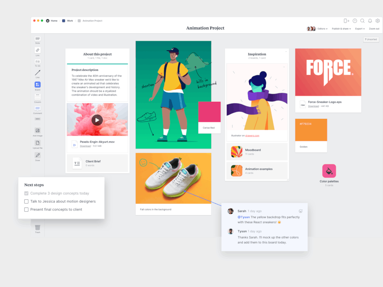
Even before the whole tribe of powerful note-taking apps descended on the digital landscape, Milanote was already carving out a niche for itself. Designed specifically with designers in mind, the app offers just enough tools to help users gather as many bits and pieces of inspiration as they can and then organize their thoughts, references, and inspirations for use later.

Designer: Milanote

Milanote basically gives users an infinite canvas to pin card-like objects that can contain text, images, YouTube links, and checklists. These can be arranged in a column or float on their own, drawn over with scribbles, and connected with lines, giving them the freedom to create mood boards, palettes, charts, and other visually interesting compositions to help their creative process. At the same time, it also helps them keep tabs on their tasks with checklists and kanban boards.

Milanote has been around for almost a decade now and, unfortunately, its age is starting to show. Unlike other apps in this space, the selection of objects that you can embed in that canvas is quite limited. While it does keep things simple, it might also fail to give the tools designers need to go beyond these basic building blocks. Milanote’s pricing system hasn’t changed that much either and it is one of the more restrictive and expensive ones out there.

What We Like

  • Clean and beautiful interface.
  • Simple and easy to use.
  • Available on Desktops and Mobile devices.

What We Don’t Like

  • Very restrictive free tier, expensive pricing.
  • Limited types of objects.

Scrintal

Although it started as something like yet another Notion alternative (more on that later), Scrintal recently launched a new version and a new image, billing itself as a “Playground for the Mind.” Instead of the more document-centric platform it once used, it now embraces a more visual approach to shaping your ideas and documenting your creative process.

Designer: Scrintal

Like with Milanote and other apps like it, Scrintal uses different kinds of blocks to represent objects, but this time with more variety and power. Not only are the more types of blocks, you can also do more with them, like structurally linking them instead of just drawing lines between them. And when you’re done with the free-form brainstorming process, you can actually convert your boards into more traditional structured documents.

If Milanote only had a very limited free tier, Scrintal doesn’t have one at all. You can have a free trial, but that’s pretty much it. And because its “2.0” version is quite new, there isn’t even any mobile app available yet. Of course, you’re unlikely to move blocks around on your phone or tablet, but just being able to view your notes anywhere can be quite convenient.

What We Like

  • Powerful free-form canvas for doing anything you want.
  • Link blocks not only visually but also logically.
  • Switch between visual board and standard documents seamlessly.

What We Don’t Like

  • New version doesn’t have mobile apps yet.
  • No limited free tier.

AFFiNE

As powerful as many of these note-taking tools might be, very few of us really know what happens behind the scenes. It’s not just because they’re complicated pieces of software but also because we have no access to their code in the first place. Some people are more conscious about their privacy and data security, and AFFinNE tries to serve this user base by offering an open source platform where you can be in total control of your data.

Designer: AFFiNE

AFFiNE’s experience operates on two different levels. On the one hand, you have what looks like a traditional linear document, except that paragraphs are actually blocks that can be almost anything, from images to tables with sliders and controls. Literally flip the switch and you’re taken to an infinite whiteboard where you can arrange these elements in a more visual way.

AFFiNE is one of the very few open source apps in this space, and some might see its fast-paced development and changes as a sign of instability and unreliability. That said, its free tier is quite generous and its lowest paid tier is also affordable, though you will have to for a different subscription to have access to much-hyped AI features.

What We Like

  • Generous free tier.
  • Seamlessly blends linear documents and visual blocks.
  • Open source software with self-hosting options coming soon.

What We Don’t Like

  • Still new and undergoing many changes.
  • AI features is a separate subscription.

Miro

Generating and organizing your own thoughts is one thing, but working with others can be quite a different beast. Different designers might have different requirements when it comes to their tools, and keeping everyone on the same page can sometimes feel like herding cats. Miro is built specifically to address the needs of collaboration, but rather than using a boring document or spreadsheet, it offers a lot of flexibility in how you express ideas and tasks.

Designer:

Miro makes working in teams not only more efficient but also a bit more fun. Visualization tools can speak louder than words, especially when they’re interactive and pleasing to look at. It also supports a wide variety of templates so you don’t always have to start a mind map or kanban board from scratch, further reducing time and friction.

This is one of the more mature products on this list and, unfortunately, it is also one of the more complicated and expensive ones. Targeted at creative professionals who mostly work with others, Miro has more disadvantages than advantages for the solo designer. It does have AI features to help condense the complexity, but, again, the pricing could be a little too much for individuals.

What We Like

  • Plenty of tools for brainstorming, planning, and documentation.
  • Expansive library of templates for different use cases.
  • Mature and stable platform with large industry backing.

What We Don’t Like

  • More oriented towards visual collaboration than individual ideation.
  • Expensive pricing plans

Walling

If you’re looking for a more organized visual representation of your content without becoming a full-blown structured document, then Walling might suit your needs and aesthetic tastes. Using the metaphor of blocks, which it calls “bricks” here, you basically create walls of different types of bricks that include images, videos, text, tables, calendars, and more. And, of course, it also has AI to help you generate ideas and organize them.

Designer:

Unlike a more free-form infinite canvas, these bricks follow a grid-like pattern that makes them look more like neatly laid-out magazines than messy whiteboards. Indeed, Walling actually lets you publish your wall or even just a section of it, practically turning it into a webpage. It’s almost like a website builder, but with a lot more freedom in how you want to lay out your cards.

Although Walling has been around for half a decade now, it has only been recently making waves with its simpler and more straightforward interface compared to bloated visual note-taking apps. In that course of time, it has also adjusted its free tier to be a bit more useful, while its paid offerings are also priced competitively.

What We Like

  • Clean user interface and magazine-like document layout
  • Publishing walls or sections is a simple click.

What We Don’t Like

  • No free-form canvas option.
  • Heavy focus on AI features.

Honorable Mentions (or Why Your Favorite App Didn’t Make The Cut)

This list is almost literally just the tip of the iceberg. The so-called PKM space is overflowing with apps with a wide range of designs, capabilities, and target audiences. These might not even be the most popular in the market, but power and popularity don’t always translate to satisfying user experiences.

There are definitely more options available, though not all of them might appeal to designers, artists, and creatives. We’d be remiss if we didn’t mention them, however, because people have different needs and tastes as well. If the previous five didn’t meet your requirements, the following apps could be more to your liking instead.

Notion and xTiles: Superpowered Databases

Databases and spreadsheets were traditionally seen as the purview of executives and IT, but the likes of Notion and xTiles have made them trendy among the productivity-loving crowd as well. In a nutshell, these platforms offer the ability to display the same piece of data in different ways, turning a line in a spreadsheet into a to-do list or a list of links into a grid of images.

Notion

Both these apps work on the level of “blocks,” which can almost be anything. Like Walling, they only allow a limited way of arranging these blocks, often in grids or columns. They are extremely powerful, appealing not just to advanced users but also to more creative people who want to bring their analog Bullet Journals to the digital world. All that power and flexibility, however, translates to complexity and, in many ways, visual chaos. It takes a lot of work to actually make good-looking pages, and you might find yourself losing time to that instead of actually doing creative work.

xTiles

Obsidian and Logseq: Privacy-First, Visuals Second

When people think of note-taking with computers and mobile devices, they most likely think of typed notes first. In this area, Obsidian and its open source rival Logseq are at the top of the food chain, offering the simplicity of text-based documents but with add-ons that go beyond just words. Both, for example, feature whiteboards and canvases where you can arrange and link your notes visually, mixing in some images and files as well.

Obsidian

Logseq

These apps value the privacy and longevity of the notes above all, which is why they adopted plain text as their primary document format and stored files locally on the device, with options to sync to the cloud at additional cost. These apps have a large treasury of plugins that add dashboards, spreadsheets, interactive elements, and whatnot to the experience, but at the end of the day, they’re still text-based, and that might be a bit limiting to visual note-takers.

MyMind and Google Keep: Pining for Pinterest

Pinterest is quite a popular resource for designers and artists, making its staggered grid (a.k.a. masonry) layout a favorite among those creating mood boards. It’s a simple design that adds visual interest without going overboard, and it’s the kind of layout that some note-taking apps are trying to adopt as well. It removes unnecessary features and distracting designs so you can simply focus on collecting references, jotting down inspiration, and scrolling through your gallery.

MyMind is a particular example of this design. With its simple and clean interface, it feels almost like Milanote but confined to this dynamic grid layout. It doesn’t come cheap, though, and has no free tier, but Google Keep comes close as a poor man’s moodboard option. That said, it really eschews the freedom of expression in exchange for a tidier space, something that could feel a bit suffocating for some users.

The post Top 5 Beautiful Note-taking Apps to Spark Creativity and Enhance Productivity first appeared on Yanko Design.

Standing floor lamp uses recycled leather to mix urban boldness and cozy warmth

Par : JC Torres
7 février 2025 à 17:20

Lamps do more than just illuminate our surroundings. They can very well change the mood in a room, especially ones whose designs are visible to everyone. The lights could give off a cool vibe that encourages productivity, or it could have a warm glow that makes you feel comfortable and at peace. Sometimes the lamp designs themselves turn a room’s narrative in a certain direction, from nature-inspired organic forms to minimalist, modern, and geometric shapes.

Lamp designs don’t have to be elaborate and complicated to have such effects. Sometimes, just the combination of form and materials is enough to be associated with certain themes and emotions. This standing floor lamp, for example, has a simple bar bent at an angle and a textile cover, but these already effectively convey the atmosphere of a city street mixed with the softness of a pasture.

Designer: Amuni Studio

Traditional street lamps cast a unique glow on the world of the night. Given their utility, their light can sometimes be harsh and cold, but it also offers safety and confidence in the dark of night. The shape of these lamps has almost become iconic, and one only needs to see the silhouette to make the association.

Corium is a standing floor lamp design that does exactly that, using the simple shape of a lamp arm bent forward at a slight angle. The lampshade is also nothing more than a long sheet of metal curving over the length of the light element like an arch. A layer of proprietary recycled leather is draped over this shade, adding a touch of organic texture and warmth to the composition.

In a way, Corium represents contrasting elements that find their harmony inside the modern home. There is the street lamp that is a staple of outdoor urban lighting, while leather is more closely associated with nature and fashion. Utility and luxury, coldness and warmth, light and shade all come together in a simple yet striking design that gives light in its own unique way.

Created using Luxion Technology (luxion.com)

Initially designed to be a pendant lamp, Corium is also an experiment in designing and producing a product entirely done in Latin America. In addition to components sourced locally, the talent and manufacturing involved were also done locally. It gives the lamp an even deeper narrative and a value that transcends its surface appearance.

The post Standing floor lamp uses recycled leather to mix urban boldness and cozy warmth first appeared on Yanko Design.

Teenage Engineering-inspired flashlight concept breaks the mold with a boxy design

Par : JC Torres
27 janvier 2025 à 14:20

In the course of using some everyday products, we probably seldom stop to question why things are designed the way they are. Why are appliances like speakers and air purifiers traditionally rectangular and boxy while flashlights and lamps are cylindrical? Sometimes, the answers lie in history and practicality, but other times it’s just a matter of convention and the lack of motivation to think outside the box.

This flashlight design concept, however, isn’t afraid to dare to be different, perhaps even to the point of sacrificing some ergonomics. Embracing a trending design aesthetic, it isn’t just breaking the mold by throwing out most conventions. It is also challenging those conventions to see what’s possible if we’re not afraid to ask “What if?”

Designer: Nikhil Kapoor

Industrial design aesthetics has carried a rather negative connotation of being cold and impersonal, but recent trends have cast a more positive light on modern renditions of the design language. Teenage Engineering’s products, in particular, have presented a certain flavor of minimalism that embraced the cold surface of metal, the angular and sharp edges of boxes, and an intentionally limited color palette.

The FL-1 flashlight concept embraces these design elements to shock and confound. Instead of the conventional barrel form, it comes in a box that will admittedly be cumbersome to hold for long periods of time, at least depending on the size. It could easily fit in the palm of your hand, as many EDC flashlights do these days, but the sharp edges could bite into your skin over time.

The design does have a few interesting features beyond its industrial aesthetic. The rectangular shape gives it enough room to fit two LED lights, which can be turned on individually or together with a simple sliding switch mechanism. There’s also a display to show the remaining battery charge so you’re never caught unaware. The flashlight is charged via USB-C, which is the only reference to the correct scale of the object.

Like Teenage Engineering’s designs, the FL-1 practically uses only two colors, or three if you count the contrasting shade of gray. A vibrant orange backside increases its visibility, but only if it’s upside down, while there’s no method for seeing the flashlight in the dark if it’s right side up. The concept definitely has its flaws, but it is still a worthwhile thought experiment on how we can challenge the status quo and come up with designs that aren’t just different but also even better.

The post Teenage Engineering-inspired flashlight concept breaks the mold with a boxy design first appeared on Yanko Design.

Modular laptops and mini PCs might be around the corner thanks to Intel

Par : JC Torres
27 janvier 2025 à 11:07

Despite laptops overtaking their towering cousins in market share, these portable computers still lack one vital trait that has kept stationary desktops still relevant today. Desktop computers are, to a very large extent, modular by design, making it easier to upgrade and replace components as needs and technologies change. Sure, some laptops have upgradable RAM and storage, but that’s pretty much all there is to them given certain limitations in design.

Those limitations include the design of the motherboard itself, an all-in-one all-or-nothing object that is pretty much the soul of a computer. Intel, however, is proposing a rather ground-breaking change that will help make these components more repairable and less wasteful. If followed by its partners, it won’t just kick off a new age of modular laptops, it could even give Intel and AMD a huge edge over their Arm-based rivals such as Qualcomm and, of now, Apple.

Designer: Intel

The difference in motherboards between desktops and laptops is like night and day. Desktops follow an industry convention that has been shaped over decades, allowing components from rival companies to be mixed and matched as the consumer desires. Laptop motherboards, on the other hand, are often designed based on brand needs and whims. More importantly, they come as a whole package, with many parts soldered onto the board, including the ones that get worn out faster than others.

Intel’s proposed guidelines try to split the laptop motherboard into three distinct parts, two of which would hold the I/O or input out components such as USB and HDMI ports. The third would be where the core silicon is located, specifically the CPU and the GPU, among others. The modularity would allow different affected parts to be replaced if broken or, if desired, even upgraded, without throwing away the rest of the motherboard.

Those guidelines also have something for mini PCs, which are like the middle child between desktops and laptops. In this matter, the CPU and motherboard are separated from the graphics card and other components, making it easier to swap out GPUs or CPUs in the future. The growing popularity of mini PCs, partially thanks to the Mac mini and Mac studio, could be the driving force behind this initiative. Ironically, Intel itself has given up on the form factor, licensing its “NUC” brand to ASUS.

Designer: Framework

These guidelines might be ideal for reducing e-waste and promoting the right to repair, but it still all depends on whether other players are willing to play ball. Laptop manufacturers might be hesitant to do the work redesigning their laptops, and Intel’s rival AMD might not be keen to cooperate either. It’s still a distant dream, but one can already have a foretaste of the future today with the Framework laptops, proving that it can indeed be done with the right design.

The post Modular laptops and mini PCs might be around the corner thanks to Intel first appeared on Yanko Design.

Atari x Nubeo limited edition Watches bring the chaos of Asteroids to your wrist

Par : JC Torres
27 janvier 2025 à 09:45

Even before turntables and instant cameras became fashionable again, the gaming industry has already been obsessed with old-school design. Whether it’s actually playing those classic titles or creating new games in a pixelated retro style, both gamers and designers have been harnessing the power of nostalgia to craft products that connect generations of people and keep the history of gaming alive.

Sometimes it’s not just the games themselves but even the merchandise that pulls at the heartstrings of fans of these cherished games. This watch, for example, might not actually let you play the iconic Asteroids game (which sounds like an idea for a smartwatch app), but it does bring not only the charm of those amorphous objects representing colliding asteroids, it even recreates the rather chaotic atmosphere of the game as well.

Designers: Atari x Nubeo

After Pong, Asteroids was arguably one of the most iconic first titles that graced the gigantic arcade cabinets in the youth of the gaming industry. Its graphics and concept were simple, but its mechanics could be unforgiving. You basically shoot down asteroids and UFOs passing by that may collide with you, all with very limited moving capabilities. It can get pretty messy quickly, with a random assortment of objects filling the large screen. Now imagine all those in a circle small enough to sit on your wrist.

That’s the adrenaline-pumping atmosphere that the limited edition Ventana Automatic watches are trying to convey every time you try to look at the time. Celebrating the game’s 45th anniversary, this Atari Asteroids watch brings all the familiar elements of the game and shrinks it down to a scale that, if it were actually a game, would be a sordid mess.

The triangular ship in the center moves to track the passing of each second, while two UFOs, colored differently from the asteroids, mark the minutes and hours using a unique layered disc system that rotates concentric circles instead of moving hands. This element adds a distinctive flair to the watch that easily sets it apart from more serious-looking timepieces.

1

The Ventana Automatic Atari Asteroids watch is powered by a Japanese automatic movement. The graphic elements are printed with Swiss Super-LumiNova, giving the watch an eerie glow in the dark. Available in Nova Nightfall, Plasma Pumpkin, Nebula Blue, Supernova Red, and Celestial Citrine colors, the limited edition watch will be something that gaming history fans and collectors might want to quickly reach for while supplies last.

The post Atari x Nubeo limited edition Watches bring the chaos of Asteroids to your wrist first appeared on Yanko Design.

Modified Roomba becomes a smart robot for dispensing doggie treats

Par : JC Torres
21 janvier 2025 à 18:20

Robot vacuum cleaners are so advanced these days that some of them barely need human intervention. Of course, that wasn’t always the case in the earliest days of this market segment, with the first generations relying on some very basic technologies and software by today’s standards. Although its name has become synonymous with robot vacs, the Roomba has almost all but faded into that background.

Some, however, have found some rather creative uses for older models, with a bit of hacking and ingenuity. Giving a very old rolling robot a better brain and literally space-grade software, this mod turns a cleaning machine into a mess-making one, albeit not by intention. Instead of picking up dirt or even clothes, the “Space Vacuum” will instead drop pieces of food for your canine companion to munch on when it’s near.

Designer: Joaquim Silveira

Most of us probably have a file of unused and abandoned electronics that are still a bit functional except for one broken or missing part. We don’t have much practical use for them, so they just end up gathering dust and taking up space, sometimes forgotten until the next Spring cleaning. A few people, however, have the fortunate skill to bring these machines back to life, though sometimes with a different function so different from the original.

This Roomba, for example, once cleaned up dirty floors in a previous lifetime. But with some clever use of off-the-shelf hardware like an Arduino and some skilled DIY electronics, it has been given a new lease on life as a dog food dispenser. Ironically, it now does the opposite of cleaning the floor and instead makes a mess, presuming the canine doesn’t gobble up the treats first.

What the Space Vacuum basically does is detect the presence of a dog, while differentiating it from other living critters in the house, and drops dog food from a paper cup that has its bottom partially cut out. Curiously enough, the software used for this project is NASA Jet Propulsion Labs’s (JPL) Fprime flight software used for space missions and controlling drones, which sounds a bit overkill for a food-dispensing robot. That, however, gives it the right to call itself a “Space Vacuum,” though the vacuum part is in question.

It’s definitely not going to win any awards for aesthetics or practicality, but the project does spark curiosity and maybe inspire a few more experiments using these house robots. The rather odd clothes-picking Roborock vacuum at CES 2025 demonstrated what these machines are actually capable of, especially with their advanced sensors and AI-powered brains. All they need is a robot arm or a proper food dispenser, and they have the makings of a general-purpose robot that won’t take up too much floor space.

The post Modified Roomba becomes a smart robot for dispensing doggie treats first appeared on Yanko Design.

Revolutionize Interiors With This Bold Steel Coffee Table for Unconventional Spaces

Par : JC Torres
20 janvier 2025 à 16:20

The Sharp coffee table boldly defies the ordinary, emerging as a striking piece of modern art. It challenges traditional ideas about furniture, positioning itself as a daring statement. Crafted for those who embrace life beyond the conventional, this table is for individuals who set their own style standards and are unafraid to break societal norms, offering a fresh perspective on home decor.

Rooted in a desire to redefine the role of furniture, the Sharp collection stands as a testament to this vision. This table is a declaration in itself, merging industrial steel with a sleek black finish to create a captivating contrast. The result is an “uncomfortable beauty” that draws the eye and sparks conversation, offering a luxurious experience that proudly embraces its bold, unrefined essence.

Designers: Nikita Gorshkov, Alexandra Ivanets (Primitive Buro)

The allure of the Sharp table lies in its unique design, characterized by stark, deliberate geometry. Minimalistic in detail yet impactful in presence, its narrow lines and abrupt edges create an aura of tension and strength. The black color scheme transforms the table into a commanding visual centerpiece, dictating the ambiance of the room and asserting its presence rather than simply blending in.

Steel, chosen for its timeless and resilient qualities, serves as the perfect medium for the Sharp table. It embodies strength and durability, while the black finish enhances its monolithic presence, lending an air of intimidation and elegance. Each table is meticulously handcrafted, ensuring every piece is unique, with its own distinct personality and character, making it a truly one-of-a-kind addition to any space.

Most eye-catching are the jagged, teeth-like feet of the table, giving the piece of furniture an imposing presence bordering on frightening. It also boggles the mind, given those pointed ends, how the table can stand so stably, let alone support the weight of a person sitting on it. Yes, it can be used as an impromptu bench, though one would wonder who would be daring enough to tempt fate.

This is why the Sharp Coffee Table is crafted for those who are fearless in making bold statements with their interiors. It attracts those who find beauty in rawness and simplicity, and who embrace the freedom that comes with rejecting conventional stereotypes, making it a perfect fit for the daring and adventurous. For those who dare to defy convention and embrace their unique sense of style, the Sharp Table offers an unparalleled experience, inviting you to explore new horizons in interior design and self-expression.

The post Revolutionize Interiors With This Bold Steel Coffee Table for Unconventional Spaces first appeared on Yanko Design.

Sport Climbing Meets Design: The Playful Hanger for Active Homes

Par : JC Torres
20 janvier 2025 à 11:07

Inspiration often emerges from unexpected sources. A walk in a forest can have you stumbling on fungi that become the inspiration for a new kind of sustainable material. Watching a crowded concert could give you an idea for the next big social media app. Those “aha!” moments often lead to interesting designs, even for the most mundane household items.

One such innovative fusion is the Grip Hanger, a clothes rack that draws its design from the unique forms found on sport climbing walls. These walls mimic the natural rock formations climbers encounter, yet they are crafted with intentional shapes to enhance grip practice and skill development. It’s almost a very loose and random association between two uses of the word “hang,” and yet it yields quite a stunning implementation that can add a bit of joy to your everyday life.

Designer: Junho Kang

Unlike the randomness of natural rocks, the holds on climbing walls are meticulously designed to challenge and train climbers. The Grip Hanger cleverly incorporates this concept, with its “Hold” component mirroring the playful shapes of climbing holds. Their seemingly deformed shapes hide a deeper meaning to them, something you might not realize unless you take a closer look.

This whimsical design gives the hanger itself a distinctive personality, Its hook mimics the way climbers’ hands grasp these holds, with thin metal fingers trying to grip those stone-like holds. This subtle design adds a touch of sport climbing flair to any room, or at least makes you pause and wonder why a hanger would look that way.

Constructed from bent sheet metal, the clothes rack itself mirrors the angular, rugged aesthetic of artificial climbing walls. Its raw, brutalist design speaks to the architectural style often seen in urban landscapes, making it a bold statement piece. This edgy design goes beyond mere looks and provides sturdy support and a unique visual appeal that catches the eye.

The Grip Hanger stands out with its modular functionality, featuring perforations that allow for the attachment of detachable shelves. This adaptability makes it not only a stylish addition but also a practical solution for organizing clothes and accessories. The design invites users to think creatively, transforming a simple clothes rack into an engaging, interactive piece of home decor.

This innovative design challenges the conventional view of everyday objects, infusing them with creativity and fun. The Grip Hanger encourages us to look beyond traditional designs and embrace the unexpected, turning a mundane item into something extraordinary. Its playful yet functional approach serves as a reminder that inspiration can be found anywhere, even in the most unexpected places.

It also demonstrates how anything can be a source of inspiration and ideas, even the ones you least expect. Its blend of sport climbing elements and practical functionality makes it a standout piece, adding character and charm to any space. The Grip Hanger is a testament to the endless possibilities that arise when creativity meets everyday utility.

The post Sport Climbing Meets Design: The Playful Hanger for Active Homes first appeared on Yanko Design.

Rechargeable paper batteries promise safe, flexible, and compostable power

Par : JC Torres
16 janvier 2025 à 18:20

Many of our electronics today rely on batteries, from laptops to phones to smart home appliances to even cars. It’s almost ironic, then, that these critical batteries are also one of the most dangerous things we keep near our bodies, not to mention a hazard to the health of the planet as well. From the way they are made to the unsustainable metals and chemicals they contain, batteries, by nature, seem opposed to life itself.

Green energy like solar and wind can go only as far as recharging batteries, but we still need these volatile objects to power devices directly. This innovative battery, however, attempts to reinvent batteries from the ground up to provide true sustainable power to the point that they can even be broken down as compost. Even more intriguing, they’re made of materials you’d least expect to find in batteries: paper and water.

Designer: Flint

Technically speaking, the batteries aren’t made of the same kind of paper you write on or read from. It actually uses cellulose as the structural backbone and separator of the battery, an abundant material derived from plants and also used in paper, hence the name. As for water, it’s used as the foundation for the electrolytes that actually carry the electrical flow between the zinc-based anode and the manganese-based cathode, both of which are non-reactive, safe, and commonly found everywhere.

This unusual composition for a battery yields many benefits beyond simply being made of sustainable materials. For one, the battery has unbelievable resilience and can still output power even when cut in half, let alone not explode in your pocket when punctured. It’s also impervious to fire since it uses water-based electrolytes. This practically removes the need for those fancy but complicated and expensive cooling systems in phones and laptops, presuming they get used in those devices. The batteries can also be folded and bent safely, finally realizing the dream of flexible batteries.

The Flint Paper Batteries are advertised to have the same performance in terms of output and longevity as typical toxic rechargeable batteries. And yes, they’re rechargeable as well. They won’t live forever, though, and when they’ve finally lost their charge for good, simply removing the vacuum-sealed casing starts the natural degradation process that breaks them down into harmless components.

It all sounds idyllic but the technology is not completely ready for mass consumption just yet. One of the biggest hurdles that still needs to be overcome is mass production, and Flint’s creators are planning on using currently existing lithium-ion battery manufacturing processes in order to minimize production and adoption costs. When that happens, we could finally take a major step forward in running not only on green power but also on safe and recyclable batteries as well.

The post Rechargeable paper batteries promise safe, flexible, and compostable power first appeared on Yanko Design.

Modular wireless earbuds concept has a case that makes removing earbuds easy

Par : JC Torres
16 janvier 2025 à 16:20

Thanks to Apple, popping earbuds in and out of their charging cases almost feels natural these days. That doesn’t mean they’re convenient or easy, especially when you have to actually open the case first to get the earbuds out. It shouldn’t be that hard, but convention isn’t always on the side of common sense, especially when sticking to the norm is more cost-effective.

This concept design for a pair of modular wireless earbuds tries to challenge the status quo on many levels. It tries to create an ecosystem that goes beyond just playing audio in your ears, resulting in a few features that are, admittedly, a bit peculiar. Curiously, one of the most interesting parts of its design isn’t actually the modules but is instead its equally unconventional charging case.

Designer: Dongkyun Kim

1

Yes, the charging case, which is actually a lot larger than your typical design, still has a cover that you open up to reveal its contents. In fact, it might even be weirder than most charging cases because the cover opens down like a drawbridge. That doesn’t matter much, though, because you don’t even need to open it to access the earbuds. There are openings on each side that allow you to take them out and put them back in without opening the case at all.

It’s becoming more common for TWS earbud cases to have screens of their own to display important stats, and the Orbit concept is no different. Where it differs is that the screen is so small to avoid being distracting, though it also raises the question of whether it will be readable at all. It’s just a minor convenience anyway, something to add some flavor to the already intriguing design.

Created using Luxion Technology (luxion.com)

Created using Luxion Technology (luxion.com)

Of course, the real meat of the Orbit design concept is its modularity and the modules it comes with out of the box, or rather out of the charging case. There’s a cog-shaped wheel, for example, that magnetically latches onto one of the earbuds to add some tactile feedback for more precise and satisfying controls. Presuming there will be other products in the Orbit ecosystem, this wheel could also be a controller for those.

1

The camera modules are a bit of an odd feature. They’re supposed to improve motion tracking and spatial awareness, though that could also raise privacy concerns. It could be used to take photos or record videos that are sent to a paired smartphone in a way that looks almost natural because of their proximity to your eyes. Given their size, however, they might not be that capable of recording important memories.

The wireless earbuds themselves have a rather unusual design. In addition to adopting an open-ear technology, the buds are meant to clip to the sides of the ear, which could be uncomfortable and unstable. Indeed, the concept has quite a few interesting ideas that go beyond the actual purpose of the earbuds, but it’s really the case that could be considered to be its selling point.

The post Modular wireless earbuds concept has a case that makes removing earbuds easy first appeared on Yanko Design.

Nintendo Switch 2 Official: The Handheld That Restarted It All Has Grown Up

Par : JC Torres
16 janvier 2025 à 14:21

Although handheld gaming devices have existed since the earliest days of the Game Boy, the recent craze can probably be attributed to the unprecedented and unexpected success of the Nintendo Switch. More than just portability, it offered flexibility in gameplay, especially with its innovative removable Joy-con controllers. Although it continues to be a successful product, the almost eight-year-old device has started showing its age.

In typical Nintendo fashion, it has taken years for a successor to arrive, but the wait is finally over. After no small amount of clamor and a few leaks and false leads, the Nintendo Switch 2 has finally been confirmed to be coming this year. And while the teaser video is light on the details, there is definitely enough for fans to chew on until the official reveal in April.

Designer: Nintendo

Right off the bat, Nintendo wants to make it clear that the Nintendo Switch 2, which is its official name, is bigger than the OG Switch. You will, however, also notice a complete switch (pun intended) in color schemes. While the first Nintendo Switch drew your attention to its Blue and Red Joy-cons, the Switch 2 carries an almost completely black color scheme, with the other hues acting only as highlights on the controllers. To some extent, this makes it match the predominantly black aesthetic on handheld gaming PCs these days, though Switch 2 owners will most likely apply skins anyway.

There are, of course, even bigger changes all around, starting with, at long last, a second USB-C port at the top of the device, hopefully saying goodbye to awkward charging positions and hello to more accessories. The flimsy bar-style kickstand has also been replaced by a wide U-shaped design, giving not only more stability but also more angles. You can finally lay the Switch 2 almost flat on a table, for whatever reason you might want to.

The Joy-cons also undergo a significant change beyond the increase in size. Gone is the rail mechanism that gave the Nintendo Switch its iconic snapping sound, replaced by hopefully more reliable magnets with a matching snapping sound. The dock has also been given a facelift with rounded corners and a matte finish. All in all, the Nintendo Switch 2 exudes a more mature character than its predecessor, though it’s not clear how that will appeal to those who prefer Nintendo’s Fisher Price aesthetics.

Unsurprisingly, Nintendo is silent on the internals, so it’s still anyone’s guess how much more powerful the Switch 2 will be. Don’t hold your breath that it will go head-to-head with handheld PCs or even current-gen consoles, though. That just isn’t Nintendo’s style. Especially since Nintendo is promising compatibility with some, but not all, first-gen Switch games. More details will be revealed in the company’s Direct stream on April 2, but it looks like the launch title has already been decided to be Mario Kart.

The post Nintendo Switch 2 Official: The Handheld That Restarted It All Has Grown Up first appeared on Yanko Design.

Nokia Design Archive opens as Nokia phones start to disappear

Par : JC Torres
16 janvier 2025 à 11:40

Although Apple and Samsung are household names when it comes to smartphones these days, there was a time when they were virtually unheard of in the mobile space. Back when mobile phones were less smart, Nokia flooded the market with a variety of designs, some of which have stood the test of time, as proven by recent revivals, while others may have been far too ahead of their time. Still, others were just plain bonkers but still left quite an impression on people’s minds.

The Finnish company no longer makes phones, of course, but its legacy lives on in more ways than one. Fortunately, the Nokia Design Archive is now open to the public, preserving and sharing not just the company’s historical products but also its design processes and strategies, not to mention a few ideas that never came to light. Ironically, this comes at a time when Nokia-branded smartphones are starting to disappear, making this memorial to its legacy even more poignant.

Designer: Nokia, Aalto University

From the sturdy 5110 to the well-loved 3210, from the 5310 XpressMusic to the 8110 “banana phone,”, Nokia’s history is definitely a colorful one from a design perspective. Yes, some of the phone designs it actually launched boggle the mind and, in some cases, even offend design sensibilities, but one can’t accuse the brand of playing it safe and sticking to lucrative and overused formulas. Then again, times were very different back then, and so were people’s tastes and needs.

With Nokia formally done with the mobile phone space, that history would have been completely lost if not for this highly detailed and interactive museum of everything Nokia. The site generously provides not only photos of phones that were or could have been but also sketches, presentations, videos, and documents that narrated Nokia’s design story that spanned decades. Admittedly, navigating the site’s interactive graph UI is a bit cumbersome, but it also gives the experience a bit of a treasure-hunting flavor.

It’s definitely a treasure trove of ideas and illustrations, from concepts of the then “futuristic” 3G network to a shape-changing device that would still be very interesting today. It makes one wonder what could have been had Nokia stayed in the game. Alas, the modern smartphone world has not been kind to old giants, and it seems that Nokia’s history in mobile is finally coming to a close once and for all.

Although it has licensed its name to HMD Global to make Nokia-branded phones, both smart and dumb, that might be ending soon as well. HMD seems to be removing Nokia smartphones from its online stores, and the remaining feature phones bearing that name might soon be on the way out as well. It’s only fitting, then, that the Nokia Design Archive finally opens its doors as Nokia itself closes the final chapter of its mobile history book.

The post Nokia Design Archive opens as Nokia phones start to disappear first appeared on Yanko Design.

Marble kitchen counters and tabletops will charge your phone while you work

Par : JC Torres
15 janvier 2025 à 16:20

Wireless charging didn’t just free us from the tyranny of tangles, it also opened the doors to creative charger designs. Especially with the addition of magnetic force, chargers no longer needed to be stuck to walls or power outlets or even lie flat on charging beds. Of course, these still required the presence of often very conspicuous chargers that may look out of place in some situations, no matter how aesthetic they might be.

Some furniture makers have started integrating wireless charging into their designs but often end up making the areas too obvious, clashing with the otherwise minimalist and luxurious design of the product. This wireless charging innovation, in contrast, is almost completely invisible, save for a very subtle and elegant halo of light enclosing the charging area. In fact, this technology can be integrated into an equally innovative and sustainable stone-like material that transforms kitchen countertops and luxurious tables into futuristic charging spaces for phones.

Designer: Cosentino x FreePower

Imagine going to a bar and never having to worry about your phone dying. Simply put your mobile device down in front of you and have it charge while you sip your martini and make connections with the people around you. Or how about placing your phone on the kitchen table while you prepare dinner and listen to your favorite podcast, confident that your phone’s battery will be full by the time you’re done? All of this without a single wireless charger that stands out like a sore thumb.

FreePower’s technology was already making these James Bond-like scenarios a reality by integrating the wireless charging components in places you’d least expect them, specifically materials like marble and stone that you’d hardly expect to have embedded chargers. Its partnership with Cosentino, however, adds another twist to that dreamy technology, making it available on materials that are both luxurious and sustainable.

Cosentino’s Silestone, for example, is a low-silica mineral surface that uses recycled materials to reduce the amount of crystallized silica used. Dekton, on the other hand, mimics the appearance and texture of porcelain while using carbon-neutral materials that also help improve its durability and scratch resistance. Both materials are also produced using sustainable processes that don’t sacrifice the planet’s health in the name of luxury.

The collaboration between FreePower and Cosentino opens a new avenue for integrating convenient wireless charging spaces into luxurious but sustainable surfaces that can be used in kitchens, bathrooms, bars, conference tables, and even desks. The only drawback to this ideal situation is that these pieces of furniture have to be custom made, as retrofitting existing counters and tabletops is not yet possible at this time.

The post Marble kitchen counters and tabletops will charge your phone while you work first appeared on Yanko Design.

Stress-free electric screwdriver concept offers reliability in an elegant design

Par : JC Torres
20 décembre 2024 à 19:20

Multi-tool designs have become a common sight in many EDC kits, offering a range of tools for almost every occasion. While these might be fine for those quick and unplanned tasks, dedicated tools for specific jobs still have the advantage of offering the best experience as far as that purpose goes. When you’re at home or at your workshop, for example, a proper screwdriver is probably a better option than a tiny one that fits in your pocket.

That said, there’s also a variety of designs available for screwdrivers, ranging from the manual type to electric tools. But while the latter tend to offer more power and convenience, people still tend to reach for a classic design because they’re instantly available without having to worry about cords or batteries. This concept for an electric screwdriver tries to address that remaining flaw by introducing a design that’s ergonomic, versatile, and ultimately more reliable.

Designer: Simone Rizzi

The convenience of electric screwdrivers comes from the fact that you don’t have to strain your hand while twisting the tool. But like flashlights and other battery-powered devices we keep in drawers and toolboxes, we tend to forget to check their state until it’s too late. The stress of discovering a drained electric screwdriver right when you desperately need it is why people surprisingly still prefer the conventional and manual type of screwdriver.

Delta is a concept design for an electric screwdriver that fixes that problem with a very simple solution. The screwdriver comes with a dock for its home that acts not only as storage for driver bits but also as a charging base, not unlike the charging cases of wireless earbuds today. With that design, you can always be sure that the screwdriver will be ready for action the moment you pick it up, and there’s also a very visible indicator of just how much battery it has left.

The design of the screwdriver and its base is also unlike your typical electric screwdriver, paying close attention to aesthetics and ergonomics. Rather than a straight stick or a gun-like shape, the Delta has a slightly bent form that makes it easier and more comfortable to grasp, increasing confidence and pleasure in the use of the tool. Familiarity makes you more likely to immediately reach for this screwdriver rather than second guessing if it’s the right tool or not.

The triangular shape of the charging base isn’t by accident either. It provides stability whether it’s lying on its side or standing on one end, while also making it easy to pick up and carry the duo wherever it’s needed. The location of the driver bits offers easy and immediate access without worrying about them falling off in transit. The Delta concept doesn’t radically change the formula for an electric screwdriver, but through the combination of small improvements, it creates a design that is not only more usable but more reliable as well.

The post Stress-free electric screwdriver concept offers reliability in an elegant design first appeared on Yanko Design.

Mini gaming laptop has a removable keyboard to easily switch between work and play

Par : JC Torres
20 décembre 2024 à 16:20

Handheld gaming PCs like the Steam Deck, Lenovo Legion GO, and ASUS ROG Ally have proven to be popular designs in a somewhat niche market. Despite their small sizes, at least relative to laptops, these computers are quite capable of driving even graphics-heavy triple-A games, at least with reasonable settings. And as with any gaming-worthy computer, these handheld PCs are also capable of doing just about anything, including office productivity or even content creation.

That said, their designs are hardly conducive to use cases outside of gaming, especially for tasks that require at least a keyboard. There are alternative designs from the likes of AYANEO and GPD that do add a tiny keyboard, but those are meant more for chatting than actual work. This upcoming newcomer, however, wants you to have your cake and eat it too, and it’s using a rather ingenious design that supports both games and productivity without compromising too much.

Designer: ONE-NETBOOK

We’ve seen handheld gaming PCs that look like laptops, but these usually compress the keyboard in order to make room for gaming controls like joysticks and buttons. This creates a usable but not ideal experience, where typing is doable but uncomfortable and gaming is bearable but not always enjoyable. And that’s not even considering issues with ergonomics for both sides of the coin. Short of having a shape-shifting computer or a modular design (that has actually been done before as well), there’s really no easy way to bridge these two together, at least until now.

Unlike its predecessor that attempted to create a hybrid between a Nintendo Switch handheld and a Microsoft Surface tablet, the ONEXPLAYER G1 embraces the form factor of a small 8.8-inch laptop. Opening it up reveals what looks like a regular physical keyboard, complete with a tiny touchpad, so you might not even consider it as a gaming computer until you remove that keyboard. Yes, that keyboard is actually wireless and connected to the computer using magnets only, and lifting it up reveals the handheld’s gaming chops.

Underneath this removable keyboard are analog joysticks, a D-Pad, and face buttons, the essential parts of a game controller. Because there isn’t a critical need to have a keyboard, the design is able to accommodate a more comfortable arrangement of buttons similar to an Xbox-compatible controller. Of course, there are also triggers and shoulder buttons at the back of the laptop, as well as a number of extra buttons.

What’s interesting about this design is that even this gaming “mode” still has a split keyboard below the controls. It’s not immediately clear whether these are capacitive keys on a glass surface or if they’re just very low-travel keys for basic chat needs. Either way, it’s definitely an interesting twist on the handheld gaming PC design, though the price for such a multi-functional beast will probably cost as much as a laptop as well.

The post Mini gaming laptop has a removable keyboard to easily switch between work and play first appeared on Yanko Design.

Snail-like GaN chargers bring a long overdue aesthetic upgrade to an everyday product

Par : JC Torres
10 décembre 2024 à 18:20

Although some companies have tried to remove the chargers they ship with devices like smartphones, they haven’t exactly gone down in number at all. In fact, given the many different charging technologies and sometimes incompatible support, people might be buying more chargers to keep up with the fast-paced changes. But while these chargers are rapidly changing on the inside, they seem to have stagnated on the outside.

Chargers come in all shapes and sizes, but the vast majority of them also come in boxy and uninspiring designs. You’d think that considering how often we use them and put them out in public, people would want these essential gadgets to actually look more appealing. That’s the kind of design innovation that these chargers are bringing to your bag and your life, adding a much-needed facelift to an otherwise mundane object.

Designer: Counterpart

Chargers are boxy for a good reason, at least in the past. Electronic components were often large and bulky, so they needed to cram as much in a small space, making a regular box shape the most efficient choice. But with advancements in technology like GaN (Gallium Nitride), for example, we can squeeze in more in an even smaller space or, better yet, expand the design language that these products use.

The Charger might sound like a generic name, but its design is anything but. Rather than a square or rectangle, these chargers have a more pleasing and pleasing round shape, with a rippling surface that is almost reminiscent of Zen gardens. The cable, which would normally be unruly and difficult, is kept in line using a retractable mechanism that also protects it from wear and tear. Curiously, it gives the charger an image not unlike a snail, which is probably one of the most Zen critters given how slow it moves.

The design goes beyond just changing the way the product looks. It also feels nice in the hand thanks to the use of silicone, while post-consumer plastic adds a touch of sustainability to its character. On their own, these little changes seem inconsequential, but together they completely transform the charger from a humble tool into a lifestyle accessory, one that you wouldn’t be embarrassed to show off while you hog the power outlet.

Despite its small size, The Charger is able to output 35W of power thanks to GaN technology, enough to charger devices smaller than a laptop. If there’s one minor flaw in this design, however, is that the circular shape might block adjacent sockets in more cramped power strips or wall outlets. It’s also a bit bulkier, even if the plug can be folded up when not in use. It’s still a small price to pay for a design that improves not only the user experience but also its appreciation as well.

The post Snail-like GaN chargers bring a long overdue aesthetic upgrade to an everyday product first appeared on Yanko Design.

❌
❌