Vue normale

Il y a de nouveaux articles disponibles, cliquez pour rafraîchir la page.
À partir d’avant-hierFlux principal

Metal, Leather, Rubber, NATO, or Canvas – Which is the Right Watch Strap Material for You?

Par : Sarang Sheth
10 février 2025 à 01:30

Choosing a strap for your watch is like choosing a paint-job for your car. Or the furniture for your house. It adds an aesthetic, sometimes functional layer to the watch, just like choosing yellow paint is an aesthetic + functional choice for a cab, or choosing bunk-beds is an aesthetic + functional choice for a home with a single bedroom for two siblings, or a dorm. Watches come in hundreds (if not thousands) of varieties, and so do watch straps… but you can boil these straps down to 5 broad materials – Metal, Leather, Rubber (or Silicon), NATO (Nylon), or Canvas. So, does it make sense to spend time deliberating on what material works with your watch? Absolutely!

Each material offers its own balance of comfort, durability, and aesthetic appeal, making it crucial to consider how it fits into your daily routine and personal style. Whether you’re a suit-and-tie kind of person, a weekend explorer, or someone who just wants a reliable everyday watch, there’s a strap that perfectly suits your needs. Let’s break down each option to help you decide.

Metal Straps – Classic, Durable, and Timeless

Metal straps, often made from stainless steel or titanium, are the definition of versatility. They pair effortlessly with both formal and casual watches, making them a staple for anyone who values longevity and a refined aesthetic. A well-crafted metal bracelet adds heft and presence to a watch, making it feel more substantial on the wrist. Whether it’s the sleek polish of a Rolex Jubilee bracelet or the rugged appeal of an Omega Seamaster’s chunky links, or even the Milanese-style mesh on your Tissot Seastar, metal straps exude confidence and durability.

They work best with dive watches, dress watches, and chronographs, complementing cases that range from slim and elegant to bold and industrial. Metal straps fit seamlessly into business attire, evening wear, and even smart-casual outfits. However, they might not be the best choice for extreme outdoor activities, as they can feel heavy and less comfortable in hot weather.

Pros:

  • Exceptional durability
  • Waterproof and sweatproof
  • Timeless aesthetic
  • Excellent resale value
  • Low maintenance
  • Perfect for professional settings

Cons:

  • Generally heavier than other options
  • Can be expensive
  • May pull arm hair
  • Limited flexibility in formal situations
  • Can be challenging to size properly

Leather Straps – Sophisticated, Versatile, and Full of Character

Leather straps remain the quintessential choice for dress watches and classic timepieces, offering an unmatched level of sophistication and elegance. Available in countless varieties – from classic calfskin to exotic alligator and ostrich – leather straps can transform the character of a watch while providing excellent comfort. They’re particularly suited to dress watches, vintage timepieces, and chronographs.

The versatility of leather is remarkable, with different treatments and finishes allowing for both formal and casual applications. A black alligator strap can elevate a watch to black-tie status, while a distressed brown leather strap can create a perfect casual vintage look. They work exceptionally well with business attire and formal wear, though certain casual leather varieties can complement everyday casual wear as well.

Pros:

  • Develops unique patina over time
  • Excellent comfort
  • Wide range of styles and colors
  • Perfect for formal occasions
  • Ages beautifully
  • Easy to change

Cons:

  • Requires maintenance
  • Not water-resistant
  • Can deteriorate in hot climates
  • May show wear quickly
  • More expensive for quality options

Rubber Straps – Sporty, Waterproof, and Built for Action

Rubber straps have come a long way from their humble beginnings as purely utilitarian options for dive watches. Today’s rubber straps are available in various grades and compositions, from natural rubber to sophisticated synthetic compounds, offering supreme comfort and durability. They’re ideal for sports watches, dive watches, and any timepiece that might be exposed to water or physical activity.

High-end rubber straps, like those from Oysterflex by Rolex or Vulcanized rubber by Richard Mille, have elevated this material to luxury status. They’re also a standard fixture for most smartwatches, making them uniquely dichotomic, so don’t let people look down on you for wearing rubber straps. Rubber, or sometimes even silicone, can be hypoallergenic too, making them perfect for people with sensitive skin.

Pros:

  • Extremely durable
  • Waterproof
  • Easy to clean
  • Comfortable in all weather
  • Perfect for active lifestyles
  • Anti-allergenic

Cons:

  • Can attract dust
  • May not age as gracefully as leather
  • Limited formal applications
  • Quality varies significantly
  • Can trap moisture against skin

NATO Straps – Military Roots with Modern Versatility

Born from military specifications in the 1970s, NATO straps have evolved from purely functional items to fashion statements in their own right. Made from woven nylon, these straps are lightweight, breathable, and incredibly secure, as they loop under the watch case to prevent the watch from falling off if a spring bar fails. Their affordability and wide range of colors make them a go-to option for those who like to switch up their watch’s look frequently.

NATO straps are perfect for field watches, tool watches, and casual dive watches, giving them a rugged yet approachable vibe. They pair well with relaxed, everyday outfits—think jeans, a T-shirt, and a vintage-style watch. While they’re not ideal for formal occasions, they excel in outdoor adventures and summer wear, offering unmatched comfort in hot and humid conditions.

Pros:

  • Extremely affordable
  • Easy to change
  • Highly secure
  • Wide variety of colors and patterns
  • Comfortable in hot weather
  • Water-resistant

Cons:

  • Can look too casual for formal occasions
  • May add thickness to the watch
  • Can wear out relatively quickly
  • Some designs may appear too busy
  • Not suitable for dress watches

Canvas Straps – Rugged, Lightweight, and Understated

Canvas straps represent a perfect middle ground between the casualness of NATO straps and the sophistication of leather. These fabric straps, often made from cotton or linen, offer a unique texture and visual interest that can complement both vintage and modern timepieces. They work particularly well with field watches, pilot watches, and casual everyday timepieces.

The informal nature of canvas makes these straps perfect for weekend wear and casual settings, while still maintaining a more refined appearance than their NATO cousins. They’re especially suitable for summer months and tropical climates, offering excellent breathability while adding a touch of adventure to any watch they’re paired with.

Pros:

  • Excellent breathability
  • Casual yet refined appearance
  • Generally affordable
  • Comfortable in hot weather
  • Easy to clean
  • Lightweight

Cons:

  • Limited formal applications
  • Can absorb moisture and odors
  • May fray over time
  • Less durable than other options
  • Can be difficult to find in high quality

The post Metal, Leather, Rubber, NATO, or Canvas – Which is the Right Watch Strap Material for You? first appeared on Yanko Design.

Top 5 Beautiful Note-taking Apps to Spark Creativity and Enhance Productivity

Par : JC Torres
9 février 2025 à 00:30

The creative process is a multi-faceted journey, one that involves different stages that sometimes require tools different from our normal ones. Authors, for example, often find themselves doodling mind maps or sketching figures, while designers will type out notes and tasks every so often. When it comes to tools like notebooks and paper, there is no one solution that rules them all, but apps offer a kind of synergy that isn’t possible with analog tools.

At the same time, there are in fact too many apps nowadays thriving on buzzwords like GTD, PKM, and AI, and a whole lot of them seem to be targeted at a more tech-savvy audience. Their power often comes with complexity and carries an aesthetic that will spreadsheet-lovers more than stationery collectors. Worry not, because there are indeed note-taking and productivity apps designed with creatives and creators in mind, and these are five of the most powerful and beautiful note-taking apps to help designers, artists, and writers collect inspiration and organize their ideas.

Milanote

Even before the whole tribe of powerful note-taking apps descended on the digital landscape, Milanote was already carving out a niche for itself. Designed specifically with designers in mind, the app offers just enough tools to help users gather as many bits and pieces of inspiration as they can and then organize their thoughts, references, and inspirations for use later.

Designer: Milanote

Milanote basically gives users an infinite canvas to pin card-like objects that can contain text, images, YouTube links, and checklists. These can be arranged in a column or float on their own, drawn over with scribbles, and connected with lines, giving them the freedom to create mood boards, palettes, charts, and other visually interesting compositions to help their creative process. At the same time, it also helps them keep tabs on their tasks with checklists and kanban boards.

Milanote has been around for almost a decade now and, unfortunately, its age is starting to show. Unlike other apps in this space, the selection of objects that you can embed in that canvas is quite limited. While it does keep things simple, it might also fail to give the tools designers need to go beyond these basic building blocks. Milanote’s pricing system hasn’t changed that much either and it is one of the more restrictive and expensive ones out there.

What We Like

  • Clean and beautiful interface.
  • Simple and easy to use.
  • Available on Desktops and Mobile devices.

What We Don’t Like

  • Very restrictive free tier, expensive pricing.
  • Limited types of objects.

Scrintal

Although it started as something like yet another Notion alternative (more on that later), Scrintal recently launched a new version and a new image, billing itself as a “Playground for the Mind.” Instead of the more document-centric platform it once used, it now embraces a more visual approach to shaping your ideas and documenting your creative process.

Designer: Scrintal

Like with Milanote and other apps like it, Scrintal uses different kinds of blocks to represent objects, but this time with more variety and power. Not only are the more types of blocks, you can also do more with them, like structurally linking them instead of just drawing lines between them. And when you’re done with the free-form brainstorming process, you can actually convert your boards into more traditional structured documents.

If Milanote only had a very limited free tier, Scrintal doesn’t have one at all. You can have a free trial, but that’s pretty much it. And because its “2.0” version is quite new, there isn’t even any mobile app available yet. Of course, you’re unlikely to move blocks around on your phone or tablet, but just being able to view your notes anywhere can be quite convenient.

What We Like

  • Powerful free-form canvas for doing anything you want.
  • Link blocks not only visually but also logically.
  • Switch between visual board and standard documents seamlessly.

What We Don’t Like

  • New version doesn’t have mobile apps yet.
  • No limited free tier.

AFFiNE

As powerful as many of these note-taking tools might be, very few of us really know what happens behind the scenes. It’s not just because they’re complicated pieces of software but also because we have no access to their code in the first place. Some people are more conscious about their privacy and data security, and AFFinNE tries to serve this user base by offering an open source platform where you can be in total control of your data.

Designer: AFFiNE

AFFiNE’s experience operates on two different levels. On the one hand, you have what looks like a traditional linear document, except that paragraphs are actually blocks that can be almost anything, from images to tables with sliders and controls. Literally flip the switch and you’re taken to an infinite whiteboard where you can arrange these elements in a more visual way.

AFFiNE is one of the very few open source apps in this space, and some might see its fast-paced development and changes as a sign of instability and unreliability. That said, its free tier is quite generous and its lowest paid tier is also affordable, though you will have to for a different subscription to have access to much-hyped AI features.

What We Like

  • Generous free tier.
  • Seamlessly blends linear documents and visual blocks.
  • Open source software with self-hosting options coming soon.

What We Don’t Like

  • Still new and undergoing many changes.
  • AI features is a separate subscription.

Miro

Generating and organizing your own thoughts is one thing, but working with others can be quite a different beast. Different designers might have different requirements when it comes to their tools, and keeping everyone on the same page can sometimes feel like herding cats. Miro is built specifically to address the needs of collaboration, but rather than using a boring document or spreadsheet, it offers a lot of flexibility in how you express ideas and tasks.

Designer:

Miro makes working in teams not only more efficient but also a bit more fun. Visualization tools can speak louder than words, especially when they’re interactive and pleasing to look at. It also supports a wide variety of templates so you don’t always have to start a mind map or kanban board from scratch, further reducing time and friction.

This is one of the more mature products on this list and, unfortunately, it is also one of the more complicated and expensive ones. Targeted at creative professionals who mostly work with others, Miro has more disadvantages than advantages for the solo designer. It does have AI features to help condense the complexity, but, again, the pricing could be a little too much for individuals.

What We Like

  • Plenty of tools for brainstorming, planning, and documentation.
  • Expansive library of templates for different use cases.
  • Mature and stable platform with large industry backing.

What We Don’t Like

  • More oriented towards visual collaboration than individual ideation.
  • Expensive pricing plans

Walling

If you’re looking for a more organized visual representation of your content without becoming a full-blown structured document, then Walling might suit your needs and aesthetic tastes. Using the metaphor of blocks, which it calls “bricks” here, you basically create walls of different types of bricks that include images, videos, text, tables, calendars, and more. And, of course, it also has AI to help you generate ideas and organize them.

Designer:

Unlike a more free-form infinite canvas, these bricks follow a grid-like pattern that makes them look more like neatly laid-out magazines than messy whiteboards. Indeed, Walling actually lets you publish your wall or even just a section of it, practically turning it into a webpage. It’s almost like a website builder, but with a lot more freedom in how you want to lay out your cards.

Although Walling has been around for half a decade now, it has only been recently making waves with its simpler and more straightforward interface compared to bloated visual note-taking apps. In that course of time, it has also adjusted its free tier to be a bit more useful, while its paid offerings are also priced competitively.

What We Like

  • Clean user interface and magazine-like document layout
  • Publishing walls or sections is a simple click.

What We Don’t Like

  • No free-form canvas option.
  • Heavy focus on AI features.

Honorable Mentions (or Why Your Favorite App Didn’t Make The Cut)

This list is almost literally just the tip of the iceberg. The so-called PKM space is overflowing with apps with a wide range of designs, capabilities, and target audiences. These might not even be the most popular in the market, but power and popularity don’t always translate to satisfying user experiences.

There are definitely more options available, though not all of them might appeal to designers, artists, and creatives. We’d be remiss if we didn’t mention them, however, because people have different needs and tastes as well. If the previous five didn’t meet your requirements, the following apps could be more to your liking instead.

Notion and xTiles: Superpowered Databases

Databases and spreadsheets were traditionally seen as the purview of executives and IT, but the likes of Notion and xTiles have made them trendy among the productivity-loving crowd as well. In a nutshell, these platforms offer the ability to display the same piece of data in different ways, turning a line in a spreadsheet into a to-do list or a list of links into a grid of images.

Notion

Both these apps work on the level of “blocks,” which can almost be anything. Like Walling, they only allow a limited way of arranging these blocks, often in grids or columns. They are extremely powerful, appealing not just to advanced users but also to more creative people who want to bring their analog Bullet Journals to the digital world. All that power and flexibility, however, translates to complexity and, in many ways, visual chaos. It takes a lot of work to actually make good-looking pages, and you might find yourself losing time to that instead of actually doing creative work.

xTiles

Obsidian and Logseq: Privacy-First, Visuals Second

When people think of note-taking with computers and mobile devices, they most likely think of typed notes first. In this area, Obsidian and its open source rival Logseq are at the top of the food chain, offering the simplicity of text-based documents but with add-ons that go beyond just words. Both, for example, feature whiteboards and canvases where you can arrange and link your notes visually, mixing in some images and files as well.

Obsidian

Logseq

These apps value the privacy and longevity of the notes above all, which is why they adopted plain text as their primary document format and stored files locally on the device, with options to sync to the cloud at additional cost. These apps have a large treasury of plugins that add dashboards, spreadsheets, interactive elements, and whatnot to the experience, but at the end of the day, they’re still text-based, and that might be a bit limiting to visual note-takers.

MyMind and Google Keep: Pining for Pinterest

Pinterest is quite a popular resource for designers and artists, making its staggered grid (a.k.a. masonry) layout a favorite among those creating mood boards. It’s a simple design that adds visual interest without going overboard, and it’s the kind of layout that some note-taking apps are trying to adopt as well. It removes unnecessary features and distracting designs so you can simply focus on collecting references, jotting down inspiration, and scrolling through your gallery.

MyMind is a particular example of this design. With its simple and clean interface, it feels almost like Milanote but confined to this dynamic grid layout. It doesn’t come cheap, though, and has no free tier, but Google Keep comes close as a poor man’s moodboard option. That said, it really eschews the freedom of expression in exchange for a tidier space, something that could feel a bit suffocating for some users.

The post Top 5 Beautiful Note-taking Apps to Spark Creativity and Enhance Productivity first appeared on Yanko Design.

It’s Time To Retire ‘Millennial Grey’ – Why The Neutral Interior Color Desperately Needs To Go

Par : Sarang Sheth
27 janvier 2025 à 00:30

For a hot minute, gray was everywhere. Not just a little bit here and there—gray dominated. Gray walls, gray furniture, gray kitchen cabinets, gray exteriors. It was the unofficial uniform of home design in the 2010s, with its cold yet “modern” vibe signaling minimalism, sophistication, and, well, the ability to stage a house for resale.

But after years of grayscale everything, we’re collectively realizing it might be time to let this trend rest in peace. It’s not that gray is inherently bad—it’s just been beaten to death – like a song that goes viral on TikTok and then eventually gets hated by everyone. Let’s talk about why this trend exploded, how it overran our homes (and lives), and what’s next now that we’re all over it.

Gray Took Over Everything—and We Let It Happen

Gray didn’t just appear overnight—it filled a vacuum left by the beige overload of the early 2000s. Millennials, raised in homes with yellowy beige carpets and walls, rejected those warm tones for something cooler and more modern. Gray offered an alternative that felt like a fresh start: sleek, clean, and refreshingly neutral. It was the perfect choice for a generation looking to distance itself from the outdated interiors of the past.

Its rise was also deeply practical. Gray was calm and versatile, perfectly aligning with the minimalist aesthetic that dominated the 2010s. It offered a sense of peace in a chaotic world, and for millennials facing housing insecurity and constant economic stress, creating a serene home was a small victory. Gray wasn’t just a color—it was a vibe, one that represented order in an otherwise messy reality.

Real estate developers and landlords also saw the practicality of gray. For new builds and rental properties, it was a neutral, inoffensive choice that made spaces feel modern while appealing to as many people as possible. Add to that the influence of social media, where gray walls and monochromatic palettes became the hallmark of every trendy home makeover video, and suddenly, gray wasn’t just popular—it was unavoidable.

But like every trend that gets oversaturated, gray lost its magic. Entire homes in varying shades of gray began to feel cold, lifeless, and repetitive. What was once sleek and modern became bland and uninspired, leaving people craving warmth, personality, and individuality. The shift away from gray marks a broader move toward more vibrant and dynamic interiors—spaces that finally feel alive.

The Problem With Gray: We Overdid It

The thing about gray is that, like any good trend, it starts out fresh and exciting. But when everything is gray, it starts to feel sterile, repetitive, and kind of lifeless. What started as “modern and clean” quickly spiraled into “cold and depressing.” Then there’s the issue of personality. The beauty of a neutral is that it’s supposed to complement bold accents or allow you to add your own flair. But what ended up happening is that people just stopped adding personality altogether. They leaned into the “safe” choice, and to be honest, there’s only so much you can do with gray walls, gray flooring, and gray furniture before it all blends together into one dull blob of grayscale monotony.

And let’s talk about how this trend wasn’t even a choice for a lot of people. Landlords slapped gray paint on rental walls because it was cheap and easy, leaving tenants stuck with lifeless spaces they weren’t allowed to change. New homeowners, meanwhile, were so drained from the expense of buying a house (because, surprise, buying a house is extremely expensive) that repainting gray interiors wasn’t exactly a top priority. Gray became less of a trend and more of a trap.

The Emotional Toll of Living in Gray Spaces

There’s also something deeper to this shift. Millennials, the generation who popularized gray, are also the generation that got hit with housing crises, skyrocketing costs of living, and an endless sense of instability. Is it any wonder that a neutral like gray—a color that doesn’t ask too much or stand out too loudly—became the default? Gray doesn’t take up space. It’s non-threatening. But it’s also emotionally flat.

Living in gray-heavy spaces can feel uninspiring at best, suffocating at worst. During the pandemic, when many of us were stuck at home 24/7, those blank gray walls stopped feeling sleek and modern. Instead, they felt like cages. People started craving warmth, vibrancy, and a sense of life—things gray can’t exactly deliver.

The Signs of a Shift: Bold and Vibrant Trends Take Over

So, if we’re done with gray, what’s next? Thankfully, interior design is moving in a brighter, bolder direction. Here are a few trends that are leaving millennial gray in the dust:

1. Boho Chic:
This trend is all about earthy tones, natural textures, and an eclectic mix of patterns. Think warm terracotta, soft sage greens, woven baskets, and rugs with bold designs. It feels inviting and lived-in, the opposite of the sterile perfection of gray interiors.

2. Mediterranean Vibes:
Earthy whites, sun-drenched yellows, deep blues, and rustic wood accents are making their way into homes. This trend brings warmth, elegance, and a timeless quality that gray just can’t match. Bonus: it makes you feel like you’re vacationing in Greece.

3. Jewel Tones:
Bold jewel-inspired hues are having a major moment. From emerald green walls to amethyst purple sofas, people are embracing color in a big way. If you’re ready to embrace boldness, jewel tones are rich, luxurious, and full of personality.

4. Statement Walls:
Gray walls are out; patterned wallpapers, murals, and accent walls are in. Adding texture and visual interest to a space brings personality and vibrancy, something gray could never quite pull off.

Why These Trends Feel Right for Right Now

The death of millennial gray isn’t solely about aesthetics—it’s a reflection of bigger cultural shifts. After years of playing it safe, people are ready to embrace individuality and creativity. The pandemic taught us that our homes need to be more than just pretty; they need to feel like places we actually want to live in. Warm colors, bold designs, and eclectic touches bring life to a space in a way gray never could.

And let’s not forget: this is also about reclaiming some sense of joy. Millennials have spent the better part of their adult lives stuck in economic uncertainty. Maybe that’s why gray felt right for a while—it didn’t make any bold promises. But now? We’re ready for something that sparks a little happiness.

How to Move On From Gray (Without Losing Your Mind)

If you’re staring at gray walls and thinking, “Okay, what now?”—don’t panic. Transitioning away from gray doesn’t have to be overwhelming or expensive. Here’s how to start:

  • Start Small: Add color through accents like pillows, rugs, or artwork. You don’t have to repaint your entire home overnight.
  • Focus on Key Areas: Pick one room or one wall to revamp. A bold accent wall or a colorful piece of furniture can instantly shift the vibe.
  • Layer in Warmth: Incorporate natural materials like wood, rattan, or woven textiles to add warmth and texture.
  • Experiment: Try a peel-and-stick wallpaper or a removable decal for a low-commitment pop of personality.

For renters, small changes like colorful curtains or vibrant bedding can make a big difference. And if your landlord is cool with it, ask about painting one accent wall—it might just convince them to rethink their gray obsession too.

Gray’s Legacy—and What’s Next

So, will gray ever really go away? Probably not. It’s neutral, it’s functional, and for a lot of people, it’s still a safe choice. But its dominance as the color of the decade is definitely over. Gray will stick around in smaller doses—as a backdrop for bolder designs or paired with richer tones—but it’s no longer the main event.

The future of home design is looking a lot more colorful, a lot more personalized, and, honestly, a lot more fun. So let’s raise a glass to millennial gray: you had your moment, but now it’s time to make room for something brighter. And remember, if you’re still surrounded by gray, there’s no shame in taking your time to switch it up. Just know that when you do, your home might finally feel less like a catalog and more like, well, you.

The post It’s Time To Retire ‘Millennial Grey’ – Why The Neutral Interior Color Desperately Needs To Go first appeared on Yanko Design.

Top 3 Long-Term Trends in Product Design You Shouldn’t Ignore

Par : Aki Ukita
9 décembre 2024 à 02:45

We’re just weeks away from 2025, and sure, we could recap the year gone by – but more notably, we could also understand what the future holds for the design field. What shifts will shape the industry over the next decade? What skills and tools will define success for designers in the long term? And what trends will stick around rather than fading away like temporary fads?

KeyShot, a leader in 3D rendering software, offers unique insights into these questions. With two decades of experience working alongside freelancers, design teams, and major corporations, KeyShot’s expertise reflects the industry’s evolution. Their recent focus on a Product Design-to-Market approach connects design and go-to-market teams, streamlining workflows, reducing costs, and fostering innovation. This holistic strategy, complemented by tools like KeyShot Hub and KeyShot Dock, underscores how design processes are becoming more integrated and efficient.

Here’s a look at some of the trends that KeyShot predicts will shape the product design landscape for the next few years – from the rise of 3D visualization to the increasing importance of seamless team collaboration.

Download the KeyShot Product Design-to-Market Whitepaper Here

Trend 1: 3D Renderings will take the Front Seat over Product Photography or AI

Traditional product photography—while effective—often creates bottlenecks. Equipment costs, travel for on-site shoots, and dependency on finalized prototypes slow marketing timelines and inflate budgets. Compounding this challenge is modern consumers’ expectation of interactive visuals, like animated and 360-degree views, before making a purchase.

Enter 3D product renderings. By repurposing design-stage assets, marketing teams can drastically reduce costs and time-to-market. For instance, Oliver Yu, who managed imagery for a gaming accessories manufacturer, turned to KeyShot Studio after restructuring left his team stretched thin. He found it far more efficient than producing physical samples for photography.

With KeyShot Studio, “All of this can be done digitally before a single sample has ever been made, allowing all the stakeholders to have a photorealistic visual of the products, ultimately saving hundreds of thousands of dollars annually in sampling costs,” Yu said. Various KeyShot customers have shared that they save anywhere from $500,000 to over $10 million annually by using product renderings instead of photos.

Similarly, Randolph Engineering, known for high-end eyewear, revolutionized their workflow with KeyShot Studio. Previously, capturing product images was a laborious process due to the reflective nature of glasses. Art Director Jeff Davidson found that digital renderings not only saved time but also fostered closer collaboration with the engineering team, as they could refine materials like frame finishes and lenses together.

The financial and logistical benefits are clear, but perhaps the most compelling advantage is sales impact. A Shopify study revealed that 3D visuals outperform static images, boosting online conversion rates by 94%. This data underscores why more brands are turning to tools like KeyShot to stay competitive in e-commerce.

Trend 2: “Faster & Cheaper” Digital Prototypes Will Replace Physical Models

In product development, budget constraints and tight timelines are constant challenges. Physical prototypes, while valuable, can drain resources and slow innovation. Increasingly, designers and engineers are adopting digital prototypes—hyper-realistic 3D renderings that simulate physical models.

Neil O’Connell, a veteran product developer for companies like Microsoft and Lenovo, highlighted the efficiency of this approach. “Instead of spending weeks or months and thousands of dollars on physical prototypes, digital prototypes are faster, cheaper, and often lead to better design decisions,” O’Connell said.

Digital renderings also make complex concepts accessible to non-technical stakeholders. By using animations, exploded views, and cross-sections, engineers can communicate ideas effectively to executives, enabling quicker, more informed decisions.

At Sonos, 3D renderings play a vital role throughout the product lifecycle. Former design lead Stefan Reichert noted how KeyShot visualizations speed up cross-functional collaboration, ensuring clear communication across engineering, acoustic, and wireless teams. Razor, the globally recognized scooter brand, also relies on KeyShot renderings at every stage of development, from ideation to production.

Trend 3: Design Teamwork Will Become Less Manual and More Efficient

While design is inherently creative, many designers find themselves bogged down by administrative tasks like managing files, tracking revisions, or consolidating feedback. These inefficiencies not only waste time but also stifle innovation.

KeyShot addressed this challenge with KeyShot Hub, a platform designed to simplify collaboration and asset management. Acting as a central repository, Hub ensures all team members have access to the latest file versions, eliminating duplication and reducing miscommunication or wasted productivity. In fact, KeyShot’s developers even designed a tool to ‘measure’ this waste, providing a rough estimate of lost productivity and revenue caused by these logistical inefficiencies. You can try the free tool out here!

KeyShot Product Manager Garin Gardiner noted that Hub is particularly valuable for material management. Teams can work from a unified material library, making updates instantly accessible across the organization. Additionally, automated tagging of assets—like Model Sets or Camera Views—saves time during file searches.

Gardiner also shared that companies often underestimate how much time they lose to inefficient workflows. Yanko Design even interviewed Gardiner to know about how the new KeyShot Hub was built specifically to address the logistical challenges faced by design teams. Gardiner has also provided a full walk-through of Hub, including its integration with KeyShot Studio, on YouTube.

The Future of Product Design Is More Connected/Collaborative Than Before

The trends driving product design emphasize connection—between tools, teams, and processes. KeyShot’s commitment to a Product Design-to-Market strategy exemplifies this holistic approach, equipping designers with the technology to work smarter and collaborate seamlessly.

Whether it’s the rise of 3D renderings in marketing, the efficiency of digital prototypes, or the streamlining of collaborative workflows, the future of product design is defined by tools that empower creativity and communication. KeyShot’s suite of solutions is setting the stage for this evolution, helping designers not just keep up but lead the way.

For a deeper dive into KeyShot’s Product Design-to-Market approach, check out their free whitepaper here.

The post Top 3 Long-Term Trends in Product Design You Shouldn’t Ignore first appeared on Yanko Design.

Top Tips For Designing Your Tiny Home Based on Climate and Environment

Par : Sarang Sheth
29 septembre 2024 à 11:40

The appeal of tiny homes continues to rise as more people are drawn to the simplicity, affordability, and sustainability they offer. However, creating a cozy, functional, and lasting tiny home necessitates taking your local climate and environment into account. In this editorial, we’ll explore how to tailor your tiny home to thrive in various climates, offering practical design considerations for temperate, tropical, arid (desert), cold, and coastal environments. From personal anecdotes to professional insights, this article will guide you through what to prioritize to ensure your tiny home is both comfortable and efficient.

The environment where you plan to build isn’t just a backdrop; it’s a critical element that influences construction materials, design aesthetics, and long-term livability. A well-designed tiny home reflects thoughtful consideration of the climate, turning potential challenges into advantages. Whether you’re dealing with extreme temperatures, high humidity, frequent storms, or snowfall, your tiny home can be an oasis of comfort and functionality if built with the right principles in mind. Let’s dive into how to design your tiny sanctuary to harmonize with the environment you live in.

Tiny Home Tips for a Temperate (Mild) Climate

1. Effective Insulation: Keep it Cozy Year-Round

One of the best decisions you can make for a tiny home in a temperate climate is to invest in effective insulation. Think materials such as thermal insulation that can maintain comfortable indoor temperatures regardless of the season. Double-glazed windows are a game-changer. They help keep the heat out during summer and retain warmth in winter, making your tiny home’s energy consumption significantly lower.

2. Natural Light: Brighten Your Space Naturally

Maximizing natural light is another key consideration. Large windows and skylights can transform a small space into a bright, airy sanctuary. Light-colored interior finishes, such as white walls or pale wood flooring, help reflect sunlight, enhancing the overall sense of space. This is not just about aesthetics; natural light positively impacts mental health and reduces the need for artificial lighting, saving energy.

3. Seasonal Adaptability: Adjust Your Spaces with Ease

A temperate climate sees changes in temperature and humidity throughout the year. Designing flexible spaces or modular elements within your home can allow you to adjust your living conditions easily. Heating and cooling systems should be tailored for moderate variations, ensuring that your home remains comfortable through the seasons without significant energy expenditure.

4. Ventilation: Fresh Air Circulation

Proper ventilation is crucial for maintaining air quality in your tiny home. Design your windows and vents to promote cross-ventilation, ensuring fresh air circulates freely. Ceiling fans or mechanical ventilation systems can supplement natural airflow, especially on those days when opening windows isn’t an option.

5. Sustainable Materials: Eco-Friendly Living

Choosing locally sourced, sustainable building materials not only reduces your carbon footprint but also supports local businesses. Consider green roofs or walls, which can offer additional insulation and improve air quality, making your tiny home more eco-friendly and enjoyable to live in.

Tiny Home Tips for a Tropical (Humid) Climate

1. Moisture-Resistant Materials: Combat the Dampness

In tropical climates, dealing with high humidity and frequent rainfall is essential. Bamboo wood is a superb choice, as it is naturally resistant to moisture. Metals that don’t rust and mold-resistant paints and finishes will also extend the life of your home, reducing maintenance costs and efforts.

2. Ventilation: Natural Breezes to prevent that Musty Feeling

Strategic window placement and the use of louvers can help maximize airflow, keeping your home cool and dry. Elevated flooring is another effective strategy, allowing air to circulate underneath the house and preventing moisture build-up and that dank, musty feeling that you can often get from homes with the windows shut for too long.

3. Shading: Beat the Heat and Rain

To combat the relentless sun, incorporate overhangs and pergolas into your design. These elements protect against direct sunlight and rain, while light-colored and reflective roofing materials can reduce heat absorption, keeping the indoor spaces cooler.

4. Cooling Strategies: Passive Solutions to Stay Comfortable

Incorporate natural cooling techniques such as wide eaves and verandas, which shield your home from the sun while allowing breezes to flow through. Passive cooling systems, like roof ventilation or even small water features, can also play a significant role in keeping your tiny home comfortably cool.

5. Outdoor Living Spaces: Expand Your Living Area

Designing for outdoor living spaces in tropical climates not only expands your living area but also helps mitigate indoor heat. Equip these areas with weather-resistant furniture and fixtures, creating a comfortable and inviting addition to your tiny home.

Tiny Home Tips for an Arid (Desert) Climate

1. Thermal Mass: Regulate Temperature Naturally

In desert climates, the drastic temperature changes between day and night call for materials with high thermal mass, such as adobe or concrete. These materials absorb heat during the day and release it at night, helping to regulate your home’s temperature naturally.

2. Shade and Cooling: Keeping Cool in the Desert Heat

Incorporate shading devices like awnings and pergolas to reduce heat gain. Evaporative cooling systems, which use water to cool the air, can be incredibly effective in these dry climates, providing an energy-efficient means of temperature control.

3. Water Conservation: Make Every Drop Count

Water is a precious resource in arid environments. Implement rainwater harvesting systems to collect and store what little rainfall you get. Low-flow fixtures and greywater recycling systems can help minimize water use, making your home more sustainable.

4. Solar Energy: Harness the Sun’s Power

Solar panels are a must in sun-drenched regions. With strategic placement, these panels can provide a significant portion of your home’s energy needs, reducing reliance on non-renewable sources and lowering bills.

5. Landscape Design: Drought-resistant and Beautiful

Opt for xeriscaping—a landscaping method that uses drought-resistant plants. This reduces the amount of water needed for gardening while still offering aesthetic benefits. Efficient irrigation solutions can further minimize outdoor water use, aligning your tiny home with sustainable living practices.

Tiny Home Tips for a Cold (Snowfall) Climate

1. Insulation and Heating: Stay Warm All Winter Long

For areas experiencing significant snowfall, proper insulation is paramount. Materials like spray foam or rigid foam board provide excellent thermal resistance. Efficient heating systems such as radiant floor heating or wood stoves can ensure your home remains warm and cozy.

2. Snow Load Consideration: Keep Your Roof Safe

Your roof should be designed to handle heavy snow loads. This typically means a steep pitch and possibly a metal roofing material to facilitate snow shedding, preventing structural damage.

3. Energy Efficiency: Keep the Cold Out and the Warmth In

Triple-glazed windows are an excellent investment in colder climates. They provide superior insulation, keeping the heat inside and cold air out. Pair these with energy-efficient appliances and fixtures to further reduce your energy consumption.

4. Weatherproofing: Shield Against the Elements

Sealing and weatherproofing are vital to prevent drafts and heat loss. Use durable, weather-resistant exterior cladding to protect your home from the elements, ensuring longevity and reduced maintenance.

5. Access and Safety: Ease Your Winter Woes

For those snowy winters, incorporating heated walkways or driveways can prevent ice build-up, making daily access safer. Design considerations should also include adequate storage for winter gear and provisions, ensuring that your tiny home remains functional during the cold months.

Tiny Home Tips for a Coastal Climate

1. Salt-Resistant Materials: Protect Against Corrosion

Living near the sea presents unique challenges, primarily due to salt. Choose materials like composites or treated wood that can withstand salt corrosion. Non-corrosive metals, such as stainless steel or aluminum, are also excellent options for fixtures and structural elements.

2. Elevated Design: Guard Against Flooding

An elevated structure helps prevent flooding and water damage, which are common issues in coastal areas. Sturdy foundations are necessary to withstand coastal storms and wave impact, ensuring the safety and durability of your tiny home.

3. Wind Resistance: Build to Withstand Strong Winds

To combat high winds, incorporate aerodynamic designs that reduce resistance. Reinforced structural elements, such as hurricane ties or braced frames, are critical in providing additional stability and safety.

4. Humidity Control: Maintain a Healthy Environment

Dehumidifiers or humidity control systems are essential in coastal climates. Proper ventilation is key to preventing mold and mildew growth, ensuring that your living space remains healthy and comfortable.

5. Views and Natural Light: Embrace the Scenic Beauty

One of the joys of coastal living is the view. Large windows and open layouts can maximize these ocean vistas, making your tiny home a serene retreat. Outdoor living spaces that blend seamlessly with the natural environment not only enhance the aesthetic appeal but also expand your living area.


Designing a tiny home that harmonizes with its environment is an exercise in both creativity and practicality. The benefits are manifold: from increased comfort and efficiency to sustainability and aesthetic appeal. It requires a nuanced understanding of local climate challenges and opportunities. By using the right materials and design principles, you can create a tiny home that not only stands the test of time but also provides a sanctuary in harmony with nature.

Remember, your tiny home is more than just a place to live— it’s a reflection of your lifestyle and values. Whether you’re basking in the sun’s tropical warmth, savoring the tranquility of the coast, or enjoying the crisp air of a snowy landscape, your tiny home can be your personal oasis, thoughtfully designed for comfort and sustainability. So, as you embark on this journey, consider these tailored recommendations to make every square foot of your tiny home a testament to smart, climate-conscious design.

The post Top Tips For Designing Your Tiny Home Based on Climate and Environment first appeared on Yanko Design.

Meta’s futuristic Orion AR Glasses have Holographic Displays and Neural Control. Apple should take notes

Par : Sarang Sheth
25 septembre 2024 à 20:45

At the Meta Connect 2024 keynote, not only did Mark Zuckerberg debut actual Augmented Reality with holographic displays and neural control, it did so in a device that’s smaller, lighter, and one could argue, more socially acceptable (aka stylish) than Apple’s Vision Pro. Dubbed the Orion, it’s simply a developer prototype for now, but Meta hopes to refine the design, improve the displays, and actually sell it at an affordable price to consumers.

Designer: Meta

Orion is not a bulky headset—it’s a sleek, spectacle-like device that weighs under 100 grams, making it comfortable for extended use. This is an impressive feat considering the amount of technology packed into such a small form factor. While Meta Quest Pro and Apple’s Vision Pro are capable of mixed reality, Orion’s fully transparent, holographic display takes things to a different level. Instead of the passthrough experiences that blend digital elements on top of a live camera feed, Orion projects 3D objects directly into the real world using innovative waveguide technology. The frames are made from magnesium, a super-light metal known for its strength and ability to dissipate heat (something even NASA’s relied on for its space hardware).

The core of this magic is a set of tiny projectors embedded within the arms of the glasses. These projectors beam light into lenses that have nanoscale 3D structures, creating stunningly sharp holographic displays. Zuckerberg emphasized that you could go about your day—whether you’re working in a coffee shop or flying on a plane—while interacting with immersive AR elements like a cinema-sized virtual screen or multiple work monitors.

But it’s not just about visuals. The glasses also facilitate natural social interaction: you can maintain eye contact with others through the transparent lenses, and digital elements seamlessly overlay onto the real world. Need to send a message? Instead of fumbling for your phone, a hologram will appear before your eyes, letting you reply with a quick, subtle gesture. This fluid integration of the digital and physical worlds could set Orion apart from its competitors.

When it comes to control, the Orion glasses offer several interaction modes—voice, hand, and eye tracking—but the star of the show is the neural wristband. In contrast to the Vision Pro, which relies on hand gestures, eye-tracking, and voice commands, Orion takes the next step by reading neural signals from your wrist to control the device. This neural interface allows for discreet control. Imagine being in a meeting or walking down the street—gesturing in mid-air or speaking aloud commands isn’t always convenient. The wristband can pick up subtle electrical signals from your brain and translate them into actions, like tapping your fingers to summon a holographic card game or message a friend. This introduces a new level of human-computer interaction, far more intimate and nuanced than what’s currently available on the market.

While Apple’s Vision Pro and Meta’s previous Quest Pro have been praised for their intuitive interaction systems, Orion’s neural control represents a massive leap forward. It reduces the friction of interacting with digital elements by cutting down on the physical and vocal gestures required, creating a more seamless experience.

One of the key differentiators for Orion is its display technology. Unlike the Vision Pro or Meta Quest Pro, which rely on cameras to pass a live feed of the outside world onto a screen, Orion offers true augmented reality. The glasses project digital holograms directly into your field of view, blending with your surroundings. This isn’t just a camera feed of your environment with digital elements superimposed—it’s real-world AR with transparent lenses that you can see through as you would normal glasses. The holograms are bright enough to stand out even in varied lighting conditions and sharp enough to allow users to perceive fine details in their digital overlays.

Zuckerberg illustrated this with examples: receiving a message as a floating hologram or “teleporting” a distant friend’s avatar into your living room. The display architecture is entirely new, made possible by custom silicon chips and sensors integrated into the glasses, offering a level of immersion that’s more subtle yet more profound than the pass-through systems we’ve seen so far. In a private demo, he even played a metaverse version of Pong with key industry experts like Nvidia CEO Jensen Huang, and investors like Gary Vaynerchuck and Daymond John of Shark Tank.

For all its innovation, Orion is still in the development phase. Zuckerberg was candid that Orion is not yet ready for consumers. Instead, it will serve as a development kit for Meta’s internal teams and a select group of external partners. This will help refine both the hardware and software, as well as grow the ecosystem of apps and experiences that will make Orion valuable when it eventually hits the consumer market. There’s also the matter of affordability—Zuckerberg mentioned the team is working to improve manufacturing processes to bring the cost down. As it stands, this isn’t a device you’ll see in stores next week, but it’s a crucial step in realizing Meta’s vision for the future of AR.

The potential for Orion is vast. Zuckerberg envisions it as the next major computing platform, capable of reshaping how we work, play, and interact with others. By leveraging the power of true augmented reality with a groundbreaking neural interface, Orion positions itself as more than just a wearable gadget—it’s an entirely new way of interfacing with the digital and physical worlds. For now, it’s an exciting glimpse into what the future might hold. The Orion glasses may not be in your hands today, but their arrival could redefine the entire AR landscape in the years to come.

The post Meta’s futuristic Orion AR Glasses have Holographic Displays and Neural Control. Apple should take notes first appeared on Yanko Design.

Interview with Leif Lindner, CEO of IFA: Leading a New Era of Innovation and Culture

2 septembre 2024 à 17:20

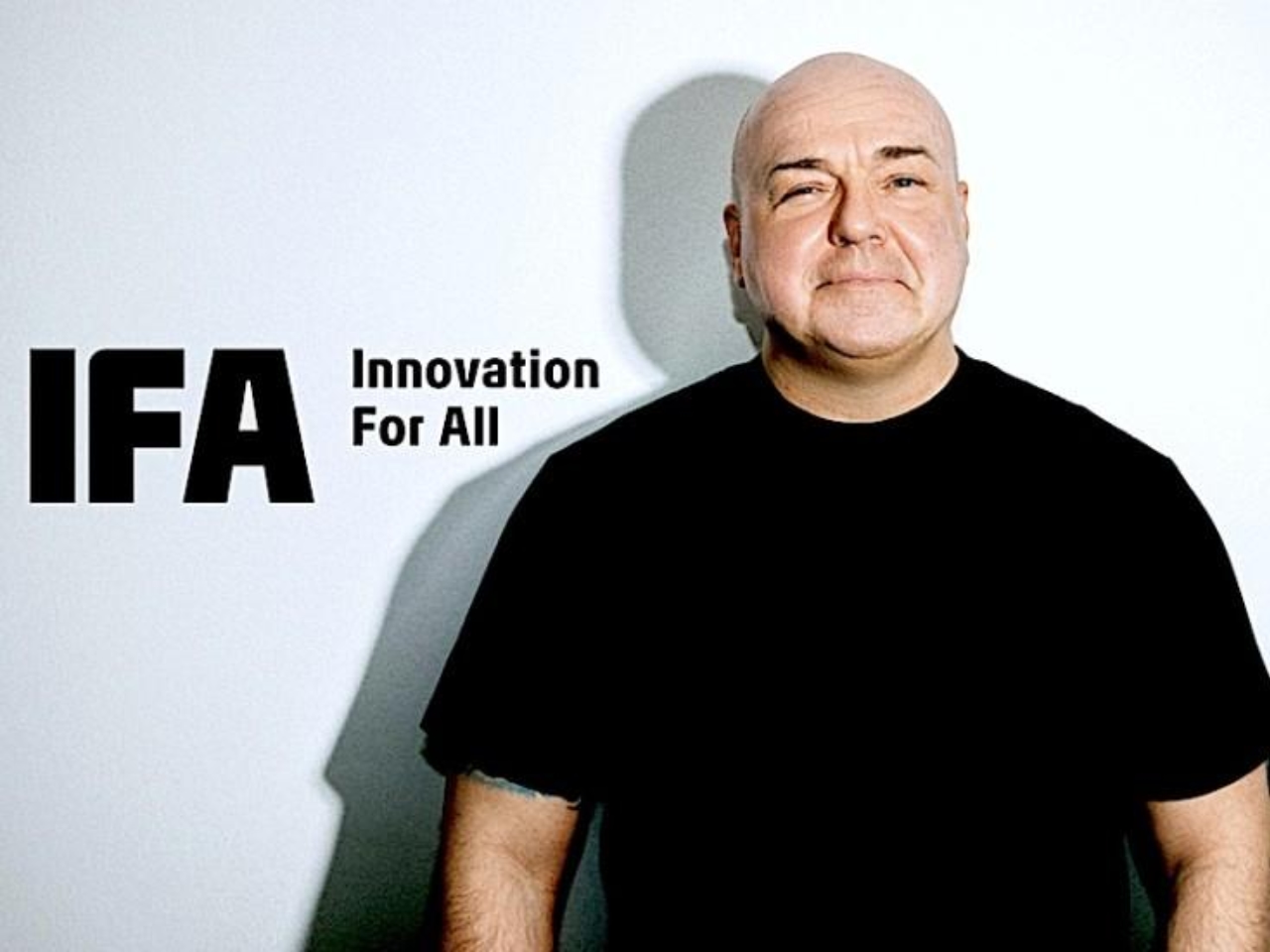
As the Internationale Funkausstellung Berlin (IFA) gears up to celebrate its 100th anniversary, the tech industry focuses on Berlin, where tradition meets innovation. IFA, one of the world’s leading trade shows for consumer electronics and home appliances, has long been a platform where global brands showcase their latest innovations, set trends, and connect with industry professionals and consumers alike. It’s an event that shapes the direction of technology, influencing the products and services that will define the market in the years to come. Leading this transformation into its next century is Leif Lindner, the CEO of IFA Management GmbH since October 1, 2023. With over 25 years of industry experience, including a significant tenure at Samsung Electronics Germany, Lindner brings a wealth of knowledge and a strong network to his role as CEO. His experience in multicultural settings enhances his leadership as he guides IFA into a new era. In this interview, I explore how Lindner balances IFA’s storied history with a fresh approach to ensure it remains at the forefront of global technology showcases.

Vincent Nguyen: Good afternoon! Thank you for taking the time to chat with me. You’ve been traveling all over the world recently. Is this normal for a CEO in your position, especially right before the show?

Leif Lindner: “Yes, it’s part of the job. I’ve been with IFA for a relatively short time, but given the importance of the 100th anniversary and the transition we’re going through, it’s crucial for me to be hands-on.”

This response underscores Lindner’s commitment to being actively involved in the evolution of IFA during such a pivotal year. His hands-on approach ensures that the event reflects his vision and strategy. Adapting and leading from the front is essential in an industry as fast-paced as technology.

Leif Lindner traveled to Tokyo with Jan Kronenberger (IFA, Head of PR and Content) to promote IFA Berlin.

Nguyen: How does IFA plan to balance the needs of big brands with the rising importance of smaller innovators?

Lindner: “Smaller brands can become significant players quickly, and they need special attention. At the same time, we must keep our mature, long-term partners in the spotlight.”

Lindner’s strategy to balance attention between established giants and emerging innovators is crucial. It shows that IFA is a platform where future technology leaders can emerge, ensuring that both new and established companies have the space to thrive. His approach fosters an environment where innovation from both large corporations and smaller, agile startups can flourish.

A prime example of a growing brand poised to make a significant impact at IFA 2024 is Narwal, a company that has rapidly ascended to the forefront of the smart home cleaning industry since its founding in 2016 in Shenzhen, China. Narwal is set to unveil its latest groundbreaking innovation in the smart home cleaning sector at IFA 2024 in Berlin, and we’re looking forward to seeing what they have in store. Its pioneering products, such as the world’s first self-cleaning mop and vacuum robot, highlight the company’s success. With over 1,200 international patents and a team of more than 700 R&D engineers, Narwal showcases the kind of innovation and technological leadership that IFA aims to highlight. The brand has received significant industry recognition, winning prestigious awards, including the CES Innovation Awards, Red Dot Design Awards, and the Edison Gold Award.

Narwal’s strategic expansion into key markets like North America, Europe, and Asia has solidified its leadership in the smart home sector. In Europe, particularly Germany, the company has built strong partnerships with major retailers like OTTO, MediaMarkt, and Saturn, making its products widely available. By investing in local research and partnerships, Narwal’s long-term vision focuses on further growth in Europe, with Germany as a crucial market. This commitment to meeting European consumers’ needs and delivering intelligent cleaning solutions aligns with the innovative spirit that IFA showcases.

Narwal’s mission is to give people more freedom to do what they love and with who they love.

Nguyen: Can you explain the rebranding process you’ve initiated? What is your vision for the new IFA?

Lindner: “We wanted to create a visual identity that’s more colorful and youthful, while also incorporating entertainment into the show. We want IFA to be seen not just as a tech show, but as a cultural event that resonates with younger audiences.”

The rebranding of IFA is about transforming the event into something that resonates with the next generation of tech enthusiasts. By incorporating elements of entertainment and culture, Lindner is positioning IFA as a multifaceted experience rather than just an exhibition. This approach aligns with broader trends where the lines between technology, culture, and lifestyle are increasingly blurred, making IFA a must-experience event.

As part of the IFA 100 celebrations, the “IFA 100 Years The Exhibition” reflects this transformation. After a successful summer run at Bikini Berlin, the exhibition now opens its doors to all IFA visitors at the Palais. This exhibition goes beyond commemorating IFA’s centennial—it sparks a dynamic dialogue at the intersection of technology and creativity, encouraging attendees to explore innovation’s impact on our lives.

Eight Berlin-based artists were engaged to interpret IFA’s history and future through art, each piece representing a distinct theme. Their works, accessible to Berliners and international visitors, draw from an inspiring past and a visionary future. The exhibition also features extraordinary technology exhibits that offer a glimpse back to the beginnings of technology, bridging the gap between past and future innovations.

Visitors can even take a piece of the exhibition home by creating their own personal AI avatar with the IFA avatar generator, highlighting the event’s integration of cutting-edge technology with personal and creative expression.

The themes explored by the artists include:

Radio, where the journey from early broadcasting to the era of podcasts, highlights the social relevance of media and its evolution. Video, an exploration of the transition from black-and-white television to on-demand video services, illustrates the evolution of visual media. Audio, which celebrates music from vinyl records to cloud streaming, captures sound’s emotional and experiential aspects—online, showcasing the transformative impact of the Internet and digitalization on society, from early telecommunication to the Internet of Things. Computers and Games offers an artistic take on the evolution of gaming and computing, from home PCs to mobile gaming and digital culture. Digital Lifestyle, portraying the smartphone’s role in shaping global, connected lifestyles, from telephony to social media and AI. Home Appliances & Networking, examining the evolution of household appliances, from traditional stoves to smart home networks. Finally, Creation & Social Media digs into content creation in the digital age, from analog photography to influencer-driven social media.

Bryan Adams concert at IFA 2024

IFA 2024 will also feature a special open-air concert by Bryan Adams at the Sommergarten Stage, adding a lively cultural dimension that sets the tone for the event. This reflects Lindner’s commitment to reimagining IFA as a vibrant experience that blends technology with entertainment and appeals to a diverse, younger audience, ensuring its relevance as it enters its second century.

Nguyen: How do you plan to address the risk of losing pillar brands that have supported IFA over the years?

Lindner: “It’s a real concern. We’ve already seen some brands pull out in recent years. My job is to bring them back by proving that we understand the changing landscape and are evolving to offer more value.”

Lindner’s candidness about the challenges IFA faces highlights his proactive approach to leadership. His focus on evolving IFA’s value proposition to re-engage these key brands demonstrates that he’s not content with maintaining the status quo. He’s actively seeking to adapt IFA’s offerings to better align with the needs of today’s tech giants. This strategy is vital for keeping IFA relevant in an industry constantly in flux.

Nguyen: Are you expanding IFA’s global reach, particularly in regions like India or China?

Lindner: “This year, we’ve focused on balancing our exhibitor base, especially bringing back more Korean, Japanese, and Taiwanese brands. India has a lot of potential, but we need to approach it with a full-speed strategy, which requires the right local partnerships.”

This strategy to expand IFA’s reach into Asia reflects an understanding of where the future of technology is being shaped. By strengthening ties with key markets like Korea, Japan, and Taiwan and recognizing the potential in India, Lindner is ensuring that IFA remains relevant on a global scale. His emphasis on local partnerships shows a thoughtful, sustainable approach to expansion, extending IFA’s influence well beyond Europe.

IFA Global Press Conference – Shanghai 2016

IFA Global Press Conference – Shanghai 2016

Nguyen: IFA often coincides with Labor Day in the US. Has the show always been scheduled during the first week of September?

Lindner: “Yes, it has traditionally been around this time. The dates for the next several years are already fixed. While it’s a challenge for US companies, especially with Labor Day, we believe this timing is right overall. The first week of September positions IFA at a critical juncture in the calendar, just before the peak sales season in Europe. This timing allows brands to showcase their latest innovations and launch products when consumer interest is at its highest. It also gives companies the opportunity to generate buzz and secure media coverage ahead of the crucial fourth quarter, which is often a make-or-break period for many in the consumer electronics industry.”

IFA Messe Berlin

Lindner elaborated on the rationale behind maintaining this traditional schedule despite potential conflicts for some international participants. He emphasized that the timing of IFA is not arbitrary; it has been carefully chosen to align with the European market’s key sales cycles. This alignment ensures that the event remains strategically positioned to offer maximum value to exhibitors and attendees. By scheduling IFA just before the peak sales season, the event becomes a pivotal platform for brands looking to make significant announcements and capture the attention of both the media and consumers at a time when it matters most.

He acknowledged the challenges that this timing presents for US companies, particularly given the overlap with Labor Day, a major holiday in the United States. However, the benefits of holding IFA during this period far outweigh the drawbacks. The fixed schedule allows companies to plan their product launches and marketing strategies well in advance, ensuring they can fully leverage the opportunities that IFA presents.

Moreover, Lindner pointed out that the consistency of IFA’s schedule has helped to establish the event as a key fixture in the global tech calendar. Companies and industry professionals know exactly when to expect IFA each year, which has contributed to its reputation as a must-attend event for anyone involved in the consumer electronics sector.

Vincent: There’s often a comparison between IFA and CES, especially since they’re so close together. How do you handle the competition, especially for brands that might only have the budget for one major event?

Lindner: “I believe IFA and CES can coexist because they serve different focuses. IFA is a comprehensive showcase right before the peak sales season in Europe, which is crucial for many brands.”

Lindner’s perspective clearly explains how IFA differentiates itself from CES. By emphasizing IFA’s unique timing and focus on the European market, Lindner highlights the event’s strategic importance for brands looking to engage with this critical audience. It’s not about competing head-to-head with CES but about offering a direct connection to the European market at a pivotal moment in the sales cycle.

Vincent: Are there any brands that have particularly impressed you this year that you think Yanko Design readers should check out?

Lindner: “There are several. For example, SharkNinja has been particularly innovative, releasing numerous products in Europe. Samsung continues to impress with their holistic approach to technology, and Chinese brands like DJI are also setting new standards in the market. We should also not underestimate how Chinese brands like Hisense and Haier are bringing power to the market. They understand the market better than before and are moving toward a more quality-driven approach. Their understanding and perception of the market always impress me.”

Lindner’s recognition of these brands highlights the tech industry’s diverse and dynamic nature today, emphasizing IFA’s role as a global platform where both established leaders and emerging innovators can shine.

SharkNinja has been making waves in Europe with various new products that combine cutting-edge tech with everyday practicality. Whether it’s their powerful vacuum cleaners or smart kitchen gadgets, SharkNinja has found a way to make life at home easier and more efficient, which has helped them become a household name in the appliance market.

Samsung, a tech giant, continues dominating a wide range of electronics—from smartphones and home appliances to smart home systems. Their latest advancements in QLED and OLED TVs keep them ahead of the curve in display technology. Samsung’s approach blends sustainability with innovation, making its products forward-thinking and eco-friendly and solidifying its leadership in the industry.

DJI, the brand that revolutionized the drone industry, continues to set higher aerial photography and cinematography standards. Their drones are known for their exceptional camera quality, user-friendly controls, and reliable performance, making them a favorite among professional filmmakers and hobbyists. But their innovation doesn’t stop at drones. They’ve expanded into handheld stabilizers, action cameras, and more. At IFA, there’s a lot of excitement around what they will unveil, particularly with the buzz surrounding the rumored Neo, which is expected to be a game-changer. We’re also eagerly anticipating their entry into the mirrorless camera market, which could bring their imaging expertise to new heights. Additionally, their entry into portable power solutions, including impressive battery technology, and their move into e-bikes are developments we’re watching closely. This expansion into new areas could significantly impact the market and add even more excitement to an impressive lineup.

Hisense has significantly impacted the TV and projector markets, particularly with their massive 100-inch-plus TVs and innovative projector technologies. Their commitment to delivering a cinema-like experience at home has made them a top choice for those seeking high-quality, immersive viewing. The Canvas TV, for example, combines a massive screen with a sleek, minimalist design that easily blends into any living space. This modular design allows users to arrange the display panels in various configurations, creating a customizable viewing experience. It’s about integrating technology seamlessly into the home environment.

In addition to their impressive TVs, Hisense has also gained attention with their short-throw projectors. These projectors deliver bright, sharp images from just a short distance, making them ideal for smaller spaces where a traditional projector setup might not be feasible. Hisense’s Laser TVs, which function as ultra-short-throw projectors, offer 4K resolution, HDR support, and vibrant colors while maintaining a compact and easy-to-install form factor. These projectors can display images over 100 inches in size, providing a theater-like experience without needing a dedicated projection room.

Hisense’s advancements in projector technology also include features like ALR (Ambient Light Rejection) screens, which enhance viewing even in well-lit rooms, and integrated smart platforms that offer easy access to streaming services, apps, and more. Their focus on innovation has positioned Hisense as a leader in the home entertainment market, allowing consumers to enjoy a big-screen experience at home without compromising on quality or convenience.

Haier, another major player from China, continues to grow its presence in the home appliance industry by focusing on quality and innovation. They offer various products, from refrigerators and washing machines to air conditioners and smart home devices. Haier’s commitment to creating durable, efficient, and easy-to-use appliances has earned them a solid reputation worldwide. As they continue to push into more advanced smart home technology, Haier is helping to shape the future of how we live at home.

Haier Appliances

These brands are pushing the boundaries of what’s possible, and their presence at IFA underscores the event’s position as a global stage for the best in technology. Lindner’s comments emphasize IFA’s role as a platform for showcasing established leaders and emerging innovators, highlighting the event’s importance in the ever-evolving tech landscape.

Vincent: Finally, can you share three personal things about yourself that we can share with our readers?

Lindner: “Sure! First, as a child, I was fascinated by consumer electronics, particularly TVs. That passion led me to where I am today. Second, I relax by listening to heavy metal music and attending concerts. Metallica is one of my favorites. And third, I box once a week to clear my head and stay fit.”

These personal insights provide a deeper understanding of the person behind the role. Lindner’s early fascination with consumer electronics reminds us that passion can drive a career, shaping his path to where he is today. His love for heavy metal and boxing shows a balance between intensity and focus—qualities undoubtedly reflected in his leadership style. It’s clear that his personal interests and professional approach are intertwined, bringing a level of passion and energy to his role at IFA that is both inspiring and effective.

Leif Lindner speaking at NextRise2024 Coex

As IFA embarks on its second century, Leif Lindner is guiding the event into a new era where technology and culture intersect, innovation is accessible to all, and the event remains as dynamic and forward-thinking as the industry it represents. This interview offers insight into the thoughtful leadership and clear vision driving IFA forward. Lindner’s commitment to making “innovation for all” a reality ensures IFA’s position as a cornerstone of the global tech calendar, drawing both established industry giants and rising innovators. His strategic focus on inclusivity, global expansion, and cultural relevance is actively shaping IFA’s future while preserving and redefining its legacy. Under Lindner’s leadership, IFA is set to remain a leading platform where innovation meets opportunity, influencing the tech world for many years to come. Starting this Wednesday, our team will be on the ground to bring you the latest and greatest products showcasing at IFA 2024. We invite you to check back often for coverage.

The post Interview with Leif Lindner, CEO of IFA: Leading a New Era of Innovation and Culture first appeared on Yanko Design.

Timeless Triumph: 1934 Bugatti Type 59 Sports Wins Best in Show 2024, Crowned with Rolex 1908

19 août 2024 à 17:20

Good morning, everyone! Today’s Mobile Monday and Wristwatch Wednesday converge into a celebration of two timeless icons. We’re featuring the elegant 1934 Bugatti Type 59 Sports, which recently claimed Best of Show at the 73rd Pebble Beach Concours d’Elegance, alongside the exquisite Rolex 1908 timepiece awarded to the winner. Both of these masterpieces capture the essence of what’s old and new, seamlessly blending the past and present.

1934 Bugatti Type 59 Sports Wins Best in Show 2024

Designers: Bugatti and Rolex

Image Bugatti: 1934 Bugatti Type 59 Sports with chassis number 57248

The 1934 Bugatti Type 59 Sports and the Rolex 1908 have histories stretching back to when craftsmanship was paramount and every detail mattered. Though from different worlds—automotive and horology—these two icons share a narrative that speaks to the pursuit of perfection and the appreciation for timeless beauty.

Rolex 1908 reference 52508

For the first time in the Pebble Beach Concours d’Elegance history, Best of Show was awarded to a preservation car—a remarkable distinction that adds another layer to the Bugatti Type 59’s storied past. This year, 214 cars from 16 countries and 29 states pulled onto the competition field, but the 1934 Bugatti Type 59 Sports, presented by Fritz Burkard of The Pearl Collection in Zug, Switzerland, claimed the spotlight.

Image Rolex: 1934 Bugatti Type 59 Sports with chassis number 57248

Concours Chairman Sandra Button highlighted the significance of this victory, noting that this particular Type 59 is a rare factory race car with multiple Grand Prix victories to its name. This car has connections to some of the greatest racing legends and even ties to royalty. What makes it even more extraordinary is that it remains preserved in the livery given to it by King Leopold of Belgium, showcasing its authentic and original character.

The Bugatti Type 59 Sports stands as a masterpiece of automotive artistry. Bugatti, renowned for its pursuit of excellence, crafted the Type 59 as a sublime blend of elegance and power. Its design exudes refined style, boasting a low-slung body, intricate wire wheels, and the distinctive growl of its 3.3-liter engine. This vehicle exemplifies the pinnacle of collaboration between engineers and designers. Its triumph as a preservation car at Pebble Beach highlights the enduring value of originality and historical authenticity in the world of classic automobiles.

Image: Bugatti

A living symbol of racing legacy, this vehicle bears the marks of its illustrious history in every scuff and scratch. From its leather seats to its wooden steering wheel, each imperfection tells a story. Pre-war legends like René Dreyfus and Jean-Pierre Wimille piloted this machine through some of the most prestigious Grand Prix events of the 1930s, cementing its racing pedigree.

Image: Bugatti

Later, the car found its way into the hands of King Leopold III of Belgium, who added his own touch by repainting it in his signature black and yellow livery. As the first of only six ever produced, this Type 59 Sports is a powerful reminder of Bugatti’s enduring impact on automotive history.

Image: Bugatti

Image: Rolex

Throughout the years, the car has been in the care of various collectors who have all respected its original state. The current owner, Fritz Burkard, has prioritized keeping this historical piece untouched as much as possible, preserving its patina to honor its rich past. This win at Pebble Beach underscores the car’s historical importance and highlights the significance of maintaining the authenticity of classic automobiles.

Image: Rolex

The Rolex 1908, awarded to the Best of Show winner, mirrors the Bugatti’s commitment to preserving history while celebrating precision and elegance. Rolex, a brand synonymous with reliability and craftsmanship, introduced the 1908 model as a nod to its rich heritage. The 1908’s design is understated yet undeniably elegant, reflecting the brand’s focus on timeless design rather than fleeting trends. The watch’s movement, with its meticulous attention to detail, ensures that it doesn’t just tell time—it honors it.

Rolex 1908 reference 52508 Awarded to Best of Show at the 73rd Pebble Beach Concours d’Elegance

This particular Rolex 1908 model, paired with a traditional brown alligator leather strap, is crafted in 18-karat yellow gold and features an intense white dial. The strap is distinguished by its green calfskin lining and tone-on-tone stitching, adding to its luxurious look and feel. The timepiece is also notable for its transparent sapphire case back, which reveals the intricate Caliber 7140 movement, showcasing Rolex’s dedication to precision and aesthetics. The engraving “Best of Show 2024” is discreetly placed on the Dualclasp, a double folding clasp made of 18-karat yellow gold, that sits perfectly centered on the wrist, showcasing the meticulous design and craftsmanship for which Rolex is renowned.

Earlier in the day, before the start of the Concours, Rolex was kind enough to give me a fleeting moment with the 1908, and it’s truly breathtaking. Combining classic elements with cutting-edge technology makes the Rolex 1908 a fitting award for such a prestigious event, perfectly complementing the legacy and elegance of the 1934 Bugatti Type 59 Sports.

When the Bugatti Type 59 Sports won Best of Show at the 73rd Pebble Beach Concours d’Elegance, it marked more than just a victory for a car—it was a recognition of the enduring appeal of something beautifully crafted. The Rolex 1908, awarded to the winner, complements this achievement perfectly, representing a piece that, like the Bugatti, is treasured for its significance and what it symbolizes.

Both the Bugatti Type 59 Sports and the Rolex 1908 showcase the pinnacle of craftsmanship from their respective eras, blending timeless elegance with cutting-edge engineering. The Bugatti, with its sleek lines and powerful engine, represents the golden age of automotive design, while the Rolex 1908 embodies the precision and sophistication of early 20th-century horology. They remind us that true innovation stands the test of time, inspiring enthusiasts and collectors alike.

Image: Rolex

The post Timeless Triumph: 1934 Bugatti Type 59 Sports Wins Best in Show 2024, Crowned with Rolex 1908 first appeared on Yanko Design.

The Enduring Legacy of the Adidas Samba: A Synthesis of Style, Sport, and Innovation

4 août 2024 à 17:20

Welcome to Sneakers Sunday at Yanko Design. Today, we explore the storied evolution of the Adidas Samba. Originally designed in 1950, this iconic shoe has served athletes with its functional design while also becoming a staple in global fashion and culture. The Samba’s journey from a functional soccer shoe to a fashion icon offers a fascinating look at how design can adapt to changing times while retaining its core essence.

Designer: Adi Dassler + ADIDAS

Origins and Early Design

The Samba was born out of necessity in post-war Germany, where harsh winters created challenging conditions for soccer players. Adi Dassler, the founder of Adidas, recognized the need for a shoe that could offer traction on icy surfaces. His solution was the Samba, a shoe that featured a revolutionary gum rubber sole providing superior grip and traction. This innovation set Samba apart from other athletic footwear and marked the beginning of its iconic status.

Adi Dasslers with Adidas Samba in the 1950s

Alongside its functional sole, the Samba boasted a durable leather upper with Adidas’s signature three stripes, adding structural integrity and visual appeal. This combination of practicality and style made the Samba an instant hit on and off the field. The initial design laid the foundation for a versatile shoe that could transition seamlessly from sports to fashion.

The early Samba models also included a high-top variant, which offered additional ankle support and warmth, making it particularly popular in colder climates. This version retained the classic elements of the original while providing an added layer of functionality, broadening the shoe’s appeal beyond the athletic community. The high-top Samba was especially favored by soccer players who needed extra protection during harsh weather, demonstrating Adidas’s commitment to meeting the diverse needs of its customers.

Evolution Through the Decades

As the decades passed, the Samba underwent significant transformations to keep pace with changing trends and consumer preferences. In the 1960s and 1970s, Adidas began experimenting with new materials and colorways to expand the Samba’s appeal beyond its original sports market. The introduction of softer leathers and synthetic fabrics enhanced the shoe’s comfort and durability, making it more suitable for casual wear.

This period also saw the Samba embracing a broader color palette, moving beyond the traditional black and white to include a variety of vibrant hues and patterns. These changes reflected the growing influence of fashion on athletic footwear, as consumers increasingly sought shoes that combined performance with personal style. The Samba’s ability to adapt to these shifts while retaining its core design elements cemented its status as a timeless classic.

In addition to material innovations, the Samba’s design also evolved to reflect the changing needs of its audience. The high-top version, for instance, gained popularity in urban settings, where its stylish silhouette and practical features made it a favorite among fashion-forward individuals. This adaptability helped the Samba maintain its relevance in a rapidly changing market as it continued to capture the imagination of new generations.

Cultural Impact and Global Reach

The Samba’s appeal extended far beyond the soccer field, becoming a symbol of youth and rebellion across the globe. In the 1980s, the shoe was embraced by various subcultures, from hip-hop enthusiasts to skaters, each group adding its own chapter to the Samba’s rich history. Its simple yet striking design made it a popular choice for those looking to make a statement, whether on the dance floor or the streets.

This widespread adoption across diverse cultures and continents underscored the Samba’s universal appeal. Its ability to transcend boundaries and resonate with people from all walks of life highlighted its versatility and timeless charm. The Samba maintained its identity while adapting to myriad personal styles, whether paired with jeans and a T-shirt or more formal attire.

The Adidas Samba, designed in the 1950s, has evolved through numerous editions over the past 70 years. Photo: Adidas

The Samba’s influence also extended to the music and entertainment world, where it became a fixture in popular culture. Celebrities and musicians alike were drawn to the shoe’s unique blend of functionality and fashion, further solidifying its status as an icon. The Samba’s presence in films, music videos, and on the feet of influential figures helped cement its place in the cultural zeitgeist, ensuring its continued relevance in the ever-evolving fashion world.

Recent Collaborations and Innovations

In recent years, Adidas has leveraged collaborations to keep the Samba at the forefront of the fashion industry. Partnerships with designers and fashion houses have introduced new versions of the shoe that maintain its classic elements while incorporating modern design trends and materials. These collaborations have breathed new life into the Samba, attracting a new generation of fans and reinforcing its status as a fashion icon.

Naked x adidas Samba JI3993

One notable collaboration is with Copenhagen-based fashion brand Naked, which reimagined the Samba with intricate lace details and soft, pastel overlays. This partnership highlights the sneaker’s adaptability to current fashion trends and ability to blend traditional craftsmanship with contemporary design elements. These limited-edition models incorporate luxurious materials and subtle design tweaks, such as co-branded tongues and custom lace tags, making each release a collectible piece.

Naked x adidas Samba JI3993

Adidas has also focused on sustainability, integrating eco-friendly materials into the Samba’s design. This commitment ensures the shoe remains popular among environmentally conscious consumers without sacrificing style or quality. By embracing sustainable practices and innovative materials, Adidas is preserving the Samba’s legacy and paving the way for future generations of this iconic shoe.

The Adidas Samba’s journey from a functional sports shoe to a cultural icon is a testament to its timeless design and enduring appeal. Its continuous adaptation and relevance in the sneaker industry testify to its lasting legacy and broad appeal. As we look to the future, the Samba will continue to inspire and captivate audiences worldwide, cementing its place in the annals of sneaker history.

The post The Enduring Legacy of the Adidas Samba: A Synthesis of Style, Sport, and Innovation first appeared on Yanko Design.

Apple’s AirPods Pro 2 is My Everyday Carry I can’t live without

1 juillet 2024 à 17:20

Apple’s AirPods Pro 2 is my go-to everyday carry (EDC). At Yanko Design, we typically think of EDC items as tools like a knife, screwdriver, or flashlight—all rolled into one neat package. However, for those of us who need great audio for music, conference calls, and more, the AirPods Pro 2 are perfect. Their design is sleek and compact, fitting comfortably in the ear with different ear tip sizes to get the right fit. The charging case is genius—small enough to slip into the coin pocket of your jeans, making it super easy to carry around.

Designer: Apple

I gave my AirPods Pro to my 11-year-old, thinking I could get by with other brands of earbuds or headsets. That was a big mistake. Nothing else matched the seamless experience of switching between my iPhone, iPad Pro, MacBook Pro, and MacBook Air. The AirPods Pro just work, no fuss.

With the new H2 chip, the sound quality is top-notch. Enhanced Active Noise Cancellation and Transparency modes let you dive into your music or stay aware of your surroundings. The Adaptive Transparency mode even adjusts to loud noises on the fly. Plus, the battery life is impressive—up to six hours with ANC on and up to 30 hours with the charging case. No more constant recharges.

AirPods Pro 2: H2 Chip + custom-built driver and amplifier

The Personalized Spatial Audio feature, with dynamic head tracking, makes listening feel unique to you. The new touch controls on the stems are super handy for adjusting the volume on the go. Thanks to their stealth design, one could even use them as earplugs for sleeping on an airplane. I enjoy doing yard work, so they work amazingly well at blocking out the loud sound of a lawnmower and weed wackers.

I missed my AirPods Pro so much that I took them back, ordered a new pair for my kid, and snagged them at 20% off on Amazon. They’re just that good.

For anyone in the Apple ecosystem, it’s tough to recommend anything else. The seamless integration, amazing sound quality, and smart design make them an essential part of daily life. These little gems combine functionality, style, and tech into one awesome package.

Looking Forward to What’s Next

At WWDC 2024, Apple announced exciting updates for the AirPods lineup, aiming to make them even better for daily use and gaming. One cool new feature is interacting with Siri using head movements. Exclusive to AirPods Pro, you can nod or shake your head to answer or dismiss calls, manage notifications, and interact with messages silently. The H2 chip’s machine learning makes this hands-free experience seamless.

AirPods Pro also got a voice isolation upgrade. This tech reduces background noise during calls, making sure your voice comes through clearly, even in noisy or windy places. Apple introduced a new API for game developers to optimize games for AirPods. This means better dynamic head tracking and reduced audio latency, making the gaming experience on Apple devices more immersive. Latency is way down, making these earbuds great for gaming. AirPods Pro, paired with the iPhone 15 Pro Max, offers Apple’s best wireless audio latency ever for mobile gaming.

With support for 16-bit, 48kHz audio in games, your voice will come through crystal clear to teammates and other players. Perfect for those intense multiplayer sessions. These updates show Apple’s drive to make AirPods even better. The new features and enhancements will be available as a free firmware update this fall, with the developer beta available now for Apple Developer Program members.

Why Choose the AirPods Pro 2 Over the Original AirPods Pro and Regular AirPods?

On this Mobile Monday, we’re focusing on the AirPods Pro 2, and here’s why they stand out compared to the original AirPods Pro and regular AirPods. When it comes to wireless earbuds, Apple’s AirPods lineup offers several options, but the AirPods Pro 2 is the clear choice for several compelling reasons.

First, the AirPods Pro 2 feature the new H2 chip, which significantly enhances audio performance. The sound quality is richer and more immersive, with deeper bass and clearer highs. This is a noticeable improvement over both the original AirPods Pro and the regular AirPods, making your music, podcasts, and calls sound better than ever.

While the original AirPods Pro introduced Active Noise Cancellation (ANC), the AirPods Pro 2 took it to the next level. Enhanced ANC means you can block out more ambient noise, allowing for a more focused listening experience. The new Adaptive Transparency mode also dynamically adjusts to sudden loud noises, protecting your ears while still letting you stay aware of your surroundings.

Battery life is crucial for wireless earbuds, and the AirPods Pro 2 delivers. With ANC enabled, they offer up to six hours of listening time, and the charging case extends this to up to 30 hours. This is a significant improvement over the original AirPods Pro and regular AirPods, which means less frequent charging and more time enjoying your audio.

One of the standout features of the AirPods Pro 2 is Personalized Spatial Audio. This technology tailors the audio experience to the unique shape of your ears, providing an immersive, theater-like sound. Combined with dynamic head tracking, it creates a more engaging and personalized listening experience, which is a step up from what the original AirPods Pro and regular AirPods offer.

The AirPods Pro 2 supports Bluetooth 5.3, ensuring a more stable and efficient connection with your devices. The new touch controls on the stems are intuitive and allow you to adjust volume with a simple swipe, making them easier to use on the go compared to the original AirPods Pro and regular AirPods.

The AirPods Pro 2 comes with additional ear tip sizes, ensuring a more customized fit for a wider range of users. This improves both comfort and the effectiveness of noise cancellation. The regular AirPods, with their one-size-fits-all design, can’t match this level of personalized fit.

With updates announced at WWDC 2024, the AirPods Pro 2 is set to receive even more features that enhance usability. From head movement-based Siri interactions to improved voice isolation for clearer calls, these upcoming updates make the AirPods Pro 2 a future-proof investment.

The post Apple’s AirPods Pro 2 is My Everyday Carry I can’t live without first appeared on Yanko Design.

WWDC 2024: New Apple Intelligence From the Core

9 juin 2024 à 17:20

Apologies for today’s Sneakers Sunday feature being replaced, but there’s a compelling reason: Apple’s special event, WWDC 2024, is taking place tomorrow. Given the significance of this event, I’ll be attending WWDC to provide firsthand insights and experiences. The keynote begins at 10 a.m. PT (1 p.m. ET) on Monday, June 10, and I’ll be on the ground for two days to dive deeper into the announcements and hopefully experience some of the new features Apple will unveil.

Apple Park Steve Jobs Theatre

WWDC holds a special place for Apple and the entire tech community. It’s an annual gathering where developers come to learn, network, and gain insights directly from Apple’s engineers and executives. For Apple, it’s a platform to showcase their latest innovations and set the tone for the year ahead. For developers, it’s an invaluable opportunity to get hands-on experience with new tools and technologies that will shape the apps and services they create. And for end users, WWDC often hints at the future capabilities of their devices, offering a glimpse into the enhancements and features that will soon be at their fingertips.

The anticipation surrounding WWDC isn’t solely about the big reveals; it’s about the entire ecosystem Apple has built. From beta testing new versions of iOS, macOS, watchOS, and more, to understanding the deeper integration of software and hardware, WWDC is a comprehensive showcase of Apple’s vision. The joy of beta testing is something that many tech enthusiasts look forward to every year. It’s a chance to experience the cutting-edge developments before they are officially released, and to contribute feedback that helps refine the final product. This iterative process of development, testing, and feedback is crucial in delivering the polished, user-friendly experiences that Apple is known for.

Tomorrow’s WWDC promises to be particularly exciting due to the speculations and rumors that have been swirling for months. From AI advancements to the integration of new technologies in their operating systems, Apple is expected to make several significant announcements. The focus on AI is especially intriguing, with rumors suggesting that Apple will introduce a range of new AI-driven features across its platforms. The term “Apple Intelligence” has been floated, hinting at features like voice memo transcriptions, enhanced search capabilities, and a more conversational Siri. The integration of AI is expected to be subtle yet impactful, enhancing the user experience in ways that feel intuitive and seamless.

In recent years, the tech industry has seen a surge in AI developments from companies like OpenAI, Microsoft, Samsung, and Google. Apple’s response to this trend will be closely watched, as the company has traditionally taken a more measured approach to integrating new technologies, prioritizing user privacy and security. The upcoming announcements are expected to reflect this philosophy, with a focus on on-device AI processing. This approach not only enhances performance but also reinforces Apple’s commitment to privacy, ensuring that user data remains secure.

While the prospect of new hardware always generates excitement, it’s the software updates that are the true highlight of WWDC. The introduction of new operating system versions for iPhone, iPad, Mac, and Apple Watch will set the stage for the next generation of apps and services. The iPad Pro M4, with its advanced capabilities, is a prime example of the kind of device that will benefit from these updates. Developers and users alike are eager to see how Apple and third-party developers will leverage the hardware to create new, innovative experiences.

The Importance of WWDC for Apple, Developers, and Consumers

WWDC is a cornerstone event for Apple, providing a platform to unveil its latest software advancements and to set the strategic direction for the coming year. For developers, WWDC is a goldmine of information, offering detailed sessions on new APIs, frameworks, and tools that will empower them to create more sophisticated and powerful apps. This event is crucial for keeping the developer community engaged and informed, fostering innovation, and ensuring that Apple’s ecosystem continues to thrive.

For consumers, WWDC is equally important. The announcements made at the event often translate into new features and improvements that enhance the everyday use of their devices. Whether it’s a new operating system with improved functionality, enhanced security features, or entirely new apps, the ripple effect of WWDC is felt across the user base. The excitement generated by WWDC stems from the promise of better, more integrated experiences that make technology more useful and enjoyable.

The Joy of Beta Testing

One of the most exciting aspects of WWDC for many tech enthusiasts is the opportunity to beta test new software. Apple’s beta programs for iOS, macOS, watchOS, and other platforms allow users to experience the latest features before they are officially released. This early access provides a unique opportunity to explore new functionalities, discover bugs, and provide feedback that can help shape the final product.

Beta testing isn’t just about getting a sneak peek at new features; it’s about being part of the development process. Users who participate in beta testing contribute valuable insights that help Apple refine its software, ensuring that the final release is as polished and user-friendly as possible. This collaborative approach underscores Apple’s commitment to delivering high-quality experiences that meet the needs and expectations of its users.

Analysis of Expected Announcements

This year’s WWDC is expected to be rich with announcements that will shape the future of Apple’s ecosystem. The emphasis on AI, particularly on on-device processing, is likely to be a major theme. Apple’s approach to AI, dubbed “Apple Intelligence,” is expected to bring a host of new features designed to enhance productivity and user experience. These include voice memo transcriptions, faster search capabilities, and a more conversational Siri.

Apple Siri

Siri’s at the heart of Apple’s AI strategy. The assistant is poised for a major upgrade, potentially becoming more context-aware and capable of handling multi-step tasks. Imagine asking Siri to create a GIF from a set of photos and send it to one of your contacts in a single command. This evolution is expected to make Siri a more powerful digital assistant, aligning it with advancements seen in other AI systems. The integration of AI isn’t limited to iOS. macOS and watchOS are also expected to receive significant updates that incorporate AI capabilities. For example, macOS may see enhancements that improve multitasking and productivity, while watchOS could introduce new health and fitness features powered by AI. The Apple Watch, already a leader in wearable technology, could become even more indispensable with these new capabilities.

In addition to AI, there are rumors that Apple is working with OpenAI to integrate advanced language models into its operating systems. This collaboration could lead to more sophisticated natural language processing features, enhancing the way users interact with their devices. Although previous reports suggested that Apple was also in talks with Google about incorporating its Gemini AI system, it appears that these discussions may not have resulted in a partnership.

Another area of focus at WWDC is expected to be customization and accessibility. With iOS 18, users may gain more control over the appearance and layout of their Home Screen, allowing for greater personalization. Accessibility features, such as Eye Tracking on iPad and iPhone and Live Captions on VisionOS, will likely be highlighted, reflecting Apple’s ongoing commitment to making its products accessible to everyone.

The Role of Security in AI and On-Device Processing

Security has always been a cornerstone of Apple’s philosophy, and this is especially true when it comes to AI. By processing AI tasks on-device, Apple can ensure that user data remains secure and private. This approach minimizes the need to send data to the cloud, reducing the risk of exposure to potential security breaches. It also aligns with Apple’s broader strategy of maintaining user trust by prioritizing privacy in its product designs.

The integration of on-device AI processing will allow Apple to offer advanced features without compromising security. For example, AI-powered features like voice memo transcriptions and enhanced search can be processed locally on the device, ensuring that sensitive information remains secure. This approach not only enhances performance but also reinforces Apple’s commitment to privacy, a key differentiator in an industry where data security is increasingly a concern.

New Hardware and Software Updates

While new hardware announcements are always exciting, it’s the software updates that truly steal the show at WWDC. The introduction of new versions of iOS, macOS, watchOS, and other operating systems will set the stage for the next generation of apps and services. These updates are expected to bring a host of new features and improvements that will enhance the user experience across Apple’s ecosystem.

The iPad Pro M4, with its advanced capabilities, is a prime example of the kind of device that will benefit from these updates. With the new software, developers will have the tools they need to create innovative apps that leverage the hardware’s full potential. From productivity enhancements to new creative tools, the possibilities are endless.

Apple M4 Chip

WWDC 2024 promises to be a landmark event for Apple and its community of developers and users. The focus on AI and on-device processing highlights Apple’s commitment to innovation while maintaining its core principles of privacy and security. The joy of beta testing, the anticipation of new software updates, and the excitement of potential hardware announcements all contribute to the unique allure of WWDC. As we look forward to the keynote and the days that follow, the tech world eagerly awaits the next chapter in Apple’s ongoing story of innovation and excellence.

Don’t miss out on our coverage from the “mothership.” Be sure to check back tomorrow and Tuesday for Yanko Design’s in-depth analysis and updates straight from WWDC 2024.

The post WWDC 2024: New Apple Intelligence From the Core first appeared on Yanko Design.

Top Design Innovations from Computex 2024: Where Technology Meets Aesthetics

Par : JC Torres
8 juin 2024 à 22:45

One of the world’s biggest computer-centric tech expos has just ended and, unsurprisingly, a lot of the rhetoric revolved around AI. But if you walk around the showroom floor, another theme quickly becomes evident in the midst of new products as well as some not-so-new wares. Consumer tastes have evolved once again, even among those who would embrace the label of being a gamer. Design is no longer just a feature for the few but an important part of a product’s DNA. We’ve seen quite a wide range of designs across an equally wide range of products, from the eccentric to the elegant. Here are some of the most notable designs to grace our paths at Computex 2024 in Taiwan, showcasing not just the trends but also the innovations in the computing industry.

Cool Computing: PC Case Designs

Desktop computers have evolved from uninspiring towers to smoldering workstations with over-the-top lighting to a smorgasbord of designs that cater to a variety of tastes and interests. Computex 2024 is a glowing testament to not only the changes in design trends but also to the extent that some manufacturers will go to in order to appeal to their loyal fans.

ADATA XPG Invader X

Designer: ADATA

Winner of an iF Design Award, the ADATA XPG Invader X values transparency in more ways than one. Its clear front and side panels let you marvel at the neatly arranged components that power this gaming beast, including the tubes and RGB-lit fans that keep the box operating at maximum efficiency. Equally interesting, however, is the chassis’s ESG-compliant design, utilizing post-consumer recycled plastics and upgrade-friendly components. It’s a stylish, eco-friendly computer that tries to offset the carbon emissions of your gaming lifestyle.

Cooler Master Mecha Cases

Designer: Cooler Master

Who said computers needed to come in the form of boxes? Cooler Master definitely didn’t. With designs that come in the form of a robotic shark and a giant mechanical sneaker, these PC cases shatter expectations and misconceptions about how our computers should look like. And as hardware becomes smaller even as they become more powerful, it’s only a matter of time before these become the standard rather than the outlier.

PNY Aftershock Bubble Tea PC

Designer: PNY x AftershockPC

Electronics and liquids don’t mix but it becomes a mind-blowing mystery when you see the two together. And now, we don’t mean liquid cooling. From the makers of ramen-themed desktop towers, this Bubble Tea PC will have you not only scratching your head but also craving a cup of boba. Instead of a sugary and milky drink, however, it’s a luscious-colored coolant that has faux tapioca balls swirling around as it keeps your cool-looking PC thermally cool. This collab between PC maker PNY and case designer Aftershock isn’t a joke either but a fully functional gaming PC that’s ready to put a new spin on your cravings.

Power In Your Hands: Handheld Gaming PCs

While there are plenty of AI-toting laptops scattered around Computex this year, they are hardly the only computers vying for attention. Gaming handheld PCs are pushing the envelope not only in performance in a small form factor but also in terms of design. There’s definitely plenty of room for experimentation, and there are a few that have caught our attention and fancy.

ADATA XPG Nia

Designer: ADATA

An unexpected contender from a brand better known for its memory and data storage hardware, the XPG Nia focuses on the aspects often left out in the wake of specs and benchmarks. A tilting screen, for example, can drastically improve the comfort of staring at a handheld computer for long periods of time, while upgradable RAM in addition to upgradable storage gives the device a longer life than even some of the smartphones we have today.

ASUS ROG Ally X

Designer: ASUS ROG

The ASUS ROG Ally X is a fine example of refinement over sensational changes. The base design remains the same, but the subtle and sometimes invisible improvements deliver an almost totally different experience that’s a step above in terms of usability. Best of all, however, ASUS isn’t removing the OG ROG Ally from the market just yet, leaving consumers with the choice between affordability and power.

MSI Claw 8 AI+

Designer: MSI

The MSI Claw A1M was an odd one when it came out, but the Claw 8 AI+ cements the manufacturer’s position in the young handheld gaming PC segment. With newer, AI-friendlier hardware comes significant improvements that are necessary for such a small gaming device. It’s still rather unique in its use of Intel silicon, and it will live or die by that commitment. Its design, however, is also enough to make it a noteworthy contender in this fast-growing arena.

ZOTAC ZONE

Designer: ZOTAC

ZOTAC is another new contender, one that has its sights set on the name that started it all: the Steam Deck. While it resembles this progenitor in some aspects, the ZOTAC ZONE tries to take the design where Valve seems reluctant to go. Better hardware and configurable controls will sing to the hearts of many gamers, but the steep price tag could be a major deterrent as well.

Material Matters: Aesthetic and Sustainable Designs

Design innovation doesn’t just have to come from wild new forms or combinations of ideas. Even the materials used for products can have a notable positive effect on the user experience, especially when they delight not just the eyes but also other senses like touch. Bonus points if they also benefit the environment, ensuring there will still be a planet for consumers to live on.

ASUS Ceraluminum

Designer: ASUS

Laptop users are becoming more and more design-conscious. Even those who don’t tend to personalize the backs of their laptops want it to be something that will leave a lasting positive impression on bystanders, not to mention on themselves. Combining the durability of metal with the luxury of ceramic, ASUS’s new Ceraluminum material subtly elevates the laptop from a technological product to an art object. First used on the new ASUS Zenbook S 16, this material exudes beauty that you not only see but also feel every time you touch the laptop or lift its lid.

TECNO CAMON 30 Series LOEWE Design Edition

Designer: TECNO

Paying homage to both coffee lovers and environment-conscious consumers, TECNO and LOEWE designed a back cover material that gives waste coffee grounds new life. Using an equally eco-friendly process, this more sustainable material gives the TECNO CAMON 30 Series LOEWE Design Edition a distinctive appearance and texture that easily sets itself apart from the crowd. Plus, the use of color blocking also marks the phone with a modern style to fit the discerning tastes of modern consumers.

Creative License: Tools for Designers

All these wonderful designs don’t just pop out from thin air. Someone has to make them, from initial ideation to prototyping to manufacturing. Designers and creators naturally need tools that can meet the growing complexities of their work, and Computex definitely has quite a few in store for them.

Acer SpatialLabs Eye 3D Camera

Designer: Acer

Spatial computing, mixed reality, and the metaverse require a special kind of content, one that breaks free from the confines of flat, 2D space. Even in video meetings and live selling streams, 3D objects are becoming more in demand, offering not just viewers but also presenters new ways to connect and communicate. Acer’s new SpatialLabs Eye 3D camera tries to democratize that process, effectively giving anyone the ability to capture, record, and stream any real-world 3D object as a digital copy.

ASUS ProArt PZ13 Detachable Laptop

Designer: ASUS

As computers become more powerful and geographical boundaries become shorter, content creation can no longer be confined to a desk in an office or room. The ASUS ProArt PZ13 gives designers, artists, engineers, and everyone in between that kind of flexibility with its portable and detachable design. What makes this 2-in-1 computer different is that it’s part of the new breed of Windows computers running on the latest Qualcomm Snapdragon X chip, promising improved performance and, of course, on-device AI capabilities.

Power to the User: Empowering Gamers and Creators

One thing that gamers, creators, and power users have in common is their need for power, both literally and figuratively. The ability to customize not only their experience but also the appearance of their equipment goes a long way in giving them the confidence to get their job done, and these designs definitely deliver that with a touch of pizzazz!

ASUS Project DALI E Ink Cover Laptop

Designer: ASUS

E Ink is no longer just for eBook readers. Now that it has color and is being used in signage, the eye-friendly and power-efficient display technology is finding its way to the most unexpected places, like the back of this laptop concept. Project DALI turns the laptop cover into a canvas for users of all walks of life to express themselves or simply have a different design every day if they want. All without draining the battery even when the laptop isn’t running.

ASUS ROG Mjolnir Portable UPS

Designer: ASUS ROG

Nothing scares a gamer or designer more than losing power in the middle of an intense playing or working session. Uninterruptible power supplies are a staple for these people, but if you’ll be getting one, why settle for a boring box when you can have one of the most powerful weapons in the universe? Shaped after the mythological hammer of Thor, the ROG Mjolnir is a power station with an attitude and, more importantly, the power and features to actually match.

Cooler Master MasterHUB Modular Stream Kit

Designer: Cooler Master

A typical computer keyboard has 87 to 101 keys or more, but sometimes even those aren’t enough for content creators, streamers, gamers, and advanced computer users. When you have to remember a bunch of keyboard shortcuts that differ from program to program, you’re putting a heavy burden on your mind that could be used for actual creative thinking instead. This modular MasterHUB stream kit and control center not only offers the power of programmable buttons but also lets you decide how you want those controls to be arranged and look.

The post Top Design Innovations from Computex 2024: Where Technology Meets Aesthetics first appeared on Yanko Design.

Why Onitsuka Tiger MEXICO 66 SD Sneakers are the Ultimate Choice for Style and Comfort

2 juin 2024 à 17:20

The Onitsuka Tiger MEXICO 66 SD shoes perfectly blend classic style and modern flair, making them an exciting choice for anyone who wants to step up their sneaker game. These shoes come in various colors, so there’s something for everyone, but let me tell you why I picked the green ones—they’re just too cool to pass up.

First off, let’s talk about the color. The MEXICO 66 SD in green features a striking mix of green, red, and yellow on a creamy white background. The green and red stripes on the sides really pop, giving the shoes a vibrant, sporty look without being over the top. They’re like a burst of energy for your feet!

Premium Materials and Superior Comfort

The upper part of the shoe is made from high-quality goat leather. This means they’re soft, comfy, and tough enough to handle daily wear and tear. The leather gives them a premium feel, so you can easily rock these sneakers for different occasions, whether heading to a casual hangout or a more stylish event. Goat leather is known for its softness and flexibility, making it an excellent choice for shoes that need to be durable and comfortable.

Onitsuka Tiger MEXICO 66 SD: ColorsBIRCH/GREEN

One of my favorite features is the OrthoLite liner. This plush insole offers incredible cushioning and support, making these shoes super comfortable for all-day wear. Here’s the kicker: these are the first pair of sneakers I’ve found that are perfect for going sockless. I’m unsure if this is by design or an unintended feature, but the MEXICO 66 SD ticks all the boxes for sockless comfort. First, the liner is designed to keep your feet comfortable all day, making it feel like you’re walking on clouds. The antimicrobial properties of the OrthoLite insole also help keep your feet fresh and reduce odor, which is especially important when you’re going sockless.

The soft goat leather upper is another critical factor. It’s gentle on your feet, reducing the risk of blisters and discomfort often resulting from going sockless. The interior lining is smooth and supportive, preventing the sidewalls from wrinkling or crumbling, which can be a significant issue with other sneakers. The overall design and material choices make these shoes a dream to wear with no-show socks or none at all. The leather molds to your foot over time, enhancing the fit and comfort with each wear, making these shoes an excellent long-term investment for your wardrobe.

Real-World Durability and Versatility

Onitsuka Tiger MEXICO 66 SD: ColorsBIRCH/GREEN + Onewheel Pint X

I don’t baby these shoes, and they remain looking great after all kinds of use. Whether it’s sessions on the rowing machine, yard work, or riding around on my Onewheel, these shoes handle it all. On the Onewheel, the flat soles are perfect. They allow me to feel the board, make tiny adjustments quickly, and maintain balance effortlessly. The minimalist design also makes them my go-to shoes for driving. The soles offer an excellent pedal feel, making driving a more connected experience.

If you’re spending almost $200 on these shoes, they must look good and perform well in different situations. The durable materials and robust construction ensure they withstand rough and frequent use. After all these activities, from intense workouts to outdoor chores, the MEXICO 66 SD still looks fresh and stylish. The combination of a comfortable fit, excellent support, and sturdy build makes them versatile enough to handle any challenge while maintaining their sleek appearance.

Detailed Craftsmanship and Versatile Colorways

The branding on these shoes is spot-on. The Onitsuka Tiger logo is perfectly placed on the tongue, heel, and top eyelet. The tongue has the classic red label with the Onitsuka Tiger name, and there’s a cool yellow tab on the heel with the Tiger logo. These little touches add to the overall style and make the shoes easily recognizable.

Another highlight is the rubber sole. It’s designed to provide excellent grip and stability, so you won’t have to worry about slipping, no matter where you are. Plus, the low-profile design keeps the shoes looking sleek and modern, making them a versatile addition to your wardrobe. The tread pattern on the sole ensures reliable traction, whether navigating city streets or taking a casual hike.

Let’s explore some details that make these shoes stand out. The stitching and paneling are top-notch, adding durability and a touch of flair. The precise stitching reinforces the shoe’s structure and showcases the quality of craftsmanship. You can tell a lot of thought went into making these shoes as durable as they are stylish. The multi-panel construction enhances the shoe’s durability and provides flexibility, ensuring each step is comfortable and natural.

From a top-down view, the laces are threaded through metal eyelets, ensuring a secure fit. The high-quality laces stay tied, so you won’t have to worry about them coming undone during your day. This practical feature keeps the sporty look intact while making the shoes perfect for everyday wear. The metal eyelets also add a touch of sophistication, complementing the shoe’s overall design.

The back of the shoe features crisscrossing stripes around the heel, adding depth and texture. The yellow heel tab isn’t just for looks—it’s a handy pull tab that makes putting on these shoes a breeze. Every detail has been considered to ensure these shoes are functional and fashionable.

While I chose the green design because it’s my favorite color, the MEXICO 66 SD line offers many other fabulous colorways. There’s the classic navy blue and white combo, which is timeless and versatile. If you want to make a bold statement, the vibrant yellow with black stripes is sure to turn heads. For a more minimalist look, the all-white version is sleek and sophisticated. Dark navy is another excellent option, providing a rich tone that pairs well with various outfits.

Onitsuka Tiger MEXICO 66 SD: ColorsWHITE/DIRECTOIRE BLUE

Other excellent options include beige and brown for a natural, earthy vibe and a sporty white base with blue and red stripes. Check out the beige design with green or orange stripes if you want something unique. There’s even a beige version with brown and green accents, adding a subtle yet distinctive touch.

Each colorway has the same high-quality leather upper and OrthoLite liner for comfort and durability. The variety of colors means you can find a pair that perfectly fits your style. Whether you’re out for a casual day or need reliable shoes for light activities, the MEXICO 66 SD delivers performance and style. These shoes are a fun and exciting choice for anyone looking to add a versatile, stylish sneaker to their collection.

Historical Value and Iconic Design

The MEXICO 66 line carries a rich history that dates back to the origins of the Onitsuka Tiger brand. Onitsuka Tiger was founded in 1949 by Kihachiro Onitsuka with the mission to promote health through sports. The brand quickly gained a reputation for its innovative designs and high-quality footwear.

Kihachiro Onitsuka, Founder of Onitsuka Tiger, circa 1953

The original MEXICO 66 debuted in 1966 and was introduced ahead of the 1968 Mexico City Olympics. It was the first shoe to feature the now-iconic Onitsuka Tiger stripes, symbolizing the brand’s commitment to quality and performance. Athletes worldwide wore the MEXICO 66, and it became a staple in both the sports and fashion industries.

Olympian runner Abebe Bikila woree Onitsuka as his official shoes
Uma Thurman wearing Onitsuka Tiger in Kill Bill Vol. 1

Popular colorways of the original MEXICO 66 included classic combinations like white with blue and red stripes, navy with white stripes, and yellow with black stripes. These designs provided functionality for athletes while offering a stylish option for everyday wear.

The MEXICO 66 SD continues this legacy, incorporating modern materials and technology while staying true to the original design elements. The shoe’s classic silhouette and contemporary features make it a timeless piece that honors its historical roots while appealing to today’s fashion-forward crowd. The blend of heritage and innovation in the MEXICO 66 SD ensures that it remains a relevant and beloved choice for sneaker enthusiasts worldwide.

The post Why Onitsuka Tiger MEXICO 66 SD Sneakers are the Ultimate Choice for Style and Comfort first appeared on Yanko Design.

Unveiling the Popularity of On Cloud Shoes: Why Everyone Loves Them

26 mai 2024 à 17:20

The meteoric rise of On Cloud shoes in the athletic footwear market is attributed to their revolutionary CloudTec technology, offering soft cushioning and energy return combined with lightweight and stylish designs. These shoes provide exceptional versatility across various terrains, making them suitable for road running, trail running, and everyday wear. Strategic partnerships with high-profile athletes and a solid commitment to sustainability through initiatives like the Cyclon program and CleanCloud technology further boost their appeal. My family’s personal experiences with the durability and comfort of On Cloud shoes underscore their exceptional craftsmanship and high-quality materials, solidifying their reputation as a trusted choice for performance and casual use.

Designer: On + Roger Federer

Technology Making Every Step Feel Like a Cloud

CloudTec technology sets On Cloud shoes apart from other running shoes. Imagine stepping on tiny, soft clouds every time you walk or run. That’s the magic of CloudTec! This innovative technology is at the heart of every On Cloud shoe, providing runners and walkers with an outstanding comfort and performance experience. 

When you look at On Cloud shoes, you’ll notice the distinctive “cloud” pods on the bottom. These hollow pods act like tiny bubbles. As you walk or run, these pods compress and squish down, making your landing soft and gentle, like stepping on a cushion. This is especially noticeable in models like the On Cloud 5 and the Cloud X, where the pods are designed to absorb impact effectively, reducing the strain on your feet and legs.

Cloud X 3 Training Shoe (Women)

But the magic doesn’t stop there. After the pods compress during your landing, they quickly bounce back to their original shape when you push off with your toes for your next step. This bounce gives you a little extra spring in your step, helping you move forward more quickly. This feature is particularly beneficial in On Cloudflow, a shoe runners favor for its responsive and energetic feel during fast-paced runs.

On CloudFlow

CloudTec’s ability to provide soft landings and bouncy takeoffs makes it unique. Traditional running shoes might feel hard or stiff when you land, but CloudTec ensures that every step is cushioned. At the same time, the bounce helps you propel forward, enhancing your performance without compromising comfort. The Cloudflyer model, designed for stability and support, showcases how CloudTec can adapt to different running needs while offering that cloud-like feel.

This technology enhances both comfort and performance. For example, the Cloudswift features CloudTec combined with Helion super foam, providing a smooth, comfortable ride with excellent energy return. Whether training for a marathon or just enjoying a leisurely walk, the soft landings protect your joints, while the responsive takeoffs boost your performance.

On Helion Superfoam

Lightweight and Minimalist Design Allows For Speed and Agility in Every Step

In addition to their innovative CloudTec technology, On Cloud shoes are renowned for their lightweight and minimalist design. This design philosophy is perfect for modern runners who value speed and agility. On Cloud shoes are built to be incredibly light, using materials that reduce weight without sacrificing support or durability.

For instance, the On Cloud 5 is one of the lightest models in the lineup, making it ideal for everyday wear and casual runs. Its minimalist design means that it lacks the bulky, heavy materials found in traditional running shoes, allowing runners to feel faster and more agile. This lightness doesn’t come at the expense of support, as each shoe is carefully engineered to provide the stability and structure needed for a comfortable run.

On Cloud 5

The aesthetics of On Cloud shoes also play a significant role in their popularity. They come in various stylish colors and sleek designs, appealing to those who want their running shoes to look as good as they feel. The Cloud X, for example, offers a range of vibrant color options that stand out whether you’re running in the park or walking around town. The attention to design detail extends to small features like reflective decals for added visibility and a tiny Swiss flag on the rear of the right shoe, showcasing their Swiss heritage.

Depending on where you live and the local climate, you might prefer the waterproof versions of On Cloud shoes. Models like the Cloudventure Waterproof are designed to keep your feet dry during wet weather runs. While these waterproof versions gain a little weight and sacrifice some breathability, they provide excellent protection against the elements, ensuring your socks and feet stay dry, which can make a big difference in comfort and performance during a rainy run.

The lightweight construction and eye-catching design make On Cloud shoes functional and fashionable. Whether you prefer the bold colors of the Cloudflow or the classic look of the Cloud, there’s a design to match every style. This blend of performance and aesthetics ensures that On Cloud shoes remain a top choice for runners and casual wearers.

Versatility Across All Terrain Lets You Conquer Roads and Trails Alike

Transitioning to the versatility of On Cloud shoes, it’s evident that they are designed to handle a variety of terrains, both on and off the trails. This adaptability is a key factor in their widespread popularity among runners and outdoor enthusiasts. Whether you’re pounding the pavement, navigating rocky trails, or enjoying a mix of both, On Cloud shoes have got you covered.

Cloudventure Peak 3

Models like the Cloudventure are specifically engineered for trail running, offering excellent grip and stability on uneven surfaces. The aggressive outsole design ensures that you maintain traction, even on slippery or loose ground. The Cloudventure’s durable construction and protective features make it ideal for tackling rugged terrain, providing confidence and support with every step.

For those who prefer road running, the On Cloudstratus offers a smooth and stable ride on paved surfaces. Its double layer of CloudTec cushioning absorbs impact effectively, making long runs on hard surfaces more comfortable. The Cloudstratus also features a responsive Speedboard that enhances your stride efficiency, making it a favorite for distance runners.

Cloudstratus 3

But the flexibility of On Cloud shoes extends beyond running. The Cloudultra is perfect for those who enjoy a mix of activities, from trail running to hiking to casual wear. Its adaptable design and superior comfort make it a great choice for any outdoor adventure. Whether you’re exploring new trails or simply walking around town, the Cloudultra provides the support and cushioning you need.

Cloudultra 2

This versatility ensures that On Cloud shoes are not confined to a single type of activity or terrain. They are built to transition seamlessly between different environments, making them a reliable choice for outdoor pursuits. With On Cloud shoes, you can confidently tackle any adventure, knowing that your footwear is designed to perform, no matter where your journey takes you.

The Influencer Effect and Celebrity Endorsements: Boosting Popularity

Another significant factor contributing to the popularity of On Cloud shoes is the influence of celebrities and social media endorsements. Strategic partnerships with well-known athletes and influencers have significantly boosted the brand’s visibility and popularity. The involvement of notable tennis players in product development showcases On’s commitment to performance and innovation.

Roger Federer, a co-entrepreneur and investor in On since 2019, plays a significant role beyond mere sponsorship. He collaborates closely with the company’s founders and product development teams, bringing his extensive experience and insights to enhance On’s products and marketing strategies. This partnership began organically when Federer was seen wearing On shoes, leading to a deeper involvement due to shared values and a passion for innovation. One notable outcome of this collaboration is “THE ROGER” series, a tennis-inspired sneaker line that combines Swiss engineering with Federer’s input to deliver high performance and comfort.

On and Roger Federer

Federer’s involvement was a strategic move that paid off significantly. He spent 20 days in the lab with the On team, developing the pro tennis shoe to meet his high standards. This hands-on approach allowed Federer to contribute directly to the design and functionality of the shoes, ensuring they met the demands of professional athletes.

The limited edition Roger Centre Court 0-Series On sneaker

Building on Federer’s influence, On has recently signed world No. 1 Iga Świątek and American rising star Ben Shelton. Świątek, a three-time Grand Slam champion, is the first female tennis player to join On. She will wear On’s tennis shoes and apparel and contribute her ideas to developing new products tailored to athletes’ needs. Świątek’s endorsement aligns with On’s core values and commitment to supporting top-tier athletes.

Ben Shelton, known for his athleticism and power, also joins On as the brand’s first male tennis player. His early success, including reaching the quarterfinals at the Australian Open and winning the Japan Open, underscores his potential. Shelton’s partnership with On allows him to grow with a company making significant strides in the tennis world.

These endorsements highlight On’s strategy to integrate athlete feedback into their product development, ensuring their offerings meet the highest performance and innovation standards. This approach enhances On’s reputation in the sports industry and helps them create products that resonate with both professional athletes and everyday users.

Commitment to Sustainability

On Cloud’s commitment to sustainability is a core aspect of its brand identity, driving innovation in product design and corporate practices. The company has implemented several groundbreaking initiatives to reduce its environmental footprint and promote a circular economy.

One of the flagship sustainability projects is the Cyclon program, which exemplifies On’s dedication to circularity. This program offers high-performance gear designed to be fully recyclable. A prime example is the Cloudneo shoe, which is made from over 50% castor beans. Instead of purchasing the shoe outright, customers subscribe to it. When the shoes are worn out, they return them to On, where the materials are recycled into new products. This model reduces waste and ensures that materials are continually reused, aligning with the principles of a circular economy. The Cyclon-T, a performance tee made with over 90% bio-based materials, is another product in this line, showcasing On’s commitment to renewable resources.

In addition to the Cyclon program, On has developed CleanCloud technology, which transforms carbon emissions into high-performance materials. The Cloudprime shoe is a notable product from this initiative, featuring an EVA foam sole made with 51% CO2. This innovative approach captures carbon emissions, converts them into ethanol, and transforms them into various materials used in footwear and apparel. This process helps reduce atmospheric CO2 and sets a new standard for sustainable material production in the industry.

On Running also focuses on sustainable production practices across its entire product line. The company is working towards eliminating petrol-based materials and replacing them with fossil-free alternatives. The CleanCloud fabric in their Pace collection incorporates 20% recycled carbon emissions, demonstrating how On integrates sustainability into its apparel line.

Moreover, On has launched re-commerce platforms like Onward to extend the lifecycle of its products. This initiative allows customers to return used gear, which is then refurbished and resold, reducing waste and promoting a culture of reuse. On’s commitment to sustainability is further evidenced by its ongoing efforts to improve the production processes of its core technologies, such as the Speedboard, to minimize waste and emissions.

On Speedboard

By integrating sustainable practices into every aspect of their business, from material selection to production and end-of-life recycling, On Running addresses the environmental impact of their products and leads the industry in eco-friendly innovation. This holistic approach ensures that On’s products meet the highest performance standards while supporting a more sustainable future for the planet.

Exceptional Craftsmanship and Quality Materials

On’s dedication to exceptional craftsmanship and the use of high-quality materials sets it apart in the athletic footwear industry. This commitment is evident in its advanced technologies, sustainable practices, and user experiences, which speak volumes about the brand’s reliability and performance.

From my own experience, On Cloud shoes have consistently delivered on their promise of comfort and durability. I own a pair of On Cloud 5 Waterproof shoes, which have served me well in various weather conditions. Initially, these shoes provided excellent waterproofing and support during my runs, keeping my feet dry and comfortable even in wet conditions. Over time, as they transitioned from my go-to running shoes to my yard shoes, their durability continued to impress me, showcasing the long-lasting quality of On’s materials and construction.

My wife shares a similar appreciation for On Cloud shoes. She primarily wears the Cloud 5 model for her daily activities and workouts. The lightweight design and superior cushioning of the CloudTec technology make them her preferred choice for short runs and long walks. The breathability and comfort provided by these shoes have enhanced her overall experience, making them an indispensable part of her active lifestyle.

Our 13-year-old daughter is also a fan of On Running. She owns a pair of On Cloud 5 All Terrain and proper tennis shoes, perfect for her adventurous spirit. Whether she’s running on trails or competing in tennis matches, these shoes provide the necessary grip and stability to keep her safe and comfortable. The stylish design also appeals to her, making them a hit among her friends and peers.

Between the three of us, we own seven pairs of On Running shoes, each serving a unique purpose yet all sharing the same high quality and performance standards. The variety in On’s lineup—from specialized tennis shoes to versatile all-terrain options—ensures that every family member can find a model that fits their needs.

On Cloud’s exceptional craftsmanship and use of high-quality materials are reflected in the positive experiences my family and I have had with their products. From the durability of the Cloud 5 Waterproof shoes to the comfort of the Cloud 5 and the versatility of the All Terrain model, On Running has proven to be a reliable and preferred brand in our household.

The post Unveiling the Popularity of On Cloud Shoes: Why Everyone Loves Them first appeared on Yanko Design.

What Makes a Watch Design Timeless Over 70 Years

15 mai 2024 à 17:20

Rolex: first Datejust 1945

Wristwatches have gone through many changes over the past 70 years, but some designs have stayed popular through it all. What’s the secret to a watch that never goes out of style? It’s a blend of simplicity, versatility, quality craftsmanship, innovation, and a nod to history. Let’s dive into how brands like Rolex, Omega, Audemars Piguet, Casio, and Swatch have kept their designs timeless.

1950s: The Golden Age of Elegance

The 1950s were all about elegance. After the war, people craved refined accessories. Watches from this era were clean and simple. The Rolex Datejust, introduced in 1945, became notable in the 1950s with its straightforward dial and comfortable Jubilee bracelet. Its 36mm case size was just right—not too big, not too small.

Rolex: Datejust

Introduced in 1948, the Omega Seamaster quickly rose to prominence and became a favorite among watch enthusiasts and casual wearers alike. Its design, balancing robustness and elegance, ensured its suitability for various occasions. Whether for a casual outing or a formal event, the Seamaster proved to be a versatile accessory. Its case was crafted from durable stainless steel, enhancing the watch’s practicality for everyday wear. Additionally, the watch was equipped with waterproof features, emphasizing Omega’s commitment to functionality without compromising design. Its sleek and refined look made it both practical and stylish.

Another impressive timepiece from this era is the Patek Philippe Calatrava. This watch stands out because of its minimalist design, characterized by a clean and uncluttered dial with simple hour markers. Its slim case enhances its refined and subtle aesthetic. The craftsmanship that goes into this piece is top-notch, with every detail meticulously executed. The Calatrava, with its understated elegance, has set a high bar for future designs in the watchmaking industry.

1960s: The Rise of Versatility

The 1960s marked an era of change and acceleration in lifestyle, necessitating timepieces that could keep up with the pace. The Rolex Submariner emerged as a symbol of both adventure and style. Its easy-to-read dial, rotating bezel, and superior water resistance make it an attractive timepiece for adventurers. It was designed to perform optimally underwater and also held its own in formal settings, making it a versatile accessory.

This era also saw the rise of the Omega Speedmaster, famously known as the “Moonwatch,” after it was worn during the Apollo moon landings. The Omega Speedmaster was chosen for its functionality and precision. Its tachymeter bezel allowed for the accurate measurement of speed, a feature integral for both astronauts and car enthusiasts. Its chronograph functions made it a perfect blend of style and functionality.

OMEGA Speedmaster Moonwatch, 1965

The Rolex Daytona, first introduced in 1963, became synonymous with auto racing. Named after the famous Daytona International Speedway, the watch was designed to meet the needs of professional race car drivers. The Daytona’s chronograph function, coupled with a tachymeter bezel, allowed drivers to measure average speeds up to 400 kilometers or miles per hour. The watch featured a distinctive dial layout with three sub-dials and was initially available in both stainless steel and gold. Its robust design and high-performance movement made it a favorite among motorsport enthusiasts and collectors alike.

Paul Newman Daytona Ref. 6239
Photo: Courtesy Sotheby’s

Introduced in 1963, the Heuer Carrera appealed to race car drivers and professionals alike. The watch stood out for its chronograph function and bold, easy-to-read dial. These attributes allowed users to keep accurate time while adding a fashionable touch to their ensemble. The success of the Heuer Carrera underscored the idea that form and function can coexist in a well-designed timepiece.

1970s: Breaking the Mold

The 1970s was a transformative decade that shattered pre-existing norms. The quartz revolution introduced cutting-edge technology into watchmaking, leading to more audacious designs. The Seiko Astron, the world’s first quartz watch, offered remarkable accuracy and affordability, setting a new industry standard for precision.

Seiko Quartz-Astron 35SQ

During the same period, the Audemars Piguet Royal Oak emerged in 1972, shaking up conventional luxury watch design with its distinct octagonal bezel and integrated bracelet. Designed by Gérald Genta, the Royal Oak’s stainless steel case and bold design were revolutionary at a time when luxury watches were typically crafted from precious metals. The Royal Oak’s bold design and unconventional material choice set a new standard in watchmaking.

Audemars Piguet 1972 Royal Oak 5402ST

Rolex introduced the Explorer II in 1971. With its 24-hour bezel and robust construction, it was also specifically crafted for adventurers. The Explorer II catered to the growing trend of sports and adventure watches, blending functionality with rugged good looks.

1980s: Digital and Classic Converge

The 1980s saw a blend of digital sophistication and traditional aesthetics in watch design. Casio introduced the G-Shock line, bringing tough, functional watches that appealed to active people. The G-Shock’s shock resistance and multifunctional digital displays set a new standard in watch design. These watches were designed to withstand extreme conditions, making them a favorite among athletes and outdoor enthusiasts.

At the same time, classic designs like the Patek Philippe Calatrava remained popular for their simple, elegant looks. The Calatrava’s timeless design continued to attract those who appreciated traditional watchmaking.

TAG Heuer made a splash with the Formula 1, introduced in 1986. This watch combined sporty looks with quartz technology, appealing to a younger audience and cementing TAG Heuer’s reputation in motorsports.

1990s: Return to Heritage

The 1990s marked a return to heritage within horology. Watchmakers began reissuing classic models with contemporary updates, blending the old with the new. One such model was the Omega Speedmaster Professional, linked to the Apollo moon landings. Its practical and functional design ensured its continued relevance.

Jaeger LeCoultre Reverso 18k 1990s

The 1990s also saw the resurgence of the Jaeger-LeCoultre Reverso, a model originally designed in the 1930s. Known for its unique reversible case, the Reverso became a symbol of timeless elegance and innovative design. The reissued models combined vintage charm with modern precision.

Another model that gained iconic status during this period was the Rolex GMT-Master II. Introduced in 1983, it came into its own in the ’90s. Its dual-time-zone function was a boon for frequent travelers. Moreover, its robust design meant it could withstand the rigors of international travel, making it a trusted travel companion.

The Rolex Daytona, first introduced in 1963, also saw renewed popularity in the 1990s. Its association with auto racing and robust chronograph function made it a standout model. Its design, featuring a tachymeter bezel and high-performance movement, appealed to both collectors and motorsport enthusiasts.

2000s: Embracing Boldness

In the early 21st century, the trend in watches shifted towards larger models. Brands like Panerai and Hublot embraced large cases for individuals who wanted their timepieces to stand out. Panerai’s designs, rooted in military diving, featured oversized dials and bold numerals, making them highly legible and stylish.

In 2005, Hublot launched its Big Bang series, marked by its large cases and innovative use of materials like rubber and ceramic. The Big Bang series offered a refreshing change from traditional watch designs, appealing to watch enthusiasts seeking something different.

The Audemars Piguet Royal Oak Offshore first launched in 1993 but gained prominence in the 2000s. It expanded the original Royal Oak design with larger cases and more rugged features. This bold approach to watch design appealed to a new generation of watch lovers seeking a statement piece.

2010s: Balance and Innovation

The 2010s marked a shift towards balanced designs. Watch sizes typically ranged from 38mm to 42mm, catering to a broader audience. The Swatch Sistem51 won over watch enthusiasts with its unique approach to automatic watch production, featuring a construction of just 51 parts and a fully automated manufacturing process.

In 2012, the Tudor Black Bay reappeared, drawing on elements from Tudor’s iconic dive watches of the 1950s and 1960s. The Black Bay blended vintage design cues with modern materials and technology, resulting in a timepiece recognized as a classic.

In 2018, the Omega Seamaster Diver 300M was reintroduced with updates like ceramic materials and a modernized movement while preserving the iconic design elements.

2020s: Comfort, Versatility, and Sustainability

Today, the focus is on comfort, versatility, and sustainability. Watchmakers are incorporating recycled materials and adopting eco-friendly processes without compromising design. The Swatch x Omega MoonSwatch collaboration blends the iconic look of the Omega Speedmaster with Swatch’s innovative materials.

The Oris Aquis Date Upcycle features a dial made from recycled ocean plastic, emphasizing sustainability and giving each watch a unique look.

The Rolex Oyster Perpetual, refreshed in 2020 with vibrant dial colors, combines classic design with modern aesthetics. Its simplicity and robustness, enhanced with new color options, make it versatile and stylish.

ROLEX: TURQUOISE BLUE DIAL – Named ‘Celebration’

Conclusion

What makes a watch timeless? It’s a blend of simplicity, versatility, quality craftsmanship, innovation, and a touch of history. Watches like the Rolex Datejust, Omega Speedmaster, and Swatch Sistem51 show how these elements combine to withstand time. Versatility is vital, as a timeless watch should look good in both a boardroom and on a beach. The Rolex Submariner exemplifies this with its dual role as both a tool watch and a dress watch.

Quality craftsmanship is fundamental, with the use of premium materials and meticulous attention to detail elevating a watch. The Patek Philippe Calatrava and Audemars Piguet Royal Oak demonstrate that quality renders a watch truly timeless. Innovation also keeps the watch industry lively, from the quartz revolution to the integration of new materials and digital features. Staying ahead in technology without compromising the core design is crucial.

A connection to heritage endows a watch with historical significance, with vintage reissues and designs influenced by a brand’s archives reminding us of the traditions that have shaped watchmaking. These elements have characterized the most iconic watches for the past 70 years. While trends may change, these principles ensure a watch’s appeal to generations. Whether it’s a vintage reissue, a modern classic, or a bold new design, a timeless watch stands the test of time and trends.

OMEGA: Seamaster models of 1948

Thank you for joining me on this journey through the history of timeless watch designs. I truly appreciate your continued support and enthusiasm for Wristwatch Wednesday. If you’re new to this column, welcome!

The post What Makes a Watch Design Timeless Over 70 Years first appeared on Yanko Design.

Top 5 Quirky Phone Designs That Actually Make Sense

Par : JC Torres
14 mai 2024 à 16:40

Smartphones today seem to look very similar, varying only in the shape of the camera bump and the color of their backs. Sometimes, the materials might be different, too, but the same large-sized “candy bar” form factor has become the standard for all the smartphones currently in the market. There was a time, however, when companies were a bit more daring, experimenting with phone designs and features in an attempt to stand out from the crowd. That did lead to some rather eccentric and sometimes even ridiculous designs that make us question the sanity of the minds behind them. But there are times when those odd designs of the past actually have important relevance today. Here are five such phone design oddities that we wished existed or still exist, and some alternatives in case you may have been smitten by their quirky appearance.

Designer: Google, Motorola

Undying Handset: Project Ara

Google’s Project Ara inspired the idea of a modular smartphone whose components you can easily swap to upgrade or repair parts. In theory, this would make the phone last forever, or at least as long as the base is intact and parts continue to be manufactured for it. In practice, it was a very ambitious endeavor that could neither meet expectations nor present a viable business model that wouldn’t bankrupt manufacturers. In the end, that sustainable and immortal smartphone remained just a dream, at least in that idealistic and perfect form.

Alternative: Fairphone 5

Designer: Fairphone

Fortunately, a part of that dream is actually possible and even sustainable in more ways than one. Although you can’t hot swap components on the fly, the Fairphone 5 at least offers a way for owners to change important parts of the phone, like batteries or even cameras, to keep them running almost forever. There are some limitations, of course, but if all you want is a phone that will last you for almost a decade instead of just two years, this self-repairable design pretty much has that in the bag.

Mobile Shutterbug: Nokia N90

One of the biggest uses for smartphones today next to social media is taking photos and videos. In the days even before the term “smartphone” was coined, even the most advanced handsets from the likes of Nokia could barely hold a candle to point-and-click cameras. That’s why the quirky Nokia N90 was prophetic and way ahead of its time, envisioning a day when smartphones would be used like camcorders, though with a bit more awkwardness due to their inflexible designs.

Alternative: Nokia x Nothing Concept

Designer: Viet Doan Duc

While clamshell phones are back in season thanks to foldable screens, the folding and twisting design of the original Nokia N90 remains a distant memory. This concept tries to answer the question of “what if?” and mixes two famed brands’ design languages to craft what could be the perfect camera phone. It makes you feel like a pro photographer or cinematographer, holding up your phone not with shame but with pride, capturing not only the moment but also people’s attention in a good way.

Pocket Book: YotaPhone Dual-Screen Phone

Designer: YotaDevices

E Ink devices are becoming more popular these days, especially after the addition of features like stylus support and color. These displays are easy on the eyes and the battery, allowing the screen to show the same thing for days without requiring a recharge. A few years back, a small company tried to bring those benefits to the smartphone in the oddest way, by putting an E Ink screen on its back. Although it can be used for reading e-books on the go, its main purpose was to have a battery-saving always-on display that is a bit more dynamic and useful than typical AOD implementations.

Alternative: Onyx BOOX Palma

Designer: BOOX

That said, a phone-sized Android device with an E Ink display might be an even more efficient design, which is what the Onyx BOOX Palma is offering. Technically, it’s an e-book reader that’s the size of a regular phone and actually runs Android, which is the standard for BOOX’s devices. This means it has access to the same apps you have on your regular phone, but without color. You also don’t have cellular connectivity via a SIM card, which might be a deal-breaker for a phone but a great deal for distraction-free reading and mobility.

Productive Minimalism: Minimal Phone

Designer: The Minimal Company

BlackBerry might have joined the likes of Nokia and LG as just parts of the annals of mobile history, but its squarish shape and QWERTY keyboard are forever etched in the consciousness of even the least tech-savvy person on the planet. Many have tried to recreate that magic, but this rather elegant yet odd phone puts a twist to it. It combines the iconic BlackBerry design with an E Ink screen and a minimalist aesthetic, promising distraction-free productivity by actually limiting what you can do on the device. It can even make it easier to actually reply to or post on social media, though the drab grayscale screen is probably going to make that a little less enjoyable anyway.

Alternative: Clicks QWERTY Case

Designer: Clicks

The idea of a BlackBerry-like experience might tickle the fancy of smartphone users, but none of them will be willing to ditch their powerful, colorful, and highly functional smartphones. Clicks is a case that tries to bring the best of both worlds, and it’s practically just a case that slides onto an iPhone to provide that tactile typing experience. You won’t have to give up your favorite apps, especially the ones you need to actually be productive, but the burden of being disciplined and ignoring distractions is now on you instead.

Shapeshifting Multitasker: Astro Slide 5G

Designer: Planet Computers

A phone that opens like a mini typewriter has actually been around since the days of the Nokia Communicator and its kin, but that design proved to be more complicated than they’re worth. After playing with that same design, PlanetComputing shifted to a slider that still provides that typing experience while retaining the exact same functions as a phone. Unfortunately, such a mechanism proved to be just as clunky and unreliable, and the software platform didn’t exactly lend itself well to a landscape screen.

Alternative: Any Foldable Phone

Designer: OPPO

These days, you don’t have to rely on a physical qwerty keyboard to have that same mini laptop experience. With foldable phones now more common, you can tap away on a more flexible on-screen keyboard when the device is only half-folded. At the same time, however, you have both phone and tablet functionality in your hands. Admittedly, the design is far from perfect, and we’re still waiting for more affordable foldables coming in the very near future.

The post Top 5 Quirky Phone Designs That Actually Make Sense first appeared on Yanko Design.

Beyond Telling Time: How the Apple Watch Redefines Modern Wearables

8 mai 2024 à 22:30

Apple Watch Ultra 2 + iPhone 15 Pro

Welcome to Wristwatch Wednesday, my weekly column on Yanko Design, where I delve into the captivating world of watches. If you’re new to our publication and have noticed a plethora of Apple-related articles, rest assured, our editorial team casts a wide net, covering a diverse range of design-focused products. Our reviews and feature articles span across technology, sneakers, home appliances, everyday carry items, and so much more.

Designer: Apple

This inaugural column seems only fitting to kick off our discussions with the world’s best-selling watch – the Apple Watch. According to a report from AppleWorld.Today, since its launch in 2015, Apple has sold an estimated 229.3 million Apple Watches. Note that these sales figures are estimates and have not been confirmed by Apple. By any standard, a product that surpasses 100 million units in sales—a milestone Apple reached several years ago—can justifiably be called the world’s top-selling watch.

However, my intent with this column goes beyond discussing sales figures. Instead, I aim to explore the design and features of these watches that have captivated the likes of celebrities, Formula 1 drivers, and even esteemed figures like Mr. Wonder from Shark Tank. The reasons for strapping on this wrist-sized computer vary. For instance, my wife primarily uses her Apple Watch to keep track of time and notifications. Despite having cellular service activated, I’ve rarely seen her initiate a call. Yet, there have been instances where her iPhone was misplaced, and the watch served as her only means to take incoming calls. A feature that my kids and I, and yes, even my wife, have found incredibly useful is the ability to ping the iPhone when it’s misplaced.

Before delving deeper, let’s briefly discuss the specs and design of the Apple Watch. In my experience, the Apple Watch performs flawlessly without any noticeable hiccups or performance issues. As for the design, its iconic squarish shape may not appeal to everyone, but it’s something users have come to accept. Personally, I don’t have a preference one way or the other. However, I must say I appreciate the ruggedness of the Watch Ultra, which I still wear. I haven’t seen a compelling reason to upgrade to the Watch Ultra 2, especially when the regular versions in aluminum or stainless steel are also available. The fact that Apple managed to incorporate materials like titanium and sapphire crystal, along with a plethora of features, into this tech marvel, all at a reasonable price point, continues to astound me. That being said, the Apple Watch Series 9 and the Apple Watch Ultra 2, each exceptional in its own right, showcase unique design attributes and features catering to diverse user requirements.

The Apple Watch Series 9 exudes a chic, versatile aesthetic, making it an ideal accessory for everyday wear. Its finishes include aluminum and stainless steel, with a color palette that offers Pink, Midnight, and Starlight for the aluminum cases and traditional Gold and Graphite for stainless steel. On the other hand, the Apple Watch Ultra 2 prioritizes durability and outdoor utility, embodied in an aerospace-grade titanium case that highlights its hard-wearing nature and premium appeal for more extreme conditions.

The size and weight of both models reflect their respective design principles. The Apple Watch Ultra 2, larger and heavier at 49mm in height and 61.4 grams, is designed to withstand outdoor activities. The Apple Watch Series 9, meanwhile, presents a more compact profile with heights of 45mm and 41mm and lighter weights starting from 31.9 grams for the smallest aluminum model, providing a less intrusive presence for day-to-day use.

When it comes to features, both models are built with the S9 SiP, a 64-bit dual-core processor, underlining Apple’s dedication to high performance across its products. However, the Ultra 2 takes a step ahead with specialized features such as a depth gauge, a water temperature sensor, and an enhanced always-on retina display with brightness up to 3000 nits, providing superior visibility in outdoor settings compared to the 2000 nits of the Series 9.

Both models offer a broad spectrum of health and wellness features, including heart rate monitoring and ECG. However, the Ultra 2 broadens its scope to outdoor sports and adventures with additional sensors and activity profiles. This includes in-depth support for diving, precision GPS for explorers, and durability enhancements such as improved water resistance up to 100 meters and dust resistance, making it more resilient against harsh environments compared to the more lifestyle-focused Series 9.

Battery life is another differentiating factor; the Ultra 2 offers up to 36 hours of regular usage and an impressive 72 hours in Low Power Mode, a substantial improvement from the 18 hours offered by the Series 9. This aligns with the Ultra 2’s design for prolonged activities and expeditions where charging might be infrequent.

All in all, while both the Apple Watch Series 9 and Ultra 2 share core technologies and a commitment to health tracking, the Ultra 2 targets users who require robustness and expanded functionalities in challenging environments, whereas the Series 9 caters to everyday users with its stylish design and enough tech to meet routine health and connectivity needs.

For someone like me, who often travels for work (such as working out of our office in Japan or on a photography junket in Iceland with Olympus), having reliable connectivity is vital. Both Apple Watch models provide cellular options, ensuring constant contact with family or emergency services, wherever your work or adventures take you. This peace of mind is invaluable, especially in remote locations or during unforeseen situations.

The safety features in both watches, including Emergency SOS and international emergency calling, become crucial in such situations. For example, if you’re photographing the northern lights in a remote icy landscape in Iceland and encounter a dangerous situation, the Apple Watch enables you to call for help swiftly. Similarly, when navigating through the busy streets of Tokyo, these features ensure you’re never truly isolated, even in an unfamiliar urban environment.

For families, these watches offer more than just communication. For elderly parents, the fall detection feature can alert you if they have a severe fall, triggering an SOS if they are unresponsive. This reassures you that help can be solicited even when they’re alone.

For young children, the Apple Watch can serve as an efficient tracking device. If your kids are walking to school or attending a playdate, the GPS functionality combined with cellular connectivity allows you to check their location at any time. It’s like having an extra pair of eyes, ensuring their safety when they are out of sight. With the Apple Watch Ultra 2’s enhanced durability and the Series 9’s streamlined comfort, there’s a suitable option for every family member based on their needs and lifestyle.

The Crash Detection feature of the Ultra 2 is especially advantageous for users across different age groups, from young children to the elderly. For example, if a child is involved in a school bus accident, the watch is capable of detecting the severe crash and automatically initiates contact with emergency services. Similarly, it provides reassurance for elderly drivers, as the watch can detect if they’ve been in a severe car accident and automatically call for help. Speaking from personal experience, having spent a decade test-driving cars for SlashGear in remote locations such as on the side of the Alps or the challenging driving conditions in Peru, having this feature offers me a sense of security. I’m reassured knowing that in an unexpected event, I have a better chance of receiving help promptly, thanks to the Apple Watch Ultra 2’s Crash Detection feature.

My passion for watch collection began with the brand Panerai, largely due to its simple mechanism for swapping out the bracelet or watch strap. It’s a feature that led me to spend more on the straps than the watch itself. My experience with the Apple Watch is similar. Its clever design enables a quick strap change with just one button push, making it suitable for various activities or occasions, which enhances its appeal. Since the introduction of the Watch Ultra, I’ve invested more in straps than the watch itself. Interestingly, I’ve found my ultimate favorite – the 45mm cypress solo loop. To me, it’s akin to donning a tailored Italian wool suit. My fondness for the green strap has led me to stockpile size 7 for winter and size 8 for summer. The watch and strap together create an uninterrupted loop when on my wrist. The convenience of putting on and taking off the watch is comparable to slipping on a bracelet. The beauty of the Apple Watch is its versatility; you could purchase a variety of straps to cater to your taste or simply choose one strap that fulfills all your needs.

Before wrapping up this lengthy article, I’d like to shift focus to the health functionalities that are particularly significant to me. Sleep tracking is paramount due to my inconsistent sleep schedule, often caused by collaborating with colleagues across different time zones. Having the ability to track multiple time zones simultaneously is nothing short of amazing. Therefore, having the Apple Watch track my total sleep duration and, more importantly, the quality of each minute I spend resting provides invaluable insights into whether I’m getting sufficient rest.

Monitoring my heart rate and heart rate variability are also vital aspects of my health tracking routine. These metrics can provide insight into my overall cardiovascular health and my body’s response to stress and recovery.

Interestingly, one feature that I find surprisingly useful is the activity reminder. I often become so engrossed in my work that hours fly by without me taking a moment to stand up and move around. While it may seem mundane or obvious, the reminder to get up and take a short walk is incredibly important. It helps break up periods of prolonged sitting, which can contribute to various health problems.

It’s true that the Apple Watch won’t last an eternity like a Rolex or even a $50 Casio; Apple has packed enough features and future-proof the watch to allow you a sufficient length of time, which, in my opinion, yields a pretty good ROI. The need to upgrade or buy a new watch every year, two or three years, isn’t necessary unless you decide you want to change things up. As for me, I wear the Watch Ultra 90% of the time while my Rolex Pepsi gets around 5% wrist time, and yes, I do give my wrist a rest from wearing nothing.

If you enjoy this column, you’re invited to return every Wednesday at 10:20AM PDT for my weekly Wrist Watch Wednesday feature. If there are topics you’d like me to cover or watches you’d like to see reviewed on Yanko Design, you can find me on X: @Nguyen or threads.net: @vincentnguyen.

The post Beyond Telling Time: How the Apple Watch Redefines Modern Wearables first appeared on Yanko Design.

The new Apple Pencil Pro is a death-sentence for Wacom

Par : Sarang Sheth
8 mai 2024 à 20:45

Wacom was once an industry leader in the sketching tablet PC market. However, it’s no match for the deadly combo of the new iPad Pro M4 and the Apple Pencil Pro. Announced at the iPad keynote yesterday, the new Pencil Pro packs features so unique, it makes regular capacitive styluses look like tools from the Stone Age. The new Pencil Pro has a new squeeze gesture to activate quick menus, can track rotation to have objects and brushes rotate in real-time (known as barrel roll), and even has a haptic motor for feedback – while still packing features from previous models like the hover feature, pressure and tilt sensitivity, and low-latency. If all that wasn’t enough, the Pencil Pro even has Find My support, allowing you to locate your stylus if it ever gets lost. The Wacom Pro Pen 3 on the other hand, has buttons.

Styluses have existed for decades at this point, and if you asked anyone ten years back which was the most well-designed stylus and tablet combo for creatives, the answer would invariably be something from Wacom’s lineup. The company had three options back in the day, the budget Wacom Bamboo, the mid-range Wacom Intuos, and the flagship Wacom Cintiq. Apart from the Cintiq, none of the other tablets had screens – they were just massive trackpads that you could only draw on with styluses. The Cintiq was the closest thing to an iPad – it had a screen, allowed multi-touch gestures, and came with controls galore… the only problem was that it didn’t work independently, it needed to be tethered to a desktop or laptop to work. The Cintiq, along with the Intuos and Bamboo, came with a stylus that featured a pressure and tilt-sensitive tip, along with programable buttons that let you undo or redo tasks, and a stylus tip on the back of the pen also that activated the eraser, mimicking how most pencils come with erasers on their reverse tip. The styluses also operated without batteries, allowing for hours of sketching without needing to charge the pen periodically.

The Wacom Cintiq Pro is anywhere between 5-8 times thicker than the 2024 iPad Pro

Cut to yesterday when Apple dropped the iPad Pro M4 and the comparison is incredibly stark. For starters, whenever anyone asks me whether they should buy an iPad or a Wacom, the answer is almost always the former… because when you’re not sketching on the Wacom, it’s useless, but when you’re not sketching on the iPad, it’s still an iPad. The difference seems even greater with the new iPad Pro being Apple’s thinnest device yet at just 5.1mm thick, while the 16-inch Wacom Cintiq is a whopping 25mm thick – 5 times thicker than its competitor. Cut to the larger 22-inch Cintiq and it’s a staggering 40mm thick, or the equivalent of 8 iPad Pros stacked one on top of the other.

However, a hardware comparison between a trillion-dollar electronics giant and Wacom, that’s valued at just half a billion dollars doesn’t seem fair. What does seem fair, however, is to just look at one singular product to see how far Apple’s outpaced its competition – the humble stylus. Wacom played a critical role in perfecting its EMR stylus technology, which was game-changing a decade or so ago. The pens ran without batteries, could sense pressure and tilt with stunning accuracy, and an eraser on the rear, becoming the creative industry’s go-to for digital sketching. When Apple debuted the Pencil, it had the same features except without any buttons. The Pencil 2, on the other hand, got a tap feature that let you swap between brush and eraser, and a unique charging mechanism that allowed you to charge your stylus simply by snapping it to the side of an iPad (it subsequently also got a hover function with newer iPad models). Apple’s newly announced Pencil Pro, which dropped yesterday, however, is an entirely different beast.

The new Pencil Pro has the hover function, lets you squeeze to activate a quick menu, and even supports barrel rolls that allow you to rotate brushes or objects simply by rotating your stylus. In true Apple fashion, it doesn’t have any buttons on it, but you can still tap to alternate between brush and eraser, and you even get a brush preview when your stylus is near the screen, letting you know how your brush is oriented. If all that wasn’t enough, the new Pencil Pro even packs Apple’s Find My feature, letting you locate a lost pencil through your iPad or iPhone.

The Pencil Pro can be squeezed to activate a quick menu

A great stylus on the iPad Pro, which already comes with an industry-leading chip, laptop-grade performance, a brilliant camera setup and LiDAR sensor, and an app store, basically makes the iPad or Wacom question moot. The only true advantage Wacom’s tablets have at this point is that they’re bigger than iPads, starting at 16 inches and maxing out at 27 inches diagonally. They also cost MUCH more than the iPad Pros, with the Cintiq Pro 16″ starting at $1599, and the Cintiq Pro 27″ having an eye-watering $3499 price tag. That’s Vision Pro territory for a sketching tablet.

The haptic motor gives you feedback when you squeeze the Pencil Pro

There still is a market for Wacom products. They’re massive, preferred by the hardcore animation and visual industries, and are platform-agnostic, which means you can easily run Windows or Linux programs on them, which most power users will appreciate over being limited to the iPadOS. But for the most part, the iPad Pro and Pencil Pro are so far ahead of their competition at this point, that they’ve made Wacom’s tablets (an already niche creative-focused gadget) even more niche… almost to the point of obscure.

The post The new Apple Pencil Pro is a death-sentence for Wacom first appeared on Yanko Design.

❌
❌