❌

Vue normale

  • ✇Yanko Design
  • The 5 Best Outdoor Gear of November 2026
    A campsite gets complicated through small inconveniences: a flashlight that’s running low, cookware competing for space, nowhere inviting to sit once dinner is done. Those are useful starting points for an outdoor gear roundup. This November’s selection looks at designs that address the practical business of spending time outside, with room for a telescope that gives you a reason to stay out long after the dishes have been put away. These are our editorial picks for November 2026, selected for
     

The 5 Best Outdoor Gear of November 2026

7 novembre 2026 à 07:40

A campsite gets complicated through small inconveniences: a flashlight that’s running low, cookware competing for space, nowhere inviting to sit once dinner is done. Those are useful starting points for an outdoor gear roundup. This November’s selection looks at designs that address the practical business of spending time outside, with room for a telescope that gives you a reason to stay out long after the dishes have been put away.

These are our editorial picks for November 2026, selected for their approach to carrying, setting up, and using outdoor equipment. They aren’t five releases from the same month, and this isn’t a ranking based on comparative field testing. Each offers a specific design detail worth considering, along with compromises that deserve attention before anything joins your packing list. Think of the collection as five different possibilities, not one mandatory kit.

1. Olight Baton 4 Premium Edition

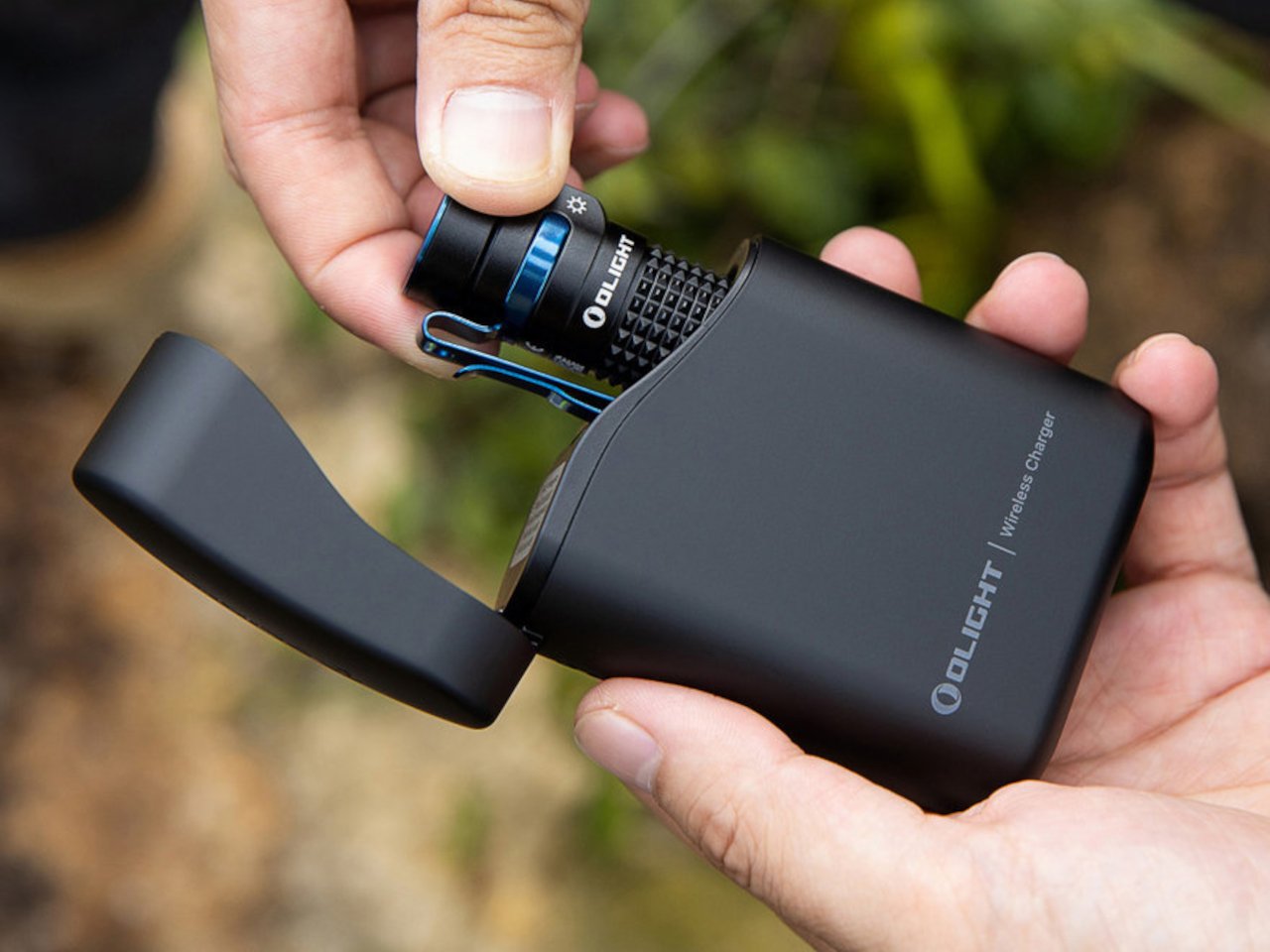
The smartest part of Olight’s Baton 4 Premium Edition is the case. Its flip-top enclosure carries a 5,000mAh battery, recharges the flashlight, and lets you operate the light without removing it. Open the lid, press the case’s button, and the flashlight can illuminate while remaining docked. Holding the button adjusts brightness. That gives the enclosure a useful role beyond storage, particularly when you only need a quick look inside a bag or around the campsite before putting everything away again.

The flashlight itself measures just 2.48 inches long and weighs 52.5 grams with its battery. Olight rates its maximum output at 1,300 lumens, though the manual shows that turbo brightness begins stepping down after 90 seconds. The case also supplies USB-C power to external devices, offering backup charging without another dedicated battery pack. There’s a packing tradeoff: the 142-gram case weighs considerably more than the light. Bring both when charging flexibility matters; carrying only the flashlight keeps things much lighter.

What we like

  • The flashlight remains usable while docked in its charging case.
  • USB-C output gives the case a second job: powering other devices.

What we dislike

  • The charging case adds considerably more weight than the flashlight alone.
  • The 1,300-lumen maximum is a brief turbo setting, not sustained output.

2. DWARFLAB Draco Smart Telescope

DWARFLAB’s Draco is the indulgence in this selection: a preorder smart telescope designed for photographing the night sky. Its 90mm aperture, folded optics, and integrated cameras bring several astronomy components into one portable instrument. The particularly interesting mechanism is a rotating imaging sensor that compensates for field rotation, the apparent twisting of stars across an image during an exposure. DWARFLAB advertises single exposures of up to 300 seconds, with guiding hardware built into the telescope instead of attached as another accessory.

The practical appeal is how much setup the system takes on. Through the DWARFLAB app, Draco automates focusing, targeting, tracking, and image stacking, while its wide-angle and telephoto cameras can capture simultaneously. Scheduled shooting also makes an overnight session possible without constant supervision. At 5.5 kilograms, though, this is equipment to transport rather than casually add to a hiking bag.

Click Here to Buy Now: $1599

What we like

  • Integrated guiding and automated capture reduce the number of separate components to manage.
  • Simultaneous wide-angle and telephoto imaging offers two views of the same night.

What we dislike

  • A 5.5-kilogram body makes this a substantial addition to your luggage.
  • Preorder status rules it out as a dependable purchase for an imminent trip.

3. Zempire Stealth-Jet Wide Camp Stove

Zempire’s Stealth-Jet Wide addresses a familiar packing problem: a camp kitchen can occupy a surprising amount of the trunk. This two-burner stove closes into a powder-coated pressed-steel body just 2 inches thick. Its packed footprint remains a substantial 23.2 by 12 inches, but the shallow profile gives you a flatter object to arrange around other equipment. Open it, and the extra width provides space for larger pots and pans, with independently controlled burners rated at up to 10,000 BTUs each.

The supporting details are refreshingly practical. Rear and side wind shields surround the cooking area, pull-switch piezo ignition removes the need for matches during normal operation, and a removable pot stand provides access for cleaning. The $210 stove includes a propane canister hose connector, though fuel is separate. At 10 pounds, 13 ounces, its thinness solves storage bulk rather than backpack weight. That makes it a sensible design to consider for car camping, where fitting equipment matters more than carrying it.

What we like

  • The 2-inch packed profile reduces the stove’s storage bulk.
  • Two independently controlled burners provide flexibility for cooking a meal.

What we dislike

  • Its nearly 11-pound weight makes it poorly suited to backpacking.
  • A compatible propane canister and fuel must be purchased separately.

4. Nike ACG x Helinox Chair Zero LT

The Nike ACG x Helinox Chair Zero LT makes its construction the visual attraction. An orange frame sits beneath translucent Ghostgrid fabric, drawing attention to the supporting structure rather than hiding it under a substantial upholstered seat. Helinox describes Ghostgrid as a monofilament mesh with a reinforced ripstop grid, developed to balance low weight with resistance to abrasion and tearing. It’s an appropriate material story for a chair whose appeal depends on how little furniture you’re willing to carry outdoors.

The specifications make that argument concrete: 534 grams packed, a 265-pound stated capacity, and a carry case measuring 14 by 4.5 by 4.5 inches. Shock-corded aluminum poles form the frame, while an included X-Strap increases ground contact area to help reduce sinking on softer surfaces. Fit deserves attention before the branding: Helinox identifies adults under 5 feet, 9 inches among its ideal users.

What we like

  • A 534-gram packed weight makes the case for carrying a separate seat.
  • The included X-Strap addresses sinking on softer ground.

What we dislike

  • Helinox’s stated ideal-user guidance makes fit worth checking for taller buyers.
  • The collaboration is currently sold out on the US site.

5. Clip&Go Radio

The Clip&Go Radio puts its carrying method directly into the body. A built-in carabiner attaches the 220-gram device to a backpack or other gear, keeping its AM, FM, and shortwave radio accessible without assigning it an interior pocket. The design makes particular sense for something combining everyday listening with backup functions. There’s a flashlight, an audible SOS alarm with a flashing light, and a replaceable 2,000mAh battery that can also supply power to compatible smartphones.

The charging hierarchy is worth understanding before heading out. USB-C is the recommended primary method, with the shop listing approximately two hours for a full charge. The hand crank and solar panel are emergency alternatives, with listed charging times of approximately six and 67 hours, respectively. Neither should be mistaken for a quick substitute for plugging in. The replaceable 18650 cell is the more appealing ownership detail: when the battery wears out, you can replace it rather than retire the radio.

Click Here to Buy Now: $60.00

What we like

  • The integrated carabiner keeps it accessible.
  • Its 18650 battery is replaceable.

What we dislike

  • Solar charging is extremely slow.
  • Hand-crank charging is a lengthy backup method.

Packing Around the Trip

Before adding any of these to your equipment, decide what kind of outing you’re packing for. A trunk, a bicycle pannier, and a backpack impose different limits. Put the complete setup on the scale, including cases, cables, fuel, and accessories, rather than judging an object by its headline measurement. A thin stove still needs room around it; a compact instrument can still represent a substantial share of what you’re carrying.

It’s also worth separating the job you need done from the extra functions that sound appealing on a product page. Choose lighting around how you’ll use it, seating around your body, and specialist equipment around an activity you genuinely enjoy. Multifunctional gear earns its place when those functions match your habits. The better purchase may be the object that replaces something awkward, rather than another addition to an already crowded bag.

The post The 5 Best Outdoor Gear of November 2026 first appeared on Yanko Design.

  • ✇Yanko Design
  • This $129 Portable Jacuzzi turns any bathtub into a personal spa
    Installing a jetted tub usually means a new tub, a plumber, a dedicated electrical circuit, and some tile you never planned on replacing. That’s a lot of renovation for the simple pleasure of moving water. WAVORA’s Z1 shrinks the whole idea into a cordless puck that fits in your palm and suction-mounts inside the tub you already own. It’s roughly a hockey puck’s chubbier cousin, and it runs on a rechargeable battery, so there’s no cord dangling over the edge or near the water. Think of it as a
     

This $129 Portable Jacuzzi turns any bathtub into a personal spa

6 novembre 2026 à 21:45

Installing a jetted tub usually means a new tub, a plumber, a dedicated electrical circuit, and some tile you never planned on replacing. That’s a lot of renovation for the simple pleasure of moving water. WAVORA’s Z1 shrinks the whole idea into a cordless puck that fits in your palm and suction-mounts inside the tub you already own. It’s roughly a hockey puck’s chubbier cousin, and it runs on a rechargeable battery, so there’s no cord dangling over the edge or near the water. Think of it as a jetted tub’s greatest hit with the remodel left out.

WAVORA, a Louisville, Kentucky brand, sealed the Z1’s motor away from the bath water entirely, so there’s no spinning shaft poking through a rubber seal and waiting to leak. Most compact pumps use a rotating shaft that passes through the housing, guarded by a dynamic seal that rubs and wears every time the motor spins. The Z1 separates the drive from the transmission and closes everything up with static seals, which have no moving surfaces to grind down. The surrounding water doubles as coolant, pulling heat off the housing while it runs, which is a neat bit of free engineering. Your bath, in other words, is also the radiator.

Designer: WAVORA

Click Here to Buy Now: $129 $235 (45% off) Hurry! Only 6 days left.

A Grapefruit-Sized Jet That Mounts on the Wall or the Floor

The Z1 measures 4.3 by 3.5 inches (109 x 89mm) and weighs about 19 ounces (545g), which puts it in medium-sized citric fruit territory. Its form is a soft, cream-white drum with a slatted grille where the water exits and two control buttons on its flank. Small indicator LEDs glow through the shell, so you can check the setting without fishing the thing out. Most cordless bath jets on Amazon are taller cylinders with swiveling nozzles, and they tend to look like pool equipment. The Z1 reads closer to a diffuser or a candle, which helps when it’s sitting on a shelf between soaks.

A double-sided suction mount does the holding, sticking to the tub on one face and the Z1 on the other. It grips best on smooth, non-porous surfaces, which covers acrylic, enamel, glass, polished stainless steel, and glazed tile, so most American tubs qualify. Mount it on the side wall and you get a directional stream that sweeps across the tub like a classic jet aimed at your back. Set it on the floor and the water pushes upward through the bath instead, closer to a spring welling up from below. Swapping between the two takes seconds, which means you pick where the movement starts every night, something a built-in jet can never do.

Three Flow Modes and Up to Five Hours Per Charge

Gentle Flow keeps a soft, steady current moving around you, perfect for a bath with a book in one hand. Power Flow cranks up circulation and shoves water and existing bath foam around the whole tub, which is the setting for sore legs after a long run. Spa Rhythm pulses the intensity up and down in waves, mimicking the ebb and surge of a proper spa jet. One button cycles through all three, so switching moods doesn’t require reading a manual with wet hands. The Z1 moves water rather than injecting air, so the fizzy, aerated feel of a whirlpool comes from your bath bombs, which the launch bundle conveniently includes.

Gentle Flow runs for up to five hours on one charge, Power Flow for about two, and the pulsing Spa Rhythm for around an hour. Five hours in the gentlest mode covers several evening soaks before you need to think about a cable, unless you’re the type who refills the hot water three times. Charging happens over the included USB cable outside the tub, so the only thing near the water is a sealed puck on battery power. Being cordless also frees the Z1 from the nearest outlet, which in most bathrooms sits over by the sink. Corded rivals solve that with a 13-foot cable, which is a lot of wire to drape around a tub of water.

An Outlet You Can Rinse in the Sink, and a $129 Launch Price

Built-in jets have a reputation, and anyone who has fired one up after months of disuse has seen the flakes that come out of the plumbing. The Z1’s outlet section detaches completely, so hair, petals, and bath bomb debris get rinsed out at the sink instead of building up inside. Smaller snags come off by hand without removing anything. The entire water path lives inside a body you can hold under a faucet, so there’s no hidden pipework for gunk to colonize. Budget bath jets on Amazon run about $30 to $70, and their swiveling nozzle assemblies offer more nooks for that gunk to settle into.

The Z1 launches at $129 in a Spa Ritual Set, against a $235 MSRP, bundled with a USB charging cable, the double-sided suction mount, and a manual. WAVORA throws in six botanical bath bombs, six bath liners, and a mesh pouch, which turns the box into a ready-made gift. A single cream-white finish appears across the launch materials, with no other colors announced. Orders ship worldwide, including the US, with delivery estimated for January 2027. WAVORA hasn’t listed warranty terms yet, so check the product page before ordering. That’s a jetted tub’s worth of moving water for the price of a nice dinner, and the tile gets to stay exactly where it is.

Click Here to Buy Now: $129 $235 (45% off) Hurry! Only 6 days left.

The post This $129 Portable Jacuzzi turns any bathtub into a personal spa first appeared on Yanko Design.

  • ✇Yanko Design
  • An Oregon Parking Lot Was Transformed Into a Forest-Inspired Library
     At East County Library in Gresham, Oregon, timber columns rise through gaps in the acoustic ceiling, keeping the structure visually separate from the surfaces around it. Holst Architecture designed this detail to suggest tree trunks reaching toward a canopy. The forest reference is built into the architecture, rather than applied afterward as a decorative theme. Opened in May 2026, the approximately 95,000-square-foot library serves eastern Multnomah County. Holst led the design, collaborating
     

An Oregon Parking Lot Was Transformed Into a Forest-Inspired Library

6 novembre 2026 à 19:30

 At East County Library in Gresham, Oregon, timber columns rise through gaps in the acoustic ceiling, keeping the structure visually separate from the surfaces around it. Holst Architecture designed this detail to suggest tree trunks reaching toward a canopy. The forest reference is built into the architecture, rather than applied afterward as a decorative theme.

Opened in May 2026, the approximately 95,000-square-foot library serves eastern Multnomah County. Holst led the design, collaborating with Adjaye Associates through the design development phase. Its scale addresses a longstanding imbalance: more than 40 percent of county residents live east of Interstate 205, yet East County previously had the library system’s smallest footprint.

Designer: Holst

The project replaces an underused parking lot with a public destination connected to transit. A tree-lined pedestrian route links the MAX light rail stop and northern civic space to a terraced entrance plaza on Division Street. That arrangement makes the approach part of the project, giving pedestrians a defined route between transportation and the library’s entrances.

Inside, glulam beams and cross-laminated timber panels form the primary structural system. Double-height entrances and a central living room establish larger clearings within the column grid. Holst paired overhead beams and introduced recessed lines in the timber to give the ceiling depth and rhythm. These choices make the forest analogy legible through construction, without requiring literal representations of branches or leaves.

The building isn’t exclusively timber. Concrete shear walls around the auditorium and along the eastern side provide structural support, with concrete also used around acoustically sensitive spaces. This hybrid approach is worth noting: the material palette responds to different demands rather than treating exposed wood as the answer to every problem.

Holst organizes the plan from active spaces on the west toward focused reading and work areas on the east. Entrances, creative activities, and children’s play occupy the busier edge. Collections and specialized rooms sit toward the center, while window-lined seating provides a quieter destination. The layout acknowledges that a contemporary library needs room for conversation and concentration.

That range includes an audiovisual studio, a creative learning room, indoor and enclosed outdoor children’s spaces, and a rooftop terrace. Two sensory rooms, one oriented toward children and another toward adults, offer adjustable lighting and different ways to engage or withdraw. Community consultation helped shape these provisions, giving the expansive brief specific places to land.

Radiant flooring and rooftop solar panels accompany a LEED Gold target, not a confirmed certification. Beyond those systems, the useful architectural decision is spatial: a large civic building makes room for different levels of participation, including the simple wish to sit quietly with a book.

The post An Oregon Parking Lot Was Transformed Into a Forest-Inspired Library first appeared on Yanko Design.

  • ✇Yanko Design
  • This fan-made LEGO McDonald’s combo comes with everything except the McFlurry
    In 1999, LEGO sold an official McDonald’s restaurant brickset through its Shop at Home catalog in the US, and it was adorably tiny. Set 3438 used 98 pieces to build a little drive-through window, a car, and an umbrella table, with stickers doing most of the branding work. The employee was basically a standard LEGO chef with the logo slapped on his chest. One collector paid $75 for a sealed copy back in 2011, for a set that cost around ten bucks new. Twenty-seven years later, a fan builder think
     

This fan-made LEGO McDonald’s combo comes with everything except the McFlurry

6 novembre 2026 à 18:30

In 1999, LEGO sold an official McDonald’s restaurant brickset through its Shop at Home catalog in the US, and it was adorably tiny. Set 3438 used 98 pieces to build a little drive-through window, a car, and an umbrella table, with stickers doing most of the branding work. The employee was basically a standard LEGO chef with the logo slapped on his chest. One collector paid $75 for a sealed copy back in 2011, for a set that cost around ten bucks new. Twenty-seven years later, a fan builder thinks the next LEGO McDonald’s should skip the building entirely and go straight for the food.

Called McDonald’s Menu, brickbybrick_’s LEGO Ideas submission rebuilds a classic combo big enough to hold its own on a shelf. There’s a red tray with giant Golden Arches in the middle, a cheeseburger, a red carton overflowing with fries, and a white cup loaded with transparent ice and a striped straw. Zero minifigures, zero drive-through, all lunch. The project went up on October 29 and is already sitting at 1,440 supporters, which tells me a lot of AFOLs (adult fans of LEGO) are hungry. I’m one of them, and I’m writing this before lunch.

Designer: brickbybrick_

Red plates form the tray, finished with a raised, rounded rim and a handle at each end, so it reads as molded plastic instead of a stack of bricks. A big yellow set of Golden Arches sits dead center, breaking up what would otherwise be a whole lot of red. The food is arranged in the classic triangle: burger front left, cup at the back, fries off to the right. It’s the exact layout you’d find on any table at your local McDonald’s around noon. That framing makes the build look like a meal someone just set down, which is half the fun of it.

The cheeseburger starts with a dome of tan curved elements, smooth on top like a plain hamburger bun. Under it sits a red layer that reads as tomato, then bright green leaf pieces fanning out as lettuce, a slice of yellow cheese, and a dark brown patty. Those leaves are a nice bit of NPU (nice part usage, for the uninitiated), taking foliage meant for LEGO gardens and jungles and turning it into a salad. Each layer sticks out at slightly uneven angles, giving the burger that freshly squished look of something just pulled from its wrapper. Real fast food never comes perfectly stacked, and this one looks like it survived a lunch rush.

A pile of yellow plates and bricks spills out of the red fry carton at every angle, some standing tall and some flopped over the edge the way the last few always are. The carton gets the real thing’s shape right, the one McDonald’s introduced in 1970 with a wide mouth for quick scooping and a profile that keeps the fries from falling out. The Golden Arches appear on its face in yellow, the same red-and-yellow combo that has been selling fries for over five decades. Building fries in LEGO is easy, but making them look casually messy takes real effort. My only complaint is that I can’t salt them.

My favorite detail, though, is the drink. The white cup’s top is left open, showing a load of transparent pieces packed in as ice, with a red-and-white striped straw sticking out at a jaunty angle. That straw does three jobs at once. It gives the composition its tallest point, adds a splash of red to an otherwise white element, and nods to a real McDonald’s quirk, since the chain says its straws are slightly wider than average so more Coke hits your taste buds. The ice tells its own story, because McDonald’s pre-chills its syrup and sets the ratio expecting the ice to melt. Leaving the lid off is what lets you see all of it.

Back in 2021, adammark’s McDonald’s Franchise 1955-1969, a walk-up burger stand with a Speedee System kitchen, hit 10,000 supporters and reached the Third 2021 Review. It was one of 36 projects in that round, and Hocus Pocus ended up as the only one approved. brickbybrick_ takes a different route, shrinking the subject from a restaurant down to a single meal sized for a shelf. The build is unlicensed, so those Golden Arches are a fan’s tribute, and any official version would need McDonald’s on board. The two companies have teamed up before, going back to LEGO’s first Happy Meal promotion in 1983, so the precedent exists.

McDonald’s Menu currently has 1,440 supporters and 599 days left to reach its next milestone of 5,000. LEGO Ideas runs on community momentum: fans submit their builds, supporters rally behind the ones they love, and projects that hit 10,000 get reviewed by LEGO for a shot at becoming real sets. It’s a long climb for a lunch order, but every Ideas set on store shelves started at zero votes. If you’d like to see this combo in a box, head to the LEGO Ideas page and give it your vote. Personally, I’m holding out for a Super Size edition, which McDonald’s retired in 2004 but LEGO is more than welcome to bring back.

The post This fan-made LEGO McDonald’s combo comes with everything except the McFlurry first appeared on Yanko Design.

  • ✇Yanko Design
  • Story mfg.’s Plaid ASICS Go Outdoors Without the Tactical Look
    I like an outdoor sneaker that doesn’t look as though it came with a survival briefing. For everyday walks, the visual intensity of technical footwear can feel like more commitment than the outing requires. The Story mfg. x ASICS GEL-TRANSCEND FJ addresses that small but familiar wardrobe problem with hiking-blanket-inspired checks and a trail-derived sole. The collaboration’s online debut is scheduled for November 11, 2026, so this is a forthcoming release rather than something already on shel
     

Story mfg.’s Plaid ASICS Go Outdoors Without the Tactical Look

6 novembre 2026 à 17:30

I like an outdoor sneaker that doesn’t look as though it came with a survival briefing. For everyday walks, the visual intensity of technical footwear can feel like more commitment than the outing requires. The Story mfg. x ASICS GEL-TRANSCEND FJ addresses that small but familiar wardrobe problem with hiking-blanket-inspired checks and a trail-derived sole. The collaboration’s online debut is scheduled for November 11, 2026, so this is a forthcoming release rather than something already on shelves.

The blanket reference deserves a closer look. These aren’t described as shoes made from repurposed blankets. Instead, the collaboration translates that familiar check into an upper combining mesh and synthetic leather overlays. Plaid travels across the toe, lacing area, side stripes, and heel. It’s a clever place to put the pattern: the reinforcing pieces become the decoration, so the checks follow the shoe’s construction rather than appearing as a graphic dropped onto an otherwise unrelated sneaker.

Designers: Story mfg. x ASICS

The two color directions make that approach easier to live with. There’s a black-and-gray version and a rich brown alternative, both keeping the pattern within a restrained palette. Personally, I’d lean toward brown for the full camp-blanket association, although the black pair makes a convincing case for itself. In the product photograph, its pale crossing lines pick out the overlapping panels while the black mesh recedes. There’s plenty happening without a bright accent demanding attention.

ASICS supplies more than a recognizable logo here. The underlying GEL-TRANSCEND FJ draws on the company’s hiking and walking footwear from the 1990s, including elements of the TRANSCEND series, GEL-ODYSSEY, and GEL-RADIUS. That matters because the slightly old-fashioned proportions have a genuine design lineage. To my eye, they also give Story mfg.’s plaid a more convincing home than a streamlined racing upper would. The references feel compatible, even before the collaboration’s storytelling enters the picture.

Underneath, the model uses the GEL-FujiTrabuco 7 tooling system, which brings that jagged profile into the design. ASICS describes the base in terms of durability and grip across different conditions. Those are manufacturer claims, not a substitute for wearing this particular pair, but the borrowed platform gives the collaboration a functional foundation beyond its surface treatment. I’d still want to know how it fits and feels over several miles before calling it an everyday favorite.

The campaign gives the shoe a broader setting than an outfit photograph. A forager, a blacksmith, dancers, farmers, and cyclists appear in their own environments, extending the brands’ idea of rambling beyond a designated hiking route. I like that choice. It leaves room for movement that isn’t measured as exercise, and for people whose relationship with their surroundings comes through work, curiosity, or routine. A sneaker doesn’t need an athletic achievement attached to every outing.

Then comes the Rambling Club, which adds a pleasantly silly layer to the release. Events are scheduled at Story mfg.’s London studio on November 7 and 8, followed by a New York chapter on November 10. Prospective members submit an application and a hand-drawn self-portrait for early access. Asking someone to draw themselves is a charmingly awkward alternative to the usual frictionless checkout. I’d rather a launch have a little personality than another countdown timer.

For anyone skipping the club, the wider shopping details are straightforward: Story mfg.’s online release is scheduled for November 11, followed by ASICS and select retailers on November 20, 2026. Hypebeast lists the retail price at $180. That puts some responsibility on the design to offer more than a nice campaign, and I think the placement of the plaid does more persuasive work than the club membership ever could.

My interest would ultimately come down to how often I’d reach for them after the novelty wore off. The checks give the shoe character, but the subdued colors leave room for ordinary clothes and ordinary plans. I can picture the brown pair with faded jeans more readily than a coordinated hiking outfit. That’s the useful design proposition here: an outdoor-looking sneaker that doesn’t require the rest of the day to dress up around it.

The post Story mfg.’s Plaid ASICS Go Outdoors Without the Tactical Look first appeared on Yanko Design.

  • ✇Yanko Design
  • Tesla is ending Cybertruck production in Texas, hinting at discontinuing the model entirely
    Tesla is pulling the plug on the Cybertruck, and the official reason involves real estate. Elon Musk posted on X on November 6 that production at Gigafactory Texas will wind down around the middle of 2027 to make room for more Cybercab production. That would be a reasonable explanation if Giga Texas were a studio apartment. The factory has more than 10 million square feet (roughly 929,000 square meters) of floor space, and the Cybertruck line has been running at a fraction of its installed capa
     

Tesla is ending Cybertruck production in Texas, hinting at discontinuing the model entirely

6 novembre 2026 à 16:30

Tesla is pulling the plug on the Cybertruck, and the official reason involves real estate. Elon Musk posted on X on November 6 that production at Gigafactory Texas will wind down around the middle of 2027 to make room for more Cybercab production. That would be a reasonable explanation if Giga Texas were a studio apartment. The factory has more than 10 million square feet (roughly 929,000 square meters) of floor space, and the Cybertruck line has been running at a fraction of its installed capacity. Call it the most polite breakup text in automotive history.

The less polite version is that nobody’s buying it. Electrek estimates Tesla is moving around 30,000 Cybertrucks a year on a line built for 250,000, and Cox Automotive counts just 11,586 US sales through the first nine months of 2026. This is the same truck that debuted in 2019 with a promised $39,900 price tag and a pair of freshly shattered “Armor Glass” windows. Back then I called it a Toblerone on wheels, and being right seven years later brings me zero joy. Okay, maybe a little. The truck peaked on a stage in 2019, and nothing it did on the road ever topped that.

Price cuts, price hikes, and a convenient excuse

A cheaper rear-wheel-drive Cybertruck launched in 2025 and vanished within months, setting the tone for two years of Tesla trying one pricing strategy after another. A more affordable dual-motor trim reached customers this summer, then Tesla raised prices by $5,000 in August, putting that version at $74,990. Some of the most dependable demand came from inside the family, with S&P Global Mobility data showing SpaceX bought 1,279 Cybertrucks in the last quarter of 2025. Musk’s companies accounted for roughly 19% of US Cybertruck registrations that quarter. When your rocket company is one of your best customers, the truck has a demand problem.

Tesla used the same “make room” framing earlier this year, when it ended Model S and Model X production to free up its Fremont factory for Optimus humanoid robots. Retiring a product sounds a lot better when it’s framed as making space for the future. The Cybertruck’s exit also leaves plenty unanswered: no firm end date, no word on outstanding orders, and nothing yet on parts and service for existing owners. Tesla hadn’t responded to Gizmodo’s request for comment, either. The closest thing to an official goodbye came from lead engineer Wes Morrill, who posted that the truck “lives on through Cybercab.” Engineers write better eulogies than CEOs, apparently.

A mood board of movie cars met a real winter

The Cybertruck’s problems started on the mood board. A photo Walter Isaacson shared from Tesla’s design studio shows a wall of film and game vehicles, including James Bond’s submarine Lotus Esprit and the Back to the Future DeLorean, and Musk has openly credited Blade Runner as a major influence. Movie cars only have to look incredible for the length of a shot. Chief designer Franz von Holzhausen later conceded that most of the studio hated the final faceted shape, and Musk shot down every attempt to soften it, famously declaring he doesn’t do focus groups. One man’s taste beat an entire design team, and the market eventually sided with the team.

In early 2024, owners in rain-soaked California started posting photos of orange rust specks on their stainless panels after just a couple of days of driving. Morrill blamed surface contamination that cleans right off, which is technically reassuring and terrible marketing for a truck sold as indestructible. A year later, Tesla recalled 46,096 trucks because a stainless trim panel called the cant rail, bonded with structural adhesive, could delaminate and detach. Owners had reported failures in cold weather. In between, 3,878 trucks were recalled because an unapproved dab of soap during assembly let the accelerator pedal pad slip loose and get trapped in the trim. Armor, it turns out, still depends on glue.

The Cybertruck became a statement about its creator

No other Tesla carried Elon Musk’s fingerprints like the Cybertruck. The Model 3 is a mainstream sedan, while the Cybertruck was one person’s vision, pushed through over his own design studio’s objections. That made it the most personal object Tesla ever sold, and its meaning shifted with its creator’s public image. As Musk became one of the most polarizing figures in American politics, buying a Cybertruck started reading as a political statement. One Yahoo Finance commentator put it bluntly, calling it a middle finger on four wheels. Tesla even tried controlling who owned one, briefly threatening early buyers with a $50,000 penalty for flipping their trucks.

A Yale study put a number on that effect, estimating Musk’s “polarizing and partisan actions” cost Tesla between 1 million and 1.26 million US sales from October 2022 to April 2025. Rival EV and hybrid makers saw their sales rise 17% to 22% over the same stretch. CleanTechnica argued the headline figure was far too high, while agreeing that the partisan effect was real. Federal Election Commission data also shows Musk as the 2026 midterm cycle’s biggest individual donor, at roughly $446 million to Republican-aligned groups. That money came from his own pocket, and the Cybertruck got its end date three days after Election Day. A car built as a personal statement eventually gets judged as one.

The engineering lives on in Cybercab, and so does the playbook

The Cybertruck did introduce some significant engineering changes for Tesla, starting with the company’s first 800-volt architecture. Higher voltage means less current for the same power, which can allow thinner cables and faster charging. It also swapped the industry-standard 12-volt low-voltage system for a 48-volt one, reducing wiring requirements. Its steer-by-wire setup eliminated the mechanical steering connection entirely, a first for a production car and something even the Infiniti Q50 retained as a backup. Morrill’s farewell points straight at the Cybercab, the gold two-seat robotaxi with no steering wheel, pedals, or mirrors that Tesla started building in April. The truck basically served as a very large, very shiny test bench.

Last month, Tesla unveiled a new Roadster with cold-gas thrusters, asking for $50,000 deposits for the Performance version and $250,000 for the Thrust version, under a reservation agreement that says Tesla can’t guarantee when, or if, the car will be delivered. That’s nine years after Tesla first took deposits on a next-gen Roadster that never shipped. The Semi, unveiled that same year with production promised for 2019, only reached volume production this September, and the Cybercab is already facing two NHTSA reviews. Back in 2019, I wrote that the only number that would matter for the Cybertruck was its sales. I’d like to think Elon’s announcement is the proof I was looking for.

The post Tesla is ending Cybertruck production in Texas, hinting at discontinuing the model entirely first appeared on Yanko Design.

  • ✇Yanko Design
  • Midea’s award-winning blender concept can both heat and cool your mixture down
    Picture a blender with a stovetop hidden in its base, so it can turn soybeans into hot soy milk or rice into congee without you touching a pot. Heated blenders like this are a breakfast staple across China, and most share one annoying flaw: the drink comes out scalding, leaving you to blow on it like it owes you money. Midea’s Fully Automatic Air Flow Blender targets that wait with an airflow system designed to help with both cooking and cooling. Midea claims it brings drinks down to 131°F (55°
     

Midea’s award-winning blender concept can both heat and cool your mixture down

6 novembre 2026 à 15:20

Picture a blender with a stovetop hidden in its base, so it can turn soybeans into hot soy milk or rice into congee without you touching a pot. Heated blenders like this are a breakfast staple across China, and most share one annoying flaw: the drink comes out scalding, leaving you to blow on it like it owes you money. Midea’s Fully Automatic Air Flow Blender targets that wait with an airflow system designed to help with both cooking and cooling. Midea claims it brings drinks down to 131°F (55°C) within five minutes of finishing. That’s roughly where breakfast stops being a dare and starts being breakfast.

The machine comes from Guangdong Midea Consumer Electric, with a design team led by Peng Xi and Wang Jin, and it received a Red Dot Award: Design Concept 2026 in the Ready for Market track. That track recognizes near-finished products that haven’t reached shelves, judged partly on whether they can realistically ship within a year. Midea says the airflow lets the motor blend at full power without soy milk foaming over. A built-in water tank sits alongside the blending jar, and the linen-textured shell looks ready for a Scandinavian café. The Chinese-language interface suggests a launch in China first, though there’s no word yet on US availability.

Designers: Peng Xi, Wang Jin, Li Qianlun, Jo Jeongmin, Ru Guanhong & Wang Xingzhe

Soybeans contain saponins, compounds that contribute to soy milk’s bubble-bath foam when heated. Heated blenders typically manage this by blending in short bursts and pausing the heat to keep the foam from reaching the lid. That stop-start rhythm helps explain why a batch of soy milk on Midea’s existing machines takes around 30 minutes. The company credits its airflow system with cutting prep time in half, though it hasn’t detailed how the system controls foam.

A freshly cooked batch of soy milk or congee can come out near 212°F (100°C), then sit in the jar cooling a degree at a time while you wait. Midea’s existing heated blenders hold drinks at 131°F (55°C) on keep-warm for up to six hours, so the target is familiar territory for the brand. The new machine’s trick is getting there fast: Midea says cooling takes about five minutes. That’s roughly the time it takes to find your shoes and your keys. Paired with overnight scheduling, it could have freshly made soy milk ready to drink when you wake up.

Visually, the appliance splits into two towers that share a figure-eight footprint. On the left, a linen-textured column holds a water tank that lifts straight out from the top, with a corrugated grip that echoes the ribbed base beneath the glass jar. On the right, the jar wears a copper-colored lid ring that appears to double as a status light. Midea’s description of the surface as a linen texture suggests a molded finish rather than real cloth, a sensible call next to a jar of hot congee. The touch panel flips up for easier reading and carries illustrated buttons for soy milk, juices and milkshakes, porridges, and cleaning, including one porridge program labeled for better sleep.

The closest thing US readers will recognize is the Ninja Foodi Cold & Hot Blender, which pairs an 800-watt heating element with a 64-ounce glass pitcher and sells for around $200 at Walmart. It can cook soup from raw ingredients, but you’re still the one pouring in water and waiting for everything to cool. Midea’s pitch is to automate more of that work, drawing water from the built-in tank and offering a high-temperature wash and drying cycle through the menu. The tank will still need refilling, of course. There’s no price or US release date yet, so this one stays on the wishlist.

The post Midea’s award-winning blender concept can both heat and cool your mixture down first appeared on Yanko Design.

  • ✇Yanko Design
  • The Nubeo Ecliptic watch puts a tiny spacecraft control panel on your wrist
    Hollywood loves a sequel, and so does the watch world, though watch sequels trade explosions and cameos for colorways. Nubeo’s Ecliptic Retrograde Dual Time first landed in October 2024, and the square-cased space watch is back for 2026 in six new colorways, from the blue-strapped Firewater Blue to the moodily named Steel Phantom. The core recipe stays put: a 45mm steel case, a matte black dial, and a second time zone displayed by a hand that sweeps a retrograde arc before snapping back to zero
     

The Nubeo Ecliptic watch puts a tiny spacecraft control panel on your wrist

6 novembre 2026 à 14:20

Hollywood loves a sequel, and so does the watch world, though watch sequels trade explosions and cameos for colorways. Nubeo’s Ecliptic Retrograde Dual Time first landed in October 2024, and the square-cased space watch is back for 2026 in six new colorways, from the blue-strapped Firewater Blue to the moodily named Steel Phantom. The core recipe stays put: a 45mm steel case, a matte black dial, and a second time zone displayed by a hand that sweeps a retrograde arc before snapping back to zero.

That hand crawls from 0 to 24 across the lower dial, then flies back to the start like it just remembered it left the stove on. Nubeo pairs it with a big date, a 24-hour subdial, and a caseback engraved with the sun, Earth, and the ecliptic plane. That last detail explains the name, since the ecliptic is the path the sun appears to trace across our sky over a year. Every colorway runs on a Japanese quartz movement and lists for $250, with an advertised 20% launch discount bringing it to $200.

Designer: Nubeo

A Dial Built Like a Spacecraft Control Panel

Nubeo stacks this dial in layers, starting with a matte black honeycomb mesh at the base. A raised chapter ring sits above it with a printed 05 to 55 minute track, while an oversized applied 12 anchors the top. The 24-hour subdial sits near 9 o’clock, the framed date window is at 4, and the dual time arc wraps across the bottom third. Applied indices and hands carry Japanese lume for low-light visibility. Each colorway also changes the accents on a few of these elements.

Putting the second time zone on its own arc separates it from the main time display, a useful distinction on a dial this busy. A traditional GMT, like the Rolex GMT-Master, adds a fourth hand that points to a 24-hour scale around the edge. The Ecliptic moves that reading to the lower dial instead. On the blacked-out version, green lume emphasizes the hands and markers. The coil-spring details at the four corners are decorative, reinforcing the spacecraft-control-panel look. Honestly, this dial looks like it should come with a launch sequence.

Square, Steel, and 155 Grams of Attitude

The stainless steel case measures 45mm across (about 1.77 inches), 45mm lug to lug, and 16mm thick (0.63 inches). Square cases tend to wear larger than round ones of the same width because the corners fill out more of the wrist. The matching width and lug-to-lug measurements keep the case from extending farther along the wrist, but this is still a substantial watch at 155 grams (5.5 ounces), paired with a 26mm rubber strap. An anti-reflective mineral crystal covers the dial, and water resistance is rated at 5 ATM.

The square sports case has plenty of precedent, from Bell & Ross’s cockpit-instrument BR 03 to Hublot’s Square Bang. Nubeo takes a similar instrument-panel approach, adding recessed channels with exposed screws along the case flanks and a crown finished in each colorway’s accent shade. Inside sits a Japanese quartz movement, though Nubeo doesn’t name the specific caliber. Quartz makes sense for a dual time watch that might spend a week in a drawer between trips, keeping both time displays running without winding.

Six New Colorways, Same Cosmic Recipe

The 2026 lineup includes Firewater Blue, Cardinal Teal, Forest Veil, Royal Twilight, Dark Alloy, and Steel Phantom, all built on the same matte black dial. The differences are in the dial accents, crown color, case finish, and rubber strap. Across the lineup, you’ll find yellow straps, blue straps, gray straps with yellow details, and a blacked-out case for anyone allergic to shiny things. The original 2024 variants included Space Blue, Hazard Red, and Golden Black, which Nubeo sold as limited editions. The caseback in the press images carries a limited-edition marking too, though Nubeo hasn’t listed an edition size for the new run.

The Ecliptic fits into Nubeo’s catalog, which leans heavily on space and pop culture with collaborations like the Space Invaders Automatic and the Atari Asteroids watches. This one draws on astronomy rather than a licensed property and costs considerably less than those collaborations. Citizen’s Eco-Drive BR0120 offers retrograde dual time too, wrapped in a classic round case for the buttoned-up crowd. The Ecliptic is the more conspicuous option, with its square case, layered dial, and bright strap choices. Nubeo lists it at $250 before the launch discount, with free shipping and a two-year warranty.

The post The Nubeo Ecliptic watch puts a tiny spacecraft control panel on your wrist first appeared on Yanko Design.

  • ✇Yanko Design
  • Raven Prism Smart Glasses Put a Linux Computer in the Corner of Your Eye
    Checking a recipe with flour on your fingers is a good reminder that a touchscreen isn’t always the most convenient interface. Raven Resonance’s Prism glasses propose keeping those instructions in the corner of your vision instead, with eye controls leaving your hands free. The reservation-stage wearable puts a Linux computer inside familiar-looking frames, rather than simply supplying another screen tethered to your phone. The frames make some concessions to everything packed inside. Thick tem
     

Raven Prism Smart Glasses Put a Linux Computer in the Corner of Your Eye

Par : JC Torres
6 novembre 2026 à 13:20

Checking a recipe with flour on your fingers is a good reminder that a touchscreen isn’t always the most convenient interface. Raven Resonance’s Prism glasses propose keeping those instructions in the corner of your vision instead, with eye controls leaving your hands free. The reservation-stage wearable puts a Linux computer inside familiar-looking frames, rather than simply supplying another screen tethered to your phone.

The frames make some concessions to everything packed inside. Thick temples run back from a dark brow, while clearer lower rims soften the outline around the lenses. Pale end pieces add a contrasting finish without covering the front in conspicuous branding. There’s still more hardware beside your head than ordinary glasses would carry, so familiar styling shouldn’t be confused with proven comfort.

Designer: Raven Resonance

The display occupies the right eye’s periphery, using a full-color waveguide with a 30-degree diagonal field of view. Its position is meant to make a recipe or reference image available when you glance over, rather than filling your central view. That arrangement suits checking the next instruction while cooking, although looking away from your hands still requires choosing a sensible moment to pause.

Eye control gives that arrangement its practical purpose. Raven’s software framework includes buttons you activate by holding your gaze on them, along with gaze-based navigation. You wouldn’t need to tap a temple every time your hands were occupied. The challenge is distinguishing a deliberate selection from an ordinary glance, something the developer guidance acknowledges by recommending large targets and avoiding crowded layouts.

Privacy gets a physical control rather than just a settings menu. A cover must be moved manually before the 13-megapixel camera can operate, and lights in the rims signal when it’s active. Raven also says speech recognition runs locally and cloud sharing requires consent. Those choices make the intended boundaries clearer, but they don’t amount to an independent security audit of the system.

Keeping prescription glasses usable while their electronics recharge takes another physical solution. Raven Wings are removable battery modules, designed to swap without shutting down your apps. Two pairs and a charging case are included, letting one set recharge while you wear the other. That makes the all-day ambition about exchanging batteries, not a published promise of uninterrupted runtime from a single pair.

Underneath that eyewear is Raven OS, running on a quad-core ARM processor with up to 4GB of memory. Developers can connect remotely and build compatible applications, but Linux underneath doesn’t mean every desktop program fits a tiny wearable display. Navigation directions and other phone-supplied information also remain part of the pitch, so standalone computing shouldn’t be mistaken for making your phone redundant.

Prism is priced at $1,499, including supported prescription lenses, with initial US shipments planned for January 2027. New reservations currently fall into a summer 2027 batch, not that first delivery window. Its usefulness will depend on whether these small interactions feel easier than reaching for a phone, and whether you’re comfortable keeping the screen, batteries, and computer on your face all day.

The post Raven Prism Smart Glasses Put a Linux Computer in the Corner of Your Eye first appeared on Yanko Design.

  • ✇Yanko Design
  • Urban Desk Saves Space Without Making You Move Your Monitor
    A monitor is an awkward thing to put away at the end of a workday. The screen, stand, cables, and nearby lamp make packing up feel like a small relocation project. Leave everything out, though, and the living room keeps looking like an office long after you’ve closed your laptop. Urban Desk, from German furniture brand UrbanNature, addresses that everyday friction by letting part of the workspace retreat while the equipment stays put. Designed by Jörg Brachmann, the desk takes a refreshingly mo
     

Urban Desk Saves Space Without Making You Move Your Monitor

6 novembre 2026 à 12:20

A monitor is an awkward thing to put away at the end of a workday. The screen, stand, cables, and nearby lamp make packing up feel like a small relocation project. Leave everything out, though, and the living room keeps looking like an office long after you’ve closed your laptop. Urban Desk, from German furniture brand UrbanNature, addresses that everyday friction by letting part of the workspace retreat while the equipment stays put.

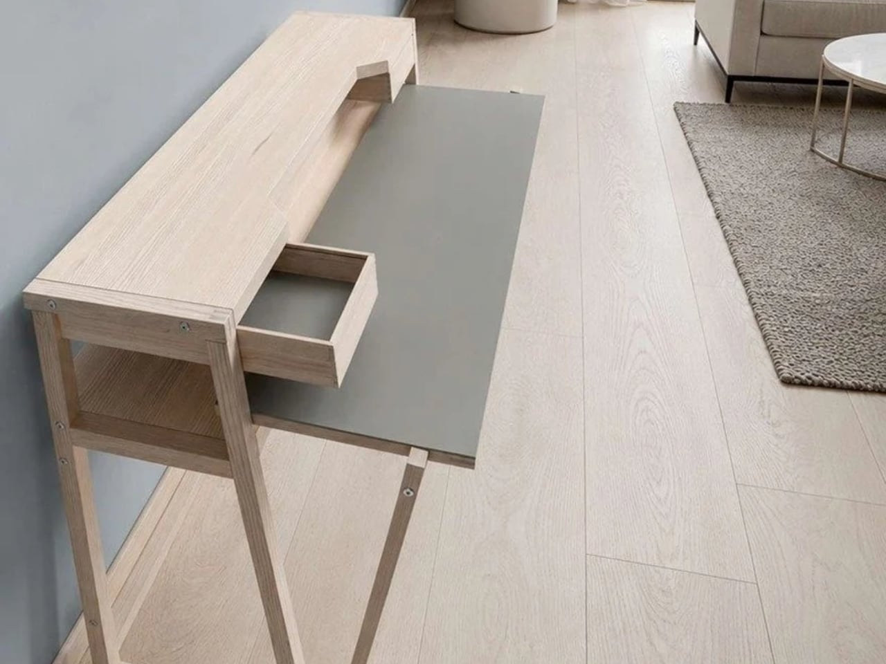
Designed by Jörg Brachmann, the desk takes a refreshingly modest approach to working in a room that also has other jobs. Its lower work surface pulls forward for use and slides back afterward. A fixed upper structure holds the monitor and other accessories, so changing the desk’s configuration doesn’t require rebuilding your setup. It’s an existing product offered through UrbanNature’s online store, rather than a concept asking us to imagine the practical details.

Designer: UrbanNature

The distinction between a moving surface and a stationary shelf is the important design decision here. According to the project’s Green Product Award entry, the tabletop extends horizontally without lowering or tilting, while the rigid upper structure accommodates a monitor. I like that the transformation has a limited, understandable purpose. You’re bringing more work surface toward you, then returning it when you’re done. The furniture doesn’t need to perform an elaborate disappearing act to earn its place.

UrbanNature lists the movable worktop at approximately 16.5 inches deep when retracted and 26 inches when extended. That’s roughly 9.4 inches of additional depth during use. The base itself is about 19.7 inches deep, so the smaller worktop measurement shouldn’t be mistaken for the entire desk’s footprint. Those distinctions matter when you’re measuring a bedroom corner or deciding how much passage space you’ll have beside a sofa.

For me, the appeal is permission to leave a functional setup alone. A space-saving design loses some of its usefulness if putting it away becomes another chore. Here, the separation between equipment and working surface suggests a less demanding routine. You still have to manage whatever you’ve spread across the moving section, of course. A notebook doesn’t file itself because the furniture has a clever mechanism.

The materials also suit that domestic role. UrbanNature specifies solid ash or oak alongside a blockboard worktop finished with linoleum, plus exposed wooden joints. Two A4-sized drawers sit beneath the monitor shelf. Those are useful places for notebooks, pens, and charging accessories, rather than an invitation to accumulate an entire office archive. I’d rather have a little storage close to hand than add another cabinet beside a desk chosen to save space.

There’s a fair compromise in the name of this arrangement: your office never fully disappears. The monitor remains visible, as does the desk. Core77 aptly describes it as a partial hideaway. That won’t satisfy someone who wants work equipment completely out of sight during dinner. Personally, I find the compromise reasonable. Keeping a screen ready for tomorrow can be worth more than achieving a perfectly office-free room tonight.

I’d want to check the setup against my own equipment before buying, particularly the monitor’s position and how comfortably the extended surface meets a chair. The fixed upper shelf establishes part of that arrangement for you. UrbanNature itself notes that an appropriate chair and correct screen height still matter. A compact footprint is useful, but it shouldn’t become the only measurement that gets your attention.

The online listing currently ranges from €995 to €1,429, including VAT. International buyers would need to confirm delivery and the total cost; the shipping policy notes possible additional charges outside the EU. At that price, I’d want the pull-out surface to earn its keep daily. The strongest argument for Urban Desk is simple: it lets you keep a ready-to-use workstation while asking a little less of the room once work is over.

The post Urban Desk Saves Space Without Making You Move Your Monitor first appeared on Yanko Design.

  • ✇Yanko Design
  • Sony MDR-3R over-ear headphones revive nostalgia of the Walkman era
    Remember the Walkman headphones from more than four decades ago? Well, the nostalgia is revived as Sony has brought back over-ear headphones for a generation obsessed with wired audio gear. The new pair of earphones draws inspiration from the originals that debuted in 1981, with the original design drawings referenced in crafting this pair. The inspiration doesn’t stop at the looks alone, as the earphones come with the same 23mm dynamic driver, so that the same sound signature can be replicated
     

Sony MDR-3R over-ear headphones revive nostalgia of the Walkman era

6 novembre 2026 à 11:20

Remember the Walkman headphones from more than four decades ago? Well, the nostalgia is revived as Sony has brought back over-ear headphones for a generation obsessed with wired audio gear. The new pair of earphones draws inspiration from the originals that debuted in 1981, with the original design drawings referenced in crafting this pair.

The inspiration doesn’t stop at the looks alone, as the earphones come with the same 23mm dynamic driver, so that the same sound signature can be replicated in these. All the modern conveniences are included, though, like a microphone for taking calls and the in-line remote control to toggle calls, music, and podcast streaming. This falls straight in line with the trend that brands like Final with AirWire and StillFrame are following.

Designer: Sony

For audiophiles who are constantly juggling their expensive gear, chasing that perfect sound, this is a subtle reminder of how it all started back then. The nostalgia of a balanced, warm sound signature that emphasized natural vocals and emotional richness. The earphones come with the iconic blue and orange earpads to customize the look. Hitting the rewind button, the OG earphones shipped with the Walkman TPS-L2 in 1979 and played cassettes.

You can barely distinguish the MDR-3R from the original one, and millennials will instantly feel the nostalgia. The small design details, like the metal headband and the holes on the outer casing of the drivers. Sony doesn’t stop there, as the packaging and the instruction manual also take you back to the golden era. Practicality of use is also taken care of, as the earphones weigh just 38 grams, bettering the original ones by 2 grams.

Since modern phones are rarely seen with a 3.5mm headphone jack, the pair comes with a USB-C connector to plug in easily with modern devices. I would have liked the headphones to come with a swappable option to plug in a 3.5mm or 4.4mm jack for high-quality playback with services like Tidal or Apple Music. That said, you’ll have to buy a USB-C to 3.5mm or 4.4mm jack so that you can plug it into DAPs like the HiBy W4 HiFi Amplifier.

Along with the OG classic version, the earphones also come in a Stranger Things Edition that has a black headband and the themed red and black foam pads to match the ones worn by Max. The standard MDR-3R over-ear earphones are priced at $59.99, while the Stranger Things Edition comes for $79.99.

The post Sony MDR-3R over-ear headphones revive nostalgia of the Walkman era first appeared on Yanko Design.

  • ✇Yanko Design
  • WOLOLOW’s UFO Lamp Uses a Bulb You Can Actually Replace
    A bedside lamp ought to survive a burned-out bulb, especially when its shape is the reason you bought it. I’d hate to retire a little flying saucer over a lighting component. That’s the practical appeal of WOLOLOW Night Lamp Ver 2.0: beneath its Space Age exterior sits a replaceable LED bulb. The object gets to keep its personality when the light source needs changing, a sensible priority for something designed to be displayed. Designed by Arthur Koshatahyan and Kostya Trunov, the lamp is curre
     

WOLOLOW’s UFO Lamp Uses a Bulb You Can Actually Replace

6 novembre 2026 à 10:20

A bedside lamp ought to survive a burned-out bulb, especially when its shape is the reason you bought it. I’d hate to retire a little flying saucer over a lighting component. That’s the practical appeal of WOLOLOW Night Lamp Ver 2.0: beneath its Space Age exterior sits a replaceable LED bulb. The object gets to keep its personality when the light source needs changing, a sensible priority for something designed to be displayed.

Designed by Arthur Koshatahyan and Kostya Trunov, the lamp is currently a Kickstarter project, with a working prototype documented by its makers. Its flattened, elliptical body has a ring of oval portholes and stands on three angled metal legs. The reference is wonderfully specific: Matti Suuronen’s 1968 Futuro House, translated into an object you can put beside your bed rather than climb into for the weekend.

Designers: Arthur Koshatahyan and Kostya Trunov

The architectural backstory gives that familiar UFO silhouette a little more substance. Futuro began with a commission for a ski lodge that could be assembled on difficult terrain and heated quickly. Its rounded plastic shell belonged to an optimistic vision of how people might live. I like seeing that ambition brought down to nightstand scale. You don’t need to know its history to enjoy the lamp, but knowing it makes the reference feel less arbitrary.

At 10 inches across and 6.5 inches tall, WOLOLOW 2.0 needs a meaningful patch of tabletop. The campaign specifies an ABS plastic body, polycarbonate windows, and a metal base with coated tips. Those dimensions are worth checking against your nightstand before getting attached to the miniature-house idea. It may be a small building, but it isn’t an especially tiny bedside accessory.

The five proposed finishes give the same silhouette quite different personalities: white, yellow, orange, sky blue, and mirror chrome. My vote goes to orange, which feels comfortably committed to the retro-futurist premise. Chrome makes a stronger decorative statement, while white would be my choice for a room that already has plenty happening. Color matters here because the lamp has such a recognizable outline. It doesn’t need a dramatic finish to announce itself.

Version 2.0 also drops the previous generation’s integrated battery in favor of external power. I’m comfortable with that trade for a lamp intended to stay beside a bed. A cord is less appealing if you want to move it around frequently, but keeping another decorative object charged wouldn’t be my preference either. The more consequential change is the user-replaceable bulb, which makes the lighting hardware less permanently tied to the sculptural shell.

Inside is a socket for a compatible 12V MR16 LED with a GU5.3 base. Smart features depend on the bulb you install, rather than being built into WOLOLOW itself. A compatible smart bulb could provide dimming, colors, or scheduling, but the prototype demonstration uses a standard warm-white bulb. The makers haven’t demonstrated smart operation in that video, so compatibility deserves attention before buying an upgrade.

The campaign lists a warm-white bulb and magnetic USB power cable as included, with the cable connecting beneath the lamp. A wall adapter and optional smart bulb are separate purchases. Individual lamp rewards currently carry an estimated March 2027 delivery date, which remains a crowdfunding target rather than a confirmed arrival. I’d approach it as backing a design still headed toward production, not ordering a lamp already sitting in a warehouse.

For me, the appeal comes down to giving an everyday object enough character that you’d want to keep it. The little windows make sense as part of the architectural reference and as openings for light; the legs give the saucer its landed posture. WOLOLOW is playful without asking the owner to treat it as a joke. I’d happily leave the smart-bulb possibilities alone and let the warm-white version do its thing. A small illuminated house beside the bed already has a pretty good job.

The post WOLOLOW’s UFO Lamp Uses a Bulb You Can Actually Replace first appeared on Yanko Design.

  • ✇Yanko Design
  • Keychron’s $35 Keypad Turns AI Shortcuts Into Four Physical Buttons
    Working with an AI coding assistant can mean repeating the same handful of commands while your fingers hunt across a keyboard full of other possibilities. Keychron’s F4 HE 8K Vibe Coding Keypad gives those repeated decisions their own little patch of desk. Four programmable keys put prompting, dictation, approval, and rejection within reach, without asking you to replace the keyboard you already use. The square body measures just 1.77 inches on each side, although its tall keycaps bring the hei
     

Keychron’s $35 Keypad Turns AI Shortcuts Into Four Physical Buttons

Par : JC Torres
6 novembre 2026 à 09:20

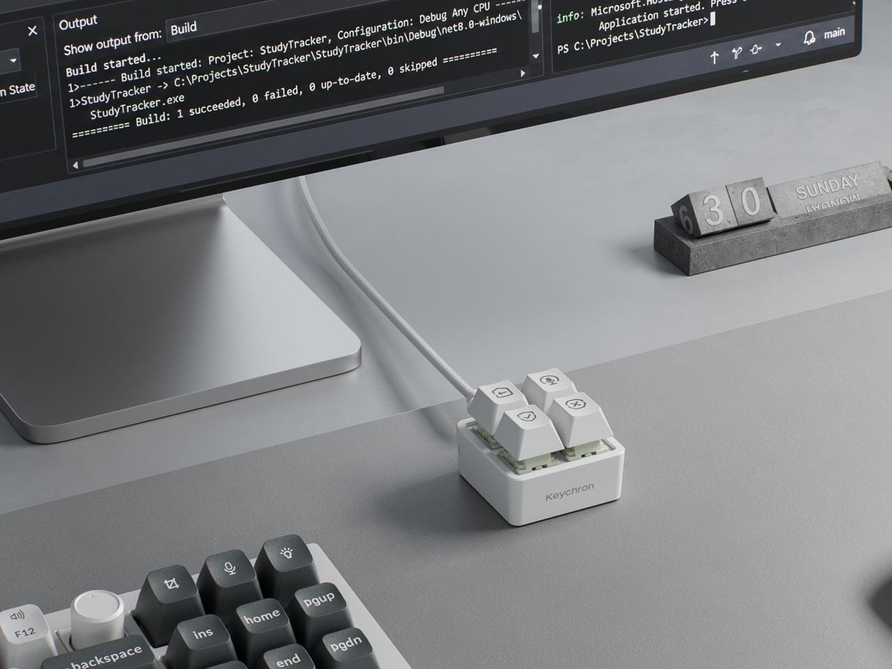
Working with an AI coding assistant can mean repeating the same handful of commands while your fingers hunt across a keyboard full of other possibilities. Keychron’s F4 HE 8K Vibe Coding Keypad gives those repeated decisions their own little patch of desk. Four programmable keys put prompting, dictation, approval, and rejection within reach, without asking you to replace the keyboard you already use.

The square body measures just 1.77 inches on each side, although its tall keycaps bring the height to 1.35 inches. Available in black or white, it looks like someone neatly cut a corner from a mechanical keyboard. An ABS plastic enclosure surrounds an aluminum plate, leaving the switch housings visible beneath the caps instead of hiding them behind a broad decorative surround.

Designer: Keychron

Those caps do more than supply a place to press. Keychron provides 15 icon options in dye-sublimated PBT, so a microphone, check mark, or cross can identify what you’ve assigned underneath. Per-key RGB adds another cue, letting you color an approval key green and a rejection key red. These are physical labels and configured colors, not screens that update when you switch applications.

The intended routine is familiar if you’ve spent time reviewing generated code. Start a conversation, dictate a change, then accept or reject what comes back, using mappings suited to your software. Keychron supplies Codex and Claude presets through its browser-based Launcher. The microphone icon needs particular attention, though: there’s no microphone inside this little box, so voice input still needs one elsewhere.

Launcher also handles ordinary shortcuts and recorded macros, giving the keypad something to do when you’re finished negotiating with an AI. A meeting mute button or a window-snapping shortcut might earn its place just as easily. Settings save to the device, but the relevant shortcuts still need to work on the next computer. Onboard memory carries your assignments, not the applications they control.

The magnetic switches add a less obvious kind of customization. You can choose how far a key travels before registering, making a shallow press sufficient or requiring a more deliberate movement. Dynamic Keystrokes can assign up to four actions across pressing and releasing one key. That’s extra flexibility, although remembering several hidden actions might undermine the simplicity of having four clearly labeled buttons.

Keychron advertises 8,000 reports per second over USB-C with a suitable cable, a gaming-oriented specification rather than evidence that AI will answer faster. More immediately relevant is another wire trailing from such a small accessory. The listed box contents include the keypad, 11 extra caps, and a manual, but no cable, so you’ll need to provide that part of the setup yourself.

The F4 costs $34.99, but the featured Launcher version remains in beta ahead of its planned November 9, 2026 release. That caveat aside, the question is how often you’re repeating the same commands. Four dedicated buttons are appealing when they remove a daily nuisance, less so when they’re another thing to remember beside your perfectly functional keyboard.

The post Keychron’s $35 Keypad Turns AI Shortcuts Into Four Physical Buttons first appeared on Yanko Design.

  • ✇Yanko Design
  • The 5 Best Tiny Homes of November 2026
    A bedroom door can matter more than another clever storage compartment. So can a dining table that stays put, a bathroom you don’t have to share, or a living room with a view beyond the opposite wall. For November, we’ve selected five compact homes that give these everyday details serious attention. Their plans make downsizing easier to picture without treating the simple act of going to bed as a climbing exercise. This selection spans trailer homes, park models, and larger modular dwellings, i
     

The 5 Best Tiny Homes of November 2026

6 novembre 2026 à 07:40

A bedroom door can matter more than another clever storage compartment. So can a dining table that stays put, a bathroom you don’t have to share, or a living room with a view beyond the opposite wall. For November, we’ve selected five compact homes that give these everyday details serious attention. Their plans make downsizing easier to picture without treating the simple act of going to bed as a climbing exercise.

This selection spans trailer homes, park models, and larger modular dwellings, including a 700-square-foot option that stretches the tiny home label. We’re comparing their spatial decisions rather than reporting hands-on testing, with particular attention to privacy, usable rooms, and practical installation requirements.

1. Acadia

Sweet-Haus Tiny Cabin Company’s Acadia approaches downsizing through privacy rather than extreme compression. Its 700 square feet contain two bedrooms and two full bathrooms, all on one level, alongside an open kitchen and living area. That extra bathroom earns its place if two adults keep different schedules or regularly host overnight guests. The manufacturer currently identifies Acadia as a modular home for permanent installation in South Carolina and North Carolina, so think settled small house rather than roaming weekend cabin.

The kitchen supports that residential approach with a 24-inch Haier range, an 18-inch dishwasher, and a refrigerator with a bottom freezer. Custom solid wood cabinetry and drawers beneath the beds give storage an architectural role instead of leaving everything to loose furniture. Bedrooms accommodate queen or king bed bases, while bathroom configurations include showers or tub-and-shower combinations. It’s a persuasive option for people who want fewer rooms to maintain without abandoning familiar household routines or privacy.

What we like

  • Two full bathrooms make sharing a compact home a more practical proposition.
  • Both bedrooms stay downstairs, with storage incorporated beneath the beds.

What we dislike

  • At 700 square feet, it won’t satisfy anyone seeking a genuinely minimal footprint.
  • Permanent foundation requirements and availability limited to the Carolinas narrow its suitability.

2. Leah

Leah puts its most expressive architecture around the living room. Tall, divided glazing wraps the corner beneath a pitched roof, making the shared space resemble a small garden pavilion in Vagabond Haven’s illustrations. The Swedish builder offers 52 square meters, approximately 560 square feet, including a sleeping loft, with a separate main bedroom downstairs. That arrangement makes sense for a couple who want a private bedroom for themselves and occasional sleeping space upstairs without climbing stairs every night before bed.

A corridor separates the main bedroom from the communal rooms, while the illustrated kitchen turns a corner to form an L. There’s space for a separate dining table rather than eating every meal at a counter. Vertical Thermopine siding, a steel roof, and triple glazing round out the specification. The practical catch is delivery: Leah has no wheels and needs a low-bed truck and crane. Its generous living room belongs to a planned site, not an impulsive road trip.

What we like

  • The downstairs main bedroom makes the loft optional for an owner’s nightly routine.
  • Concentrating the largest windows around the living room gives the shared space a distinct architectural identity.

What we dislike

  • The loft still comes with restricted headroom beneath the pitched roof.
  • The unfurnished starting specification excludes the kitchen and heating, so the illustrated interior requires a closer look at the options list.

3. Helena

Helena earns its place by giving both bedrooms ordinary doors on the same floor. Vagabond Haven’s modular design contains 45 square meters, roughly 484 square feet, and three sleeping places, with no loft to negotiate. For a parent and child, or a couple wanting a separate room for guests and desk work, that distinction is useful. The smaller bedroom can take a single bed, desk, and wardrobe, keeping those activities out of the lounge rather than making it serve everyone.

The trade-off is width. Helena measures 9.2 by 5.98 meters, making it a different proposition from a narrow trailer home. Its steel frame has no wheels, and transport requires a truck and crane. In the manufacturer’s illustrations, pale vertical siding and extensive glazing face an outdoor terrace, while the kitchen and dining area share the living zone. Triple glazing and mineral wool insulation are specified, but buyers need to distinguish the unfurnished model from the interior shown in the illustrations.

What we like

  • Two enclosed bedrooms provide separation without relying on upstairs sleeping space.
  • The smaller bedroom can accommodate a desk alongside its bed and wardrobe.

What we dislike

  • Its nearly six-meter width demands more site space than a slender trailer layout.
  • Despite having two bedrooms, the stated sleeping capacity is three, which may rule it out for a household of four.

4. eVista XL Limited Edition

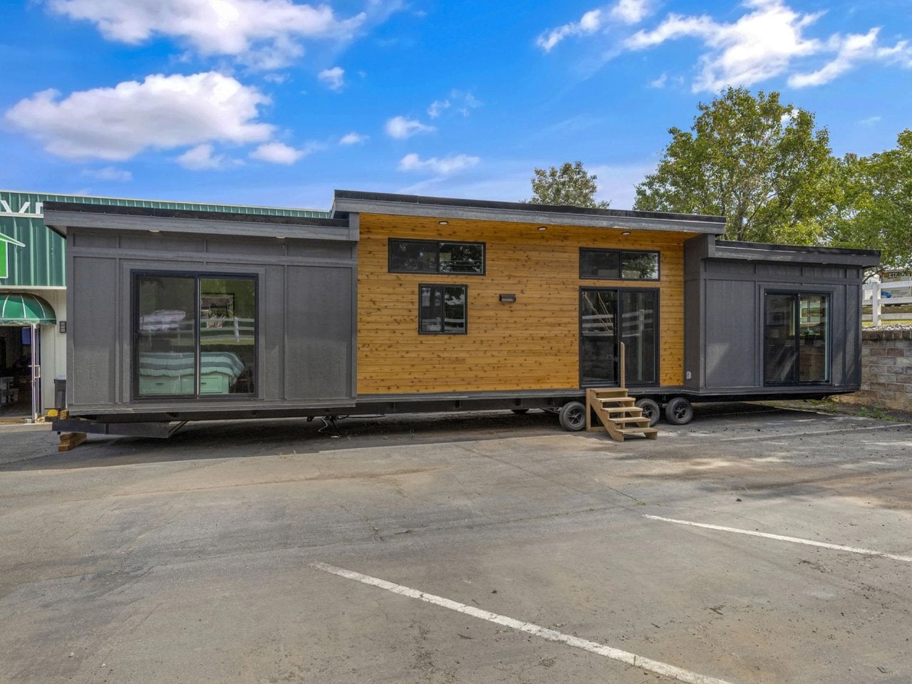
Escape’s eVista XL Limited Edition is the compact choice for someone who wants a bedroom door without giving up the trailer format. The 26-foot home keeps everything on one floor, with a walk-around queen bed separated from the living area by a sliding door. That access matters: getting up doesn’t require crawling across the mattress or descending from a loft. Dark timber cladding gives the exterior a restrained character, with the design’s effort concentrated on everyday interior arrangements.

Inside, drywall and maple trim accompany quartz counters, a two-burner induction cooktop, a combination microwave and convection oven, and a tall refrigerator. Flip tables open for meals or laptop work, then fold away to release floor space. Escape lists the completed Limited Edition at $75,365, with free delivery advertised, rather than presenting it as a future concept. The small bathroom and compact cooking area remain concessions to its size, so the private bedroom shouldn’t be mistaken for abundant space.

What we like

  • A separate bedroom with access around the queen bed avoids a common small home compromise.
  • Folding tables let dining and work surfaces disappear when circulation matters more.

What we dislike

  • The two-burner cooktop limits how many dishes can be cooked simultaneously.
  • The outdoor deck is optional, and Escape doesn’t handle site selection or preparation.

5. Winslow

Zook Cabins’ Winslow takes the cottage brief seriously, beginning with a covered porch instead of treating outdoor seating as an afterthought. The park model offers 400 square feet of finished interior space, with a private bedroom and no sleeping loft. Its 14-by-43-foot overall dimensions include the porch and roof overhangs, an important distinction from usable indoor area. Lap siding, shake accents, and white window frames establish the coastal character without requiring the house to sit beside water.

The floor plan places the bedroom at one end and the porch at the other, with living, dining, and kitchen functions grouped between them. Built-in cabinetry handles storage and display, while the dining arrangement includes seating around a proper table. A hall closet accommodates the water heater and laundry hookups, giving mundane equipment a designated home. For someone who values familiar domestic proportions over a loft’s extra sleeping capacity, Winslow keeps the daily essentials within an uncomplicated single floor.

What we like

  • The covered porch provides a dedicated outdoor room outside the finished interior footprint.
  • A private bedroom and designated utility closet give sleeping and household equipment their own places.

What we dislike

  • One enclosed bedroom and no loft leave limited separate sleeping space for guests.
  • The kitchen’s two-burner electric cooktop is a concession for anyone accustomed to a larger range.

Choose the Floor Plan, Then Check the Site

Before choosing a favorite, imagine two people using the plan at once. One is cooking while the other works, sleeps, or gets ready to leave. Check where doors open, which routes pass the bed, and whether the dining surface can stay in use during meal preparation. A small home’s floor plan becomes more revealing when you stop counting features and start following the movements those features are supposed to support.

Then give the site the same attention as the interior. Ask what delivery access, lifting equipment, foundations, and utility connections the particular model needs, and confirm permitted use with the relevant local authority before committing. An attractive starting price won’t answer those questions. The most convincing tiny home is the one whose layout fits your routines and whose installation requirements fit the place where you actually intend to put it.

The post The 5 Best Tiny Homes of November 2026 first appeared on Yanko Design.

  • ✇Yanko Design
  • Razer’s New Hammerhead Earbuds Bring Back the Cable, Not the Headphone Jack
    Wireless earbuds can make a short gaming break depend on whether you remembered to charge their case the night before. Razer’s Hammerhead V3 Chroma takes that worry off the list with a cable that carries audio and power through USB-C. There’s no headphone jack involved in this return to wired listening, and the angled plug has been shaped around the hands holding your phone. The connector has a 90-degree bend, letting the cable run alongside a compatible device rather than sticking straight int
     

Razer’s New Hammerhead Earbuds Bring Back the Cable, Not the Headphone Jack

Par : JC Torres
6 novembre 2026 à 06:07

Wireless earbuds can make a short gaming break depend on whether you remembered to charge their case the night before. Razer’s Hammerhead V3 Chroma takes that worry off the list with a cable that carries audio and power through USB-C. There’s no headphone jack involved in this return to wired listening, and the angled plug has been shaped around the hands holding your phone.

The connector has a 90-degree bend, letting the cable run alongside a compatible device rather than sticking straight into your palm. That matters when you rotate a phone for a game and wrap both hands around its ends. It’s a small adjustment to an unglamorous component, but one that addresses one immediate objection to putting a wire back into a handheld setup.

Designer: Razer

The wire also gives Razer somewhere to put controls that don’t have to share space with an ear tip. An in-line remote handles volume, playback, and active noise cancellation (ANC), with raised controls you can locate by touch rather than tapping an earbud. Its omnidirectional microphone supports calls and team chat, keeping the interactions on the cable instead of behind another phone menu.

Of course, subtlety isn’t really the point of a bright green cable hanging from black earbuds. Circular outer caps carry illuminated Razer logos, with Chroma RGB offering 16.8 million color options. The glossy housings and short stems aren’t particularly dramatic by themselves, but the color makes the whole arrangement unmistakably gaming hardware, even when you’re simply listening to music on the bus.

Inside each earbud, a dynamic driver works alongside a dedicated tweeter, dividing the work between lower and higher frequencies. Razer includes feed-forward ANC, intended to reduce surrounding noise during a commute or a match in a shared room. Noise cancellation brings a familiar wireless-earbud convenience to a wired pair, although neither the driver arrangement nor the connection guarantees great sound on its own.

Four presets cover Gaming, Music, Movies, and Call, alongside a custom equalizer profile for anyone who prefers adjusting the balance themselves. Moving to a PC adds THX Surround Sound 7.1 through Razer Synapse 4. That’s a software-dependent extra, not something the earbuds automatically deliver on every phone, so the same connection doesn’t mean an identical feature set everywhere you plug them in.

The IPX4 rating allows for splashes and sweat, which makes sense for earbuds that might move from a desk to a drizzly commute. It doesn’t turn them into waterproof gear. The cable needs managing: it can catch on clothing or pull against the phone when you reach too far. A bent connector changes its direction, not the distance you’re able to move.

Launched on November 5, 2026, the Hammerhead V3 Chroma costs $79.99 in the US. The trade is straightforward: fewer batteries to remember, but a cable and an occupied USB-C port in return. If that’s your phone’s only charging connection, you’ll need another way to top it up while listening. The earbuds need no charging, but your phone doesn’t get the same night off.

The post Razer’s New Hammerhead Earbuds Bring Back the Cable, Not the Headphone Jack first appeared on Yanko Design.

  • ✇Yanko Design
  • The PP-2 Turntable Plays Vinyl Upside Down, Without the Fuss
    Choosing an album should be the enjoyable part of playing a record. Hovering a delicate needle over its edge can feel like an unnecessary little test, especially if you want music rather than a new equipment hobby. Waiting for Ideas addresses that friction with the PP-2, an aluminum turntable that takes tonearm adjustment out of the listener’s hands. Place the record upside down, press Play, and playback happens underneath. The Paris studio, founded by Jean-Baptiste Anotin, explored this approa
     

The PP-2 Turntable Plays Vinyl Upside Down, Without the Fuss

6 novembre 2026 à 05:15

Choosing an album should be the enjoyable part of playing a record. Hovering a delicate needle over its edge can feel like an unnecessary little test, especially if you want music rather than a new equipment hobby. Waiting for Ideas addresses that friction with the PP-2, an aluminum turntable that takes tonearm adjustment out of the listener’s hands. Place the record upside down, press Play, and playback happens underneath.

The Paris studio, founded by Jean-Baptiste Anotin, explored this approach with the PP-1, which we covered in March 2025. That earlier model hid its needle below the record and made an unusually convincing case for simplifying vinyl playback. The PP-2 continues that idea with an optical pickup system. It’s currently listed for preorder, so this is a product to plan around rather than expect immediately.

Designer: Waiting for Ideas

I like the premise because the ritual of vinyl doesn’t have to include every mechanical responsibility associated with it. Choosing a sleeve, pulling out a record, and committing to an album side already give the experience its character. For my money, operating the equipment shouldn’t become a separate qualification. The PP-2’s appeal starts with that distinction, well before any discussion of audio fidelity.

Its body is CNC-machined from a solid block of aluminum and anodized, with a footprint roughly 13.8 inches square and a height just under 3 inches. Those proportions give it a compact, architectural presence on paper, closer to a deliberately placed object than a sprawling component. The square format also feels appropriate: a record is already visually busy enough without the surrounding hardware competing for attention.

The optical system deserves a careful explanation, because “reading vinyl with light” can suggest the wrong thing. A physical stylus still follows the groove. Light measures that stylus’s movement instead of the magnets and coils used in conventional magnetic cartridges. Waiting for Ideas credits Miniot technology, whose optical pickup approach preserves an analog signal path. This isn’t a contactless laser player, despite how futuristic the description might sound.

Waiting for Ideas says removing magnets from the moving stylus assembly reduces its mass, allowing more faithful tracking and finer detail. Those are appealing promises, but I’d want independent measurements and listening tests before treating them as reasons to upgrade. The clearer design achievement is easier to understand: the system keeps the delicate business of following a groove largely outside the user’s daily routine.

The motor gets a corresponding update. PP-2 uses an axial-flux direct-drive motor with optical speed control, which the studio says adjusts rotation 1,000 times per second. It supports 33 and 45 rpm records. The useful goal here is consistency, not a correction count worth showing off to guests. I’m more interested in what that engineering lets the owner stop worrying about than how impressive it sounds in a specification list.

A built-in preamplifier, RCA connections, a 3.5mm output, and USB-C power complete the practical picture. Including the preamp keeps another specialized component out of the shopping equation, while the wired outputs give the design familiar connections to work with. I appreciate that restraint. A visually simplified turntable loses some of its argument if assembling the rest of the system requires decoding a second equipment catalog.

The difficult number is the price. The store lists the PP-2 at €8,900 and asks buyers to allow up to eight weeks for assembly and shipping. Applicable import duties and taxes outside the European Union are additional. That makes this a luxury interpretation of convenience, not an accessible entry point for someone buying their first few records. The purchase argument needs to include a serious attachment to the object itself.

At that price, I’d also want clear answers about servicing and long-term support before ordering. Still, I can appreciate the decision to make elaborate engineering recede from everyday use. The PP-2 leaves the listener with a record to choose and a Play button to press. For someone who loves albums more than adjusting equipment, that’s a thoughtful place to focus the design.

The post The PP-2 Turntable Plays Vinyl Upside Down, Without the Fuss first appeared on Yanko Design.

  • ✇Yanko Design
  • Peak Design’s Charging Station Folds Flat to Charge Two Phones
    Charging a phone and a pair of earbuds is easy enough, but sharing that same stand with another phone is a different matter. Peak Design’s new Charging Station addresses that problem with two equally capable magnetic pads and a hinged arm. Stand it up beside your laptop, or lay it flat so two phones can recharge without competing for the better spot. The shape is straightforward, with a narrow metal arm linking two rounded-square charging surfaces. Die-cast aluminum and zinc form the chassis, w
     

Peak Design’s Charging Station Folds Flat to Charge Two Phones

Par : JC Torres
4 novembre 2026 à 10:20

Charging a phone and a pair of earbuds is easy enough, but sharing that same stand with another phone is a different matter. Peak Design’s new Charging Station addresses that problem with two equally capable magnetic pads and a hinged arm. Stand it up beside your laptop, or lay it flat so two phones can recharge without competing for the better spot.

The shape is straightforward, with a narrow metal arm linking two rounded-square charging surfaces. Die-cast aluminum and zinc form the chassis, while the machined aluminum stem provides the moving structure. Laminated Clarino covers the pads, and a non-slip TPU foot sits underneath. Black and Moon finishes keep the color choices restrained, rather than turning your nightstand into a brightly branded electronics display.

Designer: Peak Design

Two hinges let you adjust the arm and upper pad separately, positioning a phone for a video call or a glance at your calendar. Magnetic attachment supports portrait and landscape orientations, so changing what you’re doing doesn’t require another stand. An earbud case can sit on the lower pad while the phone stays raised, keeping both devices within the same small desktop footprint.

The lower pad gets more interesting when you fold the station flat. Peak Design rates both Qi2.2 pads for up to 25W simultaneously, allowing two compatible phones to recharge at once without assigning one a slower accessory spot. That doesn’t mean every magnetically attached phone will receive 25W, though. The device’s own charging support still determines how much power it can accept.

That folding movement also changes how the charger travels. Packed flat, it measures 6.3 by 2.7 by 0.6 inches, with the arm tucked alongside the body instead of projecting into your bag. At 9.7 ounces, it still adds weight to a travel kit, but you aren’t packing a rigid desktop stand just to keep a phone propped up in a hotel room.

A separate USB-C output makes room for a third device, although this connection is wired. Its 7.5W output is suited to smaller accessories rather than replacing a laptop charger. A watch still needs its own charging cable or puck, so this isn’t a dedicated three-device wireless dock. It simply gives that extra cable somewhere to connect without occupying another outlet on the wall.

The $99.95 price also leaves out the wall adapter. Peak Design includes a fabric-wrapped USB-C cable rated for 100W, but specifies at least a 45W power supply to operate the station and 75W or more for maximum dual charging speed. That makes the adapter part of the buying decision, particularly if your existing charger is already committed to powering something else at home.

The post Peak Design’s Charging Station Folds Flat to Charge Two Phones first appeared on Yanko Design.

  • ✇Yanko Design
  • Xbox Put a Working Series X Inside a Giant Fake Alligator
    Finding a place for a game console usually means clearing a shelf, not making room for a reptile. Microsoft’s Xbox Series X-BITE puts a working Series X inside an artificial alligator measuring more than five feet long. The one-off creation trades a discreet electronics box for something closer to a wildlife exhibit, complete with a controller between its teeth. The alligator rests on slim posts above a rectangular, wood-grain base, with its legs hanging below and its tail curling toward the fl
     

Xbox Put a Working Series X Inside a Giant Fake Alligator

Par : JC Torres
4 novembre 2026 à 09:20

Finding a place for a game console usually means clearing a shelf, not making room for a reptile. Microsoft’s Xbox Series X-BITE puts a working Series X inside an artificial alligator measuring more than five feet long. The one-off creation trades a discreet electronics box for something closer to a wildlife exhibit, complete with a controller between its teeth.

The alligator rests on slim posts above a rectangular, wood-grain base, with its legs hanging below and its tail curling toward the floor. Dark, ridged scales and a lighter belly give it the appearance of a mounted specimen. That familiar display format does much of the work, making the oversized enclosure feel deliberately theatrical rather than like an ordinary console wearing a novelty cover.

Designer: Microsoft (Xbox)

A raised section on its back interrupts those scales, with an illuminated Xbox Nexus symbol worked into the surface. It’s the clearest clue that the animal has supposedly swallowed something it shouldn’t. The branding stays small against the length of the body, allowing the fabrication to carry the joke before the glowing logo explains why there’s an alligator underneath your television in the first place.

The head gets a less subtle treatment. Xbox-green irises surround pupils shaped around the Nexus symbol, turning the creature’s stare into another brand reference. Between the open jaws sits a custom Xbox Wireless Controller with artificial bite marks. It gives the sculpture a little unfinished business, as though the console wasn’t quite enough of a meal and the accessories were next on the menu.

The commission went to creature-effects specialists, who used 3D modeling, sculpting, and fabrication to build the animal around the hardware. That process gives a promotional console the attention normally associated with a film prop. Florida supplied the inspiration, according to Xbox, although the animal itself is entirely artificial. No actual alligators were used or harmed in creating this unusually elaborate console enclosure.

For the person who eventually owns it, the obvious challenge is finding a suitable place to put it. More than five feet of reptile won’t disappear into the usual gap beside a television. Its long base asks for a substantial display surface, and the raised mounting makes the whole assembly something to plan a room around rather than tuck away.

There’s also a qualification behind the playable-console claim. Xbox says the Series X inside works, but its fine print recommends the finished creation for display. The announcement doesn’t explain ventilation, access to ports, or servicing inside the sculpted body. That leaves a distinction between functioning hardware and a practical replacement for the console you switch on every evening after work.

Only one Series X-BITE exists, and it’s being offered through a sweepstakes rather than a retail release. There isn’t a shelf price to weigh against a standard console or a choice of less toothy finishes. The appeal is owning the fabrication itself, with a working Xbox as its unlikely inhabitant. The controller has a home, provided you don’t mind the teeth.

The post Xbox Put a Working Series X Inside a Giant Fake Alligator first appeared on Yanko Design.

  • ✇Yanko Design
  • The 5 Best EDC Designs of November 2026
    The most interesting EDC upgrade here begins with something that already fits a pocket: a Zippo case. Open the lid, and there’s no lighter inside, just a miniature ratchet and carefully arranged bits. That little reversal sets the tone for this November selection. These designs aren’t trying to turn you into a survivalist. They reconsider the objects you reach for when something needs tightening, illuminating, carrying, organizing, or writing down. We’ve brought together one DIY project and fou
     

The 5 Best EDC Designs of November 2026

4 novembre 2026 à 07:40

The most interesting EDC upgrade here begins with something that already fits a pocket: a Zippo case. Open the lid, and there’s no lighter inside, just a miniature ratchet and carefully arranged bits. That little reversal sets the tone for this November selection. These designs aren’t trying to turn you into a survivalist. They reconsider the objects you reach for when something needs tightening, illuminating, carrying, organizing, or writing down.

We’ve brought together one DIY project and four retail designs, including a swiveling flashlight, a cork wallet, and a pencil that skips sharpening. This is our November edit of existing designs, not a roundup of November launches. The common thread is thoughtful use of limited space, whether that means fitting tools inside a familiar shell or removing an annoyance from something as ordinary as the keys you carry every day.

1. DIY Zippo Toolkit

Tiny Tool Shop’s Zippo conversion makes a persuasive case for designing around an enclosure rather than starting again. A custom-printed insert holds a micro ratchet, two Steinwhale bits, and a Klein utility knife extension inside the emptied lighter shell. Each component gets its own recess, turning the interior into a fitted tray rather than a loose collection of hardware. The recognizable metal case supplies the hinge, lid, and compact outline, while the insert gives it an entirely different purpose.

The best detail addresses the obvious drawback of tight packing: getting the ratchet back out. A spring salvaged from a disposable Bic lighter helps push it through an opening in the case. It’s a satisfying piece of resourcefulness, but this remains a maker project, not a finished product sold by Zippo. Reproducing it involves sourcing compatible tools, producing the insert, and modifying the shell. It also replaces the lighter function completely, trading a flame for a very small repair kit.

What we like

  • Reuses a familiar hinged enclosure with a fitted layout for the tools.
  • Spring-assisted retrieval makes tightly packed components easier to access.

What we dislike

  • Requires fabrication, compatible components, and modifications to the case.
  • The insert’s dedicated recesses limit flexibility when changing the tool selection.

2. Painless Key Ring

Most key rings make you use your fingernails as miniature pry bars. The Painless Key Ring changes the entry geometry instead, using a continuous wave shape to guide a key onto the ring. You’re still working with a springy metal loop, but without the same tightly stacked starting point as a conventional split ring. It’s a modest redesign with a clear purpose: make changing keys less fiddly without turning the key ring into another complicated mechanism you need to carry around.

Made from stainless spring steel, the ring is listed at 0.8mm thick and weighs three grams. The silver set costs $30 and includes one large ring plus three small ones, giving you separate attachment points for different keys. The appeal isn’t adding another tool to your pocket. It improves the connection between what you already have. If you rarely change keys, the benefit may not justify the price. For someone regularly swapping house, office, and shared keys, the geometry is more compelling.

Click Here to Buy Now: $30.00

What we like

  • Wave-shaped entry offers an alternative to prying apart a conventional split ring.
  • The set includes smaller rings for organizing separate keys.

What we dislike

  • At $30 for the silver set, it’s a deliberate upgrade to a basic accessory.
  • Keys still need threading around the ring rather than releasing through a gate.

3. WUBEN G5 Compact Flashlight

The WUBEN G5 puts its most useful feature above the body: a head that rotates through 180 degrees. Rather than repositioning the entire flashlight whenever the beam misses your work, you can change its direction while the body stays attached. An adjustable clip and tail magnet give you different mounting options, particularly useful when both hands are occupied. The flat form also avoids the rolling habit of cylindrical flashlights, making this a small lighting tool with several sensible working positions.

WUBEN lists the standard G5 at approximately 52 grams, with USB Type-C charging and maximum white output of 400 lumens. Its current specification gives an IP65 rating, which means this is not a light to treat as submersible. At $19.99 for standard colors, it’s an accessible alternative to reaching for your phone. The limitation is endurance: WUBEN’s longest runtime figure belongs at the lowest output, not maximum brightness. Choose it for short tasks rather than prolonged use at maximum brightness.

What we like

  • Rotating head, clip, and magnet provide several ways to position the beam.
  • The compact, flat body suits pocket carry without rolling away when set down.

What we dislike

  • Maximum brightness and maximum runtime describe different operating settings.
  • Its IP65 rating does not cover immersion.

4. Pocket Everlasting All-Metal Pencil

A pocket pencil needs to survive being carried before it can be useful on paper. Sun-Star’s Pocket Everlasting All-Metal Pencil approaches that problem with a metal body, protective cap, and a writing tip that doesn’t need sharpening. At 4.7 inches long, it gives you a dedicated place to put a measurement, sketch, or passing thought without unlocking a screen. There’s no elaborate deployment mechanism, just a compact writing instrument ready to accompany a notebook.

The tip uses graphite and alloy particles to make an erasable mark. That makes it better understood as an alternative pencil technology than a pen that happens to look metallic. At $19.95, it’s also one of the less expensive objects in this selection. The name needs a little perspective: “Everlasting” isn’t a literal promise of infinite use. Its appeal is avoiding routine sharpening, while your preference for line darkness and feel still determines whether it earns space beside your keys.

Click Here to Buy Now: $19.95

What we like

  • A capped metal body gives the writing tip protection during carry.
  • Erasable marks and no routine sharpening make it an interesting notebook companion.

What we dislike

  • At 4.7 inches, it still needs more space than a miniature keychain tool.
  • Pencil marks aren’t a substitute for ink when permanent writing is needed.

5. Corkor Front-Pocket Cork Wallet

Corkor’s Front-Pocket Cork Wallet provides a welcome break from machined metal. Its cork fabric exterior has an irregular grain that gives a familiar card holder a distinct material identity. The layout stays straightforward: three card slots, an ID window, and two compartments for folded bills. Rather than adding moving parts to make a wallet interesting, Corkor keeps the construction restrained and lets the surface do the work. It suits an edited daily carry better than a collection of forgotten receipts.

The Portuguese maker lists an empty weight of 20 grams and dimensions of 110 by 80 by 10 millimeters. That last figure matters: adding cards and folded notes will change how much room it occupies. Corkor makes the $59 holder in Portugal and includes RFID-blocking construction, though the more tangible benefit is its simple organization. There’s no coin pocket, and cash takes more preparation than sliding notes into a full billfold. Those are deliberate compromises for someone who wants to downsize.

What we like

  • Cork fabric offers an animal-free alternative to a conventional leather exterior.
  • Separate card, ID, and cash compartments keep the layout easy to understand.

What we dislike

  • There’s nowhere dedicated to loose change.
  • Bills must be folded, making cash less convenient to sort.

Small Improvements Worth Carrying

The Zippo conversion is the conversation starter, but the quieter designs may make the bigger difference to a particular routine. A ring that’s easier to load helps someone changing keys. A swiveling light helps someone working with both hands. A simpler wallet helps someone trying to carry less. None needs to solve every problem to justify its place; it just needs to address one you actually encounter with some regularity.

These five designs aren’t a checklist to buy in full. The Zippo project asks for making time rather than a quick checkout, while the wallet asks you to reconsider what deserves carrying at all. Start with the small frustration you already recognize, then consider the space, upkeep, and setup its solution requires. A useful everyday carry should make your day feel less encumbered, not simply leave your pockets more fully equipped.

The post The 5 Best EDC Designs of November 2026 first appeared on Yanko Design.

  • ✇Yanko Design
  • Pillowy Steel Furniture Without a Stitch of Upholstery
    The steel in Sarah Naghawi’s JAWF collection looks caught halfway between a box and a balloon. Surfaces bulge, dip, and crease, giving rigid metal the appearance of something you might squeeze. I like that moment of confusion, especially because the material remains so obviously metallic. Presented at Amman Design Week 2026, the Jordanian designer’s experimental collection explores how pressure can turn stainless-steel sheets into sculptural objects with their own internal spaces. The problem b
     

Pillowy Steel Furniture Without a Stitch of Upholstery

4 novembre 2026 à 06:07

The steel in Sarah Naghawi’s JAWF collection looks caught halfway between a box and a balloon. Surfaces bulge, dip, and crease, giving rigid metal the appearance of something you might squeeze. I like that moment of confusion, especially because the material remains so obviously metallic. Presented at Amman Design Week 2026, the Jordanian designer’s experimental collection explores how pressure can turn stainless-steel sheets into sculptural objects with their own internal spaces.

The problem being explored belongs to the workshop rather than the living room: how to give sheet metal volume, depth, and an interior through the forming process itself. Naghawi uses hydromechanical forming, introducing hydraulic fluid pressure into welded sheet assemblies so the metal expands and deforms. Pressure becomes a shaping tool, pushing the steel beyond its original flat condition. The attraction is that the resulting surface helps define both the object’s exterior and the space within it.

Designer: Sarah Naghawi (photos by ASPIRE Ali Saadi Photography)

That industrial terminology sounds less approachable than the result. Think of the principle of inflation, except the steel permanently retains the deformation created during fabrication. Outward curves and inward hollows remain as evidence of the forces applied to the material. This gives the objects a physical history you can read in their surfaces. The process hasn’t been hidden beneath a decorative finish; its effects supply much of the visual character.

The name helps explain why those hollows matter. JAWF comes from an Arabic word referring to an inner chamber or protected cavity. Naghawi treats that interior space as a starting point for design, with recesses suggesting possibilities for storage and enclosure. I appreciate that emphasis because sculptural furniture can sometimes ask us to admire its silhouette while leaving its practical purpose unresolved. Here, the cavity is central to the investigation, even if everyday usefulness still needs closer examination.

In the exhibition photographs, a tall rectangular piece stands on slender, splayed legs, with three pronounced recesses arranged vertically across its face. Nearby, a horizontal piece stretches across angled supports, its upper surface rising and falling rather than settling into a conventional flat plane. A smaller stacked form brings the same swelling geometry closer to the floor. The family resemblance comes through clearly, but each silhouette gives the pressure-shaped surfaces a different setting.

The reflective finish makes those shapes particularly animated in photographs. Blue from the exhibition floor and bright patches of window light break across the steel, making some edges easy to follow and others surprisingly difficult to locate. To my eye, the pieces sit somewhere between furniture and oversized, crumpled silver packaging. That comparison is affectionate. The familiar shine draws you in, while the uneven geometry prevents the objects from becoming another exercise in polished metallic perfection.

The studio’s balloon reference feels especially useful here. A balloon’s skin and its interior volume develop together under pressure; JAWF translates that relationship into a material that holds the resulting shape. The resemblance stops short of literal imitation, which is a good choice. These aren’t novelty balloons recreated in steel. Their boxy outlines, compressed areas, and deep cavities give them a more awkward, interesting presence. They look like objects negotiating with the force that made them.

I’d want dimensions, weight, pricing, and evidence of everyday usability before treating JAWF as a furniture recommendation. A striking recess doesn’t automatically make a convenient shelf, and an expressive surface doesn’t establish how comfortably an object fits into a home. Those questions don’t diminish the experiment. They establish where the next stage of development would become interesting: translating a compelling material study into pieces whose proportions and functions feel equally considered.

For now, I’m persuaded by the decision to leave the steel’s deformation visible. JAWF gives the eye plenty to enjoy, but it also makes fabrication part of that enjoyment. You can follow a bulge into a hollow and understand that the two belong to the same event. That’s a satisfying reason to look twice, even before deciding where the object might live.

The post Pillowy Steel Furniture Without a Stitch of Upholstery first appeared on Yanko Design.
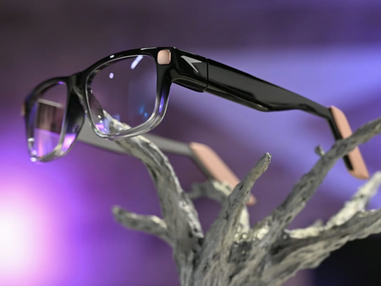
❌