Vue normale

Il y a de nouveaux articles disponibles, cliquez pour rafraîchir la page.
Aujourd’hui — 6 octobre 2025Flux principal

IKEA ÖDLEBLAD Lamp Puts a Twist on Flatpack Lighting and the Allen Key

Par : JC Torres
6 octobre 2025 à 13:20

The IKEA Allen key has become an unlikely icon of modern DIY culture, synonymous with flatpack furniture assembly and the satisfying challenge of building your own furniture. For decades, this humble hexagonal tool has been the bridge between a box of parts and a finished piece of furniture. Yet despite its essential role in IKEA’s success, the Allen key often represents the barrier between customers and their completed projects.

The ÖDLEBLAD lamp flips this relationship on its head in the most delightfully ironic way possible. This new pendant light draws direct inspiration from the Allen key’s form and function, but eliminates the need for any tools whatsoever during assembly. The lamp celebrates the tool that made IKEA famous while proving that sometimes the best design solutions come from making things simpler rather than more complex.

Designer: David Wahl (IKEA)

The assembly experience feels almost magical in its simplicity. The birch veneer shade arrives as a flat bundle of wooden slats, each piece designed with integrated twist-and-lock mechanisms that mirror the action of an Allen key. You simply twist the pieces into place, creating a layered, sculptural shade without fumbling for tools or hunting for missing screws.

The irony isn’t lost on anyone familiar with IKEA’s assembly process. Here’s a lamp inspired by the very tool that has challenged countless customers, yet it assembles without requiring that tool at all. This playful contradiction makes the ÖDLEBLAD feel like both a celebration of and a gentle joke about IKEA’s flatpack heritage.

Of course, the lighting quality matches the clever assembly method. The layered birch veneer slats create beautiful patterns of light and shadow, casting warm, organic textures across walls and surfaces. The white inner shade ensures even light distribution, while the natural wood adds warmth and character that works beautifully in dining areas, bedrooms, or living spaces.

The sustainable material choices reinforce IKEA’s environmental commitments. The renewable birch veneer and minimal packaging reduce environmental impact, while the tool-free assembly means fewer metal components and simpler manufacturing processes. The flatpack efficiency also reduces shipping costs and storage requirements, making the entire product lifecycle more sustainable.

That said, the real genius lies in how the ÖDLEBLAD democratizes good lighting design. By eliminating tools and complicated assembly steps, IKEA makes quality pendant lighting accessible to anyone, regardless of their DIY confidence or tool collection. The lamp assembles in minutes and can be just as easily disassembled for moving or storage.

You’ll notice how this approach reflects IKEA’s broader design philosophy of removing barriers between people and good design. The ÖDLEBLAD lamp demonstrates how even the most familiar design challenges can inspire fresh thinking. You can appreciate both the clever engineering and the gentle humor of a product that honors the Allen key by making it completely unnecessary.

The post IKEA ÖDLEBLAD Lamp Puts a Twist on Flatpack Lighting and the Allen Key first appeared on Yanko Design.

Top 5 Ways E Ink Displays Are Transforming Modern Design

Par : JC Torres
6 octobre 2025 à 11:40

Traditional screens have become the digital equivalent of energy vampires, constantly draining batteries while bombarding our eyes with harsh blue light that leaves us squinting and tired. LCD and OLED displays demand constant power to maintain their bright, flashy visuals, creating a world where we’re always hunting for charging cables and dealing with screens that become unreadable the moment we step into sunlight.

E Ink displays offer a refreshingly different approach to this screen fatigue problem. By mimicking the look and feel of actual ink on paper, this technology flips the script on what we expect from digital displays. E Ink dominates the ePaper market, though other electronic paper technologies exist alongside it. The result feels like reading a book instead of staring at a glowing rectangle.

What Makes E Ink Different

Unlike traditional displays that blast light at your face, E Ink reflects ambient light just like a printed page would. The technology uses tiny microcapsules filled with charged particles that rearrange themselves to form text and images. Once an image appears, it stays there without using any power at all, which explains why e-readers can last for weeks on a single charge.

The benefits extend far beyond just battery life. E Ink displays remain perfectly readable in bright sunlight, where your smartphone screen would become a useless mirror. The flexible nature of the technology means displays can bend, curve, and even fold without breaking. For designers tired of working around the rigid constraints of glass screens, E Ink opens up entirely new possibilities.

Designer: Montblanc

The Current Limitations

E Ink comes with certain trade-offs that designers need to understand. Colors remain somewhat muted compared to the vibrant displays we’re used to, though recent advances have brought more life to ePaper screens. Refresh rates are slower, so you won’t be watching Netflix on an E Ink display anytime soon. Large panels can still be pricey, though costs keep dropping as production scales up.

These constraints haven’t stopped designers from finding creative ways to harness E Ink’s strengths. Smart product teams have learned to work within these limitations, focusing on applications where the technology’s benefits far outweigh its drawbacks. The results often surprise people with their elegance and practicality, proving that constraints can spark innovation.

Designer: BOOX

Five Industries Embracing E Ink Innovation

The real magic happens when you see E Ink displays in action across different industries. Each sector has found unique ways to leverage the technology’s strengths, creating products that simply wouldn’t be possible with traditional screens. Here are five concrete examples that show how E Ink is changing the design game.

Laptops: Your Lid Becomes a Canvas

Designer: ASUS

Laptop lids have been boring black rectangles for decades, but E Ink is changing that in fascinating ways. ASUS’s Project Dali concept turns the back of your laptop into a customizable display where you can showcase artwork, display your calendar, or show off your company logo during meetings. It’s like having a digital tattoo for your computer that changes whenever you want it to.

Designer: Lenovo

Lenovo took this concept to market with their ThinkBook 13x Gen 4 SPE, which features an actual E Ink display built into the lid. You can switch between personal artwork during coffee breaks and professional branding during client presentations. The display sips so little power that it barely affects battery life, yet it transforms your laptop from anonymous tech into a personal statement piece.

Transportation: Solar-Powered Information That Actually Works

Public transit signs have always been a nightmare to power and maintain, especially at remote bus stops without electrical connections. Boston’s MBTA solved this problem elegantly by deploying solar-powered E Ink signs throughout the city’s bus stops and Green Line stations. These displays show real-time arrival information, service alerts, and schedules without requiring a single wire to be run.

Designer: MBTA, E Ink

The beauty of these installations becomes obvious during New England winters, when the signs keep working despite snow, ice, and sub-zero temperatures. Solar panels provide enough juice to keep the displays running continuously, while the E Ink technology ensures perfect readability whether you’re squinting through morning glare or trying to read in dim evening light.

Makers: DIY Dreams Made Accessible

The maker community has embraced E Ink displays with the enthusiasm typically reserved for new Arduino boards or 3D printing breakthroughs. Waveshare offers dozens of different E Ink modules that work seamlessly with Raspberry Pi, Arduino, and other popular platforms. Suddenly, creating a custom weather station or smart home dashboard doesn’t require a computer science degree or a massive budget.

Designer: Waveshare

Hobbyists use these displays to build everything from digital art installations to battery-powered information kiosks that can run for months without maintenance. The paper-like appearance means these creations blend naturally into homes and offices, avoiding the harsh, obviously digital look of traditional screens. It’s democratized display technology in ways that would have seemed impossible just a few years ago.

Fashion: Accessories That Change With Your Mood

Fashion has always been about self-expression, but E Ink takes personalization to an entirely new level. The Tago Arc bracelet demonstrates this beautifully, featuring a flexible E Ink display that lets you cycle through hundreds of different patterns using your smartphone. One moment you’re wearing geometric shapes, the next you’re sporting flowing organic patterns that match your outfit perfectly.

Designer: LIBR8TECH

The bracelet never needs charging because it draws power through NFC only when changing patterns. This means you get infinite customization without the hassle of yet another device to plug in every night. It’s the kind of accessory that makes people do double-takes, wondering how your jewelry just changed designs right before their eyes.

Consumer Electronics: Devices That Respect Your Attention

Designer: reMarkable

E Ink device like the BOOX Note Max and reMarkable Paper Pro Move have created an entirely new category of devices focused on thoughtful interaction. These tablets feel remarkably similar to writing on paper, making them favorites among designers, writers, and anyone who takes handwritten notes seriously. The screens don’t strain your eyes during long reading sessions, unlike their LCD counterparts.

The BOOX Palma takes this concept in a different direction by creating a phone-sized E Ink device that looks and feels like a smartphone but focuses entirely on reading and productivity. This pocket-sized e-reader runs Android, giving you access to reading apps, note-taking tools, and basic communication functions without the distracting elements that make regular smartphones so addictive. It’s like carrying a digital book that happens to connect to the internet, perfect for people who want to stay connected without getting sucked into endless social media scrolling.

Accessibility Revolution

E Ink technology has become surprisingly accessible to individual designers and small companies over the past few years. Development kits and reference designs are readily available from multiple suppliers, while costs have dropped to levels that make experimentation feasible for creative projects and startup ventures. You no longer need deep pockets or specialized engineering knowledge to explore ePaper possibilities.

This democratization has accelerated innovation across multiple industries. Designers can prototype E Ink applications quickly and affordably, leading to creative solutions that might never have emerged from traditional corporate research and development cycles. The growing ecosystem of compatible components and software libraries continues to lower barriers while expanding creative possibilities for everyone.

Designer: Pedro Luraschi

Designer: Ashtf

Technical Progress Continues

Recent advances have addressed many of E Ink’s early limitations while opening up new application areas. Color reproduction has improved dramatically, though it still requires thoughtful design consideration. Refresh rates have increased enough to support interactive applications, while manufacturing improvements have reduced costs and increased reliability across the board.

Research into advanced ePaper technologies continues at a rapid pace. Flexible displays that can fold, roll, or stretch are becoming practical for commercial applications. Integration with touch sensors and other interactive elements keeps improving, making E Ink displays suitable for sophisticated user interface design that goes beyond simple text and images.

Designer: Sony (FES U Watch)

A Different Design Philosophy

E Ink represents a fundamentally different approach to digital interaction, one that prioritizes sustainability, comfort, and thoughtful engagement over flashy visuals and constant stimulation. This philosophy resonates with designers who want to create products that enhance human experience without competing aggressively for attention. The technology encourages restraint and purposefulness in ways that feel refreshing in our cluttered digital landscape.

Products built around E Ink often exhibit a deliberate, focused quality that stands out from the noise. The constraints imposed by the technology force designers to think carefully about essential functions and user needs, often resulting in elegant solutions. The influence of E Ink thinking extends beyond products that actually use the technology, shaping broader conversations about conscious design practices.

As E Ink continues to mature, these ideas will likely influence how we think about digital interaction across many different product categories and industries. The technology has already proven that displays don’t need to be bright, fast, and power-hungry to be effective. Sometimes the best solution involves stepping back from the latest and greatest to focus on what actually serves people well.

Designer: E Ink

The post Top 5 Ways E Ink Displays Are Transforming Modern Design first appeared on Yanko Design.

Solar Winds Wine Tasting Pavilion Imagines Architecture and Energy Flowing Together

Par : JC Torres
6 octobre 2025 à 10:07

Renewable energy systems in commercial architecture often remain hidden behind facades or tucked away on rooftops, treated as necessary but unsightly additions to building design. This approach misses opportunities to celebrate sustainable technology as part of the architectural experience, particularly in industries like wine making, where connection to natural cycles and environmental stewardship could enhance rather than compromise the visitor experience.

The Solar Winds Wine Tasting Pavilion by Michael Jantzen takes a radically different approach to this challenge. This unbuilt concept transforms renewable energy gathering into the starring feature of a winery pavilion, creating a structure where solar panels and wind turbines become sculptural elements that enhance both the building’s beauty and its environmental mission.

Designer: Michael Jantzen

The pavilion’s form immediately captures attention with its flowing series of curved steel panels that sweep across the structure like frozen waves. These panels, formed with two different radii, create a dynamic, undulating canopy that echoes the rolling hills of wine country. The effect feels both organic and futuristic, as if grapevines themselves had inspired a piece of architectural sculpture.

The steel arches and horizontal supports underneath provide the structural framework, clad with glass panels that can automatically open and close for natural ventilation control. This adaptive system allows the pavilion to respond to changing weather conditions while maintaining the flowing aesthetic. An open-air version could eliminate the glass entirely, creating a purely shaded gathering space.

The renewable energy integration becomes part of the visual spectacle rather than hiding in the background. Many of the curved panels incorporate flexible photovoltaic material positioned for optimal sun exposure, generating electricity for both the pavilion and the main winery. Panels without solar cells are painted to match, maintaining the cohesive flowing appearance while providing essential shade for the interior spaces.

Of course, the vertical-axis wind turbine adjacent to the pavilion adds another layer of energy generation and visual drama. The turbine’s sleek profile complements the pavilion’s sculptural form, while the circular bench built around its base creates a contemplative spot for visitors to observe both the technology and the surrounding landscape.

The interior experience feels equally thoughtful, with the curved panels casting intricate, ever-changing shadow patterns across the floor. Visitors can enjoy wine tastings and special events while surrounded by the gentle play of light and shadow, creating an atmosphere that connects them directly to the natural forces powering the building.

That said, the symbolic inspiration runs deeper than mere aesthetics. The trellis-like structure references the fundamental relationship between grapevines and their supporting framework, suggesting that buildings, too, can grow and adapt in harmony with their environment and energy sources.

You’ll notice how this concept challenges conventional approaches to both winery architecture and sustainable design. Rather than treating energy systems as afterthoughts, Jantzen makes them central to the architectural experience, creating spaces where visitors can appreciate both fine wine and the elegant technology that powers their experience.

The Solar Winds Wine Tasting Pavilion invites us to imagine buildings that celebrate their energy sources as proudly as they display their contents. This approach suggests possibilities for architecture that educates, inspires, and delights while advancing environmental goals through visible, beautiful sustainability.

The post Solar Winds Wine Tasting Pavilion Imagines Architecture and Energy Flowing Together first appeared on Yanko Design.

À partir d’avant-hierFlux principal

Open Printer Gives Makers a Fully Open Flexible Inkjet Platform

Par : JC Torres
2 octobre 2025 à 08:45

Traditional inkjet printers have become increasingly frustrating for anyone who values flexibility, repairability, or creative experimentation. Locked-down firmware prevents modifications, expensive proprietary cartridges drain budgets, and when something breaks, you’re often better off buying a new printer than attempting repairs. This throwaway culture feels particularly wasteful when you consider how much useful technology gets discarded due to artificial limitations.

What makes the Open Printer project particularly compelling is how it reimagines what an inkjet printer can be when freed from corporate constraints. This open-source platform puts control back in users’ hands, offering a fully documented, hackable, and repairable alternative that encourages experimentation rather than discouraging it through proprietary barriers and planned obsolescence.

Designer: Léonard Hartmann, Nicolas Schurando, Laurent Berthuel (Open Tools)

The hardware centers around a Raspberry Pi Zero W that serves as the printer’s brain, enabling wireless connectivity and remote control through a simple web interface. The modular carriage system uses standard HP inkjet cartridges, keeping operating costs reasonable while ensuring replacement parts remain widely available. You get a printer built from 3D-printed components and off-the-shelf parts that anyone can source, assemble, and modify.

The creative potential becomes apparent when you consider the flexible media support. Unlike consumer printers that restrict you to specific paper sizes and types, the Open Printer can handle everything from standard documents to envelopes, cardboard, wood, and even fabric. This opens up possibilities for art projects, prototyping, and experimental applications that would be impossible with conventional printers.

Of course, the open-source nature means the printer can evolve based on community needs and contributions. All hardware designs, schematics, and firmware live on GitHub, encouraging users to share improvements, add features, or adapt the design for specific applications. This collaborative approach ensures the printer becomes more capable over time rather than becoming obsolete.

The wireless operation and web-based interface make the Open Printer surprisingly user-friendly despite its DIY nature. You can upload print jobs from any device on your network, monitor progress remotely, and manage the printer without installing special drivers or software. This simplicity makes it particularly appealing for educational settings where students can learn about printer mechanics without getting bogged down in proprietary complexity.

That said, the project’s broader significance extends beyond just printing. The Open Printer challenges the assumption that complex devices must remain black boxes that users can’t understand, modify, or repair. By providing complete documentation and encouraging experimentation, it demonstrates how open-source hardware can create more sustainable, educational, and empowering relationships between people and technology.

The Open Printer taps into something fundamental about how we relate to our tools and devices. Rather than accepting artificial limitations imposed by manufacturers, this approach invites exploration, learning, and creative problem-solving. You can see how this kind of thinking might influence other hardware categories, creating a future where our devices serve our needs rather than corporate interests.

The post Open Printer Gives Makers a Fully Open Flexible Inkjet Platform first appeared on Yanko Design.

Meet TORRAS Flexline 67W: The Retractable Charger That Tames Cable Chaos

Par : JC Torres
16 septembre 2025 à 01:45

The modern tech user’s bag has become a graveyard of tangled cables, forgotten adapters, and bulky chargers that somehow multiply when you’re not looking. You’ve got the laptop charger, the phone charger, the USB-C cable that works with some devices but not others, and maybe a power bank thrown in for good measure. Every business trip or study session involves hunting through this electronic spaghetti to find the right combination of cables and adapters.

TORRAS apparently looked at this universal chaos and decided there had to be a better way to handle our charging needs without turning every bag into a cable management nightmare. Their Flexline 67W retractable charger and MiniMag power bank represent two different approaches to solving the portable power problem, each addressing specific pain points that anyone juggling multiple devices will immediately recognize and appreciate.

Designer: TORRAS

Click Here to Buy Now: Amazon (10% off, use coupon code “4CZXXE4T”) | Website (10% off, use coupon code “Yanko Design”). Hurry, offer ends in 48-hours!

Flexline 67W Retractable Charger: Engineering Meets Everyday Convenience

The Flexline 67W takes a radically different approach by integrating everything you need into one compact device that’s smaller than most laptop chargers alone. The built-in retractable USB-C cable extends smoothly up to 1 meter with a stepless adjustment mechanism that feels genuinely satisfying to use. Unlike those cheap retractable cables that jam or snap after a few months, this system is engineered for over 10,000 pulls and tested to the point where it can literally suspend a suitcase.

What makes the retractable mechanism particularly clever is the magnetic Type-C head locking system that ensures precise alignment every time you connect or store the cable. The magnetic snap provides tactile feedback that confirms a secure connection, while the anti-jamming design means the cable retracts smoothly without getting stuck or requiring multiple attempts. This attention to mechanical detail transforms a simple charging action into something that feels engineered rather than just functional.

The dual USB-C charging capability addresses the reality that most people carry multiple devices that need power throughout the day. You can charge a laptop at up to 45W while simultaneously powering your phone at 20W through the additional USB-C port, with smart power allocation automatically adjusting output based on what’s connected. The second USB-C port accepts any standard cable, giving you flexibility for different devices or charging scenarios without limiting you to just the built-in retractable cable.

TORRAS has integrated serious thermal management technology that goes beyond what you’d expect from a portable charger. The Tora-Iceon intelligent thermal control system uses GaN III semiconductor technology, NTC dual chips, and AI temperature monitoring that checks thermal conditions 36,000 times per hour. This isn’t just about keeping the charger cool, but actively protecting your phone’s battery health by preventing the heat damage that fast charging can cause over time.

The engineering extends to practical durability features that matter for daily use. The foldable plug prevents scratches in your bag while keeping the overall footprint minimal, and the smooth, glossy exterior resists wear from constant handling. Universal voltage support means it works anywhere in the world, while compatibility with PD3.1, QC3.0, PPS, and Apple 2.4A protocols ensures fast charging for virtually any modern device you might own.

For business travelers and students, the Flexline 67W represents a genuine upgrade in both convenience and reliability. Instead of hunting through your bag for the right cable or adapter, everything you need is integrated into one device that’s actually smaller than most traditional laptop chargers. The retractable cable means you can pull out exactly the length you need for any situation, whether you’re working at a cramped airplane tray table or a spacious conference room.

The build quality reflects TORRAS’s commitment to longevity rather than planned obsolescence. With a two-year warranty and a claimed 10-year lifespan, the Flexline 67W is designed to outlast multiple device upgrade cycles. This approach reduces electronic waste while providing genuine value for users who are tired of replacing cheap chargers every few months when they inevitably break or stop working reliably.

MiniMag Power Bank: Ultra-Slim Wireless Charging Anywhere

The MiniMag power bank takes a different approach to portable power, prioritizing wireless convenience and ultra-slim portability over maximum capacity. At just 0.3 inches thick, it’s genuinely thinner than most smartphones and slides effortlessly into a pocket, wallet, or small bag without adding noticeable bulk to your everyday carry setup.

The aluminum alloy construction serves dual purposes, providing both heat dissipation for safe charging and a premium feel that matches high-end devices. The 5,000mAh capacity might seem modest compared to brick-sized power banks, but it’s perfectly sized for emergency phone charging or extending your device’s battery life during long days away from outlets without weighing you down. There’s also a 10,000mAh variant for those who want to pack an extra punch.

MagSafe compatibility makes the MiniMag particularly appealing for iPhone users who want truly cable-free charging. The magnetic alignment ensures a secure connection with compatible cases, while 7.5W wireless charging provides steady power without the heat buildup that can damage batteries. For faster charging or non-wireless devices, the 18W USB-C port handles wired charging efficiently, and you can charge two devices simultaneously.

The MiniMag’s real strength lies in its convenience for everyday scenarios. Whether you’re commuting, traveling, or just want backup power without the bulk, it provides reliable charging that doesn’t interfere with how you use your phone. Pass-through charging means you can charge both the power bank and your device simultaneously, while LED indicators keep you informed about remaining capacity without guesswork or surprise power outages.

Both products demonstrate how thoughtful engineering can transform mundane accessories into tools that genuinely improve daily life. The Flexline 67W and MiniMag represent a shift toward charging solutions that prioritize user experience, durability, and real-world convenience over just delivering power as cheaply as possible.

Click Here to Buy Now: Amazon (10% off, use coupon code “4CZXXE4T”) | Website (10% off, use coupon code “Yanko Design”). Hurry, offer ends in 48-hours!

The post Meet TORRAS Flexline 67W: The Retractable Charger That Tames Cable Chaos first appeared on Yanko Design.

QUB Candlestick Concept Holds Two Candle Types in Minimalist Stone

Par : JC Torres
20 août 2025 à 14:20

Candlelight has this timeless way of making any space feel warmer and more intimate, but finding the perfect candlestick that works for different moods and candle types can be surprisingly tricky. Ross Sorokovyi’s QUB candlestick concept tackles this challenge with refreshingly simple geometry.

The QUB is basically a perfect 60mm stone cube, but here’s where it gets clever. Each cube has two different-sized holes on different faces, so you can hold either a standard taper candle or a tealight depending on which way you orient it. Need dramatic height for dinner? Pop in a taper candle. Want something cozy for reading? Flip it over and drop in a tealight.

Designer: Ross Sorokovyi (Mudu Studio)

What makes this design genuinely smart is how it strips away everything unnecessary while actually adding functionality. Most candlesticks lock you into one candle type forever, but QUB adapts to whatever vibe you’re going for. The cube form feels both ancient and contemporary, like something that could have existed centuries ago but still looks perfectly at home on a modern table.

These are carved from natural stone, and each piece shows off the material’s unique character. The images reveal gorgeous variations in marble and granite, from deep green with dramatic veining to soft gray with subtle patterns. The surface treatment mixes smooth polished areas with ribbed, chiseled sections that add visual texture and give your hands something interesting to feel.

The ribbed quarter-cylinder cut into each cube’s base does double duty, too. It lightens the visual weight so these don’t look like boring blocks, and it creates this modular quality where multiple QUBs can nest together or stack in interesting patterns. You can arrange them in grids, align the ribbed sections for rhythm, or mix different stone colors for contrast.

This modularity turns individual candle holders into something more sculptural and architectural. Instead of just lighting one candle, you’re creating these little landscapes of light and shadow. The weight of the stone keeps everything stable, while the compact size means you can easily rearrange them as your space or mood changes.

The concept celebrates that honest, tactile quality of natural stone where no two pieces look exactly alike. Those natural imperfections and variations become features rather than flaws, giving each QUB its own personality. The substantial weight makes them feel permanent and valuable rather than disposable.

Of course, this remains a concept design, so questions about heat resistance, cleaning, and real-world durability haven’t been tested yet. The sharp edges might also be less forgiving than traditional, rounded candlesticks if you accidentally bump into them in dim light.

But as a design statement, QUB succeeds brilliantly at reimagining something as basic as a candle holder. It proves that even the simplest objects can benefit from thoughtful reconsideration. For anyone who appreciates when form and function work together seamlessly, QUB offers a compelling vision of what everyday objects could become with just a little more creative thinking.

The post QUB Candlestick Concept Holds Two Candle Types in Minimalist Stone first appeared on Yanko Design.

Arca Modular Furniture System Adapts Effortlessly to Any Space

Par : JC Torres
20 août 2025 à 10:30

Finding furniture that actually keeps up with your changing life feels impossible these days. You move apartments, your needs shift, or you just want to rearrange things, and suddenly that expensive bookshelf becomes dead weight.

Elements Studio looked at this problem and created something genuinely clever with their Arca modular system. Each piece is made from premium Baltic birch, which brings that beautiful fine grain and rock-solid stability you can actually feel when you touch it.

Designer: Ishac Bertran and Jon Wohl (Elements Studio)

The natural knots and imperfections aren’t hidden away either; they’re celebrated as proof this stuff came from actual trees. Elements Studio crafts these pieces in small batches with regional artisans, which means every unit gets proper attention instead of rolling off some anonymous assembly line.

The real genius lies in how ridiculously versatile each unit becomes. One piece works as a nightstand, bench, bookshelf, or storage depending on what you need that day. Stack them vertically for a tower of shelves or line them up horizontally for a media console.

Those included stacking pins keep everything secure when you build upward, so you’re not worried about your tower toppling over. The whole system ships flat and assembles without any tools, which means no hunting for screwdrivers or deciphering confusing diagrams.

This approach makes so much sense for how people actually live now. Your studio apartment setup becomes completely different when you move into a house. That bench by your entryway transforms into bedroom storage when life changes.

Instead of buying new furniture every time, you just reconfigure what you already own. The flat-pack shipping keeps costs reasonable and reduces environmental impact compared to shipping fully assembled pieces. Assembly takes minutes rather than hours.

What makes Arca genuinely exciting is how it invites you to participate in designing your own space. Most furniture forces you to work around its limitations, but Arca adapts to whatever weird corner or awkward wall you’re dealing with.

Start with one unit and expand as your collection or space grows. The sustainability angle feels authentic rather than forced. By designing pieces that evolve with users instead of becoming obsolete, Elements Studio tackles the throwaway furniture problem from a practical angle.

Local production supports regional economies while reducing shipping emissions, too. Arca represents a smarter approach to furnishing modern homes. Instead of buying static pieces that might work for your current situation, you invest in a system that grows alongside your life.

For anyone tired of furniture that holds them hostage to one configuration, Arca offers genuine freedom to experiment and evolve. It’s modular furniture done right, without the compromises or cheap materials that usually come with the territory.

The post Arca Modular Furniture System Adapts Effortlessly to Any Space first appeared on Yanko Design.

Snapmaker U1 Color 3D Printer Blends Blazing Speed With Less Waste

Par : JC Torres
20 août 2025 à 01:45

Most 3D printers force you to choose between speed, color, quality, or price. You can have fast prints, but only in one color. Multi-color prints take forever and waste enormous amounts of filament. Professional results require expensive machines that most makers can’t justify.

The Snapmaker U1 Color 3D Printer refuses to accept these compromises. This isn’t just another incremental improvement but a fundamental rethinking of how desktop 3D printing should work. It’s designed for makers who want everything: speed, color, precision, and sustainability.

Designer: You Li

Click Here to Buy Now: $749 $999 ($250 off). Hurry, only 411/3500 left! Raised over $6.2 million.

A New Approach to Multi-Material Printing

Traditional consumer 3D printers rely on single-nozzle systems that require time-consuming filament swaps and produce mountains of waste. Every color change means flushing perfectly good material, creating wasteful piles of purge that often use more filament than the actual print.

The Snapmaker U1 introduces a four-head tool-changing system that allows multi-color and multi-material prints in a single job. Each toolhead is physically separate, eliminating cross-contamination and enabling seamless transitions between colors and materials. This approach mirrors professional industrial printers but brings the technology to desktop users.

Design Philosophy and Brand Confidence

Snapmaker has built a reputation for reliable, innovative desktop fabrication tools that actually deliver on their promises. The U1 continues this tradition with a modular CoreXY design that looks as advanced as it performs. With an aesthetic plastic shell and careful attention to engineering, this creation tool is designed from the get-go to be accessible, both in terms of cost as well as functionality.

The machine’s visual design reflects its technical sophistication. The Snapmaker U1 has a transparent back panel that complements its open front, allowing it to visually flow more naturally into your workspace. Clean lines, thoughtful component placement, and a transparent approach to showing its capabilities create a printer that’s as much a statement piece as a production tool.

SnapSwap™: Fast, Waste-Free Tool-changing

The SnapSwap™ system enables physical toolhead swaps in just five seconds, transforming how multi-material printing works. This avoids the little balls of perfectly good filament, wasted by typical AMS style machines, and reduces filament waste by up to 80% compared to traditional systems. The precision is remarkable: automatic toolhead alignment stays within 0.04mm for sharp, clean prints.

Consider a four-color dragon figure that takes five hours on the U1 versus thirty hours on conventional printers. The U1 uses just 96 grams of filament, while others waste 483 grams on the same model. It even boasts up to 80% electricity savings! That’s not just efficiency but a fundamental shift toward sustainable making.

Speed, Precision, and Print Quality

The CoreXY motion system delivers print speeds up to 300mm/s with travel speeds reaching 500mm/s and acceleration hitting 20,000mm/s². These aren’t just impressive numbers but translate into real-world time savings without sacrificing quality. Smart calibration features include mesh bed leveling and active vibration control.

The large 270 x 270 x 270mm build volume accommodates both ambitious single prints and efficient batch production. Pressure advance compensates for flow delays, ensuring accurate prints with crisp details even at high speeds. Stainless steel nozzles support a wide range of filaments, with hardened steel nozzles and even new nozzle sizes on the way.

Eco-Friendly Innovation

The SnapSwap™ system’s waste reduction goes beyond cost savings to address environmental concerns. Using large amounts of filament typically wasted during color changes aligns with growing demands for sustainable maker tools. This isn’t greenwashing but genuine material efficiency.

The environmental impact extends beyond individual projects. When scaled across thousands of users, the waste reduction becomes significant. It’s the kind of innovation that makes 3D printing more responsible without sacrificing capability.

Smart Automation for Effortless Printing

The automatic filament system holds four spools with RFID recognition, auto-loading, and backup mode functionality. This eliminates manual intervention during long prints and ensures consistent material flow. The built-in AI camera captures time-lapses while monitoring for anomalies and print failures.

Snapmaker Orca Slicer provides engineer-tested profiles optimized for the U1’s capabilities. The companion app enables remote print management, real-time monitoring, and instant alerts when issues arise. Failure detection covers air printing, filament run-out, and power loss recovery.

The Snapmaker U1 represents a leap forward in accessible, high-performance 3D printing. It empowers makers to create more while wasting less, exploring new creative possibilities in a machine that’s as visually impressive as it is technically advanced. Sometimes the best innovations come from refusing to accept the limitations everyone else considers inevitable.

Click Here to Buy Now: $749 $999 ($250 off). Hurry, only 411/3500 left! Raised over $6.2 million.

The post Snapmaker U1 Color 3D Printer Blends Blazing Speed With Less Waste first appeared on Yanko Design.

KeyGo Ultra-Slim Folding Keyboard Puts a Touch Screen at Your Fingertips

Par : JC Torres
19 août 2025 à 23:30

Working on the go always feels like a compromise. You’re stuck with tiny laptop keyboards that cramp your hands, or you’re juggling a separate keyboard, mouse, and maybe a portable monitor that never quite fits together properly. The whole setup becomes this awkward dance of cables and stands.

The KeyGo Ultra-Slim Folding Keyboard throws out that rulebook entirely. This isn’t just another portable keyboard with a gimmicky feature tacked on but a genuine rethinking of what mobile productivity can look like when you stop accepting limitations as inevitable.

Designer: KeyGo

Click Here to Buy Now: $269 $538 (50% off). Hurry, less than 72 hours left! Raised over $152,000.

Premium Build That Actually Feels Premium

The first thing you notice about KeyGo is how substantial it feels. The CNC-anodized aluminum construction gives it that MacBook-level heft and finish that makes most plastic peripherals feel cheap by comparison. This isn’t trying to be the lightest option but the most satisfying one to use.

The 180-degree foldable design is where the engineering really shows. The hinge mechanism transitions smoothly from closed to fully open without any wobble or flex. At 800 grams and folding down to just 324mm wide, it slips into most laptop bags without dominating your carry weight.

Lighting That Actually Matters

Those RGB backlighting modes aren’t just for show (though they do look fantastic). The three lighting options serve real purposes: breathing mode for low-light work, solid color for distraction-free typing, and rainbow wave for when you want your workspace to feel more alive. The FN + Q/W/E shortcuts make switching between them effortless.

The lighting system goes beyond basic functionality to create an emotional connection with your workspace. There’s something satisfying about watching the rainbow wave ripple across the keys as you type, or having the breathing effect gently pulse during those late-night work sessions. It’s the kind of detail that transforms a tool into something you genuinely enjoy using.

Two Input Methods, Infinite Possibilities

Here’s where KeyGo gets interesting. That 12.8-inch touchscreen sitting above the keyboard isn’t just a novelty but a genuine second display with 1920×720 resolution and full ten-finger touch support. The fully laminated glass eliminates that annoying air gap you get with cheaper displays.

The screen works as a traditional second monitor for multitasking, but the touch capability transforms how you interact with your devices. Swipe between apps, drag files directly with your fingers, or use it as a massive touchpad when you need precision. The 72% NTSC color gamut makes it suitable for creative work too.

Universal Compatibility Done Right

KeyGo works with everything: Windows, macOS, Linux, Android, and even iOS devices. The dual USB-C ports (one for power only, the other for full functionality) plus a USB-A port mean you’re never hunting for the right adapter. Turn your tablet into a productivity powerhouse or add touch input to that old desktop that’s never had it.

The scissor-switch keys are quiet enough for coffee shop work but responsive enough for serious typing sessions. Whether you’re coding, writing, or managing spreadsheets, the keyboard feels like a natural extension of your workflow rather than a compromise you have to work around.

Scenarios That Actually Make Sense

Picture this: you’re working remotely and need to reference documents while writing. Instead of constantly alt-tabbing, your references live on the KeyGo screen while you type on the main display. Or you’re editing video and want timeline controls at your fingertips without cluttering your main workspace.

The modular design adapts to different environments, too. Desktop setup when you’re at home, mobile workstation when you’re traveling, or even mounted in a car for those times when your vehicle becomes your office. The easy-to-clean surface makes it practical for medical or shared environments.

The Future of Portable Productivity

KeyGo represents something bigger than just another keyboard upgrade. It’s proof that portable productivity doesn’t have to mean settling for less. By combining tactile typing with versatile touch input, it creates new possibilities for how we work, create, and interact with our devices.

Sometimes the best innovations come from refusing to accept that things have to work a certain way. KeyGo makes mobile productivity feel less like a compromise and more like a genuine choice. It’s the kind of product that makes you wonder why everyone else is still doing things the hard way.

Click Here to Buy Now: $269 $538 (50% off). Hurry, less than 72 left! Raised over $152,000.

The post KeyGo Ultra-Slim Folding Keyboard Puts a Touch Screen at Your Fingertips first appeared on Yanko Design.

Qui Magnetic Pencil System Turns Everyday Writing Into a Mindful Ritual

Par : JC Torres
13 août 2025 à 08:45

The humble pencil gets no respect. We lose them constantly, treat them as disposable afterthoughts, and rarely think about their environmental impact. Most office supplies exist in this weird limbo between necessary and forgettable, serving their purpose without adding any joy to our daily routines.

The Qui Magnetic Pencil System by PQ Design and Ozio challenges this throwaway mentality entirely. This isn’t just another writing tool but a thoughtfully engineered system that transforms how we interact with something as basic as putting pencil to paper.

Designer: Piero Quintiliani (PQ Design) x Ozio

PQ Design built Qui around a simple but profound question: how can a pencil become a constant, valued companion rather than a disposable object? Their answer combines meaningful innovation with the belief that the smallest gestures often matter most.

The foundation starts with a recycled paper pencil made entirely from post-consumer waste. This sounds like it might feel cheap or flimsy, but the engineering is surprisingly sophisticated. The paper body performs exactly like traditional wood while avoiding the environmental cost of harvesting trees.

The tactile experience feels genuinely pleasant. The surface has a subtle texture that’s comfortable to grip during long writing sessions. The lightweight feel reduces hand fatigue, and there’s zero risk of splintering like you sometimes get with wooden pencils.

A colorful magnetic clip attaches to the pencil body, serving as both visual accent and functional anchor point. This small component transforms how you store and retrieve your writing tool, creating a satisfying snap when docking or undocking from magnetic surfaces.

The system includes a discreet adhesive steel disk that can be mounted anywhere you need quick pencil access. Stick it on your monitor, notebook cover, desk edge, or wall. The disk blends into its environment while ensuring your pencil stays exactly where you left it.

This transforms the entire experience of using a pencil. No more rummaging through drawers or losing track of your writing tool. The magnetic connection means your pencil is always anchored and ready, turning retrieval into a small moment of satisfaction rather than frustration.

The modularity adds practical value, too. Individual components can be replaced or updated without discarding the whole system. The colorful clips let you personalize your setup, while the replaceable pencil bodies extend the system’s useful life indefinitely.

Qui represents something bigger than just better stationery. It’s about bringing mindfulness and intentionality to the tools we use every day. The satisfying click of the magnetic connection, the pleasant feel of the recycled paper body, and the visual pop of color all contribute to making writing feel more deliberate and enjoyable. This design shows that even something as simple as a pencil can be reengineered to foster sustainability, reduce waste, and bring genuine delight to everyday moments.

The post Qui Magnetic Pencil System Turns Everyday Writing Into a Mindful Ritual first appeared on Yanko Design.

REDMAGIC Astra Gaming Tablet Review: Compact Power, Premium Design

Par : JC Torres
25 juillet 2025 à 15:20

PROS:


  • Premium design with subtle gamer aesthetic.

  • Off-center USB-C port allows comfortable gaming while charging.

  • Impressive gaming performance and display quality.

  • Large battery with fast charging speed.

CONS:


  • Average camera performance.

  • A bit expensive.

  • Longevity concerns due to turbofan and software update support.

RATINGS:

AESTHETICS
ERGONOMICS
PERFORMANCE
SUSTAINABILITY / REPAIRABILITY
VALUE FOR MONEY

EDITOR'S QUOTE:

The REDMAGIC Astra Gaming Tablet delivers flagship gaming performance in a surprisingly elegant package.

Gaming tablets have always occupied this weird middle ground between smartphones and laptops, never quite knowing what they want to be. Most manufacturers either go full throttle with aggressive designs that look like they belong in a sci-fi movie, or they play it safe with boring slabs that could put you to sleep. The REDMAGIC Astra Gaming Tablet tries to walk this tightrope.

At 9.06 inches, the REDMAGIC Astra presents itself as something different, a gaming device that doesn’t scream for attention but whispers confidence instead. It’s compact enough to slip into a backpack without making you look like you’re carrying a small TV, yet powerful enough to handle whatever you throw at it. But does this tablet actually deliver on its promise of being both a serious gaming machine and a device you’d be proud to use in public? We give it a spin to find out.

Designer: REDMAGIC

Aesthetics

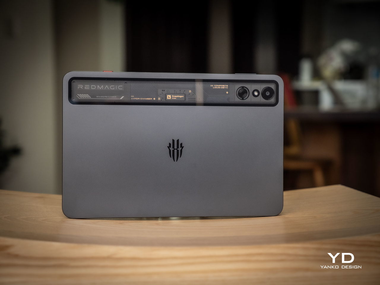
The REDMAGIC Astra represents one of those rare Android tablets that actually gets gaming aesthetics right without going completely overboard. While other gaming devices look like they were designed by someone who watched too many Transformers movies, the Astra opts for restraint. The flat design eliminates that annoying camera bump that makes tablets wobble on desks, creating clean lines that wouldn’t look out of place anywhere.

The “transparent” metal body sounds way cooler than it actually turns out to be. It’s basically just a small window at the top of the device, which is marketing speak for a tiny see-through section. But honestly, it works better than expected. This design choice adds just enough visual interest without making the tablet look like a prop from a cyberpunk movie. The aviation aluminum frame feels premium in your hands, giving you that satisfying weight that screams quality.

What really sets the REDMAGIC Astra apart are the configurable RGB lighting elements strategically placed on the REDMAGIC branding and within the turbofan assembly. Unlike those garish gaming laptops that light up like Christmas trees, these lights can be customized or turned off completely. You can match your mood, your setup, or just turn them off when you want to look professional during video calls. It’s that kind of flexibility that shows thoughtful design.

The color options are refreshingly simple, with Eclipse (black) and Starfrost (silver) variants that both look sophisticated. The flat design philosophy extends to every surface, creating a device that sits flush on tables and feels comfortable in your hands. Even the bezels, at just 4.9mm, manage to look intentional rather than cheap, framing the display without wasting precious screen real estate.

The overall aesthetic strikes that perfect balance between “I’m serious about gaming” and “I’m not embarrassed to use this in public.” It’s the kind of design that makes you want to show it off to friends, but not in a flashy way. The REDMAGIC Astra looks like it belongs in the hands of someone who knows what they’re doing, whether that’s dominating a mobile game or presenting in a boardroom.

Ergonomics

At 370 grams and just 6.9mm thick, the REDMAGIC Astra feels almost impossibly light for what it packs inside. You can easily hold this thing with one hand for basic tasks, though gaming naturally requires both hands for any serious action. The weight distribution feels perfectly balanced, preventing that awkward hand fatigue you get with poorly designed tablets during extended sessions.

The real genius lies in the off-center USB port placement, which might seem like a weird design choice until you actually start gaming. This positioning allows you to charge the tablet while playing in horizontal orientation without the cable getting in the way of your hands. It’s one of those small details that shows REDMAGIC actually thinks about how people use their devices in real life, rather than just making them look pretty.

Physical button placement follows conventional tablet wisdom, so you won’t spend time hunting for the power button or volume controls. The Magic Key adds a nice touch of customization, defaulting to Game Space access but letting you assign it to whatever function you use most. The surface textures on the aluminum frame provide just enough grip without making the device feel rough or cheap. Everything feels deliberate and well-considered.

Performance

The Snapdragon 8 Elite processor, boosted by REDMAGIC’s RedCore R3 Pro gaming chip, delivers the kind of performance that makes you forget you’re using a tablet. Real-world gaming tests show this thing can handle demanding titles without breaking a sweat, maintaining smooth frame rates even during those intense battle royale moments when everything’s exploding on screen. It’s the kind of power that makes other tablets look like toys.

The REDMAGIC Astra stands out as one of the few tablets with a built-in turbofan, complete with configurable speed settings. You can hear it working, but it’s not obnoxiously loud like some gaming laptops. The fan does its job keeping things cool, though the device still runs noticeably warm during intensive gaming sessions. It’s not uncomfortably hot, just warm enough to remind you there’s serious hardware working inside that aluminum frame.

The 2.4K OLED display with its 165Hz refresh rate makes everything look buttery smooth. Colors pop with that OLED richness that LCD screens just can’t match, and the high refresh rate means fast-paced games feel incredibly responsive. The 90.1% screen-to-body ratio creates an immersive experience that draws you into whatever you’re playing, while the 1,600 nits peak brightness ensures visibility even in bright sunlight.

Gaming performance really shines with features like frame interpolation technology that makes games look smoother than they actually are. The Game Space software provides quick access to performance tweaks, screen recording, and other gaming-focused tools without cluttering up the main interface. It’s the kind of thoughtful software integration that enhances the experience rather than getting in the way of what you’re trying to do.

Fast charging lives up to the hype, getting the massive 8,200mAh battery from zero to full in about 71 minutes when using the proper 35W charging brick. That’s genuinely impressive for such a large battery, and it means you’re not tethered to a wall outlet for hours when you need a quick top-up between gaming sessions. No wireless charging, though, which isn’t that unusual for a tablet.

The cameras do their job without trying to be something they’re not. The 13MP rear and 9MP front cameras handle video calls and casual photos adequately, which is exactly what you’d expect from a gaming-focused tablet. They’re not going to replace your smartphone camera, but they don’t need to. This tablet knows what it is and doesn’t pretend to be a photography powerhouse.

Sustainability

The integrated turbofan, while great for performance, introduces some legitimate concerns about long-term durability. Moving parts always represent potential failure points, and the IP54 rating provides only basic protection against dust and water. For a device with active cooling, you’d really want better protection against particles that could gum up the works over time. It’s a trade-off between performance and longevity.

The build quality appears solid, with premium materials that should withstand normal use without showing excessive wear. The aluminum frame and glass construction feel robust, though the specialized gaming features might require more careful handling than your average tablet. Repairability remains a question mark, especially regarding the cooling system and internal components that make this device special. That turbofan could become a costly repair down the line.

REDMAGIC hasn’t committed to any specific software update schedule for the Astra, which creates uncertainty about how long this tablet will stay current. Without guaranteed update timelines, you’re essentially gambling on the company’s goodwill for future Android versions and security patches. This approach feels outdated when other manufacturers are promising years of support for premium devices. It’s honestly disappointing for a tablet at this price point.

Value

Pricing starts at $499 for the 12GB RAM and 256GB storage model, jumping to $649 for 16GB/512GB and $849 for the top-tier 24GB/1TB configuration. These aren’t budget prices by any stretch, but they reflect the specialized hardware and premium materials packed inside. You’re paying flagship tablet money for flagship tablet performance, plus gaming-specific features you won’t find elsewhere in this form factor.

Compared to mainstream tablets in similar price ranges, the REDMAGIC Astra offers unique gaming-focused features that justify the premium. The active cooling, high-refresh OLED display, and gaming-optimized software provide value that generic tablets simply can’t match. If you’re serious about mobile gaming, these features become essential rather than nice-to-have extras. The question becomes whether you actually need what this tablet offers.

The device proves worth every penny for users who fully utilize its gaming capabilities and appreciate the thoughtful design choices. However, casual users looking for general tablet functionality might find better value in mainstream alternatives that prioritize different features. The REDMAGIC Astra succeeds as a specialized tool for dedicated mobile gamers willing to pay for performance and unique capabilities that you can’t get anywhere else.

Verdict

The REDMAGIC Astra Gaming Tablet successfully navigates the tricky balance between gaming functionality and mainstream appeal. Its thoughtful design choices, from the restrained aesthetics to the practical port placement, show a genuine understanding of what users actually want from a gaming tablet. While it’s not perfect, particularly regarding sustainability concerns and premium pricing, the device delivers on its core gaming promises with surprising style and sophistication.

For design-conscious users seeking serious mobile gaming performance, the REDMAGIC Astra represents a compelling option that doesn’t compromise aesthetic sensibilities. Its combination of premium materials, thoughtful ergonomics, and powerful hardware creates a device that feels equally at home in professional environments and gaming setups. The REDMAGIC Astra proves that gaming devices can be both functional and beautiful, setting a new standard for what portable gaming should actually look like.

The post REDMAGIC Astra Gaming Tablet Review: Compact Power, Premium Design first appeared on Yanko Design.

TROPHY Mental Care Concept Transforms Stress Into Sculptural Art

Par : JC Torres
25 juillet 2025 à 10:07

Stress relief gadgets usually look like what they are: cheap plastic toys designed to be squeezed, spun, or clicked until they inevitably break. Most fidget devices prioritize function over form, leaving you with something that works but looks completely out of place on your desk or bookshelf.

The TROPHY concept takes a completely different approach to mental care products by disguising stress relief as sculptural art. This portable device looks more like a modern art piece or an elegant trophy than a typical fidget toy, making it something you’d actually want to display in your home or office.

Designer: Mingi Cho

TROPHY works by combining the proven benefits of tactile stimulation with intentional design aesthetics. Users can hold, grip, and manipulate both the trophy-shaped object and its textured metal stand, using physical movement and touch to help manage negative emotions and stress. The concept leverages acupressure principles and the playful elements found in fidget toys, but packages everything in a form that feels sophisticated rather than childish.

Research supports the effectiveness of tactile fidget tools for emotional regulation. Studies have shown that stimulating the tactile system can help improve sensory processing along with related emotions and behaviors, particularly for people dealing with anxiety or attention challenges. Physical movement, even small tactile actions, releases dopamine and norepinephrine, which can increase attention and help sharpen focus.

The analog approach feels refreshing in a world saturated with app-based wellness solutions and digital mental health tools. Instead of requiring screens, notifications, or connectivity, TROPHY relies entirely on physical interaction and sensory feedback. The device provides responsive communication through vibration, haptics, and rotation, creating a more immediate and tangible experience than smartphone-based stress management apps.

What makes TROPHY particularly clever is how it addresses the social stigma often associated with stress relief tools. Traditional fidget toys can look unprofessional or childish in adult environments, but this sculptural approach allows users to engage in stress management without drawing unwanted attention or feeling self-conscious about their coping mechanisms.

The concept’s tagline, “Things that never come back,” hints at the temporary nature of stress and negative emotions. By providing a physical outlet for these feelings, TROPHY encourages users to acknowledge their stress, engage with it through touch and movement, then let it go rather than carrying it around mentally.

The textured surfaces on both the trophy and its stand invite exploration and repeated interaction, much like worry stones or prayer beads that people have used for centuries to manage anxiety and promote mindfulness. This tactile engagement gives the mind something concrete to focus on, creating a meditative break from overwhelming thoughts or emotions.

TROPHY demonstrates how thoughtful design can elevate everyday wellness tools from functional gadgets into meaningful objects that people actually want to use and keep around. By combining proven stress relief techniques with sculptural aesthetics, this concept shows that mental care products don’t have to sacrifice style for effectiveness.

The post TROPHY Mental Care Concept Transforms Stress Into Sculptural Art first appeared on Yanko Design.

Open-Source Robot Reachy Mini Brings AI to Your Desktop

Par : JC Torres
15 juillet 2025 à 16:20

Most robots today look like they belong in a factory or a science fiction movie, with their cold metal frames and intimidating mechanical movements that make you think twice about getting too close. There’s something inherently off-putting about the way most robotic designs prioritize function over approachability, creating machines that feel more like tools than companions, even when they’re supposed to help us in our daily lives.

That’s what makes Reachy Mini such a refreshing departure from the typical robotics playbook. This compact desktop robot from Hugging Face feels more like a curious pet than a piece of industrial equipment, with its expressive LED eyes and animated antennas that give it genuine personality. At just 11 inches tall and weighing 3.3 pounds, it’s sized more like a stuffed animal than a traditional robot.

Designer: Hugging Face, Pollen Robotics

Hugging Face, the machine learning platform often called “the GitHub of AI” for its vast community of developers sharing AI models and datasets, has taken its first step into physical robotics with this charming little companion. The company’s open-source, community-driven philosophy translates beautifully into hardware, creating a robot that’s designed to be modified, customized, and shared rather than locked down by proprietary restrictions.

The design itself is surprisingly endearing, with two animated antennas that move expressively and a head that can rotate with six degrees of freedom, giving Reachy Mini an almost pet-like quality. When it goes into sleep mode, it actually shrinks down to about 9 inches tall, which adds to its charm in a way that most tech products completely miss. The wide-angle camera and 5W speaker are integrated so seamlessly that they don’t disrupt the friendly aesthetic.

What’s particularly clever about Reachy Mini is how it comes as a kit with 3D-printable components, making customization not just possible but encouraged. You can choose between a Lite version for $299 that connects to your computer, or the full autonomous version with a Raspberry Pi 5 that can operate independently. The fact that everything is open-source means you’re not just buying a robot, you’re joining a community of makers who share modifications and improvements.

The AI integration is where things get really interesting, though. Reachy Mini taps directly into Hugging Face’s ecosystem of AI models, giving it conversational abilities, object recognition, and even emotional expression that feels surprisingly natural. You can have actual conversations with it, use it as a coding tutor, or even turn it into an interactive art project, all through simple Python programming that’s accessible to beginners.

Of course, there are some practical considerations to keep in mind. The early development phase means you’re essentially becoming a beta tester, and the full autonomous version won’t ship until fall 2025 at the earliest. The Lite version, arriving late summer 2025, requires a tethered connection to your computer, which limits its mobility somewhat.

The educational potential here is enormous, particularly for STEM programs where students can learn programming, AI, and robotics through hands-on experimentation rather than abstract theory. The growing community around Reachy Mini is already sharing projects, modifications, and educational resources that make advanced robotics accessible to everyone, not just engineering students.

Reachy Mini succeeds because it understands that the future of robotics isn’t about creating more sophisticated machines, but about making technology more human-centered and approachable. By combining expressive design with open-source accessibility, it proves that the most innovative robots might just be the ones that feel less like robots and more like companions we actually want to spend time with.

The post Open-Source Robot Reachy Mini Brings AI to Your Desktop first appeared on Yanko Design.

Samsung Removed the Galaxy Z Fold7 S Pen, and This Stylus Lover Agrees

Par : JC Torres
15 juillet 2025 à 13:20

Samsung just took the covers off the Galaxy Z Fold7, and it represents the biggest change in the foldable flagship since the Galaxy Z Fold3 introduced S Pen support in 2021 and the Galaxy Z Fold5’s new hinge in 2023 that allowed it to close completely flat. This year’s highlights include the thinnest Galaxy Z Fold yet, better durability, larger screens, and, finally, upgraded cameras. It’s not all good news, of course, like the bulging camera bump, but perhaps the change that sent waves across the Internet was the removal of S Pen support.

I have been a great fan of pen-enabled devices, seeing them as the near-perfect fusion of digital and analog worlds, particularly when it comes to drawing and note-taking. Samsung was one of the first few tech companies that embraced this, from the Galaxy Note phones and tablets to the old Samsung ATIV PC line. Although styluses, both active and capacitive, aren’t that rare anymore (thank you Apple Pencil), Samsung remains part of a small group that uses the famed Wacom’s technologies for its smartphones and tablets. Despite my self-professed obsession with the stylus, I think Samsung made the right call in removing it from the Galaxy Z Fold7, but I don’t think the story ends here either.

Designer: Samsung

Why Samsung Removed The Z Fold7 S Pen

Galaxy Z Fold6

Galaxy Z Fold5

Imagine whipping out your smartphone, unfolding it into a tablet, and immediately sketching inspiration or jotting down ideas the instant inspiration strikes. It’s almost like pulling out a paper sketchbook or pocket notebook but with the advantage of apps and the cloud. It’s one of the advertised features of Samsung foldables since the Galaxy Z Fold3 and a dream come true for digital creators. Except, it turns out, very few actually use these devices that way.

Galaxy Z Fold3

The Web, especially YouTube, is filled with anecdotes and examples of artists, designers, and even architects using tablets for their work, but not so much on foldables. Yes, there are very few pen-enabled foldable phones in the market, but there are even fewer voices showing how they use these devices for those very specific purposes. Reading, watching, or even typing, are all covered, but drawing with a stylus and handwritten notes are almost always limited to one-time reviews and demos.

Galaxy Z Fold7

It’s not that the stylus use case is invalid but because, at least at this point in time, consumers have bigger concerns about foldables than where to store the S Pen (more on that later). They are more interested in how thin the phone is when folded, how usable it is as a phone, and, more importantly, how durable that fragile flexible main screen is. As it happens, those are exactly the things that Samsung addressed in the Galaxy Z Fold7, choosing to focus on what people need here and now, while still keeping the doors open for the return of the pen.

Why The S Pen Fold Edition Didn’t Work

Popularity wasn’t the biggest problem of the S Pen for the Galaxy Z Fold. Quite the contrary, it was the symptom, not the cause. The reasons why even die-hard stylus users shy away from the accessory’s foldable version can probably be boiled down to two things: confidence and convenience.

Galaxy Z Fold5

Let’s face it: even with all the marketing and figures, even foldable owners are still a little bit wary of the durability of the foldable inner screen. It tends to be a little softer than a regular phone screen, and poking it with a stylus or pressing down hard on it might cause some to worry. The technology is getting better, of course, but not yet to the point of completely dispelling fears.

Galaxy Z Fold6

There’s also the design of the foldable phone itself, which leaves no room for the stylus unless you don the right case. Tablets have it easy with a large body that can be used to magnetically hold and charge their stylus, but not so much a device that folds down to the size of a pocketable phone. Not unless you have a silo like on the Galaxy S Ultra, but then you’d be going back to the problem of thickness.

There’s also the matter of awkwardness when using the foldable phone as a digital canvas because of its almost square aspect ratio. An iPad mini with the same screen size has a larger surface area and a more rectangular shape that matches paper and notebooks more closely. It’s definitely a minor gripe, but one that gnaws at the creator’s subconscious little by little.

Galaxy Z Fold6

One Chapter Closes, The Next Is Yet To Be Written

To some extent, the removal of S Pen functionality from this year’s flagship foldable definitely feels like a huge loss, but I don’t think the story ends there completely. There are still plenty of ways that foldables can be improved that would allow the triumphant return of the stylus. Samsung does seem to be moving in that direction, though it’s not yet clear when all the pieces will fall into place.

Galaxy Z Fold5

For one, there’s the tri-fold device that Samsung will be unveiling later this year. That will help solve the awkward feeling of scribbling on a square display since it will give you a regular tablet-shaped screen to work with. Whether the “G Fold” will actually come with S Pen support or not is still uncertain, but given the Galaxy Z Fold7, I’m leaning more towards a “no” for now.

Galaxy Z Fold4

Samsung is also rumored to be working on a new stylus technology that is more like the Apple Pencil or Microsoft’s Surface Pen. That means using a stylus that requires a battery in order to remove the need for a digitizer layer underneath the screen. This digitizer is one of the reasons for the thickness of previous Z Fold models, and its removal helped trim down the Galaxy Z Fold7’s size a lot. Of course, this also means no longer using Wacom technology, but that might be a small price to pay in the grand scheme of things.

Such a technology would also mean that Samsung will be able to continue improving the durability of a foldable screen with better Ultra-Thin Glass (UTG). That, in turn, helps give confidence that every press and stroke won’t take the foldable phone closer to its demise.

The Big Question: Galaxy Z Fold7, Skip or Buy?

Galaxy Z Fold7

Setting aside the awkward, bulging camera bump for a moment, the answer is rather a simple one. If the stylus has never captured your fancy, then the Galaxy Z Fold7 represents the best of Samsung’s foldable design and technology. It’s super slim, more usable as a phone when folded, and can take better pictures. It’s still catching up to some of its rivals, especially in the photography department, but it’s encouraging to see some bold choices being made, even if it meant taking out one key feature.

For those who buy Samsung foldables for the stylus experience, the answer is even easier: no. Stick to the Galaxy Z Fold6, which is a decent device on its own, and wait for the next chapter in the story of the Galaxy Z Fold to be written. It’s exciting to finally see some movement from Samsung in this space, and hopefully, all the signs pointing in that direction will come to pass.

Galaxy Z Fold7

The post Samsung Removed the Galaxy Z Fold7 S Pen, and This Stylus Lover Agrees first appeared on Yanko Design.

Commodore 64 Ultimate Returns in Style with Glowing and Gold Editions

Par : JC Torres
15 juillet 2025 à 11:02

The Commodore 64 was one of those computers that defined an entire generation’s relationship with technology, complete with its chunky beige case and that satisfying mechanical keyboard that made every keystroke feel deliberate. These days, most of our computing happens on sleek, minimalist devices that prioritize function over personality, which makes the new Commodore 64 Ultimate series feel like a breath of fresh air.

What makes this modern revival particularly interesting is how it doesn’t just slap some retro styling onto contemporary hardware and call it a day. Instead, the Ultimate series comes in three distinct flavors, each designed to appeal to different types of nostalgia seekers while actually being useful computers you can plug into your modern setup.

Designer: Commodore

The BASIC Beige edition is probably what most people picture when they think of a faithful C64 recreation. It sports that familiar cream-colored plastic case that screams 1980s home computing, complete with a proper mechanical keyboard that delivers the same tactile satisfaction as the original. Of course, underneath that nostalgic exterior, you’ll find modern conveniences like HDMI output and USB ports, so you won’t have to hunt down vintage monitors or deal with finicky RF connections.

Then there’s the Starlight Edition, which takes the retro concept in a completely different direction. This version features a translucent case packed with sound-reactive LEDs that pulse and change colors based on whatever game or music you’re playing. The effect is pretty spectacular, especially when you consider they’ve also created the world’s first translucent mechanical keyboard PCB, allowing the internal lighting to shine through each key as you type.

The real showstopper, however, is the Founders Edition, which is limited to just 6,400 units. This golden beauty takes inspiration from the legendary millionth C64 that Commodore produced back in the day, featuring a translucent amber case that gives off a warm, premium glow. The attention to detail here is impressive, with 24k gold-plated badges, satin gold keycaps, and a comprehensive collector’s package that includes everything from a commemorative certificate to an exclusive t-shirt and even a gold dog tag necklace.

All three editions share the same modernized guts, which means you get contemporary features like SD card slots for easy game loading, Ethernet connectivity, and compatibility with both vintage peripherals and modern accessories. The mechanical keyboards across all versions aren’t just for show either, they’re fully functional and maintain compatibility with original C64 software, so these aren’t just expensive display pieces gathering dust on your shelf.

What’s particularly clever about this approach is how it taps into the growing trend of technostalgia without falling into the trap of being purely decorative. Sure, these computers look fantastic sitting on your desk, but they’re also genuinely useful for anyone interested in retro computing, programming, or just experiencing what home computing felt like before everything moved to touchscreens and cloud services.

That said, you’ll need to be prepared for some compromises. The limited production runs mean these won’t be cheap, and the Founders Edition in particular is clearly aimed at serious collectors rather than casual users. The translucent cases and LED lighting, while visually striking, might not appeal to everyone’s aesthetic preferences either.

The Commodore 64 Ultimate series succeeds because it understands that good retro design isn’t just about copying old aesthetics. Instead, it takes the best parts of the original experience, the tactile keyboard, the distinctive case design, the immediate boot-up satisfaction, and combines them with modern reliability and connectivity. The result is something that feels both familiar and fresh, proving that sometimes the best way forward is to take a thoughtful look backward.

The post Commodore 64 Ultimate Returns in Style with Glowing and Gold Editions first appeared on Yanko Design.

ITDA Concept Offers A Minimalist Approach to Family Connection at Home

Par : JC Torres
4 juillet 2025 à 17:00

It is easy to take for granted how much technology we surround ourselves with every day, but somehow, even surrounded by screens, real connections at home can feel harder than ever. That is the challenge at the heart of ITDA, a concept design from Korea that aims to help families find each other again in the most gentle and thoughtful way possible.

The name ITDA comes from a Korean word that means “to connect,” and that philosophy runs through every detail. This is not just another smart gadget or an app notification fighting for your attention. Instead, ITDA is a collection of gentle, tactile objects designed to quietly restore the little moments we have been missing, those exchanges of feeling and warmth that get lost in the shuffle of daily life.

Designers: Hyunwoo Jung, Yehoon Cho, Sieun Cha, Gayeon Kim

At the center of the system is TOPI, a device that looks more like a minimalist home sculpture than anything you would expect from a tech product. Set it on the kitchen table or by the entryway, and it becomes a gentle hub for conversation. Instead of sending out alerts or lighting up with endless information, TOPI introduces topics when family members are together, using a display that feels inviting rather than commanding. There is even a little shelf on its back for keys or treasures, which feels like a reminder that the belongings we carry say as much about us as our words do.

The rest of the collection is just as quietly clever. TILO gives a more humane spin on that drab office time card. Instead of something you dread, it welcomes you home with a familiar voice as soon as you step in the door and put in your personal card. It is the kind of touch that could easily become a small but meaningful ritual, the sound of someone who cares, right when you need it most.

Then there is TOK, a pebble-shaped device made for those times when words are tough to find. Instead of forcing a conversation, TOK lets you send a simple signal, by inserting the pebble-shaped object into TOPI that matches your mood, messages that say, “I am thinking of you,” or “I would like to talk.” It is nonverbal, simple, and maybe even a little poetic, especially for anyone who has ever wished they could reach out without having to explain everything.

What is striking about ITDA is how little it asks of you. There are no complicated screens to navigate, no endless setup menus, and no pressure to perform. The forms are gentle and approachable, meant to blend into your home rather than take it over. Every element, from the way you interact with the devices to the materials themselves, feels designed for comfort and calm.

It is worth remembering that ITDA is just a concept right now, not something you can buy and plug in tomorrow. But as a piece of design thinking, it feels especially timely. In a world where smart often means louder, brighter, and busier, ITDA turns the volume down and gently nudges us back toward each other. Maybe that is the real innovation: a reminder that sometimes, the most important connections do not happen on a screen, they happen in the quiet spaces we make for each other.

The post ITDA Concept Offers A Minimalist Approach to Family Connection at Home first appeared on Yanko Design.

Copilot Fellow Concept is an AI Pendant That Feels More Like a Friend Than a Gadget

Par : JC Torres
4 juillet 2025 à 16:20

Ever feel like AI is always hiding in the background, tucked away on your phone or buried behind a dozen browser tabs? Most of us interact with digital assistants through screens, which, let’s be honest, makes technology feel a little distant from our actual lives. But what if AI could be more present, accessible, and even a little bit stylish? That’s where the Copilot Fellow concept comes in, and honestly, it’s hard not to get a little excited about the idea.

The Copilot Fellow isn’t just another gadget to add to your collection. Picture a pill-shaped device, smooth and minimal, with a flat front and back. The front features a camera and a bold Copilot button, the heart of the design. Tap it, and you’re instantly connected to your AI assistant, ready to ask a question, set a reminder, or get a quick weather update. It’s designed to be intuitive, something you can operate without fiddling around or losing your train of thought.

Designer: Braz de Pina

What really makes Copilot Fellow stand out, though, are the four shortcut buttons, two on each side, that you can program for your favorite prompts or voice commands. Imagine setting one for “What’s on my calendar?” and another for “Send a quick note.” There’s no scrolling through endless menus or getting lost in settings. It’s simple, direct, and focused on the way you actually use AI day to day.

Now, here’s a little twist to that premise: While the front is all about that single, satisfying Copilot button, the back features a discreet screen. If you want to read your prompts or see some quick info, it’s there. But since it’s hidden away on the reverse side, it never gets in the way. This design choice keeps your interactions as screen-free as you want them to be, which feels like a breath of fresh air in our notification-heavy world.

One of the coolest things about Copilot Fellow is how you can wear it. You’re not locked into any one style, it works as a pendant around your neck, or you can just toss it in your pocket. It feels less like another gadget and more like a little presence you carry with you, always ready to help but never demanding attention. There’s something almost companion-like about it, which is a big leap from the usual “Hey Siri” or “Okay Google” voice floating out of your phone.

It’s important to remember that this is still a concept design, and Microsoft is unlikely to make one itself. But honestly, wouldn’t it be cool if someone DIY’ed their own version? The simplicity and flexibility make it feel approachable, even for tinkerers. Copilot Fellow reimagines how we might invite AI into our lives: more personal, more tangible, and a lot more stylish. Would you wear your AI around your neck, or are you sticking with the old-school phone in your pocket? Either way, this concept makes us rethink what AI gadgets could be.

The post Copilot Fellow Concept is an AI Pendant That Feels More Like a Friend Than a Gadget first appeared on Yanko Design.

Clicker Pen Key Holder Concept Turns Everyday Keys Into Pocket Perfection

Par : JC Torres
27 juin 2025 à 16:20

There is something oddly frustrating about fishing around for the right key while juggling a phone, bag, or coffee cup. Traditional key holders sometimes make things tidier, but they still leave you with a tangle of metal, mystery jingles, and the occasional scratch on your favorite gadget. The simple act of grabbing a key shouldn’t feel like a daily puzzle, yet for many of us, it somehow does.

Key holders have existed for ages, but their designs rarely change. After all, keys are just keys, right? That’s why when an entrepreneur set out to rethink this small but stubborn daily problem, they partnered with a design team to create a truly clever alternative. The result is Keyo—a sleek, minimal organizer that borrows inspiration from those classic multi-cartridge pens you might remember from school.

Designer: Diego Mata, NOS Design

Keyo is compact, with a shape that feels natural in your hand or pocket. It’s designed to simplify one of those little interactions you repeat countless times a week. The hard plastic shell protects your keys from scratches and damage, while also keeping them from scratching anything else in your pocket or bag. It’s the kind of thoughtful upgrade that makes you wonder how you ever managed the old way.

The real fun comes with the sliding mechanism. With a satisfying click, you can deploy each of the three stored keys individually, so you always get the one you want, right when you need it. No more fumbling or flipping through a ring of lookalikes. This smooth action feels almost like using a fancy pen: one push, one key, and you’re set.

Keyo’s design also means less noise and less clutter. By housing everything inside a lightweight and durable shell, it cuts down on the jangling sound that follows most keychains. The body is available in several colors, making it easy to match your mood or style. Whether you prefer understated black or something a bit more playful, there’s a version for everyone.

Inside, the mechanism is designed to fit a wide variety of key shapes and sizes. The length of Keyo is carefully tuned to accommodate the most common key heads on the market, so you don’t need to order custom keys or make modifications. Just load them in and you’re ready to go, no fuss or extra trips to the hardware store required.

It’s the sort of concept that makes everyday life just a little smoother. With Keyo, searching for the right key becomes a thing of the past, replaced by a quick, intuitive motion that feels both familiar and refreshingly new. For anyone tired of the daily key shuffle, it’s a smart solution waiting to be brought into reality.

The post Clicker Pen Key Holder Concept Turns Everyday Keys Into Pocket Perfection first appeared on Yanko Design.

Fairphone 6 Proves Sustainability and Customization Can Go Hand in Hand

Par : JC Torres
26 juin 2025 à 13:20

The Fairphone 6 arrives with a quiet confidence, carrying on the company’s mission to make smartphones that respect both the planet and the people who use them. At first glance, it might look like any other modern device, but every detail tells a different story. This phone is built for those who want more than just the latest specs. It is for anyone who values mindful design and practical longevity, right down to the smallest screw.

One of the most impressive aspects of the Fairphone 6 is the careful choice of materials. Recycled plastics form the backbone of the frame and back cover, while ethically sourced metals like Fairtrade gold and conflict-free tin and tungsten make up the internal circuitry. Even the battery is produced with responsibly sourced cobalt and lithium. By focusing on these thoughtful materials, Fairphone manages to shrink the environmental footprint of each phone, setting an industry example that others will hopefully follow.

Designer: Fairphone

Repairability has always been Fairphone’s hallmark, and the sixth generation stays true to those roots while adding a new layer of durability. The back plate and battery are both removable, not with a quick snap but with a few turns of a screwdriver. It is a subtle shift that gives the phone a more solid feel without locking out the user. If the battery ever fades or a component needs swapping, it is just a matter of unscrewing, replacing, and reassembling; no special tools or trips to a service center required.

Customization is where the Fairphone 6 truly stands apart. The accessory ecosystem is designed with the same sustainable mindset as the phone itself. Instead of relying on sticky adhesives or magnets, everything from cardholders to finger loops and lanyards attaches with sturdy screws. Whether you use them on the bare phone or with the matching protective case, these add-ons are made from recycled materials and built to last through daily use. The result is a phone that feels uniquely yours, down to the smallest accessory.

This screw-based system is more than a clever engineering trick. It ensures that every attachment remains secure and functional over time, avoiding the wear and tear that comes with less robust solutions. It is a design philosophy that values longevity and flexibility, making it easy to update or personalize your phone as your needs change. Each accessory fits neatly into the overall vision of sustainability, blending practical function with an honest, transparent approach to design.

With the Fairphone 6, repairability and sustainability are not just marketing buzzwords: they are woven into every fiber and feature. It is a phone for those who want their technology to reflect their values, proving that innovation does not have to come at the expense of responsibility or individuality.

The post Fairphone 6 Proves Sustainability and Customization Can Go Hand in Hand first appeared on Yanko Design.

❌
❌