Vue normale

Il y a de nouveaux articles disponibles, cliquez pour rafraîchir la page.
Aujourd’hui — 6 octobre 2025Flux principal

This Bizarre Wallet + Whiteboard Might Just Be the Most Creative EDC Ever Made

Par : Sarang Sheth
6 octobre 2025 à 01:45

You remember that scene in the first Avengers movie? Captain standing in front of Tony Stark, asking him what he is without the suit? Tony replies without a blink – Genius, billionaire, playboy, philanthropist. I imagine that if this same conversation were to happen in the EDC realm, most wallets are essentially just sheets of leather that hold cash, cards, and currency. Strip the valuables away, and you’ve got nothing but carcass left. The MEMO wallet from New Things Lab, however, has a fairly essential feature even when it isn’t holding anything – it’s a dry-erase whiteboard that also parades as a wallet. Yes, you read that right. A whiteboard. In your wallet.

The concept sounds absurd until you actually think about it. When was the last time you saw someone pull out a notepad to jot something down? Probably never, because nobody carries those anymore. But ideas still hit at random moments, phone numbers still need to be scribbled down, and sometimes you just need to sketch something out quickly. The MEMO wallet acknowledges this reality by making the notepad part of something you’re already carrying anyway.

Designer: New Things Lab

Click Here to Buy Now

The wallet’s design is deceptively simple. Imagine a bifold wallet, but instead of opening the bifold to reveal your cards and cash, you open it to reveal a two-panel dry-erase whiteboard along with a built-in removable marker. Imagine a tiny notebook – that’s essentially what you get. The panels themselves are whiteboards on the inside, but on the outside, you’ll see a slot that lets you store up to 6 cards. Each panel has enough space for 3 cards, covering most use-cases. I, for example have 3 payment cards, 2 ID cards, and 1 access card for my coworking space. That’s pretty much all I need to carry on a daily basis.

The dry-erase whiteboard is an extra feature that my creative brain personally loves. It feels intuitive, allowing me to quickly take notes without using my phone. There’s no screen-time, the ideas aren’t stored on a device that has internet access, and you can do everything from taking notes to making doodles – analog, baby. The marker docks right inside the wallet (although I wish it were slightly thinner), and when closed, your notes stay hidden and not at risk of accidentally getting wiped away inside your pocket. The marker itself has a built-in eraser just in case you want a fresh slate.

New Things Lab built this thing from precision-milled 6063 aluminum, the same stuff used in window frames, so it can handle daily abuse without showing wear. The CNC machining gives it clean lines and tight tolerances that feel premium in hand. Three anodized finishes are available: Charcoal Black, Slate Grey, and Gilded Rose, though the darker options might disappear in the depths of your bag if you’re not careful.

The whiteboard surface works exactly as advertised. Write on it, erase it, repeat. No paper waste, no running out of pages, no ink bleeding through. Whether you’re sketching out a floor plan, writing down WiFi passwords, or just doodling during a boring meeting, the surface handles it all. The magnetic closure keeps everything secure, and the compact 108 x 74 x 11mm dimensions slip into any pocket without bulk.

RFID blocking comes standard, protecting your cards from digital pickpocketing attempts. The aluminum construction naturally shields electromagnetic signals, so this isn’t some afterthought feature tacked on for marketing purposes.

The trade-offs are real though. Six card slots won’t accommodate everyone’s plastic collection, and the aluminum construction makes it heavier than typical wallets. The pen, while clever, could easily get lost if you’re not careful about clipping it back in place. Some people might find the dry-erase format awkward after years of paper and digital notes.

But for minimalists who actually use their EDC gear, the MEMO wallet makes a compelling case. It’s genuinely innovative without being gimmicky, practical without sacrificing style. In a world of identical carbon fiber and leather wallets, something this different deserves attention. At around $90, it’s not cheap, but the build quality and unique functionality justify the premium. Sometimes the best ideas are the ones that seem completely obvious once someone finally does them.

The post This Bizarre Wallet + Whiteboard Might Just Be the Most Creative EDC Ever Made first appeared on Yanko Design.

À partir d’avant-hierFlux principal

Get Ready For Humanism-inspired Robot Vacuums That Blend Into Your Home Decor

Par : Sarang Sheth
2 octobre 2025 à 01:45

Most robot vacuums beg for your forgiveness with their awkward, boxy presence, but the Roborock Qrevo CurvX asks for a place in your home like a well-chosen piece of furniture. It enters the conversation not just as another appliance, but as a statement on what home technology should be. With its softly arched silhouette and a philosophy that puts people, not just specifications, at the forefront, the Qrevo CurvX is engineered to disappear into your life, not just your room corners. It feels like the robot vacuum for those who think about how form and emotion, not just about function.

The design philosophy behind the CurvX is described with terms like “surface tension” and “soft architecture,” which sounds more like a museum exhibit than a home appliance. Looking at the unit, you can see what they mean. The docking station abandons the rigid, tower-like structure of its peers for a continuous, fluid curve that houses the water tanks and dustbin. It’s a quiet, elegant form that flows seamlessly into a living space, looking less like a piece of machinery and more like a minimalist sculpture. This is a direct response to a world where smart devices are often cold, visually intrusive objects. By embracing a rounded silhouette and muted tones, Roborock seems to be asking a fundamental question: how should a piece of technology feel when it lives with you? The answer, apparently, is that it should feel like it belongs.

Designer: Roborock

Click Here to Buy Now: $999.99 $1499.99 ($500 off). Hurry, deal ends in 48-hours!

This thinking goes deeper than just aesthetics, reflecting a core principle of humanistic design and “soft technology.” The idea here is that the machine should adapt to the human, not the other way around. It’s a philosophy born from asking how a device can respect the emotional and cultural rhythm of a home. This translates into tangible features that reduce the friction between you and the technology. The CurvX operates with a brushless motor and optimized hardware that significantly cut down on noise, making it a quiet collaborator rather than a noisy servant that interrupts your conversations or concentration. The fully automated dock is another manifestation of this warmth; by handling nearly all the dirty work of emptying, washing, and drying, it removes the mental and physical burden of maintenance. It’s a thoughtful approach where the technology aims to be considerate, anticipating needs and fading into the background, allowing you to simply enjoy a clean space without constantly tending to the machine that creates it.

Of course, a beautiful object that fails at its primary job is just an expensive paperweight. While the Qrevo CurvX speaks in soft aesthetic tones, it performs with absolute confidence. Beneath that sculptural exterior lies a flagship-level cleaning system that seems to address nearly every common complaint about robot vacuums. The power behind the operation is its 22,000Pa HyperForce suction system. That number might sound abstract, but for context, it represents a level of force capable of lifting dirt and allergens from deep within carpet fibers, a task where many lesser robots struggle. It’s the kind of power that translates to a visibly cleaner floor, not just a surface-level tidy up.

This raw power is channeled through a cleverly designed Dual Anti-Tangle System. Anyone who has ever owned a robot vacuum, especially with pets or long-haired family members, knows the tedious ritual of flipping the robot over to cut away a tangled mess of hair from the brush roll. The CurvX system uses a unique split-brush design that works to prevent hair from wrapping in the first place, directing it straight into the dustbin. This is one of those quality-of-life features that transforms the ownership experience from one of constant maintenance to one of genuine automation. The robot just works, leaving you to do anything else.

Mopping has also received a significant upgrade. The system uses dual spinning mop pads that scrub floors with consistent pressure, a far more effective method than simply dragging a wet cloth around. What truly sets it apart, however, is its intelligent auto-mop lifting capability. When the robot detects it is moving from a hard floor to a carpet or rug, it lifts its mop pads by a full 10 millimeters. This small action is a huge deal; it prevents the robot from dragging a wet, dirty mop across your carpets, allowing it to vacuum and mop an entire mixed-surface floor plan in a single, uninterrupted run.

The intelligence extends to the Multifunctional Dock 3.0 Thermo+, which is the brains and pit crew of the entire operation. After a cleaning run, the robot returns to the dock, which automatically empties the robot’s dustbin into a larger bag. It then washes the spinning mop pads with 176°F (80°C) hot water to dissolve grime and kill bacteria, followed by a hot air-drying cycle to prevent mildew and odors (based on testing carried out by TUV Rheinland on Staphylococcus aureus and Escherichia coli under default self-cleaning mode, over 99.99% of bacteria or the spinning mops are effectively removed). It even refills the robot’s onboard water tank for the next mopping session. This comprehensive self-maintenance cycle means user interaction is reduced to occasionally changing the dock’s water and dust bag, pushing the system much closer to a true set-it-and-forget-it reality.

Two of the most innovative features are the ones you can’t immediately see. The first is the industry-first AdaptiLift Chassis. This system allows the robot to physically lift its own body to clear obstacles like tall thresholds between rooms, a common barrier that can trap other robots. Observers have noted this gives the CurvX an impressive ability to navigate complex homes without getting stuck. The second is its RetractSense Navigation System, which includes a FlexiArm side brush. On most round robots, cleaning corners and edges is a persistent weakness. The CurvX’s side brush can dynamically extend outwards, actively reaching into corners and along baseboards to sweep debris into the path of the main brushes, ensuring a more thorough clean where it matters most.

All of this hardware is guided by a sophisticated brain. The Reactive AI 3.0 Obstacle Recognition uses a forward-facing camera and structured light to identify and avoid common household objects, identifying up to 108 types of obstacles. It builds a detailed map of your home, allowing for customized cleaning schedules, no-go zones, and room-specific settings, all controlled through a user-friendly app. At just 3.14 inches (7.98 cm) tall, its ultra-slim profile lets it glide under low furniture, cleaning the hidden spaces that are often missed. It all comes together to create a machine that is not just powerful, but also perceptive and respectful of its environment. The Roborock Qrevo CurvX doesn’t ask you to choose between a clean home and a beautiful one; it offers both, proving that cleanliness isn’t just about a dust-free floor, it’s about an aesthetic home too.

Click Here to Buy Now: $999.99 $1499.99 ($500 off). Hurry, deal ends in 48-hours!

The post Get Ready For Humanism-inspired Robot Vacuums That Blend Into Your Home Decor first appeared on Yanko Design.

Fidget-worthy Titanium Micro-knife is a ‘Seriously Fun’ piece of Tactical EDC

Par : Sarang Sheth
20 septembre 2025 à 01:45

I don’t think anyone apart from Bruce Lee actually made nunchucks appear ‘seriously dangerous’. A lot of the appeal of a pair of nunchucks lie in the theater, the fanfare, the performance… but operate them well and they’re hellishly deadly. The TiNova is somewhat like that. Its magnet-enabled fidget-to-open mechanism is about as enjoyable as flicking around a butterfly knife or a pair of nunchucks, but once open, the TiNova is a tiny beast that packs a punch.

A titanium body, a machined construction, and a D2 blade make the TiNova a bite-sized brute. Nothing about the knife feels flimsy or toy-like… even though the entire thing measures just under 4 inches when open. When closed, the TiNova drops down to a mere 2.4 inches in length, and is small enough to be worn around your neck like a nifty EDC dog-tag. When you mean business, take it off, flick it open, and your pocket powerhouse is ready for serious action.

Designer: Ideaspark

Click Here to Buy Now: $45 $65 (31% off) Hurry, only 11 days left!

The TiNova is smaller than the average pinky finger, making it roughly the size of your standard thumb-drive. The two-part titanium handle is held together with a single pivot point, and a pair of magnets that snap the handle into its closed position. A drop-point blade sits in a gap between the two halves of the handle, concealed when not in use. To deploy the blade, simply swivel any one half of the handle around 360° and the blade travels outwards with confidence. It’s not like your regular flipper, which requires dexterity, or a switchblade or OTF, which requires being vigilant. The TiNova’s blade deployment is all about flair and performance. With enough practice, a simple flick of your wrist and a good amount of centrifugal force should have the handles rotate a full 360° to deploy the blade.

Once out in the open, the TiNova’s blade means absolute business – D2 steel is a top-tier steel in the EDC and knifemaking world, giving the TiNova street cred. A standard spear-tip design with a single drop-point edge makes the TiNova a reliable workhorse. When open, there’s nothing you can do to cause the knife to ‘fail’ the way a cheap lock on a budget knife would. This thing is built solid, and will even pierce through wood without as much as a bit of flex. The drop point edge is a classic in the industry, making it perfect for piercing, cutting, slicing, scraping, and whittling. Although built to withstand the outdoors, the blade works just as effectively indoors or in tactical/emergency situations.

However, seriousness aside, the TiNova’s charm lies in its fun personality. That fidget mechanism is almost entirely the most charming feature about this knife. It’s designed to engage your fingers, as you attach and detach the ends of the handles. If you’ve seen those magnetic fidget bars/sliders, think of the TiNova as just like them, but with a deadly blade just tucked away for when the fun stops.

This tactile appeal is easily what makes the TiNova such a stellar pick for your everyday carry. Why would you carry a boring folding knife when the alternative is something that feels fun and looks intimidating? With enough practice, the knife should flip open effortlessly, and should definitely drop a few jaws in the process. If you don’t believe EDC should have a component of childlike joy, this one might not be for you.

The reliably strong D2 blade cuts through everything with ease, whether it’s as simple as an envelope or an Amazon parcel, or as tough as wood or even paracord. The steel’s high-strength and blade retention means it’s definitely going to stay sharp even with regular use, although the drop-point design means that even IF the TiNova lost its edge (that’s a big if), sharpening it is fairly simple.

Meanwhile, the blade sits within a practically indestructible titanium shell. The machined titanium design boasts this sandblasted finish which is great to grip, while grooves on the handle add to the friction. The flat handle is ambidextrous, and tritium slots on both sides mean you can add glow-vials to make your EDC visible in low light. A lanyard hole means you can string your TiNova to a keyring or even a neck-worn chain, just in case the tiny form factor is a little too small for merely slipping into your pockets. And as far as ‘practically indestructible’ goes, you could run over the TiNova with your car and the titanium will shrug it off like a gentle breeze.

The knife falls within the small-carry category, given its tiny 1.4-inch blade and sub-4-inch overall design. The titanium makes the TiNova as lightweight as it is robust, weighing a paltry 38.8 grams or 1.37 ounces (that’s about as much as an AirPods case).

The TiNova starts at $45, or 20 bucks off its $65 MSRP. It’s designed to be scratch-resistant, corrosion-proof, and will weather any sort of rough use. In fact, designer Ideaspark confidently offers a lifetime warranty on the TiNova. Grab yours now and it’ll ship with a complimentary keyring… and if you want to jazz your knife up, an extra $15 will allow you to either get a custom engraving on the handle, or have it coated in PVD black, making it the ultimate stealthy EDC companion that still knows how to have some fun!

Click Here to Buy Now: $45 $65 (31% off) Hurry, only 11 days left!

The post Fidget-worthy Titanium Micro-knife is a ‘Seriously Fun’ piece of Tactical EDC first appeared on Yanko Design.

Step Inside this Giant Kaleidoscope That Feels Like it Descended From Krypton

Par : Sarang Sheth
20 septembre 2025 à 00:30

When Li Hao’s Pop Star View Platform first appeared in the landscape, it probably broke a few people’s brains. This isn’t your typical public art installation that politely sits in a corner being contemplative. Instead, it’s a massive crystalline beast that looks like it crash-landed from Krypton, all faceted surfaces and impossible geometry that shifts from alien fortress to disco ball depending on the light. The structure is based on an icosahedron, but Li Hao has exploded and reconstructed it into something that feels both mathematically precise and completely otherworldly. You’re looking at what happens when someone takes sacred geometry and runs it through a kaleidoscope filter.

The visual impact is absolutely bonkers in the best possible way. Those iridescent panels catch and fracture sunlight into a spectrum that would make a prism jealous, creating this constantly shifting light show that transforms throughout the day. At sunset, the thing becomes a beacon of pure color that radiates across the landscape like some kind of interdimensional lighthouse. The dichroic glass or film coating on each facet creates that oil-slick rainbow effect, where purples bleed into teals, oranges melt into magentas, and the whole structure seems to pulse with its own internal energy.

Designer: Li Hao

What’s brilliant about Pop Star is how it plays with scale and perception. From a distance, it reads as this monolithic alien artifact, but as you get closer, the complexity of the internal structure reveals itself. Those black steel frames create a secondary geometric pattern within each colored panel, adding depth and visual texture that keeps your eye engaged. The mesh or perforated elements in some sections let you see through the structure, creating layers of transparency that make the whole thing feel less solid and more like a hologram materializing in space.

Creating a structure this large with so many angled surfaces while maintaining structural integrity requires serious computational design work. Each joint has to handle complex load distributions, and the panel mounting system needs to accommodate thermal expansion while keeping those pristine edges aligned. The fact that it doubles as a viewing platform means the internal framework has to support human traffic, adding another layer of complexity to what could have been just a sculptural statement.

Pop Star View Platform earned its Golden A’ Design Award by doing something most public art fails at: it creates genuine wonder without being pretentious about it. Whether you’re a design nerd who appreciates the mathematical elegance or just someone walking by who stops dead because holy shit, what is that thing, the installation delivers. It’s Instagram-ready spectacle with serious conceptual depth, proving that sometimes the most effective way to make people think about space, light, and perception is to build something so visually arresting they can’t look away.

The post Step Inside this Giant Kaleidoscope That Feels Like it Descended From Krypton first appeared on Yanko Design.

This Soap Fights Skin Cancer: And A 14-Year Old Invented It

Par : Sarang Sheth
19 septembre 2025 à 22:30

Innovation sometimes comes from the most unexpected sources, and nothing proves this better than the groundbreaking work of Heman Bekele. This 14-year-old wunderkind from Virginia has developed something that seasoned scientists and pharmaceutical companies haven’t quite cracked: an affordable soap that could potentially treat and prevent skin cancer. What makes his invention so revolutionary isn’t just the concept but the elegant simplicity behind it, combining basic chemistry with sophisticated drug delivery systems in a way that makes you wonder why nobody thought of it before.

The scientific community has certainly taken notice. Bekele’s Skin Cancer Treating Soap (SCTS) earned him the 3M Young Scientist Challenge award with a $25,000 prize, landed him on TIME magazine’s cover as their 2024 Kid of the Year, and most recently secured him the Gloria Barron Prize for Young Heroes with another $10,000 to support his research. Not bad for someone who still has to balance lab work with high school homework and marching band practice.

Designer: Heman Bekele

Bekele’s innovation journey started with his childhood observations in Ethiopia, where he witnessed countless people working long hours under the scorching sun without protective clothing or sunscreen. After his family moved to the United States, he connected these memories with what he learned about skin cancer risks and treatment disparities. The standard treatment, imiquimod cream, costs a staggering $40,000, putting it far beyond reach for most people globally. His brilliant insight? Create a vehicle that costs pennies but delivers the same active ingredient.

The technical genius of Bekele’s soap lies in its use of lipid nanoparticles that encapsulate imiquimod, an FDA-approved compound that activates immune cells to fight cancer. When users wash with the soap, the lipid nanoparticles adhere to the skin at a molecular level, remaining behind after rinsing to deliver the cancer-fighting drug. This solves the primary challenge of topical medications, keeping the active ingredient in contact with the skin long enough to be effective while bringing the cost down to under $9 per bar.

Currently, Bekele is collaborating with molecular biologist Vito Rebecca at Johns Hopkins Bloomberg School of Public Health, running tests on mice injected with skin cancer cells. The research is showing promise, though there’s still significant work ahead. The scientific process requires patience; patenting, clinical trials, and FDA approval could take up to a decade.

The potential impact stretches far beyond just another cancer treatment. If successful, this technology could revolutionize drug delivery systems broadly, making treatments more accessible worldwide, particularly in regions with limited healthcare infrastructure. The concept could potentially extend to other skin conditions or even preventative applications.

The post This Soap Fights Skin Cancer: And A 14-Year Old Invented It first appeared on Yanko Design.

“Joy at Work” is the Only Success Metric That Matters: Building India’s largest Design Movement

Par : Sarang Sheth
19 septembre 2025 à 20:30

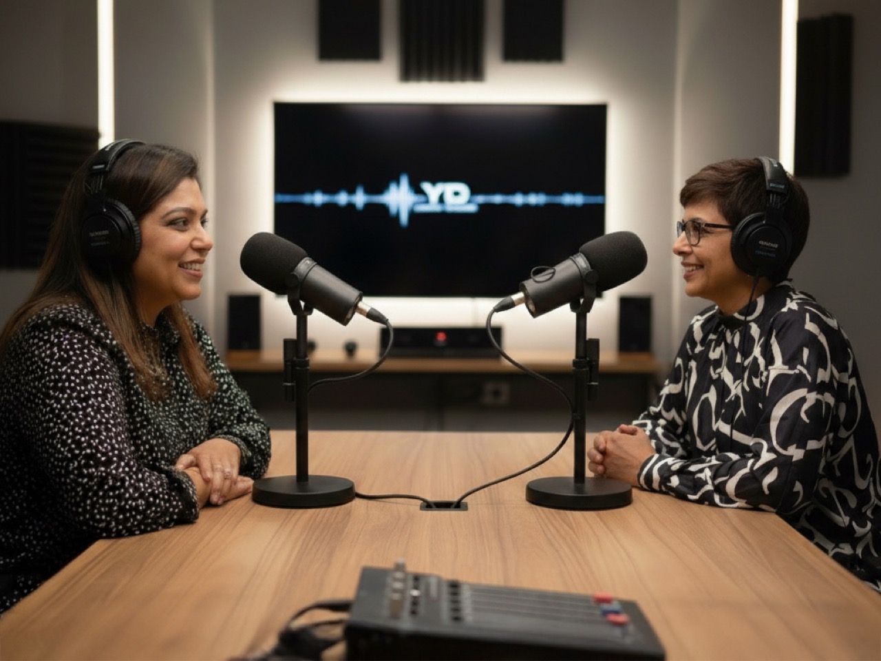
Every Tuesday, Yanko Design’s new podcast “Design Mindset” goes beyond the portfolios and project showcases, diving deep into the philosophies, failures, and future-facing strategies of the world’s most influential creative leaders. Hosted by Radhika Seth, “Design Mindset” brings candid conversations that reveal not just how great design is made, but why it matters, especially when the stakes are high, and the choices aren’t easy. Whether you’re a young designer, a founder, or simply a creative at heart, the show aims to inspire and equip you to build businesses and products that serve both profit and purpose.

Our premiere episode features Ashwini Deshpande, co-founder of Elephant Design, India’s largest independent multidisciplinary design consultancy. With a career spanning 36 years, Ashwini represents a generation that transformed Indian design from an afterthought to a vital force in business and society. The conversation traces Elephant’s origins in 1989’s scarcity-driven India, reveals the philosophy that design is “not a luxury, but a democracy,” and explores how commercial success and social impact can, and should, align.

Why Choosing Between Profit and Purpose is a False Dilemma

Ashwini wastes no time confronting the age-old debate between doing good and doing well. “You don’t have to choose between profit and purpose. You can integrate both. It can come together,” she asserts with the confidence of someone who has spent 36 years proving this theory. This isn’t wishful thinking or corporate speak. It’s a business philosophy forged in the fires of India’s economic transformation, when design consultancy was virtually unknown and every project was an opportunity to prove that good design could create social change.

The foundation of this belief traces back to Elephant’s radical vision, shaped at NID (National Institute of Design), which saw design as a tool for everyone, not a luxury for the few. “Design isn’t a luxury, it’s not a tool, it’s a democracy,” Ashwini says. But democracy requires participation, and participation requires survival. “You can do good only if you survive to do that. It was important to get financial stability and have a business model that could grow, that could employ more designers, and in turn spread the impact of design.” For Ashwini, design is part of nation-building, and fair compensation is not just deserved, but essential for sustaining impact.

Building a Design Empire in an Economy That Didn’t Know Design Existed

Picture India in the late 1980s: just two car models, scooters bought on installment with years-long waiting lists, no malls, no branded clothes, and computers just beginning to enter workplaces. This was the landscape where Elephant Design was born, and every single project was revolutionary simply by existing. “Anyone who is willing to invest in design to improve anything, be it their products or communication, was going to make a positive impact on the Indian economy,” Ashwini recalls.

Starting a design consultancy in this environment wasn’t just ambitious, it was necessary. “We didn’t have really many other choices. It wasn’t like placement coordinators queuing up outside NID. Nobody was employing designers. So this seemed like the right thing to do.” Every project became an opportunity to create social change and prove that good design could transform how Indians consumed products and experiences. But this wasn’t idealism for its own sake. “It was never a blind sort of charitable enterprise because then we wouldn’t have survived and we wouldn’t have got the good people that we have working with us if we were not financially stable.”

The Brutal Reality of Selling Something Nobody Knew They Needed

Almost no one in India’s early business landscape understood the value of paying for design. Branding and communication needs were served by advertising agencies who threw those services in for free against media budgets. Product design needs were fulfilled by what was called “R&D,” which Ashwini translates with a wry smile: “refer and duplicate.” This was the market Elephant entered, armed with nothing but conviction and necessity.

“We had no choice. Nobody knew that they had to pay design fees to get design consulting advice,” Ashwini explains. “So we had to begin by making them realize that you can make profits if you employ good design. Whether you work with us or you work with whoever else, but design is going to help you make profits.” The team became evangelists by necessity, constantly proving that design wasn’t a marketing expense but a capital investment that would yield returns. “Evangelizing alone isn’t enough; you have to prove it. Eventually, you have to prove that good design actually made good profits.” This pragmatic advocacy laid the groundwork for the next generation of Indian design studios.

User Advocacy: The North Star That Never Changes

As Elephant grew to over 70 people, maintaining the core philosophy became both more crucial and more challenging. The answer, Ashwini discovered, wasn’t in rigid rules but in a singular focus: “We are the users’ advocates. As long as we are able to solve for them, everything else will fall in place.” This approach allows for diversity in methods while maintaining consistency in outcomes. A Gen Z designer might approach a problem differently than a millennial, but if both solve for the user, both approaches have merit.

The focus on user advocacy also shapes how Elephant evaluates potential team members. “Some people don’t ride an elephant,” Ashwini says with characteristic directness. “If the philosophies don’t match, it’s not for you to ride the elephant. But as long as you are able to solve for the user, things fall in place.” This isn’t about cultural fit in the superficial sense, it’s about shared commitment to putting user needs at the center of every decision. “As long as your differentiation is based on user insights, and you’re solving pain points, either for the users or for the businesses, you’re doing good by default.”

The Rockefeller Revelation: Three Pledges That Changed Everything

In 2008, the Rockefeller Foundation invited 12 designers from around the world to explore how design could address social impact projects. For Ashwini, this wasn’t just a workshop, it was “transformative” in providing “some kind of conduit to what one was always wanting to do.” The key insight wasn’t about abandoning commercial work for social good, it was about integration. “All of us want to do good, but many of us have no idea where or how to begin because the world is full of wicked problems.”

Ashwini returned with three pledges that would reshape Elephant’s approach. First, start with backyard problems because “no problem is too small to solve.” Their first project was garbage segregation awareness in the communities around their Pune studio. Second, work through your own competency. “If mine is visual communication, then that’s what I should do to solve that problem. As long as you identify your core competency and use that for a social impact cause, it’s going to see the most effect.” Third, ride on commercial projects to introduce social impact. “No business wants to do bad, and if you just pop up an opportunity for them to do good, they are very receptive.”

Purpose-Washing vs. Purpose-Doing: How to Spot the Difference

The design world is drowning in purpose-washing, and Ashwini doesn’t mince words about it. “If you just take a look at the winners of many of the global design competitions, you will be drowned in purpose-washing, unfortunately.” But beneath the shiny, award-winning facades, there are quieter movements making real differences, one idea at a time. These projects might not sparkle or win awards, but they create positive change for users and businesses alike.

The test for authenticity is brutal but simple: “Did you move the needle as much as the project’s potential was?” This isn’t about intention or effort, it’s about results. “That shine and glory of purpose-washing will only take you that far. But it will leave you dissatisfied because you wouldn’t have actually made the difference that you have the potential to do.” Young designers, Ashwini believes, understand this instinctively and won’t be satisfied with hollow trophies that represent missed opportunities for real impact.

Cultural Preservation Through Smart Business: The Paper Boat Success Story

When asked to name a project that perfectly balances commercial success and social impact, Ashwini points to Elephant’s 12-year collaboration with Paper Boat, a beverage brand that revives traditional Indian drinks. “It talks about drinks from memories. Ethnic drinks that were sort of getting extinct have been brought back in a very contemporary format.” This isn’t social impact in the conventional sense of poverty alleviation or education, but something equally important: cultural preservation.

“I believe preserving culture is in itself a social impact. I think we’ve managed to do that really well with that company, literally preserving culture one package at a time.” The project demonstrates how social impact doesn’t always have to be about addressing society’s most pressing problems. Sometimes it’s about maintaining connections to heritage and identity in a rapidly modernizing world. The commercial success of Paper Boat proves that consumers will pay premium prices for products that connect them to their roots, making cultural preservation not just socially valuable but economically viable.

When Purpose and Profit Collide: Making the Hard Choice

In a rapid-fire challenge, Ashwini is asked what wins when purpose and profit seem to conflict. Her answer comes without hesitation: “Purpose. Because you can do well by doing good. I believe profit follows.” This isn’t naive idealism, it’s hard-earned wisdom from someone who has built a thriving business while staying true to her values. “Success can come to you if you’ve done good. Whether it is money, fame, satisfaction, it’ll all come if you’ve done good.”

This philosophy was tested in a hypothetical scenario about a lucrative rebranding project for a company with questionable labor practices. Rather than walking away or compromising values, Ashwini’s approach demonstrates sophisticated thinking: use the branding process to surface and align core values, making the labor issues impossible to ignore. “Corporate branding is actually an inside-out exercise. Whatever is your core, we will only help you articulate it. The moment you start doing that kind of digging inside and you look at some practices that clearly lead to wrong set of values, no business is going to want to adopt those wrong set of values.”

The Joy Factor: What Sustainable Success Really Feels Like

Asked to describe sustainable business success in one word, Ashwini’s response is immediate: “Joyous.” This isn’t about happiness as a nice-to-have perk, it’s about joy as a fundamental requirement. “Joy at work, if there is no joy, there is no point.” This perspective reframes the entire conversation about work-life balance and sustainable business practices. Joy isn’t the reward for success, it’s the foundation that makes success meaningful and sustainable.

For someone starting a purpose-driven business today, Ashwini’s advice is characteristically direct: “Just start. Don’t wait.” There’s no perfect moment, no ideal conditions, no complete roadmap. The key is beginning with authentic intention and the willingness to learn and adapt. “Don’t just build a business, build a movement,” she concludes, encapsulating a philosophy that has guided Elephant Design for over three decades and continues to inspire the next generation of purpose-driven entrepreneurs.


Design Mindset is now live, with new episodes dropping every Tuesday. Whether you’re a working designer, a tech junkie, or simply someone who loves beautiful things, Yanko Design’s new podcast promises fresh insights and lively conversation on what it really means to shape the visual and functional world around us. Visit Yanko Design’s YouTube page for more!

The post “Joy at Work” is the Only Success Metric That Matters: Building India’s largest Design Movement first appeared on Yanko Design.

Tesla Ushers In 20th Anniversary with commemorative Speedform Model Set

Par : Sarang Sheth
15 septembre 2025 à 21:30

It’s baffling to think about how it’s been more than 2 decades since EVs actually entered the mainstream. Here’s a factoid – Tesla was founded in 2003 and acquired in 2004 by Elon Musk (contrary to popular belief, Musk isn’t the founder of Tesla). The first Tesla car was launched in 2008, just a year after the first iPhone. Pretty incredible, huh?

To celebrate over 20 years of mainstream electrification, Tesla just released a limited edition Speedform Set of all the cars they’ve sold. The set features a gold miniaturized lineup of every car from the first Roadster to the Cybertruck, made to look like a ‘speedform’ or an abstract sculptural version of the car, in automotive design parlance. The Speedform Set features 7 cars, with the year that each of them launched etched onto the baseplate, and costs $250.

Designer: Tesla

Speedforms are usually created in the design stage, to quickly test out proportions, aesthetics, and overall fluidity. They don’t go through any meticulous engineering. Automotive Designers just make rough sketches and then convert them into 3D models to gauge what a car ‘could’ look like. They’re made to a tiny scale, often the size of tabletop models barely a couple of inches wide. These Tesla models have the exact same proportion and level of detail.

The $250 kit comes with the 7 cars that Tesla is currently retailing. It starts with the 2008 Roadster (v1), going up to the S3XY models, and finally the Tesla Semi and the Cybertruck. The Model 3 speedform even has the gullwing style open doors for added detail. Notably, the Roadster V2 is still missing in action, even though it was announced nearly 8 years ago. Even though just recently announced, the Robotaxis haven’t made it to the set yet, although it does make sense considering they’re still concepts that are open to refinement.

The post Tesla Ushers In 20th Anniversary with commemorative Speedform Model Set first appeared on Yanko Design.

Today I Learned That Zippo Makes EDC Multitools Too

Par : Sarang Sheth
15 septembre 2025 à 20:30

You look at certain companies and just instantly a product comes to mind. When you hear the word Yamaha, the vast population thinks ‘Motorcycles’, when you hear Bose, you think ‘Speakers’, and when you hear Zippo, you instantly think of ‘Lighters’. Well, Yamaha also makes some top-notch pianos, Bose has an entire flourishing division of shock-absorbing truck seats, and Zippo also happens to make EDC tools!

Meet the Zippo Bit Safe Screwdriver Insert – a multitool designed to fit inside your lighter. The company basically looked at its iconic lighter and thought, ‘Hey, what if we developed modules for it?’ To that end, the Bit Safe Screwdriver Insert is a 4-bit multitool that fits right into your standard Zippo lighter case. Flip it open and instead of the flame or the burner, you’re greeted with a screwdriver that you can then use to tighten and loosen stuff, repair gadgets, and be a total tinkerer. The insert works intuitively, and doesn’t have any igniting abilities, which means this might be the only Zippo you can carry into an airport!

Designer: Zippo

Click Here to Buy Now

Now I’m not entirely sure what makes a man cooler – whipping out a lighter, or whipping out a screwdriver and fixing something… but Zippo has both those grounds covered. The Bit Safe Screwdriver Insert is a nifty EDC module that attaches into any spare Zippo case you may have lying around. It’s compatible with all Zippo  Classic cases, as per the website, and provides storage for 3 bits, along with a mounting bracket for 1 bit. A magnetic insert holds all the bits in place, and to get working, all you need to do is just flip the lighter open and get rotating.

I recommend keeping the lighter case on for most activities (it looks cooler), but there are times when the lighter’s lid may come in the way. That’s when you just remove the Bit Safe insert and use it like a flat-grip driver. Put it back and the insert clicks into place, echoing a familiar Zippo user experience.

Each Bit Safe comes with 4 bits – #1 Phillips, #2 Phillips, #2 Flat, and T20 Torx. The outer shell itself is made from aluminum (with the famous Zippo lid hinge), while the bits themselves are made from tool-grade steel. The bits are your standard hex bits, so you could potentially swap them out for other bits that you constantly find yourself using.

The insert costs under $15 and makes for a pretty nifty piece of EDC. There’s a bit of an illusion at play here, as people just assume you’re pulling a Zippo lighter out of your pocket, only to reveal that it’s actually an EDC multitool. If you’re a Zippo aficionado, this insert’s a great way to make use of any old cases you may have lying around. Zippo, if you’re reading this, make a power bank insert next! Imagine flipping the lid open to reveal a USB-C port!

Click Here to Buy Now

The post Today I Learned That Zippo Makes EDC Multitools Too first appeared on Yanko Design.

The iPhone Air is NOT a precursor to Apple Glasses… Here’s why

Par : Sarang Sheth
15 septembre 2025 à 19:15

I recently read a Digital Trends piece that spoke about how the ‘iPhone Air is setting us up for Apple Smart Glasses‘, and I couldn’t help but think about how journalists who look at the iPhone Air have one of two reactions. There’s one group of bloggers who believe this particular launch is just a stepping stone to a foldable phone… while the other group, marveling at how all the computing of the iPhone Air exists inside the bump, believe that this is actually leading to Apple building smart glasses. The latter are wrong, but before I tell you my spicy take, let me just preface by declaring that Apple almost certainly could be working on both foldables as well as smart glasses. I just don’t think the iPhone Air is leading to Apple Glasses – because there’s already a device that’s been leading to it. The Watch.

Something about Apple launching a new product really makes journalists lose all sense of objectivity. I’m not being rude, I’m saying this because I’ve found myself doing this too. I was genuinely excited when Apple unveiled the Touch Bar, the Dynamic Island, and Camera Control. It felt ground-breaking for precisely 4 minutes before I then reminded myself… the Touch Bar was first put on a Lenovo laptop 2 years before apple, the Dynamic Island is still larger than most hole-punch cameras, and the Camera Control, while great, doesn’t beat the innovation that Sony’s had in their ‘camera phone’ era. I’m not dunking on Apple, but hear me out – it’s impressive how Apple managed to fit an entire smartphone into the iPhone Air’s camera bump, but Apple’s done this before – the Apple Watch is essentially a computer crammed into a wristwatch. Saying the iPhone Air is building up to smart glasses means completely ignoring all of Apple’s work in the Watch category.

Will the iPhone Air’s innovations lead to wearable breakthroughs? Absolutely. The watch’s heart rate monitor led to breakthroughs in heart-tracking tech that made it to the AirPods Pro 3. The Center Stage camera on the Mac made it to the iPhone. Innovation always travels in multiple directions. But nobody looked at the heart rate monitor on the Apple Watch and thought, wow, this is definitely going to go into my ear someday.

The point is, Apple’s been on track for making powerful wearable devices. The Watch is essentially a computer that’s only limited by its chipset and OS. Bump the S-series chipset’s capabilities to match the A-series and the smartwatch essentially becomes a powerful computing device. It’s already got a gyroscope, it has a battery, tracks health, is ridiculously water-resistant, and could easily pack a camera if you remove the entire sensor array on the bottom for calculating blood oxygen, wrist temperature, respiratory rate, and heart rate variability.

So what’s the iPhone Air hinting at? To be honest, I think the most logical conclusion is a foldable. Apple’s built the iPhone Air to be ridiculously strong, thin, and capable of matching up to the performance of regular flagships. The iPhone Air’s thin design still has a massive battery, which obviously doesn’t port to a pair of smart glasses. Digital Trends asks this exact same question, wondering if Apple’s glasses will have a tethered battery pack like the Vision Pro. But then again, this is exactly what I find so amusing – journalists forgetting that Apple’s been making powerful computing devices with tiny batteries. All you need to do is look at your wrist!

The post The iPhone Air is NOT a precursor to Apple Glasses… Here’s why first appeared on Yanko Design.

Don’t blindly trust Apple’s build quality… this durable iPhone 17 Pro case has 20-foot drop protection

Par : Sarang Sheth
12 septembre 2025 à 01:45

Remember bendgate? That infamous moment when the iPhone 6 Plus buckled under pressure, quite literally bending in people’s pockets and sparking a global conversation about smartphone durability. Apple learned from that debacle, but SUPCASE has taken the lesson to an entirely different level with their new UB Grip Pro case for the iPhone 17 Pro series. SUPCASE has essentially built a fortress around Apple’s latest flagship, complete with military-grade protection that makes the original bendgate controversy look like a gentle warm-up exercise. This case doesn’t just protect your phone; it turns it into an indestructible communication device that belongs in a superhero’s arsenal.

The UB Grip Pro represents SUPCASE’s evolution from their legendary Unicorn Beetle Pro series, trading the aggressive angular ridges for what they call “structural elegance.” The company has managed to create something that looks like it rolled off the assembly line of a high-end military contractor, complete with precision-milled aluminum components and a design language that screams industrial sophistication. The case wraps around the iPhone 17 Pro’s new aluminum-glass hybrid back and that distinctive horizontal camera bar with the kind of protection typically reserved for equipment heading into combat zones. SUPCASE claims 20-foot drop protection, which means your phone could theoretically survive falling from a second-story window and still boot up ready for your next video call. The four-corner airbag design distributes impact forces like a professional stunt coordinator, ensuring that even the most dramatic accidents become mere footnotes in your phone’s survival story.

Designer: Jet Weng

Click Here to But Now: $29.69 $32.99 (10% off, use coupon code “YANKOIP17”). Hurry, deal ends in 48-hours!

The integrated kickstand is rated to survive over 55,000 open-close cycles as per SUPCASE’s testing. SUPCASE built this component from aluminum alloy, giving it the kind of durability you’d expect from your own MacBook’s hinge rather than a some nondescript smartphone accessory online. The kickstand offers 120-degree portrait positioning and 57-degree landscape angles, perfect for taking advantage of the iPhone 17 Pro’s enhanced dual video recording capabilities. The ring grip function doubles as a security feature, essentially making it impossible to drop your phone during those one-handed photography sessions. When folded flat, the kickstand disappears into the case’s contours like a hidden weapon in a spy thriller, maintaining that sleek profile while keeping serious functionality at your fingertips.

SUPCASE’s approach to MagSafe compatibility reads like something from a physics textbook. They’ve incorporated N52 magnets that generate seven times the magnetic force of standard cases, creating a hold strength of up to 1,800 grams. This means your iPhone will stick to magnetic car mounts with the tenacity of a gecko on glass, even during the bumpiest off-road adventures. The magnetic array ensures perfect alignment with MagSafe chargers, delivering the full 25W wireless charging speed without any of the positioning guesswork that plagues weaker magnetic cases. The magnets are strategically positioned to work seamlessly with the relocated Apple logo on the iPhone 17 Pro’s back panel, creating a perfectly centered aesthetic when using clear MagSafe accessories.

The camera zone usually wears the bruises, and the iPhone 17 Pro’s camera bar asks for dedicated protection. Reinforced impact zones wrap the rectangular module without turning it into a brick, a detail that matters in pockets and bags. Raised borders create clearance on tables while avoiding the harsh lip that snags on fabrics. Materials around this area feel denser and more resilient, which echoes the protective story without adding theatrical thickness. Photography stays comfortable to grip, especially when the ring is tucked and the case’s side texture takes over.

The Camera Control button features 19 copper conductors that deliver ultra-responsive feedback, making every shutter press feel as crisp and immediate as the bare phone. This level of precision engineering typically appears in professional camera equipment, not smartphone cases. The case’s textured surfaces provide grip security without sacrificing the premium feel that iPhone users expect. SUPCASE has managed to create a surface that feels substantial and secure in your hand while maintaining the kind of finish quality that wouldn’t look out of place in a luxury car interior.

The included 9H tempered glass screen protector completes the 360-degree protection package, turning your iPhone 17 Pro into a virtually indestructible communication device. Unlike many case manufacturers who treat screen protection as an afterthought or expensive add-on, SUPCASE includes premium glass protection right in the box. The 0.33mm thickness maintains touch sensitivity while providing hardness levels that rival sapphire crystal. The installation process integrates seamlessly with the case design, creating a unified protection system rather than a collection of separate accessories. This comprehensive approach means your iPhone receives laboratory-grade protection from the moment you unbox the case.

The UB Grip Pro comes in four colorways that complement the iPhone 17 Pro’s new finish options: classic black for stealth operations, Guldan for those who prefer darker sophistication, coral that matches the phone’s rumored new color options, and azure that adds a pop of personality to the industrial design. Each color maintains the same premium finish quality and attention to detail that makes this case feel like a custom piece of tactical equipment. SUPCASE has priced the UB Grip Pro competitively for what amounts to comprehensive protection that could save you from a costly device replacement. Available through SUPCASE’s official store and Amazon, this case promises to add armor-like properties to your phone, making it so strong even Hulk wouldn’t be able to bend it… probably.

Click Here to But Now: $29.69 $32.99 (10% off, use coupon code “YANKOIP17”). Hurry, deal ends in 48-hours!

The post Don’t blindly trust Apple’s build quality… this durable iPhone 17 Pro case has 20-foot drop protection first appeared on Yanko Design.

Nothing’s CMF gets its own Sneaker Line with this edgy, modular Fan-made Design

Par : Sarang Sheth
12 septembre 2025 à 00:30

Carl Pei’s ethos of injecting fun into technology culminated in not one, but two brands. Most people recognize a Nothing device in the wild, instantly spotting and identifying its transparent design. But as a little sibling to the Nothing brand, Pei also unveiled CMF – a design-forward tech brand that was specifically founded to bring great technology and great design to the masses.

CMF actually pre-empted Nothing on a few fronts, it launched the first 3-camera smartphone before Nothing, it rolled out GaN chargers before Nothing, it even still holds the mantle of being the only brand of the two to have a smartwatch… and now it seems like CMF is adding sneakers to its list. The sneakers come as a result of a collab with Indian sneaker brand Gully Labs, but rather than merely launching a sneaker line, the two brands decided to turn the exercise into a community design effort. The result, perhaps one of the most interesting pieces of footwear I’ve seen from the design community. This particular concept by Abhishek Mistry injects CMF’s design ethos into a piece of footwear brilliantly. Aside from just making a neon orange pair of shoes, Mistry wove CMF details into them too, ditching the laces for a BOA system, and translating the CMF Phone’s modular backplate into a modular heel counter. The result feels perfectly CMF, it’s edgy, wild, and has that iconic flair that Pei’s constantly spoken about injecting into the products he creates.

Designer: Abhishek Mistry

The purpose of the community challenge was to rally the community behind the company – a classic move to build culture while also ensuring a strong, unwavering base of support. A side pursuit, however, is to also release a product that captures the brand’s essence perfectly – and Mistry’s design does that remarkably well. CMF’s design ethos has always been around building products that are fun, interactive, and modular. It’s practically baked into the Phone 1 and Phone 2 Pro’s designs, as well as the Buds series. The interaction manifests in the form of a laceless design that ditches conventional laces for a closed-loop BOA system. A knob, that looks very similar to the one found on the Phone and the Buds, lets you tighten or loosen the shoes, giving them a wonderfully tactile and enjoyable touch. You don’t need two hands to fasten your shoes, and you sure as hell don’t need velcro. Rotate the knob to tighten, rotate the other way to loosen. Genius.

The shoes also come in four colorways that match the CMF phones, you’ve got the iconic Orange color (which personally looks better on the shoes than on CMF’s tech), but then for the faint of heart, you’ve got more somber colors like white, black, and light green. The paneling feels exquisitely premium, as the shoes use cutting-edge new-age materials, or as Mistry calls, technical fabric. There’s an interplay of matte and metallic finishes, quite like on the Phone 2 Pro, and the CMF logo is confidently placed on the BOA knob, while the Gully Labs logo finds its way on the front.

That, however, isn’t where Mistry draws the line. Like the Phone 1 and 2 Pro, the sneaker builds modularity into its design too, giving the entire community the ability to customize their shoes while also opening up an entire third-party aftermarket for custom parts. The design borrows from the CMF Phones’ removable backplates, featuring a removable heel cover that’s held together by the same screws found on the Phone 1 and 2 Pro. Simply unscrew the heel cover on your existing shoe and swap it for something more funky or more your style. You could go for a color-change, a texture-change, even a material change should you choose! Want to go even more wild? Turn that modular heel into an accessory mount – maybe for AirTags, maybe a mount for a GoPro, the possibilities are quite literally endless, and let’s just say, CMF’s target audience has a surplus of creativity!

For now, Mistry’s footwear exists as a fan-made concept, but the competition’s underway, and with enough luck, designs like Mistry’s could get officially picked up by the brands and potentially turned into actual footwear. If you’d love to see modular sneakers with BOA fasteners, go check out Abhishek Mistry’s Instagram page for more photos. Or if you’re interested in designing your own shoes, check out the official competition page for more info.

The post Nothing’s CMF gets its own Sneaker Line with this edgy, modular Fan-made Design first appeared on Yanko Design.

The one ‘Non-Apple product’ that Apple announced on September 9th

Par : Sarang Sheth
11 septembre 2025 à 21:30

Apple’s September keynote events are a familiar ritual, a carefully choreographed presentation of their latest and greatest hardware. This year, we got everything we expected: the regular iPhone 17, the powerful new iPhone 17 Pro and Pro Max, details on the A19 Pro chip, and a surprise with the ridiculously slim iPhone Air. Amidst the sea of polished metal and Ceramic Shield panels, however, something unusual happened. Apple gave the spotlight to a product that wasn’t their own. For a few crucial moments, the focus shifted to a small, unassuming black box from Blackmagic Design, a company beloved by video professionals. This device, the Camera ProDock, was the only non-Apple product to get a showcase at the keynote, and its presence spoke volumes about where Apple sees the future of filmmaking heading.

The Blackmagic Camera ProDock is, at its core, the ultimate professional dongle for the iPhone 17 Pro. It’s a purpose-built hub designed to solve every major problem that has kept the iPhone from being a primary camera on a serious film set. For years, filmmakers have used iPhones for B-roll or in tight spots where a larger camera wouldn’t fit, but integrating them into a professional workflow has always been a collection of compromises and clunky workarounds. The ProDock aims to eliminate those compromises entirely by giving the iPhone the physical inputs and outputs that are standard on any high-end cinema camera. It’s a rugged, mountable accessory that provides connections for power, external microphones, headphones, on-set monitors, and solid-state drives for recording, all while fitting seamlessly into a professional camera rig.

Designer: Blackmagic

Two big features that made the cut this year on the Pro iPhones (which can be taken advantage of by the Camera ProDock) are genlock and external timecode. For anyone outside the film industry, these terms probably sound like technical jargon, but they are the bedrock of multi-camera productions. Think of genlock as the master conductor for an orchestra of cameras; it sends out a sync pulse that ensures every single camera on set captures a frame at the exact same microsecond. Timecode, then, is the sheet music, giving every one of those frames a unique, identical timestamp across all cameras and audio recorders. This synchronization is absolutely critical. It means an editor can drop footage from an iPhone 17 Pro, a high-end ARRI cinema camera, and a separate audio recorder onto a timeline, and everything will line up perfectly, down to the frame. This single feature, enabled by the ProDock’s BNC connectors, transforms the iPhone from a capable solo camera into a reliable team player in a professional ecosystem.

Beyond the crucial sync capabilities, the ProDock addresses the practical needs of a working set. Its full-size HDMI port allows for direct connection to a proper director’s monitor, so the creative team can see exactly what the camera is capturing on a large, color-accurate display. The three USB-C ports are a godsend for data management and power. A filmmaker can now record hours of footage in the highest quality ProRes RAW format directly to an external SSD, bypassing the iPhone’s internal storage limitations completely. At the same time, those ports can keep the phone and other accessories powered, ensuring a long shooting day isn’t cut short by a dead battery. The addition of professional 3.5mm jacks for both a microphone and headphones finally solves the audio problem, providing for high-quality sound capture and zero-latency monitoring, something impossible to achieve with wireless solutions.

This hardware is perfectly complemented by a robust software ecosystem. The dock works hand-in-hand with the free Blackmagic Camera app and Apple’s updated Final Cut Camera 2.0. These apps are the control center that unlock the ProDock’s full potential, allowing users to manage recordings, monitor audio levels, and take advantage of the iPhone 17 Pro’s new Apple Log 2 color profile for maximum flexibility in post-production. The combination of hardware and software creates a seamless, end-to-end workflow from capture to edit, which is precisely what professionals demand. Apple’s decision to feature the ProDock wasn’t just a friendly nod to a partner; it was a clear signal. It was an acknowledgment that while their own hardware and software are incredibly powerful, the final step into the professional world requires a bridge, a physical link to the established standards of an industry. The Blackmagic Camera ProDock is that bridge, and its quiet debut on Apple’s stage might just have been one of the most significant announcements for filmmakers this year.

The post The one ‘Non-Apple product’ that Apple announced on September 9th first appeared on Yanko Design.

The New Vans Future Clog Looks Like an Alien Spaceship for Your Feet

Par : Sarang Sheth
19 août 2025 à 20:30

It’s a striking move for Vans to embrace the clog format, especially with a design that leans so hard into futuristic minimalism. Looking at the Vans Future Clog in light of the Dutch clog’s history, the connection is both surprising and oddly fitting. Traditional Dutch clogs, or “klompen,” were sturdy, carved from wood, and designed as practical footwear for farmers and laborers. Their iconic, blocky silhouette, instantly recognizable for its simplicity and function, has endured for centuries as a symbol of honest craftsmanship and everyday utility.

The Vans Future Clog plays with this legacy in a way that feels almost tongue-in-cheek. The exaggerated, blunt front and seamless build echo the klomp’s solid, all-in-one construction, but instead of wood, Vans opts for a lightweight, synthetic material that is molded rather than carved. The simplicity of the clog is preserved: there are no laces, minimal seams, and a monolithic look, but it’s been reimagined for a postmodern, urban audience. The result is something that feels both ancient and alien at once: a nod to Europe’s peasant past, updated for streetwear’s obsession with the bold and the unusual.

Designer: SR Studio for Vans

Sterling Ruby’s SR Studio brings an art world perspective to this collaboration that elevates the clog beyond typical footwear territory. Ruby, known for his large-scale sculptures and installations that often explore themes of decay, transformation, and industrial materials, seems like an ideal partner for reimagining something as humble as the clog. His influence is evident in the Future Clog’s sculptural quality and its willingness to look more like a wearable art piece than traditional footwear. The collaboration suggests that Vans is serious about pushing boundaries, not just creating another slip-on variation.

Comparing the Vans Future Clog to other modern, monomaterial footwear, the parallels with Yeezy’s Foam Runner and similar slip-on silhouettes are obvious. These shoes, popularized by brands like Adidas (Yeezy), Crocs (with their recent designer collabs), and even Merrell (Hydro Moc), all tap into a shared ethos: comfort, easy wear, and a sculptural approach that makes each pair instantly recognizable. They’re all about statement shapes, single-piece construction, and a willingness to look strange, sometimes even polarizing, rather than safe.


Where the Yeezy Foam Runner has organic curves and alien pod-like holes, the Vans Future Clog is more angular and automotive, almost as if the designers took the klomp, ran it through a wind tunnel, and then cast it in foam. Both shoes are intentionally minimal in branding, letting the silhouette and material do the talking. Each pairs well with streetwear and casual fits, but they telegraph different moods: Yeezies are more futuristic and playful, Crocs lean on comfort and nostalgia, while the Vans Future Clog splits the difference between industrial design object and fashion experiment.

The real question is whether this represents a new direction for Vans or just a one-off experiment. Given the brand’s recent “New Future” campaign and their push into premium materials and collaborations, this feels like testing the waters for a more design-forward approach. The clog format offers advantages: it’s Instagram-friendly, comfortable for extended wear, and different enough to generate buzz without alienating core customers who can always fall back on Old Skools. Smart brands know when to zig while others zag, and Vans appears to be zigging hard into sculptural footwear territory.

The post The New Vans Future Clog Looks Like an Alien Spaceship for Your Feet first appeared on Yanko Design.

Where Outdoor EDC Meets Gaming: This Pocket Flashlight Also Has A RGB Pixel Display With ‘Games’

Par : Sarang Sheth
13 août 2025 à 01:45

Picture this: you’re fumbling around in a power outage, reach for your EDC flashlight, and instead of just clicking it on, you’re greeted by a tiny pixelated smiley face winking back at you. Welcome to 2025, where the humble flashlight has evolved into something that would make your inner 90s kid absolutely lose their mind. The LOOPDOT isn’t trying to reinvent the wheel here, but it’s definitely asking why that wheel can’t also play rock-paper-scissors while illuminating your path.

The intersection of EDC culture and gaming tech has been brewing for years, but the LOOPDOT is the first product to nail the landing. While most flashlight manufacturers obsess over lumens and battery life (important, sure), LOOPGEAR decided to ask a different question: what if your everyday carry could also be your everyday joy? The result is a device that manages to be both a serious 400-lumen workhorse and a delightful pocket companion that can entertain you during boring meetings or power outages.

Designer: LOOPGEAR

Click Here to Buy Now: $35 $50 (30% off). Hurry, only a few left!

Let’s talk specs first because underneath all that pixel art magic lies a genuinely capable flashlight. The LOOPDOT pumps out 400 lumens at maximum output with a CRI of 90, which means colors look natural and accurate under its beam. That’s impressive for something this compact and playful. The stepless dimming system lets you dial in exactly the brightness you need, from a gentle nightstand glow to full-power illumination. Most EDC lights force you into preset brightness levels, but the LOOPDOT’s smooth adjustment feels luxurious by comparison. The dual beam system offers both flood and throw modes, making it versatile enough for close-up work or distance lighting.

What sets this apart from every other flashlight on the market is that RGB pixel display staring back at you. Early users describe it as surprisingly bright, colorful, and crisp, which immediately transforms the device from tool to conversation starter. The display shows custom animations, mini-games, battery status, and whatever else the community dreams up. Think of it as a tiny canvas for 8-bit art that happens to be attached to a high-quality flashlight. The display isn’t just decorative either; it communicates useful information about your flashlight’s status in ways that feel more engaging than traditional LED indicators.

Controlling everything is a mechanical fidget dial that doubles as both interface and stress toy. Modeled to somewhat resemble the crown on an Apple Watch, this little wheel is sheer eye and finger-candy, giving you something to obsess over. You scroll through brightness levels, navigate the pixel display menus, and play those built-in mini-games all through this single control. The fidget aspect isn’t accidental; LOOPGEAR clearly understands that EDC enthusiasts love objects they can manipulate and interact with throughout the day. The dial gives your hands something to do during conference calls while also serving as the primary interface for a surprisingly sophisticated device.

Gaming elements elevate this beyond typical EDC fare. The mini-games aren’t throwaway features; they’re genuinely engaging diversions that take advantage of the pixel display and fidget dial interface. Imagine playing a quick rock-paper-scissors while waiting for your coffee to brew to reflect your mood. These features tap into the same nostalgic gaming impulses that make retro handhelds so appealing, but in a package that serves a practical daily function.

Community input shaped the LOOPDOT’s development, with over 2,500 EDC enthusiasts contributing feedback during the design process. This crowdsourced approach shows in the final product’s attention to user preferences and real-world needs. The device feels like it was designed by people who actually carry and use EDC gear daily, rather than engineers working in isolation. That community connection also suggests ongoing firmware updates and new features as the user base grows and shares ideas.

The entire device has the design appeal of something made by a nerdy tech and EDC enthusiast. The LOOPDOT pays tribute to new-age products like the Plaud NotePin with its capsule-shaped design, the Apple Watch with its rotating crown/wheel, and retro gizmos like the Tamagotchi with its pixel-based gaming interface. The body of the LOOPDOT is sand-blasted aluminum, complete with a curved tempered glass on the front.

A magnetic back lets you snap it to metallic objects, the built-in clip lets you attach the LOOPDOT to your pocket for hands-free lighting, and a lanyard hole lets you string a lanyard for easy carry. The LOOPDOT is EDC, after all…

The LOOPDOT represents something genuinely new in the EDC space: a device that combines serious functionality with unabashed playfulness. At 400 lumens with high color rendering, it handles lighting duties admirably. The pixel display and fidget dial transform routine interactions into moments of delight. For $23.50 during the pre-order campaign, it’s positioned as an accessible entry point into this new category of playful EDC gear. Whether this signals the future direction of pocket tools or remains a delightful novelty, the LOOPDOT proves that even the most utilitarian objects can benefit from a generous helping of joy and creativity.

The LOOPDOT carries an IPX6 rating, meaning it laughs off rain and even brief submersion. The body is built to handle drops and daily abuse, which is essential for any EDC item worth carrying. A magnetic base provide flexible mounting options, while the overall size remains compact enough for comfortable pocket carry. Each LOOPDOT ships with a 5-year warranty as well as a 30-day money-back guarantee if you aren’t thrilled with your purchase – although those 30 days will cruise by while you obsess over the light’s sheer usefulness and the addictive gaming feature on that RGB pixel display!

As of the launch day (August 12th), all users who place an order within the first 4 hours will receive magnetic clips along with their order. 10 lucky backers to register a pledge within the first 12 hours will be randomly selected to receive a standard aluminum LOOPDOT for free (priority shipped 10-15 days after the campaign ends). 3 more lucky winners within the next 24 hours will receive priority shipping too! The LOOPDOT ships locally from the US, the UK, and the EU.

Click Here to Buy Now: $35 $50 (30% off). Hurry, only a few left!

The post Where Outdoor EDC Meets Gaming: This Pocket Flashlight Also Has A RGB Pixel Display With ‘Games’ first appeared on Yanko Design.

Instead of walls, this interior designer divided a Warehouse Space using colours and shapes

Par : Sarang Sheth
12 août 2025 à 21:30

Walk into a warehouse in Bangalore’s Turahalli Forest and you might expect the usual: concrete, echoing emptiness, and the faint smell of dust. What you get instead is a journey – one that Megha Dugar Jain crafted for her client, THE ROOOM, completely redefining what a 2,500-square-foot godown can be. Sometimes, the most extraordinary transformations happen in the most ordinary places. The original space was as unremarkable as they come, but Megha’s vision turns it into a series of moments, each more surprising than the last, with every inch designed to invite curiosity and spark delight.

This is interior design as storytelling. Megha doesn’t just lay down materials or pick colors off a swatch book. She orchestrates visual microcosms, letting each zone unfold in its own unique way. The result is a kind of spatial patchwork where your eyes group elements together, building mini-worlds out of color, texture, and form. The lack of traditional walls isn’t a limitation; it’s an invitation to explore, to let boundaries blur and new relationships emerge between spaces.

Designer: Megha Dugar Jain

Mr. Folds is the silent protagonist here. Not a person, but an idea: the spirit of transformation itself. Megha talks about him like an old friend, a metaphor for the magic that happens when the ordinary is folded – sometimes literally, sometimes just in spirit – into something layered and unexpected. Think of Mr. Folds as the gentle mischief behind every crease in the design, the reason a simple panel suddenly suggests complexity, and why every corner seems to have a little more to say than you first notice. Scroll down and you may just spot Mr. Folds casually browsing around the space.

Walking into the main area, visitors immediately notice the dramatic shift from the soft peach monochrome of the entrance to a bold black-and-white interplay that defines different functional zones. The reception area features a striking curved counter with a crisp white top sitting atop a terracotta jaali base, its geometric patterns allowing light and air to flow through while creating intricate shadows across the floor. Above this, a flowing metal arch structure partially divides the space without closing it off completely. These arches serve multiple purposes: they guide movement, frame views into adjacent areas, and add a sculptural element that draws the eye upward. Megha has cleverly used these architectural features to suggest boundaries rather than enforce them. The arch motif repeats throughout the space, creating a visual rhythm that helps tie disparate elements together. Each arch feels like a portal, inviting visitors to step through and discover what lies beyond, while the curved forms soften what could otherwise be a boxy, rigid environment.

Perhaps the most playful elements in the space are what I call the “orange splooshes,” those organic, fluid shapes that break up the geometric precision of the checkered floor. These vibrant orange forms appear to spill out from the staircase, defying the grid and introducing an element of surprise and whimsy. The stairs themselves continue this orange theme, creating a bold visual statement that draws you upward. You’ll even see a strange ‘sploosh’ underneath the leg of a table. What makes these elements so effective is their unexpectedness; in a space defined by careful planning and intentional design moves, these fluid shapes feel almost rebellious, as if the orange paint had a mind of its own and decided to ignore the boundaries. Megha describes this as “an optical illusion of spillage, an artful disruption that intrigued and delighted.” And she’s right. These moments of controlled chaos provide relief from the more structured elements, reminding us that the best designs often include an element of playfulness. The orange forms also serve as wayfinding devices, subtly guiding visitors through the space without resorting to obvious signage.

The origami inspiration takes physical form in the sit-out area, where an extraordinary plywood panel transforms a simple wall into a sculptural masterpiece. This isn’t delicate paper folding; it’s origami principles applied to a rigid material, creating dramatic angles and planes that catch light and cast ever-changing shadows throughout the day. The technical achievement here shouldn’t be underestimated. Coaxing plywood, a material that naturally resists bending, into these complex folds requires both engineering knowledge and artistic vision. The result is a feature that feels simultaneously architectural and artistic. As natural light moves across its surface, the panel comes alive, revealing new dimensions and details. Visitors often find themselves touching these surfaces, trying to understand how something so solid can appear so dynamic. The panel serves as a focal point in the sit-out area, which itself opens to views of the surrounding Turahalli Forest, creating a dialogue between the geometric precision inside and the organic forms of nature outside.

Complementing these architectural elements are the custom-crafted berge decorative panels that adorn various walls throughout the space. These panels feature intricate, flowing patterns carved into the plywood, celebrating the natural grain and texture of the wood while adding another layer of visual complexity. Unlike the folded panels, which create dimension through physical manipulation of the material, these berge panels achieve depth through intricate surface patterning. The wavy, organic forms feel almost like topographic maps or flowing water, introducing a natural element that balances the more geometric aspects of the design. What makes these panels particularly impressive is how Megha transforms a humble material like plywood into something that looks precious and handcrafted.

What ultimately makes this transformation so successful is Megha Dugar Jain’s unique approach to spatial division. Instead of erecting walls to separate functions, she’s used color, material, and thematic elements to create distinct zones that still feel connected to the whole. The active, human-centric areas burst with vibrant hues and dynamic forms, while display zones adopt a more restrained palette that puts the focus on the products themselves. This strategy creates a space that feels both cohesive and varied, allowing for different experiences within a single open environment. The transitions between zones feel natural rather than abrupt, guided by subtle shifts in flooring, lighting, and material. And while each area has its own character, recurring elements like the curved forms, organic patterns, and thoughtful material selections create a visual language that unifies the entire project. The space works because it balances structure with spontaneity, allowing for moments of surprise within an overall framework that makes sense. It’s like a well-composed piece of music, with themes that repeat and evolve throughout, creating something that feels both familiar and fresh with each encounter.

The post Instead of walls, this interior designer divided a Warehouse Space using colours and shapes first appeared on Yanko Design.

This 205W GaN Travel Adapter is the ONLY charger you need to carry in 2025

Par : Sarang Sheth
25 juillet 2025 à 01:45

I transitioned to GaN bricks last year and never looked back. One power brick, powerful enough to charge my laptop, phone, iPad, AND my watch – all at the same time. It just made sense. Not just because having a 4-in-1 charger cuts the cable and plug/socket headache… but it makes travel EASY. As someone who has to unpack his laptop bag every time he walks through security at an airport, the idea of pulling out 5 different chargers only to then put them all back one by one was just extra trouble than I needed. Now, I have one power brick, three cables, and enough juice to take care of all my devices. However, there was still a problem – the GaN Charger I had only came with a US plug layout. The Voyager 205 solves that.

Hear me out – 205W power output, 8 ports for all your devices, AND a universal design that works with ALL plug types. The Voyager 205 is compact, built for travel, and is powerful enough to singlehandedly power two laptops at once. Slip it into your backpack along with 2-3 cables and you don’t need to carry a single charger around with you. This $89 GaN power brick will juice your phone, laptop, tablet, drone, Nintendo Switch, power bank, smartwatch, AND your TWS earbuds… all at the same time.

Designer: TESSAN

Click Here to Buy Now: $89 $128 ($39 off). Hurry, only a few units left!

“Our journey into travel adapter innovation was never just business – it was personal,” say the folks at TESSAN… and it shows. I love my GaN adapter, but I struggled with plug points in China, India, and the EU. The Voyager 205 just adds that last layer of ease and access the power brick industry needed. It’s ruthlessly capable, has so many ports you’ll run out of gadgets, and still manages to be compact enough to fit in the palm of your hand. The secret lies in how far GaN technology has come in these years.

For newbies, GaN is the latest tech breakthrough in semiconductors. Every product you currently own runs on silicon-based chipsets – the problem, however, is that silicon (as great as it is) doesn’t have a track record for remarkable efficiency. The higher the output, the beefier the chipset, the more heat it generates, and the more power gets lost in the process. It’s why your laptop’s power brick is so huge… but switch to GaN and things change. GaN, or Gallium Nitride is much more power-efficient than Silicon, which means that a palm-sized power adapter can actually pack upwards of 100W of output… or in this case, 205W.

That much wattage is enough to simultaneously charge two laptops at the same time. With 205W and PD3.1, the Voyager 205 isn’t enough power for you, it’s enough power for your entire family. Your laptop, your partner’s laptop, your kid’s iPad or Switch, and even a travel appliance – this thing takes care of it all. The adapter comes with 7 USB ports (2 USB-A ports and 5 USB-C ports), as well as your standard universal AC outlet for anything with a plug, be it a travel kettle, an iron, your beard trimmer, or a hair dryer. Aside from pure unadulterated power, the Voyager 205 is smart enough to divert enough electricity to each gadget. The adapter distributes power to each device depending on their needs, sending more to laptops and tablets (up to 140W to a single port), an intermediate amount to phones, and then distributing an adequate amount to your smaller gadgets like your wearables. It still ensures all your gadgets fast-charge, which is what makes everything worth it at the end of the day.

A universal design means the Voyager works anywhere. Sliders let you eject/retract plug designs based on the country/continent you’re in. The Voyager is designed to be globally compatible, and ships to over 200 countries, which means regardless of where you are, you’re sorted. It measures 3.9 inches tall, 2.1 inches wide, and 2.2 inches deep. The adapter weighs 0.7 lbs (326 grams), making it perfect for slipping right into your backpack and forgetting about any cable or charger woe for the foreseeable future. And for the safety-conscious, it’s made from flame-retardant polymer, and has all the safety checks for power delivery.

At $89, it’s practically a no-brainer, considering it offsets as many as 8 chargers thanks to its 8-in-1 design. For posterity, my 140W charger cost me nearly $100 and charges only 4 devices at a time. If (like me) you’re considering upgrading your existing charger routine to something that’s powerful, travel-friendly, and future-proof, the Voyager 205 ships globally starting November 2025. Each adapter comes with a ___ year warranty, and is built by TESSAN, which currently ranks as the #1 travel adapter brand on Amazon. For good reason, if you ask me.

Click Here to Buy Now: $89 $128 ($39 off). Hurry, only a few units left!

The post This 205W GaN Travel Adapter is the ONLY charger you need to carry in 2025 first appeared on Yanko Design.

The ‘Viral’ Sunset Lamp on TikTok just got a Cyberpunk/Bauhaus upgrade

Par : Sarang Sheth
25 juillet 2025 à 00:30

Close your eyes and think of a cyberpunk poster of a city skyline. Focus your attention on the sunset – usually, it’s represented by a circle split in two… with the upper half being a solid yellow or orange, and the lower half being a set of lines, looking like the sunset’s ripples on an ocean or sea. Just google Cyberpunk Sunset and you’ll see exactly what I’m talking about. Now, imagine that as an actual lamp and you get the Bauhaus Sunset Lamp from Simig Lighting – a minimally gorgeous lamp that abstracts the sun into something familiar digitally, represented physically.

For long, the internet was dominated by sunset lamps, those cylindrical lights with fisheye lenses that cast a perfect circle of light on any wall, looking like a sunset of sorts. While that sunset lamp had its ‘time in the sun’, this one is slowly and surely taking over the internet, enchanting an entire generation of cyberpunk-loving people who now graduated to loving IKEA, Pottery Barn, and West Elm.

Designer: Simig Lighting

The lamp looks great on its own, but even more so when placed in front of a large window, allowing its reflection to be superimposed upon a dusky sunset. The illusion gets created perfectly (just look at the image above), as you see a cyberpunk-ish sun floating in the air, hovering right above the horizon. The lamp’s warm orange/ochre color makes it look exactly like a sunset too, creating what I can only describe as the perfect optical illusion!

The lampshade comes made from a combination of glass as well as acrylic. The glass dome sits on top, diffusing the light from two LED bulbs wonderfully into that pastel-ish yellow glow. Meanwhile, orange-colored acrylic rings on the bottom catch the rest of the light, glowing in entirety thanks to acrylic’s edge-lighting property. This allows the sun to look the way it does, as the lamp’s upper dome and lower rings glow with almost the same intensity, creating the perfect effect. No other material could have done the same kind of magic.

Each Bauhaus Sunset Lamp is powered by three E27 bulbs, and comes in multiple sizes depending on the kind of interior space you have. Simig Lighting makes a blue and white version too, which personally isn’t my cup of tea. This colorway right here is as perfect as it gets, given that it does such a remarkable job of nailing the aesthetic it’s trying to go for. The lamps start at $88 for the smallest size (6.3 inches wide), going up to $183 for the largest size which measures almost a foot in diameter.

The post The ‘Viral’ Sunset Lamp on TikTok just got a Cyberpunk/Bauhaus upgrade first appeared on Yanko Design.

Montoir’s MWMOD-01 V2 People’s Choice Collection: Swiss Mechanics Meet Community Design

Par : Sarang Sheth
15 juillet 2025 à 01:45

Good design often exists at the intersection of scarcity and accessibility. The watch industry typically forces consumers to choose between mass-produced affordability or exclusive luxury at astronomical prices. Montoir’s new MWMOD-01 V2 People’s Choice Collection carves out an intriguing middle path with just 100 numbered timepieces spread across three community-selected colorways. These Swiss-made mechanical watches deliver premium specifications at $375 (currently 50% off future retail), challenging conventional pricing models through direct-to-consumer distribution. The collection represents something increasingly rare in today’s market: genuine exclusivity without artificial inflation.

The watches themselves tell a compelling design story through vibrant, carefully considered dial options. The “Watermelon” variant (limited to 25 pieces) features a soft green dial with a light red seconds hand. “Banana Creme” (50 pieces) offers a warm yellow face paired with a crisp white seconds hand. The “White Fume” edition (25 pieces) showcases a smoky, vignetted white-to-grey gradient with a bold red seconds hand for contrast. Each colorway emerged from months of community voting, making these designs a direct reflection of enthusiast preferences rather than corporate market testing. This approach has produced timepieces with genuine character in a segment often plagued by derivative aesthetics.

Designer: Montoir Watches

Click Here to Buy Now: $360 $375 ($15 off, use coupon code “YANKO”). Hurry, deal ends in 48-hours!

The 40mm case strikes an ideal balance between presence and wearability, measuring just 11.9mm thick with a comfortable 47.8mm lug-to-lug span. Constructed from surgical-grade 316L stainless steel, the case architecture features clean lines, brushed finishing, and a 120-click unidirectional bezel with a luminous pip. The flat sapphire crystal includes an anti-reflective coating for improved legibility, while the screw-down crown ensures the watch maintains its impressive 200-meter water resistance rating. Each caseback comes individually numbered and decorated with an engraved vintage diver’s helmet motif, reinforcing both exclusivity and thematic coherence.

Montoir has equipped these watches with a Swiss-made mechanical movement, custom modified to eliminate the “ghost date” function. This thoughtful adjustment creates smoother winding action and removes unnecessary crown positions, demonstrating attention to detail often reserved for much pricier timepieces. The movement beats at 28,800 vibrations per hour, offers hacking and hand-winding capabilities, and provides approximately 38 hours of power reserve. BGW9 Super-LumiNova adorns the hands, hour markers, and bezel pip, ensuring nighttime legibility. The included premium FKM rubber strap comes color-matched to each dial variant, combining vintage tropic styling with modern materials and comfort.

The watch industry increasingly relies on artificial scarcity and inflated pricing, with many brands producing “limited editions” in quantities that strain the definition of exclusivity. Montoir takes a different approach by genuinely limiting production to 100 total pieces, individually numbering each watch, and committing to never repeating these exact configurations. This strategy creates authentic collectibility without exploiting customer FOMO or manipulating secondary market values. The transparent pricing model further distinguishes Montoir from competitors, delivering Swiss mechanical quality at a price point typically associated with mass-produced quartz timepieces from fashion brands.

The watches represent a compelling value proposition for design enthusiasts and collectors alike. The 40mm case size suits most wrists, while the sub-12mm thickness ensures comfortable daily wear. The combination of vibrant dials, quality construction, mechanical movement, and serious water resistance creates versatile timepieces suitable for both casual and professional environments. With most units already claimed and production scheduled to deliver in early 2026, these watches demonstrate how thoughtful design, community involvement, and transparent business practices can create genuinely desirable products in an increasingly crowded marketplace. For those interested in securing one of the remaining pieces, Montoir offers an additional $15 discount with code “YANKO” at checkout.

Click Here to Buy Now: $360 $375 ($15 off, use coupon code “YANKO”). Hurry, deal ends in 48-hours!

The post Montoir’s MWMOD-01 V2 People’s Choice Collection: Swiss Mechanics Meet Community Design first appeared on Yanko Design.

This Gigantic ‘AirPods’ Backpack actually holds (and organizes) your items

Par : Sarang Sheth
15 juillet 2025 à 00:30

I can only imagine the look on the TSA’s face as you walk up to them with a massive AirPods case strapped to your back. You’ll definitely get a few looks from the people around you, and maybe a few covert videos as you pop open the lid to reveal two massive AirPods-looking containers inside the bag… only for them to slide out and be, well, actual containers.

Designed by New York-based Bravest Studios, the AirPack is equal parts EDC and social commentary. The quirky design enlarges the AirPods to the size of a 44-liter backpack, playing on scale, design, and familiarity in a way that should easily grab everyone’s attention. There’s nothing ‘special’ about the backpack’s design if you look at it just objectively. But unless you’ve lived under a rock for the past decade, just a glance at the AirPack will instantly make you think, “Did that guy just walk past me with a massive AirPods case strapped to his back??”

Designer: Bravest Studios

The design’s meant to grab eyeballs, something fairly important in today’s economy. It comes with a fairly surprising level of detail. The top of the bag pops up exactly like an AirPods case’s lid, revealing two AirPods-shaped masses on the inside. The interior of the lid has the negative indentations to make space for the ‘AirPods’, and a close look reveals a fairly impressive level of detail with the hinge mechanism too.

However, slide the AirPods out and you’ll realize that they’re just regular containers. Designed to hold anything from clothes to sneakers, or even some of your tech and EDC, the two containers organize your belongings into ‘left’ and ‘right’ channels. Zippers mean you can use each container individually too, although they make much more sense when popped into the backpack! Besides, there’s even space for a laptop in the backpack, although images don’t really show where you’d store your laptop or how you’d access it. I’m inclined to believe Bravest Studios, though.

That’s because the AirPack isn’t a concept or vaporware. It’s a real product that will go on sale at Bravest’s NYC Soho popup on the 19th of July. There’s no word on pricing yet (although expect this limited-edition drop to be on the more expensive side), but if you can afford the AirPack, promise me you won’t desecrate it with those godawful Labubu accessories. I beg you.

The post This Gigantic ‘AirPods’ Backpack actually holds (and organizes) your items first appeared on Yanko Design.

❌
❌