Vue normale

Il y a de nouveaux articles disponibles, cliquez pour rafraîchir la page.
Aujourd’hui — 14 décembre 2025Flux principal

This Doughnut Chair Has One Bite Missing, and That’s Your Seat

Par : JC Torres
13 décembre 2025 à 23:30

Most chairs are clearly assembled objects, with legs, a seat, and a backrest, all stacked and joined together. Sculptural lounge pieces sometimes flip that script and feel more like a single volume that has been carved or sliced. Chunk is a concept that leans into that second approach, imagining seating as a doughnut with a bite taken out rather than a frame with cushions bolted on, treating furniture as something you edit rather than assemble.

The designer imagined a chair that looks like a doughnut with a chunk removed. The missing piece becomes the seat and the opening for the backrest, while the rest of the ring wraps around in a continuous loop. The concept is less about novelty and more about seeing how far a single looping form can be pushed into something you can actually sit in, where the absence of material defines the place for the body.

Designer: Liam de la Bedoyere

Both the seat and backrest share the same oval cross-section, but as the base curves up to become the backrest, that oval quietly swaps its length and width. It is wide and low where you sit, then gradually becomes tall and narrow as it rises behind you. The section never breaks; it just morphs along the path, which gives the chair a sense of motion even when it is still and empty.

The “bite” creates a bowl-like seat that cradles the hips and thighs, while the rising loop offers a relaxed backrest rather than a rigid upright. The proportions suggest a low, lounge-style posture, closer to a reading chair or a corner piece in a living room than a dining chair. The continuous curve encourages you to lean back and sink in, not perch on the edge ready to stand again.

A near-cylindrical form can look like it might roll away, but the geometry and internal structure are tuned to keep the center of gravity low and slightly behind the seat. The base is subtly flattened, and a denser core at the bottom would keep it from tipping forward when someone leans back. The result is a chair that looks precarious from some angles but behaves like a grounded lounge piece once you sit.

The monolithic upholstery, a textured fabric that wraps the entire volume without obvious breaks, reinforces the idea of a single chunk of material. The form reads differently as you move around it, sometimes like a shell, sometimes like a curled leaf, sometimes like a coiled creature. It is the kind of chair that anchors a corner or gallery-like space, inviting you to walk around it before you decide to sit down and settle in.

Chunk uses subtraction as its main design move, starting from a complete ring and then removing just enough to create a place for the body. For a category that often defaults to adding parts, there is something satisfying about a chair that feels like it has been edited down to a single, looping gesture, with one decisive bite turning an abstract volume into a place to rest, read, or just sink into for a while.

The post This Doughnut Chair Has One Bite Missing, and That’s Your Seat first appeared on Yanko Design.

Tray210 Proves Recycled Plastic Doesn’t Have to Look Grey and Boring

Par : JC Torres
13 décembre 2025 à 20:15

Recycled plastic products often fall into two camps: grey utilitarian bins or loud, speckled experiments that feel more like proof of concept than something you want on your desk. Tray210 recycled, a collaboration between Korean studio intenxiv and manufacturer INTOPS under the rmrp brand, takes a different approach, using recycled plastics and waste additives to create a tray that feels like a considered object first and an eco story second, treating material diversity as part of the design language.

Tray210 recycled is a circular tray with three compartments, an evolution of the original Tray210 form. It grew out of INTOPS’ grecipe eco-material platform and hida’s CMF proposals, which is a long way of saying it is the result of a tight loop between material science and industrial design. The goal was to pursue material diversity and break away from the cheap recycled stereotype, making something that belongs in sight rather than hidden under a desk.

Designer: Intenxiv x INTOPS

The form is intuitive, a 210 mm circle with a raised, ribbed bar running across the middle and two shallow wells on either side. The central groove is sized for pens, pencils, or chopsticks, and the ribs keep cylindrical objects from rolling away. The side compartments are open and shallow, perfect for earbuds, clips, rings, or keys. It is the kind of layout you understand at a glance without needing instructions or labels; just place your pen where the grooves are.

The material story is where Tray210 recycled gets interesting. Multiple recycled blends reflect their sources: Clam and Wood use 80 percent recycled PP with shell and wood waste, Charcoal adds 15 percent charcoal to 80 percent recycled PP, and Stone uses 10–50 percent recycled ABS. Transparent and Marble variants use recycled PC or PCABS with ceramic particles or marble-like pigment. Each colorway is visually tied to its waste stream, making the origin legible and intentional.

The aim is to create a design closer to the lifestyle rmrp pursues, breaking away from the impression recycled plastic generally gives. The Clam and Wood versions read as soft, muted pastels with fine speckling, Charcoal feels like a deep, almost architectural grey, and Stone and Transparent lean into translucency and particulate. Instead of hiding the recycled content, the CMF work uses it as texture and character, closer to terrazzo or stoneware than to injection-molded scrap that just happens to be grey.

The combination of clear zoning and tactile surfaces makes Tray210 recycled feel at home on a desk, entryway shelf, or bedside table. The central groove keeps your favorite pen or stylus always in the same place, while the side wells catch whatever tends to float around, from SD cards to jewelry. The different material stories let you pick a version that matches how you want the space to feel: calm, earthy, industrial, or a bit more playful.

A simple tray can carry a lot of design thinking, from intuitive ergonomics to material storytelling and responsible sourcing. Tray210 recycled is not trying to save the world on its own, but it does show how recycled plastic can be turned into something you actually want to touch and keep in sight. For people who care about both what an object does and what it is made from, that is a quiet but meaningful upgrade over another anonymous catch-all that eventually ends up in a drawer.

The post Tray210 Proves Recycled Plastic Doesn’t Have to Look Grey and Boring first appeared on Yanko Design.

Nocs Braque Stacks Two Cubes into a 25kg Sculptural Stereo System

Par : JC Torres
13 décembre 2025 à 14:20

Most hi-fi speakers still look like anonymous black rectangles, even when they sound great. A few brands treat speakers as furniture or sculpture, but often at the expense of engineering. Braque by Nocs tries to sit in the middle, a pair of cubes that are as considered visually as they are technically, treating stereo as both sound and composition rather than one serving the other as an afterthought.

Nocs calls Braque “two cubes, one sculptural stereo system,” and each speaker is a stacked pair, a CNC-machined plywood enclosure on top of a 25 kg solid-steel base. Built in numbered editions, assembled in Estonia with the steel cube handcrafted in Sweden, and tuned back at Nocs Lab, Braque signals that this is not a mass-market soundbar or a safe play for casual listeners who just want something wireless.

Designer: Nocs Design

The upper cube is rigid plywood finished in deep matte-black oil, chosen for tonal warmth and acoustic integrity, and the lower cube is a hand-welded, brushed steel block that anchors the system physically and visually. Sorbothane isolation pads sit between them, decoupling the enclosure from the base so the driver can move without shaking the furniture or smearing the soundstage. Together, the two volumes form a study in symmetry, a minimal yet expressive composition.

The acoustic core is an 8-inch Celestion FTX0820 coaxial driver with a 1-inch compression tweeter at its center, powered by dual Hypex FA122 modules delivering 125 W per side with integrated DSP. The coaxial layout gives a point-source image, and the active 2-way design lets Nocs control crossover and EQ precisely, resulting in a 42 Hz–20 kHz response that is tuned rather than guessed at from a passive circuit.

Nocs describes their studio-sound approach as tuning like sculpture, not adding but uncovering, working with artists and engineers to balance emotion, texture, and detail. The dual-cube design is part of that, lifting the driver to ear height when seated and using mass and isolation to keep the presentation clean and stable at real-world volumes. The idea is that a speaker should reveal music rather than shape it into a brand’s house curve.

Braque offers both analog and digital inputs, RCA and XLR for analog, plus S/PDIF, AES/EBU, and coaxial for digital, and it is meant to connect directly to turntables with a phono stage, streamers, or studio interfaces. There is no built-in streaming or app layer, which feels intentional; you bring your own source and let the speakers handle amplification and conversion from there without trying to be a whole ecosystem.

Braque behaves in a living room or studio as two strict cubes that read like small pieces of Cubist architecture until you press play. For people who want their speakers to be part of the composition of a space, not just equipment pushed into corners, the combination of Celestion drivers, Hypex power, and that heavy steel base makes Braque feel like a very deliberate answer to how a stereo should look and sound in 2025, where form and performance finally coexist without one apologizing for the other.

The post Nocs Braque Stacks Two Cubes into a 25kg Sculptural Stereo System first appeared on Yanko Design.

À partir d’avant-hierFlux principal

This Square Player Refuses to Stream Music, and That’s the Point

Par : JC Torres
1 décembre 2025 à 15:20

Streaming services turned album covers into tiny squares you scroll past on your way to something else. Phones made music convenient, but also turned it into background noise competing with notifications, emails, and every app demanding attention at once. You used to hold a record sleeve and feel like you owned something specific. Now your entire library is just files in a folder somewhere, and nothing about that experience feels remotely special or worth paying attention to.

Sleevenote is musician Tom Vek’s attempt to give digital albums their own object again. It’s a square music player with a 4-inch screen that matches the shape of album artwork, designed to show covers, back sleeves, and booklet pages without any other interface getting in the way. The device only plays music you actually buy and download from places like Bandcamp, deliberately skipping Spotify and Apple Music to keep ownership separate from the endless scroll.

Designers: Tom Vek, Chris Hipgrave (Sleevenote)

The hardware is a black square that’s mostly screen from the front, with a thick body and rounded edges that make it feel more like a handheld picture frame than a phone. Physical playback buttons sit along one side so you can skip tracks without touching the screen. When you hold it, the weight and thickness are noticeable. This isn’t trying to slip into a pocket; it’s trying to sit on your desk or rest in your hand like a miniature album sleeve.

The screen shows high-resolution artwork, back covers, lyrics, and credits supplied through the Sleevenote platform. You swipe through booklet pages while listening, and the interface stays out of the way so the album art fills the entire square without overlays or buttons. The whole point is that the device becomes the album cover while music plays, which works better in practice than it sounds on paper when you describe it.

Sleevenote won’t let you stream anything. It encourages you to “audition” music on your phone and only put albums you truly love on the player, treating it more like a curated shelf than a jukebox with everything. This sounds good in theory, but means carrying a second device that can’t do anything except play the files you’ve already bought, which feels like a lot of friction for album art, no matter how nice the screen looks.

Sleevenote works as a small act of resistance against music as disposable content. For people who miss having a physical relationship with albums, a square player that only does one thing might feel like a shrine worth keeping. Whether that’s worth the price for a device with a screen barely bigger than your phone is a different question, but the idea that digital music deserves its own object makes more sense than cramming everything into the same distracted rectangle.

The post This Square Player Refuses to Stream Music, and That’s the Point first appeared on Yanko Design.

Bene Just Built Office Furniture You Can Reconfigure Without Any Tools

Par : JC Torres
1 décembre 2025 à 14:20

Offices keep buying furniture that looks permanent, which works fine until someone needs the room to do something different. A workshop space becomes a presentation area, a meeting room needs to turn into individual work zones, and nobody wants to wait three days for facilities to show up with screwdrivers. The furniture just sits there looking expensive and immovable while everyone works around it instead of with it.

PIXEL by Bene is designer Didi Lenz’s answer, and it looks almost suspiciously simple. Each piece is a 36 x 36 cm cube made from raw pine plywood with visible grain and knots all over the surface. Lenz says it isn’t really furniture, which makes sense when you see people stacking them into benches, flipping them into tables, or just using one as a side storage box with a handle cut into the side.

Designer: Didi Lenze (Bene)

The wood is completely untreated, so every cube looks slightly different depending on which part of the tree it came from. Some have dark knots near the corners, others show lighter grain patterns, and the plywood edges are exposed instead of hidden under veneer. It definitely reads as workshop material rather than corporate office product, which seems to be the whole point. You can see the screws holding the corners together.

The cubes stack easily because they’re all the same size, and the cutout handles on two sides let you carry them around or fold them over to connect boxes side by side. Add a white laminate top and a stack becomes a work table. Add casters to the bottom, and it rolls wherever you need it. PIXEL Rack adds metal frames that turn stacks into proper shelving or room dividers with slots for whiteboards and plants.

Bene shows photos of teams building entire project rooms by hand. Boxes stacked three high become benches for workshops, racks filled with boxes create semi-transparent walls between work zones, and tops laid across stacks turn into standing height tables. The setups look intentionally unfinished, like someone is still building them, which is probably the aesthetic Lenz wanted. Nothing looks bolted down or precious.

The system works because it assumes people will move things around themselves without asking permission. You need more seating for a presentation, so you grab some boxes from the storage wall and stack them into rows. The presentation ends, and those same boxes become side tables or go back to holding supplies. Heck, they can turn into a bar for an event if you add the right tops.

Raw plywood has obvious trade-offs. It’ll get dinged and stained over time, the surface isn’t smooth enough for detailed work, and the workshop look won’t suit every office brand. The fixed 36 cm dimension means everything is the same height whether you’re sitting, standing, or storing things, which can feel awkward. Some people will look at PIXEL and just see fancy storage crates, which isn’t entirely wrong.

But the system makes sense for spaces that need to change shape constantly. Co-working areas, design studios, classrooms, and pop-up shops can rebuild their layout between sessions without calling anyone. The wood looks honest and approachable instead of intimidating, and you don’t need instructions to figure out that boxes stack. PIXEL by Bene basically gives you building blocks that happen to be office furniture, or maybe it’s the other way around.

The post Bene Just Built Office Furniture You Can Reconfigure Without Any Tools first appeared on Yanko Design.

AYANEO Just Built a 115Wh Strix Halo Handheld and Killed Portability

Par : JC Torres
1 décembre 2025 à 09:45

Gaming handhelds are supposed to fit in your hands, but AMD’s new Strix Halo processors generate serious heat and drain batteries faster than you can finish a boss fight. The GPD Win 5 and OneXFly Apex responded by strapping external battery packs to their backs, which works, but looks like your handheld is wearing a fanny pack in the wrong spot. It’s practical but awkward, and it raises an obvious question: if you’re adding external batteries anyway, why not just make the whole device bigger?

AYANEO apparently asked that same question and decided to run with it. The AYANEO NEXT II skips external packs entirely, hiding a massive 115Wh battery and a 9.06-inch OLED inside a thick, sculpted body that feels more like a portable gaming monitor with grips than something you’d slip into a backpack. It’s AYANEO’s answer to Strix Halo’s power demands, and the solution involves simply accepting that this thing was never going to be pocketable in the first place.

Designer: AYANEO

The design doesn’t apologize for its size. Deep grips flare outward like a proper gamepad, and the body is thick enough to house dual cooling fans without turning into a space heater. Hall effect sticks sit where your thumbs expect them, surrounded by a floating D-pad, dual touchpads, and speakers that actually face you instead of firing sound into your lap. It looks less like a Switch rival and more like someone decided gaming monitors needed handles attached.

That 9.06-inch screen uses an unusual 3:2 aspect ratio instead of the typical widescreen shape most games expect. You get a gorgeous OLED panel with refresh rates up to 165Hz and brightness that peaks at 1100 nits, which sounds fantastic until you realize most games will either add black bars or run nowhere near 165 frames per second at this resolution anyway. Still, it’s lovely for desktop windows and emulators that appreciate the extra vertical space.

The 115Wh battery is where things get complicated. Everything stays hidden inside for a cleaner look and more console-like feel, but that capacity might cause questions at airport security since many airlines cap carry-on batteries at 100Wh. You also can’t swap batteries when one dies, and constantly feeding an 85-watt processor means faster charge cycles and potential long-term wear. You’re looking at two to three hours of heavy gaming before hunting for an outlet.

The dual cooling fans work hard to keep Strix Halo from overheating, and you’ll definitely hear them during intense sessions. AYANEO claims it can sustain up to 85 watts, which should let the integrated Radeon graphics handle modern games at respectable settings, though you’ll also feel warmth radiating from the vents. This is less a grab-and-go portable and more something you carry from the couch to the desk when you need a scenery change.

AYANEO loaded the NEXT II with premium controls that enthusiasts will genuinely appreciate. Hall effect sticks and triggers promise zero drift, dual-stage trigger locks switch between smooth analog and clicky digital modes, and rear buttons plus dual touchpads give you more inputs than a standard controller. A magnetic haptic motor adds feedback that tries to mimic console vibration, and the AYASpace software hides Windows behind a console-style launcher with performance tuning options built in.

The AYANEO NEXT II essentially stops pretending to be portable. It won’t fit in a jacket pocket, might get flagged at airport security, and is almost certainly too heavy for comfortable one-handed play in bed. But if you want something that feels more like a small gaming monitor with built-in controls rather than a device you’d actually carry around town, this oversized approach makes a strange kind of sense. You just have to accept that portability took a back seat to screen size and battery capacity.

The post AYANEO Just Built a 115Wh Strix Halo Handheld and Killed Portability first appeared on Yanko Design.

DIY 3D-Printed Clamshell Turns BOOX Palma Into a Tiny Laptop

Par : JC Torres
19 novembre 2025 à 11:07

Palmtops and UMPCs are experiencing a quiet resurgence among people who want something more focused than a laptop and more tactile than a phone. Compact e-ink devices and tiny Bluetooth keyboards have become affordable building blocks for exactly this kind of project, letting makers combine them into pocketable machines tailored to writing, reading, or just tinkering. The result is a small but growing wave of DIY cyberdecks and writerdecks that feel like modern reinterpretations of classic Psion palmtops.

The Palm(a)top Computer v0 is one of those projects, born on Reddit when user CommonKingfisher decided to pair a BOOX Palma e-ink Android phone with a compact Bluetooth keyboard and a custom 3D-printed clamshell case. The result looks like a cross between a vintage Psion and a modern writerdeck, small enough to slide into a jacket pocket but functional enough to handle real writing and reading sessions on the go.

Designer: CommonKingfisher

The core hardware is straightforward. The BOOX Palma sits in the top half of the shell, while a CACOE Bluetooth mini keyboard occupies the bottom half. The keyboard was originally glued into a PU-leather folio, which the maker carefully peeled off using gentle heat from a hair dryer to expose the bare board. When opened, the two halves form a tiny laptop layout with the e-ink screen above and the keyboard below.

The clamshell itself is 3D-printed in a speckled filament that looks like stone, with two brass hinges along the spine giving it a slightly retro, handcrafted feel. Closed, it resembles a small hardback book with the Palma’s camera cutout visible on the back. Open, the recessed trays hold both the screen and keyboard flush, turning the whole thing into a surprisingly polished handheld computer, considering it’s a first prototype.

The typing experience is functional but not perfect. The maker describes it as “okay to type on once you get used to it,” and thumb typing “kinda works,” though it’s not ideal for either style. You can rest the device on your lap during a train ride and use it vertically like a book, with the Palma displaying an e-book and the keyboard ready for quick notes or annotations.

The build has a few issues that the maker plans to fix in the next version. It’s top-heavy, so it needs to lie flat or gain a kickstand or counterweight under the keyboard, possibly a DIY flat power bank. The hinge currently lacks friction and needs a hard stop around one hundred twenty degrees to keep the screen upright. There are also small cosmetic tweaks, like correcting the display frame width.

Palm(a)top Computer v0 shows how off-the-shelf parts and a 3D printer can turn a niche e-ink phone into a bespoke palmtop tailored to one person’s workflow. Most consumer gadgets arrive as sealed rectangles you can’t modify, but projects like this embrace iteration and imperfection. It’s less about having all the answers and more about building something personal that might inspire the next version.

The post DIY 3D-Printed Clamshell Turns BOOX Palma Into a Tiny Laptop first appeared on Yanko Design.

Freewrite Wordrunner Counts Words With Clicking Mechanical Wheels

Par : JC Torres
19 novembre 2025 à 09:45

Writers spend more time with their keyboards than any other tool, yet most options are either gaming boards covered in RGB lights or cheap office slabs optimized for cost rather than comfort. Neither category really thinks about what writers actually need, which is a keyboard that can keep up with long sessions without killing your wrists and maybe even help you stay focused when the blank page starts feeling oppressive.

Freewrite’s Wordrunner is a mechanical keyboard built specifically for writing, complete with a built-in mechanical word counter and sprint timer. It works with any device that accepts a USB or Bluetooth keyboard, from laptops and desktops to tablets and phones, and its core features live in the hardware rather than in yet another app or cloud service that you’ll forget to open halfway through your writing session.

Designer: Freewrite

The standout feature is the Wordometer, an eight-digit electromechanical counter with rotating wheels driven by a coreless motor and controlled by an internal microprocessor. It tracks words in real time using a simple algorithm based on spaces and punctuation, stays visible even when the keyboard is off, and can be reset with a mechanical lever to the left of the display. The counter makes a soft clicking sound as the wheels turn, giving you tactile and audible feedback every time you hit a milestone.

The keyboard also includes a built-in sprint timer that lets you run Pomodoro-style sessions or custom writing sprints without leaving your desk. Subtle red and green lights keep you on track, and you can configure the timer to count up or down depending on how you prefer to work. The standard function row has been replaced with writer-centric keys like Find, Replace, Print, and Undo, plus three programmable macro keys labeled Zap, Pow, and Bam for whatever shortcuts you use most.

The typing experience is what you’d expect from a premium mechanical keyboard. High-quality tactile switches, multiple layers of sound dampening, and a gasket mount design deliver what beta testers kept calling “so satisfying.” Each switch is rated for eighty million presses, which should be enough to see you through multiple novels without the keys wearing out. The die-cast aluminum body gives the board a heft and solidity that plastic keyboards can’t match, keeping it planted on your desk no matter how fast your fingers fly.

Tucked into the top right corner is a multi-directional joystick that controls media playback and volume, so you can adjust your music without touching the mouse or breaking flow. Connectivity is equally flexible. The Wordrunner supports wired USB-C and Bluetooth, pairs with up to four devices at once, and switches between them with a keystroke. It works with Windows, macOS, iPadOS, and Android without requiring special software, which means you can move it between machines without reconfiguring anything.

Wordrunner is designed for writers who want their keyboard to be more than a generic input device. It turns progress into something physical with the mechanical word counter, structures writing sessions with the built-in timer, and wraps it all in a solid, retro-industrial chassis that looks like a specialized tool rather than consumer electronics. It’s less about flashy features and more about making the act of writing feel intentional every time you sit down to work.

The post Freewrite Wordrunner Counts Words With Clicking Mechanical Wheels first appeared on Yanko Design.

This E Ink Clock Prints Fortunes and Jokes on Paper Slips

Par : JC Torres
19 novembre 2025 à 02:45

Time usually passes without much fanfare. Numbers flip on your phone screen, the day blurs from morning coffee to evening TV, and most minutes feel interchangeable. Clocks are background objects, functional but forgettable, doing nothing more than reminding you how late you’re running. There’s no ceremony to checking the time, no surprise waiting when you glance at the display. It’s just numbers counting down to whatever you’re supposed to do next.

Houracle by True Angle approaches this differently. Instead of treating time as something that simply ticks away, it turns each minute into a potential moment of delight. The device is part clock, part oracle, with an eco-friendly thermal printer tucked into the top that spits out fortunes, jokes, riddles, or random facts tied to the exact moment you press the button. It’s the kind of thing that makes you want to check the time just to see what happens.

Designer: True Angle

Click Here to Buy Now: $128 $213 (40% off). Hurry, only a few left!

The design is deliberately retro. A boxy, powder-coated aluminum body with rounded edges, a large orange or yellow button on the top, and an e-ink display that looks like a pencil sketch on paper. The screen shows the time and date, the weather for your selected location, and a small prompt inviting you to press print. Five icons along the right edge let you select modes, fortune, fact, joke, riddle, or surprise, each represented by simple graphics.

Press the button and the printer whirs to life, a satisfying mechanical sound as the paper slip emerges from the top. At 7:42 in the morning, it might tell you destiny took a coffee break and suggest making your own magic. At 11:15, it could mention your brain runs on about 20 watts, enough to power a dim bulb or a brilliant idea. The messages feel oddly personal because they’re tied to that specific minute.

What makes this genuinely charming is how the slips accumulate. They end up on the fridge, tucked into notebooks, or shared with family members over breakfast. Heck, you might find yourself printing extras just to see what weird fact or ridiculous joke Houracle generates next. The lucky numbers printed at the bottom add an extra layer of whimsy that completes the fortune cookie vibe without taking itself too seriously.

The e-ink screen plays a bigger role than you’d expect. Unlike the glowing blue displays most clocks use, this one reflects ambient light rather than emitting it. That makes it easier on the eyes, especially at night, and gives the whole device a calming presence. The screen updates when you interact with it, but otherwise sits quietly, blending into the background.

Of course, the whole thing runs on wall power, which means no batteries to replace or USB cables to manage. The aluminum body is built to last, assembled with screws rather than glue. Houracle also uses BPA and BPS-free thermal slips, sourced from a company that plants a new tree or restores kelp in the ocean for every box of thermal rolls purchased. True Angle designed Houracle with sustainability in mind, using recyclable materials and avoiding planned obsolescence.

What’s surprising is how much a simple printed slip can shift your mood. A clever riddle before bed, a dumb joke during a work break, or a strange fact that makes you pause for a second. These aren’t profound moments, but they add small pockets of joy to days that might otherwise feel routine. Houracle captures the anticipation you used to feel when cracking open a fortune cookie.

The device sits on your desk or nightstand, looking unassuming until you press that button and hear the printer activate. Then it becomes something else entirely, a little machine that marks time with paper artifacts you’ll probably keep longer than you should. For anyone who’s tired of clocks that just tell time and do nothing else, that small shift makes all the difference.

Click Here to Buy Now: $128 $213 (40% off). Hurry, only a few left!

The post This E Ink Clock Prints Fortunes and Jokes on Paper Slips first appeared on Yanko Design.

Lemokey Keyboard With Analog Keys Triggers 4 Actions Per Press

Par : JC Torres
7 novembre 2025 à 11:07

The mechanical keyboard market has split into factions that rarely speak to each other. Gaming boards chase millisecond advantages with features most people will never configure, while design-focused options prioritize clean lines at the expense of functionality. Premium keyboards exist in both categories, but they seldom bridge the gap between looking appropriate in a minimalist workspace and delivering the kind of technical depth that competitive players actually use.

The Lemokey L1 HE addresses this gap with a CNC-milled aluminum chassis that weighs nearly two kilograms and looks deliberate rather than flashy. Available in white with yellow accents, black, or silver, the 75% layout includes macro keys and a programmable roller on the left side that defaults to volume control but accepts custom assignments. The metal construction and clean lines work on desks where aesthetics matter.

Designer: Lemokey (Keychron)

The switches underneath are where things get interesting. Gateron’s double-rail magnetic switches use Hall Effect sensors instead of physical contact points, which sounds technical until you realize what it enables. Every key’s activation point adjusts from feather-light to deliberate across a 3.6mm range. Set your movement keys to hair-trigger sensitivity. Configure typing keys deeper so resting fingers don’t accidentally fire off characters. The keyboard adapts to how you work rather than forcing adaptation the other way.

Press a key partway, and one action triggers. Press deeper, and a different command fires. Deeper still, another. Release at the right depth and a fourth activates. This isn’t theoretical; it changes how certain games and workflows operate once you stop thinking in binary keypresses. Walking versus running becomes pressure instead of separate keys. Multi-key shortcuts collapse into single presses with varying depth. Finger gymnastics get replaced by pressure control.

Switching to analog mode turns the keyboard into something closer to a controller. Racing games suddenly respond to how deeply you press acceleration keys, not just whether they’re pressed at all. The magnetic switches detect these pressure variations smoothly enough that steering feels genuine rather than approximated. People who prefer keyboards over controllers gain functionality that previously required switching input methods entirely.

The web-based configurator runs through any modern browser without installation, working identically across operating systems. Remapping happens quickly. Macros are built through straightforward menus. The keyboard connects wirelessly at 1000Hz polling for gaming or switches between three Bluetooth devices for productivity. Battery lasts long enough that charging becomes a weekly task rather than a daily concern.

Typing produces sounds that feel dampened and substantial rather than hollow or sharp. Multiple foam layers and gasket mounting create that quality, along with stabilizers that keep larger keys smooth. The double-shot PBT keycaps handle daily wear without developing shine, and the metal body prevents any flex during aggressive typing sessions. RGB lighting exists but stays subdued enough not to dominate the aesthetic.

The L1 HE occupies unusual territory between gaming keyboards and professional boards. It delivers rapid trigger modes and analog control alongside a build quality and appearance that work in spaces where RGB unicorn vomit would draw complaints. The programmable roller, magnetic switches, and four-action keys make it technically ambitious, while the design keeps it visually restrained.

The post Lemokey Keyboard With Analog Keys Triggers 4 Actions Per Press first appeared on Yanko Design.

Kensington Trackball Has a Scroll Ring and 16 Programmable Buttons

Par : JC Torres
29 octobre 2025 à 10:07

Most creative pros and power users know the pain of wrist fatigue and cluttered desks that come from long hours of editing, designing, or producing content. Traditional mice and trackpads force you to compromise between comfort, precision, and desk space, especially during marathon sessions where every movement adds up to strain and discomfort by the end of the day. Finding an input device that solves all three remains surprisingly difficult.

The Kensington Expert Mouse TB800 EQ is a new flagship trackball that rethinks the desktop experience for demanding professionals. With its award-winning design, ambidextrous form, and deep customization capabilities, it’s built to make demanding workflows feel effortless and even a little bit luxurious. Winner of both the iF Design and Red Dot Awards for 2025, it’s as much about visual presence as performance.

Designer: Kensington

The TB800 EQ stands out with a sculptural, symmetrical body, matte black finish, and a large 55mm trackball nestled at its center for precise control. The low, angled profile supports a natural hand position for both left- and right-handed users, actively minimizing fatigue and repetitive strain during extended use. Every detail, from the ribbed scroll ring to the smooth button layout, is crafted for both comfort and visual appeal.

The optical tracking system delivers ultra-precise, responsive control with minimal hand movement required, with a polling rate up to 1kHz for completely lag-free performance during intensive work. The adjustable scroll ring lets you switch effortlessly between smooth and line-by-line scrolling depending on the task, while two side scrolls handle horizontal movement and precise zoom control for navigating complex timelines or detailed designs.

Up to 16 programmable functions can be assigned using the free Kensington Konnect software, letting you tailor the trackball specifically for video editing, music production, CAD work, or any creative workflow that demands shortcuts. Plug-and-play works immediately out of the box for basic use, but power users can dive deep into customization to match their exact needs and preferred working style.

The TB800 EQ connects to up to four devices simultaneously through two Bluetooth connections, one 2.4GHz wireless connection, and one USB-C wired connection, so you can instantly switch between computers and tablets without re-pairing or fumbling with settings. The rechargeable battery lasts up to four months on a single charge, and USB-C charging means you never have to swap batteries or interrupt work mid-project.

Made with 47 percent post-consumer recycled plastic, the TB800 EQ balances professional performance with environmental responsibility. Registration unlocks an extended version of Avid Pro Tools Intro+ software, giving sound engineers access to industry-standard tools. Backed by a three-year warranty and Kensington’s professional support, this trackball is built for years of reliable, comfortable use in demanding creative environments.

For anyone who wants their desk to feel as good as it looks while maintaining precision control throughout long creative sessions, the TB800 EQ is a sculptural, functional upgrade that finally treats the trackball as both a tool and a design statement. It’s the kind of investment that pays dividends in comfort, efficiency, and workspace satisfaction for professionals who spend hours at the computer daily.

The post Kensington Trackball Has a Scroll Ring and 16 Programmable Buttons first appeared on Yanko Design.

This E Ink 4G Smartphone Runs for Days and Won’t Hurt Your Eyes

Par : JC Torres
29 octobre 2025 à 08:50

Most smartphones are designed for speed, color, and endless scrolling, but that comes at the cost of tired eyes and constant battery anxiety throughout the day. For readers, students, and professionals who want a calmer, more focused mobile experience without the glare and endless distractions of conventional screens, the usual smartphone just isn’t built for the job or designed with their specific needs in mind at all.

The Bigme HiBreak S offers a different approach, swapping out the harsh glare of LCD screens for a 5.84-inch E Ink display and pairing it with a premium leather-textured back cover for a comfortable grip during extended use. It’s a phone that prioritizes eye comfort and clarity over flashy features and multimedia capabilities, built specifically for long reading sessions, document work, and extended days without needing a charger nearby.

Designer: Bigme

The HiBreak S stands out with its understated, leather-textured back cover and slim 8.6-millimeter profile that slips easily into pockets and bags. The E Ink screen, available in both black-and-white at 276 PPI and color at 92 PPI, delivers a paper-like reading experience with 36-level adjustable front lighting for comfortable use in any environment, from bright sunlight to dark rooms.

Whether you’re reading ebooks during commutes, reviewing documents for work, or checking messages throughout the day, the display reduces eye strain significantly compared to traditional screens. The E Ink technology sips power rather than gulping it, making the HiBreak S ideal for marathon study sessions, workdays, or travel where charging opportunities are limited and every percentage point of battery matters.

Under the hood, the HiBreak S runs Android 14 on an octa-core processor, with 6GB RAM and 128GB storage expandable up to 1TB via microSD card for extensive libraries. The 3300mAh battery and ultra-low-power E Ink screen mean you can go days between charges, even with heavy reading, scanning, or moderate calling throughout your normal routine.

Full 4G LTE support ensures reliable calls and data connectivity worldwide across a wide range of frequency bands, while dual-band Wi-Fi and Bluetooth 5.0 keep you connected to headphones, speakers, and other devices. The phone handles essential communication and productivity tasks smoothly, though it’s not designed for intensive gaming or video streaming like conventional smartphones with backlit displays.

The HiBreak S goes beyond reading with its dual cameras optimized for real-world productivity and everyday document management. The 13MP rear and 5MP front cameras excel at document scanning, with built-in OCR technology converting paper notes, contracts, and handouts into searchable digital files in seconds. For students, researchers, and anyone juggling paperwork daily, this feature streamlines organization dramatically and reduces tedious manual typing.

Bigme’s xRapid refresh technology and xClear ghosting elimination make the E Ink display surprisingly responsive for an e-paper screen, supporting up to 24 frames per second for scrolling and page turning without significant lag. Multiple preset modes let you tune the experience for reading, browsing, or watching clips, making the HiBreak S more versatile than traditional E Ink devices that feel sluggish and unresponsive.

The Bigme HiBreak S delivers eye comfort, exceptional battery life, and practical simplicity for anyone tired of eye strain and battery drain from conventional smartphones with backlit displays. For those who value reading, document scanning, and distraction-free communication over gaming and multimedia consumption, it offers a refreshing alternative that prioritizes visual comfort and productivity without sacrificing the essential features you need from a modern smartphone.

The post This E Ink 4G Smartphone Runs for Days and Won’t Hurt Your Eyes first appeared on Yanko Design.

This Card Holder Has Magnetic Pens, a Ruler, and Hidden Compass

Par : JC Torres
23 octobre 2025 à 17:00

Most of us have been caught without a pen when inspiration strikes or a quick note needs jotting down. Carrying a full pencil case feels clunky for everyday life, but going without means missing out on spontaneous sketches, reminders, or ideas that slip away before you get home to your desk.

The Gifted concept reimagines everyday writing tools as a slim, modular set that fits in your pocket. Designed by Mingzhou Gu, this card holder blends writing instruments, a ruler, and magnetic modularity into a single, minimalist accessory that’s always ready when creativity calls or practical needs arise.

Designer: Mingzhou Gu

Gifted’s design centers on flexibility and simplicity through thoughtful modularity. The slim card holder features two magnetic slots on the back, each holding a writing tool that slides out easily when needed. You can choose between a pen, pencil, or marker depending on your daily tasks, swapping modules to match your workflow.

Some writing tool modules hide a foldout compass inside their bodies, adding a subtle layer of utility for sketching diagrams, navigating, or just satisfying the inner adventurer. This clever detail speaks to users who appreciate when functional objects contain small surprises that enhance their usefulness without adding bulk or complexity.

The card holder doubles as a straightedge, with ruler markings along one edge for quick measurements or drawing straight lines on the fly. The brown leather or vegan leather pocket holds several cards securely, while a pull-tab makes access effortless even when your hands are full or you’re juggling multiple items.

The compact form slips easily into any pocket, bag, or jacket without creating annoying bulk. A keychain loop allows you to attach Gifted to your backpack, purse, or keys, making it part of your everyday carry without requiring a dedicated storage spot or constantly hunting through bags.

Material choices balance durability with tactile appeal. The case is crafted from lightweight metal or high-quality plastic, with the tactile brown pocket providing visual and physical contrast. The orange accent adds personality without overwhelming the minimalist aesthetic, making the design feel considered and refined.

Available in both black and white finishes, Gifted adapts to different personal styles and environments. The understated design means it blends into professional settings, creative studios, or outdoor adventures without looking out of place. Whether you’re sketching in a notebook, leaving a note, or measuring a quick dimension, everything you need is right there.

The concept targets creatives, professionals, and adventurers who value being prepared without carrying excessive gear. The clean presentation and thoughtful details make it an ideal gift for writers, designers, or anyone who appreciates clever everyday carry solutions that combine multiple functions without feeling overwrought or complicated.

Gifted turns writing essentials into a pocket-sized, modular accessory that encourages spontaneous creativity and organization. For anyone who loves to write, sketch, or stay prepared on the go, this concept offers a clever take on what everyday carry can be when design and functionality receive equal attention.

The post This Card Holder Has Magnetic Pens, a Ruler, and Hidden Compass first appeared on Yanko Design.

Airthings Renew Looks Like Nordic Furniture, Works Anywhere

Par : JC Torres
23 octobre 2025 à 15:20

Most air purifiers are designed to be hidden away in corners or behind furniture. Their boxy shapes, blinking lights, and utilitarian looks clash with carefully curated interiors, forcing you to choose between clean air and visual harmony. For anyone who cares about both wellness and aesthetics, finding a purifier that actually enhances a room feels nearly impossible.

Airthings Renew approaches air purification from a design-first perspective, combining advanced cleaning technology with a minimalist, Scandinavian-inspired form that looks natural in any space. Instead of hiding the device, you can place it where it works best without worrying about disrupting your interior design or creating visual clutter.

Designer: Airthings

Inspired by Nordic landscapes and interiors, Renew’s muted charcoal tones, soft rounded corners, and matte finish blend effortlessly into bedrooms, living rooms, or home studios. The compact, rectangular form is intentionally understated, designed to disappear among your furniture rather than demand attention. The single-button side interface keeps controls minimal and approachable.

The versatile footprint offers genuine placement flexibility. Set it on the floor beside your bed for overnight purification. Place it on a low shelf near your desk for cleaner work air. Position it in a corner of the living room where it quietly handles the entire space. The form factor adapts to different rooms and layouts without requiring specific furniture or dedicated placement zones.

The design works equally well standing vertically or positioned horizontally in tight spaces. The fabric exterior with its subtle texture feels more like furniture upholstery than typical plastic housings. This material choice helps Renew blend into Scandinavian, minimalist, or contemporary interiors without looking out of place or overly technical.

Behind the calm exterior sits a four-stage filtration system. The washable audio-grade textile outer pre-filter catches pet hair and dust. A washable inner pre-filter traps pollen and finer particles. The HEPA-13 filter removes 99.97 percent of particles down to 0.3 microns, while activated charcoal captures odors and volatile organic compounds.

A high-precision laser sensor monitors particulate matter in real time, automatically adjusting filtration intensity in Auto mode. The Airthings app lets you check air quality levels, switch between Boost mode for rapid cleaning, Silent mode for undisturbed sleep, or Auto mode for intelligent, hands-off operation throughout the day.

Smart home integration through the Airthings ecosystem means the purifier works alongside other Airthings sensors, providing a complete picture of your home’s air quality. Maintenance stays simple with washable pre-filters and straightforward replacement for HEPA and charcoal filters. Airthings Renew brings thoughtful design and smart technology together in an air purifier that enhances spaces rather than detracting from them, proving clean air and beautiful interiors can coexist effortlessly.

The post Airthings Renew Looks Like Nordic Furniture, Works Anywhere first appeared on Yanko Design.

Portalgraph Just Killed 3D Glasses With This Award-Winning Display

Par : JC Torres
11 octobre 2025 à 17:20

3D visualization has become a necessary evil that most designers secretly hate. Want to preview your architectural model in three dimensions? Better strap on a sweaty VR headset and hope you don’t bump into furniture. Need to show clients how their product looks from different angles? Good luck explaining why they need to wear bulky goggles for a simple design review.

Portalgraph by Beleve Vision cuts through this nonsense by turning any regular TV or computer monitor into a glasses-free 3D display that actually works. The technology creates convincing three-dimensional visuals without requiring headsets, special glasses, or expensive hardware upgrades. Multiple people can view the same 3D content simultaneously, making collaboration natural instead of awkward.

Designer: Beleve Vision

The system tracks your head movements in real time using a combination of hardware and software that attaches to existing screens. Move around, and Portalgraph adjusts the 3D perspective to maintain depth perception from different viewing angles. The technology converts 2D content into three-dimensional experiences instantly or displays native 3D content with proper depth that doesn’t strain your eyes.

Creative professionals get immediate workflow improvements from this approach. Preview 3D models without switching between programs or dealing with clunky interfaces. Spot proportion problems, lighting issues, and spatial relationships at a glance during normal work sessions. Team meetings become productive when everyone gathers around one screen and discusses specific design elements in a shared 3D space.

Real-world applications make sense across different creative fields. Architects can walk clients through building designs without technical training or comfort with unfamiliar technology. Game developers test character animations and environment layouts while maintaining their regular workflow patterns. Product designers showcase prototypes during video calls where clients examine designs from multiple angles without downloading special software or learning new interfaces.

The technology makes advanced 3D visualization accessible to smaller studios, freelancers, and educational institutions that can’t justify expensive VR investments. Portalgraph works with standard monitors and TVs, eliminating the need for specialized hardware purchases. This democratization opens creative possibilities for designers who previously couldn’t afford or manage complex immersive visualization setups.

Collaboration becomes the standout feature in creative workflows where feedback drives the design process. Traditional VR isolates users in individual experiences, making group discussions feel disconnected and inefficient. Portalgraph enables natural teamwork where designers, clients, and stakeholders examine identical three-dimensional content together while maintaining eye contact and normal conversation flow.

While Portalgraph remains limited in current market availability, the technology represents a significant leap toward making 3D content creation feel intuitive rather than technical. The ability to experience genuine depth perception without barriers could fundamentally change how designers approach their daily work, seamlessly blending 2D sketching with 3D visualization throughout creative processes without switching tools or mindsets.

The post Portalgraph Just Killed 3D Glasses With This Award-Winning Display first appeared on Yanko Design.

This Titanium EDC Knife Has 3 Opening Styles and Costs Just $159

Par : JC Torres
11 octobre 2025 à 01:45

The problem with most EDC knives is that they’re either pretty to look at or actually useful, rarely both. Cheap materials make them look tacky, stiff mechanisms make them frustrating to use, and don’t even get started on how quickly they lose their edge. That hasn’t stopped manufacturers from churning out countless variations of the same disappointing formula, leaving users to choose between form and function.

The Scarab 2.0 takes a completely different approach to solving these everyday annoyances. Instead of cutting corners, it brings together aerospace-grade titanium and carbon fiber, paired with an M390 steel blade that knife enthusiasts swear by. The result looks almost too good to use, though that would be missing the point entirely. This is a tool made for daily challenges, not display cases.

Designer: MIH

Click Here to Buy Now: $159 $237 (33% off). Hurry, only 39/60 left!

The visual appeal hits you immediately, thanks to its striking combination of materials and thoughtful design. Red or black carbon fiber inlays catch light in fascinating ways, while the machined titanium frame adds an industrial sophistication that many premium knives try to achieve but few manage to pull off. It’s definitely quite a sight, though the real magic happens when you actually pick it up.

Anyone who has tried to open a knife with cold, wet, or tired hands knows how frustrating it can be. The Scarab 2.0 solves this with not one but three different opening methods. A thumb stud, button lock, and flipper opening mean you’ll never struggle to deploy the blade. The smooth roller bearing system makes each method feel natural and reliable, without the gritty, stiff action common in other knives.

The M390 steel blade is what really sets this knife apart from the crowd. While other knives might stay sharp for a few weeks of regular use, this steel keeps its edge through months of daily tasks. No more torn packages or awkward cuts. The 15-degree edge angle makes every slice clean and precise, whether you’re breaking down boxes or preparing food outdoors.

The handle isn’t just about looks. The GR5 titanium frame, the same material used in aircraft components, provides incredible strength without unnecessary weight. The textured carbon fiber offers a secure grip even with wet hands or gloves. Together, they create a knife that feels as premium as it looks, with every surface engineered for comfort and control.

Practical features make the Scarab 2.0 genuinely useful for everyday carry. A deep carry clip keeps the knife secure and discreet in any pocket, while the lanyard hole offers alternative attachment options. Four tritium slots compatible with glow tubes ensure you can find your knife quickly in low light. At just 4.59 inches when folded, it maintains a compact profile despite its capabilities.

The knife’s durability goes beyond its premium materials. Sweat, rain, and humidity won’t affect the titanium frame or M390 blade. The carbon fiber components add rigidity while keeping the total weight at just 2.9 ounces. It’s the kind of tool that gets better with use, developing character without losing performance.

Even the manufacturing process reflects attention to sustainability. The titanium components can be recycled and reused, while the precision CNC machining minimizes material waste. Every aspect of the Scarab 2.0 is engineered for longevity, reducing its environmental impact through years of reliable service.

The Scarab 2.0 shows what happens when designers prioritize both aesthetics and functionality. It’s a knife that works as well in the office as it does on outdoor adventures, ready for whatever task comes its way. For those tired of compromising between good looks and actual performance, this knife offers something genuinely different.

Click Here to Buy Now: $159 $237 (33% off). Hurry, only 39/60 left!

The post This Titanium EDC Knife Has 3 Opening Styles and Costs Just $159 first appeared on Yanko Design.

IKEA ÖDLEBLAD Lamp Puts a Twist on Flatpack Lighting and the Allen Key

Par : JC Torres
6 octobre 2025 à 13:20

The IKEA Allen key has become an unlikely icon of modern DIY culture, synonymous with flatpack furniture assembly and the satisfying challenge of building your own furniture. For decades, this humble hexagonal tool has been the bridge between a box of parts and a finished piece of furniture. Yet despite its essential role in IKEA’s success, the Allen key often represents the barrier between customers and their completed projects.

The ÖDLEBLAD lamp flips this relationship on its head in the most delightfully ironic way possible. This new pendant light draws direct inspiration from the Allen key’s form and function, but eliminates the need for any tools whatsoever during assembly. The lamp celebrates the tool that made IKEA famous while proving that sometimes the best design solutions come from making things simpler rather than more complex.

Designer: David Wahl (IKEA)

The assembly experience feels almost magical in its simplicity. The birch veneer shade arrives as a flat bundle of wooden slats, each piece designed with integrated twist-and-lock mechanisms that mirror the action of an Allen key. You simply twist the pieces into place, creating a layered, sculptural shade without fumbling for tools or hunting for missing screws.

The irony isn’t lost on anyone familiar with IKEA’s assembly process. Here’s a lamp inspired by the very tool that has challenged countless customers, yet it assembles without requiring that tool at all. This playful contradiction makes the ÖDLEBLAD feel like both a celebration of and a gentle joke about IKEA’s flatpack heritage.

Of course, the lighting quality matches the clever assembly method. The layered birch veneer slats create beautiful patterns of light and shadow, casting warm, organic textures across walls and surfaces. The white inner shade ensures even light distribution, while the natural wood adds warmth and character that works beautifully in dining areas, bedrooms, or living spaces.

The sustainable material choices reinforce IKEA’s environmental commitments. The renewable birch veneer and minimal packaging reduce environmental impact, while the tool-free assembly means fewer metal components and simpler manufacturing processes. The flatpack efficiency also reduces shipping costs and storage requirements, making the entire product lifecycle more sustainable.

That said, the real genius lies in how the ÖDLEBLAD democratizes good lighting design. By eliminating tools and complicated assembly steps, IKEA makes quality pendant lighting accessible to anyone, regardless of their DIY confidence or tool collection. The lamp assembles in minutes and can be just as easily disassembled for moving or storage.

You’ll notice how this approach reflects IKEA’s broader design philosophy of removing barriers between people and good design. The ÖDLEBLAD lamp demonstrates how even the most familiar design challenges can inspire fresh thinking. You can appreciate both the clever engineering and the gentle humor of a product that honors the Allen key by making it completely unnecessary.

The post IKEA ÖDLEBLAD Lamp Puts a Twist on Flatpack Lighting and the Allen Key first appeared on Yanko Design.

Top 5 Ways E Ink Displays Are Transforming Modern Design

Par : JC Torres
6 octobre 2025 à 11:40

Traditional screens have become the digital equivalent of energy vampires, constantly draining batteries while bombarding our eyes with harsh blue light that leaves us squinting and tired. LCD and OLED displays demand constant power to maintain their bright, flashy visuals, creating a world where we’re always hunting for charging cables and dealing with screens that become unreadable the moment we step into sunlight.

E Ink displays offer a refreshingly different approach to this screen fatigue problem. By mimicking the look and feel of actual ink on paper, this technology flips the script on what we expect from digital displays. E Ink dominates the ePaper market, though other electronic paper technologies exist alongside it. The result feels like reading a book instead of staring at a glowing rectangle.

What Makes E Ink Different

Unlike traditional displays that blast light at your face, E Ink reflects ambient light just like a printed page would. The technology uses tiny microcapsules filled with charged particles that rearrange themselves to form text and images. Once an image appears, it stays there without using any power at all, which explains why e-readers can last for weeks on a single charge.

The benefits extend far beyond just battery life. E Ink displays remain perfectly readable in bright sunlight, where your smartphone screen would become a useless mirror. The flexible nature of the technology means displays can bend, curve, and even fold without breaking. For designers tired of working around the rigid constraints of glass screens, E Ink opens up entirely new possibilities.

Designer: Montblanc

The Current Limitations

E Ink comes with certain trade-offs that designers need to understand. Colors remain somewhat muted compared to the vibrant displays we’re used to, though recent advances have brought more life to ePaper screens. Refresh rates are slower, so you won’t be watching Netflix on an E Ink display anytime soon. Large panels can still be pricey, though costs keep dropping as production scales up.

These constraints haven’t stopped designers from finding creative ways to harness E Ink’s strengths. Smart product teams have learned to work within these limitations, focusing on applications where the technology’s benefits far outweigh its drawbacks. The results often surprise people with their elegance and practicality, proving that constraints can spark innovation.
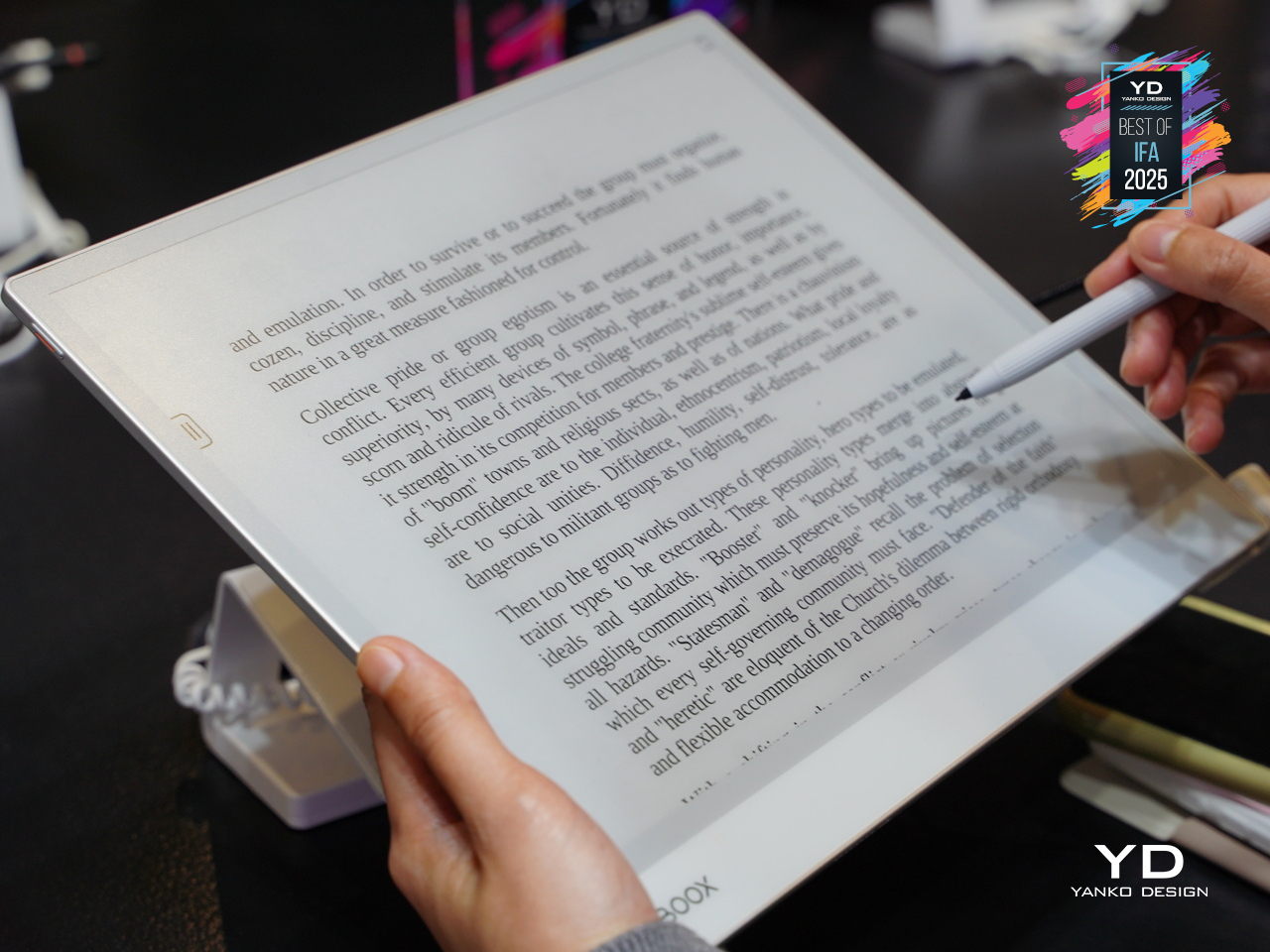
Designer: BOOX

Five Industries Embracing E Ink Innovation

The real magic happens when you see E Ink displays in action across different industries. Each sector has found unique ways to leverage the technology’s strengths, creating products that simply wouldn’t be possible with traditional screens. Here are five concrete examples that show how E Ink is changing the design game.

Laptops: Your Lid Becomes a Canvas

Designer: ASUS

Laptop lids have been boring black rectangles for decades, but E Ink is changing that in fascinating ways. ASUS’s Project Dali concept turns the back of your laptop into a customizable display where you can showcase artwork, display your calendar, or show off your company logo during meetings. It’s like having a digital tattoo for your computer that changes whenever you want it to.

Designer: Lenovo

Lenovo took this concept to market with their ThinkBook 13x Gen 4 SPE, which features an actual E Ink display built into the lid. You can switch between personal artwork during coffee breaks and professional branding during client presentations. The display sips so little power that it barely affects battery life, yet it transforms your laptop from anonymous tech into a personal statement piece.

Transportation: Solar-Powered Information That Actually Works

Public transit signs have always been a nightmare to power and maintain, especially at remote bus stops without electrical connections. Boston’s MBTA solved this problem elegantly by deploying solar-powered E Ink signs throughout the city’s bus stops and Green Line stations. These displays show real-time arrival information, service alerts, and schedules without requiring a single wire to be run.

Designer: MBTA, E Ink

The beauty of these installations becomes obvious during New England winters, when the signs keep working despite snow, ice, and sub-zero temperatures. Solar panels provide enough juice to keep the displays running continuously, while the E Ink technology ensures perfect readability whether you’re squinting through morning glare or trying to read in dim evening light.

Makers: DIY Dreams Made Accessible

The maker community has embraced E Ink displays with the enthusiasm typically reserved for new Arduino boards or 3D printing breakthroughs. Waveshare offers dozens of different E Ink modules that work seamlessly with Raspberry Pi, Arduino, and other popular platforms. Suddenly, creating a custom weather station or smart home dashboard doesn’t require a computer science degree or a massive budget.

Designer: Waveshare

Hobbyists use these displays to build everything from digital art installations to battery-powered information kiosks that can run for months without maintenance. The paper-like appearance means these creations blend naturally into homes and offices, avoiding the harsh, obviously digital look of traditional screens. It’s democratized display technology in ways that would have seemed impossible just a few years ago.

Fashion: Accessories That Change With Your Mood

Fashion has always been about self-expression, but E Ink takes personalization to an entirely new level. The Tago Arc bracelet demonstrates this beautifully, featuring a flexible E Ink display that lets you cycle through hundreds of different patterns using your smartphone. One moment you’re wearing geometric shapes, the next you’re sporting flowing organic patterns that match your outfit perfectly.

Designer: LIBR8TECH

The bracelet never needs charging because it draws power through NFC only when changing patterns. This means you get infinite customization without the hassle of yet another device to plug in every night. It’s the kind of accessory that makes people do double-takes, wondering how your jewelry just changed designs right before their eyes.

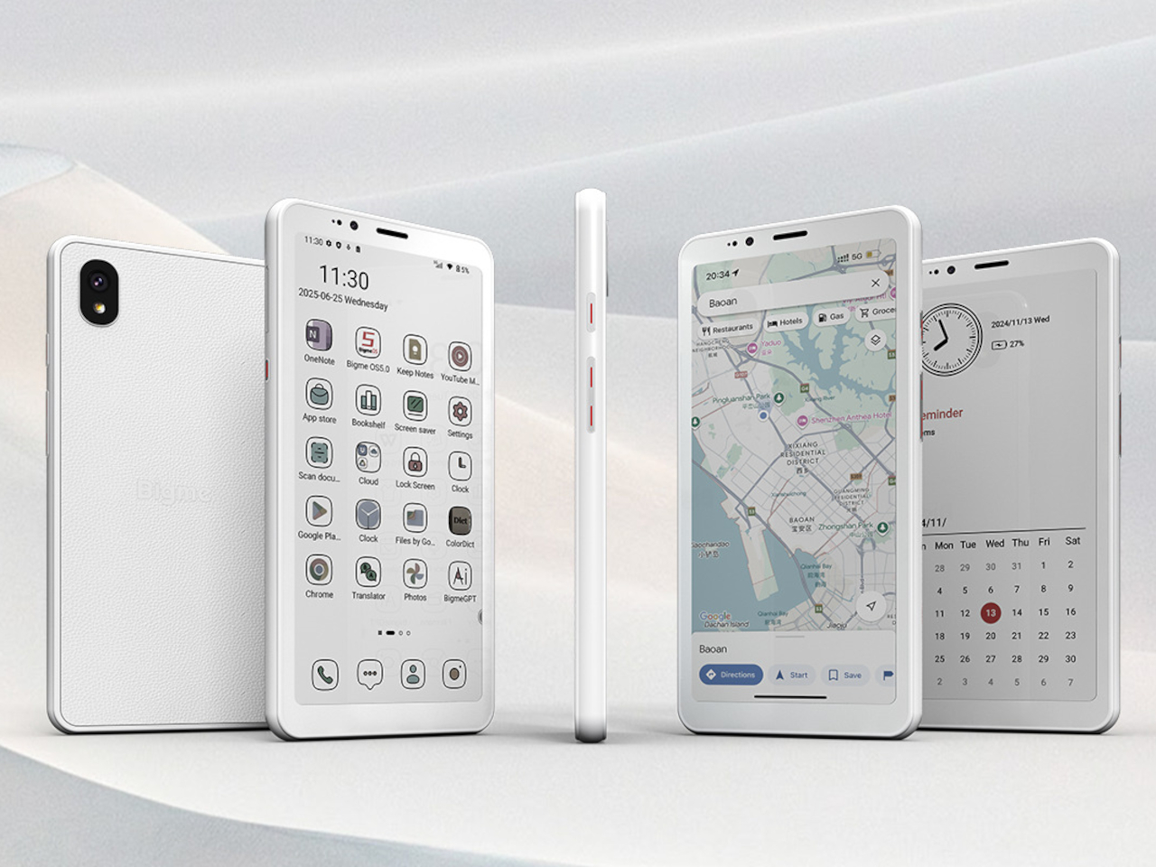
Consumer Electronics: Devices That Respect Your Attention

Designer: reMarkable

E Ink device like the BOOX Note Max and reMarkable Paper Pro Move have created an entirely new category of devices focused on thoughtful interaction. These tablets feel remarkably similar to writing on paper, making them favorites among designers, writers, and anyone who takes handwritten notes seriously. The screens don’t strain your eyes during long reading sessions, unlike their LCD counterparts.

The BOOX Palma takes this concept in a different direction by creating a phone-sized E Ink device that looks and feels like a smartphone but focuses entirely on reading and productivity. This pocket-sized e-reader runs Android, giving you access to reading apps, note-taking tools, and basic communication functions without the distracting elements that make regular smartphones so addictive. It’s like carrying a digital book that happens to connect to the internet, perfect for people who want to stay connected without getting sucked into endless social media scrolling.

Accessibility Revolution

E Ink technology has become surprisingly accessible to individual designers and small companies over the past few years. Development kits and reference designs are readily available from multiple suppliers, while costs have dropped to levels that make experimentation feasible for creative projects and startup ventures. You no longer need deep pockets or specialized engineering knowledge to explore ePaper possibilities.

This democratization has accelerated innovation across multiple industries. Designers can prototype E Ink applications quickly and affordably, leading to creative solutions that might never have emerged from traditional corporate research and development cycles. The growing ecosystem of compatible components and software libraries continues to lower barriers while expanding creative possibilities for everyone.

Designer: Pedro Luraschi

Designer: Ashtf

Technical Progress Continues

Recent advances have addressed many of E Ink’s early limitations while opening up new application areas. Color reproduction has improved dramatically, though it still requires thoughtful design consideration. Refresh rates have increased enough to support interactive applications, while manufacturing improvements have reduced costs and increased reliability across the board.

Research into advanced ePaper technologies continues at a rapid pace. Flexible displays that can fold, roll, or stretch are becoming practical for commercial applications. Integration with touch sensors and other interactive elements keeps improving, making E Ink displays suitable for sophisticated user interface design that goes beyond simple text and images.

Designer: Sony (FES U Watch)

A Different Design Philosophy

E Ink represents a fundamentally different approach to digital interaction, one that prioritizes sustainability, comfort, and thoughtful engagement over flashy visuals and constant stimulation. This philosophy resonates with designers who want to create products that enhance human experience without competing aggressively for attention. The technology encourages restraint and purposefulness in ways that feel refreshing in our cluttered digital landscape.

Products built around E Ink often exhibit a deliberate, focused quality that stands out from the noise. The constraints imposed by the technology force designers to think carefully about essential functions and user needs, often resulting in elegant solutions. The influence of E Ink thinking extends beyond products that actually use the technology, shaping broader conversations about conscious design practices.

As E Ink continues to mature, these ideas will likely influence how we think about digital interaction across many different product categories and industries. The technology has already proven that displays don’t need to be bright, fast, and power-hungry to be effective. Sometimes the best solution involves stepping back from the latest and greatest to focus on what actually serves people well.

Designer: E Ink

The post Top 5 Ways E Ink Displays Are Transforming Modern Design first appeared on Yanko Design.

Solar Winds Wine Tasting Pavilion Imagines Architecture and Energy Flowing Together

Par : JC Torres
6 octobre 2025 à 10:07

Renewable energy systems in commercial architecture often remain hidden behind facades or tucked away on rooftops, treated as necessary but unsightly additions to building design. This approach misses opportunities to celebrate sustainable technology as part of the architectural experience, particularly in industries like wine making, where connection to natural cycles and environmental stewardship could enhance rather than compromise the visitor experience.

The Solar Winds Wine Tasting Pavilion by Michael Jantzen takes a radically different approach to this challenge. This unbuilt concept transforms renewable energy gathering into the starring feature of a winery pavilion, creating a structure where solar panels and wind turbines become sculptural elements that enhance both the building’s beauty and its environmental mission.

Designer: Michael Jantzen

The pavilion’s form immediately captures attention with its flowing series of curved steel panels that sweep across the structure like frozen waves. These panels, formed with two different radii, create a dynamic, undulating canopy that echoes the rolling hills of wine country. The effect feels both organic and futuristic, as if grapevines themselves had inspired a piece of architectural sculpture.

The steel arches and horizontal supports underneath provide the structural framework, clad with glass panels that can automatically open and close for natural ventilation control. This adaptive system allows the pavilion to respond to changing weather conditions while maintaining the flowing aesthetic. An open-air version could eliminate the glass entirely, creating a purely shaded gathering space.

The renewable energy integration becomes part of the visual spectacle rather than hiding in the background. Many of the curved panels incorporate flexible photovoltaic material positioned for optimal sun exposure, generating electricity for both the pavilion and the main winery. Panels without solar cells are painted to match, maintaining the cohesive flowing appearance while providing essential shade for the interior spaces.

Of course, the vertical-axis wind turbine adjacent to the pavilion adds another layer of energy generation and visual drama. The turbine’s sleek profile complements the pavilion’s sculptural form, while the circular bench built around its base creates a contemplative spot for visitors to observe both the technology and the surrounding landscape.

The interior experience feels equally thoughtful, with the curved panels casting intricate, ever-changing shadow patterns across the floor. Visitors can enjoy wine tastings and special events while surrounded by the gentle play of light and shadow, creating an atmosphere that connects them directly to the natural forces powering the building.

That said, the symbolic inspiration runs deeper than mere aesthetics. The trellis-like structure references the fundamental relationship between grapevines and their supporting framework, suggesting that buildings, too, can grow and adapt in harmony with their environment and energy sources.

You’ll notice how this concept challenges conventional approaches to both winery architecture and sustainable design. Rather than treating energy systems as afterthoughts, Jantzen makes them central to the architectural experience, creating spaces where visitors can appreciate both fine wine and the elegant technology that powers their experience.

The Solar Winds Wine Tasting Pavilion invites us to imagine buildings that celebrate their energy sources as proudly as they display their contents. This approach suggests possibilities for architecture that educates, inspires, and delights while advancing environmental goals through visible, beautiful sustainability.

The post Solar Winds Wine Tasting Pavilion Imagines Architecture and Energy Flowing Together first appeared on Yanko Design.

❌
❌