Vue normale

Il y a de nouveaux articles disponibles, cliquez pour rafraîchir la page.
Aujourd’hui — 14 mars 2026Flux principal

Beanue Mini Is the Lamp Your Body Has Been Waiting For

Par : Ida Torres
13 mars 2026 à 22:30

Most lamps do one thing. They turn on. They stay on. And at some point, you turn them off and wonder why your eyes feel like sandpaper or why you cannot fall asleep even though you have been sitting in a dimly lit room for the last hour. Lighting is one of those things we think we understand because we interact with it every day, but most of us have been getting it quietly wrong.

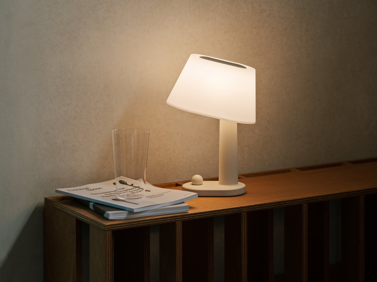
The Beanue Mini, designed by Seoul-based studio BKID co for manufacturer Baelux, is the portable follow-up to the original BAENUE The New Lamp, which collected a Red Dot Design Award in 2023 alongside recognition from Design Plus and the DFA Awards. That first lamp established Dim2Amber® as a genuinely interesting piece of patented lighting technology. The Mini takes that same idea and makes it portable, cable-free, and compact enough to fit in your hand.

Designer: BKID co

Here is what Dim2Amber® actually does, because it matters more than you might think. As you dim the lamp, it does not just reduce brightness. It simultaneously shifts the color temperature from a crisp, clear white toward a warm amber tone. During the day, the light is sharp and cool, the kind that supports focus and keeps you alert. As evening arrives and you begin dimming down, it moves into amber territory, which is the spectrum that does not interfere with melatonin production. Your body reads it as sunset rather than artificial light, and it responds accordingly. You do not have to think about any of this. The lamp does the thinking.

What I find genuinely compelling about this is that it solves a problem most of us did not even have a proper name for. We know that blue light at night disrupts sleep. We know screens are bad close to bedtime. But the lamps sitting on our nightstands, the ones we read by for an hour before bed, are just as much of an issue. Beanue Mini addresses this not through a complicated app or a schedule you have to program, but through the physical act of dimming itself. The adjustment is built into the mechanism. That is an elegant solution.

The design is worth talking about separately from the technology, because it holds its own. BKID went deliberately restrained here. There are no loud angles, no attempt to look futuristic, no material choices that announce themselves as a statement. The silhouette is soft and traditional in shape, almost like a table lamp your grandmother might have owned, except built with the kind of material precision that optimizes how light scatters and reflects through the diffuser shade. That slightly tilted shade is not an aesthetic accident either. It is functional, engineered to distribute light in a way that works whether you are using it as a reading lamp or as ambient mood lighting across a room.

The wireless charging aspect feels almost obvious in retrospect, but it genuinely matters here. The whole point of the Beanue Mini is that it belongs wherever you are. Bedroom, study, hotel room, café table, terrace at dusk. A cord defeats that entirely. Being able to pick it up, carry it, and set it down without negotiating cables is what makes the portability real rather than theoretical.

Looking at the development models photographed alongside the final product, you can see how many iterations BKID worked through to arrive at that little sphere button sitting at the base. It is such a small detail, almost insignificant at first glance, but it anchors the whole interaction. You do not tap the lamp or speak to it. You press a small ball, and that tactile contact feels satisfying in a way that touchscreens rarely do anymore.

Lighting design has been having a slow, quiet renaissance over the past few years. People are paying more attention to how their environments affect their biology, and objects like the Beanue Mini are the natural result of that growing awareness. It is not trying to be a centerpiece or a status object. It is trying to fit into your life and make the light around you better, automatically, without asking anything from you. That might be the most ambitious thing a lamp has ever tried to do.

The post Beanue Mini Is the Lamp Your Body Has Been Waiting For first appeared on Yanko Design.

Old Clothes Never Die, They Just Become Flower Pots

Par : Ida Torres
13 mars 2026 à 14:20

Most of us have a box. Or a bag, or a corner of the closet where clothes go to wait for a fate we haven’t quite settled on yet. Not trash, not donation, just quietly pushed aside. The jeans that stopped fitting but once made you feel unstoppable. The sweater that pilled after three washes but somehow survived four more years. Parting with clothes is harder than it sounds, and the fashion industry has largely treated that emotional gap as a non-problem.

ByBye, a concept designed by Gyeong Wook Kim, Sooa Kim, Gayeon Kim, and Mingyeong Shin, disagrees with that approach in the most literal way possible. It’s a countertop-sized machine that takes your worn and discarded garments and transforms them, through a process of grinding, compression, and heat, into flower pots. Real, usable, actually beautiful flower pots.

Designers: Gyeong Wook Kim, Sooa Kim, Gayeon Kim, Mingyeong Shin

Create your own Aesthetic Render: Download KeyShot Studio Right Now!

I want to sit with that idea for a second, because it’s a genuinely clever reframe of the problem. The designers describe ByBye not as a disposal system but as a “system of reform.” That language matters. When we throw clothes away, the garments disappear. When we donate, we hand off the moral weight to someone else. But ByBye asks you to stay present for the transformation and gives you something physical to show for it.

The mechanics are straightforward but impressively considered. You feed garments into the top opening, which uses a sliding rail mechanism to regulate input and automatically closes once the designated weight is reached. Inside, a shredder breaks the fabric down into fine particles. Those particles are then fed into a flower pot mold, compressed by a pressing plate, and hardened through high-temperature treatment. The finished pots rise up from the molding mechanism. The whole process takes about ten minutes per piece, and a companion app tracks fabric weight, the number of pots produced, and total production time.

What comes out of the machine is genuinely surprising. The pots carry a terrazzo-like texture from the mixed fibers, soft and speckled in muted blues, pinks, and greens depending on the fabric input. They look like something you’d find at a design fair, not something born from a pile of worn-out t-shirts. That aesthetic outcome feels important to the whole concept. If the result were dull or utilitarian, the emotional payoff wouldn’t land. Instead, you end up with an object that holds some trace of the original garment, and then holds a plant on top of that.

The project raises questions I keep turning over. Can the machine handle all fabric types, including synthetic blends that behave very differently under heat and compression? What’s the upper limit on pot durability when working with processed textiles? These feel like the natural next steps for a concept this promising, and I genuinely hope the team is pushing toward them.

What ByBye gets absolutely right is the emotional architecture of the experience. The name alone, a gentle play on “bye bye” and “by” as in made by, signals that this isn’t designed to make you feel guilty about your wardrobe. The copy throughout the project, “Hello? Nice to Wear You,” “Let Your Clothes Begin Again,” reads more like an invitation than an environmental lecture. That tone is rare in sustainable design, which has a tendency to lead with shame rather than possibility.

The designers put it plainly in their project statement: “Not a system of disposal, but a system of reform where clothing is seen again, and made anew.” That’s a design philosophy worth paying attention to. Fashion produces staggering amounts of textile waste every year, and while no home appliance is going to fix that alone, concepts like ByBye shift the conversation in a useful direction. They make the ending feel less like a loss and more like a beginning. Parting with clothes is still going to feel like something. But now it might feel like planting something too.

The post Old Clothes Never Die, They Just Become Flower Pots first appeared on Yanko Design.

À partir d’avant-hierFlux principal

A Maker Just Built A Polaroid Camera for 100x Cheaper Using Thermal Receipt Paper

Par : Ida Torres
10 mars 2026 à 22:30

Remember when instant cameras were magic? You pressed a button, a mechanical whir filled the air, and moments later you were shaking a photo like it owed you money. Polaroid made photography feel like alchemy, turning light into physical memory right in your hands.

The Poor Man’s Polaroid by Boxart brings that instant gratification back using a thermal printer (the same kind that spits out your CVS receipts) and costs less than a cent per print compared to roughly a euro for each Polaroid picture. The name is a bit tongue-in-cheek since the parts actually cost more than the cheapest Polaroid cameras, but the creator clarifies it’s a “fun DIY project, possibly made by poor hands”.

Designer: Boxart

The whole setup is beautifully straightforward. A Raspberry Pi Zero and camera drive a receipt printer, all housed in a 3D-printed case with the guts of a power bank providing juice. Press the button, wait a beat, and out slides your photo on thermal paper. No film cartridges to buy, no wondering if you loaded it correctly, no accidentally exposing your entire pack to light.

Does the image quality match a real Polaroid? Not even close. The photos aren’t the same quality as self-developing film, but they have some charm to them. You get a not-very-good grayscale image on curly paper. But that’s kind of the point. The beauty of instant photography was never really about pristine resolution. It was about immediacy, about physicality, about having something tangible to pin on your wall or slip into someone’s hand.

This project lives in that sweet spot between nostalgia and practicality. Thermal paper might fade over time and the images might look like they came from a 1990s fax machine, but you can shoot hundreds of photos without bankrupting yourself. The economics are almost absurd when you compare it to authentic instant film, which has climbed to luxury pricing in recent years.

I love that this exists because it reminds us that the tools we carry don’t always need to be the most advanced or expensive. Sometimes the joy is in the making itself, in cobbling together a Raspberry Pi, a webcam, and a thermal printer to recreate something that used to cost hundreds of dollars and came from a factory. It’s technology as craft project, gadgetry as personal expression.

The curling thermal paper and grainy output might not win photography awards, but they capture something else: the spirit of experimentation that made instant cameras revolutionary in the first place. Edwin Land didn’t perfect the Polaroid overnight. He iterated, tinkered, and eventually changed how we thought about photography. Boxart’s version might use Python code instead of complex chemistry, but the impulse is the same.

What makes this project particularly appealing is its accessibility. The parts are 3D printed and the code is in Python, meaning anyone with basic maker skills can attempt it. You’re not locked into a proprietary ecosystem or dependent on a company that might discontinue your film stock. You own the entire chain of production, from capture to print.

Sure, you could buy cheap instant print cameras from import sites for less money. But where’s the story in that? Where’s the satisfaction of building something yourself, of understanding exactly how it works, of being able to modify and improve it over time? This isn’t just a camera. It’s a statement about what technology can be when we strip away the branding and the markup and the planned obsolescence.

The Poor Man’s Polaroid won’t replace your smartphone camera or even a proper instant camera if image quality is your priority. But it offers something more valuable: proof that with a little ingenuity and some off-the-shelf components, you can recreate the magic of instant photography on your own terms. And sometimes that curly thermal paper printout means more precisely because you built the machine that made it.

The post A Maker Just Built A Polaroid Camera for 100x Cheaper Using Thermal Receipt Paper first appeared on Yanko Design.

This Hermès x Bialetti Moka Pot Concept Has No Business Looking This Good

Par : Ida Torres
19 février 2026 à 18:20

If you follow concept design on social media, there’s a good chance you’ve already stumbled across Jane Morelli’s work. She’s the designer behind that Lacoste x Bialetti moka pot that went viral not too long ago, and now she’s back with something that somehow manages to feel even more covetable. For the Year of the Horse, she has created a concept coffee set that imagines what a Hermès x Bialetti collaboration could look like, and the result is genuinely breathtaking.

To be clear, this is not a real product. It’s a speculative design concept, an unofficial creative exploration that Morelli put together entirely on her own. Neither Hermès nor Bialetti has signed off on it, and there’s no indication it will ever hit shelves. But that hasn’t stopped the internet from losing its collective mind over it, and once you see it, you’ll understand why.

Designer: Jane Morelli

The concept draws on two things that already go together better than most people realize. Hermès has deep equestrian roots. The brand was originally founded as a harness and saddle workshop, and the horse has been central to its identity ever since. That iconic logo featuring a horse-drawn Duc carriage pays homage to the brand’s equestrian beginnings and still appears on every box and ribbon the brand produces today. So when a designer decides to celebrate the Year of the Horse, Hermès is a natural fit.

Bialetti, meanwhile, has its own kind of cult status. The Moka Express, invented by Alfonso Bialetti in 1933, completely changed how people made coffee at home. That eight-sided stovetop brewer became one of the most recognizable objects in design history, sitting comfortably in the same conversation as the Eames chair or the Anglepoise lamp. It’s Italian, it’s timeless, and it’s on millions of kitchen counters around the world.

Morelli’s concept merges both worlds with a detail-oriented love for both brands that really shows. The moka pot gets the full Hermès treatment: a rich burnt orange body with a cream horse silhouette painted on its side, and a three-dimensional horse figurine standing on top of the lid in place of the usual knob. It’s playful without being loud, sculptural without being impractical. The color palette, that signature Hermès orange paired with warm cream and a cognac brown handle, feels completely at home on a stovetop.

The espresso cup might be the most charming piece of the set. A sculpted horse head forms the top of the handle, with the body flowing down into a ribbed, flowing tail that curves back up to meet the cup. The saucer takes the shape of a horseshoe, with the spoon resting neatly in the groove on one side. Every element has been thought through, which is what sets a great concept apart from a quick render.

The whole set comes presented in a walnut wooden box lined with cream fabric, with “Hermès x Bialetti: Year of the Horse” inscribed on the inside of the lid. Even the packaging looks like something you’d want to display on a shelf rather than throw away. It’s the kind of unboxing experience that luxury brands have mastered, and Morelli has translated that into her concept with impressive accuracy.

What makes this design so compelling is how it sits at the intersection of craft, culture, and storytelling. The Year of the Horse in the Chinese zodiac is associated with energy, freedom, and elegance, all qualities that feel right at home in both the Hermès and Bialetti universes. Morelli didn’t just slap two logos together and call it a day. She built a visual language that feels native to both brands, which is no small feat. It’s a concept, yes. But the best concepts do exactly what this one does: they make you want something that doesn’t exist yet, and they make you wonder why nobody has done it already.

The post This Hermès x Bialetti Moka Pot Concept Has No Business Looking This Good first appeared on Yanko Design.

LEGO Just Built the $90 Snoopy Set Every Peanuts Fan Always Wanted

Par : Ida Torres
19 février 2026 à 15:20

No matter how old we get, most of us would probably still collect things from our favorite characters when we were kids. Some would call it healing our inner child, while others would simply say we now have the money to buy what we want compared to back then. Either way, there’s something undeniably joyful about it. Snoopy is probably one of the most beloved and enduring characters of all time, and if you’re a LEGO lover as well as a fan of this witty beagle, then you’d want to hold on to your roof.

LEGO is releasing a new build for Snoopy fans to celebrate over 75 years of the Peanuts legacy. LEGO Ideas Peanuts: Snoopy’s Doghouse is a 964-piece set that features the iconic dog and his legendary red doghouse. It’s not just a toy, as it’s meant for those who are 18 years old and above. Rather, it’s a display piece that brings together fun, nostalgia, and the unique joy that comes from building something featuring our all-time favorite character.

Designer: LEGO

What makes this set even more special is its origin story. It started as a fan submission on the LEGO Ideas platform, a space where LEGO enthusiasts submit their own brick creations, rally votes from the community, and if they’re lucky, see their dream set come to life. This one was designed by fan creator “bossofdos64,” and after earning enough votes from fellow fans, the LEGO Group worked their magic to make it a reality. So in a way, this set was made by a fan, for fans, and that’s something truly worth celebrating.

The doghouse itself stands over 10 inches high, 6.5 inches wide, and 5.5 inches deep, making it ideal as a statement piece on your shelf or desk. Aside from the iconic red doghouse that even casual fans would recognize anywhere, the set also comes with a posable Snoopy figure. It has two alternative leg builds so you can pose him sitting or standing, and two neck positions so he can be upright or lying down, fully ready for whatever mood strikes you.

A Snoopy scene wouldn’t be complete without Woodstock, his little yellow bird bestie of officially unknown species. The set also includes accessories like a typewriter to give Snoopy his classic writing moments, a campfire with marshmallows for a cozy toasting scene, and a grassy green base to anchor the whole display together. The interior walls of the doghouse can even be folded out to reveal a gorgeous starry night sky backdrop that really sets the mood.

With all these elements, you’ll be able to recreate some iconic scenes to make your Snoopy heart truly happy. You can display him lounging on top of the doghouse with Woodstock resting on his belly, living his best life and, honestly, inspiring us all. You can also pose Snoopy typing away at his little LEGO typewriter, working on that great novel we’re all still waiting for, or have the two besties toasting marshmallows together under a starry sky. The set offers enough variety that you might find yourself rearranging the display every season just because you can.

The LEGO Builder app gives you access to 3D instructions, whether you’re a first-timer or an experienced builder who wants to zoom in, rotate, and track their progress along the way. The set is priced at $89.99 USD, making it a thoughtful splurge or a perfect gift for any Peanuts lover in your life. You can pre-order the set now, and it will start shipping out this June.

Whether you’re building it for yourself or gifting it to someone whose eyes light up at the mere sight of a little black-and-white beagle, this set is a beautiful reminder that some things never get old. Snoopy has been napping on that rooftop, dreaming big, and making us smile for over 75 years, and clearly, he has absolutely no plans of stopping. Good grief, indeed.

The post LEGO Just Built the $90 Snoopy Set Every Peanuts Fan Always Wanted first appeared on Yanko Design.

Virginia Sin’s KEEP Collection Makes Order Look Like Art

Par : Ida Torres
19 février 2026 à 14:20

There’s a certain satisfaction in putting things exactly where they belong. Keys on the hook. Jewelry in a tray. Pens in their place. It sounds mundane, but anyone who’s experienced it knows it’s anything but. I am not the most organized person in the world but whenever I see well-designed stationery or office supplies, I feel the need to get them just to have something interesting looking in my workspace.

Virginia Sin, the Brooklyn-based ceramics designer and founder of SIN, built her latest collection around that very feeling. The KEEP Collection is three pieces: the FORMARA Organizer, the ARCHIVA Tray, and the CACHE Organizer. That’s it. No sprawling lineup, no unnecessary additions. Just three carefully considered ceramic objects designed to hold the small things that tend to scatter across your desk, dresser, or entryway table.

Designer: Virginia Sin

What makes KEEP different from your average catchall tray is how it treats visibility as a feature, not an oversight. The pieces are shaped to encourage intentional placement rather than concealed storage, so your objects remain visible and accessible at all times. The soft curves and contained volumes aren’t just pretty to look at; they’re doing quiet, practical work. Sin described the collection as “a meditation on how form holds space: for objects, for order.” She’s not just making storage. She’s making something you’d want to look at even when it’s empty.

Each piece has its own personality. The FORMARA Organizer ($148) is the most organic of the three. With two gentle compartments flowing side by side, it recalls the shape of a bamboo shoot split open or water running through carved channels. It’s the one you’d reach for when you want your jewelry or hair accessories somewhere beautiful, not just somewhere reachable. It’s perfect to also place some notebooks or paper materials in it since it’s high enough.

The ARCHIVA Tray ($120) takes the opposite approach. Its clean edges and angular planes recall the structure of an architectural model, sharp, balanced, and quietly commanding. At 10.5 inches long, it’s the workhorse of the collection, perfect for corralling pens, notes, or the rotating cast of small objects that always end up on a desk. It looks like something you’d find in a very well-edited design studio, which is exactly the point.

Then there’s the CACHE Organizer ($120), and it might be the most quietly clever of all. Its triangular form transforms what is essentially an everyday fold into something that feels like a gesture. The depth makes it practical for taller items like markers, scissors, or rolled-up sketches, but the shape gives it enough visual presence to hold its own as a sculptural object. At 8.5 inches long and 4 inches tall, it fits comfortably on a nightstand or shelf without demanding attention.

All three pieces are handmade in stoneware at SIN’s Brooklyn studio and finished in a warm bone colorway that sits somewhere between cream and natural clay. The matte finish keeps the focus on form rather than surface, which is the right call. These pieces are about shape doing the heavy lifting.

SIN is no small name in the design world. Virginia Sin’s work has been featured in Architectural Digest, The New York Times, and Goop, and her porcelain paper plates were used at Eleven Madison Park. The KEEP Collection is the latest chapter in a body of work that consistently asks what everyday objects can look like when someone genuinely thinks them through.

The collection lands at exactly the right cultural moment. There’s a growing appetite for owning fewer, better things. Pieces that earn their spot on a shelf. Design that doesn’t shout. KEEP fits that conversation without feeling like it was made for it. The forms feel too considered, too quiet, too genuinely useful to be trend-driven. That’s the mark of design built to last. The KEEP Collection is available now at virginiasin.com.

The post Virginia Sin’s KEEP Collection Makes Order Look Like Art first appeared on Yanko Design.

Someone Finally Made Video Meetings Look Like a Game Console

Par : Ida Torres
8 février 2026 à 20:15

There’s something deeply satisfying about watching designers take a swing at corporate boredom. Fevertime, a recent collaboration by Dugyeong Lee, Gyeong Wook Kim, MyeongHoon Cheon, and Dayong Yoon, does exactly that by transforming the typical video conference setup into something that looks like it belongs in a mid-80s arcade.

The concept is deceptively simple: what if meetings felt less like mandatory Zoom rectangles and more like gathering around a shared screen? The team created a physical meeting system inspired by retro game consoles, complete with a bright red spherical camera perched on a stand like some cheerful robot companion, and a base unit that wouldn’t look out of place next to your old Nintendo. There are even cartridge-style slots and that unmistakable game controller aesthetic, all rendered in a palette of scorched red, neon accents, and soft grays.

Designers: Dugyeong Lee, Gyeong Wook Kim, MyeongHoon Cheon, dayong Yoon

But this isn’t just nostalgia bait. The designers identified a real problem with modern collaboration tools: everyone staring at their own screens creates this weird isolation, even when you’re supposedly “together” in a virtual room. Fevertime flips that script by projecting content onto a shared surface, encouraging actual eye contact and spatial awareness. The physical device becomes a focal point, something to gather around rather than disappear behind.

The system lets users set up meetings in advance, defining time, participants, and structure before anyone logs on. When the session starts, participants can instantly share content from their personal devices onto the collective display. Everything stays synced and visible to everyone simultaneously. No more “Can you see my screen?” or fumbling through share settings while everyone waits. The interface shows meeting cards, schedules, and project data in a clean, modular layout that feels more like organizing a playlist than managing corporate logistics.

What makes Fevertime visually compelling is how committed it is to the gaming metaphor. The red sphere isn’t trying to look sleek or invisible like most tech hardware. It wants to be noticed. It practically begs to be the conversation starter in the room. The cartridge system for what appears to be different meeting modes or templates plays into that collectible, tactable quality that made physical media so satisfying. You’re not just clicking through digital menus; you’re handling objects, sliding things into slots, physically engaging with the technology.

The UI design carries that same energy. Bright pink highlight screens pop against neutral backgrounds. Typography is bold and condensed, channeling the space constraints of old arcade cabinets where every pixel counted. Cards and modules feel like game level selects or achievement screens. There’s a playful confidence in the branding, with the Fevertime logo rendered in that wavy, almost melting typography that suggests heat and intensity without being aggressive.

The designers describe the project as capturing “a single moment of high-intensity creative output,” that fever state when an idea finally clicks and everything flows. That philosophy shows up in the pulsing, breathing quality of the custom lettering, where font weights fluctuate to create visual rhythm. It’s design that refuses to sit still, much like the creative process it’s trying to facilitate.

From a product design perspective, Fevertime sits in that interesting space between speculative concept and plausible near-future tech. The physical components look production-ready, with thoughtful details like ventilation ridges on the base unit and a weighted stand for the camera sphere. But there’s also a conceptual boldness here, a willingness to say “what if meeting technology looked completely different from what we’re used to?”

The team used Adobe’s creative suite to develop the project, combining Photoshop and Illustrator for the identity work with After Effects for motion elements. That mix of static and animated content gives Fevertime a kinetic presence even in still images. You can imagine the interface cards sliding, the logo pulsing, the whole system humming with that arcade-ready energy.

Whether Fevertime ever makes it to market is almost beside the point. As a design exercise, it asks useful questions about how we physically and emotionally experience collaboration technology. It challenges the assumption that workplace tools need to look serious and minimal. And it demonstrates how pulling from gaming culture can make even something as mundane as meeting software feel fresh and approachable. Sometimes the best design projects are the ones that make you think, “Wait, why doesn’t everything look like this?”

The post Someone Finally Made Video Meetings Look Like a Game Console first appeared on Yanko Design.

This Chair Looks Skeletal But That’s Exactly the Point

Par : Ida Torres
8 février 2026 à 14:20

There’s something satisfying about watching minimalism meet function in furniture design, and Denis Zarembo’s Insero Chair does exactly that with an unexpected twist. Based in Moscow, Zarembo has created a piece that challenges how we think about sitting, proving that sometimes the most interesting designs come from playing with basic shapes in not-so-basic ways.

The Insero Chair isn’t trying to reinvent the wheel. Instead, it’s reimagining the seat, backrest, and frame through a lens of geometric precision that feels both contemporary and surprisingly timeless. What makes this design stand out on Behance, where it’s already racked up dozens of appreciations and hundreds of views, is how it balances visual lightness with structural integrity.

Designer: Denis Zarembo

At first glance, the chair appears almost skeletal. Clean lines intersect at deliberate angles, creating a framework that looks like it could have been sketched in a single, confident stroke. But look closer and you’ll notice the thoughtfulness behind each junction point, each curve, each decision about where material exists and where it’s been carved away. This isn’t minimalism for minimalism’s sake. It’s reduction with purpose.

The name “Insero” comes from Latin, meaning “to insert” or “to place within,” which gives us a clue about Zarembo’s design philosophy. The chair seems to explore the relationship between positive and negative space, between what’s there and what’s deliberately absent. The seat appears to nestle within the frame rather than simply sit on top of it, creating an integrated whole that feels more like sculpture than traditional furniture.

What’s particularly clever is how the design manages to look both delicate and sturdy. The slender proportions suggest lightness and mobility, which is increasingly important in our flexible living spaces where furniture needs to work harder and move more freely. Yet the geometric construction hints at strength, with forces distributed through the frame in ways that are as much about engineering as aesthetics.

The chair exists at that sweet spot where industrial design meets art object. You could absolutely see it in a modern apartment or a minimalist office, but you could just as easily imagine it cordoned off in a design museum, being studied for its formal qualities. That dual nature is what makes pieces like this so compelling. They don’t just serve a function; they start conversations.

Zarembo’s work fits into a larger tradition of designers who understand that chairs are never just chairs. They’re statements about how we live, how we work, how we relax. From Charles and Ray Eames to contemporary makers pushing digital fabrication techniques, chair design has always been a proving ground for new ideas. The Insero Chair continues that lineage while speaking in a distinctly current visual language.

The rendering quality also deserves mention. The way Zarembo has presented the chair on Behance shows it from multiple angles, letting viewers appreciate how the geometry shifts depending on perspective. Sometimes it looks almost two-dimensional, like a line drawing come to life. From other angles, the complexity reveals itself, showing depth and dimension you might not initially expect. This careful presentation isn’t just about showing off. It’s essential for understanding how the piece actually works in three-dimensional space.

There’s no information yet about whether the Insero Chair will move into production, but that’s almost beside the point. Concept furniture serves an important role in pushing the conversation forward, in asking “what if?” even when “when?” remains unanswered. These designs influence other makers, spark ideas, and gradually shift our collective sense of what’s possible.

For anyone interested in where contemporary furniture design is heading, pieces like the Insero Chair offer valuable clues. We’re seeing a move away from bulky, overwrought designs toward cleaner silhouettes that don’t sacrifice comfort or functionality. We’re seeing digital tools enable precision that would have been difficult or impossible with traditional methods. And we’re seeing designers like Zarembo who understand that good design doesn’t shout. It speaks clearly, confidently, and leaves room for you to fill in the meaning yourself.

Whether the Insero Chair ends up in living rooms or remains in the realm of conceptual exploration, it’s already doing what good design should: making us look twice, think differently, and reconsider something as everyday as where we choose to sit.

The post This Chair Looks Skeletal But That’s Exactly the Point first appeared on Yanko Design.

This Award-Winning Pen Floats Like a Cloud on Your Desk

Par : Ida Torres
3 février 2026 à 16:20

Remember the last time you picked up a pen and actually stopped to look at it? Most of us don’t. We grab whatever’s lying around, scribble a note, and move on with our day. But designer Leila Ensaniat is challenging that autopilot relationship we have with one of our most familiar tools. Her creation, Pulse, recently snagged the Golden A’ Design Award for 3D Printed Forms and Products, and it’s easy to see why this isn’t your average ballpoint.

Pulse is what Ensaniat calls a “floating pen,” and that description actually makes sense once you see it. Drawing inspiration from the quiet, effortless drift of clouds, the pen feels less like a writing instrument and more like a small sculptural moment on your desk. It’s the kind of object that makes you pause, which is pretty rare when we’re talking about something as mundane as a pen.

Designer: Leila Ensaniat

What makes this design really interesting is how it blends old-school craftsmanship with cutting-edge technology. The pen features biomorphic patterns that look like they grew organically rather than being designed, and they’re created using lost wax casting in aluminum, silver, bronze, and gold. That’s a centuries-old metalworking technique typically reserved for jewelry and art pieces, not everyday writing tools. But that collision of traditional craft and contemporary design thinking is exactly what gives Pulse its unique character.

Ensaniat, who has a background as an industrial designer at Cisco specializing in consumer electronics, brings a tech-world sensibility to object design. Her approach centers on human-centered design, which basically means she’s thinking hard about how we actually interact with objects rather than just how they look on a shelf. With Pulse, that philosophy translates into something that feels natural in your hand while also making you reconsider what a pen can be.

The surface treatments are particularly thoughtful. Those nature-inspired patterns aren’t just decorative, they enhance both the visual appeal and the tactile experience of holding the pen. It’s a detail that matters more than you’d think. When an object feels good to touch, when it has texture and weight that seems intentional, it changes your relationship with it. You’re more likely to keep it on your desk, to reach for it specifically, to actually care about this tool that usually gets treated as disposable.

What’s fascinating about Pulse is how it sits at the intersection of sculpture and utility. The design explores that balance between being something you want to look at and something you actually need to use. Plenty of designer pens lean too hard into the luxury angle and end up feeling precious and impractical. Others focus purely on function and look forgettable. Pulse seems to nail that middle ground where form and function aren’t competing, they’re collaborating.

The project also gave Ensaniat deeper insight into the metal finishing and plating industry, which might sound technical but is actually important. Understanding how materials behave, how different metals can be worked and finished, how surface treatments hold up to actual use, that knowledge separates decorative design from functional design. A beautiful pen that tarnishes after a week or feels unbalanced when you write isn’t really good design, it’s just good marketing.

Created for her brand N I L A, which focuses on integrating technology seamlessly into everyday life, Pulse represents a broader design philosophy about making thoughtful, human-centered objects that solve real problems while also being distinct and meaningful. It’s an approach that feels increasingly relevant as we’re surrounded by more and more identical mass-produced stuff. Pulse won’t revolutionize how we write, and it’s not trying to. But it does suggest that even the most familiar, seemingly finished objects in our lives still have room for fresh thinking. Sometimes all it takes is a designer willing to ask why something has to be the way it’s always been, then having the skill to actually answer that question with something better.

The post This Award-Winning Pen Floats Like a Cloud on Your Desk first appeared on Yanko Design.

This New Sofa Compresses Like an Accordion (Fits in Your Cart)

Par : Ida Torres
3 février 2026 à 11:07

Remember when buying a sofa meant measuring doorways, hoping it would fit in the elevator, and bribing friends with pizza to help you haul it up three flights of stairs? Designer Yuqi Wang just made all of that obsolete with the Accordion Modular Sofa, and the concept is as brilliant as it sounds.

The whole design centers on one genius idea: what if you only needed one type of module to create any sofa configuration you could imagine? The Accordion does exactly that with a single base unit that compresses and expands like its musical namesake. Through an internal structure made from high-resilience foam, wooden side panels, climbing ropes, and adjustable knobs, each module can change its size and curvature to fit whatever space you’re working with.

Designer: Yuqi Wang

What makes this really clever is how it solves multiple problems at once. Traditional modular sofas usually require you to buy different shaped pieces (corner units, armrests, middle sections) and hope you’ve guessed right about what you need. With the Accordion system, you’re working with identical modules that transform as needed. Want a compact loveseat for your apartment? Use two modules. Need a sprawling sectional for your living room? Add more units and configure them however you like. The possibilities aren’t just numerous, they’re practically endless.

But here’s where it gets even better. Because these modules compress, the whole thing ships flat-packed in a way that actually makes sense. We’re talking small enough to literally place in a shopping cart and carry out yourself. No more waiting weeks for delivery windows or paying outrageous shipping fees. The compression feature dramatically cuts down on packaging waste, storage costs, and the carbon footprint of transportation. It’s the kind of sustainable design choice that doesn’t require you to sacrifice anything in return.

The inspiration came from watching an accordion player perform, where Wang noticed how the instrument’s bellows compress and expand with such fluidity. That rhythmic movement translated into furniture creates something that feels almost alive, like the sofa adapts to you rather than the other way around. The technical execution involved studying compression mechanisms from various industrial applications before landing on a prototype that was both simple and effective.

For anyone who’s moved apartments multiple times or likes to rearrange furniture seasonally, this is a game changer. Your sofa can literally grow or shrink with your needs. Hosting a party? Expand it. Need more floor space for a home workout? Compress it down. The adjustable knobs make reconfiguring straightforward enough that you won’t need tools or an engineering degree.

The design world has taken notice. The Accordion Modular Sofa won the Golden A’ Design Award in Furniture Design for 2025, one of the most prestigious recognitions in the field. This isn’t just a participation trophy either. The Golden award represents first-rate, outstanding design that genuinely advances the intersection of art, science, and technology. What’s exciting is that this isn’t some far-off concept. The sofa is scheduled to hit the market in October 2025, which means you could actually have one of these in your home soon. It represents a shift in how we think about furniture ownership, moving away from bulky investments that lock you into one configuration toward adaptable pieces that evolve with your lifestyle.

The Accordion Modular Sofa proves that innovative design doesn’t have to be complicated or precious. Sometimes the best ideas are the ones that make you wonder why nobody thought of them sooner. A sofa that compresses for transport, expands for comfort, and reconfigures endlessly from a single module type? That’s the kind of practical magic that makes design truly great.

The post This New Sofa Compresses Like an Accordion (Fits in Your Cart) first appeared on Yanko Design.

Why This Air Conditioner Filter Took Design Cues from Your Toolbox

Par : Ida Torres
3 février 2026 à 09:45

Let me tell you about something that caught my eye recently. When was the last time you actually looked forward to cleaning your air conditioner filter? Yeah, I thought so. But the folks at ZHEJIANG ZHONGGUANG ELECTRICAL CO.,LTD have done something pretty clever that might change how we think about one of home maintenance’s most tedious tasks. Their Snapcool air conditioner just won a Golden A’ Design Award, and here’s why it deserves your attention.

Picture a tape measure. You know that satisfying feeling when you pull out the metal strip and it snaps back into place with a smooth click? Now imagine that same mechanism applied to your AC’s filter system. That’s exactly what the design team behind Snapcool did, and the result is both practical and surprisingly delightful.

Designer: ZHEJIANG ZHONGGUANG ELECTRICAL CO.,LTD

The whole concept flips conventional air conditioner design on its head. Most AC units hide their filters behind awkward panels that require tools, patience, and sometimes a bit of cursing to remove. Snapcool mounts its filter system on the side, where it slides in and out with the ease of extending a measuring tape. This isn’t just about making maintenance easier (though it definitely does that). It’s about turning a chore into something almost fun.

What really makes this design sing is the eye-catching orange filter compartment. It’s not just there to look cool, though it certainly does that. The bold color serves as a constant visual reminder to check your filter status, which means you’re more likely to keep up with maintenance and enjoy better air quality. It’s the kind of thoughtful detail that shows someone actually considered how people interact with these machines in real life, not just in a sterile testing environment.

The aesthetics matter here too. Traditional air conditioners tend to be those white boxes we tolerate but don’t exactly love. Snapcool breaks that mold with its sleek, modern shape that actually looks like it belongs in a contemporary home. There’s something inherently futuristic about its design language. It feels less like an appliance and more like a piece of tech you’d actually want to show off. This project came to life through collaboration between six team members: Jinghong Zhang, Yuxin He, Menglin Xie, Yuhui Xu, Haiping Hou, and Xiaojun Yuan. Their collective vision demonstrates what happens when designers stop treating home appliances as purely functional objects and start seeing them as opportunities for innovation and delight.

The recognition from the A’ Design Award isn’t just a trophy for the mantle. It’s validation of a broader shift happening in product design right now. We’re moving away from the idea that utilitarian objects should be invisible or purely functional. Instead, designers are asking why everyday items can’t be both beautiful and practical, why they can’t spark a little joy even as they perform mundane tasks.

ZHEJIANG ZHONGGUANG ELECTRICAL CO.,LTD, operating under their OUTES brand, has been building a reputation for integrated climate control solutions across hotels, universities, factories, and residential buildings. This isn’t their first rodeo with design excellence either. They’ve racked up six A’ Design Awards, proving that Snapcool isn’t a fluke but part of a consistent commitment to pushing boundaries in HVAC design.

What strikes me most about Snapcool is how it challenges our assumptions. We’ve collectively decided that air conditioners should be forgettable white boxes tucked into corners. But why? There’s no rule that says climate control can’t have personality. There’s no law stating that filter maintenance must be annoying. The tape measure inspiration is genius because it’s so obvious in hindsight. We’ve had this perfectly functional, satisfying mechanism sitting in our tool drawers for decades, and it took creative thinking to realize it could solve a problem in a completely different context.

Snapcool represents a future where even the most utilitarian objects can bring a smile to our faces. Where maintenance becomes less of a burden and more of an experience. Where our living spaces are populated by thoughtfully designed products that respect both our intelligence and our desire for beauty. Sometimes the best innovations aren’t about inventing something entirely new. They’re about looking at old problems through fresh eyes and borrowing brilliance from unexpected places.

The post Why This Air Conditioner Filter Took Design Cues from Your Toolbox first appeared on Yanko Design.

This $175 Bike Stand Finally Solved Our Garage Storage Mess

Par : Ida Torres
1 février 2026 à 16:23

If you own a bike, you’ve probably played the garage Tetris game at least once. You know the drill: your bike leans against a wall, falls over at 2 AM with a crash, or blocks the path to literally everything else you need. It’s the kind of everyday design problem that makes you wonder why nobody’s come up with something better.

Well, someone finally has. British industrial designer George Laight created the Flip, a freestanding bike stand that’s so cleverly designed, it makes you question why we’ve been settling for wall hooks and pulley systems all this time.

Designer: George Laight for BikeStow

The origin story is pretty relatable. Laight was studying Product Design Engineering at Loughborough University when he hit a wall, literally and figuratively. He had a bike and a tiny student flat with a strict no-holes-in-the-walls policy. Vertical storage made the most sense for his cramped space, but he couldn’t use traditional wall-mounted solutions without losing his security deposit. So he did what any frustrated design student would do: he invented his own solution.

The Flip is essentially a portable bike stand with wheels that lets you store your bike vertically or horizontally, depending on what works for your space. The genius is in its flexibility. Unlike fixed storage solutions that require you to commit a specific area of your garage or apartment to bike storage forever, the Flip rolls around wherever you need it. Cleaning out the garage? Wheel it aside. Reorganizing your storage shed? Move it in seconds. It’s bike storage that adapts to your life instead of demanding you work around it.

Here’s how it works: you roll your bike into the stand while it’s in the horizontal position, then rotate it upright if you want vertical storage. There’s a slider mechanism that locks the bike in place, keeping it stable in either orientation. The wheels on the base make maneuvering surprisingly easy, even in tight spaces. And when you’re not using it at all, the entire stand folds flat for storage.

That last feature is particularly brilliant for anyone dealing with limited space. Heading out on a bike trip and your bike won’t be home for a week? Fold the stand flat and tuck it away. Living in a city apartment where every square foot counts? Same deal. The Flip essentially disappears when you don’t need it, which is more than you can say for permanent wall hooks or ceiling-mounted systems.

The stand is made from plywood, giving it a clean, modern aesthetic that doesn’t look out of place in contemporary homes. Customer reviews consistently mention that it’s attractive enough to display openly, whether you’re storing your bike in a hallway, office, or living space. One reviewer specifically noted that they’re “more than happy to have it on display in the office, with or without a bike in it.”

The Flip works with pretty much any bike you throw at it: road bikes, mountain bikes, electric bikes, even fat bikes with tires up to five inches wide. Multiple stands can be nested close together if you’ve got a household with several bikes, creating an organized parking area that doesn’t devolve into the usual tangled-handlebars chaos.

At around $175, it’s not the cheapest bike storage option out there, but it’s also significantly more versatile than a basic wall hook. BikeStow backs it with a two-year warranty and includes a custom Restrap securing strap to keep your bike stable. Customer ratings sit at a perfect five stars, with reviewers praising both its functionality and build quality.

Most bike storage solutions fall into two categories: cheap and flimsy, or expensive and permanent. The Flip occupies an interesting middle ground. It’s well-made and thoughtfully designed, but it doesn’t require you to drill holes in your walls or dedicate a chunk of your home to bike storage forever. It’s the kind of practical, human-centered design that solves a real problem without creating new ones.

For anyone tired of tripping over their bike or playing storage Tetris every time they need garage space, the Flip offers a refreshingly simple solution. Sometimes the best designs aren’t revolutionary, they just make everyday life a little bit easier.

The post This $175 Bike Stand Finally Solved Our Garage Storage Mess first appeared on Yanko Design.

When Your Speaker Is Also a Statement: The Tresound Mini

Par : Ida Torres
1 février 2026 à 14:20

Sometimes the best tech isn’t the loudest. It’s the one that makes you pause and actually look at it before you press play. That’s what designers Yong Cao and Jianfeng Lv have managed to pull off with the Tresound Mini, a desktop Bluetooth speaker that refuses to be just another black box on your desk.

At first glance, this compact speaker looks like it wandered in from a modern art gallery. Its cone-shaped design is clean, almost architectural, with a minimalist aesthetic that feels intentional without being precious about it. The form isn’t just for show, either. TRETTITRE, the emerging HiFi brand behind the speaker, describes itself as bridging traditional audio quality with something more forward-thinking, and you can see that philosophy at work here.

Designers: Yong Cao and Jianfeng Lv

The Tresound Mini recently won the Golden A’ Design Award in the Audio and Sound Equipment Design category, which is one of those achievements that signals serious design cred. But awards aside, what makes this speaker interesting is how it thinks about the desktop experience differently. Instead of trying to dominate your workspace with aggressive angles or flashy lights, it takes a more refined approach. The design integrates seamlessly into your environment, whether that’s a home office setup, a creative studio, or just a corner of your apartment where you actually get things done.

Art Director Yong Cao and Designer Jianfeng Lv, both from China, approached this project with a focus on what they call the “deep integration of brand design and product design”. That sounds like design speak, but what it really means is that every element serves a purpose. The cone shape isn’t arbitrary. It contributes to the audio performance while also giving the speaker a distinctive profile that stands out without screaming for attention. It’s the kind of design that works equally well in a carefully curated Instagram photo or just sitting there doing its job.

Let’s talk about the packaging, because this is where things get genuinely clever. Instead of going with the typical cardboard box and foam inserts, the Tresound Mini comes with a carrying bag that’s wet-pressed from bamboo fiber pulp. This isn’t just packaging in the traditional sense. It’s designed to double as a carrying case, making the speaker genuinely portable. The bamboo fiber approach is both environmentally friendly and cost-effective, reducing packaging waste while providing actual protection for the product. It’s the kind of thoughtful detail that shows someone was actually thinking about the full lifecycle of the product, not just the unboxing moment.

The portability factor is key here. Desktop speakers traditionally live in one spot, tethered to your workspace. But the Tresound Mini was designed with the understanding that people move around now. You might want it on your desk in the morning, out on a balcony in the afternoon, or in your kitchen while you’re cooking dinner. The compact size and that bamboo fiber carrying bag make that kind of flexibility possible.

TRETTITRE positions itself as catering to “the new generation of HiFi enthusiasts”, which is a smart read of where audio culture is heading. There’s a growing audience that cares about sound quality but doesn’t want to sacrifice design or deal with the bulk and complexity of traditional HiFi setups. They want something that sounds good, looks intentional, and fits into spaces that might not have room for a full speaker system. The Tresound Mini seems built specifically for that demographic.

What’s interesting about this design is how it challenges the assumption that good audio equipment needs to look technical or industrial. There’s no display screen, no visible screws, no aggressive branding. Just a clean geometric form that happens to deliver quality sound. It’s the audio equivalent of those minimal tech accessories that proved you don’t need to sacrifice aesthetics for function.

The success of the Tresound Mini might signal a broader shift in how we think about desktop audio. As more people work from home or create hybrid living and working spaces, there’s an appetite for products that perform well without dominating the visual landscape. We want our tech to be good at what it does, but we also want it to feel like it belongs in our actual lives, not in a showroom.

Yong Cao and Jianfeng Lv have created something that manages to be both functional and thoughtful. The Tresound Mini proves that when you approach product design with real consideration for how people actually use things, you can create something that transcends its basic function and becomes worth talking about.

The post When Your Speaker Is Also a Statement: The Tresound Mini first appeared on Yanko Design.

Your Dog Can Now Turn On the Lights (No, Really)

Par : Ida Torres
31 janvier 2026 à 20:15

We’re living through a strange moment where our refrigerators are smarter than ever, our thermostats learn our habits, and now, apparently, dogs can control household appliances. The Dogosophy Button, developed by researchers at The Open University’s Animal-Computer Interaction Laboratory, is a wireless switch designed specifically for canine use. Think of it as a smart home device, but instead of asking Alexa, you’re teaching your golden retriever.

This isn’t some novelty gadget cooked up to go viral on TikTok. The button is the result of years of serious research led by Professor Clara Mancini, who runs the ACI Lab. Initially created for assistance dogs who need to help their owners turn on lights, fans, or kettles, the button has now been launched to the public for any dog owner who wants to give their pet a bit more agency. The philosophy behind it, called “Dogosophy,” centers on designing technology around how dogs actually experience the world, rather than forcing them to adapt to our human habits.

Designer: The Open University’s Animal-Computer Interaction Laboratory

So what makes this button dog-friendly? Start with color. Dogs see the world differently than we do, and blue happens to be one of the colors they can recognize most clearly. The button’s push pad is a bright blue, set against a white casing that creates high contrast, making it easier to spot against floors, walls, or furniture. The slightly curved, raised shape means dogs can press it from various angles without needing pinpoint accuracy, which anyone who’s watched a dog enthusiastically miss their water bowl can appreciate.

The button itself is built to handle the reality of being used by an animal. The outer casing is sturdy plastic designed to withstand repeated nose-booping and paw-whacking. The push pad has a textured surface that helps dogs grip without slipping, whether they’re using their snout or paw. Inside, a small light flashes when the button is pressed, soft enough not to hurt their eyes but clear enough to confirm the action worked. It’s the kind of thoughtful design that comes from actually studying how dogs interact with objects, not just shrinking human tech down to pet size.

The system is refreshingly simple. Each set includes the button, a receiver, and basic mounting hardware. The receiver plugs into whatever appliance you want your dog to control, from a lamp to a fan to a kettle. The button connects wirelessly up to 40 meters away, giving you flexibility in where you place it. Press the button once, the appliance turns on. Press it again, it turns off. No app required, no monthly subscription, no “please update your firmware” notifications.

For assistance dogs, this kind of tool is genuinely useful. A dog trained to help someone with mobility issues could turn on a light when their owner enters a dark room or switch on a fan during hot weather. But the public release opens up more playful possibilities. Your dog could theoretically learn to turn on a fan when they’re overheated, activate a toy dispenser when they’re bored, or signal when they want attention by flipping a lamp on and off like a furry poltergeist.

Of course, training matters. Professor Mancini tested the button with her own husky, Kara, noting that huskies are notoriously stubborn compared to more biddable breeds like Labradors. The button works if your dog is motivated and you’re patient. This isn’t plug-and-play; it’s more like plug-and-train-with-treats-and-repetition.

The Dogosophy Button is priced at £96 (including VAT) and is currently available through retailers like Story & Sons. Whether it becomes a legitimate tool for pet owners or just an interesting experiment in animal-computer interaction remains to be seen. But there’s something appealing about the idea of designing technology that considers more than just human needs. Professor Mancini puts it plainly: humans have built a world measured for ourselves, often pushing other species out. A button that meets dogs on their terms feels like a small step toward sharing space more thoughtfully.

The post Your Dog Can Now Turn On the Lights (No, Really) first appeared on Yanko Design.

This Award-Winning Bookstore Looks Like a Portal to Outer Space

Par : Ida Torres
31 janvier 2026 à 14:20

Picture walking through a bustling marketplace in China and suddenly stumbling upon what looks like a giant celestial machine that’s crashed through the ceiling. That’s exactly the vibe designer Li Xiang was going for with the Huai’an Zhongshuge Bookstore, and let me tell you, this place is absolutely wild.

Located in Jiangsu Province and completed in 2023, this isn’t your typical cozy corner bookshop with reading nooks and potted plants. Instead, Li Xiang of X+Living studio created something that feels like you’ve stepped through a portal into another dimension. The bookstore just snagged the 2025 Platinum A’ Design Award in Interior Space and Exhibition Design, which is basically the design world’s way of saying “this is incredibly special.”

Designer: Li Xiang

What makes this space so mind-blowing? It’s all about those massive three-dimensional structures that look like astronomical instruments floating inside the store. Imagine concentric rings and geometric forms inspired by celestial mechanics, all reimagined as bookshelves and display areas. The books themselves seem to defy gravity, positioned on these dramatic structures in ways that make you feel like you’re browsing a library floating somewhere in deep space.

But here’s the thing that really gets me about this design. Li Xiang didn’t just want to create something that looked cool for Instagram (though it absolutely does). There’s a deeper philosophy at work here. He describes the project as tearing open a spacetime rift in the midst of everyday city life, which sounds dramatic but actually makes total sense when you think about it.

Li Xiang believes that in our fast-paced modern world, many people have lost the ability to dream. We get stuck in routines, moving through identical concrete cityscapes, dealing with the mundane realities of daily life. His idea was to create a space where people could detach from all that, even just briefly, and rediscover something more imaginative within themselves. As he puts it, the architectural space becomes an extension of dreamlike reality, a spiritual revelation suspended above the ordinary city below.

That’s pretty powerful stuff for a retail space, right? But it works because the design truly commits to the concept. Those exaggerated celestial forms aren’t just decoration. They break up the monotony of reinforced concrete and rectangular spaces that dominate urban architecture. When you’re surrounded by these cosmic structures, your brain kind of has no choice but to shift gears and enter a different mental space.

What I really appreciate is how this fits into the broader Zhongshuge philosophy. This bookstore chain follows a principle of “chain but not replicate, each store with its own cultural style.” So while there are other Zhongshuge locations across China, each one tells its own story and creates a unique experience. The Huai’an location chose to go full sci-fi spectacular, and the results speak for themselves.

From a technical standpoint, pulling this off wasn’t simple either. The project had to overcome some seriously complex spatial and structural challenges to create that feeling of cosmic vastness within what’s actually a confined retail area. Those massive rings and irregular geometric forms needed precise engineering to work safely while maintaining that surreal, gravity-defying aesthetic.

There’s something really special about seeing retail design pushed this far. We’re used to stores being functional, maybe pleasant, occasionally stylish. But Li Xiang took a different approach entirely, creating an environment that prioritizes experience and emotion over conventional retail logic. It’s architecture that values your mental space, that wants you to feel something beyond just the transaction of buying books.

If you’re someone who gets excited about the intersection of design, technology, and culture, this bookstore represents something important. It shows us that commercial spaces don’t have to be boring or predictable. They can be destinations, experiences, even forms of art that make us think differently about the everyday spaces we move through. And maybe, just maybe, they can help us remember how to dream a little.

The post This Award-Winning Bookstore Looks Like a Portal to Outer Space first appeared on Yanko Design.

Aerospace Engineers Just Solved Your Messy Nightstand Problem

Par : Ida Torres
22 décembre 2025 à 14:20

You know that thing where you walk into your bedroom at the end of the day and just start emptying your pockets onto whatever flat surface is closest? Keys land on the dresser, wallet gets tossed on the nightstand, watch goes who knows where. It’s a universal ritual of coming home, and it’s exactly the kind of everyday moment that aerospace engineers Javier De Andrés García and Anaïs Wallet decided to redesign.

Their brand, Unavela, takes the precision and intentionality of aerospace engineering and applies it to the mundane objects we interact with daily. The Unavela Valet Tray is a perfect example of this philosophy: it’s a catchall that doesn’t just catch, it elevates the entire experience of organization into something that feels considered and purposeful.

Designers: Javier De Andrés García, Anaïs Wallet (Unavela)

What makes this particularly interesting is the design pedigree behind it. De Andrés García and Wallet aren’t your typical product designers who sketch pretty shapes and call it a day. They come from a world where every gram matters, where form follows function with almost religious devotion, and where materials are chosen based on performance characteristics rather than trends. When aerospace engineers decide to make a tray for your keys, you can bet they’ve thought about it differently than everyone else.

The valet tray sits in that sweet spot between utilitarian and beautiful. It’s not trying to disappear into your decor, nor is it screaming for attention. Instead, it occupies space with quiet confidence, the way really good design tends to do. Think of it as the functional equivalent of that friend who just makes everything run more smoothly without making a big deal about it.

Valet trays themselves have an interesting history. Originally, they were the domain of well-appointed gentleman’s dressers, a place to organize pocket watches, cufflinks, and collar stays. But in our modern world of smartphones, AirPods, car key fobs, and whatever else we’re carrying, the valet tray has become even more relevant. We might not wear pocket watches anymore, but we’ve got more stuff to keep track of than ever before.

What Unavela brings to this category is a fresh perspective. When you look at their work across different products, you see a consistent thread: they’re interested in what they call “functional objects.” Not decorative objects that happen to be functional, but pieces where the function itself becomes the aesthetic statement. It’s a subtle but important distinction. The beauty comes from how well something works, not from applied decoration or styling tricks.

This approach feels particularly resonant right now. We’re living in an era where people are increasingly interested in buying fewer, better things. The whole concept of everyday carry (EDC) has evolved from a niche hobby into a broader cultural conversation about intentionality and quality. People are thinking more carefully about the objects they interact with daily, and they want those objects to reflect thoughtfulness and care. The Unavela Valet Tray fits perfectly into this mindset. It’s not fast furniture or disposable decor. It’s a considered piece that’s designed to be used daily and to improve with that use. There’s something deeply satisfying about having a designated spot for your everyday items, about the ritual of emptying your pockets into a tray that was designed specifically for that purpose.

From a design perspective, what’s compelling is how Unavela bridges the gap between industrial design and consumer products. Aerospace engineering isn’t typically associated with home goods, but maybe it should be. After all, if you can design components for aircraft where failure isn’t an option and weight is critical, you probably have some interesting insights about how to make a really excellent tray. The beauty of good design is that it often looks simple, even inevitable, but that simplicity is the result of countless decisions and refinements. Every angle, every dimension, every material choice has been considered. It’s the difference between something that works and something that works exceptionally well.

For anyone interested in design, tech, or the intersection of engineering and everyday life, the Unavela Valet Tray represents something larger than just a place to put your keys. It’s a statement about bringing rigor and intentionality to the objects we live with. It’s about applying aerospace-level thinking to earthbound problems. And honestly, in a world full of stuff that’s designed to be replaced rather than cherished, that’s a pretty refreshing approach.

The post Aerospace Engineers Just Solved Your Messy Nightstand Problem first appeared on Yanko Design.

This $7,000 Robot Shapeshifts Into 3 Different Machines

Par : Ida Torres
21 décembre 2025 à 21:45

Imagine a robot that can transform like a high-tech LEGO set, swapping out legs for arms or wheels depending on what the day throws at it. That’s exactly what LimX Dynamics has cooked up with their latest creation, the Tron 2, and honestly, it’s making me rethink everything I thought I knew about what robots can do.

The Tron 2 isn’t your typical one-trick-pony robot. This thing is basically the Swiss Army knife of the robotics world. Chinese startup LimX Dynamics just unveiled this modular marvel that can morph between three completely different configurations: a dual-armed humanoid torso, a wheeled-leg explorer, or a bipedal walker that can actually climb stairs without making you nervous. And get this, you can switch between these forms with just a screwdriver. No fancy tools, no complicated procedures. Just some strategic unscrewing and you’ve got a whole new robot.

Designer: LimX Dynamics

The company’s demo video starts with something delightfully surreal: just a pair of robotic legs casually strolling along, completely headless and armless. Then, like watching a transformer come to life in real time, those same leg components get repurposed into arms, complete with a head and torso. Suddenly, you’ve got a full humanoid lifting heavy water bottles and showing off its surprisingly impressive strength.

What makes the Tron 2 particularly fascinating is its intelligence layer. This isn’t just a mechanical chameleon. It’s powered by advanced AI and built on what’s called a vision-language-action platform, which essentially means it can see, understand commands, and actually do something useful with that information. The robot comes with a fully open software development kit that plays nice with both ROS1 and ROS2, making it a dream for researchers and developers who want to experiment without fighting proprietary systems.

Performance-wise, the specs are genuinely impressive. Each of its dual arms features seven degrees of freedom with a reach of 70 centimeters and can handle up to 10 kilograms of payload together. The wheeled configuration offers about four hours of runtime and can haul around 30 kilograms of cargo, while the bipedal mode excels at navigating tricky terrain like staircases that would leave most wheeled robots stuck at the bottom. The demo footage shows Tron 2 doing things that feel almost show-offy: playing table tennis, performing cartwheels, rolling around smoothly on wheels, and conquering staircases with the confidence of someone who’s done it a thousand times. It’s the kind of versatility that makes you wonder why we’ve been so committed to single-purpose robots for so long.

And here’s where things get really interesting. LimX is positioning the Tron 2 as ideal for future Mars missions. Think about it: on Mars, you can’t exactly call a repair truck when something breaks or send a specialized robot for every different task. You need something adaptable, something that can switch roles as mission needs evolve. The modular design means you could potentially swap out damaged components or reconfigure for different tasks without needing an entirely new robot shipped from Earth.

For research labs, the Tron 2 offers something that’s been surprisingly rare: a flexible test bed that can support multiple types of projects without requiring a whole fleet of different robots. Whether you’re studying manipulation, locomotion, or AI integration, you can configure the same platform to suit your specific needs. Perhaps most surprisingly, this technological marvel starts at just 49,800 Chinese yuan, which translates to around $7,000 USD. For context, that’s dramatically cheaper than many specialized robots that can only do a fraction of what the Tron 2 offers. Pre-orders are already open, though LimX hasn’t fully disclosed all the pricing details or specified exactly who their target customers are.

The Tron 2 represents something bigger than just another cool robot demo. It’s pointing toward a future where adaptability matters more than specialization, where one well-designed platform can handle whatever challenges come its way. Whether it ends up exploring Mars or revolutionizing warehouse operations here on Earth, this shape-shifting bot is definitely one to watch.

The post This $7,000 Robot Shapeshifts Into 3 Different Machines first appeared on Yanko Design.

Rotating Kitchen Cubes Make Wasting Food Actually Impossible

Par : Ida Torres
14 décembre 2025 à 14:20

We’ve all been there. You buy fresh produce with the best intentions, tuck it away in the fridge or pantry, and then discover a wilted mess two weeks later. It’s frustrating, wasteful, and honestly, it happens way more often than we’d like to admit. But what if your storage system actually worked with you instead of against you?

Enter Saveit, a modular food storage concept by designer Yerin Kim that’s making me rethink everything about how we organize our kitchens. At first glance, it looks like something straight out of a design museum with its sleek metal boxes, perforated panels, and pops of color. But the real magic happens when you actually use it.

Designer: Yerin Kim

The system is built around a brilliantly simple idea: rotating storage that follows the FIFO principle (first in, first out). You know how grocery stores stock their shelves so older items move to the front? That’s exactly what Saveit does for your home. The modules feature these clever two-way rotating structures, so when you add new food from one side, the older items naturally move toward the exit point. No more mystery tomatoes rotting in the back of your produce drawer.

What makes this system feel genuinely different is how modular and adaptable it is. The stackable metal units can be configured in countless ways, kind of like edible Tetris. Need more space for root vegetables this week? Rearrange. Stocking up on citrus? Adjust accordingly. The colored sliding trays and hanging hooks accommodate everything from loose potatoes to bunches of bananas, and each component is designed to maximize airflow through those perforated backs, keeping produce fresher longer.

The aesthetic is industrial meets playful, with that brushed metal finish that feels both serious and approachable. Those bright red, green, blue, and yellow accents aren’t just for looks either. They help you quickly identify different food categories or rotation systems at a glance. It’s functional design that doesn’t sacrifice personality.

But here’s what really sold me on this concept: every single part slides out and pops into the dishwasher. Anyone who’s ever tried to clean a traditional produce basket or drawer knows that trapped dirt and sticky residue situation. Saveit eliminates that headache entirely. The removable design means you can actually keep your storage clean without contortionist-level flexibility or a dedicated scrub brush.

The environmental angle here is significant too. Food waste is a massive problem. We’re talking about roughly a third of all food produced globally ending up in the trash, which contributes to greenhouse gas emissions and represents billions of dollars thrown away annually. While Saveit won’t solve food waste entirely, it tackles one of the root causes: poor visibility and organization at home. When you can actually see what you have and the system naturally prioritizes older items, you’re far more likely to use everything before it goes bad. There’s something refreshing about design that solves real problems without overcomplicating things. Saveit doesn’t require an app, doesn’t need to be plugged in, and doesn’t come with a subscription service. It’s just smart, thoughtful design applied to an everyday challenge. The kind of thing that makes you wonder why storage hasn’t worked this way all along.

Yerin Kim’s creation sits at this interesting intersection of sustainability, functionality, and visual appeal that feels very now. It’s the type of design that tech enthusiasts appreciate for its systematic approach, that eco-conscious consumers love for its waste-reduction potential, and that design lovers simply want to display on their countertops. It transforms a mundane task (food storage) into something that actually feels considered and intentional. Whether Saveit moves from concept to production remains to be seen, but it represents a shift in how we think about kitchen organization. Storage shouldn’t be something you work around. It should work for you, making sustainable choices easier and more intuitive. And if it looks this good while doing it? Even better.

The post Rotating Kitchen Cubes Make Wasting Food Actually Impossible first appeared on Yanko Design.

When Your Desk Lamp Becomes Your Study Partner: Check Mate

Par : Ida Torres
13 décembre 2025 à 21:45

We’ve all been there. You’re three hours into a study session, hunched over your desk with tabs multiplying like rabbits, your phone buzzing with notifications, and that nagging feeling that you’re not actually retaining anything. Digital learning promised us flexibility and endless resources, but sometimes it feels more like drowning in information while learning nothing at all.

A new concept design called Check Mate is tackling this exact problem, and it’s making waves in the design community for all the right reasons. Created by a team of seven designers (Dongkyun Kim, Jaeryeon Lee, Eojin Jeon, Noey, Jaeyeon Lee, Jagyeong Baek, and Jimin Yeo), this concept reimagines what a study companion could look like if we actually designed for how people learn in the digital age. While you can’t buy it yet, the ideas behind it are definitely worth paying attention to.

Designers: Dongkyun Kim, Jaeryeon Lee, Eojin Jeon, Noey, Jaeyeon Lee, Jagyeong Baek, Jimin Yeo

Create your own Aesthetic Render: Download KeyShot Studio Right Now!

The name itself is clever. “Check Mate” borrows from chess, evoking that decisive moment of victory, but it’s also wonderfully literal. This concept envisions a device that genuinely acts as your learning mate, checking in on your progress and helping you actually achieve those goals instead of just feeling busy. The design language speaks to this dual nature with a clean, minimalist aesthetic in soft gray tones, punctuated by shots of energizing yellow that feel like highlighting the important bits in a textbook.

What makes this concept compelling is that the designers didn’t just jump to solutions. They actually did their homework (pun intended) by researching what digital learners need and where current methods fall short. Their field research identified some uncomfortable truths: digital learning can create passive attitudes, make us susceptible to misinformation, and ironically, despite all our access to information, contribute to declining literacy levels. We’re getting really good at searching and depending on AI, but are we actually learning?

The proposed device looks deceptively simple. At first glance, it’s an elegant desk lamp with an adjustable arm and a cylindrical head wrapped in fabric, giving it a softer, more approachable vibe than your typical tech gadget. But the concept goes deeper, packing some serious multitasking capabilities into that minimal form. The lamp head would rotate and adjust, there appears to be a projection or camera system integrated into the design, and the base doubles as a wireless charging pad. Those yellow accents aren’t just for looks either, they’re envisioned as tactile interaction points that make the technology feel more human and less intimidating.

Where Check Mate really shines as a concept is in how it reimagines the learning experience. The visualization shows it functioning as a projection device that could display educational content, video calls with instructors, or interactive annotations directly onto your workspace or wall. Imagine highlighting text on actual paper and having that integrate with your digital notes, or being able to project your screen large enough to actually see what you’re working on without squinting at a laptop.

The concept addresses one of digital learning’s biggest weaknesses: that narrow, passive relationship we have with our screens. By proposing a way to bring information into your physical space and allowing for more natural interaction, it suggests learning could feel less like staring into the void and more like an active, engaging process. You wouldn’t just be consuming content, you’d be working with it in a space that feels comfortable and personal.

The packaging design in the concept presentation deserves a mention too. Everything is shown organized in a beautifully designed kit with that signature yellow and gray color scheme. It’s the kind of unboxing experience that would make you feel like you’re opening something important, not just another gadget. There’s a psychological element to that. When something looks and feels intentional, we treat it more seriously. As a concept, Check Mate represents the kind of forward thinking we need more of in the education technology space. It pushes conversations forward about how we should be designing for learning, how technology could support rather than distract, and what the future of education might actually look like when we stop thinking about it as just “Zoom, but make it fancier.”

The reality is that digital learning isn’t going anywhere. Remote work, online courses, and hybrid education models are here to stay. So maybe concepts like Check Mate can inspire the tools we actually need, devices designed for this reality instead of just adapting what we already have. The best part? It suggests that the answer isn’t more screens or more apps, it’s smarter integration of digital and physical spaces, and technology that adapts to how we naturally learn rather than forcing us to adapt to it.

The post When Your Desk Lamp Becomes Your Study Partner: Check Mate first appeared on Yanko Design.

❌
❌